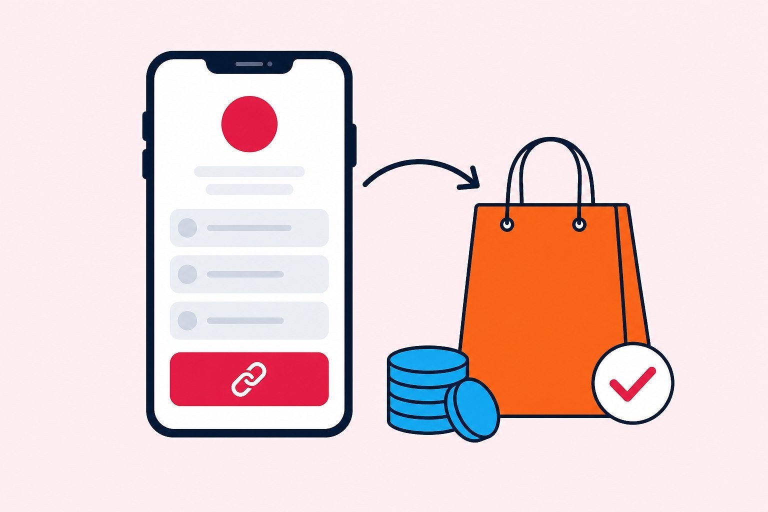
How a biolink for sales works on one hub page: CTAs, biolink lead form, biolink catalog, and conversion tracking for Instagram selling.
Biolink for sales is a one-URL hub that helps small shops and creators close leads or orders - when CTAs, a biolink lead form, and a biolink catalog sit in a clear order. This article covers when a bio is enough versus a landing, and when a link in bio shop on Instagram still needs measurement before you raise ads. Try it at /create-bio-link. Hub strategy: biolink marketing strategy 2026.
Biolink for sales: when a bio is enough - and when you need a landing
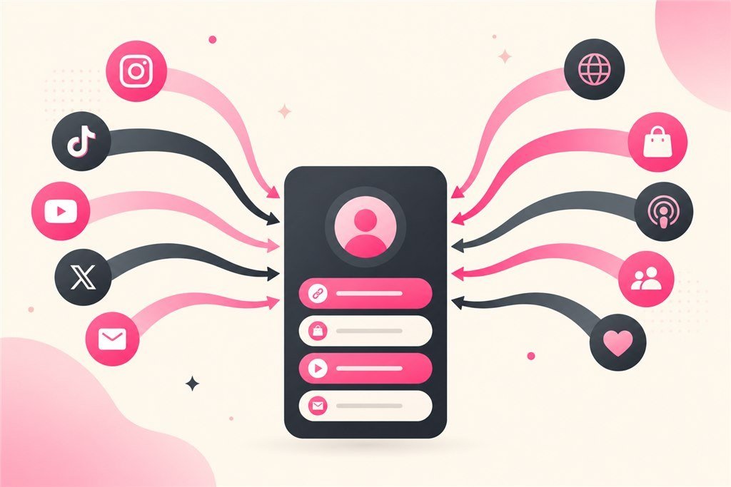
A biolink is enough when you sell a few clear products or services, visitors arrive from Instagram or TikTok, you need several exits (chat, form, shop, content) on one bio URL, and the team does not want to maintain a large website. It is not enough when an ads offer needs a single-job page with a longer story, deep SEO, or complex checkout - then build a campaign landing with a solid AI landing page prompt approach and keep the bio as the gateway.
A common mistake is stuffing everything onto the bio and expecting landing-level conversion. Bios win on decision speed and ordered multi-CTAs. Landings win on depth for one offer. Healthy shops often use both: a stable bio plus flash landings per campaign.
Practical rule: if seven of ten customer questions look alike and three to five buttons plus a short form can answer them, biolink for sales is enough to learn. If every buyer needs a fifteen-minute consult before they trust you, the bio can still capture leads - connect to booking or CRM so leads do not die in inbox. Creators selling digital usually start with bio because the audience already lives on social. Local SMEs can start with bio to gather bookings, then open a services page when local SEO matters.
Primary and secondary CTAs - stop diluting one page
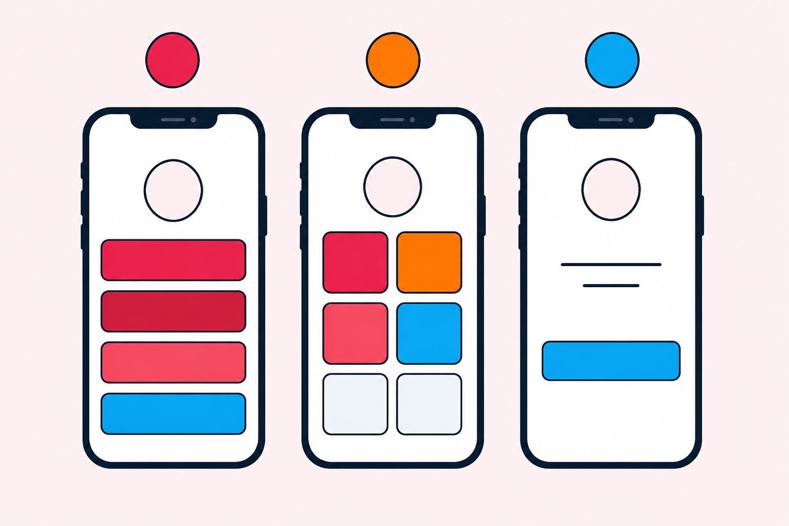
A bio should have one primary CTA in the priority slot after the avatar: “Order,” “Get a quote,” “Sign up.” Secondary CTAs sit below: catalog, other channels, reading. If every button has the same visual weight, people do not know what to do first - click quality drops even when click volume looks fine.
Rule of thumb: one primary CTA, two to four useful secondary CTAs, avoid a fifteen-link list. During campaigns, temporarily hide off-offer buttons. Name buttons by action plus value (“Get the size checklist,” not “Link 1”). Check on a real phone. For AI versus manual builds, see biolink AI and biolink manual.
Visual order is business order. If ads push a pre-order while the top button still says “Read the blog,” you are breaking the creative with the hub. Biolink for sales must match this month’s offer, not vanity links that exist “because we always had them.”
Biolink lead form - when it beats inbox DMs
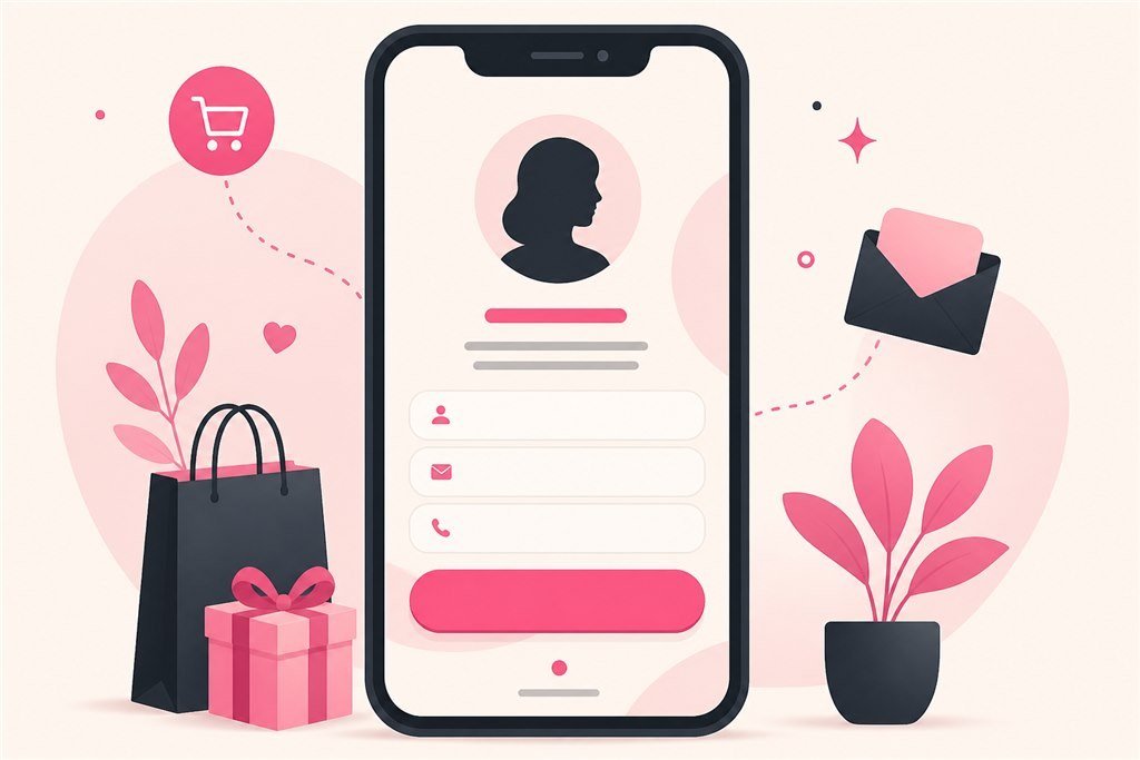
DMs feel friendly but do not scale: missed messages, hard UTM attribution, messy CRM entry. A biolink lead form captures leads after hours, standardizes fields, and connects light automation. Use forms when you need a nurture list or booking queue; keep DMs when high-ticket consults require a real conversation.
Fewer fields win in the learning stage. Name plus phone or email is often enough. Add a needs note if qualification matters. State how soon you will reply. Leads ignored for twenty-four to forty-eight hours break the whole path - tools cannot replace sales process. Storage and processing details live on the backend storage Page.
A form is an asset if someone follows up; a liability if it exists “for show.” Write the reply window on the page and in the ops sheet. That is the difference between a sales hub and a link business card.
Light catalogs by industry - a practical link in bio shop
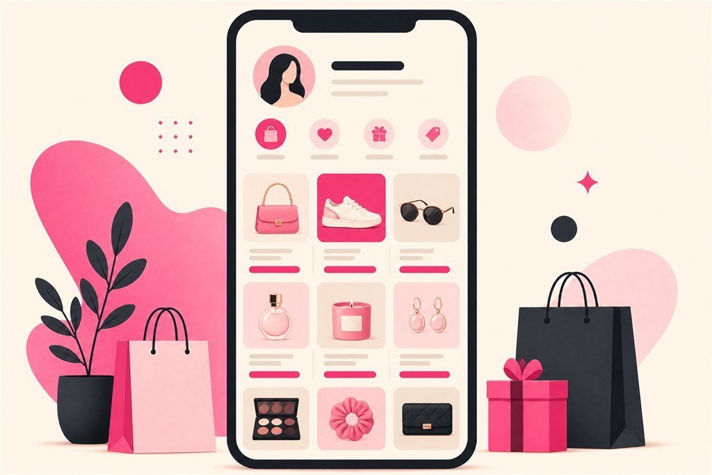
Fashion and beauty: a few hot products plus chat for sizing. F&B: menu images or a PDF plus table booking. Courses: learner outcomes, start dates, and a form. Local services: packages, service area, and booking. Do not showcase fifty SKUs on a bio without filters; feature bestsellers. Keep images light and captions short: name plus price or CTA. Variable prices: write “from …” and push detail into chat or form.
A biolink catalog is not a warehouse. It is intentional merchandising. If people keep asking “which colors are left,” put that question into the form or chat - do not turn the bio into a spreadsheet. A link in bio shop feels strong when people decide quickly; it feels tired when they scroll like a marketplace.
Heavy images kill conversion on 4G. Compress before upload. One sharp photo with a clear price beats five blurry shots. Check on a real phone before you call the hub done.
Minimum measurement before you raise ads
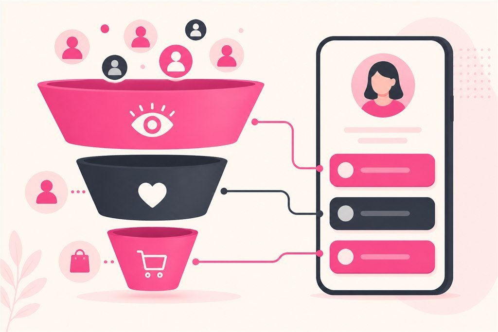
Three layers are usually enough at first: (1) button clicks on the bio so you know which CTA wins; (2) short links plus UTM so you know which source sends people; (3) a pixel if you run Meta or Google so you can learn from people who already touched the hub. Do not wait until you are “big enough to measure.” Early measurement tells you whether to fix the button, the offer, or the follow-up.
Define conversion the same way in ads and sales before anyone debates ROAS. Click is not lead; lead is not order. If you only sell organic, still note which video or post drove bio taps. Creative time is not free. At month-end, archive which CTAs ran so next quarter already has a brief.
When paid traffic hits the bio, keep the hub layout stable and rotate aliases or UTMs by campaign. One unlabeled shared ads URL for every creative makes learning impossible. Treat measurement as part of the offer, not as optional polish.
Weekly operations for shops using biolink for sales
Spend thirty to forty-five minutes each week: read clicks and leads, pick one hypothesis, change one thing, write a note. Assign owners even when people wear multiple hats: who owns CTAs, who owns ad URLs, who answers leads. Before you scale: QA inside the real Instagram or TikTok in-app browser, and write a follow-up SLA people can keep.
Days one and two after a CTA change: prioritize answering leads inside the window promised on the page. Days three to seven: fix one friction point (button copy, image, form). End of week: hide links that fight the current offer. SEO and OG work can wait for a second hour - they should not block having a live hub today.
Small teams often fail here: everyone edits the bio, nobody owns the inbox. Put one line on a sheet: name, job, review date. Writing permissions once is cheaper than ten meetings about who may touch what. That discipline is what makes biolink for sales a system instead of a pretty URL.
When to graduate from bio to a campaign landing
Graduate when ads need a longer story than a few buttons, when customers keep asking questions the bio cannot hold, when you need a single-offer page separated from a multi-CTA hub, or when checkout logic outgrows a short form. The common pattern: keep biolink for sales as the stable door, and send short links into campaign landings.
Do not graduate because a competitor has a large website. Graduate because numbers and customer questions demand it. If bio clicks are strong but leads are weak, fix CTA and form first. If leads are strong but revenue is weak, inspect price, sales script, and delivery - not button color.
Creators selling digital products can stay on bio plus form for a long time. Physical shops with many variants often use bio plus chat or form, then landings when ad spend grows. B2B services often use bio for lead capture plus a capability page when SEO matters. For prompt structure on those landings, return to marketing prompts for AI landing pages.
Three sales mistakes on bio that cost more than missing features
Mistake one: ten equal buttons. Visitors invent their own journey - usually they leave. Fix with one primary CTA and hide the rest.
Mistake two: a form nobody calls back. Leads go cold fast. Fix with an SLA and a named owner before you add more fields.
Mistake three: celebrating clicks as if they were sales. Clicks only say a path was touched. Leads and orders say whether the business moved. Meetings without a written question turn into taste debates.
Prevent all three with a fixed thirty-to-forty-five-minute block, a one-page sheet, and a rule against changing five things in one day. A biolink lead form and a catalog only earn their keep when those habits exist.
A 90-day path - from live hub to a scale decision
Days 1 - 14: lock one offer, one CTA, one destination URL, and one minimum measurement method. Do not open a CMS, five landings, and five pixels. The first two weeks exist to clean the path and teach the team to read numbers. If leads arrive and nobody replies on time, fix sales process before you fix layout.
Days 15 - 45: run small traffic (paid or warm). Change only one variable per week: headline, button, form, or source. Keep a changelog. Compare seven days to the previous seven, not to “how this week felt.” If clicks rise and leads do not, do not raise bids - fix destination or offer. If leads rise and money does not, inspect script, price, and delivery.
Days 46 - 90: scale only what proved out. Add a second campaign landing when a second offer is truly different. Add more pages when customer questions repeat. Deepen the catalog only after bestsellers are stable. Everything “for completeness” before day ninety usually creates maintenance debt.
At quarter end: a sixty-minute meeting - what to keep, what to cut, what to amplify. Archive creatives, aliases, UTMs, CTAs, and numbers. That memory is next quarter’s brief. SMEs do not need a strategy department; they need a habit of writing things down.
A minimum scoreboard - four numbers, not twenty
Complex dashboards make teams avoid looking. Four numbers cover most SMEs: (1) hub visits; (2) primary CTA tap rate or form starts; (3) qualified leads or orders; (4) cost per lead or order if you run paid. If those four are missing, do not redesign the layout - fix measurement first.
Add a short qualitative note each week: what people ask in DMs, which objections repeat, which creatives brought the right visitors. Qualitative notes explain quantitative dips. Without them you only see “form fell” and guess between price, shipping, and vague copy.
Suggested rhythm: ten minutes on days with ads live; a thirty-to-forty-five-minute weekly block; month-end archive. Do not watch realtime charts and kill a campaign after four hours. Short windows create noisy “optimization,” especially with a new pixel and cold audiences. Protect your link in bio shop from that habit.
Quick use cases: when a link in bio shop wins - and when it loses
Wins: the owner answers leads inside the promised window; this month’s CTA matches ads and Stories; the catalog shows only a few hot items; sources are measurable. Visitors know what to tap within five seconds.
Loses: ten equal buttons; a form nobody calls; price and shipping only explained in long DMs; no idea which collab drove orders. In that state, do not blame “weak biolink software” - fix process before you add another block.
If you are choosing between bio and landing: keep biolink for sales as the door, test small ads into the bio or into a short link, and open a landing only when one offer needs more depth than a multi-CTA hub can hold. Pair that landing work with a clear marketing prompt, not with a vague “make a website.”
Merchandising the catalog without turning bio into a storefront clone
Refresh the showcase with the campaign, not once a year. A bio still featuring last season’s hero while ads push a new SKU trains distrust. Treat the biolink catalog as living merchandising: rotate what is hot, hide what is out of stock, and keep captions honest about wait times.
If you sell kits or bundles, show the bundle as one card with a clear next step - chat for customization or form for sizing - instead of listing every component. People on social arrive with low patience and high scroll speed. Respect that attention budget.
When inventory changes daily, prefer “message for today’s menu” or “check availability” over stale prices. Outdated prices on a public bio create refunds and angry comments. Honesty beats completeness when the hub updates slower than the shelf.
In short
Biolink for sales is enough for many small shops when CTAs have order, a biolink lead form has a human follow-up, and a biolink catalog only showcases bestsellers. A link in bio shop does not replace a deep landing; it is the social door. Measure early, operate weekly, graduate to landings when numbers and questions demand it. Start at /create-bio-link.
FAQ
How many SKUs can a bio still handle?
There is no hard number. If people decide quickly with a few hot items plus chat or form, the bio is enough. If they need deep browsing and many filters, keep the full catalog elsewhere and treat the bio as a short shelf.
Is a form better than DMs?
Forms win when you need scale and standardized fields. DMs win for high-ticket conversations. Many shops use form as primary and DM as backup.
Do I need a custom domain on day one?
Not required. Go live first; attach a domain when brand or SEO needs it - do not let DNS delay launch day.
How many buttons is too many?
Too many is when visitors must guess which button matters. Practical pattern: one primary, a few useful secondary links. Hide off-season links during campaigns.
When do I definitely need a landing?
When ads or an offer need a single-job story deeper than a multi-CTA hub, or when customer questions outgrow what the bio can hold.