Marketing prompts that help AI build a converting landing page: Hero, benefits, form, CTA structure, prompt templates, and a pre-ads audit checklist.
An AI landing page prompt decides whether the model ships a page that sells or one that only looks polished. This guide locks a clear Hero Form CTA frame, practical marketing prompt landing patterns, and a pre-ads checklist so you actually launch a converting landing page - marketing and PR angle, not a product walkthrough. Start at /create-website. Product map: AI website builder from idea to live.

A converting landing page needs block order - not more animation
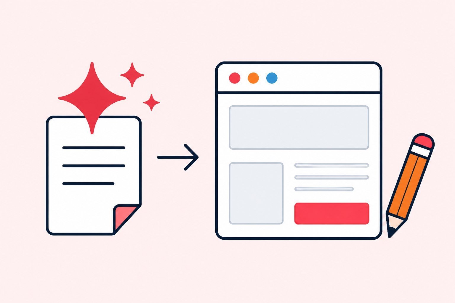
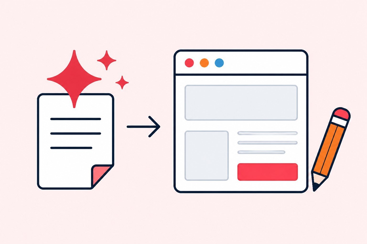
A landing wins when it does one job. The hero states the offer and who it is for in a few seconds. Benefit blocks translate pain into outcomes people can picture. Proof reduces doubt. The form and call-to-action capture the move. Any section that drifts off that job adds friction. Models fill this frame well when the brief is specific; vague instructions produce “about the company” pages that never close.
That is different from a biolink. A bio is a hub with several exits; a landing is a single-offer pipe. When you need a social hub, see biolink for sales. When you are still choosing whether AI websites fit your stage, the pillar at AI website builder from idea to live maps the longer path.
Before you write an AI landing page prompt, finish this sentence: “This page exists to ____ for ____ by ____.” If you cannot fill it, do not generate. Empty briefs are the root of pretty, useless pages. A converting landing page starts from that sentence, not from a theme that looks expensive.

AI landing page prompt - write the hero like a marketer, not a decorator
Minimum frame for a strong brief: audience, pain, offer, CTA, tone. Force concrete outcomes. Ban empty headlines like “comprehensive solutions for modern brands.” Product-level Chat AI steps live on the chat AI prompt Page; this article stays on marketing structure.
Build a landing for women's fashion shop owners aged 25 - 40.
Offer: summer collection pre-order, ships in 10 days.
Headline emphasizes speed + limited slots.
Sub explains why ordering early wins.
Primary CTA: Reserve pre-order.
Tone: modern, short, not flowery.
Required structure: Hero Form CTA, 3 benefits, 1 proof, short FAQ.
Add negative constraints: no long menus, no second competing offer beside the hero, no off-topic blog grids. “Do not” instructions improve a marketing prompt landing as much as “please do.” Models mirror your clarity; they do not invent strategy you never wrote down.
One language tip that still matters in English markets: ask for plain speech. If you do not, you often get technical slogans - “optimize the conversion experience” - that sound correct and land cold with a shop owner who just wants a clear next step.

Benefits and proof - prompts that sound like the industry you serve
Local services: response speed, service area, time commitments; proof from Google reviews or booked jobs. Courses and digital products: learner outcomes and a visible path; short testimonials. Physical products: materials or differentiators, returns; real customer photos. Name the proof type in the brief so the model leaves a slot instead of inventing five-star quotes.
Ask explicitly for “three benefit cards plus one proof block,” and list the real numbers you will swap in later. The model places the frame; you replace fictional metrics before ads. Ad platforms will optimize against whatever trust signal is on the page - weak or fake proof trains the wrong learning. If you lack strong social proof yet, use a honest process promise or a founder note. Do not fabricate reviews.
When you draft an AI landing page prompt, separate benefits from features. “A five-field form” is a feature. “Leave a phone number in thirty seconds and get a call back within two hours” is a benefit. Models list features by default unless you force outcome language.

Forms and CTAs - where pretty pages go quiet
Long forms create drop-off. In the learning stage, name plus phone or email is usually enough. Add a field only when you will use it to qualify. State how soon someone will reply. Write the CTA as verb plus value: “Get the size checklist,” not “Submit.” That microcopy is part of trust, not decoration.
On phones, the button must be thumb-reachable and not clipped by a sticky banner. If you offer both a form and a chat widget, pick one primary path - two equal exits freeze people. This is the Form and CTA half of Hero Form CTA, and many briefs forget to describe it at all.
A converting landing page does not finish when the visitor taps send. Someone has to call back inside the window you promised. Tools do not replace sales process; they only surface demand faster.
AI landing page prompt patterns by goal
Lead capture: stress what happens after they share details, reduce spam fear, and put a reply SLA on the button line. Booking: name time windows, service area, and cancellation rules. Pre-order or flash: state the deadline and the early-bird benefit - not only “X% off.” Event signup: date, place or online link, and one reason to show up.
Each goal deserves its own page, or at least a clearly different version. Do not ask one AI landing page prompt to carry five offers. Paid ads buy one promise; the page must keep that promise without competing headlines.
If traffic comes from Reels, TikTok, and Search at once, you can still use one landing - but measure each source with UTM or short links. Do not call the page “weak” when one channel is simply sending the wrong people.

Pre-ads checklist - ship only what you can defend
- Offer on the page matches the creative image and the spoken line in the ad.
- Hero headline is readable on a phone within five seconds.
- At least one real proof block (no placeholder stars).
- Form submits on a real 4G connection.
- Primary CTA names one action only.
- UTM or short link exists per traffic source.
- Pixel (if you use Meta or Google Ads) and a minimum conversion event are live.
- A named person owns leads inside the SLA written on the page.
Skip the last item and your converting landing page only fills a dead inbox. Publish is a technical step; calling people back is the business step. Attach a custom domain when brand or SEO needs it - do not let DNS work delay a live URL if you only need traffic today.
After go-live, send the link to someone outside the team. Fresh eyes catch what you no longer see: clipped buttons, missing required fields, or a CTA that says one thing while the hero says another.
Three edit passes after the first AI draft
Pass one - clarity: does a stranger understand what you sell? Fix headline and sub before you touch colors. Pass two - trust: add real proof, cut buzzwords. Pass three - friction: shorten the form, sharpen the CTA, compress heavy images.
Many teams regenerate five times because the page “is not pretty yet.” Usually they need a better brief and those three passes. A disciplined AI landing page prompt cuts rebuilds; disciplined edits after publish cut wasted ad spend.
Keep a short weekly changelog: what changed, why, and the seven-day numbers before and after. Without notes, meetings argue taste instead of evidence.
Weekly ops with an AI-built landing
Block thirty to forty-five minutes each week. Read four numbers: visits, form starts or primary CTA taps, qualified leads, and cost per lead if you run paid. Pick one hypothesis. Change one thing. Write it down.
Assign owners even on a tiny team: who owns copy, who owns ad URLs, who follows up. Before you scale: QA inside a real phone browser, and agree on one conversion definition between ads and sales. Add a second page only when a second offer is truly different.
Organic is not free. Hours writing Reels, answering DMs, and tightening the landing are costs. Measure organic with the same discipline as paid; the only difference is cash out the door. If people arrive and leave nothing, inspect CTA and follow-up before you blame the algorithm.
When one landing is enough - and when you need more pages or a bio
One landing is enough when the offer is clear, visitors already know you a little from ads or social, and you need to learn whether the promise closes. Add more pages when the brand needs service depth, a long FAQ, or a blog. Add a bio when people live on Instagram or TikTok and you want several stable exits - campaign landings can still sit behind short links.
A common expensive mistake: building a “full website” before one offer wins. Cost is not only build time - it is maintenance, message drift, and numbers scattered across URLs. A chain of small pages, each with one job, usually beats one large site built once and abandoned.
If your sales bio is already stable, bring AI landings in when ads need a deeper story than a few buttons. The two layers do not replace each other. For hub strategy on social, pair this with your biolink playbook rather than forcing every visitor through a long page.
Three expensive prompt mistakes
Mistake one: a vague brief, then blaming the model. AI reflects the clarity of the brief. Fix the brief before you regenerate for the fifth time.
Mistake two: a beautiful page with a foggy button and foggy follow-up. People can tap, but they do not know what they just signed up for - or nobody calls within a day or two.
Mistake three: measuring one layer and concluding about another. You watch short-link clicks and call the landing weak while the form is broken on mobile. Each metric answers one question.
A quieter fourth mistake: stuffing keywords into every sentence “for SEO.” Campaign landings live on clarity and trust speed. SEO helps more on long content pages; paid landings prioritize conversion first. That is why a good marketing prompt landing brief talks about audience and offer, not keyword density on the hero.
One-page brief template - copy into your notes
- Audience: who they are, what they fear or want.
- Offer in one sentence, plus a deadline if you have one.
- Three benefits in outcome language.
- One real proof item you will paste in.
- Primary CTA plus reply SLA.
- Things that must not appear on the page.
- Expected traffic sources and how you will measure (UTM or pixel).
Fill those seven lines before you open an AI landing page prompt session. Paper briefs are cheaper than ten rebuilds in a tool. When the brief is solid, open /create-website and ship a first draft the same day.
After fourteen days of numbers, decide: keep and scale, fix one block, or kill the offer. Do not keep a page “because we already spent time on it” when the numbers disagree. Sunk cost is not a strategy.
Monday habit after you have a converting landing page
Keep the changelog short: date, block changed, seven-day metrics before and after. If an agency also edits the page, send the seven-line brief and the four metrics before you grant edit rights.
One cheap habit: every Monday, open the page on a phone over 4G for sixty seconds. Stay close to how a real visitor feels. Many form and button failures only show up there - not on office desktop Wi‑Fi. That habit protects every Hero Form CTA you ship after the first draft.
When you change the hero, change the ad creative the same week or pause the mismatch. Message match between ad and page is still one of the cheapest conversion lifts available. Tools help you ship; they do not excuse a broken promise between creative and landing.
If two teammates edit the same page without a changelog, you will lose the thread of what “worked last Tuesday.” Treat the live URL like inventory: labeled, dated, and owned. That habit matters more than another round of theme tweaks when you are trying to learn from small traffic.
In short
A strong AI landing page prompt reads like a marketing brief: audience, pain, offer, a named Hero Form CTA structure, and clear “do not” constraints. The model gives you a draft; real proof, a short form, and follow-up SLA turn that draft into a converting landing page. Audit before ads, edit weekly, measure each source. Start at /create-website.
FAQ
Is a longer prompt always better than a short one?
Length is not clarity. A one-page brief with audience, offer, required structure, and negative constraints usually beats a long, flowery paragraph.
Do I need deep CRO expertise on day one?
Not at first. You need enough discipline for one offer, one CTA, real proof, and measurement. Deeper CRO comes after traffic is steady.
Should I regenerate the whole page or edit the current draft?
Prefer editing headline, proof, and form first. Regenerate when the structure is completely wrong for the goal - not because the colors feel unfinished.
When do I use a landing versus a biolink?
Use a landing when ads or a campaign need one story and one job. Use a biolink when social needs a multi-exit hub. Many teams run both.
How long before I know the landing is working?
On small traffic, use a seven-day window and compare to the seven days before one change. Do not kill a campaign after four hours of noisy data.