
- Full process map
- Glossary
- Steps
- Step 1 - See the three defaults
- Step 2 - Add a custom breakpoint
- Step 3 - Reorder breakpoints
- Step 4 - Fit to content height
- Step 5 - Delete unused breakpoints
- Important: a breakpoint is a “view,” not a “separate page”
- Compared with Webflow & Framer
- Technical limits
- Common issues & fixes
- Tips
- Self-check
Appifio Creator · Lesson C02 · Beginner → Intermediate
Desktop · Tablet · Mobile
Use the three default Canvas breakpoints, add a custom width between 320-1920px via Add breakpoint, and turn on Fit to content height so frames aren’t clipped.
Learning goals: Read and reorder Canvas breakpoints, add custom widths in range, enable fit-height when needed, understand breakpoints are a viewing mode - not separate page copies.
Reading time: about 14 minutes
Prerequisites: You can switch to Canvas (C01).
Previous: C01 - View space: Standard vs Canvas
Next: C03 - Turn on Inspector: select elements, edit text & images
Full process map
Glossary
| Term | Meaning | Where in the UI |
|---|---|---|
| Breakpoint | A fixed-width preview frame that simulates one device class | Frames side by side on Canvas |
| Desktop / Tablet / Mobile | Three built-ins: 1200px / 810px / 390px | Fixed label on each frame |
| Custom size | A breakpoint you name and size yourself, 320-1920px | Inside Add breakpoint modal |
| Fit to content height | Frame height grows with the page - no clip / no empty gap | Toggle on each breakpoint |
Steps
Step 1 - See the three defaults
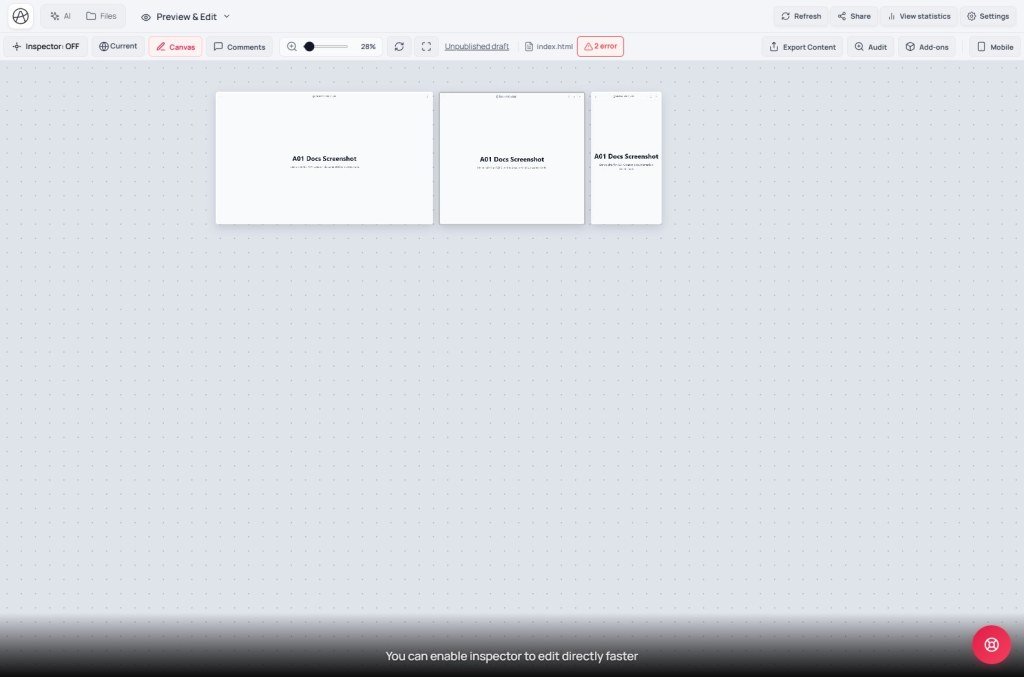
After enabling Canvas (C01), Creator shows three frames side by side:
| Breakpoint | Default width | Simulates |
|---|---|---|
| Desktop | 1200px | Typical desktop screen |
| Tablet | 810px | iPad and mid-size tablets |
| Mobile | 390px | Common phones (modern iPhone-class) |
The artboard label often looks like “Desktop · 1200” - name plus width - so you know which frame you’re looking at when zoomed out.
Step 2 - Add a custom breakpoint
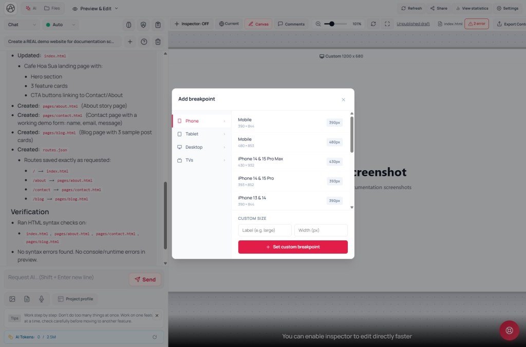
Click Add (full tooltip: Add custom breakpoint) at the end of the breakpoint row. The Add breakpoint modal opens with Custom size:
- Enter Breakpoint name - or follow the hint like “Label (e.g. large)”.
- Enter Width (px) - only 320-1920 px is accepted. Outside that range you’ll see Width must be between 320-1920 px.
- Click Set custom breakpoint (or Add in the modal). The new frame joins the row next to the three defaults.
Use a custom breakpoint when you need a special size - e.g. small laptop 1366px or large phone 428px - that the defaults don’t cover.
Step 3 - Reorder breakpoints
You can drag to reorder frames - e.g. put Mobile first if you check mobile first. Order only affects Canvas layout, not the live site.
Step 4 - Fit to content height
Each breakpoint can toggle Fit to content height. Off: fixed minimum height (easier to compare to a real screen, but may leave empty space on short pages or clip long ones). On: the frame grows with the real page height at that width - useful when mobile stacks many more sections than desktop.
Step 5 - Delete unused breakpoints
Choose Delete breakpoint for frames you no longer need. That only removes your Canvas view - it does not delete CSS or site data.
Important: a breakpoint is a “view,” not a “separate page”
Defaults and custom frames all show the same HTML/CSS file - only the container width changes. Different looks come from your (or AI’s) responsive CSS / media queries, like resizing a real browser. So: editing CSS in the Inspector (C03-C04) while looking at one breakpoint updates the source file and can affect other sizes if that CSS isn’t scoped in its own media query.
Compared with Webflow & Framer
| Tool | Default breakpoints | Custom |
|---|---|---|
| Appifio Creator | Desktop 1200 / Tablet 810 / Mobile 390 | Add any custom width 320-1920px; view all side by side |
| Webflow | Five fixed breakpoints (Desktop, Tablet, Mobile Landscape, Mobile Portrait…) | Custom breakpoints (plan-dependent), but one at a time via the bar - not side by side |
| Framer | Desktop/Tablet/Phone similar to Webflow | Can add breakpoints; preview per device type |
Technical limits
You can
- Compare many widths side by side on one screen
- Add as many custom breakpoints as you want in range
- Drag to reorder display order
You can’t
- Enter widths outside 320-1920px (no true 4K/8K or sub-phone widths)
- Create different content per breakpoint - one file, CSS decides the look
- 100% match a real device (network, DPI…)
Common issues & fixes
| Issue | Fix |
|---|---|
| “Width must be between 320-1920 px” | Re-enter a value in range; below 320px is rarely useful for common devices. |
| Breakpoint frame clips the bottom of the page | Turn on Fit to content height for that breakpoint. |
| CSS edit at one size breaks another | CSS outside a media query hits every size - ask AI (UI mode, B05) to wrap it in the right media query. |
Tips
- Keep the three defaults visible - they cover most real traffic.
- Add custom widths only with a reason (special client device, or debugging one broken size) - too many frames make pan/zoom harder.
- Enable Fit to content height on all breakpoints when building a long landing page so you see full content without scrolling inside tiny frames.
Self-check
- Do you remember the three default widths (1200/810/390)?
- Can you add a custom breakpoint via Add breakpoint?
- Do you understand breakpoints don’t create separate content?
- Do you know when to use Fit to content height?
Next lesson
C03 - Turn on Inspector: select elements, edit text & images
Enable Inspector, click to select, edit text/link/image directly, and use Undo/Redo when you mis-edit.
Internal navigation (same language)
Appifio Creator · User guide · C02
