- Full process map
- Glossary
- Steps
- Step 1 - Spot the toggle and its tooltip
- Step 2 - Zoom in Standard and Canvas
- Step 3 - Pan in Canvas
- Step 4 - Android Mock hides Canvas
- Step 5 - Reload and fullscreen
- Step 6 - Combine with Current / Changes and Mobile
- When to pick Standard vs Canvas
- Compared with Figma & Webflow
- Technical limits
- Common issues & fixes
- Tips
- Self-check
Appifio Creator · Lesson C01 · Beginner
Standard vs Canvas
This lesson explains the Canvas/Standard toggle, the zoom bar, when to use each mode, why turning on Android Mock temporarily hides Canvas, and where the fullscreen / reload buttons live.
Learning goals: Switch fluently between Standard and Canvas, use zoom correctly, understand Canvas vs Android Mock, know where reload/fullscreen sit.
Reading time: about 14 minutes
Prerequisites: You understand Current / Changes (lesson A03).
Previous: B06 - Prompt Studio & Project profile
Next: C02 - Canvas breakpoints & responsive
Full process map
Glossary
| Term | Meaning | Where in the UI |
|---|---|---|
| Standard | One preview frame; zoom with a simple slider | Button labeled Standard |
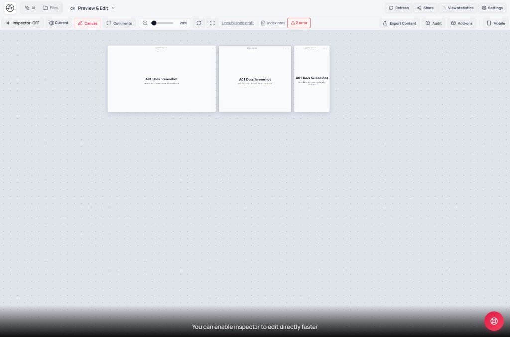
| Canvas | Pan/zoom artboard; multiple breakpoints side by side (C02) | Button labeled Canvas |
| Android Mock | Simulate an Android-app look inside the preview | Android Mock button |
| Fit | Reset zoom so the whole preview fits | Button tooltip Reset zoom / fit to frame |
Steps
Step 1 - Spot the toggle and its tooltip
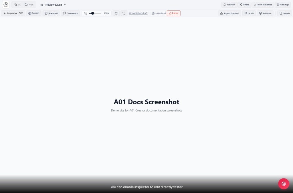
On the View & edit tab toolbar, one button flips its label with the current mode - Canvas or Standard. Hover it; the tooltip matches the state:
| You’re in | Tooltip |
|---|---|
| Standard (Canvas off) | “Using normal preview - click to enable canvas workspace” |
| Canvas (on) | “Using canvas workspace - click to return to normal preview” |
Click to switch. Both modes show the same page content - only the preview framing differs, not two different pages.
Step 2 - Zoom in Standard and Canvas
Zoom shares one slider and a fit button. Technical range:
- Min 0.15× - max 3× (Standard and Canvas).
- Button / icon tooltip Reset zoom / fit to frame → fit the main artboard (Canvas: prefers the largest active breakpoint frame).
- On narrow screens, initial fit may land around 0.15×-0.6× - you can still drag the slider up to 3× for detail.
- Canvas: Ctrl/Cmd + scroll zooms at the pointer; drag to pan; multiple breakpoints side by side (C02).
- Standard: mainly slider + fit; the Mobile button still simulates a narrow frame without full Canvas.
Zoom only scales the editor preview - it does not change visitor CSS. For real responsive checks: use Canvas breakpoints / Mobile, not zoom alone.
Step 3 - Pan in Canvas
In Canvas the preview is a pan-able artboard with zoom as above. Biggest difference from Standard: Canvas shows several breakpoints side by side (Desktop · Tablet · Mobile - details in C02) so you can compare responsive layouts without resizing the browser.
Step 4 - Android Mock hides Canvas
Remember: When you turn on Android Mock, the system hides the Canvas/Standard toggle from the toolbar. The preview only shows the Android-app simulation.
Why: Android Mock renders the page as a single app frame (like a real phone screen, not a multi-breakpoint responsive site), so Canvas “frames side by side” doesn’t apply. To use Canvas again, turn Android Mock off first - the Canvas button returns immediately.
Step 5 - Reload and fullscreen
Beside the Canvas/Standard button are two icon-only controls:
- Reload (rotating-arrow icon) - refreshes the preview from the current virtual disk without clearing your Changes. Use when the preview looks stale or AI just edited in another tab.
- Fullscreen (four-corner arrows) - expands the preview to fill the browser, temporarily hiding floating tools for clean viewing/testing. Click again (or Esc) to exit.
Step 6 - Combine with Current / Changes and Mobile
Standard and Canvas both share the Current/Changes switch (live vs draft) and the Mobile button for a quick narrow frame without full Canvas.
When to pick Standard vs Canvas
Use Standard when
You need a quick single frame, a weaker machine / small screen, or you’re focused on reading content / click-testing features more than comparing layouts.
Use Canvas when
You’re checking responsive design, comparing desktop/tablet/mobile side by side, or fine-tuning with the Inspector (C03) across sizes at once.
Compared with Figma & Webflow
| Tool | Multi-size viewing |
|---|---|
| Appifio Creator (Canvas) | Free pan/zoom artboard; several breakpoints side by side on a real iframe (live page with JS/interaction) |
| Figma | Static frames on a design canvas - not a running website, just UI mockups |
| Webflow | Breakpoint bar (Desktop/Tablet/Mobile) switches frames one at a time, not side-by-side like Canvas |
Technical limits
You can
- Switch Standard/Canvas instantly, unlimited times
- Zoom out to 0.15× for very long pages
- Fullscreen for a clean client demo without toolbars
You can’t
- Use Canvas at the same time as Android Mock
- Zoom past 3× - not a pixel-measurement tool
- See multiple frames at once in Standard
Common issues & fixes
| Issue | Fix |
|---|---|
| Can’t find the Canvas button | Android Mock is on - turn it off so Canvas returns. |
| Preview shows stale content | Click reload (rotating-arrow icon) to refresh from the virtual disk. |
| Zoom stuck too large/small | Click Reset zoom / fit to frame. |
| Stuck in fullscreen | Click the fullscreen button again or press Esc. |
Tips
- Start the workday in Canvas for a responsive overview; switch to Standard when you need deep zoom on details.
- Before sending a demo link, use fullscreen so clients don’t see edit toolbars.
- If AI just finished editing and you don’t see it, try reload before assuming AI failed - often the preview simply hasn’t refreshed.
Self-check
- Can you read the Canvas/Standard tooltip in both states?
- Do you know zoom behaves differently on large vs <1024px screens?
- Can you explain why Android Mock hides Canvas?
- Can you find reload and fullscreen?
Next lesson
C02 - Canvas breakpoints: Desktop · Tablet · Mobile
Dive into the three default breakpoints, custom widths 320-1920px, and Fit to content height.
Internal navigation (same language)
Appifio Creator · User guide · C01
