AI Prompt Studio - Intelligent Prompt Library
Explore and use professional AI prompts to optimize your workflow.
One-click Use
Websites
Markdown Text
design-md
website-prompt
landing-page-prompt
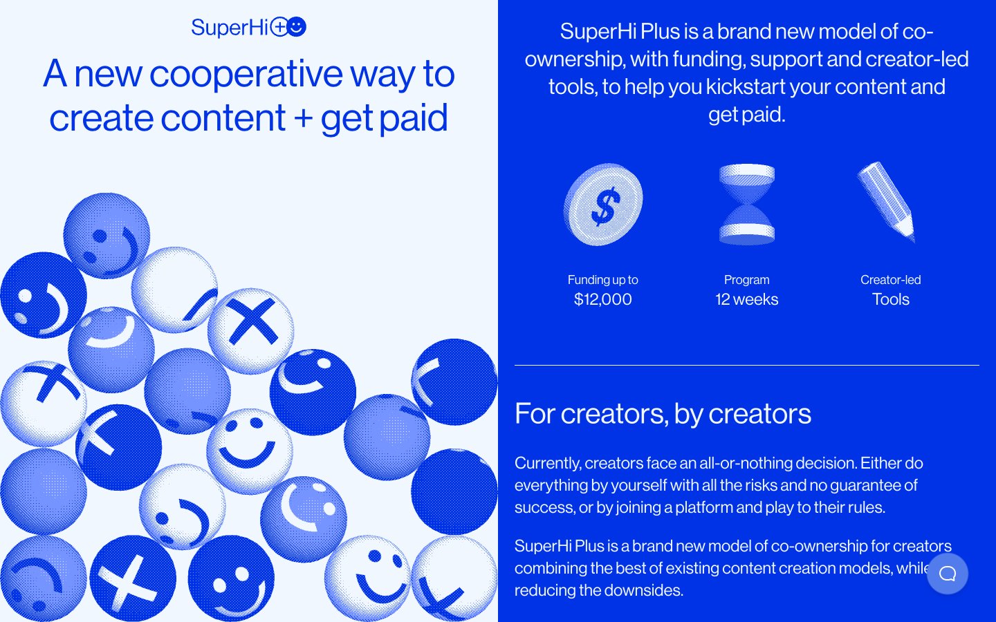
SuperHi Plus
SuperHi Plus — Style Reference

# SuperHi Plus — Style Reference
> Cobalt blueprint scattered with emoji marbles. The page lives half in electric blue, half in ice white, swapping sides as you scroll.
**Theme:** dark
SuperHi Plus uses a split-screen cobalt-and-ice language: one half of every section is saturated electric blue, the other is near-white, and the two panels swap roles as you scroll. Typography is a single-weight neo-grotesque display face at enormous scale (up to 85px) — the design speaks in one voice, never shouting or whispering, just stating. Decorative 3D emoji marbles anchor the light panels as visual texture while flat content lives on the blue. Components are chunky and tactile: 1px inset borders replace shadows, pill radii (50–72px) sit next to sharp 16px cards, and arrow-prefixed text labels function as navigation. The system is deliberately unornamented — no gradients, no drop shadows, no color tints — relying on the binary blue/white tension to create rhythm.
## Tokens — Colors
| Name | Value | Token | Role |
|------|-------|-------|------|
| Cobalt Voltage | `#0033e5` | `--color-cobalt-voltage` | Primary surface, page background, filled action buttons, heading text, link color, and active borders. The structural anchor of the system — every dark panel lives here |
| Ice White | `#f0f7ff` | `--color-ice-white` | Light surface, card backgrounds on blue sections, heading and body text on blue panels, hairline borders, ghost button outlines. Counter-surface to Cobalt Voltage |
| Cobalt Mist | `#527ceb` | `--color-cobalt-mist` | Soft blue tint used sparingly for secondary button fills and tonal accents where Cobalt Voltage would be too heavy. Falls below WCAG on Ice White |
| Pitch | `#000000` | `--color-pitch` | SVG icon fills, nav element fills, and decorative graphic anchors. Used as the dark accent inside light panels |
Websites
Markdown Text
design-md
website-prompt
landing-page-prompt
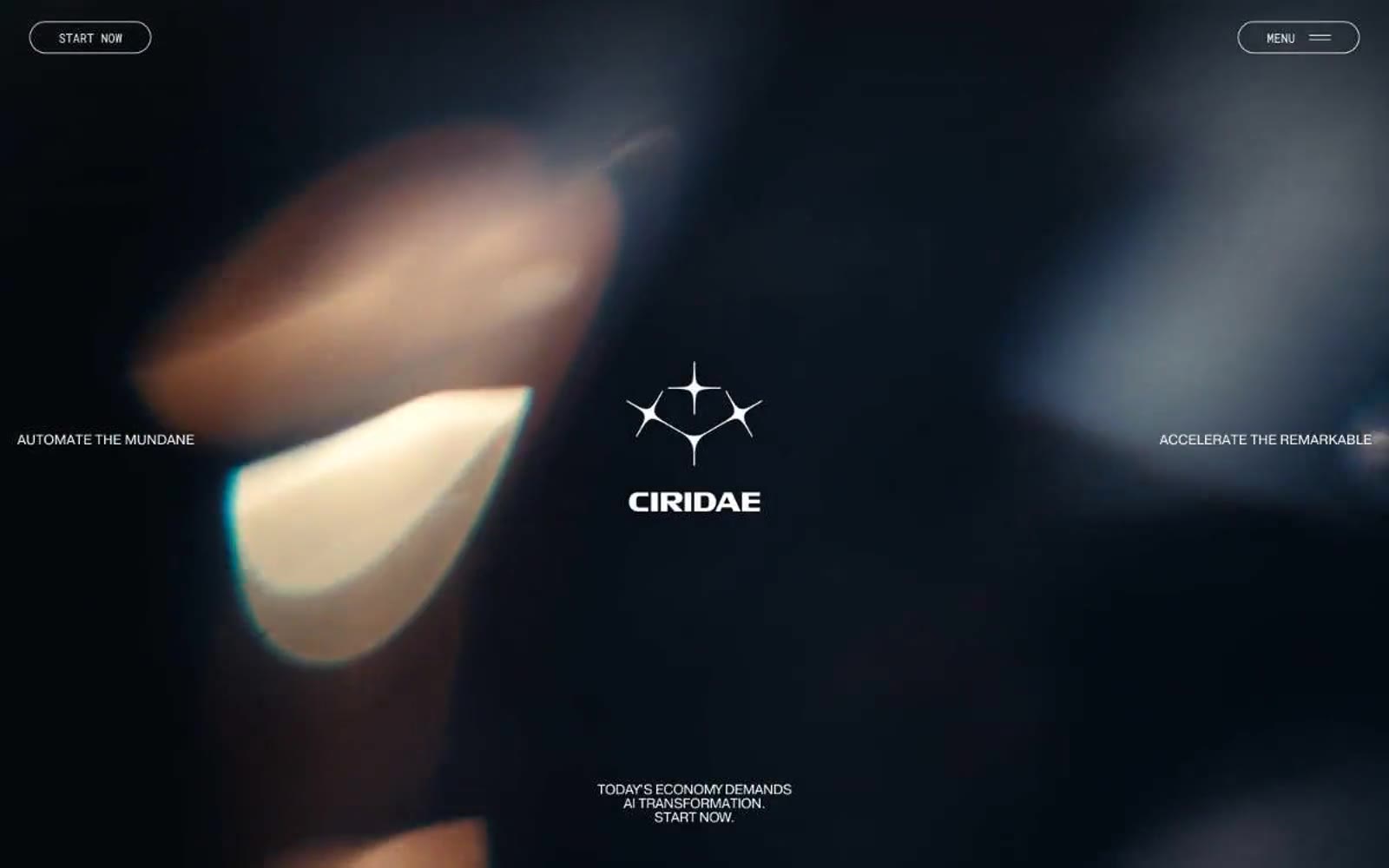
Ciridae
Ciridae — Style Reference
# Ciridae — Style Reference
> Noir observatory with ember glints — a darkened planetarium where white condensed type orbits a single warm copper star.
**Theme:** dark
Ciridae presents a cinematic dark canvas — near-black void (#0b0b0b) with crisp white condensed type floating in generous negative space. The entire interface is achromatic except for a single warm copper accent (#cc6437) that surfaces only as quiet punctuation in logo geometry, decorative strokes, or background atmospherics — never as a functional call-to-action. Typography is the loudest element: a custom condensed sans (Pragmatica Cond) set in a single weight (400) creates hierarchy purely through size, not boldness, with aggressively tight letter-spacing (-0.02em) and line-heights that compress down to 0.90 for the largest display sizes. The visual system avoids shadows entirely — depth is implied through surface shifts (#0b0b0b → #272a2a) and typographic scale, not elevation. Interactive elements are fully rounded pills (1440px radius) rendered as ghost outlines or pure text labels, reinforcing a philosophy of restraint: the brand whispers through geometry and spacing rather than shouting through color or weight.
## Tokens — Colors
| Name | Value | Token | Role |
|------|-------|-------|------|
| Void | `#0b0b0b` | `--color-void` | Primary canvas, page background, hero base layer |
| Carbon | `#272a2a` | `--color-carbon` | Elevated surface — subtle panel lift above the void, card backgrounds, secondary containers |
| Ash | `#858585` | `--color-ash` | Muted text, secondary metadata, low-emphasis borders and dividers |
| Fog | `#cecece` | `--color-fog` | Tertiary text, border accents, subtle separators between sections and content blocks |
Websites
Markdown Text
design-md
website-prompt
landing-page-prompt
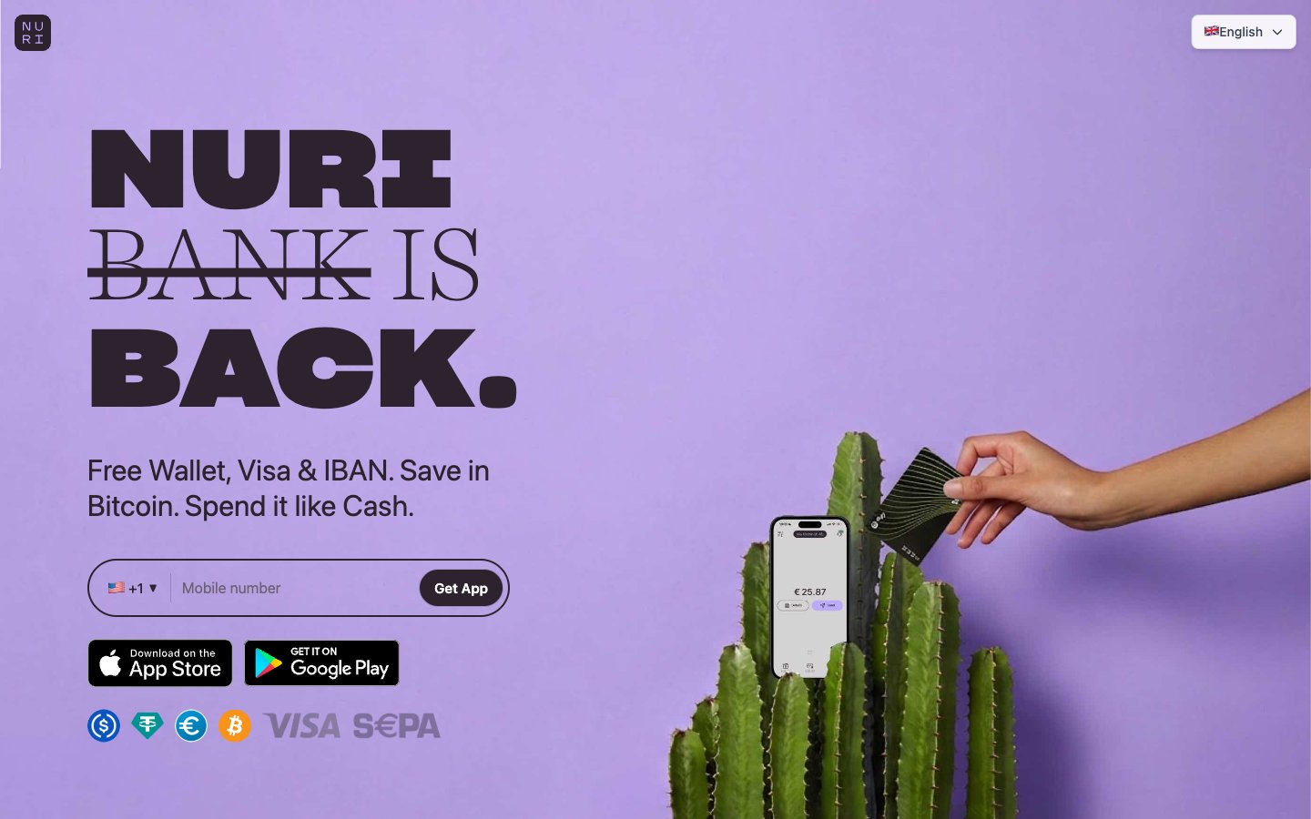
Nuri
Nuri — Style Reference
# Nuri — Style Reference
> Lavender art-deco bank lobby — pill-soft, serif-meets-stencil, cool violet bleeding into warm cream.
**Theme:** light
Nuri operates on a soft lavender canvas with a single bold typographic gesture: enormous Sharp Grotesk black-slab headlines colliding with whisper-weight Harriet Display serifs in the same line, like a financial publication cut by a graffiti stencil. The palette stays in cool violet territory across canvas, card, and hero surfaces, with a warm cream band cutting in near the footer — a deliberate cool-to-warm color temperature arc that signals a human, editorial fintech rather than a blue-and-white banking clone. Surfaces are pill-soft (9999px and 48px radii dominate), shadows are nearly absent, and accents appear as small illustrated characters and one Bitcoin-orange punctuation mark rather than as saturated UI chrome.
## Tokens — Colors
| Name | Value | Token | Role |
|------|-------|-------|------|
| Hero Violet | `#beaaff` | `--color-hero-violet` | Hero section background, full-bleed brand wash — saturated lavender makes the page unmistakable from a thumbnail |
| Card Lilac | `#e2d9ff` | `--color-card-lilac` | Card and panel surfaces — desaturated companion to Hero Violet, used for elevated content blocks on the lighter canvas |
| Bitcoin Orange | `#f97316` | `--color-bitcoin-orange` | Accent for the Bitcoin currency icon and selective callouts — the only warm chromatic note in a cool palette, anchoring the crypto identity |
| Warm Cream | `#fff7ed` | `--color-warm-cream` | Footer band and warm transitions — breaks the lavender monotony with a peach-tinged neutral |
Websites
Markdown Text
design-md
website-prompt
landing-page-prompt
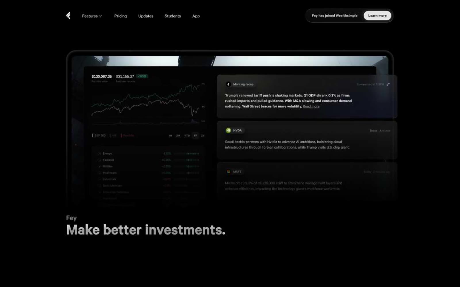
Fey
Fey — Style Reference
# Fey — Style Reference
> Nocturnal Bloomberg terminal, matte-black with luminous type
**Theme:** dark
Fey operates in a nocturnal financial terminal aesthetic: deep matte-black canvas, a single typographic voice (calibre) doing all the heavy lifting, and chromatic color deployed as signal rather than decoration. The interface feels like a Bloomberg terminal redesigned by an Apple hardware team — data-dense product surfaces float on near-black, white type glows with AAA contrast, and orange/blue/green appear only where meaning demands attention (accented words, price direction, status pills). Components are built from generous 16px card radii and pill-shaped 99px controls, with soft black halos creating depth instead of hard elevation. The signature move is typographic: tight tracking on large display sizes (-0.08em) compresses confident statements into compact, premium-feeling headlines, while weight 400 does most of the work — there is no shouting, only calm authority. Every surface lives in the #0b0b0b→#191919 range, making any chromatic accent feel intentionally switched on.
## Tokens — Colors
| Name | Value | Token | Role |
|------|-------|-------|------|
| Fey White | `#ffffff` | `--color-fey-white` | Primary text, decorative borders, hairlines — the dominant color of the system, used for typography and 554+ border occurrences |
| Fey Ink | `#0b0b0b` | `--color-fey-ink` | Primary canvas and card surfaces — the near-black that everything floats on |
| Fey Charcoal | `#191919` | `--color-fey-charcoal` | Elevated card surface, secondary panels — one step lighter than the canvas for nested depth |
| Fey Obsidian | `#131313` | `--color-fey-obsidian` | Tertiary surface, input backgrounds, subtle elevated layers |
Websites
Markdown Text
design-md
website-prompt
landing-page-prompt
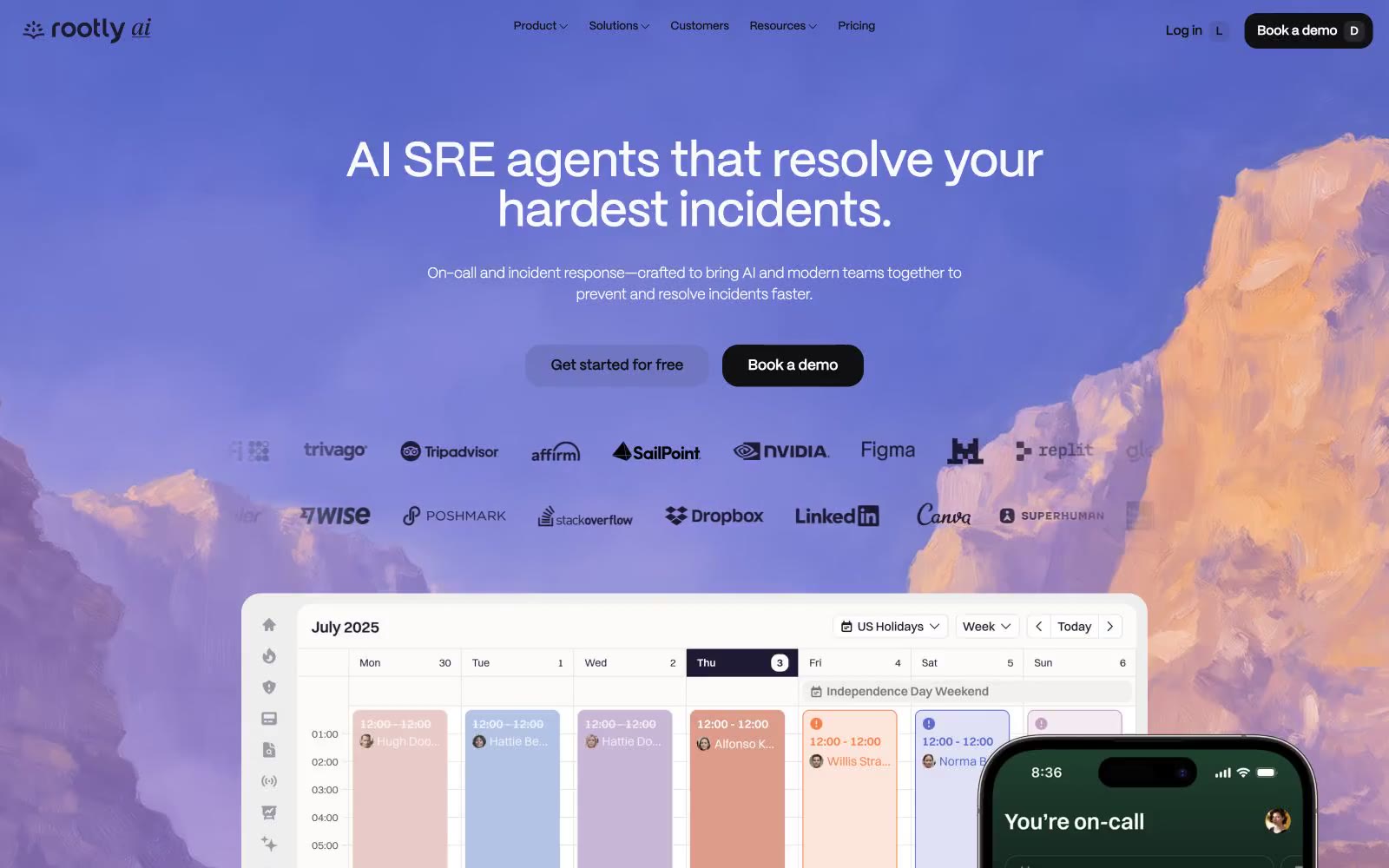
Rootly
Rootly — Style Reference
# Rootly — Style Reference
> violet signal over alpine dawn — thin whisper-type on near-white, with one vivid violet accent rising into a luminous gradient sky
**Theme:** light
Rootly is a near-monochrome system with a single violet pulse running through it. The canvas is a barely-tinted off-white (#fbfaff) sitting under crisp white cards, with the near-black #100f12 doing almost all of the structural heavy-lifting — borders, text, filled CTAs. Violet (#8d6fde) and its lavender washes (#ebe5ff, #d9cffa) appear as small functional accents, never as decorative floods. Typography is the most opinionated choice: the custom Ppmori at weight 200 renders headlines as whisper-thin glyphs that feel almost handwritten, while body and UI lock to weight 500. Every interactive element is a full pill (1440px radius) — buttons, inputs, nav links, tags — sitting next to gently rounded cards (~17px). The hero is the one place the system breaks its own restraint: a dramatic violet-to-rose gradient over mountain photography that reads like dawn breaking above a cloud line. Everything else stays calm, high-contrast, and quiet.
## Tokens — Colors
| Name | Value | Token | Role |
|------|-------|-------|------|
| Ink | `#100f12` | `--color-ink` | Primary text, dominant borders, filled CTA buttons, badge borders. Near-black with a barely-perceptible violet undertone that makes it warmer than pure black against the lavender-tinted canvas |
| Snow | `#fbfaff` | `--color-snow` | Page canvas and outer backgrounds. A whisper of violet lifts it above pure white so it harmonizes with the brand washes |
| Paper | `#ffffff` | `--color-paper` | Card surfaces, elevated panels, secondary button fills. Pure white stacked on Snow creates depth without shadows |
| Graphite | `#44434e` | `--color-graphite` | Mid-weight borders and dividers, secondary text emphasis. Sits between Ink and the body grays for hierarchy layers |
Websites
Markdown Text
design-md
website-prompt
landing-page-prompt
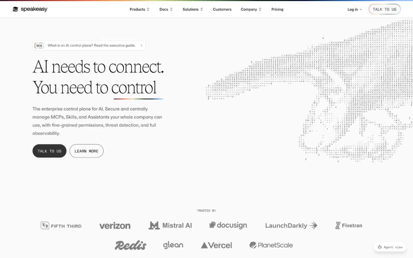
Speakeasy
Speakeasy — Style Reference
# Speakeasy — Style Reference
> Editorial broadsheet on a white field with a rainbow ribbon
**Theme:** light
Speakeasy is a near-monochromatic editorial system built on a vast white canvas, with one extraordinary move: a custom serif (Tobias) rendered at weight 100, stretched to 140px headlines that whisper rather than announce. The interface feels like a high-end print magazine that accidentally became a product page — generous breathing room, hairline dividers, flat surfaces, and a single vibrant gradient hairline at the page's top edge that acts as a signature ribbon. Color is rationed like ink: black and a warm gray scale do nearly all the work, while small chromatic accents (green, orange, yellow, violet, red) appear as functional punctuation inside icons, badges, and feature illustrations. Components are deliberately flat — borders over shadows, small radii, compact spacing — letting the type and the top rainbow gradient do the brand-building.
## Tokens — Colors
| Name | Value | Token | Role |
|------|-------|-------|------|
| Ink Black | `#000000` | `--color-ink-black` | Dark borders and separators for elevated surfaces and inverted UI. Do not promote it to the primary CTA color |
| Paper White | `#ffffff` | `--color-paper-white` | Page and card surfaces, button text on dark fills, inverse text on black |
| Ash Gray | `#dbdbdb` | `--color-ash-gray` | Default hairline borders, dividers between sections, the most-used neutral border |
| Carbon | `#242424` | `--color-carbon` | Navigation borders, deep surface tone, alt black for softer contrast |
Websites
Markdown Text
design-md
website-prompt
landing-page-prompt
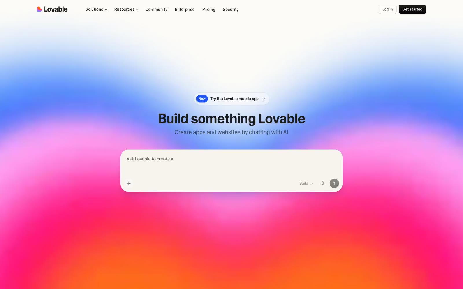
Lovable
Lovable — Style Reference
# Lovable — Style Reference
> Warm parchment canvas behind a single prismatic horizon
**Theme:** light
Lovable wraps an AI builder tool in a warm parchment world where the only spectacle is a single gradient horizon in the hero — everywhere else, the interface retreats into cream surfaces, near-black text, and one custom variable-weight sans-serif. The palette is almost entirely achromatic: warm off-whites and charcoal, with color appearing only as the hero's ambient rainbow gradient and never in UI controls. Components are pill-shaped or softly rounded, borders are warm beige rather than cool gray, and shadows are barely-there inset strokes rather than drop shadows. The overall rhythm is compact vertically but generously padded horizontally, creating a feeling of quiet space inside small containers.
## Tokens — Colors
| Name | Value | Token | Role |
|------|-------|-------|------|
| Parchment | `#fcfbf8` | `--color-parchment` | Page canvas, primary background, card surfaces when on darker parents |
| Warm Sand | `#f7f4ed` | `--color-warm-sand` | Card backgrounds, elevated surface panels, secondary containers |
| Linen Border | `#eceae4` | `--color-linen-border` | All borders — nav dividers, card outlines, input strokes, section separators. Warm beige rather than cool gray gives the entire UI its distinctive non-tech softness |
| Stone | `#d4d3d0` | `--color-stone` | Subtle box-shadow tints, disabled borders, secondary dividers |
Websites
Markdown Text
design-md
website-prompt
landing-page-prompt
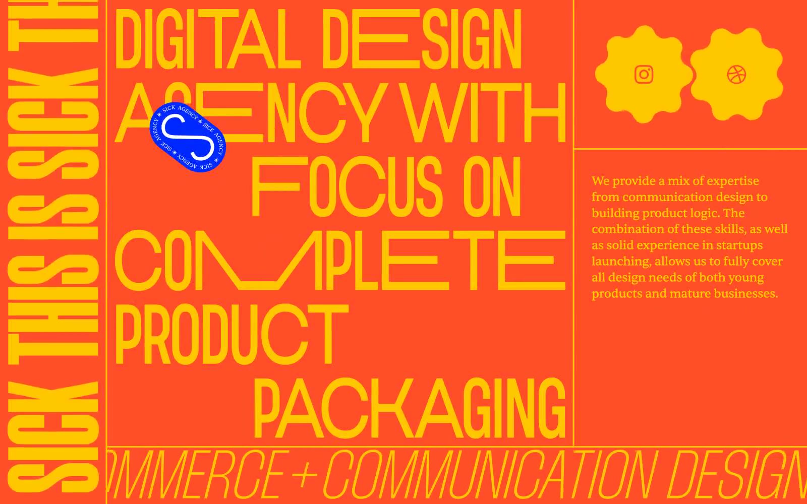
SICK AGENCY
SICK AGENCY — Style Reference
# SICK AGENCY — Style Reference
> Loud printed broadside on a brick wall — a maximalist zine spread screaming from a screen.
**Theme:** mixed
Sick Agency treats the browser as a printed broadside, not a software interface. The system is unapologetically maximalist: three saturated color fields (voltage yellow, radioactive orange, electric blue) alternate as full-bleed section backgrounds, and those colors do not play a supporting role — they are the surface. Display typography is the primary content: condensed black-weight faces at 122–229px are set with line-heights as tight as 0.70, filling the viewport edge-to-edge with no margin for safety. There are no cards, no shadows, no neutral grays, no subtle elevation — the visual hierarchy comes from color contrast and type scale jumps of 5–10x, not from spacing or depth. Interactive elements are pill-shaped and stark, not soft. The overall logic is poster-first: every screen should look like a layer of a zine spread.
## Tokens — Colors
| Name | Value | Token | Role |
|------|-------|-------|------|
| Voltage Yellow | `#ffc700` | `--color-voltage-yellow` | Primary section background and dominant display text color. Headings, borders, and full-bleed canvas bands. Carries the highest visual weight on the page |
| Radioactive Orange | `#ff4e27` | `--color-radioactive-orange` | Secondary section background and accent border color. Outlined action borders, dividers, icon strokes, and full-bleed canvas bands that create contrast with the yellow |
| Electric Cobalt | `#0029ff` | `--color-electric-cobalt` | Primary action background and tertiary section background. The only filled button color in the system; also used for full-bleed canvas bands and decorative sticker badges |
| Burnt Sienna | `#4d170c` | `--color-burnt-sienna` | Error and warning state. Input border in invalid state. Reads as a deep brick-red against the lighter orange, preserving the system’s warm-color vocabulary |
Websites
Markdown Text
design-md
website-prompt
landing-page-prompt
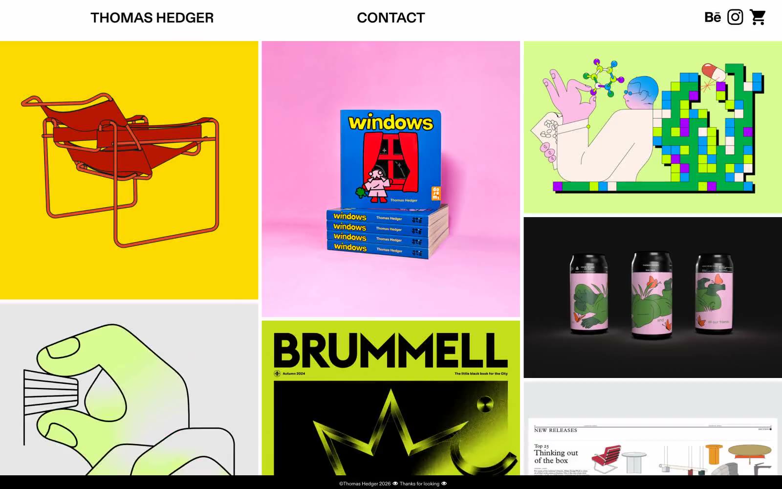
Thomas Hedger
Thomas Hedger — Style Reference
# Thomas Hedger — Style Reference
> Silent frame, loud prints
**Theme:** light
Thomas Hedger is a designer's portfolio presented as a museum catalog: a nearly colorless white frame that stages loud, saturated work. The UI speaks in only two voices — flat white canvas and Diatype typography — and the portfolio tiles are the entire color story. The grid is a full-bleed 3-column mosaic with negligible internal padding, so project images abut each other like prints in a flat-file drawer. There are no shadows, no rounded corners, no brand color, no gradients, no semantic states. Navigation is dead-center honest: the designer's name, a single contact word, and three utility icons. Every aesthetic decision recedes so the work can shout.
## Tokens — Colors
| Name | Value | Token | Role |
|------|-------|-------|------|
| Canvas White | `#ffffff` | `--color-canvas-white` | Page background, card surface, text on dark tiles |
| Ink Black | `#000000` | `--color-ink-black` | Primary text, card and image borders, grid hairlines, nav accents |
| Carbon Plum | `#29242b` | `--color-carbon-plum` | Heading text — a warm near-black that softens against pure Ink Black for editorial moments |
| Ash | `#e5e5e5` | `--color-ash` | Subtle divider and muted border tone for low-emphasis separations |
Websites
Markdown Text
design-md
website-prompt
landing-page-prompt
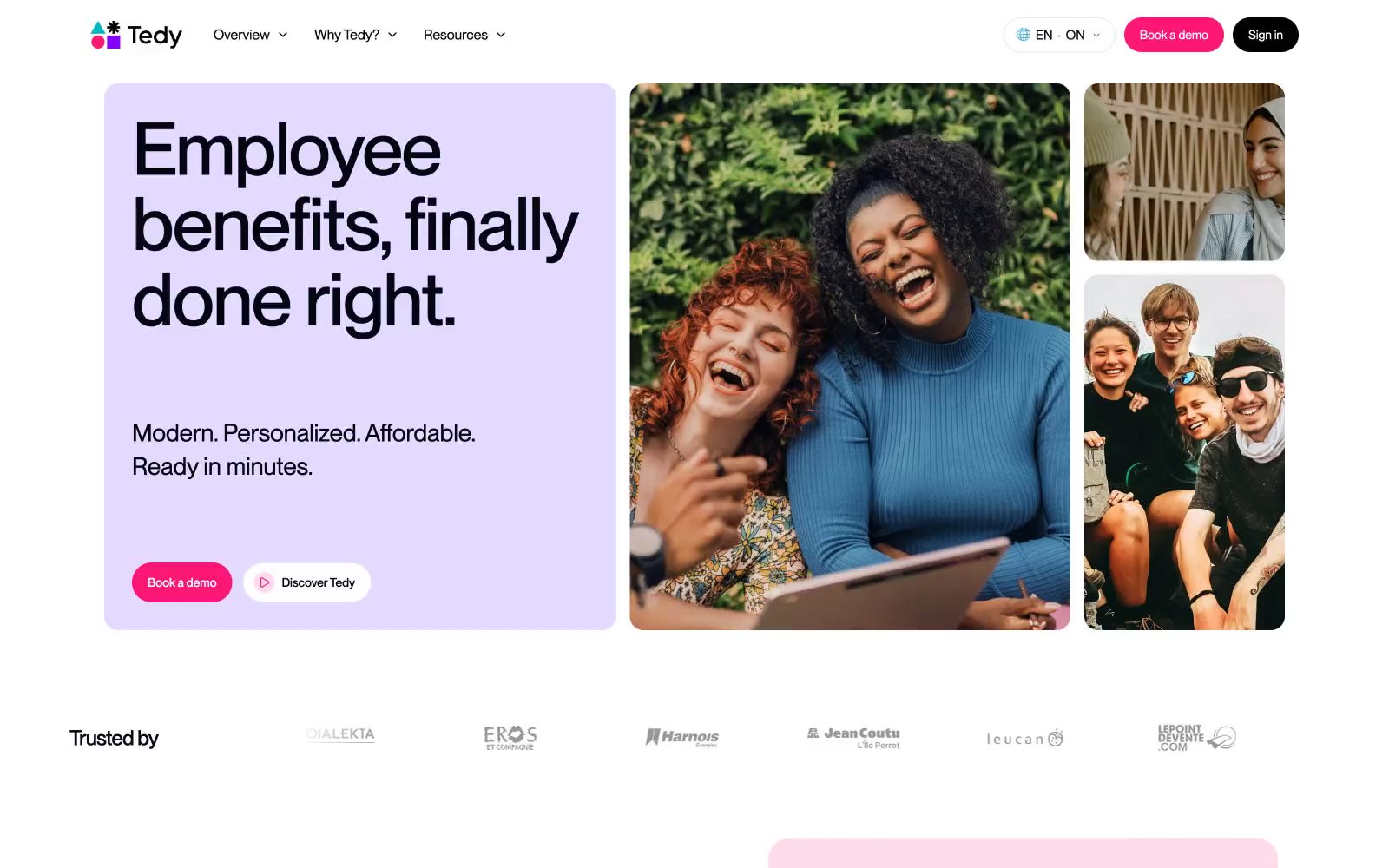
Tedy
Tedy — Style Reference
# Tedy — Style Reference
> Marshmallow world with a raspberry pulse — pastel surface washes on white, one hot pink doing all the urgent work.
**Theme:** light
Tedy operates in a soft pastel universe built on one disciplined trick: a near-white canvas flooded with candy-colored surface washes (lavender, mint, butter, sky) and a single hot raspberry (#fd1774) doing all the urgent work. The pink is the only saturated color in the entire system — every CTA, every action surface, every tension point comes from that one hue, with a signature raspberry-tinted shadow extending 18px below it. Typography is where the system gets unexpectedly loud: Montreal Neue hits 104px at line-height 0.90 with tracking pulled to -6.5%, producing poster-etched density that contradicts the soft surroundings — headlines are set almost on top of themselves. Radii are uniformly generous (32px on cards, 999px on buttons, nothing sharp anywhere), and the atmosphere is amplified by colored radial-gradient glows that make the white space feel lit rather than empty.
## Tokens — Colors
| Name | Value | Token | Role |
|------|-------|-------|------|
| Raspberry Pulse | `#fd1774` | `--color-raspberry-pulse` | Primary CTA fill, active states, colored shadow accents — the sole saturated hue in the system, creating urgency against matte pastels |
| Ink Black | `#030712` | `--color-ink-black` | Neutral form states, badge text, and quiet UI feedback where color should stay understated. Do not promote it to the primary CTA color |
| Lavender Mist | `linear-gradient(to top, rgb(231, 214, 255) 0%, oklab(0.902604 0.0325668 -0.0481643 / 0.85) 50%, rgba(0, 0, 0, 0) 100%)` | `--color-lavender-mist` | Hero card background, testimonial card wash, section surface — the dominant pastel; Hero gradient base — soft lavender fading downward into white; Composite atmospheric glow — purple/pink/teal/amber radial halos blending on white canvas |
| Mint Cream | `#e3f7d6` | `--color-mint-cream` | Feature card surface, success-tinted badges, body wash — pastel green for nature/wellness cues |
Websites
Markdown Text
design-md
website-prompt
landing-page-prompt
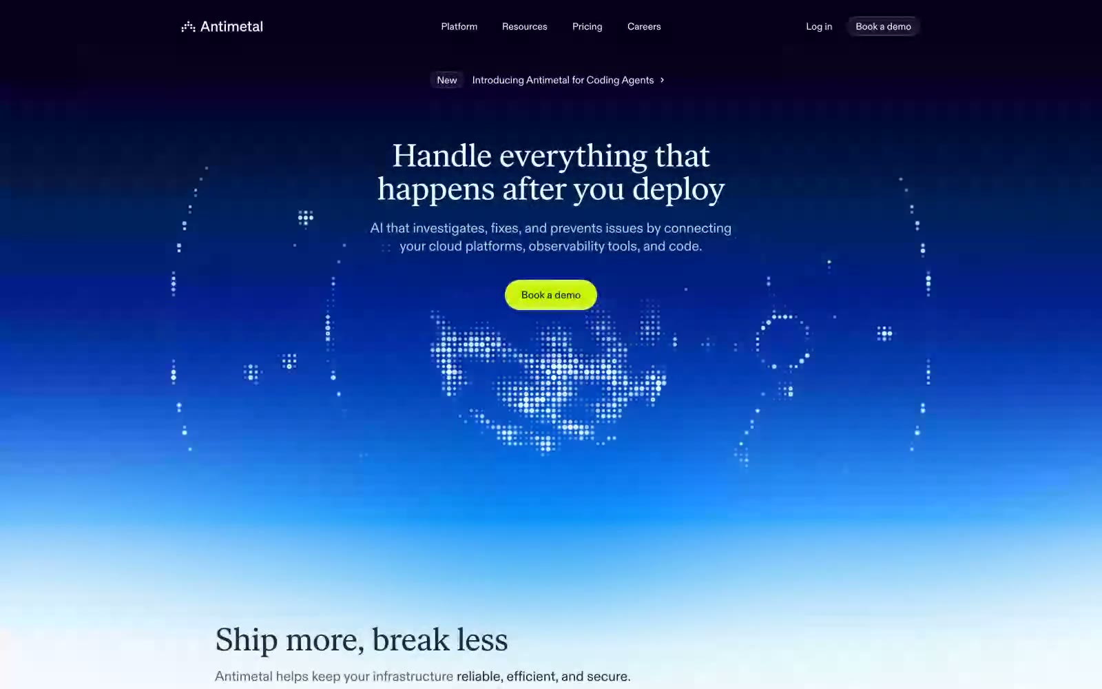
Antimetal
Antimetal — Style Reference
# Antimetal — Style Reference
> Electric storm over a blueprint — vivid neon signal cutting through deep navy atmosphere, then snapping to precise technical daylight.
**Theme:** mixed
Antimetal operates in two visual modes that coexist on one page: a deep navy-to-electric-blue hero that feels like staring into a server rack at night, and a near-white #f8f9fc product surface that reads like a technical dashboard in daylight. The transition between these modes is dramatic and intentional — dark atmospheric entry, then immediate pivot to a light, data-dense product UI. The single color that bridges both modes is a vivid chartreuse (#d0f100) used exclusively on primary CTAs, creating an almost jarring contrast against both the dark hero and the light product surface. Typography is custom throughout: abcdFont handles all UI at tight tracking (-0.016em), while ivarTextFont with OpenType alternates takes headlines at display sizes, giving the largest text a slightly editorial, high-craft quality uncommon in infrastructure tooling. Elevation is achieved through layered blue-tinted shadows (rgba(0,39,80,...)) rather than dark fills, so even raised surfaces feel part of the same chromatic family.
## Tokens — Colors
| Name | Value | Token | Role |
|------|-------|-------|------|
| Midnight Navy | `#1b2540` | `--color-midnight-navy` | Primary text, heading color on light surfaces, nav text, icon fills, input text, border color across cards and form elements — the structural ink of the entire light-mode UI |
| Deep Cosmos | `#001033` | `--color-deep-cosmos` | Blue action color for filled buttons, selected navigation states, and focused conversion moments. |
| Chartreuse Pulse | `#d0f100` | `--color-chartreuse-pulse` | Green action color for filled buttons, selected navigation states, and focused conversion moments. |
| Ice Veil | `#e0f6ff` | `--color-ice-veil` | Ghost button borders in dark hero mode, subtle icon stroke tints, very-light atmospheric surface wash in the hero region |
Websites
Markdown Text
design-md
website-prompt
landing-page-prompt
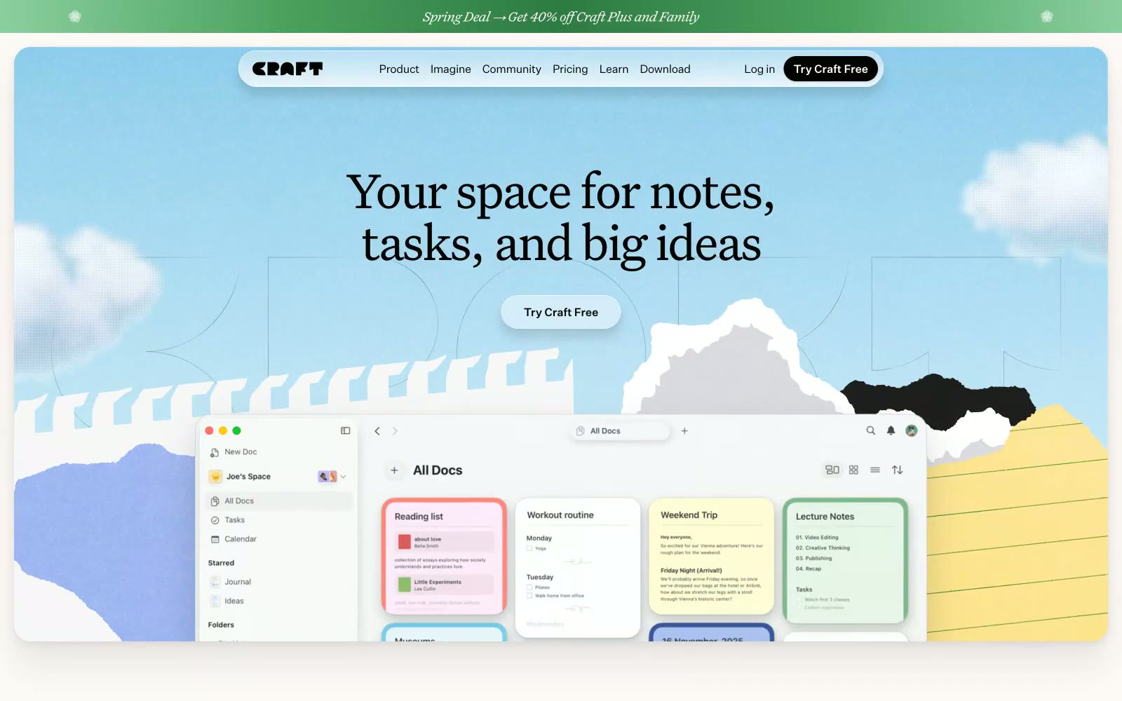
Craft Docs
Craft Docs — Style Reference
# Craft Docs — Style Reference
> Digital Scrapbook Collage. The design feels like a thoughtful, tactile scrapbook where structured digital notes meet soft, organic textures.
**Theme:** light
The design aesthetic is gentle, creative, and tactile, evoking the feeling of a personal journal or artist's scrapbook. This is achieved through a warm, off-white canvas (#fff3e7), a palette of soft pastels (#9bd8a9, #fde99b), and organic, torn-paper collage elements. The primary visual signature is the typographic pairing: a sophisticated, tightly-tracked serif (`UntitledSerifFont`) for large, literary headlines, contrasted with a clean, functional sans-serif (`UntitledSansFont`) for all UI and body text. Rounded corners (14px, 24px) are prevalent, but are punctuated by pill-shaped buttons, creating a soft and approachable interface. Deep, multi-layered shadows provide a subtle, non-intrusive sense of depth, making elements feel floated rather than stacked.
## Tokens — Colors
| Name | Value | Token | Role |
|------|-------|-------|------|
| Canvas | `#fff3e7` | `--color-canvas` | Main page background, creating a warm, paper-like base. |
| Ink | `#030302` | `--color-ink` | Primary text, headlines, and filled UI elements. |
| White | `#ffffff` | `--color-white` | Card surfaces, contrast text on dark backgrounds. |
| Linen | `#f7f7f7` | `--color-linen` | Secondary light backgrounds, subtle dividers. |
Websites
Markdown Text
design-md
website-prompt
landing-page-prompt
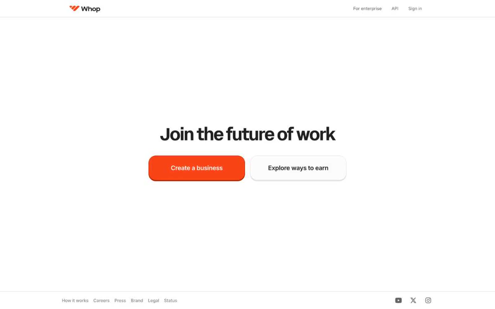
Whop
Whop — Style Reference
# Whop — Style Reference
> Bold sticker on cream paper — a minimal light canvas with a single orange button that casts a hard burnt-orange shadow.
**Theme:** light
Whop uses a high-contrast light canvas with a single saturated orange as the entire chromatic vocabulary. The system is typographically polarized: a custom geometric display face (acidGrotesk) at near-mega sizes for hero and section headlines, and Inter for all functional UI at 14-20px. Surfaces stay flat — no gradients, minimal shadows — with one signature move: the primary orange button carries a hard 3px offset shadow in a deeper burnt-orange rather than a soft drop shadow, giving the interface a slightly retro, almost sticker-like weight. Card corners are pillowy at 24px while buttons stay compact at 8px, creating a clear hierarchy of softness between content containers and interactive elements. The overall rhythm is spacious and confident: large display headlines, generous 64-80px section gaps, and white phone mockups floating on a near-white canvas.
## Tokens — Colors
| Name | Value | Token | Role |
|------|-------|-------|------|
| Ember Orange | `#fa4616` | `--color-ember-orange` | Orange wash for highlight backgrounds, decorative bands, and soft emphasis behind content. Do not promote it to the primary CTA color |
| Ember Shadow | `#b62600` | `--color-ember-shadow` | Hard 3px offset shadow beneath Ember Orange buttons — a deeper burnt orange instead of a soft drop shadow |
| Carbon | `#202020` | `--color-carbon` | Primary text, heading strokes, heavy borders, icon fills |
| Snow | `#ffffff` | `--color-snow` | Card surfaces, button text on dark fills, the elevated layer above the page canvas |
Websites
Markdown Text
design-md
website-prompt
landing-page-prompt
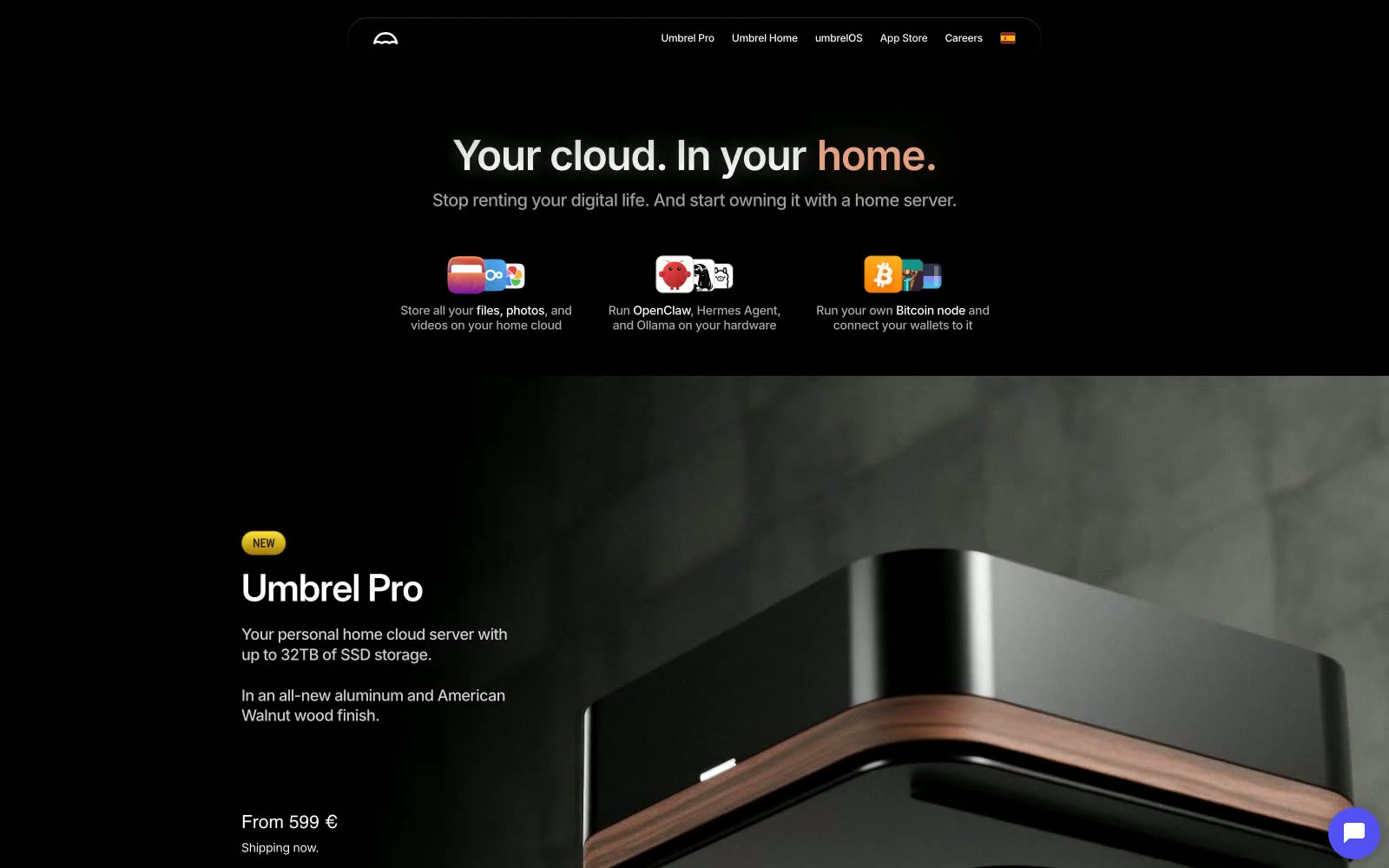
Umbrel
Umbrel — Style Reference
# Umbrel — Style Reference
> warm hearth inside a midnight server room — a black room where a single peach glow marks what matters.
**Theme:** dark
Umbrel reads as a premium consumer-hardware brand rendered in near-total darkness: a black canvas, white sans-serif type, and a single warm peach accent that glows like an ember in the void. The floating glass-pill navigation, oversized product photography on dark stone, and pill-shaped ghost buttons all signal a hardware-first identity that borrows from the language of high-end consumer electronics. Color is rationed: ninety-eight percent of the interface is monochrome, with the warm accent used only for emotionally loaded words like 'home' and a cool violet reserved for purchase actions. Cards float on near-black surfaces with large, soft radii; gradients appear only as atmospheric backdrops or as vibrant app-store tiles, never as interface chrome.
## Tokens — Colors
| Name | Value | Token | Role |
|------|-------|-------|------|
| Void Black | `#000000` | `--color-void-black` | Page canvas, hero backgrounds, section bands, image mattes — the absolute black that swallows the viewport and lets the product photography and peach accent feel lit |
| Graphite | `#191919` | `--color-graphite` | Supporting neutral for secondary UI, dividers, and muted labels. |
| Charcoal | `#3d3d3d` | `--color-charcoal` | Secondary surface tone for button hover states, tertiary card layers, and the borders that separate a card from canvas |
| Warm Smoke | `#61635d` | `--color-warm-smoke` | Desaturated warm-gray for divider lines, muted metadata, and the border tone that gives the dark UI a slight olive cast rather than going cold blue |
Websites
Markdown Text
design-md
website-prompt
landing-page-prompt
Studio Gruhl
Studio Gruhl — Style Reference
# Studio Gruhl — Style Reference
> matte-black gallery manifesto
**Theme:** dark
Studio Gruhl runs on a dark, text-first portfolio language: massive GreedStandard type bleeds edge-to-edge while UI chrome recedes into matte black surfaces. The interface is essentially achromatic — white text, charcoal surfaces, and a muted ash gray — so that case-study video and imagery carry all the chromatic weight. Components are minimal and compact: pill-shaped navigation at 9999px, a 12px radius as the universal workhorse for cards and buttons, and almost no decorative chrome. The work IS the decoration; the framework simply provides a quiet, full-bleed stage.
## Tokens — Colors
| Name | Value | Token | Role |
|------|-------|-------|------|
| Bright White | `#ffffff` | `--color-bright-white` | Primary text, hairline borders, nav dividers, icon strokes — white doubles as the divider system in this monochrome dark UI |
| Carbon | `#2e2e30` | `--color-carbon` | Page canvas, card surfaces, neutral filled button background — the dominant surface for the entire dark experience |
| Obsidian | `#18181b` | `--color-obsidian` | Nav bar surface, deeper layered cards, footer base — sits one step below Carbon to create a subtle depth read |
| Ash | `#969696` | `--color-ash` | Muted body text, caption copy, low-emphasis dividers — never used for headings, always for secondary information |
Websites
Markdown Text
design-md
website-prompt
landing-page-prompt
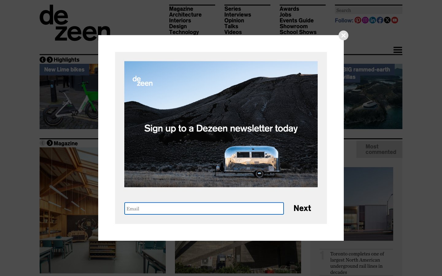
Dezeen
Dezeen — Style Reference
# Dezeen — Style Reference
> White-cube gallery for architecture photography — pure white canvas, image-first cards, blue-violet ink.
**Theme:** light
Dezeen operates as a white-cube editorial gallery for architecture and design — the page reads like a curated biennale catalogue rather than a content portal. Photography occupies near-total visual weight: full-bleed image cards sit on a pure white canvas with almost no chrome between them, letting the work speak before the typography. A single muted blue-violet (#556e9b) carries every interactive signal — links, nav, heading accents — against a strict black-on-white text system, with a vivid orange (#ff7617) reserved as a rare chromatic punctuation for hover and emphasis. Headlines use StandardCT at weight 700 with tight line-heights that compress display copy into architectural bands, while Chronicle Text G1 A keeps body copy quiet and readable at 14–16px. Components are deliberately flat: no drop-shadows on cards, no decorative gradients, and a distinctive blue-violet colored shadow (rgba(101,122,183,0.6)) that bleeds horizontally from select headings as the only elevation gesture.
## Tokens — Colors
| Name | Value | Token | Role |
|------|-------|-------|------|
| Gallery Indigo | `#556e9b` | `--color-gallery-indigo` | Violet supporting accent for decorative details and low-frequency emphasis. Do not promote it to the primary CTA color |
| Signal Orange | `#ff7617` | `--color-signal-orange` | Hover states on links, rare emphasis marks, accent strokes — appears sparingly to create a small spark against the cool blue-violet baseline |
Websites
Markdown Text
design-md
website-prompt
landing-page-prompt
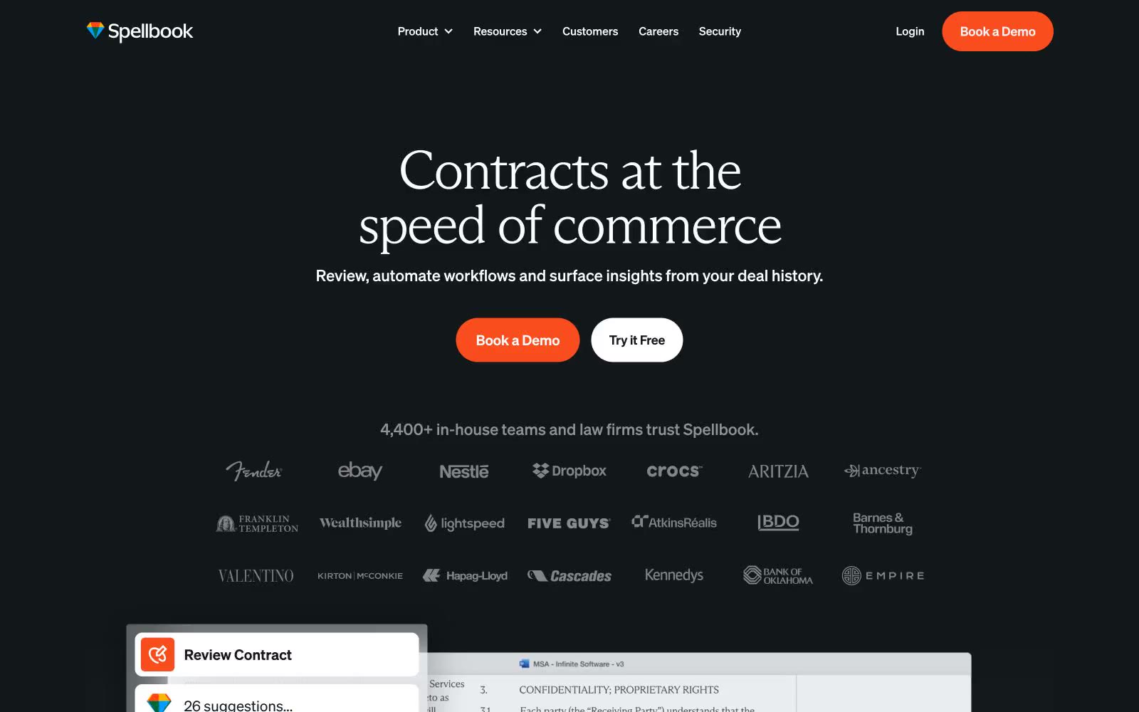
Spellbook
Spellbook — Style Reference
# Spellbook — Style Reference
> midnight courtroom lit by coral ink — a dark editorial surface where a warm orange pen mark is the only sound
**Theme:** dark
Spellbook operates as a midnight legal library: near-black canvas, editorial serif display type, and a single coral-orange action color that cuts through the darkness. The system refuses the typical SaaS blue/gradient playbook — instead it borrows from premium print: Arizona Mix at 67–77px with aggressively tight tracking turns headlines into magazine covers, while Soehne handles all UI at quiet, compact sizes. The visual hierarchy is built on contrast between white text on #121719 and the warmth of #f94d1 CTAs, not on shadows or elevation. Surfaces stay flat; depth comes from background shifts (canvas → #222729 → #2b3133 for inputs) and from typographic scale, not drop shadows. Components are sharp-edged (4px radius) except buttons and badges which go full pill (1600px/100px), creating a deliberate tension between editorial precision and soft, inviting action targets.
## Tokens — Colors
| Name | Value | Token | Role |
|------|-------|-------|------|
| Courtroom Ink | `#121719` | `--color-courtroom-ink` | Page canvas, primary background — near-black with a faint cool tint, not pure black; sets the midnight tone |
| Lectern Surface | `#222729` | `--color-lectern-surface` | Elevated card and panel surfaces sitting one step above the canvas; used for feature cards and link hovers |
| Document Drawer | `#2b3133` | `--color-document-drawer` | Input field backgrounds, form controls — one level above card surfaces to read as recessed |
| Manuscript White | `#ffffff` | `--color-manuscript-white` | Primary headings, body text on dark surfaces, ghost-button borders, and inverted text on coral CTAs |
Websites
Markdown Text
design-md
website-prompt
landing-page-prompt
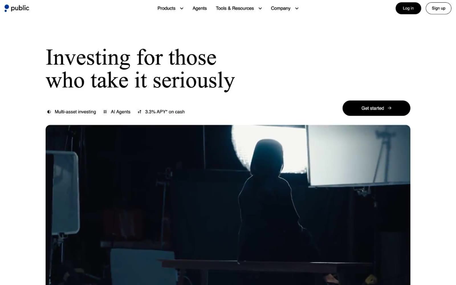
Public
Public — Style Reference
# Public — Style Reference
> monochrome editorial on cold marble — a near-monochrome canvas, a serif at weight 300, one violet accent doing all the chromatic work.
**Theme:** light
Public reads like a financial broadsheet rendered in UI: a near-monochrome canvas of cool grays and bone white, with one vivid violet used sparingly as a linking accent. The signature is Denton, a custom serif held at an almost whispered weight 300 for display headlines — a deliberate inversion of fintech convention that swaps the usual bold sans for something editorial and considered. Inter carries every functional surface, keeping the interface legible and quiet. Surfaces are flat and unembellished, depth is earned through the occasional 16px-radius card or a soft 10px shadow rather than gradients or heavy elevation. The only true color is #0027b3 violet, reserved for links and the rare inline accent tag; everything else is ink, paper, and shadow. Buttons are long pill shapes (100px radius) — the primary action is a matte black fill, secondaries are ghost outlines. Generous vertical breathing room between sections and a centered editorial layout reinforce the sense that this is a place for reading, not scanning.
## Tokens — Colors
| Name | Value | Token | Role |
|------|-------|-------|------|
| Paper White | `#ffffff` | `--color-paper-white` | Card surfaces, elevated panels, inverted button fills |
| Marble Canvas | `#f3f6f9` | `--color-marble-canvas` | Page background — the dominant surface behind every section |
| Bone Mist | `#e9edf3` | `--color-bone-mist` | Hairline borders, subtle dividers, card outlines on canvas |
| Fog Line | `#dce2ea` | `--color-fog-line` | Secondary borders, input outlines, table dividers |
Websites
Markdown Text
design-md
website-prompt
landing-page-prompt
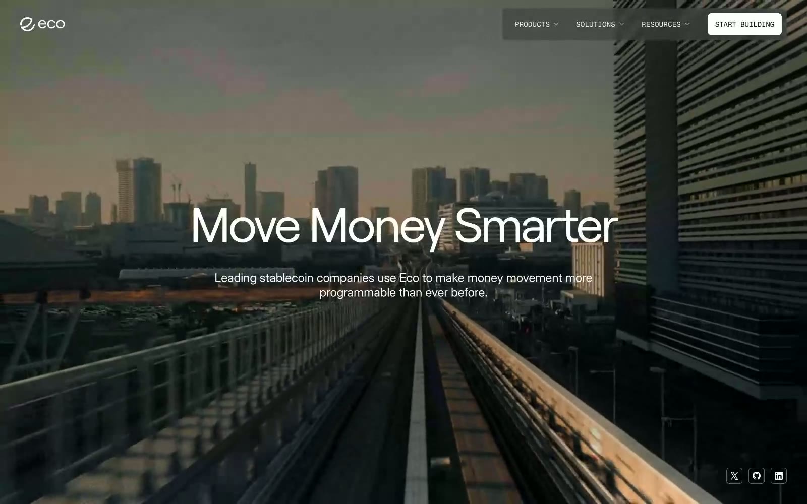
Eco
Eco — Style Reference
# Eco — Style Reference
> skyline vault at dusk — a near-monochrome ledger where negative space and oversized display type carry the entire brand weight, interrupted only by tiny electric-blue marks.
**Theme:** mixed
Eco operates as a financial cathedral rendered in near-total monochrome: a white-and-bone canvas interrupted by near-black voids, with the entire brand voice carried by type rather than color. Display sizes stretch to 90–96px with aggressive negative tracking, making headlines feel architectural and authoritative without chromatic support. Surfaces transition sharply between light (#ffffff/#efefef) and deep ink (#0f111a/#141414/#000000), creating a vault-like rhythm where every dark band reads as a chamber of gravity. A single blue gradient (deep cobalt to electric sky) surfaces sparingly on small UI marks, never as a CTA fill — actions are ghost-bordered on dark, ghost-bordered on light, or monochrome text links. Components are flat, minimal-elevation, and rely on hairline contrast and generous whitespace rather than shadow or color to separate. The system feels less like a product UI and more like a bank lobby translated into the screen — restrained, confident, almost ceremonial in its avoidance of decoration.
## Tokens — Colors
| Name | Value | Token | Role |
|------|-------|-------|------|
| Bone | `#ffffff` | `--color-bone` | Primary canvas, card surfaces, button text on dark bands — the dominant air of the system |
| Ash Mist | `#efefef` | `--color-ash-mist` | Light supporting surface for subtle backgrounds and section separation. Do not promote it to the primary CTA color |
| Vault Ink | `#0f111a` | `--color-vault-ink` | Primary heading text, dark band backgrounds, footer surface — the near-black that carries all authority and seals dark chambers |
| Absolute | `#000000` | `--color-absolute` | Deepest dark band background, high-contrast text on light surfaces — used where absolute weight is required |
Websites
Markdown Text
design-md
website-prompt
landing-page-prompt
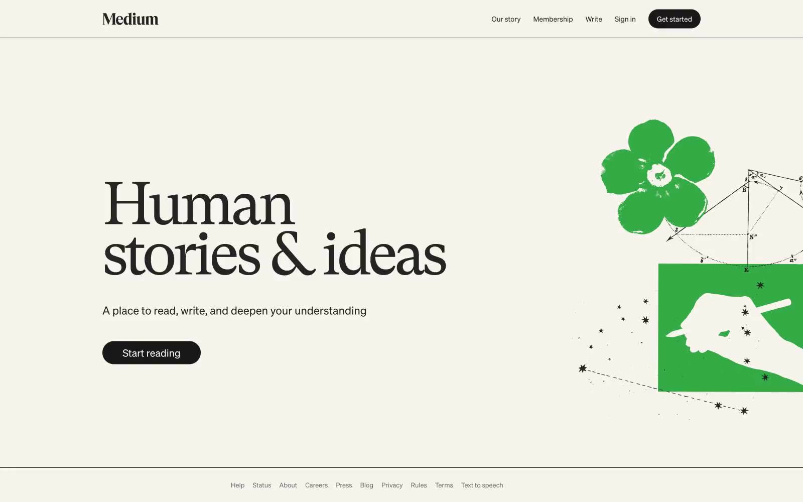
Medium
Medium — Style Reference
# Medium — Style Reference
> cream-colored broadsheet at golden hour
**Theme:** light
Medium operates as a literary reading room translated to the web: a warm cream canvas (#f7f4ed) replaces the sterile white common to SaaS, making long-form prose feel like a printed page. The visual system is aggressively monochromatic — nearly every UI surface, text, and border sits in a narrow band of warm grays from #242424 to #6b6b6b — so the reader's attention goes entirely to content. The single brand gesture is the serif hero headline (GT Super at 120px, weight 400, tracking -0.055em), a deliberate anti-trend choice: a transitional book serif at display scale with whisper weight, not a bold geometric sans, signals 'we publish books, not software.' Buttons are full pills in near-black, the only solid ink on the page.
## Tokens — Colors
| Name | Value | Token | Role |
|------|-------|-------|------|
| Newsprint Cream | `#f7f4ed` | `--color-newsprint-cream` | Page canvas, hero background, section backgrounds — the warm off-white that makes the entire interface feel printed rather than digital |
| Paper White | `#ffffff` | `--color-paper-white` | Card surfaces, elevated panels, form inputs, and any surface that needs to lift off the cream canvas |
| Ink | `#242424` | `--color-ink` | Primary text, body copy, links, heading text — slightly warmer than pure black, sits comfortably on cream |
| Body Gray | `#333333` | `--color-body-gray` | Secondary text and default body color where slightly lighter than Ink is needed without losing contrast |
Websites
Markdown Text
design-md
website-prompt
landing-page-prompt
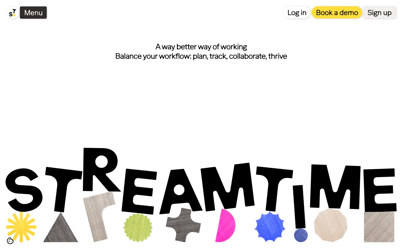
Streamtime
Streamtime — Style Reference
# Streamtime — Style Reference
> Tactile creative moodboard — designer scrapbook desk
**Theme:** light
Streamtime reads like a creative agency scrapbook rendered in software: a warm cream canvas (#f1e8de) holds the page together while a small arsenal of vivid accent colors — sun yellow, hot pink, lime, blue, green — explode across cards, buttons, and decorative shapes like paper cutouts. Typography does the heavy lifting: both Ease Standard and Ease Display run at a single 400 weight, so hierarchy is built through scale (12px body to 100px display) and tight negative tracking, not through bolding. The system alternates between light editorial sections and one dramatic near-black (#2f2c29) hero band, creating a print-magazine rhythm. Surfaces stay mostly flat with hairline black borders and soft warm shadows rather than elevations; the only round elements are large pill buttons (96-160px radius) that feel like sticker labels pressed onto a page.
## Tokens — Colors
| Name | Value | Token | Role |
|------|-------|-------|------|
| Sun Yellow | `#ffde3b` | `--color-sun-yellow` | Primary action buttons, card highlights, decorative shapes, the signature pop — the only color with true filled-button authority |
| Hot Pink | `#ff4dd5` | `--color-hot-pink` | Decorative borders, accent shapes, image overlays — used as visual punctuation, never as fill |
| Lime Burst | `#c1f32b` | `--color-lime-burst` | Decorative strokes, border accents, secondary highlight — energetic counterweight to Sun Yellow |
| Periwinkle | `#6483ff` | `--color-periwinkle` | Card background, secondary action — the cool blue in an otherwise warm palette |
Websites
Markdown Text
design-md
website-prompt
landing-page-prompt
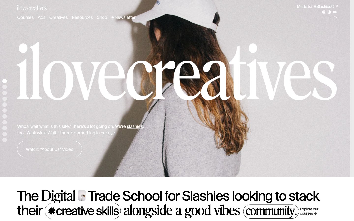
ilovecreatives
ilovecreatives — Style Reference
# ilovecreatives — Style Reference
> Gen-Z monochrome zine at viewport scale
**Theme:** light
ilovecreatives is a monochrome editorial system for a Gen-Z creative community: every screen is a page from an indie print zine scaled to viewport. The palette is aggressively achromatic — deep ink black, soft charcoal, warm paper white, and one barely-there lime-cream surface — with zero chromatic accent. Photography carries the color: lush full-bleed color in the hero and course cards, then a deliberate pivot to high-contrast black & white in the profile grids. Typography is the only chrome: a Swiss grotesque (Suisse Regular) handles all UI, a custom Roman display serif (Romana) blasts the brand wordmark edge-to-edge across the hero, and aggressive negative letter-spacing ties everything to the page edges. Components are minimal: pill-shaped ghost buttons, pill-shaped location tags, 20px-radius photo cards, and almost no shadows. The feeling is warm, confident, editorial, community-first — never corporate SaaS.
## Tokens — Colors
| Name | Value | Token | Role |
|------|-------|-------|------|
| Ink Black | `#222222` | `--color-ink-black` | Primary text, pill button borders, hairline dividers, ghost button outlines, card borders — the workhorse near-black that reads softer than pure #000000 at body sizes |
| Pure Black | `#000000` | `--color-pure-black` | Logo, sharpest borders, true-black hero overlays, selected/active states, image masking — used sparingly where maximum contrast or absolute black is required |
| Paper White | `#ffffff` | `--color-paper-white` | Page canvas, card surfaces, button fills, badge backgrounds, hero photo overlay anchor — the default background of everything |
| Risograph Lime | `#e1ea99` | `--color-risograph-lime` | Secondary surface accent — warm cream-lime wash used on occasional highlighted blocks, tag fills, and standout cards; the only chromatic note in the entire system and intentionally muted to a riso-print tint |
Websites
Markdown Text
design-md
website-prompt
landing-page-prompt
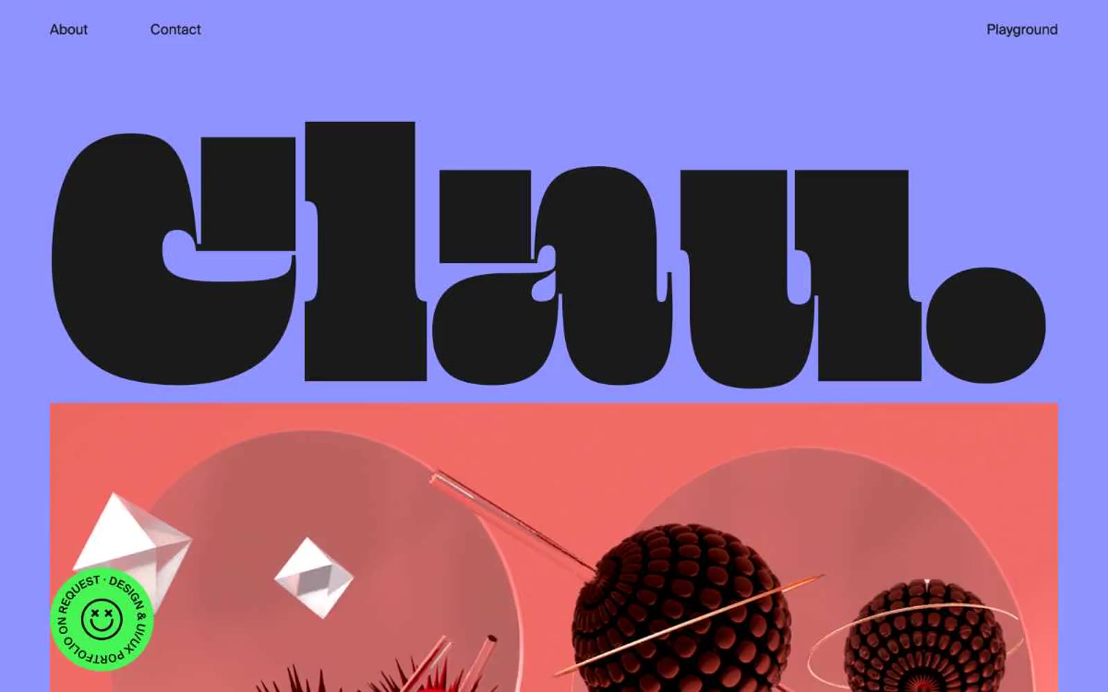
clau.as.kee
clau.as.kee — Style Reference
# clau.as.kee — Style Reference
> lavender poster wall, monumental type. A flat periwinkle field with a single black-letter sculpture filling the viewport and a thin line of small nav text floating above it.
**Theme:** light
clau.as.kee is a typographic monolith on a field of periwinkle. The page is essentially one giant poster: a single lavender canvas (#8e93ff) carries colossal custom-drawn letterforms that dwarf everything else, while a thin black hairline system and one jarring green badge do the work of UI. Almost no component vocabulary exists — navigation, headlines, and portfolio frames are all variations of oversized type and flat color blocks. The design is anti-SaaS: no cards, no shadows, no buttons-as-pills, no soft radii. The restraint is total: two neutrals (black ink, paper white), one saturated background, one green signal. When new pages are built, the first decision is canvas: lavender. The second is scale: type must be monumental or it is wrong.
## Tokens — Colors
| Name | Value | Token | Role |
|------|-------|-------|------|
| Periwinkle Field | `#8e93ff` | `--color-periwinkle-field` | Page canvas, hero background, full-bleed section fills — the single defining brand color, a mid-saturation lavender that swallows the viewport and against which all type is set in black ink |
| Carbon Ink | `#1a1a1a` | `--color-carbon-ink` | Primary text, display type, hairline borders, dark panels, nav links — near-black rather than pure black, keeps the lavender from vibrating too hard |
| Paper White | `#ffffff` | `--color-paper-white` | Hairline borders, dividers, input outlines, and card edges on light surfaces. |
| Signal Green | `#47f654` | `--color-signal-green` | Green action color for filled buttons, selected navigation states, and focused conversion moments. |
Websites
Markdown Text
design-md
website-prompt
landing-page-prompt
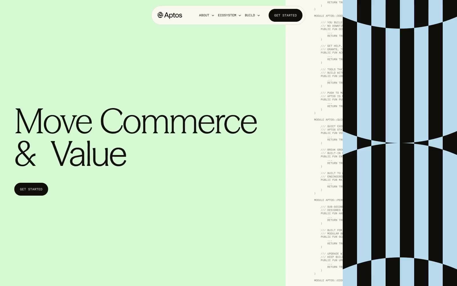
Aptos Network
Aptos Network — Style Reference
# Aptos Network — Style Reference
> Earth-toned code atelier — a sage-walled observatory where terracotta, sand, and powder-blue panels hold monospaced code beside serif prose, framed by 1px ink hairlines.
**Theme:** light
Aptos presents a warm, editorial take on blockchain infrastructure — full-bleed color sections in muted sage, khaki, sand, and powder blue replace the typical dark-and-neon crypto visual language. A single custom serif (Season Serif) with fractional weights from 335–444 carries the entire voice, from 120px display headlines to 9px captions, with negative tracking on display and positive tracking on micro type. Layout is split-composition: left-aligned text, right-side decorative geometry. Components are flat, borderless, and weightless — 1px hairlines drawn as inset shadows do the work of dividers, and pill-shaped buttons (9999px) are the only rounded form. The aesthetic reads like a terracotta-tinted monograph about distributed systems, not a dashboard.
## Tokens — Colors
| Name | Value | Token | Role |
|------|-------|-------|------|
| Ink | `#0f0e0b` | `--color-ink` | Primary text, hairline borders, icon strokes, nav outlines — the near-black that carries 90% of all foreground weight. Not pure black: a warm brown-black that feels printed, not screened |
| Bone | `#f9f9f0` | `--color-bone` | Page canvas, card surfaces, nav-pill fill, button text on dark — a warm off-white with the faintest yellow-green cast that matches the sage and sand sections without competing |
| Ash | `#6d6c67` | `--color-ash` | Secondary text, subtle borders, muted metadata — a mid neutral that sits between Ink and the page; used when primary text would be too heavy |
| Charcoal | `#21201c` | `--color-charcoal` | Filled CTA buttons, active markers — slightly warmer than Ink; the button fill that reads as a dense matte stamp rather than a flat black |