AI Prompt Studio - Intelligent Prompt Library
Explore and use professional AI prompts to optimize your workflow.
One-click Use
Websites
Markdown Text
design-md
website-prompt
landing-page-prompt
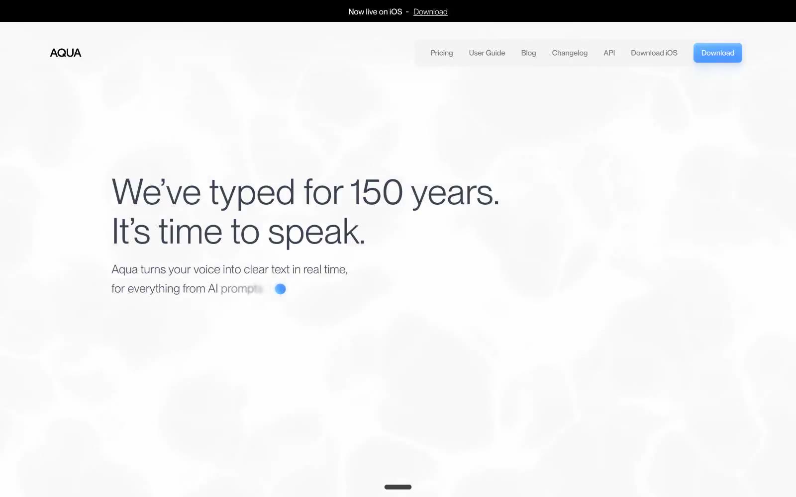
Aqua Voice
Aqua Voice — Style Reference

# Aqua Voice — Style Reference
> Whisper on paper — ultra-light type resting on near-white with a single blue drop of color
**Theme:** light
Aqua speaks in a typographic whisper on near-white surfaces. PP Neue Montreal at weight 200 for headlines is the signature — text that feels etched rather than printed, gaining authority through restraint instead of volume. The palette is 99% achromatic: a paper-white canvas, a tight ladder of cool grays for text, and a single vivid sky blue that appears only as functional punctuation for the download CTA, link accents, and the tiny 'now live' dot. Surfaces are flat with hairline borders and almost imperceptible shadows; the only elevation is a millimeter of rgba(0,0,0,0.02) depth. Components are compact and utilitarian — small radii, tight padding, ghost controls — but the page breathes with generous vertical rhythm between sections. Layout centers text in wide single-column blocks rather than fighting for grid space, and a large product screenshot in a soft 20px card anchors the second screen.
## Tokens — Colors
| Name | Value | Token | Role |
|------|-------|-------|------|
| Sky Signal | `#67beff` | `--color-sky-signal` | Blue action color for filled buttons, selected navigation states, and focused conversion moments |
| Electric Iris | `#4288ff` | `--color-electric-iris` | Outlined/ghost action border, inline link accent, focus rings — cooler and slightly deeper than Sky Signal |
| Paper White | `#fafbfc` | `--color-paper-white` | Page canvas, primary surface, inverted text on dark bars |
| Mist | `#f3f7fa` | `--color-mist` | Subtle band backgrounds, section alternation, elevated surface tint |
Websites
Markdown Text
design-md
website-prompt
landing-page-prompt
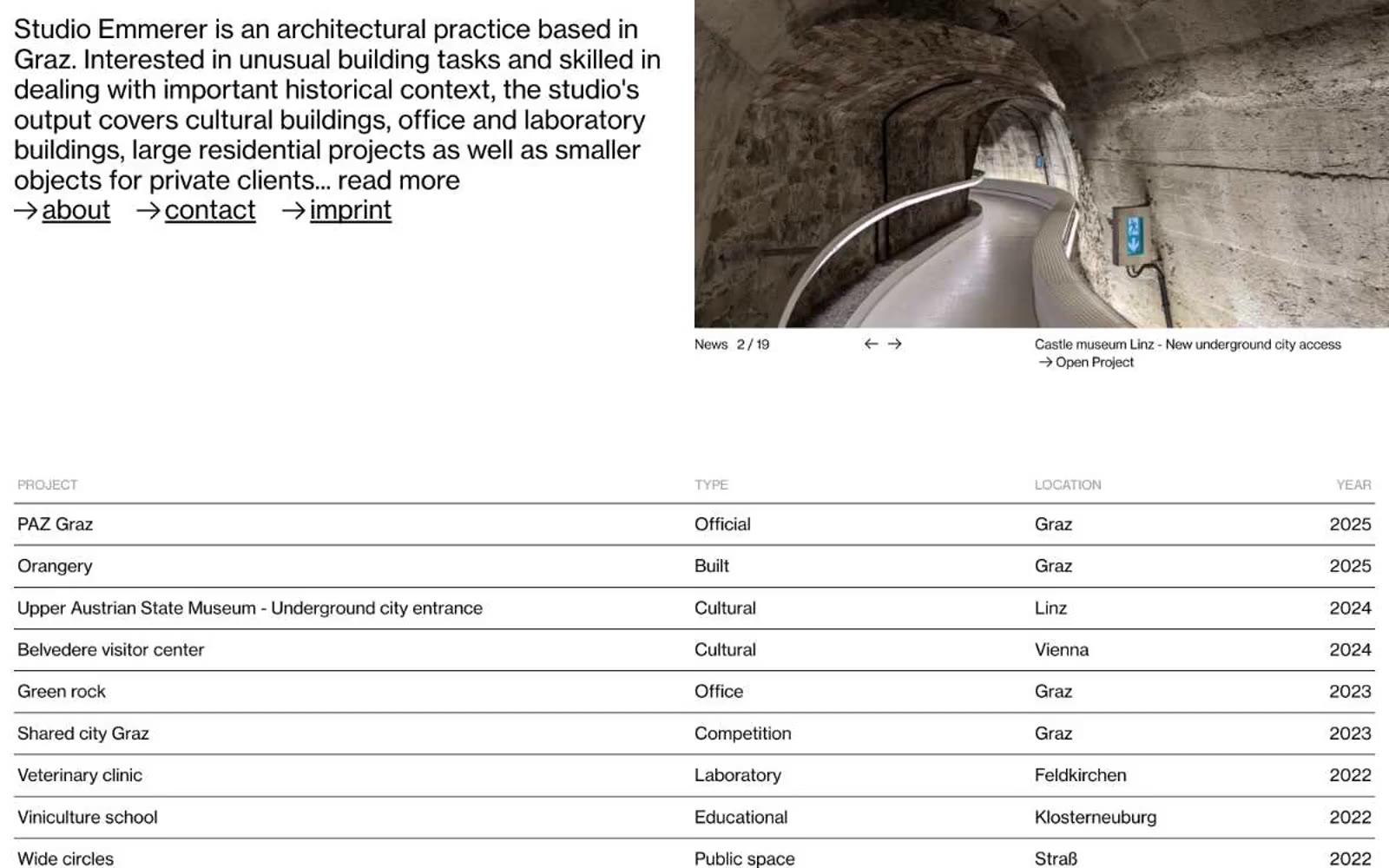
Studio Emmerer
Studio Emmerer — Style Reference
# Studio Emmerer — Style Reference
> Typeset on drafting paper
**Theme:** light
Studio Emmerer presents itself as typed content first, photography second — a two-tone document where NHaasGrotesk weight 400 carries every word at 16px or 30px, with tight 0.90–1.16 line-heights and negative tracking at every size. The palette is strictly black, white, and a single mid-gray (#999999) reserved for table column headers; there are no fills, no shadows, no rounded corners, no decorative graphics of any kind. A flat project table dominates the page — 1px black row dividers, 12px vertical padding, edge to edge with no card containers wrapping the rows. The right-arrow glyph (→) is the only interactive ornament, prefixing inline underlined links for both site navigation and individual project entries. Everything else is whitespace and type: the layout reads like a printed catalogue spread, not a software interface.
## Tokens — Colors
| Name | Value | Token | Role |
|------|-------|-------|------|
| Pure Black | `#000000` | `--color-pure-black` | Body text, inline links, project titles, table row dividers, the arrow (→) glyph |
| Drafting White | `#ffffff` | `--color-drafting-white` | Page background, surface under all content — no tint, no gradient |
| Index Gray | `#999999` | `--color-index-gray` | Table column headers (PROJECT, TYPE, LOCATION, YEAR), supporting metadata, secondary borders |
Websites
Markdown Text
design-md
website-prompt
landing-page-prompt
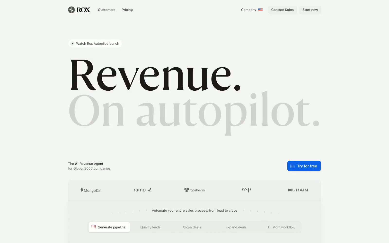
Rox
Rox — Style Reference
# Rox — Style Reference
> Editorial broadsheet meets product UI — black serif masthead on warm newsprint, hairline rules, one blue button
**Theme:** light
Rox uses a high-contrast editorial language on a warm stone canvas: a single massive serif display headline commands the hero while the product interface speaks in compact, hairline-bordered UI. The palette is near-monochrome — warm grays ranging from #ececea canvas to #1c1917 ink — with one electric blue used exclusively for the primary action button. Status states (Enriching, Engaging, Replying) are the only place where multiple chromatic colors appear, and they appear small, as pill badges, never as decorative washes. The system feels like a financial broadsheet redesigned as software: authoritative type, no rounding softness, minimal shadow, and information density where it counts.
## Tokens — Colors
| Name | Value | Token | Role |
|------|-------|-------|------|
| Newsprint | `#ececea` | `--color-newsprint` | Page canvas — the warm off-white ground that all sections sit on |
| Bright White | `#ffffff` | `--color-bright-white` | Card surfaces, elevated panels, product mockup backgrounds |
| Bone | `#f5f5f4` | `--color-bone` | Subtle surface wash, alternating bands, input fills |
| Stone 200 | `#d4d2d1` | `--color-stone-200` | Hairline borders, dividers, stepper connectors, table row separators |
Websites
Markdown Text
design-md
website-prompt
landing-page-prompt
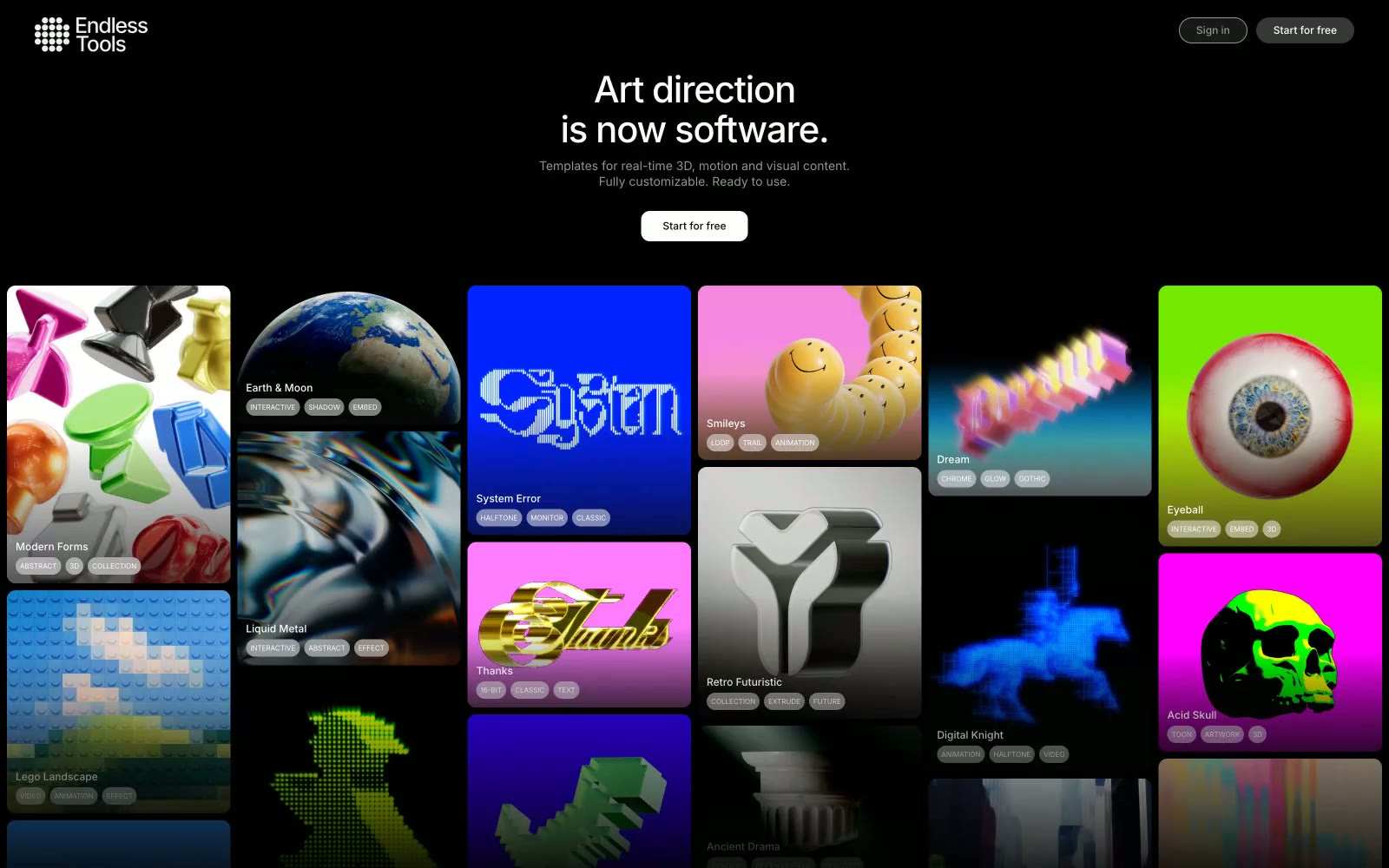
Endlesstools
Endlesstools — Style Reference
# Endlesstools — Style Reference
> Black-box gallery wall for digital art
**Theme:** dark
Endlesstools uses a black-box gallery aesthetic: a near-black canvas recedes so chromatic artwork can dominate. The palette is almost entirely achromatic—whites and a narrow gray scale handle every structural role—punctuated by one Twitter-blue link accent and a single tri-color gradient (lime→amber→magenta) reserved for brand moments. Inter at compact sizes with consistent negative letter-spacing reads as a precision instrument rather than a marketing surface. Elevation is drawn, not dropped: every container edge is a 1px hairline border, never a shadow, giving the whole interface a wireframe-precise, blueprint-on-obsidian quality.
## Tokens — Colors
| Name | Value | Token | Role |
|------|-------|-------|------|
| Obsidian Canvas | `#080808` | `--color-obsidian-canvas` | Page background, deepest surface |
| Onyx Card | `#181818` | `--color-onyx-card` | Card fills, elevated surfaces above the canvas |
| Graphite Layer | `#1e1e1e` | `--color-graphite-layer` | Input backgrounds, subtle surface lift from Obsidian |
| Slate Border | `#373737` | `--color-slate-border` | Primary 1px hairline borders on cards, inputs, containers |
Websites
Markdown Text
design-md
website-prompt
landing-page-prompt
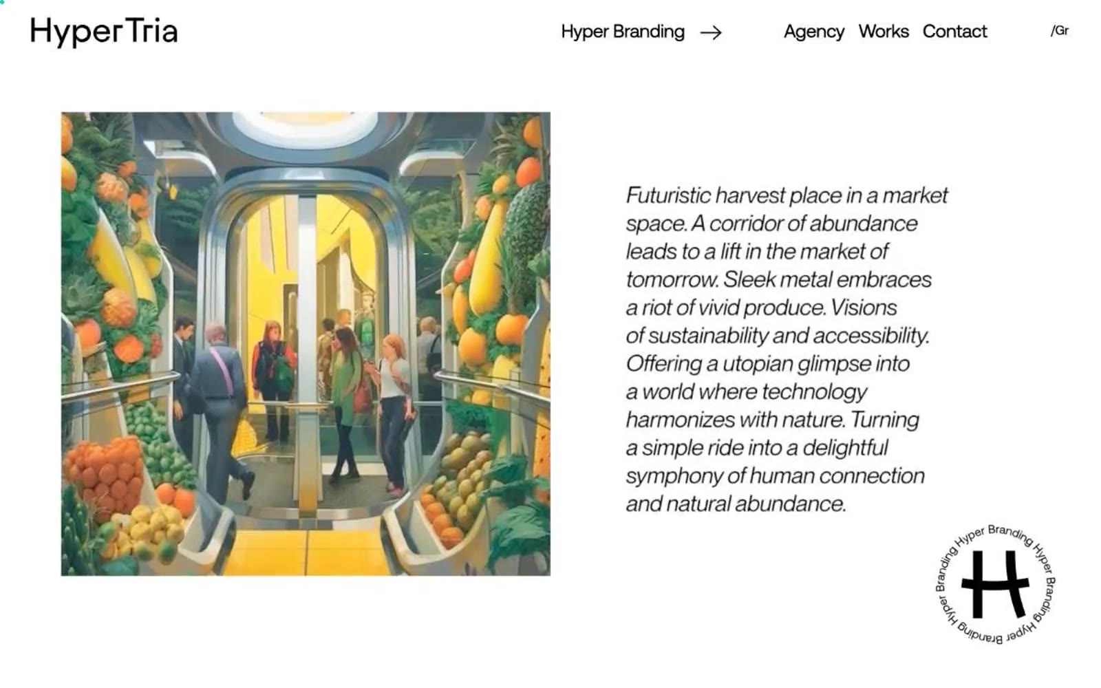
Hyper Tria
Hyper Tria — Style Reference
# Hyper Tria — Style Reference
> chrome monolith in a white gallery
**Theme:** mixed
Hyper Branding operates as an editorial design agency portfolio that swings between theatrical and austere: a full-bleed black hero dominated by massive chrome 3D lettering, then crisp white gallery sections where product photography and oversized Aeonik headlines do the storytelling. The system is deliberately monochrome at its bones — black, white, a single mid-gray — with a vivid red used as deliberate punctuation for navigation, kicker labels, and the agency wordmark, and a vivid green reserved for the rotating brand badge. Typography is the primary surface: a custom geometric sans rendered at whisper-light weights (300) at near-paragraph-line-heights (0.90–1.00), with aggressive negative tracking on display sizes that lets letterforms lock into sculptural compositions. Everything is sharp-edged — zero border-radius across the system — reinforcing the gallery-meets-manifesto posture rather than a soft consumer-product feel.
## Tokens — Colors
| Name | Value | Token | Role |
|------|-------|-------|------|
| Ember Red | `#ee3a49` | `--color-ember-red` | Wordmark, navigation text, kicker labels, and the single chromatic accent that makes the otherwise monochrome system read as a brand. The warmth against pure black and white creates editorial urgency without tipping into alarm |
| Hyper Green | `#0fa64b` | `--color-hyper-green` | Reserved for the rotating circular brand badge and high-prominence brand moments. A single saturated spot of color in an otherwise achromatic system — used sparingly so it lands as identity, not decoration |
| Signal Blue | `#007bff` | `--color-signal-blue` | Outlined/ghost action border, image frame accent, and link underline. Functions as the system's cool counterweight to the warm Ember Red — used for bordered interactive elements rather than filled buttons |
| Obsidian | `#000000` | `--color-obsidian` | Page canvas in the hero, primary text color in light sections, and the dominant border color across all UI elements. Carries the heaviest weight in the system — defines edges, type, and spatial structure |
Websites
Markdown Text
design-md
website-prompt
landing-page-prompt
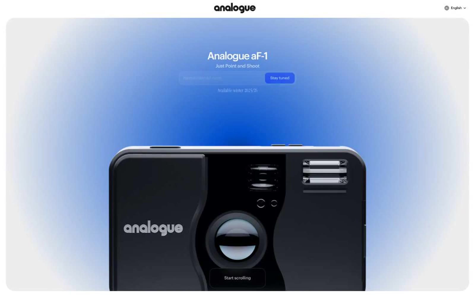
Analogue aF-1
Analogue aF-1 — Style Reference
# Analogue aF-1 — Style Reference
> Vogue spread meets Bauhaus blueprint
**Theme:** light
Analogue aF-1 speaks the visual language of a luxury editorial print magazine: stark white canvases, Garamond serif whispers for moments of meaning, and a single jolt of electric blue that only appears when a hand is asked to act. Surfaces are flat, defined by hairline borders and generous corner radii (20-30px) rather than shadows — depth comes from layering soft radial washes and full-bleed photography behind film-strip frames. The palette is almost fanatically achromatic; the blue is rationed like ink, reserved exclusively for the primary action and atmospheric product vignettes. Components feel like printed editorial spreads — confident negative space, confident typography, and no decoration that doesn't earn its place.
## Tokens — Colors
| Name | Value | Token | Role |
|------|-------|-------|------|
| Cobalt Signal | `#002fff` | `--color-cobalt-signal` | Violet action color for filled buttons, selected navigation states, and focused conversion moments. |
| Pure White | `#ffffff` | `--color-pure-white` | Page canvas, card surfaces, button text on cobalt fill, heading text on dark sections |
| Graphite | `#171717` | `--color-graphite` | Primary body text, heading text, hairline borders, icon strokes — the workhorse near-black that carries UI structure |
| Carbon | `#070707` | `--color-carbon` | Deepest text, dark gradient anchor points, near-black accents where maximum contrast is needed |
Websites
Markdown Text
design-md
website-prompt
landing-page-prompt
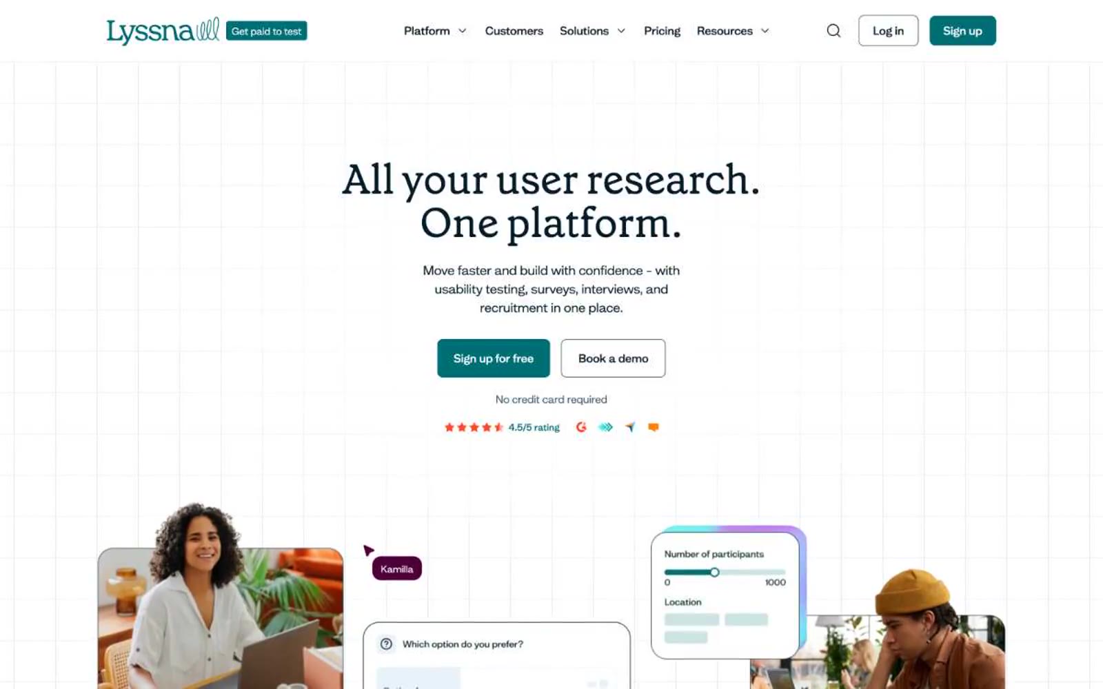
Lyssna
Lyssna — Style Reference
# Lyssna — Style Reference
> botanical research journal — a quiet white page where one deep teal button glows beneath serif headlines and mint accent panels breathe like greenhouse glass.
**Theme:** light
Lyssna reads as a botanical research journal brought to life on screen: a near-white editorial canvas, a deeply saturated dark teal that anchors every action, and a single bright mint surface (#b9ffe8) that recurs as accent wash, pill background, and decorative envelope around product imagery. Typography carries the personality — a humanist serif (grenette) reserved exclusively for headlines at 46–60px, weight 400, giving the page a magazine-editorial authority, while the custom sans (mint) handles everything from 12px caption to 22px subheading with quiet consistency. The visual rhythm is open and breathable: centered hero, generous vertical gaps, then alternating white and tinted-mint sections with three-column feature steps. Decorative elements — participant name tags, conic rating rings, soft-pink and cream product cards — add warmth without ever competing with the dark teal action color. Nothing is loud; the teal button is the only thing on screen that pulses.
## Tokens — Colors
| Name | Value | Token | Role |
|------|-------|-------|------|
| Deep Teal | `#006e75` | `--color-deep-teal` | Primary filled action buttons (Sign up, primary CTAs), active nav state, brand mark — the single chromatic command on every page |
| Ink | `#061d29` | `--color-ink` | Primary heading and body text — the dominant non-neutral color, carries 17:1 contrast on white, near-black with a cool cast |
| Midnight Teal | `#072626` | `--color-midnight-teal` | Alternate heading ink and dark surface text — sits beside Ink for inverse text on light tinted surfaces |
| Mist | `#425d6d` | `--color-mist` | Muted body text, outlined/secondary action borders, supporting links — the soft spoken gray-teal for secondary chrome |
Websites
Markdown Text
design-md
website-prompt
landing-page-prompt
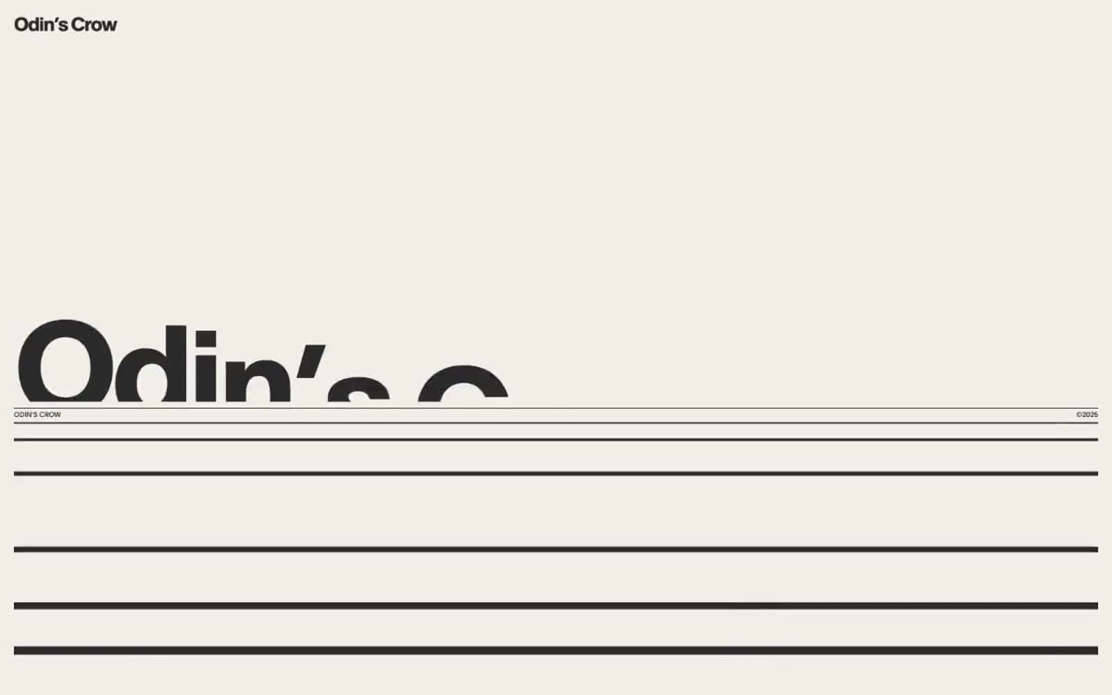
Odin's Crow
Odin's Crow — Style Reference
# Odin's Crow — Style Reference
> Swiss broadsheet on warm bone — a single typographic grid held together by hairline rules, where one massive headline bleeds past the fold while a 10px wordmark anchors the corner.
**Theme:** light
Odin's Crow operates as a typographic broadsheet — a Swiss editorial design language where type, rules, and negative space do all the work. The palette is almost entirely warm bone-and-ink: a single near-black text color sits on warm parchment surfaces, separated not by cards or shadows but by full-bleed horizontal rules in stone gray. Scale is weaponized: a 10px wordmark in the top corner exists in the same composition as 190px display headlines that deliberately bleed off the right edge. Section organization uses a numbered system (1.1, 1.2…) paired with short labels, mimicking manuscript chapters. There are no buttons, no gradients, no shadows, no imagery — the design system is purely typographic and structural, trusting the geometry of the page to carry the entire visual identity.
## Tokens — Colors
| Name | Value | Token | Role |
|------|-------|-------|------|
| Bone | `#dbd7d3` | `--color-bone` | Primary page canvas — warm off-white that carries the entire reading surface; everything else floats on or beside it |
| Ash | `#e5e7eb` | `--color-ash` | Structural divider lines and hairline borders — the single most-used color in the system at 2300+ occurrences, used exclusively to draw the rules that separate sections |
| Inkstone | `#2b2b2b` | `--color-inkstone` | Primary text and graphic fill — near-black with no pure-black harshness, used for all type at every size and for icon/illustration fills |
| Graphite | `#535251` | `--color-graphite` | Secondary text and muted borders — for sub-labels, metadata, and the dimmer secondary rule lines |
Websites
Markdown Text
design-md
website-prompt
landing-page-prompt
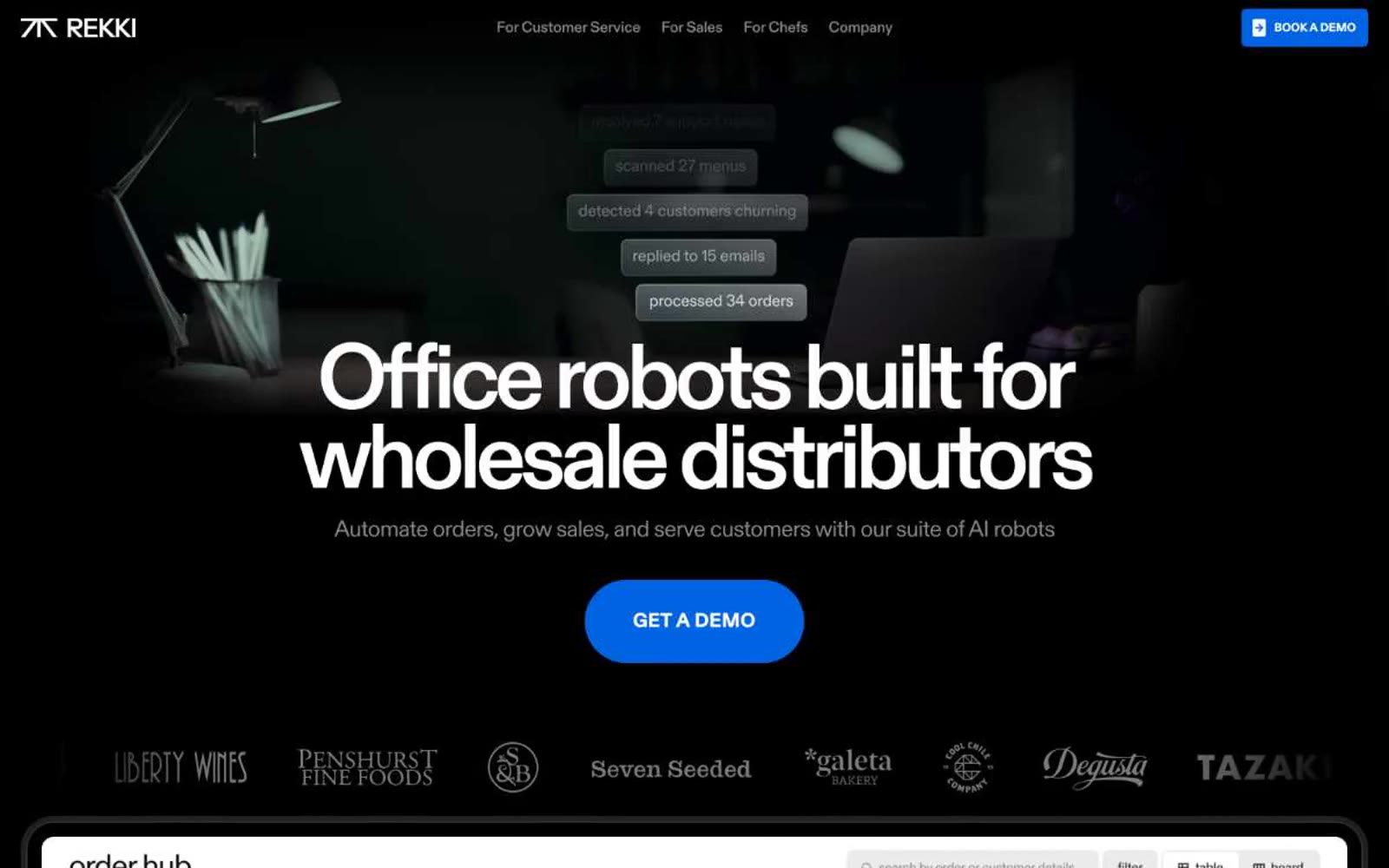
REKKI
REKKI — Style Reference
# REKKI — Style Reference
> Mission control dashboard in a darkroom
**Theme:** dark
REKKI is a midnight enterprise control room: a pitch-black canvas hosting dense product interfaces that glow from within. The visual system is nearly monochromatic — no semantic color clutter, no decorative gradients — letting one electric blue do all the emotional heavy lifting on CTAs, active states, and brand punctuation. Typography is custom and characterful: Diatype REKKI brings quiet authority with tight negative tracking on display sizes, while OCD-GARRI handles the utilitarian UI labels. Components sit on the canvas like instrument panels — dark, lightly elevated by near-invisible inset white borders rather than drop shadows, with pill-shaped interactive elements that feel like physical switches.
## Tokens — Colors
| Name | Value | Token | Role |
|------|-------|-------|------|
| Signal Blue | `#0063e1` | `--color-signal-blue` | Primary CTA fill, active nav indicator, brand accent dots, link highlights — the single chromatic voice in an otherwise silent monochrome system |
| Obsidian | `#000000` | `--color-obsidian` | Page canvas, dominant background, hairline divider color, icon fill — the floor of the entire system |
| Carbon | `#040910` | `--color-carbon` | Card surface base, deep panel backgrounds — first step above the page canvas |
| Graphite | `#0d0d0d` | `--color-graphite` | Elevated card surfaces, section backgrounds, border fills — the mid-surface layer |
Websites
Markdown Text
design-md
website-prompt
landing-page-prompt
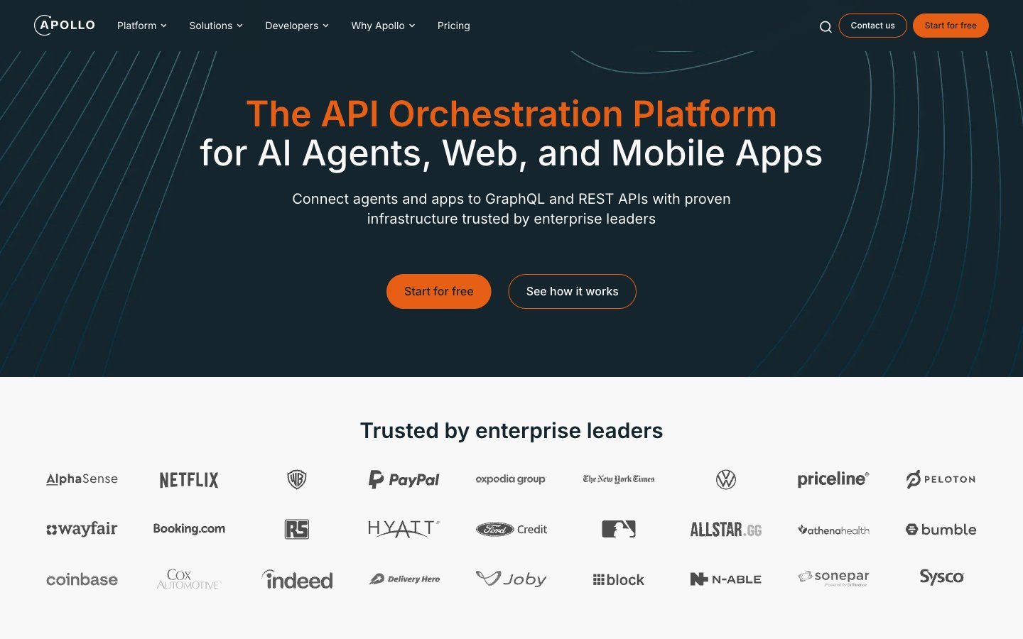
Apollographql
Apollographql — Style Reference
# Apollographql — Style Reference
> Mission control at midnight — a starfield console where orange is the only dial that glows.
**Theme:** mixed
Apollo uses a deep-space command-center language: a near-black navy canvas anchors every major surface, a star-field line pattern reinforces the cosmic/orchestration metaphor, and one vivid orange does all the shouting. Inter at confident weights (400 for body, 600–700 for headings, 900 for hero) keeps the system feeling developer-native rather than marketing-polished. Components are oversized and generous — testimonial cards, video panels, and feature blocks all carry 24–32px radii and 48px internal padding, making the interface feel more like a product tour than a landing page. The orange #e75e15 is rationed: it colors brand name mentions, one per-screen hero accent, and the pill action button, but never decorates backgrounds or fills cards. Every transition from dark to light surfaces uses the same gray-50 (#efefef) as a neutral floor, creating a predictable rhythm of starfield-dark panels floating on a quiet gray field.
## Tokens — Colors
| Name | Value | Token | Role |
|------|-------|-------|------|
| Cosmic Ink | `#15252d` | `--color-cosmic-ink` | Hero background, testimonial card surface, headline text on light surfaces, footer, and the entire dark-mode layer |
| Cinder | `#254250` | `--color-cinder` | Secondary dark surface for testimonial and profile cards — a slightly lifted step above Cosmic Ink so cards read as separate panels without leaving the dark family |
| Fog | `#9fb2bc` | `--color-fog` | Muted dividers, dashed card separators, secondary icon strokes on dark surfaces |
| Mist | `#e2e8f0` | `--color-mist` | Hairline borders, section dividers, subtle outline controls on light surfaces |
Websites
Markdown Text
design-md
website-prompt
landing-page-prompt
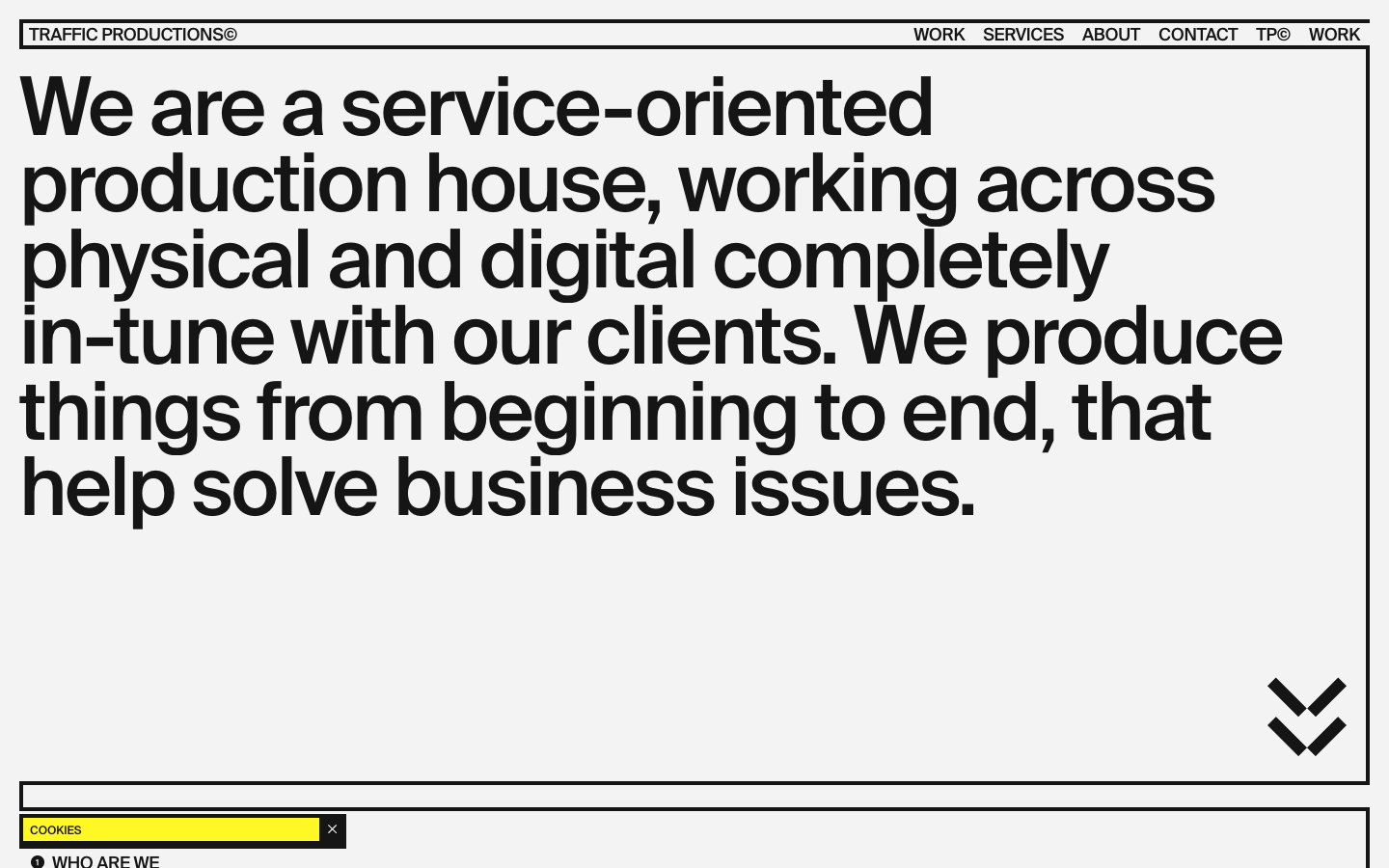
Home
Home — Style Reference
# Home — Style Reference
> Swiss broadsheet behind a highlighter pen
**Theme:** light
Traffic Productions operates as a typographic poster dragged onto the web: a pale gray canvas framed by hairline black rules, a single fluorescent yellow that behaves like a marker pen, and a single typeface (Suisse) pushed to display sizes of 108px with aggressively negative tracking. The system rejects softness — no shadows, no rounded surfaces (except pill buttons), no gradients, no decorative imagery except monochrome photography treated as raw material. Layout is ruled-grid editorial: content lives inside thin black rectangles like entries in a printed specimen book, and the yellow accent is never decorative — it always labels, highlights, or marks an action. Density is compact, the type scale is extreme, and the overall feel is a Swiss production-house broadsheet that happens to scroll.
## Tokens — Colors
| Name | Value | Token | Role |
|------|-------|-------|------|
| Highlighter Yellow | `#fff824` | `--color-highlighter-yellow` | Yellow supporting accent for decorative details and low-frequency emphasis. Do not promote it to the primary CTA color |
| Ink | `#151515` | `--color-ink` | Primary text, all borders and dividers, icons, nav links, button text — the near-black slightly softer than pure #000 used for most typographic and structural marks |
| Canvas | `#f3f3f3` | `--color-canvas` | Page background, the off-white ground that prevents the design from reading as stark white — a subtle warmth that lets the black feel printed rather than digital |
| Pure Black | `#000000` | `--color-pure-black` | Icon fills, select structural marks, absolute contrast — used sparingly where maximum black is needed (SVG icon strokes, the heaviest emphasis) |
Websites
Markdown Text
design-md
website-prompt
landing-page-prompt
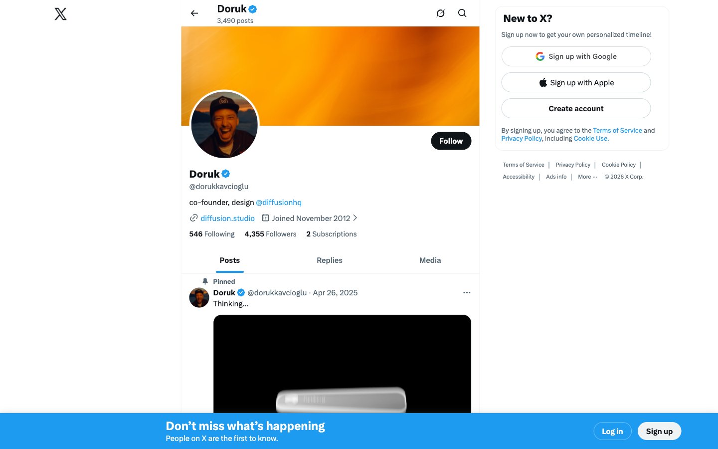
X (formerly Twitter)
X (formerly Twitter) — Style Reference
# X (formerly Twitter) — Style Reference
> blue wire on white newsprint. A stark, content-first timeline where one vivid blue punctures an otherwise monochrome interface, and pill-shaped controls signal action without weight.
**Theme:** light
X is a newswire on white paper: a content-first real-time conversation surface where the UI dissolves into the background so text and media carry the experience. The design is ruthlessly minimal — a three-column grid (left nav, center feed, right rail), hairline borders instead of shadows, and one chromatic accent (X Blue) that appears only on things you can tap. Typography is the product: TwitterChirp's custom letterforms with the ss01 stylistic set create a distinctive voice across every weight. Buttons are infinite-radius pills, surfaces are flat whites, and density stays compact to maximize feed real estate. Every visual choice reinforces the idea that X is a public square, not a software product — the chrome is scaffolding, the content is the building.
## Tokens — Colors
| Name | Value | Token | Role |
|------|-------|-------|------|
| X Blue | `#1d9bf0` | `--color-x-blue` | Follow buttons, link text, verified badges, active nav icons, bottom CTA accents — the only chromatic color in the system, used sparingly to mark anything interactive or trustworthy |
| Ink Black | `#0f1419` | `--color-ink-black` | Primary text, button text, icon fills — the dominant readable foreground on light surfaces |
| Graphite | `#536471` | `--color-graphite` | Secondary text, metadata, timestamps, muted icon fills, helper labels |
| Fog Gray | `#829aab` | `--color-fog-gray` | Tertiary text and disabled-state foreground |
Websites
Markdown Text
design-md
website-prompt
landing-page-prompt
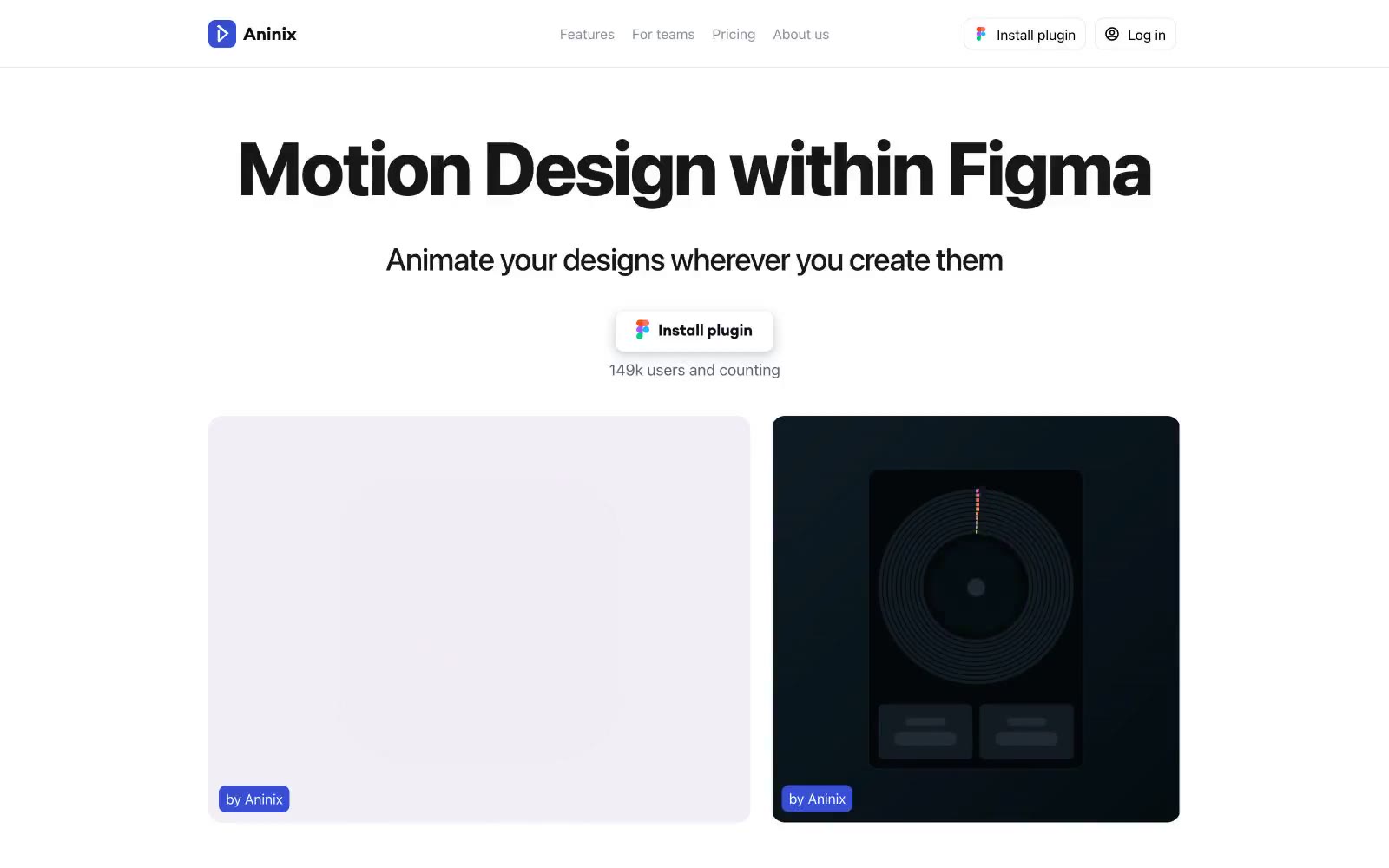
Aninix
Aninix — Style Reference
# Aninix — Style Reference
> white gallery wall with one indigo switch
**Theme:** light
Aninix operates on near-total chromatic restraint: a white canvas, bold confident type, and a single electric indigo that activates only where human intent lives. The page reads like a minimalist product gallery — every element is either pure structural gray or that one vivid blue-violet, which makes the brand color feel like a switch being thrown rather than decoration. Components are flat, lightly bordered, and generous with whitespace; the layout alternates light and dark showcase cards to let the product work breathe. Typography is large, heavy, and unapologetic — a 64px-plus display headline against a quiet field, with body text that stays at human scale.
## Tokens — Colors
| Name | Value | Token | Role |
|------|-------|-------|------|
| Indigo Switch | `#374fd5` | `--color-indigo-switch` | Violet action color for filled buttons, selected navigation states, and focused conversion moments. |
| Pure White | `#ffffff` | `--color-pure-white` | Page canvas, button surfaces, card backgrounds, reverse text on dark blocks |
| Soft Mist | `#f0f0f0` | `--color-soft-mist` | Secondary card surfaces, subtle fill blocks beneath product showcases |
| Carbon Black | `#000000` | `--color-carbon-black` | Primary text, heavy icon strokes, structural borders, divider lines |
Websites
Markdown Text
design-md
website-prompt
landing-page-prompt
Madebyon
Madebyon — Style Reference
# Madebyon — Style Reference
> black gallery with chartreuse spark. A dark void where one neon-green bullet pierces the silence, all voice carried by warm-white type that breathes in oversized editorial headlines.
**Theme:** dark
Madebyon operates as a dark-canvas digital studio identity: near-black void backgrounds (#000000) push every element forward, with a warm off-white (#faf9f4) doing the heavy typographic lifting. A single electric chartreuse accent (#dcff4f) — the only chromatic color in the system — is rationed to a single filled CTA, giving it a searchlight quality against the dark. The type system uses one custom geometric sans (Favorit) across two voices: a wide-spaced extended cut at 40-56px for editorial-style headlines, and a regular cut at 11-24px for everything else. Layouts are generous and section-driven, with each section separated by substantial vertical air (64-96px) and contained within a centered max-width grid. Components are flat or barely elevated — borders do the structural work, shadows are absent. The overall rhythm is gallery-like: whitespace, tight type, and one green spark.
## Tokens — Colors
| Name | Value | Token | Role |
|------|-------|-------|------|
| Canvas Void | `#000000` | `--color-canvas-void` | Page background, hero canvas, deepest surface layer |
| Off-White | `#faf9f4` | `--color-off-white` | Primary text, headlines, icon strokes, card backgrounds inside dark frames, borders on cards — warm cream gives the type a lit-from-within quality against pure black |
| Surface Charcoal | `#151515` | `--color-surface-charcoal` | Elevated surface for inputs, nav elements, card interiors — sits one step above the canvas to create depth without lightness |
| Muted Smoke | `#666666` | `--color-muted-smoke` | Secondary text, inactive link borders, subdued metadata |
Websites
Markdown Text
design-md
website-prompt
landing-page-prompt
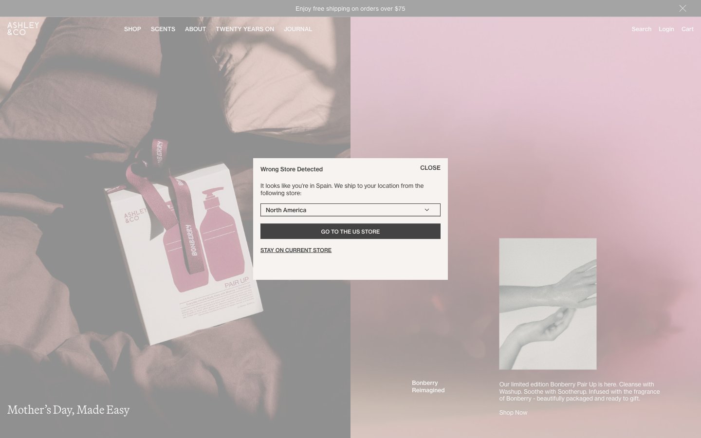
Ashleyandco
Ashleyandco — Style Reference
# Ashleyandco — Style Reference
> Whispered apothecary editorial — a warm cream page where a single serif headline floats like a perfume ad and every other element recedes into silence.
**Theme:** light
Ashley & Co operates in the visual register of a hushed beauty editorial: a warm cream canvas, near-black ink typography, and photography that arrives in muted rose and stone washes. The interface stays almost entirely achromatic — color is permitted only inside the imagery, never on buttons, borders, or type. Two typefaces do the heavy lifting: a refined serif (Martina Plant) for display moments that feel like magazine pull-quotes, and Neue Haas Grotesk Text for everything utilitarian. Components are weightless: hairline borders, no shadows, no fills beyond the canvas itself. White space is the dominant design element — generous 80px section gaps and off-grid asymmetry create the feeling of flipping through a coffee-table book rather than scrolling a shop. Navigation is whisper-thin uppercase tracked lettering; CTAs are text links with thin underlines. The overall effect is restrained, apothecary-luxe, and confident enough to let product photography and serif headlines carry the entire brand.
## Tokens — Colors
| Name | Value | Token | Role |
|------|-------|-------|------|
| Warm Cream | `#f6f3f0` | `--color-warm-cream` | Page canvas, hero and section backgrounds. This off-white with a barely-there pink undertone is the only surface tone used at scale — it warms the entire brand without ever calling attention to itself |
| Pure White | `#ffffff` | `--color-pure-white` | Card surfaces, modal backgrounds, and inverted text on dark buttons. Used sparingly against the cream canvas to create a single step of elevation without shadows |
| Ink Charcoal | `#3c3c3c` | `--color-ink-charcoal` | Primary body text, nav links, headings, and the dominant border color. Slightly softer than pure black — the entire interface reads as if printed in warm ink rather than digital black |
| Carbon Black | `#000000` | `--color-carbon-black` | Maximum-contrast text and strong borders for emphasis moments. Used in place of Ink Charcoal when an element needs to read as a hard rule — list separators, selected states, bold emphasis |
Websites
Markdown Text
design-md
website-prompt
landing-page-prompt
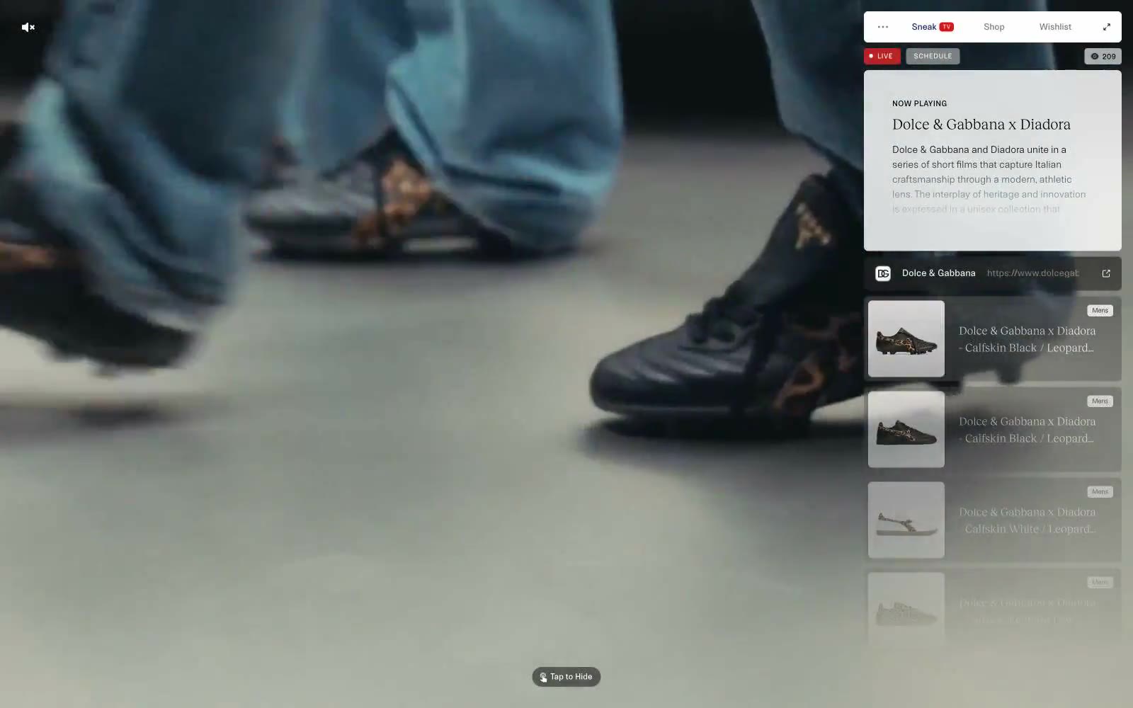
Sneak in Peace
Sneak in Peace — Style Reference
# Sneak in Peace — Style Reference
> Editorial gallery behind frosted glass. A single muted fashion film bleeds edge-to-edge while every interactive surface — tabs, now-playing card, product tiles — hovers in a translucent white panel pinned to the right edge, as if pinned to a museum vitrine.
**Theme:** light
Sneak in Peace operates as a floating editorial vitrine: a full-bleed fashion film runs behind a translucent white panel that carries every interactive surface. The system is aggressively monochrome — 99% of pixels live in a narrow band between white, warm off-white, and two workhorse grays (#3d3d3d and #000000). Color is rationed like ink: one vivid red reserved exclusively for live-status punctuation, one deep navy (#142161) that surfaces only as a link border, and nothing else. Typography splits sharply between a utilitarian grotesque (NTNeuss) at 8–14px with generous tracking — creating a label/UI vocabulary — and a single editorial serif (RecklessNeue) used at 16–21px for narrative titles. Components are compact, 6px-cornered, almost flat, and float over the media rather than block it. The dominant gesture is restraint: the camera does the talking, the UI whispers.
## Tokens — Colors
| Name | Value | Token | Role |
|------|-------|-------|------|
| Ink Black | `#000000` | `--color-ink-black` | Primary text, icon strokes, high-contrast borders — the strongest voice in the system, used sparingly on headlines and glyphs |
| Charcoal | `#3d3d3d` | `--color-charcoal` | Default text, dividers, input and card borders — the workhorse gray carrying the entire UI structure |
| Concrete | `#9e9e9e` | `--color-concrete` | Subdued body text and secondary borders — the whisper layer beneath Charcoal |
| Ash | `#b5b5b5` | `--color-ash` | Disabled or resting-state button fills — surfaces that should recede |
Websites
Markdown Text
design-md
website-prompt
landing-page-prompt
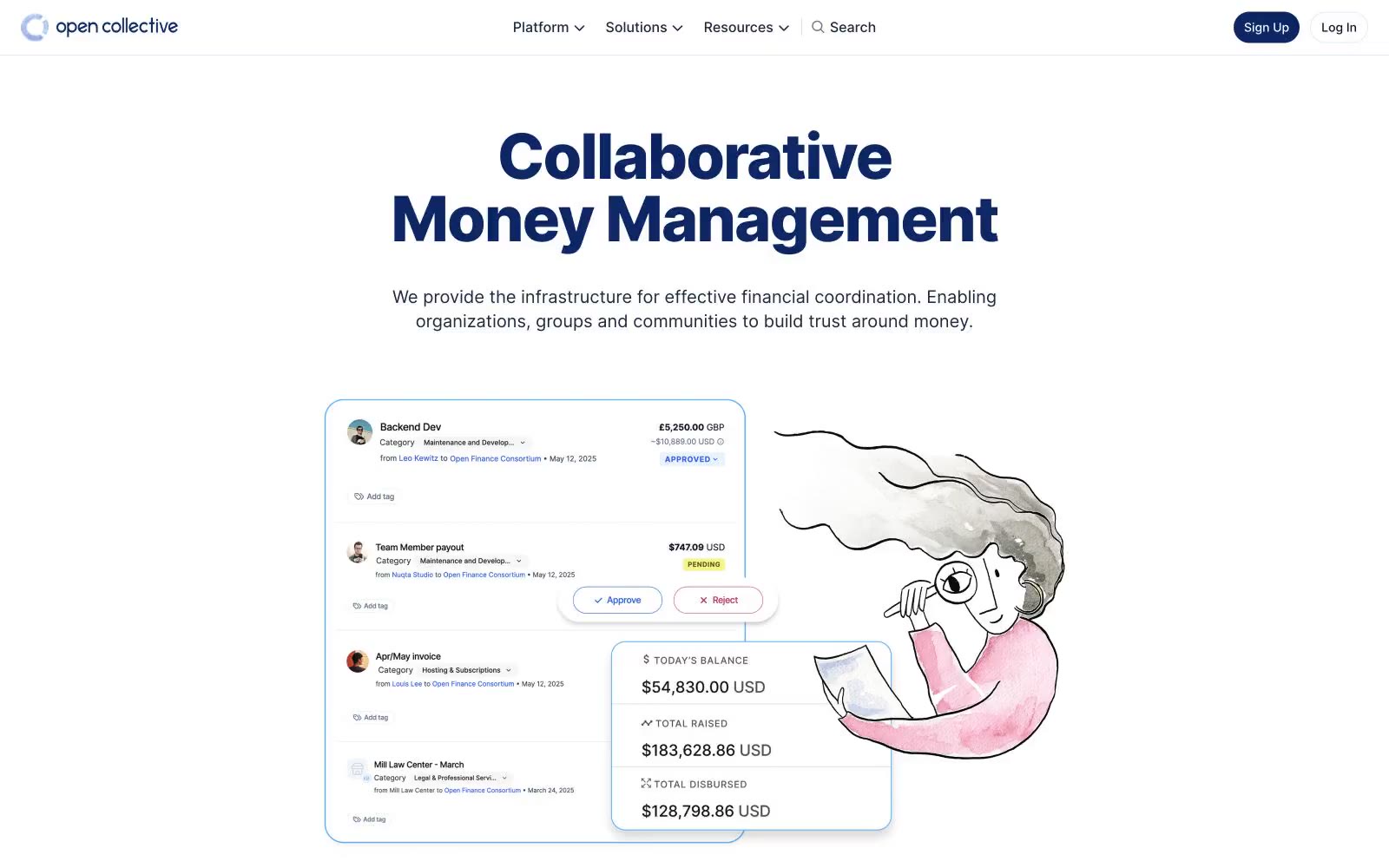
Raise
Raise — Style Reference
# Raise — Style Reference
> sunlit open ledger — a near-white page with a single deep-navy headline and a hand-drawn illustration pulling warmth into a financial interface.
**Theme:** light
Open Collective's design language is a sunlit open ledger: a near-white canvas, hairline cool-gray dividers, and one deep navy that does all the chromatic work. Headlines carry the brand — oversized, weight 800, tightly tracked Inter at 60–72px — sitting directly on white with no panel behind them, so type itself becomes the hero. Body copy stays in a compact, near-black ink, never pure black, giving the financial content a softer documentary feel. Soft watercolor illustration breaks up the financial density with human warmth; UI chrome stays minimal, with 12px radii and a single subtle card shadow. Color is rationed like ink: the navy is the only saturated hue, used for headings, primary actions, and the brand mark — everything else is neutral.
## Tokens — Colors
| Name | Value | Token | Role |
|------|-------|-------|------|
| Collective Navy | `#0c2764` | `--color-collective-navy` | Primary headings, primary CTA button fill, brand mark, active navigation — the only saturated color on the page, used to anchor identity and signal action |
| Inkwell | `#0f172b` | `--color-inkwell` | Primary body text, high-emphasis copy, button text on light backgrounds, icon strokes — the default text color across nearly all contexts |
| Slate Ink | `#1d293d` | `--color-slate-ink` | Secondary headings, icon strokes, body text where slightly lighter weight is needed |
| Pencil Graphite | `#314158` | `--color-pencil-graphite` | Tertiary headings and supporting labels, slightly softer than Inkwell for hierarchy breaks |
Websites
Markdown Text
design-md
website-prompt
landing-page-prompt
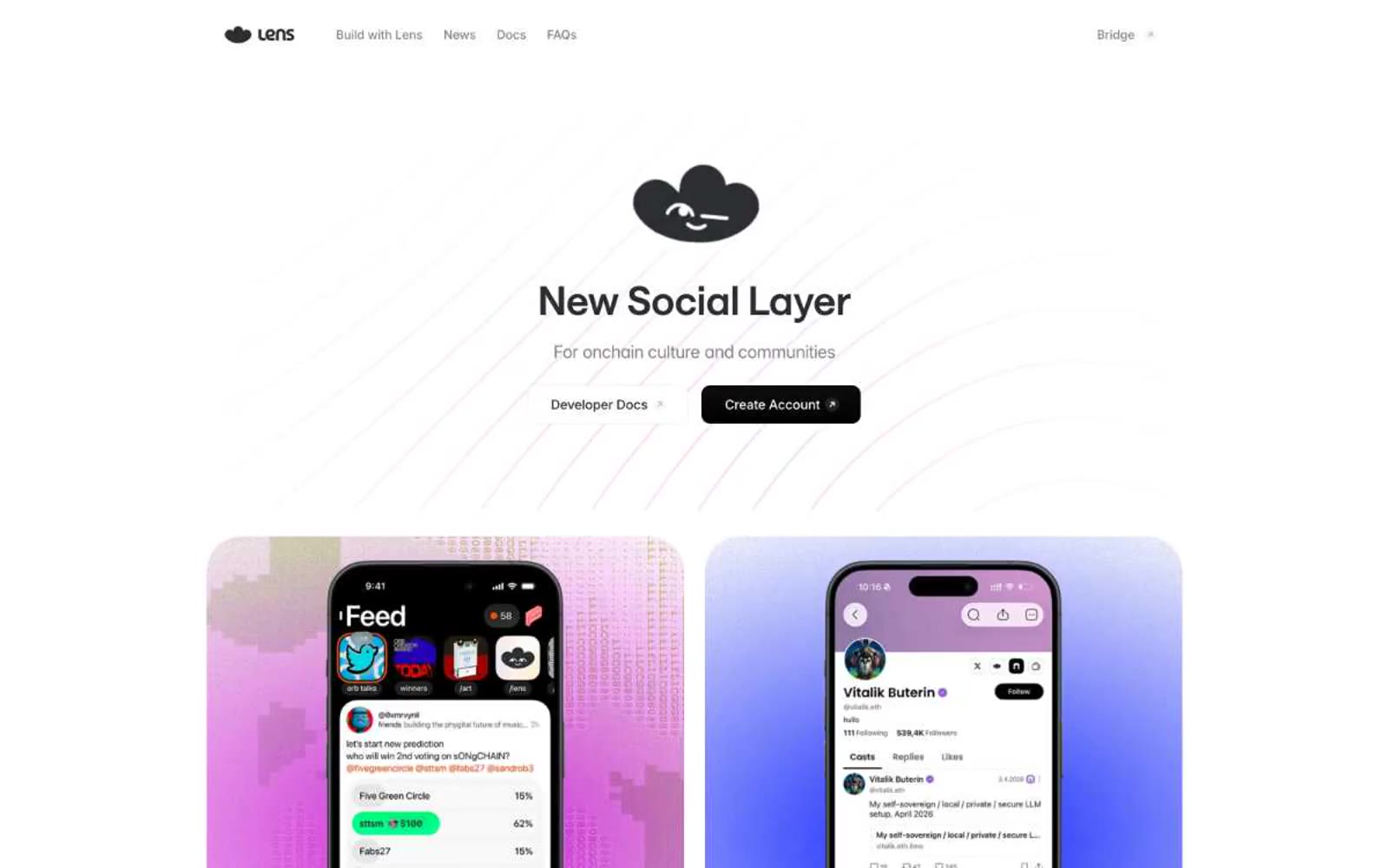
Lens
Lens — Style Reference
# Lens — Style Reference
> mint signal on white paper — a single teal CTA floating in a sea of quiet graphite and pale gray.
**Theme:** light
Lens Protocol reads as a quiet developer platform: white paper background, a single cloud-black logo mark, and one mint-teal accent that powers every interactive surface. The system is overwhelmingly achromatic — graphite type on white with a pale neutral mid-gray border palette — so the teal CTA feels switched on rather than decorative. Pill-shaped controls (50px radius) dominate over square cards (16px), creating a soft, rounded interaction language. Feature cards use faint pastels (peach, mint, lavender, periwinkle) as backdrops for small monochrome icons, giving each capability its own colored tile without ever breaking the achromatic system. Typography pairs Saans (a humanist display sans with ss01 alternates) for headings and Inter for utility text, with both using tight negative tracking that makes the type feel engineered rather than editorial.
## Tokens — Colors
| Name | Value | Token | Role |
|------|-------|-------|------|
| Mint Signal | `#00caa0` | `--color-mint-signal` | Primary CTA fill, active nav indicator, link accent on dark — vivid teal against white creates the only chromatic punctuation in the system |
| Graphite | `#2c2d30` | `--color-graphite` | Primary text, heading strokes, icon fills, button borders — the near-black workhorse, kept slightly warm to avoid a cold digital feel |
| Carbon Black | `#211d1d` | `--color-carbon-black` | Body text at high contrast, deep surface text — warmer alternative to Graphite for long-form copy |
| Slate Mid | `#808183` | `--color-slate-mid` | Secondary text, helper copy, muted borders — sits between Graphite and Silver for tertiary hierarchy |
Websites
Markdown Text
design-md
website-prompt
landing-page-prompt
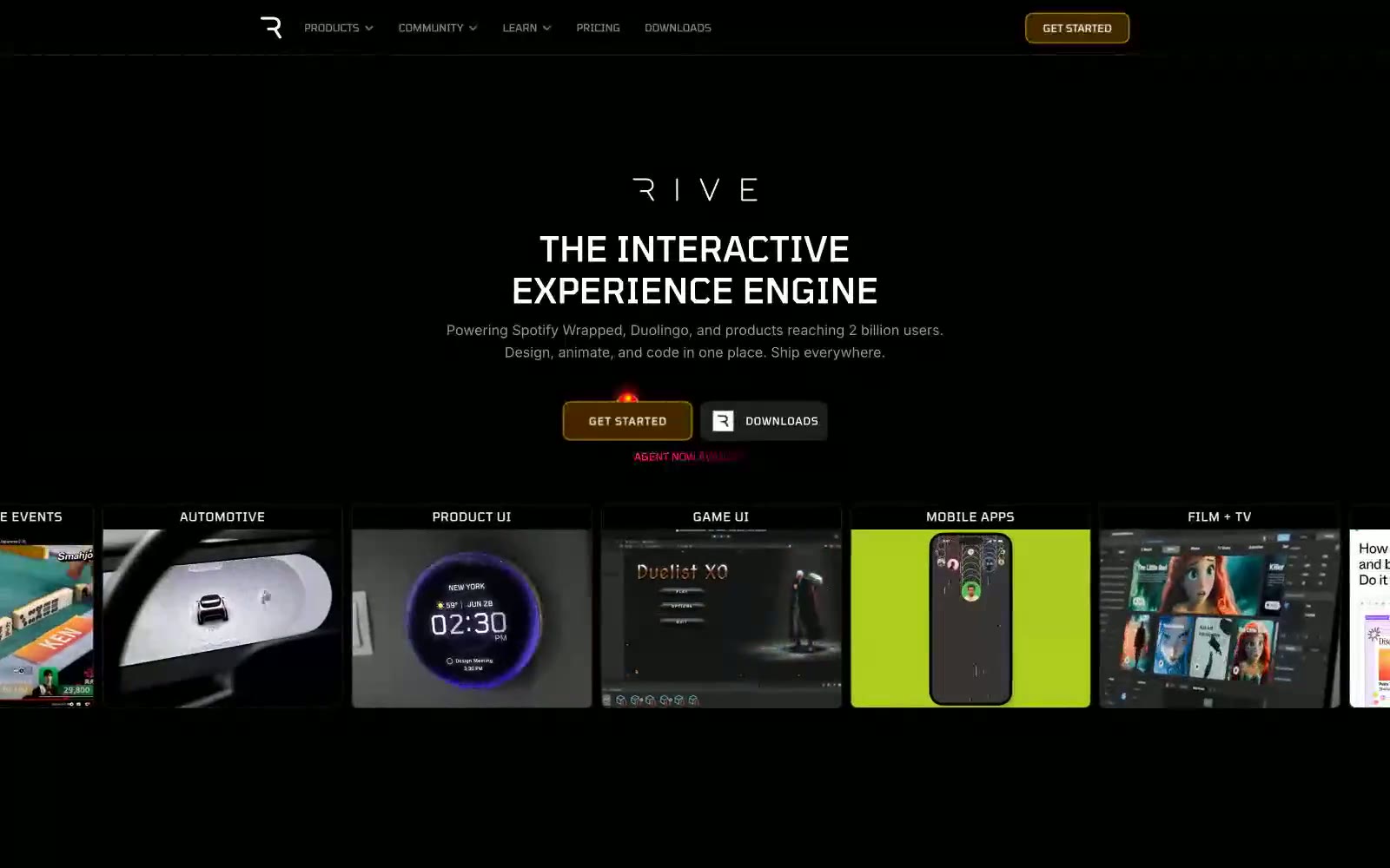
Rive
Rive — Style Reference
# Rive — Style Reference
> Precision Night Vision. The interface is a specialized lens, cutting through darkness to focus on technical details with absolute clarity.
**Theme:** dark
The design feels like a high-end piece of creative software, a focused digital workshop cloaked in darkness. A pure black #000000 canvas eliminates all distraction, forcing attention onto the content and UI. The technical, wide-set 'Tomorrow' typeface is the defining visual signature, establishing a futuristic, blueprint-like quality for all headings. A single, warm 'Ignition Orange' accent appears only on primary CTAs, acting as a functional guidance point in the monochromatic environment. Elevation is conveyed not by shadows but by subtle shifts in dark gray surfaces, creating depth like nested panels on a piece of precision hardware.
## Tokens — Colors
| Name | Value | Token | Role |
|------|-------|-------|------|
| Ignition Orange | `#ffa41c` | `--color-ignition-orange` | Primary CTAs and eyebrow labels — the sole warm accent, providing a clear, unmissable call to action. |
| Obsidian | `#000000` | `--color-obsidian` | Primary page background. |
| Charcoal | `#111111` | `--color-charcoal` | Secondary surfaces, like contained button backgrounds. |
| Graphite | `#1d1d1d` | `--color-graphite` | Tertiary surfaces, small button backgrounds. |
Websites
Markdown Text
design-md
website-prompt
landing-page-prompt
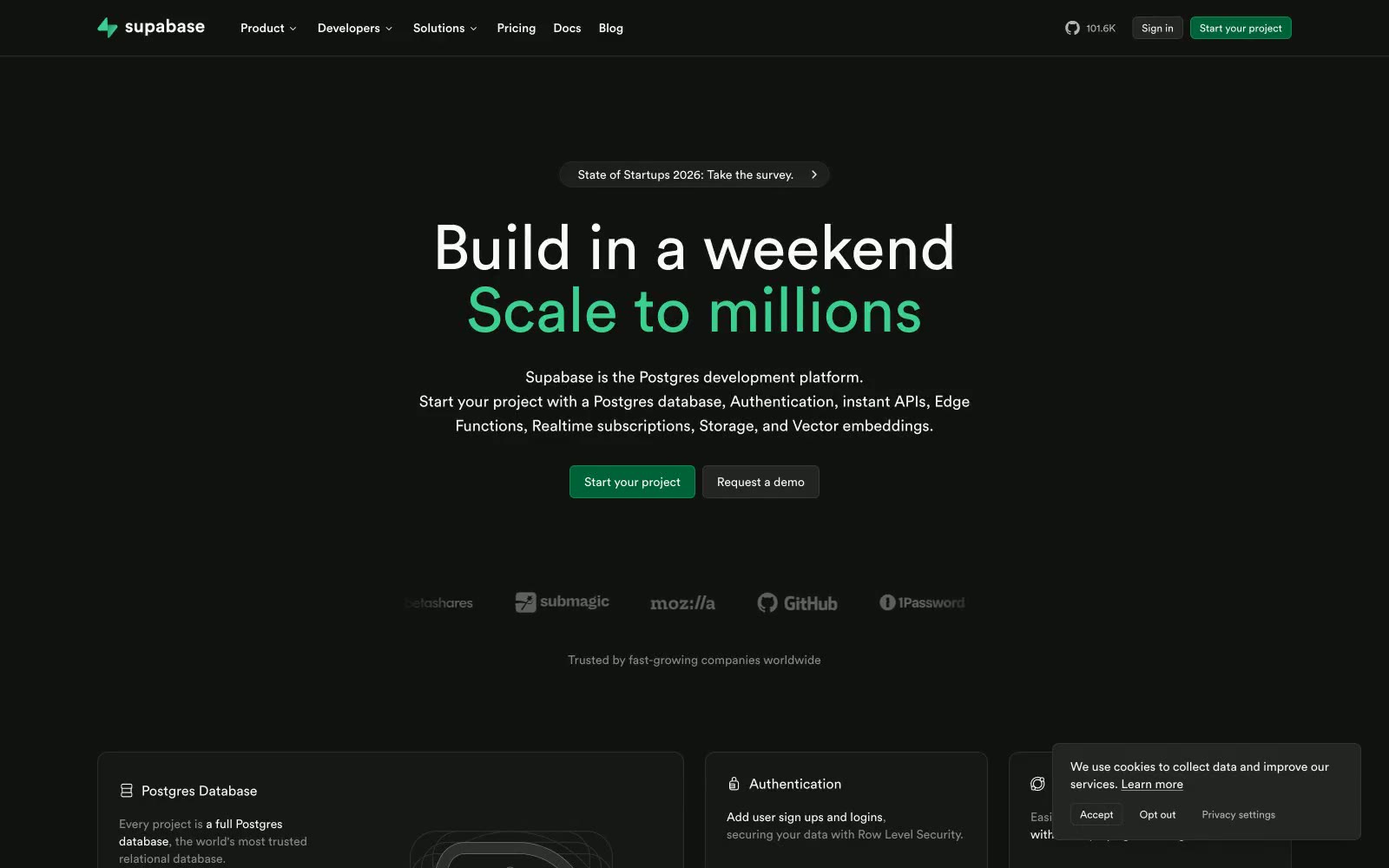
Supabase
Supabase — Style Reference
# Supabase — Style Reference
> Midnight code editor with phosphor green caret — a single chromatic pulse on a sea of charcoal.
**Theme:** dark
Supabase is a midnight IDE with phosphor green punctuation: a near-black canvas, monochrome UI surfaces, and a single vivid green that marks emphasis, headings, and primary actions. The interface borrows its rhythm from code editors — hairline borders, pill controls, generous vertical breathing room, and tight geometric typography (Circular) that whispers in regular weight rather than shouting in bold. Color is rationed: the page is 99% grayscale, and every green pixel earns its place by being a CTA, a highlighted keyword, or a logo. Cards float one elevation level above the canvas using subtle border contrast rather than shadow. The overall feel is fast, terminal-native, and quietly confident — designed to disappear so the product and its developer audience can take the spotlight.
## Tokens — Colors
| Name | Value | Token | Role |
|------|-------|-------|------|
| Phosphor Green | `#3ecf8e` | `--color-phosphor-green` | Green supporting accent for decorative details and low-frequency emphasis. Do not promote it to the primary CTA color |
| Mint Pulse | `#00c573` | `--color-mint-pulse` | Link text and inline accent — a slightly cooler green variant for textual references that shouldn't compete with primary CTAs |
| Forest Depth | `#1f4b37` | `--color-forest-depth` | Hover and pressed borders on green CTAs — keeps the button identifiable when the fill darkens on interaction |
| Midnight Emerald | `#006239` | `--color-midnight-emerald` | Deepest green surface — for low-key brand-tinted backgrounds, subtle section washes, and disabled-brand states |
Websites
Markdown Text
design-md
website-prompt
landing-page-prompt
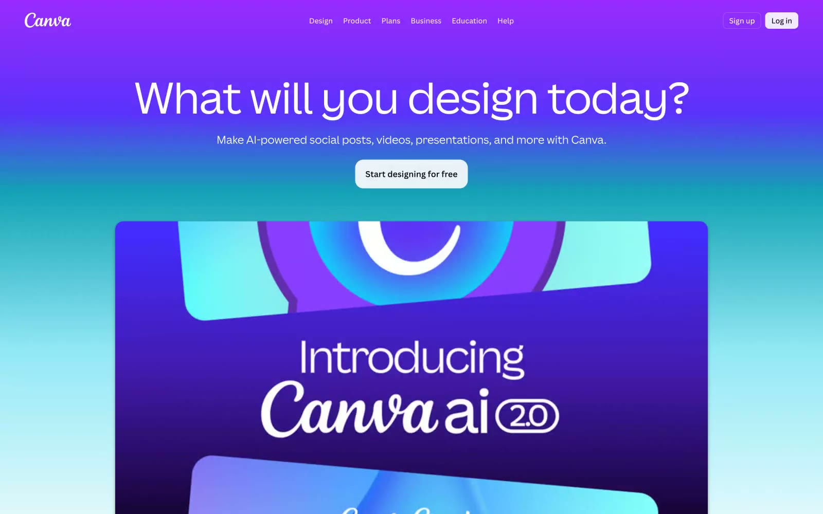
Canva
Canva — Style Reference
# Canva — Style Reference
> candy-colored creative studio — a white canvas floating inside a gradient sky
**Theme:** light
Canva's design system is a candy-colored creative studio: a canvas that breathes, floats, and splashes through saturated gradient skies. The interface alternates between pure white workspace moments and full-bleed chromatic panels that serve as the real product showcase — teal-to-violet, magenta-to-coral, emerald-to-lime — each one a mood rather than a decorative fill. Typography is a custom humanist sans (Canva Sans) that stays warm and friendly at every weight; display sizes stretch to 80px with whisper-tight tracking, while body text sits at 16–18px in a comfortable 1.4–1.5 line height. Surfaces are flat with subtle 8px rounding and barely-there blue-tinted shadows; elevation is implied through color and gradient rather than depth. The wordmark is a hand-cut italic script, the only curved-letterform in the system, acting as a signature stamp on the otherwise geometric UI.
## Tokens — Colors
| Name | Value | Token | Role |
|------|-------|-------|------|
| Canva Violet | `#8b3dff` | `--color-canva-violet` | Primary brand color, gradient anchor, link text, category icon accents |
| Soft Iris | `#a370fc` | `--color-soft-iris` | Secondary violet for lighter gradient stops, subdued link states, decorative icon tints |
| Deep Amethyst | `#9729ff` | `--color-deep-amethyst` | Violet supporting accent for decorative details and low-frequency emphasis. Do not promote it to the primary CTA color |
| Ember Red | `#ff3d4d` | `--color-ember-red` | Warm accent for gradient panels, social/heart icon variants, category tag punctuation |
Websites
Markdown Text
design-md
website-prompt
landing-page-prompt
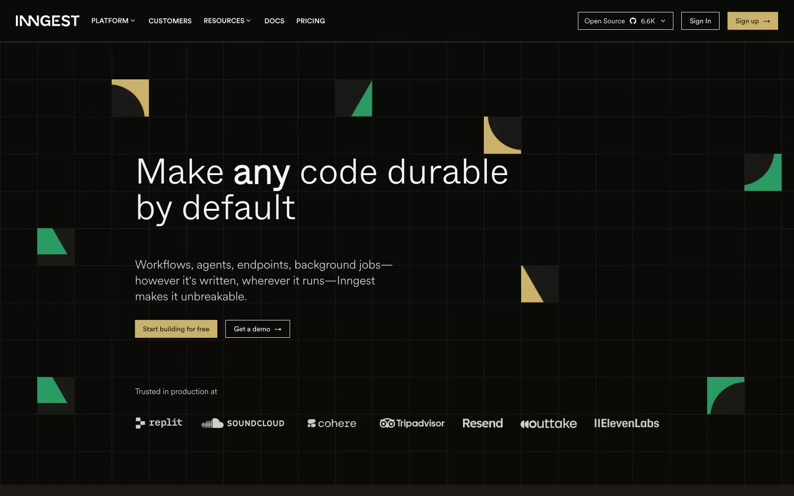
Inngest
Inngest — Style Reference
# Inngest — Style Reference
> Warm-black observatory — quiet, instrument-grade, lit by a single amber pilot light
**Theme:** dark
Inngest operates in a dim, warm-toned command-center idiom: near-black canvas with a faint umber undertone, hairline borders instead of shadows, and geometry scattered like circuit-board fragments across negative space. Type does the heavy lifting — a humanist sans (CircularXX) at 300/400 weight keeps the UI conversational while a display cut (Whyte) at 300 weight with extreme negative tracking whispers rather than shouts headlines. A single muted gold (#cab16a) is the only chromatic accent reserved for primary actions; green, red, and gold appear as decorative punctuation in floating geometric shapes, never on functional UI. Surfaces stack through four warm-tinted grays (#0c0a09 → #1c1917 → #292524 → #44403c) so cards and elevated panels read as luminance shifts, not color shifts.
## Tokens — Colors
| Name | Value | Token | Role |
|------|-------|-------|------|
| Obsidian | `#0c0a09` | `--color-obsidian` | Page background, hero canvas, base surface — carries a warm umber undertone rather than neutral black so the page reads as lit, not void |
| Graphite | `#1c1917` | `--color-graphite` | Card surface, elevated panels, nav bar, footer — one step lighter than canvas to create depth without color shift |
| Charcoal | `#292524` | `--color-charcoal` | Higher elevation surfaces, input fields, nested cards — second step in the surface stack |
| Slate | `#44403c` | `--color-slate` | Tertiary surface, hover states on dark panels, subtle dividers in dense contexts |
Websites
Markdown Text
design-md
website-prompt
landing-page-prompt
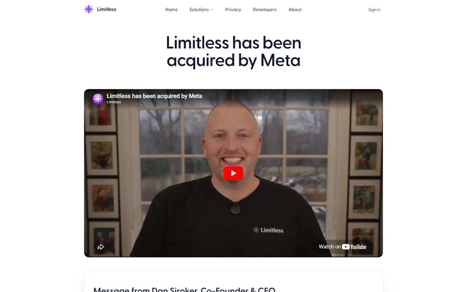
Limitless
Limitless — Style Reference
# Limitless — Style Reference
> monochrome editorial on plaster white. A single weight-contrast typeface, no accent color, and one violet spark — the system achieves identity through restraint, not decoration.
**Theme:** light
Limitless reads as a restrained editorial spread — white paper, a single neutral typeface doing all the talking, and almost no color anywhere. The interface depends on weight contrast inside one font family (Greycliff at 300 for display, 500–600 for body and UI) rather than color or ornament to create hierarchy. Surfaces are nearly invisible: the page is #f2f3f5, cards barely register above it at #ffffff or #e5e7eb tints, and the only true color in the system is a single small violet spark in the wordmark. The personality is funeral-formal-meets-product-page — wide left-aligned headlines at 60px, generous 48–80px vertical breathing room, and one subtle 16px corner radius to keep things from feeling boxy.
## Tokens — Colors
| Name | Value | Token | Role |
|------|-------|-------|------|
| Plaster | `#f2f3f5` | `--color-plaster` | Page background, full-bleed canvas |
| Mist | `#e5e7eb` | `--color-mist` | Card surfaces, placeholder image wells, subtle inset zones |
| Chalk | `#ffffff` | `--color-chalk` | Elevated card surfaces when differentiation from Plaster is needed |
| Hairline | `#d1d5db` | `--color-hairline` | Stronger dividers, disabled icon strokes, secondary borders |
Websites
Markdown Text
design-md
website-prompt
landing-page-prompt
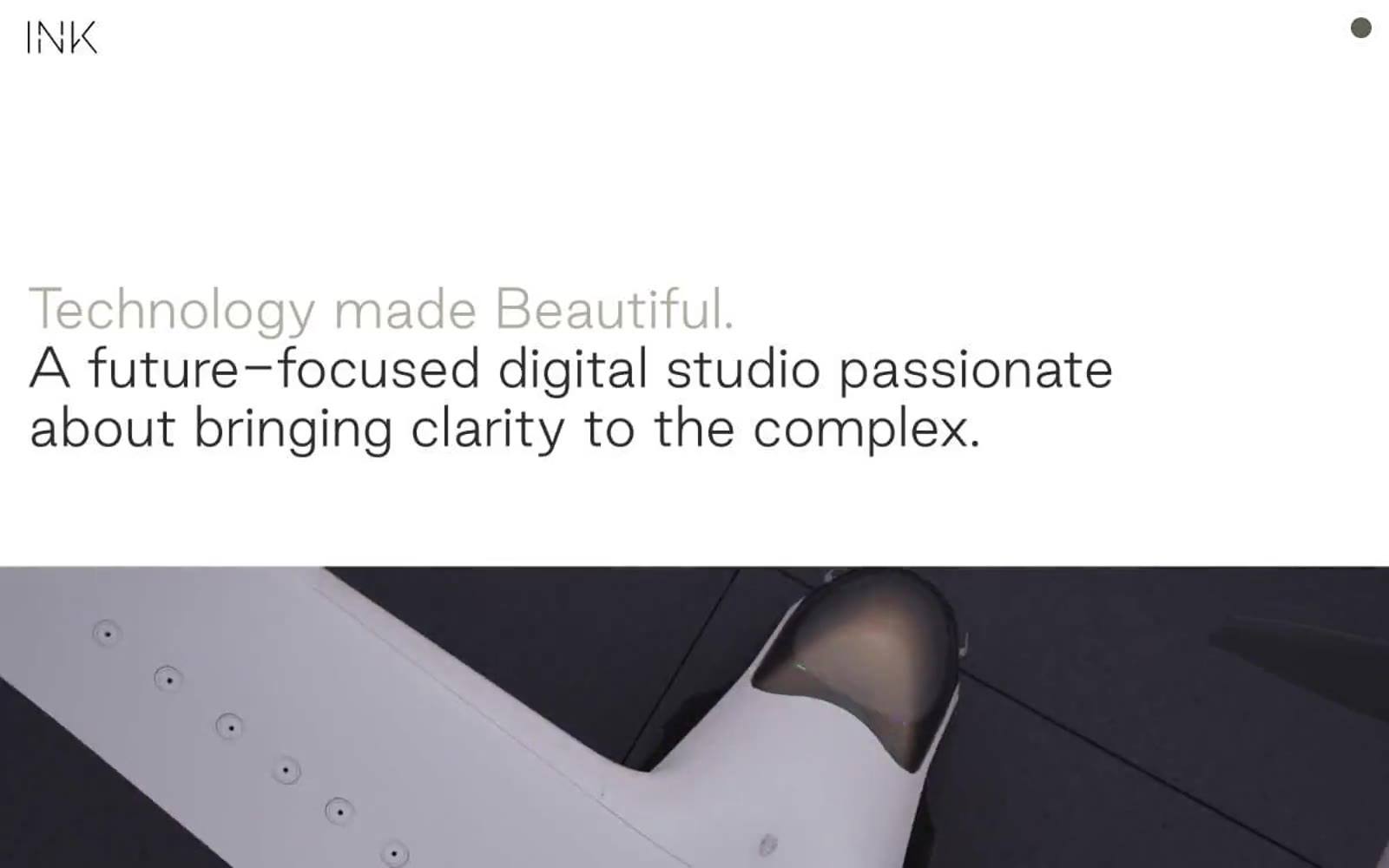
INK
INK — Style Reference
# INK — Style Reference
> Editorial spread on warm paper. A single humanist voice, monochrome with a whisper of taupe, interrupted only by full-bleed photography and a slim band of warm orange.
**Theme:** light
INK is an editorial gallery for a digital studio: warm-white paper, a single weight of a humanist sans, and photography that fills the viewport edge-to-edge. The palette is almost entirely grayscale with one warm taupe (#afa697) doing duty as a 'whispered' secondary voice, while a pair of vivid oranges surfaces only inside decorative bands and illustrations — never inside UI controls. Components are reduced to their quietest form: pill-shaped nav, hairline-thin labels, and image captions that float beneath full-bleed frames. The visual rhythm alternates between vast editorial type passages and cinematic image plates, separated by 160px of negative space.
## Tokens — Colors
| Name | Value | Token | Role |
|------|-------|-------|------|
| Ink Carbon | `#2e2a2b` | `--color-ink-carbon` | Primary text, logo mark, dark surface inversions, footer text on cream — a near-black with a barely-warm undertone that keeps the page from feeling clinical |
| Paper White | `#ffffff` | `--color-paper-white` | Page canvas and nav surface — the warm-white background that everything floats on |
| Whisper Taupe | `#afa697` | `--color-whisper-taupe` | Supporting neutral for secondary UI, dividers, and muted labels. |
| Bone Cream | `#e6dcd4` | `--color-bone-cream` | Alternate panel background and footer band — a warm cream that signals a quieter section without leaving the monochrome family |