AI Prompt Studio - Intelligent Prompt Library
Explore and use professional AI prompts to optimize your workflow.
One-click Use
Websites
Markdown Text
design-md
website-prompt
landing-page-prompt
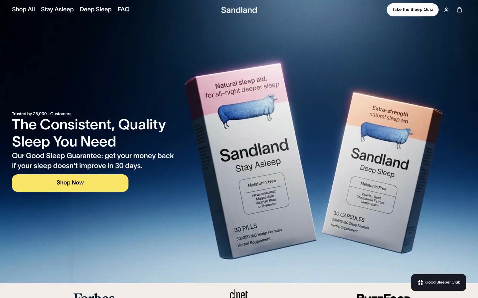
Sandland Sleep
Sandland Sleep — Style Reference

# Sandland Sleep — Style Reference
> warm cream sleep journal with deep navy nights
**Theme:** light
Sandland Sleep uses a warm cream canvas as its foundation, creating a soft, restful atmosphere that reads like a linen-wrapped pharmacy rather than a cold e-commerce site. Deep navy (#1a365d) provides the nighttime counterpart — anchoring the hero gradient and dark data cards as moments of cool, clinical authority that contrast the otherwise warm palette. A single vivid yellow (#fae467) serves as the sole chromatic punctuation for primary actions, badges, and data highlights, making every CTA feel switched on against the muted surroundings. Typography stays restrained and even, with a custom sans (Sandland-550) at moderate weights and tight tracking on display sizes, letting generous spacing and soft 10-20px radii carry the calm. Components are pill-shaped and rounded, shadows are whisper-soft (0.1 opacity), and the overall feel is a sleep journal: warm paper, navy ink, one highlighter.
## Tokens — Colors
| Name | Value | Token | Role |
|------|-------|-------|------|
| Midnight Navy | `#1a365d` | `--color-midnight-navy` | Hero gradient base, dark data cards, icon strokes — the cool nocturnal counterpoint to the warm cream canvas, signals science and trust at the deepest end of the palette |
| Sunlit Yellow | `#fae467` | `--color-sunlit-yellow` | Primary CTA fill, bestseller badges, data-highlight accents — the only vivid chromatic in the system, warm and optimistic like morning light, used sparingly so every action glows |
| Linen Cream | `#f2ede8` | `--color-linen-cream` | Page canvas, default section background — the dominant warm neutral that sets the entire sleep-warmth tone of the site |
| Paper White | `#ffffff` | `--color-paper-white` | Card surfaces, product photography backgrounds, nav backgrounds — pure white creates lift against the cream canvas |
Websites
Markdown Text
design-md
website-prompt
landing-page-prompt
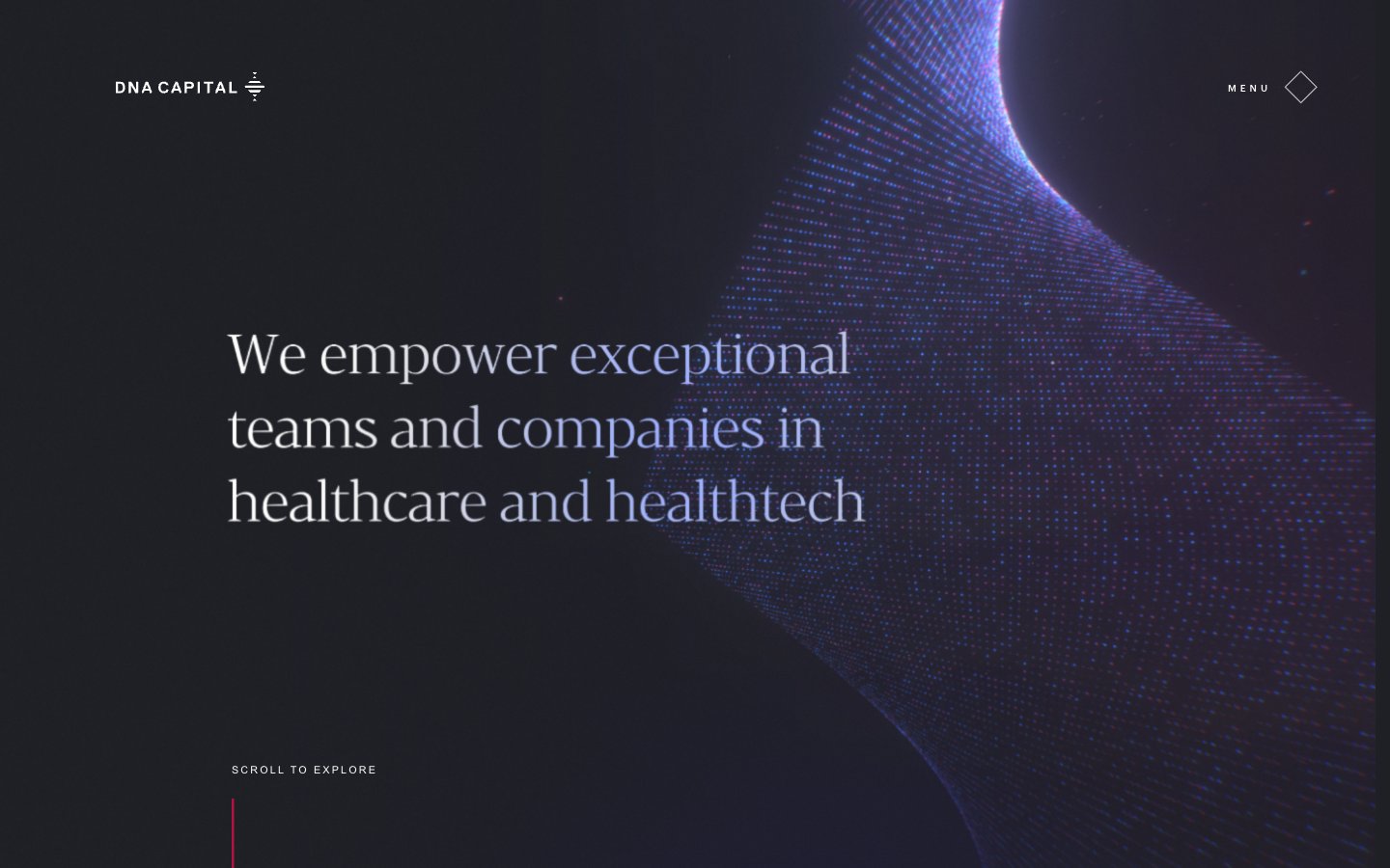
DNA
DNA — Style Reference
# DNA — Style Reference
> Midnight observatory through a particle lens
**Theme:** dark
DNA Capital is a midnight observatory for healthcare capital: a near-black canvas hosts a serif display voice that whispers at weight 300, a geometric sans for everything utilitarian, and a single electric blue that draws arcs and traces particle constellations. The page is overwhelmingly achromatic — white type and hairline borders float on #070708 — with blue appearing as small functional punctuation, never as decoration. Vertical rhythm is generous (59px section gaps, 23–32px element breathing room), and the layout pairs a left-aligned editorial column with a persistent right-side particle field that bleeds between sections. The signature typographic tension: a high-contrast serif (Darius) at 45–72px against a narrow geometric sans (Graphik) at 13–18px creates a Vogue-meets-quantum-lab feel that most financial sites cannot reach.
## Tokens — Colors
| Name | Value | Token | Role |
|------|-------|-------|------|
| Abyss Black | `#070708` | `--color-abyss-black` | Page canvas, footer ground — near-black rather than #000 gives the cosmic field a slight warmth and lets white type feel luminous rather than harsh |
| Pure White | `#ffffff` | `--color-pure-white` | Primary text, hairline dividers, section borders, icon strokes — the sole foreground color across the system |
| Steel Gray | `#8f8f93` | `--color-steel-gray` | Muted body copy, secondary descriptions — sits between the white headlines and the dark canvas to create a three-tier reading hierarchy |
| Carbon | `#000000` | `--color-carbon` | SVG fill on iconography and button borders — true black for graphic elements that need maximum weight against the warm #070708 ground |
Websites
Markdown Text
design-md
website-prompt
landing-page-prompt
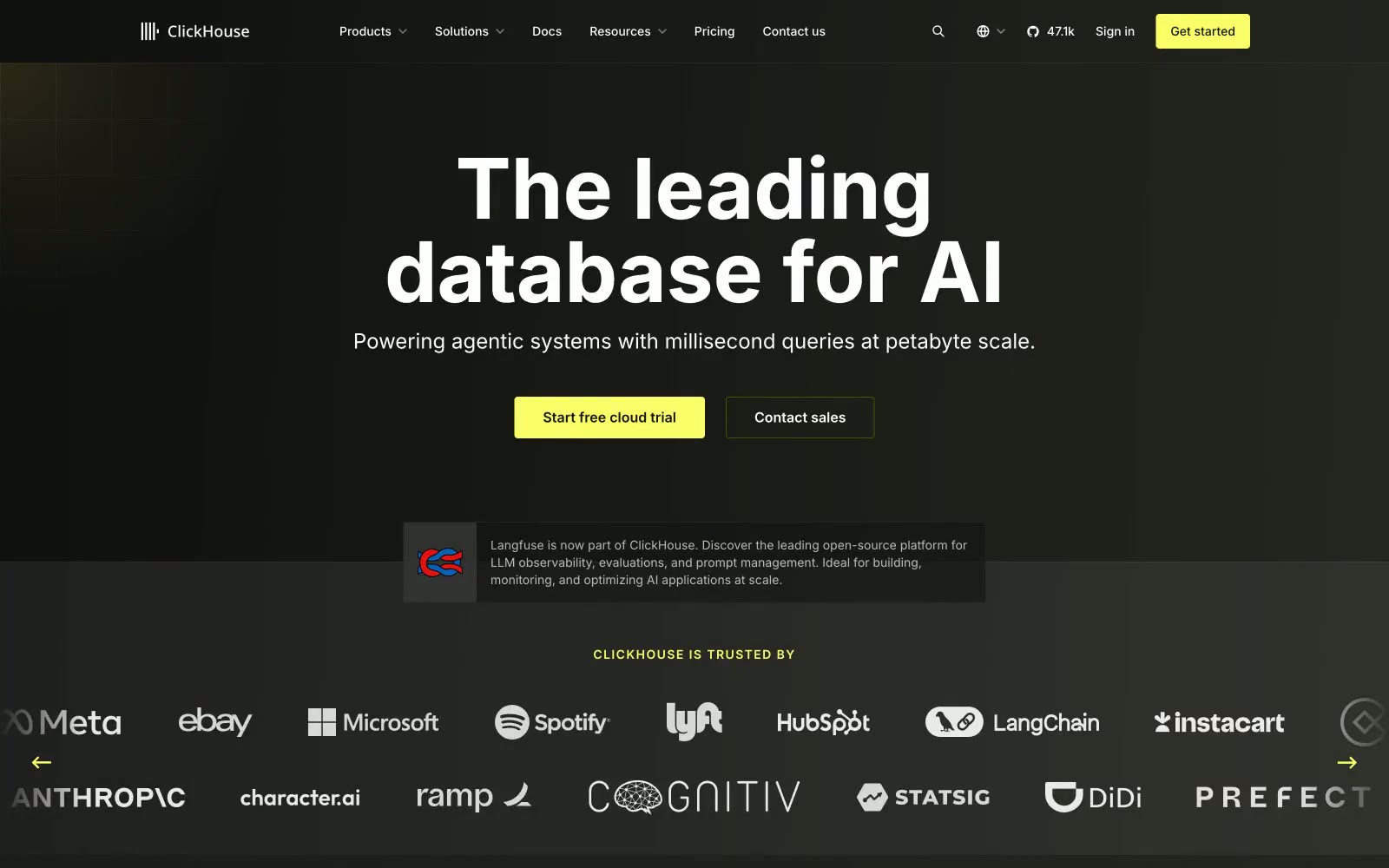
ClickHouse
ClickHouse — Style Reference
# ClickHouse — Style Reference
> phosphor terminal at midnight — a lone lime cursor glowing on black glass.
**Theme:** dark
ClickHouse reads as a phosphor terminal at midnight — a near-black canvas where one electric lime accent behaves like a blinking cursor, marking every action and highlight. The system is sparse, technical, and confident: white headlines sit in vast negative space, supported by a near-monochrome scale of dark grays that differentiate page, card, and elevated surfaces through hue alone. Components are flat and fast — hairline borders, soft 8px radii, almost no shadow. The lime (#faff69) is the only chromatic voice; it appears on the primary CTA, the 'ClickHouse' wordmark highlight, and as a small functional punctuation across icons, tags, and section markers. Typography stays in the Inter / Basier family with a single Inconsolata excursion for code, reinforcing a developer-tool register. Everything else is restrained: a quiet grid, generous breathing room, and a single visual idea — the database made visible in a flash of light.
## Tokens — Colors
| Name | Value | Token | Role |
|------|-------|-------|------|
| Electric Lime | `linear-gradient(to right, rgba(0, 0, 0, 0), rgb(250, 255, 105), rgba(0, 0, 0, 0))` | `--color-electric-lime` | Green supporting accent for decorative details and low-frequency emphasis. Do not promote it to the primary CTA color |
| Olive Ink | `#161600` | `--color-olive-ink` | Deep olive tone for muted accent backgrounds, subtle on-dark decorative tints, and low-prominence lime-tinted text variants |
| Dark Olive | `#4f5100` | `--color-dark-olive` | Muted lime used for subtle accent borders, tag backgrounds, and supporting highlight washes where full Electric Lime would be too loud |
| Lime Glow | `#fbff46` | `--color-lime-glow` | Box-shadow glow on accent elements and secondary highlight states — reinforces the phosphor-light identity without adding a new hue |
Websites
Markdown Text
design-md
website-prompt
landing-page-prompt
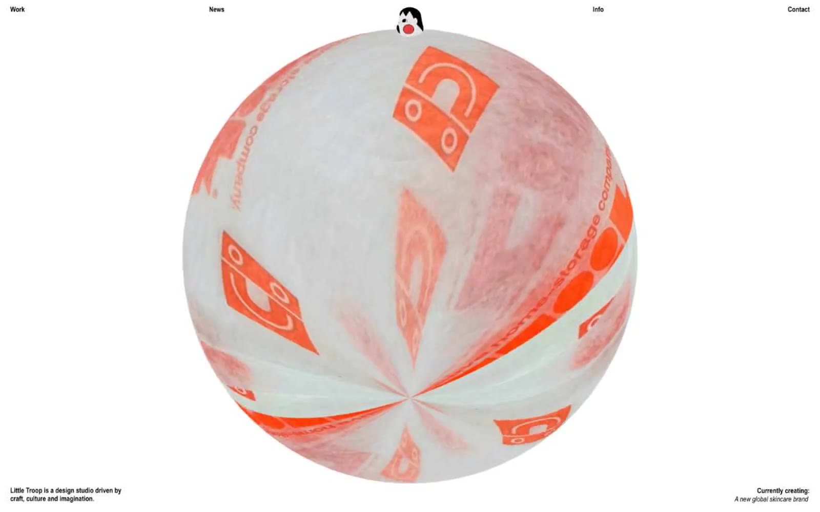
Little Troop
Little Troop — Style Reference
# Little Troop — Style Reference
> Monochrome gallery with chromatic artworks. A black pearl floating in white void.
**Theme:** light
Little Troop is a design studio portfolio that behaves like a monochrome gallery: white walls, black frames, and the work itself provides all the color. The system is ruthlessly reduced to two colors and one signature radius (50px), letting project imagery carry the chromatic and visual weight. Type stays in two registers — Arial Narrow as the functional voice for navigation, labels, body, and metadata, and Times Now at weight 250 as a single display moment that whispers rather than announces. No shadows, no gradients, no decorative surface treatments — just border, whitespace, and the rounded rectangle as the sole repeating shape.
## Tokens — Colors
| Name | Value | Token | Role |
|------|-------|-------|------|
| Pure Black | `#000000` | `--color-pure-black` | All text, all borders, the nav mark, section dividers, filter indicators. The structural ink of the entire system — every line, frame, and glyph is black on white |
| Pure White | `#ffffff` | `--color-pure-white` | Page canvas and inverse text. The only surface; cards do not introduce a separate fill — they borrow the page and let imagery do the work |
## Tokens — Typography
Websites
Markdown Text
design-md
website-prompt
landing-page-prompt
OPX Studio
OPX Studio — Style Reference
# OPX Studio — Style Reference
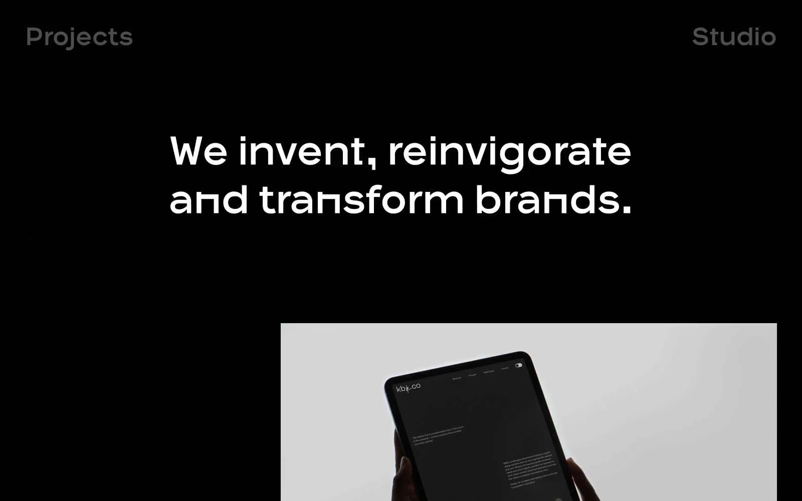
> Dark gallery monolith — a near-black exhibition hall where monumental white type and full-bleed photography do all the talking, and borders whisper at #292a2c.
**Theme:** dark
OPX Studio operates as a black void gallery: a near-pure #020202 canvas where the only voices are stark white type and full-bleed project photography. The system is aggressively monochrome — zero brand color, zero accent, zero semantic hues — letting the project imagery provide all visual variation. Typography is the sole brand signature: a single-weight (400) custom display face (OPX-Medium) scales from 18px body text to 111px editorial statements with extremely tight leading, giving the page a typographic confidence that fills the dark space. Components are flat, borderless on canvas, and rely on hairline #292a2c dividers and white-stroke pill buttons (45px radius) rather than shadows or fills. Navigation reduces to two words ("Projects", "Studio") set as oversize display type — the page itself is the brand mark. Generous 100–200px vertical breathing room between sections reinforces a slow, editorial pace rather than a dense product feel.
## Tokens — Colors
| Name | Value | Token | Role |
|------|-------|-------|------|
| Void Black | `#020202` | `--color-void-black` | Page canvas — the base background across all sections |
| Surface Black | `#000000` | `--color-surface-black` | Section surfaces and image containment backgrounds, barely distinguishable from canvas to keep elevation flat |
| Charcoal Hairline | `#292a2c` | `--color-charcoal-hairline` | Structural dividers and borders — the only mid-tone in the system, carrying 900 occurrences as the skeleton between sections and elements |
| Bone White | `#ffffff` | `--color-bone-white` | Primary text, nav labels, project titles, and 1px pill-button borders — the sole signal of interactivity |
Websites
Markdown Text
design-md
website-prompt
landing-page-prompt
Letter
Letter — Style Reference
# Letter — Style Reference
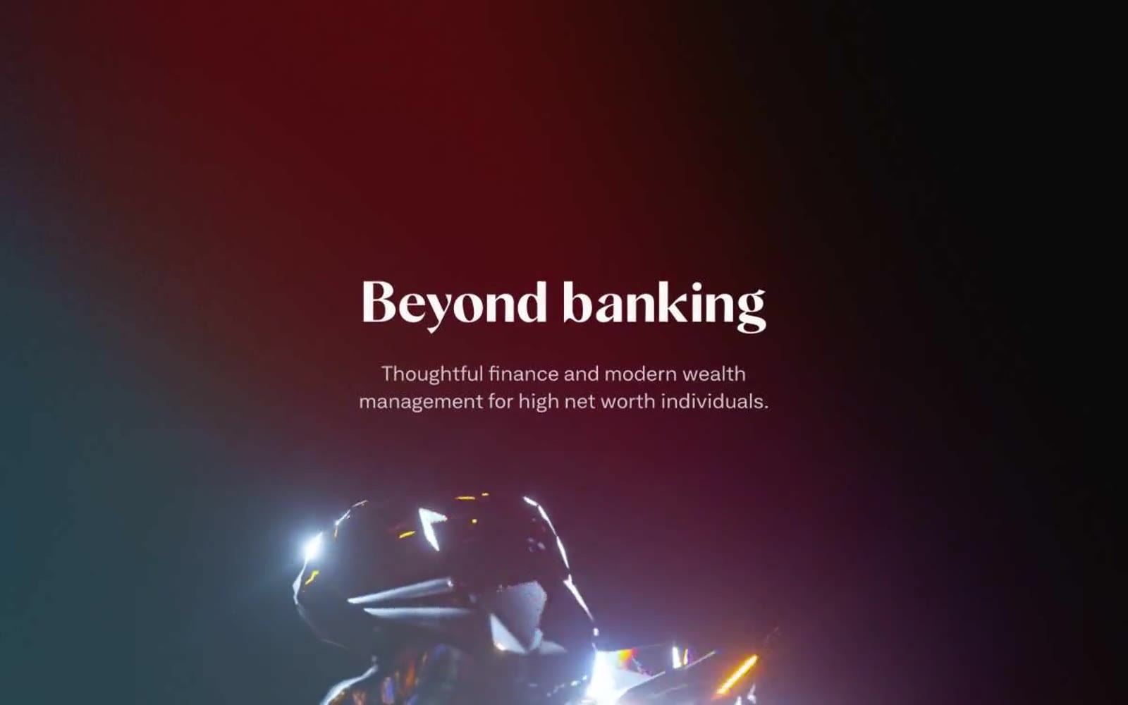
> Private gallery with iridescent vault artifacts. A black-walled showroom where serif headlines float above chrome sculptures on tinted gallery walls.
**Theme:** mixed
Letter is a private-banking platform that reads like a gallery exhibition for high-net-worth finance. The visual system pivots between a deep ink-black hero stage and a bright editorial body, with 3D metallic and prismatic renders as the recurring sculptural accent. Typography is split into two deliberate registers: a wide grotesque for interface text and navigation, and a high-contrast serif at 80px for headlines that read like magazine cover titles. Color is used as architectural punctuation — three near-gray tinted panels (peach, mint, lavender) act as gallery walls, while teal, violet, and blue claim the action buttons as discrete brand moments. Components are square and confident: 2px corner radii, generous horizontal button padding, and zero decorative shadow — the renders and typography do all the emotional work.
## Tokens — Colors
| Name | Value | Token | Role |
|------|-------|-------|------|
| Vault Ink | `#191b1f` | `--color-vault-ink` | Hero background, dark surface stage, dark card panel — deep near-black with the faintest blue chill, warmer than pure black but harder than charcoal |
| Paper White | `#ffffff` | `--color-paper-white` | Page canvas, light card surface, inverse text on dark backgrounds, outlined button fills |
| Mist White | `#f6f9f9` | `--color-mist-white` | Soft section background, subtle card surface, secondary canvas — sits one step below pure white without grayness |
| Fog Gray | `#9fabad` | `--color-fog-gray` | Muted helper text, secondary metadata, low-emphasis labels — a true middle gray with no chromatic bias |
Websites
Markdown Text
design-md
website-prompt
landing-page-prompt
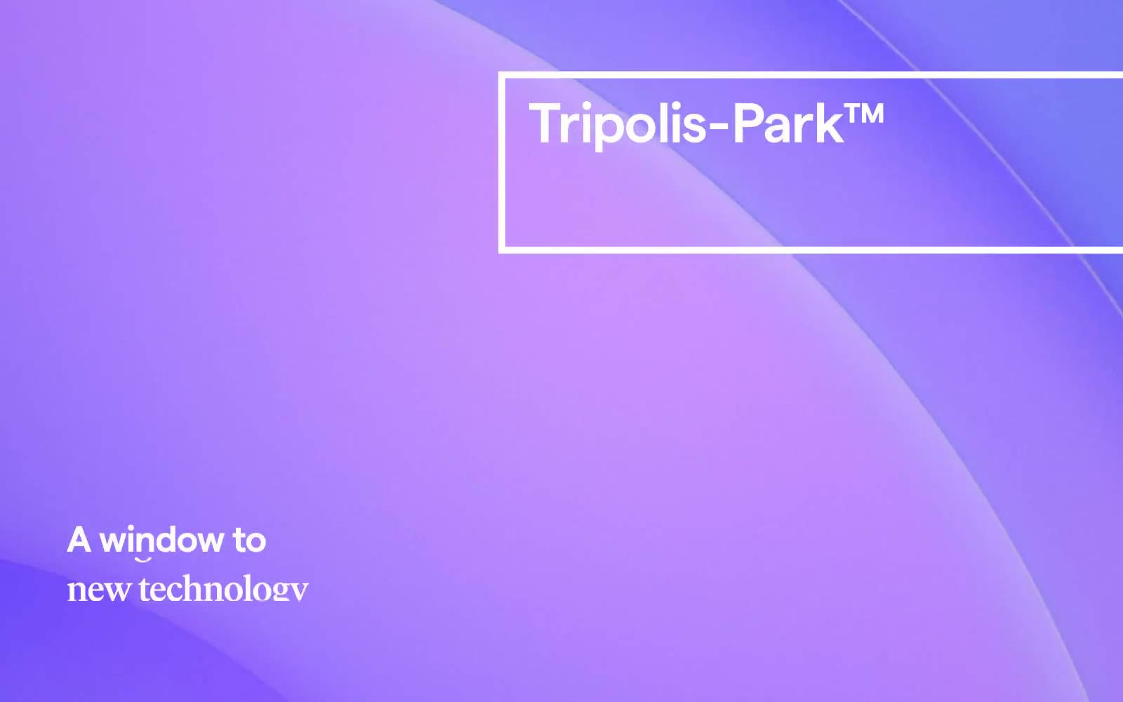
Tripolis-Park™
Tripolis-Park™ — Style Reference
# Tripolis-Park™ — Style Reference
> luminous violet portal — soft lavender light bleeding through frosted glass edges, achromatic content floating above.
**Theme:** light
Tripolis-Park uses a luminous violet-to-lavender gradient as its signature atmosphere — a soft, otherworldly wash that fills hero surfaces and section dividers, making the brand feel like a portal rather than a corporate site. Against this atmospheric purple, the interface stays strictly achromatic: pure white surfaces, black text, and hairline borders do all the structural work. Typography is custom and editorial — a humanist sans (Matter) paired with a refined serif (IvarHeadline) — set with tight negative tracking on display sizes to create confident, tight headlines. Components are minimal and borderless by default, with thin rectangular frames (no radius) used as deliberate compositional devices, not decoration.
## Tokens — Colors
| Name | Value | Token | Role |
|------|-------|-------|------|
| Aurora Lilac | `linear-gradient(135deg, #c5b0ec 0%, #a78bdb 45%, #7c4fb8 100%)` | `--color-aurora-lilac` | Hero gradient start, atmospheric section backgrounds — the soft entry tone of the brand's signature violet wash |
| Deep Iris | `#7c4fb8` | `--color-deep-iris` | Hero gradient deep stop, section transition anchors — the rich violet terminus that gives the gradient its weight |
| Midnight Ink | `#000000` | `--color-midnight-ink` | Primary text, heading strokes, hairline borders, icon fills, link color |
| Carbon Mist | `#2d2d2d` | `--color-carbon-mist` | Secondary text, subdued headings — softer than pure black for less critical copy |
Websites
Markdown Text
design-md
website-prompt
landing-page-prompt
Tomorro
Tomorro — Style Reference
# Tomorro — Style Reference
> lush greenhouse at midnight — Electric Sprout neon pierces the deep forest canvas and bone-white beds below. The brand lives in that contrast: the dark is the soil, the light is the greenhouse bench, the green is the growth.
**Theme:** mixed
Tomorro is a contract-management platform that renders in a neo-botanical dark-and-light system: deep forest-canvas sections alternate with warm bone-white panels, both fed by the same Moss-Shadow text and punctuated by an Electric Sprout green. The visual language is quiet, mature, editorial — Ozik display type at ultra-tight 0.86 line-height anchors the hero, Aeonik carries every UI surface, and Instrument Serif drops in sparingly as accent italic-adjacent voice inside badges. Components are mostly pill-shaped (28-40px radius) rather than squared, the floating nav bar looks like a pressed seed, and the green CTA is treated as botanical accent paint, not a brand wallpaper. Pages should read as 70% typography on flat surfaces, 20% product mockups floating at slight angles, 10% abstract green orb atmosphere.
## Tokens — Colors
| Name | Value | Token | Role |
|------|-------|-------|------|
| Forest Depths | `#122314` | `--color-forest-depths` | Dark elevated surface for cards, headers, and contained panels. Do not promote it to the primary CTA color |
| Moss Shadow | `#273f2b` | `--color-moss-shadow` | Gray action color for filled buttons, selected navigation states, and focused conversion moments. |
| Lichen Sage | `#7e8371` | `--color-lichen-sage` | Secondary muted text, link underline on dark, and badge border color — sits between Moss Shadow and Pure White as the off-tone voice |
| Pale Fern | `#b7bda5` | `--color-pale-fern` | Medium-contrast borders, control outlines, and structural separators. |
Websites
Markdown Text
design-md
website-prompt
landing-page-prompt
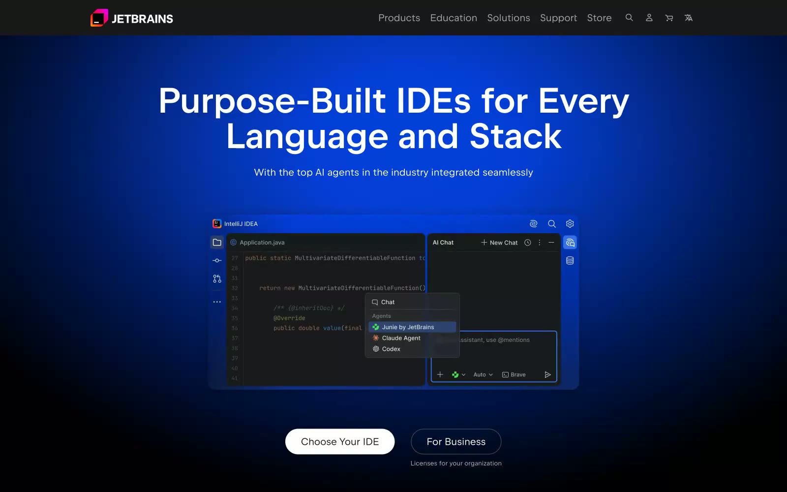
JetBrains
JetBrains — Style Reference
# JetBrains — Style Reference
> Neon nebula on obsidian — a black-ground page where violet-blue gradients bloom upward like deep-space imagery, punctuated by hot-pink neon and per-product chromatic icon light.
**Theme:** dark
JetBrains' site feels like the interior of a deep-space control room — pure black (#000000) ground plane with electric violet-to-blue gradients erupting from the darkness like bioluminescent nebulae. The defining moves are the chromatic product icon ecosystem (each IDE gets a vivid multicolor badge) floating against near-black surfaces, and the blue radial glow (rgba(0,71,253,0.8) at 75% opacity) diffused behind hero content like a spotlight on a dark stage. Headlines at 72-79px use JetBrains Sans weight 600 with tight letter-spacing, while the hot-pink accent (#f31199, CSS var --main-page-pink) fires only on category labels and brand moments — a neon sign in a dark corridor. Cards use 24px radius with translucent violet or pink fills (rgba(90,31,208,0.3), rgba(243,17,180,0.2)) that glow rather than separate.
## Tokens — Colors
| Name | Value | Token | Role |
|------|-------|-------|------|
| Obsidian Ground | `#000000` | `--color-obsidian-ground` | Page background — the absolute black base all gradients and glows emerge from |
| Deep Charcoal | `#19191c` | `--color-deep-charcoal` | Nav bar background, footer, elevated surface one step above absolute black |
| Graphite | `#343434` | `--color-graphite` | Most-used color on site; borders, dividers, muted icon strokes, body text secondary contexts |
| Iron | `#474749` | `--color-iron` | Subtle borders, inactive state outlines |
Websites
Markdown Text
design-md
website-prompt
landing-page-prompt
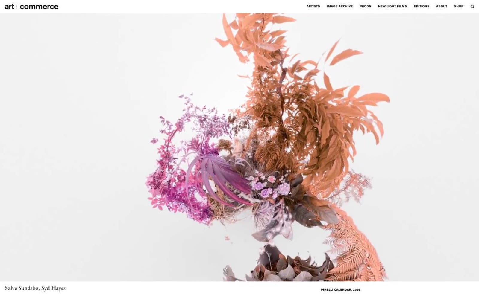
Artandcommerce
Artandcommerce — Style Reference
# Artandcommerce — Style Reference
> art book spread on bone paper
**Theme:** light
Art+Commerce is a quiet editorial gallery on bone paper: a near-monochrome canvas where large-format commissioned photography and magazine covers become the entire visual system. The type pairing is the signature — Adobe Garamond in weight 400 whispers editorial luxury while Akzidenz Grotesk in small, widely-tracked uppercase provides mechanical, gallery-label clarity. There is no brand color, no gradient, no shadow, no radius; hierarchy is built from a single black ink, generous white space, and a disciplined 56px display line. Density is sparse and the page breathes like an art book spread — images sit full-bleed, metadata hovers in tiny tracked caps at the edges, and every UI element defers to the artwork.
## Tokens — Colors
| Name | Value | Token | Role |
|------|-------|-------|------|
| Ink | `#000000` | `--color-ink` | Primary text, navigation labels, logo, link borders, footer type — the single graphic ink of the system. Every stroke, border, and character mark across the site |
| Bone | `#e7e7e7` | `--color-bone` | Page canvas, card surface, elevated surface — the warm near-white that holds all imagery and text |
| Charcoal | `#121212` | `--color-charcoal` | Secondary text and deep surface tone where slightly softer black is needed against bone |
Websites
Markdown Text
design-md
website-prompt
landing-page-prompt
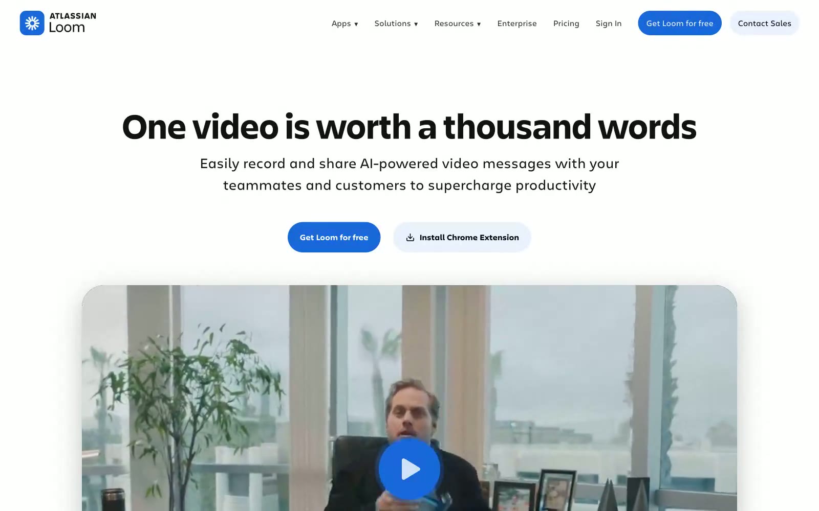
Loom
Loom — Style Reference
# Loom — Style Reference
> Sunlit message lounge — a bright, pill-shaped communication booth on white marble, lit by one confident blue lamp.
**Theme:** light
Loom uses a sunlit, airy communication-workspace language — a clean white canvas with generous breathing room, fully pill-shaped controls, and a single saturated blue (#1868db) that threads through navigation, links, and buttons to create one consistent interactive color. The design relies on soft pastel surface tints — pale blue #e9f2fe, buttery cream, mint, and lavender — to differentiate content zones without breaking the bright, welcoming atmosphere. Typography is restrained and editorial: Charlie Display at weight 700 anchors headlines in compact, tight-leading forms while Charlie Text handles body and UI at 15–19px, giving the product a confident voice that never feels heavy. Cards use large rounded corners (~42–69px) and layered ambient shadows to feel like physical surfaces, and the 9999px pill shape carries the entire interactive vocabulary — every clickable element is a capsule.
## Tokens — Colors
| Name | Value | Token | Role |
|------|-------|-------|------|
| Signal Blue | `#1868db` | `--color-signal-blue` | Blue supporting accent for decorative details and low-frequency emphasis. Do not promote it to the primary CTA color |
| Pale Wash | `#e9f2fe` | `--color-pale-wash` | Light blue surface for testimonial cards, banner backgrounds, and soft feature zones |
| Paper White | `#ffffff` | `--color-paper-white` | Primary page and card background; the default canvas |
| Ink Black | `#101214` | `--color-ink-black` | Primary text color for headings and body copy |
Websites
Markdown Text
design-md
website-prompt
landing-page-prompt
Design
Design — Style Reference
# Design — Style Reference
> neon green glyph in a dark void
**Theme:** dark
Cash App's design system is a dark-mode monolith: near-black canvas, white type that ranges from whisper-quiet 10px labels to 122px display monuments, and exactly one chromatic accent — electric Cash Green — that appears almost never but defines the brand when it does. Depth is communicated through typographic scale and whitespace rather than shadows or layered surfaces; hairline silver borders (#e5e7eb) at sub-1px visual weight separate regions without breaking the void. The type scale is intentionally extreme: no medium headings exist between 16px body and 86px display, forcing dramatic contrast that makes every page feel like an editorial spread. Spacing is generous (64px section gaps, 30px internal padding) and density stays low — this system rewards restraint and punishes decoration.
## Tokens — Colors
| Name | Value | Token | Role |
|------|-------|-------|------|
| Obsidian | `#000000` | `--color-obsidian` | Page canvas, inverted surfaces, display type on light blocks |
| Snow | `#ffffff` | `--color-snow` | Primary text, high-contrast headings, logo lockup fills |
| Mist | `#e5e7eb` | `--color-mist` | Hairline dividers, section borders, card outlines, link borders — the only structural separator in the system |
| Slate | `#858585` | `--color-slate` | Muted body text, secondary labels, list items, metadata |
Websites
Markdown Text
design-md
website-prompt
landing-page-prompt
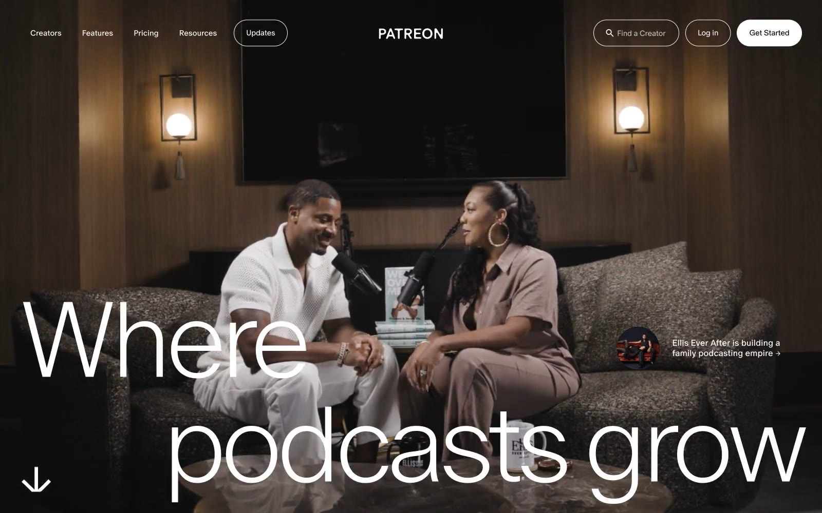
Patreon
Patreon — Style Reference
# Patreon — Style Reference
> White gallery for creator portraits — a near-blank editorial stage where the only color lives inside the frame.
**Theme:** light
Patreon is an editorial-monochrome platform: a near-pure white canvas where the only color is photographic. The UI recedes so creator portraits can dominate. The custom 'Oracle' typeface is set in whisper-light weights (250–350) with aggressively tight negative tracking, producing a high-fashion magazine tone rather than a typical SaaS register. Buttons and inputs are pill-shaped (30–45px radii), borders are hairline #1a1a1a, and the single filled action is pure black — no chromatic brand color, no gradients, no decorative tint. The system is deliberately austere: the visual richness comes from real human photography, not from interface ornament.
## Tokens — Colors
| Name | Value | Token | Role |
|------|-------|-------|------|
| Obsidian | `#1a1a1a` | `--color-obsidian` | Primary text, hairline borders, subtle dividers — used at very-high frequency (1452 instances) across body, list, card, and input borders. The near-black rather than pure #000 keeps the UI from feeling harsh while preserving the monochromatic authority |
| Paper | `#ffffff` | `--color-paper` | Page canvas, card surfaces, button text on dark fills, input fields. The base layer everything else floats on |
| Stage Black | `#000000` | `--color-stage-black` | High-contrast neutral action fill for primary buttons on light surfaces. |
| Concrete | `#959595` | `--color-concrete` | Mid-tone neutral for secondary text, muted metadata, disabled states. Bridges the gap between #1a1a1a and white for hierarchical de-emphasis |
Websites
Markdown Text
design-md
website-prompt
landing-page-prompt
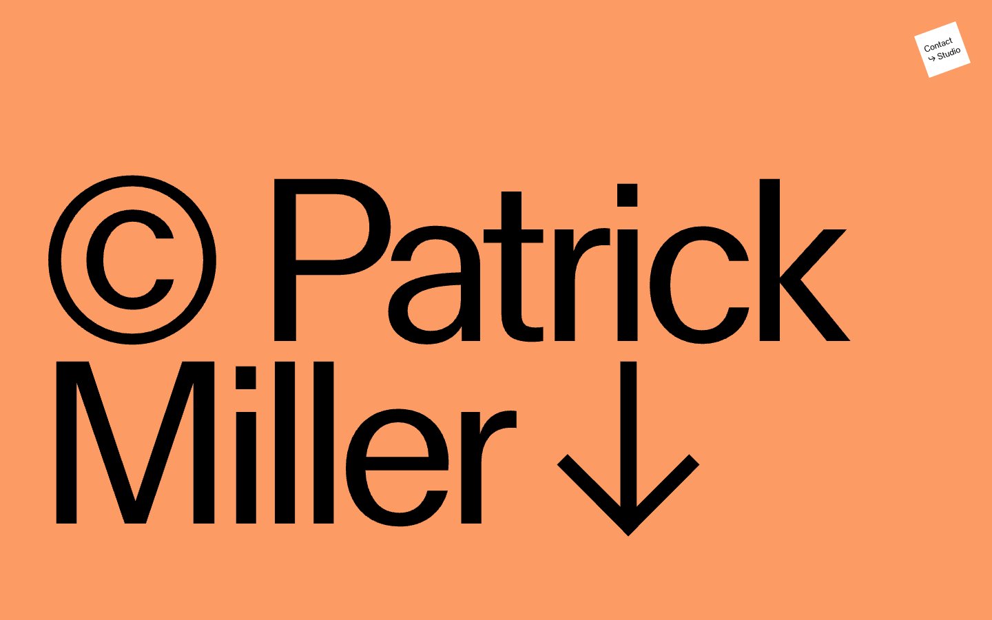
Patrick Miller
Patrick Miller — Style Reference
# Patrick Miller — Style Reference
> oversized masthead on chalky color fields — a portfolio that behaves like a printed poster
**Theme:** light
Patrick Miller's site treats every viewport as a single editorial spread: full-bleed color fields carry one oversized typographic statement, then a split-screen gallery follows with almost no UI. The palette is warm and chalky — salmon, blush linen, candlelight cream, and a whisper of sage — never digital or saturated, more like pastel chalk dusted across a wall. MlrStandard, a custom sans, does the heavy lifting at extreme sizes (331px hero) with tight tracking, while a near-invisible secondary chrome handles wayfinding: tiny centered labels, hairline arrows, and one small dark circle as the only solid interactive element. There are no cards, no grids, no shadows — content is presented as flat color blocks and monumental type, the way a magazine cover treats a masthead.
## Tokens — Colors
| Name | Value | Token | Role |
|------|-------|-------|------|
| Persimmon Wash | `#fd9b65` | `--color-persimmon-wash` | Hero full-bleed section background — warm terracotta field that carries the massive name lockup |
| Blush Linen | `#e9d1c7` | `--color-blush-linen` | Section background, split-screen left or right panel — dusty rose that softens adjacent fields |
| Candlelight | `#f8f5d1` | `--color-candlelight` | Section background, split-screen panel — off-white cream that recedes behind type |
| Sage Whisper | `#9ac8ae` | `--color-sage-whisper` | Accent full-bleed background for occasional sections — desaturated eucalyptus that cools the warm system |
Websites
Markdown Text
design-md
website-prompt
landing-page-prompt
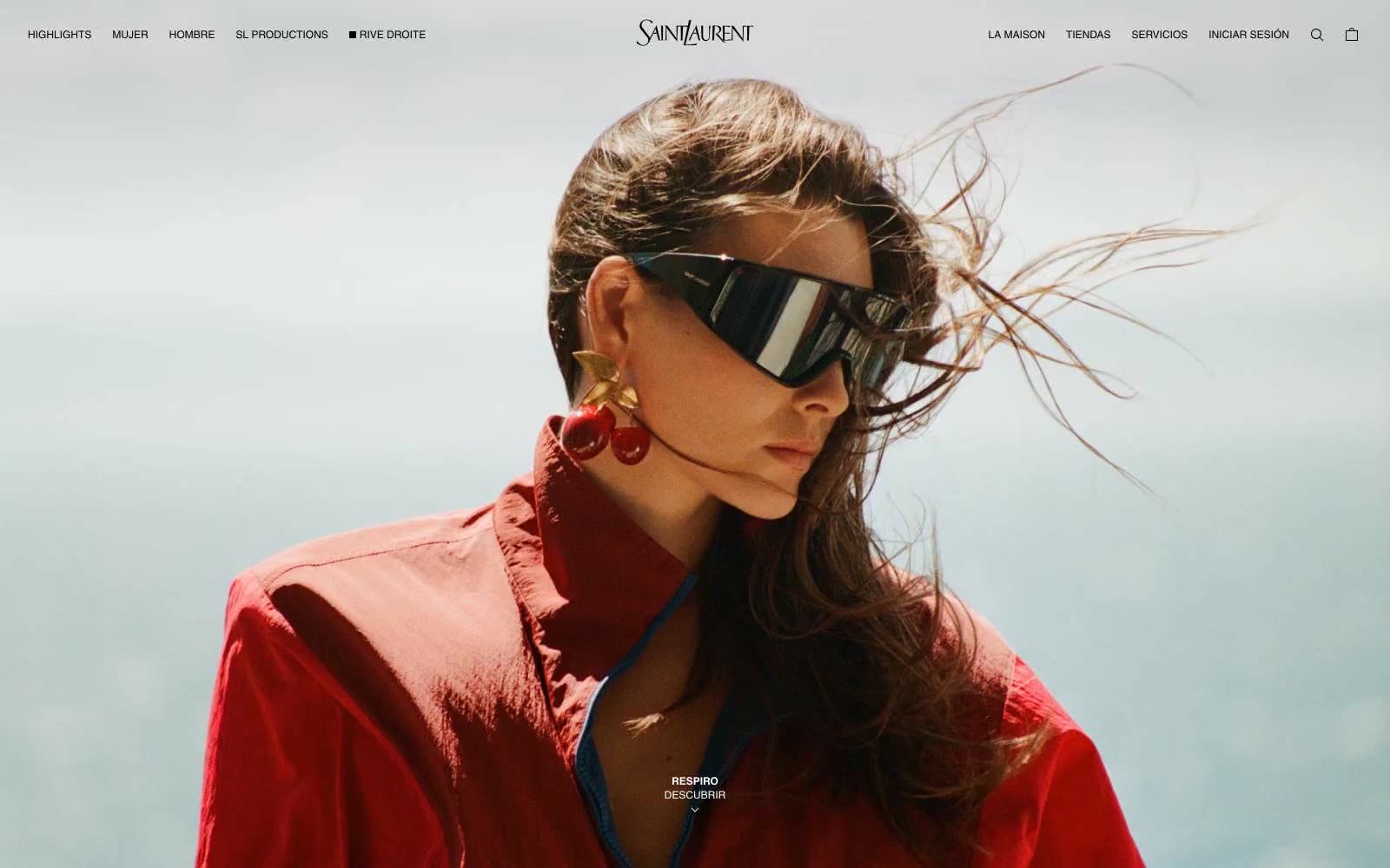
Ysl
Ysl — Style Reference
# Ysl — Style Reference
> black-and-white cinema still — a single model under a single wordmark, nothing else permitted
**Theme:** dark
YSL is a luxury fashion editorial stage where the interface dissolves into full-bleed photography and the only visible chrome is a single line of text navigation. The system is pure binary: obsidian black and pure white, with zero intermediate tones, zero shadows, zero borders, and zero decoration. Every element earns its place by carrying the brand wordmark or a functional link — there is no card, no badge, no gradient, no rounded surface. The site reads as a magazine spread: the photograph fills the screen, the YSL logotype anchors the top center, and tiny uppercase captions float near the bottom edge. Whitespace and letter-spacing do the heavy lifting that color and shadow do on conventional sites.
## Tokens — Colors
| Name | Value | Token | Role |
|------|-------|-------|------|
| Obsidian | `#000000` | `--color-obsidian` | Primary text, nav labels on light photography, footer and legal copy, card inversions, and full-bleed section dividers — the absolute dark that frames everything |
| Pure White | `#ffffff` | `--color-pure-white` | Page canvas, card surfaces, and inverse nav labels on dark photography — the negative space that lets imagery breathe |
## Tokens — Typography
Websites
Markdown Text
design-md
website-prompt
landing-page-prompt
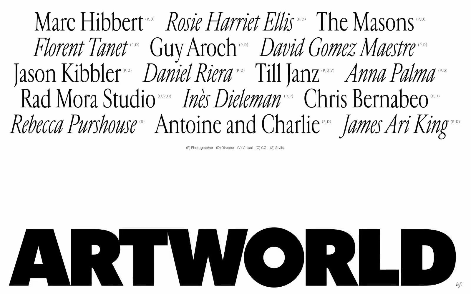
ARTWORLD
ARTWORLD — Style Reference
# ARTWORLD — Style Reference
> fashion masthead on white linen
**Theme:** light
ARTWORLD is a typographic art piece masquerading as a website — an agency masthead where the entire visual system is built from two weights of contrast: pure white paper and pure black ink. The aesthetic borrows from high-fashion editorial credits pages, where the talent roster becomes the design itself, and a single oversized wordmark anchors the composition like a magazine cover. Two type families do all the work: Cardinal Fruit (a refined display serif) provides the elegant italic voices for names, while Graphik Light at weight 300 supplies the quiet, whisper-thin supporting text — a deliberate anti-convention choice that makes the 75px display serifs feel monumental by contrast. Everything is left-aligned in a ragged editorial grid, with no color, no shadows, no rounded corners, no decoration. The system is monochrome to its bones and treats typography as the only meaningful design surface.
## Tokens — Colors
| Name | Value | Token | Role |
|------|-------|-------|------|
| Ink Black | `#000000` | `--color-ink-black` | All text, the ARTWORLD wordmark, hairline structural borders, link strokes — the only mark-making color in the entire system |
| Paper White | `#ffffff` | `--color-paper-white` | Page canvas, negative space between type, reverse text on the wordmark bar |
## Tokens — Typography
Websites
Markdown Text
design-md
website-prompt
landing-page-prompt
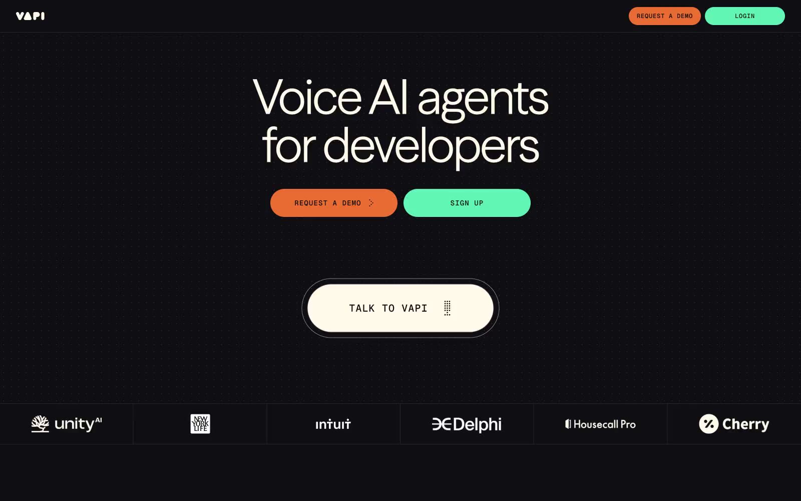
Vapi
Vapi — Style Reference
# Vapi — Style Reference
> Neon spectrogram across midnight concrete
**Theme:** dark
Vapi operates as a developer-facing voice AI platform rendered in deep midnight with a single warm cream text color and two oppositional accent fills — burnt orange and mint green. The visual language is sparse and dark: headlines whisper at weight 300 in a custom neo-grotesque, corners stay unusually tight at ~5.6px (closer to a hard rectangle than a card), and color discipline is strict except in one signature moment — a horizontal audio-waveform graphic that explodes into six vivid hues (blue, pink, yellow, violet, green, orange) to evoke a voice spectrogram. Interfaces feel like a developer console: monospaced nav labels with wide tracking, thin hairline borders, no shadows, and pill-shaped action buttons that sit on the canvas without elevation.
## Tokens — Colors
| Name | Value | Token | Role |
|------|-------|-------|------|
| Void Canvas | `#0e0e13` | `--color-void-canvas` | Page background, primary canvas — near-black with a cool ink tint that lets the cream text feel hand-set rather than digital |
| Carbon Surface | `#09090b` | `--color-carbon-surface` | Card backgrounds, inset panels, and list items — one shade deeper than the canvas to create surface depth without elevation |
| Slab Elevated | `#18181b` | `--color-slab-elevated` | Elevated surface layer, rarely visible — used only for small chips and modal-like overlays that need to sit above cards |
| Iron Border | `#27272a` | `--color-iron-border` | Primary hairline border across lists, dividers, and card edges — appears 490+ times, it is the structural skeleton of the system |
Websites
Markdown Text
design-md
website-prompt
landing-page-prompt
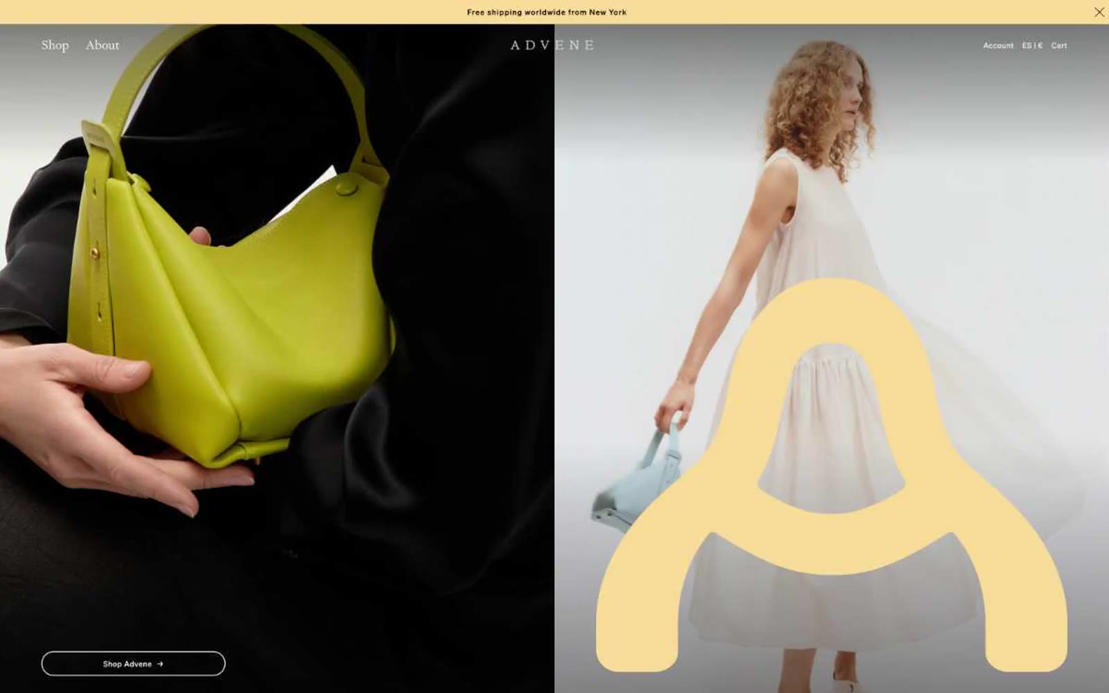
Advene
Advene — Style Reference
# Advene — Style Reference
> editorial fashion spread on warm parchment — a gallery catalog that happens to sell handbags
**Theme:** light
Advene reads as an art-gallery catalog printed on warm parchment: a luxury accessories brand whose interface behaves like an editorial spread rather than a storefront. The canvas is a muted stone-warm gray (#dfe0db) rather than clinical white, and the entire palette is pulled from natural pigments — oxblood, olive, sage, buttercream — with a single unexpected electric blue for outlined actions. Typography is a single humanist serif (Signifier) at restrained sizes, paired with a widely-tracked monospace (Pitch) for micro-labels, creating a tension between book-like body text and almost architectural small caps. Layout is full-bleed and split-screen, sections are separated by generous air rather than dividers, and imagery is treated as artwork — halftone dots, oversized letterforms, and tight portrait crops that bleed edge-to-edge. The overall effect is restrained, expensive, and deliberate: nothing is decorative, everything earns its space.
## Tokens — Colors
| Name | Value | Token | Role |
|------|-------|-------|------|
| Parchment Stone | `#dfe0db` | `--color-parchment-stone` | Primary page canvas — the warm stone-gray ground that replaces clinical white throughout the entire site |
| Bone White | `#eeefea` | `--color-bone-white` | Elevated card and section surface, one step lighter than the canvas |
| Pure White | `#ffffff` | `--color-pure-white` | Nav background, pill button fills, card surfaces needing maximum contrast against the stone canvas |
| Carbon | `#000000` | `--color-carbon` | Primary text, hairline borders, icon strokes — the dominant ink of the system |
Websites
Markdown Text
design-md
website-prompt
landing-page-prompt
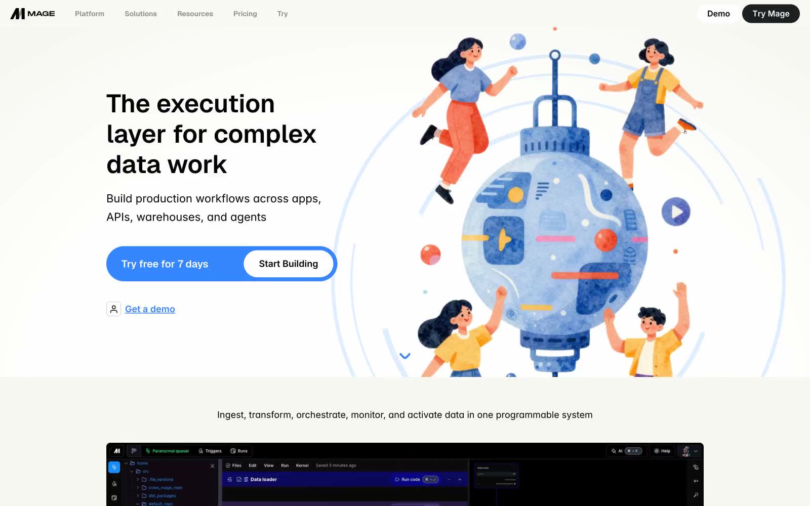
Mage
Mage — Style Reference
# Mage — Style Reference
> data alchemy on parchment. Warm off-white canvas, whisper-weight Inter headlines, one cobalt switch for action, dark-mode product islands floating inside a bright editorial page.
**Theme:** light
Mage operates on a warm parchment canvas (#f7f7f1) that gives the data-platform brand an editorial, almost lab-notebook warmth rather than the cold gray most SaaS tools default to. The interface is deliberately quiet: soft cards on a warm white field, generous breathing room, and a single vivid electric-cobalt accent (#244cff) that acts as a switch — it appears only on primary actions, nowhere else. Typography is Inter-only, used at restrained weights (400 dominates even at display sizes), which makes the large headlines feel declarative rather than shouting. Product surfaces (the pipeline editor) are dark-mode islands embedded inside the light page, creating a clear visual contract: marketing context is warm-paper light, working context is deep-graphite dark. Decorative violet (#c3aeff) threads through the brand illustration as a secondary color note, never as UI chrome.
## Tokens — Colors
| Name | Value | Token | Role |
|------|-------|-------|------|
| Electric Cobalt | `#244cff` | `--color-electric-cobalt` | Primary action fill — CTA buttons, active nav state, the single switched-on color in an otherwise muted system |
| Lavender Mist | `#c3aeff` | `--color-lavender-mist` | Brand illustration accent — decorative fills in the hero artwork and supporting graphics, echoes the cobalt at lower saturation |
| Parchment | `#f7f7f1` | `--color-parchment` | Page canvas — warm off-white background that gives the whole site its editorial, paper-like quality |
| Snow | `#ffffff` | `--color-snow` | Card surfaces, text on dark backgrounds, product thumbnail containers |
Websites
Markdown Text
design-md
website-prompt
landing-page-prompt
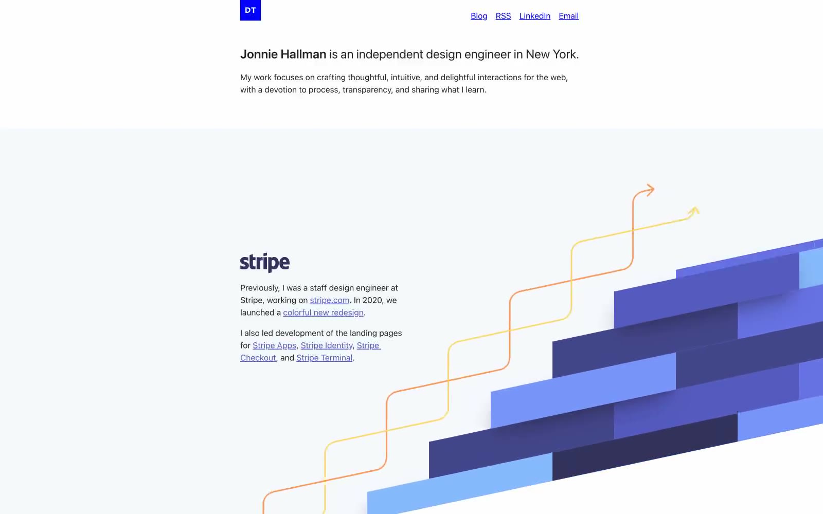
destroytoday.com
destroytoday.com — Style Reference
# destroytoday.com — Style Reference
> Designer's monograph on cream paper. A portfolio that reads like a printed document — paragraph text, underlined links, small blue initials stamp, and illustrations that arrive as full-bleed moments between blocks of writing.
**Theme:** light
A designer's personal monograph rendered as a quiet, text-first portfolio on white paper. The visual language is almost typographic: a single dark gray on warm white, a tiny blue square logo stamp, underlined links in muted indigo, and paper-warm dividers — like reading someone's printed case studies. Color only enters as illustration accent: a Stripe section with flowing yellow and orange arrows weaving through cobalt gradient blocks, a Casper product photo on bare white, a Dropbox phone mockup with carousel UI. The system deliberately refuses visual noise — no shadows, no gradients on UI, no decorative borders. What breaks the monochrome is meaningful: project imagery and the signature blue stamp that anchors identity.
## Tokens — Colors
| Name | Value | Token | Role |
|------|-------|-------|------|
| Ink Black | `#222222` | `--color-ink-black` | Primary text, nav text, body copy, image borders, dominant foreground on white canvas |
| Paper White | `#ffffff` | `--color-paper-white` | Page background, image backgrounds, the base surface every section sits on |
| Stone Border | `#d8d4cf` | `--color-stone-border` | Warm hairline dividers, image borders, subtle structural lines — the only neutral that carries a paper-warm tint |
| Pure Black | `#000000` | `--color-pure-black` | Icon fills, absolute contrast moments in illustration shadows |
Websites
Markdown Text
design-md
website-prompt
landing-page-prompt
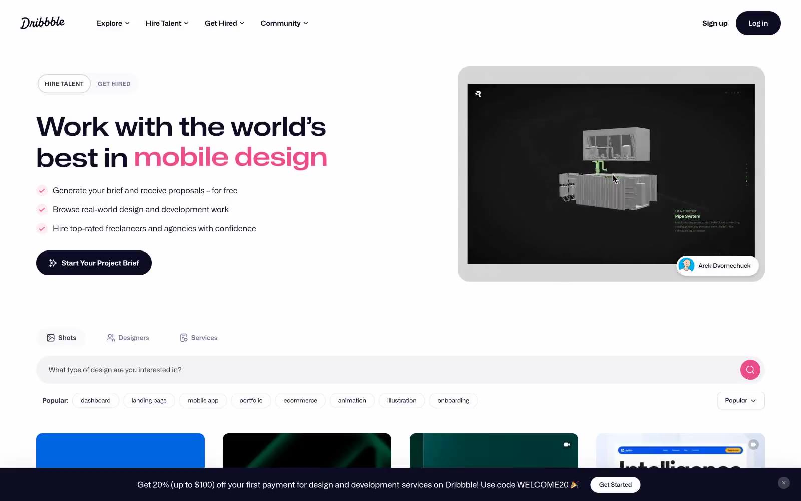
Dribbble
Dribbble — Style Reference
# Dribbble — Style Reference
> gallery wall at design week — a quiet white room where one magenta spotlight circles each piece
**Theme:** light
Dribbble reads as a curated gallery wall for creative work: white canvas, near-black typography, and one unmistakable magenta accent that marks every brand moment. The system is compact and image-first — large rounded thumbnails fill a 4-column grid while chrome stays minimal and quiet. Dark solid buttons with 8px radii carry primary actions, while the pink appears as small functional punctuation for search, PRO badges, and highlights rather than flooding large surfaces. Typography uses Mona Sans at relatively tight line heights, producing a dense scannable rhythm that lets the submitted work carry the visual weight.
## Tokens — Colors
| Name | Value | Token | Role |
|------|-------|-------|------|
| Dribbble Pink | `#ea4c89` | `--color-dribbble-pink` | Brand signature accent — search submit button, PRO badge, logo mark, active heart, hover pulses — one vivid magenta against the monochrome canvas makes the brand unmistakable at any size |
| Midnight Ink | `#0d0c22` | `--color-midnight-ink` | Primary text, filled primary buttons, dark surface fills, icon strokes — a near-black with a cool blue undertone that reads warmer than pure black against white |
| Deep Plum | `#060318` | `--color-deep-plum` | Navigation bar fill, darkest text tokens, logo wordmark — slightly cooler and deeper than Midnight Ink for the fixed header band |
| Charcoal Plum | `#3d3d4e` | `--color-charcoal-plum` | Supporting neutral for secondary UI, dividers, and muted labels. Do not promote it to the primary CTA color |
Websites
Markdown Text
design-md
website-prompt
landing-page-prompt
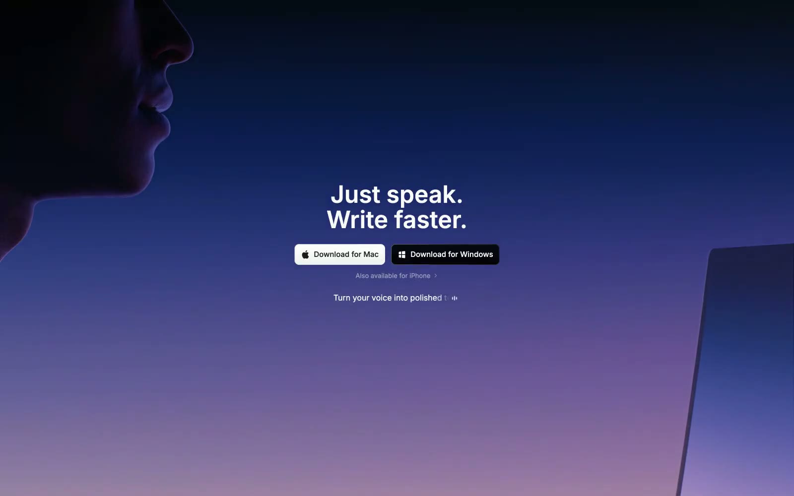
Superwhisper
Superwhisper — Style Reference
# Superwhisper — Style Reference
> aurora dissolving over midnight glass
**Theme:** dark
Superwhisper is a cinematic dark-mode product that earns its name through a hero aurora — a vertical gradient that bleeds from near-black through deep navy and violet into a dusty lavender-pink horizon, with only a shadowed silhouette of lips and a laptop edge to ground the abstraction. The whole page sits on a near-black canvas (#000000) with the hero card floating as a single rounded surface (24px radius), and every other surface is either a charcoal step up or a translucent black overlay. Inter is the only voice; display sizes use aggressive negative tracking (-3.4px at 60px) so large headlines feel compressed and confident rather than airy. Color is rationed: one electric blue (#0088ff) does the work of a traditional accent for icons, links, and small functional highlights, while white — not a chromatic color — is the primary action fill. The system is intentionally restrained, atmospheric, and product-focused, with most screens staying near-monochrome and letting the gradient hero do the emotional work.
## Tokens — Colors
| Name | Value | Token | Role |
|------|-------|-------|------|
| Electric Signal | `#0088ff` | `--color-electric-signal` | Brand accent — icons, link text, small functional highlights, inline code accents |
| Lavender Mist | `#b855e7` | `--color-lavender-mist` | Brand signature — terminal color of the hero aurora gradient, decorative washes |
| Sky Wash | `#60a5fa` | `--color-sky-wash` | Accent — subdued link blue for secondary text-level links |
| Ember | `#e6714f` | `--color-ember` | Accent — warm decorative token used sparingly in illustration/code contexts |
Websites
Markdown Text
design-md
website-prompt
landing-page-prompt
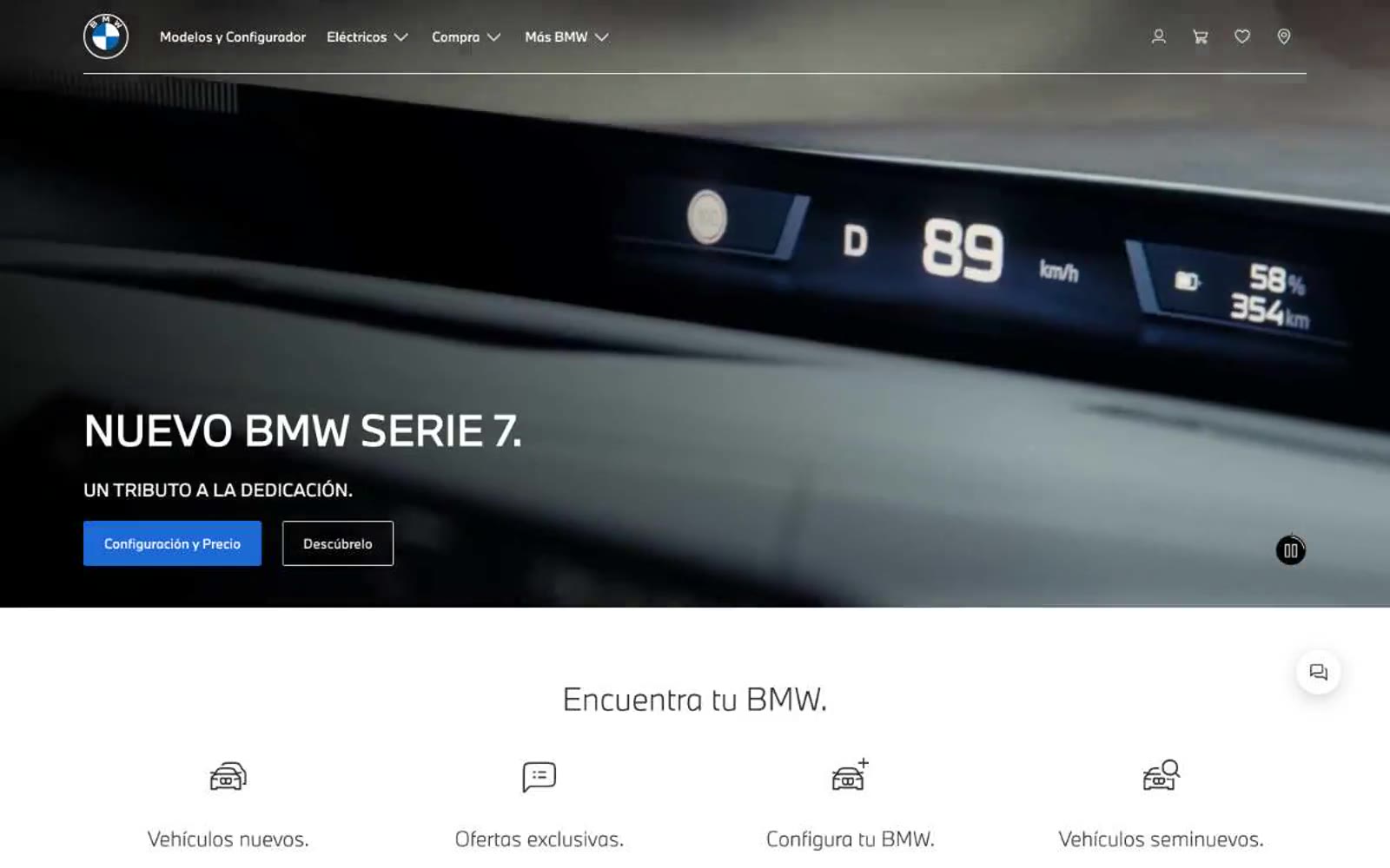
BMW.com
BMW.com — Style Reference
# BMW.com — Style Reference
> Gallery wall for sculpted metal — a typographic frame where the cars are the only color.
**Theme:** light
BMW.com uses an austere automotive showcase language: the UI recedes entirely so the product photography can speak. The interface is built from just two surfaces — pure white and a charcoal near-black — connected by a whisper-light display heading at 60px that signals premium through typographic restraint rather than weight. Every structural element (navigation, footer links, language switcher) is rendered as plain text with no decorative chrome, treating the web page as a typographic frame for the vehicles rather than a software interface. The signature choice is the 300-weight display face — a deliberate anti-convention in luxury automotive branding where most competitors default to 700–900 weights.
## Tokens — Colors
| Name | Value | Token | Role |
|------|-------|-------|------|
| Carbon | `#262626` | `--color-carbon` | Body text, footer background, heading text on light surfaces — the near-black structural anchor |
| Pure White | `#ffffff` | `--color-pure-white` | Page canvas, header background, inverted text on dark footer |
| Concrete | `#bbbbbb` | `--color-concrete` | Muted helper text and secondary dividers on white surfaces, secondary text on dark footer |
| Fog | `#f1f1f1` | `--color-fog` | Alternate surface band, subtle card background where a step up from pure white is needed |
Websites
Markdown Text
design-md
website-prompt
landing-page-prompt
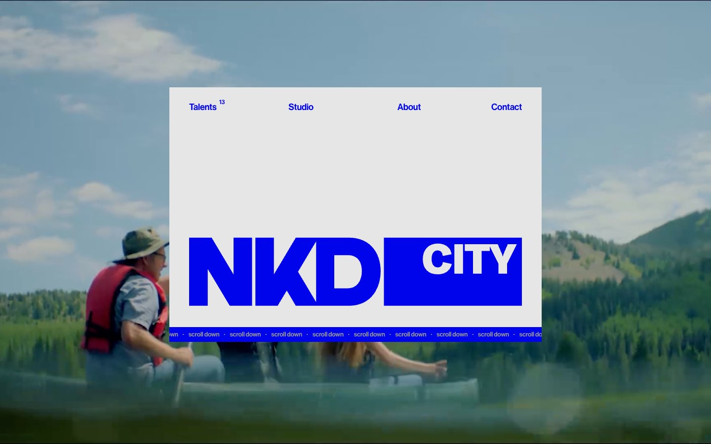
Nakedcityfilms
Nakedcityfilms — Style Reference
# Nakedcityfilms — Style Reference
> electric blue headline over cinematic void
**Theme:** mixed
Naked City Films operates as a high-contrast editorial production brand: a flat, shadowless canvas that swings between cool gray daylight and near-black midnight, anchored by a single electric blue (#0004eb) that functions as both voice and verb. Typography is the entire interface — an ultralight-to-medium neo-grotesque pairs against an italic display serif for category labels, creating a magazine-spread rhythm where giant 68px headlines sit beside 13px navigation in the same family. Layout is deliberately asymmetric, floating UI panels over full-bleed cinematic media, with generous negative space used as a compositional element rather than leftover. The system rejects decoration: no shadows, no gradients, no rounded corners — confidence comes from type weight contrast, color commitment, and scale.
## Tokens — Colors
| Name | Value | Token | Role |
|------|-------|-------|------|
| Electric Cobalt | `#0004eb` | `--color-electric-cobalt` | Headlines, nav links, logo block fill, project category labels, section accents — the only chromatic voice in the system, treated at massive scale (wordmarks, 44–68px type) to dominate every surface it touches |
| Abyssal Ink | `#050516` | `--color-abyssal-ink` | Dark section canvases, primary body text on light surfaces, reversed logo lockup — near-black with a barely-perceptible blue cast that keeps it on-brand rather than neutral |
| Bone White | `#ffffff` | `--color-bone-white` | Light section canvases, inverted text on dark and blue surfaces, floating card backgrounds over media |
| Concrete Mist | `#e6e6e6` | `--color-concrete-mist` | Primary light-mode page canvas, muted text fills, ghost-surface panels — the cool gray ground that lets the blue detonate |