AI Prompt Studio - Intelligent Prompt Library
Explore and use professional AI prompts to optimize your workflow.
One-click Use
Websites
Markdown Text
design-md
website-prompt
landing-page-prompt
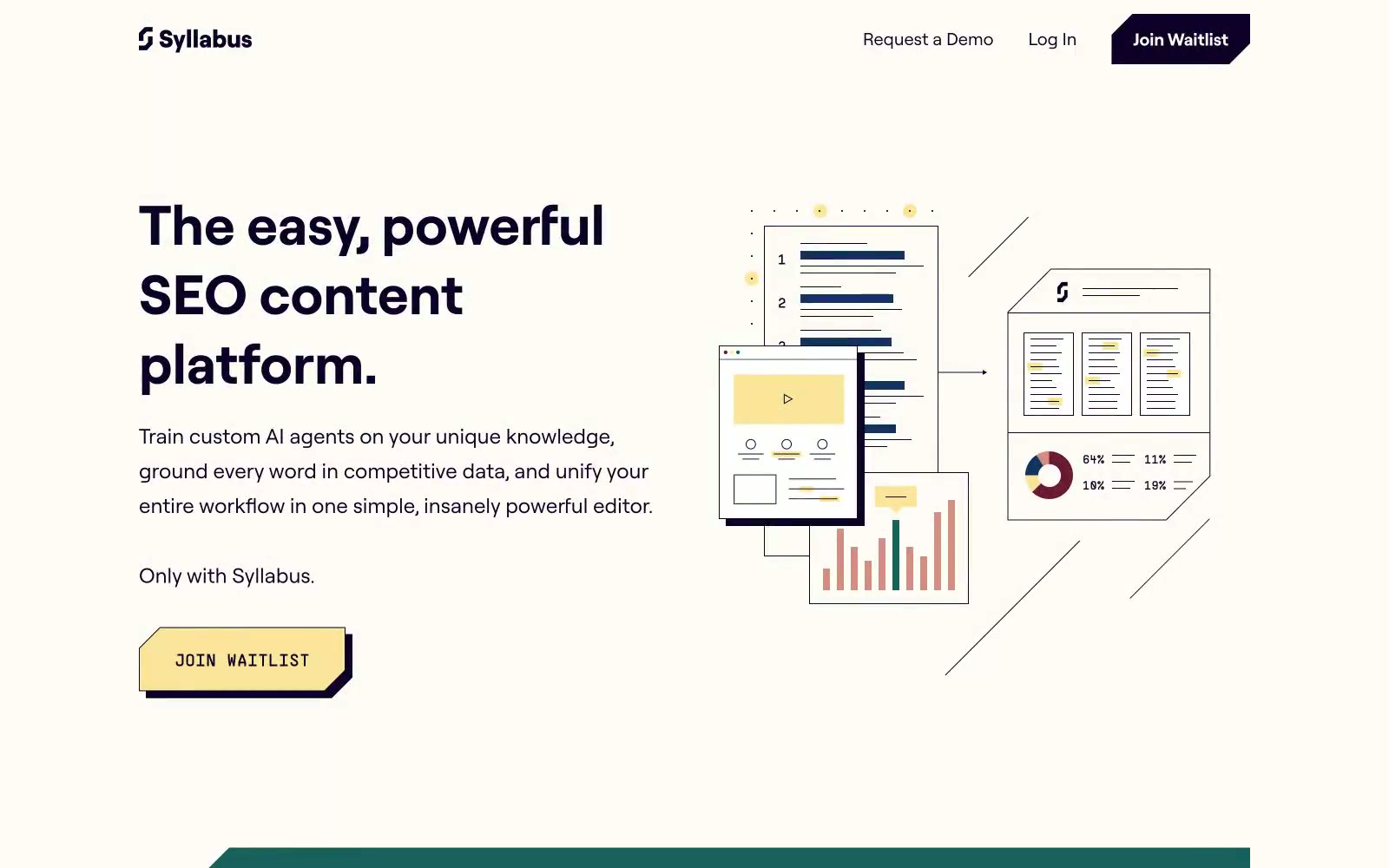
Syllabus
Syllabus — Style Reference

# Syllabus — Style Reference
> cream-paper magazine meets geometric sans-serif. Warm off-white surfaces, near-black violet ink, and one buttery yellow accent that functions as the page's only raised voice — like a sticky note pressed onto fine stationery.
**Theme:** light
Syllabus operates as a warm, editorial-tech environment: a cream paper-like canvas with deep violet as the near-black structural color, punctuated by buttery yellow interactive surfaces and teal section blocks. The aesthetic reads like a premium print magazine reinterpreted as a product — flat illustrations with selective color fills, generous vertical breathing room, and confident oversized headlines. Typography is restrained to one custom geometric sans (Roobert) that carries personality through scale jumps rather than weight contrast. The single signature trick: yellow CTA buttons with a hard offset shadow, turning every action into a physical, pressable artifact against the cream.
## Tokens — Colors
| Name | Value | Token | Role |
|------|-------|-------|------|
| Ink Violet | `#0d0129` | `--color-ink-violet` | Violet accent for outlined action borders, linked labels, and lightweight interactive emphasis. Do not promote it to the primary CTA color |
| Butter Yellow | `#fae59b` | `--color-butter-yellow` | Yellow wash for highlight backgrounds, decorative bands, and soft emphasis behind content. Do not promote it to the primary CTA color |
| Deep Teal | `#19615c` | `--color-deep-teal` | Dark section backgrounds for contrasting content blocks and nav text. Used as a full-bleed band color when a section needs to shift away from the cream canvas into a more saturated, grounded tone |
| Cream Paper | `#fffcf7` | `--color-cream-paper` | Primary page canvas and card surface — replaces the default pure white. The slight warm tint is the most distinctive choice in the system; it makes the violet ink and yellow accent feel intentional rather than stark |
Websites
Markdown Text
design-md
website-prompt
landing-page-prompt
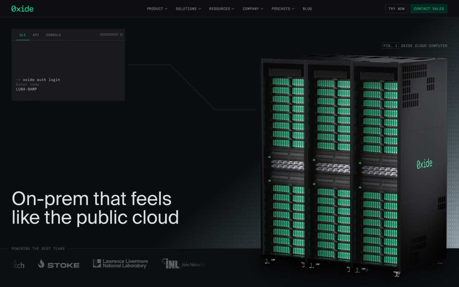
Oxide Computer Company
Oxide Computer Company — Style Reference
# Oxide Computer Company — Style Reference
> Datacenter rack at midnight with one green LED lit
**Theme:** dark
Oxide uses a terminal-grade infrastructure language: near-black canvas, razor-thin 1px hairlines, monospace labels that read like CLI output, and a single vivid green that behaves like an LED status indicator rather than a marketing accent. The site treats its own interface the way it treats its racks — exposed, functional, and free of decoration. Everything technical (tabs, badges, nav items, code, system labels) renders in GT America Mono at small sizes with wide tracking; everything human (headlines, body, marketing copy) uses SuisseIntl at comfortable sizes with tight tracking. Color is rationed: green only signals active/initialized/selected states, while magenta-tinted status lines (like 'STATUS ERROR') hint at secondary diagnostics. Surfaces are nearly flat — inset 1px strokes instead of drop shadows, no rounded corners on structural elements, and a surface stack that moves from true black through charcoal to deep teal rather than the usual gray ramp.
## Tokens — Colors
| Name | Value | Token | Role |
|------|-------|-------|------|
| Void Black | `#0b0e12` | `--color-void-black` | Page canvas, deepest background layer — absorbs everything below the fold |
| Carbon | `#181a1d` | `--color-carbon` | Card surfaces, terminal mockup backgrounds, badge fill |
| Graphite | `#1f2124` | `--color-graphite` | Elevated surface, nested panel backgrounds, subtle border against carbon |
| Slate Base | `#303235` | `--color-slate-base` | Dominant neutral — body text borders, hairlines, icon strokes, grid line color (appears 5,900+ times as borderColor) |
Websites
Markdown Text
design-md
website-prompt
landing-page-prompt
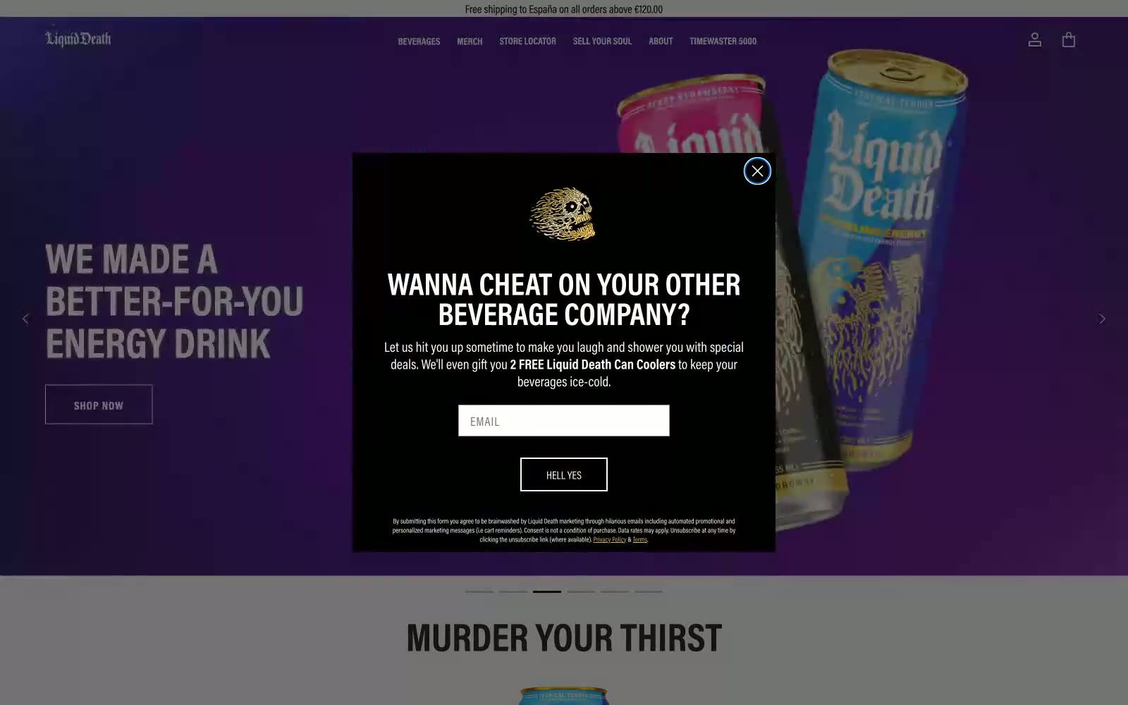
Liquid Death
Liquid Death — Style Reference
# Liquid Death — Style Reference
> Heavy Metal Vending Machine
**Theme:** mixed
This design system feels like a heavy metal concert flyer brought to life as a direct-to-consumer brand. The aesthetic is built on brutalist principles: a stark palette of pure black and white, zero rounded corners, and aggressive, uppercase typography. This creates a hard, confrontational edge, deliberately rejecting the soft, approachable look of typical beverage companies. Splashes of antique gold in logos and links are the only moments of warmth, acting like a glint of metal on a matte black surface. The layout uses full-bleed, high-contrast sections, creating a jarring, powerful rhythm that mirrors the brand's 'Murder Your Thirst' tagline.
## Tokens — Colors
| Name | Value | Token | Role |
|------|-------|-------|------|
| Death Black | `#000000` | `--color-death-black` | Primary text, core UI backgrounds, filled buttons. Establishes the dominant, aggressive tone. |
| Bone White | `#ffffff` | `--color-bone-white` | Text on dark backgrounds, primary page backgrounds. |
| Off-Black | `#151515` | `--color-off-black` | Body copy on light backgrounds, secondary UI elements. |
| Ash Gray | `#e3e3e3` | `--color-ash-gray` | Product grid background, subtle dividers. |
Websites
Markdown Text
design-md
website-prompt
landing-page-prompt
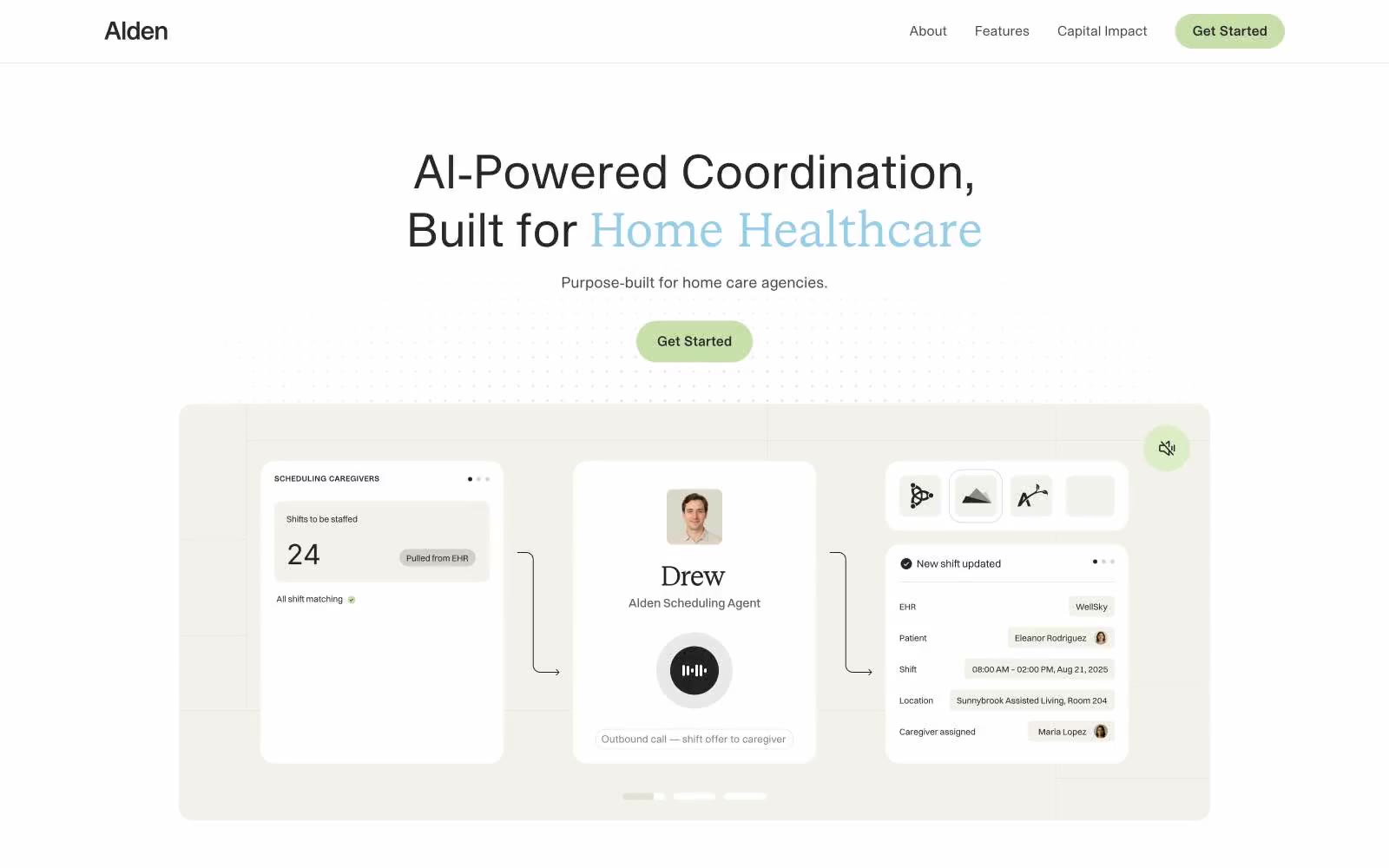
Alden
Alden — Style Reference
# Alden — Style Reference
> serene clinic on warm parchment — a page so quiet the single blue word and sage button feel like the only sound in the room
**Theme:** light
Alden operates on an editorial healthcare register: a near-white canvas warmed by a single cream parchment surface, deep near-black typography, and exactly two chromatic accents — a whisper-soft sky blue used like a highlighter on chosen words, and a muted sage green reserved for the primary action. The system is 98% achromatic and feels intentionally clinical-but-warm, closer to a premium health magazine than a SaaS dashboard. Type mixes a geometric sans for UI with a contemporary serif for the biggest headlines, tightened by consistently negative tracking so the type sits dense and confident rather than airy. Surfaces are flat with very soft card edges (16px), buttons are fully pill-shaped, and the only decorative motion is the subtle blue wash at section edges. An AI agent should treat color as punctuation, not decoration — silence is the default state.
## Tokens — Colors
| Name | Value | Token | Role |
|------|-------|-------|------|
| Parchment Cream | `#f3f1eb` | `--color-parchment-cream` | Alternate surface and product-mockup backdrop — the warm cream gives the white canvas a second, softer layer without introducing contrast noise |
| Ink Black | `#28262a` | `--color-ink-black` | Primary headings, body text, and the heaviest borders — a near-black with the faintest plum undertone, softer than pure #000 for large blocks of text |
| Graphite | `#4a4a4c` | `--color-graphite` | Secondary text, icon strokes, and lighter borders — the mid-neutral that separates captions from body without going to gray |
| Paper White | `#ffffff` | `--color-paper-white` | Page canvas and card surfaces — the dominant background across the entire system |
Websites
Markdown Text
design-md
website-prompt
landing-page-prompt
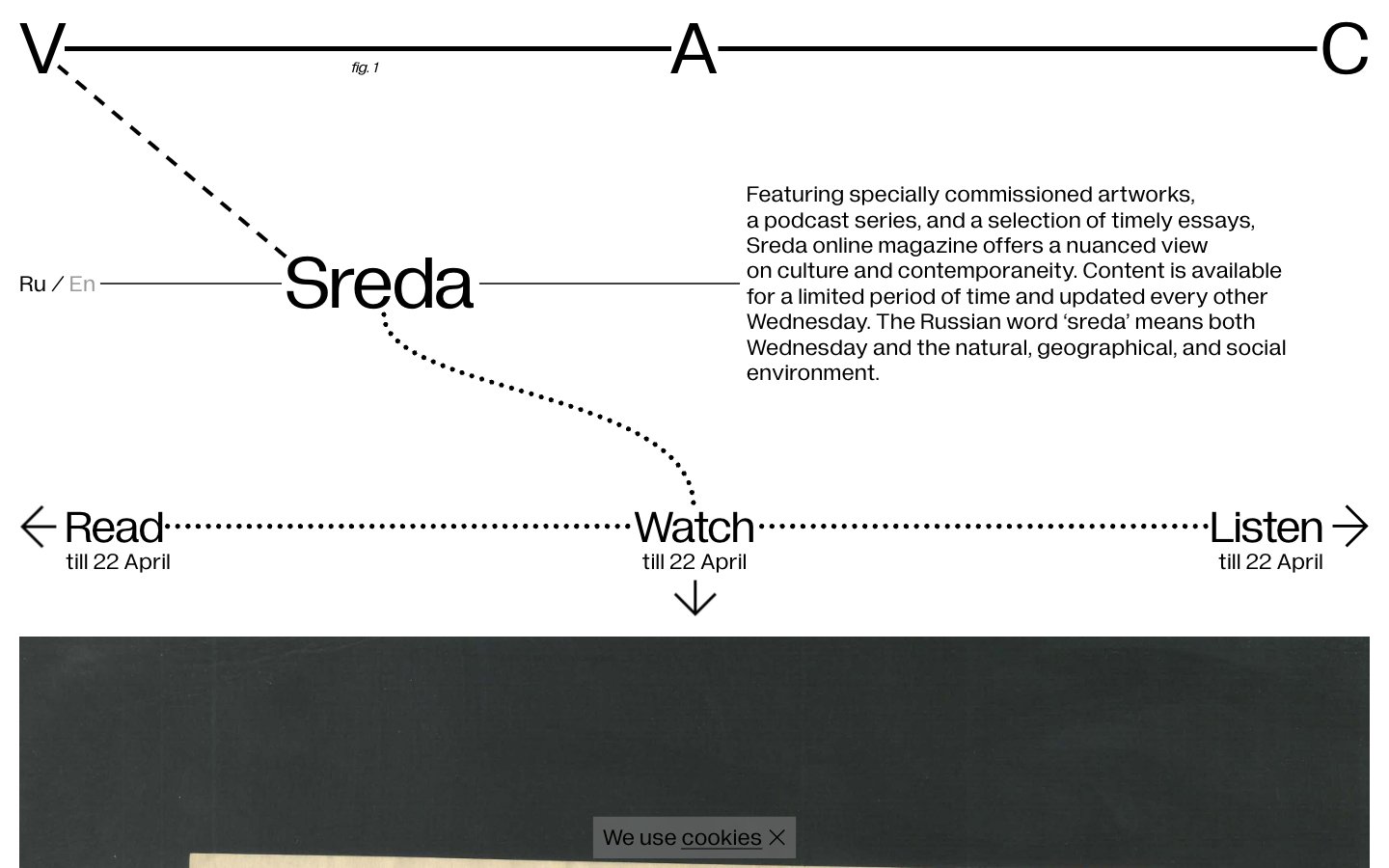
V–A–C Sreda
V–A–C Sreda — Style Reference
# V–A–C Sreda — Style Reference
> white-cube exhibition diagram — pencil-thin connectors link floating type against a white field, like a curator's wall label meets a constellation chart
**Theme:** light
V–A–C Sreda reads as a white-cube exhibition catalog translated into the browser: pure black ink on a white field, with thin dotted and dashed lines connecting headlines, captions, and navigation arrows like a hand-drawn constellation map. The composition is deliberately diagrammatic — type elements sit at variable positions linked by hairline rules rather than sitting inside conventional containers, and every UI surface is borderless and shadowless. Typography does all the structural work through two custom faces (Diagramatika Display for oversized markers, Diagramatika Text for prose), both held at weight 400, which keeps the system flat, editorial, and resistant to visual decoration. Color is never used as ornament; the only chromatic role is the faint #999999 that recedes for helper metadata. Density is comfortable and the rhythm is generous, with content floating in white space and connected by ruled connectors rather than boxed into cards or panels.
## Tokens — Colors
| Name | Value | Token | Role |
|------|-------|-------|------|
| Ink Black | `#000000` | `--color-ink-black` | Neutral form states, badge text, and quiet UI feedback where color should stay understated. Do not promote it to the primary CTA color |
| Paper White | `#ffffff` | `--color-paper-white` | Page canvas, card surfaces, and the only background color used across the system |
| Pencil Gray | `#999999` | `--color-pencil-gray` | Faded helper text and secondary metadata — recedes so primary content carries weight |
Websites
Markdown Text
design-md
website-prompt
landing-page-prompt
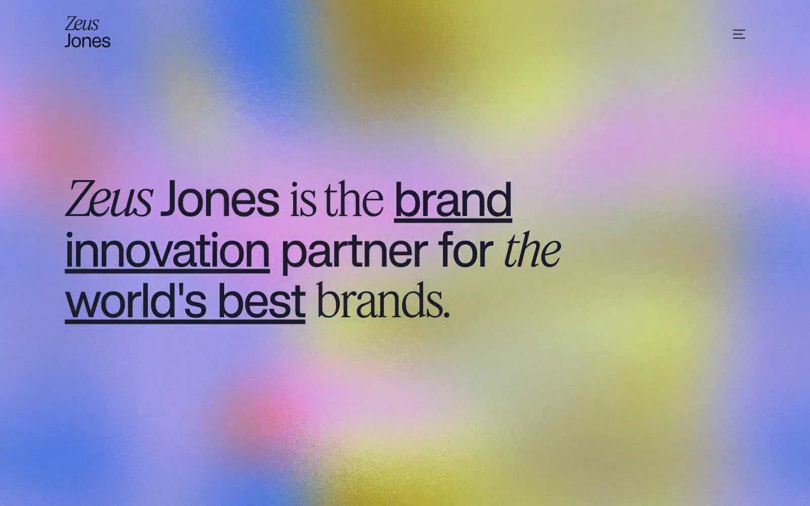
Zeus Jones
Zeus Jones — Style Reference
# Zeus Jones — Style Reference
> risograph broadsheet on warm cream — a page that prints like a zine and loads like a gallery.
**Theme:** light
Zeus Jones operates on an editorial broadsheet language: a warm cream canvas carries the entire site while one near-black ink (#1a1c2c) does all the typographic and interactive work. The signature move is weight 100 display type at 60–90px — headline copy that whispers rather than shouts, a deliberate inversion of the agency-website reflex to use bold display sans. Interactive elements are fully rounded pills; cards, images, and tags share a 20px radius. Shadows are absent — the design uses border weight and type contrast for separation. The hero breaks the monochrome with a single full-bleed aurora of color, but every section below it returns to the quiet cream-and-ink discipline, with underlined sans-serif and serif italic used as editorial emphasis devices.
## Tokens — Colors
| Name | Value | Token | Role |
|------|-------|-------|------|
| Midnight Ink | `#1a1c2c` | `--color-midnight-ink` | Primary text, filled pill buttons, hairline borders, dark surfaces — the only chromatic color in the system; near-black with a barely-perceptible cool navy cast that softens the contrast against warm cream without losing the gravitas of pure black |
| Warm Parchment | `#fcfaf3` | `--color-warm-parchment` | Page canvas and light surface base — a creamy off-white that replaces the default SaaS pure-white with paper warmth, making the page feel printed rather than rendered |
| Soft Linen | `#ebe9e4` | `--color-soft-linen` | Elevated card and panel surface — one step darker than the canvas, used sparingly to lift a card or a section band without introducing a new color |
| Obsidian | `#000000` | `--color-obsidian` | SVG icon fills and decorative monochrome marks — reserved for vector assets where true black reads cleaner than the navy-tinted Midnight Ink |
Websites
Markdown Text
design-md
website-prompt
landing-page-prompt
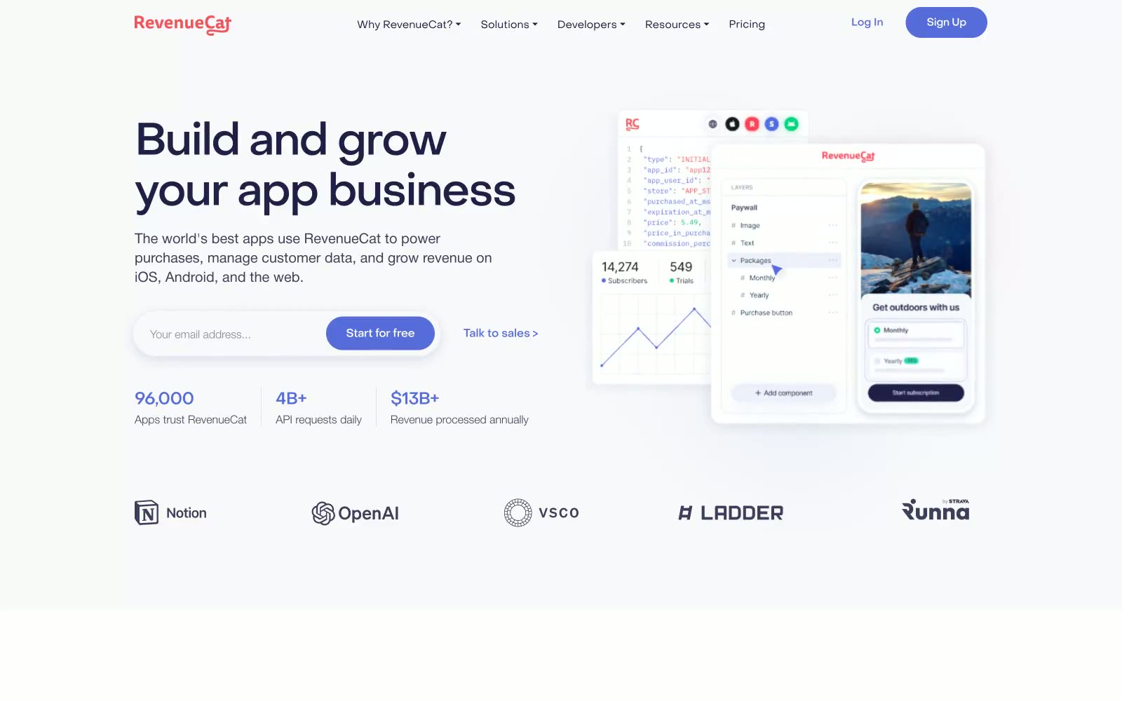
Revenuecat
Revenuecat — Style Reference
# Revenuecat — Style Reference
> Periwinkle dashboard on a cloud-white canvas — generous, airy, and confidently understated.
**Theme:** light
RevenueCat speaks in a calm, developer-trusted visual register: cloud-white canvases, deep-navy ink, and a single periwinkle accent that carries every interactive moment. The headline voice is generous and oversized (up to 80px) but whispers through ultra-light weights and tight negative tracking, letting the typographic mass do the work that color and decoration normally would. Surfaces are flat and airy — soft cards on a near-white field with violet-tinted ambient shadows — and the whole system leans on shape (16px corners, 9999px pill buttons) rather than chrome to define hierarchy. Warm coral red and mint green appear as quiet decorative punctuation for category icons and chart highlights, never competing with the periwinkle for interactive priority.
## Tokens — Colors
| Name | Value | Token | Role |
|------|-------|-------|------|
| Periwinkle Signal | `#576cdb` | `--color-periwinkle-signal` | Violet supporting accent for decorative details and low-frequency emphasis. Do not promote it to the primary CTA color |
| Deep Indigo | `#1f1f47` | `--color-deep-indigo` | Primary heading text, nav links, high-emphasis body — anchors the palette with near-black authority carrying a faint cool tint |
| Storm Violet | `#3d3d5c` | `--color-storm-violet` | Secondary text, input values, subdued body copy — sits between indigo and gray for medium-emphasis reading |
| Slate | `#575775` | `--color-slate` | Muted inline links, secondary metadata, caption-level annotations |
Websites
Markdown Text
design-md
website-prompt
landing-page-prompt
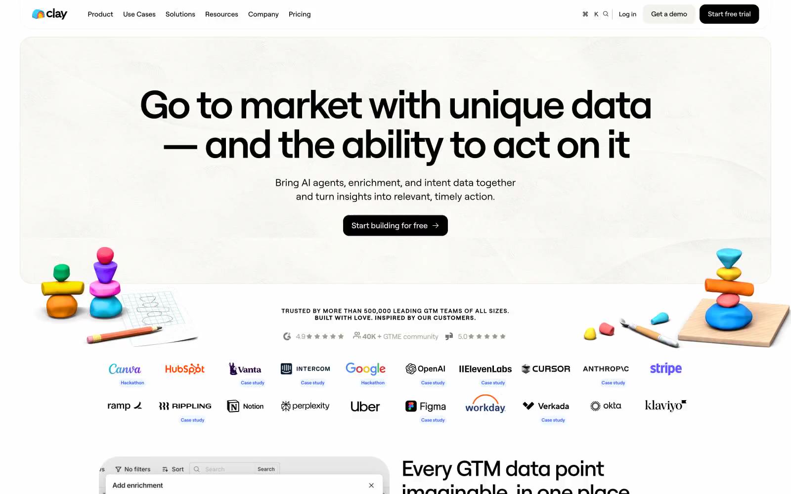
Clay
Clay — Style Reference
# Clay — Style Reference
> Bright playroom of clay shapes on white paper. A monochrome workspace punctuated by vivid, hand-rolled chromatic objects that feel weighty and tactile.
**Theme:** light
Clay uses a bright, tactile workspace language: white canvas with weighty black type, pill-shaped controls, and a vivid violet accent (#3859f9) that powers links, key callouts, and inline emphasis. Most surfaces stay monochrome — warm cream (#f9f8f6) cards on pure white with soft beige borders (#dad4c8) — while chromatic moments arrive as full-bleed colored testimonial cards in lime, orange, cyan, and magenta, like individual clay sculptures placed on a clean table. Components feel hand-shaped rather than pixel-perfect: generous border radii (12–40px), near-zero elevation, and tight negative tracking on large display sizes. The overall feel is energetic and confident without being decorative — color is reserved for social proof and brand moments, not for functional UI.
## Tokens — Colors
| Name | Value | Token | Role |
|------|-------|-------|------|
| Ink Black | `#000000` | `--color-ink-black` | Dark supporting neutral for text, icons, and strong contrast. Do not promote it to the primary CTA color |
| Paper White | `#ffffff` | `--color-paper-white` | Page canvas, card surfaces, button text on dark fills, inverted text on color |
| Warm Cream | `#f9f8f6` | `--color-warm-cream` | Soft surface variant for feature cards, footer background, and off-white panels — gives the white space a paper-like warmth |
| Sand Border | `#dad4c8` | `--color-sand-border` | Primary hairline border and divider — warm beige rather than cool gray, keeps the system from feeling sterile |
Websites
Markdown Text
design-md
website-prompt
landing-page-prompt
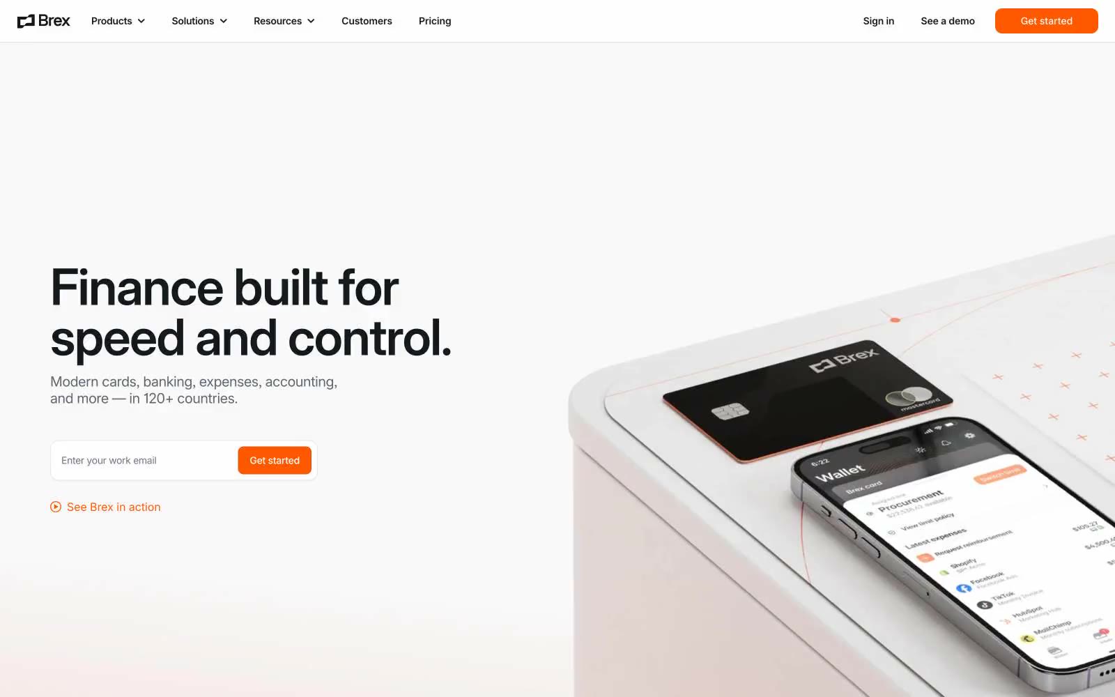
Brex
Brex — Style Reference
# Brex — Style Reference
> White concrete, single ember — a clinical financial instrument where one orange spark does all the talking.
**Theme:** light
Brex is a white concrete financial workbench lit by a single orange ember. The interface lives on a near-pure white canvas with tight, almost compressed Inter type and a custom Flecha display face, and the only chromatic voice in the system is #ff5900 — a vivid ember that marks every primary action, link, and tab indicator without ever becoming decorative. Dark surfaces (#000710 footer, #15191 announcement bar) frame the bright body, creating a hard light/dark bookend that makes the white sections feel taller. Components are flat with a 12px radius, minimal shadows, hairline borders, and generous 48px section gaps — the system is designed to feel like a precision instrument for finance teams, not a marketing site.
## Tokens — Colors
| Name | Value | Token | Role |
|------|-------|-------|------|
| Ember | `#ff5900` | `--color-ember` | Orange supporting accent for decorative details and low-frequency emphasis; Orange supporting accent for decorative details and low-frequency emphasis. |
| Abyss | `#000710` | `--color-abyss` | Footer background, deepest dark surface — a near-black with a barely-perceptible blue cast that distinguishes it from pure black at section transitions |
| Carbon | `#15191e` | `--color-carbon` | Announcement bar, dark mode headers, elevated dark surfaces — softer than Abyss, used where dark needs to feel like product chrome rather than footer |
| Ink | `#000000` | `--color-ink` | Primary headings, body text, heavy borders — the dominant text color across light surfaces |
Websites
Markdown Text
design-md
website-prompt
landing-page-prompt
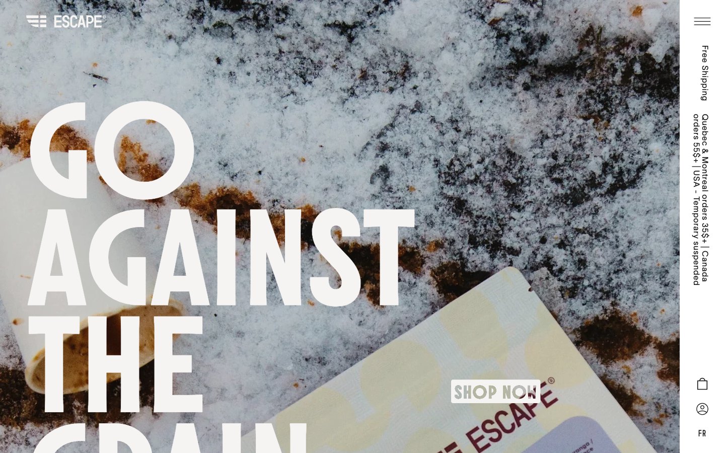
Escape Coffee Company
Escape Coffee Company — Style Reference
# Escape Coffee Company — Style Reference
> Frost-bleached editorial broadsheet — large display type cut into warm off-white, all atmosphere carried by raw photography.
**Theme:** light
Escape is a monochromatic, editorial system built around weather-worn photography and three custom typefaces that do the heavy lifting. The canvas is a warm off-white (#f5f4f2) rather than pure white, giving every page the feel of a sun-bleached magazine spread rather than a SaaS dashboard. Molitor at 250px carries the emotional weight — oversized, tightly leaded (0.85), and slightly negative-tracked so the type feels cut from stone — while TWK Lausanne at near-light weights (200–300) handles everything functional with the restraint of a printed caption. Color is deliberately absent: the entire palette is warm grays from #ffffff to #151515, and accents arrive only as the texture of the imagery itself (snow, stone, coffee grounds). Components are minimal and geometric: thin borders, no elevation, tiny radii (3–10px), and generous whitespace. The system never decorates — it curates.
## Tokens — Colors
| Name | Value | Token | Role |
|------|-------|-------|------|
| Bone | `#f5f4f2` | `--color-bone` | Primary canvas, page background, section surfaces — warm off-white replaces pure white to give every page a printed, slightly weathered feel |
| Ink | `#151515` | `--color-ink` | High-contrast neutral action fill for primary buttons on light surfaces. |
| Ash | `#ebe9e6` | `--color-ash` | Secondary surface, input fills, subtle dividers, disabled states — one step darker than Bone, used to separate zones without introducing color |
| Paper | `#ffffff` | `--color-paper` | Card surfaces, elevated panels, reverse text on dark images — true white reserved for surface lift against the warm canvas |
Websites
Markdown Text
design-md
website-prompt
landing-page-prompt
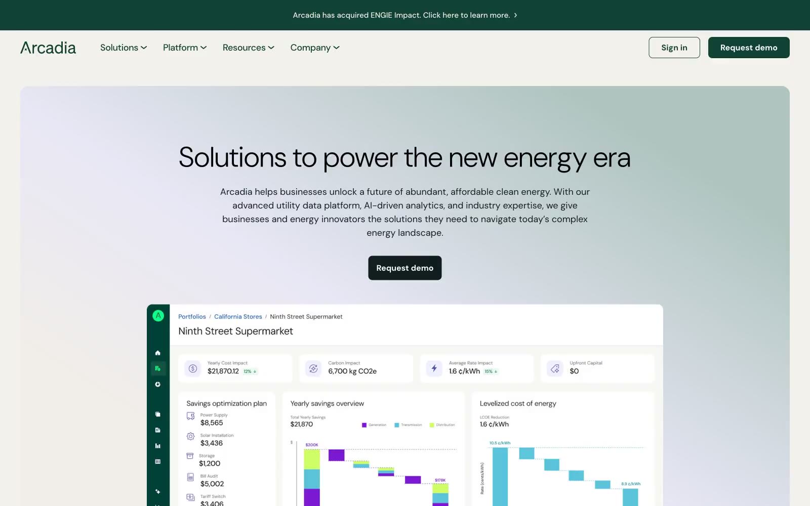
Arcadia
Arcadia — Style Reference
# Arcadia — Style Reference
> forest observatory at dawn — deep evergreen authority on warm cream paper, one mint LED accent and pale violet data orbs suspended in soft morning light.
**Theme:** light
Arcadia is a clean-energy observatory rendered in warm light: an off-white cream canvas with deep forest-green authority, one electric-mint accent that switches actions on like an LED, and violet used sparingly for decorative data-orb highlights. The system feels measured and considered — DM Sans at restrained weights, generous 24-40px breathing room, and a 16px radius that rounds corners enough to feel modern but not playful. Hero sections dissolve into ultra-soft sage-to-cream gradients, and product surfaces are flat white with thin sage borders rather than shadowed cards. Decorative moments — floating orb networks, isometric energy illustrations, bar charts — carry the visual interest, while the interface itself stays quiet, editorial, and high-trust.
## Tokens — Colors
| Name | Value | Token | Role |
|------|-------|-------|------|
| Canopy | `#104336` | `--color-canopy` | Primary brand — announcement bar, nav strip, primary CTA fill, section borders. The deep evergreen reads as institutional and environmental at once: it is the only saturated color the interface wears as a uniform, giving every page an authoritative dark-green header band |
| Mint Pulse | `#0fff87` | `--color-mint-pulse` | Accent / secondary action — vivid electric-mint button fill, eyebrow label text, decorative highlights. Against the forest-green chrome, mint reads as a switched-on LED; use it only where the UI needs to feel powered or selected |
| Orb Violet | `#7c18d3` | `--color-orb-violet` | Decorative data accent — floating sphere fills, chart highlights, illustrated node markers. Violet is the only non-green chromatic and appears only on ornamental 3D orbs and chart accents, never on controls |
| Cream Paper | `#f3f1ec` | `--color-cream-paper` | Canvas / soft surface — primary page background on hero and section bands. Slightly warm so the page never reads as sterile white |
Websites
Markdown Text
design-md
website-prompt
landing-page-prompt
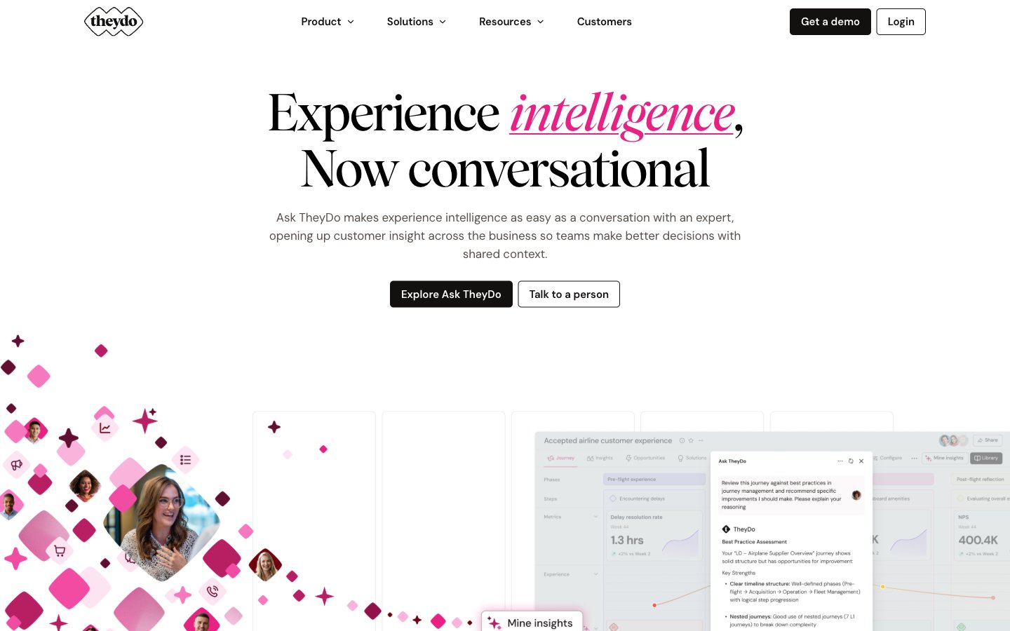
TheyDo
TheyDo — Style Reference
# TheyDo — Style Reference
> Blush editorial spread with magenta confetti. Warm pink paper, serif headlines, a single hot-pink accent that only outlines and whispers — never shouts.
**Theme:** light
TheyDo reads as an editorial product page printed on warm blush paper: a soft #fce7f3 canvas (never cold white) carries a confident serif headline (Wulkan) that pairs with a pragmatic sans (DM Sans) for body and UI. The visual identity is built on a single saturated hot-pink (#e82183) used exclusively as outline, stroke, and italic accent — never as a filled surface — which keeps the interface calm while still feeling branded. Floating magenta diamond motifs (echoing the TheyDo logo mark) scatter across the hero like confetti, establishing a playful geometry that recurs in card borders and section dividers. Components are flat and border-driven: 8px corners, 1px hairline rules (#c6c3c3 or pink tints), no shadows, and dark charcoal filled buttons (#131110) as the single primary action. The rhythm is generous — 80px between sections, 15–20px within cards — producing a spacious, magazine-like cadence rather than a dense SaaS dashboard.
## Tokens — Colors
| Name | Value | Token | Role |
|------|-------|-------|------|
| Blush Paper | `#fce7f3` | `--color-blush-paper` | Primary page canvas, hero washes, and large background blocks — the warm off-white that replaces cold #ffffff in most full-page contexts |
| Pure White | `#ffffff` | `--color-pure-white` | Card surfaces, button text on dark fills, and the contrast layer that sits on top of the blush canvas inside containers |
| Charcoal Ink | `#131110` | `--color-charcoal-ink` | Primary text, filled primary-action buttons (Get a demo, Explore Ask TheyDo), and the nav's dark CTA — the heaviest value in the system |
| Black | `#000000` | `--color-black` | Secondary text color, icon strokes, and sharp typographic accents where maximum weight is needed without warmth |
Websites
Markdown Text
design-md
website-prompt
landing-page-prompt
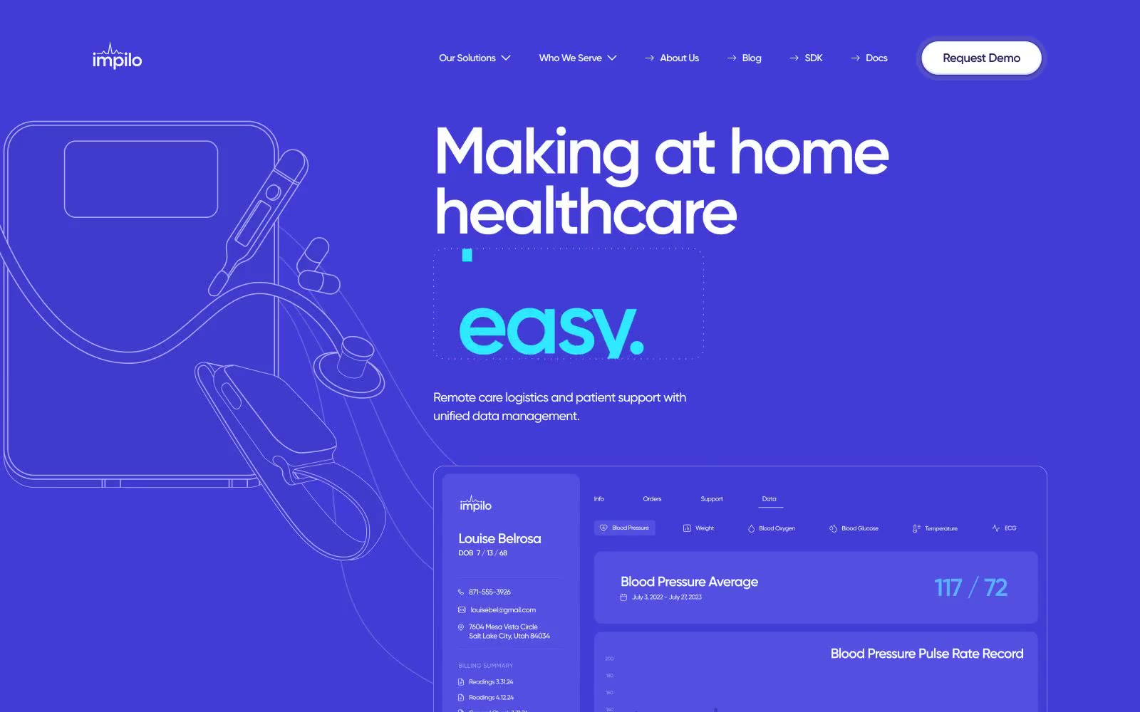
Impilo
Impilo — Style Reference
# Impilo — Style Reference
> Midnight clinical observatory — a violet command console where health data glows in cyan.
**Theme:** dark
Impilo operates in a deep midnight-violet universe where the canvas itself (#16165c) carries the brand — there is no white default, only progressively lighter violet surfaces stacking toward #f4f4f6 for inverted sections. A single typeface (Gilroy) speaks in two voices: weight 500 for running text and weight 600 for display, with aggressive negative tracking at large sizes that makes headlines feel engineered rather than written. The accent system is a clinical triad — cyan #00b1ff for data and links, mint #00ffaa for positive states, and a lighter violet #b1a6f6 for line-art illustration — so color never decorates, it always means something. Surfaces are pill-soft (1425px buttons, 24-32px cards) and float on ambient violet shadows rather than neutral grays, keeping every elevation on-brand.
## Tokens — Colors
| Name | Value | Token | Role |
|------|-------|-------|------|
| Deep Iris | `#16165c` | `--color-deep-iris` | Page canvas, hero background, primary surface — the brand-defining midnight violet that sets the entire dark mode identity |
| Iris Shadow | `#232269` | `--color-iris-shadow` | Elevated card surfaces on dark canvas, secondary card backgrounds — one step lighter than canvas for depth without breaking the violet atmosphere |
| Iris Glow | `#403cd5` | `--color-iris-glow` | Mid-tone accent surface, footer background, highlighted metric blocks — mid-violet for tertiary elevation and accent fills |
| Iris Pulse | `#5350cc` | `--color-iris-pulse` | Violet action color for filled buttons, selected navigation states, and focused conversion moments. |
Websites
Markdown Text
design-md
website-prompt
landing-page-prompt
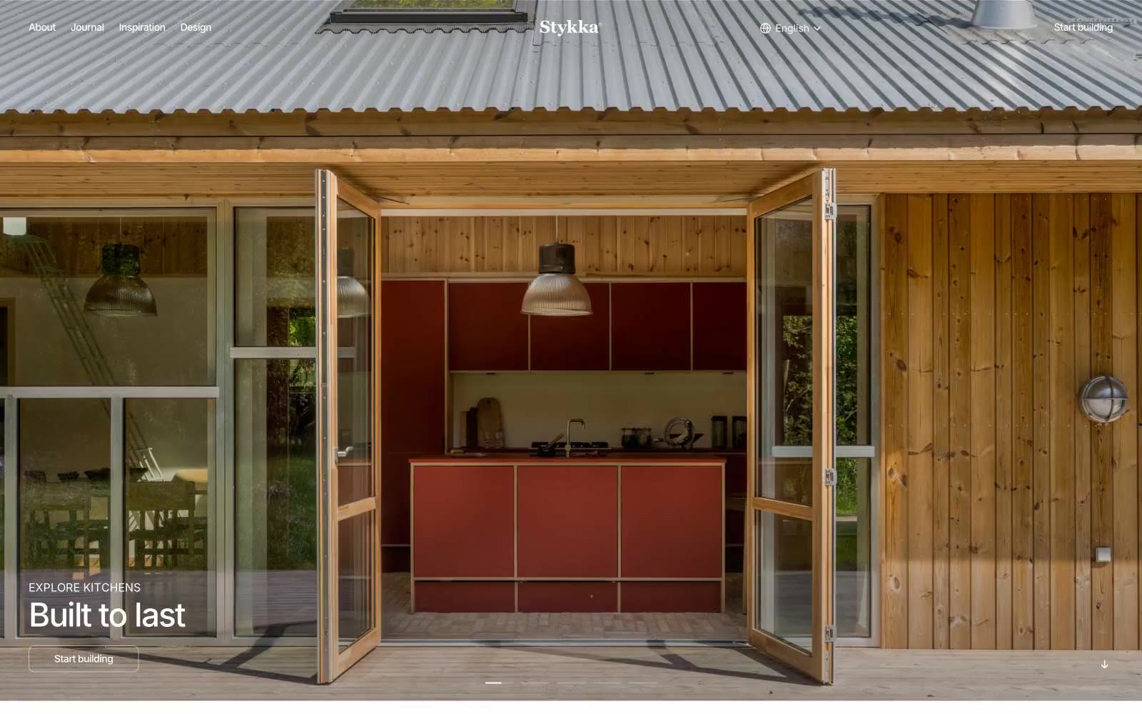
Stykka
Stykka — Style Reference
# Stykka — Style Reference
> Scandi atelier under white light — a quiet, hand-built showroom where the only voice is the photograph
**Theme:** light
Stykka is a Scandinavian kitchen brand that treats the interface like a museum catalog: pure white canvas, black hairline borders, and full-bleed photography that carries every ounce of warmth, color, and craft. The UI is deliberately invisible — there is no accent color, no decoration, no shadow stack — so that the kitchens in the imagery feel like the only subject on screen. Typography does the talking: Inter at tight negative tracking on large display sizes, uppercase tracked labels for section openers, and a system fallback for the tiniest metadata. Spacing is compact and editorial, with 10px gaps between elements and generous white space at the section level. Everything from the nav to the feature grid to the outlined CTA assumes a black-and-white photograph will do the emotional heavy lifting — the system stays out of the way.
## Tokens — Colors
| Name | Value | Token | Role |
|------|-------|-------|------|
| Press Black | `#000000` | `--color-press-black` | Primary text, 1px hairlines, icon strokes, outlined button borders. The structural ink of the entire system — every border, every label, every headline resolves to this single value |
| Gallery White | `#ffffff` | `--color-gallery-white` | Page canvas, card surfaces, button text on dark surfaces, inverse overlay backgrounds. The unbroken ground on which every photograph sits |
| Plate Gray | `#b8b8b8` | `--color-plate-gray` | Subtle disabled state, placeholder fill, secondary metadata. Reads as 10.6:1 on black (safe for muted labels) but only 2.0:1 on white — never use as body text on the default canvas |
Websites
Markdown Text
design-md
website-prompt
landing-page-prompt
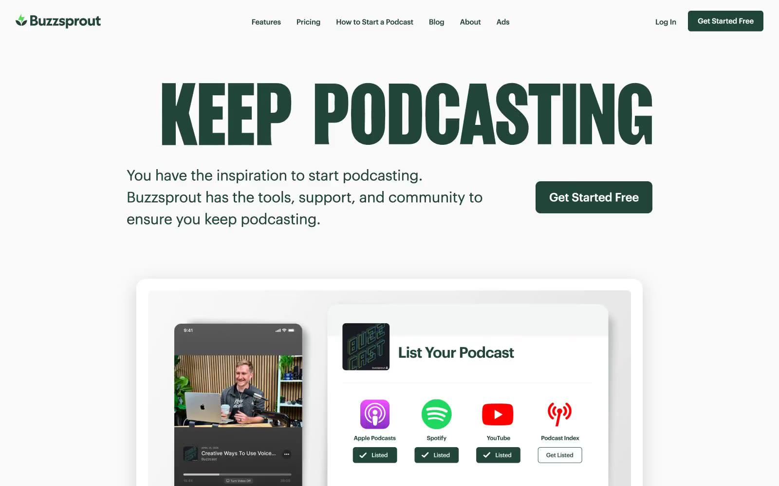
Free Podcast Hosting
Free Podcast Hosting — Style Reference
# Free Podcast Hosting — Style Reference
> Botanical broadcast studio — a forest-green command console on white paper, anchored by a massive condensed-serif headline that reads like a magazine cover for audio.
**Theme:** light
Buzzsprout's design language is a quiet, editorial command center for audio creators: a white canvas overlaid with a single deep botanical green (#214538) that carries every brand action and headline. The interface is deliberately sparse, leaning on generous whitespace, hairline #e4e5e6 borders, and soft 8px radii to build a sense of calm professionalism. Typography is the signature element — a condensed serif display face (Girott) shouting at 168px sits against the practical geometric sans (Graphik) handling everything else, creating a magazine-meets-dashboard tension. Color is used as punctuation, not decoration: green appears only on CTAs, active states, brand marks, and key links, while body text stays in a near-black green-tinted ink (#151e1b) and helper copy drops to #4d4d4f. The rhythm alternates between bright white product sections and a single dark photographic band, giving the page a focused, almost meditative feel rather than a marketing-firehose energy.
## Tokens — Colors
| Name | Value | Token | Role |
|------|-------|-------|------|
| Forest Canopy | `#214538` | `--color-forest-canopy` | Primary brand action — CTA button fills, nav text, active tab indicators, brand icons, link hovers, section headings. Deep botanical green against white gives every action weight without aggression |
| Studio Ink | `#151e1b` | `--color-studio-ink` | Primary body and heading text. Slightly green-tinted near-black reads as quieter than pure #000, harmonizing with the brand green instead of fighting it |
| Graphite Body | `#4d4d4f` | `--color-graphite-body` | Secondary and helper text — descriptions, captions, supporting copy under headings and feature labels |
| Ash Border | `#e4e5e6` | `--color-ash-border` | Default hairline border for cards, inputs, nav containers, list dividers, and button outlines. The structural skeleton of the interface |
Websites
Markdown Text
design-md
website-prompt
landing-page-prompt
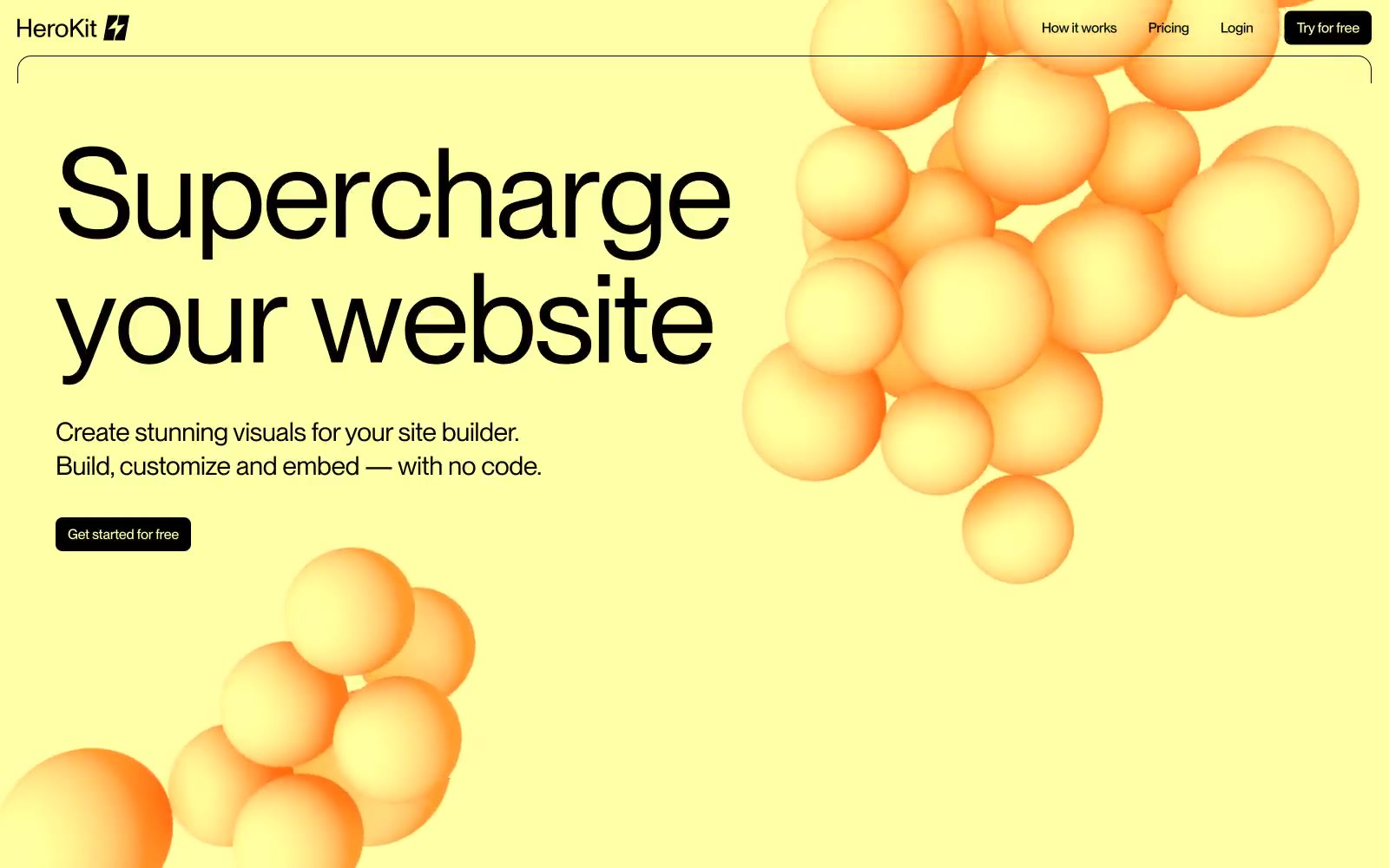
HeroKit
HeroKit — Style Reference
# HeroKit — Style Reference
> Pale lemon neon on an obsidian void — an editorial poster that happens to be a product page.
**Theme:** dark
HeroKit uses an obsidian-canvas, neon-punctuation language: pure black surfaces swallow the page, and a single pale lemon yellow #ffffa7 is the entire chromatic vocabulary for action and brand identity. Display type is huge, tight-tracked PP Neue Montreal at 100–120px with negative tracking around -4.8px, giving headlines a compressed, editorial-poster feel that dominates the hero and section openers. The product speaks through 3D bubbly, organic renders rather than photography or flat illustration, floating against the void like jellyfish under spotlight. Components stay light: thin borders, 8px radii, no drop shadows, no gradients — structure is implied through contrast and whitespace rather than elevation. Density is generous; the site breathes because the product visuals do the heavy work.
## Tokens — Colors
| Name | Value | Token | Role |
|------|-------|-------|------|
| Pale Lemon | `#ffffa7` | `--color-pale-lemon` | Primary action fill, brand accent, hero section wash, badge labels — the single chromatic voice of the entire system |
| Electric Yellow | `#fddd05` | `--color-electric-yellow` | Yellow outline accent for tags, dividers, and focused UI edges. Do not promote it to the primary CTA color |
| Obsidian | `#000000` | `--color-obsidian` | Page canvas, card surfaces, text on light fills, hairline dividers, image borders — the base everything floats on |
| Paper | `#ffffff` | `--color-paper` | Primary text on dark, card surface alt, heading strokes, inverted button text |
Websites
Markdown Text
design-md
website-prompt
landing-page-prompt
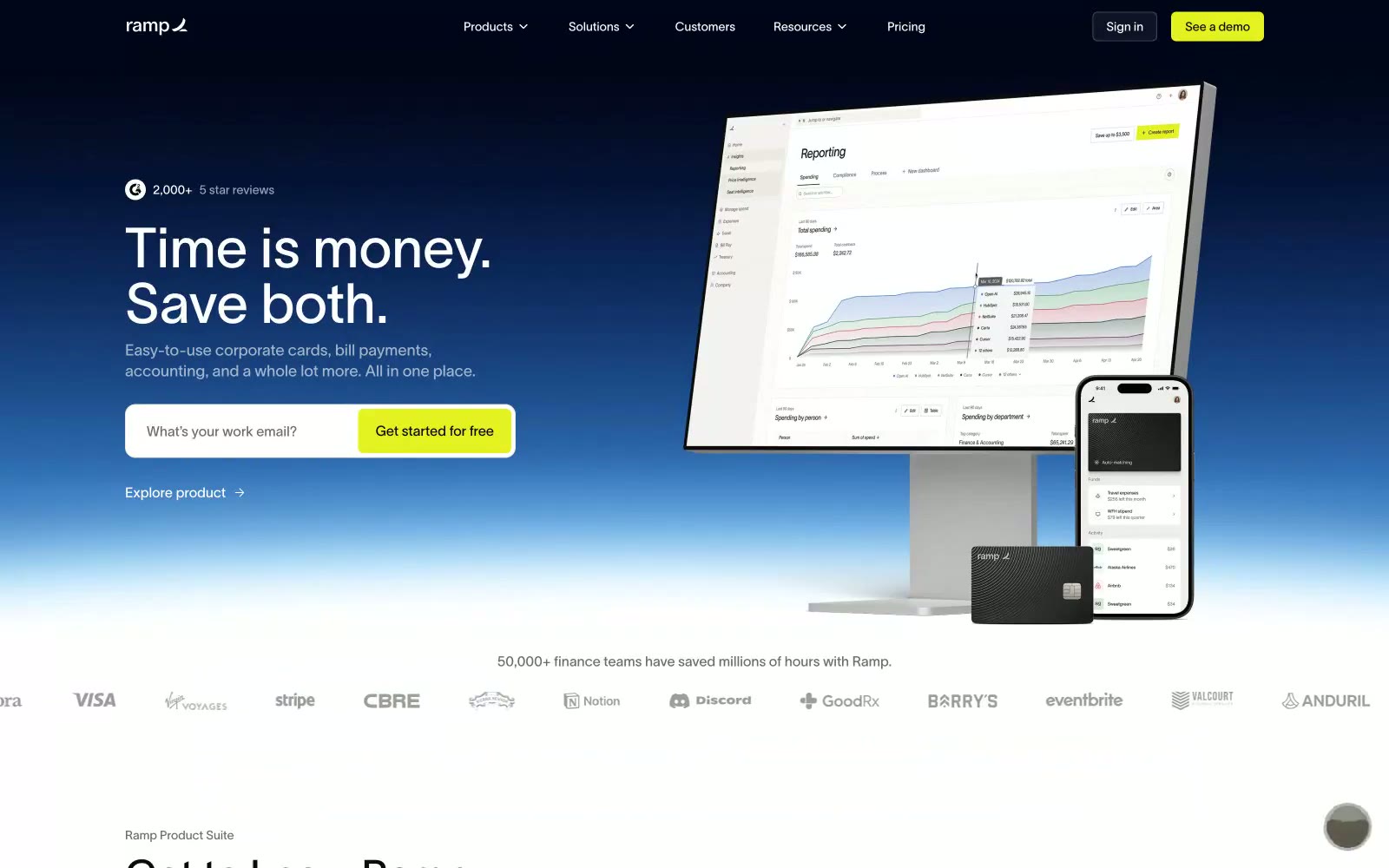
Ramp
Ramp — Style Reference
# Ramp — Style Reference
> dawn-lit financial cockpit. A premium fintech control surface where dark sky opens onto warm paper-white decks, anchored by a single chartreuse ignition button.
**Theme:** light
Ramp's visual system is a financial command center rendered in dawn light: a dramatic gradient sky opens the page, then resolves into warm white surfaces organized around product photography and a single electric lime accent. The palette is overwhelmingly neutral — warm off-whites, deep obsidians, and slate borders — letting the chartreuse CTA carry the only chromatic voice. Lausanne, a custom sans-serif, sets every word with quiet authority at scale, from 64px hero headlines down to 13px captions. Components are built on a strict two-radius system: 4px for functional controls, 12px for cards and surfaces. The page reads as premium and confident, not playful — the lime accent is functional urgency, never decoration.
## Tokens — Colors
| Name | Value | Token | Role |
|------|-------|-------|------|
| Lime Signal | `#e4f222` | `--color-lime-signal` | Green supporting accent for decorative details and low-frequency emphasis. Do not promote it to the primary CTA color |
| Cobalt Glow | `#5683d2` | `--color-cobalt-glow` | Hero gradient midpoint, decorative accents, link hover washes. Provides the atmospheric blue that carries the dawn-sky hero treatment |
| Obsidian | `#0c0a08` | `--color-obsidian` | Primary text color, dark canvas surfaces, navigation bar, footer. The near-black that grounds the system with 19.8:1 contrast against white |
| Paper | `#ffffff` | `--color-paper` | Page background in light sections, text on dark surfaces, input fills. The clean canvas that lets product imagery and the lime accent command attention |
Websites
Markdown Text
design-md
website-prompt
landing-page-prompt
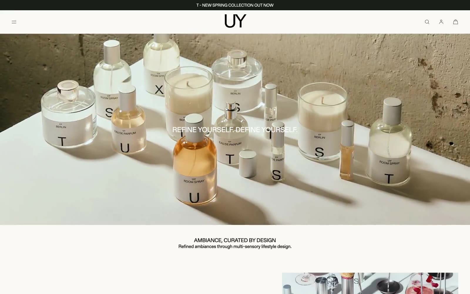
UY Studio
UY Studio — Style Reference
# UY Studio — Style Reference
> Monastic stone gallery — a quiet concrete-walled space where perfume bottles sit on white plinths, lit by one weight-400 voice and four warm grays.
**Theme:** light
UY operates as a monastic gallery: four warm grays, one weight of type, zero ornament. The entire interface speaks in a single 400-weight voice from 13px captions to 48px display lines, letting whitespace and grid alignment do what color and weight would in a louder system. The palette is almost geological — a limestone canvas, soot text, chalk surfaces, and a single graphite for the rare dark button — all warm-tinted to harmonize with the raw concrete and weathered plaster in the photography. Products are treated as still-life objects on white plinths, presented full-bleed against textured walls with no decorative chrome, UI patterns, or color to compete with the objects themselves.
## Tokens — Colors
| Name | Value | Token | Role |
|------|-------|-------|------|
| Soot | `#24241f` | `--color-soot` | Primary text, all icon strokes, hairline borders, nav links, footer text — the single dark voice of the system |
| Limestone | `#d1d3cf` | `--color-limestone` | Page canvas, announcement bar, nav background — the warm-tinted near-gray that replaces white as the system's base tone |
| Chalk | `#e5e5e5` | `--color-chalk` | Secondary surface, subtle borders, product photo backgrounds — a slightly cooler neutral for layering atop Limestone |
| Graphite | `#333333` | `--color-graphite` | Dark button fill — the only filled surface in the system, used sparingly for a single tonal shift from the Soot text |
Websites
Markdown Text
design-md
website-prompt
landing-page-prompt
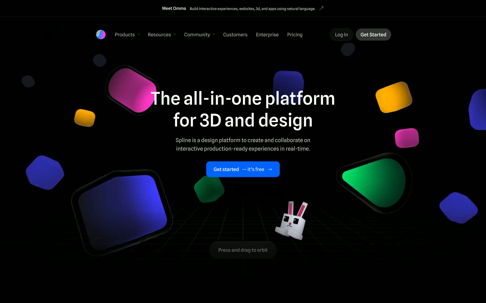
Spline
Spline — Style Reference
# Spline — Style Reference
> Glowing Forms in the Void
**Theme:** dark
The design feels like a creative void, a deep space canvas where ideas materialize as glowing forms. An absolute black (#000000) background serves as this void, making every piece of content feel like it's emitting light. Hierarchy is achieved not through shadows or solid grays, but through layered translucency — panels and buttons are semi-transparent white overlays, creating a glassmorphism effect. The custom Spline Sans typeface is used universally at normal weights, giving headings a confident but understated presence. A single, energetic Spline Blue (#0062ff) is reserved for primary actions, acting as a focused beacon in the minimalist dark environment.
## Tokens — Colors
| Name | Value | Token | Role |
|------|-------|-------|------|
| Void Black | `#000000` | `--color-void-black` | Global page background, the foundational canvas for all content |
| Panel Sheen | `#ffffff` | `--color-panel-sheen` | Card and panel surfaces (CSS var: --color-panel-bg) |
| Button Sheen | `#ffffff` | `--color-button-sheen` | Secondary button backgrounds (CSS var: --color-btn-bg) |
| Bright White | `#ffffff` | `--color-bright-white` | Headlines, primary text, active icons, logos |
Websites
Markdown Text
design-md
website-prompt
landing-page-prompt
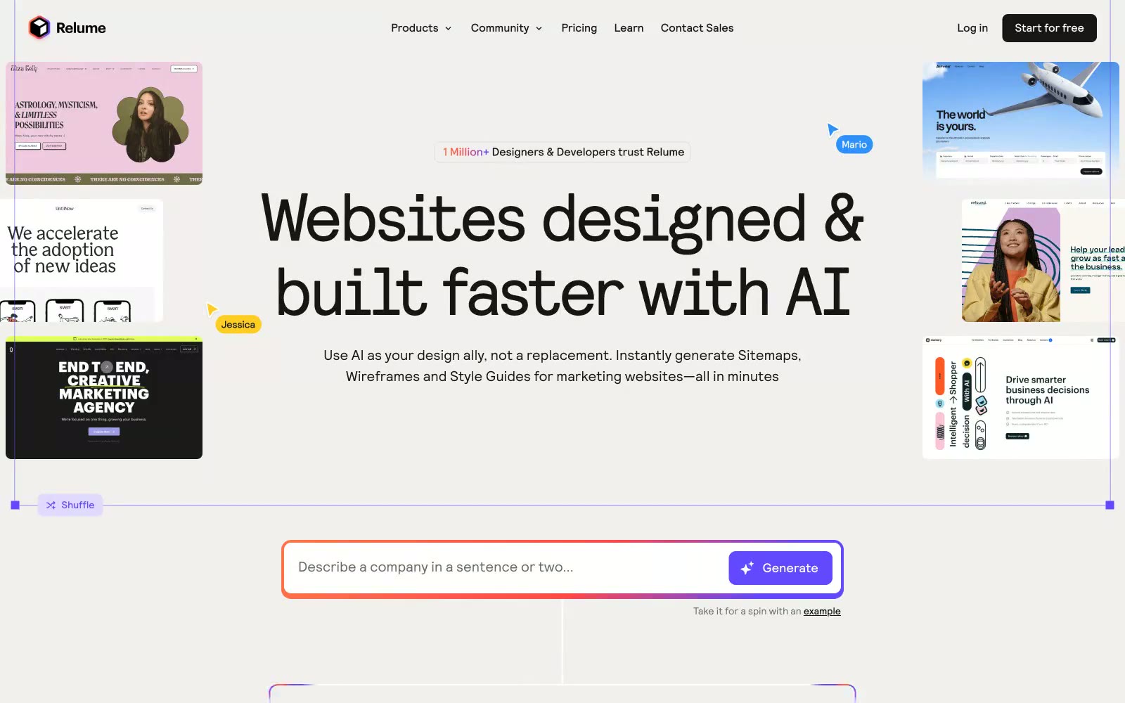
Relume
Relume — Style Reference
# Relume — Style Reference
> Cream canvas, one violet spark.
**Theme:** light
Relume is a light-mode, warm-neutral AI design tool that pairs a cream canvas with confident oversized type and a single electric violet as its only chromatic accent. The visual language is built on a custom grotesque ('Relative') that runs from a 224px hero down to 12px captions without ever leaving the family, giving the site one continuous typographic voice. A signature three-stop orange-to-red-to-violet gradient punctuates the page — applied to text on the word 'faster' and as a hairline border on the primary prompt input — making the otherwise restrained palette feel switched on. Cards float on white against the warm canvas with soft shadows and 16px radii, while the primary CTA button is a solid violet (#6248ff) that doesn't fight for attention but always wins it.
## Tokens — Colors
| Name | Value | Token | Role |
|------|-------|-------|------|
| Electric Iris | `linear-gradient(100deg, rgb(255, 116, 72), rgb(255, 72, 72) 42%, rgb(98, 72, 255) 85%)` | `--color-electric-iris` | Violet action color for filled buttons, selected navigation states, and focused conversion moments. |
| Soft Lilac | `#b8adf5` | `--color-soft-lilac` | Decorative icon strokes, subtle border accents, secondary violet UI |
| Iris Mist | `#e0daff` | `--color-iris-mist` | Hover wash on violet buttons, soft chip backgrounds, tinted surface |
| Ink | `#161616` | `--color-ink` | Primary text, primary outline-button border, dark CTA text on light surfaces, icon strokes |
Websites
Markdown Text
design-md
website-prompt
landing-page-prompt
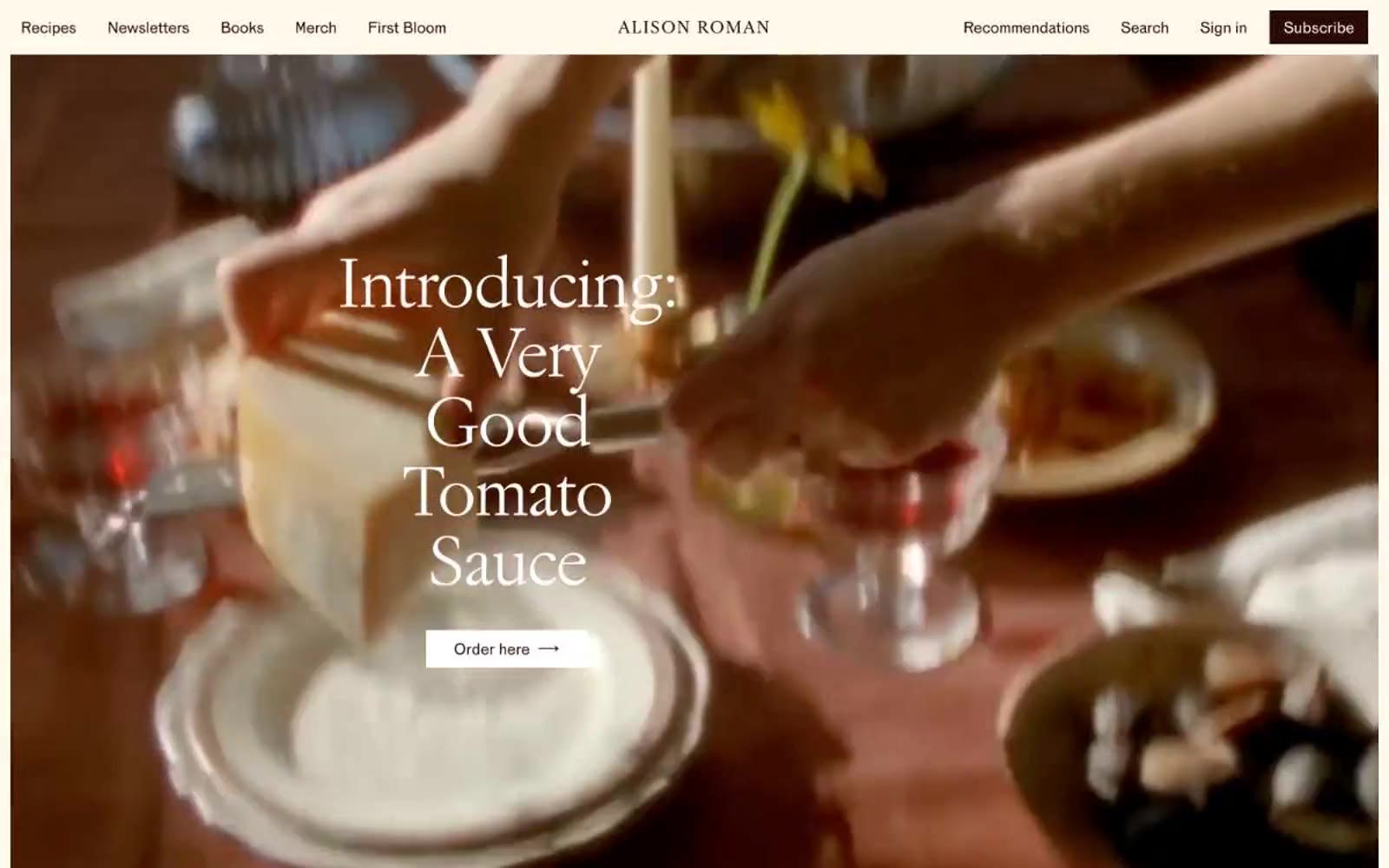
Alison Roman
Alison Roman — Style Reference
# Alison Roman — Style Reference
> cookbook pages on warm cream paper — a printed spread from an artisan food memoir, translated to screen with zero loss of tactility
**Theme:** light
Alison Roman's site is a warm, editorial cookbook author's atelier — cream-paper canvas, elegant serif typography, and a single near-black warm-brown that carries every text and action. The palette is almost entirely tonal: three creams layered from canvas to card, a whisper-pale yellow for link underlines, and a burgundy flash reserved for book-cover backgrounds. Layout is generous, magazine-paced, and asymmetric — book covers on the left, descriptive copy on the right, with the dark-brown filled 'Order' button as the sole structural punctuation. No shadows, no gradients, no decorative borders; hierarchy is built through type scale, generous whitespace, and the contrast between warm cream and warm black. The design reads like a printed cookbook spread translated faithfully to the web: confident, restrained, and food-warm without ever resorting to food clichés.
## Tokens — Colors
| Name | Value | Token | Role |
|------|-------|-------|------|
| Aubergine Ink | `#290a08` | `--color-aubergine-ink` | Primary text, headings, filled action buttons, footer text — the warm near-black that anchors every screen; it is the only chromatic dark in the system and the only acceptable fill for primary actions |
| Vintage Burgundy | `#810c00` | `--color-vintage-burgundy` | Orange wash for highlight backgrounds, decorative bands, and soft emphasis behind content. |
| Buttery Highlight | `#fff3cc` | `--color-buttery-highlight` | Link text and selected heading accent — a pale custard yellow used sparingly to mark hyperlinks and tiny editorial highlights, sitting at AAA contrast on the ink |
| Parchment Canvas | `#f6f0e1` | `--color-parchment-canvas` | Page background — the dominant warm cream that defines the entire site mood; every screen sits on this surface |
Websites
Markdown Text
design-md
website-prompt
landing-page-prompt
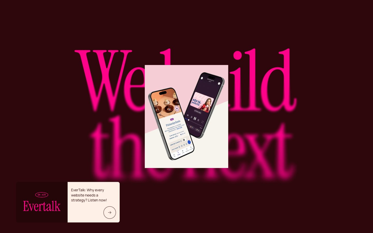
Evermade
Evermade — Style Reference
# Evermade — Style Reference
> Editorial punk on cream paper
**Theme:** light
Evermade uses an editorial-meets-punk aesthetic: warm cream canvases (#fef0e6) serve as the quiet stage, while a single hot-pink accent (#ff0389) and a deep maroon dark mode (#2d070b) provide the dramatic punctuation. The type system pairs Instrument Serif's magazine-grade display voice with DM Mono's technical labels and Manrope's neutral body, creating a clear three-tier hierarchy where each tier has a distinct visual job. Everything is pill-shaped (9999px radius) — buttons, tags, link underlines — giving the interface a soft, rounded, almost sticker-like quality. Components are flat and border-driven rather than shadow-driven; depth comes from alternating cream and blush surfaces and the occasional maroon band, not from elevation.
## Tokens — Colors
| Name | Value | Token | Role |
|------|-------|-------|------|
| Wine Maroon | `#2d070b` | `--color-wine-maroon` | Dark section background, heading text on cream, card borders, footer surface — near-black with a blood-red undertone, sets the dramatic contrast against the cream canvas |
| Hot Pink | `#ff0389` | `--color-hot-pink` | Outlined action borders, link underlines, tag labels, decorative brand accent — the visual signature; appears as border-color and text, never as filled background |
| Cream Paper | `#fef0e6` | `--color-cream-paper` | Primary page canvas, section background, card surface for hero product mockups — warm off-white that reads as paper rather than screen |
| Blush Card | `#ffdce2` | `--color-blush-card` | Secondary card surface, subtle highlight wash, tag pill backgrounds — one step warmer and pinker than the cream, creates gentle figure-ground separation |
Websites
Markdown Text
design-md
website-prompt
landing-page-prompt
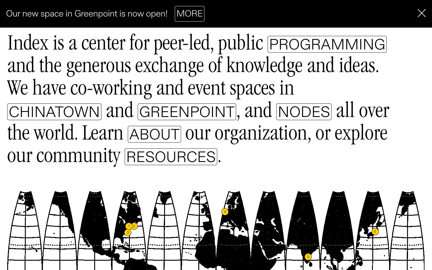
Index
Index — Style Reference
# Index — Style Reference
> editorial broadsheet with yellow highlighter — a stark black-and-white printed publication where #ffd600 marks the only point of emphasis
**Theme:** light
Index reads as an editorial broadsheet translated to the web: near-total achromatic discipline, a single condensed serif for display headlines, and one highlighter-yellow accent used sparingly to mark what matters. Surfaces stay paper-white for most content, but the design flips to full-ink black for announcement bars and feature cards, creating high-contrast plate-like breaks rather than gradients or shadows. Typography does the heavy lifting — light-weight serif at 75–80px with aggressive negative tracking for headlines, a geometric sans for UI, and small uppercase labels with positive tracking as section markers. Components are flat, thin-bordered, and unornamented: links live as outlined text pills, buttons are 6px-radius rectangles, and the only color punctuation is a 16px yellow dot. The world map is rendered as a row of black triangular segments with yellow location pins — graphic, diagrammatic, and never illustrative.
## Tokens — Colors
| Name | Value | Token | Role |
|------|-------|-------|------|
| Index Ink | `#000000` | `--color-index-ink` | Primary text, announcement bar background, dark feature cards, map silhouettes, hairline borders. The dominant structural color — used where ink would go on a printed page |
| Paper White | `#ffffff` | `--color-paper-white` | Page canvas, card surfaces, body backgrounds, inverted text on dark surfaces. The base layer of the entire system |
| Highlighter Yellow | `#ffd600` | `--color-highlighter-yellow` | Yellow wash for highlight backgrounds, decorative bands, and soft emphasis behind content. |
Websites
Markdown Text
design-md
website-prompt
landing-page-prompt
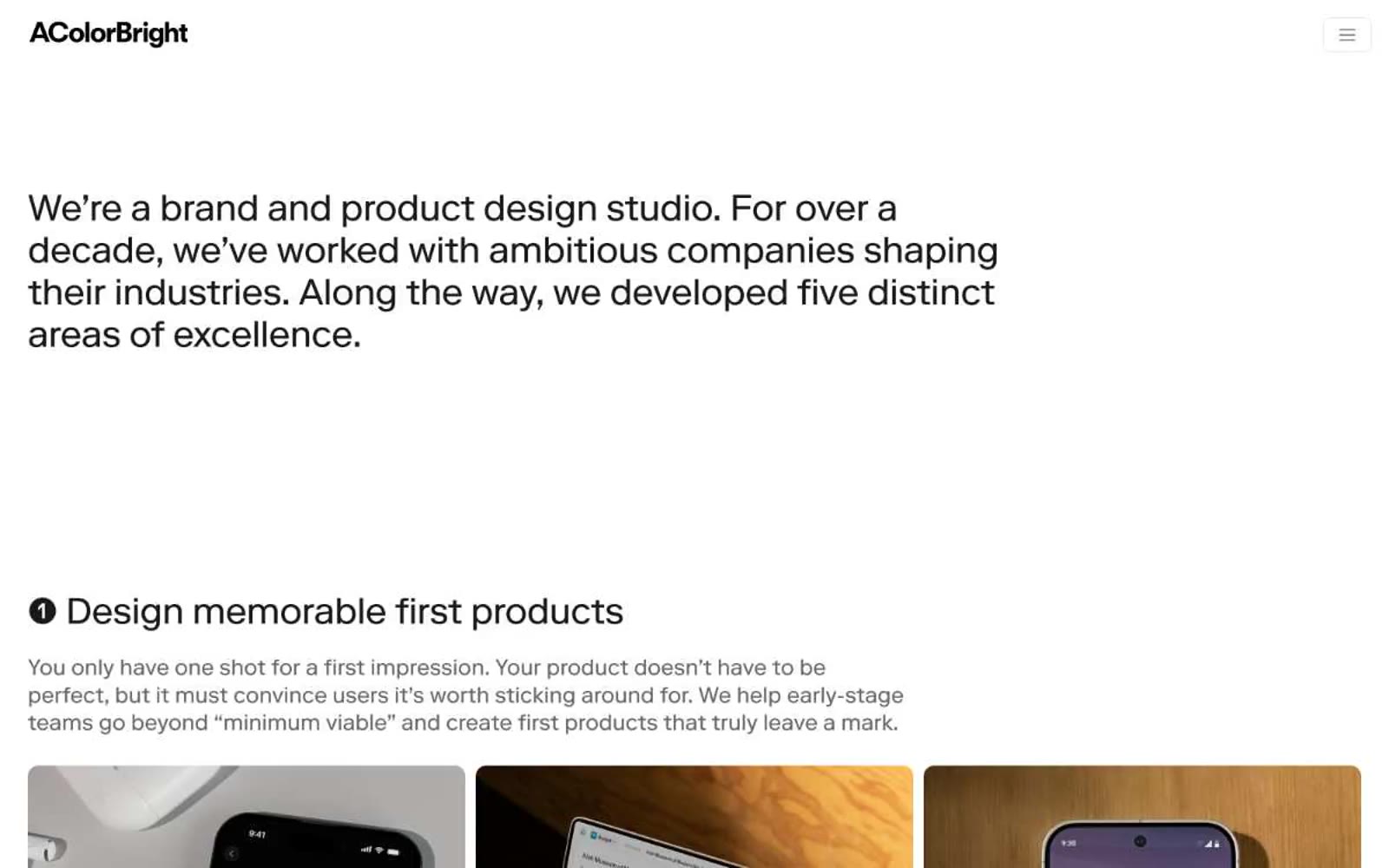
Acolorbright
Acolorbright — Style Reference
# Acolorbright — Style Reference
> White gallery walls around black-ink editorial type
**Theme:** light
AColorBright is a typographic monolith — an achromatic editorial canvas where a single custom serif/grotesque hybrid (RiformaLLWeb) does all the visual work. Every surface is paper-white or near-black; color is rejected entirely (0% colorfulness), so hierarchy comes from type size, weight contrast, and generous negative space. The signature motif is the numbered black circle preceding each section heading, creating a serial-chapter rhythm across what would otherwise be a long-form scroll. Components are borderless and shadowless — cards are defined by typography and 12px image radii, buttons are flat black-on-white rectangles with 8px corners, and dividers are implied by whitespace rather than hairlines. Imagery is the only chromatic interruption: full-bleed product photography sits inside rounded frames as proof of craft, not decoration.
## Tokens — Colors
| Name | Value | Token | Role |
|------|-------|-------|------|
| Ink Black | `#1a1a1a` | `--color-ink-black` | Primary text, all structural borders (cards, lists, nav containers), heading borders, icon strokes — the dominant ink tone chosen over pure #000 for slightly softer edge contrast against white |
| Charcoal | `#262626` | `--color-charcoal` | Navigation backgrounds, filled button surfaces — the slightly lighter fill that keeps dark UI elements from feeling dead-flat against text |
| Graphite | `#666666` | `--color-graphite` | Body copy, secondary text, link borders, surface tints in data regions — the mid-neutral that carries paragraph-level content without competing with headings |
| Ash | `#999999` | `--color-ash` | Medium-contrast borders, control outlines, and structural separators. |