AI Prompt Studio - Intelligent Prompt Library
Explore and use professional AI prompts to optimize your workflow.
One-click Use
Websites
Markdown Text
design-md
website-prompt
landing-page-prompt
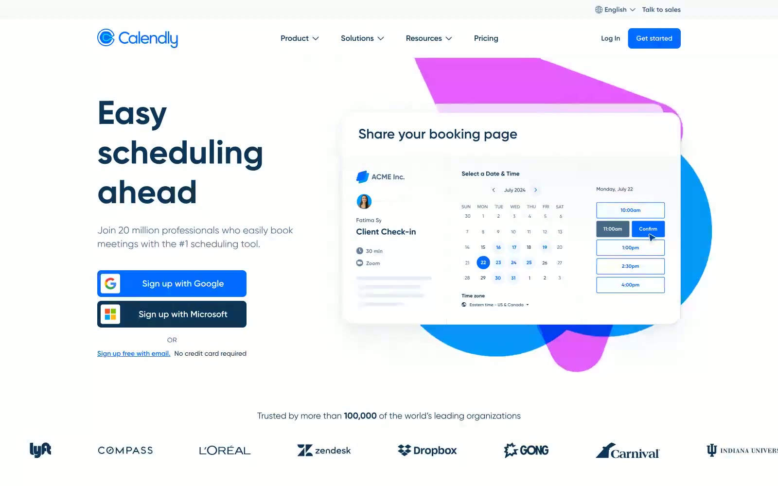
Calendly.com
Calendly.com — Style Reference

# Calendly.com — Style Reference
> Quiet professional calendar on frosted paper
**Theme:** light
Calendly's design system is a quiet, professional canvas built on white surfaces and near-black text, with a signature dark navy (#0b3558) that gives headlines weight without resorting to pure black. A single vivid blue (#006bff) acts as the lone functional accent, reserved for CTAs and interactive moments, while the rest of the palette stays deliberately desaturated. The brand's most distinctive move is decorative gradient shapes—pink, violet, and warm yellow blobs—layered behind product UI mockups to add warmth and depth to an otherwise austere interface. Typography is a single custom family (Gilroy) at generous sizes with confident weights, and components are lightweight: 4px button radii, soft blue-gray shadows, and hairline borders that feel precise rather than playful.
## Tokens — Colors
| Name | Value | Token | Role |
|------|-------|-------|------|
| Midnight Navy | `#0b3558` | `--color-midnight-navy` | Headlines, primary brand text, logo wordmark, dark headings — the signature voice of the brand |
| Signal Blue | `#006bff` | `--color-signal-blue` | Violet supporting accent for decorative details and low-frequency emphasis. Do not promote it to the primary CTA color |
| Slate Blue | `#476788` | `--color-slate-blue` | Secondary body text, muted descriptions, icon strokes, nav links in body context |
| Carbon | `#0a0a0a` | `--color-carbon` | Primary body text, button text on light surfaces, high-emphasis copy |
Websites
Markdown Text
design-md
website-prompt
landing-page-prompt
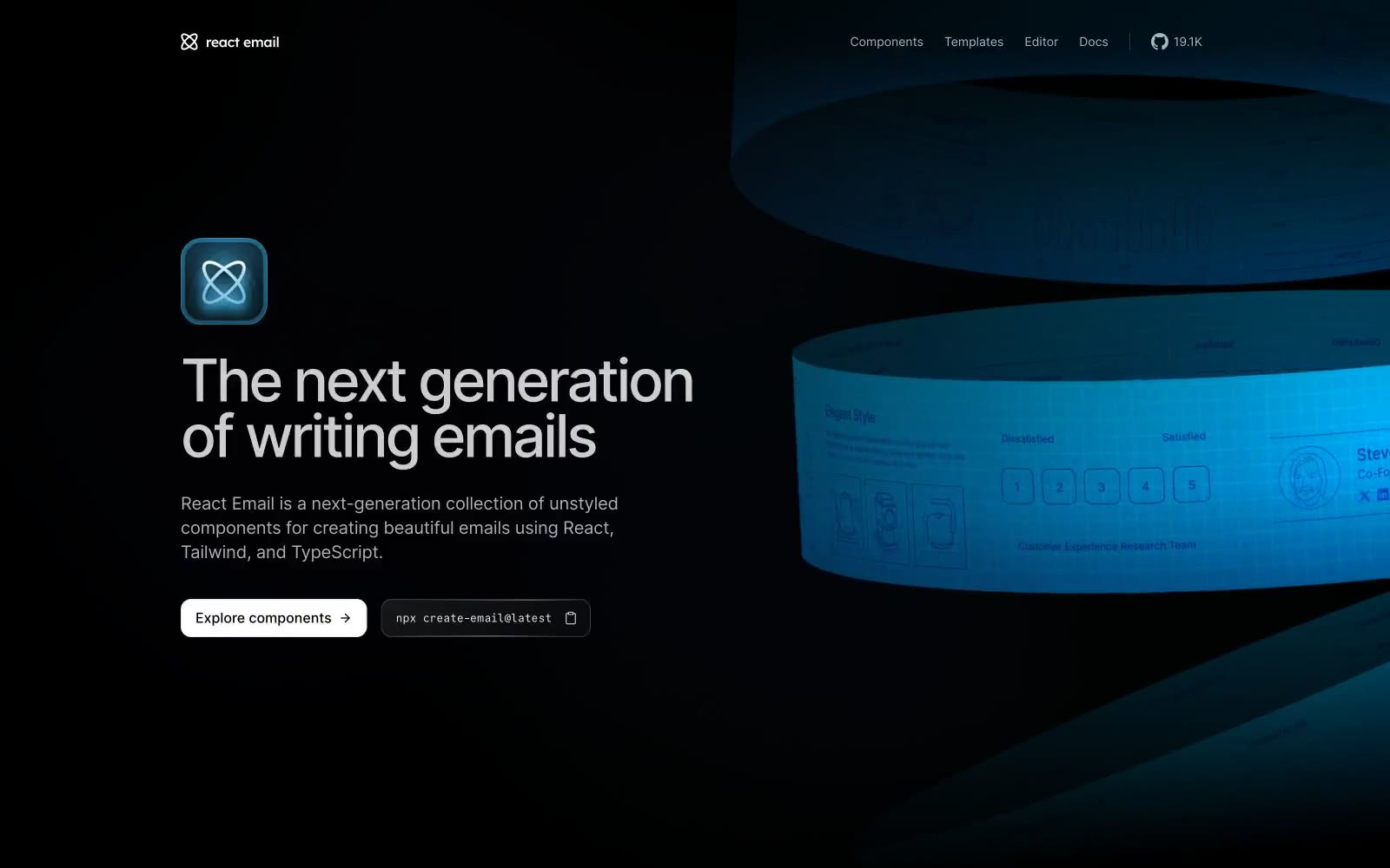
React Email
React Email — Style Reference
# React Email — Style Reference
> Obsidian workshop for code artisans — deep matte black, hairline white edges, and one cyan beacon glowing through developer glass.
**Theme:** dark
React Email presents itself as an obsidian workshop where developer tools feel handcrafted: deep black canvases, precise white typography, and a single cyan accent that glows through product imagery like light through aquarium glass. The visual rhythm is editorial — generous section gaps, left-aligned text blocks, and right-aligned product visuals that drift in and out of focus through subtle radial glows. Components feel engineered rather than decorated: thin hairline borders, inset white edge highlights that read as machined metal, and near-zero elevation. Code is first-class citizen — monospace badges sit inline with CTAs, terminal commands share visual weight with button labels, and the Inter / CommitMono pairing bridges marketing copy and developer documentation without tonal shift.
## Tokens — Colors
| Name | Value | Token | Role |
|------|-------|-------|------|
| Obsidian | `#000000` | `--color-obsidian` | Page canvas, primary background — the floor everything sits on |
| Carbon | `#0f0f10` | `--color-carbon` | Card and elevated surface — one step up from canvas for contained blocks |
| Graphite | `#27272a` | `--color-graphite` | Borders, dividers, inset surfaces, nav background — the structural neutral |
| Filament | `#e5e7eb` | `--color-filament` | Hairline borders on badges, tags, and outlined controls — the machined edge |
Websites
Markdown Text
design-md
website-prompt
landing-page-prompt
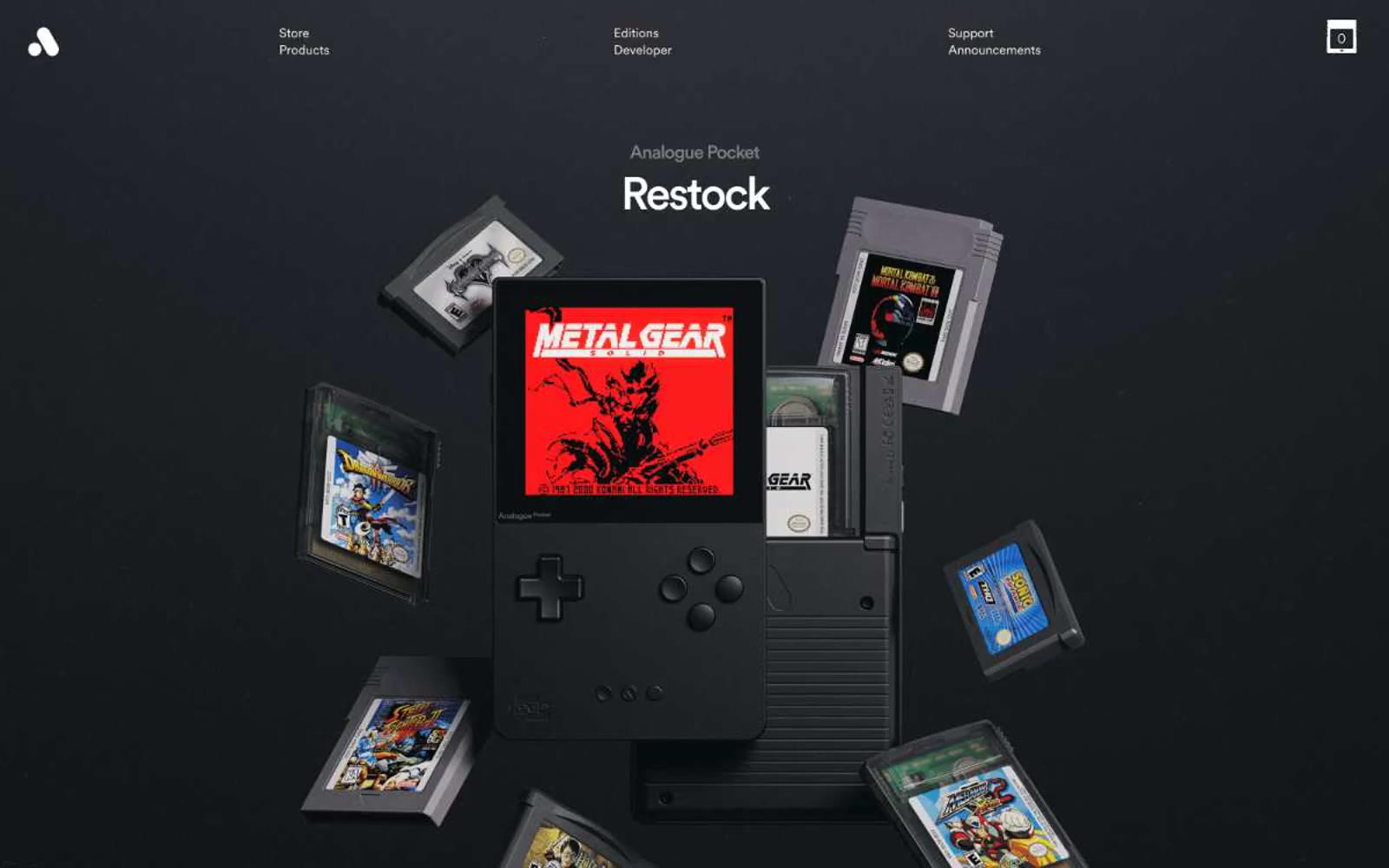
Analogue
Analogue — Style Reference
# Analogue — Style Reference
> Black gallery vitrine — products float in void
**Theme:** dark
Analogue presents as a black-box gallery: products float untethered against pure dark voids, lit like museum objects rather than marketed like commodities. The visual language is rigorously monochrome — black, white, and a single soft gray do all the work, with no chromatic accents competing for attention. Typography is a single custom family used at whisper-to-medium weights, carrying dramatic negative tracking that tightens aggressively as size increases. Components feel weighted and architectural: rounded card corners, generous breathing room, and the only 'action' surface is a clean white pill that reads as a beacon against the dark. Every screen should read as quiet and confident, letting the hardware itself be the spectacle.
## Tokens — Colors
| Name | Value | Token | Role |
|------|-------|-------|------|
| Carbon Canvas | `#000000` | `--color-carbon-canvas` | Page backgrounds, section canvases, card surfaces in dark sections |
| Bone White | `#ffffff` | `--color-bone-white` | Light supporting surface for subtle backgrounds and section separation. Do not promote it to the primary CTA color |
| Ash Veil | `#e5e7eb` | `--color-ash-veil` | Subtle borders, hairline dividers, light-mode card surfaces, light section backgrounds |
| Smoke | `#bfbfbf` | `--color-smoke` | Secondary text, muted captions, supporting metadata on dark surfaces |
Websites
Markdown Text
design-md
website-prompt
landing-page-prompt
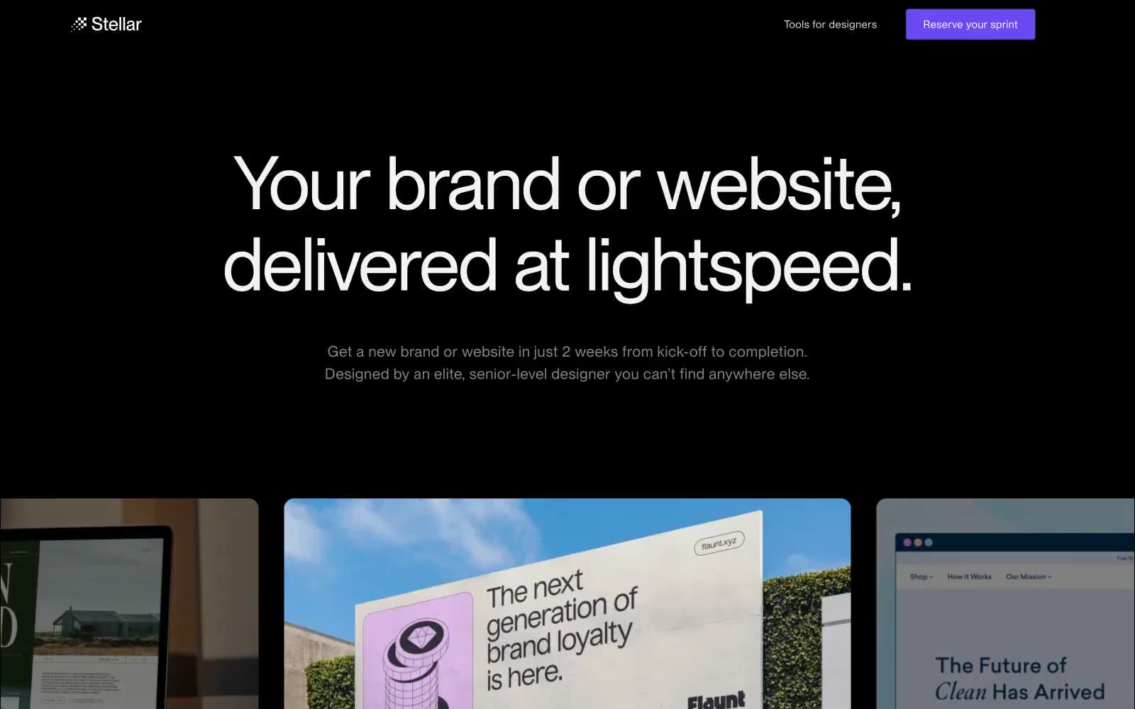
Stellar
Stellar — Style Reference
# Stellar — Style Reference
> Gallery wall at midnight
**Theme:** dark
Stellar operates in a midnight-black creative marketplace language: pure void canvas, dark elevated surfaces, oversized whisper-light display type, and a single vivid violet that fires only when an action matters. The entire interface reads like a portfolio on a closed gallery wall — everything recedes into shadow except the headline and the one CTA. Color is rationed: achromatic text and hairline borders do 95% of the work, and #6a48f2 appears as a precise electric punctuation on the reserve button, link hovers, and selected states. Components are minimal and borderless by default, gaining shape only through subtle #2c2c2 outlines and 6-10px corner softening. The design's defining choice is restraint — massive 70-104px type at weight 400 with tight negative tracking creates a hushed authority that does not compete with the photography of the designers themselves.
## Tokens — Colors
| Name | Value | Token | Role |
|------|-------|-------|------|
| Void Black | `#000000` | `--color-void-black` | Page background, primary canvas — absolute black eliminates surface depth, making images and white type feel like they float |
| Obsidian | `#171718` | `--color-obsidian` | Card surfaces, elevated panels, designer profile containers — one shade above void to separate without illuminating |
| Graphite | `#2c2c2e` | `--color-graphite` | Borders on inputs, buttons, and nav dividers — the thinnest readable outline on near-black |
| Ash | `#888888` | `--color-ash` | Muted body text, secondary labels, inactive borders — the only gray with enough chroma to carry information |
Websites
Markdown Text
design-md
website-prompt
landing-page-prompt
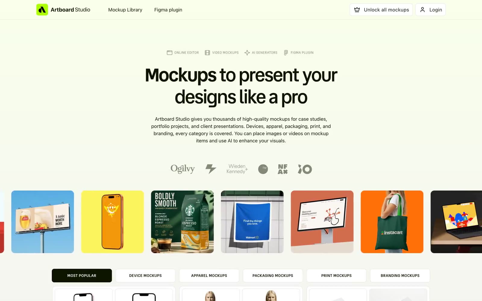
Artboard
Artboard — Style Reference
# Artboard — Style Reference
> Lime-voltage designer's tabletop. White paper, ink-black type, and one electric green that powers the whole studio.
**Theme:** light
Artboard Studio reads as a designer's toolshed laid out on a white tabletop — clinical canvas, high-contrast near-black type, and a single lime-green voltage that makes active states feel switched on. The system is overwhelmingly light and spacious, with confidence coming from tight tracking on large display type rather than weight or color. Buttons lean outlined rather than filled, borrowing the near-black as their stroke so primary actions feel like ink stamps on paper rather than glossy pills. Category surfaces (phone, apparel, packaging) are coded with soft pastel washes — peach, sky, mint — so visual variety arrives as color-coded cards, not gradients or shadows.
## Tokens — Colors
| Name | Value | Token | Role |
|------|-------|-------|------|
| Midnight Ink | `#0d1400` | `--color-midnight-ink` | Primary text, ghost/outline action borders, filled dark buttons — near-black with a faint green undertone carries both editorial type and CTA strokes |
| Lime Voltage | `#aaff00` | `--color-lime-voltage` | Brand accent, active states, highlight tags, energetic punctuation — the single chromatic accent that gives the white canvas its electric charge |
| Paper White | `#ffffff` | `--color-paper-white` | Page canvas, card surfaces, button fills — the foundation everything sits on |
| Olive Stone | `#838976` | `--color-olive-stone` | Muted helper text, secondary icons, neutral badge borders, low-emphasis UI chrome |
Websites
Markdown Text
design-md
website-prompt
landing-page-prompt
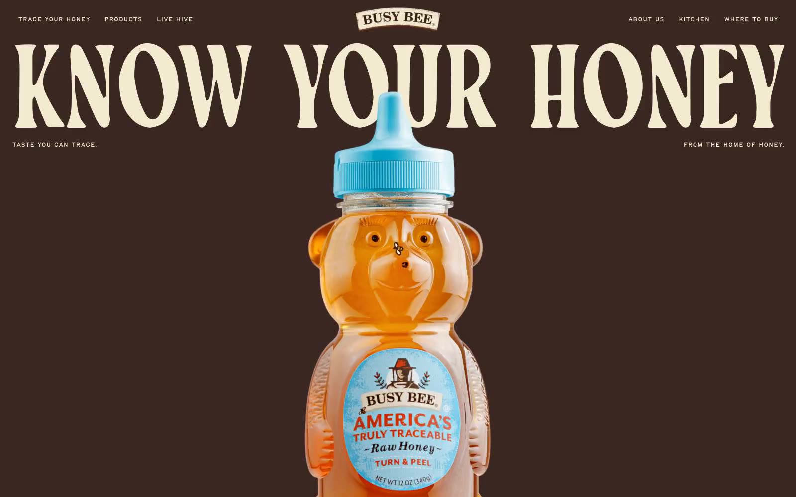
Busy Bee Honey
Busy Bee Honey — Style Reference
# Busy Bee Honey — Style Reference
> painted barn-side honey label — dark cocoa, gold, and blue stacked like a vintage billboard. Two sentence grounding: massive condensed serif display type bleeds edge-to-edge against solid color bands, and the bear-bottle product sits centered and unframed like the hero of a roadside sign.
**Theme:** mixed
Busy Bee Honey speaks in a roadside-Americana voice: full-bleed bands of dark cocoa, honeycomb gold, and cornflower blue, each separated by a scrolling marquee strip. Display headlines are enormous — up to 238px — in a condensed display serif with aggressive 0.80 line-height and slight negative tracking, so words like 'KNOW YOUR HONEY' loom like painted barn-side lettering. The product (the bear-shaped bottle) is the visual anchor: centered, unframed, full-bleed, no card chrome around it. Color blocks are flat, unshadowed, and contiguous — the design relies on brutal color contrast and type scale to create rhythm, not on elevation or container surfaces. Pills are the only shape language; everything else is rectangular and sectioned. The feel is less 'ecommerce product page' and more 'printed honey label folded into a billboard'.
## Tokens — Colors
| Name | Value | Token | Role |
|------|-------|-------|------|
| Dark Cocoa | `#3b2722` | `--color-dark-cocoa` | Primary canvas for hero/header, body text on light surfaces, structural borders, dark CTA fills — the most-used chromatic color in the system, carrying 80%+ of text and border weight |
| Cream Parchment | `#f2ebd0` | `--color-cream-parchment` | Light canvas for alternate sections, text on dark canvases, hairline borders, card surfaces — the warm off-white that makes the dark cocoa feel like printed kraft paper |
| Charcoal | `#000000` | `--color-charcoal` | Hard-edge text and fine borders where absolute contrast is required |
| Honeycomb Gold | `#ffca50` | `--color-honeycomb-gold` | Filled CTA buttons on dark sections, full-bleed section canvas, nav fill — the most chromatic and warmest surface, used as functional punctuation against the brown |
Websites
Markdown Text
design-md
website-prompt
landing-page-prompt
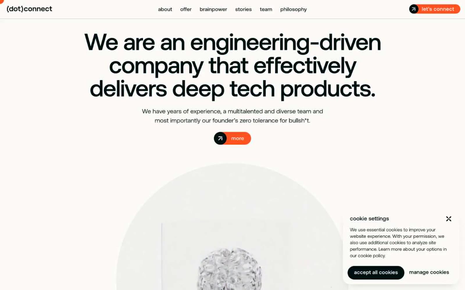
(dot)connect
(dot)connect — Style Reference
# (dot)connect — Style Reference
> Swiss engineering blueprint with a single ember
**Theme:** light
(dot)connect operates as a Swiss-engineering canvas: a warm off-white stage (#fcfbf8) where a single near-black ink (#001011) does almost all the work, and a vivid orange (#fd5321) appears only as deliberate punctuation — never decoration. The typographic signature is extreme: headlines balloon to 72-101px with aggressive negative tracking (-0.025em), creating a display voice that feels architectural rather than marketing-soft. Components are softly rounded (20-24px radii on cards and buttons), never sharp, never heavy — elevation is implied through hairline borders and tonal surface shifts, not shadows. The system reads as 'engineering blueprint with a pulse of fire': monochromatic discipline broken by one warm chromatic gesture per viewport.
## Tokens — Colors
| Name | Value | Token | Role |
|------|-------|-------|------|
| Bone Canvas | `#fcfbf8` | `--color-bone-canvas` | Primary page background, card surfaces, light text on dark — warm off-white reads as paper, not screen |
| Charcoal Ink | `#001011` | `--color-charcoal-ink` | Primary text, headings, primary action fill, dominant borders — near-black with a barely-perceptible cool tint that distinguishes it from pure #000 |
| Smoke Veil | `#0f1e1f` | `--color-smoke-veil` | Secondary text and borders for body-level elements — a half-step lighter than Charcoal for visual hierarchy without contrast loss |
| Ash Layer | `#ededea` | `--color-ash-layer` | Elevated card backgrounds, subtle surface differentiation, hover states — a warm gray that complements the bone canvas without going cold |
Websites
Markdown Text
design-md
website-prompt
landing-page-prompt
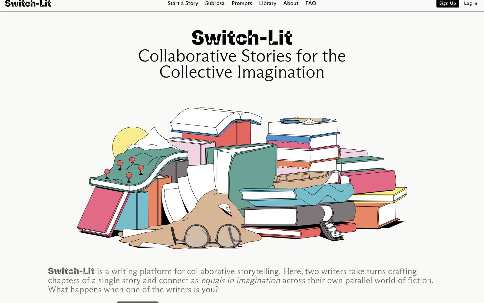
Switch-Lit
Switch-Lit — Style Reference
# Switch-Lit — Style Reference
> Inked editorial grid on cream paper
**Theme:** light
Switch-Lit is an editorial brutalist system printed on warm cream paper. Every structural element is drawn in a single black hairline — card edges, dividers, icon strokes, button outlines — so the page reads like a typeset manuscript where the grid itself is inked. Typography carries the personality: heavy condensed display type sits next to whisper-light flared serifs, and body copy uses a wide-tracked grotesque that feels typeset rather than typed. Accent color appears as highlighter punctuation — electric lime, cornflower, spring green — used in small swatches on cards and tags rather than as backgrounds for hero sections. The whole effect is closer to a printed literary quarterly than a SaaS product: restrained, opinionated, and deeply typographic.
## Tokens — Colors
| Name | Value | Token | Role |
|------|-------|-------|------|
| Manuscript Cream | `#f9f9f7` | `--color-manuscript-cream` | Page canvas, card surfaces, button text on dark — warm off-white that reads as paper rather than screen |
| Press Black | `#000000` | `--color-press-black` | All borders, body text, headings, icon strokes — the single ink that draws the entire structural system |
| Sage Border | `#d2ddd2` | `--color-sage-border` | Secondary card and button borders where a softer hairline is needed — desaturated green-gray |
| Mist Green | `#dee5dd` | `--color-mist-green` | Icon strokes and fills, button borders on tertiary controls — barely-there gray-green for subordinate elements |
Websites
Markdown Text
design-md
website-prompt
landing-page-prompt
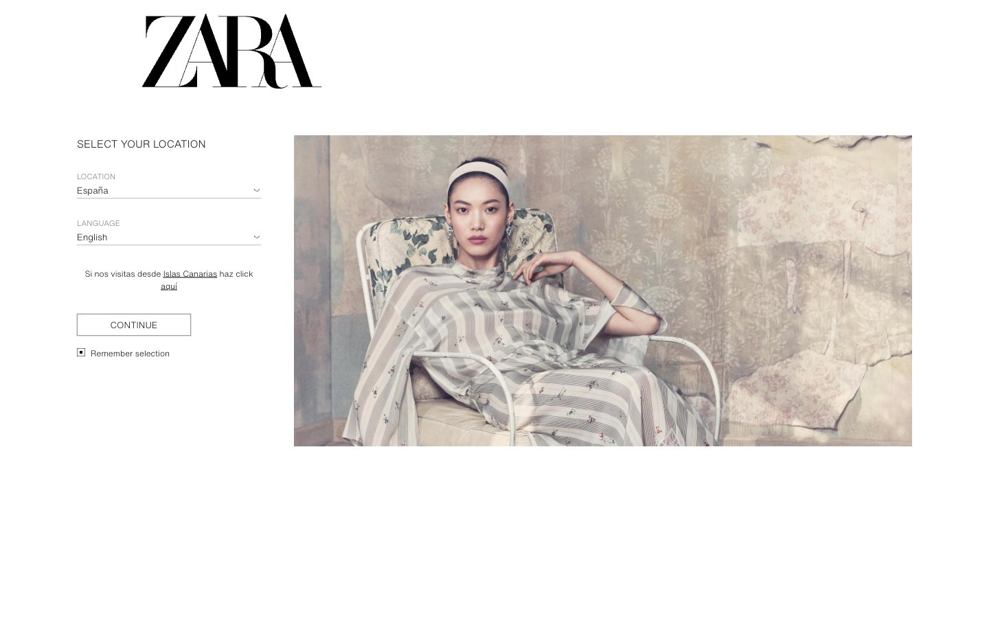
Zara
Zara — Style Reference
# Zara — Style Reference
> Gallery wall for fashion — pure white space, hairline frames, editorial imagery as the only color.
**Theme:** light
Zara's design system is editorial minimalism pushed to its logical extreme: a flat, monochromatic canvas where the interface deliberately recedes so editorial photography can carry the entire brand experience. The palette is essentially binary — pure black on pure white with a single mid-gray for secondary text — and the only decorative typographic moment is the ZARA wordmark itself, a high-contrast didone-style serif that functions as a logo, not as a heading font. UI typography is unusually compact (11–16px) and uses a single neutral sans-serif, giving every screen the look of a fashion magazine page. Components are borderless or use hairline strokes, with zero shadows, zero gradients, and zero rounded corners — the design language of a gallery wall, not a software product.
## Tokens — Colors
| Name | Value | Token | Role |
|------|-------|-------|------|
| Canvas | `#ffffff` | `--color-canvas` | Page backgrounds, form surfaces, image backgrounds — the silent stage on which all content sits |
| Ink | `#000000` | `--color-ink` | Primary text, icons, hairline borders, button outlines, checkbox marks, form labels |
| Stone | `#757575` | `--color-stone` | Secondary/helper text, placeholder text, disabled labels — the only mid-tone that breaks the binary |
Websites
Markdown Text
design-md
website-prompt
landing-page-prompt
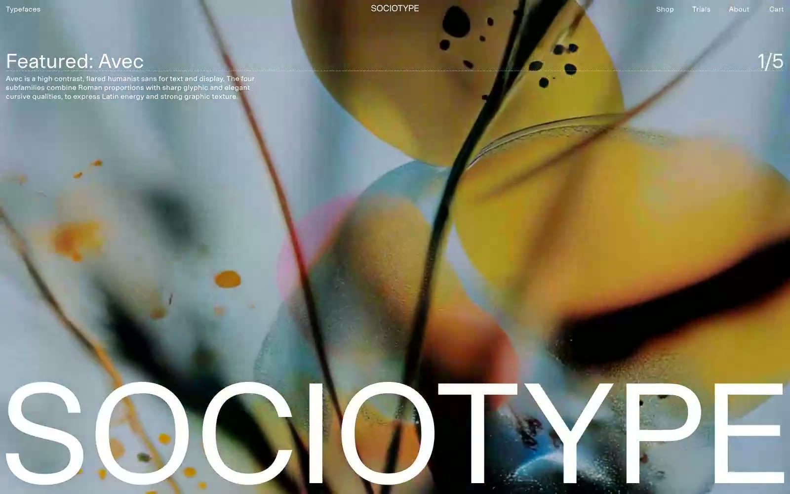
Sociotype
Sociotype — Style Reference
# Sociotype — Style Reference
> Type specimen museum on white paper
**Theme:** light
Sociotype is a type foundry site that operates as a curated letterform gallery: a near-pure black-and-white canvas where custom typefaces are the only chromatic event. The interface is essentially a specimen book rendered in a browser — enormous 251px type specimens sit on paper-white backgrounds, with hairline 1px borders and zero shadows drawing all the visual weight. The hero breaks the monochrome contract with a single full-bleed atmospheric photograph (refracted glass, water, prismatic color) used as a rotating feature stage, letting the photography supply the one moment of saturated color per page load. Navigation, labels, and chrome are uniformly small (11–14px) Onsite Regular with wide letter-spacing, behaving like museum wall text rather than app UI. Components are stripped to their minimum: a top bar, a size selector, a fullscreen toggle, arrow-suffix text links, and category lists — every element defers to the type being sold.
## Tokens — Colors
| Name | Value | Token | Role |
|------|-------|-------|------|
| Onyx | `#000000` | `--color-onyx` | Primary text, all borders and dividers, nav and link strokes — the structural black of every UI line |
| Paper | `#ffffff` | `--color-paper` | Page and card surfaces, reverse text on dark overlays |
| Charcoal | `#1a1818` | `--color-charcoal` | Body text on light surfaces where true black reads too clinical — used for paragraph copy and descriptions |
| Graphite | `#818181` | `--color-graphite` | Secondary text, caption labels, size selector, muted metadata |
Websites
Markdown Text
design-md
website-prompt
landing-page-prompt
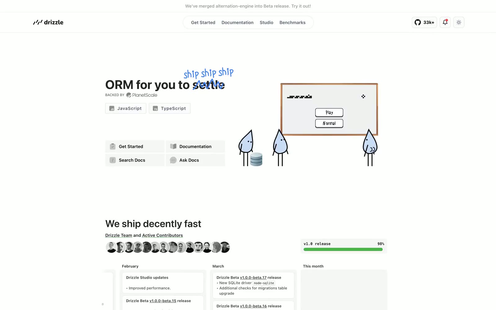
Drizzle ORM
Drizzle ORM — Style Reference
# Drizzle ORM — Style Reference
> Rainwater terminal on graph paper — a clean developer workbench where ink-blue notes float over monochrome code, with little raindrop creatures as the only witnesses.
**Theme:** light
Drizzle ORM presents as a quiet code workshop: a near-monochrome canvas where dark slate text sits on warm-white surfaces, with electric blue appearing only where intention demands it — in handwritten annotations sketched over the page, in performance graphs, and in the occasional code link. The visual language is deliberately restrained but not sterile: raindrop mascots and hand-drawn notes inject personality into an otherwise terminal-like layout, giving the interface a workbench feel rather than a polished marketing surface. Components stay compact and information-dense — thin borders at 8px radius, code blocks that look pasted from a real terminal, and cards that hold metrics rather than decoration. Color is rationed: two near-grays for text layers, one border gray, one bright blue, and the rest is whitespace and charts.
## Tokens — Colors
| Name | Value | Token | Role |
|------|-------|-------|------|
| Electric Cobalt | `#3e7ff0` | `--color-electric-cobalt` | Handwritten annotations overlaid on headlines, heading-level emphasis, brand voice. The single saturated color in the system; its scarcity makes it feel like a marker pen picked up to circle something important |
| Signal Blue | `#006be6` | `--color-signal-blue` | Blue supporting accent for decorative details and low-frequency emphasis. Do not promote it to the primary CTA color |
| Ink | `#222222` | `--color-ink` | Primary body and heading text. Off-black with a hair of warmth so long passages never feel like printed laser output |
| Slate | `#282b3b` | `--color-slate` | High-density text color across the interface — appears in button labels, icon strokes, and link copy. The workhorse dark tone that carries most interface chrome |
Websites
Markdown Text
design-md
website-prompt
landing-page-prompt
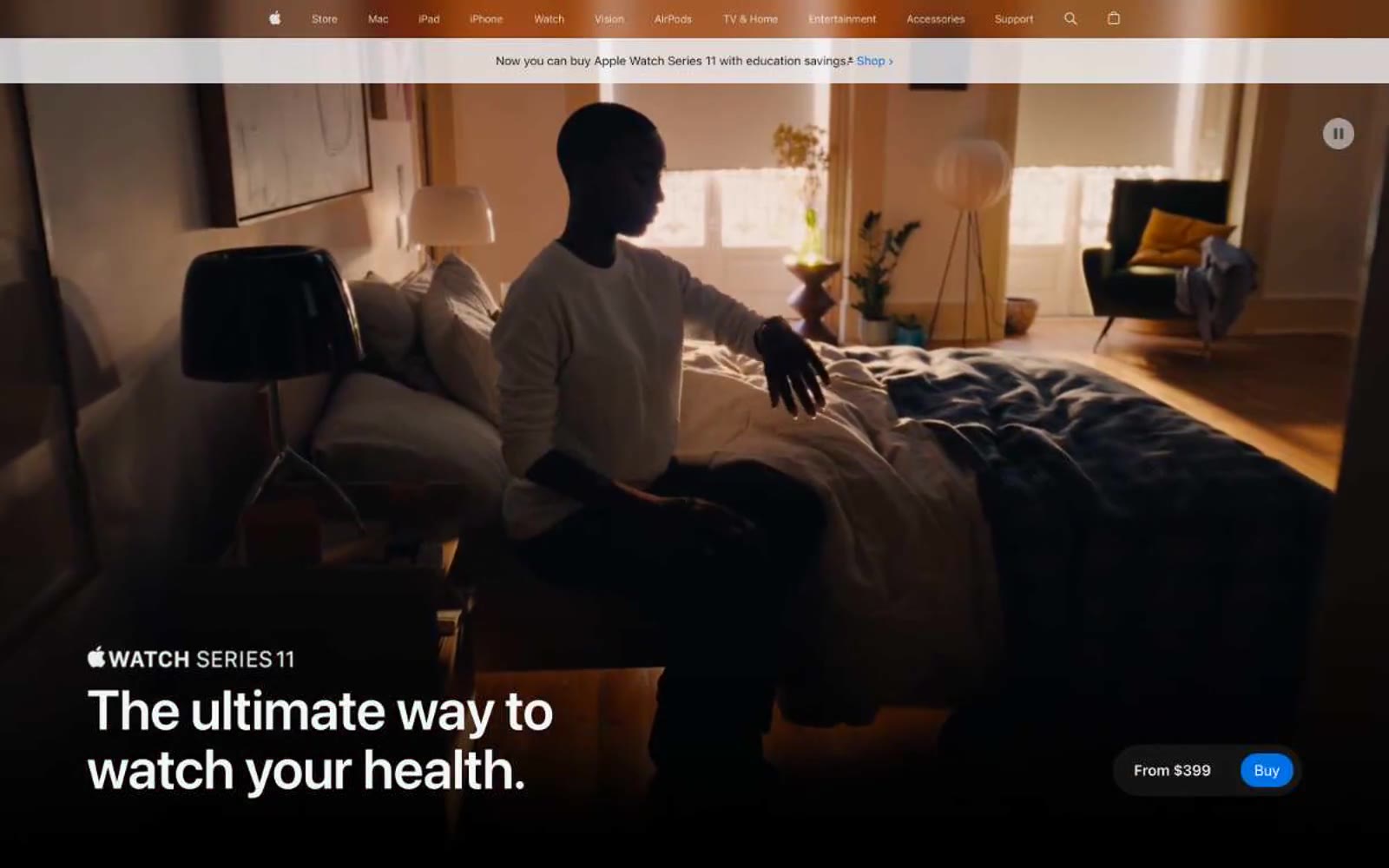
Apple (España)
Apple (España) — Style Reference
# Apple (España) — Style Reference
> cinematic gallery on poured concrete — every product its own still life, every headline a wall label
**Theme:** light
Apple's product page language is cinematic and confident: a full-bleed photographic hero bleeds edge-to-edge, then resolves into spacious white and pale-gray bands where the product sits alone, photographed under controlled studio light. Type is the primary voice — SF Pro Display at display scale carries short, declarative Spanish headlines with aggressively tight negative tracking, while SF Pro Text keeps UI and body quiet. Color is almost entirely neutral; the only chromatic move is a single vivid Apple blue that powers the buying action, with text links and legal footnotes wearing a slightly deeper blue. The system rewards breathing room: large product images sit opposite single short paragraphs, feature lists collapse into icon-pill accordions, and elevation is barely perceptible — corners are generously rounded but cards rely on tonal contrast against #f5f5f7, never on drop shadows.
## Tokens — Colors
| Name | Value | Token | Role |
|------|-------|-------|------|
| Apple Blue | `#0071e3` | `--color-apple-blue` | Primary CTA fill — the single saturated button on the page (Comprar, Learn more). Vivid mid-blue that reads as a switch-on moment against matte neutrals |
| Link Blue | `#0066cc` | `--color-link-blue` | Inline text links, footnote references, and underlined link borders. Slightly deeper and cooler than the CTA blue so links and buttons read as distinct actions |
| Signal Green | `#03aa49` | `--color-signal-green` | Accent stroke for positive health/sleep metric visualizations and decorative data highlights on product UI |
| Ember Orange | `#ed6300` | `--color-ember-orange` | Orange outline accent for tags, dividers, and focused UI edges |
Websites
Markdown Text
design-md
website-prompt
landing-page-prompt
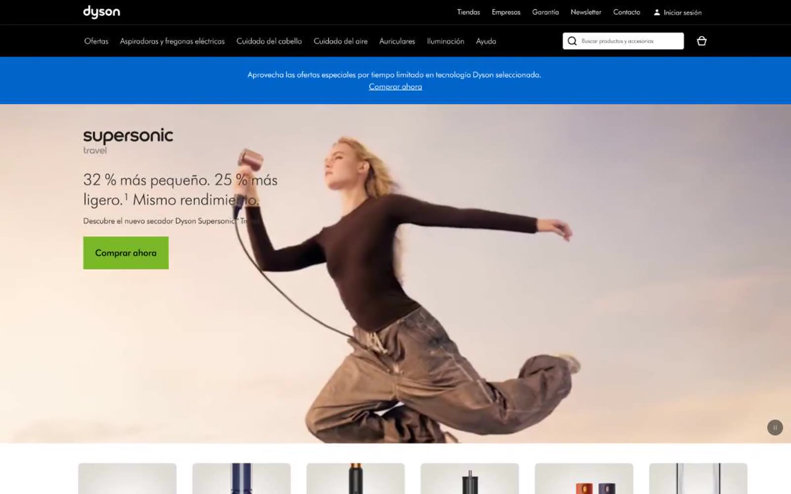
Dyson
Dyson — Style Reference
# Dyson — Style Reference
> engineering gallery on warm paper — products are specimens on a mat board, framed by a black lintel and a single green purchase signal in an otherwise monochrome room.
**Theme:** light
Dyson treats its products as museum objects on a warm cream canvas (#fff8e6) rather than items on a clinical white grid. The interface is overwhelmingly monochrome — charcoal text (#333333), white product cards, hairline dividers (#ebebeb) — with chromatic color appearing only as functional punctuation: a green (#79b928) for the occasional filled promotional button, a vivid blue (#0066cc) for announcement bars and price text, and a single warm brown (#ac5d00) reserved for new-product labels. A solid black header bar anchors every page like a gallery lintel, and content sections breathe through generous vertical rhythm rather than tight stacking. Typography is geometric and precise (DysonFutura, a custom Futura derivative), preferring weight 300 for headlines so engineering speaks quietly. Corners stay sharp — 2px on controls, 8px on imagery — and shadows are entirely absent; surfaces layer through flat planes and 1px rules, producing the vitrine-like effect of objects placed on paper rather than stacked in 3D space.
## Tokens — Colors
| Name | Value | Token | Role |
|------|-------|-------|------|
| Cream Canvas | `#fff8e6` | `--color-cream-canvas` | Page background, hero and section canvas — the warm off-white that replaces pure white and gives the interface its gallery-mat quality |
| Paper White | `#ffffff` | `--color-paper-white` | Product card surfaces, input fields, secondary navigation bar — the brighter white that sits on top of the cream canvas |
| Charcoal Ink | `#333333` | `--color-charcoal-ink` | Primary text, headings, product names, body copy — the dominant text color across the entire interface |
| Graphite Body | `#555555` | `--color-graphite-body` | Secondary body text, descriptions, paragraph copy — a softer dark gray for long-form reading |
Websites
Markdown Text
design-md
website-prompt
landing-page-prompt
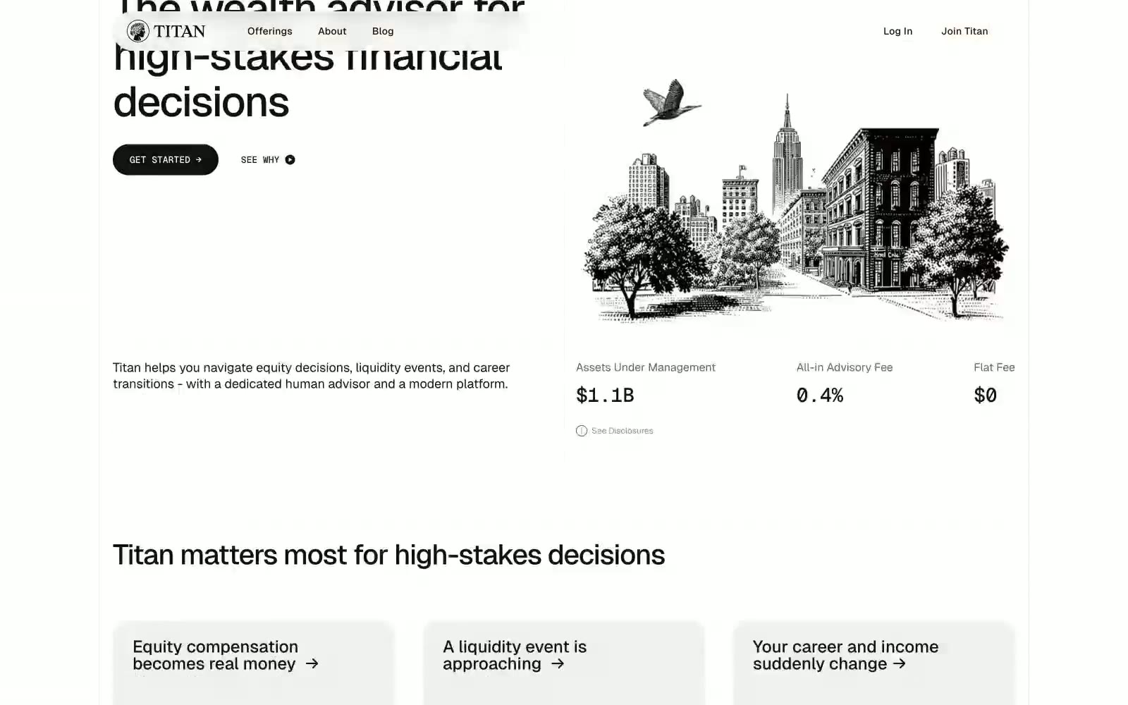
Titan
Titan — Style Reference
# Titan — Style Reference
> Wall Street broadsheet on cream paper — black ink, single accent rule, no noise.
**Theme:** light
Titan runs a paper-and-ink editorial system: pure achromatic palette, generous whitespace, and oversized type that reads like a financial broadsheet. Geist carries the voice — a geometric sans at weight 400–500 for everything functional, weight 700 reserved for display headlines that anchor each section. The only structural device is a single black filled pill button; everything else is text, thin hairline borders, and warm-gray card fills (#e9eaeb). Pills at 160px radius and cards at 32px radius create the only curvature in the system — flat, confident, never decorative. No color, no gradients, no shadows; hierarchy comes from type size, weight, and the warm/cool gray contrast between #e9eaeb (canvas wash) and #d8d3cc (accent surface). Geist Mono appears only where numbers demand authority: $1.1B AUM, 0.4% fee.
## Tokens — Colors
| Name | Value | Token | Role |
|------|-------|-------|------|
| Obsidian | `#111111` | `--color-obsidian` | Primary text, hairline borders, icon strokes, card outlines — the structural ink of the system |
| Paper | `#ffffff` | `--color-paper` | Page canvas, card surfaces, button text on dark fills, nav background |
| Linen | `#e9eaeb` | `--color-linen` | Secondary card surface, subtle wash for grouped content blocks, nav pill fills |
| Sand | `#d8d3cc` | `--color-sand` | Warm-gray accent for ghost button borders, secondary surface fill, tonal divider |
Websites
Markdown Text
design-md
website-prompt
landing-page-prompt
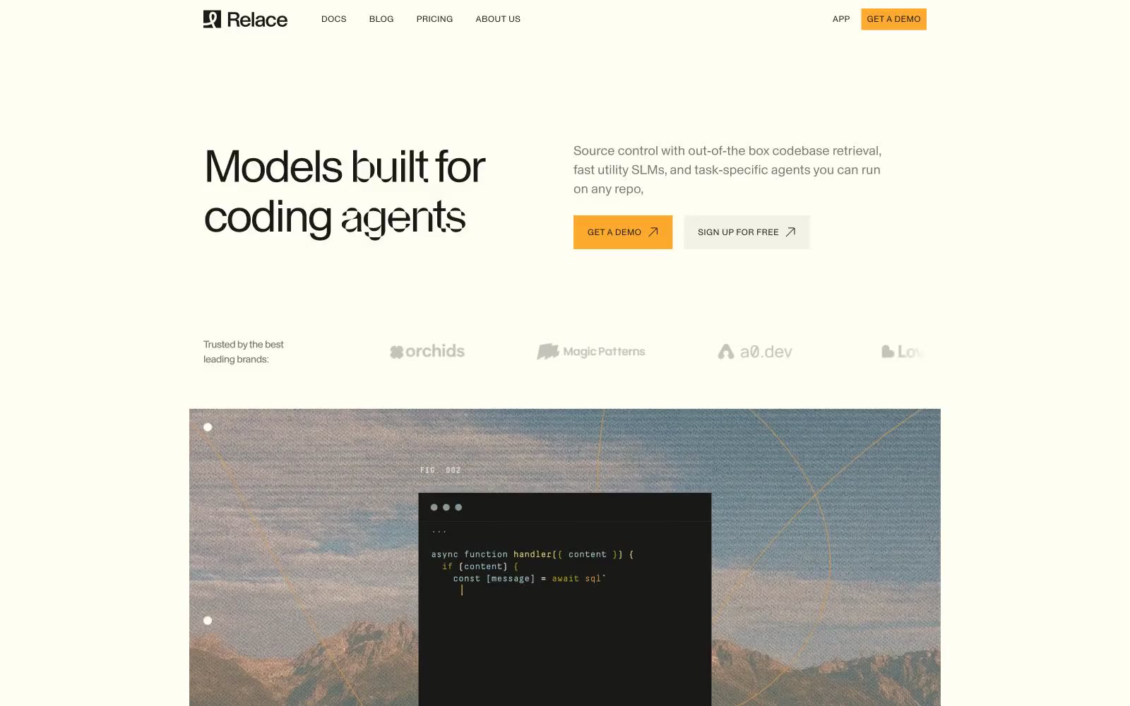
Relace
Relace — Style Reference
# Relace — Style Reference
> Warm paper notebook with amber ink — an editor's desk, not a dashboard.
**Theme:** light
Relace operates as a warm-paper devtool: a cream canvas (#fffef2) rather than cold white, with a single rationed amber accent (#fcaa2d) that punctuates CTAs and inline highlights. Typography carries the entire personality — a distinctive geometric sans (Parabole Trial) with aggressively tight tracking at display sizes produces editorial-weight, left-aligned headlines, while a monospace (Decima Mono Pro) handles all UI chrome, version labels, and code. The system is radically sharp: 2px radii dominate, hairlines replace shadows, and structural black borders (#000000) define separation rather than elevation. Landscape photography with code overlays breaks the monochrome rhythm, and the single warm accent is reserved for moments that must land — never decorative.
## Tokens — Colors
| Name | Value | Token | Role |
|------|-------|-------|------|
| Page Cream | `#fffef2` | `--color-page-cream` | Universal page background and card surface — the warm, almost unbleached paper that defines the entire visual temperature |
| Ink Black | `#191918` | `--color-ink-black` | Primary text color, dark surface fills, and code-window backgrounds — warm near-black, never pure optical black |
| Rule Black | `#000000` | `--color-rule-black` | Structural hairlines and borders — 1px lines that define cards, separate sections, and replace shadow as the elevation language |
| Warm Stone | `#75756f` | `--color-warm-stone` | Muted body text, secondary borders, and inactive link states — a warm gray that recedes without going cool |
Websites
Markdown Text
design-md
website-prompt
landing-page-prompt
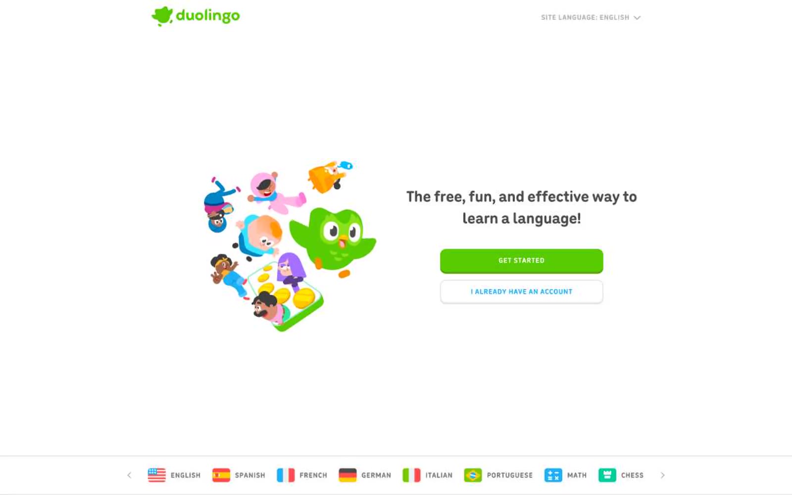
Duolingo
Duolingo — Style Reference
# Duolingo — Style Reference
> Green playground with thick marker outlines
**Theme:** light
Duolingo is a playful, gamified language-learning canvas: a white background dominated by a single saturated brand green that fills primary actions, with thick, colorful borders giving every interactive element a tactile, pressable quality. The interface pairs a friendly rounded sans-serif for body, nav, and links with a heavy display face for oversized feature headlines, creating a contrast between approachable daily-use type and confident, exclamation-point section headers. Color appears sparingly but decisively — green for primary actions and headings, blue for secondary highlights, and a lighter lime green used extensively as a link/button border for an outlined, glowing treatment. The visual mood is warm, educational, and game-like, with cartoon character illustrations that humanize every product surface.
## Tokens — Colors
| Name | Value | Token | Role |
|------|-------|-------|------|
| Ecto Green | `#58cc02` | `--color-ecto-green` | Green outline accent for tags, dividers, and focused UI edges. Do not promote it to the primary CTA color |
| Lingot Lime | `#a5ed6e` | `--color-lingot-lime` | Outlined-action border and link accent — used as the chromatic border on link and button elements in 256+ instances. The lighter green outline gives interactive elements a glowing, highlighter-pen quality against white backgrounds |
| Eel Light | `#d7ffb8` | `--color-eel-light` | Soft highlight and pale border — lightest green used for card outlines, soft surface washes, and the bottom shadow border on filled green buttons to create a 3D pressable effect |
| Macaw Blue | `#1cb0f6` | `--color-macaw-blue` | Secondary action accent — body borders, link text, and outlined button borders for secondary actions like language-specific CTAs. The cyan-blue sibling to the green system, signaling alternative or complementary actions |
Websites
Markdown Text
design-md
website-prompt
landing-page-prompt
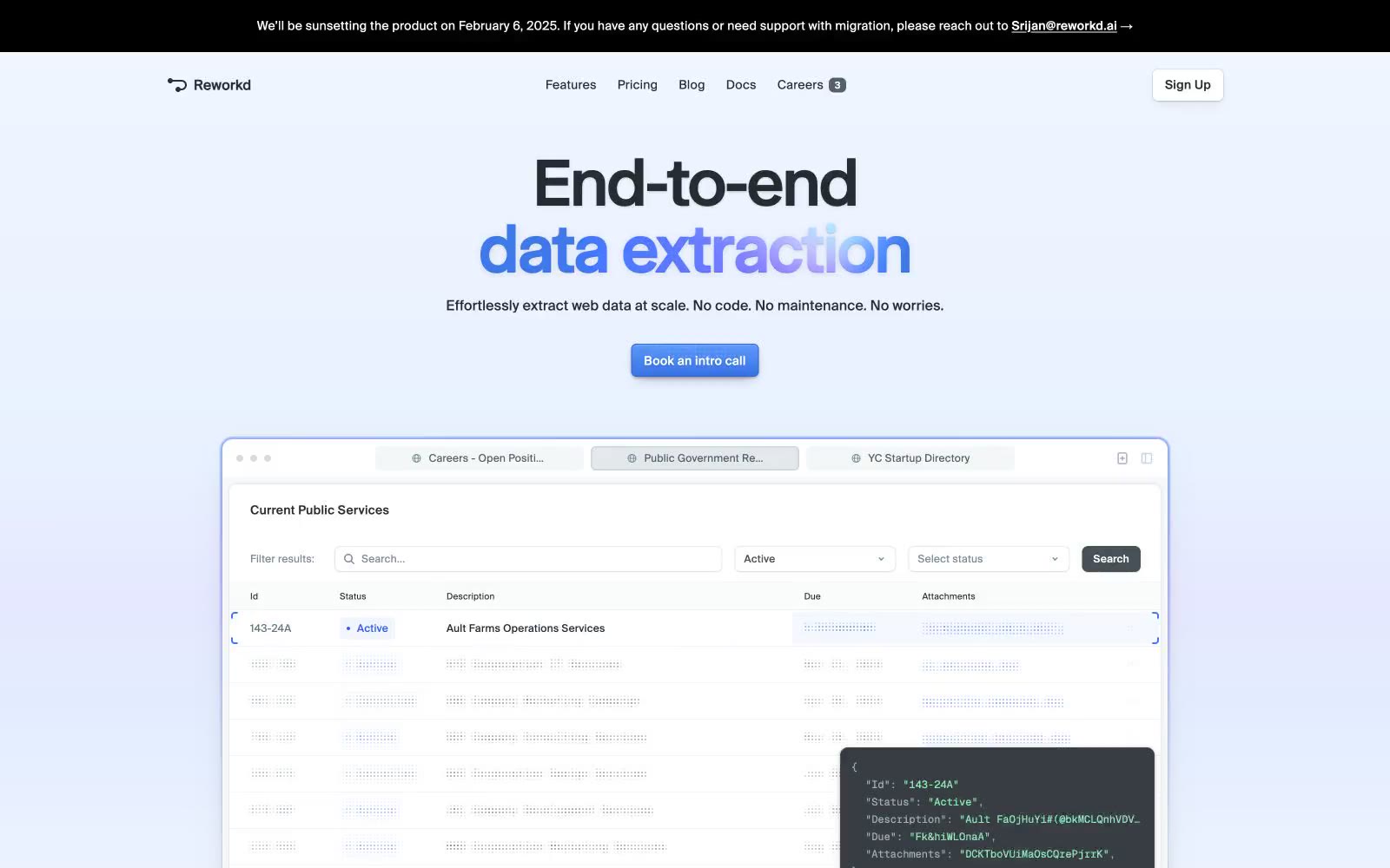
Reworkd
Reworkd — Style Reference
# Reworkd — Style Reference
> Soft daylight over a product blueprint — the only color that speaks is the action button and the gradient headline above it.
**Theme:** light
Reworkd presents a quiet, AI-tool aesthetic built on a soft lavender-to-white canvas with a single vivid blue accent that powers CTAs, gradient text fills, and the product's blue-violet glow. The defining typographic move is pairing a custom high-contrast display serif (Selecta) at near-black against Suisse Intl for the entire UI chrome — the serif headline is the only decorative gesture on an otherwise utilitarian surface, creating a calm-product contrast. Layout is compact, centered, max-width contained, with thin 6px-radius cards floating on layered soft shadows and hairline 1px borders. Color discipline is strict: 95% achromatic plus one electric blue family, with green reserved for status badges and gradients used sparingly for atmosphere (hero glow) and emphasis (gradient headline text).
## Tokens — Colors
| Name | Value | Token | Role |
|------|-------|-------|------|
| Iris Blue | `radial-gradient(335.69% 99.21% at 57.77% 0px, rgb(0, 89, 255) 0px, rgba(129, 118, 255, 0.73) 36.5%, rgba(255, 225, 66, 0) 75.65%, rgba(72, 132, 239, 0) 100%)` | `--color-iris-blue` | Brand borders, gradient text fills, icon strokes, link accents — the dominant chromatic identifier across the entire site; Hero background radial glow — the atmospheric blue light at the top of the page |
| Cobalt | `linear-gradient(rgb(88, 151, 247) 0px, rgb(56, 114, 230) 100%)` | `--color-cobalt` | Primary action button fill, active states — the only solid color button in the system; Violet action color for filled buttons, selected navigation states, and focused conversion moments. |
| Sky Glow | `#3e9ed0` | `--color-sky-glow` | Secondary blue accent for illustrations and decorative icon strokes |
| Mint Pulse | `#89ecb0` | `--color-mint-pulse` | Green outline accent for tags, dividers, and focused UI edges. Use as a supporting accent, not as a status color |
Websites
Markdown Text
design-md
website-prompt
landing-page-prompt
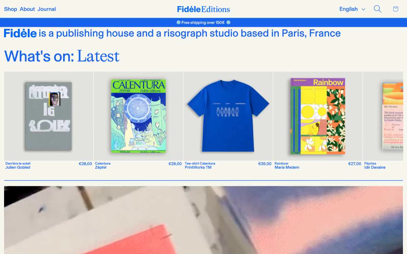
Fidèle Editions
Fidèle Editions — Style Reference
# Fidèle Editions — Style Reference
> Risograph blue ink on warm cream paper. A single fluorescent blue floods headlines, the announcement bar, and a giant asterisk logo, stamped onto a flat cream stock with zero shadows and near-zero rounding — the page reads as a printed broadsheet, not a SaaS interface.
**Theme:** light
Fidèle Editions operates as a risograph studio's web storefront: a warm cream paper canvas printed with one aggressive blue ink. The entire system is built on flatness — no shadows, no gradients, near-zero corner rounding, no decorative borders. Typography does the heavy lifting: a custom geometric sans (BaselGrotesk) at extreme size contrast, with display sizes crushed tight at 0.92 line-height and negative tracking, while small labels breathe with wide positive tracking. The vivid blue is used as a printing press uses ink — for type, nav, the announcement bar, and the massive asterisk logo — never as a subtle accent. Content lives in dense, editorial blocks: full-bleed imagery, tight product grids, photo strips. Every element feels stamped onto paper, not rendered on a screen.
## Tokens — Colors
| Name | Value | Token | Role |
|------|-------|-------|------|
| Fidèle Blue | `#1664eb` | `--color-fidle-blue` | Headlines, nav links, brand asterisk, announcement bar fill, body borders — the single chromatic ink of the system; whenever color appears, this is it |
| Lighter Press Blue | `#4f89ec` | `--color-lighter-press-blue` | Secondary blue used for subtle borders, icon tints, and decorative strokes where Fidèle Blue would dominate |
| Link Blue | `#006ce5` | `--color-link-blue` | Deeper blue for inline hyperlinks within running text, slightly darker than the primary to read as a separate interactive state |
| Paper White | `#f8f7ef` | `--color-paper-white` | Page canvas and card surfaces — a warm off-white that gives the entire system its print-stock identity; never use pure #ffffff for page background |
Websites
Markdown Text
design-md
website-prompt
landing-page-prompt
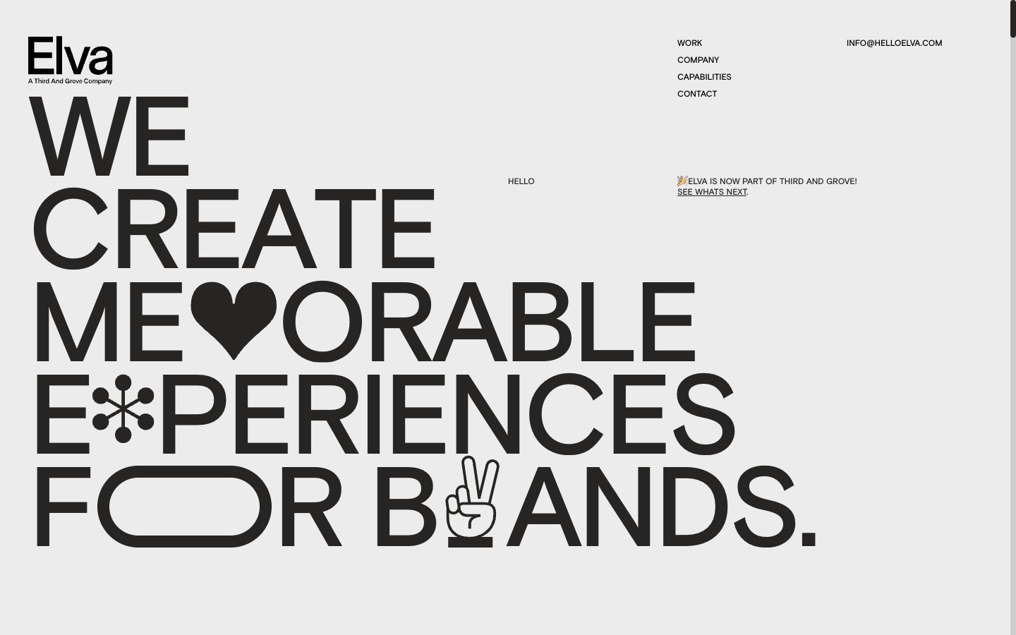
Elva
Elva — Style Reference
# Elva — Style Reference
> Monumental type on warm concrete
**Theme:** light
Elva is a typographic monument, not a typical agency site. The entire visual system is built on a custom Basis sans-serif rendered at extreme sizes — from 12px navigation to 640px hero headlines — on a warm bone-white canvas with near-zero color information. The signature moves are compressed display lines at line-height 0.82 with -0.06em tracking that force words to stack as architectural blocks, and generous 80–160px section gaps that make negative space the primary compositional tool. There are no buttons, cards, or shadows — only text links with arrows and a handful of pictogram glyphs (heart, asterisk, peace sign, victory hand) that replace individual letters in the display type, acting as typographic flourishes rather than traditional icons. The warm undertone of the #262523 text prevents the minimalism from feeling cold or clinical — the page reads as printed matter on warm paper.
## Tokens — Colors
| Name | Value | Token | Role |
|------|-------|-------|------|
| Warm Obsidian | `#262523` | `--color-warm-obsidian` | Primary text, logos, pictogram strokes, structural elements — the near-black with a brown undertone is the only ink in the system and gives the minimalism its printed-on-paper warmth |
| Bone White | `#ececec` | `--color-bone-white` | Page canvas and primary surface — the warm slightly-grayed white fills the entire viewport and provides the breathing room around monumental type |
| Pale Ash | `#cfcdcd` | `--color-pale-ash` | Secondary surface and hairline borders — one step darker than the canvas, used for subtle dividers and the rare nested surface |
| Pure Black | `#000000` | `--color-pure-black` | Sparing deep contrast for the smallest marks and AAA contrast anchors — never used for body text (that is always Warm Obsidian) |
Websites
Markdown Text
design-md
website-prompt
landing-page-prompt
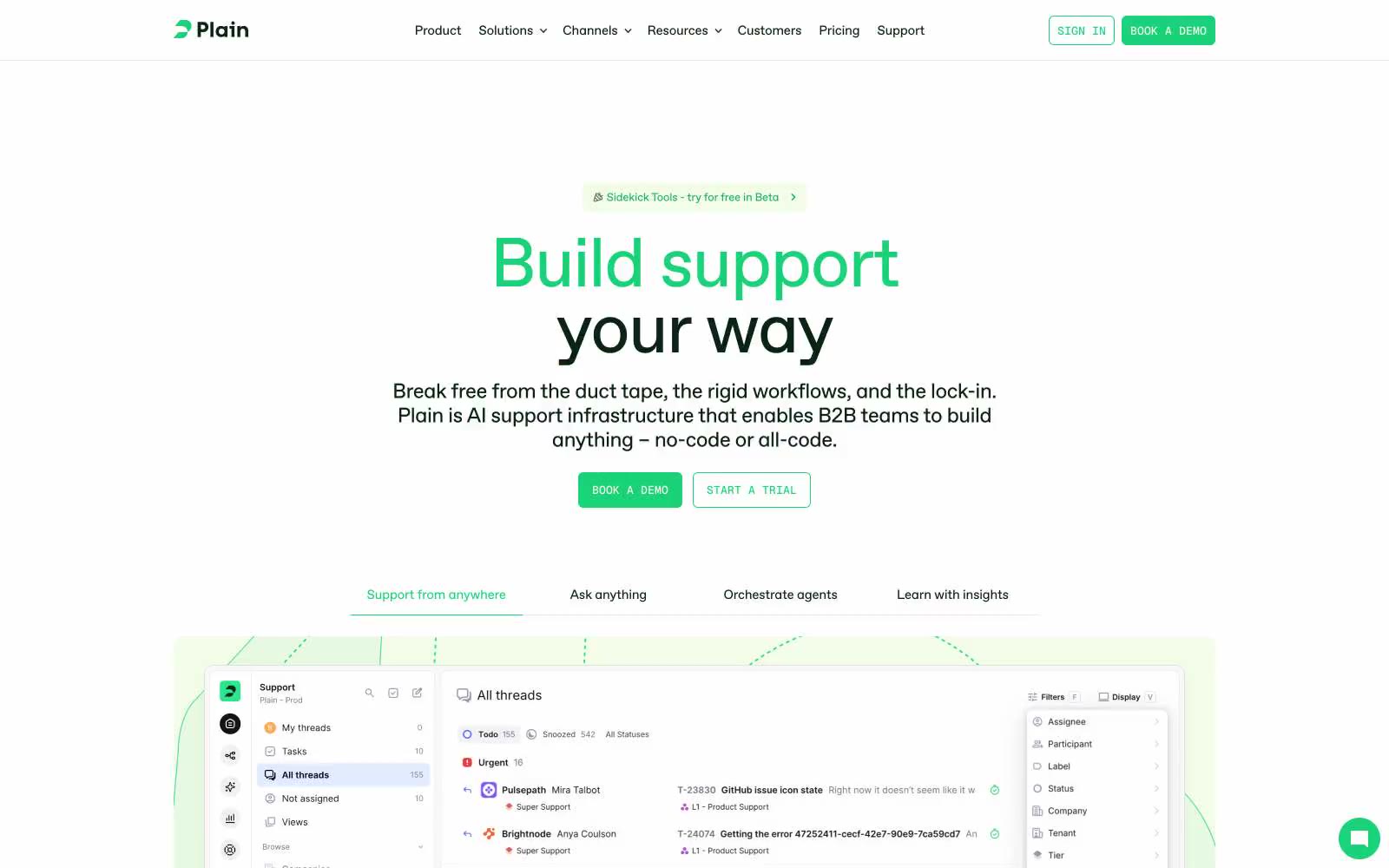
Plain
Plain — Style Reference
# Plain — Style Reference
> Botanical greenhouse on warm parchment — a single living green accent breathing inside a calm cream workspace.
**Theme:** light
Plain uses a botanical productivity-canvas language: warm parchment-cream surfaces, a single vivid green accent, and ABC Favorit set with tight negative tracking to create a calm but alive workspace feel. The interface stays quiet and mostly monochromatic — deep forest-black ink on warm off-white — letting the green act as small functional punctuation for primary actions, active states, and notification dots. Components feel like editorial product UI: 6px-rounded buttons, 9px-rounded cards, generous 24-40px breathing room, and product screenshots treated as the hero rather than decorative imagery. Type carries the energy — display headlines at 80px whisper with -0.02em tracking, emoji-embedded headings break the grid playfully, and Geist Mono tags provide quiet metadata rhythm alongside the warm Favorit voice.
## Tokens — Colors
| Name | Value | Token | Role |
|------|-------|-------|------|
| Forest Ink | `#0a2414` | `--color-forest-ink` | Primary text, heading strokes, and structural borders. A near-black with green undertone that grounds the warm cream surfaces in nature rather than corporate gray |
| Parchment Cream | `#f3fbe9` | `--color-parchment-cream` | Primary surface for buttons, soft callouts, and section tints. A warm cream with green undertone — the canvas color, not pure white |
| Card Linen | `#f9f6f1` | `--color-card-linen` | Card and elevated surface background. Slightly warmer and more beige than Parchment Cream, creating a paper-grain feel for nested elements |
| Sage Charcoal | `#283a2e` | `--color-sage-charcoal` | Dark elevated surface for hero feature blocks and inverse sections. A muted green-black that ties the dark theme back to the brand green |
Websites
Markdown Text
design-md
website-prompt
landing-page-prompt
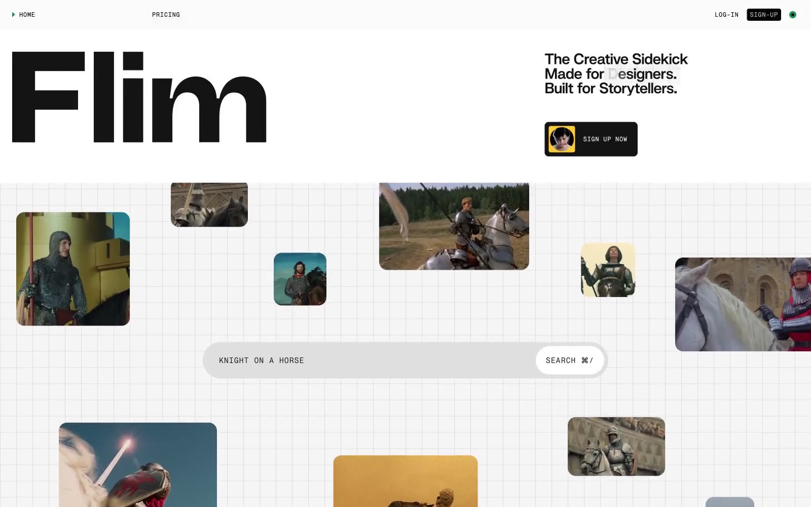
Flim
Flim — Style Reference
# Flim — Style Reference
> Scattered polaroids on a sketchpad grid
**Theme:** light
Flim's design language is a creative-tool's analog workspace: a vast light-gray canvas etched with a subtle grid, scattered with rounded polaroid-like image cards, and anchored by a single oversized custom wordmark. The system is 99% monochrome — near-black ink on warm light gray paper — with tiny, deliberate splashes of signal green, ember orange, and highlight yellow used as functional punctuation rather than decoration. Typography splits into three voices: a heavy custom display face (Swizzy) for the hero wordmark, a mono micro-typeface (PP Neue Montreal Mono) for navigation, labels, and search placeholders, and system Arial for body. Components feel loose and handmade rather than gridded: pill-shaped search bars, image thumbnails with a 16px radius floating asymmetrically, ghost navigation, and a single hard-edged black button. The grid pattern and scattered image layout evoke a corkboard or lightbox — the visual metaphor of a creative agency's working surface.
## Tokens — Colors
| Name | Value | Token | Role |
|------|-------|-------|------|
| Ink | `#141414` | `--color-ink` | Primary text, nav links, icon strokes, image card borders, filled button background, the dominant near-black that carries the entire UI |
| Paper | `#ffffff` | `--color-paper` | Text on dark surfaces, surface highlights, card surfaces floating above the canvas, button text on filled actions |
| Canvas | `#f5f5f5` | `--color-canvas` | Page background, search bar fills, the warm light gray that is the base layer for everything |
| Mist | `#e9e9e9` | `--color-mist` | Secondary surface fills, card backgrounds, alternating bands below the canvas, muted blocks |
Websites
Markdown Text
design-md
website-prompt
landing-page-prompt
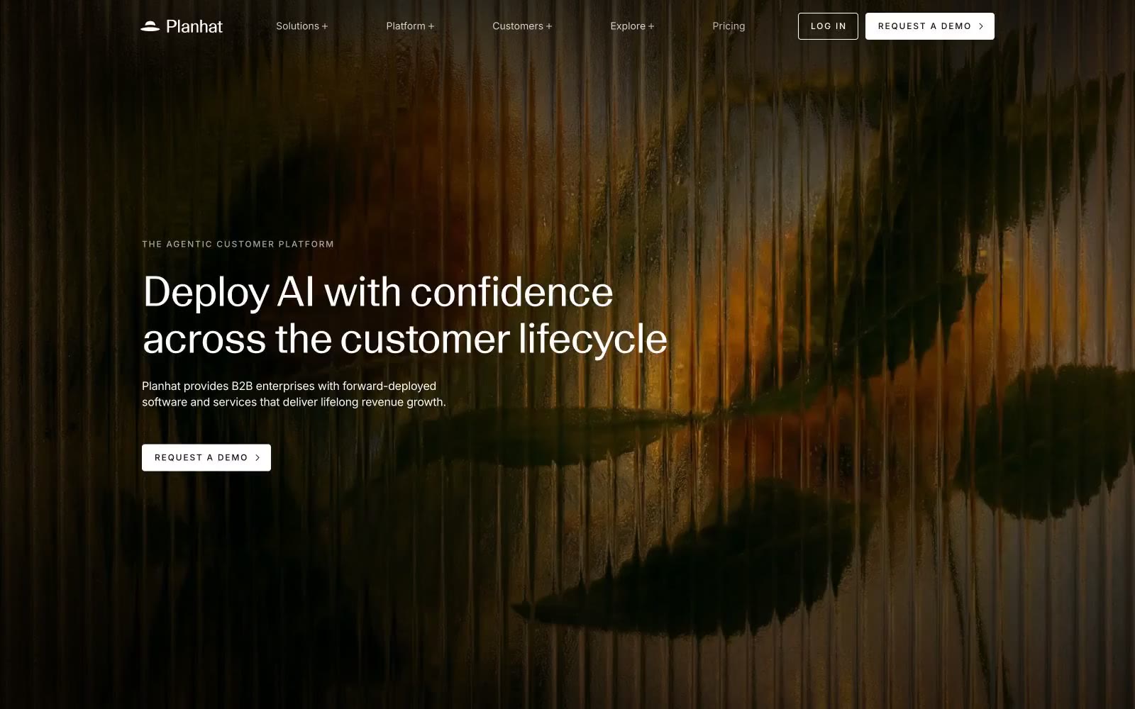
Planhat
Planhat — Style Reference
# Planhat — Style Reference
> Cinematic monochrome editorial — a darkroom print on cold-pressed paper.
**Theme:** mixed
Planhat speaks in a near-monochrome editorial voice: a cinematic dark hero — photographic forest warmth fading into black — gives way to cool white space below, where content breathes between hairline borders and large, tightly-tracked display type. The system is almost entirely black, white, and a warm taupe; chromatic color is absent from the marketing surface, making any accent feel intentional when it appears. Type does the heavy lifting: a custom neo-grotesque variable face with aggressive negative tracking carries headlines up to 113px, while Inter handles UI and body at a compact rhythm. The overall feel is a printed annual report crossed with a darkroom — quiet authority, generous whitespace, and the confidence to leave large areas of the page nearly empty.
## Tokens — Colors
| Name | Value | Token | Role |
|------|-------|-------|------|
| Obsidian | `#000000` | `--color-obsidian` | Neutral form states, badge text, and quiet UI feedback where color should stay understated. Do not promote it to the primary CTA color |
| Paper White | `#ffffff` | `--color-paper-white` | Page canvas, card surfaces, filled-button text — the bright stage everything sits on |
| Deep Ink | `#121211` | `--color-deep-ink` | Secondary text and input field treatment — a near-black that softens long-form body copy without losing contrast |
| Graphite | `#575551` | `--color-graphite` | Muted helper text and secondary descriptions — a mid-gray that recedes behind Obsidian labels |
Websites
Markdown Text
design-md
website-prompt
landing-page-prompt
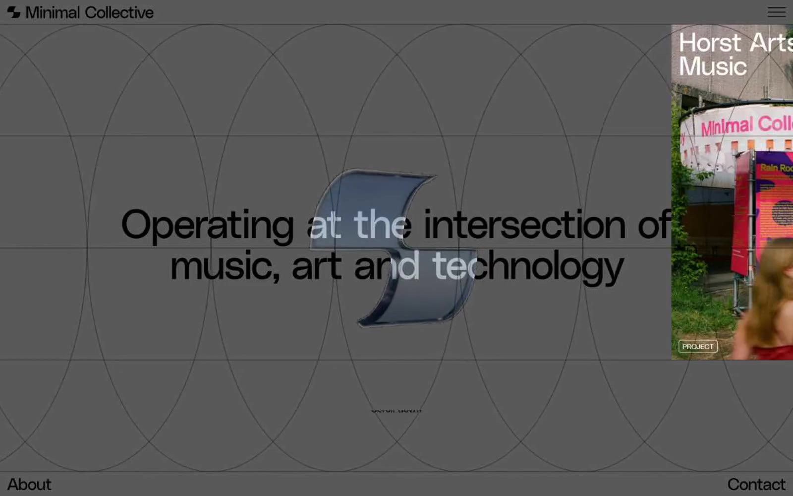
Minimal Collective
Minimal Collective — Style Reference
# Minimal Collective — Style Reference
> midnight gallery wall
**Theme:** dark
Minimal Collective operates as a pitch-black editorial canvas where every element earns its presence through restraint rather than decoration. A single geometric sans-serif at weight 400 — never heavier — carries all hierarchy; even 77px display headlines whisper instead of shout, with letter-spacing compressed to -0.056em that pulls letters into sculptural, almost overlapping forms. The interface is colorlessly austere: true black #000000 as the void, hairline white borders as the only structural language, and bordered category pills (EDITORIAL, PREMIERE, CULTURE) that function as ghost labels rather than UI affordances. Content arrives as an overlapping photographic mosaic — event documentation, art installations, studio interiors — layered against the black field without shadows, gradients, or card elevation to separate them from the canvas. The aesthetic is closer to a contemporary art publication at midnight than a typical product UI.
## Tokens — Colors
| Name | Value | Token | Role |
|------|-------|-------|------|
| Obsidian | `#000000` | `--color-obsidian` | Page canvas, primary surface, image card backgrounds, footer/header fields |
| Ash | `#5a5a5a` | `--color-ash` | Secondary structural elements, input borders, mid-tone dividers, muted UI chrome |
| Ghost White | `#ffffff` | `--color-ghost-white` | Primary text, heading fills, hairline borders, badge outlines, link strokes |
Websites
Markdown Text
design-md
website-prompt
landing-page-prompt
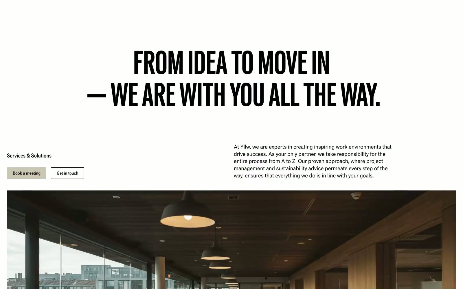
Yllw
Yllw — Style Reference
# Yllw — Style Reference
> Swiss-Bauhaus print monograph. Think oversized Grotesk on warm putty paper, hairline rules, no shadows — architecture rendered as typography.
**Theme:** light
Yllw is an editorial workspace brand: a single variable font pressed into monumental display sizes, a near-grayscale palette anchored by one warm putty neutral, and borders drawn with 1px inset strokes instead of shadows. The page reads like a Swiss-Bauhaus print artifact dropped onto a web canvas — oversized uppercase headlines (often 90–216px) with line-heights pulled tight to 0.88, a dominant putty-stone hue (#cac7b4) that functions simultaneously as canvas, button, and border, and a single signal-yellow announcement bar that acts as the only chromatic punctuation. Components are deliberately raw: 2px corners, hairline rules, no decorative gradients, no elevation depth — every surface is defined by adjacency, not by shadow. New screens should feel like pages from the same printed monograph, not like a product UI.
## Tokens — Colors
| Name | Value | Token | Role |
|------|-------|-------|------|
| Putty Stone | `#cac7b4` | `--color-putty-stone` | Light neutral action fill for buttons on dark surfaces. |
| Signal Yellow | `#ffdd00` | `--color-signal-yellow` | Top announcement bar background, occasional highlight — the only fully saturated color in the system, reserved for time-sensitive messaging and high-visibility callouts |
| Ink | `#000000` | `--color-ink` | Primary text, icon strokes, primary borders — the maximum-contrast foreground that does 90% of the typographic and structural work |
| Paper | `#ffffff` | `--color-paper` | Inverse surface, card backgrounds on darker sections, button text on filled putty buttons, hairline border against putty canvas |