AI Prompt Studio - Intelligent Prompt Library
Explore and use professional AI prompts to optimize your workflow.
One-click Use
Websites
Markdown Text
design-md
website-prompt
landing-page-prompt
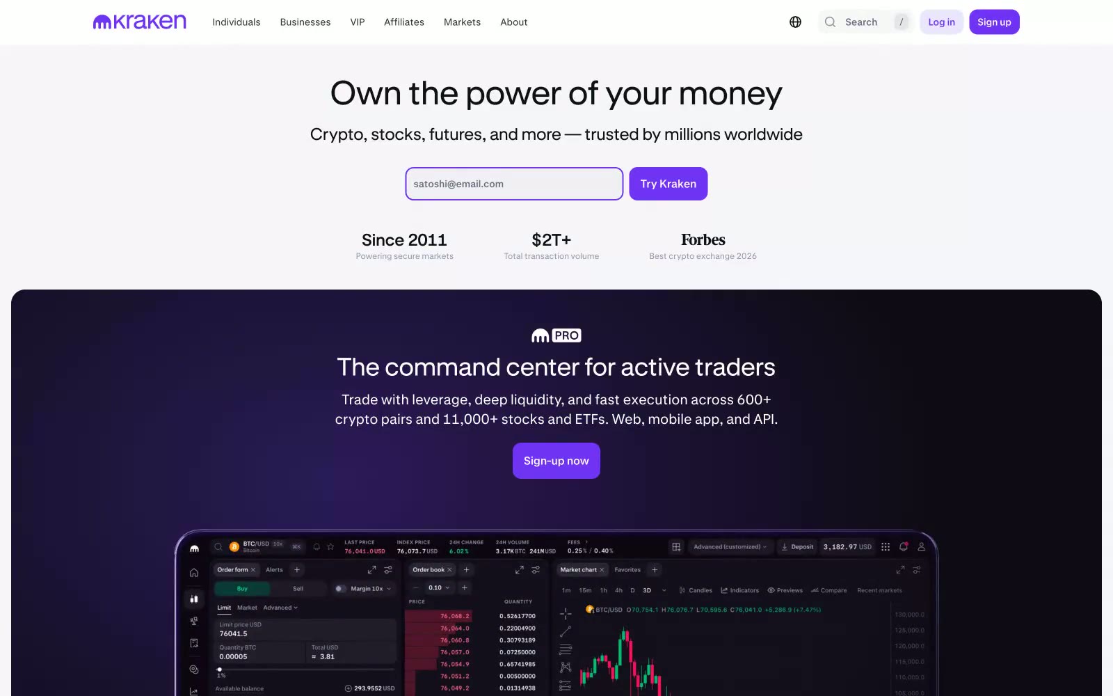
Kraken
Kraken — Style Reference

# Kraken — Style Reference
> violet ledger on frosted glass — a precise financial document where one electric purple ink does all the talking.
**Theme:** light
Kraken is a light-mode crypto exchange interface that reads like a precise financial ledger: a near-white canvas (#ffffff, #f6f5f9), near-black typography (#101114) at very high contrast, and one signature violet (#7132f5) that appears sparingly as brand punctuation on headlines, icons, links, and the primary action. Surfaces stay almost weightless — cards float on a barely-there 3% black shadow with 4px/24px blur rather than hard borders, so the whole UI feels printed rather than boxed. The system uses two custom typefaces: Kraken-Product (400/500) for all UI and body text from 10–16px, and Kraken-Brand (400/700) for 20–48px display with tight negative tracking (-0.0210em to -0.0140em) that compresses headlines into a confident, compact block. Information density is high and deliberately so: nav bars, asset tickers, stat grids, and news cards pack together with 12px gutters, letting the white space between sections do the breathing.
## Tokens — Colors
| Name | Value | Token | Role |
|------|-------|-------|------|
| Kraken Violet | `#7132f5` | `--color-kraken-violet` | Violet supporting accent for decorative details and low-frequency emphasis. Do not promote it to the primary CTA color |
| Deep Iris | `#2e3350` | `--color-deep-iris` | Dark surface backing for the brand radial gradient and darker brand moments |
| Midnight Ink | `#202333` | `--color-midnight-ink` | Dark surface backing paired with violet gradients, section-level dark accents |
| Ink Black | `#101114` | `--color-ink-black` | Primary text, headlines, icon strokes, and input borders — the dominant ink at 18,000+ occurrences |
Websites
Markdown Text
design-md
website-prompt
landing-page-prompt
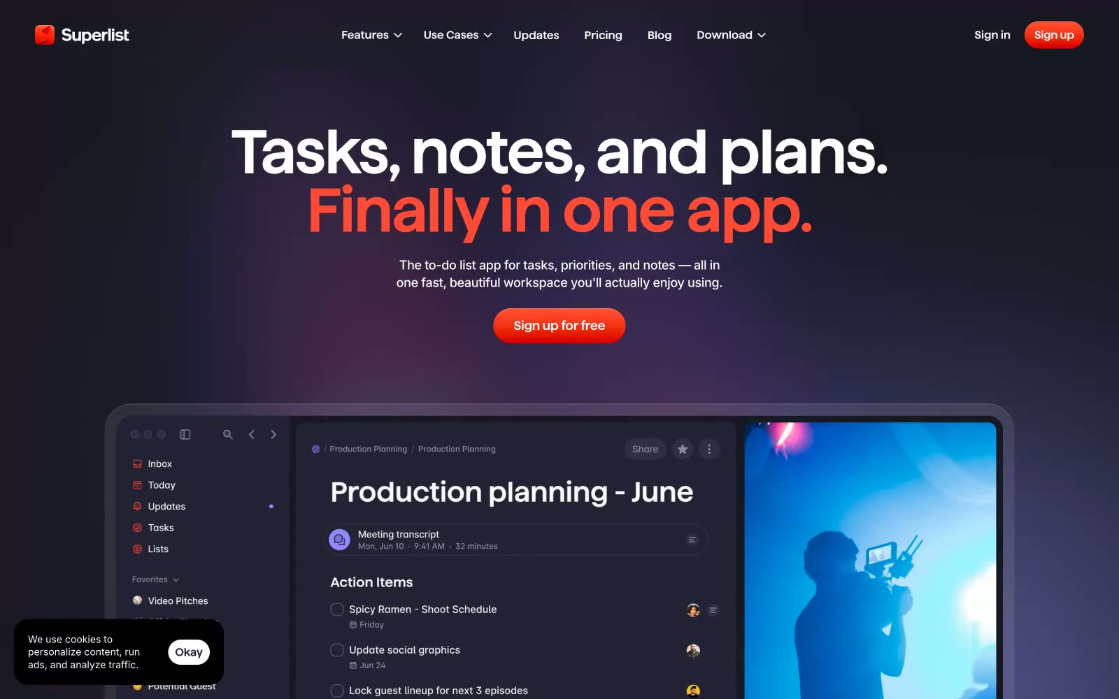
Superlist
Superlist — Style Reference
# Superlist — Style Reference
> midnight workspace with coral embers — a quiet aubergine app surface where one warm orange spark signals every action
**Theme:** dark
Superlist uses a midnight-violet productivity language: deep aubergine canvas, warm coral as the single ignition color, and oversized sans-serif headlines that carry the entire mood. The interface feels like a focused late-night workspace — quiet, layered, and confident, with color appearing only as functional punctuation on CTAs, active states, and key highlights. Surfaces stack in subtle purple-tinted darks (#181824 → #26253b), avoiding pure black to keep depth feeling warm rather than clinical. Components are generously rounded (20px cards, pill buttons), softly shadowed, and breathe through comfortable 10–16px gaps rather than tight grids. The headline voice is everything: weight 600 at 70–88px with tight -0.02em tracking treats copy as typography, not interface text — it's closer to editorial than SaaS.
## Tokens — Colors
| Name | Value | Token | Role |
|------|-------|-------|------|
| Aubergine Canvas | `#181824` | `--color-aubergine-canvas` | Page background, primary canvas — warm-tinted dark replaces pure black so the UI feels layered rather than flat |
| Elevated Plum | `#26253b` | `--color-elevated-plum` | Card surfaces, input fields, nav containers — one step lighter than canvas to create depth without a visible border |
| Pure White | `#ffffff` | `--color-pure-white` | Primary headings, button text, icon strokes — maximum contrast on the dark canvas |
| Fog Text | `#696f81` | `--color-fog-text` | Body text, secondary headings, muted borders — sits at 7:1 contrast for comfortable reading on the aubergine canvas |
Websites
Markdown Text
design-md
website-prompt
landing-page-prompt
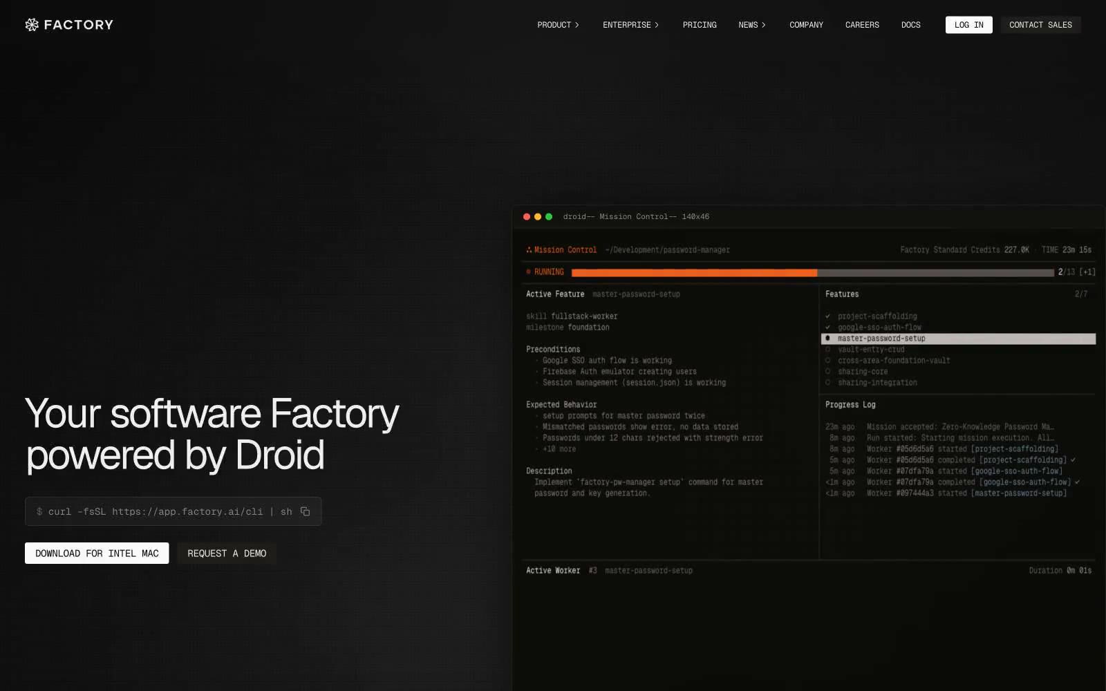
Factory.ai
Factory.ai — Style Reference
# Factory.ai — Style Reference
> Engineer's spec sheet on warm vellum. Off-white canvas, 4px corners, 1px hairlines, monospace labels, and one orange dot that signals but never shouts.
**Theme:** light
Factory.ai reads as a technical spec sheet on warm vellum: an off-white canvas, a tightly tracked geometric sans for headlines, and one vivid orange dot that punctuates a nearly monochrome interface. The visual language borrows from terminal windows and code editors — monospace type is everywhere, borders are 1px hairlines, corners are sharp at 4px, and product mockups (IDE panels, CLI boxes, terminal windows) carry the visual weight that photography would in a consumer brand. Elevation is communicated through surface tone shifts and dotted borders, never drop shadows. The orange accent never fills large shapes; it appears only as a 8px signal dot beside labels like "VERSION" — the color is a status indicator, not a brand wall. Every screen should feel like a developer's working document: high information density, minimal decoration, monospace for anything categorical, and prose reserved for primary messaging.
## Tokens — Colors
| Name | Value | Token | Role |
|------|-------|-------|------|
| Paper White | `#fafafa` | `--color-paper-white` | Page canvas, page background |
| Frost Surface | `#eeeeee` | `--color-frost-surface` | Card surface, elevated panels, muted backgrounds |
| Ash Hairline | `#d6d3d2` | `--color-ash-hairline` | Subtle dividers, dotted borders, faint structural lines |
| Pewter Rule | `#b8b3b0` | `--color-pewter-rule` | Most-used border color, hairline rules, input outlines, card borders |
Websites
Markdown Text
design-md
website-prompt
landing-page-prompt
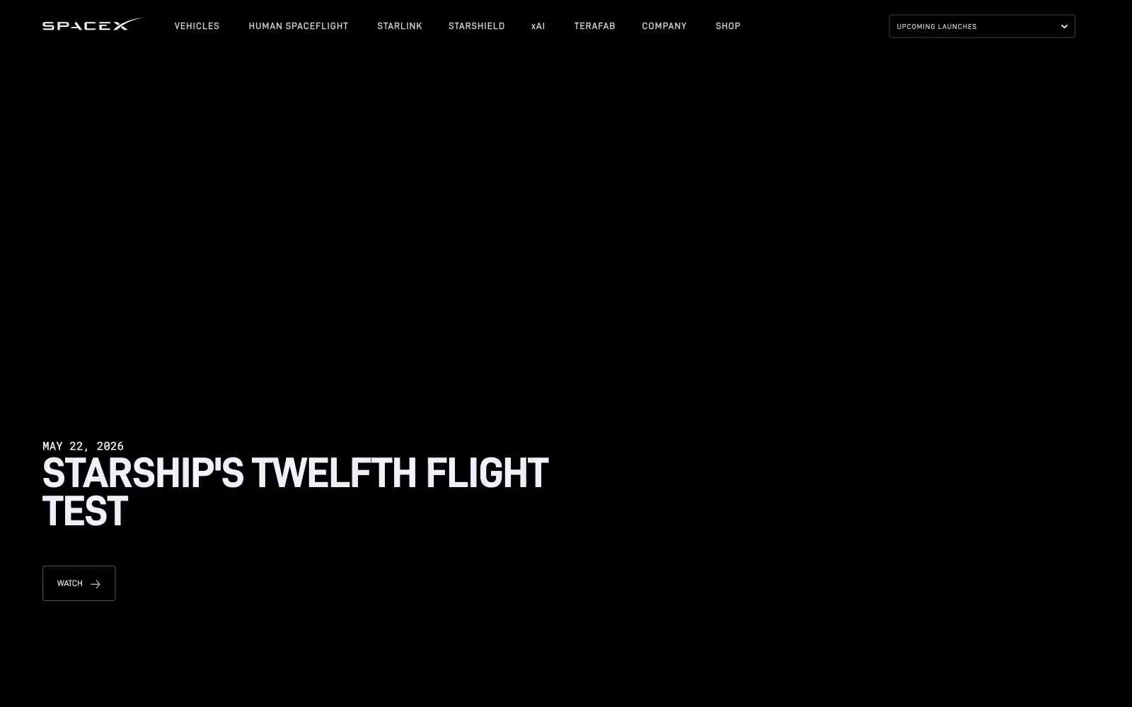
SpaceX
SpaceX — Style Reference
# SpaceX — Style Reference
> Mission control viewport into deep space
**Theme:** dark
SpaceX operates in cinematic darkness. The entire interface is a single voice — off-white technical typography on absolute black — with no decorative color to compete with the full-bleed photography of spacecraft and celestial bodies. D-DIN, a geometric industrial sans, gives every label the feel of an instrument panel readout; uppercase tracking at 0.09-0.10em turns navigation into mission-control abbreviations. The page surrenders its visual real estate to imagery: text floats over rockets and planets rather than sitting in contained cards. Buttons are hairline outlines, never filled. Color appears only as a function of light — the page has no accent, no warm, no soft.
## Tokens — Colors
| Name | Value | Token | Role |
|------|-------|-------|------|
| Void Black | `#000000` | `--color-void-black` | Page canvas, all section backgrounds — the unbroken dark that makes the photography luminous |
| Star White | `#f0f0fa` | `--color-star-white` | All body text, headings, icons, nav labels, button text, button borders — the sole foreground color; the cool tint reads as artificial light against black, not paper |
| Dim Steel | `#545457` | `--color-dim-steel` | Supporting neutral for secondary UI, dividers, and muted labels. Do not promote it to the primary CTA color |
| Dark Gunmetal | `#404040` | `--color-dark-gunmetal` | Subtle nav separators and low-emphasis dividers — barely visible against black, used only when structural separation is needed |
Websites
Markdown Text
design-md
website-prompt
landing-page-prompt
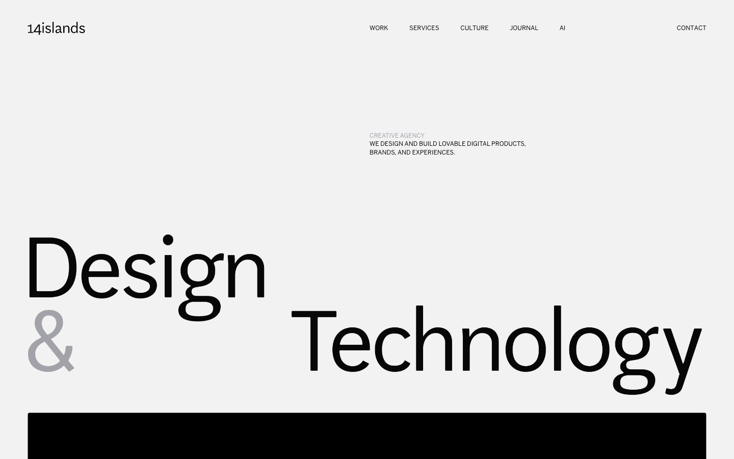
14islands
14islands — Style Reference
# 14islands — Style Reference
> Monochrome editorial gallery — A pristine gallery wall where oversized black typography and full-bleed photography exist without decoration, color, or UI noise.
**Theme:** light
14islands operates as a gallery space for digital work: pure white canvas, near-black text, and a single mid-gray for quiet secondary information. The visual hierarchy is built entirely through scale — display type swells to 180px while body text stays at a disciplined 16px, creating a 10× relationship that feels editorial rather than digital. Components are barely there: hairline borders, 4px corners, no shadows, no chromatic color anywhere in the interface. Photography and full-bleed dark media blocks carry the visual weight that color would in a more conventional system. The single design device that breaks the monochrome discipline is the lighter-gray ampersand or category label — a whisper of contrast that structures typographic relationships without adding hue.
## Tokens — Colors
| Name | Value | Token | Role |
|------|-------|-------|------|
| Ink | `#070707` | `--color-ink` | Primary text, display headlines, full-bleed dark media blocks, nav wordmark — the single near-black that anchors every interface |
| Paper | `#ffffff` | `--color-paper` | Default canvas, card surfaces, text on dark sections |
| Fog | `#f2f2f2` | `--color-fog` | Subtle surface differentiation for alternating sections or inset panels — barely visible, used to create quiet separation without borders |
| Stone | `#a2a2a9` | `--color-stone` | Secondary text, category labels, decorative ampersand, muted button text — the entire chromatic-like hierarchy comes from this one gray |
Websites
Markdown Text
design-md
website-prompt
landing-page-prompt
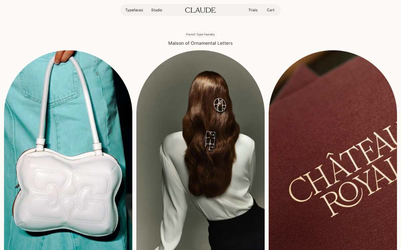
Claude Type
Claude Type — Style Reference
# Claude Type — Style Reference
> curated gallery on warm parchment
**Theme:** light
Claude Type operates as a curated type foundry gallery rendered on warm linen parchment: an editorial cream canvas, pill-shaped UI chrome, and arched image portals that frame type specimens like museum vitrines. The interface is almost entirely achromatic — deep warm-black text on cream surfaces — with a single electric green badge as the only chromatic punctuation. Frosted-glass navigation floats over content, display serifs are treated as hero artwork not as UI text, and borders rather than shadows define every surface. The visual rhythm is gallery-slow: generous breathing room, tombstone-arched cards, and the type itself doing the heavy lifting.
## Tokens — Colors
| Name | Value | Token | Role |
|------|-------|-------|------|
| Parchment Cream | `#fcfbf7` | `--color-parchment-cream` | Primary page canvas and hero section background — warm off-white that flatters display serifs the way museum walls flatter paintings |
| Pure Linen | `#ffffff` | `--color-pure-linen` | Card surfaces, button fills, icon strokes — the cleanest white sits one step above the cream canvas to separate cards from page |
| Warm Linen | `#e7e4e0` | `--color-warm-linen` | Secondary surface and frosted nav background — a muted stone tone that softens the nav bar against the cream canvas |
| Ink Black | `#0d0d0f` | `--color-ink-black` | Primary text and button borders — near-black with a cool undertone, used for all body copy and the outlined button strokes |
Websites
Markdown Text
design-md
website-prompt
landing-page-prompt
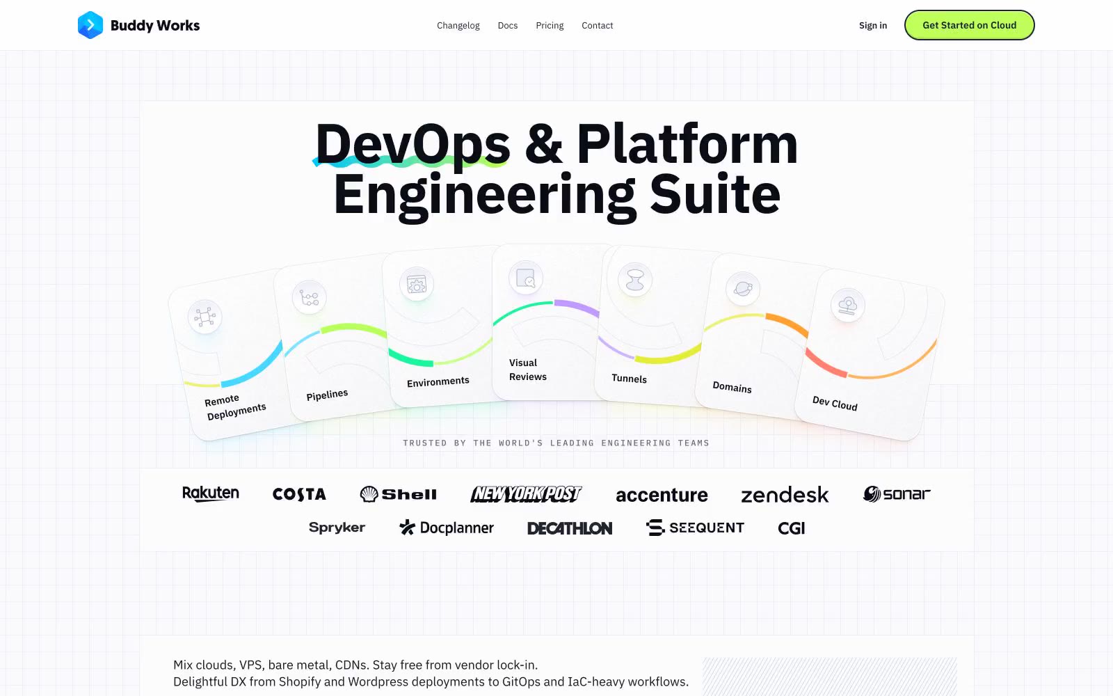
Buddy
Buddy — Style Reference
# Buddy — Style Reference
> Engineering blueprint on graph paper. A white drafting surface scored with a faint grid, inked in near-black, punctuated by fluorescent chartreuse annotations and iridescent gradient strokes.
**Theme:** mixed
Buddy Works renders as a clean engineering workspace drawn on graph paper — a near-white canvas overlaid with a subtle blueprint grid, deeply saturated near-black ink for type, and one unmistakable lime-green CTA that snaps every action into focus. Color is rationed: 95% of the interface stays achromatic with a navy-ink text system, while vivid chromatic energy is reserved for a lime button, cobalt link accent, and the rainbow radial-gradient swooshes that underline headlines and trace the edges of feature cards. Surfaces are whisper-soft — white cards, hairline slate borders, layered translucent shadows tinted with brand hues — and the only heavy shadows are cast by product screenshots and elevated testimonial cards. Typography is IBM Plex Sans at comfortable sizes with aggressive negative tracking on the display sizes, giving headlines a tightened, engineering-specimen feel rather than a marketing-brochure feel. Component geometry is built on two pillars: 56px-radius pill buttons and 24px-radius cards, with a few 14px-radius inner cards for tighter clusters. The result is a system that reads as drafted, measured, and instrumented — a tool surface, not a landing page.
## Tokens — Colors
| Name | Value | Token | Role |
|------|-------|-------|------|
| Lime Spark | `#bfff5a` | `--color-lime-spark` | Primary action fill — CTA buttons, active tab pill, high-visibility highlights. Chartreuse against near-white creates immediate focus without the aggression of red or blue |
| Cobalt Signal | `#1a67fd` | `--color-cobalt-signal` | Link color, brand logo mark, nav active indicator. The only saturated blue in the system; used sparingly to mark interactivity in text and icon contexts |
| Forest Depth | `#0b3d28` | `--color-forest-depth` | Subdued heading and accent text on tinted surfaces — a darkened shade of the lime family used when the lime itself would be too loud |
| Paper White | `#fcfcfd` | `--color-paper-white` | Page canvas, card surface base, input background, button text on lime. The system neutral; everything else floats on this |
Websites
Markdown Text
design-md
website-prompt
landing-page-prompt
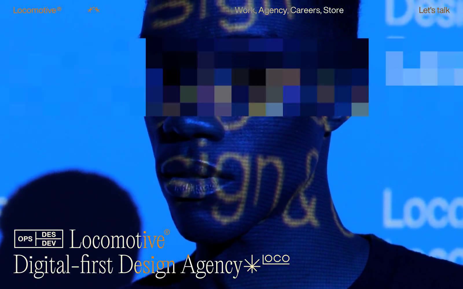
Locomotive
Locomotive — Style Reference
# Locomotive — Style Reference
> Monochrome zine between blood-red slides. Black ink and white paper form the structural grammar; only photography is allowed to scream.
**Theme:** light
Locomotive operates a strict two-color monochrome system — black ink on white paper, nothing else. The visual language is editorial and gallery-like: massive display type at 110px sets a museum-catalogue tone, while a single weight 400 across all text avoids the visual noise of bold or light variants, letting scale alone carry hierarchy. Full-bleed dramatic photography supplies all color and atmosphere; the interface itself never does. Generous vertical breathing room (150px section padding) and hairline horizontal dividers create a Swiss-style zine rhythm. The result feels like flipping through a high-end art monograph where typography is the architecture and images are the exhibits.
## Tokens — Colors
| Name | Value | Token | Role |
|------|-------|-------|------|
| Ink | `#000000` | `--color-ink` | Body text, headings, footer text, inverted section backgrounds, cards, borders, nav — the universal structural color |
| Paper | `#ffffff` | `--color-paper` | Page canvas, card surfaces on dark sections, text on inverted black backgrounds |
## Tokens — Typography
Websites
Markdown Text
design-md
website-prompt
landing-page-prompt
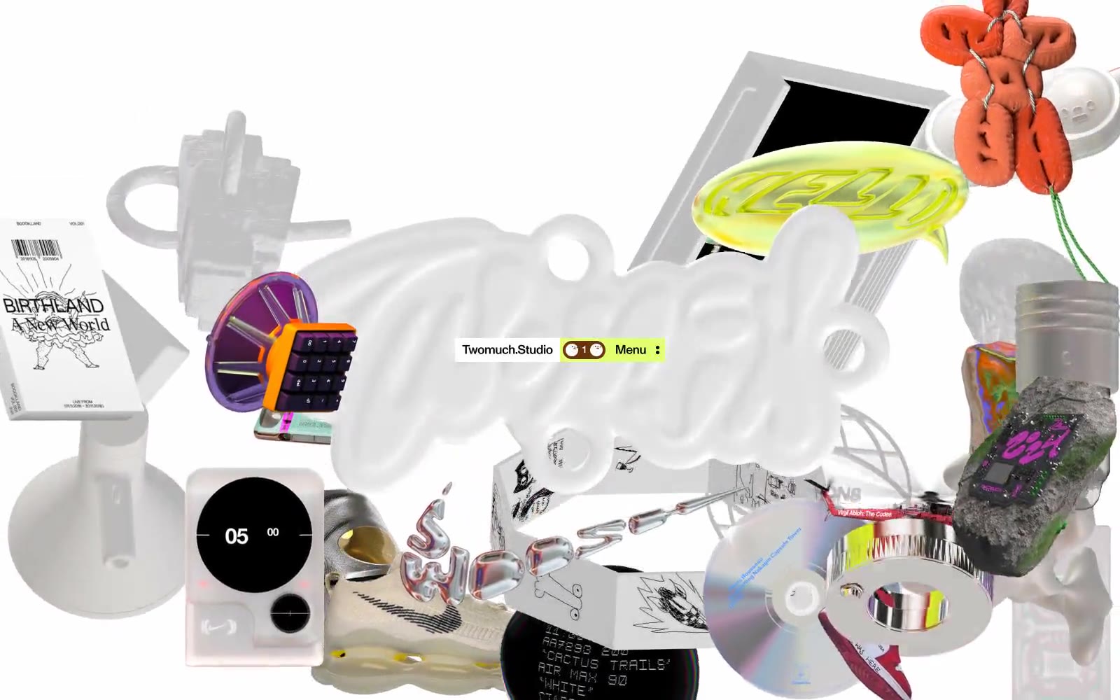
TWOMUCH.STUDIO
TWOMUCH.STUDIO — Style Reference
# TWOMUCH.STUDIO — Style Reference
> floating museum of curiosities
**Theme:** light
A studio interface that disappears into its own canvas — a vast field of curated 3D objects, printed artifacts, and cultural ephemera floats on a flat gray plate, with the UI reduced to a single pill-shaped nav bar pinned at the visual center. Color is rationed to one vivid lime accent that acts as a highlighter against a near-total monochrome system; every other surface stays quiet so the objects can speak. Typography is locked to a single custom geometric grotesque at medium weight with aggressive negative tracking, giving even short labels a compressed, poster-like authority. Components are minimal by design — pills, circles, and hairline rules — letting the curated imagery carry the page.
## Tokens — Colors
| Name | Value | Token | Role |
|------|-------|-------|------|
| Gallery Plate | `#e5e7eb` | `--color-gallery-plate` | Primary canvas and hairline dividers — the infinite gray field that hosts floating objects and borders nearly every surface in the system |
| Carbon | `#000000` | `--color-carbon` | Primary text, icon strokes, and the dark pill in the nav bar — the only true black in the system, used for type and high-contrast marks |
| Chalk | `#f4f4f4` | `--color-chalk` | Elevated surface above the canvas — cards, panels, and lighter button fills that need to lift off the gray field |
| Paper White | `#ffffff` | `--color-paper-white` | Inset surfaces and inverse text on dark fills — the cleanest white available for maximum contrast pop |
Websites
Markdown Text
design-md
website-prompt
landing-page-prompt
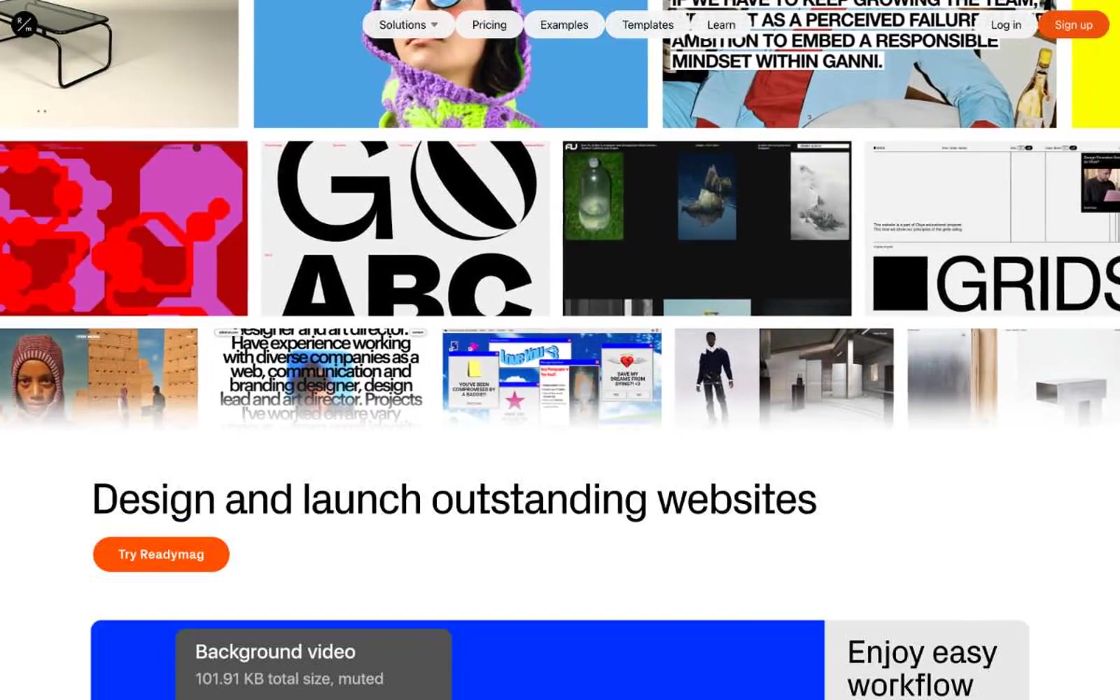
Readymag
Readymag — Style Reference
# Readymag — Style Reference
> Designer's editorial playground — a restrained white shell around bold, magazine-grade color blocks.
**Theme:** light
Readymag is a designer's editorial playground: a white-canvas product shell wrapped around an unmistakably bold, magazine-grade visual identity. The interface stays restrained — pure white background, near-black text, hairline borders — so the real work happens in feature blocks painted in saturated solid panels (electric violet, cobalt blue, ember orange, pure black, signal yellow). Typography carries enormous personality: a custom geometric display face at 30–80px with aggressively tight negative tracking does the heavy lifting for headlines, while a quieter workhorse sans handles body and UI. Components feel hand-set rather than templated — pill-shaped CTAs, thick section margins, and card surfaces that confidently fill their panels with color instead of nudging content forward with elevation. The result reads less like SaaS and more like a creative agency's homepage.
## Tokens — Colors
| Name | Value | Token | Role |
|------|-------|-------|------|
| Electric Violet | `#8800ff` | `--color-electric-violet` | Headline accents, decorative strokes, feature callouts — vivid violet against the white canvas makes typographic moments feel electric and editorial rather than corporate |
| Deep Violet | `#2c0fb1` | `--color-deep-violet` | Secondary violet accent, decorative borders and outlines paired with the primary violet for layered brand moments |
| Ember Orange | `#ff5000` | `--color-ember-orange` | Orange supporting accent for decorative details and low-frequency emphasis. Do not promote it to the primary CTA color |
| Burnt Orange | `#ec520b` | `--color-burnt-orange` | Orange supporting accent for decorative details and low-frequency emphasis. Do not promote it to the primary CTA color |
Websites
Markdown Text
design-md
website-prompt
landing-page-prompt
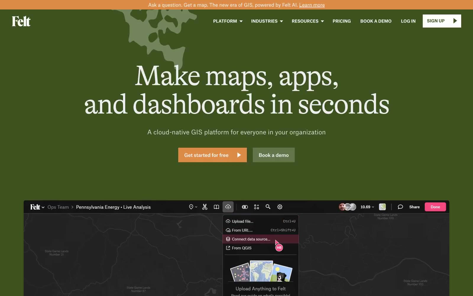
Felt
Felt — Style Reference
# Felt — Style Reference
> topographic atlas at dusk — moss-green pages, serif headlines, one amber needle
**Theme:** dark
Felt renders as a cartographer's field journal at dusk: a deep mossy-green canvas carries oversized editorial serif headlines that feel pulled from a vintage atlas, while a grotesque sans handles utility text. The warm amber accent appears sparingly — a compass needle against the green — punctuating CTAs, links, and interactive borders without ever flooding the surface. Layout is centered, magazine-like, with generous breathing room and full-width product reveals that feel like fold-out map spreads. The visual rhythm alternates between typographic hero zones and embedded product UI, creating a sense of a working tool rather than a marketing site.
## Tokens — Colors
| Name | Value | Token | Role |
|------|-------|-------|------|
| Moss Canvas | `#314218` | `--color-moss-canvas` | Page background, hero sections, dominant canvas — the deep mossy green that carries the entire site and grounds the editorial atmosphere |
| Fern | `#3d521e` | `--color-fern` | Mid-green surface for cards, elevated panels, and the topside of the surface stack |
| Lichen | `#64754b` | `--color-lichen` | Muted green for secondary surfaces, borders on cards, and subtle dividers against the canvas |
| Forest Floor | `#212f0c` | `--color-forest-floor` | Deeper green for nested surface layers and inset product UI backgrounds |
Websites
Markdown Text
design-md
website-prompt
landing-page-prompt
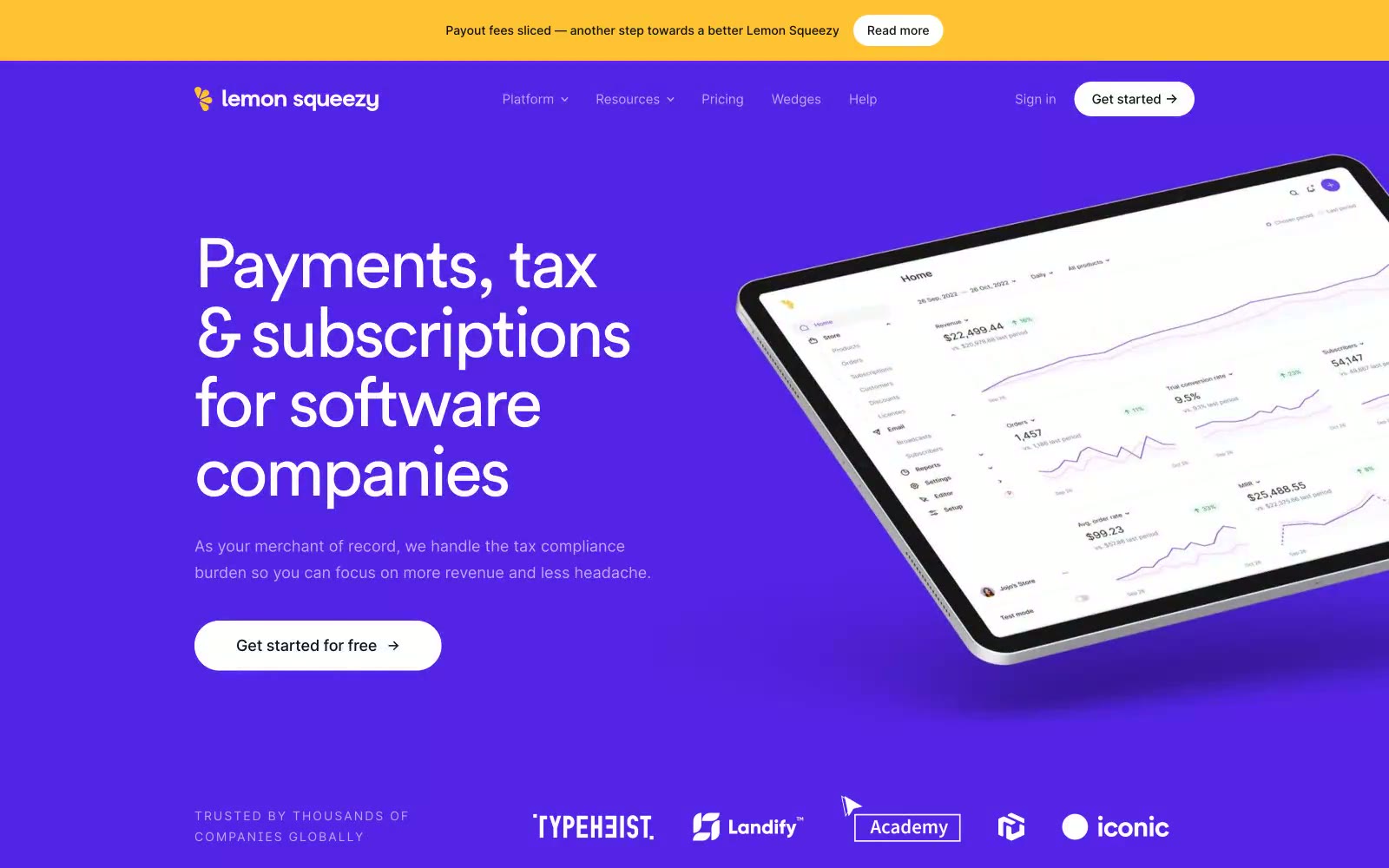
Payments
Payments — Style Reference
# Payments — Style Reference
> zesty citrus on royal violet. Deep electric purple acts as the night sky while lemon-yellow accents spark like fresh citrus zest across a clean white surface.
**Theme:** mixed
Lemon Squeezy operates on an electric-citrus visual logic: deep royal violet dominates as the hero and CTA canvas, while a sharp lemon-yellow accent acts as functional punctuation for announcement bars and brand moments. The typography pairs a geometric custom display face (Circular Pro Book) with tight negative tracking against Inter for body, producing confident blocky headlines that feel modern without coldness. Cards are unusually rounded at 48px, giving every surface a soft approachable weight, while primary action buttons sit at a tighter 8px radius — a deliberate contrast between playful surfaces and decisive calls-to-action. Full-bleed purple feature bands alternate with white content sections, creating a rhythm of bright calm punctuated by bold brand color. Product mockups float on angled tablets with subtle elevation, reinforcing the all-in-one platform narrative through visual proximity.
## Tokens — Colors
| Name | Value | Token | Role |
|------|-------|-------|------|
| Royal Violet | `#5423e7` | `--color-royal-violet` | Violet supporting accent for decorative details and low-frequency emphasis. Do not promote it to the primary CTA color |
| Electric Iris | `#7047eb` | `--color-electric-iris` | Icon strokes, secondary accents on violet backgrounds, chart highlights — a slightly lighter companion to Royal Violet |
| Lemon Zest | `#ffc233` | `--color-lemon-zest` | Top announcement banners, brand lemon accent, key highlight moments — a sharp citrus spike against the violet/white system |
| Orchid | `#cf75ff` | `--color-orchid` | Decorative pastel accent on violet sections, soft highlight washes, pill badge fills |
Websites
Markdown Text
design-md
website-prompt
landing-page-prompt
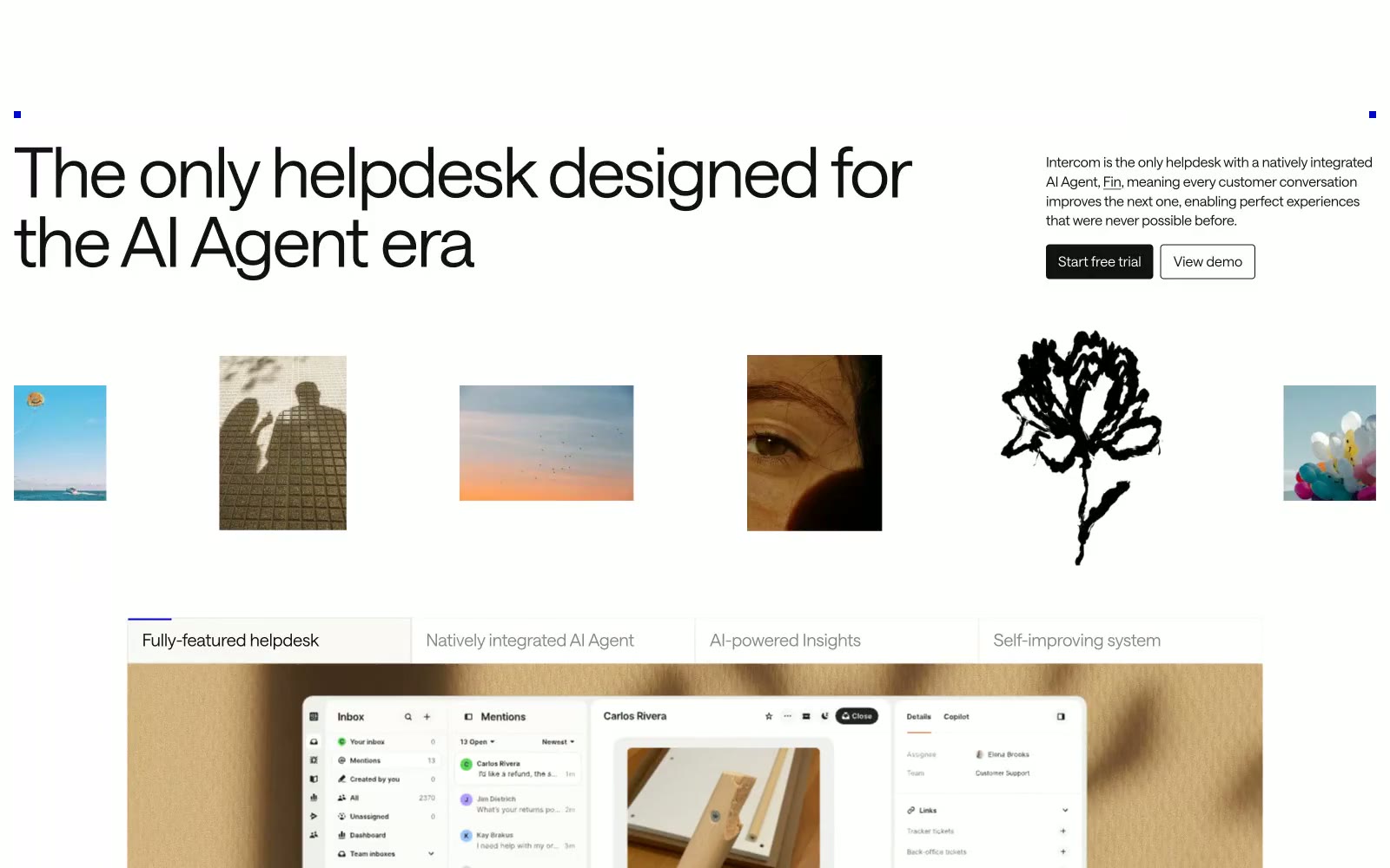
Intercom
Intercom — Style Reference
# Intercom — Style Reference
> Warm cream editorial spread
**Theme:** light
Intercom's design language reads like an editorial magazine printed on warm cream paper: an off-white canvas (#faf9f6) replaces the cold SaaS gray, all body and display type sits at weight 300 for a whisper-light confidence, and a single vivid violet (#0007cb) does nearly all the chromatic work in small, deliberate doses. Sharp 4px corners on every control reject the rounded-softness trend in favor of architectural precision, and SaansMono at wide tracking acts as a labeling system — the way captions and tags function in print. Serrif at 300 weight appears inside body copy as a quiet editorial counterpoint, the one concession to typographic richness in an otherwise austere system. Components feel weightless: thin hairline borders in warm stone (#dedbd6), no decorative shadows, black-filled primary buttons that anchor without weight.
## Tokens — Colors
| Name | Value | Token | Role |
|------|-------|-------|------|
| Electric Violet | `#0007cb` | `--color-electric-violet` | Brand accent — used sparingly for emphasis moments, selected icon strokes, and tag punctuation; the only saturated color in the system creates instant focus when it appears against the warm neutral canvas |
| Pure White | `#ffffff` | `--color-pure-white` | Card surfaces, product screenshot backgrounds, inverted button text |
| Canvas Cream | `#faf9f6` | `--color-canvas-cream` | Primary page canvas — the warm off-white that defines the entire surface temperature; every screen lives on this tone |
| Linen | `#f1eee9` | `--color-linen` | Secondary surface for sectioned blocks, elevated cards, and alternating content bands — one step warmer than canvas |
Websites
Markdown Text
design-md
website-prompt
landing-page-prompt
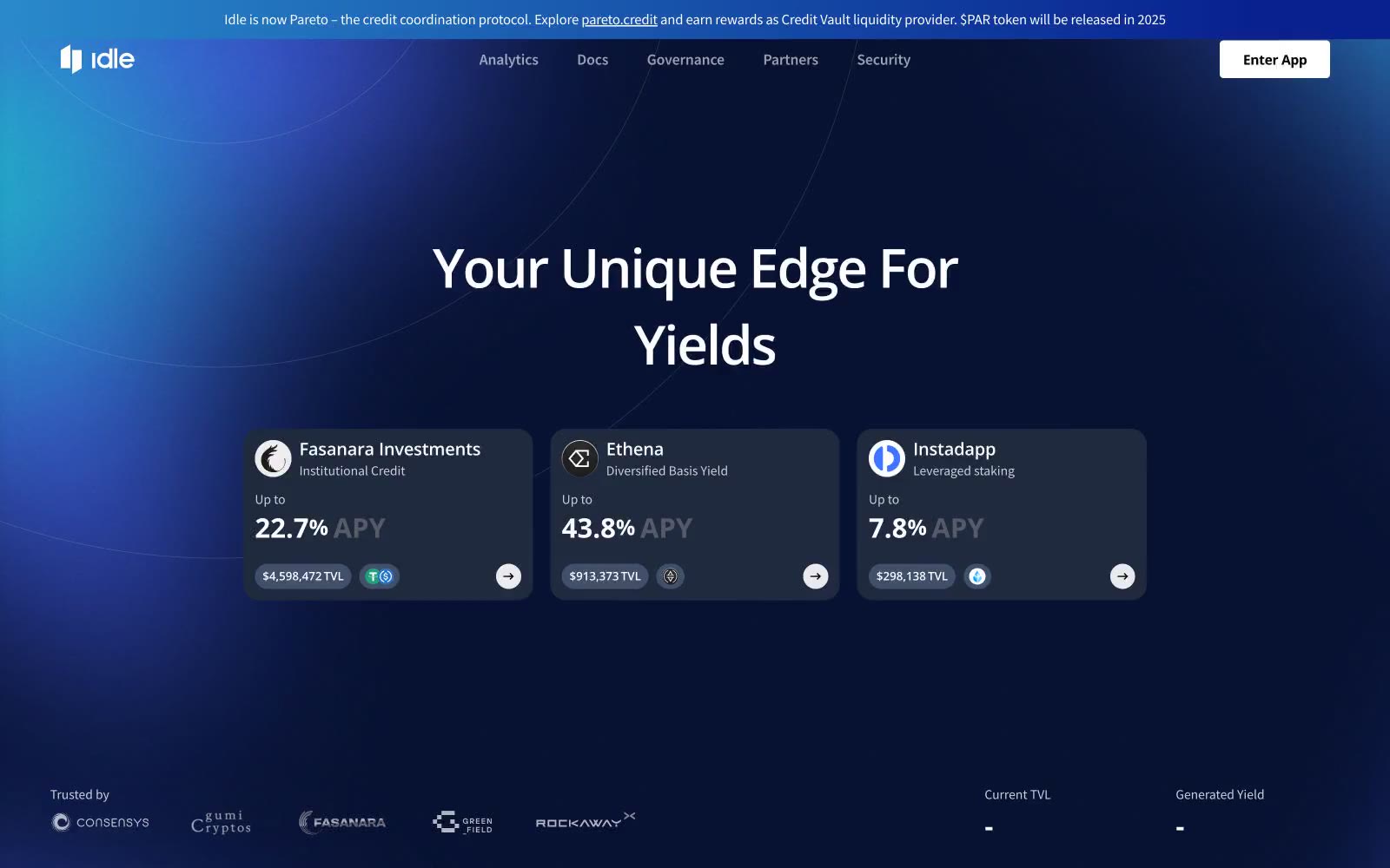
Idle Finance
Idle Finance — Style Reference
# Idle Finance — Style Reference
> Neon deep-sea trading floor — a dark navy terminal where a single cyan signal pierces the gloom.
**Theme:** dark
Idle Finance uses a deep-ocean DeFi terminal language: near-black navy canvas with a single electric cyan accent that glows against the dark like a depth signal. The page behaves like a trading interface — dense, data-forward, atmospheric — with radial blue gradients creating a sense of horizon light emanating from behind content. Typography is the workhorse: Open Sans at heavy weights, with the hero statement split by a cyan highlight to break the headline into a branded mantra. Cards are nearly flat with hairline borders (no shadows, no elevation tricks), and the only chrome is a 1px border. Components are compact and utilitarian: pill-shaped action buttons, chip-style chain badges with extreme 80px radii, tab navigation that looks like an exchange filter bar.
## Tokens — Colors
| Name | Value | Token | Role |
|------|-------|-------|------|
| Abyss Navy | `#17202e` | `--color-abyss-navy` | Page canvas and card surfaces — the foundational darkness every other element floats on |
| Tide Card | `#202a3e` | `--color-tide-card` | Elevated surface for nested cards, button backgrounds, and section containers — one step lighter than the canvas to imply depth without shadow |
| Spectral Cyan | `#6ae4ff` | `--color-spectral-cyan` | Hero highlight word, outlined action borders, icon strokes, link borders — the single electric signal that draws the eye through the dark interface |
| Bone White | `#ffffff` | `--color-bone-white` | Primary text, filled action buttons, and high-contrast labels — the only fully white tone, reserved for reading and final calls-to-action |
Websites
Markdown Text
design-md
website-prompt
landing-page-prompt
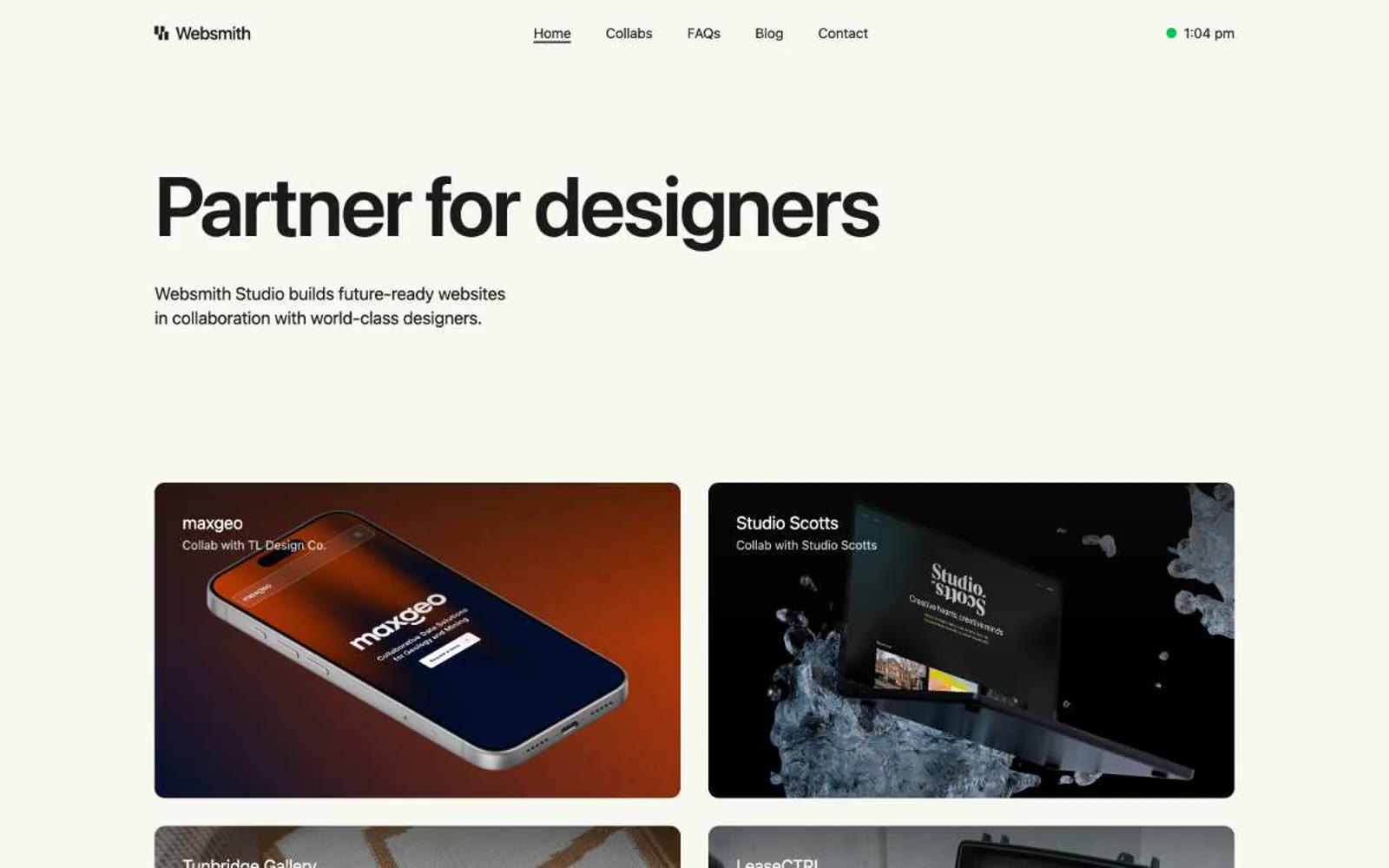
Websmith Studio
Websmith Studio — Style Reference
# Websmith Studio — Style Reference
> morning light on cream paper
**Theme:** light
Websmith Studio is a quiet, almost monastic portfolio language built on warm cream paper and one near-black ink. The hero is typographic — a 96px sentence that carries the entire first screen — and everything else retreats to give it room. The interface is 99% achromatic; color appears only as three pastel card surfaces (powder blue, mint, blush) and a single vivid green status dot, used as functional punctuation rather than decoration. Components are flat and borderless, relying on generous whitespace, 12px image radii, and a single dark filled button to create rhythm. The system feels less like a website and more like a printed editorial spread — confident, restrained, and deliberately under-designed.
## Tokens — Colors
| Name | Value | Token | Role |
|------|-------|-------|------|
| Cream Paper | `#f8f8f2` | `--color-cream-paper` | Page canvas and base surface — warm off-white that softens the starkness of pure white, giving the whole site a printed-editorial warmth |
| Card White | `#ffffff` | `--color-card-white` | Elevated card surfaces and the nav bar — sits one step above the cream canvas to create subtle layering without shadows; White text and button labels — used on dark backgrounds and as the light-mode border on neutral card edges |
| Studio Ink | `#1a1a1a` | `--color-studio-ink` | Primary text, icons, and the filled button — near-black rather than pure black, softer on the warm canvas and used as the sole dark element in the system |
| Deep Black | `#000000` | `--color-deep-black` | Reserved for SVG icon fills — logo glyph and nav icon strokes; rarely surfaces as a background |
Websites
Markdown Text
design-md
website-prompt
landing-page-prompt
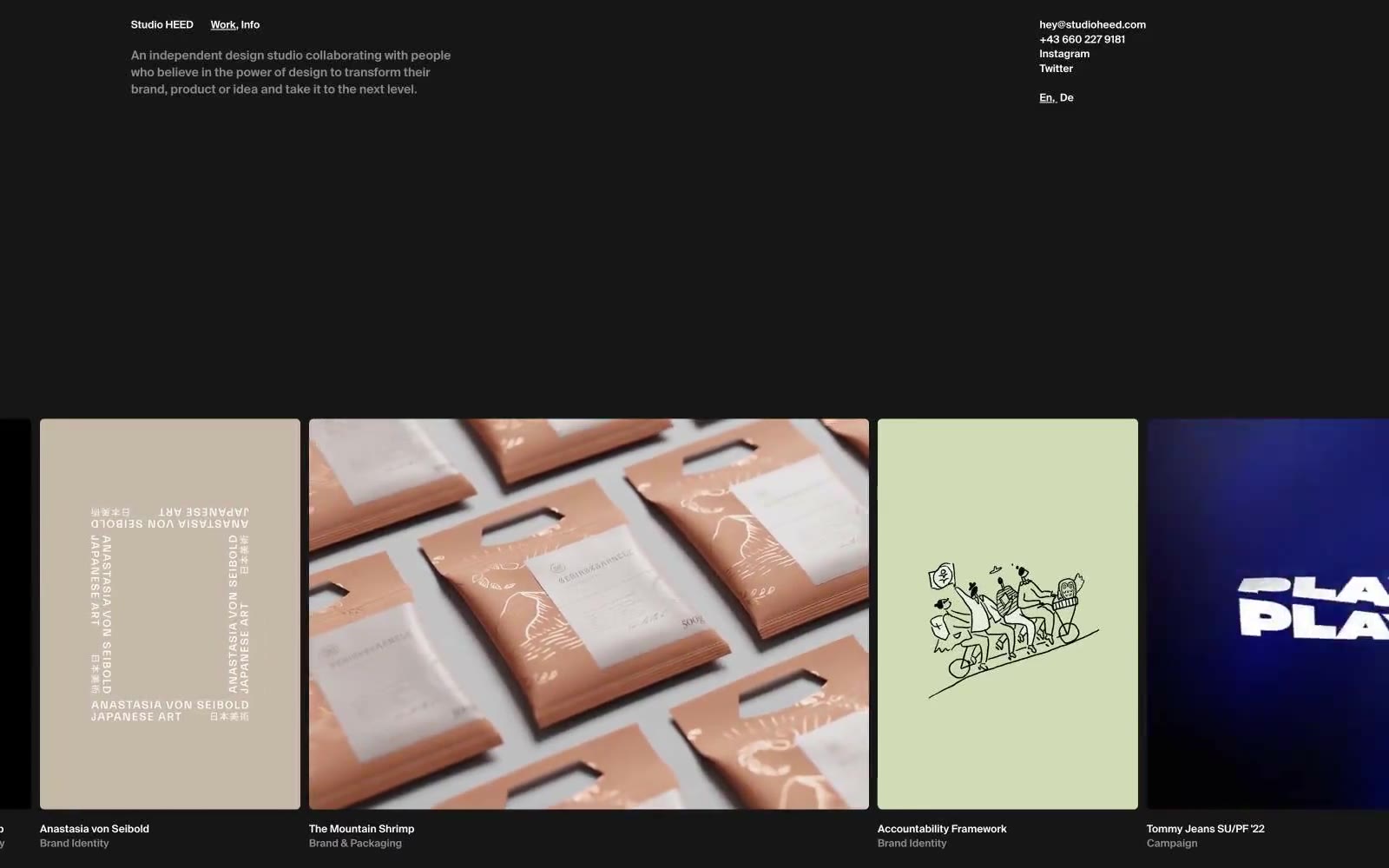
Studio HEED
Studio HEED — Style Reference
# Studio HEED — Style Reference
> midnight gallery wall — black exhibition space with hairline white frames and tiny precise labels
**Theme:** dark
Studio HEED operates as a midnight editorial gallery: an almost entirely monochrome canvas where the page itself is the dark room, white hairline borders become picture frames, and the work hangs like a curated exhibition. Every surface decision — the near-black canvas, a single deep navy panel, a warm cement gray alternate — reduces visual noise to let the project tiles breathe. Typography is deliberately microscopic (12–14px, weight 600) so labels whisper authority rather than shout, turning small caps into the studio's signature rhythm. Radii are locked to 5px everywhere, which keeps the aesthetic architectural and unfussy — no soft pillowy cards, no decorative gradients, no shadows. The grid gap of 14px is the heartbeat of the layout, giving every project the same precise breathing room regardless of column count.
## Tokens — Colors
| Name | Value | Token | Role |
|------|-------|-------|------|
| Void | `#000000` | `--color-void` | Page canvas, dominant card surface — the near-black that absorbs the eye and lets project imagery carry all visual weight |
| White | `#ffffff` | `--color-white` | Hairline borders, text, link borders, and the 124 link borders form the white wireframe structure of every tile and section |
| Midnight Navy | `#00174f` | `--color-midnight-navy` | Accent card surface and decorative panels — the only chromatic hue in the system, used sparingly as a deep tonal interruption against the void |
| Cement | `#c2c1bf` | `--color-cement` | Alternate card surface — a warm desaturated gray that breaks the black/navy rhythm when a tile needs to feel physical or grounded |
Websites
Markdown Text
design-md
website-prompt
landing-page-prompt
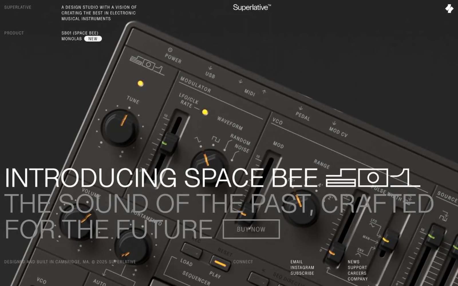
Superlative
Superlative — Style Reference
# Superlative — Style Reference
> Industrial product monograph behind studio glass. A darkroom vitrine where hardware, label, and oversized headline share one continuous, almost weightless plane.
**Theme:** mixed
Superlative uses an industrial-design monograph language: warm cream canvas, dramatic dark product photography, and large editorial display type that behaves more like a print catalog than a SaaS landing page. Almost all UI is monochrome — the visual interest comes from a single warm ember accent that echoes the LED indicators on the hardware itself, never from decorative gradients or illustration. Components are deliberately sparse and almost sharp — thin 1px borders, tight 3px button radii, 15px gaps — so the product and the typography do the talking. The condensed uppercase labels with wide tracking function as a typographic wiring diagram, identifying every element on screen in the manner of an engineering schematic.
## Tokens — Colors
| Name | Value | Token | Role |
|------|-------|-------|------|
| Pulp Cream | `#f6f4f2` | `--color-pulp-cream` | Page canvas, light section backgrounds, the warm off-white that defines the brand's paper-like base layer |
| Graphite Veil | `#e4e3e2` | `--color-graphite-veil` | Subtle card surfaces, hairline divider washes — one shade darker than the canvas for quiet elevation |
| Mid Ash | `#8c8c8c` | `--color-mid-ash` | Muted metadata text, disabled labels, secondary borders — the middle voice between ink and whisper |
| Ink Black | `#141414` | `--color-ink-black` | Primary text, dark section surfaces, the dominant heading color on light backgrounds |
Websites
Markdown Text
design-md
website-prompt
landing-page-prompt
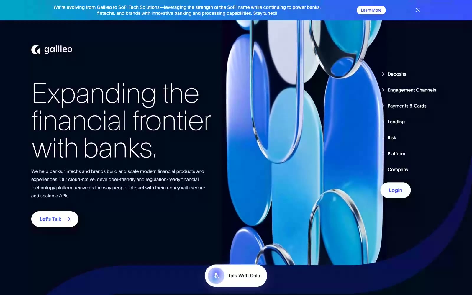
Galileo-ft
Galileo-ft — Style Reference
# Galileo-ft — Style Reference
> deep-space command deck with electric blue signals
**Theme:** dark
Galileo operates in a deep-space financial observatory: near-black navy canvases, whisper-thin type at display weights, and a single electric cobalt-blue accent that lights the interface like circuit current. Surfaces stack as dark on dark, separated by hairline lavender-tinted borders rather than elevation, giving the page a flat, architectural depth. The brand voice is restrained and premium — generous radii, oversized 3D glass sculpture photography as the hero motif, and color used sparingly so the blue accent always reads as intentional and high-stakes. Type is the signature: weight 100 headlines on a custom geometric face float above the page rather than commanding it, creating authority through restraint.
## Tokens — Colors
| Name | Value | Token | Role |
|------|-------|-------|------|
| Void Navy | `#03081a` | `--color-void-navy` | Page canvas and primary dark surface — the base layer everything else floats on |
| Deep Indigo | `#020626` | `--color-deep-indigo` | Card surfaces, raised panels, and secondary structural fills |
| Inkline Violet | `#292f66` | `--color-inkline-violet` | Hairline dividers, card borders, icon strokes — the structural skeleton color |
| Quartz Lavender | `#aab1f2` | `--color-quartz-lavender` | Secondary text, outlined link borders, muted body copy, inactive navigation |
Websites
Markdown Text
design-md
website-prompt
landing-page-prompt
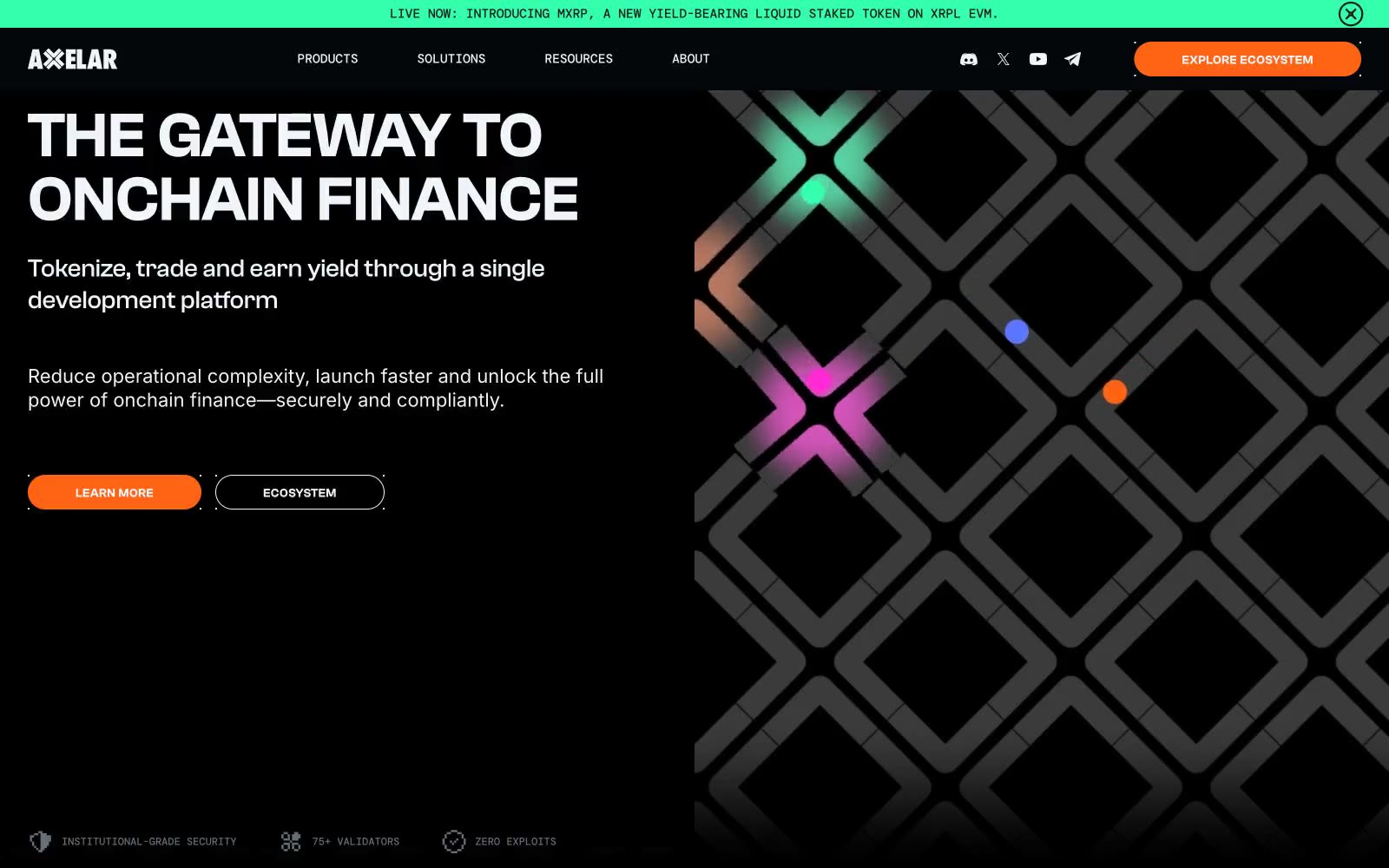
Axelar
Axelar — Style Reference
# Axelar — Style Reference
> Signal lights through dark lattice
**Theme:** dark
Axelar's interface reads as infrastructure-grade crypto plumbing rendered in a dark command-center aesthetic. The canvas sits at near-black abyss (#04070a), with a deliberate surface hierarchy stepping up through progressively lighter grays for cards, nav, and elevated panels — depth without brightness. A single vivid orange (#ff6314) is the chromatic authority: every primary action, every product surface, every active state draws from it. Supporting accent hues (electric green, violet, magenta, cyan) appear only as tiny category dots and badges, functioning as node indicators in a network topology rather than decorative variety. Clashgrotesk carries the angular, geometric voice at 500/600 weights; Inter provides the readable body; DM Mono stamps technical labels and metadata. The hero's diamond-lattice pattern with scattered colored dots establishes a network/graph metaphor that recurs in the partner-section category indicators.
## Tokens — Colors
| Name | Value | Token | Role |
|------|-------|-------|------|
| Signal Orange | `#ff6314` | `--color-signal-orange` | Orange action color for filled buttons, selected navigation states, and focused conversion moments. |
| Node Green | `#33ffac` | `--color-node-green` | Category dot indicators, success-tinted badges — functions as a network-node status light, never as a full surface |
| Node Violet | `#5b76ff` | `--color-node-violet` | Category dot indicators and info-adjacent badges — part of the node-light spectrum for category encoding |
| Node Magenta | `#ff2ad4` | `--color-node-magenta` | Category dot indicators and accent badges — part of the node-light spectrum for category encoding |
Websites
Markdown Text
design-md
website-prompt
landing-page-prompt
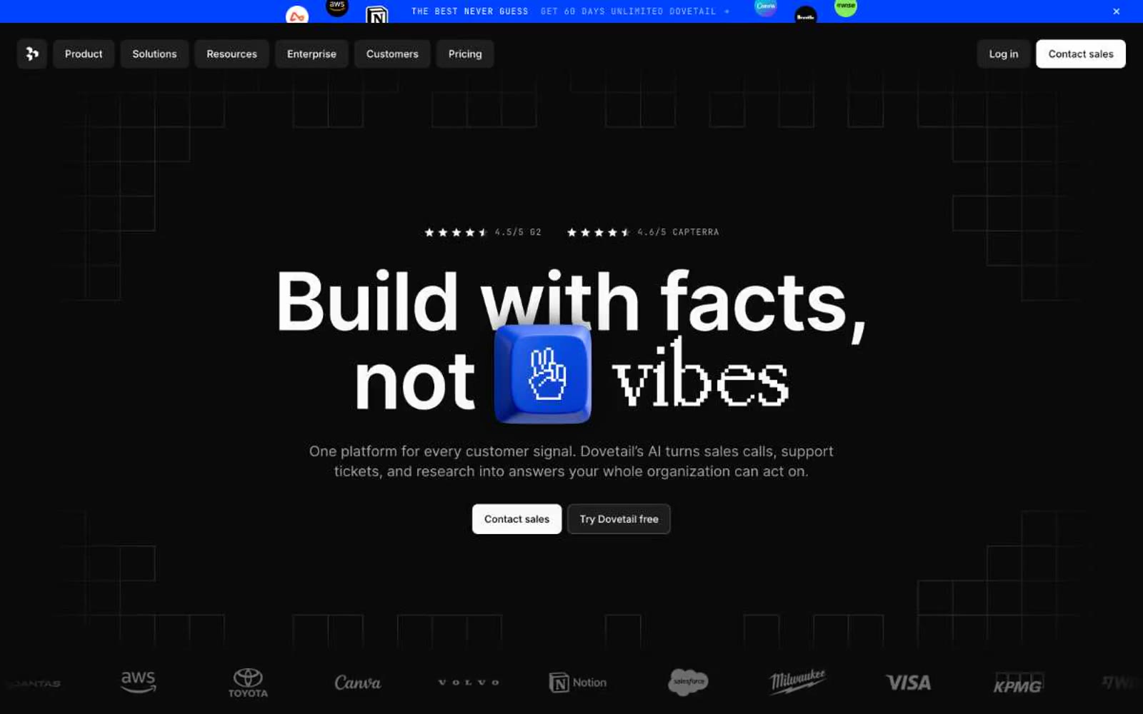
Dovetail
Dovetail — Style Reference
# Dovetail — Style Reference
> Blueprint grid under a black moon — faint graph lines, white type, one violet spark.
**Theme:** dark
Dovetail operates in a midnight command-center language: a near-black canvas structured by a faint blueprint grid, with white type and a single soft indigo accent. Surfaces stack from pure black to charcoal, each step subtle enough to feel like elevation through luminance rather than shadow. The system is compact and data-dense — Inter carries every reading load, JetBrains Mono stamps categorical labels, and 8px radii keep containers crisp rather than soft. Color is rationed: most of the interface stays achromatic, with #6798ff appearing only as functional punctuation on icons, stat markers, and chart elements.
## Tokens — Colors
| Name | Value | Token | Role |
|------|-------|-------|------|
| Soft Indigo | `#6798ff` | `--color-soft-indigo` | Brand accent — iconography, stat markers, chart series, link states; the single chromatic note in an otherwise achromatic system |
| Pure Black | `#000000` | `--color-pure-black` | Deepest surface — modal backdrops, full-bleed image fills, inline SVG fills |
| Carbon | `#0a0a0a` | `--color-carbon` | Page canvas — the primary background; near-black with no warmth |
| Graphite | `#141414` | `--color-graphite` | Card surface — one step above the canvas to delineate content blocks |
Websites
Markdown Text
design-md
website-prompt
landing-page-prompt
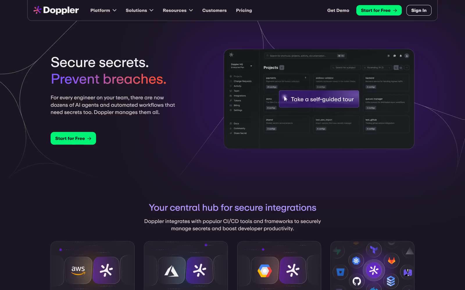
Doppler
Doppler — Style Reference
# Doppler — Style Reference
> violet-lit vault at midnight. A near-black canvas glows with a single lavender signal and a green confirmation light, every surface rounded just enough to feel handled.
**Theme:** dark
Doppler operates as a dark-mode security console: a near-black violet-tinted canvas (#1c1624) with whisper-thin light borders, one vivid green that signals 'go', and one lavender violet that carries brand voice in headlines and highlights. The interface feels like a vault UI — dense product surfaces, glass-blur header, 20px rounded cards floating on a midnight field. Typography is a single custom geometric sans (Doppler Repro) that tightens aggressively at large sizes (-0.02em) for a compressed, engineered feel. Color is rationed: green appears only where action is requested, violet only where brand voice is needed, everything else is monochrome. The hero headline uses a multi-stop violet gradient to create a single moment of chromatic warmth before the page settles back into its dark security posture.
## Tokens — Colors
| Name | Value | Token | Role |
|------|-------|-------|------|
| Midnight Plum | `#1c1624` | `--color-midnight-plum` | Page canvas, primary dark surface — the near-black with a violet undertone that gives the UI its cool, secure temperature |
| Shadow Plum | `#2d2734` | `--color-shadow-plum` | Elevated card surface, input fields, nested panels — one step lighter than canvas to suggest depth without a shadow |
| Bone White | `#f1f0ec` | `--color-bone-white` | Primary text, icon strokes, button labels on dark — warm off-white avoids the sterile feel of pure white against violet-black |
| Fog Line | `#e5e7eb` | `--color-fog-line` | Hairline borders, dividers, card outlines — the most-used neutral in the system, defining every container edge |
Websites
Markdown Text
design-md
website-prompt
landing-page-prompt
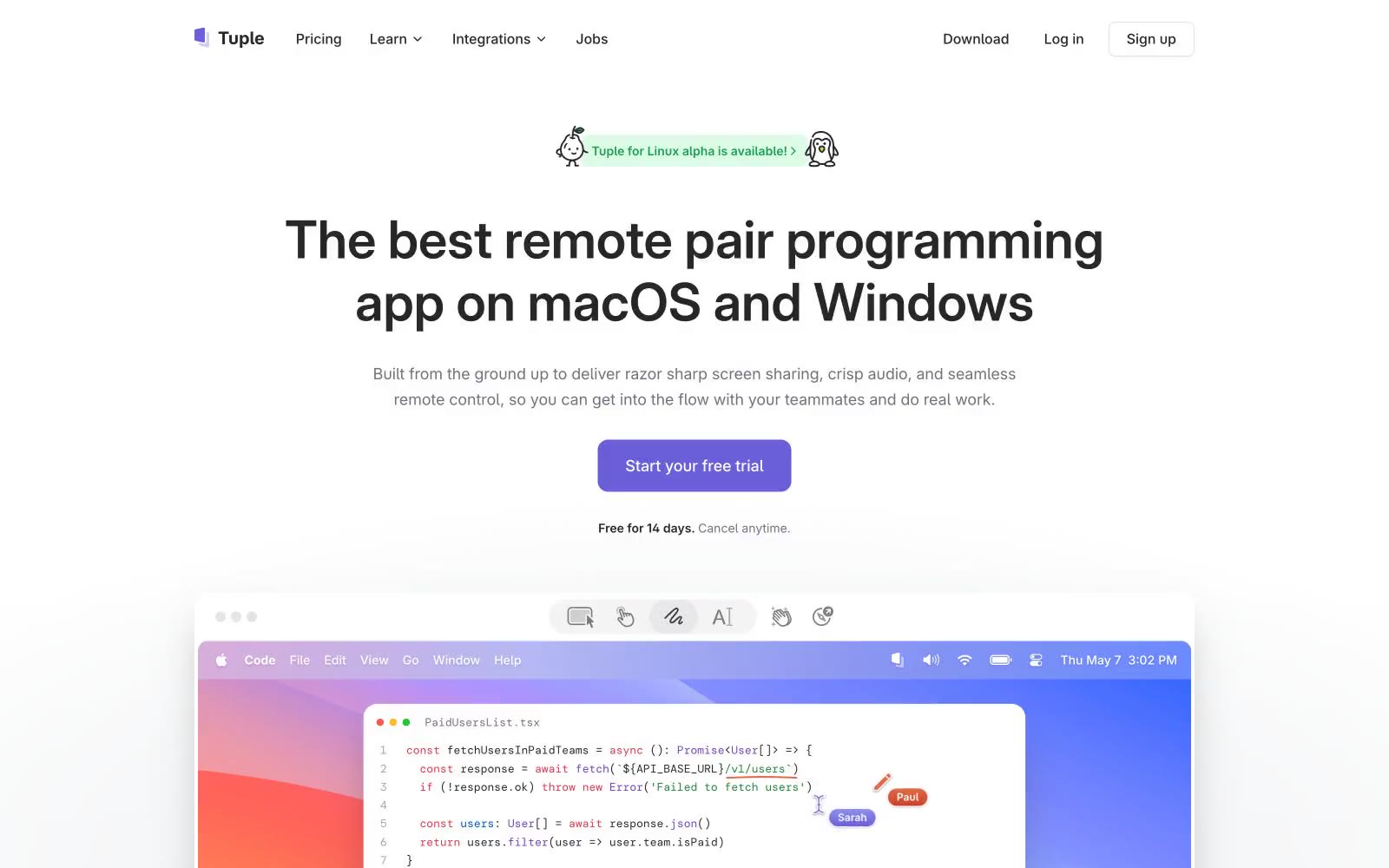
Tuple
Tuple — Style Reference
# Tuple — Style Reference
> Developer pair-programming workshop — clean white surfaces, one violet CTA, playful multi-color accents, and a dark band that makes the light sections breathe.
**Theme:** light
Tuple's design language is a developer's pair-programming workshop: bright, airy light surfaces with a single confident violet CTA that makes the primary action unmistakable. The visual identity leans on a four-color accent palette — violet, blue, orange, green — used sparingly as headings, icons, and the product-screenshot wallpapers, while the structural UI stays zinc-neutral and quiet. Typography pairs Inter Variable for everything functional with DM Mono for small all-caps labels and section eyebrows, which is a signature devtool move: mono labels say 'this is a product built by engineers' without resorting to skeuomorphism. Components are mostly flat and bordered rather than heavily shadowed, with a mix of 8px and 12px radii giving cards a modern-but-not-too-soft feel. The page alternates between generous white space sections and one dramatic dark band, creating rhythm without monotony.
## Tokens — Colors
| Name | Value | Token | Role |
|------|-------|-------|------|
| Iris | `#6a5ed9` | `--color-iris` | Primary action — CTA buttons, filled links, active nav states |
| Cobalt | `#3f71d4` | `--color-cobalt` | Brand accent — icons, heading highlights, link hover; the most-used chromatic color in illustrations and product chrome |
| Coral | `#db5434` | `--color-coral` | Brand accent — headings, product-screenshot strokes, decorative highlights; warm counterweight to the cool blues and violets |
| Sprout | `#1bb152` | `--color-sprout` | Green text accent for links, tags, and emphasized short phrases |
Websites
Markdown Text
design-md
website-prompt
landing-page-prompt
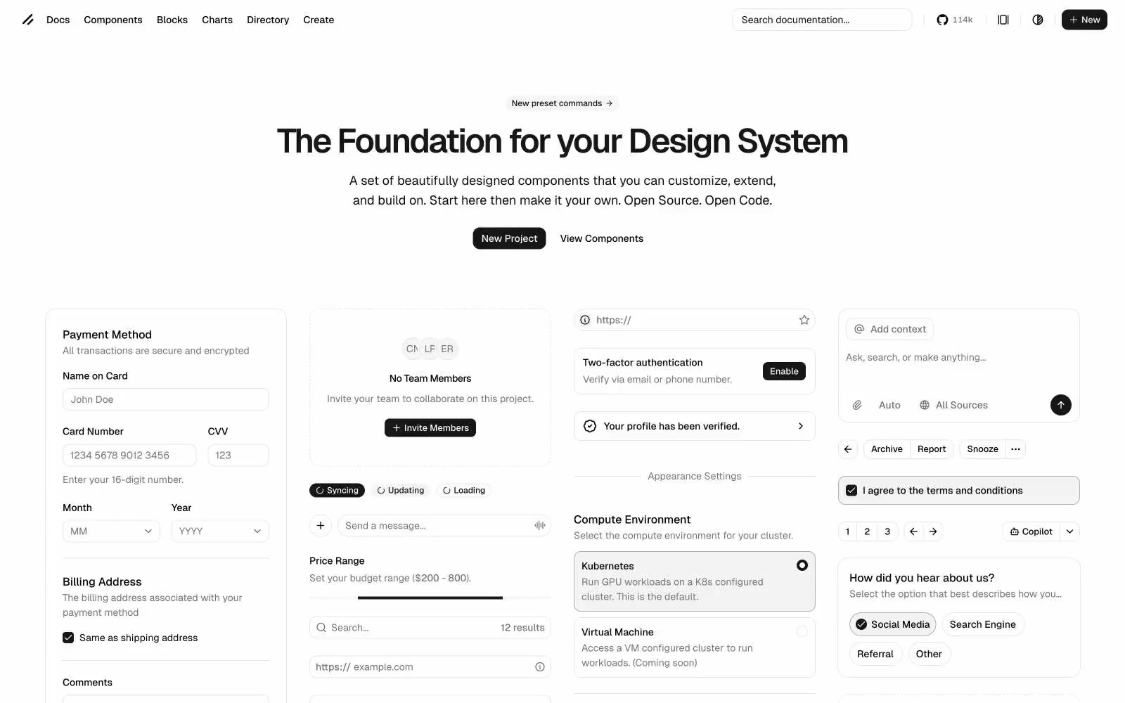
Ui
Ui — Style Reference
# Ui — Style Reference
> brutalist Swiss grid in graphite and chalk. A designer's drafting table where every line is a 1px border, every surface is white, and the only accent is a filled-black button that cuts like a blade through all that negative space.
**Theme:** light
shadcn/ui is a strictly monochromatic design system documentation site: pure white canvas, graphite text, and hairline #e5e5e5 borders doing all the structural work. There is zero brand color — the system IS the absence of color, which is the point. Typography (Geist) carries the identity: weight 600 at 48px with -0.05em tracking gives the hero a tight, almost architectural gravity, while body text at 14-16px stays quiet and utilitarian. Components are compact, grid-driven, and border-first: 10px radii, 1px hairline separators, and an almost complete absence of shadow or elevation. The one filled element on the page is the black primary button — it sits like a period at the end of a sentence, deliberate and unmissable against all the white space around it.
## Tokens — Colors
| Name | Value | Token | Role |
|------|-------|-------|------|
| Graphite | `#0a0a0a` | `--color-graphite` | Dark supporting neutral for text, icons, and strong contrast. Do not promote it to the primary CTA color |
| Pure Black | `#000000` | `--color-pure-black` | Body text, icon fills, link text, and the darkest border variant — the default ink |
| Carbon | `#171717` | `--color-carbon` | Dark surface for inverted cards, dark-mode preview tiles, and badge backgrounds — sits one step above graphite for subtle dark layering |
| Concrete | `#737373` | `--color-concrete` | Secondary body text, muted labels, placeholder content — the workhorse mid-gray for non-primary copy |
Websites
Markdown Text
design-md
website-prompt
landing-page-prompt
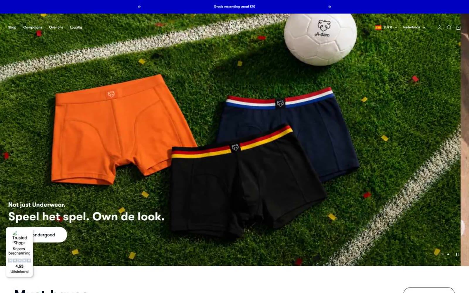
A-dam
A-dam — Style Reference
# A-dam — Style Reference
> morning surf over a curated product shelf — a light, airy canvas where honest basics and ocean-toned photography do the talking.
**Theme:** light
A-dam speaks through a quiet, honest visual language: a morning sky of off-white and warm gray frames products like specimens on a clean shelf. The dark navy (#000e1f) anchors every text surface with calm authority, while a single saturated blue (#0000c5) appears only in the announcement bar — a deliberate exclamation against an otherwise hushed palette. GT Walsheim Pro at weight 900 and 70px with a 1.00 line-height gives display headlines presence without shouting, the tight leading turning huge type into graphic blocks. Pill-shaped buttons (30px radius) and flat product cards create a friendly, approachable surface where imagery — full-bleed beach photography, material flat-lays, and clean product shots — carries the emotional weight.
## Tokens — Colors
| Name | Value | Token | Role |
|------|-------|-------|------|
| Midcurrent Navy | `#000e1f` | `--color-midcurrent-navy` | Primary text, filled buttons, rating widget, icon strokes — the workhorse dark surface that grounds every interface layer |
| Deep Cobalt | `#0000c5` | `--color-deep-cobalt` | Announcement bar surface and occasional accent punctuation — saturated blue used sparingly to break an otherwise monochrome frame |
| Twilight Slate | `#1a2635` | `--color-twilight-slate` | Secondary borders and emphasis dividers — a near-gray that steps up from Midcurrent Navy for subtle layering without contrast jumps |
| Graphite | `#000000` | `--color-graphite` | Icon fills, nav text, and footer ink — pure black reserved for the smallest functional elements where maximum punch is needed |