AI Prompt Studio - Intelligent Prompt Library
Explore and use professional AI prompts to optimize your workflow.
One-click Use
Websites
Markdown Text
design-md
website-prompt
landing-page-prompt
Norgram
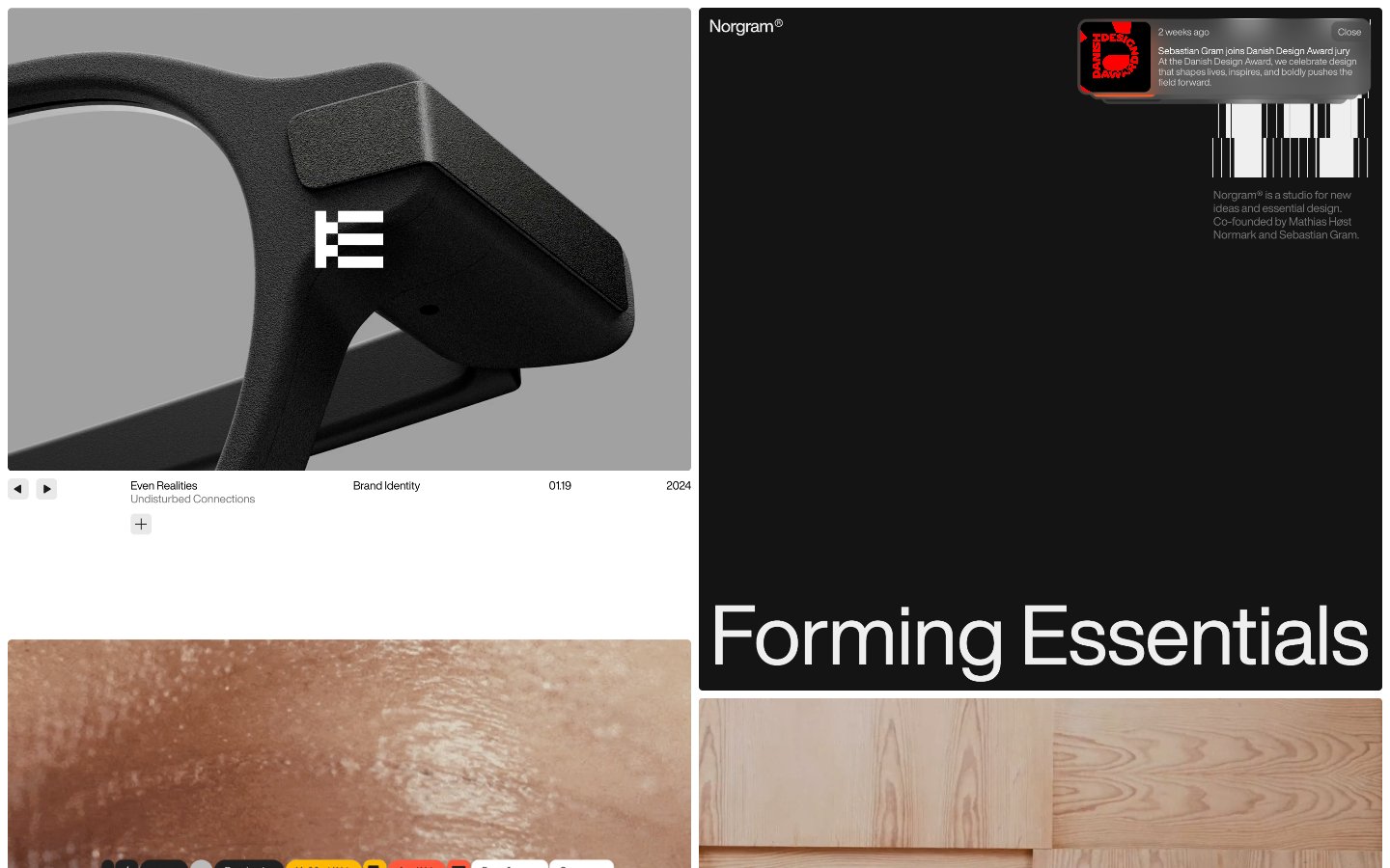
Norgram — Style Reference

# Norgram — Style Reference
> white-walled art gallery
**Theme:** light
Norgram operates as an editorial design studio: a pristine white canvas, zero chromatic color, and typography as the sole protagonist. The system is ruthlessly monochrome — every screen reads as a black-on-white publication layout, with imagery providing the only relief. Helvetica Now Display carries the entire voice: whisper-tight tracking at headline sizes (87px at -0.02em), compact 12px metadata, and generous line-height restraint (1.0–1.17). Components are flat, borderless or hairline-bordered, and reduced to their typographic skeleton. There are no fills, no accents, no shadows of consequence — the discipline is in what is omitted. Page rhythm comes from alternating hero-sized image plates against dense text columns, and a persistent bottom info bar that anchors every section like a museum placard.
## Tokens — Colors
| Name | Value | Token | Role |
|------|-------|-------|------|
| Obsidian | `#000000` | `--color-obsidian` | Primary text, dominant border ink, iconography, link default |
| Charcoal | `#141414` | `--color-charcoal` | Body text, card surface, dark UI block on white canvas |
| Paper White | `#ffffff` | `--color-paper-white` | Page canvas, card surface, inverse text on dark blocks |
| Bone | `#efefef` | `--color-bone` | Hairline borders, dividers, input outlines, and card edges on light surfaces. Do not promote it to the primary CTA color |
Websites
Markdown Text
design-md
website-prompt
landing-page-prompt
Canva
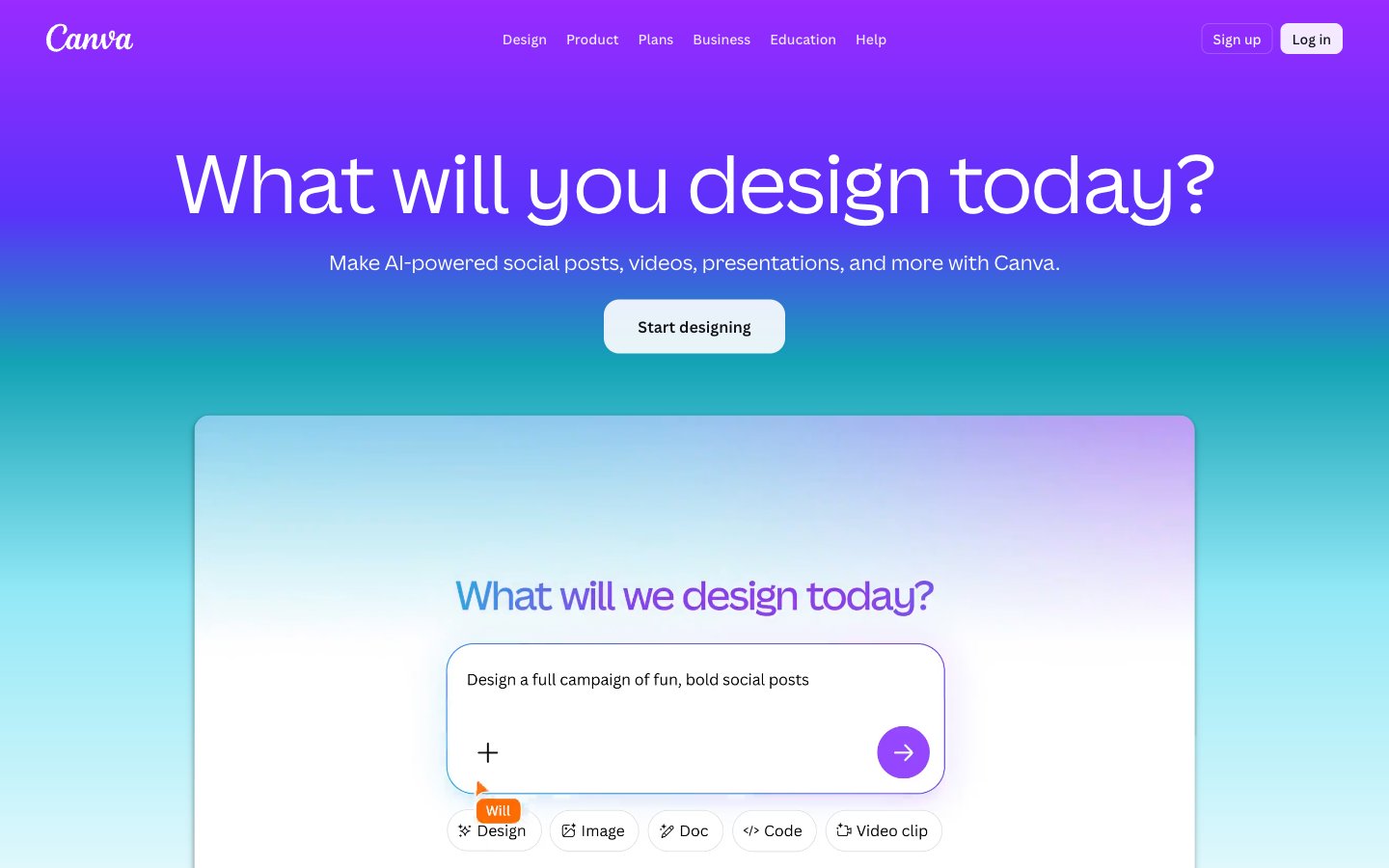
Canva — Style Reference
# Canva — Style Reference
> playful artist's studio bathed in violet dawn — a clean white workspace where every accent, icon, and gradient wash arrives pre-tuned for creative work.
**Theme:** light
Canva speaks in a friendly, creative-atelier language: a near-white canvas where every surface is generous and every accent is vivid. The brand color is a saturated violet (#8b3dff) that recurs across navigation, tags, icons, and gradient washes, anchored by a near-black ink (#0f1015) for all primary type. The visual personality is gradient-loving and slightly playful — backgrounds dissolve from teal into violet, from magenta into coral — yet the UI chrome itself stays calm and monochrome so that user-generated creativity doesn't fight the frame. Type is set in the custom Canva Sans with tight tracking and optical alternates (ss02, ss03) for a warm, humanist feel; headlines run large (56–84px) at ultra-tight leading, giving the page a poster-like gravity. Surfaces are soft, 8px corners, with the brand's most distinctive move being a single floating prompt card that dominates the hero — a calm, rounded white panel set against a full-bleed gradient field.
## Tokens — Colors
| Name | Value | Token | Role |
|------|-------|-------|------|
| Canva Violet | `#8b3dff` | `--color-canva-violet` | Primary brand color — filled buttons, active navigation, link text, gradient anchors, brand icons, tag fills |
| Deep Violet | `#9729ff` | `--color-deep-violet` | Secondary violet for decorative elements, secondary icon accents, gradient stop |
| Lavender Mist | `#a370fc` | `--color-lavender-mist` | Tertiary violet tint — outlined/ghost action borders, muted brand accents, image overlays |
| Coral Ember | `#ff6105` | `--color-coral-ember` | Vivid orange — decorative icon accent, category tag, gradient co-stop alongside violet |
Websites
Markdown Text
design-md
website-prompt
landing-page-prompt
Fallen Grape
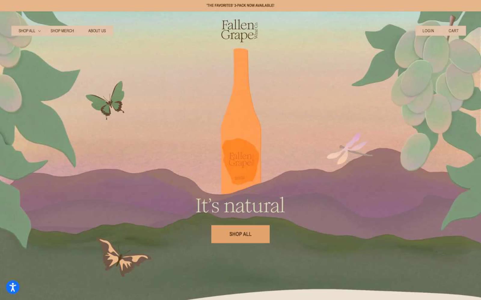
Fallen Grape — Style Reference
# Fallen Grape — Style Reference
> Sun-drenched vineyard at golden hour. Warm cream paper, walnut ink, terracotta warmth — a wine label breathed into a full interface.
**Theme:** light
Fallen Grape uses a sun-drenched, vineyard-at-golden-hour language: warm cream canvases, deep walnut typography, and peach-terracotta accents that feel pressed from ripe grapes rather than screen-painted. The interface stays nearly monochromatic in warm neutrals, letting product photography and a single sage-green accent carry visual variety. Hairline brown borders separate regions instead of shadows or elevation — surfaces are flat and paper-like, evoking a hand-pressed wine label. Typography is a deliberate two-voice system: a humanist serif (Romie) for brand and editorial moments, paired with a condensed utilitarian sans (Arial Narrow) for functional text, creating a tension between craft and clarity that defines the brand.
## Tokens — Colors
| Name | Value | Token | Role |
|------|-------|-------|------|
| Vintage Cream | `#ece0d2` | `--color-vintage-cream` | Page canvas, section backgrounds, footer surface — the warm paper tone that grounds all content and sets the sun-faded, natural mood |
| Bone White | `#f3f3f3` | `--color-bone-white` | Card surfaces, navigation background — a cooler off-white that lifts cards above the cream canvas without harsh contrast |
| Walnut Ink | `#573d21` | `--color-walnut-ink` | Primary text, headings, body copy, link color — deep brown that reads as ink on aged paper rather than digital black |
| Saddle Brown | `#7c664d` | `--color-saddle-brown` | Hairline borders (cards, nav, body dividers), secondary text, muted UI lines — the structural outline color that replaces shadows |
Websites
Markdown Text
design-md
website-prompt
landing-page-prompt
Shupatto
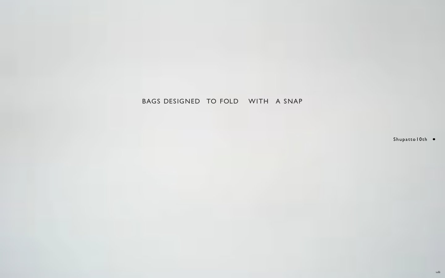
Shupatto — Style Reference
# Shupatto — Style Reference
> Museum vitrine on white marble
**Theme:** light
Shupatto's digital presence operates like a quiet museum vitrine for a single physical product. The visual system is almost entirely achromatic — a canvas of white interrupted by hairline charcoal lines, generous negative space, and minuscule typography that whispers rather than shouts. Everything is set in uppercase with dramatically wide letter-spacing, transforming even body copy into editorial display text. The only chromatic note is a soft periwinkle blue that functions less as a brand color and more as a faint pressure point — a tag, a selected state, a small badge. The interface is a study in restraint: no shadows, no gradients, no rounded corners beyond 3px, no decorative imagery competing with the product. Line work and typographic rhythm do all the work.
## Tokens — Colors
| Name | Value | Token | Role |
|------|-------|-------|------|
| Graphite | `#2d2d2d` | `--color-graphite` | Primary text, hairline borders, structural lines — the dominant neutral carrying all interface weight |
| Ink | `#000000` | `--color-ink` | Strongest text and most emphatic borders, logo dots, footer marks |
| Paper | `#ffffff` | `--color-paper` | Page canvas, card surfaces, nav backgrounds — the unbroken white field everything floats on |
| Fog | `#878887` | `--color-fog` | Muted helper text, secondary borders, dimmed metadata |
Websites
Markdown Text
design-md
website-prompt
landing-page-prompt
Hardworkclub
Hardworkclub — Style Reference
# Hardworkclub — Style Reference
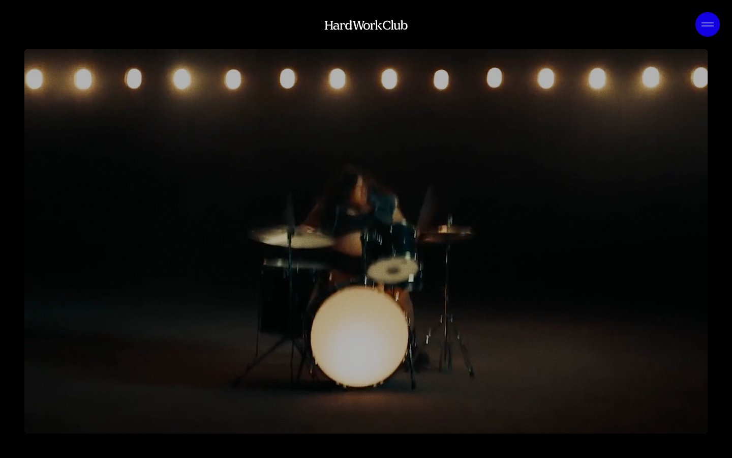
> midnight black-box theater — a dark room where one round blue light glows above a stage, and the only thing louder than the silence is the film playing
**Theme:** dark
Hardworkclub operates as a black-box performance space: the page is a single dark room where cinematic footage plays full-bleed and the only interruptions are a luminous cobalt menu dot and a thin Maligna serif wordmark. The system is aggressively monochrome — pure black canvas, bone-white type, and one electric blue accent that exists solely on the circular nav control. Layout is left-aligned and editorial rather than centered and corporate; cards breathe inside 48px padding with no shadows and almost no visible borders, letting photography carry the visual weight. Typography splits cleanly between a grotesque workhorse (Founders Grotesk) for body and UI labels and a humanist serif (Maligna) that signals craft, warmth, and 'we are not a template' on the hero, logo, and work-card overlays.
## Tokens — Colors
| Name | Value | Token | Role |
|------|-------|-------|------|
| Pitch Black | `#000000` | `--color-pitch-black` | Page canvas, hero backgrounds, card fills — the default surface for the entire site; every other element floats on this |
| Bone White | `#ffffff` | `--color-bone-white` | Primary text, hairline borders on dark surfaces, nav wordmark, overlay labels on imagery |
| Charcoal Whisper | `#313130` | `--color-charcoal-whisper` | Near-invisible secondary borders and dividers — just enough to separate layers without breaking the black-box illusion |
| Electric Cobalt | `#1200e3` | `--color-electric-cobalt` | The circular nav toggle button and the only chromatic surface in the UI — a single stage light against an otherwise dark room |
Websites
Markdown Text
design-md
website-prompt
landing-page-prompt
TWOTWO
TWOTWO — Style Reference
# TWOTWO — Style Reference
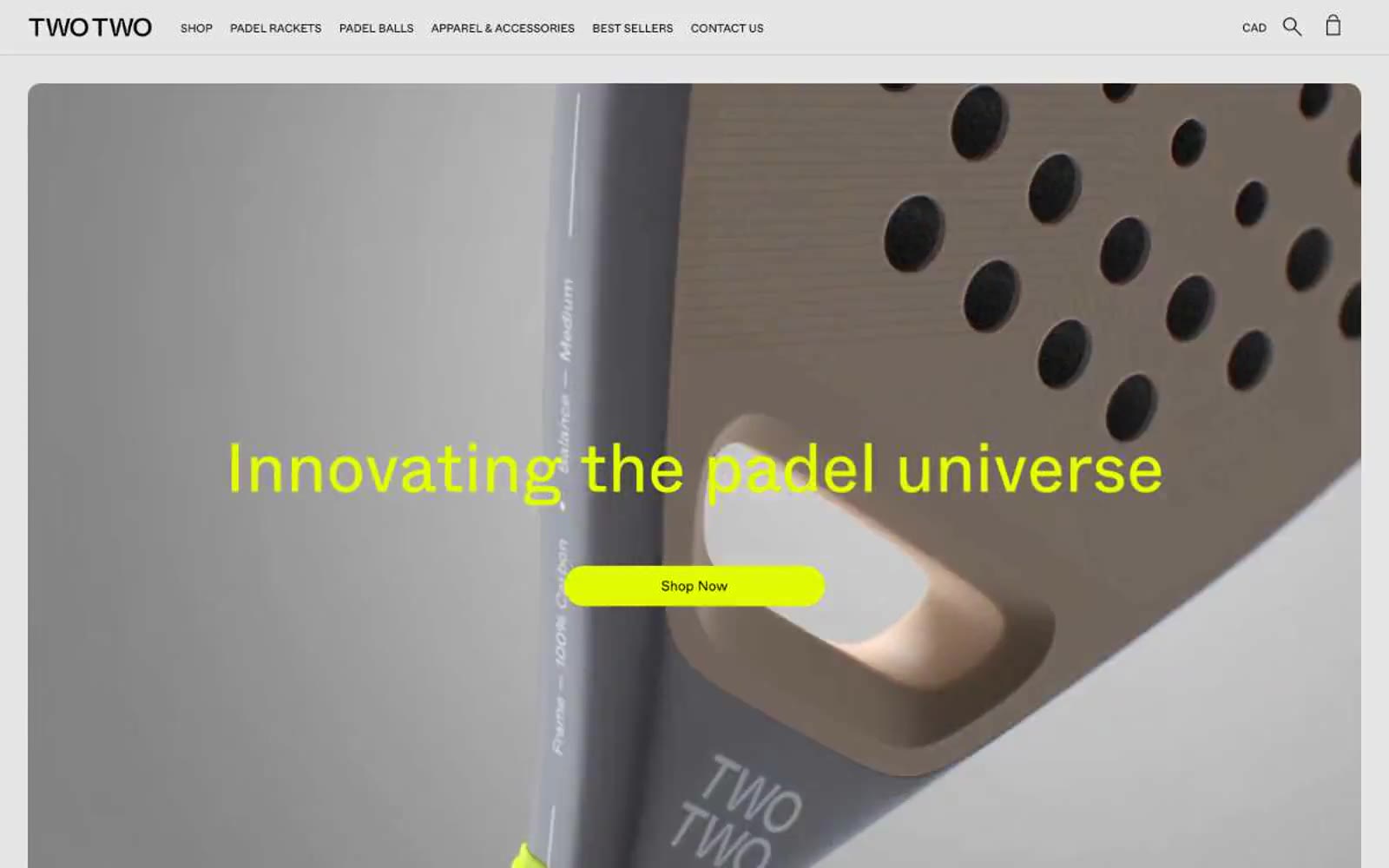
> voltage lime on monochrome concrete — a single neon punch inside a black-and-white editorial grid
**Theme:** light
TWOTWO operates on ruthless visual discipline: a near-pure black-and-white system interrupted by a single piercing voltage-lime accent. The brand reads like a sports-tech catalog stripped to its bones — generous white space, a Swiss-grotesque typeface (Whyte) that does all the tonal work, and absolutely no decorative gradients, shadows, or secondary hues. Product photography is the only color the page permits on its own terms: the rackets themselves bring in coral, blue, sage, and orange, but every UI surface, border, and label stays monochrome. The lime accent functions as functional punctuation — a filled pill button, a hover state, a small swatch tag — never as decoration. Everything is geometric, compact, and confident: 16px image radii, 50px pill buttons, 72px display headlines, uppercase tracked navigation, and tight 1.1 line heights that let type do the heavy lifting. The mood is less 'padel store' and more 'industrial design catalog on a white marble bench.'
## Tokens — Colors
| Name | Value | Token | Role |
|------|-------|-------|------|
| Voltage Lime | `#e3fc03` | `--color-voltage-lime` | Primary CTA fill, active state, accent badges, and decorative highlights — the single chromatic moment in an otherwise monochrome system. Sits at 18.2:1 contrast against black, so it doubles as a high-visibility call-to-action and a hover indicator without needing a second hue |
| Obsidian | `#000000` | `--color-obsidian` | Primary text, hairline borders, icon strokes, image borders, and footer background. Carries 2,045 border usages — this system uses black lines to structure space more than boxes or cards |
| Graphite | `#323232` | `--color-graphite` | Secondary text and softer borders — slightly lifted from pure black to create a visible hierarchy without introducing color |
| Carbon | `#1a1a1a` | `--color-carbon` | Icon strokes, link underlines, and low-priority UI marks — the third step of the dark scale, reserved for fine detail that should recede from primary text |
Websites
Markdown Text
design-md
website-prompt
landing-page-prompt
Outsource Consultants
Outsource Consultants — Style Reference
# Outsource Consultants — Style Reference
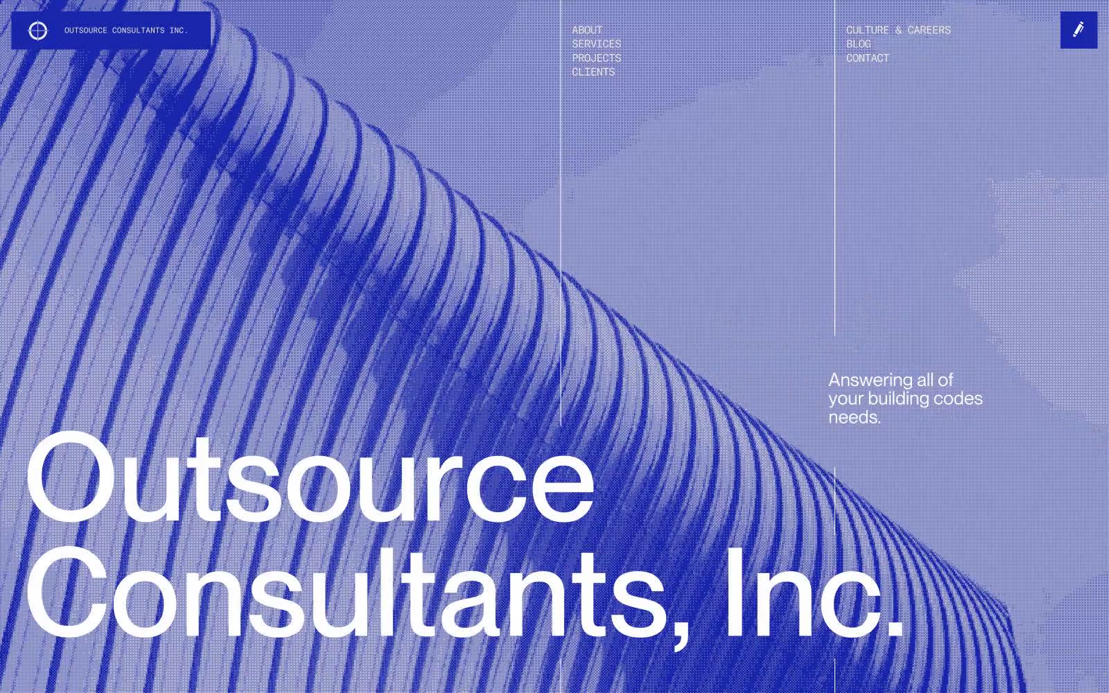
> Architectural broadsheet on bone paper. A monograph aesthetic where one violent indigo section interrupts an otherwise warm, typographically maximalist grid.
**Theme:** light
Outsource Consultants operates on a stark editorial-architectural system: a warm bone-gray canvas, a single vivid indigo that detonates across full-bleed sections, and typography that swings between a grotesque sans at 160px and a mono micro-label at 10px. The aesthetic borrows from Swiss broadsides and architecture plates — large type does the heavy lifting while information is compressed into monospaced metadata. Layouts are asymmetric and generous, with sections alternating between bone and indigo rather than stacking on white. Components are borderless, almost flat, relying on scale and the indigo-on-bone contrast to create hierarchy rather than elevation, shadows, or fills. The system feels less like a SaaS dashboard and more like a printed monograph for a technical practice.
## Tokens — Colors
| Name | Value | Token | Role |
|------|-------|-------|------|
| Indigo Strike | `#1925aa` | `--color-indigo-strike` | Brand mark, full-bleed section backgrounds, large headlines, icon strokes, nav borders — the singular chromatic voice of the system, used as a sudden tonal shift rather than a decorative accent |
| Bone | `#e8e6e0` | `--color-bone` | Page canvas and card surface — a warm off-white that reads as paper rather than screen, providing the neutral ground against which indigo gains force |
| Ink | `#000000` | `--color-ink` | Body copy, small labels, standard text — used for dense information layers that must stay recessive against the bone canvas |
| Paper | `#ffffff` | `--color-paper` | Light supporting surface for subtle backgrounds and section separation. Do not promote it to the primary CTA color |
Websites
Markdown Text
design-md
website-prompt
landing-page-prompt
Intra
Intra — Style Reference
# Intra — Style Reference
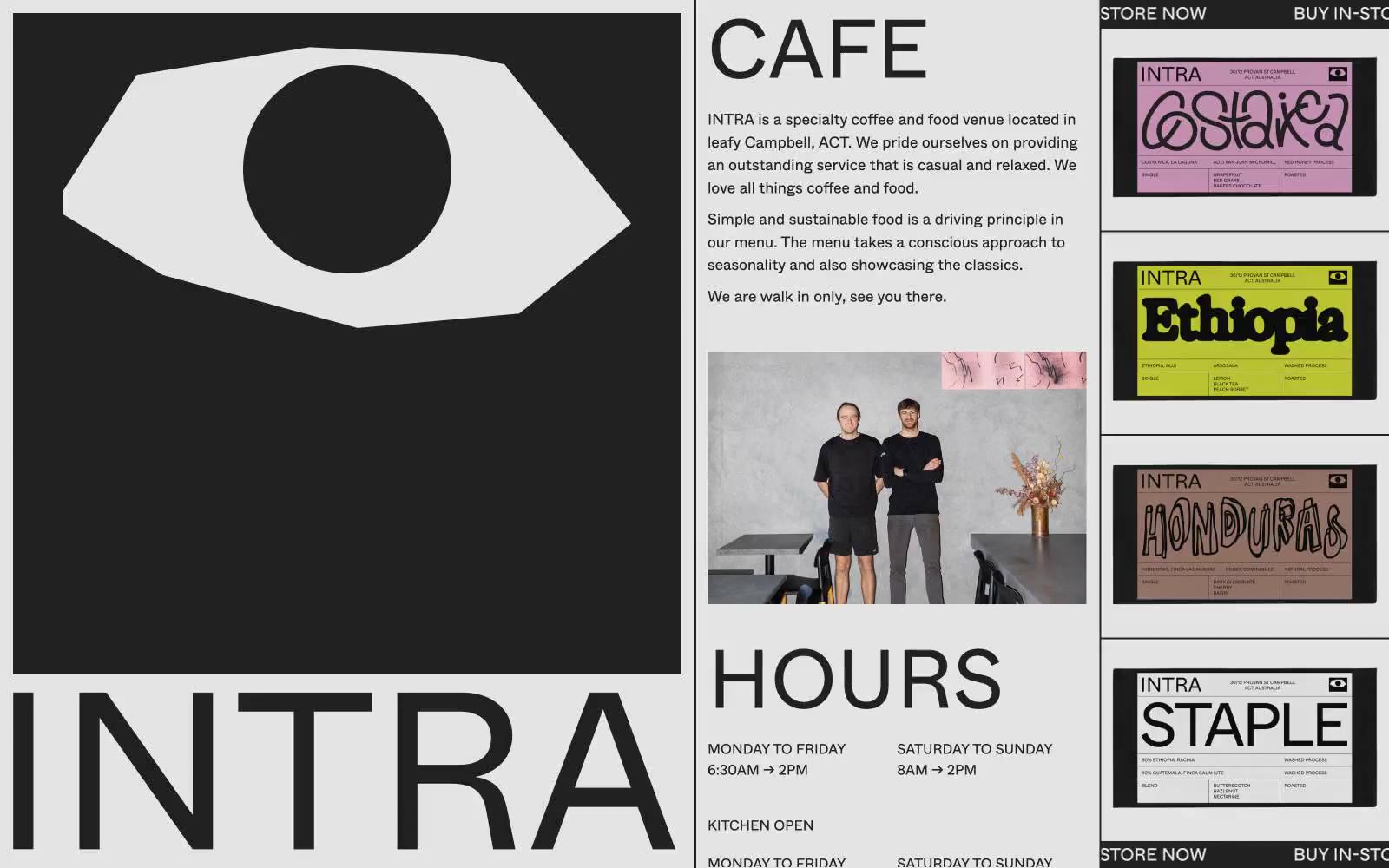
> white-walled gallery placard with one giant black eye
**Theme:** light
Intra is a brutally editorial cafe identity: a white canvas dominated by an oversized black eye-mark and gigantic sans-serif wordmarks that read like gallery wall text. Color is almost entirely suppressed — only black, near-black, white, and a single hairline gray — so that the bright packaging of its coffee bags (magenta, lime, terracotta) detonates against the monochrome page like curated art objects. Type is the interface: 95px Whyte at weight 400 does the heavy lifting that buttons and color would do on a conventional site, and every section breathes through generous 100px vertical padding and wide 50px gutters. The aesthetic borrows from Swiss editorial print, brutalist signage, and museum labeling — content is presented as a series of facts, images, and objects rather than wrapped in a product UI.
## Tokens — Colors
| Name | Value | Token | Role |
|------|-------|-------|------|
| Paper White | `#ffffff` | `--color-paper-white` | Page canvas, card surfaces, type knocked out of black panels |
| Ink Black | `#212529` | `--color-ink-black` | Primary text, bold panels, the dominant non-white surface — carries a barely-perceptible cool tint that softens it from pure #000 |
| Pure Black | `#000000` | `--color-pure-black` | Button strokes, logo fill, and the heaviest typographic moments where absolute zero contrast is required |
| Hairline Gray | `#e4e4e4` | `--color-hairline-gray` | Dividers, card borders, image outlines, table rules — the only mid-tone in the system |
Websites
Markdown Text
design-md
website-prompt
landing-page-prompt
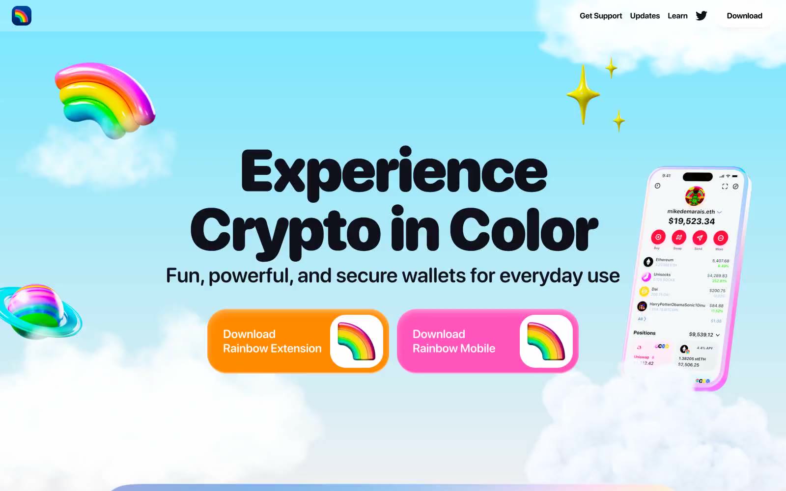
Rainbow
Rainbow — Style Reference
# Rainbow — Style Reference
> rainbow candy floating on cotton-candy sky
**Theme:** light
Rainbow uses a sky-bright, toy-store visual language: pillowy rounded letterforms, candy-saturated accents, and 3D rainbow mascots floating against pastel sky backgrounds. The system is light-mode with a near-black (#0f101a) for all type and iconography, keeping a single high-contrast ink against airy white and lavender surfaces. Two chromatic CTAs — tangerine orange (#ff8a00) and hot pink (#ff54bb) — carry every primary action, paired with full-bleed multi-hue gradients in feature sections that dissolve mint, coral, lavender, and sky-blue into white. Components lean playful and chunky: 40-50px pill radii on buttons, 32px corner radii on device frames, heavy rounded display type at 80-100px with tight -0.03em tracking. The rule is bold-but-soft: large confident shapes, rounded edges everywhere, no harsh shadows or fine borders — depth comes from inset highlights and pastel washes rather than elevation.
## Tokens — Colors
| Name | Value | Token | Role |
|------|-------|-------|------|
| Ink Black | `#0f101a` | `--color-ink-black` | Primary text, headings, iconography, dark surface anchors — the single high-contrast ink that drives every readable element |
| Pure White | `#ffffff` | `--color-pure-white` | Page canvas, card surfaces, button text on chromatic fills, inset highlight wash |
| Cloud Gray | `#f1f3f6` | `--color-cloud-gray` | Soft surface wash for alternating bands and section backgrounds, secondary card fills |
| Mist Gray | `#c7c7c7` | `--color-mist-gray` | Inset shadow color for glassy device-frame depth |
Websites
Markdown Text
design-md
website-prompt
landing-page-prompt
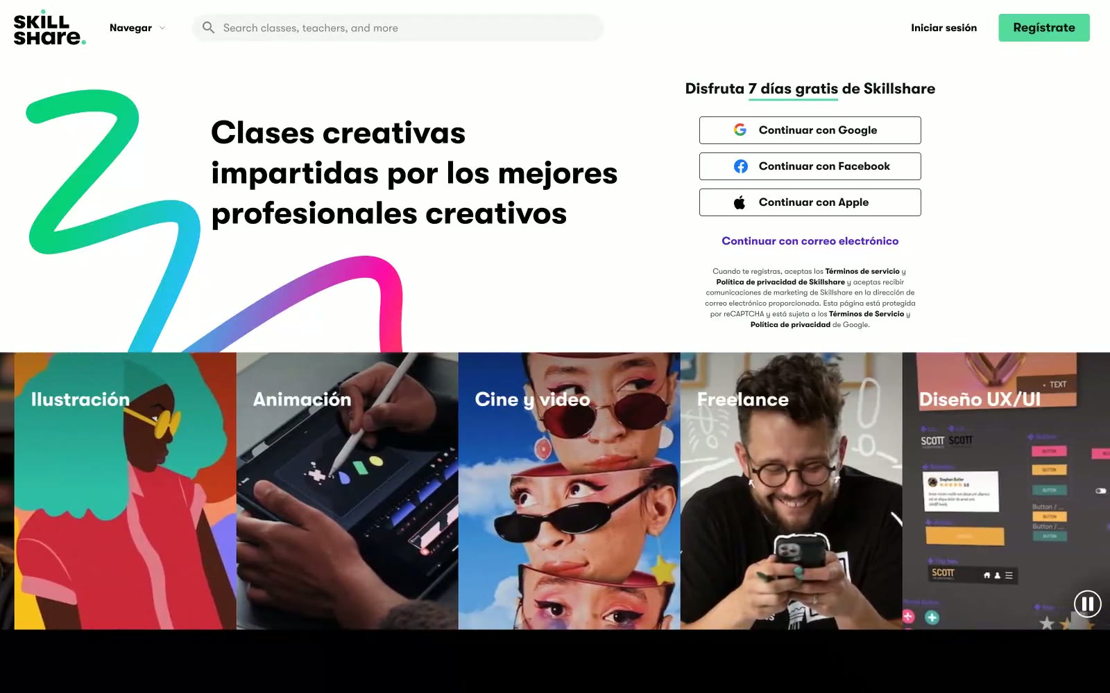
Skillshare
Skillshare — Style Reference
# Skillshare — Style Reference
> Poster studio on matte black — bold instructor faces, chalk-white type, single neon pulse.
**Theme:** mixed
Skillshare operates in stark black-and-white contrast with a single electric cyan-green accent that fires only on key interactive moments. The hero splits between a chalk-white left panel with bold headline weight and a pure black right panel hosting the registration flow — a literal light/dark duality that mirrors its creator/learner tension. Photo cards of instructors are presented edge-to-edge without padding, letting faces fill the frame; identity replaces ornament. The GT Walsheim Pro typeface at weight 700 for headlines and tight 0.90-0.96 line heights on large sizes creates a stacked, poster-like density. Cyan-green (#55da9b) and the brighter #00ff84 appear exclusively on CTAs and checkmarks — tiny amounts of color doing maximum work against acres of black and white.
## Tokens — Colors
| Name | Value | Token | Role |
|------|-------|-------|------|
| Studio Black | `#000000` | `--color-studio-black` | Primary text, dark section backgrounds, nav background on scroll — full-spectrum black with no tint creates maximum contrast against white sections |
| Pure White | `#ffffff` | `--color-pure-white` | Page background, card surfaces, text on dark sections, button fills |
| Deep Ink | `#0b1215` | `--color-deep-ink` | Body text on white backgrounds, button text on white buttons — near-black with the faintest cool tint |
| Graphite Stroke | `#394649` | `--color-graphite-stroke` | Border color on white buttons, secondary text, dividers |
Websites
Markdown Text
design-md
website-prompt
landing-page-prompt
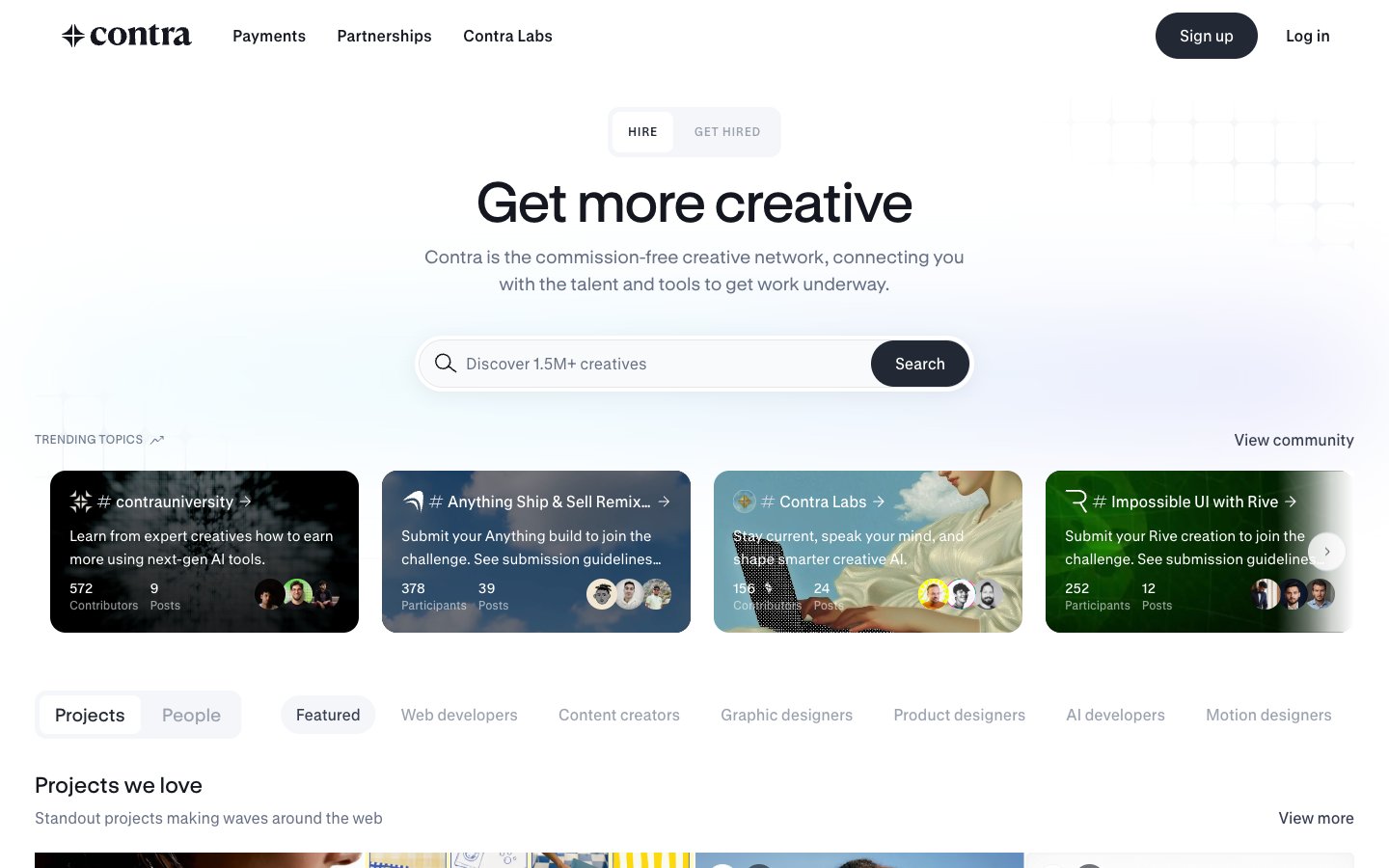
Contra
Contra — Style Reference
# Contra — Style Reference
> Editorial portfolio wall on white marble
**Theme:** light
Contra operates as a curated creative-marketplace gallery: a bright white editorial canvas where almost every element is either deep ink or hairline gray, and chromatic color only erupts inside challenge/category cards and the hero gradient wash. The system reads like a print portfolio — flat, photo-forward, grid-disciplined — with one near-black action color (Charcoal #222834) carrying all primary interactivity. Typography is a custom GT Standard family whose large display sizes (up to 58px) with tight -0.01em tracking give the hero a magazine-cover gravity, while compact 14–16px body text keeps the dense directory rows legible. Components favor pill shapes (24px buttons, 16–40px tags) and razor-thin 4px card corners, with elevation achieved through a soft two-layer charcoal shadow rather than heavy borders.
## Tokens — Colors
| Name | Value | Token | Role |
|------|-------|-------|------|
| Ink | `#14171f` | `--color-ink` | Primary text, headings, icon strokes, hairline borders, deep surfaces — the near-black backbone that makes white space read as gallery rather than form |
| Paper | `#ffffff` | `--color-paper` | Primary canvas and card surface — the default ground for the entire directory |
| Mist | `#f5f6f9` | `--color-mist` | Secondary surface for subtle bands, input fills, and tag/chip backgrounds that need to sit just behind Paper |
| Hairline | `#e5e7eb` | `--color-hairline` | Borders, dividers, and outlined-button strokes — the thinnest visible structural line |
Websites
Markdown Text
design-md
website-prompt
landing-page-prompt
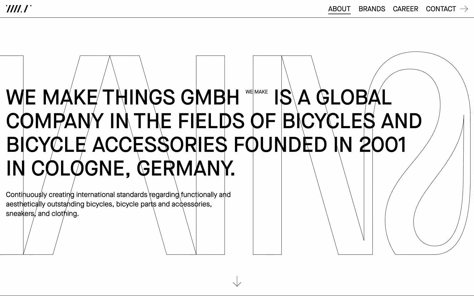
Wemakethings
Wemakethings — Style Reference
# Wemakethings — Style Reference
> Brutalist editorial broadsheet — ink-on-white architecture with type as the only building material.
**Theme:** light
WeMakeThings operates on a brutally reductive editorial logic: pure black ink on a white paper canvas, with nothing but typography and whitespace to carry the entire visual system. The site reads like a design broadsheet — massive outlined display type acts as architectural scaffolding behind bold all-caps headlines, creating depth and scale without any color, shadow, or imagery. Components are stripped to their skeleton: hairline underlines, thin borders, and direct unadorned type. Density is comfortable with generous margins, and the brand grid uses vertical text columns to turn a simple list into a typographic wall. There is no decoration, no warmth, no gradient — just confident restraint where every pixel earns its place.
## Tokens — Colors
| Name | Value | Token | Role |
|------|-------|-------|------|
| Ink Black | `#000000` | `--color-ink-black` | Primary text, all borders, outline strokes, link underlines, background type fill |
| Paper White | `#ffffff` | `--color-paper-white` | Page canvas, card surface, filled button background |
## Tokens — Typography
Websites
Markdown Text
design-md
website-prompt
landing-page-prompt
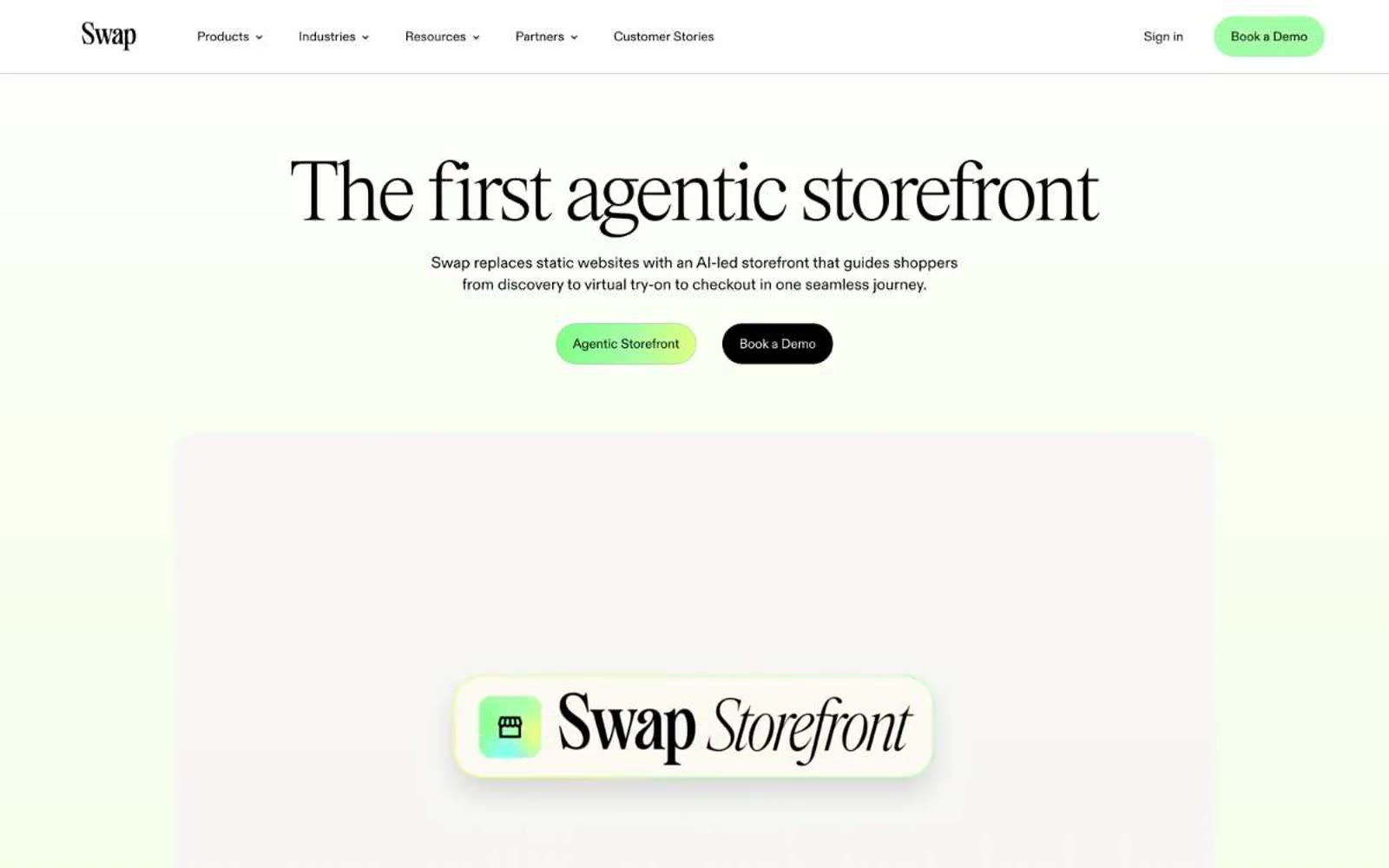
Swap
Swap — Style Reference
# Swap — Style Reference
> Mint editorial greenhouse — pale sage rooms with vivid lime accents and whisper-weight serif type.
**Theme:** light
Swap's design is a pale-mint editorial canvas anchored by a high-fashion display serif and pill-shaped vivid green CTAs. The brand reads like a luxury fashion magazine spread digitized — generous whitespace, a barely-there sage wash, and lime-green accents that feel like fresh foliage against a near-white backdrop. Everything sits lightly: thin charcoal-black borders, soft 28px blur shadows, 24px card radii, and a custom display serif that shifts between ultra-thin (100) and light (300) to whisper rather than shout. The green-to-yellow gradient display text is the only moment of visual spectacle — the rest of the system stays restrained, monochrome, and editorial, with color appearing as small functional punctuation for primary actions, tags, and active states.
## Tokens — Colors
| Name | Value | Token | Role |
|------|-------|-------|------|
| Mint Wash | `#f2ffe3` | `--color-mint-wash` | Page canvas, section backgrounds, hero wash — the dominant surface tone |
| Vivid Lime | `linear-gradient(90deg, rgb(130, 255, 135), rgb(163, 253, 167) 50%, rgb(222, 255, 130))` | `--color-vivid-lime` | Primary action button fill, accent highlights, gradient mid-stop, active tag backgrounds; Display text treatment — vivid lime-to-citrus gradient on hero headlines |
| Forest Depth | `#0d5b3b` | `--color-forest-depth` | Deep green card backgrounds, contrast surfaces, gradient anchor |
| Pine Shadow | `#083a26` | `--color-pine-shadow` | Darkest green for emphasis cards, gradient endpoints, high-contrast text on light surfaces |
Websites
Markdown Text
design-md
website-prompt
landing-page-prompt
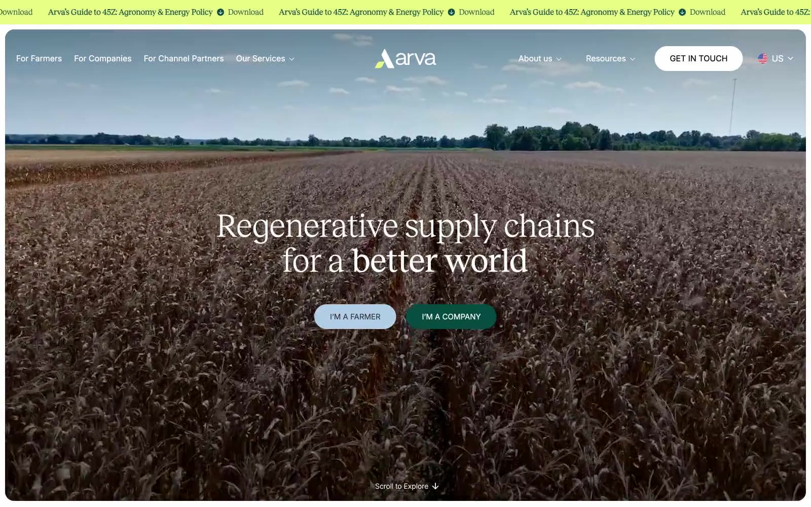
Arva
Arva — Style Reference
# Arva — Style Reference
> Pastoral editorial magazine spread on a cream field
**Theme:** light
Arva uses a pastoral editorial language: warm cream canvas replaces pure white, deep forest green anchors the brand, and quilted pastel surfaces (sky blue, peach, sage, bone) tile across content sections like fields seen from altitude. Typography pairs a refined editorial serif (Reckless) with a neutral sans (Inter), giving the site a printed-magazine feel over a typical SaaS chrome. Buttons are dramatically pill-shaped (100–110px radius), photography dominates above the fold at full-bleed, and the only saturated color besides the brand green appears as a vivid lime marquee strip — a single high-energy accent against an otherwise quiet, earth-toned system.
## Tokens — Colors
| Name | Value | Token | Role |
|------|-------|-------|------|
| Forest Ink | `#07503f` | `--color-forest-ink` | Primary brand color, header background, nav bar fill, section dividers, footer — deep teal-green against warm cream creates agricultural gravitas |
| Vivid Lime | `#e8fe85` | `--color-vivid-lime` | Promotional marquee strip, highlight announcement bars, occasional link hover wash — the only high-energy accent in the palette |
| Bone | `#f1efdf` | `--color-bone` | Page canvas, base background — warm off-white replacing pure white to feel organic and printed |
| Pure White | `#ffffff` | `--color-pure-white` | Card surfaces, input fills, button text, icon backgrounds — the bright counterpoint against bone canvas |
Websites
Markdown Text
design-md
website-prompt
landing-page-prompt
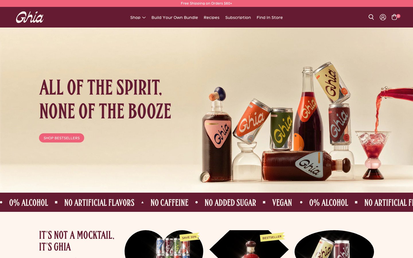
Ghia
Ghia — Style Reference
# Ghia — Style Reference
> Mediterranean sunset on a vintage aperitivo label
**Theme:** light
Ghia expresses itself as a Mediterranean aperitivo label in digital form: warm cream canvases, deep wine-burgundy sections, and coral-pink CTAs that feel like vintage packaging. The type system pairs a humanist transitional serif (Vivey) for warmth and readability with a condensed display sans (FHA Condensed) for editorial all-caps headlines — the same contrast you'd find on an Italian spirits label. Components are rounded and tactile: pill buttons, circular product frames, and full-bleed product photography. The page alternates between sun-warmed cream surfaces and dark burgundy statement blocks, with color used sparingly to make the pink CTAs and blue accent moments pop. Density is relaxed and editorial — generous margins, large display headlines, and product photography that takes visual priority over text.
## Tokens — Colors
| Name | Value | Token | Role |
|------|-------|-------|------|
| Ghia Burgundy | `#651c32` | `--color-ghia-burgundy` | Primary brand color, header bar, statement sections, marquee bands, footer — the deep wine that grounds the whole system |
| Coral CTA | `#ef6079` | `--color-coral-cta` | Filled pill buttons (Shop Bestsellers, Add to Cart, Our Story), active tab indicators, small accent dots |
| Aperitivo Cream | `#f2e2d5` | `--color-aperitivo-cream` | Primary page canvas and warm card surfaces |
| Bone White | `#fef6ee` | `--color-bone-white` | Lightest surface, header text on dark, soft secondary card backgrounds |
Websites
Markdown Text
design-md
website-prompt
landing-page-prompt
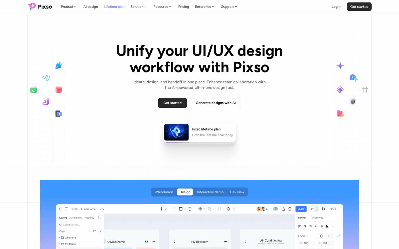
Pixso
Pixso — Style Reference
# Pixso — Style Reference
> pristine designer's canvas flooded with morning light
**Theme:** light
Pixso's marketing surface is a near-monochrome gallery: a warm-white canvas, hairline borders, and black headline type let the colorful product work and design kit thumbnails do the visual talking. Figtree carries the entire voice in a wide weight range — whispers at 400, confident at 600, and a wall of presence at 700 for the hero statement. The only chromatic punctuation is a single pale-blue wash and a purple-to-blue logo gradient; everything else earns its color by showing real product, not decoration. Components sit flat with very soft shadows and modest radii, so the page feels like a designer's tool laid out on a marble desk — the tools are quiet, the work is loud.
## Tokens — Colors
| Name | Value | Token | Role |
|------|-------|-------|------|
| Obsidian | `#000000` | `--color-obsidian` | Primary text, heading type, dark icons, and the strongest foreground layer |
| Carbon | `#121212` | `--color-carbon` | Filled primary buttons, active nav state, dark surface fill |
| Graphite | `#333333` | `--color-graphite` | Secondary headings, button labels on light surfaces, heavy icon strokes |
| Slate | `#666666` | `--color-slate` | Body secondary text, helper copy, muted metadata |
Websites
Markdown Text
design-md
website-prompt
landing-page-prompt
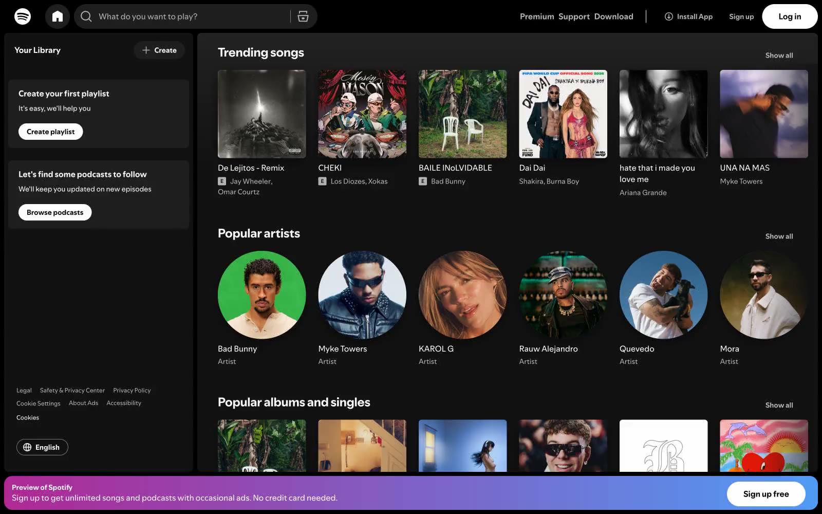
Spotify
Spotify — Style Reference
# Spotify — Style Reference
> Nocturnal jukebox control room
**Theme:** dark
Spotify's web interface is a dense, dark-mode media command center: a near-black canvas punctuated by vibrant album artwork, one signature green accent, and pill-shaped controls. Typography is compact and utilitarian — a custom geometric sans-serif at small sizes that lets album art and artist photography do the visual heavy lifting. The layout is a fixed two-column shell (sidebar + main feed) with card grids of square covers and circular avatars, creating a rhythmic alternation between geometry types. The interface avoids heavy elevation, relying on subtle surface differentiation (#121212 cards on #000000 canvas) and the one large gradient banner to inject energy. The result feels like a DJ's control room: information-dense, acoustically dark, and ready to play at a glance.
## Tokens — Colors
| Name | Value | Token | Role |
|------|-------|-------|------|
| Spotify Green | `#1ed760` | `--color-spotify-green` | Green supporting accent for decorative details and low-frequency emphasis. Do not promote it to the primary CTA color |
| Signal Red | `#b85850` | `--color-signal-red` | Red supporting accent for decorative details and low-frequency emphasis. Use as a supporting accent, not as a status color |
| Void Black | `#000000` | `--color-void-black` | Page canvas, top nav background, deepest surface layer |
| Carbon | `#121212` | `--color-carbon` | Card surfaces, sidebar panels, secondary surface layer above canvas |
Websites
Markdown Text
design-md
website-prompt
landing-page-prompt
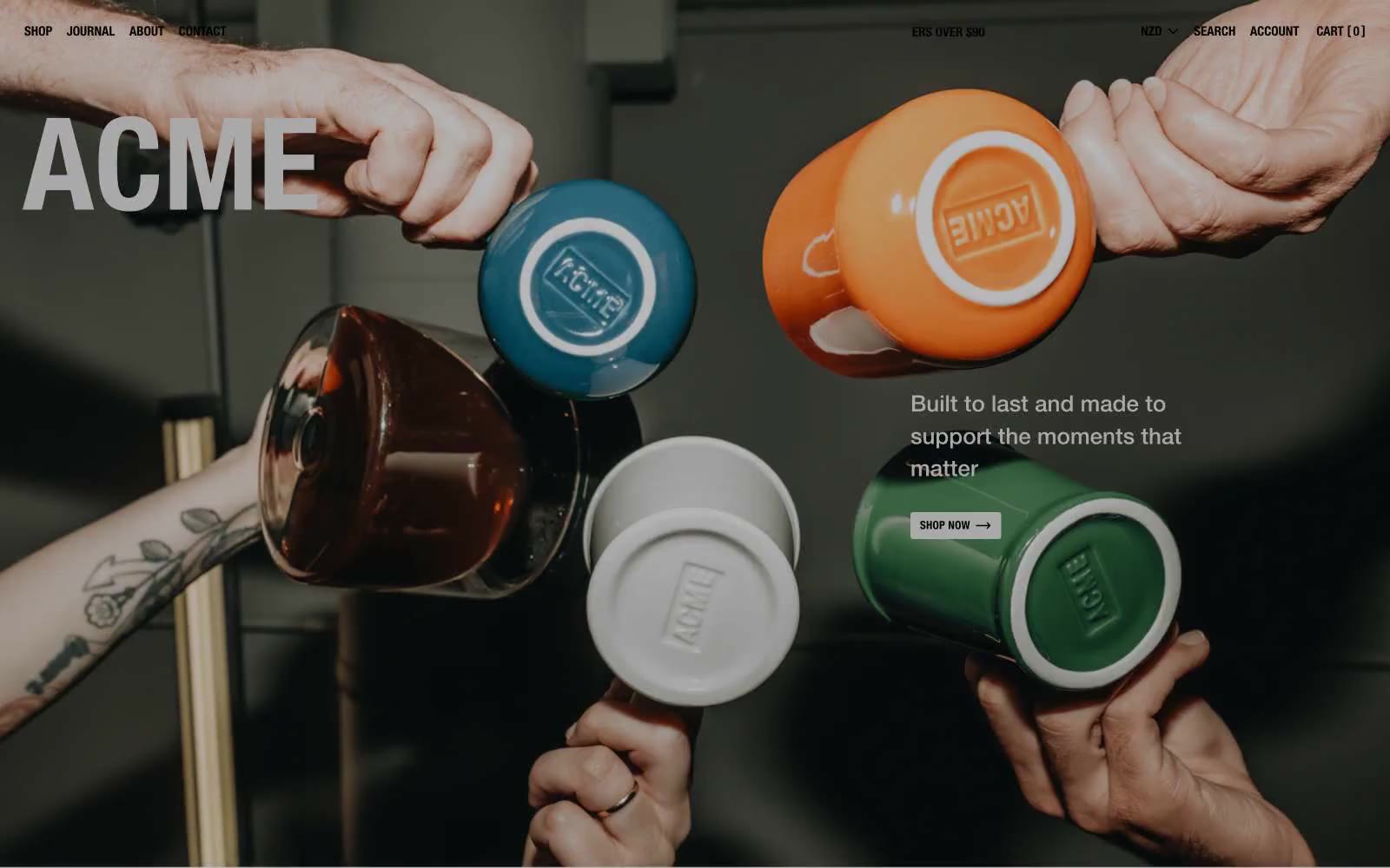
Acme Cups New Zealand
Acme Cups New Zealand — Style Reference
# Acme Cups New Zealand — Style Reference
> editorial ceramics gallery. A stark white-walled room with a single massive black headline and quiet gray dividers, where handmade cups in terracotta, forest, and teal are the only vivid things visible.
**Theme:** light
Acme's interface is a deliberately austere stage: a near-monochrome gallery wall of concrete gray and hairline black, where the only color in the room comes from the ceramic products themselves. The 148px Helvetica Neue wordmark and all-caps uppercase labels behave like a magazine cover or museum catalog rather than a typical storefront. Structural separation is done with 1px borders rather than shadows, every corner sits at 3px, and product photography does the emotional work that color, gradients, and illustration would otherwise do. The result reads as editorial, architectural, and confident — restraint as a design statement.
## Tokens — Colors
| Name | Value | Token | Role |
|------|-------|-------|------|
| Ink Black | `#000000` | `--color-ink-black` | Primary text, all structural borders, logo wordmark, button outlines — the load-bearing color of the entire system |
| Gallery White | `#fefefe` | `--color-gallery-white` | Card surfaces, product photography backgrounds, badge fills, hero overlay text color |
| Concrete Canvas | `#e3e2e2` | `--color-concrete-canvas` | Dominant page background — the warm-tinted gray that sets the gallery-like stage for every section |
| Ash Border | `#c3c3c3` | `--color-ash-border` | Card borders, badge outlines, subtle dividers — secondary structure below the black hairline |
Websites
Markdown Text
design-md
website-prompt
landing-page-prompt
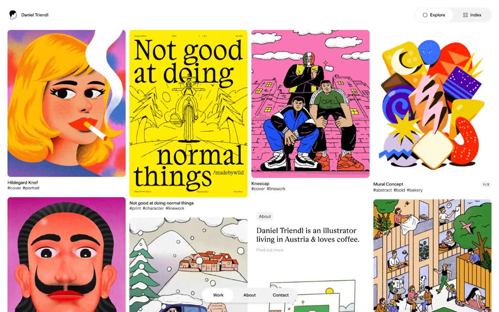
Daniel Triendl
Daniel Triendl — Style Reference
# Daniel Triendl — Style Reference
> White gallery wall for loud art
**Theme:** light
Daniel Triendl is a digital gallery wall disguised as a portfolio site. The chrome is deliberately austere — pure white canvas, black hairline borders, serif body text, a tiny avatar — so that the kaleidoscopic illustration work can carry every screen without competition. The UI behaves like a museum label: small, quiet, always secondary to the artwork it describes. Navigation is stripped to two ghost buttons and three floating pills, and the only surfaces that deviate from white are a single soft-gray tint used for those pills and the occasional tag background.
## Tokens — Colors
| Name | Value | Token | Role |
|------|-------|-------|------|
| Obsidian | `#000000` | `--color-obsidian` | Primary text, hairline borders, avatar stroke, ghost button outlines — the only ink on the page; borders are the structural device, not shadows |
| Canvas White | `#ffffff` | `--color-canvas-white` | Page background, card surface, nav fill — the gallery wall itself |
| Plaster Gray | `#f2f2f2` | `--color-plaster-gray` | Pill navigation background, subtle surface for tag chips, soft section washes |
| Ash Gray | `#9b9b9b` | `--color-ash-gray` | Muted secondary text, caption labels under illustrations, hairline borders on less prominent elements |
Websites
Markdown Text
design-md
website-prompt
landing-page-prompt
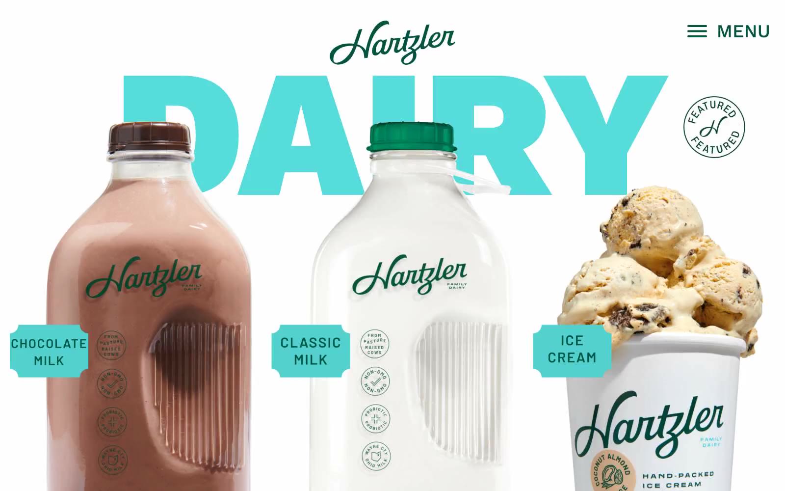
Hartzler Family Dairy
Hartzler Family Dairy — Style Reference
# Hartzler Family Dairy — Style Reference
> Creamery billboard at golden hour — the products are the type and the type is the room.
**Theme:** light
Hartzler Family Dairy uses a sunlit country-creamery aesthetic where product photography is the hero and display type does the branding. Massive Work Sans 900 headlines (290–333px) at 0.70 line-height stretch behind and around product photos, acting as architectural color blocks — teal 'DAIRY' and butter-yellow 'FRESH' alternate as section identifiers while a single deep forest green anchors all chrome, logos, and interactive borders. The interface is intentionally sparse: white canvas, minimal nav (just a 'MENU' link), no decorative gradients, no shadows — the bottles, butter sticks, and ice cream scoops are the visual content. Accent colors appear ONLY in oversized display text and small category tags; everything else is charcoal text and forest-green outlines, creating the feel of a vintage dairy billboard stripped of clutter.
## Tokens — Colors
| Name | Value | Token | Role |
|------|-------|-------|------|
| Forest Heritage | `#035542` | `--color-forest-heritage` | Teal accent for outlined action borders, linked labels, and lightweight interactive emphasis. Do not promote it to the primary CTA color |
| Billboard Blue | `#2b7bb9` | `--color-billboard-blue` | Outlined link and button borders, secondary decorative strokes on product imagery. Never a filled background — always a 1–2px stroke that reads as an old-school printed link underline |
| Cream Teal | `#56dddb` | `--color-cream-teal` | Teal outline accent for tags, dividers, and focused UI edges. |
| Butter Yellow | `#f9e9a9` | `--color-butter-yellow` | Yellow outline accent for tags, dividers, and focused UI edges. |
Websites
Markdown Text
design-md
website-prompt
landing-page-prompt
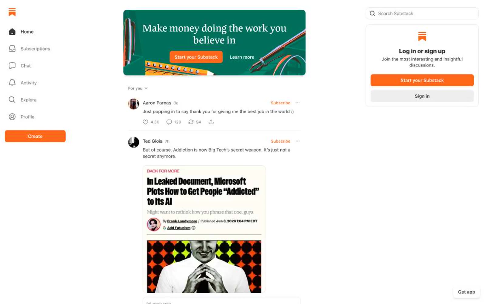
Substack
Substack — Style Reference
# Substack — Style Reference
> orange ink on a newsroom desk
**Theme:** light
Substack reads like a well-worn newsroom dashboard — white canvas, warm near-black text, and one loud signal-orange that marks every act of creation. The visual hierarchy is built from density rather than decoration: thin gray rules separate feed items, avatars are small, metadata is muted, and the reader's eye is trained to find the orange CTA, the orange logo, the orange 'Subscribe' link, the orange 'Create' button. Surfaces stay flat and unbounded — no card shadows, no panel chrome — letting the typography (a compact system-ui chrome paired with a custom serif headline face) carry the editorial weight. The signature gesture is restraint in chrome and loudness in one color: a reading app that looks like a publishing tool.
## Tokens — Colors
| Name | Value | Token | Role |
|------|-------|-------|------|
| Signal Orange | `#ff6719` | `--color-signal-orange` | Orange supporting accent for decorative details and low-frequency emphasis. Do not promote it to the primary CTA color |
| Ink | `#363737` | `--color-ink` | Primary text — body copy, headings, post titles, timestamps, author names; warm-shifted near-black instead of pure #000 for less aggressive reading |
| Paper | `#ffffff` | `--color-paper` | Page canvas, card surfaces, input fields, nav background — the dominant surface, occupying the vast majority of the interface |
| Charcoal | `#232525` | `--color-charcoal` | Secondary text and high-emphasis link hover state; deeper than Ink for code blocks and emphasis blocks |
Websites
Markdown Text
design-md
website-prompt
landing-page-prompt
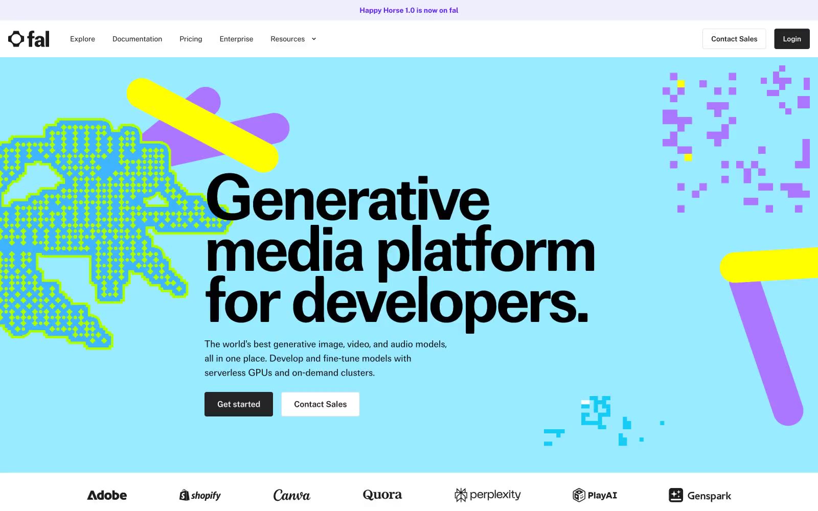
Generative AI
Generative AI — Style Reference
# Generative AI — Style Reference
> 8-bit playground on clean white paper. A white canvas interrupted by flat colored bands and scattered pixel-art creatures, held together by one bold geometric typeface and zero shadows.
**Theme:** light
fal uses a playful generative-canvas language: clean white surfaces, one bold geometric sans (focal) at compressed tracking, dark filled buttons that sit flat against brightly-colored full-bleed section bands, and scattered 8-bit pixel art decorations in lime, violet, and pink that break the otherwise minimal developer-tool grid. Color is used sectionally — each band gets its own flat wash (sky-blue hero, lime highlight, violet CTA strip, pink testimonial accent) — so the page reads like a series of colored panels stitched together by white gutters. Components stay flat and sharp: 4px button radii, 12px card radii, hairline #e5e7eb borders, no shadows, no gradients, no rounded-pill controls. The pixel creatures are the only decorative noise on an otherwise quiet, text-forward canvas — they signal 'creative playground' without ever competing with the type.
## Tokens — Colors
| Name | Value | Token | Role |
|------|-------|-------|------|
| Pixel Lime | `#f1ffd2` | `--color-pixel-lime` | Green wash for highlight backgrounds, decorative bands, and soft emphasis behind content. |
| Sky Cyan | `#99ecff` | `--color-sky-cyan` | Hero band background, full-bleed section washes, pixel-art fill — the signature page-anchoring color |
| Electric Violet | `#6120ee` | `--color-electric-violet` | Inline links, underlined text accents, dark-band pixel highlights — the primary brand chromatic |
| Deep Ultraviolet | `#4a17b0` | `--color-deep-ultraviolet` | Dark section backgrounds, card pixel-art fills, footer band — deeper companion to Electric Violet |
Websites
Markdown Text
design-md
website-prompt
landing-page-prompt
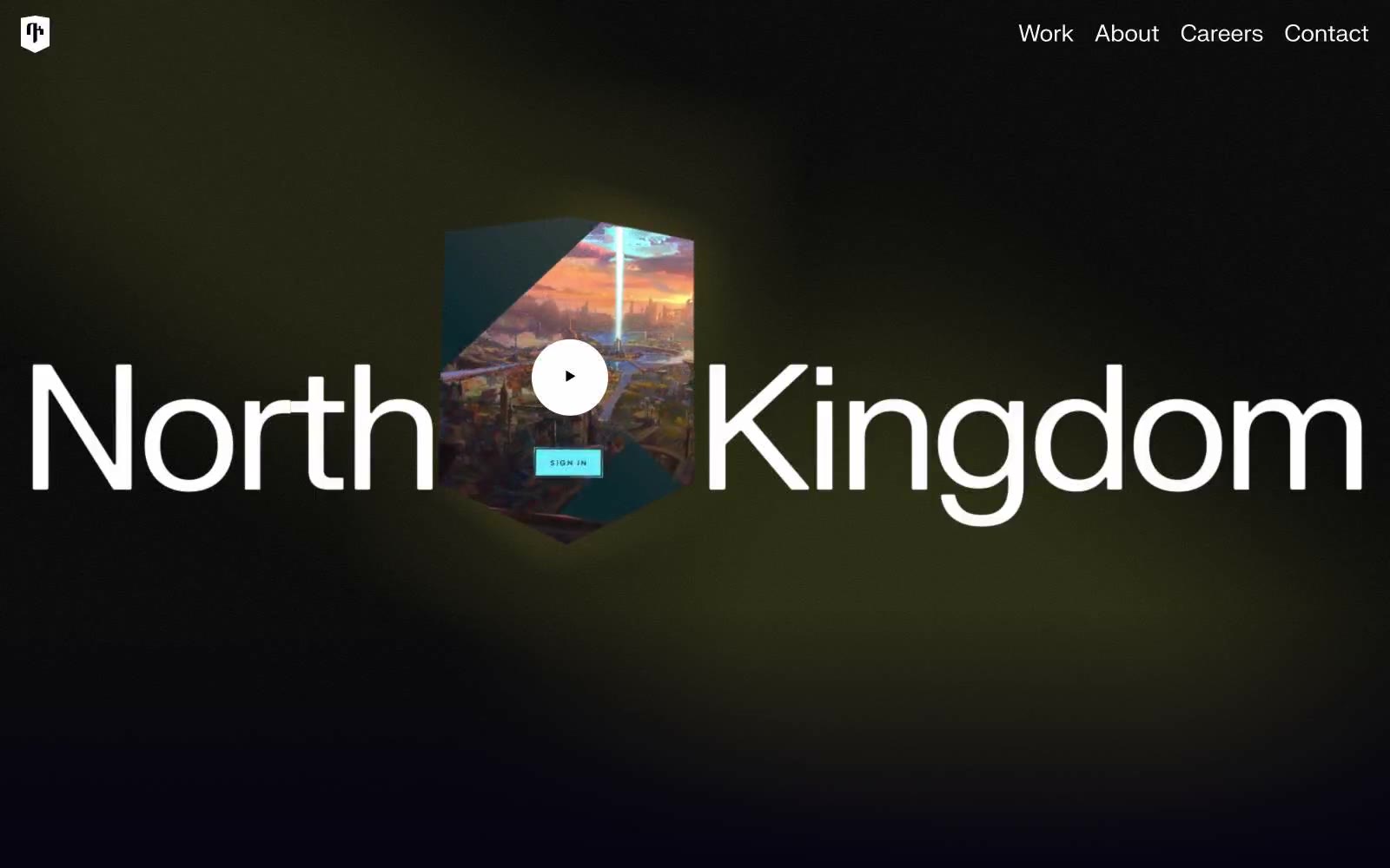
North Kingdom
North Kingdom — Style Reference
# North Kingdom — Style Reference
> cinematic void with luminous type — a black film-studio soundstage where a single wordmark glows
**Theme:** dark
North Kingdom reads as a cinematic void: an almost-black canvas (#050311) swallowing everything except oversized white type and a single luminous accent. The wordmark is the hero — giant neo-grotesque letterforms spanning the full viewport, flanked by a 3D shield emblem with a circular play affordance. The entire palette is near-monochrome; there is no chromatic brand color, no gradients, no decorative warmth. Every component lives or dies by contrast: white type and hairlines on darkness, with a single muted gray (#9b9aa0) carrying all secondary information. Surfaces are flat — no shadows, no elevation tricks, no glass effects. Geometry is quiet and slightly sharp: 8px image/card radii, 4px button radii, with one outlier 26px pill input that signals interactivity. The effect is a digital agency portfolio treated like a film title card.
## Tokens — Colors
| Name | Value | Token | Role |
|------|-------|-------|------|
| Void Ink | `#050311` | `--color-void-ink` | Page canvas, section backgrounds, dark surface base — the near-black stage on which all content sits, carrying a barely-perceptible cool-violet undertone that keeps it from feeling clinical |
| Pure White | `#ffffff` | `--color-pure-white` | Primary text, headline color, hairline borders, icon strokes, button outlines — the only high-contrast voice in the system; when something needs to be seen, it is white |
| Carbon Black | `#000000` | `--color-carbon-black` | Monochrome icon fills, brand marks, and high-contrast graphic details. Do not promote it to the primary CTA color |
| Ash Gray | `#9b9aa0` | `--color-ash-gray` | Muted body text, secondary headings, subtle borders, disabled states — carries all secondary information without competing with the white voice |
Websites
Markdown Text
design-md
website-prompt
landing-page-prompt
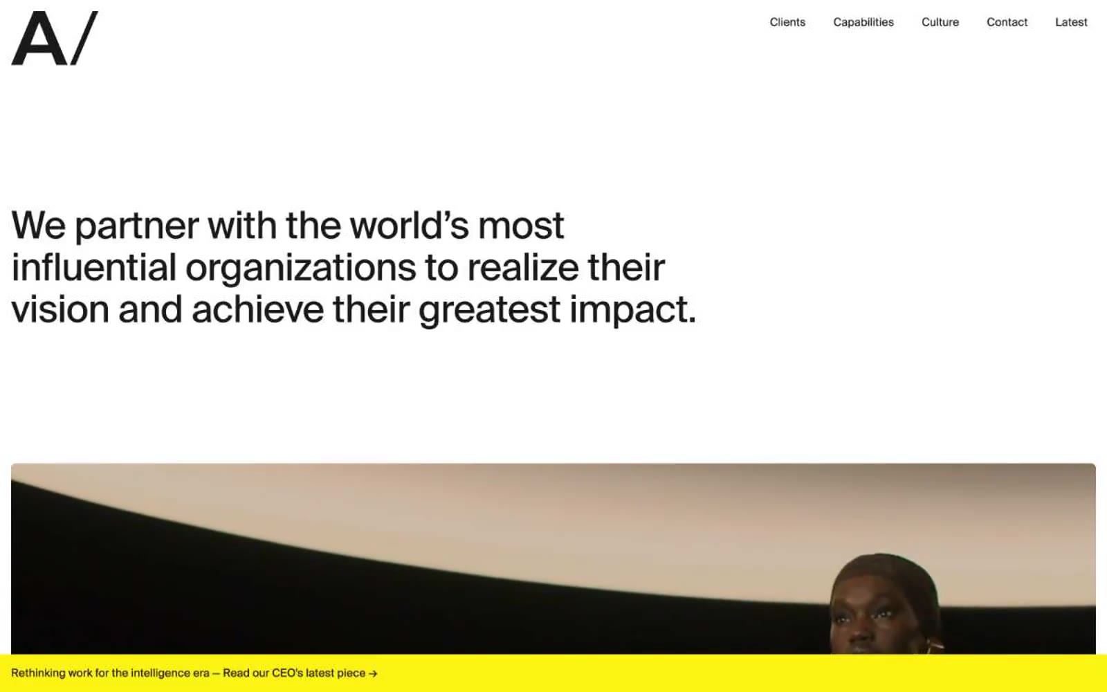
AREA 17
AREA 17 — Style Reference
# AREA 17 — Style Reference
> Monochrome editorial struck yellow — a typographic monolith on white marble interrupted by a single flash of electric yellow.
**Theme:** light
AREA 17 operates as a monochrome editorial canvas with typographic confidence as its primary visual language. The system is deliberately austere: near-black text on pure white, hairline borders, flat surfaces, and almost no color — just one electric yellow that appears as a single bright accent against the grayscale field. Headlines do the heavy lifting through scale and tight tracking, using Suisse Intl at display sizes to create an editorial, almost magazine-like voice. Layout breathes with generous whitespace punctuated by full-bleed cinematic content blocks that break the typographic grid. The aesthetic reads as a design agency's own portfolio: restrained, opinionated, and confident enough to leave most of the page empty.
## Tokens — Colors
| Name | Value | Token | Role |
|------|-------|-------|------|
| Pure White | `#ffffff` | `--color-pure-white` | Page canvas, input fields, inverse text on dark surfaces |
| Graphite | `#1a1a1a` | `--color-graphite` | Primary text, headlines, body copy, nav links — near-black warmth over pure black |
| True Black | `#000000` | `--color-true-black` | Logo mark fill, select borders, deep shadow tone |
| Hairline | `#e6e6e6` | `--color-hairline` | Borders, dividers, outlined control strokes, card edges |