AI Prompt Studio - Intelligent Prompt Library
Explore and use professional AI prompts to optimize your workflow.
One-click Use
Websites
Markdown Text
design-md
website-prompt
landing-page-prompt
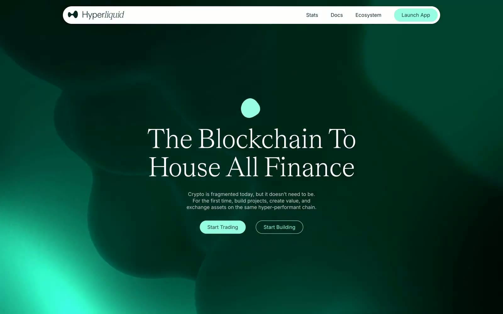
Hyper Foundation
Hyper Foundation — Style Reference

# Hyper Foundation — Style Reference
> Living emerald sanctuary — a deep forest vault where a single luminous mint glow breathes through organic, shadowed forms.
**Theme:** dark
Hyperliquid reads as a dark editorial cryptofinance environment: a deep forest-green canvas breathing with organic, softly glowing teal shapes that create depth without literal imagery. A single luminous mint accent provides all action, iconography, and typographic emphasis against the dark surface, producing a near-monochromatic palette where brightness is rationed as punctuation. Display headlines use a custom serif (Teodor) at 90px with tight 0.75 leading — an editorial, magazine-like gesture that contrasts with the lightweight Inter body text, which keeps a quiet conversational register. Pill-shaped controls at 60px radius are the primary interaction language, paired with generous negative space and a single signature mint-glow shadow that makes elevated surfaces feel like light sources rather than floating panels.
## Tokens — Colors
| Name | Value | Token | Role |
|------|-------|-------|------|
| Forest Depths | `#072724` | `--color-forest-depths` | Page canvas, hero background, deep surface layer — the dominant dark field that everything else floats on |
| Midnight Tide | `#0f3933` | `--color-midnight-tide` | Primary text on canvas, strong borders, secondary surface tint — readable white-space-equivalent for dark mode |
| Shadow Teal | `#23524c` | `--color-shadow-teal` | Elevated surface, card fills, subtle borders — one step lighter than the canvas for layer separation |
| Charcoal Hairline | `#2c2e33` | `--color-charcoal-hairline` | Subtle dividers and default 1px borders across cards, images, and icons — almost invisible on the dark canvas, used for structural quietness |
Websites
Markdown Text
design-md
website-prompt
landing-page-prompt
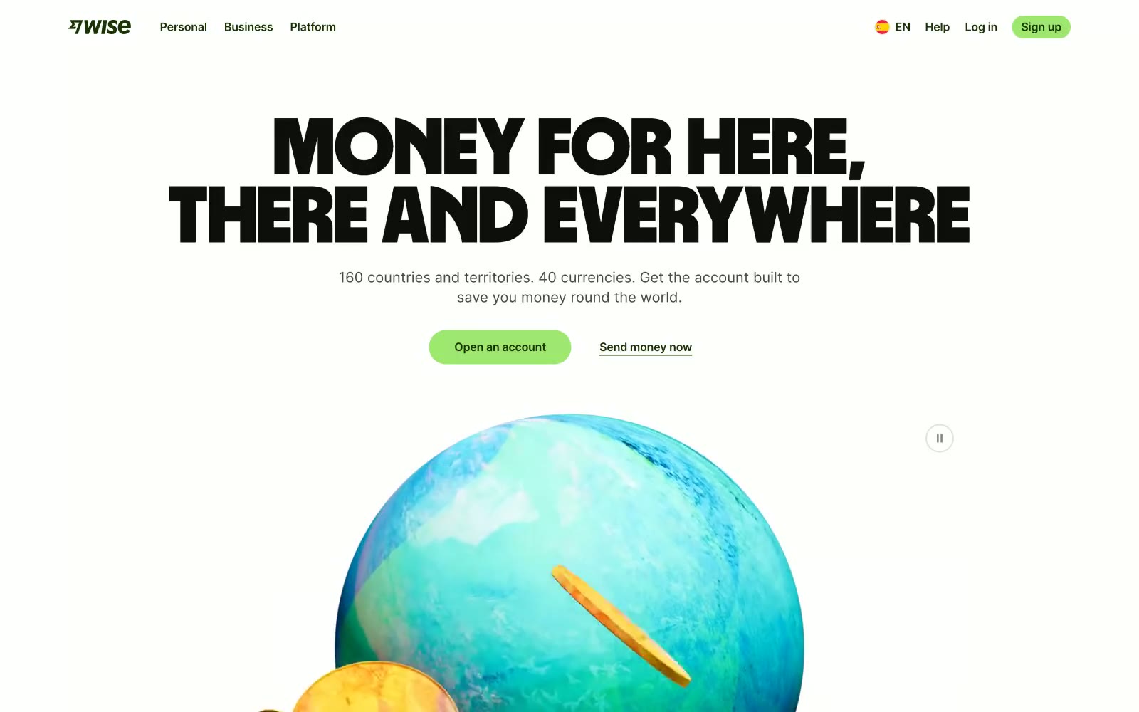
Wise
Wise — Style Reference
# Wise — Style Reference
> deep moss with lime voltage. Lime sparks on a near-black forest floor, with massive blocky display type announcing every move.
**Theme:** light
Wise speaks in a confident, slightly loud voice: a deep forest green (#163300) carries most of the surface area — text, nav, dark sections, icons — while a single electric lime (#9fe870) acts as functional punctuation on CTAs, active tabs, and key highlights. The display type is almost aggressive: Wise Sans at weight 900, tightly tracked, shouted across the hero in 100px+ block letters. The rest of the system stays restrained on a near-white canvas with soft gray surfaces (#e8ebe6). Components are pill-shaped by default — buttons, nav segments, flag thumbnails, image masks — with gentle 10px radii reserved for cards and inputs. Color rarely gradients; instead, the lime–forest pairing inverts cleanly when sections go dark, creating rhythm without decoration.
## Tokens — Colors
| Name | Value | Token | Role |
|------|-------|-------|------|
| Forest Ink | `#163300` | `--color-forest-ink` | Dominant brand dark — nav text, dark section backgrounds, primary copy on light surfaces, icon strokes, filled navigation pills. This is the brand's gravity: wherever you need weight or authority, you reach for Forest Ink |
| Lime Voltage | `#9fe870` | `--color-lime-voltage` | Green supporting accent for decorative details and low-frequency emphasis. Do not promote it to the primary CTA color |
| Spruce | `#054d28` | `--color-spruce` | Secondary dark green for card surfaces, supporting iconography, and tonal depth on dark sections where Forest Ink is too heavy |
| Linen Mist | `#e2f6d5` | `--color-linen-mist` | Pale green wash for soft highlight surfaces, tinted card backgrounds, nav hover states. A whisper of the brand green for low-emphasis containers |
Websites
Markdown Text
design-md
website-prompt
landing-page-prompt
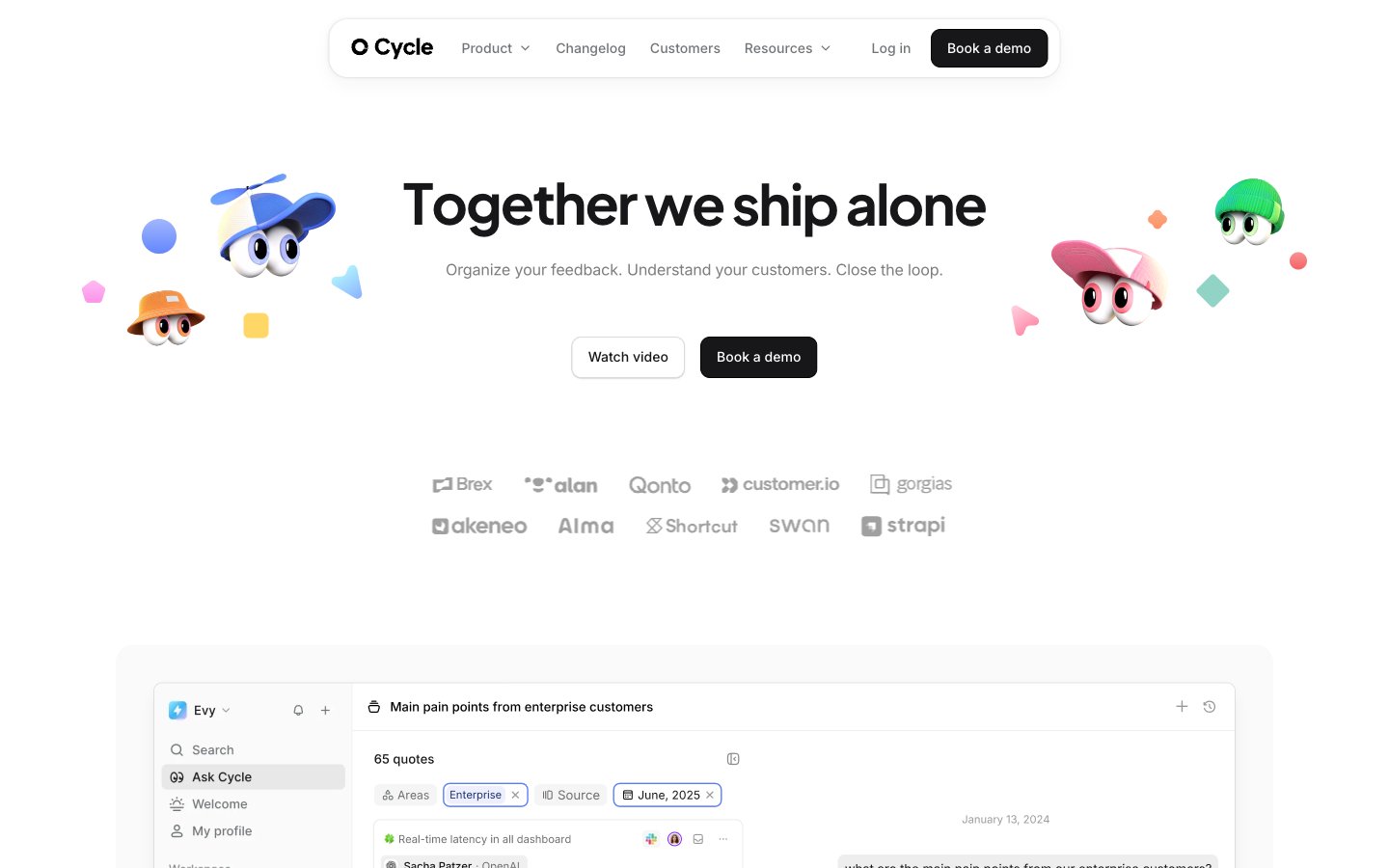
Cycle
Cycle — Style Reference
# Cycle — Style Reference
> Ink-stained porcelain workshop with jewel-toned labels
**Theme:** light
Cycle's visual language reads as a warm, analog workspace — slightly off-white canvas, ink-black type, and a palette of deep jewel tones that feel more like vintage inkpots than SaaS accents. Headlines use Eudoxus Sans at heavy weights with tight tracking, giving every title physical weight; body and UI default to Inter at comfortable 14–16px. Components sit on a very soft shadow system (low-opacity warm gray) rather than hard borders, and large 20px corner radii make cards feel like ceramic tiles. Color is functional and categorical — each product agent or feature cluster gets its own deep hue (teal, violet, amber, maroon) and its own tinted background wash, never decorative gradients.
## Tokens — Colors
| Name | Value | Token | Role |
|------|-------|-------|------|
| Ink Black | `#171618` | `--color-ink-black` | Primary text, icons, dark surfaces — the dominant neutral; never use pure #000 for text |
| Pure Black | `#000000` | `--color-pure-black` | Dark supporting neutral for text, icons, and strong contrast. Do not promote it to the primary CTA color |
| Paper White | `#ffffff` | `--color-paper-white` | Card surfaces, modal panels, text on dark buttons — the brightest surface in the stack |
| Warm Canvas | `#f7f7f7` | `--color-warm-canvas` | Page background, subtle section divider — the off-white that gives the system its warm analog feel |
Websites
Markdown Text
design-md
website-prompt
landing-page-prompt
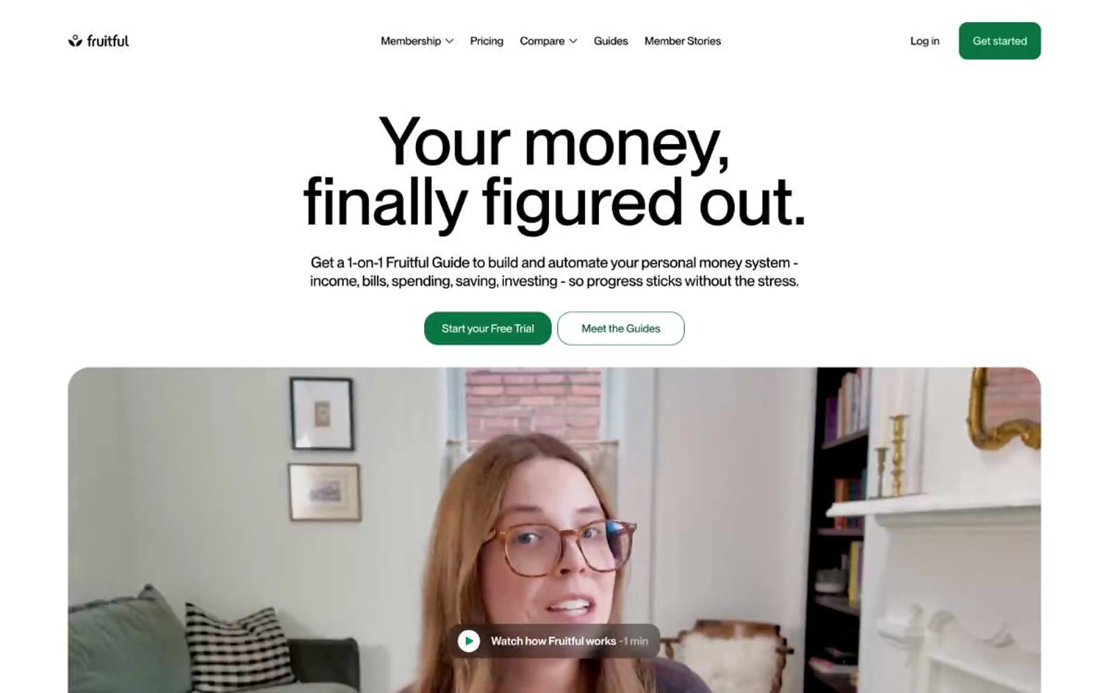
Fruitful
Fruitful — Style Reference
# Fruitful — Style Reference
> Sun-drenched kitchen herb garden — warm cream surfaces, single deep green accent, botanical softness throughout.
**Theme:** light
Fruitful operates as a sunlit kitchen-table financial practice: warm cream surfaces replace the cold grays of typical fintech, and a single deep forest green acts as the only chromatic voice. Type carries the weight — large, tight-tracked display sizes (up to 91px) that feel hand-set rather than engineered, grounding an otherwise gentle interface. Components are rounded and soft (12px on most containers, 80px on pills), with photographic portraits of real Guides in large rounded frames replacing the abstract product shots common in the category. Elevation is nearly invisible — a single multi-layer shadow reserved for the deepest cards — and borders are thin and quiet. The overall rhythm is: generous whitespace, centered headline bands, 2–3 column card grids, and a warm-but-bright palette that keeps the experience feeling like advice from a friend, not a dashboard.
## Tokens — Colors
| Name | Value | Token | Role |
|------|-------|-------|------|
| Forest Floor | `#0b7443` | `--color-forest-floor` | Primary action buttons, active nav state, brand links — deep green against warm cream creates confident without corporate |
| Deep Moss | `#054f31` | `--color-deep-moss` | Green outline accent for tags, dividers, and focused UI edges. Do not promote it to the primary CTA color |
| Vivid Leaf | `#61bc76` | `--color-vivid-leaf` | Green decorative accent for icons, marks, and small graphic details. Do not promote it to the primary CTA color |
| Bright Sprout | `#039855` | `--color-bright-sprout` | Green outline accent for tags, dividers, and focused UI edges |
Websites
Markdown Text
design-md
website-prompt
landing-page-prompt
SoundCloud
SoundCloud — Style Reference
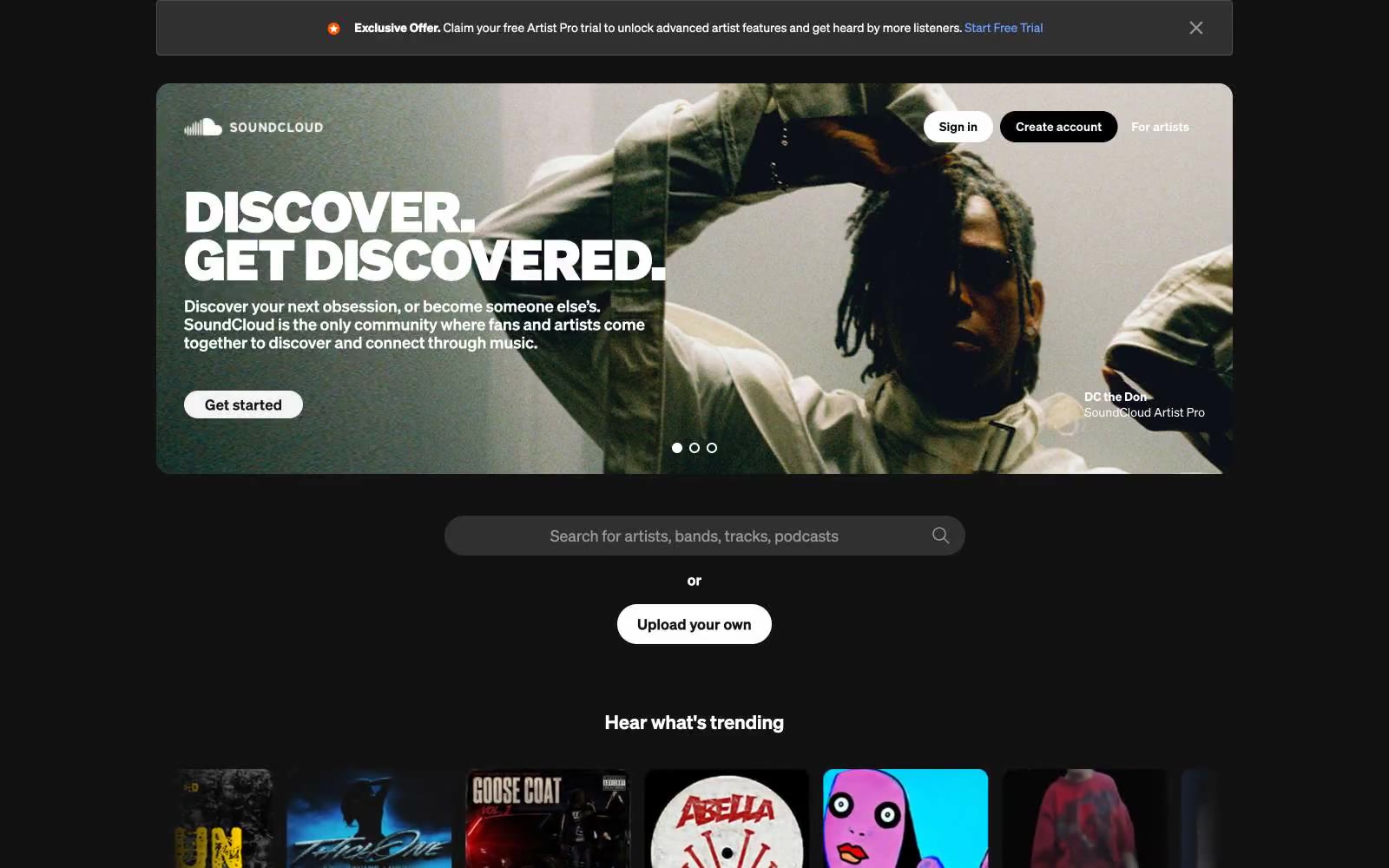
# SoundCloud — Style Reference
> concert darkroom with neon blue signal — a near-black gallery where album art and one cool accent color do all the work, and the chrome around them stays invisible.
**Theme:** dark
SoundCloud is a dark-stage media environment: near-black canvas (#121212) sets the venue, album artwork and photography carry the color, and a single cool blue (#699fff) punctuates links and interactive moments. The interface stays flat and almost shadowless — definition comes from inset hairlines and gray scale shifts rather than elevation, which keeps the focus on the visuals (artists, track artwork, lifestyle photography). Typography is a custom geometric sans (Söhne) with an unusually wide weight range including a 100-weight for whisper-thin display moments, paired with comfortable 8–16px padding and squared 4px corners that feel utilitarian and unfussy. Components are rectangular and content-dense — buttons are flat fills, cards are bare containers for cover art, inputs are minimal — letting the music content be the visual hero.
## Tokens — Colors
| Name | Value | Token | Role |
|------|-------|-------|------|
| Obsidian | `#121212` | `--color-obsidian` | Page background, hero overlay base, primary dark surface |
| Graphite | `#303030` | `--color-graphite` | Elevated dark surfaces — input fields, card backgrounds over the dark canvas, nested panels |
| Mid Gray | `#666666` | `--color-mid-gray` | Mid-tone dividers, secondary surface tier above Graphite |
| Fog | `#999999` | `--color-fog` | Supporting neutral for secondary UI, dividers, and muted labels. |
Websites
Markdown Text
design-md
website-prompt
landing-page-prompt
Ko-fi
Ko-fi — Style Reference
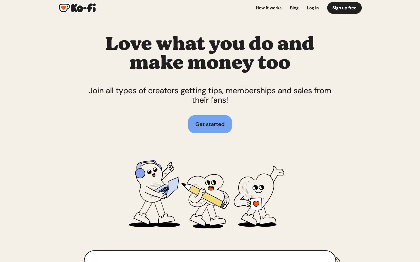
# Ko-fi — Style Reference
> Warm café chalkboard on cream paper.
**Theme:** light
Ko-fi reads like a warm indie café menu printed on recycled card stock. A cream page canvas replaces the cold white typical of creator tools, and a custom chunky display font stamps hero headlines with a hand-set zine energy while DM Sans keeps everything readable. Every interactive element is aggressively rounded — pill buttons, pillow-soft cards, capsule inputs — giving the whole system a tactile, sticker-book quality. Black 2-3px borders wrap photo and card surfaces instead of shadows, reinforcing the cut-out-and-paste craft aesthetic. A single soft periwinkle blue punctuates the otherwise warm neutral palette as the one and only accent, reserved for primary actions so they always feel like the most important thing on screen.
## Tokens — Colors
| Name | Value | Token | Role |
|------|-------|-------|------|
| Oat Cream | `#e9dfd2` | `--color-oat-cream` | Secondary surface — feature card backgrounds, warm button fills, tag backgrounds |
| Morning Fog | `#e5e7eb` | `--color-morning-fog` | Page canvas, subtle borders, hairline dividers — the base everything sits on |
| Ink Black | `#202020` | `--color-ink-black` | Primary text, dark filled buttons, dark icon fills |
| Sticker Black | `#000000` | `--color-sticker-black` | Heavy borders on cards, images, and the logo wordmark — the signature outline that makes elements feel cut from paper |
Websites
Markdown Text
design-md
website-prompt
landing-page-prompt
Aaply
Aaply — Style Reference
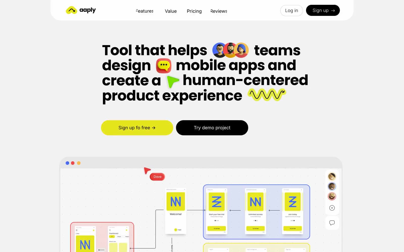
# Aaply — Style Reference
> Digital sketchpad with electric highlighter
**Theme:** light
Aaply reads as a digital sketchpad on a light gray canvas: everything is flat, everything is rounded, and electric yellow carries the energy while black anchors the structure. The headline itself behaves like a whiteboard — bold black type interrupted by colorful emoji and icon stickers, signaling that this is a tool for creative work. Surfaces float as soft white cards on a cool gray field with a faint dot-grid texture, never relying on shadows for depth. Brand color appears as generous fills (buttons, accent shapes, logo marks) rather than thin strokes or tinted backgrounds. The overall feeling is energetic but unpretentious — a working surface, not a gallery.
## Tokens — Colors
| Name | Value | Token | Role |
|------|-------|-------|------|
| Highlighter Yellow | `#e6e51e` | `--color-highlighter-yellow` | Primary brand accent — logo mark, filled pill buttons, accent shapes inside product mockups, highlight washes on feature cards |
| Annotation Red | `#f34646` | `--color-annotation-red` | Red supporting accent for decorative details and low-frequency emphasis |
| Signal Blue | `#466cf3` | `--color-signal-blue` | Product mockup logos, icon accents, connector arrows inside the flow diagram — the cool counterweight to warm yellow |
| Peach Wash | `#ff8562` | `--color-peach-wash` | Soft tinted background blocks behind product mockup clusters — warm secondary surface that softens the gray canvas |
Websites
Markdown Text
design-md
website-prompt
landing-page-prompt
Peloton
Peloton — Style Reference
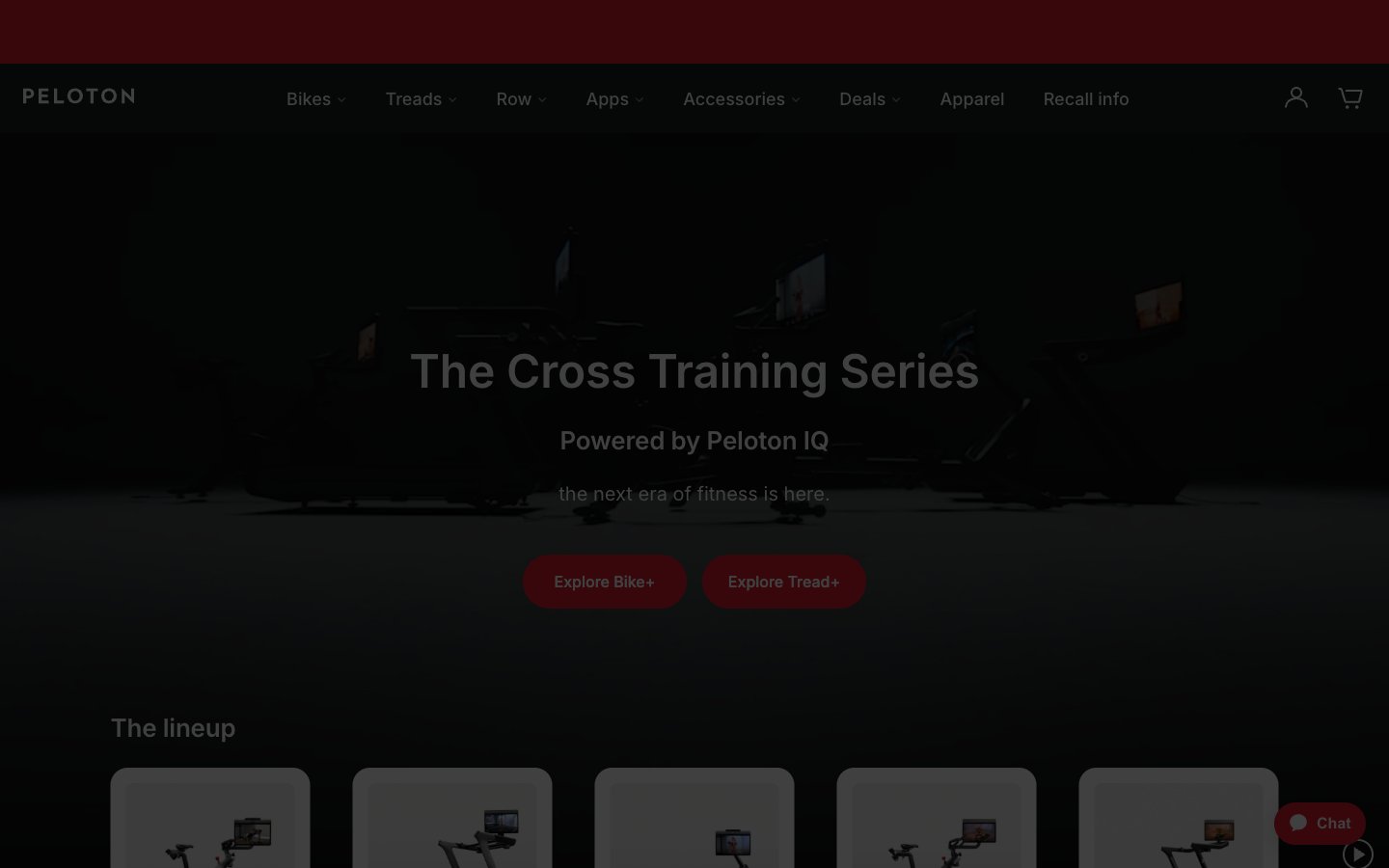
# Peloton — Style Reference
> Red beacon on charcoal runway. A fitness showroom where one electric red CTA cuts through vast dark exhibition space into clean white product galleries.
**Theme:** mixed
Peloton runs a disciplined two-mode visual system: cinematic charcoal hero surfaces that make product photography glow, followed by bright white product grids that let the merchandise speak. The palette is almost entirely achromatic — gunmetal, white, and warm grays — with one vivid red accent that acts as the only chromatic punctuation on the page, reserved exclusively for primary actions, brand marks, and the persistent chat widget. Inter carries the entire typographic voice at a wide range of weights, from whisper-light 300 display headlines to confident 500 nav labels, creating a calm, premium fitness-retail atmosphere. Components are generous: 28px pill buttons, 6px inputs, 24px image corners, and minimal elevation — surfaces do the structural work, shadows stay absent or near-invisible.
## Tokens — Colors
| Name | Value | Token | Role |
|------|-------|-------|------|
| Peloton Red | `#df1c2f` | `--color-peloton-red` | Red supporting accent for decorative details and low-frequency emphasis. Do not promote it to the primary CTA color |
| Carbon Black | `#181a1d` | `--color-carbon-black` | Primary text color, dark hero surfaces, navigation bar, footer backgrounds, heading color — the structural anchor of the entire system |
| Pure White | `#ffffff` | `--color-pure-white` | Light supporting surface for subtle backgrounds and section separation. Do not promote it to the primary CTA color |
| Mist Gray | `#f7f7f7` | `--color-mist-gray` | Page canvas, subtle section backgrounds behind product grids, alternate band separator |
Websites
Markdown Text
design-md
website-prompt
landing-page-prompt
Kobu
Kobu — Style Reference
# Kobu — Style Reference
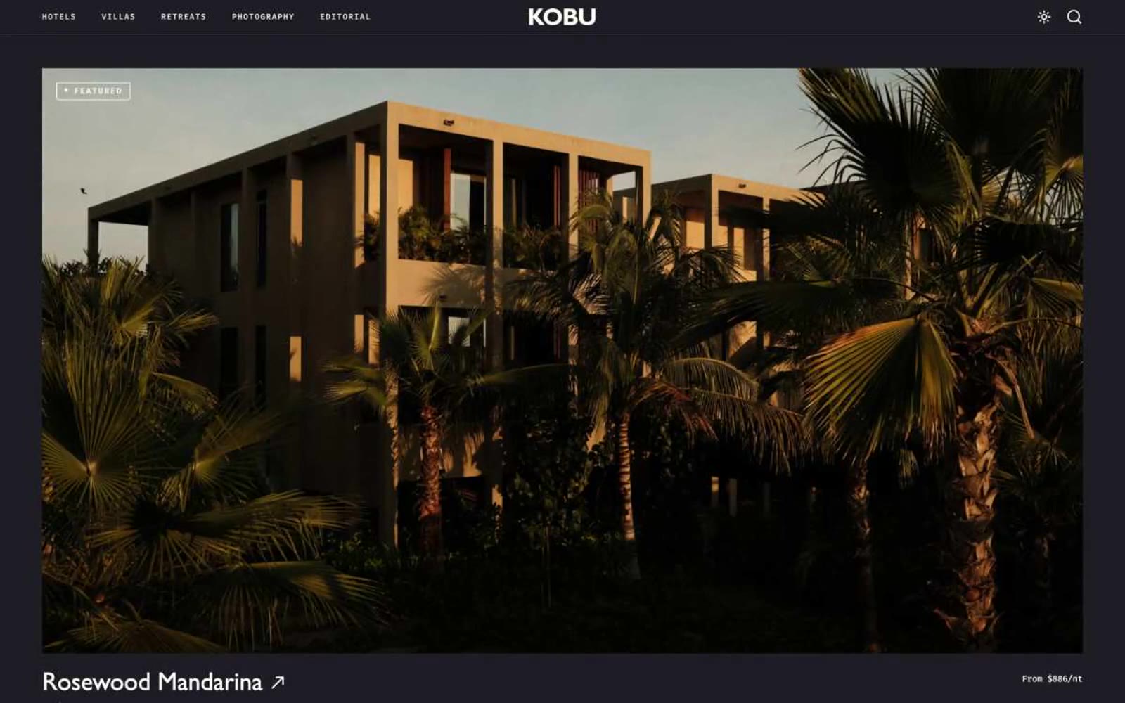
> Monochrome travel gazette on warm parchment
**Theme:** light
Kobu operates as an editorial travel portfolio: a warm cream canvas, almost zero chromatic noise, and photography as the only color. The massive display wordmark KOBU stretches nearly edge-to-edge — the brand name itself is the visual statement, not a logo mark. Everything else recedes: a humanist Gill Sans sets a literary, guidebook tone while Fira Mono handles small uppercase labels that read as printed museum tags. Cards live on the page edge with hairline borders, no shadows, no fills, and 5px-rounded badges floating in the top-left corner of each photograph. The system is deliberately austere — no CTAs, no accent colors, no gradients — so that the architecture and landscapes in the photography become the only expressive element on screen.
## Tokens — Colors
| Name | Value | Token | Role |
|------|-------|-------|------|
| Obsidian | `#242429` | `--color-obsidian` | Primary text, icon strokes, hairline borders across the system — the workhorse dark that replaces pure black for a slightly warmer read |
| Parchment | `#f9f5f2` | `--color-parchment` | Page canvas, hero and footer backgrounds — warm off-white that signals editorial paper rather than digital default |
| Gallery White | `#ffffff` | `--color-gallery-white` | Card surfaces, image borders, badge backgrounds — the brighter neutral used to lift content off the parchment |
| Ink Black | `#000000` | `--color-ink-black` | Headings, navigation borders, and high-contrast typographic moments where maximum weight is needed |
Websites
Markdown Text
design-md
website-prompt
landing-page-prompt
beehiiv
beehiiv — Style Reference
# beehiiv — Style Reference
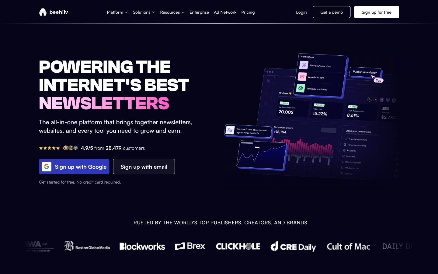
> midnight observatory with neon plasma
**Theme:** dark
beehiiv uses a midnight-canvas language: near-black surfaces with subtle violet undertones, tight geometric display type in Clash Grotesk, and a signature electric-indigo-to-hot-magenta gradient that injects energy into an otherwise restrained layout. The page behaves like a product launch site — dark always, with content cards floating on the dark canvas using thin violet borders and faint glows rather than heavy shadows. Satoshi carries all interface text with comfortable spacing, while Clash Grotesk delivers the headline voice at 60-72px with zero letter-spacing for confident geometric authority. Accent color appears sparingly: as a gradient on hero text, as a full-bleed highlight on one testimonial card, and as small chromatic icons — never as large filled buttons. Components are flat and precise, relying on border-weight and inner glow rather than elevation.
## Tokens — Colors
| Name | Value | Token | Role |
|------|-------|-------|------|
| Abyss Ink | `#060419` | `--color-abyss-ink` | Page background, deepest surface — the void that everything floats on |
| Deep Violet | `linear-gradient(to right bottom, rgba(6, 4, 25, 0.4), rgba(47, 57, 186, 0.8))` | `--color-deep-violet` | Card and panel surfaces — one step lifted from the canvas; Atmospheric gradient overlay — blends canvas into indigo accent |
| Twilight Plum | `#141230` | `--color-twilight-plum` | Elevated surfaces, active nav backgrounds, deeper card variants |
| Dark Plum | `#1b0e27` | `--color-dark-plum` | Hover states, inset surface, tooltip backgrounds |
Websites
Markdown Text
design-md
website-prompt
landing-page-prompt
Browserbase
Browserbase — Style Reference
# Browserbase — Style Reference
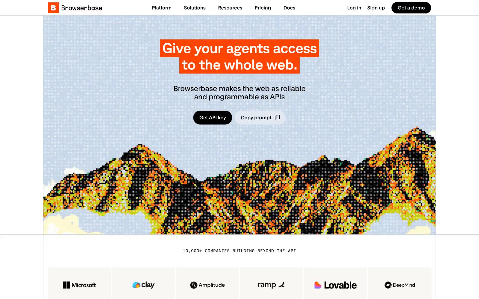
> editorial broadsheet meets data terminal — a single hot orange punctuating a near-monochrome field of oversized GT Planar headlines, soft pastel card surfaces, and tiny mono metadata.
**Theme:** light
Browserbase reads as a data-forward developer tool dressed in editorial broadsheet clothing: a near-monochrome canvas anchored by a single hot orange used purely for typographic emphasis, never for buttons. The interface stays quiet with black, white, and off-white surfaces, while cards and feature blocks introduce soft pastel tints — lavender-gray, sky blue, cream — to group content without resorting to shadows. Display headlines in GT Planar at large sizes sit alongside compact GT Standard Mono labels, creating the rhythm of a technical magazine: large confident statements punctuated by precise metadata. Filled black pill buttons carry the weight of every primary action; the orange is reserved for highlight boxes inside headlines and the footer band, making the brand color a punctuation mark rather than a navigational cue.
## Tokens — Colors
| Name | Value | Token | Role |
|------|-------|-------|------|
| Ink Black | `#000000` | `--color-ink-black` | Primary text, filled action buttons, card borders, dividers — the structural spine of the entire interface |
| Paper White | `#ffffff` | `--color-paper-white` | Page canvas, card surfaces, button text on dark fills, icon fills on dark backgrounds |
| Faint Slate | `#f8fafc` | `--color-faint-slate` | Subtle off-white for logo strip cards, secondary panel backgrounds, alternating section tint |
| Lavender Mist | `#e2e9f3` | `--color-lavender-mist` | Feature card surfaces and section background tints — soft cool gray that groups content without weight |
Websites
Markdown Text
design-md
website-prompt
landing-page-prompt
Readwise
Readwise — Style Reference
# Readwise — Style Reference
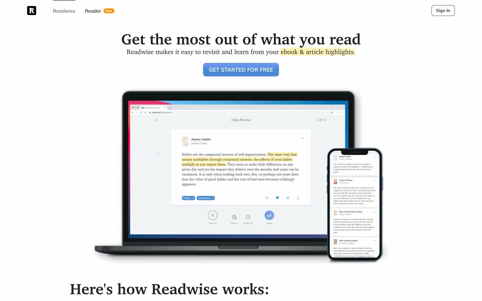
> A reader's annotated journal — quiet paper-white, serif headlines, and one blue pen.
**Theme:** light
Readwise presents a literary productivity workspace: a near-white canvas with a single editorial blue accent and warm yellow highlighter washes that literally visualize the product's purpose. The type system pairs a transitional serif (Charter) for headlines with a humanist sans (Mulish) for everything else, creating a bookish-but-modern reading-room atmosphere rather than a typical SaaS dashboard feel. Surfaces are flat and quiet — cards float on a cool paper-white (#f1f5f8) with hairline borders, almost no shadows, and rounded corners that feel like printed cards rather than app tiles. Yellow (#fff7ca) functions as a literal highlighter behind in-line emphasized text, not as a decorative accent — the product's identity IS the act of marking what matters. Components stay compact and text-forward, with one filled blue button carrying all the weight and everything else rendered in ghost or text-link form.
## Tokens — Colors
| Name | Value | Token | Role |
|------|-------|-------|------|
| Pen Blue | `#478cd0` | `--color-pen-blue` | Blue supporting accent for decorative details and low-frequency emphasis. Do not promote it to the primary CTA color |
| Highlighter Yellow | `#fff7ca` | `--color-highlighter-yellow` | Yellow supporting accent for decorative details and low-frequency emphasis. |
| Reader Orange | `#fb9100` | `--color-reader-orange` | Orange supporting accent for decorative details and low-frequency emphasis |
| Paper White | `#ffffff` | `--color-paper-white` | Card surfaces, product screenshot backgrounds, button text on filled buttons, and the nav background. The topmost surface tier |
Websites
Markdown Text
design-md
website-prompt
landing-page-prompt
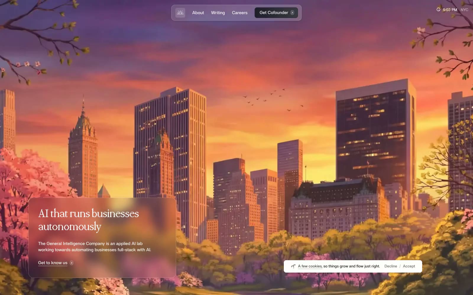
General Intelligence Company
General Intelligence Company — Style Reference
# General Intelligence Company — Style Reference
> illustrated metropolis behind frosted glass
**Theme:** light
General Intelligence Company presents as an editorial publication about applied AI: a warm off-white canvas (#fefffc) holds near-black serif headlines and compact sans body text, with a single vivid blue (#0081c0) used sparingly as accent. Full-bleed painted illustrations (a twilight cityscape, a flowering meadow) establish atmosphere, while frosted-glass text cards float over them to deliver the message — the hero is a literary tableau, not a product screenshot. The custom display serif 'ppmondwest' with its tight -0.02em tracking sets a measured, almost academic register; the sans 'af' keeps every other surface quiet and functional. Components feel paper-like and light: hairline borders, soft ring shadows, generous corner radii on cards (12-24px), and pill-shaped floating controls rather than heavy filled panels.
## Tokens — Colors
| Name | Value | Token | Role |
|------|-------|-------|------|
| Hudson Blue | `#0081c0` | `--color-hudson-blue` | Blue wash for highlight backgrounds, decorative bands, and soft emphasis behind content. Do not promote it to the primary CTA color |
| Slate Cyan | `#41a1cf` | `--color-slate-cyan` | Blue accent for outlined action borders, linked labels, and lightweight interactive emphasis. Do not promote it to the primary CTA color |
| Graphite Night | `#282834` | `--color-graphite-night` | Floating navigation island fill and icon strokes — the dark surface that anchors the pill-shaped nav against the light canvas |
| Ink | `#171717` | `--color-ink` | Primary text and dominant border color. Drives 619 occurrences — the structural backbone of the interface |
Websites
Markdown Text
design-md
website-prompt
landing-page-prompt
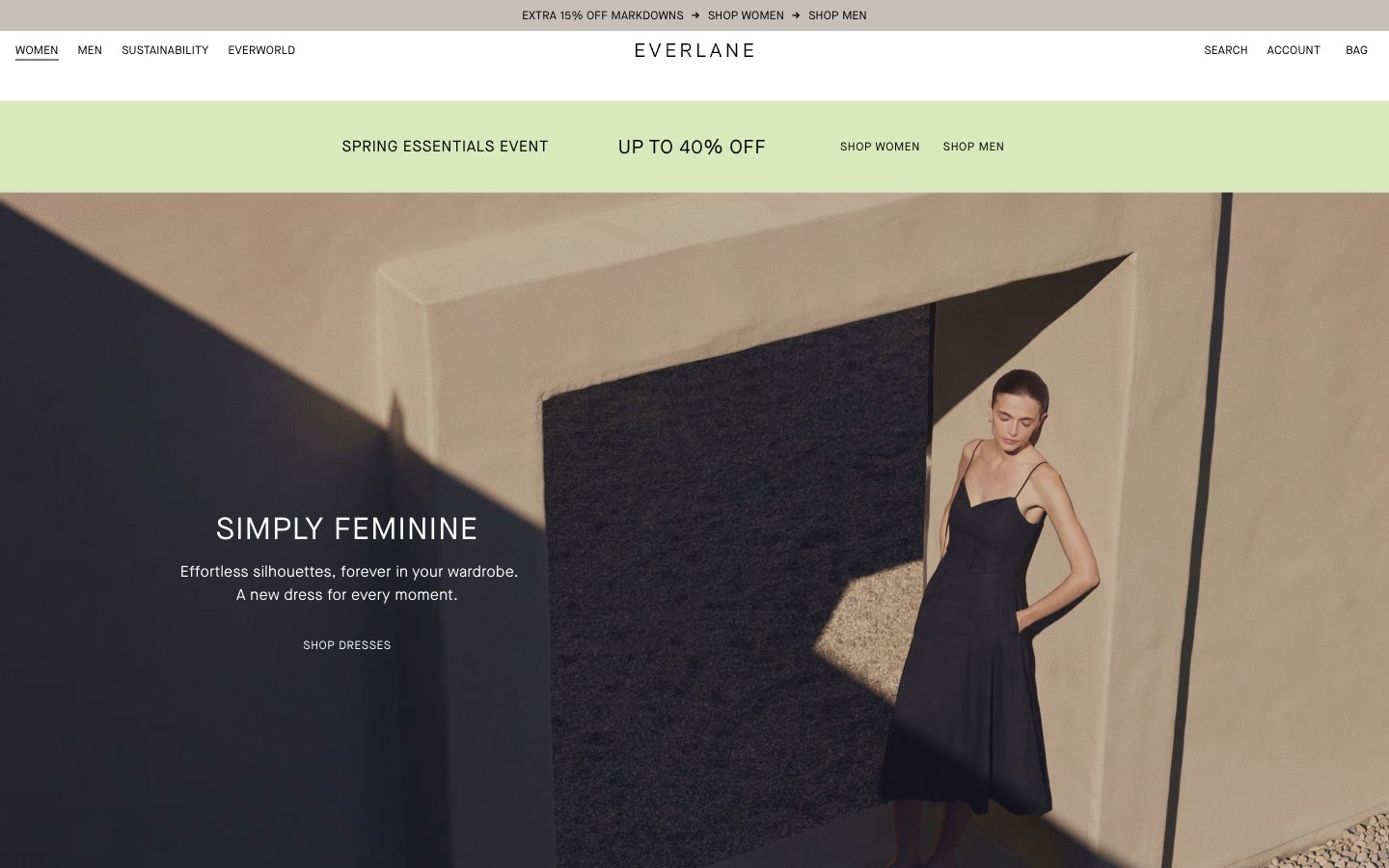
Everlane
Everlane — Style Reference
# Everlane — Style Reference
> Minimalist atelier on raw linen. White walls, bare architecture, a single sage-green ribbon of light.
**Theme:** light
Everlane operates as a minimalist editorial fashion catalogue: near-total achromatic palette, one soft sage accent reserved for promotional urgency, and Maison Neue set almost entirely in uppercase with wide tracking. Photography carries nearly all visual weight — full-bleed editorial shots and tightly cropped product images sit on white canvases with zero decoration, zero shadows, and zero chrome. Type is the only ornament: tracked uppercase headings float over imagery, body copy stays minimal and quiet. Components are stripped to their essentials — thin text links, sharp-edged product tiles, no buttons, no cards, no panels. The result reads less like a storefront and more like a printed lookbook translated to screen.
## Tokens — Colors
| Name | Value | Token | Role |
|------|-------|-------|------|
| Onyx | `#000000` | `--color-onyx` | Primary text, icons, hairline borders, nav typography, footer text — the dominant ink across every surface |
| Paper White | `#ffffff` | `--color-paper-white` | Page canvas, product card backgrounds, hero text overlays, input fills |
| Soot | `#121212` | `--color-soot` | Dark feature sections, inverted text on light surfaces, high-contrast blocks |
| Ink | `#161912` | `--color-ink` | Near-black body text variant, deep borders — virtually indistinguishable from Onyx but carries a barely-warm cast |
Websites
Markdown Text
design-md
website-prompt
landing-page-prompt
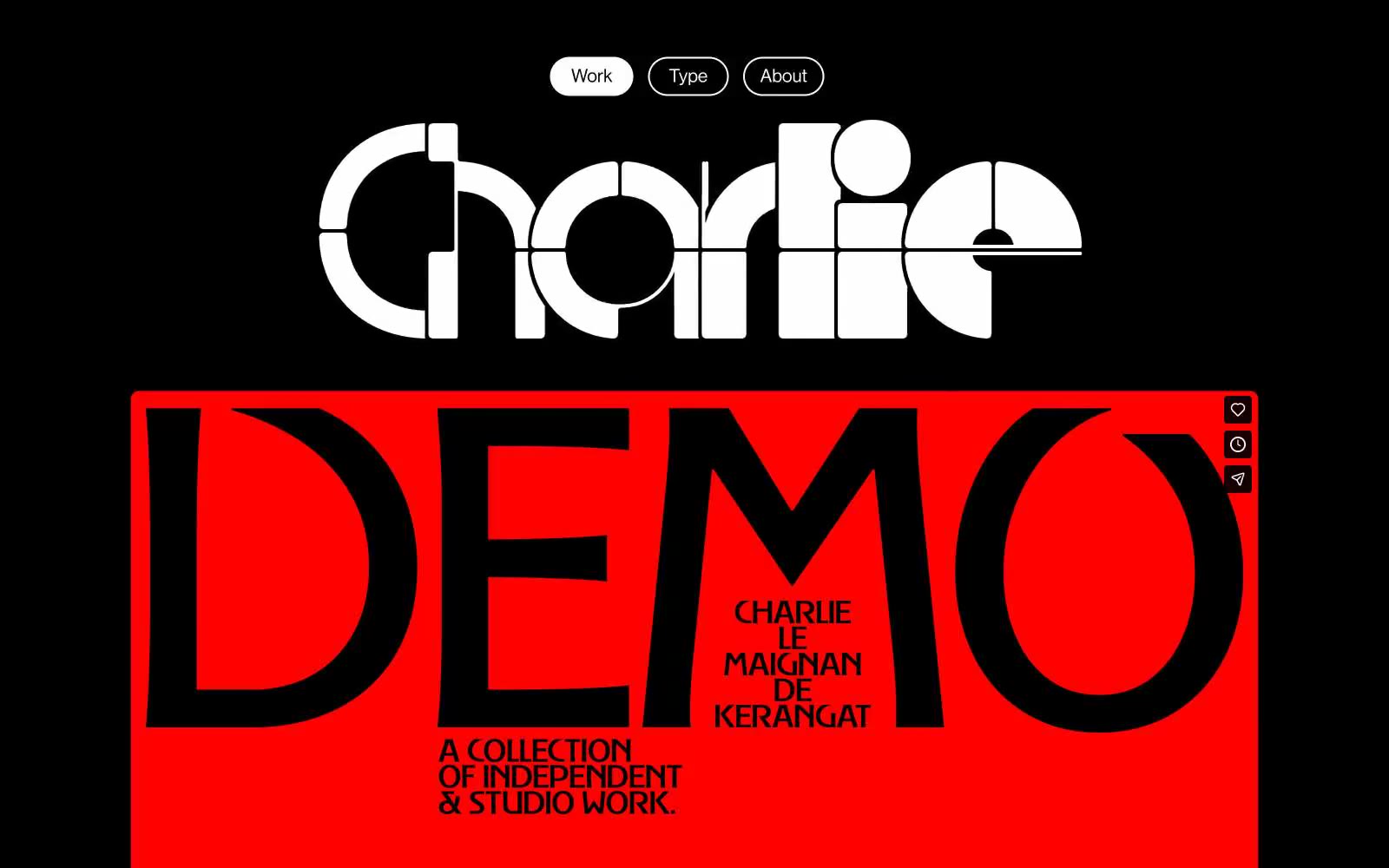
Charlie
Charlie — Style Reference
# Charlie — Style Reference
> Monastery stone-cut typography on obsidian. A portfolio that uses one red wall to make silence deafening.
**Theme:** dark
Charlie Le Maignan's portfolio is a brutalist editorial canvas: pure black void as the page, oversized white type as the only architecture, and one punishing red slab that detonates against the monochrome. The visual language is a collision of a custom sliced display face (Brasparz) at absurd scale against a restrained neo-grotesque (NeueHaas) doing the quiet labor. Everything is allowed to be massive — line-height compressed to 0.70, letter-spacing driven to -0.079em — so type bleeds across the viewport rather than sitting inside it. The single red hero block functions as the only color punctuation in the entire system; everything else stays achromatic. Surfaces are flat with no elevation, no gradients, no decorative shadow — the design communicates through scale, contrast, and a single chromatic detonation.
## Tokens — Colors
| Name | Value | Token | Role |
|------|-------|-------|------|
| Obsidian | `#000000` | `--color-obsidian` | Page canvas, deep surface — the void everything floats on |
| Bone White | `#ffffff` | `--color-bone-white` | Primary type, nav pill borders, active state fill, hairlines, iconography |
| Ash Gray | `#838383` | `--color-ash-gray` | Muted secondary text, inactive nav labels, tertiary metadata |
| Alarm Red | `#ed1c24` | `--color-alarm-red` | Hero detonation block — the only chromatic moment, used as full-bleed surface against black. Makes monochrome feel like a held breath before a shout |
Websites
Markdown Text
design-md
website-prompt
landing-page-prompt
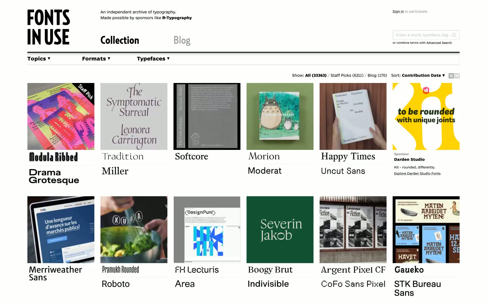
Fonts In Use
Fonts In Use — Style Reference
# Fonts In Use — Style Reference
> White gallery wall for letterforms
**Theme:** light
Fonts In Use operates as a typographic museum: an editorial archive where the interface is deliberately invisible so the letterforms being catalogued can speak. Every surface is white or near-white, every stroke is black, and the only typographic personality comes from the custom BentonSansRE UI sans and RelayCond display — never from decoration. The 5-column thumbnail grid functions as the page's primary content unit, each card pairing a photographic evidence image with a live sample of the typeface it documents (Baste, Proxima Nova, Zilla Slab…). Density is compact and newspaper-like rather than spacious-SaaS: tight vertical rhythm, 5px gaps, hairline 2px radii on controls, no shadows, no gradients, no accent color. The whole system reads as a printed specimen sheet rendered for the screen — restrained, factual, anti-decoration.
## Tokens — Colors
| Name | Value | Token | Role |
|------|-------|-------|------|
| Carbon | `#000000` | `--color-carbon` | Primary text, all borders, logo wordmark, nav links, search input border — the sole ink color in the entire system |
| Paper | `#ffffff` | `--color-paper` | Light supporting surface for subtle backgrounds and section separation. Do not promote it to the primary CTA color |
| Bone | `#f0f0f0` | `--color-bone` | Alternate row striping, search input fill, subtle list separators — a barely-there warm gray for differentiation |
| Mist | `#dddddd` | `--color-mist` | Input borders, subtle dividers — the lightest functional border tone |
Websites
Markdown Text
design-md
website-prompt
landing-page-prompt
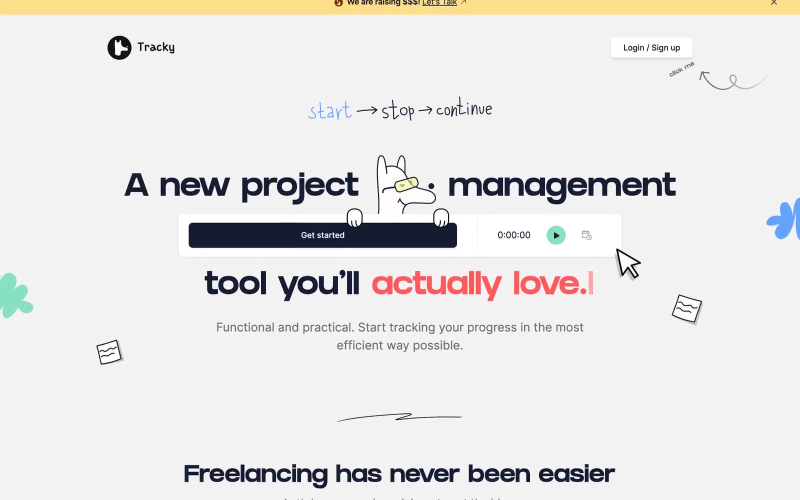
Tracky
Tracky — Style Reference
# Tracky — Style Reference
> doodled planner on warm paper
**Theme:** light
Tracky reads like a creative's bullet journal that became a product: a warm light canvas (#f2f2f2) carries a near-black navy (#151b31) workhorse for text, borders, and primary actions, while coral red (#ff5858) and mint green (#86e0c1) appear as small functional punctuation for emphasis and live states. GRIFTER supplies the brand's voice at display scale — chunky, hand-printed, slightly loosened tracking — while Inter handles all UI and body work at compact, tightly-tracked sizes. Components sit on soft 8px and 16px radii with whisper-light shadows, generous section breathing, and hand-drawn illustration accents (doodles, organic blobs, bunny mascot) that make project management feel like doodling in a notebook rather than filing a ticket.
## Tokens — Colors
| Name | Value | Token | Role |
|------|-------|-------|------|
| Inkwell Navy | `#151b31` | `--color-inkwell-navy` | Primary buttons, dominant text and borders, dark feature card backgrounds — the workhorse near-black that reads as softer and warmer than pure #000 |
| Coral Emphasis | `#ff5858` | `--color-coral-emphasis` | Accent text for key words in headlines, emphasis highlights, and selective links — warm red against navy creates playful energy without corporate aggression |
| Mint Pulse | `#86e0c1` | `--color-mint-pulse` | Green state accent for badges, validation surfaces, and short status labels. |
| Butter Yellow | `#fedf89` | `--color-butter-yellow` | Top announcement banner, highlight washes — warm pastel yellow for friendly alerts that don't shout |
Websites
Markdown Text
design-md
website-prompt
landing-page-prompt
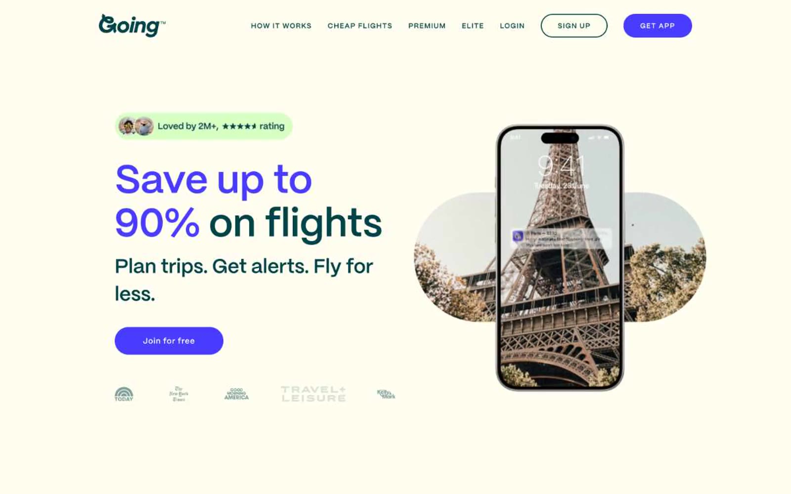
Going™
Going™ — Style Reference
# Going™ — Style Reference
> Sun-bleached travel journal with electric ink
**Theme:** light
Going is a warm-paper travel companion: a parchment canvas (#fffef0, never pure white) carries deep lagoon teal body text and pill-shaped electric iris CTAs, with soft mint wash bands organizing content sections. PP Mori's slightly off-axis 475 weight gives paragraphs a friendlier gravity than standard 400, while display sizes push tracking outward (up to 0.10em at 80px) for an editorial-poster feel. Surfaces stack: parchment base → mint wash content bands → ink-bordered cards with a whisper shadow. The design refuses cold SaaS conventions — black is used sparingly as a hairline border accent, not as primary type, and the single violet CTA carries all interactive weight across the page.
## Tokens — Colors
| Name | Value | Token | Role |
|------|-------|-------|------|
| Deep Lagoon | `#004449` | `--color-deep-lagoon` | Primary text, body copy, icon strokes, navigation — deep teal replaces black for all running text and primary iconography, lending a warm printed feel rather than digital harshness |
| Electric Iris | `#483cff` | `--color-electric-iris` | Violet action color for filled buttons, selected navigation states, and focused conversion moments. |
| Parchment | `#fffef0` | `--color-parchment` | Page canvas, card surfaces on mint sections, inverted text on dark elements — warm off-white background replaces clinical #ffffff, reducing glare and adding editorial softness |
| Ink Black | `#000000` | `--color-ink-black` | Hairline borders, card outlines, structural dividers, footer strokes — used as 1px boundary lines rather than as primary type, creating crispness against the cream base |
Websites
Markdown Text
design-md
website-prompt
landing-page-prompt
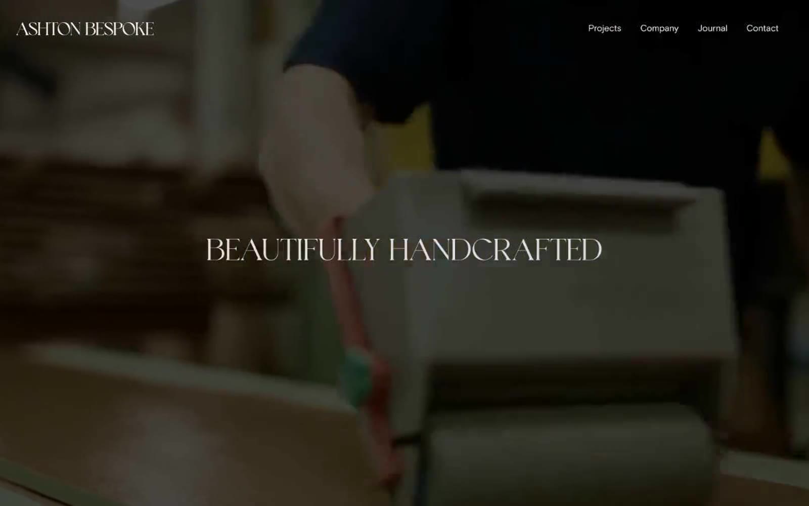
Ashton Bespoke
Ashton Bespoke — Style Reference
# Ashton Bespoke — Style Reference
> Stone cathedral of craftsmanship — warm parchment surface, one whisper of burgundy, letterspaced serif that breathes.
**Theme:** light
Ashton Bespoke operates as an editorial gallery for craftsmanship rather than a traditional website: a warm parchment canvas, one custom serif voice, and near-zero UI chrome. The entire palette collapses to stone, ink, and white with a single restrained wine note reserved for footer gravity and atmospheric emphasis. Photography carries the brand — full-bleed workshop imagery with no decorative overlay competes with nothing because the interface refuses to compete back. Generous negative space, hairline borders, and letterspaced serif headlines give every page the cadence of a printed monograph.
## Tokens — Colors
| Name | Value | Token | Role |
|------|-------|-------|------|
| Burnt Wine | `#38141b` | `--color-burnt-wine` | Footer background, sectional dark bands, atmospheric accent — the sole chromatic note in an otherwise achromatic palette, used sparingly to anchor gravity |
| Ink Stone | `#262626` | `--color-ink-stone` | Primary text, hairline borders, image frames, nav links — the structural near-black that defines every edge and label |
| Warm Parchment | `#e0ded8` | `--color-warm-parchment` | Dominant page canvas, section backgrounds, card surfaces — warm stone tone that gives the site its gallery-like, hand-made feel |
| White | `#ffffff` | `--color-white` | Elevated surfaces, inverted text on dark sections, nav text over imagery, subtle highlight washes |
Websites
Markdown Text
design-md
website-prompt
landing-page-prompt
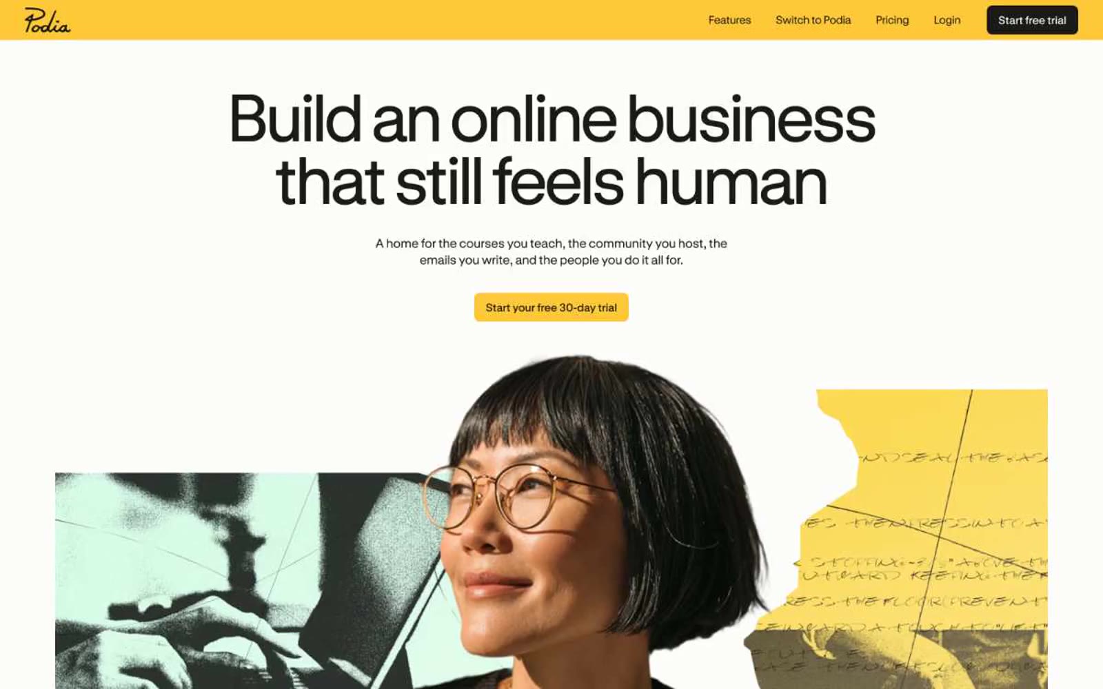
Podia
Podia — Style Reference
# Podia — Style Reference
> Warm papercraft afternoon. Organic blob shapes float across a matte white canvas in terracotta, lavender, and dusty blue, framing compressed geometric headlines and generous colored product cards.
**Theme:** light
Podia is a warm papercraft afternoon: a light canvas scattered with organic blob shapes in terracotta, lavender, and dusty blue, framing a creator-friendly marketplace interface. The custom StabilGrotesk pulls tight with negative tracking at display sizes, giving headlines a compressed, almost hand-cut quality that reinforces the studio-workshop metaphor. Color is deployed as functional territory: three chromatic product zones (sky blue, terracotta, lavender) signal distinct platform capabilities, while a near-black with violet undertown carries every primary action. Surfaces are matte and flat — no gradients, no glow, no glass — letting the muted chromatic palette do the emotional work. Components are generous and rounded: 24–56px radii, pill buttons, colored cards, and ample 36–80px section breathing room. The system reads as a quiet craftsperson's table, not a corporate dashboard.
## Tokens — Colors
| Name | Value | Token | Role |
|------|-------|-------|------|
| Ink | `#06040e` | `--color-ink` | Primary text, primary CTA fill, nav background, heading copy — near-black with a violet undertone that ties dark elements back to the brand palette |
| Deep Teal | `#10242f` | `--color-deep-teal` | Secondary headings, body emphasis, dark surface variation — co-leads with Ink for high-contrast typographic hierarchy |
| Graphite | `#452623` | `--color-graphite` | Tertiary text and dark surface variant — warm brown-black that softens the typographic scale below the primary two |
| Fog | `#f5f5f5` | `--color-fog` | Page canvas, section background — the warm off-white that gives the entire interface its sunlit, paper-like quality |
Websites
Markdown Text
design-md
website-prompt
landing-page-prompt
Active Theory
Active Theory — Style Reference
# Active Theory — Style Reference
> observatory dome at midnight — a single instrument glowing in void, surrounded by instrument-panel micro-labels
**Theme:** dark
Active Theory's interface is an abyss: near-total black canvas swallowed by a single luminous 3D artifact, with chrome reduced to whisper-thin uppercase labels and hairline rules. The visual language borrows from architectural drafting and particle physics — a monospaced geometric typeface (nbarchitekt) labels every interface element while a serif (Times) handles the rare body passage, creating tension between technical precision and editorial warmth. UI elements exist at the periphery: a pill-shaped top-right nav connected by a drawn line, a small cookie consent anchored bottom-right. Color is almost entirely achromatic; the sole chromatic note is a desaturated midnight violet used sparingly on the cookie accept affordance, never reaching for hero or marketing prominence. The design system essentially says: the 3D piece IS the interface, and every chrome element should defer to it.
## Tokens — Colors
| Name | Value | Token | Role |
|------|-------|-------|------|
| Void Black | `#000000` | `--color-void-black` | Page canvas, modal backdrops, particle field background |
| Pure White | `#ffffff` | `--color-pure-white` | Primary text, nav labels, button text on dark fills |
| Graphite Border | `#4d4d4d` | `--color-graphite-border` | Hairline dividers, faint structural rules |
| Steel Border | `#808080` | `--color-steel-border` | Outlined button borders, secondary dividers |
Websites
Markdown Text
design-md
website-prompt
landing-page-prompt
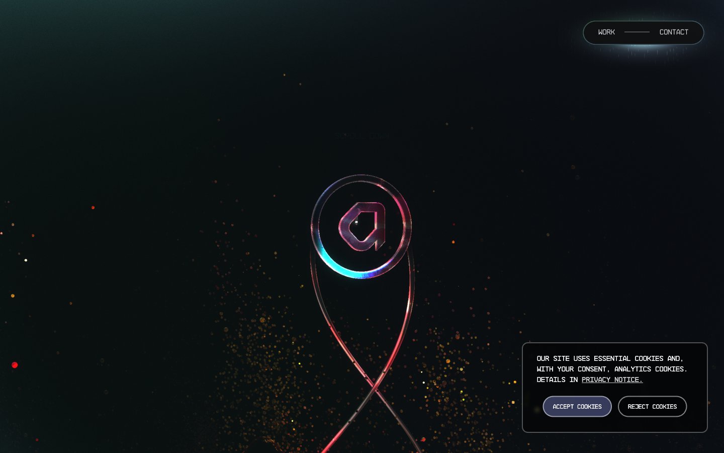
Becklyn
Becklyn — Style Reference
# Becklyn — Style Reference
> Obsidian gallery with italic poetry — a black-walled room where one serif sentence glows and everything else is silence.
**Theme:** dark
Becklyn operates as a near-monochrome dark gallery: an obsidian canvas with a single spectrum beam of color used as identity punctuation. The interface is almost entirely achromatic — white type on near-black, a slightly lifted charcoal for cards, mid-gray for hairline rules and muted copy — so the typography carries the entire expressive load. Headlines lean on Cambon's italic serif cut at hero scale, paired against UniversalSans's quiet neutral geometry for body and UI. Components are deliberately thin: pill-shaped controls, hairline borders, no heavy elevation. A vivid blue-to-plum-to-crimson gradient surfaces only as a brand mark, not as a functional button or accent. The mood is editorial and restrained — closer to a print portfolio than a SaaS dashboard.
## Tokens — Colors
| Name | Value | Token | Role |
|------|-------|-------|------|
| Bone White | `#ffffff` | `--color-bone-white` | Primary text, icon strokes, hairline borders, inverted pill highlights. The single light color in the system — it does all the foreground work against the black canvas |
| Obsidian | `#1a1a1a` | `--color-obsidian` | Page canvas, section backgrounds, inverse surface for pills and inputs. Never pure #000 — the slight warmth keeps the surface from feeling harsh |
| Lifted Charcoal | `#3b3b3b` | `--color-lifted-charcoal` | Card and elevated panel surfaces. One step lighter than the canvas, giving containment without resorting to shadows |
| Smoke | `#606060` | `--color-smoke` | Muted helper text, inactive nav labels, secondary dividers, tag outlines. Quiet enough to recede behind the white content layer |
Websites
Markdown Text
design-md
website-prompt
landing-page-prompt
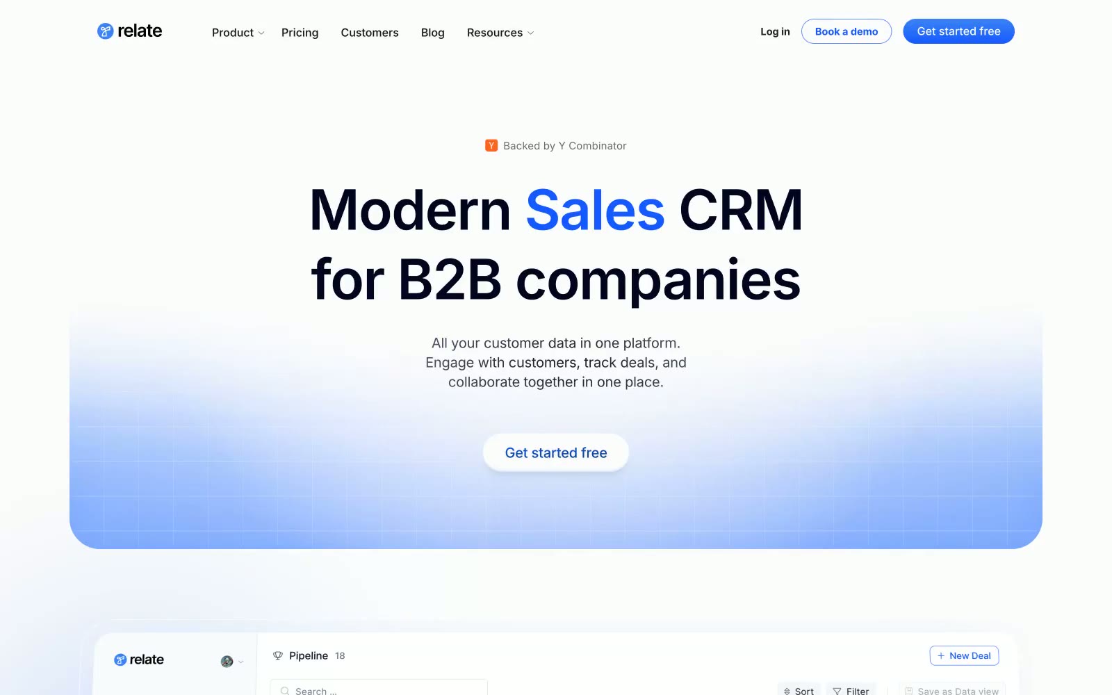
Relate
Relate — Style Reference
# Relate — Style Reference
> Blueprint on frosted linen — Inter headlines with tight negative tracking over a pale blue-white canvas, product UI surfacing as quiet white cards, the single vivid blue accent used like a highlighter pen rather than paint.
**Theme:** light
Relate uses a light, airy canvas with a near-white #fcfcfc base that gives the product a paper-like stillness. The hero section features a soft blue-lavender radial wash that bleeds into white, making the product feel approachable without relying on heavy gradients. Typography is Inter-first with aggressive negative tracking at display sizes — headlines tighten toward -2px at 80px, conveying focus and density without visual noise. The accent blue #145aff appears as inline text color and focused-element emphasis rather than filled button backgrounds, so the interface stays quiet and the brand color reads as a signal, not decoration. Product screenshots embedded in rounded cards with 8px radius and feather-light shadows (rgba(0,0,0,0.1)) create the impression of a real app hovering just above the page surface.
## Tokens — Colors
| Name | Value | Token | Role |
|------|-------|-------|------|
| Linen Canvas | `#fcfcfc` | `--color-linen-canvas` | Primary page background and default card surface — the near-white that reads as paper rather than pure white, reducing harshness on body-length reading |
| Sky Wash | `#f0f4fe` | `--color-sky-wash` | Subtle blue-tinted section backgrounds, secondary card fills, and hero gradient endpoint — the one step between canvas and pure white that creates soft depth |
| Midnight Ink | `#020520` | `--color-midnight-ink` | Primary hero and display headline color — the deepest text tone on light backgrounds, with a slight violet shift that prevents flat-black harshness |
| Graphite | `#14141e` | `--color-graphite` | Secondary headline and body text at high prominence — slightly lighter than Midnight Ink, used for section headings and strong body content |
Websites
Markdown Text
design-md
website-prompt
landing-page-prompt
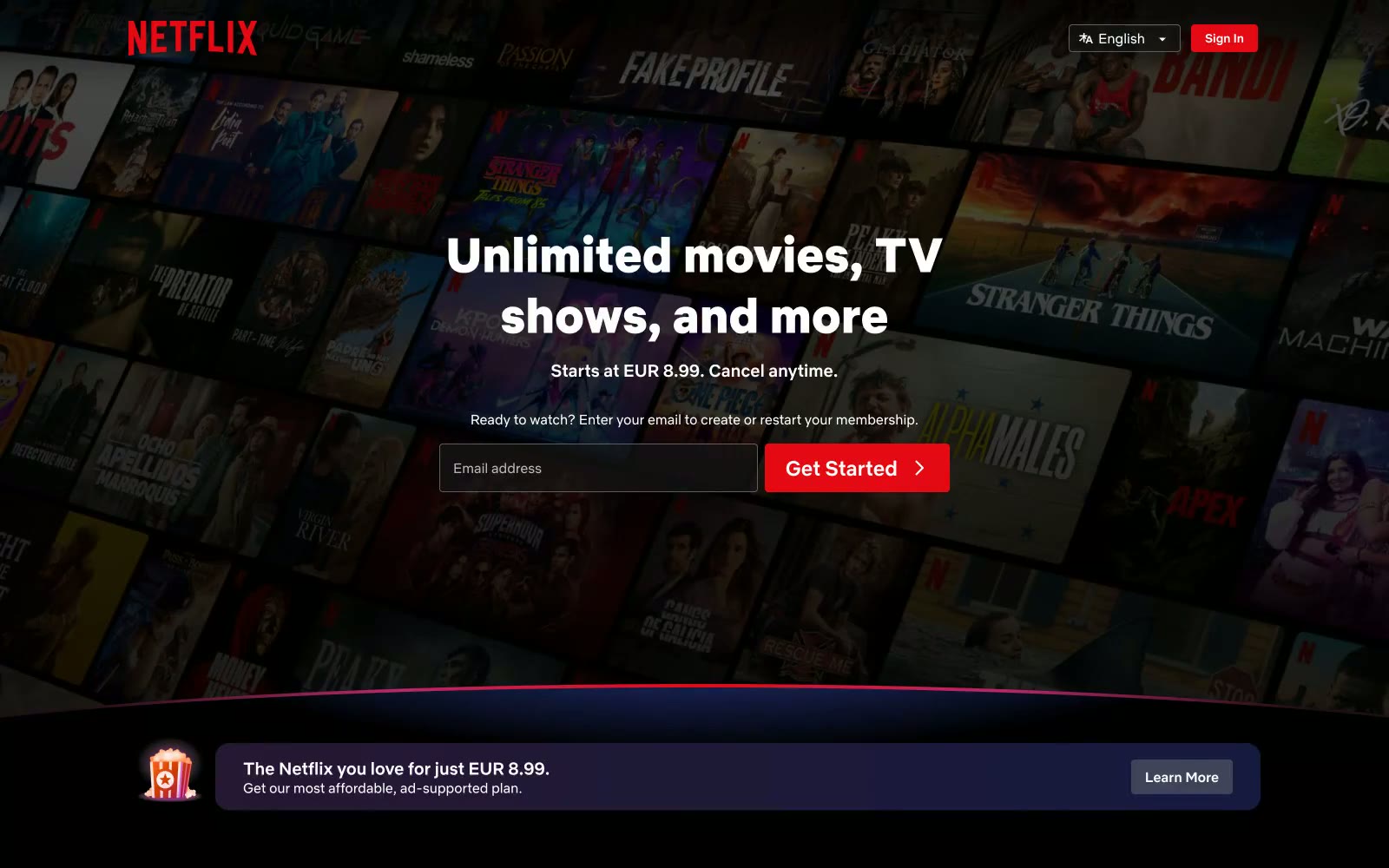
Netflix
Netflix Spain — Style Reference
# Netflix Spain — Style Reference
> The Infinite Digital Shelf. A cinematic experience where an endless library of content is presented against a pure black, theatrical backdrop.
**Theme:** dark
The design system feels like the house lights dimming in a theater, creating an immersive, cinematic space. The foundation is a pure black (#000000) void, against which content carousels appear as an infinite, browsable library. The single, iconic 'Netflix Red' (#e50914) is used with extreme restraint, reserved for the brand mark and primary calls-to-action, serving as the sole point of visual urgency. The custom font, Netflix Sans, is the confident and utilitarian voice, scaling from microcopy to massive 56px headlines without flourish. Feature cards add subtle dimensionality not with shadows, but with a deep, cosmic gradient of blue and purple, making them glow softly in the darkness.
## Tokens — Colors
| Name | Value | Token | Role |
|------|-------|-------|------|
| Netflix Red | `#e50914` | `--color-netflix-red` | Brand logo, primary CTAs, active indicators — the single, powerful accent that drives action and defines identity. |
| Feature Card Gradient | `linear-gradient(149deg, #192247, #210e17)` | `--color-feature-card-gradient` | Background for secondary feature cards, adding a subtle, deep-space dimensionality without using shadows. |
| Deep Space | `#000000` | `--color-deep-space` | Primary page and section backgrounds, creating a pure black canvas for content. |
| Graphite | `#2d2d2d` | `--color-graphite` | Subtle background surfaces, component backgrounds. |