AI Prompt Studio - Intelligent Prompt Library
Explore and use professional AI prompts to optimize your workflow.
Gamma
Gamma — Style Reference

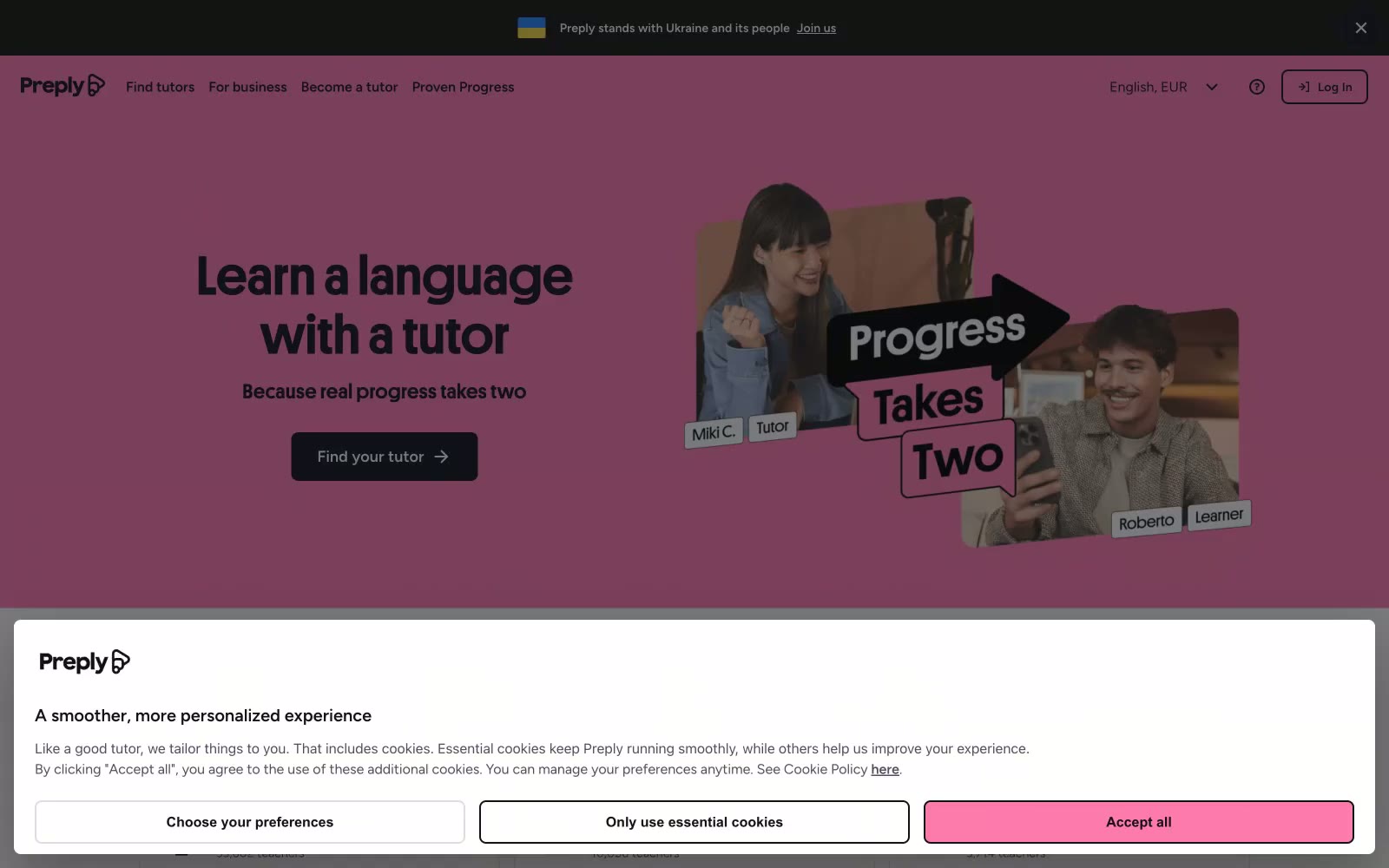
Preply
Preply — Style Reference
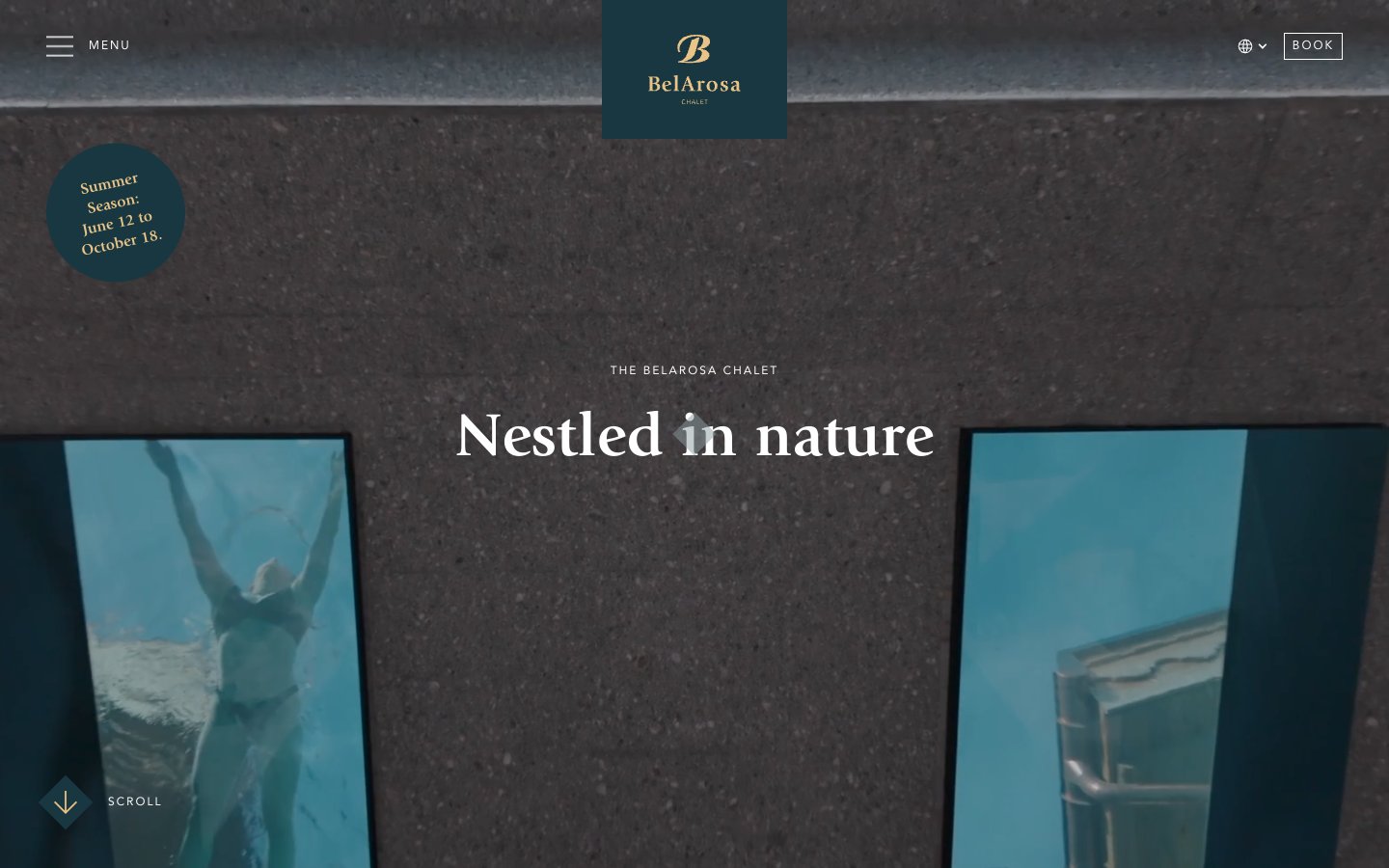
BelArosa Chalet
BelArosa Chalet — Style Reference
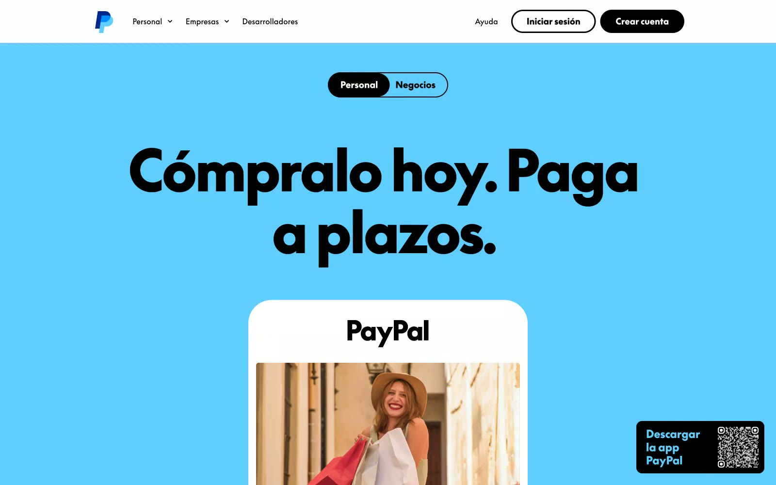
Enviar Dinero
Enviar Dinero — Style Reference

iUSPC by Coinshift
iUSPC by Coinshift — Style Reference
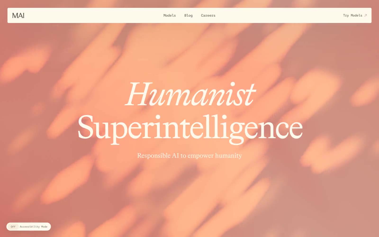
Microsoft AI
Microsoft AI — Style Reference
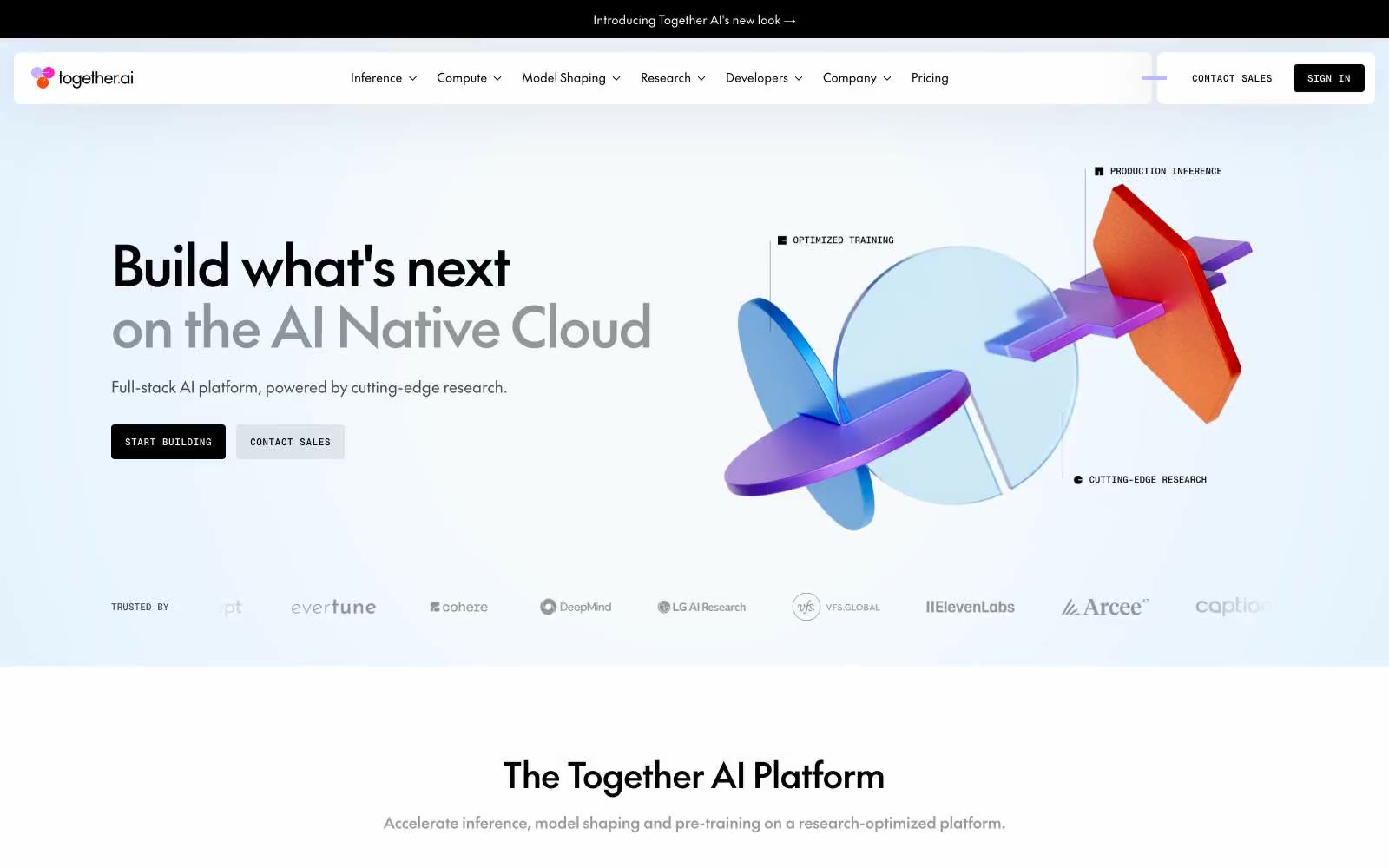
Together AI
Together AI — Style Reference
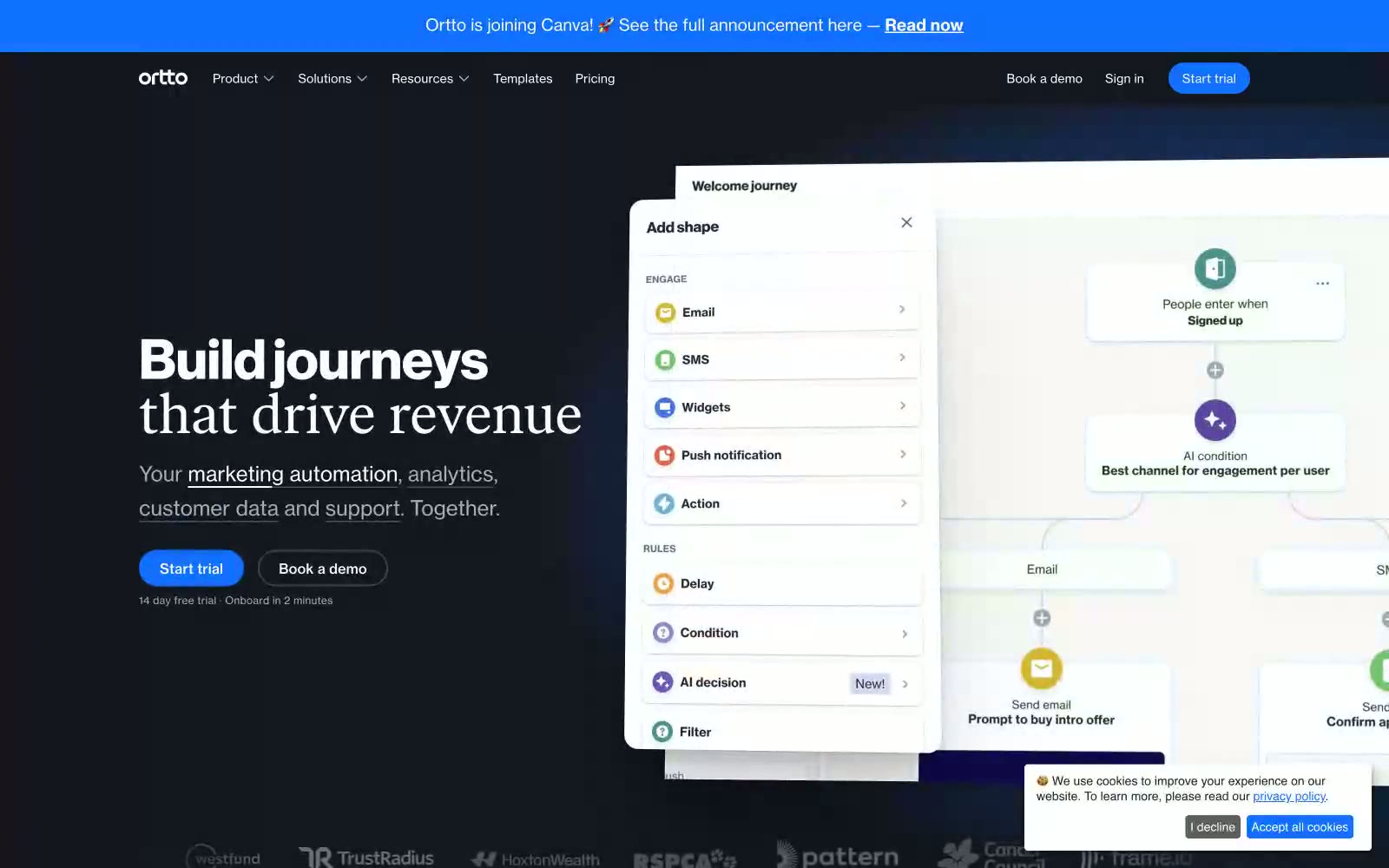
Ortto
Ortto — Style Reference

LE CAMP
LE CAMP — Style Reference
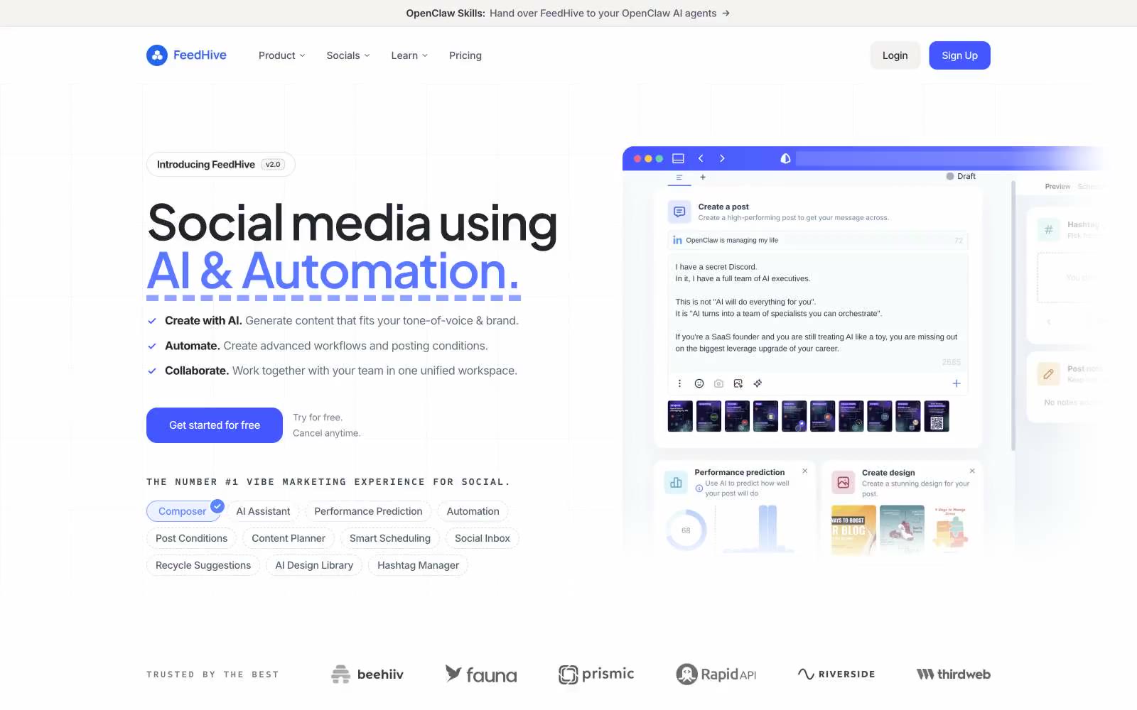
FeedHive
FeedHive — Style Reference
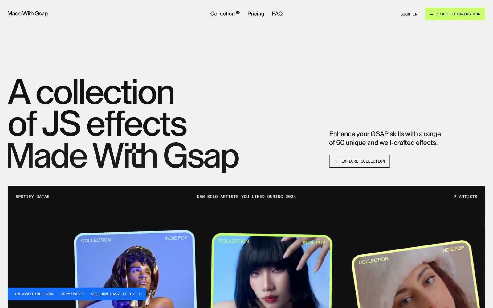
Made With Gsap
Made With Gsap — Style Reference
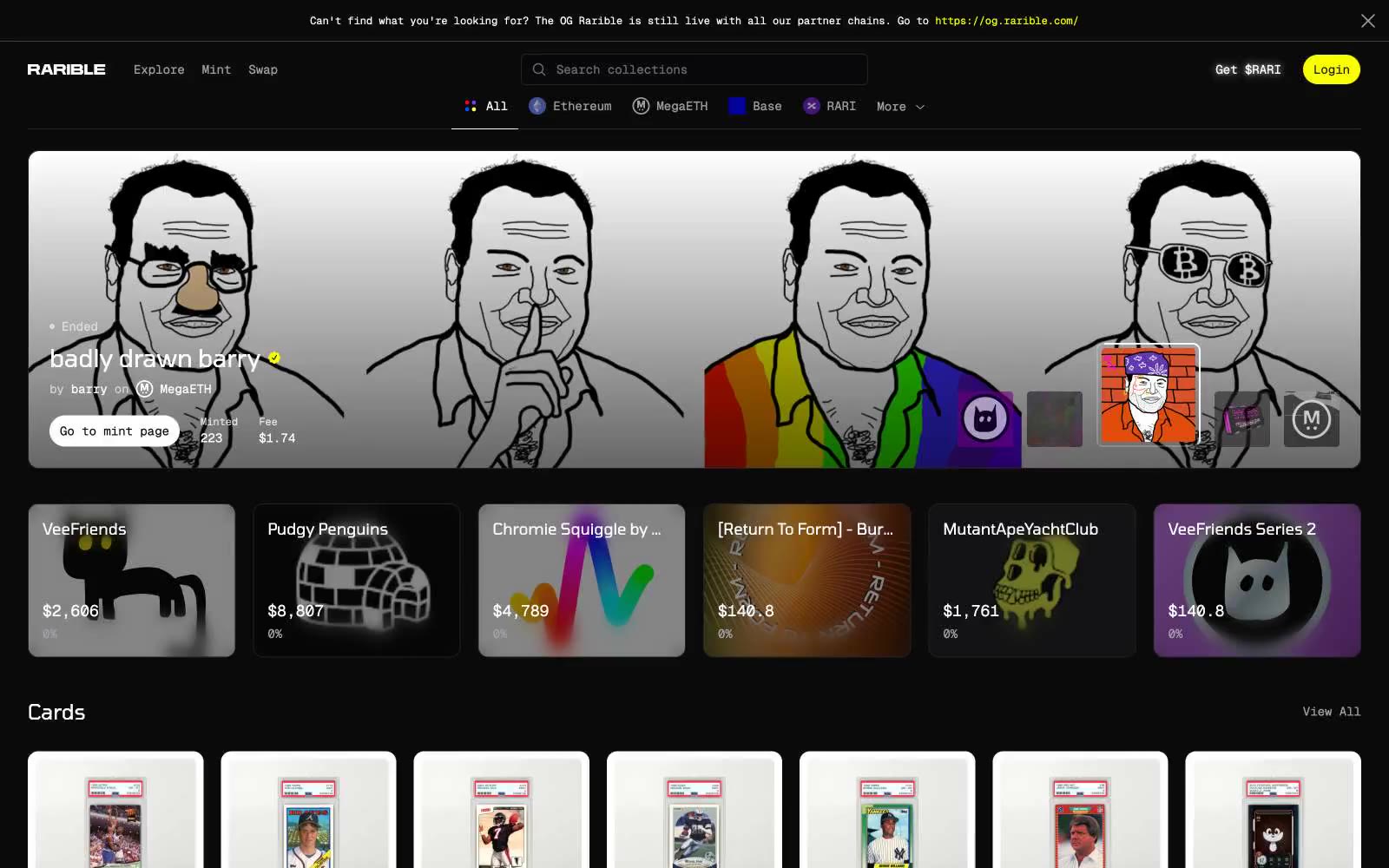
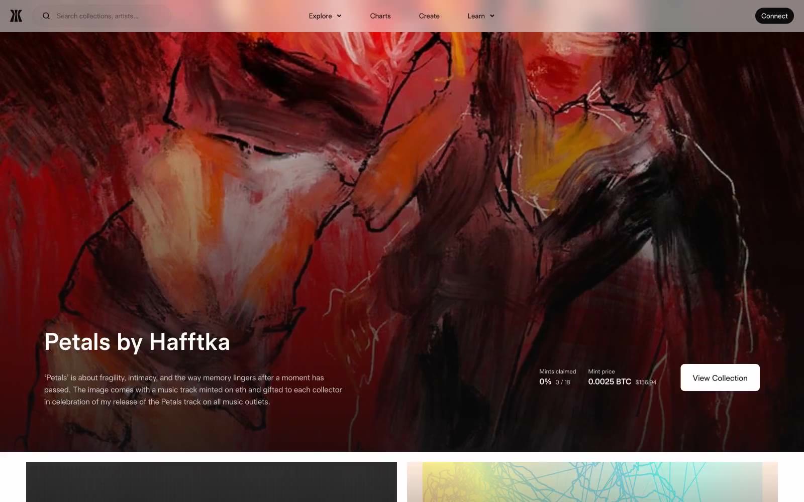
Rarible
Rarible — Style Reference
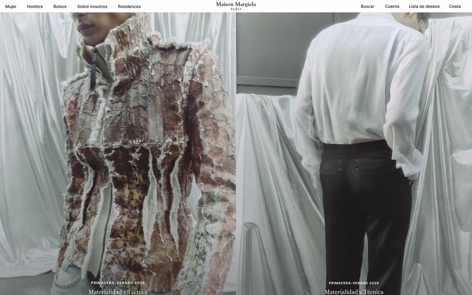
Maisonmargiela
Maisonmargiela — Style Reference
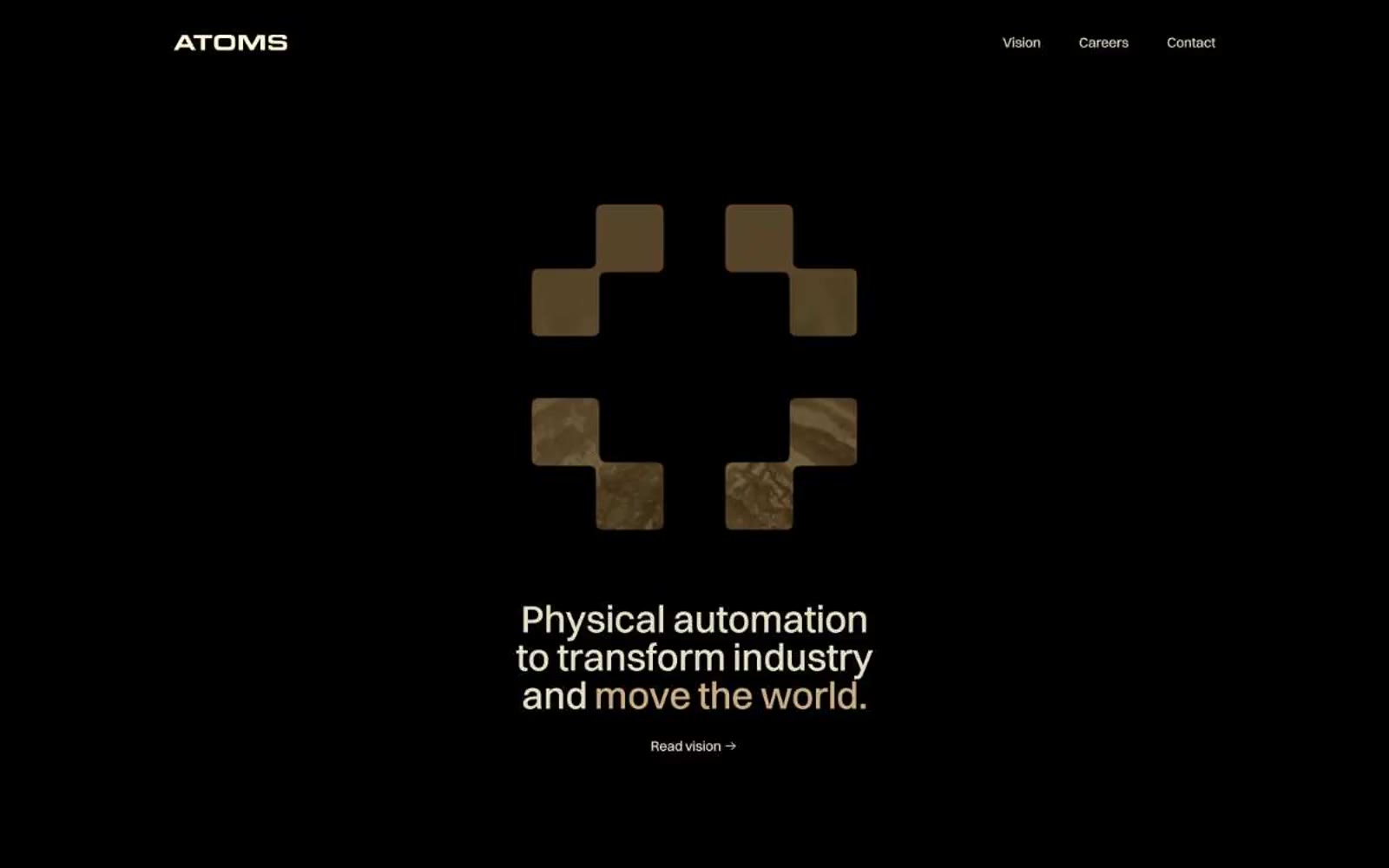
Atoms
Atoms — Style Reference
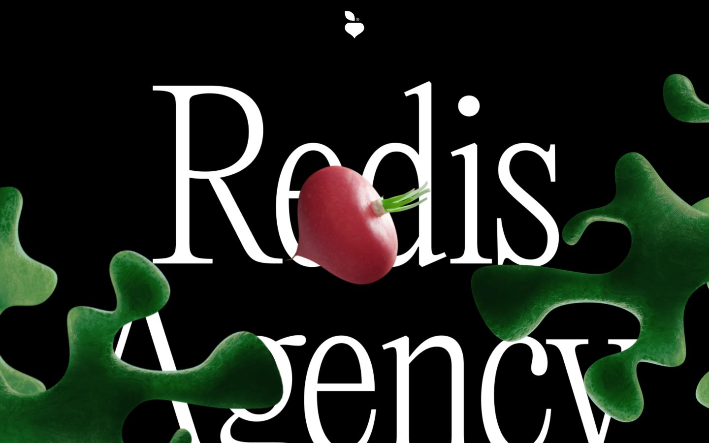
Redis Agency
Redis Agency — Style Reference
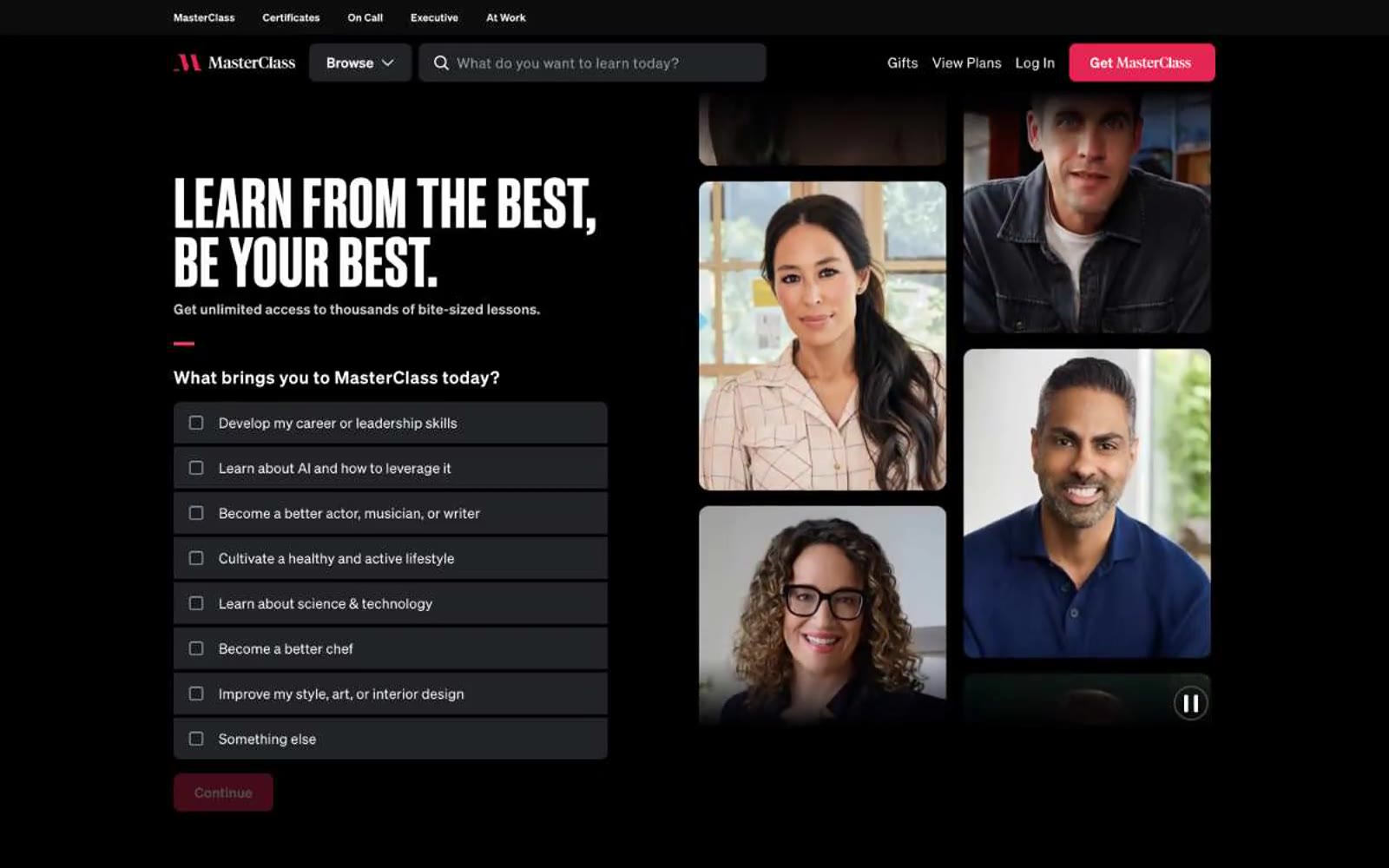
MasterClass
MasterClass — Style Reference
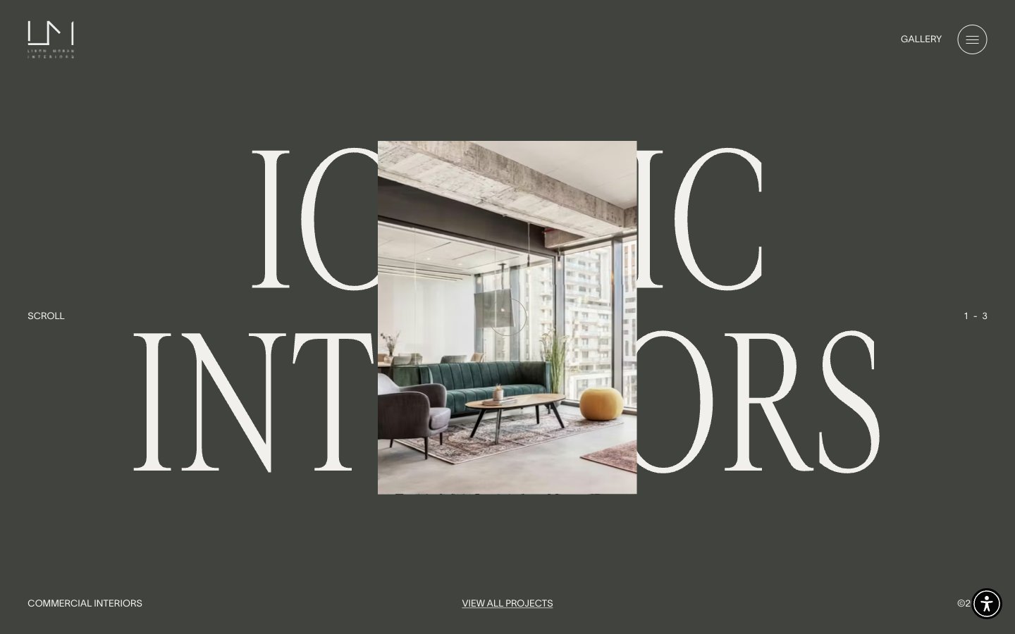
Liron Moran Interiors
Liron Moran Interiors — Style Reference
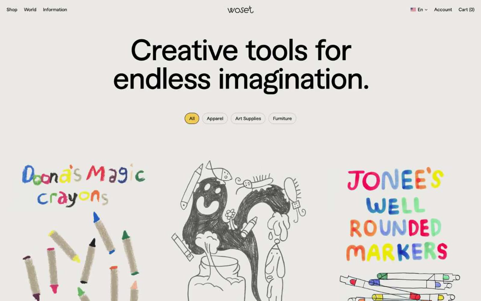
Woset
Woset — Style Reference
Moffitt.Moffitt. -
Moffitt.Moffitt. - — Style Reference
Signal Messenger
Signal Messenger — Style Reference
Programa
Programa — Style Reference
Superhuman
Superhuman — Style Reference
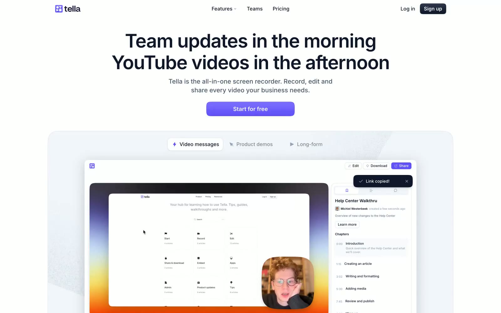
Tella
Tella — Style Reference
Petertarka
Petertarka — Style Reference