AI Prompt Studio - Intelligent Prompt Library
Explore and use professional AI prompts to optimize your workflow.
One-click Use
Websites
Markdown Text
design-md
website-prompt
landing-page-prompt
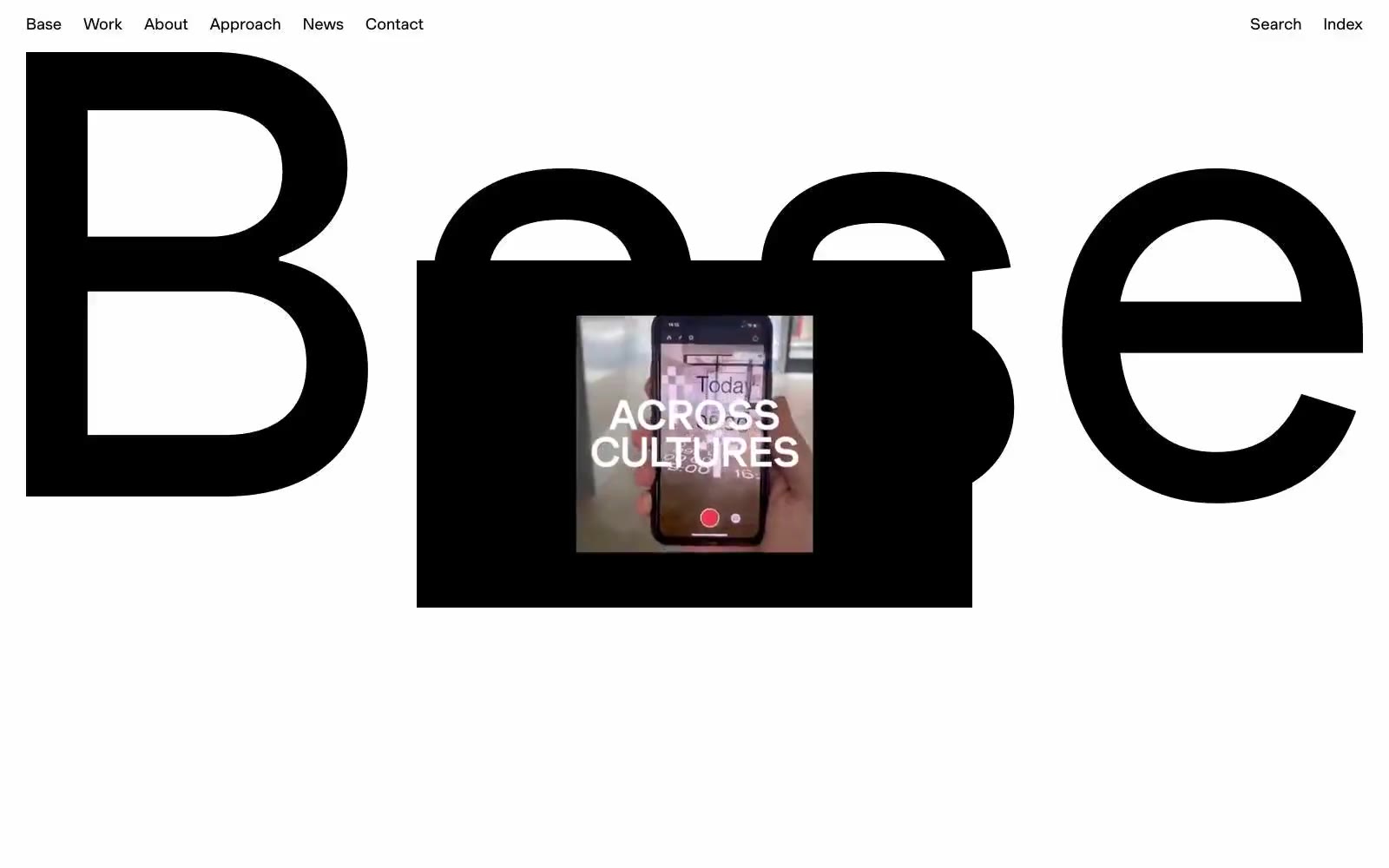
Base Design
Base Design — Style Reference

# Base Design — Style Reference
> Monochrome art book unbound — two-tone editorial monolith with documentary bleed photography and zero chromatic accent
**Theme:** mixed
Base Design operates as a stark, print-inspired editorial system: a pure two-tone canvas where black and white alternate as full-bleed sections without mediation. Typography carries every visual decision — a single custom grotesque (BaseGrotesk) speaks in one voice across 12px nav labels and 65px display wordmarks, with consistent 0.01em tracking tightening the rhythm. Photography is the only color, presented as oversized documentary frames that bleed to the edges and let white text sit directly on the image. Components are almost invisible: pill-shaped buttons, hairline rules, and zero decorative chrome. The system feels like flipping through a brutalist monograph — nothing is colored, everything is composed.
## Tokens — Colors
| Name | Value | Token | Role |
|------|-------|-------|------|
| Bone White | `#ffffff` | `--color-bone-white` | Page canvas, card surfaces, heading text on dark sections, overlaid text on photography |
| Lamp Black | `#000000` | `--color-lamp-black` | Primary text, display wordmarks, full-bleed dark section backgrounds, hairlines, border rules, button borders |
| Fog | `#ababab` | `--color-fog` | Muted secondary text, inactive link borders, de-emphasized helper text |
Websites
Markdown Text
design-md
website-prompt
landing-page-prompt
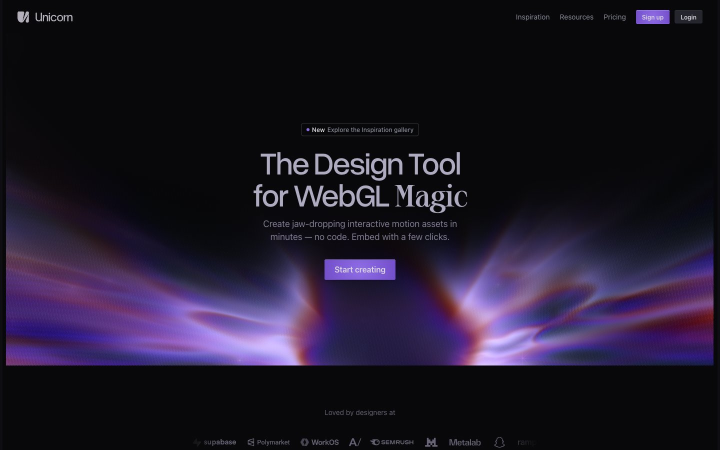
Unicorn Studio
Unicorn Studio — Style Reference
# Unicorn Studio — Style Reference
> aurora behind smoked glass — a black velvet void pierced by prismatic violet light, with type that breathes quietly beside it
**Theme:** dark
Unicorn Studio lives in a near-black void where light itself becomes the product: the canvas is a matte charcoal, typography whispers in cool pearl grays, and the only chromatic voice is a violet WebGL aurora that bleeds through gradients, link borders, and hero atmospheres. Surfaces stack in barely-perceptible steps of darkness — #08080a → #0d0d12 → #17171c — so depth is communicated through value shifts rather than shadows, with a thin dark key-line (`#31313a`, -1px offset) doing the work of elevation on interactive elements. The display face is Overused Grotesk with aggressive negative tracking (up to -0.063em), pulling letters so close they almost touch, while body text stays in the system stack at a comfortable 16px with subtle -0.01em tightening. Interaction is restrained: light-filled cream buttons against the void, hairline violet underlines on links, and 3px micro-radii that keep the language architectural rather than friendly.
## Tokens — Colors
| Name | Value | Token | Role |
|------|-------|-------|------|
| Void | `#08080a` | `--color-void` | Page canvas, deepest surface, card backgrounds — the base layer against which everything else floats |
| Charcoal | `#0d0d12` | `--color-charcoal` | Section backgrounds, elevated panels, modal surfaces — first step off the canvas |
| Graphite | `#17171c` | `--color-graphite` | Card surfaces, nested containers, secondary panels |
| Slate | `#25252d` | `--color-slate` | Elevated surface fill, subtle button hover states, dark interactive variant |
Websites
Markdown Text
design-md
website-prompt
landing-page-prompt
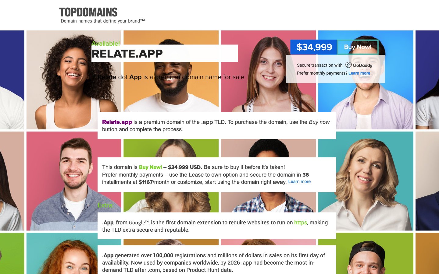
Relate dot App
Relate dot App — Style Reference
# Relate dot App — Style Reference
> Diversity mosaic behind frosted notes. A wall of color-blocked portraits carries every visual mood the system needs; every UI element is a clean white card or a flat colored chip floating above it.
**Theme:** light
A domain-marketplace surface that turns a wall of human portraits into the brand canvas: a dense color-coded photo mosaic of diverse faces on saturated background blocks, with crisp white information cards floating on top like sticky notes. Typography is the loud element — oversized all-caps display lockup sits above utilitarian sans body text in a calm neutral scale. Chromatic accents are functional, not decorative: a single blue drives links and the Buy Now affordance, while a vivid green signals availability and supplementary actions. The overall impression is a premium product card that breathes through whitespace inside each panel rather than through gaps between them, letting the portrait grid supply all the energy the chrome refuses to.
## Tokens — Colors
| Name | Value | Token | Role |
|------|-------|-------|------|
| Lime Pulse | `#7bd428` | `--color-lime-pulse` | Green outline accent for tags, dividers, and focused UI edges |
| Signal Blue | `#2484f2` | `--color-signal-blue` | Blue accent for outlined action borders, linked labels, and lightweight interactive emphasis. Do not promote it to the primary CTA color |
| Deep Signal | `#2374c4` | `--color-deep-signal` | Hover/pressed state for Signal Blue links and outlined actions, visited-link fallback — one step darker so the interactive state has a clear visual step |
| Carbon | `#222222` | `--color-carbon` | Headline text, dark section headers, strong emphasis |
Websites
Markdown Text
design-md
website-prompt
landing-page-prompt
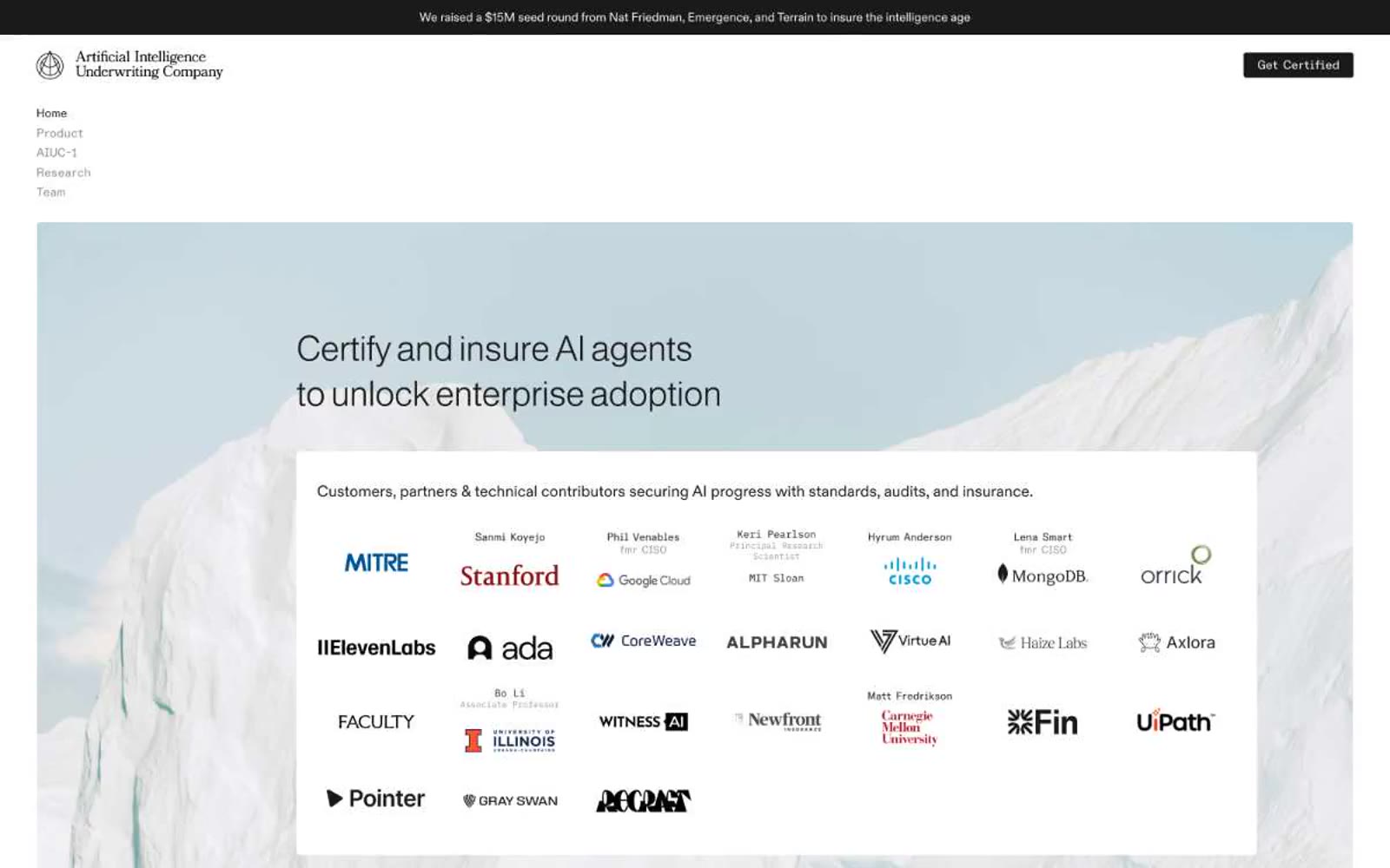
AIUC
AIUC — Style Reference
# AIUC — Style Reference
> Alpine underwriting ledger — a white page ruled with hairline rules, topped by a single pale-blue mountain photograph.
**Theme:** light
AIUC operates as a Swiss-style editorial system: white canvas, near-achromatic palette, and one whisper of icy blue that lives only in the hero photograph and a single cool surface tint. Typography does the heavy lifting — Almarai at weight 300 with tight negative tracking carries every headline, while ABC Diatype Semi-Mono punctuates labels and links with quiet technicality. Components are flat, hairline-bordered, and 4px-rounded; the only chromatic surface is the landscape hero. The overall feel is the trust language of a law firm or underwriter: restrained, confident, almost print-like.
## Tokens — Colors
| Name | Value | Token | Role |
|------|-------|-------|------|
| Canvas | `#ffffff` | `--color-canvas` | Page background, card surfaces, primary surface for all content blocks |
| Ink | `#000000` | `--color-ink` | Hairline borders, icon strokes, fine dividers — the linework that structures the page |
| Obsidian | `#1a1a1a` | `--color-obsidian` | Primary text, heading text, filled CTA buttons, dark feature cards |
| Graphite | `#323232` | `--color-graphite` | Secondary text, link text, default link borders — slightly softer than Obsidian for body copy |
Websites
Markdown Text
design-md
website-prompt
landing-page-prompt
OFF+BRAND.
OFF+BRAND. — Style Reference
# OFF+BRAND. — Style Reference
> Iridescent sphere on warm parchment
**Theme:** light
OFF+BRAND. operates as a typographic architecture on warm parchment: a near-monochrome canvas (#e5e4e0) where a single custom geometric sans-serif (Ataero Retina OB) carries nearly all the expressive weight. Headlines are monumentally large (up to 103px) with tight line-height (0.80) and whisper-wide tracking, while a singular iridescent gradient sphere — yellow bleeding into pink, then blue, then dissolving into white — anchors the hero as the only chromatic event on an otherwise achromatic page. Interfaces should feel like an editorial spread: thin concentric circle ornaments, a precise 2×5 client logo grid, grid-paper project cards, and label text that tracks wide like museum signage. There are no shadows, no fills, no buttons heavier than a ghost link with a 10px radius — restraint is the entire design language.
## Tokens — Colors
| Name | Value | Token | Role |
|------|-------|-------|------|
| Parchment | `#e5e4e0` | `--color-parchment` | Page canvas, section backgrounds — warm off-white that replaces pure white, making the page feel like printed stock rather than a screen |
| Ink | `#1d1d1d` | `--color-ink` | Primary text, heading strokes, link borders, all dark UI elements — near-black with zero blue cast, reading as editorial print |
| Paper | `#ffffff` | `--color-paper` | Elevated card surfaces, logo container backgrounds, project card canvases — pure white to lift content above the warm parchment |
| Ash | `#bfbebe` | `--color-ash` | Hairline borders, subtle dividers, structural outlines that need to recede against the parchment |
Websites
Markdown Text
design-md
website-prompt
landing-page-prompt
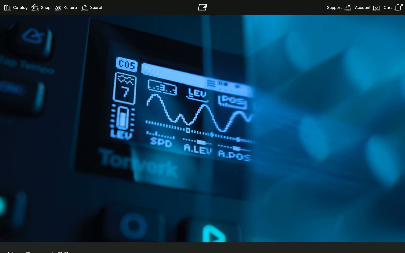
Elektron
Elektron — Style Reference
# Elektron — Style Reference
> Hardware control panel at midnight — a near-black canvas where product photography glows and the interface stays almost invisible.
**Theme:** dark
Elektron's interface is essentially a darkroom for showcasing hardware: a #222222 canvas with #151515 surfaces and #eeeef2 type, where the product photography — cinematic, near-black close-ups of synthesizers with blue LCD glow — does all the emotional work. The UI itself is brutally compact (4px base unit, 7px input radius, 0px everywhere else) and refuses every soft modern signal: no gradients, no shadows, no rounded buttons, no colored accents in chrome. Typography is a single custom geometric grotesque (Neue Haas Grotesk) in weight 400 only for body, with a display cut at 450/500 for headlines; a secondary dot-matrix face echoes the LCD readouts on the products themselves. All body text carries positive tracking (0.013–0.042em) that reads as industrial specification-sheet rather than marketing. The whole system feels like the printed silkscreen on a Eurorack module: monochrome, functional, hardware-obsessed.
## Tokens — Colors
| Name | Value | Token | Role |
|------|-------|-------|------|
| Page Canvas | `#222222` | `--color-page-canvas` | Page background, full-bleed canvas behind all product imagery and content bands |
| Deep Surface | `#151515` | `--color-deep-surface` | Dark supporting neutral for text, icons, and strong contrast. Do not promote it to the primary CTA color |
| Void | `#000000` | `--color-void` | Deepest layer — button cores, icon fills, the negative space inside navigation controls |
| Platinum | `#eeeef2` | `--color-platinum` | Primary text, icons, link body, badges, footer text — the only light-on-dark workhorse |
Websites
Markdown Text
design-md
website-prompt
landing-page-prompt
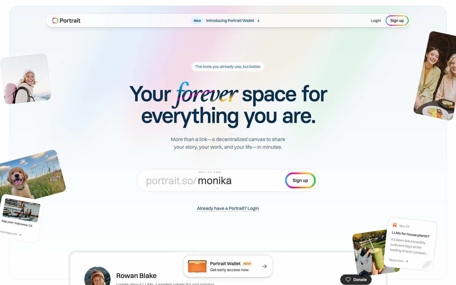
Portrait
Portrait — Style Reference
# Portrait — Style Reference
> polaroid memory wall on cream paper. A bright, off-white scrapbook where deep-navy ink provides the only text, the only structural lines, and the only border color — with a single hand-drawn rainbow that appears once, on the Sign up button and on the italicized word forever, and never again.
**Theme:** light
Portrait is a sunlit, deeply personal canvas for identity: a near-white page where a single deep-navy ink carries almost all text and structural lines, and color appears only as warm pastel surface washes or a signature rainbow that bleeds through italicized words, button borders, and small decorative strokes. The type system is two-voice — Switzer for steady UI, Basier Circle for giant display headlines that compress tight against each other — and the geometry favors generous rounding (24px cards, 28px pill buttons) with barely-there shadows that let content float rather than stamp itself. Everything reads like a scrapbook: scattered tilted photo cards, mint and peach and sky-blue tints, a thin rainbow border around the Sign up button, and a sticky pill nav that hovers above the page with a whisper of elevation. The overall density is comfortable, the rhythm is calm, and the brand voice is warm but restrained — let the user be loud, keep the frame quiet.
## Tokens — Colors
| Name | Value | Token | Role |
|------|-------|-------|------|
| Portrait Ink | `#08304c` | `--color-portrait-ink` | Primary text, heading strokes, outlined action borders — the single deep navy that holds the entire type and structural line system |
| Nautical Teal | `#084e72` | `--color-nautical-teal` | Secondary brand ink for nav strokes, icons, and accent text where Ink feels too heavy |
| Rainbow Spectrum | `linear-gradient(90deg, rgb(38, 192, 255), rgb(230, 0, 194) 20%, rgb(255, 73, 78) 40%, rgb(255, 161, 62) 60%, rgb(255, 200, 55) 80%, rgb(0, 204, 61))` | `--color-rainbow-spectrum` | Supporting palette color for small decorative accents when the core palette needs contrast. Do not promote it to the primary CTA color |
| Lavender Violet | `#8e51ff` | `--color-lavender-violet` | Decorative spectrum color — appears only as part of the rainbow gradient, never as a standalone fill |
Websites
Markdown Text
design-md
website-prompt
landing-page-prompt
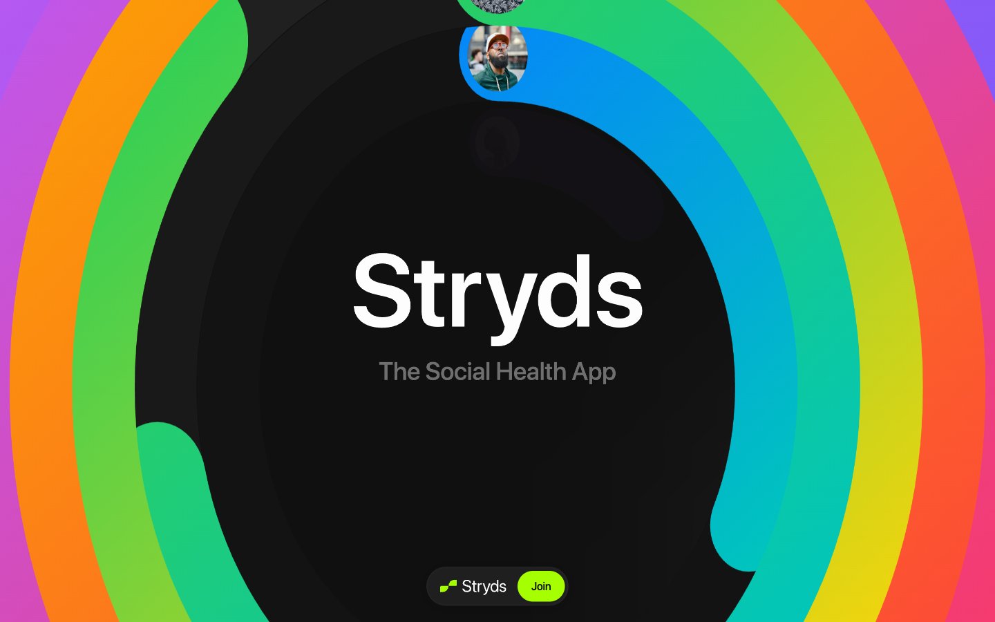
Stryds
Stryds — Style Reference
# Stryds — Style Reference
> Aurora ringed midnight void
**Theme:** dark
Stryds is a poster-scale health manifesto: a near-black void ringed by a segmented spectrum gradient, with display typography that pushes past 100px to feel like a billboard, not a dashboard. The entire palette is monochrome — one canvas tone, one text tone, one border tone — broken only by Electric Lime, the single chromatic voice that makes CTAs and active states feel switched on. A massive circular gradient frame is the signature visual gesture, reappearing around hero text and content blocks like a health aura. Components are minimal and pill-shaped; the design has almost no elevation, no photography, and no illustration beyond the spectrum ring itself and a floating avatar. The result is an editorial, late-night broadcast feel: bold, confrontational, and deeply opinionated about digital wellness.
## Tokens — Colors
| Name | Value | Token | Role |
|------|-------|-------|------|
| Electric Lime | `#a6ff00` | `--color-electric-lime` | Green action color for filled buttons, selected navigation states, and focused conversion moments. |
| Deep Violet | `#040126` | `--color-deep-violet` | Outlined action borders, subtle decorative borders — a near-black indigo that adds tonal depth to dark borders without breaking the monochrome canvas |
| Obsidian | `#101010` | `--color-obsidian` | Page canvas, outermost background, shadow tokens — the base void that every surface floats on |
| Carbon | `#171717` | `--color-carbon` | Card surfaces, elevated content panels — the only step above Obsidian in the surface stack |
Websites
Markdown Text
design-md
website-prompt
landing-page-prompt
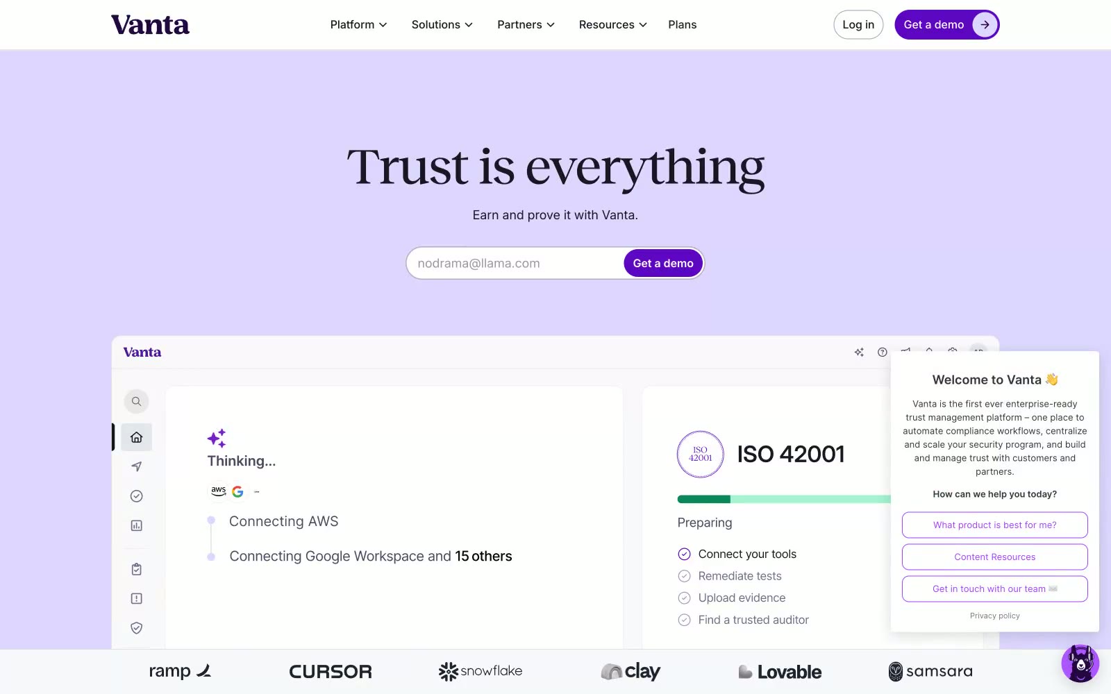
Vanta
Vanta — Style Reference
# Vanta — Style Reference
> Editorial violet ledger on parchment
**Theme:** light
Vanta presents a trust-forward enterprise language built on a deep violet palette and an editorial type system. Reckless serif headlines (weight 400, sizes 42–90px) carry warmth and authority, while Inter Variable at 400–700 handles every UI surface, keeping components functional and quiet. The visual identity hinges on a lavender hero wash (#ddd6ff), fully pill-shaped controls (999px radius), and a single deep-violet CTA color (#5e05c4) that never shouts — it punctuates. Cards float on white with 16px radii and hairline #181822 borders rather than shadows, producing a flat, architectural feel closer to a printed compliance report than a typical SaaS dashboard.
## Tokens — Colors
| Name | Value | Token | Role |
|------|-------|-------|------|
| Indigo Ink | `#260048` | `--color-indigo-ink` | Logo, brand wordmark, decorative icon fills, strong border accents |
| Vivid Violet | `#5e05c4` | `--color-vivid-violet` | Primary action button fills, active nav text, filled badges — the single saturated brand moment |
| Mid Violet | `#8f47d5` | `--color-mid-violet` | Inline link text, outlined badge borders, icon accents, secondary emphasis |
| Soft Violet | `#ba9dff` | `--color-soft-violet` | Decorative icon strokes, light borders, muted link treatments |
Websites
Markdown Text
design-md
website-prompt
landing-page-prompt
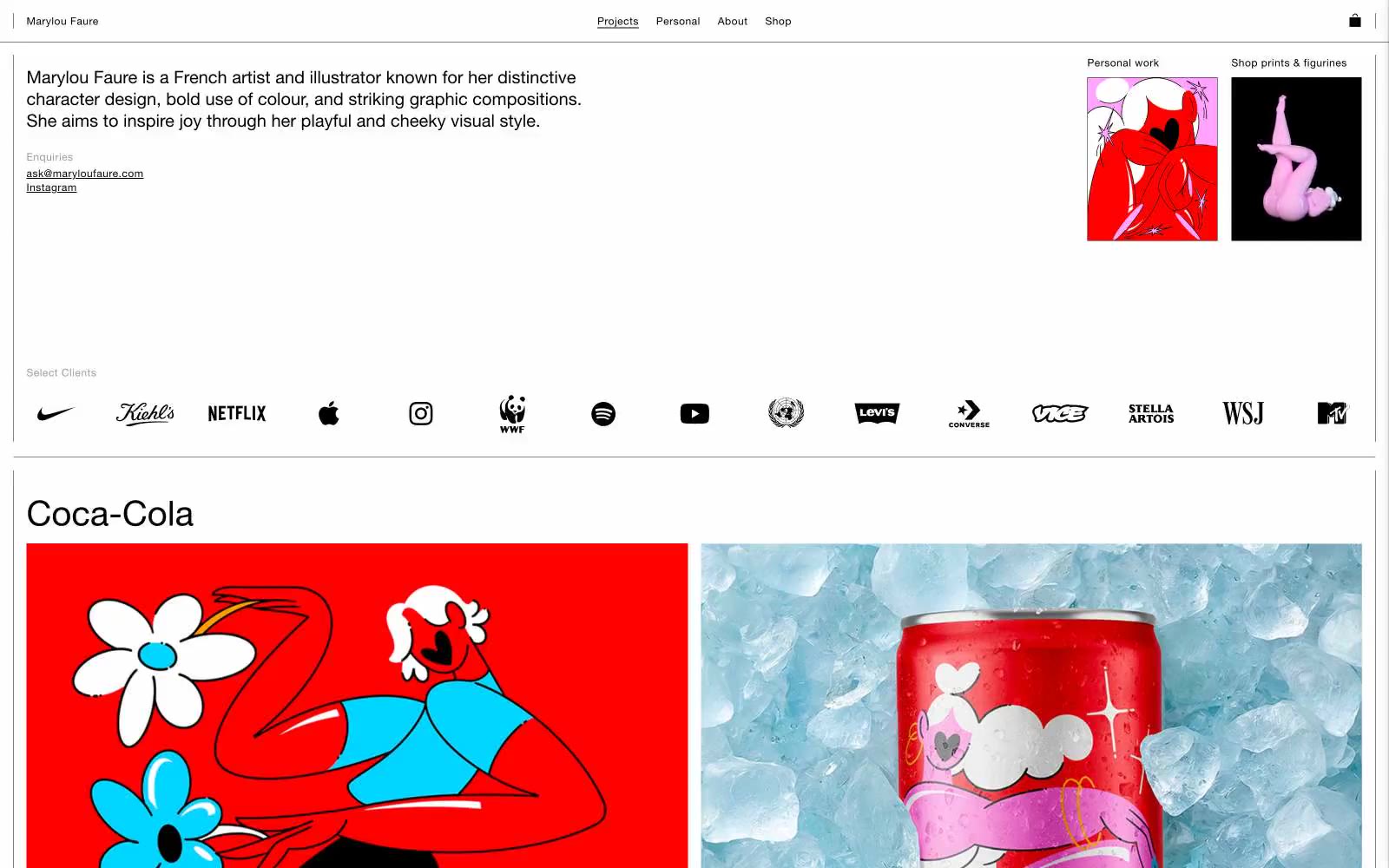
Marylou Faure
Marylou Faure — Style Reference
# Marylou Faure — Style Reference
> white gallery wall for fearless color
**Theme:** light
Marylou Faure is a gallery wall, not a website. The interface strips itself to a bare white canvas with hairline borders and near-microscopic UI chrome, so the illustrations — vivid reds, bubblegum pinks, electric blues, acid greens — can detonate against it. Typography is a quiet geometric sans (Helvetica Now) that never competes with the artwork; body text lives at 12-16px in near-black, nav links sit in a thin uppercase row, and the only typographic shout is the project title. The system follows one rule: the UI must be the quietest element on every page, so the art is the only thing with a voice.
## Tokens — Colors
| Name | Value | Token | Role |
|------|-------|-------|------|
| Ink | `#000000` | `--color-ink` | All text, hairline borders, nav dividers, the structural skeleton of the page |
| Ash | `#737373` | `--color-ash` | Email link, secondary metadata text |
| Paper | `#ffffff` | `--color-paper` | Page background, card surfaces — the unbroken gallery wall |
| Crimson Pop | `#ff0000` | `--color-crimson-pop` | Red wash for highlight backgrounds, decorative bands, and soft emphasis behind content. Do not promote it to the primary CTA color |
Websites
Markdown Text
design-md
website-prompt
landing-page-prompt
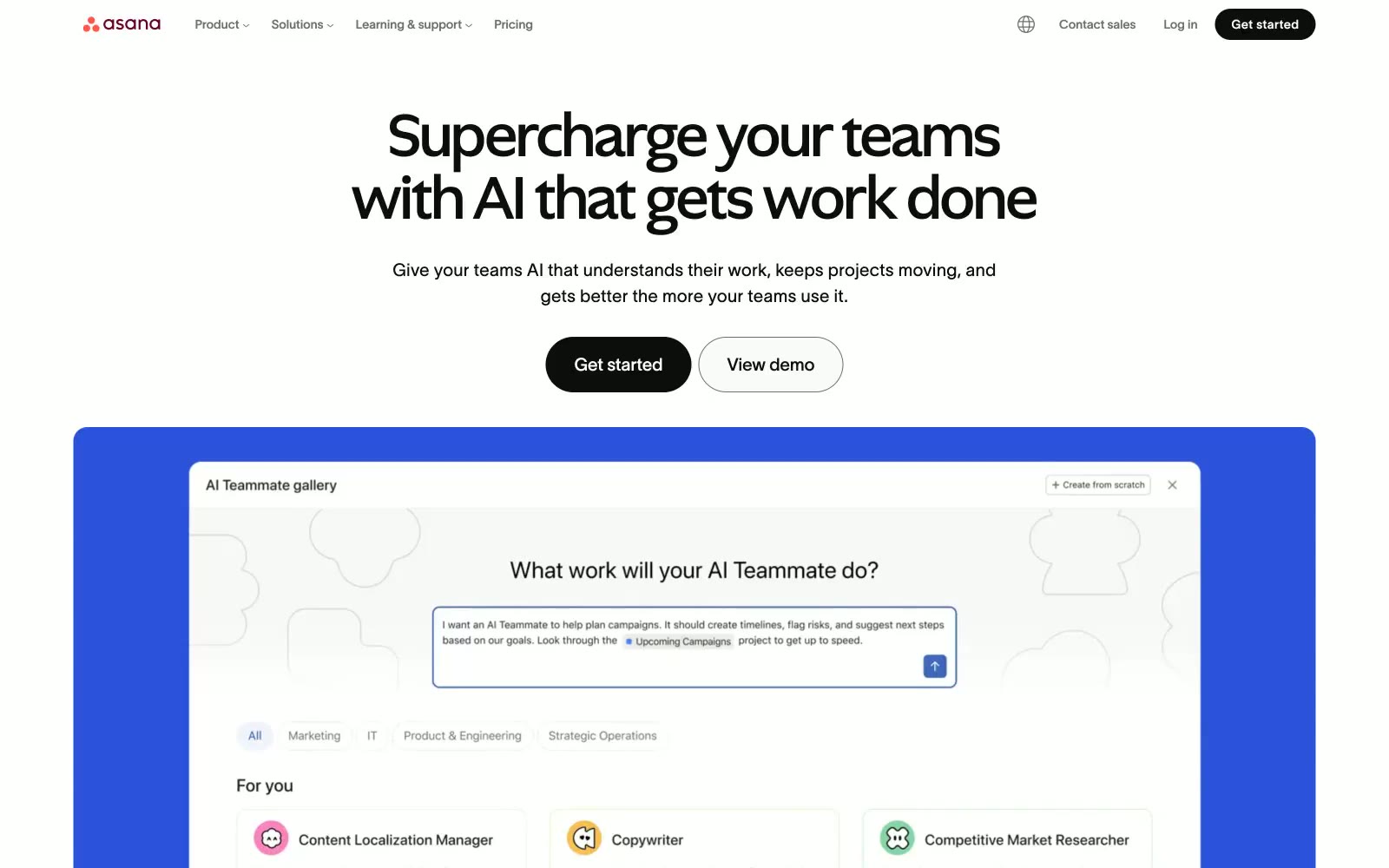
Asana
Asana — Style Reference
# Asana — Style Reference
> Productivity whiteboard lit by a coral lamp — authoritative black type on a breathing white field, with a warm coral flash and a deep-navy flicker to signal where action lives.
**Theme:** light
Asana reads as a white canvas under a coral-and-violet editorial system — generous whitespace punctuated by a near-black (#0d0d0d) headline weight that commands attention, then released into light gray body copy. The signature move is two coexisting type voices: Ghost at 60-72px with -0.0070em tracking for display headlines that compress letter forms into dense, authoritative blocks, and TWK Lausanne at 300-500 weight handling everything else with a humanist openness. Pill buttons (100px+ radius) float as soft capsules against sharp-cornered cards (10-16px), creating gentle contrast between interaction surfaces and content containers. The coral tint (#ffeaec background, #690031 deep text) acts as a warm semantic accent for the product's brand-colored UI elements, while a saturated dark violet (#222875) marks interactive and informational states — both restrained to small, intentional doses against an otherwise achromatic canvas.
## Tokens — Colors
| Name | Value | Token | Role |
|------|-------|-------|------|
| Ink Black | `#0d0d0d` | `--color-ink-black` | Body text, headings, button fill, icon strokes — near-black rather than true black keeps contrast high without harshness |
| Pure White | `#ffffff` | `--color-pure-white` | Page background, button text on dark fills, nav surface |
| Mist | `#f3f3f3` | `--color-mist` | Secondary button background, alternating section background fill |
| Cloud | `#e7e7e7` | `--color-cloud` | Card borders, dividers, section background tint |
Websites
Markdown Text
design-md
website-prompt
landing-page-prompt
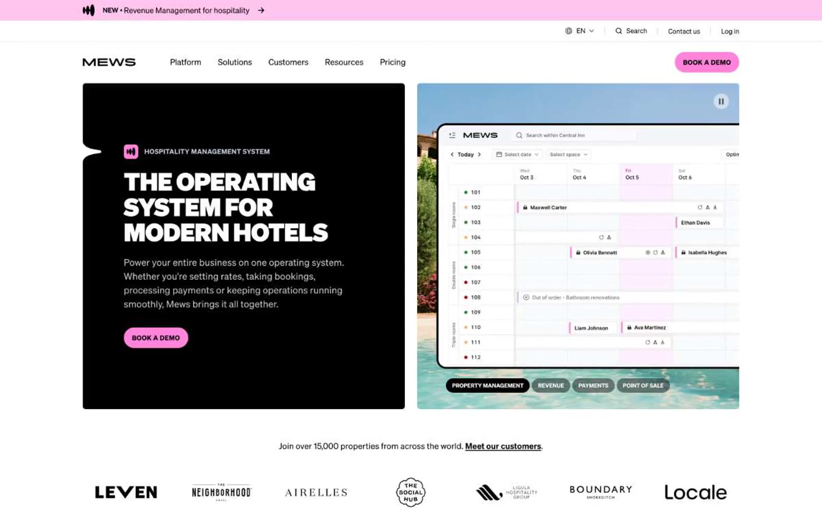
Mews
Mews — Style Reference
# Mews — Style Reference
> Hospitality command center at pink dawn. A white-walled, sunlit workspace where bold black type, warm cream cards, and a single candy-pink action button define every screen — playful confidence over enterprise restraint.
**Theme:** light
Mews operates as a hospitality command center bathed in pink dawn: a predominantly white canvas, warm cream card surfaces, and a saturated candy-pink accent that drives every primary action. The visual language is unapologetically confident — headlines render at extreme weights (900) at display sizes, pushed tight with aggressive negative tracking, while body copy sits in a comfortable 400-weight Soehne. Surfaces stay flat and minimal; the few chromatic moments (soft pink, ice blue, lime green) are reserved for categorical tiles, product UI highlights, and the signature pill-shaped CTA. The result reads as a modern operating system for hotels: structured, optimistic, slightly playful, and decidedly not corporate-grey SaaS.
## Tokens — Colors
| Name | Value | Token | Role |
|------|-------|-------|------|
| Canvas White | `#ffffff` | `--color-canvas-white` | Primary page background, top of surface stack |
| Warm Cream | `#fffcf6` | `--color-warm-cream` | Card and elevated surface backgrounds, gentle warmth against pure white |
| Ink Black | `#000000` | `--color-ink-black` | Primary text, icons, borders, and dark hero panels — the dominant structural color |
| Charcoal | `#333333` | `--color-charcoal` | Secondary text and softer borders where pure black would feel too heavy |
Websites
Markdown Text
design-md
website-prompt
landing-page-prompt
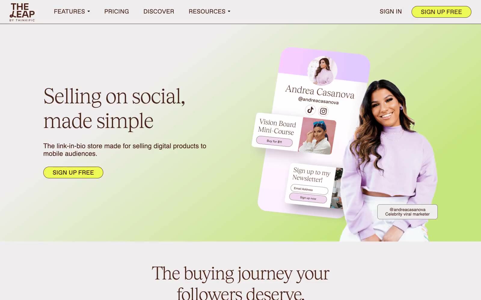
The Leap
The Leap — Style Reference
# The Leap — Style Reference
> espresso ink on warm cream
**Theme:** light
The Leap uses a warm-creator economy visual language: near-white canvas, espresso-brown text instead of black, a single acid lime-yellow CTA that pops against muted surfaces, and serif display headlines paired with a contemporary neo-grotesque body. Decorative pastels (lavender, mint, sky blue, lemon) appear inside product mockups and section washes rather than chrome. Cards are generously rounded (30px), buttons are fully pill-shaped (100px), and the whole system reads approachable and editorial — the opposite of corporate SaaS. The brown-on-cream + lime accent palette signals a brand built for individual creators, not enterprise buyers.
## Tokens — Colors
| Name | Value | Token | Role |
|------|-------|-------|------|
| Espresso Ink | `#482317` | `--color-espresso-ink` | Primary text, headings, nav links, body copy, and outlined button borders — a warm dark brown that replaces pure black and gives the whole system a softer, editorial voice |
| Fog Border | `#e5e7eb` | `--color-fog-border` | Hairline borders, dividers, input outlines, and icon strokes across cards, nav, and body containers |
| Cream Canvas | `#fafafa` | `--color-cream-canvas` | Page background and card surfaces — the off-white that everything sits on, warmer than pure white |
| Lime Spark | `#ecf956` | `--color-lime-spark` | Green action color for filled buttons, selected navigation states, and focused conversion moments. |
Websites
Markdown Text
design-md
website-prompt
landing-page-prompt
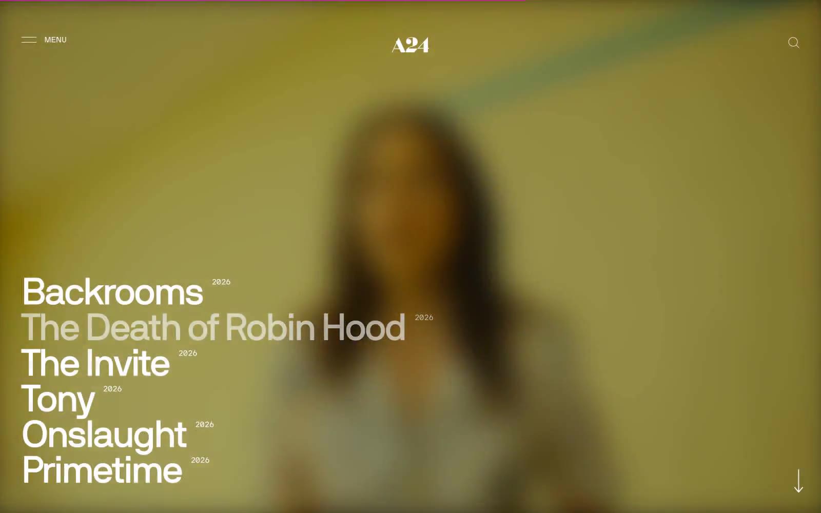
A24
A24 — Style Reference
# A24 — Style Reference
> opening title sequence on pure black
**Theme:** mixed
A24 operates as a cinematic editorial system: pure monochrome pages where typography does all the emotional work. The design alternates full-bleed black and white bands, using a custom humanist sans-serif (NB International) at extreme sizes — up to 74px display — to let film titles and headlines become visual artifacts rather than mere labels. Every UI element is stripped to its barest form: hairline borders, zero radius, zero shadow, zero chromatic accent. The site's restraint IS the brand; it borrows the visual grammar of a film opening title sequence — high contrast, generous negative space, and confidence through absence rather than addition.
## Tokens — Colors
| Name | Value | Token | Role |
|------|-------|-------|------|
| Obsidian | `#000000` | `--color-obsidian` | Section backgrounds for dark bands, primary body text on light surfaces, hairline borders and dividers throughout — the structural backbone of every page |
| Paper White | `#ffffff` | `--color-paper-white` | Light section backgrounds, card surfaces, product image containers, modal/overlay panels, primary text on dark backgrounds |
| Ash Gray | `#eeeeee` | `--color-ash-gray` | Subtle surface variant for product showcase panels and soft background shifts on light sections |
| Smoke | `#888888` | `--color-smoke` | Muted secondary text, subdued nav labels, low-emphasis borders — sits just above AA contrast for accessibility |
Websites
Markdown Text
design-md
website-prompt
landing-page-prompt
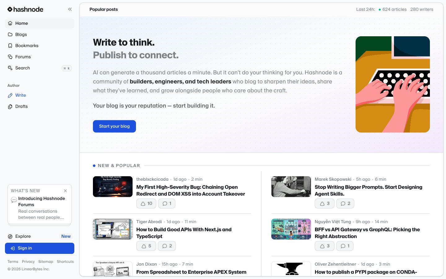
Hashnode
Hashnode — Style Reference
# Hashnode — Style Reference
> Editorial newsroom on a gray runway — a clean monochrome feed where one electric blue accent carries all the energy.
**Theme:** light
Hashnode presents an editorial newsroom aesthetic: a near-monochrome canvas of warm-cool grays where the only chromatic element is a single electric blueprint blue that does all the talking. Typography is uniformly Suisse Intl, a humanist grotesque with tight negative tracking, giving headlines a confident, typeset-in-a-publication feel rather than a dashboard utilitarian one. Surfaces are flat with hairline borders instead of shadows — the interface trusts typography and whitespace to create hierarchy, not elevation. Components feel like cards laid out on a magazine spread: rounded but not pillowy, compact but breathable, with a two-column card grid that reads like a homepage feed. Color appears sparingly as functional punctuation — links, a single CTA fill, badges — never as decoration.
## Tokens — Colors
| Name | Value | Token | Role |
|------|-------|-------|------|
| Blueprint Blue | `#1d52de` | `--color-blueprint-blue` | Violet supporting accent for decorative details and low-frequency emphasis. Do not promote it to the primary CTA color |
| Ink Black | `#16191c` | `--color-ink-black` | Primary body text, headings, icon strokes — the dominant ink |
| Carbon | `#1c2024` | `--color-carbon` | Secondary heading text and high-emphasis icon fills where a subtle warmth is desired over pure ink |
| Slate | `#7b8187` | `--color-slate` | Muted metadata, helper text, placeholder text, secondary icons, timestamps, vote/comment counts |
Websites
Markdown Text
design-md
website-prompt
landing-page-prompt
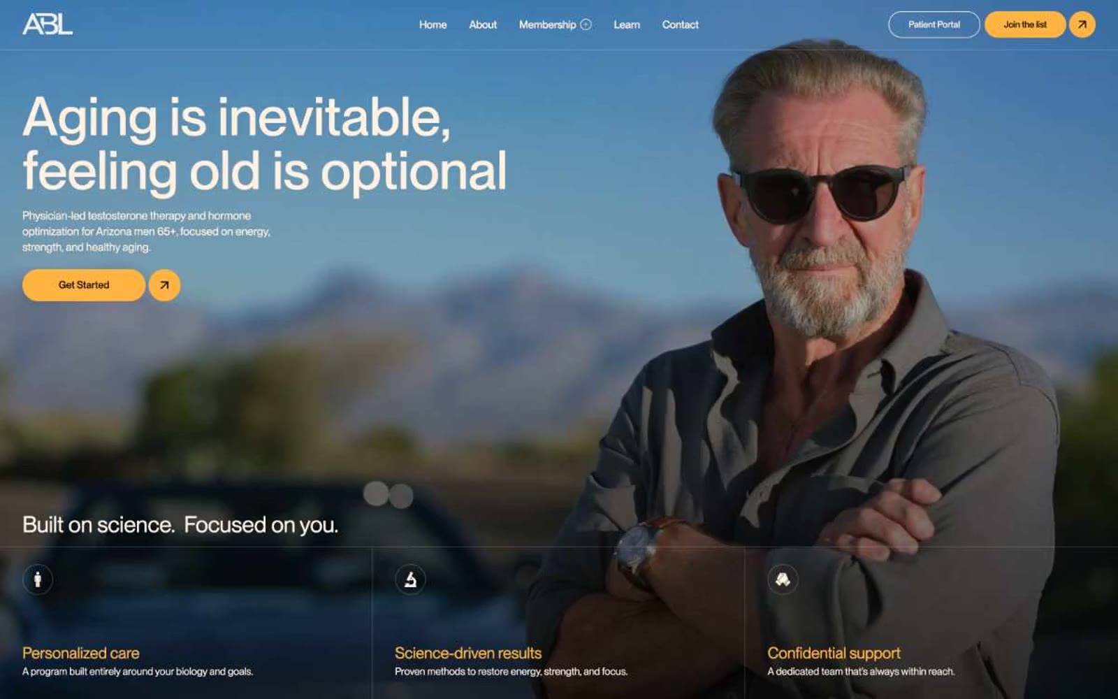
Abetterlou
Abetterlou — Style Reference
# Abetterlou — Style Reference
> Embers on saddle leather — warm cream typography glowing against deep coffee-black, with amber-gold buttons that feel pressed into the page like heated metalwork.
**Theme:** dark
A warm dark 'private clinic at dusk' system: coffee-black canvas (#140b00), cream typography (#fff1e0), and a single amber accent (#ffb442) that fires only on action. PP Neue Montreal carries the entire voice at weights 400 and 500 — geometric and clinical, but the cream ink and tight negative tracking on the 43–81px range give it editorial weight rather than generic SaaS feel. The defining rhythm is a shape contrast: full-pill controls (buttons, inputs, links at ~1296px radius) sit on gently squared 6px surfaces, so action elements feel pressed-in and tactile while content cards stay quiet. Restraint is the system: one chromatic accent, two font weights, compact 12px gaps, and 52px section breath that reads premium without becoming airy.
## Tokens — Colors
| Name | Value | Token | Role |
|------|-------|-------|------|
| Espresso | `#140b00` | `--color-espresso` | Page canvas and primary surface — warm coffee-black rather than pure black, the entire site sits on this |
| Midnight Cocoa | `#0b0600` | `--color-midnight-cocoa` | Deepest surface for footers and recessed bands — almost-black brown for slight layering below Espresso |
| Warm Cream | `#fff1e0` | `--color-warm-cream` | Primary text and icon strokes — the only ink color across the system, reads as off-white parchment in dark contexts |
| Soft Cream | `#f1f1f1` | `--color-soft-cream` | Occasional light surface tint where near-white is needed (rare, secondary to Warm Cream) |
Websites
Markdown Text
design-md
website-prompt
landing-page-prompt
Symbolic.ai
Symbolic.ai — Style Reference
# Symbolic.ai — Style Reference
> editorial newsroom on cream paper. A broadsheet masthead in serif type, floating on warm off-white stock, with soft tan shadows that make every card feel like it was set in letterpress — not rendered.
**Theme:** light
Symbolic.ai reads like a printed broadsheet reimagined as software: a warm cream canvas (#fdfcf5) with pure black ink type, soft tan shadows instead of cool gray, and a mix of editorial serif headlines (Suisse Works) with a humanist sans (Open Runde) for body and UI. The interface never feels clinical — cards float gently on the cream paper, shadows carry a warm khaki tint (#d5d0b8) that makes even simple elevations feel printed rather than digital. Color is rationed: black handles all primary actions and borders, a deep teal signals verified/correct product states, and a single vivid violet marks AI thinking in progress. Red appears only as a stamp accent. The system trusts whitespace and typography weight to create hierarchy more than color or heavy elevation.
## Tokens — Colors
| Name | Value | Token | Role |
|------|-------|-------|------|
| Canvas Cream | `#fdfcf5` | `--color-canvas-cream` | Primary page canvas and white card surfaces. |
| Ink Black | `#000000` | `--color-ink-black` | Primary text, hairline borders, icon strokes, and the single CTA fill — black-on-cream is the system's only action color, no chromatic buttons |
| Paper White | `#ffffff` | `--color-paper-white` | Card surfaces, elevated content layers, input fills — the brighter sheet the cream canvas holds |
| Charcoal | `#4c4c4a` | `--color-charcoal` | Secondary borders, muted body text, link underline tones |
Websites
Markdown Text
design-md
website-prompt
landing-page-prompt
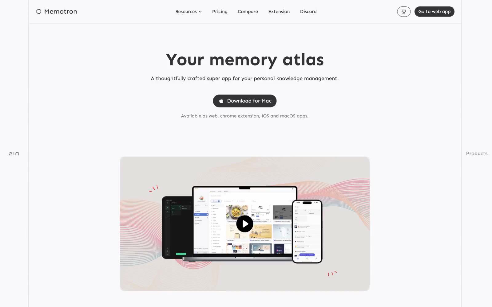
21n
21n — Style Reference
# 21n — Style Reference
> Open atlas under pale daylight — a spacious, light-mode canvas where knowledge tools feel weightless against a single charcoal anchor.
**Theme:** light
Memotron is a whisper-quiet, light-mode knowledge workspace built on a near-monochrome neutral stack — pure white canvas, cool off-white surfaces, and a single hairline border gray carry the entire visual system. The only filled button variant is charcoal-dark, which makes the single primary action feel weighty and deliberate against an otherwise weightless interface. Two accent hues (vivid green and vivid blue) appear only as functional punctuation — icons, link states, decorative strokes — never as backgrounds or large fills. Typography is humanist (Sen) with a dramatic scale jump to 56px display, giving headlines atlas-scale presence. The system is flat and border-driven: 12.5px surfaces and #e5e7eb hairlines create structure, with zero shadows or gradients.
## Tokens — Colors
| Name | Value | Token | Role |
|------|-------|-------|------|
| Snow | `#ffffff` | `--color-snow` | Primary canvas — page backgrounds, card surfaces, button text on dark fills |
| Fog | `#f9f9fb` | `--color-fog` | First surface layer above canvas — subtle alternating sections, soft elevated cards |
| Mist | `#eff0f6` | `--color-mist` | Cool card surface — slightly bluer than fog, used for inset panels and secondary cards |
| Silver | `#e5e7eb` | `--color-silver` | Hairline borders, dividers, and 1px structural lines — the system's primary separator color |
Websites
Markdown Text
design-md
website-prompt
landing-page-prompt
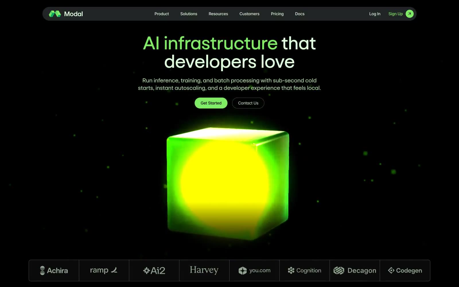
Modal
Modal — Style Reference
# Modal — Style Reference
> Phosphor terminal inside a holographic cube
**Theme:** dark
Modal renders an AI infrastructure terminal aesthetic: pure black canvas with luminescent mint-green type that glows like phosphor on a CRT. The signature visual is a volumetric green glass cube — internal light source, soft particle scatter, a single artifact of physical weight in an otherwise weightless digital environment. Typography splits between a custom display sans (Goga) for headlines and Inter Variable for all operational UI, creating a clear voice distinction between the brand speaking and the product speaking. Color is ruthlessly disciplined: near-black surface stack, one vivid neon green (#7fee64) for live action, one soft mint (#ddffdc) for readable type, and almost nothing else. The palette occasionally inverts into a pale mint section for testimonials — a deliberate cool-water counterpoint to the dark engine room.
## Tokens — Colors
| Name | Value | Token | Role |
|------|-------|-------|------|
| Phosphor Mint | `#ddffdc` | `--color-phosphor-mint` | Primary text on dark surfaces, body type on black — pale green reads as luminescent rather than white, reinforcing the terminal metaphor |
| Reactor Green | `#7fee64` | `--color-reactor-green` | Green action color for filled buttons, selected navigation states, and focused conversion moments |
| Soft Glow | `#c8f9b6` | `--color-soft-glow` | Accent backgrounds and highlighted text, eyebrow labels over imagery — diluted green for surfaces that need to feel alive without competing with Reactor Green |
| Pale Mist | `#def0dd` | `--color-pale-mist` | Inverted section background for testimonials and proof — the only light surface, a cool exhale from the dark engine room |
Websites
Markdown Text
design-md
website-prompt
landing-page-prompt
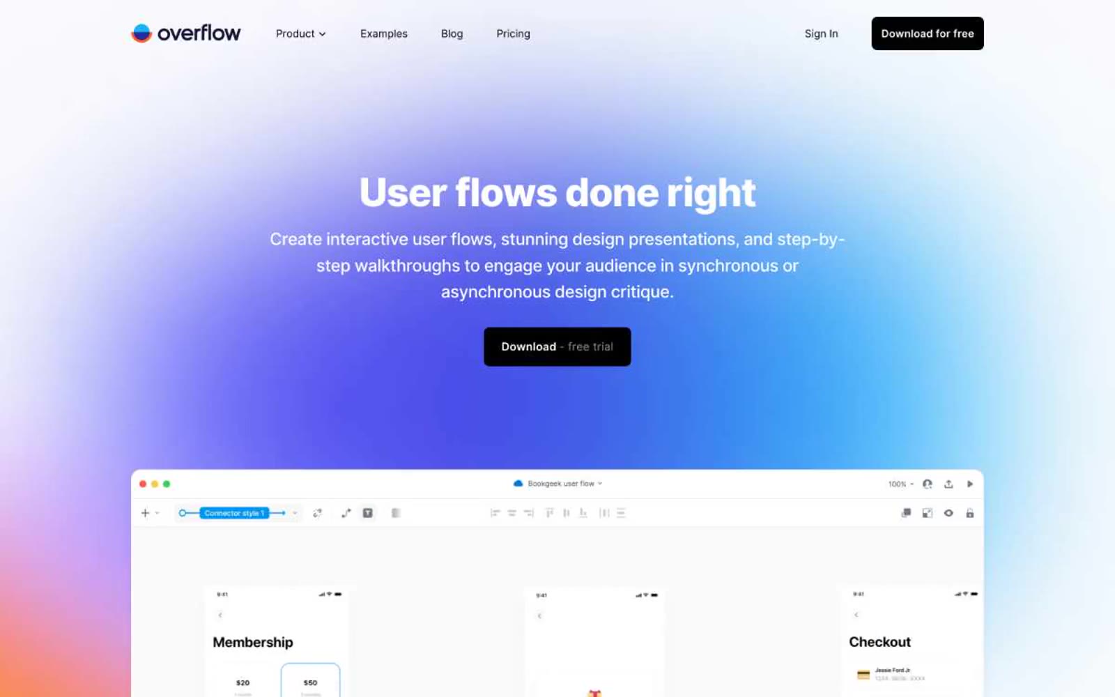
Overflow
Overflow — Style Reference
# Overflow — Style Reference
> blueprint washed in indigo
**Theme:** light
Overflow speaks in a near-whisper designer vernacular: a paper-cream canvas, one deep midnight-navy brand ink, a single sky-blue accent, and the rest rendered in honest monochrome. The page breathes — generous 80–120px section gaps, 24px card radii, 12px button radii, and very low-opacity shadows that barely register. Product UI is always shown in a macOS chrome frame floating over a soft indigo-to-sky gradient wash, signalling "this is a designer's tool for design people". Type is Inter at its tightest tracking — headings pull -0.025em, creating dense, confident blocks that sit beside lots of white space rather than filling it. The dark filled button is the only moment of full contrast on the page; everything else is quietly layered neutrals.
## Tokens — Colors
| Name | Value | Token | Role |
|------|-------|-------|------|
| Midnight Ink | `#161637` | `--color-midnight-ink` | Headings, navigation wordmark, key emphasis — a desaturated indigo-black that reads as navy without screaming blue, anchoring the typographic system |
| Sky Accent | `#0085e4` | `--color-sky-accent` | Blue supporting accent for decorative details and low-frequency emphasis. Do not promote it to the primary CTA color |
| Onyx | `#000000` | `--color-onyx` | Dark supporting neutral for text, icons, and strong contrast. Do not promote it to the primary CTA color |
| Paper White | `#fafafc` | `--color-paper-white` | Page canvas, card surfaces, button text on dark — a barely-warm white that prevents the harsh clinical feel of pure #ffffff |
Websites
Markdown Text
design-md
website-prompt
landing-page-prompt
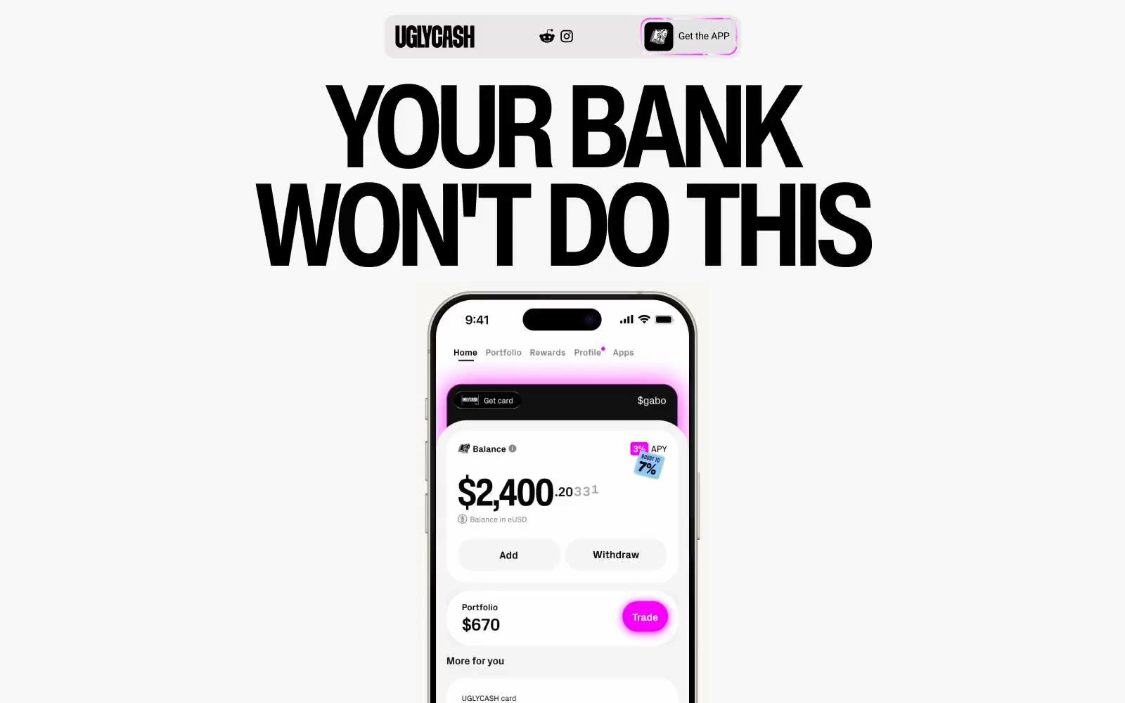
UGLYCASH
UGLYCASH — Style Reference
# UGLYCASH — Style Reference
> Sticker-covered notebook on cream paper — a vibe of irreverent, maximalist fintech that wears its chaos proudly.
**Theme:** light
UGLYCASH runs a sticker-bombed Gen-Z finance language: warm light canvas, oversized black display type, and a riot of vivid accent panels (hot pink, electric cyan, toxic lime, dusty khaki) splashed across mostly achromatic layouts. The signature move is a heavy black hairline (1px) that traces every surface — cards, phone frames, buttons, illustrations — giving the impression of printed stickers peeled onto a page. Radii are exaggerated (16px for controls, 38–46px for hero cards) to amplify the soft, toy-like feel, while the palette stays disciplined: one neutral canvas, one neutral surface, and three or four saturated brand colors used as full-bleed card fills rather than thin accents. Headlines shout at 85–164px with negative tracking; body text retreats to 14–18px Inter. Everything reads as fast, loud, and deliberately unpolished.
## Tokens — Colors
| Name | Value | Token | Role |
|------|-------|-------|------|
| Static Black | `#000000` | `--color-static-black` | Text, borders, icon strokes, button outlines — the structural ink that outlines every sticker-like surface and carries all body and heading type |
| Paper Cream | `#f2f2f2` | `--color-paper-cream` | Page canvas, body backgrounds, and soft section fills |
| Card White | `#ffffff` | `--color-card-white` | Elevated card surfaces and inverse text on dark panels |
| Surface Graphite | `#3a3a3a` | `--color-surface-graphite` | Dark card and panel fills for inverted sections |
Websites
Markdown Text
design-md
website-prompt
landing-page-prompt
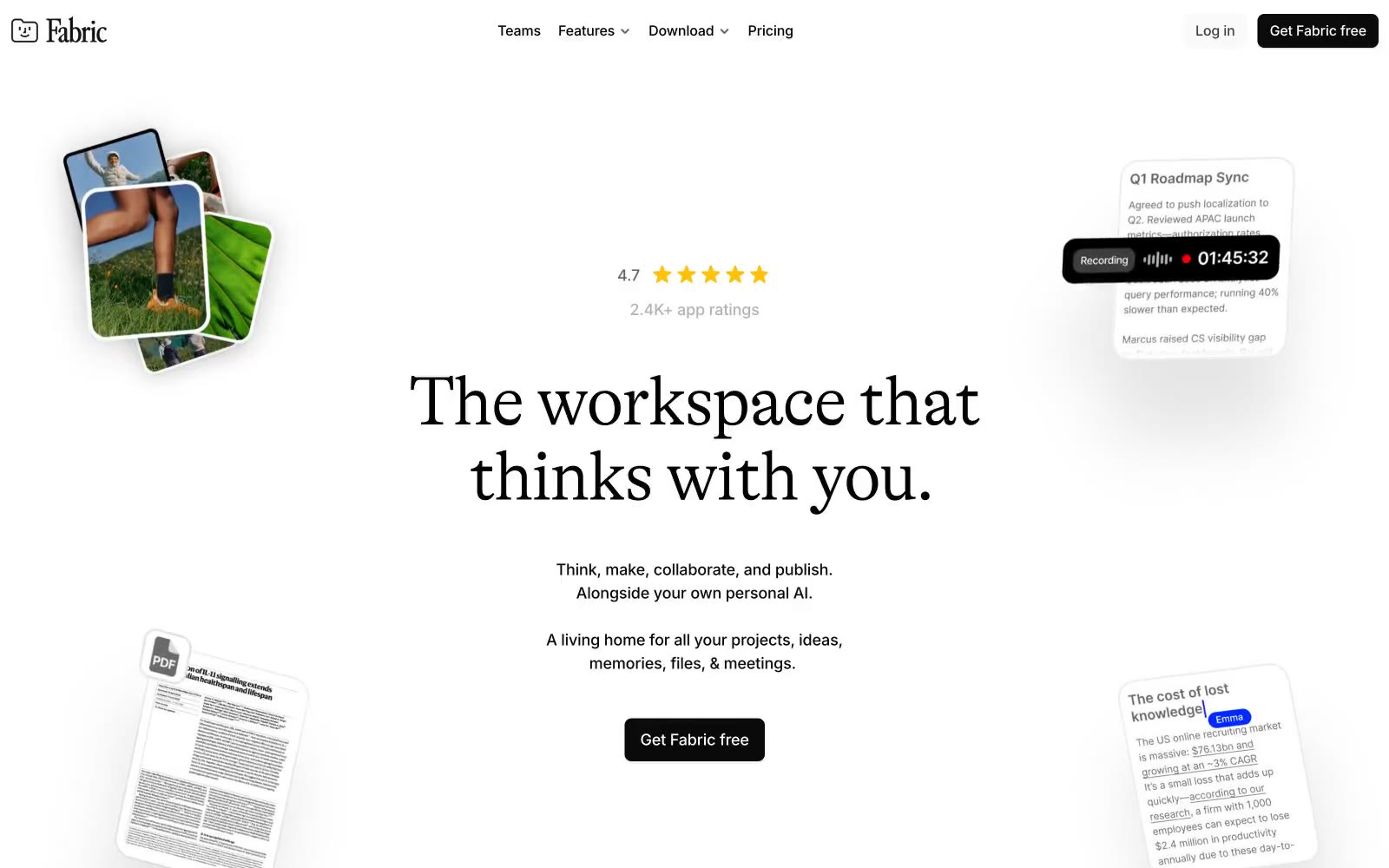
Fabric
Fabric — Style Reference
# Fabric — Style Reference
> editorial manuscript on a drafting table
**Theme:** light
Fabric uses an editorial-document language: white canvas, near-monochrome surfaces, and a single editorial serif headline that gives the workspace a literary, almost manuscript-like gravity. The product lives in a tight grayscale world — black text, white surfaces, hairline borders, and almost no color — punctuated by a single vivid electric-violet glow that appears as soft shadows, focus halos, and accent washes rather than fills. Inter handles all UI and body text at compact, confident sizes, while GT Alpina Light whispers the brand promise in weight-300 serif at 80px. Components are paper-thin: cards with 16px radii, dark filled CTAs (#0a0a0a) with 8px radii, ghost links drawn in deep indigo with a 1px underline, and shadows so subtle they register as paper grain rather than elevation. The system feels like a writer's drafting table — calm, restrained, deeply considered, with one bright violet mark on the page.
## Tokens — Colors
| Name | Value | Token | Role |
|------|-------|-------|------|
| Electric Violet | `#1100ff` | `--color-electric-violet` | Brand accent — vivid glow halos behind product cards, focus ring washes, decorative shadow tint. Appears sparingly as a soft aura, never as a filled surface or text color |
| Ink Violet | `#19154e` | `--color-ink-violet` | Link color and ghost-action border — underlined hyperlinks, outlined action borders, link text. The only chromatic text color in the system |
| Press Black | `#0a0a0a` | `--color-press-black` | Primary action background, heading text, nav backgrounds. Used for filled CTA buttons and the heaviest typographic weight in the system |
| Carbon | `#000000` | `--color-carbon` | Universal border color and high-emphasis text. The system draws most structural borders in pure black at hairline weights |
Websites
Markdown Text
design-md
website-prompt
landing-page-prompt
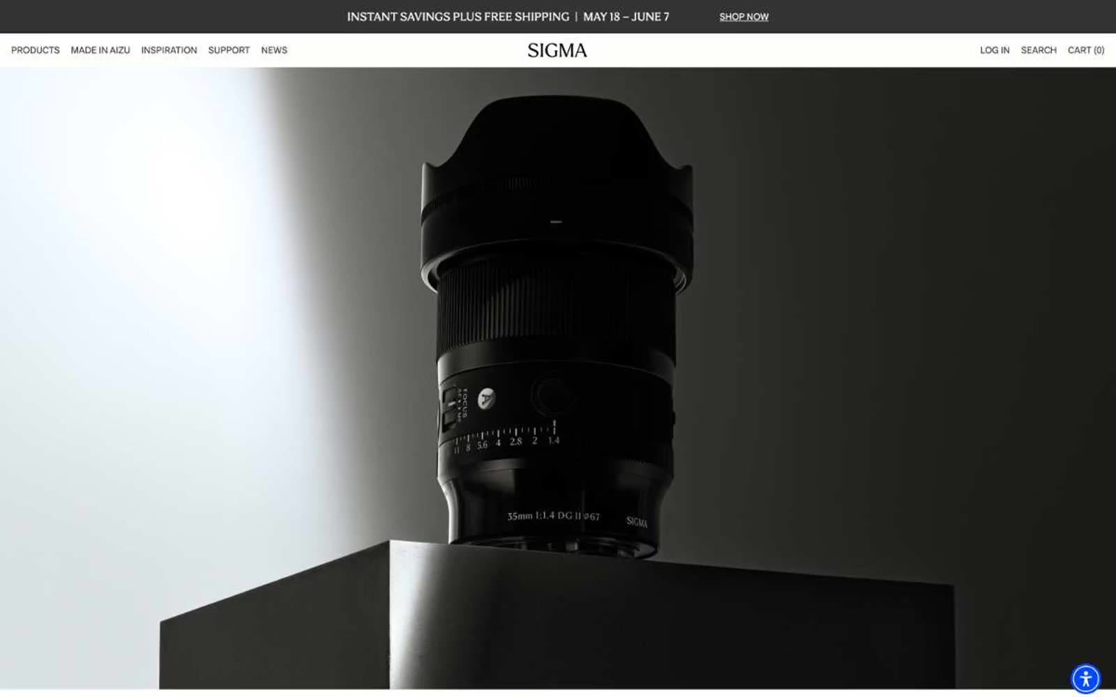
Sigmaphoto
Sigmaphoto — Style Reference
# Sigmaphoto — Style Reference
> Monochrome gallery for precision instruments — a hushed white room where the only color that matters is the one that asks you to act.
**Theme:** light
Sigma's site reads like a museum exhibition catalog for precision optical instruments — entirely weight-400 typography, vast whitespace, and a single vivid cobalt-blue accent that punctuates an otherwise purely monochrome experience. Product photography dominates at near-full-bleed scale, shot against dark studio gradients that let matte-black lens bodies dissolve into shadow and re-emerge as sculptural objects. The editorial restraint — centered serif headlines, tiny all-caps section labels, text-only CTAs — signals confidence through quietness, with the single blue button (#0048ff) functioning as the only raised voice in an otherwise whispered conversation. Sharp corners, no shadows, no gradients, no decorative motion: every screen is a frame around a piece of glass and metal.
## Tokens — Colors
| Name | Value | Token | Role |
|------|-------|-------|------|
| Slate Ink | `#333333` | `--color-slate-ink` | Primary text, dominant borders, nav links — the workhorse dark that replaces pure black everywhere a softer edge is wanted |
| Pure White | `#ffffff` | `--color-pure-white` | Neutral form states, badge text, and quiet UI feedback where color should stay understated. Do not promote it to the primary CTA color |
| Onyx Black | `#000000` | `--color-onyx-black` | Icon strokes, input borders, and hard-edge accents where maximum contrast is required |
| Warm Bone | `#faf7ef` | `--color-warm-bone` | Secondary surface — a barely-warm cream that lifts cards off pure white without introducing visible color |
Websites
Markdown Text
design-md
website-prompt
landing-page-prompt
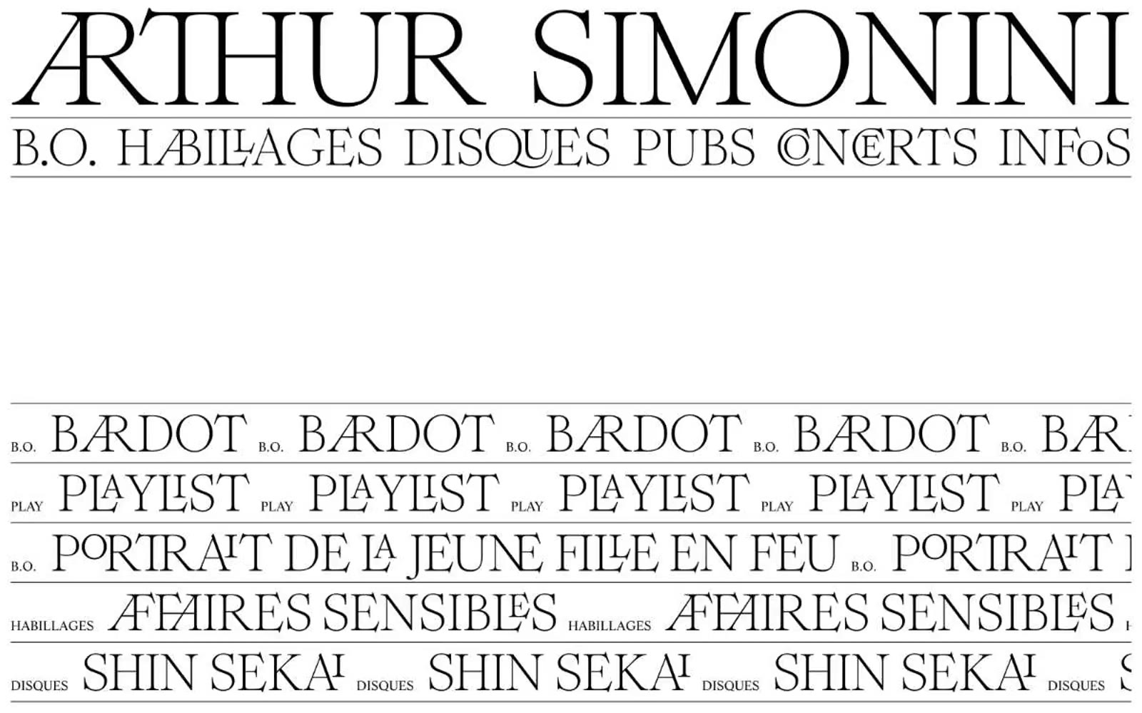
Arthursimonini
Arthursimonini — Style Reference
# Arthursimonini — Style Reference
> printed film programme in black ink
**Theme:** dark
Arthur Simonini is a high-contrast editorial showcase built on absolute monochrome: pure black canvas, pure white type, and nothing in between. The visual identity is carried entirely by two custom serif faces — a quiet text-grade serif for navigation and metadata, and an ornamental didone with discretionary ligatures reserved for oversized display moments. Layout is ruled by hairline white borders that act as section dividers and grid rails, not by cards, shadows, or color. Content is presented like a printed film programme or a French luxury maison lookbook: typographic marquees scroll repeated section titles, film posters fill grids in grayscale, and generous negative space lets the ligature-rich display type breathe. No color, no gradients, no fills, no elevation — the entire system is an exercise in typographic and structural discipline.
## Tokens — Colors
| Name | Value | Token | Role |
|------|-------|-------|------|
| Obsidian | `#000000` | `--color-obsidian` | Page canvas, nav background, poster grid ground |
| Bone | `#ffffff` | `--color-bone` | All text, hairline section borders, image borders, icon strokes |
## Tokens — Typography