AI Prompt Studio - Intelligent Prompt Library
Explore and use professional AI prompts to optimize your workflow.
One-click Use
Websites
Markdown Text
design-md
website-prompt
landing-page-prompt
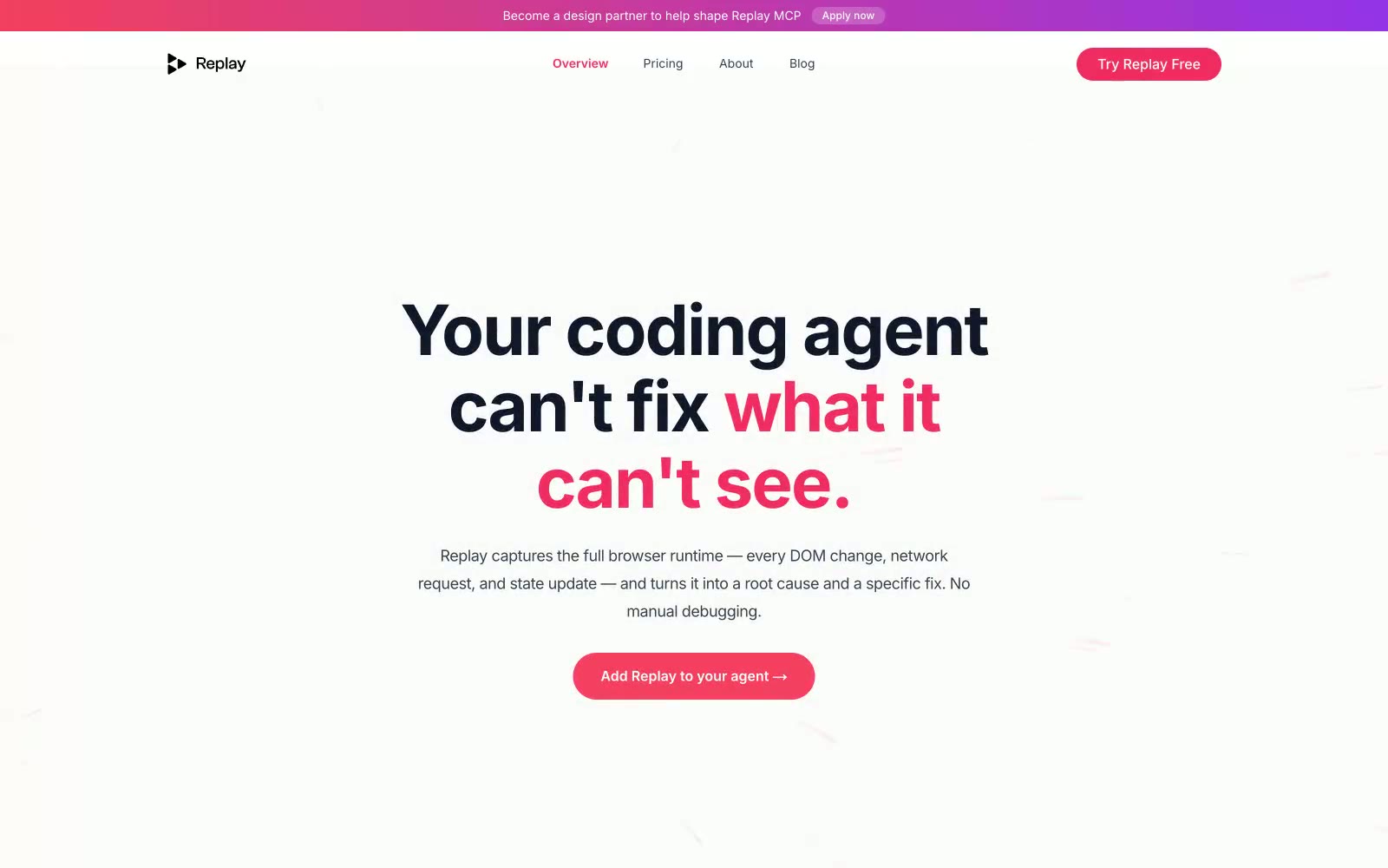
Replay
Replay — Style Reference

# Replay — Style Reference
> editorial red-pen on white blueprint. A debugging instrument that speaks in a whisper and marks its targets in coral.
**Theme:** light
Replay reads as a serious developer-tool brand dressed in quiet confidence: an almost entirely achromatic canvas where charcoal text and white surfaces do 95% of the work, and a single saturated coral-red acts as surgical punctuation on headlines, buttons, and the active nav state. The signature typographic move is emphatic color-splitting inside display headlines — a dark line in #111827 immediately followed by a line in the brand red — which makes the voice feel editorial and opinionated rather than corporate. Components stay lightweight: pill buttons, thin hairline borders, cards that float on soft elevation, and almost no decorative gradient beyond a thin top banner. Every surface earns its place; color is rationed like a resource, not applied as decoration.
## Tokens — Colors
| Name | Value | Token | Role |
|------|-------|-------|------|
| Midnight Ink | `#111827` | `--color-midnight-ink` | Primary body text, headline base, nav text — the default foreground against every surface |
| Slate 600 | `#374151` | `--color-slate-600` | Secondary text, button borders on outlined/ghost actions, list markers |
| Graphite 800 | `#1f2937` | `--color-graphite-800` | Dark surface fills for secondary buttons, dark cards, reverse sections |
| Steel 500 | `#6b7280` | `--color-steel-500` | Muted helper text, secondary link text, inactive nav |
Websites
Markdown Text
design-md
website-prompt
landing-page-prompt
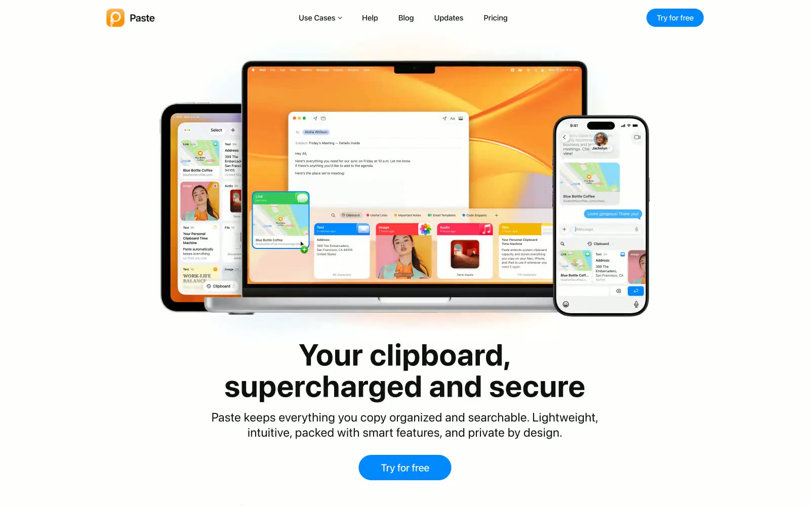
Paste
Paste — Style Reference
# Paste — Style Reference
> Amber lantern on white marble — the brand's warm gradient logo floats in vast white space, like a single lit window in a snow-covered building.
**Theme:** light
Feels like sunlight through a minimalist gallery — vast white space with black typography and a single warm-amber focal point that draws the eye like a lantern in snow. The page is dominated by pure white (#ffffff) and near-white (#f5f5f7) surfaces with near-black (#101010) text, creating extreme contrast. system-ui at display sizes (54-80px) with tight letter-spacing (-0.013em) and weight 400-700 gives headlines a native-OS feel that reinforces the Mac-utility identity. The amber-orange gradient logo (rgb(240,100,19) → rgb(254,171,48)) is the only warm element on an otherwise monochrome canvas, making it impossibly magnetic. Blue CTA buttons (#0088ff) with 100px pill radius are the sole call to action — warm brand, cool CTA, white field.
## Tokens — Colors
| Name | Value | Token | Role |
|------|-------|-------|------|
| Amber Flame | `linear-gradient(0deg, rgb(240, 100, 19) -29.375%, rgb(254, 171, 48) 100%)` | `--color-amber-flame` | Logo, brand mark, gradient start — the warm orange anchors the entire identity as the only chromatic element on a monochrome canvas |
| Honey Glow | `#feab30` | `--color-honey-glow` | Logo gradient end, warm highlight — lifts the amber into golden territory, visible in section headings and brand accents |
| Signal Blue | `#0088ff` | `--color-signal-blue` | Primary CTA buttons, interactive links — cool blue against warm-amber brand creates intentional temperature contrast that separates identity from action |
| Bright Blue | `#1c95ff` | `--color-bright-blue` | Hover/active state for blue CTAs, secondary interactive highlights |
Websites
Markdown Text
design-md
website-prompt
landing-page-prompt
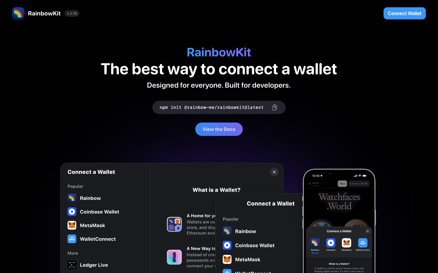
RainbowKit
RainbowKit — Style Reference
# RainbowKit — Style Reference
> Neon wallet modal floating in a black void — the blue-to-violet aurora glows through the dark.
**Theme:** dark
RainbowKit uses a midnight crypto-native language: a black canvas with floating dark cards, confident rounded sans-serif typography, and a single vivid blue-to-violet gradient as the brand's emotional core. The design lives in the gap between developer-tool severity and consumer-app approachability — heavy shadows create depth on a flat dark surface, inset white border highlights define button edges, and 9999px radii make every interactive feel like a friendly pill. Color is used surgically: a primary signal blue for action, the aurora gradient for the hero CTA, and pure white text against layered grays for hierarchy. Component modals float with dramatic 24px shadow stacks, previewing the toolkit's own product surfaces. The six-column partner grid below signals community trust at scale without resorting to testimonials.
## Tokens — Colors
| Name | Value | Token | Role |
|------|-------|-------|------|
| Signal Blue | `#0e76fd` | `--color-signal-blue` | Primary CTA fill, active states, brand wordmark, link emphasis — the only chromatic blue with enough surface area to carry identity |
| Aurora Gradient | `linear-gradient(to right, rgb(56, 152, 255), rgb(122, 112, 255))` | `--color-aurora-gradient` | Hero CTA gradient, brand wordmark highlight, selected-state washes — flows from sky-blue to electric violet |
| Electric Violet | `#7a70ff` | `--color-electric-violet` | Gradient terminus, brand-secondary accent — appears only as the cool half of the aurora |
| Deep Iris | `#38228f` | `--color-deep-iris` | Violet wash for highlight backgrounds, decorative bands, and soft emphasis behind content. |
Websites
Markdown Text
design-md
website-prompt
landing-page-prompt
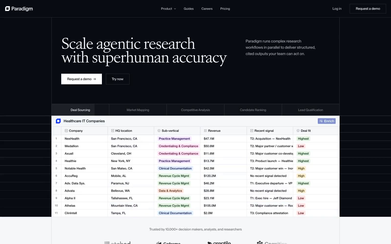
Paradigm
Paradigm — Style Reference
# Paradigm — Style Reference
> midnight lab notebook opening to daylight — a dark first screen cracks into a bright, data-rich scroll.
**Theme:** light
Paradigm opens in a dark observatory atmosphere — near-black canvas, white serif display type, and a live data table that already proves the product — then dissolves into a daylight research interface of white paper, soft tinted surfaces, and pastel status badges. The signature move is the Atacama VAR serif at 44–54px with -0.06em tracking, paired against a workhorse PP Neue Montreal that carries the entire UI at 14–22px with tabular numerals. Color is rationed: one vivid blue (#0a33ff) punctuates the brand through active states and step indicators, status is communicated through six dark-ink + pastel-wash badge pairs (forest, sapphire, mulberry, amber, crimson, plum), and the rest of the system lives in carefully tuned warm and cool grays. Components feel like research instruments — 4px corners, hairline borders, a signature white inner-glow on product mockup cards, and almost no drop shadows.
## Tokens — Colors
| Name | Value | Token | Role |
|------|-------|-------|------|
| Midnight Ink | `#080b12` | `--color-midnight-ink` | Primary text, hero background, card borders, table rules — the structural near-black that anchors both dark and light regions |
| Paper | `#ffffff` | `--color-paper` | Page background, card surfaces, inverted button fill in dark hero |
| Fog | `#f6f7f8` | `--color-fog` | Subtle surface lift for secondary panels, table zebra rows, input wells |
| Pearl | `#edeef1` | `--color-pearl` | Quiet button backgrounds, nested surface tint |
Websites
Markdown Text
design-md
website-prompt
landing-page-prompt
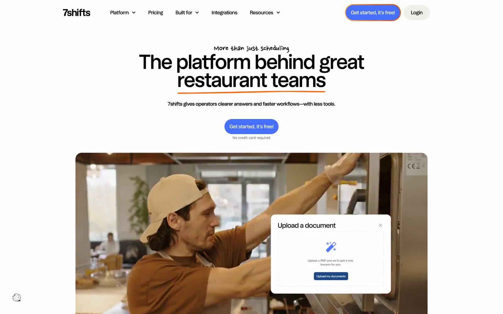
7shifts
7shifts — Style Reference
# 7shifts — Style Reference
> warm diner counter with neon chalk accents — a bright restaurant counter where indigo buttons, orange hand-drawn underlines, and lime highlighter marks sit on clean white and warm bone surfaces, with occasional black bands that make the colors glow.
**Theme:** light
7shifts is a light, air-kissed SaaS canvas with a single punchy indigo as the call-to-action and a small cast of warm accents doing the personality work. The page reads like a clean restaurant counter: white surface, warm bone secondary panels, soft pastel card variants, and the occasional full-bleed black band that makes everything around it feel brighter. Orange is the signature flourish — it underlines hero words in a hand-drawn stroke, floods feature backgrounds, and marks tabbed content — while a lime-green acts as highlighter text inside dark sections. Components are generous and rounded (pill buttons, 20px cards, 40px hero plates) with a compact vertical rhythm. The lone script typeface, Nanum Pen Script, shows up only as a personality accent under hero copy and never on body or UI controls.
## Tokens — Colors
| Name | Value | Token | Role |
|------|-------|-------|------|
| Indigo Bolt | `#4570ff` | `--color-indigo-bolt` | Violet action color for filled buttons, selected navigation states, and focused conversion moments. |
| Ember Orange | `#ff6808` | `--color-ember-orange` | Orange accent for outlined action borders, linked labels, and lightweight interactive emphasis |
| Lime Highlighter | `#c6ff94` | `--color-lime-highlighter` | Green text accent for links, tags, and emphasized short phrases. |
| Lavender Mist | `#ebdcff` | `--color-lavender-mist` | Soft card surface, gentle section background — pastel variant for breaking up the white canvas without adding noise |
Websites
Markdown Text
design-md
website-prompt
landing-page-prompt
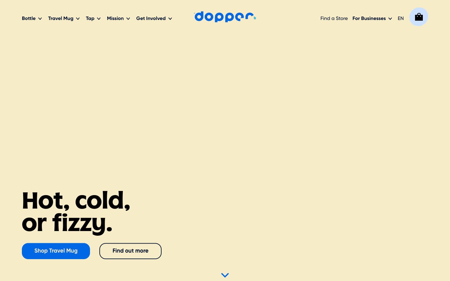
Dopper
Dopper — Style Reference
# Dopper — Style Reference
> Sunlit cream lagoon with a vivid blue current. A warm beige expanse where one electric blue channel and full-bleed candy-bright cards cut through like sunlight on water.
**Theme:** light
Dopper's visual language reads as a sunlit eco-counter: a warm cream canvas (#f6ecc8 hero, #fcfaf2 page body) carries generous whitespace and a single saturated blue (#0067e5) that snaps every interactive element into focus. The brand voice is confident but friendly — oversized display headlines in a custom 'Dopper' face, rounded 20px corners on every card and button, and solution blocks painted in candy-bright full fills (teal, yellow, sky, navy) that turn the product grid into a poster. Typography is dual-personality: a quirky custom display face for hero punch and a clean grotesque (Gilroy) for everything structural. The system avoids heavy shadows and decoration, instead using color blocks, generous 20px gaps, and large product imagery to create rhythm.
## Tokens — Colors
| Name | Value | Token | Role |
|------|-------|-------|------|
| Midnight Navy | `#000f2e` | `--color-midnight-navy` | Primary text, headings, dark surface cards, logo wordmark — the dominant ink of the system. Deep enough to anchor the cream canvas without going pure black |
| Warm Cream | `#f6ecc8` | `--color-warm-cream` | Hero band background, alternating section backdrop — sets the warm, sunlit atmosphere of the brand |
| Soft Off-White | `#fcfaf2` | `--color-soft-off-white` | Page canvas, card surfaces, button text on filled blue — the base layer everything sits on |
| Electric Blue | `#0067e5` | `--color-electric-blue` | Blue supporting accent for decorative details and low-frequency emphasis. Do not promote it to the primary CTA color |
Websites
Markdown Text
design-md
website-prompt
landing-page-prompt
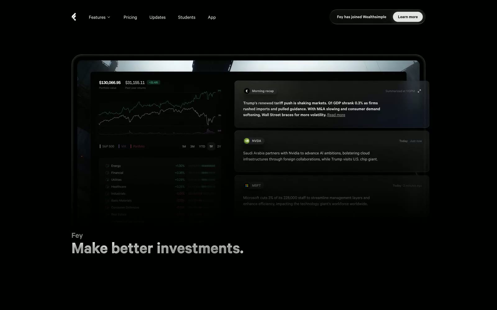
Fey
Fey — Style Reference
# Fey — Style Reference
> obsidian trading terminal — a Bloomberg-derived control room where charts, news, and data float in a void of black.
**Theme:** dark
Fey operates in obsidian — a near-black canvas (#0b0b0b) with subtly lifted card surfaces (#131313, #191919) creating depth closer to a professional trading terminal than a typical SaaS landing. The entire interface speaks in one typeface (calibre) at multiple weights, with aggressive negative tracking on large sizes that tightens display copy into something architectural rather than friendly. Three chromatic accents are deployed as functional punctuation, never decoration: orange (#ffa16c) marks the moments the brand wants you to feel — headlines, brand mark, urgency; blue (#479ffa) anchors interactive navigation and primary chart data; green (#4ebe96) signals positive market movement on price tags and buy/sell chips. The page rhythm is product-forward: oversized device mockups in a horizontal carousel do the selling, with short text blocks playing supporting role.
## Tokens — Colors
| Name | Value | Token | Role |
|------|-------|-------|------|
| Ember Orange | `#ffa16c` | `--color-ember-orange` | Orange supporting accent for decorative details and low-frequency emphasis. |
| Signal Blue | `#479ffa` | `--color-signal-blue` | Blue supporting accent for decorative details and low-frequency emphasis. Do not promote it to the primary CTA color |
| Tape Green | `#4ebe96` | `--color-tape-green` | Green supporting accent for decorative details and low-frequency emphasis. Use as a supporting accent, not as a status color |
| Snow | `#ffffff` | `--color-snow` | Primary text and foreground icons — the dominant interface voice against the dark canvas |
Websites
Markdown Text
design-md
website-prompt
landing-page-prompt
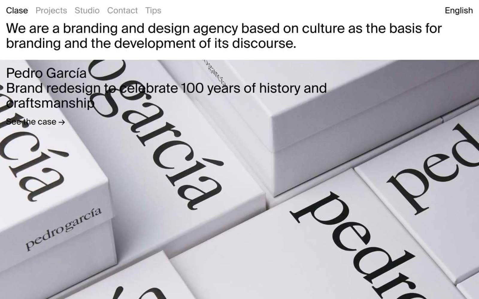
Clase bcn
Clase bcn — Style Reference
# Clase bcn — Style Reference
> editorial gallery on white wall
**Theme:** light
Clase bcn is an editorial gallery on a white wall: a branding agency whose portfolio reads like a museum catalogue. The interface is almost invisible — text, hairline dividers, and full-bleed project imagery do all the work. A single sans-serif (Suisse Int'l) at one weight (400) carries every element, from navigation labels to oversized project titles. Whitespace is generous and structural: project cards span the full viewport with titles and subtitles overlaid directly on photography. The only interactions are text links with arrow indicators; there are no buttons, no fills, no shadows, no decorative UI chrome. Color appears as content — individual project case studies bring their own palettes as background fills — while the chrome stays achromatic and quiet.
## Tokens — Colors
| Name | Value | Token | Role |
|------|-------|-------|------|
| Paper White | `#ffffff` | `--color-paper-white` | Page canvas, card surface base, text on dark cards |
| Ink Black | `#000000` | `--color-ink-black` | Primary text, hairline borders, nav labels — the structural anchor of every element |
| Carbon | `#0a0a0a` | `--color-carbon` | Secondary text and deep surfaces where pure black reads too harsh |
| Concrete | `#939393` | `--color-concrete` | Muted navigation labels, secondary link text, inactive nav state |
Websites
Markdown Text
design-md
website-prompt
landing-page-prompt
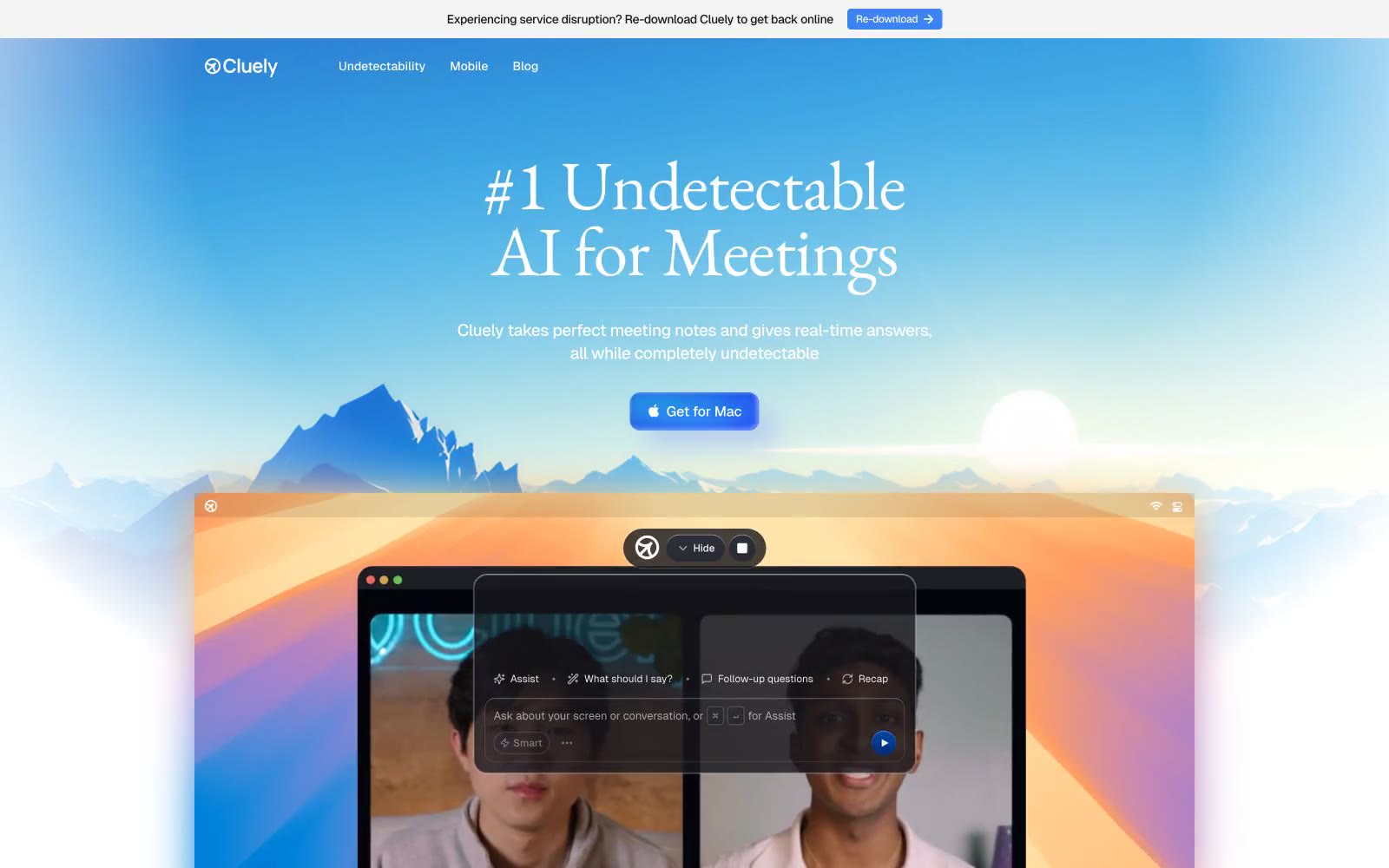
Cluely
Cluely — Style Reference
# Cluely — Style Reference
> blue dawn over mountain ridges — a premium product emerging from atmospheric gradient into crisp white workspace.
**Theme:** light
Cluely presents an atmospheric SaaS aesthetic anchored by a dramatic sky-to-mountain blue gradient hero that sets a premium, almost cinematic tone. The signature move is the pairing of a large editorial serif display headline (EB Garamond at 80px) with a precise modern sans-serif (Geist) for everything functional — this serif-meets-tech contrast is the visual identity. A single vivid blue accent (#3c83f6) powers the primary CTA, while the rest of the interface stays achromatic with soft cool-gray neutrals. Components lean compact and lightweight: 4px-radius buttons, 12-24px-radius cards, hairline borders in #e4e4e7, and no decorative shadows. The product screenshots are presented as floating, slightly tilted laptop frames — the app is the hero, not abstractions.
## Tokens — Colors
| Name | Value | Token | Role |
|------|-------|-------|------|
| Signal Blue | `#3c83f6` | `--color-signal-blue` | Blue action color for filled buttons, selected navigation states, and focused conversion moments. |
| Deep Dusk | `#022c70` | `--color-deep-dusk` | Gradient terminal stop, button shadow depth — dark indigo that anchors the primary blue toward night |
| Azure Crest | `#0544a5` | `--color-azure-crest` | Supporting palette color for small decorative accents when the core palette needs contrast. Do not promote it to the primary CTA color |
| Hover Glow | `#81b6ff` | `--color-hover-glow` | Blue supporting accent for decorative details and low-frequency emphasis. Do not promote it to the primary CTA color |

Websites
Markdown Text
design-md
website-prompt
landing-page-prompt
Busuu
Busuu — Style Reference
# Busuu — Style Reference
> playful passport of global connection. Vivid gradient skies, bubble greetings, and circular flags make the whole interface feel like a warm invitation to the world.
**Theme:** light
Busuu's design system radiates warm, approachable energy through a vivid purple-to-blue gradient hero that bleeds confidence before settling into a calm, near-white workspace. The dominant interface is built on a very pale blue-tinted canvas (#f2f7fd) with white cards floating above it, and a single saturated spring-green (#11ee92) acts as the primary action accent — an unconventional choice that immediately distinguishes it from the sea of blue CTAs in edtech. Typography is custom (Nista) with a compact, bold-friendly weight stack: heavy 800 for display, 700 for headings, and a clean 400 for body, giving the system a confident, slightly geometric voice. The visual language is heavily illustrated — flat, colorful character art with circular framing devices — and the layout relies on generous padding, pill-shaped controls, and circular flag tiles to make global language learning feel tactile and inviting rather than academic.
## Tokens — Colors
| Name | Value | Token | Role |
|------|-------|-------|------|
| Deep Indigo | `#3b1e90` | `--color-deep-indigo` | Left edge of hero gradient — anchors the purple sky of the landing banner |
| Signal Blue | `#116eee` | `--color-signal-blue` | Brand links, nav accents, heading highlights, logo wordmark — the only blue that carries brand meaning |
| Spring Mint | `#11ee92` | `--color-spring-mint` | Green supporting accent for decorative details and low-frequency emphasis. Do not promote it to the primary CTA color |
| Hero Sky Blue | `linear-gradient(90deg, #3b1e9 0%, #5a3cc4 30%, #3a6ef0 100%)` | `--color-hero-sky-blue` | Right edge of hero gradient — transitions from deep indigo to a cleaner blue, softening the landing page mood |
Websites
Markdown Text
design-md
website-prompt
landing-page-prompt
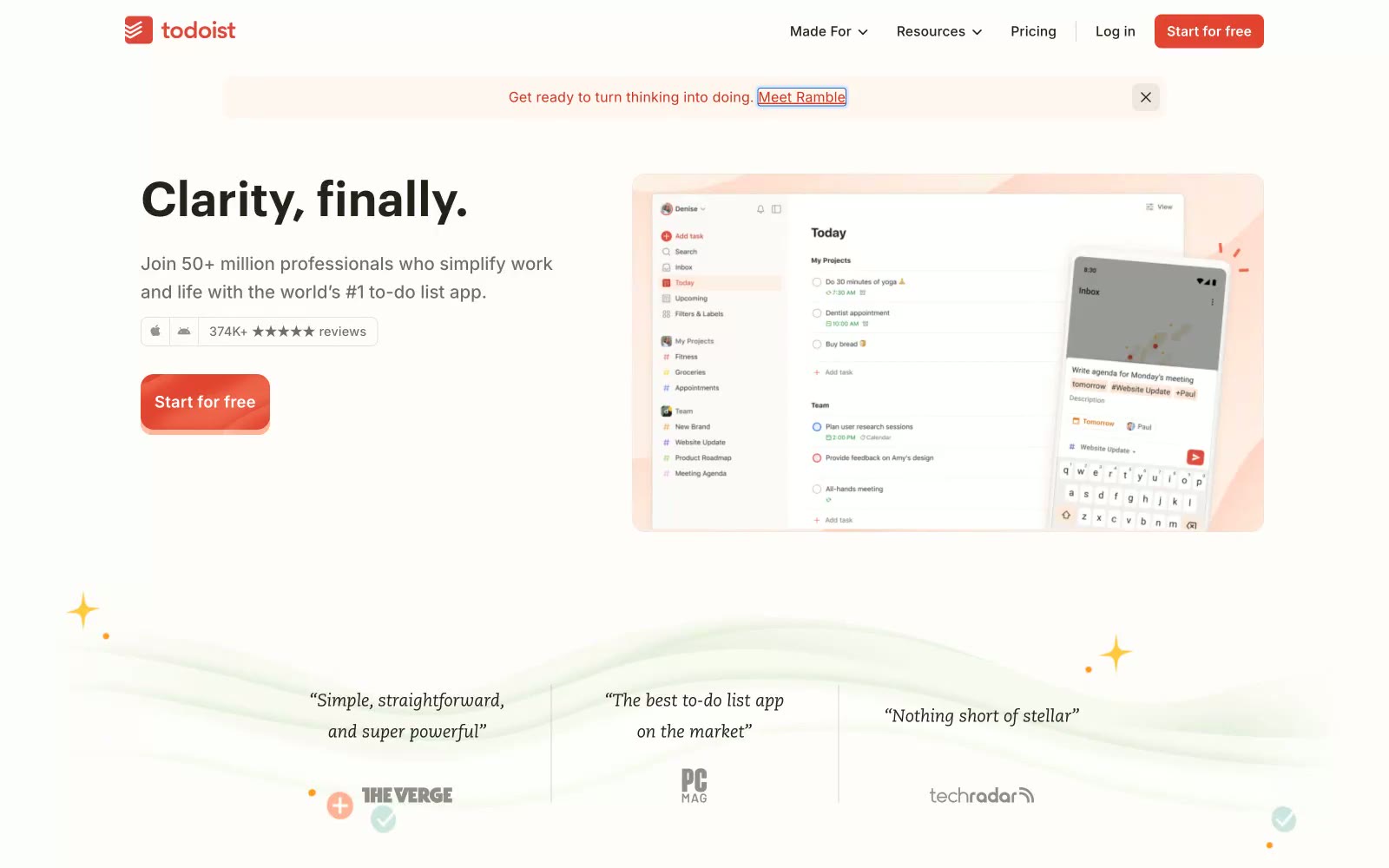
Todoist
Todoist — Style Reference
# Todoist — Style Reference
> Sunlit workspace with a paper planner — warm off-white desk, ink notes, one red pen
**Theme:** light
Todoist reads as a sunlit workspace with a paper planner: a warm off-white canvas, near-black ink text, and a single vivid red-orange accent that punctuates actions without dominating the frame. Typography is humanist and quiet — Graphik carries display sizes with tight negative tracking while Inter handles UI chrome with slightly positive tracking — so hierarchy comes from size and weight rather than color volume. Product screenshots and phone mockups float above cream-tinted decorative waves, creating atmosphere that never crosses into illustration noise. Color is rationed as functional punctuation: brand orange for one action per view, blue for links, green for status, with the rest of the screen holding still in warm neutrals. Elevation stays whisper-quiet — a single 1px hairline shadow on cards, no heavy panels or decorative gradients.
## Tokens — Colors
| Name | Value | Token | Role |
|------|-------|-------|------|
| Ember Red | `#e34432` | `--color-ember-red` | Orange supporting accent for decorative details and low-frequency emphasis. Do not promote it to the primary CTA color |
| Deep Ember | `#cf3520` | `--color-deep-ember` | Brand text emphasis, eyebrow labels, decorative iconography, secondary brand presence |
| Cobalt Link | `#0f66ae` | `--color-cobalt-link` | Hyperlinks, app-internal priority labels, informational icons |
| Ink | `#25221e` | `--color-ink` | Primary text, headings, dark icon strokes, dark surface fills |
Websites
Markdown Text
design-md
website-prompt
landing-page-prompt
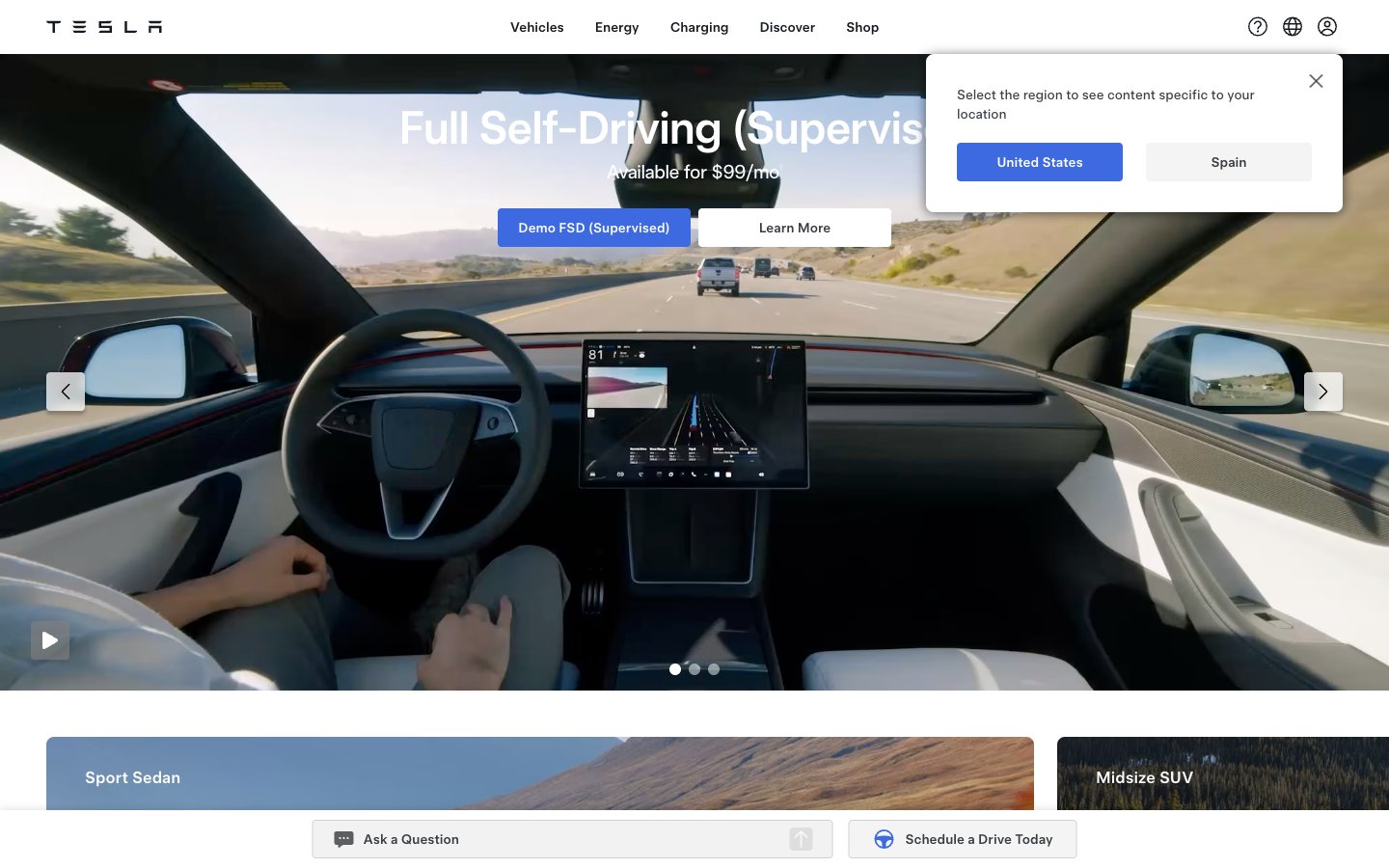
Tesla
Tesla — Style Reference
# Tesla — Style Reference
> Automotive Showroom on Screen. High-fidelity product visuals dominate, framed by a minimal, functional interface that gets out of the way.
**Theme:** light
The design operates like a premium automotive showroom translated to the screen. Every section is a full-bleed, cinematic product photograph, with UI elements acting as minimal, functional plaques. The palette is starkly achromatic, save for a single, electric Tesla Blue (#3e6ae1) reserved exclusively for primary calls-to-action, functioning like an ignition button. Typography is neutral and technical, serving information without asserting its own personality. This systematic subordination of UI to imagery ensures the product—the car, the solar panel—is always the undisrupted hero.
## Tokens — Colors
| Name | Value | Token | Role |
|------|-------|-------|------|
| Tesla Blue | `#3e6ae1` | `--color-tesla-blue` | Primary CTAs ('Order Now') — a single, focused point of saturated color in an otherwise grayscale environment, creating an unmissable action prompt. |
| Pure White | `#ffffff` | `--color-pure-white` | Primary page backgrounds, card surfaces, text on dark/blue buttons. |
| Off-White | `#eeeeee` | `--color-off-white` | Secondary content cards, subtle dividers between white sections. |
| Parchment | `#e5e3df` | `--color-parchment` | Rare alternative background color for specific sections. |
Websites
Markdown Text
design-md
website-prompt
landing-page-prompt
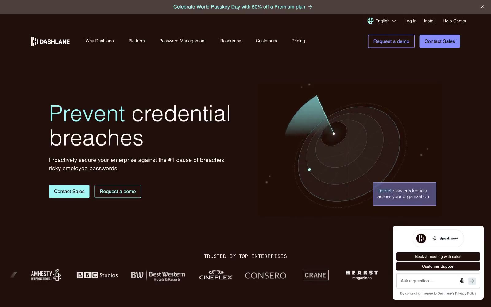
Dashlane
Dashlane — Style Reference
# Dashlane — Style Reference
> Midnight vault with mint keyholes.
**Theme:** dark
Dashlane is a dark, warm-toned security interface — a near-black cocoa canvas (#200f0a) with subtle plum depth, where mint (#a2f6f5) pierces the surface like a keyhole glow and violet (#858df9) plays the second voice. The system is built on one custom sans (Saans) that uses weight 300 for headlines and 500 for UI — a deliberate two-weight conversation that lets massive statistics whisper rather than shout. Surfaces sit on a warm scale from cocoa to deep aubergine, separated by hairline borders in muted beige (#e3ccc0) rather than cold grays. Components are pill-shaped for actions and 8px-rounded for cards; buttons feel like physical keys (9999px), never rectangles. The overall mood is 'midnight vault with a single lit doorway' — confident, restrained, with color appearing as small functional punctuation against an otherwise matte dark workspace.
## Tokens — Colors
| Name | Value | Token | Role |
|------|-------|-------|------|
| Cocoa Black | `#200f0a` | `--color-cocoa-black` | Page background, primary text on light surfaces — the warm near-black base; it has subtle brown warmth that distinguishes it from pure black and pairs with mint without vibrating |
| Cream Mist | `#fcfaf9` | `--color-cream-mist` | Primary body and heading text on dark surfaces, icon fills — soft off-white that reads as paper against cocoa |
| Warm Sand | `#e3ccc0` | `--color-warm-sand` | Hairline borders on cards and nav, subtle dividers — beige linework that defines edges without harshness |
| Ash Gray | `#e5e7eb` | `--color-ash-gray` | Secondary borders, image outlines, utility rules — neutral gray for the most abundant structural lines |
Websites
Markdown Text
design-md
website-prompt
landing-page-prompt
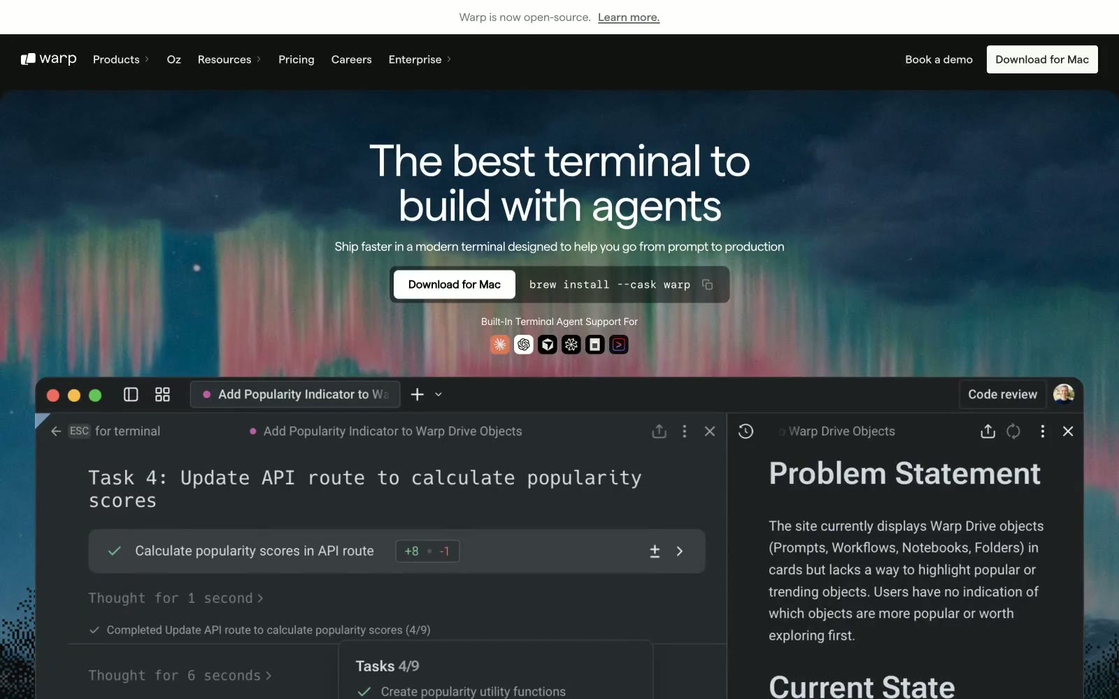
Warp
Warp — Style Reference
# Warp — Style Reference
> Deep-space command shell — a frosted obsidian cockpit where every pixel earns its place and color is a rare, meaningful signal.
**Theme:** dark
Warp operates in a deep charcoal universe: near-black canvas (#121212) layered with subtly lighter surfaces (#1e1e1d, #353534) and no shadows — elevation is communicated entirely through background-color steps. The primary typeface, Matter, does all the expressive heavy lifting: tight negative tracking at display sizes (-0.04em at 56-64px) whispers confidence rather than shouting, and the custom OpenType features (cv03, cv04, cv09, cv11) give it a precision-engineered feel that generic sans-serifs lack. Color is almost entirely absent — the one chromatic exception, a muted sage-green (#799c92), surfaces exclusively as an accent on section subheadings, making it feel like a terminal prompt color that escaped into the UI. The terminal product screenshot is the hero; the interface reproduces itself as marketing material, blurring the line between product and page.
## Tokens — Colors
| Name | Value | Token | Role |
|------|-------|-------|------|
| Void Canvas | `#121212` | `--color-void-canvas` | Primary page background, dominant surface beneath all content |
| Obsidian Deep | `#090909` | `--color-obsidian-deep` | Deepest layer — nav overlays, announcement bar background |
| Charcoal Surface | `#1e1e1d` | `--color-charcoal-surface` | Footer background, slightly elevated surface above canvas |
| Iron Surface | `#353534` | `--color-iron-surface` | Raised card surfaces, pill button backgrounds, interactive containers |
Websites
Markdown Text
design-md
website-prompt
landing-page-prompt
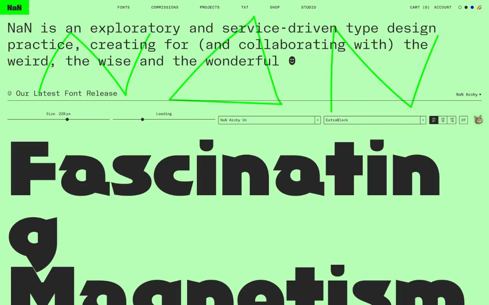
NaN
NaN — Style Reference
# NaN — Style Reference
> mint greenhouse of living letters — a pastel type lab where every headline is the product itself
**Theme:** light
NaN runs its website like a working specimen sheet: the mint-green canvas is the page, and the page is the product. Massive custom display faces (200-336px) are the visual architecture; a monospaced sans (NaN Holo Mono) set in uppercase with 0.075em tracking is the chrome that holds everything together. The palette is ruthlessly tight — one pastel canvas, near-black text (#262626, never pure black), one bright lime accent (#00ff00) for raw typographic flourishes, and a single pink-purple-blue gradient for the lone chromatic CTA. Borders do the work that shadows usually do: 1-2px hairlines define cards, inputs, and the type tester frame with no elevation. The interaction model is a live font tester — sliders for size and leading, dropdowns for family and weight — letting visitors steer the display in real time, which makes the site function as both storefront and demo.
## Tokens — Colors
| Name | Value | Token | Role |
|------|-------|-------|------|
| Mint Canvas | `#b7ffb4` | `--color-mint-canvas` | Page background, card surfaces — the signature pastel that makes dark type appear sunlit rather than printed |
| Lime Spark | `#00ff00` | `--color-lime-spark` | Decorative typographic flourishes and SVG scribble overlays — a raw signal-green that contrasts the pastel canvas without warming it |
| Carbon Ink | `#262626` | `--color-carbon-ink` | Primary text, borders, icon strokes, button outlines — softer than pure black, sits on mint without vibrating |
| Obsidian | `#000000` | `--color-obsidian` | Display-type fills at the largest sizes, pure-black SVG fills for the heaviest display specimens |
Websites
Markdown Text
design-md
website-prompt
landing-page-prompt
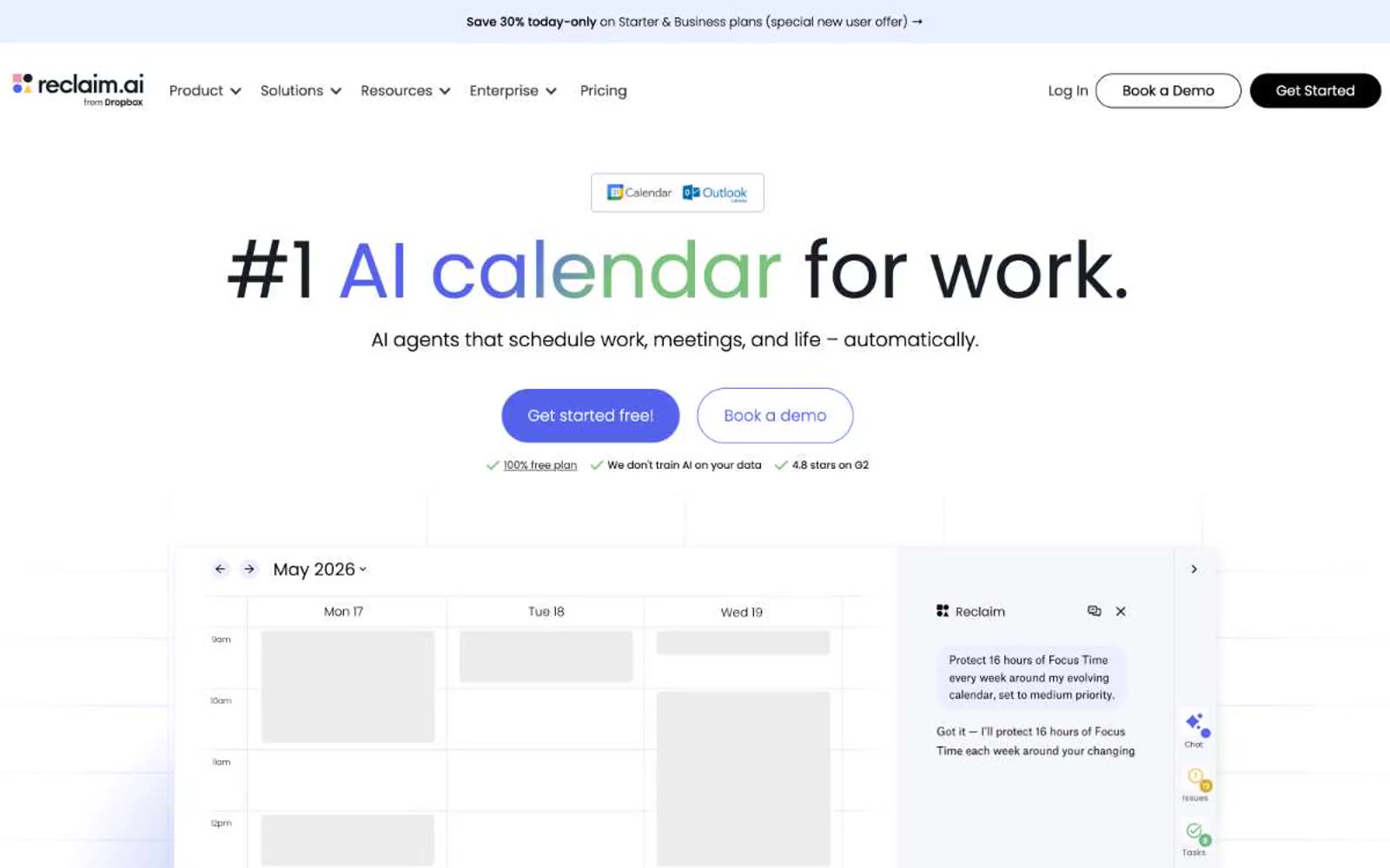
Reclaim
Reclaim — Style Reference
# Reclaim — Style Reference
> lavender productivity workshop with violet ink
**Theme:** light
Reclaim reads as a productivity tool that wants to feel friendly, not corporate. The canvas is a very pale lavender (#ebefff) that softens what could otherwise be a stark productivity app, with product surfaces staying pure white for contrast. A single vivid violet (#5562eb) drives every interactive moment — links, primary CTAs, focus states — while a matching vivid green (#7ac17b) appears as functional punctuation on the calendar visualization itself, not on controls. Typography is exclusively Poppins, used at extreme scale: 90px hero headlines with weight 300/400 whisper against the page, and tiny 11-12px body text that never feels utilitarian. Buttons are pill-shaped (100px radius) with stark black or pure violet fills — no gradients on controls. The overall feeling is "calm scheduling app, not enterprise software."
## Tokens — Colors
| Name | Value | Token | Role |
|------|-------|-------|------|
| Lavender Canvas | `#ebefff` | `--color-lavender-canvas` | Page background, hero section wash, footer background — the base atmosphere that distinguishes Reclaim from generic white SaaS |
| White Surface | `#ffffff` | `--color-white-surface` | Card surfaces, product mockup containers, button text on dark fills — pure white provides the resting layer above the lavender canvas |
| Midnight Ink | `#181d25` | `--color-midnight-ink` | Supporting neutral for secondary UI, dividers, and muted labels. Do not promote it to the primary CTA color |
| Pure Black | `#000000` | `--color-pure-black` | Dark supporting neutral for text, icons, and strong contrast. Do not promote it to the primary CTA color |
Websites
Markdown Text
design-md
website-prompt
landing-page-prompt
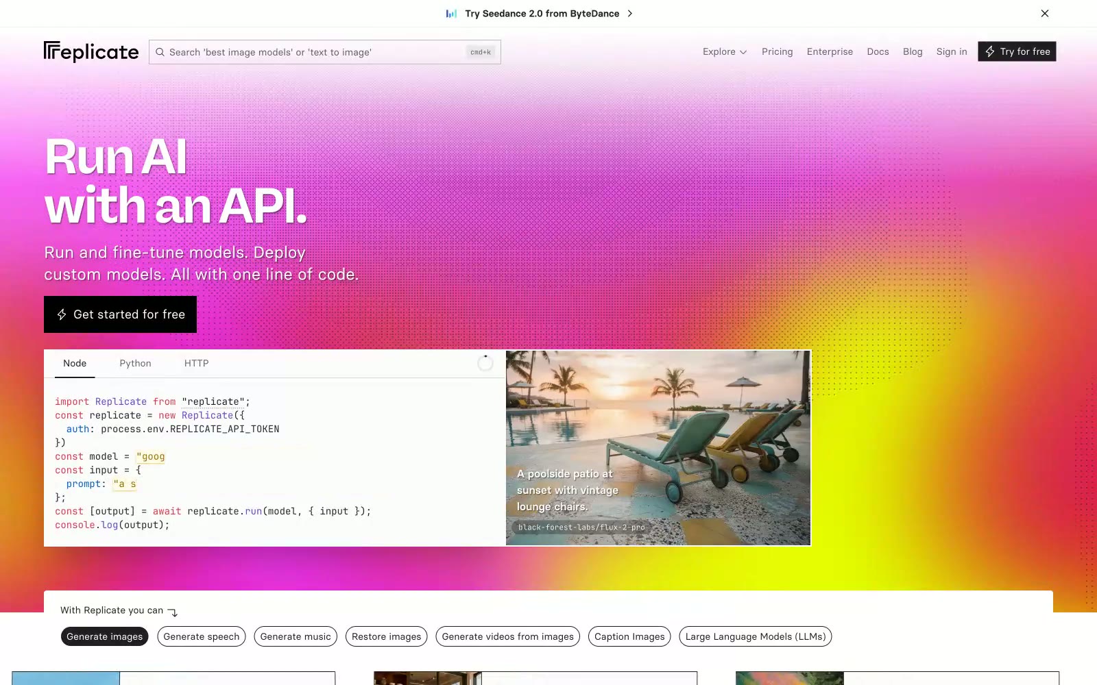
Replicate
Replicate — Style Reference
# Replicate — Style Reference
> Golden hour API workshop
**Theme:** light
Replicate projects a sunlit developer playground on white: one signature sunset gradient (magenta → ember → gold) anchors the hero, section borders, and brand moments, while every interactive surface dissolves into a pill (9999px radius). The system pairs a high-contrast display face (RB Freigeist Neue, up to 128px) for editorial headlines against Basier Square at 14–16px with -0.025em tracking for functional UI — two voices, one warm-white canvas. Code is first-class: GitHub-syntax editor cards live directly inside marketing layouts, not buried in docs. Color discipline is severe: nearly the entire interface is #202020 on #ffffff, with a single ember accent (#ea2804) appearing only inside the gradient and the logo mark. Shadows are essentially absent — flat surfaces and 1px hairline borders carry the elevation language instead.
## Tokens — Colors
| Name | Value | Token | Role |
|------|-------|-------|------|
| Sunset Gradient | `linear-gradient(135deg, #ff6bfc 0%, #ea2804 50%, #f6f47f 100%)` | `--color-sunset-gradient` | Hero background wash, section border frames, brand-mark dot grid — the only chromatic surface treatment in the system. Always at full saturation; never desaturated or muted; The single non-gradient accent — appears in the logo mark and the warm shadow tint. Never used for buttons, links, or text; its job is to anchor the gradient's red midpoint |
| Forest Signal | `#2b9a66` | `--color-forest-signal` | Green supporting accent for decorative details and low-frequency emphasis. Use as a supporting accent, not as a status color |
| Bone White | `#ffffff` | `--color-bone-white` | Page canvas, card surfaces, code editor background. The base layer everything sits on |
| Ink | `#202020` | `--color-ink` | Supporting neutral for secondary UI, dividers, and muted labels. Do not promote it to the primary CTA color |
Websites
Markdown Text
design-md
website-prompt
landing-page-prompt
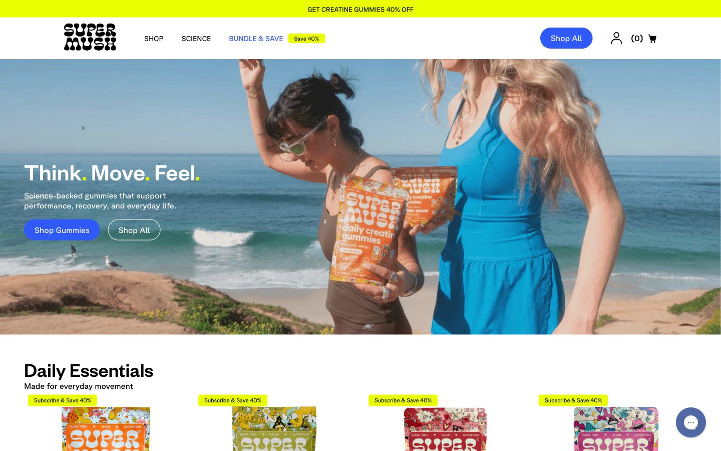
SuperMush
SuperMush — Style Reference
# SuperMush — Style Reference
> Sun-bleached skate ramp meets wellness billboard. Warm bone canvas, one electric blue action color, and full-bleed lifestyle photography that does the shouting.
**Theme:** light
SuperMush runs on a sun-drenched DTC wellness playbook: a warm bone canvas, electric cobalt as the singular action color, and a tri-color accent system (cobalt, ember orange, volt lime) that shouts without cluttering. Layout breathes between quiet white product grids and explosive full-bleed lifestyle photography, with colored bands — a lime promo bar up top, an orange retailer strip in the middle — acting as visual exclamation points. Typography is geometric and confident, leaning on tight line-heights at large sizes so headlines feel like stickers slapped onto the page rather than typed paragraphs. Components are flat and pill-shaped; the 50px button radius and near-total absence of shadows produce a tactile, high-energy feel that mirrors the packaging itself, and the orange product body color is allowed to bleed into the brand skin (retailer bar, sale flags) without ever crossing into button territory.
## Tokens — Colors
| Name | Value | Token | Role |
|------|-------|-------|------|
| Electric Cobalt | `#2f59f8` | `--color-electric-cobalt` | Primary action fills, active nav links, icon accents, link underlines. The only chromatic button color in the system — cobalt against the warm bone canvas makes every CTA feel switched on |
| Ember Orange | `#ff632a` | `--color-ember-orange` | Orange outline accent for tags, dividers, and focused UI edges. Do not promote it to the primary CTA color |
| Volt Lime | `#eaff00` | `--color-volt-lime` | Promotional and urgency surfaces: top sale bar, Subscribe & Save tags, sale-bubble accents on product cards. Reads as a highlighter against the warm canvas — use sparingly, never as a section background |
| Obsidian | `#000000` | `--color-obsidian` | Primary text, hairline borders, logo, icon strokes. The structural backbone — used aggressively for borders and dividers rather than reserving it for text alone |
Websites
Markdown Text
design-md
website-prompt
landing-page-prompt
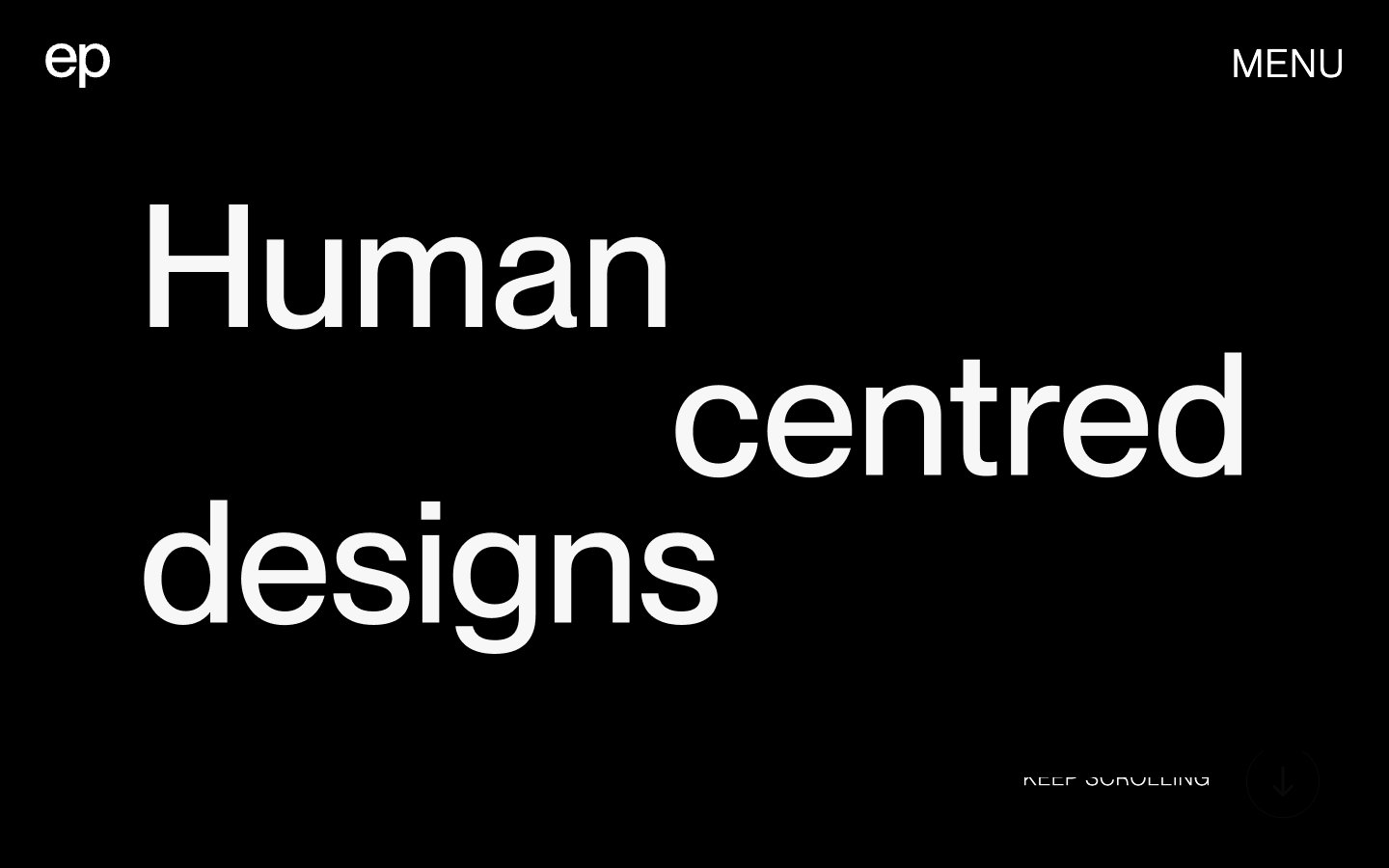
Elvina Prasad
Elvina Prasad — Style Reference
# Elvina Prasad — Style Reference
> Editorial monolith of light and shadow — enormous type carved into a binary canvas, with project imagery crashing into the letters.
**Theme:** mixed
A portfolio language built on typographic monumentality: massive Neue Montreal headlines that occupy the full width of the viewport, set against a binary canvas that flips between pure white and pure black across scrolling sections. The system is entirely achromatic — no brand color, no accent, no gradient — and lets scale, weight, and light/dark inversion do all the expressive work. Project imagery overlaps the type rather than sitting beside it, breaking the grid and making the text itself a compositional surface. Everything else is quiet: a two-letter monogram, a single nav word, a hairline scroll cue.
## Tokens — Colors
| Name | Value | Token | Role |
|------|-------|-------|------|
| Paper | `#ffffff` | `--color-paper` | Page background, light-section canvas, inverse-mode text on dark sections |
| Ink | `#000000` | `--color-ink` | Dark-section canvas, headline type on light sections, full-bleed background blocks |
| Graphite | `#333333` | `--color-graphite` | Body copy, secondary text, hairlines and card borders — the working neutral for content |
| Bone | `#f7f7f7` | `--color-bone` | Tinted surface for subtle elevation against the white canvas, used for off-white blocks and muted framing |
Websites
Markdown Text
design-md
website-prompt
landing-page-prompt
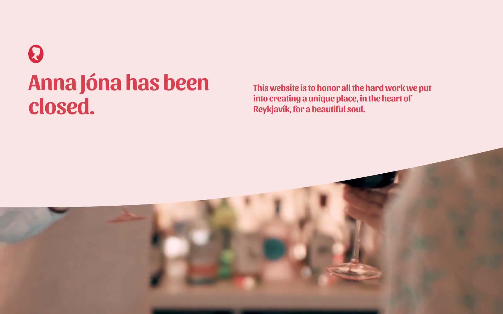
Anna Jóna
Anna Jóna — Style Reference
# Anna Jóna — Style Reference
> a love letter on blush paper
**Theme:** light
Anna Jóna speaks in a hushed, single-color voice: a blush-pink canvas washed warm and soft, with one vivid coral-red doing all the talking for type, icons, and accents. The page reads like a folded letter — generous whitespace, oversized display headings in a custom condensed serif, and angled full-bleed image cuts that bleed warm interior photography into the pink field. Every interface element is weightless: no shadows, no cards with elevation, no border treatments. Structure comes from typography scale and spatial rhythm alone, with large rounded shapes (90px) and a single pill button (300px) as the only geometric gestures. The mood is intimate, editorial, and slightly melancholic — a closing tribute rendered as quiet visual poetry.
## Tokens — Colors
| Name | Value | Token | Role |
|------|-------|-------|------|
| Blush Paper | `#fce1e3` | `--color-blush-paper` | Page canvas, section backgrounds, the warm field all content lives on |
| Coral Crimson | `#db404f` | `--color-coral-crimson` | All headings, body text, icons, and the sole action color — the entire voice of the brand |
| Midnight Ink | `#0e1736` | `--color-midnight-ink` | Deep accent for select surfaces and inverse contexts, a cool counterpoint to the warm field |
| Pure White | `#ffffff` | `--color-pure-white` | Image backgrounds, inline accents, negative space within photographs and cards |
Websites
Markdown Text
design-md
website-prompt
landing-page-prompt
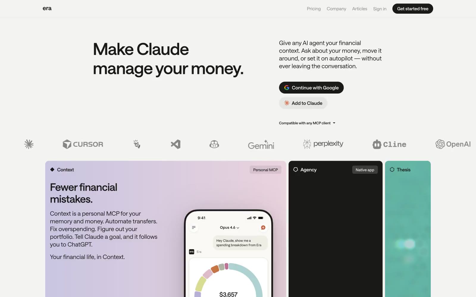
Era
Era — Style Reference
# Era — Style Reference
> Quiet ledger on warm paper
**Theme:** light
Era operates in a near-monochrome editorial register: a warm parchment canvas, ink-black typography, and just enough chromatic punctuation — a soft lavender wash, a teal panel, a black card — to make three product surfaces feel like distinct chapters in a printed financial document. The visual system privileges typographic confidence over decoration: a custom variable sans-serif at tight negative tracking carries all the weight, and the interface stays text-first, with components reduced to pill buttons, hairline borders, and flat cards with zero shadow. Every screen should feel like a well-typeset magazine spread — quiet authority, generous whitespace, and color appearing only when a surface needs to announce itself as a distinct product. Density is comfortable, not dense; the rhythm comes from large headlines and 16px padding breathing inside cards, not from packed information rows.
## Tokens — Colors
| Name | Value | Token | Role |
|------|-------|-------|------|
| Ink | `#191a17` | `--color-ink` | Primary text, filled CTA buttons, nav links, icon strokes, card borders — the near-black that carries the entire typographic and action system. Used as filled pill background for primary actions (white text) and as hairline border on outlined buttons |
| Parchment | `#f3f3f1` | `--color-parchment` | Page canvas background — a warm off-white that replaces pure white as the base surface, giving the entire site a paper-like editorial warmth rather than a clinical SaaS feel |
| Ash | `#e6e6e4` | `--color-ash` | Hairline borders, divider lines, footer borders, subtle surface elevation — the structural gray that separates content without ever competing with it |
| Paper | `#ffffff` | `--color-paper` | Light neutral action fill for buttons on dark surfaces. |
Websites
Markdown Text
design-md
website-prompt
landing-page-prompt
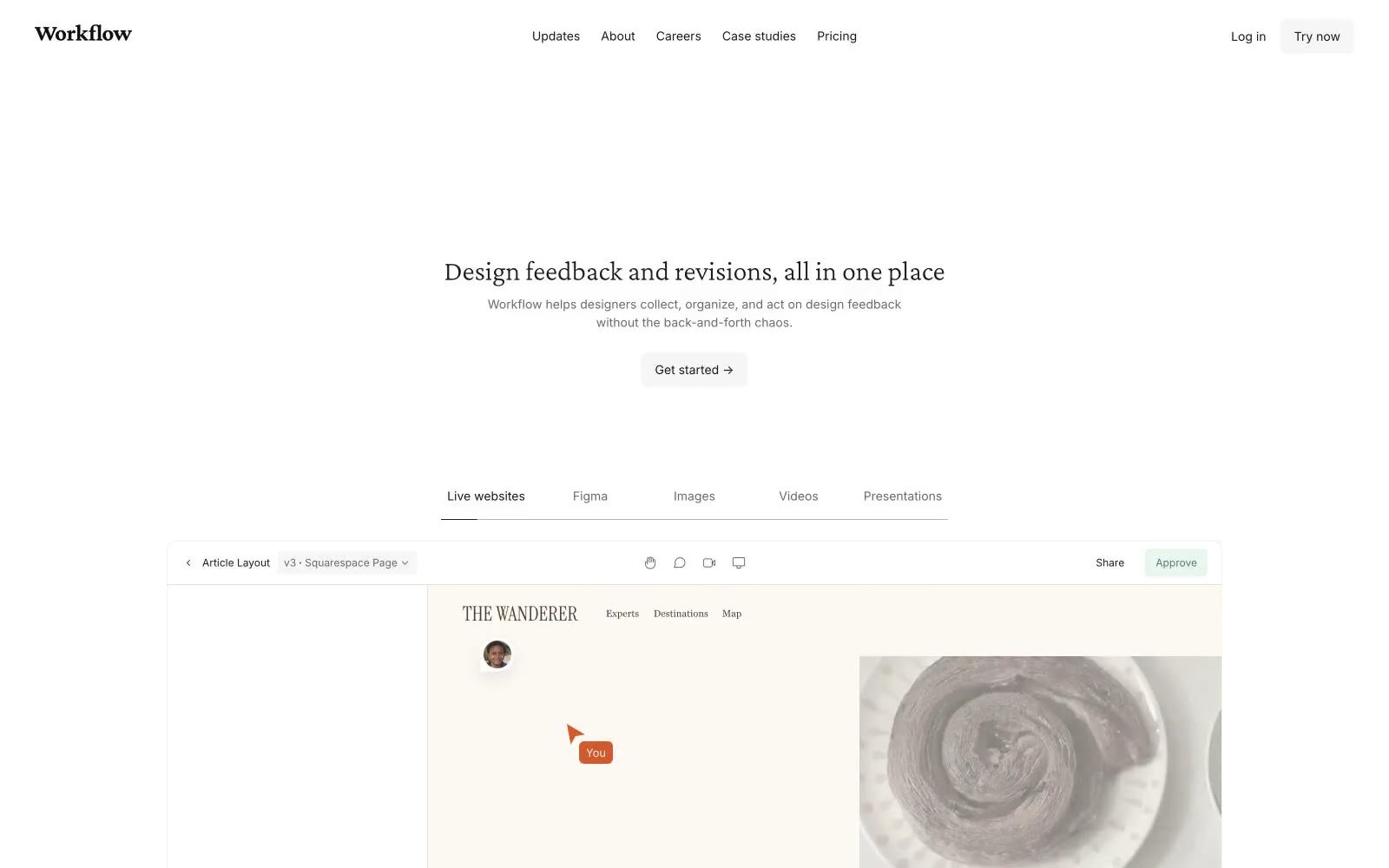
Workflow
Workflow — Style Reference
# Workflow — Style Reference
> editorial manuscript on warm linen — a designer's working notebook spread open on white paper
**Theme:** light
Workflow uses an editorial-manuscript language: a white paper canvas, whisper-weight serif headlines in Crimson Pro 300, and Inter as the working sans for body and UI. The palette is aggressively monochrome — nearly every surface is white, off-white, or warm gray, with the only chromatic note being a dusty sage green used as functional punctuation (active states, approved indicators). Components are thin and flat: hairline borders, 4–8px radii, and shadows so faint they barely register. The aesthetic reads more like a printed design quarterly than a SaaS dashboard — authority comes from typographic restraint and generous whitespace, not from saturated color or heavy elevation. An AI agent building for this brand should treat serif headings at weight 300 as the signature move, keep color to near-zero, and let borders and spacing do the structural work.
## Tokens — Colors
| Name | Value | Token | Role |
|------|-------|-------|------|
| Ink Black | `#1a1a1a` | `--color-ink-black` | Primary text, icon strokes, card and section borders, nav links |
| Paper White | `#ffffff` | `--color-paper-white` | Page canvas, card surfaces, button text on dark fills |
| Graphite | `#6a6a6a` | `--color-graphite` | Secondary text, helper copy, muted borders, image strokes |
| Warm Charcoal | `#4d3f32` | `--color-warm-charcoal` | Warm-toned text and borders — the brown-tinted dark used where the system needs a softer, paper-friendly alternative to pure black |
Websites
Markdown Text
design-md
website-prompt
landing-page-prompt
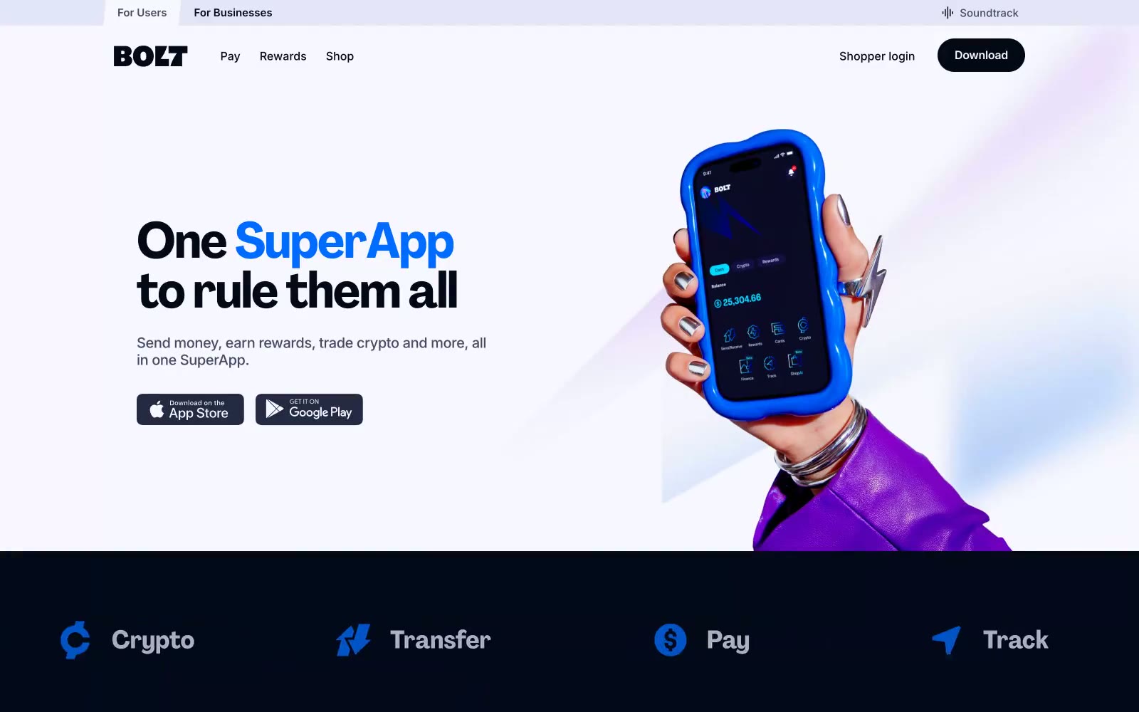
Bolt
Bolt — Style Reference
# Bolt — Style Reference
> Electric lavender at dawn. A hushed lilac canvas wakes up to a single jolt of vivid blue — the rest of the world stays cool gray, letting the brand mark and its lightning typography do the talking.
**Theme:** mixed
Bolt's design language pairs a quiet lavender-tinted canvas with an electric blue accent, creating a fintech super-app that feels calm yet charged. A custom display face (agrandir-bolt) carries the brand voice with bold geometric character forms — note the lightning-bolt cutouts in the B — while Inter handles all functional UI text at tight tracking. Sections alternate between airy light surfaces and deep midnight-navy blocks, with the brand blue reserved exclusively for action surfaces, active states, and key word emphasis within headlines. Components are minimal: pill-shaped buttons, hairline borders, no shadows, and generous whitespace that lets photography and oversized brand typography breathe.
## Tokens — Colors
| Name | Value | Token | Role |
|------|-------|-------|------|
| Lilac Mist | `#f8f6fe` | `--color-lilac-mist` | Page canvas and hero backgrounds — a barely-there lavender tint keeps the light theme from feeling sterile and gives Bolt its signature pastel warmth |
| Midnight Ink | `#04091a` | `--color-midnight-ink` | Dark borders and separators for elevated surfaces and inverted UI. Do not promote it to the primary CTA color |
| Deep Navy | `#111426` | `--color-deep-navy` | Dark section backgrounds (centered statement block, footer) and dark badge fills — slightly lighter than Midnight Ink to create a two-tone dark system |
| Slate | `#454a66` | `--color-slate` | Secondary text and icon strokes — cool mid-gray for descriptions, helper text, and inactive iconography |
Websites
Markdown Text
design-md
website-prompt
landing-page-prompt
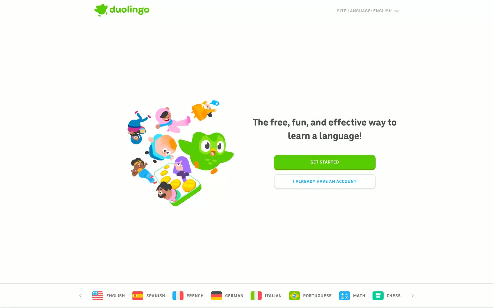
Duolingo
Duolingo — Style Reference
# Duolingo — Style Reference
> Playground Starter Kit
**Theme:** light
The design feels like an energetic, gamified classroom. Its core is built on a trinity of exuberant choices: the plump, ultra-rounded 'Feather' headline font, the vibrant 'Duo Green' that saturates all primary actions and logos, and the cast of charming, blob-like character illustrations. The layout uses vast white space as a clean canvas, making these colorful elements pop. A signature detail is the 3D-style button, which uses a solid bottom shadow to feel tactile and pressable, a stark contrast to the otherwise flat UI. The entire experience is crafted to feel fun, friendly, and encouraging, turning language learning from a chore into a game.
## Tokens — Colors
| Name | Value | Token | Role |
|------|-------|-------|------|
| Duo Green | `#58cc02` | `--color-duo-green` | Primary CTAs, logos, headlines, interactive highlights — the brand's key signifier of action and identity. |
| Sky Blue | `#1cb0f6` | `--color-sky-blue` | Secondary outline buttons, inline text links — provides a clear, alternative interactive cue. |
| Duo Green Light | `#d7ffb8` | `--color-duo-green-light` | Background tints for highlighted or active states, often paired with Duo Green. |
| Sunshine Yellow | `#ffc700` | `--color-sunshine-yellow` | Used exclusively within illustrations for pops of warmth and energy. |