AI Prompt Studio - Intelligent Prompt Library
Explore and use professional AI prompts to optimize your workflow.
One-click Use
Websites
Markdown Text
design-md
website-prompt
landing-page-prompt
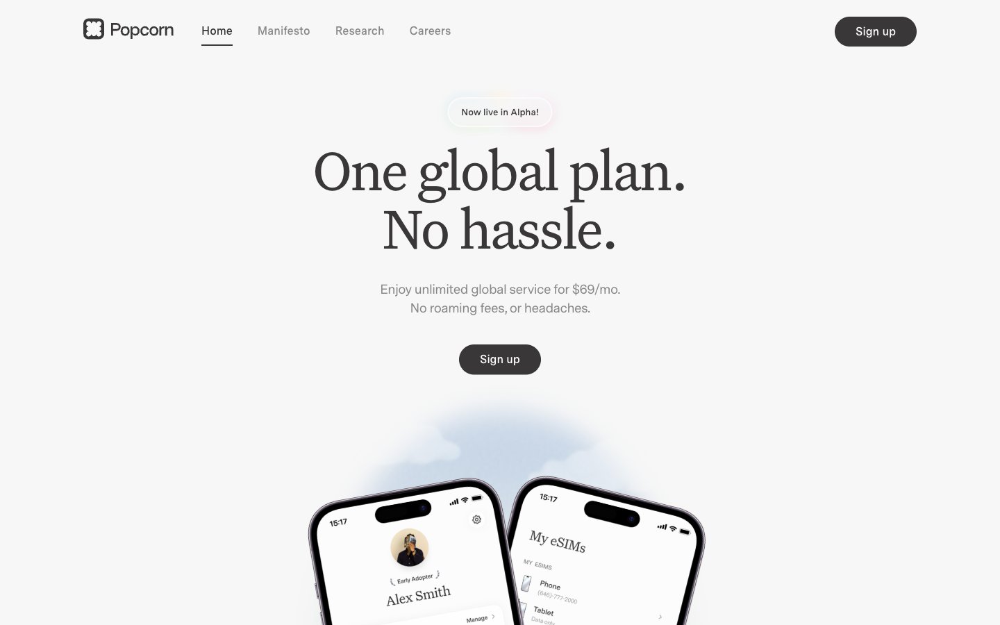
Popcorn
Popcorn — Style Reference

# Popcorn — Style Reference
> warm broadsheet on cream paper — a near-monochrome editorial where a single serif headline does all the emotional work and everything else whispers in warm gray
**Theme:** light
Popcorn operates as a warm editorial-monochrome system: a creamy off-white canvas (#f7f7f7) carries a near-black warm gray for type (#393737) and a dual-font pairing where Untitled Serif at 64–88px acts as broadsheet display and Messina Sans handles every functional role underneath. The two custom typefaces — a high-contrast serif and a humanist sans — create an editorial gravitas rarely seen in telecom, and the aggressive negative tracking on display sizes tightens the headlines into confident blocks rather than decorative flourishes. Color is nearly absent (2% colorfulness); the system relies on scale contrast, tight tracking, and one soft drop shadow (rgba(0,0,0,0.05) 0 4px 20px) to build hierarchy. Interactive elements are uniformly pill-shaped (100px radius) to create a soft humanistic counterpoint to the formal type, while a conic gradient and a lavender testimonial band provide the only chromatic punctuation.
## Tokens — Colors
| Name | Value | Token | Role |
|------|-------|-------|------|
| Warm Graphite | `#393737` | `--color-warm-graphite` | Neutral form states, badge text, and quiet UI feedback where color should stay understated. Do not promote it to the primary CTA color |
| Cream Canvas | `#f7f7f7` | `--color-cream-canvas` | Page background, badge fills, soft surface wash. The dominant canvas color — warmer than pure white, gives the serif type a paper-like substrate to sit on |
| Paper White | `#ffffff` | `--color-paper-white` | Hairline borders, dividers, input outlines, and card edges on light surfaces. |
| Fog Gray | `#888787` | `--color-fog-gray` | Muted helper text, secondary borders, inactive link text. The mid-tone that separates supporting copy from primary text without introducing color |
Websites
Markdown Text
design-md
website-prompt
landing-page-prompt
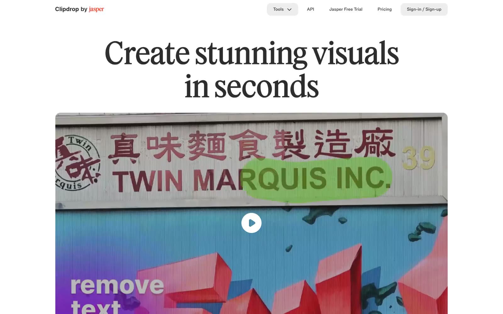
Clipdrop
Clipdrop — Style Reference
# Clipdrop — Style Reference
> photo studio on bone paper
**Theme:** light
Clipdrop reads like a contemporary art-book spread rendered as a working tool: bone-white canvas, oversized editorial serif headlines, a single vivid cobalt for actions, and generous negative space that lets the image-heavy content breathe. Surfaces are flat and borderless, with the visual system doing its work through typography, a 16px card radius, and pill-shaped controls rather than shadows or gradients. The checkerboard transparency pattern in the hero establishes the brand's image-tool DNA without competing with the photography. Color is rationed — almost the entire interface lives in three near-blacks and an off-white, with cobalt blue and a single warm orange used as precise functional punctuation for primary actions and brand marks.
## Tokens — Colors
| Name | Value | Token | Role |
|------|-------|-------|------|
| Cobalt Signal | `#1c60f6` | `--color-cobalt-signal` | Violet action color for filled buttons, selected navigation states, and focused conversion moments |
| Ember Vermillion | `#fa4028` | `--color-ember-vermillion` | Brand mark accent, the Jasper wordmark stem, and the rare warm fill. Used sparingly so it never dilutes the cobalt's primacy as the action color |
| Midnight Ink | `#24355c` | `--color-midnight-ink` | Deep navy-violet for icon fills and emphasis body copy. Sits between black and cobalt in the chromatic hierarchy — a quieter alternative to pure black when an element needs a hint of brand color |
| Periwinkle Mist | `#c9d7f5` | `--color-periwinkle-mist` | Soft lavender-blue used as a ghost/secondary button surface. Reads as a desaturated echo of Cobalt Signal — the same hue at low saturation, signaling a non-primary action without going neutral |
Websites
Markdown Text
design-md
website-prompt
landing-page-prompt
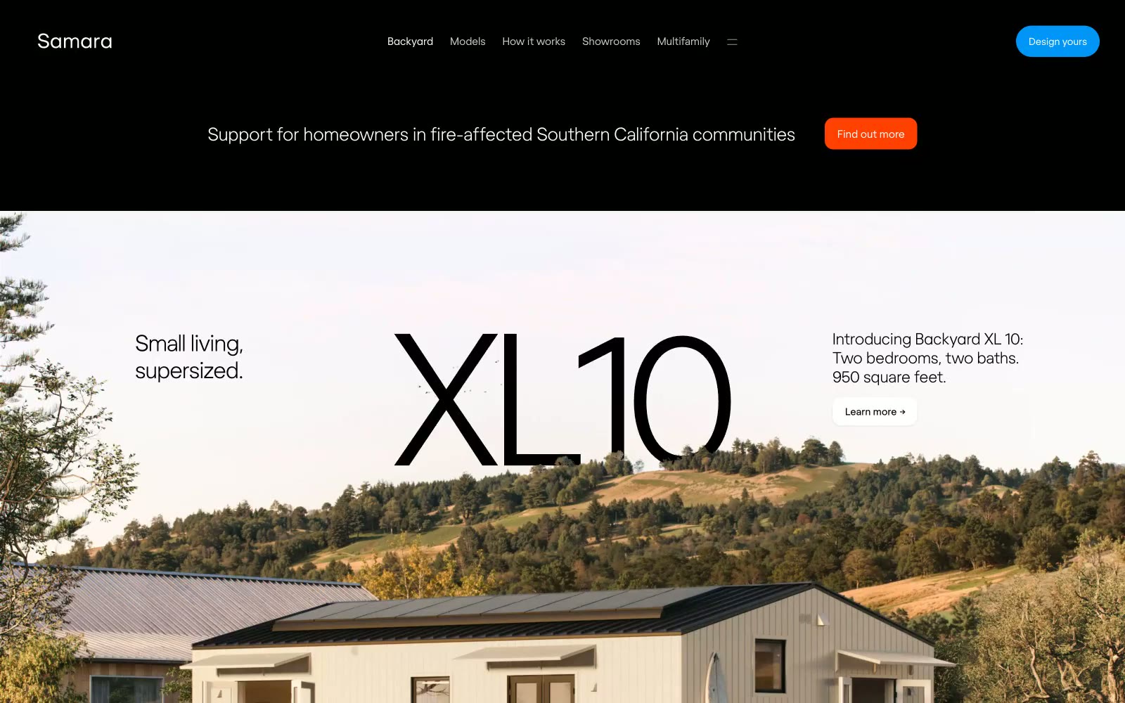
Samara
Samara — Style Reference
# Samara — Style Reference
> Sunlit architectural model. The design combines the precision of a blueprint with the warmth and airiness of natural light.
**Theme:** light
The design feels like an architectural plan rendered on warm, premium paper. It establishes authority through restraint, using vast negative space and a whisper-thin display font (Regola Light) for headlines, making them feel expansive and considered rather than loud. The palette is strictly controlled: a warm off-white (#fdfdf7) background, black ink for text, and a single, vibrant Sky Blue (#0096f7) for all primary actions. This creates a calm, focused environment where the product—modern, livable spaces—is the hero. Soft 12px radii on cards and buttons provide a touch of organic friendliness to the otherwise precise, geometric typography.
## Tokens — Colors
| Name | Value | Token | Role |
|------|-------|-------|------|
| Sky Blue | `#0096f7` | `--color-sky-blue` | Primary CTAs, interactive links, iconography — a single point of vivid color signifying action. |
| Signal Orange | `#ff4000` | `--color-signal-orange` | Secondary high-visibility CTAs, often used in dark contexts for urgent calls to action. |
| Ink | `#000000` | `--color-ink` | Headlines, body text, UI labels. |
| Pure White | `#ffffff` | `--color-pure-white` | Text on dark or colored backgrounds, button text. |
Websites
Markdown Text
design-md
website-prompt
landing-page-prompt
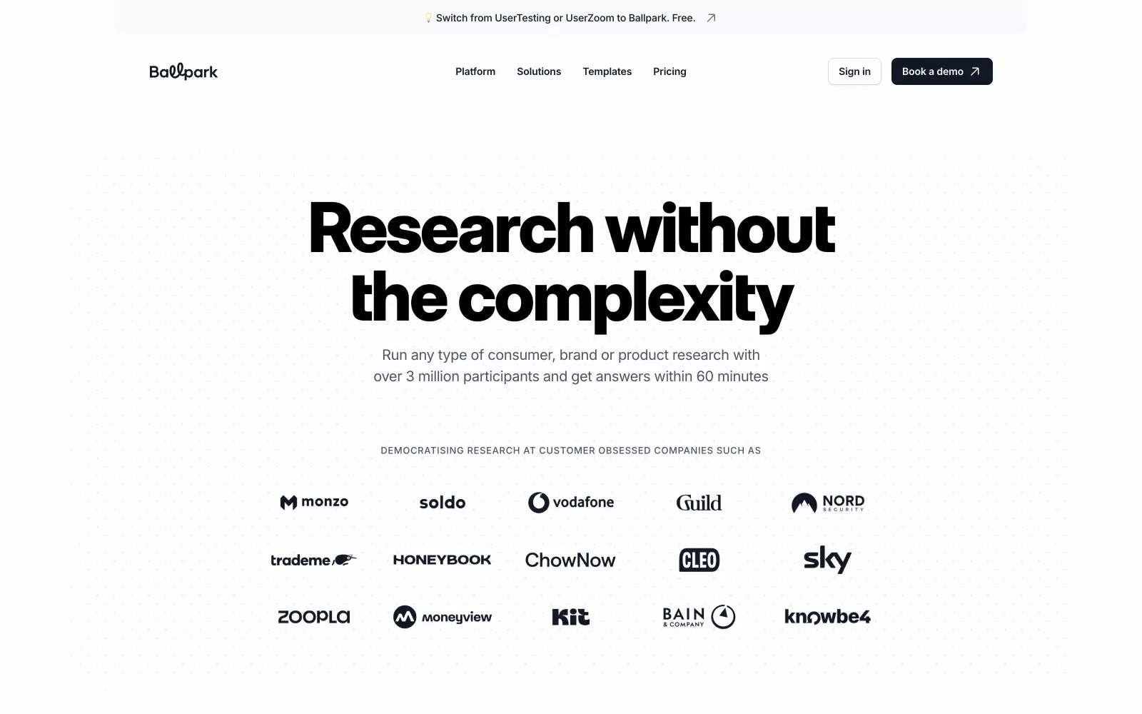
Ballpark
Ballpark — Style Reference
# Ballpark — Style Reference
> editorial white studio, single vermilion flare
**Theme:** light
Ballpark uses a confident, editorial research-platform language: a near-pure white canvas, oversized grotesque display headlines, and a single warm vermilion accent (#fc4a2b) that fires across borders, highlights, and icon strokes. The system feels quiet by default — almost every surface is white or whisper-gray — and lets the orange act as a small, functional flash against monochrome typography. Components are flat and pill-leaning: floating rounded tags, hairline-bordered cards, and a dark CTA that grounds the page against the airy type. The result reads like a magazine spread that happens to be a SaaS homepage — weight, scale, and one chromatic note doing all the work.
## Tokens — Colors
| Name | Value | Token | Role |
|------|-------|-------|------|
| Vermilion Flame | `linear-gradient(268.33deg, rgb(252, 74, 43), rgb(255, 126, 103), rgb(255, 172, 158), rgb(255, 206, 198))` | `--color-vermilion-flame` | Brand accent — borders, highlight strokes, icon fills, small inline emphasis marks. The only saturated color in the system; appears as punctuation, never as a wash; Brand-to-tint linear gradient — appears as a full-bleed color bar behind embedded product screenshots |
| Ember Pulse | `#ea3718` | `--color-ember-pulse` | Deeper vermilion variant — icon glyphs and small filled marks where the primary accent needs more weight against white |
| Tangerine Signal | `#f97316` | `--color-tangerine-signal` | Secondary warm accent — decorative strokes and illustration outlines that sit beside the primary vermilion |
| Coral Blush | `#ffac9e` | `--color-coral-blush` | Soft warm fill — subtle wash backgrounds, shadow tints that carry the brand's warmth without screaming |
Websites
Markdown Text
design-md
website-prompt
landing-page-prompt
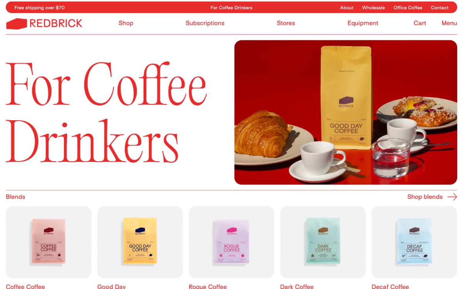
Redbrick Coffee
Redbrick Coffee — Style Reference
# Redbrick Coffee — Style Reference
> Scarlet ink editorial on butcher paper
**Theme:** light
Redbrick is an editorial coffee storefront printed in scarlet ink on warm white pages. The system is defined by a single aggressive red (#e82c2a) that saturates every interactive surface — logo, nav text, section labels, borders, arrows, and the announcement bar — while the page canvas stays creamy white and cards sit on soft #f2f2f2 surfaces. Display headlines are a weight-300 didone-adjacent serif (Editorial Old) at extraordinary sizes (100–150px) with near-1.0 line-height, letting the letterforms breathe without bold weight. Body and UI copy use a humanist sans (Surt) with consistent positive tracking, giving even short labels a printed, typeset quality. Photography is overhead lifestyle — wooden tables, open books, espresso machines, hands cradling cups — warm and editorial rather than glossy e-commerce. Layout alternates half-width image and text blocks, anchored by tiny uppercase section labels and right-aligned arrow links that behave like magazine running heads.
## Tokens — Colors
| Name | Value | Token | Role |
|------|-------|-------|------|
| Brick Red | `#e82c2a` | `--color-brick-red` | Red accent for outlined action borders, linked labels, and lightweight interactive emphasis. Do not promote it to the primary CTA color |
| Press Black | `#212529` | `--color-press-black` | Primary body and paragraph text, hero supporting text, and darkest surface accents where deeper contrast than white-on-red is needed |
| Cream White | `#ffffff` | `--color-cream-white` | Page canvas, image backgrounds, nav fill, and card surface base — the warm white that makes Brick Red feel printed rather than digital |
| Soft Grey | `#f2f2f2` | `--color-soft-grey` | Product card surface and elevated panels, one subtle step below the white canvas to separate scrolled content blocks |
Websites
Markdown Text
design-md
website-prompt
landing-page-prompt
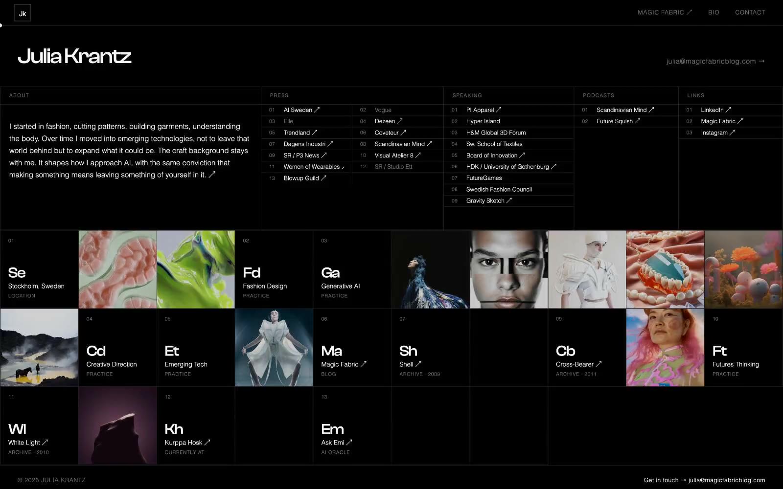
Julia Krantz
Julia Krantz — Style Reference
# Julia Krantz — Style Reference
> Darkroom contact sheet — a grid of photographic tiles on pure black, identity spelled in barely-visible weight-300 letterforms.
**Theme:** dark
Julia Krantz's portfolio operates like a darkroom contact sheet — dense grid of image tiles on near-black, with stark white typography hovering over photography. The canvas is #000000, surfaces are pure darkness, and the only warmth comes from the photographic content inside each tile. Typographic restraint is extreme: ClashDisplay at weight 300 for large display initials (the abbreviated project codes 'Se', 'Fd', 'Ga') creates a barely-there identity mark, while DM Sans at weight 300 handles all body and navigation at 10-14px with wide tracking. The grid is the interface — a mosaic of image tiles with 1px solid rgba(248,248,248,0.12) borders separating them, no rounded corners anywhere, no shadows, no gradients. Color is entirely absent from the UI layer; all chromatic interest is delegated to the photography.
## Tokens — Colors
| Name | Value | Token | Role |
|------|-------|-------|------|
| Void | `#000000` | `--color-void` | Page canvas, all section backgrounds — the true floor of the UI; every element floats above absolute black |
| Salt | `#f8f8f8` | `--color-salt` | All text, links, nav labels, borders, icons — the single foreground tone serving every text and UI edge function against black |
| Ash | `#707070` | `--color-ash` | Secondary labels, muted nav text, subdued body copy — mid-tone for visual hierarchy without introducing any hue |
| Ghost Line | `rgba(248,248,248,0.12)` | `--color-ghost-line` | Grid tile borders, dividers — rgba(248,248,248,0.12) at 12% opacity; nearly invisible structural seams |
Websites
Markdown Text
design-md
website-prompt
landing-page-prompt
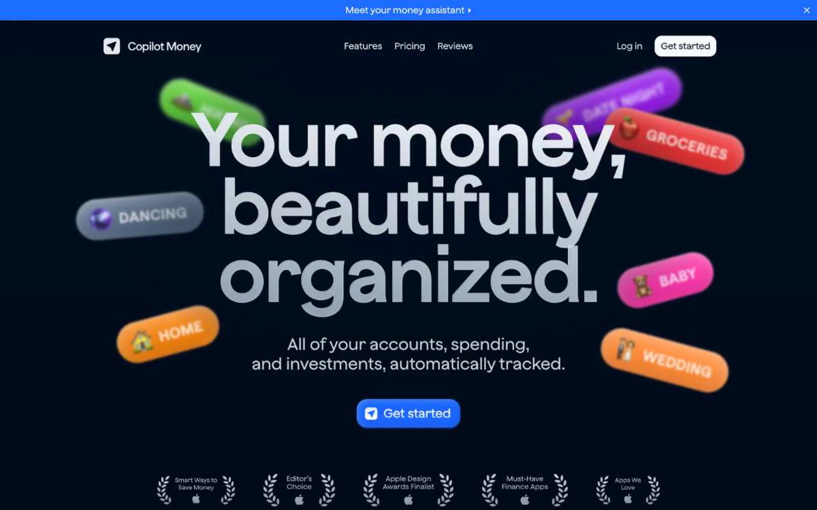
Copilot Money
Copilot Money — Style Reference
# Copilot Money — Style Reference
> Scattered neon tags over a midnight vault — a black canvas where a few candy-colored labels drift at playful angles, each glowing like an airport departure sign.
**Theme:** dark
Copilot Money is a midnight-canvas finance app where the interface stays dark, quiet, and nearly monochrome while a playful parade of candy-colored category tags — groceries, baby, wedding, home — float at jaunty angles around the hero, providing the only visual noise the page allows. Typography is the other signature: body copy at weight 100 in Matter Variable Thin creates a whisper-thin, almost-printed-on-vellum feeling, while Jokker display headings at 148px deliver structural authority through sheer scale rather than weight. A single vivid blue (#1c6cff) punctuates the darkness as the only call to action. Surfaces are given depth through layered inset shadows rather than drop shadows — a neomorphic approach that keeps the UI feeling pressed into the dark plane rather than floating above it.
## Tokens — Colors
| Name | Value | Token | Role |
|------|-------|-------|------|
| Midnight Canvas | `#000814` | `--color-midnight-canvas` | Page background, hero canvas, base layer of the dark plane |
| Deep Surface | `#010d1e` | `--color-deep-surface` | First elevated surface tier above the canvas — cards, panels, nav wells |
| Indigo Surface | `#001533` | `--color-indigo-surface` | Second elevated surface — deeper blue tint for nested containers and highlighted panels |
| Cobalt Surface | `#00215e` | `--color-cobalt-surface` | Glow-tier surface for featured blocks, highlighted links, and deep elevation wells |
Websites
Markdown Text
design-md
website-prompt
landing-page-prompt
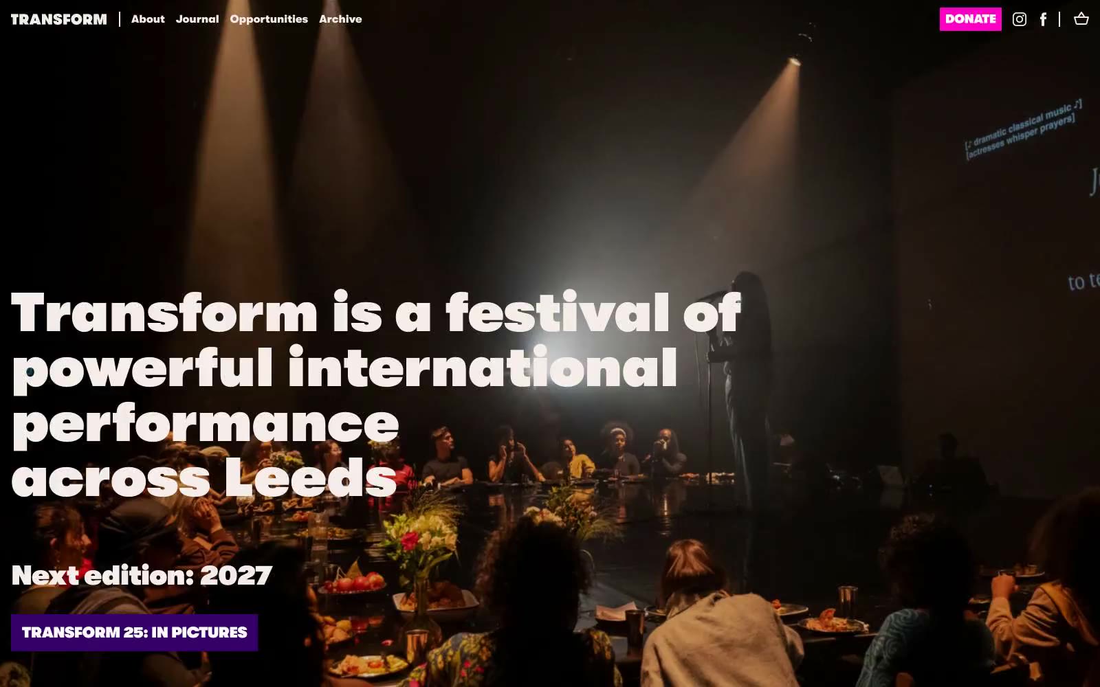
Transform
Transform — Style Reference
# Transform — Style Reference
> stage poster pinned to warm blush paper
**Theme:** light
Transform uses a theatrical broadside language: a warm blush cream canvas carries the entire site while oversized geometric headlines shout in heavy Walsheim weights. The palette is intentionally limited to three loud accents — spotlight magenta, festival violet, and stage orange — deployed like a punk poster printer's ink set, each one earning its place on a flat, unshadowed surface. Depth comes from full-bleed color blocking, not elevation, so sections read like clipped broadsheets stacked on warm paper. Components are weighty and rectangular; only links and a few interactive chips receive the 50px pill radius, making them feel like stickers pressed onto the page. Typography does the emotional work: weight 700–900 at 56–80px carries theatrical volume, while tight -0.02em tracking keeps the heavy forms from sprawling.
## Tokens — Colors
| Name | Value | Token | Role |
|------|-------|-------|------|
| Blush Cardstock | `#f4ede9` | `--color-blush-cardstock` | Page background, nav surface, dominant canvas — the warm paper everything sits on |
| Ink Black | `#000000` | `--color-ink-black` | Primary text, section headings, hairline borders, icon strokes |
| Paper White | `#ffffff` | `--color-paper-white` | Card surface, dark-section text, button labels on chromatic fills |
| Ash Gray | `#d9d9d9` | `--color-ash-gray` | Alternate card surface when a quieter neutral block is needed |
Websites
Markdown Text
design-md
website-prompt
landing-page-prompt
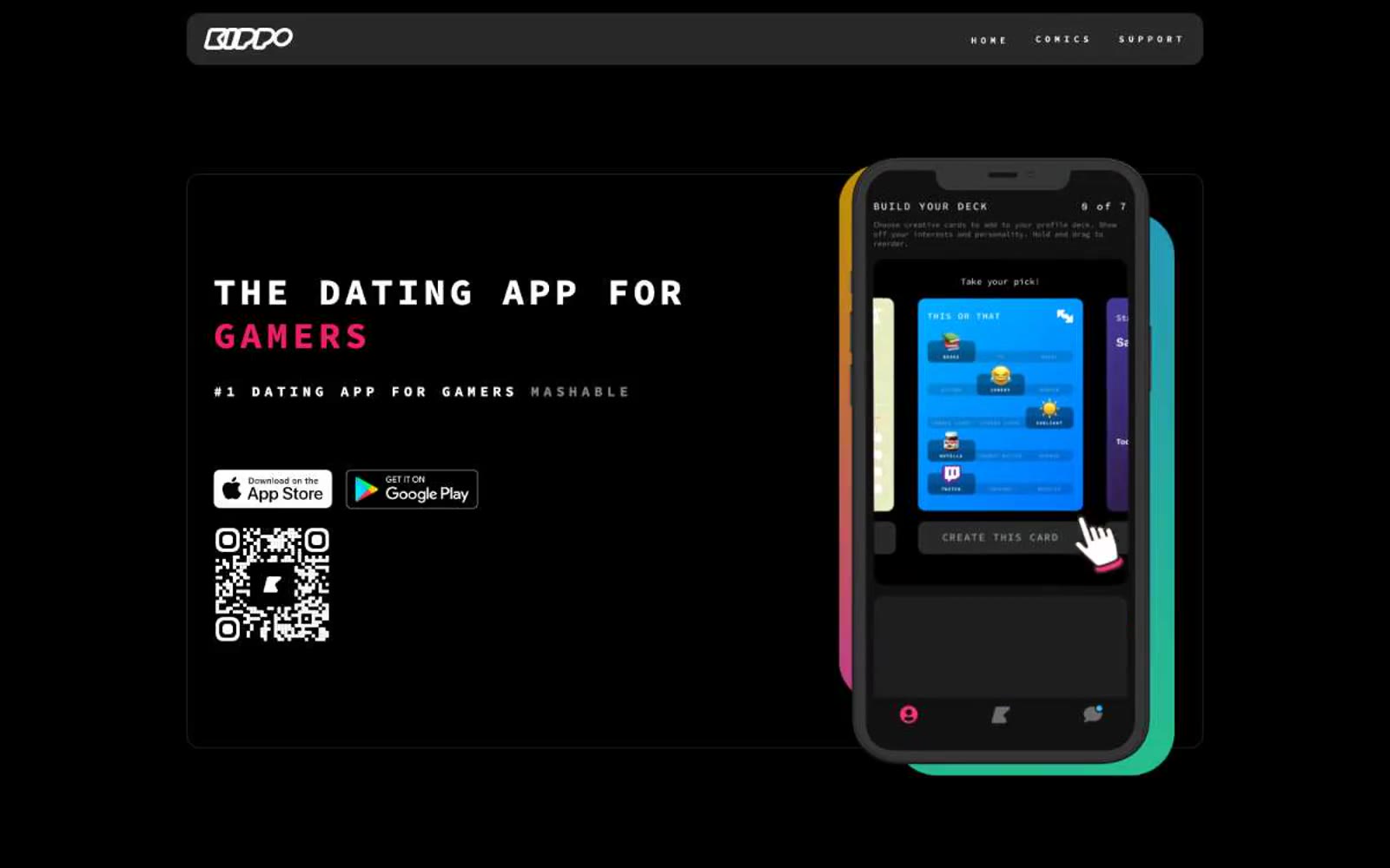
Kippo
Kippo — Style Reference
# Kippo — Style Reference
> Pixel arcade boot screen in a black void. Monospace glyphs traced in white neon against a pure black void, with a single hot-pink power-up color that should feel rare and electric when it appears.
**Theme:** dark
Kippo is a neon-on-black arcade: a pitch-black canvas where every element is drawn as a thin white outline or rendered in a single hot magenta accent. Typography is exclusively monospace (Source Code Pro) at every size — a deliberate shout to the gamer subculture that refuses to be dressed up in a humanist sans. Display text sits in all-caps with generous tracking, evoking a CRT boot screen or a chat log header. Cards are transparent panels defined only by a 1px white border, never by fill or shadow — the page reads as a wireframe brought to life. The single chromatic accent (#ee1f66) is rationed sparingly: the word 'GAMERS', CTA buttons, and small badges — making each pink element feel like a power-up on a dark screen.
## Tokens — Colors
| Name | Value | Token | Role |
|------|-------|-------|------|
| Kippo Pink | `#ee1f66` | `--color-kippo-pink` | Primary action background, accent headings, active badges — the only chromatic voice in the system, rationed to feel like a power-up rather than a brand wash |
| Void Black | `#000000` | `--color-void-black` | Page canvas, card backgrounds, image fills — the infinite dark that everything else floats on |
| Carbon | `#29292a` | `--color-carbon` | Elevated card surfaces and secondary panels — barely-distinguishable dark gray for cards that need to step forward from the black canvas |
| Ash | `#333333` | `--color-ash` | Subtle borders and dividers where white is too loud — a near-black separator for nested or secondary content |

Websites
Markdown Text
design-md
website-prompt
landing-page-prompt
MindMarket
MindMarket — Style Reference
# MindMarket — Style Reference
> Warm storybook on cream paper — a friendly editorial canvas where oversized Inter headlines and paper-cut characters share a sunlit, sticker-soft surface.
**Theme:** light
MindMarket is a warm, illustrated editorial system built on a cream-paper canvas rather than stark white, with massive Inter display type that fills the frame and a single vivid green accent that anchors the brand across navigation strokes, borders, and hero fills. The visual language borrows from paper-cut storybook illustration — flat, vibrant character art sits directly on warm neutral backgrounds, never on photographic or gradient surfaces, and the UI chrome is deliberately minimal so the artwork leads. Components are generously rounded (50–64px radii on cards and nav), creating a soft, sticker-like quality. Color behaves decoratively rather than functionally: the green, blue, red, and yellow accents repeat across illustrations and are used sparingly in UI as borders, icon accents, and surface highlights rather than as a strict semantic state system. The overall density is breathable and confident — few elements per screen, enormous type, wide margins, and the cream canvas doing the structural work that shadow systems usually handle in product UIs.
## Tokens — Colors
| Name | Value | Token | Role |
|------|-------|-------|------|
| Fresh Grass | `#8ed462` | `--color-fresh-grass` | Primary brand accent — navigation strokes, card borders, decorative highlights. The single chromatic anchor that ties the cream canvas to the brand identity |
| Cream Paper | `#f5f1e4` | `--color-cream-paper` | Dominant page background and soft card surface. Warm off-white that replaces stark white as the structural canvas |
| Ink Black | `#2c2e2a` | `--color-ink-black` | Primary text, icons, nav borders, and the dominant hairline border color. Warm near-black that reads softer than pure black on cream |
| Pure White | `#ffffff` | `--color-pure-white` | Elevated card surfaces, floating nav background, text on dark illustrations. The highest surface level in the stack |
Websites
Markdown Text
design-md
website-prompt
landing-page-prompt
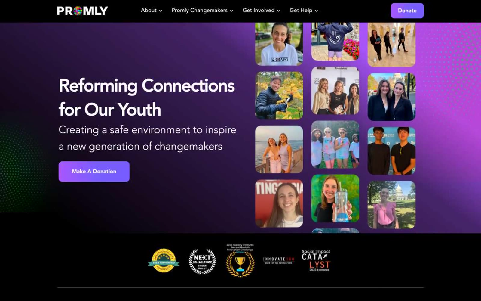
Promly
Promly — Style Reference
# Promly — Style Reference
> Midnight pulse through violet glass — a youth sanctuary lit by neon accents on near-black surfaces, where rounded photo collages float like screensavers behind sharp confident type.
**Theme:** dark
Promly operates in a midnight-violet register: deep near-black canvas (#040723) bathed in purple gradient light, with a single cool blue action color that cuts through the darkness like a notification LED. The visual language is youth-documentary — rounded-corner photo collages of real teens dominate the right half of every hero, while confident Avenir type carries the narrative on the left. Components are soft and tactile: large corner radii (20–30px on imagery, 12px on controls), violet-tinted shadows, and pill buttons that feel like app controls rather than web CTAs. Color is restrained and functional — a vivid green accent appears only on links and highlight tags, purple lives on outlined actions, and the blue filled button is the single loudest element on each screen.
## Tokens — Colors
| Name | Value | Token | Role |
|------|-------|-------|------|
| Void Indigo | `#040723` | `--color-void-indigo` | Page background, primary surface — near-black with a violet undertone that makes the whole canvas feel tinted rather than neutral |
| Abyss Plum | `#140f33` | `--color-abyss-plum` | Elevated card surface, shadow tone — a step lighter than Void Indigo, used to lift cards off the canvas with violet ambient |
| Onyx | `#000000` | `--color-onyx` | Deep contrast surface for cards, input fills, and the darkest band behind photo content |
| Glacier | `#e4ebf3` | `--color-glacier` | Off-white section backgrounds, light card surfaces — cool-tinted to harmonize with the violet system |
Websites
Markdown Text
design-md
website-prompt
landing-page-prompt
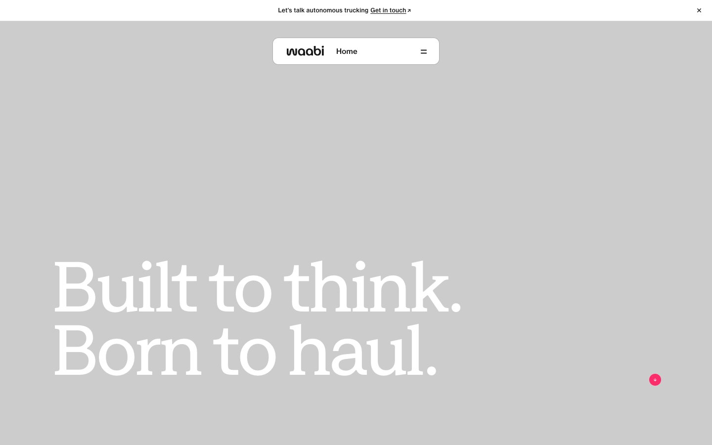
Waabi
Waabi — Style Reference
# Waabi — Style Reference
> Concrete monolith with molten-pink ignition. Warm gray editorial canvas where a single chromatic accent cuts through like a signal flare.
**Theme:** light
Waabi reads as an editorial-tech manifesto: warm concrete canvas, oversized custom display type set in tight blocks, and a single molten-pink accent that makes every interactive surface unmistakable. The page breathes — most of the canvas is empty warm gray, then content lands as confident white panels or dramatic type. Everything monochrome until you need action, at which point #ff2c6b does the entire job. Components are sparse, pill-shaped, and prefer thin borders and flat surfaces over shadows or gradients. The rhythm is large-to-larger: hero headlines at 130–150px with 0.85 line-height, then a drop to 24–40px for body, creating a magazine-scale hierarchy rather than a UI scale.
## Tokens — Colors
| Name | Value | Token | Role |
|------|-------|-------|------|
| Hot Signal | `#ff2c6b` | `--color-hot-signal` | Red action color for filled buttons, selected navigation states, and focused conversion moments. |
| Carbon | `#191818` | `--color-carbon` | Primary text, heading text, border lines, icon strokes — near-black with a faint warm cast; the dominant neutral carrying all structural information |
| Paper White | `#ffffff` | `--color-paper-white` | Light neutral action fill for buttons on dark surfaces. |
| Concrete | `#e8e6e3` | `--color-concrete` | Page background, hero canvas, section bands — the warm neutral that defines the site's atmosphere; slightly desaturated and warm-toned, not cool gray |
Websites
Markdown Text
design-md
website-prompt
landing-page-prompt
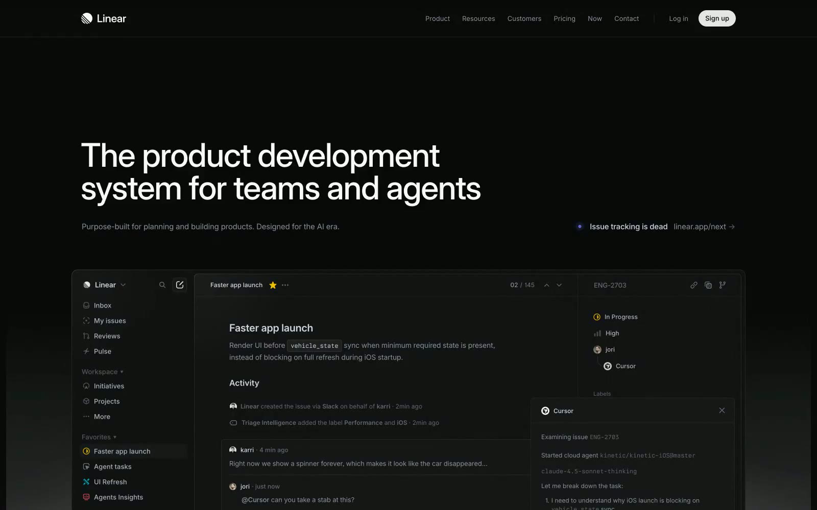
Linear
Linear — Style Reference
# Linear — Style Reference
> midnight command deck — acid-lime status light on obsidian instrument panel
**Theme:** dark
Linear is a midnight command deck for product teams: a near-black canvas, razor-thin type, and one acid-lime accent that cuts through the dark like a status light. The interface is deliberately quiet — the accent color is rationed to a single primary action per screen, with everything else living in a tight monochrome scale of cool grays. Cards gain presence through 1px inset borders and soft drop shadows rather than fills, and the entire surface stack stays in a narrow 4-step range from canvas to elevated. Typography is Inter Variable at 510/590 with custom stylistic sets, producing dense, instrument-panel density where every pixel earns its place. The voice is engineering-native: Berkeley Mono for code, tight tracking on all display sizes, and a refusal to decorate what data can already say.
## Tokens — Colors
| Name | Value | Token | Role |
|------|-------|-------|------|
| Onyx | `#08090a` | `--color-onyx` | Page background, primary canvas, deepest surface |
| Charcoal | `#0f1011` | `--color-charcoal` | Navigation bar, card base, elevated surface level 1 |
| Obsidian | `#161718` | `--color-obsidian` | Deepest card backgrounds, modal overlays, deepest elevation |
| Graphite | `#23252a` | `--color-graphite` | Hairline borders, dividers, card inset edges, input outlines |
Websites
Markdown Text
design-md
website-prompt
landing-page-prompt
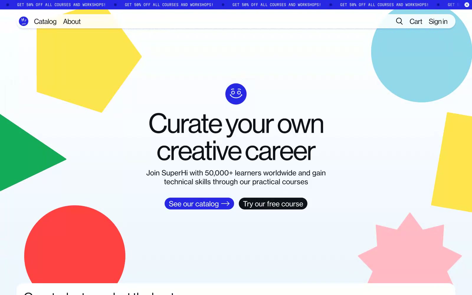
SuperHi
SuperHi — Style Reference
# SuperHi — Style Reference
> Paper-cut shapes scattered across a pale-blue classroom wall
**Theme:** light
SuperHi reads like a creative-school art room translated to screen: a near-white pale-blue canvas strewn with oversized flat paper-cut shapes in candy-bright primaries, wrapped around quietly confident typography that never competes with the playfulness. The palette is almost monochrome in interface chrome — deep ink text, white surfaces, one electric violet that powers every action — while the decorative layer is intentionally loud: yellow pentagons, red half-circles, green triangles, pink stars and powder-blue blobs float behind content like cutouts on a studio wall. Components are pill-soft (24–48px radii), buttons are chunky capsules with arrow glyphs, and the tone is friendly, confident, and unmistakably creative.
## Tokens — Colors
| Name | Value | Token | Role |
|------|-------|-------|------|
| Electric Iris | `#2727e6` | `--color-electric-iris` | Violet supporting accent for decorative details and low-frequency emphasis. Do not promote it to the primary CTA color |
| Ink Black | `#111118` | `--color-ink-black` | Primary text, dark secondary buttons, icon strokes, hairline borders — warmer than pure black, reads as ink rather than void |
| Paper White | `#ffffff` | `--color-paper-white` | Card surfaces, elevated panels, button text on dark fills, page sections that need to lift off the pale-blue canvas |
| Chalk Blue | `#f0f6ff` | `--color-chalk-blue` | Dominant page canvas — a barely-there blue tint that prevents the page from feeling clinical and ties the scattered blue shapes to the background |
Websites
Markdown Text
design-md
website-prompt
landing-page-prompt
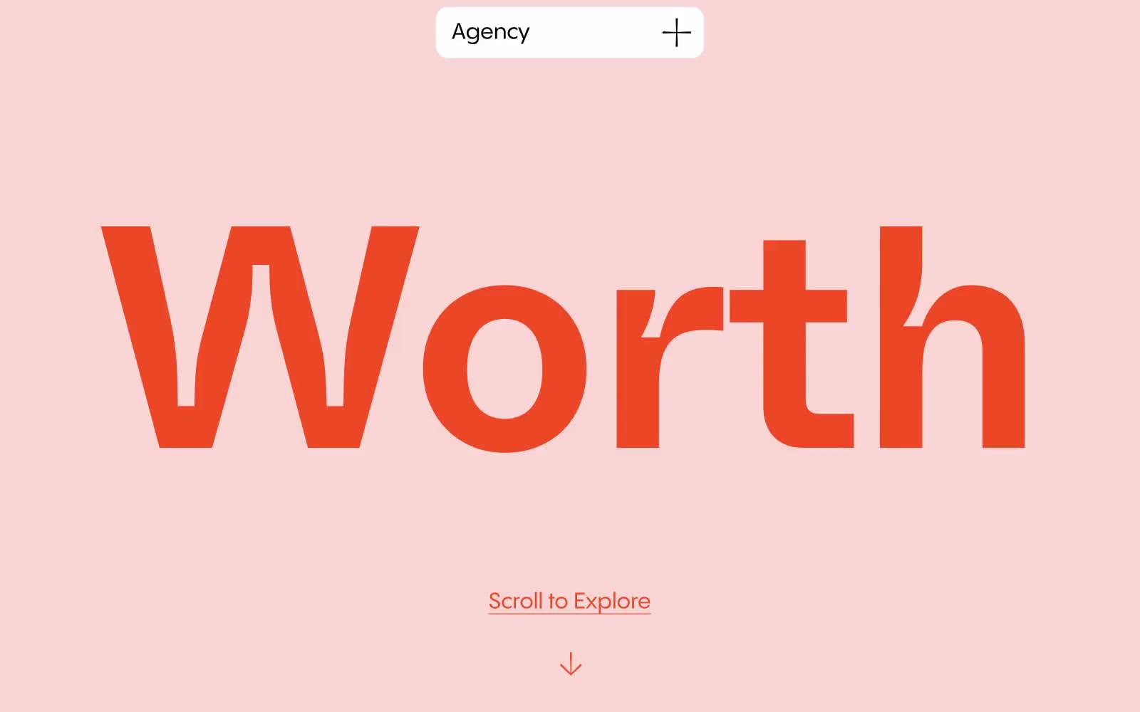
Worth Agency
Worth Agency — Style Reference
# Worth Agency — Style Reference
> studio gallery at golden hour
**Theme:** light
Worth Agency uses an editorial-gallery language: a single warm blush field introduces the brand, then the page surrenders to white space and type. The only chromatic accent is a vivid vermilion (#eb4726) — it marks the colossal custom wordmark, every link underline, and every arrow, making the entire site feel like one typographic gesture. Components are minimal and pill-shaped; a floating top-center tag is the entire navigation system, and there are no buttons anywhere — only underlined text. The aesthetic is confident restraint at exhibition scale: 400px display next to 16px body, flat color blocking instead of shadows, blush and white alternating like gallery walls.
## Tokens — Colors
| Name | Value | Token | Role |
|------|-------|-------|------|
| Blush Field | `#f8d4d4` | `--color-blush-field` | Hero section background, full-bleed section dividers, decorative border washes — the warm pastel that sets the emotional temperature for the whole site |
| Vermilion Mark | `#eb4726` | `--color-vermilion-mark` | Sole chromatic accent — brand wordmark, link underlines, arrow icons, scroll indicator. One warm note against all the near-monochrome |
| Mint Accent | `#d2fdd1` | `--color-mint-accent` | Rare card or section background — the only cool note permitted, used sparingly for tonal variety |
| Charcoal Ink | `#282828` | `--color-charcoal-ink` | Primary body text, heading text, default borders, icon strokes — the workhorse warm-black neutral |
Websites
Markdown Text
design-md
website-prompt
landing-page-prompt
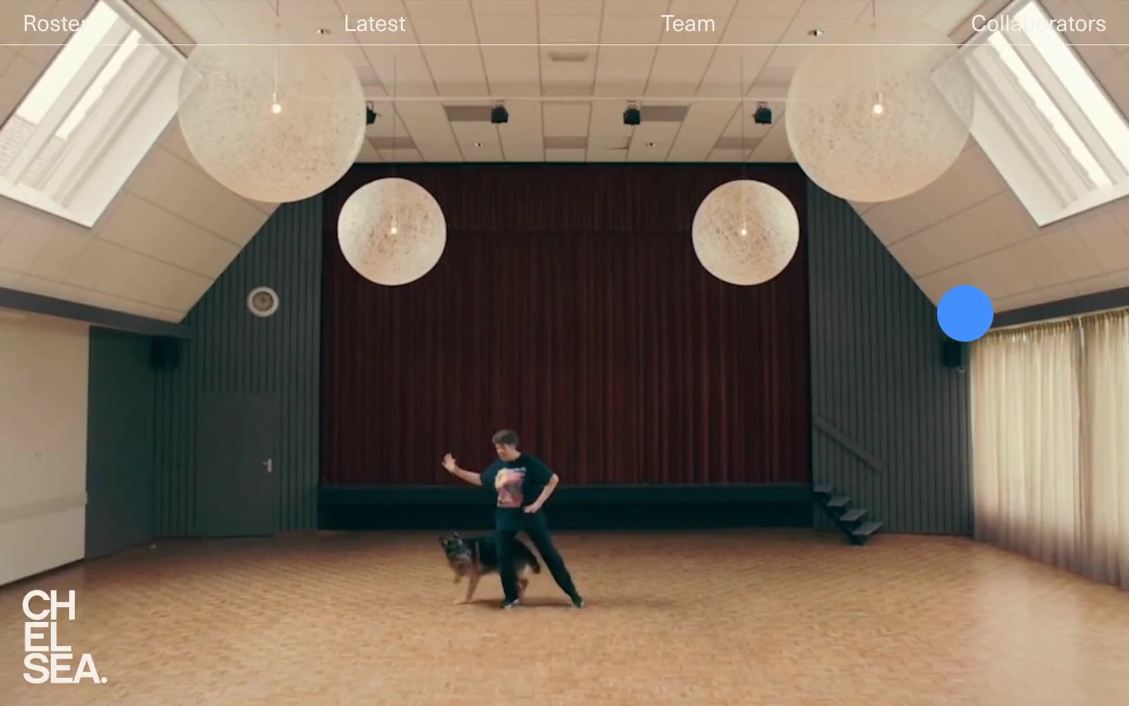
CHELSEA
CHELSEA — Style Reference
# CHELSEA — Style Reference
> Black-box cinema with a single blue spotlight — the roster plays, the chrome disappears.
**Theme:** dark
Chelsea is a talent roster presented as a black-box cinema: full-bleed cinematic photography sits directly on pure black, with a single vivid blue (#4490ff) as the only chromatic voice. The interface is deliberately skeletal — a thin top bar, a tiny floating blue dot, and a name list rendered in the accent color — letting the roster's work carry all visual weight. Typography is one family (Neue Haas Unica Pro) in two weights, set with tight 1.0–1.15 line-heights so the type reads like a film credit rather than a website. Everything that can be invisible is invisible: no borders on the canvas, no shadows, no card containers, no section backgrounds — the only surface transition is the sudden black-to-photography cut. Buttons and links are pill-shaped (9999px radius) and extremely compact, reinforcing the sense that this is a viewing room, not a product dashboard.
## Tokens — Colors
| Name | Value | Token | Role |
|------|-------|-------|------|
| Void Black | `#000000` | `--color-void-black` | Page canvas, all section backgrounds, negative space — the floor everything sits on |
| Spotlight Blue | `#4490ff` | `--color-spotlight-blue` | Primary action, interactive links, roster name listings, focal dot indicator, highlighted borders — the only chromatic voice in an otherwise monochrome system |
| Carbon Slate | `#1f2937` | `--color-carbon-slate` | Headings, heavy borders, structural borders on dark surfaces — near-black with a slight cool cast for separation from the pure black canvas |
| Bone White | `#f4efe9` | `--color-bone-white` | Warm off-white for text and subtle borders — softer than pure white, evoking film stock and gallery walls against the black canvas |
Websites
Markdown Text
design-md
website-prompt
landing-page-prompt
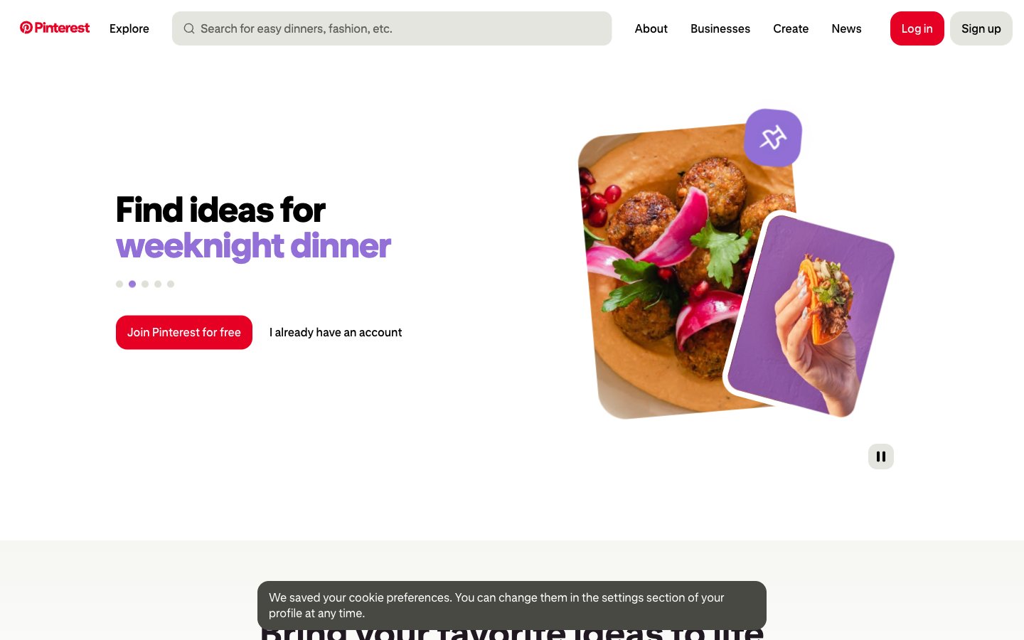
Pinterest — Style Reference
# Pinterest — Style Reference
> A pinboard under warm gallery light — white walls, one bold red thumbtack, everything else quietly waiting to be discovered.
**Theme:** light
Pinterest operates as a bright, gallery-lit scrapbook: white canvas, near-black text in a custom geometric sans, and one unmistakable red that acts as the only functional signal in an otherwise quiet interface. The visual rhythm is built on oversized rounded corners (16-40px), generous breathing room between elements (16-32px gaps), and a typography attitude that uses size and italic weight — not color — to create hierarchy. Secondary hues (violet, orange, blue) appear as small decorative punctuation inside illustrated cards and image treatments, never on chrome or controls. Components feel lightweight and playful: tilted photo cards, pill-shaped search and filters, a flat red CTA, and a single high-contrast accent for emphasis. The system reads as approachable discovery, not utility — surfaces stay matte, elevation stays minimal, and personality comes from layout composition rather than decoration.
## Tokens — Colors
| Name | Value | Token | Role |
|------|-------|-------|------|
| Pin Red | `#e60023` | `--color-pin-red` | Red supporting accent for decorative details and low-frequency emphasis. Do not promote it to the primary CTA color |
| Ink Plum | `#211922` | `--color-ink-plum` | Primary text, logo wordmark, filled dark buttons — a warm near-black that reads softer than pure #000 |
| Gallery White | `#ffffff` | `--color-gallery-white` | Page canvas, card surfaces, button text on dark fills, search field background |
| Fog Gray | `#666666` | `--color-fog-gray` | Secondary text, nav labels, icon strokes at rest, helper copy |
Websites
Markdown Text
design-md
website-prompt
landing-page-prompt
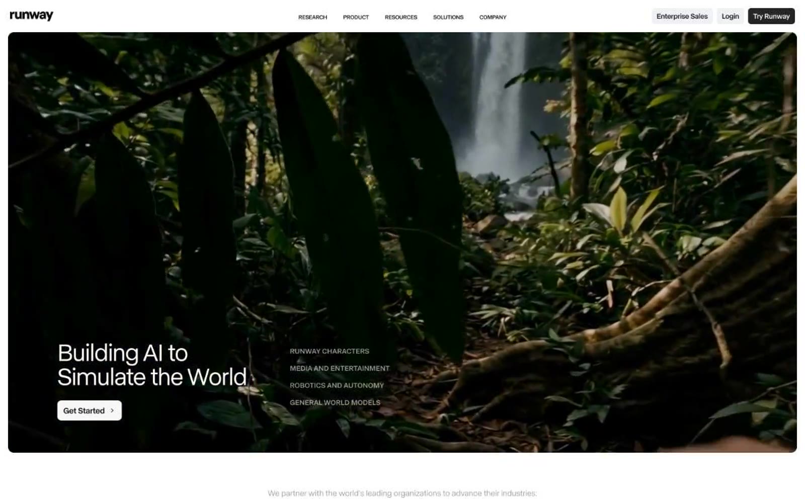
Runway
Runway — Style Reference
# Runway — Style Reference
> monochrome research studio — a printer's tray of cinematic stills on cold white paper
**Theme:** light
Runway operates as a precision research lab on white canvas — almost entirely monochrome, with a single deep cobalt accent reserved for promotional banners and the occasional highlight. Typography does the heavy lifting: a neo-grotesque sans with tightly tracked headlines carries editorial weight, reading as research statements rather than marketing copy. Components are deliberately minimal — ghost buttons, hairline dividers, image cards that sit flat against the page, no decorative elevation. The page breathes like a long-form magazine spread where AI-generated research output is the visual content itself. Every interface decision is in service of letting the work speak: no gradients, no shadows, no ornament.
## Tokens — Colors
| Name | Value | Token | Role |
|------|-------|-------|------|
| Ink Black | `#0c0c0c` | `--color-ink-black` | Dark supporting neutral for text, icons, and strong contrast. Do not promote it to the primary CTA color |
| Carbon | `#1a1a1a` | `--color-carbon` | Supporting neutral for secondary UI, dividers, and muted labels. Do not promote it to the primary CTA color |
| Graphite | `#2a2a2a` | `--color-graphite` | Secondary dark surface, button hover states |
| Slate | `#404040` | `--color-slate` | Body text, secondary headings, dense paragraph copy |
Websites
Markdown Text
design-md
website-prompt
landing-page-prompt
Frontify
Frontify — Style Reference
# Frontify — Style Reference
> Warm atelier with orange punctuation — a museum catalog rendered in cream and ink, where a single warm orange acts as the only raised voice in an otherwise hushed room.
**Theme:** light
Frontify operates as an editorial brand-management workspace: a warm cream canvas (#f0f0eb) holds white card surfaces and dark teal hero moments, with a single vivid orange (#ff3b00) acting as functional punctuation rather than decorative color. Typography carries the identity — a high-contrast serif display face (Cranny) sets an editorial, near-print tone at 40–96px, while a clean grotesque (ABC Diatype) handles all interface text at 14–18px with positive tracking. The system avoids heavy shadows and gradients, relying on warm neutrals, hairline borders, and comfortable 8px-base spacing to create a calm, considered density. Components feel lightweight: 8px card radii, pill buttons at 24–40px, ghost controls, and image-forward compositions where brand assets become the hero content.
## Tokens — Colors
| Name | Value | Token | Role |
|------|-------|-------|------|
| Warm Parchment | `#f0f0eb` | `--color-warm-parchment` | Page canvas, hero section dividers, large surface fills — warm cream replaces stark white to soften the entire interface |
| Gallery White | `#ffffff` | `--color-gallery-white` | Card surfaces, elevated panels, button text on dark fills — pure white reserved for objects sitting on the cream canvas |
| Soft Linen | `#e1e1db` | `--color-soft-linen` | Secondary card surface, subtle background fills behind grouped content |
| Mist Gray | `#d7d7cf` | `--color-mist-gray` | Subtle background fills, body section dividers |
Websites
Markdown Text
design-md
website-prompt
landing-page-prompt
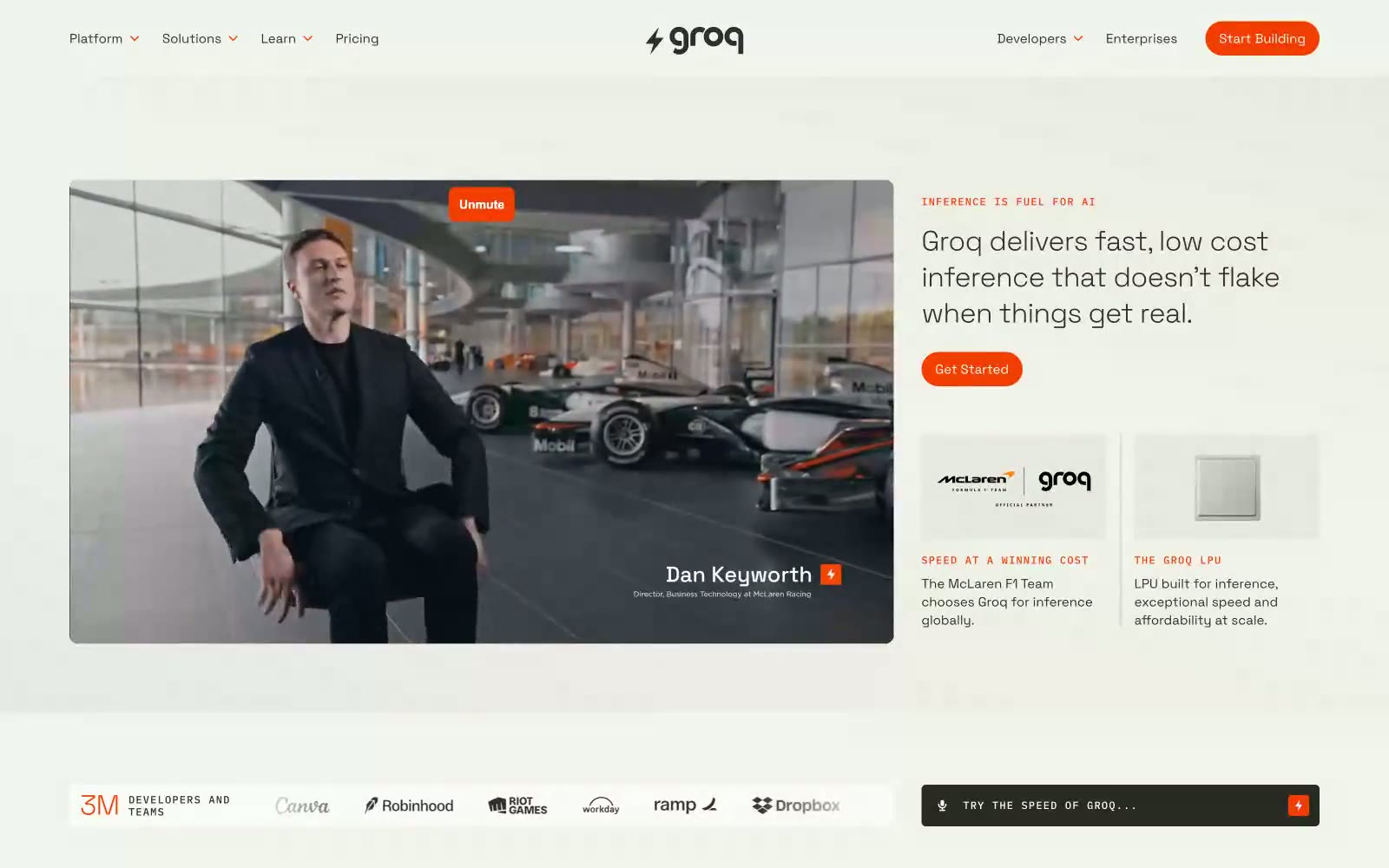
Groq
Groq — Style Reference
# Groq — Style Reference
> speed lab notebook — parchment pages, graphite text, one highlighter-orange mark
**Theme:** mixed
Groq reads as a speed lab notebook — warm parchment surfaces, tight geometric sans-serif (Space Grotesk at whisper-weight 300), and a single searing orange accent that marks every action and highlight like a highlighter pen on graph paper. The layout alternates between bright cream and deep charcoal panels, creating a documentary rhythm of thesis (light) → proof (dark) → evidence (light) rather than a marketing funnel. Typography is small, confident, and slightly compressed; pill buttons and IBM Plex Mono eyebrows with wide tracking give the whole system a technical-spec feel. Components stay flat and minimal — no drop shadows, no gradients, no decorative chrome — so the orange is always the loudest thing on screen.
## Tokens — Colors
| Name | Value | Token | Role |
|------|-------|-------|------|
| Ember Orange | `#f43e01` | `--color-ember-orange` | Orange supporting accent for decorative details and low-frequency emphasis. Do not promote it to the primary CTA color |
| Vapor Pink | `#e09afe` | `--color-vapor-pink` | Secondary decorative accent — rare highlights, special-emphasis inline marks, and select graphic flourishes. Used as a cool counterpoint to Ember Orange when a second color is needed |
| Parchment | `#e8e8de` | `--color-parchment` | Page canvas — the warm off-white that defines the site's light mode. Warmer than pure white, it gives the whole interface a paper-like quality |
| Bone | `#f3f3ee` | `--color-bone` | Elevated surface — cards, content blocks, nav backgrounds. One step lighter than Parchment, used to lift elements off the canvas without harsh contrast |
Websites
Markdown Text
design-md
website-prompt
landing-page-prompt
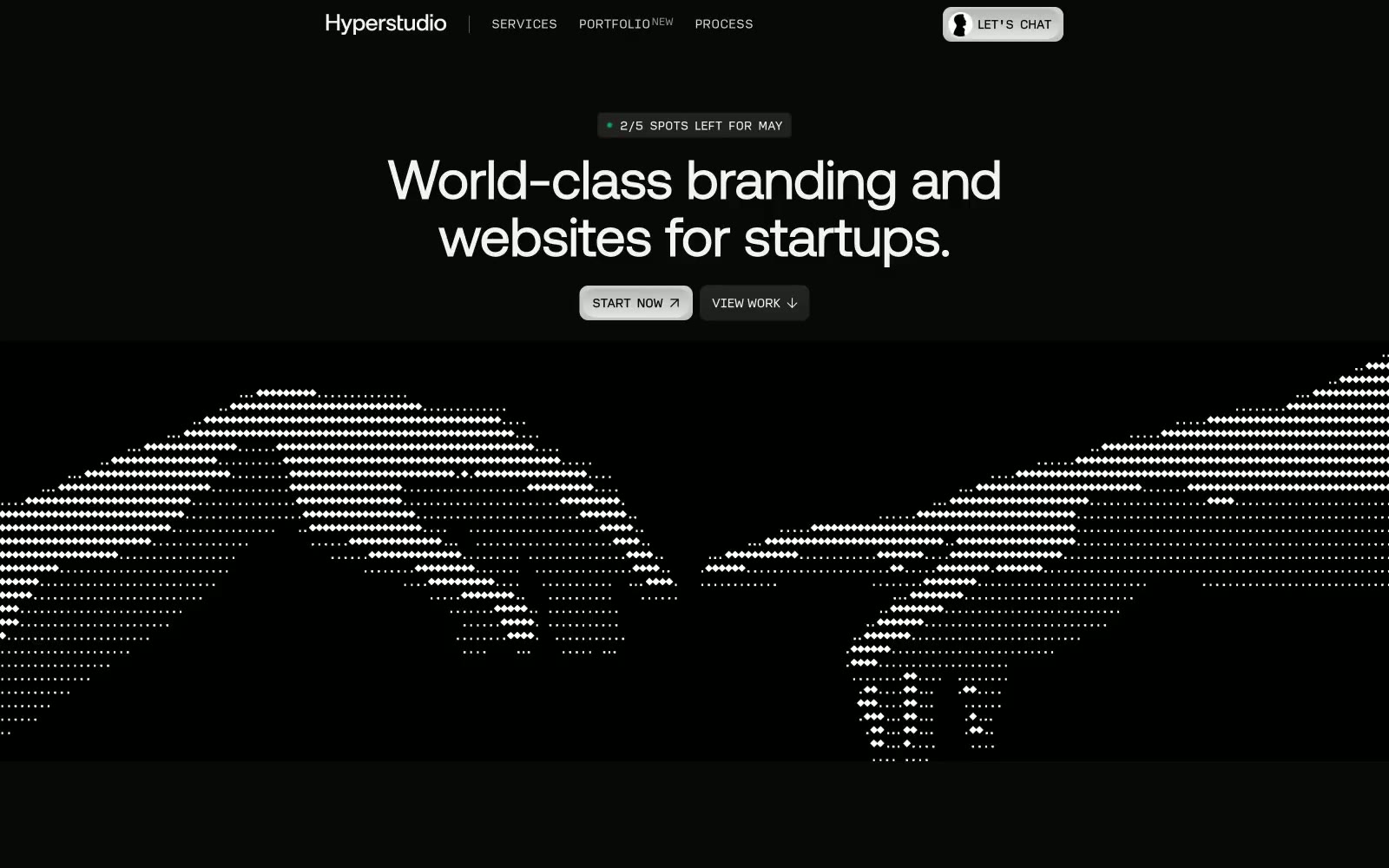
Hyperstudio
Hyperstudio — Style Reference
# Hyperstudio — Style Reference
> designer's midnight gallery — one warm lamp, lots of black walls, confident type floating on dark
**Theme:** dark
Hyperstudio operates in a near-monochrome dark mode: an almost black canvas with a single warm amber accent that feels like a desk lamp left on in a design studio. Typography carries the entire visual weight — Aeonik at light, tightly tracked headlines, paired with a monospace-feeling secondary face (Input) for meta labels and technical annotations. Components are flat, ghosted, and borderless on the canvas; surface differentiation comes from slightly lighter grays rather than shadows or fills. The layout is generous, centered, and gallery-like, letting the typographic hierarchy and small functional punctuation (a green status dot, a warm tan accent, a thin white border on a CTA) do all the work. Color is rationed aggressively — this is a system that trusts restraint.
## Tokens — Colors
| Name | Value | Token | Role |
|------|-------|-------|------|
| Obsidian Canvas | `#101010` | `--color-obsidian-canvas` | Page background, primary canvas |
| Charcoal Surface | `#333333` | `--color-charcoal-surface` | Card surfaces, elevated panels, content blocks — the dominant mid-tone that creates depth without lightness |
| Onyx Edge | `#212121` | `--color-onyx-edge` | Hairline borders, dividers, subtle structural edges |
| Ash | `#5a5a5a` | `--color-ash` | Muted UI chrome, disabled states, tertiary borders |
Websites
Markdown Text
design-md
website-prompt
landing-page-prompt
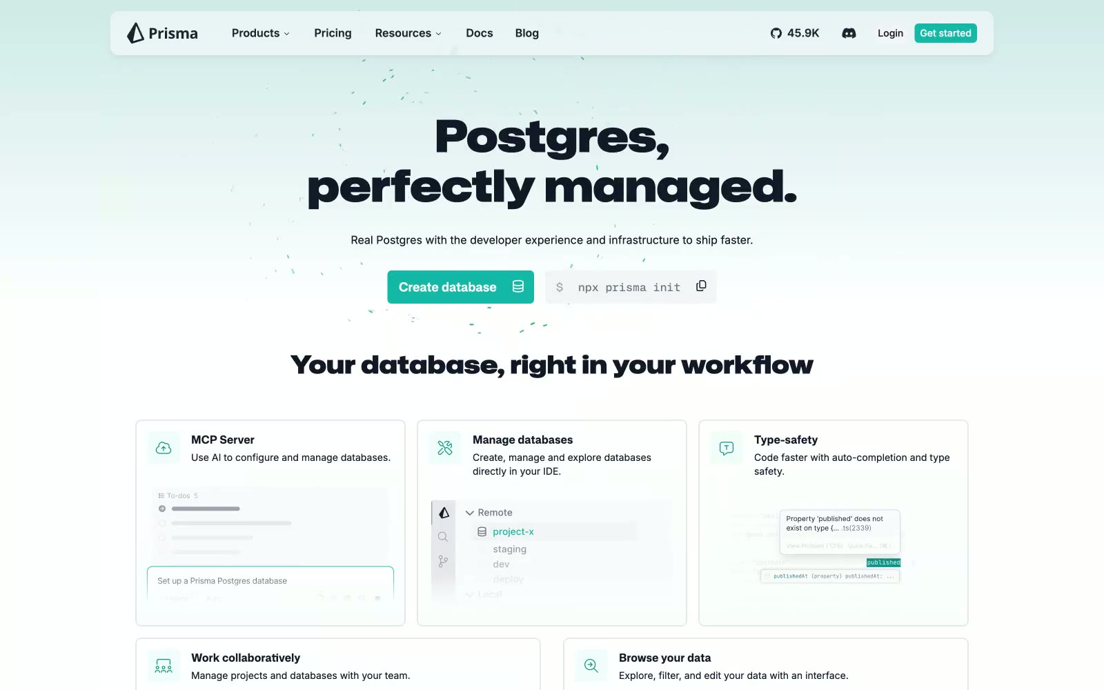
Prisma
Prisma — Style Reference
# Prisma — Style Reference
> engineer's blueprint on frosted glass
**Theme:** light
Prisma uses a disciplined developer-workbench language: pure white canvas, hairline borders, and one quiet teal accent that signals action without shouting. Typography carries the brand — Mona Sans displays at 64px with 0.1em tracking create an engineered, almost blueprint-like authority, while Inter's character variants (cv01–cv10) give body text a custom-cut feel inside an otherwise standard sans. Surfaces are nearly weightless: no decorative gradients, no drop-shadow stacks, just a single 1px border at #e2e8f0 separating regions. Components are compact and functional — code blocks sit next to CTA buttons, terminal panels replace marketing illustrations, and brand color appears only when something should be clicked. The result is a page that feels like documentation and product wrapped in one surface: quiet, precise, and trusting that code speaks louder than decoration.
## Tokens — Colors
| Name | Value | Token | Role |
|------|-------|-------|------|
| Prism Teal | `#14b8a6` | `--color-prism-teal` | Teal supporting accent for decorative details and low-frequency emphasis. Do not promote it to the primary CTA color |
| Deep Teal | `linear-gradient(rgb(13, 148, 136) 0%, rgb(255, 255, 255) 100%)` | `--color-deep-teal` | Teal supporting accent for decorative details and low-frequency emphasis. Do not promote it to the primary CTA color; Top-to-bottom gradient from Deep Teal to white — used in the hero background as a subtle vertical wash |
| Carbon Ink | `#1d242f` | `--color-carbon-ink` | Primary headings, nav text, logo mark, heavy body emphasis — near-black with a cool blue undertone that pairs with the teal accent |
| Graphite | `#111827` | `--color-graphite` | Body text, button labels, dense content text — deeper than Carbon Ink, reserved for running copy and form values |
Websites
Markdown Text
design-md
website-prompt
landing-page-prompt
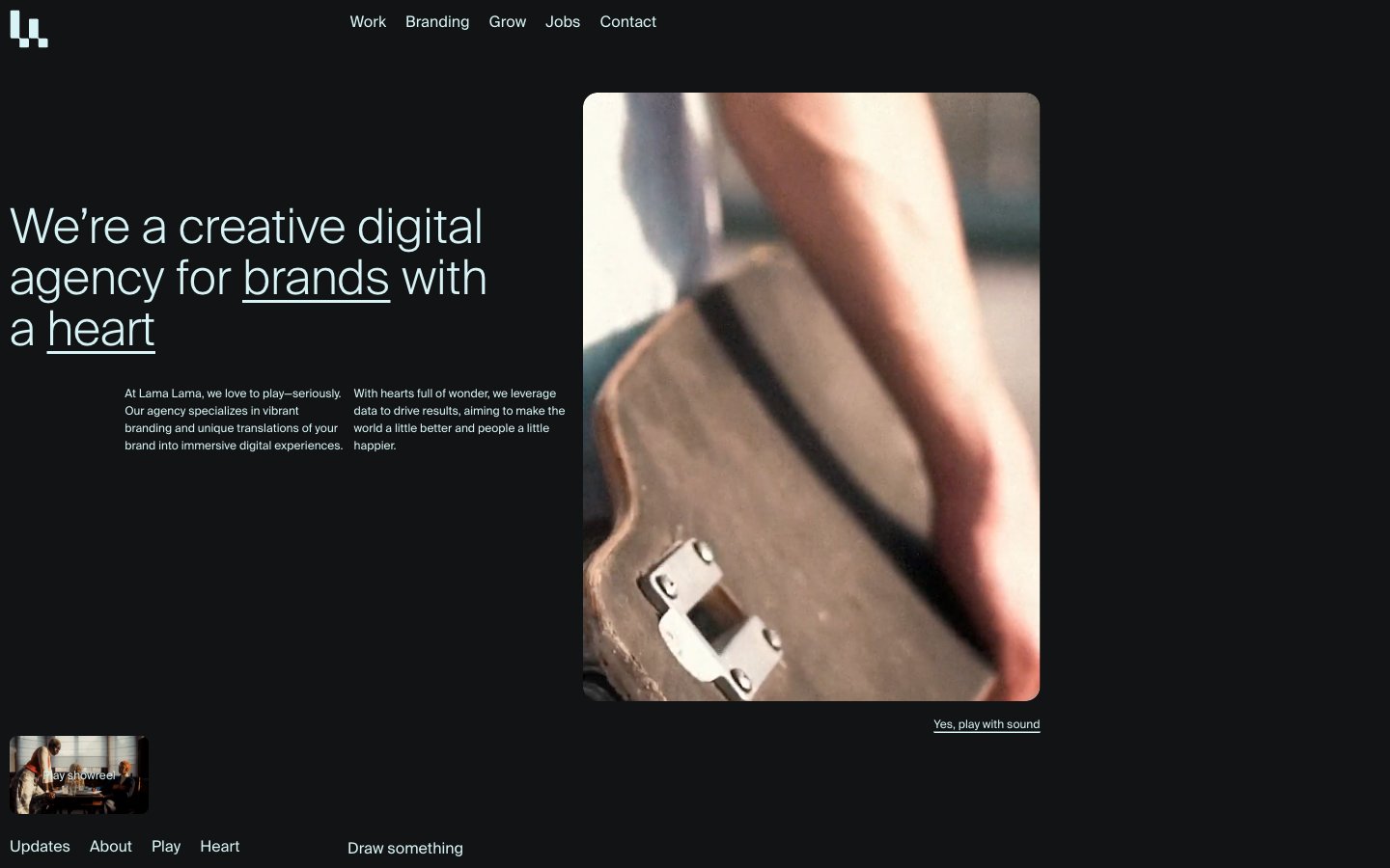
Lama Lama
Lama Lama — Style Reference
# Lama Lama — Style Reference
> midnight studio with a frozen-white spotlight
**Theme:** dark
Lama Lama is a cinematic, near-monochrome editorial agency site: the canvas is almost pure black, the foreground is a single pale ice-cyan white used for every word on the page, and the only color punctuation is the same ice-white flipping into a full-bleed inverted panel at the foot of the page. Typography is a Swiss grotesque (Suisse Int'l) at whisper-light weights — 300 for hero and section headlines — which reads as confident, unfussy, and editorial rather than loud. Layout is asymmetric and full-bleed: short text columns anchored to the viewport's left margin, generous gutters of 40–48px, and large editorial photographs or video frames occupying the remaining width. There are almost no filled buttons; navigation, links, and calls to action are all ghost text with thin underlines, which makes the interface feel like a magazine spread rather than a product UI.
## Tokens — Colors
| Name | Value | Token | Role |
|------|-------|-------|------|
| Ice Cyan | `#d7f3f5` | `--color-ice-cyan` | All foreground text, underlined link strokes, hairline borders, and the full-bleed inverted surface at the page foot — the only chromatic element in the system, used to make every readable word and every interactive affordance feel like it shares one voice |
| Void | `#020203` | `--color-void` | Page background and deepest canvas layer — near-pure black with a barely-perceptible cool tint that makes Ice Cyan read slightly blue |
| Carbon | `#111314` | `--color-carbon` | Elevated card surface, section backdrop, and subtle horizontal divider band — one step lighter than Void to lift project cards and content blocks without breaking the dark mood |
Websites
Markdown Text
design-md
website-prompt
landing-page-prompt
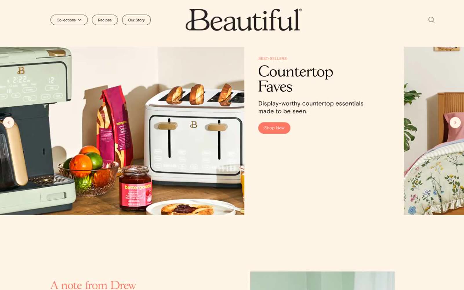
Beautiful™
Beautiful™ — Style Reference
# Beautiful™ — Style Reference
> Warm kitchen on a Sunday morning
**Theme:** light
Beautiful's design system is a warm, domestic tableau: a cream-ivory canvas (#fff5e6) replaces the typical white product background, immediately signaling "home" rather than "software." A single vivid coral accent (#fa7864) punctuates the interface — appearing only on filled action buttons, the serif editorial headings, and one coral CTA banner — while everything else stays restrained: thin black 1px borders, white card surfaces, and an elegant GascogneTS serif paired with the practical Basis Grotesque Pro sans. Components lean generous and pill-shaped, always outlined in black rather than elevated with shadow, always warm-toned rather than cool-neutral. The system reads like a lifestyle magazine spread, not a product catalog: serif hero headlines whisper authority, the coral accent is rationed like saffron, and the cream canvas does the heavy lifting of mood.
## Tokens — Colors
| Name | Value | Token | Role |
|------|-------|-------|------|
| Coral Pop | `#fa7864` | `--color-coral-pop` | Orange action color for filled buttons, selected navigation states, and focused conversion moments. |
| Terracotta Whisper | `#dc8264` | `--color-terracotta-whisper` | Orange accent for outlined action borders, linked labels, and lightweight interactive emphasis. |
| Cream Linen | `#fff5e6` | `--color-cream-linen` | Primary page canvas — every section background. The signature surface: warm, not white, immediately domestic. Used for the hero band, the about/letter section, the category circles area, and footer transitions |
| Ink Black | `#000000` | `--color-ink-black` | Primary text, logo, all hairline borders on nav buttons/cards/circles/icons, and the thin rules that define almost every component — the structural skeleton of the entire interface |