AI Prompt Studio - Intelligent Prompt Library
Explore and use professional AI prompts to optimize your workflow.

Lithic
Lithic — Style Reference

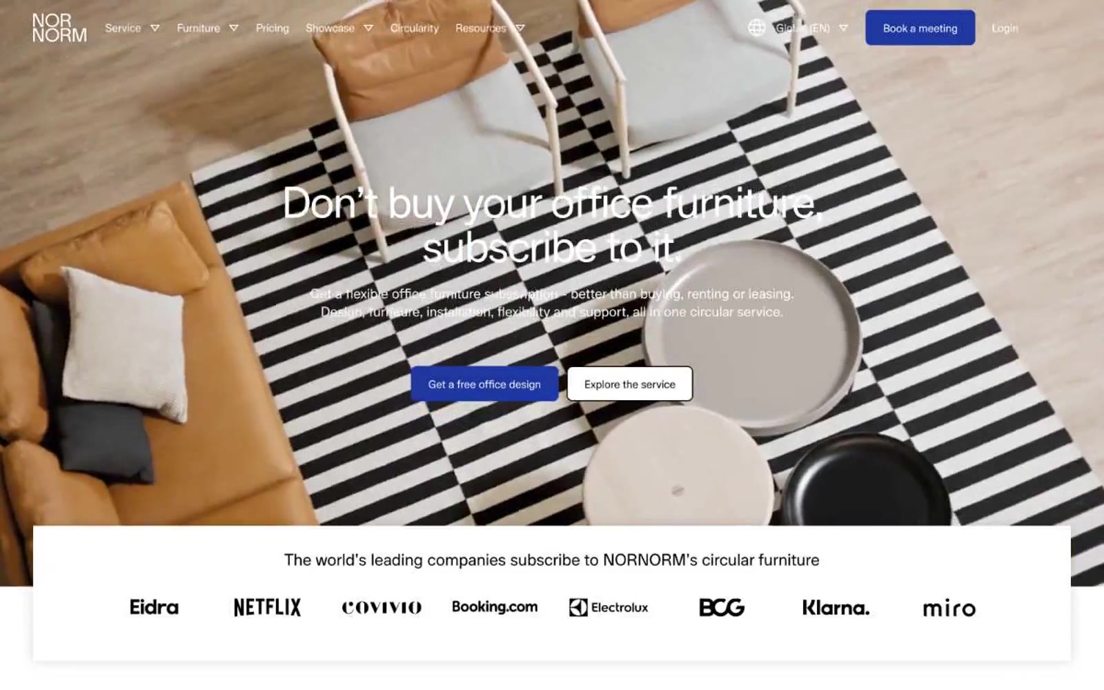
Nornorm
Nornorm — Style Reference
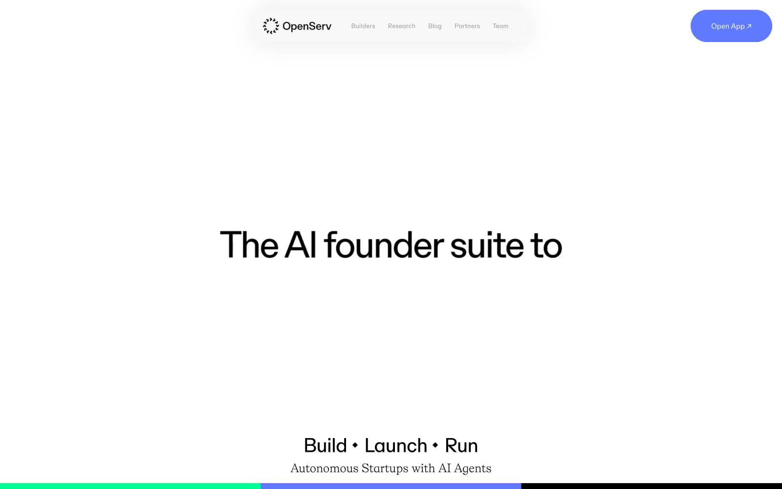
OpenServ
OpenServ — Style Reference
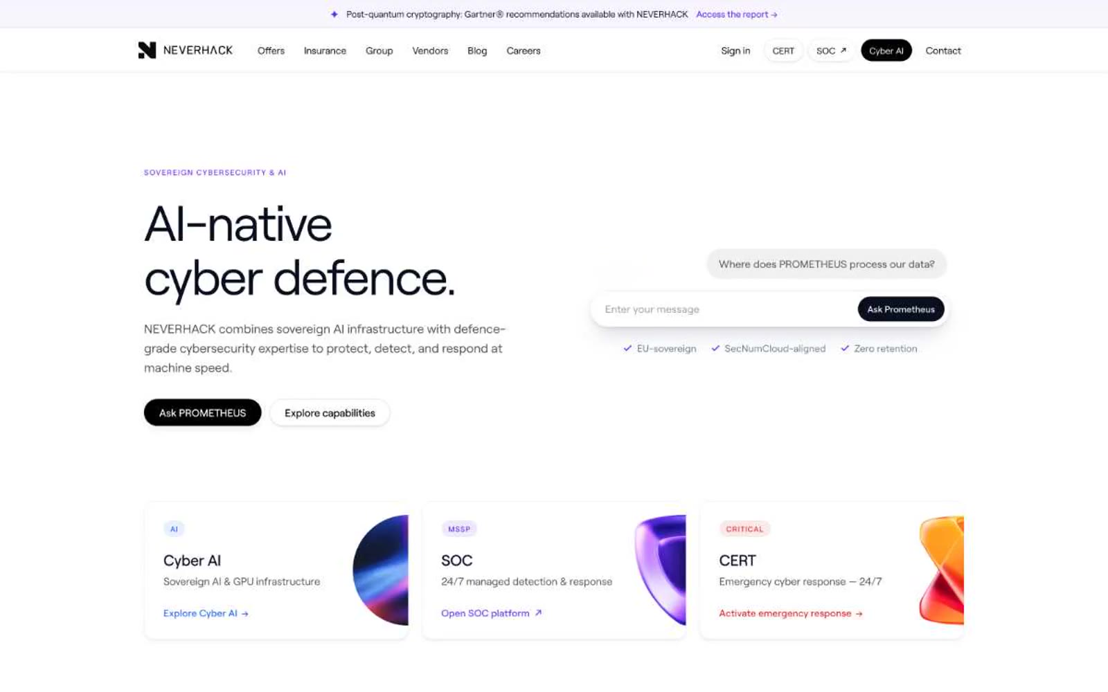
NEVERHACK
NEVERHACK — Style Reference
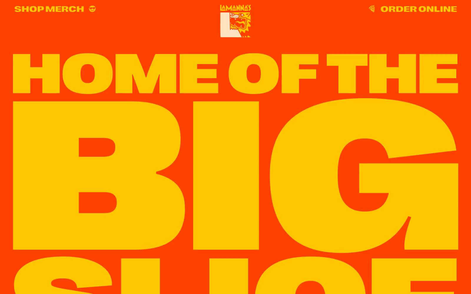
Lamanna
Lamanna — Style Reference
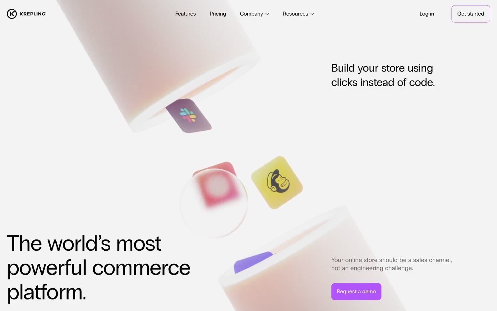
Krepling
Krepling — Style Reference
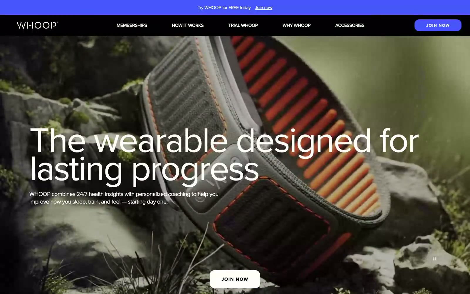
WHOOP
WHOOP — Style Reference
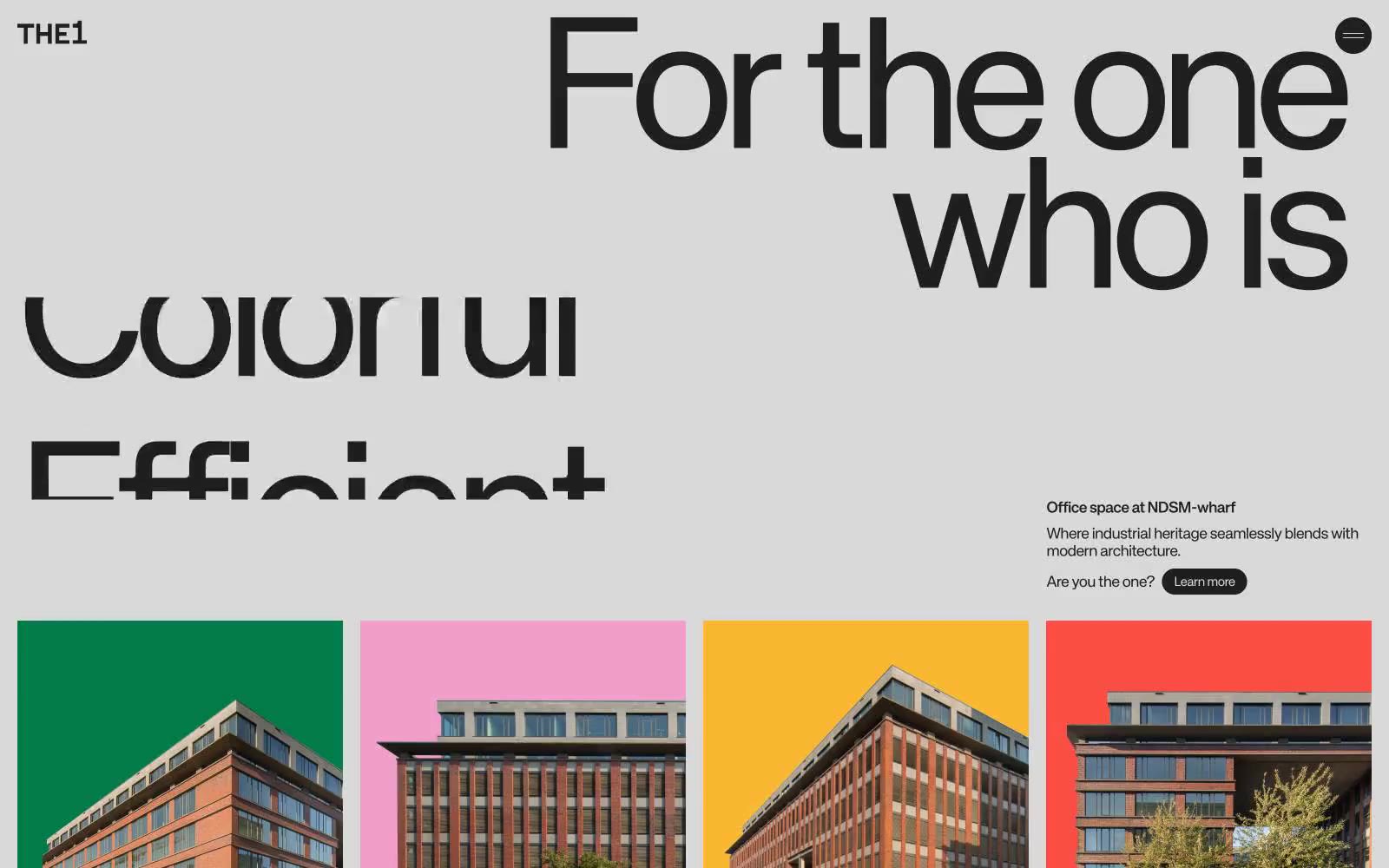
The1
The1 — Style Reference
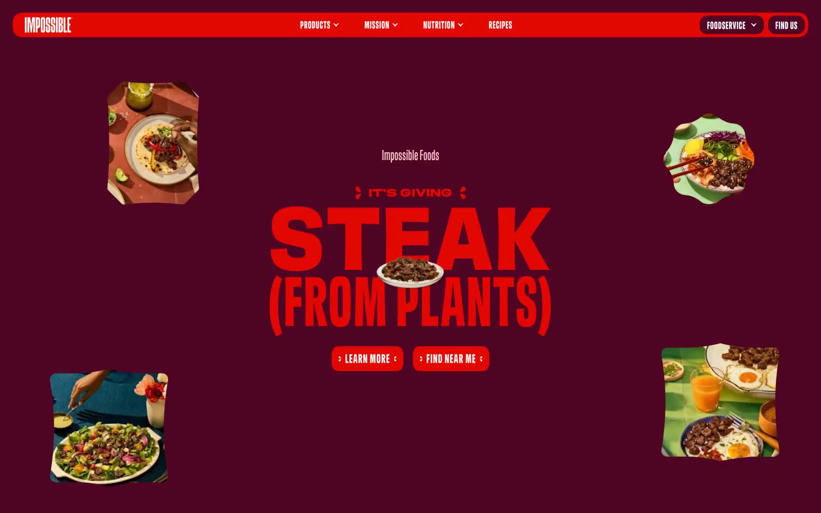
Home page | Impossible Foods
Home page | Impossible Foods — Style Reference
Grain
Grain — Style Reference
Navigate
Navigate — Style Reference
Wealthsimple
Wealthsimple — Style Reference
Letters
Letters — Style Reference

OHZI Interactive Studio / Dive into digital magic.
OHZI Interactive Studio / Dive into digital magic. — Style Reference
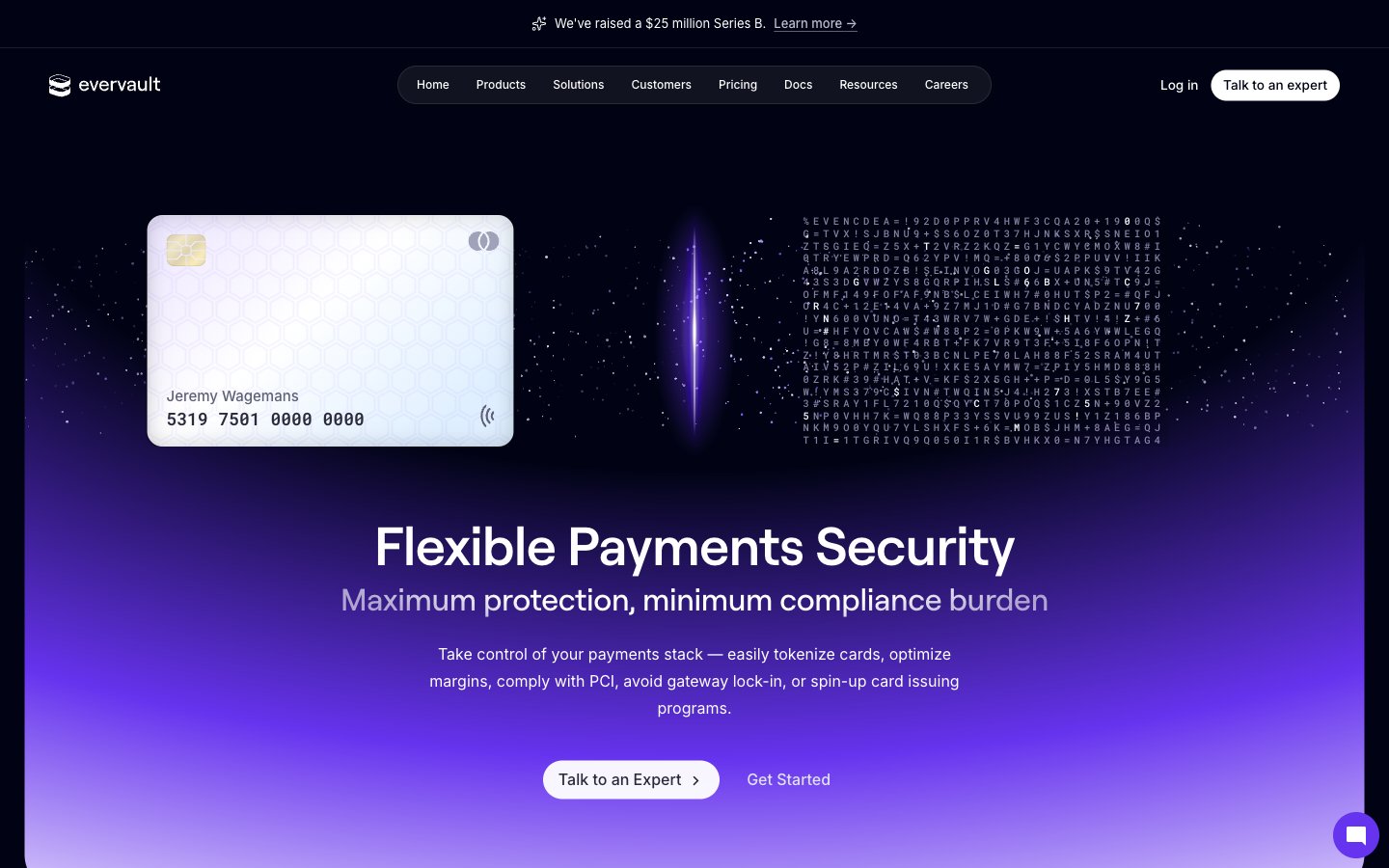
Evervault
Evervault — Style Reference
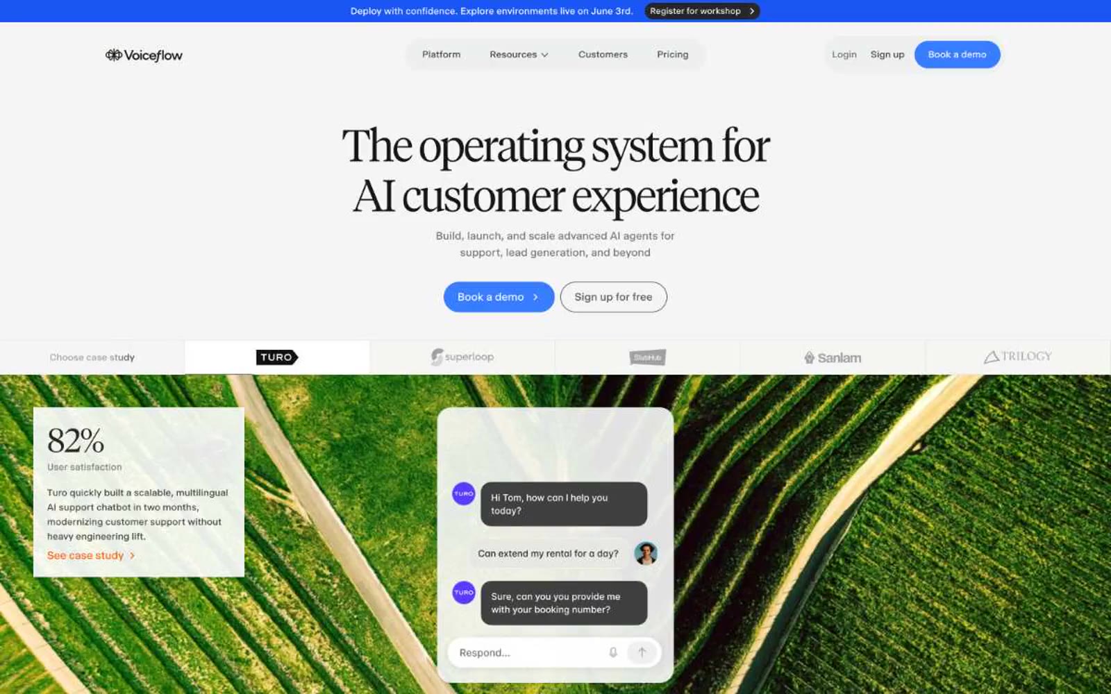
Voiceflow
Voiceflow — Style Reference
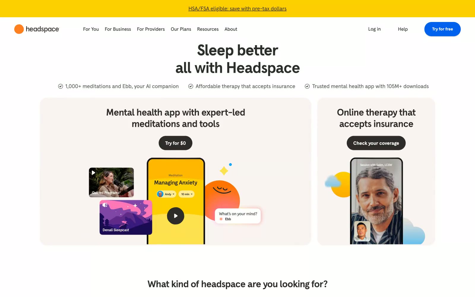
Headspace
Headspace — Style Reference
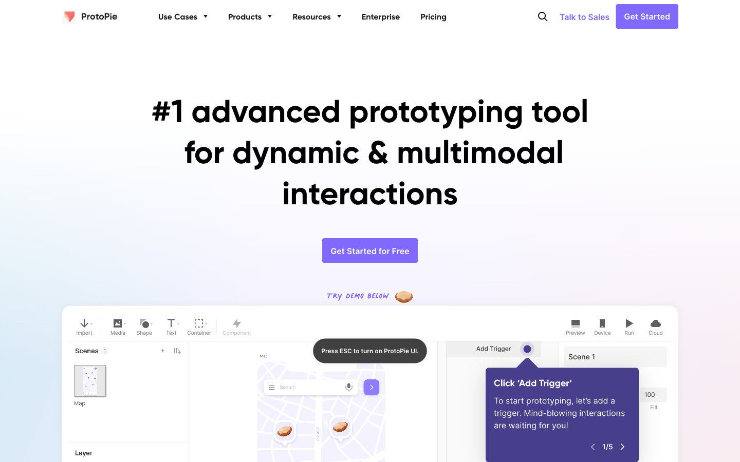
ProtoPie
ProtoPie — Style Reference
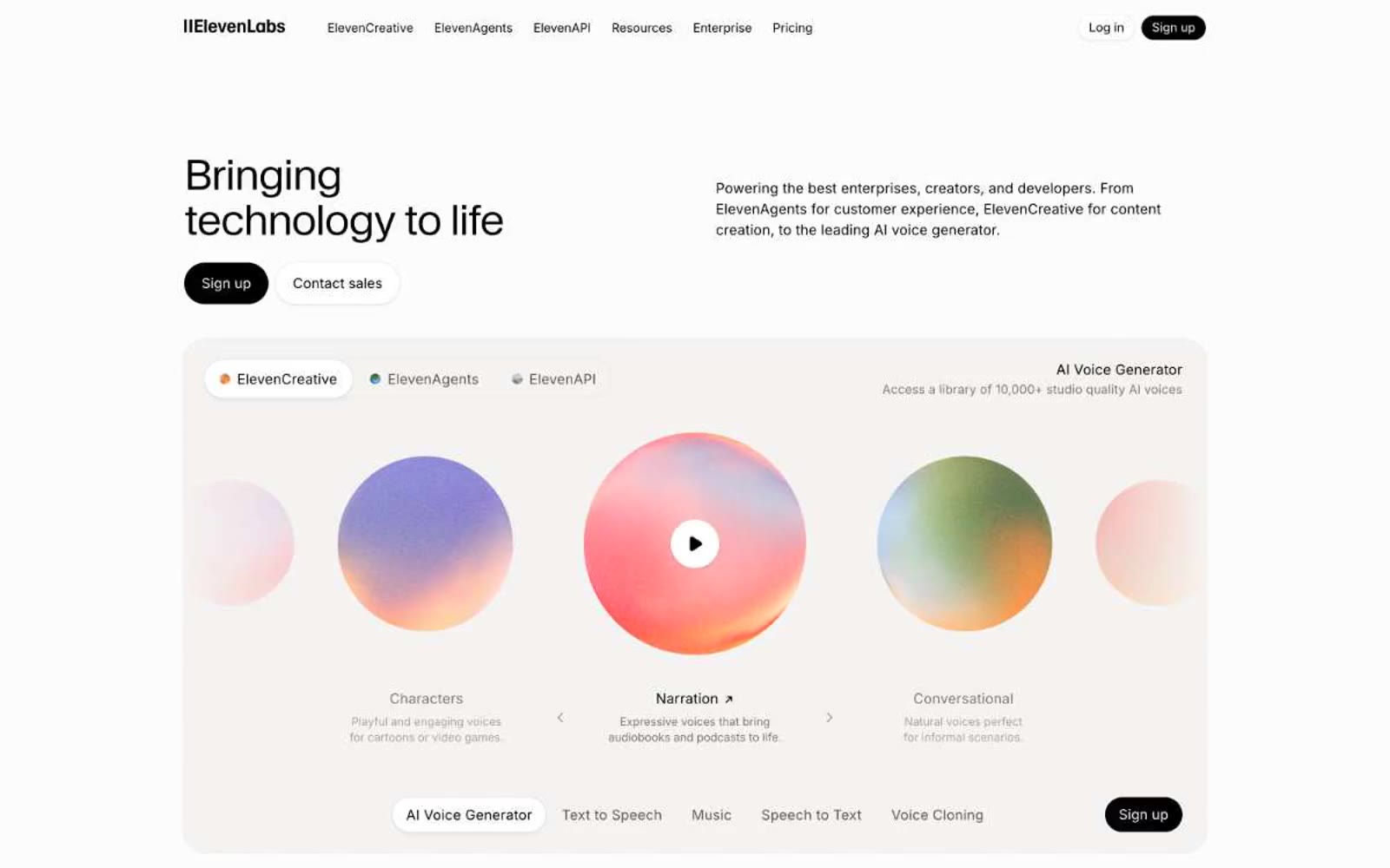
ElevenLabs
ElevenLabs — Style Reference
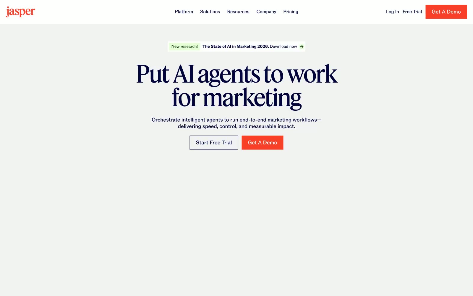
Jasper
Jasper — Style Reference
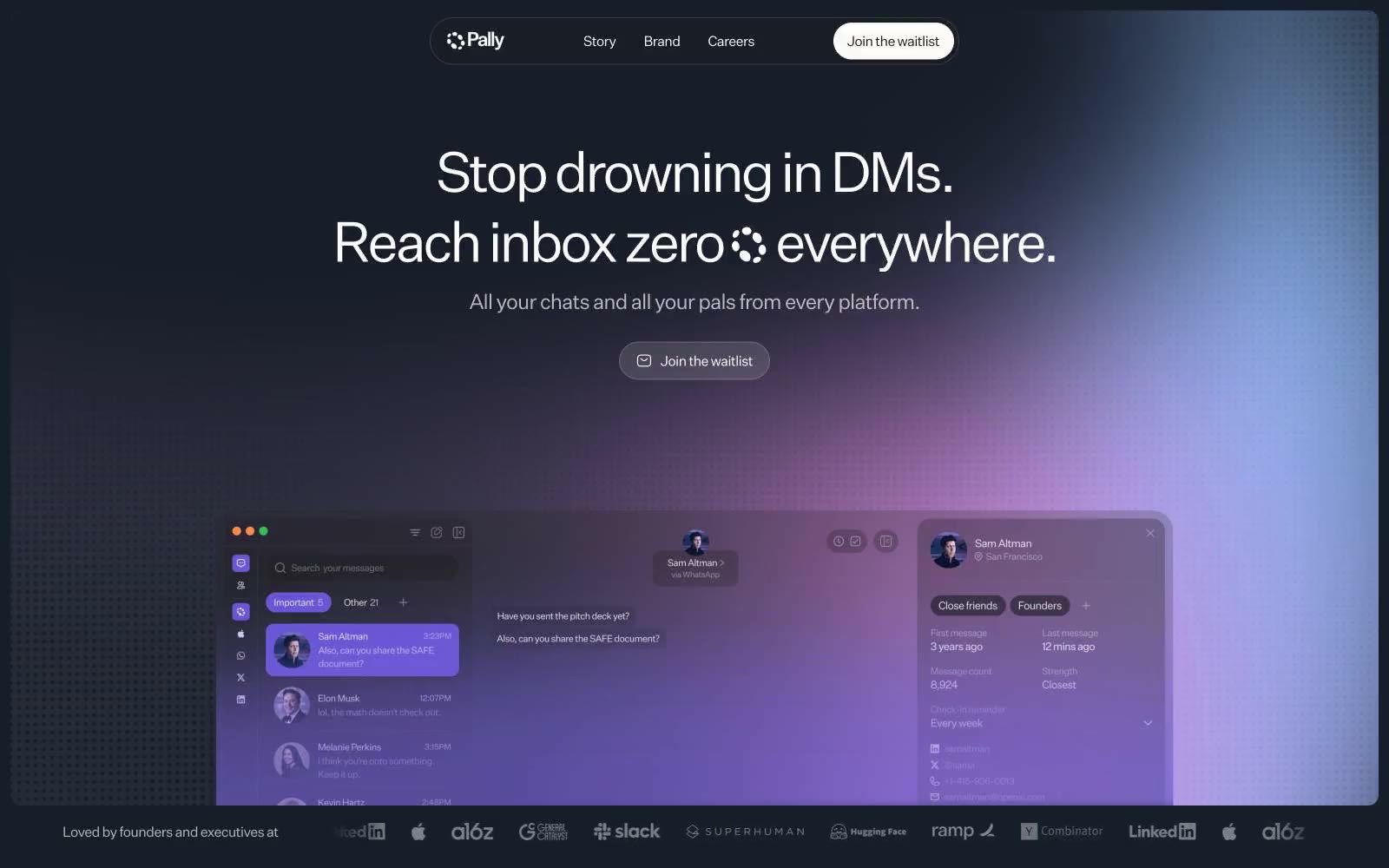
Pally
Pally — Style Reference
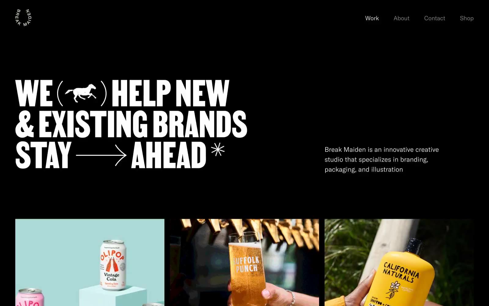
Break Maiden
Break Maiden — Style Reference
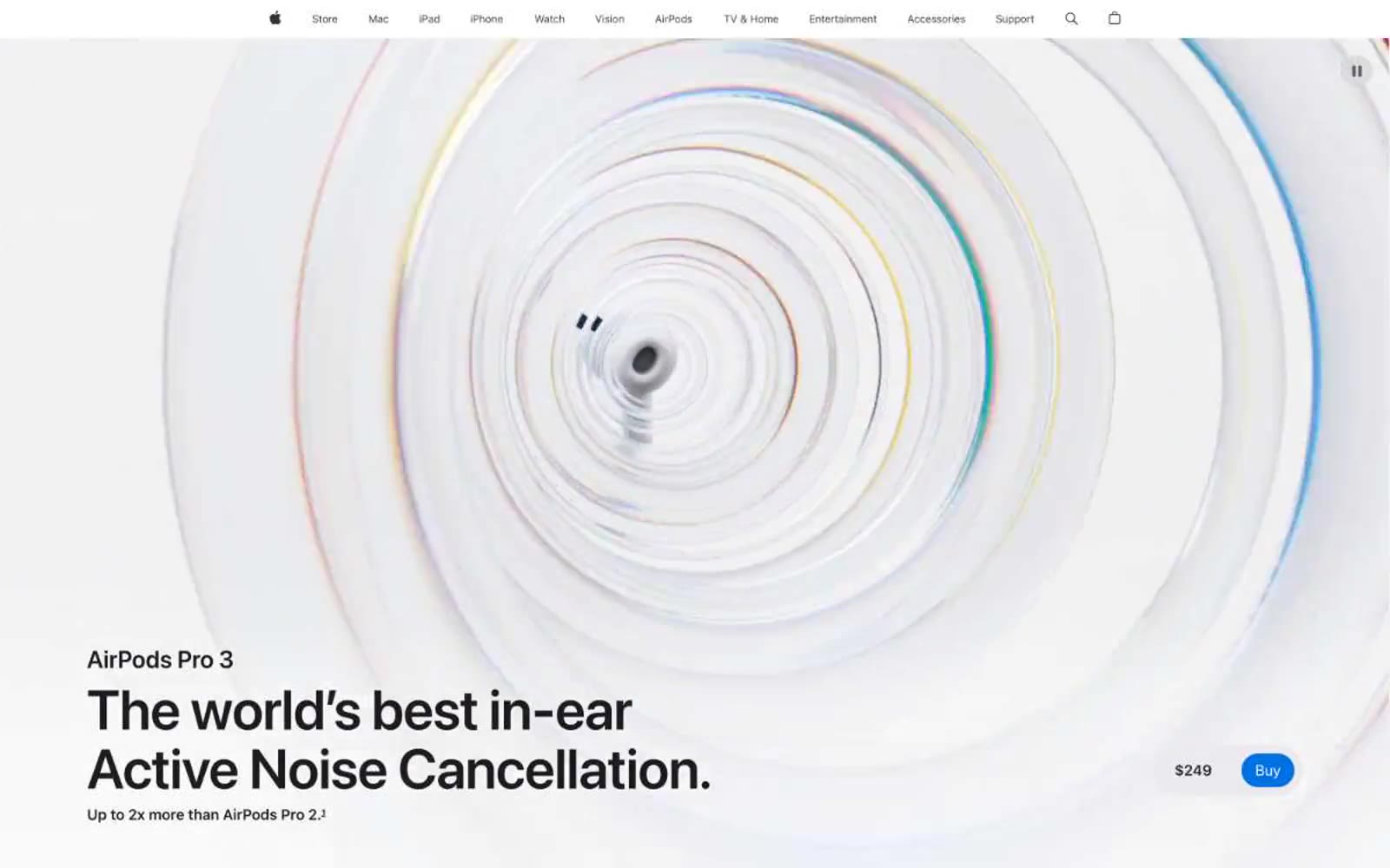
Apple (España)
Apple (España) — Style Reference
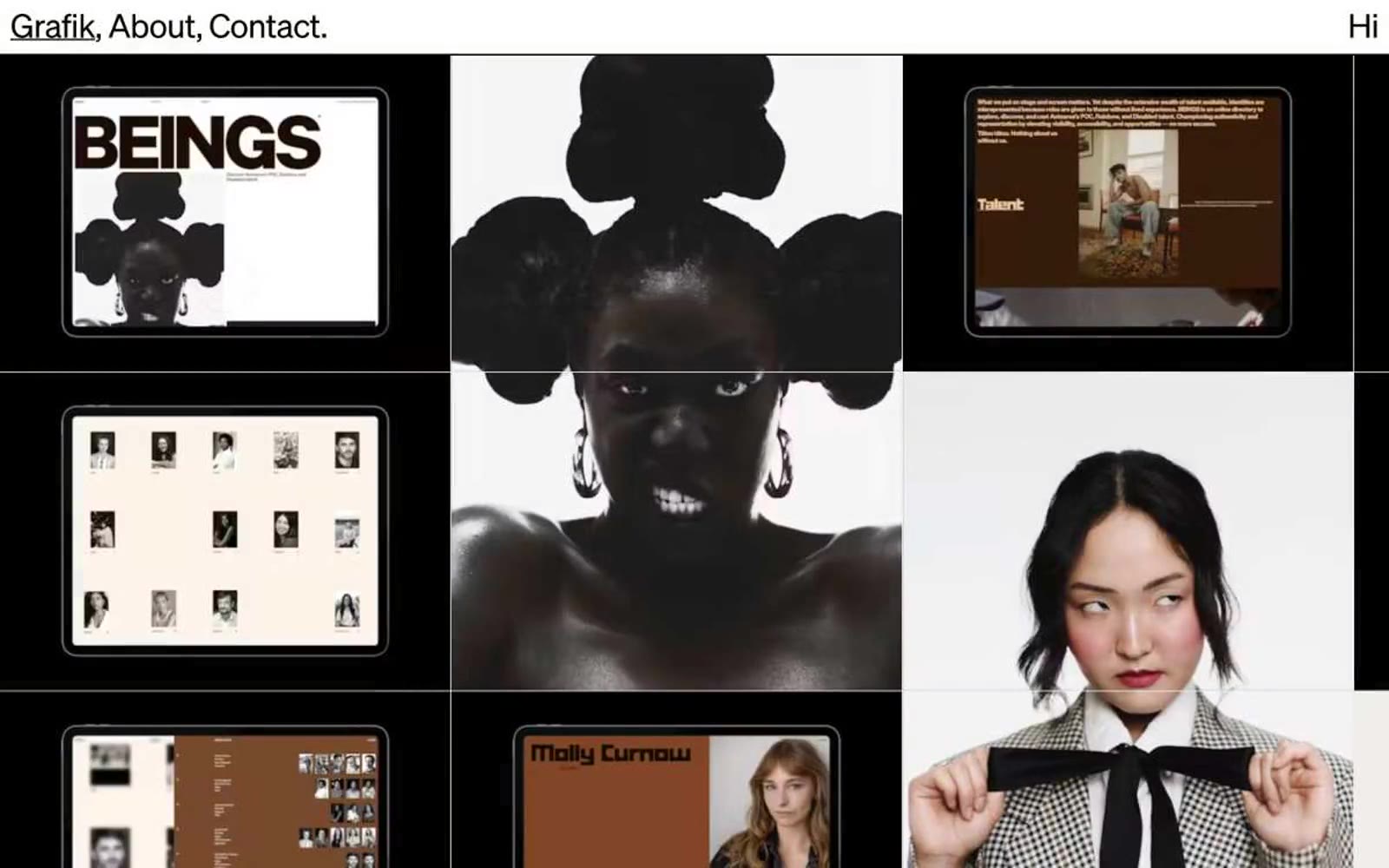
Grafik
Grafik — Style Reference