AI Prompt Studio - Intelligent Prompt Library
Explore and use professional AI prompts to optimize your workflow.
One-click Use
Websites
Markdown Text
design-md
website-prompt
landing-page-prompt
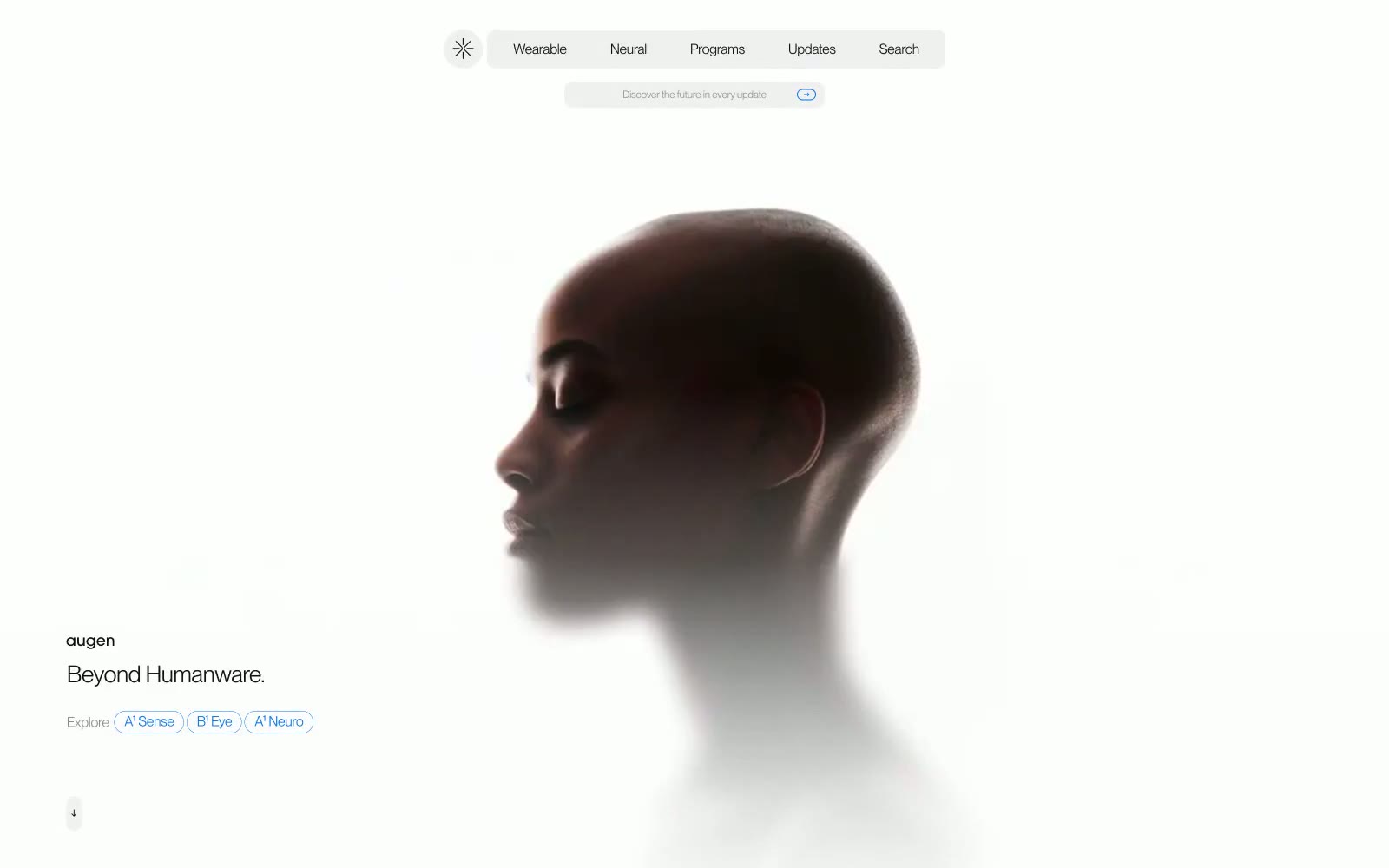
Augen Pro
Augen Pro — Style Reference

# Augen Pro — Style Reference
> Silhouette dissolving into white
**Theme:** light
Augen Pro is an achromatic whisper on a near-white void, broken by a single electric-blue signal. The entire interface speaks in low register: the largest text is 27px, headings use weight 350, and the canvas is a barely-warm #f2f2f4 that reads as paper rather than screen. A floating pill navigation anchors the top while content drifts toward the bottom-left, giving the page the feeling of a printed manifesto about future hardware rather than a product catalog. One dark section at the bottom inverts the palette, using the same restraint in reverse: white text on #0f1012 with the blue accent reserved for links and a single floating square ornament. Components are minimal and text-led — pill tags, ghost links, and small superscript labels — with the only visual punctuation being the blue #0071e3 that threads through links, icons, and decorative marks.
## Tokens — Colors
| Name | Value | Token | Role |
|------|-------|-------|------|
| Ink Black | `#0f1012` | `--color-ink-black` | Primary text, icons, dark section background, footer surface |
| Canvas Mist | `#f2f2f4` | `--color-canvas-mist` | Page background, hero canvas, soft surface fill |
| Paper White | `#fdfdfd` | `--color-paper-white` | Card surfaces, inset wells, pure-white content blocks |
| Fog Gray | `#8f8f8f` | `--color-fog-gray` | Muted secondary text, inactive nav items, button ghost text |
Websites
Markdown Text
design-md
website-prompt
landing-page-prompt
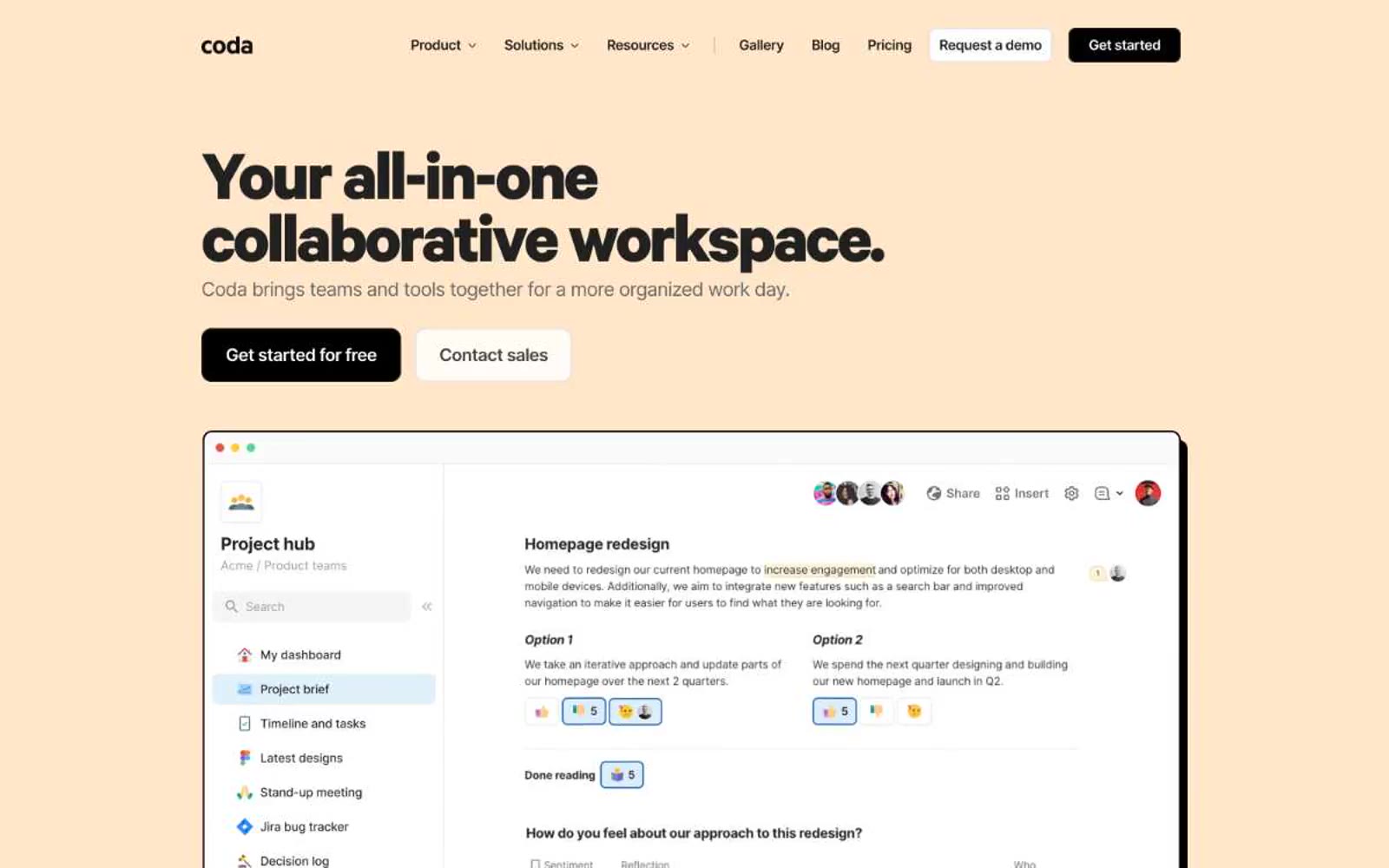
Coda
Coda — Style Reference
# Coda — Style Reference
> Cream-paper workspace — warm editor's desk where bold black type and a single orange accent do all the work.
**Theme:** light
Coda reads as a warm editorial workspace printed on cream paper: a nearly monochrome system anchored by heavy black sans-serif headlines that sit on a buttery #fff6ec canvas, with one vivid orange accent used as high-signal punctuation. The product itself is shown the way a magazine would show a well-designed tool — inside browser-chrome mockups with hard offset shadows, not soft Material-style elevation. Surfaces are mostly white; warm cream appears as the emotional entry band and as a footer anchor. Typography does almost all of the brand work: a custom 700-weight display face (Calibre-R) screams in tight tracking while Inter handles everything else at near-default weight. The result is confident and blunt — black buttons, hard shadows, and zero chromatic noise outside the single orange.
## Tokens — Colors
| Name | Value | Token | Role |
|------|-------|-------|------|
| Ink Black | `#212121` | `--color-ink-black` | Primary text, heading fills, primary borders, and the structural ink color across all UI surfaces |
| Pure White | `#ffffff` | `--color-pure-white` | Default page canvas, card surfaces, button text on dark fills, and outlined-button fills |
| Carbon | `#000000` | `--color-carbon` | Filled primary action background, hard offset shadow color, and high-contrast icon fills |
| Cream Paper | `#fff6ec` | `--color-cream-paper` | Warm hero band, footer surface, and the signature alternate canvas that gives Coda its editorial mood |
Websites
Markdown Text
design-md
website-prompt
landing-page-prompt
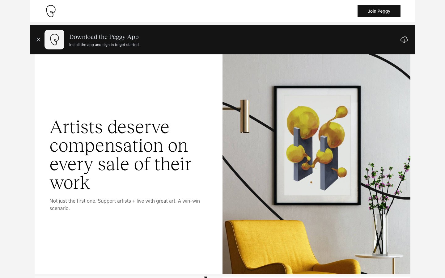
Peggy
Peggy — Style Reference
# Peggy — Style Reference
> monochrome art gallery on a winter morning — the only color comes from the work on the walls
**Theme:** light
Peggy operates as a curated white-cube gallery translated to the web: an entirely monochrome interface that treats color as something the artwork supplies, not the chrome. The page is anchored by Reckless, a contemporary serif used at whisper weight (300) for display and regular weight (400) for mid-tier headings — this single typographic decision is what separates Peggy from the sea of geometric-sans art marketplaces. Inter handles all UI chrome at 12-16px, Monument Grotesk micro-caps label the footer's category architecture. Surfaces are flat and almost invisible: #f4f4f4 canvas, #ffffff cards, hairline #f4f4f4 borders, with one dark surface (#141414) reserved for the app-download notification strip and the primary CTA. There is no brand color, no gradient, no decorative elevation — the system earns its atmosphere through generous negative space, squareness (no rounded corners except pill-masked photography), and the trust that real art and real type are enough.
## Tokens — Colors
| Name | Value | Token | Role |
|------|-------|-------|------|
| Gallery White | `#ffffff` | `--color-gallery-white` | Card surfaces, input fields, button text on dark fills, nav surface over dark strips |
| Canvas Mist | `#f4f4f4` | `--color-canvas-mist` | Page background; also functions as the universal hairline border (borderColor 572 occurrences across every context) — the system draws structure with the canvas color itself |
| Ink Black | `#000000` | `--color-ink-black` | Primary text, logo, nav labels, body copy — the strongest type color, never used as a surface |
| Charcoal | `#141414` | `--color-charcoal` | High-contrast neutral action fill for primary buttons on light surfaces. |
Websites
Markdown Text
design-md
website-prompt
landing-page-prompt
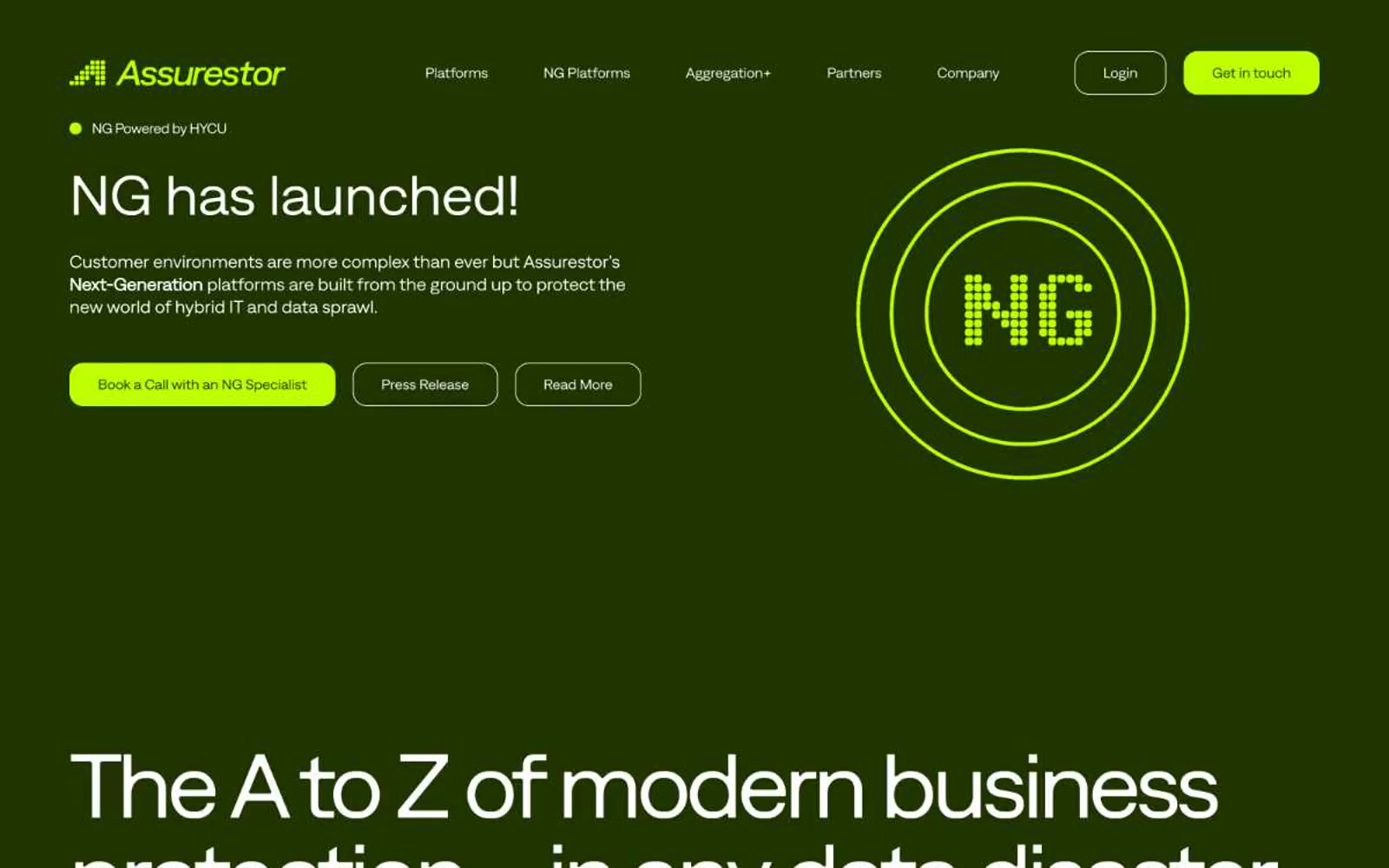
Assurestor
Assurestor — Style Reference
# Assurestor — Style Reference
> Electric terminal in a deep forest vault — lime phosphor on midnight olive.
**Theme:** dark
Assurestor operates as a dark-mode command console: a deep forest-green canvas (#203400) swallows the viewport while a single electric lime (#bdff00) acts as the only signal of action or emphasis — like phosphor readouts on a military terminal. The custom "Denim Ink" typeface dominates with extreme size jumps (64→86→94px) and aggressive negative tracking, producing headlines that feel carved rather than written. Surfaces layer subtly within the green family (#1b2d00 cards, #335400 elevated panels) rather than introducing grays, keeping the system chromatically disciplined. Components stay lightweight: ghost outlines replace heavy fills, generous corner radii (32px cards, 9999px pills) soften the dark density, and lime is rationed to CTAs, active dots, and one large illustrative block.
## Tokens — Colors
| Name | Value | Token | Role |
|------|-------|-------|------|
| Forest Canopy | `#203400` | `--color-forest-canopy` | Primary page background, nav strip, footer canvas — the dominant surface that defines the entire brand atmosphere |
| Vault Floor | `#1b2d00` | `--color-vault-floor` | Card surfaces, recessed panels, elevated content blocks within the forest canvas |
| Canopy Mid | `#335400` | `--color-canopy-mid` | Elevated card variant, highlighted surface tier above the base canvas |
| Lime Phosphor | `#bdff00` | `--color-lime-phosphor` | Primary action buttons, active state indicators, illustrative highlight panels, brand-accent moments — the sole chromatic signal in the system |
Websites
Markdown Text
design-md
website-prompt
landing-page-prompt
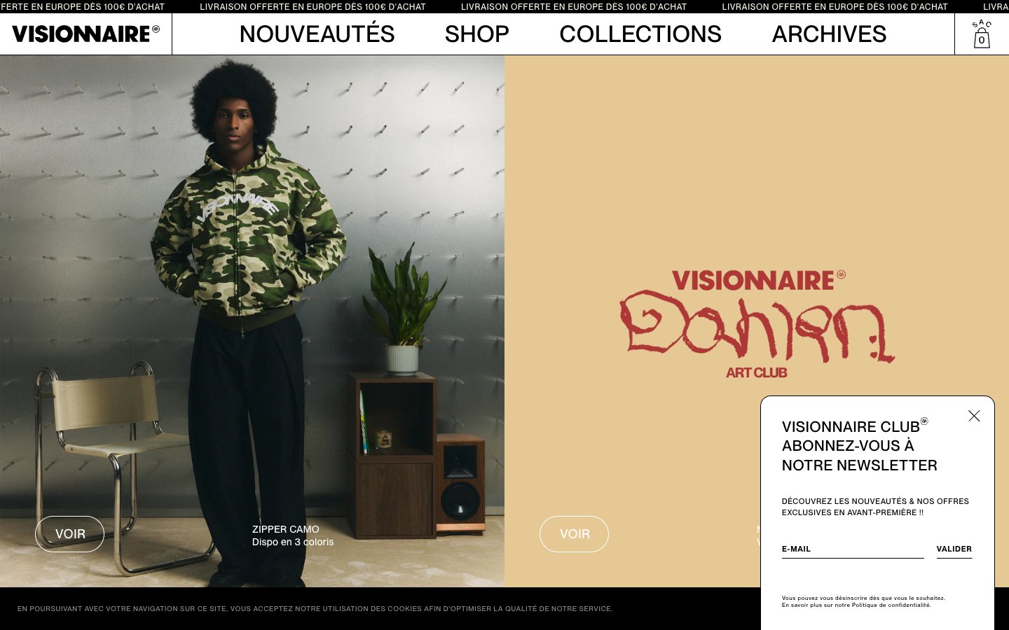
VISIONNAIRE
VISIONNAIRE — Style Reference
# VISIONNAIRE — Style Reference
> Editorial streetwear gallery on bone-white. The brand behaves like a printed lookbook: flat white canvas, sharp black ink, and a single warm cream panel used as a colour-block stage for product or wordmark.
**Theme:** light
VISIONNAIRE is an editorial streetwear shop rendered as a gallery on bone-white: large-format photography, heavy uppercase tracking, and a stripped-down achromatic palette that lets garment prints and color-block hero panels do the visual work. The interface avoids chrome — no shadows, no rounded card stacks, no gradient washes — relying on hard edges, hairline rules, and a single warm cream (#f7f5e8) to break the black-on-white monotony. Pill buttons (50px radius) and generous letter-spacing on every label give the system a fashion-magazine cadence rather than a retail-grid feel. Product tiles are dense and uniform (4 across), prioritising catalogue breadth over white-space breathing room, and the entire chrome reads as uppercase, tracked, and slightly shouted — like a runway programme.
## Tokens — Colors
| Name | Value | Token | Role |
|------|-------|-------|------|
| Obsidian | `#000000` | `--color-obsidian` | Neutral form states, badge text, and quiet UI feedback where color should stay understated. Do not promote it to the primary CTA color |
| Bone White | `#ffffff` | `--color-bone-white` | Page canvas, product card backgrounds, modal surfaces — the base everything sits on |
| Vellum Cream | `#f7f5e8` | `--color-vellum-cream` | Warm off-white used for color-block hero panels, editorial sections, and the newsletter module background — the only chromatic surface in the system |
| Charcoal | `#231f20` | `--color-charcoal` | Near-black for body copy on white and cream surfaces — slightly softer than pure obsidian, preserving AAA contrast on the warm cream |
Websites
Markdown Text
design-md
website-prompt
landing-page-prompt
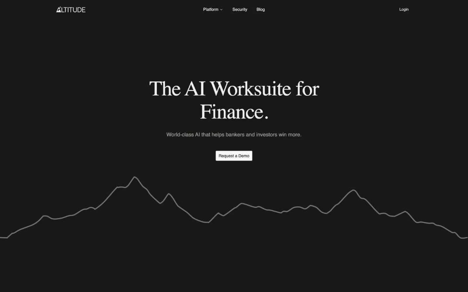
Altitude
Altitude — Style Reference
# Altitude — Style Reference
> midnight financial editorial — a darkened trading floor printed on bone-white serif stock, lit only by thin borders and a single blue accent.
**Theme:** dark
Altitude operates in a midnight editorial register: near-black canvas, off-white serif headlines (Libre Baskerville), and razor-thin secondary type (Inter). The serif-on-dark pairing is the signature — most AI finance tools lean on geometric sans-serifs; Altitude borrows from financial print (WSJ, FT) to signal authority and discretion. Mountain ridge linework and painterly landscape photography replace the usual gradient meshes and 3D renders, grounding the AI product in a sense of summit and scale. Surfaces are stratified by barely-perceptible gray steps (#111 → #181 → #1f → #26 → #32), with hairline borders doing the structural work that shadows do elsewhere. Color is almost entirely absent from the interface — when it appears, it reads as functional punctuation rather than decoration. Components are tight, rectangular (4–8px radii), and content-forward.
## Tokens — Colors
| Name | Value | Token | Role |
|------|-------|-------|------|
| Carbon Canvas | `#181818` | `--color-carbon-canvas` | Primary page background; the foundational dark surface that all sections sit on |
| Obsidian | `#111111` | `--color-obsidian` | Deepest layer — footer, contrast blocks, shadow wells |
| Graphite Card | `#1f1f1f` | `--color-graphite-card` | Card and input surfaces lifted one step above canvas |
| Slate Elevated | `#262626` | `--color-slate-elevated` | Elevated surfaces — table rows, hover states, secondary panels |
Websites
Markdown Text
design-md
website-prompt
landing-page-prompt
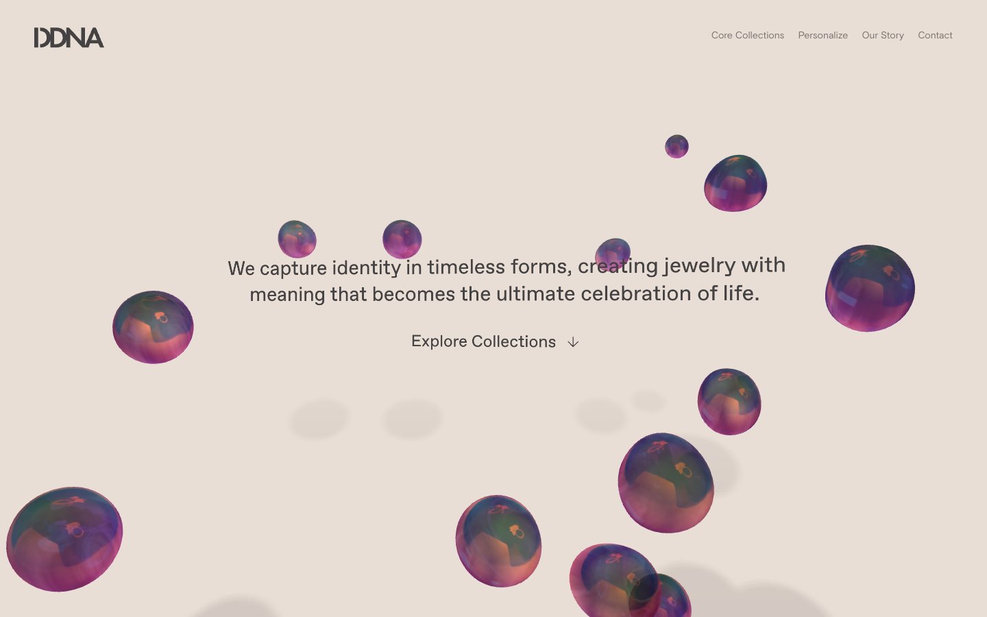
ddna
ddna — Style Reference
# ddna — Style Reference
> warm museum vitrine on raw linen
**Theme:** light
ddna is a warm earth-toned luxury system built on a single temperature of pigment: cream canvas, stone beige surfaces, dark warm-charcoal text. There is no accent color — the brand speaks through material, texture, and generous silence. Typography is uniformly weight 400 across every level, with wide tracking on small text that makes even body copy feel like a museum label. The hero is a composition of iridescent floating orbs against a peach-cream field, the only chromatic event in an otherwise monochrome world. Surfaces are flat and shadowless; depth comes from tonal layering, not elevation. Components are quiet to the point of absence — text links replace buttons, labels replace cards, and the product photography does the work that chrome would normally do.
## Tokens — Colors
| Name | Value | Token | Role |
|------|-------|-------|------|
| Stone Charcoal | `#444242` | `--color-stone-charcoal` | Primary text, navigation links, hairline borders, footer anchors — dark warm gray carries the same temperature as the cream surfaces it sits on, never pure black |
| Linen Cream | `#efe3dc` | `--color-linen-cream` | Heading text, footer surface, and the lighter plane in the surface stack — sits one step above the canvas |
| Warm Sand | `#dacabf` | `--color-warm-sand` | Page canvas — the dominant field every section and hero lives on |
| Dust | `#938a83` | `--color-dust` | Secondary borders and dividers when Stone Charcoal would be too heavy |
Websites
Markdown Text
design-md
website-prompt
landing-page-prompt
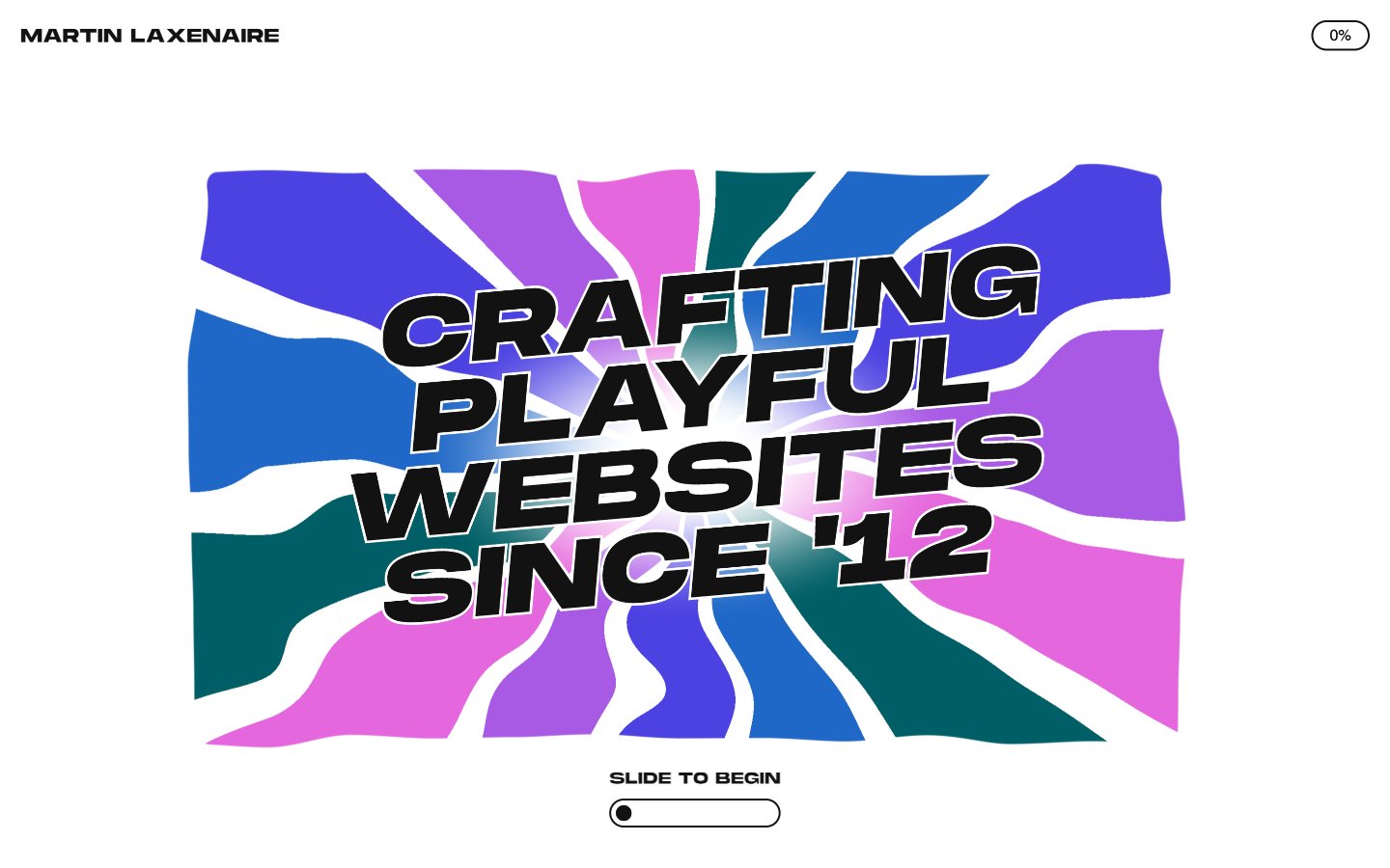
Martin Laxenaire
Martin Laxenaire — Style Reference
# Martin Laxenaire — Style Reference
> kinetic poster crashing through liquid color waves
**Theme:** light
Martin Laxenaire's site operates as a kinetic poster on a white gallery wall: a near-monochrome interface where one massive black display typeface (MonumentExtended UltraBold) at sizes up to 419px does all the shouting, surrounded by generous negative space. The rest of the typography collapses into a tiny, tight utility voice (Swiss 16–21px) for links, buttons, and body — the hierarchy is binary, either whisper or roar. A single soft pink (#f9d9f7) provides the canvas for an abstract, organic wave-field of fluid color shapes that the headline text crashes through, creating the site's signature collision of brutalist black letterpress against liquid color. Components are minimal — pill-shaped controls, hairline borders, and almost no surface differentiation. The system feels like a print designer's portfolio disguised as a web dev portfolio: editorial in restraint, explosive in the focal pieces.
## Tokens — Colors
| Name | Value | Token | Role |
|------|-------|-------|------|
| Ink Black | `#121212` | `--color-ink-black` | Primary text, all borders, icon strokes, the dominant UI color — every word and divider is this near-black |
| Paper White | `#ffffff` | `--color-paper-white` | Page canvas, surface background, button fills for outlined ghost controls |
| Blush Wash | `#f9d9f7` | `--color-blush-wash` | Hero art backdrop, accent surface — the soft pink that hosts the fluid color-shape composition |
Websites
Markdown Text
design-md
website-prompt
landing-page-prompt
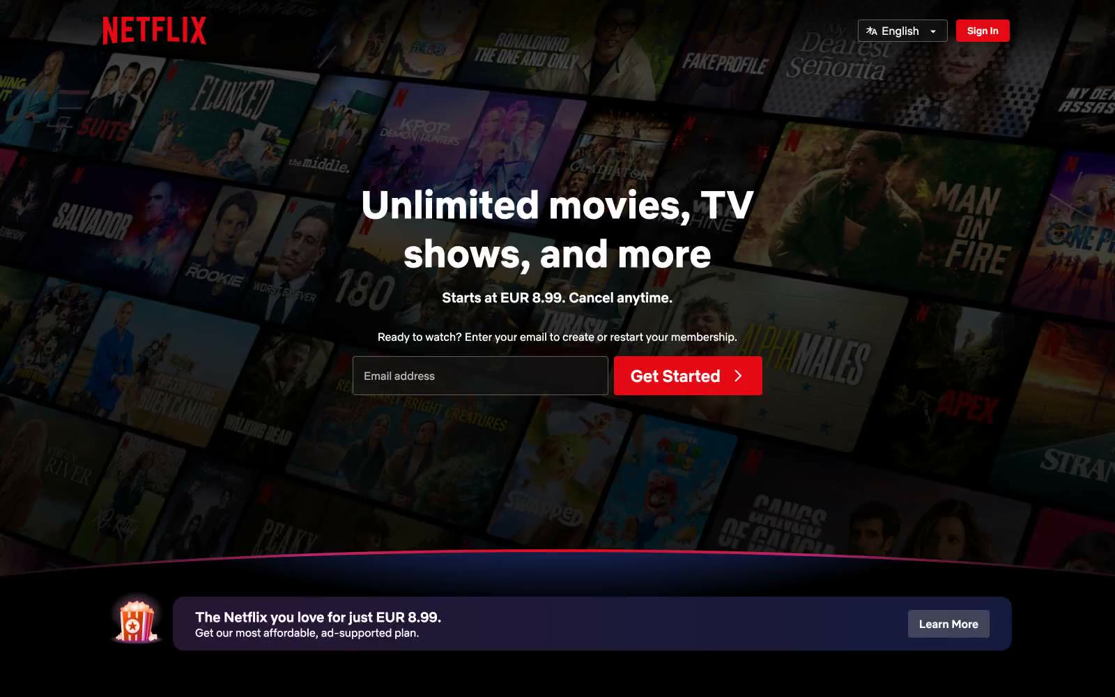
Netflix Spain
Netflix Spain — Style Reference
# Netflix Spain — Style Reference
> A black cinema lobby with one red exit sign.
**Theme:** dark
Netflix operates in cinematic darkness: a pure black void where vibrant content artwork becomes the visual hero. The interface strips itself down to typography and a single, unambiguous signal of action — Netflix Red. Every surface is some shade of near-black, creating a theatrical environment that makes movie posters, thumbnails, and show artwork explode off the screen. The system is intentionally minimal at the chrome level and maximal at the content level, with the red accent acting as the only warm temperature in an otherwise cold, immersive black space. Cards and feature tiles carry subtle dark-to-dark gradients (deep indigo, burgundy, charcoal) that add atmospheric depth without competing with the photographic content they frame.
## Tokens — Colors
| Name | Value | Token | Role |
|------|-------|-------|------|
| Netflix Red | `#e50914` | `--color-netflix-red` | Primary CTAs, brand logo, active states, and the single chromatic accent in the entire system — the only warm color allowed to break the black void |
| Pure Black | `#000000` | `--color-pure-black` | Dominant page canvas and deepest surface — the cinematic background that swallows everything non-essential |
| Obsidian | `#0f0f0f` | `--color-obsidian` | Elevated surface tone, barely distinguishable from black — used for subtle layering and section dividers |
| Carbon | `#232323` | `--color-carbon` | Card and button surface background — the primary elevated layer above pure black |
Websites
Markdown Text
design-md
website-prompt
landing-page-prompt
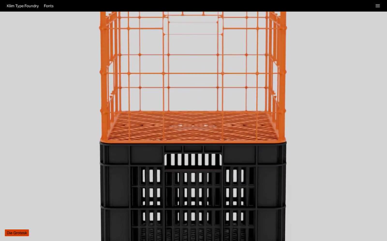
Klim
Klim — Style Reference
# Klim — Style Reference
> typographic gallery in a black box — a curator's vitrina where each specimen hangs in its own dark band
**Theme:** mixed
Klim Type Foundry presents its library as a typographic gallery: each typeface gets its own full-bleed band, set in itself, with no ornament. The site alternates between a matte black gallery mode and a pale studio-gray mode, letting the letterforms carry all the visual weight. UI chrome is reduced to a thin black header strip and small orange label tags; everything else is type. The accent system is deliberately loud — vivid orange-red, electric blue, mint teal — used as tiny color punches against an otherwise neutral monochrome canvas.
## Tokens — Colors
| Name | Value | Token | Role |
|------|-------|-------|------|
| Studio Charcoal | `#101c19` | `--color-studio-charcoal` | Page canvas, primary background — a near-black with a green undertone that reads as neutral but feels warmer than pure black |
| Gallery Black | `#000000` | `--color-gallery-black` | Feature bands, specimen backgrounds, header bar — pure black for maximum type contrast |
| Charcoal Surface | `#1c1c1c` | `--color-charcoal-surface` | Elevated surface, input fields, secondary panel backgrounds — one step lighter than the canvas |
| Slate Mist | `#3c585f` | `--color-slate-mist` | Muted accent band, tertiary surface — desaturated blue-gray used as an alternate section background |
Websites
Markdown Text
design-md
website-prompt
landing-page-prompt
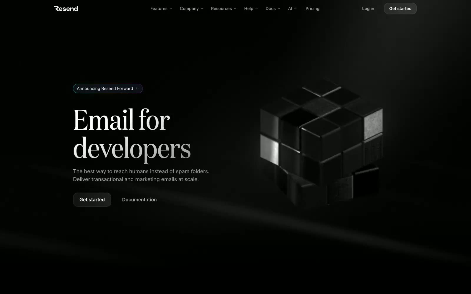
Resend
Resend — Style Reference
# Resend — Style Reference
> Obsidian developer terminal — every surface reads like polished black glass under a focused beam of white type.
**Theme:** dark
Resend is a pure black command surface — the canvas is #000000 with near-zero colorfulness (1%), giving the entire interface the weight of polished obsidian. Headlines use a custom serif (Domaine) at display sizes with tight -0.01em tracking, while UI copy runs in Inter and monospaced code elements appear in CommitMono, creating a three-voice typographic hierarchy that signals dev tooling without decoration. Color appears almost exclusively as functional data punctuation: violet for code identity, blue for interactive borders, and a handful of vivid status colors (green, red, yellow, light blue) that function as email event indicators — never as decoration. The system uses subtle border-based elevation (1px hairlines at #292d30) rather than shadows, keeping all surfaces flush and matte on black.
## Tokens — Colors
| Name | Value | Token | Role |
|------|-------|-------|------|
| Void Black | `#000000` | `--color-void-black` | Page canvas, card backgrounds — the dominant surface across every section |
| Graphite Rail | `#292d30` | `--color-graphite-rail` | Component borders, dividers, image frames — hairline structural separation on black |
| Smoke | `#464a4d` | `--color-smoke` | Subtle secondary borders and muted text-adjacent strokes |
| Ash | `#6c6c6c` | `--color-ash` | Tertiary text, badge labels, de-emphasized body content |
Websites
Markdown Text
design-md
website-prompt
landing-page-prompt
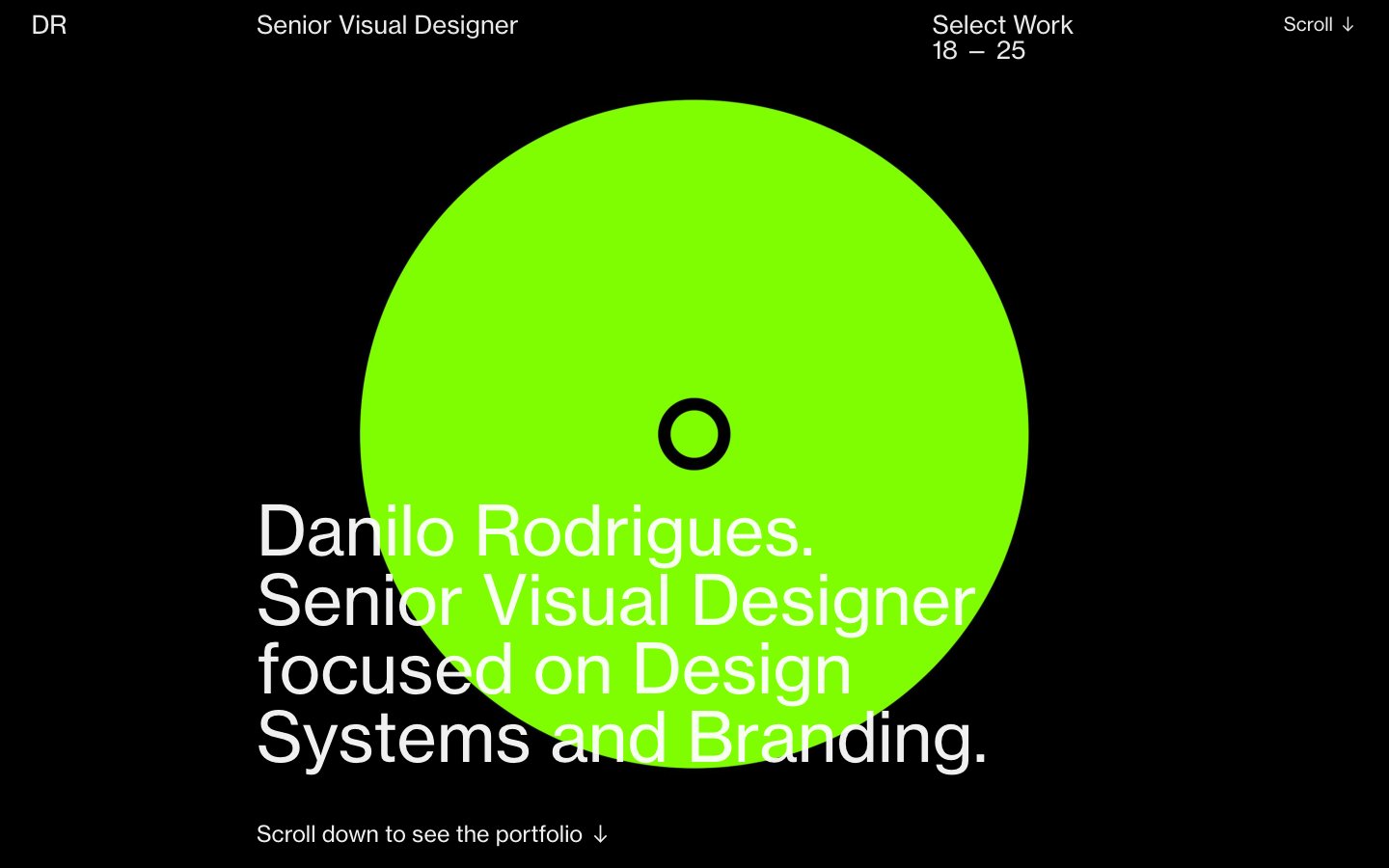
Danilo Rodrigues
Danilo Rodrigues — Style Reference
# Danilo Rodrigues — Style Reference
> Neon flare in a black void — a single oversized lime disc burning against a perfectly black page, with white type drifting around it like caption text on a gallery wall.
**Theme:** dark
Danilo Rodrigues runs on an almost monastic black-and-white system interrupted by two high-voltage color punches: a giant neon-lime disc in the hero and a saturated cobalt header band. Every other choice is editorial restraint — single-weight Neue Haas Grotesk at full volume, pure #000 canvas, and no shadows, no gradients, no borders, no buttons. The visual personality comes from what is removed, not added: there is no chrome, no card system, no component grid. Content sits directly on the void, left-aligned with generous indent, sized in two registers — a 71px display voice and an 18–19px working voice. Treat every screen as a printed editorial spread: monochrome page, one oversized geometric form, and copy that breathes.
## Tokens — Colors
| Name | Value | Token | Role |
|------|-------|-------|------|
| Void Black | `#000000` | `--color-void-black` | Page canvas, hero field, all large surface areas — the dominant ground that makes every other element read as signal |
| Bone White | `#eaeaea` | `--color-bone-white` | Primary body text, paragraph copy, bio blocks, nav labels — slightly off-white so it never feels clinical against the pure black field |
| Paper White | `#ffffff` | `--color-paper-white` | Headline text, hero display type, the loudest typographic register — pure white reserved for the largest voices on the page |
| Ash | `#878787` | `--color-ash` | Secondary heading text, muted labels, supportive metadata — the middle gray that lets a subhead recede behind a headline |
Websites
Markdown Text
design-md
website-prompt
landing-page-prompt
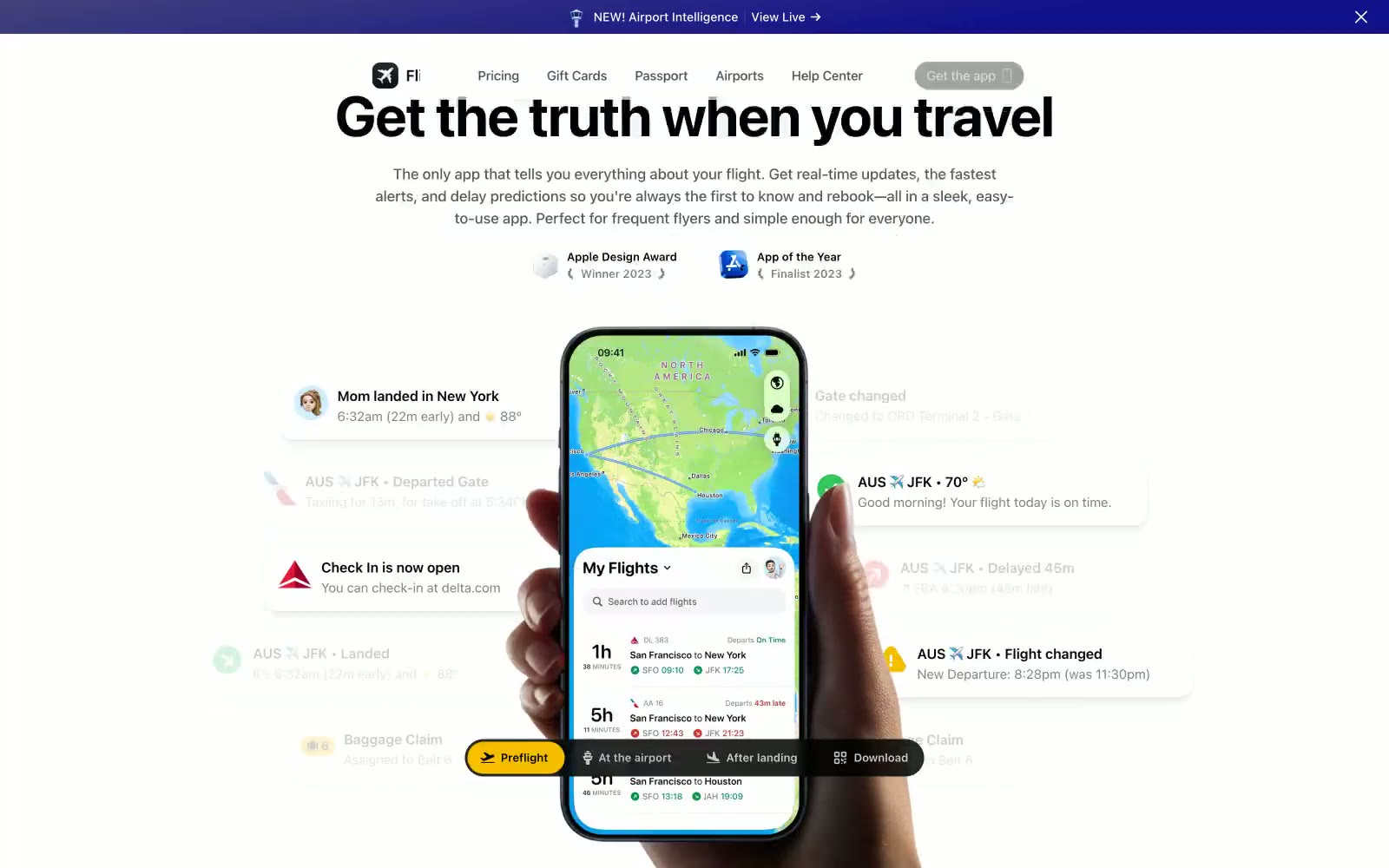
Flighty
Flighty — Style Reference
# Flighty — Style Reference
> Control tower at midnight — a luminous control room with glowing screens floating around a single device
**Theme:** mixed
Flighty is a departure-board-meets-control-tower: the upper page reads as a crisp white airport information panel, then the page drops into a deep midnight-violet control room with glowing screens in the dark. The palette is overwhelmingly achromatic, with one vivid blue (#007bff) reserved for actions and one amber-yellow (#f7be00) for the download conversion — a signal-light system against the dark and light surfaces. Typography is confident and heavy: a 56px display headline with tight -0.025em tracking that lands like a gate-change announcement, supported by compact system-ui body text. The signature element is the phone mockup surrounded by floating notification cards — soft, shadowed, slightly tilted cards showing real-time flight data (delays, gate changes, check-in opens) that orbit the device and make the product feel alive rather than static. Surfaces are nearly flat with ultra-low-opacity shadows (0.02–0.04) and hairline borders, so depth comes from layering and the page's light-to-dark transition, not from heavy drop shadows.
## Tokens — Colors
| Name | Value | Token | Role |
|------|-------|-------|------|
| Signal Blue | `#007bff` | `--color-signal-blue` | Primary action button fill, active link states, focus indicators — the single chromatic action color in an otherwise achromatic system |
| Amber Alert | `#f7be00` | `--color-amber-alert` | Download CTA, high-priority callouts, notification accents — warm yellow against dark surfaces for the conversion moment |
| Deep Indigo | `#0d0021` | `--color-deep-indigo` | Dark section backgrounds, announcement bar, hero gradient base — the midnight-violet that makes screens glow |
| Midnight Ink | `#05010d` | `--color-midnight-ink` | Dark card surfaces, deepest background layer — near-black with a violet undertone |
Websites
Markdown Text
design-md
website-prompt
landing-page-prompt
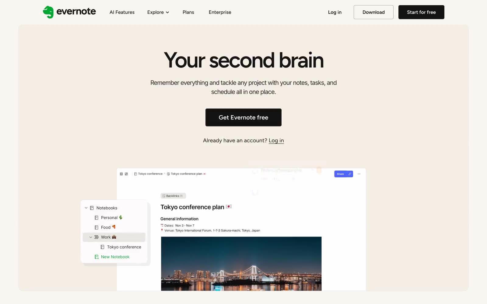
Evernote
Evernote — Style Reference
# Evernote — Style Reference
> Afternoon sun on cream paper — a warm, lived-in notebook where white cards float on beige, dark text breathes, and one lime-green highlighter marks the important things.
**Theme:** light
Evernote is a warm-paper productivity workspace: a cream canvas (#f9f6f2) replaces the typical white SaaS background, giving every screen the feel of a sunlit notebook page. The interface stays nearly monochrome — charcoal text, white elevated cards, hairline gray borders — with one vivid lime green (#94e130) acting as the singular energy accent for CTAs, icons, and highlights. Display headlines use Figtree at 300 weight with tight tracking, reading as editorial and airy rather than corporate. The visual rhythm is calm: centered hero stacks, generous section gaps, card carousels with small colored category squares, and a single dark contrast band (black with organic gradient blobs) that breaks the cream monotony for high-energy moments.
## Tokens — Colors
| Name | Value | Token | Role |
|------|-------|-------|------|
| Lime Sprout | `#94e130` | `--color-lime-sprout` | Primary action button, icon highlights, accent tags — the singular chromatic punctuation that makes actions feel switched on against the cream canvas |
| Paper Cream | `#f9f6f2` | `--color-paper-cream` | Page canvas, hero background, section backgrounds — warm off-white that replaces standard white with a paper-like quality |
| Ivory Card | `#f4eee5` | `--color-ivory-card` | Alternate card surface, warm-toned elevated panels that sit one step deeper than the cream canvas |
| Pure White | `#ffffff` | `--color-pure-white` | Elevated card surfaces, product screenshot containers, button text on dark fills |
Websites
Markdown Text
design-md
website-prompt
landing-page-prompt
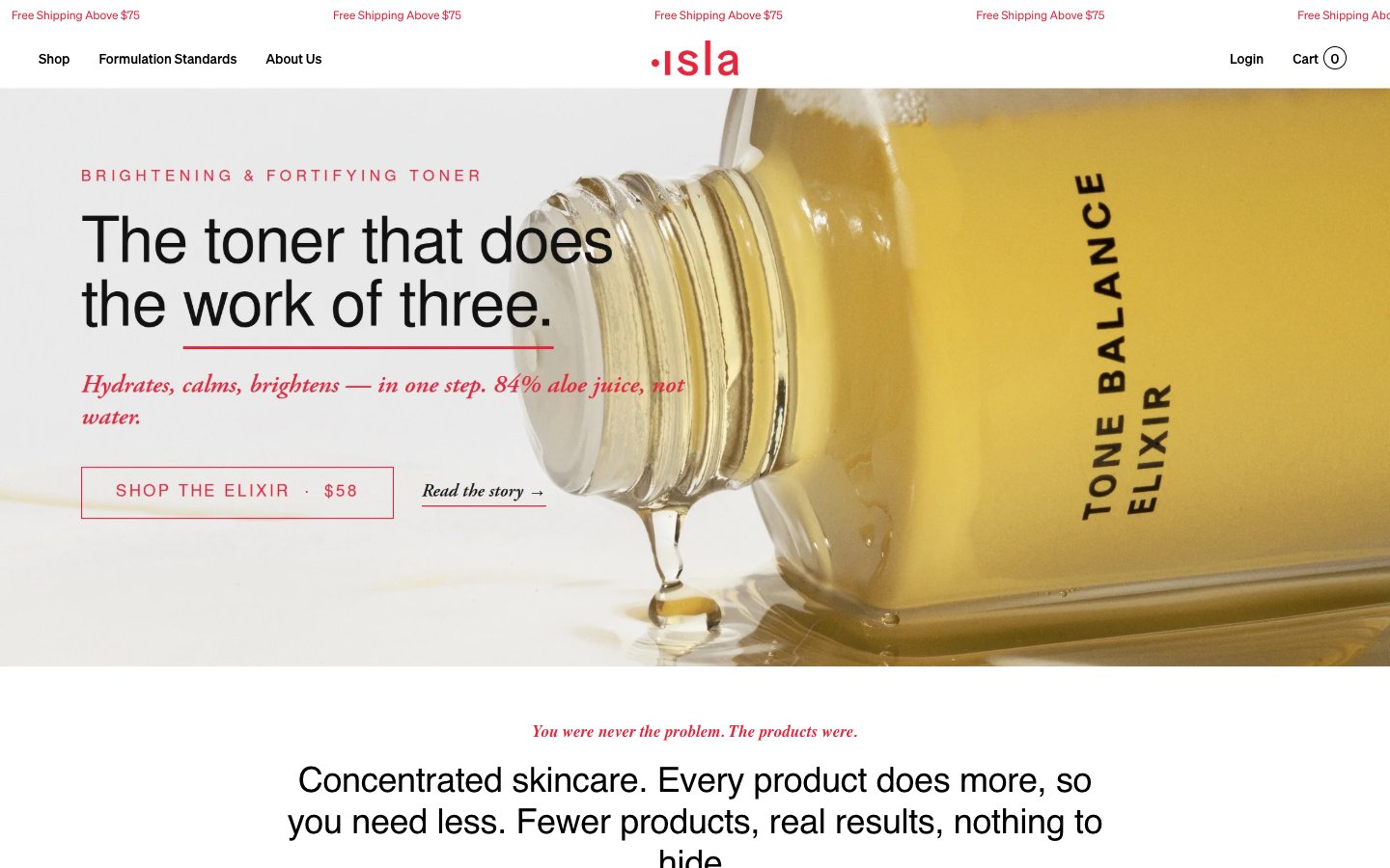
Isla Beauty
Isla Beauty — Style Reference
# Isla Beauty — Style Reference
> Cream apothecary with surgical red accents — think warm parchment walls, amber bottles, and a single red seal on every label.
**Theme:** light
Isla is a warm editorial apothecary: a cream-paper canvas, a single vivid red that does the work of an alarm clock, and a typographic mix of geometric sans (Soehne/Nimbus) paired with Garamond italic for emotional moments. The palette stays close to skin and paper — off-white, warm sand, blush, deep ink — with red appearing only as a small functional burst: CTAs, section eyebrows, add-to-cart fills, inline accents. Components are flat and quiet: 3px corners, hairline borders, no shadows, no gradients. Layout breathes; product photography carries the visual weight while type remains a composed voice — uppercase tracked labels over serif italics over sans body.
## Tokens — Colors
| Name | Value | Token | Role |
|------|-------|-------|------|
| Crimson Seal | `#e4263d` | `--color-crimson-seal` | Primary action — filled add-to-cart buttons, CTA borders, section eyebrows, price accents, link underlines, and all brand punctuation against the cream canvas. The red carries the entire chromatic load; it must read as deliberate and small, never as decoration |
| Vermillion Mark | `#e4002b` | `--color-vermillion-mark` | Secondary red accent — link borders, icon strokes, and outline-only controls. Slightly deeper than Crimson Seal; use when a quieter red moment is needed alongside the primary |
| Ink Black | `#000000` | `--color-ink-black` | Primary text, primary borders, navigation rules, body hairlines. The structural anchor of the entire interface |
| Soft Coal | `#1a1a1a` | `--color-soft-coal` | Badge borders, heading text, list markers, card text on cream — a near-black used where pure black would feel clinical against the warm canvas |
Websites
Markdown Text
design-md
website-prompt
landing-page-prompt
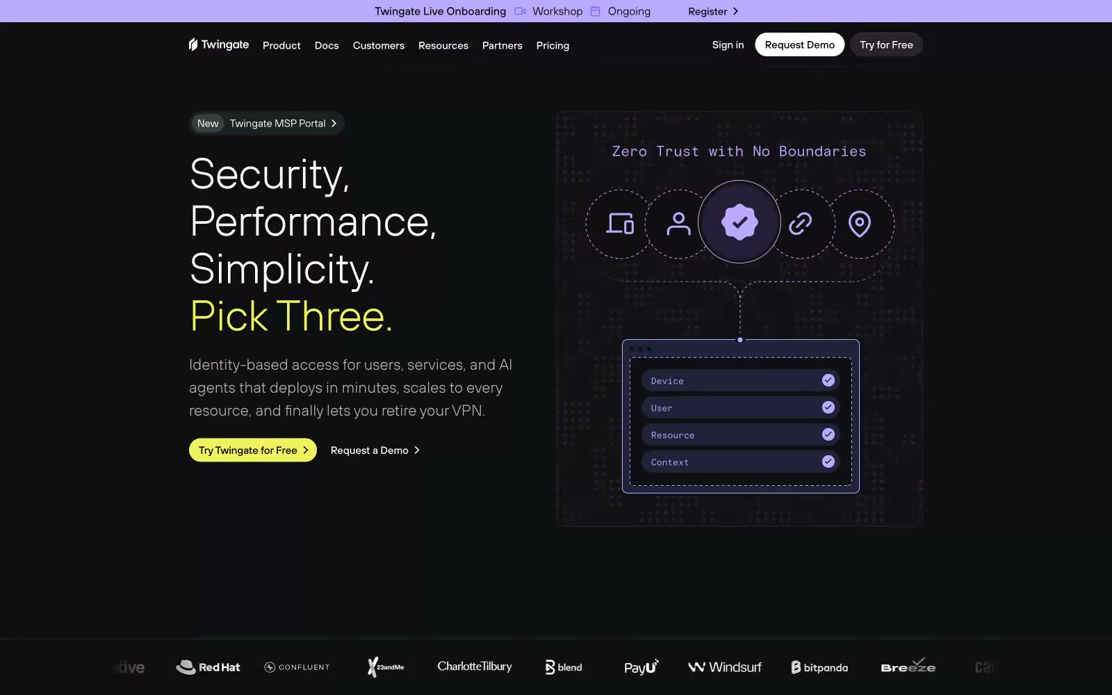
Twingate
Twingate — Style Reference
# Twingate — Style Reference
> Midnight control room with violet and chartreuse signal lights. The whole interface sits on a near-black void, with two accent colors pulsing like status LEDs across instrument-panel components — restrained, engineered, and slightly futuristic without being showy.
**Theme:** dark
Twingate operates as a midnight command center: an almost pure-black canvas layered with charcoal surfaces, where electric violet and chartreuse act as live-signal accents rather than decoration. The system speaks in quiet, light-weight typography — large headlines sit at TT Hoves Light with tight negative tracking, body text at TT Hoves Regular — letting the type architecture carry the weight while color is used as functional punctuation. Components feel instrument-panel: pill buttons, hairline-inset highlights replacing drop shadows, and rounded-but-not-soft 8–12px radii that read as engineered hardware rather than soft material. The result is a dark, security-grade interface that feels more like a control surface than a marketing page: every chromatic moment earns its screen real estate.
## Tokens — Colors
| Name | Value | Token | Role |
|------|-------|-------|------|
| Void Black | `#000000` | `--color-void-black` | Page canvas, hero backgrounds, full-bleed sections |
| Obsidian | `#0e0f11` | `--color-obsidian` | Card surfaces, elevated panels, content containers above the page |
| Carbon | `#141617` | `--color-carbon` | Secondary surface layer, input fields, nested containers |
| Graphite | `#1d2023` | `--color-graphite` | Supporting neutral for secondary UI, dividers, and muted labels. Do not promote it to the primary CTA color |
Websites
Markdown Text
design-md
website-prompt
landing-page-prompt
Workable
Workable — Style Reference
# Workable — Style Reference
> Warm portrait gallery on cream paper
**Theme:** light
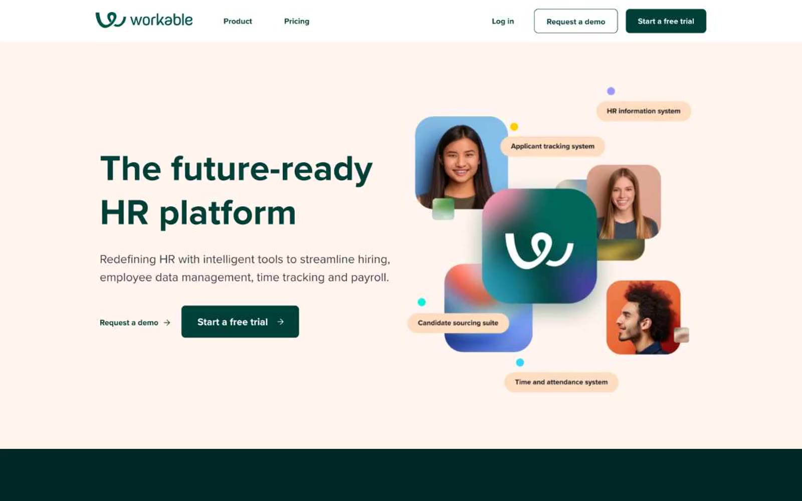
Workable reads as a warm, human-centered HR platform built on a cream canvas with a deep forest-teal primary color and playful multicolor accents. The visual signature is bold display typography paired with rounded photography tiles floating over gradient-washed product shots — people always feel close, never corporate. Surfaces are layered from a warm off-white base (#fff5ee) through soft pastel card backgrounds (peach, blue, cream) to white product screenshots, creating depth without shadows. Accent colors (lime, cyan, violet) appear as decorative punctuation in illustrations, gradients, and feature category badges, never as functional UI chrome. The overall feel is approachable and confident — a recruiting tool that signals 'people-first' through warm tones and rounded, generous shapes.
## Tokens — Colors
| Name | Value | Token | Role |
|------|-------|-------|------|
| Cream Paper | `#fff5ee` | `--color-cream-paper` | Page canvas, section backgrounds — warm off-white that softens the whole interface and distinguishes Workable from stark-white SaaS |
| Ink Black | `#0f161e` | `--color-ink-black` | Primary text, dark filled buttons, body copy, nav links, borders — the cool near-black that grounds all warm surfaces |
| Pure White | `#ffffff` | `--color-pure-white` | Card surfaces, product screenshot backgrounds, text on dark fills — the cleanest highlight in the surface stack |
| Graphite | `#333942` | `--color-graphite` | Secondary text, muted body copy, link borders — readable but receding |
Websites
Markdown Text
design-md
website-prompt
landing-page-prompt
Hims App
Hims App — Style Reference
# Hims App — Style Reference
> spa brochure on vellum paper
**Theme:** light
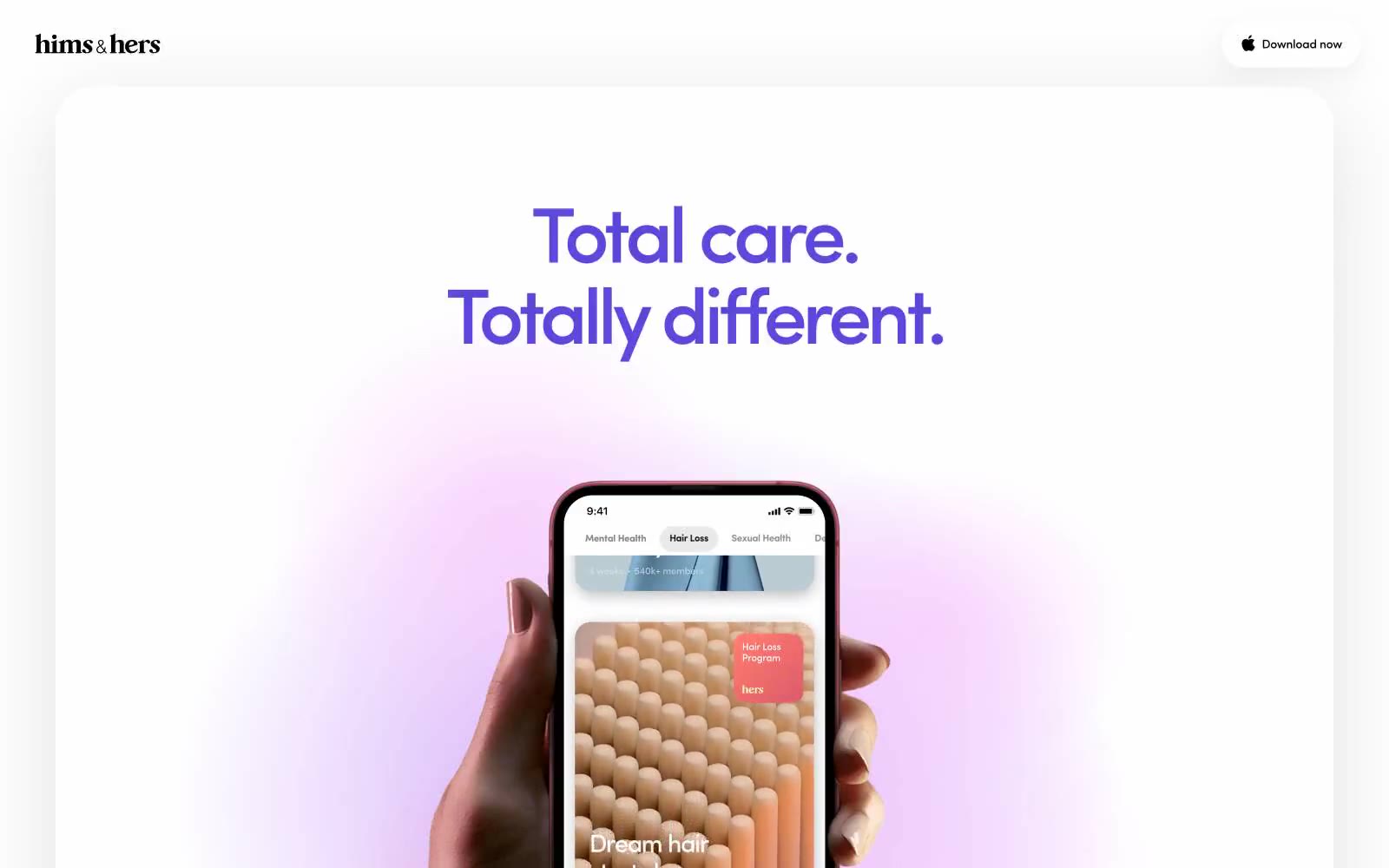
Hims App operates as a calm, monochrome wellness interface where one violet accent does all the emotional work against an otherwise achromatic canvas. The system is built for breath: oversized type in a custom geometric sans (sofia), generously rounded surfaces (30–52px radii), and long-spread soft shadows that make cards appear to float rather than sit. The hero is photographic and intimate — a hand holding a phone, product color bleeding into real skin — but the surrounding UI stays austere: white canvas, black type, hairline borders. Violet #5d48db is reserved almost exclusively for headlines and occasional borders, never for filled buttons. Components feel like printed editorial spreads: large negative space, no decorative gradients in chrome, and a single type family carrying every weight of meaning.
## Tokens — Colors
| Name | Value | Token | Role |
|------|-------|-------|------|
| Hims Violet | `#5d48db` | `--color-hims-violet` | Headline text, display borders, brand accent — the single chromatic voice in an otherwise monochrome system |
| Carbon Black | `#000000` | `--color-carbon-black` | Primary text, hairline borders, icon fills, nav dividers — the structural ink of the interface |
| Paper White | `#ffffff` | `--color-paper-white` | Page canvas, card surfaces, nav background, image backgrounds — the base surface at every elevation level |
| Vellum Gray | `#f0f0f0` | `--color-vellum-gray` | List dividers, subtle row separators, muted list text — the quietest structural neutral |
Websites
Markdown Text
design-md
website-prompt
landing-page-prompt
Wallpaper Projects
Wallpaper Projects — Style Reference
# Wallpaper Projects — Style Reference
> Editorial gallery on warm paper — a spread from a 12×16 art monograph where cream stock, near-black ink, and one enormous serif do all the talking.
**Theme:** light
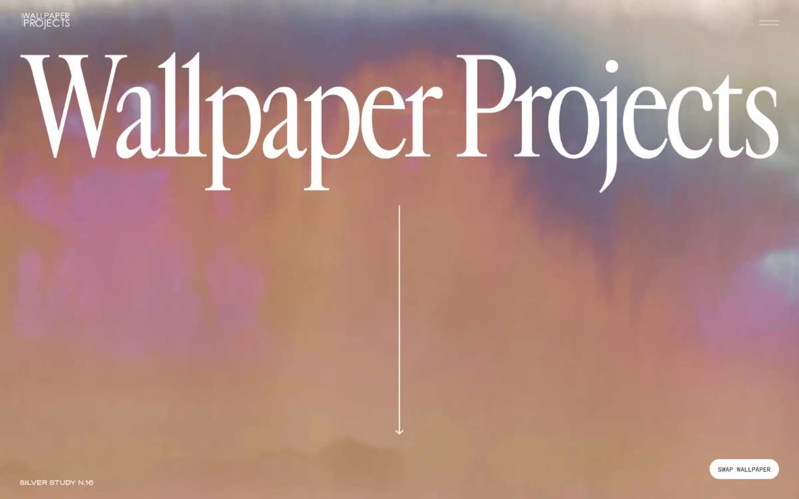
Wallpaper Projects reads like a high-end art book spread printed on warm cream stock: massive editorial serif type (Cardinal Fruit) set against quiet, paper-warm surfaces, with a single near-black ink doing all the work. The palette is rigorously monochrome — no chromatic accents, no decorative gradients, no shadows — letting the photography and the typographic scale do the heavy lifting. Layout is asymmetric and gallery-paced: full-bleed atmospheric heroes give way to split text+image compositions on cream, with generous negative space acting as the primary structural device. Every interactive element is reduced to a dark pill on warm paper, and the entire system whispers 'considered, expensive, restrained' rather than shouting.
## Tokens — Colors
| Name | Value | Token | Role |
|------|-------|-------|------|
| Ink Black | `#1e1e1e` | `--color-ink-black` | Primary text, dark pill button fills, borders, heading strokes — the only ink in the system |
| Paper White | `#ffffff` | `--color-paper-white` | Primary canvas, image backgrounds, button text on dark fills |
| Warm Cream | `#fbf9f3` | `--color-warm-cream` | Alternate surface — the signature cream stock that gives the system its editorial warmth, used for secondary sections and cards |
| Pure Black | `#000000` | `--color-pure-black` | Maximum contrast moments, occasional true-black text where #1e1e1 isn't dark enough |
Websites
Markdown Text
design-md
website-prompt
landing-page-prompt
MekaVerse
MekaVerse — Style Reference
# MekaVerse — Style Reference
> monochrome gallery for digital artifacts — a pure black void where a rendered world hangs like a museum piece, and all UI is white ink on matte black glass.
**Theme:** dark
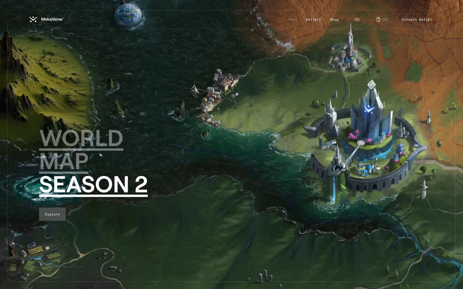
MekaVerse is a cinematic web3 game portal where the interface dissolves and the rendered world takes the stage. The entire UI is a monochrome shell — pure black canvas, white type, single charcoal button — built to frame massive full-bleed 3D artwork without competing with it. Typography does almost all the work: a single custom geometric sans (Roobert) stacked at extreme sizes with aggressive negative line-height for hero titles, and a quiet monospaced face (GT America Mono) whispering UI chrome in 10–12px. Surfaces are flat — no shadows, no gradients, no chromatic accent — the game art provides all color and depth. Every chrome element is featherweight: hairline 1px borders, 2px corner radii on interactive controls, and text-only hover states. The system reads less like a website and more like a gallery wall where the 3D world is the only object in the room.
## Tokens — Colors
| Name | Value | Token | Role |
|------|-------|-------|------|
| Void | `#000000` | `--color-void` | Page canvas, image overlays, nav background — pure black lets full-bleed 3D renders carry every chromatic moment while UI chrome disappears into the background |
| Bone | `#ffffff` | `--color-bone` | Hairline borders, dividers, input outlines, and card edges on light surfaces. |
| Charcoal | `#444345` | `--color-charcoal` | Filled action buttons (Explore, Connect Wallet) and the one elevated surface level above the void — a soft dark step that reads as pressed-in rather than raised, keeping the flat-gallery feel |
| Frost | `#e2e2e2` | `--color-frost` | Hairline borders, divider lines, subtle structural edges — visible only where it separates two dark surfaces or wraps a control |
Websites
Markdown Text
design-md
website-prompt
landing-page-prompt
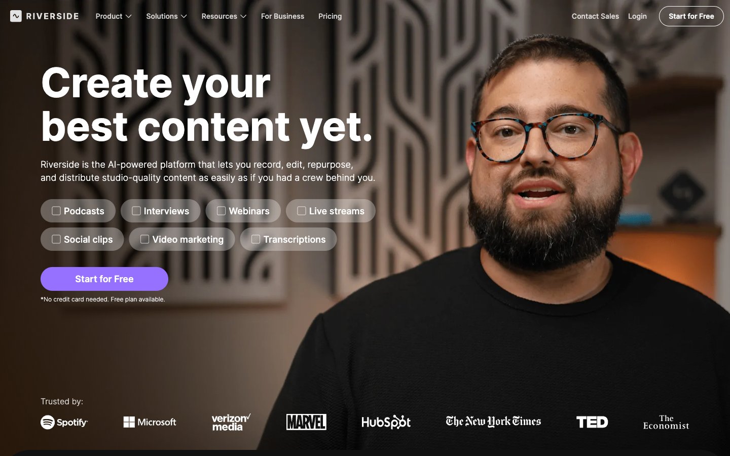
Riverside
Riverside — Style Reference
# Riverside — Style Reference
> Studio darkroom behind frosted glass
**Theme:** light
Riverside runs a near-monochrome light system anchored by white canvas and near-black text, with a single vivid violet accent (#9671ff) that functions as the only chromatic element in the entire interface. The visual rhythm alternates between pure white content bands and full-bleed dark sections (near-black backgrounds) that host feature lists and CTAs, creating a cinematic on/off cadence rather than a continuous light layout. Typography is exclusively Inter (with IBM Plex Sans 600 reserved for a narrow role), set with aggressive negative tracking and tight line-heights at large sizes — headlines feel compressed and intentional rather than airy. Components are lightweight: pill-shaped buttons at 300px radius, 8px card radii, hairline borders over soft tints, and almost no elevation. The violet accent is rationed — one filled CTA per screen, occasional icon strokes, soft wash backgrounds — which makes it feel like a deliberate switch being thrown rather than decoration.
## Tokens — Colors
| Name | Value | Token | Role |
|------|-------|-------|------|
| Studio Violet | `#9671ff` | `--color-studio-violet` | Primary CTA buttons, active nav indicators, selected states, accent icon strokes — the sole chromatic switch in an otherwise grayscale interface; one filled violet per screen creates a clear hierarchy of action |
| Lavender Mist | `#f2eeff` | `--color-lavender-mist` | Soft accent surface washes behind feature tags, subtle highlighted regions, and selected nav backgrounds — a whisper of brand color that never competes with the primary violet |
| Periwinkle Tint | `#eae3ff` | `--color-periwinkle-tint` | Deeper lavender wash for highlighted tag backgrounds, soft brand-tinted card surfaces, and active state fills that need more presence than Lavender Mist |
| Iris Light | `#ad98fa` | `--color-iris-light` | Secondary violet for outlined buttons, hover strokes, and decorative icon tints where full Studio Violet would be too loud |
Websites
Markdown Text
design-md
website-prompt
landing-page-prompt
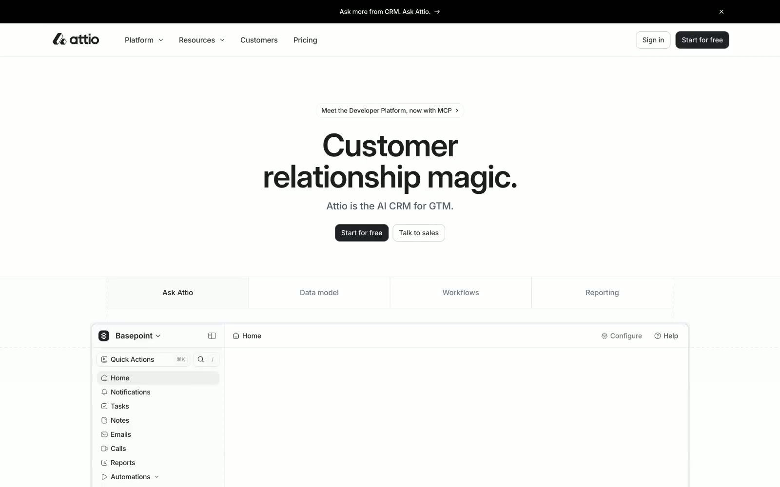
Attio
Attio — Style Reference
# Attio — Style Reference
> Precision Digital Toolkit. A design system built on a foundation of high-contrast monochrome, where soft serif headlines provide a human touch to a clinical, tool-like interface.
**Theme:** light
The design feels like a meticulously organized, high-end instrument. It operates on a starkly minimalist, black-and-white axis, where near-black (#1c1d1f) on pure white is the default state for text and primary actions. The most distinctive choice is the typographic duality: large, inviting headlines are set in the soft serif Tiempos Text, while the entire user interface, from buttons to body copy, uses the neutral sans-serif Inter. This creates a rhythm between approachable storytelling and functional precision. Color is used with extreme restraint, appearing as subtle accents for interactive states or status indicators, ensuring the user's focus remains on content and functionality. A consistent 10px radius on buttons provides a soft counterpoint to the otherwise sharp, grid-aligned UI frames.
## Tokens — Colors
| Name | Value | Token | Role |
|------|-------|-------|------|
| White | `#ffffff` | `--color-white` | Primary page background, text on dark surfaces |
| Ash | `#f3f4f6` | `--color-ash` | Subtle background panels, button pressed state |
| Stone | `#e4e7ec` | `--color-stone` | Light borders, dividers |
| Slate | `#d3d8df` | `--color-slate` | Default borders, inactive UI elements |
Websites
Markdown Text
design-md
website-prompt
landing-page-prompt
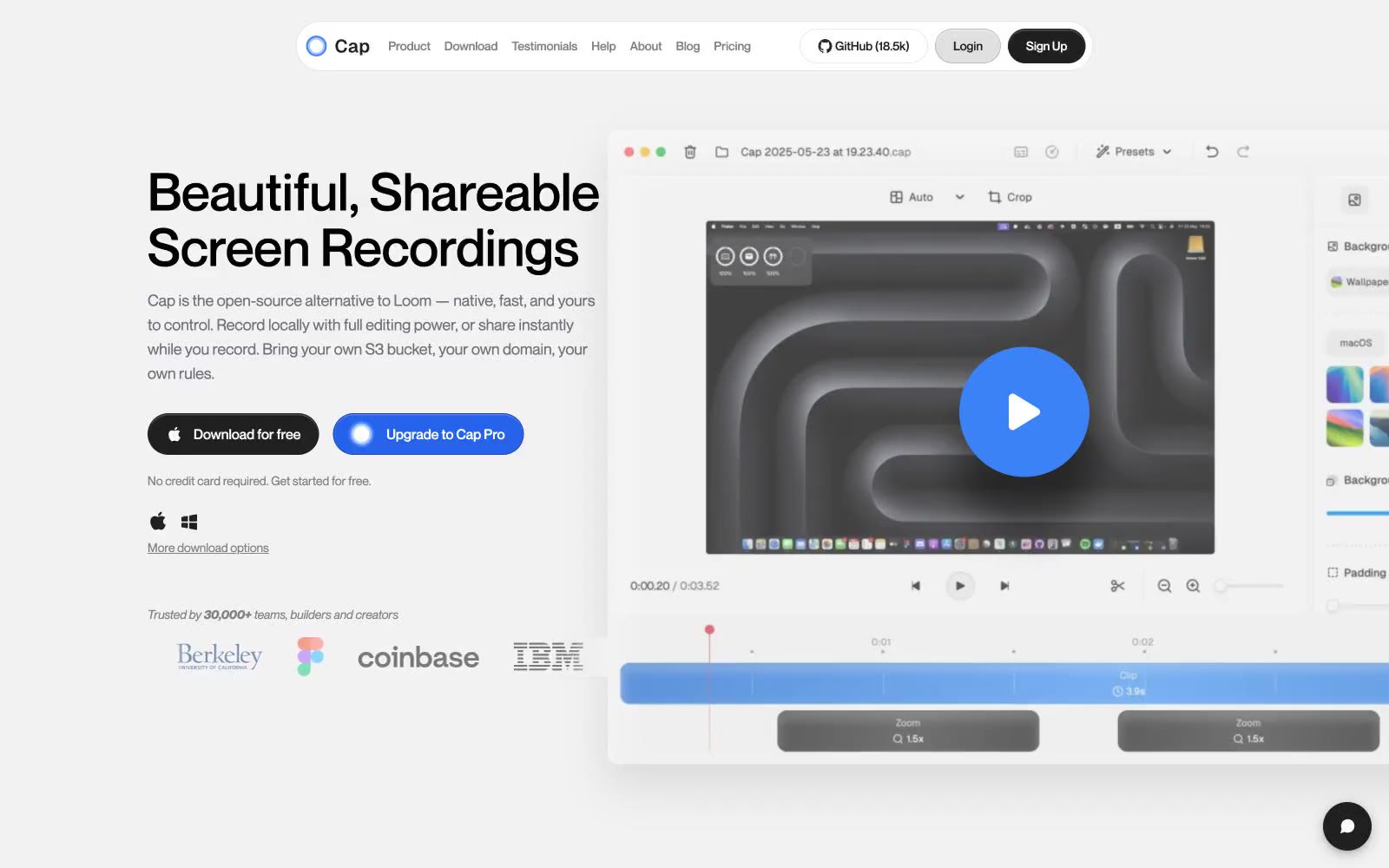
Cap
Cap — Style Reference
# Cap — Style Reference
> quiet white studio with a single blue spark
**Theme:** light
Cap reads as a calm, white-canvas workspace with a single confident blue accent — the visual language of a focused native desktop tool that happens to live in a browser. Surfaces are nearly white with hairline gray borders doing most of the structural work; elevation is barely-there, leaning on 1px strokes and subtle inset highlights rather than heavy drop shadows. Typography is a single geometric sans at three weights, set generously tight on display sizes, with uppercase eyebrow labels floating at 20% letter-spacing above section headings. The two-color button system — black for download/ownership, blue for upgrade/purchase — carries all the decision-making in the layout; everything else stays quiet. Multi-color gradients appear only inside the product mockup (the wave/ribbon artwork) and never bleed into UI chrome, keeping the interface disciplined.
## Tokens — Colors
| Name | Value | Token | Role |
|------|-------|-------|------|
| Signal Blue | `#3b82f6` | `--color-signal-blue` | Primary brand accent — links, active nav indicators, icon highlights, the inner play-button of the product mockup. Saturated enough to be the one color users remember, restrained enough to never compete with copy |
| Action Blue | `#2563eb` | `--color-action-blue` | Filled CTA buttons (Upgrade to Cap Pro), focus rings, and the strongest interactive state. One shade deeper than Signal Blue to give pressed actions a subtle weight shift |
| Ink Black | `#202020` | `--color-ink-black` | Headings, body text, the dark CTA button fill (Download for free). Off-black rather than pure #000 to avoid harsh edges on white |
| Carbon | `#000000` | `--color-carbon` | Pure black reserved for the highest-emphasis text and icon fills where maximum contrast is required |
Websites
Markdown Text
design-md
website-prompt
landing-page-prompt
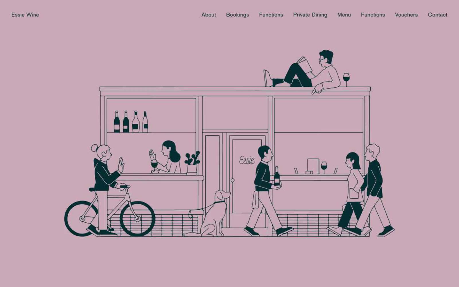
Essie Wine
Essie Wine — Style Reference
# Essie Wine — Style Reference
> Dusty rose chapbook with mustard chapter breaks
**Theme:** mixed
Essie Wine is an editorial neighborhood-wine-bar identity: three full-bleed color fields (dusty rose, warm white, mustard olive) stitched together by generous vertical breathing room and serif type that reads like a small magazine spread. Color is deployed as atmosphere, not accent — the entire page is the brand, and components are reduced to thin hairline rules, all-caps Elementa labels, and BasicCommercial serif body copy. The illustration in the hero is a single detailed line-art scene that does the storytelling work a SaaS site would delegate to feature cards and metrics. Interactions are quiet: ghost buttons, borderless inputs, no shadows, no gradients, no rounded corners — the only depth comes from section-to-section color shifts.
## Tokens — Colors
| Name | Value | Token | Role |
|------|-------|-------|------|
| Ink Teal | `#062d32` | `--color-ink-teal` | Primary type, illustration linework, nav wordmark, heading hairlines — the near-black that reads as warm ink rather than flat black, giving the serif type a hand-printed quality |
| Dusty Rose | `#c9a9b5` | `--color-dusty-rose` | Hero section field — the signature chapter color. Used as a full-bleed canvas behind the line-art illustration to create the soft, sun-bleached, evening-light atmosphere |
| Mustard Olive | `#aa9e54` | `--color-mustard-olive` | Booking and function-section field — the warm, earthy second chapter. Appears as a full-bleed background that pushes serif headings and form labels into high-contrast territory |
| Slate Teal | `#344b52` | `--color-slate-teal` | Secondary text, link borders, tertiary headings — a lighter wash of Ink Teal for passages that shouldn't compete with the primary wordmark |