AI Prompt Studio - Intelligent Prompt Library
Explore and use professional AI prompts to optimize your workflow.
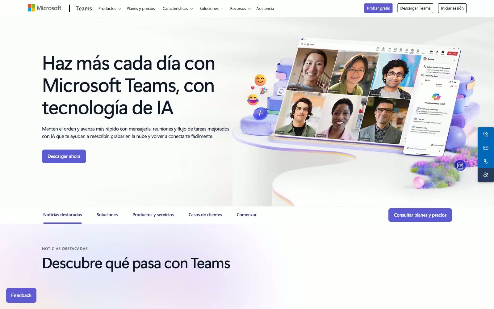
Videoconferencia
Videoconferencia — Style Reference

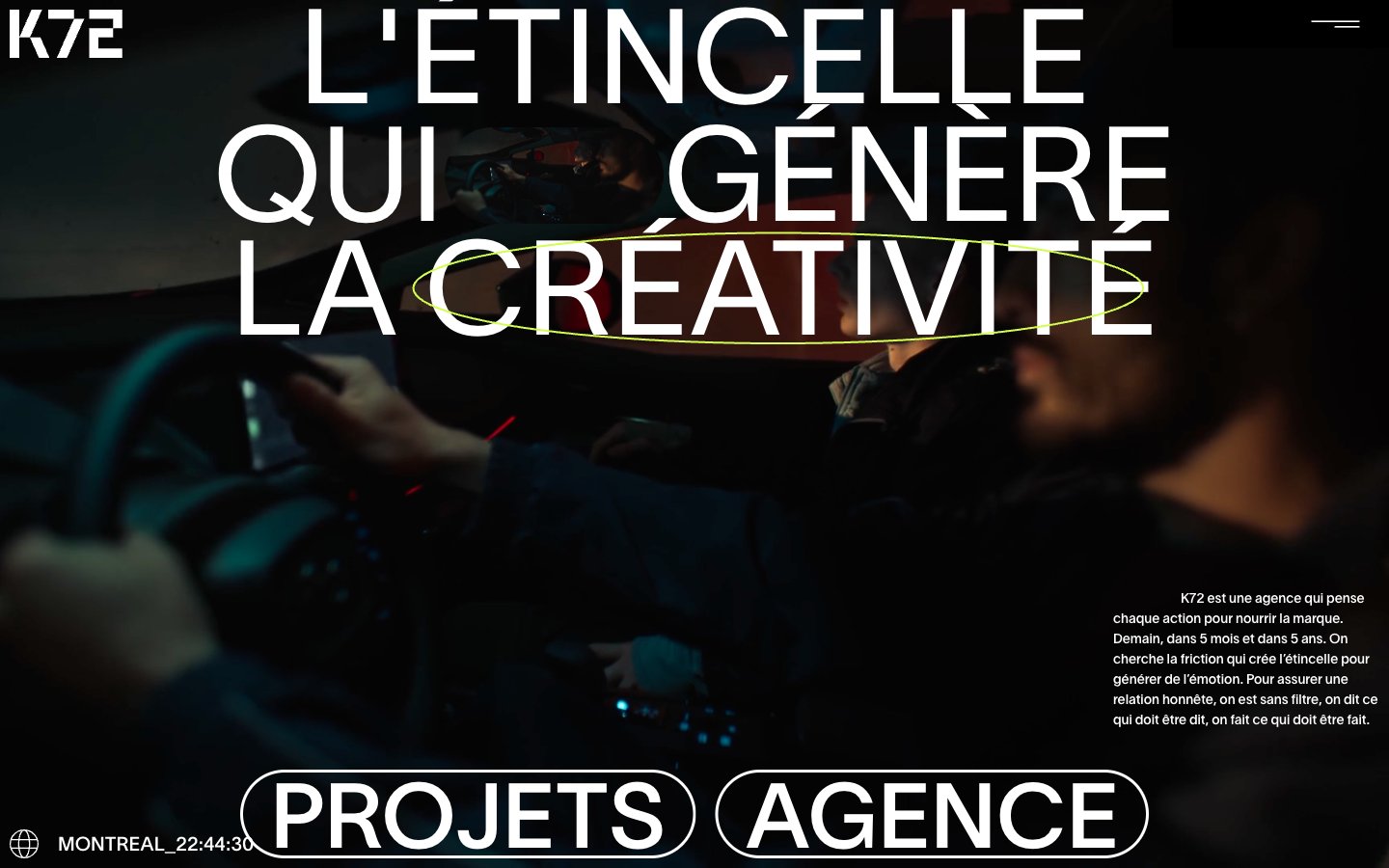
Agence K72
Agence K72 — Style Reference
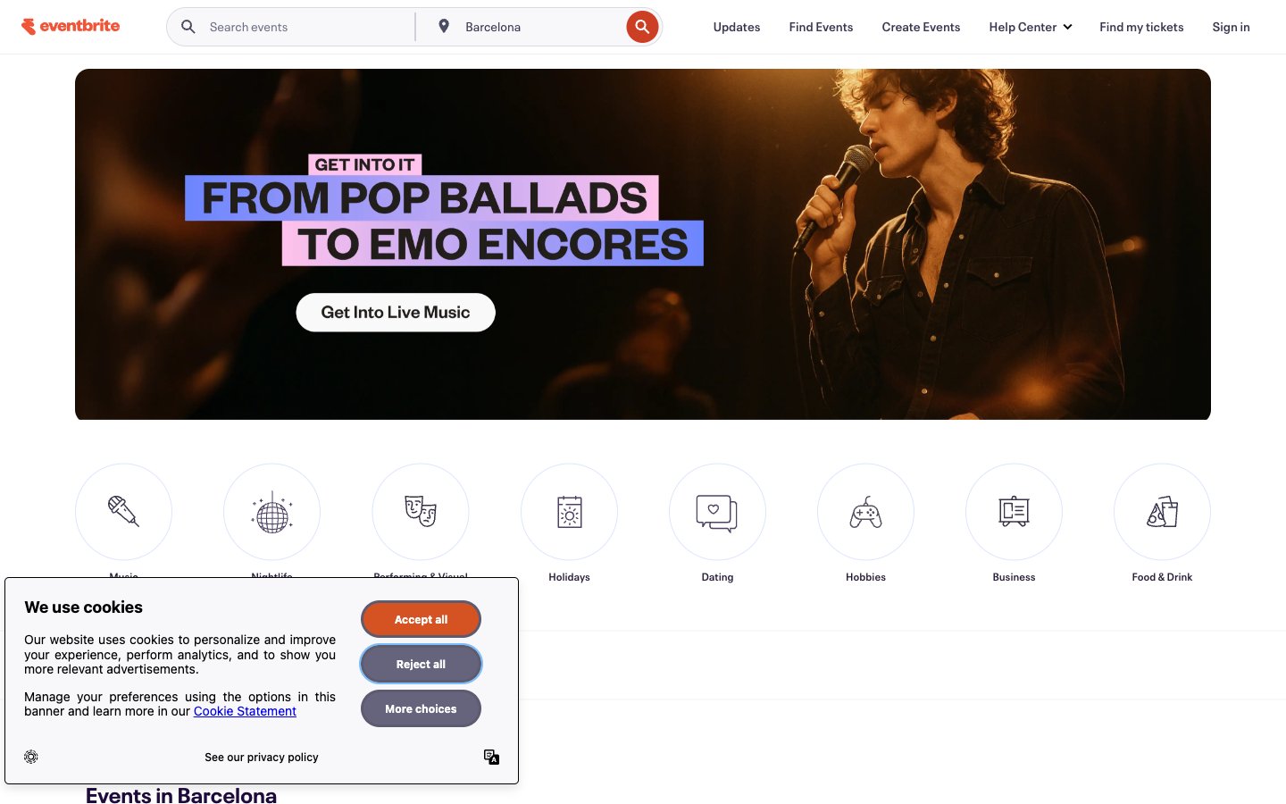
Eventbrite
Eventbrite — Style Reference
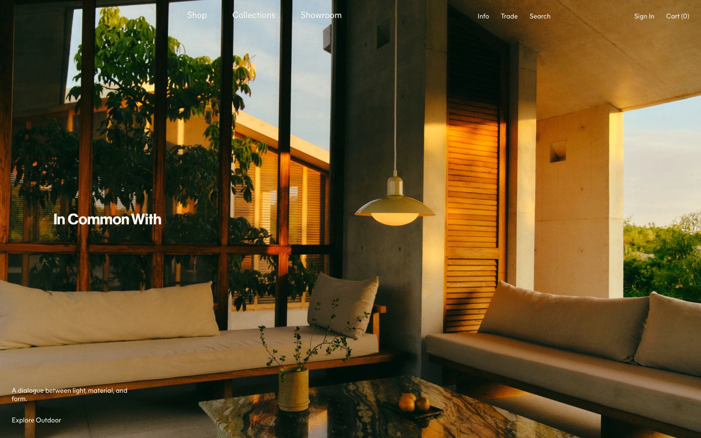
Incommonwith
Incommonwith — Style Reference
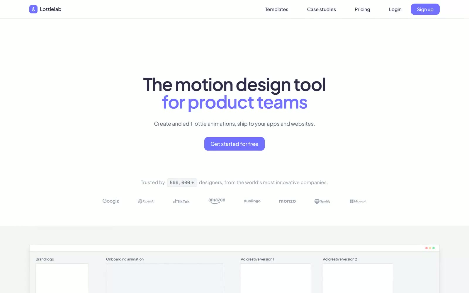
Lottielab
Lottielab — Style Reference
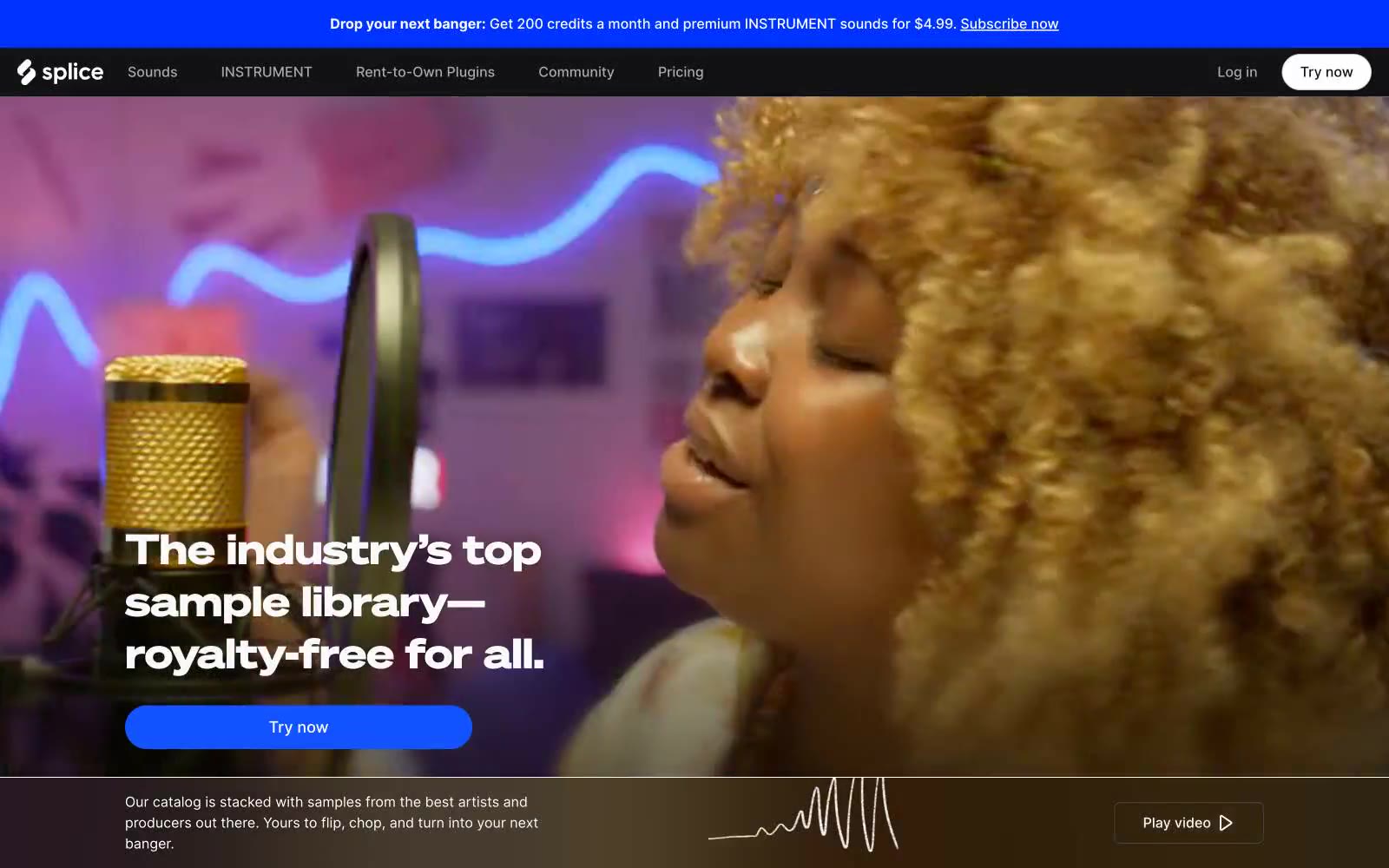
Splice
Splice — Style Reference
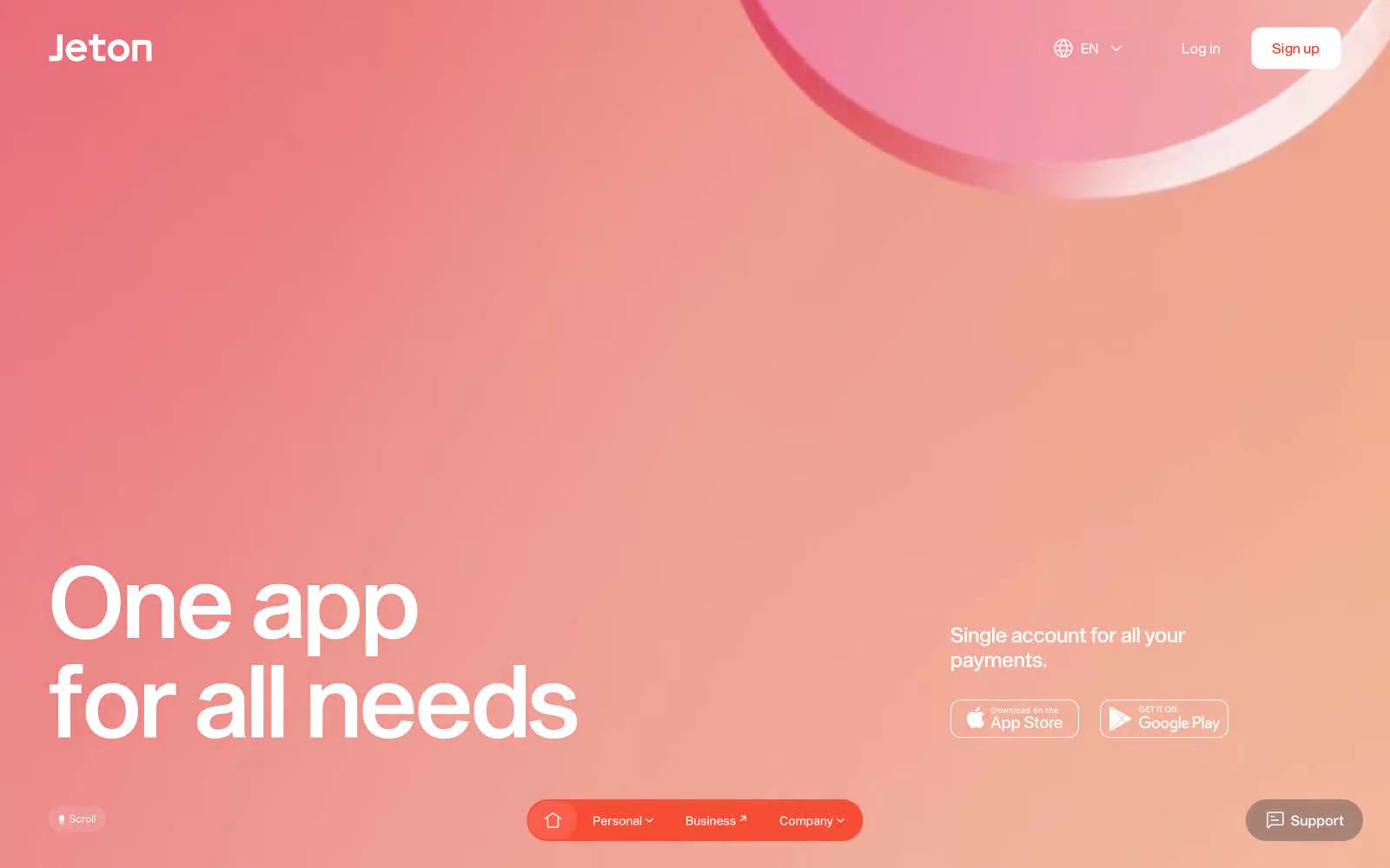
Jeton
Jeton — Style Reference
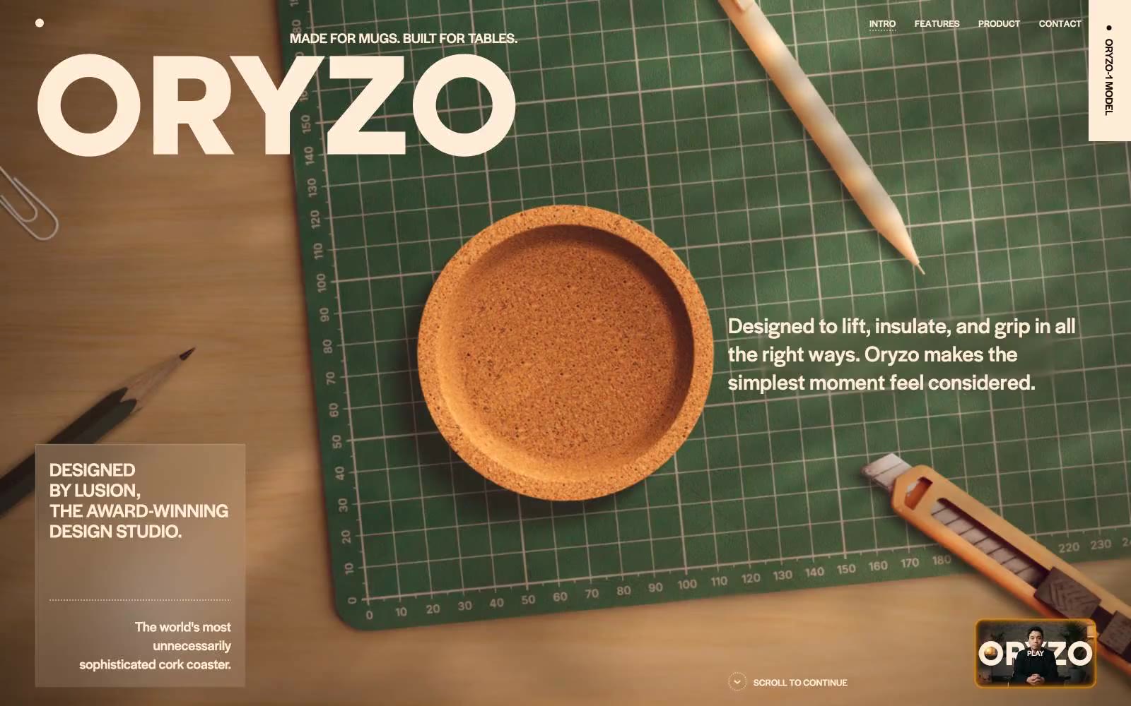
ORYZO AI
ORYZO AI — Style Reference
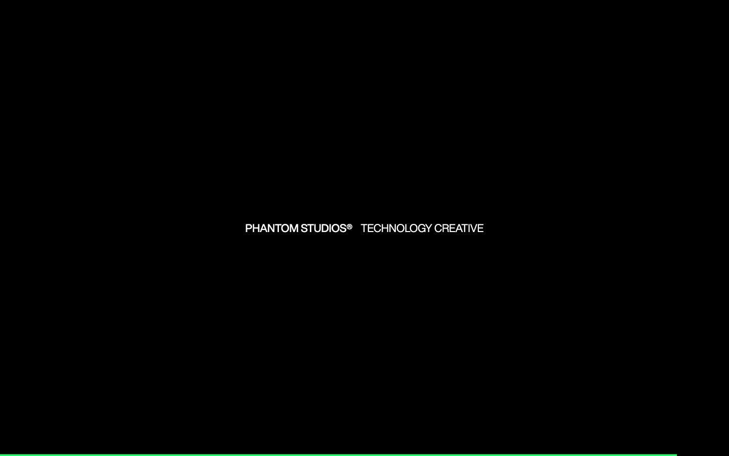
Phantom Studios
Phantom Studios — Style Reference
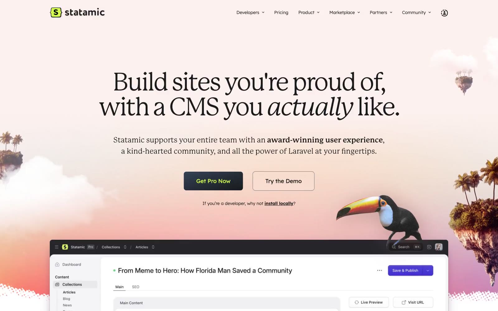
Statamic
Statamic — Style Reference
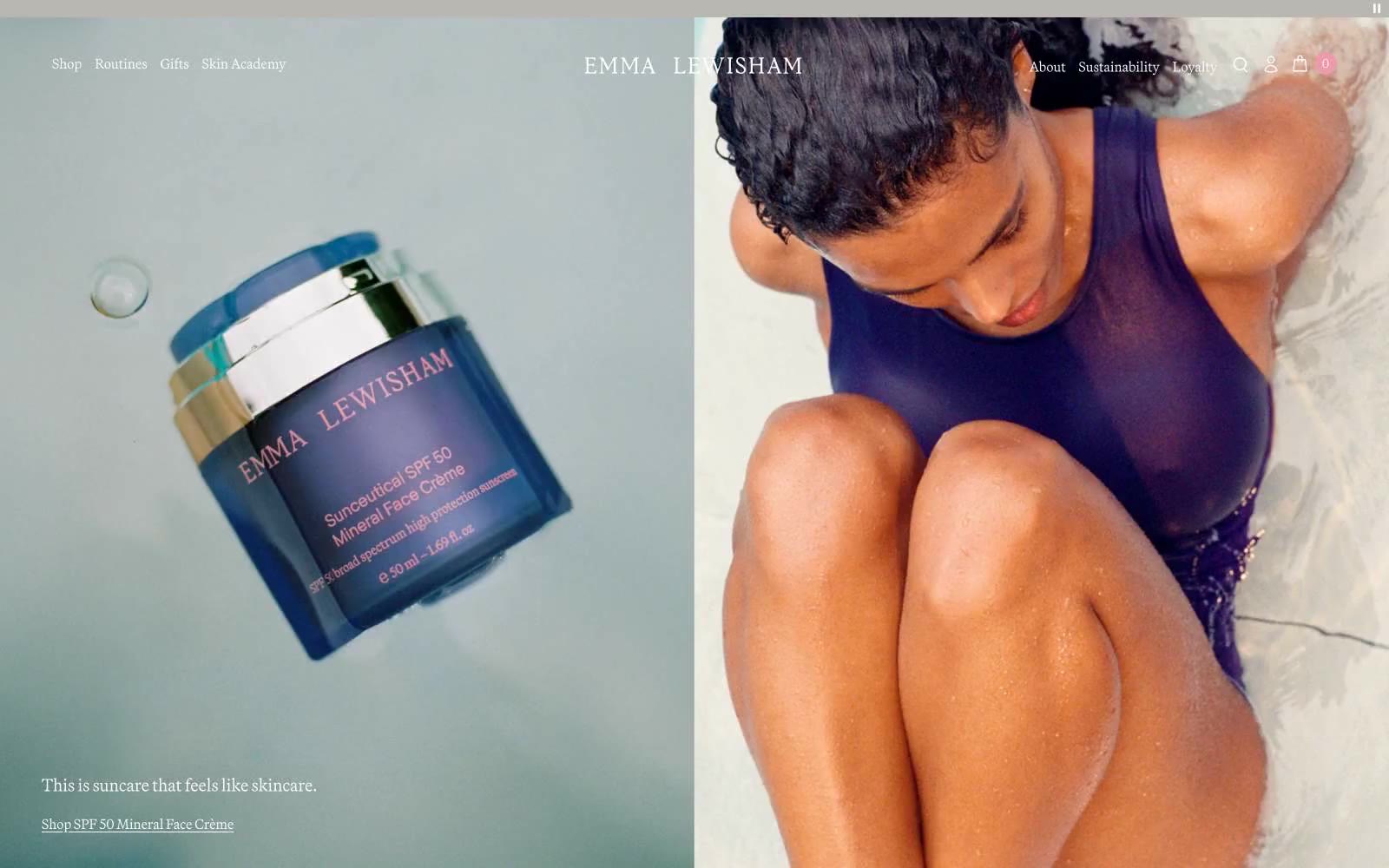
Emmalewisham
Emmalewisham — Style Reference
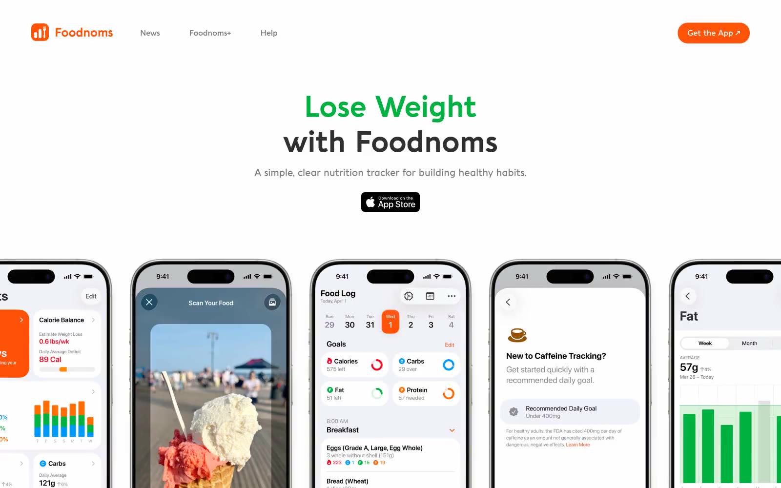
Foodnoms
Foodnoms — Style Reference
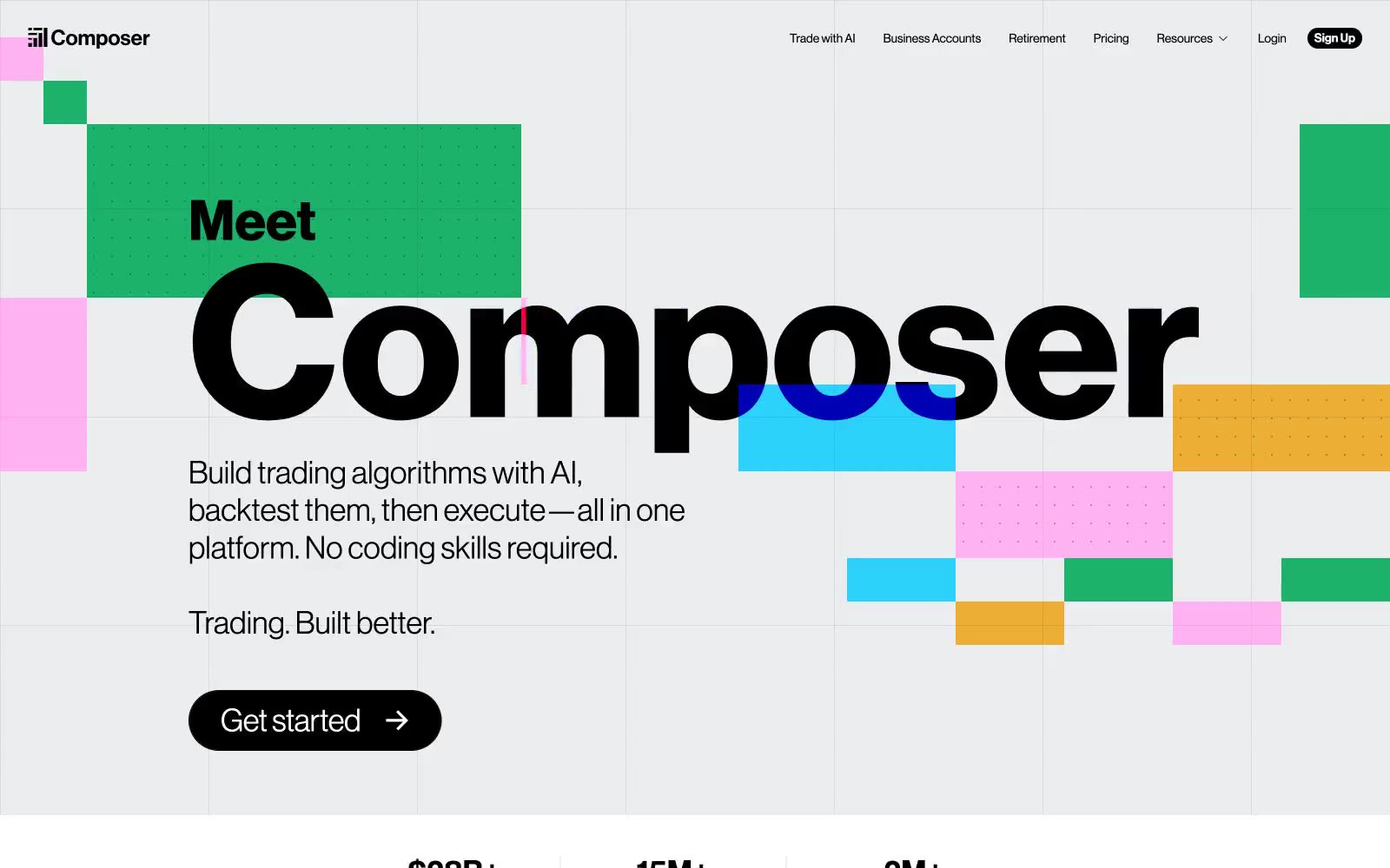
Composer
Composer — Style Reference
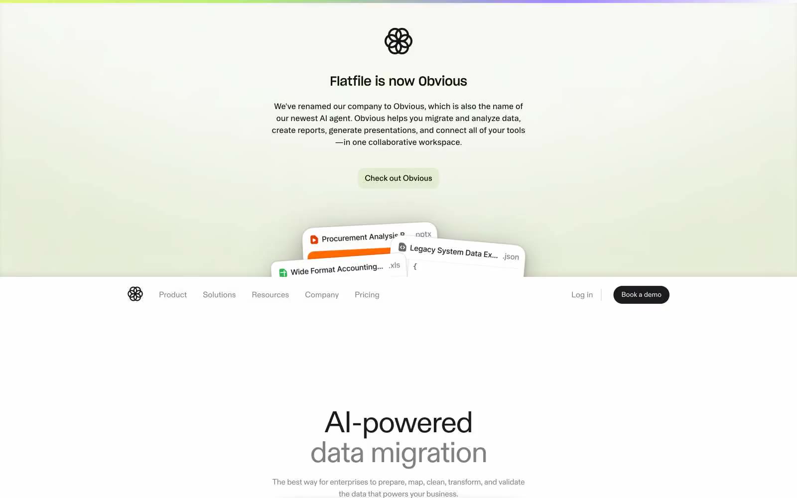
Flatfile
Flatfile — Style Reference
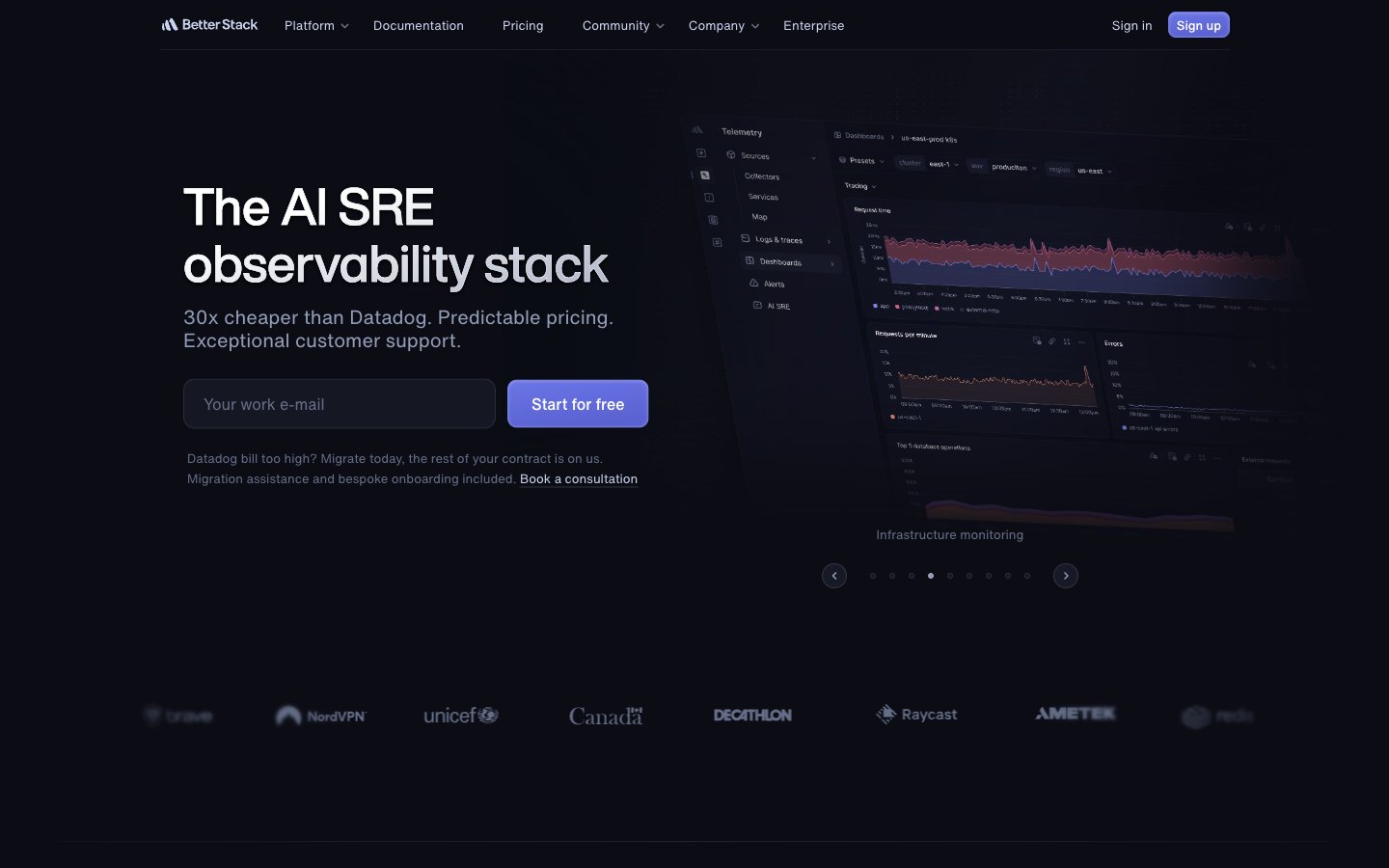
Better Stack
Better Stack — Style Reference
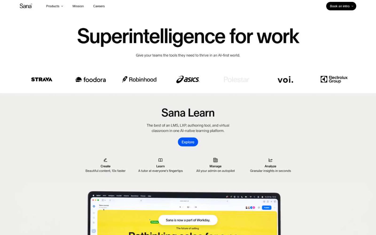
Superintelligence for work
Superintelligence for work — Style Reference
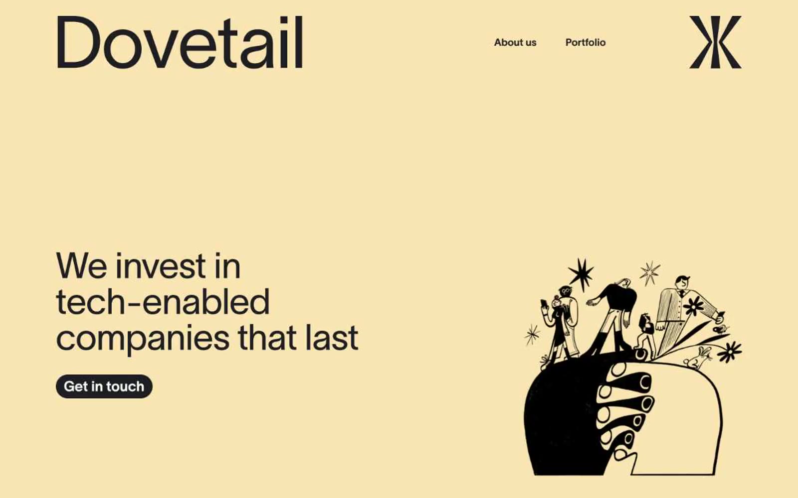
Dovetail
Dovetail — Style Reference
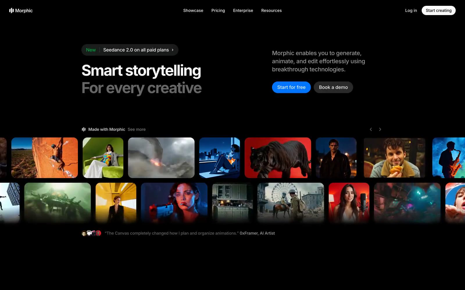
Morphic
Morphic — Style Reference
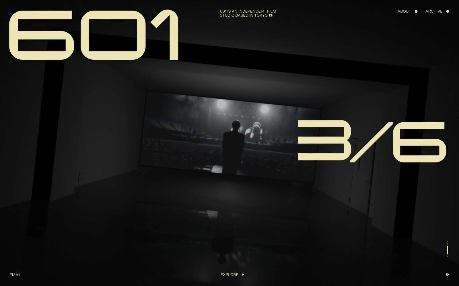
601 Inc.
601 Inc. — Style Reference
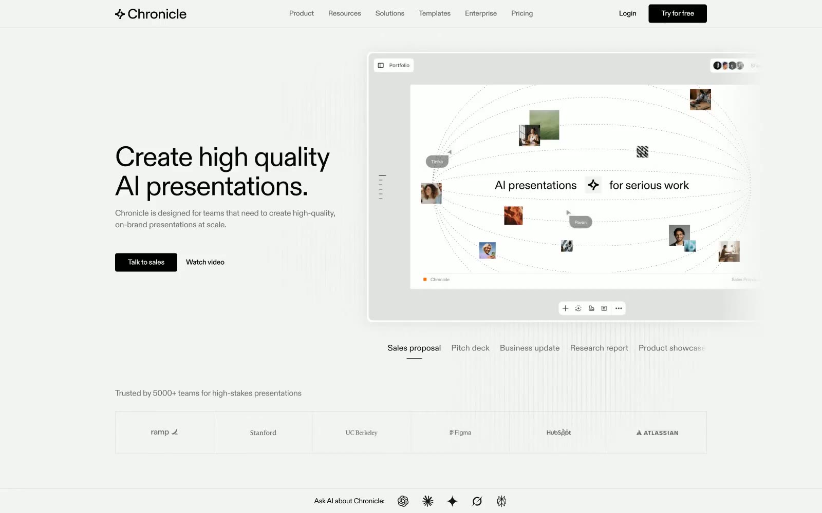
Chronicle
Chronicle — Style Reference

Nathan Riley
Nathan Riley — Style Reference
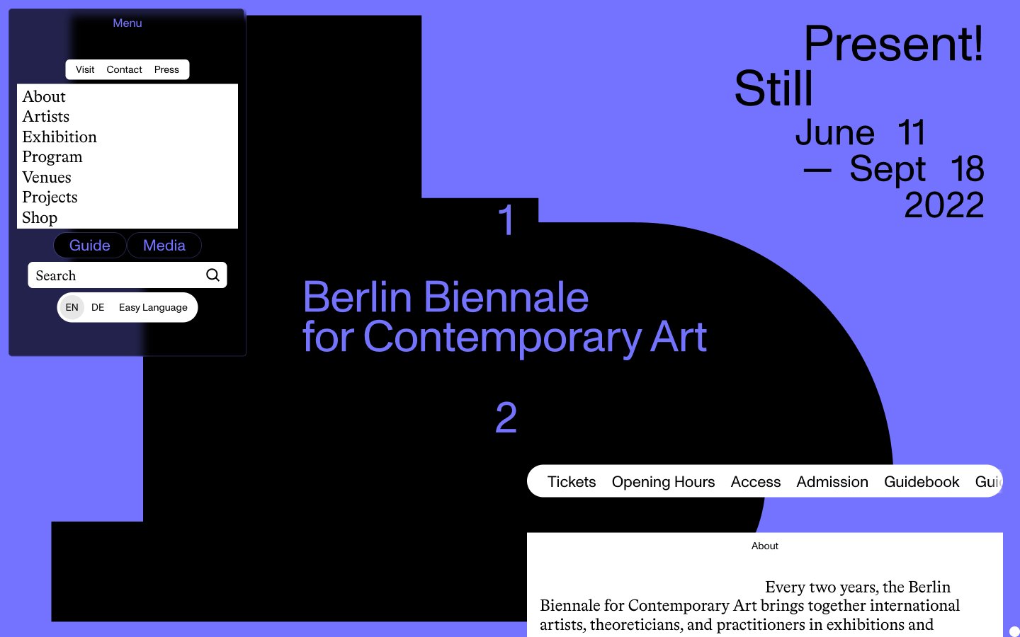
12th Berlin Biennale for Contemporary Art
12th Berlin Biennale for Contemporary Art — Style Reference
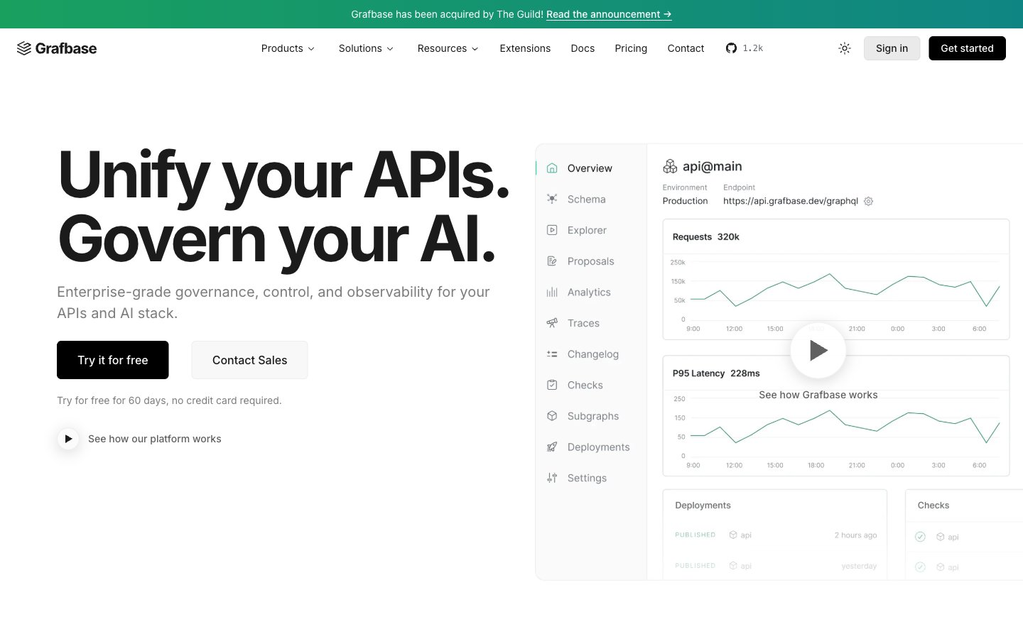
Grafbase
Grafbase — Style Reference
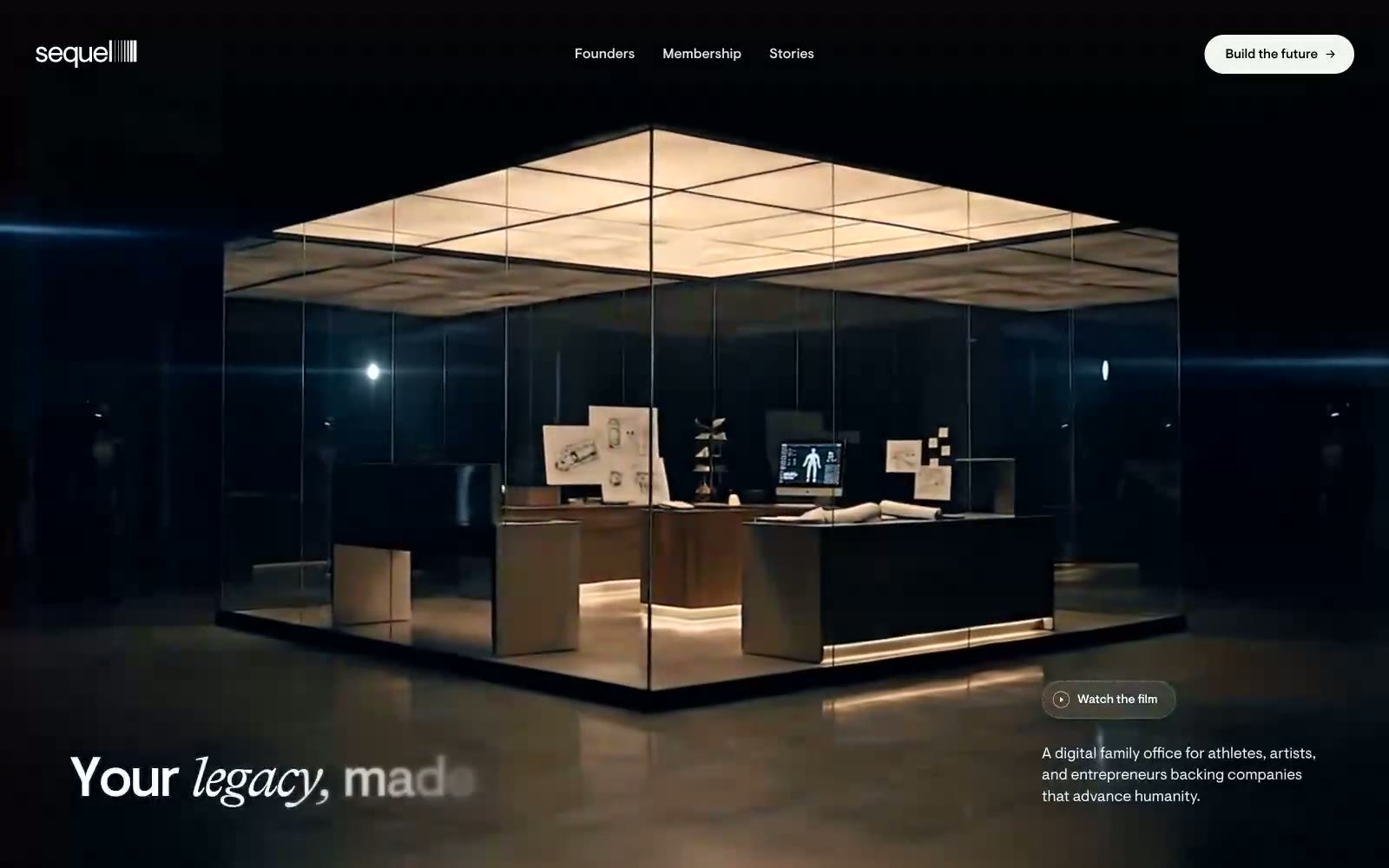
Sequel
Sequel — Style Reference