AI Prompt Studio - Intelligent Prompt Library
Explore and use professional AI prompts to optimize your workflow.
One-click Use
Websites
Markdown Text
design-md
website-prompt
landing-page-prompt
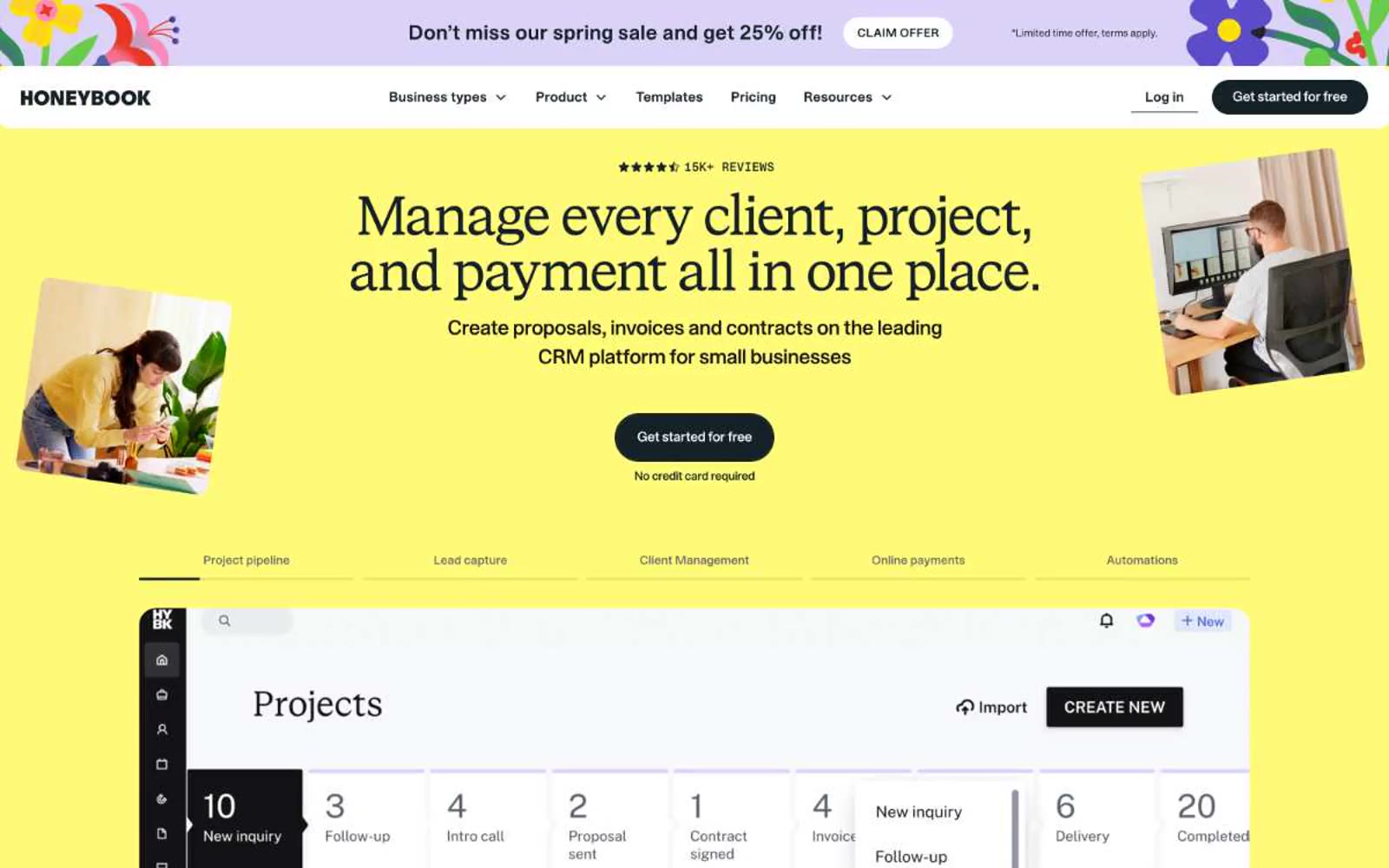
HoneyBook
HoneyBook — Style Reference

# HoneyBook — Style Reference
> sunlit creative studio on warm cream — a bright yellow marquee opening onto white workspace panels and dark pill stamps.
**Theme:** light
HoneyBook uses a sunlit-creative-studio language: a saturated sunshine-yellow hero, warm dark-navy text, and white product surfaces. The visual system is built on the tension between a serif display voice (STK Bureau Serif) and a confident geometric sans (STK Bureau Sans), with a tiny all-caps eyebrow face (STK Gerhard) that whispers 'editorial' above section headers. Buttons are absolute pills — fully rounded, dark-navy, no shadows — making actions feel like physical stamps pressed onto the page. Surfaces stay quiet and white below the fold; the yellow appears as a deliberate color block for hero/marquee moments rather than scattered decoration, creating a recognizable entry-and-rest rhythm across long pages.
## Tokens — Colors
| Name | Value | Token | Role |
|------|-------|-------|------|
| Honey Yellow | `#fffa77` | `--color-honey-yellow` | Yellow wash for highlight backgrounds, decorative bands, and soft emphasis behind content. |
| Marigold | `#fffa56` | `--color-marigold` | Accent fills on cards, headline underline strokes, icon highlights, secondary callouts — slightly punchier sibling of Honey Yellow for moments that need to sit on white |
| Inkwell | `#142127` | `--color-inkwell` | Dark borders and separators for elevated surfaces and inverted UI. Do not promote it to the primary CTA color |
| Carbon | `#131416` | `--color-carbon` | Body text and high-contrast borders on light surfaces, alt dark fill for emphasis blocks |
Websites
Markdown Text
design-md
website-prompt
landing-page-prompt
Adora
Adora — Style Reference
# Adora — Style Reference
> impressionist museum behind frosted glass
**Theme:** light
Adora wraps a precise product-analytics interface inside an impressionist gallery — white cards and crisp dashboards sit on canvas-like backgrounds of swirling oil-paint color, with hand-drawn squiggle underlines giving headings a notebook-becoming-poster feel. The color story is white-surface discipline broken by a single vivid violet for action and a palette of pastel accents (sky blue, lime, bubblegum pink, hot magenta) that are used as small confetti, not washes. Shapes are confidently rounded: cards and the product frame are very generous (40-64px), badges and the floating nav pill are stadium-rounded, buttons are gently rounded (8-12px). Typography pairs a custom display face (PolySans) at heavy weights for headlines against Plus Jakarta Sans at 400-500 for UI, with universal -0.02em tracking pulling the whole system tight and contemporary.
## Tokens — Colors
| Name | Value | Token | Role |
|------|-------|-------|------|
| Electric Violet | `#592eff` | `--color-electric-violet` | Primary action background, filled CTA buttons, active link borders, selected badge strokes — the single saturated chromatic that drives every conversion and active state |
| Midnight Plum | `#21164c` | `--color-midnight-plum` | Headline text color, display-weight typography — deep violet-ink that reads as near-black but carries a violet undertone matching the primary |
| Obsidian Charcoal | `#353241` | `--color-obsidian-charcoal` | Body text, paragraph copy, list items, icon strokes, default borders and dividers — the workhorse neutral that defines almost all interface line work |
| Slate Smoke | `#5f5f69` | `--color-slate-smoke` | Secondary body text, muted helper copy, supporting metadata |
Websites
Markdown Text
design-md
website-prompt
landing-page-prompt
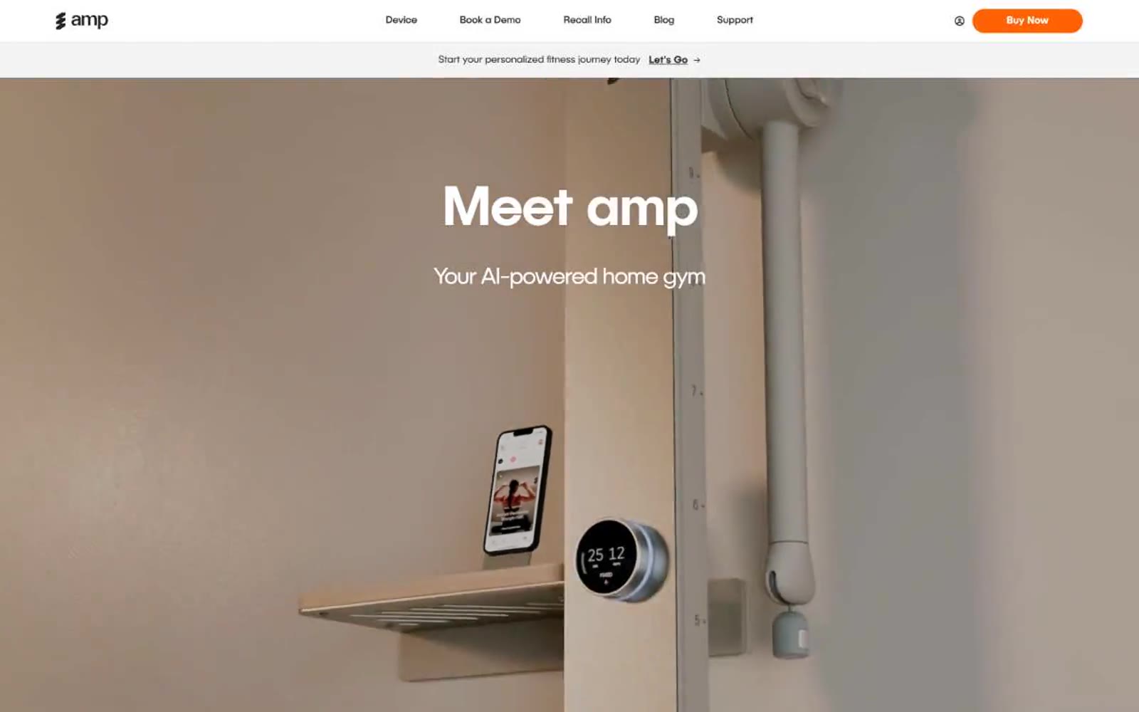
amp
amp — Style Reference
# amp — Style Reference
> warm orange pill on cool white. The design feels like a premium fitness product photographed in a sunlit loft: one object, one accent, one confident typeface doing all the work.
**Theme:** light
amp is a single-color, single-typeface system: one warm orange against an achromatic canvas, and one custom sans-serif used at every size. The page reads like a product photography spread — generous whitespace, large editorial headlines, and a single device (the amp column) photographed in a soft beige interior. Orange is rationed: it marks the buy button, the current step indicator, and a thin accent rule. Everything else stays in white, off-white, and near-black, so the accent does the talking. Cards and inputs use small 5px corners; the primary CTA is a 50px pill with a brand-colored glow; secondary controls round to 24px. Typography is one family (PublicaSans) at weights 300/400/500, tightening its tracking aggressively as sizes scale up — -0.036em at display, almost zero at body.
## Tokens — Colors
| Name | Value | Token | Role |
|------|-------|-------|------|
| Amp Orange | `#ff6105` | `--color-amp-orange` | Primary action fill, active step badge, accent rule, and brand strokes — the only chromatic color in the interface. Used at high contrast on white surfaces (7.0:1 against #ffffff) and as a warm border tint on cards and inputs |
| Amp Glow | `#ffa069` | `--color-amp-glow` | Orange supporting accent for decorative details and low-frequency emphasis. Do not promote it to the primary CTA color |
| Peach Wash | `#ffdfcd` | `--color-peach-wash` | Soft highlight surface for featured cards and step accents. A near-gray peach that stays quiet while adding warmth to a card stack |
| Ink | `#0a0a0a` | `--color-ink` | Primary text, logo mark, button text. 19.8:1 against white — the highest-contrast neutral in the stack |
Websites
Markdown Text
design-md
website-prompt
landing-page-prompt
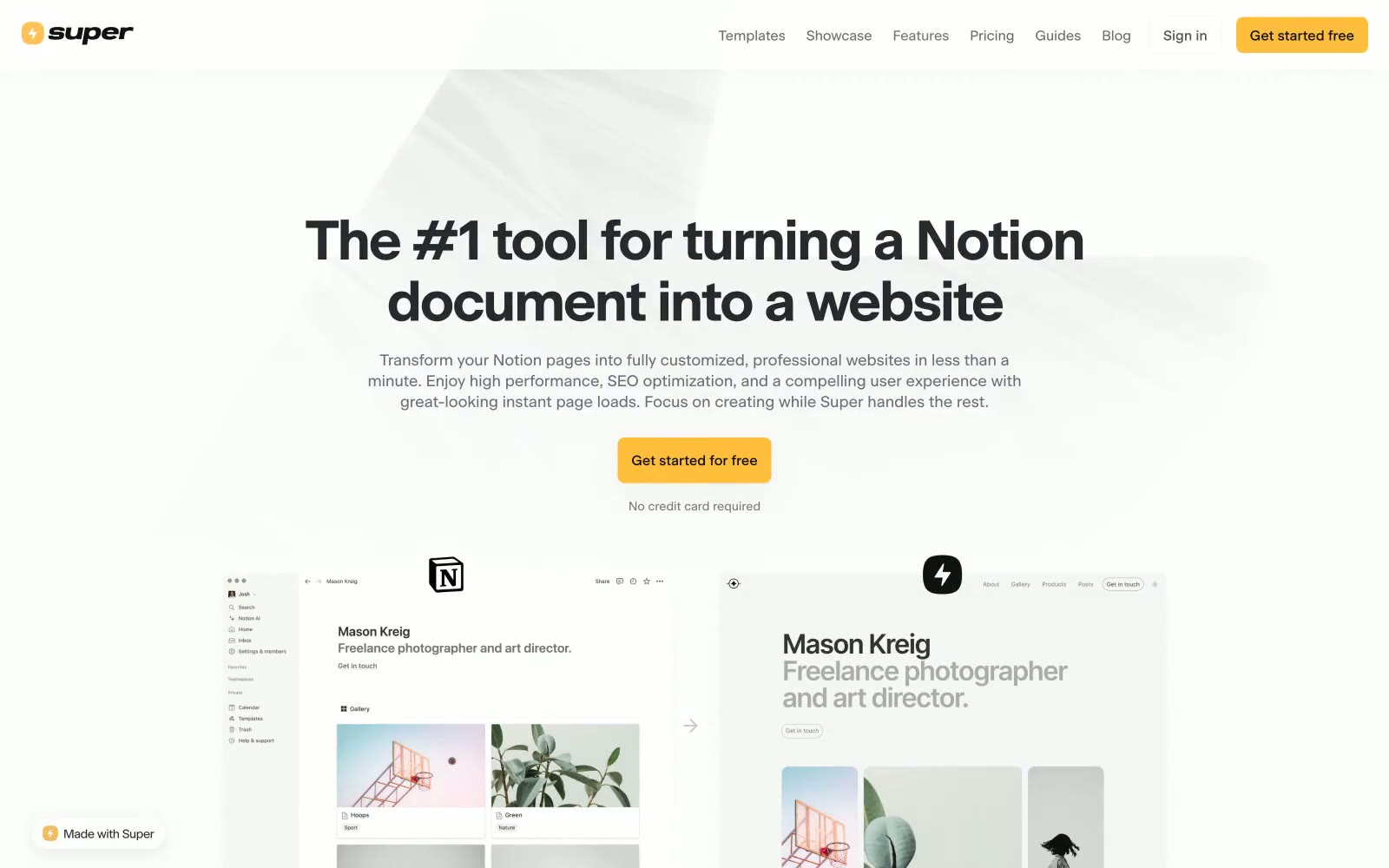
Super
Super — Style Reference
# Super — Style Reference
> Sunlit paper desk with one amber marker
**Theme:** mixed
Super runs on a near-monochrome warm-neutral canvas that borrows the tactile grammar of a notebook — cream paper backgrounds, charcoal ink text, hairline dividers — and punctuates it with a single saturated amber that acts as the page's only chromatic accent. The result reads like a well-typeset document that has been wired to one working button: quiet, considered, and immediately legible about where to click. Typography is custom (Beausite) set tight at display sizes and confident at body sizes, giving the page editorial weight without heaviness. Components are lightweight — soft white cards sitting on cream, no decorative gradients, minimal elevation, ghost nav links, and a bold amber filled button as the sole loud element on most screens. The visual system extends Notion's own canvas palette (#f9f9f8, #37352f) and adds a sunlit warm accent to distinguish the brand from its parent tool.
## Tokens — Colors
| Name | Value | Token | Role |
|------|-------|-------|------|
| Amber Pulse | `#ffbe3c` | `--color-amber-pulse` | Yellow supporting accent for decorative details and low-frequency emphasis. Do not promote it to the primary CTA color |
| Cream Paper | `#f9f9f8` | `--color-cream-paper` | Page background and outer canvas. Borrowed from Notion's own workspace palette to position Super as its native publishing layer |
| White Card | `#ffffff` | `--color-white-card` | Card and elevated surface that sits on Cream Paper. Provides subtle separation through brightness contrast rather than shadow |
| Ink Charcoal | `#262a2e` | `--color-ink-charcoal` | Primary text, dominant foreground color, nav elements, and high-emphasis UI. The workhorse neutral of the entire system |
Websites
Markdown Text
design-md
website-prompt
landing-page-prompt
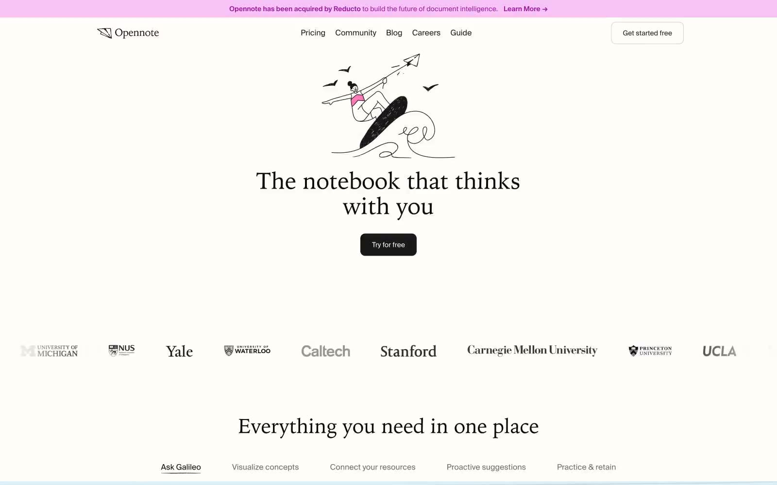
Opennote
Opennote — Style Reference
# Opennote — Style Reference
> warm leather journal on sunlit paper — the interface feels hand-bound, not engineered
**Theme:** light
Opennote speaks in the voice of a well-loved notebook: warm cream paper, serif headlines that feel hand-set, and a dark-sepia CTA that reads like a leather binding rather than a SaaS button. The palette is almost entirely achromatic — ivory canvas, charcoal ink, hairline graphite rules — with four dark chromatic accents (sepia, ink-violet, forest, oxblood) used sparingly as marginalia, never as fills. Chrome is minimal: a 10px radius, a single border tone, and almost no shadow. Whitespace carries the layout, broken up by hand-drawn line illustrations that float like doodles in a margin. The result is a product that looks like it was designed in a studio with good natural light, not a dashboard that was optimized in a sprint.
## Tokens — Colors
| Name | Value | Token | Role |
|------|-------|-------|------|
| Ivory Page | `#fffdf8` | `--color-ivory-page` | Primary canvas, page background, card surface. Warm off-white reads as paper, not screen |
| Ink Charcoal | `#0a0a0a` | `--color-ink-charcoal` | Primary text, icon strokes, body copy. Near-black with a touch of warmth against the ivory canvas |
| Pressed Black | `#000000` | `--color-pressed-black` | Illustration fill, SVG marks, fine ink details. Hard black reserved for the hand-drawn graphics layer |
| Graphite Rule | `#e5e5e5` | `--color-graphite-rule` | Hairline borders, dividers, card outlines, image frames. The dominant structural neutral — everything thin on the page is drawn with this |
Websites
Markdown Text
design-md
website-prompt
landing-page-prompt
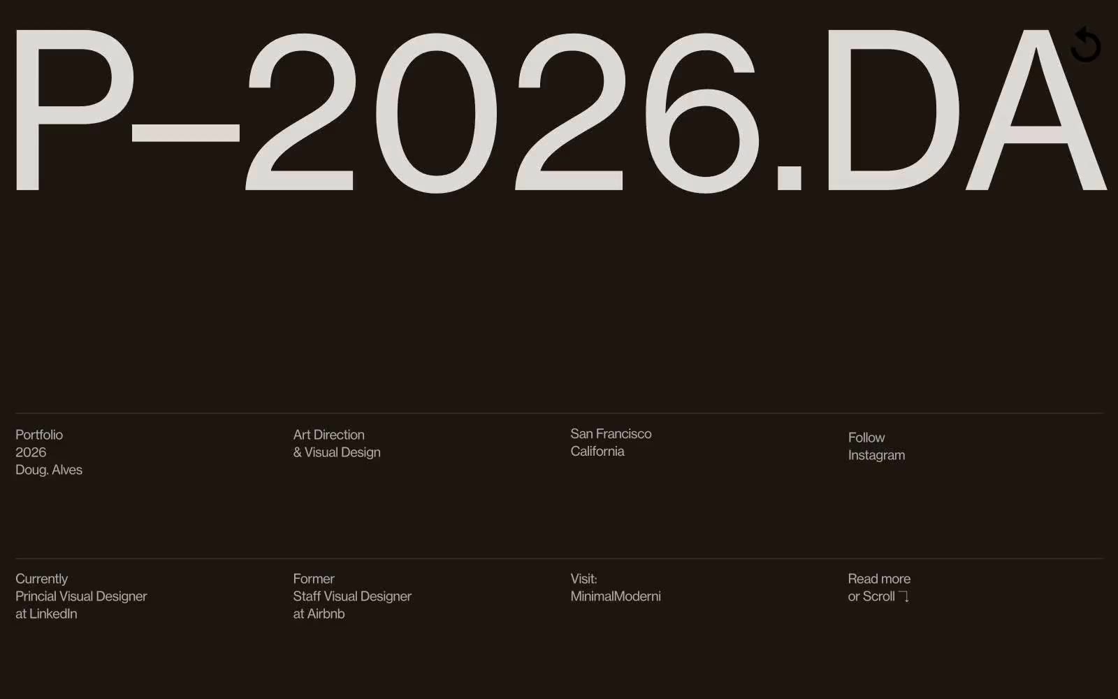
Doug–Alves
Doug–Alves — Style Reference
# Doug–Alves — Style Reference
> Oversized typographic monolith on warm charcoal
**Theme:** mixed
Doug Alves' portfolio treats every viewport like a gallery wall: one massive piece of typographic art dominates the dark hero, then the site steps down into compact, editorial information grids. The palette is ruthlessly achromatic — warm espresso black, bone white, and graphite — with no chromatic accent anywhere; all visual energy comes from type scale and contrast. Headlines run to 197px at weight 300 with aggressive negative tracking, while body copy stays at 16-18px, creating a 10:1 size ratio that makes the whole site feel like a single oversized poster surrounded by fine-print specifications. Layout is full-bleed with sections switching between warm-dark and white, and information always arranges into crisp multi-column grids separated by hairline graphite rules.
## Tokens — Colors
| Name | Value | Token | Role |
|------|-------|-------|------|
| Espresso | `#1d1610` | `--color-espresso` | Hero and dark section background — warm-tinted near-black reads as architectural, not as raw #000, giving the oversized display type a gallery-wall feel |
| Graphite | `#282828` | `--color-graphite` | Primary body text, structural borders, section dividers — the workhorse neutral that draws the hairline rules and most interface lines |
| Slate | `#333333` | `--color-slate` | Secondary body and heading text — slightly lighter than Graphite, used for headings and emphasized body copy where Graphite is reserved for borders |
| Obsidian | `#000000` | `--color-obsidian` | Display headings on light sections and pure-black accents — used sparingly for maximum impact on the white About and Latest sections |
Websites
Markdown Text
design-md
website-prompt
landing-page-prompt
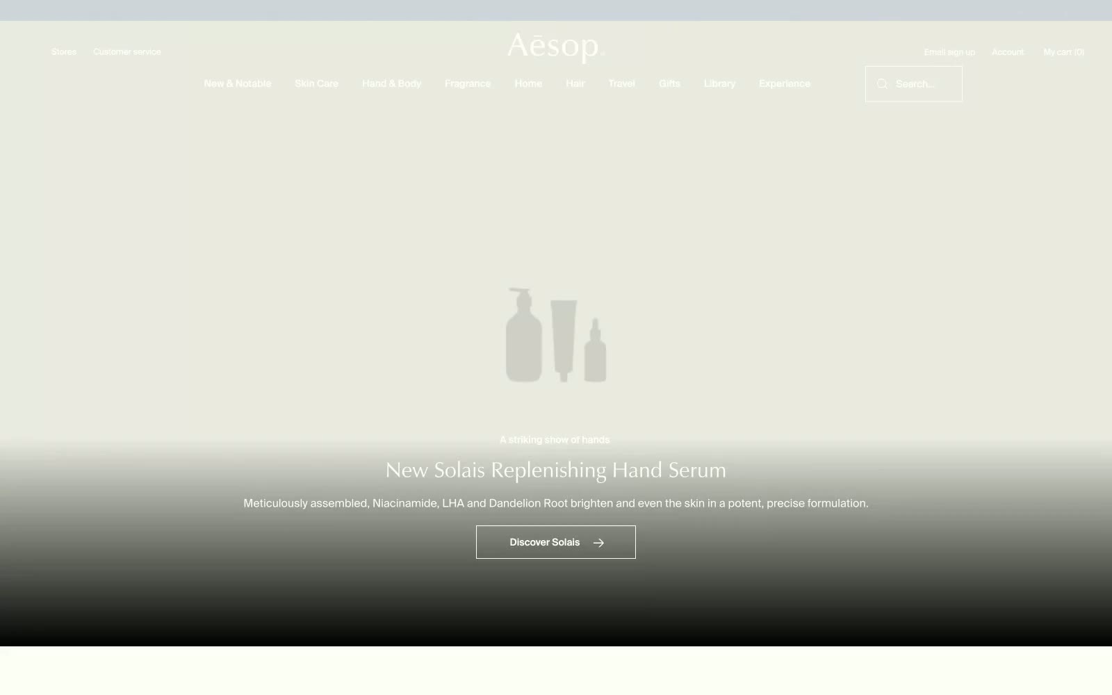
Aesop
NGLORA — Style Reference
# NGLORA — Style Reference
> NGLORA - Apothecary's Formulary. A meticulously organized space where typography and product photography are treated with scientific precision.
**Theme:** light
The design evokes a scholarly apothecary's formulary, where every element is presented with meticulous precision. It operates on a starkly limited palette of warm off-white and charcoal, creating a high-contrast, text-forward environment. A rigid, architectural layout with sharp 0px corners dominates, reinforcing a sense of order and clinical quality. The system's signature is the typographic tension between the humanist serif 'Zapf-Humanist' for expressive headlines and the neutral sans-serif 'SuisseIntl' for all functional text, lending an air of classicism to a modern digital interface.
## Tokens — Colors
| Name | Value | Token | Role |
|------|-------|-------|------|
| Parchment | `#fffef2` | `--color-parchment` | Primary page background, light surfaces. |
| Charcoal | `#333333` | `--color-charcoal` | Primary text, UI icons, primary buttons, borders. |
| Ink Black | `#000000` | `--color-ink-black` | Hero section text, high-emphasis text elements. |
| Carbon | `#252525` | `--color-carbon` | Footer background, secondary dark surfaces. |
Websites
Markdown Text
design-md
website-prompt
landing-page-prompt
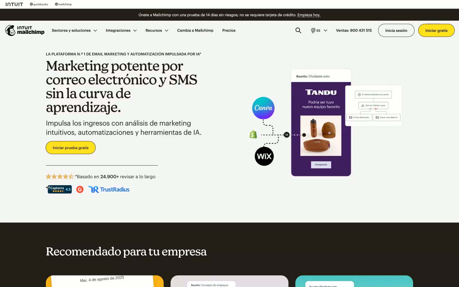
Mailchimp
Mailchimp — Style Reference
# Mailchimp — Style Reference
> Vintage press meets electric yellow — an editorial print house with one neon switch.
**Theme:** light
Mailchimp's visual language feels like a vintage newspaper printing house that discovered electric color — warm near-black (#231e15) dominates nearly every surface and typographic element, while a single voltage-yellow (#ffe01b) CTA button commands every page. The type system splits between Graphik Web (a geometric sans at tight -0.013em tracking) for all body/UI text and Means Web (a display serif-adjacent face at -0.021em) for headlines — a newspaper/magazine editorial duality that's rare in SaaS. Cards are flatly borderless or carry a soft warm shadow (rgba(35,30,21,0.15)), never the blue-tinted floating shadows common to other platforms. Section backgrounds alternate between #ffffff, #f5f5f5, the warm cream #ebe1cd, and near-black #231e15, creating a banded editorial rhythm. The pill CTA (26px radius, yellow fill, dark stroke, dark text) is the one rounded form in a system that otherwise uses 3px or zero radius everywhere.
## Tokens — Colors
| Name | Value | Token | Role |
|------|-------|-------|------|
| Press Black | `#231e15` | `--color-press-black` | Primary text, headings, button borders, backgrounds of dark sections — the near-black with a warm brown undertone that prevents harshness and reads as ink rather than void |
| Voltage Yellow | `#ffe01b` | `--color-voltage-yellow` | Primary CTA buttons and nav 'Iniciar gratis' — one saturated hit of color on an otherwise near-monochrome page; impossible to miss without competing for dominance |
| Teal Ink | `#004e56` | `--color-teal-ink` | Links, icon fills, image accents — muted teal provides navigational contrast against warm-neutral backgrounds without reading as a generic blue |
| Warm Parchment | `#ebe1cd` | `--color-warm-parchment` | Section backgrounds for GDPR and feature callout bands — warm cream that reads as aged newsprint, warmer than gray |
Websites
Markdown Text
design-md
website-prompt
landing-page-prompt
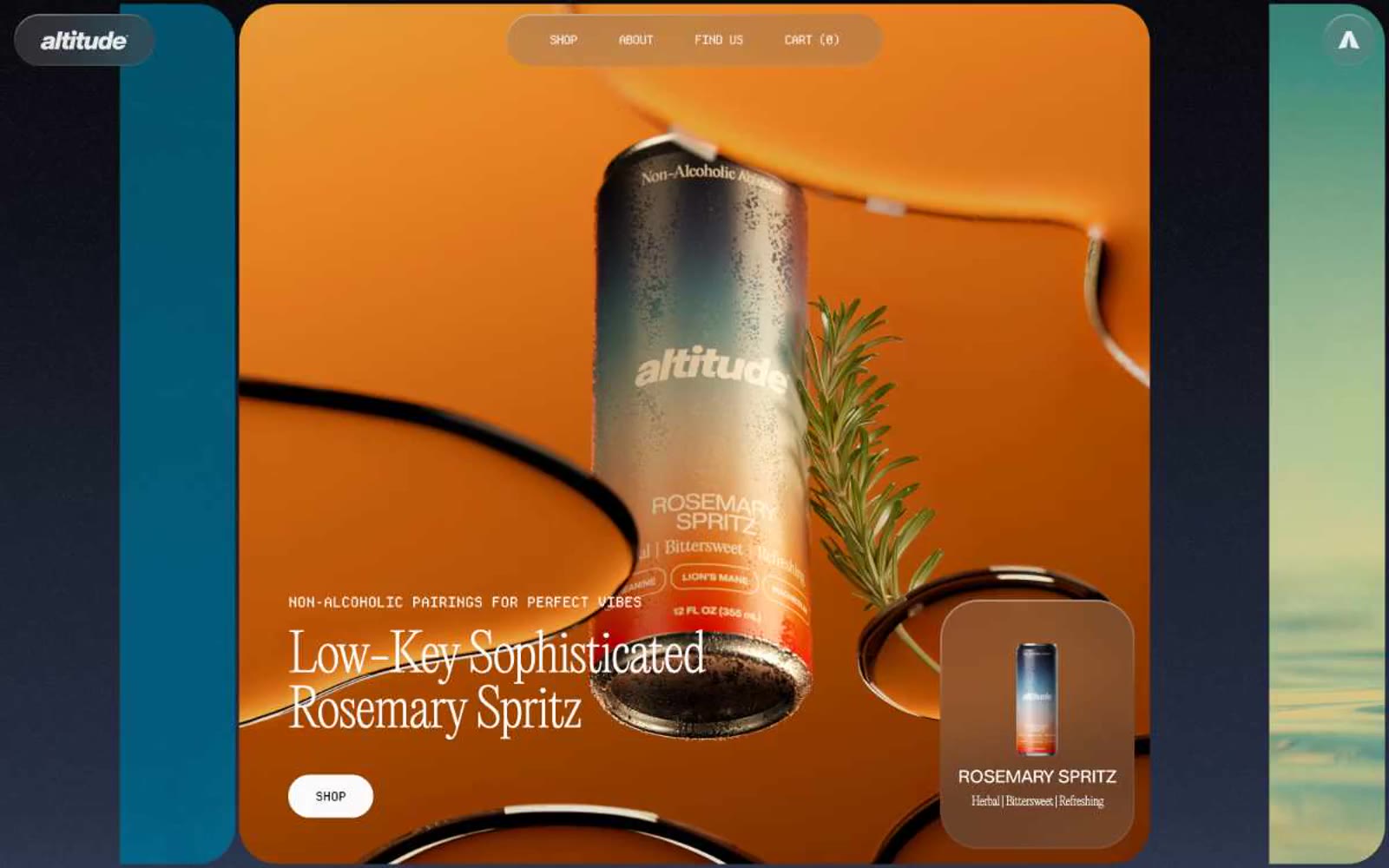
Altitude Beverages
Altitude Beverages — Style Reference
# Altitude Beverages — Style Reference
> Monochrome editorial spread. Imagine a fashion magazine spread stripped of all color except the product photography — the type and whitespace do all the storytelling.
**Theme:** mixed
Altitude Beverages reads as a monochrome editorial spread: a near-white canvas (#fafafa) carrying oversized typographic statements while saturated product photography provides the only chromatic energy. The system oscillates between two extremes — an airy, gallery-like light surface with a massive 160px display headline and pill-shaped monospace navigation, and a dense charcoal-to-slate gradient section that functions as a cinematic counterpoint. Every UI element is reduced to its bare geometry: pill buttons, hairline borders, no shadows, no decorative ornamentation. The typographic cast — light-weight serif (EditorialNew) for editorial flourishes, ultra-bold display sans (HelveticaNowDisplay) for hero impact, and a monospaced label face (DepartureMono) for navigation — is the actual identity system; color and components deliberately recede so the type and photography can perform.
## Tokens — Colors
| Name | Value | Token | Role |
|------|-------|-------|------|
| Canvas White | `#fafafa` | `--color-canvas-white` | Page background, card surfaces, primary canvas — the dominant near-white that lets photography and type carry all visual weight |
| Warm Ash | `#d9d9d9` | `--color-warm-ash` | Elevated surface backgrounds for cards, buttons, and nav pill container — a warm gray one step darker than canvas for subtle layering without shadows |
| Mid Gray | `#cdcdce` | `--color-mid-gray` | Hairline borders, link underlines, and divider lines — sits between canvas and text to create structure without weight |
| Ink Black | `#07060b` | `--color-ink-black` | Primary text, button labels, heading copy — a near-pure black with a faint blue undertone for maximum contrast against the warm canvas |
Websites
Markdown Text
design-md
website-prompt
landing-page-prompt
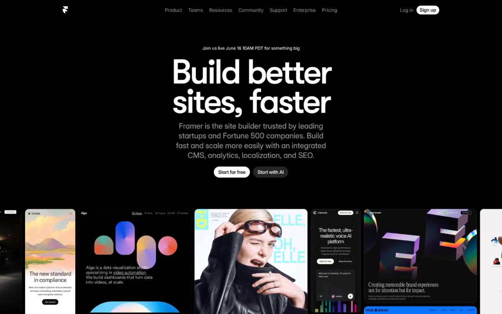
Framer
Framer — Style Reference
# Framer — Style Reference
> cinematic black gallery. Pure black canvases cradle white editorial type and one electric blue accent that traces edges rather than filling space.
**Theme:** dark
Framer operates in absolute darkness: a pure black canvas (#000000) where white typography and one electric blue (#0099ff) do all the talking. The design language is cinematic and confident — oversized condensed display type (GT Walsheim at 85–110px) anchors every section, while the rest of the interface dissolves into near-black surface layers. The signature rhythm is alternating maximalist hero typography against minimal, gridded screenshots of customer sites, all bordered by hairline dividers and powered by compact 10px spacing. The blue accent never fills buttons; it traces edges, outlines cards, and fires on micro-interactions like text selection and link hover — restrained, never decorative. Components are weightless: pill-shaped controls, thin borders, and barely-there elevation that lets the photography and editorial typography carry the weight.
## Tokens — Colors
| Name | Value | Token | Role |
|------|-------|-------|------|
| Void | `#000000` | `--color-void` | Page background, primary canvas — the void that everything else sits on. Also used for filled primary buttons, nav background, card borders, and the vast majority of interface borders |
| Carbon | `#080808` | `--color-carbon` | Card surface layer, elevated panels, secondary background — barely lifted from the void to suggest depth without leaving the dark family |
| Obsidian | `#111111` | `--color-obsidian` | Higher elevation cards and modal surfaces — the second step up from the page |
| Graphite | `#171717` | `--color-graphite` | Top-tier surface for popovers, tooltips, and deeply nested panels |

Websites
Markdown Text
design-md
website-prompt
landing-page-prompt
Zendesk
Zendesk — Style Reference
# Zendesk — Style Reference
> Lime signal in a forest clearing — precision SaaS dressed in warm organic ink, where the single electric-green accent cuts through like a backlit leaf.
**Theme:** light
Zendesk's homepage projects warmth and authority through an unusual pairing: near-black almost-green ink (#11110d) on warm off-white (#f5f5f2), punctuated by a single electric lime (#d1f470) that reads as both verdant and technological. The dark forest-green event banner (#203524) at the top immediately signals brand confidence — deep, earthy, not the expected corporate blue. Body text lives in near-black #11110d rather than pure black, giving the page a slightly warm, organic undertone that softens what could otherwise feel austere. The signature move is the lime CTA: vivid enough to stop the eye, yet grounded enough to feel like a product choice rather than a marketing trick. Card surfaces use #f5f5f2 — a shade away from white — so card lifts happen through warm contrast rather than shadows.
## Tokens — Colors
| Name | Value | Token | Role |
|------|-------|-------|------|
| Electric Lime | `#d1f470` | `--color-electric-lime` | Primary CTA buttons, active indicators, accent highlights — the only saturated color on the page, so it carries 100% of the interactive signaling weight |
| Forest Canopy | `#203524` | `--color-forest-canopy` | Event/announcement banner backgrounds — deep forest green that creates visual separation from page content without using darkness alone |
| Deep Grove | `#2d4c33` | `--color-deep-grove` | Secondary dark-green surfaces, card backgrounds in dark sections |
| Lime Fade | `linear-gradient(to right, rgba(0, 0, 0, 0), rgb(209, 244, 112))` | `--color-lime-fade` | Decorative fade effects, scroll-indicator overlays in lime-to-transparent direction |
Websites
Markdown Text
design-md
website-prompt
landing-page-prompt
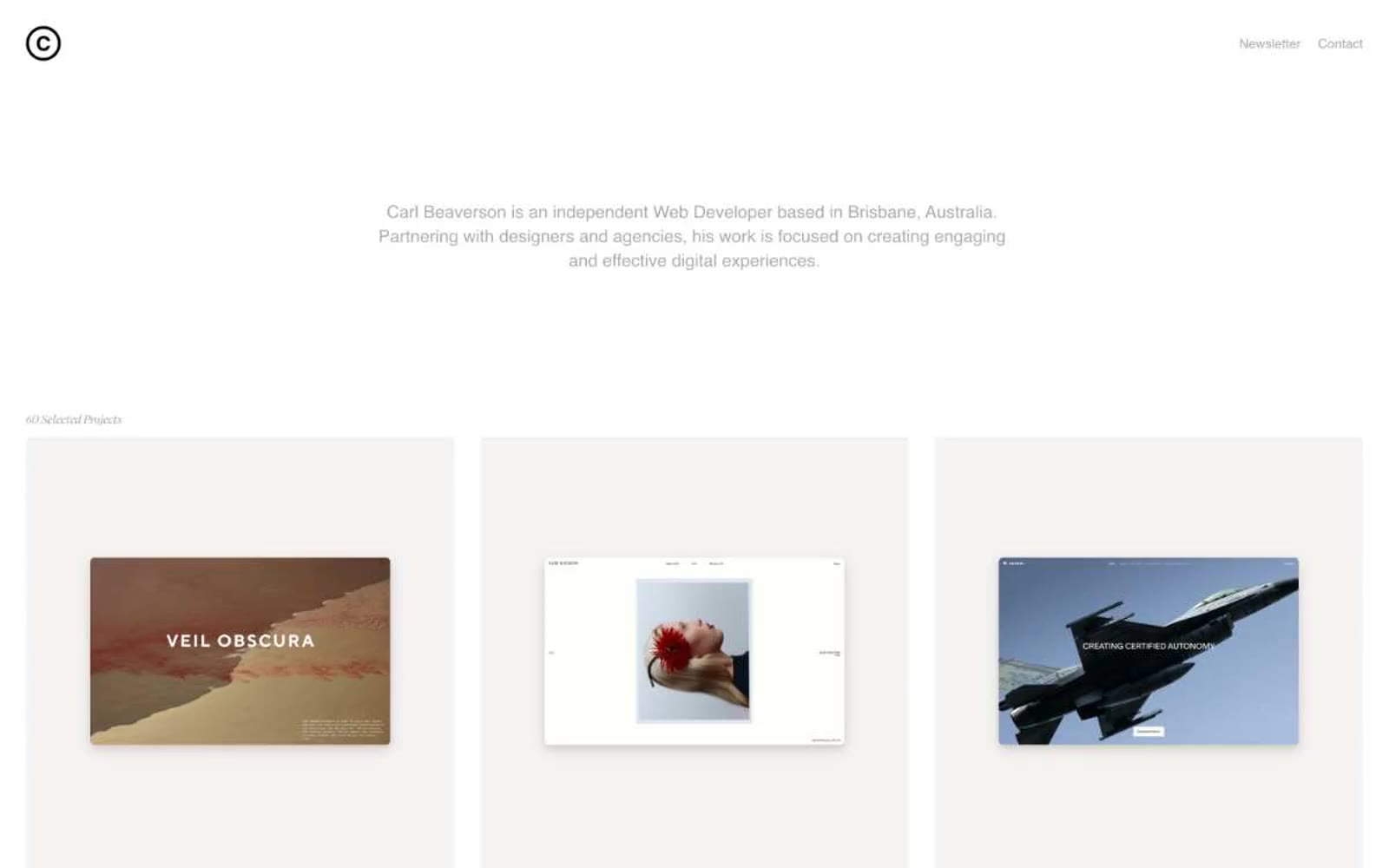
Brisbane Web Developer
Brisbane Web Developer — Style Reference
# Brisbane Web Developer — Style Reference
> gallery wall in winter light. An achromatic, spacious portfolio on a warm bone-white canvas, with each project tile framed by soft brown-toned shadows and labeled in a whisper-thin display face.
**Theme:** light
Carl Beaverson's portfolio operates on radical restraint: a warm off-white canvas, exclusively neutral tones, and a single accent typeface (Suisse Works) reserved for the smallest typographic moments. The entire system is achromatic — no brand color, no chromatic accent, no semantic hues. Hierarchy is built through scale jumps, tracking, and generous negative space rather than color or weight. Components float on warm-tinted brown shadows that subtly warm an otherwise cold minimalist grid. The reading order is content-first: three-up project tiles, tiny attribution text, and large section gutters that let each piece breathe independently.
## Tokens — Colors
| Name | Value | Token | Role |
|------|-------|-------|------|
| Bone Canvas | `#f4f3f1` | `--color-bone-canvas` | Light supporting surface for subtle backgrounds and section separation. Do not promote it to the primary CTA color |
| Ink | `#333333` | `--color-ink` | Primary headings, button text, input text, high-contrast labels |
| Graphite | `#4d4d4d` | `--color-graphite` | Body text, paragraph copy, longer-form descriptions |
| Slate | `#666666` | `--color-slate` | Muted secondary text, tertiary metadata |
Websites
Markdown Text
design-md
website-prompt
landing-page-prompt
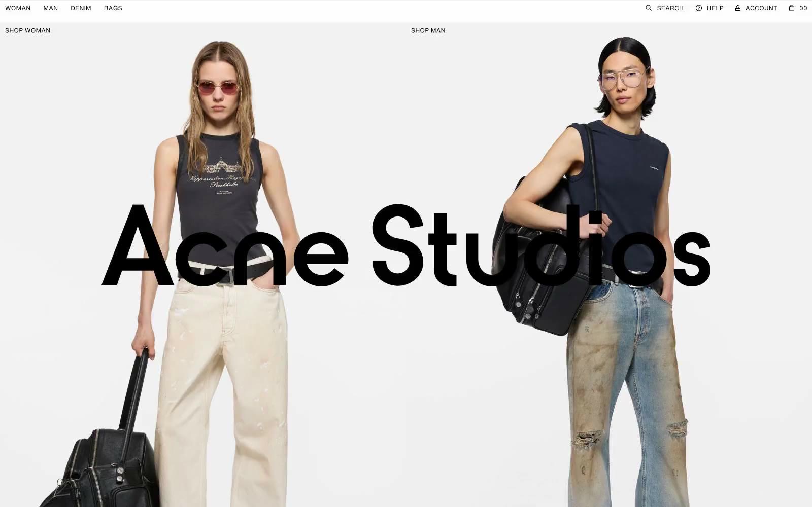
Acne Studios
Acne Studios — Style Reference
# Acne Studios — Style Reference
> Minimalist gallery white space with bold photographic moments — a fashion magazine laid flat on marble.
**Theme:** light
Acne Studios operates as a digital fashion magazine rather than a conventional storefront: white canvas, full-bleed editorial photography, and almost no UI chrome. The entire page reads as curated art-direction — product images sit edge-to-edge in tight grids, and the only typographic punctuation is tiny uppercase labels with generous letter-spacing. The signature electric cobalt (#0018a8) is used sparingly on links and interactive accents, never as a filled button, letting the photography own attention. Components are deliberately weightless: no shadows, no card surfaces, no rounded containers, no decorative borders. Space between elements does the structural work that elevation does elsewhere.
## Tokens — Colors
| Name | Value | Token | Role |
|------|-------|-------|------|
| Electric Cobalt | `#0018a8` | `--color-electric-cobalt` | Violet supporting accent for decorative details and low-frequency emphasis. Do not promote it to the primary CTA color |
| Ink Black | `#000000` | `--color-ink-black` | Primary text, logo wordmark, icon strokes, nav labels, and footer copy. Used at 21:1 contrast on white for absolute legibility |
| Graphite | `#6b6b6b` | `--color-graphite` | Supporting neutral for secondary UI, dividers, and muted labels. |
| Paper White | `#ffffff` | `--color-paper-white` | Page canvas, product card backgrounds, and nav bar surface. The dominant ground that lets editorial photography breathe |
Websites
Markdown Text
design-md
website-prompt
landing-page-prompt
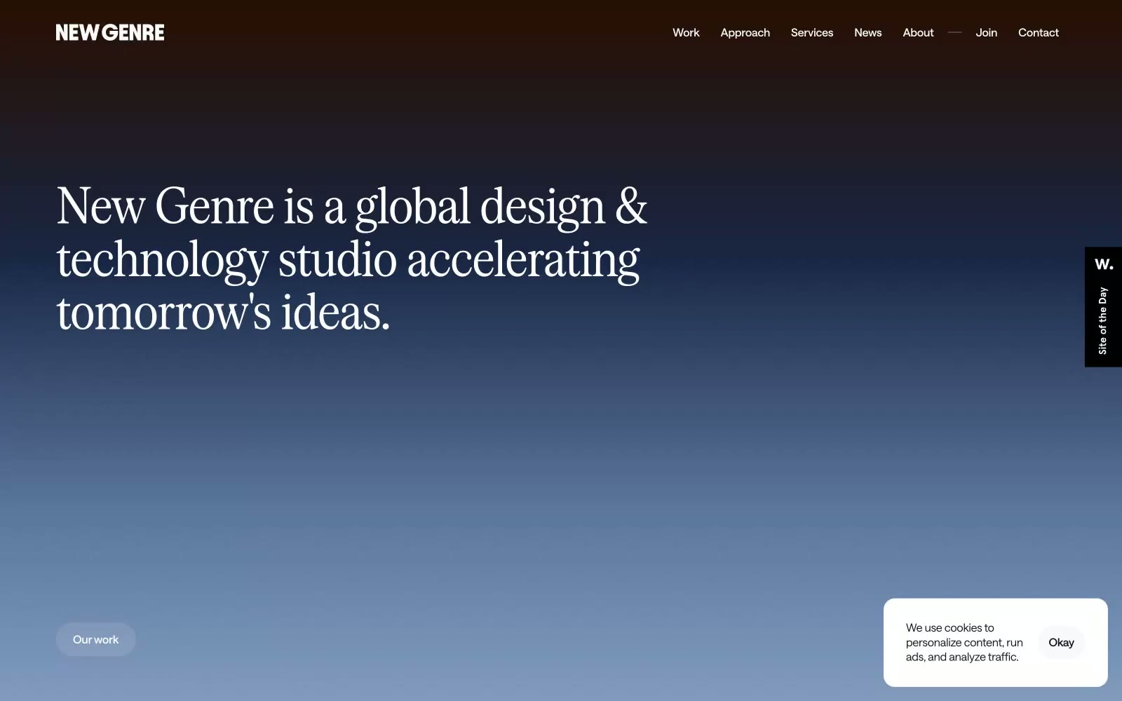
New Genre
New Genre — Style Reference
# New Genre — Style Reference
> Cinematic horizon at golden hour — a single gradient arc from charred umber through steel twilight to warm parchment, against which condensed serif headlines carve like editorial mastheads.
**Theme:** light
New Genre operates in a cinematic dawn-to-dusk register: near-white surfaces, a near-black text color, and one monumental gradient that arcs from charred brown through steel blue to warm cream — that gradient IS the brand. Typography is a two-voice conversation between a condensed display serif (Serrif Condensed) that fills the top of every page with editorial gravity, and a low-weight geometric sans (Saans Variable) that handles everything else with quiet precision. The system is deliberately monochromatic at the interface level — no accent buttons, no chromatic badges — letting photographic work, gradient washes, and typographic contrast carry all the emotion. Components are architectural: pill-shaped controls at 50-90px radius, 16px-radius cards, hairline dividers, and barely-there elevation. Space is compact and functional, never decorative.
## Tokens — Colors
| Name | Value | Token | Role |
|------|-------|-------|------|
| Parchment Canvas | `#ffffff` | `--color-parchment-canvas` | Page backgrounds, card surfaces, inverse text on dark fills |
| Onyx | `#0c1018` | `--color-onyx` | Primary body text, headings, input text, icon fills — blue-shifted near-black replaces pure #000 across the interface |
| Pure Black | `#000000` | `--color-pure-black` | Footer text, heavy display accents, icon strokes — reserved for maximum weight moments |
| Charred Umber | `#1e1310` | `--color-charred-umber` | Footer surface, dark contrast bands, gradient origin stop — warm dark anchors the bottom of the spectrum |
Websites
Markdown Text
design-md
website-prompt
landing-page-prompt
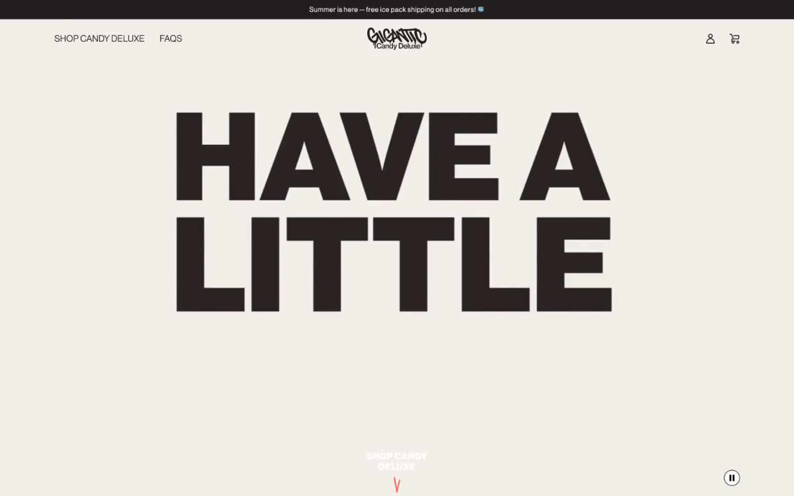
Gigantic
Gigantic — Style Reference
# Gigantic — Style Reference
> punk-rock candy wrapper shouting on cream paper
**Theme:** light
Gigantic operates on a punk-rock confectionery visual language: an oversized headline voice shouting over warm cream paper, a single screaming orange-red accent, and packaging-forward product photography that treats each bar like a streetwear drop. The dominant near-black is the brand's primary action and text color — buttons are not colorful, they are assertive and monochromatic, with the orange-red reserved for product flavor coding, the footer wash, and the brand mark. Typography carries the energy: Neue Haas Grotesk Display set at near-display sizes, tracked wide and set heavy, so the type itself becomes the graphic. Whitespace is generous, the canvas is always warm (#f0ede7) rather than clinical white, and components stay flat — no shadows, no gradients, no glassmorphism — just bold ink on cream paper with a single loud accent.
## Tokens — Colors
| Name | Value | Token | Role |
|------|-------|-------|------|
| Ink Black | `#231f20` | `--color-ink-black` | Primary text, filled action buttons, nav, headings, hairline borders, product bar backgrounds |
| Cream Paper | `#f0ede7` | `--color-cream-paper` | Primary page canvas, section backgrounds, image backgrounds |
| Pure White | `#ffffff` | `--color-pure-white` | Inverted text on dark surfaces, button text, card/image backgrounds |
| Blast Red | `#ff634b` | `--color-blast-red` | Flavor-coded product accent (Salted Peanut bar), footer band, brand mark, single decorative punctuation across the cream canvas |
Websites
Markdown Text
design-md
website-prompt
landing-page-prompt
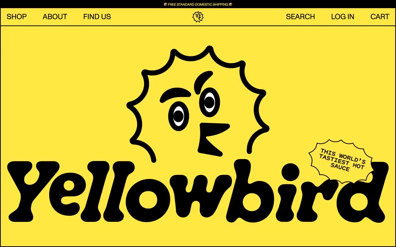
Yellowbird®
Yellowbird® — Style Reference
# Yellowbird® — Style Reference
> Retro condiment billboard in midday sun — a single yellow plane under a black sun, every letter drawn with a fat marker.
The system breathes through color contrast, not elevation: yellow on yellow separated by thick black strokes, with cream cards as the only neutral relief.
**Theme:** light
Yellowbird is a high-volume, two-color world: a single vivid yellow floods every section while black does all the structural and typographic work. The page reads like a hand-drawn condiment billboard — flat surfaces, thick hairline borders instead of shadows, generous breathing room, and a custom chunky display face that turns the wordmark into the hero. There is no gradient depth, no glassmorphism, no card-on-card layering; spatial separation comes from color swaps (yellow band → cream card → black button) and generous padding. Interactive elements stay minimal and confident: most surfaces are borderless on the yellow canvas, product cards use a 30px radius and a solid black stroke, and the one true CTA is a heavy black pill-shaped button with white text. The blue (#007aff) appears only as a ghost-button border for secondary actions, making it feel borrowed rather than owned.
## Tokens — Colors
| Name | Value | Token | Role |
|------|-------|-------|------|
| Sunglow | `#ffe845` | `--color-sunglow` | Brand canvas — the dominant page background across all sections, hero, footer, and announcement bar; also fills product category tags and sticker burst shapes |
| Sauce Bottle Black | `#000000` | `--color-sauce-bottle-black` | Primary text, all borders and hairlines, product card strokes, mascot linework, and the filled primary action button background — does the heavy structural and typographic lifting |
Websites
Markdown Text
design-md
website-prompt
landing-page-prompt
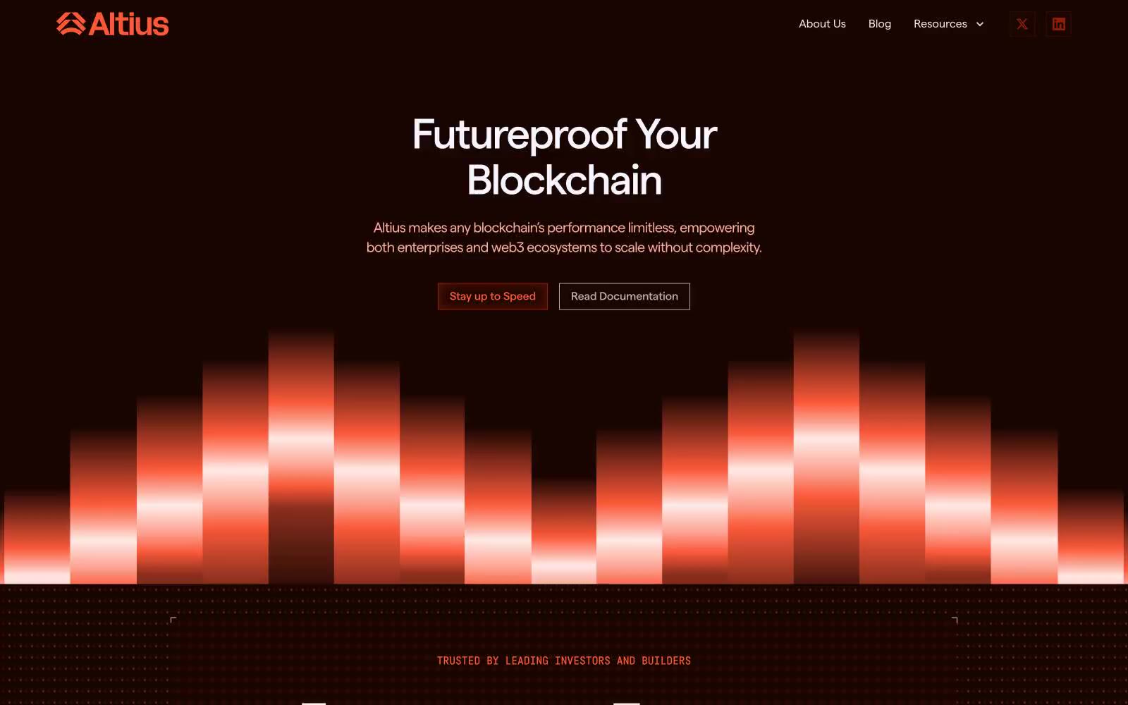
Altius
Altius — Style Reference
# Altius — Style Reference
> Molten embers on obsidian. A blockchain command center lit from within by coral fire, where dark surfaces breathe warm light through hairline gaps and inset glows.
**Theme:** dark
Altius operates in a volcanic-ember register: deep obsidian-brown surfaces warmed by coral and flare-orange highlights, like a blockchain control room rendered in molten glass and cooled lava. The page rhythm alternates between heavy dark sections and light peach breathing spaces, creating a thermal oscillation rather than the typical dark-mode-everywhere crypto UI. Typography is tight-tracked and weight-confident — Matter (sans) at weight 700 for display, with Fabrikatmono (monospace) as a technical accent for tags and labels. Components feel pressed-in rather than floating: buttons carry an inner ember-glow shadow, cards use hairline coral borders on dark, and the hero's vertical gradient bars suggest a sound wave or thermal spectrum. Color is the brand's primary voice — expect a dark, warm, confident system that treats coral-orange as functional punctuation across a near-black canvas.
## Tokens — Colors
| Name | Value | Token | Role |
|------|-------|-------|------|
| Obsidian Ember | `#190501` | `--color-obsidian-ember` | Primary dark canvas — page background in dark sections, card surface, deepest borders. The black-with-warmth that defines the brand atmosphere |
| Dark Cocoa | `#340a01` | `--color-dark-cocoa` | Secondary dark surface, deep link borders, icon outlines — one step lifted from obsidian for layering depth |
| Molten Core | `#631303` | `--color-molten-core` | Inset glow shadow source, deep red-brown accents — the pressed-ember tone that gives buttons their internal fire |
| Signal Red | `#951c04` | `--color-signal-red` | Outlined/ghost action border, nav borders, icon strokes, interactive outlines — the chromatic action color used for outlined buttons and active control edges |
Websites
Markdown Text
design-md
website-prompt
landing-page-prompt
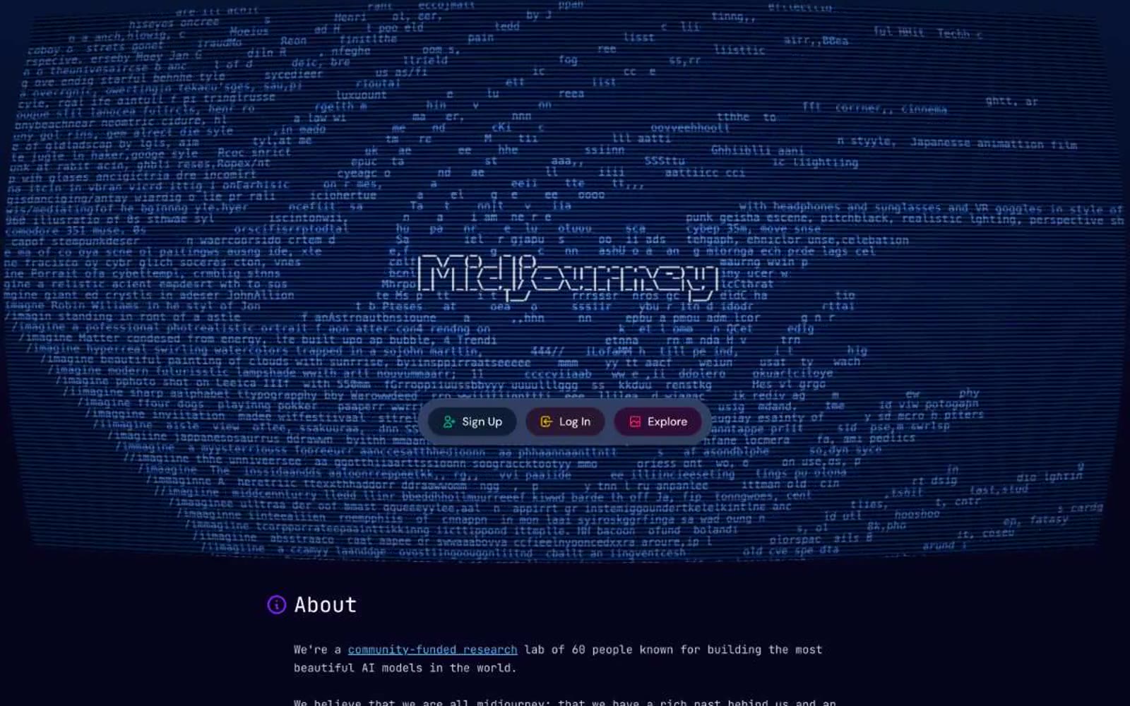
Midjourney
Midjourney — Style Reference
# Midjourney — Style Reference
> Deep-ocean bioluminescent terminal. A pressurized darkness where intelligence visibly generates itself in ASCII streams, and controls appear as faintly glowing specimens.
**Theme:** dark
Midjourney's interface feels like peering through a deep-ocean porthole into a bioluminescent void — vast, pressurized darkness with faint light sources. The #06051d near-black with violet undertone is not simply dark but dimensionally deep, distinguished from pure black by that violet warmth that reads as cosmic rather than void. A sprawling ASCII/generative text animation fills the hero against this background, making the interface itself feel like it's generating intelligence in real time. Section headings and nav use JetBrains Mono exclusively — monospace as aesthetic choice, not technical necessity, giving every label the weight of a terminal command. The three pill buttons (Sign Up, Log In, Explore) float as translucent jewels — each tinted a different hue (green, yellow, red-orange) at 20% opacity against their dark backgrounds, with matching text colors, making them feel less like CTAs and more like categorized data packets.
## Tokens — Colors
| Name | Value | Token | Role |
|------|-------|-------|------|
| Cosmic Void | `linear-gradient(0deg, rgb(6, 5, 29) 30%, rgb(6, 20, 52))` | `--color-cosmic-void` | Primary page background and hero fill — the violet undertone separates it from neutral black, making darkness feel galactic rather than empty |
| Abyssal Blue | `#0f1c36` | `--color-abyssal-blue` | Secondary surface backgrounds, button background variant — a step lighter than Cosmic Void for subtle depth layering |
| Steel Navy | `#1d293d` | `--color-steel-navy` | Card surfaces, nav background, interactive container backgrounds |
| Deep Slate | `#314062` | `--color-deep-slate` | Elevated card or hover state backgrounds |
Websites
Markdown Text
design-md
website-prompt
landing-page-prompt
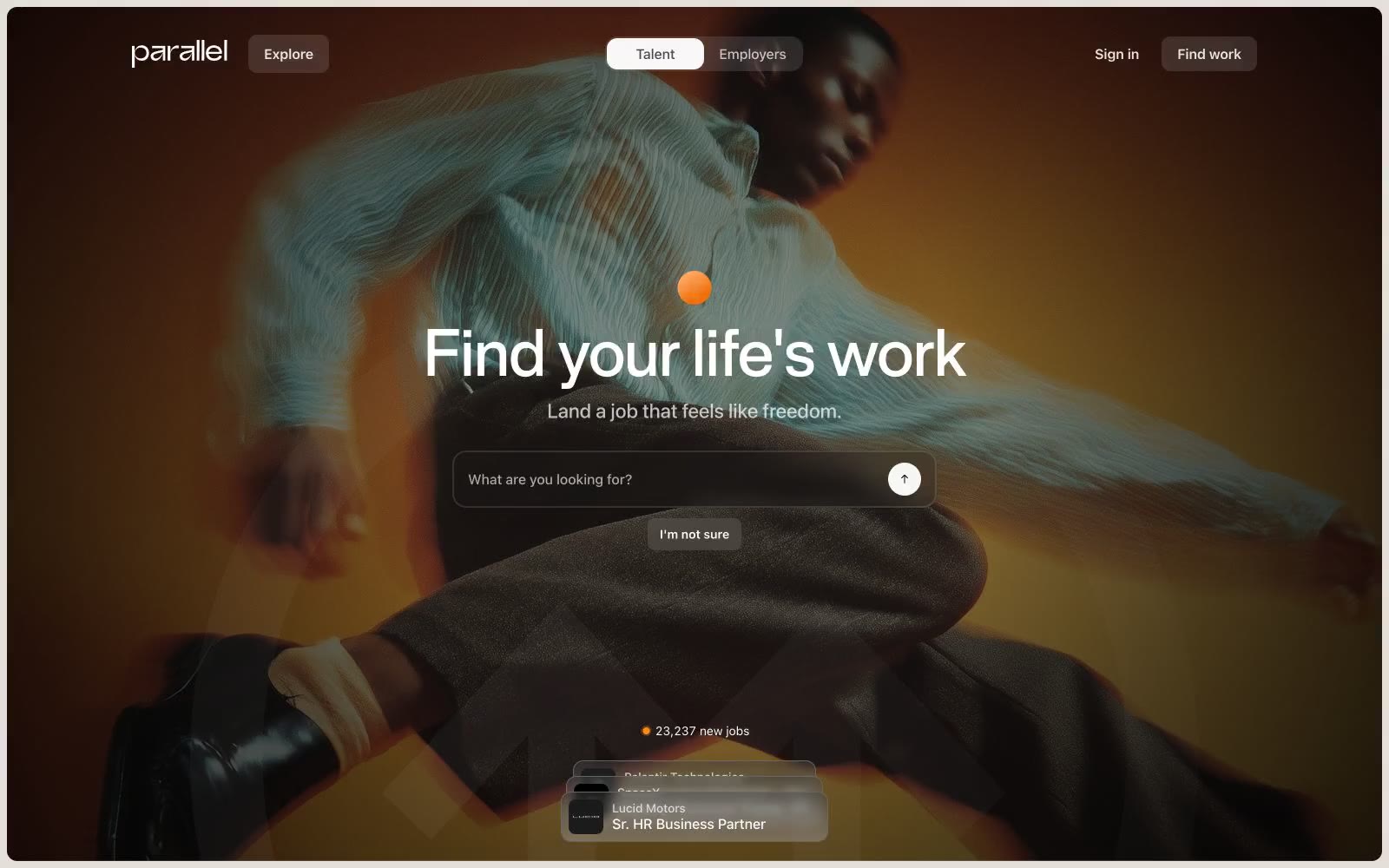
Home
Home — Style Reference
# Home — Style Reference
> Warm editorial atelier. Cream paper, charcoal ink, and one ember-orange period of emphasis — a job platform that feels like an art-book spread photographed under amber light.
**Theme:** light
Parallel operates as a warm editorial atelier: a cream-paper canvas (#e4dfd9) hosts product surfaces in white, photography is presented in full-bleed cinematic crops with deep blacks and amber-warm lighting, and the only chromatic punctuation is a small ember-orange dot that marks emphasis. Typography carries a dual-register system — a weight-500 editorial display face (Rules Font) for headlines and a neutral system sans-serif for everything functional — letting headings feel hand-set while the UI stays quiet and utility-driven. Components are physically restrained: 20px card radii, 8-12px button radii, hairline #c7c7c7 dividers, a single soft shadow for elevation, and pill-shaped toggles. The design vocabulary is closer to a magazine layout than a SaaS dashboard — generous breathing room, aligned text blocks, and photography treated as the hero, not the accent.
## Tokens — Colors
| Name | Value | Token | Role |
|------|-------|-------|------|
| Cream Paper | `#e4dfd9` | `--color-cream-paper` | Page background canvas, hero overlays, editorial section backdrops — the warm off-white that sets the entire system apart from generic SaaS grays |
| Pure White | `#ffffff` | `--color-pure-white` | Card surfaces, product UI mockups, input fields, text on dark photography |
| Charcoal Ink | `#000000` | `--color-charcoal-ink` | Primary text, strong borders, icon strokes, logo wordmark — the maximum-contrast voice |
| Near Black | `#050505` | `--color-near-black` | Body text and heading color for subtle warmth below pure black |
Websites
Markdown Text
design-md
website-prompt
landing-page-prompt
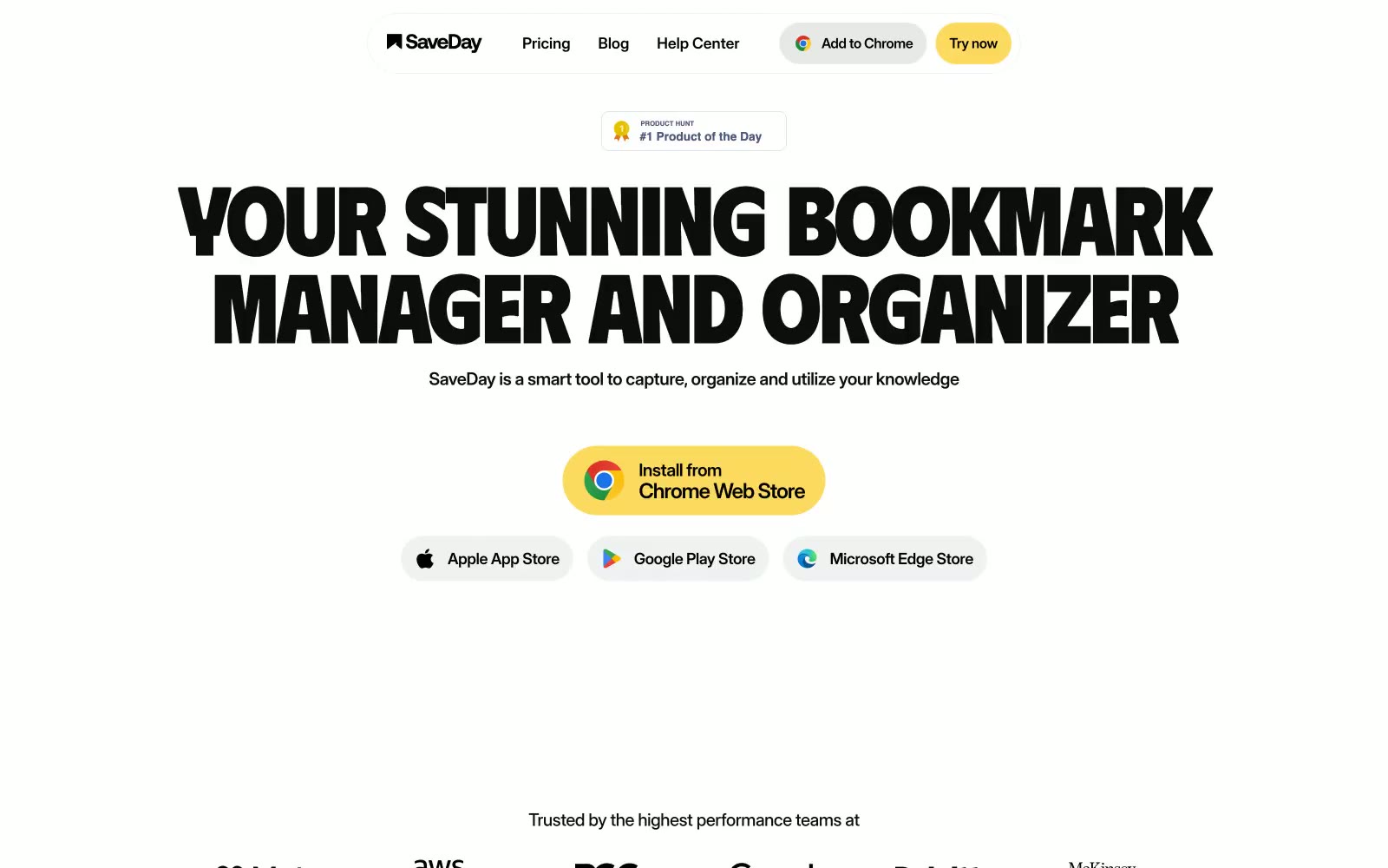
SaveDay
SaveDay — Style Reference
# SaveDay — Style Reference
> butter-highlighter poster typography — oversize black uppercase type on cream paper, with one band of yellow dragged across each section.
**Theme:** light
SaveDay reads as a sun-bleached editorial spread with a butter-yellow highlighter dragged across it: a near-monochrome paper-white canvas, oversized uppercase display type in Phudu, and one saturated #fbda5f yellow that paints full-width section bands and pill accents. The system is unapologetically poster-like — headlines fill the viewport at 112px, letter-spacing pulls tight to -0.04em, and text alignment is almost always centered, producing a print-poster cadence rather than a dashboard cadence. Information is delivered in horizontal color bands (light gray, yellow, black) that act as section dividers and surface treatments in one move, with no shadows mediating depth. Components are confidently chunky: 24px card radii, 160px pill radii on CTAs and tags, hairline-thick black borders, and flat fills — the geometry does the work that gradients and shadows usually do.
## Tokens — Colors
| Name | Value | Token | Role |
|------|-------|-------|------|
| Butter Highlight | `#fbda5f` | `--color-butter-highlight` | Yellow accent for outlined action borders, linked labels, and lightweight interactive emphasis. Do not promote it to the primary CTA color |
| Signal Blue | `#006aff` | `--color-signal-blue` | Link and icon accent for secondary navigation and store-badge fills — cool counterpoint to the warm yellow, never used for primary CTAs |
| Ink | `#0d0d0d` | `--color-ink` | Body text, heading text, card borders, hairline dividers — the dominant near-black that carries almost all typography and outlines |
| Pure Black | `#000000` | `--color-pure-black` | Hard-edge borders on feature band cards, icon fills, and the inverted footer band where it provides maximum contrast against yellow text |
Websites
Markdown Text
design-md
website-prompt
landing-page-prompt
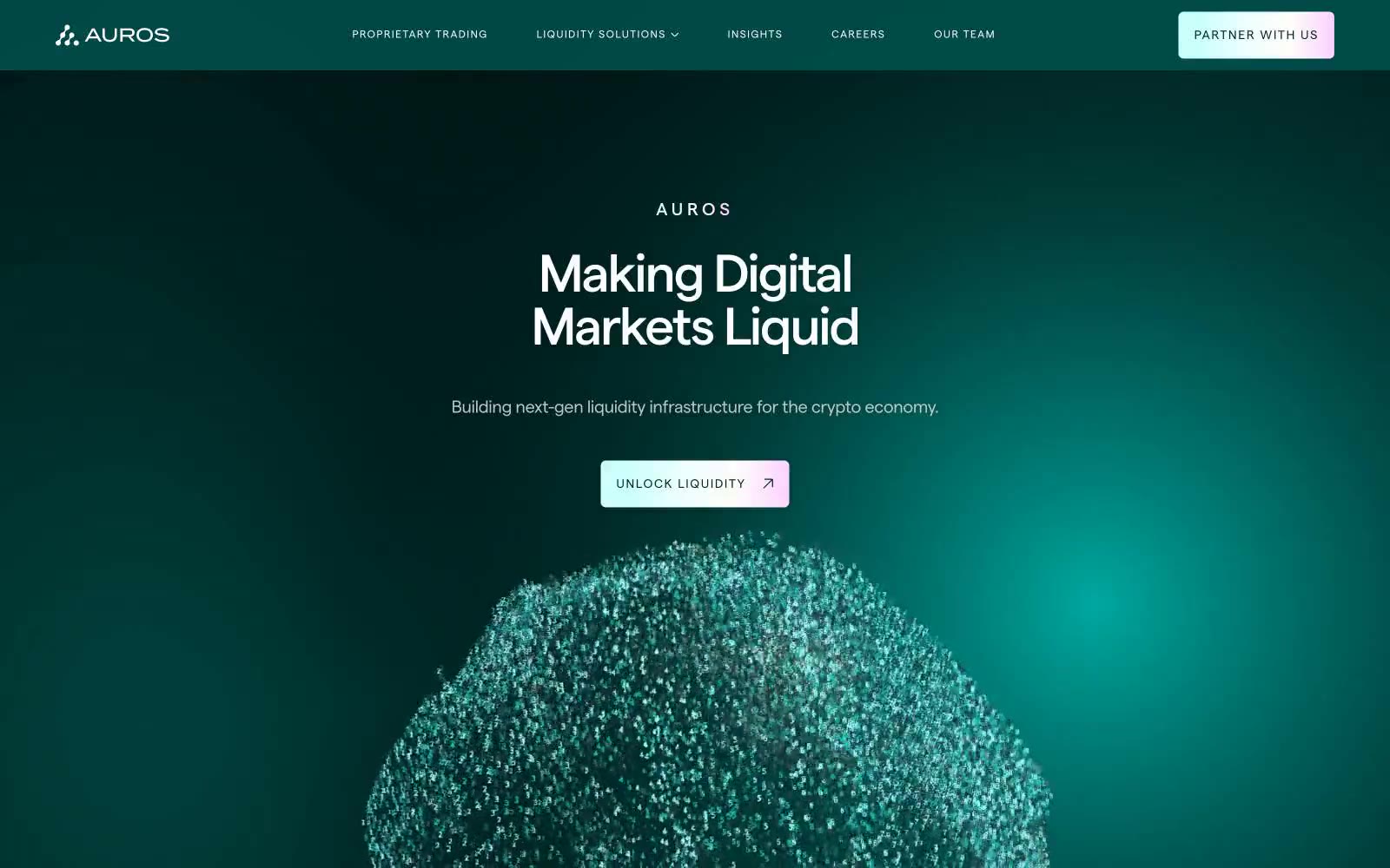
Auros
Auros — Style Reference
# Auros — Style Reference
> abyssal observatory with bioluminescent data constellations. A dark teal void where luminous particles, tight display type, and rationed teal-to-lavender gradients signal liquidity and precision.
**Theme:** dark
Auros reads as a deep-ocean trading terminal: a near-black teal abyss punctuated by luminous data points, subtle lavender warmth, and a single particle sphere that anchors the visual identity. Typography carries the brand's confidence — a custom geometric sans (Matter) is pushed to extreme sizes, from 10px tracked-out eyebrow labels to 295px display type that crouches aggressively tight. Surfaces are whisper-thin: the card layer sits just one shade above the canvas, creating depth through tonal difference rather than shadows. Accents are rationed — a teal-to-cyan gradient signals action, a barely-there lavender border whispers warmth against the cool field, and small mint dots prefix section labels like navigation beacons.
## Tokens — Colors
| Name | Value | Token | Role |
|------|-------|-------|------|
| Abyssal Teal | `#012624` | `--color-abyssal-teal` | Page canvas, primary background — the dominant field the entire interface floats on |
| Midnight Current | `#011d1c` | `--color-midnight-current` | Card surface, elevated panels — one step deeper than canvas, surfaces feel pressed into the void |
| Tide Pool Teal | `#003734` | `--color-tide-pool-teal` | Interactive card backgrounds, subtle filled actions, secondary surface lift |
| Fog Veil | `#bbc7c6` | `--color-fog-veil` | Body text, secondary copy, muted borders — the dim chorus against white headlines |
Websites
Markdown Text
design-md
website-prompt
landing-page-prompt
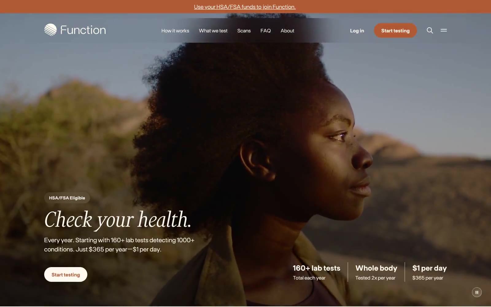
Function
Function — Style Reference
# Function — Style Reference
> warm apothecary journal on parchment
**Theme:** light
Function reads like a premium editorial wellness journal printed on warm cream paper: a serif display voice (Financier) delivers headlines with quiet authority while a humanist sans (Ftbase) carries the body language of a calm clinician. The canvas is never sterile white — every surface sits in a warm parchment range from #fef9ef to #f5eee1, and a single terracotta accent (#b05a36) punctuates actions, badges, and icon strokes like a wax seal on an apothecary label. Components are rounded generously (24px cards, 40px buttons, 9999px pills) but never feel toy-like because shadows are used sparingly and only at two elevations. Italic serif words mixed with roman serif in the same headline create a typographic rhythm that's the system's strongest signature — health tech that trusts the reader to slow down.
## Tokens — Colors
| Name | Value | Token | Role |
|------|-------|-------|------|
| Terracotta Seal | `linear-gradient(116deg, rgb(176, 90, 54), rgb(212, 166, 142))` | `--color-terracotta-seal` | Primary action buttons, eyebrow labels, active states, icon strokes, key badges — a single warm rust against cream paper, evokes clinical warmth without medical sterility; Subtle hero overlay gradient from terracotta to a lighter tan — used on hero photo treatment and decorative seals, not on UI surfaces |
| Parchment | `#fef9ef` | `--color-parchment` | Page canvas and primary surface — never use pure white; this warm off-white is the system's base tone |
| Aged Paper | `#f5eee1` | `--color-aged-paper` | Card and panel surfaces, subtle wash backgrounds — one step deeper than the canvas to create soft elevation without shadows |
| Warm Taupe | `#d1c9bf` | `--color-warm-taupe` | Hairline borders, divider lines, card outlines — replaces cold gray with a tone that belongs to the cream family |
Websites
Markdown Text
design-md
website-prompt
landing-page-prompt
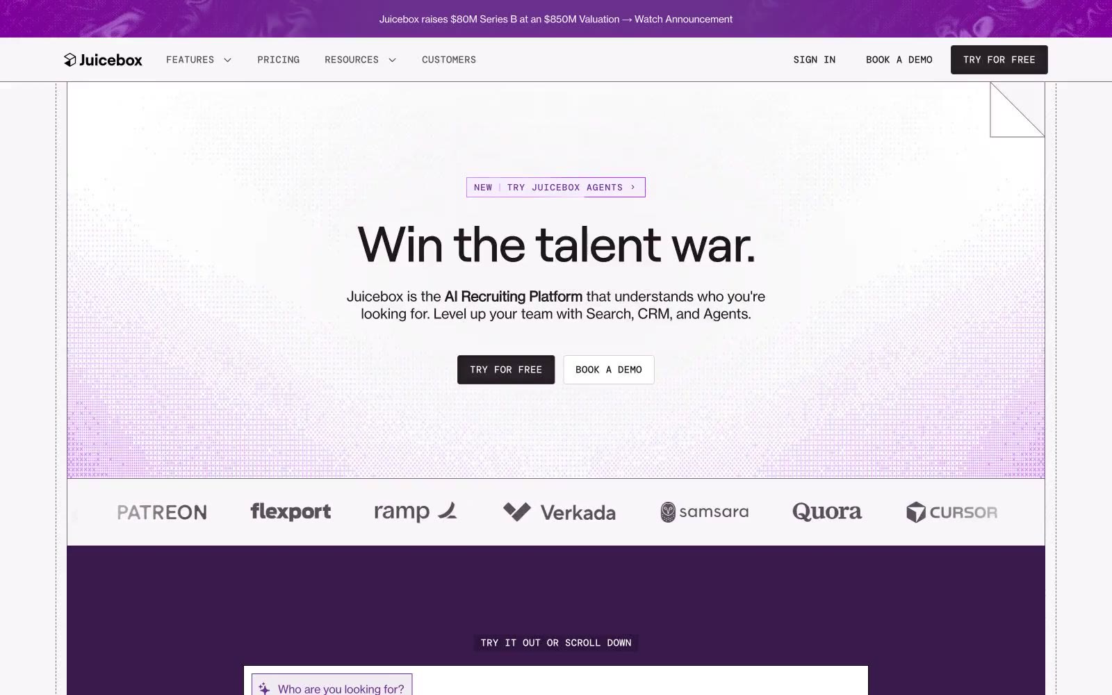
Juicebox.ai
Juicebox.ai — Style Reference
# Juicebox.ai — Style Reference
> Talent command center on cream paper
**Theme:** light
Juicebox operates in a talent-recruiting command center dialect: near-white canvas surfaces, a single saturated royal-purple that floods heroes and product frames, and tight, oversized serifless headlines that feel like executive memos rather than SaaS marketing. The interface is deliberately quiet — hairline borders, 2px radii, mono-spaced technical labels — so that the purple moments (hero washes, active tabs, product frames) feel like voltage jumps against an otherwise grayscale instrument panel. Body copy is set in a grotesque at 14–18px with slightly tightened tracking; display copy uses a neo-grotesque display face with aggressive negative letter-spacing at 40–72px that compresses headlines into confident, compact blocks. Components are compact, rectangular, and unornamented: no rounded pills, no drop shadows, no gradients on controls. Elevation is implied by surface lightness and a single inset shadow reserved for active/pressed states.
## Tokens — Colors
| Name | Value | Token | Role |
|------|-------|-------|------|
| Royal Plum | `#6a2f8d` | `--color-royal-plum` | Primary brand color — hero washes, product frames, active nav indicator, link accents, and decorative section bands. Carries 100% of the chromatic brand weight; the system is monochrome until this color appears |
| Plum Mist | `#eee8fd` | `--color-plum-mist` | Tinted lilac surface used for soft product/section backgrounds and as the lightest stop in purple gradient washes. Pairs with Royal Plum to create a two-stop purple atmosphere without needing darker midtones |
| Lilac Outline | `#da9efd` | `--color-lilac-outline` | Decorative stroke accent — used sparingly on illustration outlines, diagram borders, and ornamental SVG marks that sit over plum surfaces |
| Forest Mark | `#2f8d6e` | `--color-forest-mark` | Green outline accent for tags, dividers, and focused UI edges |
Websites
Markdown Text
design-md
website-prompt
landing-page-prompt
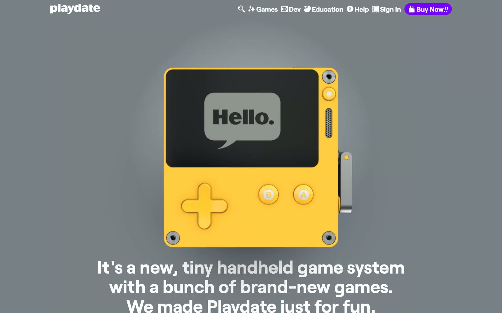
Playdate
Playdate — Style Reference
# Playdate — Style Reference
> A yellow Game Boy under museum lights. Playdate's whole identity is that single bright product held against neutral gray, with one violet spark doing all the interactive work.
**Theme:** mixed
Playdate reads like a sunlit toy-store catalog: saturated yellow bands alternate with cool gray and white sections, each one a stage for the bright handheld itself. A single violet accent does all the talking — buttons, links, the nav buy-pill — while the rest of the UI stays quiet on warm charcoal text and bone-white cards. Roobert carries the tone: an oversized lowercase wordmark in sunflower yellow is the brand's signature, body copy sits at a confident 22px in a humanist geometric, and line-height is generous enough to feel handmade. Components are intentionally weightless: 2.85px corners on game cards, no decorative borders, and CTAs that float as purple pills with soft drop-shadows. The rhythm is full-bleed sections stacked vertically, each one swapping palette so the page reads like a printed product brochure rather than a typical SaaS landing.
## Tokens — Colors
| Name | Value | Token | Role |
|------|-------|-------|------|
| Sunbeam Yellow | `#ffc500` | `--color-sunbeam-yellow` | Section backgrounds, the product itself, display wordmarks — the page's primary brand canvas and the loudest single color in the system |
| Electric Violet | `linear-gradient(180deg, rgb(148, 0, 255), rgb(92, 0, 255))` | `--color-electric-violet` | Violet supporting accent for decorative details and low-frequency emphasis. Do not promote it to the primary CTA color |
| Carbon | `#312f27` | `--color-carbon` | Body text, heading text, icon strokes, form labels — a warm near-black chosen over pure #000 to sit comfortably against yellow and white without vibrating |
| Paper White | `#ffffff` | `--color-paper-white` | Card surfaces, text on violet buttons, text on dark bands — the default light surface |