AI Prompt Studio - Intelligent Prompt Library
Explore and use professional AI prompts to optimize your workflow.
One-click Use
Websites
Markdown Text
design-md
website-prompt
landing-page-prompt
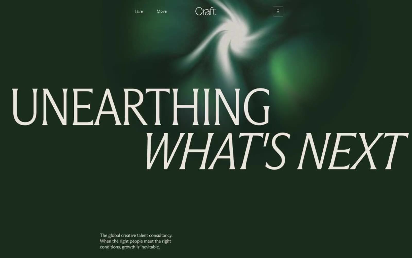
Craft
Craft — Style Reference

# Craft — Style Reference
> botanical conservatory on warm parchment — cream pages holding vivid green specimens and one quiet forest room.
**Theme:** light
Craft operates as a botanical conservatory on warm parchment: a cream canvas (#f7f5f2) carries the whole body, punctuated by a single deep-forest hero (#1d3023) that swallows the viewport behind a flowing organic green shape. Type is the primary voice — a custom condensed serif at 180px whispers the brand promise in tight -0.03em tracking, then a lighter Arizona Flare handles everything else at human scale. Color is used as punctuation, not decoration: the cream surface dominates, a near-black plum-brown carries all text, and a vivid lime green (#26d862) appears only on action, inline links, and the occasional accent word inside headlines. Components stay flat and unshadowed — the hierarchy comes from type size, generous whitespace (56px section gaps), and 8px-radius cards that hold full-bleed flower photography. The rhythm is editorial: one dramatic dark hero, then a stream of quiet cream sections with centered serif statements, 4-column stat strips, and image grids that let the botanical subjects do the work.
## Tokens — Colors
| Name | Value | Token | Role |
|------|-------|-------|------|
| Bone Linen | `#f7f5f2` | `--color-bone-linen` | Page canvas, body backgrounds — the warm off-white that carries almost every section and makes the dark hero and green accents feel like specimens on display |
| Oat Milk | `#eae6df` | `--color-oat-milk` | Card surfaces, elevated panels, secondary containers — a half-step darker than the canvas for gentle separation without shadow |
| Driftwood | `#d7d2cc` | `--color-driftwood` | Hairline borders, dividers, structural separators — warm gray that reads as line work, not as color |
| Ash Mauve | `#645757` | `--color-ash-mauve` | Secondary text, captions, muted labels — used where near-black would be too heavy, sits at 80 instances |
Websites
Markdown Text
design-md
website-prompt
landing-page-prompt
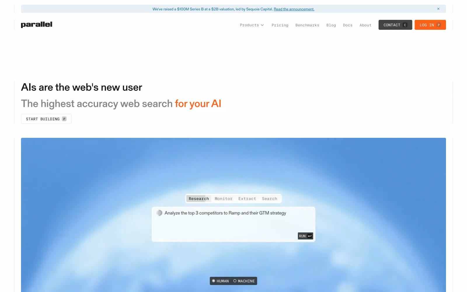
Parallel Web Systems
Parallel Web Systems — Style Reference
# Parallel Web Systems — Style Reference
> Engineering journal at dawn — a technical reading room where data streams replace photography and the type does the talking.
**Theme:** light
Parallel reads like an engineering journal printed on cream paper: a light, editorial canvas in warm off-white, a single serif (gerstnerProgramm) carrying all reading content, and a monospaced secondary voice (ftSystemMono) governing every piece of UI chrome — nav items, buttons, toggles, tags. The palette is almost entirely grayscale with two saturated accent punctuation marks: a steel blue that fills a large data-visualization hero panel, and a vivid orange that lands on exactly one CTA and one inline emphasis phrase. Surfaces are flat and hairline-divided rather than shadowed; radii are brutally small (2px), giving the whole system the feel of a technical schematic. The single dark moment is a dithered, data-textured footer band that mirrors the hero, closing the page in the same visual language it opened with.
## Tokens — Colors
| Name | Value | Token | Role |
|------|-------|-------|------|
| Schematic Blue | `#0d6ea5` | `--color-schematic-blue` | Hero data-visualization panels, inline emphasis phrases, link/heading accents — the cool, restrained blue of a blueprint or oscilloscope trace, used at scale to make a single colored block dominate a page |
| Signal Orange | `#fb631b` | `--color-signal-orange` | Orange supporting accent for decorative details and low-frequency emphasis. Do not promote it to the primary CTA color |
| Ink Black | `#181818` | `--color-ink-black` | Primary text, dark filled buttons (CONTACT), the HUMAN/MACHINE pill toggle — a near-black that is softer than pure #000, the default reading color across all body and headings |
| Graphite | `#434343` | `--color-graphite` | Secondary nav and button text, footer secondary links — the mid-tier of the neutral scale, sits between Ink Black and Slate |
Websites
Markdown Text
design-md
website-prompt
landing-page-prompt
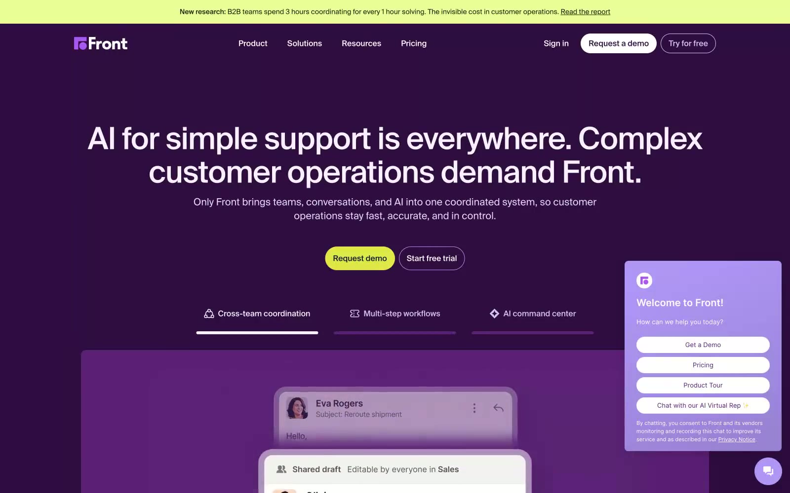
Front
Front — Style Reference
# Front — Style Reference
> Midnight plum control room, one lime spark. Deep aubergine walls, lavender mist borders, and a single chartreuse beacon that pulls every eye.
**Theme:** dark
Front operates in a deep-plum command-center language: a single saturated purple (#300c41) carries the page, lighter lavender cards float above it, and one electric lime accent punches through the darkness as the only warm color. Typography is neo-grotesque and tightly tracked, with display sizes at weight 500 pulling inward at -0.02em so headlines feel machined rather than drawn. Surfaces are flat — no drop shadows, only a hairline 1px inset ring in pale lilac (#d0c6f0) to define interactive edges. The overall rhythm is confident and dense: rounded pill controls (40-64px radius), compact 8/16/24px spacing, and dark-on-dark layering that makes the lime CTA feel switched on.
## Tokens — Colors
| Name | Value | Token | Role |
|------|-------|-------|------|
| Aubergine | `#300c41` | `--color-aubergine` | Page canvas, hero backgrounds, nav background — the single dominant surface color that gives Front its unmistakable identity |
| Royal Plum | `#5b1f76` | `--color-royal-plum` | Pink supporting accent for decorative details and low-frequency emphasis. Do not promote it to the primary CTA color |
| Lime Spark | `#dee948` | `--color-lime-spark` | Green supporting accent for decorative details and low-frequency emphasis. Do not promote it to the primary CTA color |
| Bright Violet | `#8034bf` | `--color-bright-violet` | Violet supporting accent for decorative details and low-frequency emphasis. Do not promote it to the primary CTA color |
Websites
Markdown Text
design-md
website-prompt
landing-page-prompt
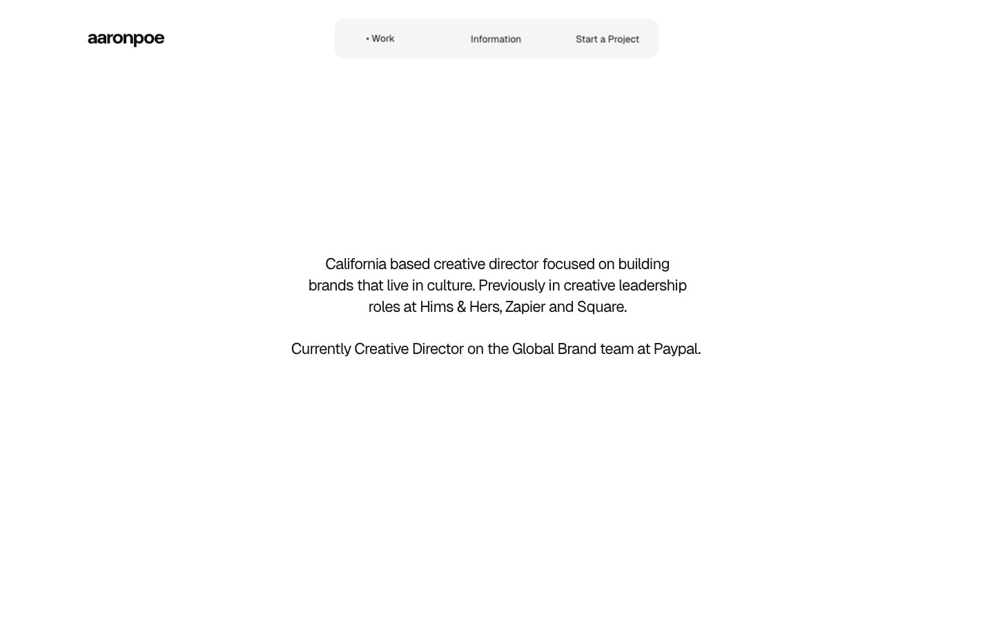
Aaron Poe & Co
Aaron Poe & Co — Style Reference
# Aaron Poe & Co — Style Reference
> Quiet white gallery — coral pink whispers float in vast considered silence, framed only by pill-shaped nav and tightly-tracked type.
**Theme:** light
Aaron Poe & Co operates as a curator's white room — a creative director's portfolio that strips interface to typography, whitespace, and a single accent. The canvas is pure white; the type stack pairs Geist (tightly tracked, negative letter-spacing) with system fonts for body copy; and a warm coral pink (#ea587d) surfaces only on heading text and hairline borders, never as a filled button. Components feel like gallery placards: a floating pill-shaped nav, centered bio blocks, and subtle 1px inset borders replacing the need for drop shadows. The rhythm is editorial — vast negative space punctuated by compressed, confident type and one whisper of color.
## Tokens — Colors
| Name | Value | Token | Role |
|------|-------|-------|------|
| Coral Rose | `#ea587d` | `--color-coral-rose` | Accent for heading text, hairline borders, and active-state markers — the single chromatic signal in an otherwise achromatic system |
| Pure White | `#ffffff` | `--color-pure-white` | Page canvas, card surfaces, and inverted backgrounds |
| Cloud | `#f2f2f2` | `--color-cloud` | Pill nav background, subtle surface elevation, and inset border shadows |
| Bone | `#d9d8d4` | `--color-bone` | Warm-toned secondary surface tint for alternating bands |
Websites
Markdown Text
design-md
website-prompt
landing-page-prompt
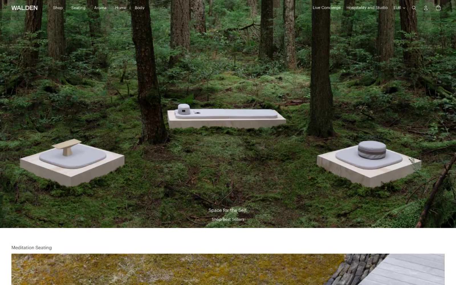
Walden
Walden — Style Reference
# Walden — Style Reference
> A still forest floor — every product is a stone, every pixel is moss and silence.
**Theme:** light
Walden is a meditation and ritual-object brand whose interface behaves like a quiet gallery wall. The canvas is pure white; nearly every surface, border, and control is rendered in warm grayscale, with no chromatic accent anywhere in the system. Type is small, tight, and lowercase-leaning, and the only structural cues are hairline strokes in stone-gray (#d3cec5) — no drop shadows, no elevation tricks, no gradients. Full-bleed nature and product photography carries the entire emotional load, so the chrome around it must stay almost invisible. Components feel handmade, not templated: a 2px button radius, a 16px max radius on cards, and 1px inset rings as the only shadows in the system.
## Tokens — Colors
| Name | Value | Token | Role |
|------|-------|-------|------|
| Charcoal Ink | `#3f3f3f` | `--color-charcoal-ink` | Primary text, default borders, link underlines, icon strokes — the workhorse gray that carries almost every label and divider in the system |
| Paper White | `#ffffff` | `--color-paper-white` | Page canvas, nav background, card surfaces, button text — the absolute ground of the interface |
| Stone Veil | `#d3cec5` | `--color-stone-veil` | Hairline borders, inset focus rings, soft separator lines — the warm gray that makes every edge feel like a seam in paper or stone, not a UI stroke |
| Sumi Black | `#030302` | `--color-sumi-black` | Filled button backgrounds, active state borders, highest-emphasis text — the near-black ink, warmer than pure black, used when a control must be pressed or selected |
Websites
Markdown Text
design-md
website-prompt
landing-page-prompt
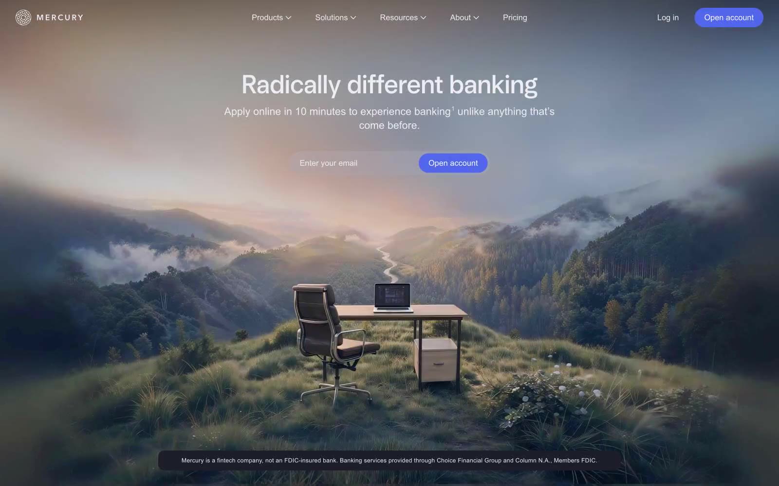
Mercury
Mercury — Style Reference
# Mercury — Style Reference
> Mountain Top Command Center
**Theme:** dark
The design feels like a command center at twilight, expansive and focused. A deep, near-black neutral palette (#1e1e2a, #171721) creates an immersive, cinematic canvas where glowing off-white text (#ededf3) provides crisp clarity. All energy is channeled into a single, vibrant violet-blue accent (#5266eb) reserved strictly for primary calls-to-action, like indicator lights on a high-tech console. The typography is a defining feature, with custom fonts used at light weights for headlines, creating an authoritative yet approachable voice. The contrast between spacious, atmospheric hero imagery and the stark, text-driven UI below creates a journey from aspiration to action.
## Tokens — Colors
| Name | Value | Token | Role |
|------|-------|-------|------|
| Mercury Blue | `#5266eb` | `--color-mercury-blue` | Primary CTA buttons — the single, vivid accent in a muted palette, focusing user action. |
| Ghost Blue | `#cdddff` | `--color-ghost-blue` | Secondary button backgrounds, hover states — a desaturated, ethereal blue suggesting interaction. |
| Deep Space | `#171721` | `--color-deep-space` | Outermost page background layer, providing depth. |
| Midnight Slate | `#1e1e2a` | `--color-midnight-slate` | Primary page and section backgrounds. |
Websites
Markdown Text
design-md
website-prompt
landing-page-prompt
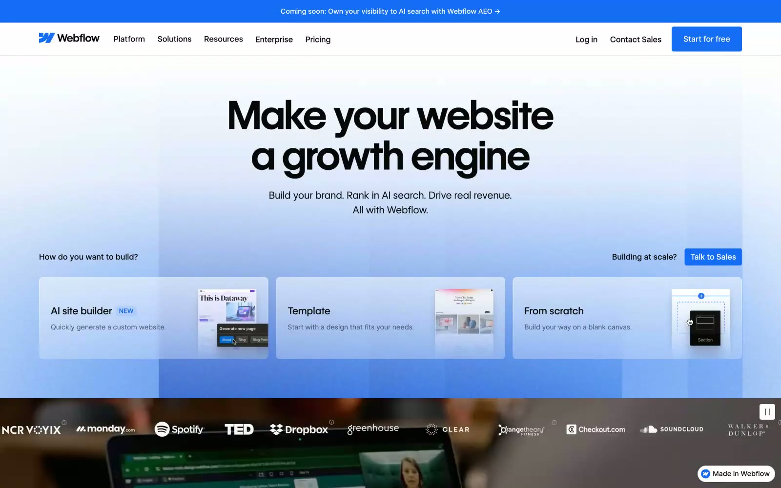
Webflow
Webflow — Style Reference
# Webflow — Style Reference
> white studio, black ink, one blue mark — a designer's drafting table rendered as a web page.
**Theme:** light
Webflow presents a studio-grade design platform language: a stark white canvas, near-black type, and a single saturated blue that punctuates the interface with quiet authority. Headlines speak at monumental sizes (56–80px) in a custom geometric variable sans, carrying tight negative tracking that makes each character feel chiseled rather than typeset. The visual rhythm is generous — large vertical breathing room between sections, cards floating on soft 8px radii with barely-there shadows, and product imagery embedded in realistic browser chrome to demonstrate capability rather than describe it. Color discipline is extreme: the palette is almost entirely achromatic, with the brand blue (#146ef5) reserved for primary actions, active states, and link emphasis, and the entire chromatic spectrum compressed to just two more hues (a soft green and warm orange) that appear only in micro-illustration contexts.
## Tokens — Colors
| Name | Value | Token | Role |
|------|-------|-------|------|
| Webflow Blue | `#146ef5` | `--color-webflow-blue` | Blue supporting accent for decorative details and low-frequency emphasis. Do not promote it to the primary CTA color |
| Indigo Ink | `#1366e2` | `--color-indigo-ink` | Blue supporting accent for decorative details and low-frequency emphasis. Do not promote it to the primary CTA color |
| Mercury Tint | `#6ca7ff` | `--color-mercury-tint` | Soft blue for icon decorations, gradient transitions, and muted highlight washes within illustrations |
| Mint Pulse | `#60ed76` | `--color-mint-pulse` | Green supporting accent for decorative details and low-frequency emphasis |
Websites
Markdown Text
design-md
website-prompt
landing-page-prompt
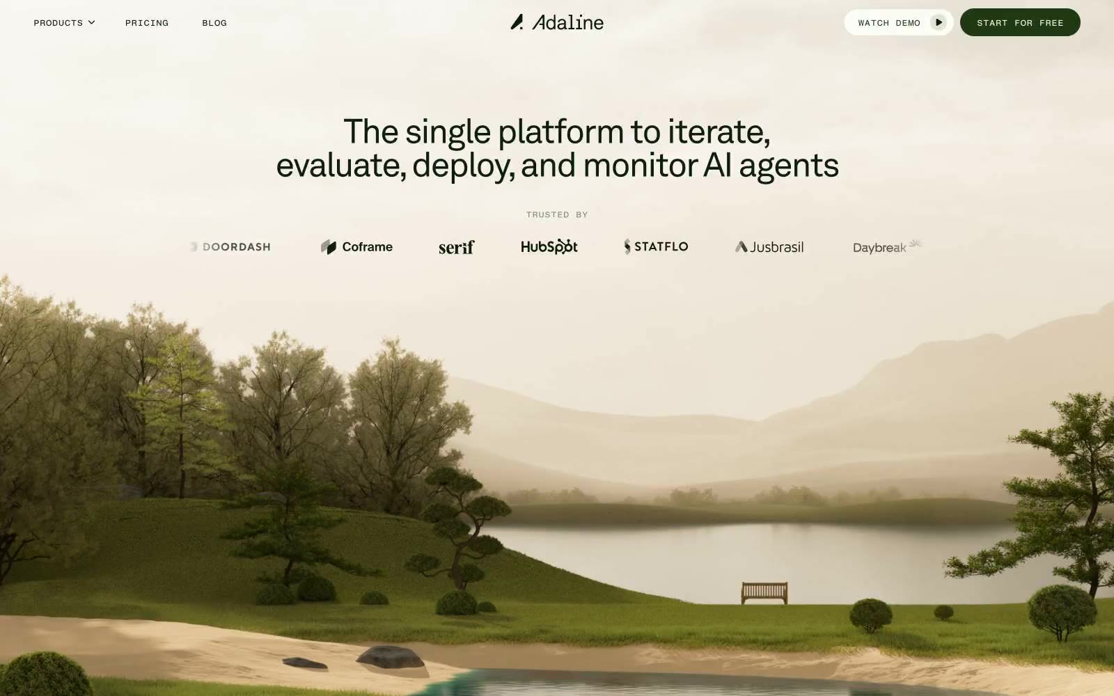
Adaline
Adaline — Style Reference
# Adaline — Style Reference
> botanical journal at dawn
**Theme:** light
Adaline renders as a contemplative workspace: a warm cream canvas draped over a painted landscape, with near-black forest text and one deep warm-brown action color. Typography stays geometric and humanist (Akkurat) with an experimental monospace (Fragment Mono) for micro-labels — never decorative, always functional. Surfaces layer as subtle sage tints, borders are hairline thin, and components whisper rather than shout: ghost buttons, outlined nav, 20px pill radii, almost zero elevation. The whole system behaves like a botanical journal — quiet, organic, deliberate — where the only saturated moment is the primary action and the only sharp edge is the cursor.
## Tokens — Colors
| Name | Value | Token | Role |
|------|-------|-------|------|
| Cream Paper | `#fbfdf6` | `--color-cream-paper` | Page canvas, card surfaces, inverted text on dark fills |
| Botanical Ink | `#0a1d08` | `--color-botanical-ink` | Primary headings, body text, outlined/ghost button borders, nav text |
| Bark Brown | `#31200b` | `--color-bark-brown` | Decorative fill, secondary text tone, SVG illustration depth |
| Warm Loam | `#4a3212` | `--color-warm-loam` | Primary action button fill — the single chromatic CTA, deep earthy brown against cream |
Websites
Markdown Text
design-md
website-prompt
landing-page-prompt
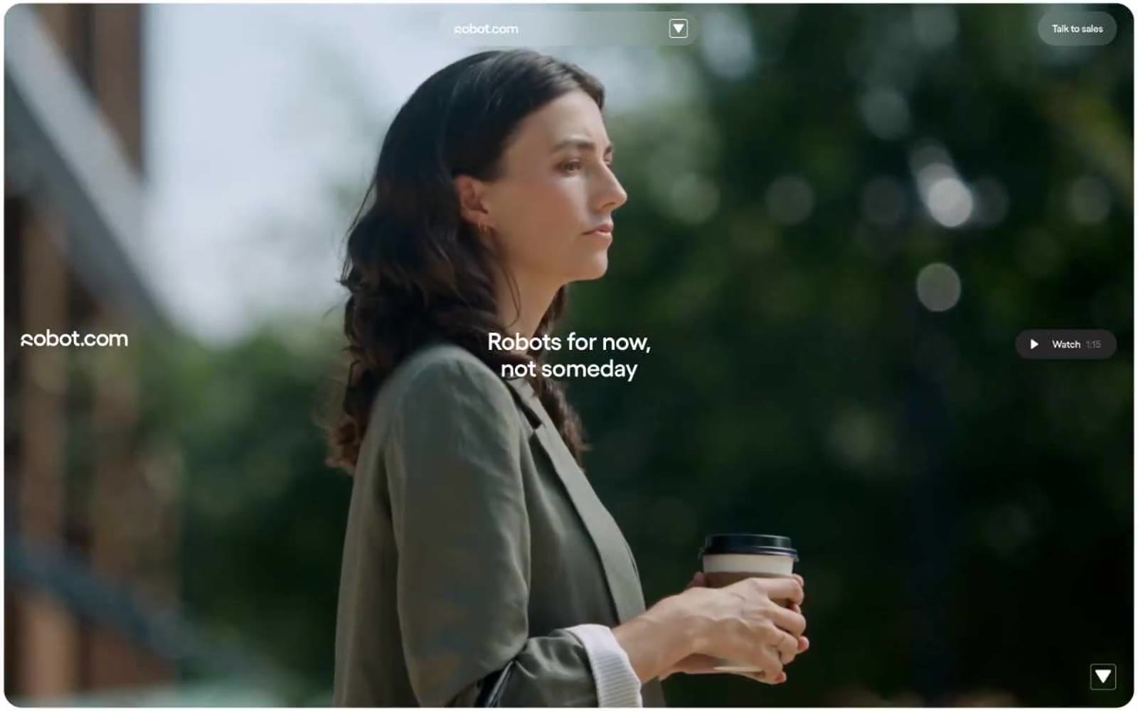
robot.com
robot.com — Style Reference
# robot.com — Style Reference
> a printed editorial spread with a yellow highlighter
Warm off-white paper, ink-black type, and a single neon-yellow accent that marks what matters — the system behaves like a confident magazine layout, not a software dashboard.
**Theme:** light
robot.com speaks in a near-monochrome voice — warm off-white canvas, ink-black text, and a single screaming-yellow accent that operates like a highlighter on a printed page. The system feels editorial and confident: aggressive type (custom Yellix at up to 100px with negative tracking), pill-shaped controls (24-30px radii dominate), and section-level color blocks that flip between off-white, near-black, and yellow rather than subtle gradient washes. Product photography is treated as full-bleed cinematic evidence — no crops, no UI chrome around it — while text blocks sit in narrow left-aligned columns that leave generous right-side breathing room. The visual rhythm alternates quiet monochrome bands with bold accent blocks, making the yellow feel earned rather than decorative.
## Tokens — Colors
| Name | Value | Token | Role |
|------|-------|-------|------|
| Yellix Yellow | `#fff65d` | `--color-yellix-yellow` | Primary action buttons, section accent blocks, highlight tags, decorative fills — the sole chromatic color, used sparingly to make a single element pop per view |
| Bone White | `#ffffff` | `--color-bone-white` | Page canvas, inverted text on dark blocks, filled button text |
Websites
Markdown Text
design-md
website-prompt
landing-page-prompt
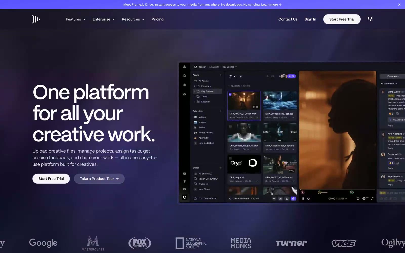
Frame.io
Frame.io — Style Reference
# Frame.io — Style Reference
> Midnight cinema projection room.
A dark suite where a single blue spotlight does all the work and the UI recedes so creative content can project forward.
**Theme:** dark
Frame.io is a midnight projection room for creative teams: a near-black canvas layered with deep cosmic gradients, where large confident display type floats above product surfaces like film titles above a reel. The palette is almost entirely achromatic — only one vivid blue (#6199f6) and a muted violet border tone (#4f4f80) break the monochrome, used sparingly for icons, eyebrow labels, and card edges. Typography is the loudest voice: a single geometric sans (FrameGothic) carries everything from 80px display headlines to 14px body copy, with custom inktrap letterforms reserved for tiny all-caps section labels. Components stay thin and editorial: pill-shaped nav buttons, ghost CTAs, 10px-radius cards with violet-tinted borders, and zero decorative ornament — every element exists to frame the work, not compete with it.
## Tokens — Colors
| Name | Value | Token | Role |
|------|-------|-------|------|
| Carbon Vellum | `#fcfcfc` | `--color-carbon-vellum` | Primary text, inverse button text, icon strokes — near-white reads as paper against the void |
| Obsidian | `#0a0a13` | `--color-obsidian` | Primary page canvas and dominant background; the slight blue undertone keeps it from feeling flat black |
Websites
Markdown Text
design-md
website-prompt
landing-page-prompt
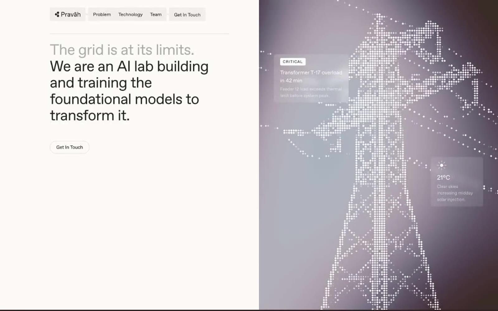
Pravah
Pravah — Style Reference
# Pravah — Style Reference
> engineering dossier on warm parchment
**Theme:** light
Pravah's design system operates on a near-monochromatic warm-neutral palette anchored by a parchment-cream canvas and punctuated by deep aubergine-black sections. The visual language is closer to an engineering dossier than a SaaS landing page: wireframe grid illustrations, pointillist pixel-mapped photography, and uppercase tracked labels that read like field notes. Typography is single-family (ABCfavorit Book) and does all the expressive work through two weights, tight display tracking, and open uppercase badges. Contrast is achieved through tonal inversion — full sections flip from cream to near-black — rather than chromatic accents. The result feels measured, scientific, and quietly confident, like infrastructure software that doesn't need to perform.
## Tokens — Colors
| Name | Value | Token | Role |
|------|-------|-------|------|
| Parchment | `#f3f1ed` | `--color-parchment` | Primary page canvas — the warm off-white that gives the entire system its editorial, non-digital feel |
| Pure White | `#ffffff` | `--color-pure-white` | Card surfaces, badge fills, and inset panels — sits one step above the parchment canvas to create gentle elevation without shadows |
| Ink Black | `#181011` | `--color-ink-black` | Primary text, default borders, nav strokes, and structural outlines — the dominant typographic and border color across all contexts |
| Charcoal | `#222222` | `--color-charcoal` | Secondary headings and heavier-weight text where slightly softer than Ink Black is desired |
Websites
Markdown Text
design-md
website-prompt
landing-page-prompt
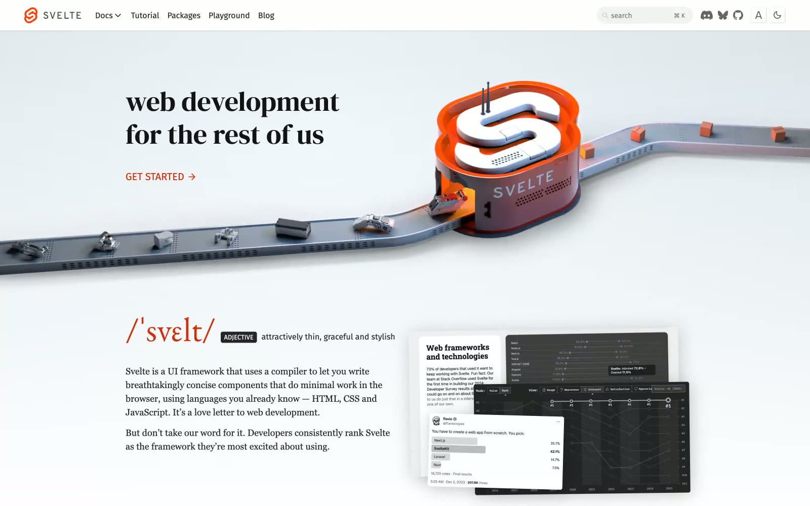
Svelte
Svelte — Style Reference
# Svelte — Style Reference
> Editorial broadsheet on white marble — serif voice, single ember accent
**Theme:** light
Svelte's site reads like a literary broadsheet translated into a framework landing page. Serif typography — EB Garamond for running text, DM Serif Display for hero headlines — carries the voice while a tight sans-serif (Fira Sans) handles the chrome: nav, buttons, tags, search. The canvas is pure white, surfaces are rare, and elevation is almost nonexistent; hierarchy comes from type size and weight rather than cards or shadows. A single vivid orange (#d43008) punctuates the monochrome page: it owns the logo, the GET STARTED arrow, the /svelte/ wordmark, and the documentary link. CTAs are arrow-suffixed text links, never boxed buttons. The site breathes — generous vertical rhythm, centered serif headlines, grayscale sponsor logos, and very little ornamentation between sections.
## Tokens — Colors
| Name | Value | Token | Role |
|------|-------|-------|------|
| Svelte Ember | `#d43008` | `--color-svelte-ember` | Orange supporting accent for decorative details and low-frequency emphasis. Do not promote it to the primary CTA color |
| Ink | `#262626` | `--color-ink` | Primary text, nav items, body copy, button labels — soft black that avoids the harshness of #000 while preserving 15:1 contrast on white |
| Carbon | `#141414` | `--color-carbon` | Headlines and display copy — slightly heavier than Ink to give the serif wordmarks visual weight against the white canvas |
| Paper | `#ffffff` | `--color-paper` | Page canvas, card surfaces, nav background — the dominant background everywhere |
Websites
Markdown Text
design-md
website-prompt
landing-page-prompt
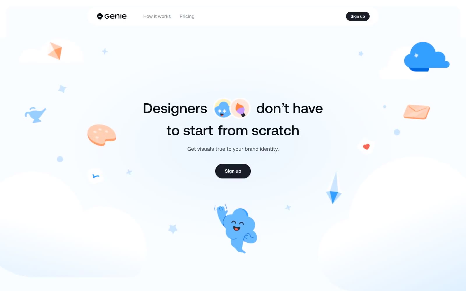
Geniestudio
Geniestudio — Style Reference
# Geniestudio — Style Reference
> playful pastel sky with floating doodles
**Theme:** light
Geniestudio speaks the visual language of a modern design canvas: an airy, pastel-blue workspace where playful illustrated characters drift across generous negative space. The system pairs one near-black CTA (#181d27) against a pale blue canvas (#ebf5ff) with a quartet of saturated illustration accents — cornflower blue, tangerine, violet, mustard — that inject warmth without competing with the UI. Typography is restrained and geometric: Aeonik weight 500 carries the headlines with tight -0.02em tracking, while Geist 500/600 handles everything from 10px captions to button labels. Surfaces are flat, borders are hairline, radii are generous (32px is the default), and shadows are barely-there blue-tinted washes rather than dark drops. The result is a tool that feels creative, approachable, and quietly confident — color is reserved for storytelling, not chrome.
## Tokens — Colors
| Name | Value | Token | Role |
|------|-------|-------|------|
| Sky Wash | `#ebf5ff` | `--color-sky-wash` | Page canvas — pale blue sets the airier alternative to pure white and gives the page a soft atmospheric base |
| Paper White | `#fafdff` | `--color-paper-white` | Card and elevated surface — a whisper cooler than pure white, keeps surfaces from feeling stark against the sky canvas |
| Cloud Veil | `#f6f7f8` | `--color-cloud-veil` | Subtle alternate surface and fill wash for muted UI elements that need separation without contrast |
| Pure White | `#ffffff` | `--color-pure-white` | Nested card surfaces, icon fills, and button text — the brightest stop in the stack |
Websites
Markdown Text
design-md
website-prompt
landing-page-prompt
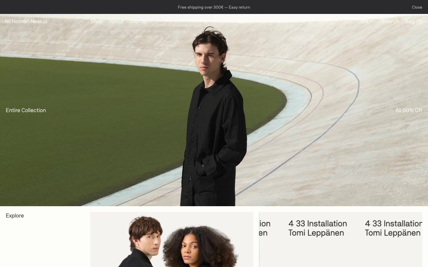
Nomen Nescio
Nomen Nescio — Style Reference
# Nomen Nescio — Style Reference
> ink on warm paper
**Theme:** light
Nomen Nescio is an editorial paper-and-ink system for a conceptual fashion label: a warm off-white canvas (#fdfdfa) holds oversized fashion photography while every interface element recedes into a single near-black ink (#2b2b2e). The entire typography stack uses one custom sans-serif at one weight (400) — no bold, no light, no italic — so hierarchy is built purely through size and negative letter-spacing rather than contrast. Components are flat rectangles, no shadows, no rounded corners, no color: identity comes from the restraint, the warm neutrals, and the photography bleeding edge-to-edge. The system feels like a printed zine reproduced as a website — whitespace is the layout grid, and every UI surface could be cut from the same sheet of paper.
## Tokens — Colors
| Name | Value | Token | Role |
|------|-------|-------|------|
| Paper | `#fdfdfa` | `--color-paper` | Page canvas and card surfaces — warm off-white reads as aged paper, not digital white |
| Bone | `#f5f3ee` | `--color-bone` | Elevated surface and subtle washes — used for card backgrounds and hover states, one step warmer than canvas |
| Ink | `#2b2b2e` | `--color-ink` | Primary text, navigation, borders, and outlined actions — near-black with a warm undertone, never pure #000 |
| Ash | `#bebcb4` | `--color-ash` | Muted text and secondary borders — warm gray for metadata, subtitles, and hairline dividers |
Websites
Markdown Text
design-md
website-prompt
landing-page-prompt
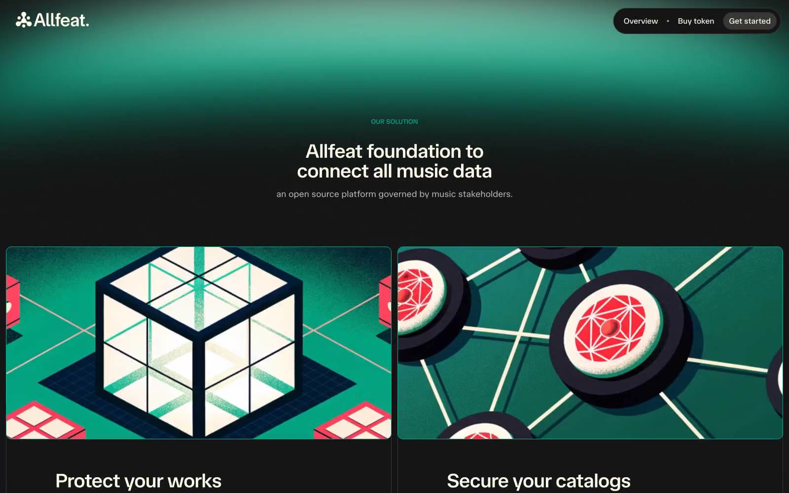
Allfeat
Allfeat — Style Reference
# Allfeat — Style Reference
> Backstage monitor at midnight — one teal stage light cutting through warm cream type on charcoal glass.
**Theme:** dark
Allfeat is a dark-mode music infrastructure platform that uses a warm cream-on-charcoal palette as its resting state, then ignites the canvas with a teal radial wash for heroes and a coral-red gradient for emotional punctuation. The system is built on a single typeface (TASA Orbiter) in three restrained weights, with display sizes pulled tight via -0.02em tracking so headlines read as confident blocks rather than airy declarations. Geometry splits sharply: anything interactive is a full pill (900px), anything containing content is a 12px-radius card with an inset hairline border in #383835 — no floating shadows, no glass, no blur. Color is rationed: teal is the only fill that means 'do this', coral is the only color that means 'feel something', and every other surface stays in the warm-gray neutral family. The result feels like a concert venue's backstage monitor — dark, functional, with one stage light cutting through.
## Tokens — Colors
| Name | Value | Token | Role |
|------|-------|-------|------|
| Charcoal Stage | `#151515` | `--color-charcoal-stage` | Page canvas, primary surface, all dark backgrounds — the base layer every other color sits on |
| Warm Cream | `#fffbeb` | `--color-warm-cream` | Primary text, nav links, heading copy, hairline borders on dark surfaces — never pure white, always slightly buttered |
| Card Edge | `#383835` | `--color-card-edge` | Inset 1px card borders, card ambient shadow, subtle separator lines on elevated surfaces |
| Mute Cream | `#b8b8b8` | `--color-mute-cream` | Secondary body text, subdued descriptions, muted helper copy |
Websites
Markdown Text
design-md
website-prompt
landing-page-prompt
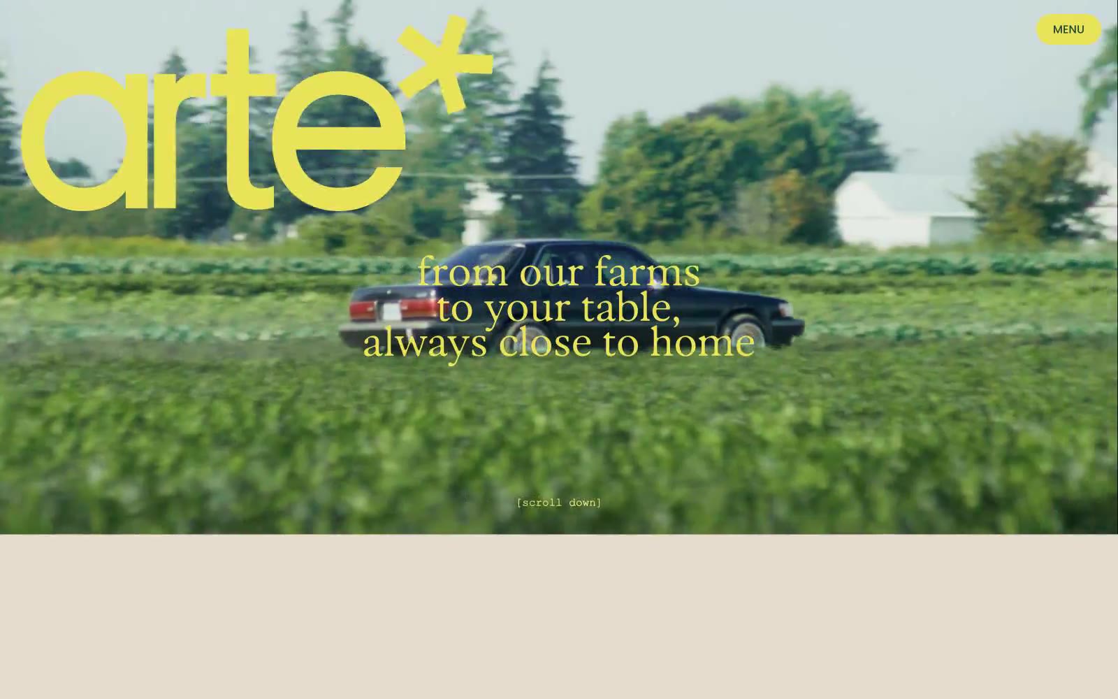
arte*
arte* — Style Reference
# arte* — Style Reference
> Golden hour harvest editorial — a cream canvas where sun-dappled forest photos meet oversized rounded display type, electric chartreuse logo, and warm copper text that feels printed rather than rendered.
**Theme:** light
arte* is a sunlit harvest editorial: a warm cream canvas (#e5dccd) hosts oversized display headlines in Parafina — a soft, slightly retro rounded sans at extreme sizes (70–173px) with crushed line-heights near 0.8–0.9 — while Poppins handles all secondary copy at a tight 1.4. The palette is farm-garden: burnt harvest copper (#ab5700) for primary text, a shocking chartreuse (#e8e359) for the logo and hero overlays, and a periwinkle (#7997ff) that acts as a cool counterweight for inline highlights. Imagery is the other half of the system — full-bleed golden-hour photography of forests, food, and faces, layered with display type rather than separated from it. Components are few and soft: pill buttons at 31px radius, 20px card radii, hairline borders, almost no shadows. The overall impression is a printed cookbook or farmers' market poster digitized — confident display type, earth-toned with one electric yellow accent, and the brand name itself ends in an asterisk that signals playful editorial mischief.
## Tokens — Colors
| Name | Value | Token | Role |
|------|-------|-------|------|
| Wheat Cream | `#e5dccd` | `--color-wheat-cream` | Page canvas, card surfaces, section backgrounds — the warm off-white that holds every screen |
| Harvest Copper | `#ab5700` | `--color-harvest-copper` | Primary text, body copy, list borders, card borders, decorative strokes — the default ink color across all editorial content |
| Citron Beam | `#e8e359` | `--color-citron-beam` | Logotype color, hero text overlays, accent borders, icon highlights — the electric chartreuse that makes the brand pop against forest greens and cream |
| Morning Glory | `#7997ff` | `--color-morning-glory` | Inline text highlights, links, secondary icon accents, input focus — a cool periwinkle that cools the otherwise warm palette when it enters body copy |
Websites
Markdown Text
design-md
website-prompt
landing-page-prompt
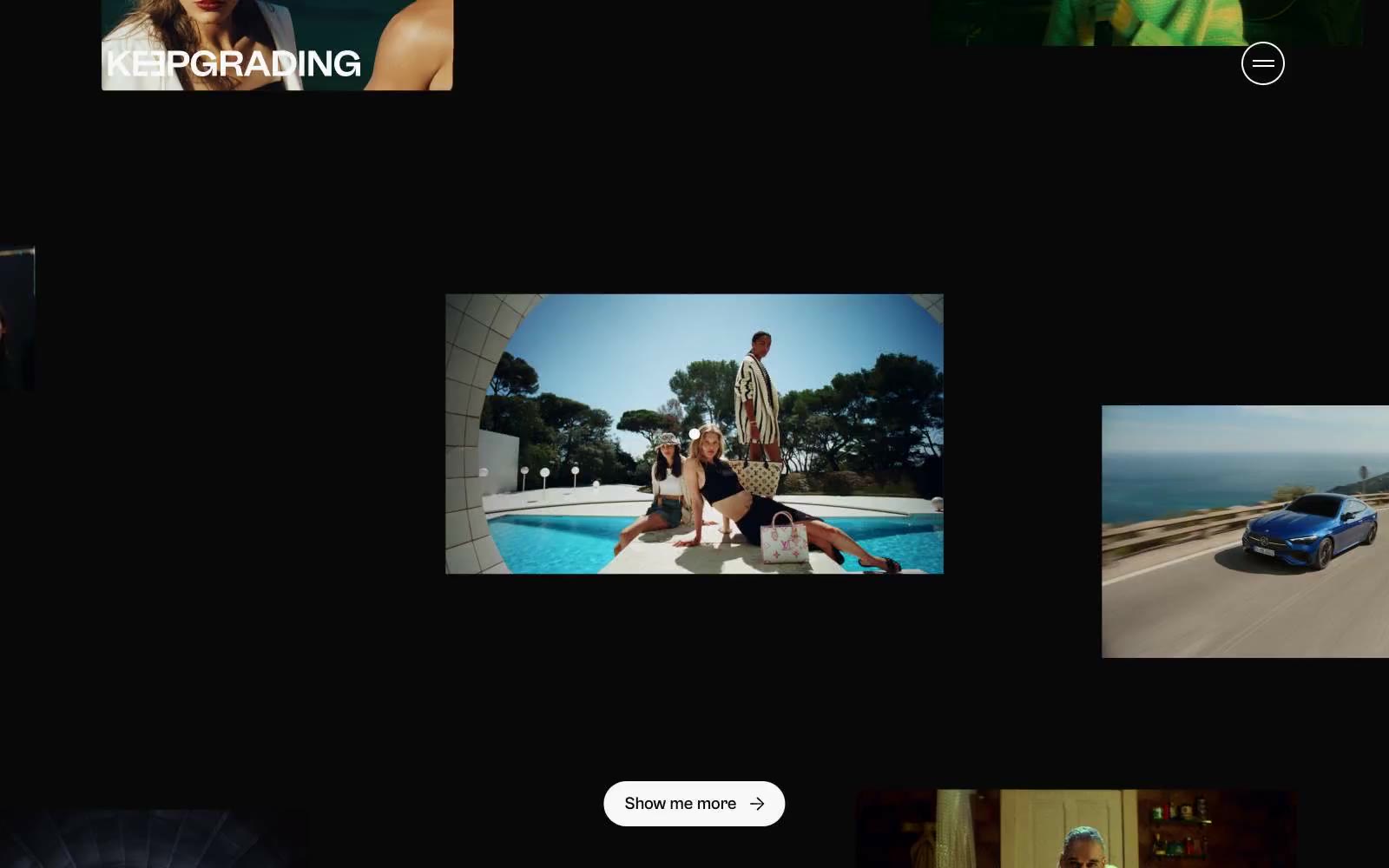
KeepGrading
KeepGrading — Style Reference
# KeepGrading — Style Reference
> Polaroids scattered in a darkroom
**Theme:** dark
KeepGrading is a black-room editorial portfolio: a near-total monochrome canvas where photographs float as scattered frames in deep void. The UI is deliberately quiet so imagery does the talking — only the Cabinet Grotesk display type, white hairline borders, and one pill-shaped ghost control surface as interface elements. No chromatic accents, no gradients, no shadows; the entire visual hierarchy is carried by contrast, scale, and whitespace between photographs. Density is comfortable but vertical rhythm is loose, with 48px breathing room between bands and frames held in place by a single 1px white border. Components are skeletal — a circular nav toggle, a wordmark logo, floating image cards with soft 160px corners, and pill buttons with 9999px radius — letting the photography dominate the experience.
## Tokens — Colors
| Name | Value | Token | Role |
|------|-------|-------|------|
| Studio White | `#f8f8f8` | `--color-studio-white` | Primary text, ghost-button borders, image-frame outlines, nav icon strokes — the single light voice in a dark room |
| Void Black | `#080808` | `--color-void-black` | Page canvas, behind-everything background, image frame fills between photographs |
| Pure Black | `#000000` | `--color-pure-black` | SVG icon fills, deepest surface layer for inline graphics and decorative marks |
| Bone White | `#f0f0f0` | `--color-bone-white` | Soft secondary text and supporting hairline strokes when pure white feels too clinical |
Websites
Markdown Text
design-md
website-prompt
landing-page-prompt
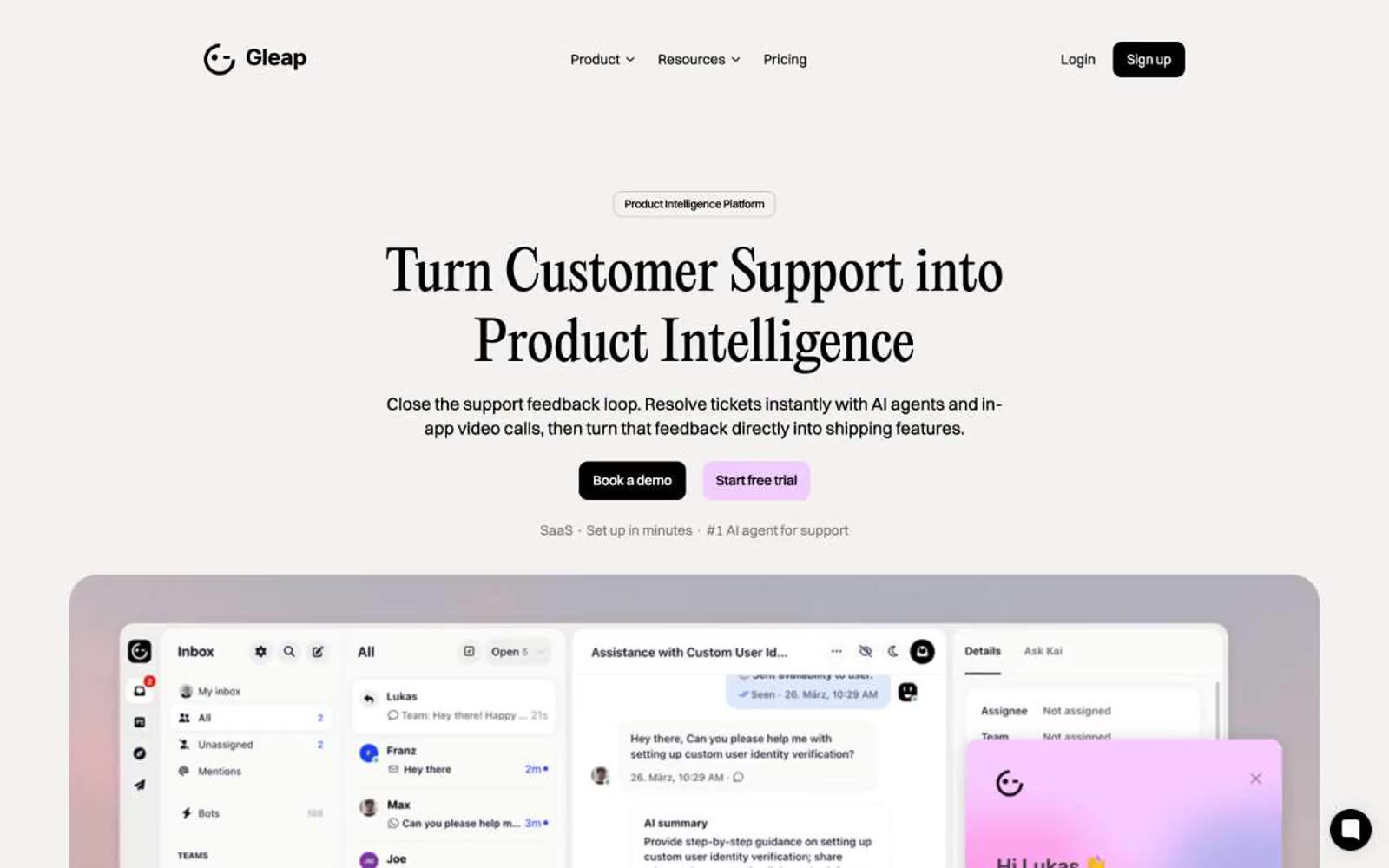
Gleap
Gleap — Style Reference
# Gleap — Style Reference
> Editorial serif over pastel SaaS — like a design magazine spread rendered in product UI.
**Theme:** light
Gleap runs a light-canvas editorial system: warm cream off-whites, near-black text, and two pastel accents (soft lavender-pink and powder blue) that act as quiet highlights rather than loud brand colors. The signature move is the pairing of a high-contrast editorial serif (PP Editorial New) for hero and section headlines against a geometric grotesk (Switzer) for everything functional, which makes the marketing voice feel like a magazine spread while the product UI stays utilitarian. Surfaces are flat with very soft shadows, cards are generously rounded (24–42px), and buttons sit in a small radius (10px) with either solid black or pastel fills — the contrast between hard geometric controls and large soft product surfaces gives the whole system its rhythm.
## Tokens — Colors
| Name | Value | Token | Role |
|------|-------|-------|------|
| Obsidian | `#000000` | `--color-obsidian` | Primary text, filled dark CTAs, high-contrast borders. Sets the typographic anchor against the cream canvas |
| Graphite | `#333333` | `--color-graphite` | Secondary text and the dominant hairline border color (336 uses). Carries the structural edge system |
| Slate | `#7b7b7b` | `--color-slate` | Muted helper text and inactive link text. Used wherever secondary information must recede |
| Mist | `#bcbcbc` | `--color-mist` | Subtle badge borders and soft body borders. Sits between structural Graphite and canvas in the border hierarchy |
Websites
Markdown Text
design-md
website-prompt
landing-page-prompt
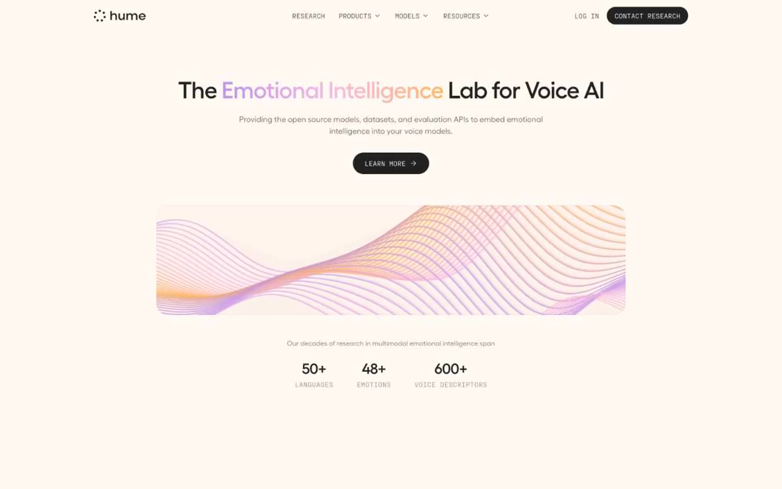
Hume AI
Hume AI — Style Reference
# Hume AI — Style Reference
> Scientific pastel instrument panel. A calm white laboratory where near-black typography measures soft watercolor data washes.
**Theme:** light
Hume AI reads as a scientific pastel instrument panel: a near-white laboratory canvas where the only hard mark is a near-black #222222, and color enters as soft watercolor washes — rose, lavender, peach, mint, sky — that visualize data rather than decorate it. The headline typographic move is tight, low-contrast Fellix at 36–48px with negative tracking, set in a weight that whispers rather than shouts, framing emotional intelligence as measured restraint. Components are pill-shaped or softly rounded (8/12/16/24px radii), borders are invisible or hairline, shadows are absent — surfaces separate by hue and whitespace, not elevation. Monospace PP Fraktion Mono appears as the 'lab label' voice: uppercase column headers, tag chips, and data annotations carry a positive +0.025em tracking that contrasts the display sans's tight -0.025em. The overall rhythm is centered, generous, and editorial — sections breathe with 48–64px gaps, content never crowds, and the only saturated accent (#c094e4 violet) lives inside data bars and brand moments, never on chrome.
## Tokens — Colors
| Name | Value | Token | Role |
|------|-------|-------|------|
| Ink | `#222222` | `--color-ink` | Primary text, filled buttons, nav strokes, icon fills — near-black rather than pure black to soften the interface |
| Paper | `#ffffff` | `--color-paper` | Base canvas, card surfaces, button text on dark fills |
| Bone | `#fff9f3` | `--color-bone` | Warm off-white secondary surface, subtle background tints behind sections |
| Smoke | `#7a7876` | `--color-smoke` | Muted helper text, secondary button text, disabled labels |
Websites
Markdown Text
design-md
website-prompt
landing-page-prompt
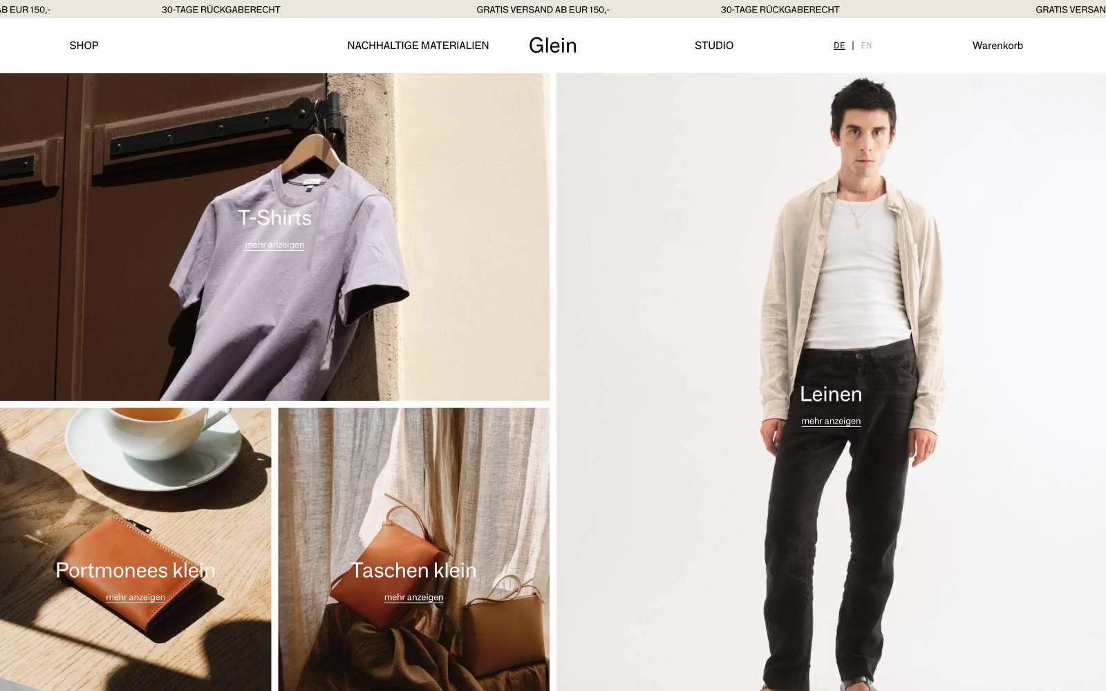
Glein
Glein — Style Reference
# Glein — Style Reference
> Atelier lookbook on warm linen — full-bleed photography, hairline rules, one whisper-weight voice.
**Theme:** light
Glein operates as a monochromatic editorial canvas: oversized product and lifestyle photography fills nearly every viewport, with white sans-serif category labels floating directly on top of the imagery. The palette is a tight warm-achromatic system — Bone White, Midnight Black, a signature Warm Sand beige, and Concrete Gray — with zero chromatic accent, which forces the photography's natural tones (denim, linen, leather) to become the color story. Typography stays at weight 400 across both the grotesque and monospace companion; no bold weights exist, so hierarchy is built through size alone, culminating in a 111px display. Components are razor-thin: hairline black borders, zero radius, micro-padding, and no shadows. The result reads like an art-school lookbook — restrained, tactile, and quiet, where the absence of decoration is the signature.
## Tokens — Colors
| Name | Value | Token | Role |
|------|-------|-------|------|
| Midnight Ink | `#000000` | `--color-midnight-ink` | Primary text, nav hairline borders, footer dividers, section rules, button text. Dominant structural color — defines the graphic skeleton against the warm canvas |
| Bone White | `#ffffff` | `--color-bone-white` | Page canvas, card surfaces, overlay text on dark imagery, cookie dialog background. The breathing space |
| Warm Sand | `#ebe6dc` | `--color-warm-sand` | Secondary surface and section bands — the warm beige that gives the atelier its linen-like tactility. Section dividers, footer wash, category card backgrounds |
| Concrete Gray | `#8c8c8c` | `--color-concrete-gray` | Muted secondary text, tertiary borders, subdued image overlays. The recede color — present but never competing |
Websites
Markdown Text
design-md
website-prompt
landing-page-prompt
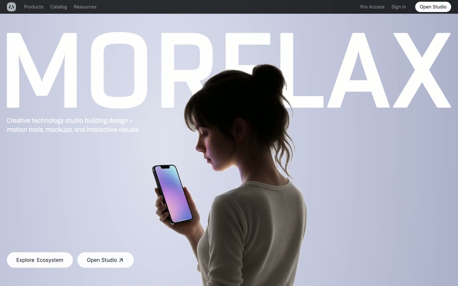
Morflax
Morflax — Style Reference
# Morflax — Style Reference
> Porcelain gallery, one blue spark — a near-black nav bar hovers above a white room that briefly blushes lavender, while every action and border stays in grayscale until a single cobalt button confirms the moment.
**Theme:** light
Morflax reads as a monochrome showroom with a single blue beacon: a near-black navigation bar floats above a porcelain-white canvas that is briefly washed in soft lavender at the hero, then returns to a crisp neutral white for every content section. Color is rationed — vivid blue (#298ef5) earns its presence on exactly one filled action, while everything else (borders, body text, surfaces) is graded grays from #e5e7eb hairlines through #171718 ink. The typography pairs Inter's clinical neutrality at 400/500/600 with a wide-tracked display treatment (0.05em) reserved for the brand wordmark, and the hero exploits oversized type that bleeds off-canvas. Components are quiet and rounded: pill buttons, 16–24px card radii, soft 25px-blur shadows — the only visual noise comes from the 3D-rendered product cards, which carry the chromatic energy the interface refuses to.
## Tokens — Colors
| Name | Value | Token | Role |
|------|-------|-------|------|
| Cobalt Spark | `#298ef5` | `--color-cobalt-spark` | Primary filled action, active states, brand accent — the sole chromatic voice in an otherwise monochrome system, so it must appear sparingly to retain its charge |
| Obsidian Bar | `#333333` | `--color-obsidian-bar` | Navigation background — dark anchor that frames the light canvas below |
| Ink | `#171718` | `--color-ink` | Primary headings and body text — near-black with a barely-warm cast that softens against pure #000 |
| Carbon | `#25282b` | `--color-carbon` | Icon strokes, secondary text, UI graphics — a touch cooler than Ink for icon differentiation |
Websites
Markdown Text
design-md
website-prompt
landing-page-prompt
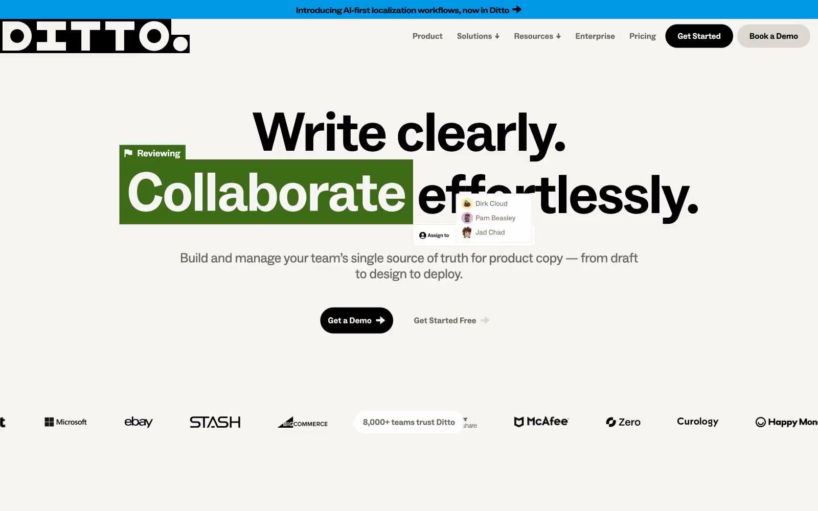
Ditto
Ditto — Style Reference
# Ditto — Style Reference
> marked-up manuscript on warm parchment
**Theme:** light
Ditto speaks the visual language of a copy editor's desk: warm parchment-cream canvases, confident black sans-serif type at near-poster scale, and a full crayon box of highlighter colors applied as if someone grabbed a marker. Every color in the palette is a tool — green, yellow, orange, purple, blue, pink all function as markup ink over running text, never as decorative fills. Components are stubby and rounded into pills — buttons, tags, and nav items all collapse into the same soft capsule shape, keeping the surface quiet so the annotated text can shout. There are no shadows, no gradients, no glassmorphism — the entire identity is built from flat color, heavy type, and the metaphor of someone reviewing a manuscript with a set of Sharpies.
## Tokens — Colors
| Name | Value | Token | Role |
|------|-------|-------|------|
| Parchment | `#f7f5f3` | `--color-parchment` | Page canvas, section backgrounds, and the inside of cards — a warm off-white that reads as paper, not screen. Every other color in the system is applied as ink on top of this surface |
| India Ink | `#000000` | `--color-india-ink` | Primary text, heading color, nav text, button fills, and hairline borders — the heaviest presence in the system at 1,849 hits. High-contrast against Parchment (#f7f5f3) at 19.3:1 |
| Charcoal Warm | `#222222` | `--color-charcoal-warm` | Secondary text and structural borders, softer than pure black for elements that need hierarchy without dropping out of the warm palette |
| Graphite Warm | `#6a6559` | `--color-graphite-warm` | Muted text, secondary nav labels, and border accents — a brown-tinted dark gray that keeps the system's warmth even in its quietest elements |
Websites
Markdown Text
design-md
website-prompt
landing-page-prompt
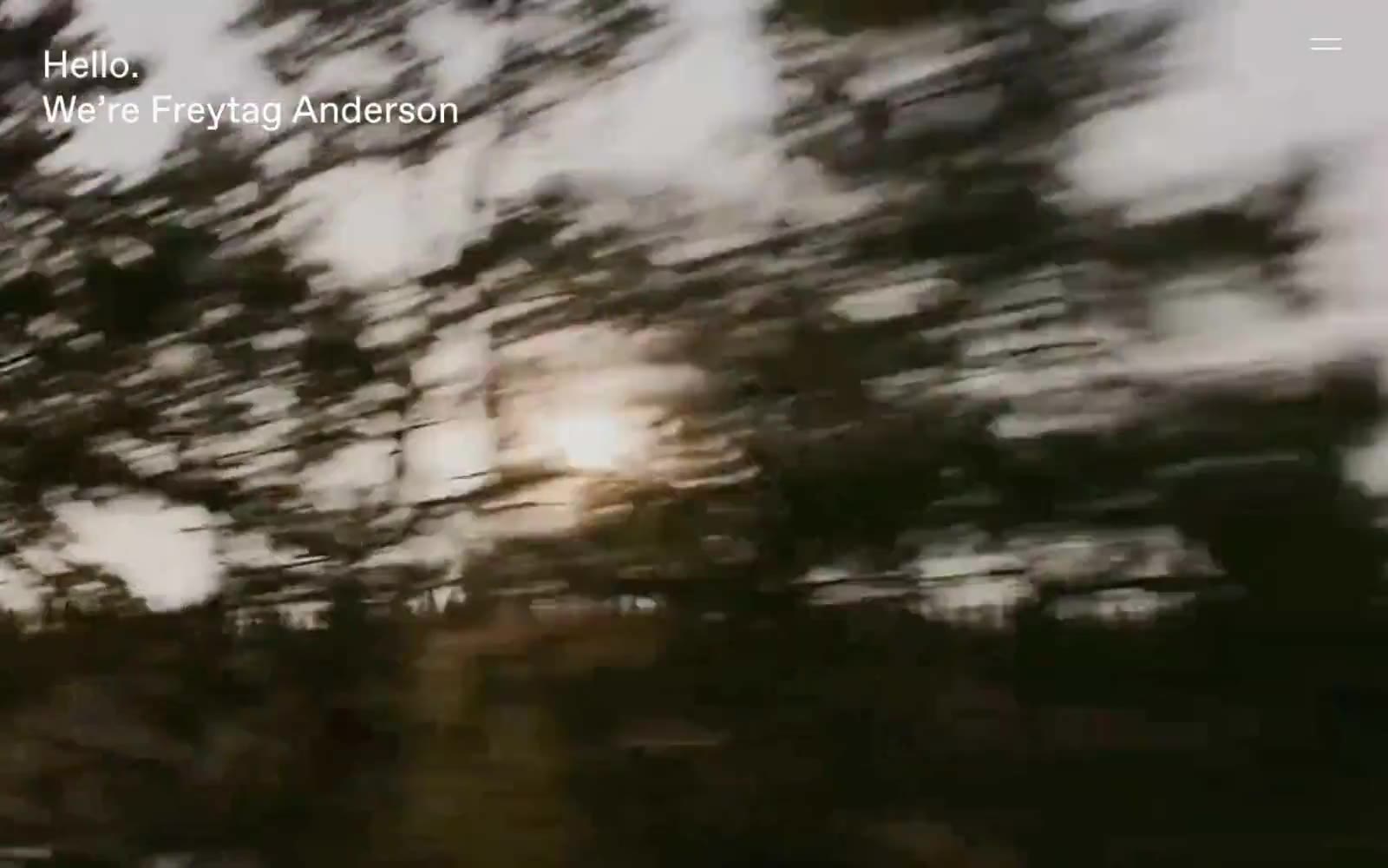
Freytag Anderson
Freytag Anderson — Style Reference
# Freytag Anderson — Style Reference
> cinema curtain rising on a single word.
A vast moving image carries the screen, the brand name sits in the corner like a title card, and nothing else competes for attention.
**Theme:** mixed
Freytag Anderson operates as a cinematic portfolio: full-bleed atmospheric photography carries the entire visual weight while typography recedes to a whisper. The site is almost entirely achromatic — an off-white canvas (#fafafa), pure black ink, and a single warm-charcoal section that reads like a film intermission. FAVORIT, a single grotesque sans-serif, is the only voice, used identically for headlines, body, and UI; weight shifts and tracking do all the work of hierarchy. Text consistently anchors to the top-left viewport corner over imagery, and a single hamburger line replaces conventional navigation. Components are reduced to their minimum: pill-shaped ghost controls with hairline borders, no card surfaces, no shadows, no gradients. The impression is of a film opening — image, title, silence — rather than a product surface.
## Tokens — Colors
| Name | Value | Token | Role |
|------|-------|-------|------|
| Paper | `#fafafa` | `--color-paper` | Page canvas, base surface behind text — off-white, never pure white, to soften photographic edges |
| Ink | `#000000` | `--color-ink` | Primary text, hairline borders, link underlines — the only chromatic accent in the system is its absence of color |
Websites
Markdown Text
design-md
website-prompt
landing-page-prompt
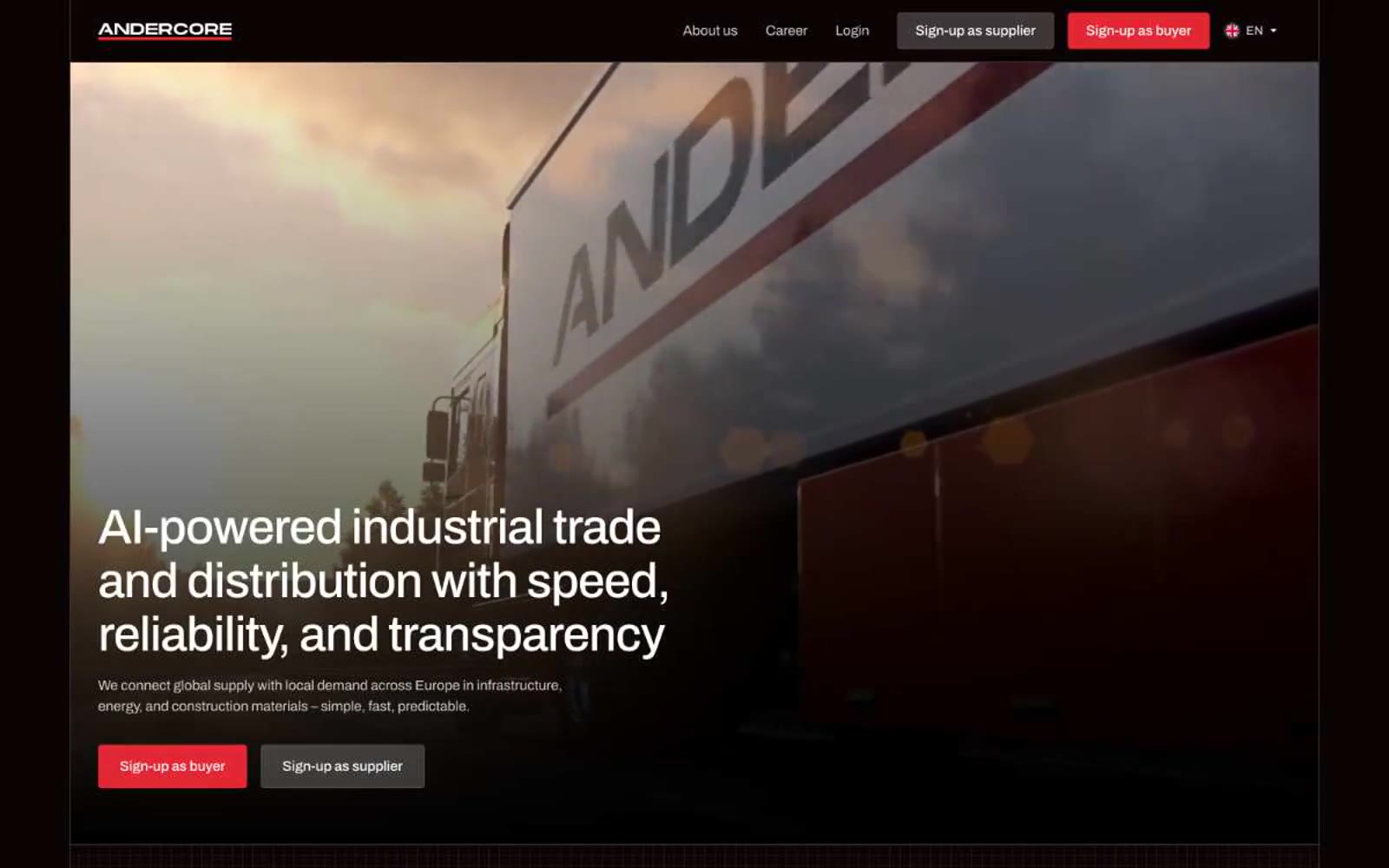
Andercore
Andercore — Style Reference
# Andercore — Style Reference
> Steel blueprint at midnight
**Theme:** dark
Andercore runs on a chiaroscuro industrial language: near-black canvases (#0b0405) with crisp white type, sharp 4px corners, and a single rationed red (#e32735) that does all the talking. The page alternates between a light navigation band and full-bleed dark sections where borders (1px, #382e30) define structure instead of shadows or elevation. Archivo carries geometric precision at every size with tight -0.02em tracking, while Space Mono at 12px stamps industrial instrument-style labels onto badges and step counters. Red never decorates — it activates, marking the single primary action, the active step underline, and key UI connectors. The whole system feels like a control room: dense, deliberate, and lit by a single indicator lamp.
## Tokens — Colors
| Name | Value | Token | Role |
|------|-------|-------|------|
| Signal Red | `#e32735` | `--color-signal-red` | Red action color for filled buttons, selected navigation states, and focused conversion moments |
| Carbon | `#0b0405` | `--color-carbon` | Primary section background, full-bleed dark canvases, secondary button fill |
| Graphite | `#150e0f` | `--color-graphite` | Alternate near-black surface for cards and elevated panels on dark sections |
| Steel | `#382e30` | `--color-steel` | Hairline borders on dark surfaces, card edges, table dividers, UI mockup outlines |