AI Prompt Studio - Intelligent Prompt Library
Explore and use professional AI prompts to optimize your workflow.
One-click Use
Websites
Markdown Text
design-md
website-prompt
landing-page-prompt
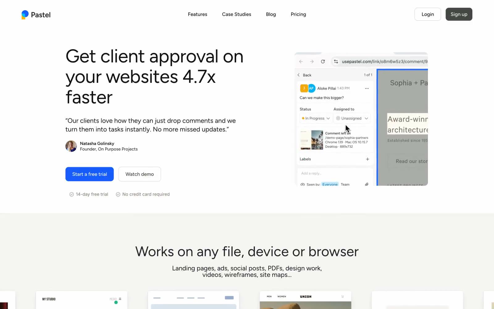
Pastel
Pastel — Style Reference

# Pastel — Style Reference
> Quiet paper notebook with one vivid ink stamp
**Theme:** light
Pastel is a quiet, paper-warm canvas interrupted by one vivid blue stamp. The interface is nearly monochrome — deep near-black text on a stone-white background, with cool gray-blue borders doing the structural work that shadows do elsewhere. A single cobalt accent surfaces only at decision points: the primary CTA, active link, and a few brand marks. The unusual 8.8px corner radius is the signature — softer than a 6px tech feel, tighter than a 12px consumer feel, it signals 'serious tool, friendly enough'. Figtree carries negative tracking at every size, pulling headlines into compact, confident shapes rather than letting them sprawl. Density is generous; whitespace is treated as a structural element, not a luxury. Components are flat with hairline borders, never elevated with shadows.
## Tokens — Colors
| Name | Value | Token | Role |
|------|-------|-------|------|
| Paper Stone | `#f5f5f4` | `--color-paper-stone` | Light supporting surface for subtle backgrounds and section separation. |
| Chalk | `#e6e3e2` | `--color-chalk` | Secondary card surface, subtle section bands one step above canvas |
| Ink Black | `#111111` | `--color-ink-black` | Primary headings, body text, icon strokes — the dominant text and graphic color across all contexts |
| Graphite | `#222222` | `--color-graphite` | Secondary headings, card titles, slightly softer than Ink Black for hierarchical depth |
Websites
Markdown Text
design-md
website-prompt
landing-page-prompt
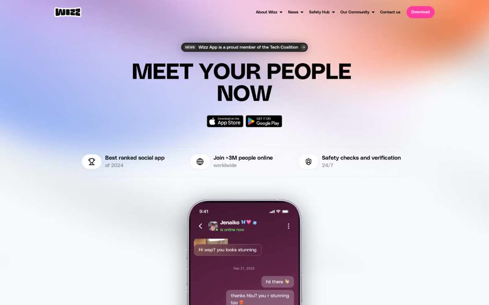
Wizz
Wizz — Style Reference
# Wizz — Style Reference
> Neon pink highlighter on a black-and-white editorial — like a single fluorescent mark on a fashion magazine spread.
**Theme:** light
Wizz operates on a high-contrast social-app language: saturated black-and-white structure shot through with one electric hot-pink accent that functions as the only chromatic signal in the system. The hero is deliberately loud — a full-bleed multi-hue gradient (lavender, coral, sky, amber) supporting massive compressed black type — while every section below retreats to white space and lets pink do the work as a single, recurring punctuation mark. Typography is geometric and architectural: PolySans Bulky at display sizes, PolySans Median for headings and nav, PolySans Neutral for body — each weight stepping down in confidence rather than warmth. Components are rounded, pill-heavy, and flat; the only depth comes from a very faint black shadow on raised buttons. The navigation bar is a floating black pill that hovers above the page, setting the visual rhythm of dark-on-light framing devices.
## Tokens — Colors
| Name | Value | Token | Role |
|------|-------|-------|------|
| Volt Pink | `#ff3d9e` | `--color-volt-pink` | Primary action buttons, section labels, active states, cookie accept — the sole chromatic brand color, carrying 100% of the accent weight in the interface |
| Obsidian | `#000000` | `--color-obsidian` | Page text, floating navigation bar, bold display headlines, cookie banner surface, icon fills |
| Paper White | `#ffffff` | `--color-paper-white` | Page canvas, section backgrounds, text on dark surfaces, card surfaces in light sections |
| Ash | `#dadada` | `--color-ash` | Hairline borders, card inset rings, subtle dividers, secondary text on light backgrounds |
Websites
Markdown Text
design-md
website-prompt
landing-page-prompt
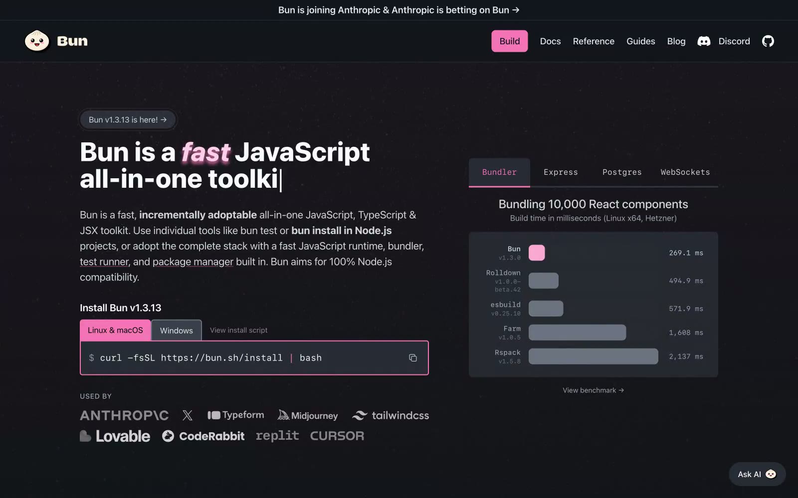
Bun
Bun — Style Reference
# Bun — Style Reference
> Hot pink cursor in a midnight terminal — every interface element is either prose or code, and the pink tells you what to click.
**Theme:** dark
Bun's design language is a dark, developer-first aesthetic that treats the terminal as a design surface. The interface lives in near-black depths (#0d0e11) with elevated cards floating at #14151a and #1e2028, creating subtle depth without shadows. A single hot pink accent (#f472b6) cuts through the monochrome like a syntax highlighter cursor — it marks every primary action, highlights the fast word in headlines, and outlines code blocks, making interactive elements instantly scannable against the quiet background. Typography is utilitarian: system-ui for everything readable, JetBrains Mono for everything executable. Headlines are large and tight-tracked, body copy is generous and unembellished, and the visual rhythm alternates between prose sections and terminal-style code blocks. The overall feel is developer-tool meets brutalist poster — confident, slightly irreverent, and obsessed with speed.
## Tokens — Colors
| Name | Value | Token | Role |
|------|-------|-------|------|
| Void | `#0d0e11` | `--color-void` | Page canvas, hero backgrounds, deepest surface layer |
| Obsidian | `#14151a` | `--color-obsidian` | Card surfaces, elevated panels, code block backgrounds |
| Graphite | `#1e2028` | `--color-graphite` | Secondary card surfaces, hover states, nested panels |
| Iron | `#282a36` | `--color-iron` | Borders, dividers, subtle separators, table lines |
Websites
Markdown Text
design-md
website-prompt
landing-page-prompt
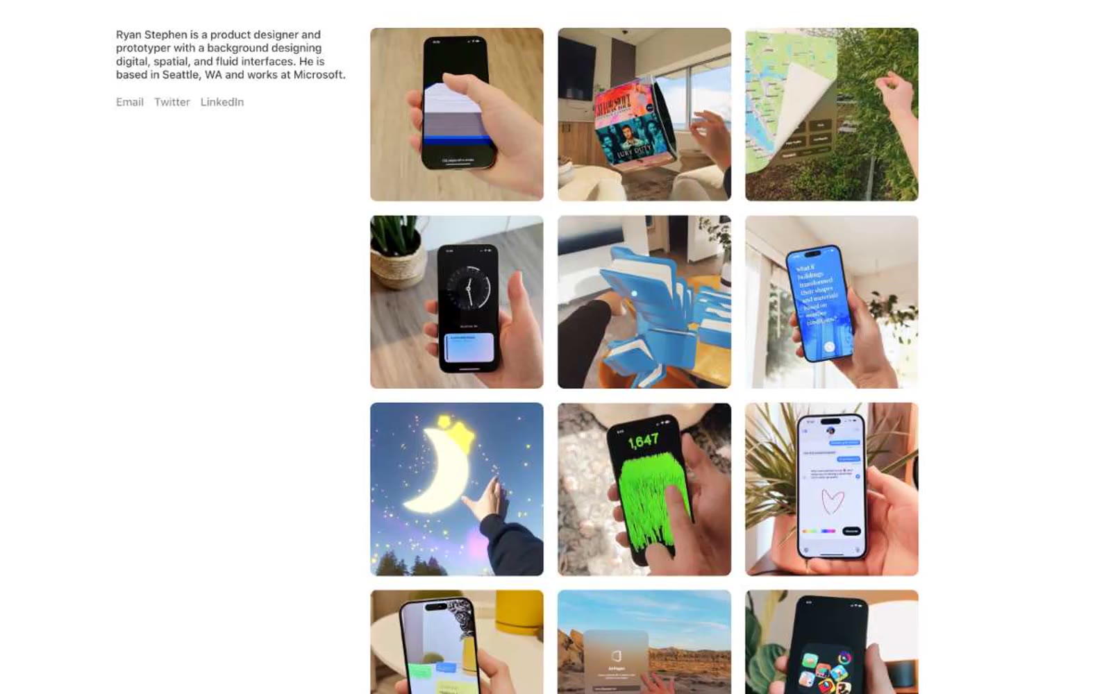
Ryan Stephen
Ryan Stephen — Style Reference
# Ryan Stephen — Style Reference
> Quiet gallery wall on white plaster — the portfolio is the product, the UI is invisible.
**Theme:** light
Ryan Stephen's portfolio is a quiet gallery wall on white plaster: nearly all black and white, with one warm gray doing the work of secondary text and link borders. The layout is content-first and image-dominant — a single bio block on the left, a 3-column photo grid on the right — with no chrome, no decoration, and no brand color competing with the work. The visual system is intentionally austere: system fonts, a single 10px image radius, generous whitespace, and zero shadows or gradients. Every interface element is reduced to its function so the photographs carry the page.
## Tokens — Colors
| Name | Value | Token | Role |
|------|-------|-------|------|
| Ink Black | `#000000` | `--color-ink-black` | Primary text, image frame borders, structural lines |
| Charcoal | `#404040` | `--color-charcoal` | Secondary body text, subdued labels |
| Warm Ash | `#8b8b94` | `--color-warm-ash` | Muted helper text, link borders, link text, decorative dividers |
| Plaster White | `#ffffff` | `--color-plaster-white` | Page canvas, card surfaces, image backgrounds |
Websites
Markdown Text
design-md
website-prompt
landing-page-prompt
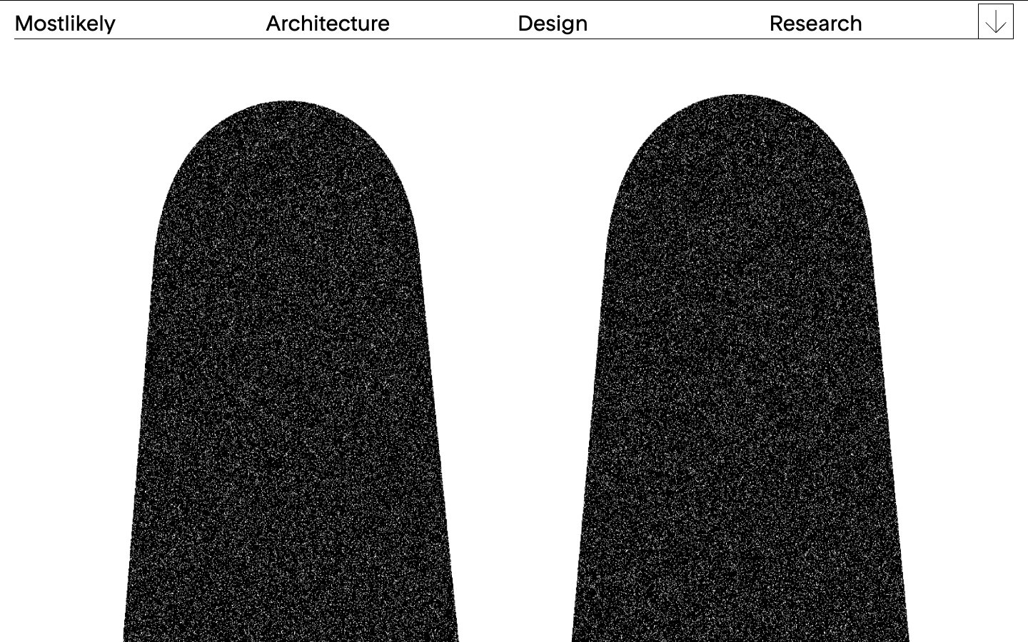
mostlikely
mostlikely — Style Reference
# mostlikely — Style Reference
> Inked archways on bone-white vellum
**Theme:** light
A strict two-color monochrome system — pure ink black and bone white with zero chromatic accent. The signature is the monumental arch: tall vertical forms capped with full semicircular rounding that read as cathedral portals, mausoleum doorways, or architect's drafting silhouettes. Typography is a single custom display face (Rondelle) used at exactly one weight (400) and only two sizes, so hierarchy comes from scale and whitespace rather than weight, color, or decoration. Navigation is a whisper-thin hairline rule across the top with widely-spaced text links. The system is brutally restrained: no shadows, no gradients, no borders other than 1px hairlines, no color punctuation — the arch shape itself does all the emotional work.
## Tokens — Colors
| Name | Value | Token | Role |
|------|-------|-------|------|
| Ink Black | `#000000` | `--color-ink-black` | Page text, all border rules, signature arch fills — the entire graphical language. The 21:1 contrast against white is the system's only expressive tool |
| Bone White | `#ffffff` | `--color-bone-white` | Canvas, card surfaces, and all negative space — the field against which ink shapes register as architecture |
## Tokens — Typography
Websites
Markdown Text
design-md
website-prompt
landing-page-prompt
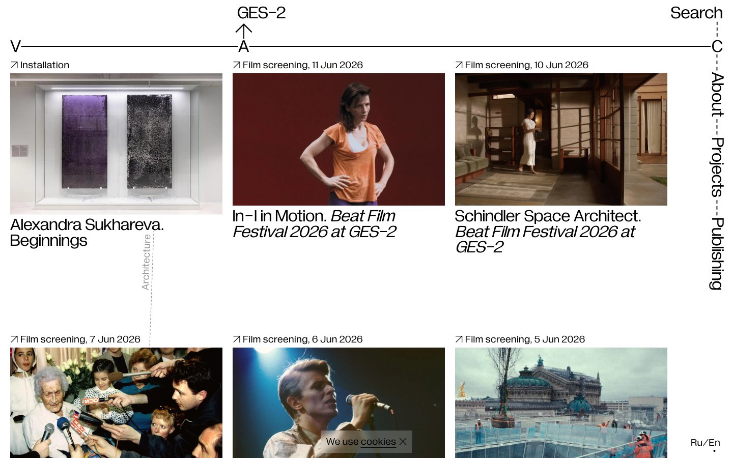
V–A–C
V–A–C — Style Reference
# V–A–C — Style Reference
> Gallery wall on a drafting table. The starkness of a printed exhibition catalog where every margin, weight, and registration mark is deliberate.
**Theme:** light
V–A–C reads like a printed exhibition catalog translated to the web: pure white paper, pure black ink, and not a single chromatic pixel. The entire system is achromatic — typography does all the expressive work, and it does so at a single weight (400) across both body and display. The signature is the V—A—C registration line stretching full-bleed across the top of every screen, turning the page header into an architectural measurement mark. Layout is a strict three-column card grid where each card is a museum wall label: full-bleed image, tiny ↗ metadata link, and a tight two-line title — separated by 250px+ of vertical breathing room between rows. No shadows, no rounded corners, no gradients, no accent color. The visual language is the visual restraint.
## Tokens — Colors
| Name | Value | Token | Role |
|------|-------|-------|------|
| Ink | `#000000` | `--color-ink` | Primary text, all borders, card outlines, link color, arrow glyphs, V—A—C registration marks |
| Paper | `#ffffff` | `--color-paper` | Hairline borders, dividers, input outlines, and card edges on light surfaces. Do not promote it to the primary CTA color |
| Graphite | `#999999` | `--color-graphite` | Diagonal category watermarks on cards, subtle decorative strokes — the only third tone in the system |
Websites
Markdown Text
design-md
website-prompt
landing-page-prompt
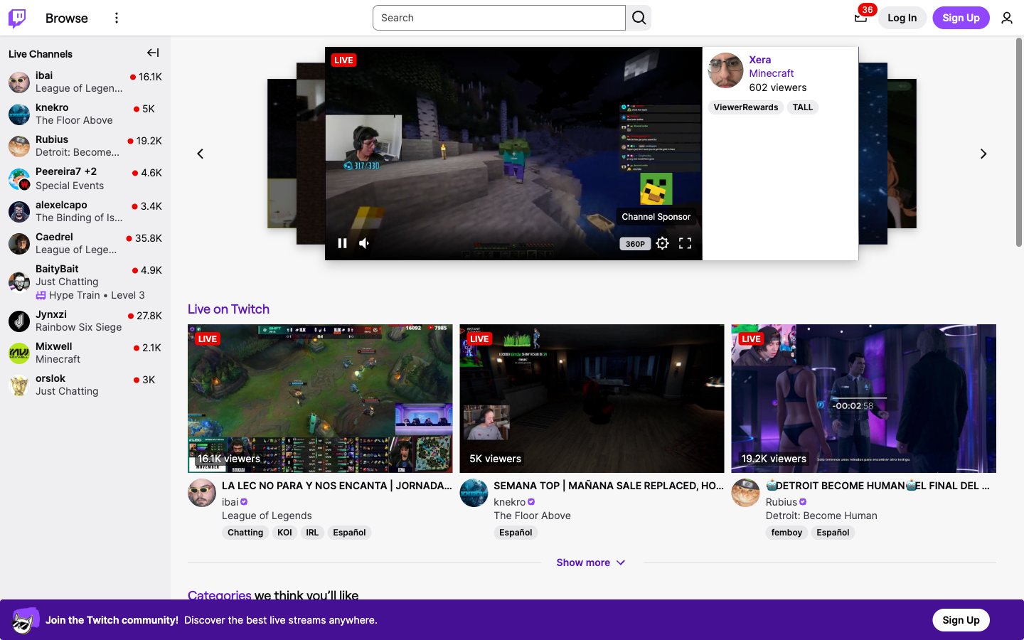
Twitch
Twitch — Style Reference
# Twitch — Style Reference
> Stadium scoreboard on parchment
**Theme:** light
Twitch's design system reads as a dense, utilitarian broadcast console: a light gray canvas (#efeff1) hosts compact white cards (#ffffff) with near-black text (#0e0e10), letting a saturated deep purple (#5c16c5) and a sharp signal red (#eb0400) do all the semantic heavy lifting. The signature is the contrast between information density and visual softness — everything is pill-shaped (9000px radius) for buttons, avatars, tags, and thumbnails, while content cards stay sharp-cornered at 4px to feel like flat broadcast tiles. Typography stays small and quiet (Inter at 11–14px for the entire interface) so that streamer thumbnails and live video remain the visual heroes. The deep, near-violet brand purple is unusually dark for a consumer platform — it carries the weight of a logo, not a decoration — while the lighter Twitch purple (#9147ff) appears on action surfaces like the Sign Up button.
## Tokens — Colors
| Name | Value | Token | Role |
|------|-------|-------|------|
| Deep Iris | `#5c16c5` | `--color-deep-iris` | Primary brand color — logo wordmark, link text, active nav icons, decorative accent fills. Unusually dark violet gives the wordmark the weight of a jersey number rather than a SaaS accent |
| Twitch Purple | `#9147ff` | `--color-twitch-purple` | Violet supporting accent for decorative details and low-frequency emphasis. Do not promote it to the primary CTA color |
| Broadcast Red | `#eb0400` | `--color-broadcast-red` | Red supporting accent for decorative details and low-frequency emphasis. Use as a supporting accent, not as a status color |
| Dark Matter | `#0e0e10` | `--color-dark-matter` | Primary text, icon strokes, dark UI surfaces, featured stream overlays, footer text. Near-black with a faint warm cast |
Websites
Markdown Text
design-md
website-prompt
landing-page-prompt
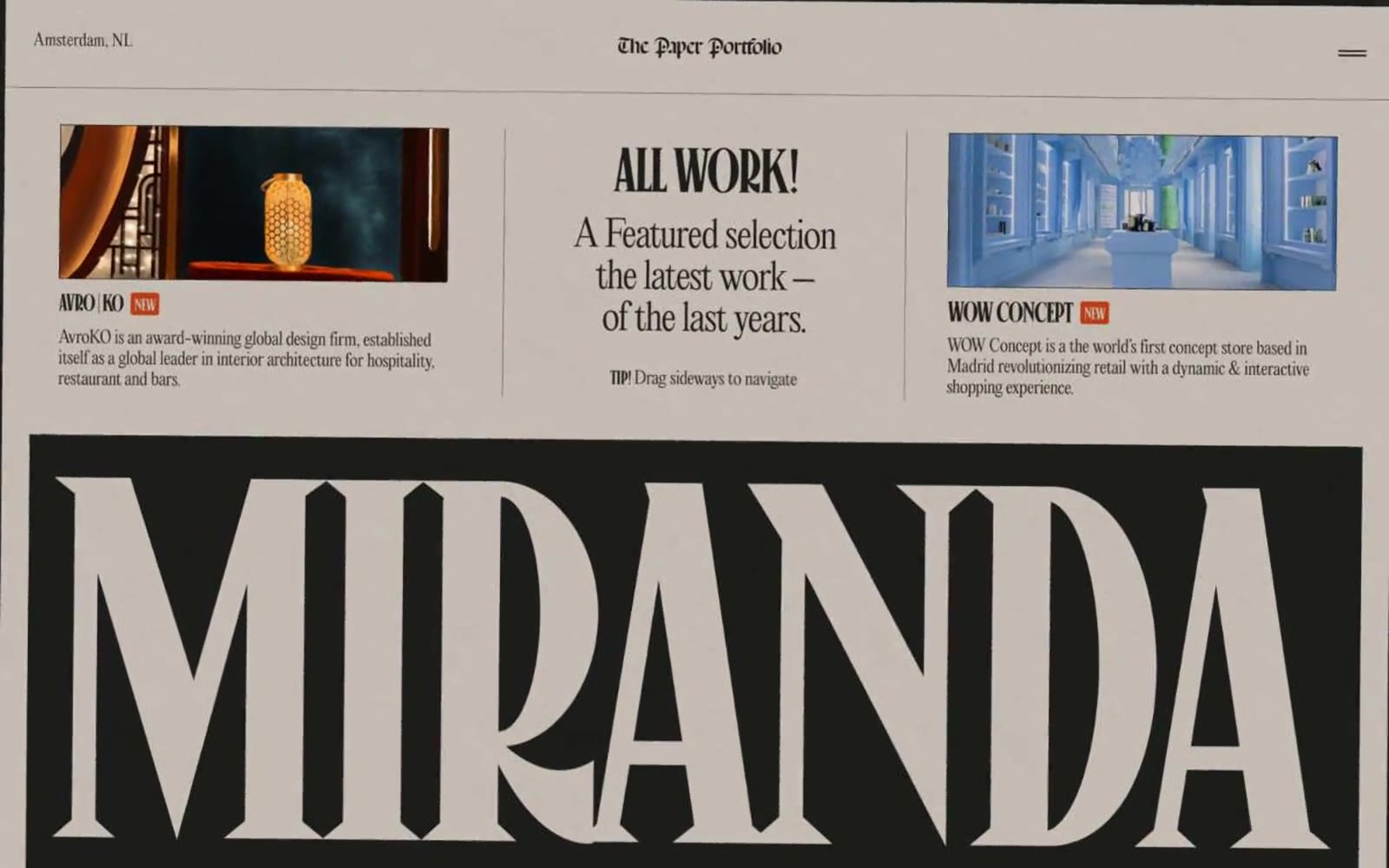
Miranda
Miranda — Style Reference
# Miranda — Style Reference
> Old-world broadsheet on warm cream — newspaper editorial for the digital age.
**Theme:** light
A vintage broadsheet portfolio rendered on warm parchment stock. Near-black ink dominates text, borders, and large editorial banners; the cream canvas stays quiet and matte, never clinical. Display type is the brand: enormous custom serifs (Canopee, Germgoth) with negative tracking and sub-1.0 line-heights so letters collide and bleed into one another, mimicking woodblock print and 19th-century poster lettering. One warm ember-orange accent appears sparingly — a stamp, a star icon — like a hand-stamped seal. Components stay flat and borderless; depth comes from contrast, not shadow. Layout reads like a zine or newspaper spread: oversized headline banners intercut with tight three-column project grids and full-bleed illustrations.
## Tokens — Colors
| Name | Value | Token | Role |
|------|-------|-------|------|
| Parchment | `#e2dedb` | `--color-parchment` | Page background, image matte areas — the warm stock everything else is printed on |
| Bone Cream | `#cdc6be` | `--color-bone-cream` | Card surfaces, secondary panels, subtle inset backgrounds slightly darker than parchment |
| Ink Black | `#1d1d1b` | `--color-ink-black` | Body text, nav links, borders, large display banner fills, icon strokes — the near-black that carries every contrast-critical role |
| Charcoal | `#69645f` | `--color-charcoal` | Muted secondary text, subdued borders, quiet typographic accents |
Websites
Markdown Text
design-md
website-prompt
landing-page-prompt
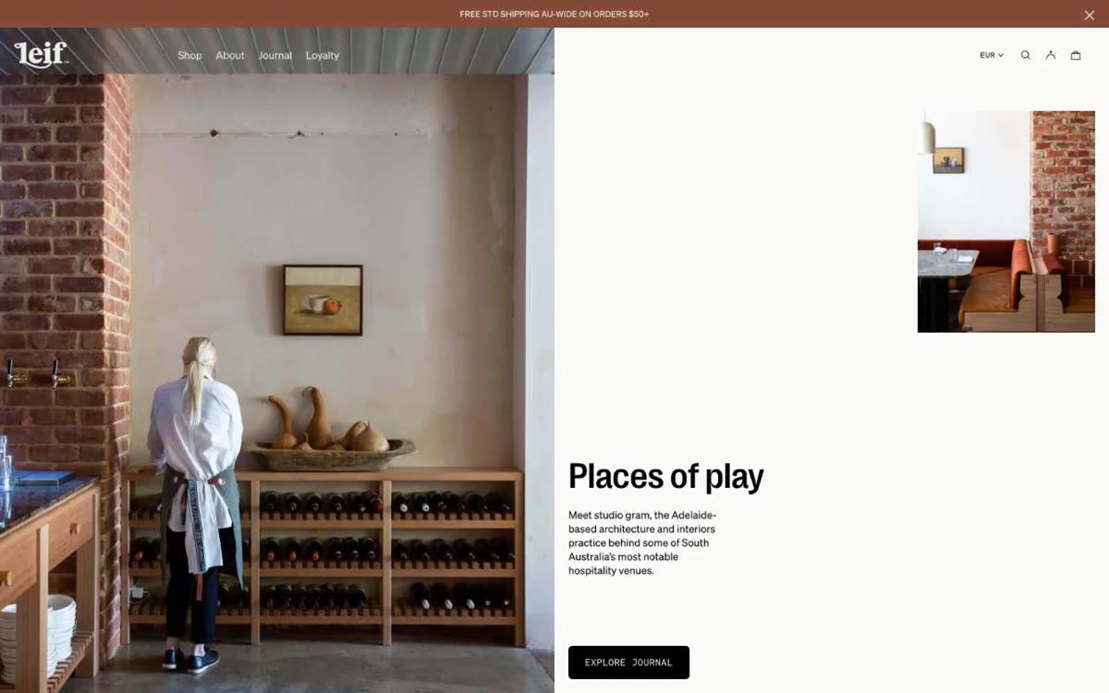
Leif Products
Leif Products — Style Reference
# Leif Products — Style Reference
> Apothecary on raw linen. A warm, hand-pressed editorial where ink-black type sits on bone-cream paper beside botanical product photography.
**Theme:** light
Leif is an editorial apothecary: warm cream canvas, botanical product photography, and whisper-thin display type that treats body care like a fashion magazine spread. The palette is almost entirely warm neutrals — stone, bone, ink, a dusty rose blush, and a pale chartreuse for accent — so the only color in the interface comes from the products and botanicals themselves. Layout breathes through generous product photography, split editorial compositions, and minimal chrome. Type does the heavy lifting: PP Right Grotesk at weight 200 for headlines creates a calligraphic lightness uncommon in commerce, while Söhne Mono small caps label scent families like museum tags. Components stay quiet — hairline borders, near-zero radii, no shadows — letting the imagery and typography carry the brand.
## Tokens — Colors
| Name | Value | Token | Role |
|------|-------|-------|------|
| Bone | `#fafaf9` | `--color-bone` | Page canvas, primary card surface — the off-white paper tone the entire interface sits on, warm enough to feel linen, not bright enough to feel clinical |
| Ink | `#000000` | `--color-ink` | All body type, primary action border, all interactive strokes — the only dark in the system, pure black rather than warm charcoal to create maximum contrast against the cream canvas |
| Stone | `#e5e2dc` | `--color-stone` | Card borders, hairline dividers, subtle section breaks — the warm gray-beige that separates elements without drawing attention |
| Linen | `#edede7` | `--color-linen` | Hairline borders, dividers, input outlines, and card edges on light surfaces. Do not promote it to the primary CTA color |
Websites
Markdown Text
design-md
website-prompt
landing-page-prompt
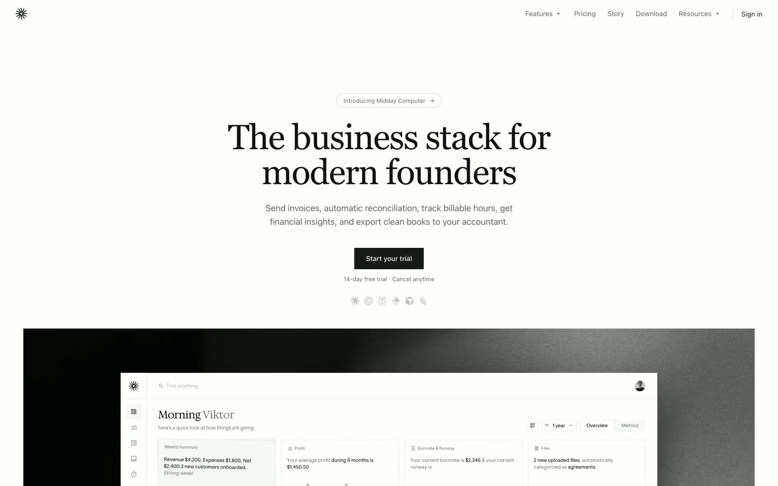
Midday
Midday — Style Reference
# Midday — Style Reference
> Editorial broadsheet on parchment — a 72px serif headline over warm stone, spaced sans-serif body text, pill-shaped controls, zero shadows.
**Theme:** light
Midday reads like an editorial broadsheet translated to software: a warm parchment canvas, a spaced sans-serif body voice, and a serif display face that announces sections like magazine pull-quotes. The system is monochrome to the point of austerity — surfaces stack in warm off-whites, borders are hairline-thin, and chromatic color appears only as functional punctuation for financial data (a single moss green) and the dark filled CTA. Every interactive element is pill-shaped; nothing is squared off. The design is completely flat — no shadows, no gradients, no decorative depth. Spacing is compact and rhythmic on a 4px grid, keeping dense ledger data legible without breathing room.
## Tokens — Colors
| Name | Value | Token | Role |
|------|-------|-------|------|
| Parchment | `#dbdad7` | `--color-parchment` | Page canvas and hairline borders — the warm off-white that unifies every surface and defines every divider at 1px |
| Paper | `#ffffff` | `--color-paper` | Card surfaces, input fields, pill button fills — pure white sits one level above the warm canvas |
| Sand | `#e6e4e0` | `--color-sand` | Secondary surface for table rows, inset panels, and tonal contrast between stacked cards |
| Ink | `#121212` | `--color-ink` | Primary text, icons, and logo — near-black for maximum contrast against parchment and paper |
Websites
Markdown Text
design-md
website-prompt
landing-page-prompt
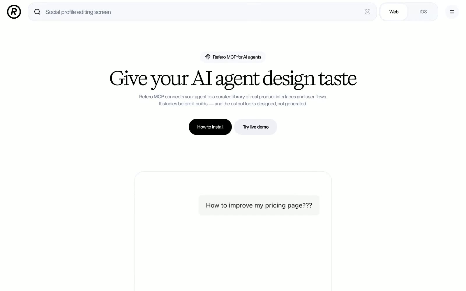
Refero
Refero — Style Reference
# Refero — Style Reference
> Editorial ink on white marble — a typographer's product page where the serif headline IS the brand, and everything else stays out of its way.
**Theme:** light
Refero uses a white-canvas editorial language where a high-contrast serif headline font (Title) carries nearly all expressive weight against an otherwise achromatic UI. The page breathes with generous vertical rhythm, letting black-on-white hierarchy do the work that other systems hand to color. The single accent move is a filled black pill button against white — no gradients, no color splashes, just ink-weight contrast. Borders and muted grays form a quiet structural grid, while the inset blue-tinted shadow on surface elements is the only chromatic whisper in an otherwise monochrome system.
## Tokens — Colors
| Name | Value | Token | Role |
|------|-------|-------|------|
| Pure Canvas | `#ffffff` | `--color-pure-canvas` | Primary page background, modal/dialog background |
| Frost Surface | `#f7f8fb` | `--color-frost-surface` | Secondary surface, subtle background containers, nav pill background |
| Midnight Ink | `#000000` | `--color-midnight-ink` | Neutral form states, badge text, and quiet UI feedback where color should stay understated. Do not promote it to the primary CTA color |
| Deep Charcoal | `#13151b` | `--color-deep-charcoal` | Near-black text for dense UI labels, active nav tab text |
Websites
Markdown Text
design-md
website-prompt
landing-page-prompt
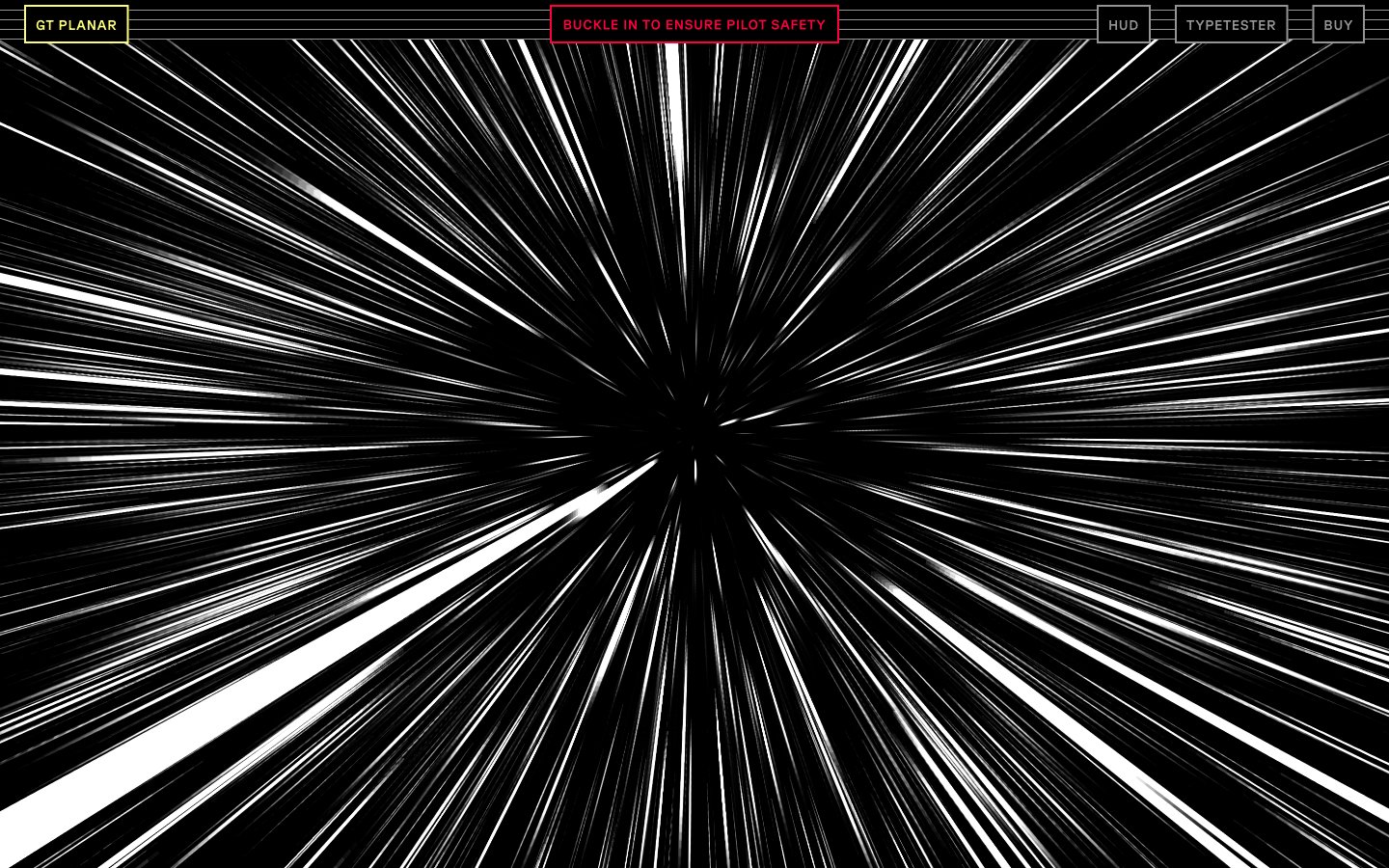
Gt-planar
Gt-planar — Style Reference
# Gt-planar — Style Reference
> cockpit HUD at warp speed
**Theme:** dark
GT Planar is a cockpit-HUD aesthetic deployed as a typeface showcase: pitch-black canvas, violet primary action, and an electric yellow-green border palette that reads like instrument-panel backlighting. Typography is the protagonist — the custom GT Planar face is the interface, not decoration on top of it. The visual system avoids depth entirely: no drop shadows, no gradients, no elevation. Instead, structure comes from 1px white hairline borders and chromatic outlines that act as glowing wireframes against the dark void. Density is high, padding is tight (1-5px range), and color appears as small, intentional function-driven punctuation rather than background wash. The result feels like looking through a pilot's heads-up display at lightspeed — every element is engineered, every line carries data, and the page itself is a working instrument rather than a marketing surface.
## Tokens — Colors
| Name | Value | Token | Role |
|------|-------|-------|------|
| Hyperspace Violet | `#6100ff` | `--color-hyperspace-violet` | Primary CTA fill, filled action backgrounds, and dominant accent border — a saturated electric violet that reads as powered-on against pure black |
| Reactor Yellow | `#fcff76` | `--color-reactor-yellow` | Green outline accent for tags, dividers, and focused UI edges. |
| Plasma Green | `#00ff85` | `--color-plasma-green` | Secondary accent for headings, link text, and body emphasis — a neon mint that signals live/active states and reads as data flowing through the HUD |
| Crimson Alert | `#ff003d` | `--color-crimson-alert` | Red outline accent for tags, dividers, and focused UI edges. Use as a supporting accent, not as a status color |
Websites
Markdown Text
design-md
website-prompt
landing-page-prompt
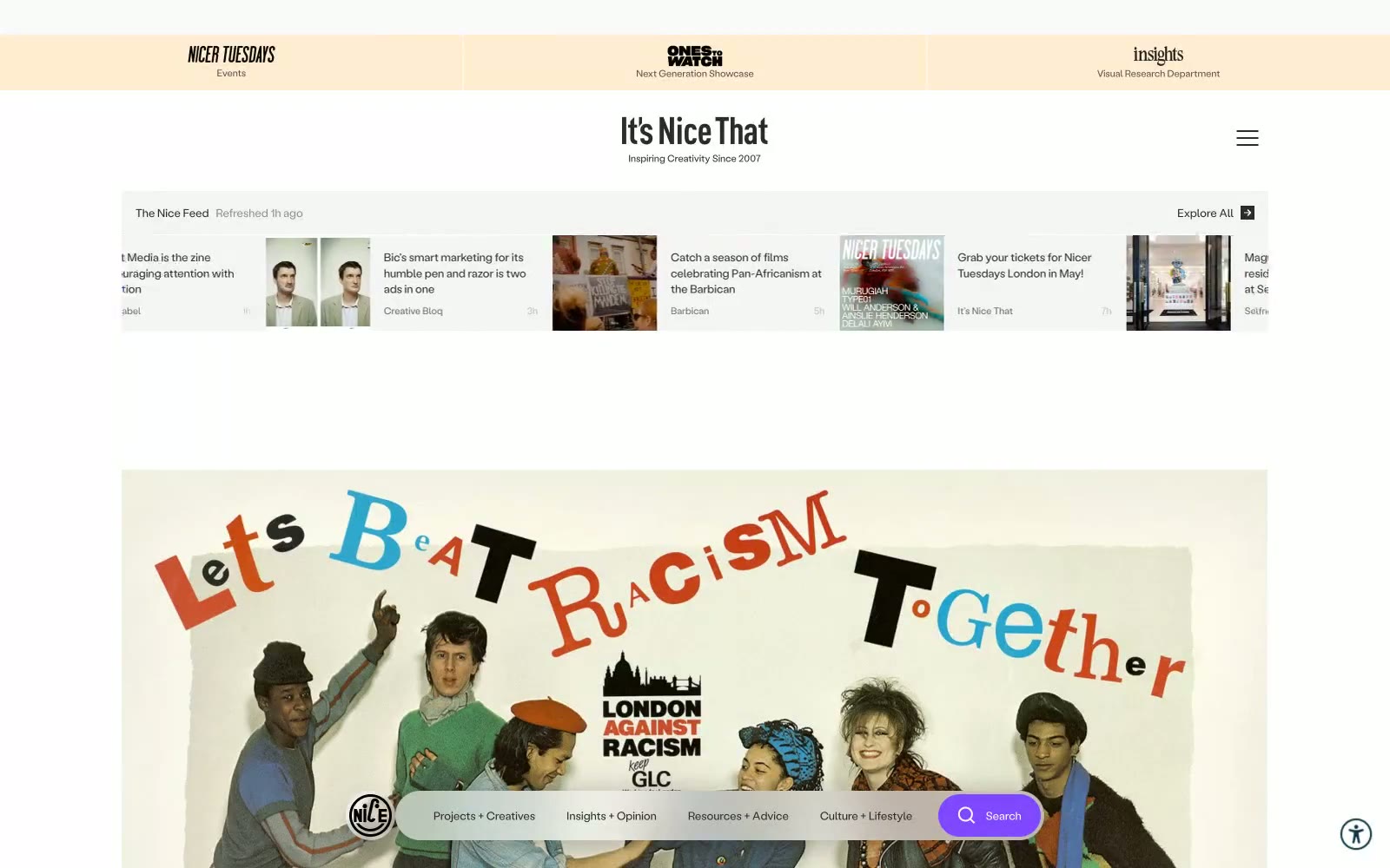
Itsnicethat
Itsnicethat — Style Reference
# Itsnicethat — Style Reference
> Art-school broadsheet on a desk. A near-white page dressed in monochrome type, with one violet accent for navigation and vivid Risograph prints exploding through the grid.
**Theme:** light
It's Nice That operates as a quiet editorial newsroom: a near-white canvas with a single violet pulse. Almost every surface is achromatic — warm off-white, pure white, near-black text — and color is rationed like ink, appearing only as functional punctuation on the search button, on hover, or in full-bleed editorial photography. Typography does the heavy lifting: a wide-tracked display face (LabilVariable) floats generous air around every headline and label, creating a magazine-like cadence, while Bradford sets compact body and UI text tight to the grid. Components are deliberately flat and compact — no shadows, pill-shaped controls at 75px radius, tight 10–20px padding — so the colorful illustration and photography content always reads as the hero. The result feels like flipping through a printed art-school broadsheet: restrained chrome, loud art.
## Tokens — Colors
| Name | Value | Token | Role |
|------|-------|-------|------|
| Page Mist | `#f0efef` | `--color-page-mist` | Page canvas — the warm off-white that holds the entire site. Cards and content float on top of this |
| Card White | `#ffffff` | `--color-card-white` | Card surfaces, input fields, elevated panels — the brighter layer stacked above Page Mist |
| Ink | `#2b2b2b` | `--color-ink` | Primary text, body copy, headings, icons, link defaults. Slightly softer than pure black, warming the type against the off-white canvas |
| Graphite | `#676767` | `--color-graphite` | Secondary text, metadata (dates, bylines), footer labels, muted descriptions |
Websites
Markdown Text
design-md
website-prompt
landing-page-prompt
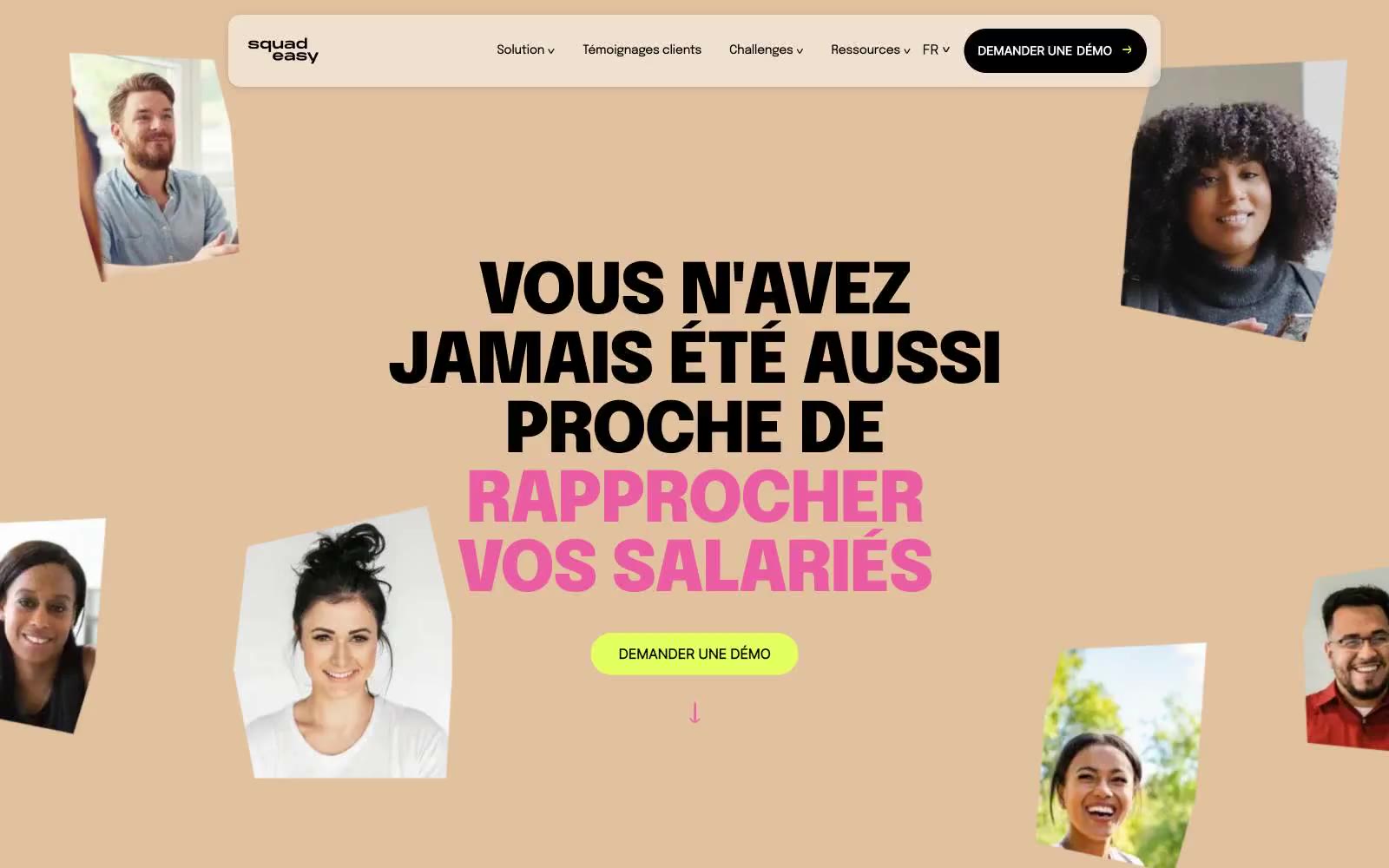
SquadEasy
SquadEasy — Style Reference
# SquadEasy — Style Reference
> Polaroid scrapbook on sunlit peach paper
**Theme:** light
SquadEasy uses a sun-drenched, scrapbook-like language: a warm tan canvas anchors every screen, scattered polaroid photos sit at jaunty angles, and oversized black display type carries the brand voice. Color works as a small but vivid palette — lime CTA, lavender cards, pink headline punctuation, green link underlines — deployed sparingly against the peach ground. Components are pill-shaped and rounded-soft; the floating capsule navigation and 9999px-radius buttons create a sticker-on-paper feel. The system favors warmth, confidence, and craft over minimalism: every screen should feel hand-pinned, not templated.
## Tokens — Colors
| Name | Value | Token | Role |
|------|-------|-------|------|
| Peach Ground | `#e1c19e` | `--color-peach-ground` | Page canvas, hero and section backgrounds — the warm tan base that ties the whole site together like craft paper |
| Lime Pop | `#e4ff60` | `--color-lime-pop` | Green action color for filled buttons, selected navigation states, and focused conversion moments. |
| Lavender Card | `#adabff` | `--color-lavender-card` | Card and surface panels, soft-tinted blocks that lift content off the peach canvas without going cold |
| Magenta Marker | `#ea5da3` | `--color-magenta-marker` | Highlight words inside headlines, decorative strokes and borders — the hand-marker pink that punches single words out of the black display type |
Websites
Markdown Text
design-md
website-prompt
landing-page-prompt
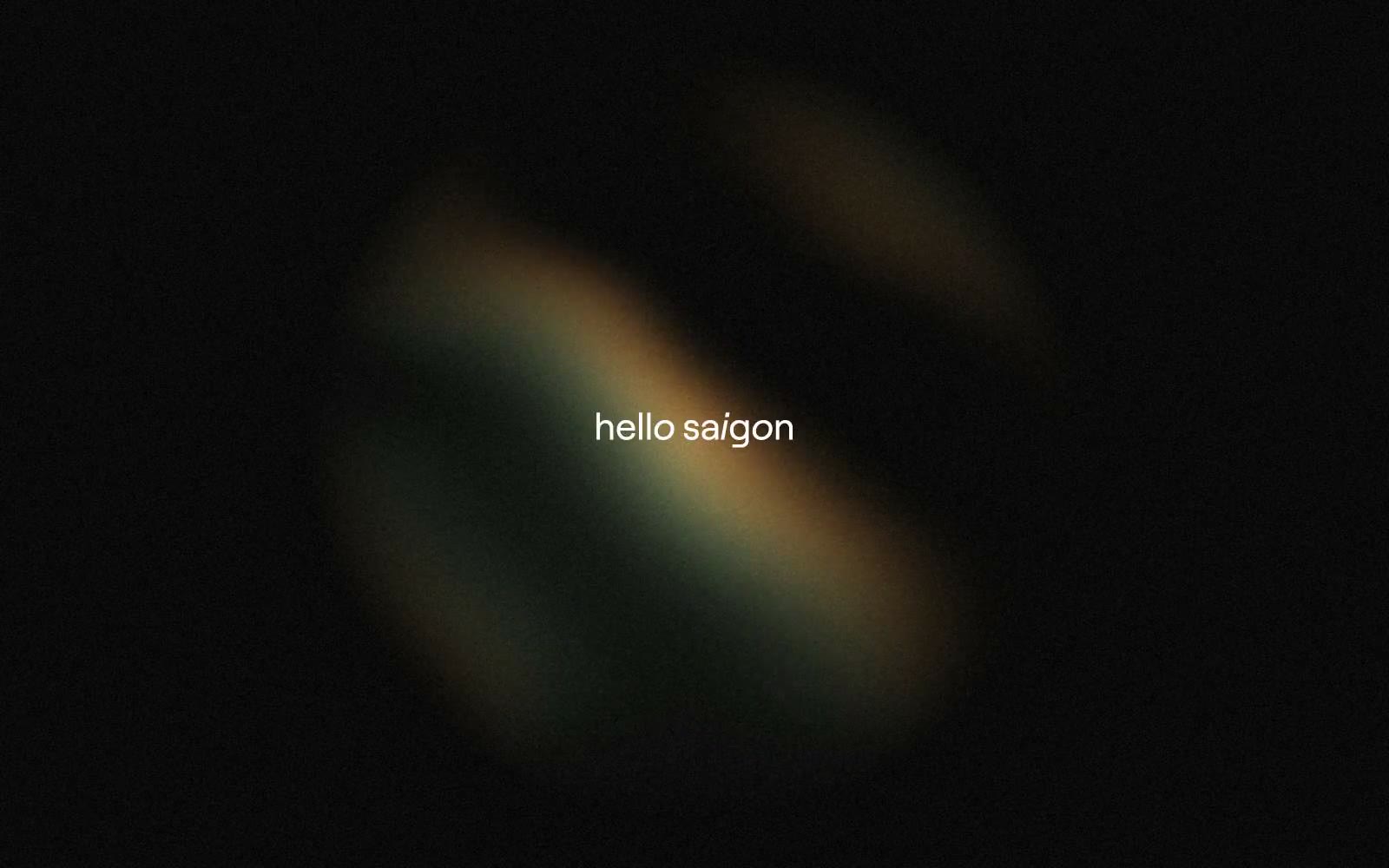
monopo saigon
monopo saigon — Style Reference
# monopo saigon — Style Reference
> cinematic darkroom with floating white type — gallery walls that alternate between pure white editorial space and immersive black frames holding organic 3D forms.
**Theme:** mixed
Monopo Saigon operates a cinematic editorial canvas: pure monochrome architecture (white, ink, and a staircase of grays) interrupted by full-bleed dark atmospheric frames carrying 3D organic imagery. The system is fundamentally light and structural, with dark sections acting as immersive gallery walls rather than primary surface mode. Typography does the emotional work — a single custom geometric sans (Roobert) stretched across an extreme scale from 9px micro-labels to 225px hero statements, creating tension between whisper-fine UI and monumental display. Components are minimal and confident: pill-shaped controls, hairline borders, ghost navigation, and almost no decorative chrome. Color is nearly absent from the system itself — the brand voice lives in scale, space, and atmospheric photography rather than in chromatic identity.
## Tokens — Colors
| Name | Value | Token | Role |
|------|-------|-------|------|
| Paper White | `#ffffff` | `--color-paper-white` | Primary canvas, card surfaces, text on dark frames, hairline borders — the default ground state for all structural sections |
| Ink Black | `#000000` | `--color-ink-black` | Primary text, dark surface backgrounds for hero/feature frames, icon strokes — anchors all legible content |
| Carbon | `#181818` | `--color-carbon` | Secondary dark for footer text, subtle dark borders, icon fills — slightly softer than pure ink for layered depth |
| Ash | `#6d6d6d` | `--color-ash` | Muted body text, hairline borders on light surfaces, secondary metadata |
Websites
Markdown Text
design-md
website-prompt
landing-page-prompt
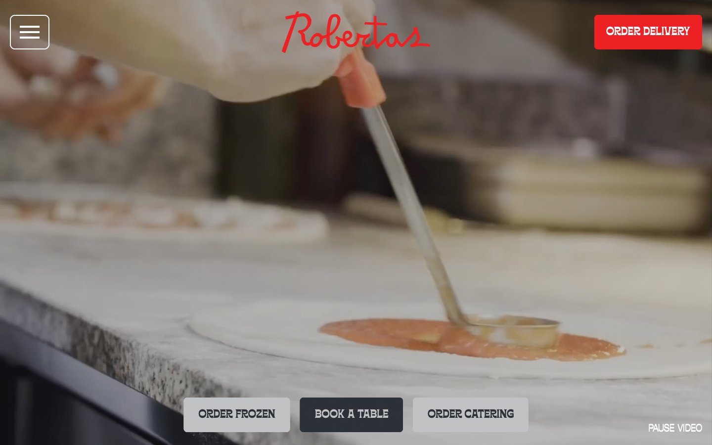
Roberta's Pizza
Roberta's Pizza — Style Reference
# Roberta's Pizza — Style Reference
> Brooklyn pizza punk parlor — a checkered tablecloth lit by neon red signage, where every screen is a poster.
**Theme:** light
Roberta's runs on a near-monochromatic system anchored by white canvas and charcoal type, with vivid red deployed as a single loud punctuation color for primary actions, social-proof walls, and signature brand moments. The type system pairs a quirky tracked-out sans (Offset TM) for body, UI labels, and most controls with a condensed display face (Borensa) that takes over at 80–120px for headlines that shout from full-bleed sections. Layouts are unapologetically full-bleed: a video hero, a red 'Get Social' wall, a centered text-and-CTA stack — with content rhythm set by generous vertical breathing room and a decorative vocabulary of checkered borders, star bands, polaroid frames, and hand-drawn skull and pizza-slice iconography borrowed from Italian-American diner signage and zine culture. Buttons sit flat without elevation on the filled state; the only shadow in the system is a hard, 4px-offset drop on secondary links, deliberately retro rather than soft-modern.
## Tokens — Colors
| Name | Value | Token | Role |
|------|-------|-------|------|
| Roberta Red | `#ed2023` | `--color-roberta-red` | Primary filled CTAs, full-bleed social section background, logo wordmark, and any place the brand must shout — vivid red against white and charcoal creates urgency and warmth without aggression |
| Charcoal | `#2b2f36` | `--color-charcoal` | Primary text, body copy, dark CTA fill, hairline borders, icon strokes, image borders — the structural neutral that carries 90% of the interface |
| Pure White | `#ffffff` | `--color-pure-white` | Page canvas, card surfaces, text on dark backgrounds, button text, badge backgrounds — the dominant neutral that gives the system its airy, poster-like feel |
| Pure Black | `#000000` | `--color-pure-black` | Input field borders and the deepest surface accent — used sparingly for the hardest possible contrast point on form elements |
Websites
Markdown Text
design-md
website-prompt
landing-page-prompt
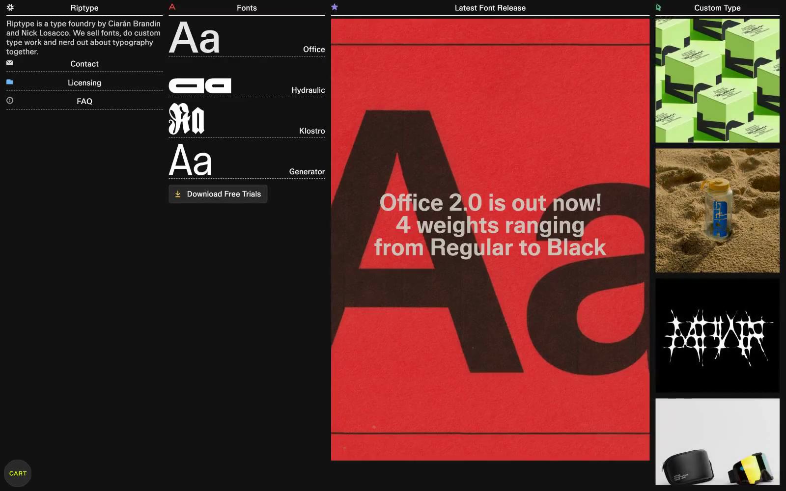
Riptype Foundry
Riptype Foundry — Style Reference
# Riptype Foundry — Style Reference
> ink on black paper — the type is the only bright thing in the room
**Theme:** dark
Riptype is a specimen-book for a type foundry: a dark matte canvas the type sits on like ink on black paper. Monochrome structure is absolute — the only chromatic element is a single acid yellow-green (#d9ff00) that functions as a signal flare, marking interactive moments and decorative accents without ever becoming decorative. Typography is the product, so the layout is dense and editorial, with characters rendered at spec-sheet size and minimal chrome between them. Components are flat, border-driven, and near-invisible — the system gets out of the way so the typeforms can speak. The mood is workshop-dark: process-oriented, print-referenced, confident in restraint.
## Tokens — Colors
| Name | Value | Token | Role |
|------|-------|-------|------|
| Workshop Black | `#121212` | `--color-workshop-black` | Page background, primary canvas — the dark surface the type sits on |
| Platen Gray | `#292929` | `--color-platen-gray` | Raised surface for buttons, hover fills, interactive plate |
| Bone | `#d0d0d0` | `--color-bone` | Default body text, link strokes, hairline rules, icon outlines |
| Ash | `#a0a0a0` | `--color-ash` | Secondary text, metadata, subdued borders and captions |

Websites
Markdown Text
design-md
website-prompt
landing-page-prompt
Hex
Hex — Style Reference
# Hex — Style Reference
> alchemy lab on cream parchment — literary serif headline over dense data notebook
**Theme:** light
Hex treats its marketing site like a research notebook: a warm cream canvas, a near-black violet ink, and a hand-drawn editorial headline floating above crisp sans-serif body copy. The hero pairs PP Editorial New italic at weight 200 with PP Formula's compressed 800-weight — a tension between literary softness and engineered density that recurs throughout. CTAs are intentionally quiet: thin dark outlines and dark text on white, no filled buttons, no drop-shadows that would shout over the product. Violet-tinted borders and shadows (rgba(71,57,130,0.1)) are the only chromatic warmth on the surface, while product screenshots and data visualizations carry the real color — viridis-style purples, teals, greens, and yellows blooming inside the notebook panels. The site reads as compact, technical, and confident: dense info blocks, 3px micro-radii on controls, and generous breathing room only between sections.
## Tokens — Colors
| Name | Value | Token | Role |
|------|-------|-------|------|
| Ink Violet | `#01011b` | `--color-ink-violet` | Primary text, body copy, heavy borders, data labels — the near-black ink with a violet undertone that makes charts and code blocks feel in-brand even at full contrast |
| Plum Charcoal | `#31263b` | `--color-plum-charcoal` | Heavy borders, icon strokes, secondary text — a warm dark that softens harsh black and gives outlines a violet cast |
| Storm Mauve | `#43394c` | `--color-storm-mauve` | Nav borders, tertiary text, muted headings — sits between Ink Violet and Plum Charcoal for intermediate contrast |
| Slate Iris | `#717a94` | `--color-slate-iris` | Muted body text, icon fills, table borders — cool blue-gray for de-emphasized UI elements |

Websites
Markdown Text
design-md
website-prompt
landing-page-prompt
HubSpot
HubSpot — Style Reference
# HubSpot — Style Reference
> Warm cream paper with a single orange spark. HubSpot feels like a design magazine printed on heavy stock — editorial serif headlines, warm off-white pages, and one flame-orange accent that lights up only the moments that matter.
**Theme:** light
HubSpot's design system is a warm, editorial enterprise aesthetic built on cream-paper canvases rather than stark white. A single vivid orange (#ff4800) serves as the sole chromatic accent — appearing in CTAs, icons, the logo sprocket, and even the period punctuation on the hero headline — while everything else stays in a carefully graded neutral scale from off-white to near-black. Typography pairs a custom sans (HubSpot Sans) for UI and body with a custom serif (HubSpot Serif) for headlines, a deliberate choice that signals editorial confidence over typical SaaS utility. Cards float on warm parchment with soft 16px corners and hairline borders rather than heavy shadows, and generous vertical breathing room between sections gives the whole site a calm, unhurried rhythm. The 2% colorfulness score is structural: orange is never decorative chrome, it's functional punctuation that always means "act here" or "this is HubSpot."
## Tokens — Colors
| Name | Value | Token | Role |
|------|-------|-------|------|
| Sprout Orange | `#ff4800` | `--color-sprout-orange` | Primary CTAs, logo sprocket, active nav states, functional icons, and the period punctuation on hero headlines — the sole chromatic accent in the entire system |
| Canvas Cream | `#fcfcfa` | `--color-canvas-cream` | Page background, card surfaces, button text, light dividers |
| Warm Parchment | `#f8f5ee` | `--color-warm-parchment` | Alternating section backgrounds, navigation surface, soft-band separators that give the page a paper-stock warmth |
| Ink | `#1f1f1f` | `--color-ink` | Primary body text, headings, card borders, hairline dividers — the structural near-black used everywhere a line or label needs weight |
Websites
Markdown Text
design-md
website-prompt
landing-page-prompt
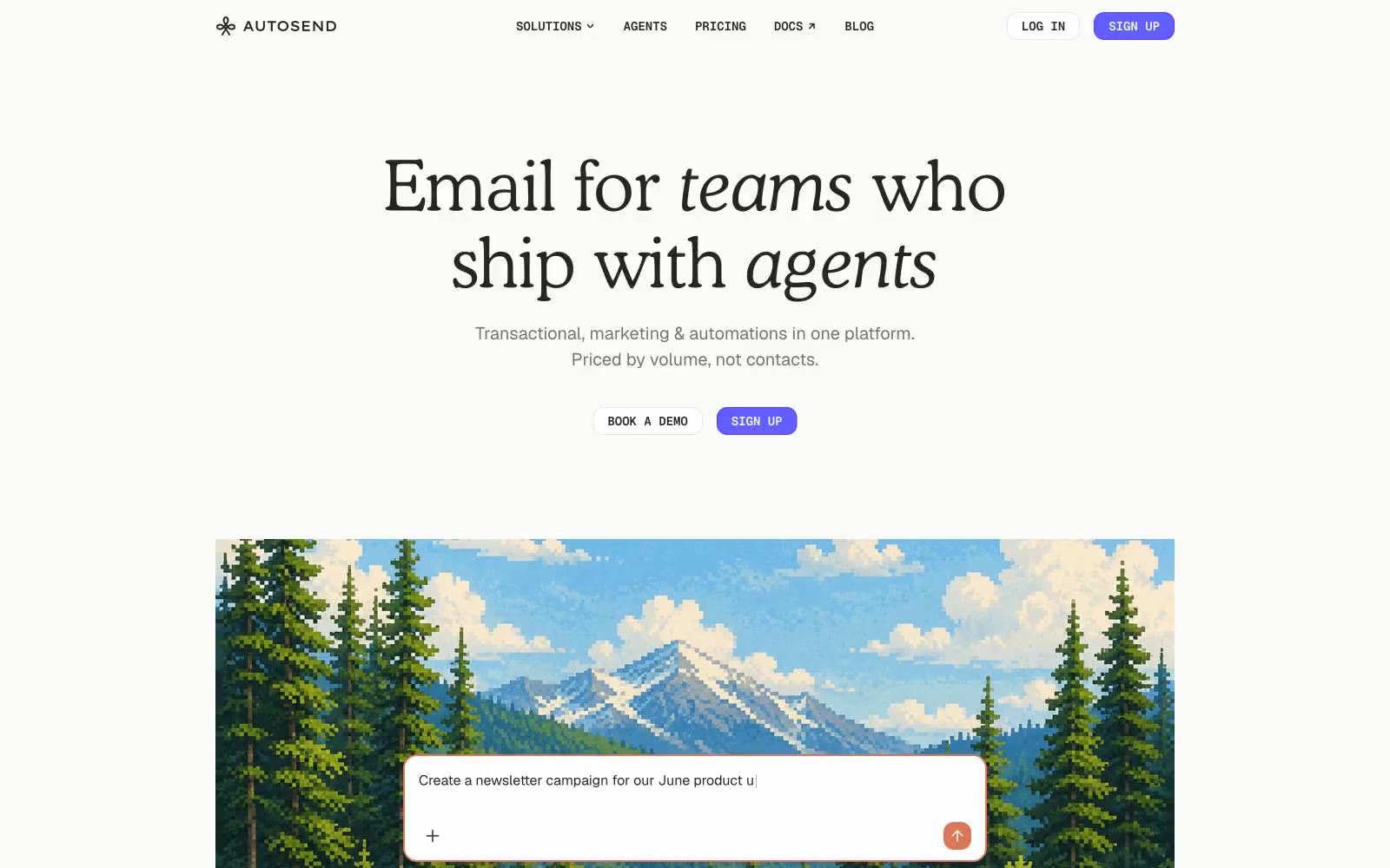
AutoSend
AutoSend — Style Reference
# AutoSend — Style Reference
> Warm stone atelier with a single violet spark — where serif headlines and electric-indigo CTAs share the same quiet off-white room.
**Theme:** light
AutoSend reads like a warm-technical workspace: a stone-warm off-white canvas, restrained chrome, and one vivid electric-violet accent that makes actions feel switched on. The hero headline is a Cooper serif at near-display size, pairing upright with italic for a single emphasis word — this humanist serif is the anti-Sans-Helvetica SaaS move and defines the page's voice. UI chrome stays monochrome and calm; color is punctuation, not wallpaper, appearing on the CTA, card borders, and icon strokes. Components are flat and weightless: 8–16px radii, hairline stone borders, and a single soft drop shadow reserved for elevated product surfaces.
## Tokens — Colors
| Name | Value | Token | Role |
|------|-------|-------|------|
| Warm Bone | `#fafaf9` | `--color-warm-bone` | Page canvas, button secondary fills, section backgrounds — the warm off-white that prevents the page from feeling clinical |
| Paper White | `#ffffff` | `--color-paper-white` | Card surfaces, elevated panels, primary button text, input fills — layered above Warm Bone for subtle separation |
| Stone Mist | `#e7e5e4` | `--color-stone-mist` | Hairline borders, dividers, button outlines, list separators — the structural linework that holds the layout together |
| Bark Grey | `#79716b` | `--color-bark-grey` | Muted body text, secondary labels, icon strokes, placeholder copy — warm rather than cool grey |
Websites
Markdown Text
design-md
website-prompt
landing-page-prompt
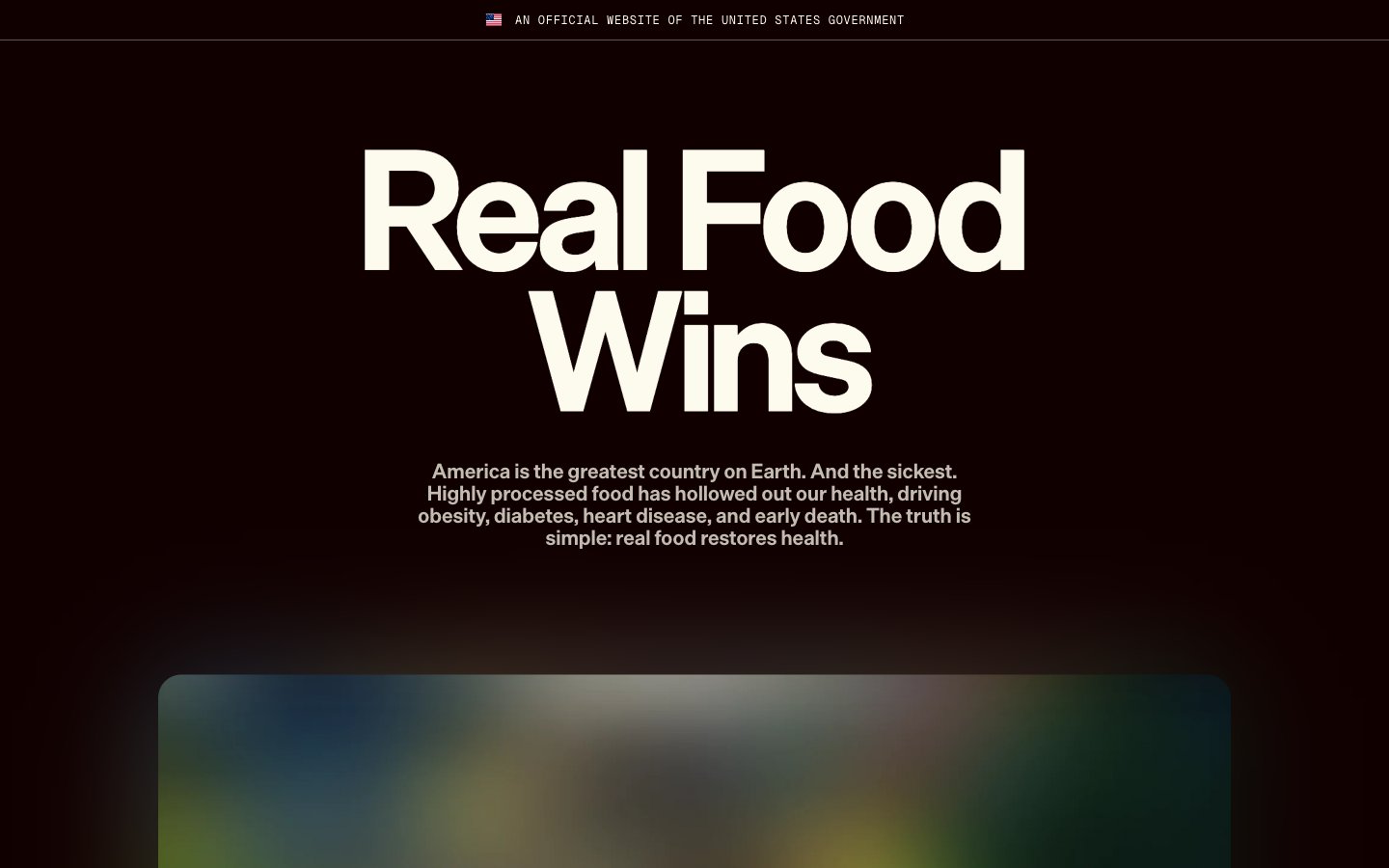
Eat Real Food
Eat Real Food — Style Reference
# Eat Real Food — Style Reference
> government health brief on cream parchment
**Theme:** light
Eat Real Food reads as a government health brief printed on aged parchment: warm cream canvas, near-black ink, and one alarm-red used only when the data needs to stop you in your tracks. The visual system is nearly monochromatic by design — color is treated as editorial punctuation, not decoration. Display type is enormous and tight (170px headlines at 0.84 line-height), making every hero statement feel like a front-page declaration. Components are rounded, pill-shaped, and float on flat surfaces with the faintest layered shadows. The aesthetic borrows from broadsheet newspaper design and government reports: confident, restrained, and data-driven.
## Tokens — Colors
| Name | Value | Token | Role |
|------|-------|-------|------|
| Press Ink | `#110000` | `--color-press-ink` | Primary text, dark hero surfaces, filled pill buttons, navigation dots — near-black with a warm undertone replaces the cold #000000 to keep the palette feeling printed rather than digital |
| Aged Parchment | `#fdfbee` | `--color-aged-parchment` | Page canvas, body text on dark surfaces, filled button backgrounds — the warm off-white that gives the entire site its paper-like quality |
| Newsprint White | `#ffffff` | `--color-newsprint-white` | Card surfaces, elevated panels, button text on dark fills |
| Wheat Field | `#f3f0d6` | `--color-wheat-field` | Accent surface, secondary button fill, soft highlight wash — a desaturated straw tone that sits between parchment and olive |
Websites
Markdown Text
design-md
website-prompt
landing-page-prompt
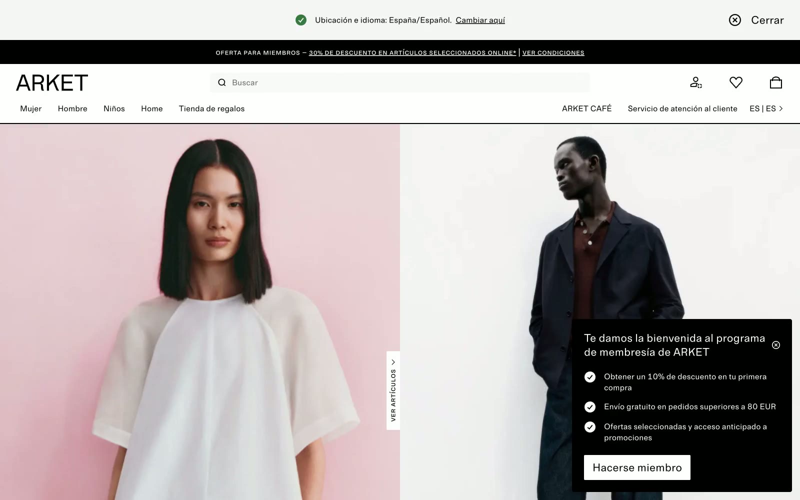
ARKET
ARKET — Style Reference
# ARKET — Style Reference
> Scandinavian white gallery. Full-bleed photography on bone-white canvases, hairline rules, and a small-caps monospace labeling each section like a museum wall tag.
**Theme:** light
ARKET is a Scandinavian fashion retailer whose digital presence reads as a curated white-gallery space: bone-white canvases, carbon-black type, hairline borders, and no color anywhere except inside the photography itself. Typography pairs a quiet humanist sans with a small-caps monospace that labels editorial cards like museum wall text, reinforcing the art-direction-over-advertising voice. Interactive elements are sharp (2px corners), flat, and rely on inversion rather than color for emphasis — a solid black button sits beside an outlined one at the same height. The system prizes restraint: generous whitespace, no gradients, minimal elevation, and a single nearly invisible blue accent reserved for links. Every screen should feel like a printed lookbook page — spacious, monochrome, and let the imagery do the chromatic work.
## Tokens — Colors
| Name | Value | Token | Role |
|------|-------|-------|------|
| Carbon | `#000000` | `--color-carbon` | Primary text, navigation, icons, hairline borders, filled emphasis buttons, and the membership overlay surface |
| Bone White | `#ffffff` | `--color-bone-white` | Page canvas, card surfaces, and inverse text on dark surfaces |
| Linen | `#eaeae8` | `--color-linen` | Outlined button borders, tag and chip backgrounds |
| Mist | `#e0e0e0` | `--color-mist` | Hairline dividers, input borders, subtle section separators |
Websites
Markdown Text
design-md
website-prompt
landing-page-prompt
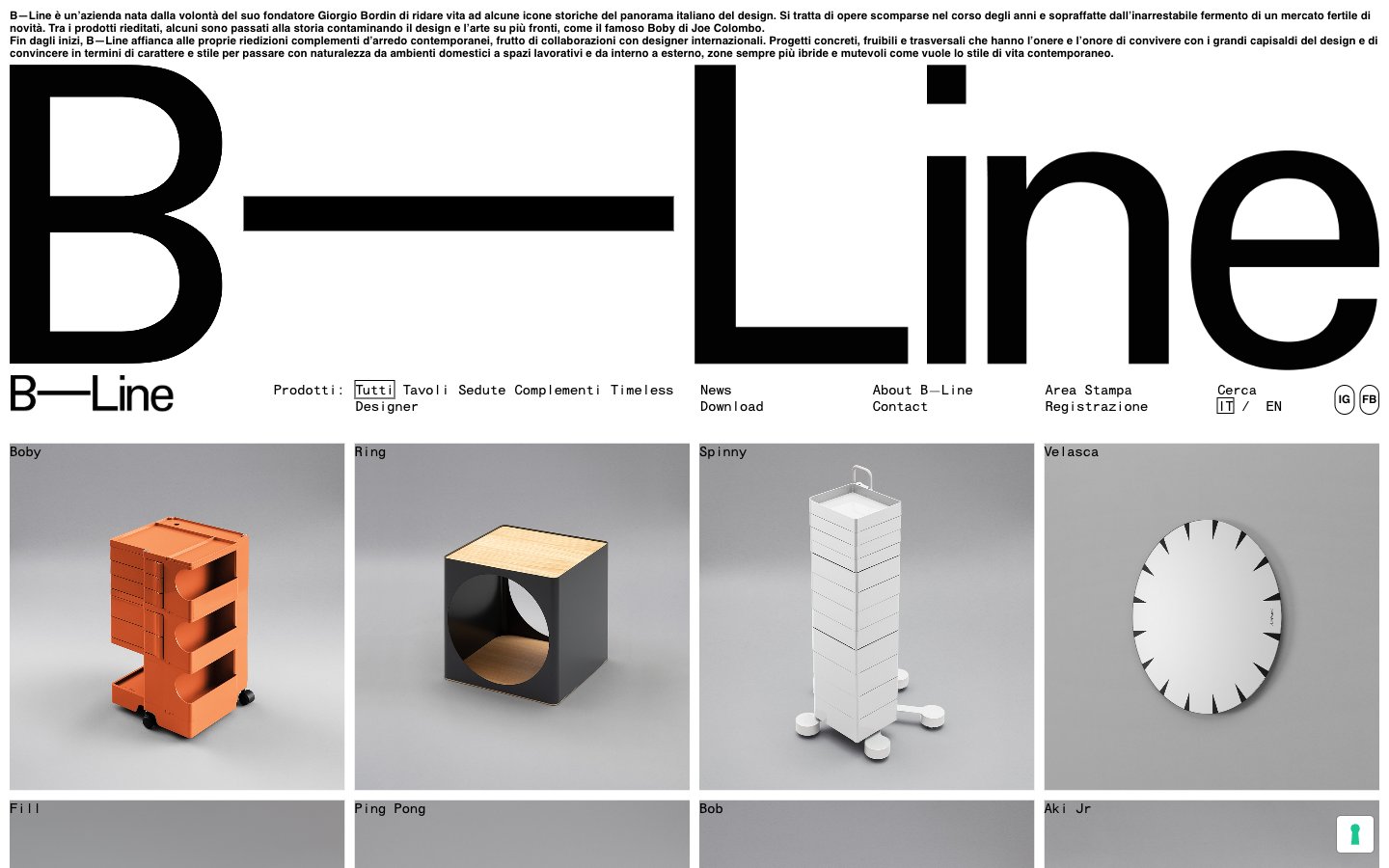
B—Line
B—Line — Style Reference
# B—Line — Style Reference
> Monospaced editorial museum catalog — achromatic typographic grid where the wordmark out-sizes every product.
**Theme:** light
B—Line operates as an editorial product index rather than a marketing site — the brand name itself is the hero, rendered at architectural scale before any product imagery appears. The palette is intentionally colorless: pure black, white, and a single mid-gray carry every text, border, and surface decision. Monospace typography (HELVMONO) dominates body, navigation, and metadata, giving every label the feel of a museum catalog entry. Product photography is treated as object documentation: uniform gray studio backdrops, tight crops, and zero lifestyle staging. Surfaces stay flat — no elevation, no decorative gradients, no rounded corners beyond a few subtle link treatments. The result is a Swiss-inflected minimalism where the absence of color and decoration is the statement.
## Tokens — Colors
| Name | Value | Token | Role |
|------|-------|-------|------|
| Ink | `#000000` | `--color-ink` | Primary text, all borders, nav link color, product card frame, massive hero wordmark — the structural color of the entire system |
| Paper | `#ffffff` | `--color-paper` | Page canvas, card backgrounds, image backgrounds, inverted text on dark controls |
| Graphite | `#595959` | `--color-graphite` | Muted secondary text, tertiary borders, inactive UI elements |
Websites
Markdown Text
design-md
website-prompt
landing-page-prompt
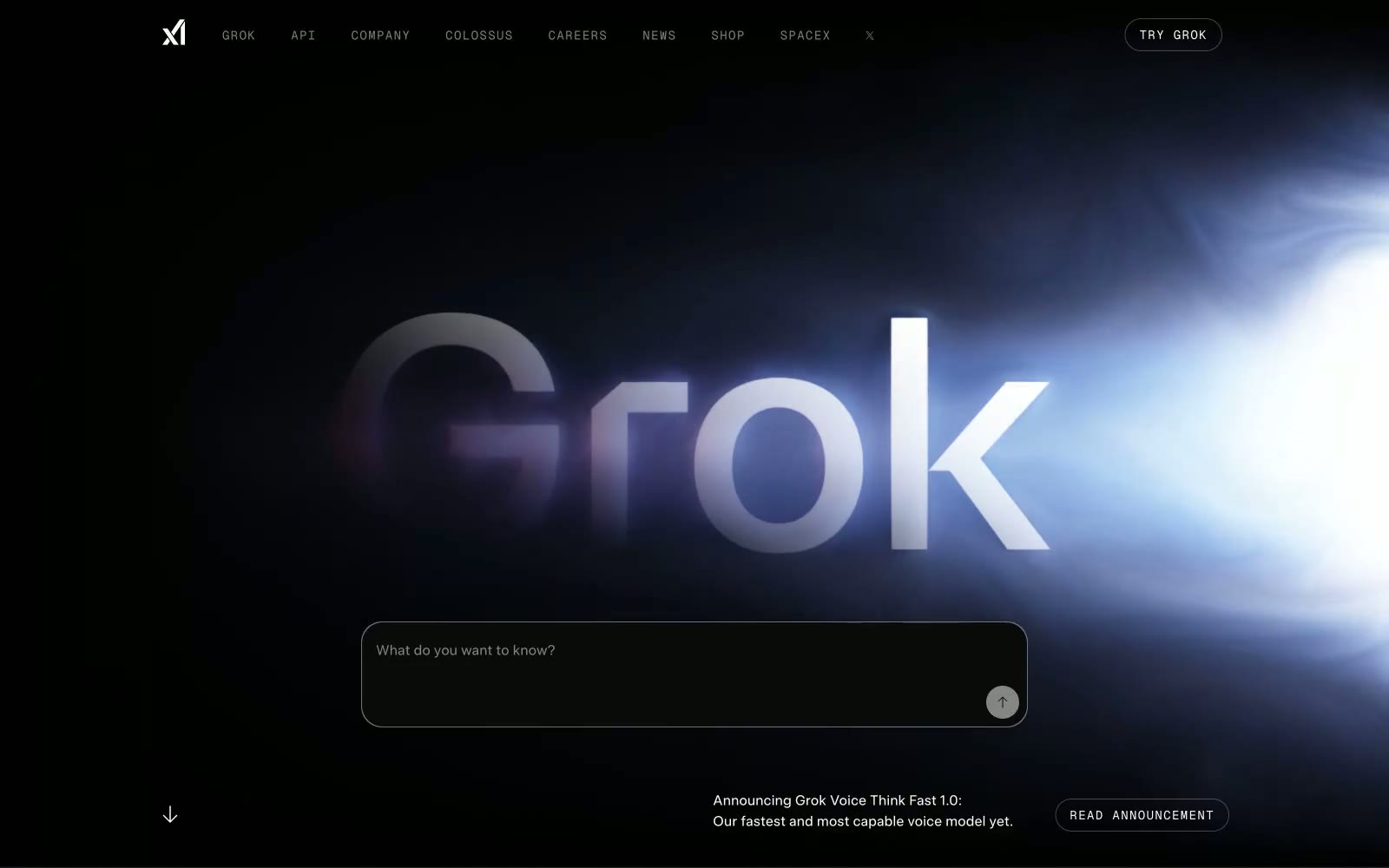
xAI
xAI — Style Reference
# xAI — Style Reference
> cosmic void pierced by a single luminous thread
**Theme:** dark
xAI operates in the visual language of deep space: a near-black void where a single luminous word becomes the only source of light. The interface is almost entirely monochrome — pure whites and graphite grays on absolute black — treating the product wordmark as a celestial object that emits its own glow. Typography is whisper-thin (weight 400 across all sizes), trusting negative space and tight tracking to do the heavy lifting rather than weight or decoration. Components are skeletal: ghost pills, hairline borders at #1f2228, inputs defined only by a subtle focus ring, and abstract line illustrations that hint at cosmic phenomena. The only chromatic punctuation is a single electric blue (#2563eb) for input focus, and a warm amber light wash bleeding up from the footer horizon — the system treats color as rare atmospheric event, not decoration.
## Tokens — Colors
| Name | Value | Token | Role |
|------|-------|-------|------|
| Void Black | `#0c0c0b` | `--color-void-black` | Page canvas, input fills, icon backgrounds — the base layer everything floats on |
| Graphite | `#1f2228` | `--color-graphite` | Hairline borders across all containers, cards, nav separators, and input outlines — defines structural edges without contrast |
| Charcoal | `#141619` | `--color-charcoal` | Secondary border tone for deeper structural edges |
| Smoke | `#474747` | `--color-smoke` | Dark borders and separators for elevated surfaces and inverted UI. Do not promote it to the primary CTA color |