AI Prompt Studio - Intelligent Prompt Library
Explore and use professional AI prompts to optimize your workflow.
One-click Use
Websites
Markdown Text
design-md
website-prompt
landing-page-prompt
Branding
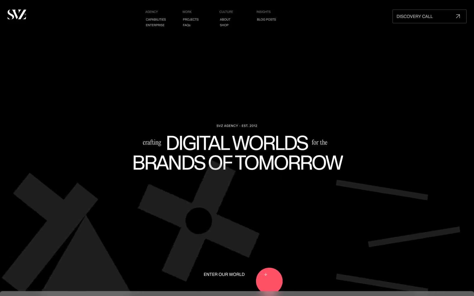
Branding — Style Reference

# Branding — Style Reference
> Black gallery wall, blood-red punctuation — Oversized white display type floats on a void-like dark canvas, interrupted by a single vivid red accent and dramatic ornamental display faces that feel like gallery signage rather than web UI.
**Theme:** dark
SVZ operates in the visual register of a high-fashion editorial: pitch-black canvas, oversized display typography that dominates the viewport, and a single arterial red that appears like a wound in the monochrome. The interface is deliberately sparse — most surfaces carry no chrome at all, letting type, photographic collage, and oversized background shapes do the work. Text is primarily white on near-black, with an off-white (#f3efef) reserved for inverted bodies and footers. Hierarchy is achieved through scale (160px display stepping down to 10px labels) and weight contrast (300 whisper-thin body against 700 blocky caps), never through color or chrome. Every interactive element is ghost or hairline-bordered — the system refuses to shout with buttons, preferring arrows and discover-call links that feel like editorial pull-quotes.
## Tokens — Colors
| Name | Value | Token | Role |
|------|-------|-------|------|
| Void Canvas | `#080808` | `--color-void-canvas` | Primary page background; the base upon which all display type and floating shapes sit |
| Absolute Black | `#000000` | `--color-absolute-black` | Deepest surface, decorative fills, icon strokes — the floor beneath the void |
| Charcoal Plate | `#171617` | `--color-charcoal-plate` | Footer and inverted section backgrounds, slightly elevated off the base void |
| Smoke Plate | `#262525` | `--color-smoke-plate` | Secondary surface for content blocks and image treatments layered over the void |
Websites
Markdown Text
design-md
website-prompt
landing-page-prompt
Fold
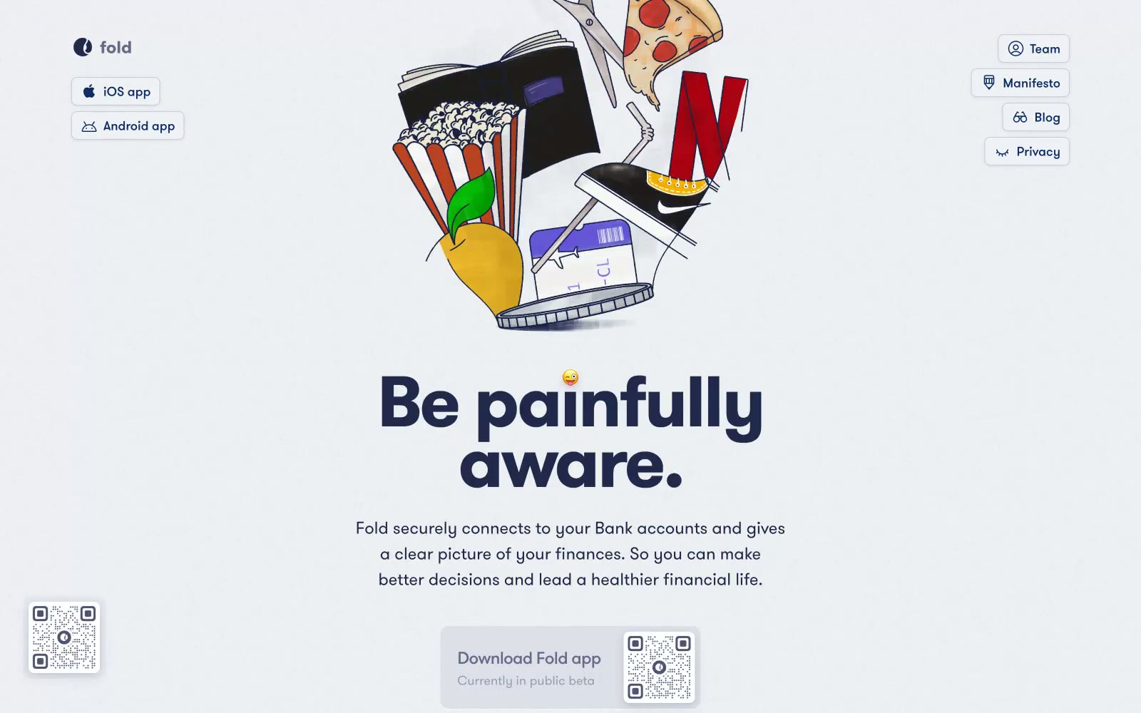
Fold — Style Reference
# Fold — Style Reference
> Bauhaus poster on fog
**Theme:** light
Fold's visual language is a bright, spacious fintech workspace built on a cool-tinted near-white canvas. Deep midnight navy (#20294c) carries the weight of authority in headlines and body text, while a softer cornflower (#375390) handles borders, icons, and secondary surfaces. The interface stays predominantly achromatic with a single electric blue accent (#459af8) for interactive elements and links. Cards float on generous white surfaces with soft, large-radius shadows tinted in navy rather than gray — the shadows themselves are on-brand. Typography is confidently large: the hero headline at 100px with extreme negative tracking makes the page feel like a poster rather than a web app, while everything else stays calm and geometric through GT Walsheim Pro's rounded forms. The mood is honest and confrontational, reinforced by the illustration style of 3D-ish lifestyle objects (pizza, popcorn, phone) rendered with crisp edges and minimal backgrounds.
## Tokens — Colors
| Name | Value | Token | Role |
|------|-------|-------|------|
| Midnight Navy | `#20294c` | `--color-midnight-navy` | Violet text accent for links, tags, and emphasized short phrases. Do not promote it to the primary CTA color |
| Cornflower Steel | `#375390` | `--color-cornflower-steel` | Borders, icon strokes, secondary text, tag outlines — a desaturated cousin of midnight used for structural elements that recede from primary copy |
| Electric Blue | `#459af8` | `--color-electric-blue` | Inline links, active nav text, small accent dots — the only high-chroma blue, used sparingly to signal clickable moments |
| Fog White | `#f0f1f5` | `--color-fog-white` | Page canvas, subtle card fills, list backgrounds, nav backdrop — the off-white base layer that gives the navy its depth |
Websites
Markdown Text
design-md
website-prompt
landing-page-prompt
Val Town
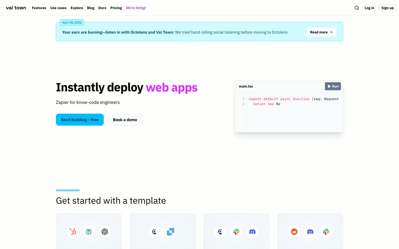
Val Town — Style Reference
# Val Town — Style Reference
> daylight IDE with cyan sparks. White-washed IDE where chrome recedes, code glows in syntax colors, and one electric cyan button reads as 'run'.
**Theme:** light
Val Town uses a daylight-IDE visual language: a near-white canvas with a single vivid cyan as the "run" button accent, playful magenta and violet used sparingly to energize specific words inside otherwise neutral type, and the hero is always a real code editor mock rather than abstract illustration. Typography carries the brand more than color does — IBM Plex Sans at 400 for body, 700 for headings, and iA Writer Mono for all code, giving every screen the feel of a well-typeset terminal. Components are flat and low-elevation, relying on hairline borders and a cool light-gray card surface (#f1f5f9) to separate layers; depth only appears in the code editor mock where a soft 20px shadow lifts the card off the page. Color is rationed like a developer's cursor: it only appears where state changes, where code is highlighted, or where a single word deserves emphasis — the rest of the UI stays monochrome and quiet.
## Tokens — Colors
| Name | Value | Token | Role |
|------|-------|-------|------|
| Cyan Pulse | `#00bcff` | `--color-cyan-pulse` | Blue supporting accent for decorative details and low-frequency emphasis. Do not promote it to the primary CTA color |
| Voltage Cyan | `#53eafd` | `--color-voltage-cyan` | Announcement bar border, decorative code-editor highlights — brighter, more electric than Cyan Pulse, used for outline accents only |
| Plasma Violet | `#8e51ff` | `--color-plasma-violet` | Violet supporting accent for decorative details and low-frequency emphasis. |
| Signal Magenta | `#e12afb` | `--color-signal-magenta` | Hiring nav link, emphasis words inside testimonial bodies — a second accent reserved for editorial moments, not chrome |
Websites
Markdown Text
design-md
website-prompt
landing-page-prompt
Status
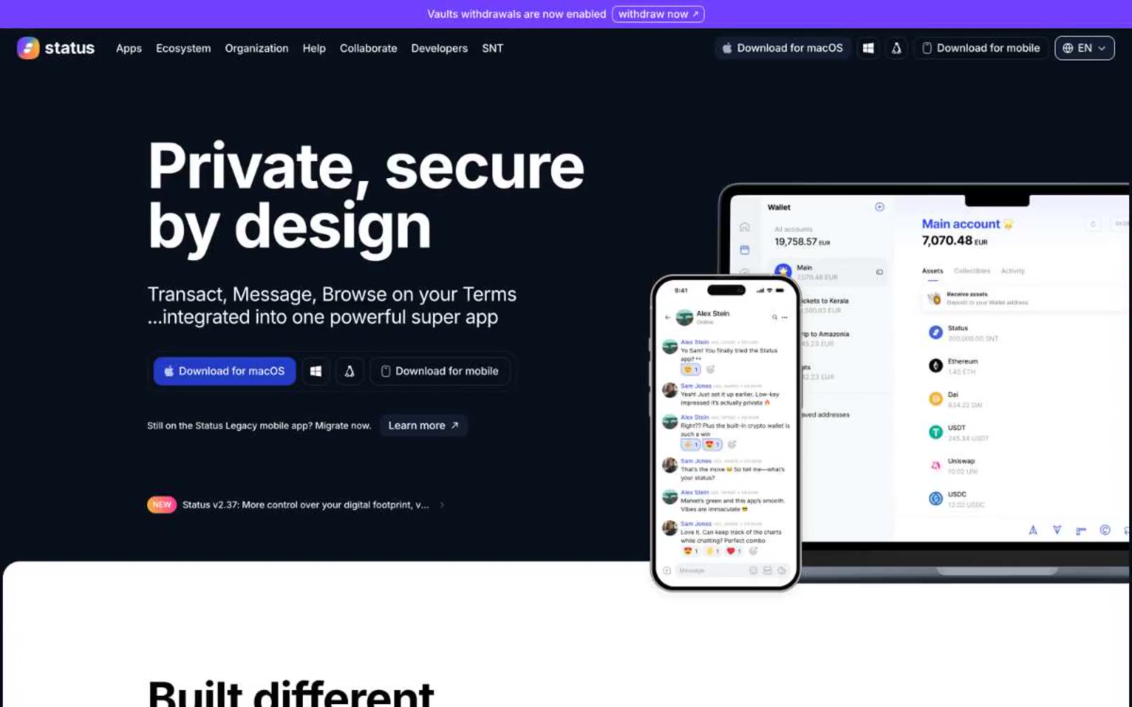
Status — Style Reference
# Status — Style Reference
> encrypted vault behind midnight glass — a dark security console where the only color is a single violet signal lamp
**Theme:** dark
Status presents an encrypted-vault aesthetic: a near-black canvas (#09101c) with steel-toned borders and elevated slate surfaces that read as private infrastructure rather than consumer app. Color is rationed tightly — Status Violet (#7140fd) owns brand identity moments while Signal Blue (#2a4af5) carries the only filled action, and everything else stays in an achromatic 95% palette. Inter handles every typographic role, with display 88px headlines tracking at -0.021em that feel engineered rather than set. Comfortable 4px-based rhythm, 20-24px card radii, and 12px pill-shaped controls create a deliberate, security-first surface language. Product mockups (wallet, messenger) are the primary visual content — the device IS the hero, not lifestyle photography.
## Tokens — Colors
| Name | Value | Token | Role |
|------|-------|-------|------|
| Midnight Ink | `#09101c` | `--color-midnight-ink` | Page canvas, card backgrounds, primary surface — the near-black base that absorbs everything else |
| Slate Depth | `#131d2f` | `--color-slate-depth` | Elevated surface for buttons and interactive containers, one step above the canvas |
| Steel Edge | `#1b273d` | `--color-steel-edge` | Primary border color, link underlines, nav separators — defines structural edges at very high frequency |
| Graphite Plate | `#3a4049` | `--color-graphite-plate` | Secondary card surface, subtle elevation tier above Midnight Ink |
Websites
Markdown Text
design-md
website-prompt
landing-page-prompt
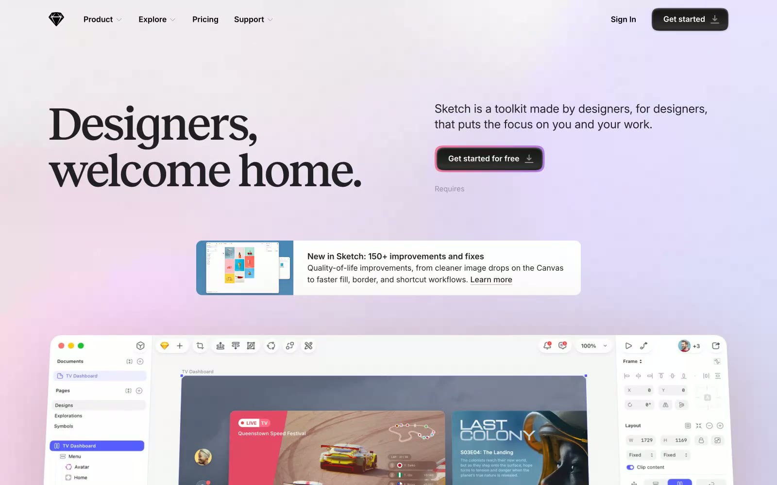
Sketch
Sketch — Style Reference
# Sketch — Style Reference
> serif poetry on pastel paper
**Theme:** light
Sketch's design language is a writer's studio reimagined as software: a quiet, nearly grayscale canvas where one warm serif headline and a single soft pink-to-lavender gradient do all the emotional work. The interface itself is restrained — Inter at modest sizes, thin dividers, pill-shaped controls — letting the product (the Sketch app) and the community's quotes breathe. The signature move is the dark pill CTA wrapped in a diffused magenta halo: a button that glows like a desk lamp at dusk, signaling action without shouting. Color is rationed; when it appears, it arrives as atmospheric wash (the hero gradient) or as a tiny punctuation (a violet badge, a teal tag), never as structural fill.
## Tokens — Colors
| Name | Value | Token | Role |
|------|-------|-------|------|
| Obsidian | `#212123` | `--color-obsidian` | Primary text, headings, icon strokes — near-black with a faint cool undertone, softer than pure #000 to reduce glare on long-form copy |
| Bone | `#fafafa` | `--color-bone` | Light supporting surface for subtle backgrounds and section separation. Do not promote it to the primary CTA color |
| Graphite | `#4a4a4a` | `--color-graphite` | Body text, secondary copy, footer text — the mid-gray that creates the reading layer between headlines and captions |
| Carbon | `#000000` | `--color-carbon` | Pure black reserved for the highest-contrast elements: nav links, button labels, icon fills where absolute clarity is required |
Websites
Markdown Text
design-md
website-prompt
landing-page-prompt
ALIGNE
ALIGNE — Style Reference
# ALIGNE — Style Reference
> editorial spec sheet on warm charcoal
**Theme:** light
ALIGNE operates in near-total monochrome — warm charcoal (#24170f) on warm white, with a single blue accent for badge punctuation. The visual language sits at the intersection of fashion editorial and architectural spec sheet: monospace body type, extended sans-serif headlines with dramatically wide tracking, almost zero border-radius, and photography that does the heavy lifting while UI chrome dissolves into thin lines and small uppercase labels. Layouts are grid-rigid and generous, with product cards sitting on bare white — the garments, not the interface, are the interface. The single chromatic event in the system is a vivid blue (#0073ff) reserved exclusively for 'NEW IN' badge outlines, functioning as functional punctuation rather than decoration.
## Tokens — Colors
| Name | Value | Token | Role |
|------|-------|-------|------|
| Warm Charcoal | `#24170f` | `--color-warm-charcoal` | Primary action background (filled CTA buttons), high-prominence borders, dark surface bands, nav and footer text on light backgrounds |
| Soft Black | `#151515` | `--color-soft-black` | Body text, headings on light backgrounds, general borders, link text — the workhorse dark neutral |
| Pure White | `#ffffff` | `--color-pure-white` | Page canvas, card surfaces, text on dark hero/footer bands, outlined action borders (ghost buttons on dark imagery) |
| Ash Gray | `#ececec` | `--color-ash-gray` | Secondary surface for alternating sections, subtle background bands |
Websites
Markdown Text
design-md
website-prompt
landing-page-prompt
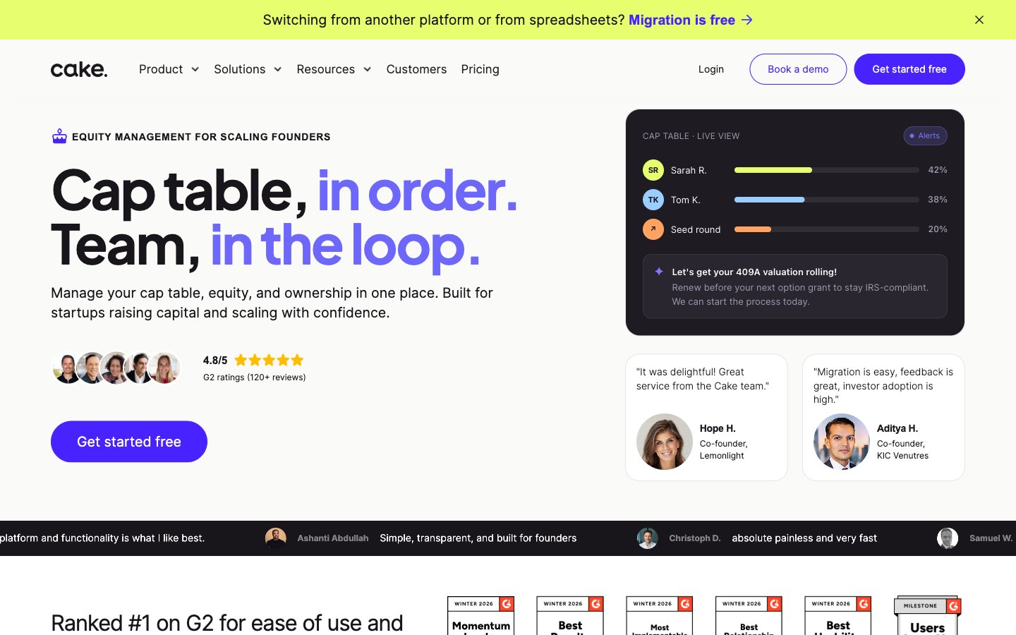
Cake Equity
Cake Equity — Style Reference
# Cake Equity — Style Reference
> founder's command center on warm bone-white, electric violet switches, chartreuse receipts
**Theme:** light
Cake Equity uses a founder-financial command-center language: warm bone-white canvas (#fafaf8) with confident dark near-black type (#18161a), one electric deep-violet primary (#4823ff) that drives every conversion surface, and a single chartreuse accent (#e7ff6e) used sparingly as a highlight receipt on the top bar. The system is quiet and orderly — a single color does the loud work, while lighter tints of violet (#ede9ff, #d9d2ff) build soft structure around content. Typography is split-purpose: Plus Jakarta Sans 700 slams display headlines with negative tracking, while Inter handles all UI and body at measured weights (400/500). Cards and containers round generously at 20px, buttons become fully pill-shaped (100px), and the grid is spacious rather than dense — a financial tool that breathes instead of cramming data.
## Tokens — Colors
| Name | Value | Token | Role |
|------|-------|-------|------|
| Electric Violet | `#4823ff` | `--color-electric-violet` | Primary action buttons, filled CTAs, link accents, key icon strokes — the deepest saturated violet in the system carries every conversion moment with maximum voltage against the warm canvas |
| Voltage Mid | `#7e78ff` | `--color-voltage-mid` | Hover and active states on the primary violet, selected nav background, secondary fills — carries the brand's chromatic weight when Electric Violet is too loud |
| Iris Accent | `#6d67fb` | `--color-iris-accent` | Violet outline accent for tags, dividers, and focused UI edges. |
| Lilac Wash | `#ede9ff` | `--color-lilac-wash` | Soft section backgrounds, card borders on light surfaces, tinted containers — the lightest tint of the brand violet, used to suggest brand presence without committing to full color |
Websites
Markdown Text
design-md
website-prompt
landing-page-prompt
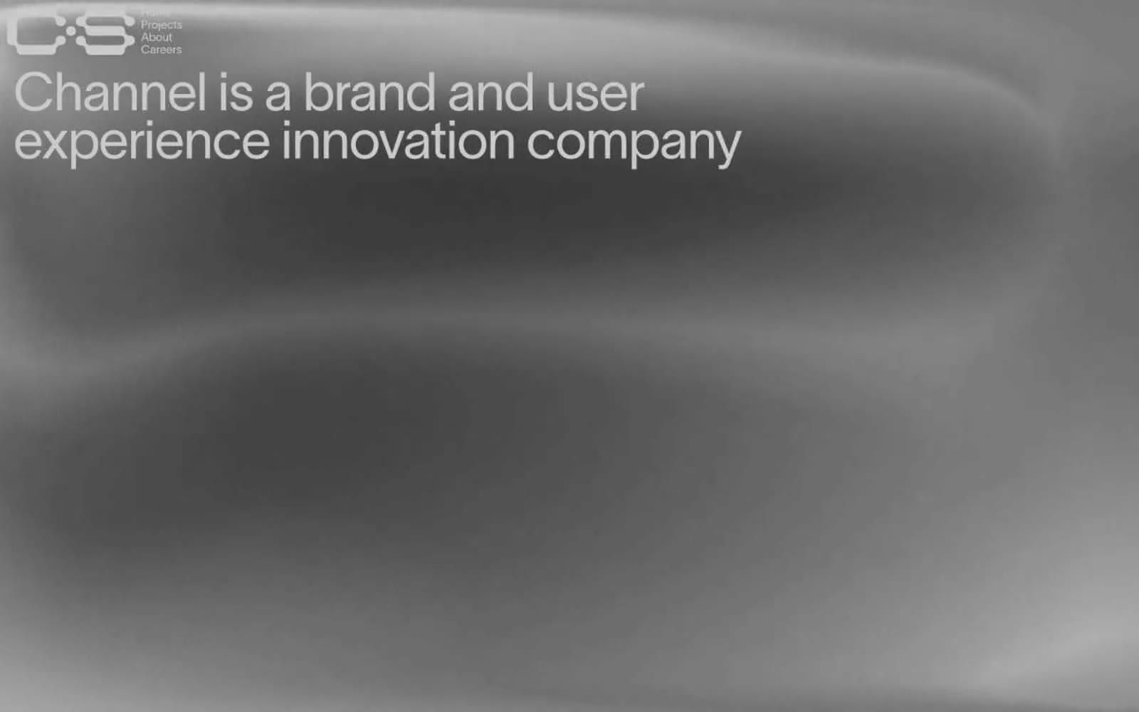
Channel Studio
Channel Studio — Style Reference
# Channel Studio — Style Reference
> Studio darkroom with a single coral flare
**Theme:** dark
Channel Studio lives in a monochrome studio-darkroom: near-black canvas, flat surfaces, no shadows, no gradients, and a single warm coral red that fires like a signal flare against the grayscale. Typography carries the entire identity — one neo-grotesque sans-serif at one weight, tight negative tracking, and display sizes (45px, 75px) set at sub-1.0 line-heights so headlines stack like a concrete poem. Layout is full-bleed and editorial: alternating type-only black panels and oversized project photography that treats the viewport as a gallery wall. Components are stripped to bare text and raw images — no buttons in the traditional sense, just links with arrows, small uppercase labels, and a red accent reserved exclusively for project titles and signature borders.
## Tokens — Colors
| Name | Value | Token | Role |
|------|-------|-------|------|
| Bone Gray | `#cacaca` | `--color-bone-gray` | Primary text on dark surfaces, hairline borders on images and links, divider strokes — a desaturated near-white that reads softer than pure #fff against black |
| Carbon Black | `#0a0a0a` | `--color-carbon-black` | Page background, section canvas, project card surface — the entire design lives here |
| Iron Gray | `#727272` | `--color-iron-gray` | Muted secondary text, low-emphasis borders, caption-level metadata |
| Coral Flare | `#ff7777` | `--color-coral-flare` | Accent for project titles, signature heading borders, and occasional decorative strokes — the only chromatic element in the system, used sparingly for editorial emphasis |
Websites
Markdown Text
design-md
website-prompt
landing-page-prompt
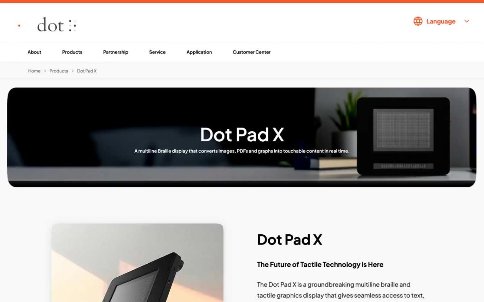
Dot Inc.
Dot Inc. — Style Reference
# Dot Inc. — Style Reference
> white laboratory with a single orange spark
**Theme:** light
Dot Inc. operates a precise, near-monochrome visual system anchored by pure white surfaces and a single high-saturation orange accent that acts as functional punctuation. The interface is spacious, typographically confident, and relies on Plus Jakarta Sans at varying weights to create hierarchy without color noise. Every container, image, and card carries a generous 20-30px radius — the softness is the brand's tactile signature, echoing the braille dot product itself. Components are flat, borders are hairline, and the single shadow token is reserved for the primary action button. Color appears only when the system needs you to do something.
## Tokens — Colors
| Name | Value | Token | Role |
|------|-------|-------|------|
| Ember Orange | `#ff5a2f` | `--color-ember-orange` | Primary action buttons, active badges, accent borders — the system's only chromatic voice, used to signal interactivity and emphasis |
| Ember Orange (link variant) | `#f15b2b` | `--color-ember-orange-link-variant` | Orange text accent for links, tags, and emphasized short phrases. Do not promote it to the primary CTA color |
| Carbon Black | `#000000` | `--color-carbon-black` | Primary text, icons, image overlays, card headings — maximum contrast against white canvas |
| Graphite | `#1f1f1f` | `--color-graphite` | Headings, body emphasis, dark surface alternative — slightly softened black for large display text |
Websites
Markdown Text
design-md
website-prompt
landing-page-prompt
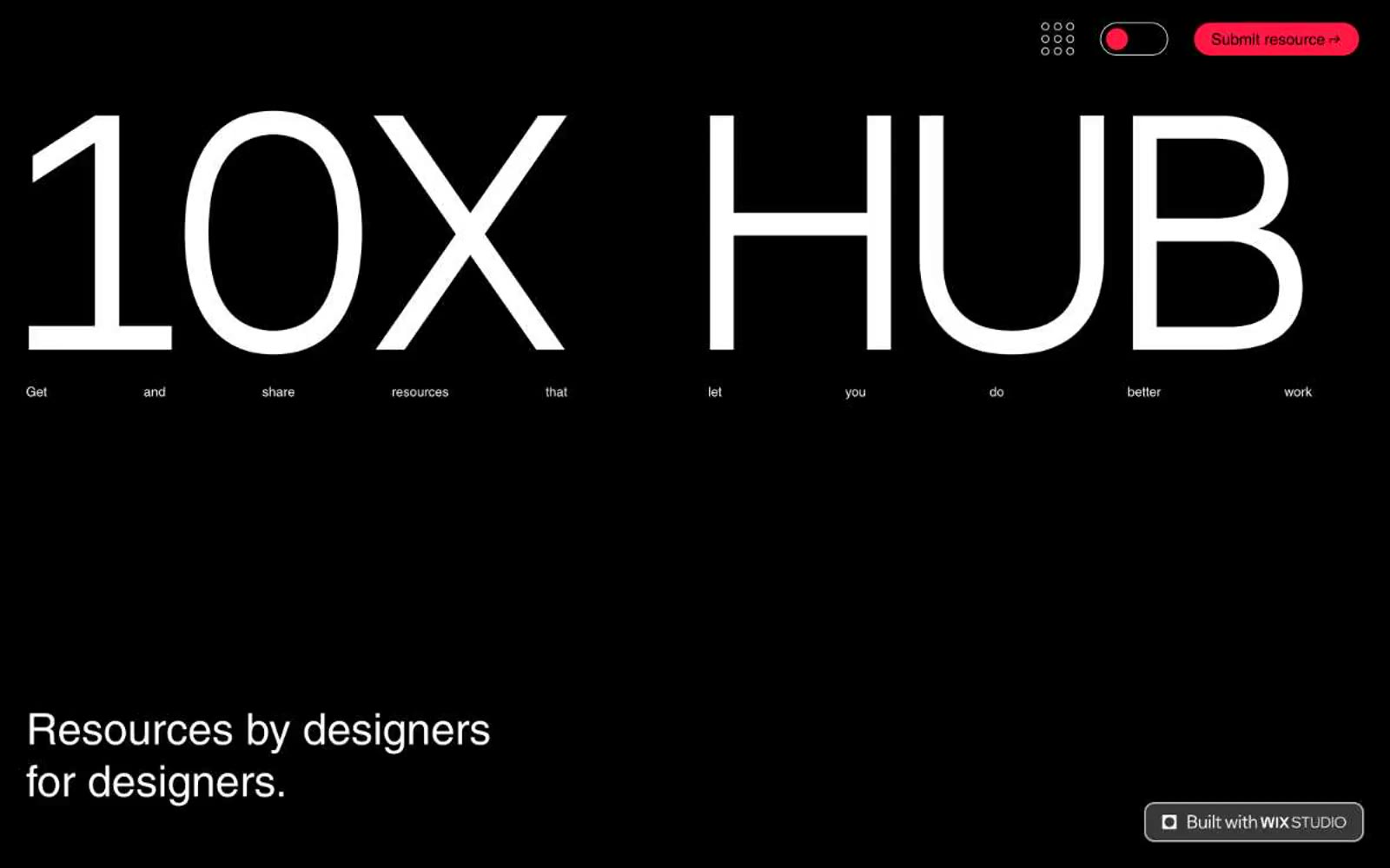
10X HUB
10X HUB — Style Reference
# 10X HUB — Style Reference
> ink and ember poster wall
**Theme:** mixed
10X Hub operates as a high-contrast editorial system built on pure black, pure white, and a single vivid red (#ff1841) that acts as both accent and full section background. The design is deliberately raw and unembellished — massive unweighted typography dominates the hero, controls reduce to pill shapes or hairline underlines, and there is no shadow language or surface elevation to soften edges. The page reads as a brutalist poster: sections alternate between ink-black voids and coral-red fields, with the white canvas peeking through for form areas and body content. Every interface element is stripped to its minimum viable form — a border, a radius of 999px, a single fill color — so the visual weight stays on the words and the red interruption.
## Tokens — Colors
| Name | Value | Token | Role |
|------|-------|-------|------|
| Ember Red | `#ff1841` | `--color-ember-red` | Red supporting accent for decorative details and low-frequency emphasis. Do not promote it to the primary CTA color |
| Bloodline | `#7b0016` | `--color-bloodline` | Decorative dark red stroke, link hover states, secondary accent where a deeper red register is needed against white |
| Obsidian | `#000000` | `--color-obsidian` | Hero section background, primary body text, icon strokes, input field text — the structural darkness |
| Paper White | `#ffffff` | `--color-paper-white` | Page canvas base, text on dark backgrounds, input field backgrounds |
Websites
Markdown Text
design-md
website-prompt
landing-page-prompt
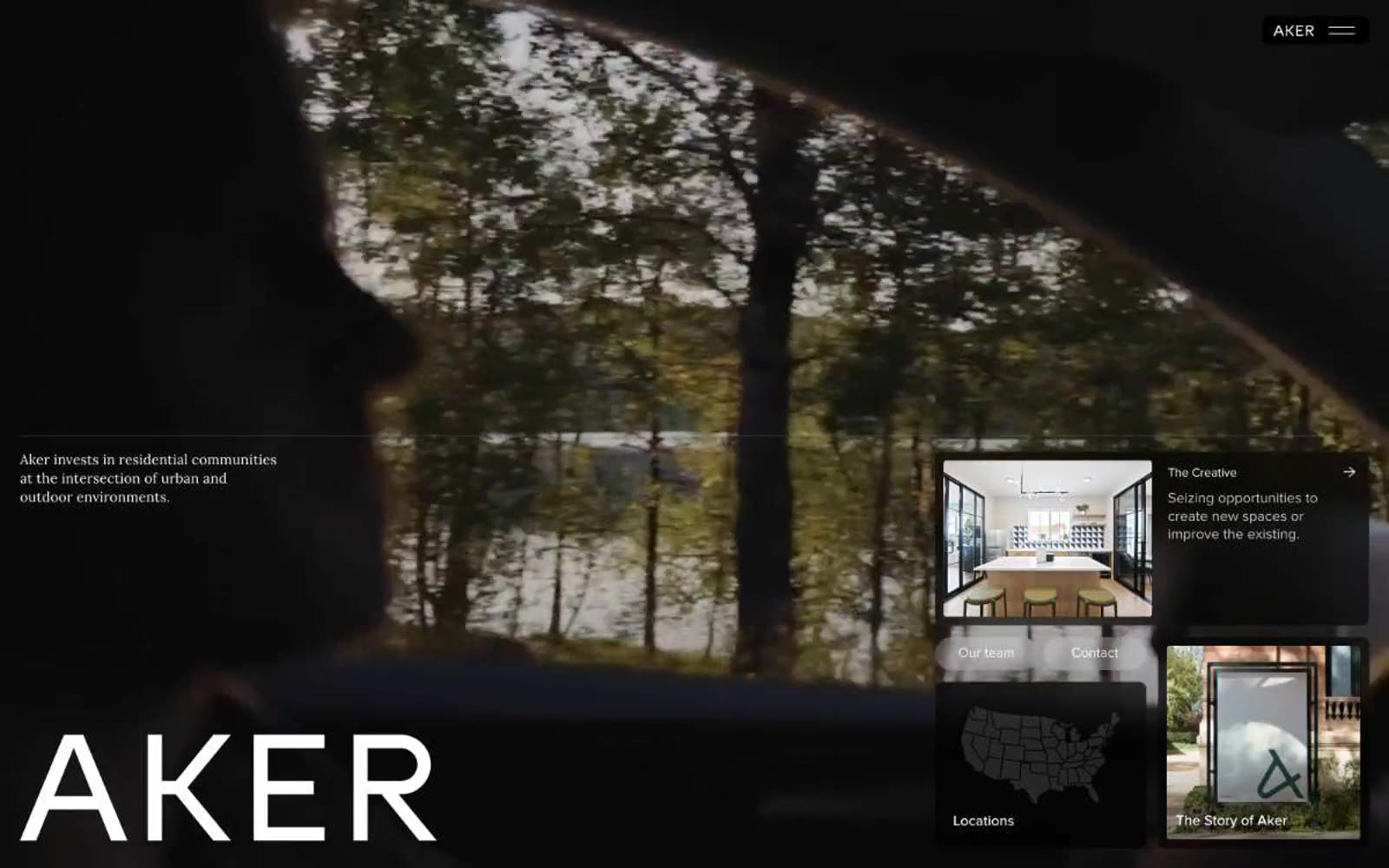
Aker
Aker — Style Reference
# Aker — Style Reference
> darkroom gallery wall
Monumental type floats over muted landscape photography like exhibit labels in a high-end architectural gallery — white walls, warm terracotta spotlights, everything else recedes.
**Theme:** light
Aker speaks in the visual vocabulary of a premium real-estate developer: dramatic full-bleed photography anchoring each section, a single warm terracotta accent cutting through near-monochrome layouts, and typography that oscillates between whisper-light and monumental. The interface trusts white space and dark imagery to do the heavy lifting — chrome is minimal, borders are hairlines, and interactive elements are reduced to text-and-arrow pairs or subtly filled dark pills. The single most distinctive choice is the contrast between the 168px Proxima Nova at weight 300 for the brand mark and the 15–18px body copy at the same family — the same typeface carries both the shouting and the whispering, which makes the voice feel unified rather than hybrid.
## Tokens — Colors
| Name | Value | Token | Role |
|------|-------|-------|------|
| Ink | `#000000` | `--color-ink` | Primary text, hairline borders, icon strokes, link text on light surfaces |
| Paper | `#ffffff` | `--color-paper` | Page canvas, card surfaces, text on dark photography and dark surfaces |
| Char | `#1c1c1c` | `--color-char` | Dark surface panels, navigation pill background, elevated dark cards |
Websites
Markdown Text
design-md
website-prompt
landing-page-prompt
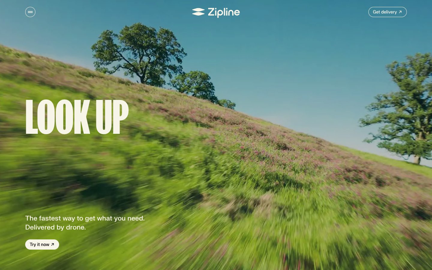
Zipline
Zipline — Style Reference
# Zipline — Style Reference
> open meadow in morning light
**Theme:** light
Zipline reads like a nature magazine cover reimagined for a drone-delivery startup: a warm cream canvas (#f7f4e8) replaces the usual stark SaaS white, and the entire visual rhythm is dictated by fkScreamer — a massive, ultra-heavy display face that stamps oversized editorial statements across the page. Photography is the primary medium, shot at ground level with motion blur so the landscape itself feels like it's moving; the UI is a secondary layer that only intrudes with thin black outlines, a single violet (#643aed) accent for cards, and restrained type. Components are generous (20px radii, 24px interior padding) but never decorative — the system prizes breathing room and confident restraint over dense information architecture.
## Tokens — Colors
| Name | Value | Token | Role |
|------|-------|-------|------|
| Meadow Cream | `#f7f4e8` | `--color-meadow-cream` | Page canvas, card surfaces, body text inverse, button borders — the warm off-white that gives the whole system its outdoor, paper-like character instead of clinical SaaS white |
| Hillside Ink | `#000000` | `--color-hillside-ink` | Primary headings, body copy, icon strokes, filled action buttons, hairline borders — maximum-contrast black that lets the cream breathe and makes fkScreamer headlines land |
| Stone Border | `#c6c3ba` | `--color-stone-border` | Muted dividers, secondary surfaces, low-contrast borders — warm gray that sits a step behind Meadow Cream and prevents the canvas from looking flat |
| Drone Violet | `#643aed` | `--color-drone-violet` | Card and feature-block backgrounds, accent surfaces — the single chromatic note in an otherwise achromatic system; vivid against the cream so attention-grabbing blocks pop without breaking the editorial mood |
Websites
Markdown Text
design-md
website-prompt
landing-page-prompt
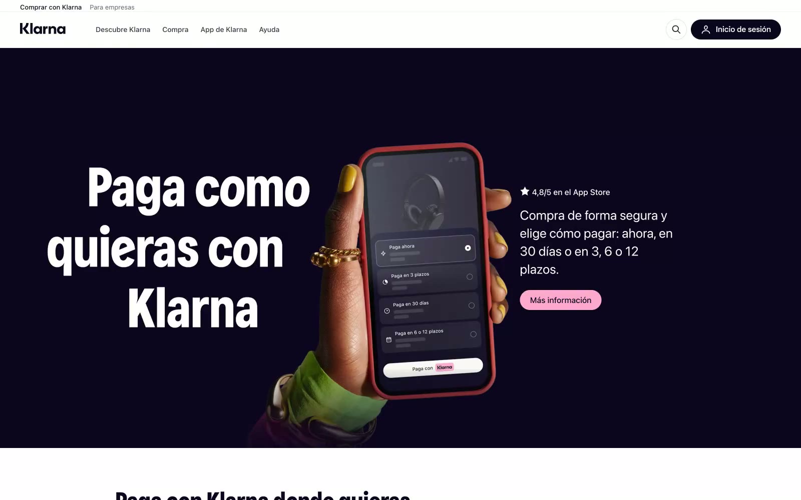
Klarna ES
Klarna ES — Style Reference
# Klarna ES — Style Reference
> midnight gallery with candy accents — a near-black plum void opens onto a warm bone-white floor scattered with vibrant product cards, anchored by oversized geometric type and pill-shaped controls.
**Theme:** light
Klarna's visual system is a confident dark-meets-light duality: a near-black plum (#0b051d) anchors brand presence across the hero and display type, set against a warm bone-white canvas (#f9f8f5) that keeps content sections approachable rather than clinical. Oversized custom display typography at 90px commands the hero, while compact body text at 16px stays quiet and legible. Playful accent colors — bubblegum pink, lavender, lime, deep plum — appear as small punctuation on cards and CTAs, never as structural or background elements. Generous rounded corners (16-32px on cards, pill-shaped buttons), near-zero shadows, and hairline borders create a premium, almost gallery-like feel where depth comes from color contrast and scale, not from elevation.
## Tokens — Colors
| Name | Value | Token | Role |
|------|-------|-------|------|
| Midnight Plum | `#0b051d` | `--color-midnight-plum` | Violet supporting accent for decorative details and low-frequency emphasis. |
| Deep Plum | `#2c2242` | `--color-deep-plum` | Accent card background — a slightly lifted version of Midnight Plum, used for dark-themed product/feature cards to create tonal variation within the dark family |
| Lavender Mist | `#aa89f2` | `--color-lavender-mist` | Violet supporting accent for decorative details and low-frequency emphasis |
| Lime Sherbet | `#e6ffa9` | `--color-lime-sherbet` | Accent card background — high-key lime used as a rotating card surface color. High contrast against Midnight Plum text makes it ideal for dark-on-light product cards |
Websites
Markdown Text
design-md
website-prompt
landing-page-prompt
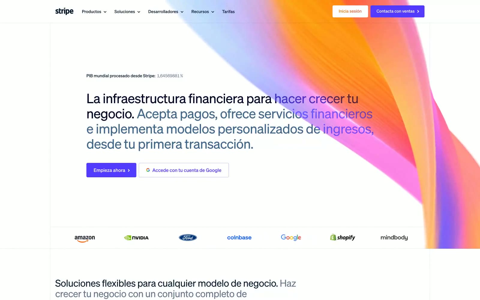
Stripe
Stripe — Style Reference
# Stripe — Style Reference
> violet horizon at dawn — a single electric accent on a vast calm canvas, with light bleeding in from the right edge.
**Theme:** light
Stripe operates as a financial infrastructure for the internet: airy, confident, nearly typographic. The interface is a near-monochrome canvas of cool whites and deep navy ink, interrupted only by a single electric violet accent that makes every action feel switched on. Headlines are set in weight 300 with aggressive negative tracking — authority through restraint, not volume — and gradient text is the signature move for hero statements, flowing from electric violet through slate gray. Decorative gradients (violet → magenta → amber) appear as soft halos behind product art and hero edges, never as backgrounds for content. Surfaces are flat, corners stay at 4px, and elevation is reserved for floating product mockups rather than UI chrome.
## Tokens — Colors
| Name | Value | Token | Role |
|------|-------|-------|------|
| Electric Iris | `#533afd` | `--color-electric-iris` | Primary action fill, active nav, brand focal point — the only saturated color allowed to carry weight against the white canvas |
| Lumen Violet | `#8087ff` | `--color-lumen-violet` | Hover/active washes, secondary link state, icon accents, soft brand halos |
| Midnight Ink | `#061b31` | `--color-midnight-ink` | Primary text, nav ink, dark CTA text — deep near-black blue, never pure black |
| Steel | `#50617a` | `--color-steel` | Body text, secondary headings, default link color — the workhorse neutral that reads as typography, not decoration |
Websites
Markdown Text
design-md
website-prompt
landing-page-prompt
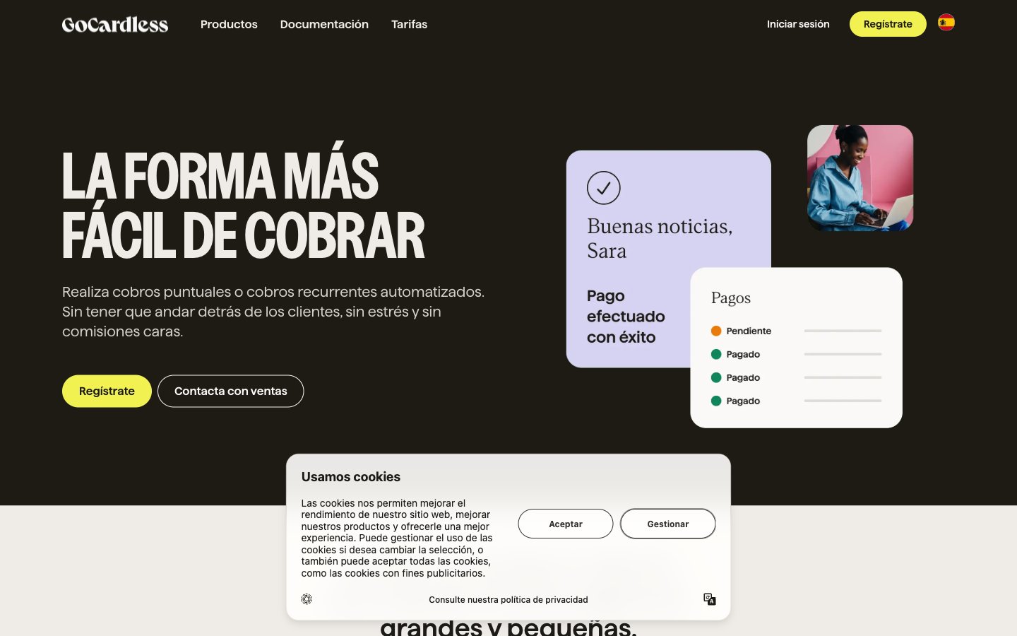
Gocardless
Gocardless — Style Reference
# Gocardless — Style Reference
> warm cream broadsheet with acid yellow highlighter
**Theme:** mixed
GoCardless uses a warm, editorial fintech language: a cream paper-white canvas punctuated by one electric acid-yellow accent that acts as functional highlighter rather than decoration. The system lives almost entirely in achromatic warm tones — deep charcoal text on cream surfaces — with bold sans-serif typography that carries the weight of the design. Type is oversized and confident (up to 84px display, weight 700) sitting alongside a single whisper-light serif at 48px for contrast. Surfaces are flat with hairline borders instead of shadows, and every interactive element rounds to a generous 32px pill, giving the interface a soft, button-like tactility. The result feels like a well-designed financial newspaper: serious, warm, and surprisingly playful when the yellow punctuates a dark hero.
## Tokens — Colors
| Name | Value | Token | Role |
|------|-------|-------|------|
| Acid Highlight | `#f1f252` | `--color-acid-highlight` | Primary action buttons, decorative accent shapes, heading highlights, nav emphasis — the single chromatic color in an otherwise achromatic system, used sparingly to draw the eye to CTAs and break visual monotony |
| Charcoal Ink | `#1c1b18` | `--color-charcoal-ink` | Primary text, dark hero/section backgrounds, icon strokes, nav borders, high-contrast surfaces — the structural black of the system, warmer than pure black |
| Warm Graphite | `#545048` | `--color-warm-graphite` | Secondary body text, muted labels, image borders, card borders, icon outlines — the mid-tone that bridges ink and paper |
| Cream Paper | `#efece7` | `--color-cream-paper` | Dominant page canvas, card backgrounds on dark sections, nav borders, link borders — the warm off-white that defines the brand's lighter surfaces |
Websites
Markdown Text
design-md
website-prompt
landing-page-prompt
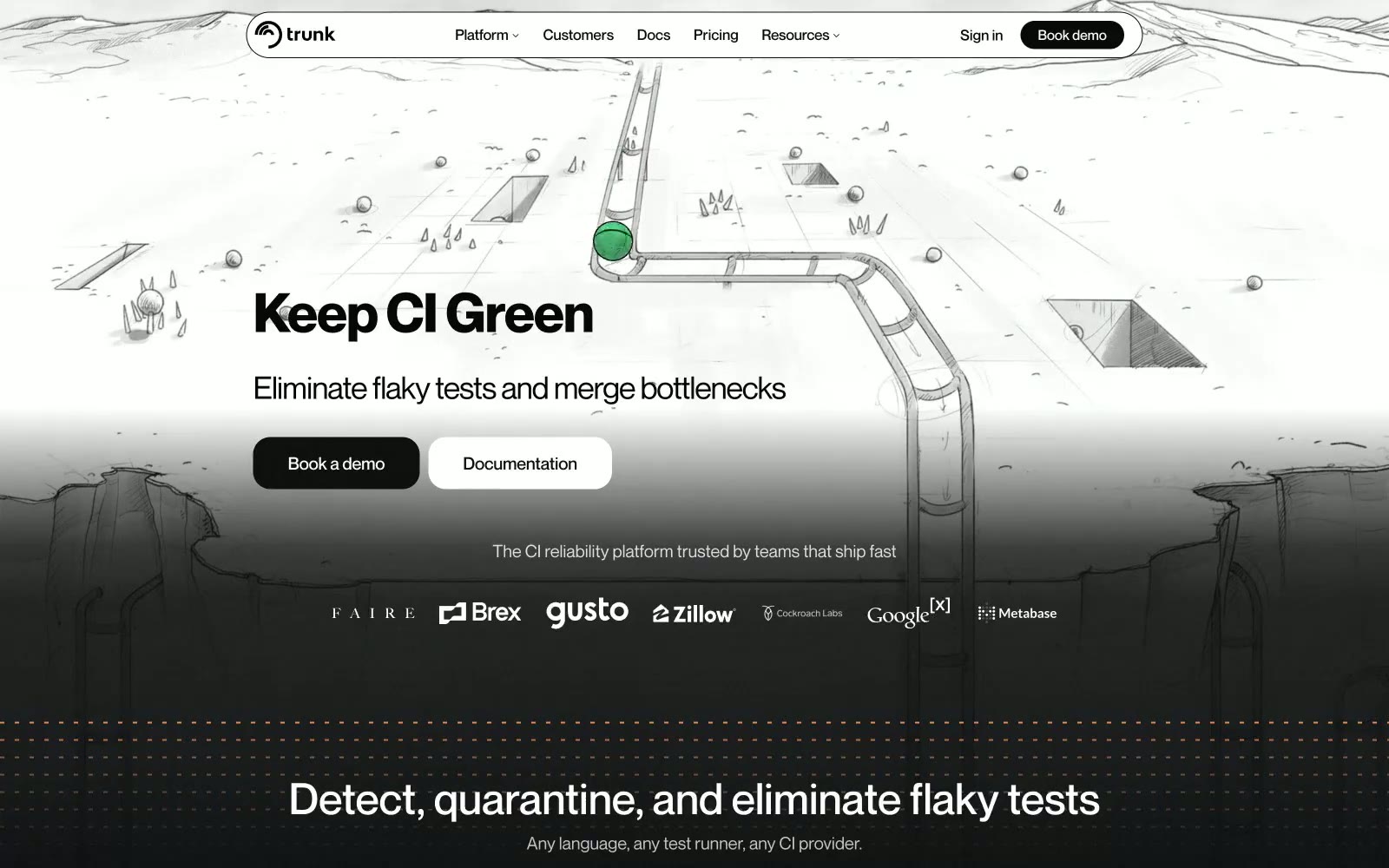
Trunk
Trunk — Style Reference
# Trunk — Style Reference
> monochrome control room with one green signal light. A dark, technical, near-grayscale interface where the only color that matters is a single dot of green confirming the pipeline is alive.
**Theme:** dark
Trunk is a near-monochrome command center for CI reliability: deep matte-black canvas, hairline dividers in cool gray, and a single, almost-restraint palette of black-to-white neutrals. The interface feels like an engineer's terminal that grew up into a product — flat, dense, confident, with type that whispers at display sizes (weight 300, tight tracking) and snaps to attention at body sizes. The lone chromatic accent is a single green signal that appears once in the hero illustration as a ball rolling through pipes; the rest of the system speaks in grayscale. Components sit on the canvas with minimal elevation — borders and contrast do the work, not shadows. The page alternates between a light illustrated hero and dark product sections, but the product surface is the source of truth: black ground, gray borders, white type, no decorative gradients, no noise.
## Tokens — Colors
| Name | Value | Token | Role |
|------|-------|-------|------|
| Obsidian | `#000000` | `--color-obsidian` | Page canvas, primary background — the ground everything sits on |
| Carbon | `#08090b` | `--color-carbon` | Elevated card surfaces, nav text, deep backgrounds one step above the canvas |
| Graphite | `#232323` | `--color-graphite` | Card and button borders — the hairline skeleton that defines structure |
| Slate Mist | `#89898d` | `--color-slate-mist` | Subtle background fills, muted surface overlays |
Websites
Markdown Text
design-md
website-prompt
landing-page-prompt
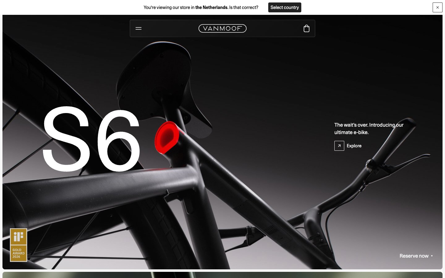
Vanmoof
Vanmoof — Style Reference
# Vanmoof — Style Reference
> cinematic monochrome showroom
**Theme:** mixed
Vanmoof operates on radical monochromatic discipline: a black, white, and gray system where the only visual loudness comes from 280px product-letter typography and full-bleed dark product photography. The interface itself is almost invisible — thin 1px borders at #e5e7eb, ghost controls, no accent color, no decorative gradients, no brand fills. The page alternates between dark cinematic hero panels (where the product IS the color) and white editorial sections with quiet 4-column feature grids. Every chrome decision prioritizes negative space and typographic confidence over UI density. Components feel like museum labels next to sculpture, not a software dashboard. The 2px radius on buttons and 8px on cards keep geometry sharp and architectural, reinforcing a premium industrial-product language rather than a consumer-app softness.
## Tokens — Colors
| Name | Value | Token | Role |
|------|-------|-------|------|
| Carbon | `#222222` | `--color-carbon` | Navigation bar, dark surface panels, primary text on light, logo wordmark fill — the near-black anchor of the system, softer than pure #000 for reduced eye strain on large surfaces |
| Obsidian | `#000000` | `--color-obsidian` | Body text, headline text on light surfaces, footer text — reserved for highest-emphasis type where absolute black is needed for maximum contrast (21:1 on white) |
| Graphite | `#313131` | `--color-graphite` | Secondary text, link text on light, button labels on light surfaces — the mid-dark step between Carbon and Obsidian for hierarchy without a hue shift |
| Frost | `#ffffff` | `--color-frost` | Page canvas for content sections, card surfaces, icon fills on dark hero, button text on dark fills |
Websites
Markdown Text
design-md
website-prompt
landing-page-prompt
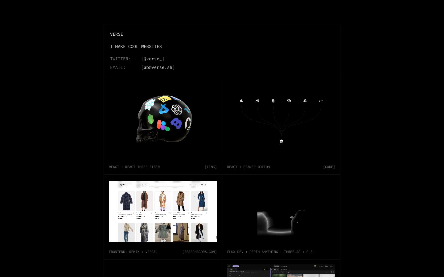
Verse
Verse — Style Reference
# Verse — Style Reference
> monochrome terminal grid in a dark void — hairline cells on black, the work inside each cell carrying all the color
**Theme:** dark
Verse operates as a monochrome terminal: a near-black canvas bisected by a two-column grid of light-bordered project tiles, with Commit Mono at 11–16px carrying every piece of information. Color is not part of the UI vocabulary — it lives only inside the media surfaces (3D renders, product photography, gradients) that each tile contains. Elevation, rounded corners, and shadows are absent; the light hairline grid line on black is the sole structural device, doing the work that color, depth, and scale do in conventional systems. The result is a developer-console aesthetic where the work inside each frame is loud and the chrome around it is deliberately silent.
## Tokens — Colors
| Name | Value | Token | Role |
|------|-------|-------|------|
| Grid Line | `#e5e7eb` | `--color-grid-line` | Primary border between tiles and around media surfaces — the only structural divider in the system, doing the work of card outlines, section separators, and elevation simultaneously |
| Body Text | `#d4d4d4` | `--color-body-text` | Primary readable text — project names, bio copy, metadata labels |
| Muted Text | `#737373` | `--color-muted-text` | Secondary metadata, category tags, and the [link] indicator — recedes behind body text to create a two-tier reading hierarchy without changing weight |
| Subtle Divider | `#171717` | `--color-subtle-divider` | Low-contrast internal dividers and edge treatments — barely visible against the page background, used where a hairline would be too loud |

Websites
Markdown Text
design-md
website-prompt
landing-page-prompt
cord.com
cord.com — Style Reference
# cord.com — Style Reference
> deep ocean signal station — a deep-navy command deck set against white sea-fog, punctuated by one bright blue flare
**Theme:** light
Cord uses a maritime-monochrome language: an almost white canvas flooded with generous air, a near-black midnight navy (#0b3658) carrying every word of weight, and a single bright harbor-blue accent (#4e9ad9) reserved for the logo, the primary button, and active states. The type system rides one family (Figtree) from weight 400 body up to weight 800 display, producing headlines that feel stamped rather than set. Surfaces are soft and rounded — cards float on tinted-blue shadows rather than hard borders, with corner radii between 20px and 32px that make the product feel approachable despite the serious navy palette. Rhythm is calm and centered: one dominant headline, one subtitle, one search field, no chrome — the UI reads like a job board stripped to its essentials and then lightly polished. The only chromatic deviation outside the navy/blue axis is a green presence indicator (#42b3b1) and a single dark CTA banner that flips to the navy ground color, creating the page's one moment of contrast.
## Tokens — Colors
| Name | Value | Token | Role |
|------|-------|-------|------|
| Midnight Harbor | `#0b3658` | `--color-midnight-harbor` | Primary text, headings, logo, dark CTA banner — the near-black navy that carries the entire voice of the interface |
| Signal Blue | `#4e9ad9` | `--color-signal-blue` | Primary action background, logo wordmark, active nav and toggle states — the single bright chromatic accent against the navy/white axis |
| Slate Channel | `#486984` | `--color-slate-channel` | Secondary text, outlined link borders, muted icon strokes — mid-tone companion to Midnight Harbor for de-emphasized copy |
| Pale Steel | `#688dac` | `--color-pale-steel` | Tertiary text and meta labels, light borders on headings — the lightest blue-gray still reading as chromatic |
Websites
Markdown Text
design-md
website-prompt
landing-page-prompt
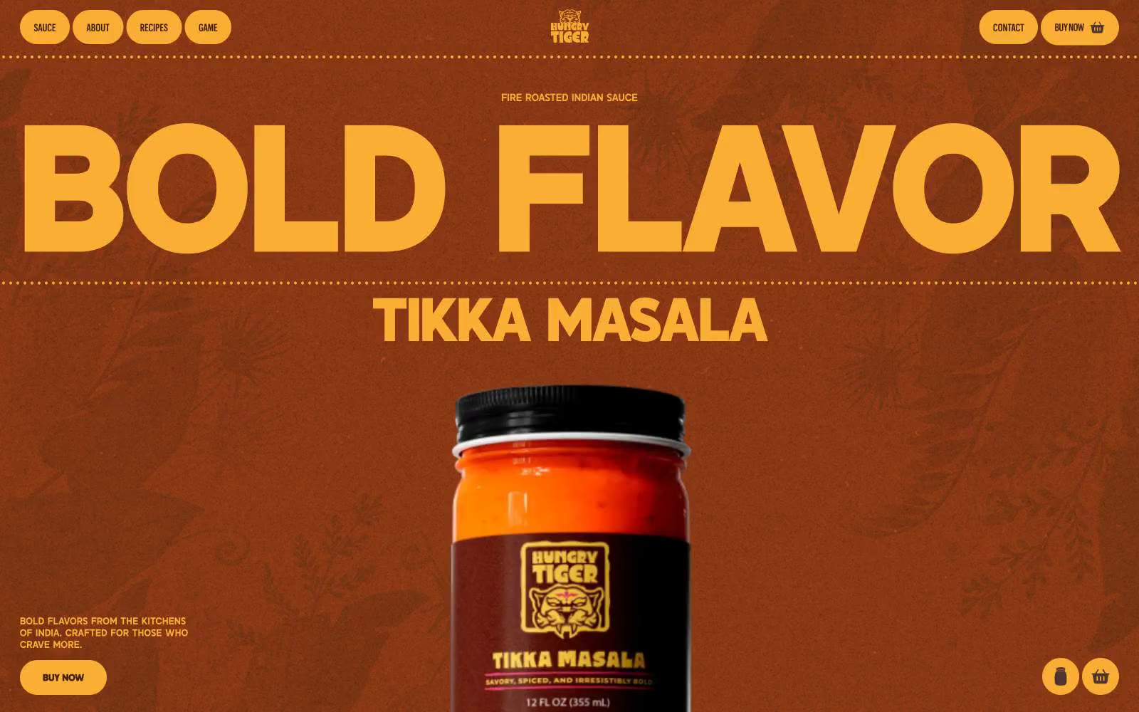
Hungry Tiger
Hungry Tiger — Style Reference
# Hungry Tiger — Style Reference
> Turmeric-bright graffiti on a tandoor wall. A single gold-on-rust palette with display type so large it reads as a spice market sign, not a webpage.
**Theme:** dark
Hungry Tiger is a fire-roasted condiment brand rendered as a maximalist typographic poster: a deep rust-brown canvas, a single searing Tiger Gold accent, and an absurdly oversized custom display face that swallows the viewport. The system behaves like a spice label — confident, warm, slightly aggressive — with pill-shaped controls, dotted horizontal rules, and dense botanical watermarks that suggest Indian heat without literal illustration. Text is the hero; product photography is small and isolated against the dark. Every surface shares the same warm brown family, and contrast is driven by the gold against charred browns, not by adding new hues.
## Tokens — Colors
| Name | Value | Token | Role |
|------|-------|-------|------|
| Tiger Gold | `#faae33` | `--color-tiger-gold` | Primary action, filled buttons, active nav, heading strokes, key icon accents — the only chromatic color permitted to leave the warm-brown monochrome and interrupt the page |
| Ember Rust | `#823513` | `--color-ember-rust` | Dominant page canvas and hero backdrop — the color that defines every viewport |
| Saffron Glow | `#9f531b` | `--color-saffron-glow` | Secondary heading accent, decorative borders, mid-tone text — a warm orange that softens Tiger Gold without competing |
| Dark Spice | `#402011` | `--color-dark-spice` | Card surfaces, input fields, badge fills, button ghost backgrounds, body text color — the workhorse dark-brown that lifts content off Ember Rust |
Websites
Markdown Text
design-md
website-prompt
landing-page-prompt
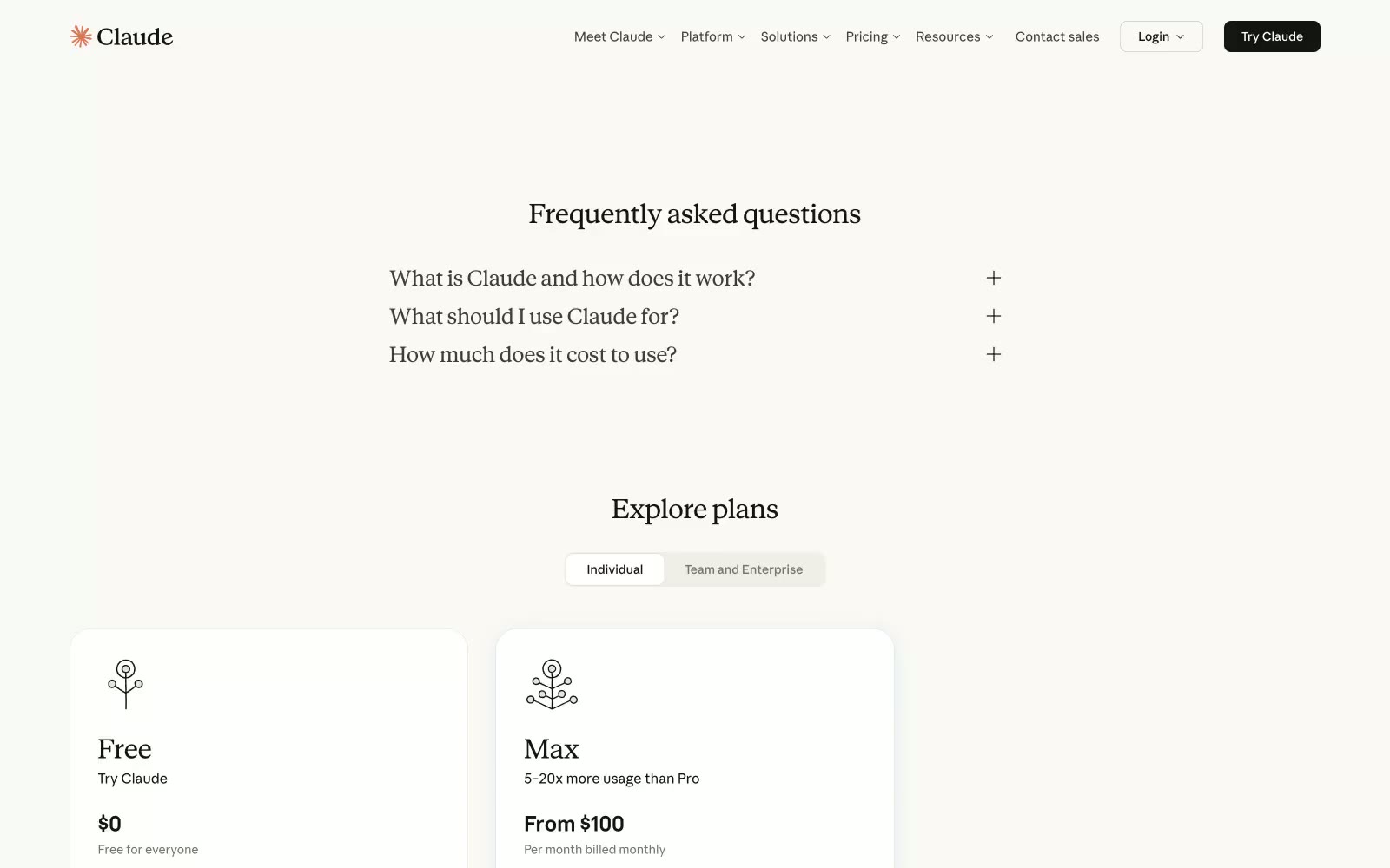
Claude
Claude — Style Reference
# Claude — Style Reference
> Warm letterpress on cream paper — a literary workspace where ink-black text rests on ivory stock and color appears only as deliberate annotation.
**Theme:** light
Claude's design system reads like a letterpress journal on cream paper — a warm ivory canvas (#faf9f5) under near-black ink (#141413), with taupe linen borders that frame content like printed margins. The interface is almost achromatic: color is rationed to a single dusty blue accent, used sparingly for emphasis rather than decoration. Typography carries the brand: a humanist sans (Anthropic Sans) for UI and a literary serif (Anthropic Serif) for headlines, which transforms what could be generic SaaS into something editorial and considered. Components are flat, border-defined, and gently rounded — the system trades drop shadows for hairline warmth, creating a tactile paper-like quality instead of the usual glass-and-elevation vocabulary of tech products.
## Tokens — Colors
| Name | Value | Token | Role |
|------|-------|-------|------|
| Ivory Canvas | `#faf9f5` | `--color-ivory-canvas` | Page background, primary canvas — warm off-white that makes the interface feel like printed paper rather than a screen |
| Pure White | `#ffffff` | `--color-pure-white` | Card surfaces, input fields, elevated containers sitting atop the ivory canvas |
| Warm Parchment | `#f0eee6` | `--color-warm-parchment` | Secondary surface for subtle differentiation — toggle backgrounds, hover washes, muted zones |
| Ink Black | `#141413` | `--color-ink-black` | Primary text, dark filled buttons, high-emphasis UI elements — near-black with a warm cast |
Websites
Markdown Text
design-md
website-prompt
landing-page-prompt
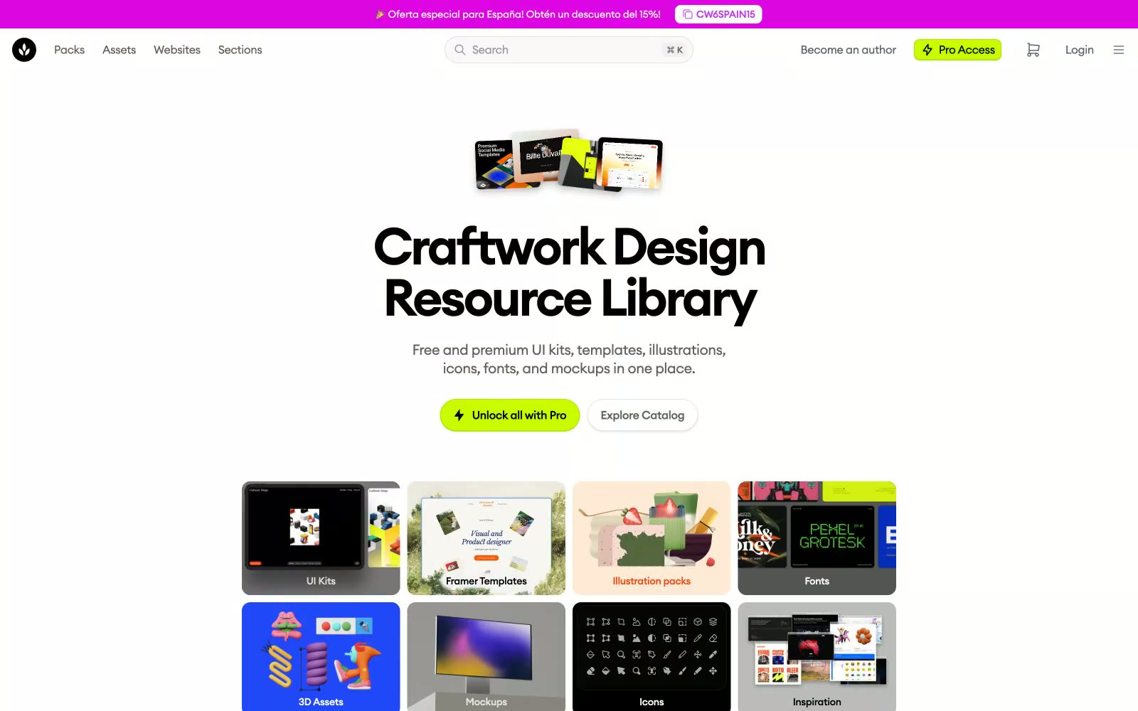
Craftwork
Craftwork — Style Reference
# Craftwork — Style Reference
> Designer's atelier with one acid-green lamp. A bright, paper-clean workspace where one vivid lime accent marks the premium shelf and everything else is a measured, gallery-quiet neutral.
**Theme:** light
Craftwork is a clean, light-canvas marketplace language built on near-monochrome neutrals — white cards on #f9f9f9 paper, deep black text, hairline gray borders — with one acid-green (#cafc00) accent that acts as a visual highlighter for premium and brand moments. A geometric humanist sans (Euclid Circular A) carries the typography, running from whisper-tight 72px display headlines (ls ≈ -0.069em) down to compact 14–16px body text, creating a density that feels editorial rather than spacious. Components sit lightly on the surface: 10px rounded cards, 9999px pill nav buttons, and shadows so subtle they read as paper texture rather than elevation. The remaining two accents — vermillion #f54911 and magenta #c42df9 — appear only as decorative punctuation in icons, tags, and illustration, never competing with the green for attention. The overall rhythm is compact and content-forward, prioritizing catalog density over generous white space.
## Tokens — Colors
| Name | Value | Token | Role |
|------|-------|-------|------|
| Acid Green | `#cafc00` | `--color-acid-green` | Brand accent — the singular chromatic highlight. Marks the Pro Access pill in the nav, the primary upgrade button, and occasional pill highlights. The only color allowed to carry brand meaning at full saturation |
| Vermillion | `#f54911` | `--color-vermillion` | Secondary accent — warm red-orange for emphasis text, decorative borders, and small brand moments. Never used for backgrounds at scale |
| Magenta Pop | `#c42df9` | `--color-magenta-pop` | Tertiary accent — vivid pink for icons, decorative strokes, and illustration pops. Functions as a tertiary tag color in the brand palette |
| Ink Black | `#000000` | `--color-ink-black` | Primary text, heading strokes, and the dominant interface color. Carries body copy, icons, and high-contrast borders |
Websites
Markdown Text
design-md
website-prompt
landing-page-prompt
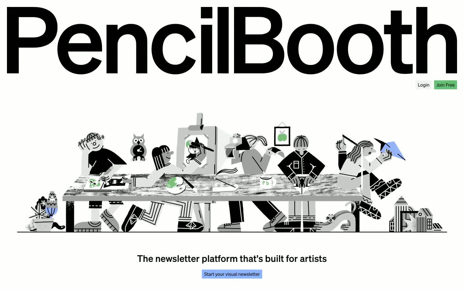
PencilBooth
PencilBooth — Style Reference
# PencilBooth — Style Reference
> Monochrome broadsheet manifesto. PencilBooth looks like a typographic broadsheet laid flat on a gallery wall — enormous display type anchoring two-column reading rows, hairline rules separating sections, and a single deep-navy accent breaking the gray silence only when a state is active.
**Theme:** light
PencilBooth is a monochrome editorial broadsheet: pure white and soft gray surfaces carry the load, with a single deep navy accent reserved exclusively for the active/selected state. The visual system is dominated by typographic architecture — 96px display headlines at weight 700 act as section anchors, while body copy stays compact and dense in a two-column reading grid. The interface reads like a curated print manifesto, not a SaaS dashboard: components are flat, borders are hairlines, and chromatic color appears only as functional punctuation (a highlighted tab, a colored emoji-style icon avatar). Every surface decision prioritizes legibility and quiet hierarchy over visual flourish.
## Tokens — Colors
| Name | Value | Token | Role |
|------|-------|-------|------|
| Ink Black | `#000000` | `--color-ink-black` | Primary text, display headlines, icon strokes — the only true black in the system, used at full strength for headlines and body to maximize contrast against the light canvas |
| Paper White | `#ffffff` | `--color-paper-white` | Card surfaces, elevated panels, and inset backgrounds — the bright surface that floats above the canvas gray |
| Canvas Gray | `#f2f2f2` | `--color-canvas-gray` | Page background and recessed surface — the dominant canvas that makes white cards feel lifted without using shadows |
| Hairline Gray | `#e5e7eb` | `--color-hairline-gray` | Borders, dividers, card outlines, and structural rules — by far the most-used color (4960 occurrences), it defines every interface edge with 1px restraint |
Websites
Markdown Text
design-md
website-prompt
landing-page-prompt
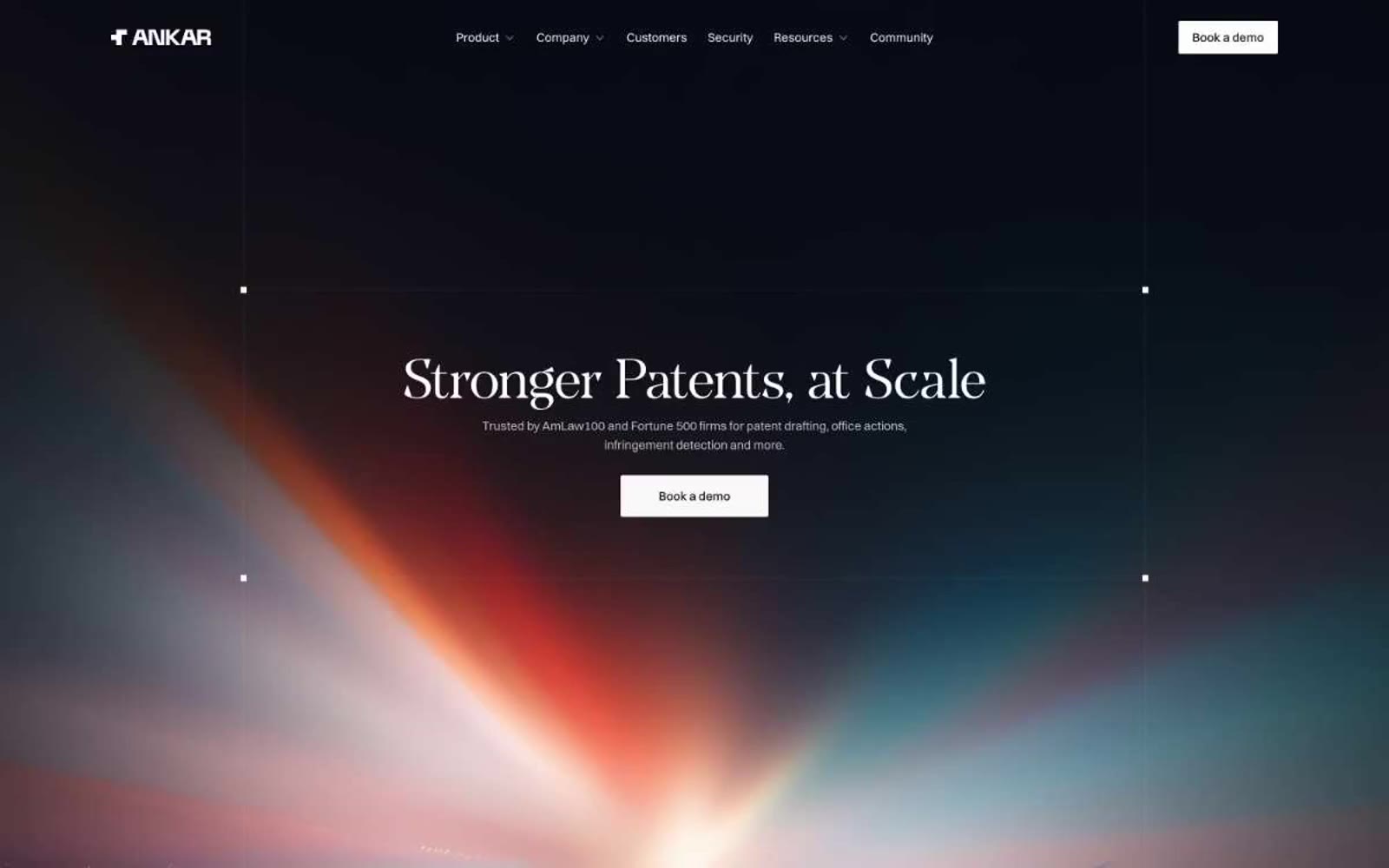
Ankar AI
Ankar AI — Style Reference
# Ankar AI — Style Reference
> Patent vault opening into white atelier — a darkroom hero with a single illuminated manuscript, dissolving into generous editorial whitespace.
**Theme:** light
Ankar operates as an editorial-monochrome system: strict black, white, and grays with zero chromatic accents. The hero is a full-bleed dark vault with a cinematic radial light burst, where a weight-300 transitional serif headline whispers authority instead of shouting it. Below, the page becomes a white atelier — generous whitespace, four-column feature cards with dark gradient surfaces holding white icons, and a calm sans-serif body. The aesthetic borrows from law journals and architectural monographs: disciplined, quiet, and expensive. Restrained 4px corners on buttons keep the feel precise rather than friendly, and the only typographic flourish is the serif's tight line-height (0.98–1.06) which lets display sizes feel carved rather than stacked.
## Tokens — Colors
| Name | Value | Token | Role |
|------|-------|-------|------|
| Obsidian | `#000000` | `--color-obsidian` | Primary text, hairline borders, icon strokes |
| Paper White | `#ffffff` | `--color-paper-white` | Page canvas, card surfaces, text on dark |
| Ink | `#171717` | `--color-ink` | Filled button background, dark card surfaces, hero base |
| Charcoal | `#1f1f1f` | `--color-charcoal` | Dark feature card surfaces, elevated dark panels |