AI Prompt Studio - Intelligent Prompt Library
Explore and use professional AI prompts to optimize your workflow.
One-click Use
Websites
Markdown Text
design-md
website-prompt
landing-page-prompt
ChatGPT
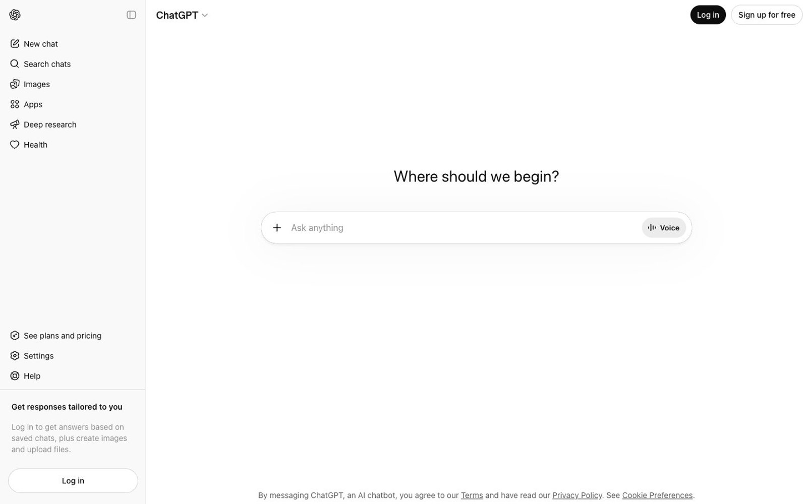
ChatGPT — Style Reference

# ChatGPT — Style Reference
> monastic writing desk at dawn — one input field on a white page, nothing else to look at
**Theme:** light
ChatGPT's interface is a monastic writing desk at dawn: a near-monochrome white canvas where the prompt input is the only object in the room. The design strips away every conventional UI signal — no brand color, no gradients, no meaningful shadows, no decorative imagery — leaving ink on paper. System-sans typography does all the work, with a single near-black (#0d0d0d) carrying text, icons, borders, and filled controls interchangeably. The page is a two-column shell: a narrow icon-and-text sidebar pinned left, and an empty stage where a centered sentence ('Where should I begin?') floats above a rounded input field. The discipline is compact spacing (6-10px), 10px corner radii, and a custom wordmark font (OpenAI Sans) that whispers the brand name once in the header and then disappears.
## Tokens — Colors
| Name | Value | Token | Role |
|------|-------|-------|------|
| Ink Black | `#0d0d0d` | `--color-ink-black` | Dark supporting neutral for text, icons, and strong contrast. Do not promote it to the primary CTA color |
| Paper | `#f9f9f9` | `--color-paper` | Sidebar background, page canvas — the slightly cooler off-white that separates the nav rail from the main stage |
| Snow | `#ffffff` | `--color-snow` | Main content surface, input field background, card surfaces — the brighter white where the user's attention belongs |
| Smoke | `#5d5d5d` | `--color-smoke` | Tertiary text, subdued helper copy, subtle shadow tint — secondary to Ink Black |
Websites
Markdown Text
design-md
website-prompt
landing-page-prompt
Quizlet
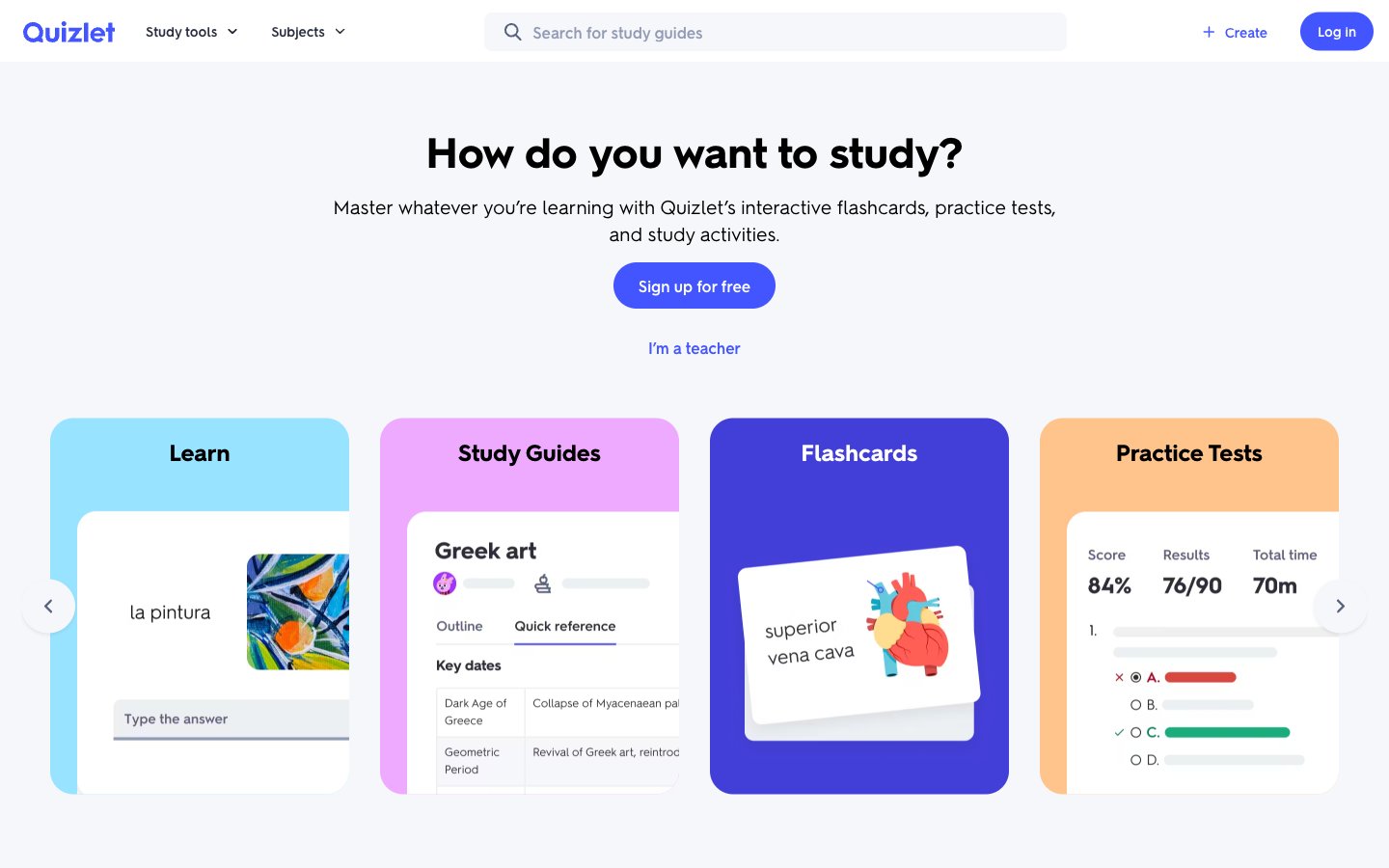
Quizlet — Style Reference
# Quizlet — Style Reference
> color-coded classroom on white — a quiet study desk where four pastel flashcards are the only splash of color against cool gray walls and a single indigo highlighter mark.
**Theme:** light
Quizlet presents an educational workspace on a soft blue-white canvas: a calm, distraction-free study environment where four vivid feature cards (cyan, magenta, brand violet, peach) inject personality into an otherwise restrained palette. Typography is geometric and approachable—Hurme Geometric Sans at weight 400 carrying most of the load, avoiding the over-bolded weight 700 headlines common in SaaS. Components are flat and soft-edged: 4px radius on controls, 8px on cards, 200px pill on filled buttons, with subtle rgba(40,46,62,0.1) shadows providing gentle elevation rather than dramatic depth. The single brand violet #4255ff is the focal point of the interface—links, active states, and filled interactive elements all draw from it, creating a consistent accent against the neutral charcoal #282e3 text and the cool gray canvas #f6f7fb. White card surfaces (#ffffff) and tinted lilac panels (#edefff) create a clear two-level surface hierarchy without ever needing heavy borders or saturated backgrounds.
## Tokens — Colors
| Name | Value | Token | Role |
|------|-------|-------|------|
| Iris Bolt | `#4255ff` | `--color-iris-bolt` | Violet supporting accent for decorative details and low-frequency emphasis. Do not promote it to the primary CTA color |
| Ink Charcoal | `#282e3e` | `--color-ink-charcoal` | Primary text, headings, body copy, footer headings, icon strokes — near-black navy that reads warmer than pure #000 on light surfaces |
| Deep Indigo | `#2e3856` | `--color-deep-indigo` | Secondary body text, supporting copy where Ink Charcoal would feel too heavy |
| Slate Veil | `#586380` | `--color-slate-veil` | Muted helper text, secondary metadata, tertiary nav items, subtle icon fills |
Websites
Markdown Text
design-md
website-prompt
landing-page-prompt
Drepute
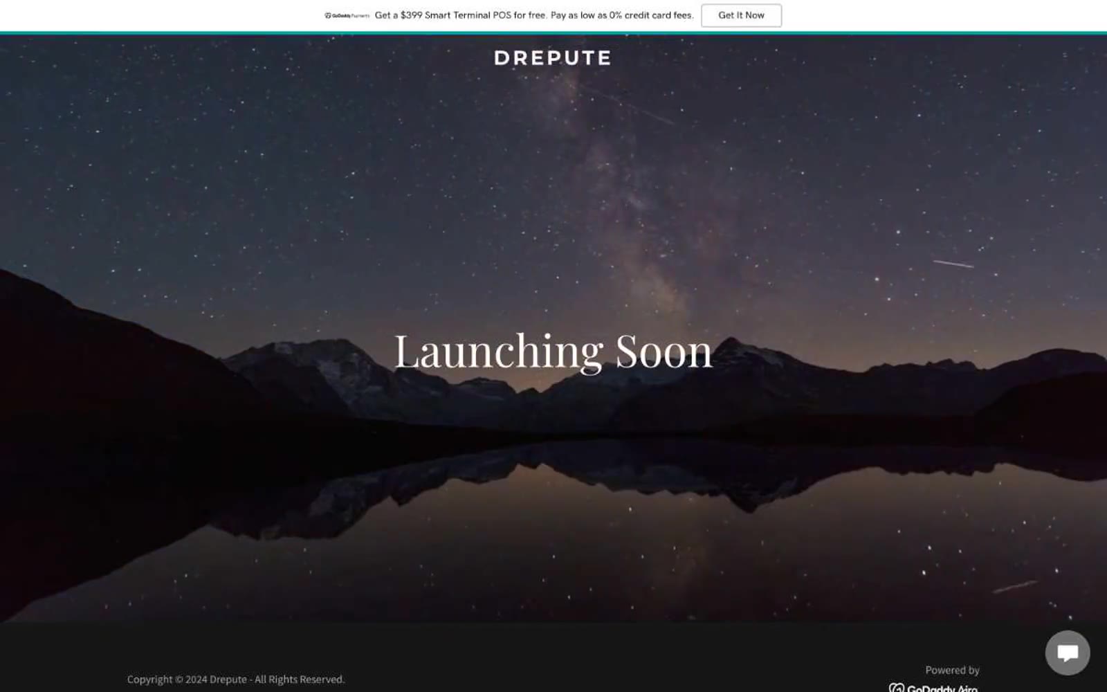
Drepute — Style Reference
# Drepute — Style Reference
> midnight observatory over still water — a single sentence floats beneath a field of stars
**Theme:** dark
Drepute is a cinematic black-canvas teaser built around a single full-bleed photograph: a still alpine lake mirroring a starfield at midnight. The UI is deliberately invisible — no cards, no shadows, no panels. A single Playfair Display headline floats over the image while everything else is Source Sans Pro at 14–16px. The wordmark uses Montserrat 700 with extreme letter-spacing (0.154em), turning the brand name into a constellation of letters across the top. Color is almost entirely absent: pure black, white, and three grays form a five-step achromatic scale, with one deep teal (#00a4a6) appearing only as a link border. Radii are locked at 4px everywhere — no pills, no soft corners, just sharp rectangular edges. The whole site feels like a movie title card: a single image, a single sentence, and a brand name hovering above it all.
## Tokens — Colors
| Name | Value | Token | Role |
|------|-------|-------|------|
| Pure White | `#ffffff` | `--color-pure-white` | Primary text on dark hero, input fills, light surfaces |
| Deep Ink | `#000000` | `--color-deep-ink` | Dominant text and border color across body, nav, and dividers |
| Obsidian | `#161616` | `--color-obsidian` | Dark canvas and hero surface — the page's atmospheric base |
| Ash Gray | `#bfbfbf` | `--color-ash-gray` | Subtle input borders, ghost box-shadows, disabled hairlines |
Websites
Markdown Text
design-md
website-prompt
landing-page-prompt
Lovi
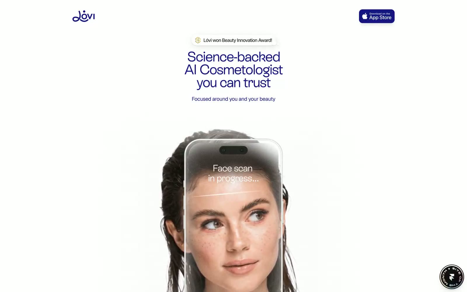
Lovi — Style Reference
# Lovi — Style Reference
> prescription violet on porcelain
**Theme:** light
Lóvi operates as a prescription-grade beauty interface: deep indigo ink on near-white porcelain, with a single saturated violet as the brand voice. The visual system is deliberately clinical-minimal — almost all surfaces are paper-white or bone, borders are hairline or non-existent, and the only significant shadow is a single low-opacity elevation wash. Typography is split between a custom geometric display face (ES Rebond Grotesque) for headlines and a neutral sans (Inter) for body, creating a clear hierarchy without color shouting. The rich chromatic spectrum detected in raw data (pinks, greens, oranges) is almost entirely decorative or illustrative — design-system tokens are austere: one brand violet, a muted lavender for secondary text, and a handful of semantic accents. Every screen should feel like a clinical leaflet: calm, confident, printed rather than rendered.
## Tokens — Colors
| Name | Value | Token | Role |
|------|-------|-------|------|
| Indigo Ink | `#151581` | `--color-indigo-ink` | Primary headlines, body emphasis, and brand voice — this is the only color that carries the brand identity. All top-level headings and primary body text are set in this violet rather than black, giving every screen a tinted authority without ever feeling decorative |
| Electric Violet | `linear-gradient(270deg, rgba(102, 127, 255, 0.8) 19.614%, rgba(206, 162, 255, 0.8) 50.0389%, rgba(255, 133, 177, 0.8) 86.0908%)` | `--color-electric-violet` | Violet supporting accent for decorative details and low-frequency emphasis. Do not promote it to the primary CTA color; Voice-bar and scan-overlay gradient sweeping Electric Violet → Lilac → Petal Blush — the signature visual of the AI interaction moment |
| Lavender Mist | `#a1a1cd` | `--color-lavender-mist` | Secondary body text, muted links, and sub-labels — sits one step down from Indigo Ink on the same hue, creating a tonal ladder without introducing a different color family |
| Lilac Accent | `#9f73e6` | `--color-lilac-accent` | Decorative and illustrative accent — used in iconography, gradient midpoints, and the scan/voice visual treatment rather than for UI controls |
Websites
Markdown Text
design-md
website-prompt
landing-page-prompt
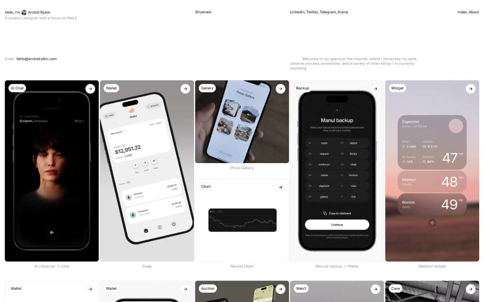
Andrei Rybin
Andrei Rybin — Style Reference
# Andrei Rybin — Style Reference
> monochrome atelier notebook — a designer's sketchbook where phone screens are pinned like contact sheets on a white wall
**Theme:** light
A monochrome atelier notebook: a near-pure black-on-white canvas where the only visual event is typography against a generous grid of project tiles. Every surface is paper-white; every element either ink-black or a single shade of graphite for secondary information — there is no accent color, no gradient, no fill that isn't neutral. Components are stripped to their function: a pill-shaped label names the work, a circular arrow button invites the next view, thin 1px borders quietly separate sections. The product is the showcase, so the system recedes — the phone mockups carry all the visual weight while the framework stays silent.
## Tokens — Colors
| Name | Value | Token | Role |
|------|-------|-------|------|
| Paper | `#ffffff` | `--color-paper` | Page background, card surfaces, image holders — the dominant canvas; everything sits on this |
| Ink | `#000000` | `--color-ink` | Primary text, link text, icon strokes, thin section dividers — the only mark-making color |
| Graphite | `#858585` | `--color-graphite` | Secondary text, muted metadata, and softer border lines that recede behind primary ink |
| Stone | `#8e8e90` | `--color-stone` | Cool-toned border and divider strokes for borders that need a hairline without competing with Ink |
Websites
Markdown Text
design-md
website-prompt
landing-page-prompt
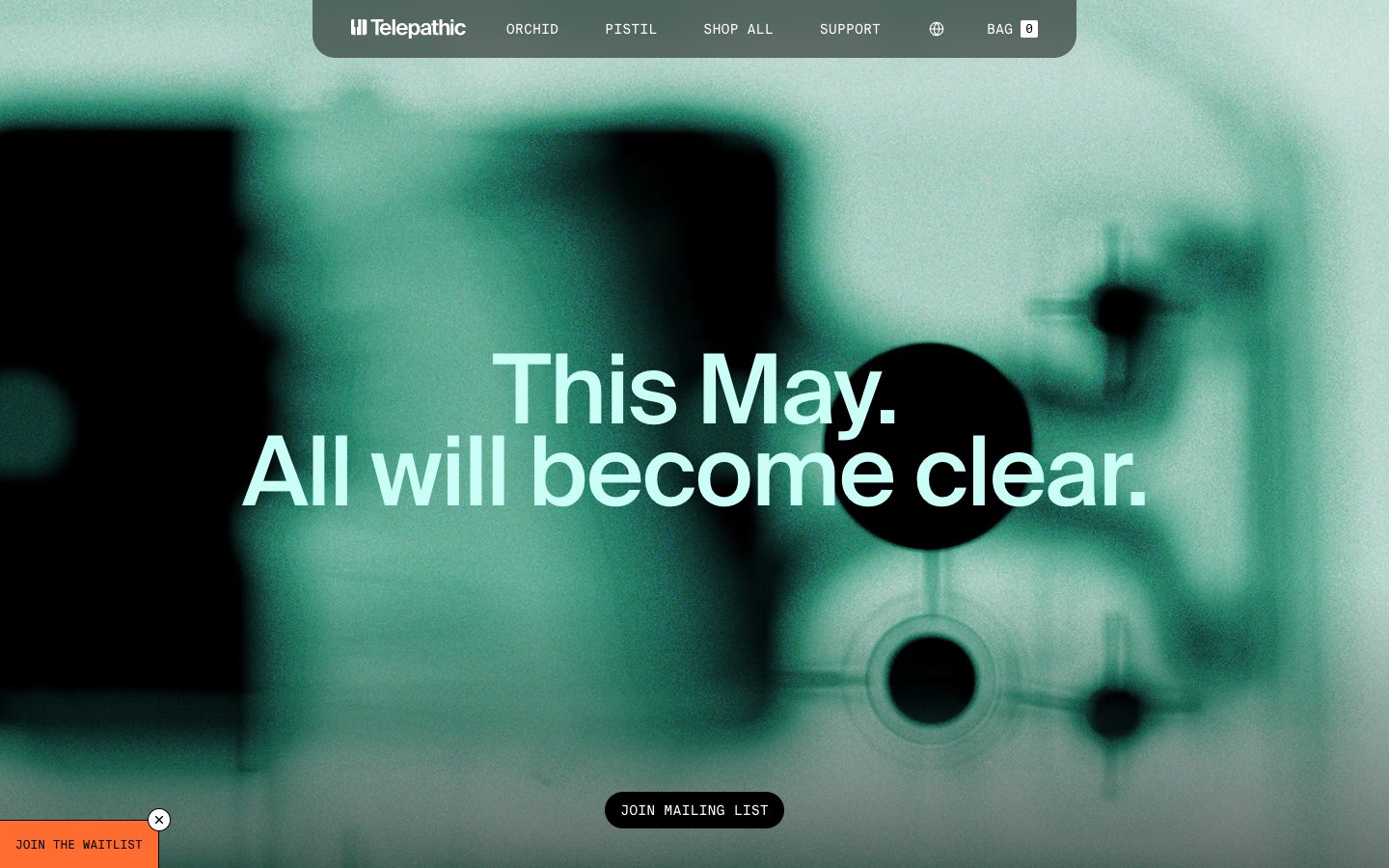
Telepathic Instruments
Telepathic Instruments — Style Reference
# Telepathic Instruments — Style Reference
> broadcast control room at golden hour — obsidian screens, warm cream paper, one tungsten bulb
**Theme:** light
Telepathic Instruments operates in a studio-dark, broadcast-crisp visual register: full-bleed atmospheric photography gives way to white product surfaces and pill-shaped controls, with a single vivid orange as the only chromatic punctuation in an otherwise monochrome world. Typography is the brand's loudest instrument — Suisse Intl set at near-display sizes with aggressive negative tracking (up to -0.03em) creates headlines that read as engineering specimens rather than marketing copy. The aesthetic borrows from audio hardware UIs and Bauhaus signage: hairline borders, flat surfaces, one functional accent, generous negative space. Components stay low-weight and gestural — pill buttons, ghost links, soft 24px card radii — letting product imagery and music equipment screenshots carry visual weight.
## Tokens — Colors
| Name | Value | Token | Role |
|------|-------|-------|------|
| Solder Orange | `#ff6c2f` | `--color-solder-orange` | Primary action background, call-to-action pills, featured product highlight — the single chromatic accent that makes interactive elements feel switched on against the otherwise neutral canvas |
| Bone | `#d7cdb8` | `--color-bone` | Warm beige wash — soft highlight surfaces and muted decorative fills that keep the palette from feeling clinical |
| Signal White | `#ffffff` | `--color-signal-white` | Card surfaces, content backgrounds, reversed text on dark fills — the clean base layer where product photography sits |
| Linen Gray | `#e5e7eb` | `--color-linen-gray` | Page canvas, hairline borders, nav separators, input borders — the dominant neutral providing the structural baseline across the entire interface |
Websites
Markdown Text
design-md
website-prompt
landing-page-prompt
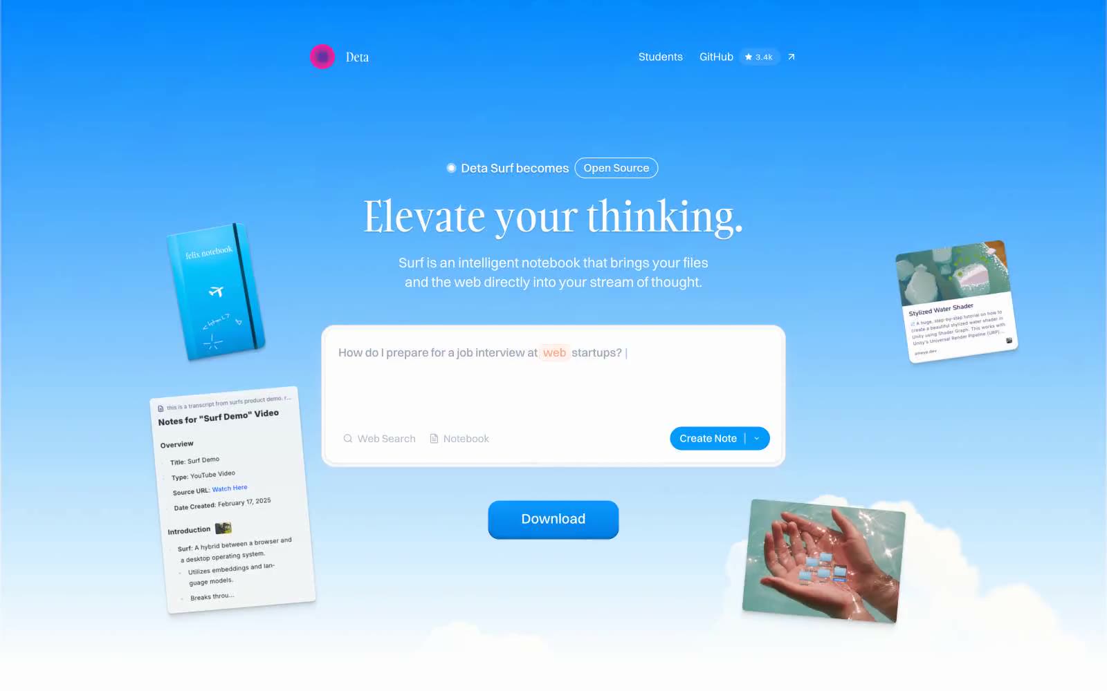
Deta Surf
Deta Surf — Style Reference
# Deta Surf — Style Reference
> Open notebook floating in a clear blue sky. A serif headline drifts above a pill-shaped search bar while tilted content cards orbit like ideas in a thought bubble.
**Theme:** light
Deta Surf treats the web like a cumulus notebook — a pale blue sky gradient carries the hero, content cards tilt and float at the edges, and the interface itself feels weightless. The signature typographic tension sits between Gambarino serif headlines and Switzer geometric sans: the words feel handwritten, the UI feels engineered. Tanker appears sparingly as an all-caps accent (16-19px, +0.05em tracking) on tags and small display elements, breaking the otherwise clean system with a crafted, editorial touch. Components hover rather than sit: cards carry a single hairline shadow at 5% opacity, filled buttons gain depth from a #006dc8 inset highlight, and the single brand blue (#009afc) appears only where the user must act. The whole system breathes — 8px base, generous 32px section gaps, 30px rounded hero search bar, and pill-shaped controls everywhere signal a contemplative, low-friction product.
## Tokens — Colors
| Name | Value | Token | Role |
|------|-------|-------|------|
| Surf Blue | `#009afc` | `--color-surf-blue` | Primary CTA fill, focused interactive state — the only vivid color in the system, reserved for actions that complete a task |
| Deep Current | `#006dc8` | `--color-deep-current` | Inset button highlight, pressed state, button shadow tint — creates the lifted feel under filled CTAs |
| Sky Wash | `linear-gradient(180deg, #4a9eff 0%, #7bb8ff 50%, #a8d5ff 100%)` | `--color-sky-wash` | Pill badges (Open Source tag), outlined action borders, soft highlight washes — the cool whisper of brand blue on neutral surfaces |
| Sky Veil | `linear-gradient(180deg, #4a9eff 0%, #7bb8ff 50%, #a8d5ff 100%)` | `--color-sky-veil` | Hero background gradient bottom stop — fades the sky into white at the page floor |
Websites
Markdown Text
design-md
website-prompt
landing-page-prompt
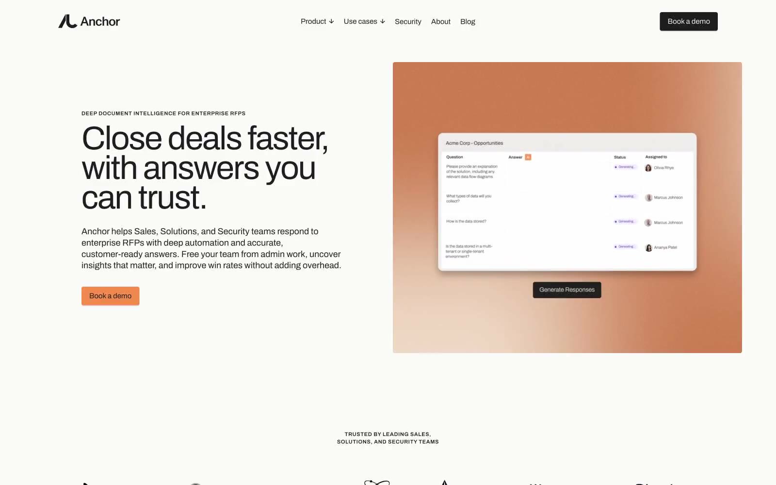
Getanchor
Getanchor — Style Reference
# Getanchor — Style Reference
> Warm terracotta on sun-bleached cream.
**Theme:** light
Anchor's visual system reads as a warm editorial workspace: a sun-bleached cream canvas, one quiet terracotta accent, and type that feels set rather than styled. The dominant page surface is never pure white — it sits in the #f0e9e5 to #e3d7cd warm-cream range, which makes white product cards look lifted off the page like paper on paper. Color is rationed: roughly 99% of every screen is neutral, and the single warm orange (#ee884f) only fires on the primary action, earning attention by scarcity. Components stay flat and light — pill buttons, 4px-radius cards, hairline borders, and shadows so thin they read as paper grain rather than elevation. The tone is confident and unhurried, closer to a printed quarterly than a dashboard.
## Tokens — Colors
| Name | Value | Token | Role |
|------|-------|-------|------|
| Ink | `#1e1e1e` | `--color-ink` | Body text, headings, primary borders, icon strokes — the dominant neutral that carries almost all type and structural lines |
| Cream Canvas | `#e3d7cd` | `--color-cream-canvas` | Page background and deepest warm surface — the base tone of the entire site |
| Warm White | `#f0e9e5` | `--color-warm-white` | Primary card and section surface, nav background, soft fills |
| Paper White | `#f5f2f0` | `--color-paper-white` | Button hover surfaces and elevated neutral blocks, slightly cooler than Warm White |
Websites
Markdown Text
design-md
website-prompt
landing-page-prompt
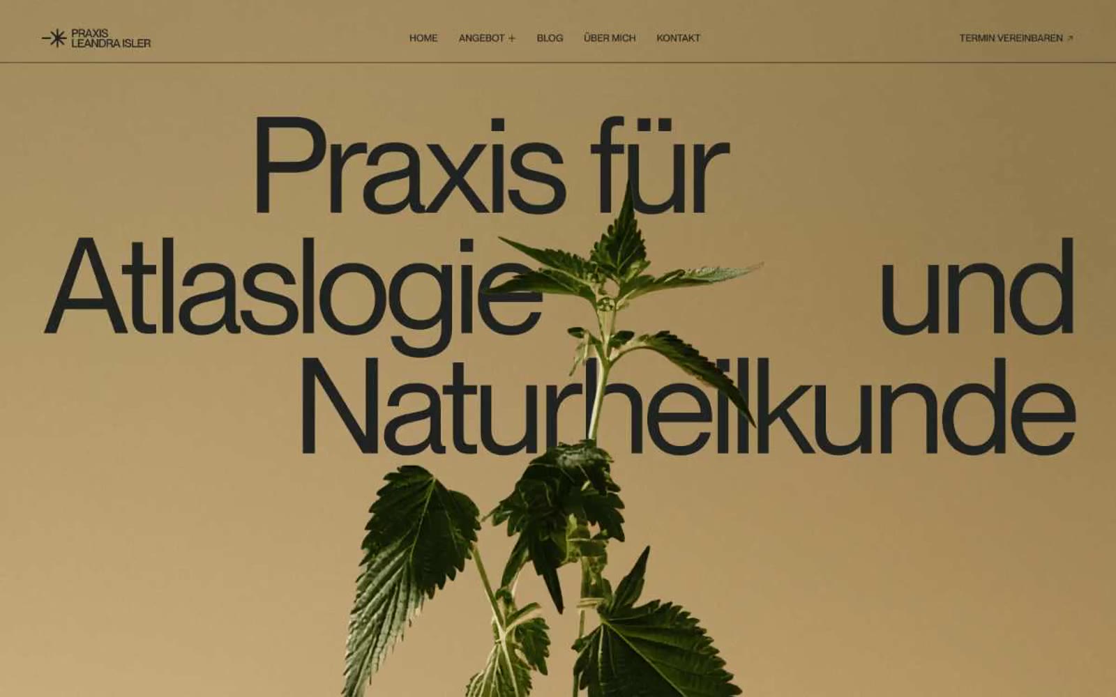
Leandra-isler
Leandra-isler — Style Reference
# Leandra-isler — Style Reference
> dried botanicals pressed into warm vellum — calm, tactile, editorial, almost reverent.
**Theme:** light
Praxis Leandra Isler reads like a printed herbalist's broadsheet — a single warm sand canvas stretching edge to edge, interrupted only by a dark, almost-black typeface and the living green of a botanical photograph. The entire visual system is held together by a monochromatic earth palette: no competing UI colors, no decorative surfaces, no shadows. Typography does all the structural work, scaling from a 14px caption to a 173px display headline on the same single typeface, so the eye reads scale itself as hierarchy. Surfaces are flat and paper-like; the only "depth" comes from a soft vertical gradient that deepens the tone at the top, mimicking vellum under raking light. Every chrome element — nav, links, buttons — is a thin underline or a hairline rule, never a filled chip. The result is a contemplative, gallery-wall atmosphere where the plant is the hero and the interface gets out of the way.
## Tokens — Colors
| Name | Value | Token | Role |
|------|-------|-------|------|
| Vellum Sand | `#f4e6cd` | `--color-vellum-sand` | Primary page canvas — the base warm-cream that fills every section, never competing with content |
| Pressed Linen | `#edddc3` | `--color-pressed-linen` | Secondary surface for subtle section breaks, link backgrounds, and content cards resting on Vellum Sand |
| Aged Ink | `#1e211e` | `--color-aged-ink` | Dominant text and hairline border color — near-black with a touch of warmth, used for 95% of all rules, headings, and body copy |
| Charcoal Black | `#000000` | `--color-charcoal-black` | Hard ink for display headings, icon fills, and the strongest contrast moments where absolute black reads better than warm |
Websites
Markdown Text
design-md
website-prompt
landing-page-prompt
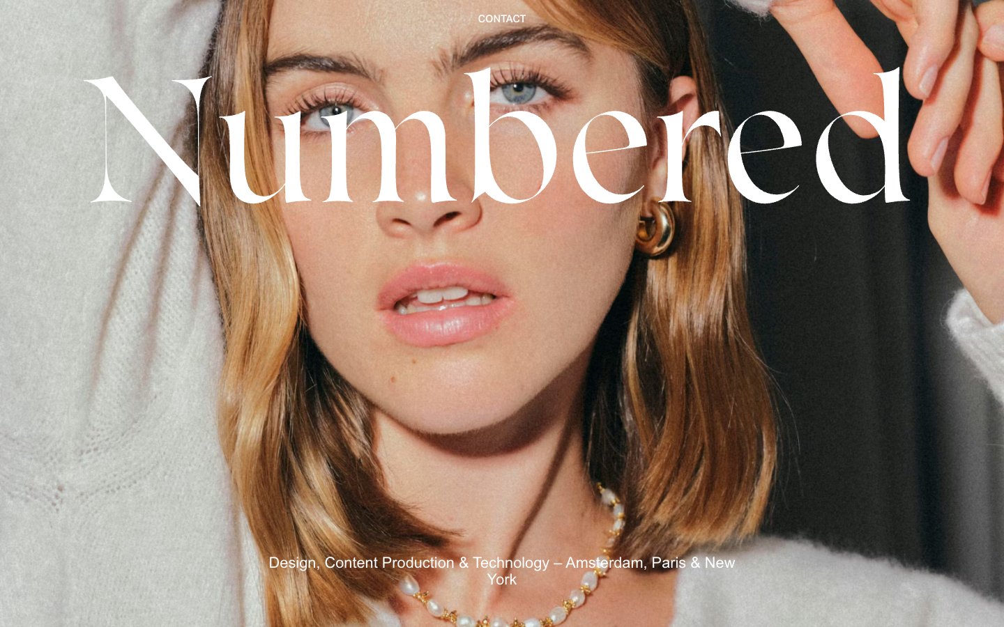
Numbered
Numbered — Style Reference
# Numbered — Style Reference
> fashion editorial on black velvet. A near-black runway where a single face fills the frame and the only marks are white ink and a whispered bronze thread.
**Theme:** dark
Numbered operates as a fashion-editorial canvas: a deep ink-black void that lets full-bleed portrait photography and oversized typography do all the work. The interface is almost invisible — no buttons, no cards, no grids — just hairline white type floating over imagery and near-black panels. A single warm bronze tone (#bc9873) surfaces occasionally as a material accent against the monochrome severity, echoing the golden-hour skin tones in the photography. Whitespace is treated as a luxury material: sections are separated by 80–120px vertical gaps, content is anchored to wide left/right gutters of ~119–238px, and links are underlined plain text rather than interactive widgets. The system reads as a magazine spread, not a product UI.
## Tokens — Colors
| Name | Value | Token | Role |
|------|-------|-------|------|
| Ink Black | `#111111` | `--color-ink-black` | Primary canvas — full-page background, hero panels, footer. The dominant surface everything else floats over |
| Paper White | `#ffffff` | `--color-paper-white` | All text, hairline borders, nav links, section labels. The only ink on the page; used at 100% opacity on dark surfaces and as a border-only accent on imagery |
| Smoke | `#4f4f4f` | `--color-smoke` | Subtle hairline borders on navigation elements — recedes against the ink black, visible only on close inspection |
| Bronze Veil | `#bc9873` | `--color-bronze-veil` | Orange wash for highlight backgrounds, decorative bands, and soft emphasis behind content. Do not promote it to the primary CTA color |
Websites
Markdown Text
design-md
website-prompt
landing-page-prompt
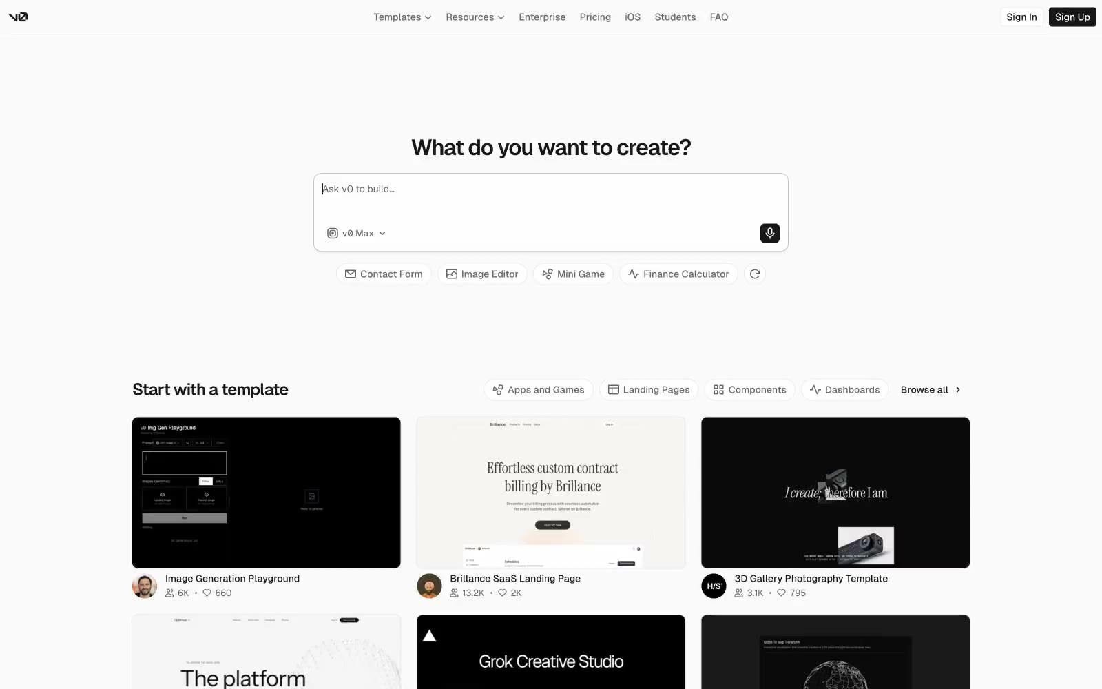
v0 by Vercel
v0 by Vercel — Style Reference
# v0 by Vercel — Style Reference
> A Machinist's Blueprint. Precision and function are paramount, with every element serving a clear purpose on a clean, technical surface.
**Theme:** light
The design feels like a functional schematic on a stark white drafting table. Its nearly monochrome palette — #FFFFFF, #FAFAFA, #EAEAEA, #171717 — creates a utility-first atmosphere where user input is the only source of color. Typography is the main architectural element; a custom sans-serif is used everywhere, with tight negative letter-spacing at large sizes creating dense, impactful headlines. The UI is built from simple primitives: solid black CTAs with an 8px radius and subtly bordered white chips, distinguishing primary commands from secondary suggestions.
## Tokens — Colors
| Name | Value | Token | Role |
|------|-------|-------|------|
| Paper White | `#ffffff` | `--color-paper-white` | Text on dark buttons, pill button backgrounds. |
| Canvas | `#fafafa` | `--color-canvas` | Primary page background. |
| Line | `#eaeaea` | `--color-line` | Borders for headers, ghost buttons, and dividers. |
| Subtext | `#666666` | `--color-subtext` | Secondary text, navigation links, placeholder text. |
Websites
Markdown Text
design-md
website-prompt
landing-page-prompt
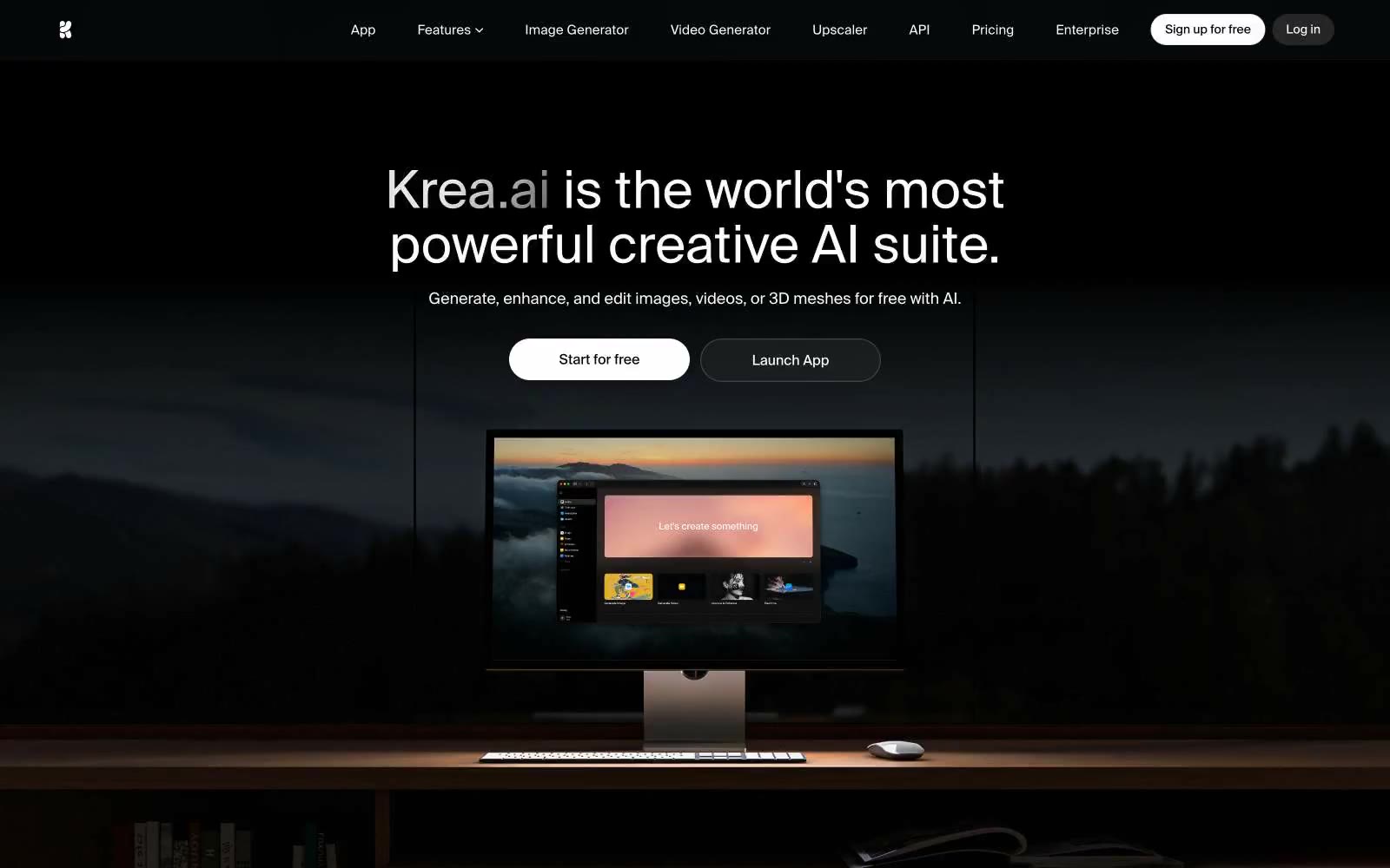
Krea
Krea — Style Reference
# Krea — Style Reference
> noir gallery at midnight
**Theme:** dark
Krea operates as a cinematic monochrome stage: pure black canvases, surgically tight Suisse Intl type, and zero chromatic noise compete for attention with the AI-generated imagery itself. The interface dissolves into atmosphere — the product floats on darkness rather than sitting on a surface. Buttons toggle between white-fill and ghost-outline pills, never introducing color. Typography does all the heavy lifting: compressed display weights at 96px/72px pull the eye down into the page, while sub-1.0 line-heights on heroes create an almost film-credit density. Spacing is generous but never airy — 80–96px section gaps with 12–20px element rhythm keeps things composed, not floaty.
## Tokens — Colors
| Name | Value | Token | Role |
|------|-------|-------|------|
| Obsidian | `#000000` | `--color-obsidian` | Primary page background, hero canvas, image void — the default stage everything sits on |
| Midnight | `#0b0f15` | `--color-midnight` | Hero ambient and large image containers — a near-black with the faintest blue undertone that keeps the void from looking flat |
| Charcoal | `#171717` | `--color-charcoal` | Elevated card surfaces, hover state for ghost buttons, secondary panels that need to lift off Obsidian |
| Graphite | `#262626` | `--color-graphite` | Supporting neutral for secondary UI, dividers, and muted labels. Do not promote it to the primary CTA color |
Websites
Markdown Text
design-md
website-prompt
landing-page-prompt
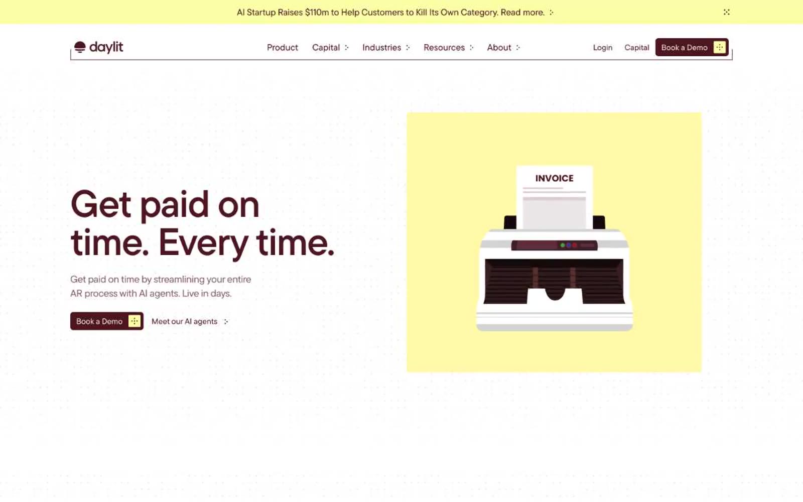
Daylit
Daylit — Style Reference
# Daylit — Style Reference
> Burgundy ink on cream parchment — a modern ledger rewritten for the AI era.
**Theme:** light
Daylit operates in a warm, candlelit fintech vernacular — a parchment-ivory canvas (#fbf9f6) replaces the cold white norm, and a single deep burgundy (#4d1520) does all the heavy lifting as text, borders, and the primary action fill. Pale lemon (#faffa7) acts as a secondary highlight accent that appears in decorative illustration blocks, testimonial card borders, and badge fills, keeping the palette to roughly two chromatic anchors. Type is large, confident, and tightly tracked — display sizes push to 76–85px with aggressive negative letter-spacing, giving headlines a sculptural, almost editorial quality. Components are flat and low-elevation: hairline warm borders, a 6px default radius, and a single brand-tinted shadow reserved for hero-scale elevation. The overall rhythm is spacious and unhurried, with generous section padding and a centered max-width reading column that feels like a well-typeset annual report rather than a dense SaaS dashboard.
## Tokens — Colors
| Name | Value | Token | Role |
|------|-------|-------|------|
| Wine Ink | `#4d1520` | `--color-wine-ink` | Primary text, primary filled button background, active states, heading color, card borders, and dominant brand stroke — the single chromatic anchor of the entire system |
| Midnight Wine | `#360912` | `--color-midnight-wine` | Darkest surface for footer bands and inverted panels |
| Lemon Whisper | `#faffa7` | `--color-lemon-whisper` | Decorative accent fill and border — used in illustration blocks, testimonial card outlines, icon highlights, and soft highlight washes |
| Blush Rust | `#662f3d` | `--color-blush-rust` | Softened brand fill for secondary surfaces and SVG illustration shading |
Websites
Markdown Text
design-md
website-prompt
landing-page-prompt
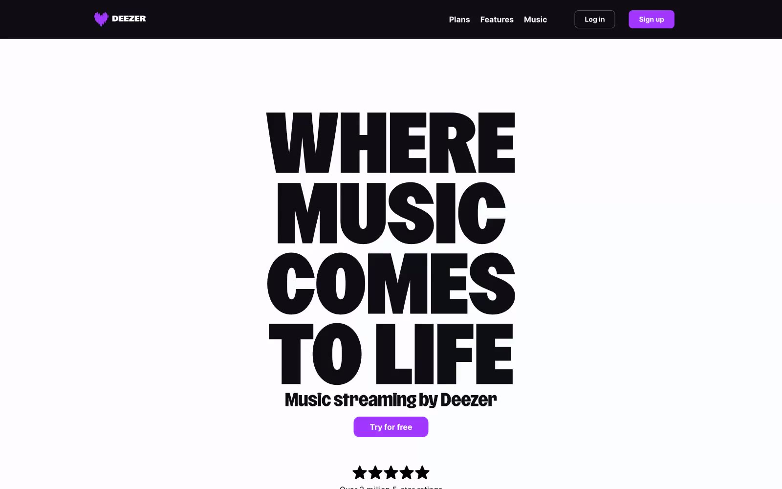
Deezer
Deezer — Style Reference
# Deezer — Style Reference
> Festival poster meets dark arena
**Theme:** mixed
Deezer's visual system is a dramatic concert-poster language: a sunlit white hero dominated by a single ultra-condensed display headline, followed by dark arena sections where content floats on light card surfaces against near-black backgrounds. Typography carries the entire brand voice — a custom 700-800 weight display face with absurdly tight line-heights (0.71–0.90) that makes the hero feel like a music festival flyer, not a SaaS page. One vivid violet (#a238ff) is the only chromatic note across the system, used with discipline: filled CTAs, pill badges, and the top promotional banner. The palette is otherwise near-monochrome — stark black on white for the hero, near-black with white text for the lower arena, and a single soft lilac for subtle washes. Components are light, flat, and confident: pill-shaped buttons, thin dividers, no decorative shadows, no gradients. The rhythm alternates light/dark bands vertically to create contrast between marketing drama and product clarity.
## Tokens — Colors
| Name | Value | Token | Role |
|------|-------|-------|------|
| Paper White | `#fdfcfe` | `--color-paper-white` | Page and hero backgrounds, card surfaces floating on dark sections, light theme canvas |
| Carbon Black | `#0f0d13` | `--color-carbon-black` | Dark section backgrounds, navigation bar, inverse canvas, pricing and FAQ arena |
| Pure Black | `#000000` | `--color-pure-black` | Display headline text on light surfaces, icon fills, maximum-contrast text |
| Ink Black | `#191922` | `--color-ink-black` | Button text on light pill surfaces, subtle text on cards |
Websites
Markdown Text
design-md
website-prompt
landing-page-prompt
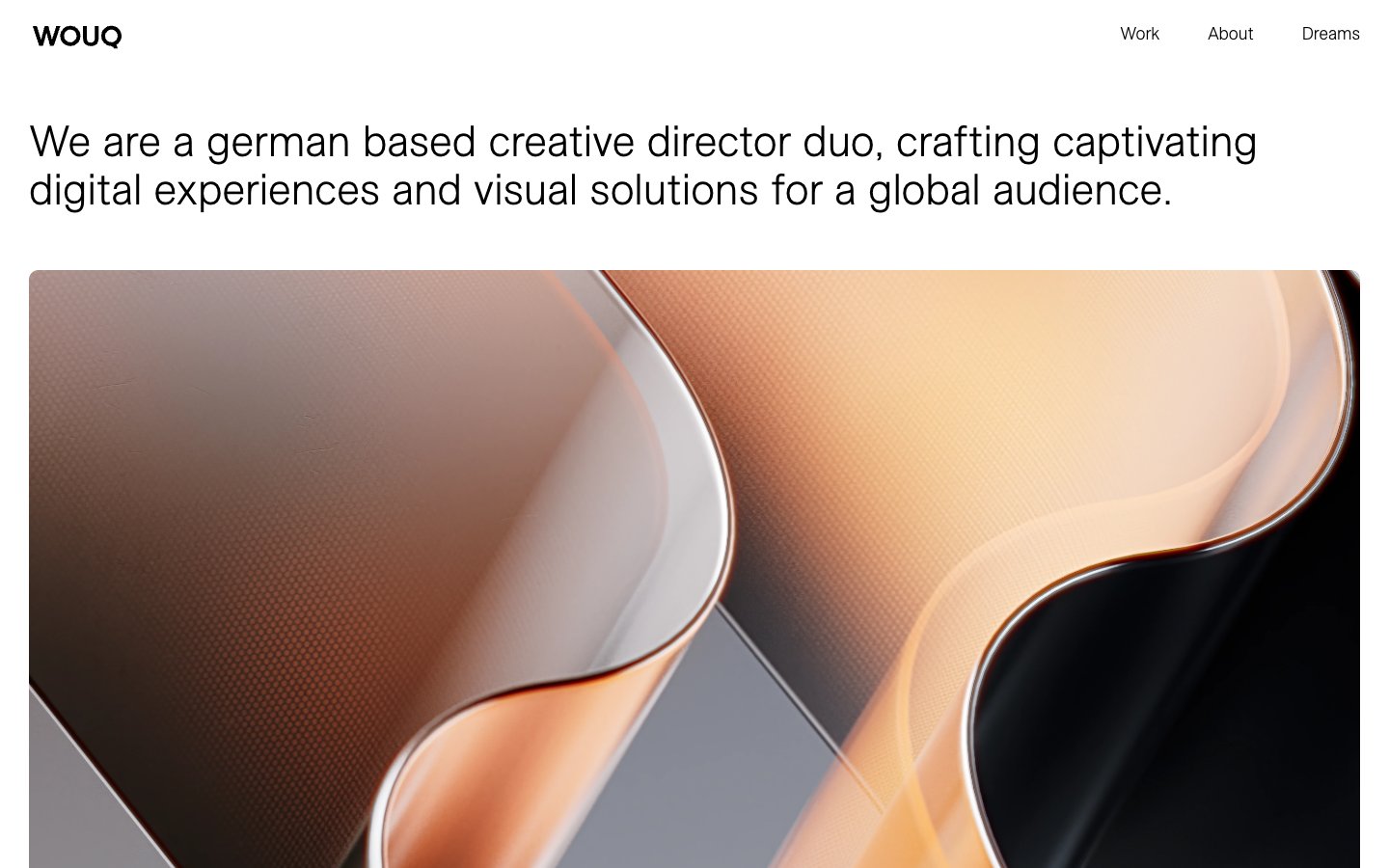
WOUQ
WOUQ — Style Reference
# WOUQ — Style Reference
> Monochrome gallery wall, museum label typography
**Theme:** light
WOUQ operates as a monochrome editorial portfolio: a near-total absence of color, with black text and hairline rules carrying all functional weight on a white canvas. The page is image-forward — large photography and 3D-rendered artwork dominate, treated as gallery objects with a single shared 10px corner radius and minimal chrome. Typography is the only expressive instrument: a custom neo-grotesque face (ESAllianz) is deployed at near-display sizes (45px) for the tagline and category labels, with a tight 1.11 line-height that lets the text stack into editorial blocks rather than breathing room. The interface deliberately removes every non-essential signal — no buttons, no badges, no gradients, no shadows, no accent color — so that the work itself carries the visual identity. Navigation is a plain text row, and project tiles are flat rectangles with two stacked text lines overlaid in a corner, mimicking museum wall labels rather than card UI patterns.
## Tokens — Colors
| Name | Value | Token | Role |
|------|-------|-------|------|
| Carbon Black | `#000000` | `--color-carbon-black` | Dark borders and separators for elevated surfaces and inverted UI. Do not promote it to the primary CTA color |
| Gallery White | `#ffffff` | `--color-gallery-white` | Page canvas, card surfaces, and heading backgrounds — the dominant surface across all sections |
| Plaster Gray | `#efefef` | `--color-plaster-gray` | Subtle surface variation against white — used at near-imperceptible contrast for stacked layers |
Websites
Markdown Text
design-md
website-prompt
landing-page-prompt
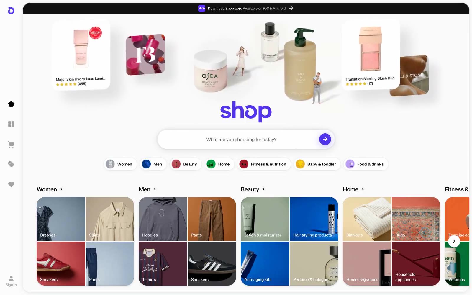
Shop
Shop — Style Reference
# Shop — Style Reference
> Product photography on a white void
**Theme:** light
Shop runs on a near-monochrome canvas where the product imagery does all the visual work and a single saturated violet does the talking. The interface dissolves into the background — white surface, hairline gray borders, no decorative gradients, no mood lighting — so that product cards, star ratings, and lifestyle photography carry every bit of color and texture. Typography is custom-drawn (GT Standard) at small sizes with aggressive negative tracking, which keeps labels and card titles feeling engineered rather than editorial. The single violet (#5433eb) is rationed: the wordmark, the search submit arrow, and one glow shadow on a primary button. Everything else is achromatic. Components are compact, border-driven rather than shadow-driven, and rely on 22-28px corner radii to feel soft without becoming pill-shaped.
## Tokens — Colors
| Name | Value | Token | Role |
|------|-------|-------|------|
| Shop Violet | `#5433eb` | `--color-shop-violet` | Wordmark, search submit arrow, primary button fill, brand icon — saturated indigo-violet that reads as electric against a pure white canvas. Used sparingly so it carries signal weight |
| Violet Glow | `#c0b5f3` | `--color-violet-glow` | Violet supporting accent for decorative details and low-frequency emphasis. Do not promote it to the primary CTA color |
| Pure White | `#ffffff` | `--color-pure-white` | Page canvas, card surfaces, input fields, inverse text on violet buttons |
| Ink Black | `#000000` | `--color-ink-black` | Primary text, dominant border color across cards/nav/dividers, and outline-button strokes — the structural skeleton of the whole UI |
Websites
Markdown Text
design-md
website-prompt
landing-page-prompt
PostNew
PostNew — Style Reference
# PostNew — Style Reference
> After-hours gallery with daylight spreads
**Theme:** dark
PostNew operates as an after-hours gallery: a near-black canvas (#1a1a1a) acts as a quiet vitrine frame, while full-bleed editorial spreads detonate with color, photography, and bold display type when content opens. The system is ruthlessly achromatic on the structural layer — only five near-grayscale tokens carry the entire UI — and delegates all chromatic expression to the content itself. Typography is intentionally scarce: ABC Diatype Medium at two sizes for editorial moments, system sans at 12px for chrome. The feeling is curated rather than designed: a portfolio shell that disappears so the work can perform.
## Tokens — Colors
| Name | Value | Token | Role |
|------|-------|-------|------|
| Canvas Black | `#1a1a1a` | `--color-canvas-black` | Page background, gallery vitrine, frame around content — a near-black not-quite-pure-black that lets imagery breathe without the harshness of #000 |
| Bone White | `#fafafa` | `--color-bone-white` | Primary text, nav labels, icon strokes, light surface fill — the only light token, reserved for foreground against Canvas Black |
| Slate Surface | `#242424` | `--color-slate-surface` | Elevated cards, button backgrounds, secondary surface panels — one step lighter than canvas to create depth without contrast drama |
| Ash | `#5d5d5d` | `--color-ash` | Muted UI elements, inactive dots, decorative fills — the 6.3:1 ratio against white keeps it legible but clearly secondary |
Websites
Markdown Text
design-md
website-prompt
landing-page-prompt
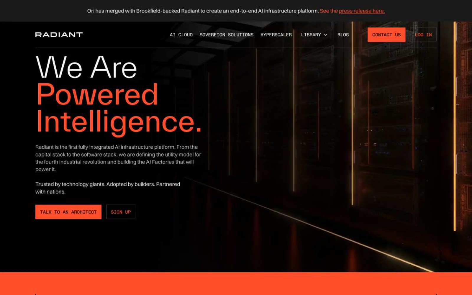
Ori
Ori — Style Reference
# Ori — Style Reference
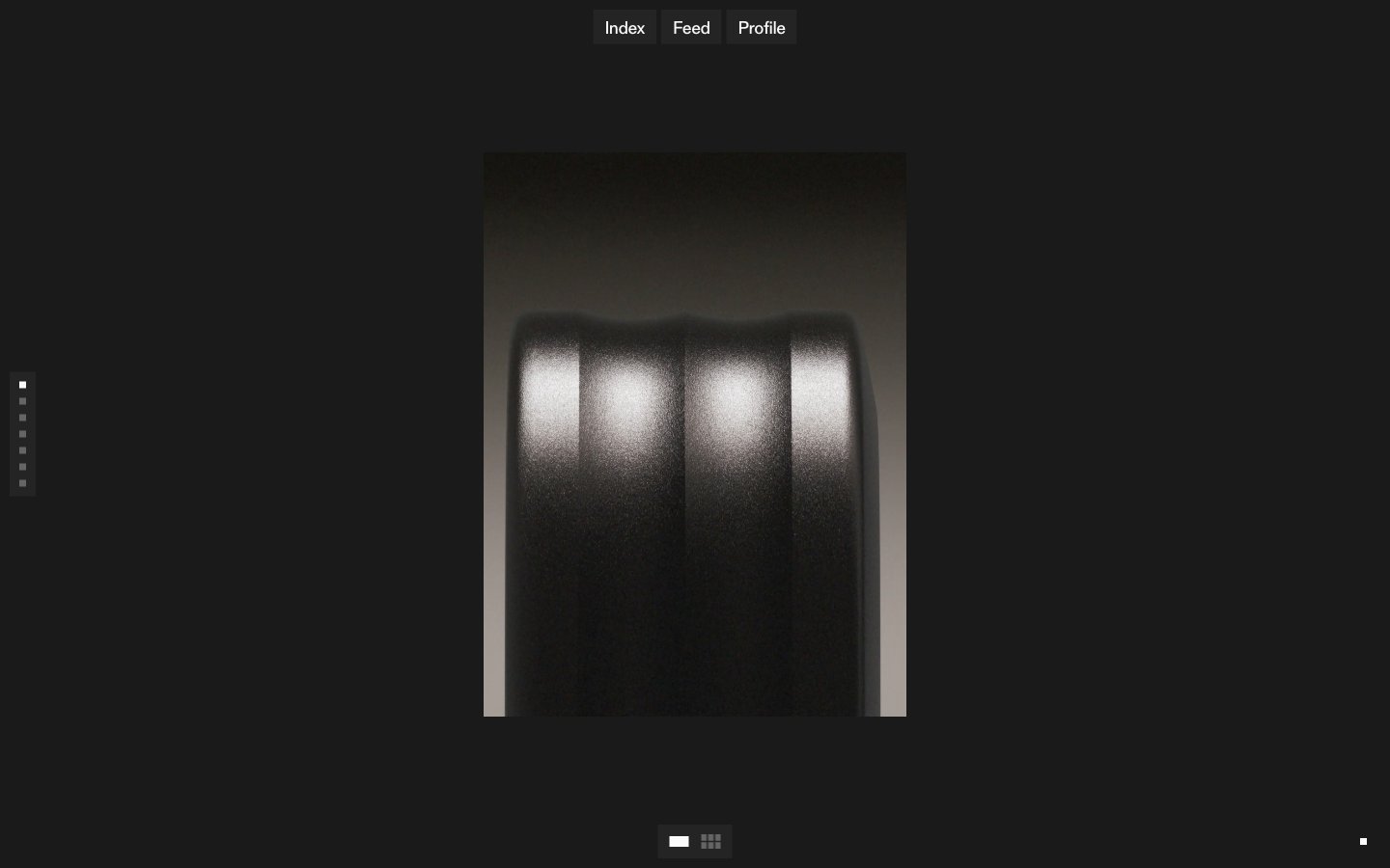
> Server-room at midnight — black void, white light, one ignited switch.
**Theme:** dark
Radiant (formerly Ori) operates in a dark infrastructure-at-night language: pure black canvas, bright white typography at whisper-light weight, and a single saturated orange that ignites action and full-bleed statements. The visual grammar borrows from data-center photography — server racks, neon edge-lights, and hard architectural lines — and translates that into UI: zero border-radius on interactive elements, hairline borders, and monospaced labels that feel like terminal readouts. Headlines in TWK Everett at weight 300 create a cool, confident scale that never shouts; orange is rationed for CTAs, one full-bleed band, and accent details, making it feel like a power-on indicator rather than decoration. The system is text-forward and cinematic — large type breathes against dark voids, sections alternate between black and orange with no gradients or shadows to soften transitions.
## Tokens — Colors
| Name | Value | Token | Role |
|------|-------|-------|------|
| Ember Orange | `#ff4f2b` | `--color-ember-orange` | Orange action color for filled buttons, selected navigation states, and focused conversion moments. |
| Void Black | `#000000` | `--color-void-black` | Page canvas, hero background, card surface base, footer — the dominant stage on which everything floats |
| Carbon | `#1a1a1a` | `--color-carbon` | Neutral form states, badge text, and quiet UI feedback where color should stay understated. |
| Graphite Border | `#3c3c3c` | `--color-graphite-border` | Hairline dividers, ghost button borders, section separators — barely-there structural lines |
Websites
Markdown Text
design-md
website-prompt
landing-page-prompt
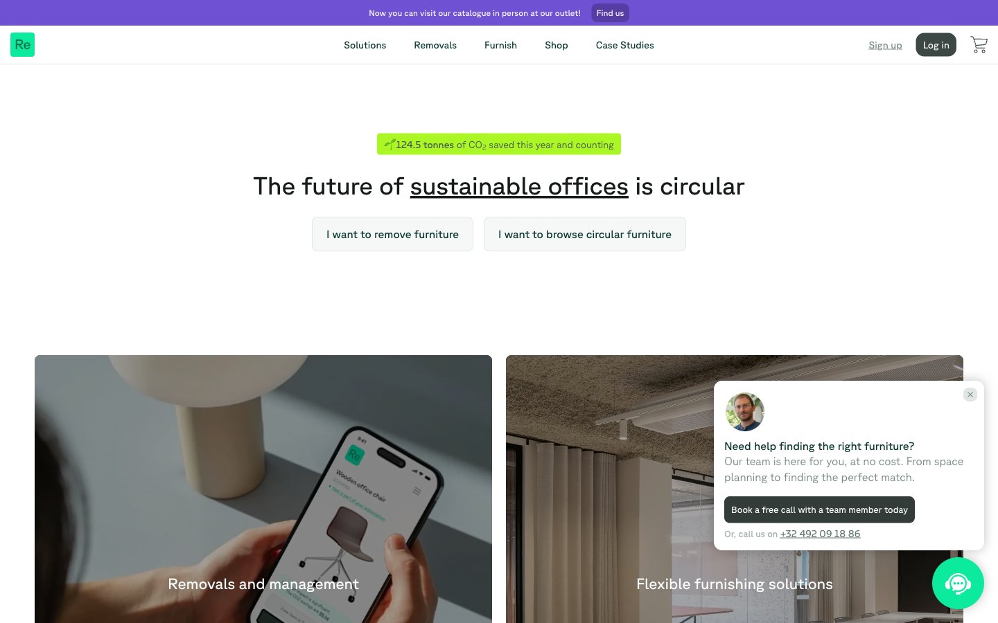
Relieve Furniture
Relieve Furniture — Style Reference
# Relieve Furniture — Style Reference
> Living moss on warm stone — a grounded, organic palette where a single deep forest-teal holds the structure and chartreuse sparks punctuate the silence.
**Theme:** light
Relieve Furniture uses a warm-stone canvas with a single deep forest-teal structural color and bright chartreuse sparks of sustainability energy. The visual language is grounded and organic: borders carry brand weight more than fills, the typeface is a whisper-thin neo-grotesque (Planar, weights 200-400), and surfaces are stacked as warm stone → mist → pure white. A vivid violet provides secondary energy for the asset calculator card and link accents. Components feel light and architectural — thin teal strokes, 8px radii, soft shadows used sparingly, and a 9999px pill for sustainability badges. Color appears as punctuation (lime badges, violet link underlines, teal borders) rather than as a painted backdrop; the page reads as an editorial product on limestone rather than a marketing surface.
## Tokens — Colors
| Name | Value | Token | Role |
|------|-------|-------|------|
| Forest Ink | `#0b392f` | `--color-forest-ink` | Primary brand color — carries borders, navigation strokes, heading underlines, card edges, and structural outlines. This teal defines the design more than any fill color; surfaces stay warm and neutral while the Forest Ink draws the architecture |
| Iris | `#6f52d3` | `--color-iris` | Vivid violet accent — link underlines, secondary call-out card backgrounds (asset calculator), heading emphasis, and selective section highlights. Acts as a counterpoint to Forest Ink, used when a block needs energy without the sustainability context of lime |
| Deep Iris | `#6043ba` | `--color-deep-iris` | Pressed iris for button backgrounds or filled actions where a chromatic state is needed without warmth — denser than Iris, used as the active/filled counterpart of the violet family |
| Soft Iris | `#7f6de1` | `--color-soft-iris` | Tinted violet for softer card washes or large surface blocks that need chromatic presence without the saturation of Iris |
Websites
Markdown Text
design-md
website-prompt
landing-page-prompt
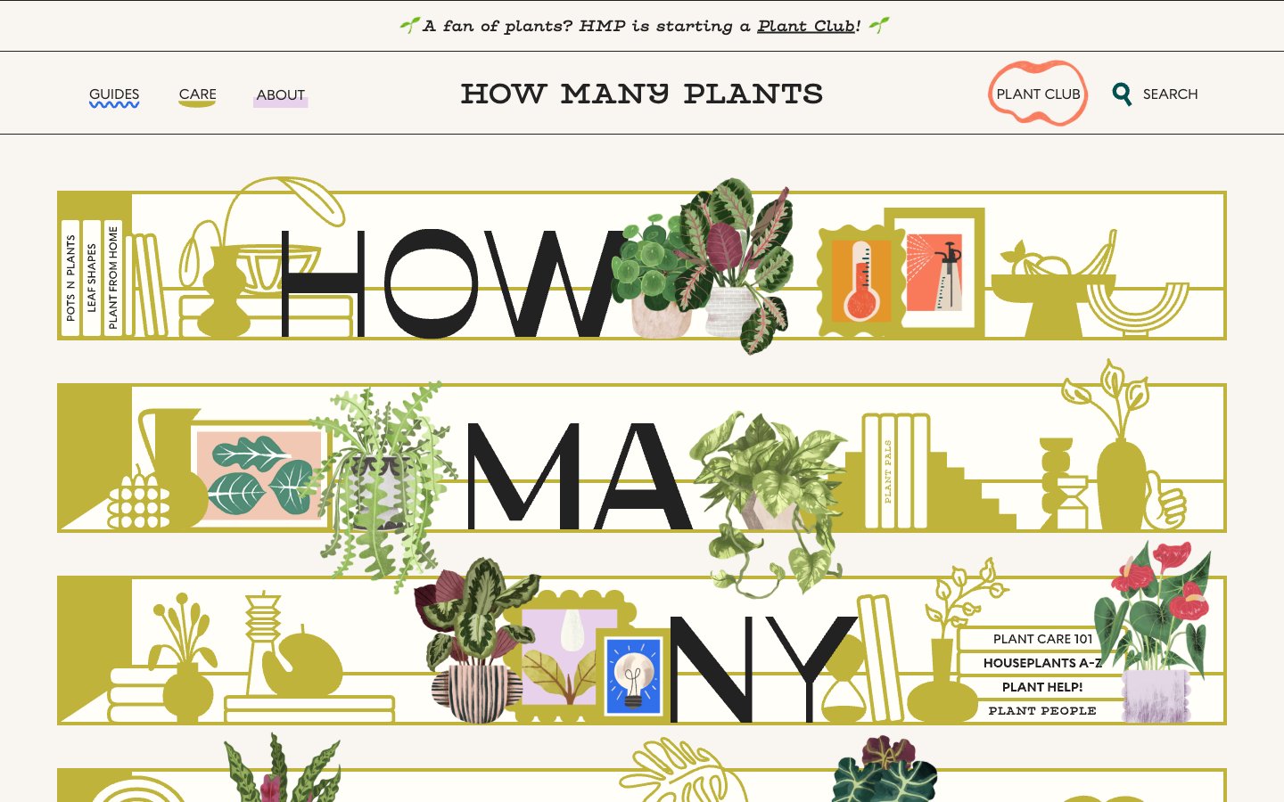
How Many Plants
How Many Plants — Style Reference
# How Many Plants — Style Reference
> Golden botanical broadside on cream paper — a illustrated shelf system where the page title sits inside bands of potted plants and brass instruments.
**Theme:** light
How Many Plants is a warm botanical editorial — a cream-paper broadside where a single golden-olive hue carries every illustration, banner, and accent. The hero is built from horizontal illustrated shelves in mustard that interlock with oversized display type, turning the page title into a shelf of plant pots, books, and vases. Surfaces are flat and paper-like; shadows are hard 6px offsets in the mustard itself, not soft drops, giving every decorated element the look of a cut-and-paste collage. The palette is ruthlessly small — cream canvas, black ink, one saturated gold, one dusty lavender, one dark teal — and that constraint IS the identity. Typography mixes a chunky geometric display face with a typewriter secondary, so headings feel poster-like while body copy stays intimate and typewritten.
## Tokens — Colors
| Name | Value | Token | Role |
|------|-------|-------|------|
| Cream Paper | `#f9f5f1` | `--color-cream-paper` | Page background, card surfaces, section bands — the warm off-white that reads as uncoated stock rather than digital white |
| Ink Black | `#222222` | `--color-ink-black` | Primary text, illustration outlines, large display letters, image borders — near-black that feels like a drafting pen rather than pure black |
| Golden Olive | `#bfb33b` | `--color-golden-olive` | Signature illustration color, hero shelf bands, decorative borders, hard offset shadows, icon fills — the only saturated hue in the system and the brand's defining mark |
| Dusty Lavender | `#e8d1eb` | `--color-dusty-lavender` | Tab backgrounds, tag pills, soft surface accents — desaturated lilac that cools the warm cream without competing with the gold |
Websites
Markdown Text
design-md
website-prompt
landing-page-prompt
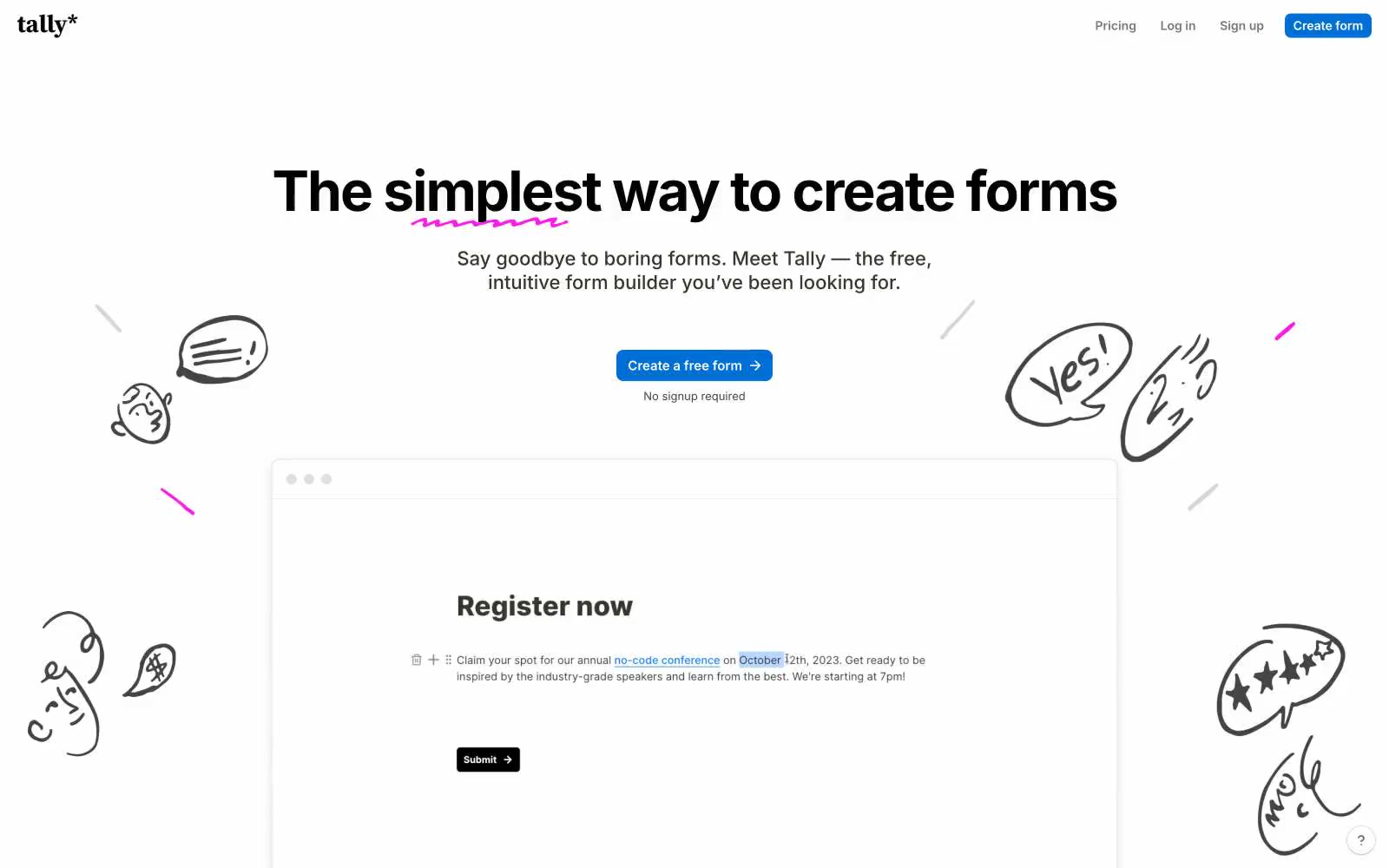
Tally Forms
Tally Forms — Style Reference
# Tally Forms — Style Reference
> Notebook doodles on warm paper — a gray-paper canvas scattered with magenta-pink hand-drawn marks and centered editorial headlines.
**Theme:** light
Tally's visual system reads as 'notebook doodles on warm paper' — a quiet, editorial interface where a warm gray canvas (#e0e0df) carries white card surfaces and almost everything else steps out of the way so that one vivid magenta-pink (#f81ce5) can do the emotional work. That pink is reserved for illustration strokes, icon outlines, and the occasional decorative border on a feature card — it never fills a button. Conversion is handled by a single classic blue (#0070d7), keeping brand expression and action expression separate. Typography is Inter in a wide weight range, tracked tight at -0.031em, with a 64px display headline that feels closer to a magazine masthead than a SaaS hero. Hand-drawn squiggles, underlines, and star/confetti motifs float around the margins, turning the page edges into a sketchbook rather than leaving them as dead space. Cards are flat white on warm gray with a subtle warm-tinted shadow stack, rounded at 10px, and the overall rhythm is comfortable — generous gaps, centered hero, then 2-up feature columns.
## Tokens — Colors
| Name | Value | Token | Role |
|------|-------|-------|------|
| Tally Magenta | `radial-gradient(circle, rgba(248,28,229,0.36) 0%, rgba(248,28,229,0) 70%)` | `--color-tally-magenta` | Pink decorative accent for icons, marks, and small graphic details. Do not promote it to the primary CTA color; Decorative focus-ring and glow tint used to draw the eye to a highlighted feature card, applied as a soft 2–4px outer ring rather than a fill |
| Action Blue | `#0070d7` | `--color-action-blue` | Primary action buttons only — the lone chromatic fill in the system, used to mark conversion moments without competing with the magenta brand mark |
| Ink | `#37352f` | `--color-ink` | Primary text, heading fills, and the dominant dark border color across cards, body elements, and form chrome. A warm near-black rather than pure black |
| Paper | `#e0e0df` | `--color-paper` | Page canvas — the warm light-gray background that all white card surfaces sit on. The signature surface of the system |
Websites
Markdown Text
design-md
website-prompt
landing-page-prompt
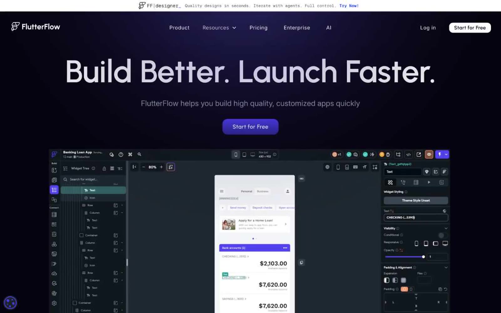
FlutterFlow
FlutterFlow — Style Reference
# FlutterFlow — Style Reference
> violet control room at midnight
**Theme:** dark
FlutterFlow's design system is a midnight workspace for app builders: near-black canvas (#060311) with deep violet energy radiating from gradient orbs and glowing CTAs. Urbanist, an understated geometric sans, carries the brand voice with generous letter-spacing that makes even 100px headlines feel architectural rather than shouty. The interface follows a clear three-tier surface stack — Obsidian canvas, Onyx cards, and Electric Violet accents — creating a developer-tool density that still feels premium and approachable. Every interactive element whispers confidence: pill-shaped buttons, 24px card radii, hairline violet borders, and minimal elevation replaced by subtle glows and gradient washes.
## Tokens — Colors
| Name | Value | Token | Role |
|------|-------|-------|------|
| Electric Violet | `#5800fd` | `--color-electric-violet` | Violet supporting accent for decorative details and low-frequency emphasis. Do not promote it to the primary CTA color |
| Deep Indigo | `#2415c6` | `--color-deep-indigo` | Saturated brand depth — testimonial card backgrounds, gradient mid-stops, and decorative fills that reinforce violet identity without competing with Electric Violet for attention |
| Periwinkle Glow | `#7066ed` | `--color-periwinkle-glow` | Soft brand highlight — icon tints, secondary accents, and gradient highlights that lighten the violet palette for hover states and decorative ornament |
| Halo Violet | `radial-gradient(circle farthest-side at 0px -30%, rgb(75, 57, 239), rgba(6, 3, 17, 0) 84%)` | `--color-halo-violet` | Radial gradient seed — the orb color that radiates from the hero top-left corner and bleeds into card backgrounds, creating atmosphere without flat fill |
Websites
Markdown Text
design-md
website-prompt
landing-page-prompt
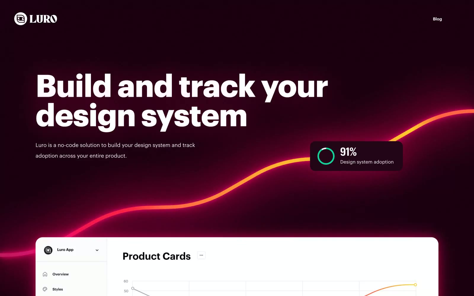
Luro
Luro — Style Reference
# Luro — Style Reference
> Crimson laser chamber. Deep obsidian walls, every surface ringed in hot pink plasma.
**Theme:** dark
Luro operates as a dark cinematic showcase where the product floats on near-obsidian canvas and every card emits a hot crimson halo. The signature isn't a surface color — it's a shadow: a wide pink plasma glow that lifts cards off the void and makes the UI feel like neon signage in a dark room. Typography is geometric and tightly tracked in Graphik, with negative letter-spacing pulling the large display headlines into a single dense block. Layout is spacious and centered, with a product screenshot hero above a 4-up media grid, then alternating feature blocks. The visual economy is extreme: a few card variants, a pill button, and one consistent glow shadow do all the work.
## Tokens — Colors
| Name | Value | Token | Role |
|------|-------|-------|------|
| Obsidian Void | `#10020a` | `--color-obsidian-void` | Page canvas and primary surface background — the near-black that everything floats above |
| Dark Mulberry | `#1e0313` | `--color-dark-mulberry` | Elevated card surface — the second tier above the canvas, slightly warmed by the glow that surrounds it |
| Frost White | `#ffffff` | `--color-frost-white` | Primary text, hairline borders, nav links, and icon fills on dark surfaces |
| Soft Chalk | `#f2f2f2` | `--color-soft-chalk` | Light surface fill for product mockup cards and inner product UI panels |
Websites
Markdown Text
design-md
website-prompt
landing-page-prompt
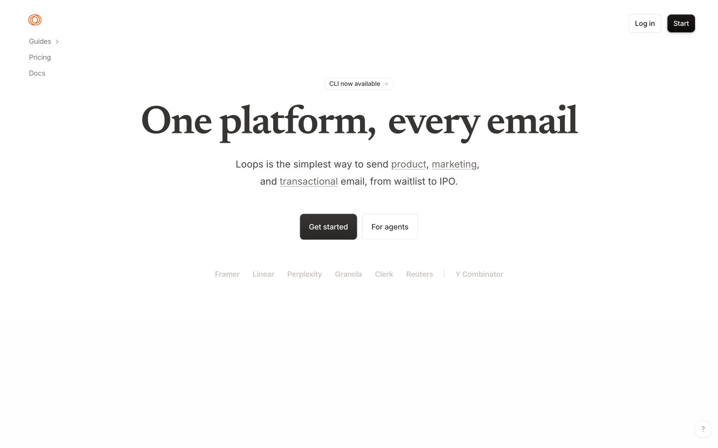
Loops
Loops — Style Reference
# Loops — Style Reference
> Warm parchment behind a serif headline — like a stationer's print proof lit by afternoon sun.
**Theme:** light
Loops runs a warm, editorial light interface — cream paper (#faf9f7) instead of cold white, a serif display face (Newsreader) that gives marketing screens a magazine-cover gravity, and a single orange (#f97316) that barely appears, like a wax seal on an envelope. The product itself stays almost entirely achromatic: dark pill buttons, hairline stone-toned borders, and flat surfaces with no decorative gradients. Components feel like printed editorial stationery — generous line-height, tight tracking on display, small tags as 999px pills, and elevation reduced to a single hairline inset shadow. An AI agent should treat orange as a signal, not a chrome — it should only fire on the logo, status pips, and small icon accents — while the primary action is always the dark charcoal pill (#1c1917 fill, white text).
## Tokens — Colors
| Name | Value | Token | Role |
|------|-------|-------|------|
| Parchment | `#faf9f7` | `--color-parchment` | Page canvas — the warm off-white that defines the entire experience; never substitute pure #ffffff at the body level |
| Paper | `#ffffff` | `--color-paper` | Card surfaces, code blocks, and inset panels sitting on Parchment |
| Mist | `#f1efef` | `--color-mist` | Subtle secondary surface — hover states on tag pills, tinted code snippet backgrounds, gentle section differentiation without borders |
| Stone-200 | `#e7e5e4` | `--color-stone-200` | Default hairline border — button outlines, card edges, input borders |