AI Prompt Studio - Intelligent Prompt Library
Explore and use professional AI prompts to optimize your workflow.
One-click Use
Websites
Markdown Text
design-md
website-prompt
landing-page-prompt
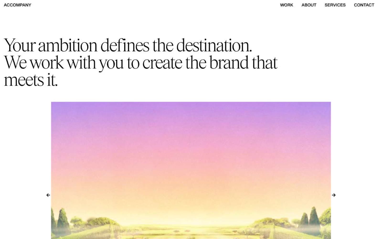
ACCOMPANY
ACCOMPANY — Style Reference

# ACCOMPANY — Style Reference
> Editorial broadside on bone canvas. A monochrome typographic system where a 80px light serif headline does all the emotional work and everything else stays out of its way.
**Theme:** light
ACCOMPANY runs on a monochrome editorial system: pure black on bone white, with no shadows, no gradients, no accent color. A custom light serif (Items-Light) carries the entire brand voice at 80px display scale with aggressive 0.90 line-height, while a medium grotesque (SyndicatGroteskMedium) handles everything from 44px subheads down to 16px body copy. Hierarchy is built entirely through type size, weight contrast (light serif vs medium grotesque), and whitespace — the system behaves like a museum monograph or fashion broadside, assuming the work itself provides the color. Components are architectural skeletons: hairline rules, uppercase micro-labels, generous gutters, and flat image frames. Color enters only through photography.
## Tokens — Colors
| Name | Value | Token | Role |
|------|-------|-------|------|
| Bone White | `#ffffff` | `--color-bone-white` | Page canvas, all surface backgrounds, image negative space |
| Obsidian Ink | `#000000` | `--color-obsidian-ink` | All text, headings, nav links, button labels, hairline borders, icon strokes, body borders |
| Carbon Edge | `#0a0a0a` | `--color-carbon-edge` | Near-black border variant for subtle structural dividers, indistinguishable from ink at reading distance |
Websites
Markdown Text
design-md
website-prompt
landing-page-prompt
Bibliothèque
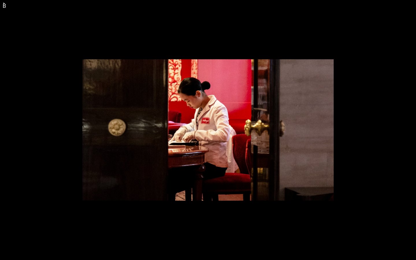
Bibliothèque — Style Reference
# Bibliothèque — Style Reference
> Black-cube gallery under spotlight — a single illuminated plate in a vast dark room.
**Theme:** dark
Bibliothèque operates as a black-cube gallery aesthetic: the entire interface is a dark void (#000000) where only white hairline type and centered photographic plates exist. The only brand mark is a small white serif 'B.' tucked in the top-left corner. Components feel like museum vitrines — thin white rules, generous negative space, no fills, no shadows, no gradients, and no chromatic accent of any kind. Typography is a single weight (400) of a custom neo-grotesque at an extreme binary scale: 12–18px functional text against an isolated 80px display. The visual system is fundamentally about restraint and curation — every UI element should feel like it could be removed and the page would not lose meaning.
## Tokens — Colors
| Name | Value | Token | Role |
|------|-------|-------|------|
| Ink Black | `#000000` | `--color-ink-black` | Page canvas, card surfaces, footer — the universal background. Cards do not lift from the canvas; they are demarcated only by hairline white borders |
| Gallery White | `#ffffff` | `--color-gallery-white` | Body text, headings, nav marks, hairline borders, link underlines, list dividers — the sole foreground. Used as 1px structural lines rather than fills |
## Tokens — Typography
Websites
Markdown Text
design-md
website-prompt
landing-page-prompt
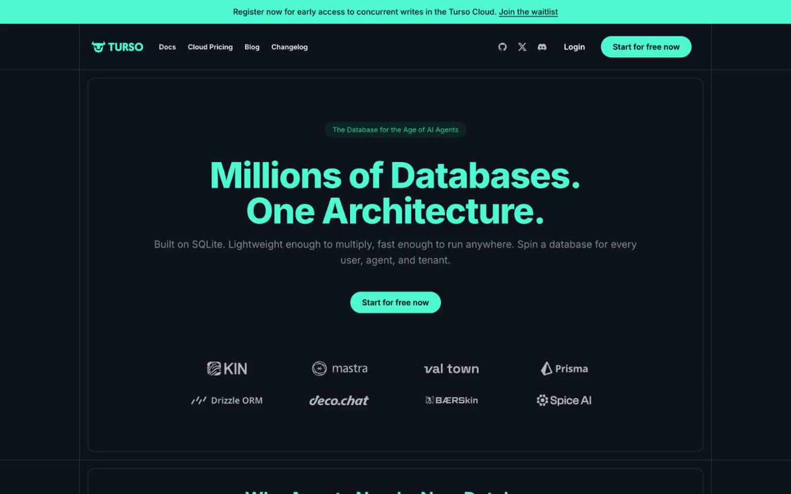
Turso
Turso — Style Reference
# Turso — Style Reference
> Terminal glow in a server closet — the mint LED on a rack of dark steel.
**Theme:** dark
Turso operates in a deep-space developer console aesthetic: near-black canvas with subtle teal undertones, a single vivid mint accent that acts as the system's 'powered on' signal, and a secondary electric magenta for beta/experimental framing. The interface stays quiet and typographic — white text on dark surfaces carries the content — while color appears only as functional punctuation for headings, badges, primary actions, and the thin colored borders that define product cards. Components feel light and terminal-like: pill buttons, thin outlined cards with a one-pixel gradient edge, monospace-flecked code snippets, and flat surfaces without drop-shadow elevation. The result reads as an infrastructure product designed by people who think in terminals — restrained, confident, and unmistakably dark.
## Tokens — Colors
| Name | Value | Token | Role |
|------|-------|-------|------|
| Deep Space | `#0d1318` | `--color-deep-space` | Page background, deepest canvas layer, link-on-light contrast |
| Obsidian | `#121b1f` | `--color-obsidian` | Hero and large content surface, slightly lifted from canvas |
| Carbon Teal | `#162129` | `--color-carbon-teal` | Card surface, button hover backgrounds, elevated containers |
| Slate Drift | `#283945` | `--color-slate-drift` | Subtle borders, dividers, muted panel borders, ghost button surfaces |
Websites
Markdown Text
design-md
website-prompt
landing-page-prompt
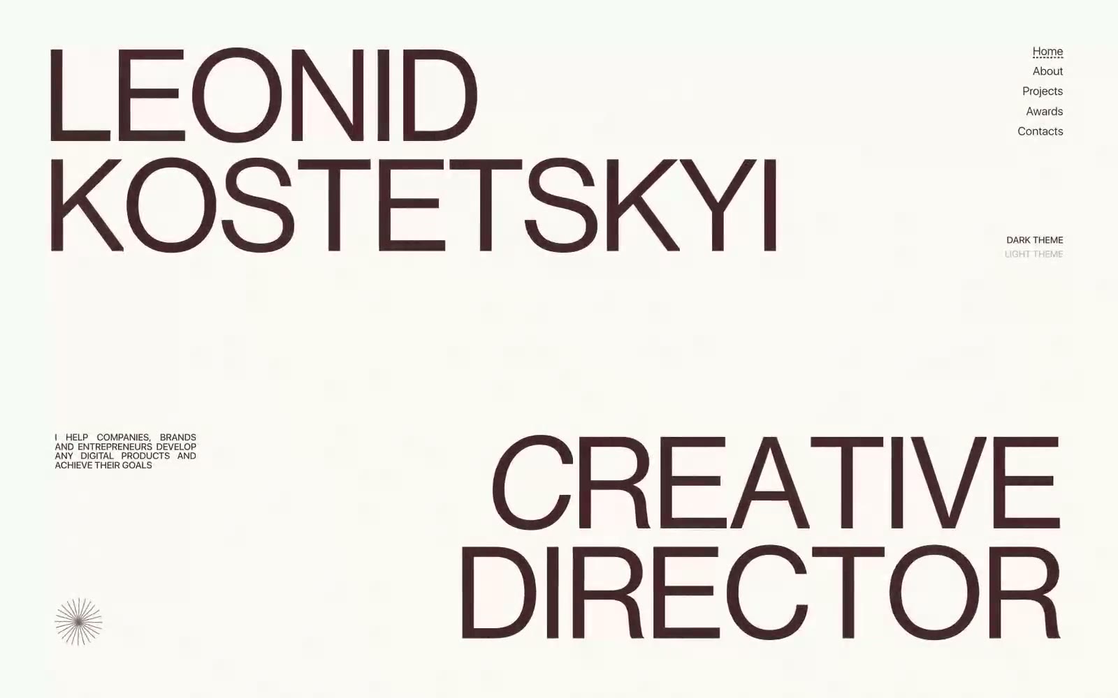
Leonid Kostetskyi
Leonid Kostetskyi — Style Reference
# Leonid Kostetskyi — Style Reference
> Wine-stained editorial gallery — oversized typographic statements floating on a white gallery wall, every mark a deliberate negative space.
**Theme:** light
Leonid Kostetskyi's site is a single-canvas editorial spread: a near-white gallery wall dominated by oversized Neue Haas Display headlines set in a muted dark-wine accent. The system runs on extreme contrast — one chromatic color (#472425, a desaturated oxblood) does all the brand work against pure white, with black and near-black handling secondary text and hairlines. Typography is the product: display faces reach 188px with negative tracking, sitting beside 8–15px uppercase utility labels. Spacing is expansive and editorial, with massive vertical breathing room between elements and no decorative ornamentation beyond one small radial starburst mark. The feel is Swiss-poster meets personal portfolio — confident, restrained, slightly austere, and unmistakably authored.
## Tokens — Colors
| Name | Value | Token | Role |
|------|-------|-------|------|
| Oxblood | `#472425` | `--color-oxblood` | The singular chromatic identity — display headlines, nav links, body text, borders, and the active theme toggle. This muted dark-wine red carries all brand presence; the system is monochrome with this one warm, desaturated red as the only color |
| Paper White | `#ffffff` | `--color-paper-white` | Page canvas and card surfaces. The background that the typography sits on; it reads as gallery white, not pure technical white |
| Carbon Black | `#000000` | `--color-carbon-black` | Secondary text, decorative borders, and structural hairlines. Used as the neutral companion to Oxblood when chromatic emphasis isn't needed |
| Graphite | `#121212` | `--color-graphite` | Tertiary text and body borders. A softer near-black for inline content where pure black feels too harsh |
Websites
Markdown Text
design-md
website-prompt
landing-page-prompt
Bento
Bento — Style Reference
# Bento — Style Reference
> bento lunchbox on sunlit linoleum. A grid of rounded, sticker-like cards in lime, lavender, cobalt, and maroon, each ringed with thick black ink, sitting on warm off-white linen beneath a confident geometric headline.
**Theme:** mixed
Bento speaks in a sunlit, pop-art bento-box language: full-bleed banded sections in lime, royal blue, and maroon stack vertically like a Japanese lunch tray, separated by generous white space on a warm linen canvas (#f3f3f1). The system is high-contrast and confident — thick black outlines wrap nearly every shape (1284+ black border occurrences), giving cards, buttons, and illustrations a hand-drawn, sticker-like quality that rejects soft shadows. Typography is tight and assertive: a custom geometric sans at up to 800 weight, with negative tracking that pulls display headlines into a single dense mass at 80px. The color palette is deliberately loud but disciplined — lime green is the single loud action accent, while maroon, royal blue, lavender, forest, cobalt, and gold serve as decorative section/card fills. Components lean pill-shaped (99px) and heavily rounded (64px, 32px), with small-radius (8px) exceptions for nav and inputs. The overall mood is playful, maximalist, and unapologetically graphic — a creator-tool brand that celebrates personality over neutrality.
## Tokens — Colors
| Name | Value | Token | Role |
|------|-------|-------|------|
| Lime Spark | `#d2e823` | `--color-lime-spark` | Primary action buttons, active nav fills, highlight card surfaces — the single loud CTA accent that punches through every colored band |
| Lavender Mist | `#e9c0e9` | `--color-lavender-mist` | Decorative borders, icon outlines, soft card edges, and subtle highlight washes — a pastel companion that desaturates without disappearing |
| Cobalt Band | `#2665d6` | `--color-cobalt-band` | Violet outline accent for tags, dividers, and focused UI edges. Do not promote it to the primary CTA color |
| Maroon Plate | `#780016` | `--color-maroon-plate` | Deep section backgrounds, card fills — anchors the lower page with a wine-colored tray that makes white type glow |
Websites
Markdown Text
design-md
website-prompt
landing-page-prompt
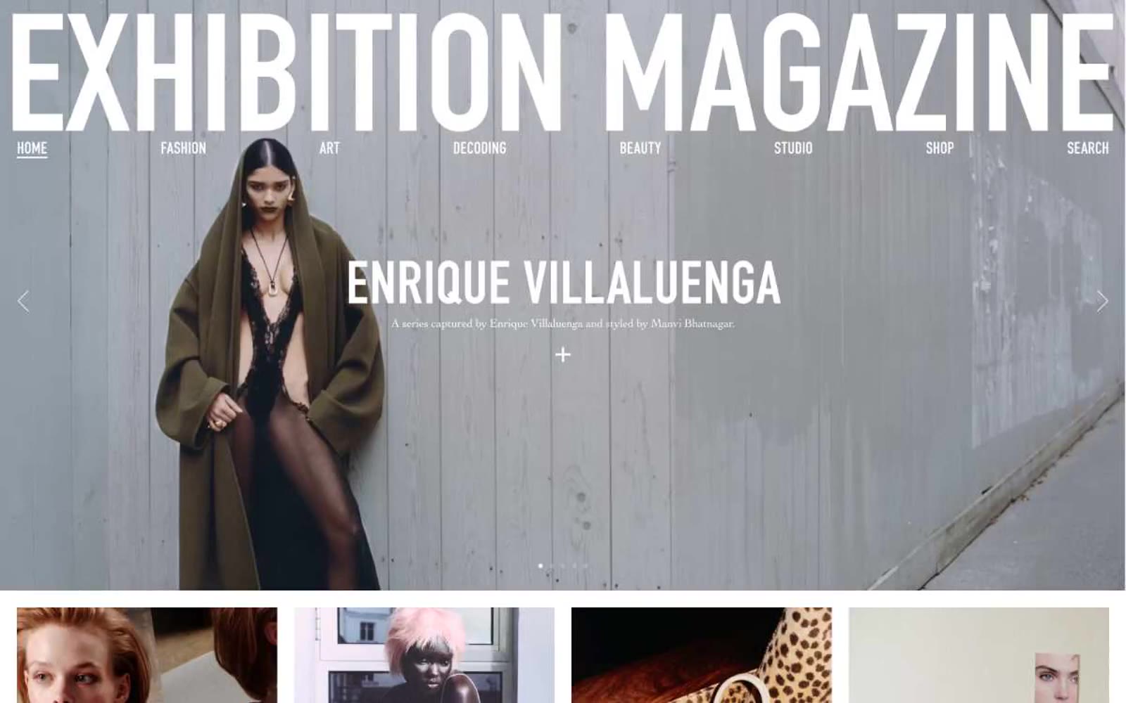
Exhibition Magazine
Exhibition Magazine — Style Reference
# Exhibition Magazine — Style Reference
> Concrete editorial monolith
**Theme:** light
Exhibition Magazine operates as a printed editorial artifact translated to screen: white canvas, hairline rules, and oversized condensed typography that commands the viewport. The visual system is almost entirely achromatic — color is virtually absent, replaced by the interplay of pure black text, white surfaces, and the grey 1px line that organizes everything. Two type families do all the work: DIN at 90–100px for display and section titles with extremely tight tracking and near-vertical line-height, and a serif (Cochin) for editorial body and descriptions that warms the otherwise clinical grid. Navigation and micro-labels use a tiny 13px all-caps face with generous 0.062em letter-spacing, creating a typographic hierarchy based on scale contrast alone — gargantuan display type against whisper-quiet UI chrome. Components are stripped to their essentials: image cards with no rounded corners, text buttons that are just underlined words, and a full-bleed black footer that closes the page with the same oversized type on inverted grounds.
## Tokens — Colors
| Name | Value | Token | Role |
|------|-------|-------|------|
| Paper White | `#ffffff` | `--color-paper-white` | Page backgrounds, nav bar, card surfaces, image backgrounds |
| Ink Black | `#000000` | `--color-ink-black` | All text, nav links, display headings, footer background, card titles |
| Hairline Grey | `#e5e7eb` | `--color-hairline-grey` | 1px borders, dividers, card outlines, link underlines — the structural skeleton of the layout |
| Ash Grey | `#a9a9a9` | `--color-ash-grey` | Muted surface fills, image placeholder backgrounds, secondary tonal blocks |
Websites
Markdown Text
design-md
website-prompt
landing-page-prompt
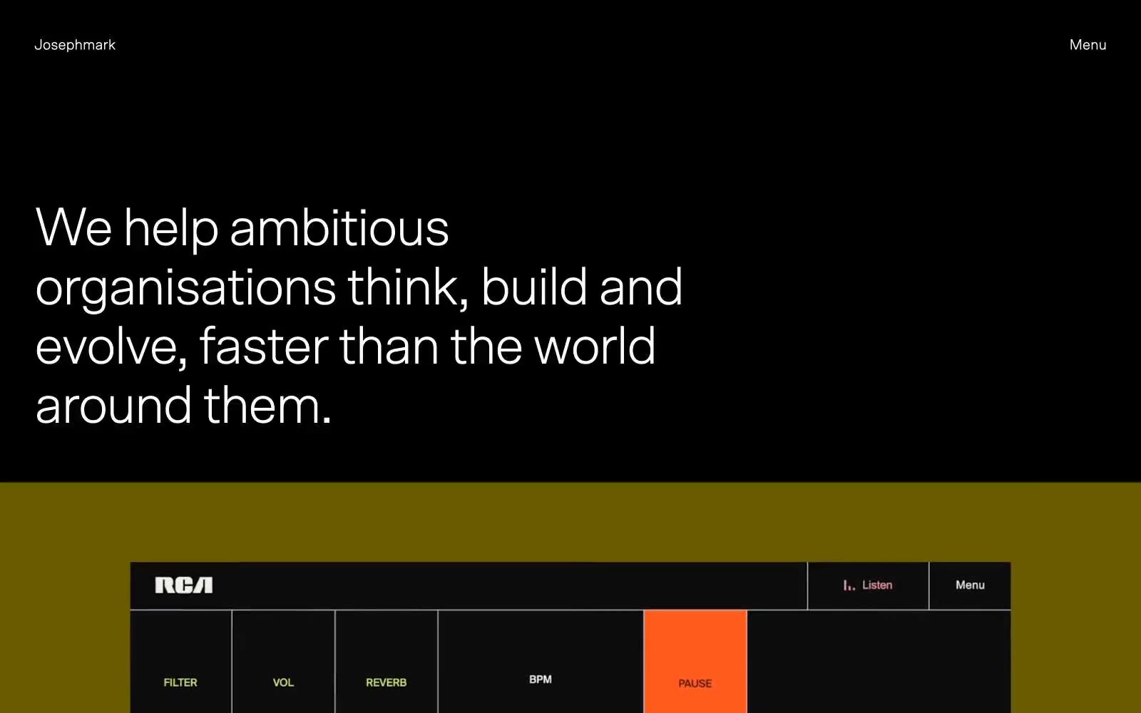
Josephmark
Josephmark — Style Reference
# Josephmark — Style Reference
> Midnight editorial gallery. Monochrome walls, warm spotlights, oversized grotesque typography floating in negative space.
**Theme:** dark
Josephmark operates as a midnight editorial gallery for digital craftsmanship: dark-dominant canvases, oversized Scto Grotesk set tight with aggressive negative tracking, and an almost entirely achromatic palette where a single warm taupe (#a9a498) acts as the only chromatic relief. The system prizes restraint over decoration — flat surfaces, hairline borders, pill-shaped buttons, zero shadows, and text that does the heavy lifting through scale and weight rather than color. Screens alternate between deep charcoal stages and cream-paper inserts, creating a rhythm of dark void and quiet warmth. Content is allowed to be loud (the case study artwork, the orange RCA piece, the Walking Dead illustration) while the chrome around it stays nearly invisible — a museum wall, not a website chrome.
## Tokens — Colors
| Name | Value | Token | Role |
|------|-------|-------|------|
| Carbon Black | `#000000` | `--color-carbon-black` | Primary dark canvas — hero backgrounds, full-bleed section stages, base for the editorial atmosphere |
| Pure White | `#ffffff` | `--color-pure-white` | Inverse text on dark canvases, form field backgrounds, button text on filled dark elements |
| Stone Taupe | `#a9a498` | `--color-stone-taupe` | The system's sole warm chromatic note — muted link states, secondary surface tints, paper-like card backgrounds that soften the black-to-gray transitions |
| Bone Cream | `#f4f5ef` | `--color-bone-cream` | Warm off-white surface — secondary card and panel backgrounds, breaks the clinical feel of pure white and echoes the studio's paper-based brand collateral |
Websites
Markdown Text
design-md
website-prompt
landing-page-prompt
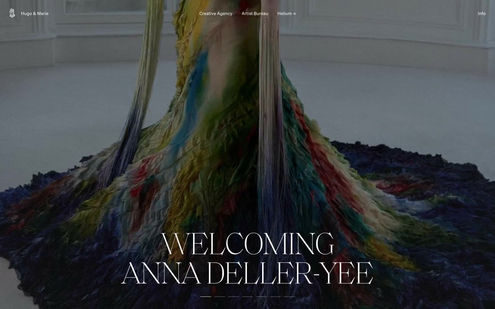
Hugo & Marie
Hugo & Marie — Style Reference
# Hugo & Marie — Style Reference
> Monochrome gallery catalog — editorial photography mounted on infinite white, framed by whisper-thin serif.
**Theme:** light
Hugo & Marie operates as a curatorial monochrome canvas: pure white negative space frames dramatic full-bleed editorial photography, with content living in the tension between near-black ink and paper. Typography carries all the personality — an ultralight serif display (weight 100, 100px) sets ceremonial headlines that feel like gallery wall text, while a restrained neo-grotesque sans (soehne, weights 300/400) handles everything from navigation to body copy. The interface refuses decorative chrome: no filled buttons, no color accents, no shadows — navigation is text-with-arrow, badges are hairline pills, and section dividers are single-pixel rules. This is a portfolio-first system where the artists' imagery is the only chromatic event, and the UI must vanish around it.
## Tokens — Colors
| Name | Value | Token | Role |
|------|-------|-------|------|
| Paper White | `#ffffff` | `--color-paper-white` | Page background, card surfaces, badge fills, nav dividers, input fields — the dominant surface that recedes to let imagery speak |
| Ink Black | `#000000` | `--color-ink-black` | Primary text, dense border structure, dark image overlays — the structural anchor for rules and headings |
| Soft Ink | `#0a0a0a` | `--color-soft-ink` | Dark borders and separators for elevated surfaces and inverted UI. |
| Graphite | `#767676` | `--color-graphite` | Input field borders — the only place a mid-gray border appears, marking form-field edges without competing with imagery |
Websites
Markdown Text
design-md
website-prompt
landing-page-prompt
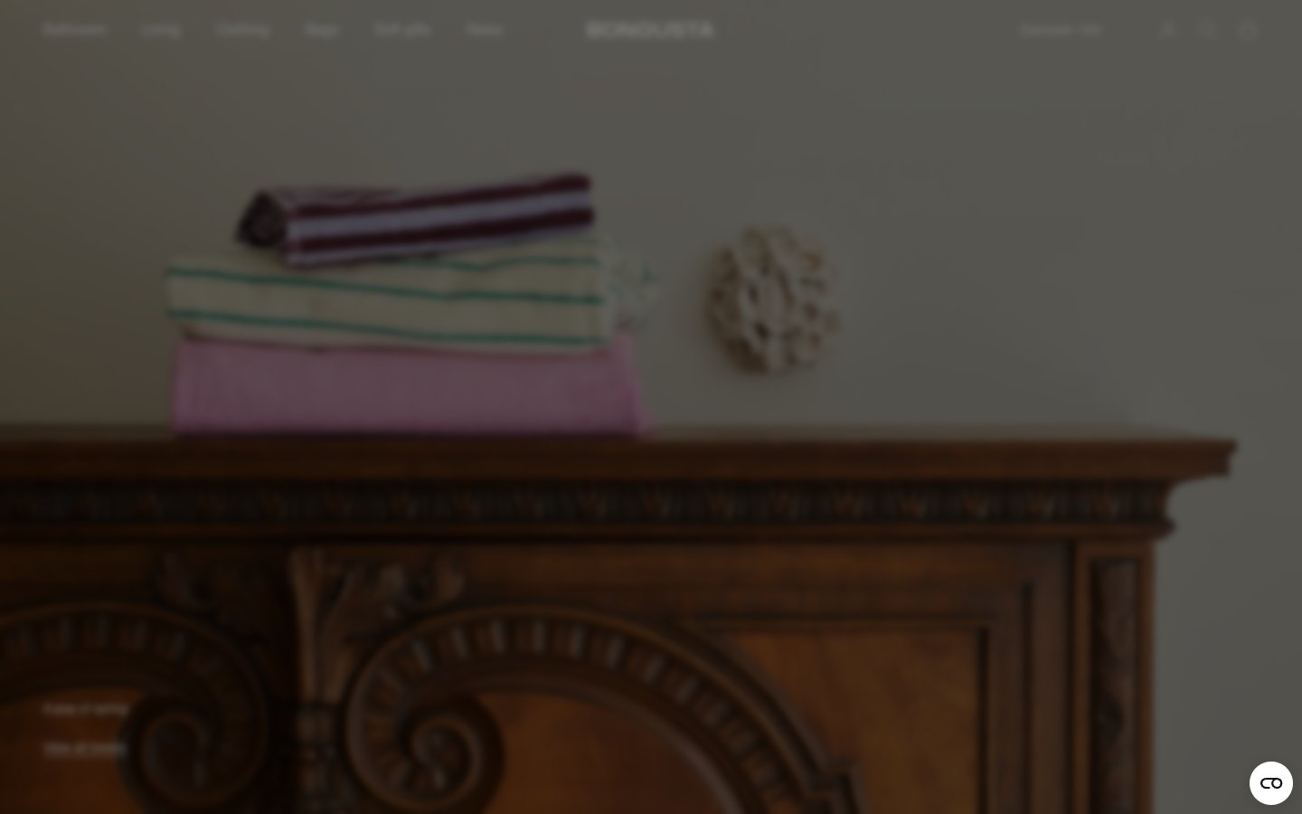
Bongusta
Bongusta — Style Reference
# Bongusta — Style Reference
> editorial linen closet behind museum glass
**Theme:** light
Bongusta operates as a quiet, editorial luxury system: warm white canvas, deep aubergine ink replacing pure black, and a single humanist sans-serif carrying all typography at compact sizes. The near-monochrome palette deliberately steps back so textile photography and interior still-lifes carry the visual weight — the UI is the gallery wall, never the artwork. Structure is built from warm linen hairlines rather than elevation, with pill-shaped actions carrying the only brand-tinted shadow in the entire system. The result reads like a curated museum catalog: dense with product, restrained in chrome, and confident enough to let the objects speak.
## Tokens — Colors
| Name | Value | Token | Role |
|------|-------|-------|------|
| Aubergine Ink | `#321929` | `--color-aubergine-ink` | Primary text, icons, outlined action borders, badges, links — a warm near-black that gives the monochrome system its only chromatic voice without ever feeling colored |
| Warm Linen | `#e0dddf` | `--color-warm-linen` | Structural borders on cards, dividers, image edges, nav, lists — the single most-used color in the system defines every edge between surfaces |
| Soft White | `#ffffff` | `--color-soft-white` | Page background, card surfaces, nav fill, badge fills — the canvas on which everything sits |
| Charcoal | `#1d1d1f` | `--color-charcoal` | Input field borders, image container borders, secondary structural edges where slightly more weight is needed than Warm Linen |
Websites
Markdown Text
design-md
website-prompt
landing-page-prompt
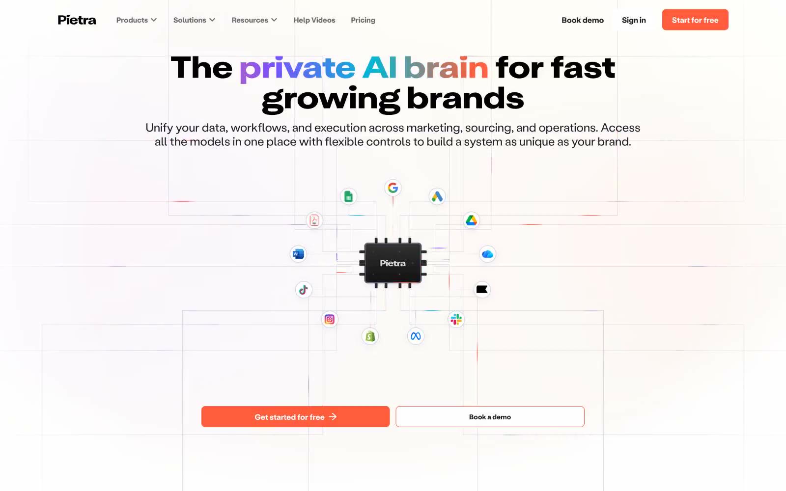
Pietrastudio
Pietrastudio — Style Reference
# Pietrastudio — Style Reference
> sunlit AI workshop on cream paper
**Theme:** light
Pietra is a warm-light productivity canvas where AI feels like a sunlit desk — cream-white surfaces, soft peach ambient washes, and one vivid coral action color that cuts through the warmth. The type system is paired and confident: a tall, tightly-tracked display face (Attila) shouts the headlines while a neutral grotesque (Labil Grotesk) handles everything else at near-tight tracking. Components sit on the page with soft, layered shadows — inset highlights and warm-tinted drop shadows give cards a paper-on-paper feel rather than digital elevation. Color is deployed as function: coral for the one true primary action, a palette of saturated gradient swatches (purple, blue, green, magenta, sunset) used as category tags on feature cards, and otherwise a near-monochrome system of grays. Density is comfortable with generous vertical breathing room between sections, max-width contained layouts, and 12-16px card padding inside 12-20px radii.
## Tokens — Colors
| Name | Value | Token | Role |
|------|-------|-------|------|
| Ember Coral | `#ff5c3c` | `--color-ember-coral` | Primary CTA fill, active nav, brand accent — a warm vermillion that sits forward against cream backgrounds without feeling aggressive |
| Pure White | `#ffffff` | `--color-pure-white` | Page canvas, card surfaces, button text on dark fills — the base everything else rests on |
| Ink Black | `#000000` | `--color-ink-black` | Primary heading text, body text, dominant borders — the workhorse contrast color used at 1750+ instances |
| Cream Paper | `#f8f6f2` | `--color-cream-paper` | Warm off-white surface layer for elevated cards and section bands — gives the page its sunlit warmth without leaving pure white |
Websites
Markdown Text
design-md
website-prompt
landing-page-prompt
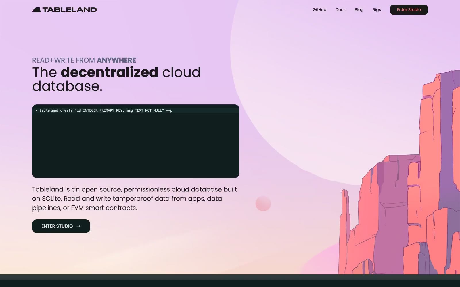
Tableland
Tableland — Style Reference
# Tableland — Style Reference
> alpine dusk at the terminal — soft coral peaks rising over a deep green-black void with one mint-green signal light glowing on the horizon.
**Theme:** dark
Tableland operates as a dark-mode developer surface punctuated by a single painted moment: a lavender-coral hero landscape that gives way to a calm, infrastructure-feeling interior. Typography is geometric humanist (Poppins) with weight 300 doing the heavy lifting on display copy, giving headlines a quiet, engineered feel rather than a marketing punch. A muted teal (#75b6b5) carries all interactive voice — nav, icons, links, learn-more affordances — while a single vivid mint green (#0be291) is reserved exclusively for emphasized headings, creating a clear hierarchy where teal navigates and green signals the primary read. Surfaces are layered in near-black steps (page → card → elevated), with cards and buttons rounded modestly (8–16px) and never pill-shaped except for tags and icon containers. The visual signature is the contrast between the soft painterly hero and the hard-edged terminal aesthetic below it — a database that feels both approachable and uncompromising.
## Tokens — Colors
| Name | Value | Token | Role |
|------|-------|-------|------|
| Abyss Teal | `#75b6b5` | `--color-abyss-teal` | Teal text accent for links, tags, and emphasized short phrases. Do not promote it to the primary CTA color |
| Mint Beacon | `#0be291` | `--color-mint-beacon` | Green text accent for links, tags, and emphasized short phrases. Do not promote it to the primary CTA color |
| Coral Ember | `#f4706b` | `--color-coral-ember` | Decorative icon accent — used sparingly in nav icons and the hero illustration's mountain highlights. Warm counterpoint to the cool teal/mint palette |
| Lavender Mist | `#e4cbf2` | `--color-lavender-mist` | Hero atmosphere — the soft lavender backdrop of the hero section and mountain illustration sky. Only used in the hero band; never in component surfaces or UI chrome |
Websites
Markdown Text
design-md
website-prompt
landing-page-prompt
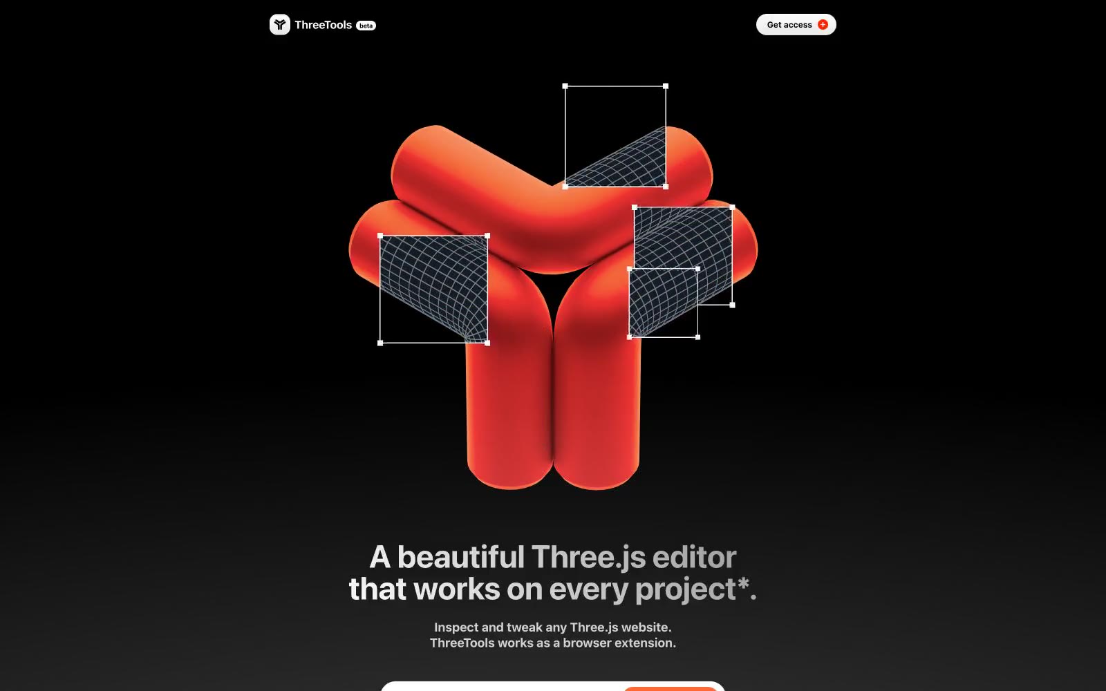
Three
Three — Style Reference
# Three — Style Reference
> Molten ember on gunmetal — a single hot-orange spark cutting through near-total darkness, with every surface stripped of color until the moment something matters.
**Theme:** dark
ThreeTools is a matte-black developer canvas lit by a single molten-orange spark. The interface is overwhelmingly achromatic — near-black surfaces, white text, gray hairline borders — and the only chromatic element is a vivid #ff4300 reserved exclusively for primary action surfaces and decorative emphasis. Typography is aggressively bold: the system font is set at weight 700 across every size from 9px badges to 68px display headlines, with tight negative tracking that intensifies as type grows. Components are softly rounded with 15–25px radii on controls and cards, 50–999px on inputs and pills, giving a friendly counterweight to the otherwise austere dark background. The design system is minimal, monochromatic, and lets the brand-orange carry 100% of the chromatic narrative — a single warm point in a sea of graphite.
## Tokens — Colors
| Name | Value | Token | Role |
|------|-------|-------|------|
| Ember Orange | `#ff4300` | `--color-ember-orange` | Orange action color for filled buttons, selected navigation states, and focused conversion moments |
| Void Black | `#111111` | `--color-void-black` | Page canvas, deepest background layer |
| Obsidian | `#181818` | `--color-obsidian` | Elevated card surface, section backgrounds |
| Charcoal | `#2b2a2a` | `--color-charcoal` | Footer surface, tertiary elevated panel |
Websites
Markdown Text
design-md
website-prompt
landing-page-prompt
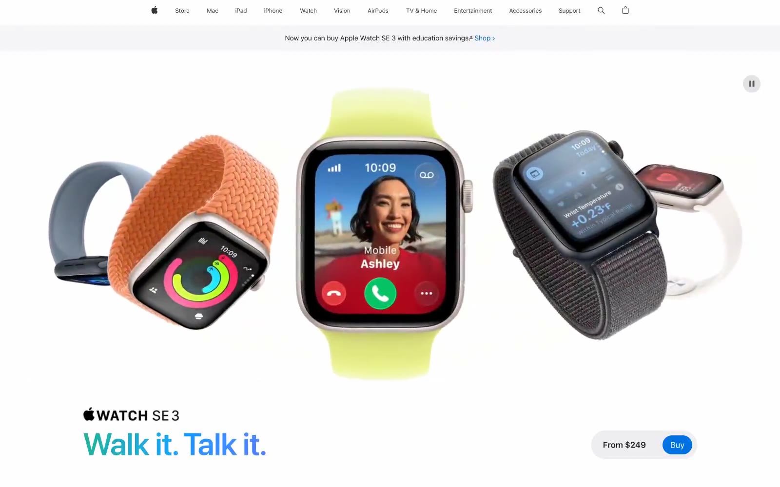
Apple (España)
Apple (España) — Style Reference
# Apple (España) — Style Reference
> white museum gallery at noon
**Theme:** light
Apple's product page language is a luminous white gallery: every pixel of chrome is stripped away so the photographed product and one bold typographic statement own the screen. Headlines in SF Pro Display at 64–96px do nearly all of the work, set in near-black (#1d1d1f) with selectively tinted words — a green verb for one emotion, a blue verb for another — that turn the headline itself into a micro-product story. Surfaces are paper-flat: no shadows, no gradients, no decorative borders, only hairline rules and generous whitespace. Interaction is reduced to two button archetypes — a blue pill (#0071e3) for the purchase moment and a subtle neutral pill (#e2e2e5) for everything else — surrounded by a sea of 28px-rounded cards that float on a #f5f5f7 canvas. The whole system is engineered to feel weightless, confident, and barely-designed: the brand is the product, and the design system is the silence around it.
## Tokens — Colors
| Name | Value | Token | Role |
|------|-------|-------|------|
| Pure Canvas | `#f5f5f7` | `--color-pure-canvas` | Page background, section bands, card surfaces — a near-white that separates structural surfaces from pure white product highlights without introducing tint |
| Paper White | `#ffffff` | `--color-paper-white` | Elevated card surfaces, icon fills, and inverted text on dark/colored backgrounds |
| Obsidian | `#1d1d1f` | `--color-obsidian` | Primary text, headlines, card borders, nav rules — the singular dark anchor; not pure black, a graphite that softens contrast on white |
| Iron Gray | `#707070` | `--color-iron-gray` | Secondary nav borders, list dividers, subdued UI metadata |
Websites
Markdown Text
design-md
website-prompt
landing-page-prompt
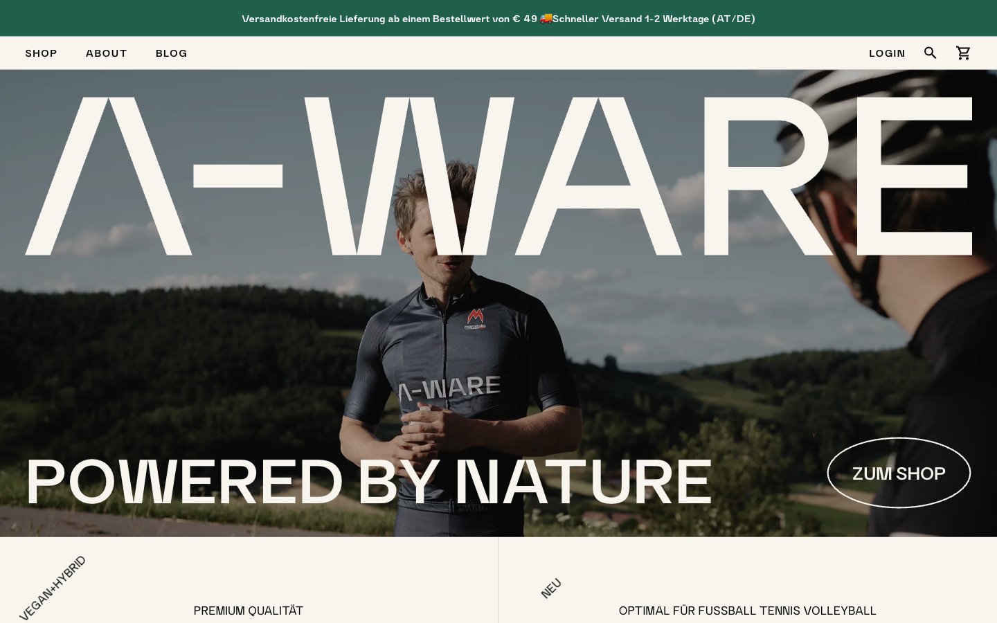
A-WARE
A-WARE — Style Reference
# A-WARE — Style Reference
> Apothecary editorial on warm parchment. A alpine athlete's apothecary spread: cream paper, black ink, one bronze seal, and dark glass canisters floating in generous whitespace.
**Theme:** light
A-WARE speaks in the quiet language of an editorial apothecary: vast off-white parchment surfaces, black ink typography, and a single warm bronze accent that only appears as functional punctuation. The interface is almost entirely achromatic — cream canvas, near-black text, hairline rules — letting the product photography (dark matte canisters against bright void) carry the visual weight. A condensed display face whispers authority rather than shouting it; body text uses a clean grotesk with generous tracking on labels (0.10em uppercase) to evoke pharmaceutical precision. Components are spare and geometric: ghost pill buttons, thin black dividers, product cards that float as if pinned to the page, and almost no elevation. Every screen should feel like a page torn from a premium sports-science magazine.
## Tokens — Colors
| Name | Value | Token | Role |
|------|-------|-------|------|
| Obsidian Ink | `#000000` | `--color-obsidian-ink` | Primary text, hairline borders, icon strokes, button outlines — the near-total absence of color in the UI makes pure black the structural backbone |
| Paper White | `#ffffff` | `--color-paper-white` | Primary canvas, card surfaces, button text on dark fills |
| Parchment | `#f7f5ee` | `--color-parchment` | Warm off-white surface layer above the page — hero overlays, section backgrounds, and elevated product zones |
| Linen | `#ece9df` | `--color-linen` | Subtle surface step for footers and the deepest background band — barely darker than Parchment, used to create quiet zone separation |
Websites
Markdown Text
design-md
website-prompt
landing-page-prompt
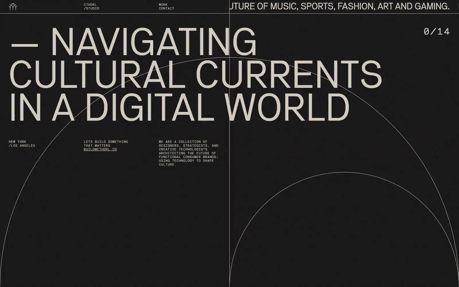
cthdrl
cthdrl — Style Reference
# cthdrl — Style Reference
> gallery wall at midnight
**Theme:** dark
Cthdrl operates in pure negative space: a pitch-black canvas where a single warm bone-white carries every word, line, and interface element. Typography is the architecture — oversized display weights compress into tight leading (0.85) to create monolithic headline slabs, while a monospaced face handles navigation, metadata, and body copy at intentionally small sizes. There are no fills, no shadows, no rounded surfaces, and no chromatic accents in the UI layer itself; color appears only as full-bleed gradient sections (deep maroons, violets, olive) that act as atmospheric chapter breaks. The system feels less like a website and more like a printed broadsheet or gallery wall: silence as the primary material, cream-on-black text as the only voice.
## Tokens — Colors
| Name | Value | Token | Role |
|------|-------|-------|------|
| Bone | `#e7ded1` | `--color-bone` | Primary text, hairline borders, navigation labels, link color, icon strokes — the sole chromatic element in the UI layer, a warm off-white that avoids clinical sterility |
| Void | `#000000` | `--color-void` | Page canvas, section backgrounds, every surface — pure black, not a near-black |
| Maroon Gradient | `linear-gradient(rgb(76, 11, 2), rgb(91, 48, 82))` | `--color-maroon-gradient` | Full-bleed atmospheric section background — deep oxidized red creating a candlelit warmth against the surrounding void |
| Violet Gradient | `linear-gradient(rgb(76, 11, 2), rgb(91, 48, 82))` | `--color-violet-gradient` | Full-bleed atmospheric section background — deep indigo wash, a cold counterpoint to the maroon sections |
Websites
Markdown Text
design-md
website-prompt
landing-page-prompt
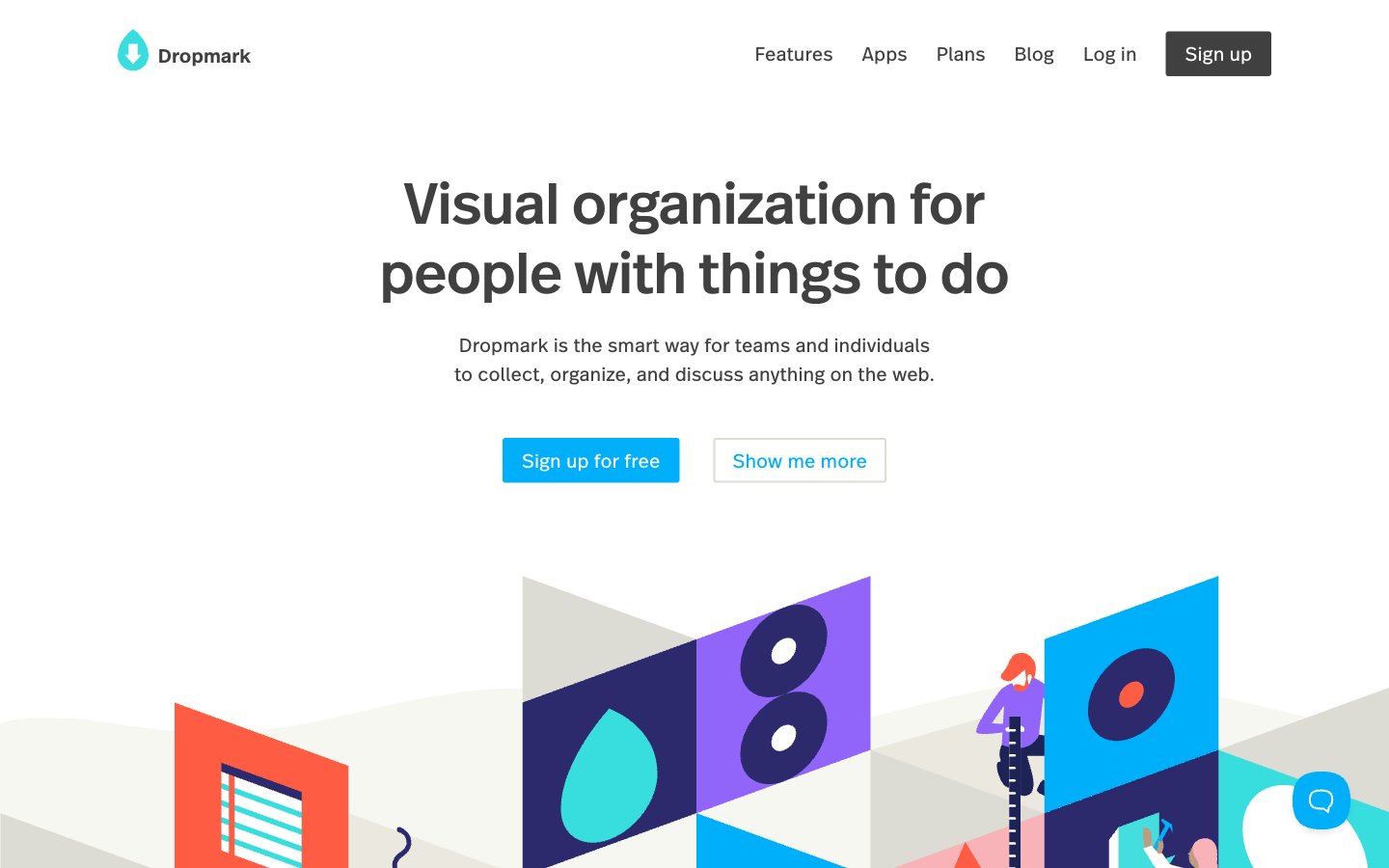
Dropmark
Dropmark — Style Reference
# Dropmark — Style Reference
> Warm paper atelier with cubist murals
**Theme:** light
Dropmark lives on a warm cream paper canvas (#f7f7f1) with almost no chrome, letting a vivid cubist illustration system carry the brand's voice while the interface stays nearly monochrome. The type system pairs DropmarkRealHead (weight 500, used sparingly for display and section titles) with DropmarkRealText (400/600/700) for everything else, creating a calm editorial cadence where headings whisper at medium weight rather than shout bold. A single cyan (#00affa) is the only chromatic UI accent, reserved for the outlined action border language and the filled primary button — every other surface and border is warm gray. Radii are near-zero (3px) and shadows are essentially absent, producing a flat, paper-like feel that contrasts deliberately with the bold geometric illustration murals acting as section art.
## Tokens — Colors
| Name | Value | Token | Role |
|------|-------|-------|------|
| Cyan Signal | `#00affa` | `--color-cyan-signal` | Blue accent for outlined action borders, linked labels, and lightweight interactive emphasis. Do not promote it to the primary CTA color |
| Cream Paper | `#f7f7f1` | `--color-cream-paper` | Page canvas, section backgrounds, soft card surfaces — the warm off-white ground everything sits on |
| Pure White | `#ffffff` | `--color-pure-white` | Inset cards, modal surfaces, inverse button text, nav background |
| Stone Gray | `#dcdcd4` | `--color-stone-gray` | Subtle accent surfaces, inset focus rings, warm shadow tints |
Websites
Markdown Text
design-md
website-prompt
landing-page-prompt
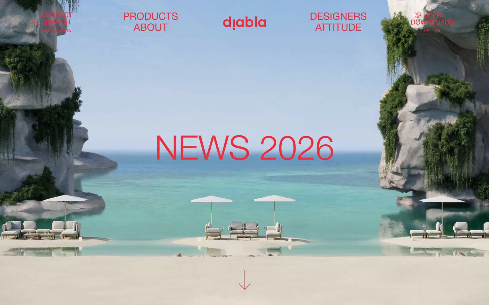
Diabla
Diabla — Style Reference
# Diabla — Style Reference
> Mediterranean courtyard at noon — sun-bleached pink walls, one bold red canvas awning, and editorial serif headlines stretched across the sky.
**Theme:** light
Diabla speaks in a sun-bleached Mediterranean vernacular: a whisper-pink canvas, editorial Helvetica, and one searing vermillion that punctuates like lipstick. Typography does the heavy lifting — the display face is set absurdly large (80–110px) and pulled almost impossibly tight (line-height 0.88–0.91), turning product names into cropped fashion headlines. Interfaces are quiet and gallery-like: generous whitespace, hairline-red outlined buttons, and almost no shadow. Color is rationed: red appears as outlines, link text, and the wordmark, never as a flat fill — the brand gestures rather than shouts. The result reads like a Vogue spread for outdoor furniture rather than an e-commerce catalog.
## Tokens — Colors
| Name | Value | Token | Role |
|------|-------|-------|------|
| Vermillion | `#ed2e38` | `--color-vermillion` | Wordmark, link text, heading text, outlined-button borders — the single chromatic note in an otherwise neutral palette, used as outline and ink rather than flood fill to keep it editorial |
| Blush Canvas | `#fcf0f3` | `--color-blush-canvas` | Page background, input field fills — a barely-there warm pink that softens the white experience and gives the brand its sunlit, not sterile, identity |
| Charcoal Ink | `#333333` | `--color-charcoal-ink` | Body copy, paragraph text, default readable text — softer than pure black, lets the red feel like the only sharp edge on the page |
| Onyx | `#000000` | `--color-onyx` | Button text and occasional thin button borders where a neutral-bordered variant is needed |
Websites
Markdown Text
design-md
website-prompt
landing-page-prompt
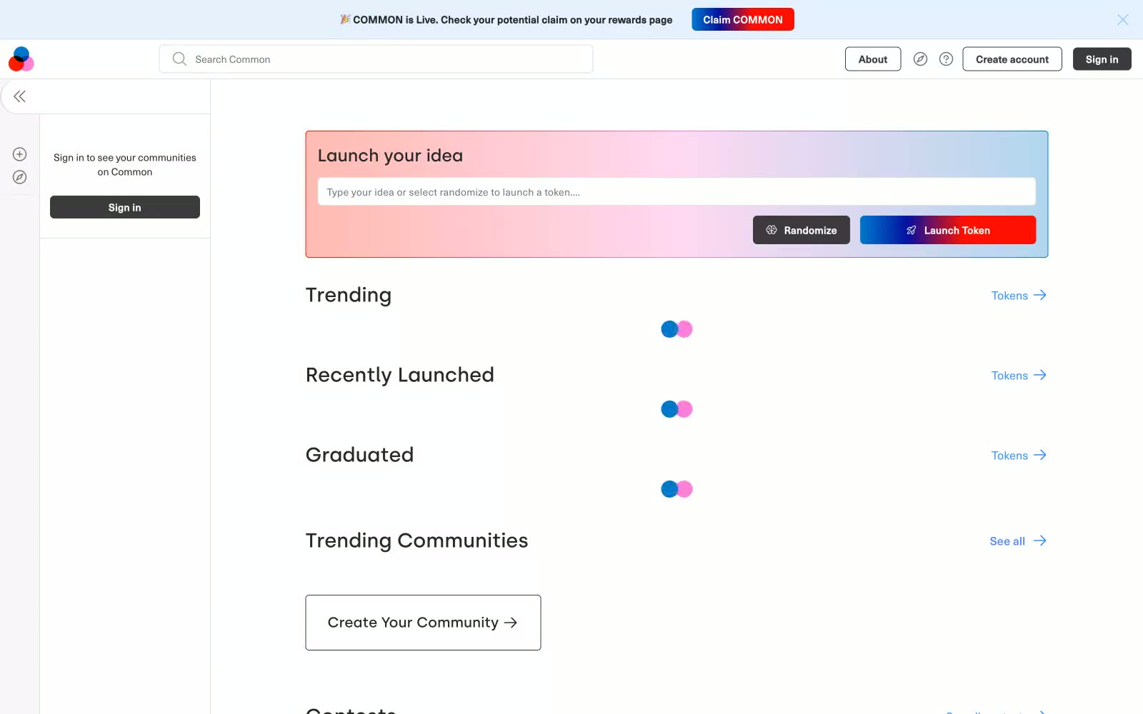
Common
Common — Style Reference
# Common — Style Reference
> graph paper under neon streaks
**Theme:** light
Common operates on a graphite-and-paper economy: the canvas is near-white, structure is near-black, and everything meaningful is signalled by one of two narrow chromatic accents or a single full-spectrum gradient. Type is compact and uniform (NeueHaasUnica, tabular figures, whisper-wide tracking) so the page reads as a ledger rather than a brochure. The 6px radius is the system's only bend — nothing is fully pill, nothing is sharp. Color is rationed: blue and violet appear as thin borders, link strokes, and icon dots; the vivid spectrum is reserved for the launch card and the launch button, which together form a single ceremonial moment on an otherwise quiet page. Elevation is barely there (a 1px/5% shadow) — depth is created by hairline borders on a stacked gray surface, not by floating cards.
## Tokens — Colors
| Name | Value | Token | Role |
|------|-------|-------|------|
| Carbon | `#000000` | `--color-carbon` | Body text, structural hairlines, dark icon strokes — the universal ink that defines every other element on the page |
| Paper | `#ffffff` | `--color-paper` | Page canvas, card surfaces, input fields, button text on dark fills |
| Fog | `#f0eff0` | `--color-fog` | Body background wash, second surface tier below cards |
| Silver | `#e0dfe1` | `--color-silver` | Input borders, subtle dividers between content bands |
Websites
Markdown Text
design-md
website-prompt
landing-page-prompt
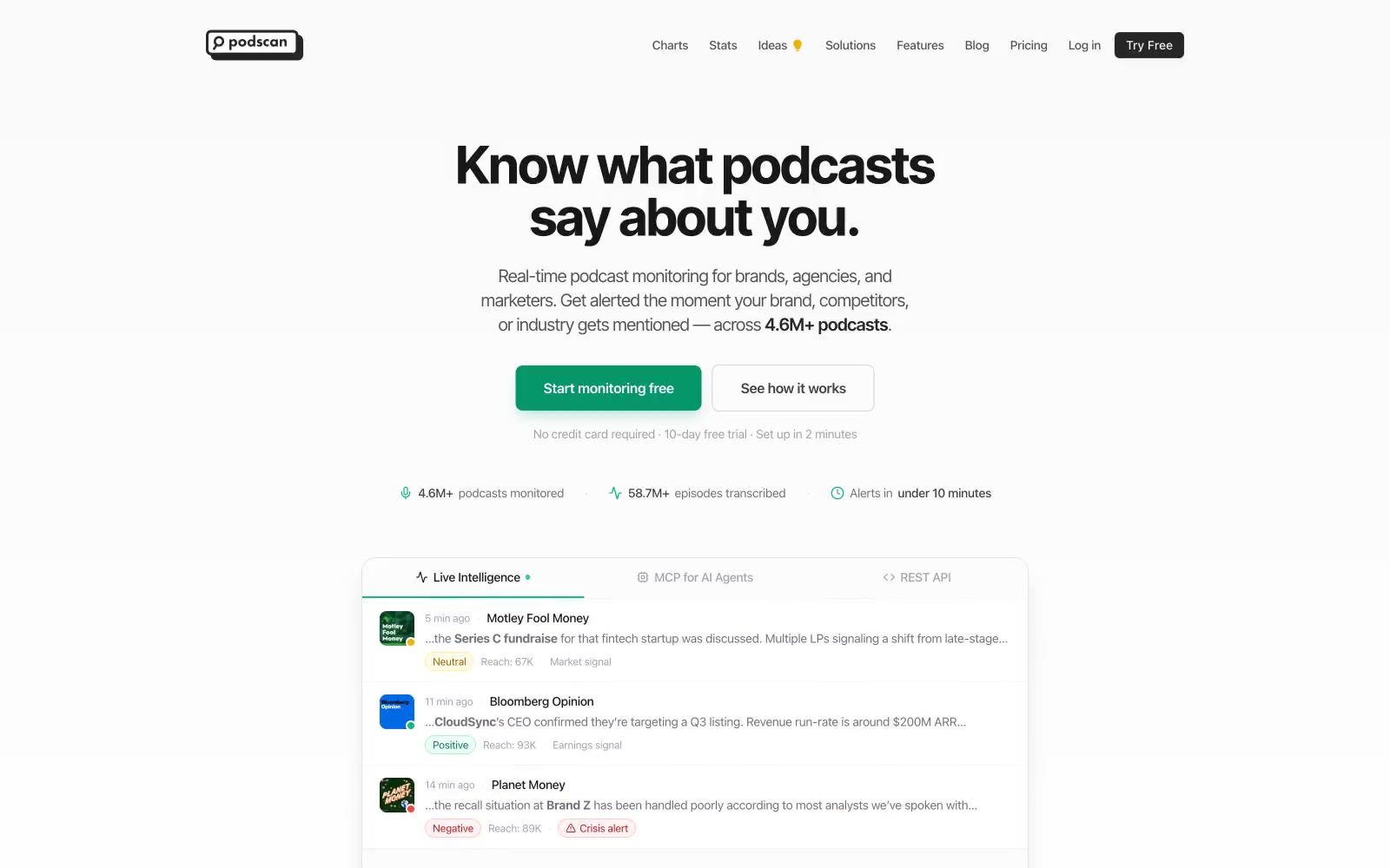
Podscan.fm
Podscan.fm — Style Reference
# Podscan.fm — Style Reference
> Green-lit podcast radar on white paper — a quiet instrument panel where one emerald signal cuts through grayscale data.
**Theme:** light
Podscan.fm reads as a modern data-intelligence console on a crisp white canvas: monochrome foundation, one vivid emerald green as the single navigational north star, and a disciplined palette of categorical colors (violet, pink, blue, teal) used only to differentiate adjacent use-cases or pricing tiers. Typography is a system sans rendered tight — negative tracking at every size creates a compressed, data-display rhythm rather than editorial looseness. Components are flat, lightly bordered, rounded at 8–12px, and rely on hairline #e5e7eb dividers more than shadow for separation. Sentiment badges, colored icon disks, and tier-distinct CTA fills (black, green, violet) carry the color load, so a new page should feel mostly grayscale with green as the verb-action color and secondary hues appearing only as small functional punctuation.
## Tokens — Colors
| Name | Value | Token | Role |
|------|-------|-------|------|
| Emerald Signal | `#059669` | `--color-emerald-signal` | Green action color for filled buttons, selected navigation states, and focused conversion moments. |
| Mint Pulse | `#10b981` | `--color-mint-pulse` | Secondary green for iconography, category tags, and decorative emphasis where a lighter hue is needed |
| Onyx Ink | `#18181b` | `--color-onyx-ink` | Primary text, dark CTA fill, logo wordmark, elevated headings — the near-black that anchors every screen |
| Pure Canvas | `#ffffff` | `--color-pure-canvas` | Page background, card surfaces, button text on dark fills, input fields |
Websites
Markdown Text
design-md
website-prompt
landing-page-prompt
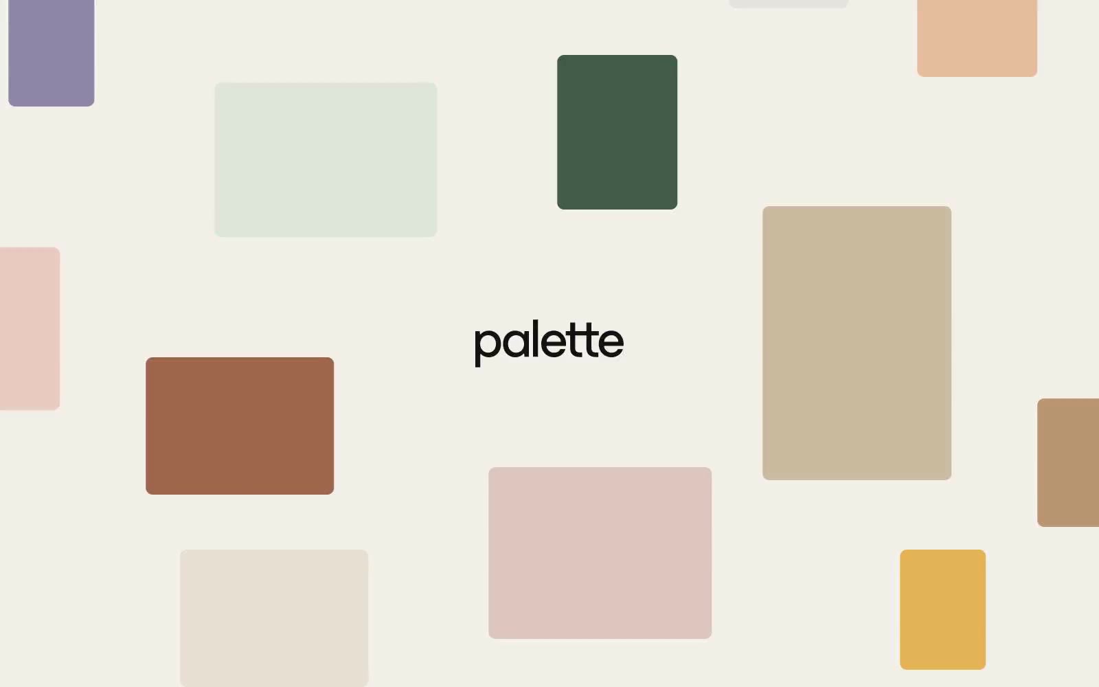
Palette Supply
Palette Supply — Style Reference
# Palette Supply — Style Reference
> art-supply shelf in a sunlit studio
**Theme:** light
Palette Supply operates on the principle that color IS the product — the interface recedes so that swatches can speak. A warm cream canvas (#f2f0e9) acts like a designer's worktable, with matte rectangular swatches scattered at varying sizes and aspect ratios, each one a distinct earthy hue from a curated palette. The UI chrome is deliberately quiet: a deep ink black (#141212) for text, a single saturated blue-violet (#3051a8) reserved exclusively for actions and links, and zero shadows — every boundary is a hairline border or a color edge. Typography is custom and confident: 'esbuild' stamps oversized 64px display titles with extremely tight tracking, while 'ppsupply' handles everything else at whisper-light weights (100 and 300) that make the page feel airy and unhurried. The result reads less like a web app and more like a well-organized stationery catalog — generous whitespace, tactile surfaces, no gradients, no glassmorphism, no decorative noise.
## Tokens — Colors
| Name | Value | Token | Role |
|------|-------|-------|------|
| Studio Cream | `#f2f0e9` | `--color-studio-cream` | Page canvas — warm off-white ground that warms every color placed on it, the single largest surface in the system |
| Paper White | `#ffffff` | `--color-paper-white` | Elevated card and surface layer, used when a swatch or content block needs to sit above the canvas |
| Ink Black | `#141212` | `--color-ink-black` | Primary text, heading strokes, and hairline borders — slightly warmer than pure black, pairs cleanly with the cream canvas |
| Pencil Gray | `#a1a0a0` | `--color-pencil-gray` | Muted secondary text and inactive borders, the only mid-gray in the neutral scale |
Websites
Markdown Text
design-md
website-prompt
landing-page-prompt
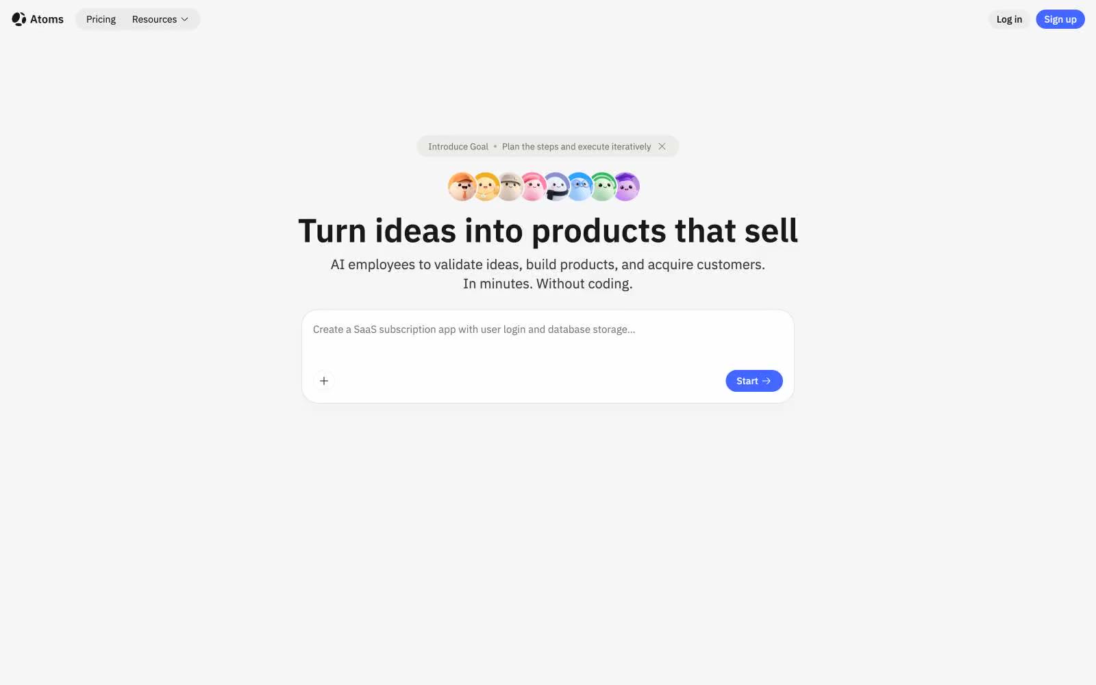
Atoms
Atoms — Style Reference
# Atoms — Style Reference
> white atelier with one blue spark
**Theme:** light
Atoms operates as a quiet workshop: near-white canvas, one confident blue-violet accent, and typography that lets content breathe rather than perform. The system is almost achromatic — gray is the structural material, and the single chromatic note appears only when something is actionable, linked, or wants to be named. Surfaces are flat and soft, cards float on barely-there shadows, and radii swing between fully pill-shaped (9999px) and generously rounded (24px) — never sharp, never heavy. IBM Plex Sans carries the UI at compact sizes while Plex Serif surfaces once, at 48px, giving the hero headline a literary weight that the product photography (template thumbnails with Mac chrome) deliberately undercuts with its playful, colorful content.
## Tokens — Colors
| Name | Value | Token | Role |
|------|-------|-------|------|
| Atoms Blue | `#4267ff` | `--color-atoms-blue` | Violet supporting accent for decorative details and low-frequency emphasis. Do not promote it to the primary CTA color |
| Atoms Blue Deep | `#425ce1` | `--color-atoms-blue-deep` | Violet supporting accent for decorative details and low-frequency emphasis. Do not promote it to the primary CTA color |
| Mac Red | `#ff5f56` | `--color-mac-red` | Red supporting accent for decorative details and low-frequency emphasis |
| Mac Yellow | `#ffbd2e` | `--color-mac-yellow` | Decorative window-chrome dot on template preview thumbnails |
Websites
Markdown Text
design-md
website-prompt
landing-page-prompt
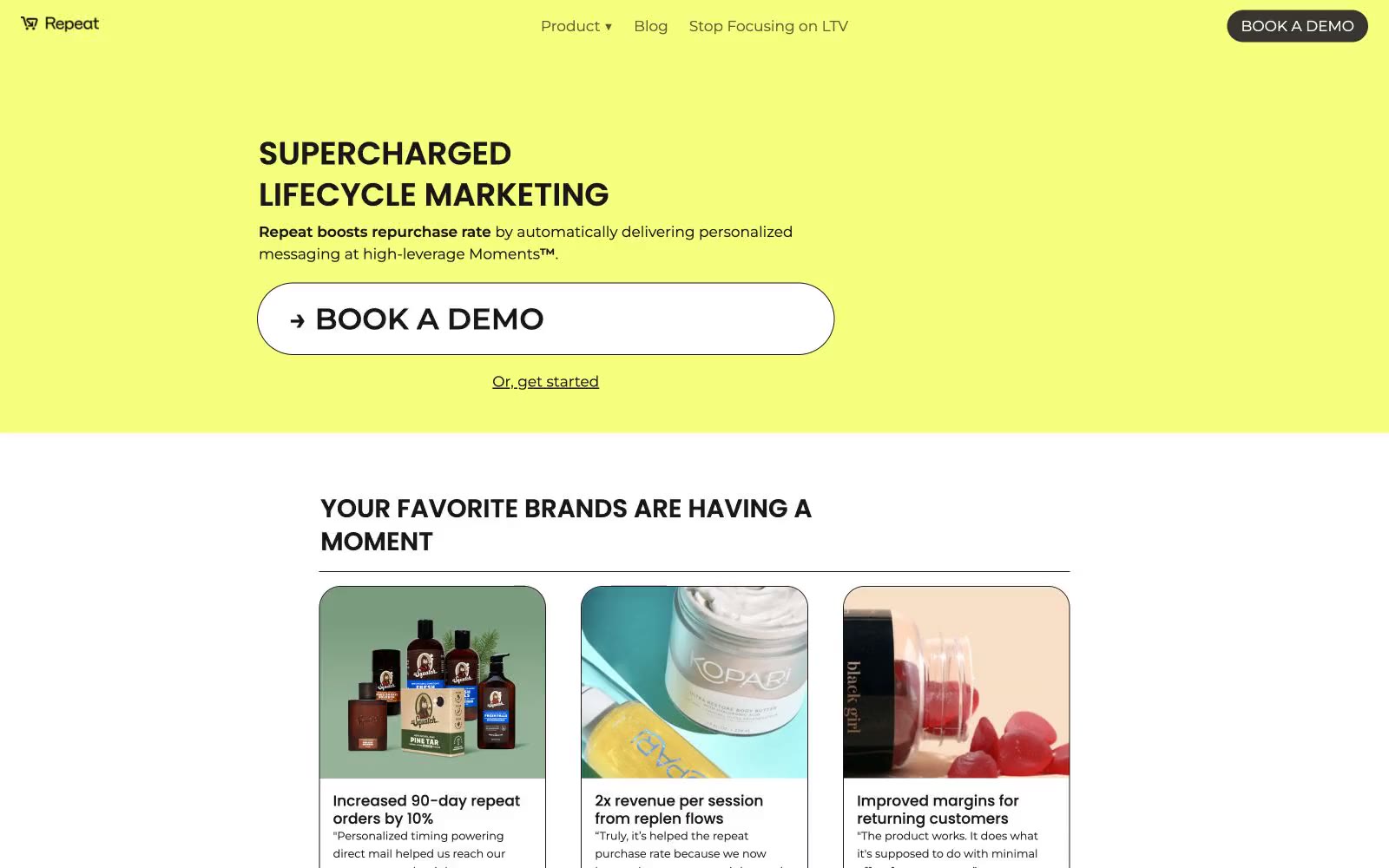
Repeat
Repeat — Style Reference
# Repeat — Style Reference
> Highlighter swipe on warm notebook paper — Repeat's lime washes act like marker strokes across cream stock, with near-black ink and pill-rounded cards floating flat above.
**Theme:** light
Repeat uses an editorial highlighter-on-paper language: a vivid lime wash dominates the canvas like a marker swipe, a warm cream ground reads as notebook stock, and a single near-black ink carries every word of authority. Typography is assertive and uppercase — Poppins at heavy weight sets section titles in tight 1.2 line-height stacks, while Montserrat runs the body in a calm 17px — the contrast between shouting headlines and conversational body is the visual rhythm. Components are flat, generously rounded at 25px, and rely on thin black borders rather than shadows; even the CTA is a near-flat white card with a hairline border sitting on the lime. The single lime accent should be used sparingly as full-bleed section punctuation, never as a button fill or text color — color here is atmosphere, not chrome.
## Tokens — Colors
| Name | Value | Token | Role |
|------|-------|-------|------|
| Ink | `#171717` | `--color-ink` | Dark borders and separators for elevated surfaces and inverted UI. Do not promote it to the primary CTA color |
| Paper | `#ffffff` | `--color-paper` | Hairline borders, dividers, input outlines, and card edges on light surfaces. Do not promote it to the primary CTA color |
| Notebook Cream | `#ede7e2` | `--color-notebook-cream` | Page canvas for body sections, feature row backgrounds — warm off-white that softens white cards and reads as paper stock |
| Olive Ink | `#37352f` | `--color-olive-ink` | Secondary near-black surface — warmer than Ink, used as a fill on the logo grid tiles and nav background accent |
Websites
Markdown Text
design-md
website-prompt
landing-page-prompt
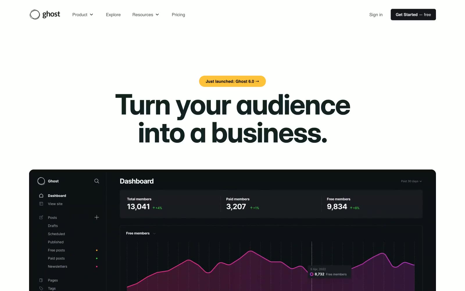
Ghost
Ghost — Style Reference
# Ghost — Style Reference
> Monumental type on infinite white paper
**Theme:** mixed
Ghost speaks at full volume through typography alone: monumental Inter Display headlines (72–96px, weight 600, tracking -0.025em) command the white canvas, then drop to InterVariable for compact, functional body text. The page alternates between two distinct modes — bright white editorial sections with massive headlines and product/dashboard sections rendered in near-black (#15171a) with vivid purple-pink chart gradients. A single chromatic accent — electric lime (#d1ff19) — punctuates links and emphasis against the achromatic backbone, while a warm amber pill (#fec137) handles announcement chips. Components stay soft and approachable: 24px radius on primary controls, 8px on cards, layered 0.1-alpha shadows that hint at elevation without weight. The rhythm is editorial — enormous headlines, generous vertical breathing room, centered or left-aligned stacks, with dark product cards providing visual counterpoint to the white marketing canvas.
## Tokens — Colors
| Name | Value | Token | Role |
|------|-------|-------|------|
| Ink Black | `#15171a` | `--color-ink-black` | Supporting neutral for secondary UI, dividers, and muted labels. Do not promote it to the primary CTA color |
| Paper White | `#ffffff` | `--color-paper-white` | Page canvas, card surfaces, button text on dark fills |
| Mist Gray | `#e5e7eb` | `--color-mist-gray` | Hairline borders, subtle dividers, ghost surfaces — the dominant neutral that softens the white-on-white hierarchy |
| Slate Veil | `#94a3b8` | `--color-slate-veil` | Muted body text, secondary metadata, nav placeholders — desaturated blue-gray reads as informational without competing with headlines |
Websites
Markdown Text
design-md
website-prompt
landing-page-prompt
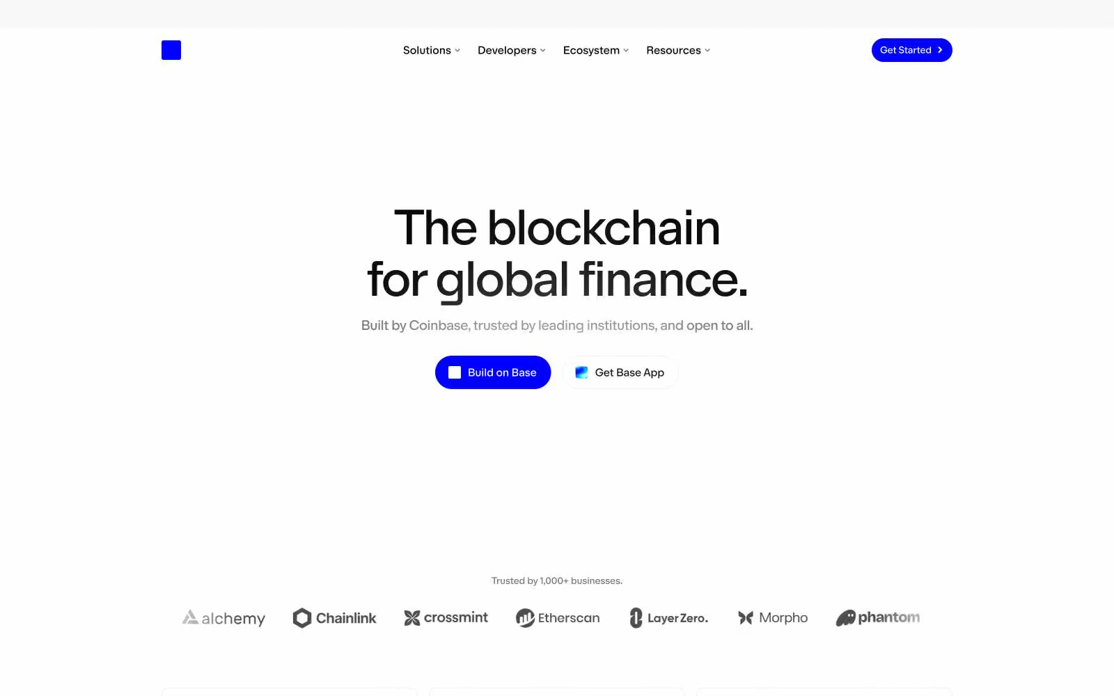
Base
Base — Style Reference
# Base — Style Reference
> Blueprint globe, blue pulse.
**Theme:** light
Base reads as a wireframe atlas on white paper: hairline vertical bars form continents across the canvas, and one electric blue marks every point of action — the logo block, filled buttons, and map data points. Typography carries the visual weight: a massive geometric display face (Doto at 115px, -0.025em tracking) headlines, while a wide-tracked monospaced label font (0.073em) pins section categories in uppercase. Surfaces stay flat and nearly borderless; structure comes from generous whitespace, a 4px-based spacing grid, and the occasional 8px-radius card. The system is overwhelmingly monochrome; blue is rationed as sharp punctuation, never used as decoration.
## Tokens — Colors
| Name | Value | Token | Role |
|------|-------|-------|------|
| Electric Blue | `#0000ff` | `--color-electric-blue` | Violet outline accent for tags, dividers, and focused UI edges. Do not promote it to the primary CTA color |
| Wireframe Green | `#098551` | `--color-wireframe-green` | Data point accent on the world map visualization — marks growth/gas nodes against the neutral wireframe |
| Carbon | `#000000` | `--color-carbon` | Primary text, headlines, structural lines, iconography |
| Pure White | `#ffffff` | `--color-pure-white` | Page canvas, card surfaces, button text on dark or chromatic fills |