AI Prompt Studio - Intelligent Prompt Library
Explore and use professional AI prompts to optimize your workflow.
One-click Use
Websites
Markdown Text
design-md
website-prompt
landing-page-prompt
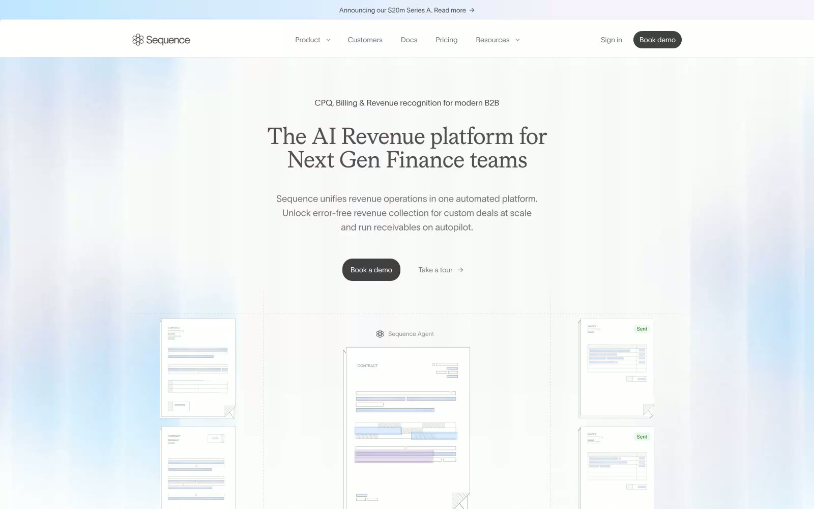
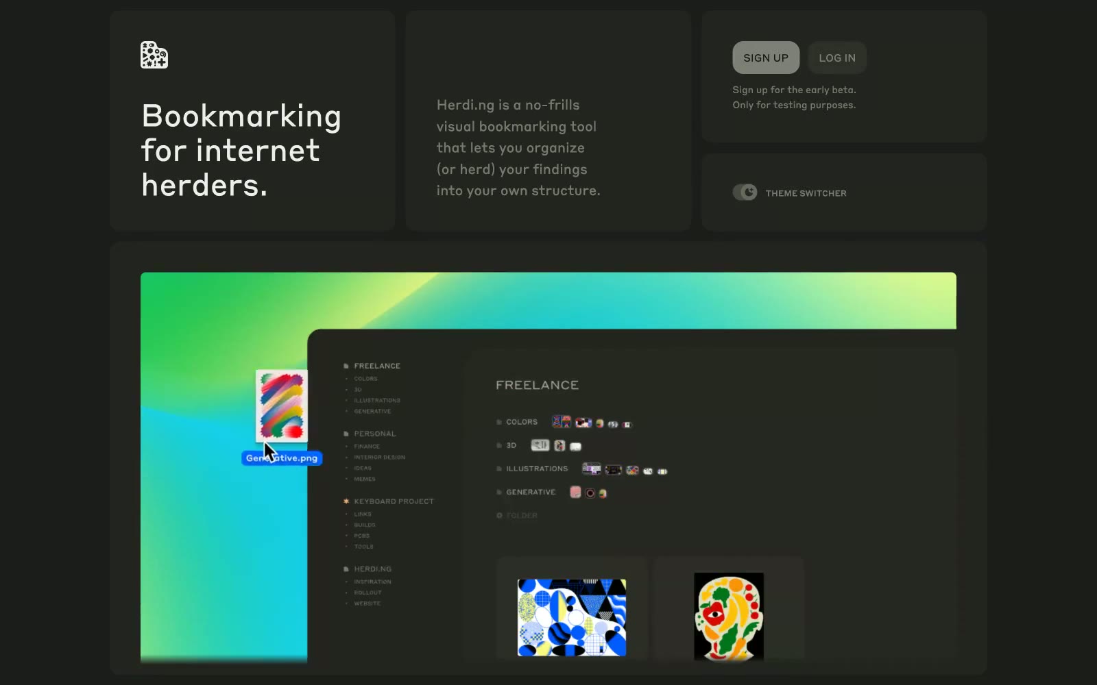
Sequence
Sequence — Style Reference

# Sequence — Style Reference
> blueprint paper with violet annotations. A near-white editorial surface where everything is grayscale and one precise violet pulse marks every action worth taking.
**Theme:** light
Sequence reads like an editorial finance publication rendered in product form: a near-white canvas, a humanist sans (TWK Lausanne) carrying almost all interface text, and a light-weight serif (Moderat Serif) used sparingly on large display headlines to inject editorial gravity. Depth comes from hairline borders and thin layered shadows, not heavy panels or colored fills. A single vivid violet (#a565ff) is the only chromatic accent in the system — it functions as a precise annotation, appearing on primary CTAs, active icons, and subtle brand glows, while the rest of the interface stays in cool grays. Soft blue-violet radial washes in hero and section backgrounds create atmospheric depth without committing to color, and the overall density is compact and precise rather than spacious or airy.
## Tokens — Colors
| Name | Value | Token | Role |
|------|-------|-------|------|
| Violet Pulse | `#a565ff` | `--color-violet-pulse` | Primary CTAs, active icons, brand glow accents — the single chromatic accent in the system; everything else defers to it |
| Indigo Ink | `#5e5cff` | `--color-indigo-ink` | Link text, secondary text emphasis, and accent strokes where violet would be too loud |
| Lavender Wash | `#ebebff` | `--color-lavender-wash` | Soft tinted backgrounds for highlighted callouts and subtle surface differentiation |
| Iris Glow | `#e0c9ff` | `--color-iris-glow` | Violet supporting accent for decorative details and low-frequency emphasis. Do not promote it to the primary CTA color |
Websites
Markdown Text
design-md
website-prompt
landing-page-prompt
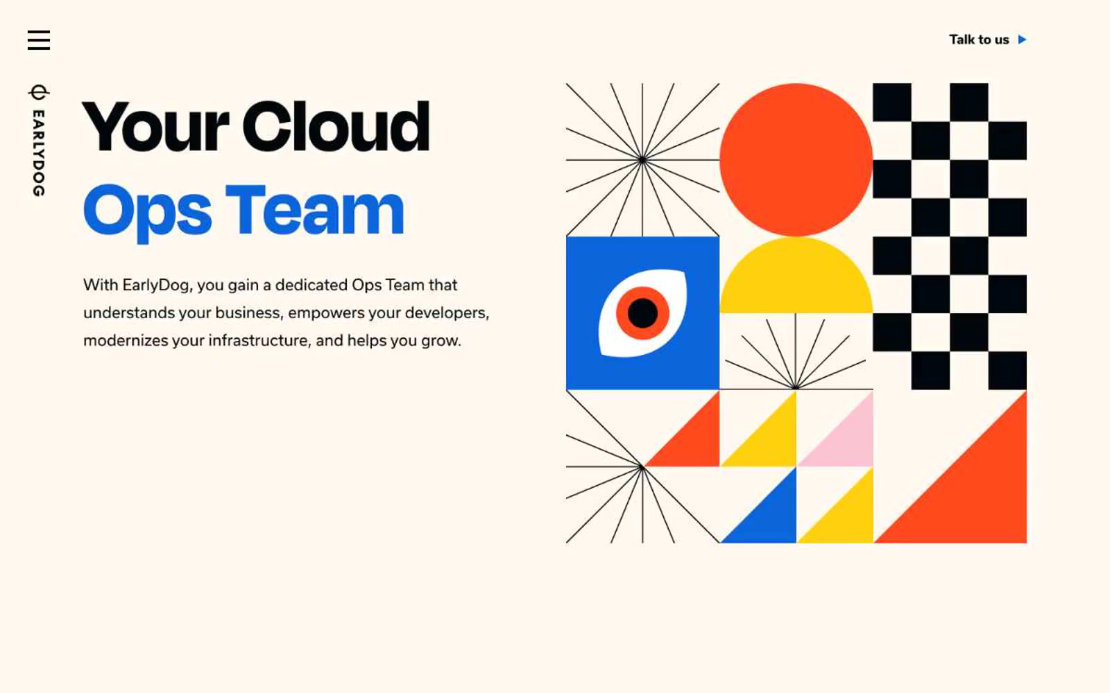
Earlydog
Earlydog — Style Reference
# Earlydog — Style Reference
> Bauhaus poster pinned to a cloud architect's corkboard — cream paper, primary-color shapes, oversized geometric type.
**Theme:** light
Earlydog operates as a Bauhaus design lab transplanted into DevOps — warm cream paper backgrounds, near-black typography, one vivid blue accent, and geometric illustrations built from primary-color primitives (circles, squares, checkerboards, starbursts, triangles). The display face (degular-display) sets oversized 52–116px headlines with positive letter-spacing, an unusual choice that gives the type geometric breathing room rather than the tight editorial tension most display fonts chase. Body copy stays at 18px in a humanist sans (usual), keeping reading temperature warm against the eggshell canvas. Components are intentionally sparse: pill-shaped outlined buttons, ghost links with play-triangle markers, and generous 96px section gaps that let the geometric artwork breathe. The functional palette is restricted to three colors — cream, ink, blue — while illustrations carry the full primary-color spectrum as decorative punctuation.
## Tokens — Colors
| Name | Value | Token | Role |
|------|-------|-------|------|
| Cream Paper | `#fff9f0` | `--color-cream-paper` | Page canvas, card surfaces, button fills — warm off-white gives the entire interface a paper-like, print-graphic feel that warms the cool blue accent |
| Midnight Ink | `#000609` | `--color-midnight-ink` | Primary text, heading strokes, hairline borders, outlined button frames, logo mark — near-black with a barely-perceptible blue tint keeps it from feeling dead |
| Signal Blue | `#0a65db` | `--color-signal-blue` | Accent headings, icon strokes, active nav emphasis, illustration accent shapes — the single chromatic functional color, used sparingly to mark emphasis and brand voice |
| Ember Red | `#ee4623` | `--color-ember-red` | Illustration accent — primary-color punctuation in geometric compositions, starbursts, circular forms, and triangle fills |
Websites
Markdown Text
design-md
website-prompt
landing-page-prompt
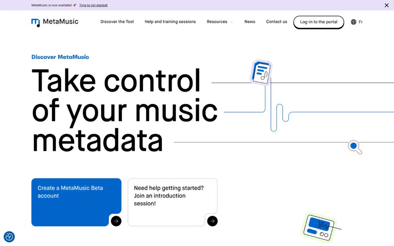
MetaMusic
MetaMusic — Style Reference
# MetaMusic — Style Reference
> editorial cream broadsheet with sticker-flat accents — a warm-paper canvas where oversized type and hard-offset shadows replace all decoration.
**Theme:** mixed
MetaMusic speaks in a paper-warm, editorial tone: a cream canvas (#f4f1ea) hosts oversized display headlines (up to 120px) that read like a museum wall label, while one vivid blue (#0066cc) and one deep indigo (#0e2575) carry all functional weight. Surfaces stack from cream → white → light-blue wash → indigo panel, creating a gentle warm-to-cool gradient as the eye scrolls. The defining texture is a hard 4px solid black offset shadow (zero blur) — a flat, almost sticker-like treatment that gives buttons and cards a tactile, printed feel rather than a soft Material elevation. Typography is monolinear and quiet: Maison Neue at every UI role, Spoof reserved for a single 22px accent heading, all set tight with negative tracking at display sizes. Components stay spacious (24px card radius, 40px internal padding) and never compete with the massive hero type; illustrated document and music icons float on warm peach circles as the only decorative voice.
## Tokens — Colors
| Name | Value | Token | Role |
|------|-------|-------|------|
| Brand Blue | `#0066cc` | `--color-brand-blue` | Primary action background, link underlines, heading accents, card fills on light surfaces — the single chromatic voice that powers CTAs, active states, and iconography |
| Deep Indigo | `#0e2575` | `--color-deep-indigo` | Dark section backgrounds (feature/why panels), hero image frames — the only place a full-bleed surface goes deep and saturated |
| Midnight Card | `#213680` | `--color-midnight-card` | Elevated card surface when sitting on Deep Indigo backgrounds — one step lighter than the panel to separate without using shadow |
| Charcoal Ink | `#101820` | `--color-charcoal-ink` | Body text and dark-surface secondary fills — slightly cooler than pure black, anchors reading text without harshness |
Websites
Markdown Text
design-md
website-prompt
landing-page-prompt
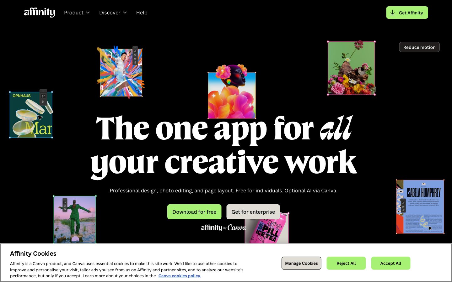
Affinity
Affinity — Style Reference
# Affinity — Style Reference
> floating gallery in a black void — a dark editorial stage where one green accent is the only spot of light
**Theme:** dark
Affinity inhabits a black-void gallery: a single near-black canvas with editorial-scale serif headlines floating over it, surrounded by scattered design work as if pinned to an invisible wall. The visual grammar pairs a massive custom serif (reaching 112px at near-unity line-height) with a neutral sans for everything utilitarian, creating tension between gallery gravitas and interface clarity. A single electric spring-green — #a7f175 — is the only chromatic signal, used sparingly for the one action that matters. Images carry soft, directional drop shadows that suggest stage lighting on a dark backdrop. Surfaces stay nearly indistinguishable from the canvas; the system communicates through type scale, whitespace, and that one green pulse rather than elevation or color-coded regions.
## Tokens — Colors
| Name | Value | Token | Role |
|------|-------|-------|------|
| Spring Pulse | `#a7f175` | `--color-spring-pulse` | Primary action buttons, active states, the single chromatic accent — a high-chroma lime-green that reads as switched-on against the black canvas |
| Void | `#000000` | `--color-void` | Page canvas, hero background, deepest surface — the negative space everything floats on |
| Obsidian | `#211d1d` | `--color-obsidian` | Elevated surface, button fills, subtle card backgrounds — one step off true black to distinguish interactive elements |
| Carbon | `#0f1015` | `--color-carbon` | Card surfaces, body text on light flips, icon fills — the workhorse dark for contained components |
Websites
Markdown Text
design-md
website-prompt
landing-page-prompt
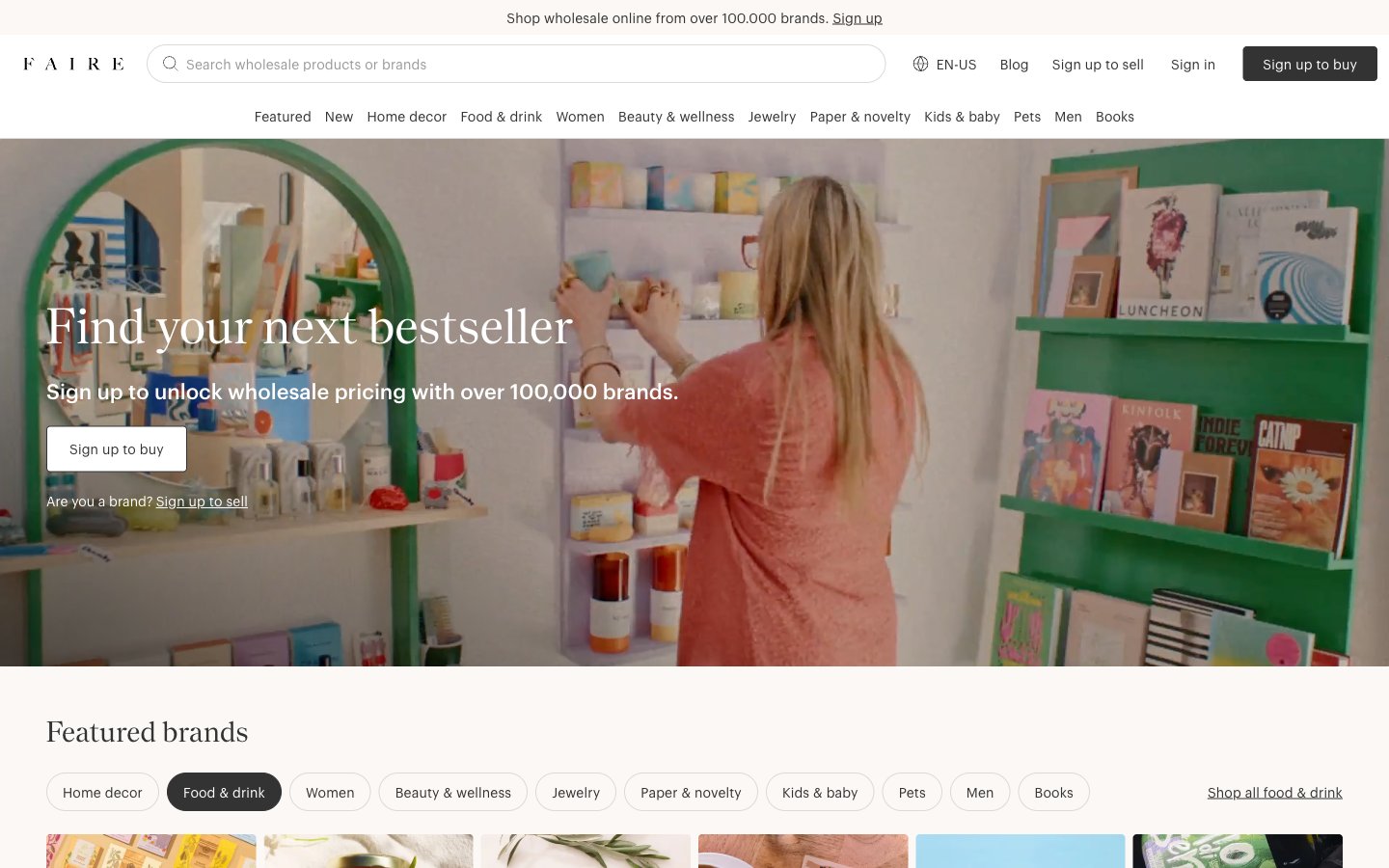
Faire ES
Faire ES — Style Reference
# Faire ES — Style Reference
> warm cream wholesale catalog
**Theme:** light
Faire reads like a printed wholesale catalog digitized — warm cream paper (#fbf8f6) as the canvas, a whisper-thin geometric sans (Graphik 100) for body and a high-contrast serif (Nantes) for editorial headlines, almost zero chromatic noise, and one pale buttery yellow (#f1f29f) used as a decorative underline accent rather than a functional call-to-action. The whole interface is achromatic: the brand 'Sign up to buy' button is matte black, the secondary 'Sign in' is ghost, category nav pills use a generous 40px radius, and the 4px button radius keeps control elements grounded and rectangular against the otherwise pill-shaped navigation. Imagery carries all the warmth — full-bleed lifestyle photography of boutiques, shelves, and product stills — while the UI stays quiet, editorial, and whitespace-driven, letting merchants' products feel curated rather than marketed.
## Tokens — Colors
| Name | Value | Token | Role |
|------|-------|-------|------|
| Cream Paper | `#fbf8f6` | `--color-cream-paper` | Page canvas, hero backgrounds, warm base layer beneath white cards |
| Pure White | `#ffffff` | `--color-pure-white` | Card surfaces, search field background, raised panels, inverted text on dark buttons |
| Ink Black | `#000000` | `--color-ink-black` | Dark borders and separators for elevated surfaces and inverted UI. Do not promote it to the primary CTA color |
| Charcoal | `#333333` | `--color-charcoal` | Secondary text, form field borders, body copy, inactive link text |
Websites
Markdown Text
design-md
website-prompt
landing-page-prompt
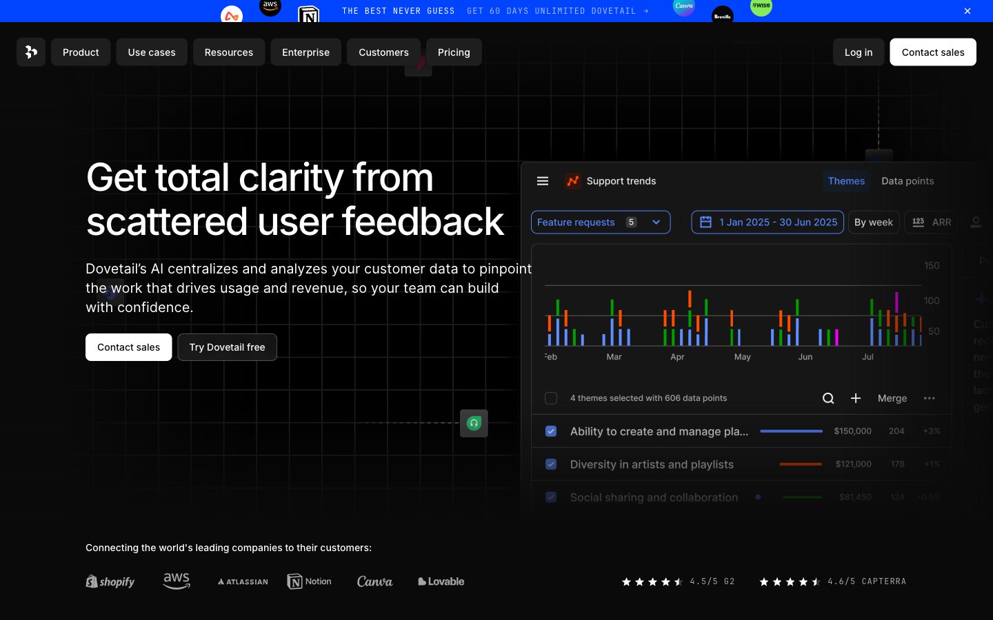
Dovetail
Dovetail — Style Reference
# Dovetail — Style Reference
> blueprint control room at midnight.
**Theme:** dark
Dovetail's design language is a dark command center: near-black canvas, subtle grid wireframes, and cool gray type that recedes so charts and data can lead. A single vivid cornflower blue (#6798ff) acts as the system's only chromatic accent — it appears on the announcement bar, feature icons, and active highlights, never as decorative noise. Typography is Inter at every layer with progressively tighter tracking as sizes grow (from -0.012em at 14px to -0.036em at 64px), giving headlines a compressed, engineered quality rather than a marketing gloss. Components are weightless: 8px radii, hairline borders at #1e1e1 or #313131, zero shadows, and flat surfaces that stack through tone rather than elevation. The overall rhythm is compact, technical, and instrument-like — a tool room, not a pitch deck.
## Tokens — Colors
| Name | Value | Token | Role |
|------|-------|-------|------|
| Blue Cornflower | `#6798ff` | `--color-blue-cornflower` | Accent for announcement bar, feature icons, active states, and data highlight strokes |
| Page Ink | `#0a0a0a` | `--color-page-ink` | Primary page background — the dark canvas that everything sits on |
| Card Carbon | `#1e1e1e` | `--color-card-carbon` | Card surfaces, button backgrounds, and key borders that delineate panels |
| Deep Coal | `#141414` | `--color-deep-coal` | Alternate surface level for nested cards and section backgrounds |
Websites
Markdown Text
design-md
website-prompt
landing-page-prompt
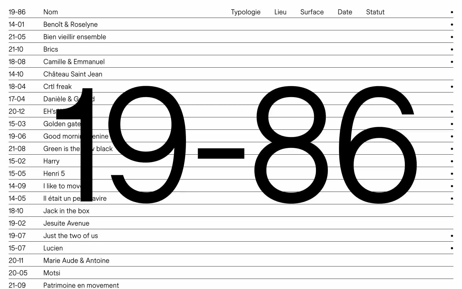
19–86
19–86 — Style Reference
# 19–86 — Style Reference
> Monumental numerals on white ledger
**Theme:** light
19–86 is a typographic ledger — a French design studio that compresses its entire visual identity into a single hairline weight of one custom typeface and the barest possible palette: black on white. The brand number itself, set at 490px, lives behind the content as a permanent architectural watermark, never louder than the project list it organizes. Information is presented as a flat, left-aligned index — date, title, typology, location, surface, status — separated by 1px rules, never by cards, shadows, or color. The 24px body and the 490px display are the same font, the same whisper weight; the difference is amplitude, not voice. White space is the primary design tool: 24px between rows, generous side margins, and the watermark breathing through the gaps. Every screen should feel like a page from a Swiss architecture manual — spare, certain, unsentimental, and confident that less is enough.
## Tokens — Colors
| Name | Value | Token | Role |
|------|-------|-------|------|
| Ink | `#000000` | `--color-ink` | Dark supporting neutral for text, icons, and strong contrast |
| Paper | `#ffffff` | `--color-paper` | Page canvas and every surface; the design's only second value, existing solely to make Ink legible |
## Tokens — Typography
Websites
Markdown Text
design-md
website-prompt
landing-page-prompt
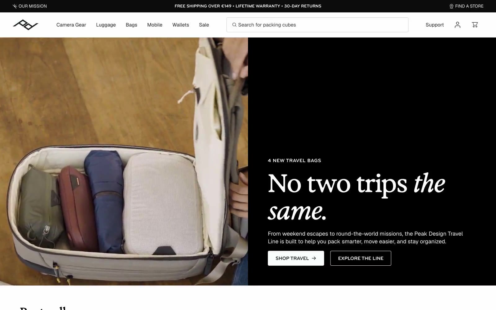
Peak Design
Peak Design — Style Reference
# Peak Design — Style Reference
> Gallery wall, half lit
**Theme:** light
Peak Design is a gallery-grade commerce experience: a near-monochrome canvas where editorial typography and product photography do all the work. The system alternates between crisp white surfaces and deep near-black panels, creating dramatic split layouts where one side carries an italic serif headline and the other a full-bleed product or lifestyle image. Typography is the brand's primary voice — a tall condensed display serif (Exposure-style) for headlines paired with a neutral grotesque (Geist) for UI and an all-caps compressed sans (bryant) for labels, eyebrows, and buttons. The interface stays disciplined: no chromatic UI elements, no decorative gradients, no shadows — just hairline borders, two corner radii (4 and 8), and a single red accent reserved for rare emphasis. Components feel engineered rather than decorated: thin dividers, flat product cards, pill-shaped filter chips, and ghost buttons that read as architectural annotations.
## Tokens — Colors
| Name | Value | Token | Role |
|------|-------|-------|------|
| Carbon Ink | `#1a211e` | `--color-carbon-ink` | Primary text, dark hero panels, body copy, icons, borders on light surfaces — the near-black that anchors every headline and forms the deep-background panels of split sections |
| Paper White | `#ffffff` | `--color-paper-white` | Light supporting surface for subtle backgrounds and section separation. Do not promote it to the primary CTA color |
| True Black | `#000000` | `--color-true-black` | Maximum contrast elements: headline fills on white, announcement bar, footer treatments, solid icon strokes — appears where the design demands the sharpest edge |
| Obsidian | `#0c0c0c` | `--color-obsidian` | Deep panel surfaces and image overlays — slightly softer than true black, used for full-bleed dark sections that need to feel weighty without flat black's harshness |
Websites
Markdown Text
design-md
website-prompt
landing-page-prompt
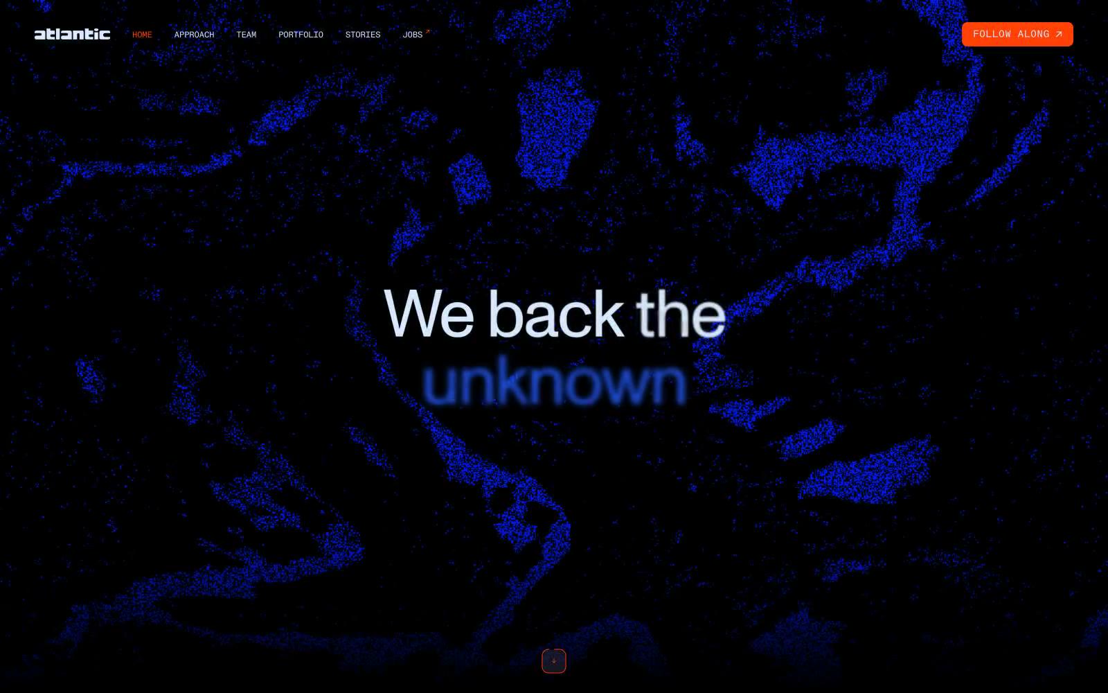
Atlantic.vc
Atlantic.vc — Style Reference
# Atlantic.vc — Style Reference
> Midnight observatory wireframe — electric blue and ice-white type on layered charcoal, traced with cool-white borders.
**Theme:** dark
Atlantic.vc operates as a midnight investment observatory: near-black canvas, cool-tinted ice-white typography, and a single electric blue (#1f58f2) that illuminates selected words inside otherwise neutral headlines like a tracer running through data. The design language is editorial and scientific — particle-cloud hero imagery, monospaced labels with wide tracking, and oversized display type (96px Monument) that occupies the full viewport. A single warm orange-red (#ff4105) breaks the cool palette exclusively for interactive states and the follow CTA, creating deliberate thermal contrast against the otherwise glacial system. Surfaces layer as concentric shades of charcoal (#000000 → #0d0d0f → #232529 → #2b2f33), with the signature cool-white #d8eaff doubling as text AND the dominant border color — a unified treatment that makes every outlined element feel like a wireframe drawn in light.
## Tokens — Colors
| Name | Value | Token | Role |
|------|-------|-------|------|
| Ice White | `#d8eaff` | `--color-ice-white` | Primary text and dominant border color — cool blue-tinted white that doubles as hairline borders, card outlines, and link underlines, creating a wireframe-in-light effect across all surfaces |
| Void Black | `#000000` | `--color-void-black` | Deepest surface — page canvas and footer base |
| Carbon | `#0d0d0f` | `--color-carbon` | Card surface — sits one shade above void, used for elevated content blocks |
| Graphite | `#232529` | `--color-graphite` | Body background and footer border surface — mid-layer charcoal |
Websites
Markdown Text
design-md
website-prompt
landing-page-prompt
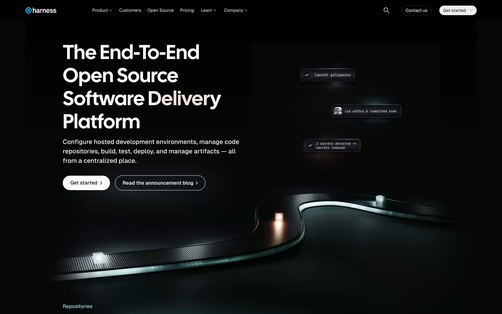
Harness.io
Harness.io — Style Reference
# Harness.io — Style Reference
> midnight mission control with phosphor-green accents
**Theme:** dark
Harness's Gitness surface reads as a nocturnal command deck: near-black canvas (#070707) with stacked card surfaces in marginally lighter shades, oversized display headlines in a condensed Calsans face with positive tracking, and a teal/mint accent (#70dcd3) that surfaces on highlight cards like a phosphor monitor glow. The page stays quiet and high-contrast — white text at AAA contrast on deep neutrals, hairline borders in light gray (not dark) to define edges against the dark canvas, and pill-shaped controls (800px radius) that feel like physical hardware buttons. Color is rationed: one bright blue (#0092e4) for active link borders and one mint (#70dcd3) for accent cards, nothing else. Spacing breathes — generous card padding, comfortable section gaps, and large display sizes that let the type carry the hierarchy rather than color or weight.
## Tokens — Colors
| Name | Value | Token | Role |
|------|-------|-------|------|
| Void Canvas | `#070707` | `--color-void-canvas` | Page background, deepest surface — near-black, the floor everything else sits on |
| Carbon Plate | `#0d0e12` | `--color-carbon-plate` | Primary card surface, one step above the canvas — the dominant elevated panel |
| Obsidian | `#141418` | `--color-obsidian` | Secondary card surface, code blocks, nested panels |
| Iron Edge | `#2e3038` | `--color-iron-edge` | Mid-tier surface, dividers, hover overlays on dark surfaces |
Websites
Markdown Text
design-md
website-prompt
landing-page-prompt
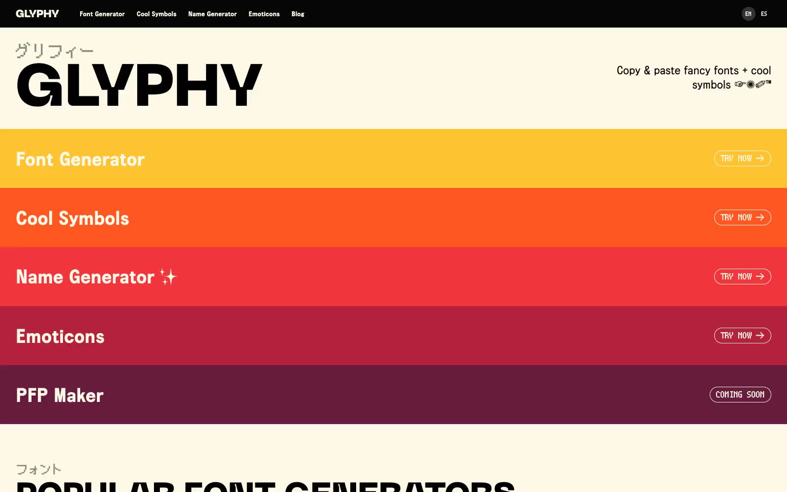
Glyphy
Glyphy — Style Reference
# Glyphy — Style Reference
> buttercream specimen sheet beneath sunset bands. A warm cream page sliced by yellow-to-plum horizontal stripes, anchored by an oversized neo-grotesque wordmark and tiny pixel Japanese eyebrows.
**Theme:** light
Glyphy is a warm-cream canvas cut by horizontal sunset bands: yellow, orange, red, burgundy, plum stacked top-to-bottom like a heat map. The interface stays almost entirely achromatic (ink on buttercream) with chromatic color appearing only as full-width category strips. Typography carries the personality: a monumental neo-grotesque display face (Neue Machina) anchors the wordmark at 120px with line-height 0.75, paired with pixel-accurate Japanese eyebrows and a clean system sans for everything else. Components are pill-shaped and minimal — outlined ghost buttons on colored bands, flat dark or cream cards with 14px corners, and dense symbol grids that feel like a typographic specimen book.
## Tokens — Colors
| Name | Value | Token | Role |
|------|-------|-------|------|
| Buttercream | `#fef9e6` | `--color-buttercream` | Page canvas, card surfaces, light text on dark — the warm cream ground that unifies the entire site |
| Ink | `#000000` | `--color-ink` | Primary text, hairlines, card borders, outlined button borders, link strokes — the only structural non-cream color in the neutral stack |
| Carbon | `#060606` | `--color-carbon` | Near-black surface for dark cards, filled button background, nav strip — slightly softer than pure ink for large fills |
| Driftwood | `#c7c3b4` | `--color-driftwood` | Muted hairline borders on cards and lists, warm gray that sits between buttercream and ink without breaking the warmth |
Websites
Markdown Text
design-md
website-prompt
landing-page-prompt
EPIC agency
EPIC agency — Style Reference
# EPIC agency — Style Reference
> violet observatory with gilded instruments — a gallery-as-night-sky where pale lavender light and warm gold details float over an infinite aubergine void.
**Theme:** dark
EPIC is a nocturnal creative agency language: a deep violet canvas plays the role of night sky while a pale lavender acts as the primary signal color for type, links, and iconography, with brushed gold as a second accent. The display face (Sang Bleu, a Garamond-class didone) arrives at colossal sizes (80–120px) to carry editorial weight, while Inter handles every working surface at compact sizes (9–18px) with generous tracking on uppercase labels. Layout is dense and magazine-like: a centered 3D hero illustration sits beside a vertical journal column, followed by a full-bleed black showreel block, with whitespace used as a controlled luxury rather than a cushion. Surfaces are flat — no shadows, no gradients — depth comes from color contrast (violet on black, lavender on violet) and from the typographic weight ratio between the display serif and the utilitarian sans.
## Tokens — Colors
| Name | Value | Token | Role |
|------|-------|-------|------|
| Aubergine Canvas | `#271a47` | `--color-aubergine-canvas` | Page background, hero canvas, filled button surface, deep surface elevation — the foundational night-sky tone that everything floats on |
| Moonlight Lavender | `#dbc9ff` | `--color-moonlight-lavender` | Violet supporting accent for decorative details and low-frequency emphasis. |
| Gilded Brass | `#bc994e` | `--color-gilded-brass` | Secondary link color, decorative icon accent, highlight strokes — a warm metallic counterpoint to the cool violet, used sparingly as jewelry on the page |
| Obsidian Black | `#000000` | `--color-obsidian-black` | Video/showreel container background, inverse button surface, maximum-contrast surface for media blocks |
Websites
Markdown Text
design-md
website-prompt
landing-page-prompt
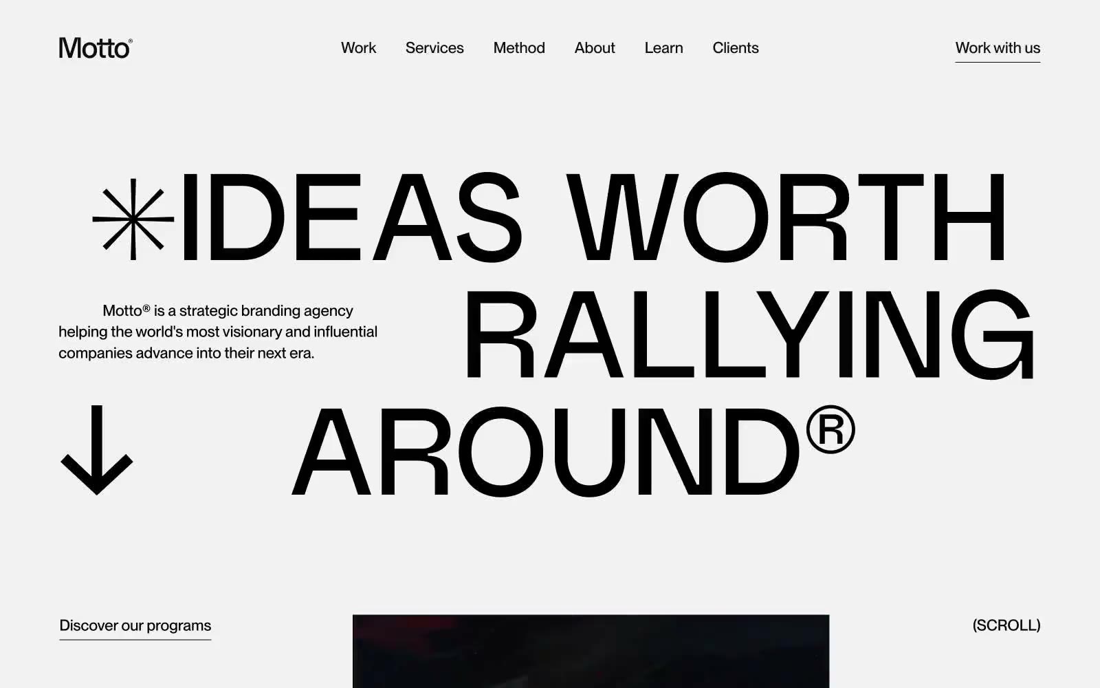
Motto®
Motto® — Style Reference
# Motto® — Style Reference
> Typographic monolith on paper — a single confident voice announcing itself on bone-white stock.
**Theme:** light
Motto® speaks in pure typographic voice: a light gray canvas, no chromatic accents, no shadows, and no decorative graphics — only two typefaces, generous whitespace, and the confidence to let a 154px headline carry an entire screen. Weight 500 is used everywhere; nothing is bold, nothing is light, so hierarchy comes from size, tracking, and whitespace rather than visual weight. Interaction is reduced to underlined text and pill-shaped controls (9999px radius), and the ® mark and asterisk-burst function as the only brand motifs. The result is a site that reads like an editorial spread rather than a product page — monochrome, declarative, and structurally disciplined.
## Tokens — Colors
| Name | Value | Token | Role |
|------|-------|-------|------|
| Motto Ink | `#000000` | `--color-motto-ink` | Primary text, headlines, logo wordmark, borders, decorative marks — the only ink in the system |
| Soft Carbon | `#1b1b1c` | `--color-soft-carbon` | Supporting neutral for secondary UI, dividers, and muted labels. Do not promote it to the primary CTA color |
| Bone Paper | `#ffffff` | `--color-bone-paper` | Card surfaces, testimonial panels, text on dark fills, inverted nav state |
| Parchment | `#f2f2f2` | `--color-parchment` | Page canvas — the default background; sections sit on this without a card wrapper |
Websites
Markdown Text
design-md
website-prompt
landing-page-prompt
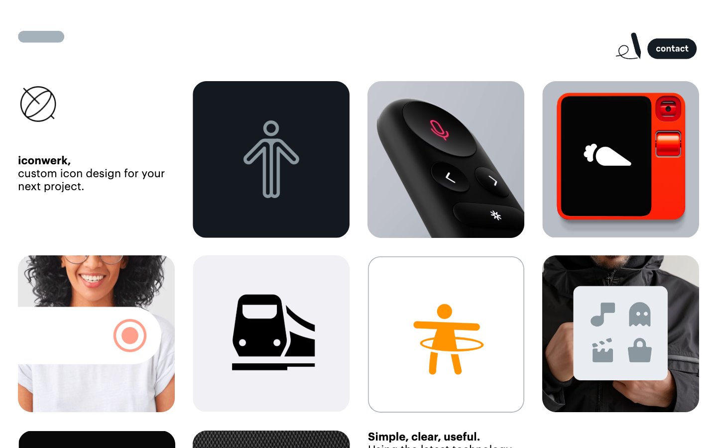
iconwerk
iconwerk — Style Reference
# iconwerk — Style Reference
> gallery wall of crafted icons — a near-invisible white room where rounded tiles of work hang in rhythmic rows
**Theme:** light
Iconwerk is a gallery wall for a custom icon studio — a near-monochrome light canvas where rounded-square tiles showcase work at a deliberate, generous rhythm. The interface recedes: black-and-white chrome, Arial system text for body copy, Graphik for display headings, and a single 28px card radius that becomes the system's signature shape. Real color lives only inside the portfolio tiles themselves — red product shots, orange illustrated figures, blue tech icons, green aerial photography — so the UI never competes with the work. The overall feel is a curated museum: quiet surroundings, loud objects, zero decorative noise.
## Tokens — Colors
| Name | Value | Token | Role |
|------|-------|-------|------|
| Ink | `#000000` | `--color-ink` | Primary headings, body text, and icon fills on light surfaces. Do not promote it to the primary CTA color |
| Paper | `#ffffff` | `--color-paper` | Page background, text on dark tiles, inverse surfaces — the canvas everything sits on |
| Fog | `#d9d9d9` | `--color-fog` | Light card tile backgrounds, secondary surface for showcased work, subtle UI dividers |
| Ash | `#8e8e93` | `--color-ash` | Pill-shaped navigation markers, muted icon strokes, secondary UI chrome |
Websites
Markdown Text
design-md
website-prompt
landing-page-prompt
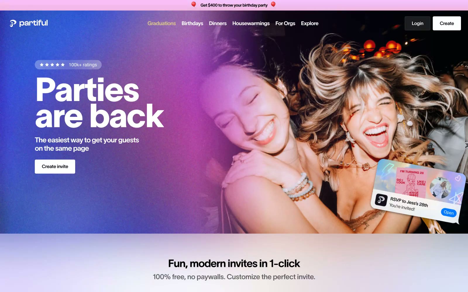
Partiful
Partiful — Style Reference
# Partiful — Style Reference
> confetti landing on white marble — the page stays quiet and light while the content explodes with color and celebration.
**Theme:** light
Partiful runs on celebration energy: a white canvas that gives way to full-bleed photographic heroes washed in purple-to-pink gradients, then returns to white for feature sections with soft periwinkle-to-white gradient backgrounds. The type system pairs a custom display face (Partiful Display Medium) for statement headlines — used at sizes up to 112px with tight -0.03em tracking — with TWK Lausanne Pan across all weights for UI text, giving the whole interface a confident, slightly editorial quality. Black is the primary action color: filled black buttons, black borders, black headings — no blue accent, just pure contrast. Decorative depth comes from invitation card imagery, scattered at tilted angles against gradient washes, making the UI feel like a physical party surface rather than a software dashboard.
## Tokens — Colors
| Name | Value | Token | Role |
|------|-------|-------|------|
| Midnight Ink | `#000000` | `--color-midnight-ink` | Primary text, filled CTA buttons, icon fills, card borders — black on white is the entire contrast system; no blue or colored accent dilutes it |
| Pure Canvas | `#ffffff` | `--color-pure-canvas` | Page background, card surfaces, button text on dark backgrounds, nav surfaces |
| Graphite | `#333333` | `--color-graphite` | Secondary body text, footer links, supporting labels |
| Slate | `#666666` | `--color-slate` | Tertiary body copy, descriptive paragraphs, helper text in feature sections |
Websites
Markdown Text
design-md
website-prompt
landing-page-prompt
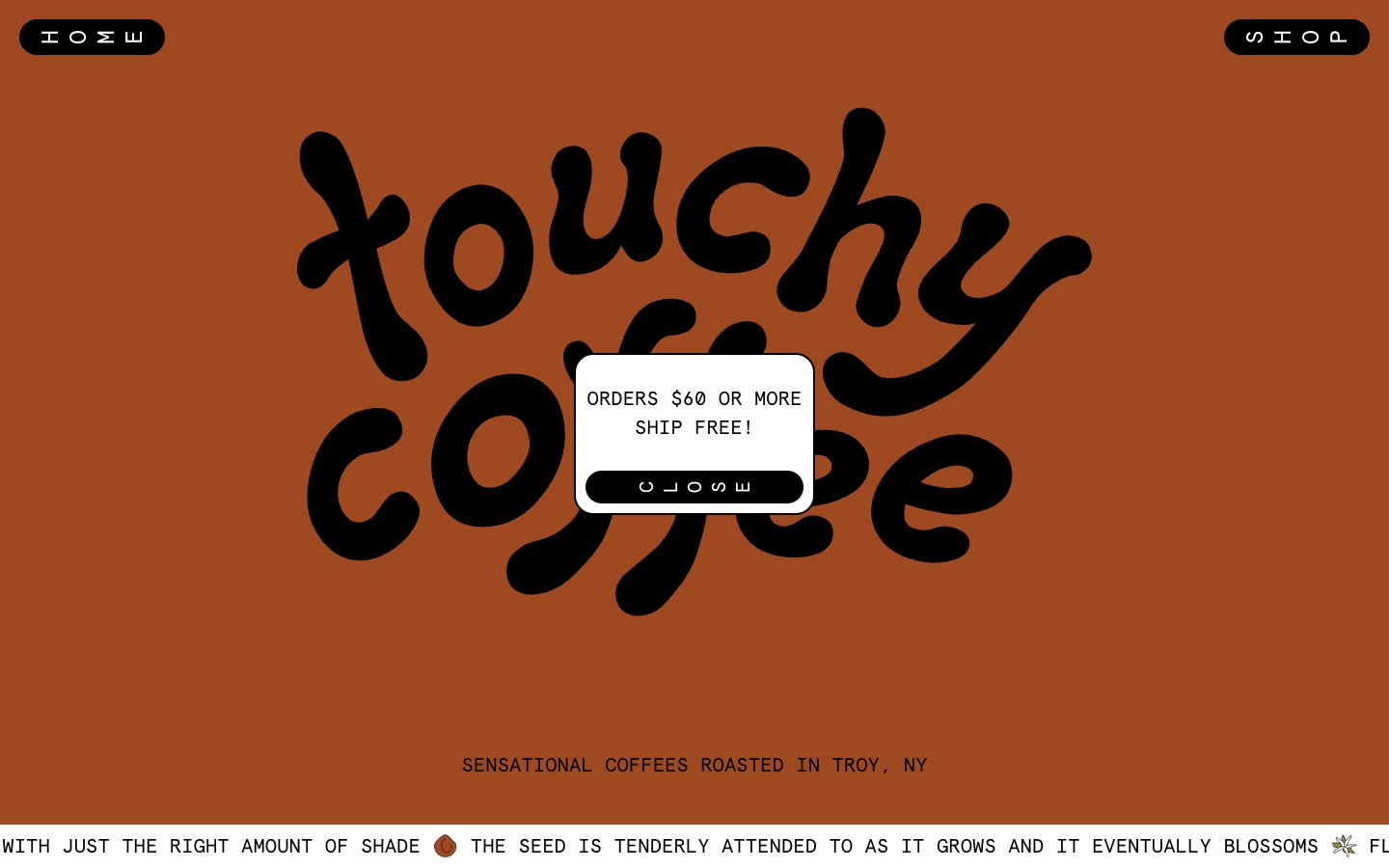
Touchy Coffee
Touchy Coffee — Style Reference
# Touchy Coffee — Style Reference
> Hand-painted coffee zine — earthy paint bands, typewriter labels, and extreme pill buttons on warm matte surfaces.
**Theme:** mixed
Touchy Coffee operates like an indie zine meets corner coffee shop: a rotating cast of earthy, hand-mixed backgrounds (terracotta, sage, sky blue) where the product photography and a bouncy custom script logo do the heavy lifting, and the UI chrome stays deliberately lo-fi. Everything readable is set in Apercu Mono — a monospaced face that reads like a typewriter label, reinforcing the craft, small-batch identity over glossy e-commerce polish. Controls are extreme pills (100px radius), cards are softly rounded (20px), and the color system behaves like a set of paint swatches — lavender, terracotta, moss green, sage gray — applied to full-bleed section bands rather than used as accent dots. Borders are bold and black, text is unapologetically black-on-color, and the overall effect is tactile, warm, and personal rather than slick or optimized.
## Tokens — Colors
| Name | Value | Token | Role |
|------|-------|-------|------|
| Ink | `#000000` | `--color-ink` | Body text, borders, pill button fills, logo — the structural constant across every section |
| Sage | `#788c8c` | `--color-sage` | Dominant neutral for section backgrounds, form borders, and the shop canvas — carries the largest surface area on the site |
| Cream | `#ffffff` | `--color-cream` | Card surfaces, input fills, text on dark pill buttons — the only true white, used sparingly as a counterpoint to the painted section bands |
| Terracotta | `#9f4920` | `--color-terracotta` | Hero section background, circular product label accents — warm clay red that grounds the brand in earth and roast |
Websites
Markdown Text
design-md
website-prompt
landing-page-prompt
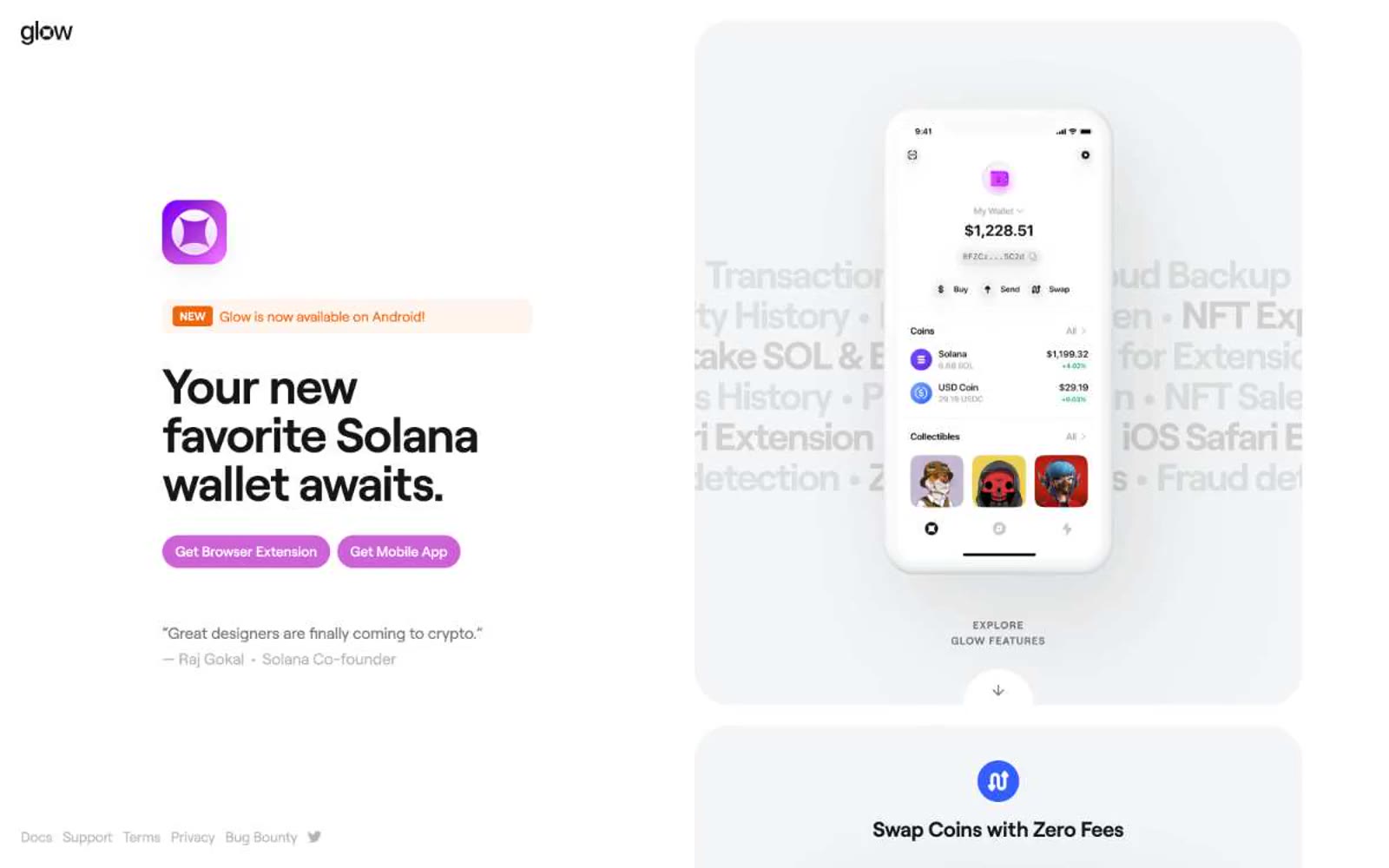
Glow
Glow — Style Reference
# Glow — Style Reference
> Magenta pulse on porcelain white. A single saturated brand color cuts through a quiet, gallery-bright canvas where phone screens are the art and a peach badge is the only warmth.
**Theme:** light
Glow uses a gallery-white product launch language: a porcelain #f4f5f6 canvas with confident bold headlines and phone mockups as the hero artifact. One vivid magenta carries the brand — appearing in the filled CTA, the logo gradient, and link accents — while orange and a peach badge provide small warm punctuation. Typography is geometric and tight-tracked (Roobert at -0.018em), giving copy a designed-objects feel rather than a marketing-brochure feel. The layout is spacious with large 40px-radius cards cradling product screenshots, and a distinctive layer of ghosted feature text on the hero that lists capabilities like museum wall labels.
## Tokens — Colors
| Name | Value | Token | Role |
|------|-------|-------|------|
| Voltage Magenta | `#cc62d5` | `--color-voltage-magenta` | Filled buttons, link borders, brand accents — the single saturated current that makes the otherwise quiet page feel switched on |
| Plasma Gradient | `radial-gradient(86% 86% at 6% 9%, rgb(136, 0, 255) 0%, rgb(167, 50, 214) 51%, rgb(239, 121, 255) 100%)` | `--color-plasma-gradient` | Logo fill, decorative gradient washes — the spectrum from deep purple to hot pink that anchors brand identity |
| Ember Orange | `#ec660d` | `--color-ember-orange` | NEW badges, lightning-bolt icons, warm accent punctuation — used sparingly as energy, not as a second brand |
| Signal Red | `#e83b47` | `--color-signal-red` | Red wash for highlight backgrounds, decorative bands, and soft emphasis behind content. Use as a supporting accent, not as a status color |
Websites
Markdown Text
design-md
website-prompt
landing-page-prompt
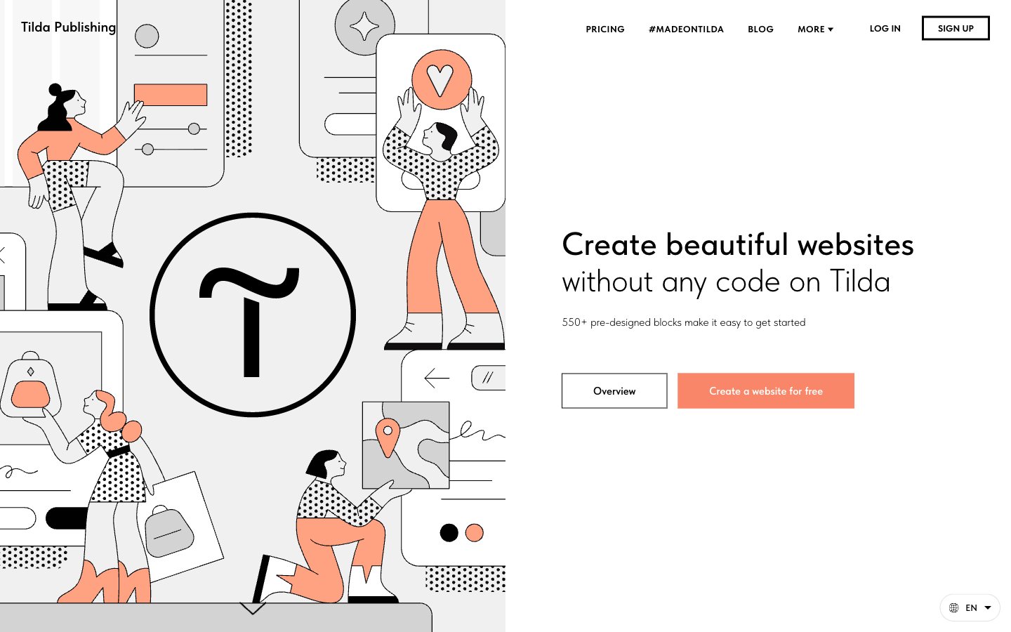
Tilda
Tilda — Style Reference
# Tilda — Style Reference
> Paper sketchbook with coral crayon
**Theme:** light
Tilda operates on a near-monochrome canvas with a single vivid coral accent doing all the emotional work. The aesthetic is editorial-illustration-meets-builder-tool: flat, hand-drawn line art fills the left side of heroes, generous whitespace breathes around light-weight headlines, and one orange-coral button is the only spot of color in an otherwise achromatic interface. Typography carries the personality — TildaSans at weight 300 whispers across 60-78px hero headlines, while the coral accent is rationed for primary actions, illustration fills, and icon highlights. Components are confident and pill-shaped: 100px radius buttons, flat surfaces with no shadows, thin black borders instead of elevation. The system should feel like a design magazine that accidentally became a product page.
## Tokens — Colors
| Name | Value | Token | Role |
|------|-------|-------|------|
| Coral Signal | `#fa8669` | `--color-coral-signal` | Orange supporting accent for decorative details and low-frequency emphasis. Do not promote it to the primary CTA color |
| Ink Black | `#000000` | `--color-ink-black` | Primary text, button strokes, dark mode contrast pairs, icon outlines |
| Carbon | `#222222` | `--color-carbon` | Supporting neutral for secondary UI, dividers, and muted labels. Do not promote it to the primary CTA color |
| Graphite Deep | `#171717` | `--color-graphite-deep` | Dark surface blocks, footer regions, inverted section backgrounds |
Websites
Markdown Text
design-md
website-prompt
landing-page-prompt
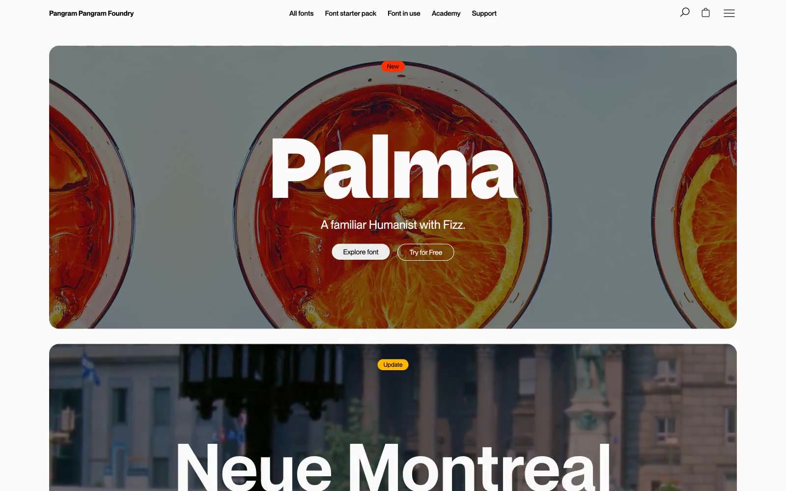
Pangram Pangram Foundry
Pangram Pangram Foundry — Style Reference
# Pangram Pangram Foundry — Style Reference
> Museum vitrine on white marble. A gallery-style type foundry where the canvas is bare stone, the lighting is flat daylight, and the only vivid color is a single orange-red label used by a curator to flag what is new.
**Theme:** light
Pangram Pangram Foundry is a type foundry that lets the typefaces speak: an editorial canvas of near-pure grayscale, with one saturated orange-red acting as a hot accent. Hero sections are full-bleed photographic plates with massive display type overlaid in white — the type IS the product, so the UI recedes. Surfaces stay quiet (#fafafa and #ededed), borders are hairline black at 1px, and the only chromatic punctuation is the single #ff2f00 accent used for status badges, icons, and tag chrome. Components are lightweight: pill-shaped controls, ghost buttons, soft card containers, and almost no elevation. The overall effect is a curatorial print catalogue translated to screen — restrained, confident, type-first.
## Tokens — Colors
| Name | Value | Token | Role |
|------|-------|-------|------|
| Ember Orange | `#ff2f00` | `--color-ember-orange` | Orange action color for filled buttons, selected navigation states, and focused conversion moments. |
| Marble White | `#fafafa` | `--color-marble-white` | Page canvas, card surfaces, input fields, default panel backgrounds. The dominant surface tone, barely off-white for warmth |
| Stone Gray | `#ededed` | `--color-stone-gray` | Secondary surface for filled buttons, muted card backgrounds, image placeholder fills. One step deeper than Marble White to create gentle separation without contrast |
| Graphite | `#666666` | `--color-graphite` | Secondary text, link color, subdued metadata, helper text. Reads as muted black — never used for primary text or headings |
Websites
Markdown Text
design-md
website-prompt
landing-page-prompt
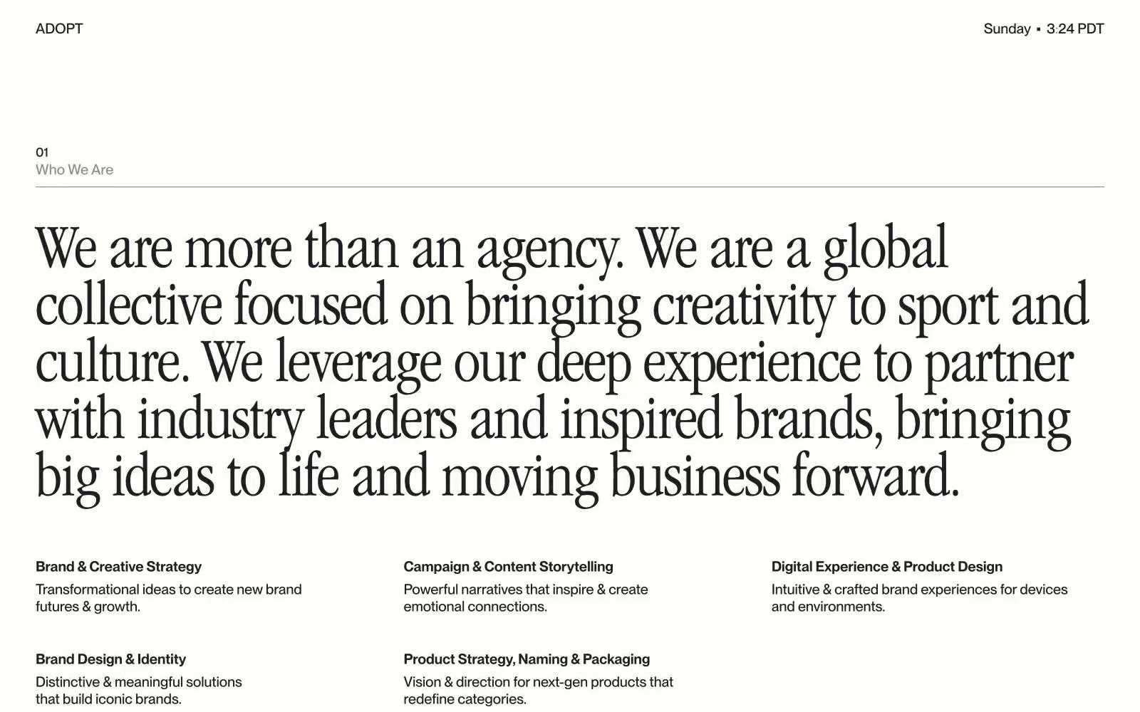
Adopt
Adopt — Style Reference
# Adopt — Style Reference
> Editorial broadsheet on warm paper. A cream canvas with one near-black ink, a tall narrow serif for headlines, and a compact grotesque whispering the labels — the page feels typeset, not designed.
**Theme:** light
Adopt reads as an editorial broadsheet rendered on warm paper: a single near-black ink against a soft cream canvas, with no gradients, no shadows, and no accent color to soften the starkness. The signature is a narrow Garamond serif at near-display sizes carrying every statement headline, paired with a compact grotesque for labels, body, and UI chrome — a two-voice system that splits content into 'editorial title' and 'production note' registers. Layout uses a rigid three-column grid for content blocks and dramatic left-aligned section numbers with hairline rules, letting generous vertical air (80–140px between sections) do the pacing. Components are deliberately invisible — no cards, no buttons with fills, no elevation — only type, rules, and whitespace organize the page.
## Tokens — Colors
| Name | Value | Token | Role |
|------|-------|-------|------|
| Bone | `#f4f1ec` | `--color-bone` | Page canvas — warm off-white that makes the black ink read like printed type rather than screen pixels |
| Carbon | `#1e1e1e` | `--color-carbon` | Primary text, body copy, headlines, section rules — the single ink that carries the whole page |
| Ash | `#8c8c8c` | `--color-ash` | Muted helper text, timestamps, secondary metadata — desaturated enough to recede behind Carbon |
| Lampblack | `#000000` | `--color-lampblack` | Hard borders on outlined controls, maximum-emphasis rules — used sparingly where Carbon is not black enough |
Websites
Markdown Text
design-md
website-prompt
landing-page-prompt
herding.app
herding.app — Style Reference
# herding.app — Style Reference
> Warm charcoal desk with a single neon spray — monochrome editorial dark UI broken by one vivid teal-lime wash.
**Theme:** dark
Herding operates as a dim, warm-toned control room: a near-black canvas of olive-charcoal surfaces, one tight utilitarian typeface at every size, and almost no chromatic noise. The interface stays monochrome and editorial — close-set type, generous gutters, soft 16px corners, and a persistent ink-into-paper inset shadow that makes cards feel pressed into the page rather than floating. The single color event is a saturated teal-to-lime gradient used sparingly as a feature banner or highlight wash; everywhere else, hierarchy comes from value contrast between warm grays and a slightly cream off-white. Components are flat, rounded, and weightless — buttons are thin-stroked outlines, tags sit as small monospaced chips, and the only 'accent' punctuation is the gradient itself.
## Tokens — Colors
| Name | Value | Token | Role |
|------|-------|-------|------|
| Off-White Ink | `#fffffe` | `--color-off-white-ink` | Primary text, icon strokes, heading color — slightly cream warm-white reads softer than pure #fff against olive-charcoal surfaces |
| Page Void | `#1c1c1a` | `--color-page-void` | Deepest page background, behind everything; the recessed layer |
| Graphite Card | `#232320` | `--color-graphite-card` | Primary card and surface — most panels, modals, and elevated containers |
| Slate Matte | `#2e2e2b` | `--color-slate-matte` | Canvas-level surface, outer page background, content area baseline |
Websites
Markdown Text
design-md
website-prompt
landing-page-prompt
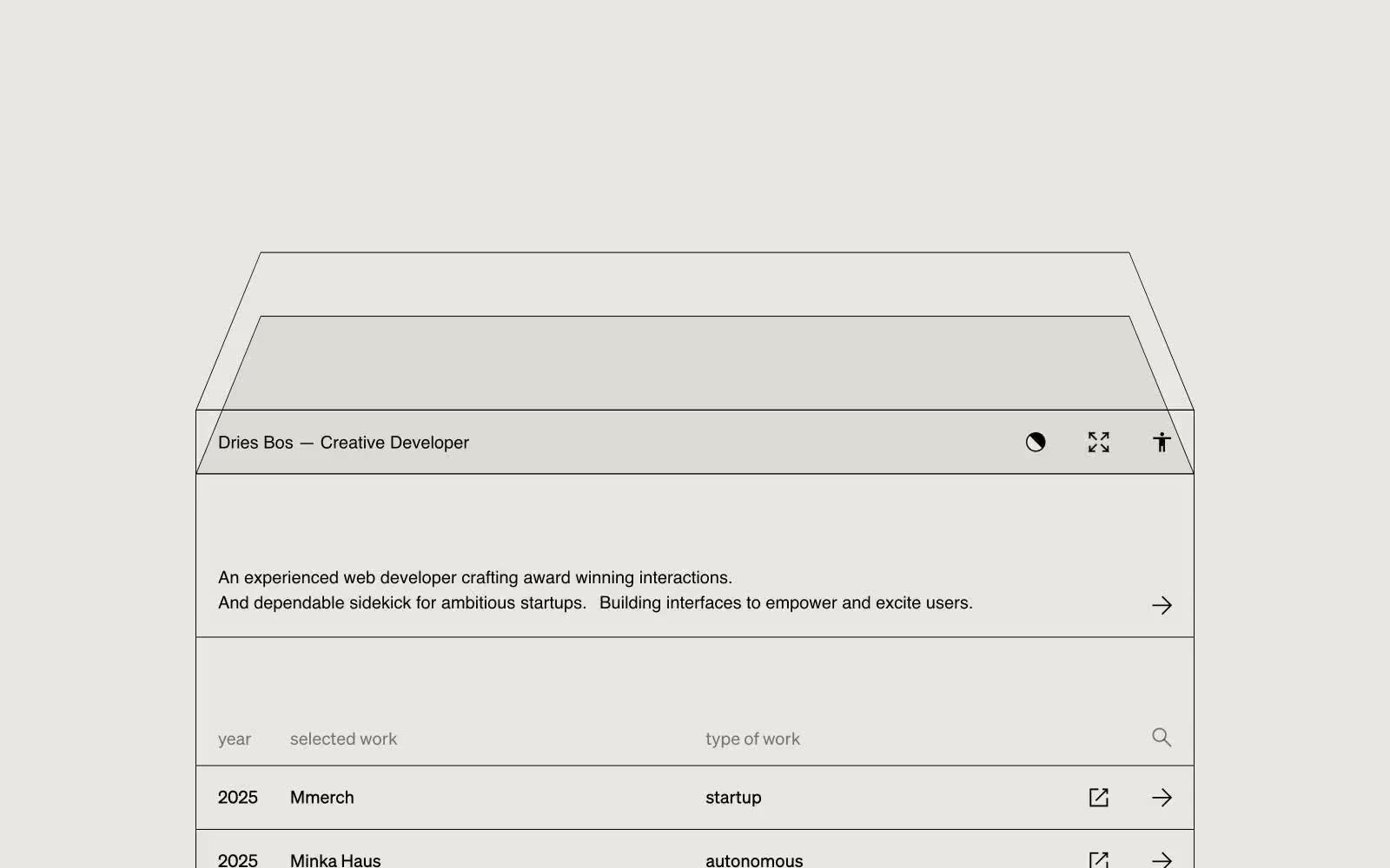
Dries Bos
Dries Bos — Style Reference
# Dries Bos — Style Reference
> editorial ink on warm vellum
**Theme:** light
A monochromatic portfolio language built on warm vellum paper and near-black ink — the visual equivalent of an architect's drafting table. Every element is a line, a label, or empty space; no fills, no shadows, no chromatic accents interrupt the editorial calm. The work list is a spreadsheet made beautiful: columns, dates, project names, and discipline tags sit on the same horizontal grid, separated by hairline rules rather than card containers. The hero is a large wireframe drawing — thin strokes on warm ground — that signals the developer's craft without ever showing a screenshot. Color is structural (paper, ink, gray) not expressive; the site trusts whitespace and type to carry mood.
## Tokens — Colors
| Name | Value | Token | Role |
|------|-------|-------|------|
| Vellum | `#e8e7e3` | `--color-vellum` | Page background, table row base, card surfaces — warm off-white reads as paper, not screen |
| Parchment | `#dddbd5` | `--color-parchment` | Alternating table rows, subtle surface lift one step above the canvas |
| India Ink | `#050200` | `--color-india-ink` | Body text, hairline borders, wireframe strokes, icon strokes — the only high-contrast tone in the system |
| Graphite | `#747472` | `--color-graphite` | Muted secondary text, disabled icon strokes, de-emphasized metadata |
Websites
Markdown Text
design-md
website-prompt
landing-page-prompt
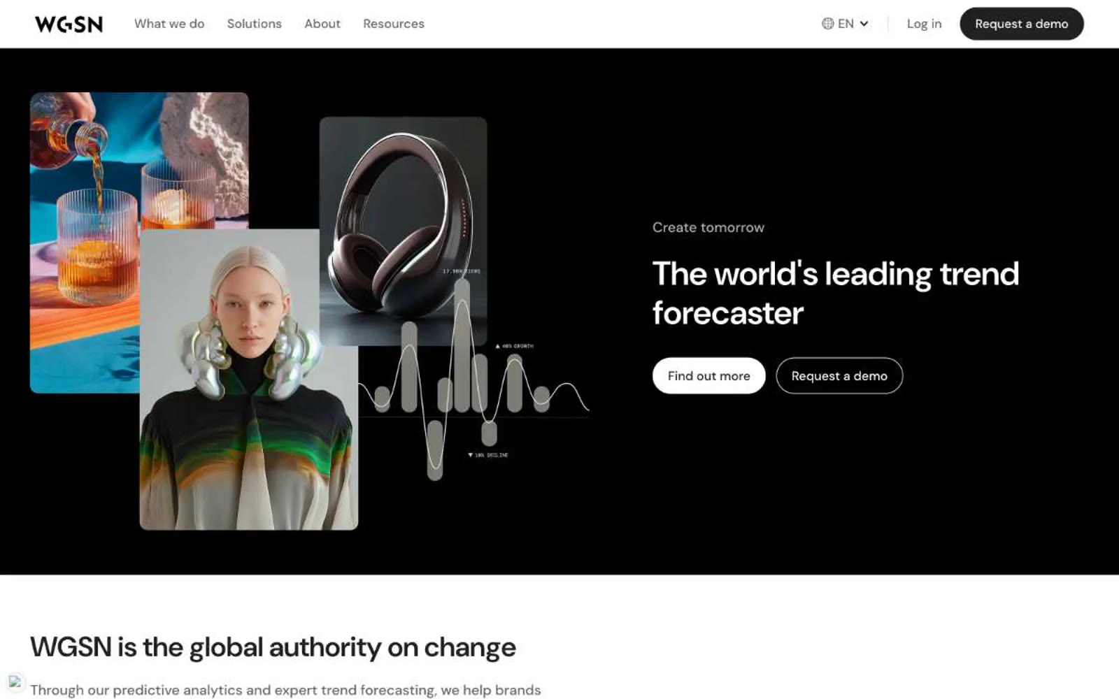
WGSN
WGSN — Style Reference
# WGSN — Style Reference
> editorial monochrome showroom
**Theme:** light
WGSN reads as an editorial monochrome showroom: a trend-forecasting catalog rendered in pure grayscale on warm-white paper. The system is defined by total chromatic absence — zero brand color — which pushes photography and editorial typography to do all emotional work. Surfaces alternate between cold pure white and a warm bone tint (#f6f2eb), with deep charcoal panels creating high-contrast hero zones. Components are confidently minimal: pill-shaped controls (40px radius), generously rounded image cards (16px), hairline borders instead of shadows, and a single sans-serif (DM Sans) carrying every voice from 12px metadata to a 92px display headline. The result feels like a high-end print magazine translated to web — restrained, premium, and image-led.
## Tokens — Colors
| Name | Value | Token | Role |
|------|-------|-------|------|
| Paper White | `#ffffff` | `--color-paper-white` | Primary canvas, card surfaces, button text, and the base against which every other neutral is measured. Carries ~21:1 contrast with deep charcoal for all body and display text |
| Bone Warm | `#f6f2eb` | `--color-bone-warm` | Secondary surface wash — the system's only warm neutral. Used as a soft section background to break white-on-white monotony and evoke paper-stock texture. Contrasts 14.4:1 with charcoal text |
| Ash Mist | `#f5f5f5` | `--color-ash-mist` | Input field backgrounds, inset card wells, and disabled surface states. The cool-gray complement to Bone Warm — use the warm tone for sections, the cool tone for form wells |
| Graphite Border | `#666666` | `--color-graphite-border` | Default hairline border color (444 border usages — by far the most-used neutral in the system). Also used for muted helper text and icon outlines. The structural divider color of the entire UI |
Websites
Markdown Text
design-md
website-prompt
landing-page-prompt
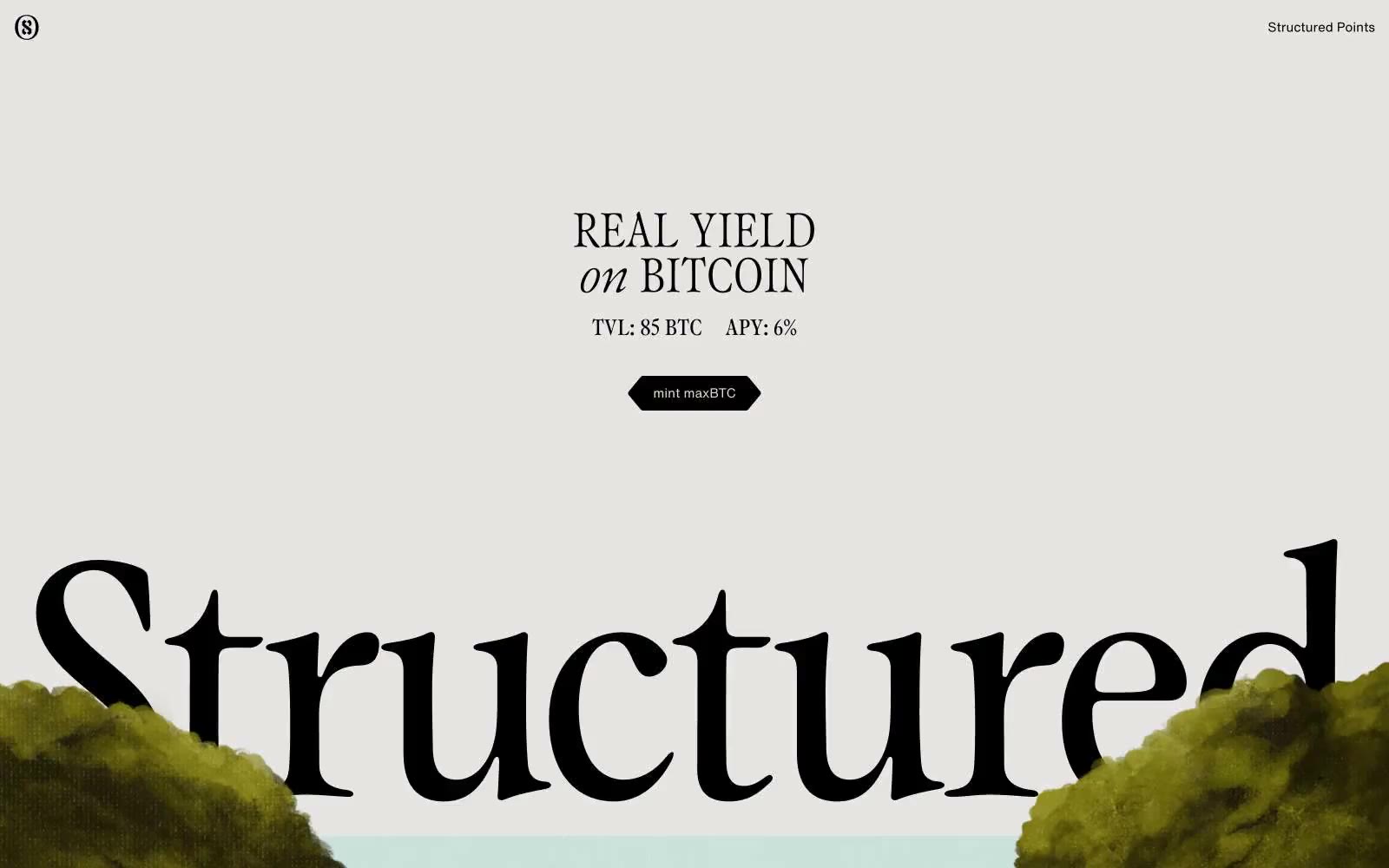
Structured
Structured — Style Reference
# Structured — Style Reference
> Renaissance gallery on putty paper
**Theme:** mixed
Structured treats finance as a gallery exhibition: a warm putty-beige canvas, stark black accents, and classical oil-painting imagery that reframes Bitcoin yield as high art. Typography is the protagonist — a custom serif at display sizes up to 374px carries the brand voice with dramatic negative tracking, while a neutral grotesk handles utility. Sections alternate between light editorial spreads and pitch-black rooms, with no gradients, no shadows, and almost no color. Every surface is flat, every border is hairline, and the only accent is the warm cream/black contrast that runs through everything. The aesthetic borrows from museum wall labels and Renaissance folios: restrained, authoritative, slightly precious.
## Tokens — Colors
| Name | Value | Token | Role |
|------|-------|-------|------|
| Putty | `#c4c3b6` | `--color-putty` | Dominant page canvas — the warm gray-beige that fills hero and most light sections. The single most-used color in the system; sets the gallery-wall tone |
| Ink | `#000000` | `--color-ink` | Dark borders and separators for elevated surfaces and inverted UI. Do not promote it to the primary CTA color |
| Bone | `#e7e5e4` | `--color-bone` | Elevated card surfaces and secondary canvas in light sections. Sits one step above Putty for subtle layering without breaking the monochrome warmth |
| Chalk | `#ebebeb` | `--color-chalk` | Footers and lightest surface tier. The coolest neutral — used sparingly at section bases to signal a different page zone |