AI Prompt Studio - Intelligent Prompt Library
Explore and use professional AI prompts to optimize your workflow.
One-click Use
Websites
Markdown Text
design-md
website-prompt
landing-page-prompt
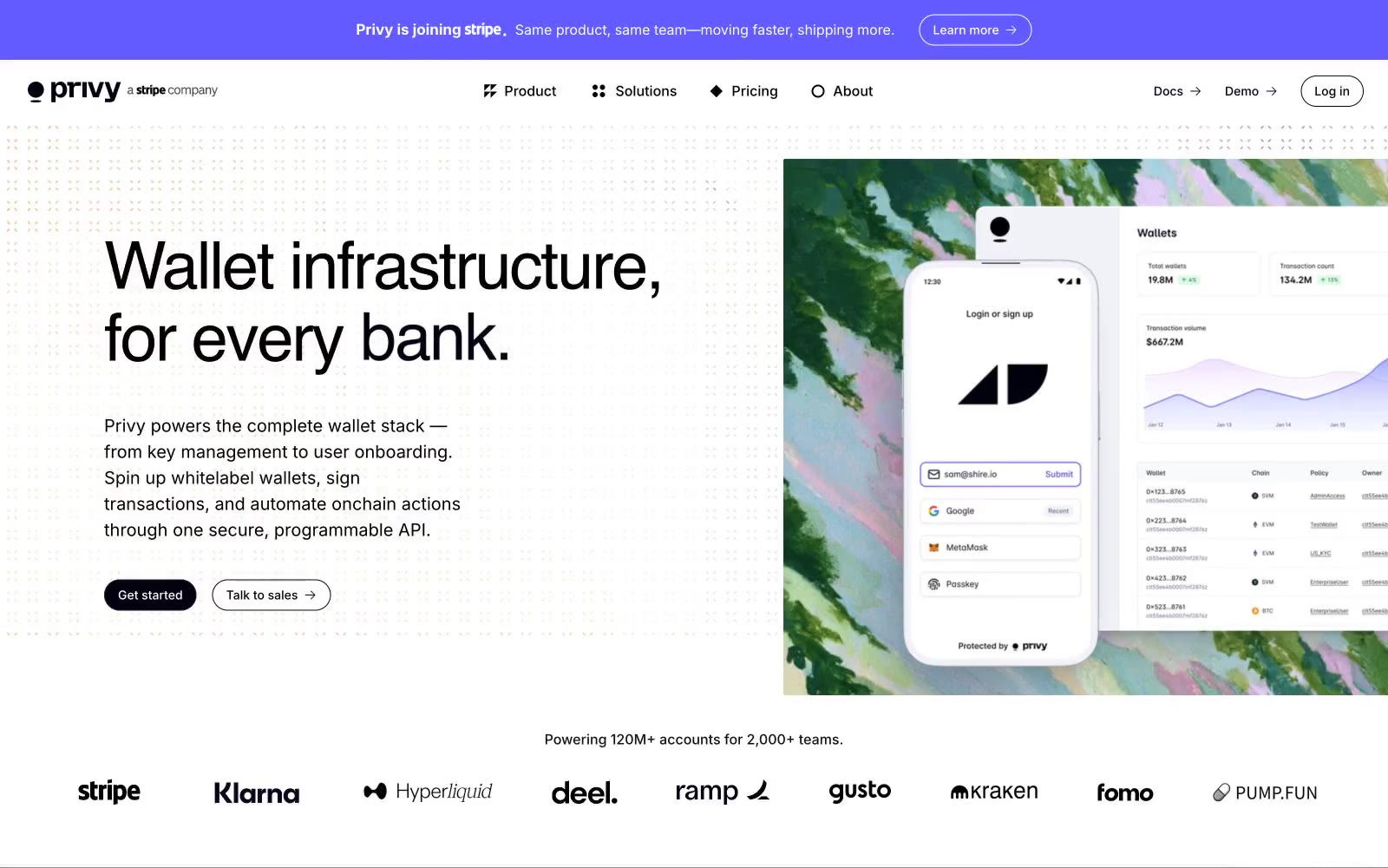
Privy
Privy — Style Reference

# Privy — Style Reference
> ink-on-marble editorial spread. White marble canvas, black serif headlines compressed tight, a single violet banner cutting across the top — restraint as authority.
**Theme:** light
Privy operates as an editorial crypto-fintech system: a near-monochrome canvas interrupted by a single vivid violet announcement band and one heavy near-black button. Typography carries the brand more than color — a custom display face (ABC Favorit) sets headlines in weight 400 at remarkably tight tracking (-0.03em) and very tight line-heights (1.03–1.15), giving even the 56px+ words a compressed, journalistic presence rather than a tech-SaaS feel. Surfaces stay flat and high-contrast: white canvas, near-black ink (#010110) for body and primary actions, with dark mode introduced selectively as full-bleed bands rather than a themable surface. Components are minimal — pill buttons (100px radius), 8px-radius cards, 1px hairline borders — letting the custom serif and the violet accent do the heavy lifting.
## Tokens — Colors
| Name | Value | Token | Role |
|------|-------|-------|------|
| Canvas | `#ffffff` | `--color-canvas` | Page background, card surfaces, input fields — the dominant neutral that everything else sits on |
| Obsidian Ink | `#010110` | `--color-obsidian-ink` | Primary text, nav borders, icon strokes, filled primary buttons, input borders — the structural near-black that reads as pure black at body sizes |
| Carbon | `#111117` | `--color-carbon` | Dark-mode card surfaces, elevated dark panels, secondary dark backgrounds |
| Graphite | `#22222a` | `--color-graphite` | Highest elevation in dark mode — feature card backgrounds, overlaid panels |
Websites
Markdown Text
design-md
website-prompt
landing-page-prompt
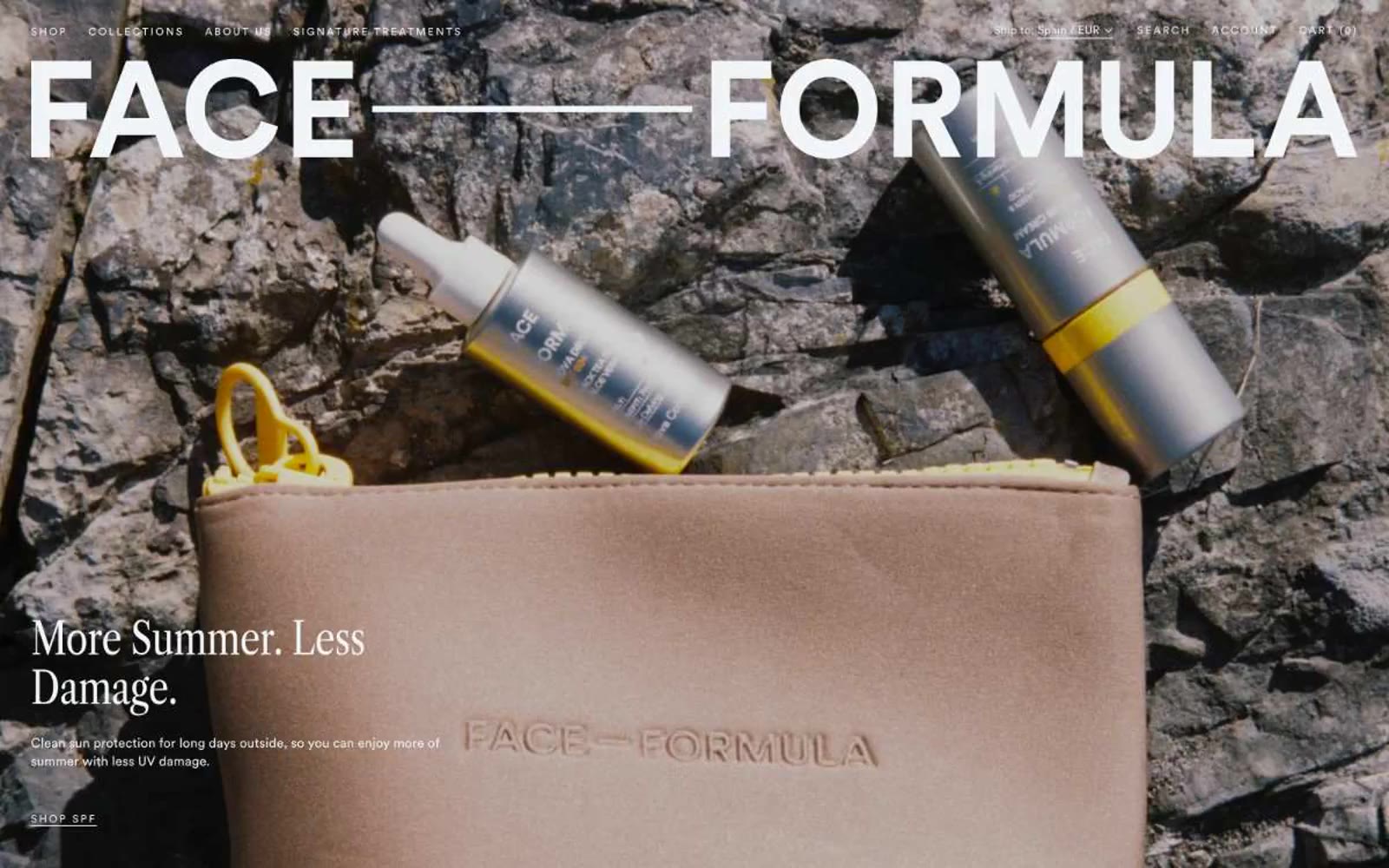
Face Formula
Face Formula — Style Reference
# Face Formula — Style Reference
> Nordic editorial portrait. A quiet Scandinavian magazine spread where the model's gaze and a 120px condensed-serif masthead do all the talking against walls of cool mist.
**Theme:** light
Face Formula reads like a Scandinavian editorial spread translated into a storefront: a near-monochromatic canvas of warm grays and cool mists, anchored by a colossal condensed-serif wordmark that makes the brand name feel like a magazine masthead rather than a logo. The palette is deliberately desaturated — 94% achromatic — so the only color the eye registers is the cool slate (#3b505a) that defines borders, navigation, and primary text against washes of mist (#f2f5f8) and white. Every interface decision whispers: ghost text links with hairline underlines instead of filled buttons, hairline 1px dividers, generous 8px-base vertical rhythm, and product surfaces that feel like gallery plinths. Two typefaces do all the work — Libre Caslon Condensed for editorial authority at display sizes, Circular Pro for every utilitarian surface — and the absence of shadows, gradients, or accent color forces the photography to carry all warmth and emotion.
## Tokens — Colors
| Name | Value | Token | Role |
|------|-------|-------|------|
| White Canvas | `#ffffff` | `--color-white-canvas` | Page background, product photography backdrop, hero base layer |
| Mist | `#f2f5f8` | `--color-mist` | Primary light surface for cards, product tiles, section bands, input fills, hairline borders — the most-used non-white color |
| Soft Mist | `#e6ebee` | `--color-soft-mist` | Elevated surface layer one step above Mist for nested cards or secondary content blocks |
| Pale Slate | `#cfdce7` | `--color-pale-slate` | Button and navigation borders, subtle dividers, outlined-control stroke |
Websites
Markdown Text
design-md
website-prompt
landing-page-prompt
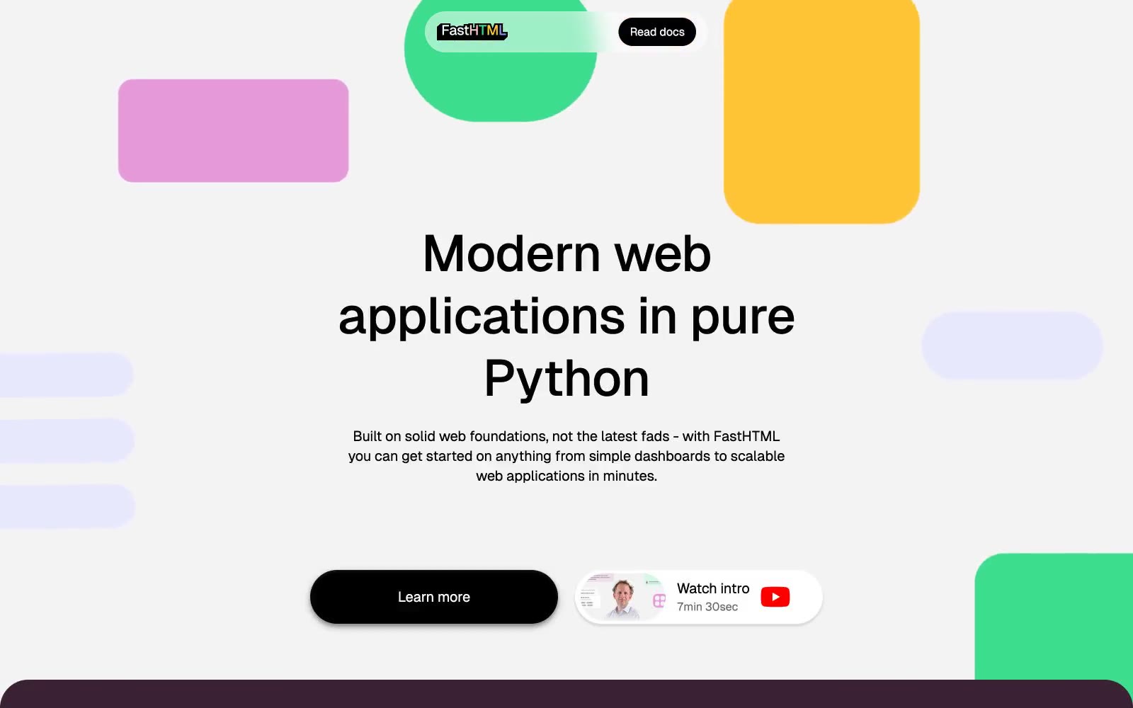
fastht.ml
fastht.ml — Style Reference
# fastht.ml — Style Reference
> Confetti scattered across gallery walls
**Theme:** mixed
FastHTML runs on a sticker-pack logic: monochrome type and pill-shaped controls float over alternating full-bleed color bands (light canvas, deep aubergine, periwinkle violet) while vivid green, yellow, pink, and violet shapes scatter like confetti in the margins. The signature is the button — a black pill with a two-layer shadow that stacks a bright white inner highlight on top of a dark drop shadow, making every control read as a physical sticker peeled from the page. Typography stays geometric and compact (Geist, tight tracking on large sizes, Geist Mono for code) so the saturated accents can do the emotional work. Cards are generously rounded (24–40px) but never feel soft — they sit on hard color blocks, not on layered neutrals.
## Tokens — Colors
| Name | Value | Token | Role |
|------|-------|-------|------|
| Sticker Green | `#3cdd8c` | `--color-sticker-green` | Decorative blob shapes, accent fills in hero and code-demo section |
| Sticker Yellow | `#ffc435` | `--color-sticker-yellow` | Decorative blob shapes, warm accent fill in hero |
| Sticker Pink | `#e699d9` | `--color-sticker-pink` | Decorative blob shapes, soft accent fill in hero |
| Periwinkle Violet | `#7575f0` | `--color-periwinkle-violet` | Full-bleed FAQ section background, section-level color band |

Websites
Markdown Text
design-md
website-prompt
landing-page-prompt
Checkly
Checkly — Style Reference
# Checkly — Style Reference
> Mission control at deep orbit
**Theme:** dark
Checkly lives in deep midnight-navy — a near-black cosmic canvas where white type floats like HUD readouts and one vivid electric blue acts as the signal accent. The system is deliberately sparse: hairline light-gray borders define structure instead of heavy shadows, product UI is shown as floating light-themed cards suspended on the dark void, and code blocks are treated as first-class content in JetBrains Mono. Inter at weight 300 gives headlines a whisper-quiet authority that lets the technical subject matter do the talking, while weight 500–600 carries operational UI. The overall feel is mission control at altitude — minimal chrome, maximal legibility, one accent doing all the semantic work.
## Tokens — Colors
| Name | Value | Token | Role |
|------|-------|-------|------|
| Void Navy | `#041734` | `--color-void-navy` | Page background, hero canvas, section bands — the deep-space base on which all other UI floats |
| Signal Blue | `#0075ff` | `--color-signal-blue` | Blue text accent for links, tags, and emphasized short phrases. Do not promote it to the primary CTA color |
| Probe Cyan | `#008ef0` | `--color-probe-cyan` | Hover/active accent variant for buttons and interactive states |
| Hub Navy | `#002652` | `--color-hub-navy` | Secondary surface tint, logo wordmark — a slightly lighter shade of the void used for depth |
Websites
Markdown Text
design-md
website-prompt
landing-page-prompt
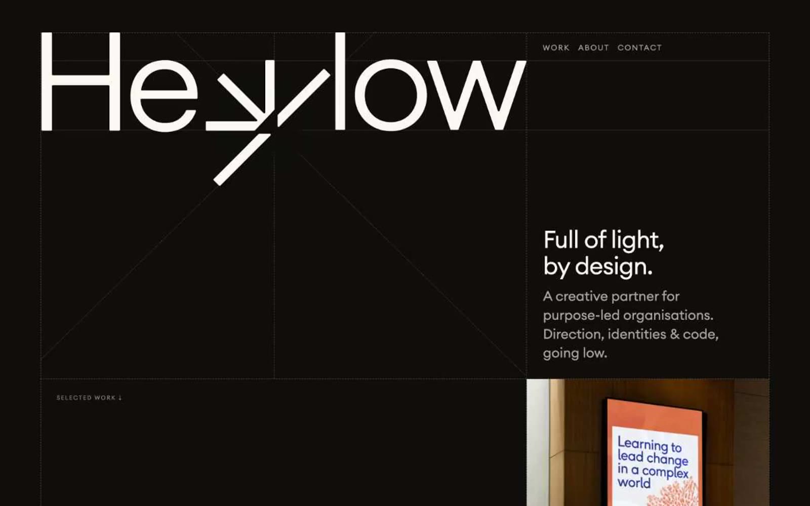
Hey Low
Hey Low — Style Reference
# Hey Low — Style Reference
> botanical field journal on cream paper — Measured, organic, and mostly silent, with one lime-green note singing on the page.
**Theme:** light
Hey Low is an ecological field journal rendered as a website: white paper, forest-ink typography, and a single sprig of chartreuse that makes actions feel alive. The composition is generous and unhurried — most of the canvas stays quiet and near-white, with dark evergreen as the structural color and pale lime appearing only where a system needs to pulse. Headlines are set in a tight, geometric sans with aggressive negative tracking at large sizes, then punctuated by a hand-set italic serif accent that injects warmth into otherwise clinical copy. Cards, buttons, and project tiles are flat and low-elevation; visual weight comes from type contrast and illustration, not shadows or gradients. Everything should feel like a studio that designs for the planet — restrained, botanical, and deliberately spare.
## Tokens — Colors
| Name | Value | Token | Role |
|------|-------|-------|------|
| Forest Ink | `#003329` | `--color-forest-ink` | Headlines, body copy, navigation text, illustration strokes, link color — the structural color that carries every page |
| Chartreuse Sprig | `#e6ffa3` | `--color-chartreuse-sprig` | Primary CTA button fill, feature card surfaces, highlight washes — the single accent that makes interactive elements feel switched on |
| Deep Moss | `#042725` | `--color-deep-moss` | Secondary action button, hover or pressed states where a darker counterweight to the lime CTA is needed |
| Vivid Lime | `#9bff48` | `--color-vivid-lime` | Decorative high-energy accent inside illustrations, hover halos, or emphasis marks — louder sibling of Chartreuse Sprig |
Websites
Markdown Text
design-md
website-prompt
landing-page-prompt
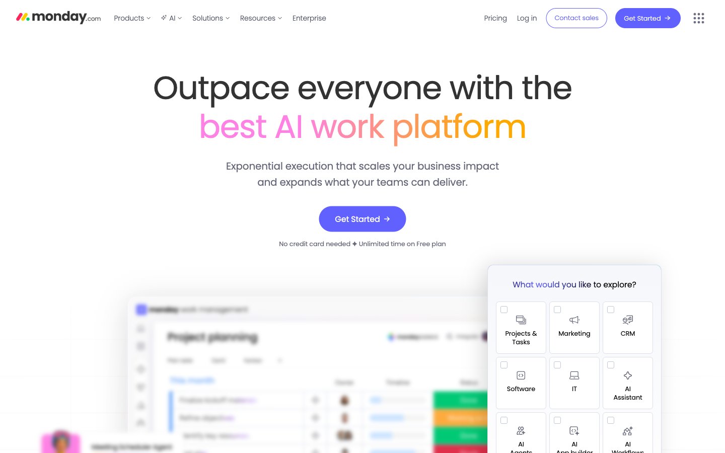
monday.com
monday.com — Style Reference
# monday.com — Style Reference
> white workshop with pastel sticky notes
**Theme:** light
monday.com runs a white-canvas productivity language with violet as its singular brand voice. The page breathes through generous whitespace, near-black typography, and pastel-colored card surfaces that borrow from a crayon-box palette — soft green, powder blue, peach, lavender, mint — creating a playful, human feeling that contrasts the serious SaaS market. Violet (#6161ff) owns the primary action and brand surfaces, while gradient text (pink→orange, cyan→violet) carries the hero's emotional charge. Components are pill-shaped and generously rounded: 160px buttons, 24px cards, 6px tags. The visual rhythm alternates between flat text-heavy sections and elevated product/board mockups that peek above the page edge, blurring the boundary between marketing and product.
## Tokens — Colors
| Name | Value | Token | Role |
|------|-------|-------|------|
| Monday Violet | `#6161ff` | `--color-monday-violet` | Primary CTA buttons, brand backgrounds, active states, gradient stops — saturated indigo reads as confident but approachable, not corporate |
| Ink | `#333333` | `--color-ink` | Primary body text, headings, button labels — near-black with a hint of warmth avoids the harshness of pure #000 |
| Slate | `#535768` | `--color-slate` | Secondary text, nav links, icon fills, footer copy — cool gray supports hierarchy without competing with headings |
| Iron | `#808080` | `--color-iron` | Muted helper text, disabled icon strokes, tertiary borders |
Websites
Markdown Text
design-md
website-prompt
landing-page-prompt
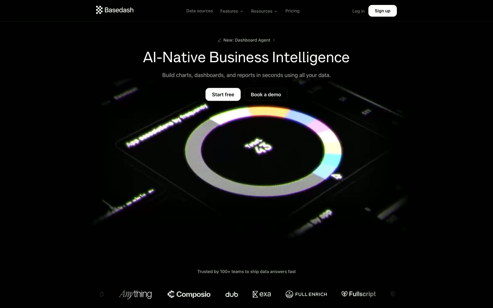
Basedash
Basedash — Style Reference
# Basedash — Style Reference
> Midnight data terminal with frosted type. A dark observatory where metrics glow in violet and green, serif headlines float above the noise, and white pill buttons are the only bright objects in a room of soft black surfaces.
**Theme:** dark
Basedash presents a dark-mode command surface for data work: pure black canvas, near-black elevated cards, and white type that reads like a terminal. The brand voice is calm and technical — Inter does all functional labor at tight tracking, while a custom display serif (Alpha Lyrae) carries hero headlines at exactly 48px, giving the page a quiet editorial accent against the monochrome interface. Two chromatic notes — a vivid violet and a vivid green — appear sparingly as chart and accent fills, never as decoration. Buttons invert the usual dark-mode expectation: filled actions are white pills on black, outlined actions are ghost links, which makes the single primary action glow. Layout is centered and generous, with cards floating on the void at 16px radius and buttons cut to 6px, a split that signals 'card is a container, button is a tool.'
## Tokens — Colors
| Name | Value | Token | Role |
|------|-------|-------|------|
| Void Black | `#000000` | `--color-void-black` | Page canvas, hero background, primary action fill — the default stage for every screen |
| Carbon Card | `#050607` | `--color-carbon-card` | Card and elevated surface background — barely lighter than the canvas so cards read as recessed wells, not raised panels |
| Ghost White | `#ffffff` | `--color-ghost-white` | Primary text, filled button background, primary action fill — the highest-contrast color in the system, used to make actions unmistakable |
| Bone White | `#e8eaee` | `--color-bone-white` | Subtle surface washes and light contrast elements — sparingly used for tonal variation in dark sections |
Websites
Markdown Text
design-md
website-prompt
landing-page-prompt
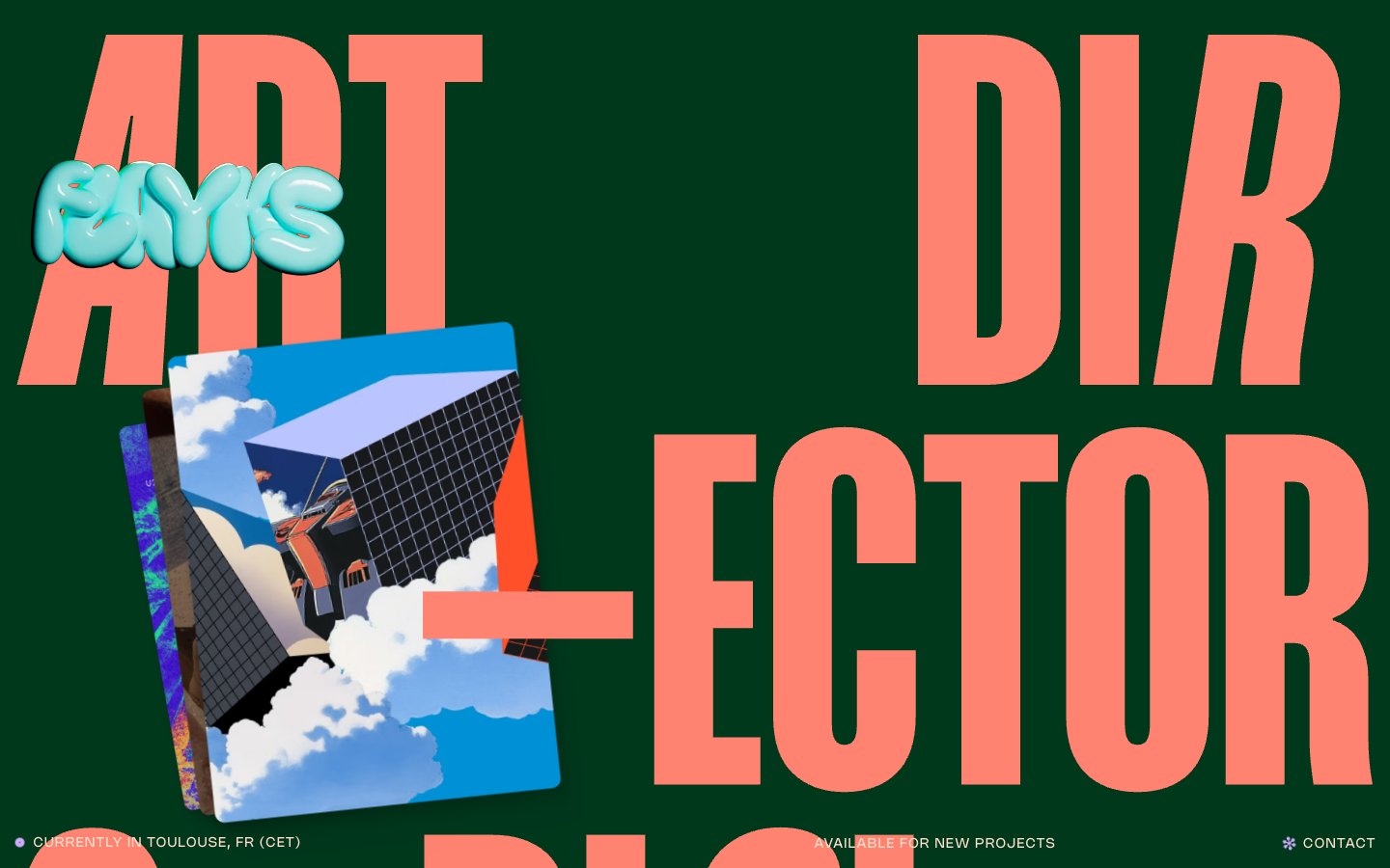
Flayks
Flayks — Style Reference
# Flayks — Style Reference
> Oversized editorial broadsheet — dark forest green page, peach ink headlines bleeding off the page edges, tiny Nohemi caption text anchoring the corners.
**Theme:** dark
Flayks is a maximalist editorial portfolio that treats every screen like a printed broadsheet: a deep forest-green canvas, oversized compressed display type that intentionally overflows the viewport, and a single warm peach tone as the dominant text and border color. The system pairs two custom typefaces — Mango Grotesque for monumental condensed headlines and Nohemi for the tiny UI chrome — creating an extreme scale contrast that defines the visual rhythm. Accents appear sparingly: coral-orange for emphasis type, lavender-violet for section labels and selected states. Surfaces are flat with a single deep shadow drop pattern on cards; 3D illustration tiles float above the canvas, slightly rotated, giving the page a tactile collage quality rather than a flat app feel.
## Tokens — Colors
| Name | Value | Token | Role |
|------|-------|-------|------|
| Forest Ink | `#00381c` | `--color-forest-ink` | Page canvas, section backgrounds — deep saturated green creates the base atmosphere; the page reads as forest-green, not black, which warms the dark theme and separates this system from generic dark-mode SaaS |
| Forest Deep | `#002d16` | `--color-forest-deep` | Shadow and recessed surface tone — used in card drop-shadows and inner depth layers, the slightly darker shade of the canvas adds dimension without breaking the monochrome green field |
| Peach Cream | `#ffe0ce` | `--color-peach-cream` | Primary text, hairline borders, outlined-action strokes — the system's only near-gray warm tone; carries the majority of legibility weight and acts as the universal border color across lists, cards, and images. Outlined ghost-button stroke color |
| Bone | `#f6e9d9` | `--color-bone` | Secondary text, decorative stroke and fill accents — a slightly cooler cream for subtle differentiation from Peach Cream without breaking the warm neutrals family |
Websites
Markdown Text
design-md
website-prompt
landing-page-prompt
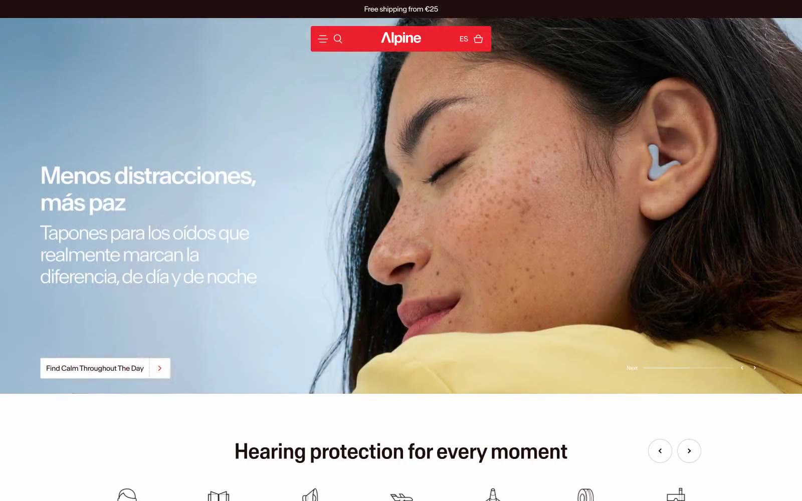
Alpine Hearing Protection
Alpine Hearing Protection — Style Reference
# Alpine Hearing Protection — Style Reference
> Sunlit Scandinavian editorial. A cinnamon-ink wordmark on warm cream paper, with one red exclamation — the rest is photography and generous whitespace.
**Theme:** light
Alpine uses a warm Scandinavian-editorial language: an off-white canvas bathed in cinnamon undertones, a near-black cocoa ink for text, and a single electric red accent that appears only in the brand bar and product badges. The system feels like a print magazine spread — generous full-bleed photography sits next to tight, sharp-cornered product cards with minimal rounding (2.23px) and no decorative elevation. Typography is custom and slightly compressed (Antarctica), pulling headlines close for editorial tension. Warm cream surfaces (#f8f0ec, #f3e7e2, #fde3d6) layer underneath product imagery like a gallery wall. The visual mood is calm, premium, and tactile — photography does the emotional work while UI components stay near-flat and information-dense. Red is rationed: a logo bar, a badge, a guarantee bar — never buttons. The only filled action color is the warm cocoa (#200e0e), which replaces what most sites would use as black.
## Tokens — Colors
| Name | Value | Token | Role |
|------|-------|-------|------|
| Cocoa Ink | `#200e0e` | `--color-cocoa-ink` | Primary text, filled action buttons, card text, icon strokes, card borders — warm near-black replaces pure black throughout, giving every label a roasted, tactile quality |
| Signal Red | `#ed212d` | `--color-signal-red` | Red decorative accent for icons, marks, and small graphic details. |
| Canvas White | `#ffffff` | `--color-canvas-white` | Page background, nav text, button labels on dark surfaces — the neutral base all warm tones sit on |
| Blush Cream | `#f8f0ec` | `--color-blush-cream` | Card surfaces, soft elevated sections, product detail backgrounds — the warm secondary layer beneath the white canvas |
Websites
Markdown Text
design-md
website-prompt
landing-page-prompt
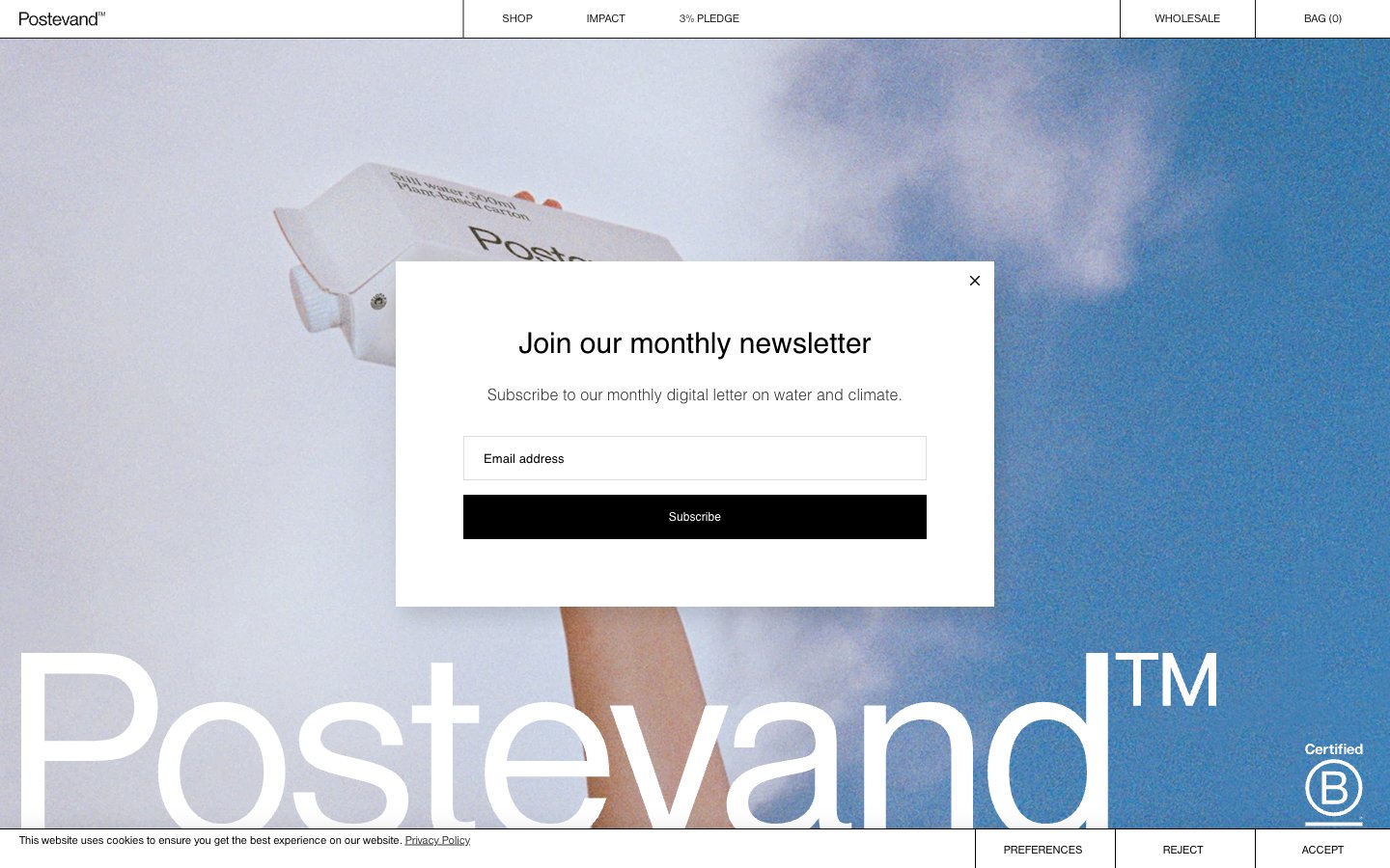
Postevand
Postevand — Style Reference
# Postevand — Style Reference
> editorial gallery on bone paper
**Theme:** light
Postevand operates as an editorial gallery on bone paper — a completely achromatic environment where the product IS the color. Every interface element reduces to black, white, and a single warm off-white (#f0f1ef), creating a Scandinavian exhibition aesthetic where photography and oversized typography carry all the visual weight. The system is aggressively minimal: hairline black rules divide the canvas into grid cells, buttons are black rectangles that feel like printed labels, and there are zero decorative gradients or chromatic accents. Typography is the only expressive tool — a single sans-serif (Nimbus Sans) speaks in whisper-weight headlines and tight tracking, with the brand wordmark scaled to fill the viewport. Components are skeletal: ghost inputs, black filled buttons that double as text, and cards that are just rectangles on the bone-colored surface.
## Tokens — Colors
| Name | Value | Token | Role |
|------|-------|-------|------|
| Ink Black | `#000000` | `--color-ink-black` | Primary text, hairline borders, filled button backgrounds, navigation rules — the structural line weight of the entire system |
| Paper White | `#ffffff` | `--color-paper-white` | Page canvas, input fills, modal surfaces, inverted text on black buttons |
| Bone | `#f0f1ef` | `--color-bone` | Card surfaces, secondary canvas tone — gives the white-on-white system a warm paper-like quality rather than sterile digital white |
| Graphite | `#333333` | `--color-graphite` | Secondary borders, subdued text — used when pure black is too heavy for hairline elements |
Websites
Markdown Text
design-md
website-prompt
landing-page-prompt
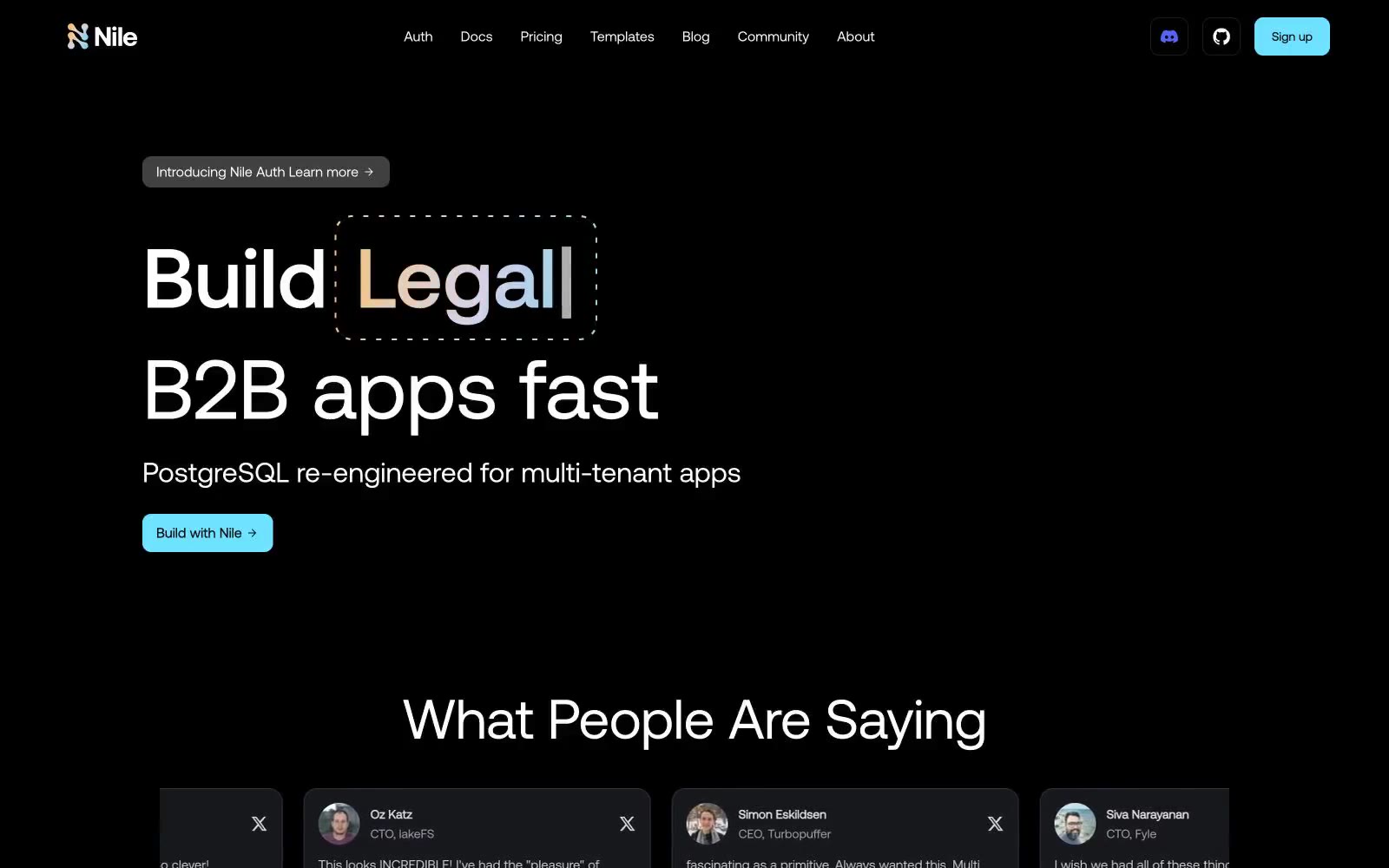
Nile Postgres
Nile Postgres — Style Reference
# Nile Postgres — Style Reference
> infra sunset on black velvet — a quiet command center where three pastel tiles glow in the dark
**Theme:** dark
Nile operates in the visual language of an infrastructure command center: a near-black canvas (#0e0e0e) with elevated surface cards (#1c1c1c) and a trio of pastel feature blocks — cyan #6fe2ff, amber #ffba6a, and lavender #d8d3ff — that function as colored tiles floating in deep space. Typography is geometric and precise: Aeonik at weights 400/500/600/700, with display sizes stretching to 96px on tight negative tracking, giving headlines an architectural, engineered feel. A signature sunset gradient (amber → lavender → cyan) threads through the hero wordmark and likely other moments, providing the only moment of continuous color flow. Components stay flat and quiet — hairline borders (#2f3336) over heavy elevation, pill buttons (9999px), rounded 16-20px cards, and no decorative shadows. The overall atmosphere is restrained infrastructure: developer-facing, confident through restraint rather than spectacle, with chromatic accents used sparingly as functional category tags rather than decoration.
## Tokens — Colors
| Name | Value | Token | Role |
|------|-------|-------|------|
| Deep Void | `#0e0e0e` | `--color-deep-void` | Page canvas, deepest surface — the black that everything floats on |
| Carbon | `#1c1c1c` | `--color-carbon` | Card surfaces, elevated panels, testimonial tiles |
| Graphite | `#2b2b2b` | `--color-graphite` | Mid-elevation surfaces, subtle layering above cards |
| Smoke | `#3f3f3f` | `--color-smoke` | Borders, dividers on elevated elements, button outlines |
Websites
Markdown Text
design-md
website-prompt
landing-page-prompt
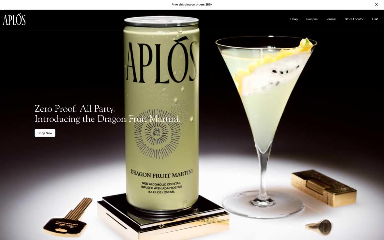
Aplós
Aplós — Style Reference
# Aplós — Style Reference
> Old-world apothecary at dusk
**Theme:** light
Aplós is an old-world apothecary rendered in warm monochrome: bone-white canvas, deep cocoa accents, and a single editorial serif (Goudy Old Style) that does the work a sans-serif system normally would. The page rhythm is slow and confident — dramatic dark hero slabs, generous cream sections, and tightly spaced type that reads more like a printed cocktail menu than a DTC storefront. The product itself is always the visual hero; the interface stays out of the way with minimal borders, one shared 5px radius, and almost no chromatic accent. Color appears only as tonal shift: bone → white → cocoa → ink, never as decorative hue.
## Tokens — Colors
| Name | Value | Token | Role |
|------|-------|-------|------|
| Bone | `#f2f1ed` | `--color-bone` | Page background, large section canvases — the warm off-white that gives the system its paper-like editorial feel |
| Paper White | `#ffffff` | `--color-paper-white` | Card surfaces, elevated panels, light benefit cards — sits one step above Bone to create lift without shadows |
| Cocoa | `#3b3429` | `--color-cocoa` | Dark accent cards, inverted text blocks — warm near-black that softens pure ink and keeps dark sections feeling organic rather than digital |
| Ink | `#000000` | `--color-ink` | Primary text, nav links, logo wordmark, hairline borders, hero backdrop |
Websites
Markdown Text
design-md
website-prompt
landing-page-prompt
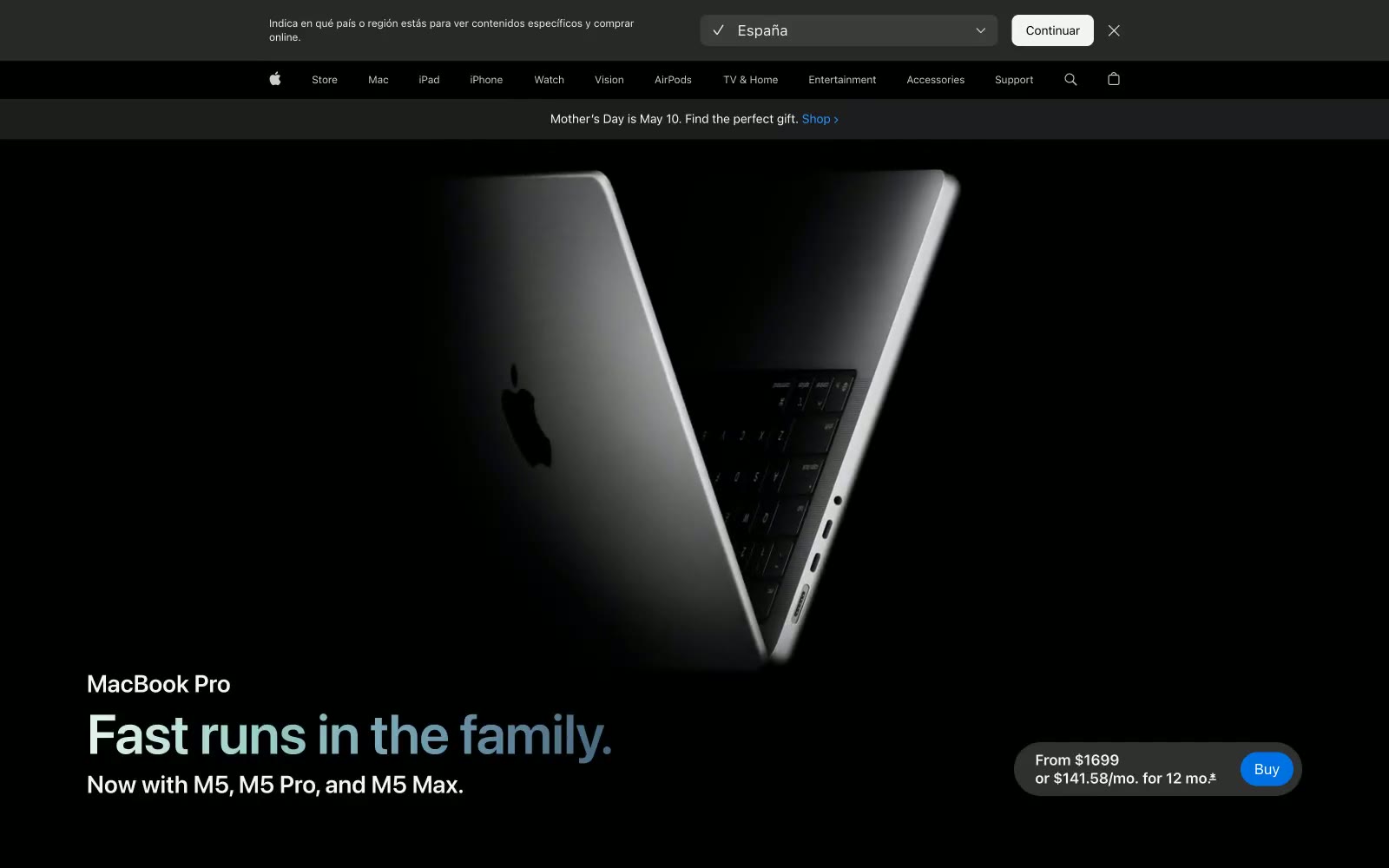
Apple
Apple — Style Reference
# Apple — Style Reference
> black void with one lit object
**Theme:** dark
Apple's MacBook Pro page operates as a cinematic dark stage: pure black canvas with a single hero-sized product photograph emerging from shadow, no decorative chrome, no gradient panels competing with the device. The system is essentially monochromatic — 98% achromatic — using tight negative letter-spacing on oversized display type (SF Pro Display at 80px) to create a sense of engineered precision rather than warmth. Color is rationed: one signature blue accent (#2997ff) powers interactive links and the pill-shaped buy button, while a subtle multi-color gradient occasionally appears in spec infographics as visual punctuation. Components are generous and soft — 28px card radii, 980px pill nav bars, 999px fully-rounded buttons — creating a tactile, object-like quality where every interactive element feels machined rather than drawn. The visual rhythm alternates between enormous breathing room (120px+ section gaps around hero blocks) and dense informational blocks (fine-print legal text at 12px), producing a confident cadence that trusts silence as a design tool.
## Tokens — Colors
| Name | Value | Token | Role |
|------|-------|-------|------|
| Pure Black | `#000000` | `--color-pure-black` | Page canvas, hero backgrounds, image voids |
| Graphite | `#1d1d1f` | `--color-graphite` | Card surfaces, footer, secondary text on light surfaces |
| Smoke | `#333336` | `--color-smoke` | Supporting neutral for secondary UI, dividers, and muted labels. Do not promote it to the primary CTA color |
| Charcoal | `#161617` | `--color-charcoal` | Supporting neutral for secondary UI, dividers, and muted labels. Do not promote it to the primary CTA color |
Websites
Markdown Text
design-md
website-prompt
landing-page-prompt
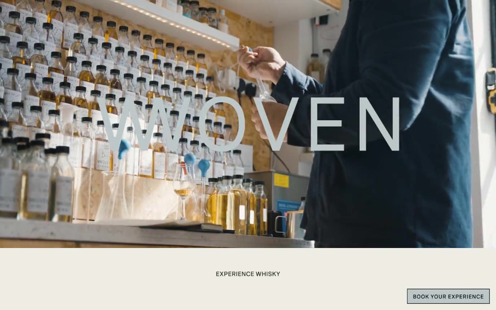
Woven
Woven — Style Reference
# Woven — Style Reference
> Ink on cream parchment. A distiller's editorial spread where warm cream canvases, a single dark ink color, and wide-tracked uppercase type create the only visual structure; product photography provides all the color.
**Theme:** light
Woven is an editorial whisky label with a parchment-on-press feel: warm cream canvases, a single dark ink color for every text and hairline border, and generous tracking that lets type breathe like a luxury magazine masthead. The entire interface is monochrome — zero chromatic accent — so product photography (amber bottles, foil caps, liquid) becomes the only color the eye ever sees. Layouts are spacious and centered, with uppercase navigational micro-copy stacked in narrow columns and section headings set far apart from their content. Components stay flat and quiet: white product cards with hairline borders, underlined text links, ghost controls, and no shadows or gradients — the cream surface is the elevation.
## Tokens — Colors
| Name | Value | Token | Role |
|------|-------|-------|------|
| Parchment Cream | `#eeede5` | `--color-parchment-cream` | Page canvas, footer surface, and dominant background — the warm off-white that gives the entire site its editorial, paper-like feel |
| Ink Black | `#232323` | `--color-ink-black` | Primary text, all hairline borders, footer ink, and the near-black that forms every structural line on the page |
| Pure White | `#ffffff` | `--color-pure-white` | Product card surfaces, alternating section backgrounds, and high-contrast text on dark or photographic surfaces |
| Iron Gray | `#4a4a4a` | `--color-iron-gray` | Secondary body text, subdued borders, and the muted text layer that sits between primary ink and background |
Websites
Markdown Text
design-md
website-prompt
landing-page-prompt
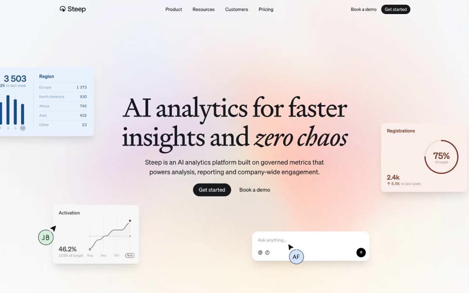
Steep
Steep — Style Reference
# Steep — Style Reference
> Soft dawn on a marble dashboard
**Theme:** light
Steep is a daylight analytics workspace: an almost achromatic canvas of white and warm-gray surfaces warmed by a single, restrained rust-peach accent and softened by a serif/sans pairing that reads as editorial rather than enterprise. The hero is a peach-lit dawn — a soft radial glow behind a monumental Signifier headline and floating product cards — then the screen settles into a cool marble dashboard where the product does the talking. Signifier carries all display weight (a deliberate contrast against the utilitarian Sohne body), radii are generously large (24px cards feel like ceramic tiles, not windows), and the entire palette treats color as punctuation: chrome is monochrome, data visualization gets the only two chromatic voices (warm rust and cool blue), and one dark fill button does all the asking. The result feels closer to a magazine layout than a SaaS dashboard — calm, editorial, confident.
## Tokens — Colors
| Name | Value | Token | Role |
|------|-------|-------|------|
| Ink | `#17191c` | `--color-ink` | Primary text, filled CTA buttons, dark surfaces — near-black with a whisper of warmth that pairs naturally with the peach accent |
| Pure White | `#ffffff` | `--color-pure-white` | Page canvas, card surfaces, text on dark buttons |
| Fog | `#f7f7f8` | `--color-fog` | Secondary canvas and section backgrounds, sidebar surfaces |
| Ash | `#4c4c4c` | `--color-ash` | Muted body text, secondary strokes |
Websites
Markdown Text
design-md
website-prompt
landing-page-prompt
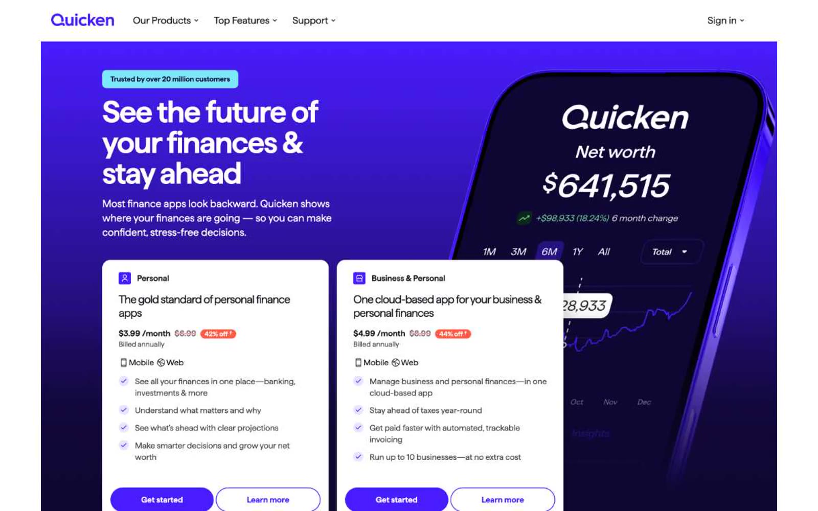
Quicken
Quicken — Style Reference
# Quicken — Style Reference
> electric violet on white marble
**Theme:** mixed
Quicken's design system orbits a single electric violet — vivid #471cff — that acts as the power source for every interactive element against a clean white canvas. The visual personality is confident financial-tech: a custom geometric sans (Haffer) sets the voice with tight negative tracking that tightens further as type grows, creating density and authority without weight. Dark violet sections (#0f0733) alternate with white bands to create rhythm, while soft lavender card borders (#dbd3ff, #bbc5fa) replace the usual gray dividers and reinforce brand identity at every edge. Components lean rounded and pill-shaped: cards use 16px corners, buttons stretch to 400px radius, and shadows are nearly absent — depth comes from color contrast and border treatment, not elevation.
## Tokens — Colors
| Name | Value | Token | Role |
|------|-------|-------|------|
| Voltage Violet | `#471cff` | `--color-voltage-violet` | Primary action buttons, active nav items, key links, brand emphasis — the single chromatic pulse of the interface; everything else defers to it |
| Deep Iris | `#0f0733` | `--color-deep-iris` | Dark section backgrounds, hero canvas, high-contrast text on light surfaces — the midnight counterpart that anchors alternating dark bands |
| Signal Red | `#eb0130` | `--color-signal-red` | Promotional accents, sale/urgency indicators, highlight strokes — used sparingly to flag attention without competing with the primary violet |
| Lilac Whisper | `#dbd3ff` | `--color-lilac-whisper` | Soft card and container borders — a low-contrast violet edge that brands outlines without adding visual weight |
Websites
Markdown Text
design-md
website-prompt
landing-page-prompt
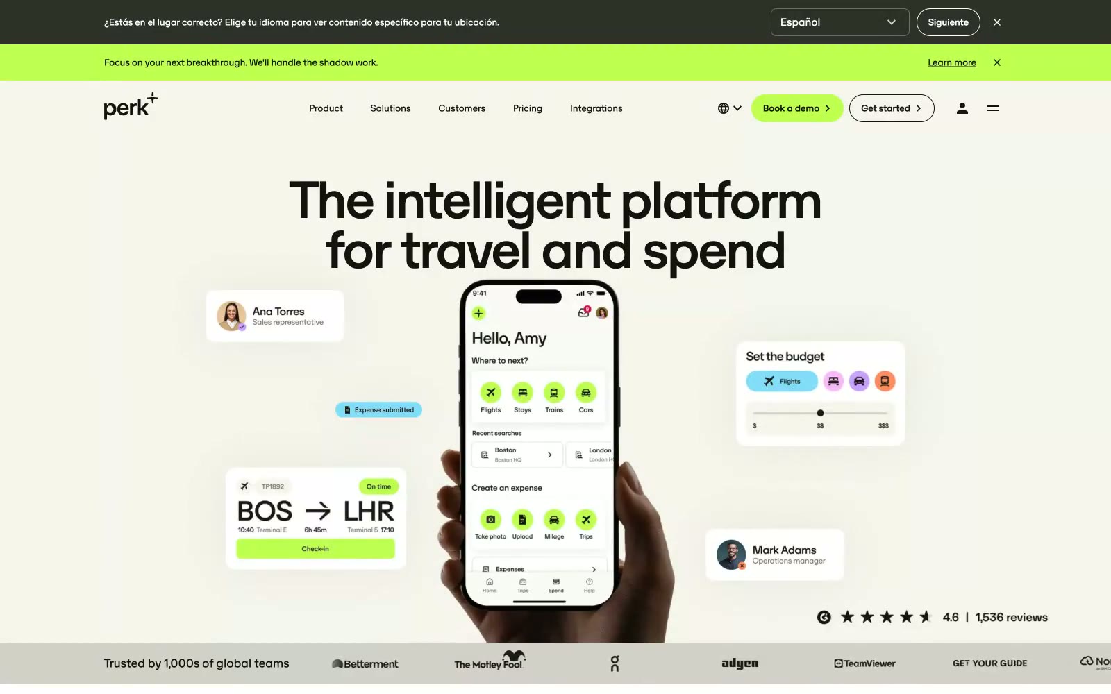
Travelperk
Travelperk — Style Reference
# Travelperk — Style Reference
> Lime spark on warm parchment — electric CTA green against aged-paper cream, zero shadows, everything rounded at exactly 26px.
**Theme:** light
Perk radiates controlled energy — a lime-charged black-and-cream field where electric #beff50 punches through near-black and warm off-white surfaces. The warm off-white (#f5f5eb) hero background reads as aged paper next to the electric lime, making the palette feel tactile rather than digital. A single custom sans, OTSono, does all the work at every scale from 10px UI labels to 200px display glyphs, with tight 0.89-0.90 leading and -0.03em tracking at display sizes making the oversized headlines feel compressed and purposeful. The 26px radius is the system's dominant shape language — applied uniformly to buttons, cards, and image frames — creating rounded-corner consistency that softens an otherwise high-contrast black/lime/cream palette. No shadows, no gradients — surfaces differ only by background value, with #14140f dark cards, #ffffff white cards, and #f5f5eb warm-cream cards all sharing the same 26px radius and no elevation metaphor.
## Tokens — Colors
| Name | Value | Token | Role |
|------|-------|-------|------|
| Electric Lime | `#beff50` | `--color-electric-lime` | Primary CTA buttons, active UI chips, icon accent fills — the single chromatic accent that detonates against every surface (near-black, white, and cream alike), creating urgency without red-coded alarm |
| Near Black | `#14140f` | `--color-near-black` | Primary text color, dark card backgrounds, nav borders — a warmed black (not pure #000000) that pairs with cream for a slightly analog feeling |
| Pure Black | `#000000` | `--color-pure-black` | High-contrast text, icon fills, button borders at max contrast |
| Pure White | `#ffffff` | `--color-pure-white` | Card backgrounds, overlay surfaces, inverted button text |
Websites
Markdown Text
design-md
website-prompt
landing-page-prompt
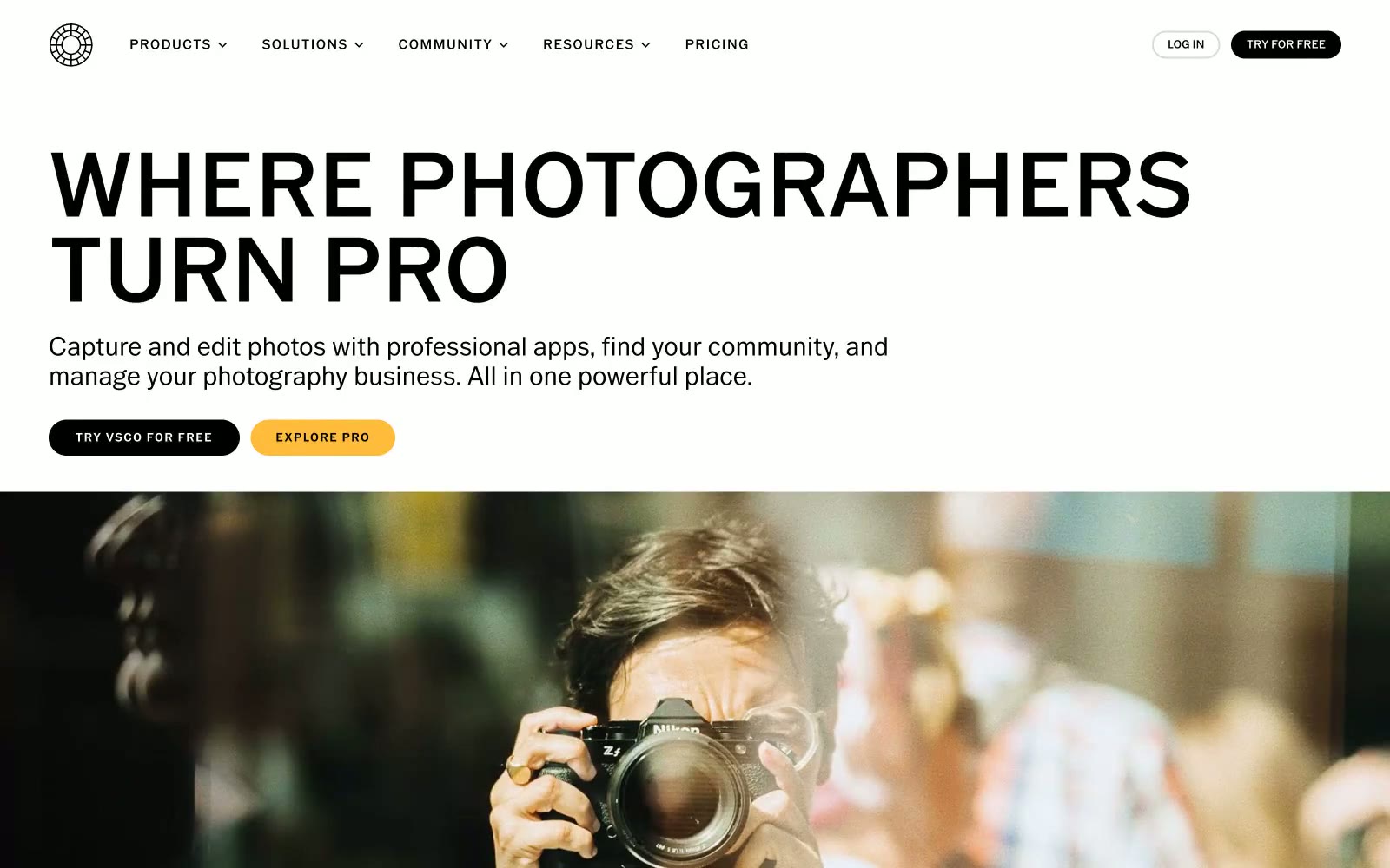
VSCO®
VSCO® — Style Reference
# VSCO® — Style Reference
> Monochrome gallery wall — a black-and-white photo exhibition where a single warm spotlight makes the next action glow.
**Theme:** mixed
VSCO's visual system reads as a monochrome photography gallery: a near-pure black-and-white canvas where a single warm amber accent punctuates action. Display type is narrow, geometric, and enormous — hero headlines push 89-98px, commanding attention through scale and tight tracking rather than through color or ornament. The palette stays disciplined: white sections frame black product bands, and full-bleed photography carries emotional weight that decoration never tries to. Buttons are pill-shaped and unflinching — black fills for default actions, amber for the single moment of warmth. The design is deliberately flat: no shadows, no gradients, no skeuomorphic depth. Elevation comes from surface contrast (white → black bands) and image bleed, not from layered depth effects.
## Tokens — Colors
| Name | Value | Token | Role |
|------|-------|-------|------|
| Photo Black | `#000000` | `--color-photo-black` | Body text, filled buttons, dark section backgrounds, nav text, borders, icon strokes — the dominant structural color across all surfaces |
| Paper White | `#ffffff` | `--color-paper-white` | Page canvas, hero background, footer background, text on dark surfaces, nav fill — the primary light surface |
| Fog Gray | `#f2f2f2` | `--color-fog-gray` | Subtle alternate section backgrounds, hairline washes — barely-there surface differentiation |
| Graphite | `#737373` | `--color-graphite` | Secondary text, footer link text, muted labels — the first step down from body black |
Websites
Markdown Text
design-md
website-prompt
landing-page-prompt
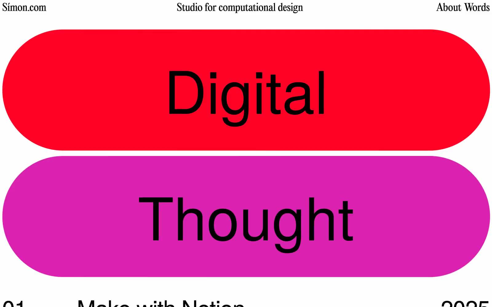
Simon Riisnæs Emmen
Simon Riisnæs Emmen — Style Reference
# Simon Riisnæs Emmen — Style Reference
> Word-shaped confetti on white paper
**Theme:** light
A studio portfolio that treats the page as a poster: a white canvas, two oversized word-shaped color blocks (coral and chartreuse), and a list of projects pinned beneath hairline rules. The visual logic is anti-UI — there are no buttons, no cards, no component grids. Type does the heavy lifting at 67px and 173px, set tight (-0.015em) in a single humanist sans-serif. Every structural line is a 1px black border; every accent surface is a 720px-radius pill that functions as a typographic container rather than a button. The mood is editorial, restrained, and slightly playful — the bold color appears only when a word needs to become an object.
## Tokens — Colors
| Name | Value | Token | Role |
|------|-------|-------|------|
| Press Black | `#000000` | `--color-press-black` | All text, hairlines, list dividers, and the 1px structural borders that organize the page |
| Paper White | `#ffffff` | `--color-paper-white` | Page canvas and the surface beneath the accent pills |
| Coral Slip | `#fd8878` | `--color-coral-slip` | Primary accent pill surface — wraps the first word-block. Warm pink against black ink keeps it readable at 9:1 contrast |
| Chartreuse Strike | `#e8fe04` | `--color-chartreuse-strike` | Secondary accent pill surface — wraps the second word-block. The highest-contrast fill on the page at 18.6:1 with black text |
Websites
Markdown Text
design-md
website-prompt
landing-page-prompt
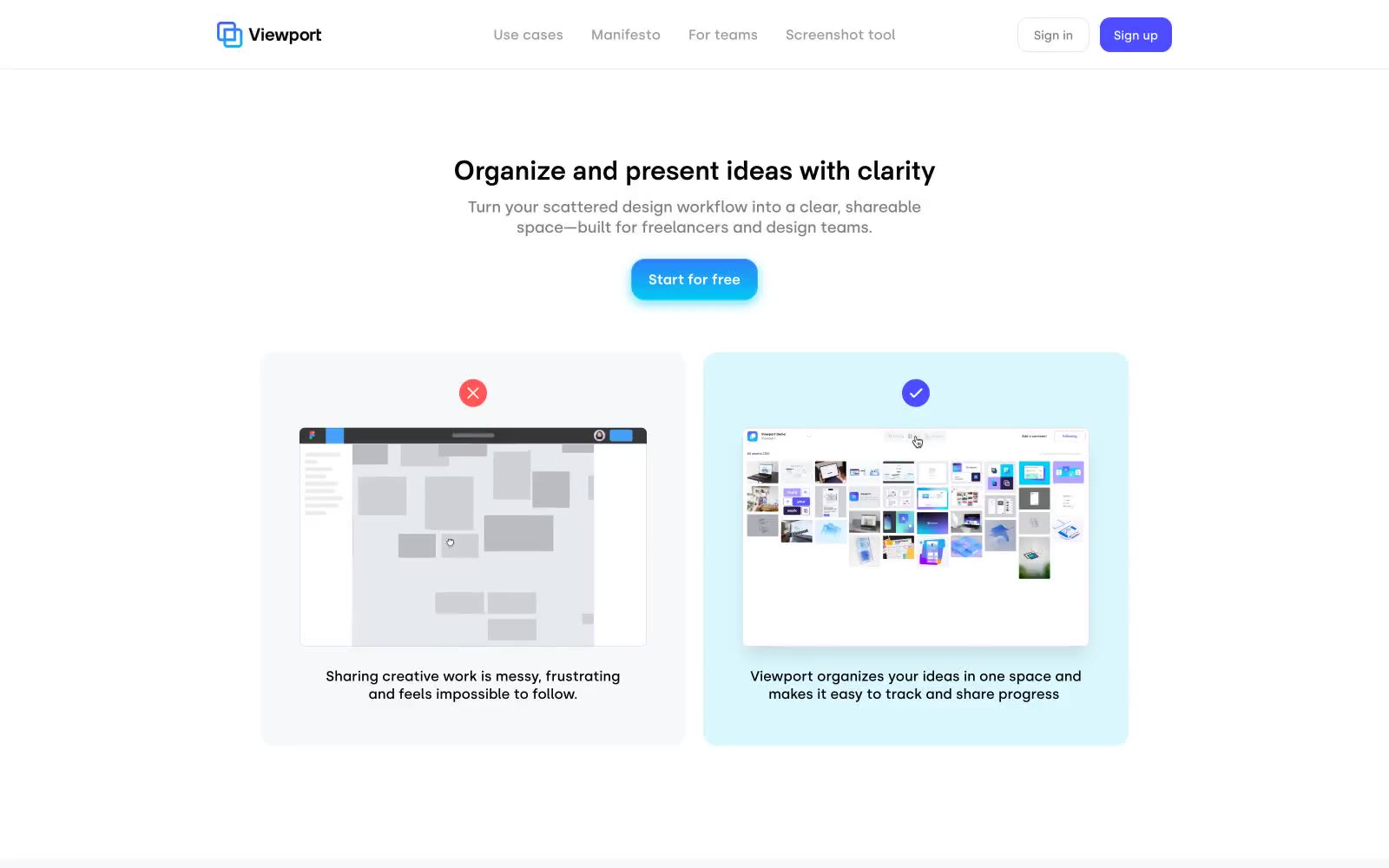
Viewport
Viewport — Style Reference
# Viewport — Style Reference
> Mint sticky-notes on a glass desk. A clean productivity canvas where one vivid indigo button is the only thing that 'switches on' against pale teal surfaces and white walls.
**Theme:** light
Viewport uses a bright, airy workspace language: pure white canvas, generous breathing room, and a signature mint-teal surface that softens sections without darkening them. The entire chromatic story is a tight two-color duo — vivid indigo for actions and mint-teal for surfaces — connected by a cyan-to-violet gradient that lives only on the primary CTA. Typography is calm and geometric: HK Sentiments Bold for headlines at a whisper-heavy 700 weight, Silka for everything functional at 14–18px, tracking pulled tight across the scale. Components feel like smooth tiles: large 16px radii on cards, 12px on buttons, 100px pills for tags, and shadows that are either barely-there gray or a branded cyan glow — never neutral mid-tones. Layouts center a single headline per section, then let wide product screenshots do the work, often floating over the mint surface like sticky notes on a glass desk.
## Tokens — Colors
| Name | Value | Token | Role |
|------|-------|-------|------|
| Indigo Voltage | `linear-gradient(0deg, rgb(0,202,242) 0%, rgb(77,77,255) 100%)` | `--color-indigo-voltage` | Primary action buttons, active nav states, accent borders, heading highlights — the sole chromatic brand color, making every interactive element unmistakable; Primary CTA button fill — the only gradient in the system, flowing from cyan to indigo vertically |
| Mint Whisper | `radial-gradient(102% 82% at 50% 107.7%, rgba(0,202,242,0.3) 0%, rgb(241,243,245) 100%)` | `--color-mint-whisper` | Signature section surface — replaces gray for feature panels, product wrappers, and comparison cards; a soft teal that reads as a colored canvas rather than a colored card; Radial hero wash — cyan blooming into neutral gray for ambient atmosphere on showcase sections |
| Cyan Pulse | `#00caf2` | `--color-cyan-pulse` | Gradient origin point and link glow shadow; appears only inside the cyan→indigo button gradient and the radial brand wash |
| Cyan Mist | `#66dff7` | `--color-cyan-mist` | Soft cyan used as a link-focus glow ring; bridges Mint Whisper and the gradient endpoints |
Websites
Markdown Text
design-md
website-prompt
landing-page-prompt
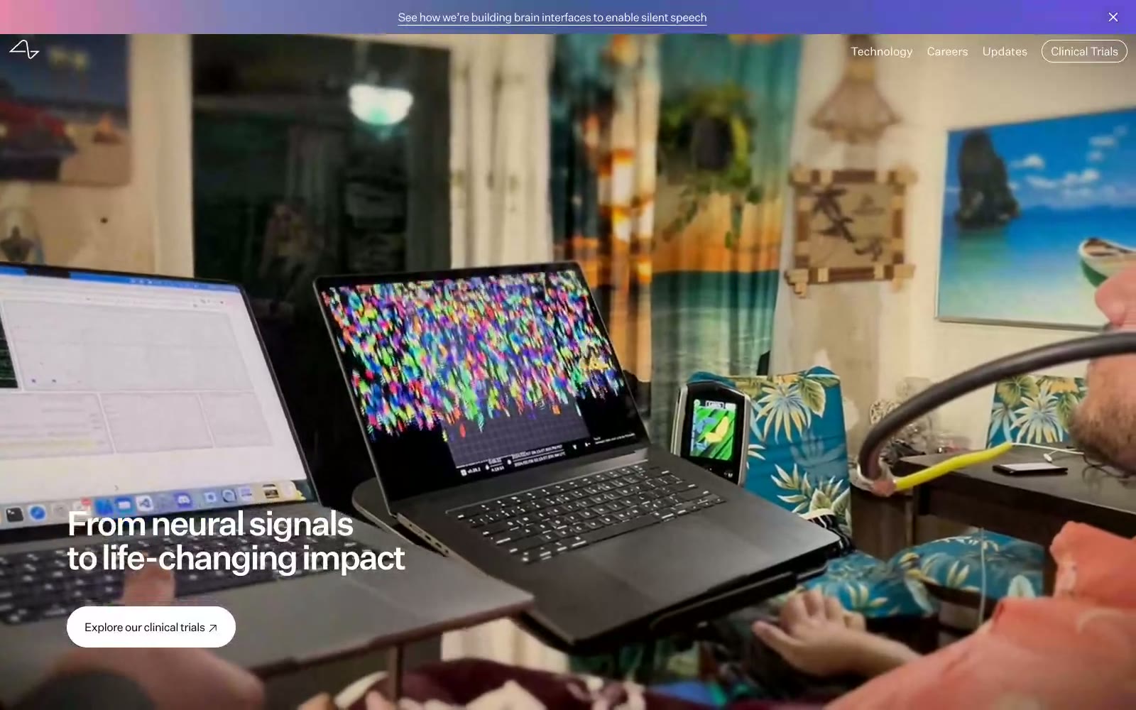
Neuralink
Neuralink — Style Reference
# Neuralink — Style Reference
> obsidian laboratory with a single color synapse — a black void where only light, shadow, and one thin spectrum of color speak
**Theme:** mixed
Neuralink operates as a near-pure monochrome system: a near-black canvas, a white surface, and one off-white band, with no chromatic brand color at all. A single spectrum gradient — pink to violet — appears only as the announcement bar and as photo-card overlays, acting as the system's sole injection of warmth and life. Typography carries almost all of the brand voice: a geometric sans at weight 300 for display sizes with aggressively tight tracking (-0.165em at 48px) that gives headlines a compressed, engineered density. Pill-shaped controls (80px radius) sit against full-bleed black and white blocks, creating a cinematic, almost editorial rhythm where the only color signal is a faint synaptic glow.
## Tokens — Colors
| Name | Value | Token | Role |
|------|-------|-------|------|
| Obsidian | `#000000` | `--color-obsidian` | Page hero canvas, primary text, section dividers, dark-mode blocks. The dominant structural color — used 931 times as backgrounds, borders, and text. Creates a void-like base that makes white type and the single gradient feel electric by contrast |
| Paper | `#ffffff` | `--color-paper` | Content section background, card surfaces, ghost-button text and border. The light counterpart to Obsidian — every content section sits on Paper, and outlined/ghost buttons invert to Paper stroke on Obsidian backgrounds |
| Ash | `#f5f5f5` | `--color-ash` | Soft off-white surface for the footer and secondary bands. Separates Paper from true white when a gentler contrast is needed — used for the meet-our-pioneers section background and the footer |
| Fog | `#bababa` | `--color-fog` | Muted nav text and low-emphasis dividers. A desaturated mid-gray for inactive navigation labels and subtle hairline borders where black would feel too heavy |
Websites
Markdown Text
design-md
website-prompt
landing-page-prompt
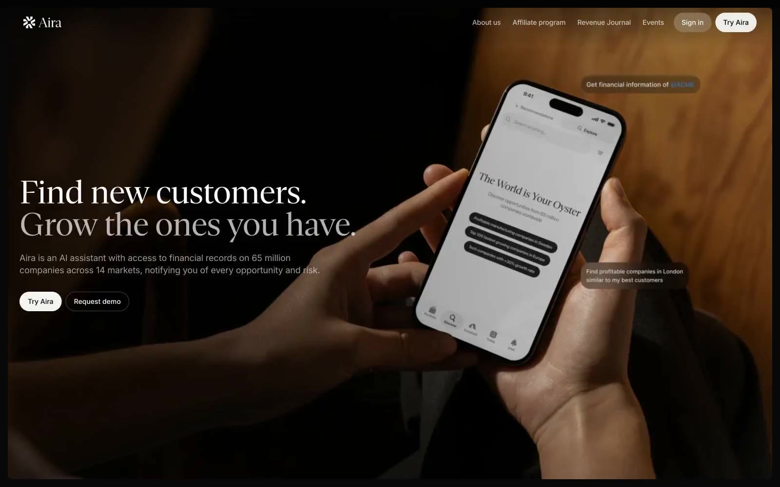
Aira
Aira — Style Reference
# Aira — Style Reference
> Sunday broadsheet at midnight — warm photography, ink type, whisper-quiet UI.
**Theme:** light
Aira uses an editorial-monochrome language: warm photographic atmospherics over a near-achromatic UI built on a single off-white canvas and ink-black type. The signature move is the serif display face (Gestura) paired against Inter for everything functional — a serif headline at 56-72px makes a fintech-adjacent AI tool feel like a Sunday business paper, not a dashboard. The interface stays paper-quiet: pill buttons, hairline borders, one dark surface per section, and almost no chromatic accent — the single warm photographic hero carries all the emotional temperature. Color appears only as the absence of color, so contrast (white → near-black) and material (soft shadow, gentle radius) do the heavy lifting that a typical SaaS palette would.
## Tokens — Colors
| Name | Value | Token | Role |
|------|-------|-------|------|
| Bone White | `#fafafb` | `--color-bone-white` | Primary canvas, card surfaces, button text, input fills |
| Graphite Ink | `#2c2c2b` | `--color-graphite-ink` | Primary borders, hairline dividers, link underlines, heading accents |
| Deep Coal | `#1f1f1f` | `--color-deep-coal` | High-contrast neutral action fill for primary buttons on light surfaces. |
| Obsidian | `#111111` | `--color-obsidian` | Body and heading text at maximum weight, dark hero overlays, icon strokes |
Websites
Markdown Text
design-md
website-prompt
landing-page-prompt
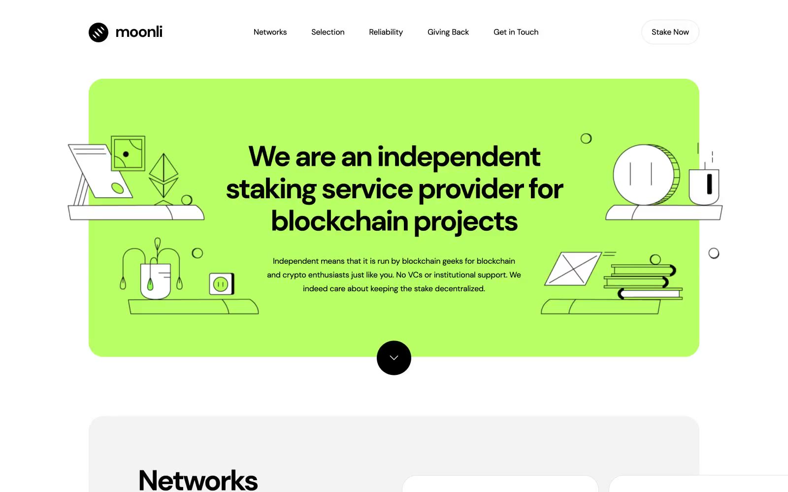
Moonli
Moonli — Style Reference
# Moonli — Style Reference
> Electric lime on white canvas — one vivid room carved out of monochrome space, framed by generous rounded edges.
**Theme:** light
Moonli runs on radical color minimalism: a white canvas, black type, and one electrifying lime accent that appears as a single massive atmospheric block rather than scattered UI elements. The lime (#b8ff65) functions as a room, not a highlight — it floods the hero entirely and reappears in section backgrounds, never as a button fill or icon tint. Everything else is pure black-on-white, anchored by generous 30-40px border radii that soften the stark monochrome contrast. DM Sans carries the entire typographic system across a wide weight range, with tight letter-spacing that scales aggressively negative at display sizes (-0.05em at 58px). Line illustrations in black on the green surfaces add personality and warmth without breaking the two-color discipline. The result reads as confident, almost poster-like — like a single bright object in a gallery of white walls.
## Tokens — Colors
| Name | Value | Token | Role |
|------|-------|-------|------|
| Lime Voltage | `#b8ff65` | `--color-lime-voltage` | Atmospheric section backgrounds, hero block — the single chromatic voice of the system, used at full-section scale rather than as UI accent |
| Obsidian | `#000000` | `--color-obsidian` | Primary text, all borders, all icons, scroll-indicator fill, logo mark |
| Paper White | `#ffffff` | `--color-paper-white` | Page background, card surfaces, nav element fills |
| Fog White | `#f3f3f3` | `--color-fog-white` | Secondary card surface, alternating section backgrounds |
Websites
Markdown Text
design-md
website-prompt
landing-page-prompt
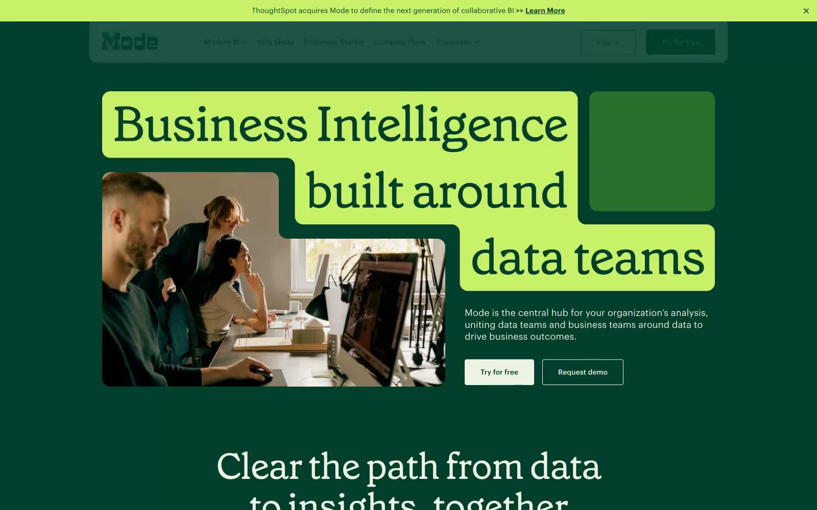
Modern Business Intelligence
Modern Business Intelligence — Style Reference
# Modern Business Intelligence — Style Reference
> Sunlit greenhouse editorial
**Theme:** light
Mode uses a botanical-editorial language: a pale sage canvas (#eef2e3) replaces the usual sterile SaaS white, and a single chartreuse accent (#c8f169) punctuates actions with a sharp, almost fluorescent pop. The headline font is a custom serif (Grenette) at 56–96px with aggressive negative tracking — the words feel pulled tight, almost condensed, and they read like a magazine cover rather than a dashboard. Depth comes from a three-layer color stack (sage → forest green → chartreuse) rather than shadows; surfaces sit flat against each other and rely on hue contrast for hierarchy. Interactive elements use small 4px corner radii while cards and large surfaces use 16px, creating a consistent geometric vocabulary. The mood is confident, warm, and intellectual — BI without the corporate coldness.
## Tokens — Colors
| Name | Value | Token | Role |
|------|-------|-------|------|
| Pale Sage | `#eef2e3` | `--color-pale-sage` | Page canvas, light card surfaces, eyebrow backgrounds, hero photo mats |
| Paper White | `#fcfcfc` | `--color-paper-white` | Elevated card surfaces, nav background, modals, footer |
| Ink Black | `#000000` | `--color-ink-black` | Primary text, icon strokes, hairline borders, ghost button outlines |
| Charcoal | `#242423` | `--color-charcoal` | Secondary text and icon fills — softer than pure black for muted UI elements |