AI Prompt Studio - Intelligent Prompt Library
Explore and use professional AI prompts to optimize your workflow.
One-click Use
Websites
Markdown Text
design-md
website-prompt
landing-page-prompt
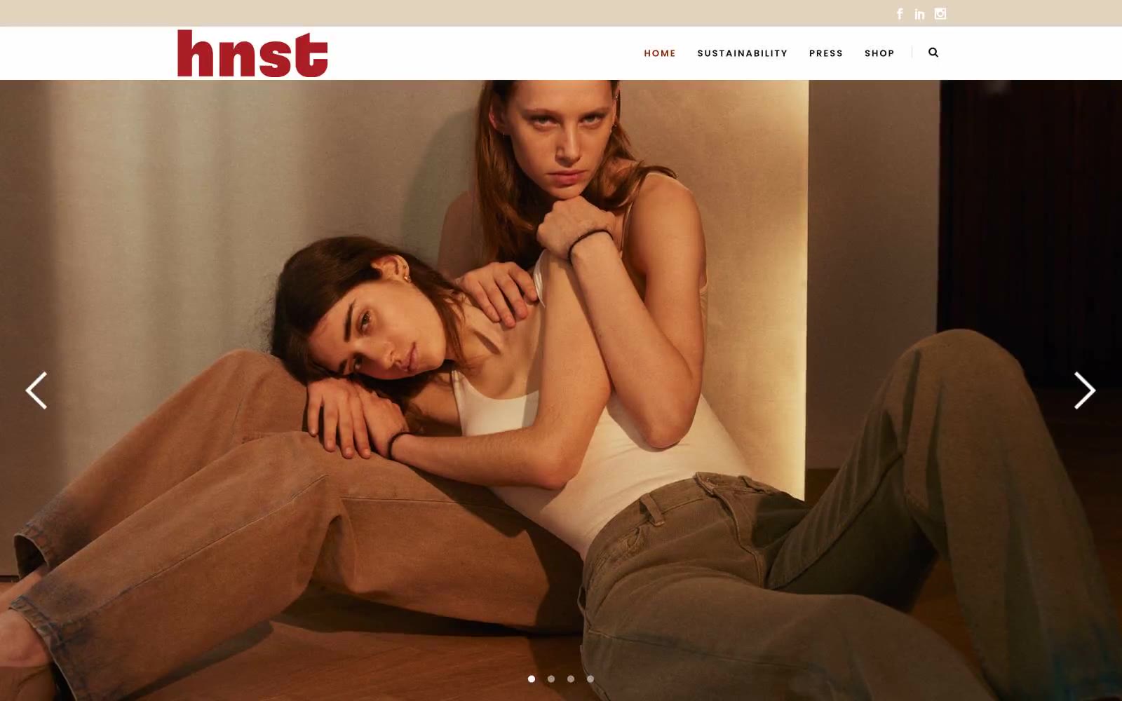
HNST Studio
HNST Studio — Style Reference

# HNST Studio — Style Reference
> earthy atelier with rust on linen — a slow-fashion gallery where a single burnt-orange accent warms an otherwise monastic cream and charcoal interior
**Theme:** light
HNST Studio speaks in a warm, earthy editorial language: bone-white canvases tinted with raw silk cream, a single rust accent that anchors every interactive moment, and gallery-style uppercase typography that lets the photography breathe. The site treats full-bleed fashion imagery as the primary surface — text and chrome are whisper-thin, positioned like museum placards around the visual work. Two type families divide labor cleanly: Raleway handles UI, navigation, and body copy in humanist proportions, while Poppins takes display headings with extreme letter-spacing, turning section labels like 'TRENDING' into printed gallery signage. Components are stripped to essentials — thin borders, soft sand-toned badges, charcoal ink for action, no shadows, no gradients — so the rust accent lands with editorial gravity against the otherwise neutral palette.
## Tokens — Colors
| Name | Value | Token | Role |
|------|-------|-------|------|
| Rust Hearth | `#892500` | `--color-rust-hearth` | Brand logo, active navigation state, section underlines, the only chromatic punctuation in the interface — carries identity weight wherever it appears |
| Blush Whisper | `#ea9195` | `--color-blush-whisper` | Secondary chromatic accent for hover states, soft tags, and paired decorative elements — never standalone, always supporting Rust Hearth |
| Linen | `#ffffff` | `--color-linen` | Neutral form states, badge text, and quiet UI feedback where color should stay understated. Do not promote it to the primary CTA color |
| Raw Silk | `#f9f6f2` | `--color-raw-silk` | Warm off-white page background — replaces sterile pure white to give the site a tactile, natural-fiber feel |
Websites
Markdown Text
design-md
website-prompt
landing-page-prompt
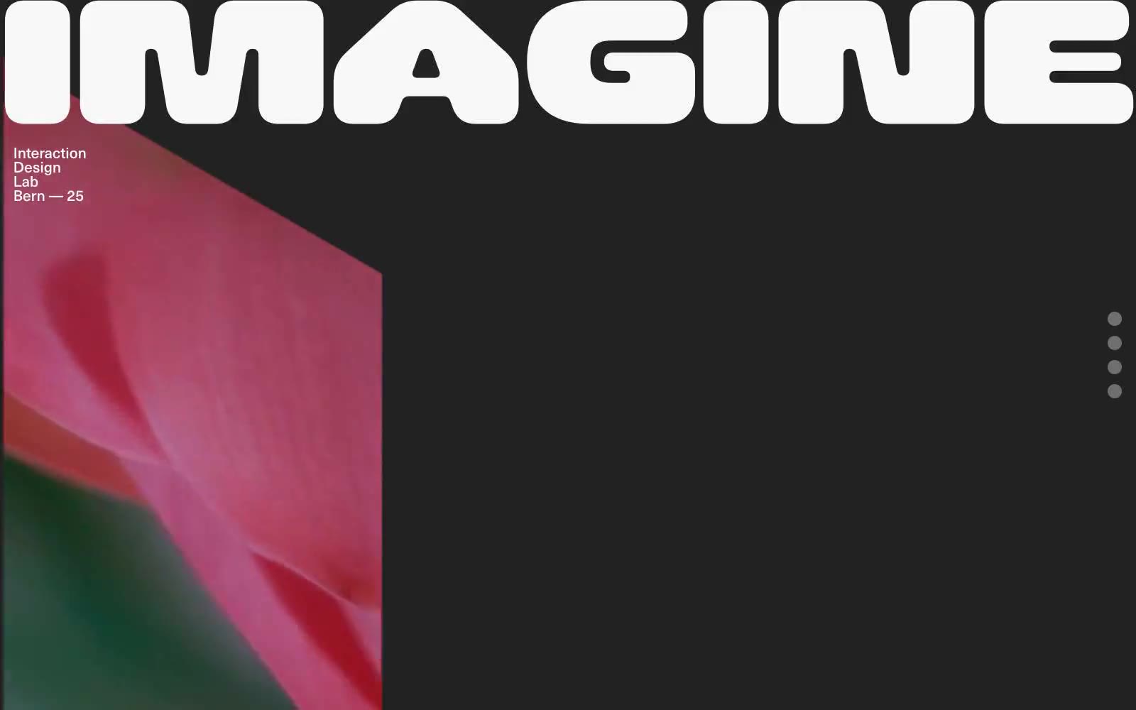
Iad-lab
Iad-lab — Style Reference
# Iad-lab — Style Reference
> art-school exhibition on charcoal
**Theme:** dark
Iad-lab operates as a digital exhibition wall rather than a conventional website: a near-black canvas interrupted by full-bleed photographic panels and two colossal display words that bleed past the viewport edges. The palette is essentially binary — off-white on charcoal — with zero chromatic decoration, letting the photography carry all emotional and visual weight. Navigation is reduced to three floating dots on the right margin; there is no header bar, no menu, no buttons. Typography does the structural work: a single grotesk family at restrained sizes handles all UI copy while an enormous, rounded display face delivers program titles at architectural scale. The rhythm is gallery-like: wide quiet sections, then sudden full-bleed visual ruptures, then quiet again.
## Tokens — Colors
| Name | Value | Token | Role |
|------|-------|-------|------|
| Charcoal Canvas | `#222222` | `--color-charcoal-canvas` | Page background, the dominant surface across all sections and the base layer behind full-bleed photography |
| Bone | `#f8f8f8` | `--color-bone` | All body text, meta labels, navigation dots, and the dominant hairline border color — serves as the single foreground tone in this near-monochrome system |
| Graphite | `#2a2b2d` | `--color-graphite` | Secondary icon strokes, subtle list dividers, and muted fill details — sits one step darker than the canvas for low-contrast decoration |
| Ash | `#757577` | `--color-ash` | Inactive or resting state for navigation dots and quiet UI affordances |
Websites
Markdown Text
design-md
website-prompt
landing-page-prompt
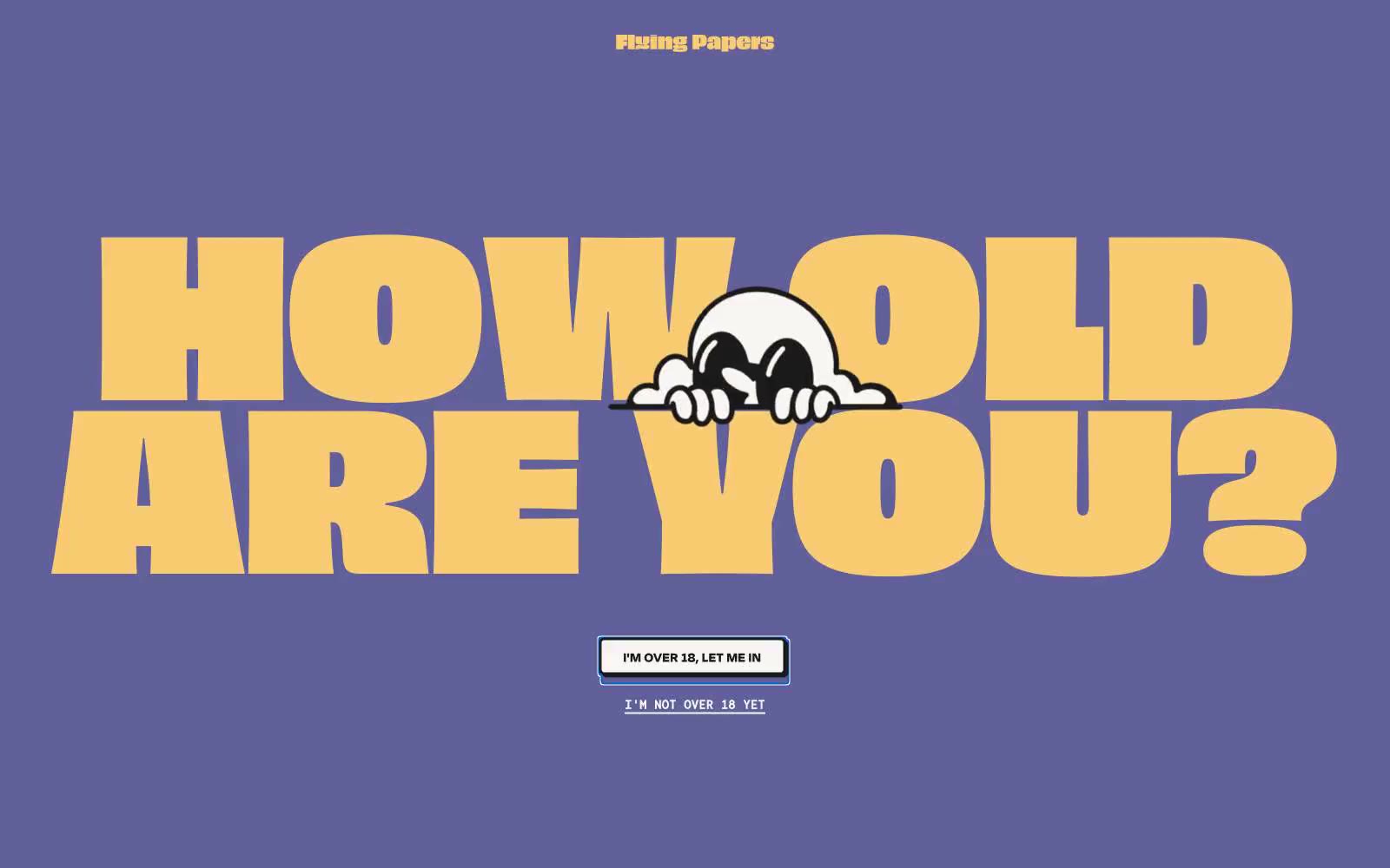
Flying Papers
Flying Papers — Style Reference
# Flying Papers — Style Reference
> Saturday morning cartoon confessional
**Theme:** light
Flying Papers operates like a Saturday-morning cartoon printed on thick riso cardstock: a flat muted-violet stage, a small cast of saturated confetti colors, and type so oversized it eats the viewport. The brand voice is loud, cheeky, and unrepentant — it doesn't ask for attention, it takes it. Every screen should feel like a single bold poster: one dominant display headline, one supporting character illustration, one inline action, and generous breathing room. Borders do the heavy lifting instead of shadows; color is used as paint, not data. Surfaces stay flat, edges stay sharp at 6px, and the only soft thing in the system is the 100px pill on the gate button.
## Tokens — Colors
| Name | Value | Token | Role |
|------|-------|-------|------|
| Dusk Violet | `#8584bd` | `--color-dusk-violet` | Primary canvas and hero background — the stage that every other color performs on |
| Hi-Vis Yellow | `#f4ed36` | `--color-hi-vis-yellow` | Yellow accent for outlined action borders, linked labels, and lightweight interactive emphasis. Do not promote it to the primary CTA color |
| Buttery Yellow | `#f9cc73` | `--color-buttery-yellow` | Secondary display text and softer borders — a mellower sibling of Hi-Vis for when Hi-Vis would be too much |
| Lilac Shadow | `#61609a` | `--color-lilac-shadow` | Card and block backgrounds — a deeper violet for nested surfaces on the violet stage |
Websites
Markdown Text
design-md
website-prompt
landing-page-prompt
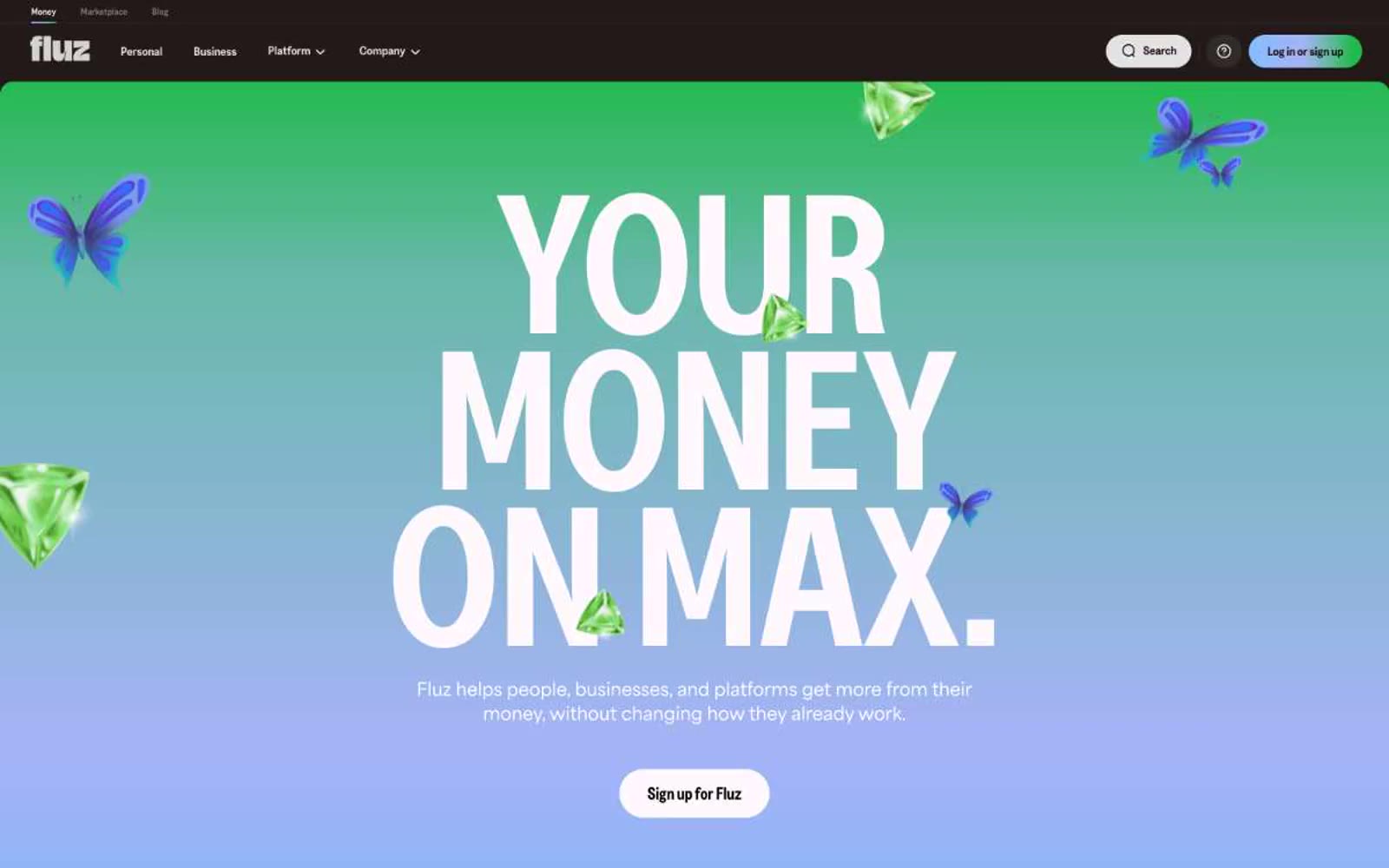
Fluz
Fluz — Style Reference
# Fluz — Style Reference
> Gemstone vault on warm parchment
**Theme:** light
Fluz runs a warm, opulent financial interface built on a single near-black brand color (#1a0000) that replaces pure black with a hint of cocoa, making the dense condensed display typography feel rich rather than clinical. The hero is maximalist — a full-bleed prismatic gradient (sky blue → lavender → mint → emerald) behind a Greed Condensed headline scaled to 96–203px, floating with 3D gems and butterflies — while every other section stays quiet, white, and typographically disciplined. Buttons are aggressively pill-shaped (200px radius) in the warm-black fill, creating a tactile, almost candy-like contrast against the minimal product card grid. The system deliberately oscillates between two registers: a one-screen burst of playful abundance, and a long, cream-toned product showcase that trusts tight tracking and condensed display type to carry the brand.
## Tokens — Colors
| Name | Value | Token | Role |
|------|-------|-------|------|
| Espresso Ink | `#1a0000` | `--color-espresso-ink` | Primary text, filled CTA buttons, top navigation bar, icon strokes — warm near-black replaces pure #000 to feel like ground cocoa rather than ink |
| Prism Spectrum | `linear-gradient(90deg, rgb(130, 190, 255), rgb(166, 180, 247) 47.21%, rgb(91, 184, 154) 73.75%, rgb(33, 186, 76) 91.26%)` | `--color-prism-spectrum` | Hero background gradient — sky blue to lavender to mint to emerald, used as a one-screen burst of color at the top of the page only |
| Canvas White | `#ffffff` | `--color-canvas-white` | Page background, product card surfaces, button text on dark fills |
| Linen Mist | `#f2f2f2` | `--color-linen-mist` | Secondary card surface, alternating section background, subtle depth against pure white |
Websites
Markdown Text
design-md
website-prompt
landing-page-prompt
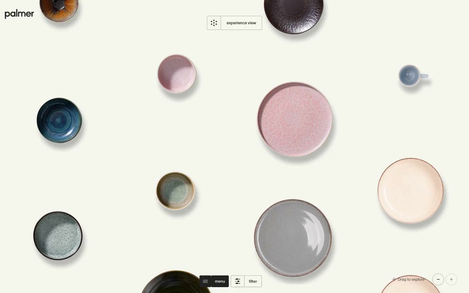
Palmer
Palmer — Style Reference
# Palmer — Style Reference
> Ceramic gallery in soft daylight — the interface is the wall, the objects are the art.
**Theme:** light
Palmer treats dinnerware like a museum exhibit on a warm cream canvas (#f5f6ee). The interface dissolves — no shadows, no chrome, no saturated accents — so hand-glazed ceramics become the only color in the room. Typography runs tight: TWK Lausanne at near-mono weights (300–500) with aggressive negative tracking that pulls letters together, including an enormous 120px display tier that functions more as editorial statement than UI label. Interactive elements are reduced to hairline borders and pill-shaped toggles, sitting at the edges of the viewport to leave the center completely uninterrupted. Everything below the fold assumes the same gallery logic: small text, thin rules, generous space between objects.
## Tokens — Colors
| Name | Value | Token | Role |
|------|-------|-------|------|
| Gallery Cream | `#f5f6ee` | `--color-gallery-cream` | Page canvas and base surface — a warm off-white that flatters glazed ceramics more than pure white would |
| Ink | `#222222` | `--color-ink` | Primary text, hairline borders, card outlines, icon strokes — the entire structural skeleton runs through this one near-black |
| Bone | `#ffffff` | `--color-bone` | Product image backgrounds, occasional inverse surface when a card needs to sit forward of the cream canvas |
| Fog | `#a1a19c` | `--color-fog` | Muted secondary borders and low-priority text — used when Ink would be too heavy for a structural divider |
Websites
Markdown Text
design-md
website-prompt
landing-page-prompt
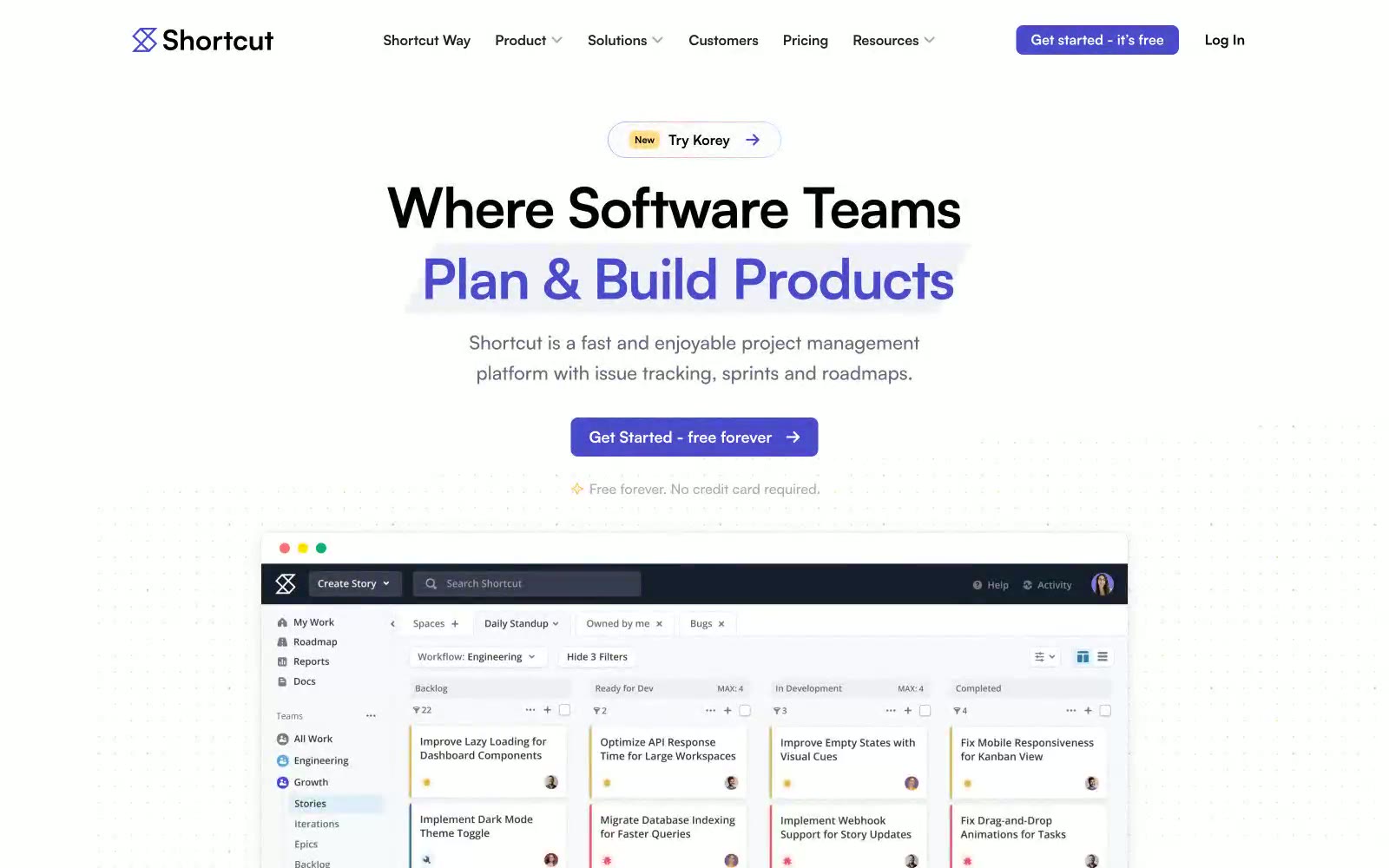
Shortcut
Shortcut — Style Reference
# Shortcut — Style Reference
> indigo ink on white paper — A whiteboard surface where one confident violet stroke does all the work.
**Theme:** light
Shortcut's visual language is an indigo-ink-on-white-paper system: a quiet, high-key canvas interrupted by a single vivid violet that does the talking. The product lives on flat white surfaces with near-invisible hairline borders; depth comes from generous whitespace and the occasional pale lavender card, never from drop shadows. Typography is a single geometric sans (Satoshi) set tight and confident at modest sizes — the interface never shouts, it narrates. Color is rationed like punctuation: deep midnight (#08093f) anchors dark sections and footers, vivid indigo (#494bcb) marks every primary action, and a single warm yellow badge appears as decorative accent. The mood is professional, restrained, and tool-like — a workhorse product UI dressed in just enough brand to feel deliberate without becoming decorative.
## Tokens — Colors
| Name | Value | Token | Role |
|------|-------|-------|------|
| Vivid Indigo | `#494bcb` | `--color-vivid-indigo` | Primary action background, filled buttons, active nav, brand focal point — the one chromatic color that carries the entire brand |
| Midnight Ink | `#08093f` | `--color-midnight-ink` | Footer background, dark section canvases, heading accent on dark surfaces — near-black with violet undertone ties it to the brand |
| Soft Violet | `#8a8ac6` | `--color-soft-violet` | Icon strokes, decorative SVG borders, illustration outlines — the muted cousin of the brand color, used where saturated indigo would be too loud |
| Pale Lavender | `#9f7ad0` | `--color-pale-lavender` | Badge accent border, decorative illustration strokes — provides warmth without competing with the primary |
Websites
Markdown Text
design-md
website-prompt
landing-page-prompt
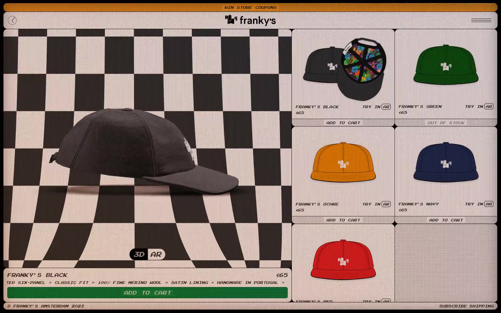
FRANKY'S
FRANKY'S — Style Reference
# FRANKY'S — Style Reference
> Retro arcade kiosk on a skate-shop counter.
**Theme:** light
Franky's is a retro arcade-meets-skate-shop visual language: a warm cream canvas (#f3e5df) wrapped in hard pixel-art borders, an omnipresent black-and-white checkerboard, and a single Arcade pixel font carrying every word on the site. The palette is deliberately impoverished — only two chromatic colors survive (signal-orange #faa21f for the marquee bar and a punchy green #128e44 for the buy button), with all hierarchy expressed through the Arcade font's weight jump from 400 to 700 and through black-on-cream contrast. Surfaces stay flat and monolithic; depth comes only from a 1px inset cream line on buttons and the checkerboard's tonal play. Components feel like 1990s shopfront sprites: thick black borders, tight 6–12px radii, compact 4–8px internal padding, and 3D/AR toggles that read as pixel icons rather than chrome. New pages should preserve the arcade cabinet feel: no gradients except the orange marquee, no soft shadows, no decorative typography — just cream paper, black pixel rules, and one warm orange call.
## Tokens — Colors
| Name | Value | Token | Role |
|------|-------|-------|------|
| Arcade Cream | `#f3e5df` | `--color-arcade-cream` | Page background, product card surfaces, inset highlights on buttons |
| Ink Black | `#000000` | `--color-ink-black` | Primary text, checkerboard tiles, all UI borders, card outlines, icon strokes |
| Pixel Gray | `#e5e7eb` | `--color-pixel-gray` | Hairline borders, card dividers, structural rules between grid cells |
| Charcoal | `#333333` | `--color-charcoal` | Secondary surface tone, checkerboard shadow squares, shadow color |
Websites
Markdown Text
design-md
website-prompt
landing-page-prompt
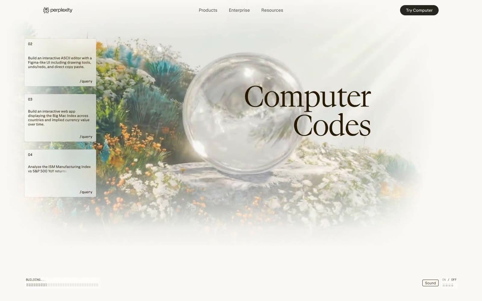
Perplexity AI
Perplexity AI — Style Reference
# Perplexity AI — Style Reference
> Garden of computational flora — technical interface blooming through botanical haze
**Theme:** light
Perplexity Computer — naturalistic interface camouflage. The design mimics a lush garden: white flower clusters (cards) float against softly blurred botanical photography, like UI elements composited onto nature footage. Warm sepia text (#271a00 — nearly brown) and cream surfaces (#faf8f5) create the impression of aged parchment overlaid on living greenery. Serif headlines at display sizes contrast with sans-serif UI, echoing the organic/digital tension. 4px and 12px radii appear across all elements except nav pills (40px), maintaining subtle roundness without full-pill uniformity. Generous whitespace (28-40px vertical rhythm) lets content breathe like clearings in foliage. The typeface suite — pplxSans for interface, pplxSerif for declarations — reinforces brand identity through custom letterforms rather than stock choices.
## Tokens — Colors
| Name | Value | Token | Role |
|------|-------|-------|------|
| Aged Sepia | `#271a00` | `--color-aged-sepia` | Primary text, borders, icons, strokes — the near-brown warmth softens digital harshness without sacrificing legibility. Appears across every UI context from nav to body to buttons. |
| Parchment | `#faf8f5` | `--color-parchment` | Page backgrounds, card surfaces, heading text on dark — the cream canvas against which all content rests. Acts as both background and reversed foreground. |
| Fog | `#d1cfc7` | `--color-fog` | Button fills, borders, dividers — a muted gray-beige midtone that bridges Parchment and Aged Sepia without introducing new chromatic energy. |
| Absolute Black | `#000000` | `--color-absolute-black` | Footer backgrounds, high-contrast text inversion — appears sparingly, reserved for terminal anchoring at page bottom. |
Websites
Markdown Text
design-md
website-prompt
landing-page-prompt
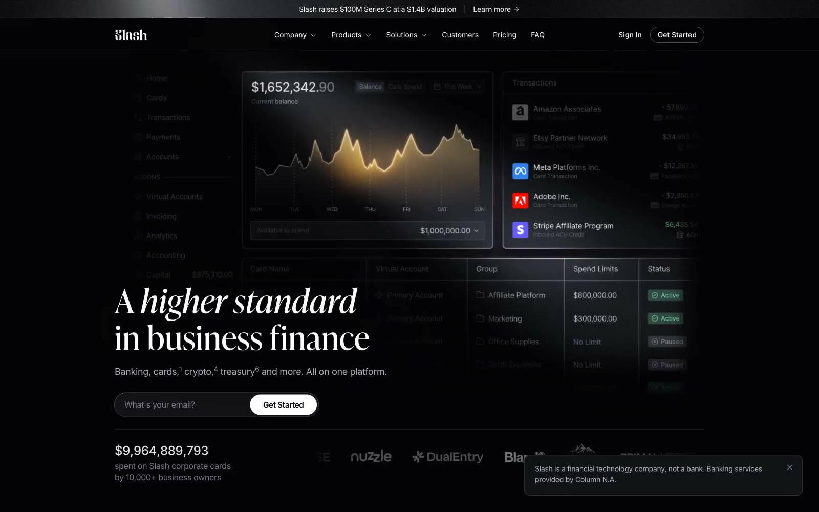
Slash
Slash — Style Reference
# Slash — Style Reference
> Nocturnal private bank — obsidian panels, gold ink. A vault door opening onto an editorial spread.
**Theme:** dark
Slash speaks in a dark editorial register: near-black canvases, Inter for the working surface, and a high-contrast display serif (Ivy Presto) that gives headlines the gravity of a financial broadsheet. Color is rationed — white and warm grays carry 95% of the interface, with a molten-gold gradient reserved for chart fills, emphasis strokes, and the occasional italic accent. Components are compact and sharp: 2px corners on inputs, nav, and inline links create a technical, ledger-like precision; 10px corners soften cards and image tiles just enough to feel modern without going soft. The feel is 'premium private banking rendered as a product UI' — quiet surfaces, confident typography, and gold used like a signature, not a brand wash.
## Tokens — Colors
| Name | Value | Token | Role |
|------|-------|-------|------|
| Obsidian | `#000000` | `--color-obsidian` | Deepest canvas, page background, elevation shadows |
| Carbon | `#030304` | `--color-carbon` | Recessed surfaces, card shadows, image matte backgrounds |
| Inkwell | `#08080a` | `--color-inkwell` | Primary dark surface, button borders, body depth |
| Graphite | `#121317` | `--color-graphite` | Raised button fills, input backgrounds, card body |
Websites
Markdown Text
design-md
website-prompt
landing-page-prompt
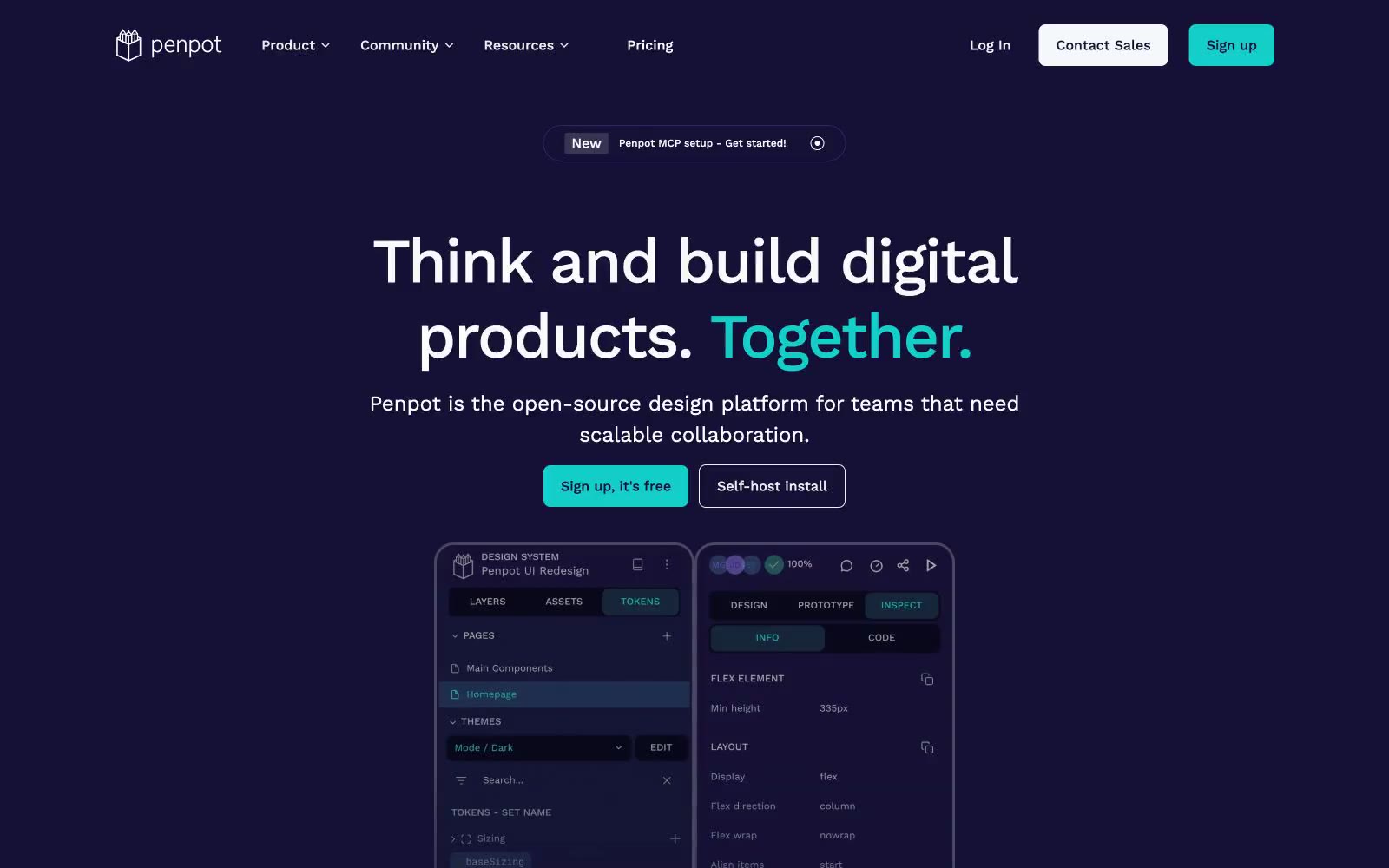
Penpot
Penpot — Style Reference
# Penpot — Style Reference
> midnight design studio with teal sparks — a deep violet hero stage where one bright teal button and one teal word ignite an otherwise monochrome canvas.
**Theme:** mixed
Penpot operates as a two-act visual system: a deep midnight-violet hero stage that commands attention, then a luminous off-white working area that lets product content breathe. The chromatic palette is intentionally austere — one deep violet, one vivid teal, and neutral grays — so the colorful design tool interface (the actual product) becomes the only place multicolor lives. Work Sans at large display sizes creates confident, slightly tightened headlines, while the same family at 14–16px keeps interface chrome readable and unpretentious. Components are flat and geometric: 8px radii on controls, 20px radii on cards, hairline borders, no decorative shadows. The single teal accent is rationed carefully — it activates CTAs, the emphasis word in headlines, and a few decorative strokes — making it feel like a switch flipped on rather than decoration.
## Tokens — Colors
| Name | Value | Token | Role |
|------|-------|-------|------|
| Deep Space Violet | `#151035` | `--color-deep-space-violet` | Primary brand surface — hero background, navigation, dark panels, code/token sidebars, and the product UI shell. Sets the dark-mode identity and creates the canvas against which the teal accent glows |
| Bright Teal | `#1ccac7` | `--color-bright-teal` | Primary action fill, emphasis word in headlines, active tab indicator, and decorative spark. The single chromatic note — rationed to CTAs, highlights, and one word per headline — making each occurrence feel switched on |
| Rich Violet | `#2f226c` | `--color-rich-violet` | Secondary violet for subtle borders, dividers, and accent strokes within the dark panels. A bridge between Deep Space Violet and Bright Teal on the dark canvas |
| Off-White | `#fafafa` | `--color-off-white` | Page canvas, light card surfaces, body text on dark surfaces, icon fills. The light-mode workhorse — never pure white, slightly warm to soften the contrast against Deep Space Violet |
Websites
Markdown Text
design-md
website-prompt
landing-page-prompt
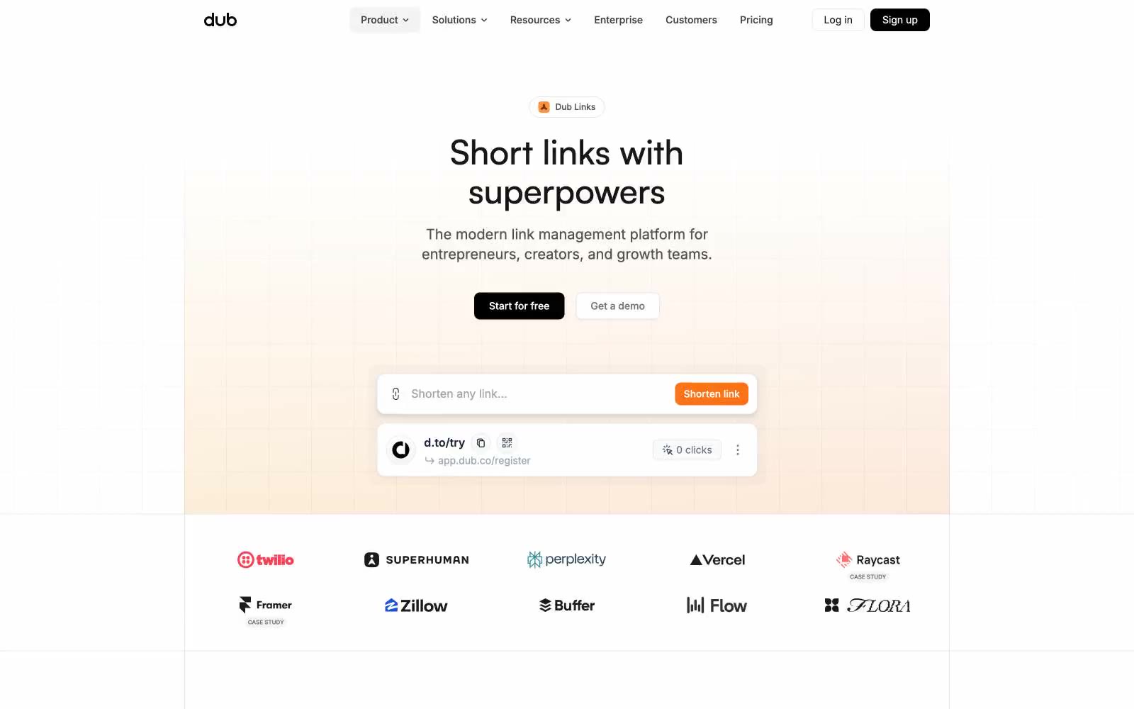
Dub Links
Dub Links — Style Reference
# Dub Links — Style Reference
> warm sunrise over monochrome architecture
**Theme:** light
Dub presents a warm, confident SaaS aesthetic: a near-monochrome interface anchored by soft cream-to-white gradients, with one vivid orange accent that makes every action feel activated. The system breathes through generous whitespace on a compact 4px grid, pairing Inter's utility precision with Satoshi's rounded display character for headlines. Surfaces stay matte and light with hairline borders and whisper-soft shadows — depth comes from subtle tonal shifts and elevation, never heavy panels. The primary CTA is always a black pill with orange-ember micro-accents nearby, creating a contrast between structural neutrality and brand warmth. Components should feel quick and utilitarian: 4px and 8px radii dominate, pill buttons carry CTAs, and cards are flat white rectangles on a faintly warm canvas.
## Tokens — Colors
| Name | Value | Token | Role |
|------|-------|-------|------|
| Canvas Cream | `#f5f5f5` | `--color-canvas-cream` | Page background base — the warm off-white that gives the interface its sunlit feel |
| Paper White | `#ffffff` | `--color-paper-white` | Card surfaces, elevated panels, input fields — pure white for content containers |
| Ink Black | `#0a0a0a` | `--color-ink-black` | Dark supporting neutral for text, icons, and strong contrast. Do not promote it to the primary CTA color |
| Charcoal | `#171717` | `--color-charcoal` | Secondary text, button text on dark fills, heading weights |
Websites
Markdown Text
design-md
website-prompt
landing-page-prompt
21 TSI
21 TSI — Style Reference
# 21 TSI — Style Reference
> Crimson void, single silhouette — a high-fashion editorial spread where the UI dissolves into atmosphere.
**Theme:** dark
21 TSI operates in the grammar of luxury fashion editorial: the interface itself is austere monochrome — white type, black canvas, hairline rules — while full-bleed crimson photography carries the entire emotional register. UI chrome is deliberately reduced to a single thin top divider, small uppercase wordmarks, and pill-bordered controls; nothing competes with the image. Typography is the structural skeleton: Saans at 12px for nav, then jumping to 106–245px for display — a near-vertical scale that makes individual headlines feel like runway installations rather than page headers. The system prefers silence over information density; every interactive element is a ghost, every frame is a photograph, and the only color that matters is whatever the lens captures.
## Tokens — Colors
| Name | Value | Token | Role |
|------|-------|-------|------|
| Black Void | `#000000` | `--color-black-void` | Page canvas behind full-bleed imagery, button borders on inverted elements, deepest surface layer |
| Paper White | `#ffffff` | `--color-paper-white` | Primary text, navigation labels, ghost-button borders, hairline rules, every UI stroke above imagery |
| Smoke | `#4d4d4d` | `--color-smoke` | Muted secondary borders and dividers used when full white feels too hot against the photographic background |
| Crimson Heat | `#b62b1a` | `--color-crimson-heat` | Dominant brand atmosphere from full-bleed editorial photography — the only chromatic note in the system, always carried by the image rather than applied to UI chrome |

Websites
Markdown Text
design-md
website-prompt
landing-page-prompt
Aboard
Aboard — Style Reference
# Aboard — Style Reference
> Editorial field journal under industrial light
**Theme:** mixed
Aboard reads as an editorial dossier drafted inside a working warehouse: Tobias serif headlines at weight 300 float over Atkinson Hyperlegible Mono body copy, a pairing that treats the page as a technical specification rather than a marketing surface. The system alternates full-bleed dark documentary bands with warm off-white reading sections, the rhythm controlled by a single vivid ember-orange that punctuates CTAs, icons, and active states against an otherwise achromatic palette. Components are deliberately thin: pill-shaped CTAs, translucent floating nav, hairline borders at 1px, almost no shadow or elevation — the interface recedes so the photography and the prose can carry the page. The warmth of the neutrals (bone white, linen, warm graphite) keeps the dark sections from feeling cold, while the orange never decorates — it always signals an action or a live status.
## Tokens — Colors
| Name | Value | Token | Role |
|------|-------|-------|------|
| Ember Orange | `#de4c00` | `--color-ember-orange` | Primary CTAs, active nav items, icon fills, link accents — the only chromatic color in the UI, it acts as a power-switch indicator against the muted neutrals |
| Soft Ember | `#efa680` | `--color-soft-ember` | Hover-state borders, subdued accent outlines, tag strokes — a desaturated echo of Ember Orange for quieter accents |
| Bone White | `#fffefb` | `--color-bone-white` | Page canvas on light sections, text color on dark/image sections |
| Linen | `#f3f2ee` | `--color-linen` | Warm secondary surface, elevated card backgrounds, subtle shadow tint |
Websites
Markdown Text
design-md
website-prompt
landing-page-prompt
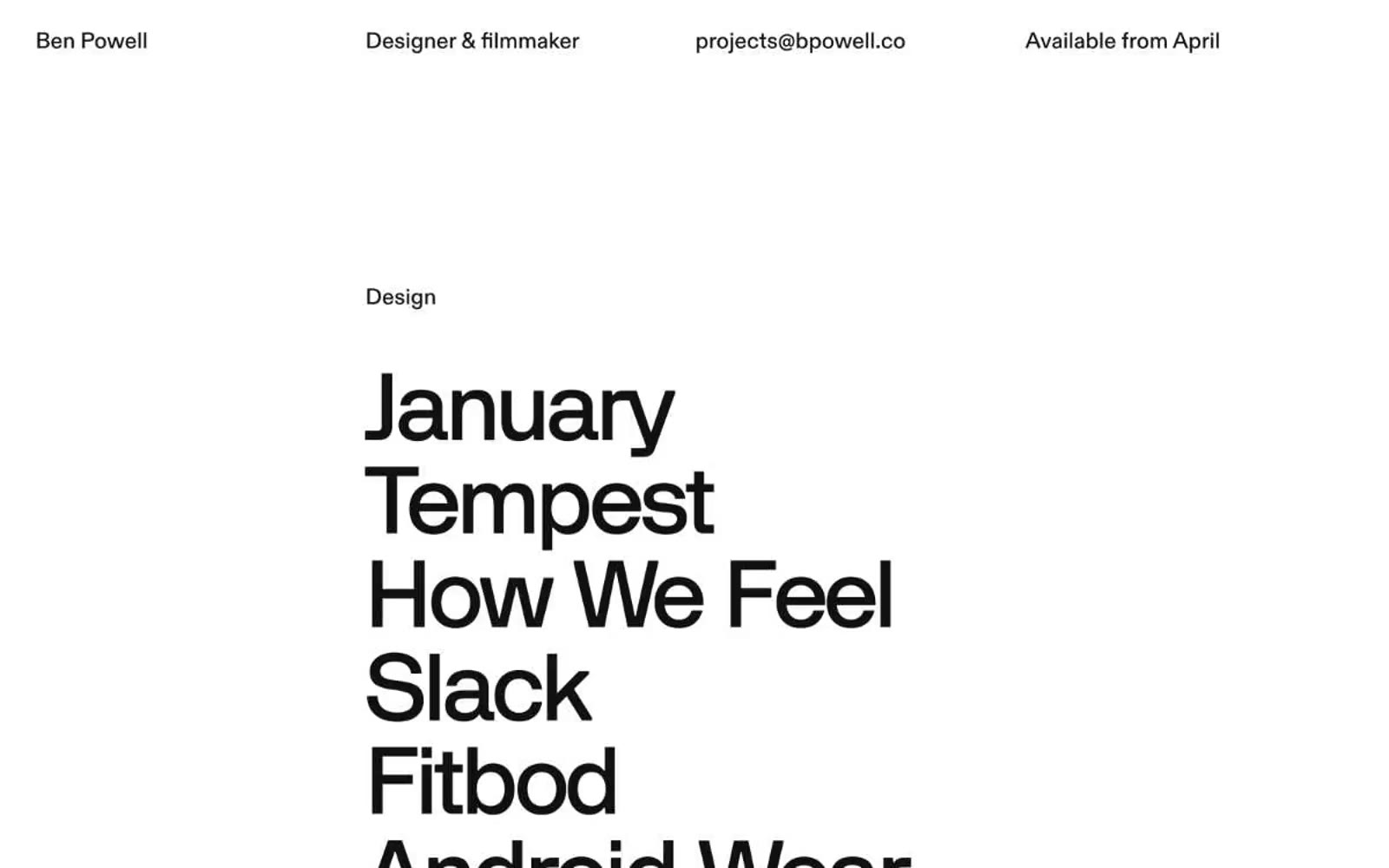
Bpowell
Bpowell — Style Reference
# Bpowell — Style Reference
> type as architecture on white plaster
**Theme:** mixed
A text-only portfolio that lets typography do every job — no imagery, no decoration, no chrome. The page reads as an architectural list: small tightly-set labels act as section markers, then oversized project names stack like concrete blocks on a wall. Two surfaces alternate — a bright white canvas for design work, an inverted near-black canvas for film — and the contrast between them is the only visual rhythm. The layout is brutally asymmetric: a single column of oversized text pinned to the left, generous gutters of negative space, and a top nav that distributes itself across the full viewport width rather than clustering in a corner. The system has no buttons, no cards, no borders in the traditional sense — the nearest thing to a border is a 1px black hairline, and even that is used sparingly. The result feels like reading a credits sequence printed on a gallery wall: austere, deliberate, and confident that the names themselves carry the weight.
## Tokens — Colors
| Name | Value | Token | Role |
|------|-------|-------|------|
| Plaster White | `#ffffff` | `--color-plaster-white` | Primary canvas for the light sections; text color on the dark sections; hairline dividers on the dark sections |
| Carbon | `#111111` | `--color-carbon` | Page background for the dark/film section; primary body text on light sections; structural fill for project name typography |
| Ink Black | `#000000` | `--color-ink-black` | Secondary text and fill on light sections; used where maximum contrast is needed against the white canvas |
| Graphite | `#2b2b2b` | `--color-graphite` | Subtle darker border for low-emphasis rules on light surfaces |
Websites
Markdown Text
design-md
website-prompt
landing-page-prompt
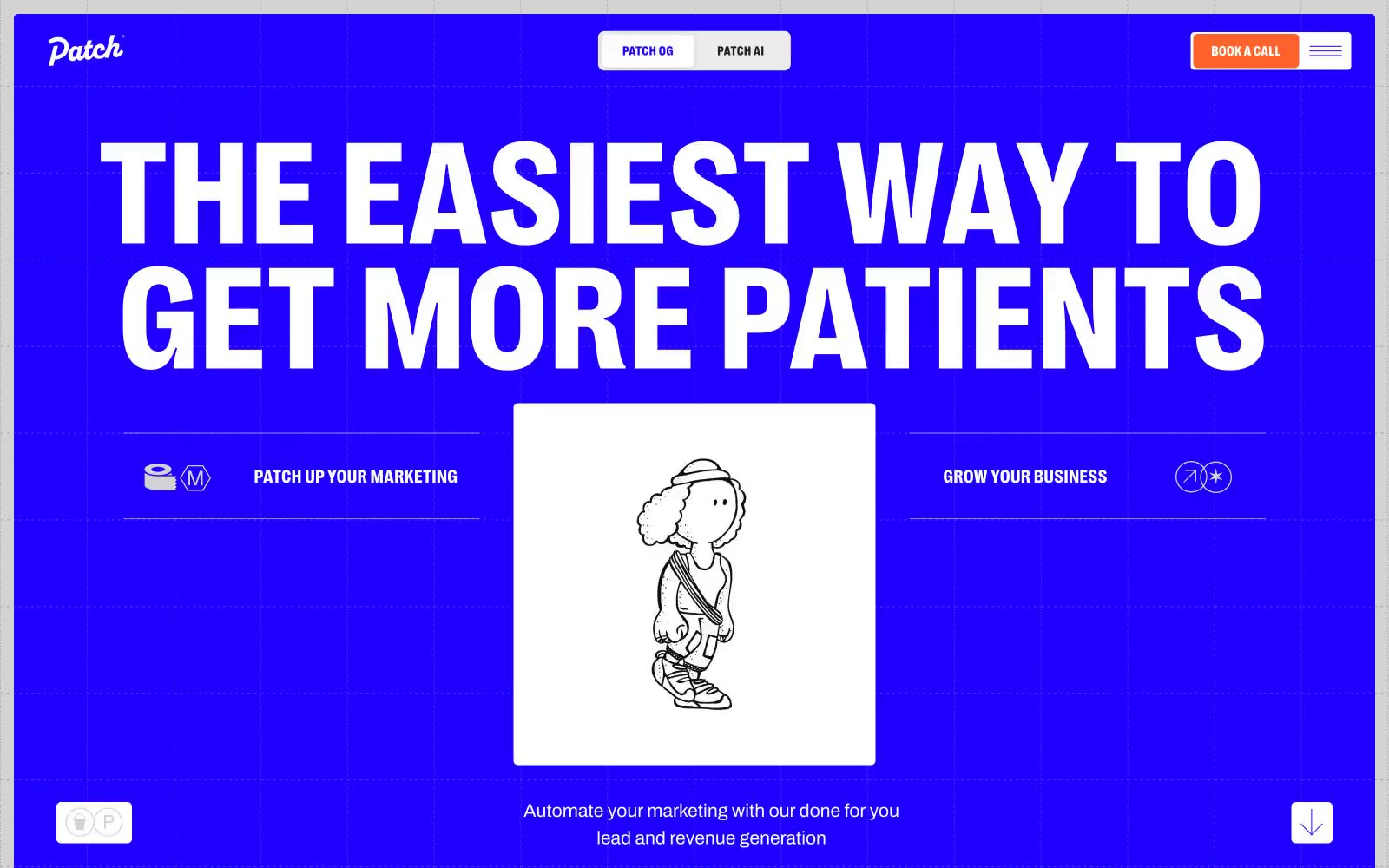
Patch
Patch — Style Reference
# Patch — Style Reference
> electric blueprint on drafting paper
**Theme:** light
Patch uses a loud, electric-blue blueprint aesthetic: a vivid indigo canvas (#1f00ff) alternates with stark white cards, and every interface element either lives inside a crisp hairline border or against the full-bleed blue. Typography is aggressive and condensed — PP Right at weight 800 with sub-1.0 line heights makes headlines feel architectural rather than friendly, while Archivo keeps body text quiet and functional. A single warm orange (#ff622b) punctures the blue/white duopoly as the only fill color used for primary actions. Hand-drawn line illustrations (sketchy people, objects) sit centered inside white cards, reinforcing a 'marketing blueprint' mood. The overall feel is a confident, slightly retro-tech agency identity — medical marketing pitched as engineering, not healthcare.
## Tokens — Colors
| Name | Value | Token | Role |
|------|-------|-------|------|
| Electric Indigo | `#1f00ff` | `--color-electric-indigo` | Full-bleed hero canvas, section backgrounds, heading text on light surfaces, all primary borders and dividers — the single chromatic color that defines the entire system |
| Patch Orange | `#ff622b` | `--color-patch-orange` | Filled CTA buttons and active nav markers — the only warm color, reserved exclusively for conversion moments |
| Pure White | `#ffffff` | `--color-pure-white` | Page canvas, hero reverse text, card surfaces, icon fills — the neutral that makes the indigo vibrate |
| Fog Gray | `#f2f2f2` | `--color-fog-gray` | Secondary card surfaces, subtle elevation between cards and canvas |
Websites
Markdown Text
design-md
website-prompt
landing-page-prompt
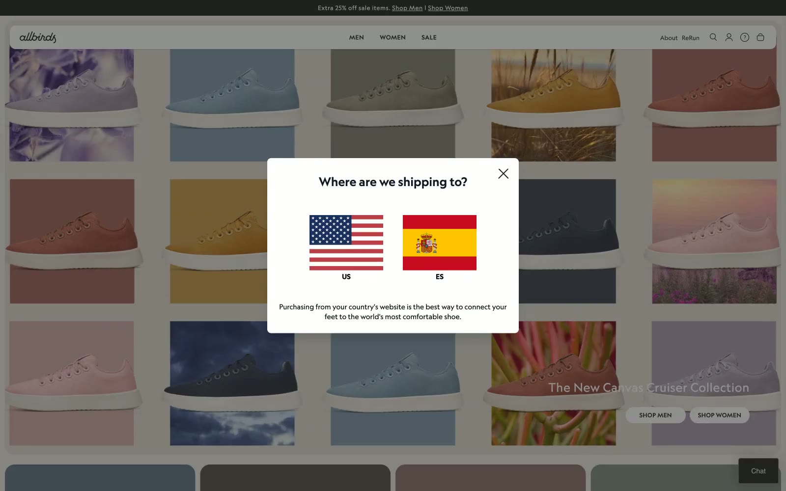
Allbirds
Allbirds — Style Reference
# Allbirds — Style Reference
> Natural materials on white linen
**Theme:** light
Allbirds runs on quiet, natural confidence — a near-totally achromatic canvas punctuated by warm sand (#e0dacf) and muted earth tones lifted directly from the product photography. The UI stays out of the product's way: white surfaces, hairline borders, uppercase tracking-heavy nav, and pill-shaped controls that feel like physical buttons rather than web elements. Self Modern (a custom serif) is reserved for the few moments of editorial weight — hero headlines and collection names — while Geograph carries every label, body line, and button at three disciplined weights. Category cards become the color system: each one takes its background swatch from the product it features, turning the navigation into a living Pantone deck.
## Tokens — Colors
| Name | Value | Token | Role |
|------|-------|-------|------|
| Canvas White | `#ffffff` | `--color-canvas-white` | Page backgrounds, card surfaces, product card backgrounds |
| Charcoal | `#212121` | `--color-charcoal` | Supporting neutral for secondary UI, dividers, and muted labels. Do not promote it to the primary CTA color |
| True Black | `#000000` | `--color-true-black` | Headlines, icons, high-contrast borders, nav text |
| Warm Sand | `#e0dacf` | `--color-warm-sand` | Hero section background, secondary surface tone, large editorial panels |
Websites
Markdown Text
design-md
website-prompt
landing-page-prompt
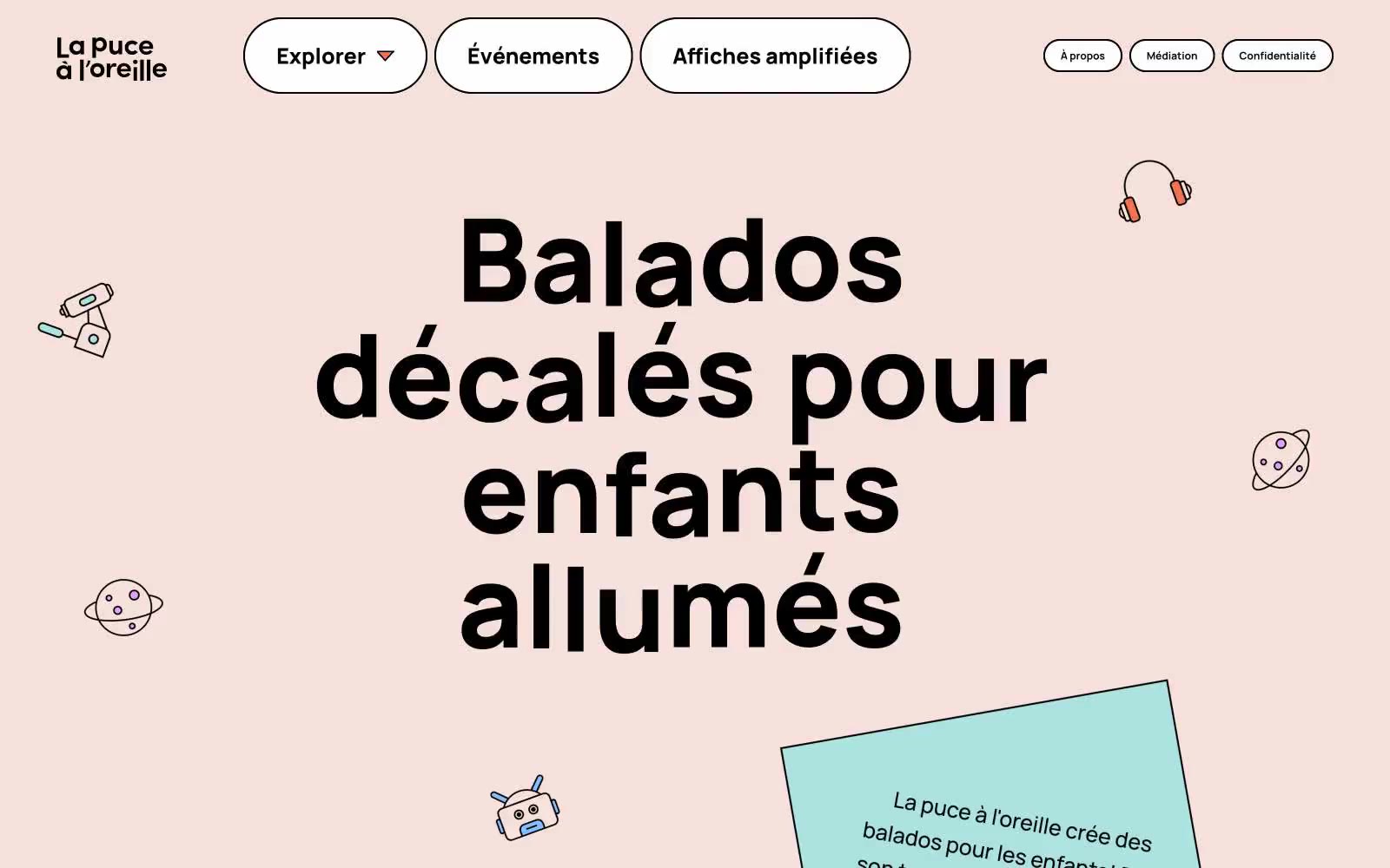
Lpalo
Lpalo — Style Reference
# Lpalo — Style Reference
> A children's storybook spread on warm peach paper — one slab-serif headline shouting through scattered crayon doodles.
**Theme:** light
La puce à l'oreille reads like a children's storybook spread across warm peach paper — a playful podcast platform where chunky black slab-serif headlines anchor the page while vivid color accents and floating line-art illustrations dance around them. The visual rhythm is generous and unhurried: a soft peach canvas (#f6e0db) holds scattered doodles, pill-shaped containers float with thick black borders, and a single oversized headline (Alfa Slab One at near-120px) does the heavy lifting for brand voice. Components feel handmade rather than engineered — black-outlined white cards, 47px pill radii, no shadows, no gradients. Color is treated as a palette of crayons pulled from a single box: every hue is saturated and flat, used as decorative punctuation on surfaces, icons, and section backgrounds rather than as functional UI states. The contrast between the type's serious slab-serif weight and the whimsical illustrations creates the site's identity tension — authoritative voice, childlike delivery.
## Tokens — Colors
| Name | Value | Token | Role |
|------|-------|-------|------|
| Peach Paper | `#f6e0db` | `--color-peach-paper` | Page canvas — the warm pastel ground that makes every black border and colored accent pop |
| Charcoal Ink | `#000000` | `--color-charcoal-ink` | Primary text, hairlines, card borders, nav outlines — the structural skeleton at 1400+ border occurrences |
| Snow | `#ffffff` | `--color-snow` | Primary page canvas and white card surfaces. Do not promote it to the primary CTA color |
| Ember Orange | `#ef724f` | `--color-ember-orange` | Decorative accent and warm card surfaces — a crayon-orange that carries the most frequency of any chromatic color across the UI |
Websites
Markdown Text
design-md
website-prompt
landing-page-prompt
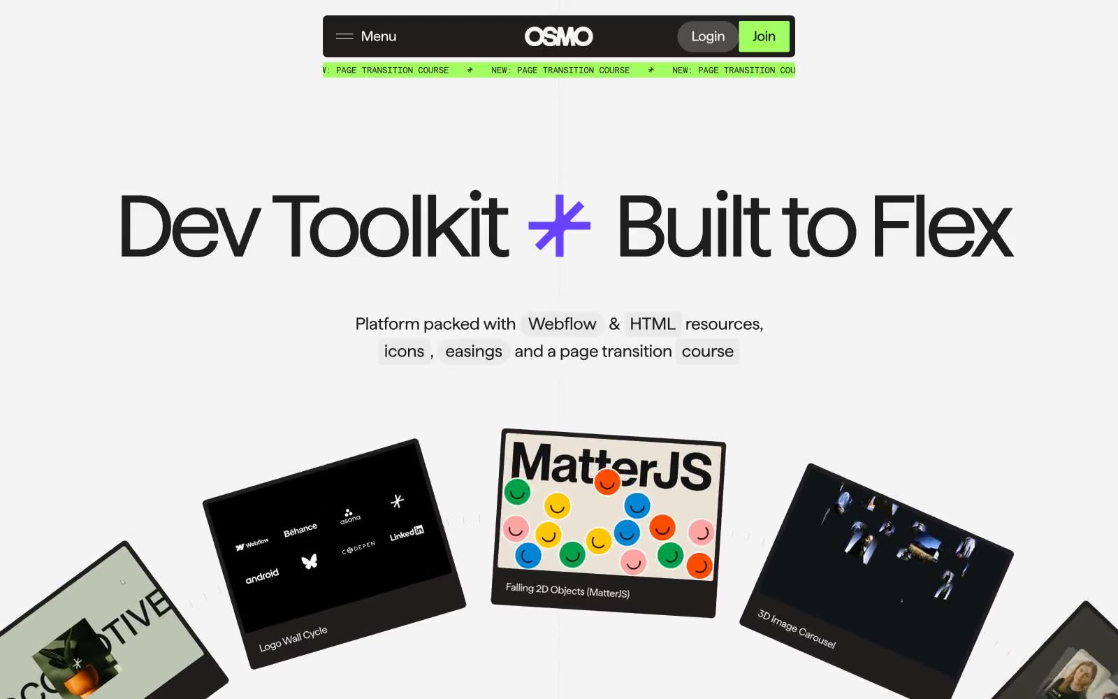
Osmo
Osmo — Style Reference
# Osmo — Style Reference
> developer museum on concrete gray
**Theme:** light
Osmo reads as a brutalist editorial platform for web craftspeople: a concrete-gray canvas stamped with oversized black display type, then punctuated by three surgical color punches — a radioactive lime for brand accents, a deep violet for featured cards, and a vermillion red for handwritten annotations. The system refuses the soft-SaaS default: corners split between surgical 2–5px precision and extreme 1600px pill rounding, creating visual tension between machine-precise content tiles and chunky lozenge controls. Typography does most of the talking through Haffer XH display cuts that can run to 150px with aggressive negative tracking, while a monospaced label font stamps technical metadata. Density is compact and content-led, with tilted product cards fanning out like a developer's portfolio pinned to a gallery wall.
## Tokens — Colors
| Name | Value | Token | Role |
|------|-------|-------|------|
| Concrete | `#f4f4f4` | `--color-concrete` | Page canvas, card surfaces, and most border work — the off-white that everything sits on |
| Ash Gray | `#eaeaea` | `--color-ash-gray` | Elevated surface layer, input fields, secondary card backgrounds |
| Bone | `#e1e1e1` | `--color-bone` | Subtle dividers, list separators, tertiary surface fill |
| Smoke | `#b8b8b8` | `--color-smoke` | Muted image borders, disabled-state outlines, badge borders |
Websites
Markdown Text
design-md
website-prompt
landing-page-prompt
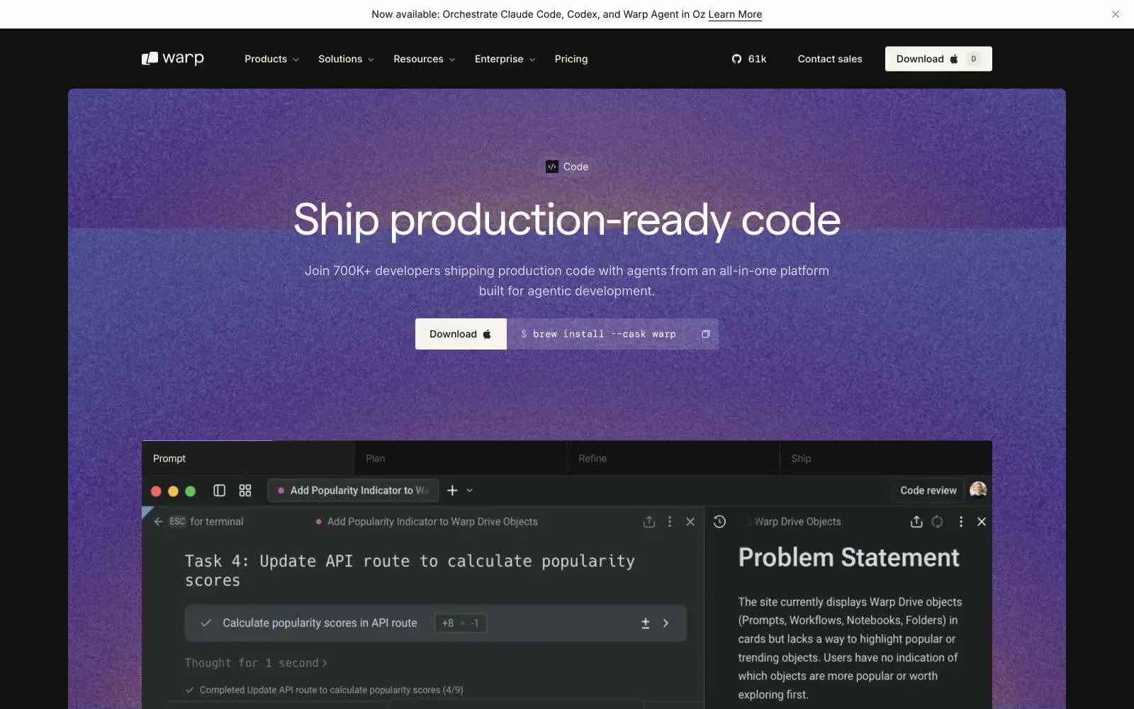
Warp
Warp — Style Reference
# Warp — Style Reference
> Moonlit terminal behind amber glass
**Theme:** dark
Warp operates as a dimmed control room: warm near-black canvases, terminal-derived product surfaces, and tight geometric typography that reads like a command line rendered in print. The palette is almost entirely achromatic with a warm undertone — no cool blues or sterile grays — giving every screen the amber cast of a late-night coding session. Accent color is rationed ruthlessly: a single muted gold and a single blue-gray appear only where the terminal needs syntax punctuation or a link must surface. Components are flat, dense, and weightless — no decorative shadows, no skeuomorphic depth, no rounded pillowy buttons. Every element earns its place through typographic precision and generous negative tracking at display sizes.
## Tokens — Colors
| Name | Value | Token | Role |
|------|-------|-------|------|
| Warm Off-White | `#faf9f6` | `--color-warm-off-white` | Primary headlines, body text, nav links — the warm cream reads softer than pure white against the charcoal canvas |
| Bone Gray | `#868684` | `--color-bone-gray` | Secondary text, captions, muted labels — the midtone that separates from Off-White without losing warmth |
| Pale Stone | `#b4b4b2` | `--color-pale-stone` | Tertiary text, ghost button labels, low-emphasis copy |
| Faint Linen | `#e3e2e0` | `--color-faint-linen` | Hairline borders, subtle dividers, selected state outlines |
Websites
Markdown Text
design-md
website-prompt
landing-page-prompt
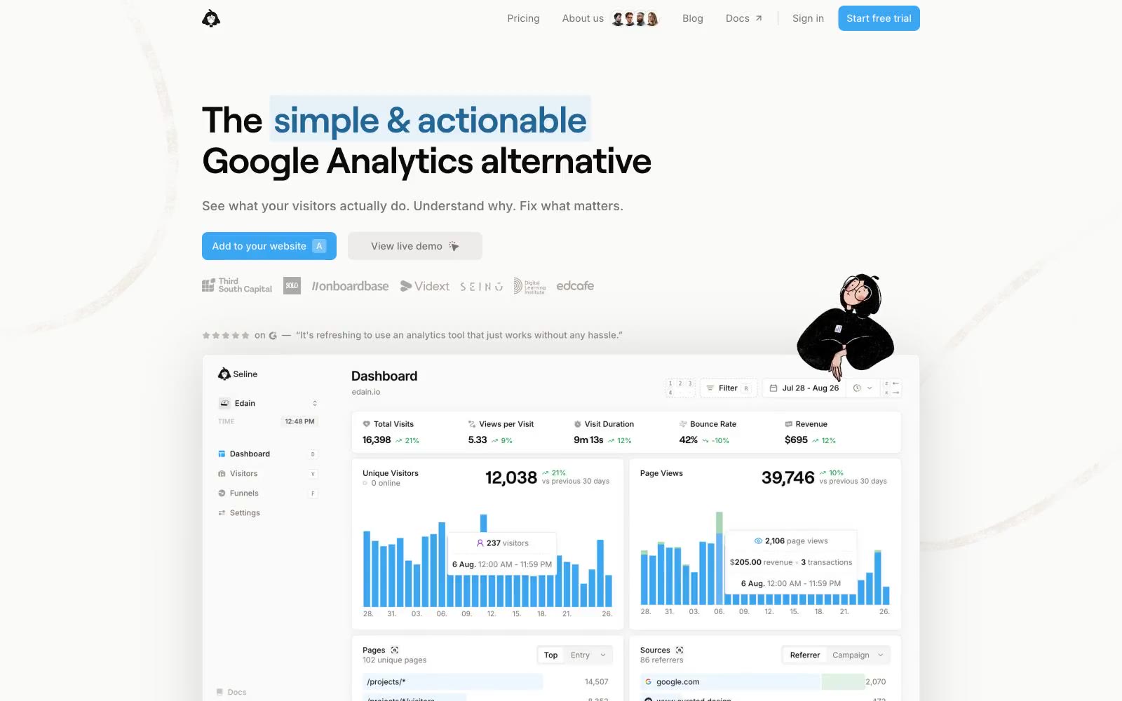
Seline Analytics
Seline Analytics — Style Reference
# Seline Analytics — Style Reference
> Sunlit data observatory on warm paper — a cream canvas where one blue signal is the only color allowed to speak.
**Theme:** light
Seline uses a sunlit data-workspace language: a warm cream canvas (#fafaf9) carries a single vivid blue signal against an otherwise completely neutral interface, creating a calm observatory where one color always means "live data, click here, something happened." The palette is intentionally 96% grayscale warm-stone — the only chromatic voice is a sky blue (#3ba6f1) that serves as chart bar, CTA fill, icon stroke, link, and inline highlight, all of the same hue. Typography pairs Inter (body and UI) with Roobert (display and large headings) — both geometric humanists, with display weights pulled tight to negative tracking so headlines read as compact confident statements rather than soft SaaS copy. Components are featherlight: pill buttons at 9999px radius, thin 1px stone borders, and shadows used only on the product-preview card and nothing else — the page sits on its surface like printed material on paper, not a glassmorphic dashboard. Handwritten annotations and a recurring photo cutout give the system a self-aware, "we built this for ourselves" texture, but the core grammar stays disciplined: warm grays, one blue, one white card, one shadow recipe.
## Tokens — Colors
| Name | Value | Token | Role |
|------|-------|-------|------|
| Signal Blue | `#3ba6f1` | `--color-signal-blue` | Blue action color for filled buttons, selected navigation states, and focused conversion moments. |
| Highlight Wash | `#c1e1f7` | `--color-highlight-wash` | Gray wash for highlight backgrounds, decorative bands, and soft emphasis behind content. Do not promote it to the primary CTA color |
| Canvas Cream | `#fafaf9` | `--color-canvas-cream` | Page background, body of the document — warm off-white stone-50 that keeps the system from feeling clinical |
| Pure White | `#ffffff` | `--color-pure-white` | Card surfaces, elevated panels, button text on dark, dashboard preview background |
Websites
Markdown Text
design-md
website-prompt
landing-page-prompt
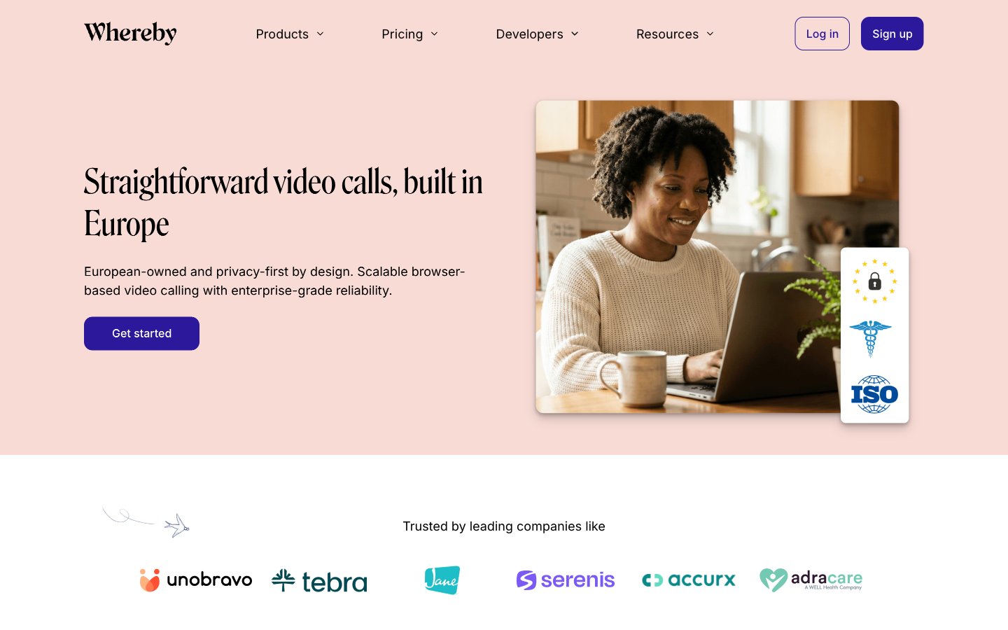
Secure
Secure — Style Reference
# Secure — Style Reference
> European café conversation in soft daylight — a warm, editorial take on video calling where serif headlines read like a thoughtful magazine spread rather than a tech product page.
**Theme:** light
Whereby presents a warm, humanized SaaS aesthetic that feels more like a thoughtful European brand than a tech tool. The system is defined by a custom condensed serif (Roslindale) used for display headlines, giving every section an editorial, considered feel — paired with Inter for body and UI to keep the interface functional and calm. A single deep violet (#2b189b) carries brand intent on CTAs and active states, while a warm blush (#f8dbd5) provides section-level atmosphere without competing with content. The visual rhythm alternates between full-bleed blush hero, white content sections, and soft gray cards — creating a gentle cadence rather than a stark corporate grid. Photography is warm and lifestyle-driven (people on laptops in real homes), and the overall feeling is unhurried, private, and European.
## Tokens — Colors
| Name | Value | Token | Role |
|------|-------|-------|------|
| Ink Black | `#000000` | `--color-ink-black` | Primary text, nav links, icons, body copy — near-absolute dominance means the system runs on contrast, not on color |
| Paper White | `#ffffff` | `--color-paper-white` | Page background and card surfaces; the default canvas everything sits on |
| Mist Gray | `#f4f4f4` | `--color-mist-gray` | Soft surface for secondary cards and section bands; lifts content off the white canvas without introducing a new hue |
| Pale Blush | `#f8dbd5` | `--color-pale-blush` | Warm section background (hero, accent bands) — the signature warmth of the brand, not a tint of any other color |
Websites
Markdown Text
design-md
website-prompt
landing-page-prompt
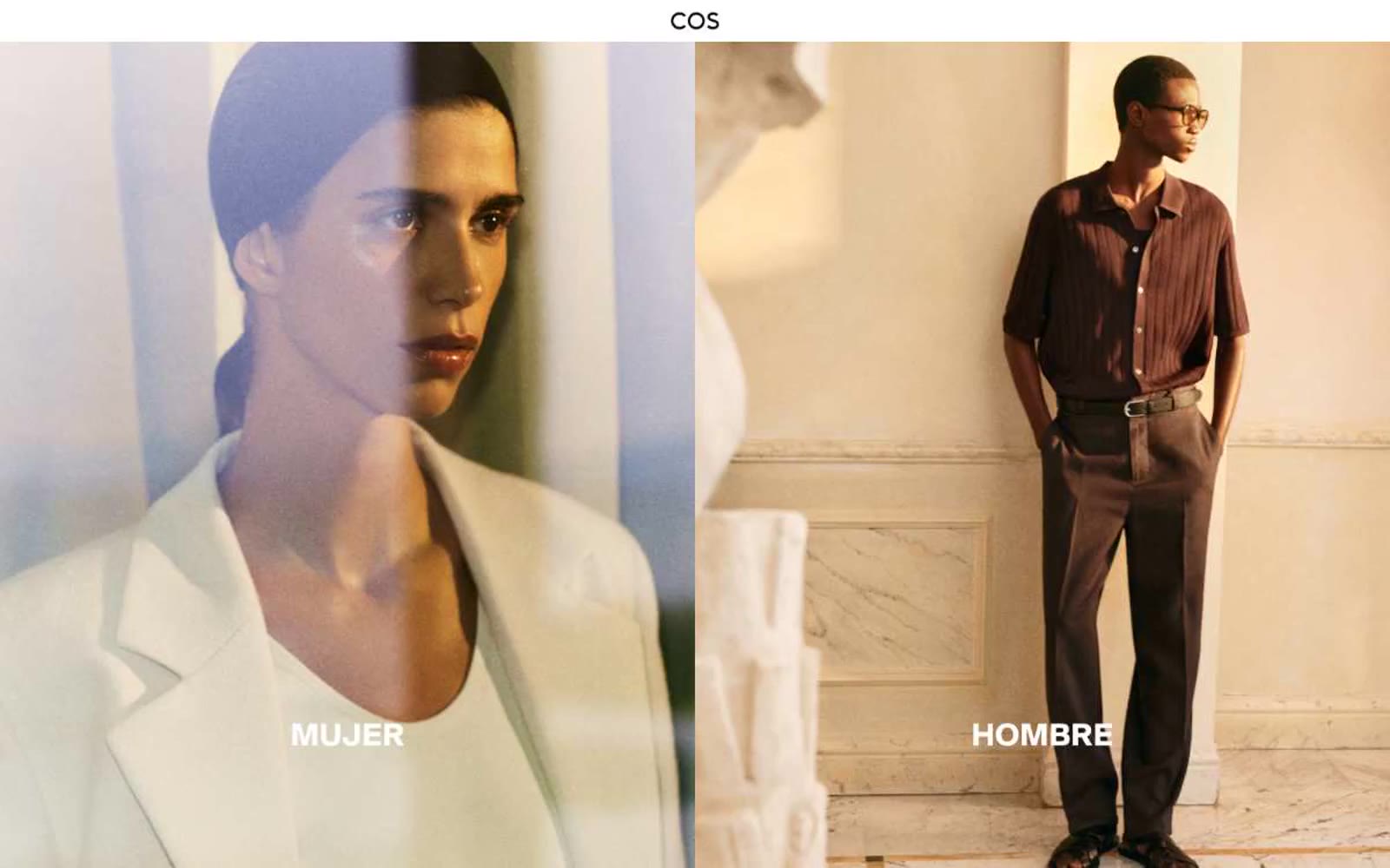
COS
COS — Style Reference
# COS — Style Reference
> white-walled fashion gallery
**Theme:** light
COS speaks in the visual grammar of a contemporary art gallery: vast white walls, oversized monochrome photography, and typography that stays out of the model's way. The interface is nearly colorless — 97% achromatic — using a near-black (#080808) on pure white (#ffffff) as the only structural contrast, with a single red (#c80000) held in reserve as a whisper-quiet accent for moments that must feel urgent without being loud. Spacing is generous and editorial, section padding reaches 135px, and components dissolve into the page: hairline borders at #dadada, no shadows, no gradients, no rounded corners. Typography (SuisseIntl) is the only ornament — a single grotesque family that stays consistent from 12px micro-labels to 35px category statements, tracking slightly positive to feel like printed gallery placards.
## Tokens — Colors
| Name | Value | Token | Role |
|------|-------|-------|------|
| Canvas White | `#ffffff` | `--color-canvas-white` | Light supporting surface for subtle backgrounds and section separation. Do not promote it to the primary CTA color |
| Ink Black | `#080808` | `--color-ink-black` | Primary text, icons, links, navigation type, button borders, logo, footer text — softer than pure black so photography does not feel clipped against it |
| True Black | `#000000` | `--color-true-black` | Hero text overlays on dark imagery, body copy, button labels — the true-zero black reserved for highest-contrast typographic moments |
| Mist Gray | `#dadada` | `--color-mist-gray` | Hairline borders, input underlines, subtle dividers, disabled-state outlines — the quietest neutral, only visible by what it separates |
Websites
Markdown Text
design-md
website-prompt
landing-page-prompt
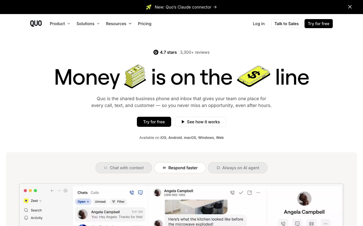
Quo (formerly OpenPhone)
Quo (formerly OpenPhone) — Style Reference
# Quo (formerly OpenPhone) — Style Reference
> highlighter on newsprint — a single chartreuse stroke against stark black-and-white editorial layout.
**Theme:** light
Quo runs on an almost ruthlessly monochromatic system — white and off-white canvases, black ink, hairline borders, near-zero elevation — with a single chartreuse accent that behaves like a highlighter, not a decoration. Headlines are editorial in scale (Roobert at up to 88px, tight -0.02em tracking) while UI stays compact in Inter, producing a newspaper-meets-app rhythm: massive confident display type above dense functional surfaces. Components are flat and rectangular with 10px corners; depth is communicated by product screenshots and one soft shadow rather than stacking. The chartreuse (#edfc47) never fills a button — it highlights words inside headlines, tags icons, and draws the eye to emphasis, making the primary action (a black filled button) feel like the default rather than a colorful exception.
## Tokens — Colors
| Name | Value | Token | Role |
|------|-------|-------|------|
| Newsprint | `#f7f6f5` | `--color-newsprint` | Page canvas and ambient background — warm off-white that softens the stark black type |
| Paper | `#ffffff` | `--color-paper` | Card surfaces, product screenshot frames, nav background — the raised, clean tier above the canvas |
| Press Black | `#000000` | `--color-press-black` | High-contrast neutral action fill for primary buttons on light surfaces. |
| Midnight | `#0a0a0c` | `--color-midnight` | Announcement bar and dark band backgrounds — near-black for the slim top promo strip |
Websites
Markdown Text
design-md
website-prompt
landing-page-prompt
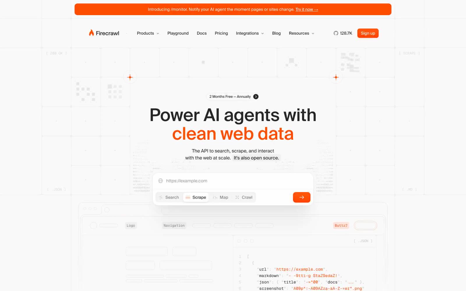
Firecrawl
Firecrawl — Style Reference
# Firecrawl — Style Reference
> Technical blueprint on warm vellum. A developer tool that swaps cold gray for a single burning orange signal, sitting on near-white surfaces stitched together by hairline grid lines.
**Theme:** light
Firecrawl operates as a developer-first workspace: a pale near-white canvas overlaid with a fine grid of hairline borders, a single vivid orange accent (#ff4d00) that acts as functional punctuation, and typography set in Suisse — a humanist grotesque whose tight tracking and generous x-height keep everything feeling engineered rather than editorial. Components are flat and quiet: pill-shaped controls (999px radius), 8px card corners, and shadow stacks that are barely perceptible (black at 2-3% alpha) so that depth comes from layering and the orange border-glow, not from drop shadows. The orange is never decorative — it appears on the CTA, the fire icon, highlight words in headlines, badge dots, and tab underlines. Everything else is a calibrated gray scale, with #e5e7eb doing the work of a thousand borders and #262626 carrying the full weight of body and heading text at AAA contrast against the off-white surfaces.
## Tokens — Colors
| Name | Value | Token | Role |
|------|-------|-------|------|
| Ember Orange | `#ff4d00` | `--color-ember-orange` | Primary action background, accent text, highlight words in headlines, fire icon, active tab underline, badge dots, link strokes — the system's only chromatic signal |
| Ember Glow (light) | `#fcddcc` | `--color-ember-glow-light` | Soft orange-tinted shadow halos behind orange buttons and badges, giving them a warm bloom without raising elevation |
| Ember Wash (deep) | `#febec2` | `--color-ember-wash-deep` | Secondary warm-tinted shadow wash, used for outer glow rings on highlighted cards and code windows |
| Gridline | `#e5e7eb` | `--color-gridline` | Dominant hairline border, card outlines, input strokes, code window dividers, grid background lines — the structural skeleton of every screen |