AI Prompt Studio - Intelligent Prompt Library
Explore and use professional AI prompts to optimize your workflow.
One-click Use
Websites
Markdown Text
design-md
website-prompt
landing-page-prompt
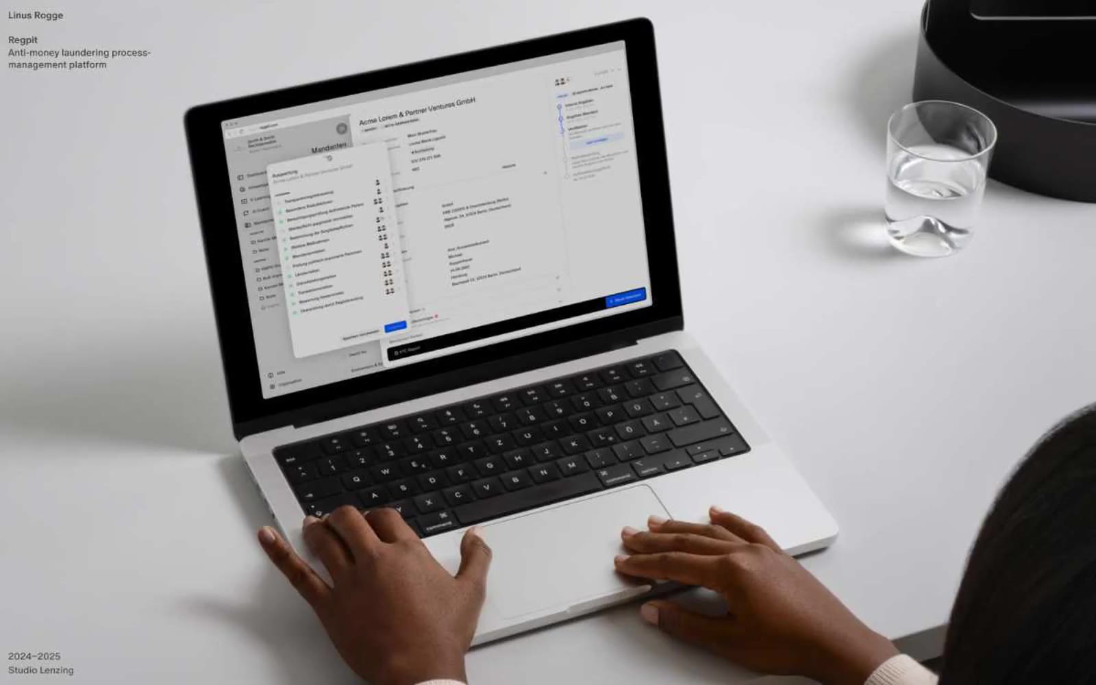
Linus Rogge
Linus Rogge — Style Reference

# Linus Rogge — Style Reference
> Editorial portfolio on gallery-white — each project a wall-sized photograph with whisper-quiet captions in the corner.
**Theme:** light
Linus Rogge is a personal portfolio built on radical typographic restraint: a single 14px type size across all text, only two colors (pure black and pure white), and gallery-scale photography as the only visual voice. Hierarchy is created through weight (400 vs 500) and generous negative space, not through size escalation. Each project is presented as a sparse left-aligned label paired with a full-bleed photograph, reading like museum wall text beside a large print. Components are nearly invisible — no shadows, no rounded corners on the canvas, no decorative color — letting the work itself carry the page.
## Tokens — Colors
| Name | Value | Token | Role |
|------|-------|-------|------|
| Paper White | `#ffffff` | `--color-paper-white` | Primary canvas, all text on dark surfaces, inverted button text |
| Ink Black | `#000000` | `--color-ink-black` | Dark supporting neutral for text, icons, and strong contrast. Do not promote it to the primary CTA color |
| Gallery Gray | `#e5e5e5` | `--color-gallery-gray` | Secondary surface for section bands, footer background washes |
| Plinth Gray | `#d4d4d4` | `--color-plinth-gray` | Tertiary surface, alternating section rhythm dividers |
Websites
Markdown Text
design-md
website-prompt
landing-page-prompt
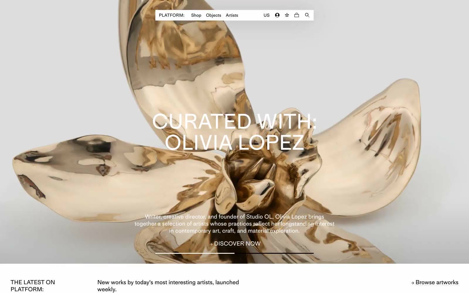
PLATFORM
PLATFORM — Style Reference
# PLATFORM — Style Reference
> white cube gallery under spotlights
**Theme:** light
PLATFORM is a monochromatic gallery vitrine: pure white canvas, pure black type, and a single typographic voice that lets the artworks carry all the color. The interface is editorial rather than commercial — generous negative space, hairline borders, and a compact 15px body size that keeps the catalog dense without feeling utilitarian. Every element is reduced to its essential geometric form: no shadows, no rounded corners, no decorative gradients. Visual weight comes from typography alone, with the display size of 72px and a restrained 1.00 line-height creating the slow, deliberate cadence of a printed exhibition catalog.
## Tokens — Colors
| Name | Value | Token | Role |
|------|-------|-------|------|
| Bone White | `#ffffff` | `--color-bone-white` | Page background, card surfaces, negative space |
| Lamp Black | `#000000` | `--color-lamp-black` | Primary text, card and nav borders, link color — the only structural color in the system |
| Ash Gray | `#dddddd` | `--color-ash-gray` | Hairline dividers, subtle surface separation |
| Concrete Gray | `#cccccc` | `--color-concrete-gray` | Secondary borders, input outlines, disabled states |
Websites
Markdown Text
design-md
website-prompt
landing-page-prompt
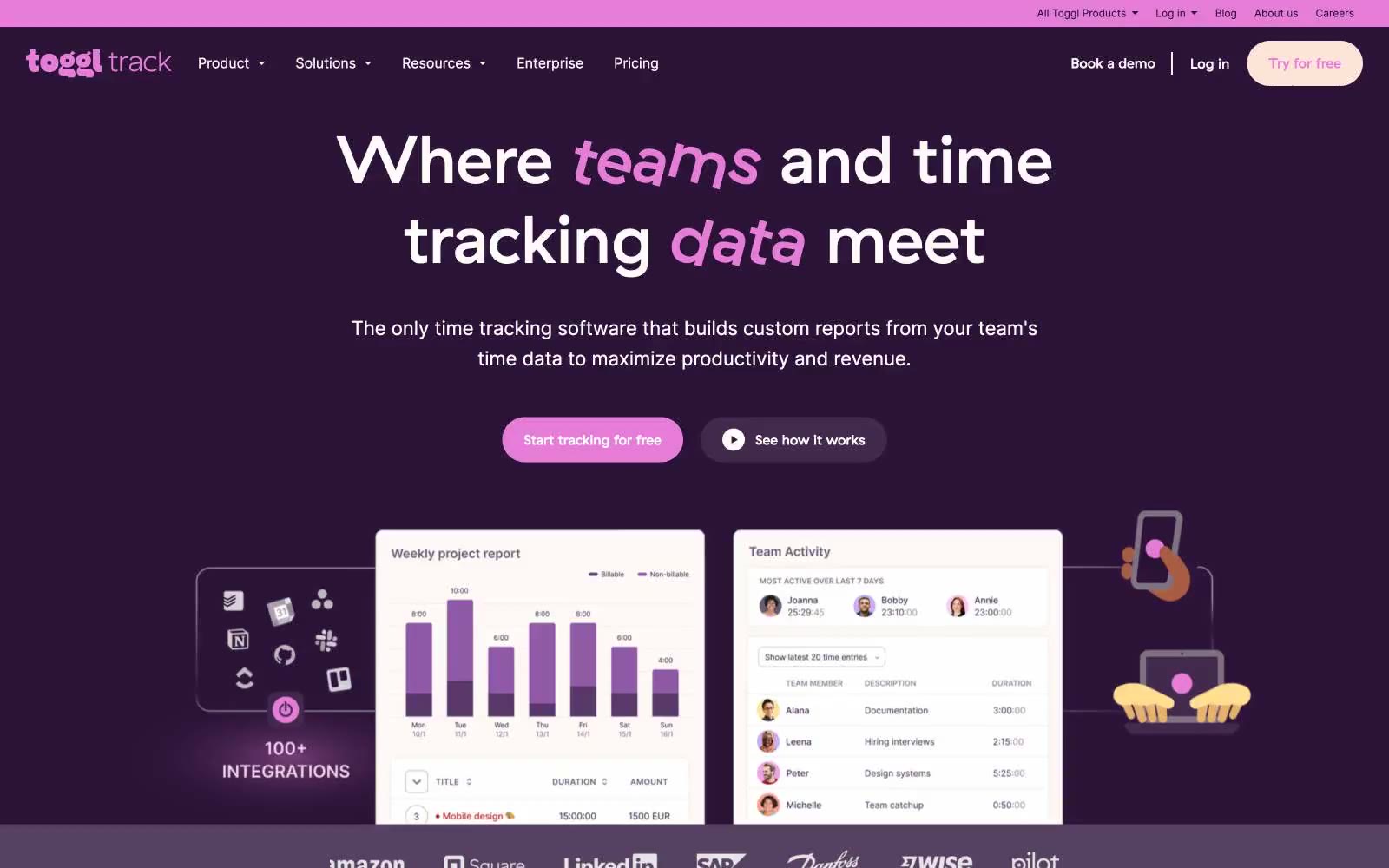
Toggl Track
Toggl Track — Style Reference
# Toggl Track — Style Reference
> Plum theater marquee — a deep aubergine stage where a single magenta spotlight word illuminates each headline.
**Theme:** mixed
Toggl Track runs on a plum-and-cream duotone: a deep aubergine stage for hero and footer bands, warm off-white for product content, and one vivid magenta-pink that hijacks single words inside headlines — set in a rotalic italic — to make the copy feel theatrical. The pink is rationed; it appears as emphasis words, filled pill CTAs, and tiny icon dots, never as a wash. Surfaces stay flat; depth comes from the contrast between dark and light bands, not from shadows or gradients. Components are chunky and generously rounded: 26px for primary buttons, 200px for pill tags and nav chips, 10px for content cards. Typography pairs GT Haptik's geometric softness (display) with Inter's neutrality (body), both set tight at 1.1–1.25 line-height on the largest sizes so headlines feel dense and confident rather than airy.
## Tokens — Colors
| Name | Value | Token | Role |
|------|-------|-------|------|
| Plum | `#2c1338` | `--color-plum` | Hero, header, and footer canvases; brand mark background. Near-black aubergine that reads as the brand's signature dark |
| Heather | `#412a4c` | `--color-heather` | Primary headings and UI text on light surfaces; secondary dark surface when Plum is too heavy. The workhorse purple |
| Magenta | `#e57cd8` | `--color-magenta` | Filled CTA buttons, emphasis words inside headlines, selected nav state, star ratings, and decorative dots. The only vivid hue — rationed to one word or one control per screen |
| Lavender Smoke | `#564260` | `--color-lavender-smoke` | Body copy and link text on warm-white surfaces where Heather would feel too heavy. Carries the brand tint into running text |
Websites
Markdown Text
design-md
website-prompt
landing-page-prompt
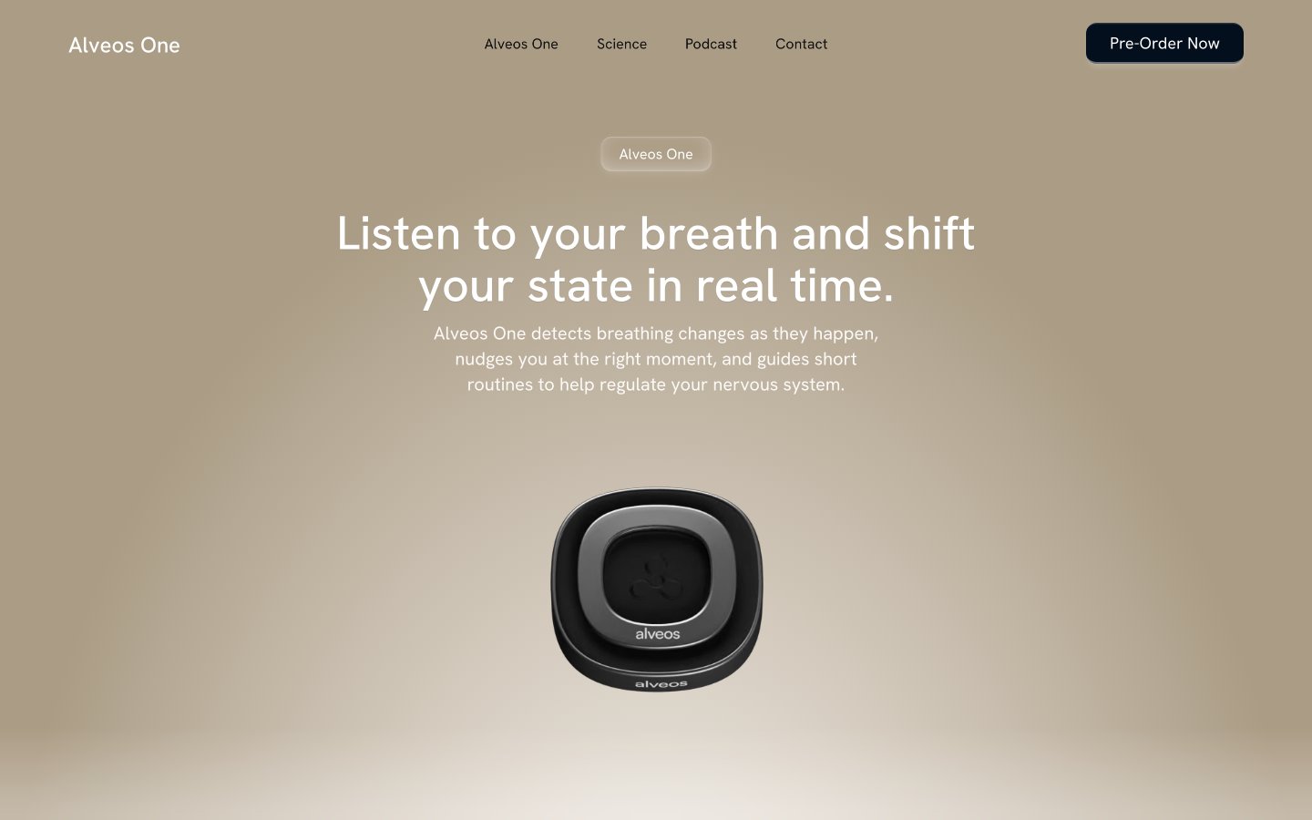
Alveos One
Alveos One — Style Reference
# Alveos One — Style Reference
> warm river-stone sanctuary — a still, cream-lit meditation room where a single graphite object rests in a pool of soft amber light.
**Theme:** light
Alveos One uses a warm, achromatic wellness language: every surface is a tone of cream, ivory, graphite, or near-black, and the product itself is the only spotlit object on the page. Composition is centered and unhurried — a radial cream-to-clay gradient frames the hero device like a stage spotlight, and downstream sections alternate between warm cream and bright white with large rounded-corner lifestyle photography carrying dark gradient overlays and white type. Typography is restrained through Hanken Grotesk at its native weights with a whisper-wide 0.4440em tracking on small all-caps labels, creating editorial calm rather than urgency. Primary actions are near-black filled buttons — not a chromatic brand color — which keeps the system feeling like a premium health product, not a SaaS tool. Corners are soft (25px dominates), shadows are nearly imperceptible, and the only gradient in the system is the warm spotlit hero.
## Tokens — Colors
| Name | Value | Token | Role |
|------|-------|-------|------|
| Linen Canvas | `#fcf9f7` | `--color-linen-canvas` | Page background, hero gradient origin — warm cream base that absorbs the entire site into a unified off-white |
| Bone White | `#ffffff` | `--color-bone-white` | Card surfaces, section backgrounds, raised panels against the linen canvas |
| Graphite Ink | `#000000` | `--color-graphite-ink` | Primary text, dominant border color across cards and sections — the system's typographic anchor |
| Nightshade Black | `#05060b` | `--color-nightshade-black` | Primary action button fill, footer background — near-black with a faint cool undertone |
Websites
Markdown Text
design-md
website-prompt
landing-page-prompt
Mintlify
Mintlify — Style Reference
# Mintlify — Style Reference
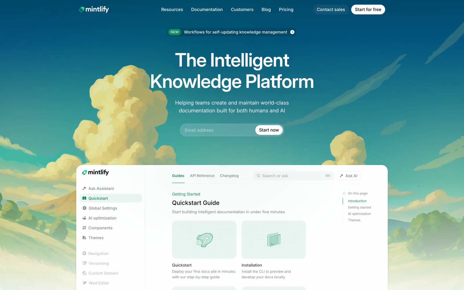
> Cloud garden over a glass desk. A hand-illustrated sky and a documentation product share the same frame — the only place color and concept collide before the page settles into monastic white.
**Theme:** light
Mintlify operates on a near-total monochrome discipline: white canvas, near-black text, and a single vivid green as the only chromatic spark across the entire interface. The hero is the deliberate exception — a hand-illustrated cloud landscape on a dark teal gradient, with the documentation product floating in the foreground as living proof. Everything downstream reverts to austere white surfaces, tight Inter typography, and component geometry that stays square (4px button radii, 16–24px card radii) rather than pill-shaped or overly rounded. Color appears as functional punctuation: green for active states, brand links, and decorative icons; black for the sole filled button variant. Elevation is whispered, never declared — shadows sit at 0.03–0.05 opacity and are felt more than seen.
## Tokens — Colors
| Name | Value | Token | Role |
|------|-------|-------|------|
| Mint Green | `#0c8c5e` | `--color-mint-green` | Brand links, active nav state, feature icons, decorative dots in eyebrow labels, the thin underline on inline code references — the only chromatic accent in a monochrome system, applied sparingly to make functional moments feel switched on |
| Ink Black | `#08090a` | `--color-ink-black` | Dark supporting neutral for text, icons, and strong contrast. Do not promote it to the primary CTA color |
| True Black | `#000000` | `--color-true-black` | Body text, link defaults before hover, icon strokes, and footer rules — the workhorse neutral that carries most of the typography load |
| Paper White | `#ffffff` | `--color-paper-white` | Page canvas, card surfaces, button text on dark fills, input fields — the base layer everything else sits on |
Websites
Markdown Text
design-md
website-prompt
landing-page-prompt
Design Full-Time
Design Full-Time — Style Reference
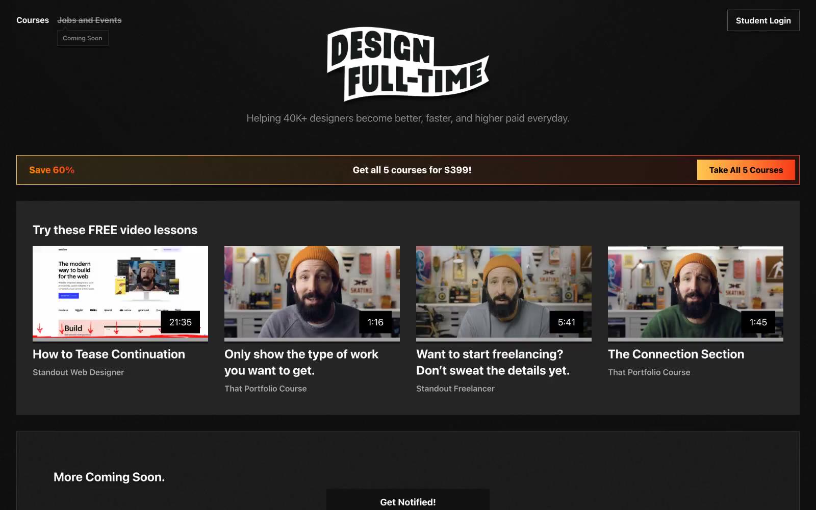
# Design Full-Time — Style Reference
> black-box cinema with a single warm spotlight
**Theme:** dark
Design Full-Time runs a black-box cinema: pure #000000 canvas, white type, and one concentrated warm gradient (amber → ember → red) reserved for conversion surfaces and savings moments. The page is almost entirely achromatic — video thumbnails, course metadata, and navigation live in monochrome gray scale, letting the single gradient banner function as a stage spotlight. Components are flat and rectangular with hairline borders, minimal rounding, and zero shadows; hierarchy comes from type weight, whitespace, and the rare chromatic punctuation. Inter at 700/800 carries the brand's confident, instructor-led voice while body text stays at 400/600 in muted grays.
## Tokens — Colors
| Name | Value | Token | Role |
|------|-------|-------|------|
| Pure Black | `#000000` | `--color-pure-black` | Page canvas, dominant background — absorbs everything so content and the warm gradient banner can command attention |
| Surface Black | `#111111` | `--color-surface-black` | Card backgrounds, elevated panels, filled neutral button surface — one step off the canvas creates depth without gray noise |
| Lifted Charcoal | `#252525` | `--color-lifted-charcoal` | Mid-elevation surfaces, hover states, and subtle card depth — bridges the page black and border tones |
| Border Gray | `#343434` | `--color-border-gray` | Hairline dividers, card outlines, table rules — defines structural edges in a flat world |
Websites
Markdown Text
design-md
website-prompt
landing-page-prompt
Uizard
Uizard — Style Reference
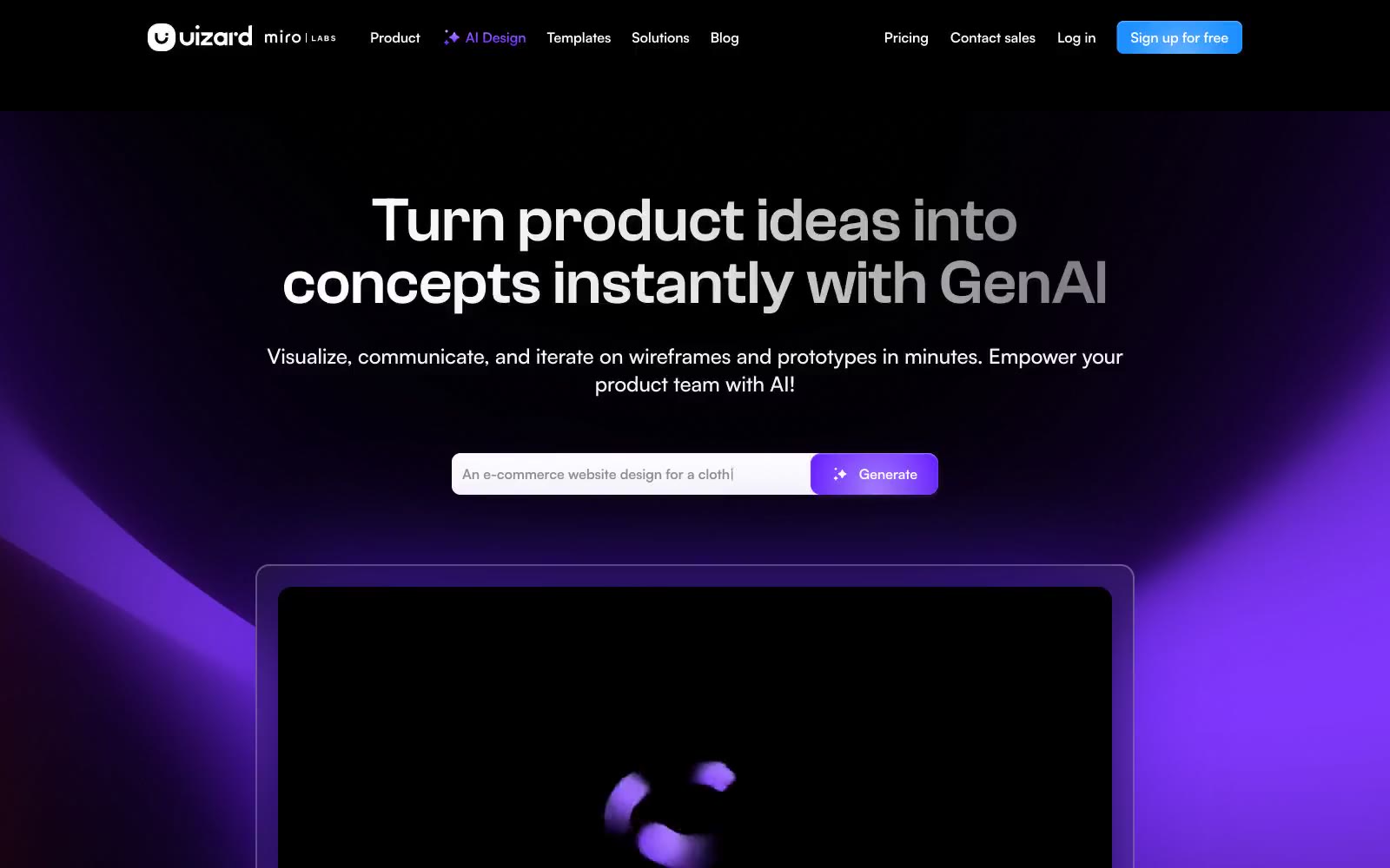
# Uizard — Style Reference
> violet aurora over obsidian — a single charged accent glowing against an ink-dark product canvas
**Theme:** dark
Uizard operates as a midnight creative studio: near-black canvases absorb attention while a single violet glow (#a881fe) acts as the room's neon sign, drawing the eye to generation moments. The interface stays overwhelmingly achromatic — white type, graphite borders, ink-black surfaces — so that the purple accent reads as functional electricity, not decoration. Typography is confident and modern: Satoshi Variable carries the product voice at comfortable weights, while Clash Grotesk breaks through at display scale for hero headlines with tight tracking. Components feel contained and architectural — cards with hairline graphite borders, pills and inputs softened to 8-12px radii, and a signature purple outer-glow shadow on the primary action that makes it appear to emit light rather than sit on a surface.
## Tokens — Colors
| Name | Value | Token | Role |
|------|-------|-------|------|
| Violet Glow | `#a881fe` | `--color-violet-glow` | Primary action fill, brand accent, hero glow origin, logo mark — the charged purple that signals generation and AI intent |
| Deep Iris | `linear-gradient(0deg, rgb(100,25,255), rgb(168,129,254))` | `--color-deep-iris` | Gradient deep stop, brand purple core — anchors hero radial bloom and logo gradient ramp |
| Soft Lilac | `linear-gradient(189.47deg, rgb(204,178,255) 4.76%, rgb(100,25,255) 92.85%)` | `--color-soft-lilac` | Gradient highlight stop — outer edge of brand gradient where violet dissolves into the dark canvas |
| Signal Blue | `#1e90ff` | `--color-signal-blue` | Blue action color for filled buttons, selected navigation states, and focused conversion moments. |
Websites
Markdown Text
design-md
website-prompt
landing-page-prompt
Sublime
Sublime — Style Reference
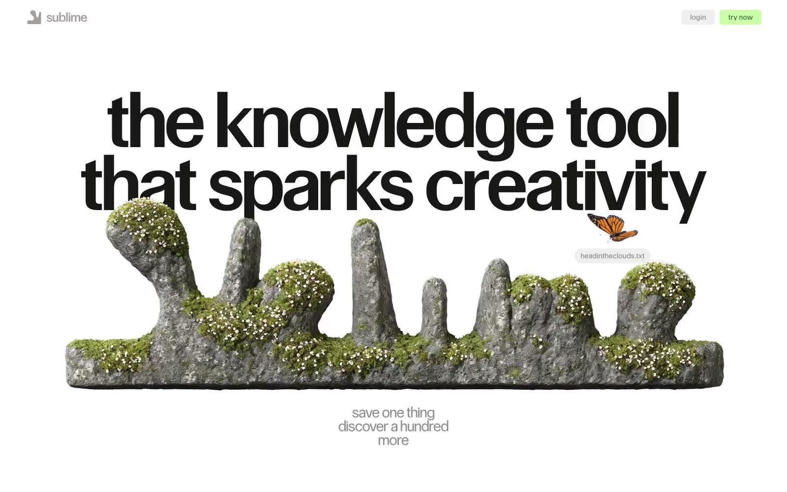
# Sublime — Style Reference
> white-walled curator's atelier — a quiet gallery where one bold black headline holds the room and a single green object is always the only thing worth picking up
**Theme:** light
Sublime operates as a digital atelier: vast white walls, a single monumental headline anchoring each view, and collected objects (text snippets, vintage images, 3D renders) that feel curated rather than organized. The palette is 98% achromatic — black on white carries the entire interface, with two whisper-soft washes (pale blue, pale green) and one vivid moss green that punctuates moments of intent. Typography does the structural work: a custom geometric sans at extreme sizes and tight tracking creates headline gravity, while Times New Roman supplies a literary counterpoint for body copy and quotes — the serif/sans collision is deliberate editorial tension, not a system oversight. Layout breathes aggressively — centered compositions, floating collaged elements that overlap and ignore grid lines, generous vertical rhythm. Radii split into two modes: crisp 5px for functional controls, 999px pill for tags and special actions.
## Tokens — Colors
| Name | Value | Token | Role |
|------|-------|-------|------|
| Moss Green | `#38744d` | `--color-moss-green` | Green outline accent for tags, dividers, and focused UI edges. Do not promote it to the primary CTA color |
| Signal Cyan | `#00aaff` | `--color-signal-cyan` | Blue outline accent for tags, dividers, and focused UI edges. |
| Ice Wash | `#e0f5ff` | `--color-ice-wash` | Cool surface tint — content card backgrounds, highlight washes; a barely-there blue that hints at a Polaroid shadow without actually adding one |
| Mint Whisper | `#cbffa6` | `--color-mint-whisper` | Warm surface tint — secondary highlight washes, soft card fills; a pale chartreuse that pairs with Moss Green as a lighter sibling |
Websites
Markdown Text
design-md
website-prompt
landing-page-prompt
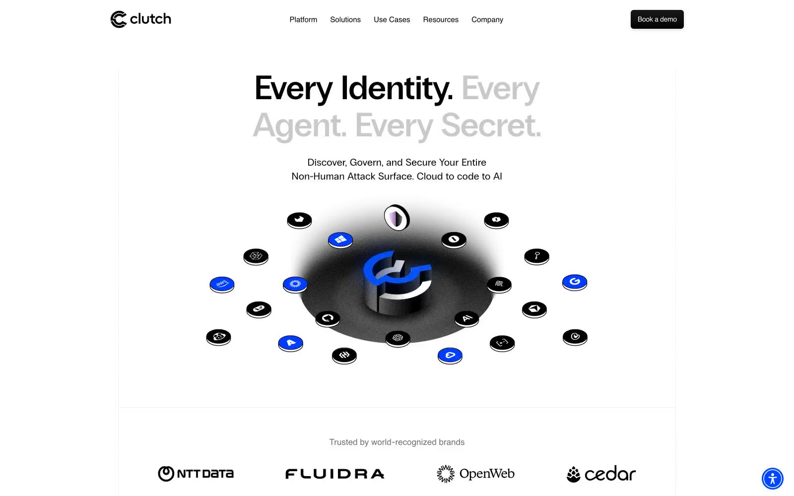
Clutch Security
Clutch Security — Style Reference
# Clutch Security — Style Reference
> Typography museum on white marble. Gallery-white walls where each word is the artifact, one blue button the only painting in the room.
**Theme:** light
Clutch Security operates in a gallery-white minimalism: a bright, almost paper-like canvas where typography carries the entire visual weight and a single electric blue does all the chromatic talking. The signature typographic move is PP Radio Grotesk display headlines where key words shift between weight 400 and 600 within the same sentence, creating a call-and-response rhythm that feels like a conversation rather than a declaration. The interface is nearly flat — 6px corners, hairline 1px borders in cool gray, and no decorative shadows — so the occasional 3D orbital illustration or 3D brand mark feels like a found object on a clean table. Everything is centered, spacious, and confident; the 80px section breaks and generous internal padding give each element room to assert itself without competing.
## Tokens — Colors
| Name | Value | Token | Role |
|------|-------|-------|------|
| Electric Cobalt | `#004dff` | `--color-electric-cobalt` | Primary action buttons, active states, the single chromatic accent that punctuates the entire monochrome system |
| Periwinkle Wash | `#d9e4ff` | `--color-periwinkle-wash` | Light blue surface for highlighted regions, subtle brand-tinted backgrounds, soft accent fills |
| Lavender Veil | `#e6c5f7` | `--color-lavender-veil` | Soft violet surface for the brand mark and tertiary accent zones, a whisper of warmth against the cool palette |
| Obsidian | `#000000` | `--color-obsidian` | Neutral form states, badge text, and quiet UI feedback where color should stay understated. Do not promote it to the primary CTA color |
Websites
Markdown Text
design-md
website-prompt
landing-page-prompt
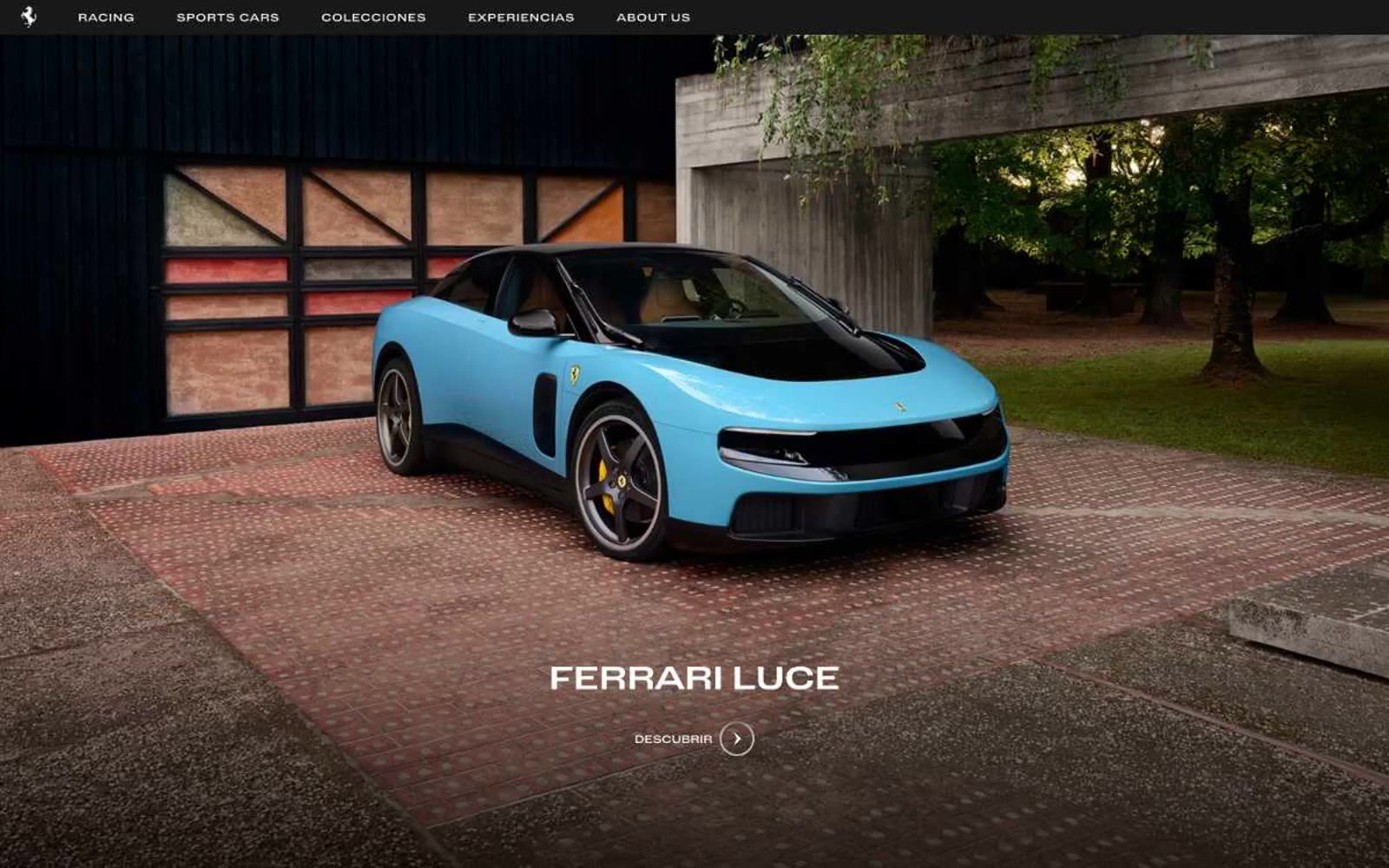
Ferrari
Ferrari — Style Reference
# Ferrari — Style Reference
> Monochrome gallery under spotlights — a completely achromatic interface that lets the cars carry all color through photography.
**Theme:** mixed
Ferrari's digital presence is a monochrome gallery under spotlights — a completely achromatic interface where the cars carry all color through photography, and the UI itself stays disciplined in pure black, white, and grayscale. Layouts are editorial: full-bleed dark cinematic heroes with centered all-caps titles, alternating into white content sections with generous breathing room and a rigid text-left/image-right rhythm. The visual language is restrained and confident — thin circular arrow CTAs, wide-tracked uppercase navigation, hairline borders, zero chromatic accents, and zero decorative gradients. Every surface decision defers to the photograph: the interface must never compete with the car.
## Tokens — Colors
| Name | Value | Token | Role |
|------|-------|-------|------|
| Pure White | `#ffffff` | `--color-pure-white` | Page canvas, light section backgrounds, card surfaces, text on dark backgrounds |
| Pure Black | `#000000` | `--color-pure-black` | Full-bleed dark hero and feature sections, deep navigation bar, primary text on light backgrounds |
| Carbon Black | `#181818` | `--color-carbon-black` | Secondary dark surfaces, dark cards, footer backgrounds — sits one step lifted from pure black |
| Graphite | `#303030` | `--color-graphite` | Elevated dark surfaces, dark borders, subtle dark-mode structure — one step lighter than Carbon |
Websites
Markdown Text
design-md
website-prompt
landing-page-prompt
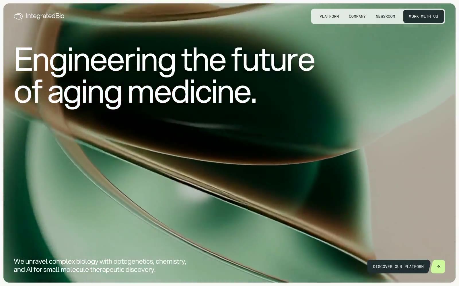
Integrated Biosciences
Integrated Biosciences — Style Reference
# Integrated Biosciences — Style Reference
> bioluminescent laboratory at midnight
**Theme:** mixed
Integrated Biosciences operates in a darkroom-laboratory visual language: a near-black canvas with cool green undertones, restrained white typography, and a single bioluminescent lime accent that activates only on small interactive elements like arrow buttons, tag dots, and progress indicators. The entire type system runs on a single weight of Aspekta — hierarchy is sculpted purely through size and aggressive negative letter-spacing, which makes 111px and 158px display lines feel architectural rather than decorative. Roboto Mono is reserved for technical labels, nav items, and metadata, reinforcing the instrumentation-bench character of the brand. Surfaces stay mostly flat — no shadows, no gradients — with thin hairline borders in #c9cbbe or #4d5757 doing all the delineation. Light sections flip to a warm off-white canvas (#f7f7f5) with white cards, but the green accent persists as a constant biological signal.
## Tokens — Colors
| Name | Value | Token | Role |
|------|-------|-------|------|
| Bioluminescent Lime | `#cef79e` | `--color-bioluminescent-lime` | Green wash for highlight backgrounds, decorative bands, and soft emphasis behind content |
| Abyssal Ink | `#222f30` | `--color-abyssal-ink` | Primary text, borders, dark canvas sections, nav backgrounds. Near-black with a cool green undertone — it is not pure black, it carries the same green note as the accent. Darkest content surface |
| Bone White | `#f7f7f5` | `--color-bone-white` | Light-section page canvas, hero/section backgrounds when in light mode. Warm off-white with the faintest cream cast |
| Paper | `#ffffff` | `--color-paper` | Card surfaces on light sections, elevated containers, icon fills, body text on dark surfaces. The brightest surface in the system |
Websites
Markdown Text
design-md
website-prompt
landing-page-prompt
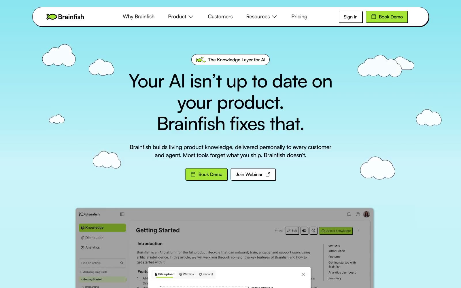
Brainfish
Brainfish — Style Reference
# Brainfish — Style Reference
> Stickers on construction paper
**Theme:** light
Brainfish is a neo-brutalist product site dressed in playground colors: white canvas, a single vivid lime-green accent, and full-bleed pastel sections (sky teal, mint green, cobalt blue) broken up by floating cloud, fish, and app-icon illustrations. Hard offset shadows (2px solid, zero blur) and thin black borders give every interactive surface a sticker-on-paper weight — components feel pinned to the page rather than floating. Type is geometric and tight (Satoshi at weight 500/700 with aggressive negative tracking on display sizes), and color enters the system sparingly: lime for action, pastel tints for data cards, full saturation only in section backgrounds. The whole system reads as a friendly, slightly hand-made explainer — UI is a comic strip about knowledge, not a dashboard.
## Tokens — Colors
| Name | Value | Token | Role |
|------|-------|-------|------|
| Lime Pulse | `#a3e635` | `--color-lime-pulse` | Green action color for filled buttons, selected navigation states, and focused conversion moments. |
| Carbon Black | `#000000` | `--color-carbon-black` | Primary text, all borders, hard offset shadows, icon strokes — the structural ink of the system |
| Paper White | `#ffffff` | `--color-paper-white` | Page canvas, card surfaces, button fills, input backgrounds — the base layer everything pins onto |
| Graphite | `#171717` | `--color-graphite` | Secondary borders, card outlines, badge strokes — a near-black for when pure #000 reads too harsh at thin weights |
Websites
Markdown Text
design-md
website-prompt
landing-page-prompt
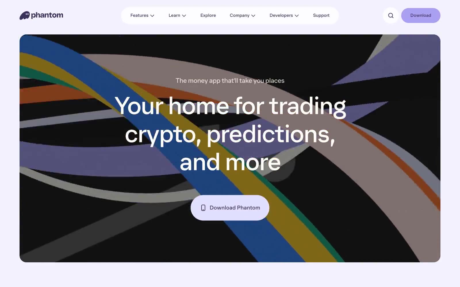
Phantom
Phantom — Style Reference
# Phantom — Style Reference
> Lavender dreamscape with a violet ghost. A pastel world that flips to midnight violet in key moments, with a friendly mascot ghost wandering between sections.
**Theme:** mixed
Phantom uses a whisper-thin custom typeface (Phantom, weight 350/400) and a dual-violet color world to make a crypto wallet feel like a friendly product, not a trading terminal. The page alternates between pale lavender surfaces and deep midnight-violet sections, with the brand ghost mascot acting as the only character in the system. Every interactive element is aggressively rounded — pills at 100px, large buttons at 32px, hero panels at 24px — giving the entire interface a soft, inflated quality. The signature shadow is not gray but brand-tinted violet (#e2dffe at 0px 0px 4px), making even small elevations feel on-brand. Type is set tight (-0.025em) and large, with display lines at 80–96px that read as quiet rather than loud because of the low weight.
## Tokens — Colors
| Name | Value | Token | Role |
|------|-------|-------|------|
| Midnight Violet | `#3c315b` | `--color-midnight-violet` | Dark section backgrounds, primary text on light surfaces, nav text — the deep brand violet anchors identity and gives the dark hero/sections their weight |
| Lavender Whisper | `#e2dffe` | `--color-lavender-whisper` | Brand-tinted shadow, soft accent washes, subtle elevation glow — replaces neutral gray shadows so elevation stays on-brand |
| Ghost Lilac | `#ab9ff2` | `--color-ghost-lilac` | Violet supporting accent for decorative details and low-frequency emphasis. Do not promote it to the primary CTA color |
| Cornflower Pop | `#4a87f2` | `--color-cornflower-pop` | Rare accent for highlighted CTAs or featured buttons — a brighter blue-violet used sparingly for emphasis |
Websites
Markdown Text
design-md
website-prompt
landing-page-prompt
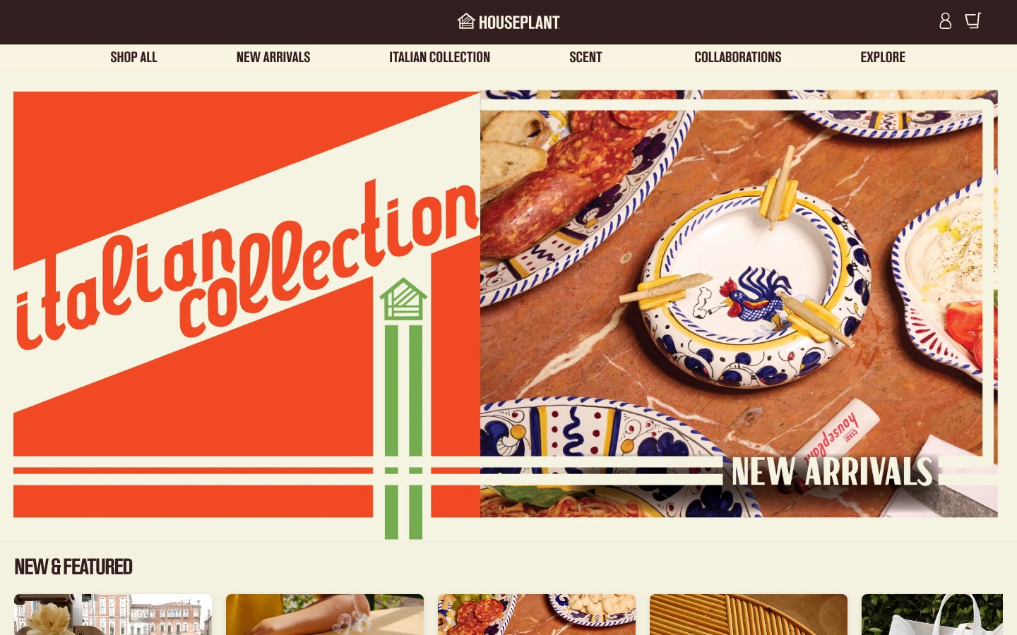
HOUSEPLANT
HOUSEPLANT — Style Reference
# HOUSEPLANT — Style Reference
> walnut bookstore on linen paper
**Theme:** light
Houseplant operates in a warm, earthy monochrome — deep walnut brown on aged cream, with the product photography doing all the chromatic work. The system reads like a vintage housewares catalog: tight custom typography, generous breathing room, no decorative gradients, and almost no accent color. The dark brown #321e1 is both text and surface, flipping between background and foreground depending on context, while the cream #f4f1e1 plays canvas. Components are minimal — solid filled buttons, hairline dividers, soft cards with a single subtle shadow. The signature move is the oversized custom wordmark that anchors the page footer, treating the brand name as a graphic element rather than a logo.
## Tokens — Colors
| Name | Value | Token | Role |
|------|-------|-------|------|
| Walnut | `#321e1e` | `--color-walnut` | Primary text color, filled action buttons, dark hero sections, footer wordmark. Deep warm brown that reads as near-black while carrying the brand's earthy warmth — used as both foreground and background surface |
| Linen | `#f4f1e0` | `--color-linen` | Page canvas, card surfaces, light text on dark backgrounds. Warm aged-cream that gives the entire system its paper-like, vintage quality |
| Graphite | `#464545` | `--color-graphite` | Secondary borders, muted helper text, subtle dividers. Neutral medium gray providing quiet separation without competing with the Walnut/Linen pair |
| Espresso | `#463938` | `--color-espresso` | Button text on light surfaces, alternate dark fill. Slightly lighter brown variant for typographic contrast within the dark family |
Websites
Markdown Text
design-md
website-prompt
landing-page-prompt
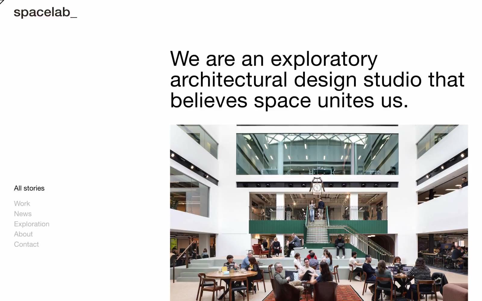
Spacelab
Spacelab — Style Reference
# Spacelab — Style Reference
> Swiss editorial grid on raw paper. A quiet gallery where Helvetica sits at the baseline and a single slate-violet button is the loudest thing in the room.
**Theme:** light
Spacelab is a Swiss-editorial architecture studio site built on near-total monochrome restraint: one typeface, one chromatic accent, and almost no surface decoration. The page behaves like a printed monograph — white canvas, oversized architectural photography, and a left-rail index navigation that recalls a museum catalogue sidebar. Type carries the entire voice: HelveticaNeue at weight 400 with line-heights compressed to 1.0–1.2 sits closer to the baseline than typical web type, making every paragraph feel set rather than typed. The single muted violet-slate (#495472) appears only on filled buttons and a rare card surface, functioning as a quiet navigational signal rather than a brand statement. Components are reduced to their skeleton: hairline borders, 4px corners, no shadows, no gradients — every element earns its weight by occupying negative space rather than filling it.
## Tokens — Colors
| Name | Value | Token | Role |
|------|-------|-------|------|
| Paper White | `#ffffff` | `--color-paper-white` | Page canvas, card surfaces, body text inversion, button labels. The dominant background; everything else sits on top of it |
| Ink Black | `#000000` | `--color-ink-black` | Primary text, icon strokes, hairline borders, the logo wordmark. Used for most dividers and structural lines (border frequency 1,156) |
| Charcoal | `#2c2222` | `--color-charcoal` | Secondary text and the heaviest border color in the system (freq 3,104). A warm-toned near-black that softens harsh contrast on long reads |
| Fossil | `#b2b4b1` | `--color-fossil` | Muted link color, inactive nav items, tertiary text. Desaturated green-gray that recedes against both paper white and ink black |
Websites
Markdown Text
design-md
website-prompt
landing-page-prompt
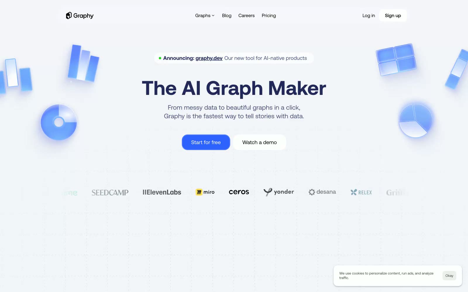
Graphy
Graphy — Style Reference
# Graphy — Style Reference
> Blueprint on white marble. A hushed, indigo-inked technical surface where a single vivid blue is the only raised voice, and floating glassy chart fragments drift across a soft gray void.
**Theme:** light
Graphy is a luminous, blueprint-clean SaaS surface that treats data visualization as a calm craft rather than a loud spectacle. The canvas is a whisper-soft lavender-gray (#f2f4f8), and card surfaces sit one level brighter in pure white, creating a quiet two-tier depth that lets vivid cobalt-blue actions glow as the only chromatic punctuation. Typography leans on Aeonik's geometric warmth with aggressively tightened tracking (negative up to -0.05em on display sizes), making even the 82px hero feel engineered rather than decorative. The signature gesture is the floating 3D chart illustrations that orbit the hero — translucent, glassy, impossibly light — paired with hairline borders, generous breathing room, and a single saturated CTA color that never competes with the data on screen.
## Tokens — Colors
| Name | Value | Token | Role |
|------|-------|-------|------|
| Indigo Ink | `#20295a` | `--color-indigo-ink` | Violet outline accent for tags, dividers, and focused UI edges. Do not promote it to the primary CTA color |
| Cobalt Signal | `#2e62ff` | `--color-cobalt-signal` | Filled CTA buttons, active states, chart accents, and interactive highlights — the single saturated voice in an otherwise muted system. Used sparingly so it reads as functional energy, not decoration |
| Electric Blue | `#0099ff` | `--color-electric-blue` | Outlined/ghost action borders and link underlines — a secondary chromatic for less-committed interactive states that still need a colored border or underline hint |
| Paper White | `linear-gradient(rgba(255, 255, 255, 0.3) 0%, rgba(76, 48, 237, 0.2) 100%)` | `--color-paper-white` | Card surfaces, elevated panels, button fills, and form inputs — the brightest surface level sitting one tier above the canvas; Translucent-to-violet gradient used on floating glassy chart illustrations and hero ornaments — fades from semi-opaque white into a soft violet aura |
Websites
Markdown Text
design-md
website-prompt
landing-page-prompt
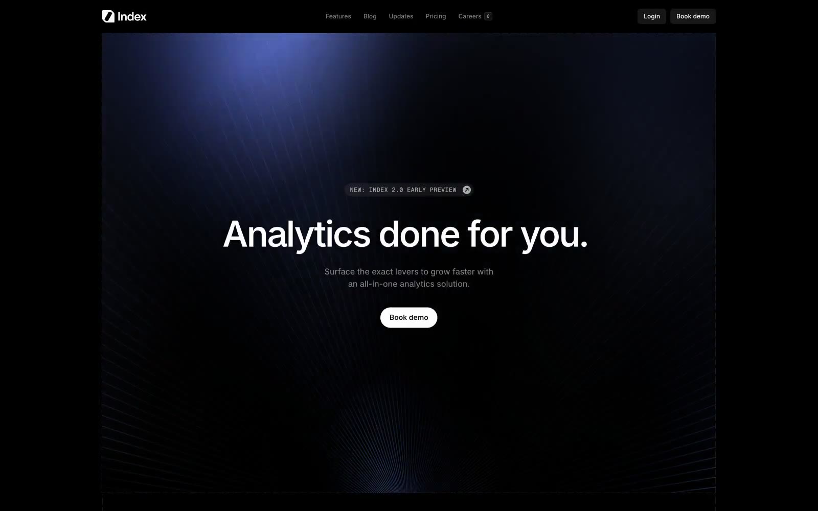
Index
Index — Style Reference
# Index — Style Reference
> Blueprint on a backlit drafting table — the entire interface is a wireframe drawing, with one periwinkle annotation pen.
**Theme:** dark
Index operates as a technical wireframe drawn in negative space: a near-black canvas wrapped in dashed containment lines, a single muted periwinkle accent (#7089ba) used as quiet annotation, and display type set at maximum weight (Raveo 1000) that anchors every section. The visual logic is "blueprint on a light table" — components are not decorated but outlined, so the interface reads as a schematic rather than a finished product. Surfaces stay matte and flat; elevation is implied by hairline dashed borders and a slight surface lift from #1c1c1c to #808080, never by shadow. The only moment of softness is the hero's radial light wash, which acts like a focused desk lamp on a drafting table. Color is rationed — achromatic 99% of the time, with the violet-blue reserved for small chromatic punctuation (data connection nodes, icon fills, subtle washes). Typography does the emotional heavy lifting: weight 1000 display lines dominate, set tight (-0.04em) and large (70px) so they feel architectural rather than editorial.
## Tokens — Colors
| Name | Value | Token | Role |
|------|-------|-------|------|
| Void | `#000000` | `--color-void` | Page background, all structural borders, primary text on light surfaces — the absolute black that makes the dashed containment lines read as ink on paper |
| Carbon | `#1c1c1c` | `--color-carbon` | Elevated surface — card backgrounds, section fills, the canvas where the hero spotlight lands; lifted one step from Void but barely |
| Graphite | `#4d4d4d` | `--color-graphite` | Tertiary borders and disabled outlines, dividers in dense lists |
| Steel | `#808080` | `--color-steel` | Body text secondary, metadata labels, muted borders, checkbox/divider lines on dark |
Websites
Markdown Text
design-md
website-prompt
landing-page-prompt
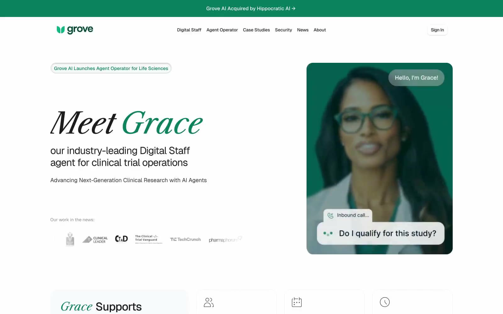
Grove AI
Grove AI — Style Reference
# Grove AI — Style Reference
> clinical journal in morning light — a single green word anchors a page of measured prose
**Theme:** light
Grove AI uses a clinical-credibility language: bright white canvas, restrained forest-green accents, and a deliberate typographic contrast between an editorial serif (Libre Caslon Text) for hero-level storytelling and a precise grotesque (Geist) for body and interface. The brand voice lives in a single green word — "Grace" — set in the serif and dropped into an otherwise monochrome headline, so the AI agent reads as the personality of the product rather than a feature. Surfaces are flat with a single light-gray card layer; elevation comes from soft inset shadows and hairline borders, never from heavy drop shadows. Component weight is lightweight: pill buttons, ghost controls, thin outlined tags, and tight small-caps section labels. Overall the system feels like a well-funded medical journal that also happens to be a product page — clinical authority expressed through restraint, not decoration.
## Tokens — Colors
| Name | Value | Token | Role |
|------|-------|-------|------|
| Forest Grove | `#0b835c` | `--color-forest-grove` | Primary brand color — used for the logo mark, the signature word in serif headlines, accent borders on tags and announcement pills, and small icon highlights. A deep, slightly desaturated green that reads as clinical and trustworthy rather than energetic |
| Pine Shadow | `#1c2b27` | `--color-pine-shadow` | Secondary dark surface — a near-black green-tinted shade for inverted buttons and dark surface moments where #000 would feel too harsh against the green accent |
| Ink Black | `#1c1c1e` | `--color-ink-black` | Dark borders and separators for elevated surfaces and inverted UI. Do not promote it to the primary CTA color |
| Graphite | `#303033` | `--color-graphite` | Secondary text and dividers — a mid-dark gray for body copy de-emphasis, subtle borders, and metadata |
Websites
Markdown Text
design-md
website-prompt
landing-page-prompt
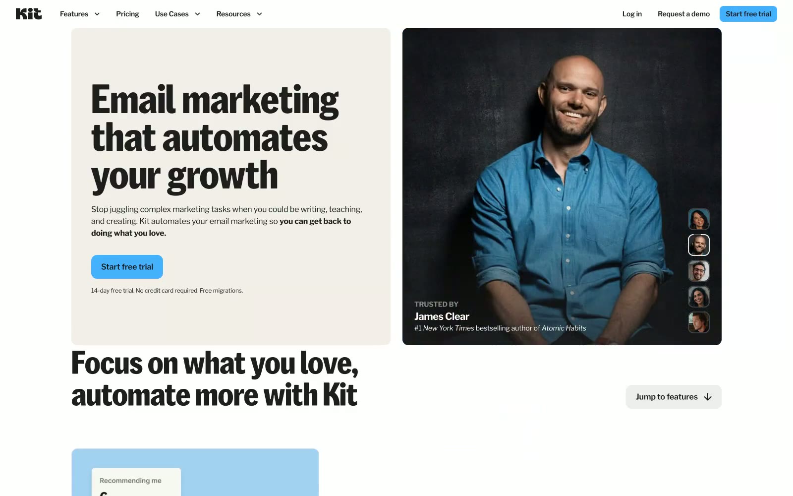
Kit
Kit — Style Reference
# Kit — Style Reference
> Warm creator notebook — parchment pages, highlighter-blue ink, heavy type on linen.
**Theme:** light
Kit reads like a warm editorial notebook — cream-tinted parchment (#f2efe9) as the page base, heavy black headlines punching out of it at weight 700, and a single sky-blue accent (#44b1ff) that appears on CTAs and interactive highlights against the near-black (#1e1e1e). The palette is intentionally muted and hand-curated: soft pastel blocks (dusty blue, blush pink, peach, sage green) appear as section backgrounds, never as text or interaction states, making the one vivid blue feel like a highlighter on a notebook page. KitSansFont at 80px/64px in the custom weight 500 dominates hero spaces with tight -0.009em tracking, while Libre Franklin handles everything else across the content hierarchy — a two-font system where custom display and workhorse utility stay in clearly assigned lanes. Radius tokens are tight and intentional: 12px on buttons and cards, 8px on secondary UI, creating a slightly-rounded-but-serious personality that avoids both sharp corporate rigidity and bubbly consumer softness.
## Tokens — Colors
| Name | Value | Token | Role |
|------|-------|-------|------|
| Sky Marker | `#44b1ff` | `--color-sky-marker` | Primary CTA buttons, active nav states, inline keyword highlights — vivid blue on parchment or near-black backgrounds acts as the single highlighter across an otherwise neutral palette, directing attention without competing with any other chromatic element |
| Dust Blue | `#a2d1f1` | `--color-dust-blue` | Hero and section background panels — muted blue used as an atmospheric backdrop, never for text or interaction |
| Blush Mist | `#e7c9f1` | `--color-blush-mist` | Section background panels — pastel pink used decoratively to vary section rhythm |
| Peach Sand | `#ffd0ad` | `--color-peach-sand` | Section background panels — muted orange for alternating content band backgrounds |
Websites
Markdown Text
design-md
website-prompt
landing-page-prompt
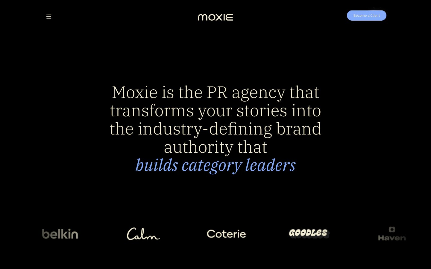
Moxie
Moxie — Style Reference
# Moxie — Style Reference
> Editorial darkroom with a single periwinkle flare — serif headlines float on a black void while a vivid blue accent punctuates the silence.
**Theme:** dark
Moxie's design system operates as an editorial PR-agency darkroom: deep black canvas, warm cream typography, and a single vivid periwinkle accent that lights up interactions like a stage spotlight. The pairing of IBM Plex Serif (for headlines) with IBM Plex Sans (for everything else) creates a magazine-meets-product tension — the serif whispers authority and editorial polish, while the sans keeps functional UI grounded and modern. Layout breathes generously with large centered serif hero statements, asymmetric card grids for work showcases, and horizontal scrolling case-study carousels. Color is used sparingly: the cream (#f4efd4) does the heavy lifting for text and hairline borders on cards, the periwinkle blue (#84acfb) acts as a singular accent for italic emphasis, active states, and the sole filled CTA, and deeper warm grays layer card-on-card depth. There are no shadows, no gradients, no decorative chrome — the system relies on generous spacing, type contrast, and selective color punctuation to create hierarchy.
## Tokens — Colors
| Name | Value | Token | Role |
|------|-------|-------|------|
| Periwinkle Flare | `#84acfb` | `--color-periwinkle-flare` | Primary action background, italic emphasis text, active nav state, heading accent — the lone chromatic signal in an otherwise achromatic system, used surgically to make interactions feel switched on |
| Warm Cream | `#f4efd4` | `--color-warm-cream` | Primary text, card borders, hairline dividers, card surfaces — a warm off-white that softens the black void and carries the editorial tone |
| Warm Ash | `#626055` | `--color-warm-ash` | Secondary card borders, muted text, button borders — a mid-tone warm gray for layering depth between cream borders and the black canvas |
| Charcoal Veil | `#333333` | `--color-charcoal-veil` | Subtle borders, low-emphasis dividers, body text borders — the deepest visible neutral for near-invisible structural lines |
Websites
Markdown Text
design-md
website-prompt
landing-page-prompt
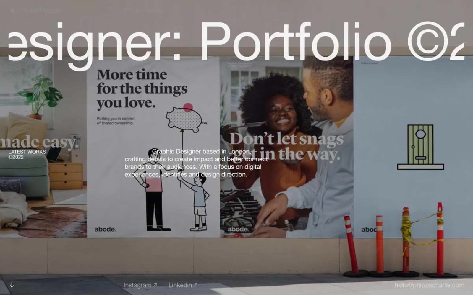
Charlie Phipps
Charlie Phipps — Style Reference
# Charlie Phipps — Style Reference
> oversized editorial gallery wall — a single massive Helvetica headline and one full-bleed photograph, nothing else
**Theme:** mixed
Charlie Phipps is a London graphic designer's portfolio rendered as an oversized editorial poster system: full-bleed photography as hero canvas, one monumental Helvetica Neue headline per screen, and near-total chromatic silence. The site reads like a printed zine blown up to wall scale — weight 400 at 162px is a deliberate anti-convention (no bold shout, just confident whisper-thin letters) paired with aggressive negative tracking that lets the headline crop the viewport. The base canvas is near-black (#101011) to make photographic color explosions land harder, but content sections flip to white with the same dramatic restraint. No buttons, no rounded corners, no shadows, no color tokens — interaction is implied by thin underlines and cursor states, and navigation is reduced to three thin links in a corner. Whitespace is the primary structural device, not cards or dividers.
## Tokens — Colors
| Name | Value | Token | Role |
|------|-------|-------|------|
| Canvas Black | `#101011` | `--color-canvas-black` | Base page canvas beneath full-bleed photography and dark bands; primary text on light surfaces; link underlines in dark contexts |
| Paper White | `#ffffff` | `--color-paper-white` | Primary text color on dark/photographic backgrounds; content section background; dominant border color (hairline rules and dividers across the layout) |
| Ink Black | `#000000` | `--color-ink-black` | Heading and body text on light surfaces; second structural border color — used wherever a slightly harder edge than #101011 is needed |
| Fog Gray | `#ededed` | `--color-fog-gray` | Subtle surface tint separating content blocks from white paper; soft borders on body text and cards where a pure white hairline would disappear |
Websites
Markdown Text
design-md
website-prompt
landing-page-prompt
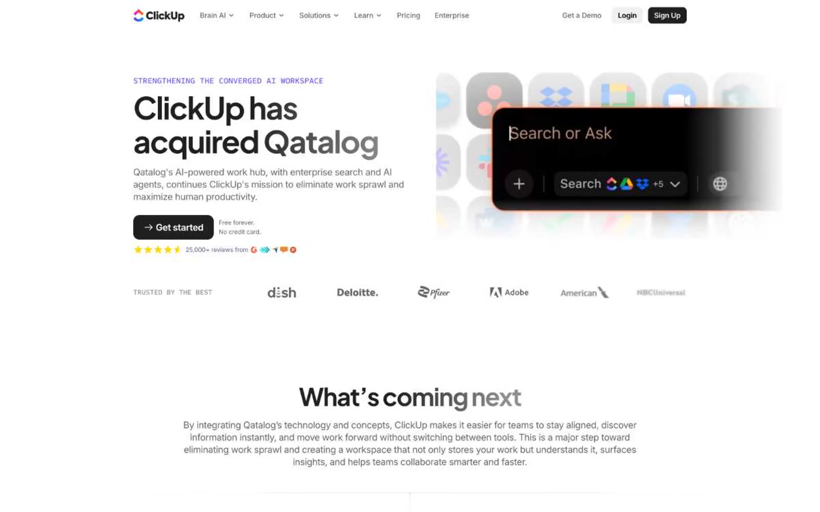
Qatalog
Qatalog — Style Reference
# Qatalog — Style Reference
> ink on paper with two violet sparks
**Theme:** light
Qatalog operates as a near-monochrome productivity canvas: white background, dark slate ink, and a restrained two-violet accent system that appears as small functional punctuation rather than broad washes. Typography is compact and confident — Plus Jakarta Sans at weights 650-700 carries headlines with tight negative tracking, while Inter handles body and UI chrome at smaller sizes. Surfaces stay flat; depth comes from dark filled cards and 9px radii, never from drop shadows. The single vivid moment is a rainbow gradient that crowns the final dark CTA section, acting as the only chromatic release across an otherwise quiet, architectural layout.
## Tokens — Colors
| Name | Value | Token | Role |
|------|-------|-------|------|
| Ink | `#292d34` | `--color-ink` | Primary text, dark surface fills, structural borders — cool near-black that reads as the dominant ink across the system |
| Pure White | `#ffffff` | `--color-pure-white` | Page canvas, card surfaces, text on dark fills |
| Slate | `#646464` | `--color-slate` | Secondary text, link borders, muted UI chrome — the mid-gray that carries nav, list borders, and body annotations |
| Charcoal | `#202020` | `--color-charcoal` | Dark filled button backgrounds, dark card surfaces, deep accent panels |
Websites
Markdown Text
design-md
website-prompt
landing-page-prompt
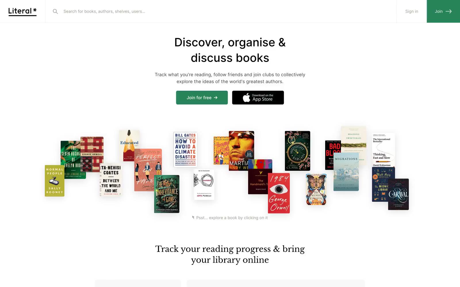
Literal
Literal — Style Reference
# Literal — Style Reference
> Library in soft daylight — a reading room where warm cream walls meet dark walnut shelves.
**Theme:** light
Literal is a literary reading room rendered in soft daylight: a near-monochrome canvas where the only chromatic note is a single forest green that marks the primary action. Headlines speak in a warm bookish serif (Libre Baskerville) while every functional element stays in clean geometric Inter, creating a quiet tension between editorial and digital. Surfaces are paper-like — soft warm gray canvas beneath pure white cards with hairline borders and almost no shadow. The whole experience is calm, spacious, and content-led, with book covers and product screenshots doing the visual work that color and ornament don't.
## Tokens — Colors
| Name | Value | Token | Role |
|------|-------|-------|------|
| Forest Green | `#278458` | `--color-forest-green` | Primary CTA fill, brand accent, star glyph in wordmark, active states — a single chromatic note anchoring an otherwise achromatic interface |
| Charcoal | `#444340` | `--color-charcoal` | Primary body and UI text, icon strokes, default border outlines |
| Soft Gray | `#f8f8f8` | `--color-soft-gray` | Page canvas and section backgrounds — warm off-white that makes white cards feel layered rather than floating |
| Warm Gray | `#9a988b` | `--color-warm-gray` | Muted helper text, secondary metadata, list dividers, de-emphasized links |
Websites
Markdown Text
design-md
website-prompt
landing-page-prompt
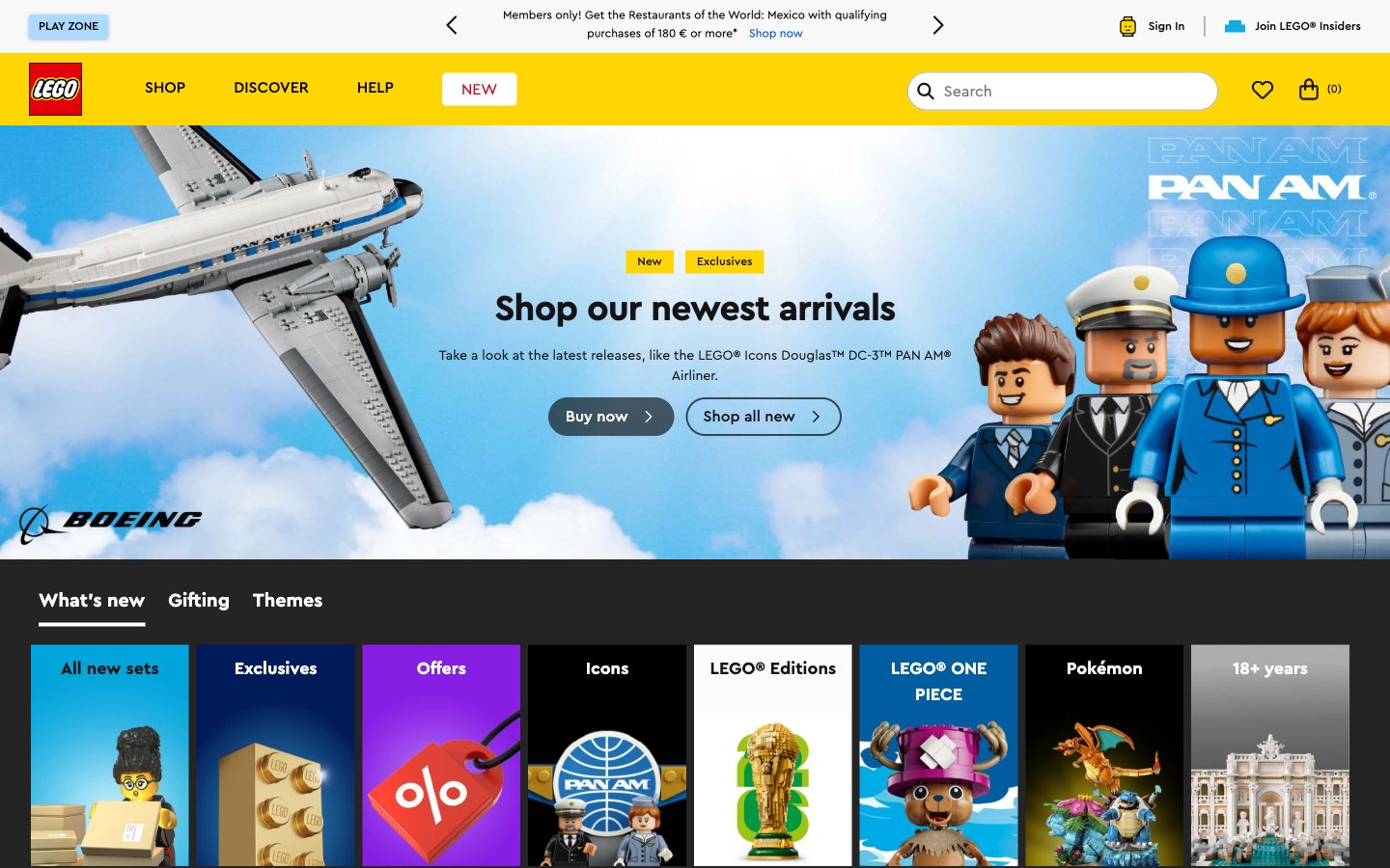
Lego
Home — Style Reference
# Home — Style Reference
> Primary-color toy aisle — the brightness of a freshly opened set box on a white table.
**Theme:** light
LEGO's digital storefront feels like a toy aisle rendered in pixels — primary colors deployed with zero restraint, product photography doing all the emotional lifting against white and near-black surfaces. The yellow (#FFD502) is the brand's pulse: it appears on badges, nav highlights, and the logo bar, a single chromatic constant amid a white/off-black neutral scaffold. The orange CTA (#F47D20) on 999px pill buttons is the only call to action color — warm, rounded, immediately readable against product whites. The dark footer (#201D48) anchors the page in LEGO's classic deep navy, grounding a page that otherwise lives in bright daylight. Type is entirely Cera Pro, a custom geometric rounded sans that echoes brick curves — weight 700 for headings at tight tracking, weight 400 for body, nothing else.
## Tokens — Colors
| Name | Value | Token | Role |
|------|-------|-------|------|
| LEGO Yellow | `#FFD502` | `--color-lego-yellow` | Logo background, badges, active nav indicators, brand accent — the single chromatic constant that appears regardless of page section, making every badge feel like a price sticker on a toy box. |
| Brick Orange | `#F47D20` | `--color-brick-orange` | Primary CTA buttons ('Buy now', 'Add to Bag', 'Become a member') — warm against white product backgrounds, the only pill button fill color for purchase actions. |
| Ember Dark | `#E96F14` | `--color-ember-dark` | Orange hover/pressed state for CTA buttons — 1 step darker than Brick Orange. |
| LEGO Navy | `#201D48` | `--color-lego-navy` | Footer background, deep brand surface — the only dark chromatic surface, anchoring the page bottom with brand identity. |