AI Prompt Studio - Intelligent Prompt Library
Explore and use professional AI prompts to optimize your workflow.
One-click Use
Websites
Markdown Text
design-md
website-prompt
landing-page-prompt
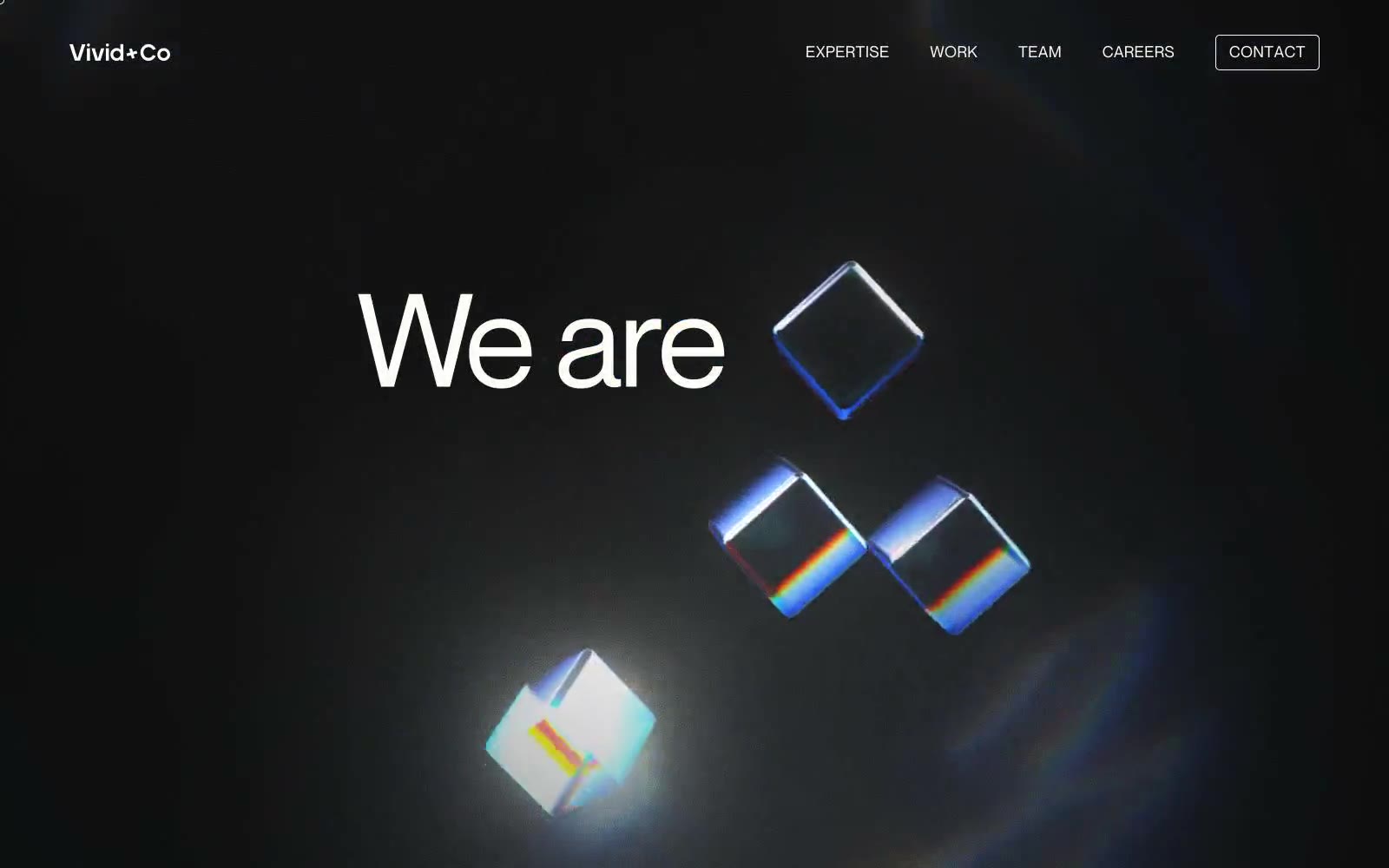
Vivid+Co
Vivid+Co — Style Reference

# Vivid+Co — Style Reference
> darkroom editorial spread
**Theme:** dark
Vivid+Co operates as a dark-canvas editorial stage where the entire interface is a single moody slate field and typography is the only subject. Massive Neue Montreal headlines at 105–136px sit directly on the dark background with no card containers, no grid scaffolding, and almost no color — the page reads like a typography magazine spread. The lone chromatic accent is a muted blue-gray (#6f879c) that appears only as hairline borders, ghost button outlines, and subtle icon strokes; warmth comes from an off-white #fffdf9 rather than from any hue. 3D glass-prism motifs float behind the text, adding depth and refraction light-play without introducing surface clutter. Components are intentionally absent in the traditional sense — sections are full-bleed type compositions, nav is a floating minimal bar, and the lone interactive shape is the rectangular outlined button. The system rewards restraint: a new page should feel like it was set on a darkroom table, not built in a component library.
## Tokens — Colors
| Name | Value | Token | Role |
|------|-------|-------|------|
| Bone White | `#fffdf9` | `--color-bone-white` | Primary text, headlines, nav links, all foreground typography. The warm off-white (not pure white) is the single most-used color in the system and gives the dark canvas a paper-print feel rather than a screen-glow feel |
| Slate Veil | `#495764` | `--color-slate-veil` | Dominant page background and the base canvas. This desaturated dark blue-slate is the entire stage — every section sits on it directly with no card or panel treatment |
| Carbon | `#101010` | `--color-carbon` | Deeper accent within dark passages, occasional icon fills, and decorative surface variation. A step darker than Slate Veil for moments that need recess rather than flat canvas |
| Obsidian | `#000000` | `--color-obsidian` | Pure black used sparingly for 3D-rendered glass prism fills and icon glyphs. Anchors decorative elements against the Slate Veil canvas |
Websites
Markdown Text
design-md
website-prompt
landing-page-prompt
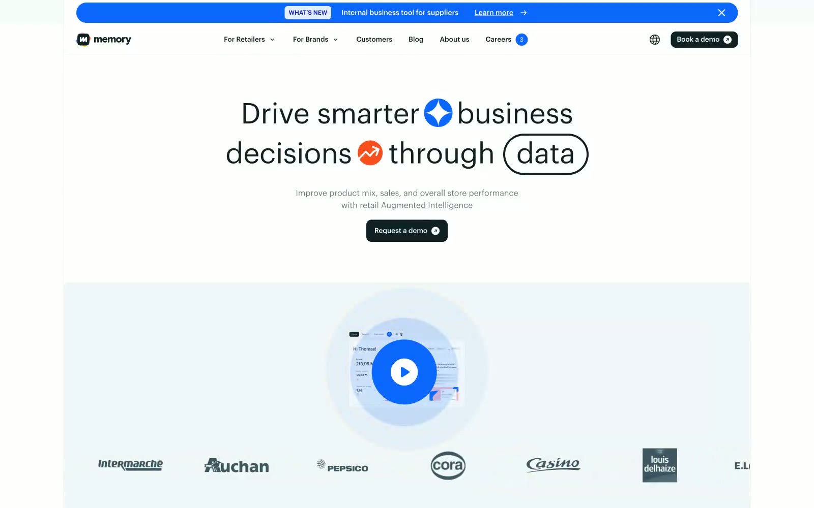
Inthememory
Inthememory — Style Reference
# Inthememory — Style Reference
> Architectural blueprint on white marble with a single warm spark. A quiet, editorial data room where deep teal ink and pill-shaped controls float over chalk-white surfaces, broken only by a single orange flare.
**Theme:** light
Inthememory presents a crisp editorial-meets-product surface: white canvas, deep ink-teal typography, and restrained warm-orange punctuation for moments of energy. Cards ride a light airy gray (#f1f7f9) with hairline borders, while pill-shaped controls (100px radius) and isometric line illustrations give the system a tactile, almost stationery-like warmth. Color is functional and rare — the electric blue (#0c67ff) is reserved for announcement bars and focus states, the orange (#fa4e1d) for hero iconography and occasional card backgrounds, and the entire chrome stays monochrome to let data and copy lead. Typography is custom Graphik at two weights only, creating a disciplined two-voice system where weight 500 earns emphasis and weight 400 carries everything else.
## Tokens — Colors
| Name | Value | Token | Role |
|------|-------|-------|------|
| Ink Teal | `#102126` | `--color-ink-teal` | Primary text, borders, filled buttons, iconography — the structural backbone of the system. Its near-black teal reads as authoritative without the harshness of pure black |
| Slate Veil | `#3d5761` | `--color-slate-veil` | Secondary text, subtle borders — bridges body copy and muted UI chrome without competing with the primary ink |
| Fog Gray | `#677b82` | `--color-fog-gray` | Tertiary text, disabled states, low-emphasis labels — the quietest neutral that still maintains readability against white |
| Chalk White | `#ffffff` | `--color-chalk-white` | Page canvas, card surfaces, button text on dark fills — the dominant surface that lets the dark ink and accent colors carry the visual weight |
Websites
Markdown Text
design-md
website-prompt
landing-page-prompt
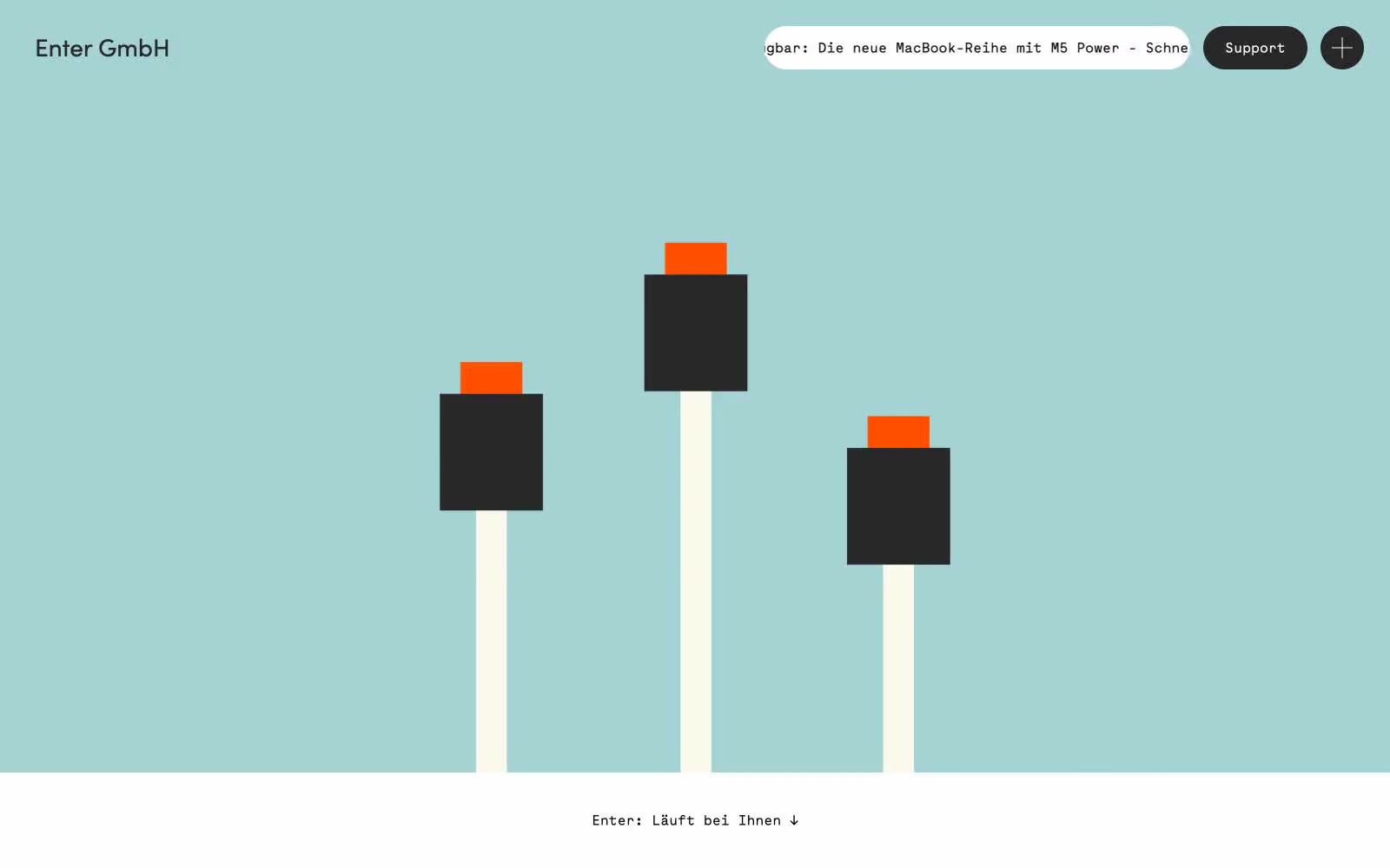
Enter GmbH
Enter GmbH — Style Reference
# Enter GmbH — Style Reference
> Bauhaus poster workshop, midday sun
**Theme:** mixed
Enter GmbH reads like a Bauhaus-influenced IT services brochure printed on warm stock: bold full-bleed color panels (seafoam, cream, signal orange) stack like poster sheets, and a monospaced face (Maax Mono) carries nearly every word, giving the whole site the cadence of a technical readout rather than a marketing page. The visual rhythm is theatrical — each horizontal band changes color and mood, with no soft transitions, just hard seams between cream, teal, white, and orange. A single abstract geometric illustration of stacked blocks on poles lives in the hero, and every interactive control is a dark pill on a colored ground. Neutrality is the default (black on white for text, #282828 for filled buttons), with orange and teal used as architectural surfaces rather than accents — they ARE the layout, not decoration on it.
## Tokens — Colors
| Name | Value | Token | Role |
|------|-------|-------|------|
| Signal Orange | `#ff5000` | `--color-signal-orange` | Full-bleed section surfaces, geometric illustration caps, partner section canvas — carries warmth and authority across an otherwise achromatic text system |
| Seafoam Panel | `#a5d3d4` | `--color-seafoam-panel` | Hero canvas and alternating section ground — a cool counterweight to the warm orange, used as full-bleed background, never as a text highlight |
| Cream Stock | `#f9f8ea` | `--color-cream-stock` | Soft band surfaces between content sections — a paper-like off-white warmer than pure #ffffff, signals a transition zone |
| Charcoal | `#282828` | `--color-charcoal` | Filled button background, dark illustration blocks, heading accents — the loaded weight of the palette, softer than pure black |
Websites
Markdown Text
design-md
website-prompt
landing-page-prompt
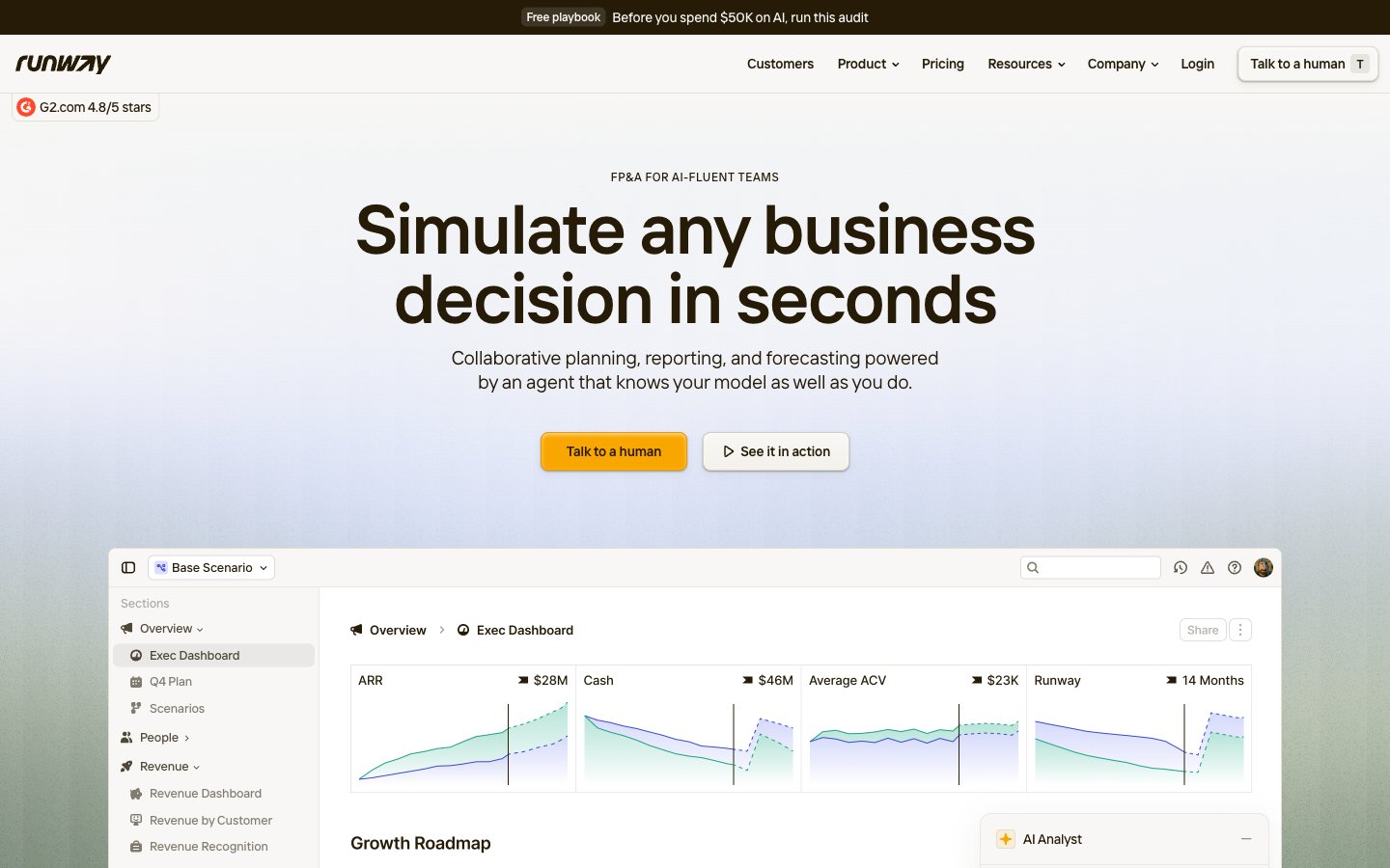
Runway
Runway — Style Reference
# Runway — Style Reference
> Kraft paper ledger under amber desk lamp. Every screen should feel like opening a well-organized financial notebook: cream paper, espresso ink, one warm highlight color, no cold digital surfaces.
**Theme:** light
Runway renders a warm, paper-like financial workspace: a cream canvas (#f8f7f5) holds white card surfaces, linen-warm dividers (#e3dfd5), and deep espresso text (#261b07) that feels printed rather than rendered. A single amber accent (#f9a600) is the only chromatic signal in the interface — it marks the primary action and never decorates, giving CTAs the weight of a highlighter on a ledger page. Typography is tight and slightly humanist via the custom Interphases Pro Variable font with non-standard weights (492, 584), producing a confident density that reads like a well-set business document. Shadows are warm-tinted browns, not cool grays, so even elevation feels like layers of kraft paper rather than floating panels. The whole system communicates analytical warmth — serious about numbers, soft on the eyes.
## Tokens — Colors
| Name | Value | Token | Role |
|------|-------|-------|------|
| Cream Canvas | `#f8f7f5` | `--color-cream-canvas` | Page background, hero wash, elevated card shadows — the warm paper that grounds every screen |
| Pure Paper | `#ffffff` | `--color-pure-paper` | Card surfaces, product screenshot backgrounds, button fills for ghost variants — the clean layer on top of cream |
| Linen Border | `#e3dfd5` | `--color-linen-border` | Primary divider color, card borders, section separators — warm gray that separates without cutting |
| Stone Mist | `#d5d2cd` | `--color-stone-mist` | Subtle button borders, secondary dividers — a step lighter than Linen for nested separation |
Websites
Markdown Text
design-md
website-prompt
landing-page-prompt
Discover
Discover — Style Reference
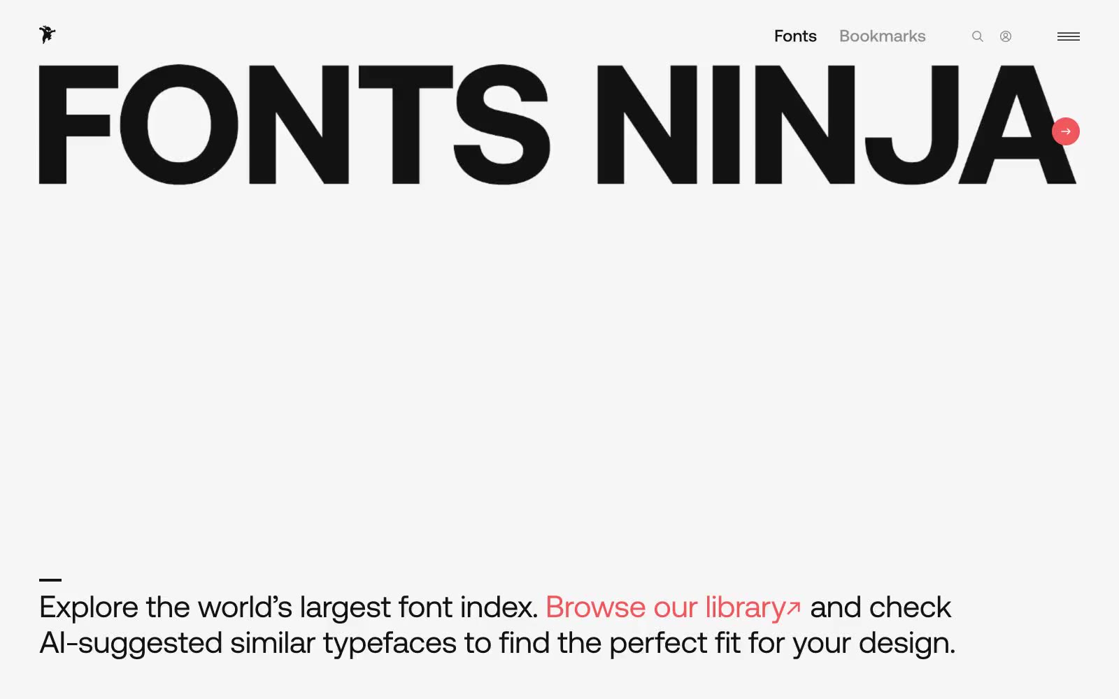
# Discover — Style Reference
> Type museum on white marble — a near-black wordmark, a whisper of coral, and everything else recedes.
**Theme:** light
Fonts Ninja is a near-monochrome gallery for letterforms, where the only chromatic note is a single warm coral that punctuates action. The canvas is near-white and stays quiet; type is the protagonist, presented at extreme scale and paired with generous negative space. Cards are soft-cornered white panels floating on a barely-there shadow, and every interactive element earns its color — most UI is ink-on-paper, and the coral appears only when something wants to be clicked. Density is compact but the layout breathes because margins are large and rhythm is measured in 10px and 24px increments rather than tight 4-8px stacks.
## Tokens — Colors
| Name | Value | Token | Role |
|------|-------|-------|------|
| Ink | `#121212` | `--color-ink` | Primary text, card borders, icon strokes, hairline dividers. A warm near-black chosen over #000 to soften contrast against white without losing authority |
| Canvas | `#ffffff` | `--color-canvas` | Hairline borders, dividers, input outlines, and card edges on light surfaces. Do not promote it to the primary CTA color |
| Fog | `#dbdada` | `--color-fog` | Ambient shadow tint, muted background washes, subtle surface elevation. Carries the 0.16-alpha shadow that lifts cards off the canvas |
| Slate | `#8e8e93` | `--color-slate` | Secondary body text, de-emphasized metadata, inactive nav borders, helper copy |
Websites
Markdown Text
design-md
website-prompt
landing-page-prompt
Pentagram
Pentagram — Style Reference
# Pentagram — Style Reference
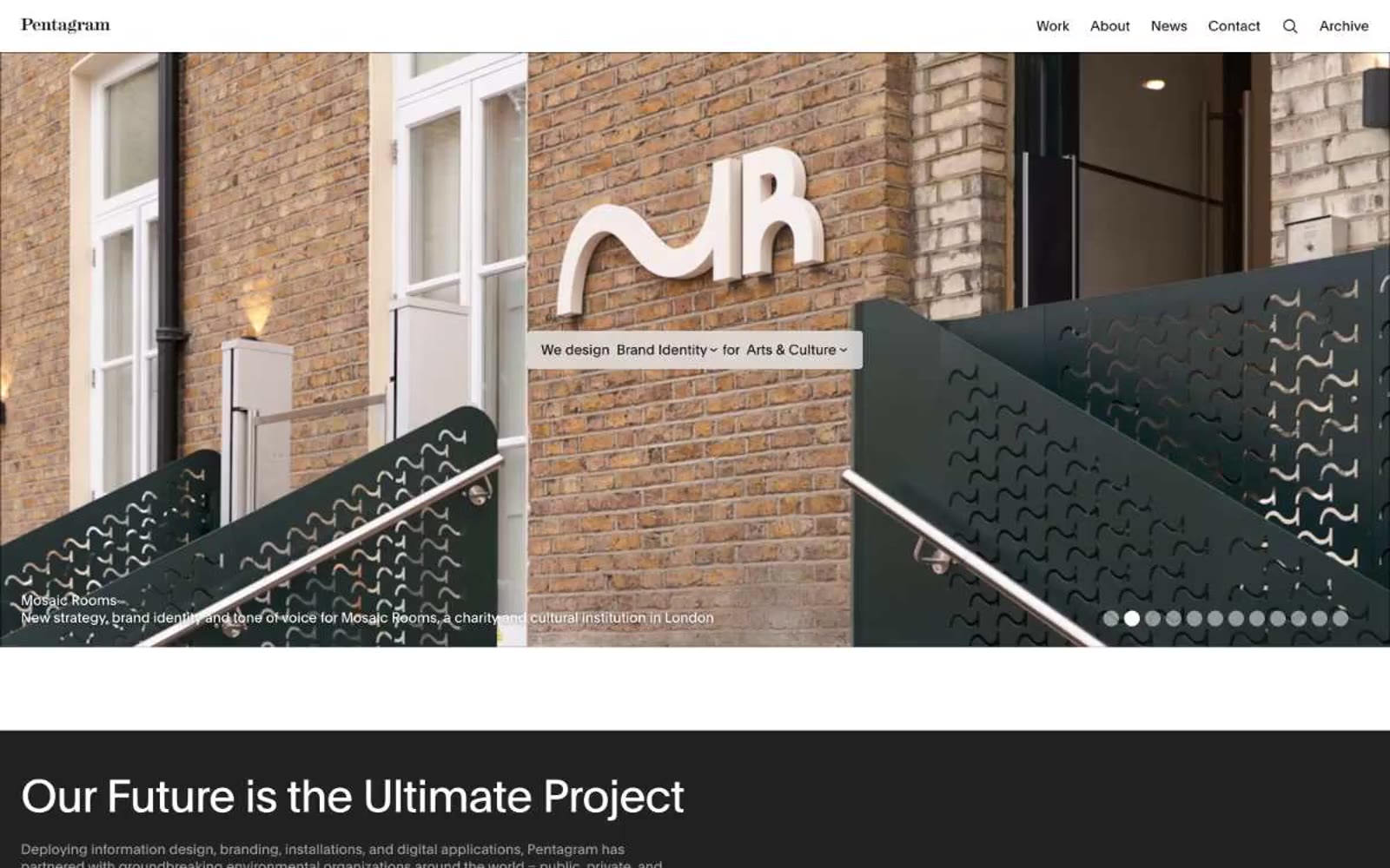
> Gallery wall of compressed restraint
**Theme:** light
Pentagram's interface behaves like a curated gallery catalog: pure achromatic canvas where the only color that appears is the work itself. Every structural decision is typographic — no icons, no badges, no filled buttons, no decorative chrome. The site alternates between white and near-black bands with massive compressed type, then presents projects as oversized solid blocks that read as color swatches before resolving into actual work. Navigation is a single row of text links. Cards are borderless or hairline-bordered. The system earns its authority through restraint: the same tight tracking and modest weights across every role, so a 52px display heading feels as composed as 13px caption text.
## Tokens — Colors
| Name | Value | Token | Role |
|------|-------|-------|------|
| Paper White | `#ffffff` | `--color-paper-white` | Page canvas, card surfaces, text on dark bands |
| Ink | `#1a1a1a` | `--color-ink` | Primary body text, heading text, hairline borders, link color — the near-black that carries 90% of all strokes |
| True Black | `#000000` | `--color-true-black` | Solid surface fills for dark bands, inverted text backgrounds, inverted footer |
| Graphite | `#222222` | `--color-graphite` | Elevated dark surface, input field fills on dark contexts |
Websites
Markdown Text
design-md
website-prompt
landing-page-prompt
Square
Square — Style Reference
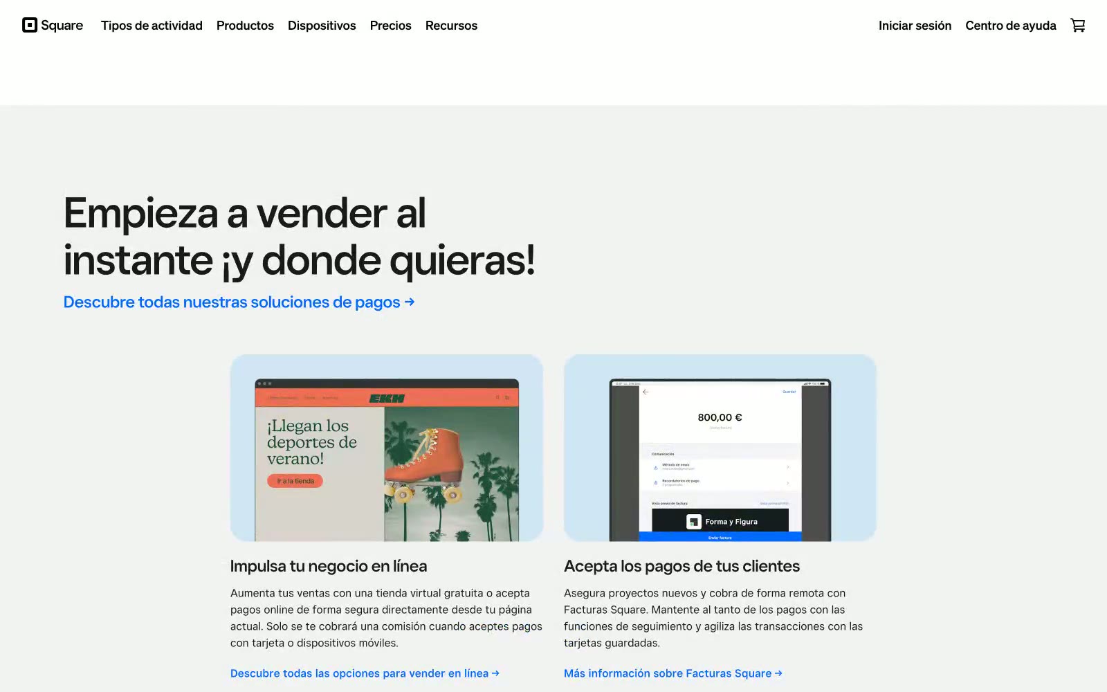
# Square — Style Reference
> blue signal on white steel.
**Theme:** mixed
Square's design system is a confident, white-canvas fintech language that lets one vivid blue do all the talking. The interface stays nearly monochrome: white surfaces, a soft gray page background, near-black text, and a single Signal Blue (#006aff) that punctuates CTAs, links, and the subscription form. Headlines lean on a geometric custom display face at near-display sizes (50–86px) with tight line-heights and negative tracking, creating a weight-of-restraint authority rather than shouting. Components are flat and minimal — a 4px-cornered filled button, a ghost variant, light-blue tinted feature cards with 24px image radii, and a single hard-edged dark footer band that flips the palette to black with white type and the same blue for the send button. Elevation is essentially absent: a 1px 16% black shadow on buttons is the only depth the system allows.
## Tokens — Colors
| Name | Value | Token | Role |
|------|-------|-------|------|
| Signal Blue | `#006aff` | `--color-signal-blue` | Primary CTAs, link text, active nav, submit buttons, icon accents — the sole chromatic voice in an otherwise achromatic system |
| Carbon | `#1a1a1a` | `--color-carbon` | Primary text, heading fills, dark icon strokes, nav labels — near-black that reads softer than pure black on white |
| Slate Gray | `#737373` | `--color-slate-gray` | Secondary text, helper copy, muted nav, input placeholder tone |
| Platinum | `#d9d9d9` | `--color-platinum` | Hairline borders, input outlines, subtle dividers between sections |
Websites
Markdown Text
design-md
website-prompt
landing-page-prompt
Trigger.dev
Trigger.dev — Style Reference
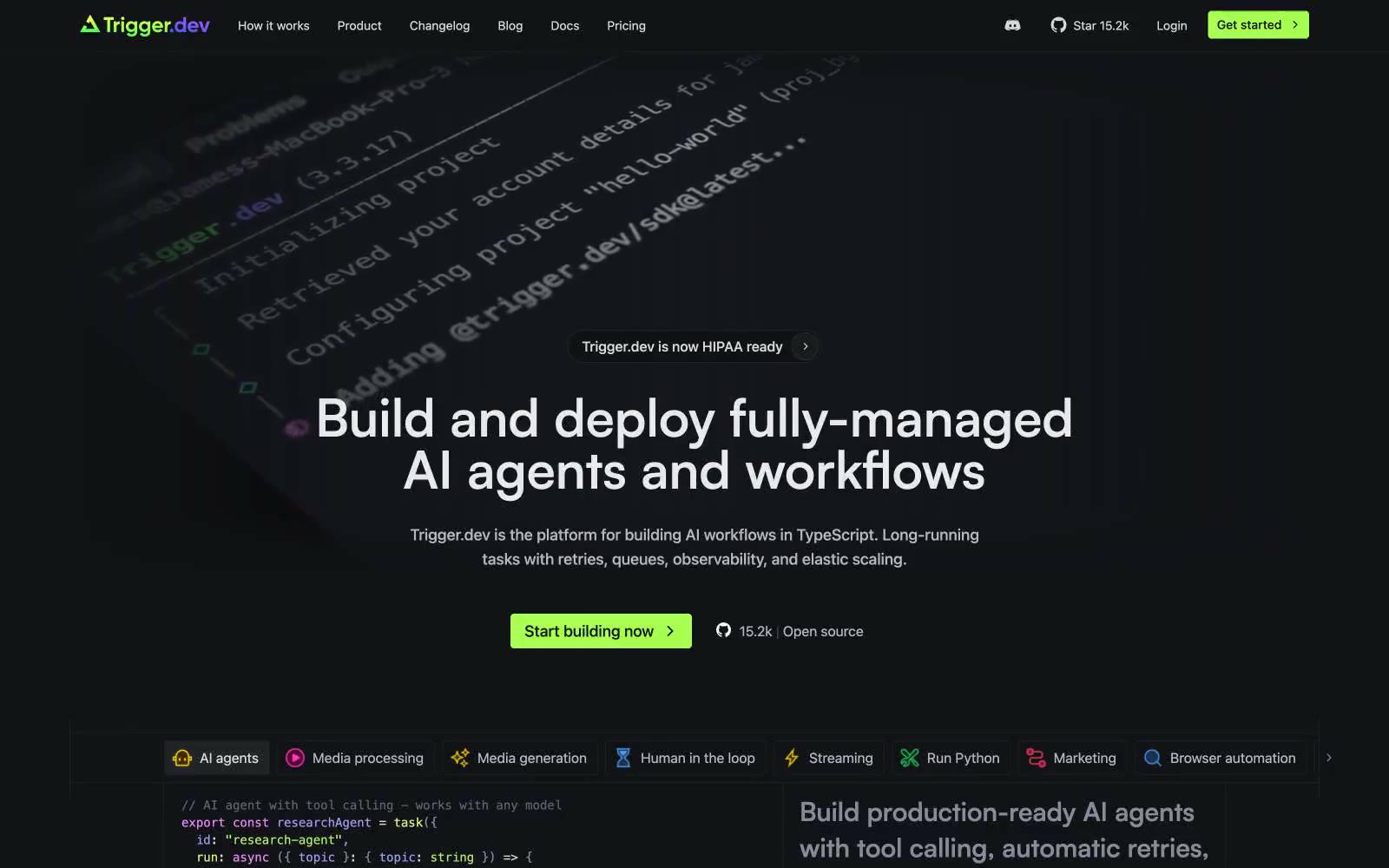
# Trigger.dev — Style Reference
> Charging terminal on slate. The interface is a dimly lit workstation where one lime LED signals activity against rows of quiet monospaced text and faint violet syntax glow.
**Theme:** dark
Trigger.dev's visual system is a dark-mode developer terminal transplanted into a marketing surface: matte charcoal canvas, Geist's quiet technical voice for body and UI, and Satoshi's geometric precision stretched to display scale with generous tracking. A single electric lime (#a8ff53) carries the brand's signal — it lives in the logo glyph, the primary nav button, and feature pills, giving the whole interface a charging-light quality against the dark. The rest of the chromatic vocabulary is a syntax-highlighting palette (pinks, violets, soft greens) borrowed from code editors, applied to feature icons and inline code so the site visually rhymes with the TypeScript it asks you to write. Surfaces stay flat and low-contrast; depth comes from 1px hairlines and the gradient stack, not from drop shadows.
## Tokens — Colors
| Name | Value | Token | Role |
|------|-------|-------|------|
| Slate Canvas | `#1c1e21` | `--color-slate-canvas` | Primary page background, hero canvas, card surface base — the workspace floor everything sits on |
| Ink Well | `#121317` | `--color-ink-well` | Deepest surface — code block backgrounds, terminal panes, inset containers that need to feel recessed below the canvas |
| Graphite Hairline | `#3b3e45` | `--color-graphite-hairline` | Subtle borders, divider lines, card edges — barely visible separators that let density carry the visual structure |
| Steel Border | `#272a2e` | `--color-steel-border` | Slightly darker hairline for nested containers and secondary borders where Graphite feels too bright |
Websites
Markdown Text
design-md
website-prompt
landing-page-prompt
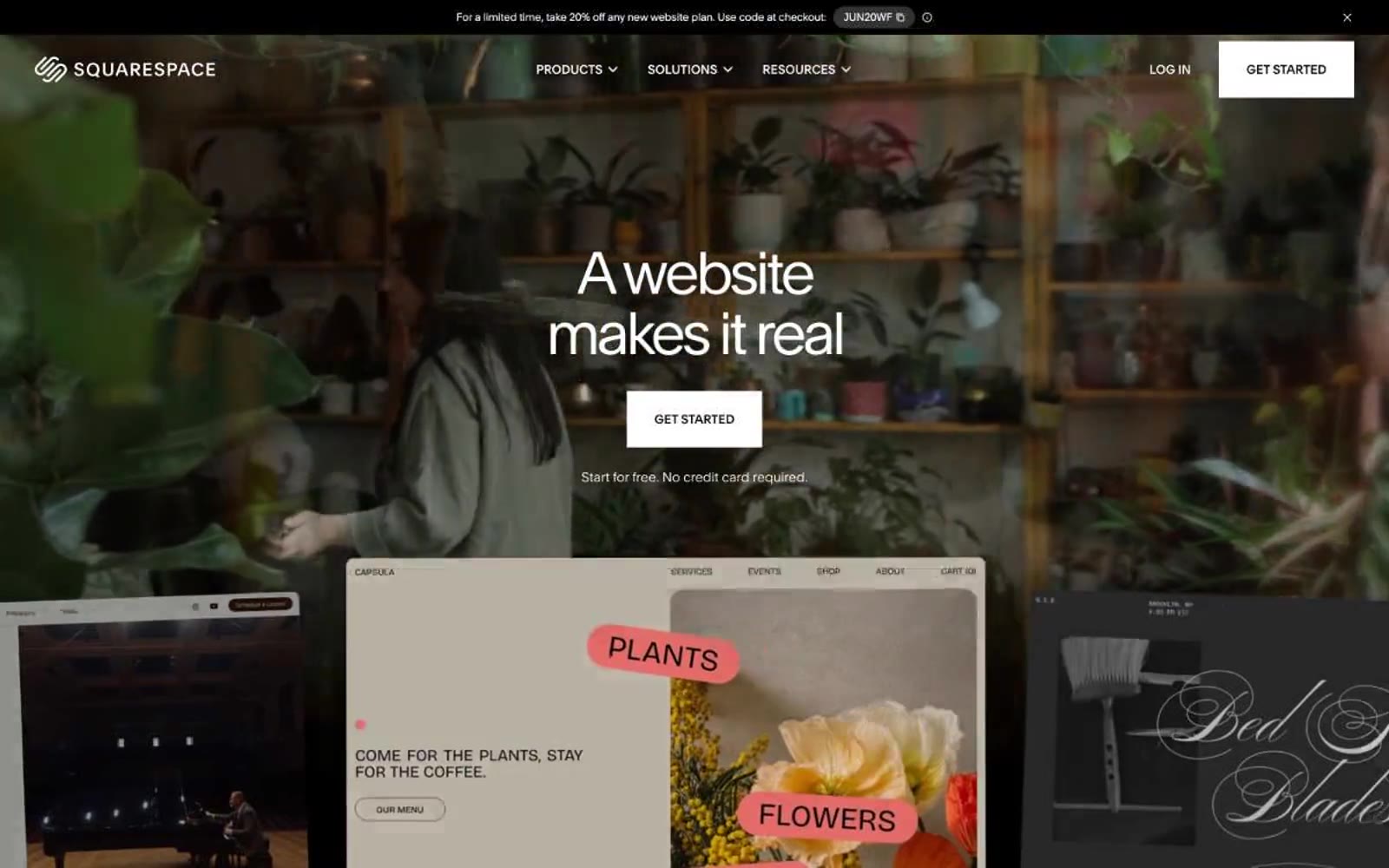
Squarespace
Squarespace — Style Reference
# Squarespace — Style Reference
> Cinematic monochrome gallery
**Theme:** light
Squarespace speaks in absolute black and white — a purely achromatic system where drama comes from scale, contrast, and full-bleed photography rather than color. The visual identity is cinematic: a single massive headline floats over a full-bleed photographic hero, then the page alternates between stark black bands and white expanses, each section announcing itself through scale rather than color. Typography carries the entire brand voice — Clarkson, a custom geometric sans, is used at whisper-light 300 weight for huge 64–72px displays with aggressively tight tracking (-0.06em), creating a serif-like density that feels editorial. Components are intentionally minimal: ghost buttons, pill-shaped filter tabs, dark image cards with arrow indicators. The system is deliberately austere so user content (the websites being built) inherits all the visual energy.
## Tokens — Colors
| Name | Value | Token | Role |
|------|-------|-------|------|
| Obsidian | `#000000` | `--color-obsidian` | Primary text, nav bar, black section bands, dark feature cards, logo mark |
| Paper | `#ffffff` | `--color-paper` | Page background, hero text on dark imagery, light section canvases, button text on filled buttons |
| Charcoal | `#2f2f2f` | `--color-charcoal` | Filled button background, elevated dark surfaces — softer than pure black, reads as premium matte |
| Ash | `#898989` | `--color-ash` | Muted body text, secondary borders, de-emphasized labels on dark backgrounds |
Websites
Markdown Text
design-md
website-prompt
landing-page-prompt
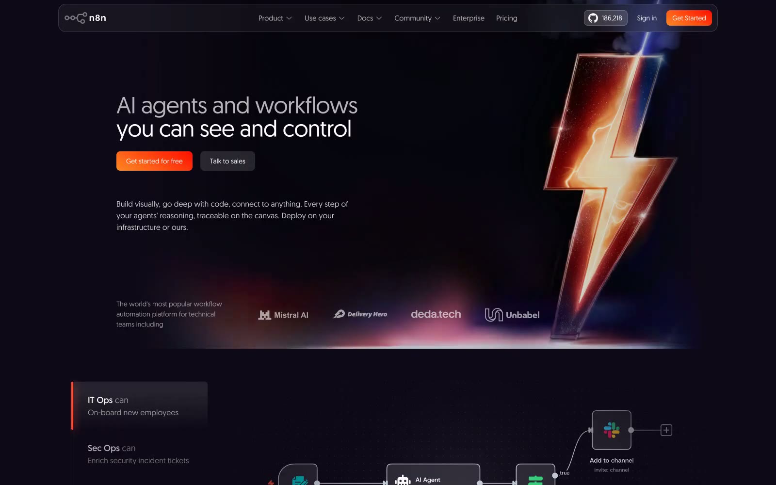
N8n
N8n — Style Reference
# N8n — Style Reference
> Workflow engine at midnight — the feeling of a live automation canvas running in a dark server room, lit by status indicators and data flows.
**Theme:** dark
n8n is a dark workflow canvas that feels like staring into a running machine at night — deep purple-black surfaces lit from within by orange fire and electric blue current. The #0e0918 base is nearly black but carries a violet undertone that makes the darkness feel technological rather than neutral. The signature visual move is the orange-to-red gradient CTA against this void: rgb(253,137,37) → rgb(255,12,0) at 30deg creates an ember glow that reads as kinetic energy. Typography runs entirely in geomanist at weights 300 and 400 — the light weight at 54px headline sizes feels deliberately restrained, letting the lightning bolt hero illustration do the shouting. Cards are not floating objects but embedded panels, using inset white-10% borders and faint orange inset bottom-glows (rgba(255,142,93,0.3)) that suggest backlit hardware.
## Tokens — Colors
| Name | Value | Token | Role |
|------|-------|-------|------|
| Void Base | `#0e0918` | `--color-void-base` | Primary page background and hero section — the near-black violet creates depth without being neutral charcoal |
| Elevated Surface | `#1a1624` | `--color-elevated-surface` | Card backgrounds (rgb(26,22,36)) — one step above void, visible as panels |
| Deep Panel | `#1b1728` | `--color-deep-panel` | Secondary card surface (rgb(27,23,40)) — close to Elevated Surface, used for 24px-radius feature cards |
| Muted Shell | `#2c2834` | `--color-muted-shell` | Ghost button backgrounds — semi-transparent frosted layer over dark surfaces |
Websites
Markdown Text
design-md
website-prompt
landing-page-prompt
mono
mono — Style Reference
# mono — Style Reference
> Swiss editorial grid as gallery wall text — a black-and-white broadsheet where type itself is the only color.
**Theme:** light
Mono operates as a strict editorial-grid system: pure white canvas, a single near-black charcoal (#292929) doing all structural and typographic work, and zero chromatic accents. The visual logic is that of a museum wall label meets a Swiss design manual — type and gridlines carry every signal, never color. Custom display faces (NH at whisper-light 100/300, EV as a razor-thin display weight, S-Works for impact) create sharp typographic contrast that fills the role color normally would. Components are flat to the point of austerity: hairline borders, zero shadows, no rounded corners, no gradients. Layout is rigidly columnar with visible structural lines acting as both composition and ornament. The feel is curated, quiet, and deliberately self-conscious about its own typographic discipline.
## Tokens — Colors
| Name | Value | Token | Role |
|------|-------|-------|------|
| Paper White | `#ffffff` | `--color-paper-white` | Page canvas, card surfaces, image backgrounds — the dominant surface that lets typography and gridlines read as structure |
| Charcoal Ink | `#292929` | `--color-charcoal-ink` | Primary text, heading fills, hairline borders, gridlines, button text — the only working neutral, doing 90% of visual heavy lifting |
| Carbon Black | `#000000` | `--color-carbon-black` | SVG fills, input borders, deepest text emphasis — used sparingly for maximum-contrast accents only |
Websites
Markdown Text
design-md
website-prompt
landing-page-prompt
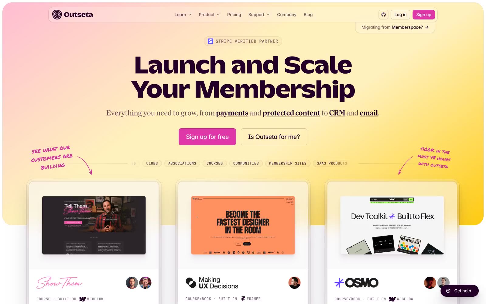
Outseta
Outseta — Style Reference
# Outseta — Style Reference
> Sunset marketplace at golden hour — a warm gradient sky hanging over deep plum night.
**Theme:** light
Outseta uses a warm sunset-marketplace language: a golden-hour gradient hero (pink to cream to yellow) anchors the page, paired with deep eggplant text (#240029) that gives the interface a grounded, premium feel. The brand color story is purple-forward — nearly all borders, body text, and icon strokes carry the #240029 tint rather than neutral black, which makes even functional chrome feel on-brand. The singular hot pink (#df37a7) does the heavy lifting as the sole action color, keeping commerce moments tight and unambiguous. A mono-spaced eyebrow font (JetBrains Mono at wide tracking) introduces every section, and free-form Permanent Marker annotations float over the hero, giving the marketing surface a hand-built, studio-notebook personality. Components are soft-cornered (6-14px), low-shadow, and sit on white with purple-tinted shadows rather than gray.
## Tokens — Colors
| Name | Value | Token | Role |
|------|-------|-------|------|
| Aubergine | `#240029` | `--color-aubergine` | Primary text, icon strokes, hairline borders, and the dark-section fill — the structural ink of the system; every functional border carries this tint rather than neutral gray |
| Fuchsia Signal | `#df37a7` | `--color-fuchsia-signal` | Primary action fill (Sign up CTA, active states) — the only hot chromatic in the system, reserved exclusively for the conversion moment |
| Heather | `#6d526d` | `--color-heather` | Pink accent for outlined action borders, linked labels, and lightweight interactive emphasis. |
| Glowstick | `#ffcc11` | `--color-glowstick` | Hero gradient terminal color and decorative accent — a single warm yellow used only for celebration moments and the sunset gradient |
Websites
Markdown Text
design-md
website-prompt
landing-page-prompt
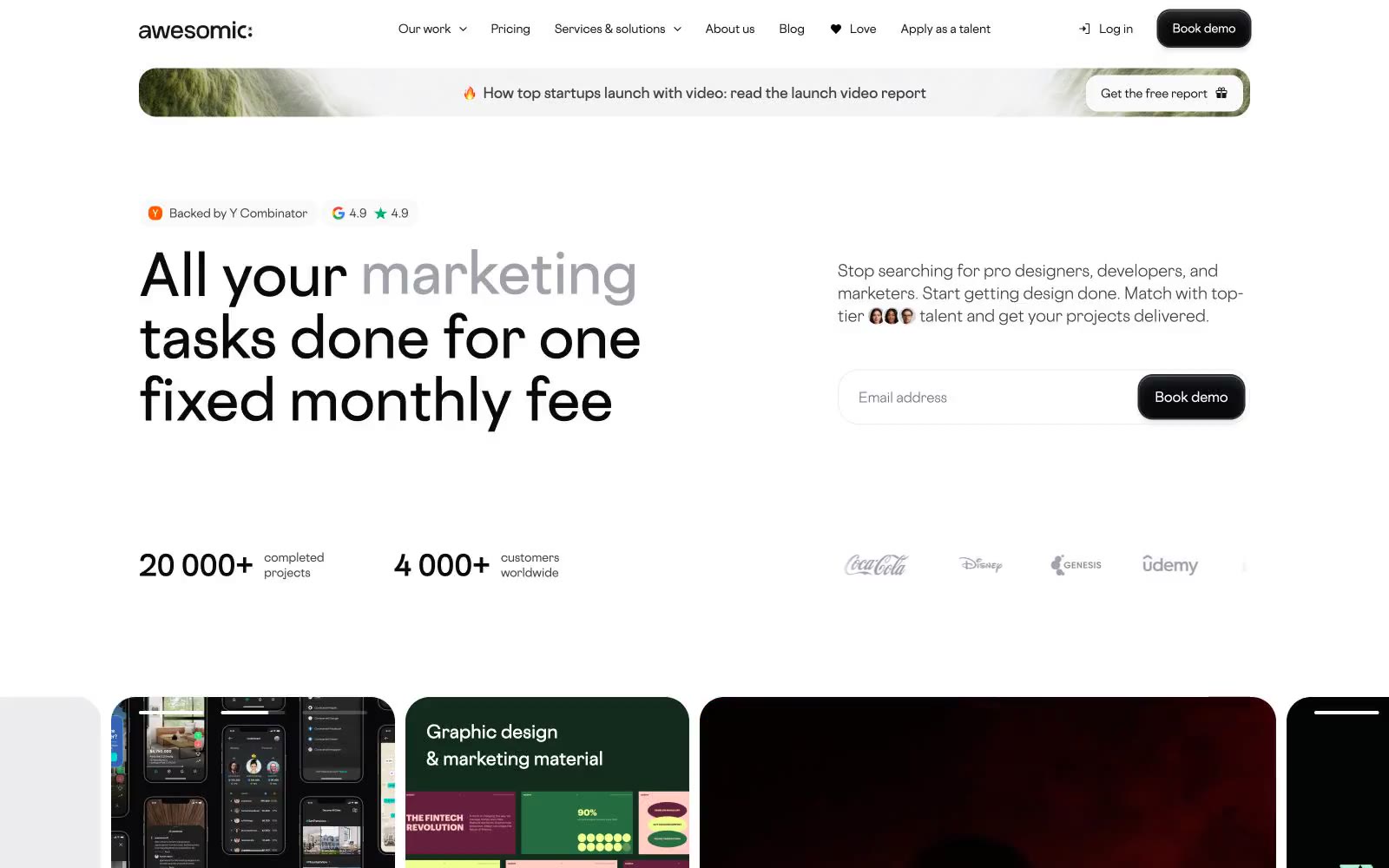
Awesomic
Awesomic — Style Reference
# Awesomic — Style Reference
> Rounded midnight marketplace — a portfolio gallery cut from matte black tiles on a white tablecloth, where large rounded corners and a single custom typeface do all the expressive work.
**Theme:** light
Awesomic operates on a white-and-near-black canvas with maximum roundness — 36px cards and pill-shaped containers dominate every surface, creating a soft, approachable tension against the very dark #09090b fills used for primary actions. The neutral scale is dense and graduated (gray-50 through gray-950), but only 3-4 steps appear in any single view, keeping contrast high without complexity. The single custom typeface, Cosmica, spans the entire system from 10px badge labels to 64px display headlines — its weight range (300–700) does all tonal work that color doesn't. Accent color is almost entirely absent from the UI layer: vivid orange (#ff5a00) surfaces only on YC badge labels, and the vivid pink (#fe45e2) is a single decorative card wash — the system's restraint makes these moments land harder.
## Tokens — Colors
| Name | Value | Token | Role |
|------|-------|-------|------|
| Obsidian | `#09090b` | `--color-obsidian` | Primary filled button backgrounds, display heading text on white surfaces — the system's anchor dark, nearly true black |
| Ink | `#18181b` | `--color-ink` | Body text, nav text, badge text on light surfaces — one shade lighter than Obsidian, used for reading-weight text |
| Graphite | `#3f3f46` | `--color-graphite` | Button borders, badge backgrounds (dark variant), border strokes across components — the dominant UI border tone |
| Slate | `#52525b` | `--color-slate` | Mid-dark card backgrounds in dark sections, subtle icon fills |
Websites
Markdown Text
design-md
website-prompt
landing-page-prompt
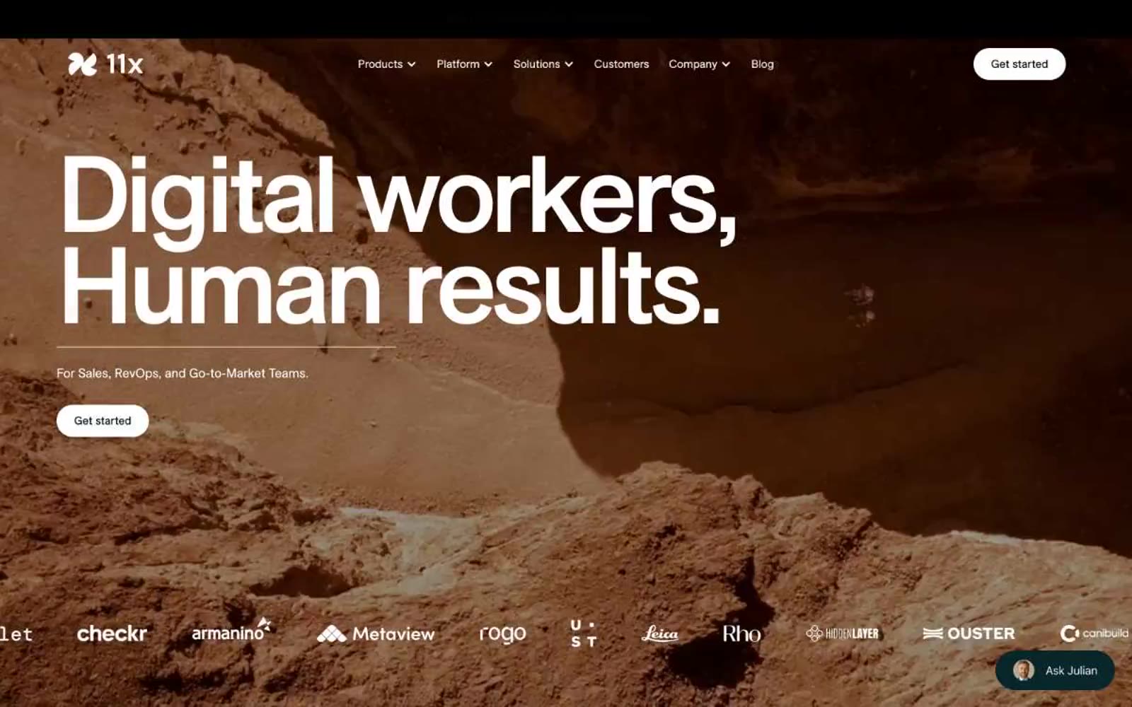
11x– Digital workers
11x– Digital workers — Style Reference
# 11x– Digital workers — Style Reference
> Cinematic editorial desert — full-bleed terrain photography against monumental serif headlines, where the page reads like a luxury magazine spread.
**Theme:** mixed
11x.ai operates as a cinematic editorial platform: dramatic full-bleed landscape photography meets oversized custom serif typography, creating the feel of a luxury magazine spread repurposed for enterprise software. The interface is almost entirely monochrome — black on white surfaces, white on deep teal sections — with color appearing only as muted, sun-bleached pastels on feature cards (dusty blue, mint, lavender, peach). The single recurring accent on dark sections is a muted slate-teal used for feature tag pills. Components are deliberately minimal: pill-shaped buttons with 999px radius, soft-bordered portrait cards, and small status badges — nothing competes with the photography or the serif headlines. The rhythm alternates between white editorial spreads and full-bleed dark narrative bands, giving the entire site the cadence of a print campaign rather than a typical SaaS landing page.
## Tokens — Colors
| Name | Value | Token | Role |
|------|-------|-------|------|
| Obsidian | `#000000` | `--color-obsidian` | Primary action buttons on light surfaces, body text, headlines, card borders — the universal ink of the system |
| Paper White | `#ffffff` | `--color-paper-white` | Page canvas on light sections, card surfaces, text on dark backgrounds, button text on filled buttons |
| Deep Teal | `#0b252a` | `--color-deep-teal` | Dark section backgrounds — the only large chromatic surface, used for narrative bands between editorial spreads |
| Bone | `#f6f5f5` | `--color-bone` | Card surfaces and hairline borders on light sections — the warm off-white that prevents starkness |

Websites
Markdown Text
design-md
website-prompt
landing-page-prompt
Home
Home — Style Reference
# Home — Style Reference
> Botanical specimen on vellum — an oxblood-stamped plate of golden fat, edges sharp, paper warm, nothing rounded.
**Theme:** light
Savor uses a warm editorial-ingredient-archive language: cream-paper canvases, full-bleed macro photographs of fats and oils as the dominant visual, and a single deep oxblood accent that replaces shadows with hairline 1px borders. Typography carries a deliberate weight contrast — Roslindale Display Condensed whispers at weight 300 across 120–140px display lines, while Suisse Intl handles body, nav, and UI chrome at 400/700. Components stay thin and outlined rather than filled: a uniform 5px corner radius across buttons, cards, and badges, generous warm-cream negative space, and a palette of essentially three tones — cream, oxblood, and ink. The site reads less like a product page and more like a botanical plate or a science monograph photographed in late-afternoon light.
## Tokens — Colors
| Name | Value | Token | Role |
|------|-------|-------|------|
| Vellum Cream | `#fff9eb` | `--color-vellum-cream` | Page canvas, card surfaces, text on dark — the dominant warm-paper background that sets the entire temperature of the interface |
| Linen | `#f0e7d7` | `--color-linen` | Secondary surface for elevated cards, button fills, and body borders — slightly warmer and denser than vellum, creates a cream-on-cream layering without leaving the neutral family |
| Buttered Gold | `#f8e47d` | `--color-buttered-gold` | Accent wash for highlights, badge fills, and tonal surface variation — a saturated warm gold used sparingly to suggest the ingredient palette without competing with photography |
| Ink | `#000000` | `--color-ink` | Primary text, logo mark, and high-contrast accents — appears in nav fills and select UI chrome where absolute blackness is needed |
Websites
Markdown Text
design-md
website-prompt
landing-page-prompt
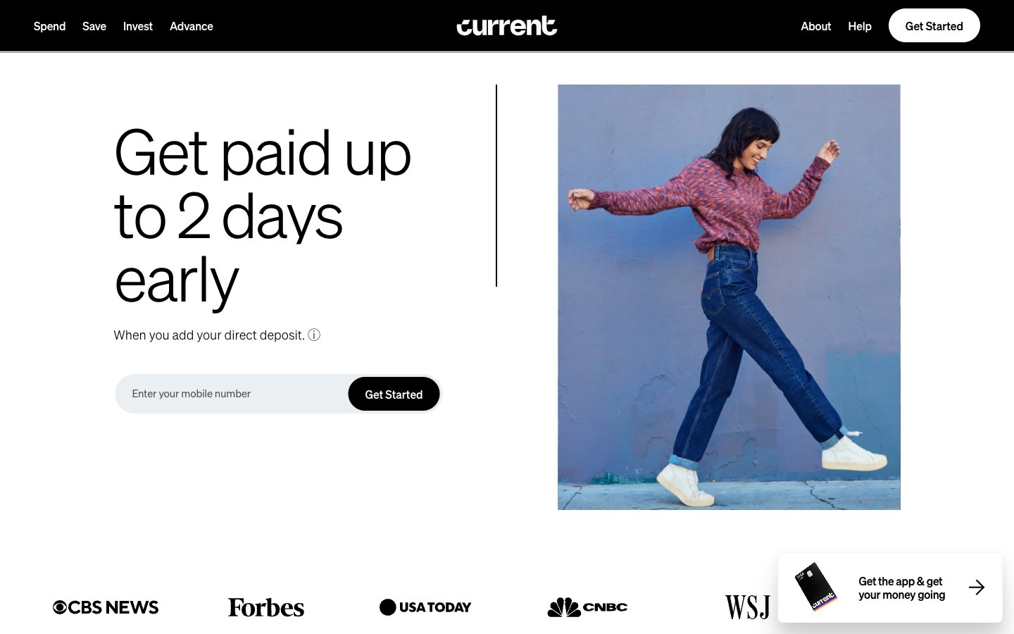
Current
Current — Style Reference
# Current — Style Reference
> Editorial gallery in black and white. A whisper-thin headline floats on white paper beside a saturated photograph — banking as a magazine spread, not a dashboard.
**Theme:** light
Current uses an editorial monochrome language: stark white canvas, pure black navigation, and whisper-thin soehne headlines that command through restraint rather than weight. The UI itself contains zero chromatic color — every screen is built from black, white, and two shades of slate gray, with a single warm-to-cool gradient reserved for brand expression. Photography brings all the color, and it does so in saturated, slightly surreal editorial frames. Components are pill-shaped and ghost-like: black-filled primary buttons sit beside thin-outlined ghost links, and the only meaningful shadow in the system is a soft ambient glow on the floating app CTA. The aesthetic reads more like a fashion magazine spread than a banking app.
## Tokens — Colors
| Name | Value | Token | Role |
|------|-------|-------|------|
| Pure Black | `#000000` | `--color-pure-black` | Navigation bar, filled primary buttons, primary headlines, hairline borders, icon strokes — the structural ink of the entire system |
| Paper White | `#ffffff` | `--color-paper-white` | Page canvas, card surfaces, nav text, button text on dark — the negative space that makes the whisper-thin type readable |
| Slate | `#737582` | `--color-slate` | Body copy, secondary text, link text, thin borders — the only mid-tone in the palette carries all helper and supporting information |
| Iron | `#4e525e` | `--color-iron` | Heavier borders, dividers in dense areas, secondary structural edges |
Websites
Markdown Text
design-md
website-prompt
landing-page-prompt
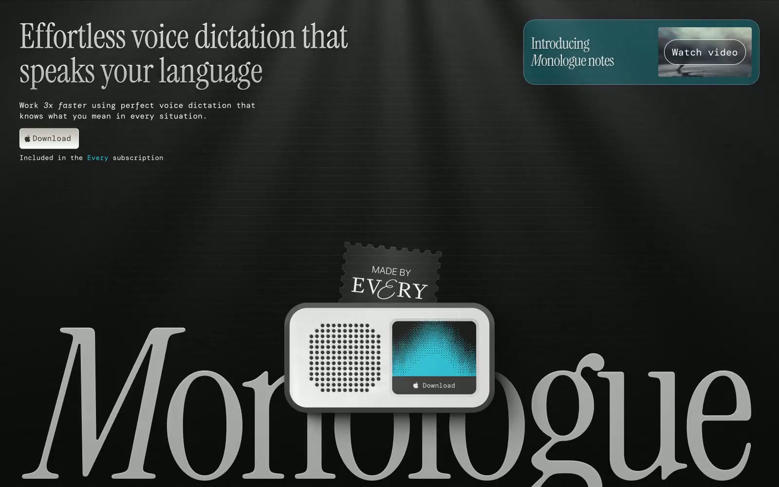
Monologue
Monologue — Style Reference
# Monologue — Style Reference
> Velvet library with a single blue spark. A vast dark room where a single italic serif headline commands attention and one cyan glow signals action.
**Theme:** dark
Monologue operates as a dark editorial canvas draped in near-black with a single electric teal pulse. The visual identity is anchored by Instrument Serif at dramatic scale — italicized headlines ranging from 28px to 400px create a magazine-cover weight, with the brand wordmark blooming across the full viewport as ghostly gray type. DM Mono handles the technical/UI chrome: labels, tags, and structural annotations that read as system metadata rather than copy. Surfaces are matte and paper-thin against the void; a solitary white download button and the teal-gradient product card provide the only points of physical weight. The mood is late-night workstation meets luxury print — confident, quiet, and typographically opinionated.
## Tokens — Colors
| Name | Value | Token | Role |
|------|-------|-------|------|
| Electric Cyan | `#19d0e8` | `--color-electric-cyan` | Accent text, accent borders, the video card surface, the gradient highlight on the product screen — the only chromatic pulse in an otherwise achromatic system |
| Sky Signal | `#44ccff` | `--color-sky-signal` | Secondary cyan for gradient stops and product screen illumination |
| Deep Teal | `#062f34` | `--color-deep-teal` | Card surface base, gradient shadow stop — anchors the teal product card in darkness |
| Void Black | `#000000` | `--color-void-black` | Page canvas, primary background — the uninterrupted dark field |
Websites
Markdown Text
design-md
website-prompt
landing-page-prompt
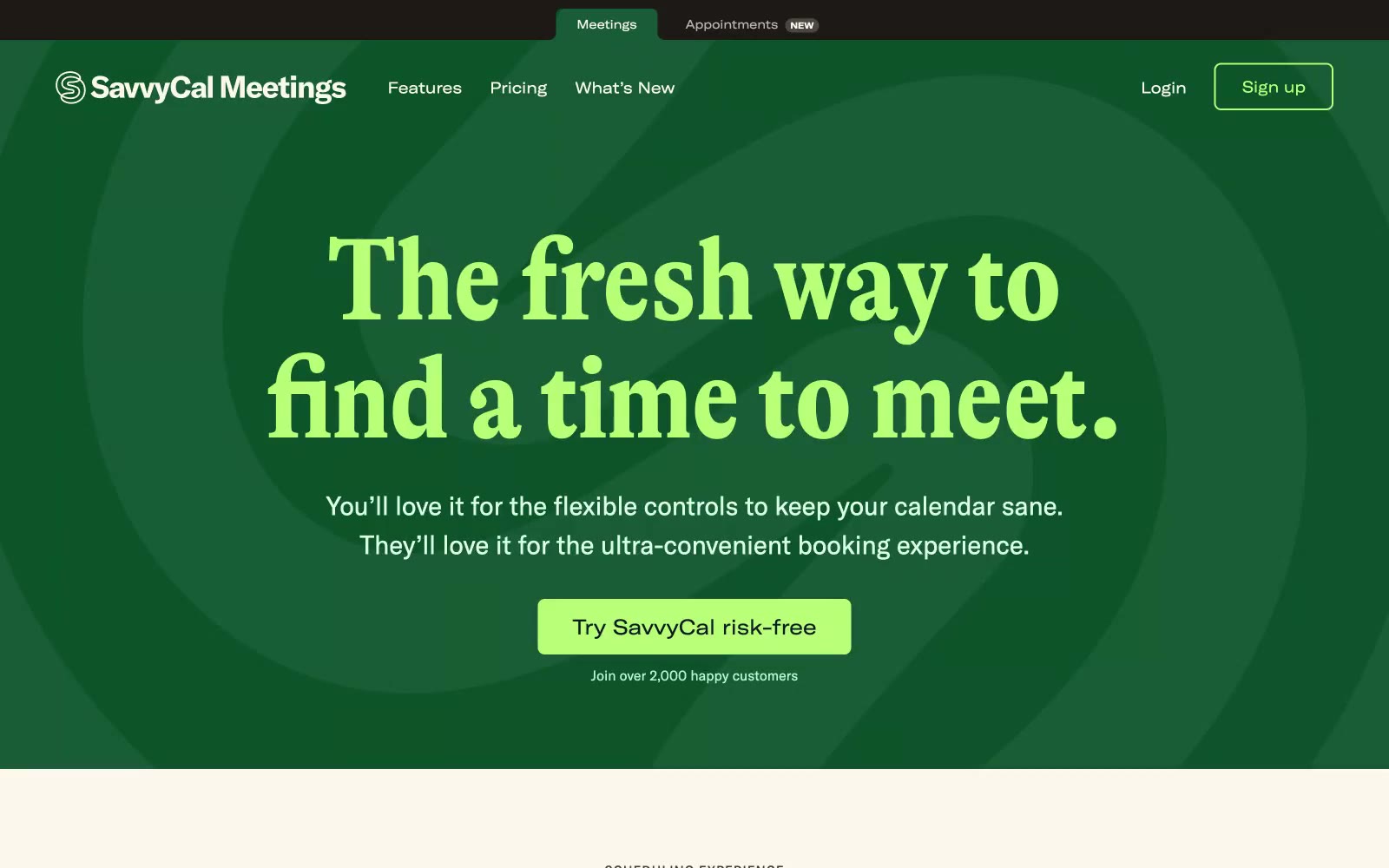
Savvycal
Savvycal — Style Reference
# Savvycal — Style Reference
> forest-green stage with cream paper pages, serif headlines and lime-green punctuation
**Theme:** mixed
SavvyCal runs on a two-zone editorial system: a forest-green hero stage and a warm cream-paper body. The personality is magazine-meets-product: a condensed display serif (GT Alpina) headlines with editorial weight, while a grotesk workhorse (GT America) carries body and UI. A single lime-sprout green punctuates every interactive moment, and a coral red lives only as decorative punctuation — wavy underlines, hand-drawn doodles, thin frame borders. The aesthetic borrows from print: warm neutrals, serif voice, generous whitespace, and handcrafted accents that soften the scheduling-tool utility. Screens should alternate between the dark stage (used sparingly for hero, feature spotlights) and the cream canvas (the default for features, pricing, content), never blending the two in one view. Surfaces stay matte and flat — no glassmorphism, no heavy elevation. Color appears as small functional dots, not washes.
## Tokens — Colors
| Name | Value | Token | Role |
|------|-------|-------|------|
| Forest Stage | `#0d542b` | `--color-forest-stage` | Hero section background, dark feature spotlights — deep green anchors the dramatic first impression |
| Lime Sprout | `#b9ff78` | `--color-lime-sprout` | Green supporting accent for decorative details and low-frequency emphasis |
| Ember Coral | `#f54320` | `--color-ember-coral` | Decorative stroke accent — wavy underlines, hand-drawn doodles, product frame borders, section dividers |
| Coral Whisper | `#ffe3e3` | `--color-coral-whisper` | Soft warm surface wash, hero gradient highlight, gentle background tints behind editorial sections |
Websites
Markdown Text
design-md
website-prompt
landing-page-prompt
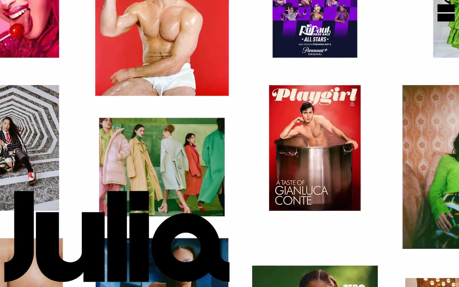
Photographer
Photographer — Style Reference
# Photographer — Style Reference
> Giant black wordmark raining through a white-walled photo gallery — the text IS the architecture.
**Theme:** light
Julia is a visual-first photography portfolio: a white canvas hosting a loose masonry of large editorial frames, interrupted by a massive black wordmark that functions as both identity and graphic device. The interface is deliberately skeletal — no menus, no cards, no buttons — letting high-saturation editorial photography carry the color while the chrome stays black-on-white. Every photographic tile is wrapped in a thin chromatic hairline border drawn from the image's own dominant hue, turning the grid itself into a color study. Type does one thing and does it loudly: an ultra-bold, tightly-tracked wordmark anchors the page and proves the design system is confident enough to let white space do the rest.
## Tokens — Colors
| Name | Value | Token | Role |
|------|-------|-------|------|
| Canvas White | `#ffffff` | `--color-canvas-white` | Page background, negative space between tiles, surface for the wordmark to read against |
| Wordmark Black | `#000000` | `--color-wordmark-black` | The Julia wordmark, all body and nav text, hairline grid borders, and structural lines — the only structural color in the system |
| Vermillion Frame | `#e21715` | `--color-vermillion-frame` | Chromatic hairline borders on photographic tiles whose dominant hue reads red — the most frequent accent border in the grid |
| Cobalt Frame | `#086392` | `--color-cobalt-frame` | Chromatic hairline borders on tiles with blue-dominant photography — paired with Vermillion as the secondary axis of the colored-frame system |
Websites
Markdown Text
design-md
website-prompt
landing-page-prompt
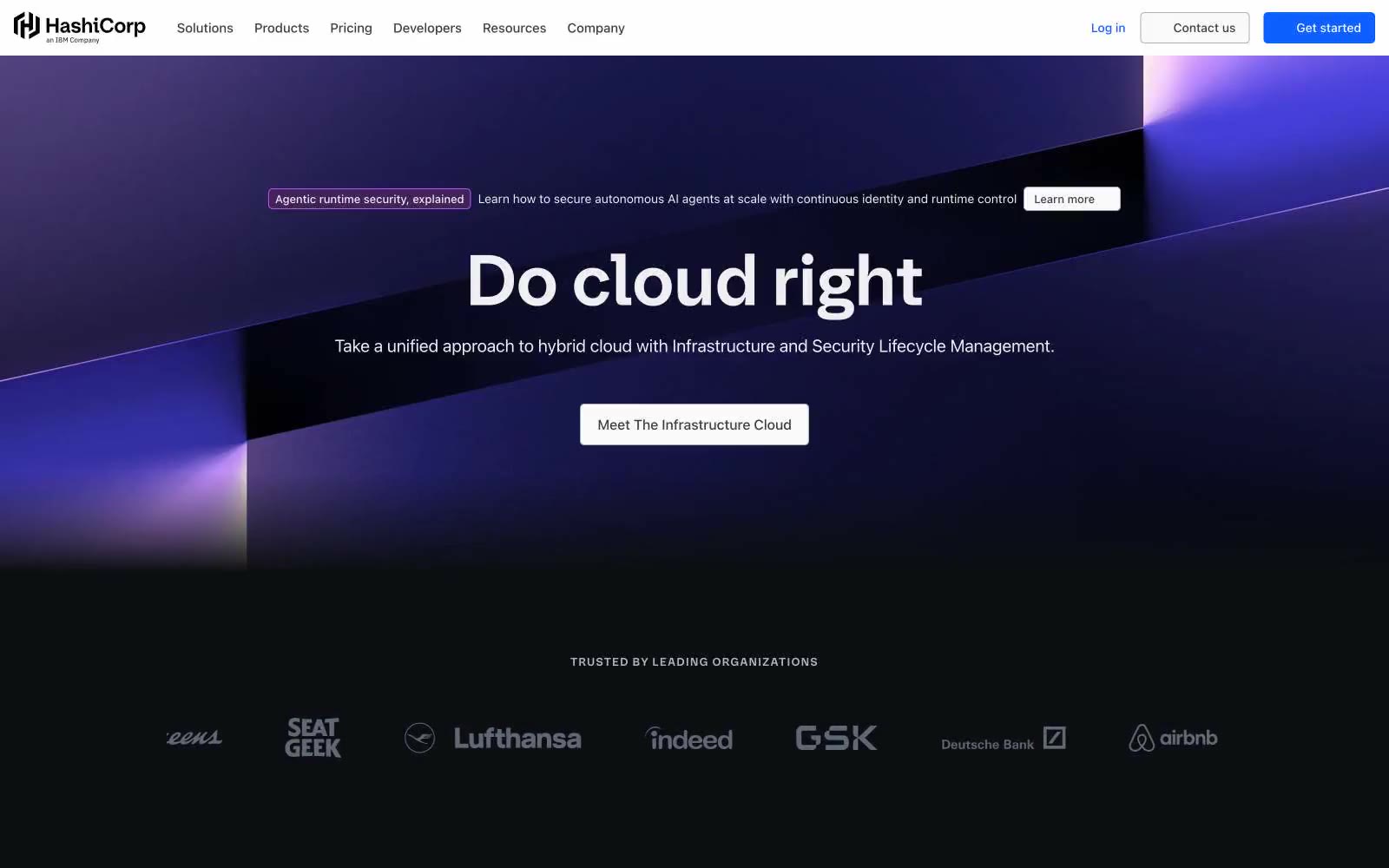
HashiCorp
HashiCorp — Style Reference
# HashiCorp — Style Reference
> midnight control room with violet neon — a dark technical surface where a glowing hexagonal cube serves as the only chromatic anchor
**Theme:** dark
HashiCorp operates a midnight control-room aesthetic: near-black canvases swallow the page, letting a single electric violet-blue brand signal carry every interactive moment. Headlines use a custom geometric sans at heavy weights with tight negative tracking, giving typography a compressed, confident posture rather than airy elegance. The 3D hexagonal cube render — glowing violet and indigo — is the signature visual, appearing wherever the brand needs to feel tangible. Surfaces stay nearly flat with hairline borders and almost imperceptible shadows; the depth comes from gradient washes, not elevation. Body copy is achromatic, generously sized, and unornamented, letting the brand blue do the work of guiding attention through links, active states, and tab indicators.
## Tokens — Colors
| Name | Value | Token | Role |
|------|-------|-------|------|
| Void Canvas | `#000000` | `--color-void-canvas` | Primary page background, hero foundation, footer base — the near-black void that absorbs all other content |
| Onyx Surface | `#0d0e12` | `--color-onyx-surface` | Elevated cards, panels, input fields, secondary surface layer above the void |
| Obsidian Plate | `#15181e` | `--color-obsidian-plate` | Highest elevation tier — modals, popovers, overlay containers |
| Ash Text | `#656a76` | `--color-ash-text` | Muted body copy, helper text, metadata, placeholder content |
Websites
Markdown Text
design-md
website-prompt
landing-page-prompt
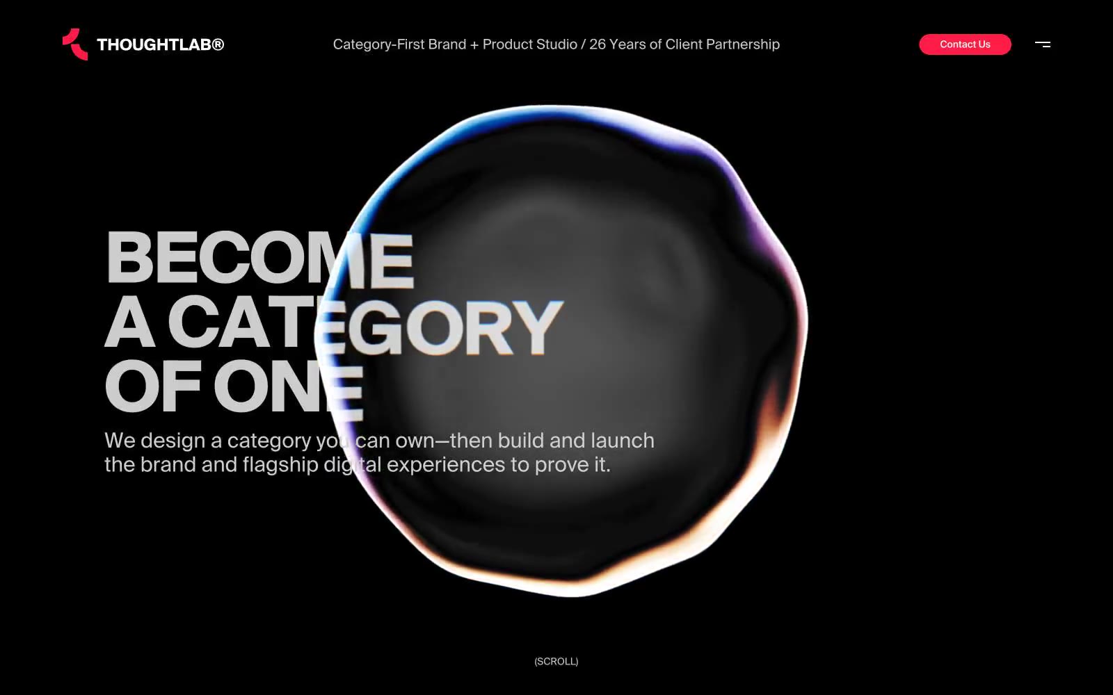
ThoughtLab
ThoughtLab — Style Reference
# ThoughtLab — Style Reference
> crimson flare in obsidian dark
**Theme:** dark
ThoughtLab operates in cinematic darkness where a single vivid red mark cuts through near-black silence. Typography is architectural and oversized — 198px display headlines with extreme negative tracking create editorial drama, while body copy stays compact at 15-17px with generous leading. The interface strips away everything nonessential: pill-shaped CTAs, hairline borders, and vast negative space let the messaging and the one red accent command full attention. The iridescent 3D orb hero is the only ornament in an otherwise weightless void where every other element recedes into shadow.
## Tokens — Colors
| Name | Value | Token | Role |
|------|-------|-------|------|
| Signal Red | `#fc1c46` | `--color-signal-red` | Primary action buttons, active states, brand mark accent — the sole chromatic note in a monochrome void, making every tap feel deliberate |
| Pure White | `#ffffff` | `--color-pure-white` | Display headlines, button text, high-contrast labels — the brightest text tier, reserved for the loudest statements |
| Ash | `#cccccc` | `--color-ash` | Body text, secondary headlines, subtle hairline borders — the workhorse gray that carries most readable content across the dark canvas |
| Graphite | `#4c4c4c` | `--color-graphite` | Muted metadata, inactive controls, tertiary borders — recedes into the background when focus should be elsewhere |
Websites
Markdown Text
design-md
website-prompt
landing-page-prompt
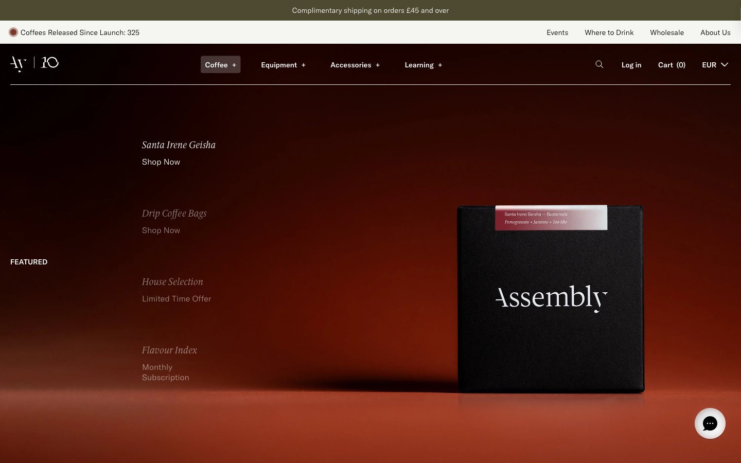
Assembly Coffee London
Assembly Coffee London — Style Reference
# Assembly Coffee London — Style Reference
> Embers in a dark roastery. A near-black canvas with warm, low-lit product photography and italic serif labels — the feeling of a specialty coffee menu printed in a midnight zine.
**Theme:** dark
Assembly Coffee's visual system reads like an editorial magazine printed on black paper. The interface is overwhelmingly dark — near-black canvases carry everything — interrupted only by product photography lit against warm studio backdrops (ember-red, deep amber) and hairline typography in white. Two type families do all the work: a geometric sans (GT America) for UI scaffolding, navigation, and metadata, and a refined serif (ID00 Serif) for product names, section labels, and editorial copy, almost always in italic, which turns a functional nav list into a curated index. The palette is almost monochromatic: the chromatic vocabulary is rationed to badge fills (pale yellow, sage green, antique gold) and the occasional warm-tinted cream surface. Buttons are not loud — price chips and 'Shop Now' links live as small text or pill-shaped cream labels. Components are thin, sharp-cornered, and rely on borders and weight contrast rather than shadows or fills for separation.
## Tokens — Colors
| Name | Value | Token | Role |
|------|-------|-------|------|
| Obsidian | `#0e1311` | `--color-obsidian` | Primary canvas — page backgrounds, hero sections, card surfaces. The near-black with a faint green undertone makes white type glow without feeling sterile |
| Pure Black | `#000000` | `--color-pure-black` | Deepest surface, borders, and type. Used for maximum-contrast outlines, product box photography backgrounds, and the darkest UI strokes |
| Ash Charcoal | `#1a1a1a` | `--color-ash-charcoal` | Secondary surface and border tone — slightly lifted from black for subtle layering on nav, dividers, and outlined button edges |
| Graphite | `#333333` | `--color-graphite` | Mid-neutral for secondary text, input borders, and card outlines where pure black is too heavy |
Websites
Markdown Text
design-md
website-prompt
landing-page-prompt
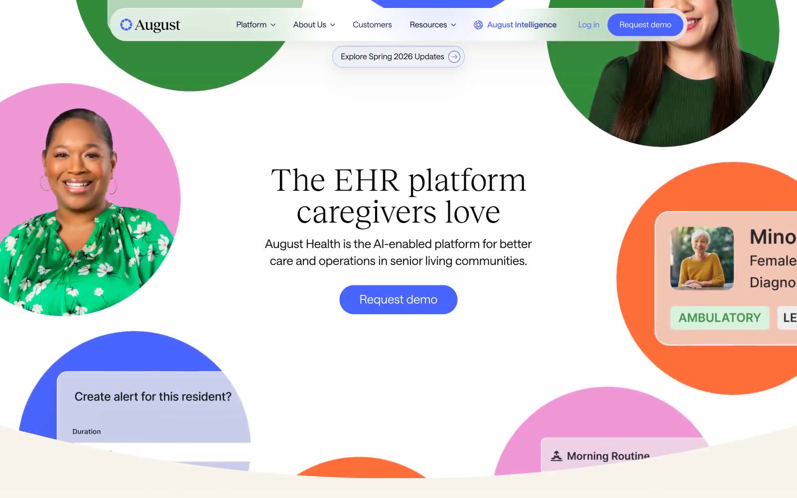
August Health EHR
August Health EHR — Style Reference
# August Health EHR — Style Reference
> Warm cream pharmacy with violet ink — a humanist clinical surface that softens healthcare's typical sterility.
**Theme:** light
August Health uses a warm-clinical visual language: a soft cream canvas (#f8f3eb) replaces the cold white typical of healthcare SaaS, and shadows are tinted with warm brown rgba(75,68,57,0.1) rather than cool gray. The pairing of an editorial serif (Reckless Neue) with a geometric sans (Saans) gives the product an approachable, humanist feel appropriate for senior care, while a vivid indigo (#4865ff) anchors all primary actions. Color appears in concentrated bursts — circular portrait frames, tinted feature cards, and pill buttons — against an otherwise restrained neutral palette, creating rhythm and warmth without overwhelming the interface.
## Tokens — Colors
| Name | Value | Token | Role |
|------|-------|-------|------|
| Primary Indigo | `#4865ff` | `--color-primary-indigo` | Primary action buttons, active nav state, icon accents — the single saturated focal color that makes CTAs unmistakably interactive |
| Deep Ink | `#080331` | `--color-deep-ink` | Headlines, body text, primary borders — near-black violet that pairs warmth with the serif typeface |
| Midnight Violet | `#1b1463` | `--color-midnight-violet` | Navigation borders, secondary surfaces, gradient terminus — darker sibling to Primary Indigo for layered depth |
| Forest | `#328a3b` | `--color-forest` | Green action color for filled buttons, selected navigation states, and focused conversion moments |
Websites
Markdown Text
design-md
website-prompt
landing-page-prompt
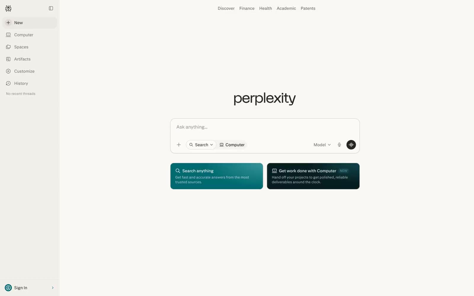
Perplexity AI
Perplexity AI — Style Reference
# Perplexity AI — Style Reference
> Warm paper library at dawn — a single open page surrounded by quiet tools, rendered in charcoal on cream.
**Theme:** light
Perplexity's interface reads like a scholar's notebook rendered in browser — a warm cream canvas (#faf8f5) that avoids sterile white, paired with deep charcoal text (#27251e) that carries a faint brown warmth. The entire system is almost entirely achromatic: no brand color, no accent hues, no gradients. Identity comes from restraint: one custom sans-serif (pplxSans) used at 12–16px, pill-shaped controls at 9999px radius, hairline-thin borders, and the near-absence of elevation. The layout is a fixed two-pane shell — a 260px left navigation rail and a centered main column — that feels closer to a research tool than a consumer product. Every interactive element is monochrome and geometric; the only shape language is pill for buttons/tags and 12–16px corners for surfaces.
## Tokens — Colors
| Name | Value | Token | Role |
|------|-------|-------|------|
| Ink | `#27251e` | `--color-ink` | Primary text, sidebar surface, active nav background, submitted query fills — deep charcoal with brown warmth that grounds the cream canvas |
| Cream | `#faf8f5` | `--color-cream` | Page canvas, sidebar background, input fields, card surfaces — warm off-white that replaces sterile pure white with paper-like softness |
| Pure Black | `#000000` | `--color-pure-black` | Dark supporting neutral for text, icons, and strong contrast. Do not promote it to the primary CTA color |
| Smoke | `#72706b` | `--color-smoke` | Secondary text, inactive nav labels, icon strokes, helper text — warm gray that recedes without disappearing |