AI Prompt Studio - Intelligent Prompt Library
Explore and use professional AI prompts to optimize your workflow.
One-click Use
Websites
Markdown Text
design-md
website-prompt
landing-page-prompt
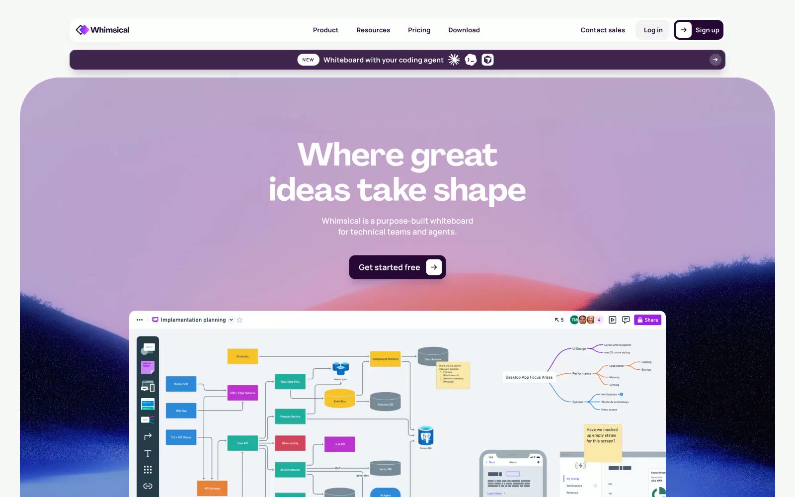
Whimsical
Whimsical — Style Reference

# Whimsical — Style Reference
> Deep plum ink on lavender mist — a creative studio notebook that thinks it's a technical whiteboard.
**Theme:** light
Whimsical operates as a dark-plum-on-cream workspace: a near-black purple (#250835) does the heavy structural work — nav borders, body text, primary buttons — while Agrandir display headlines at 48-96px float above the surface with generous negative tracking. The palette is deliberately narrow: two purples, one warm-gray-purple for muted copy, and vivid violet/blue accents that read as functional punctuation on links and icons rather than decorative noise. Sections break the monochrome discipline with full-bleed gradient washes (blue→violet→pink, purple→pink) that preview the product canvas. Cards live at 8-16px radius with plum-tinted shadows at very low opacity, and the white canvas carries a barely-there lavender undertone (#ebe6ee, #f5f4f5) rather than pure neutral gray — everything sits in the same purple family.
## Tokens — Colors
| Name | Value | Token | Role |
|------|-------|-------|------|
| Deep Plum | `#250835` | `--color-deep-plum` | Primary action fill, nav borders, headline text, card borders — the structural workhorse. High-contrast against white (18:1) lets it function as both color and text simultaneously |
| Dark Mauve | `#473054` | `--color-dark-mauve` | Secondary text and outlined action borders, muted plum that steps back from Deep Plum without leaving the family |
| Vivid Violet | `#ab2fed` | `--color-vivid-violet` | Accent link color, icon stroke — the brightest chromatic in the UI, used sparingly to mark interactive text and product iconography |
| Vivid Blue | `#0283ec` | `--color-vivid-blue` | Secondary accent on icons and flowchart elements — pairs with Vivid Violet to give the product canvas its dual-accent personality |
Websites
Markdown Text
design-md
website-prompt
landing-page-prompt
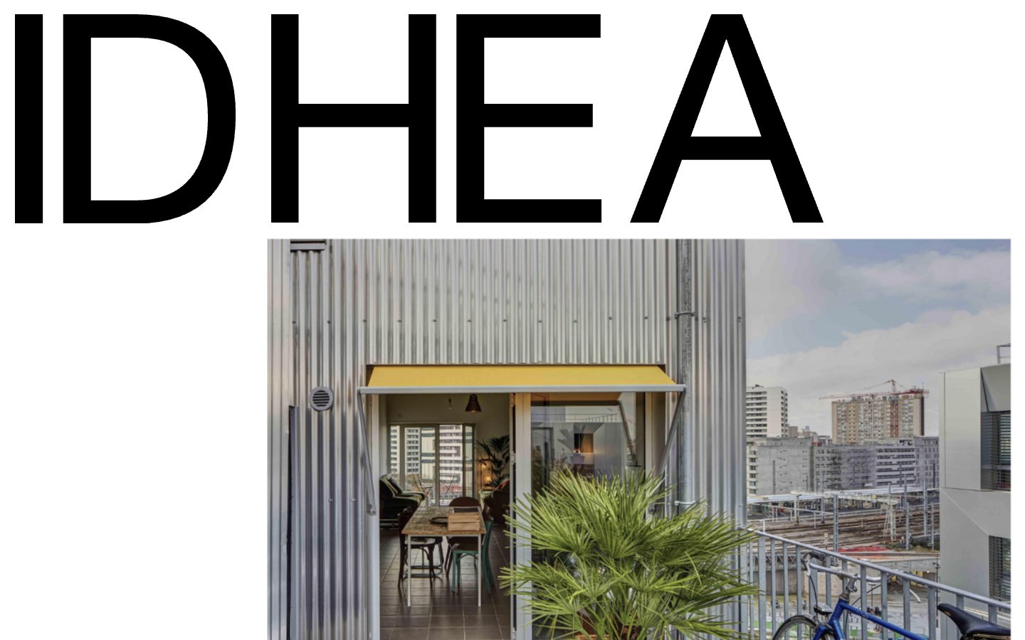
IDHEAL
IDHEAL — Style Reference
# IDHEAL — Style Reference
> Architectural editorial masthead on white marble. Display type that could be 2 meters tall in print, single photography frames, and chromatic accents drawn with a fine-point pen.
**Theme:** light
IDHEAL is an editorial architecture portfolio language: a stark white canvas where massive black sans-serif display type dominates the top of the page like a masthead, paired with full-bleed architectural photography. The visual system is deliberately sparse — surfaces are flat, dividers are hairline, and shadow is used minimally and only as a soft gray halo. Chromatic color appears almost exclusively as thin outline strokes (terracotta, magenta, olive), never as filled buttons or large blocks, creating the effect of colored pencil marks on a white page. The pairing of Helvetica Neue for display and New Century Schoolbook for body gives the site a magazine-spread tension — industrial sans for headlines, literary serif for reading — anchored by compact spacing that keeps everything gallery-tight.
## Tokens — Colors
| Name | Value | Token | Role |
|------|-------|-------|------|
| Pure White | `#ffffff` | `--color-pure-white` | Page canvas, card surfaces, button fills on dark — the entire layout sits on flat white without competing surface tones |
| Carbon Black | `#000000` | `--color-carbon-black` | Primary text, display headlines, nav borders, icon strokes — near-universal ink color, the dominant chromatic presence |
| Hairline Gray | `#e5e5e5` | `--color-hairline-gray` | Borders, dividers, subtle button outlines, muted surface backgrounds — the structural neutral that defines card edges without adding weight |
| Shadow Gray | `#cccccc` | `--color-shadow-gray` | Soft drop-shadow tint and secondary borders — only used in shadow stacks, never as a fill |
Websites
Markdown Text
design-md
website-prompt
landing-page-prompt
Podcorn
Podcorn — Style Reference
# Podcorn — Style Reference
> Indie magazine spread on warm blush paper. A cream canvas carrying deep-indigo editorial typography, hand-drawn illustrations framed in hairline rectangles, and a single coral button as the only warm mark on the page.
**Theme:** light
Podcorn Creator Lab uses a warm editorial-creative language: a peach-cream canvas (#fff4f2) beneath pure white card surfaces, deep indigo (#090335) ink for nearly all typography, and a single coral (#fc736c) accent reserved exclusively for the primary call-to-action. The signature contrast is serif Georgia headings against geometric Gilroy body text — an editorial pairing that says 'crafted content platform' rather than 'SaaS dashboard'. Illustrations are hand-drawn, one-stroke linework with flat coral and navy fills, placed inside thin rectangular frames on the cream canvas. Everything sits generous and airy; borders are hairline-thin, corners are gently rounded but not pill-shaped, and elevation is achieved through whitespace and surface shifts rather than drop shadows.
## Tokens — Colors
| Name | Value | Token | Role |
|------|-------|-------|------|
| Blush Cream | `#fff4f2` | `--color-blush-cream` | Page canvas — warm off-white that sets the editorial tone and makes the deep-indigo text read like printed ink on heavy paper |
| Pure White | `#ffffff` | `--color-pure-white` | Card surfaces, nav background, button fills on light backgrounds — stacked above the cream canvas to create depth without shadow |
| Ink Violet | `#090335` | `--color-ink-violet` | Primary text, headings, filled CTA buttons, nav links, hairline borders — the single dominant color of the entire interface; near-black with a violet undertone gives headings personality without abandoning readability |
| Coral Flame | `#fc736c` | `--color-coral-flame` | Red wash for highlight backgrounds, decorative bands, and soft emphasis behind content. Do not promote it to the primary CTA color |
Websites
Markdown Text
design-md
website-prompt
landing-page-prompt
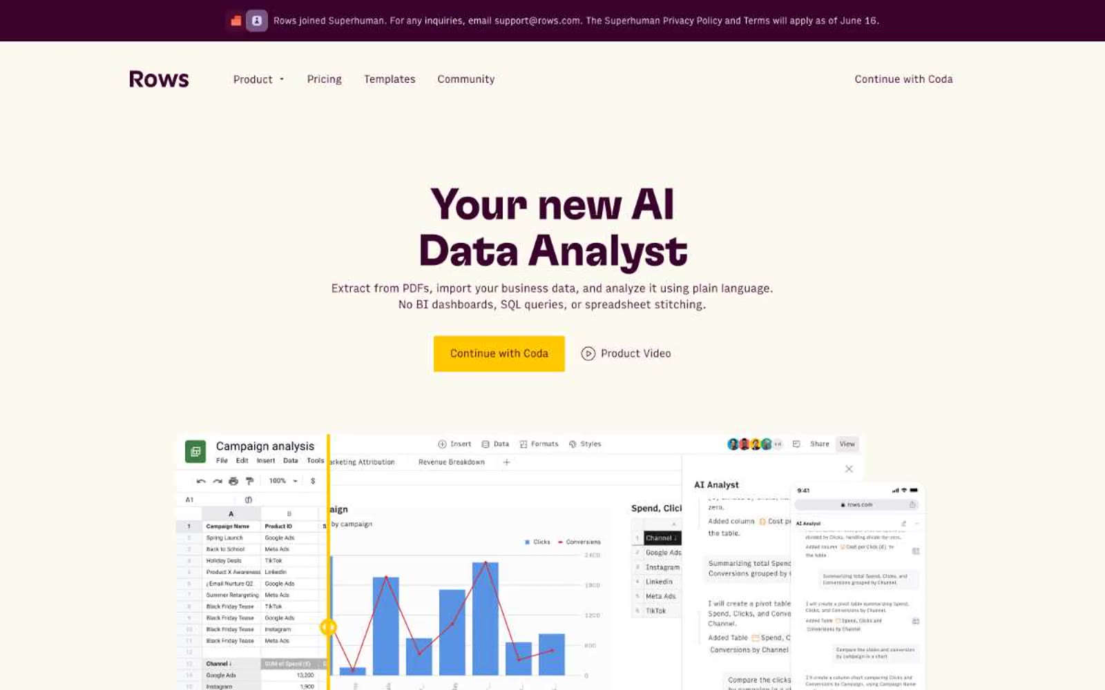
Rows
Rows — Style Reference
# Rows — Style Reference
> blank spreadsheet at dawn — calm, precise, one warm spark on cold white
**Theme:** light
Rows presents a near-monochrome workspace where black type on a vast white canvas does almost all the work, and a single warm marigold accent (used once per screen, never as fill) signals where attention belongs. The interface feels like a spreadsheet that learned to be a product: tabular density, hairline dividers, compact 8px gaps, and typographic restraint rather than chrome to organize information. Components are nearly borderless — the visual structure comes from whitespace, alignment, and the occasional thin 1px rule. Color never decorates; it only points. The single gradient (coral to marigold) exists as a brand mark, not as surface treatment.
## Tokens — Colors
| Name | Value | Token | Role |
|------|-------|-------|------|
| Ink | `#1a1a1a` | `--color-ink` | Supporting neutral for secondary UI, dividers, and muted labels. Do not promote it to the primary CTA color |
| Paper | `#ffffff` | `--color-paper` | Page canvas, card surfaces, button text on dark fills |
| Mist | `#f7f7f7` | `--color-mist` | Subtle surface lift for inset panels, hover states, secondary card backgrounds |
| Ash | `#eaeaea` | `--color-ash` | Hairline borders, dividers, tag outlines, input default border |
Websites
Markdown Text
design-md
website-prompt
landing-page-prompt
Empower
Empower — Style Reference
# Empower — Style Reference
> Chartreuse zine on midnight paper
**Theme:** mixed
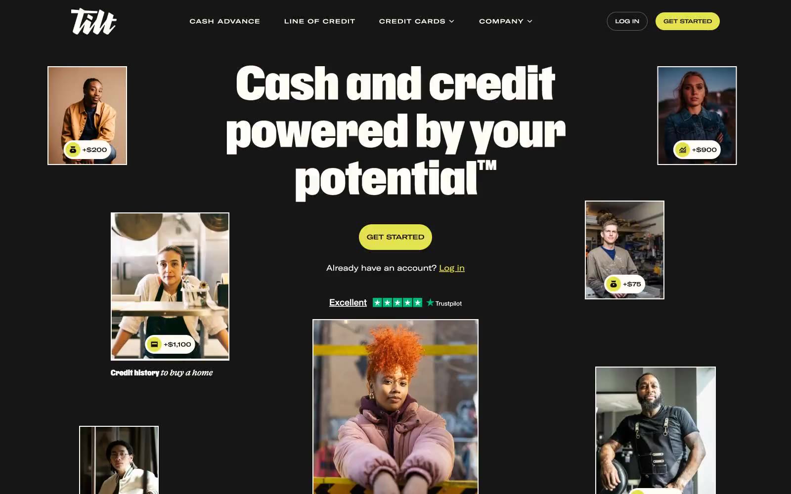
Tilt is a high-contrast financial brand built on three tonal registers: deep matte-black stages for emotional photography, warm cream paper for product education, and a single punchy chartreuse (#e4e24e) that acts as the system's only chromatic voice. The visual hierarchy is extreme — a 205px Gravity display headline commands the dark hero while supporting text settles into an unusually narrow extended sans-serif (GTAmericaExtendedRegular) that gives body copy a condensed, almost editorial feel. Photography is documentary-style real people, shot close, annotated with hand-placed price-tag pills (+$200, +$900) — the product literally hangs from their collars. The system feels like a fintech zine: confident, slightly retro, paper-warm, with yellow used sparingly to make CTAs feel switched on rather than branded.
## Tokens — Colors
| Name | Value | Token | Role |
|------|-------|-------|------|
| Chartreuse Pulse | `#e4e24e` | `--color-chartreuse-pulse` | Primary CTA fill, active states, highlight tags, product accent cards — the only saturated color in the system, used at 100% saturation to make every action feel deliberate |
| Lemon Cream | `#faf9b6` | `--color-lemon-cream` | Soft highlight wash for product feature cards and emphasis panels — a 70%-diluted chartreuse that carries the same hue without competing with CTAs |
| Midnight Ink | `#100f0f` | `--color-midnight-ink` | Primary text, icon strokes, dominant borders, dark hero and footer backgrounds — near-black with a barely-warm tint |
| Obsidian | `#000000` | `--color-obsidian` | Hard borders, focus rings, maximum-contrast text on light surfaces — pure black for structural edges |
Websites
Markdown Text
design-md
website-prompt
landing-page-prompt
Prisma Labs
Prisma Labs — Style Reference
# Prisma Labs — Style Reference
> Sunlit monochrome studio — a white gallery wall where one beam of yellow light hits
**Theme:** light
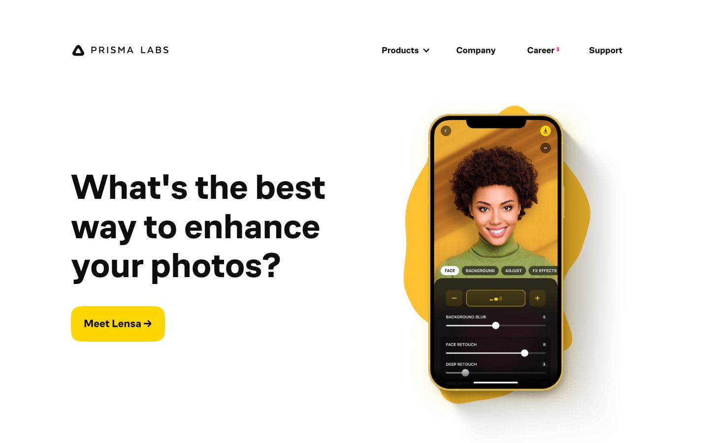
Prisma Labs runs a ruthlessly restrained visual system: pure white canvas, near-black type, and one vivid yellow as the only chromatic signal. Display headlines carry enormous weight (700) at near-1.0 line-height with tight negative tracking, reading like editorial type rather than typical SaaS hero copy. Yellow appears as functional punctuation — filled CTAs, active in-app controls, and as organic blob shapes bleeding behind phone mockups — never as decoration. The layout is split and alternating: text one side, oversized product mockup the other, with generous vertical breathing room (80–120px) between bands. Surfaces are flat; elevation is achieved through color contrast and blob backings rather than shadows.
## Tokens — Colors
| Name | Value | Token | Role |
|------|-------|-------|------|
| Ink Black | `#0d0d0d` | `--color-ink-black` | Primary text, nav links, all borders, button outlines |
| Paper White | `#ffffff` | `--color-paper-white` | Page canvas, card surfaces, button text on yellow fill |
| Graphite | `#333333` | `--color-graphite` | Secondary text, image borders, link underlines, muted dividers |
| Signal Yellow | `#ffd600` | `--color-signal-yellow` | CTA button fill, in-app active tabs, decorative blob shapes behind mockups, active state highlights — the single chromatic accent that makes actions feel switched on |
Websites
Markdown Text
design-md
website-prompt
landing-page-prompt
Sonos
Sonos — Style Reference
# Sonos — Style Reference
> Gallery wall of warm light
**Theme:** light
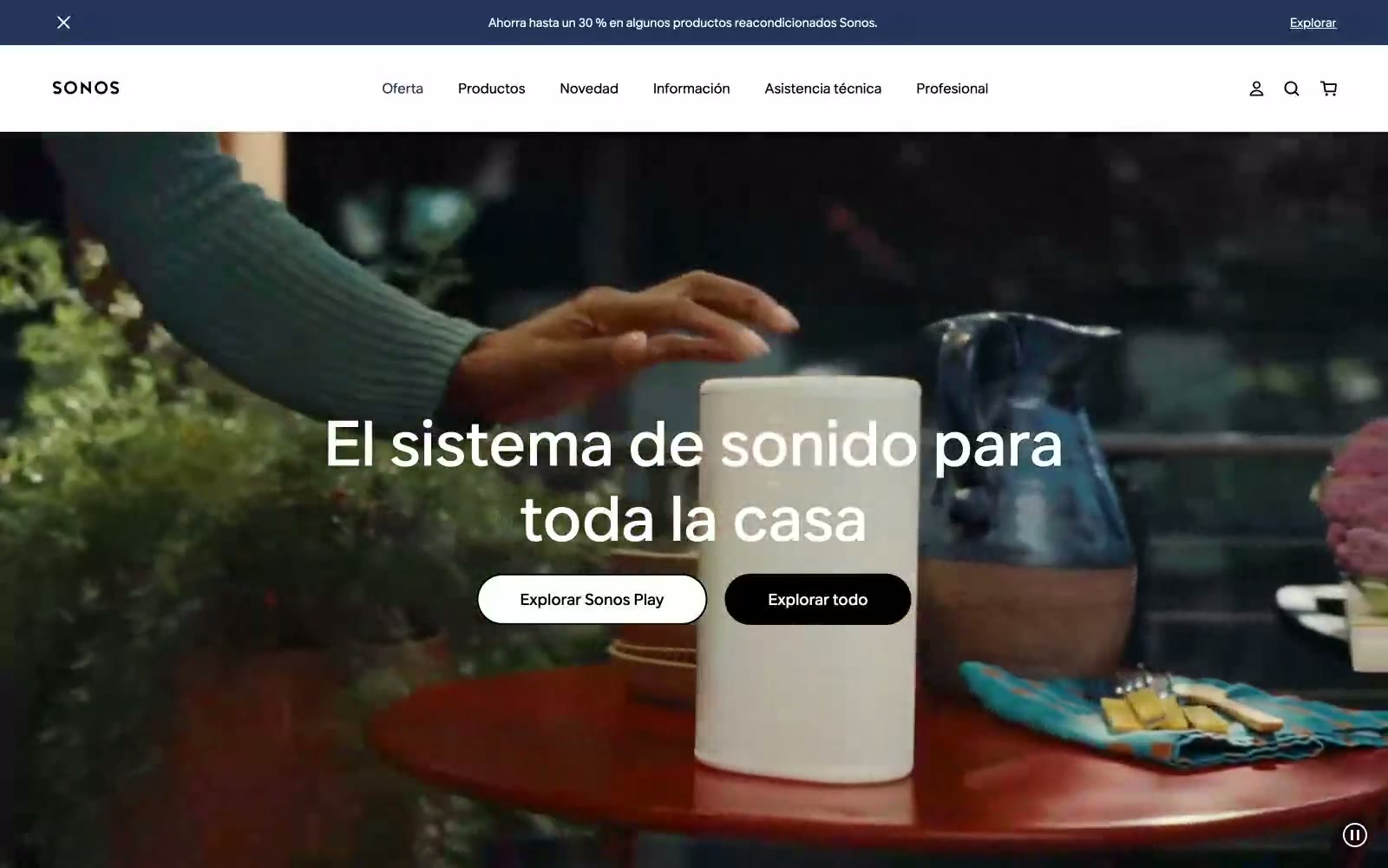
Sonos operates in a deliberate visual void — pure achromatic black, white, and gray with zero chromatic accent. The interface is a frame for photography rather than a canvas of color; lifestyle imagery of people in warm-lit spaces does every emotional job that a brand color would normally carry. Typography is the only voice: aktiv-grotesk at dramatic scale, with display sizes reaching 96px and tight 1.0 line-height creating poster-like headlines that float over full-bleed photography. Components are reduced to their silhouettes — pill-shaped buttons (80px radius), minimal navigation, generous breathing room — letting product photography and large type carry the entire identity. The result is a luxury-electronics aesthetic where restraint signals premium, not austerity.
## Tokens — Colors
| Name | Value | Token | Role |
|------|-------|-------|------|
| Obsidian | `#000000` | `--color-obsidian` | Dark supporting neutral for text, icons, and strong contrast. Do not promote it to the primary CTA color |
| Paper White | `#ffffff` | `--color-paper-white` | Light supporting surface for subtle backgrounds and section separation. Do not promote it to the primary CTA color |
| Concrete | `#f5f5f5` | `--color-concrete` | Dominant page canvas, section backgrounds, elevated surface wash |
| Graphite | `#2e2e2e` | `--color-graphite` | Dark surface panels, secondary dark fill, text on light cards |
Websites
Markdown Text
design-md
website-prompt
landing-page-prompt
Daniel Sun
Daniel Sun — Style Reference
# Daniel Sun — Style Reference
> Solar monolith on a white gallery wall — one yellow beam, one obsidian name, all the breathing room in the world.
**Theme:** light
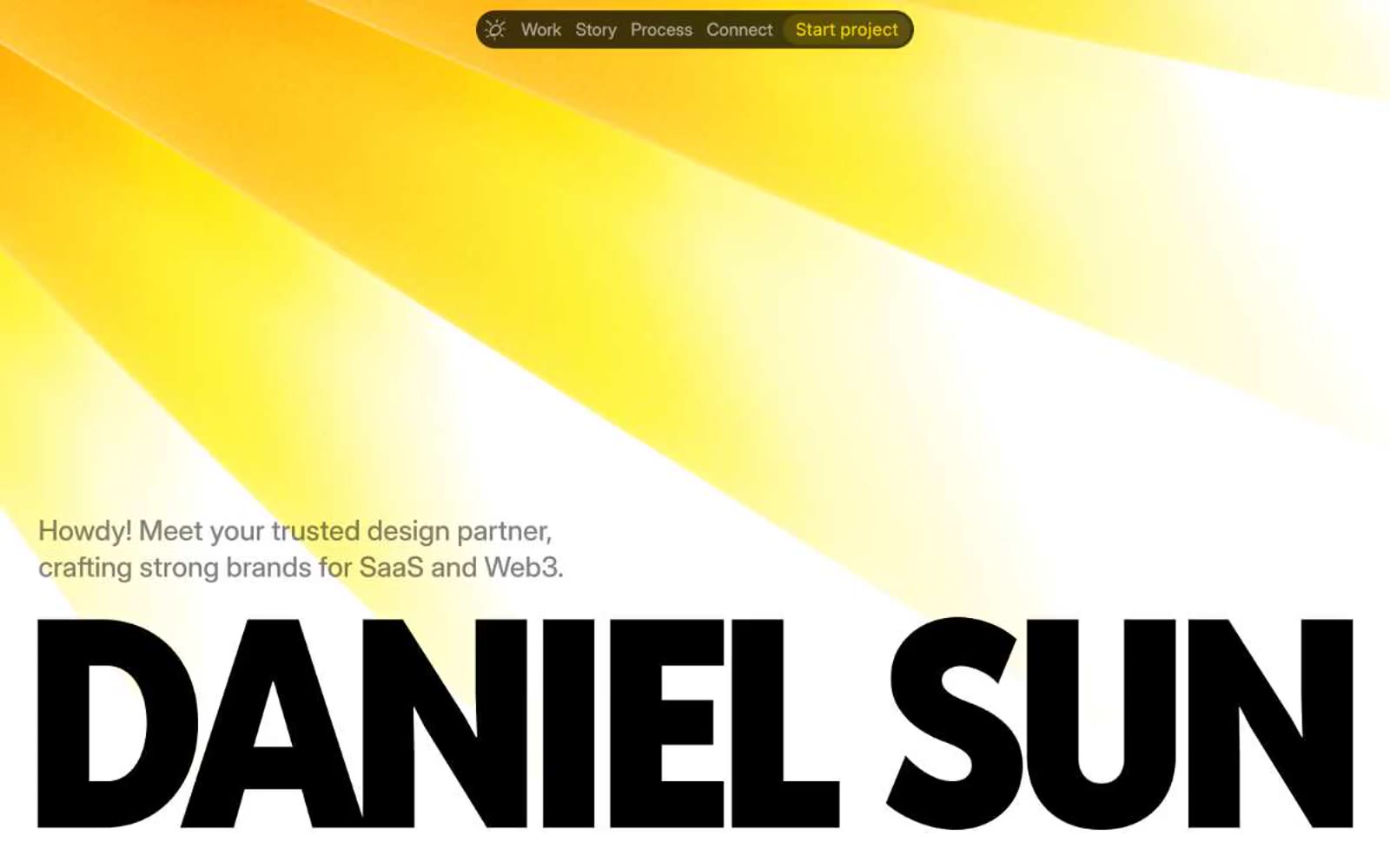
Daniel Sun's portfolio is a typographic monolith: an almost entirely achromatic canvas where a single yellow light beam cuts diagonally across the hero, and the designer's name is set at 246px in an ultra-condensed 900-weight display face that nearly spans the viewport. The system is a designer's gallery — white paper, concrete gray, obsidian type, with one solar accent that doubles as the only chromatic element. Reddit Sans Condensed 900 carries every load-bearing headline at a near-architectural scale, Inter Display 500 handles secondary headings and body, and Caveat 700 injects handwritten intimacy for personal asides like 'From 2020 til today.' Surfaces are flat, shadows are almost absent, and the navigation lives inside a single dark pill capsule that floats at the top of every page. Everything is generous, quiet, and typographically assertive — the page reads as a single confident statement rather than a grid of components.
## Tokens — Colors
| Name | Value | Token | Role |
|------|-------|-------|------|
| Solar Beam | `#ffd500` | `--color-solar-beam` | The system's only chromatic color — hero gradient beam, handwritten underline accent, and the pill-shaped highlight button inside the dark nav capsule. This is the single note of warmth in an otherwise achromatic composition; its presence transforms monochrome blocks into a sunlit moment |
| Obsidian | `#000000` | `--color-obsidian` | Primary text, display headlines, nav capsule background, and dominant typographic mass. Sets the highest-contrast tone for the condensed display name and grounds the floating nav pill |
| Paper White | `#ffffff` | `--color-paper-white` | Card surfaces, portfolio thumbnails, and the base of the white canvas. Provides the surface that the yellow beam and obsidian type play against |
| Concrete | `#f5f5f5` | `--color-concrete` | Page canvas and the lightest card/section background. Warmer than pure white, creates the gallery-wall feel beneath the hero |
Websites
Markdown Text
design-md
website-prompt
landing-page-prompt
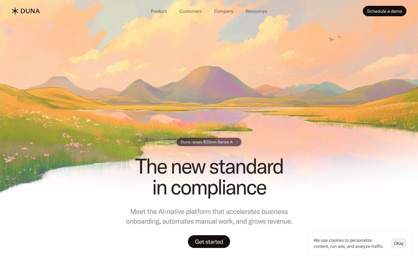
Duna
Duna — Style Reference
# Duna — Style Reference
> Sunset watercolor on warm marble — a single painted landscape over a quiet, editorial compliance document.
**Theme:** light
Duna is a monochromatic editorial canvas warmed by a single illustrated sunset landscape — the interface stays nearly 99% achromatic, with a deep aubergine-black as both text and primary action color, replacing the blue/green convention of fintech. Components are soft and pillowy: heavily rounded corners (24px on cards and images, 999px on buttons), generous breathing room, and almost no shadow — elevation is built from hairline borders and contrast alone. The hero watercolor is the only moment of color saturation in the system, a deliberate artistic peak that frames an otherwise quiet, confident, document-like surface. Typography is GT America at restrained weights with aggressive negative tracking on display sizes, giving headlines a compressed, editorial feel rather than the wide, friendly SaaS look.
## Tokens — Colors
| Name | Value | Token | Role |
|------|-------|-------|------|
| Aubergine Ink | `#1b0624` | `--color-aubergine-ink` | Primary text, heading borders, and brand character — the slight warm-purple undertone replaces conventional near-black, giving Duna a distinctive almost-black that is neither pure black nor navy |
| Espresso | `#160f0c` | `--color-espresso` | Primary action fill — filled buttons (Get started, Schedule a demo). Slightly warmer and darker than Aubergine Ink, used exclusively for interactive surfaces that need to feel pressed-into the page |
| Warm Ash | `#766a7c` | `--color-warm-ash` | Muted secondary text and subtle borders — a desaturated warm gray that softens long-form copy without competing with the primary text |
| Graphite | `#444444` | `--color-graphite` | Body text variant, icon strokes, input borders — the workhorse neutral for non-heading content |
Websites
Markdown Text
design-md
website-prompt
landing-page-prompt
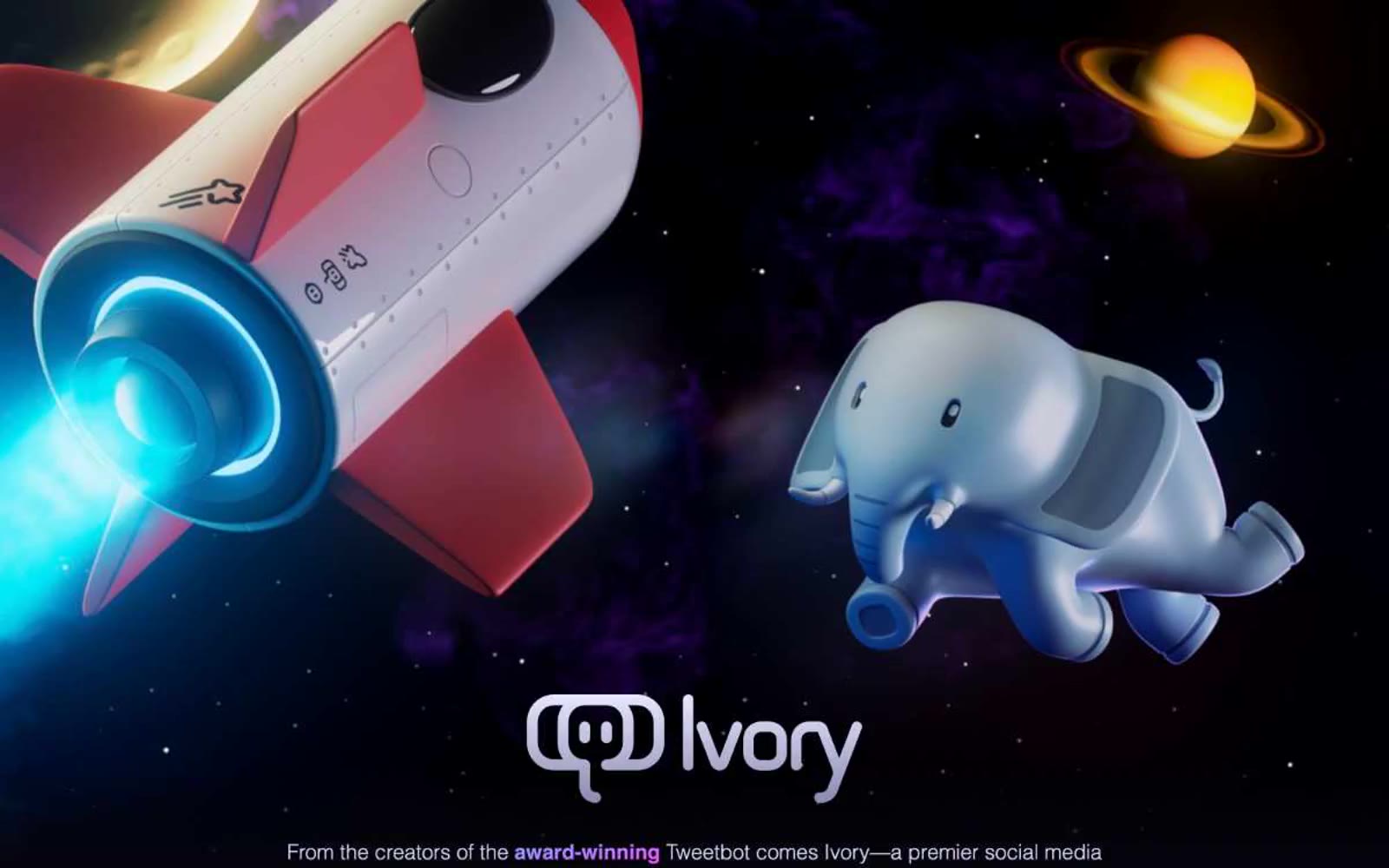
Tapbots
Tapbots — Style Reference
# Tapbots — Style Reference
> cosmic command center in violet dusk — a midnight spacecraft hangar where a single violet frequency cuts through the void
**Theme:** dark
Tapbots Ivory is a cosmic product showcase rendered in violet dusk: a near-black canvas hosts floating 3D mascots and illuminated spacecraft, with a single saturated violet threading through every interactive element. The interface is deliberately flat — no drop shadows, no card elevations, no gradients on UI surfaces — letting the 3D hero illustrations carry all visual weight while the UI itself stays quiet and spacious. Typography is exclusively the Apple system stack, which signals the product's iOS-first heritage and avoids any web-font loading delay. The layout is a single centered column that breathes generously between sections, with content maxing out well before the viewport edges. Color is used surgically: violet for links, icons, and emphasis; green and red as functional punctuation for feature headings.
## Tokens — Colors
| Name | Value | Token | Role |
|------|-------|-------|------|
| Void | `#05050b` | `--color-void` | Deepest canvas — the void behind everything, visible at the absolute darkest page edges |
| Midnight Canvas | `#1a1a1a` | `--color-midnight-canvas` | Primary page background — the dominant surface where all content lives |
| Carbon | `#111111` | `--color-carbon` | Subtle surface lift for embedded app screenshots and elevated content blocks |
| Graphite | `#212121` | `--color-graphite` | List and card surface — the faintest step up from canvas for grouped content |
Websites
Markdown Text
design-md
website-prompt
landing-page-prompt
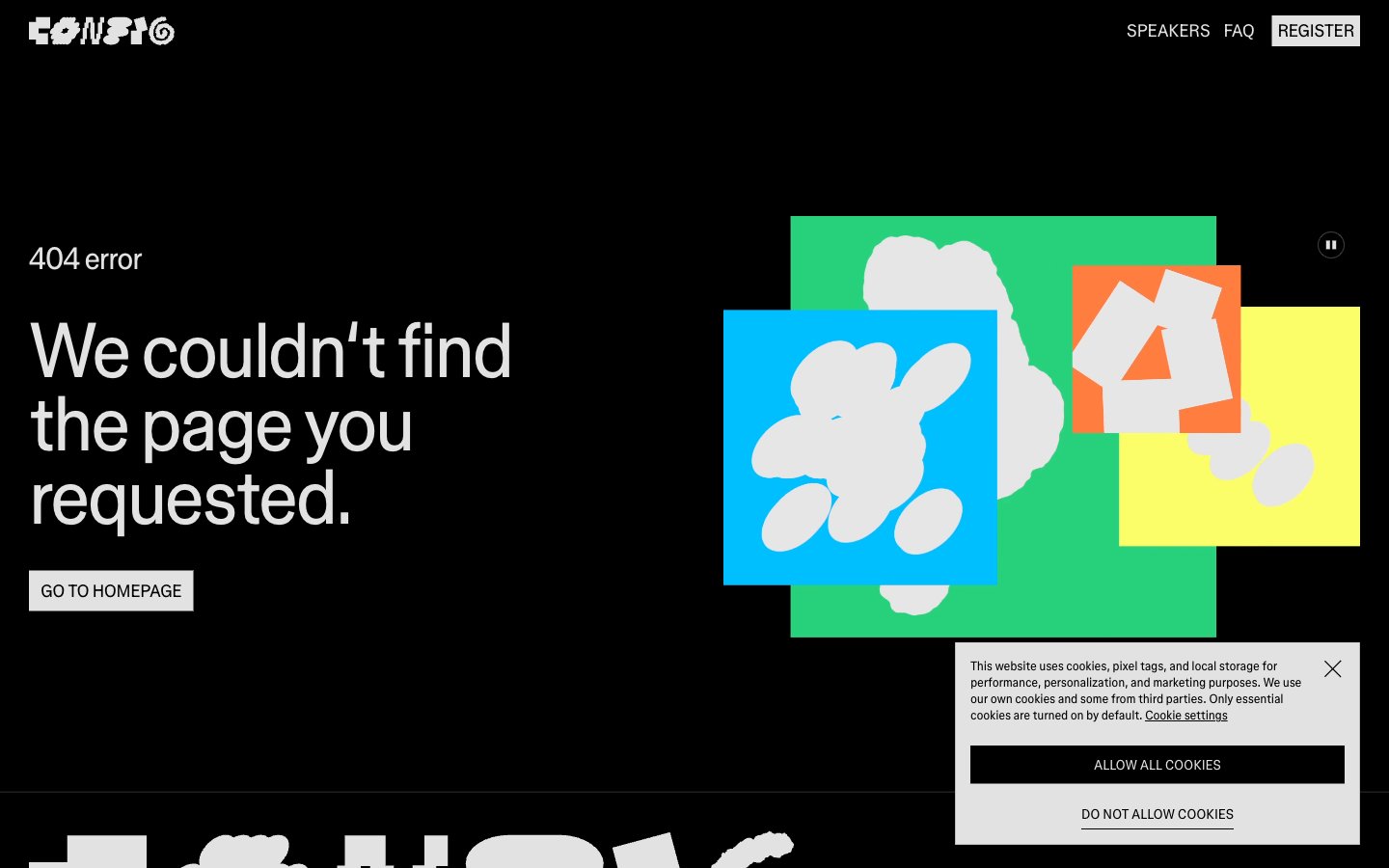
Figma Config
Figma Config — Style Reference
# Figma Config — Style Reference
> modernist poster on black velvet
**Theme:** dark
Figma Config operates in a stark typographic gallery mode: pure black canvas, one near-white text color, and a single ultra-tight custom sans-serif that does all the visual work. There is no decorative chrome, no soft cards, no color coding — hierarchy comes from scale jumps (16px to 80px) and extremely tight tracking, not from fills or elevation. Navigation is reduced to a logo and three ghost-bordered text links, and CTAs are inverted-outline buttons rather than filled pills, so the user feels they are walking through a modernist poster exhibit rather than using a product UI. The colored squares and abstract shapes that appear in error/empty states are event-specific illustration, not interface tokens — the system itself is almost entirely achromatic. Density is compact and edges are hard: borders are hairline, corners are sharp, and the only texture is the rhythm of oversized type sitting on void.
## Tokens — Colors
| Name | Value | Token | Role |
|------|-------|-------|------|
| Obsidian | `#000000` | `--color-obsidian` | Page canvas, all surface backgrounds |
| Chalk | `#e2e2e2` | `--color-chalk` | Primary text, nav links, ghost-button borders, hairline rules, footer text — the only foreground color in the system |
| Graphite | `#3d3d3d` | `--color-graphite` | Subtle button borders and secondary dividers that recede against the canvas |
| Paper | `#ffffff` | `--color-paper` | Inverted button surface (ghost buttons flipped to filled) and rare high-contrast accents |
Websites
Markdown Text
design-md
website-prompt
landing-page-prompt
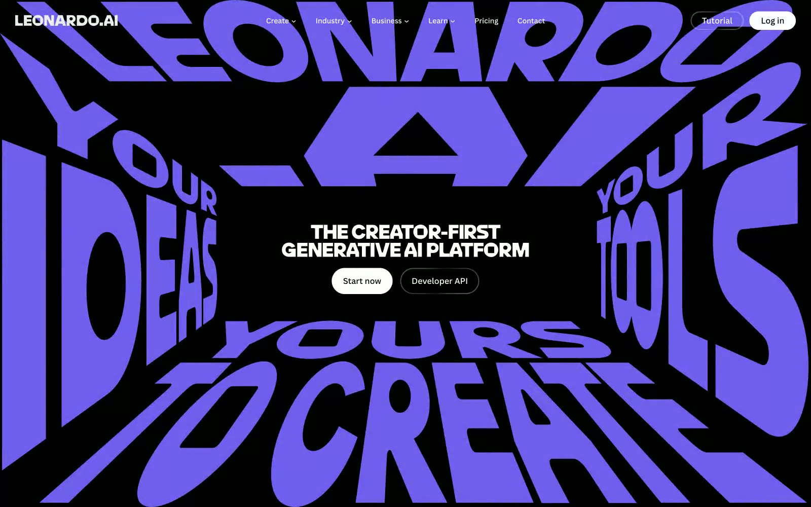
Leonardo.ai
Leonardo.ai — Style Reference
# Leonardo.ai — Style Reference
> Inverted editorial gallery. A black-walled museum where 165px violet headlines act as wall installations and AI-generated portraits hang in a tight grid below.
**Theme:** dark
Leonardo.ai is a cinematic dark-mode creative arena: near-black canvas (#000000) serves as an infinite gallery floor, and the interface speaks through sheer typographic mass rather than chrome. The brand voice is built on one saturated violet (#6e60ee) used sparingly as identity punctuation, surrounded by a vivid six-color tag palette (green, violet, yellow, pink, coral, blue) that acts as categorical color-coding for plans, styles, and creator types. Display type reaches absurd scale (up to 165px) with compressed line-heights of 0.80–0.90 and tight -0.02em tracking, making headlines feel like sculptural objects rather than text. Controls are soft and pill-shaped (60px radius), surfaces are nearly borderless, and the layout breathes with generous negative space punctuated by a tight card grid of generated imagery. The system is editorial-meets-product: it treats the page itself as a generative canvas where the UI recedes and the creator's output dominates.
## Tokens — Colors
| Name | Value | Token | Role |
|------|-------|-------|------|
| Midnight Canvas | `#000000` | `--color-midnight-canvas` | Primary page background, hero canvas, footer base |
| Obsidian Surface | `#0a0a0a` | `--color-obsidian-surface` | Elevated surface, nav backdrop, deep overlay wash |
| Charcoal Card | `#353535` | `--color-charcoal-card` | Card surface, image card background, raised panel |
| Fog | `#f5f5f5` | `--color-fog` | Light surface inversion, subtle highlight wash |
Websites
Markdown Text
design-md
website-prompt
landing-page-prompt
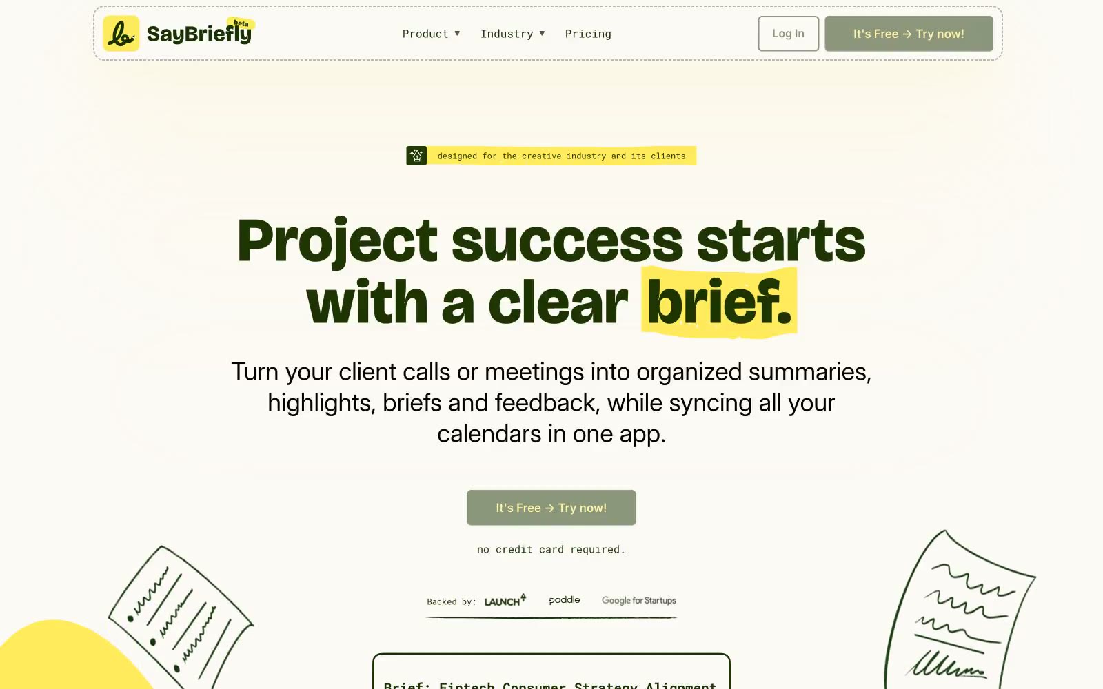
Say Briefly
Say Briefly — Style Reference
# Say Briefly — Style Reference
> creative agency sketchbook on cream paper
**Theme:** light
SayBriefly speaks the visual language of a creative studio's moodboard: warm cream paper, a single deep forest green that does the heavy lifting for text and primary actions, and a vivid school-bus yellow that acts as both highlight marker and playful punctuation. Type is deliberately split-personality — Bricolage Grotesque at extrabold for display headlines with positive tracking that gives the words a sticker-book chunkiness, paired with Inter's clean humanist sans for everything functional. The overall feel is approachable, hand-made, and slightly rebellious: rounded 6px corners everywhere, minimal shadows, scattered pastel accent cards that feel like sticky notes rather than UI cards. Color is rationed — green for structure, yellow for emphasis, and tiny washes of teal/pink/orange as decorative one-offs.
## Tokens — Colors
| Name | Value | Token | Role |
|------|-------|-------|------|
| Forest Ink | `#1a3300` | `--color-forest-ink` | Primary text, filled CTA buttons, link text, nav borders, card borders — the structural backbone. This near-black green carries 90% of the interface weight |
| Highlighter Yellow | `#ffe95c` | `--color-highlighter-yellow` | Text highlight wash (behind keywords in headlines), badge backgrounds, accent fills. Always reads as a marker stroke, never as a CTA |
| Cream Paper | `#fcfaf5` | `--color-cream-paper` | Page canvas, card surfaces, nav background — the warm off-white everything sits on. Slightly yellow-shifted to feel like aged paper, not screen white |
| Pencil Gray | `#b6b6b6` | `--color-pencil-gray` | Nav and divider borders — a single mid-gray for hairlines that should recede |
Websites
Markdown Text
design-md
website-prompt
landing-page-prompt
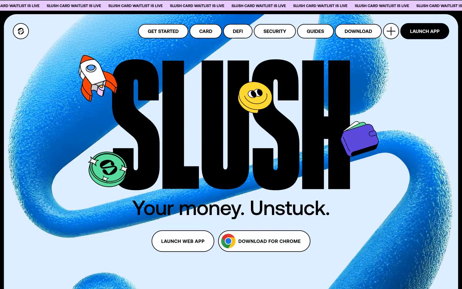
Slush
Slush — Style Reference
# Slush — Style Reference
> inflatable sticker universe on pastel paper
**Theme:** light
Slush runs on a sticker-book logic: pastel paper canvas, huge inflated 3D ribbons in electric blue, and a full rainbow of vivid sticker accents scattered like confetti. Display type is enormous and crushed (Lateral 800 at 200–640px, line-height 0.75–0.80) so the words become sculptural objects, not sentences. The six saturated brand colors function as a shared sticker palette — every color appears as a filled sticker, a card surface, or a decorative wash, never as a restrained accent. Components are rounded to the point of softness (20–40px on cards, pill-shaped on nav) and outlined in black for a hand-cut feel. The result reads less like a fintech landing page and more like a physical collage pinned to a pale wall.
## Tokens — Colors
| Name | Value | Token | Role |
|------|-------|-------|------|
| Carbon | `#000000` | `--color-carbon` | Primary text, card borders, filled CTA background, logo mark — creates the hand-cut sticker outline effect against pastel surfaces |
| Paper White | `#ffffff` | `--color-paper-white` | Page canvas, card surfaces, outlined button fills, text on dark fills |
| Sky Wash | `#dceeff` | `--color-sky-wash` | Hero section background, light blue pastel ground |
| Concrete Gray | `#cccccc` | `--color-concrete-gray` | Secondary section background, neutral interlude surface |
Websites
Markdown Text
design-md
website-prompt
landing-page-prompt
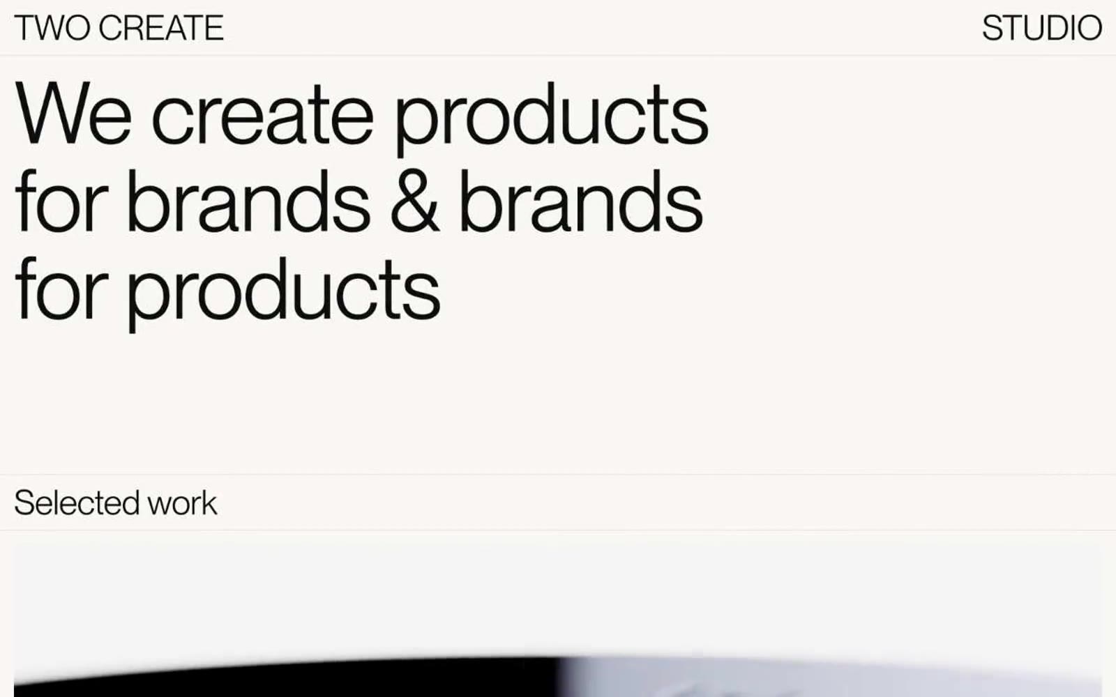
Twocreate
Twocreate — Style Reference
# Twocreate — Style Reference
> gallery wall on cream paper
**Theme:** light
Twocreate operates on a gallery-floor logic: a warm cream canvas, a single near-black ink, one typeface, and absolutely nothing else. Every interface decision is subordinated to typography — there is no color system, no shadow system, no border system, no icon system, no button system. The page reads like a printed exhibition catalogue set in PP Neue Montreal at extreme scale jumps, from 10px footer labels to 111px display headlines that fill half the viewport. Components are not really components; they are typographic blocks separated by whitespace. The product photography that does appear is a single editorial image — no cards, no grids, no treatments — placed in the flow with the same restraint as the text. This is a studio site that trusts the work and the typeface to carry all visual weight, and treats every other design discipline as decoration to be omitted.
## Tokens — Colors
| Name | Value | Token | Role |
|------|-------|-------|------|
| Ink | `#0c0c0c` | `--color-ink` | All text, links, nav items, body copy, client names, list items, and icon strokes. The near-black rather than pure black keeps type from feeling harsh against the warm canvas |
| Paper | `#f9f7f4` | `--color-paper` | Page background and primary canvas. A warm off-white with a faint yellow-pink cast — replaces the coldness of #fff with the tactility of uncoated stock |
| Stone | `#e3e1dd` | `--color-stone` | Secondary surface tone, subtle dividers, and any banded section that needs a half-step away from the canvas without introducing a true contrast color |
| Carbon | `#000000` | `--color-carbon` | Reserved for the highest-weight text moments where pure black is needed — typically the display headline and nav lockups. Slightly heavier than Ink for typographic emphasis rather than color contrast |
Websites
Markdown Text
design-md
website-prompt
landing-page-prompt
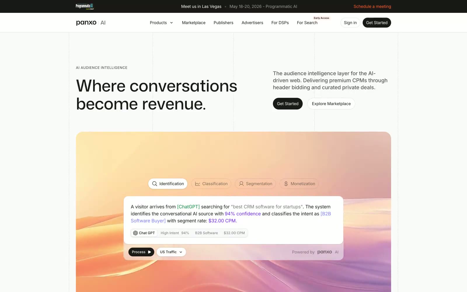
Panxo
Panxo — Style Reference
# Panxo — Style Reference
> Data terminal in warm ink — every surface echoes ledger paper, every accent reads like a highlighted cell.
**Theme:** light
Panxo reads like a financial data terminal wearing a startup's wardrobe — numbers and metrics front and center, but the palette stays warm cream and near-black rather than cold blue. The base surface is #fafafa pushing toward #f7f3eb (a barely-warm off-white), while the primary text mass is the rich near-black #1c1a17 — warmer than pure black, almost coffee. The hero visualization uses a candy-colored gradient (teal → violet → amber) as its only splash of chromatic energy against otherwise achromatic structure. Mona Sans at weight 700 and aggressive negative tracking (-0.04em at 56px) makes headlines feel compressed and purposeful — data labels rather than declarations. Interactive elements use a single deep orange (#ff6020) for CTAs, distinct from the violet data-highlight colors (#777eff, #731fff) used for semantic classification signals inside UI demos.
## Tokens — Colors
| Name | Value | Token | Role |
|------|-------|-------|------|
| Coal Ink | `#1c1a17` | `--color-coal-ink` | Primary text, filled CTA button background, dark card surface — warmer than pure black, prevents the page from reading as cold despite high contrast |
| Ledger White | `#fafafa` | `--color-ledger-white` | Page background, card surfaces, badge fills — the dominant surface; slightly warmer than #ffffff, giving the page a matte paper quality |
| Parchment | `#f7f3eb` | `--color-parchment` | Hero section background wash — the warmest surface tone, used for large atmospheric areas |
| Ash | `#f1f1f1` | `--color-ash` | Borders, divider lines, ghost button borders |
Websites
Markdown Text
design-md
website-prompt
landing-page-prompt
2.AG
2.AG — Style Reference
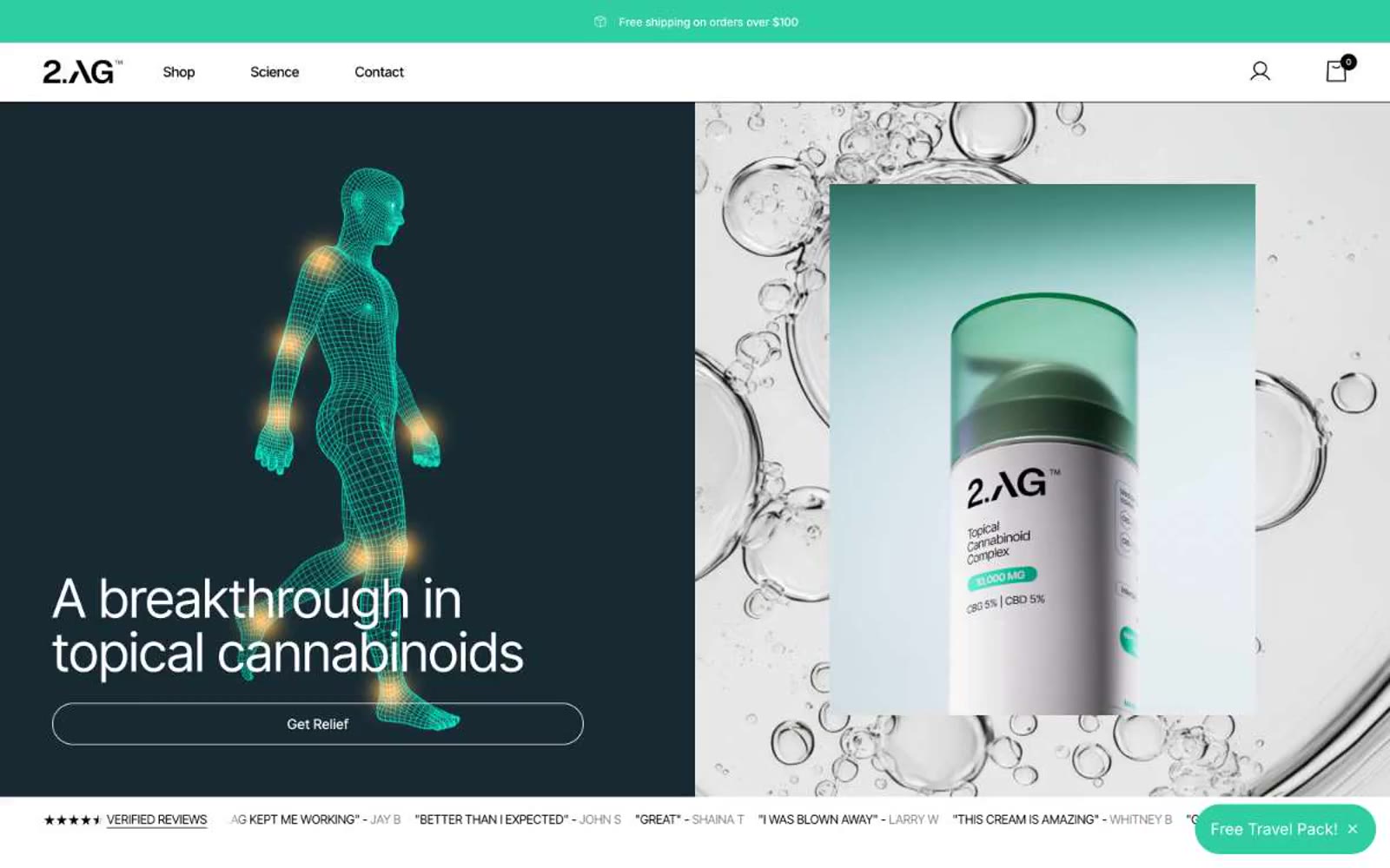
# 2.AG — Style Reference
> Clinical apothecary under teal light — a measured, prescriptive wellness brand that treats the product shot like a specimen slide.
**Theme:** light
2.AG reads as a clinical apothecary crossed with a modern science brand: near-white canvas, deep teal structural surfaces, and one vivid mint accent that activates CTAs and data highlights. Inter Tight is tightened for a pharmaceutical voice — slightly negative tracking on display sizes, generous tracking on small caps for ingredient lists and badges. Components lean into large pill radii (30–50px) for buttons and soft 12–20px corners on cards, signaling a brand that is precise about dosage but warm on the body. Dark teal sections (Rapid Relief Cream header, stat blocks) ground the page in clinical authority, while bright green punctuation provides energetic, almost pharmacy-shelf accent. Layout is split, generous, and product-forward: hero pairs a dark editorial half with a bright product half, sections alternate white and teal, and reviews/stats form dense but airy card grids.
## Tokens — Colors
| Name | Value | Token | Role |
|------|-------|-------|------|
| Deep Teal | `#244d54` | `--color-deep-teal` | Primary structural color — dark hero background, stat block surfaces, icon strokes, navigation wordmark, secondary button borders. A near-gray teal that reads as ink rather than ocean, so it grounds the brand without going clinical-cold |
| Mint Pulse | `#2ecea0` | `--color-mint-pulse` | Primary action color — filled CTA backgrounds, badge fills, active dots, announcement bar, review star highlights. Bright green with cyan lean, makes every interactive element feel switched on and biological |
| Soft Teal | `#6dddbd` | `--color-soft-teal` | Teal text accent for links, tags, and emphasized short phrases. Do not promote it to the primary CTA color |
| Carbon | `#000000` | `--color-carbon` | Body text, hairline borders, icon strokes, input borders. The dominant structural neutral — most borders on the site are pure black, giving the UI a stark, editorial frame |
Websites
Markdown Text
design-md
website-prompt
landing-page-prompt
Ayaka B. Ito
Ayaka B. Ito — Style Reference
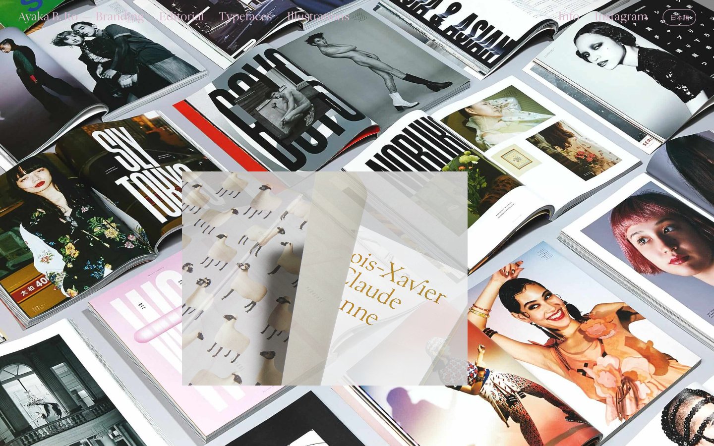
# Ayaka B. Ito — Style Reference
> Editorial spread on warm linen paper.
A tactile, magazine-like atmosphere where oversized serif type and flat color planes replace the usual UI scaffolding.
**Theme:** mixed
Ayaka B. Ito presents an editorial portfolio language: full-bleed warm-toned pages flipping between a dust-pink cover collage, a terracotta-rust intro spread, and oversized serif display panels. The system reads like a printed magazine — flat color planes, hairline rules, and one custom display serif that swells to extreme positive tracking on hero copy. Color is used as whole-page atmosphere rather than UI accent: terracotta, olive, teal, gold, and dusty pink each take over entire sections to signal project boundaries. Components are reduced to their editorial primitives — a top bar of bare category links, tiny parenthesized section tags, and pill-shaped language toggles — with no shadows, no cards, and almost no raised surfaces. The page breathes with generous vertical rhythm and lets typography do all the structural work.
## Tokens — Colors
| Name | Value | Token | Role |
|------|-------|-------|------|
| Ink Black | `#000000` | `--color-ink-black` | Body text, hairline borders, and rule lines — the dominant structural color used everywhere text and dividers are drawn |
| Bone White | `#ffffff` | `--color-bone-white` | Primary page canvas and base background for gallery and intro spreads |
Websites
Markdown Text
design-md
website-prompt
landing-page-prompt
Sackville & Co.
Sackville & Co. — Style Reference
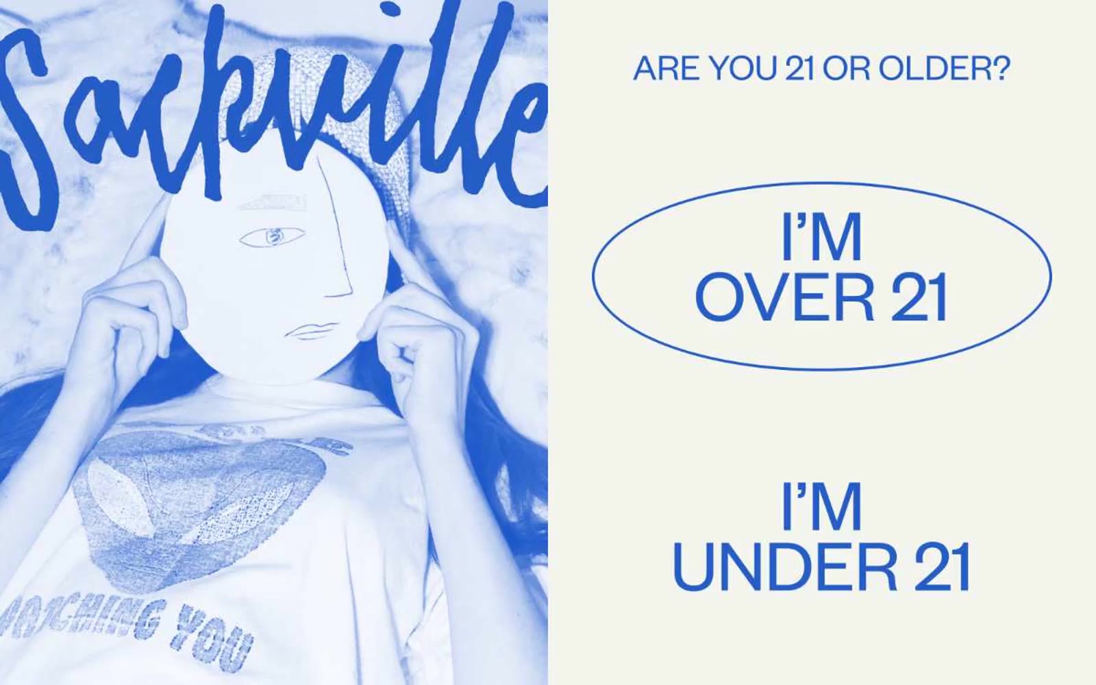
# Sackville & Co. — Style Reference
> Cobalt zine pressed onto cream — a hand-inked editorial spread where the illustration is the hero and the UI is just typeset text on warm paper.
**Theme:** light
Sackville & Co. reads like an editorial risograph zine pressed onto cream paper: a hand-inked cobalt-blue illustration anchors one half, while the other half breathes as off-white canvas with tight grotesque type and a single oversized oval outlined in blue. The system is intentionally print-coded — flat color, no gradients, no shadows, no filled buttons — and uses a saturated secondary palette (peach, fire-red, marigold, terracotta) as tonal accents in artwork and borders rather than as functional UI fills. Typography carries all the hierarchy: Founders Grotesk at weight 400 with aggressive negative line-heights (0.80–0.90) on display sizes creates the masthead pressure of a magazine cover, while TimesNow SemiLight provides editorial serif contrast for select headings. Everything feels hand-set: thin outlines, generous whitespace, no elevation, no rounded cards — just confident ink on warm paper.
## Tokens — Colors
| Name | Value | Token | Role |
|------|-------|-------|------|
| Cream Paper | `#f3f4ee` | `--color-cream-paper` | Page canvas, card surfaces — the warm off-white that makes every ink color feel like print |
| Bone White | `#f8f8f8` | `--color-bone-white` | Alternate surface wash, subtle section differentiation from the cream canvas |
| Press Black | `#231f20` | `--color-press-black` | Primary text, borders, dividers, icon strokes — the near-black ink that anchors every screen |
| Charcoal Headline | `#383435` | `--color-charcoal-headline` | Display heading text — slightly lifted from press black for softer masthead weight |
Websites
Markdown Text
design-md
website-prompt
landing-page-prompt
HBO Max
HBO Max — Style Reference
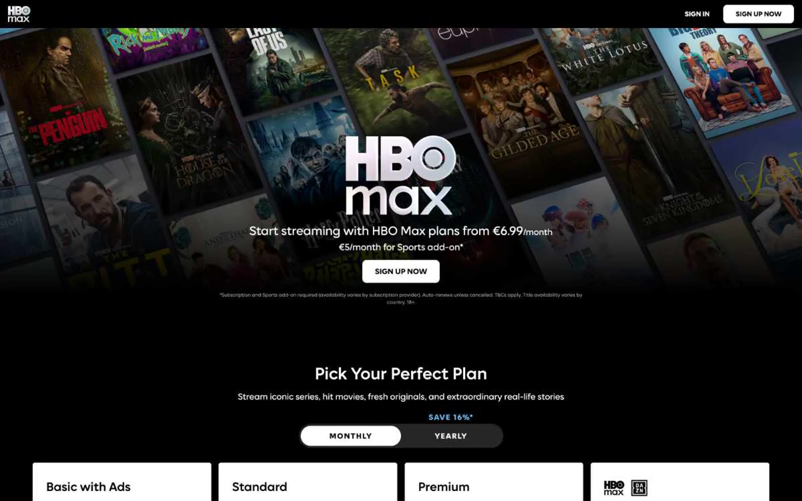
# HBO Max — Style Reference
> Cinema lobby at midnight. Pure black walls, one cool blue exit sign, and movie posters glowing from every surface.
**Theme:** dark
HBO Max is a cinema-dark streaming interface: deep black canvas, content poster art as the primary visual unit, and a single steel-blue accent that powers every interactive element. The design is deliberately sparse — white text floats on black, pricing cards flip the polarity to white-on-light to signal commerce zones, and typography does the heavy lifting through size and spacing rather than color. Components stay flat and minimal: 8px-radius buttons, hairline borders, no shadows, no gradients. The custom Max Sans typeface carries a slight positive letter-spacing on small labels, giving even utility text a cinematic, editorial quality.
## Tokens — Colors
| Name | Value | Token | Role |
|------|-------|-------|------|
| Obsidian | `#000000` | `--color-obsidian` | Page background, hero canvas, navigation surface — the default darkness that lets poster art and white text feel illuminated |
| Smoke | `#050409` | `--color-smoke` | Near-black secondary surface, subtle elevation layer above pure black for section separation |
| Ash Mist | `#b8b6bb` | `--color-ash-mist` | Muted helper text, secondary body copy, disabled icon strokes — readable but recedes |
| Iron Veil | `#89868e` | `--color-iron-veil` | Tertiary text, inactive border outlines on controls |
Websites
Markdown Text
design-md
website-prompt
landing-page-prompt
Foundry
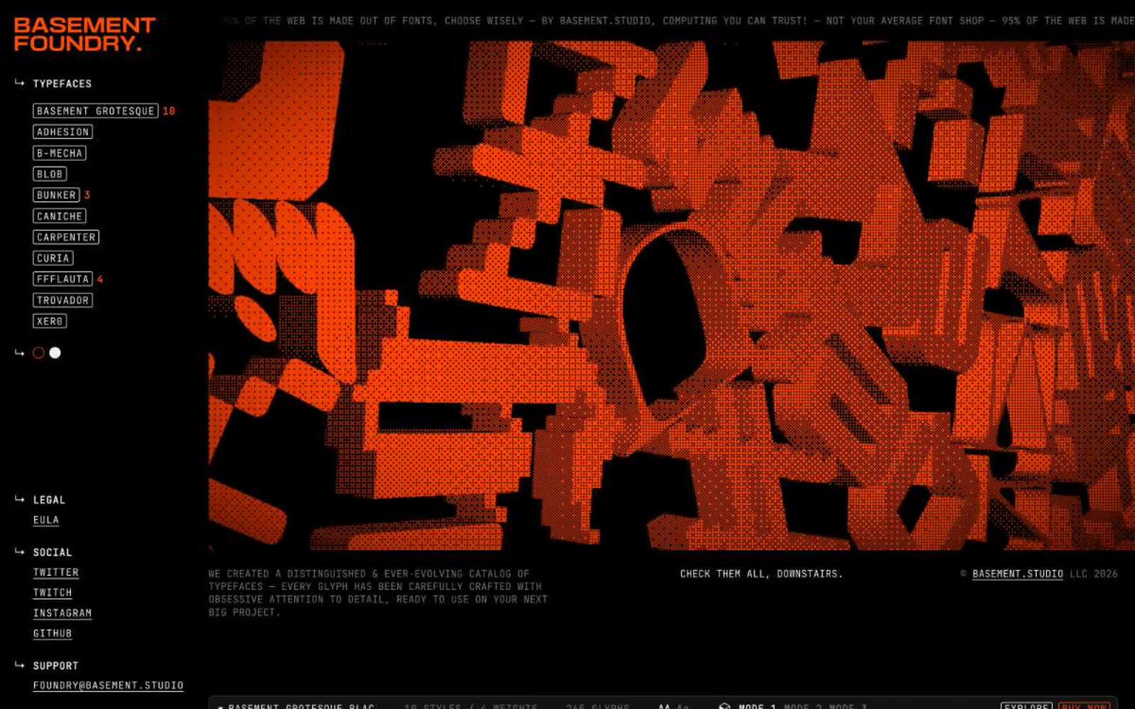
Foundry — Style Reference
# Foundry — Style Reference
> orange-lit type cathedral — a black room where enormous illuminated letterforms hang as exhibits and the only guide rails are pale wireframe borders and one neon marker color.
**Theme:** dark
Foundry is a type foundry presented as a dark workbench where the products are also the interface. A near-black canvas (#121212) hosts sharp-cornered UI chrome built almost entirely from monospaced text and hairline borders, giving the whole site the feel of a developer's terminal crossed with a gallery wall. The only chromatic voice is a vivid orange (#ff4d00) used as a structural accent on the logo, outlined action borders, and selective highlights — never as a filled button background, which keeps the accent feeling like a warning lamp or marker stroke rather than a brand paint job. Every screen is a specimen: massive custom display faces (90–234px) dominate the viewport, the UI recedes around them, and even sidebar items are styled as labeled tags. Compact spacing, near-zero radii (2.8px), and uppercase monospace metadata reinforce a precise, industrial, no-decoration sensibility — decoration lives entirely inside the typefaces themselves.
## Tokens — Colors
| Name | Value | Token | Role |
|------|-------|-------|------|
| Ember Orange | `#ff4d00` | `--color-ember-orange` | Orange accent for outlined action borders, linked labels, and lightweight interactive emphasis. Do not promote it to the primary CTA color |
| Foundry Black | `#121212` | `--color-foundry-black` | Page background, section canvas, main surface — the dominant ground that lets white type and orange accents read as luminous |
| Chalk White | `#e2e8f0` | `--color-chalk-white` | Hairline borders, nav rules, link underlines, tag outlines — the wireframe color that constructs the entire UI scaffold |
| Bone White | `#efefef` | `--color-bone-white` | Primary body and UI text, icon strokes, button text, secondary surface fills — the readable text color and the inverse fill used for emphasized controls |
Websites
Markdown Text
design-md
website-prompt
landing-page-prompt
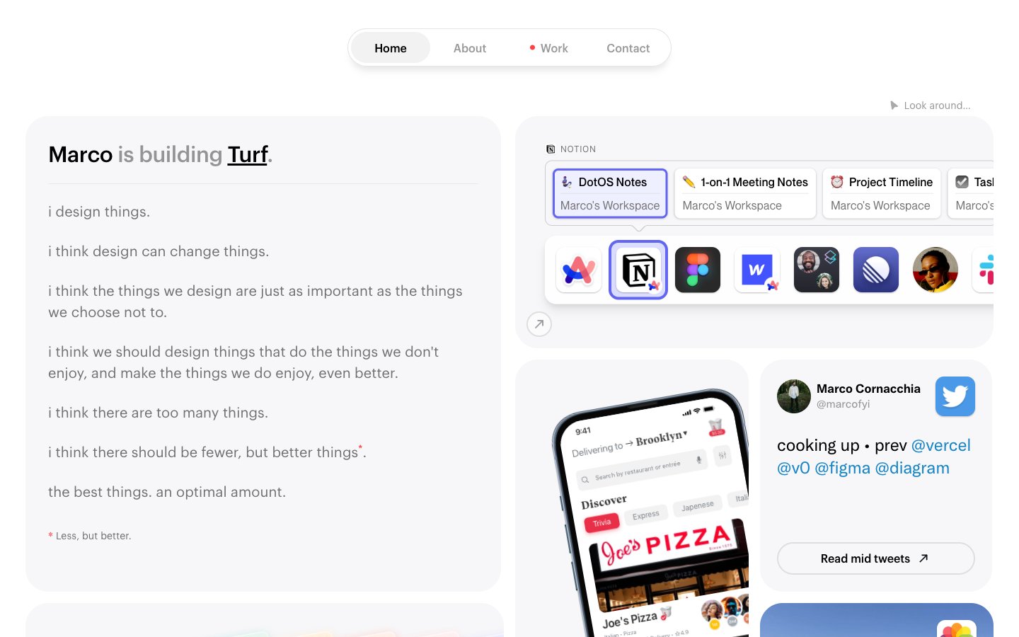
Marco
Marco — Style Reference
# Marco — Style Reference
> Moleskine notebook in cool morning light — a personal workspace where widgets float like sticky notes on warm paper.
**Theme:** light
Marco's site reads like a personal workspace laid out on cool paper: a near-white canvas, furniture-soft cards, and dense but breathable type that feels like a Moleskine spread in morning light. The layout is a disciplined two-column grid — a long-form manifesto on the left, a stack of embedded widgets, app screenshots, and avatar cards on the right — held together by generous rounded corners and whisper-light shadows. Color is rationed: 99% of the page is neutral, with violet and coral-pink appearing only as tiny functional punctuation for active links, the 'Work' status dot, and one warm gradient card. Typography is the main voice — three custom geometric sans-serifs (Maison Neue, Graphik, Neue Montreal) layered with careful tracking shifts, wide on micro-labels and tightening on larger display sizes.
## Tokens — Colors
| Name | Value | Token | Role |
|------|-------|-------|------|
| Iris Glow | `#6366f1` | `--color-iris-glow` | Violet accent for outlined action borders, linked labels, and lightweight interactive emphasis. |
| Signal Blue | `#1685c7` | `--color-signal-blue` | Blue accent for outlined action borders, linked labels, and lightweight interactive emphasis. Do not promote it to the primary CTA color |
| Ember Red | `#e92f48` | `--color-ember-red` | Red wash for highlight backgrounds, decorative bands, and soft emphasis behind content |
| Coral Pulse | `linear-gradient(16deg, rgb(255, 77, 121), rgb(255, 128, 64) 85%)` | `--color-coral-pulse` | Gradient start and secondary accent — used sparingly on warm cards and the pink-orange wash |
Websites
Markdown Text
design-md
website-prompt
landing-page-prompt
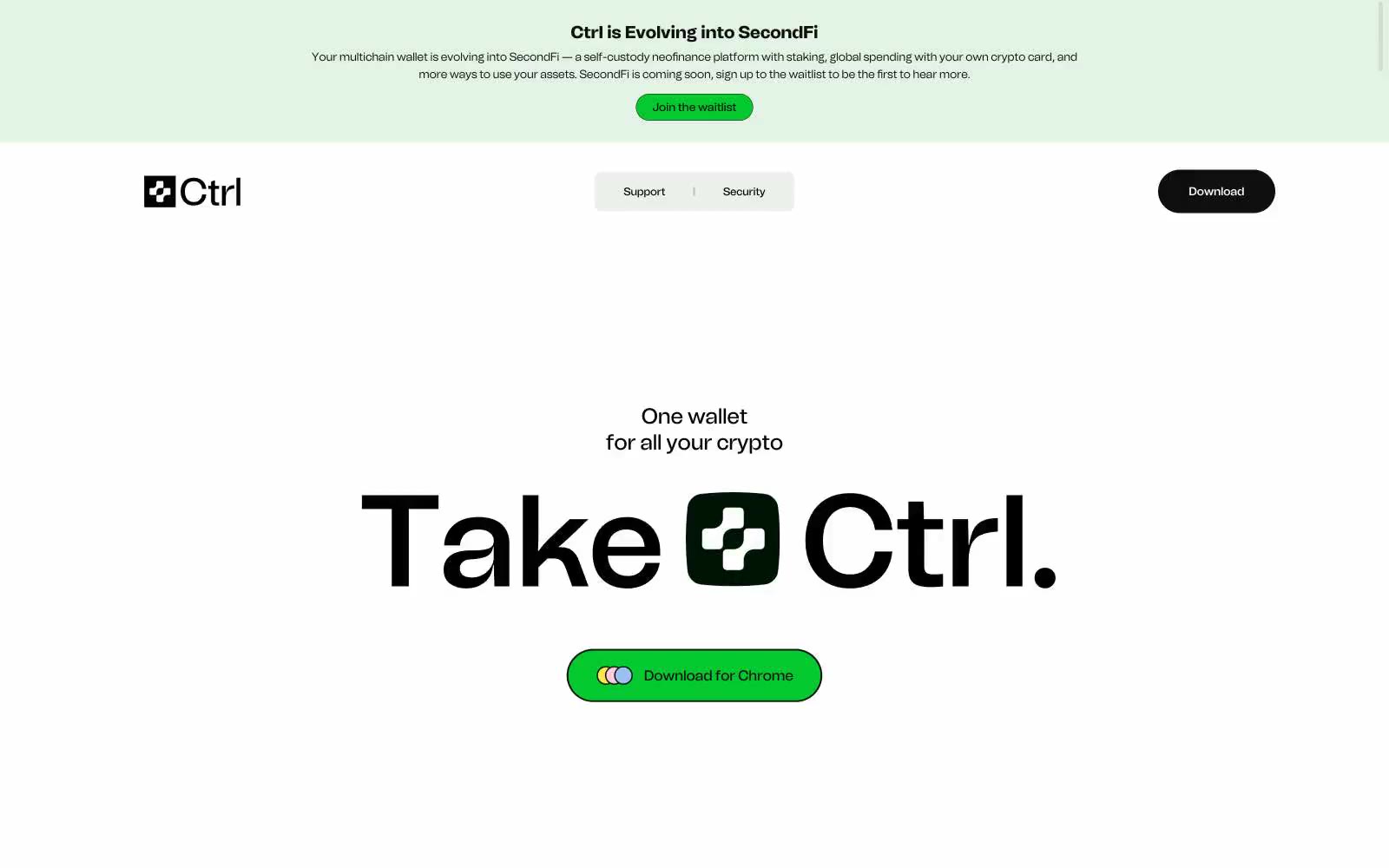
Secure and powerful crypto wallet | Ctrl Wallet
Secure and powerful crypto wallet | Ctrl Wallet — Style Reference
# Secure and powerful crypto wallet | Ctrl Wallet — Style Reference
> sticker-bombed white lab — confetti cards on surgical chrome
**Theme:** light
Ctrl uses a stark-white-canvas minimalism interrupted by playful chromatic confetti — a near-monochrome chrome where black type and thin borders do the structural work, and saturated yellow, pink, blue, and green cards scatter across the layout like sticky notes. The single functional color is vivid green (#05c92f), reserved for the download/CTA pill that anchors every screen. Typography is a single custom grotesque (Tomato Grotesk) deployed at extreme display sizes with aggressive tight leading (0.77–0.90), making headlines feel architectural rather than typographic. Components are flat, border-driven, and generously rounded — pill buttons, soft-cornered cards at 17.5px, and larger 35–52px radii on interactive elements. The system avoids elevation entirely; hierarchy comes from size, weight, and chromatic contrast, not shadow depth.
## Tokens — Colors
| Name | Value | Token | Role |
|------|-------|-------|------|
| Acid Lime | `#05c92f` | `--color-acid-lime` | Green wash for highlight backgrounds, decorative bands, and soft emphasis behind content. Do not promote it to the primary CTA color |
| Sticker Yellow | `#fcea59` | `--color-sticker-yellow` | Decorative accent card backgrounds, icon fills, confetti highlights on hero and feature spreads |
| Cotton Pink | `#ffd0e2` | `--color-cotton-pink` | Decorative accent card backgrounds, soft chromatic punctuation on feature layouts |
| Powder Blue | `#a7cbf6` | `--color-powder-blue` | Decorative accent card backgrounds, informational callout surfaces |
Websites
Markdown Text
design-md
website-prompt
landing-page-prompt
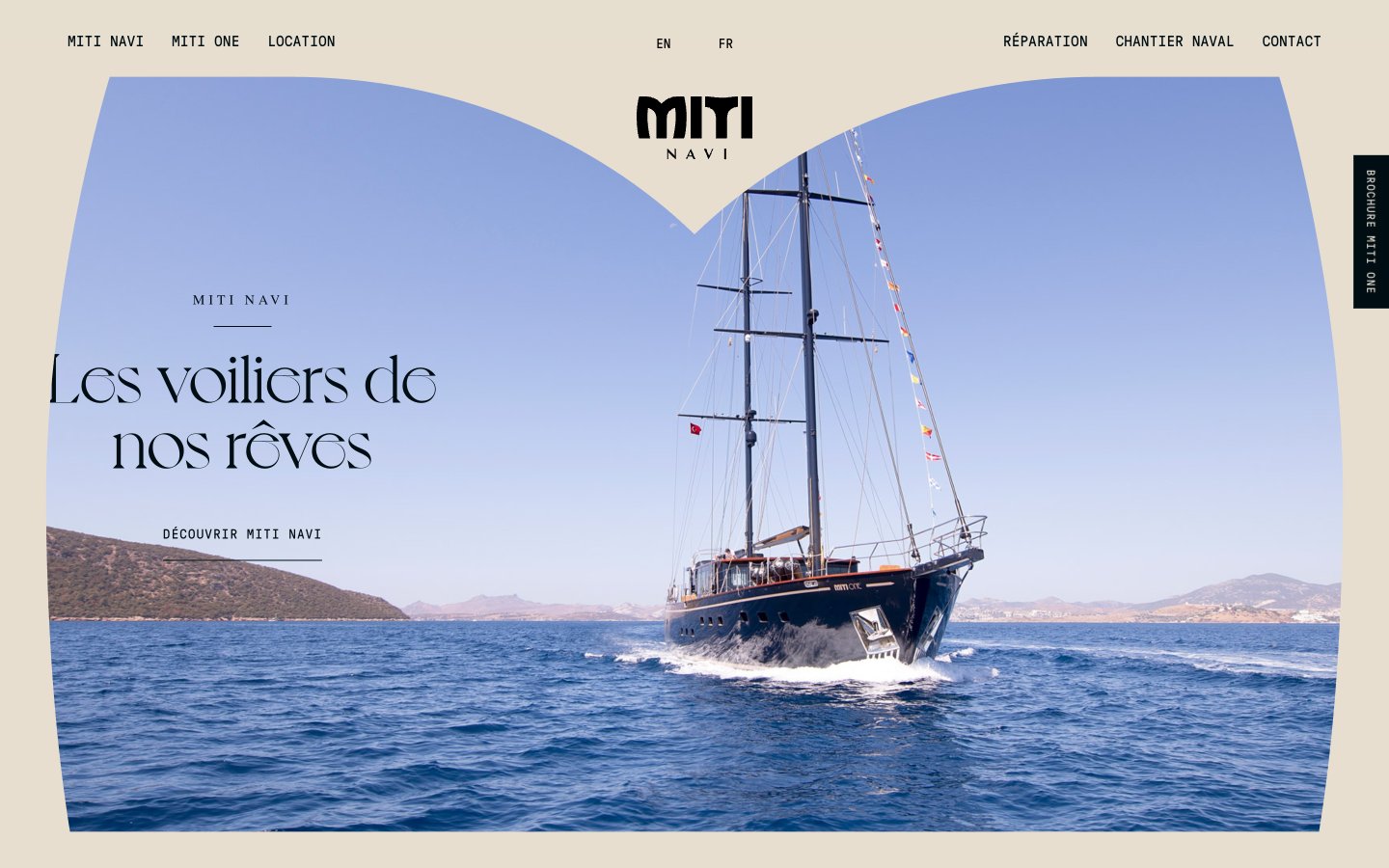
Miti Navi
Miti Navi — Style Reference
# Miti Navi — Style Reference
> Tuscan sea-view chapbook on raw linen
**Theme:** light
Miti Navi operates as a warm, paper-toned editorial canvas — think a luxury yachting magazine spread printed on unbleached craft stock. The entire interface is built on a sand-beige field (#e6dece) with deep ink-black typography, giving the site a tactile, hand-printed quality. Monospaced type (GT Pressura Mono) carries all functional UI — nav, buttons, body — lending technical precision that contrasts with the swooping, romantic serif (Voyage) reserved for editorial display lines. A single warm peach underline (#ffdead) is the only chromatic accent, used sparingly to mark interactive moments. The hero photograph is masked by a dramatic arch, the navigation splits into three balanced clusters around a centered wordmark, and a vertical sticky side tab interrupts the right edge with rotated text — all choices that read more like an art book than a product page.
## Tokens — Colors
| Name | Value | Token | Role |
|------|-------|-------|------|
| Linen | `#e6dece` | `--color-linen` | Page canvas, card surfaces, section backgrounds — the warm unbleached-paper field that carries all content |
| Deep Ink | `#000e13` | `--color-deep-ink` | Primary text, navigation, structural borders, logo lockup — near-black with the faintest cool undertone |
| Carbon | `#232323` | `--color-carbon` | Body text, icon strokes, secondary headings, hairline rules, card borders — workhorse dark for dense UI elements |
| Soft Ash | `#999999` | `--color-soft-ash` | Muted helper text, inactive nav items, subtle dividers, secondary metadata |