AI Prompt Studio - Intelligent Prompt Library
Explore and use professional AI prompts to optimize your workflow.
One-click Use
Websites
Markdown Text
design-md
website-prompt
landing-page-prompt
Safepal
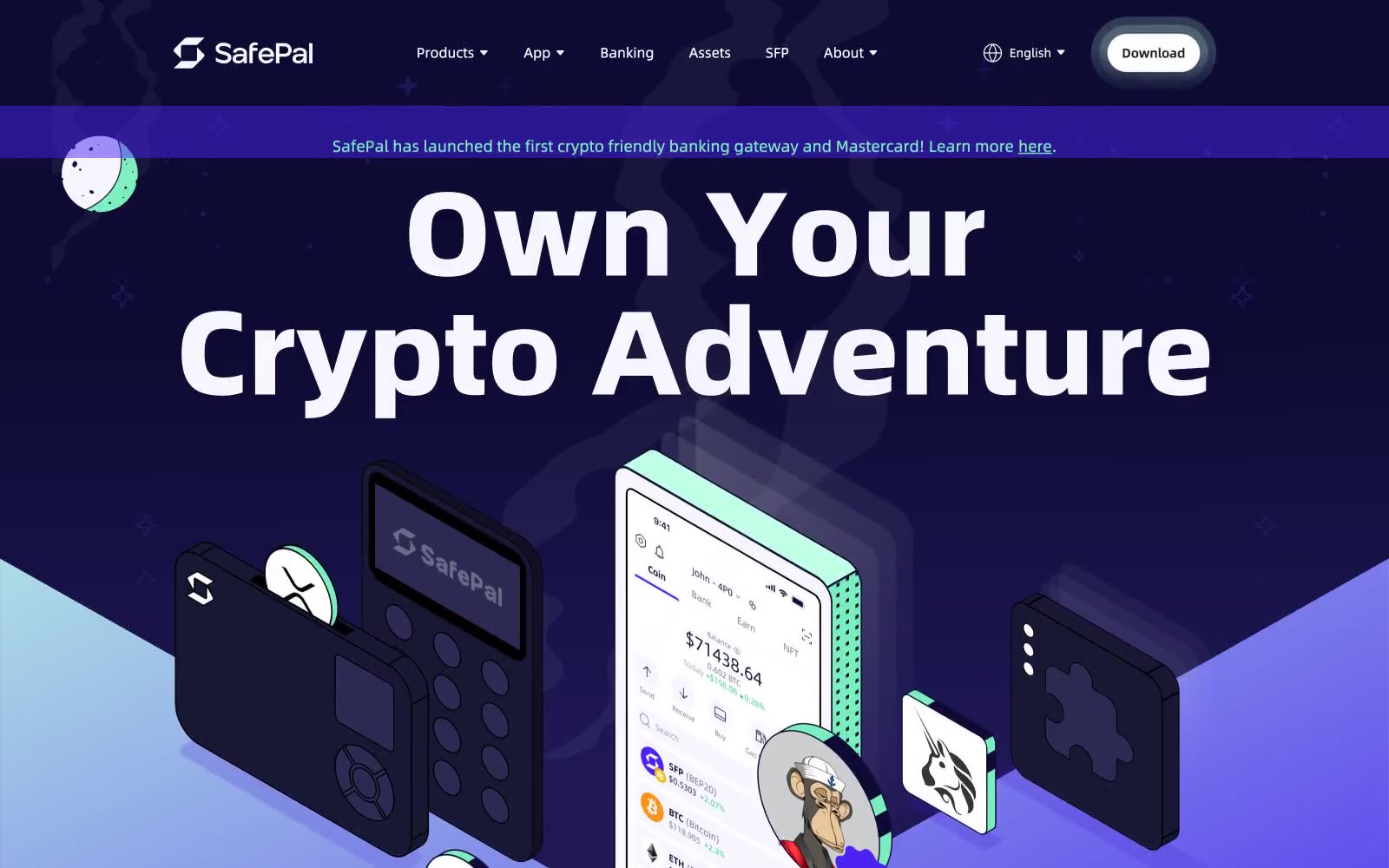
Safepal — Style Reference

# Safepal — Style Reference
> Electric violet cosmos with mint stars. SafPal lives in a deep indigo night where the only warmth is a neon mint accent and a single violet that burns like a signal flare.
**Theme:** dark
SafePal speaks in a cosmic violet vernacular: deep indigo canvases recede into atmospheric space while mint-green punctuation snaps focus back to the surface. The visual system rides on a vivid electric violet (#4a21ef) that saturates mid-page sections, paired with a luminous mint (#79efbd) that functions as the sole chromatic accent for headings, tags, and outlined action borders. Typography is monumental and assertive — the display headline at 80px with weight 800 demands ownership of the viewport, while body copy sits at a calm 16px. The 100px pill radius on buttons is the most recognizable shape signature, creating a soft contrast against the 24px card radius and the angular isometric illustrations of hardware wallets and phones that float in deep space. Surfaces stack from white cards over violet fields, with almost no shadows — depth is communicated through color contrast and illustrative floating elements rather than elevation.
## Tokens — Colors
| Name | Value | Token | Role |
|------|-------|-------|------|
| Signal Violet | `linear-gradient(154.24deg, rgb(191, 255, 228) 11.19%, rgb(74, 33, 239) 62.38%)` | `--color-signal-violet` | Page backgrounds, section bands, gradient anchor — the dominant chromatic field that defines brand presence across mid-page sections; Hero atmospheric gradient bridging mint into violet — sets the cosmic mood |
| Mint Pulse | `#79efbd` | `--color-mint-pulse` | Headline text on violet fields, outlined action borders, pill button fills, accent highlights — the sole warm punctuation against the cool violet |
| Terminal Green | `#18d26e` | `--color-terminal-green` | Green accent for outlined action borders, linked labels, and lightweight interactive emphasis. Use as a supporting accent, not as a status color |
| Deep Indigo | `linear-gradient(124.15deg, rgb(13, 11, 51) 0%, rgb(75, 62, 211) 218.07%)` | `--color-deep-indigo` | Hero background, darkest surface layer, text on light surfaces, gradient terminus; Dark section backgrounds, depth gradient behind illustrations |
Websites
Markdown Text
design-md
website-prompt
landing-page-prompt
Zellerfeld
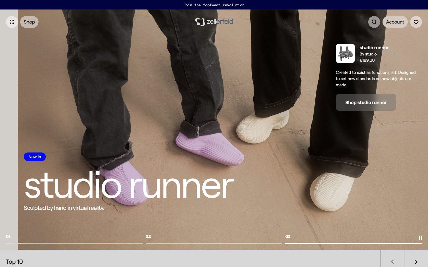
Zellerfeld — Style Reference
# Zellerfeld — Style Reference
> Sculptor's atelier on white marble — monolithic plinth surfaces, single cobalt spark, lowercase whispers from floor to ceiling.
**Theme:** light
Zellerfeld reads as a digital sculptor's gallery on white marble — a 3D-printing footwear marketplace where monochrome surfaces, generous whitespace, and oversized lowercase typography let each product behave like a museum object. The interface commits to extreme restraint: 99% achromatic canvas with a single electric cobalt (#000aff) reserved for urgency — badges, the active 'Shop' nav, the current-slide state. Cards float on a warm pearl gray rather than pure white, giving the grid a tactile, plaster-cast quality. Type stays in a single custom grotesque (Roobert) at tight -0.04em tracking, with Space Mono dropped in only for prices, ranks, and technical metadata. The result is a product page that feels closer to a design press site than a retail checkout — objects are photographed, not sold.
## Tokens — Colors
| Name | Value | Token | Role |
|------|-------|-------|------|
| Electric Cobalt | `#000aff` | `--color-electric-cobalt` | New In badges, active nav pill, current-slide indicator, claim moments — the only chromatic signal in the system, used sparingly so it reads as activation not decoration |
| Pale Iris | `#e5e7ff` | `--color-pale-iris` | New Color badge fill, soft highlight wash, tinted surface for variant callouts — a desaturated ghost of the cobalt that whispers color without breaking the monochrome regime |
| Ink Black | `#111111` | `--color-ink-black` | Primary text, default borders, icon strokes, hairline dividers — the dominant structural color across headings, lists, and links |
| Pure White | `#ffffff` | `--color-pure-white` | Neutral form states, badge text, and quiet UI feedback where color should stay understated. Do not promote it to the primary CTA color |
Websites
Markdown Text
design-md
website-prompt
landing-page-prompt
Supahub
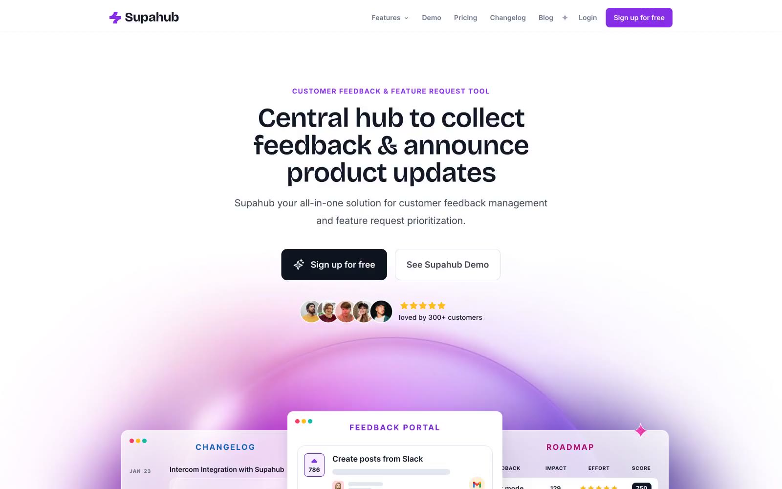
Supahub — Style Reference
# Supahub — Style Reference
> Soft daylight on a violet ridge. A mostly white, airy canvas lit by a single bright violet sun, with decorative gradient orbs spilling color into negative space and generous rounded geometry giving every surface a friendly, tactile weight.
**Theme:** light
Supahub is a sunlit feedback platform rendered in soft white space punctuated by violet confidence. The system favors a quiet, mostly achromatic canvas where a single vivid violet (#862fe7) carries all primary action weight, then lets decorative lavender, pink, and amber gradient orbs burst through hero and feature sections to dramatize product surfaces. Typography is a Bricolage Grotesque / Inter pairing: the geometric variable display face does the emotional heavy lifting at 48–56px with tight -0.025em tracking, while Inter handles dense UI, captions, and supporting copy in compact 14–16px weights. Components sit on a generous spacing rhythm with two dominant radii — 12px for buttons and small surfaces, and 9999px (pill) for avatars, tags, and decorative badges — producing a friendly, rounded, approachable product surface rather than an enterprise grid. The overall feeling is a modern SaaS product page that borrows energy from the consumer-app playbook: floating product mockups, gradient atmospheres, and testimonial walls treated as content wallpaper, never as filler.
## Tokens — Colors
| Name | Value | Token | Role |
|------|-------|-------|------|
| Voltage Violet | `#862fe7` | `--color-voltage-violet` | Primary filled action buttons, active nav state, key accent text — the single saturated brand anchor against the white canvas |
| Ultra Violet | `#5f259e` | `--color-ultra-violet` | Deeper violet for gradient stop, hover state, or emphasis text where Voltage Violet feels too bright |
| Lavender Mist | `#ad6df4` | `--color-lavender-mist` | Soft decorative violet for card backgrounds, icon tints, and gradient mid-stops |
| Orchid Wash | `#bd8ff0` | `--color-orchid-wash` | Lightest decorative violet wash for large surface fills behind product cards and feature bands |
Websites
Markdown Text
design-md
website-prompt
landing-page-prompt
Kajabi
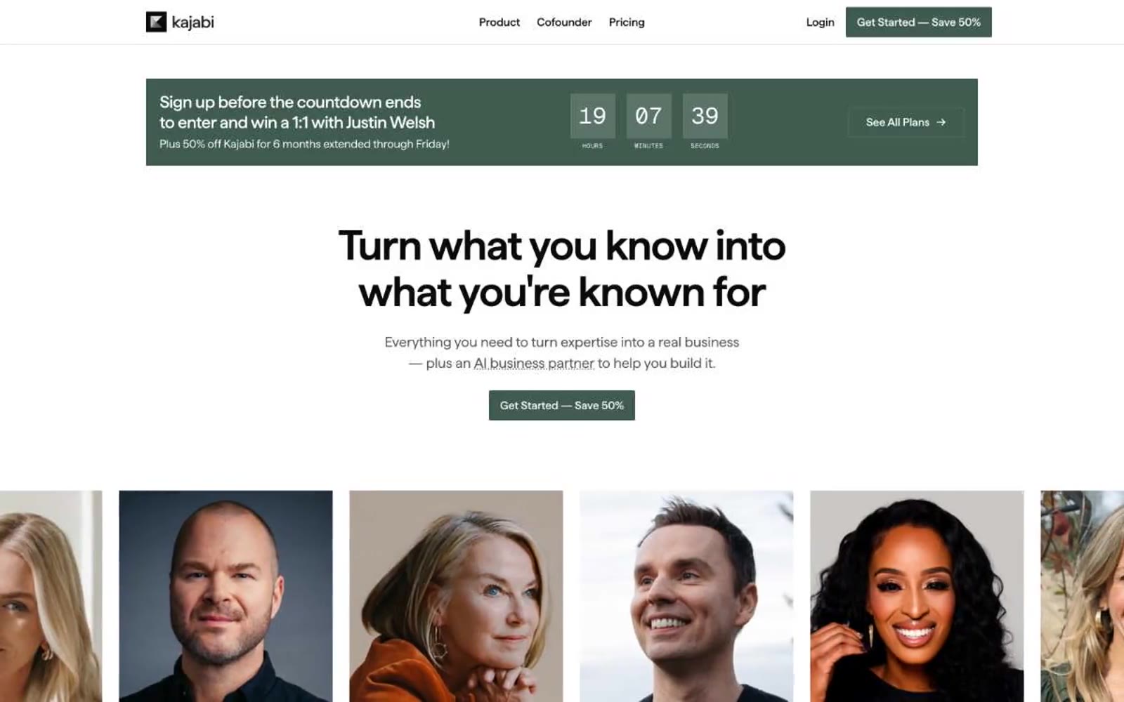
Kajabi — Style Reference
# Kajabi — Style Reference
> Gallery white walls holding warm portraits — the framework is invisible, the humans are the brand.
**Theme:** light
Kajabi runs a monochrome editorial system: pure white canvas, near-black type, and no chromatic brand color anywhere. The page surrenders all color to the content — full-bleed expert portraits, warm lifestyle video, photography — so the interface recedes and the humans do the selling. Type does the heavy lifting through scale and tight tracking rather than color or weight, with Haffer rendering at display sizes up to 60px in near-black #0a0a0a. Surfaces are flat, corners are sharp at 2px (not the modern SaaS 8-12px), and buttons are solid black rectangles. The contrast between this strict achromatic UI and the rich, warm photography creates the brand's signature tension: a clinical framework housing emotional content.
## Tokens — Colors
| Name | Value | Token | Role |
|------|-------|-------|------|
| Paper White | `#ffffff` | `--color-paper-white` | Page canvas, card surfaces, button text on dark backgrounds, inverse text in dark sections |
| Ink Black | `#0a0a0a` | `--color-ink-black` | Primary text, filled CTA buttons, navigation, footer — the only action color in the entire system, near-black not pure #000 |
| Charcoal | `#1f1f1e` | `--color-charcoal` | Dark section backgrounds (category bands, video frame borders), elevated dark surfaces |
| Stone | `#535250` | `--color-stone` | Secondary body text, muted helper text, subdued list/border accents |
Websites
Markdown Text
design-md
website-prompt
landing-page-prompt
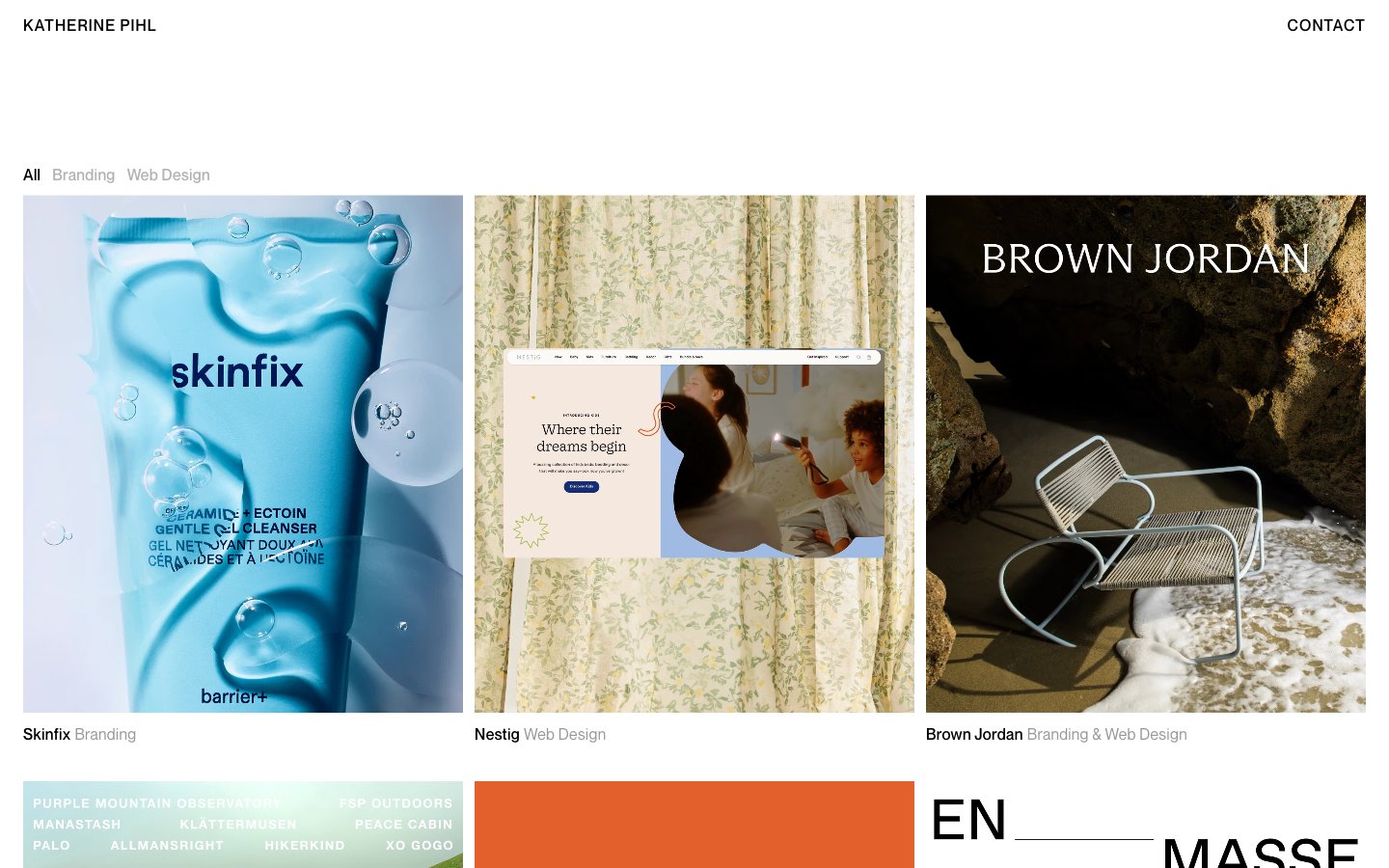
Katherine Pihl
Katherine Pihl — Style Reference
# Katherine Pihl — Style Reference
> art gallery wall at dawn — a white-walled space where black type, generous gaps, and full-bleed imagery do all the work, and the UI itself is almost invisible.
**Theme:** light
Katherine Pihl is an editorial portfolio system where the work does the talking and the interface recedes into the wall. The page is a pure white canvas with black and two grays — zero chromatic accent, zero decorative gradient, zero shadow — so the imagery carries all the color. The typographic system is the only expressive layer: a precise neo-grotesque (Neue Montreal) at 300–500 for all structural and label text, paired with a high-contrast light-weight serif (Ryhmes) that appears only as large display type overlaid on project imagery. Cards are not cards — they are unbordered, full-bleed images with text labels hanging in the whitespace below. Navigation is two text links. The layout rhythm is a 3-column grid with generous vertical breathing room; everything else is silence.
## Tokens — Colors
| Name | Value | Token | Role |
|------|-------|-------|------|
| Ink | `#000000` | `--color-ink` | Primary text, all structural borders, hairline page frames, link underlines — the single typographic ink |
| Fog | `#b3b3b3` | `--color-fog` | Page background, watermark-level surfaces, lightest borders |
| Ash | `#999999` | `--color-ash` | Medium-contrast borders, control outlines, and structural separators. |
Websites
Markdown Text
design-md
website-prompt
landing-page-prompt
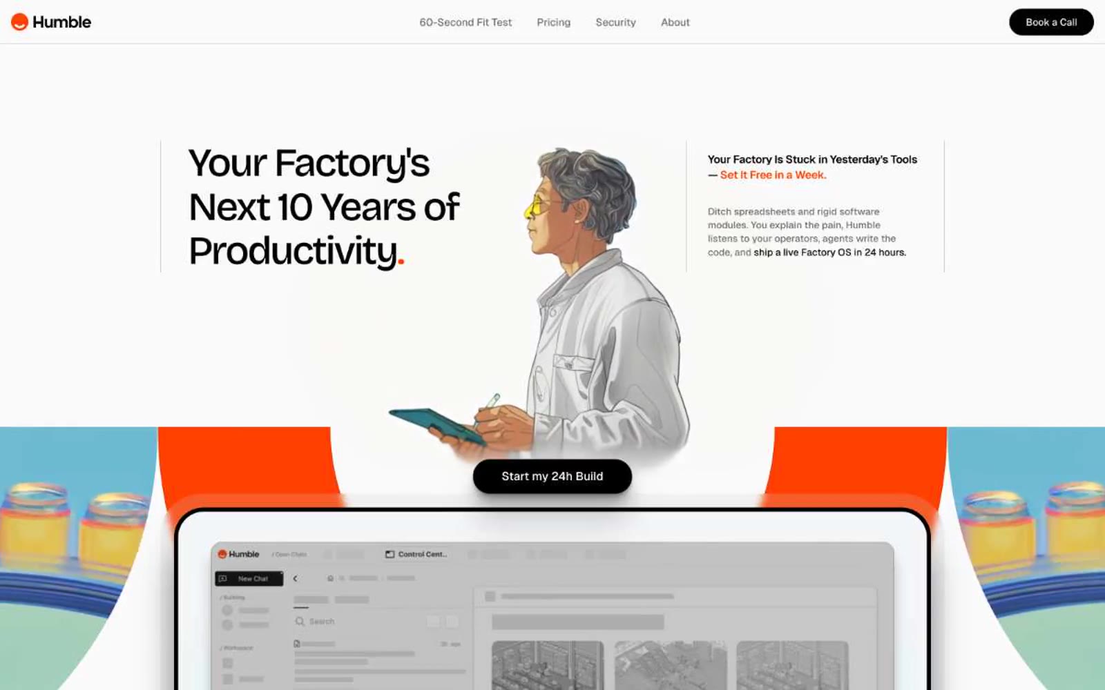
Humble
Humble — Style Reference
# Humble — Style Reference
> architect's broadsheet with safety-orange punctuation — a flat warm-white page where one vivid orange mark carries the entire brand voice.
**Theme:** light
Humble is a near-monochrome editorial system anchored by a single safety-orange accent. The canvas is warm off-white, type is set in Bricolage Grotesque with aggressive negative tracking that pulls the display sizes into poster-like blocks, and orange appears as a sharp marker-pen punctuation — a period at the end of a headline, a thin underline on a phrase, a flooded band between sections. Surfaces are flat with no shadows; hierarchy comes from generous whitespace, oversized type, and the orange accent that acts like a highlighter on a printed page. Components stay light: pill nav, ghost outlines, softly rounded product mockups, and dark filled CTAs that read as ink stamps rather than web buttons.
## Tokens — Colors
| Name | Value | Token | Role |
|------|-------|-------|------|
| Safety Orange | `#ff4000` | `--color-safety-orange` | Brand accent — terminal periods after display headlines, thin underlines on key phrases, small icon accents, and full-bleed section bands. This is the only chromatic color in the system; it must be used sparingly, like a highlighter on a printed page |
| Ink Black | `#000000` | `--color-ink-black` | Dark borders and separators for elevated surfaces and inverted UI. Do not promote it to the primary CTA color |
| Carbon | `#1c1c1c` | `--color-carbon` | Heading text where pure black feels too harsh; gives display type a slightly softer, warmer read without losing the editorial weight |
| Graphite | `#6e6e6e` | `--color-graphite` | Body secondary text, nav inactive items, caption labels. The workhorse muted neutral for supporting copy and metadata |
Websites
Markdown Text
design-md
website-prompt
landing-page-prompt
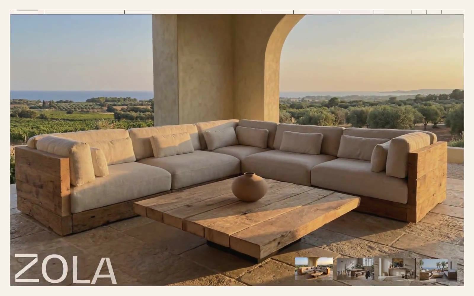
Oakâme
Oakâme — Style Reference
# Oakâme — Style Reference
> Sunlit Provençal atelier carved in warm stone
**Theme:** light
Oakâme operates as a sun-soaked Provençal atelier: a near-monochromatic warm-stone canvas (#f6f1eb) carrying deep walnut-brown ink (#403a34) and anchored by monumental display typography from the custom BwGradual face. The interface is deliberately quiet — no shadows, no gradients, no decorative color — letting reclaimed-oak furniture photography carry the entire visual weight. The signature rhythm comes from extreme type scale jumps: tiny tracked-out uppercase labels (10–12px) and ear-shattering display words (120–250px) share a page with almost no intermediate steps, producing a gallery-catalog tension between whisper and shout. Components stay architectural: hairline borders, pill-shaped controls, 8–20px padding, and a single 20px grid gutter. The system reads as a luxury furniture editorial — every screen is a spread.
## Tokens — Colors
| Name | Value | Token | Role |
|------|-------|-------|------|
| Walnut Ink | `#403a34` | `--color-walnut-ink` | Neutral button treatment for secondary actions and selected controls. |
| Linen Canvas | `#f6f1eb` | `--color-linen-canvas` | Page background, card surface, button fill on light controls, image overlays. Warm cream tone — not pure white — that gives the whole interface its Mediterranean-stone atmosphere |
| Charcoal Note | `#333333` | `--color-charcoal-note` | Secondary body text and subdued copy where Walnut Ink is reserved for headings and UI. Pairs at 11.3:1 against the canvas for AAA-level reading |
| Slate Whisper | `#555555` | `--color-slate-whisper` | Tertiary helper text, metadata, and desaturated captions. The lightest readable neutral, sitting at 6.6:1 on the canvas |
Websites
Markdown Text
design-md
website-prompt
landing-page-prompt
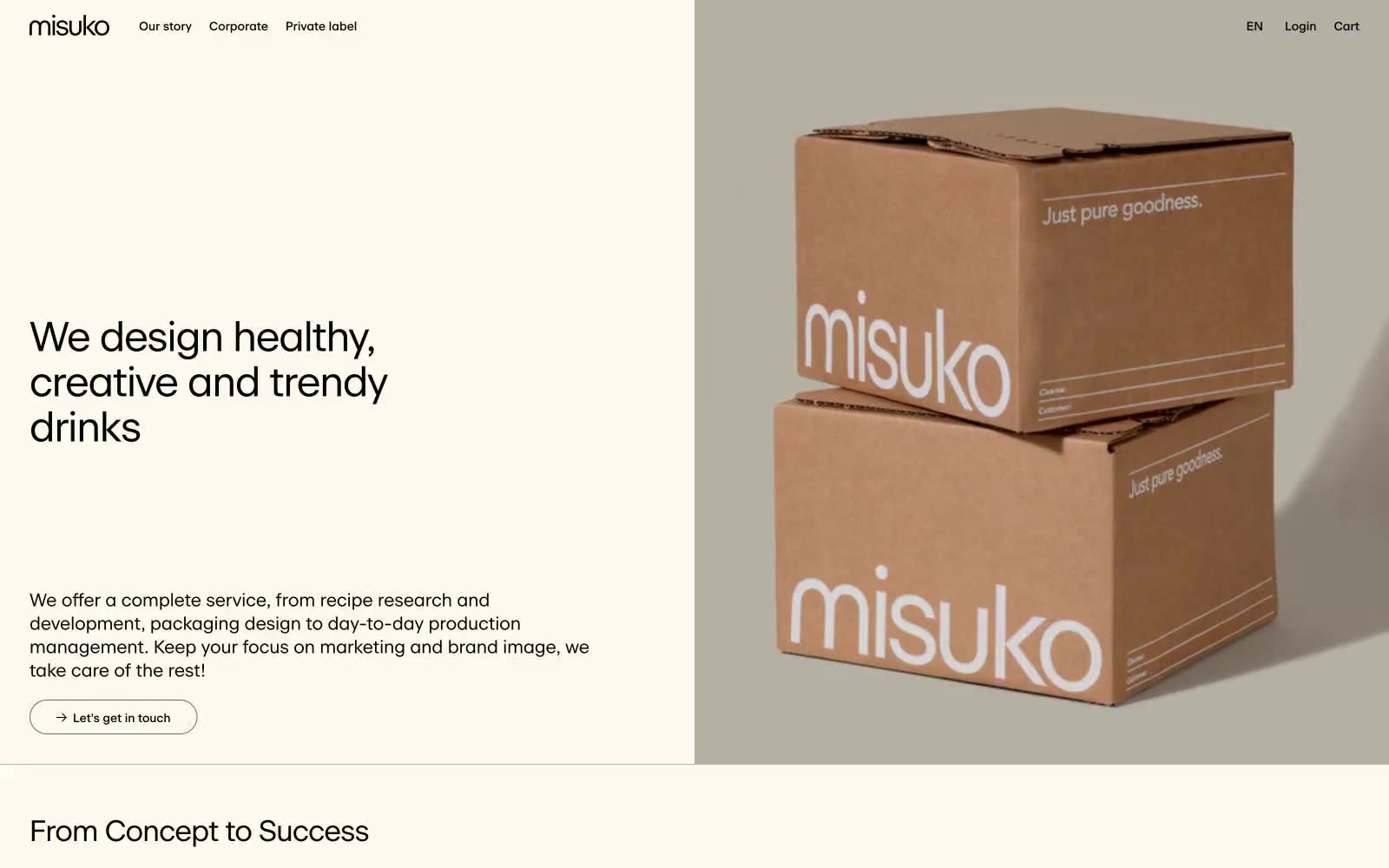
Spécialiste Belge
Spécialiste Belge — Style Reference
# Spécialiste Belge — Style Reference
> Linen-bound brand cookbook. Warm cream paper, black ink, single whispered serif, no decoration beyond the page edge.
**Theme:** light
Misuko operates as an editorial atelier for beverage branding: a warm cream canvas (#fcf9ee) carries a single custom serif-influenced sans (beausite) set in tight tracking, producing a magazine-spread calm. Every element speaks the same warm-monochrome dialect — black ink, warm-gray dividers, and beige paper — so color is reserved for product photography (cardboard tan) and the occasional pastel icon, never for chrome or decoration. The interface is almost entirely flat: no shadows, no gradients, no rounded corners beyond a single 20px pill on links, and no chromatic button fills — actions are ghost-outlined in black. Information density stays low; breathing room is generous and rhythm is dictated by large display headlines followed by narrow body columns, with three-column service grids and case-study cards doing the structural work.
## Tokens — Colors
| Name | Value | Token | Role |
|------|-------|-------|------|
| Bone White | `#fcf9ee` | `--color-bone-white` | Page canvas, hero left panel, newsletter input background — the warmest near-white, slightly yellowed like aged paper |
| Linen | `#f2efe3` | `--color-linen` | Card surfaces, section backgrounds, one decorative button fill — a half-shade deeper than Bone White, reads as the same material under indirect light |
| Pebble | `#bcbab2` | `--color-pebble` | Hairline borders, input outlines, list dividers — warm gray that disappears against the cream, only visible at the exact edge it frames |
| Bark | `#6a6965` | `--color-bark` | Secondary text, muted body copy, card meta lines — warm dark gray, 5.2:1 on Bone White, carries metadata without competing with primary text |
Websites
Markdown Text
design-md
website-prompt
landing-page-prompt
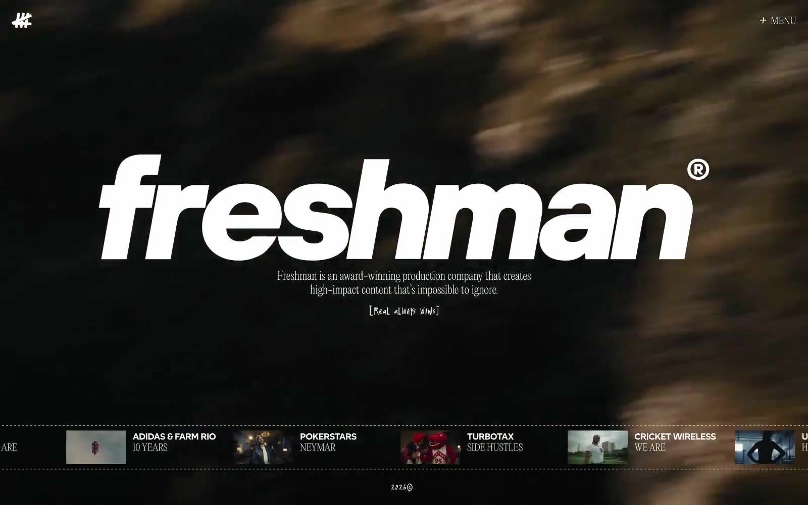
Freshman
Freshman — Style Reference
# Freshman — Style Reference
> cinema title card on black velvet
**Theme:** dark
Freshman runs a near-black canvas with almost no color noise — the white type and the lone red accent do all the heavy lifting. The visual language borrows from high-end print and cinema: a massive italicized wordmark anchors every screen, type is set ultra-light (weight 200) in Editorial New and tight in Altform, and a thin horizontal project ticker acts as the page's spine. Surfaces are flat with no shadows or gradients; hierarchy comes from scale and weight contrast, not elevation. Interaction is restrained — a single + MENU trigger, bracket-wrapped editorial labels, and a project reel that feels like a film festival credit roll rather than a SaaS nav.
## Tokens — Colors
| Name | Value | Token | Role |
|------|-------|-------|------|
| Pure White | `#ffffff` | `--color-pure-white` | Primary text, logotype fill, border strokes, and the dominant foreground on the dark canvas — carries 92% of all color instances |
| Carbon Black | `#000000` | `--color-carbon-black` | Base canvas and primary background — the default surface for every page |
| Charcoal Shale | `#101010` | `--color-charcoal-shale` | Secondary surface for icon wells, sub-panels, and slight tonal lift above the pure-black canvas |
| Signal Red | `#ff2936` | `--color-signal-red` | Sparingly-applied accent for active states, marquee highlights, and high-emphasis punctuation — used as a single saturated note against the monochrome system |
Websites
Markdown Text
design-md
website-prompt
landing-page-prompt
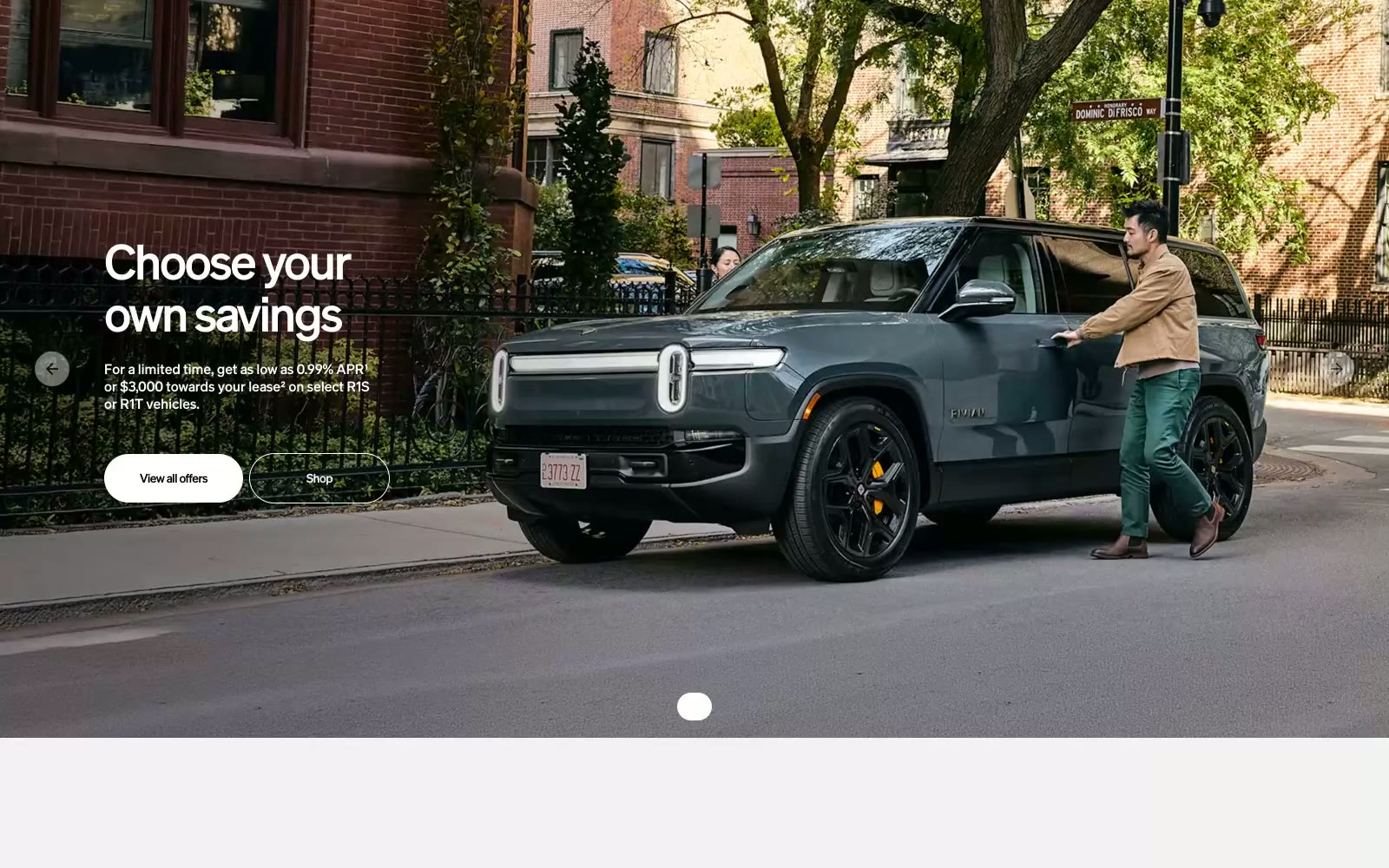
Rivian
Rivian — Style Reference
# Rivian — Style Reference
> Electric monolith on a concrete gallery wall. Rivian stages each vehicle as a sculpture against vast white space, with typography so large it becomes architecture and one warm yellow that breaks the monochrome like sunlight on a matte surface.
**Theme:** light
Rivian presents its vehicles as monumental objects in a clean architectural gallery: white concrete canvases, full-bleed cinematic photography, and one signature Solar Yellow accent that electrifies the otherwise monochrome system. Typography does the heavy lifting — a custom Adventure typeface at near-black weights paired with Liga at 360px for product monograms makes each vehicle feel branded and indivisible. Components are minimal and confident: pill-shaped controls, hairline borders, flat surfaces, and generous negative space that lets photography breathe. Color is rationed to the single yellow CTA and a few paint-swatch accents; everything else is graphite, concrete, and white. The system rejects decoration in favor of scale, restraint, and theatrical product presentation.
## Tokens — Colors
| Name | Value | Token | Role |
|------|-------|-------|------|
| Solar Yellow | `#ffac00` | `--color-solar-yellow` | Yellow supporting accent for decorative details and low-frequency emphasis. Do not promote it to the primary CTA color |
| Canyon Orange | `#e84826` | `--color-canyon-orange` | Orange supporting accent for decorative details and low-frequency emphasis. Do not promote it to the primary CTA color |
| Forest Green | `#629b5c` | `--color-forest-green` | Secondary accent for vehicle color options and category tags |
| Sky Blue | `#77afd8` | `--color-sky-blue` | Secondary accent for vehicle color options and informational highlights |
Websites
Markdown Text
design-md
website-prompt
landing-page-prompt
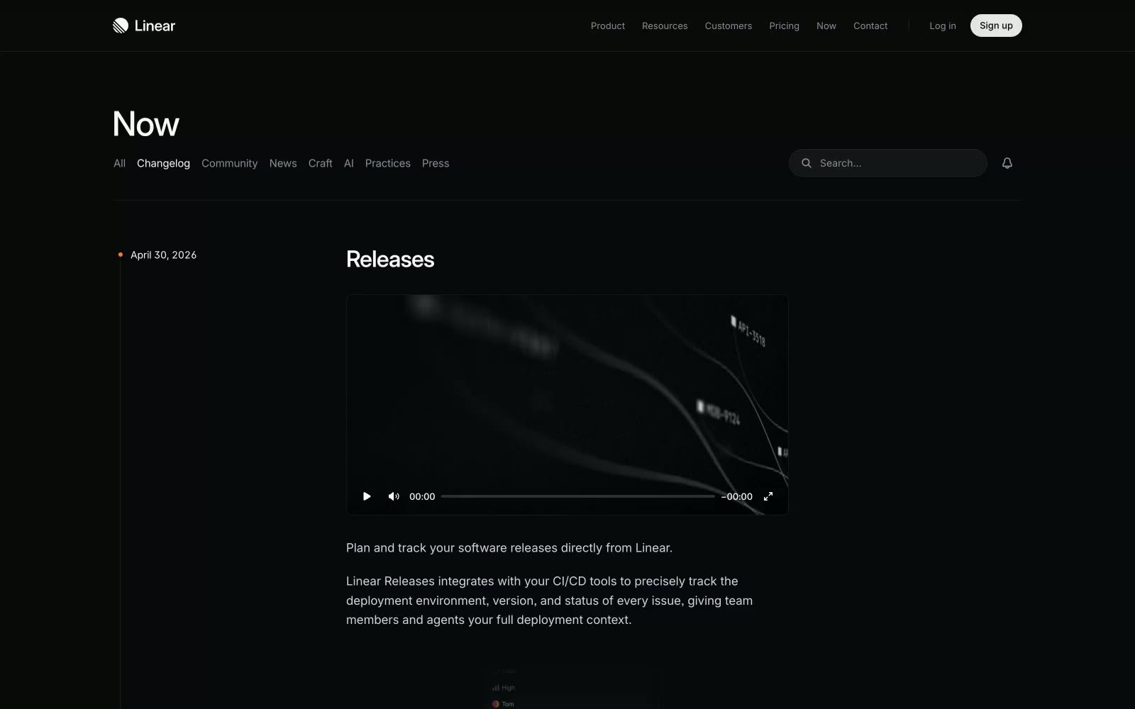
Changelog
Changelog — Style Reference
# Changelog — Style Reference
> observatory console behind dark glass.
**Theme:** dark
Linear operates in a deep-space monochrome: a near-black canvas (#08090a) layered with whisper-quiet neutral surfaces, hairline borders at 4–5px radius, and almost no chromatic presence. The entire interface reads as machined precision — Inter Variable at custom weights (400, 500, 510, 590) with negative tracking, and Berkeley Mono reserved for inline code references. Elevation is implied by stacked grays and 1px strokes, never by drop shadows. Buttons are pill-shaped (9999px) outlined in white, never filled with brand color — confidence comes from contrast and restraint, not from accents. The result feels like an engineering control surface: dense, calm, and information-first.
## Tokens — Colors
| Name | Value | Token | Role |
|------|-------|-------|------|
| Onyx Canvas | `#08090a` | `--color-onyx-canvas` | Page background, primary surface |
| Carbon Surface | `#141516` | `--color-carbon-surface` | Elevated card, input field, subtle surface layer |
| Graphite Surface | `#1c1c1f` | `--color-graphite-surface` | Mid-elevation panels, nested surfaces |
| Smoke Surface | `#23252a` | `--color-smoke-surface` | Hover state, deeper card, button surface tone |
Websites
Markdown Text
design-md
website-prompt
landing-page-prompt
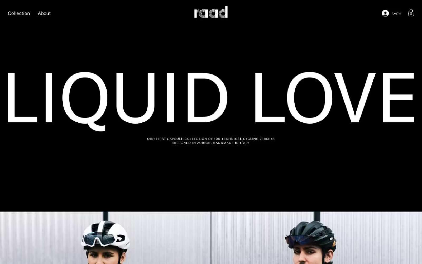
Raad Cycling
Raad Cycling — Style Reference
# Raad Cycling — Style Reference
> Ink and ivory gallery runway
**Theme:** light
Raad Cycling operates as a monochrome editorial gallery where cycling apparel is presented as wearable sculpture. The entire visual system is built on the tension between pure black and pure white — no chromatic accent, no decorative gradient, no warm undertone. Typography carries all the personality: a single geometric sans-serif rendered at extreme scale for headlines (filling nearly the full viewport width) and shrunken to whisper-thin captions for product labels. Photography is treated as gallery art — full-bleed, tightly cropped, no rounded corners, no drop shadows, no decorative framing. The aesthetic borrows from high-fashion lookbooks and contemporary art catalogues, not from sports retail. Every surface is either ink or ivory. Every interaction is a hairline border, never a filled button. The result is a brand that feels curated, expensive, and silent — the product must do the talking.
## Tokens — Colors
| Name | Value | Token | Role |
|------|-------|-------|------|
| Ink Black | `#000000` | `--color-ink-black` | Primary canvas for dark sections, product photography backgrounds, all body text on light surfaces, divider lines, and the dominant border color throughout the system |
| Ivory White | `#ffffff` | `--color-ivory-white` | Primary canvas for light sections, text on dark backgrounds, ghost-button fills and borders, the base surface against which all product photography is staged |
| Charcoal Edge | `#181818` | `--color-charcoal-edge` | Dark borders and separators for elevated surfaces and inverted UI. Do not promote it to the primary CTA color |
| Graphite | `#333333` | `--color-graphite` | Secondary border tone for subtle UI structure, divider lines between content blocks, and depth separation on otherwise flat surfaces |
Websites
Markdown Text
design-md
website-prompt
landing-page-prompt
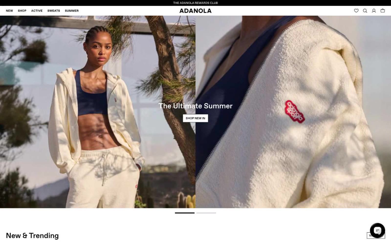
Adanola
Adanola — Style Reference
# Adanola — Style Reference
> Editorial lookbook on white paper. A fashion editorial spread where typography and photography breathe across clean white surfaces, with black ink for type and a whisper-thin custom sans-serif (Favorit) carrying the entire brand voice.
**Theme:** light
Adanola is a gallery-like fashion canvas where the product photography is the entire visual language and the UI almost disappears. The interface is near-monochrome — white surfaces, black text, and a single thin sans-serif typeface (Favorit) — letting the color of the garments themselves become the only chromatic accent on most pages. Components are deliberately lightweight: no shadows, no gradients, no decorative borders, just hairline rules, ghost outlines on primary actions, and 4px corner radii that read as crisp rather than soft. Spacing is compact and consistent (4px base), but the generous whitespace around imagery creates a calm, editorial rhythm that treats every product shot as a full-bleed editorial spread. The overall feel is closer to a high-end print lookbook than a typical e-commerce grid.
## Tokens — Colors
| Name | Value | Token | Role |
|------|-------|-------|------|
| Carbon Ink | `#000000` | `--color-carbon-ink` | Primary text, filled action buttons, icon strokes, hairlines — the dominant ink across the entire interface |
| Paper White | `#ffffff` | `--color-paper-white` | Page canvas, card surfaces, text on dark fills, image backgrounds |
| Soft Mist | `#e5e7eb` | `--color-soft-mist` | Subtle surface alternation, disabled states, skeleton backgrounds, light dividers |
| Warm Fog | `#f0efe7` | `--color-warm-fog` | Off-white surface variant for subtle banding between product rows and editorial sections |
Websites
Markdown Text
design-md
website-prompt
landing-page-prompt
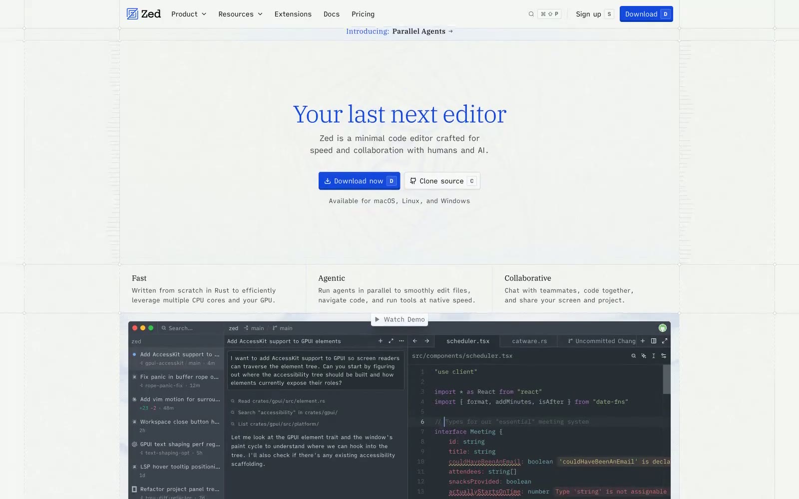
Zed
Zed — Style Reference
# Zed — Style Reference
> Blueprint workshop, wide open. A near-white gridded page held together by a single deep violet-blue and the calm authority of a humanist serif — every screen feels like a chapter in a well-printed technical manual.
**Theme:** light
Zed reads as an open-source engineering notebook rendered on faint blueprint paper: a near-white grid canvas, a single deep violet-blue that carries every heading and link, and product chrome that stays almost entirely text and hairline borders. Typography is the personality — a humanist serif (Plex Serif) for headlines at surprisingly light weights (340), a custom Writer sans for UI and body, and a wide-tracked mono (Zed Mono) for labels and shortcuts. Components are sharp-cornered (2px radius), compact (6px gaps), and almost shadowless; structure is implied by 1px inset top-borders and the faint dotted grid beneath everything. The download CTA is the only saturated fill on the page, and surrounding it everything stays quiet, typographic, and editorial — closer to a technical whitepaper than a SaaS landing page.
## Tokens — Colors
| Name | Value | Token | Role |
|------|-------|-------|------|
| Hero Violet | `#1348dc` | `--color-hero-violet` | Headlines, primary text links, brand mark — the single chromatic anchor that carries identity across the page |
| Signal Blue | `#2b7fff` | `--color-signal-blue` | Blue supporting accent for decorative details and low-frequency emphasis. Do not promote it to the primary CTA color |
| Sky Tint | `#8ec5ff` | `--color-sky-tint` | Blue supporting accent for decorative details and low-frequency emphasis. Do not promote it to the primary CTA color |
| Frost | `#bedbff` | `--color-frost` | Hairline blue borders, tag outlines, divider lines that need to read as on-brand rather than neutral |
Websites
Markdown Text
design-md
website-prompt
landing-page-prompt
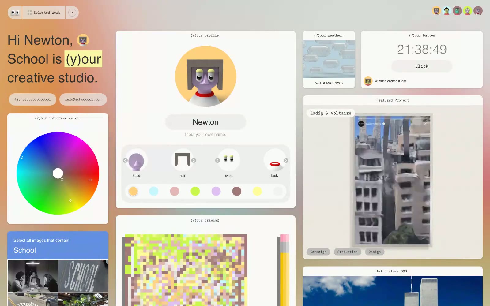
School
School — Style Reference
# School — Style Reference
> personal desktop for creative souls
**Theme:** light
School treats its portfolio as a personal desktop: a light gray canvas (#dbdbdb) tiled with generously rounded white cards, each labeled with a tiny monospace caption in parentheses like (Y)our profile. or (Y)our weather. The entire interface speaks in IBM Plex Mono — body, headings, labels, buttons, timestamps — giving every surface the texture of a terminal session or a developer's scratchpad. Color is almost entirely suppressed: the palette is 99% achromatic, with the only warmth coming from a soft tan (#e2ceb8) and a cool blue-gray (#6a728e) used as background washes, and occasional yellow highlight blocks behind individual letters. There is no hero, no marketing band, no gradient — the grid IS the experience, and each card behaves like a widget on a calm, slightly retro operating system.
## Tokens — Colors
| Name | Value | Token | Role |
|------|-------|-------|------|
| Charcoal Ink | `#303030` | `--color-charcoal-ink` | Primary text, headings, body copy, icons, link color, input borders, badges — the single dominant ink that holds the whole monochrome system together |
| Paper White | `#ffffff` | `--color-paper-white` | Card surfaces, input fields, elevated panels, text on dark fills |
| Concrete Gray | `#dbdbdb` | `--color-concrete-gray` | Page canvas, the visible background behind every card — the tone that makes white cards feel floating rather than embedded |
| Fog Mist | `#f2f2f2` | `--color-fog-mist` | Subtle elevated surfaces, secondary panels, input hover states — a step between canvas and card |
Websites
Markdown Text
design-md
website-prompt
landing-page-prompt
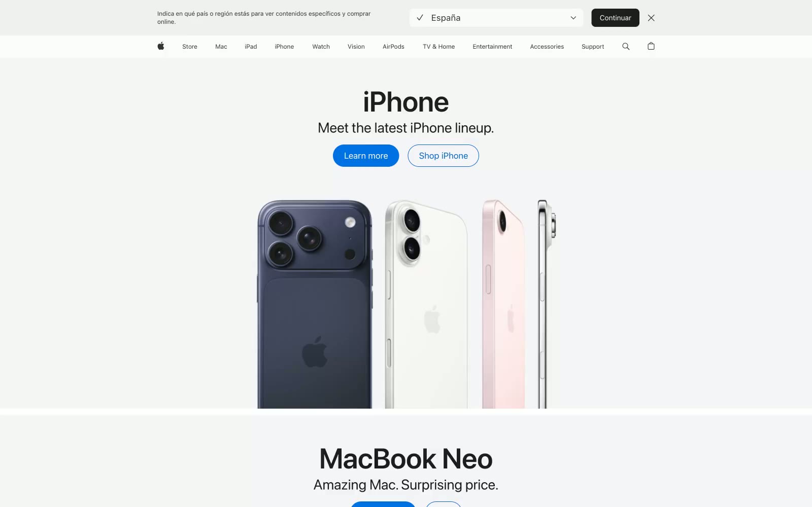
Apple
Apple — Style Reference
# Apple — Style Reference
> Museum vitrine on white marble. Products are sculpture; the interface is the gallery wall that steps back to let them speak.
**Theme:** light
Apple.com operates as a digital product vitrine: vast, gallery-like whitespace frames each device as the subject, with the entire interface receding behind it. A near-white canvas (#f5f5f7) supports white product surfaces, creating barely-perceptible elevation rather than shadow-defined hierarchy. One signature blue (#2997ff) is the only chromatic element allowed to break the achromatic default — it marks every link, every filled button, and every interactive moment. Typography is SF Pro exclusively, running from a whisper-weight 300 for subtitles to weight 700 for display headlines, with aggressively negative letter-spacing at large sizes that tightens the wordmark into an editorial sculpture. Layout rhythm alternates between centered text-above-product hero bands and horizontal media card grids, each section breathing with 80–120px of vertical air.
## Tokens — Colors
| Name | Value | Token | Role |
|------|-------|-------|------|
| Apple Blue | `#2997ff` | `--color-apple-blue` | Link color, active states, accent icons — the sole chromatic element in the system; appears wherever a text element invites interaction |
| Deep Link Blue | `#0066cc` | `--color-deep-link-blue` | Visited and hover state for links; deeper saturation signals state change without introducing a new hue family |
| Button Blue | `#0071e3` | `--color-button-blue` | Blue supporting accent for decorative details and low-frequency emphasis. Do not promote it to the primary CTA color |
| Graphite | `#1d1d1f` | `--color-graphite` | Primary text, headings, product names — the near-black of editorial print rather than pure #000, with a subtle warmth that feels premium on retina displays |
Websites
Markdown Text
design-md
website-prompt
landing-page-prompt
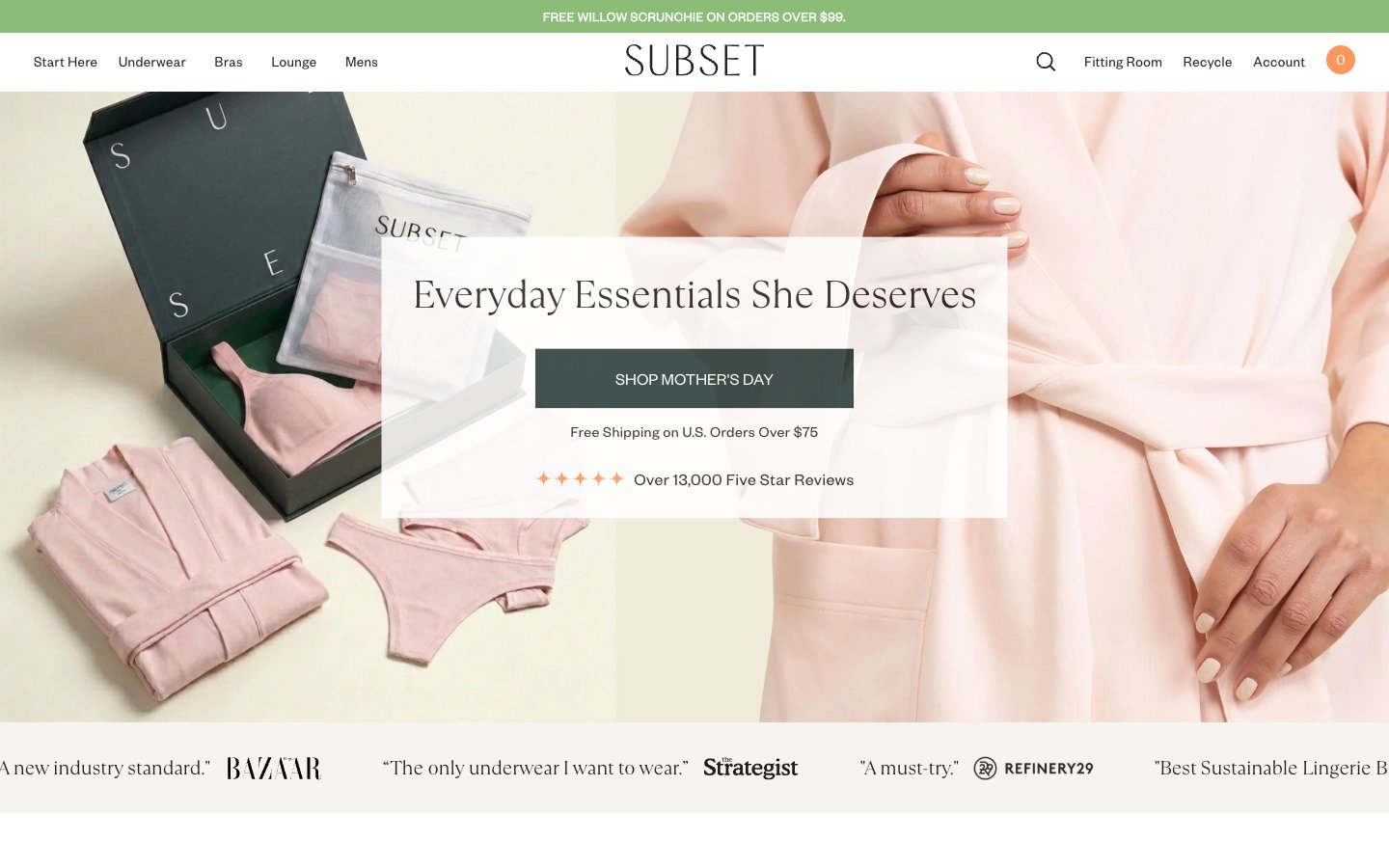
Subset
Subset — Style Reference
# Subset — Style Reference
> editorial boutique on raw linen
**Theme:** light
Subset is an editorial intimates boutique rendered on warm raw linen rather than stark white. The page breathes through a muted earth palette — sage, dusty blue, blush, ember — with Founders Grotesk as the workhorse voice and a refined serif (TT Ramillas) reserved for editorial headlines. Product photography is the hero; the UI gets out of the way with hairline borders, minimal radii, and no decorative shadows. The signature moves: aggressive letter-spacing on uppercase labels (0.1–0.15em), generous cream canvas, and color used as quiet punctuation on borders, badges, and icons rather than as large filled blocks.
## Tokens — Colors
| Name | Value | Token | Role |
|------|-------|-------|------|
| Ink | `#241f20` | `--color-ink` | Neutral form states, badge text, and quiet UI feedback where color should stay understated. Do not promote it to the primary CTA color |
| Raw Linen | `#f5f4ee` | `--color-raw-linen` | Page canvas and card backgrounds — warm off-white, the signature surface that distinguishes this system from generic white SaaS |
| White | `#ffffff` | `--color-white` | Elevated card surfaces, badge fills, inverse text on dark buttons |
| Fog | `#808080` | `--color-fog` | Muted helper text, secondary dividers, disabled labels |
Websites
Markdown Text
design-md
website-prompt
landing-page-prompt
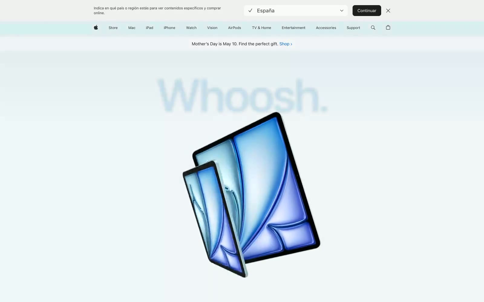
Apple
Apple — Style Reference
# Apple — Style Reference
> Cathedral of white space and one blue dot. Apple's pages are vast pale chambers where a single product floats and a single blue button glows — everything else is silence.
**Theme:** light
Apple's product page language is quiet maximalism: enormous type breathing against near-white canvas, with the product as the only loud object. The visual system relies on extreme contrast in scale — 160px hero headlines sit beside 12px legal microcopy — rather than color or ornament. A single blue accent (#0071e3) powers all interactivity; every other chromatic color is content-specific (product variants, hero gradients) and never appears on UI chrome. Surfaces are mostly flat with whisper-soft elevation (inset 1px hairline shadows, never drop shadows on cards). The rhythm is generous vertical whitespace punctuated by full-bleed gradient bands that contextualize hero imagery. Typography does the work of hierarchy: SF Pro Display at weight 600 for headlines, SF Pro Text at 400 for body, both with aggressive negative tracking that tightens the feel of even the largest sizes.
## Tokens — Colors
| Name | Value | Token | Role |
|------|-------|-------|------|
| Apple Blue | `#0071e3` | `--color-apple-blue` | Blue supporting accent for decorative details and low-frequency emphasis. Do not promote it to the primary CTA color |
| Link Blue | `#0066cc` | `--color-link-blue` | Inline text links, secondary clickable text in body copy and footers |
| Space Black | `#1d1d1f` | `--color-space-black` | Primary headings, body text, icon strokes, nav labels — the dominant text color across every surface |
| Slate | `#313131` | `--color-slate` | Secondary UI text, dark button labels, footer links, muted headings |
Websites
Markdown Text
design-md
website-prompt
landing-page-prompt
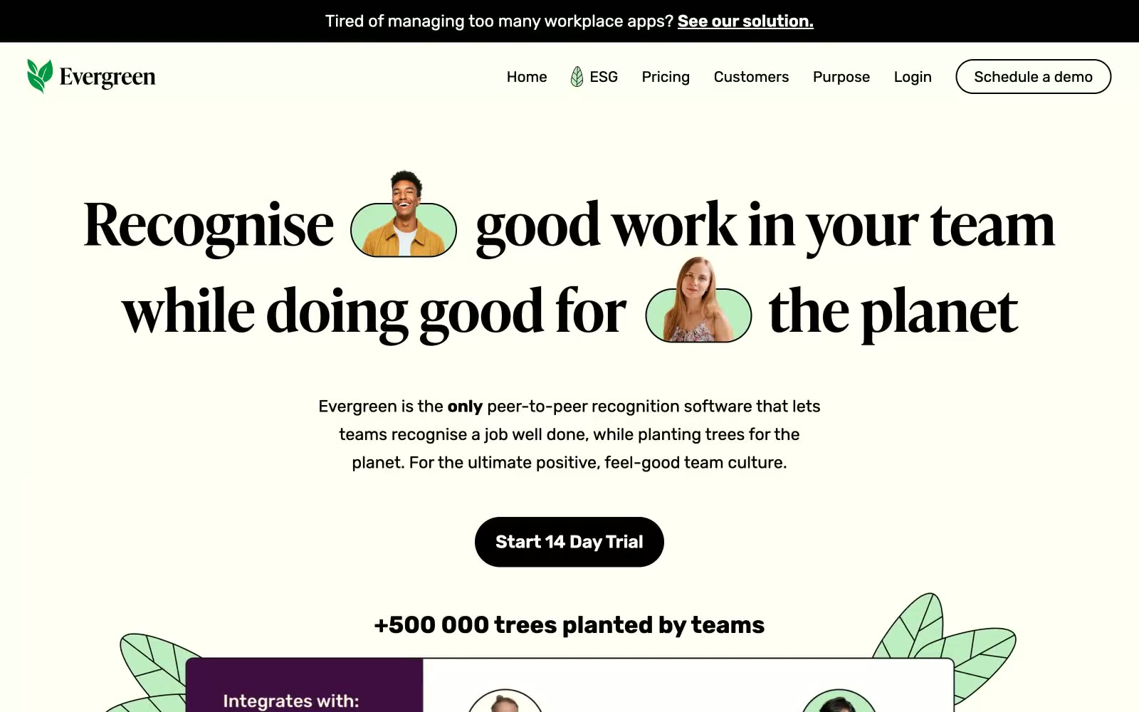
Evergreen
Evergreen — Style Reference
# Evergreen — Style Reference
> Sunlit greenhouse on linen paper
**Theme:** light
Evergreen uses a warm editorial language on a cream linen canvas, pairing a high-contrast didone-influenced serif for headlines with a friendly geometric sans for body. The palette is nearly monochrome — black ink, warm off-white surfaces, and a single soft sage mint used as organic highlight wash, never as decoration. The only saturated color is botanical and appears as a quiet accent inside avatars, badges, and illustrative leaves, never on buttons or large blocks. Components are rounded and tactile: pill-shaped primary buttons in pure black, 10px card radii, soft cream cards floating on the warmer page tone. Layout is centered and generous, with serif headlines large enough to dominate each section, body copy kept short and confident, and product/recognition mockups framed by hand-drawn leaf illustrations that bleed past their container edges.
## Tokens — Colors
| Name | Value | Token | Role |
|------|-------|-------|------|
| Linen Canvas | `#edede2` | `--color-linen-canvas` | Page background — the warm off-white base all sections sit on; this is the dominant surface of the entire site |
| Bone Card | `#fffff3` | `--color-bone-card` | Card and elevated surface background — slightly lighter than the canvas so cards read as lifted paper without shadow |
| Pure White | `#ffffff` | `--color-pure-white` | Reserved for inverted text on dark buttons, product mockup surfaces, and high-contrast inline elements |
| Ink Black | `#000000` | `--color-ink-black` | Primary action button fill, heading text, hairline borders, and the announcement bar — the high-contrast workhorse |
Websites
Markdown Text
design-md
website-prompt
landing-page-prompt
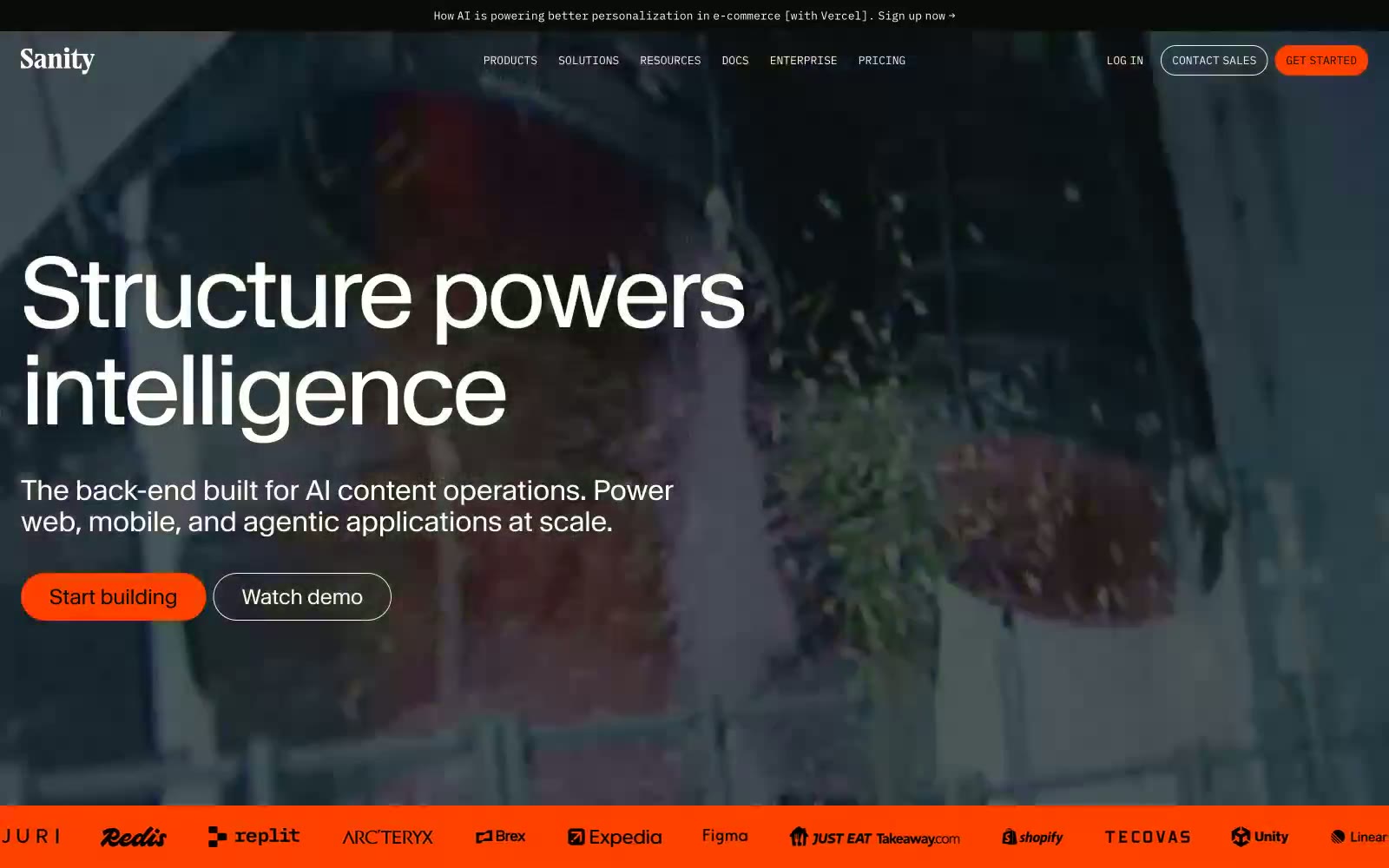
Sanity.io
Sanity.io — Style Reference
# Sanity.io — Style Reference
> Geological monolith with orange ignition. Dark agate slabs punctured by a single ember-orange CTA, surrounded by white editorial whitespace.
**Theme:** mixed
Sanity.io speaks with the confident restraint of an editorial design system: vast dark hero sections anchored by full-bleed organic photography, then a clean white grid where large Waldenburg headlines do the heavy lifting. Orange (#ff4100) functions as the only chromatic punctuation on a near-monochrome stage — it appears on the logo dot, the Get Started button, and occasional tags, never as decoration. Numbered sections (01–05) evoke a Swiss editorial layout, and the Waldenburg typeface's tight tracking at display sizes (–4.48px at 112px) creates a compressed, architectural rhythm. The UI is a content platform that treats its own product as the hero — Studio screenshots, code editors, and structured content forms appear in the marketing surface itself, blurring the line between product and pitch.
## Tokens — Colors
| Name | Value | Token | Role |
|------|-------|-------|------|
| Ember Orange | `#ff4100` | `--color-ember-orange` | Orange supporting accent for decorative details and low-frequency emphasis. Do not promote it to the primary CTA color |
| Signal Blue | `#0052ef` | `--color-signal-blue` | Links, secondary highlights, focus rings, decorative code accents — cool counterpoint to the warm orange, used sparingly |
| Plex Green | `#19d600` | `--color-plex-green` | Green supporting accent for decorative details and low-frequency emphasis. Use as a supporting accent, not as a status color |
| Plasma Magenta | `#f500ff` | `--color-plasma-magenta` | Decorative code syntax highlight, studio editor token — appears only within code/editor contexts, not general UI |
Websites
Markdown Text
design-md
website-prompt
landing-page-prompt
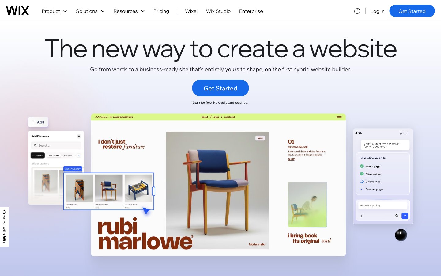
wix.com
wix.com — Style Reference
# wix.com — Style Reference
> Daylight gallery wall with electric blue signposts
**Theme:** light
Wix's visual system reads as a spacious, air-filled workspace on a bright white canvas, where oversized headlines in the custom Madefor Display typeface set a confident but airy tone. The palette is overwhelmingly achromatic — black text, white surfaces, hairline gray borders — with a single saturated electric blue (#166aea) reserved for primary action buttons and a secondary black-filled pill as the alternative action. Color appears as intentional punctuation: a lime-green surface wash, a soft lavender gradient, a yellow highlight, a violet accent — each used sparingly to mark sections, not to decorate. Components are flat, rounded, and lightweight: pill buttons at 50px radius, cards at 20px, images at 8.9px, minimal shadows. The grid breathes — generous section gaps near 80px, centered hero compositions, alternating product mockups that feel like editorial spreads rather than SaaS screenshots.
## Tokens — Colors
| Name | Value | Token | Role |
|------|-------|-------|------|
| Pure Canvas | `#ffffff` | `--color-pure-canvas` | Neutral form states, badge text, and quiet UI feedback where color should stay understated. Do not promote it to the primary CTA color |
| Slate Mist | `#f1f5f9` | `--color-slate-mist` | Elevated surface tier, input backgrounds, subtle section panels |
| Carbon Ink | `#000000` | `--color-carbon-ink` | Primary text, icon strokes, borders, dark button fills — the typographic and structural black |
| Graphite | `#1c1d21` | `--color-graphite` | Headline text alternative — slightly softened black for display type where pure black feels too clinical |
Websites
Markdown Text
design-md
website-prompt
landing-page-prompt
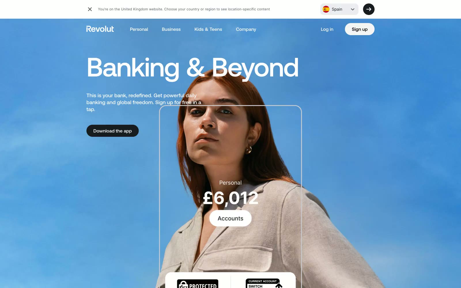
Revolut
Revolut — Style Reference
# Revolut — Style Reference
> financial passport to the world
**Theme:** light
The design feels like viewing an epic, cinematic world through the clean, clear interface of a premium device. Full-bleed, aspirational photography in hero sections sets a global, adventurous tone, suggesting the life the product enables. This cinematic feel is grounded by an incredibly strict, almost entirely achromatic color palette, where stark white content blocks sit against pure black or photo backgrounds. The display font, Aeonik Pro, is used with tight negative letter-spacing, giving headlines a precise, architectural quality. This tension between expansive human imagery and minimalist, geometric typography defines the system's identity: aspirational but controlled, powerful but simple.
## Tokens — Colors
| Name | Value | Token | Role |
|------|-------|-------|------|
| Revolut Black | `#191c1f` | `--color-revolut-black` | Primary text, dark CTA backgrounds, footers, borders. Establishes a deep, serious foundation. |
| Cloud White | `#f4f4f4` | `--color-cloud-white` | Primary light CTA backgrounds, some page sections. A soft off-white that feels less stark than pure white. |
| Pure White | `#ffffff` | `--color-pure-white` | Primary page background, text on dark surfaces. |
| Onyx Black | `#000000` | `--color-onyx-black` | Text on light CTA buttons, some secondary CTA backgrounds. |
Websites
Markdown Text
design-md
website-prompt
landing-page-prompt
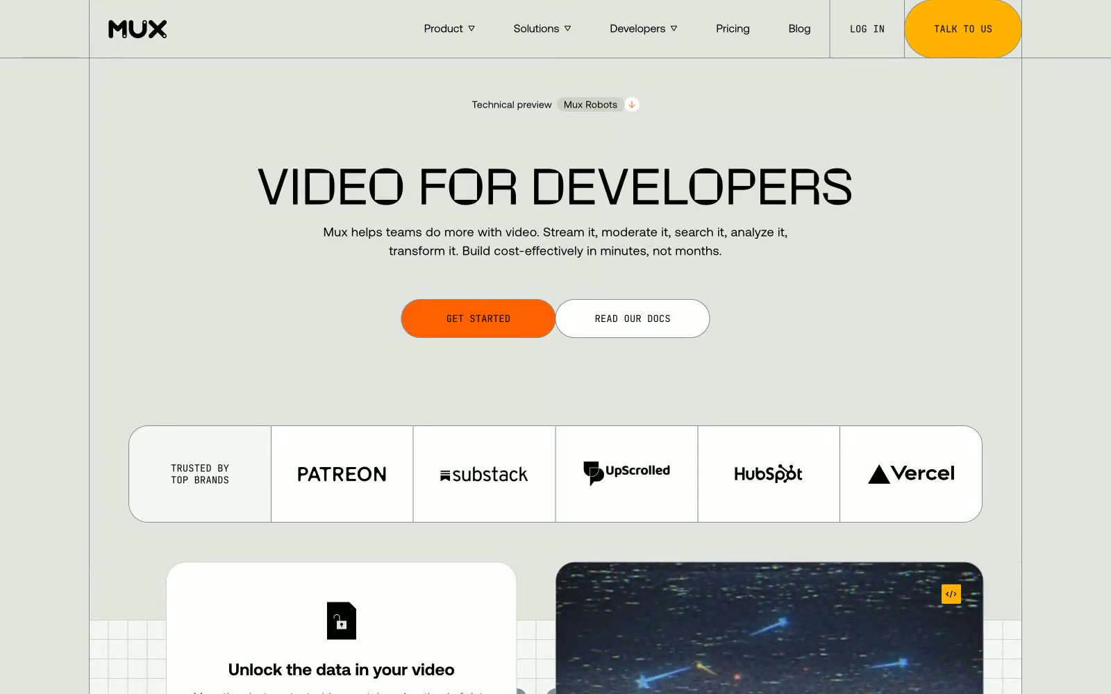
Mux
Mux — Style Reference
# Mux — Style Reference
> Sunlit video workshop on olive paper — warm sage canvas with crisp white cards, orange CTAs, and a chunky display headline that feels hand-lettered
**Theme:** light
Mux is a sunlit engineering workshop rendered in warm olive paper: a light, spacious developer-tool surface where the canvas itself (#e2e4dd, a warm sage-gray) feels like a drafting table, and crisp white cards sit on top like printed spec sheets. The system is deliberately low-chroma — the background, borders, and text carry the visual weight, while two warm accents (vivid orange #ff6100 and vivid yellow #ffb200) arrive as small functional punctuation: filled CTAs, hairline section dividers, and tiny AI labels. Typography is dual: a geometric neo-grotesque (Aeonik) for nearly everything, and a chunky display face (Rotonto) reserved for the biggest hero headlines, giving each page a clear two-register rhythm. Components are rounded generously — 28px card radii, 112–9999px pill buttons — making the interface feel hand-built and approachable rather than enterprise-precise. Dark product surfaces (#242628) appear as inset panels (transcript viewers, video player chrome) so the rest of the page stays calm and warm.
## Tokens — Colors
| Name | Value | Token | Role |
|------|-------|-------|------|
| Olive Drafting | `#e2e4dd` | `--color-olive-drafting` | Page canvas, hero backgrounds, the warm sage paper that everything sits on — the dominant surface tone of the entire site |
| Snow Card | `#ffffff` | `--color-snow-card` | Card surfaces, navigation bar, elevated panels — the only surface that floats above the olive canvas |
| Inkstone | `#000000` | `--color-inkstone` | Primary text, heading strokes, nav text, icon strokes — maximum contrast on light surfaces, always pure black |
| Forge Dark | `#242628` | `--color-forge-dark` | Dark inset surfaces — product mockups, transcript panels, video player chrome, footer; provides the only dark layer in the system |
Websites
Markdown Text
design-md
website-prompt
landing-page-prompt
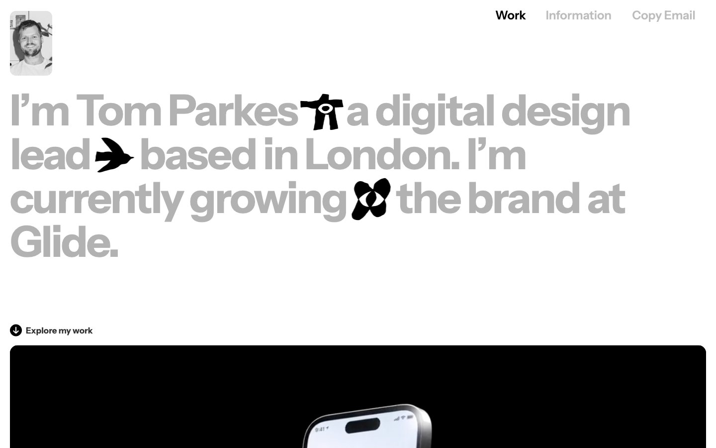
Tparkes
Tparkes — Style Reference
# Tparkes — Style Reference
> Editorial broadsheet on white. A four-word image: a designer typesetting their own name at 86px and lets the page breathe around it.
**Theme:** light
Tparkes is a typographic portfolio that treats the page as a printed broadsheet: almost entirely monochrome, white-canvas, text-driven, with one warm cream accent (#f5ffbe) appearing as a flash of color on a single surface. The hero is a single oversized statement — Instrumentsans at 86px, weight 600, line-height 0.83, negative tracking — that swallows the viewport and uses inline glyph icons (bird, plane, flower) as visual punctuation rather than decoration. Everything else recedes: a tiny 4px-radiused avatar, 20px nav items, a thin hairline border as section divider, and work thumbnails that are full-bleed images with 16px radius and quiet captions underneath. The system is anti-decorative — no shadows, no gradients, no fills on buttons, no card elevation. Communication is carried by scale, weight, and proximity, not by color or chrome.
## Tokens — Colors
| Name | Value | Token | Role |
|------|-------|-------|------|
| Paper White | `#ffffff` | `--color-paper-white` | Page canvas, card surfaces, work-thumbnail backings |
| Newsprint | `#333333` | `--color-newsprint` | Primary text, dominant hairline borders, image outlines |
| Faint Gray | `#a7a7a7` | `--color-faint-gray` | Muted text, secondary borders, caption-scale copy |
| Typesetter Gray | `#b3b3b3` | `--color-typesetter-gray` | Display-weight text, large heading fills where contrast is intentionally reduced |