AI Prompt Studio - Intelligent Prompt Library
Explore and use professional AI prompts to optimize your workflow.
One-click Use
Websites
Markdown Text
design-md
website-prompt
landing-page-prompt
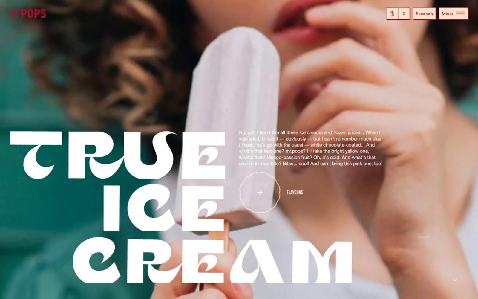
Mr. Pops
Mr. Pops — Style Reference

# Mr. Pops — Style Reference
> retro ice cream parlor on cream paper. A bright white shopfront with cherry-red trim, stacked marquee letters, and warm cream cards beneath full-bleed food photography.
**Theme:** light
Mr. Pops reads like a sunlit ice cream parlor printed on cream cardstock: warm white canvas, massive condensed display type set tight over full-bleed lifestyle photography, and a single cherry-red used almost exclusively as outline and stroke. The dominant gesture is bold — Cervo display hits 144px with 0.75 line-height and 0.05em positive tracking, stacked four lines deep — but the chrome stays airy: thin red borders, pill buttons, 40px corners, and cream-tinted secondary surfaces instead of gray. Neutrals (black, white, warm cream) carry the structure while the red punctuates. Components should feel like a hand-stamped menu card: generous whitespace, confident borders, no drop shadows, and photography that bleeds to the edge of the screen.
## Tokens — Colors
| Name | Value | Token | Role |
|------|-------|-------|------|
| Cherry Marquee | `#b00e2f` | `--color-cherry-marquee` | Brand accent, heading text, link color, icon stroke, outlined button border, footer headline — vivid warm red used as the single chromatic signal across an otherwise cream-and-white interface |
| Cream Bisque | `#fee5ca` | `--color-cream-bisque` | Secondary surface for cards, callout panels, and the cart/bag detail button — warm near-white that reads as paper, not gray |
| Canvas White | `#ffffff` | `--color-canvas-white` | Page background, card surface, input fill, button text on dark |
| Ink Black | `#000000` | `--color-ink-black` | Primary body text, icon fills, heavy borders, SVG fill — the only true dark |
Websites
Markdown Text
design-md
website-prompt
landing-page-prompt
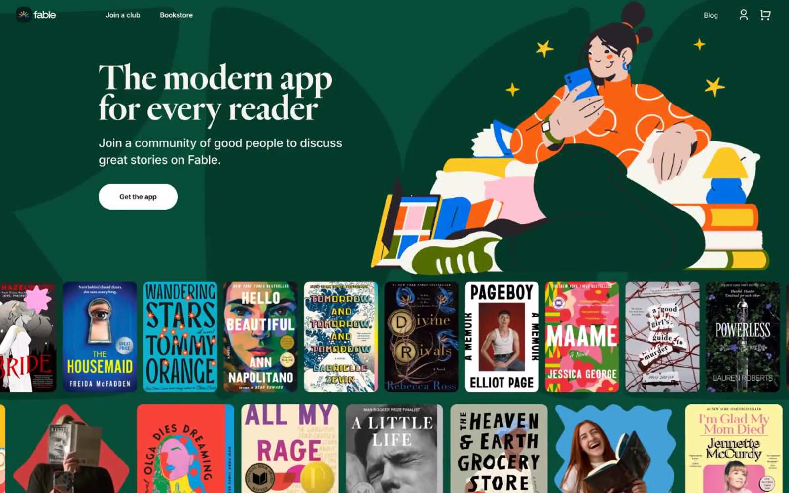
Fable
Fable — Style Reference
# Fable — Style Reference
> a literary reading nook with cream paper and ink — the book is the art
**Theme:** mixed
Fable reads like an editorial book club brought to life: generous cream surfaces, large warm serif headlines, and alternating full-bleed colored bands (forest green and sky blue) that frame colorful flat-illustration scenes. Typography is the loudest voice — Heldane Display at near-black weight with tight 0.86–0.94 line-heights produces a literary, slightly compressed headline look, while Inter handles every utility and body line at modest sizes with strong negative tracking. Buttons are stadium-pill shapes (60px radius) in two tones — dark on cream, white on color — and book covers themselves become the primary decorative motif, treated as editorial artwork rather than thumbnails. The overall rhythm is section-band driven: each full-bleed color block introduces a single concept with a headline, supporting copy, a single pill CTA, and an illustration or product preview on the right.
## Tokens — Colors
| Name | Value | Token | Role |
|------|-------|-------|------|
| Fable Forest | `#064c37` | `--color-fable-forest` | Full-bleed dark section background, first-screen hero band — deep botanical green that makes the warm cream and orange illustration pop |
| Storybook Sky | `#43a1d7` | `--color-storybook-sky` | Full-bleed mid section background — cerulean blue band that carries product-feature storytelling between cream and green sections |
| Paper Cream | `#f7f4ee` | `--color-paper-cream` | Hairline borders, dividers, input outlines, and card edges on light surfaces. |
| Ink | `#161015` | `--color-ink` | Primary heading and display text — near-black with a violet undertone that warms the editorial serif without losing contrast |
Websites
Markdown Text
design-md
website-prompt
landing-page-prompt
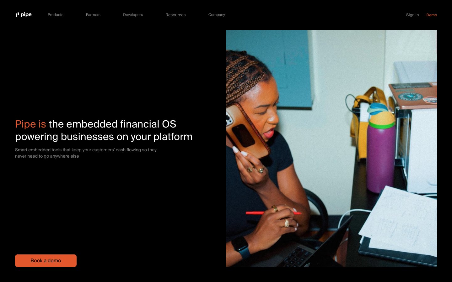
Pipe
Pipe — Style Reference
# Pipe — Style Reference
> midnight darkroom with one ember
**Theme:** dark
Pipe runs on a midnight editorial language: pitch-black canvas, a single warm orange brand accent, and one large-format photograph anchoring each section. The system is deliberately sparse — only one chromatic color in the entire palette, used sparingly as a switch-on signal for action and brand identity. Typography is a single-family geometric grotesque at one weight (400) doing all the work, with display sizes set at extremely tight line-heights (0.70) to feel sculpted rather than typeset. Surfaces are flat with no shadows; elevation is communicated through the single half-step from #000000 to #1a1a1a. Components are small, light, and bordered rather than filled — orange appears only when something must be acted upon. The overall effect is a darkroom where a single ember glows against graphite.
## Tokens — Colors
| Name | Value | Token | Role |
|------|-------|-------|------|
| Ember | `#e2572c` | `--color-ember` | Orange supporting accent for decorative details and low-frequency emphasis. Do not promote it to the primary CTA color |
| Obsidian | `#000000` | `--color-obsidian` | Page canvas, full-bleed backgrounds, image surrounds |
| Graphite | `#1a1a1a` | `--color-graphite` | Card surfaces, elevated panels, the one step up from canvas |
| Steel | `#808080` | `--color-steel` | Muted body text, secondary labels, inactive UI — sits at AA contrast against Obsidian |
Websites
Markdown Text
design-md
website-prompt
landing-page-prompt
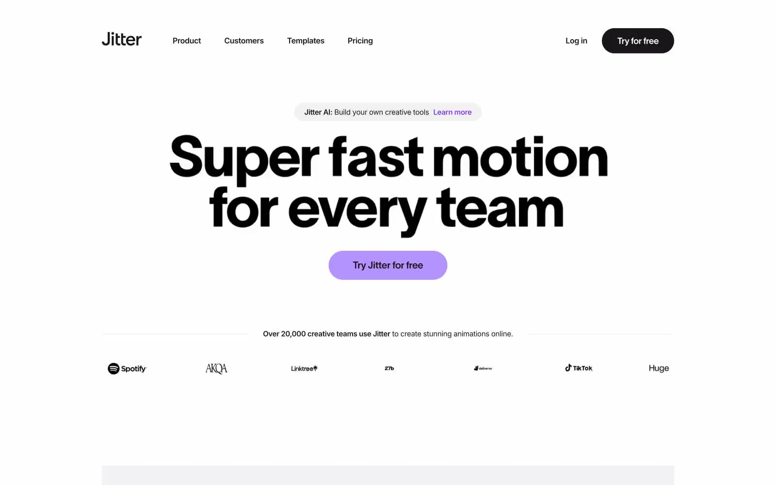
Jitter
Jitter — Style Reference
# Jitter — Style Reference
> kinetic playground in a Swiss design studio — soft white surfaces, pill-shaped cards, and a violet spark firing on near-black ink.
**Theme:** light
Jitter reads as a kinetic playground rendered in Swiss-design precision. The canvas is a soft off-white (#f2f1f3) with bright white cards floating on it via diffuse, multi-layer shadows that bleed across more than 150px of vertical space. A near-black ink (#19171c) carries the majority of the UI — headlines, nav, buttons, body — with a deeply saturated violet (#7a40ed) acting as a brand spark for hero CTAs, tags, and feature highlights. Secondary punctuation comes from a vivid cyan-blue (#00b2ff) and an electric yellow-green (#f5ff63). Typography splits the work: TWK Lausanne (a custom geometric grotesque) takes the stage at 48–200px with aggressive negative tracking, while Inter handles everything 26px and below with quiet competence. The geometry is rounded to the point of pill-shaped — cards and buttons share 40–50px radii, so every surface feels like a soft cushion rather than a hard tile.
## Tokens — Colors
| Name | Value | Token | Role |
|------|-------|-------|------|
| Studio Off-White | `#f2f1f3` | `--color-studio-off-white` | Page canvas and recessed section backgrounds — the base layer on which every card and panel sits |
| Pure White | `#ffffff` | `--color-pure-white` | Card surfaces, elevated panels, text on dark fills, button labels on filled buttons |
| Hairline Gray | `#e5e4e7` | `--color-hairline-gray` | Subtle borders, divider lines, and muted card backgrounds |
| Soft Mist | `#97979b` | `--color-soft-mist` | Muted secondary text and placeholder labels |
Websites
Markdown Text
design-md
website-prompt
landing-page-prompt
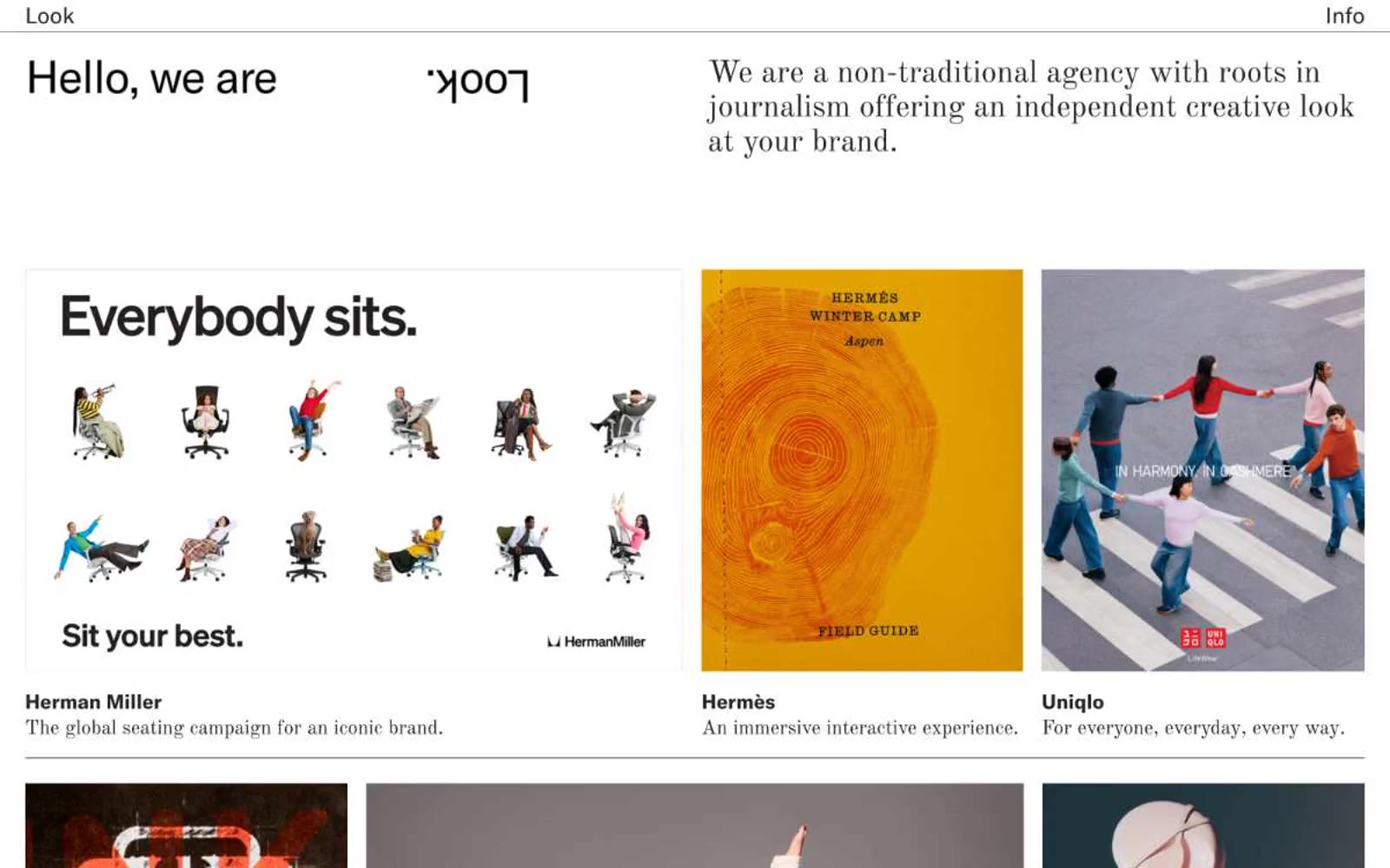
Look inc
Look inc — Style Reference
# Look inc — Style Reference
> White-walled gallery on a press proof. A typographic system of black serif and grotesque sans surrounds large documentary photography on pure white — the interface is the negative space between stories.
**Theme:** light
Look inc operates as a monochrome editorial gallery — the absence of color is the brand. The interface is a white canvas where serif headlines (Old Standard) and geometric sans (GT America) frame full-bleed project photography, letting the work itself supply all visual interest. Typography is the entire decorative system: a classical serif headline next to a modern grotesque body creates editorial tension that mirrors the agency's positioning as 'a non-traditional agency with roots in journalism.' Components are austere — no cards with shadows, no rounded containers, no accent buttons — just image tiles sitting directly on white with a small caption stack beneath. The grid is the design: equal-weight rectangular tiles arranged in rows, each tile a self-contained editorial spread.
## Tokens — Colors
| Name | Value | Token | Role |
|------|-------|-------|------|
| Press Black | `#000000` | `--color-press-black` | Headlines, body text, navigation links, hairline dividers — the single dark mark in the system |
| Proof White | `#ffffff` | `--color-proof-white` | Page canvas, tile backgrounds, the only surface tone in the system |
| Galley Gray | `#878787` | `--color-galley-gray` | Muted captions, secondary metadata, editorial sub-labels — appears sparingly under project titles |
| Rule Line | `#e5e5e5` | `--color-rule-line` | Hairline nav dividers, ultra-subtle structural separators — the faintest non-black non-white mark allowed |
Websites
Markdown Text
design-md
website-prompt
landing-page-prompt
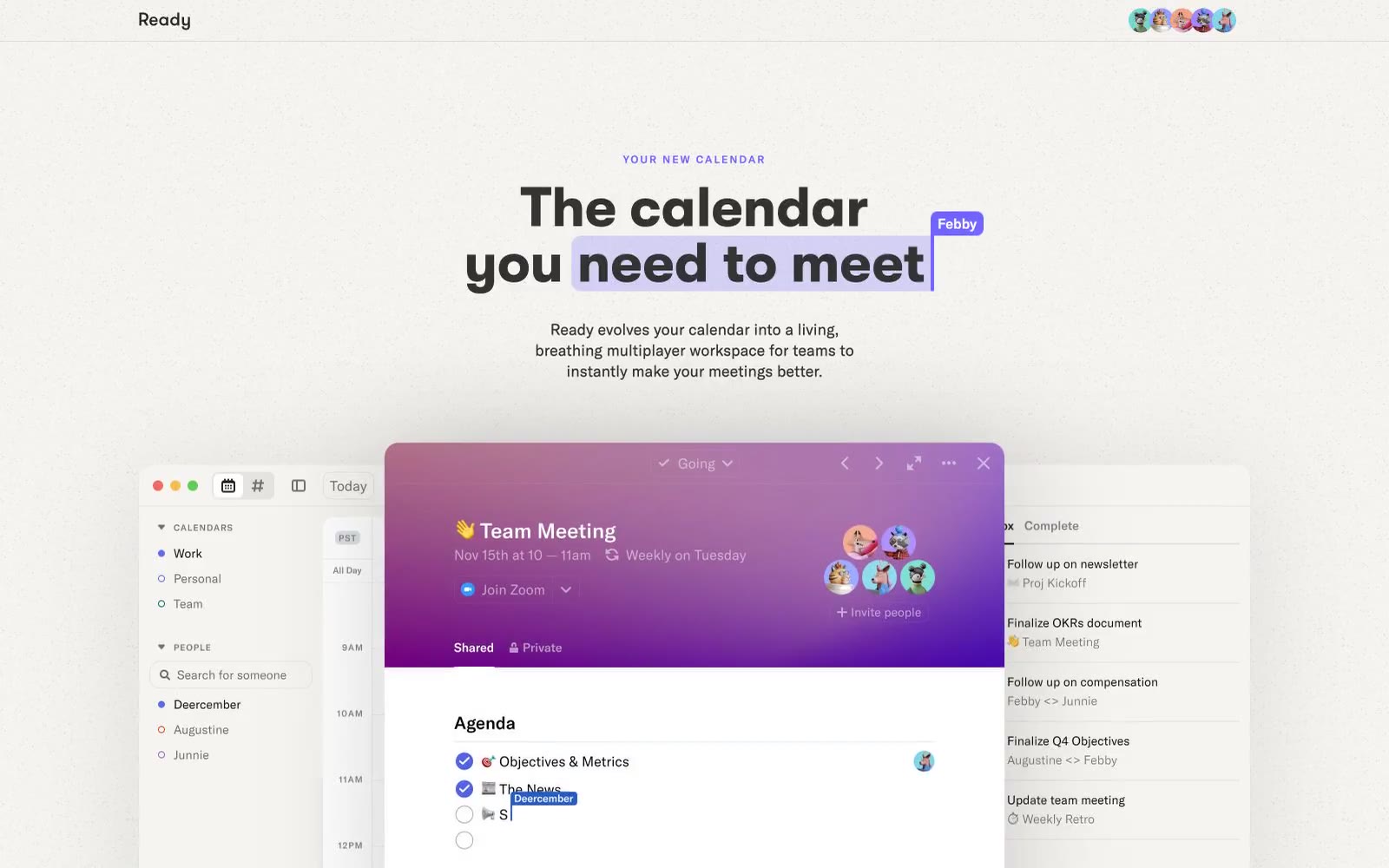
Ready
Ready — Style Reference
# Ready — Style Reference
> violet daylight workspace — a warm off-white page where a single periwinkle accent marks what matters and everything else recedes
**Theme:** light
Ready is a light, near-monochrome marketing surface where a single periwinkle violet (#7366fe) does all the chromatic work against warm off-white (#f5f3f2) and near-black text (#333333). The hierarchy is built by two contrasting type families: GT Walsheim 700 at 56-64px with 1.0 leading for headlines, and GT America at 300-500 for everything else, marked by a distinctive 0.167em tracking that gives body copy an open, slightly technical feel. Cards and product mocks sit on generous 32px radii with one soft shadow recipe, creating a gentle floating-above-paper effect rather than hard elevation. The product itself (shown in mocks) shifts into a darker, gradient-rich mode, but the marketing canvas stays quiet and confident — let the product screenshots carry the color drama.
## Tokens — Colors
| Name | Value | Token | Role |
|------|-------|-------|------|
| Paper White | `#ffffff` | `--color-paper-white` | Primary page background, card surfaces inside product mocks |
| Warm Linen | `#f5f3f2` | `--color-warm-linen` | Subtle warm surface tint, nav borders, gradient fade-out color — gives the page its paper-like quality |
| Linen Stone | `#c4c3c1` | `--color-linen-stone` | Mid neutral for muted dividers and secondary structural elements |
| Ink | `#333333` | `--color-ink` | Primary text, dominant border color — near-black, not pure, softer on the eye |
Websites
Markdown Text
design-md
website-prompt
landing-page-prompt
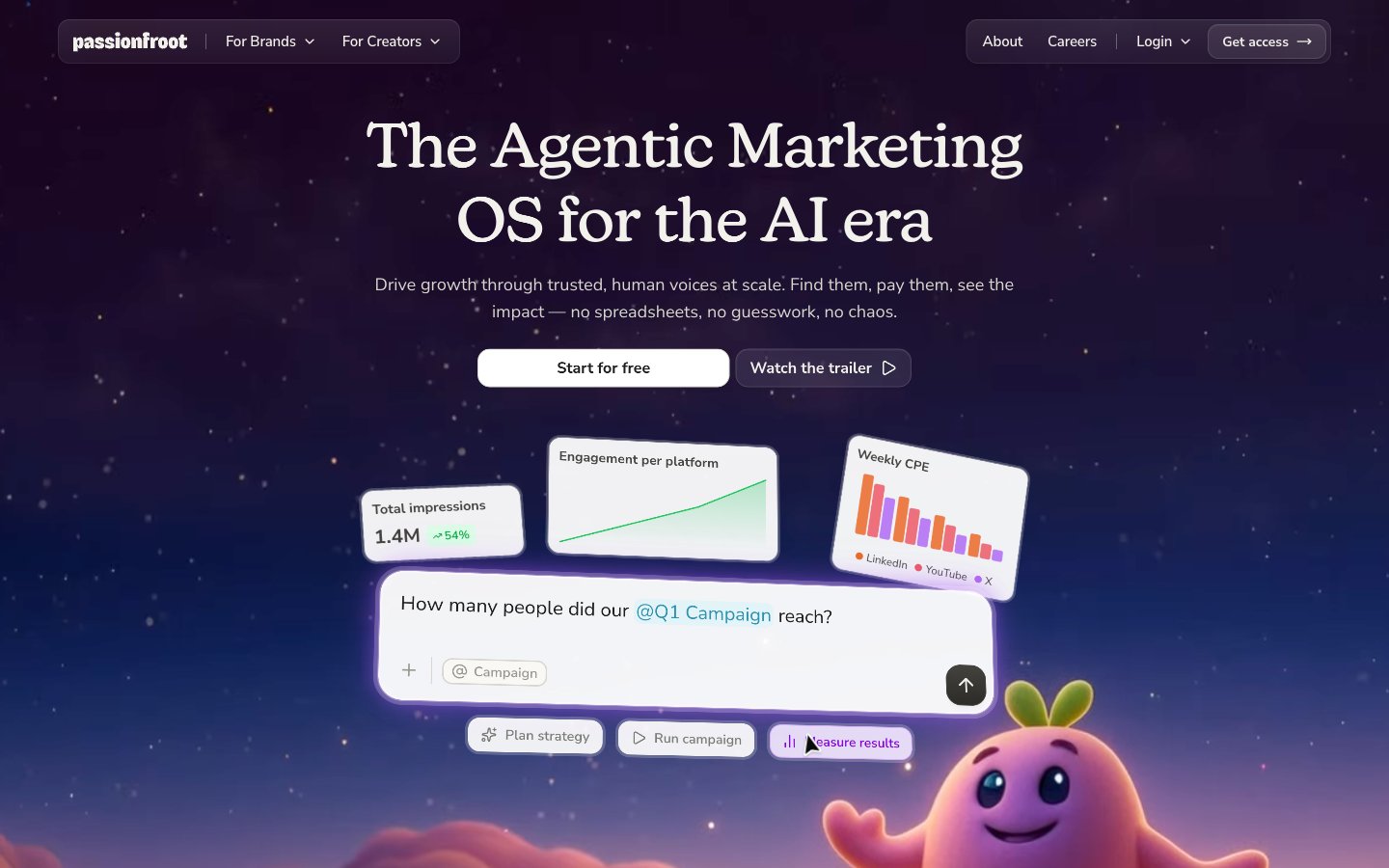
Passionfroot
Passionfroot — Style Reference
# Passionfroot — Style Reference
> Twilight cloud library on warm parchment. A serif headline drifts above cream cards lit by a violet-to-coral sky, where a pastel mascot peeks from the corner.
**Theme:** mixed
Passionfroot operates as a dusk-lit creative workspace: warm parchment canvas (#f8f7f2), a custom serif (new-kansas) for editorial-grade headlines, and a full-spectrum accent palette that treats color as joyful punctuation rather than corporate branding. Screens often open against a twilight sky gradient (deep violet bleeding into coral) before resolving into cream cards and content. The visual language is compact, rounded, and tactile — 12px radii everywhere, pill-shaped interactive chips, warm-toned layered shadows (oklch-tinted, not pure gray) that feel like sunlight on paper, and a 3D mascot that anchors the dreamy atmosphere. Components stay lightweight: thin 1px borders, ghost buttons, white elevated surfaces, no heavy drop-shadows. Color appears as small functional sprinkles — pastel card backgrounds, vivid icon strokes, chromatic borders — never as a single dominant brand color.
## Tokens — Colors
| Name | Value | Token | Role |
|------|-------|-------|------|
| Ink Black | `#1d1d1c` | `--color-ink-black` | Primary text, primary borders, dark surface fills — the workhorse neutral that carries all high-contrast text and structural outlines |
| Parchment Cream | `#f8f7f2` | `--color-parchment-cream` | Page canvas, default body background, nav surface — warm off-white that replaces pure white to avoid sterile SaaS feel |
| Sand Gray | `#d8d6ce` | `--color-sand-gray` | Hairline borders, dividers, soft box-shadow base — the warm-tinted stroke that gives components a paper-on-paper quality |
| Linen Beige | `#edeae4` | `--color-linen-beige` | Card surfaces, elevated backgrounds, shadow tint — sits one step above Parchment Cream as the secondary surface level |
Websites
Markdown Text
design-md
website-prompt
landing-page-prompt
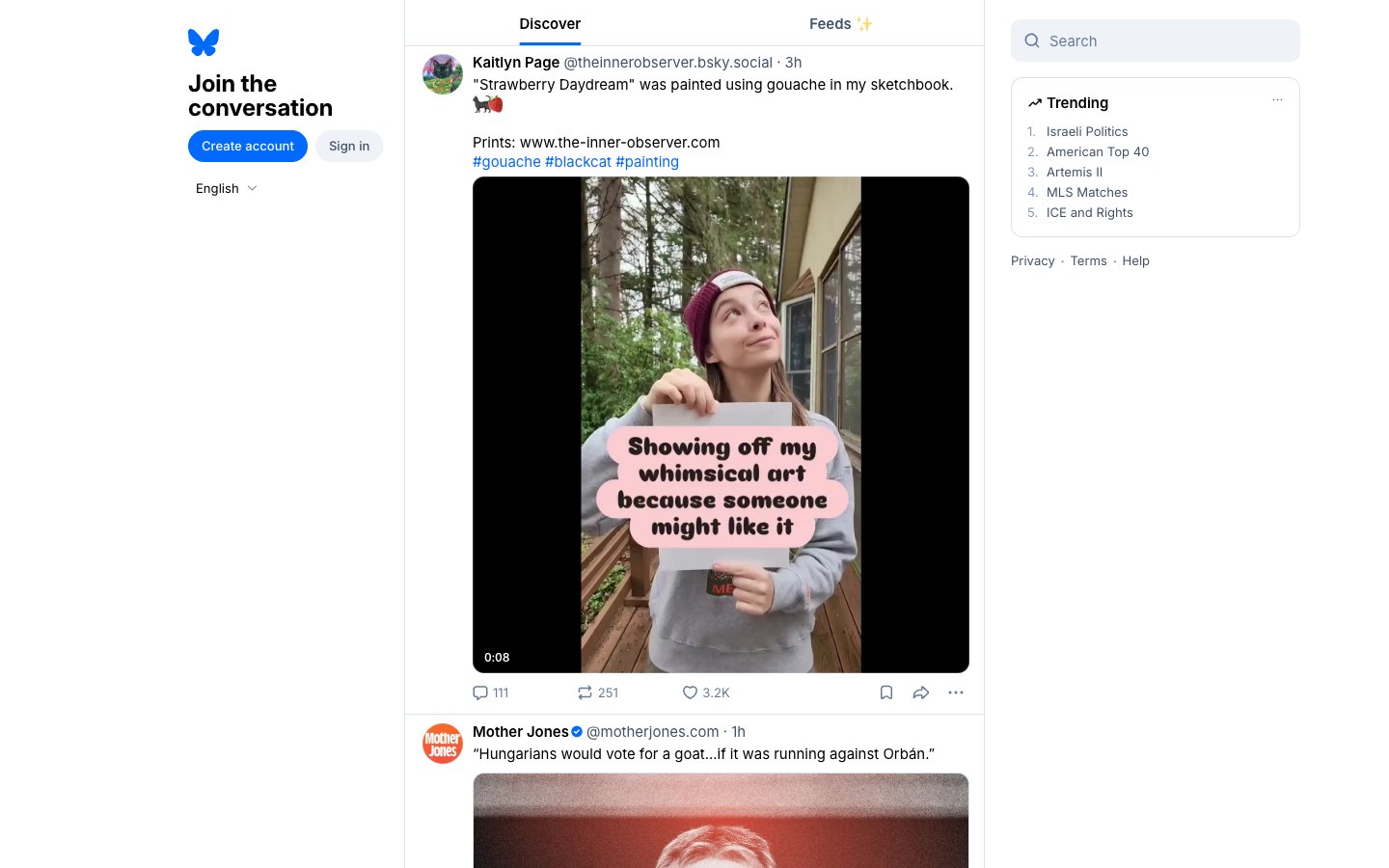
Bluesky Social
Bluesky Social — Style Reference
# Bluesky Social — Style Reference
> Morning dispatch beneath open sky
**Theme:** light
Bluesky uses an austere reading-first language: near-white canvas, hairline borders, compact Inter typography, and a single saturated blue that punctuates action and identity. The interface deliberately strips visual noise — no shadows, no gradients, no decorative geometry — letting user-generated content carry every ounce of visual weight. Pill-shaped controls and fully rounded avatars inject warmth into what would otherwise be a clinical three-column grid, while cool desaturated grays keep the chrome recede behind the feed. This is a content-forward social surface where the system is nearly invisible and the posts are the only spectacle.
## Tokens — Colors
| Name | Value | Token | Role |
|------|-------|-------|------|
| Sky Signal | `#006aff` | `--color-sky-signal` | Brand accent — the single chromatic punctuation in a monochrome interface. Active nav items, inline links, hashtag chips, and filled primary buttons |
| Slate Type | `#405168` | `--color-slate-type` | Primary text and nav labels — a cool, slightly desaturated near-black that reads softer than pure ink on the warm-white canvas |
| Hazy Steel | `#8798b0` | `--color-hazy-steel` | Secondary icons, metadata, timestamps, and muted helper text. The cool tint keeps it visually adjacent to Sky Signal without competing |
| Whisper Border | `#dce2ea` | `--color-whisper-border` | Hairline dividers and card borders. The only structural line work in the system — it defines edges without adding weight |
Websites
Markdown Text
design-md
website-prompt
landing-page-prompt
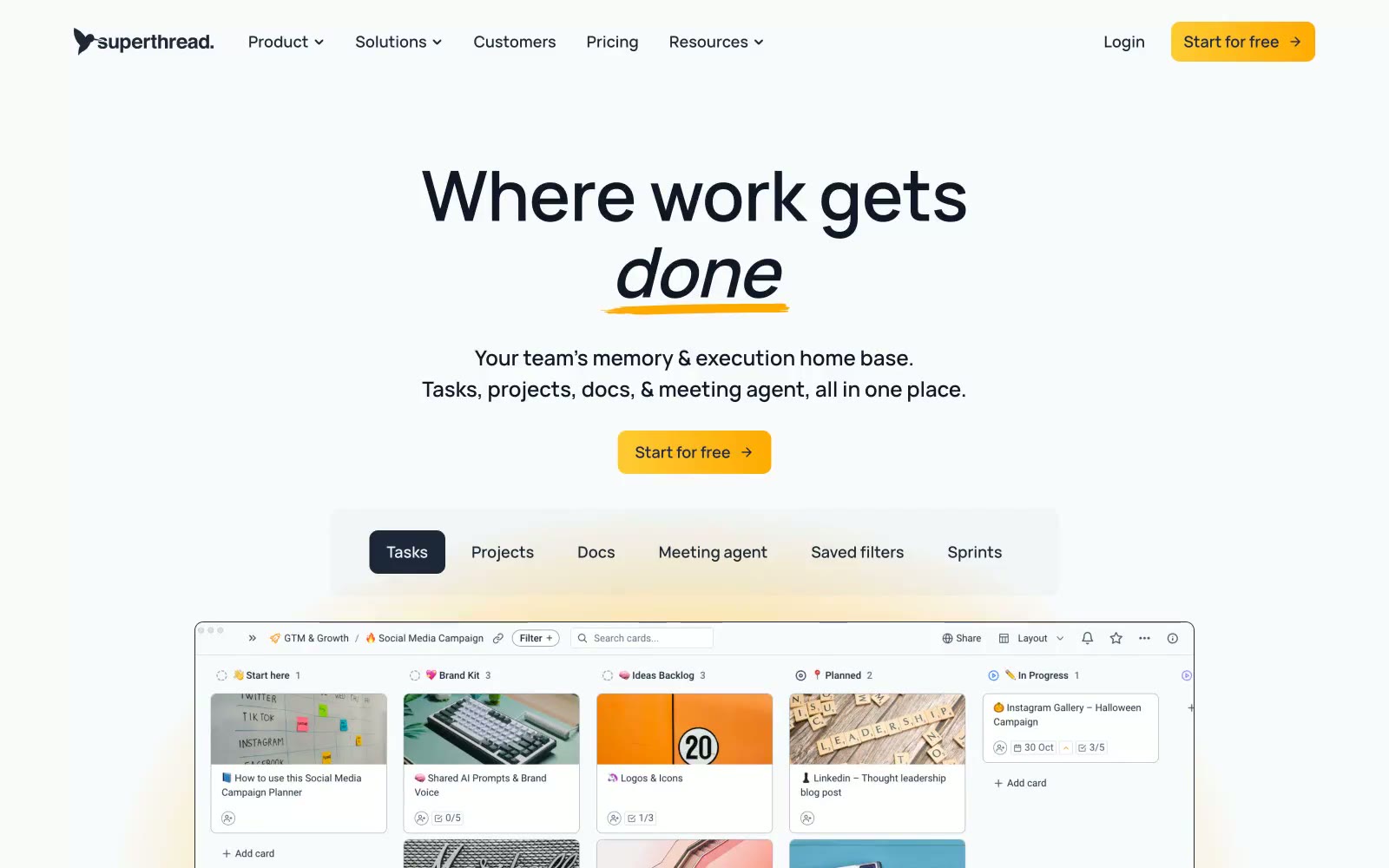
Superthread
Superthread — Style Reference
# Superthread — Style Reference
> Whiteboard confidence with amber highlighter energy. Superthread feels like a well-organized notebook page — dark ink lines, ample white space, and a single warm yellow mark that signals what matters.
**Theme:** light
Superthread runs on a whiteboard-meets-editorial visual logic: a near-white canvas, one warm amber accent that feels like a highlighter swipe, and a very heavy reliance on hard 1px dark borders to define structure instead of shadows or fills. The dark slate (#1d2939) carries almost all type and iconography, giving the system a confident, ink-on-paper weight; the amber only appears as a functional accent on the primary CTA and as the underline brushstroke beneath the italic word in the headline. Components are compact and border-driven: cards and buttons share a 10px radius, surfaces stay nearly flat with minimal elevation, and the yellow→gold gradient on the CTA creates a single source of warmth in an otherwise monochromatic page. Typography carries the personality — Vela Sans at 80px display weight with slight negative tracking, the word "done" set in italic with a hand-drawn yellow underline as the brand's signature gesture. Density is compact, gaps hover around 10–15px between elements, and the page breathes in large 64–80px section bands.
## Tokens — Colors
| Name | Value | Token | Role |
|------|-------|-------|------|
| Ink Black | `#000000` | `--color-ink-black` | Hairline borders, dividers, and icon strokes — the structural skeleton of every card, board, and list element. Used at full opacity in 1px widths to define edges instead of relying on shadows |
| Slate Ink | `#1d2939` | `--color-slate-ink` | Primary headings, body copy, and filled button backgrounds — the dominant near-black that gives the system its editorial weight. Filled CTA buttons and active tab states use this as the base fill |
| Canvas White | `#ffffff` | `--color-canvas-white` | Card and elevated surface backgrounds sitting above the page canvas |
| Page Mist | `#f9fafb` | `--color-page-mist` | Page-level background and section bands, creating a soft off-white canvas that lifts white cards without harsh contrast |
Websites
Markdown Text
design-md
website-prompt
landing-page-prompt
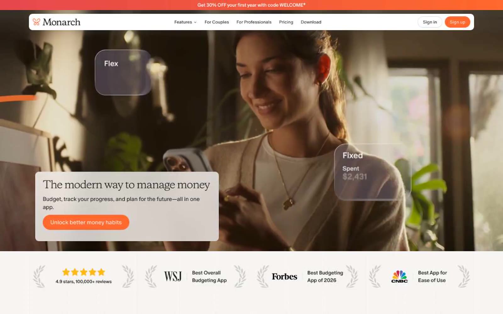
Monarch
Monarch — Style Reference
# Monarch — Style Reference
> warm linen notebook under morning light
**Theme:** light
Monarch Money uses a warm editorial-fintech language: soft cream canvas, white product surfaces, and a single vivid orange that acts as functional punctuation against an otherwise monochrome warm-gray system. Typography is the signature — a high-contrast pairing of a light-weight modern sans for UI with a distinctive editorial display face at large sizes, both carrying aggressive negative tracking that tightens the layout into a confident, magazine-like rhythm. The interface feels handcrafted rather than corporate: pill-shaped controls, hairline warm borders, whisper-light shadows, and generous breathing room that lets product screenshots carry the visual weight.
## Tokens — Colors
| Name | Value | Token | Role |
|------|-------|-------|------|
| Ember Orange | `#ff692d` | `--color-ember-orange` | Primary action buttons, active nav indicators, key UI accents — the only chromatic color in the system, reserved so it reads as decisive when it appears |
| Linen | `#efecea` | `--color-linen` | Page canvas and section backgrounds — the warm cream that separates the site from sterile white SaaS |
| Ink | `#22201d` | `--color-ink` | Primary text, icon strokes, heading color, footer text — near-black with a warm brown undertone that harmonizes with the cream canvas |
| Graphite | `#777573` | `--color-graphite` | Muted body text, secondary helper text, captions — warm mid-gray that sits between Ink and Paper |
Websites
Markdown Text
design-md
website-prompt
landing-page-prompt
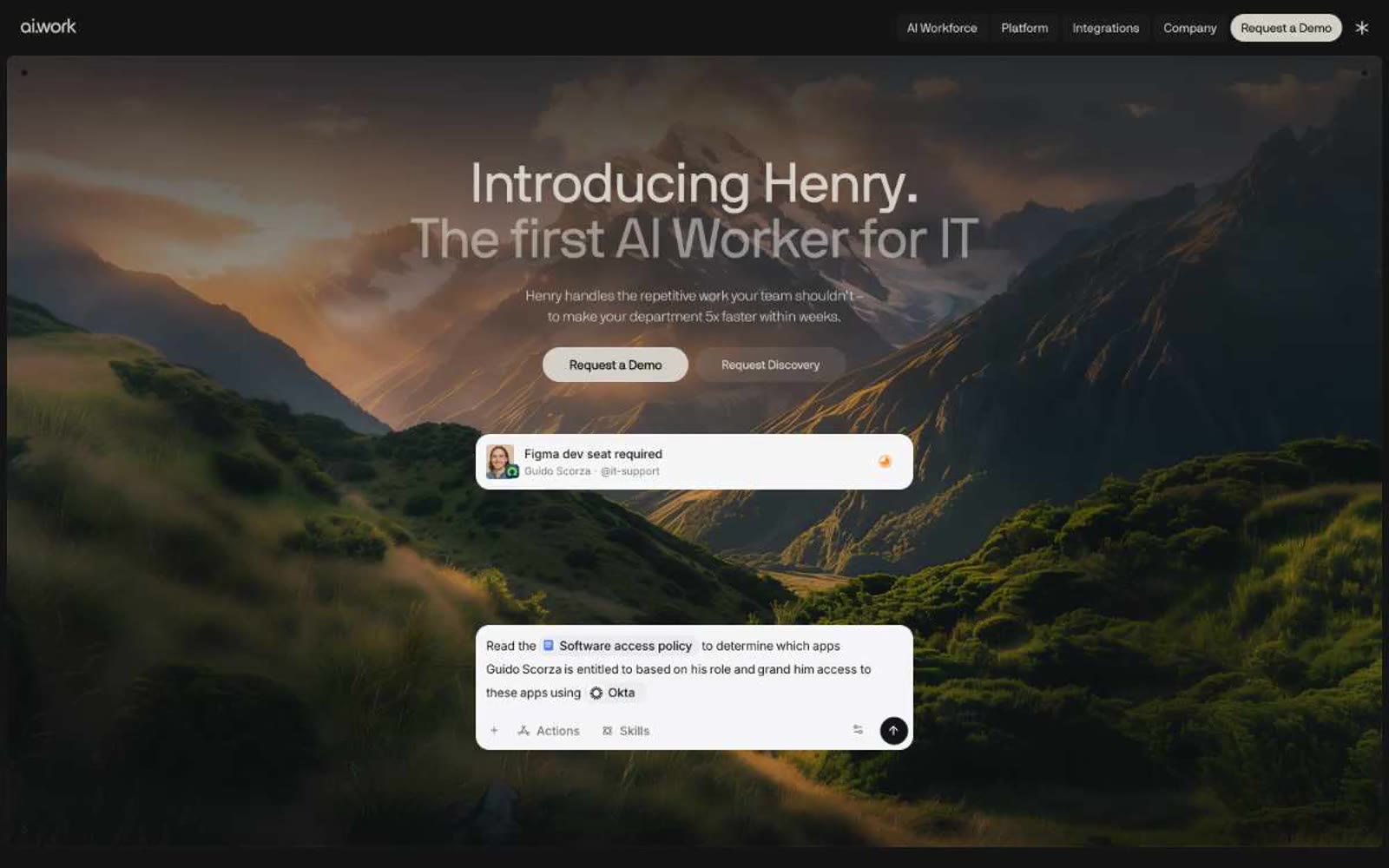
Henry
Henry — Style Reference
# Henry — Style Reference
> darkroom gallery at midnight — measured, restrained, photograph-centric
**Theme:** dark
Henry operates in a near-monochrome dark world: a coal-black canvas interrupted by a single dramatic landscape photograph in the hero, and absolutely nothing else competing for attention. Typography does the heavy lifting — NB International Pro at whisper-light 300 weight for headlines (including a staggering 204px display) creates editorial confidence that monochrome palettes usually can't achieve, while tight -0.02em tracking keeps even the giant display sizes from feeling loose. The interface language is deliberately quiet: pill-shaped white CTA against black, hairline warm-gray borders (the #d4d0c9 family is the only chromatic deviation from pure neutral), translucent dark surfaces stacked in barely-perceptible layers. Color is rationed — appearing only as small functional punctuation in stat numbers and product UI cards. Components are flat, border-driven, and dense rather than spacious. The whole system feels like a high-end editorial magazine that happens to sell enterprise software.
## Tokens — Colors
| Name | Value | Token | Role |
|------|-------|-------|------|
| Obsidian | `#000000` | `--color-obsidian` | Primary canvas, page background, base borders — the absolute ground zero of the visual system |
| Carbon | `#141414` | `--color-carbon` | Card and elevated surface background, subtle border tint — the first lift off pure black |
| Tar | `#0c0c0c` | `--color-tar` | Deep surface fill for nested elements, icon containers — sits between canvas and card |
| Bone | `#d4d0c9` | `--color-bone` | Light neutral action fill for buttons on dark surfaces. |
Websites
Markdown Text
design-md
website-prompt
landing-page-prompt
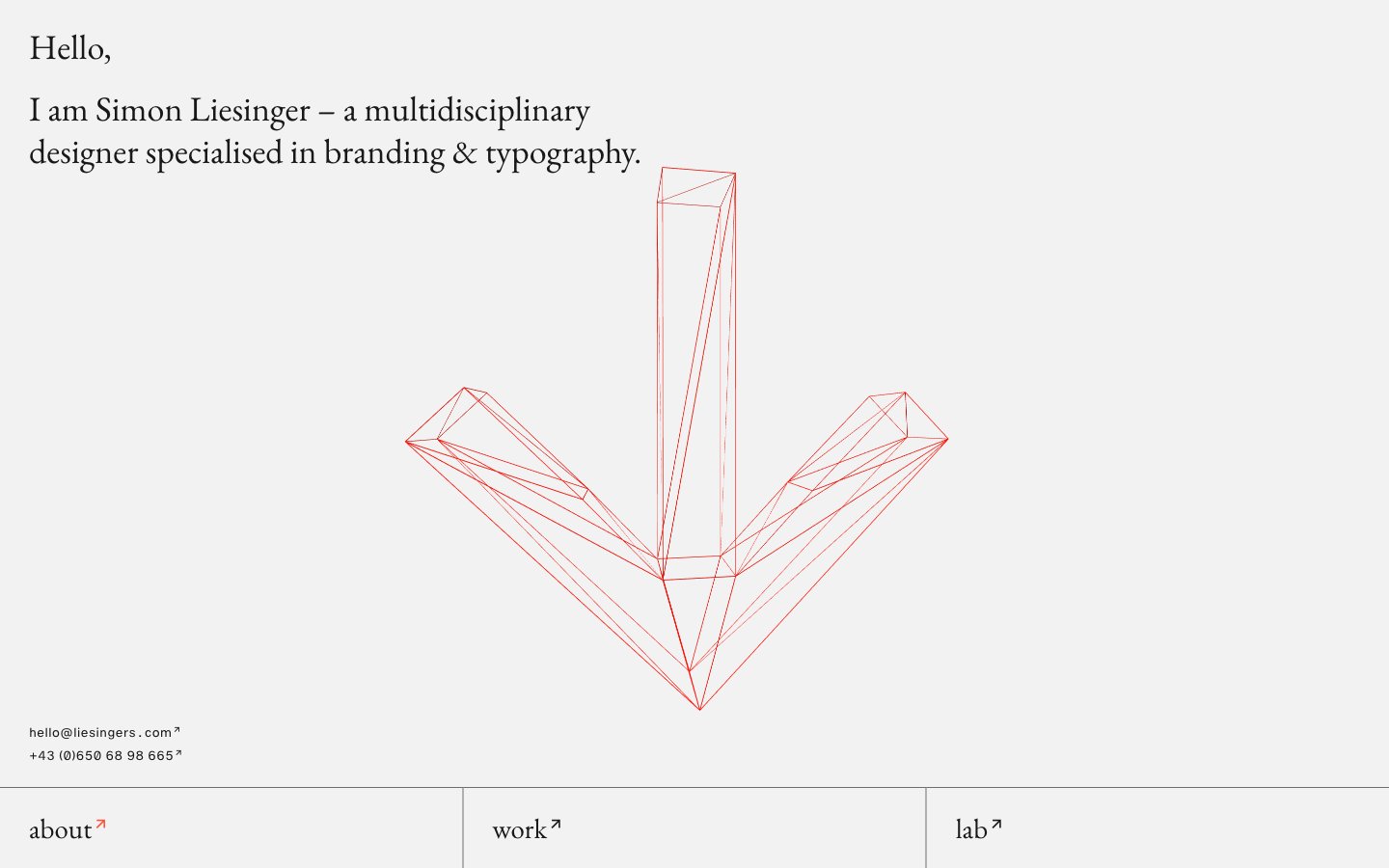
Simon Liesinger
Simon Liesinger — Style Reference
# Simon Liesinger — Style Reference
> Drafting table on bone paper. A designer’s monograph rendered as a website — serif body type sitting on a vast off-white canvas, punctuated by a single stroke of red.
**Theme:** light
Liesingers is a gallery-wrapped-in-a-browser: a near-monochromatic editorial portfolio where a warm vermillion red is the only chromatic interruption in an otherwise graphite-and-bone-white composition. The system behaves like a printed monograph — Garamond sets the voice for headlines and body copy, while Helvetica with tabular figures handles the metadata column at the foot of the page. The grid is unapologetically wide and columnar, sections stack as full-bleed bands separated by hairline rules, and the navigation lives at the bottom rather than the top. Components are flat, borderless in the traditional sense, and rely on line weight and whitespace for structure rather than fill, shadow, or color blocks. The wireframe illustration in vermillion is the only piece of ornament — everything else earns its place as structure or text.
## Tokens — Colors
| Name | Value | Token | Role |
|------|-------|-------|------|
| Bone | `#f2f2f2` | `--color-bone` | Page canvas, card surfaces, section backgrounds — the paper of the monograph |
| Graphite | `#181818` | `--color-graphite` | Primary text, body copy, hairline rules, column dividers — softer than pure black, reads as printed ink |
| Ink | `#000000` | `--color-ink` | Hardest rule weights, foot dividers, densest border lines — the purest black on the page |
| Ash | `#6e6e6e` | `--color-ash` | Muted column rules, secondary divider strokes — the gray that softens the grid |
Websites
Markdown Text
design-md
website-prompt
landing-page-prompt
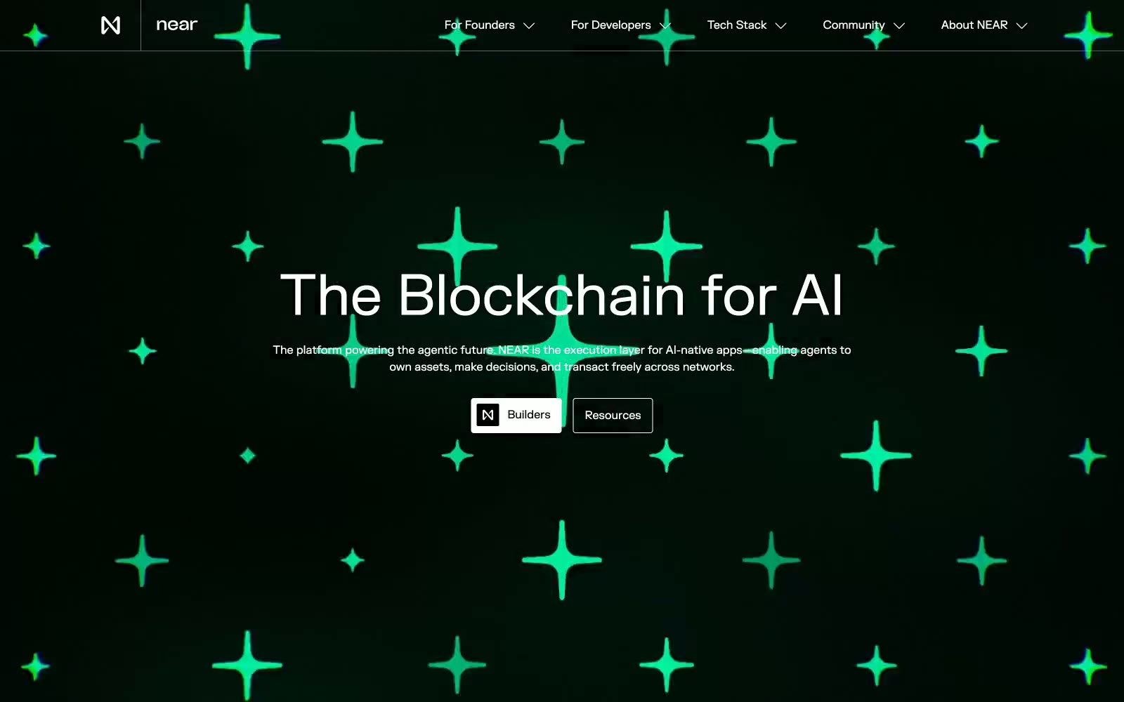
NEAR
NEAR — Style Reference
# NEAR — Style Reference
> Emerald constellation on obsidian void — a black chamber where geometric star-crosses hover like fiber-optic nodes, and a single neon green pulse is the only color that matters.
**Theme:** mixed
NEAR operates as a void-and-signal system: an obsidian canvas scattered with glowing emerald star-cross particles, interrupted by flat mint-green full-bleed bands and a repeating "AI" text-tile that functions as a signature wallpaper. Typography is geometric and confident — FKGrotesk at 80px for display headlines holds weight 500, bold through scale not heft, and tight tracking keeps blocks dense. Color discipline is total: pure black, pure white, and one vivid neon green (#00ec97) carry every functional role, with a softer sage (#c7f5d8) reserved exclusively for full-bleed light sections. Components are sharp and flat — 4px radii dominate, borders are 1px hairlines, shadows are absent, and elevation comes from color contrast and section rhythm rather than depth. The page alternates dark and light bands deliberately, making each section transition a moment of contrast rather than a fade.
## Tokens — Colors
| Name | Value | Token | Role |
|------|-------|-------|------|
| Obsidian | `#000000` | `--color-obsidian` | Primary text on light surfaces, dark section backgrounds, inverse text on light cards — the void that carries the constellation |
| Paper White | `#ffffff` | `--color-paper-white` | Light section text on dark backgrounds, card surfaces, button backgrounds on dark hero — the positive space |
| Hairline Gray | `#e5e7eb` | `--color-hairline-gray` | Hairline borders, dividers, card outlines — the most-used neutral at 1500+ occurrences forms the structural skeleton |
| Mid Gray | `#757575` | `--color-mid-gray` | Secondary text, muted link borders, disabled states, tertiary metadata |
Websites
Markdown Text
design-md
website-prompt
landing-page-prompt
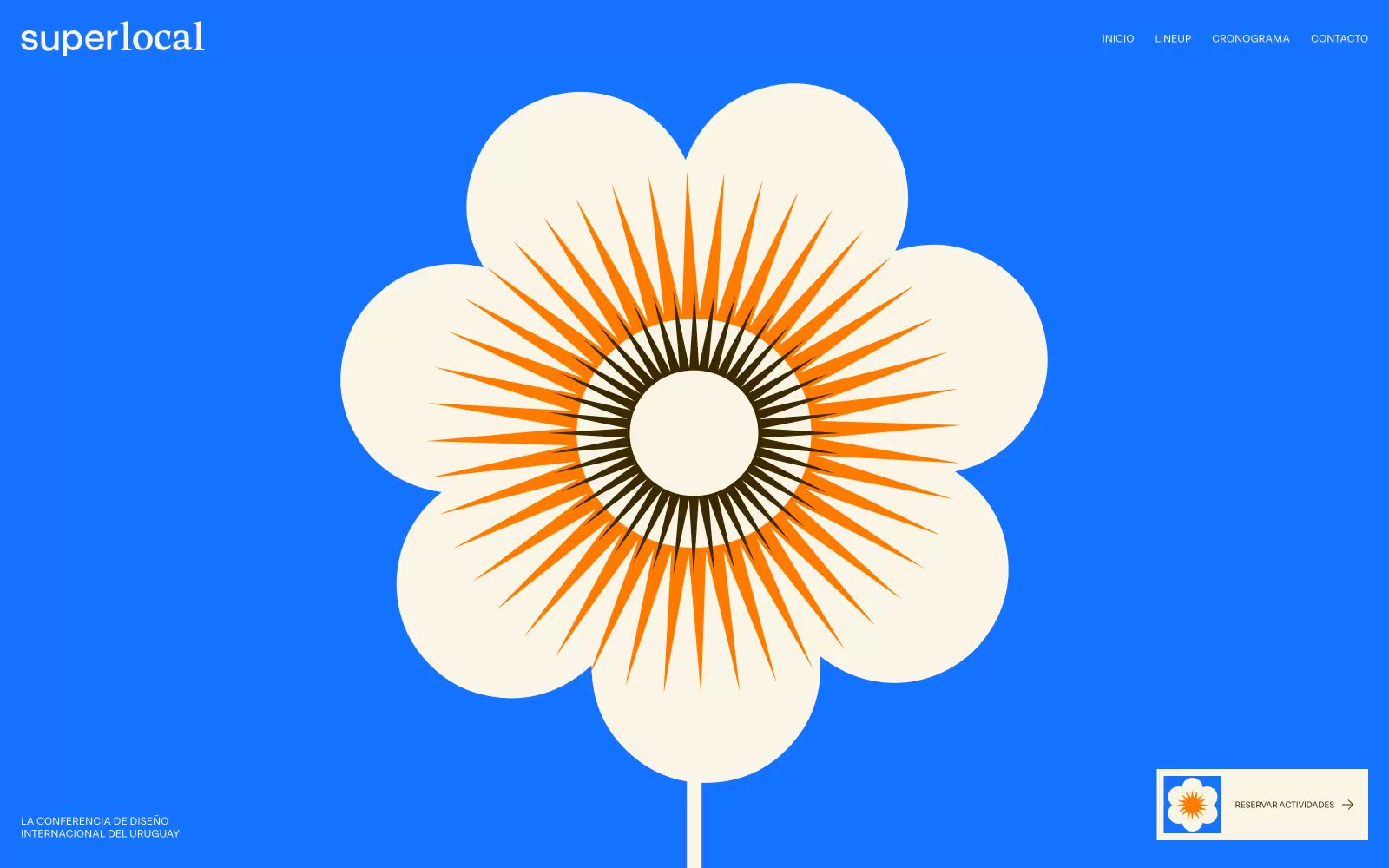
Superlocal
Superlocal — Style Reference
# Superlocal — Style Reference
> Cream risograph poster under cobalt sky — a single sheet of eggshell paper, one bolt of electric blue, and a sharp geometric face that feels printed not designed.
**Theme:** light
Superlocal reads as a printed festival poster translated to the web. The canvas is a warm eggshell cream (#fbf5e7), never clinical white — every default surface carries that risograph paper warmth. A single full-bleed electric cobalt band (#1673ff) detonates the first screen and acts as the brand's signature anchor, while a deep coffee-brown band (#3d2800) carries schedule content. Typography is dominated by a custom geometric display face (RST Reactor) that swings from a massive 172px headline with brutally tight -0.06em tracking down to 14-17px body, then jumps to positively-tracked uppercase eyebrows for the nav and captions. Controls are flat pill shapes (99px radius), the sponsor system is a sharp-cornered 6-column grid divided by hairlines, and color is rationed: most screens stay cream and monochrome, letting blue and orange erupt only on the hero and the single sunburst illustration.
## Tokens — Colors
| Name | Value | Token | Role |
|------|-------|-------|------|
| Electric Cobalt | `#1673ff` | `--color-electric-cobalt` | Full-bleed hero backgrounds, section anchors — the single saturated chord of the system, reserved for the opening band and any screen that needs to shout over the cream |
| Coffee Bean | `#3d2800` | `--color-coffee-bean` | Dark schedule bands, body text on cream, logo lockup wordmark — a warm near-black that reads as ink, not charcoal |
| Tangerine Burn | `#ff7b02` | `--color-tangerine-burn` | Sunburst illustration accent, flower petal rays — the warm counterweight to cobalt, appears only inside the hero graphic |
| Eggshell Cream | `#fbf5e7` | `--color-eggshell-cream` | Page canvas, card surfaces, sponsor grid background, section fills — the warm default that replaces white everywhere |
Websites
Markdown Text
design-md
website-prompt
landing-page-prompt
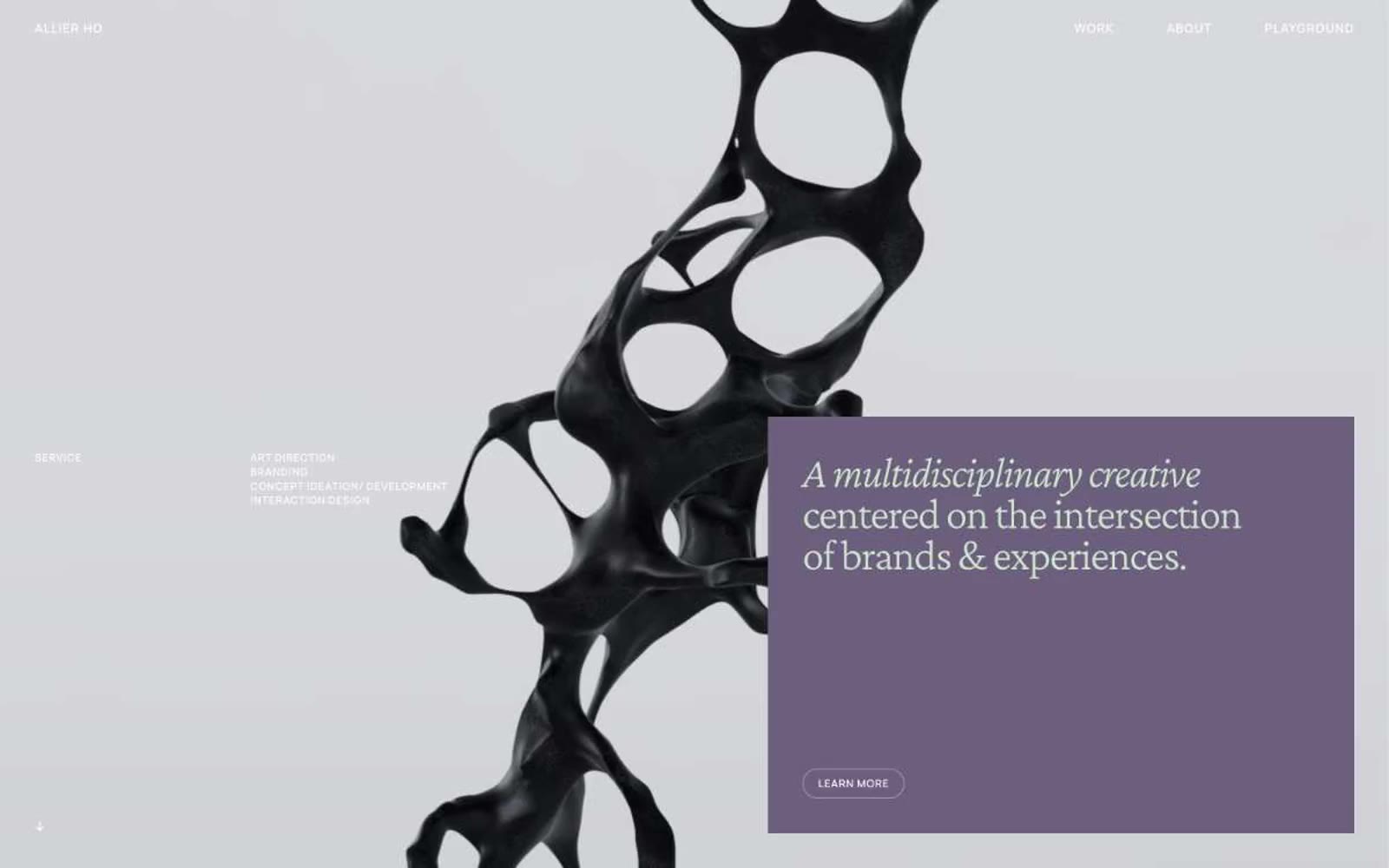
Allier Ho
Allier Ho — Style Reference
# Allier Ho — Style Reference
> serif whisper on warm paper
**Theme:** light
Allier Ho is an editorial creative-portfolio system built like a quiet art monograph: a warm off-white canvas (#fcfcfc) holds deep black ink and two whisper-quiet chromatic accents — a dusty mauve (#6c5f7d) and a pale sage (#cee6cc) — used as hairline borders and occasional heading tints rather than as fills. The signature typographic move pairs Crimson Pro at weight 300 for display headlines (an anti-conventionally light serif that whispers instead of projects) with Azeret Mono for body and label text, producing a technical-editorial tone uncommon for agency portfolios. All interactive elements share a single 200px pill radius, reinforcing a tactile, button-as-pebble language, and imagery is dominated by full-bleed sculptural 3D renders and project photography that anchor the generous negative space. Density is compact in micro-typography (10px gaps, 12px labels) but breathes widely between sections, creating a gallery-walk rhythm rather than a scrolling-page rhythm.
## Tokens — Colors
| Name | Value | Token | Role |
|------|-------|-------|------|
| Warm Paper | `#fcfcfc` | `--color-warm-paper` | Page canvas, card surfaces, and nav background — the base layer everything sits on |
| Deep Ink | `#000000` | `--color-deep-ink` | Primary text, body copy, nav links, and dominant border color — the structural voice |
| Press Black | `#1c1c1c` | `--color-press-black` | Heading text and heavy borders — slightly softer than pure black for large display sizes |
| Charcoal Trace | `#262626` | `--color-charcoal-trace` | Secondary borders, dividers, and muted text on dark surfaces |
Websites
Markdown Text
design-md
website-prompt
landing-page-prompt
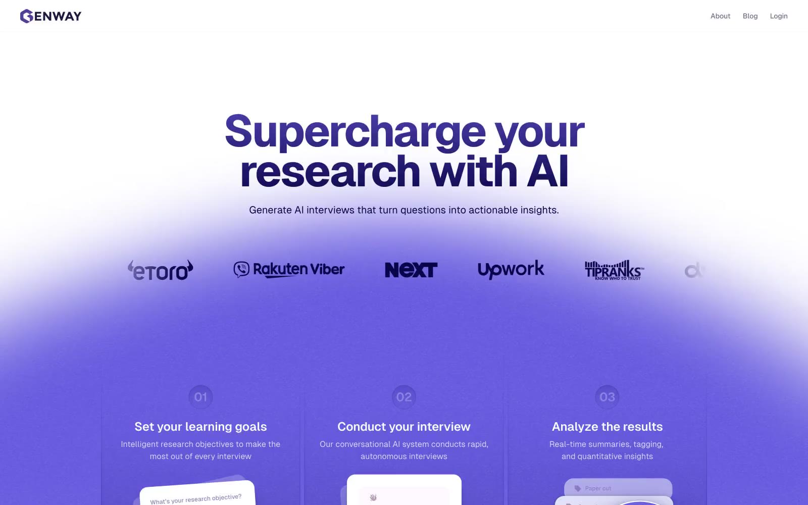
Genway
Genway — Style Reference
# Genway — Style Reference
> Indigo observatory at lavender dawn — a research terminal floating above a violet mist.
**Theme:** light
Genway operates in a deep-indigo-and-lavender atmosphere: a near-white canvas that dissolves into a vivid violet gradient wash, then returns to paper-white further down the page. The visual language is built on three forces — a single dominant indigo (#0a0449) that owns every headline, a soft lavender gradient (#e2e0f9 → #cfccf5) that provides atmospheric depth, and generous white space that makes both elements feel premium rather than loud. Typography is massive and geometric (Geist Bold at 88px for display with -0.04em tracking), creating a research-terminal authority that contrasts with the dreamy purple wash beneath. Surfaces stay feather-light — white cards with 12-32px radii, hairline violet-tinted borders, and shadows that bleed the brand's own indigo into the canvas rather than using generic gray drops. The overall effect is an AI research workspace that feels both scientifically precise and softly inviting, like a observatory at violet dawn.
## Tokens — Colors
| Name | Value | Token | Role |
|------|-------|-------|------|
| Deep Indigo | `linear-gradient(0deg, rgb(10, 4, 73) 0%, rgb(107, 94, 224) 145%)` | `--color-deep-indigo` | Primary brand color, all display headlines, logo, dominant borders — the gravitational center of the system; Dark-to-light gradient — midnight indigo dissolving into vivid violet for dramatic panels |
| Vivid Violet | `linear-gradient(rgba(255, 255, 255) 0%, rgba(107, 94, 224, 0.12) 100%)` | `--color-vivid-violet` | Accent fills, gradient endpoints, decorative highlights, secondary text emphasis; Signature hero gradient — translucent violet dissolving into pure white |
| Midnight Iris | `#0a0163` | `--color-midnight-iris` | Darkest accent, gradient start, heavy emphasis text and fills in dark contexts |
| Slate Lavender | `#706e87` | `--color-slate-lavender` | Body text, muted UI labels, secondary navigation, link borders, ghost button strokes — near-gray with a violet cast |
Websites
Markdown Text
design-md
website-prompt
landing-page-prompt
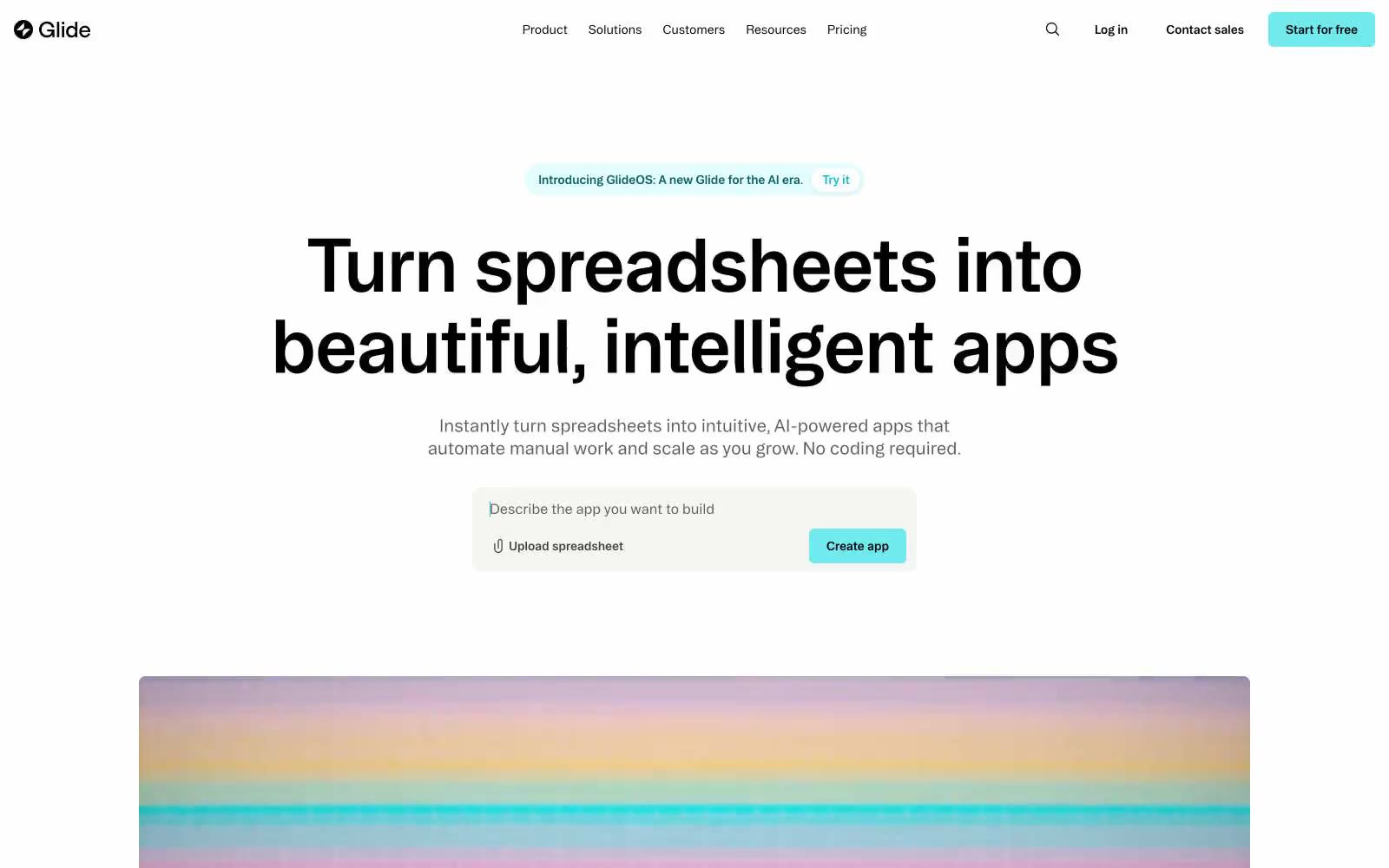
Glideapps
Glideapps — Style Reference
# Glideapps — Style Reference
> monochrome drafting table with one electric teal spark
**Theme:** light
Glide is a near-monochromatic, border-driven interface: black text, white canvas, and a single vivid teal that sparks to life only on primary actions. Typography is the main expressive instrument — a heavy workhorse sans for UI and a distinctive display face for headlines, both pulled tight with negative tracking. Components sit on hairline borders rather than shadows; the whole system reads like a precise drafting table where one electric accent is allowed to break the discipline.
## Tokens — Colors
| Name | Value | Token | Role |
|------|-------|-------|------|
| Glide Teal | `#71eaee` | `--color-glide-teal` | Primary action background, logo mark — the single chromatic accent in an otherwise black-and-white system, creating unmistakable focus on CTAs without warmth or aggression |
| Teal Mist | `#e4feff` | `--color-teal-mist` | Tinted wash for announcement pills, hover states on teal actions, and subtle accent backgrounds — extends the brand teal into ambient surface treatments |
| Ink Black | `#000000` | `--color-ink-black` | Body text, heading text, icon strokes, hairline borders, and the dominant structural element — borders outnumber fills, so black reads as architecture not just type |
| Charcoal | `#303030` | `--color-charcoal` | Secondary text, link borders, list dividers — slightly softer than pure black for non-headline copy |
Websites
Markdown Text
design-md
website-prompt
landing-page-prompt
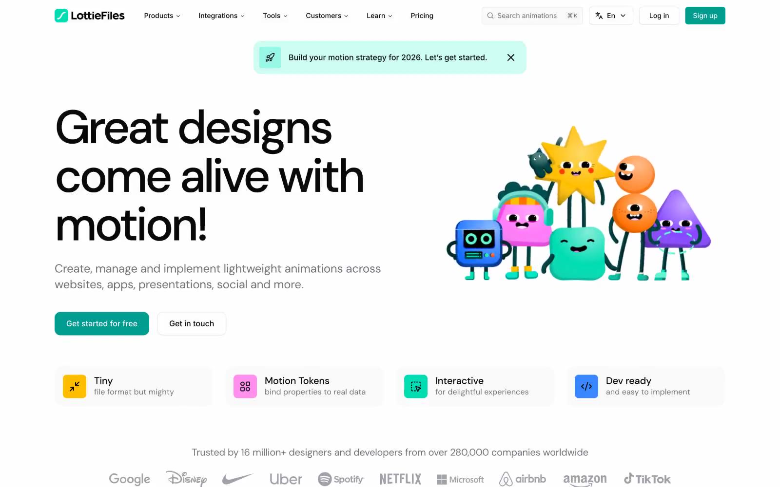
LottieFiles
LottieFiles — Style Reference
# LottieFiles — Style Reference
> playful animation studio on warm paper
**Theme:** light
LottieFiles is a warm, light-mode design system that treats motion as the product and the rest of the UI as a calm stage for it. A near-white canvas with a faint warm cast (f4f4f5 with cream accents like fff8e5) supports generous breathing room, soft 16-24px radii, and almost no shadow. One vivid teal (019d91) carries the only chromatic weight in the chrome — buttons, tags, logo mark — while the rest of the palette stays in a tight zinc-900 / zinc-100 / zinc-200 grayscale. DM Sans speaks loudly in the heroes with very tight tracking and a near-1.0 line-height at 64-96px; Inter handles everything below 32px with quiet -0.01em tracking. Color appears in content, not chrome: bright pastel mascot characters, colored customer logos, and saturated feature icons, so the UI shell can stay quietly neutral and let user work feel like the loudest thing on screen.
## Tokens — Colors
| Name | Value | Token | Role |
|------|-------|-------|------|
| Brand Teal | `#019d91` | `--color-brand-teal` | Teal supporting accent for decorative details and low-frequency emphasis. Do not promote it to the primary CTA color |
| Mint Glow | `#61f7cf` | `--color-mint-glow` | Decorative illustration accent, gradient highlights behind hero characters, animated UI flourishes |
| Mint Wash | `#b7ffe7` | `--color-mint-wash` | Teal supporting accent for decorative details and low-frequency emphasis. |
| Cream Paper | `#fff8e5` | `--color-cream-paper` | Warm accent surface for announcement banners, highlight cards, and editorial callouts — breaks the cool grayscale rhythm |
Websites
Markdown Text
design-md
website-prompt
landing-page-prompt
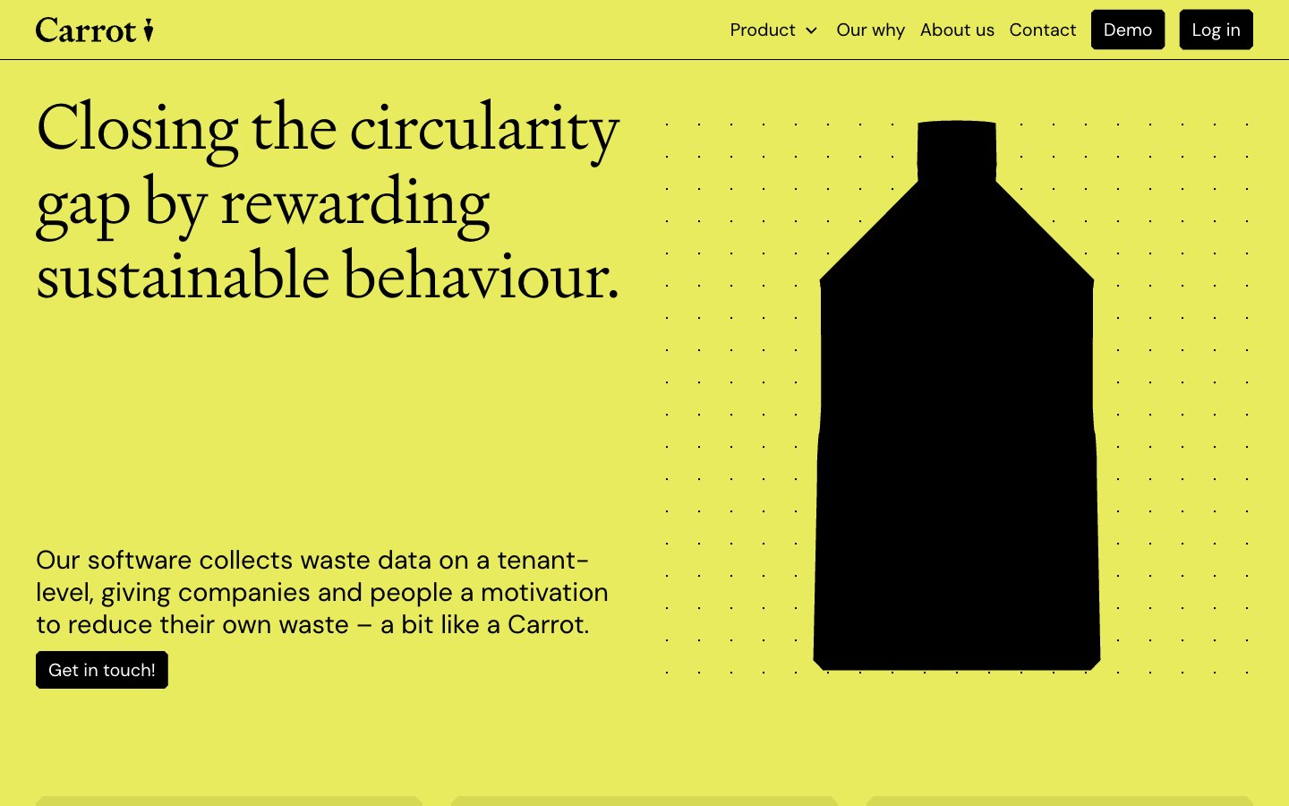
Carrot
Carrot — Style Reference
# Carrot — Style Reference
> Activist poster on a single sheet of acid-lime paper — confident, flat, and slightly loud.
**Theme:** light
Carrot commits to a radical single-color canvas — an electric chartreuse field that saturates the entire page and makes the brand impossible to misread. The rest of the system is deliberately stripped: black ink for type and structural elements, white for surfaces and button text, and a dark olive reserved for quiet secondary marks. Typography draws a sharp line between editorial and functional — a light-weight custom serif (Signifier at 300) carries the hero voice while DM Sans handles everything utilitarian at conversational weights. The result reads like a printed sustainability manifesto rendered as a web product: confident color, generous breathing room, zero ornament, and an almost rebellious refusal to use shadows, gradients, or rounded softness.
## Tokens — Colors
| Name | Value | Token | Role |
|------|-------|-------|------|
| Citrus Field | `#d4e04a` | `--color-citrus-field` | Full-page canvas and dominant brand surface — the chartreuse wash that defines the entire product. Used as hero background, section backgrounds, and feature card backgrounds with no variation or gradient |
| Carbon Black | `#000000` | `--color-carbon-black` | Primary type, filled CTA buttons, icon strokes, borders, and graphic silhouettes (the bottle hero). The structural ink of the system |
| Paper White | `#ffffff` | `--color-paper-white` | Text on black buttons, product screenshot card backgrounds, and any inverted surfaces. Pure white — not off-white |
| Moss Shadow | `#535521` | `--color-moss-shadow` | Quiet secondary accent for subdued text or border moments where pure black would feel too heavy. Rarely used — the chartreuse does the color work |
Websites
Markdown Text
design-md
website-prompt
landing-page-prompt
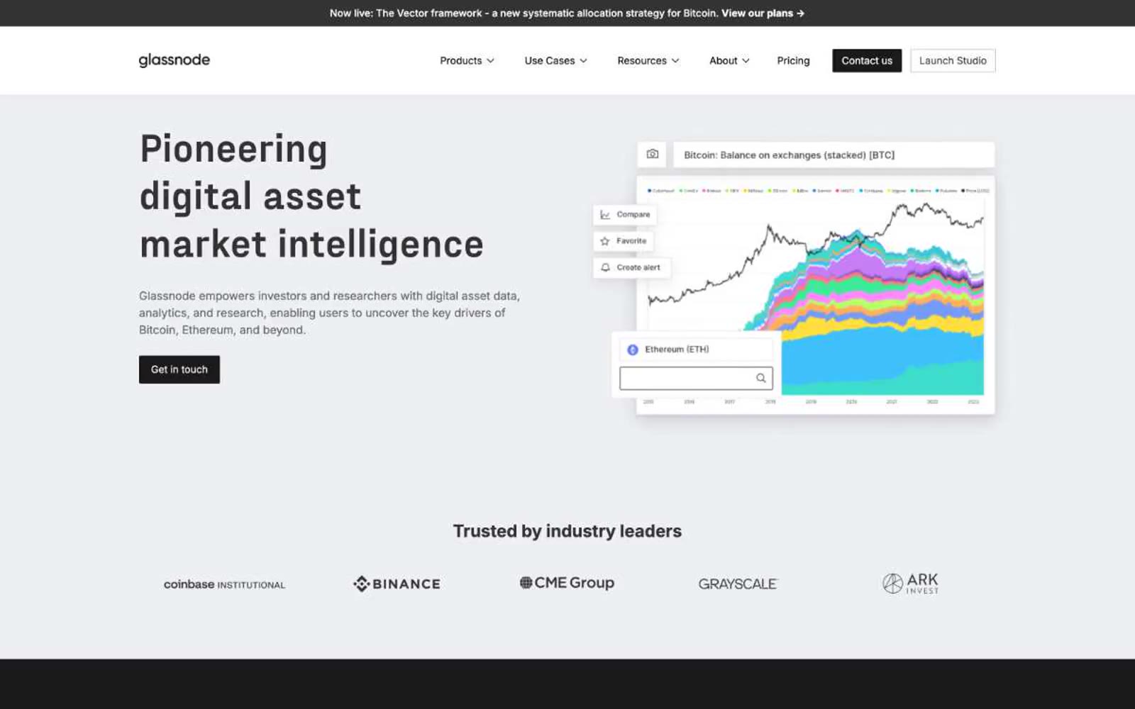
Glassnode
Glassnode — Style Reference
# Glassnode — Style Reference
> Bloomberg terminal in a glass-walled research lab
**Theme:** mixed
Glassnode reads as a monochrome institutional research console — a Bloomberg terminal dressed for a product launch page. The canvas is cool light gray, type is set in Inter at restrained sizes, and the only chromatic hint is a whisper of pale lavender that appears as accent washes and soft borders. Pages alternate between light content bands and dark statement bands, creating a study/dashboard rhythm where data and editorial copy trade places. Components are near-rectangular: 2px radii, hairline 1px borders, almost no shadow, and buttons that are solid black or ghost outlines rather than colorful pills. The system communicates authority through typographic weight and information density, not through color.
## Tokens — Colors
| Name | Value | Token | Role |
|------|-------|-------|------|
| Pure Black | `#000000` | `--color-pure-black` | Dark supporting neutral for text, icons, and strong contrast. Do not promote it to the primary CTA color |
| Obsidian | `#1a1a1a` | `--color-obsidian` | Dark section backgrounds, footer, dark band surfaces |
| Graphite | `#333333` | `--color-graphite` | Secondary headings, dark surface text, nav text on dark |
| Iron | `#5a5a5a` | `--color-iron` | Muted body copy, descriptions, helper text |
Websites
Markdown Text
design-md
website-prompt
landing-page-prompt
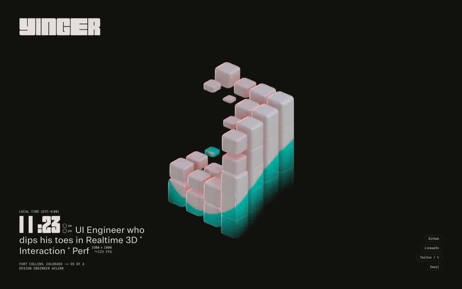
Max Yinger
Max Yinger — Style Reference
# Max Yinger — Style Reference
> Midnight engineer's terminal with floating chrome artifacts. A single bone-white light source illuminates a dark workshop where text and 3D objects share the stage at maximum density.
**Theme:** dark
Yinger's personal site operates as a midnight engineer's terminal: a near-black canvas with warm bone-white type, a single hero 3D artifact floating in negative space, and text pushed aggressively to the edges of the viewport. The system is brutally compact — 4px gaps, 12px labels, 80px displays — creating a cockpit density where every pixel is load-bearing. Color is nearly absent: one warm off-white does all the work, with a whisper of pink-coral bleeding from the 3D rendering as the only chromatic punctuation. Typography is the personality: a chunky custom display face for the masthead and time, a monospaced technical face for telemetry-style labels, and a contrast face for readable prose.
## Tokens — Colors
| Name | Value | Token | Role |
|------|-------|-------|------|
| Midnight Carbon | `#12130f` | `--color-midnight-carbon` | Dark supporting neutral for text, icons, and strong contrast. Do not promote it to the primary CTA color |
| Bone Glow | `#e4dfda` | `--color-bone-glow` | Primary text, headings, button text, all body copy. Warm off-white used at every size from 12px telemetry to 80px displays. The only color that does real work |
| Charcoal Vein | `#3c3c38` | `--color-charcoal-vein` | Secondary borders, dividers, subdued UI chrome. Warm mid-gray that registers on the dark canvas without competing with bone-white text |
| Rose Quartz Bloom | `#f5c2c8` | `--color-rose-quartz-bloom` | Accent glow on 3D rendered objects, ambient lighting bleed from the hero artifact. Never used on UI chrome — appears only as the soft pink edge-light on cubes |
Websites
Markdown Text
design-md
website-prompt
landing-page-prompt
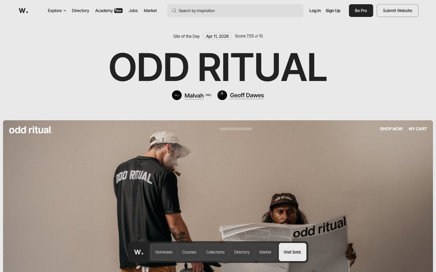
Awwwards
Awwwards — Style Reference
# Awwwards — Style Reference
> Swiss editorial gallery wall — oversized type, full-bleed photography, and a single black floating rail to navigate.
**Theme:** light
Awwwards operates as a curatorial editorial surface: near-monochrome gallery where one massive typographic statement introduces each featured site, anchored by full-bleed hero photography and minimal navigational chrome. The palette is ruthlessly achromatic — ink-black text on a warm pale-gray canvas — letting featured website imagery and a single sparse orange accent carry all visual energy. Components are flat, weighty, and rectangular: 8px radii across most surfaces, a floating dark tab bar, pill buttons that read as labels rather than actions. Type drives hierarchy almost entirely; the 127px display weight at 300 whispers authority rather than shouting, and the same Inter Tight family renders everything from 9px metadata to gallery-scale titles with quiet consistency.
## Tokens — Colors
| Name | Value | Token | Role |
|------|-------|-------|------|
| Ink | `#222222` | `--color-ink` | Primary text, filled buttons (Be Pro), dark floating nav rail, icons, input borders, table borders |
| Paper | `#ffffff` | `--color-paper` | Card surfaces, button labels, badge text, image backgrounds, content panels |
| Canvas | `#e9e9e9` | `--color-canvas` | Page background, card borders, section fills — the warm gray that makes the whole surface feel printed rather than digital |
| Fog | `#dedede` | `--color-fog` | Secondary borders, icon strokes, list dividers, subtle structural lines |
Websites
Markdown Text
design-md
website-prompt
landing-page-prompt
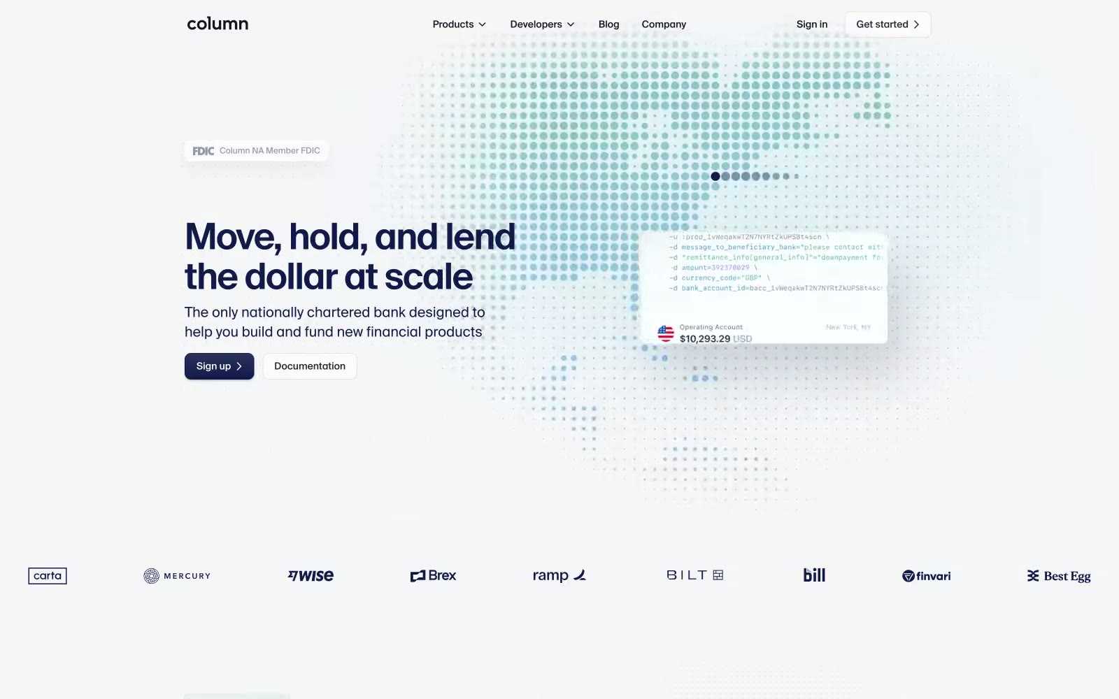
Column
Column — Style Reference
# Column — Style Reference
> Halftone atlas meets Swiss ledger — a banking API console floating over a dotted globe, where the map IS the hero and the card IS the illustration.
**Theme:** light
Column operates as a Swiss-precision banking ledger projected onto a halftone atlas. The canvas is paper-white with a sparse, deep-indigo typographic system where weight 300 headlines feel engineered rather than decorated. Color is rationed: the interface stays roughly 95% achromatic while a single Ember Orange anchors featured case-study cards, and teal pill badges provide functional punctuation. The world-map dot pattern is the signature visual motif — small circular points arranged in a grid, tinted across a full spectrum to form continents — doubling as atmospheric texture and geographic context.
## Tokens — Colors
| Name | Value | Token | Role |
|------|-------|-------|------|
| Paper White | `#f6f6f8` | `--color-paper-white` | Page background canvas |
| Card White | `#ffffff` | `--color-card-white` | Card surfaces, elevated panels, customer logo strips |
| Deep Ink | `#011821` | `--color-deep-ink` | Primary text, hero headlines, logo wordmark |
| Carbon | `#12161e` | `--color-carbon` | Secondary headings, nav links, icon strokes |
Websites
Markdown Text
design-md
website-prompt
landing-page-prompt
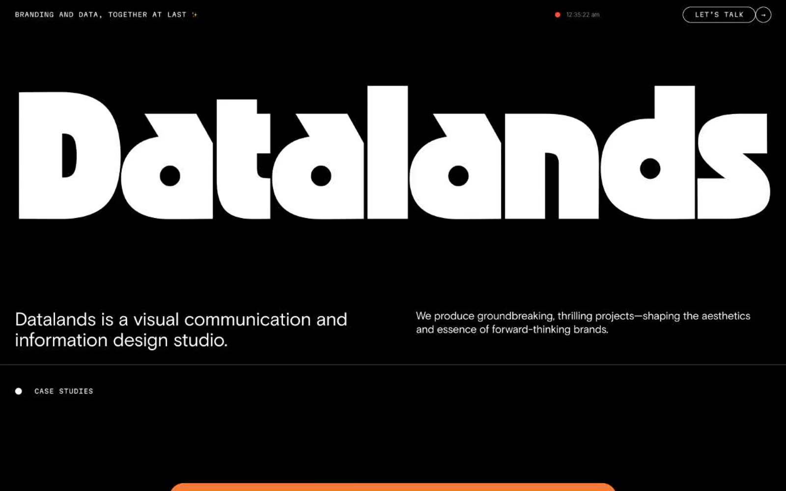
Datalands
Datalands — Style Reference
# Datalands — Style Reference
> Black cathedral with a single neon heartbeat. The wordmark fills the nave; everything else is a whispered caption beneath it.
**Theme:** dark
Datalands is a monochrome-black studio portfolio built around a single act of typographic spectacle: an OZIK Black wordmark blown to 358px, reducing the entire brand to a shape you feel before you read. The interface is deliberately austere — pure black canvas, white text, Martian Mono for all UI chrome and labels, Basis Grotesque for body copy with aggressive negative tracking. Chromatic color appears only as punctuation: a vivid magenta #fc74dd for the primary action, a small ember-orange #ff4c33 dot ticking in the nav, and case study visuals that erupt with flat geometric color. Everything rounded — inputs, buttons, tags, and the 'LET'S TALK' CTA all use 96px+ radii, creating a soft, almost capsule-like quality that contrasts the brutalist display type. The grid breathes; sections sit 80px apart, cards carry 48px of internal padding, and the dark mode is treated as a content environment, not a surface to be layered.
## Tokens — Colors
| Name | Value | Token | Role |
|------|-------|-------|------|
| Void | `#000000` | `--color-void` | Universal canvas, page background, default text, hairline borders, monogram fills. Pure black, no warm or cool bias — used at maximum density to let white type and color accents do all the work |
| Bone | `#ffffff` | `--color-bone` | Primary headings, body copy on dark, inverse button labels, inverted card surfaces for case studies |
| Charcoal | `#1d1a1a` | `--color-charcoal` | Elevated card and button-fill surfaces sitting one step above the black canvas. Slightly warm-tinted dark gray |
| Ink | `#111212` | `--color-ink` | Neutral form states, badge text, and quiet UI feedback where color should stay understated. |