AI Prompt Studio - Intelligent Prompt Library
Explore and use professional AI prompts to optimize your workflow.
One-click Use
Websites
Markdown Text
design-md
website-prompt
landing-page-prompt
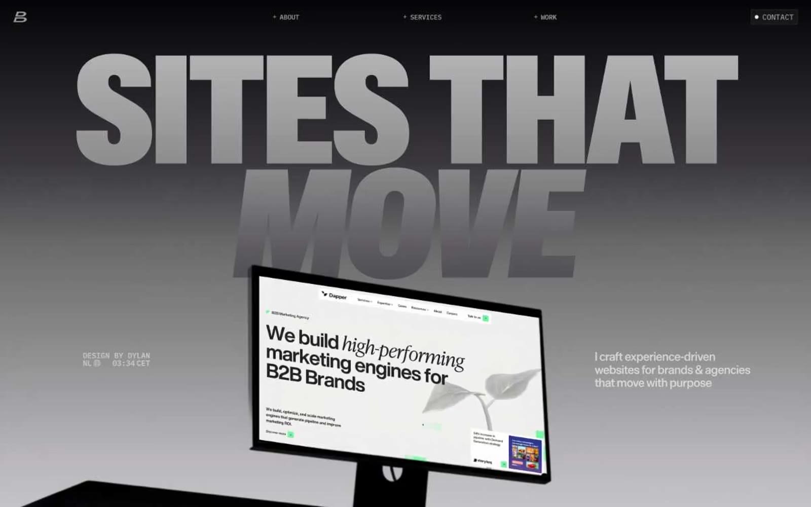
Dylanbrouwer
Dylanbrouwer — Style Reference

# Dylanbrouwer — Style Reference
> Monolithic chrome in cinematic fog — massive display type emerging from black-to-white gradient void, with orange as the only chromatic accent that exists.
**Theme:** mixed
A portfolio of two registers: cinematic dark hero canvases with chrome-metallic display type emerging from black-to-fog gradients, pivoting into bright white sections for work and services. Color is ruthlessly restrained — the entire system runs on achromatic grays and a single orange accent that lives almost exclusively on portfolio framing. Typography is the protagonist: one custom display face (ABC Gravity) explodes at 274px+ to fill the viewport, while a grotesque handles everything from 12px metadata to 60px section openers. The aesthetic reads as a designer's darkroom — confident negative space, brutalist scale jumps, and almost no decorative chrome. Components are reduced to their bones: ghost borders, mono labels, and massive wordmarks that function as section dividers.
## Tokens — Colors
| Name | Value | Token | Role |
|------|-------|-------|------|
| Obsidian | `#161616` | `--color-obsidian` | Deepest surface, near-black text, badge fills, hero background anchor |
| Graphite | `#3c3a3e` | `--color-graphite` | Primary text, default borders, link/button outlines, structural strokes — the workhorse neutral |
| Slate | `#7b7a7c` | `--color-slate` | Muted borders, secondary text, card edges |
| Ash | `#a2a2a2` | `--color-ash` | Nav borders, tertiary text, inactive states, gradient midstop |
Websites
Markdown Text
design-md
website-prompt
landing-page-prompt
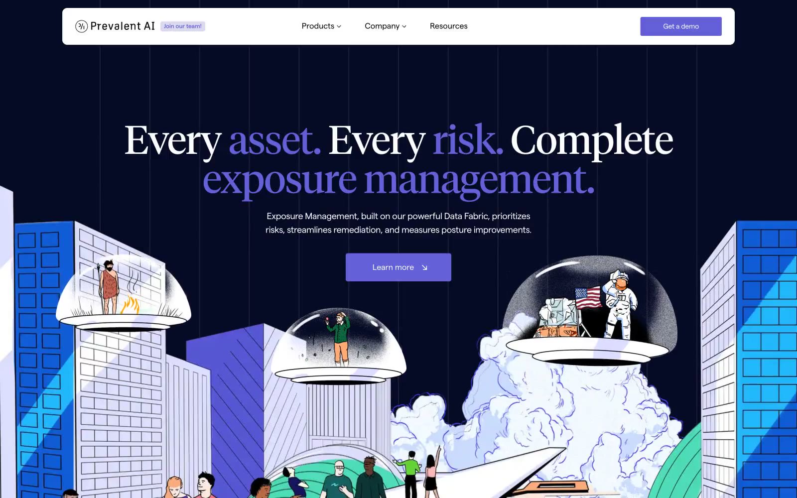
Prevalent
Prevalent — Style Reference
# Prevalent — Style Reference
> Editorial command observatory — serif intelligence briefings under a navy planetarium dome
**Theme:** mixed
Prevalent's visual system is an editorial intelligence briefing set inside a dark observatory: a near-black navy hero anchors large serif headlines in Tiempos, while the body switches to a humanist sans (Matter) for UI, captions, and controls. A single vivid violet (#6360d8) carries the entire chromatic load — it paints the most important nouns in every headline, fills the primary CTA, and underlines article links — leaving the rest of the page in pure black-on-white. The product is illustrated, not photographed: whimsical hand-drawn scenes of miniature people navigating futuristic architecture replace the usual SaaS 3D renders, giving the brand a storybook quality that contrasts sharply with its serious cybersecurity subject matter. Components are flat, borderless by default, and depend on thin black hairlines rather than shadows for separation.
## Tokens — Colors
| Name | Value | Token | Role |
|------|-------|-------|------|
| Iris Voltage | `#6360d8` | `--color-iris-voltage` | Brand accent for primary CTAs, link color, accent words inside serif headlines, and the thin violet underlines/arrows on navigation and article links |
| Midnight Vault | `#060b25` | `--color-midnight-vault` | Hero and footer canvas — the deep navy that frames the largest serif headlines and the top of the page |
| Pure Ink | `#000000` | `--color-pure-ink` | Primary text, default hairlines, and the 1px borders that separate every card, section, and image |
| Paper White | `#ffffff` | `--color-paper-white` | Page canvas, card surfaces, button text on violet, and inverse text on the dark hero |
Websites
Markdown Text
design-md
website-prompt
landing-page-prompt
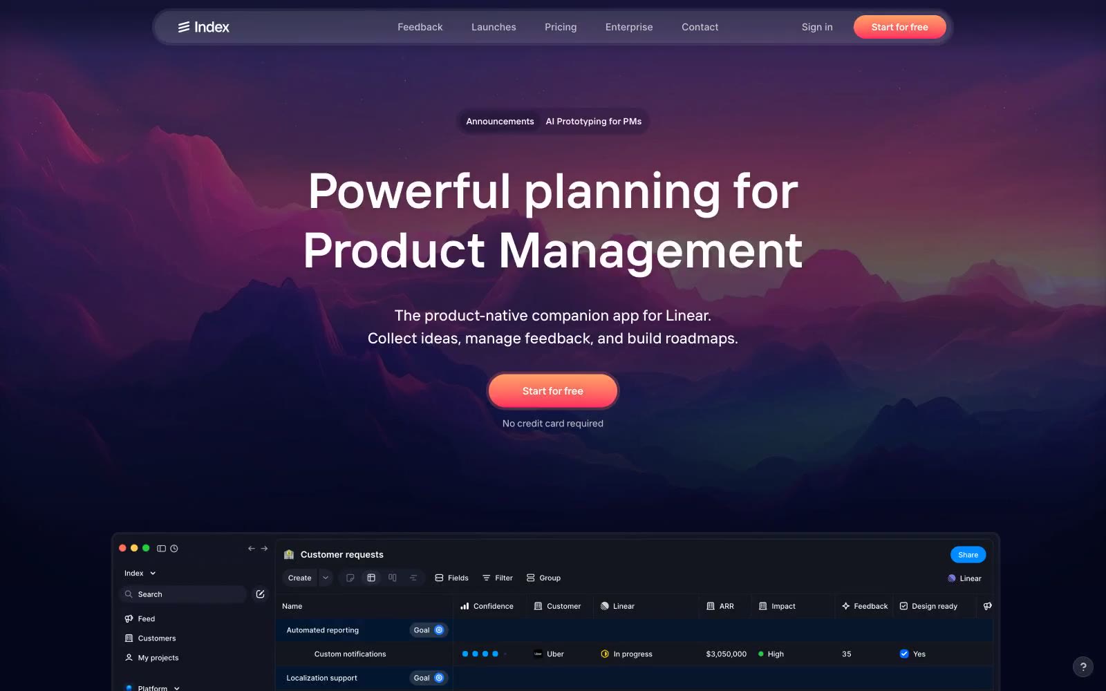
Index
Index — Style Reference
# Index — Style Reference
> twilight summit command center — a violet-tinted dark dashboard crowned by a single mountain horizon at dusk, where the only warm light is the coral CTA
**Theme:** dark
Index operates as a twilight alpine command center: a near-black canvas tinted with deep indigo and violet, overlaid with high-density product UI and crowned by a single dramatic peak-against-dusk landscape. The system stays nocturnal — backgrounds are violet-shifted blacks (#0c0a2b, #13151f), borders are muted violet hairlines (#292a4d), and text is bone-white (#ffffff) with a graphite secondary (#9b9ba4). The lone warm signal is a coral-to-red gradient (#ff8a76 → #ff3a63) reserved exclusively for the primary CTA — it reads as sunrise breaking the ridge, demanding attention against the cold palette. Inside product surfaces, color is functional punctuation: small saturated dots (electric blue #0067ff, violet #665eff, vivid red #ff3a63, chartreuse #ffff00) mark status, priority, and category. Cards float on the dark canvas with 1px violet borders, no shadows — the surface system relies on luminance steps and border weight, not elevation. Typography is compact, geometric, and slightly tracked-out at small sizes, with a custom 'Index' display face (sizes up to 72px) and Inter for the dense table/UI layer.
## Tokens — Colors
| Name | Value | Token | Role |
|------|-------|-------|------|
| Abyss Black | `#02030b` | `--color-abyss-black` | Deepest canvas — modal overlays, deepest surface beneath elevated cards |
| Midnight Indigo | `#04061c` | `--color-midnight-indigo` | Primary page canvas — hero sits on this, full-bleed sections |
| Slate Indigo | `#0c0a2b` | `--color-slate-indigo` | Elevated surface — card backgrounds, panel containers, dropdowns |
| Carbon Iris | `#13151f` | `--color-carbon-iris` | Secondary surface — table rows, list items, inset wells |
Websites
Markdown Text
design-md
website-prompt
landing-page-prompt
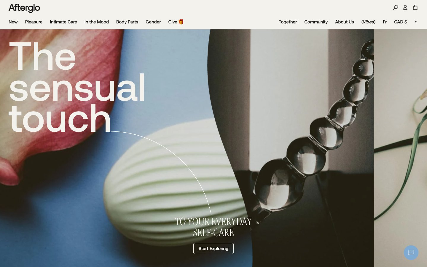
Afterglo
Afterglo — Style Reference
# Afterglo — Style Reference
> Editorial boudoir printed on cream paper — quiet, tactile, typographic.
**Theme:** light
Afterglo is an editorial intimacy shop: warm cream canvas, sensual product photography, and typographic drama built from one neo-grotesque (Aeonik) and one high-contrast display serif (Cardinal Fruit). The palette is near-monochrome with paper-warm neutrals (ivory, sage gray, ink black) punctuated by a single warm coral accent in the footer and a dusty powder blue for badges — color is rationed, never decorative. Surfaces stay flat and matte with hairline 5px radii; the depth comes from oversized type and image crops, not shadows. The rhythm alternates between full-bleed photographic hero panels and quiet editorial spreads where the serif display type does the work of an art director, not a CMS.
## Tokens — Colors
| Name | Value | Token | Role |
|------|-------|-------|------|
| Ivory Paper | `#f3f2ec` | `--color-ivory-paper` | Page canvas, card surfaces, footer wash — the warm off-white that makes every photograph feel printed, not digital |
| Sage Mist | `#e3e4df` | `--color-sage-mist` | Hairline borders, input outlines, subtle dividers, secondary card backgrounds — the cool-warm neutral that separates layers without contrast shouting |
| Bone Gray | `#cbc9bd` | `--color-bone-gray` | Mid-tone neutrals for input shadows and muted surface fills — the bridge between ivory and ink |
| Ink Black | `#131313` | `--color-ink-black` | Primary text, filled buttons, icon strokes, navigation borders — slightly softer than pure black, reads as printer's ink rather than screen |
Websites
Markdown Text
design-md
website-prompt
landing-page-prompt
Dub
Dub — Style Reference
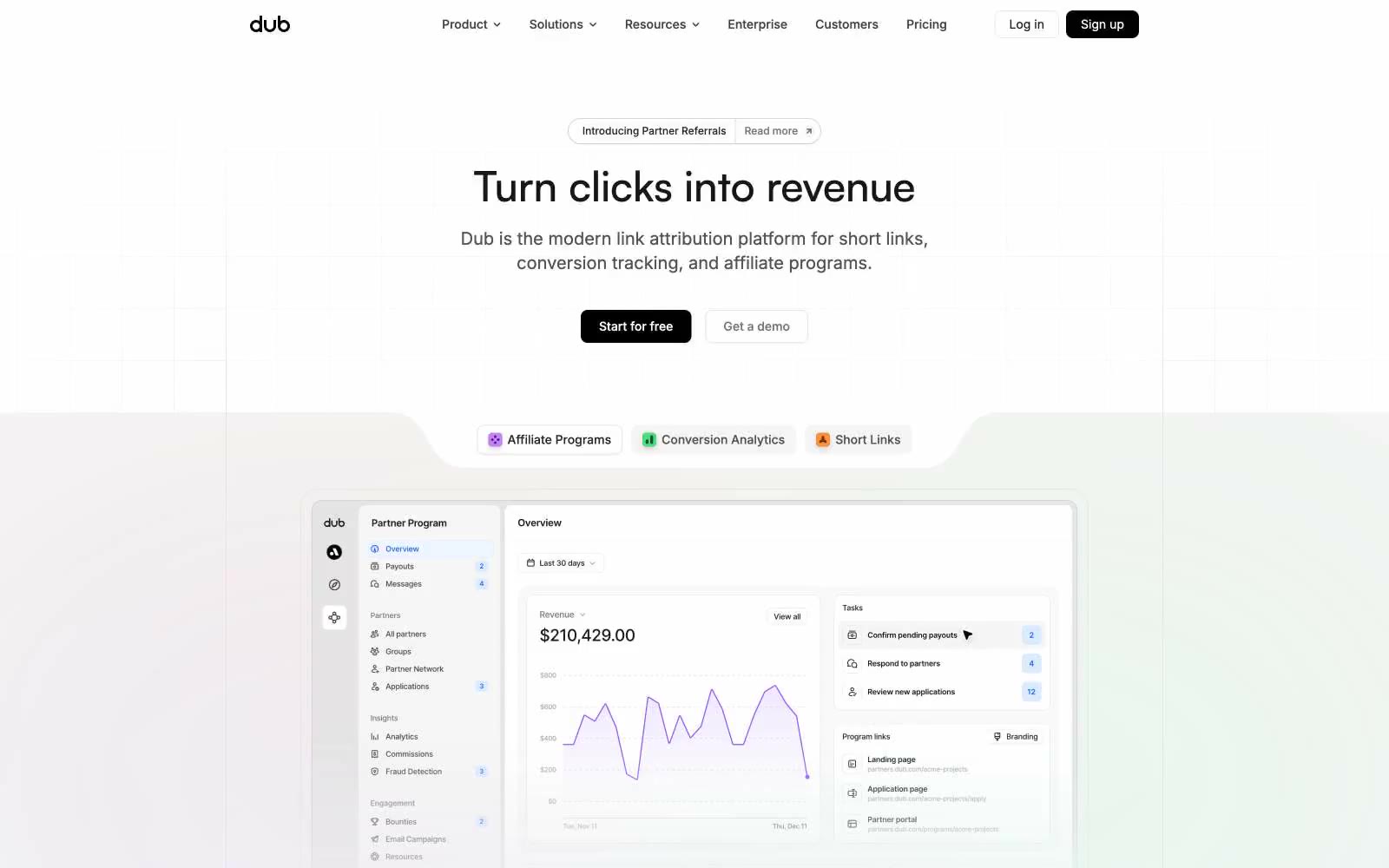
# Dub — Style Reference
> engineer's whiteboard with neon sticky tabs
**Theme:** light
Dub is a near-monochrome product surface dressed for marketing: a white canvas, hairline #e5e5e5 borders doing the structural work, black filled CTAs, and three small color tabs (orange, green, violet) that tag product capabilities. The signature is restraint — the page reads like a technical editorial layout, not a glossy SaaS brochure, with a compact density and confident Satoshi display headlines that do the talking. Product UI screenshots are the dominant visual; the chrome around them is deliberately quiet. Color is used as a labeling system, not as atmosphere, which keeps the system extensible: any new feature category slots into the orange/green/violet/pink/yellow palette without redecorating the page.
## Tokens — Colors
| Name | Value | Token | Role |
|------|-------|-------|------|
| Paper White | `#ffffff` | `--color-paper-white` | Page background, card surfaces, button text on dark fills |
| Ink Black | `#0a0a0a` | `--color-ink-black` | Primary headings, body text, and icon fills on light surfaces. Do not promote it to the primary CTA color |
| Carbon | `#171717` | `--color-carbon` | Secondary text, body emphasis, dark surfaces |
| Smoke 50 | `#f5f5f5` | `--color-smoke-50` | Elevated surface, secondary button fill, subtle wash backgrounds |
Websites
Markdown Text
design-md
website-prompt
landing-page-prompt
Uniswap
Uniswap — Style Reference
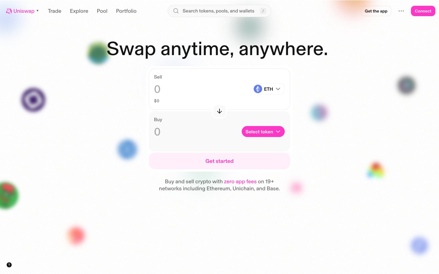
# Uniswap — Style Reference
> Pink confetti over a clean white trading desk.
**Theme:** light
Uniswap's interface is a bright, mostly flat white canvas interrupted by one saturated hot-pink accent and scattered colorful decorative orbs that give the experience a playful, confetti-like atmosphere. The system deliberately rejects the dark-mode crypto convention in favor of an airy, almost editorial feel where the swap widget sits front-and-center as a quiet white card and the pink (#ff37c7) does all the expressive work — marking the primary action, the brand mark, and the only chromatic decision an interface designer needs to make. Typography is handled by a single custom face (Basel) at unusual mid-weights (485, 535) with tight tracking across all sizes, producing a geometric, slightly clinical tone that keeps the product feeling like a serious financial tool despite the candy-colored hero. Surfaces are nearly shadowless — the only elevation in the system is a barely-visible 10% black blur — and everything is separated by hairline borders and generous whitespace rather than stacked panels. The rainbow of secondary hues (#ff4d00, #2abdff, #00c3a0, #8251fb, etc.) functions as a token/asset taxonomy rather than a UI accent system, meaning most new screens should stay achromatic with pink as the sole chromatic verb.
## Tokens — Colors
| Name | Value | Token | Role |
|------|-------|-------|------|
| Uniswap Pink | `#ff37c7` | `--color-uniswap-pink` | Primary brand mark, filled CTA buttons, active nav indicator, and the only chromatic color an interface should use — saturated hot-pink against a white canvas creates instant focal hierarchy without darkening the page |
| Midnight Ink | `#131313` | `--color-midnight-ink` | Dark borders and separators for elevated surfaces and inverted UI. |
| Pure White | `#ffffff` | `--color-pure-white` | Page canvas, card surfaces, input fields, and text on pink buttons — the structural base everything sits on |
| Carbon | `#222222` | `--color-carbon` | Secondary structural border and text variant used in nav and button outlines where slightly softer than Midnight Ink is desired |
Websites
Markdown Text
design-md
website-prompt
landing-page-prompt
Linktr
Linktr — Style Reference
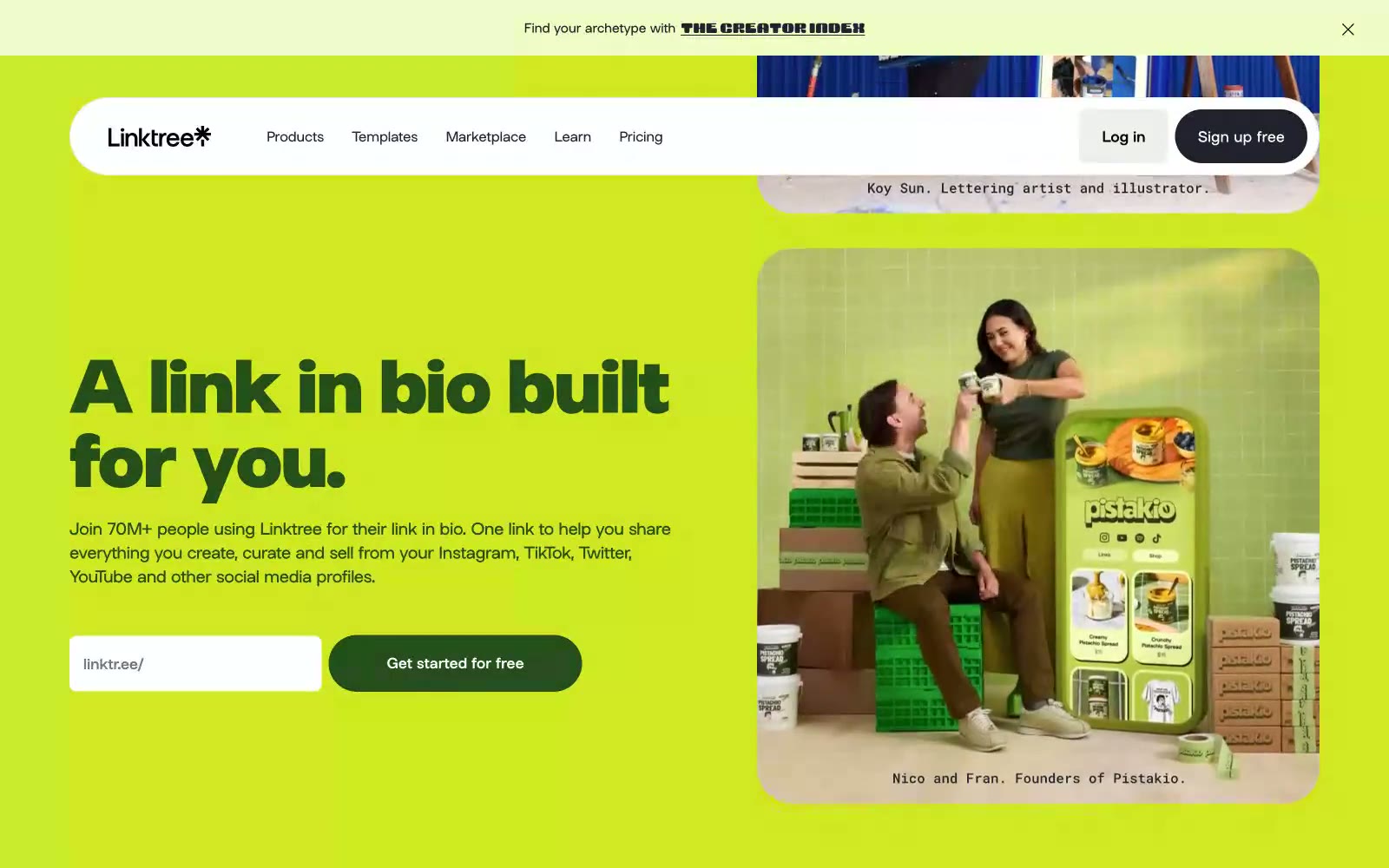
# Linktr — Style Reference
> Editorial posters stacked like candy. A full-bleed color-block site where lime green headlines sit on cobalt blue walls and white pill-shaped navs float across maroon fields.
**Theme:** mixed
Linktree speaks in full-volume color blocks: each section is a saturated wall of lime, cobalt, or maroon, and content floats on top as white pills and dark text. The system treats color as the layout, not decoration — headers, cards, and CTAs inherit the section hue rather than fighting it, while a recurring chartreuse green acts as the brand's singular action accent. Typography is a single custom geometric sans (Linksans) set extra-bold with tight negative tracking at display sizes, giving headlines a compressed, poster-like weight. Shapes are aggressively rounded: nav bars and buttons become perfect pills, cards become lozenges, and only form inputs keep a modest 8px corner. The result reads as a series of bold editorial spreads rather than a conventional product page.
## Tokens — Colors
| Name | Value | Token | Role |
|------|-------|-------|------|
| Voltage Lime | `#d2e823` | `--color-voltage-lime` | Primary action buttons, highlighted headlines, accent surfaces — the brand's signature chartreuse, used sparingly as functional punctuation across every section |
| Cobalt Signal | `#2665d6` | `--color-cobalt-signal` | Full-bleed section backgrounds, link accents — saturated blue used as an alternate hero band |
| Bordeaux Maroon | `#780016` | `--color-bordeaux-maroon` | Full-bleed FAQ and deep sections — dark wine red for high-contrast blocks |
| Midnight Ink | `#1e2330` | `--color-midnight-ink` | Primary text, icon fills, dark UI outlines — near-black with a faint blue undertone, the default ink color |
Websites
Markdown Text
design-md
website-prompt
landing-page-prompt
Reducto
Reducto — Style Reference
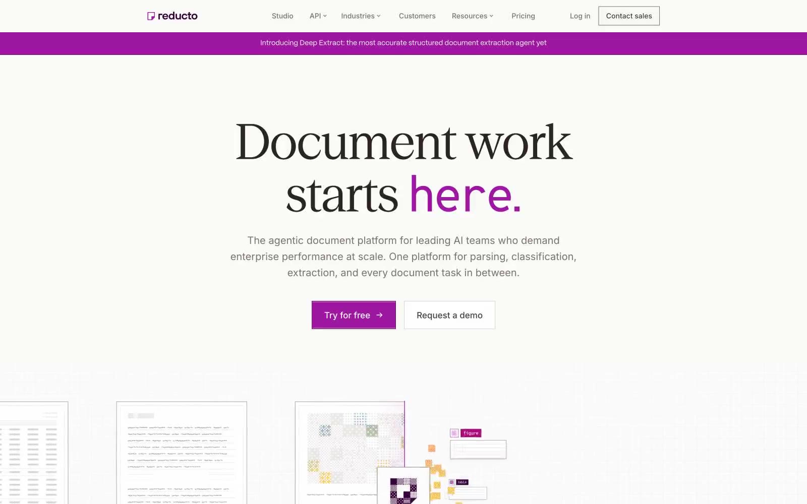
# Reducto — Style Reference
> Magazine on warm paper
**Theme:** light
Reducto presents a warm-paper editorial system: an off-white canvas paired with a custom serif that behaves like a luxury magazine masthead, grounded by a single high-chroma magenta that punches through without shouting. The aesthetic borrows from print typography — oversized serif headlines (64–136px) set in a custom face with tight tracking, paired with a workmanlike sans for utility — and treats the page as a structured document rather than a product dashboard. Color is rationed: almost everything reads in warm grays and the deep plum #310632, and the vivid magenta #9d17a0 is reserved for the moment a user needs to act. Surfaces are paper-thin, borders are warm beige instead of cold gray, and shadows are essentially absent — depth comes from inset white highlights and subtle border contrast, not from elevation.
## Tokens — Colors
| Name | Value | Token | Role |
|------|-------|-------|------|
| Aubergine | `#310632` | `--color-aubergine` | Primary text, headline color, nav active state, link accent, footer text — the deep plum that replaces black across the entire interface, giving body copy a warm violet cast instead of cold gray |
| Magenta Pulse | `#9d17a0` | `--color-magenta-pulse` | Filled primary action background, selected nav indicator, brand icon color — the single vivid hue permitted on a CTA, used sparingly so the click target glows against the paper canvas |
| Damson | `#690f6b` | `--color-damson` | Outlined action border, secondary button outline — a darker shade of the action magenta, used when a ghost/outlined button needs chromatic weight without the filled fill |
| Lilac Wash | `#dcbffb` | `--color-lilac-wash` | Violet text accent for links, tags, and emphasized short phrases. Do not promote it to the primary CTA color |
Websites
Markdown Text
design-md
website-prompt
landing-page-prompt
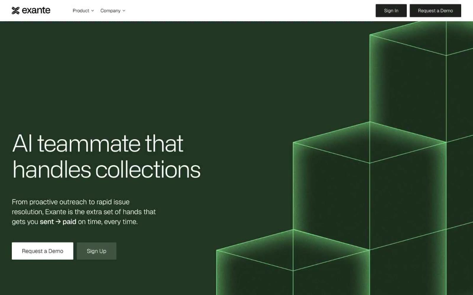
Exante
Exante — Style Reference
# Exante — Style Reference
> neon greenhouse at midnight
**Theme:** light
A fintech site that lives in two registers: a near-black hero with wireframe geometry and whisper-light Alliance No.2 display headlines at 52–80px with aggressive negative tracking, then sections that snap to a white canvas and erupt with a single radioactive mint accent. The system is deliberately sharp — a 2px border radius governs almost every surface, rejecting softness in favor of an architectural, blueprint-like language. Typography carries the brand: custom display faces set tight and large, Geist Variable keeps the interface grounded, and Geist Mono at 12px with +0.06em tracking introduces an editorial eyebrow label used above every section. Color is surgical: black, white, and a near-black with a green undertone (#1e211e) do 90% of the work; the mint #90fc95 is reserved as a single bright punctuation mark for highlight bands and metric surfaces.
## Tokens — Colors
| Name | Value | Token | Role |
|------|-------|-------|------|
| Obsidian | `#1e211e` | `--color-obsidian` | Filled buttons, hero canvas, primary text on light surfaces — near-black with a barely-there green undertone that links it to the mint accent without announcing itself |
| Paper | `#ffffff` | `--color-paper` | Page background, card surfaces, button text on dark fills, nav background |
| Pure Black | `#000000` | `--color-pure-black` | Hairline borders, icon strokes, sharpest outlines — provides the crispest edge against white surfaces |
| Graphite | `#4b4d4b` | `--color-graphite` | Secondary body text, subdued borders — the middle voice between Obsidian and Ash |
Websites
Markdown Text
design-md
website-prompt
landing-page-prompt
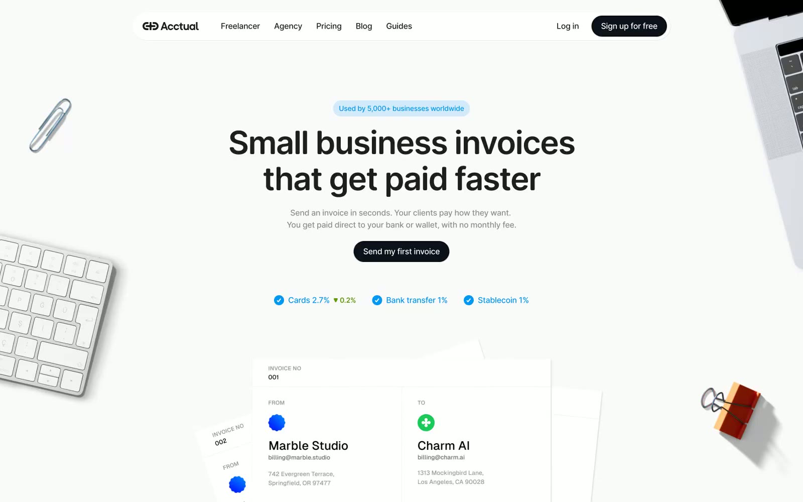
Acctual
Acctual — Style Reference
# Acctual — Style Reference
> Clean paper desk at dusk
**Theme:** light
Acctual is a near-monochrome invoice product dressed in soft paper-like neutrals — white surfaces, whisper-gray sections, and barely-there borders. The visual system is defined by restraint: chromatic color appears only as small functional punctuation (a blue checkmark, a pink avatar tile, a violet gradient wash) against an otherwise achromatic canvas. Typography does the heavy lifting — a geometric sans (Open Runde) sets confident headlines with tight negative tracking, while generous 20–32px radii and pill-shaped controls give every surface a soft, tactile, almost stationery-like quality. The overall feel is a clean invoice desk at the end of the day: papers fanned out, a paperclip and keyboard on the corner, nothing decorative competing with the work.
## Tokens — Colors
| Name | Value | Token | Role |
|------|-------|-------|------|
| Paper White | `#ffffff` | `--color-paper-white` | Card surfaces, testimonial panels, elevated content blocks |
| Cool Mist | `#f7fafc` | `--color-cool-mist` | Page canvas, alternating section bands, soft wash behind content |
| Stone Edge | `#afb0b1` | `--color-stone-edge` | Hairline dividers, FAQ separators, faint horizontal rules |
| Graphite Mute | `#8d8d8d` | `--color-graphite-mute` | Muted body copy, helper text, secondary metadata, grayscale logo cloud |
Websites
Markdown Text
design-md
website-prompt
landing-page-prompt
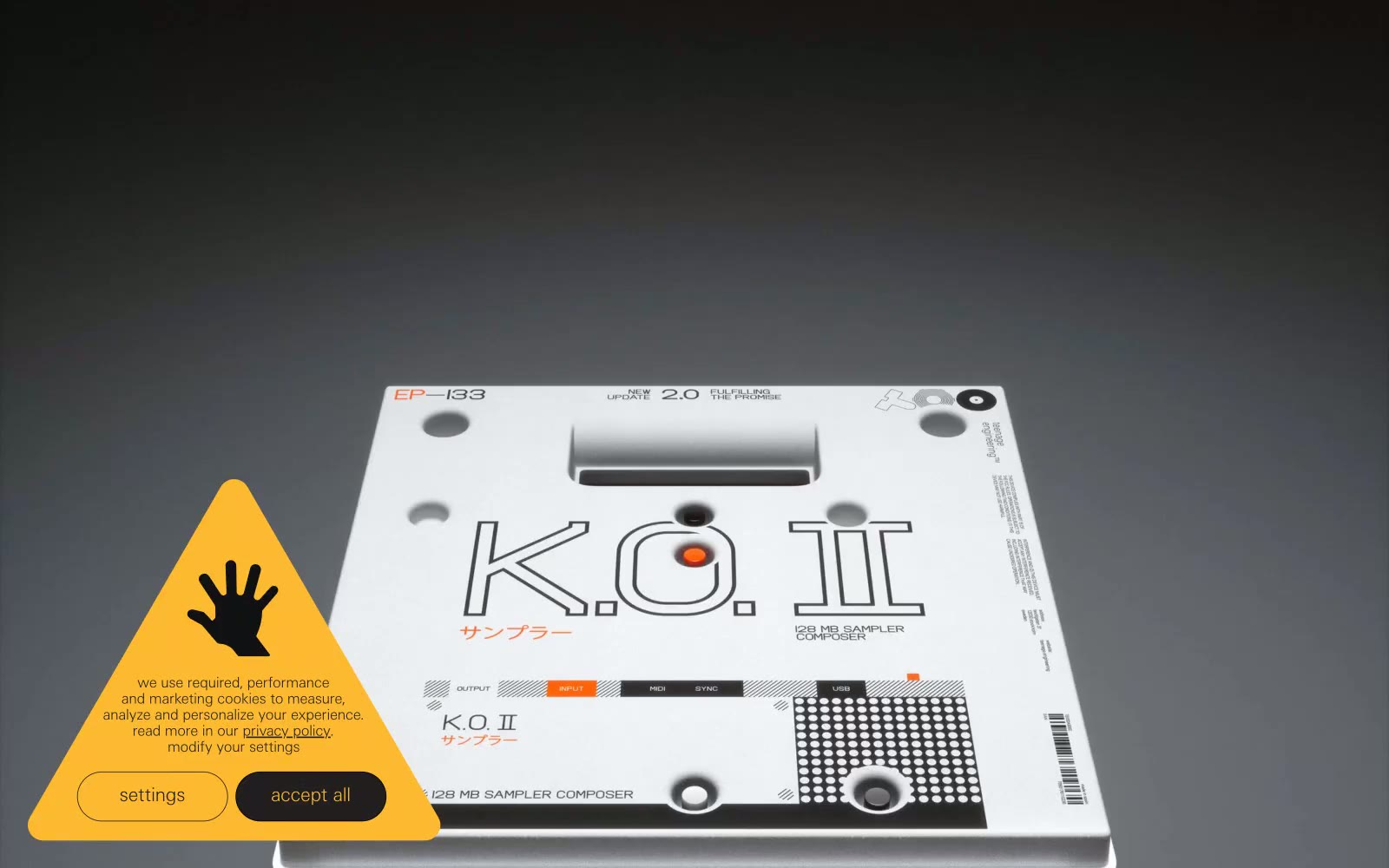
teenage engineering
teenage engineering — Style Reference
# teenage engineering — Style Reference
> industrial catalogue under studio light — the product is the only rich object on the page and everything else is whispered around it
**Theme:** light
teenage engineering reads as an industrial product catalogue rendered in typographic whispers: a near-white canvas of #f6f8f7 hosts photographed products on seamless studio backdrops, while everything else — nav items, body copy, borders, labels — sits in ultra-thin weight 100 type that almost disappears into the page. The contrast comes not from ornament but from material: products are the only dense visual objects; the UI around them is mostly negative space, hairline rules, and one occasional dark band of #0f0e12 that acts like a display case wall. Zero rounded corners, zero drop shadows, zero gradients — every edge is a straight cut, every surface is flat. Color is deliberately rationed: pure black text, gray hairlines, a slightly purplish near-black for inverted sections, and a single chromatic note (the amber warning triangle) that earns its presence by being the only non-neutral element on the page.
## Tokens — Colors
| Name | Value | Token | Role |
|------|-------|-------|------|
| Canvas Mist | `#f6f8f7` | `--color-canvas-mist` | Page background, product photography backdrop, the dominant surface — everything else sits on this almost-white field |
| Ink Black | `#000000` | `--color-ink-black` | Primary body text, dominant hairline borders, footer rules — the most-used color in the system at ~1017 occurrences, functioning as the typographic anchor |
| Carbon | `#0f0e12` | `--color-carbon` | Near-black with a barely-perceptible violet cast — used for dark hero bands, inverted text, and footer/divider blocks where pure black would feel too clinical |
| Steel Gray | `#e5e5e5` | `--color-steel-gray` | Light border hairlines, nav icon fills, list dividers — the structural gray that organizes the page into ruled sections without ever calling attention to itself |
Websites
Markdown Text
design-md
website-prompt
landing-page-prompt
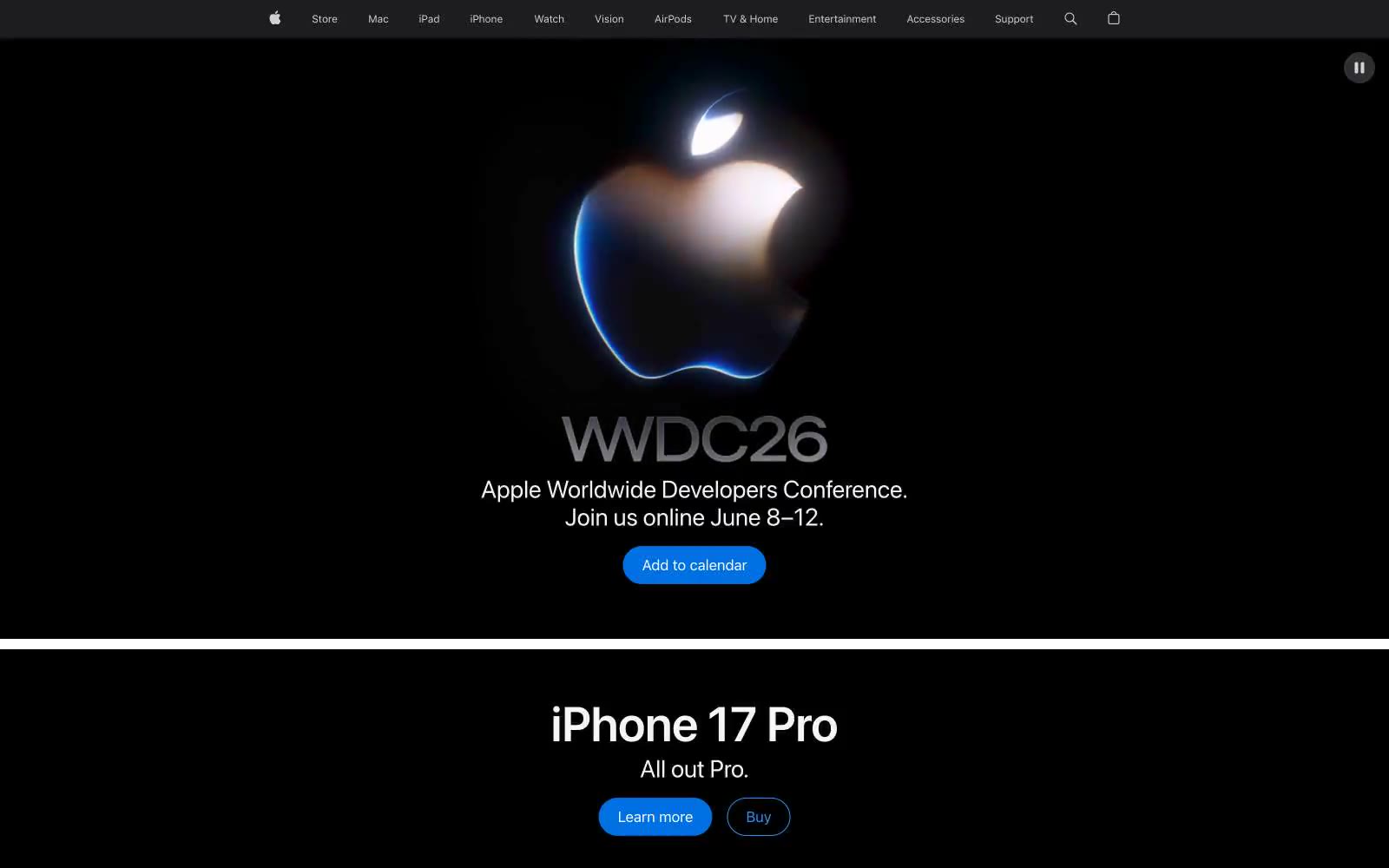
Apple
Apple — Style Reference
# Apple — Style Reference
> white room with a single blue switch.
**Theme:** light
Apple's design language is a study in restraint: near-white canvas, generous breathing room, and one vivid blue accent that makes every action feel deliberate. Typography is the primary voice — SF Pro set with negative tracking that tightens as size grows, giving headlines architectural clarity without weight. The product IS the design: large product photography and lifestyle imagery dominate, while chrome recedes into thin borders, ghost navigation, and hairline rules. Sections alternate on a light gray canvas with full-bleed color washes for promotional blocks, creating rhythm through scale shifts rather than decoration.
## Tokens — Colors
| Name | Value | Token | Role |
|------|-------|-------|------|
| Apple Blue | `#0071e3` | `--color-apple-blue` | Filled action buttons, selected states — the only chromatic interactive color, used sparingly so each appearance carries weight |
| Link Blue | `#0066cc` | `--color-link-blue` | Outlined action borders, inline links — deeper saturation than Apple Blue, used where a filled pill would be too loud |
| Signal Blue | `#2997ff` | `--color-signal-blue` | Decorative borders, image outlines, icon strokes — the lightest blue in the system, used for atmospheric emphasis rather than interaction |
| Carbon | `#1d1d1f` | `--color-carbon` | Primary text, heading borders, nav rules, card borders — the dominant ink color, near-black with a whisper of warmth |
Websites
Markdown Text
design-md
website-prompt
landing-page-prompt
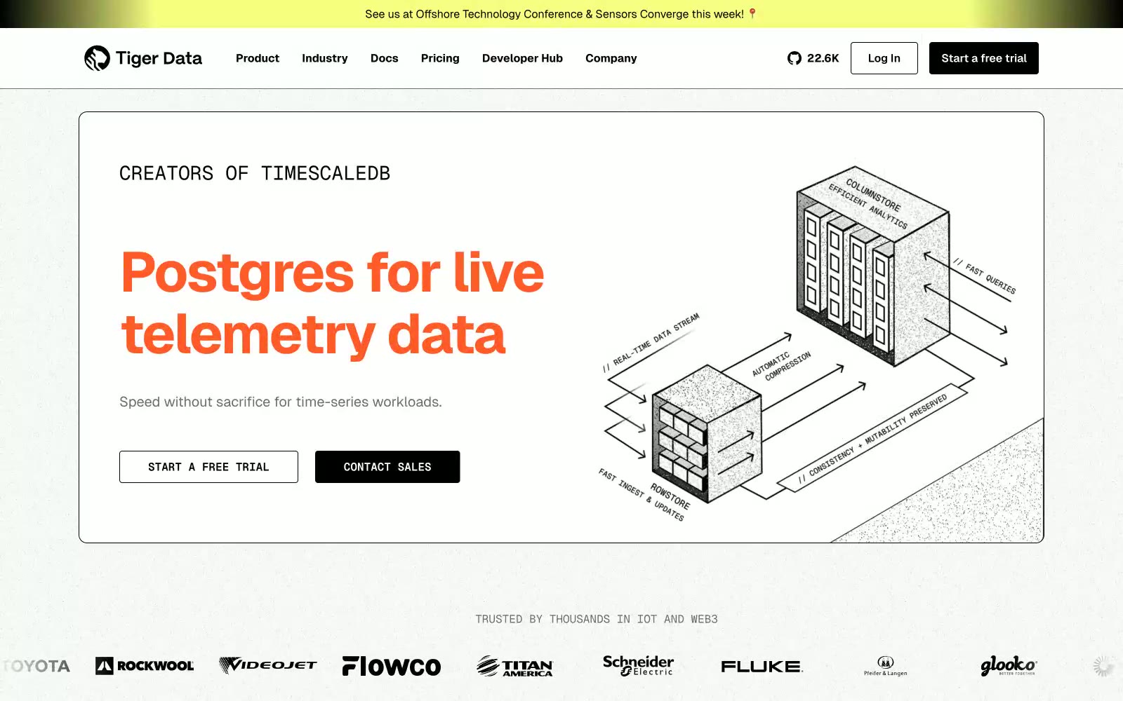
Timescale
Timescale — Style Reference
# Timescale — Style Reference
> Engineering blueprint on warm graph paper
**Theme:** light
Timescale speaks the language of infrastructure diagrams: a warm off-white canvas with subtle grid texture, bold orange statement type that functions as a visual highlighter, and monospace numerals that feel like terminal readouts. The palette is almost entirely achromatic with exactly two chromatic punctuation marks — vivid orange for voice and chartreuse for spotlight — so color always carries intent rather than decoration. Typography is structural and dual: Geist handles interface voice while Geist Mono handles numbers, codes, and emphasis, creating a constant productive tension between the conversational and the computational. The neo-brutalist hard offset shadow (5px 5px 0px solid black) on cards and the pill-shaped CTAs give the system a tactile, blueprint-on-graph-paper quality — engineered, not decorated.
## Tokens — Colors
| Name | Value | Token | Role |
|------|-------|-------|------|
| Signal Orange | `#ff5b29` | `--color-signal-orange` | Headline accent, large stat numerals, emphasis spans, decorative borders — the only color with voice, used to make key phrases feel switched on against the monochrome canvas |
| Chartreuse Highlight | `#f5ff80` | `--color-chartreuse-highlight` | Announcement bars, highlighted callout blocks, featured chip backgrounds — acts as a spotlight wash, never a CTA fill, drawing the eye to time-sensitive or notable content |
| Carbon Black | `#000000` | `--color-carbon-black` | Primary text, filled button backgrounds, hairline borders, hard offset shadows, icon strokes — the dominant structural color, used at scale for borders and dividers |
| Paper White | `#fafafa` | `--color-paper-white` | Page canvas, card surfaces, button text on dark fills — warm off-white, never pure #fff, giving the whole system a printed-paper warmth |
Websites
Markdown Text
design-md
website-prompt
landing-page-prompt
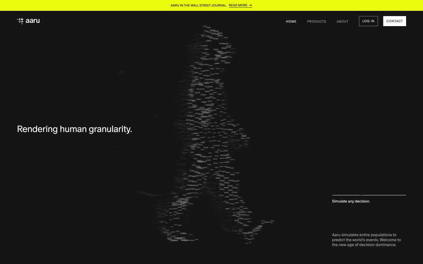
Aaru
Aaru — Style Reference
# Aaru — Style Reference
> Particle-field observatory at midnight
**Theme:** dark
Aaru operates as a dark-mode scientific observatory: pure black canvas interrupted by one vivid electric-blue section and a single acid-yellow-green accent that reads like an instrument-panel indicator light. Typography is deliberately inverted from convention — weight 330 ultra-light runs through every role, body text carries positive letter-spacing (0.025–0.080em) for a data-label cadence, and only display headings tighten to negative tracking. Surfaces are flat and shadowless; hierarchy is built through thin 1px borders, generous whitespace, and numbered annotations rather than elevation. The visual language is terminal, measured, and anti-decorative — every element earns its place like a readout on a control panel.
## Tokens — Colors
| Name | Value | Token | Role |
|------|-------|-------|------|
| Void Black | `#000000` | `--color-void-black` | Page canvas, primary background — the dominant surface across all dark sections |
| Carbon | `#0a0a0a` | `--color-carbon` | Elevated surface for nav borders, button outlines, and secondary structural elements against the black canvas |
| Graphite | `#18181b` | `--color-graphite` | Subtle raised surface for cards or containers sitting on the black canvas — the lightest neutral step before chromatic sections |
| Frost | `#ffffff` | `--color-frost` | Primary text, hairline borders on dark sections, and inverted backgrounds — the most-used color after black |
Websites
Markdown Text
design-md
website-prompt
landing-page-prompt
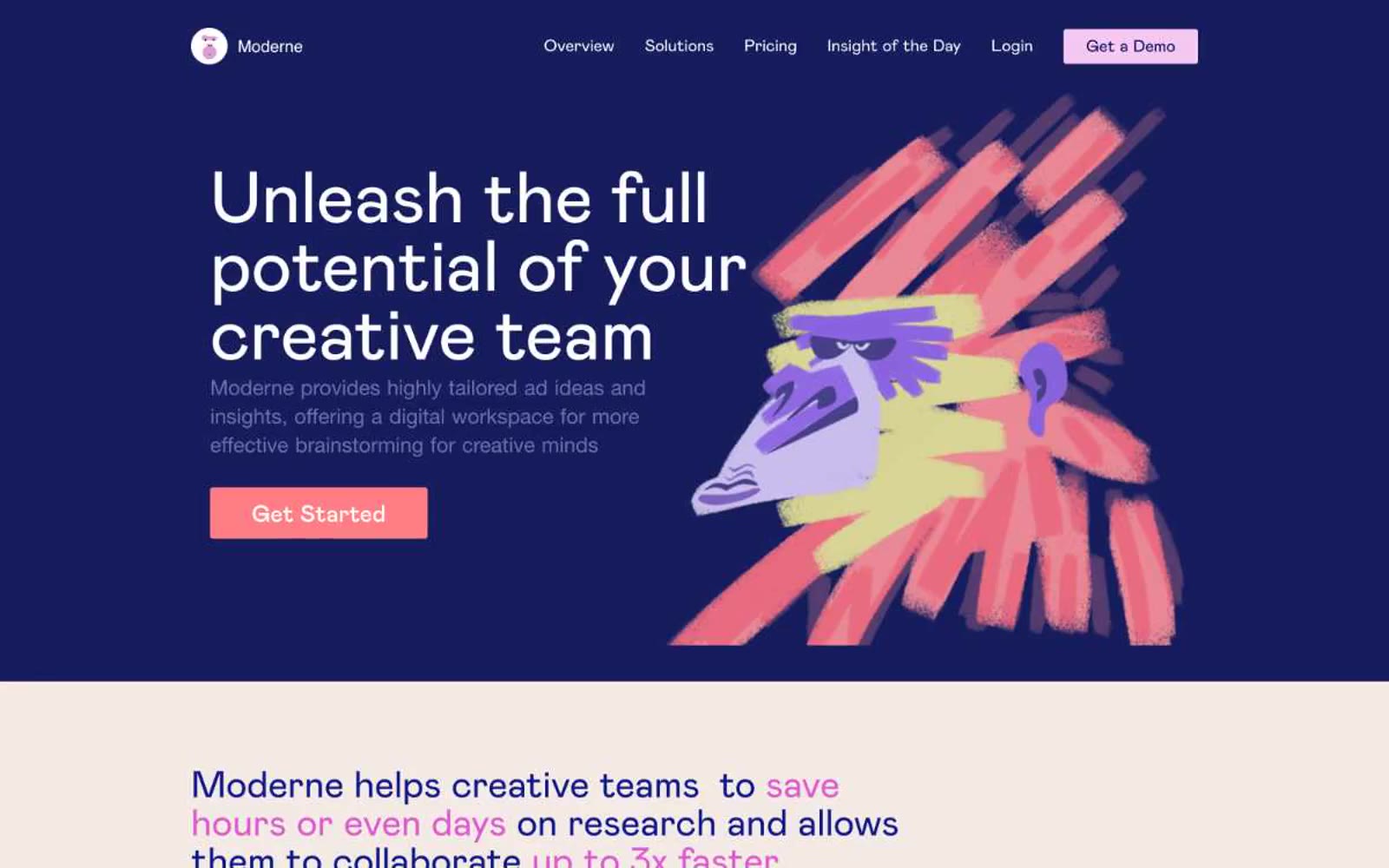
Home
Home — Style Reference
# Home — Style Reference
> Expressive creative studio on warm blush paper
**Theme:** mixed
Moderne operates as a creative-zine-meets-SaaS: a warm blush-paper canvas (#f3eae5) hosts large confident Mabry Pro headlines, while a single full-bleed deep-indigo hero band (#000647) acts as the dramatic opening spread before the page returns to cream. The color system is deliberately polychrome — a riot of coral, violet, magenta, teal, and orange accents painted across expressive hand-drawn illustrations and gradient headline fills, never reduced to a single brand hue. Typography is oversized and weight-500, giving every section an editorial poster feel rather than a dashboard feel. UI chrome stays light: 4px radii, thin dark borders, ghost buttons on the dark hero, filled coral buttons on the light sections, and illustrations do the heavy emotional lifting.
## Tokens — Colors
| Name | Value | Token | Role |
|------|-------|-------|------|
| Blush Cream | `#f3eae5` | `--color-blush-cream` | Primary page canvas — warm off-white with a rosy undertone that gives every section a paper-stock feel rather than a digital white |
| Deep Indigo | `#000647` | `--color-deep-indigo` | Violet wash for highlight backgrounds, decorative bands, and soft emphasis behind content. Do not promote it to the primary CTA color |
| Pure White | `#ffffff` | `--color-pure-white` | Card surfaces on the dark hero, button text fills, and inverse typography on dark bands |
| Graphite | `#3e3c43` | `--color-graphite` | Primary body text and high-emphasis headings on light surfaces — a near-black with a hint of warmth rather than a cold #000 |
Websites
Markdown Text
design-md
website-prompt
landing-page-prompt
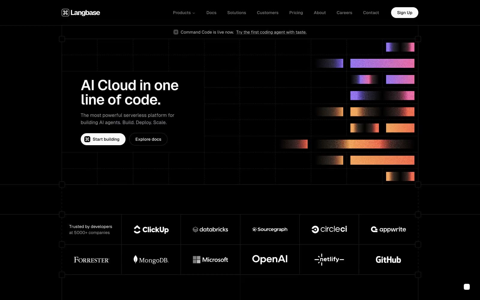
Langbase
Langbase — Style Reference
# Langbase — Style Reference
> Midnight aurora console
**Theme:** dark
Langbase is a midnight developer console where a single chromatic aurora is the only color in an otherwise pure dark-gray world. The canvas is #232324 — a near-black charcoal — structured by hairline borders at #232324 and #5c5c61 that create an architectural blueprint grid visible behind the hero. The interface reads as a terminal: GeistSans provides clean geometric UI, GeistMono adds the developer identity at display sizes, and CTAs are achromatic pills (white-on-dark) so the multi-hue gradient — peach, pink, violet, mint, sky — becomes the sole emotional accent. Components stay flat and lightweight: no decorative shadows, no colorful buttons, no rounded-everything softness. The only color is the aurora, and it appears as fragmented horizontal bars beside the hero — decorative spectacle, never functional chrome.
## Tokens — Colors
| Name | Value | Token | Role |
|------|-------|-------|------|
| Console Charcoal | `#232324` | `--color-console-charcoal` | Dominant page canvas, structural hairline borders, and the visible grid backdrop behind the hero. The single most-used color in the system; defines the near-black field that everything else sits on |
| Bone White | `#fafafa` | `--color-bone-white` | Primary text, primary action fill, and the bright pole of the system. White-on-charcoal carries all the hierarchy; nothing else is allowed to compete |
| True Black | `#000000` | `--color-true-black` | Deepest surface tone for the darkest interactive states and the reverse-text base inside white CTA buttons. Used sparingly — never as the page background |
| Off-White | `#ebeced` | `--color-off-white` | Slightly warmer white for secondary text and subtle emphasis where #fafafa would feel too clinical |
Websites
Markdown Text
design-md
website-prompt
landing-page-prompt
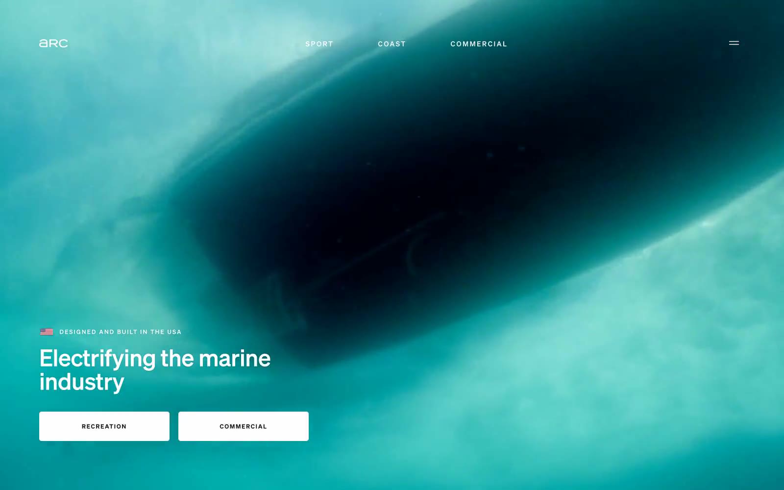
Arc
Arc — Style Reference
# Arc — Style Reference
> industrial white gallery above midnight water
**Theme:** light
Arc operates as an industrial white gallery suspended above dark ocean. The page alternates between full-bleed aerial marine photography and monastic white space dominated by type, with a single deep teal-navy band used as a rhythmic counterpoint between sections. Components are deliberately skeletal: thin ghost buttons with hairline borders, 5px corner radii on controls, almost no shadow, and generous negative space that lets the imagery and oversized type do the storytelling. The Soehne family carries a weight-300 display voice at 48–140px that reads as confident and engineering-precise, while body text sits at 16–18px weight 400 with tight tracking. Color is used as restraint — the system is 99% achromatic plus two near-black teals (#031e25, #1d1d1e) for image-driven sections, with no chromatic accent at all. Photography is always contained within generously rounded 32px frames against the flat canvas.
## Tokens — Colors
| Name | Value | Token | Role |
|------|-------|-------|------|
| Bone | `#e5e7eb` | `--color-bone` | Page canvas, card surfaces, hairline dividers between sections, ghost-button borders — the lightest structural gray carries borders, surface, and the dominant background in a near-white mode |
| Charcoal | `#0a0a0a` | `--color-charcoal` | Primary body and heading text, nav links, footer text, filled button text — near-black for maximum legibility without the harshness of pure black |
| Paper | `#ffffff` | `--color-paper` | Card surfaces, filled button backgrounds, image overlays, reverse text on dark sections — the brightest structural white |
| Obsidian | `#000000` | `--color-obsidian` | Headings on light canvas where maximum contrast is required, nav background accents — used sparingly only where absolute black is needed |
Websites
Markdown Text
design-md
website-prompt
landing-page-prompt
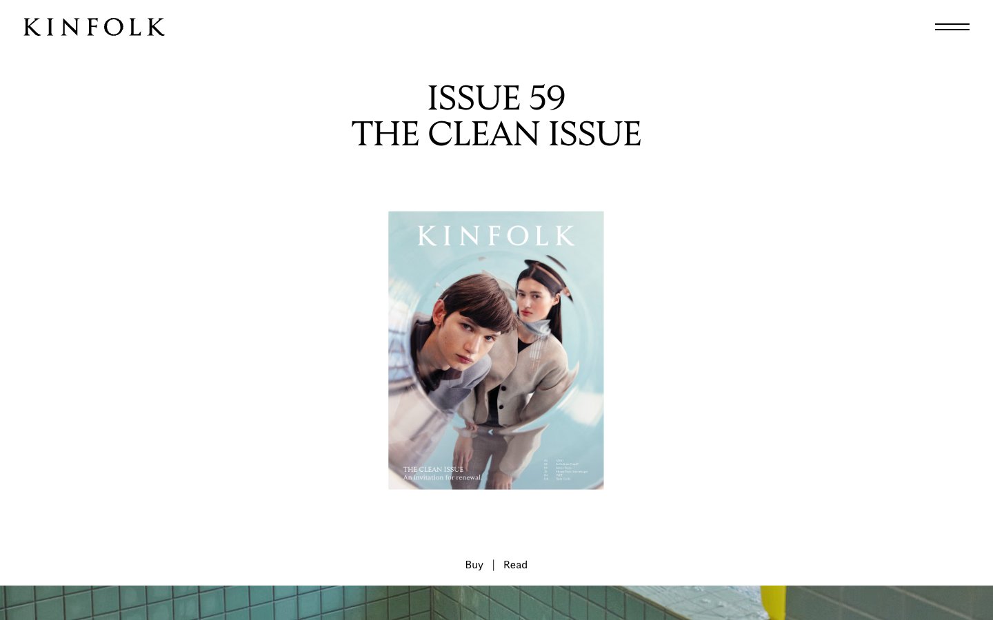
Kinfolk
Kinfolk — Style Reference
# Kinfolk — Style Reference
> Editorial broadsheet on bone-white linen — generous margins, ink-black serif, and a single warm-paper accent for section breaks.
**Theme:** light
Kinfolk translates a printed art-magazine to the web: bone-white canvases, full-bleed editorial photography, and serif type that does the heavy lifting while the interface stays nearly invisible. The entire palette is monochromatic — black ink on warm off-white paper, with a single warm sage-gray (#dbded5) used as a paper-tinted section break. There are no accent colors, no filled buttons, no decorative gradients; hierarchy is built through typographic scale, whitespace, and the rhythm of image-to-text transitions. Display serif at 50–60px with -0.025em tracking carries the editorial gravitas; a single weight (400) across all families creates a deliberately quiet, consistent voice. The result is less a website than a gallery wall — the photographs and headlines are the exhibits, and the UI is the white wall around them.
## Tokens — Colors
| Name | Value | Token | Role |
|------|-------|-------|------|
| Ink Black | `#000000` | `--color-ink-black` | Primary type, borders, icon strokes, and all hairline rules. The only foreground color in the system |
| Bone White | `#ffffff` | `--color-bone-white` | Primary canvas, card surfaces, and reverse text on dark photo overlays |
| Paper Mist | `#f4f4f4` | `--color-paper-mist` | Soft surface elevation for insets, input fields, and section backgrounds that need to step down from pure white without introducing a hue |
| Sage Paper | `#dbded5` | `--color-sage-paper` | Warm greenish-gray paper tint used as a section-break wash and full-bleed band. Provides the only chromatic moment in the system without becoming a brand color |
Websites
Markdown Text
design-md
website-prompt
landing-page-prompt
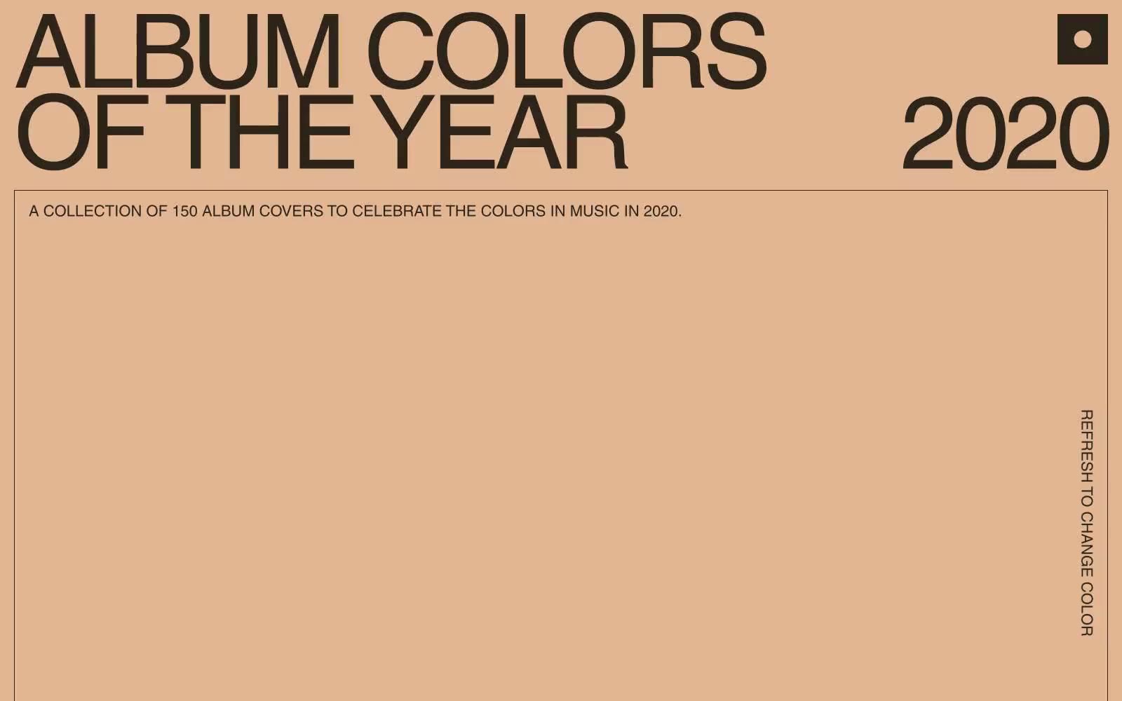
2020
2020 — Style Reference
# 2020 — Style Reference
> Solid color poster wall. A single saturated color fills the viewport like painted drywall, and massive black type sits on top as if stenciled.
**Theme:** light
Album Colors is a color-first editorial canvas: the entire viewport is a single saturated wash that changes on refresh, and everything else — type, images, UI — defers to it. The design language is brutally minimal: one custom geometric sans (Helvetica LT Pro) in a single weight, set at extraordinary sizes with aggressively tight leading, producing headline blocks that read as solid shapes rather than text. Color is the product, the navigation, and the identity — the only chrome is a small record-button icon in the corner and a rotated label urging the viewer to refresh. Album covers float on the colored field as unframed tiles; the page is closer to a poster than a website.
## Tokens — Colors
| Name | Value | Token | Role |
|------|-------|-------|------|
| Signal Orange | `#e4822e` | `--color-signal-orange` | Primary canvas — the full-viewport page background that changes on refresh; this is the design system |
| Olive Ink | `#4f503e` | `--color-olive-ink` | Primary text, headline color, and the only outlined action accent (outlined-button borders, link underlines) — warm dark green-brown that pairs with the orange field without competing chroma |
| Oxblood | `#b13225` | `--color-oxblood` | Alternating surface variation — one of the page colors the background can take on refresh |
| Burnt Sienna | `#c97f40` | `--color-burnt-sienna` | Alternating surface variation — secondary warm shade the canvas can adopt |
Websites
Markdown Text
design-md
website-prompt
landing-page-prompt
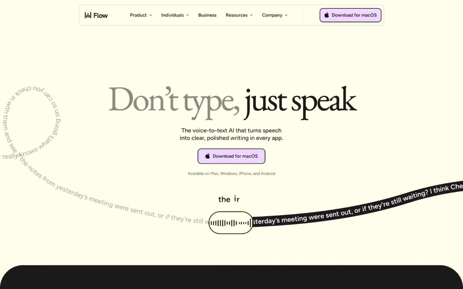
Wispr Flow
Wispr Flow — Style Reference
# Wispr Flow — Style Reference
> cream paper with deep teal ink and a lavender highlighter.
**Theme:** mixed
Wispr Flow operates as an editorial-meets-tech aesthetic: a warm cream canvas (#ffffeb) hosts a refined duotone of deep teal and soft lavender, with the design toggling between bright open sections and near-black dramatic ones. Typography is the signature — EB Garamond serif at 64–120px carries every hero headline with tight negative tracking, while Figtree sans-serif handles all UI, body, and navigation text at compact sizes. Buttons are soft lavender pills, borders are hairline-dark, and corners are generously rounded (14px on controls, 32px on cards, fully rounded on decorative orbs). The system is restrained in palette but expressive in type pairing — a newspaper serif shouting across a modern interface.
## Tokens — Colors
| Name | Value | Token | Role |
|------|-------|-------|------|
| Cream Paper | `#ffffeb` | `--color-cream-paper` | Primary page canvas, card surfaces, light section backgrounds — the warm ivory that defines the entire light theme |
| Midnight Ink | `#1a1a1a` | `--color-midnight-ink` | Primary text, dark section backgrounds, hairline borders, nav dividers — near-black rather than pure black for warmth |
| Pure Black | `#000000` | `--color-pure-black` | Decorative SVG fills and shadow color — not a text or surface token |
| White | `#ffffff` | `--color-white` | Text on dark surfaces, nav bar background, badge fills, inverse button text |
Websites
Markdown Text
design-md
website-prompt
landing-page-prompt
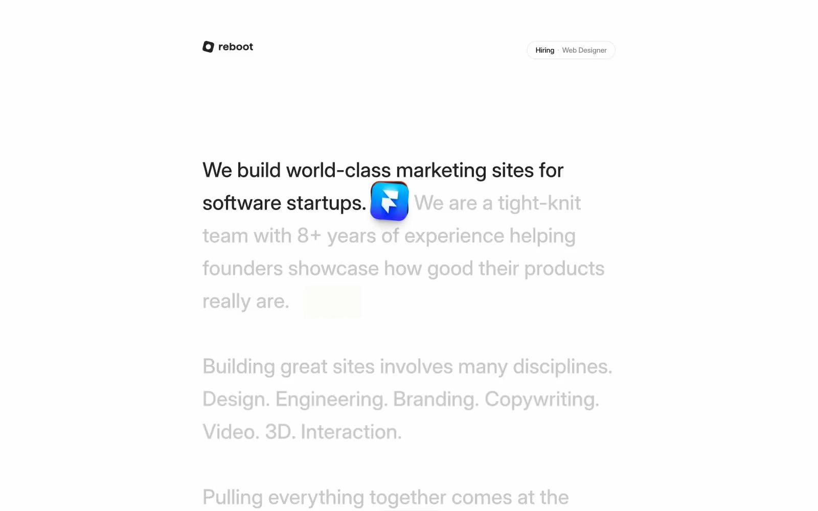
reboot
reboot — Style Reference
# reboot — Style Reference
> quiet atelier on cream paper — a design studio's homepage that reads like a printed monograph, where the only color is the one blue mark in the margin
**Theme:** light
Reboot reads like a carefully typeset editorial page: a vast warm-white canvas, a single typographic voice (Inter at 14/16/40), and almost no visual furniture. Text hierarchy comes from grayscale gradation and weight shifts between 400 and 500 rather than dramatic size jumps — the page communicates through luminance contrast, not typography volume. The only chromatic punctuation is a small blue gradient diamond used inline as a period between sentences. One black pill button anchors the interface; everything else is whitespace and well-set prose. The aesthetic is a design studio's own homepage: confident enough to let words do the work, restrained enough to make the one accent color feel like a shout.
## Tokens — Colors
| Name | Value | Token | Role |
|------|-------|-------|------|
| Paper Gray | `#e5e7eb` | `--color-paper-gray` | Page canvas and hairline borders — the warm off-white ground that all type sits on |
| Editorial Black | `#000000` | `--color-editorial-black` | Dark supporting neutral for text, icons, and strong contrast. Do not promote it to the primary CTA color |
| Charcoal Ink | `#232323` | `--color-charcoal-ink` | Headings and emphasized prose — a near-black that softens headlines against the pure black of running text |
| Soft Graphite | `#a7a7a7` | `--color-soft-graphite` | Muted body text and secondary metadata — the gray that carries secondary sentences without competing with the lead |
Websites
Markdown Text
design-md
website-prompt
landing-page-prompt
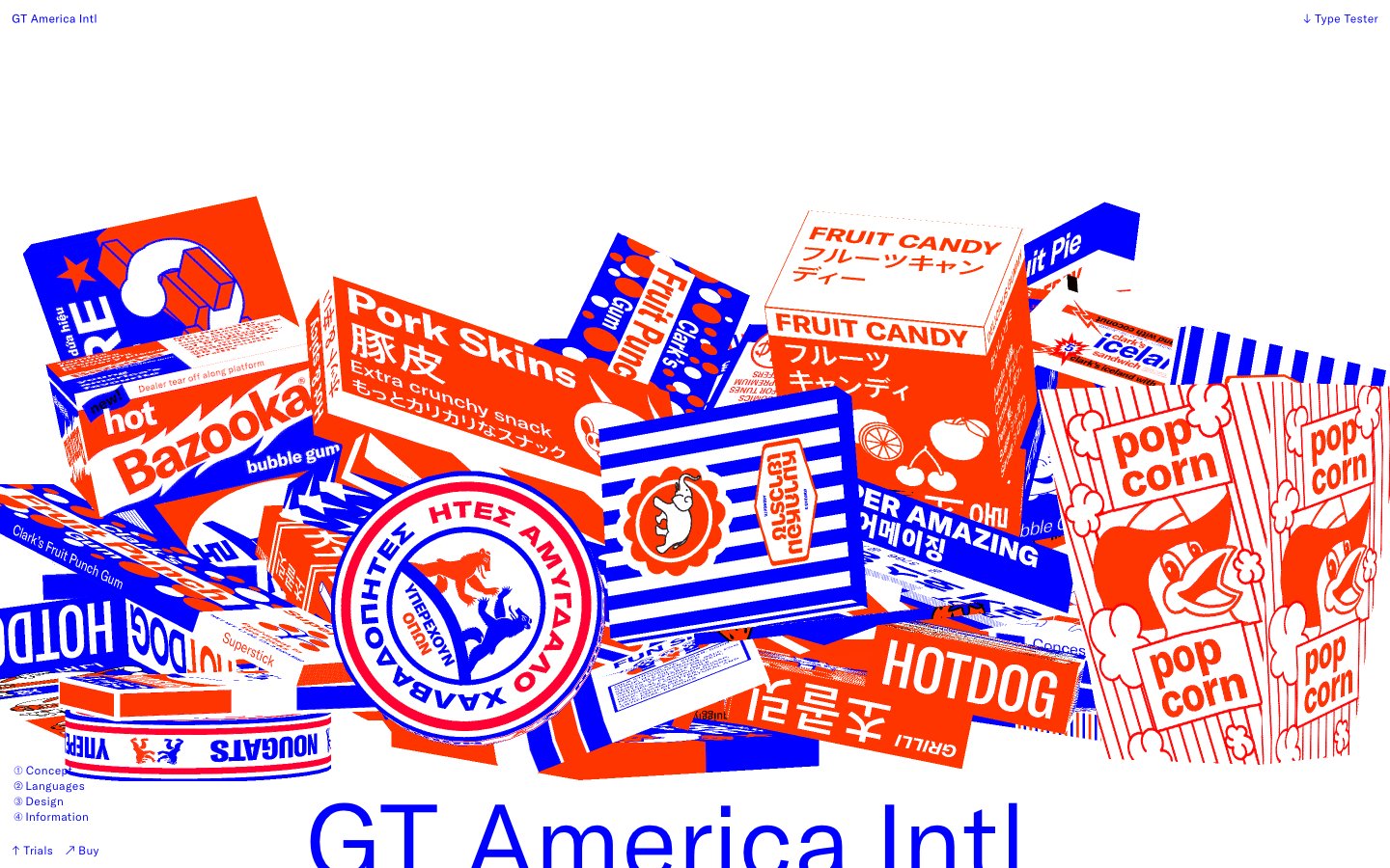
Gt-america
Gt-america — Style Reference
# Gt-america — Style Reference
> type foundry press sheet
**Theme:** light
GT-America is a type specimen for its own typeface — a site that treats the letterform as the primary interface. The canvas is pure white; the navigation is a single line of black micro-type. The whole page is structured around display-size typography (up to 900px) that swallows the viewport, with the brand's signature duotone — electric blue (#0000ff) and hot orange-red (#ff3500) — used to create product illustrations, test strips, and section dividers. Everything else (spacing, components, shadows) is suppressed in favor of the type. Components are functional minimums: pill buttons, hairline inputs, no card elevation. The system feels like a type foundry press sheet printed on white stock — the letters are loud, the chrome is invisible.
## Tokens — Colors
| Name | Value | Token | Role |
|------|-------|-------|------|
| Electric Cobalt | `#0000ff` | `--color-electric-cobalt` | Primary brand color — display headings, section rules, outlined action borders, form field borders, large-type stamps. The dominant chromatic voice on the page, used wherever the brand needs to announce itself |
| Press Orange | `#ff3500` | `--color-press-orange` | Secondary brand color — the duotone partner to Electric Cobalt, used in the product mockup illustrations and as a filled action accent. Reads as warm against the cool blue, creating a two-color print-poster tension |
| Stock White | `#ffffff` | `--color-stock-white` | Page background, card surfaces, input fills, text on dark/colored fills. The entire canvas — there is no off-white or gray alternative |
| Press Black | `#000000` | `--color-press-black` | Navigation text, footer text, fine metadata labels, small caps, SVG fill in the specimen imagery. Used sparingly — only for utility type under ~16px where the massive display type doesn't dominate |
Websites
Markdown Text
design-md
website-prompt
landing-page-prompt
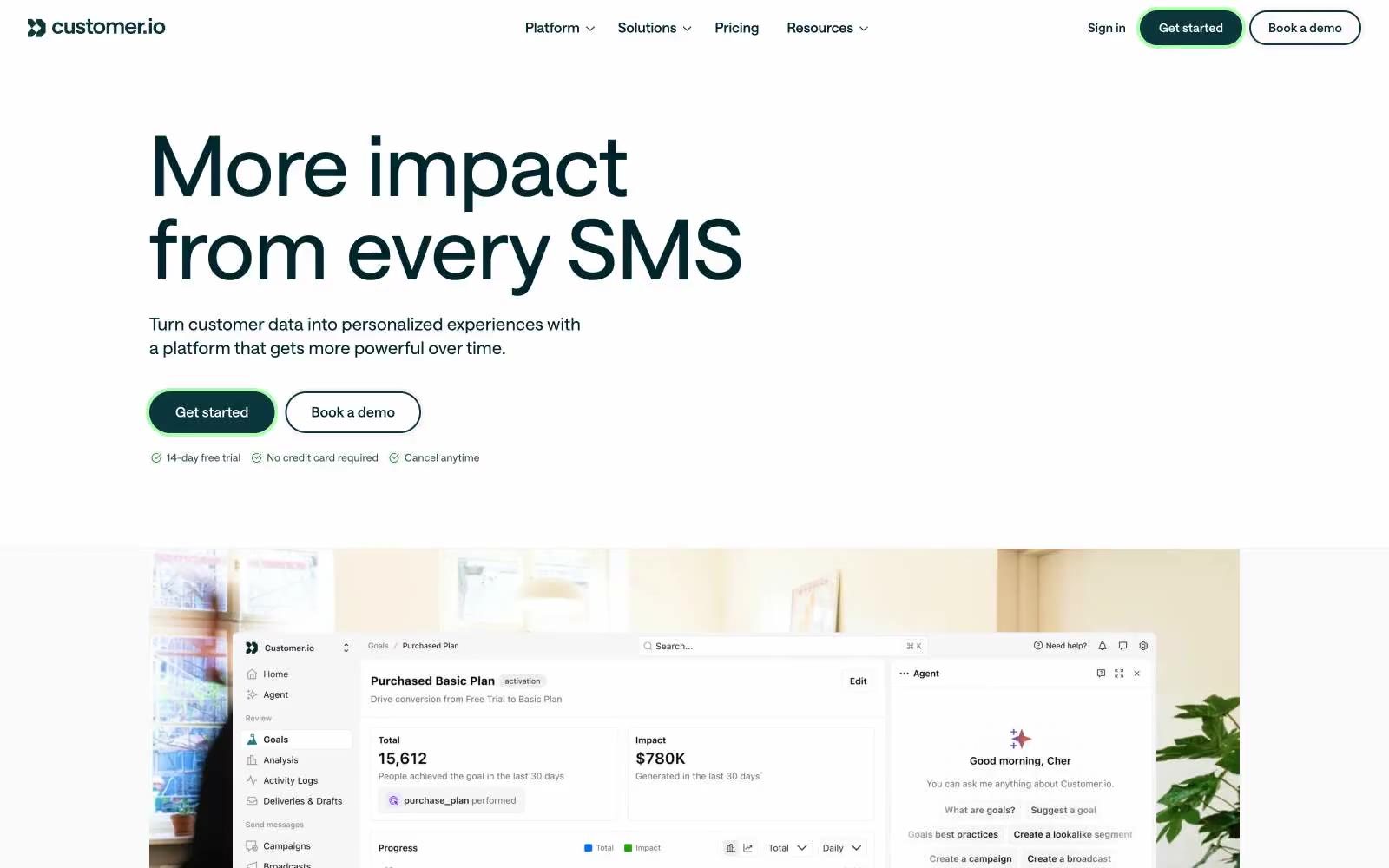
customer.io
customer.io — Style Reference
# customer.io — Style Reference
> Technical field notebook. A deep-teal ink drawing on warm-white paper, pinned by a single green glow.
**Theme:** light
Customer.io speaks in the voice of a technical field guide: a near-white canvas, a single deep-teal ink that reads almost black, hairline borders, and corner radii so small they look measured with calipers. The brand voice is quiet, precise, and editorial — type is large but tracked positively, spacing is comfortable but not airy, and the only color that ever shouts is a single acid-green halo behind the primary button. Accents are not decorative: rust, violet, and teal appear only as inline text highlights to colorize concepts, never as fills or backgrounds. The system feels less like a SaaS dashboard and more like a well-typeset operations manual where every glyph earns its place.
## Tokens — Colors
| Name | Value | Token | Role |
|------|-------|-------|------|
| Abyss Teal | `#00262b` | `--color-abyss-teal` | Primary text, filled CTA background, navigation ink — reads as near-black with a cool teal undertone, giving the brand its signature dark identity without resorting to true black |
| Botanical Teal | `#0b363b` | `--color-botanical-teal` | Hairline borders, secondary text, dividers, icon strokes — the most-used color in the system; defines the structural linework of the entire interface |
| Sulfur Glow | `#abffae` | `--color-sulfur-glow` | Green action color for filled buttons, selected navigation states, and focused conversion moments |
| Rust Oxide | `#8b3911` | `--color-rust-oxide` | Inline emphasis text and decorative strokes — appears only inside running prose to highlight one concept word, never as a fill |
Websites
Markdown Text
design-md
website-prompt
landing-page-prompt
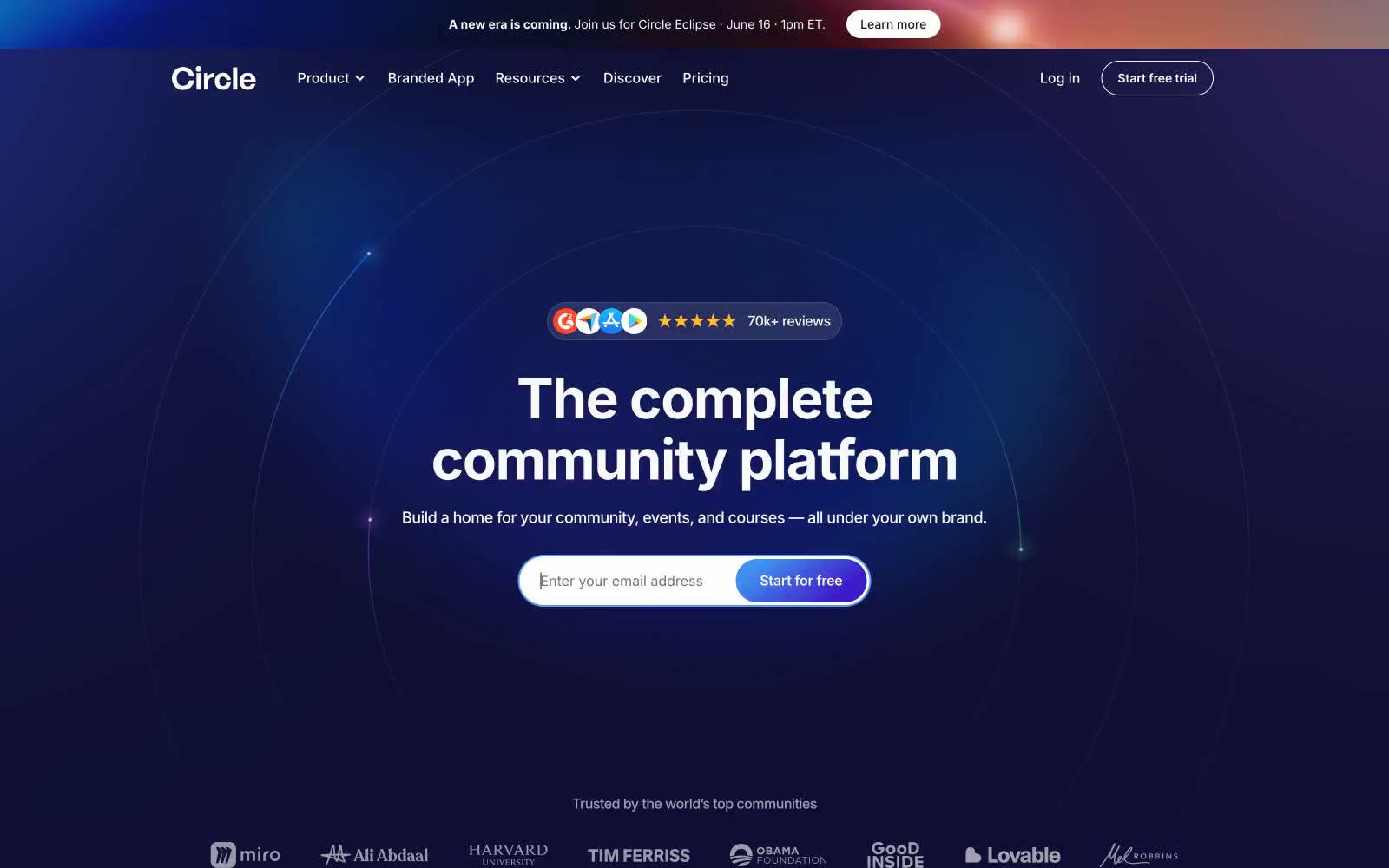
Circle
Circle — Style Reference
# Circle — Style Reference
> Aurora-lit mission control in deep midnight. A near-black indigo page glows from the center outward, cradling a single white product panel like a lit window in a planetarium.
**Theme:** dark
Circle's design system is a deep-space stage: a near-black indigo canvas radiates soft aurora gradients toward the center, and a single bright product screenshot floats on that darkness like a window into daylight. The product surface inside is crisp white and information-dense, while the marketing surface around it is theatrical — gradient CTAs, pill-shaped everything, and pastel-tinted accent cards that feel like constellation markers. Typography is a single family (Inter) pushed from whisper-tight tracking at 64px down to relaxed spacing at 10px, giving headlines a dense, confident weight that fills the dark space. The visual rhythm alternates between the cosmic dark page and floating white product panels; this contrast — not color variety — is the signature.
## Tokens — Colors
| Name | Value | Token | Role |
|------|-------|-------|------|
| Void Indigo | `#0f0f35` | `--color-void-indigo` | Page canvas — the cosmic-dark background that radiates the aurora gradient. All marketing copy and product panels float on this surface |
| Deep Space | `#15163d` | `--color-deep-space` | Outer page background where the aurora gradient fades to black, framing the central glow |
| Product White | `#ffffff` | `--color-product-white` | Product panel surfaces, input fields, card fills inside the embedded product screenshots, and the top navigation bar |
| Pure Ink | `#0a0a0a` | `--color-pure-ink` | Primary text color inside product panels and on white surfaces — near-black, slightly softer than #000 |