AI Prompt Studio - Intelligent Prompt Library
Explore and use professional AI prompts to optimize your workflow.
One-click Use

Websites
Markdown Text
design-md
website-prompt
landing-page-prompt
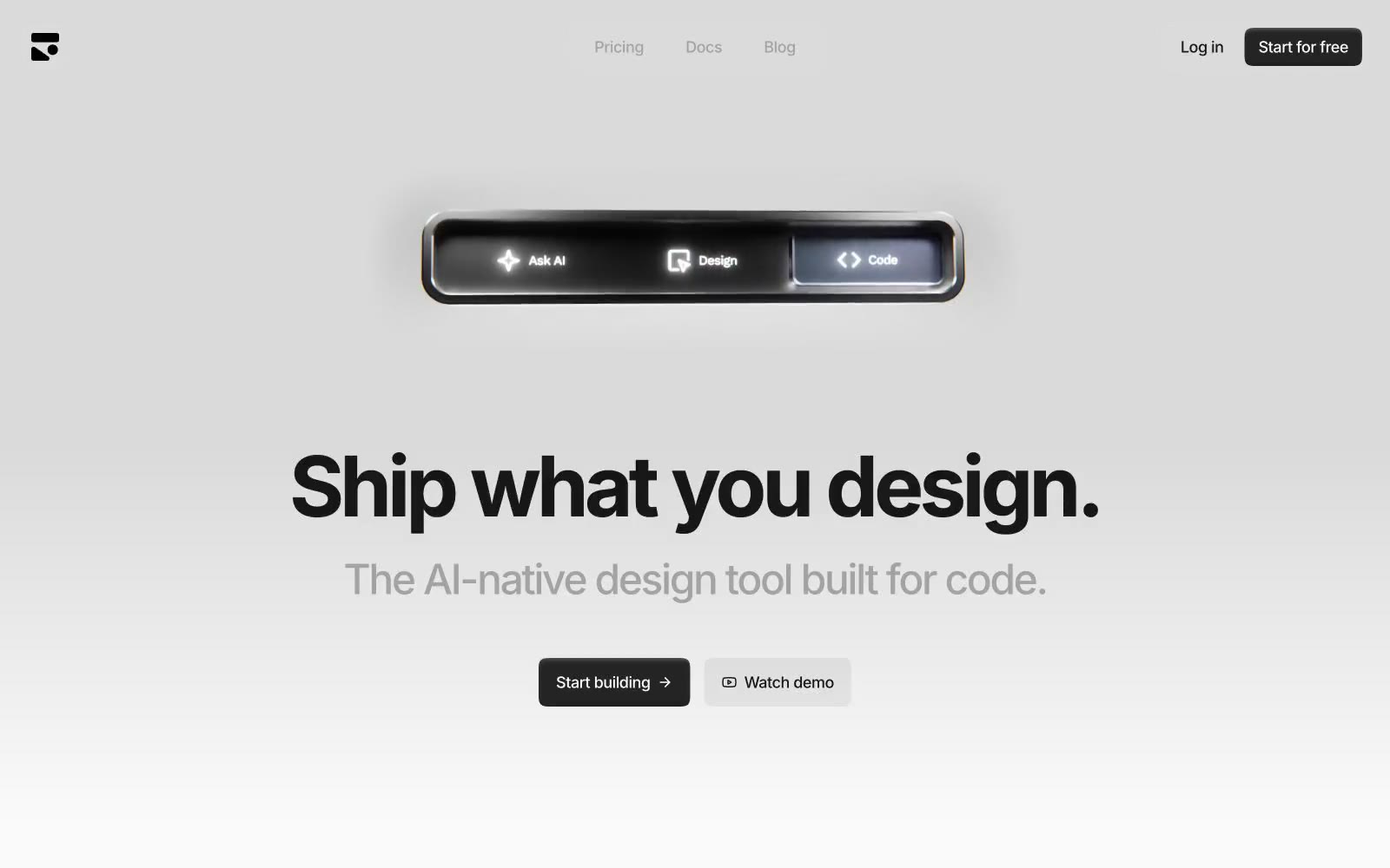
Dialog
Dialog — Style Reference

# Dialog — Style Reference
> Neutral showroom with one warm price tag. Every surface is a different tone of off-white; the orange CTA is the only color in the room.
**Theme:** light
Dialog feels like a high-end retail floor plan rendered in digital form — neutral, airy, and unhurried, with one warm accent that acts like a price tag sticker on white linen. The #f7f7f7 near-white background and pure white cards create a surface hierarchy so subtle it reads as continuous space rather than layered depth. PP Radio Grotesk Light at 50-70px is the defining move: a geometric grotesque rendered at its lightest weight makes large headlines feel handwritten on paper rather than stamped — zero aggression, maximum presence. The single orange #f69251 appears exclusively on CTAs, pulling attention the way a sale tag pops in a neutral showroom. Pill-shaped buttons (28px radius) float against square-cornered containers, the only soft shape in an otherwise rectilinear system.
## Tokens — Colors
| Name | Value | Token | Role |
|------|-------|-------|------|
| Tangerine Tag | `#f69251` | `--color-tangerine-tag` | Primary CTA buttons, 'Book a demo' pill — warm orange against near-white backgrounds signals action without urgency, echoing the palette of premium retail labels |
| Midnight Ink | `#181825` | `--color-midnight-ink` | Body text, borders — near-black with a barely perceptible blue undertone, softer than pure black for long-form reading |
| Graphite | `#484758` | `--color-graphite` | Secondary body text, descriptive copy, meta information |
| Deep Slate | `#242433` | `--color-deep-slate` | Dark surface backgrounds, card overlays in dark sections |
Websites
Markdown Text
design-md
website-prompt
landing-page-prompt
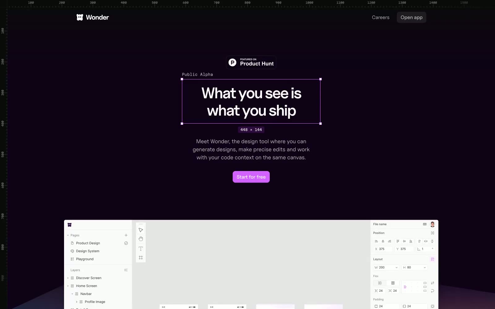
Wonder
Wonder — Style Reference
# Wonder — Style Reference
> Neon violet command center — deep plum darkness pierced by a single laser-purple light source.
**Theme:** mixed
Wonder operates as a dark-first design cosmos: a near-black violet canvas (#0f0217) creates the immersive backdrop for the brand, punctuated by a single vivid violet accent (#d262ff) that makes actions feel switched on and a muted purple-gray (#44374a) that does the quiet structural work of every border and divider. The system alternates between full-bleed dark atmosphere sections and bright white content panels, creating rhythm through contrast rather than ornament. Typography is led by Uncut Sans Variable — geometric, wide-tracked at small sizes, tight-tracked at display sizes — paired with Martian Mono for all technical metadata, dimensions, and annotation. Surfaces are flat with hairline borders instead of heavy shadows; the few elevated cards use a barely-there 1px border and large radius (14px) to feel like floating glass plates rather than solid panels. Components are sparse and confident: pill-shaped badges, 8px-radius buttons in either filled violet or ghost outline, and very few decorative flourishes beyond a hand-drawn squiggle motif.
## Tokens — Colors
| Name | Value | Token | Role |
|------|-------|-------|------|
| Void Plum | `#0f0217` | `--color-void-plum` | Page canvas and primary dark surface — the near-black violet base that absorbs the whole immersive hero and footer bands |
| Eclipse Black | `#0b0211` | `--color-eclipse-black` | Elevated card and panel surface — one shade deeper than the canvas, used for floating UI elements against the dark backdrop |
| Carbon Ink | `#111111` | `--color-carbon-ink` | Badge fills, icon stroke accents, and dark section surfaces on lighter contexts |
| Lavender Mist | `#44374a` | `--color-lavender-mist` | Dominant border and divider color across the entire system — every hairline, card edge, and UI outline uses this muted purple-gray |
Websites
Markdown Text
design-md
website-prompt
landing-page-prompt
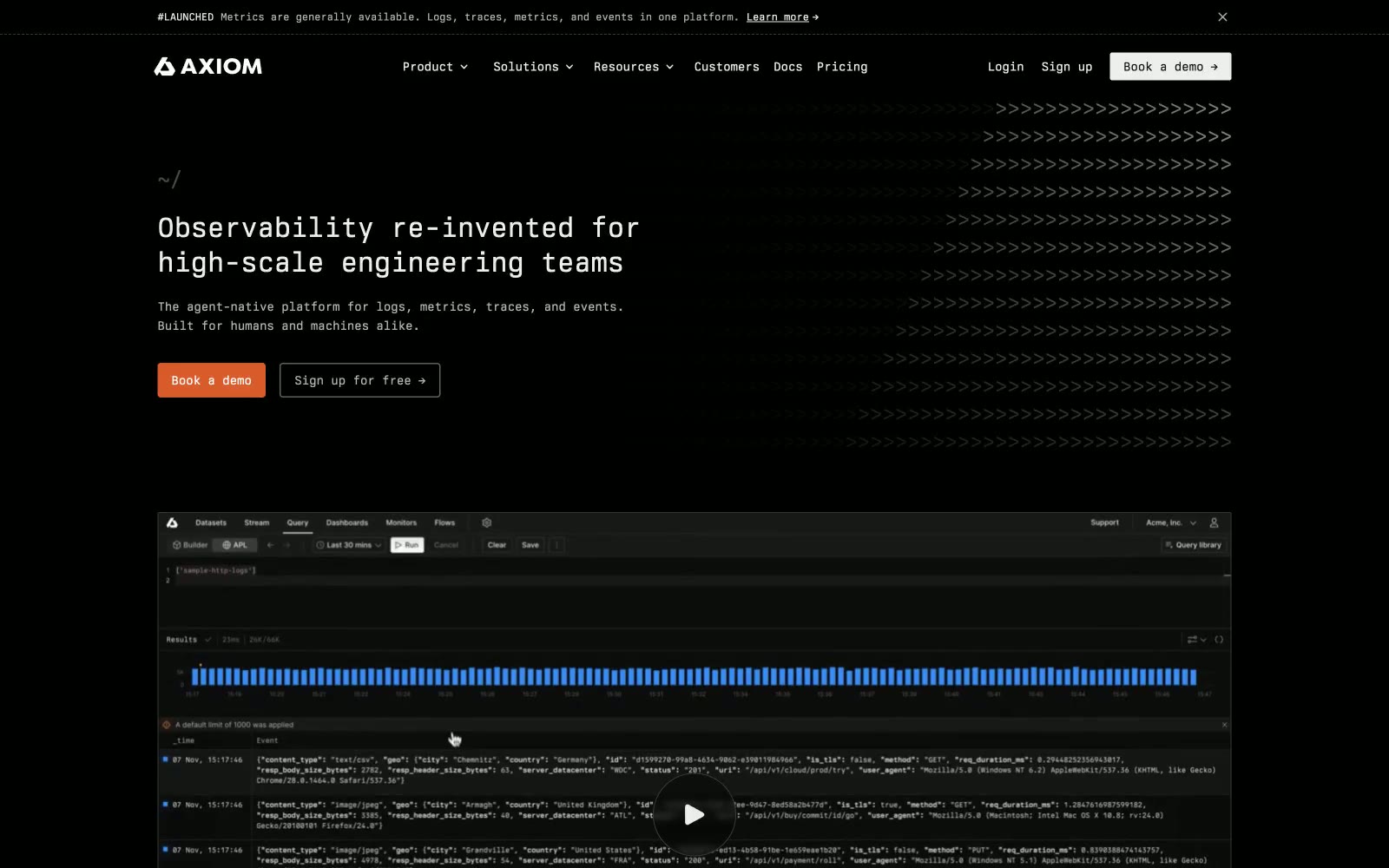
Axiom
Axiom — Style Reference
# Axiom — Style Reference
> Terminal window at midnight — flat black canvas, monospaced text, and one orange cursor blinking
**Theme:** dark
Axiom is a terminal-grade dark interface where every glyph is monospaced, every surface is near-black, and one warm orange does all the chromatic work. The design language borrows from code editors and CLI tools — no gradients, almost no shadows, no rounded softness — instead layering information through subtle shifts in dark neutrals (from #000000 canvas to #191919 cards to #202020 borders) so the UI reads like a well-formatted log file. BerkeleyMono carries the entire voice, from hero headlines to nav labels, giving the product an engineering-native feel that signals audience before it signals brand. Orange appears as a precise tool: the primary CTA fill, the log-bar visualization, and a 2px left border that marks editorial case-study cards — never decorative, always functional.
## Tokens — Colors
| Name | Value | Token | Role |
|------|-------|-------|------|
| Void | `#000000` | `--color-void` | Page background, nav fill, terminal surface |
| Carbon | `#111111` | `--color-carbon` | Primary surface, card base, hero canvas |
| Graphite | `#191919` | `--color-graphite` | Elevated card background, case-study card fill |
| Iron | `#202020` | `--color-iron` | Hairline borders, dividers, subtle separation |
Websites
Markdown Text
design-md
website-prompt
landing-page-prompt
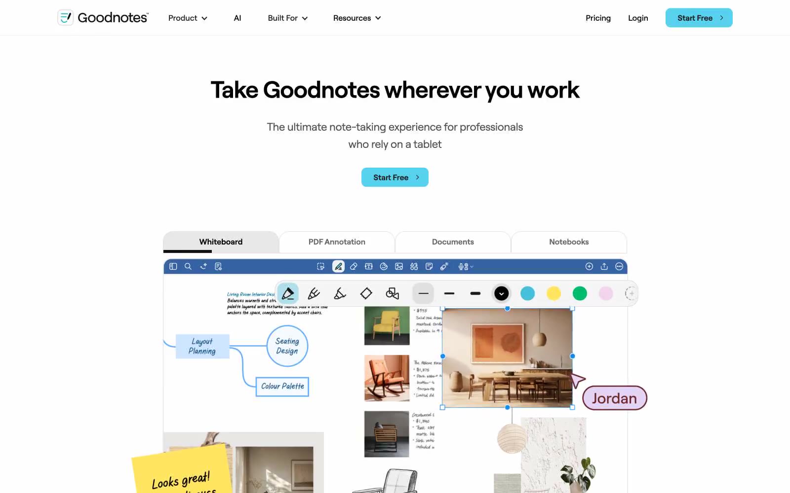
Goodnotes
Goodnotes — Style Reference
# Goodnotes — Style Reference
> Paper-white command canvas — a blank notebook page where every tool snap into place without decoration.
**Theme:** light
Goodnotes runs on a white canvas with near-zero visual noise: almost no shadow, no gradient, and a deliberately spare chromatic palette. The one saturated color — a cyan/aqua (#57d2ee) — appears exclusively on the primary CTA button, making action feel switched-on against an otherwise monochrome field. Typography is done entirely in Roobert, a custom rounded geometric sans, with pronounced negative tracking at display sizes (−0.05em) that pulls large headlines tight. Product UI screenshots carry the visual weight; the surrounding page chrome stays flat, text-forward, and densely typeset at small sizes. Borders rather than shadows define surfaces, and the single 10px radius applies universally to buttons, cards, and UI chrome.
## Tokens — Colors
| Name | Value | Token | Role |
|------|-------|-------|------|
| Pure Canvas | `#ffffff` | `--color-pure-canvas` | Page background, card backgrounds, button text on cyan CTA |
| Midnight Ink | `#000000` | `--color-midnight-ink` | Primary headlines, body text, borders on UI chrome |
| Deep Charcoal | `#1e1e1e` | `--color-deep-charcoal` | Ghost button text and borders, secondary headings, icon strokes |
| Graphite | `#111213` | `--color-graphite` | Dark nav backgrounds, dark section surfaces, link text in dark contexts |
Websites
Markdown Text
design-md
website-prompt
landing-page-prompt
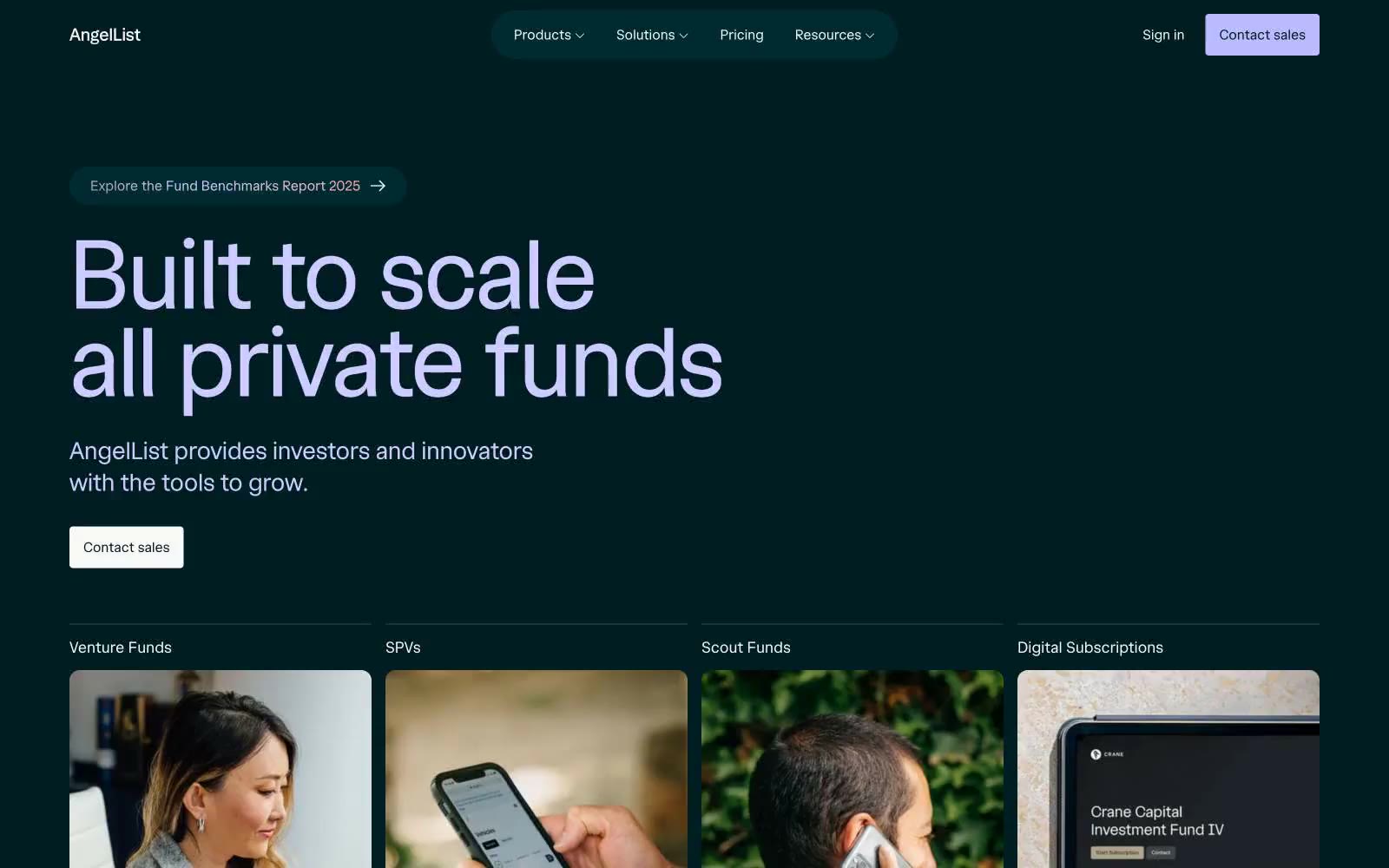
AngelList
AngelList — Style Reference
# AngelList — Style Reference
> midnight greenhouse with violet dawn — a near-black teal void where mint-green serif type glows and lavender buttons bloom as the single point of warm light
**Theme:** dark
AngelList operates as a midnight greenhouse: an almost-black teal canvas (#001d21) is the floor, mint-green serif display type (#e0fee6) glows as if bioluminescent, and one lavender-violet accent (#cdcbff) punctuates the interface like a dawn light. The visual system is dark-first — the entire page sits on the deep teal, including cards, navigation, and footer — creating a nocturnal, private-banking atmosphere rather than a typical SaaS light mode. Typography is the hero: a custom serif display face renders numerical and headline copy at extreme sizes (90–216px) with tight negative tracking, while a neutral sans handles all UI chrome. Surfaces are flat with minimal elevation; depth comes from tonal shifts between near-black teals and occasional earth-toned full-bleed bands (olive grove, mint wash). Photography is warm-toned lifestyle — people in natural light, working — contained within rounded cards that sit on the dark canvas.
## Tokens — Colors
| Name | Value | Token | Role |
|------|-------|-------|------|
| Abyssal Teal | `#001d21` | `--color-abyssal-teal` | Page canvas, hero background, navigation surface, footer, primary text on light surfaces — the void that everything sits on |
| Deep Reef | `#002b31` | `--color-deep-reef` | Elevated card surfaces, secondary buttons, filled chip backgrounds — one tonal step above the canvas to create subtle depth without leaving the dark family |
| Bio Mint | `#e0fee6` | `--color-bio-mint` | Display headlines, hero copy, large numerical type — bioluminescent mint that carries the brand's visual identity on the dark canvas |
| Lavender Dawn | `#cdcbff` | `--color-lavender-dawn` | Violet text accent for links, tags, and emphasized short phrases. Do not promote it to the primary CTA color |
Websites
Markdown Text
design-md
website-prompt
landing-page-prompt
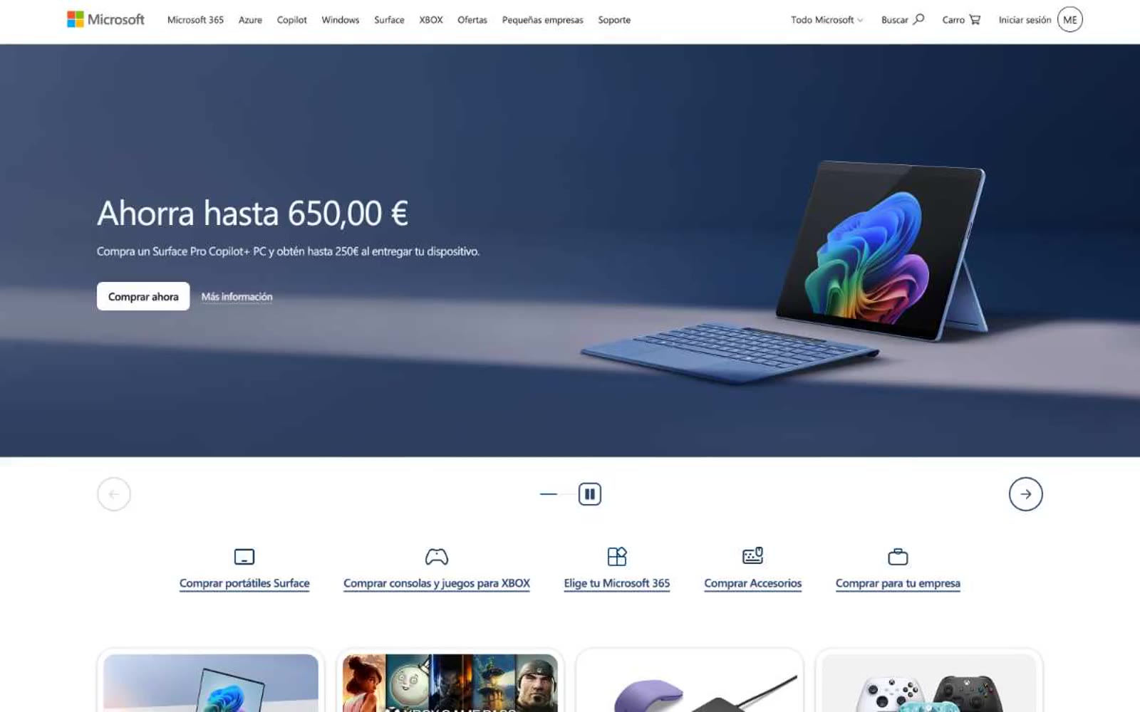
Microsoft
Microsoft — Style Reference
# Microsoft — Style Reference
> Corporate blue retail catalog — think 4-square logo against a white showroom floor with one accent blue guiding every interaction.
**Theme:** light
Microsoft.com is a corporate store-and-marketing surface: a near-white canvas punctuated by a single vivid corporate blue, with product cards floating on subtle elevation and one-color hero banners. Segoe UI carries the entire system — a humanist grotesque that reads utilitarian and confident rather than editorial. The visual rhythm is grid-disciplined: 4-column product rows, centered max-width bands, and hero sections that alternate between blue-tinted lifestyle photography and pure white card overlays. Components feel light, flat, and functional — minimal radii, thin borders, one shadow stack, no decorative gradients — letting product photography do the visual heavy lifting while the blue accent marks every action.
## Tokens — Colors
| Name | Value | Token | Role |
|------|-------|-------|------|
| Microsoft Blue | `#0067b8` | `--color-microsoft-blue` | Primary action background, link text, navigation accents, icon strokes — the single chromatic authority in the system, used for all filled CTAs and interactive highlights |
| Pure White | `#ffffff` | `--color-pure-white` | Page background, card surfaces, button text on blue, surface elevation |
| Mist Gray | `#f2f2f2` | `--color-mist-gray` | Footer background, subtle surface tone, page canvas under cards |
| Carbon Black | `#000000` | `--color-carbon-black` | Primary text, card borders, hairline dividers — the dominant typographic and structural color |
Websites
Markdown Text
design-md
website-prompt
landing-page-prompt
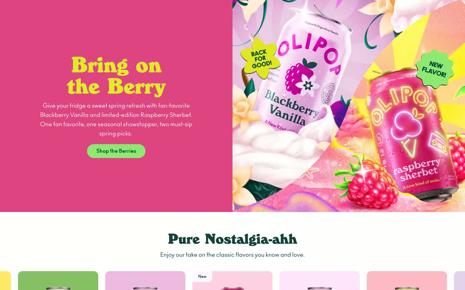
OLIPOP
OLIPOP — Style Reference
# OLIPOP — Style Reference
> Retro apothecary cream and forest teal — a soda fountain menu printed on warm paper.
**Theme:** light
OLIPOP is a sun-faded apothecary meets soda fountain: warm cream canvases, one authoritative forest-teal that anchors every header, button, and brand mark, and a carousel of pastel-flavored product cards that read like candy shelf labels from a 1950s general store. Typography does most of the storytelling — a high-contrast retro display serif (WindsorEF) at weight 800 shouts from headlines, while a clean modern sans (Ano) handles everything else with workmanlike quietness. The system lives in the gap between vintage warmth and modern e-commerce utility: pill-shaped buttons, soft 16px-radius cards, and zero shadows except a single faint glow on the primary call-to-action. Color is rationed carefully — most of the page is cream and forest teal, with chromatic energy reserved for product cards, a single wine-red accent, and a bright teal secondary action.
## Tokens — Colors
| Name | Value | Token | Role |
|------|-------|-------|------|
| Forest Ink | `#14433d` | `--color-forest-ink` | Teal supporting accent for decorative details and low-frequency emphasis. Do not promote it to the primary CTA color |
| Cream Paper | `#fdf7e7` | `--color-cream-paper` | Page canvas, section backgrounds — the off-white that every surface sits on, slightly warm so type never feels clinical |
| Mint Sage | `#d3e8e3` | `--color-mint-sage` | Hero panel background, soft section washes — a desaturated mint that recedes so forest-teal text can lead |
| Charcoal | `#3a3a3a` | `--color-charcoal` | Body text, link text, secondary icons — softer than pure black to stay in harmony with the warm cream canvas |
Websites
Markdown Text
design-md
website-prompt
landing-page-prompt
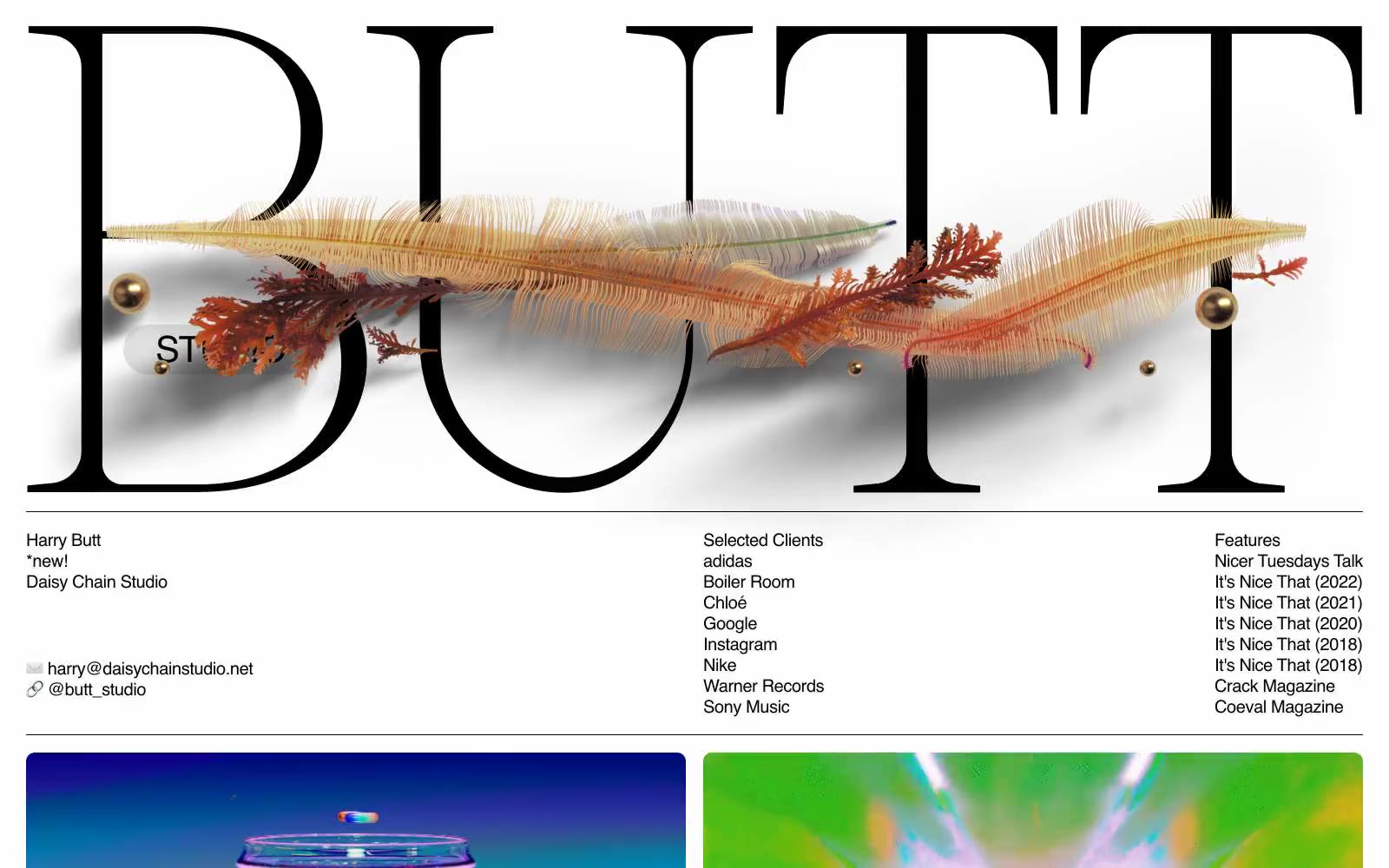
BUTT STUDIO
BUTT STUDIO — Style Reference
# BUTT STUDIO — Style Reference
> gallery wall with one massive serif wordmark
**Theme:** light
BUTT Studio is an editorial portfolio that treats type as architecture: one enormous Caslon wordmark stretches wall-to-wall across the top of the page, broken by an organic illustration that weaves through the letterforms. Below the hero, the system collapses into a clinical three-column ledger of contact, clients, and features in a quiet sans-serif, then opens into a generous two-column project grid. Color is almost entirely absent — matte black ink on warm gray paper, with a single deep indigo badge as the only chromatic punctuation. The feel is a print magazine that happens to be alive: confident serif display, utilitarian sans body, no gradients, no rounded chrome, no decorative shadows.
## Tokens — Colors
| Name | Value | Token | Role |
|------|-------|-------|------|
| Ink Black | `#000000` | `--color-ink-black` | Primary text, borders, button outlines, structural strokes — the only color that ever carries information |
| Paper | `#ffffff` | `--color-paper` | Card surfaces, thumbnail covers, inverted text on dark blocks |
| Carbon | `#131313` | `--color-carbon` | Dark project tile backgrounds, near-black surface for video panels |
| Bone Gray | `#e0e0e0` | `--color-bone-gray` | Page canvas, neutral button fills — the warm gray the whole composition sits on |
Websites
Markdown Text
design-md
website-prompt
landing-page-prompt
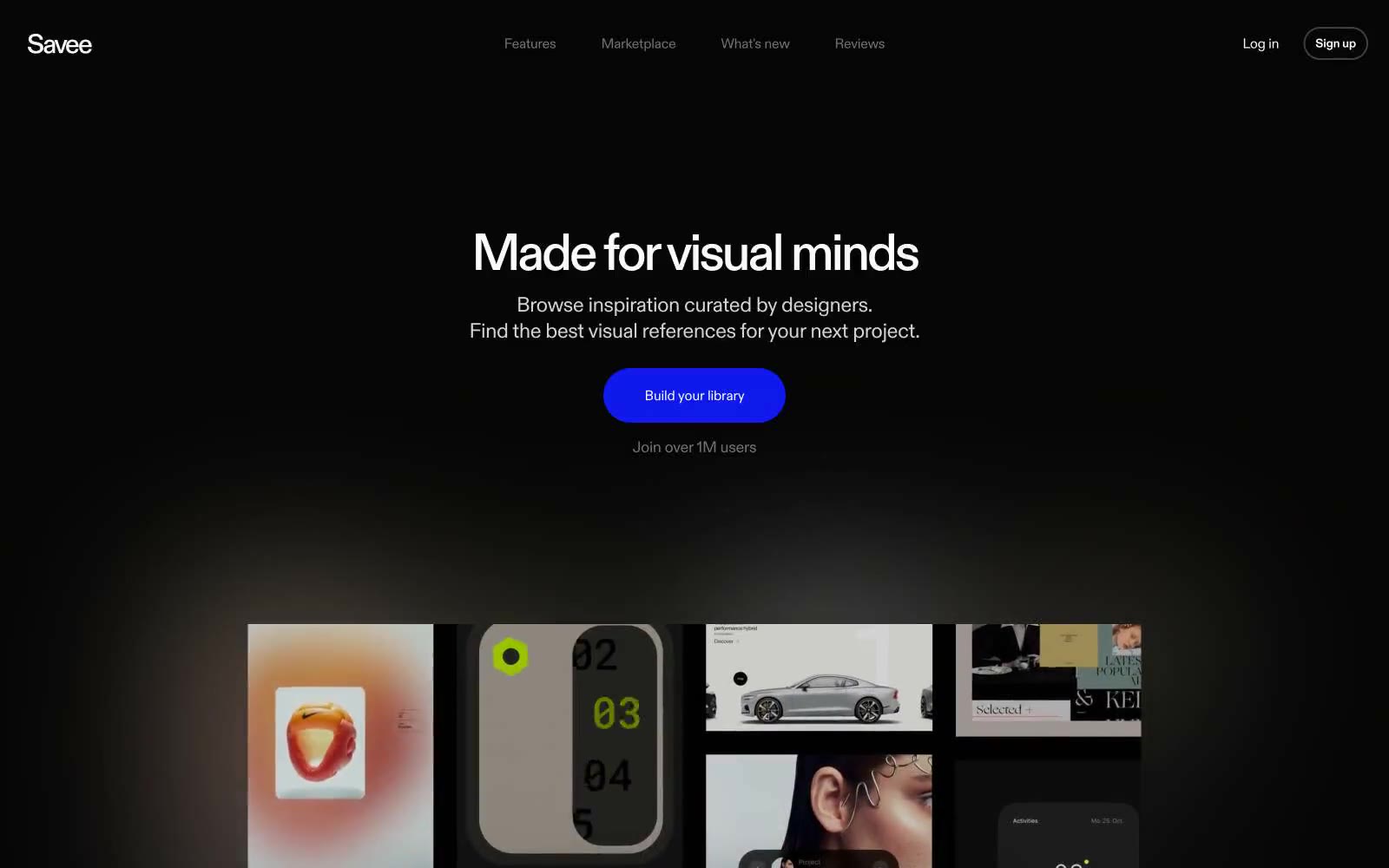
Savee
Savee — Style Reference
# Savee — Style Reference
> Black canvas for visual curators
**Theme:** dark
Savee operates in near-total darkness: an almost pure black canvas (#050505) where the only chromatic element is a single electric indigo (#1500ff) that punctuates the interface like a neon gallery light. Typography does all the heavy lifting — a single custom sans-serif used at every level, from 96px display headlines with 0.96 line-height and -0.04em tracking down to 13px captions, creating a confident editorial rhythm that feels more like a museum wall than a SaaS dashboard. Surfaces are barely distinguishable: the page canvas, elevated cards (#151515), and deeper overlays (#1e1e1e) form a near-invisible hierarchy that lets imagery and type carry the experience. The lone violet accent on the primary CTA is the only visual noise the system permits — everything else is white type on black, pill-shaped controls, and generous 64px section breathing room.
## Tokens — Colors
| Name | Value | Token | Role |
|------|-------|-------|------|
| Electric Indigo | `#1500ff` | `--color-electric-indigo` | Violet supporting accent for decorative details and low-frequency emphasis. Do not promote it to the primary CTA color |
| Obsidian | `#050505` | `--color-obsidian` | Page canvas, deepest background — the void that all content sits on |
| Charcoal | `#151515` | `--color-charcoal` | Elevated surface, product preview frames, secondary panels |
| Graphite | `#1e1e1e` | `--color-graphite` | Deeper overlay surface, hover states on dark cards, input fields |
Websites
Markdown Text
design-md
website-prompt
landing-page-prompt
Subframe
Subframe — Style Reference
# Subframe — Style Reference
> graphite blueprint on warm vellum. A designer's drafting paper where every mark is either graphite or erasure, never paint — depth comes from line weight and the occasional serif flourish.
**Theme:** light
Subframe is a monochrome designer's workbench: warm off-white canvas, graphite-black ink, and zero chromatic accent. The entire interface reads as a single material — paper, pencil, and shadow — with one bold typographic gesture: a refined serif display (Instrument Serif) against a systematic sans (Inter) to give editorial gravity to the headlines. Surfaces are flat and bordered, not elevated; depth comes from hairline dividers in #e5e7eb and inset highlights on dark controls rather than drop shadows. Density is generous: wide vertical rhythm (48–64px section gaps), centered max-width layouts, and large breathing room around type. The only color is the contrast between near-white and near-black — making the dark filled button the single loudest element on every page, and the logo strip of grayscale partner brands the only decorative visual rhythm.
## Tokens — Colors
| Name | Value | Token | Role |
|------|-------|-------|------|
| Page Canvas | `#fafafa` | `--color-page-canvas` | Page background, card-on-canvas, light text on dark surfaces — the warm white that carries the entire monochrome system |
| Hairline Border | `#e5e7eb` | `--color-hairline-border` | Dividers, card borders, image frames, icon outlines — the most-used stroke in the system, defines spatial structure |
| Card Surface | `#ededed` | `--color-card-surface` | Elevated card backgrounds, secondary surface — sits one step above canvas to create grouping without shadow |
| Divider Mid | `#dadada` | `--color-divider-mid` | Mid-tone dividers and section transitions |
Websites
Markdown Text
design-md
website-prompt
landing-page-prompt
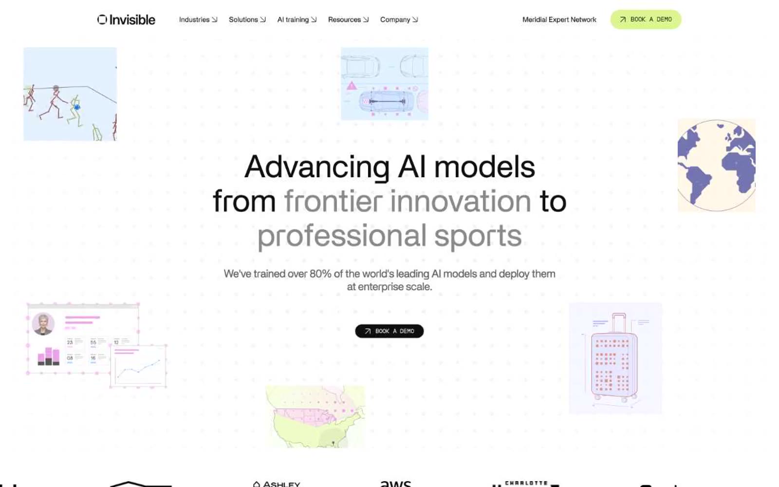
Invisibletech
Invisibletech — Style Reference
# Invisibletech — Style Reference
> Editorial sketchbook on graph paper
**Theme:** light
Invisible Tech reads as an editorial sketchbook laid over graph paper: a near-pure white canvas dotted with a faint grid, scattered with loose hand-drawn vignettes (basketball players, overhead cars, a globe), and anchored by a tight two-column content rhythm. The typographic system is a deliberate duet between two custom faces — Apk Galeria carries everything human (body, headlines, quotes) with a serif-influenced rhythm and progressively tighter tracking as type scales up, while Apkpraktikal handles everything categorical as wide-tracked small caps (section eyebrows, navigation labels, tab names). The color system is almost entirely achromatic — black, graphite, and a stack of grays do 98% of the work — with exactly two chromatic accents that carry meaning: a vivid cobalt blue for wayfinding dots and a lime-chartreuse green reserved exclusively for the primary conversion action. Components are pill-shaped, borders are 1px hairlines, and the page never raises its voice with shadows or gradients — it whispers, then lets the two-tone headline (one phrase in near-black, the following phrase in mid-gray) do the dramatic work.
## Tokens — Colors
| Name | Value | Token | Role |
|------|-------|-------|------|
| Carbon Ink | `#0f0f0f` | `--color-carbon-ink` | Primary text, hero CTA button fill, logo mark — the dominant non-white color carrying 1000+ borders and all body copy |
| Graphite | `#222222` | `--color-graphite` | Secondary surface fill, dark card backgrounds, button borders — one step lighter than Carbon for layered elements |
| Iron | `#4c4c4c` | `--color-iron` | Body text, input borders, button borders, card borders — the working neutral for readable secondary copy |
| Steel | `#606060` | `--color-steel` | Muted headings, subhead text, supporting borders |
Websites
Markdown Text
design-md
website-prompt
landing-page-prompt
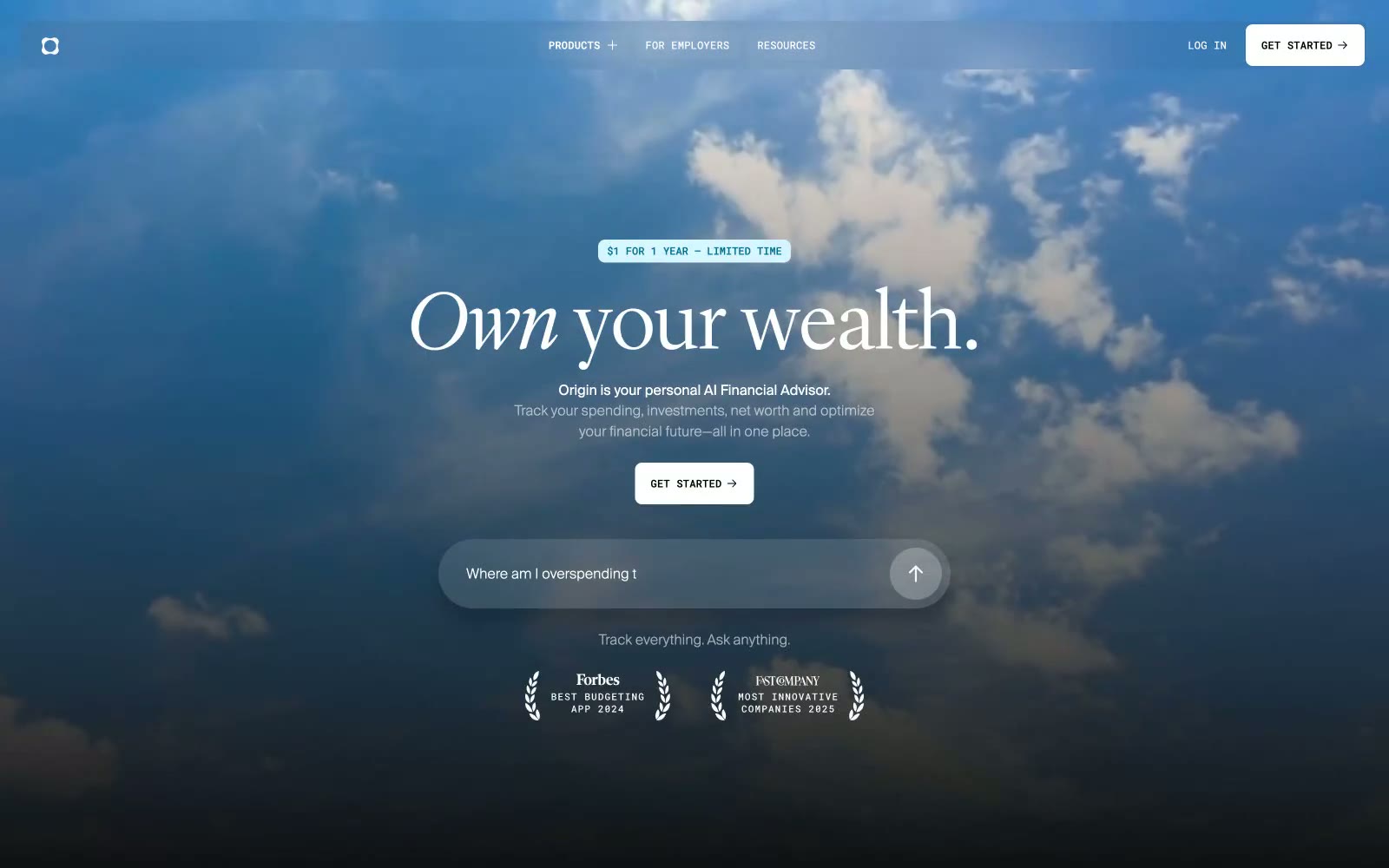
Origin Financial
Origin Financial — Style Reference
# Origin Financial — Style Reference
> serif headlines floating above dusk clouds — editorial finance at horizon altitude
**Theme:** dark
Origin speaks in an editorial financial-register voice: oversized Lyon Display serif headlines (80-96px, weight 300-400) do the emotional work while Suisse Int'l carries the UI at 14-18px against a near-black canvas stacked from #0f1011 through #2e2e2e. The interface is overwhelmingly achromatic — the only true CTA is a white pill with an arrow, never a chromatic button — and the brand's color appears not as controls but as illuminated product surfaces: violet, pink, sky-blue, and deep-indigo feature cards that float in the void like lit windows. The signature move is a full-bleed dusk-sky photograph behind the hero, giving the entire site a 'above the clouds' atmosphere that frames money as horizon, not spreadsheet. Spacing is generous and breathing; cards use 16-30px radii (never sharp), buttons are full pills (1440px), and tracking on small UI text is dramatically wide (0.182em) to feel stamped rather than typed.
## Tokens — Colors
| Name | Value | Token | Role |
|------|-------|-------|------|
| Obsidian | `#0f1011` | `--color-obsidian` | Primary page canvas — the foundational dark surface behind every section |
| Void Black | `#000000` | `--color-void-black` | Pure black for SVG illustration fills, deepest shadow base, device screen content |
| Carbon | `#090a0b` | `--color-carbon` | Elevated card surfaces and button shadow substrate — one step lighter than the page |
| Graphite | `#2e2e2e` | `--color-graphite` | Mid-tone card surface for overlays, icon borders, and elevated containers |
Websites
Markdown Text
design-md
website-prompt
landing-page-prompt
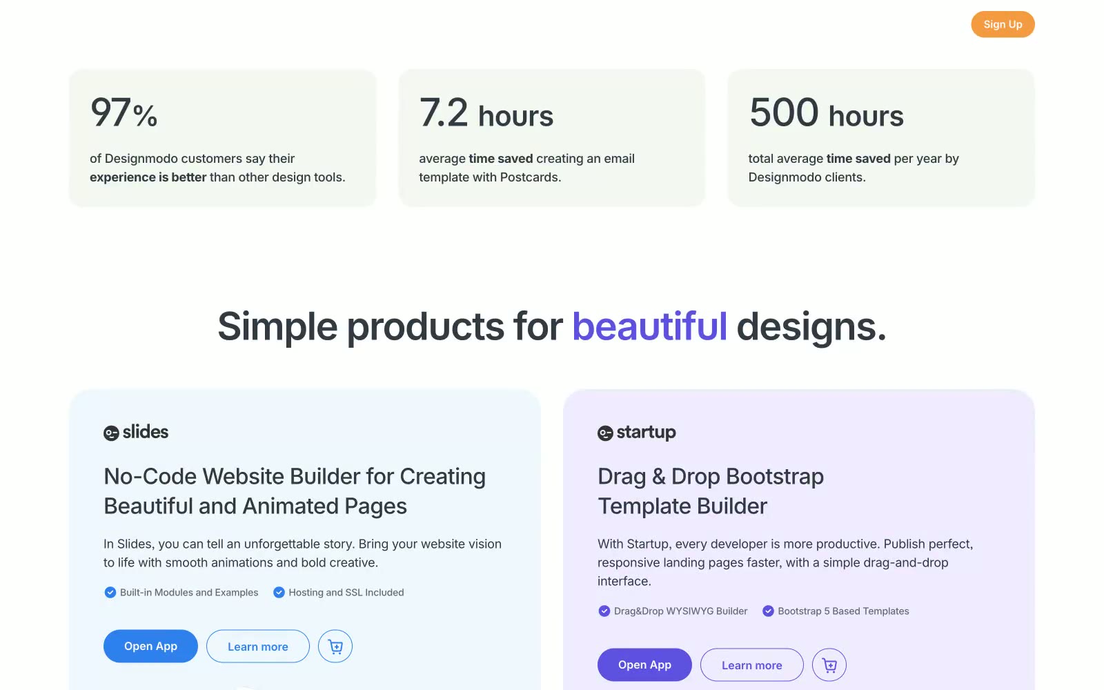
Designmodo
Designmodo — Style Reference
# Designmodo — Style Reference
> Forest clearing at dawn — dark canopy above, open light below, a single green glow marking the path forward.
**Theme:** mixed
Designmodo splits its personality across two distinct registers: a deep forest-green dark hero (#0e231c) that anchors authority, then opens into a bright white content canvas — the visual equivalent of stepping through a dark doorway into a sunlit studio. The dark sections use white and the muted sage #defaca for type, while the light sections flip to near-black #313942, creating a two-room color system where context always signals mode. A single electric green (#27ae60) is the sole interactive color in both worlds — CTA buttons, badges, and active states all share one hue, making every clickable element feel like it belongs to the same family regardless of which room it lives in. InterVariable at negative letter-spacing (down to -0.028em at display sizes) does the typographic heavy lifting, with ligature-aware feature flags 'cv03', 'cv04', 'cv06', 'cv09', 'ss03' making standard Inter feel proprietary. The 32px card radius and 999px pill buttons create the only soft geometry in an otherwise rectangular system.
## Tokens — Colors
| Name | Value | Token | Role |
|------|-------|-------|------|
| Forest Floor | `#0e231c` | `--color-forest-floor` | Hero section background, dark nav background — the deepest surface in the system; white text reads at 16.5:1 against it |
| Canopy Shadow | `#1a3029` | `--color-canopy-shadow` | Secondary dark surface, used as an elevated dark card or section band within the dark-mode hero zone |
| Pine Border | `#233630` | `--color-pine-border` | Subtle dividers within dark sections — barely distinct from the background, read more as inset lines than separators |
| Slate Ink | `#313942` | `--color-slate-ink` | Default body text, icons, borders on light sections — the near-black that does almost all the work in the light zone |

Websites
Markdown Text
design-md
website-prompt
landing-page-prompt
Google for Education
Google for Education — Style Reference
# Google for Education — Style Reference
> Open notebook in morning light — a digital classroom where whitespace, type, and one blue accent do all the work.
**Theme:** light
Google for Education operates as a restrained utility surface: a near-white canvas anchored by two type families (Google Sans Text for body and UI, Google Sans Display for headlines) and a single brand blue that functions as the system's only chromatic voice. Hierarchy comes from scale jumps and tracking — the 80px display headline is tightly tracked, while 12–16px body text opens up with positive letter-spacing for small-size legibility. Surfaces avoid decorative gradients and heavy shadows, relying on generous whitespace, 24–28px card radii, and pill-shaped controls to feel approachable rather than corporate. Color is functional punctuation, not atmosphere: green identifies the Classroom brand mark, blue marks links and active states, and everything else stays in a narrow gray scale (#202124 → #3c4043 → #5f6368 → #dadce0).
## Tokens — Colors
| Name | Value | Token | Role |
|------|-------|-------|------|
| Canvas White | `#f8f9fa` | `--color-canvas-white` | Page background, card surfaces, section bands — the off-white ground that prevents harshness against pure white product screenshots |
| Charcoal Ink | `#202124` | `--color-charcoal-ink` | Primary text, display headlines, active icon strokes — the deepest readable black-blue for maximum hierarchy |
| Graphite | `#3c4043` | `--color-graphite` | Secondary headings, nav text, strong body — one step lighter than charcoal for sub-headings and navigation labels |
| Slate | `#5f6368` | `--color-slate` | Muted body text, helper copy, icon glyphs, breadcrumb separators, footer micro-copy |
Websites
Markdown Text
design-md
website-prompt
landing-page-prompt
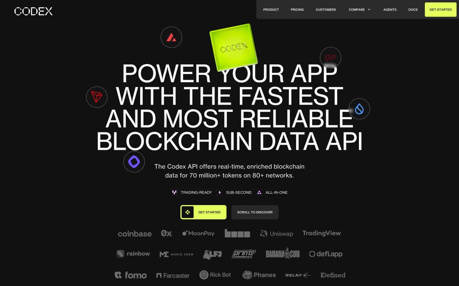
Codex.io
Codex.io — Style Reference
# Codex.io — Style Reference
> Citrine beacon in void — a glowing lime cube anchoring a dark room, with thin white type and scattered node rings floating around it.
**Theme:** mixed
Codex.io speaks in a single dramatic gesture: a luminous citrine cube floating in deep carbon void, surrounded by orbiting blockchain nodes. The interface is almost entirely dark with one electric lime accent (#e5ff5d) that does all the chromatic work — primary actions, icon strokes, decorative cubes, brand marks. Typography is a single humanist sans (Neue Haas Grotesk) set with confident, slightly tight tracking, where 80px display headlines occupy entire rows and small labels earn positive tracking. The page oscillates between dense dark sections packed with constellation diagrams and one cream reversal where giant translucent cubes frame a centered message. Every screen should feel like looking into a server room through a viewport — dark, quiet, punctuated by one bright signal.
## Tokens — Colors
| Name | Value | Token | Role |
|------|-------|-------|------|
| Citrine Signal | `#e5ff5d` | `--color-citrine-signal` | Primary action buttons, brand cube fills, accent icon strokes, decorative 3D cubes, featured logo marks — the single chromatic voice of the system |
| Carbon Black | `#111111` | `--color-carbon-black` | Page canvas, primary text on light sections, dominant border color, button fills on reversed (light) sections |
| Bone White | `#f9f9f9` | `--color-bone-white` | Primary text on dark canvas, nav and body text, light icon fills, ghost button text |
| Graphite | `#2b2b2b` | `--color-graphite` | Elevated surface above carbon, secondary panels, darker card variants |
Websites
Markdown Text
design-md
website-prompt
landing-page-prompt
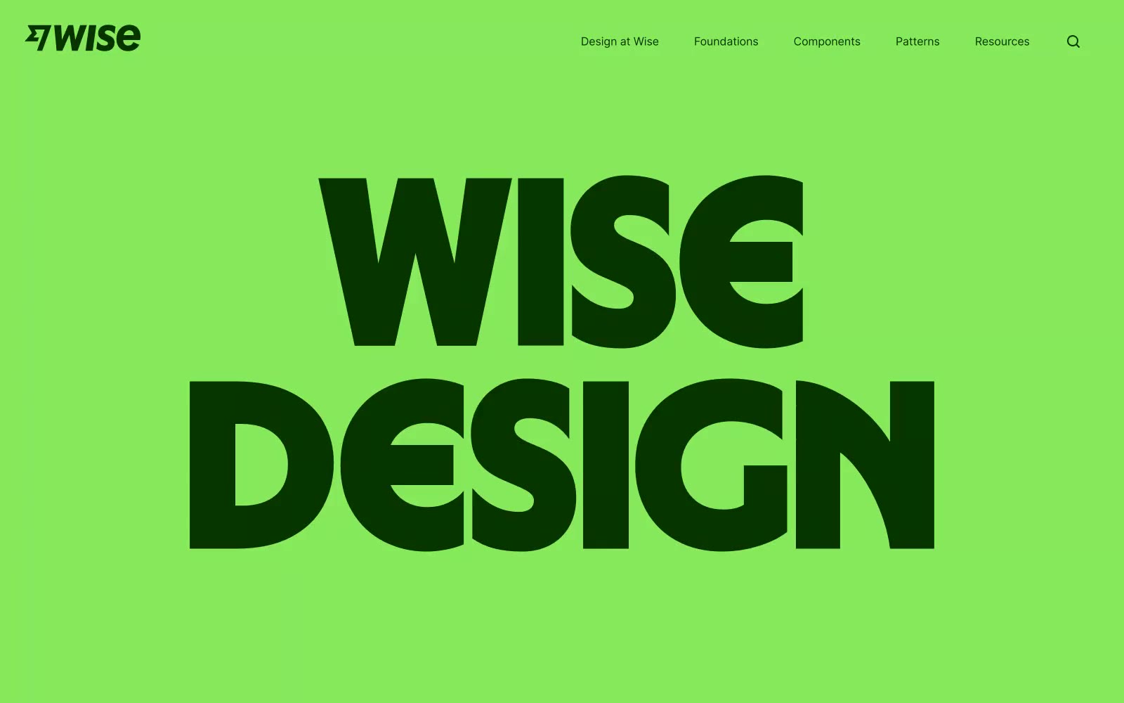
Wise Design
Wise Design — Style Reference
# Wise Design — Style Reference
> Neon market stall on a global street — electric lime signage that shouts across a crowded marketplace, then polished product UI slips in behind it.
**Theme:** mixed
Wise Design hits like a silk-screened protest poster — electric lime green (#87ea5c) floods the hero at full saturation, then dark forest ink (#083400) type slams across it at display scale. The palette is deliberately non-fintech: vivid yellow (#ffea4b), peach (#ffbd89), cotton candy pink (#ffd5f0), and deep aubergine (#2a0831) coexist like a global currency collection. Wise Sans at weight 900 with 0.85 line-height is the signature — letterforms stack so tightly they almost collide, creating billboard compression at digital scale. Pills (9999px radius) are the only rounded UI element, while large content blocks use generous 86px radii creating soft-edged cards that contrast the aggressive type. The design system oscillates between screaming and whispering — massive stacked display type then a single quiet midsize line on white.
## Tokens — Colors
| Name | Value | Token | Role |
|------|-------|-------|------|
| Lime Volt | `#87ea5c` | `--color-lime-volt` | Hero backgrounds, pill button fill, category tag backgrounds — the single most identifiable brand signal; vivid green against dark ink creates energy no fintech blue could achieve |
| Forest Ink | `#083400` | `--color-forest-ink` | Primary text, dark headlines on lime, nav links, icon fills — deep forest green instead of black keeps everything on-brand even at body size |
| Volt Yellow | `#ffea4b` | `--color-volt-yellow` | Accent headlines, decorative text color on dark backgrounds — electric yellow that pairs with deep burgundy for maximum punch |
| Papaya | `#ffbd89` | `--color-papaya` | Warm accent card backgrounds, decorative section highlights |
Websites
Markdown Text
design-md
website-prompt
landing-page-prompt
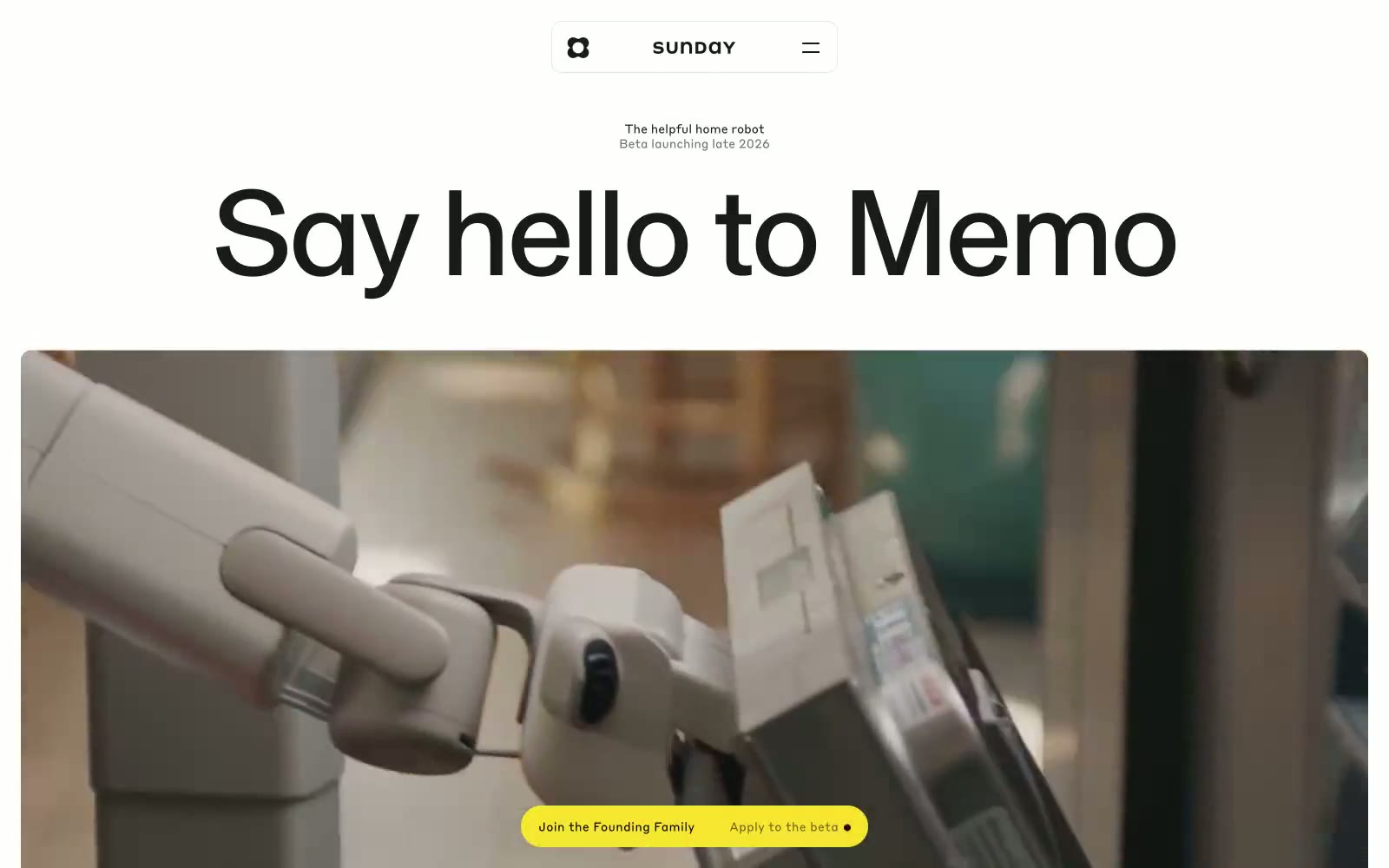
Sunday
Sunday — Style Reference
# Sunday — Style Reference
> Monochrome magazine spread with one yellow highlight
**Theme:** light
Sunday presents Memo in an editorial product-launch register: a pure white canvas dominated by massive single-weight headlines, photographic storytelling, and a single vivid yellow used as rare punctuation against a near-total absence of color. Typography is the brand — one weight (400) stretched across a scale from 14px to 142px, with slight negative tracking on display sizes, giving the page the cadence of a magazine spread rather than a software product page. The interface is sparse to the point of asceticism: centered navigation, no sidebar, no cards with shadows, no decorative gradient meshes. Color appears only as functional signal — yellow for highlight states and beta CTAs, black for everything else. The visual system reads as confidence through restraint: the robot does the talking, the page stays out of the way.
## Tokens — Colors
| Name | Value | Token | Role |
|------|-------|-------|------|
| Lemon Highlight | `#f7e731` | `--color-lemon-highlight` | Yellow supporting accent for decorative details and low-frequency emphasis |
| Ink Black | `#1a1a1a` | `--color-ink-black` | Primary text, icons, button labels, nav links, form borders — the workhorse dark for all readable content |
| Pure White | `#ffffff` | `--color-pure-white` | Page background, card surfaces, button text on dark fills — the dominant canvas |
| Pure Black | `#000000` | `--color-pure-black` | Hairline borders, footer background, maximum-emphasis text — used where Ink Black is not dark enough |
Websites
Markdown Text
design-md
website-prompt
landing-page-prompt
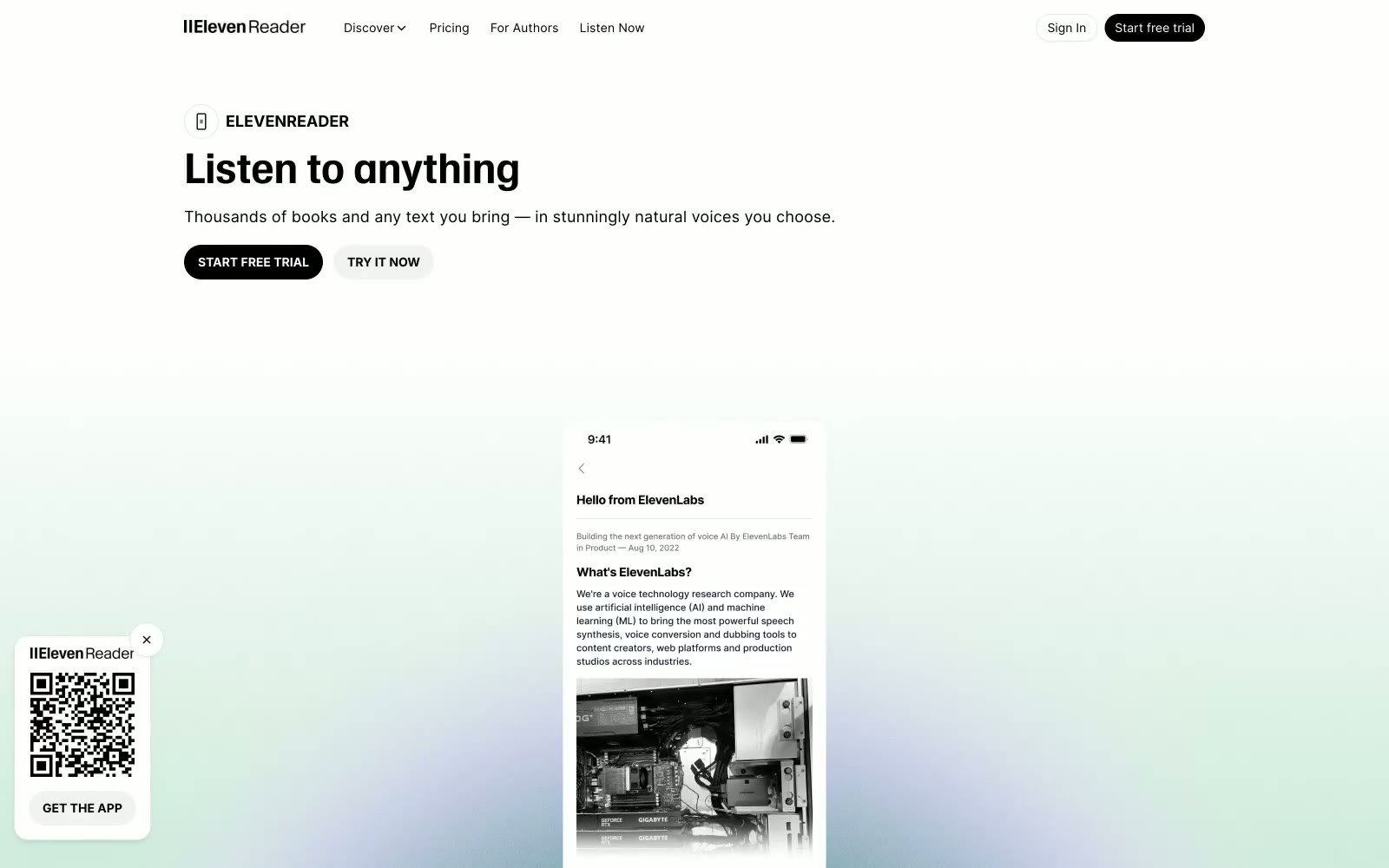
ElevenReader
ElevenReader — Style Reference
# ElevenReader — Style Reference
> newsprint minimalism with a single color bloom
**Theme:** light
ElevenReader runs on a near-monochrome visual language: paper-white canvas, ink-black type, and hairline gray borders doing all the structural work. A single custom display face (WaldenburgHF, bold only) carries every heading at a fixed tight leading, creating a single typographic voice across the whole product surface. The interface stays flat — no shadows, no elevation stacks, no decorative gradients in the UI — with one moment of color appearing as an atmospheric radial wash in the hero (forest green dissolving into lavender) that sets an emotional tone without ever repeating inside components. Pill-shaped controls (9999px radius), large generous gutters, and a single weight contrast (Inter 400 vs 700) keep the system feeling like printed editorial spread — content-first, ornament-last.
## Tokens — Colors
| Name | Value | Token | Role |
|------|-------|-------|------|
| Ink | `#000000` | `--color-ink` | Dark supporting neutral for text, icons, and strong contrast. Do not promote it to the primary CTA color |
| Paper | `#ffffff` | `--color-paper` | Light supporting surface for subtle backgrounds and section separation. Do not promote it to the primary CTA color |
| Mist | `#f2f2f2` | `--color-mist` | Page canvas, subtle alternating section backgrounds, secondary surface tone behind cards |
| Bone | `#e5e5e5` | `--color-bone` | Hairline borders, dividers between stacked rows, FAQ item outlines, low-contrast separators |
Websites
Markdown Text
design-md
website-prompt
landing-page-prompt
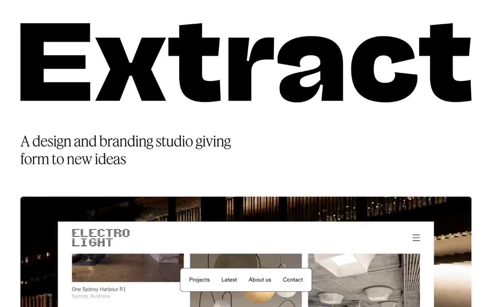
Extract
Extract — Style Reference
# Extract — Style Reference
> Editorial monolith on gallery paper
**Theme:** light
Extract operates as an editorial gallery space: a white canvas interrupted by one pastel mint wash, a single monumental wordmark, and confident body type. The visual system is almost entirely achromatic — near-black ink on white paper — with #e7feda mint appearing only as section-level atmospheric color, never as a UI accent or button fill. Hierarchy is built through extreme typographic scale contrast (104px display vs 19px body) rather than color, weight, or decoration. Components are flat and thin: hairline borders, ~9px radii, no shadows, no gradients. The navigation is a floating pill that hovers over content, reinforcing the gallery metaphor — visitors walk through curated rooms rather than scrolling a page.
## Tokens — Colors
| Name | Value | Token | Role |
|------|-------|-------|------|
| Gallery White | `#ffffff` | `--color-gallery-white` | Neutral form states, badge text, and quiet UI feedback where color should stay understated. Do not promote it to the primary CTA color |
| Ink Black | `#070707` | `--color-ink-black` | Primary text, hairline borders, filled buttons, nav text — the structural linework of the entire system; Dark surface for project cards and editorial spreads — the inverse of the canvas, used to make featured work feel like a framed plate |
| Spearmint Wash | `#e7feda` | `--color-spearmint-wash` | Green wash for highlight backgrounds, decorative bands, and soft emphasis behind content. Do not promote it to the primary CTA color |
Websites
Markdown Text
design-md
website-prompt
landing-page-prompt
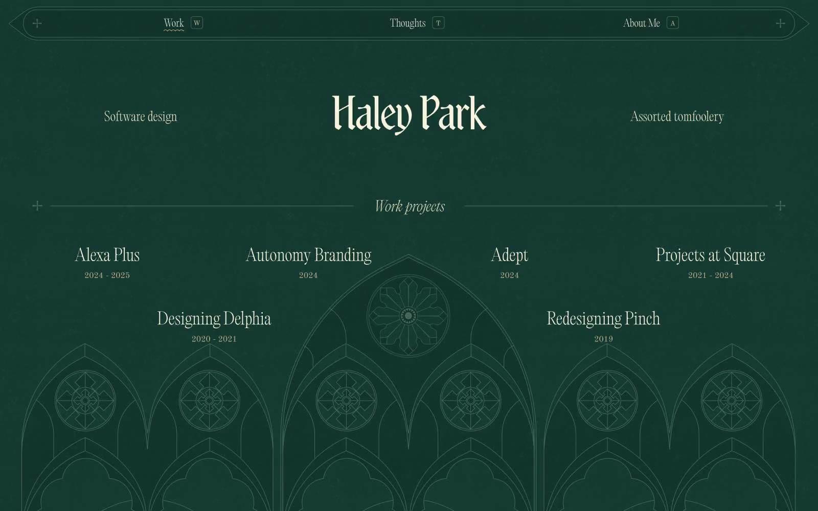
Haley Park
Haley Park — Style Reference
# Haley Park — Style Reference
> Illuminated manuscript on forest vellum
**Theme:** dark
A personal portfolio system built on a dark forest-green manuscript — the page reads like a hand-illuminated codex rather than a website. The entire interface lives inside a single chromatic mood: deep pine canvas (#143930), warm parchment text (#f8f2de), and a sage structural accent (#456859) for line work and iconography. Typography stays in the weight-200 whisper range across a curated family of editorial serifs, with one display cut (Wispy, 96px) used as a single monumental name treatment. Decorative gothic architecture — rose windows, arches, intersecting plus-signs at line junctions — bleeds through the layout as full-width structural pattern rather than ornament. No drop shadows, no gradients, no rounded cards; the system draws its depth from line weight, the cream-on-green contrast pair (11.3:1), and the disciplined rhythm of thin horizontal rules with terminal crosses.
## Tokens — Colors
| Name | Value | Token | Role |
|------|-------|-------|------|
| Pine Vellum | `#143930` | `--color-pine-vellum` | Page canvas, all section backgrounds, box-shadow tint for the only subtle elevation present |
| Cedar Stroke | `#456859` | `--color-cedar-stroke` | Stroke color for background architectural illustrations, icon outlines, sage decorative line art, secondary borders |
| Parchment | `#f8f2de` | `--color-parchment` | Primary text, link text, outlined button borders, heading characters, and the full suite of hairline rules and dividers |
| Aged Tan | `#bead89` | `--color-aged-tan` | Muted secondary text and metadata labels (project years, category tags) — sits between parchment and the background, a quieter tertiary |
Websites
Markdown Text
design-md
website-prompt
landing-page-prompt
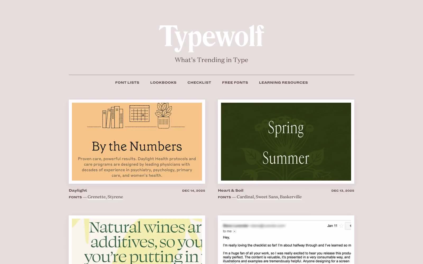
Typewolf
Typewolf — Style Reference
# Typewolf — Style Reference
> Warm parchment typography atelier. Every element is a brownish-ink stamp on dusty rose paper, with no color allowed to compete with the type.
**Theme:** light
Typewolf reads as a warm, editorial type specimen magazine pressed into a website: a dusty rose canvas (#f8f5f5) supports white rectangular cards in a two-column grid, all anchored by brownish-ink text rather than any chromatic accent system. The palette is deliberately near-monochromatic — a dark warm brown (#443235) for body copy and headlines, a slightly lighter brown (#654a4e) for nav and secondary links, and a single muted dusty rose (#916a70) reserved for borders and quiet emphasis. Typography carries the entire identity: a transitional serif (Domaine Text) for body, an ultra-heavy condensed sans (Dia) for ALL-CAPS micro-labels with -0.03em tracking, and a high-contrast display serif (Domaine Display Narrow) for editorial headlines. Surfaces are sharp-cornered, elevated only by a warm-tinted diffuse shadow (rgba(145,106,112,0.15) 0 6px 24px) that ties the elevation back to the brand palette. The result is a site that feels more like a printed specimen catalog than a web product — restrained, content-first, and quietly opinionated.
## Tokens — Colors
| Name | Value | Token | Role |
|------|-------|-------|------|
| Parchment Rose | `#f8f5f5` | `--color-parchment-rose` | Page canvas and section backgrounds — the warm off-white ground that gives the whole system its dusty, paper-like atmosphere |
| Specimen White | `#ffffff` | `--color-specimen-white` | Card surfaces and image wells — clean white plates that sit on the parchment canvas, carrying typographic specimens and editorial imagery |
| Ink Brown | `#443235` | `--color-ink-brown` | Primary text, headlines, and dominant body copy — the warm near-black that reads as ink rather than pure black against the rose canvas |
| Walnut | `#654a4e` | `--color-walnut` | Navigation text, secondary links, and muted metadata — one step lighter than Ink Brown for hierarchy without leaving the brown family |
Websites
Markdown Text
design-md
website-prompt
landing-page-prompt
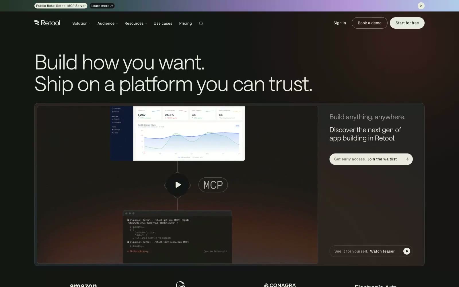
Retool
Retool — Style Reference
# Retool — Style Reference
> Warm obsidian workshop — a precision tool surface lit by ember glow, where everything is built.
**Theme:** dark
Retool operates on a near-black canvas — #151515 as the dominant ground — with off-white text (#e9ebdf) that reads more like parchment than pure white, giving the dark surface a warm, organic quality rather than a cold tech-void. Typography is the primary design tool: the custom 'saansFont' runs from weight 300 at 72px down to 380 at body sizes, with aggressive negative tracking at large scales creating compressed, authoritative headlines that feel proprietary. Surface depth is achieved through a three-step stack (#0e0e0 → #151515 → #242424) with no shadows — cards are literally darker or lighter slabs of the same material, not elevated objects. The only chromatic punctuation is muted teal (#185849, #0e352c) used as subtle background washes, while the hero gradient bleeds warm earthy tones (amber-rust into near-black) from the bottom-left, creating atmospheric depth without visual noise. Buttons are square-cornered or pill-cornered depending on context — no in-between — reinforcing a binary, decisive visual grammar.
## Tokens — Colors
| Name | Value | Token | Role |
|------|-------|-------|------|
| Obsidian Canvas | `radial-gradient(at -5% 105%, rgba(27, 46, 68, 0.5) 26%, rgba(51, 45, 43, 0.5) 44%, rgba(74, 43, 17, 0.5) 62%, rgba(73, 31, 22, 0.5) 66%, rgba(21, 21, 21, 0) 85%, rgba(21, 21, 21, 0.03) 100%)` | `--color-obsidian-canvas` | Primary page background, dominant surface across all sections; Hero background gradient — warm amber-rust bleeds from bottom-left into near-black |
| Void Black | `#0e0e0e` | `--color-void-black` | Deepest surface layer, card backgrounds that recede below canvas |
| Ember Surface | `#242424` | `--color-ember-surface` | Raised card and panel backgrounds — one step above canvas |
| Charcoal Rim | `#3f403d` | `--color-charcoal-rim` | Subtle borders and dividers on dark surfaces |
Websites
Markdown Text
design-md
website-prompt
landing-page-prompt
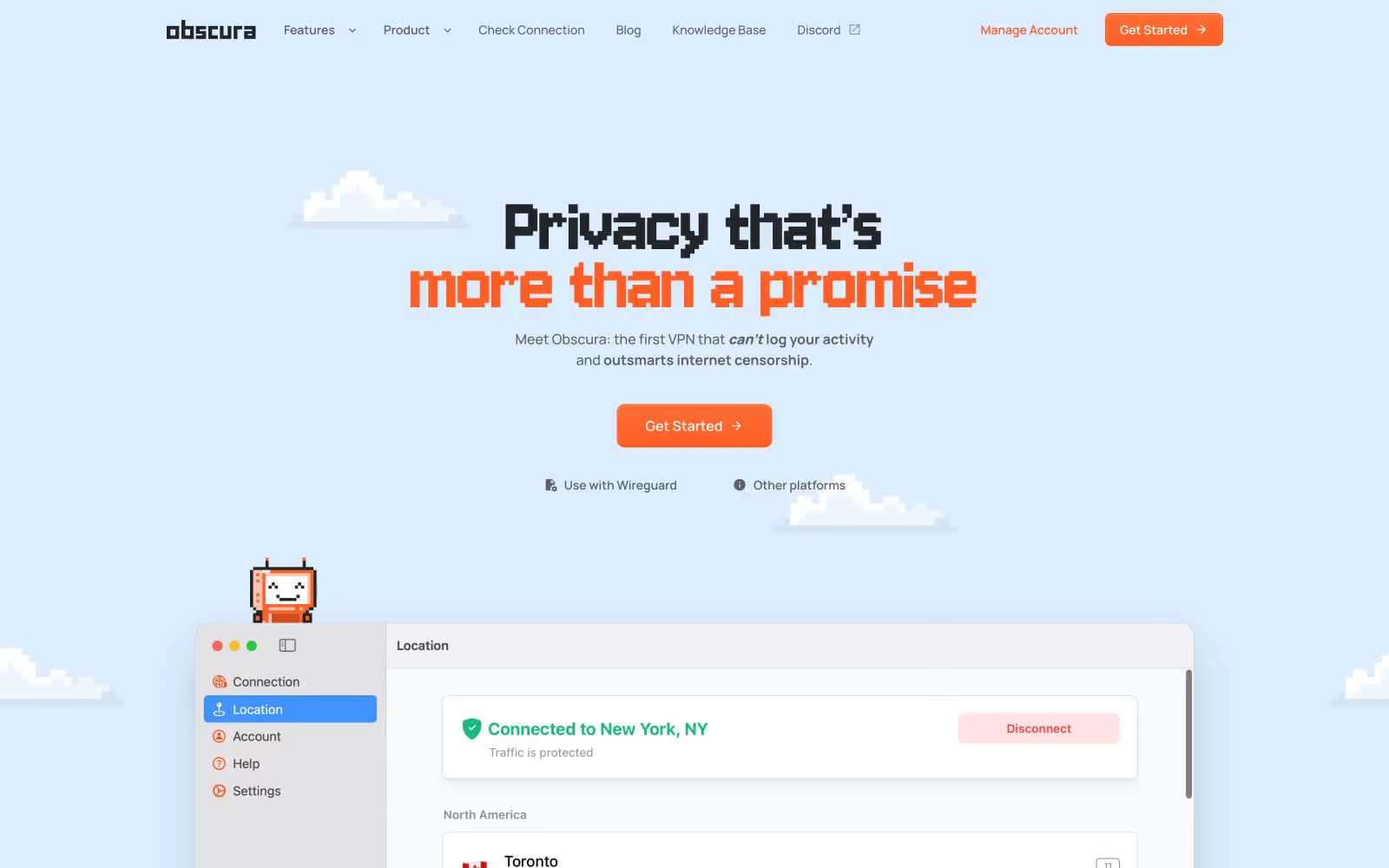
Obscura
Obscura — Style Reference
# Obscura — Style Reference
> 8-bit arcade floating on cloud paper
**Theme:** light
Obscura runs on a playful 8-bit arcade vocabulary pressed onto a soft, sky-toned paper canvas. The display type (Jersey 10) is the visual signature: chunky pixel letterforms that read like Game Boy subtitles, paired with the calm, modern geometry of Manrope for everything that needs to be read. A single vivid orange (#ff5e24) does the loud work — CTA fills, link hovers, hero emphasis, card borders — while the rest of the system stays in cream, sky-blue, and graphite. Surfaces float on a pale #e3f1fe cloud with hairline borders and whisper-soft shadows; the page feels like a pixel-art console wallpaper you actually want to live inside. The mood is privacy-as-playfulness, not privacy-as-fortress.
## Tokens — Colors
| Name | Value | Token | Role |
|------|-------|-------|------|
| Signal Orange | `#ff5e24` | `--color-signal-orange` | Primary CTA fill, hero headline emphasis, active nav link, card accent border, hover state — the single chromatic voice that earns every pixel it touches |
| Ember Crust | `#6c3200` | `--color-ember-crust` | Footer background, dark-mode brand block — used where the orange needs to recede into a deep, warm base |
| Cloud Mist | `#e3f1fe` | `--color-cloud-mist` | Page canvas tint, card surface wash, secondary button border, decorative fill behind pixel art — the soft sky that everything floats on |
| Graphite Ink | `#232629` | `--color-graphite-ink` | Primary text, nav links, icon strokes, body copy — the near-black with a cool cast that keeps the page from feeling sterile |
Websites
Markdown Text
design-md
website-prompt
landing-page-prompt
Agencja brandingowa
Agencja brandingowa — Style Reference
# Agencja brandingowa — Style Reference
> Editorial white gallery with black ink typography
**Theme:** light
A stark editorial identity system built on absolute monochrome — white canvas, black ink, gray echoes. The design reads like a printed architecture monograph: every element earns its space through generous whitespace, precise typographic control, and a refusal to use color for anything but information. Type does all the emotional work; a single custom grotesk carries both 73px display lines and 10px meta labels, unified by a stylistic alternate ('ss01') that gives the letterforms a distinctive editorial edge. Components stay flat, borders stay hairlines, radii stay generously rounded, and the entire surface stack moves from pure white through cool grays to ink black without any chromatic interruption.
## Tokens — Colors
| Name | Value | Token | Role |
|------|-------|-------|------|
| Pure White | `#ffffff` | `--color-pure-white` | Page background, card surface, inverted text on dark blocks |
| Ink Black | `#000000` | `--color-ink-black` | Primary text, headings, logo mark, all stroke and border weight |
| Obsidian | `#1f1f1f` | `--color-obsidian` | Dark section backgrounds, deep surface elevation, footer bands |
| Graphite Wash | `#333333` | `--color-graphite-wash` | Elevated dark surfaces, overlay panels |