AI Prompt Studio - Intelligent Prompt Library
Explore and use professional AI prompts to optimize your workflow.
One-click Use
Websites
Markdown Text
design-md
website-prompt
landing-page-prompt
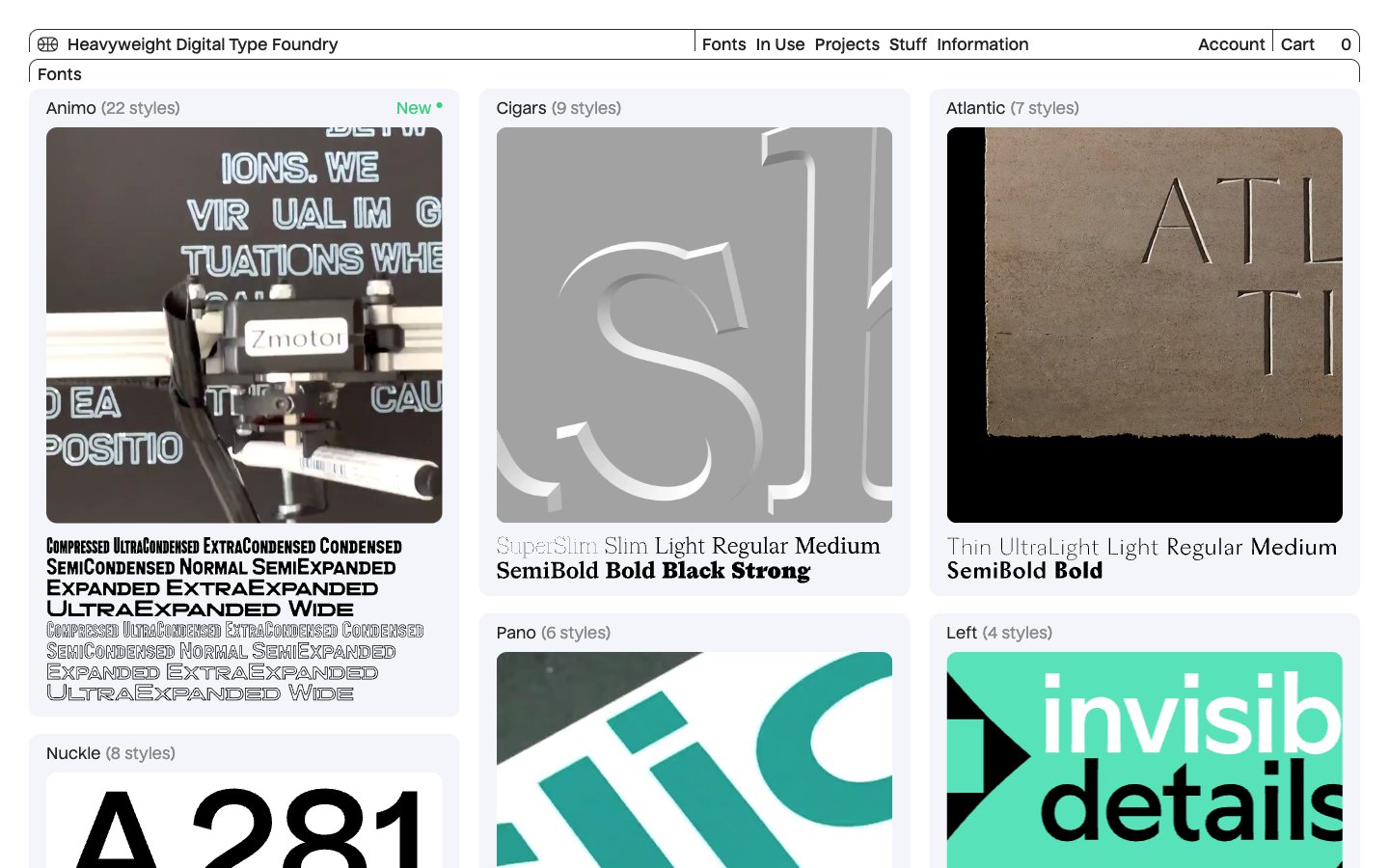
Heavyweight
Heavyweight — Style Reference

# Heavyweight — Style Reference
> Paper specimen archive. A wall of photographed letterforms printed on textured stock, hung on a cool off-white gallery wall with hairline frames.
**Theme:** light
Heavyweight treats its typefaces as museum objects: each card presents a photographic specimen of large type set in physical space, filling the card edge-to-edge. The surrounding chrome dissolves into a thin navigation bar, hairline borders, and a single custom sans (Nuckle) at just 14–16px — letting the specimens carry every visual decision. The palette is near-monochrome: cool off-white canvas (#f3f5fa), white card surfaces, near-black ink (#222222), with a single vivid mint green (#39d17f) reserved exclusively for new-release tags. An unusual 11px card radius sits between editorial and soft-modern, and the 3-column grid breathes with comfortable 12px gaps while the dense specimen coverage keeps the page visually full.
## Tokens — Colors
| Name | Value | Token | Role |
|------|-------|-------|------|
| Canvas Mist | `#f3f5fa` | `--color-canvas-mist` | Page background, the base surface everything sits on. Cool off-white with a faint blue cast — distinct from pure white so the white cards read as elevated without needing shadows |
| Card White | `#ffffff` | `--color-card-white` | Card surfaces, specimen containers, navigation background. Creates the canvas → card elevation step through surface contrast alone |
| Press Black | `#222222` | `--color-press-black` | Primary text, structural borders, card frames, button outlines. Near-black (not pure #000) so it reads as ink rather than void against the cool canvas |
| Hairline Char | `#2d2d2d` | `--color-hairline-char` | Secondary borders, nav dividers, subtle structural lines. One shade softer than Press Black for hierarchy between primary and secondary framing |
Websites
Markdown Text
design-md
website-prompt
landing-page-prompt
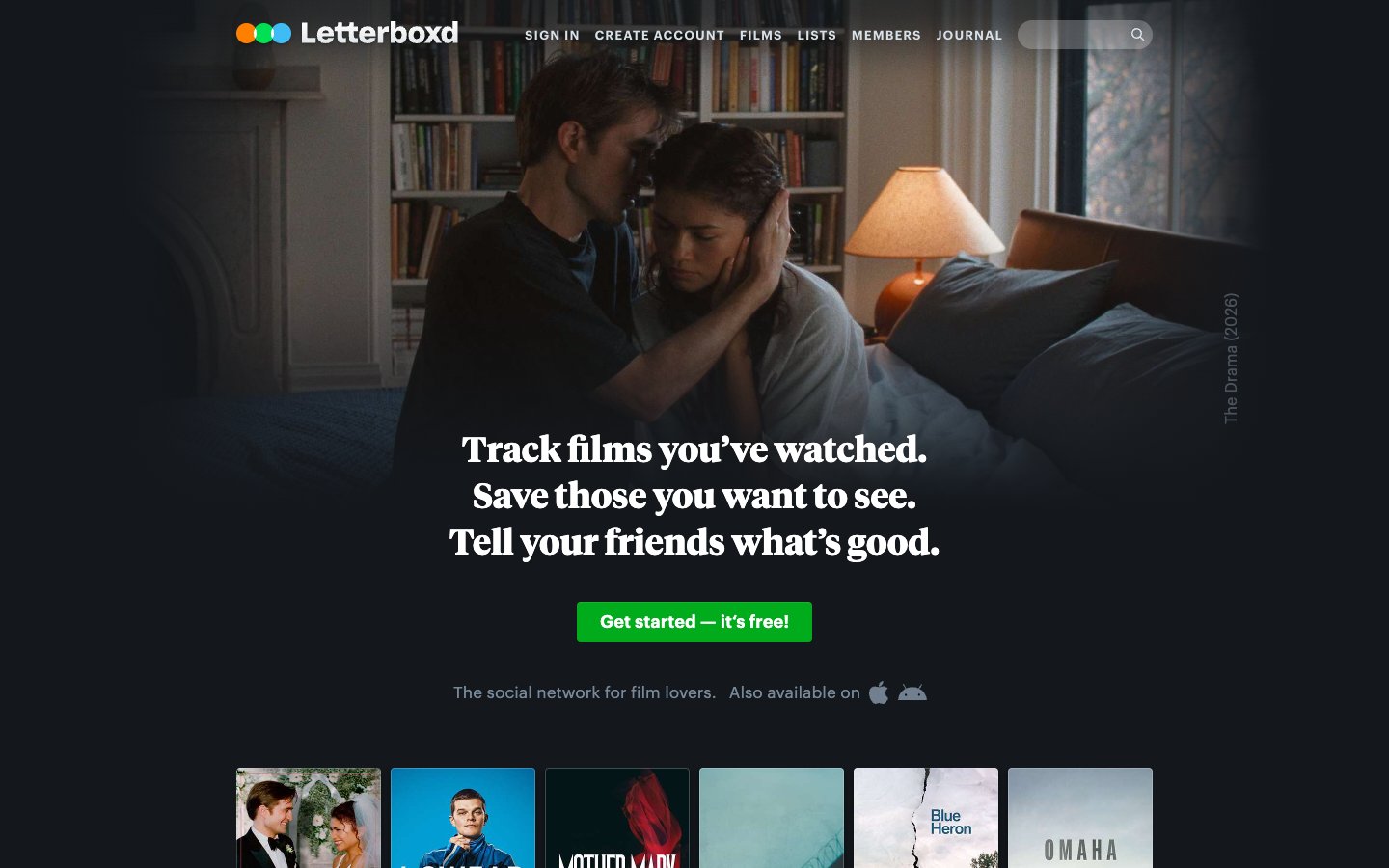
Letterboxd
Letterboxd — Style Reference
# Letterboxd — Style Reference
> Darkened cinema lobby with neon rating glow
**Theme:** dark
Letterboxd reads as a darkened cinema lobby: a near-black canvas tinted blue, content stacked in quiet horizontal bands, and one unmistakable acid-green accent that fires only at moments of action or rating. The dual-typeface system pairs a utilitarian neo-grotesque (Graphik) for chrome with a literary serif (Tiempos) for editorial moments, creating a tension between product UI and magazine. Density is comfortable, never crowded — the grid breathes around film posters and review cards, with 3px micro-radii keeping the geometry sharp and the green CTA as the only curve that matters.
## Tokens — Colors
| Name | Value | Token | Role |
|------|-------|-------|------|
| Void Black | `#14181c` | `--color-void-black` | Page canvas, app background |
| Carbon | `#202830` | `--color-carbon` | Elevated surface — cards, modals, popovers |
| Slate | `#2c3440` | `--color-slate` | Borders, dividers, subtle separators |
| Graphite | `#445566` | `--color-graphite` | Supporting neutral for secondary UI, dividers, and muted labels. Do not promote it to the primary CTA color |
Websites
Markdown Text
design-md
website-prompt
landing-page-prompt
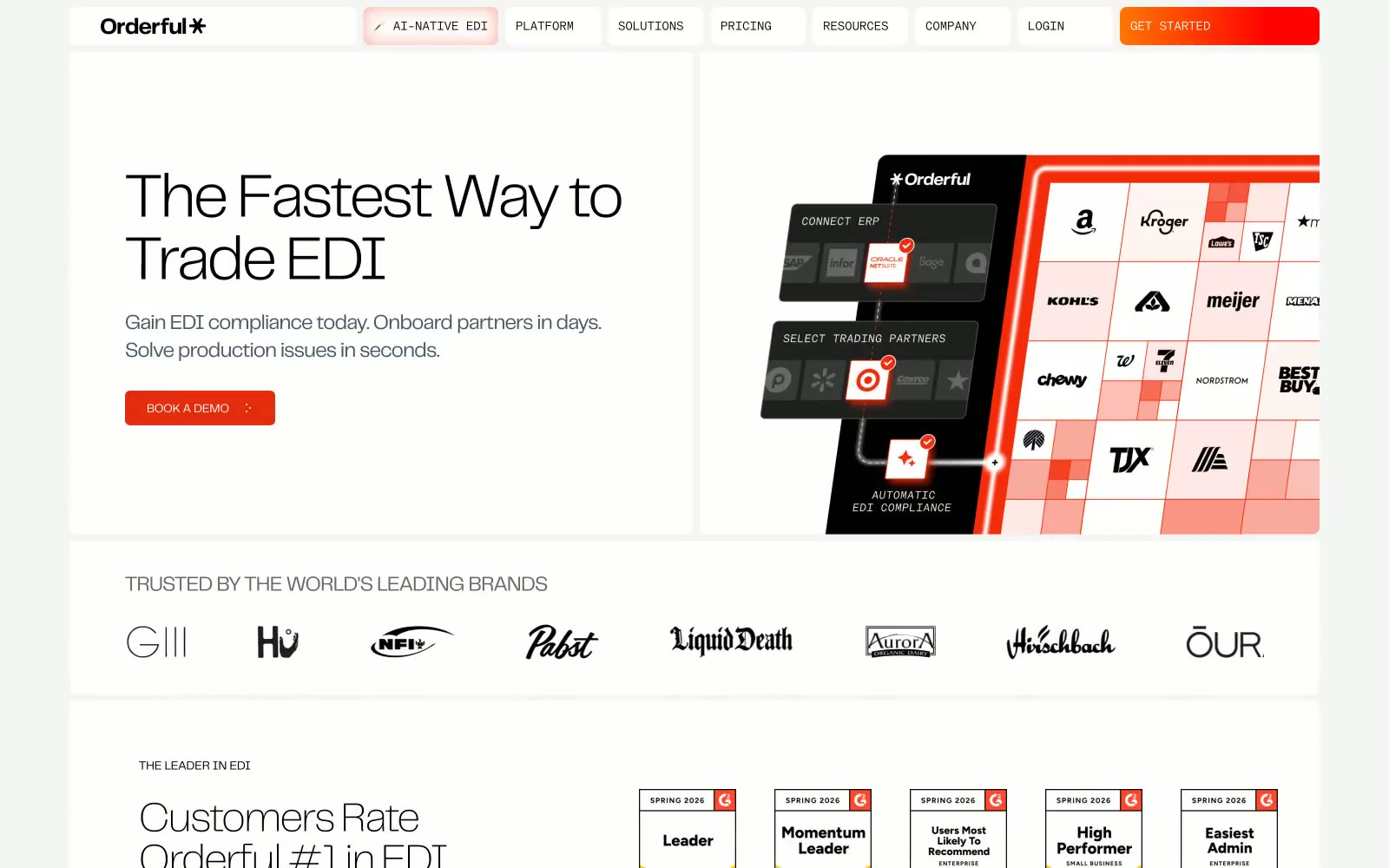
Orderful
Orderful — Style Reference
# Orderful — Style Reference
> industrial command deck — a logistics dispatcher's printed control sheet in black ink and surgical vermillion, every page restrained enough to let a single CTA shout.
**Theme:** light
Orderful reads as an industrial command deck: a near-pure achromatic surface where black-and-white typography and 8px radii meet a single surgical vermillion accent that punctuates actions rather than decorates. The typographic voice belongs to telegraf, a custom grotesk spanning weights 100–700 and sizes 12–72px, tightened with −0.025em to −0.03em tracking on display and expanded 0.025em on uppercase eyebrows, with modernGothic at 14px/300 handling a specific small-text register via the ss02 alternate. Geometry is disciplined — one universal 8px radius, one two-layer shadow stack used sparingly, and a base 8px spacing scale that breathes at 40–64px section gaps. The result is a calm, information-rich B2B surface that treats color as a scarce commodity: most screens stay monochrome, letting the single red-orange mark function as the only signal that something is actionable.
## Tokens — Colors
| Name | Value | Token | Role |
|------|-------|-------|------|
| Vermillion Signal | `linear-gradient(94deg, rgb(255, 2, 1) -33.85%, rgb(255, 120, 2) -1.54%, rgb(255, 2, 1) 73.55%)` | `--color-vermillion-signal` | Orange action color for filled buttons, selected navigation states, and focused conversion moments. |
| Ink Black | `#000000` | `--color-ink-black` | Hairline borders, logo marks, high-contrast icon strokes, strong body emphasis |
| Carbon | `#1f1f1f` | `--color-carbon` | Dark card backgrounds, inverted feature panels, footer surface |
| Slate 900 | `#101828` | `--color-slate-900` | Display and heading text, hero headlines — the dominant typographic color |
Websites
Markdown Text
design-md
website-prompt
landing-page-prompt
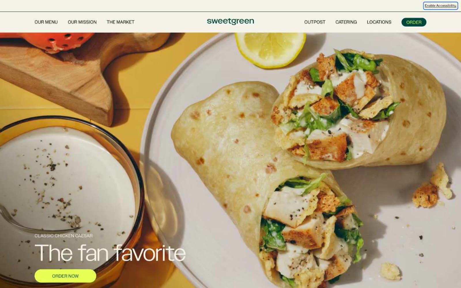
sweetgreen
sweetgreen — Style Reference
# sweetgreen — Style Reference
> farm-stand chalkboard at golden hour
**Theme:** light
Sweetgreen's design system is a warm, farm-stand-meets-modern-typography aesthetic: a cream canvas (#f4f3e7) rooted in natural materials, with deep forest green as the structural anchor and electric lime (#e6ff55) as a singular, high-energy action color. Photography carries the brand — saturated, overhead food shots on warm tile, ceramic, and concrete surfaces are treated as heroes, never as decoration. Typography does the heavy lifting on chrome: a custom geometric sans (SweetSans) renders oversized category labels and hero headlines at extreme weights (400 at 70–80px, with 0.85 line-height that lets letters nearly touch), while a secondary ultra-light display face (Grenette at 200) creates contrast through restraint. Components are deliberately spare — pill-shaped buttons, ghost text links with arrows, badge-free product cards — letting the food and the headline typography own every screen.
## Tokens — Colors
| Name | Value | Token | Role |
|------|-------|-------|------|
| Deep Forest | `#00473c` | `--color-deep-forest` | Primary brand color, nav logo, dark pill buttons, text accents, badge borders, link colors — the structural green that anchors the palette |
| Lime Glow | `#e6ff55` | `--color-lime-glow` | Green action color for filled buttons, selected navigation states, and focused conversion moments. |
| Sage Mist | `#d8e5d6` | `--color-sage-mist` | Section backgrounds, card surfaces, content band alternation — soft botanical green that signals freshness without competing with the food photography |
| Warm Sand | `#e8dcc6` | `--color-warm-sand` | Accent surface for alternate section bands — warm beige that pairs with food photography and adds earthy variety to the green-dominant palette |
Websites
Markdown Text
design-md
website-prompt
landing-page-prompt
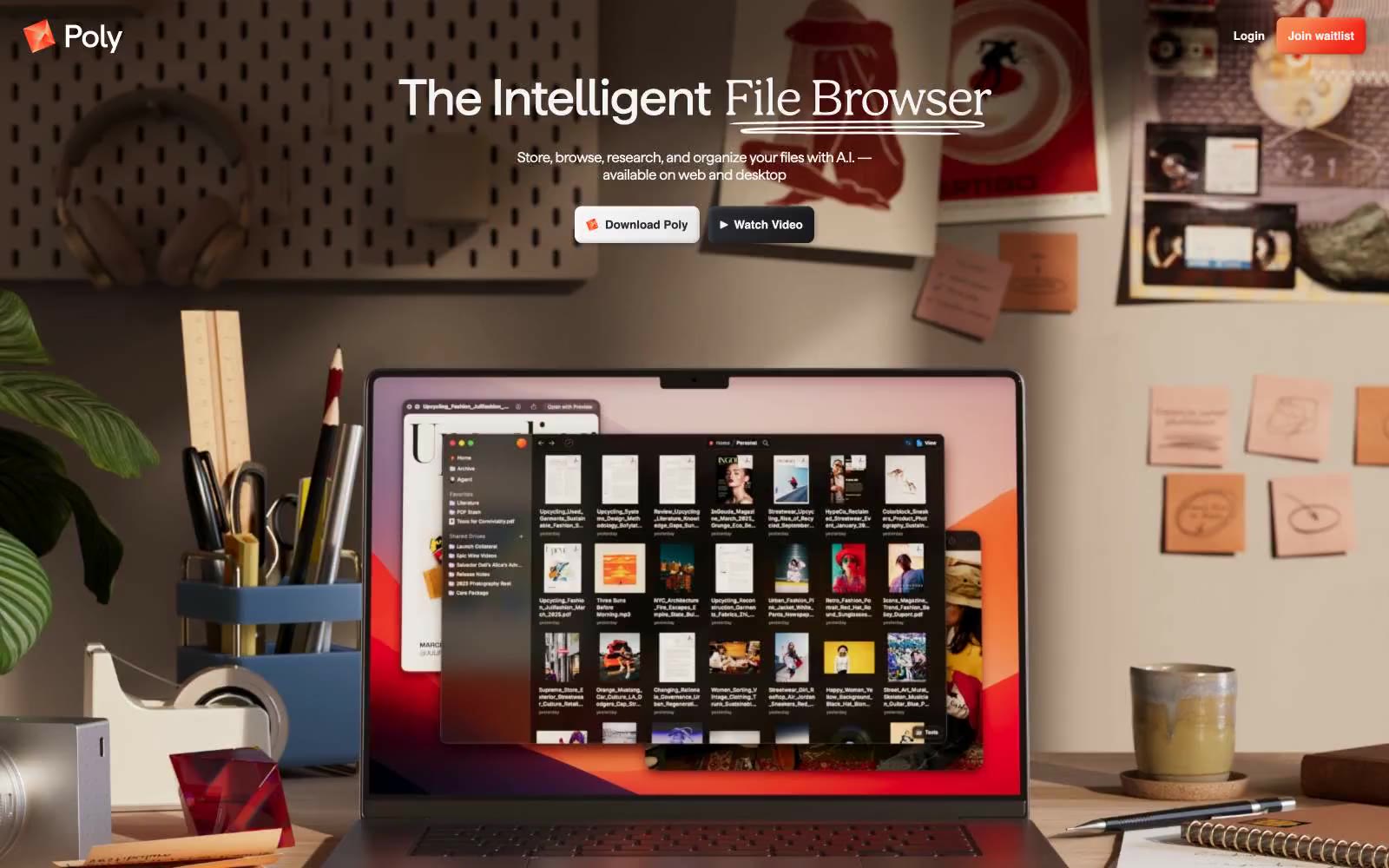
Poly
Poly — Style Reference
# Poly — Style Reference
> Ember on porcelain — one warm gradient ember floating on an otherwise pure white editorial page, surrounded by quiet serif headlines and full-bleed photography.
**Theme:** light
Poly is editorial software: a warm off-white canvas (#f4f4f4), near-black ink for text and UI, and a single ember-orange-to-red gradient reserved for the brand mark. Photography does the heavy atmospheric lifting — full-bleed desk scenes with natural materials and warm directional light replace illustration and decoration. Display type is a humanist serif (Haffer at 450, with liga and ss04 features) pulled tight at -0.02em, paired with Inter for UI. The system feels restrained the way a magazine spread feels restrained: one chromatic moment, hairline borders instead of shadows, 8px radii everywhere, and a column grid that lets the photography breathe.
## Tokens — Colors
| Name | Value | Token | Role |
|------|-------|-------|------|
| Ember Gradient | `linear-gradient(134.77deg, #f4824d 25.1%, #f42919 74.9%)` | `--color-ember-gradient` | Brand mark, Poly logo, the sole chromatic accent — warm orange fading to signal red, used only on identity, never on body UI |
| Porcelain | `#f4f4f4` | `--color-porcelain` | Page canvas, card surfaces, inverted text on dark photo backgrounds |
| Onyx | `#000000` | `--color-onyx` | Dark borders and separators for elevated surfaces and inverted UI. Do not promote it to the primary CTA color |
| Graphite | `#292930` | `--color-graphite` | Secondary text, hairline borders, icon fills, the slight warmth that keeps near-black from feeling clinical |
Websites
Markdown Text
design-md
website-prompt
landing-page-prompt
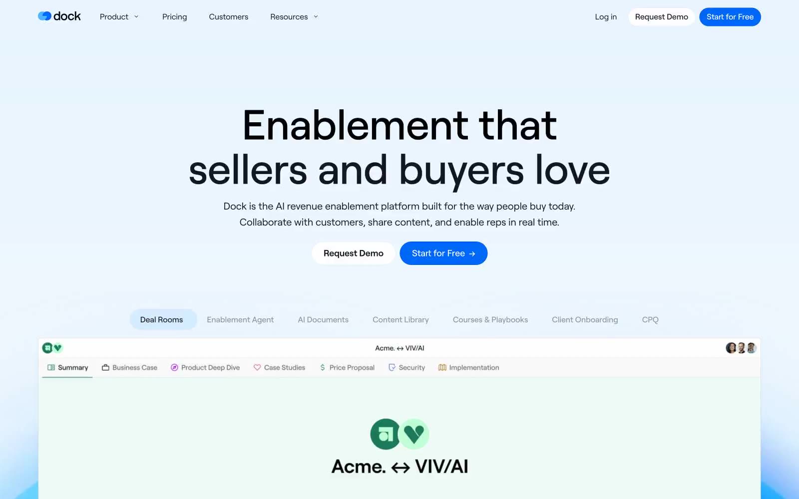
Dock
Dock — Style Reference
# Dock — Style Reference
> Sunlit cream paper, cobalt pulse
**Theme:** light
Dock operates in a sunlit, cream-warm workspace language: a soft #faf9f7 canvas replaces the usual pure-white SaaS backdrop, giving every screen a paper-like, approachable feel. Typography carries the weight — 84px Roobert display headlines sit alongside 16px body text with generous breathing room, letting the copy feel like confident printed prose rather than UI chrome. A single electric cobalt blue (#0068f9) punctuates the calm neutrals as the only interactive color: filled CTAs, active states, and links all share this vivid hue, while a secondary violet (#6736eb) appears sparingly as decorative accent. Components stay featherlight — pill-shaped buttons, hairline borders, soft elevated cards, and zero heavy shadows — so the product screenshots become the visual heroes rather than chrome around them.
## Tokens — Colors
| Name | Value | Token | Role |
|------|-------|-------|------|
| Canvas Cream | `#faf9f7` | `--color-canvas-cream` | Page background — warm off-white instead of pure white gives the entire system a paper-like, approachable feel |
| Surface Ivory | `#fbfaf7` | `--color-surface-ivory` | Card and panel surfaces — one step brighter than canvas to create subtle elevation without shadows |
| Pure White | `#ffffff` | `--color-pure-white` | Elevated surfaces, nav background, button text on filled CTAs |
| Lavender Mist | `#f4f0ff` | `--color-lavender-mist` | Decorative wash behind icons or highlight badges — cool counterpoint to the warm cream canvas |
Websites
Markdown Text
design-md
website-prompt
landing-page-prompt
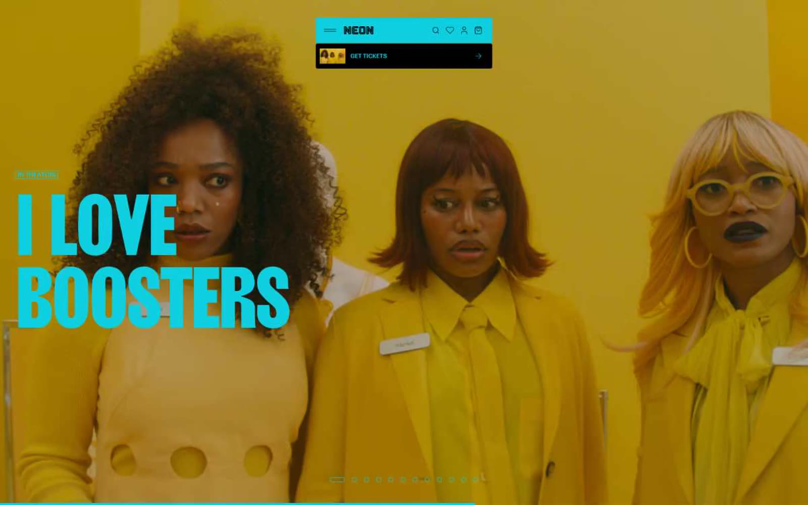
NEON Rated
NEON Rated — Style Reference
# NEON Rated — Style Reference
> cinematic gallery behind crimson neon
**Theme:** light
NEON operates as a cinematic poster wall in browser form: near-total achromatic restraint broken by a single deep crimson that only appears at brand-significant moments — the wordmark bar, release-date tags, and micro-accents. The interface is essentially a frame; the films are the content. A custom grotesque (Flatspot) handles every piece of UI at compact sizes with tight negative tracking, while a dramatic display face (Girott) is reserved exclusively for titanic section titles that bleed past 100px and anchor entire pages. Components are minimal: cards are raw image frames with thin borders, buttons are flat pills or sharp rectangles, and there is no shadow language to speak of — depth comes from film photography itself, not from chrome.
## Tokens — Colors
| Name | Value | Token | Role |
|------|-------|-------|------|
| Crimson Marquee | `#821e1e` | `--color-crimson-marquee` | Brand wordmark bar, release-date tags, selected-state borders, and the singular chromatic accent that anchors an otherwise monochrome system — deep, slightly oxidized, never orange, never bright |
| Ink | `#000000` | `--color-ink` | Primary text, icon strokes, heading color, button text, and dark-surface fills (hero overlay, footer) |
| Paper | `#ffffff` | `--color-paper` | Page background, card surface, button text on dark fills, input fields, badge text |
| Bone | `#f3f3f3` | `--color-bone` | Alternate card surface and section background, used to separate one row of film tiles from the next without a hard divider |
Websites
Markdown Text
design-md
website-prompt
landing-page-prompt
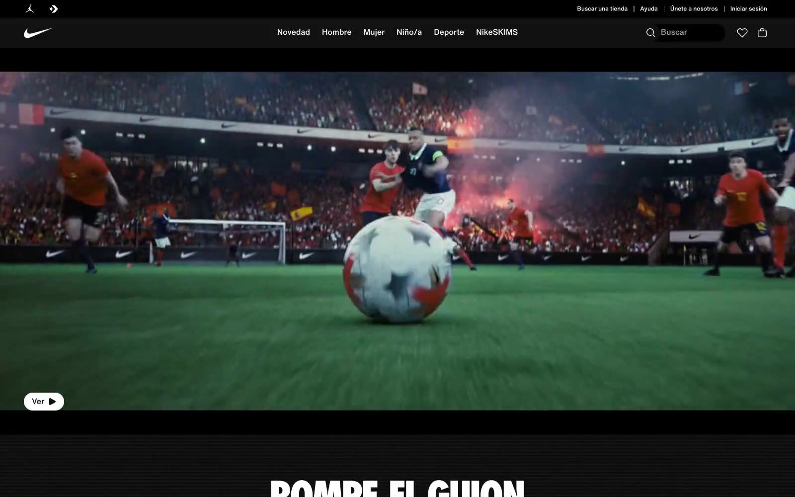
Nike.com
Nike.com — Style Reference
# Nike.com — Style Reference
> monochrome gallery of athletic performance — white walls, product as art, chrome dissolved into the background.
**Theme:** mixed
Nike.com operates as a product-first monochrome gallery: the UI stays nearly invisible so product photography can carry every screen. The entire interface is built from black, white, and three tints of gray — no accent color, no decorative gradient, no warm brand chrome. The Nike identity lives in the swoosh and the photography, never in the UI itself. Typography is compact and utilitarian, leaning on a custom Helvetica Now family at 12-20px with one oversized Nike Futura ND moment at 76px for hero headlines. Components are minimal: pill-shaped buttons at 30px radius, flat product cards, hairline borders, and almost zero elevation. The page alternates between pure white product surfaces and dramatic full-bleed dark editorial hero sections, creating rhythm through contrast rather than ornament.
## Tokens — Colors
| Name | Value | Token | Role |
|------|-------|-------|------|
| Obsidian | `#111111` | `--color-obsidian` | Dark supporting neutral for text, icons, and strong contrast. Do not promote it to the primary CTA color |
| Paper White | `#ffffff` | `--color-paper-white` | Page background, card surface, button text on dark fills, icon strokes — the default canvas for product grids and category sections |
| Concrete Gray | `#e5e5e5` | `--color-concrete-gray` | Borders, dividers, hairline separators between grid sections, subtle input outlines |
| Soft Mist | `#f5f5f5` | `--color-soft-mist` | Subtle background tint for secondary surfaces, nav search field fill, tag backgrounds |
Websites
Markdown Text
design-md
website-prompt
landing-page-prompt
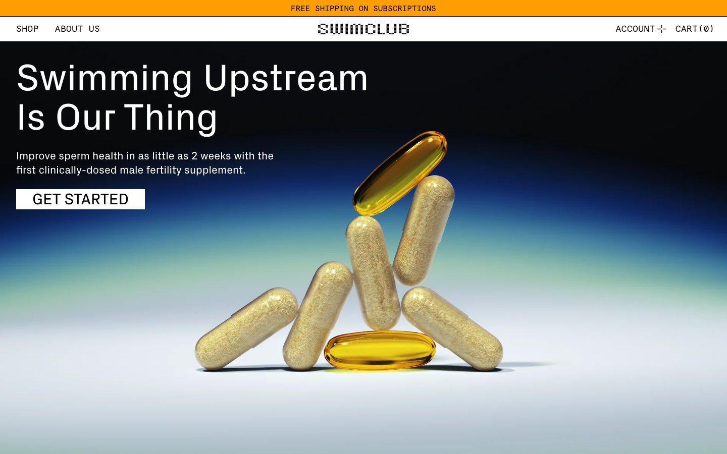
SwimClub
SwimClub — Style Reference
# SwimClub — Style Reference
> Clinical dossier behind pixelated LCD readouts
**Theme:** mixed
SwimClub runs a clinical-journal visual system: almost entirely achromatic (white, black, cool gray) with a single vivid orange (#ff9e00) used as full-bleed punctuation rather than button color. Typography does the heavy lifting — a geometric grotesque (Px Grotesk) for body and headlines, a monospace (Apercu Mono) for data labels and navigation micro-copy, and a custom pixelated display face (Swimclub) reserved for the logo and oversized statistic numbers that read like LCD readouts. Surfaces alternate between a cool off-white canvas, stark white product cards, deep navy-black hero blocks with photographic product shots, and saturated orange stat panels. The interface feels like a medical dossier viewed through a retro arcade screen: clinical, editorial, slightly playful, with sharp 0px corners and hairline dashed borders that keep everything reading as diagram rather than decoration.
## Tokens — Colors
| Name | Value | Token | Role |
|------|-------|-------|------|
| Tabloid Orange | `#ff9e00` | `--color-tabloid-orange` | Full-bleed section backgrounds (announcement bar, statistic panels) — the only chromatic brand color, used at maximum saturation to break the otherwise monochrome flow |
| Deep Capsule Navy | `linear-gradient(rgb(106, 144, 176), rgb(65, 115, 158) 30%, rgb(18, 58, 92) 97%, rgb(2, 5, 7) 139%)` | `--color-deep-capsule-navy` | Hero gradient terminal color and product photograph backgrounds — near-black with a blue undertone, not a pure black |
| Ink Black | `#000000` | `--color-ink-black` | Primary text, hairline borders, navigation dividers, card outlines, button text — the dominant structural color across the entire interface |
| Paper White | `#ffffff` | `--color-paper-white` | Page background, card surfaces, product image overlays, button fills, and text on dark or orange panels |
Websites
Markdown Text
design-md
website-prompt
landing-page-prompt
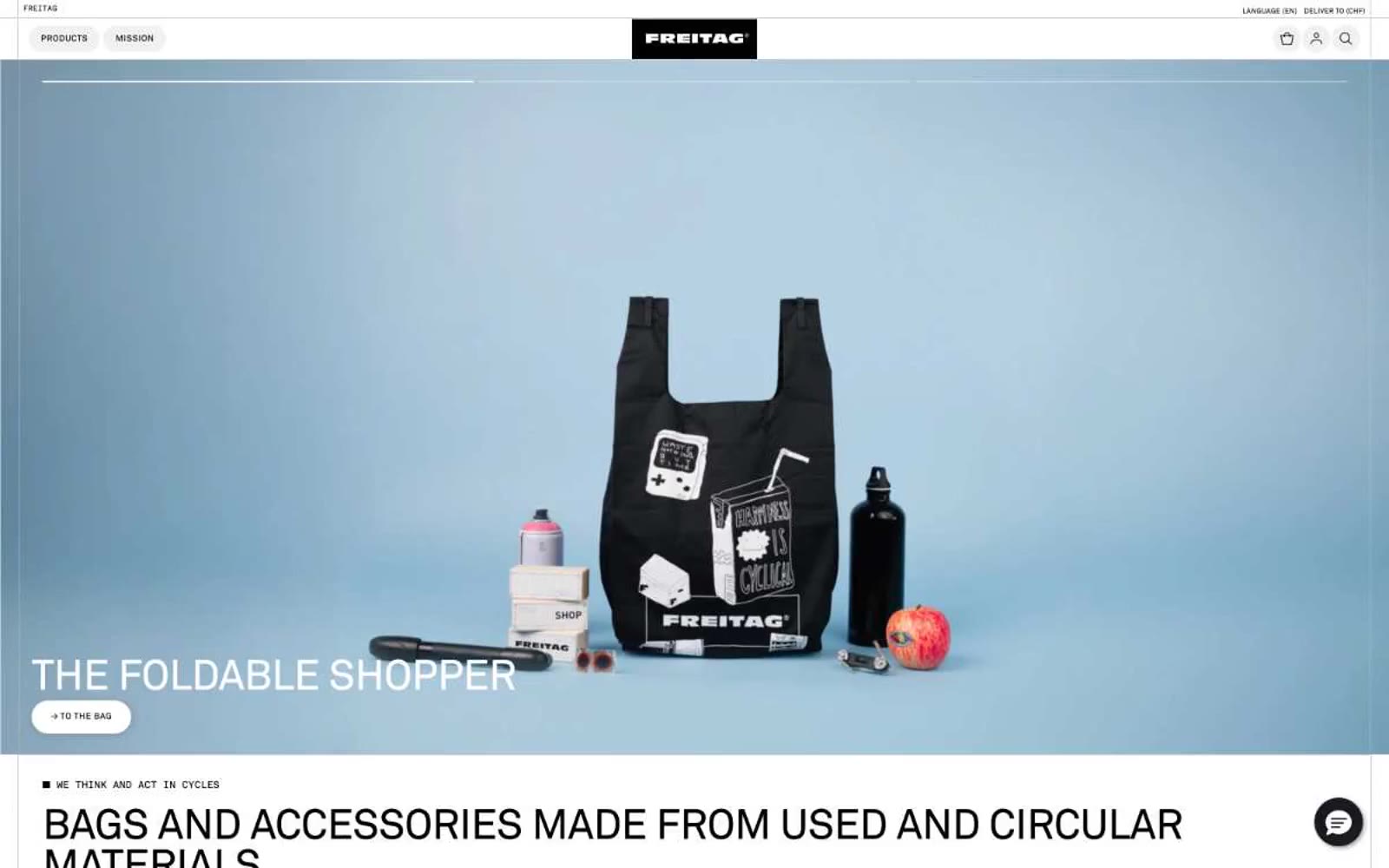
Freitag
Freitag — Style Reference
# Freitag — Style Reference
> Swiss industrial catalog — a printed manifest of truck tarpaulins laid flat on poured concrete, where the only color is the recycled product itself.
**Theme:** light
Freitag operates as a Swiss industrial catalog in monochrome: an almost color-zero system where the only chromatic surface is the product itself (truck tarpaulin bags bleeding red, yellow, blue, green). The UI is a grid of black, white, and concrete gray, serving as a neutral stage for the circular-economy merchandise. Typography is compressed and uppercase-driven (Akkurat Standard), line-heights tight as machinery, letterspacing wide on labels, and interactive elements shaped as horizontal pills with hard-edged 1px outlines. Layout follows a strict modular grid — full-bleed 50/50 hero, then 3-column category blocks, then 6-column product matrices. The signature trick: the site reads as a technical specification sheet or shipping manifest, not a fashion storefront. Components feel like they're stamped on the page rather than designed — pill buttons, thin rules, hairline grids, and almost no shadow depth.
## Tokens — Colors
| Name | Value | Token | Role |
|------|-------|-------|------|
| Carbon Black | `#000000` | `--color-carbon-black` | Primary text, logo plate, pill-button fills, hairline borders, icon strokes — the dominant ink that carries every label, heading, and outline |
| Paper White | `#ffffff` | `--color-paper-white` | Page canvas, card surfaces, product image backdrops, button text on dark fills, inverted text on category overlays |
| Concrete Gray | `#cacaca` | `--color-concrete-gray` | Card borders, thumbnail dividers, secondary dividers between product cells — the structural neutral that frames the grid |
| Mist Gray | `#f1f1f1` | `--color-mist-gray` | Subtle surface tint for inactive button states and soft fill washes, never a page background |
Websites
Markdown Text
design-md
website-prompt
landing-page-prompt
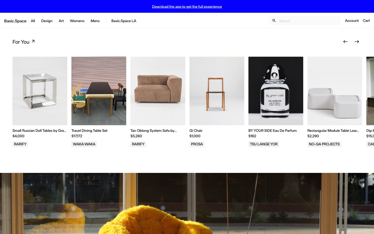
Basic.Space
Basic.Space — Style Reference
# Basic.Space — Style Reference
> curated gallery on white marble
**Theme:** light
Basic.Space is a curated gallery-commerce platform built on near-total achromatic restraint. White gallery walls, 2px-sharp product frames, and one electric blue (#0700ff) that appears only on the top announcement strip — a single chromatic interruption in an otherwise monochrome world. Typography is a custom geometric humanist (FTBasicSpace) used in three restrained weights, with tight negative letter-spacing that gives headlines a quietly confident voice. Components are gallery-light: pill-shaped controls, hairline #ebebeb dividers, no shadows, no rounded card corners. Layout is full-bleed horizontally-scrolling rails of product cards, evoking the experience of walking through a design museum where the objects are the heroes and the interface disappears.
## Tokens — Colors
| Name | Value | Token | Role |
|------|-------|-------|------|
| Electric Cobalt | `#0700ff` | `--color-electric-cobalt` | Violet wash for highlight backgrounds, decorative bands, and soft emphasis behind content. Do not promote it to the primary CTA color |
| Gallery Black | `#000000` | `--color-gallery-black` | Primary text, product titles, prices, navigation links, icon strokes, and dominant fill on collection overlay labels |
| Paper White | `#ffffff` | `--color-paper-white` | Card surfaces, product image backgrounds, and inverse text on dark imagery and the cobalt announcement bar |
| Hairline Gray | `#ebebeb` | `--color-hairline-gray` | Primary border color, page canvas background, card dividers, list separators, input field backgrounds — the dominant structural neutral |
Websites
Markdown Text
design-md
website-prompt
landing-page-prompt
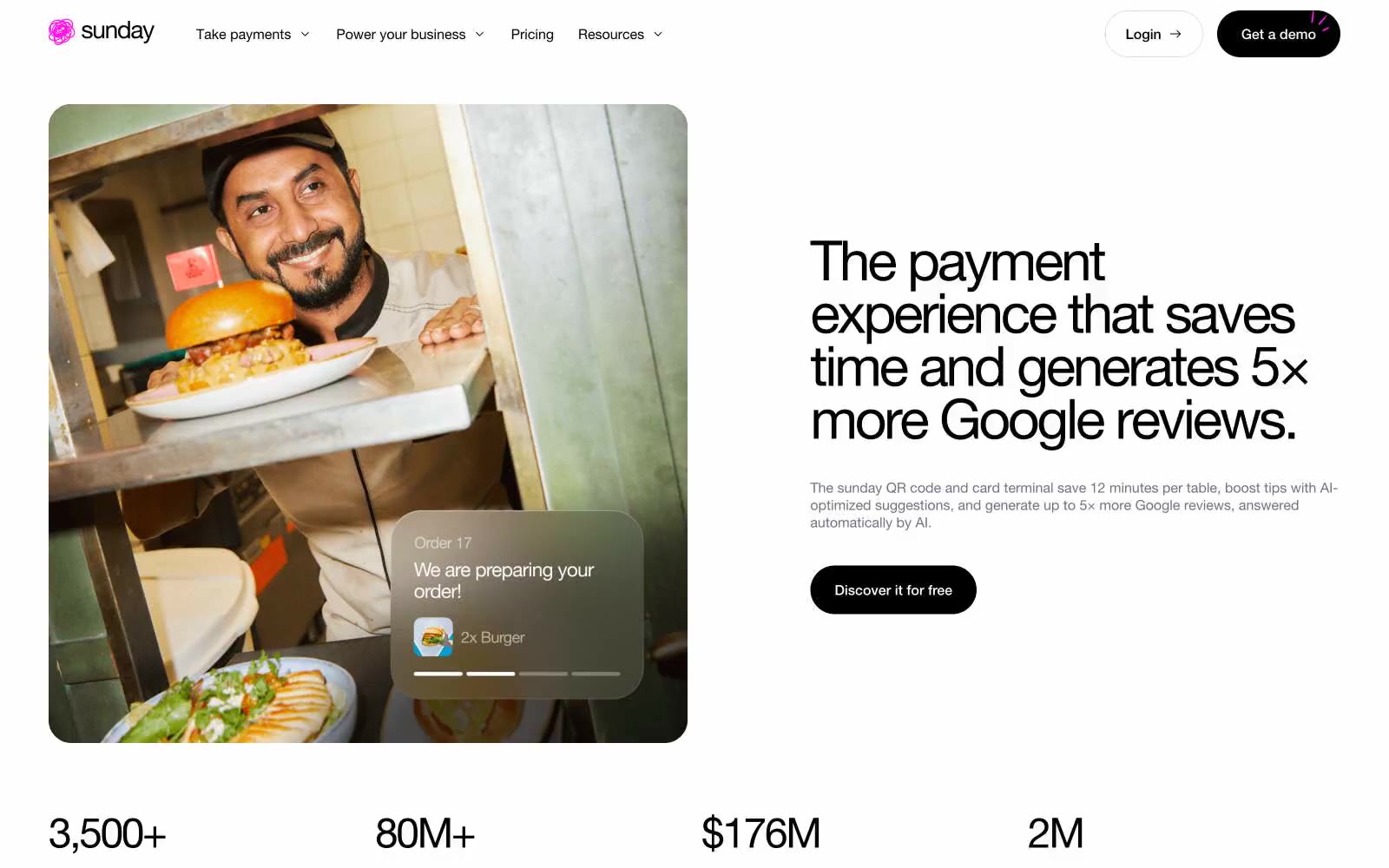
sunday
sunday — Style Reference
# sunday — Style Reference
> white gallery with a neon pulse — a clean Helvetica poster where one hot pink line cuts through the black-and-white calm.
**Theme:** light
Sunday is a white-canvas payment brand for hospitality with a single neon pink accent that acts as electric punctuation against an otherwise achromatic system. The visual logic is almost editorial: type does the heavy lifting, photography provides warmth, and color appears only where attention must land. Black is the structural default — text, borders, cards, primary buttons, even the feature section's background — while #ff17e9 is reserved for brand signals (logo, active nav, highlighted headings, badge borders). The type system is unified under one family (Helvetica Neue) but spans an extreme range from 12px captions to 200px stat numerals, with aggressive negative tracking at large sizes and positive tracking on small uppercase labels. Surfaces are flat — almost no shadows, reliance on hairline borders and contrast instead. Components lean rounded: 16px for cards and inputs, 64px pill for primary buttons, 100px for tags. The overall feel is confident minimalism warmed by real restaurant photography and one unmistakable neon pulse.
## Tokens — Colors
| Name | Value | Token | Role |
|------|-------|-------|------|
| Carbon Black | `#000000` | `--color-carbon-black` | Primary text, hairlines, filled primary buttons, dark section backgrounds, and card surfaces on dark bands — the structural default that carries the entire system |
| Pure White | `#ffffff` | `--color-pure-white` | Page canvas, card surfaces, button text on dark fills, form input fills — the negative space that frames everything |
| Warm Gray | `#736f7c` | `--color-warm-gray` | Body text on light surfaces, subtle borders, muted helper text — a near-gray that warms the neutral palette slightly |
| Mist | `#dedede` | `--color-mist` | Hairline dividers, input borders, disabled states — the lightest structural line in the system |
Websites
Markdown Text
design-md
website-prompt
landing-page-prompt
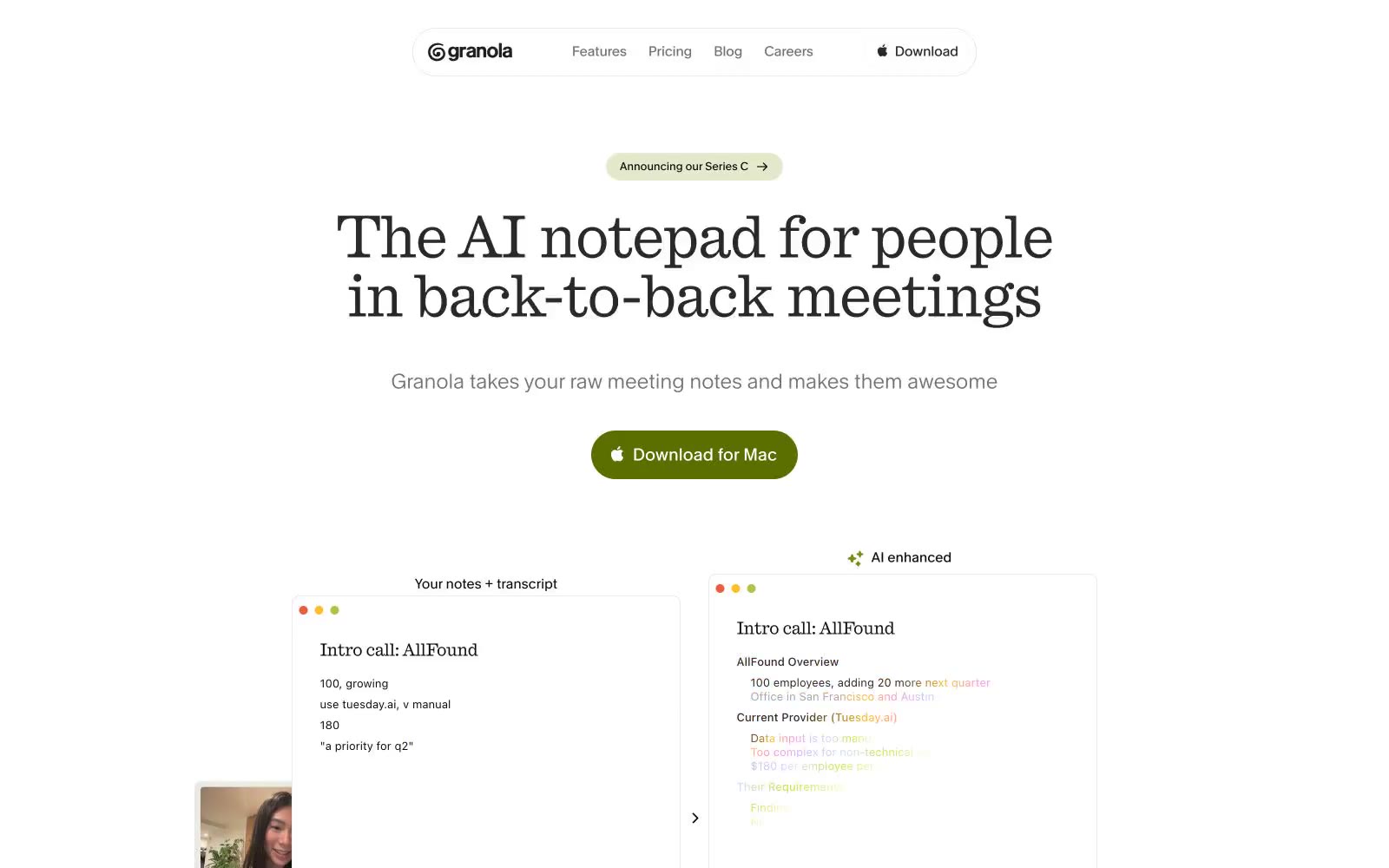
Granola
Granola — Style Reference
# Granola — Style Reference
> Field notes on warm parchment — Granola reads like a well-worn Moleskine open on a sunlit desk: serifed headlines with editorial gravity, organic green accents like ink from a plant-based pen, and hairline-ruled card borders that suggest hand-drawn note margins.
**Theme:** light
Granola pairs a serif editorial headline face (Quadrant) with a humanist mono-inflected UI face (Melange) on a near-white canvas — the tension between old-print warmth and digital utility is the defining atmosphere. The chromatic system is almost entirely olive-green: a single muted-yellow-green (#b2c248 surface, #5b6f00 filled CTA, #788c15 border accents) against hairline-bordered white cards and an off-white page. Everything else is achromatic — dark ink, mid-gray text, and 0.5px solid borders that whisper rather than rule. Typography does the heavy lifting: Quadrant at -0.015em tracking for display sizes drops weight at 68px to feel like editorial print, while Melange's 0.01em tracking at UI sizes keeps body text crisp and warm. The result is a notepad-like surface — quiet, high-contrast text on parchment-adjacent white — punctuated by bursts of organic chartreuse green.
## Tokens — Colors
| Name | Value | Token | Role |
|------|-------|-------|------|
| Parchment Canvas | `#f7f7f2` | `--color-parchment-canvas` | Page background and disabled input surfaces — the barely-warm off-white that reads as paper, not screen |
| Pure Surface | `#ffffff` | `--color-pure-surface` | Card backgrounds, nav surface, input fills, elevated overlays |
| Midnight Ink | `#0e0f0c` | `--color-midnight-ink` | Primary heading and body text — near-black with the faintest warm undertone that keeps it from feeling harsh |
| Deep Charcoal | `linear-gradient(90deg, #292929 0px, #292929 33.33%, #febe29 40%, #ff91e0 45%, #cebef8 50%, #d2e4f8 55%, #d1e043 60%, rgba(0,0,0,0) 66.67%, rgba(0,0,0,0))` | `--color-deep-charcoal` | Nav text, footer text, secondary headings, filled icon fills; Decorative gradient on AI-enhanced copy indicators — transitions from dark charcoal through amber, pink, lavender, sky, chartreuse, then fades transparent |
Websites
Markdown Text
design-md
website-prompt
landing-page-prompt
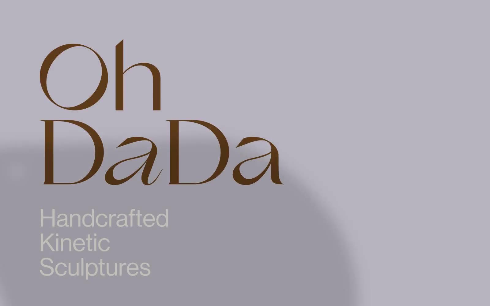
OhDada
OhDada — Style Reference
# OhDada — Style Reference
> Editorial gallery wall
**Theme:** light
OhDada operates on a gallery-catalog visual language: two quiet, chalky neutrals (warm cream and lavender-gray) alternate as full-bleed section canvases, and a single saturated saddle brown does all the typographic and structural work. The signature typographic move pairs GrandSlang-Roman at weight 100 — an ultra-thin display serif — with Neue Haas Grotesk, so the brand name whispers in calligraphic hairline strokes while supporting text sits in crisp, engineered grotesque. This is a low-density, image-forward layout where the product photography (kinetic sculptures in primary blues and browns against white walls) provides all the color the UI refuses to use. The interface is minimal to the point of editorial restraint: thin hairline borders, almost no shadows, no gradients, and components that feel like printed catalog plates rather than software surfaces.
## Tokens — Colors
| Name | Value | Token | Role |
|------|-------|-------|------|
| Chalk Cream | `#e6e0d9` | `--color-chalk-cream` | Primary page canvas and secondary section background; the warm off-white that makes brown type and sculpture photography feel curated rather than clinical |
| Lavender Stone | `#b7b3be` | `--color-lavender-stone` | Alternate section background and hero canvas; introduces a cool, chalky counterpoint to the warm cream without breaking the achromatic discipline |
| Saddle Brown | `#5d3a19` | `--color-saddle-brown` | All headings, body copy, link text, and hairline borders — the only chromatic voice in the system, used as a drawn-with-ink accent against the pale neutrals; Outlined and ghost interactive borders; links and navigation controls carry a 1px brown stroke rather than a filled background, keeping the surface quiet |
| Ink Black | `#000000` | `--color-ink-black` | Decorative SVG fills only; never used for UI text or surface elements |
Websites
Markdown Text
design-md
website-prompt
landing-page-prompt
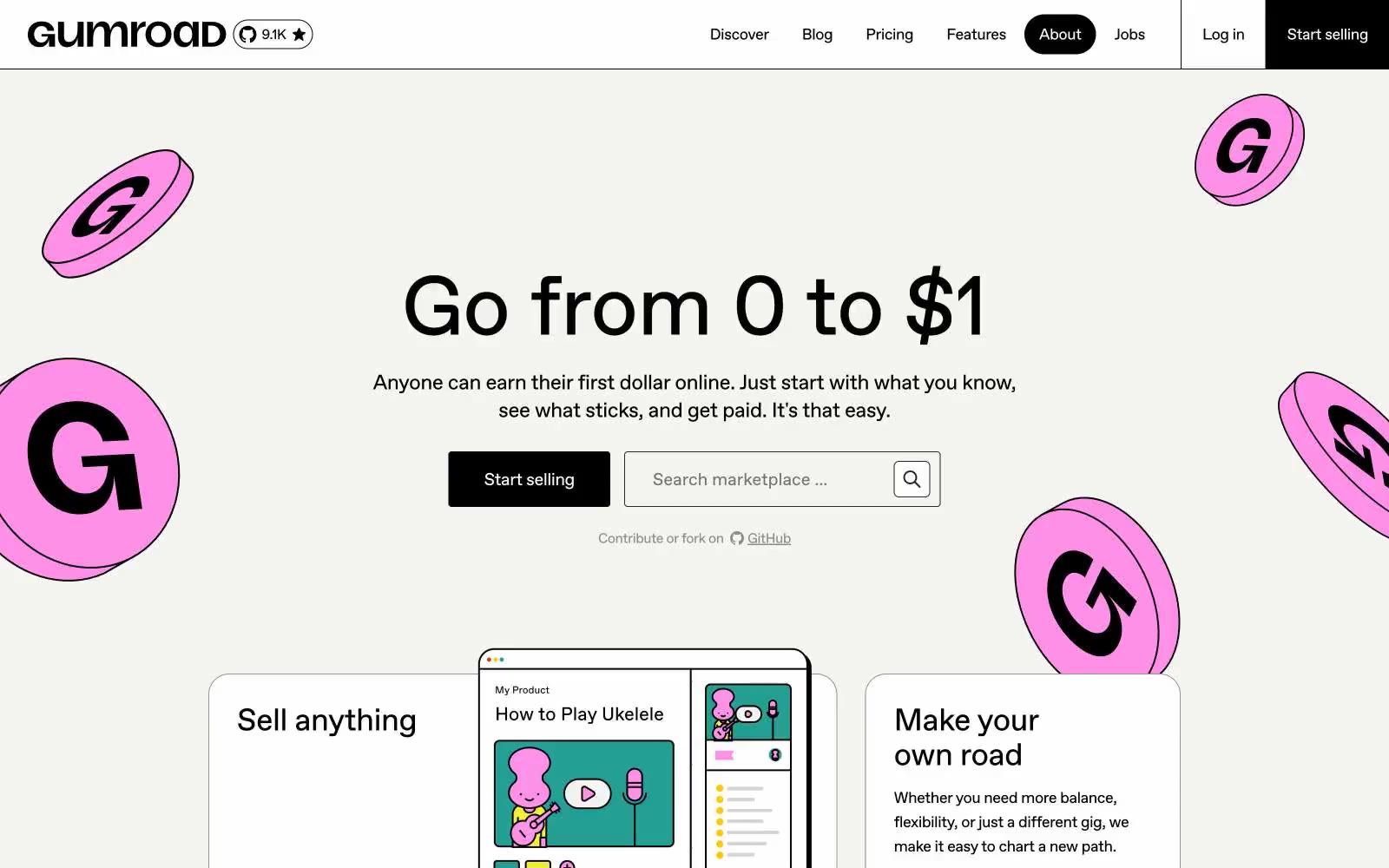
Gumroad
Gumroad — Style Reference
# Gumroad — Style Reference
> Pink coin on a cream sketchbook. Warm off-white canvas, inky geometric type, and a single hot-pink coin mascot stamped across every page like a sticker on a notebook.
**Theme:** light
Gumroad is a warm-cream canvas stamped with a single hand-drawn pink coin motif and an inky geometric sans. The off-white #f4f4f0 background feels like a sketchbook page; black type and black filled buttons land on it with the weight of a marker stroke. Surfaces stay flat — white cards sit on the warm canvas with thin gray hairline borders rather than shadows. Saturated color appears in small, deliberate punctuation: a pink coin mascot, yellow and green accent swatches used as inline color markers, and the occasional red highlight. The tone is informal, creator-first, anti-corporate — typography is tight, tracking pulls negative on display sizes, and the type scale stretches from 14px body up to 192px hero type, all from one family. Components are utility-shaped (4px radii on inputs and buttons, 16–24px on larger cards) and never decorated with gradients or glow.
## Tokens — Colors
| Name | Value | Token | Role |
|------|-------|-------|------|
| Canvas Cream | `#f4f4f0` | `--color-canvas-cream` | Page background, input fills, and the warm base layer every other surface sits on |
| Paper White | `#ffffff` | `--color-paper-white` | Card and product-tile surfaces elevated above the cream canvas |
| Ink Black | `#000000` | `--color-ink-black` | Dark supporting neutral for text, icons, and strong contrast. Do not promote it to the primary CTA color |
| Graphite | `#242423` | `--color-graphite` | Secondary text and input borders; reads as a softened black when true black would feel too harsh against cream |
Websites
Markdown Text
design-md
website-prompt
landing-page-prompt
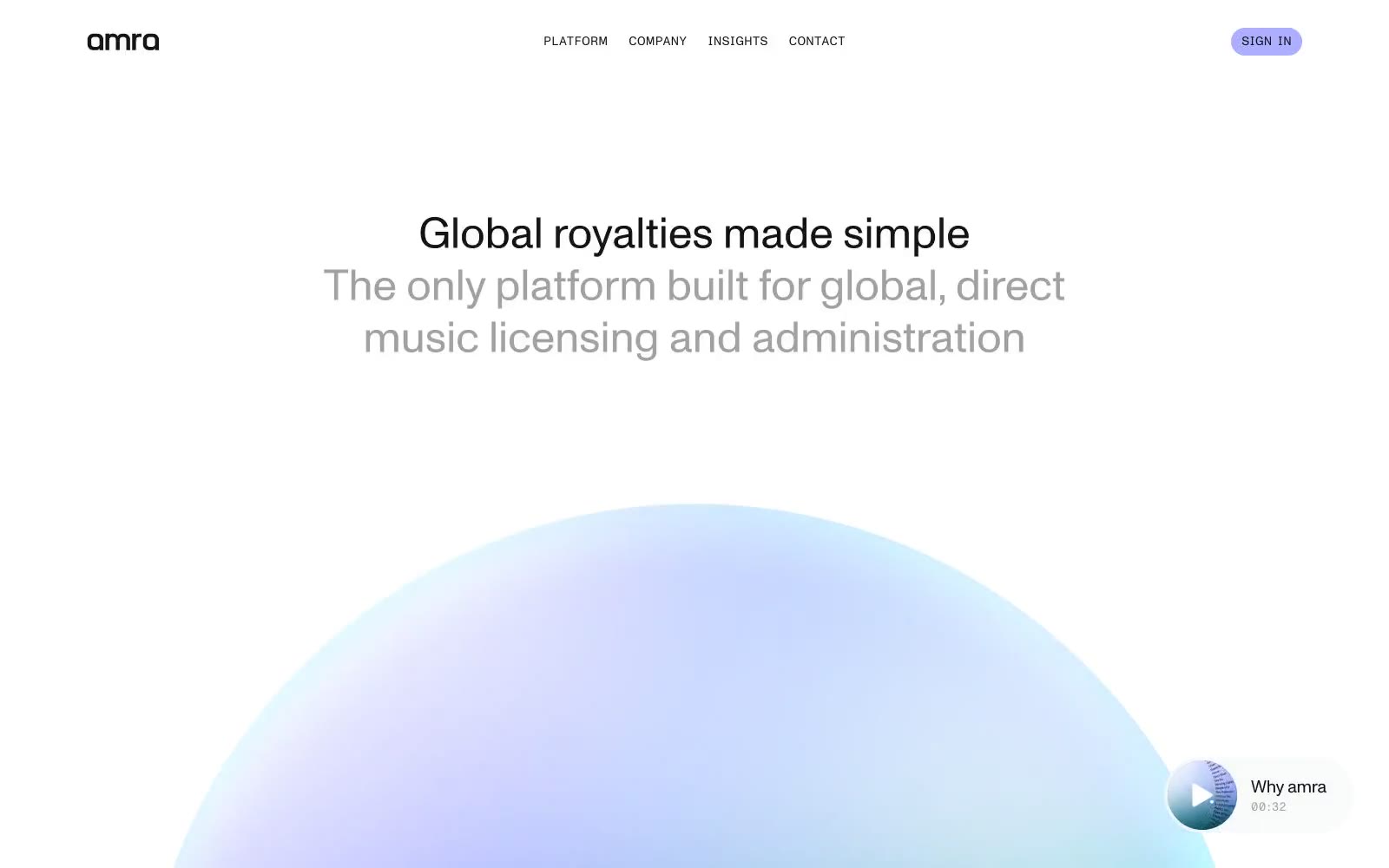
amra
amra — Style Reference
# amra — Style Reference
> iridescent sphere on white void — the lavender accent is the only chromatic pulse against an almost perfectly achromatic page, and a single gradient orb does the work that a hero illustration usually does.
**Theme:** light
Amra is a near-monochrome white canvas with a single soft lavender accent (#acafff) and an iridescent gradient sphere as its signature visual anchor. The interface stays almost completely achromatic — text, dividers, and borders all share a family of near-blacks and grays — so the lavender feels like a small electric pulse rather than a brand color. Photography is never raw: subjects are silhouetted and dropped onto the same teal-to-violet gradient as the hero sphere, making imagery feel like part of the same substance as the product. Typography is custom, geometric, and weight-400 throughout — no bold ever appears, and authority comes from size and tight tracking rather than weight. Components are large-radius and floating: a pill-shaped nav drifts over content, image cards have 44px corners, and the page breathes with 100–160px vertical gaps between sections.
## Tokens — Colors
| Name | Value | Token | Role |
|------|-------|-------|------|
| Ink Black | `#141414` | `--color-ink-black` | Primary text, all heading and body color, dominant border color, nav text and structural dividers. The near-black (not pure black) keeps the monochrome system from feeling harsh against white |
| Paper White | `#ffffff` | `--color-paper-white` | Page canvas, card surfaces, icon fills on dark backgrounds, nav pill surface when over light sections |
| Mist Gray | `#a1a1a1` | `--color-mist-gray` | Secondary text, subheadings, muted body copy, lighter hairline borders. The middle step in the achromatic scale |
| Smoke Gray | `#8a8a8a` | `--color-smoke-gray` | Nav link text at rest, medium-weight borders, tertiary text |
Websites
Markdown Text
design-md
website-prompt
landing-page-prompt
Studio Few
Studio Few — Style Reference
# Studio Few — Style Reference
> monochrome letterform sanctuary — a white gallery where black ink is the only ornament
**Theme:** light
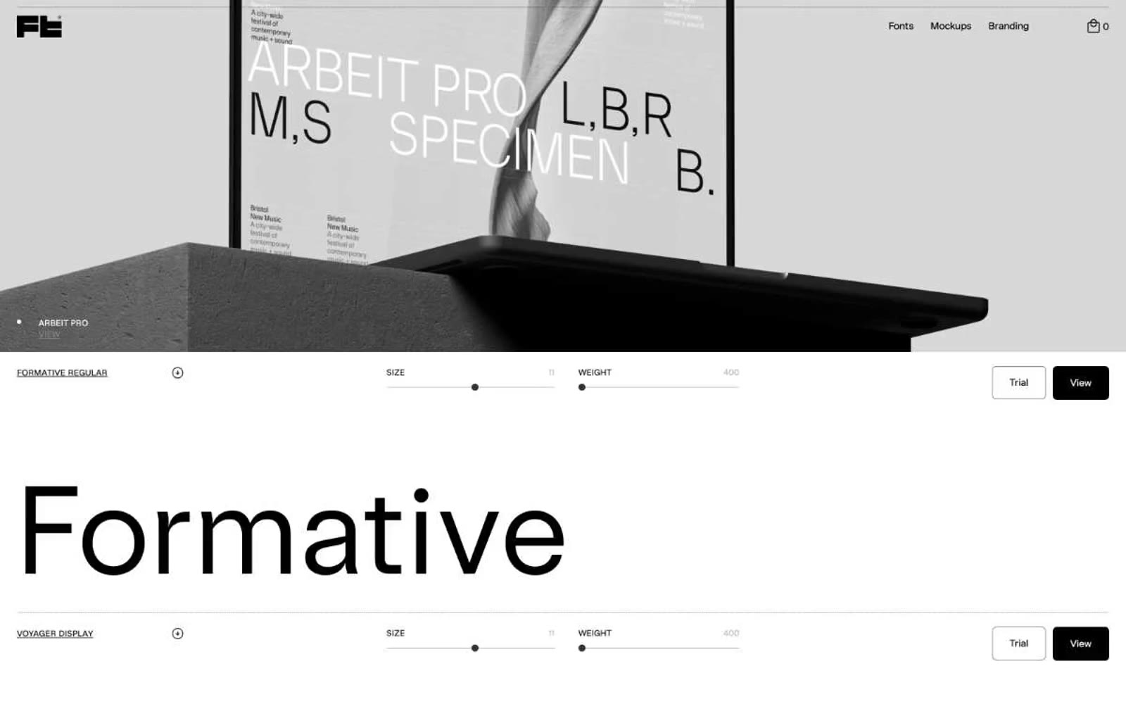
Studio Few is a type foundry where the product is the alphabet, so the design recedes entirely. The interface is pure achromatic: white canvas, black ink, a single mid-gray for inactive controls, and almost no decorative chrome. Every screen is a vertical sequence of full-width specimen rows — a tiny label, two thin slider tracks for size and weight, an outlined Trial button, a solid black View button, and then enormous custom type rendered at 115–158px as the hero. The custom Sterling family carries all UI text at 12–14px, while the specimen displays use the foundry's own faces (Formative, Voyager, Anthro, Blok, ArbeitPro, Apex), each shown solo with no surrounding art. The result feels like a gallery wall: the only thing with visual weight is the letterform itself.
## Tokens — Colors
| Name | Value | Token | Role |
|------|-------|-------|------|
| Ink Black | `#000000` | `--color-ink-black` | Body text, button fills, hairline borders, slider tracks, active states — the single dominant tone that gives every specimen its anchor |
| Paper White | `#ffffff` | `--color-paper-white` | Page canvas, card surfaces, input fills, button text on dark fills |
| Foam Gray | `#ebedee` | `--color-foam-gray` | Subtle surface lift and low-contrast dividers when a row needs to separate from pure white without using ink |
| Concrete Gray | `#b7b7b7` | `--color-concrete-gray` | Medium-contrast borders, control outlines, and structural separators. |
Websites
Markdown Text
design-md
website-prompt
landing-page-prompt
8returns
8returns — Style Reference
# 8returns — Style Reference
> Lime spark inside a midnight control room — a single electric accent that wakes up an otherwise monochrome workspace.
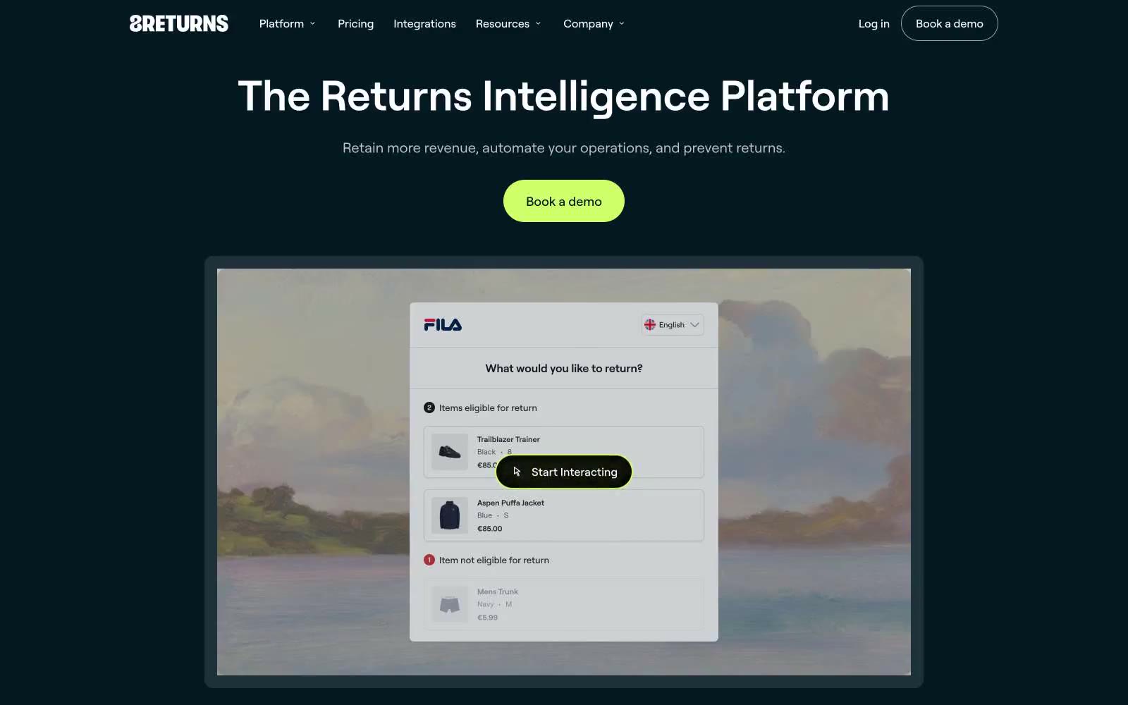
**Theme:** mixed
8returns uses a split-canvas design language: a near-black deep navy hero that opens into a bright, workspace-grade white interior. The visual identity hinges on contrast — a single electric lime (#cfff69) is the only chromatic accent allowed to glow against the dark hero, while the white product surfaces stay neutral, spacious, and almost clinical. Cards float on a cool steel-mist canvas (#eef0f2) with 16px corners, and the only decorative color inside the white sections is a cobalt iris (#6289ff) used sparingly for tags, icons, and highlight chips. Typography is a single geometric sans (roobert) running a tight, slightly positive-tracked scale from 11px captions to 64px displays, with no serif, no mono, no script — one voice across every surface.
## Tokens — Colors
| Name | Value | Token | Role |
|------|-------|-------|------|
| Lime Volt | `#cfff69` | `--color-lime-volt` | Primary action — filled CTA buttons, active tab underline, highlight chips. The only vivid color permitted against the dark hero; its near-fluorescent chroma against #051923 creates urgency without warmth or aggression |
| Cobalt Iris | `#6289ff` | `--color-cobalt-iris` | Violet outline accent for tags, dividers, and focused UI edges |
| Midnight Abyss | `#051923` | `--color-midnight-abyss` | Primary text, hero background, dark section canvas, button text on lime fills. Near-black with a cool teal undertone — not pure black, the slight blue cast keeps it feeling engineered rather than flat |
| Abyssal Teal | `#004853` | `--color-abyssal-teal` | Dark card surfaces and gradient endpoints — the bridge color between Midnight Abyss and the deep teal radial gradient. Used for elevated dark cards and inset panels |
Websites
Markdown Text
design-md
website-prompt
landing-page-prompt
Healthy Together
Healthy Together — Style Reference
# Healthy Together — Style Reference
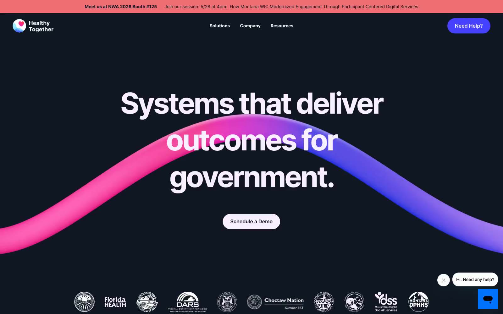
> Midnight navy with a violet brushstroke ribbon.
**Theme:** dark
Healthy Together operates as a dark-anchored government-tech platform: deep midnight-navy canvases host oversized confident headlines, broken by vivid electric-violet accent sections and pale lavender breathing room. A signature pink-to-violet ribbon sweeps through the hero like a brushstroke, giving the otherwise austere dark UI a single moment of organic energy. Cards are generously rounded (42px), buttons are fully pill-shaped, and Inter's tight tracking at massive sizes (64–92px) gives headlines a compressed, architectural weight. The visual rhythm alternates dark → vivid → soft, never plain white-on-white — every surface is a deliberate temperature.
## Tokens — Colors
| Name | Value | Token | Role |
|------|-------|-------|------|
| Midnight Ink | `#101722` | `--color-midnight-ink` | Primary text, hero canvas, nav bar, page-level dark backgrounds — the structural anchor of the entire system |
| Linen Lavender | `#f9f0ff` | `--color-linen-lavender` | Section canvas, card fills, soft highlight wash — the breathing-room surface between dark hero blocks |
| Pure White | `#ffffff` | `--color-pure-white` | Card surfaces, nav dividers, button text — the clean interior surface |
| Muted Graphite | `#6c6c7a` | `--color-muted-graphite` | Secondary text, helper copy, muted headings, subtle borders |
Websites
Markdown Text
design-md
website-prompt
landing-page-prompt
Atelier Deux-Cé
Atelier Deux-Cé — Style Reference
# Atelier Deux-Cé — Style Reference
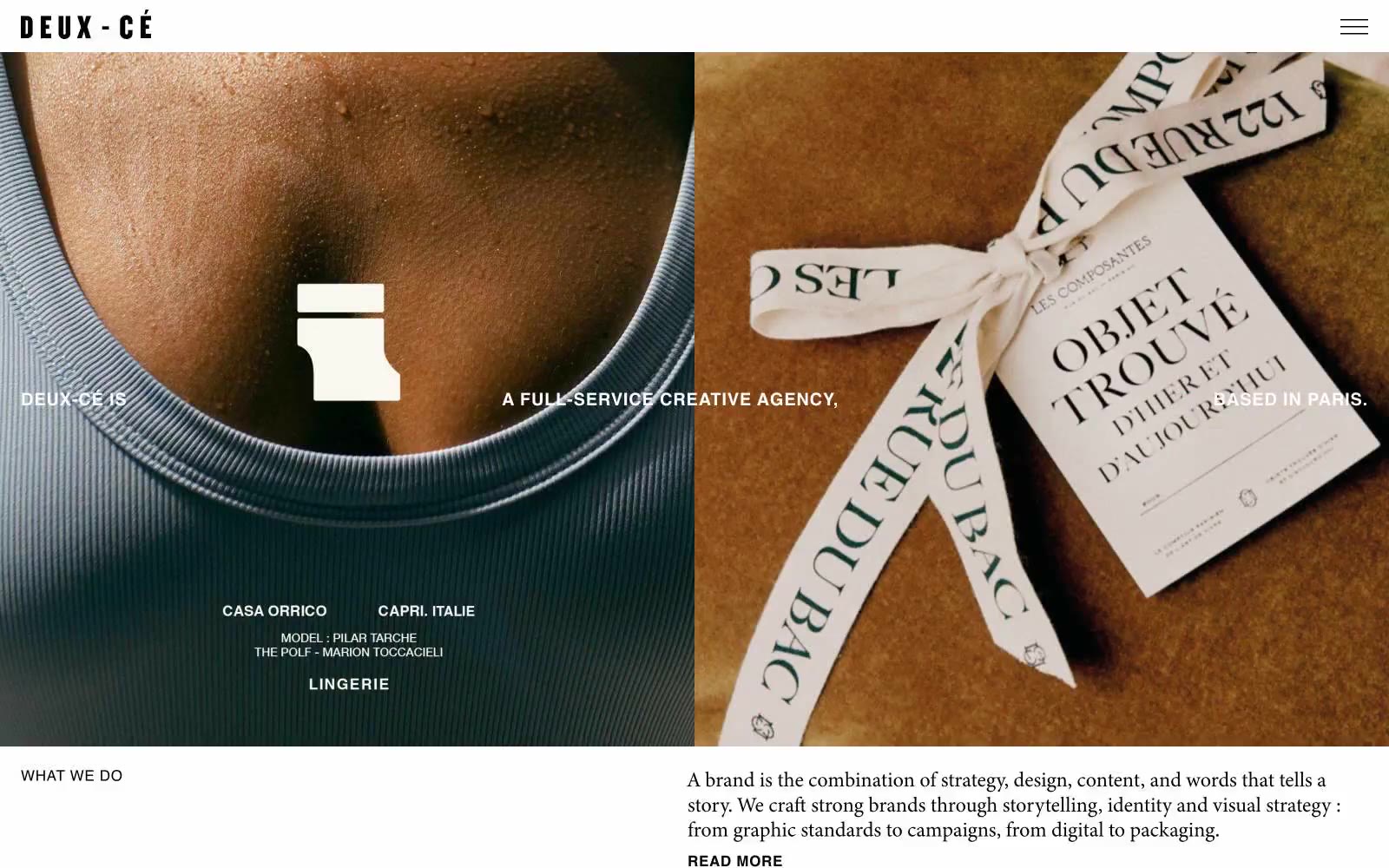
> Sunlit editorial gallery
**Theme:** light
Atelier Deux-Cé presents itself as a sunlit editorial gallery — a Paris-based creative agency whose site reads like a curated magazine spread rather than a software product. The system is photography-first: full-bleed images dominate every screen, with type acting as quiet captions and labels rather than interface chrome. A palette of warm, sun-bleached earth tones (cream, linen, sage, taupe, olive stone) replaces the typical white/gray SaaS canvas, giving every page the warmth of a Provençal villa. Black type sits at near-maximum contrast against these warm surfaces, and a single saturated green is reserved for the footer like a garden border at the end of a path. Components are deliberately few and weightless — no shadows, no gradients, no borders thicker than hairlines, no rounded corners fighting the editorial print sensibility.
## Tokens — Colors
| Name | Value | Token | Role |
|------|-------|-------|------|
| Ink Black | `#000000` | `--color-ink-black` | Body text, headings, nav links, hairline borders, and link underlines — the single type color across the entire system |
| Canvas White | `#ffffff` | `--color-canvas-white` | Page background, card surfaces, reverse text on dark photographic regions |
| Warm Linen | `#eee5da` | `--color-warm-linen` | Soft section background, the first step off pure white — gives a page the warmth of unbleached paper |
| Pale Sage | `#d8ddc6` | `--color-pale-sage` | Tinted section panels, the dominant non-white canvas tone |
Websites
Markdown Text
design-md
website-prompt
landing-page-prompt
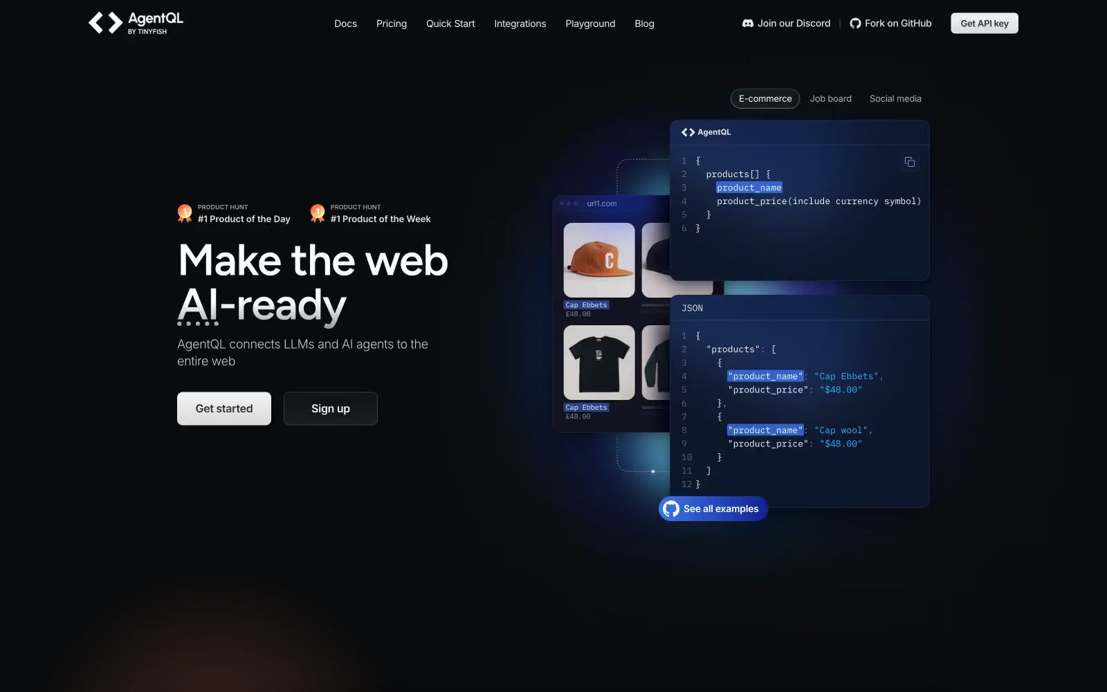
AgentQL
AgentQL — Style Reference
# AgentQL — Style Reference
> Aurora glow over a midnight terminal
**Theme:** dark
AgentQL operates in a deep-space command-center register: near-black canvas, tightly letter-spaced Figtree display headlines, and a single pair of violet aurora glows (purple + pink radial gradients) that bleed from the hero into the background. The interface is overwhelmingly achromatic — white type, cool-gray secondary text, hairline borders in dark navy — with color reserved for two specific jobs: product surface highlights (a few cards lift into a slightly violet-tinted dark) and accent CTAs (a single blue→violet gradient pill). Components sit on flat dark surfaces with generous padding, rounded to 12px, and rely on heavy dark drop shadows rather than glow for depth. The overall feel is closer to a dark IDE theme than a marketing site — Inter carries the UI, IBM Plex Mono owns code blocks, and Figtree whispers the headlines at weight 500 with tight tracking.
## Tokens — Colors
| Name | Value | Token | Role |
|------|-------|-------|------|
| Void | `#0b0c0e` | `--color-void` | Deepest surface layer, page base under hero — the floor of the dark stack |
| Abyss | `#0e111b` | `--color-abyss` | Primary page canvas and most card backgrounds; cool blue-black anchors the whole system |
| Deep Sea | `#0d172b` | `--color-deep-sea` | Elevated card surface — sits one step above the canvas, used for feature and pricing cards |
| Cobalt Panel | `#12244f` | `--color-cobalt-panel` | Highlighted card surface for feature spotlights; a violet-tinted lift that breaks the monochrome rhythm without becoming decorative |
Websites
Markdown Text
design-md
website-prompt
landing-page-prompt
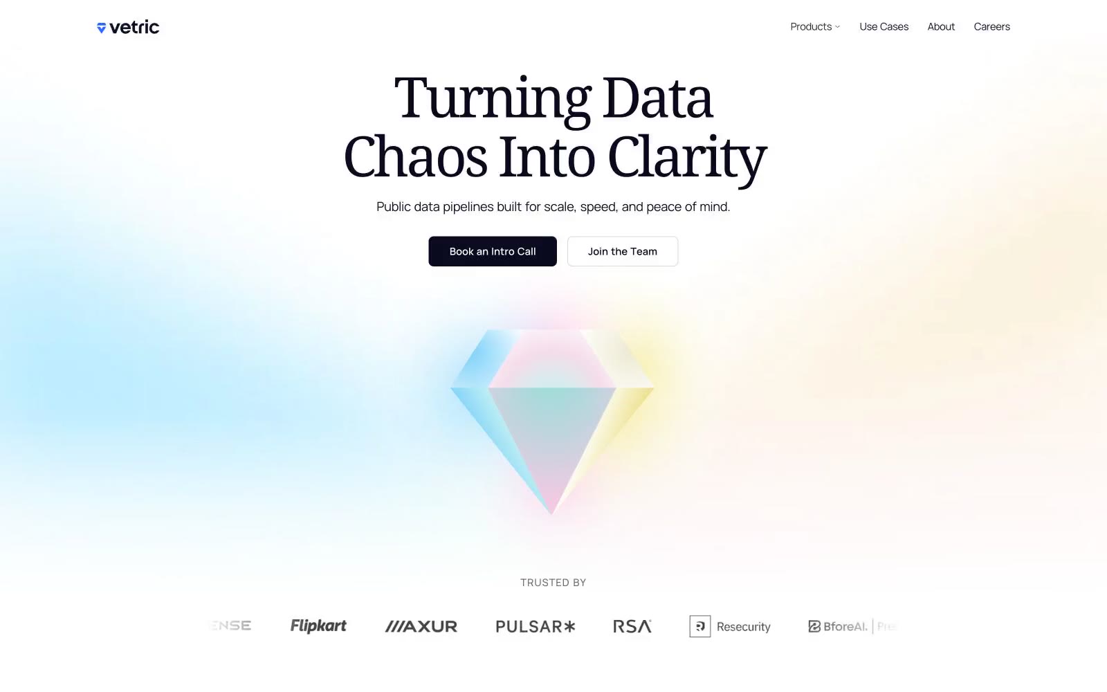
Vetric
Vetric — Style Reference
# Vetric — Style Reference
> Iridescent prism refracting clarity — a white room with one glass diamond that throws pink, blue, yellow, and green light across every surface.
**Theme:** light
Vetric uses an iridescent-prism visual language: a bright white canvas, near-black ink for text and actions, and a four-color rainbow accent set (blue, pink, yellow, green) that refracts across soft pastel washes like light through a glass diamond. The system pairs a humanist serif (Noto Serif) for headlines with a geometric sans (Manrope) for UI, creating a deliberate tension between editorial calm and technical confidence. Components stay light and flat — thin borders, gentle radii, no drop shadows — so the prismatic gradients and colored accents carry all the visual energy. The result reads as 'data made luminous': the chrome recedes, the color talks.
## Tokens — Colors
| Name | Value | Token | Role |
|------|-------|-------|------|
| Midnight Ink | `#090a1e` | `--color-midnight-ink` | Primary text, primary CTA fill, strong borders — the dominant brand dark; a slightly blue-tinted near-black that reads warmer than pure black on white |
| Paper White | `#ffffff` | `--color-paper-white` | Page canvas, card surfaces, button text on dark fills |
| Ash Border | `#e0e0e0` | `--color-ash-border` | Default hairline borders, button outlines, icon strokes |
| Carbon Nav | `#222222` | `--color-carbon-nav` | Navigation text and thin nav borders — sits one step lighter than Midnight Ink |
Websites
Markdown Text
design-md
website-prompt
landing-page-prompt
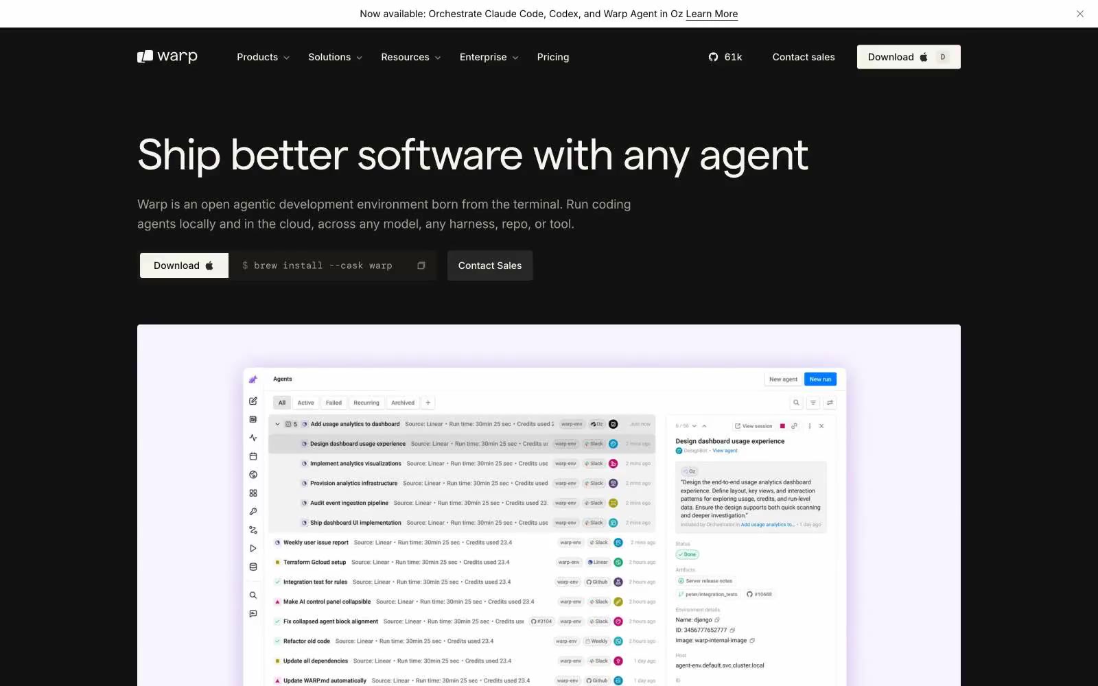
Warp
Warp — Style Reference
# Warp — Style Reference
> obsidian command center — a developer's IDE cockpit where the only glow is a single violet phosphor on matte black, and typography carries every signal
**Theme:** dark
Warp speaks in the language of a high-end terminal: an obsidian-black canvas where nearly every surface stays achromatic, typography does the heavy lifting, and a single whisper of violet (#cbb0f7) functions as quiet functional punctuation rather than decoration. The system is built for compact density — tight tracking, small body sizes, and narrow gaps create an IDE-like confidence that respects the reader's time and screen real estate. Custom Matter typeface with extreme negative tracking at display sizes (up to -0.04em at 56px) creates headlines that feel engineered rather than designed, while a warm off-white (#faf9f6) instead of pure white text keeps the dark surface from feeling clinical. The button language is defined by pill shapes (33-50px radius) on neutral fills — there is no chromatic CTA, so action hierarchy emerges from filled vs ghost contrast alone. Surfaces rise through subtle gray steps (#121212 → #1e1e1d → #333333) rather than dramatic shadows, giving the impression of flat panels stacking in negative space.
## Tokens — Colors
| Name | Value | Token | Role |
|------|-------|-------|------|
| Obsidian | `#000000` | `--color-obsidian` | Primary page canvas, nav background, terminal preview windows — the void that every other surface floats on |
| Graphite | `#121212` | `--color-graphite` | Secondary page surface, body backgrounds behind hero sections, footer base |
| Onyx | `#1e1e1d` | `--color-onyx` | Elevated card and panel surfaces — first step up from the canvas for product cards and testimonials |
| Carbon | `#333333` | `--color-carbon` | Mid-level surface for nested UI, secondary buttons, and tag/badge backgrounds |
Websites
Markdown Text
design-md
website-prompt
landing-page-prompt
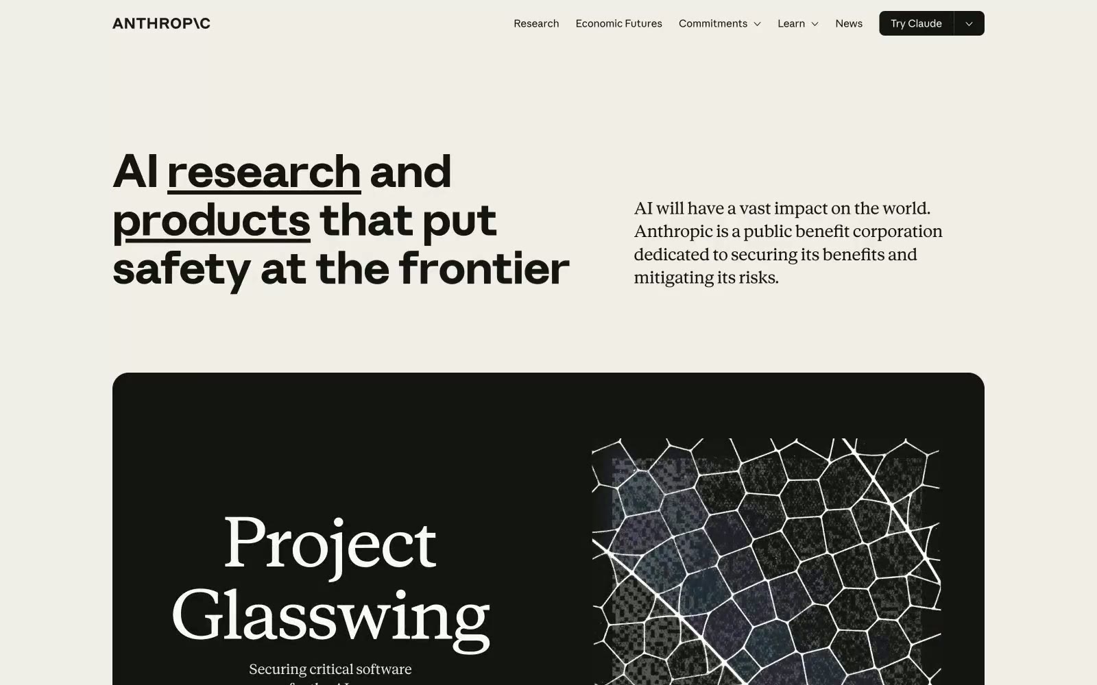
Anthropic
Anthropic — Style Reference
# Anthropic — Style Reference
> Research journal printed on warm stone — authoritative typographic composition where word-level underlines replace color as the primary emphasis mechanism, and the only warmth comes from the paper itself.
**Theme:** light
Anthropic's site runs on warm ivory parchment (#faf9f5) — not white, not gray, but the color of aged paper under good light. The palette is almost entirely achromatic, with the entire chromatic budget spent on a single earthy terracotta accent (#d97757) held in reserve in CSS tokens but largely absent from the visible UI. Two custom type families do all the personality work: Anthropic Sans drives navigation and UI at tight tracking, while Anthropic Serif delivers editorial weight in headlines and featured content — the serif-plus-grotesque pairing signals research institution, not startup. Headlines use a thick double-underline on key words (visible on 'research' and 'products') as the sole decorative device — it replaces color as the emphasis mechanism. The massive feature cards flip to near-black (#141413) background, creating hard-edged alternating surface bands with zero gradient or shadow softening.
## Tokens — Colors
| Name | Value | Token | Role |
|------|-------|-------|------|
| Slate Dark | `#141413` | `--color-slate-dark` | Primary text, borders, nav items, icon fills, card backgrounds — the near-black that appears on both light and dark surfaces, making it function as both foreground and background |
| Ivory Light | `#faf9f5` | `--color-ivory-light` | Page background, button fills, light surface base — the warm off-white that gives the site its parchment character instead of clinical white |
| Ivory Medium | `#f0eee6` | `--color-ivory-medium` | Nav backgrounds, secondary surface level, border highlights |
| Ivory Dark | `#e8e6dc` | `--color-ivory-dark` | Body text on dark backgrounds, dividers, subtle borders |