AI Prompt Studio - Intelligent Prompt Library
Explore and use professional AI prompts to optimize your workflow.
One-click Use
Websites
Markdown Text
design-md
website-prompt
landing-page-prompt
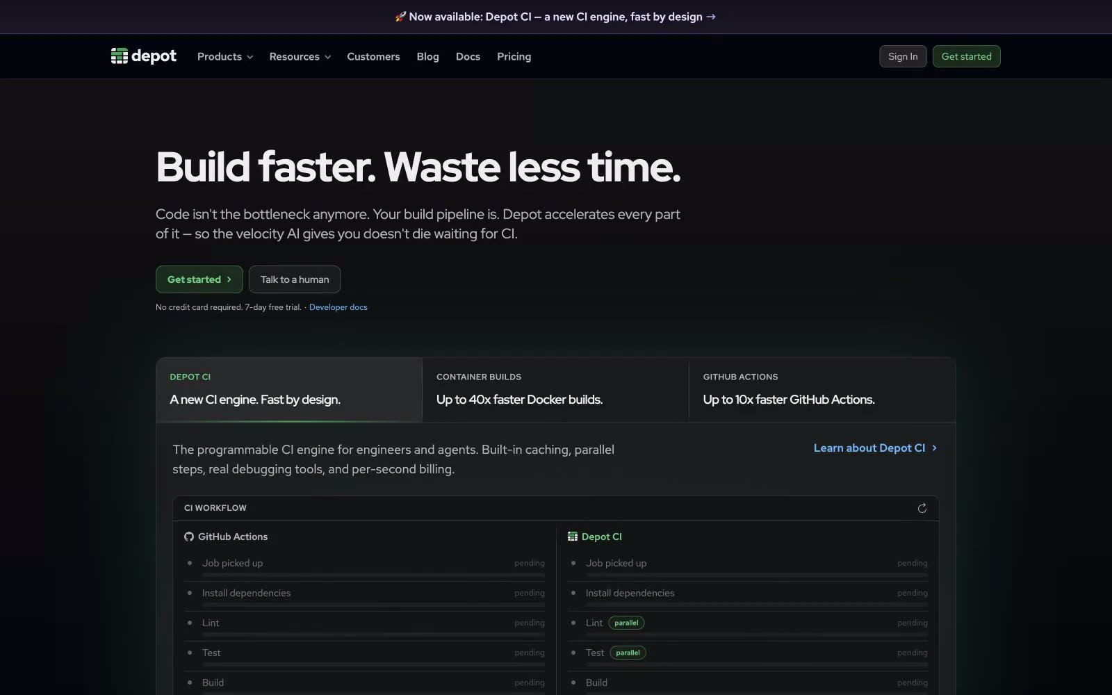
Depot
Depot — Style Reference

# Depot — Style Reference
> Dark server-rack terminal. A near-black developer console where one green LED signals action and the rest of the UI whispers in graphite.
**Theme:** dark
Depot uses a developer-console language: a near-black canvas, hairline green-tinted borders, and a single vivid green accent that lights up the only button on the page. The interface feels like a terminal that grew up into a marketing site — compact, monospace-adjacent, and confident in its restraint. Typography splits into three Red Hat families: Display for tight tracked-out headlines, Text for slightly letter-spaced body copy, and Mono for code and terminal-style labels, creating a tri-tonal typographic system. Surfaces stack in barely-perceptible lifts of near-black, separated by thin 1px hairline borders with subtle green ambient glows — no drop shadows, just inset top highlights. Color appears sparingly: green for actions and status, blue for inline links, and a soft violet for secondary decorative accents. The whole system reads as 'infrastructure you can trust' rather than 'consumer app you enjoy'.
## Tokens — Colors
| Name | Value | Token | Role |
|------|-------|-------|------|
| Signal Green | `#71d083` | `--color-signal-green` | Green supporting accent for decorative details and low-frequency emphasis |
| LED Green | `#366740` | `--color-led-green` | Green supporting accent for decorative details and low-frequency emphasis. Do not promote it to the primary CTA color |
| Moss Border | `#2d5736` | `--color-moss-border` | Subtle green-tinted border accent for highlighted cards and notification states — keeps the green theme at low intensity |
| Forest Wash | `#1d3a24` | `--color-forest-wash` | Tinted card background for highlighted/featured panels — dark green surface that sets apart spotlighted content |
Websites
Markdown Text
design-md
website-prompt
landing-page-prompt
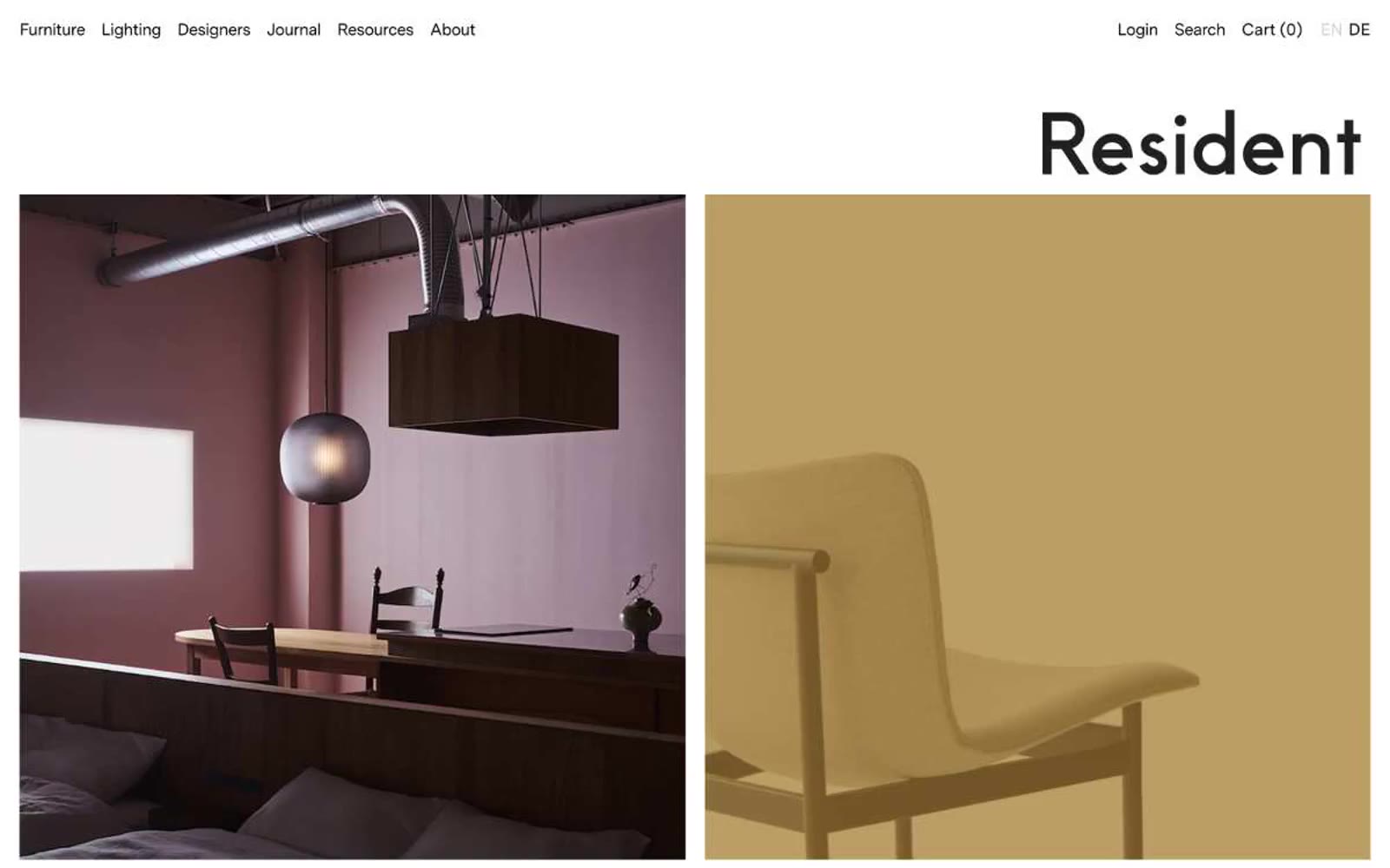
Resident
Resident — Style Reference
# Resident — Style Reference
> Architecture monograph on cream paper
**Theme:** light
Resident operates as a quiet editorial gallery for design objects: white paper canvas, near-zero chrome, and large-format photography doing all the visual work. The interface is almost entirely monochrome — black ink on white paper with hairline rules and small ghost text — letting the rooms, furniture, and light fixtures themselves provide every chromatic decision. Typography is a single custom sans-serif (MessinaSans) at moderate weights with tightened tracking, giving headlines a precise, catalogue-like authority without ever feeling loud. Components are reduced to their skeletons: a tiny underlined nav, border-only buttons, a section heading that scales to the edge of the column. No shadows, no gradients, no surface elevation — depth comes only from the photographs and generous vertical breathing room between editorial spreads.
## Tokens — Colors
| Name | Value | Token | Role |
|------|-------|-------|------|
| Ink Black | `#000000` | `--color-ink-black` | Body text, nav links, icon strokes, and all hairline borders (1px rules under nav, around inputs, and between editorial blocks). The structural workhorse — 724 borderColor occurrences and 336 body borders show it carries the layout's edges |
| Paper White | `#ffffff` | `--color-paper-white` | Page canvas, card surfaces, nav background, and ghost button fills. Everything floats on this surface; the entire interface is one flat sheet |
| Soft Graphite | `#979797` | `--color-soft-graphite` | Muted body text and secondary borders. 2.9:1 contrast against white means it is intentionally faint — used for helper copy and less critical dividers, never for primary content |
| Charcoal | `#333333` | `--color-charcoal` | Icon strokes, fills, and button borders for secondary controls. Sits between ink-black and mid-gray, giving icons a softer presence than body text without losing legibility at 12.6:1 |
Websites
Markdown Text
design-md
website-prompt
landing-page-prompt
Mother Design
Mother Design — Style Reference
# Mother Design — Style Reference
> broadsheet manifesto in black ink
**Theme:** light
Mother Design treats the browser as an editorial broadsheet: near-total monochrome, type doing all the expressive work, structure drawn in 1px ink rules rather than shadows or panels. The single chromatic note — a deep forest green at #306f09 — is so restrained it almost disappears, surfacing only as a near-invisible code-level accent. Display sizes push to 226px, making typography the hero of every screen; supporting text is set in a tight, slightly negative-tracked grotesque that reads as confident, not loud. Components are raw: bordered tabs, unframed thumbnails, vertical hairlines dividing the grid. The Times serif appears as a quiet editorial counterpoint, never as decoration. The result feels like a printed manifesto given a fixed URL — grids of ink on warm gray paper, where restraint IS the visual identity.
## Tokens — Colors
| Name | Value | Token | Role |
|------|-------|-------|------|
| Newsprint | `#f4f4f4` | `--color-newsprint` | Soft section background, alternate surface, and quiet card fill. |
| Bone White | `#ffffff` | `--color-bone-white` | Navigation background, card surfaces, button fills, inverted text — pushes forward off the gray canvas |
| Press Black | `#000000` | `--color-press-black` | Neutral form states, badge text, and quiet UI feedback where color should stay understated. |
| Foil Gray | `#808080` | `--color-foil-gray` | Secondary text, subdued link borders, metadata — sits behind Press Black as quiet annotation |
Websites
Markdown Text
design-md
website-prompt
landing-page-prompt
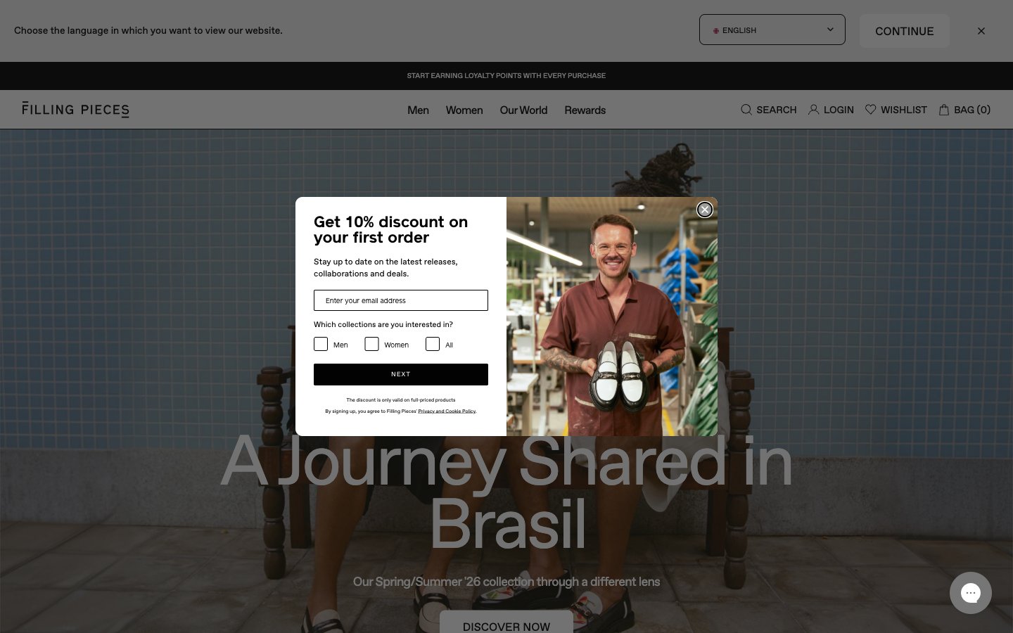
Filling Pieces
Filling Pieces — Style Reference
# Filling Pieces — Style Reference
> monochrome fashion editorial
**Theme:** light
Filling Pieces operates as a monochrome fashion editorial: the entire interface is grayscale, so the brand voice lives in photography and type, not color. A single custom sans-serif (favorit, weights 400/600) carries every label, headline, and product name, with a fixed -0.04em tracking that compresses every glyph into a tight editorial lockup. The 100px display weight is the hero's only punctuation — it is enormous, sitting directly over full-bleed photography with no overlay card or gradient. Surfaces stay warm and flat: hairline #e5e7eb borders at 1px, no shadows, no gradients, an 8px radius applied uniformly to inputs and buttons. Product cards are flat on a warm-gray canvas; the grid reads like a magazine spread, not a typical ecommerce tile wall. Every element earns its presence by being quiet.
## Tokens — Colors
| Name | Value | Token | Role |
|------|-------|-------|------|
| Obsidian | `#000000` | `--color-obsidian` | Body text, icons, primary action button fill, footer ink — the only chromatic-feeling value, used at maximum contrast for all interactive affordances |
| Paper White | `#ffffff` | `--color-paper-white` | Primary surface for cards, input fields, product tiles, and modal backgrounds; white text on dark photographic hero backgrounds |
| Hairline Gray | `#e5e7eb` | `--color-hairline-gray` | 1px borders, dividers, input outlines, card edges — the structural skeleton that separates every surface |
| Stone | `#efefef` | `--color-stone` | Secondary surface behind product grids, checkout bands, and footer — the warm neutral that lifts the page off pure white |
Websites
Markdown Text
design-md
website-prompt
landing-page-prompt
Abel
Abel — Style Reference
# Abel — Style Reference
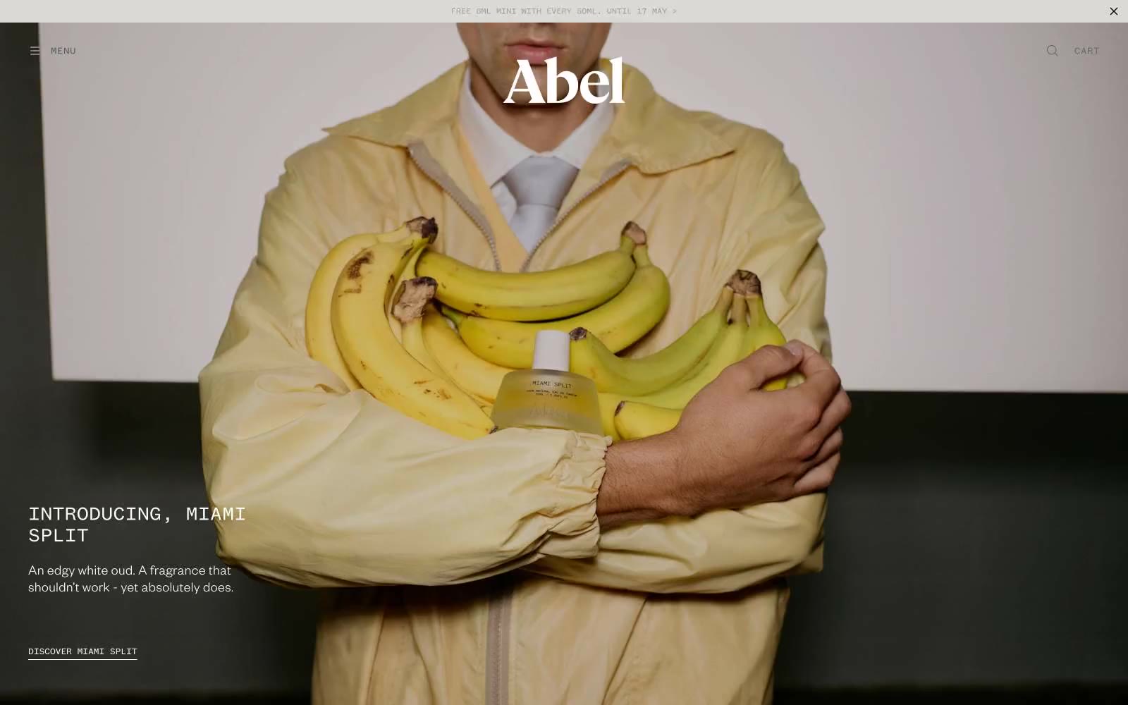
> Cream paper, black ink, breathing room — an editorial lookbook that smells of perfume.
**Theme:** light
Abel operates as an editorial fragrance house: one warm cream note against a near-total monochrome canvas, with photography doing the chromatic work. The interface is deliberately quiet — near-black ink on white paper, whisper-light sans-serif headlines (weight 300), and a monospaced voice for all functional microcopy that gives every label, button, and link the cadence of a typeset colophon. Spacing is generous and sectional, letting full-bleed photographic plates alternate with white product cards; the result reads like a printed lookbook rather than a retail UI. The single non-neutral (#f6eada, a warm parchment cream) appears as a subtle surface tint and accent border — never as fill or decoration — so the visual system stays austere while the imagery carries all the color temperature.
## Tokens — Colors
| Name | Value | Token | Role |
|------|-------|-------|------|
| Ink Black | `#030303` | `--color-ink-black` | Primary text, hairlines, ghost button borders, product card outlines, icon strokes — the dominant structural color; sets all copy and dividers against white and cream surfaces |
| Paper White | `#ffffff` | `--color-paper-white` | Page canvas, product card backgrounds, inverse text on black buttons and dark imagery |
| Parchment Cream | `#f6eada` | `--color-parchment-cream` | Warm accent surface, hairline borders, subtle highlight washes — the only chromatic note in the system; appears sparingly as tint, never as bold fill, to echo natural ingredient warmth without competing with photography |
| Ash Gray | `#cccccc` | `--color-ash-gray` | Disabled/placeholder surfaces, secondary background panels behind product imagery |
Websites
Markdown Text
design-md
website-prompt
landing-page-prompt
Akash Tyagi
Akash Tyagi — Style Reference
# Akash Tyagi — Style Reference
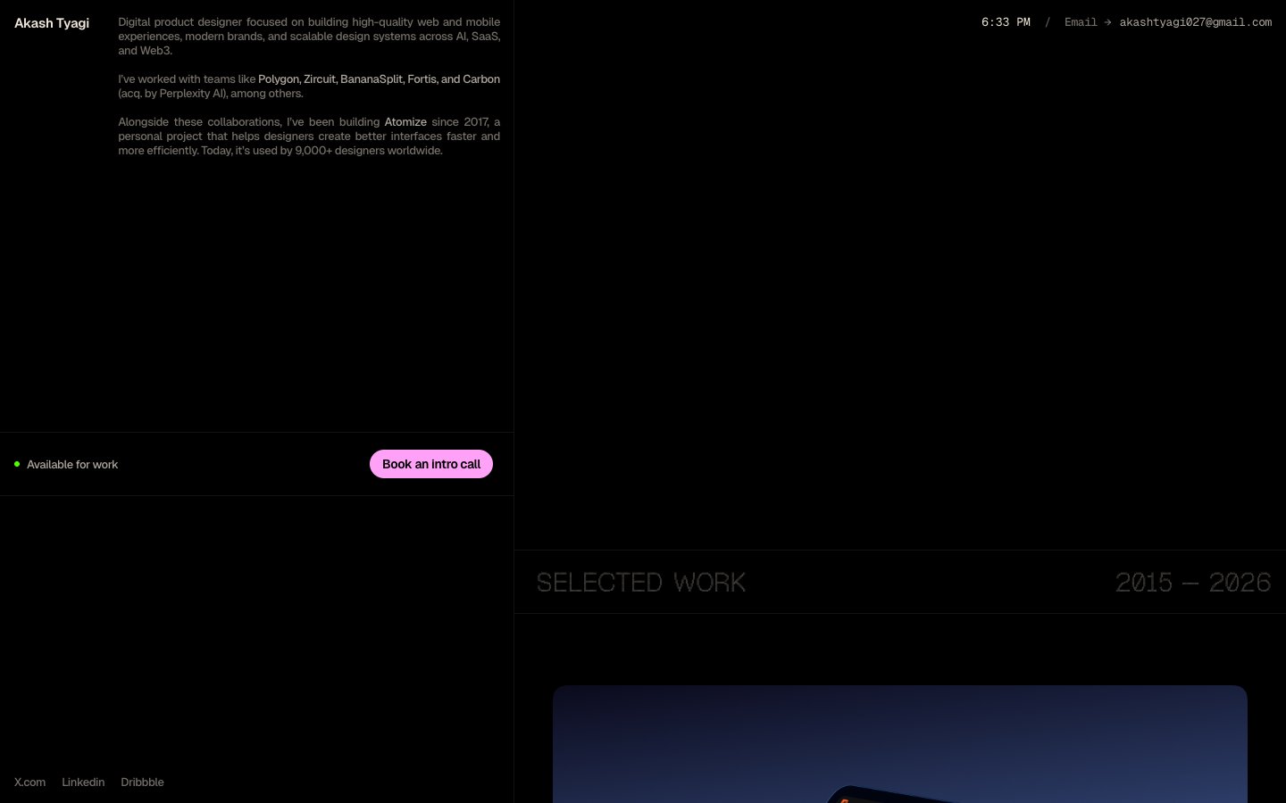
> midnight gallery wall with hot pink markers
**Theme:** dark
Akash Tyagi is a dark editorial portfolio rendered as a midnight canvas with warm parchment text and a single vivid pink accent that acts as functional punctuation rather than decoration. The layout breathes — 200px section gaps, generous asymmetric two-column compositions, and display labels set in Geist Pixel Triangle create a gallery-wall rhythm where each project is given the silence it needs. Every neutral carries a warm sepia undertone, deliberately steering away from the cool blue-grays of typical tech portfolios. Components are minimal and flat: pill CTAs, hairline dividers, status dots, and large unfettered project imagery — there is no elevation, no gradients, no ornamentation beyond typography and a single chromatic accent.
## Tokens — Colors
| Name | Value | Token | Role |
|------|-------|-------|------|
| Obsidian Canvas | `#000000` | `--color-obsidian-canvas` | Page background, card surfaces, inverted text on pink fills |
| Parchment | `#efe6d8` | `--color-parchment` | Primary body and heading text — warm near-white with sepia undertone, replaces the typical cool white of dark UIs |
| Bone | `#aca69c` | `--color-bone` | Secondary text, button borders, metadata — mid-tone warm gray |
| Ash | `#736e68` | `--color-ash` | Muted body text, subtle link borders, inactive labels |
Websites
Markdown Text
design-md
website-prompt
landing-page-prompt
Ambrook
Ambrook — Style Reference
# Ambrook — Style Reference
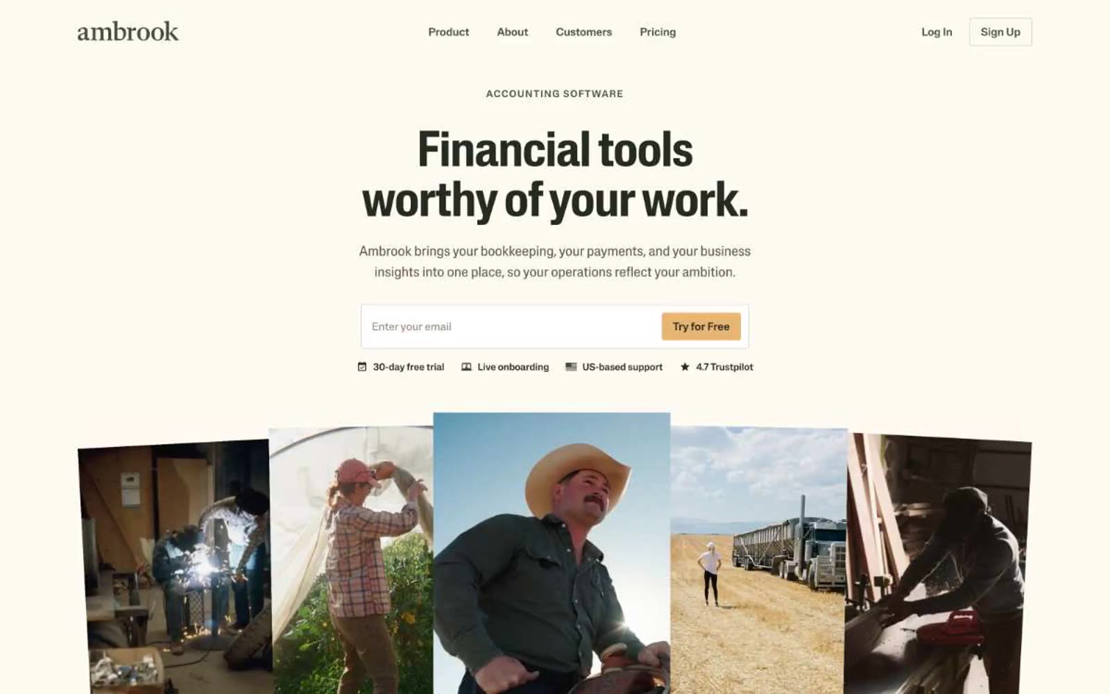
> harvest ledger on butcher paper
**Theme:** light
Ambrook speaks in the visual dialect of American heartland: warm parchment canvas, ink-dark type, and a single harvest-amber accent that warms every primary action. The palette is deliberately desaturated — olive greens, wheat tans, bark browns — as if the interface itself were printed on recycled butcher paper and stamped with soy ink. Headlines use a custom display face with quiet authority (weight 500, not the expected 700), and every section opens with a small uppercase eyebrow that breathes across the page on wide tracking. Photography is documentary, not aspirational — welders, ranchers, truckers, unposed and full-sun. The result is an interface that feels rooted, not glossy: trustworthy through warmth rather than through chrome.
## Tokens — Colors
| Name | Value | Token | Role |
|------|-------|-------|------|
| Parchment | `#fcfaf1` | `--color-parchment` | Page canvas and card surfaces — warm off-white replaces pure #ffffff to keep the system grounded in an agricultural, paper-like register |
| Bone | `#efe9e0` | `--color-bone` | Secondary surface for footer, soft sections, and hairline borders that need separation from the parchment canvas without harsh contrast |
| Pure White | `#ffffff` | `--color-pure-white` | Elevated card and product-mockup surface — used sparingly to lift specific panels (like the Ledger screenshot) above the parchment base |
| Loam | `#c7bcaf` | `--color-loam` | Subtle dividers, card edges, and low-emphasis borders between the canvas and content blocks |
Websites
Markdown Text
design-md
website-prompt
landing-page-prompt
Thisispam
Thisispam — Style Reference
# Thisispam — Style Reference
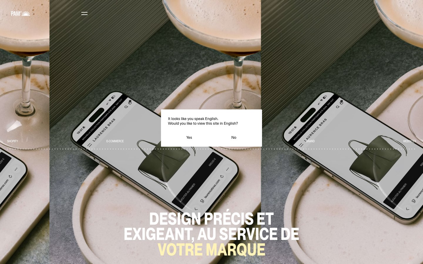
> butter-yellow editorial broadsheet — a Swiss-press layout where a single warm cream stock, razor-sharp type, and a zero-chrome surface system turn each scroll into a printed page.
**Theme:** light
Thisispam operates as a Swiss-influenced editorial design system: a warm butter-yellow canvas paired with stark black ink typography and almost zero chrome. The visual language borrows from print broadsheets — large, confident display headlines sit in tight uppercase clusters, while project images float in a strict grid with caption-level metadata beneath. Color is used with extreme discipline: #fff3b8 functions as both page ground and emphasis highlight, leaving black to carry all text and white to separate content blocks. No shadows, no rounding, no gradients — the system relies on typographic scale, generous whitespace, and the unusual warm background to create atmosphere. Sections alternate between yellow paper, pure white, and ink black, creating a rhythmic editorial flow.
## Tokens — Colors
| Name | Value | Token | Role |
|------|-------|-------|------|
| Butter Paper | `#fff3b8` | `--color-butter-paper` | Dominant page canvas for entire sections, emphasis text on dark photographic backgrounds, hairline link borders, and the third band in the surface stack — a warm cream that replaces white as the design's atmospheric ground |
| Ink Black | `#000000` | `--color-ink-black` | Primary text color across all surfaces, hairlines and structural borders, the footer and dark-band background — every word, rule, and icon reads as solid ink on the cream or white ground |
| Paper White | `#ffffff` | `--color-paper-white` | White section backgrounds and card surfaces that separate the yellow bands, inverse text on the black footer, and the language modal surface |
| Wheat | `#f1e4a4` | `--color-wheat` | Muted input-field fill used on the yellow canvas — a slightly darker cream that lets form fields recede into the warm ground without losing the surface hierarchy |
Websites
Markdown Text
design-md
website-prompt
landing-page-prompt
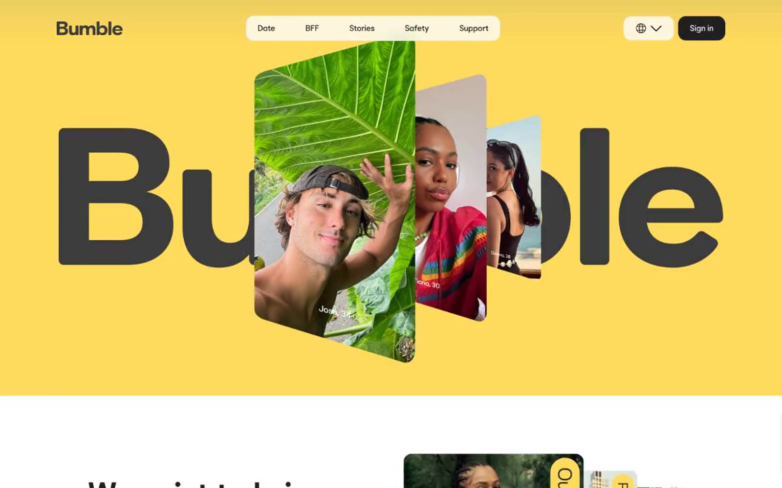
Bumble
Bumble — Style Reference
# Bumble — Style Reference
> Sunlit honey editorial
**Theme:** light
Bumble runs on a monochrome-plus-one-warmth system: near-black ink (#202020) carries every word, every border, every interactive surface, and one vivid honey-yellow (#ffdb5b) floods the hero and feature canvases as the brand's emotional signal. The geometry is soft and confident — 16-24px radii on cards and buttons, pill-shaped badges at 1000px, barely-there shadows at 12% opacity — so nothing feels sharp or aggressive. BumbleSans speaks in slightly opened letter-spacing (0.007-0.02em), which is unusual for a geometric sans and gives even the smallest UI copy a warm, unhurried cadence. Content is arranged in generous 24-40px padded cards over white surfaces, with full-bleed yellow bands acting as the visual punctuation between sections. The result reads like a sunlit lifestyle magazine: human photography does the heavy lifting, the brand color is never decorative noise, and the UI recedes so the people in the photos lead.
## Tokens — Colors
| Name | Value | Token | Role |
|------|-------|-------|------|
| Bumble Honey | `#ffdb5b` | `--color-bumble-honey` | Yellow state accent for badges, validation surfaces, and short status labels. |
| Pollen | `#fff386` | `--color-pollen` | Lighter yellow accent surface for secondary card frames and tonal variation against Honey |
| Bumble Ink | `#202020` | `--color-bumble-ink` | Primary text, filled action buttons, all borders and dividers — the structural near-black that carries 2,100+ UI instances and is the de facto primary action color |
| Paper White | `#ffffff` | `--color-paper-white` | Page canvas, card surfaces, button text on dark fills, body text inverse |
Websites
Markdown Text
design-md
website-prompt
landing-page-prompt
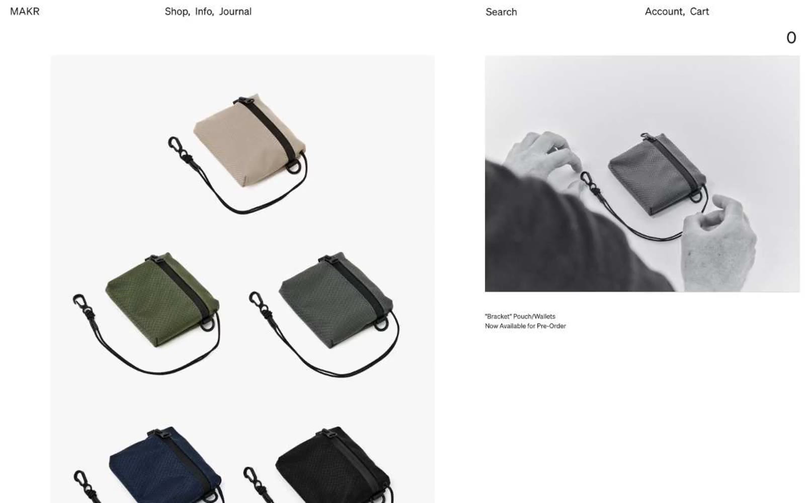
MAKR
MAKR — Style Reference
# MAKR — Style Reference
> Museum vitrine for crafted leather. A quiet, paper-white gallery where warm-black ink labels float beneath large editorial photographs of leather objects held in hands or placed in landscapes, with one muted sage band as the only chromatic interruption.
**Theme:** light
MAKR is an editorial e-commerce gallery for crafted leather objects, built on an almost completely achromatic palette where photography is the protagonist. A single near-gray banner tone (with a barely-there sage cast) punctuates the top announcement strip, while everything else — surfaces, text, dividers, links — lives in deep warm-black ink on paper-white. Typography is the Sohne neo-grotesque at its most restrained: small sizes, generous line-height, and positive tracking on uppercase labels read as gallery-wall text, not web UI copy. The layout is image-dominant, asymmetric, and museum-sparse: product objects are photographed on hands, in landscapes, in natural light, with tiny caption links beneath. Components are nearly invisible — underlined text links, ghost inputs, no shadows, no rounded buttons — letting the leather and the photography carry the brand weight.
## Tokens — Colors
| Name | Value | Token | Role |
|------|-------|-------|------|
| Obsidian Ink | `#1c1717` | `--color-obsidian-ink` | Primary text, all text links, body copy, headings, icon strokes, hairline borders across the entire UI. This is the load-bearing color — 17.7:1 on white, used for 5,000+ instances. Its very slight warm cast (not pure black) gives the entire interface a printed-catalog feel rather than a screen feel |
| Paper | `#ffffff` | `--color-paper` | Hairline borders, dividers, input outlines, and card edges on light surfaces. Do not promote it to the primary CTA color |
| Bone | `#f0f0f0` | `--color-bone` | Secondary surface for alternating sections, subtle panel backgrounds, and inline borders/separators. Creates the faintest warm-gray tier between paper-white and the sage announcement band |
| Eucalyptus Mist | `#a9aea9` | `--color-eucalyptus-mist` | Top announcement banner background, muted section washes, tertiary border. Reads as near-gray in isolation but carries a barely-perceptible sage cast when used full-width — a single chromatic breath in an otherwise monochrome system |
Websites
Markdown Text
design-md
website-prompt
landing-page-prompt
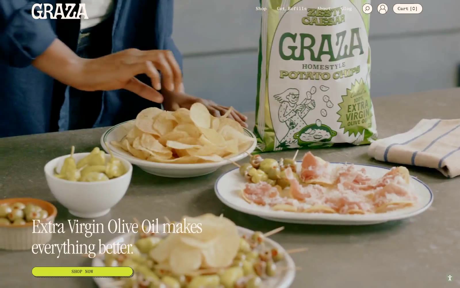
GRAZA
GRAZA — Style Reference
# GRAZA — Style Reference
> Mediterranean deli counter, sunlit and hand-set
**Theme:** light
Graza channels a sun-drenched Mediterranean deli counter — warm cream surfaces, an olive-dark ink that reads like aged wood, and occasional bursts of acid-green that feel like produce under fluorescent market lights. Typography carries a confident editorial weight: a typewriter serif does the conversational work while a condensed Garamond swoops in for oversized display moments. Color behaves like a produce aisle — the canvas is always warm and neutral, and the vivid greens appear as full-bleed section bands or small functional punctuation, never as chrome on chrome. Components stay spare and hand-set: pill buttons, hairline borders, gentle 20px image radii, and almost no shadow. The rhythm alternates between photographic full-bleed hero plates, text-only editorial spreads on solid color fields, and split text+image compositions. Nothing is grid-locked; whitespace and asymmetry do the work.
## Tokens — Colors
| Name | Value | Token | Role |
|------|-------|-------|------|
| Olive Ink | `#3c422e` | `--color-olive-ink` | Primary text, nav links, borders, button outlines, icon strokes — near-black with an olive undertone that keeps the page from feeling clinical |
| Linen Cream | `#fff4ec` | `--color-linen-cream` | Light supporting surface for subtle backgrounds and section separation. Do not promote it to the primary CTA color |
| Buttery Peach | `#f6e6d9` | `--color-buttery-peach` | Secondary surface and warm contrast bands — slightly deeper than Linen Cream, used to break long pages and nest cards |
| Squeeze Bottle Green | `#9eef80` | `--color-squeeze-bottle-green` | Full-bleed section bands, highlighted text treatments — bright produce-shelf green that carries entire pages |
Websites
Markdown Text
design-md
website-prompt
landing-page-prompt
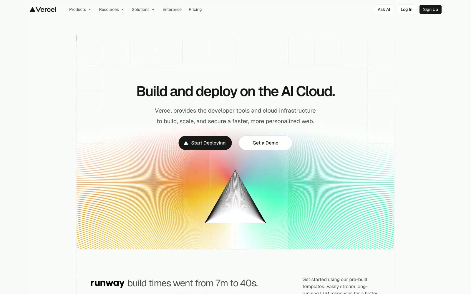
Vercel
Vercel — Style Reference
# Vercel — Style Reference
> Prismatic monolith on graph paper — a single dark triangle refracts a full conic spectrum against a faint engineer grid, and everything else on the page is pure black-on-white precision.
**Theme:** light
Vercel operates as a near-monochrome engineering workspace: off-white canvas (#fafafa), near-black text and filled actions (#171717, never pure #000), hairline borders (#ebebeb) carrying structure instead of shadows, and one signature burst of prismatic color from the conic-gradient prism logo that appears exactly once per screen. The type system is exclusively Geist — a geometric grotesque with very tight negative tracking at large sizes (-0.06em at 48px) and no decorative weights — giving the entire UI a precise, lab-instrument quality. Density is compact: 6px radii dominate cards and buttons, 12px padding wraps most surfaces, and 2–8px gaps control rhythm. Color is rationed — chromatic blue, red, and teal appear only as decorative illustration accents; the product chrome stays strictly achromatic with the prism gradient serving as the only chromatic punctuation.
## Tokens — Colors
| Name | Value | Token | Role |
|------|-------|-------|------|
| Graphite | `#171717` | `--color-graphite` | Primary text, filled action buttons, primary borders. The near-black is intentional — not #000000 — giving surfaces a slightly warmer, inkier feel than pure black would |
| Marble White | `#fafafa` | `--color-marble-white` | Page canvas, card surfaces, elevated panels. Not pure white — the faint warmth reads as paper rather than screen |
| Pearl | `#ffffff` | `--color-pearl` | Inset surface white used inside cards, button text on dark fills, and inner panel highlights |
| Hairline | `#ebebeb` | `--color-hairline` | Default border color for cards, nav, inputs, dividers. Carries structural separation in place of shadows |
Websites
Markdown Text
design-md
website-prompt
landing-page-prompt
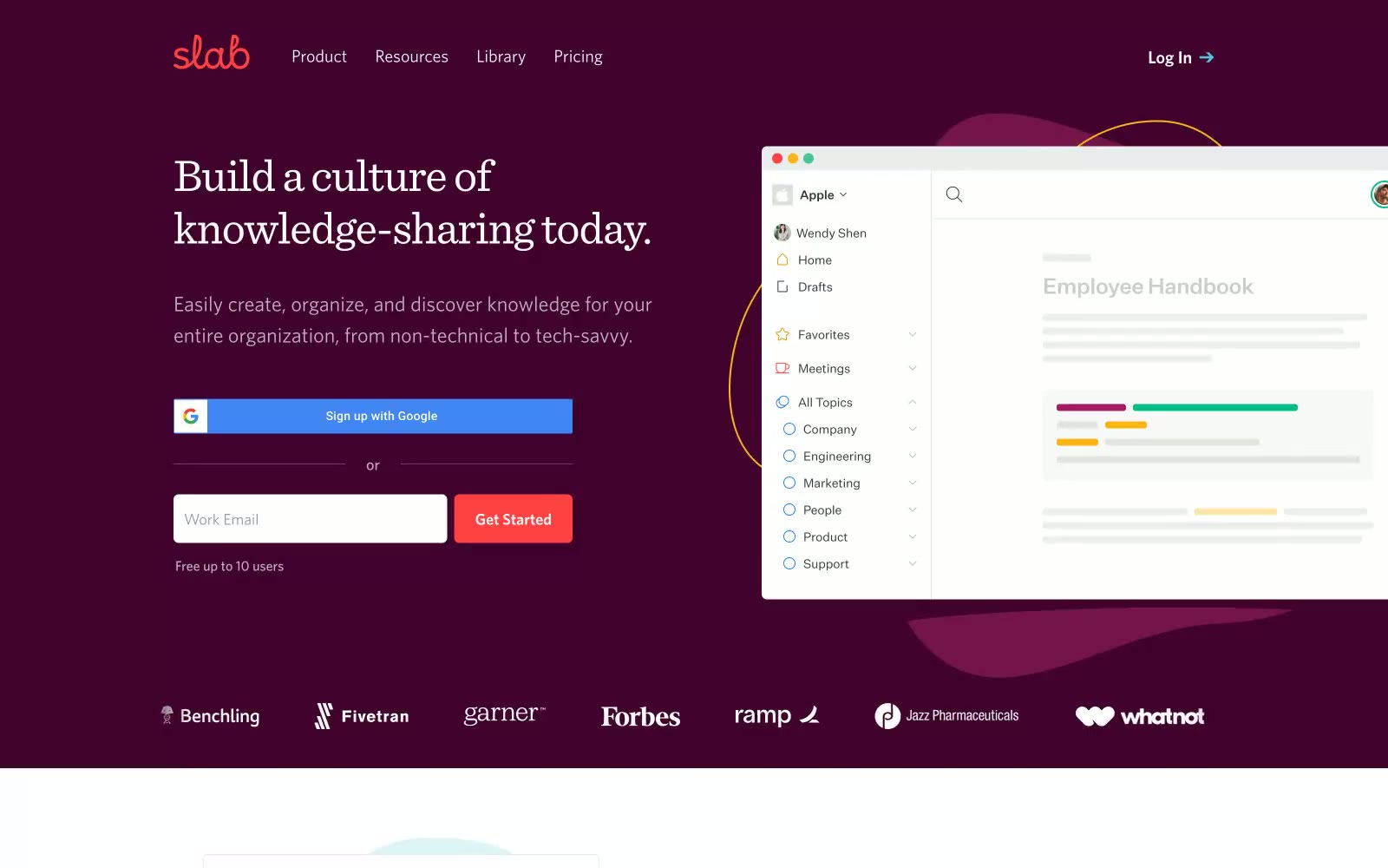
Slab
Slab — Style Reference
# Slab — Style Reference
> midnight-wine reading room
**Theme:** mixed
Slab reads like a curated library wrapped in a midnight-wine storefront: a deep plum hero cradles white serif headlines, then opens into bright, spacious editorial layouts where serif display type meets a quiet Whitney sans-serif system. Color is rationed — nearly all of the interface is grayscale — but the single coral-red action and the wine hero create a two-temperature palette: warm authority at the edges, cool utility in the middle. The aesthetic borrows from print publishing: Sentinel's 300-weight serif whispers rather than shouts, generous whitespace around each section feels like a magazine spread, and the 6px corner radius on inputs/buttons is restrained enough to feel editorial rather than soft. Decorative circles, organic blobs, and illustrated document cards float alongside flat UI — the visual language is human and craft-forward, not corporate.
## Tokens — Colors
| Name | Value | Token | Role |
|------|-------|-------|------|
| Midnight Wine | `linear-gradient(90deg, #42022, rgba(66, 2, 46, 0))` | `--color-midnight-wine` | Hero band background, section dividers, deep surface moments — the deepest brand tone, used as atmosphere not as UI fill |
| Coral Ember | `#ff4143` | `--color-coral-ember` | Red supporting accent for decorative details and low-frequency emphasis. Do not promote it to the primary CTA color |
| Slate Ink | `#455360` | `--color-slate-ink` | Primary text, icons, heading strokes, input borders, default UI chrome — the dominant near-gray that gives the system its printed-paper authority |
| Fog Gray | `#939598` | `--color-fog-gray` | Secondary text, helper copy, muted badges, logo tints — recedes behind Slate Ink to build typographic depth |
Websites
Markdown Text
design-md
website-prompt
landing-page-prompt
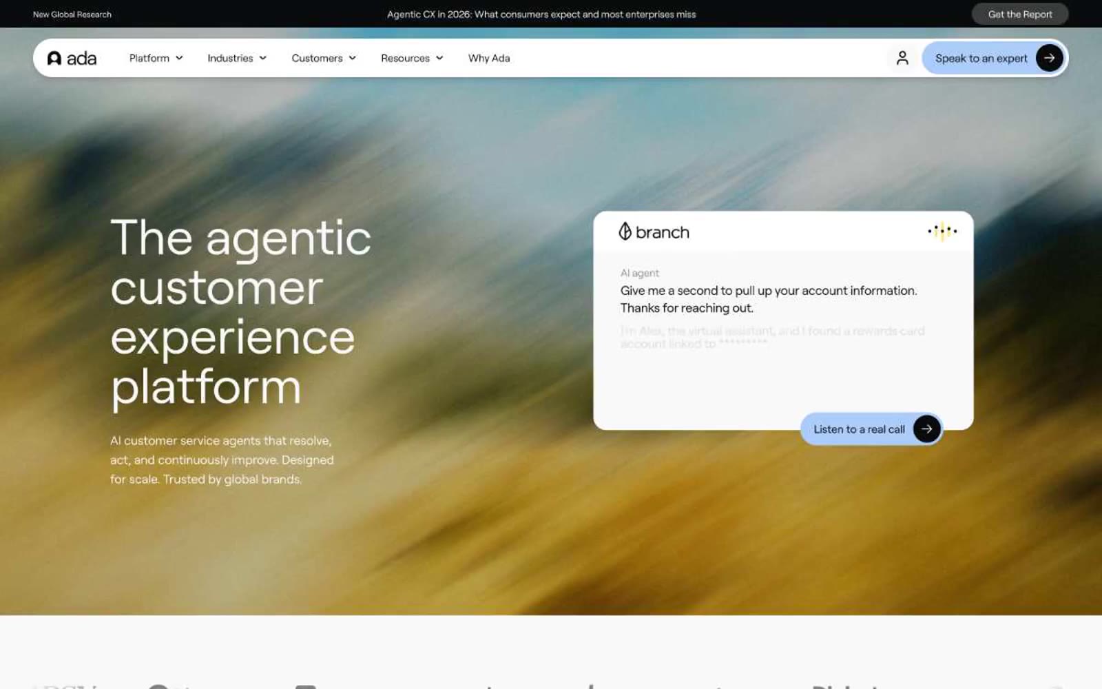
Ada
Ada — Style Reference
# Ada — Style Reference
> Daylight gallery with pastel punctuation — a quiet off-white room where four jewel-tone colors are allowed to speak, and everything else stays in charcoal.
**Theme:** light
Ada operates as a daylight gallery: an off-white canvas with generous breathing room, a single humanist sans-serif doing all the voice work, and jewel-toned accent colors that appear only as deliberate punctuation marks. The visual system resists decoration — no gradients on buttons, no drop shadows on cards, no chrome competing with content. Instead, identity comes from a small, disciplined palette (forest green, periwinkle blue, candy pink, butter yellow) used as left-edge accent bars on stat cards and as filled pill buttons. Hierarchy is built through size contrast and whitespace, not color volume. Surfaces sit on a warm #f9f9f9 ground with #ffffff cards floating above. The hero's defining move is a heavily blurred photographic background that feels like looking through frosted glass — it adds warmth and depth without competing with the white headline that reads like editorial typography.
## Tokens — Colors
| Name | Value | Token | Role |
|------|-------|-------|------|
| Inkstone | `#0a0b0c` | `--color-inkstone` | Primary text, body copy, headings, hairline borders, dark UI surfaces — the near-black backbone of the entire interface, used at massive scale for borders and typography |
| Bone | `#f9f9f9` | `--color-bone` | Page canvas, section backgrounds, subtle surface tier beneath cards — a warm off-white that softens the contrast of the interface |
| Paper | `#ffffff` | `--color-paper` | Card surfaces, elevated panels, chat widget container, inputs — the brightest tier of the surface stack |
| Ash | `#d8d8d8` | `--color-ash` | Decorative SVG fills, disabled input borders, neutral dividers |
Websites
Markdown Text
design-md
website-prompt
landing-page-prompt
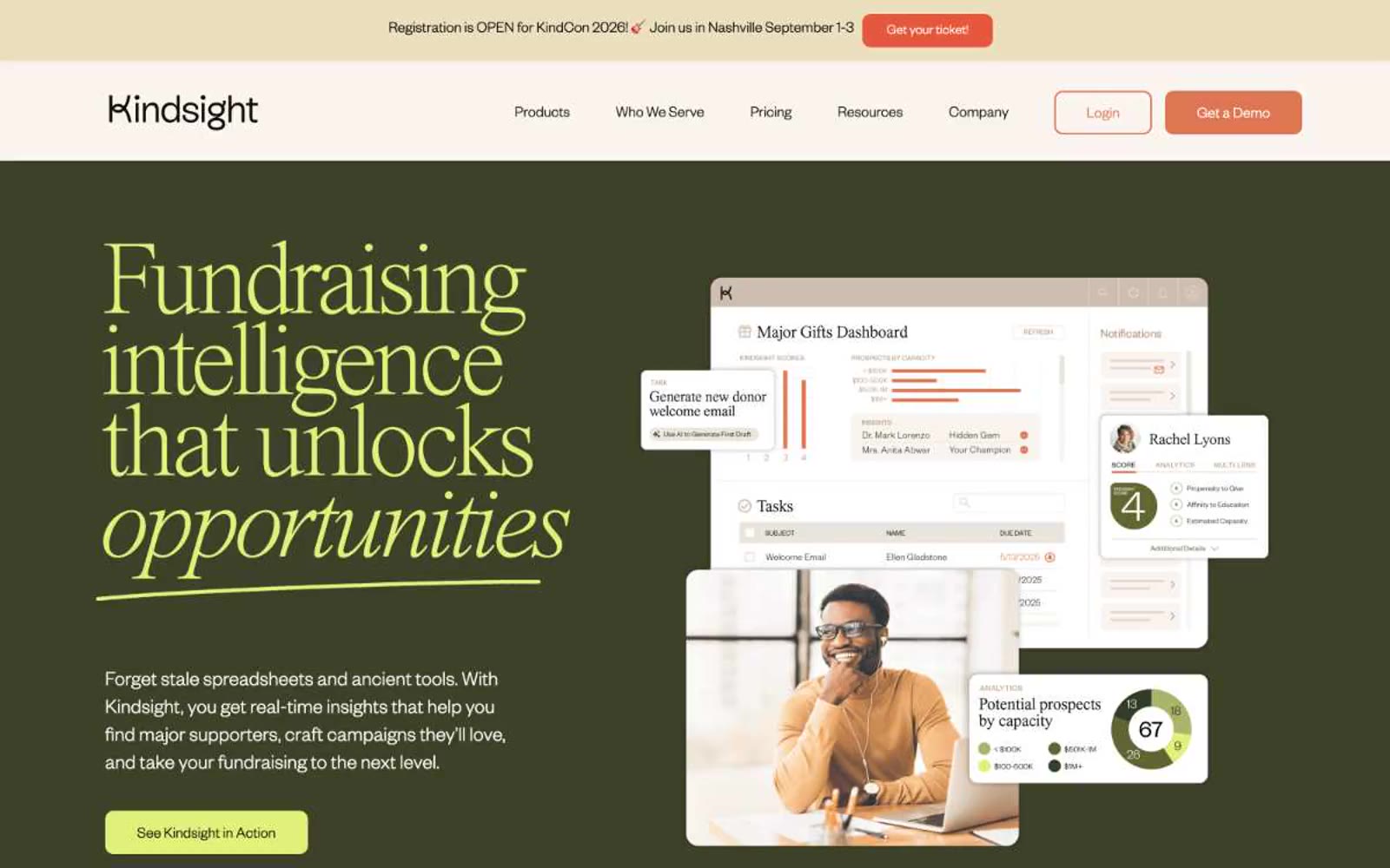
Kindsight
Kindsight — Style Reference
# Kindsight — Style Reference
> Sunlit field journal at dusk — an earthy, editorial calm built from cream paper, olive ink, and a single flash of chartreuse highlight.
Kindsight feels like a sustainably-printed nonprofit annual report: warm cream backgrounds, near-black text with a green undertone, a deep olive hero panel, and terracotta as the only shout. The single chartreuse accent is used sparingly — as underline punctuation on italic display words, badge fills, and illustrative highlights — never as a functional color. Display type in Times Now at weights 200-300 with tight tracking reads like editorial cover typography, not SaaS headlines.
**Theme:** light
Kindsight operates in a warm, editorial register that reads more like a design magazine than a SaaS dashboard. A cream canvas (#faf5f1) holds the page, with a deep olive hero (#3d4128) creating an earthy, almost botanical atmosphere. Display type uses Times Now at whisper weights (200-300) with aggressive negative tracking, producing compressed, magazine-cover headlines. A single chartreuse accent (#e1f079) appears as decorative highlight — underlines beneath italic display words, badges, illustration fills — never as a utility color. Terracotta (#de7653) is the only CTA color, appearing as solid filled buttons or thick outlined pills. Components favor generous 24px card radii, thin hairline borders, and zero or very subtle elevation; the design relies on tonal contrast between cream, near-black with green undertones (#0e0f0a), and the dark olive hero block to create depth rather than shadows.
## Tokens — Colors
| Name | Value | Token | Role |
|------|-------|-------|------|
| Cream Paper | `#faf5f1` | `--color-cream-paper` | Page background, nav surface, warm canvas base |
| Soft Linen | `#fefffa` | `--color-soft-linen` | Card surface, slightly brighter than canvas for subtle elevation |
Websites
Markdown Text
design-md
website-prompt
landing-page-prompt
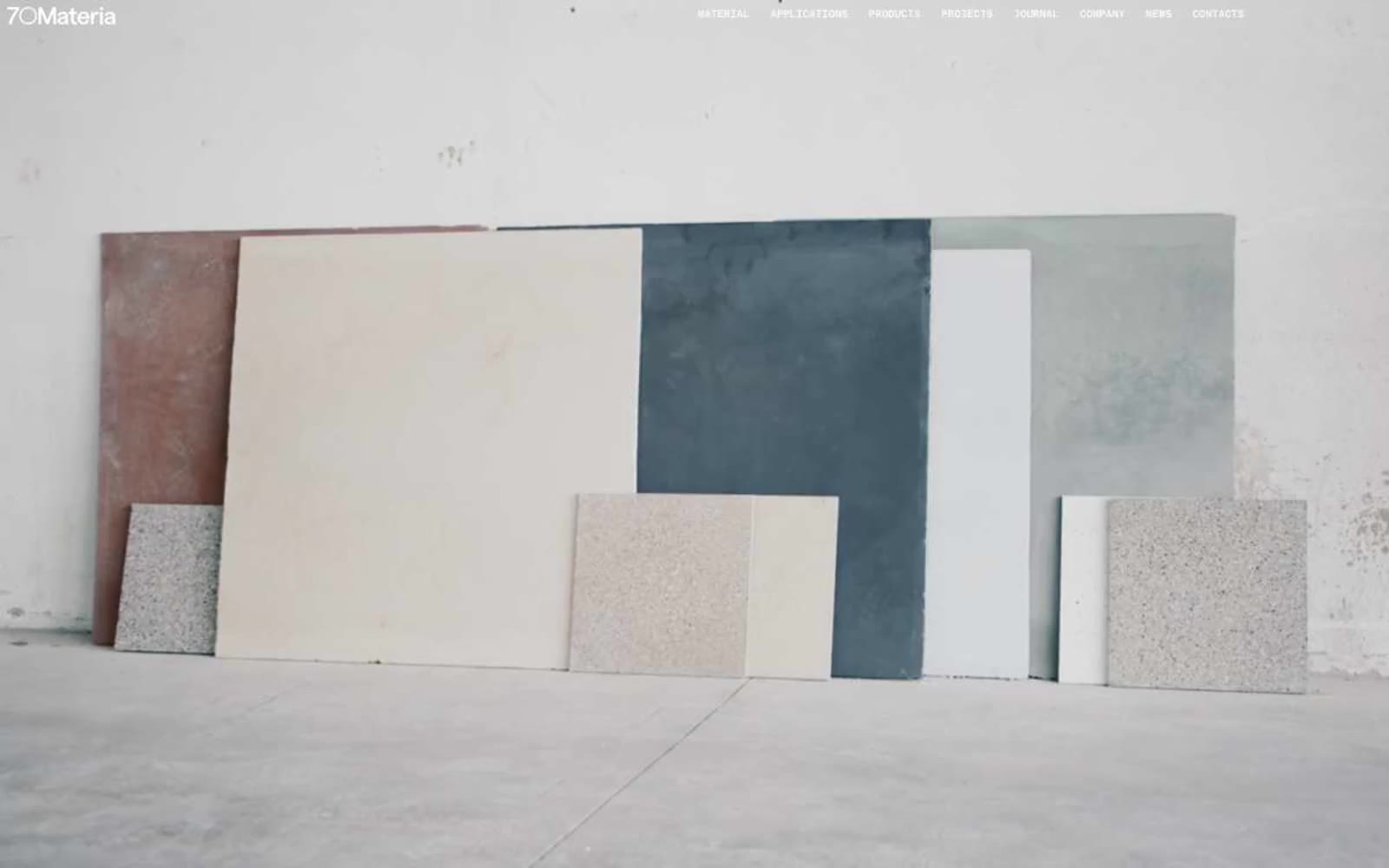
70Materia
70Materia — Style Reference
# 70Materia — Style Reference
> Architectural sample board on white paper — the UI is the mount, never the artwork.
**Theme:** light
70Materia is a neutral frame built to disappear around its content — a curated material library where the UI chrome is deliberately invisible so stone, terrazzo, and pigment samples can dominate. Every typographic element sits at weight 400 in a single sans family (Matter), with a monospace companion (Matter Mono) used for labels, navigation, and small UI controls. Letter-spacing on the mono (0.02em–0.04em) plus tabular numerals gives the interface a spec-sheet, architectural-drawing quality — as if the page itself is a technical sample board. The palette is strictly achromatic: black text, white surfaces, and a warm mid-gray canvas (#bababa) that recedes behind the photography. Buttons are thin, square, and outlined; the only filled surface is a near-black (#1e1e1e) for select actions and the footer. No accent color exists in the system — all chromatic energy is outsourced to the product photography.
## Tokens — Colors
| Name | Value | Token | Role |
|------|-------|-------|------|
| Obsidian | `#000000` | `--color-obsidian` | Primary text, hairline borders, navigation outlines — the structural ink |
| Bone | `#ffffff` | `--color-bone` | Page highlights, card surfaces, text on dark surfaces, button outlines |
| Graphite | `#1e1e1e` | `--color-graphite` | Filled button background, footer surface, dark UI blocks — warm near-black replacing pure black for non-text surfaces |
| Ash | `#bababa` | `--color-ash` | Dominant page canvas, muted dividers, secondary surface tone |

Websites
Markdown Text
design-md
website-prompt
landing-page-prompt
Shopify
Shopify — Style Reference
# Shopify — Style Reference
> Midnight greenhouse — merchants' brands blooming against deep teal-black, lit by a single mint spark.
**Theme:** dark
Shopify's design system is a midnight workshop for commerce: an almost-black canvas tinted with deep teal-green, broad confident sans-serif type, and one electric mint accent that activates interactive moments. The interface feels like a darkroom where products and brands are the light source — photography and merchant storefronts glow against the near-black surfaces while chrome recedes. Components are geometric but soft: 12px-radius cards with hairline borders, pill buttons, and weight-330 display type that whispers scale rather than shouting. A single chromatic punctuation (#36f4a4) appears sparingly on links, tags, and focus states, reserving color for functional moments so the merchant stories stay the visual focus.
## Tokens — Colors
| Name | Value | Token | Role |
|------|-------|-------|------|
| Midnight Forest | `#02090a` | `--color-midnight-forest` | Page canvas, hero backgrounds, section backgrounds |
| Deep Lichen | `#061a1c` | `--color-deep-lichen` | Primary card surfaces, elevated panels, content blocks |
| Shaded Fern | `#072720` | `--color-shaded-fern` | Navigation bar, secondary cards, subtle panel lift |
| Spruce Border | `#1e2c31` | `--color-spruce-border` | Hairline card borders, divider lines, input outlines |
Websites
Markdown Text
design-md
website-prompt
landing-page-prompt
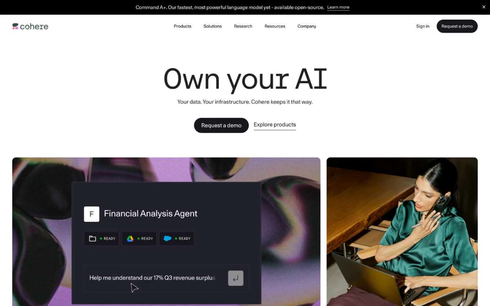
Cohere
Cohere — Style Reference
# Cohere — Style Reference
> Editorial monograph on cream paper — every screen is a spread, not a dashboard.
**Theme:** light
Cohere reads as an editorial product monograph: a cream-white canvas, near-black typography, and pill-shaped dark CTAs carry the entire hierarchy without ornament. The signature is restraint — one tri-color gradient (coral → violet → blue) appears only inside photography and decorative washes, never on UI controls, so the interface stays monochrome while imagery supplies chromatic warmth. Typography does the heavy lifting: Unica77 at every UI role with tight negative tracking, and a wider CohereText display face for hero headlines, creating editorial authority rather than SaaS density. Components are minimal and confident — 22px rounded image cards, hairline #e5e7eb borders, dark filled actions — letting photography, code snippets, and copy carry the narrative weight.
## Tokens — Colors
| Name | Value | Token | Role |
|------|-------|-------|------|
| Canvas White | `#ffffff` | `--color-canvas-white` | Primary page background, card surfaces, button text |
| Soft Cream | `#f0eee9` | `--color-soft-cream` | Subtle warm surface variant for alternating sections |
| Hairline Mist | `#e5e7eb` | `--color-hairline-mist` | Default borders, dividers, card outlines, input strokes |
| Silver Rule | `#d9d9dd` | `--color-silver-rule` | Secondary borders, nav dividers, subtle separators |
Websites
Markdown Text
design-md
website-prompt
landing-page-prompt
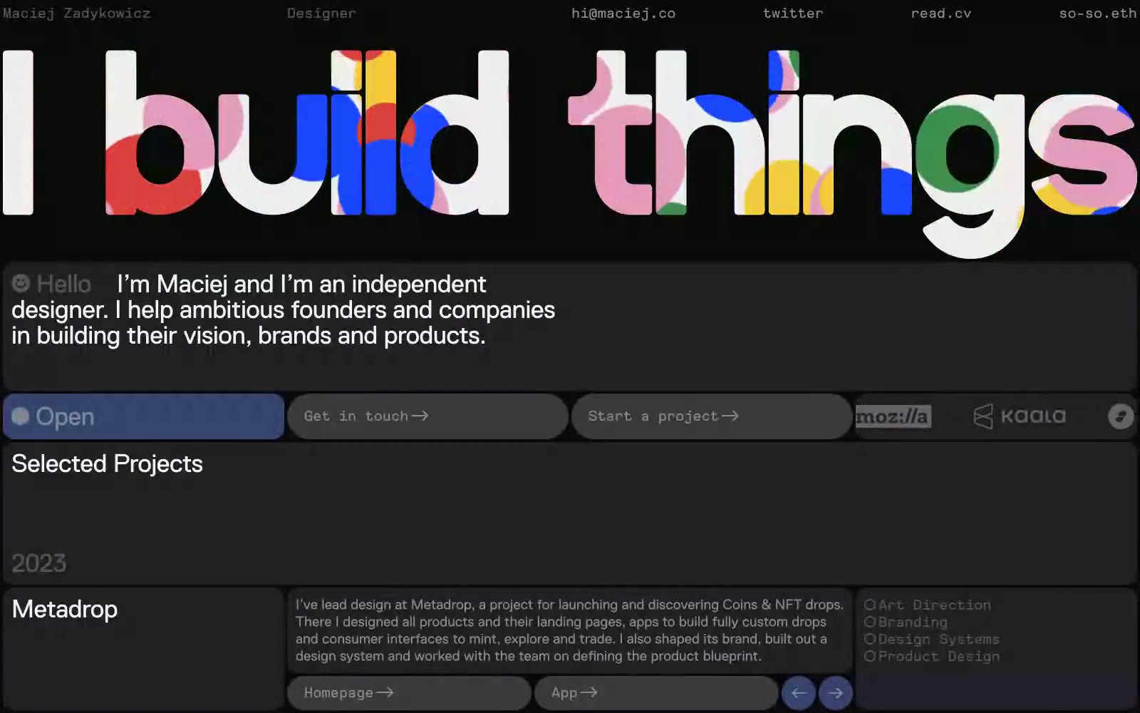
Maciej Zadykowicz
Maciej Zadykowicz — Style Reference
# Maciej Zadykowicz — Style Reference
> midnight gallery with a kaleidoscope mural — a near-black studio wall where one brilliantly colorful typographic artwork commands attention and everything else stays quiet and deliberate.
**Theme:** dark
Maciej Zadykowicz's portfolio operates as a midnight design studio: a near-black canvas of deep slate (#25262d) that lets a single spectacular piece of typographic art — the multicolored 'I build things' mural — command the entire first impression. Below the hero, the system retreats into quiet restraint: light bone-white text (#f2f2f3) over flat dark cards, tight Replica typography, pill-shaped controls, and a single muted indigo (#384270) reserved for the live 'Open' status indicator. The page reads like a gallery wall — the work IS the decoration, so chrome stays compact, metadata is mono-typed, and the only chromatic accent carries semantic meaning (availability, live state). Information density is high but breathing — project entries stack as year/title/description/tags with generous 24px internal padding, and the 16px card radius softens the otherwise severe dark surface.
## Tokens — Colors
| Name | Value | Token | Role |
|------|-------|-------|------|
| Bone White | `#f2f2f3` | `--color-bone-white` | Primary text, nav links, button labels, footer copy — the only light on the page, used for everything that must be read |
| Slate Dark | `#25262d` | `--color-slate-dark` | Page canvas, base surface for all cards and sections |
| Graphite | `#383a42` | `--color-graphite` | Elevated surface — nested cards, button hover fills, secondary panels sitting on top of Slate Dark |
| Fog | `#858893` | `--color-fog` | Secondary text, metadata labels, inactive nav items, muted descriptions |
Websites
Markdown Text
design-md
website-prompt
landing-page-prompt
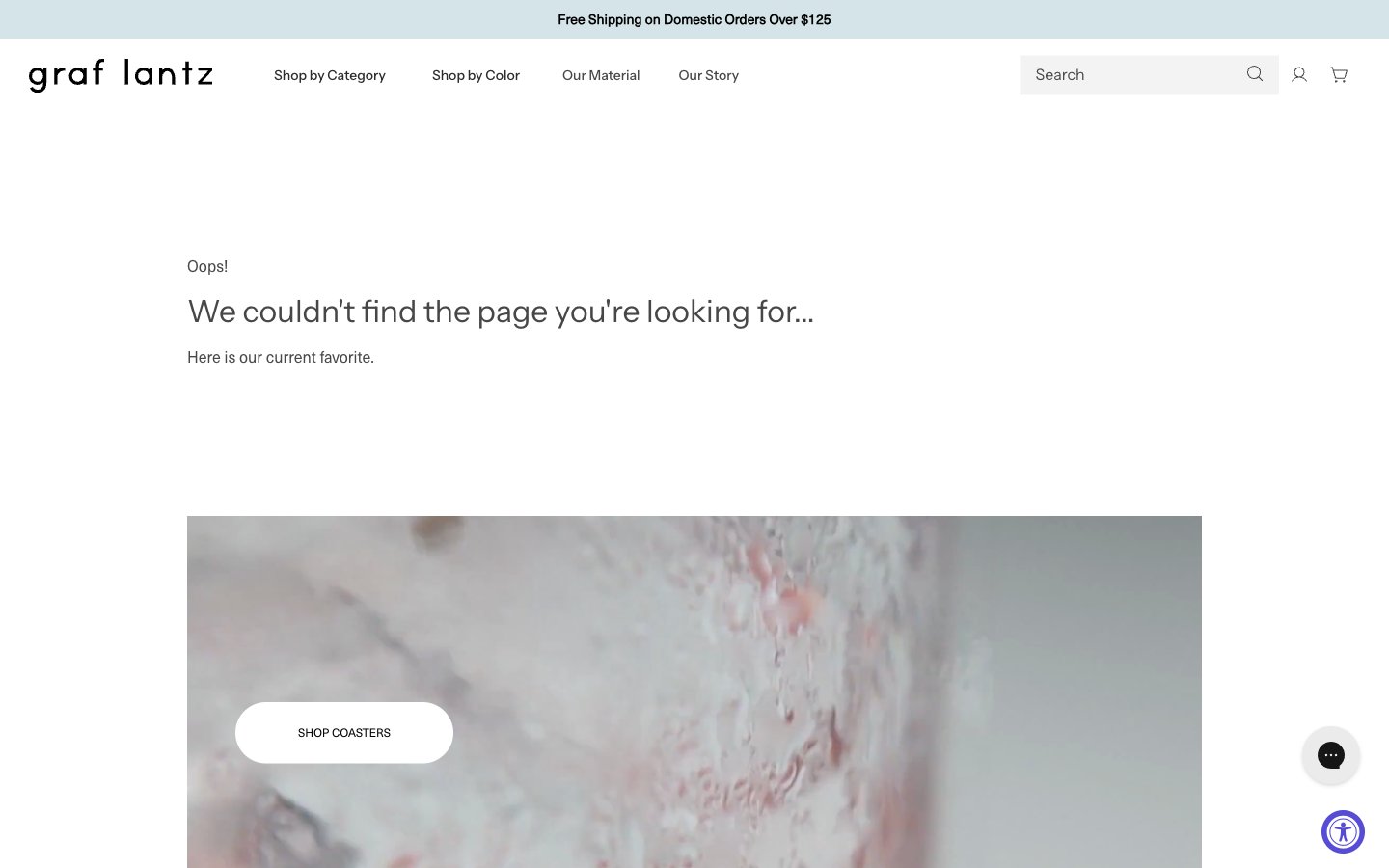
Graf Lantz
Graf Lantz — Style Reference
# Graf Lantz — Style Reference
> Scandinavian atelier on raw linen — one violet stroke of urgency inside an otherwise bone-white room.
**Theme:** light
Graf Lantz reads as a Scandinavian atelier on raw linen: bone-white canvas, a single brand violet used almost as punctuation, and product photography that is cropped so close the felt texture becomes the atmosphere. The page is overwhelmingly typographic and whitespace-driven, with 99% achromatic surfaces and one accent surface reserved for actions. Type stays in a tight, slightly condensed grotesque (NeueHaasUnica) for utility, while a softer, almost humanist display face (accessibly) is reserved for the wordmark and key CTAs — the contrast is between machine-crish utility text and warm display moments. Components are paper-thin: no shadows, no elevation stacks, hairline borders in the #474747–#212121 range, and pill-shaped controls with ~50px radius. Density is comfortable to airy; every product frame is meant to feel like an object on a gallery shelf.
## Tokens — Colors
| Name | Value | Token | Role |
|------|-------|-------|------|
| Canvas White | `#ffffff` | `--color-canvas-white` | Page background, card surfaces, inverted text on dark washes. The neutral ground everything else is mounted on |
| Soft Ash | `#eeeeee` | `--color-soft-ash` | Light neutral action fill for buttons on dark surfaces. |
| Mist Sage | `#d5e4e8` | `--color-mist-sage` | Announcement bar and quiet informational washes — a desaturated teal that reads as utility, never as decoration |
| Graphite | `#474747` | `--color-graphite` | Primary body text, default borders, the dominant hairline tone. The structural neutral of the system |
Websites
Markdown Text
design-md
website-prompt
landing-page-prompt
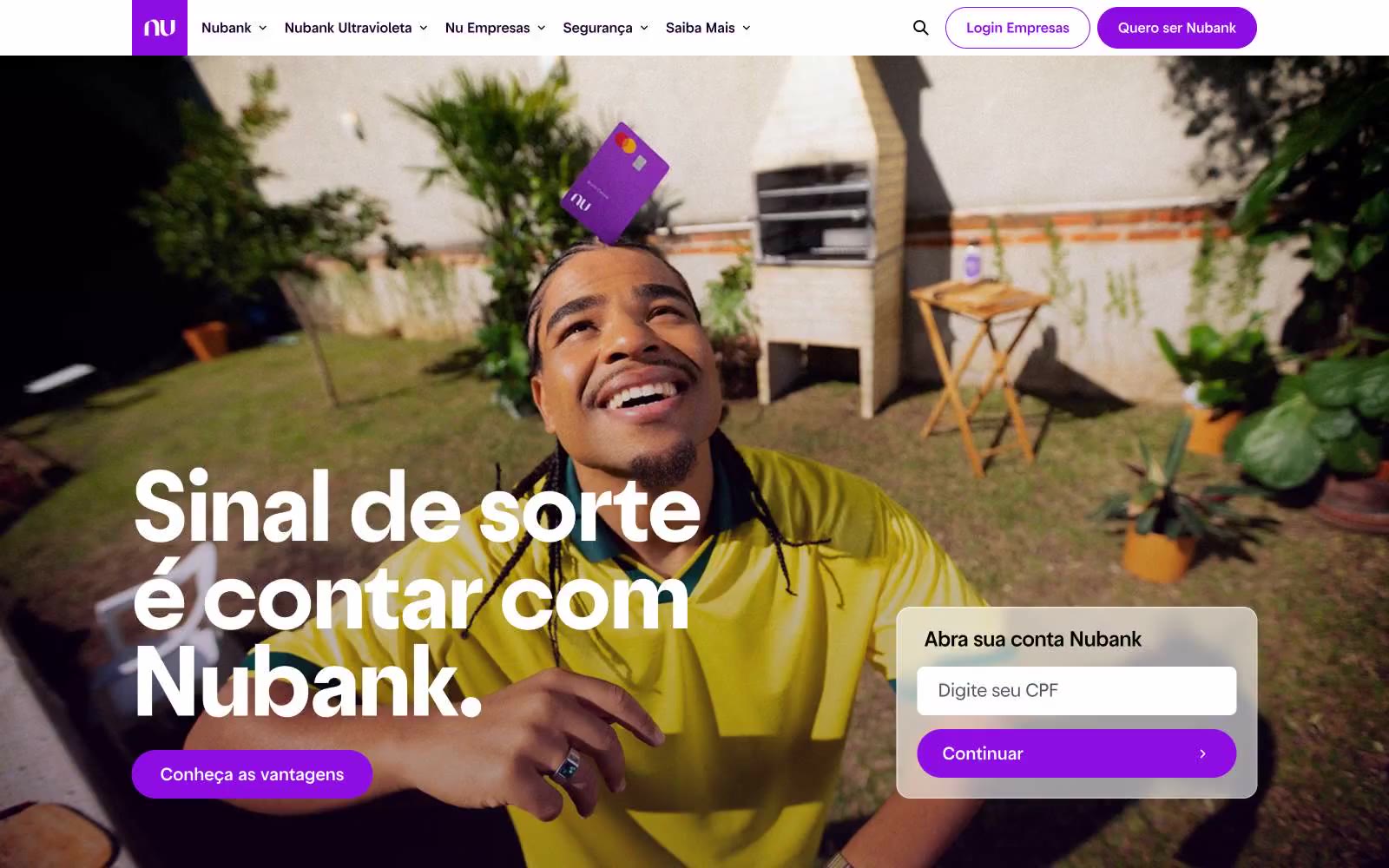
Somos incansáveis pra você não precisar ser | Nubank
Somos incansáveis pra você não precisar ser | Nubank — Style Reference
# Somos incansáveis pra você não precisar ser | Nubank — Style Reference
> Violet signal on white marble — one vivid accent on luminous off-white, all surfaces curved into soft pills.
**Theme:** mixed
Nubank operates on a radical one-accent system: a white porcelain canvas, black ink typography, and a single vivid violet that functions as the only chromatic note in the entire interface. The visual grammar is built on pill shapes — buttons, inputs, and links all curve into 999px capsules, giving the system a soft, rounded, approachable personality that softens the severity of high-contrast black-on-white. Typography carries the authority: a custom geometric sans (Graphik) at weights 400-500 with aggressive negative tracking, creating tight, composed headlines that whisper rather than shout. The page breathes — generous 8px-based spacing, large display sizes (up to 56px), and dark photo sections that contrast with otherwise luminous white surfaces. Every interaction surface is a pill, every accent is violet, and every screen feels like a single page from a meticulously typeset magazine.
## Tokens — Colors
| Name | Value | Token | Role |
|------|-------|-------|------|
| Nubank Violet | `#820ad1` | `--color-nubank-violet` | Violet supporting accent for decorative details and low-frequency emphasis. Do not promote it to the primary CTA color |
| Deep Iris | `#290b4d` | `--color-deep-iris` | Violet supporting accent for decorative details and low-frequency emphasis. Do not promote it to the primary CTA color |
| Dusty Violet | `#714f8f` | `--color-dusty-violet` | Subtle violet washes, disabled violet states, muted brand backgrounds |
| Ink | `#000000` | `--color-ink` | Dark supporting neutral for text, icons, and strong contrast. Do not promote it to the primary CTA color |
Websites
Markdown Text
design-md
website-prompt
landing-page-prompt
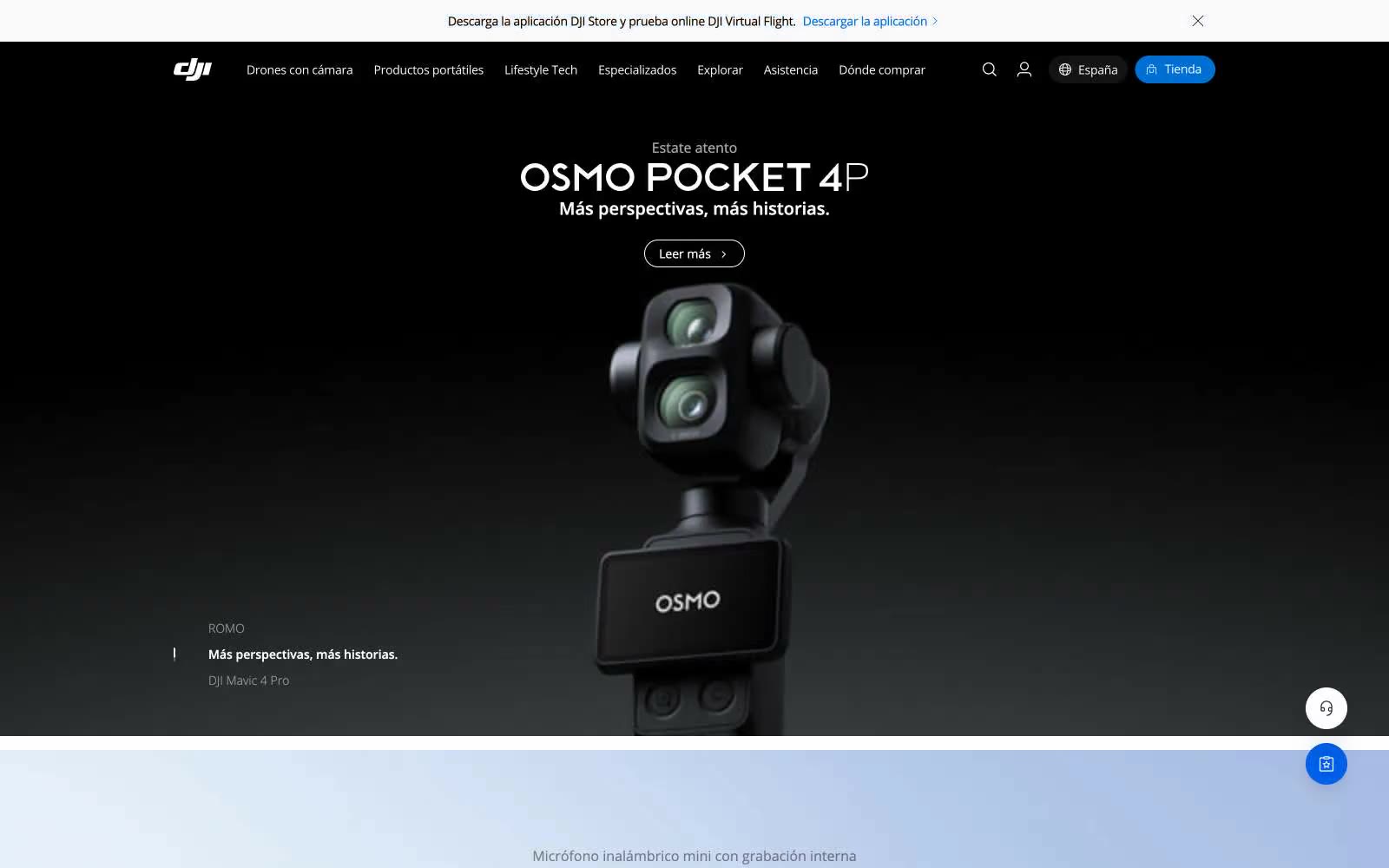
DJI
DJI — Style Reference
# DJI — Style Reference
> aerospace black canvas with a single electric blue thrust
**Theme:** mixed
DJI presents its products like aviation reveal footage: the hero is a near-black void where the device emerges from shadow, then the rest of the site opens into a clean, light-gray editorial grid of product cards. The palette is deliberately restrained — nearly monochromatic — with one vivid blue (#0070d5) that does the work of brand recognition, active state, and the one persistent call to action. Typography is Open Sans in a wide weight range (300–600) with tight negative tracking on display sizes, giving headlines a engineered, technical feel without serif warmth. Components are minimal: pill-shaped buttons at 64px radius, flat product cards with no decorative borders, ghost links with chevrons, and an almost shadowless surface system that lets the product photography carry all visual weight.
## Tokens — Colors
| Name | Value | Token | Role |
|------|-------|-------|------|
| Onyx | `#000000` | `--color-onyx` | Primary text, icons, dark hero backgrounds, footer — the dominant ink color across all UI |
| Paper | `#ffffff` | `--color-paper` | Card surfaces, nav bar, product detail panels, input fields — the lightest surface in the stack |
| Fog | `#ededed` | `--color-fog` | Page canvas behind card grids and product sections — slightly cool, lower than pure white so product imagery pops |
| Slate | `#6c7073` | `--color-slate` | Muted helper text, disabled states, secondary button borders, input placeholder |
Websites
Markdown Text
design-md
website-prompt
landing-page-prompt
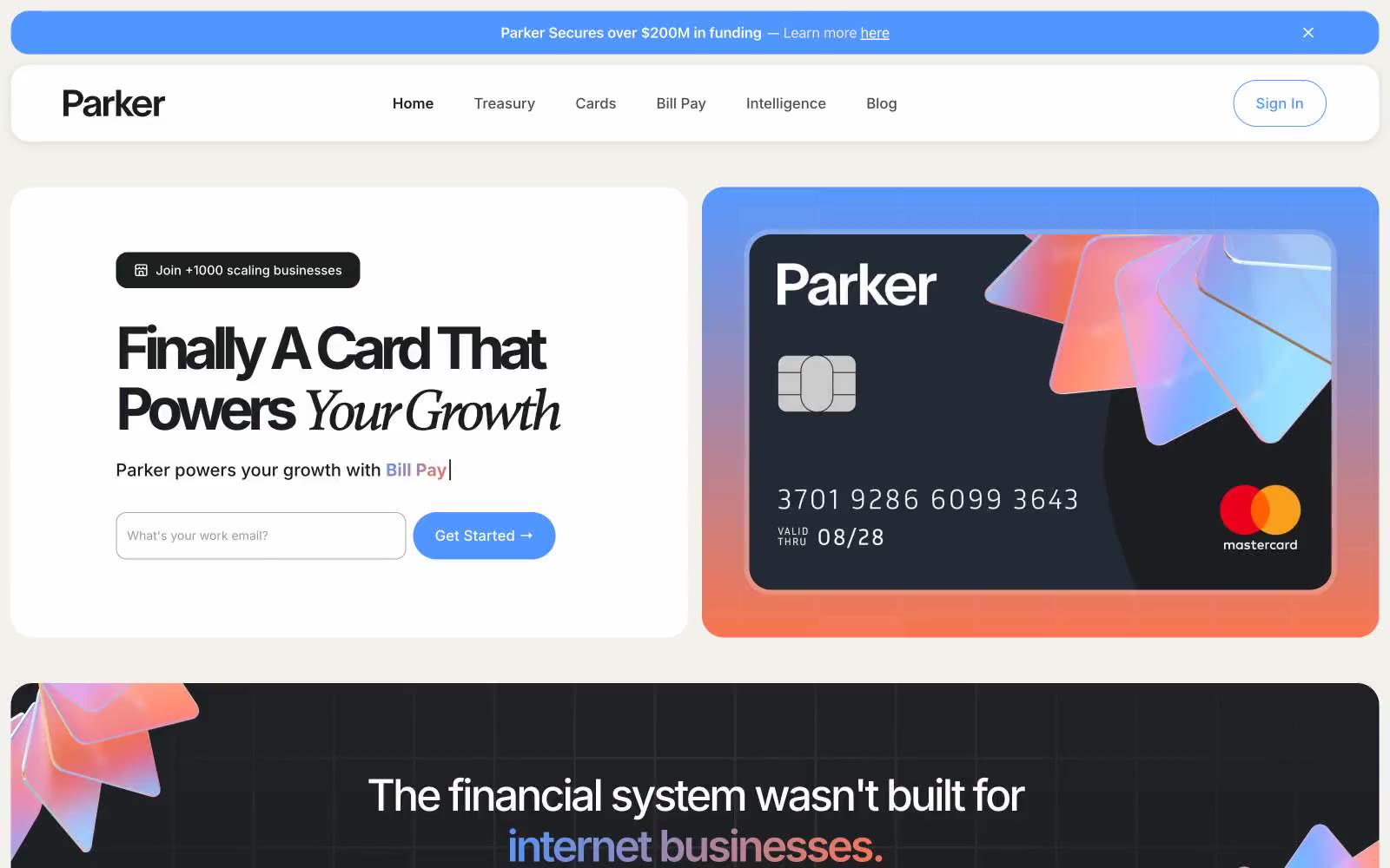
Join Parker
Join Parker — Style Reference
# Join Parker — Style Reference
> Banker's ledger meets indie magazine — white paper, electric blue ink, one italic flourish that rewrites the headline.
**Theme:** light
Parker operates as a confident fintech command center: white parchment canvas, single electric-blue primary, and a quiet italic serif that interrupts the all-sans orthodoxy. The dual-typeface system — Inter for everything functional, Gambetta italic for a single word of emphasis — is the signature: a sans headline reads as utility, but 'Powers Your Growth' in italic serif turns the value prop into editorial copy. Components are generously rounded (24px cards, 9999px pills) giving the dense financial UI a soft, approachable feel. A full-bleed electric-blue feature section breaks the white rhythm and re-establishes the brand as the visual anchor. Color is used sparingly and functionally: blue for action and brand surfaces, orange for one conversion-critical CTA, warm parchment and sand for soft surfaces that keep the page from feeling sterile.
## Tokens — Colors
| Name | Value | Token | Role |
|------|-------|-------|------|
| Electric Blue | `#5196fe` | `--color-electric-blue` | Primary brand color — filled CTAs, full-bleed feature section background, icon accents, the credit card product visual's gradient. Carries 80% of brand recognition |
| Ember Orange | `#f9754e` | `--color-ember-orange` | Orange action color for filled buttons, selected navigation states, and focused conversion moments. |
| Ink Black | `#1b1d20` | `--color-ink-black` | Primary text, dark card surfaces (the credit card mockup, the dark feature section), heavy borders. Not pure black — sits slightly warm |
| Midnight | `#101828` | `--color-midnight` | Secondary text and dark borders when Ink Black feels too heavy in tight contexts |
Websites
Markdown Text
design-md
website-prompt
landing-page-prompt
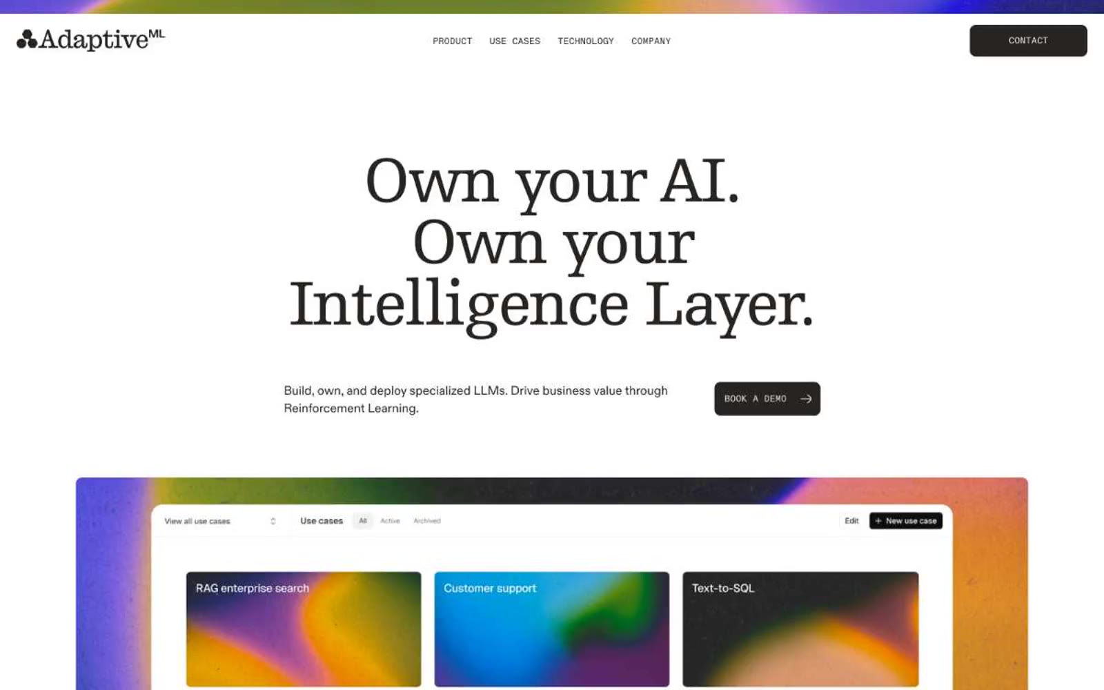
Adaptive ML
Adaptive ML — Style Reference
# Adaptive ML — Style Reference
> Printed monograph on warm cream paper. A confident editorial monochrome where the only color is the artwork on the cards and the only ornament is the serif.
**Theme:** light
Adaptive ML presents a warm editorial-monochrome language: a near-black ink (#272421) on warm cream-white paper (#ffffff, #edebe8), with classical serif headlines (Egyptienne F) that read like printed monograph typography rather than web display text. The interface is deliberately austere — no chromatic accent, no decorative gradient panels, no colored badges — so the eye is pulled to one of two things: the editorial headlines, or the vivid abstract gradient artwork on content cards that acts as the only color in the system. Components are flat and confident: dark filled buttons, hairline borders, 9px radii, and an almost invisible 12px shadow reserved for elevated cards. The overall rhythm is spacious and sectioned, with uppercase tracked mono labels (Diatype Mono) used as quiet typographic furniture next to flowing serif display text.
## Tokens — Colors
| Name | Value | Token | Role |
|------|-------|-------|------|
| Ink | `#272421` | `--color-ink` | Primary text, filled buttons, dark inverse surfaces, hairlines, logo mark. The single darkest token in the system — a warm near-black that reads as ink, not pure black |
| Paper Warm | `#edebe8` | `--color-paper-warm` | Hairline borders, dividers, input outlines, and card edges on light surfaces. Do not promote it to the primary CTA color |
| Paper Cool | `#e3e3e2` | `--color-paper-cool` | Tertiary surface tint, alternating row backgrounds, inset wells. Slightly cooler than Paper Warm — used sparingly to create layered depth without color |
| Mist | `#eeeeed` | `--color-mist` | Subtle dividers, low-contrast borders, badge fill backgrounds, hover wash on neutral surfaces. Sits one step lighter than Paper Warm for hairline detail work |