AI Prompt Studio - Intelligent Prompt Library
Explore and use professional AI prompts to optimize your workflow.
One-click Use
Websites
Markdown Text
design-md
website-prompt
landing-page-prompt
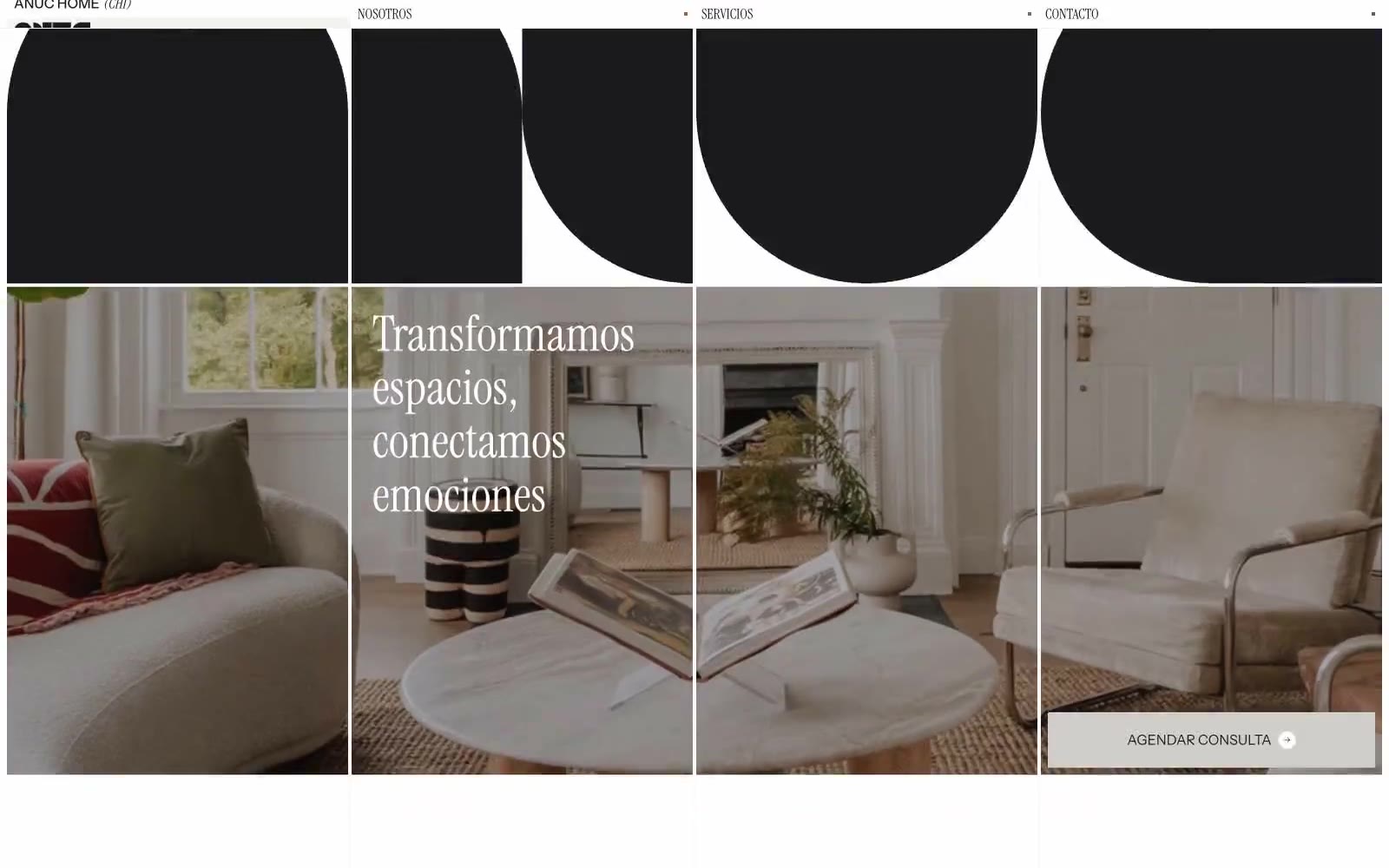
Anuc Home
Anuc Home — Style Reference

# Anuc Home — Style Reference
> editorial gallery in warm white — a quiet, magazine-like space where oversized serif headlines and monumental rounded geometric letterforms frame intimate interior photography
**Theme:** light
Anuc Home is an editorial interior-design gallery: a near-monochrome warm-white canvas where oversized Instrument Serif headlines converse with quiet Instrument Sans UI, creating a magazine-meets-architectural-portfolio atmosphere. The signature move is the massive ANUC wordmark built from pure geometric shapes — full-radius arches and circles — that doubles as the brand's visual identity and its spatial language. The palette is deliberately restrained to 2% chromatic, letting photography of styled interiors carry all the warmth; the UI never competes, just frames. Components feel architectural rather than app-like: sharp corners, hairline borders, generous negative space, and no shadows. Density is compact in data sections but breathing in editorial sections, with 96px+ section gaps creating a gallery-walk rhythm.
## Tokens — Colors
| Name | Value | Token | Role |
|------|-------|-------|------|
| Ink | `#1a1a1e` | `--color-ink` | Primary text, all borders, logo forms, icon strokes — the structural near-black that defines every contour across the system |
| Canvas | `#f3f3f2` | `--color-canvas` | Page background — warm off-white that gives the entire system its gallery-wall warmth rather than clinical white |
| Paper | `#ffffff` | `--color-paper` | Card surfaces, article blocks, elevated panels — pure white sits on top of Canvas to create subtle layering without shadows |
| Ash | `#d1d1d2` | `--color-ash` | Hairline borders, divider lines, subtle structural rules — the thinnest visible grid |
Websites
Markdown Text
design-md
website-prompt
landing-page-prompt
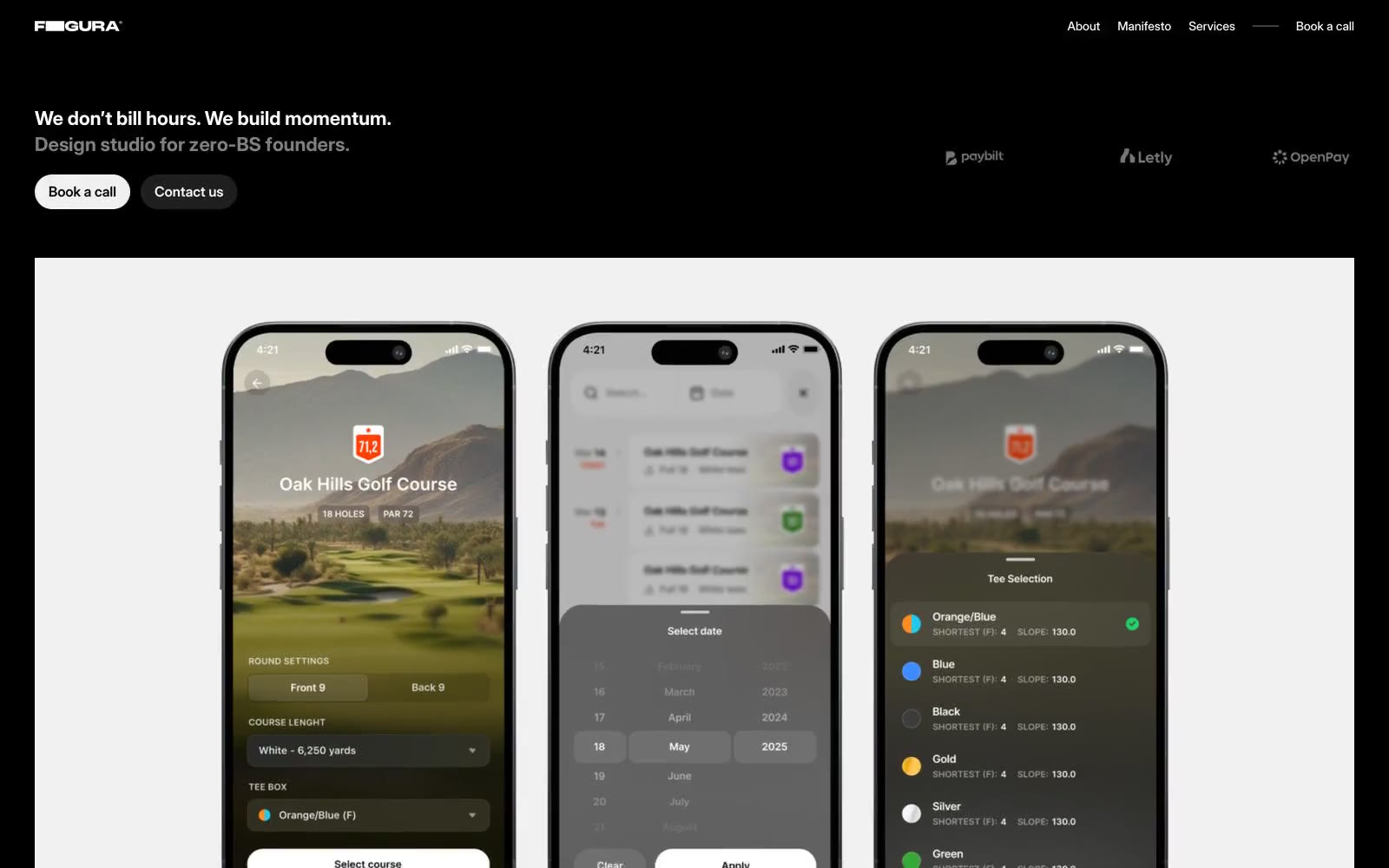
Figura
Figura — Style Reference
# Figura — Style Reference
> Black-box gallery with neon-white typography
**Theme:** dark
Figura operates in a stark monochrome register — a pitch-black canvas (#000000) with white typography that sits on the page like neon signage. The system is built on extreme contrast, not decoration: nothing competes with the words, the work, or the whitespace. White surfaces (the product mockup card) function as proscenium stages that interrupt the dark, creating a cinematic reveal between black sections. The visual attitude is confident and unapologetic — a design studio that bills itself as 'no design thinking theater' should look like one. Type does the heavy lifting: Inter Display in tight tracking for headlines, Geist Mono in wide tracking for small labels, creating a typographic duet between editorial prose and technical metadata.
## Tokens — Colors
| Name | Value | Token | Role |
|------|-------|-------|------|
| Void | `#000000` | `--color-void` | Page background, section canvas — the dominant ground that swallows 80%+ of the screen and gives white text its full charge |
| Paper | `#ffffff` | `--color-paper` | Primary text, reversed buttons, featured surface cards (product mockup stage) — used sparingly so each white element reads as a deliberate reveal |
| Ash | `#8f8f8f` | `--color-ash` | Muted helper text, secondary borders, disabled labels — the only non-pure neutral in the palette, carries low-emphasis metadata |
| Charcoal | `#1f1f1f` | `--color-charcoal` | First elevation step — subtle panel surfaces that lift content off pure black without breaking the dark mood |
Websites
Markdown Text
design-md
website-prompt
landing-page-prompt
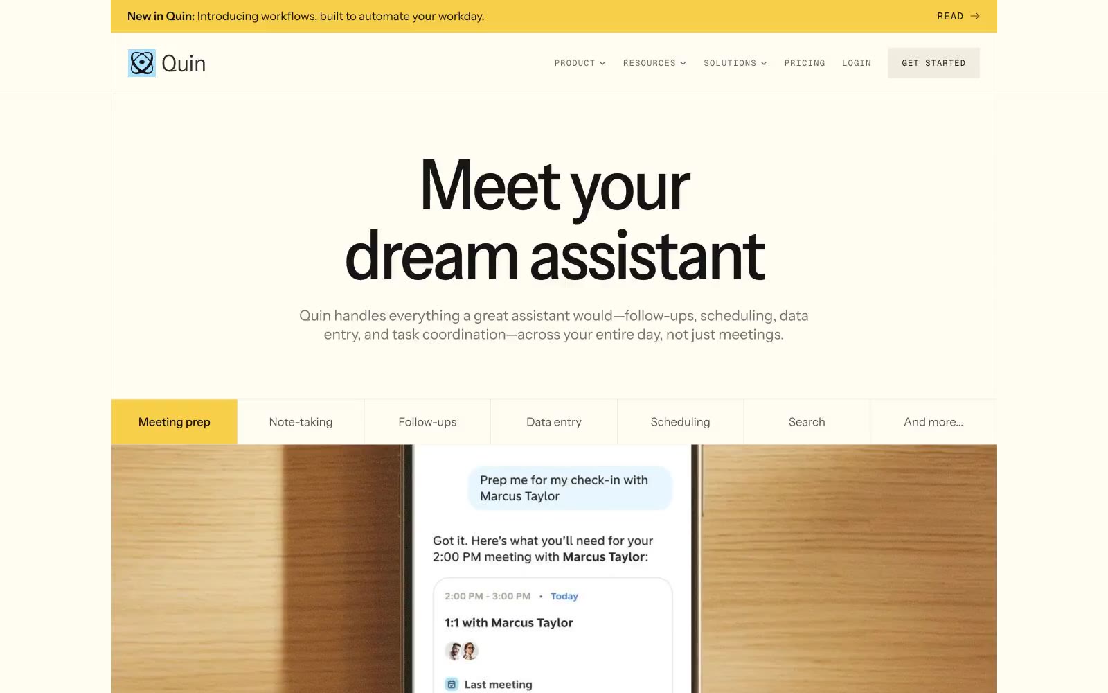
Quin
Quin — Style Reference
# Quin — Style Reference
> warm cream notebook with stamped yellow ink
**Theme:** light
Quin reads like a warm, paper-textured productivity journal — cream canvases, heavy black type, and two accent hues (honey yellow and powder blue) that feel hand-stamped rather than digitally applied. The system is overwhelmingly achromatic; warmth comes from the ivory page color (#fffcf2) and a sandstone neutral palette, not from hue. Hierarchy is built through Instrument Sans at extreme size jumps — 96px display headlines compress to 0.75 line-height with aggressive negative tracking, while body text breathes at 1.5–1.71. Every interface surface sits flat or uses a single hairline border; elevation is implied by tonal shifts in the cream scale, never by drop shadows. Geist Mono with wide positive tracking labels every interactive element, turning nav items, buttons, and badges into typeset stamps rather than chrome.
## Tokens — Colors
| Name | Value | Token | Role |
|------|-------|-------|------|
| Ivory Page | `#fffcf2` | `--color-ivory-page` | Primary canvas — page background, card surfaces, light section bands |
| Sandstone | `#f0ecdf` | `--color-sandstone` | Secondary surface — alternating bands, section dividers, subtle card fills |
| Pebble Border | `#d0cec6` | `--color-pebble-border` | Hairline borders, button outlines, nav dividers, card edges |
| Driftwood | `#a19c8c` | `--color-driftwood` | Muted decorative borders and tonal accents where a softer line is needed |
Websites
Markdown Text
design-md
website-prompt
landing-page-prompt
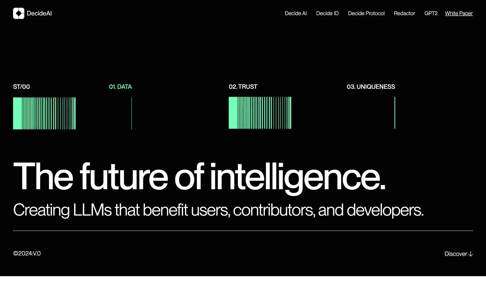
Decide AI
Decide AI — Style Reference
# Decide AI — Style Reference
> Observatory at midnight — mint signal
**Theme:** dark
Decide AI operates as a midnight intelligence command center — a near-black canvas (Deep Obsidian) where massive display type dominates and a single mint-green accent (#73ffb9) punctuates the silence. The system speaks in two voices: whisper-quiet product cards on a dark surface, and oversized editorial headlines at 110–220px that fill the viewport like a magazine spread. Typography is the entire personality: PP Neue Montreal at display weights with aggressive negative tracking collapses the visual gap between letters, creating geometric solidity at extreme sizes. Components are minimal — pill-radius buttons, thin hairline borders in #e5e7eb, and almost no decoration. Color is rationed: a 2% colorfulness budget means the green accent appears as bars, icons, and rare punctuation rather than full surfaces. Density is comfortable and spacious, with generous vertical gaps and content centered in wide container widths.
## Tokens — Colors
| Name | Value | Token | Role |
|------|-------|-------|------|
| Deep Obsidian | `#030303` | `--color-deep-obsidian` | Page canvas, card surfaces, body text on light surfaces |
| Pure Black | `#000000` | `--color-pure-black` | SVG fills, deepest surface level beneath Obsidian |
| Frost | `#ffffff` | `--color-frost` | Primary text on dark surfaces, icon fills, inverted surfaces |
| Silver Haze | `#e5e7eb` | `--color-silver-haze` | Hairline borders, dividers, subtle list separators |
Websites
Markdown Text
design-md
website-prompt
landing-page-prompt
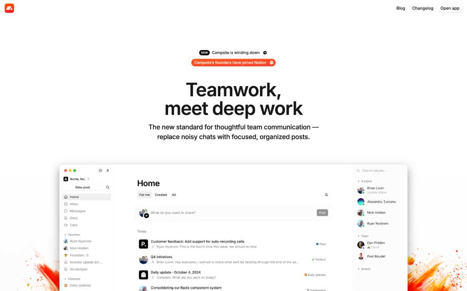
Campsite
Campsite — Style Reference
# Campsite — Style Reference
> Warm paper workspace — quiet, cream, and product-forward
**Theme:** light
Campsite runs on warm minimalism: a cream-white canvas (#fffdf9) that feels like paper, paired with near-black text and almost no color. The interface is quiet, compact, and confident — Inter at every size, tight tracking on display sizes, pill-shaped controls, and soft elevation that barely lifts off the page. Color is rationed to functional punctuation: green for resolved states, a warm yellow wash for highlights, and a single dark-orange tone that lives in decorative paint-splash branding rather than in the UI itself. The product mockup is the hero — large, full-bleed, and dominant — while surrounding copy stays small and restrained, letting the product speak.
## Tokens — Colors
| Name | Value | Token | Role |
|------|-------|-------|------|
| Warm Canvas | `#fffdf9` | `--color-warm-canvas` | Page background — a warm off-white that gives the entire site its paper-like quality |
| Pure White | `#ffffff` | `--color-pure-white` | Card surfaces, elevated panels, and product-screenshot backgrounds |
| Ash Mist | `#f5f5f5` | `--color-ash-mist` | Secondary surface for subtle differentiation — post bodies, sidebar items, input fields |
| Soft Fog | `#f0f0f0` | `--color-soft-fog` | Tertiary surface for nested elements, dividers, and inactive states |
Websites
Markdown Text
design-md
website-prompt
landing-page-prompt
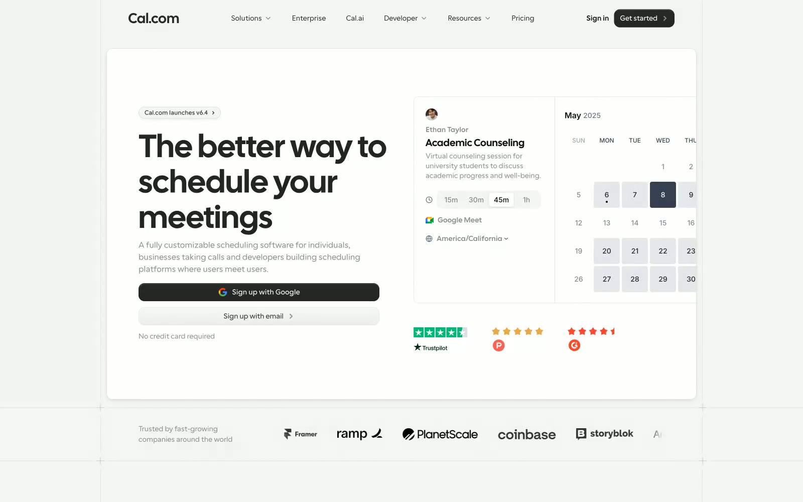
Cal.com
Cal.com — Style Reference
# Cal.com — Style Reference
> Monochrome Utility, Human Touch. A system that prioritizes clarity and function with a stark black-and-white palette, but softens it with friendly typography and rounded forms.
**Theme:** light
The design feels like a pragmatic, high-precision instrument. It's built on a strict and disciplined monochrome palette of black, white, and echelon grays, where color is intentionally excluded from the core UI to emphasize function. The custom font, 'Cal Sans', defines the visual identity with its geometric yet open letterforms, giving headlines a technical but approachable character. Nearly all interactive elements are either solid black or pill-shaped outlines, creating a binary system of action. Cards are the fundamental building block, using soft 8-12px radii and extremely subtle shadows to create a quiet, layered topology on a light gray background.
## Tokens — Colors
| Name | Value | Token | Role |
|------|-------|-------|------|
| Ink | `#101010` | `--color-ink` | Primary CTAs, primary text, active states. Used as the strongest dark tone, providing maximum contrast and visual weight for key actions. |
| Action Blue | `#0099ff` | `--color-action-blue` | Tertiary links, informational banner text. A rare, functional splash of color reserved for secondary calls to action and informational highlights. |
| White | `#ffffff` | `--color-white` | Card backgrounds, text on dark buttons. |
| Paper | `#f4f4f4` | `--color-paper` | Main page background. |
Websites
Markdown Text
design-md
website-prompt
landing-page-prompt
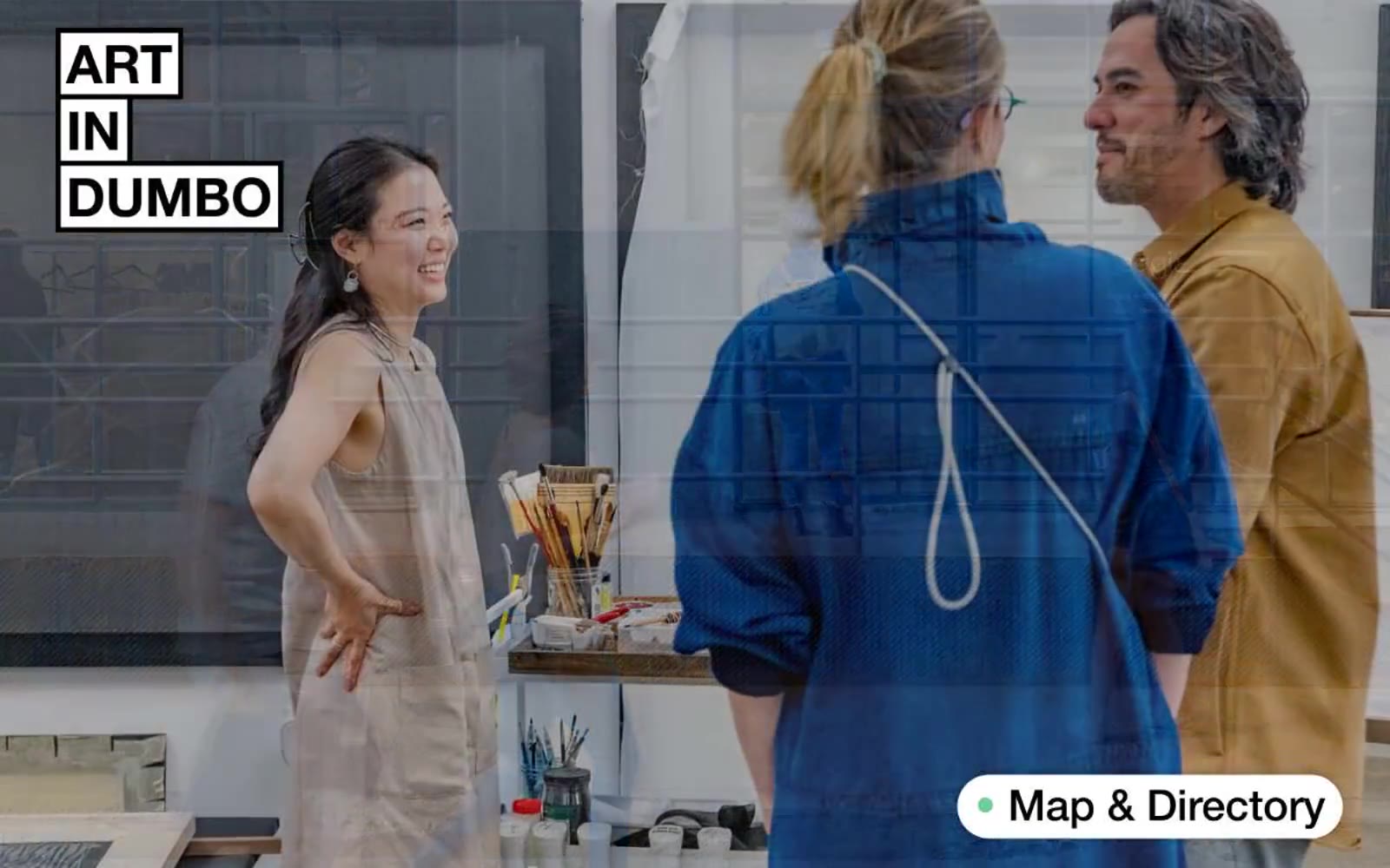
Art In DUMBO
Art In DUMBO — Style Reference
# Art In DUMBO — Style Reference
> gallery broadside on raw paper
**Theme:** light
Art In DUMBO reads like a broadside poster pinned to a white-cube gallery wall: one weight of Helvetica at every size, black ink on raw paper, and a single sage-green accent that punctuates action and status like a curator's sticker. The system is unapologetically editorial — full-bleed documentary photography carries the atmosphere while the type system stays calm, dense, and confident at every breakpoint. Surfaces are almost entirely white or warm off-white; structure comes from hairline black rules, never from shadows or colored panels. Components are few and stocky: pill buttons with 50px radii sit next to sharp 2px-radius inputs, creating deliberate radius contrast. Color is rationed — sage green for the only real CTA, warm orange for urgency tags, and otherwise a pure black-to-warm-gray ramp.
## Tokens — Colors
| Name | Value | Token | Role |
|------|-------|-------|------|
| Carbon | `#000000` | `--color-carbon` | Primary text, logo cells, hairline dividers between list rows, icon strokes — the only ink in the system |
| Paper | `#ffffff` | `--color-paper` | Page canvas, card surfaces, pill-button fills, inverse text on dark cells |
| Plaster | `#f1f2f2` | `--color-plaster` | Input fields, secondary surfaces, subtle button hovers |
| Linen | `#e5e3df` | `--color-linen` | Warm off-white section backgrounds, large quiet surfaces that break the white without going gray |
Websites
Markdown Text
design-md
website-prompt
landing-page-prompt
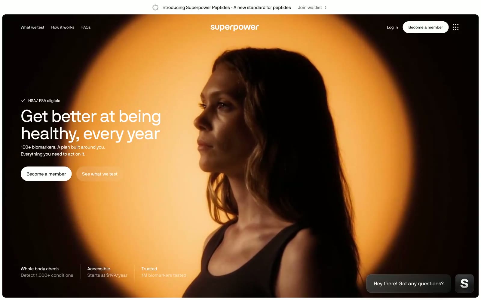
Superpower
Superpower — Style Reference
# Superpower — Style Reference
> Bioluminescent health command center
**Theme:** light
Superpower wraps a serious clinical promise in cinematic, atmospheric UI: full-bleed dark photography heroes transition into crisp white content surfaces, with one vivid sunrise-orange accent pulsing through the system. Typography carries the brand — a proprietary geometric sans at whisper-tight negative tracking, scaling from 11px metadata to 66px display with line-heights that compress as sizes grow (1.00 at display, 1.40–1.50 at body). A floating dark pill navigation bar hovers over imagery, and pill-shaped CTAs create a tension between clinical precision and warm vitality. Surfaces are mostly flat — the system relies on generous white space, hairline zinc dividers, and a single faint shadow pattern rather than heavy elevation. Color is rationed: nearly everything is black, white, or zinc-gray, and the orange appears only as functional punctuation on actions and brand marks.
## Tokens — Colors
| Name | Value | Token | Role |
|------|-------|-------|------|
| Sunrise Coral | `#fc5f2b` | `--color-sunrise-coral` | Orange supporting accent for decorative details and low-frequency emphasis. Do not promote it to the primary CTA color |
| Coral Glow | `linear-gradient(88deg, rgb(252, 95, 43), rgb(255, 139, 100) 90%, rgb(255, 255, 255))` | `--color-coral-glow` | Gradient endpoint paired with Sunrise Coral for decorative membership card wash |
| Carbon Black | `#18181b` | `--color-carbon-black` | Primary text, floating navigation bar fill, headings, icon strokes |
| Pure Black | `#000000` | `--color-pure-black` | Logo wordmark, deep contrast borders |
Websites
Markdown Text
design-md
website-prompt
landing-page-prompt
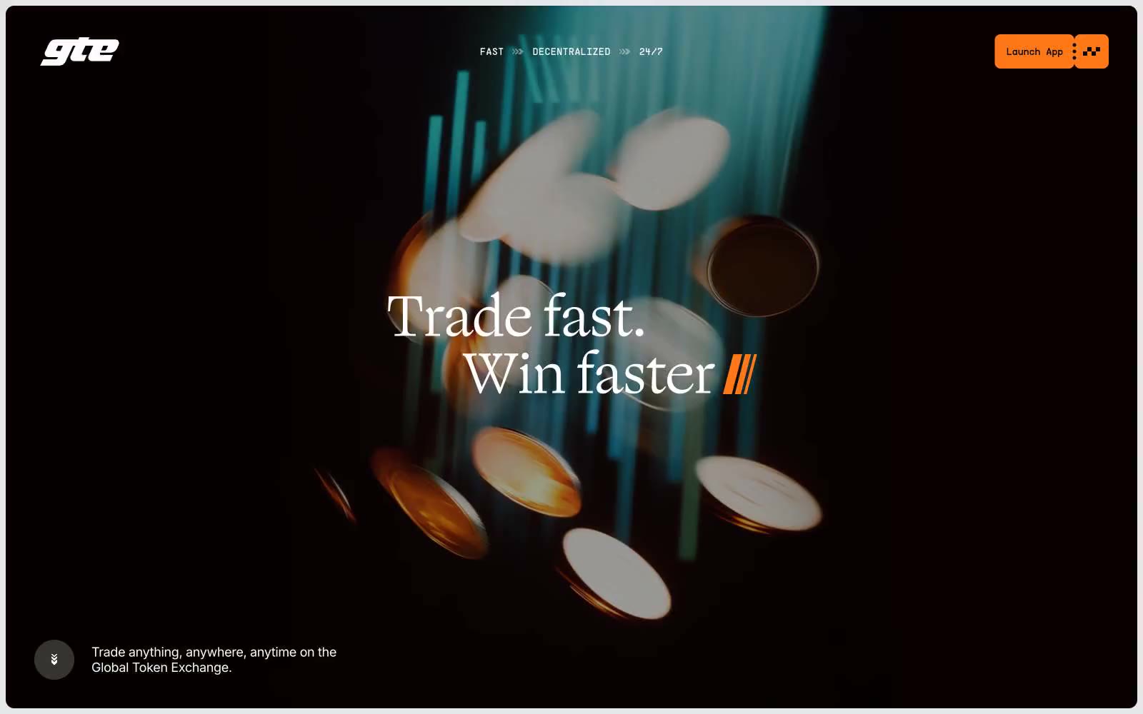
GTE
GTE — Style Reference
# GTE — Style Reference
> Trading terminal behind gallery lighting
**Theme:** mixed
GTE operates on a high-contrast split-personality canvas: a near-black hero stage gives way to a stark white content body, with a single vivid orange accent acting as the connective tissue between the two. Typography carries the brand identity more than color does — a thin, high-contrast serif (Ogg Text Light) handles every headline while a humanist sans (Inter) and a custom geometric monospace (PP Supply Mono) handle UI and data, creating a editorial-meets-terminal feel. Surfaces are flat and unshadowed; depth is achieved through tonal layering (white → soft gray → near-black) and generous border-radius on cards (12–24px) rather than drop shadows. The orange is deployed sparingly and surgically: CTA fills, small tag pills, and accent strokes — never as a wash or gradient. Density leans compact (10px gaps, 16px card padding) with breathing room reserved for section transitions (40px+). The visual rhythm is: dark dramatic hero → clean white feature grid → dark CTA band — a structure that reads as confident, editorial, and trading-desk serious.
## Tokens — Colors
| Name | Value | Token | Role |
|------|-------|-------|------|
| Ember Orange | `#ff7817` | `--color-ember-orange` | Primary CTAs, feature tag pills, active states, and brand accent strokes — the only chromatic color in the system, used surgically to signal action and brand presence against the monochrome canvas |
| Vellum | `#ffffff` | `--color-vellum` | Page canvas background, card surfaces, and inverted text on dark sections |
| Obsidian | `#18181b` | `--color-obsidian` | Primary text, dark section backgrounds, and strong borders — the structural near-black that defines all dark surfaces and high-contrast outlines |
| Onyx | `#09090b` | `--color-onyx` | Deepest dark — modal backgrounds, input borders on dark, the darkest UI layer above Obsidian |
Websites
Markdown Text
design-md
website-prompt
landing-page-prompt
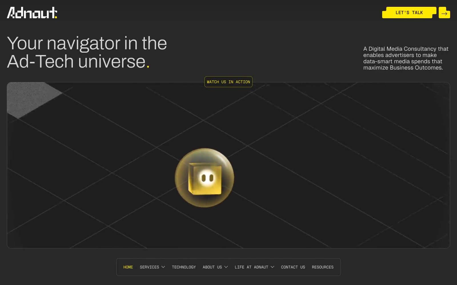
Adnaut
Adnaut — Style Reference
# Adnaut — Style Reference
> After-hours mission control lit by sodium lamps
**Theme:** dark
Adnaut operates in a nocturnal command-deck language: near-black canvas, confident yellow punctuation, and ultra-light display type that floats above a landscape of rounded, glassy cards and isometric 3D vignettes. Color is rationed — almost the entire surface is achromatic or a single carbonized dark, with #ffe900 as a reactive highlighter that draws the eye to nav, CTAs, and accent cards; #00ff1a flashes in once or twice per screen for editorial emphasis. The system feels weightless despite the dark base: cards are tall and lightly bordered, headlines whisper at weight 100-300, and components lean on radius rather than shadow to separate layers. Every interface element should feel like a control surface in a control room — restrained, precise, and lit from within by a single warm-yellow lamp.
## Tokens — Colors
| Name | Value | Token | Role |
|------|-------|-------|------|
| Sodium Yellow | `#ffe900` | `--color-sodium-yellow` | Primary CTA fills, active nav indicators, accent card backgrounds, logo wordmark, and the single chromatic punctuation across an otherwise monochrome system |
| Lime Pulse | `#00ff1a` | `--color-lime-pulse` | Editorial accent — one or two keyword words per page glow in this green to carry emphasis and keep the palette from feeling monochrome |
| Carbon | `#1f1d01` | `--color-carbon` | Page background canvas — the near-black with a barely-warm tint that anchors the entire system |
| Graphite | `#282828` | `--color-graphite` | Elevated card surfaces, outlined button borders, and the primary border tone for sections that need separation from the canvas |
Websites
Markdown Text
design-md
website-prompt
landing-page-prompt
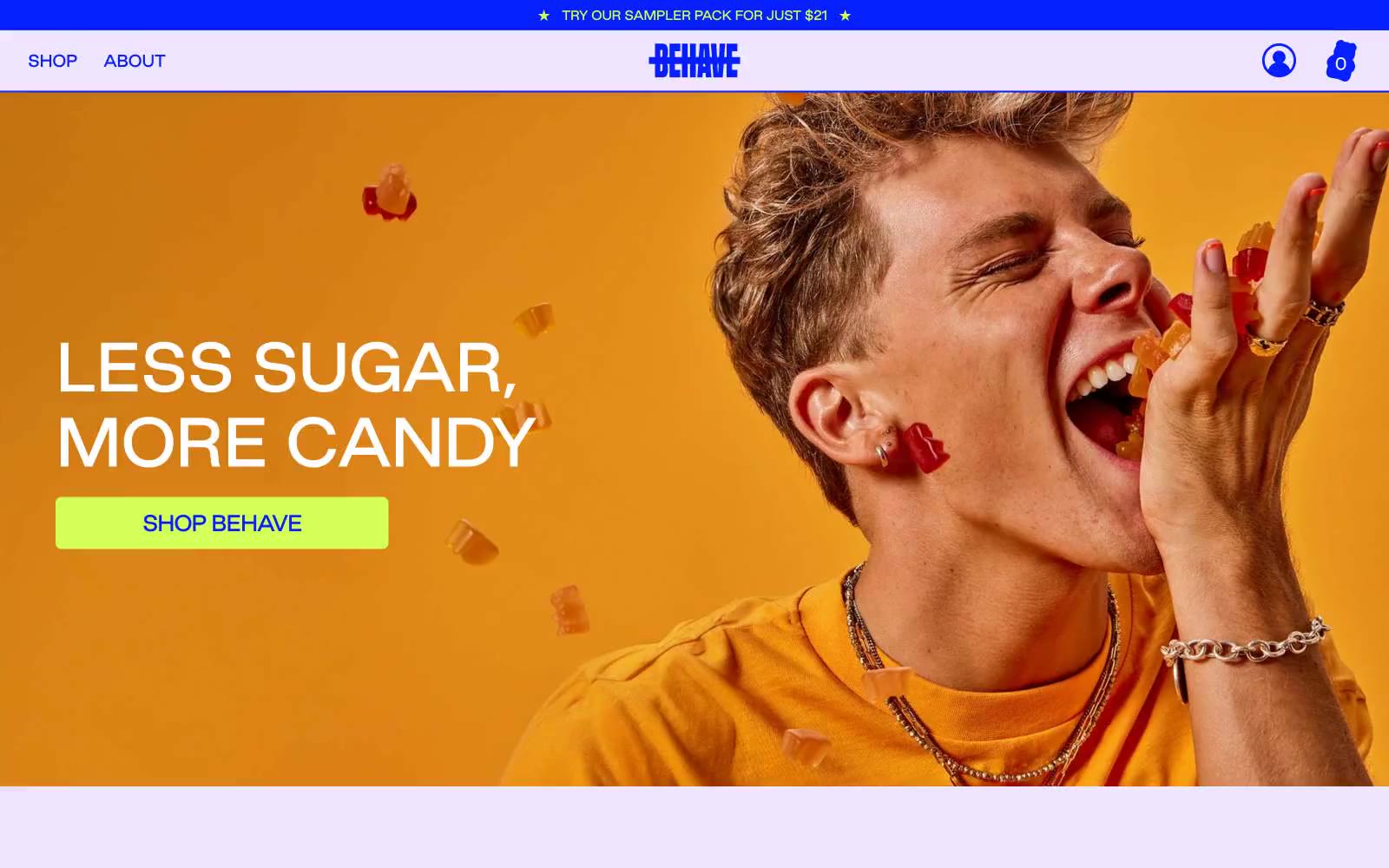
BEHAVE Candy
BEHAVE Candy — Style Reference
# BEHAVE Candy — Style Reference
> neon candy-aisle pop. A single electric cobalt carries every word, chartreuse lime stabs through as the only accent, and pale lavender makes the whole thing feel lit from within rather than printed.
**Theme:** light
BEHAVE candy speaks in a maximalist candy-aisle visual language: a single dominant cobalt blue carries every word, border, and icon, while electric chartreuse lime punctuates only the moments that need to act or shout. The canvas is pale lavender rather than white, which makes the cobalt feel like neon signage rather than corporate navy. Photography is editorial and full-bleed — close-cropped people mid-bite, rows of gummy bears — and text is almost entirely the brand blue, never black or gray. Components are soft-cornered but not pillowy: cards carry a 20px radius and thin cobalt outlines, buttons sit at a tighter 7px radius, and type runs tight (-0.05em at display sizes) to give the wide headlines a compressed, almost squished punch. The overall feeling is unapologetically loud, friendly, and slightly bratty — built for a single product category, not a platform.
## Tokens — Colors
| Name | Value | Token | Role |
|------|-------|-------|------|
| Cobalt Surge | `#061fff` | `--color-cobalt-surge` | Headlines, body text, card borders, nav links, icons, and the filled primary CTA — this is the single voice of the brand and appears in nearly every context including input outlines. Saturated blue at near-maximum chroma reads as neon rather than corporate |
| Sour Lime | `#d3ff56` | `--color-sour-lime` | Green action color for filled buttons, selected navigation states, and focused conversion moments. |
| Blush Puck | `#ffcfd1` | `--color-blush-puck` | Product card fills behind the flavor name — a warm pink that softens the cobalt/lime intensity and reads as candy packaging rather than UI chrome |
| Lavender Mist | `#efe5ff` | `--color-lavender-mist` | Primary page canvas — every content section between photographic full-bleeds lives on this pale lavender. Replaces what would normally be white or light gray |
Websites
Markdown Text
design-md
website-prompt
landing-page-prompt
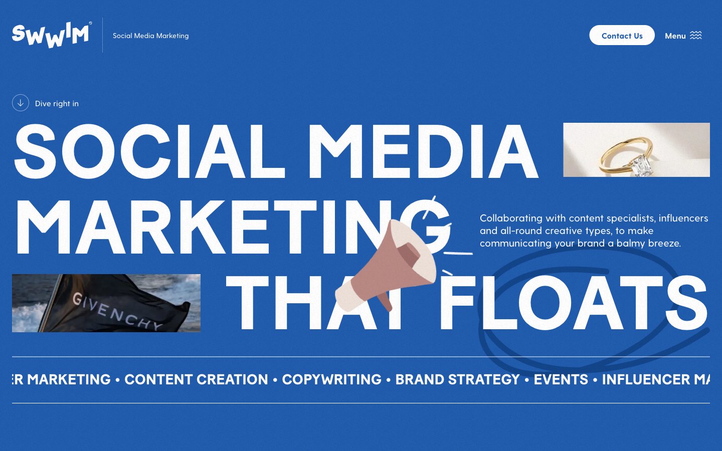
Swwim
Swwim — Style Reference
# Swwim — Style Reference
> Cobalt wave with floating luxury objects.
A vivid blue ocean where oversized white type is pierced by editorial product still-lifes.
**Theme:** light
Swwim is a full-bleed, blue-saturated agency site where the hero IS the brand: a massive all-caps Baton Turbo display at 151px sits on a vivid cobalt field, scattered with floating product crops (a diamond ring, a Givenchy sandal, a megaphone) that overlap the letterforms. The rest of the system stays disciplined — white canvas pages, hairline #e5e7eb borders, pill-shaped controls with 9999px radius, Greycliff for everything readable. The color palette is nearly monochromatic: one hero blue (#1658b3) carries the page, with deeper #0d3c88 and darkest #01295f as gradient depth inside decorative graphics, and a single warm #eee1d9 flesh-tone accent peeking through illustration fills. Components are flat, borderless against the blue, and almost borderless against white — elevation comes from typography weight, not shadow stacks.
## Tokens — Colors
| Name | Value | Token | Role |
|------|-------|-------|------|
| Cobalt Current | `#1658b3` | `--color-cobalt-current` | Hero background, primary surface flood, outlined-link borders — the single color that defines every full-bleed section |
| Deep Channel | `#0d3c88` | `--color-deep-channel` | Darker blue for gradient depth in decorative graphics, icon accents, footer bands |
Websites
Markdown Text
design-md
website-prompt
landing-page-prompt
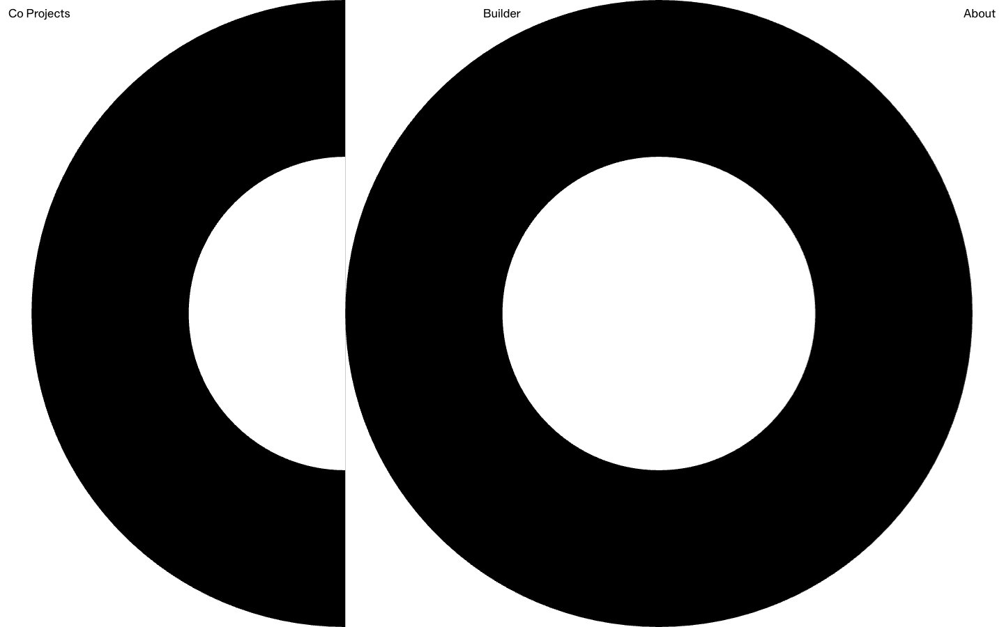
Co Projects
Co Projects — Style Reference
# Co Projects — Style Reference
> black geometric sculpture on white void. Massive circular forms carved from a pure white gallery wall, where the only type is whisper-weight 400 and the only accent is the void between things.
**Theme:** light
Co Projects operates as a geometric art gallery translated into web form: a pure white void interrupted by massive black circular forms, a single hairline gray for structural rules, and two weight-400 typefaces doing all the communication. The system rejects almost every contemporary UI convention — no shadows, no gradients, no color, no rounded rectangles, no bold weights, no icons. What remains is raw figure/ground contrast at architectural scale: tiny 16px nav labels float in the corners while 60px display text and viewport-spanning black rings dominate the canvas. Spacing is museum-generous, with 139–208px gaps between major elements creating room to breathe that most product interfaces would call wasteful. The visual language trusts that shape, scale, and negative space carry the brand harder than any color system could.
## Tokens — Colors
| Name | Value | Token | Role |
|------|-------|-------|------|
| Paper White | `#ffffff` | `--color-paper-white` | Page canvas, background of all surfaces, inner counter of the ring forms — the negative space that gives the black marks their mass |
| Graphite Ink | `#000000` | `--color-graphite-ink` | Primary mark fill, text, and the large circular ring forms. The sole chromatic-payload element in the system |
| Fog Hairline | `#e5e7eb` | `--color-fog-hairline` | Hairline borders, structural dividers, and subtle separator rules at 1px. The only gray in the palette and it never fills — it only divides |
Websites
Markdown Text
design-md
website-prompt
landing-page-prompt
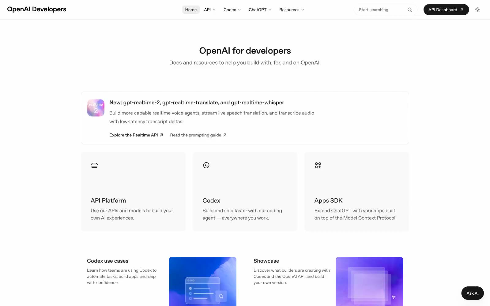
OpenAI Developers
OpenAI Developers — Style Reference
# OpenAI Developers — Style Reference
> stark white laboratory
**Theme:** light
OpenAI Developers is a stark, documentation-first interface built on pure white canvas with near-black text and zero chromatic accent. Visual hierarchy lives entirely in typographic weight, generous whitespace, and quiet surface shifts between #ffffff, #f9f9f9, and #f3f3f3 rather than color, shadow, or decoration. Components are flat, geometric, and small: 8px-radius cards with hair-thin borders, pill-shaped controls, and a single dark button that reads as the only significant mass on screen. The result feels like an engineering reference sheet — precise, unornamented, and confident that the content carries the weight. Color appears only as deliberate punctuation: a blue-purple gradient on the model-version badge and, below the fold, gradient product cards that break the monochrome to signal featured material.
## Tokens — Colors
| Name | Value | Token | Role |
|------|-------|-------|------|
| Obsidian | `#000000` | `--color-obsidian` | Dark supporting neutral for text, icons, and strong contrast. Do not promote it to the primary CTA color |
| Paper White | `#ffffff` | `--color-paper-white` | Page canvas, card surfaces, inverse text on dark buttons |
| Carbon | `#181818` | `--color-carbon` | Section backgrounds, dark surface containers, large heading text |
| Fog White | `#f9f9f9` | `--color-fog-white` | Card backgrounds, subtle elevated surfaces, ghost button hover fills |
Websites
Markdown Text
design-md
website-prompt
landing-page-prompt
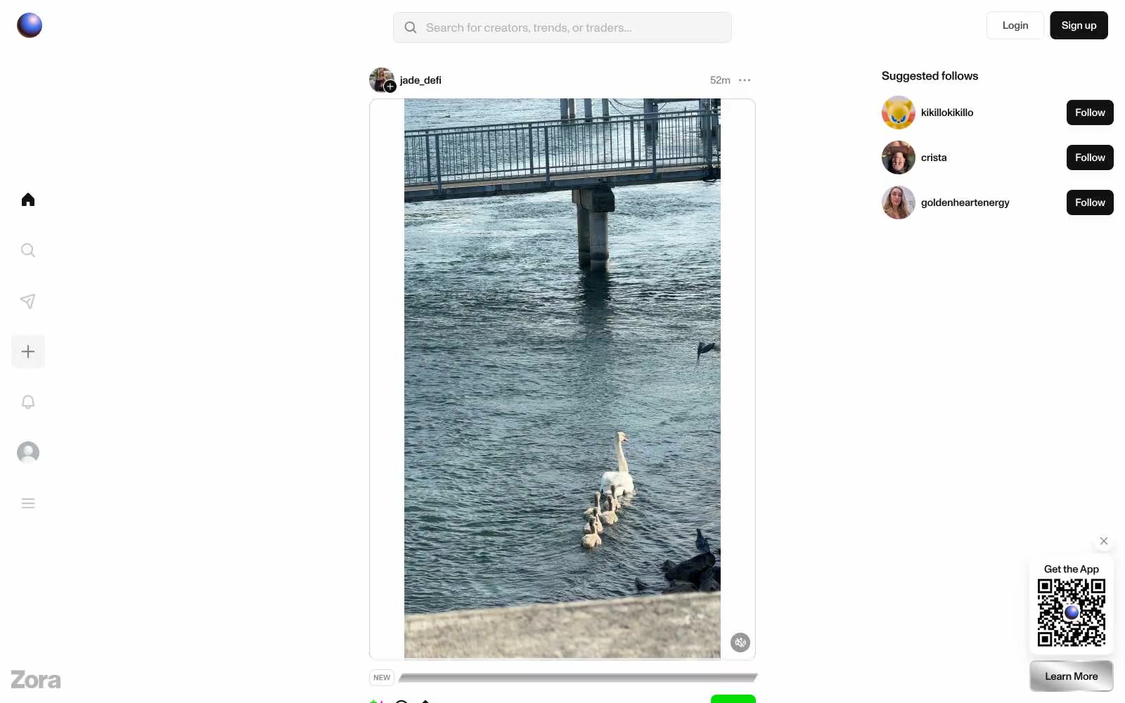
Zora
Zora — Style Reference
# Zora — Style Reference
> Neon gallery on graphite glass.\n\n{
**Theme:** light
Zora operates as a stark digital gallery: a near-monochrome canvas where only neon-grade color earns screen space. The interface is ruthlessly compact — 11–17px type, 4–8px gaps, pill-shaped controls — letting the artwork carry visual weight while the chrome recedes. MonumentGrotesk's geometric neutrality, set tight at -0.015em, reads more like UI labels than prose, reinforcing a tool-like, transactional posture. Color appears as deliberate shock: one radioactive green for purchase actions, one hot pink for secondary emphasis, and otherwise pure grayscale. Elevation is suppressed; cards sit flat with hairline edges rather than shadow stacks.
## Tokens — Colors
| Name | Value | Token | Role |
|------|-------|-------|------|
| Void Black | `#121212` | `--color-void-black` | Dark supporting neutral for text, icons, and strong contrast. Do not promote it to the primary CTA color |
| Graphite | `#4d4d4d` | `--color-graphite` | Secondary text, body copy, icons, nav labels, metadata |
| Fog Gray | `#878787` | `--color-fog-gray` | Muted helper text, tertiary metadata, inactive icon strokes |
| Ash | `#cacaca` | `--color-ash` | Placeholder text, light borders, disabled strokes |
Websites
Markdown Text
design-md
website-prompt
landing-page-prompt
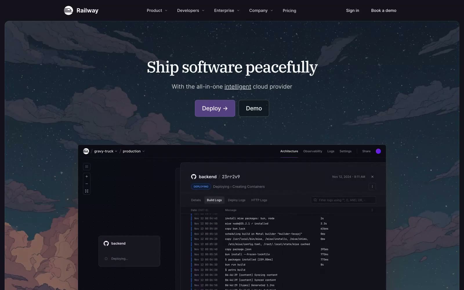
Railway
Railway — Style Reference
# Railway — Style Reference
> Cosmic Midnight Express. A calm, powerful journey through a dark, starlit environment, guided by clear signals.
**Theme:** dark
The design system feels like a tranquil night journey on a futuristic train. It operates in a deep, near-black space (#13111c), punctuated by a single, focused accent of cosmic lilac (#553f83) for primary actions, creating a calm yet confident mood. Large, elegant serif headlines (IBM Plex Serif) provide a literary, almost classic authority that contrasts with the clean, utilitarian sans-serif (Inter) used for the UI. Elevation is achieved through subtle surface shifts and fine borders (#33323e) rather than shadows, reinforcing a flat, technical aesthetic. The signature element is the painterly, atmospheric hero illustration, which establishes a peaceful, imaginative tone that subverts typical dev-tool intensity.
## Tokens — Colors
| Name | Value | Token | Role |
|------|-------|-------|------|
| Deep Space | `#13111c` | `--color-deep-space` | Primary page background. |
| Surface | `#1a191f` | `--color-surface` | Card backgrounds, secondary surfaces. |
| Crater | `#33323` | `--color-crater` | Borders, UI dividers, subtle background elements. |
| Black Hole | `#0d0c14` | `--color-black-hole` | Darkest UI components, code blocks. |
Websites
Markdown Text
design-md
website-prompt
landing-page-prompt
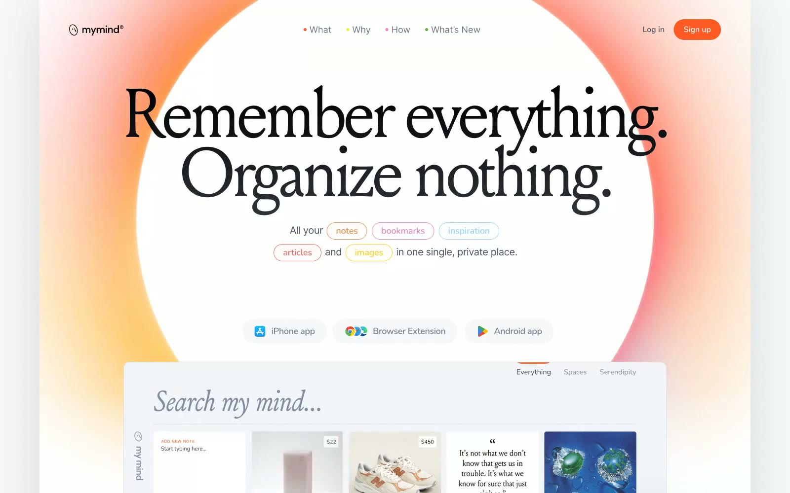
mymind
mymind — Style Reference
# mymind — Style Reference
> Sunlit personal archive — a warm afternoon light spilling across a private collection of saved thoughts, images, and bookmarks, curated without folders.
**Theme:** light
mymind feels like a private journal left open on a warm windowsill — soft, diffuse light bleeding in from orange-to-white gradients that suffuse the entire canvas in ambient warmth. The hero background is a radial bloom of coral-orange fading to white, not a photograph or illustration, just color as atmosphere. Typography does the heavy lifting: Louize serif at 96–140px with aggressive negative tracking (-0.062em) creates editorial weight that editorial magazines would recognize, while Nunito handles micro-UI labels at tracked-out uppercase (0.063em to 0.125em) — the two extremes of the letter-spacing scale are the system's visual signature. Cards sit on tinted pastel surfaces (#e5eaf2, #f3f0e7, #dde9d3) rather than generic white, each hue suggesting a different mood of content. The single chromatic accent — Ember Orange #ff5924 — appears only as an outlined pill button border and brand moment, never as a filled CTA, making it feel like a mark rather than a command.
## Tokens — Colors
| Name | Value | Token | Role |
|------|-------|-------|------|
| Ember Orange | `linear-gradient(rgb(255, 89, 36) 0%, rgb(255, 168, 106) 100%)` | `--color-ember-orange` | Brand accent — outlined pill buttons, nav bullet markers, section eyebrow text. Never filled. Appears as coral-warm mark, not command.; Decorative gradient on brand moments and section backgrounds — orange to warm amber; Hero section background — radial bloom from intense orange bleeding into white canvas, creating the signature warm ambient atmosphere |
| Cobalt Link | `#1573dd` | `--color-cobalt-link` | Inline hyperlinks and underlined interactive text — only chromatic non-orange color in the UI |
| Midnight Ink | `#000000` | `--color-midnight-ink` | Page background (dark sections), primary display text, icon fills |
| Canvas White | `#f9fafc` | `--color-canvas-white` | Primary page canvas — the base surface of all main content sections |
Websites
Markdown Text
design-md
website-prompt
landing-page-prompt
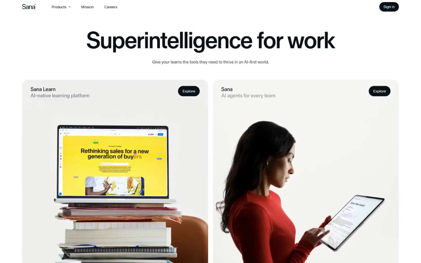
Sana Agents
Sana Agents — Style Reference
# Sana Agents — Style Reference
> Lime spark on editorial white
**Theme:** light
Sana's design system is an editorial-grade monochrome canvas with a single electric accent — a Swiss-poster discipline applied to a knowledge work product. The page is overwhelmingly white and typographic, with a massive weight-400 serif headline that gives the brand a literary, almost magazine-cover authority rare in AI tooling. Dark surfaces (#0a1217) and one vivid lime (#cdfe00) appear as deliberate punctuation — full-bleed product cards, sign-up panels, and the occasional action button — never as background washes. Rounded geometry is generous: 24px for cards and inputs, full pills for buttons, which together give the system a soft, tactile quality against the otherwise austere type. Components stay flat and unshaded; depth comes from surface color contrast rather than shadows, creating a visual rhythm of white → frost → ink → lime rather than z-axis elevation.
## Tokens — Colors
| Name | Value | Token | Role |
|------|-------|-------|------|
| Ink Black | `#0a1217` | `--color-ink-black` | Primary text, dark card surfaces, sign-up panel, filled primary buttons on light backgrounds |
| Paper White | `#ffffff` | `--color-paper-white` | Light supporting surface for subtle backgrounds and section separation. Do not promote it to the primary CTA color |
| Frost Wash | `#e4eff7` | `--color-frost-wash` | Soft tinted surface for light product cards and secondary panels — the only chromatic step between paper white and ink black |
| Stone Gray | `#85898b` | `--color-stone-gray` | Muted helper text, footer labels, and desaturated secondary copy |

Websites
Markdown Text
design-md
website-prompt
landing-page-prompt
SpatialChat
SpatialChat — Style Reference
# SpatialChat — Style Reference
> violet pulse on white parchment
**Theme:** light
SpatialChat is a airy SaaS marketing surface that treats violet as a single sharp accent against an almost paper-white canvas. The visual rhythm is wide: generous vertical breathing room, centered hero stacks, then alternating two-column feature blocks. Weight lives in typography — Satoshi carries 700-weight display lines at 60px — while UI elements stay flat or float with a barely-there 6%-opacity shadow. Components read as soft rectangles: 12px buttons, 16px cards, hairline #e5e7eb borders. Color is rationed: violet (#5727e7) appears only on primary CTAs, the announcement bar, the 'New' badge, and active states; everywhere else is grayscale. The mood is confident-but-friendly — a product page that wants to feel modern without being cold, and approachable without being playful.
## Tokens — Colors
| Name | Value | Token | Role |
|------|-------|-------|------|
| Brand Violet | `#5727e7` | `--color-brand-violet` | Violet supporting accent for decorative details and low-frequency emphasis. Do not promote it to the primary CTA color |
| Tinted Highlight | `#f2f2ff` | `--color-tinted-highlight` | Light supporting surface for subtle backgrounds and section separation. |
| Ink Black | `#030712` | `--color-ink-black` | Headline text, primary copy at full weight — the deepest near-black, used wherever the system needs maximum contrast on white |
| Graphite | `#222222` | `--color-graphite` | Secondary text, button labels on filled surfaces, dark UI chrome where pure black is too heavy |
Websites
Markdown Text
design-md
website-prompt
landing-page-prompt
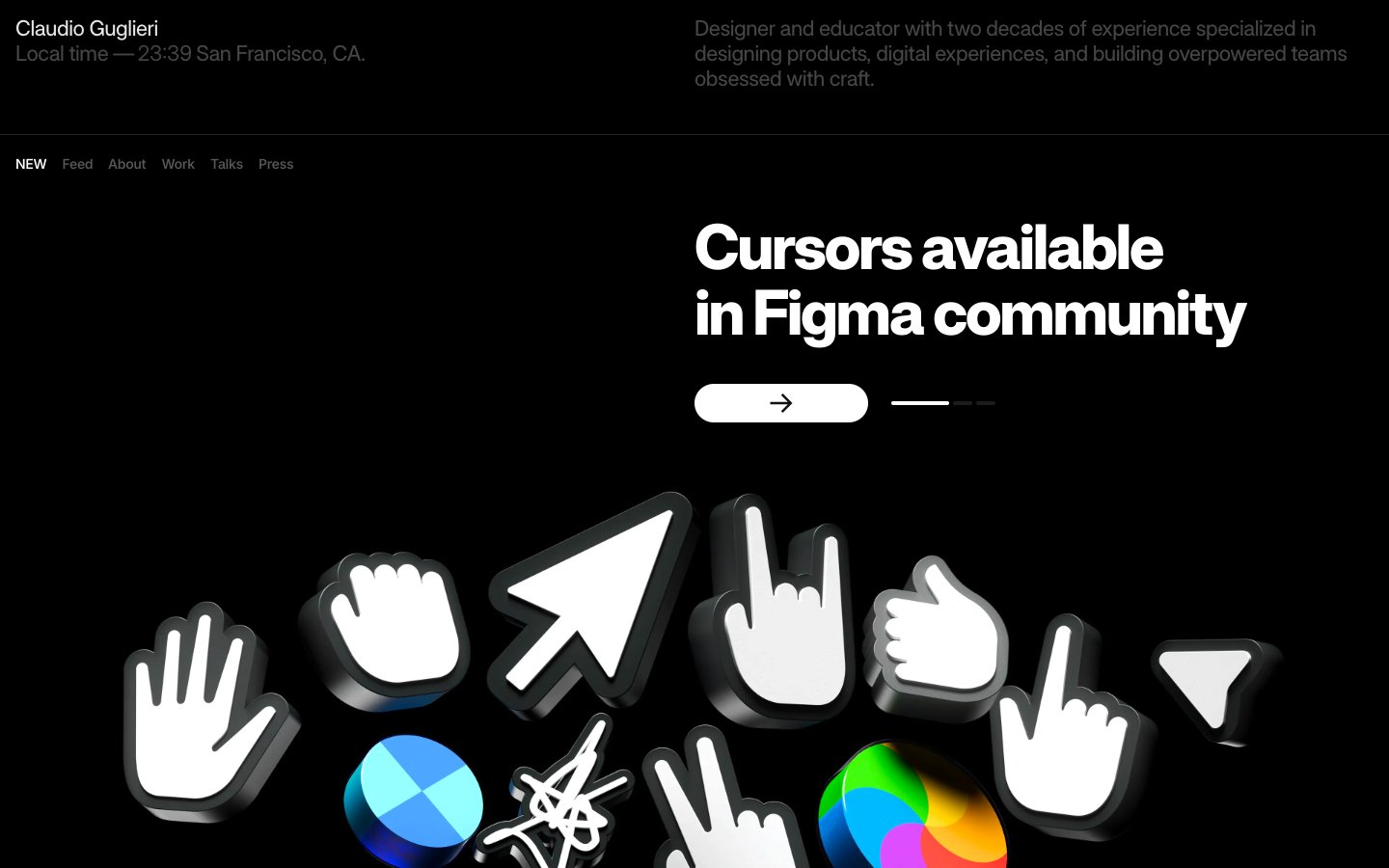
Guglieri
Guglieri — Style Reference
# Guglieri — Style Reference
> monochrome typographic gallery. Every pixel is either ink-black, paper-white, or a gray between — hierarchy lives in the weight of Raveo Variable, never in color.
**Theme:** dark
Guglieri is a monochrome typographic gallery: pure obsidian canvas, one voice of custom variable display type at its heaviest weight, and zero chromatic noise. The entire system is achromatic — every interface element, border, and label lives on a grayscale between true black and pure white, with the only color in the experience coming from editorial imagery and artwork. Hierarchy is built through weight, size, and negative letter-spacing rather than color, with the custom Raveo Variable font pushing to weight 1000 to create visual mass without warmth. Components are stripped to their skeletons: pill buttons with hairline borders, generous section spacing, and text-driven navigation. The mood is a designer-critic's reading room — confident, editorial, anti-decorative.
## Tokens — Colors
| Name | Value | Token | Role |
|------|-------|-------|------|
| Obsidian | `#000000` | `--color-obsidian` | Page background, card surfaces, primary canvas — the default stage for all content |
| Paper White | `#ffffff` | `--color-paper-white` | Primary text, pill button fills, display headlines on dark, thin borders for reverse-contrast components |
| Carbon | `#111111` | `--color-carbon` | Input fields, secondary surface elevation, subtle dark borders — one shade above Obsidian for depth without contrast |
| Graphite | `#1c1c1c` | `--color-graphite` | Elevated surface layer above the canvas — for overlay cards, tooltips, and floating panels |
Websites
Markdown Text
design-md
website-prompt
landing-page-prompt
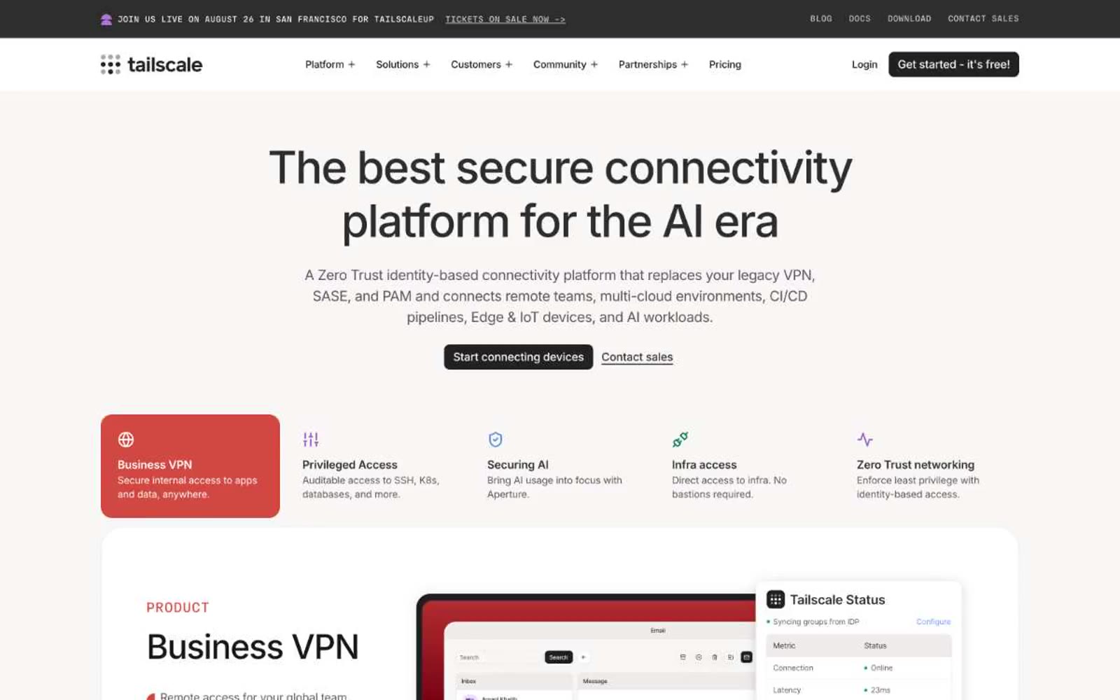
Tailscale
Tailscale — Style Reference
# Tailscale — Style Reference
> Engineer's whiteboard on cream paper. A warm off-white canvas with a single red marker stroke, soft 16px corners, and Inter at whisper weights — the visual language of infrastructure documentation that respects the reader.
**Theme:** light
Tailscale's visual system is a warm, paper-grounded infrastructure UI that treats network security as approachable rather than intimidating. A cream canvas (#eeebea) replaces the typical stark white SaaS background, and a single Signal Red (#d04841) acts as rare punctuation against a near-black (#181717) text and border system. Typography stays conversational — Inter at light weights (300-400) for headlines rather than the usual bold-shout, and a custom geometric (MDIO) reserved for small technical labels with wide tracking. Components are soft and rounded (16px is the dominant radius for cards, nav, images, and buttons), shadows are barely perceptible (2% black at 4px blur), and the overall feel is a confident engineer's notebook rather than a corporate dashboard.
## Tokens — Colors
| Name | Value | Token | Role |
|------|-------|-------|------|
| Ink | `#181717` | `--color-ink` | Dark borders and separators for elevated surfaces and inverted UI. Do not promote it to the primary CTA color |
| Bone | `#eeebea` | `--color-bone` | Page canvas and section backgrounds — the warm off-white ground that sets the whole system apart from stark-white SaaS |
| Paper | `#ffffff` | `--color-paper` | Card surfaces, product UI panels, testimonial tiles, integration logos — lifted off the Bone canvas to create depth |
| Graphite | `#2e2d2d` | `--color-graphite` | Secondary borders, body text dividers, nav rules — one step lighter than Ink for layered information |
Websites
Markdown Text
design-md
website-prompt
landing-page-prompt
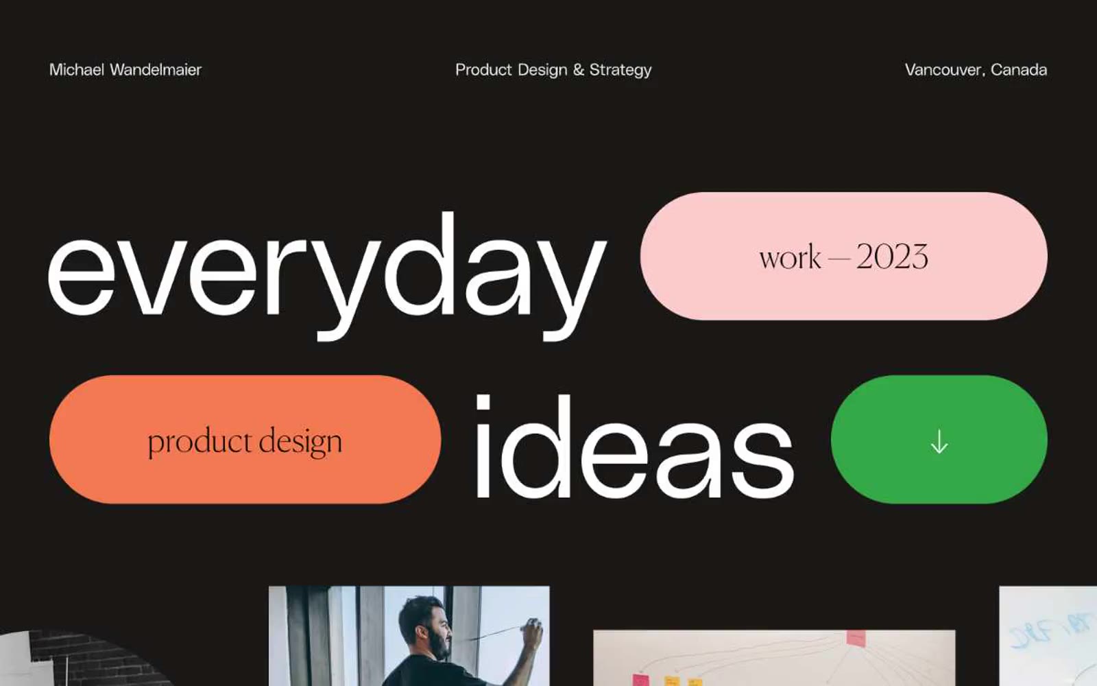
Michael Wandelmaier
Michael Wandelmaier — Style Reference
# Michael Wandelmaier — Style Reference
> museum placard on black velvet — three candy pills, one whisper-weight serif, and almost nothing else.
**Theme:** dark
A designer's portfolio reads as an after-hours editorial gallery: an almost-black canvas hosts oversized hairline serif headlines (Canela Web at weight 100) that fill the viewport like poster type, while three candy-coloured pill shapes — coral, apricot, grass green — sit alongside the words like adhesive labels on a curator's wall. The sans counterpart (PolySans, also weight 100) is reserved for small all-caps tags and UI chrome, set with an unusually wide 0.2em tracking that makes even 12px labels feel like printed specimen text. The page is deliberately monochrome and quiet everywhere except for those three filled pills, which function as the only bursts of colour on the entire site — used as category labels, not as actions. The only true interactive surface is a green pill with a down-arrow. There are no shadows, no gradients, no decorative borders; hierarchy is built entirely through type scale, white space, and the contrast between vast dark areas and tight white text blocks.
## Tokens — Colors
| Name | Value | Token | Role |
|------|-------|-------|------|
| Inkwell | `#000000` | `--color-inkwell` | Page background, card surface, image masking — the entire site lives on this near-black canvas. True black, not charcoal; the void is the design |
| Bone | `#ffffff` | `--color-bone` | Neutral form states, badge text, and quiet UI feedback where color should stay understated. Do not promote it to the primary CTA color |
| Ash | `#a9a9a9` | `--color-ash` | Medium-contrast borders, control outlines, and structural separators. |
| Ember | `#302f2d` | `--color-ember` | List separators with a barely-perceptible warm cast — gives the hairline rules a paper-like tone against the cold black background |
Websites
Markdown Text
design-md
website-prompt
landing-page-prompt
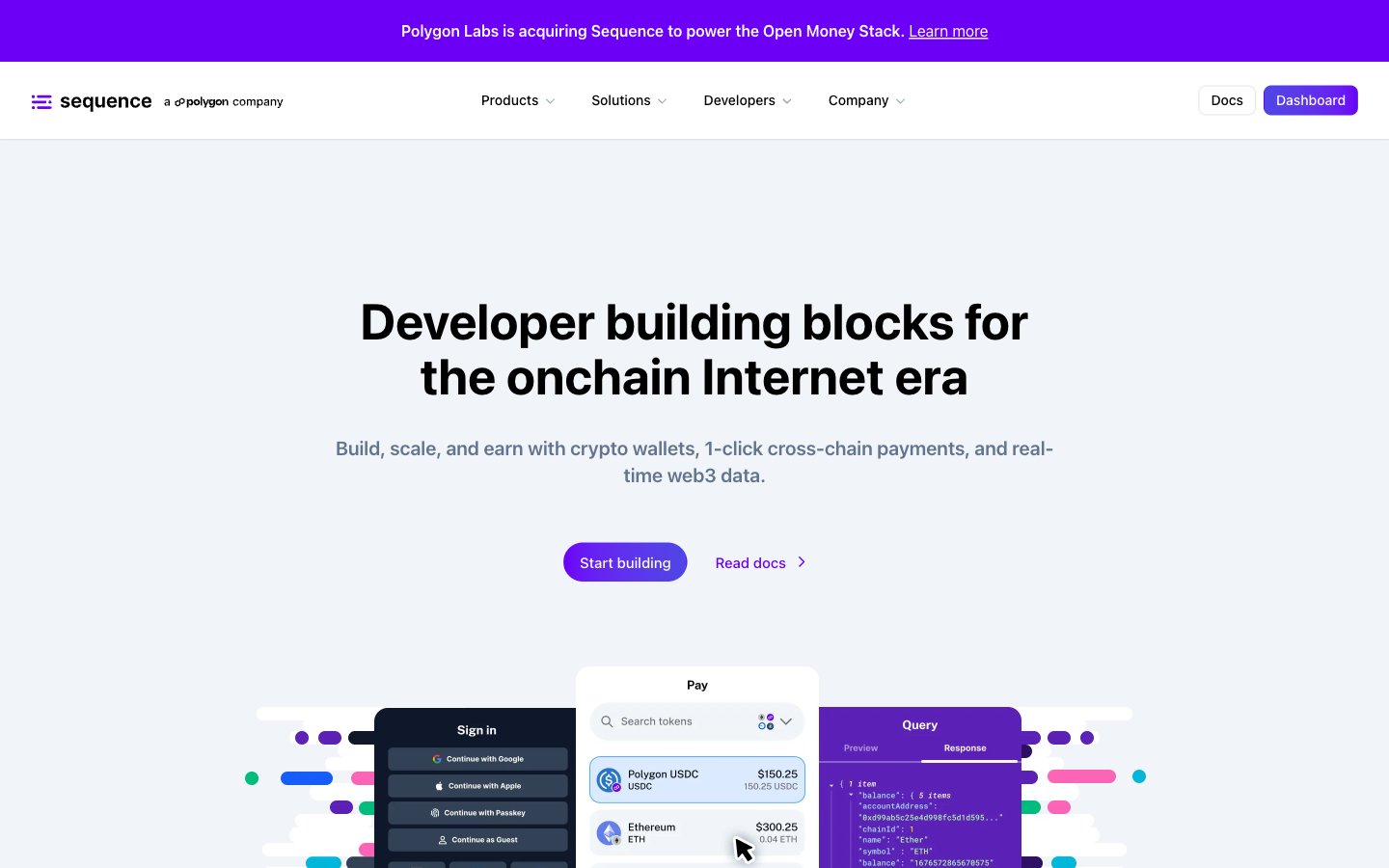
Sequence
Sequence — Style Reference
# Sequence — Style Reference
> API console on soft daylight — the interface is the product, and purple is the only power color.
**Theme:** light
Sequence presents a light, developer-first visual language built on white surfaces, a confident sans-serif type system, and a single dominant purple that acts as the only serious brand signal on the page. The aesthetic reads like a modern API platform — generous whitespace, compact card grids, hairline borders, and soft elevation rather than heavy shadows or dark mode theatrics. Color is rationed: pages stay largely monochromatic, with purple reserved for primary actions, the logo, and a signature gradient that powers hero treatments and the dashboard call-to-action. Decorative accents in green, blue, and pink appear inside product illustrations and mockups, not in the chrome — they signal 'crypto-native' without competing with the brand. Components are flat and functional, leaning on geometry (8px button radius, 20px card radius, 24px soft shadow) rather than decoration to create rhythm and trust.
## Tokens — Colors
| Name | Value | Token | Role |
|------|-------|-------|------|
| Electric Iris | `linear-gradient(to right, #6c00f6 0%, #4f46e5 100%)` | `--color-electric-iris` | Violet text accent for links, tags, and emphasized short phrases. Do not promote it to the primary CTA color |
| Bright Violet | `#7f22fe` | `--color-bright-violet` | Violet text accent for links, tags, and emphasized short phrases. Do not promote it to the primary CTA color |
| Indigo Drift | `#4f46e5` | `--color-indigo-drift` | Gradient terminus — pairs with Electric Iris to create the right-leaning purple-to-indigo gradient on CTAs and hero accents |
| Midnight Slate | `#0f172b` | `--color-midnight-slate` | Primary text, dark surface fills, logo mark, and icon strokes — the heaviest neutral in the system |
Websites
Markdown Text
design-md
website-prompt
landing-page-prompt
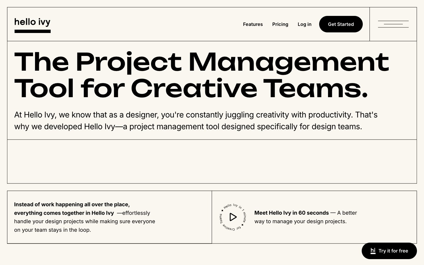
Helloivy
Helloivy — Style Reference
# Helloivy — Style Reference
> Risograph-printed design journal on cream paper. A two-color editorial system where personality lives in typography, not color — the cream background, black ink, and one whisper-gray are the entire palette, and the quirky geometric display face carries all the brand energy the restrained palette deliberately withholds.
**Theme:** light
Helloivy uses a warm-cream editorial canvas with near-monochrome ink-black typography, giving the product a print-magazine feel rather than typical SaaS sterility. The display typeface (Unbounded) is geometric and slightly playful, carrying personality that the restrained palette deliberately withholds; Inter does the quiet labor of body, UI, and labels. Surfaces are flat — no shadows, no gradients — and the only elevation comes from filled black pills sitting on cream, or muted gray cards containing product commentary. Color is rationed: the cream canvas (#faf6f0) anchors the page, black owns headlines and primary actions, a single slate gray (#5e697f) handles secondary text, and white is reserved for product mockup surfaces. Everything else is space, type, and the occasional thin hairline border.
## Tokens — Colors
| Name | Value | Token | Role |
|------|-------|-------|------|
| Cream Paper | `#faf6f0` | `--color-cream-paper` | Page canvas, section backgrounds, card surfaces — the warm off-white ground that makes the whole site read like a print artifact rather than a screen |
| Ink Black | `#000000` | `--color-ink-black` | Headlines, body text, primary filled buttons, logo mark, dividers, icons — the dominant structural color carrying almost all information |
| Slate Whisper | `#5e697f` | `--color-slate-whisper` | Secondary body text, muted descriptions, helper text, subdued labels — the single desaturated accent that softens body copy without competing with headlines |
| Charcoal | `#555555` | `--color-charcoal` | Secondary paragraph text, sub-labels, low-emphasis copy where Slate Whisper isn't deployed — fills the gap between ink-black headlines and whisper-gray annotations |