AI Prompt Studio - Intelligent Prompt Library
Explore and use professional AI prompts to optimize your workflow.
One-click Use
Websites
Markdown Text
design-md
website-prompt
landing-page-prompt
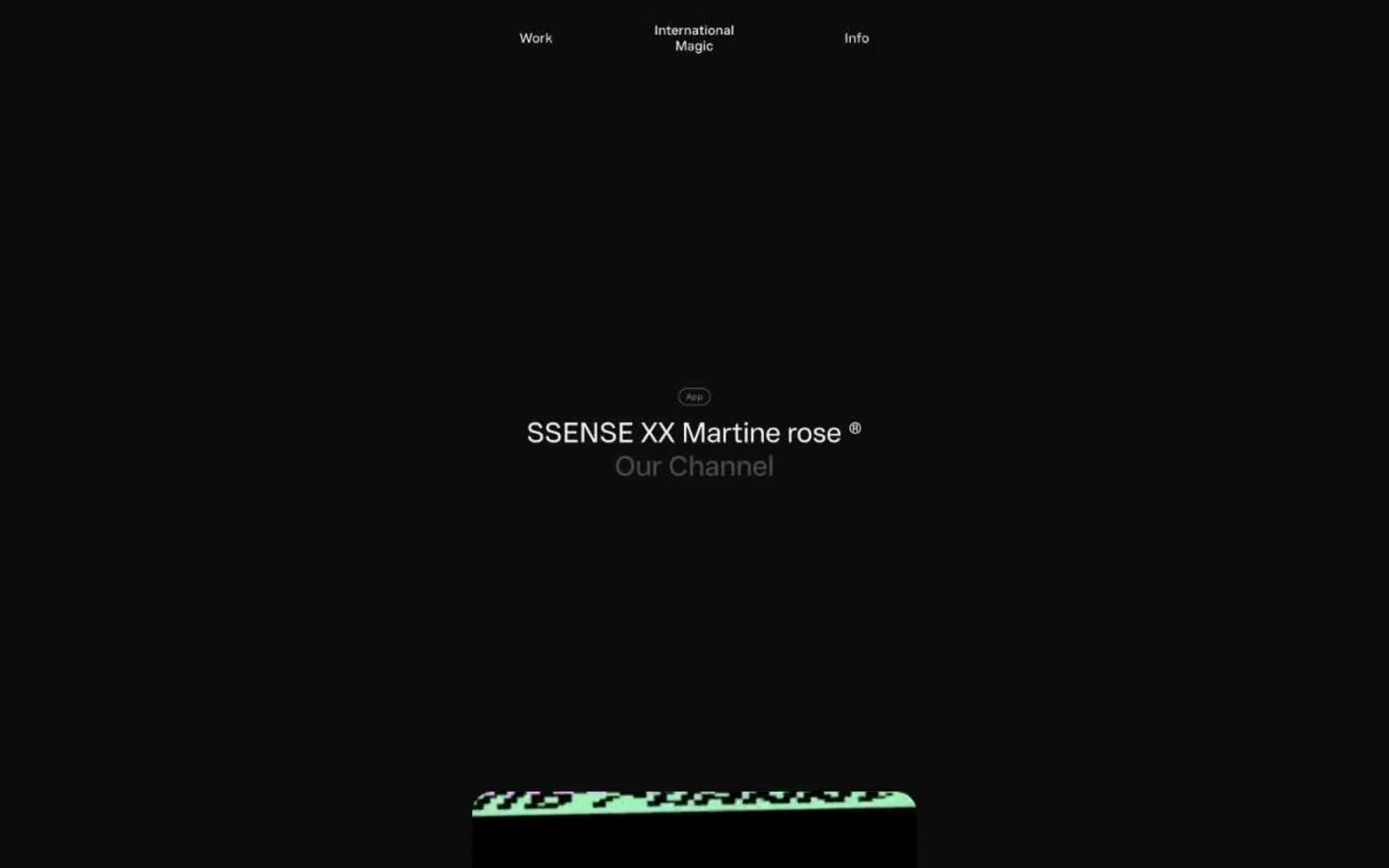
International Magic
International Magic — Style Reference

# International Magic — Style Reference
> midnight gallery wall — a single spotlight, a piece of work, and a wall of black velvet
**Theme:** dark
International Magic presents itself inside a near-black void where only the work is allowed to speak. The entire interface is achromatic — off-white type on charcoal canvas, with gray as the only variable — so attention collapses onto whatever the agency is showing. Layouts are sparse, centered, and vertical, with enormous breathing room between sections; navigation sits as three quiet words in a single line at the very top. Components are soft and rounded: 24px on device and work containers, 9999px on buttons and badges, and one large diffuse shadow that gently lifts content from the darkness rather than locking it down with sharp edges. The custom Wand UI Pro typeface carries almost the entire brand voice — its negative tracking at display sizes and slightly widened tracking on micro-labels create the same contrast as the page: quiet at scale, deliberate at small.
## Tokens — Colors
| Name | Value | Token | Role |
|------|-------|-------|------|
| Void | `#0a0a0a` | `--color-void` | Page background, primary canvas — the dark field that holds every piece of work |
| Chalk | `#f7f7f7` | `--color-chalk` | Hairline borders, dividers, input outlines, and card edges on light surfaces. Do not promote it to the primary CTA color |
| Ivory | `#ebebeb` | `--color-ivory` | Button labels and button borders — marginally warmer than Chalk, used on neutral pill buttons to feel pressed but not clinical |
| Ash | `#7c7c7c` | `--color-ash` | Secondary link and body text, subdued dividers — mid-gray for de-emphasized type that still needs to read |
Websites
Markdown Text
design-md
website-prompt
landing-page-prompt
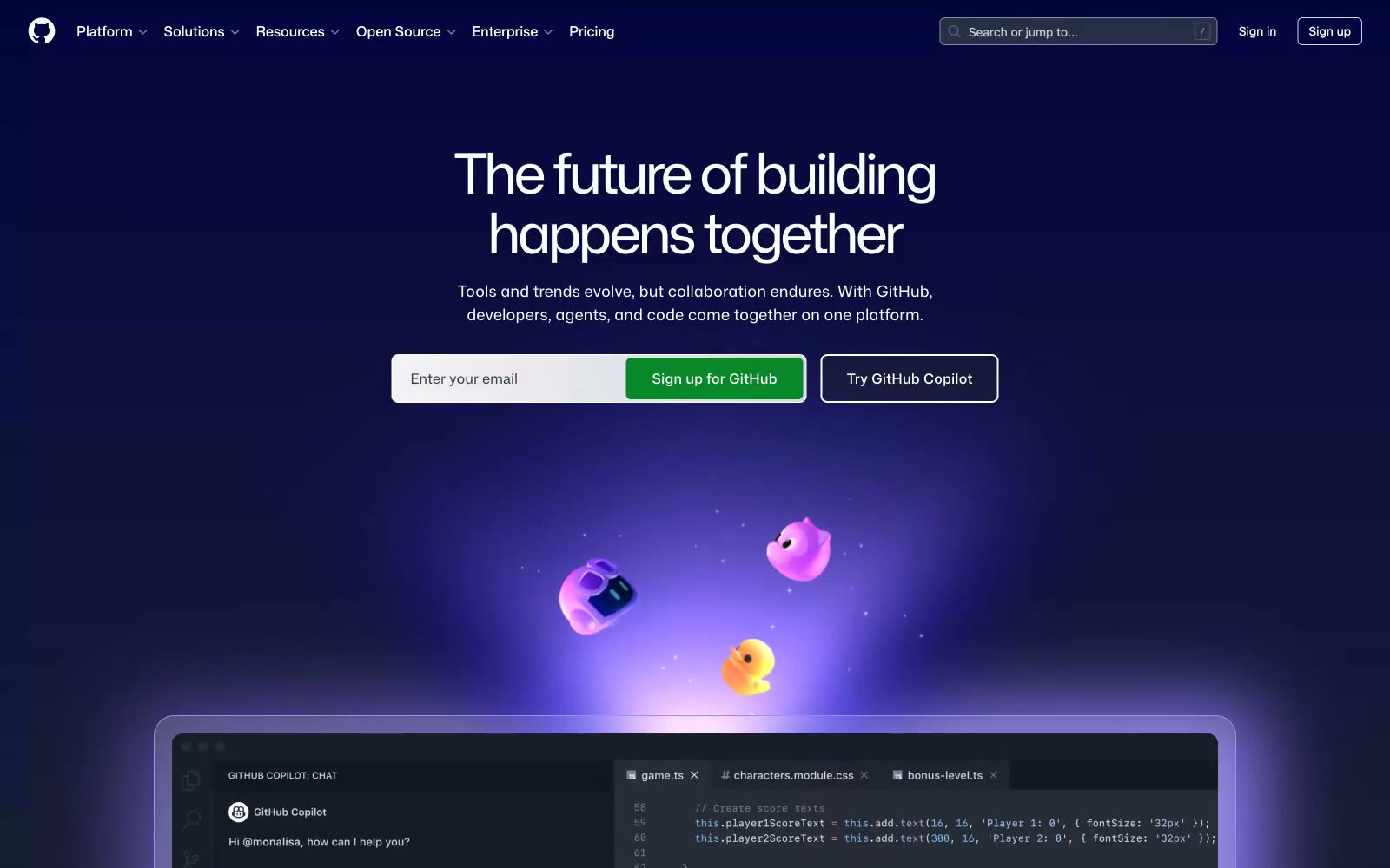
GitHub
GitHub — Style Reference
# GitHub — Style Reference
> violet aurora over developer cosmos — deep midnight surfaces lit by floating purple glows and quiet white type
**Theme:** dark
GitHub operates in a cosmic dark-mode universe where deep near-black canvases (#0d1117) recede behind floating violet and blue radial glows that feel more like aurora than UI. The interface is overwhelmingly achromatic — white and cool-white text on layered dark surfaces — with color appearing as sparse functional punctuation: a soft sky-blue for links, a vivid mint for success/code, and a single emerald CTA that anchors conversion. Typography is custom (Mona Sans) with an unusually wide weight range and aggressive negative tracking on display sizes that makes large headlines feel compressed and confident. Components are flat and low-elevation — 6px radii on controls, 24px on cards — with borders and subtle surface lifts doing the structural work that shadows would do elsewhere. The overall rhythm is spacious, editorial, and quiet, with 3D character illustrations and gradient halos providing the only moments of visual exuberance.
## Tokens — Colors
| Name | Value | Token | Role |
|------|-------|-------|------|
| Midnight Canvas | `#0d1117` | `--color-midnight-canvas` | Page background, primary canvas — GitHub's signature near-black with a barely-perceptible cool tint |
| Abyss Surface | `#090d0a` | `--color-abyss-surface` | Deepest overlay, button base, modal backgrounds — one shade darker than canvas for contrast pop |
| Void Black | `#000000` | `--color-void-black` | Input fields, nav fills, absolute darkest layers — used where pure black is needed for separation |
| Elevated Surface | `#151a22` | `--color-elevated-surface` | Button fills, secondary card surfaces — one step up from canvas for interactive elements |
Websites
Markdown Text
design-md
website-prompt
landing-page-prompt
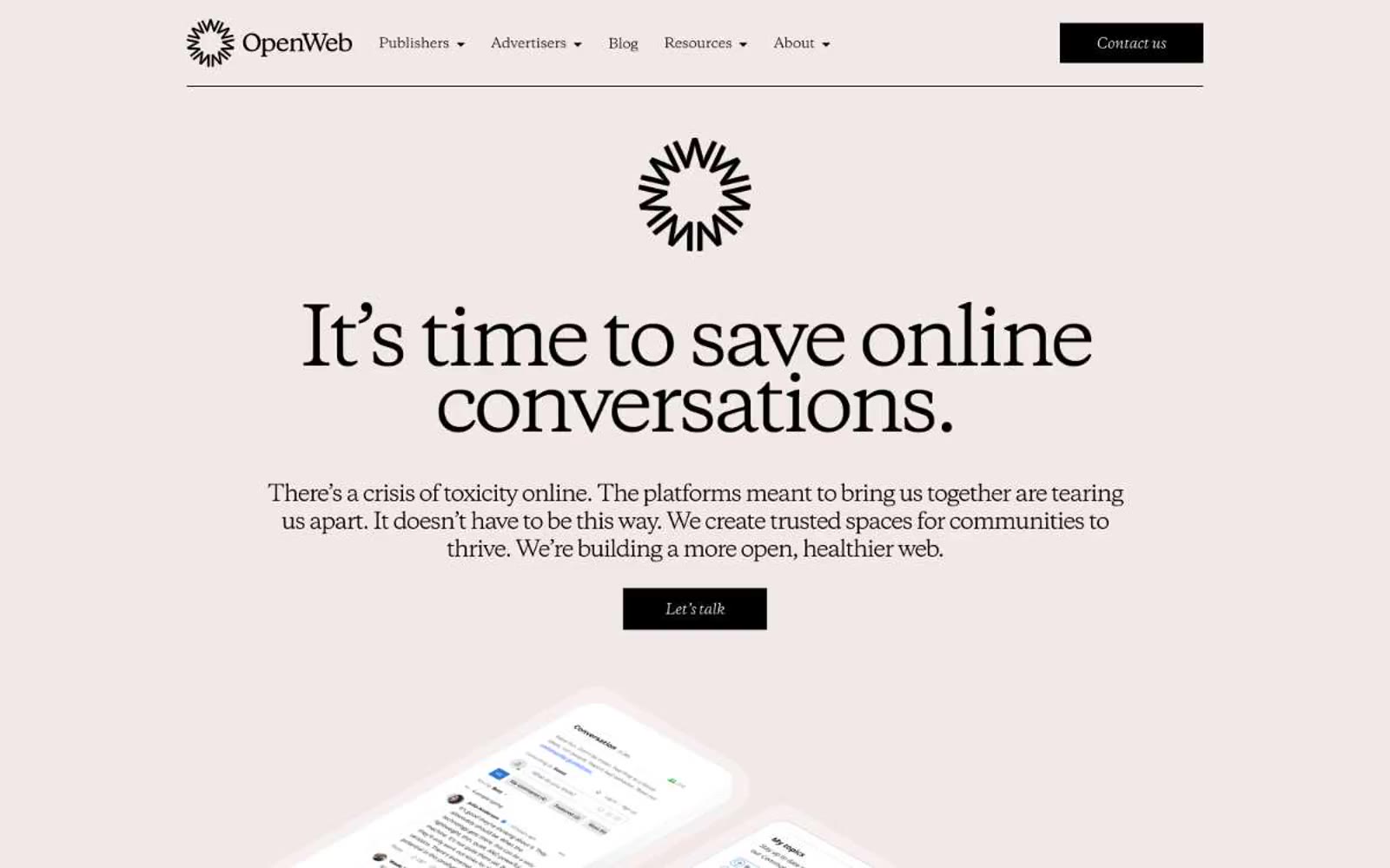
OpenWeb
OpenWeb — Style Reference
# OpenWeb — Style Reference
> Editorial broadsheet on warm rose paper. A blush canvas carries enormous serif headlines and one electric-blue accent — the whole page reads like a printed editorial spread rebuilt as a screen, where type weight and warm negative space replace panels, borders, and shadows.
**Theme:** light
OpenWeb reads like an editorial broadsheet printed on warm rose paper: a single blush canvas (#f1e9e7), nearly all-black type set in a sharp transitional serif, and one vivid electric blue as the only chromatic accent. The interface is almost entirely typographic — no card shadows, no panel borders, no decorative dividers — letting huge serif headlines at 70–90px with aggressively tight negative tracking do all the structural work. Black filled buttons and ghost blue links provide the only UI punctuation; everything else is whitespace, line breaks, and the warm paper tone. The mood is literary and considered, not app-like; pages feel closer to a magazine spread than a SaaS dashboard.
## Tokens — Colors
| Name | Value | Token | Role |
|------|-------|-------|------|
| Blush Paper | `#f1e9e7` | `--color-blush-paper` | Page canvas, all section backgrounds — the warm rose-tinted ground that gives the entire site its editorial, printed-on-paper feel. Never a flat white, never a cool gray |
| Carbon Ink | `#000000` | `--color-carbon-ink` | Primary text, filled buttons, all iconography, form labels, footer rules. The dominant non-canvas color — drives every typographic and interactive element |
| Bone White | `#ffffff` | `--color-bone-white` | Text color inside filled black buttons, reverse-fill surfaces, and form input contrast. Used sparingly as the counter-tone to Carbon Ink |
| Fossil Gray | `#7b7f83` | `--color-fossil-gray` | Muted helper text, secondary metadata, subdued form placeholder tones. The only neutral that softens Carbon Ink for non-primary copy |
Websites
Markdown Text
design-md
website-prompt
landing-page-prompt
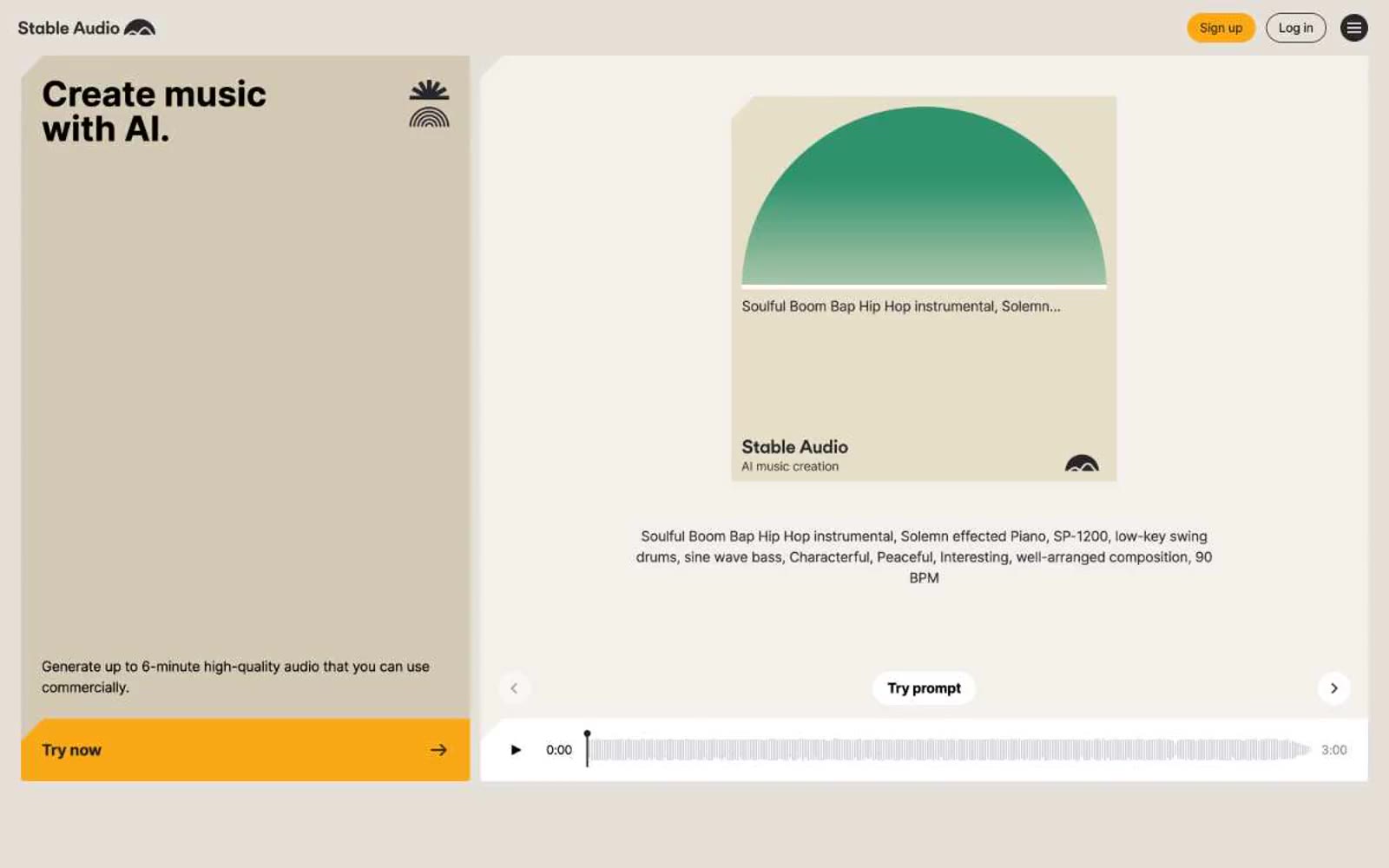
Stable Audio
Stable Audio — Style Reference
# Stable Audio — Style Reference
> Sunlit studio on warm paper.
**Theme:** light
Stable Audio uses a warm-paper studio language: the canvas is cream (#f4f1ec) rather than clinical white, letting bold black headlines and a single amber CTA sit on a surface that feels analog and approachable, like a record sleeve. Full-bleed colored panels — lavender, mustard, sage, khaki — function as oversized section backgrounds behind product mockups, giving the page rhythm the way paint-chip swatches might behind a mixing console. Every interactive element is pill-shaped (9999px) and every card surface is a near-sharp 4px, creating a deliberate contrast between round controls and angular content blocks. A signature half-circle "sun" graphic recurs in every track artwork, and a vivid neon green (#a0f32f) marks every audio-active element, making sound visible across the interface. Product screenshots do the explanatory work; illustration and lifestyle photography are deliberately absent.
## Tokens — Colors
| Name | Value | Token | Role |
|------|-------|-------|------|
| Amber Pulse | `#f9a916` | `--color-amber-pulse` | Yellow supporting accent for decorative details and low-frequency emphasis. Do not promote it to the primary CTA color |
| Lime Signal | `#a0f32f` | `--color-lime-signal` | Green supporting accent for decorative details and low-frequency emphasis. |
| Lavender Wash | `#c4bae3` | `--color-lavender-wash` | Text-to-audio feature panel background — large full-bleed section tint |
| Mustard Field | `#e1ca46` | `--color-mustard-field` | Audio-to-audio feature panel background — full-bleed section tint |
Websites
Markdown Text
design-md
website-prompt
landing-page-prompt
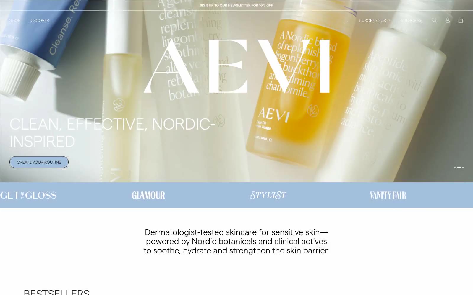
Aevi Wellness
Aevi Wellness — Style Reference
# Aevi Wellness — Style Reference
> Nordic apothecary, weightless type. A muted slate-blue accent interrupts an otherwise achromatic, light-as-air editorial layout where product photography overlaps hairline-bordered cards on warm white.
**Theme:** light
Aevi Wellness reads like a Nordic editorial spread translated into e-commerce: generous product photography overlapping a warm off-white canvas, whisper-weight typography that gives headlines room to breathe, and a single muted slate-blue accent that appears only where the brand needs to signal action or section shift. The palette is almost entirely achromatic — warm near-black text (#231f20), pure white surfaces, and a powder-blue band (#d5e0ea) that structures the page into editorial chapters. Components are barely-there: ultra-thin hairline borders, 2px corner radii on most elements, and 60px pill buttons for primary actions. The overall feel is clinical-luxury — the products themselves are the visual subject, and the interface stays out of their way.
## Tokens — Colors
| Name | Value | Token | Role |
|------|-------|-------|------|
| Powder Blue | `#d5e0ea` | `--color-powder-blue` | Section bands, card borders, decorative dividers — the brand's secondary canvas, used to segment the page into editorial chapters without introducing contrast |
| Slate Bloom | `#a3bfdb` | `--color-slate-bloom` | Primary action buttons, active states — the single chromatic accent; its low saturation keeps it feeling clinical rather than commercial |
| Warm Ink | `#231f20` | `--color-warm-ink` | Primary text, hairline borders, card outlines, icon strokes — near-black with a warm undertone that softens the high-contrast text against white |
| True Black | `#000000` | `--color-true-black` | Icon fills, occasional heavy borders — used sparingly for graphical weight when maximum contrast is needed |
Websites
Markdown Text
design-md
website-prompt
landing-page-prompt
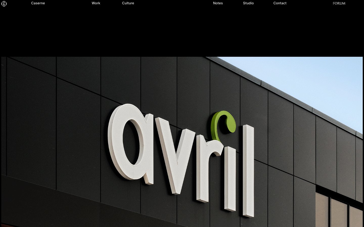
Caserne
Caserne — Style Reference
# Caserne — Style Reference
> black gallery wall with white type whispers
**Theme:** dark
Caserne operates as a gallery-grade portfolio: a near-pure black canvas where oversized editorial photography does the heavy lifting, and the interface itself retreats into hairline borders and whisper-thin type. The visual language is gallery-grade restraint — true black dominates, type sits at 13–14px in custom ABC Oracle, and the only motion is the page scroll revealing monolithic project images. Every UI element earns its place: there is no navigation chrome, no button fills, no decorative gradient — just text, image, and a 1px line. The « » guillemets prefixing project labels are a French-Canadian editorial signature, hinting at the studio's Montreal roots and anchoring the brand in a curatorial, almost typographic sensibility.
## Tokens — Colors
| Name | Value | Token | Role |
|------|-------|-------|------|
| Obsidian | `#000000` | `--color-obsidian` | Page canvas, full-bleed section backgrounds, hero containers |
| Paper | `#ffffff` | `--color-paper` | Primary text, project labels, navigation links, icon strokes on dark surfaces |
| Frost | `#f2f2f2` | `--color-frost` | Hairline borders, image outlines, grid dividers, nav separators — the structural linework of the entire interface |
| Smoke | `#858484` | `--color-smoke` | Muted secondary text, project descriptions, metadata captions |
Websites
Markdown Text
design-md
website-prompt
landing-page-prompt
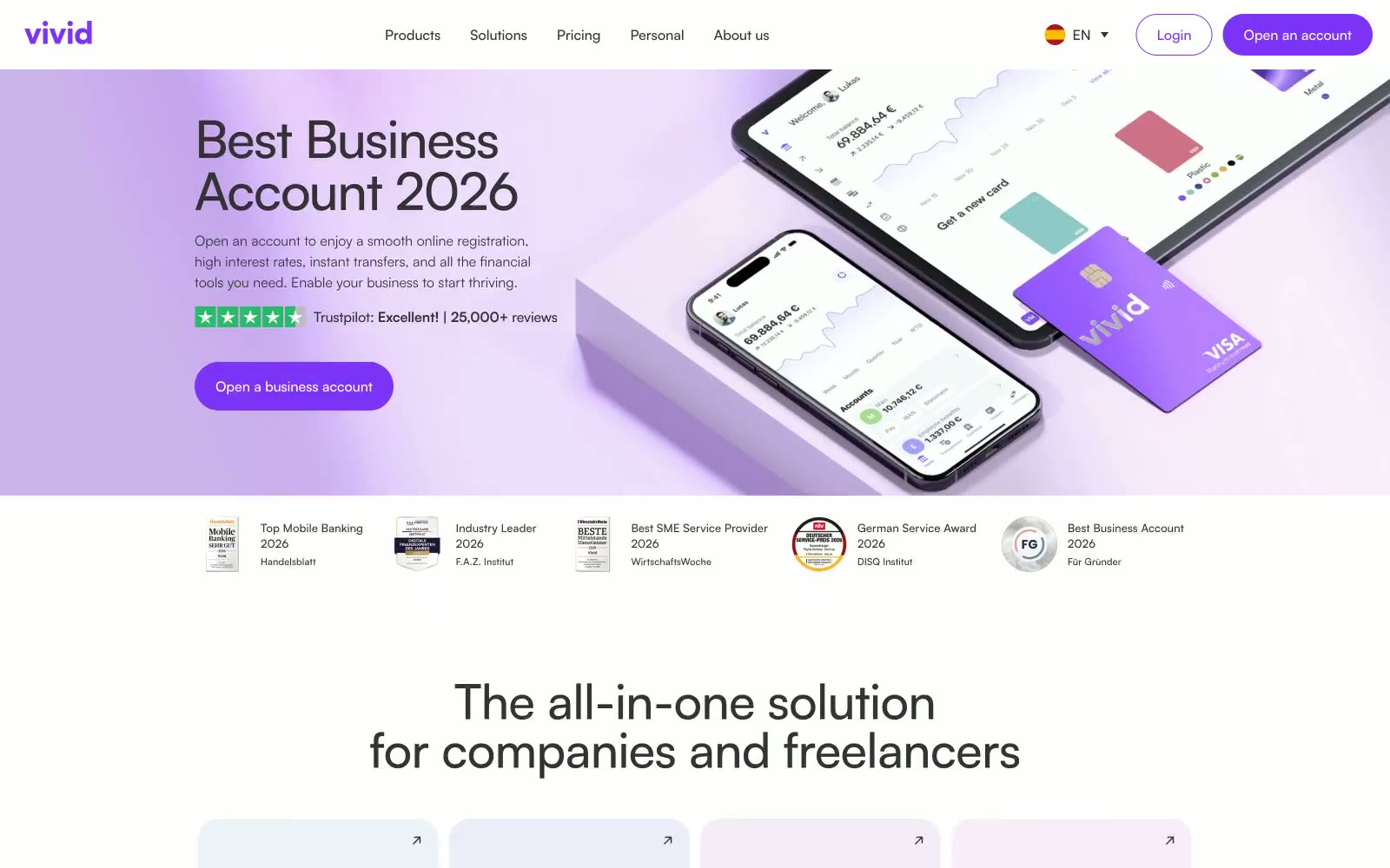
Vivid Spain
Vivid Spain — Style Reference
# Vivid Spain — Style Reference
> Lavender dusk over white marble — a soft violet wash on a clean white surface, where one vivid purple accent does all the work.
**Theme:** light
Vivid is a lavender-lit fintech canvas: a white marble surface washed in soft violet gradients, where the only chromatic decision a designer makes is how much purple to pour on. The system is radically monochromatic — a single vivid violet (#7d33f6) carries every interactive moment, from logo to CTA to active toggle, while the rest of the interface stays in a disciplined gray-on-white scale. Components breathe through soft pastel card backgrounds (#f4edff, #e9d4fb) and pill-shaped controls (100px radius) that feel like rounded candy, never corporate. Typography is geometric Satoshi at every weight, with aggressive negative letter-spacing on display sizes pulling the headlines tight, and generous positive tracking on small uppercase labels. The visual signature is restraint: no shadows, no borders on hero surfaces, no decorative noise — just purple light, white space, and confident type.
## Tokens — Colors
| Name | Value | Token | Role |
|------|-------|-------|------|
| Vivid Violet | `#7d33f6` | `--color-vivid-violet` | Primary CTAs, logo, active nav, toggle thumb, link emphasis — the single chromatic decision that powers all interactivity. Deeply saturated against white to command attention without the corporate-blue cliche |
| Lilac Veil | `#f4edff` | `--color-lilac-veil` | Light supporting surface for subtle backgrounds and section separation. Do not promote it to the primary CTA color |
| Orchid Whisper | `#e9d4fb` | `--color-orchid-whisper` | Muted violet wash for feature card backgrounds and decorative fills. Sits between Lilac Veil and Vivid Violet to create tonal depth in card grids |
| Periwinkle Glow | `#9292ff` | `--color-periwinkle-glow` | Violet supporting accent for decorative details and low-frequency emphasis. Do not promote it to the primary CTA color |
Websites
Markdown Text
design-md
website-prompt
landing-page-prompt
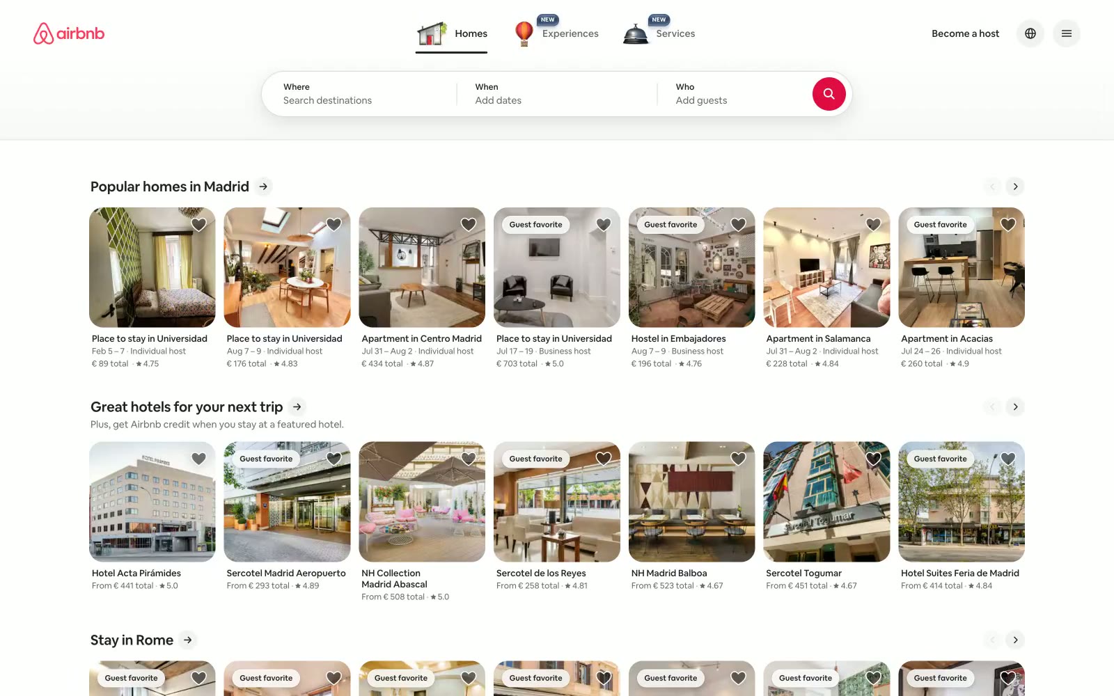
Airbnb
Airbnb — Style Reference
# Airbnb — Style Reference
> Vacation photos pinned to a white corkboard — bright photography contained in rounded frames against a near-white surface, with a single coral pin holding everything together.
**Theme:** light
Airbnb's interface is a warm, airy marketplace built on near-white surfaces and a single coral-red brand heartbeat. The #f7f7f7 canvas with #ffffff card surfaces creates a barely-there depth — paper stacked on paper — where photography does all the visual heavy lifting. The custom Airbnb Cereal VF variable font runs at weights 400–700 across a compact, tight scale with negative letter-spacing at larger sizes, giving the UI a quiet confidence without needing decorative elements. The singular #ff385c coral-red appears exclusively on brand touchpoints (logo, active states, the search button), making it feel like a signature rather than a system color. Card images bleed edge-to-edge with 20px rounded corners — the only generous radius in an otherwise compact, information-dense layout.
## Tokens — Colors
| Name | Value | Token | Role |
|------|-------|-------|------|
| Rausch Coral | `#ff385c` | `--color-rausch-coral` | Brand logo fill, active nav underline, search button icon background, carousel dot active state — the single chromatic signature that makes the interface recognizable |
| Rausch Deep | `#e00b41` | `--color-rausch-deep` | Hover state darkening of Rausch Coral on interactive brand elements |
| Carbon | `#222222` | `--color-carbon` | Primary text, headings, borders, icon strokes — the dominant neutral forming almost all typographic content |
| Slate | `#6a6a6a` | `--color-slate` | Secondary text (metadata, subtext, secondary labels), secondary icon fill |
Websites
Markdown Text
design-md
website-prompt
landing-page-prompt
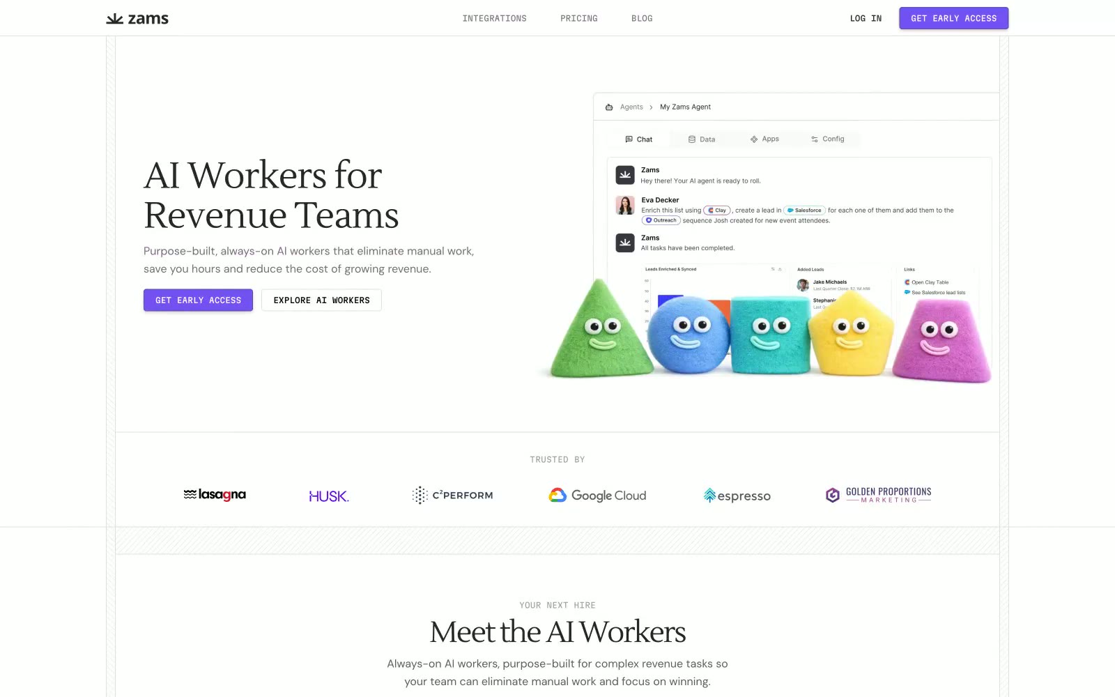
Obviously
Obviously — Style Reference
# Obviously — Style Reference
> Whimsical claymation on white paper. Zams stages friendly geometric play-doh creatures on a clean, almost clinical white backdrop, letting one vivid violet do all the chromatic work and a warm serif handle the typographic warmth.
**Theme:** light
Zams runs a dual-language visual system: a rigorously minimal, serif-headed enterprise aesthetic married to a cast of chubby, candy-colored claymation characters that embody the AI workers themselves. The white canvas is intentional stage-craft — it lets the violet CTA (#7451f2), the subtle dotted-grid patterns, and the pastel mascots carry all the visual personality while the surrounding chrome (tabs, integration logos, compliance badges) stays quietly functional. Headlines use a warm serif (Lustria) with tight negative tracking, body and UI run on DM Sans, and labels like "COMING SOON", "EVAN", and "YOUR NEXT HIRE" shift into Martian Mono to give sections a technical, almost build-log voice. Components are square-jawed: 4px corners, hairline borders, one subtle button shadow, and no decorative gradients. The overall tone is enterprise-credible but never sterile — the mascots break the tension, and the monospace meta-labels signal "this product is engineered, not assembled."
## Tokens — Colors
| Name | Value | Token | Role |
|------|-------|-------|------|
| Iris Violet | `#7451f2` | `--color-iris-violet` | Primary filled CTA buttons, active tab indicator, the single chromatic accent across the whole system. One vivid purple against a near-achromatic canvas creates brand presence without color noise |
| Deep Iris | `#5952a1` | `--color-deep-iris` | Outlined/ghost action border, secondary violet for secondary buttons and stroke accents. Darker tone of the primary — keeps the brand family intact when a softer surface is needed |
| Cobalt Info | `#0072c6` | `--color-cobalt-info` | Blue state accent for badges, validation surfaces, and short status labels. Do not promote it to the primary CTA color |
| Powder Blue | `#d6e5ff` | `--color-powder-blue` | Neutral form states, badge text, and quiet UI feedback where color should stay understated. |
Websites
Markdown Text
design-md
website-prompt
landing-page-prompt
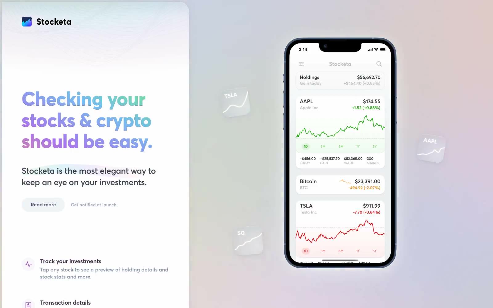
Stocketa
Stocketa — Style Reference
# Stocketa — Style Reference
> Neon aurora on frosted glass — a light, weightless interface floating beneath a prism-washed sky.
**Theme:** light
Stocketa floats its product on a dreamy light canvas washed with a soft radial aurora — green, teal, purple, and pink bleeding from the top — where the color is felt as atmosphere rather than seen as decoration. The interface below stays calm and almost achromatic: white cards, hairline borders, and a signature three-layer shadow (a faint blue-tinted outer drop, a 1px white inner highlight, and a barely-there navy inset) that whispers elevation instead of declaring it. A single vivid magenta (#995bb9) does all the emotional work — painting headlines as a left-to-right gradient, filling icons, and pulling the eye through each section. Typography is a custom geometric sans (averta standard) cut for very tight negative tracking at display sizes up to 98px, giving even the biggest headlines a compressed, confident posture. The phone mockup is the hero: it sits at the visual center of every section, turning the product itself into the brand's primary visual asset.
## Tokens — Colors
| Name | Value | Token | Role |
|------|-------|-------|------|
| Aurora Magenta | `#995bb9` | `--color-aurora-magenta` | Headline gradient start, icon fills, decorative brand strokes — the single chromatic voice of the system, used as gradient text on display headings and as fill on small icon badges |
| Deep Iris | `#5b638c` | `--color-deep-iris` | Muted violet used for decorative SVG strokes and secondary graphic outlines — sits behind the magenta as the system-wide line color |
| Midnight Ink | `#1d2630` | `--color-midnight-ink` | Primary body and heading text on light surfaces — slightly warmer than pure black, reads softer at large sizes while keeping AAA contrast |
| Obsidian | `#000000` | `--color-obsidian` | Highest-weight text and the densest border color — used where maximum contrast is required against the near-white canvas |

Websites
Markdown Text
design-md
website-prompt
landing-page-prompt
Agence Foudre
Agence Foudre — Style Reference
# Agence Foudre — Style Reference
> Magazine splash page in lipstick pink.
**Theme:** light
Agence Foudre uses a bold editorial-magazine language: warm cream canvas, oversized condensed display type in vivid magenta, and a surprising deep-forest green that reads as both body text and accent. The interface is deliberately sparse — most of the viewport is empty space, and content arrives in dense typographic punches rather than card grids or product visuals. Color is used as emotional punctuation: hot pink screams, faded pink whispers, deep green grounds, and warm off-white softens every surface. Components are minimal — circular pink buttons, pill-shaped badges, and big chunky type are the only chrome. This is a portfolio/expression site, not a product UI: the brand's personality IS the typography and color, everything else stays out of the way.
## Tokens — Colors
| Name | Value | Token | Role |
|------|-------|-------|------|
| Lipstick Magenta | `#db3c8a` | `--color-lipstick-magenta` | Display headlines, primary brand color, icon buttons, heading accents — vivid pink carries 100% of brand recognition |
| Forest Ink | `#00522d` | `--color-forest-ink` | Body text, links, iconography, footer — deep saturated green against cream creates editorial gravitas no neutral could |
| Blush Cream | `#fce5df` | `--color-blush-cream` | Soft surface tint, badge backgrounds, gentle wash blocks, hover states — warm off-pink that sits between page and accent |
| Warm Chalk | `#fff8f6` | `--color-warm-chalk` | Light supporting surface for subtle backgrounds and section separation. Do not promote it to the primary CTA color |
Websites
Markdown Text
design-md
website-prompt
landing-page-prompt
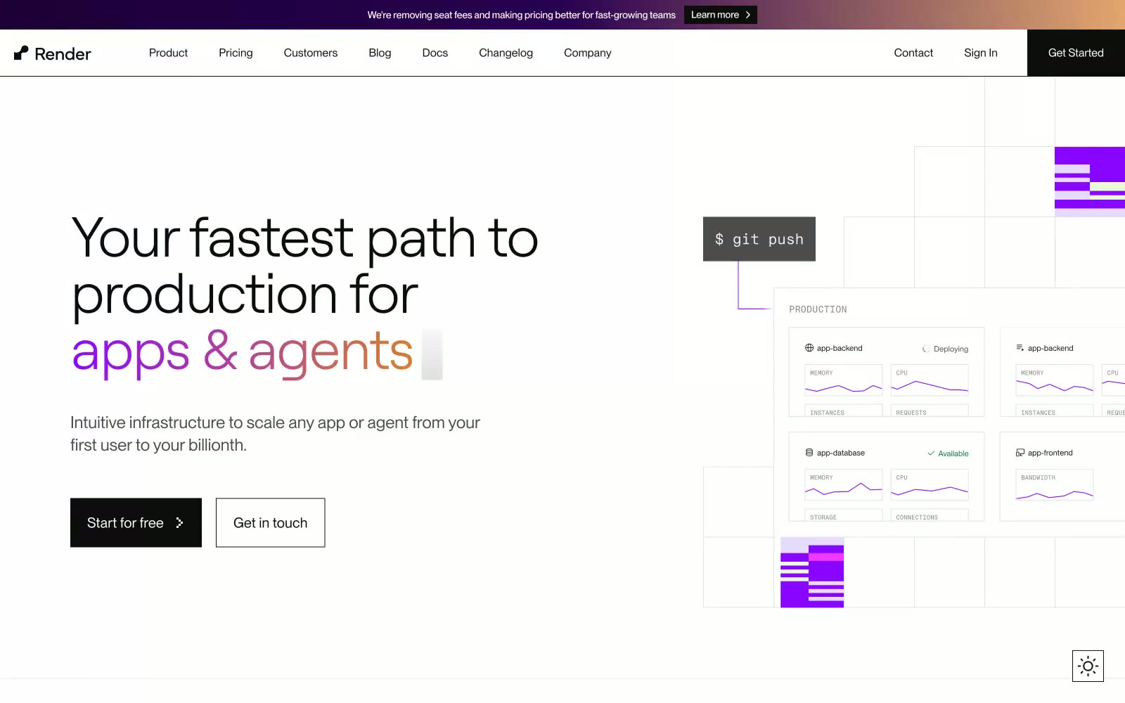
Render
Render — Style Reference
# Render — Style Reference
> Blueprint on brushed aluminum. The interface reads as a clean, geometric engineering document — white space, hairline rules, and one violet marker line drawing the eye to the action.
**Theme:** light
Render presents a clinical, paper-white canvas for cloud infrastructure — an interface that feels like a well-organized technical schematic rather than a marketing surface. The system is overwhelmingly achromatic: #0d0d0d text on #ffffff surfaces, separated by hairline #e3e3e3 borders, with one vivid violet (#8a05ff) acting as the singular brand punctuation and a warm-to-cool gradient (violet→orange) reserved for hero emphasis. Typography is the primary expressive tool — Roobert at light weight 300 with tight tracking carries headlines with geometric quietness, while PPNeueMontreal handles UI with workmanlike neutrality. Code-adjacent elements use PPNeueMontrealMono, lending technical credibility without resorting to cliché terminal aesthetics. Components are square-cornered, border-defined, and low-elevation; the interface reads as a grid of confident panels rather than floating cards. Color appears sparingly — a violet step number, a soft tinted surface, a gradient text phrase — so when it does appear, it carries weight.
## Tokens — Colors
| Name | Value | Token | Role |
|------|-------|-------|------|
| Obsidian | `#0d0d0d` | `--color-obsidian` | Dark supporting neutral for text, icons, and strong contrast. Do not promote it to the primary CTA color |
| Paper White | `#ffffff` | `--color-paper-white` | Page canvas, card surfaces, button text on dark fills — the dominant base against which all content rests |
| Graphite Hairline | `#e3e3e3` | `--color-graphite-hairline` | Borders, dividers, subtle surface tints — the workhorse neutral at 4000+ occurrences that defines structural edges throughout the UI |
| Smoke | `#4d4d4d` | `--color-smoke` | Secondary text, muted nav, footer copy — the soft mid-gray for de-emphasized but still readable text |
Websites
Markdown Text
design-md
website-prompt
landing-page-prompt
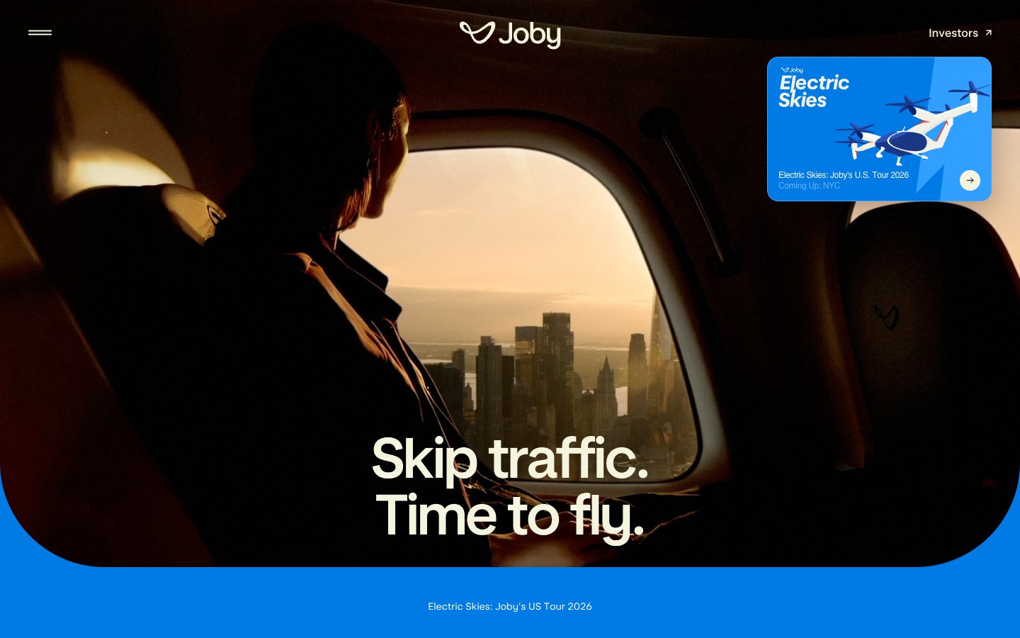
Joby Aviation
Joby Aviation — Style Reference
# Joby Aviation — Style Reference
> Golden hour cockpit over a sleeping city — every screen is a window seat.
**Theme:** light
Joby Aviation's design language is cinematic aviation editorial: full-bleed golden-hour photography carries the narrative, with a warm parchment canvas (#f5f4df) and near-black ink (#0e1620) doing all the structural work. The interface stays minimal and almost invisible so the imagery does the persuading — text overlays float over photographs with thin left-border accents rather than boxed containers. Vivid electric blue (#007ae5) appears only as functional punctuation on floating cards, the bottom tour strip, and select icon strokes, while the custom Joby Display type at near-200px sizes whispers the headline rather than shouts it. Components are light, floating, and round; even the tour card and small chips use generous 16px radii, and the navigation is reduced to a centered logomark with a hamburger and a single text link. The system never decorates — every surface is either a photograph, the warm cream canvas, or a single solid blue band.
## Tokens — Colors
| Name | Value | Token | Role |
|------|-------|-------|------|
| Parchment Cream | `#f5f4df` | `--color-parchment-cream` | Page canvas, card surfaces, text color on dark imagery — the warm off-white that keeps photography from feeling cold |
| Carbon Ink | `#0e1620` | `--color-carbon-ink` | Body text, headings, hairline borders, icon strokes — near-black with a cool blue undertone that pairs with the cream |
| Pale Sky | `#c1dfef` | `--color-pale-sky` | Soft secondary surface wash, subtle section backgrounds when cream needs contrast |
| Shadow Khaki | `#abab9c` | `--color-shadow-khaki` | Warm gray used in card box-shadow tinting — gives elevation a warm cast rather than a cold blue |
Websites
Markdown Text
design-md
website-prompt
landing-page-prompt
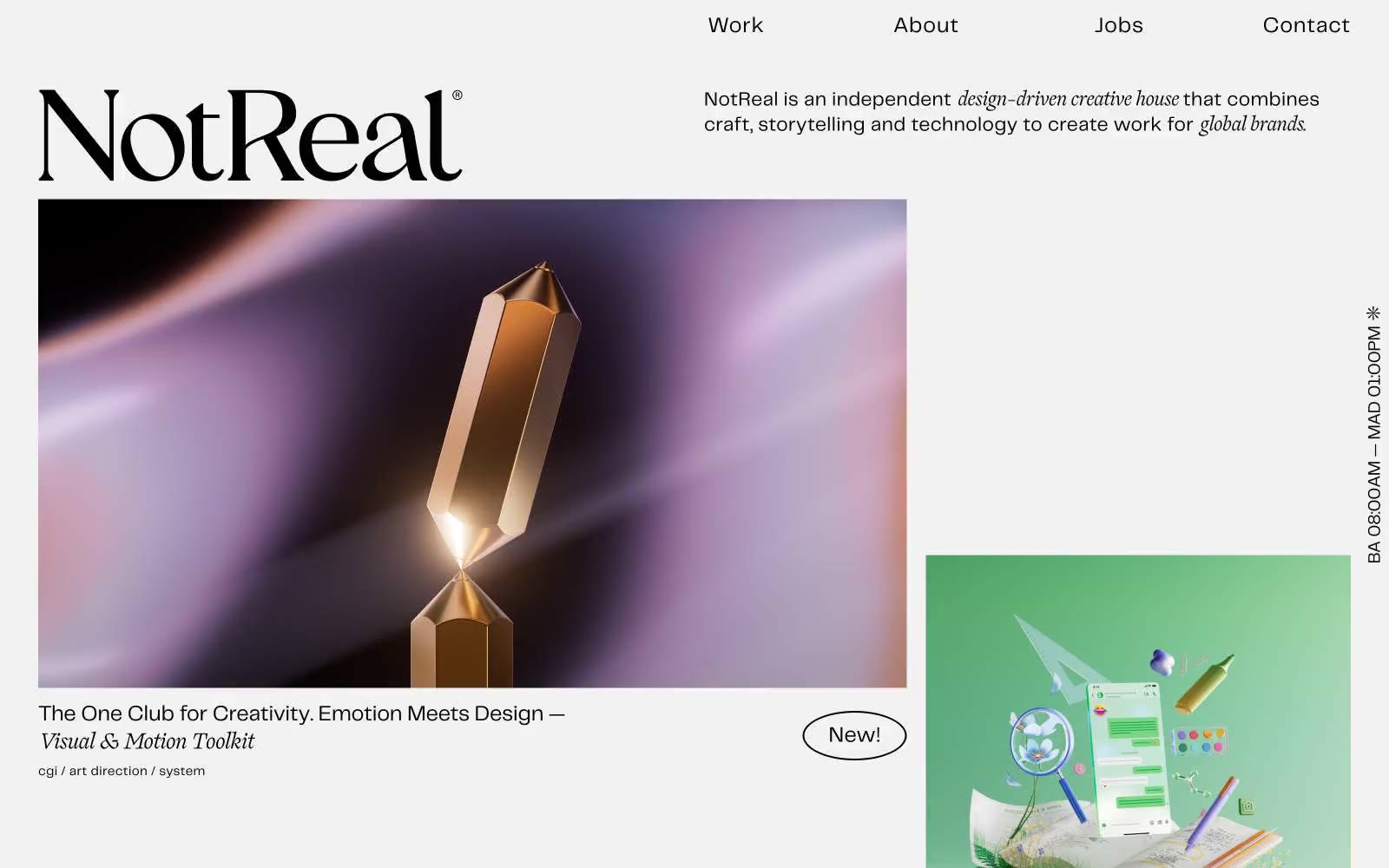
Not Real
Not Real — Style Reference
# Not Real — Style Reference
> Editorial gallery spread on greyscale vellum — a high-end catalog where only the artwork is allowed to scream with color.
**Theme:** light
NotReal operates as a typographic gallery: a near-empty off-white canvas where large product renders and campaign stills do the visual talking while two custom typefaces carry the verbal load. The system is deliberately chromatic-starved — three grays compose 99% of the interface — so that every saturated pixel arrives as client artwork, never as UI chrome. Layout is editorial, not app-like: an asymmetric two-column grid where hero images land at varying vertical offsets to create z-pattern reading flow, with vertical running text and micro-metadata adding a printed-catalog rhythm. The pairing of ogg (a high-contrast didone-influenced serif) for display with telegraf (geometric sans) for everything else is the signature — a whisper-and-speak duality where the serif announces the work and the sans documents it.
## Tokens — Colors
| Name | Value | Token | Role |
|------|-------|-------|------|
| Ink Charcoal | `#292a2c` | `--color-ink-charcoal` | Primary text, dominant border strokes (635 occurrences as borderColor), nav accents |
| Vellum | `#f2f2f2` | `--color-vellum` | Page canvas, card surfaces — warm-leaning off-white that gives the page a paper-stock feel rather than digital white |
| Full Black | `#000000` | `--color-full-black` | Link border underlines, footer text, icon strokes, image overlay text — used as a chromatic anchor only where maximum contrast against Vellum is required |
Websites
Markdown Text
design-md
website-prompt
landing-page-prompt
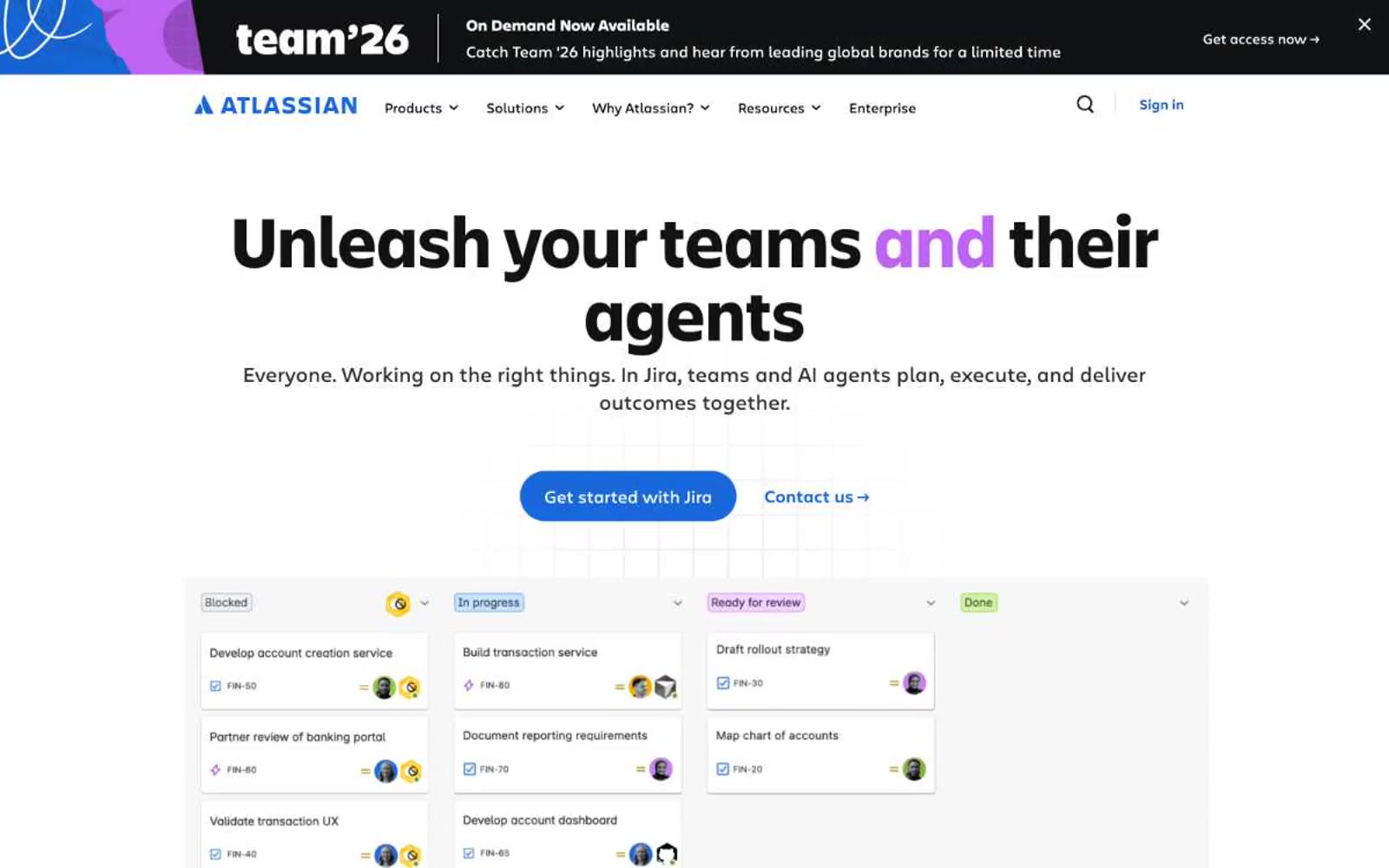
Atlassian
Atlassian — Style Reference
# Atlassian — Style Reference
> Confetti-edged engineering blueprint. A clean white enterprise canvas interrupted by dark navy editorial panels framed in torn geometric color — vivid violet, taxicab yellow, electric blue, leaf green — like precise diagrams pinned between paint-splattered dividers.
**Theme:** light
Atlassian operates as an enterprise workshop dressed in casual confidence: a white canvas where dense product interfaces meet bold, colorful editorial moments. The visual system splits between quiet functional surfaces (white, light gray, subtle blue) and expressive dark hero blocks (near-black navies) framed by fragmented geometric confetti in vivid violet, yellow, blue, and green. Typography is a paired custom sans family — Charlie Text for dense UI, Charlie Display for editorial headlines that grow to 80px with tightened tracking. Components are large, rounded, and borderless — pills for actions, generous 20px radii for cards, almost no shadow. Color is disciplined: one electric blue drives every primary action and link, while chromatic energy lives only in decorative edges and section dividers, never bleeding into functional UI.
## Tokens — Colors
| Name | Value | Token | Role |
|------|-------|-------|------|
| Atlassian Blue | `#1868db` | `--color-atlassian-blue` | Primary action buttons, active links, focus states, icon accents — the single chromatic action color across the entire system, providing directional clarity against monochrome surfaces |
| Midnight Navy | `#101214` | `--color-midnight-navy` | Primary text, heading fills on light surfaces, dark hero panel backgrounds, link text — the dominant ink color |
| Carbon Edge | `#292a2e` | `--color-carbon-edge` | Card borders on light surfaces, body text, input borders, secondary heading text |
| Slate Current | `#1c2b42` | `--color-slate-current` | Outlined action borders, icon strokes, list dividers, tertiary text — a blue-tinted near-gray that hints at brand without committing to color |
Websites
Markdown Text
design-md
website-prompt
landing-page-prompt
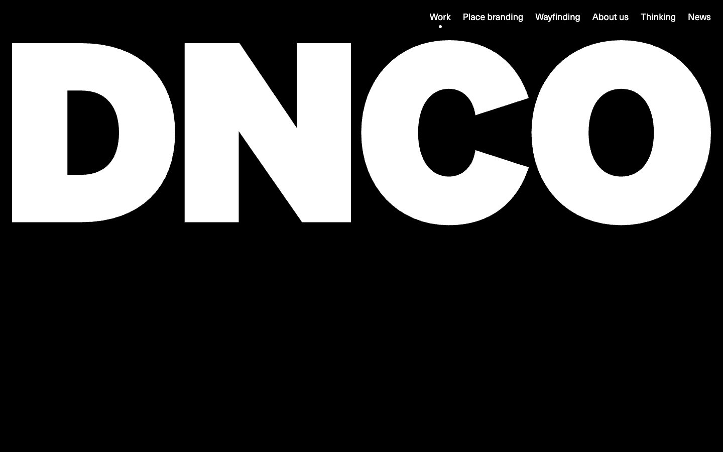
DNCO
DNCO — Style Reference
# DNCO — Style Reference
> editorial gallery on white linen.
**Theme:** light
DNCO operates on radical typographic restraint: a single sans-serif at a single weight (Neue Haas Unica Pro, 400) deployed across a 72px-to-16px scale, anchored on a near-achromatic palette of white, off-white, and pure black. The site reads like an editorial print spread — headlines breathe against generous whitespace, borders are whisper-thin hairlines (#e5e7eb), and the only color in the system comes from project photography, never from chrome or accent fills. Navigation and interactive elements are pill-shaped (9999px radius), text is always the interactive primitive, and the brand wordmark doubles as a full-bleed hero that inverts to black. Components are minimal, weightless, and border-driven rather than shadow-driven — the aesthetic is gallery catalogue, not SaaS dashboard.
## Tokens — Colors
| Name | Value | Token | Role |
|------|-------|-------|------|
| Canvas White | `#ffffff` | `--color-canvas-white` | Page background, primary surface for content blocks, card bases |
| Hairline Mist | `#e5e7eb` | `--color-hairline-mist` | Hairline borders, dividers, subtle surface wash, filter chip backgrounds, image placeholder fill |
| Obsidian | `#000000` | `--color-obsidian` | Primary text, brand wordmark fill, dark hero background, link text, heading color |
| Ash | `#a3a3a3` | `--color-ash` | Muted secondary text, captions, inactive filter labels, helper text |
Websites
Markdown Text
design-md
website-prompt
landing-page-prompt
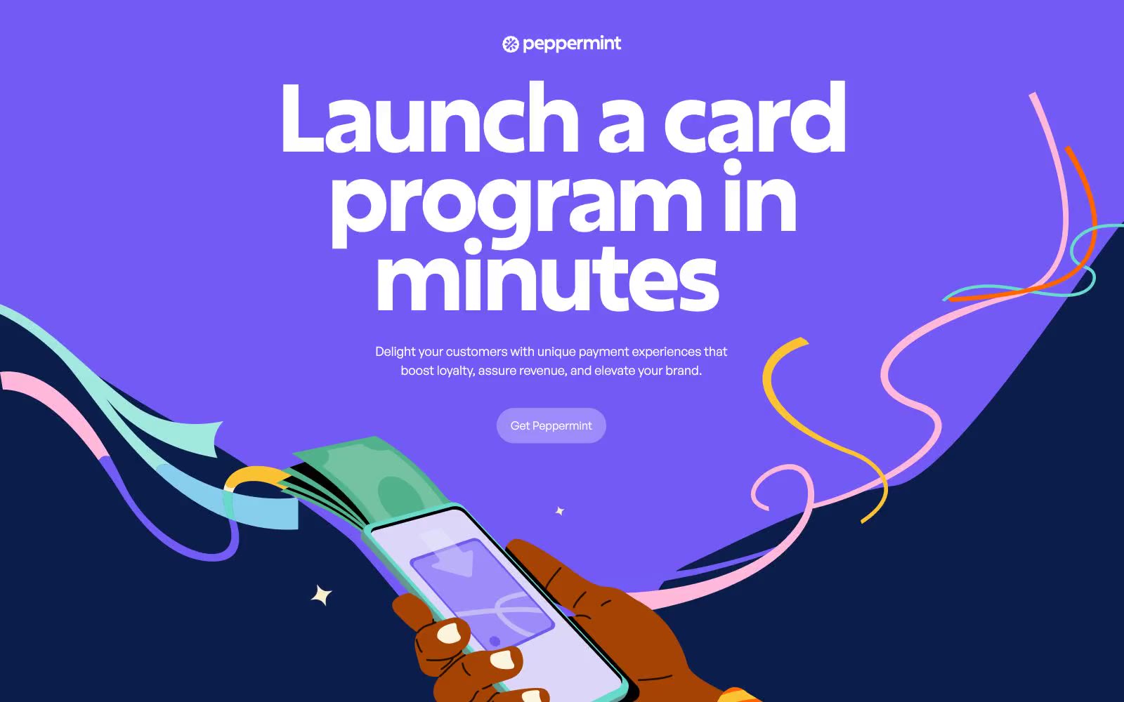
Peppermint
Peppermint — Style Reference
# Peppermint — Style Reference
> Midnight canvas with playful streamers — a deep navy void where hand-drawn ribbons and geometric type dance above warm cream paper surfaces.
**Theme:** dark
Peppermint runs on a midnight-canvas principle: a near-black indigo (#0a1d4b) saturates the page as both background and brand DNA, giving the site the feeling of a deep-ocean screen where bold illustrations and geometric type float free. Excon's display cuts — tightly tracked, geometric, editorial — are the visual signature, paired with Generalsans' humanist warmth for everything conversational. The system deliberately alternates between dark immersion bands and warm cream (#fcf6ea, #faedd2) paper-surfaces, so heavy content areas (FAQ, forms) feel grounded in tactile warmth rather than floating in the void. Hand-drawn illustrations with flowing ribbon strokes in pink, teal, and ice-blue do the heavy atmospheric lifting — there is no photography, no gradients, no decorative shadows. Components are confidently round (24px cards, 48–100px pill buttons) and sit on the canvas with color contrast alone rather than elevation.
## Tokens — Colors
| Name | Value | Token | Role |
|------|-------|-------|------|
| Midnight Sapphire | `#0a1d4b` | `--color-midnight-sapphire` | Primary canvas for hero and feature bands, body text on cream surfaces, outlined action borders — the void that everything floats on |
| Bright Violet | `#9c8bf9` | `--color-bright-violet` | Rare accent fill for highlight buttons and emphasis moments — a vivid punctuation against the matte navy canvas |
| Deep Indigo | `#162d67` | `--color-deep-indigo` | Elevated card surface against the main canvas — one step lighter than Midnight Sapphire, used for nested feature cards |
| Slate Violet | `#3a486b` | `--color-slate-violet` | Muted text on dark sections, secondary borders and dividers — a desaturated companion to the primary navy |
Websites
Markdown Text
design-md
website-prompt
landing-page-prompt
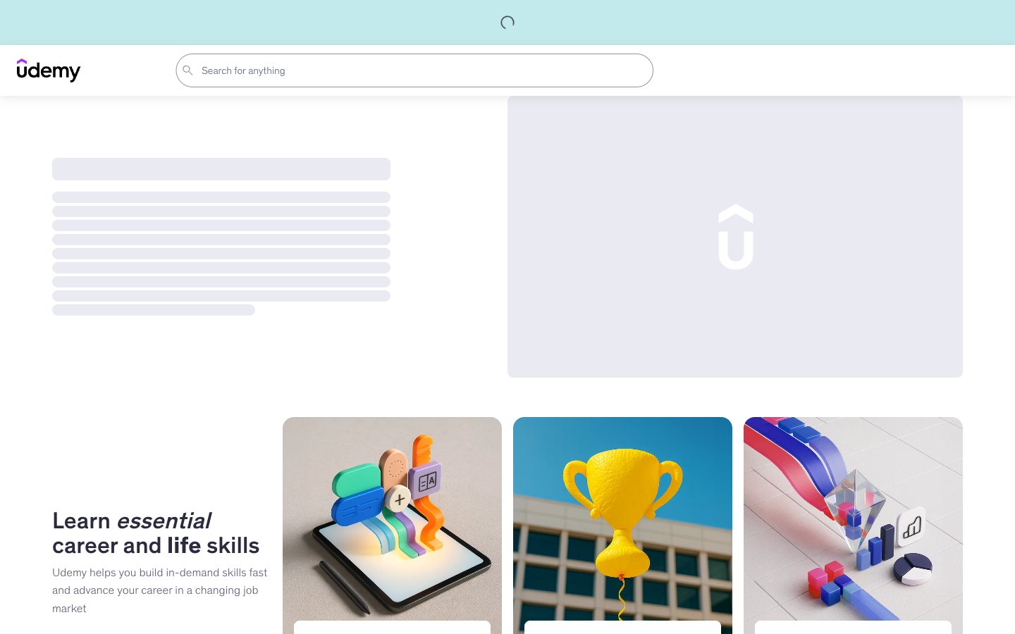
Udemy
Udemy — Style Reference
# Udemy — Style Reference
> Modern classroom whiteboard with violet ink.
**Theme:** light
Udemy reads as a calm, instructive marketplace: white canvas with soft cool-gray surfaces, a near-black ink scale for type, and two chromatic accents — a signature violet and a warm orange — that always appear as outlined borders or small marks rather than filled panels. Components are flat and lightweight, leaning on 8px radii and hairline borders instead of heavy elevation. A 3D-illustration vocabulary (soft clay-like product objects, isometric shapes, saturated accent pops) carries the personality, while the UI itself stays disciplined and instructional.
## Tokens — Colors
| Name | Value | Token | Role |
|------|-------|-------|------|
| Ink | `#2a2b3f` | `--color-ink` | Primary text, heading strokes, default icon strokes, body copy |
| Obsidian | `#202230` | `--color-obsidian` | Card backgrounds in dark sections, inverted surfaces, footer panel |
| Graphite | `#33364a` | `--color-graphite` | Body-level dark surfaces, secondary panel fills |
| Slate | `#3d4055` | `--color-slate` | Card borders and muted dark backgrounds |
Websites
Markdown Text
design-md
website-prompt
landing-page-prompt
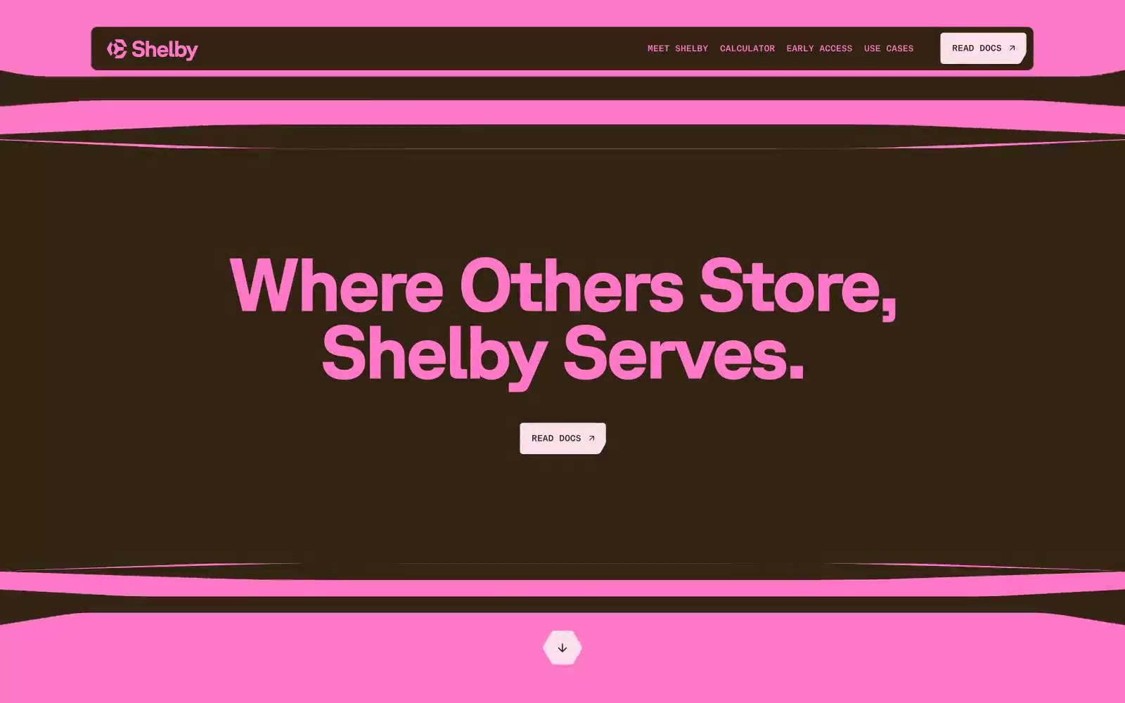
Shelby
Shelby — Style Reference
# Shelby — Style Reference
> neon signage on cocoa leather
**Theme:** dark
Shelby runs on a warm-cocoa dark canvas punctuated by electric hot-pink type — a brutalist-cute aesthetic that swaps the typical fintech dark-gray for an almost edible brown background and turns contrast into spectacle. Typography is the hero: oversized GT-Planar display weights at 59-95px with aggressively tight tracking, set center-aligned on full-bleed color blocks that flip between deep umber, hot pink, and pale rose. Components are flat and undecorated — no shadows, tiny 4-10px radii, monospaced uppercase micro-labels in ABCReproMono that float above headlines like product codes. The rhythm is theatrical: each section is a color field change, not a card grid.
## Tokens — Colors
| Name | Value | Token | Role |
|------|-------|-------|------|
| Cocoa Husk | `#322312` | `--color-cocoa-husk` | Primary page canvas, body text on light surfaces, large display type on pink fields |
| Neon Orchid | `#ff77c9` | `--color-neon-orchid` | Signature accent — massive display headlines on dark sections, body links, icon strokes, tag fills, the dominant brand voice |
| Petal Wash | `#ffdfef` | `--color-petal-wash` | Light section canvas, button label text on dark fields, badge text |
| Plum Velvet | `#470b64` | `--color-plum-velvet` | Deepest accent surface — section backgrounds that sit between the cocoa base and neon pink, creates tonal depth in the surface stack |
Websites
Markdown Text
design-md
website-prompt
landing-page-prompt
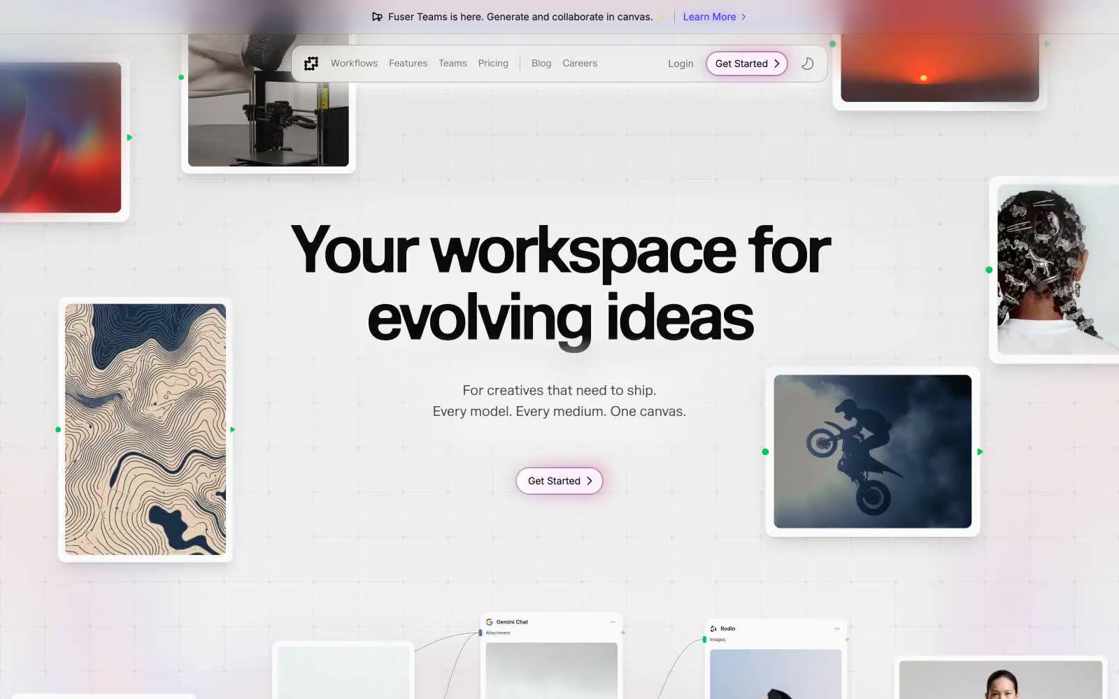
Fuser
Fuser — Style Reference
# Fuser — Style Reference
> Scattered polaroids on a designer's working wall
**Theme:** light
Fuser is a light, airy creative-canvas interface that treats the page itself like a scattered studio mood board: white surfaces, thin hairline borders, generous breathing room, and a single confident violet accent. The visual grammar is polaroids-on-paper — floating image cards, subtle shadows, soft 16px radii — layered over a faint grid that implies infinite workspace. Typography pairs a humanist serif display face (Marund) with a utilitarian sans (Inter) so headlines feel editorial while UI stays neutral. Color is used as functional punctuation, not decoration: violet for connection and action, a vivid green for live/connected node markers, and an almost-achromatic neutral scale for everything else. The aesthetic signals creative-tool-with-serious-substance — playful in composition, disciplined in execution.
## Tokens — Colors
| Name | Value | Token | Role |
|------|-------|-------|------|
| Electric Violet | `#432dd7` | `--color-electric-violet` | Primary brand accent — icon strokes, card borders, active link underlines, connection lines, and the dominant chromatic signal across product surfaces |
| Bright Indigo | `#4f39f6` | `--color-bright-indigo` | Interactive links, active nav items, icon highlights, and secondary borders — a slightly lighter sibling to Electric Violet for hover/active states |
| Deep Indigo | `#312c85` | `--color-deep-indigo` | Pressed/visited state of brand accent, dark text on light-violet surfaces, and the deepest chromatic token in the brand scale |
| Soft Violet | `#a6a5fe` | `--color-soft-violet` | Outlined button borders, light icon strokes, and lavender-toned hairlines — the pastel end of the brand ramp |
Websites
Markdown Text
design-md
website-prompt
landing-page-prompt
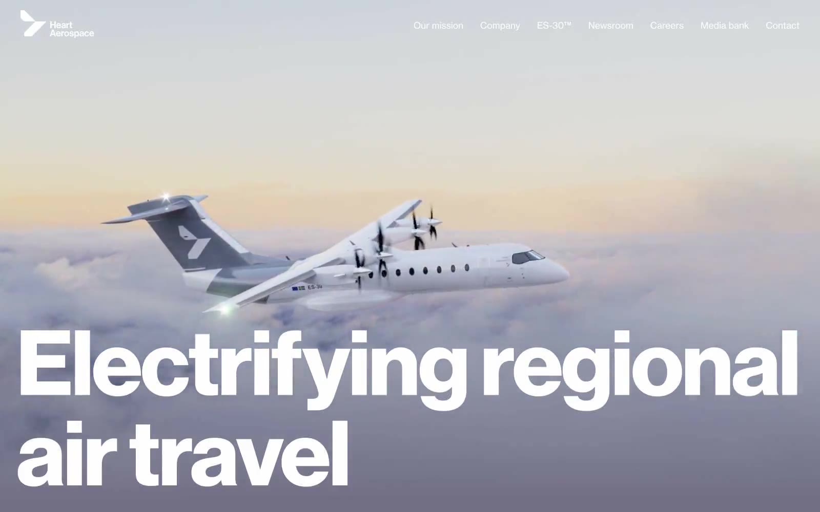
Heart Aerospace
Heart Aerospace — Style Reference
# Heart Aerospace — Style Reference
> monumental type drifting through cloud-level gradient skies — the brand reads like an engineering manifesto printed on atmosphere.
**Theme:** light
Heart Aerospace uses a monumental-typography-over-atmospheric-sky language: the brand communicates through oversized type and full-bleed aviation photography, with almost no decorative UI chrome. The palette is nearly monochrome — a muted stratosphere purple-gray anchors atmospheric sections, a deep jetstream blue punctuates outlined actions, and black/white carry all structural weight. Every screen should feel like a single composition: type the subject, photography the environment, negative space the luxury. There are no cards, no shadows, no rounded surfaces, no gradients beyond the sky atmosphere — the design earns its restraint by letting a 156px display headline and a photograph do all the work.
## Tokens — Colors
| Name | Value | Token | Role |
|------|-------|-------|------|
| Stratosphere | `#716e85` | `--color-stratosphere` | Hero and section atmospheric backgrounds, sky gradient origin, the signature non-neutral surface that carries brand mood |
| Jetstream Blue | `#001489` | `--color-jetstream-blue` | Outlined/ghost action borders, link text, image accent borders — the only chromatic accent, used as outlined-link color and focused-frame treatment, never as a filled button background |
| Onyx | `#000000` | `--color-onyx` | Primary text, structural borders, footer background, partner logo fills |
| Cloud | `#ffffff` | `--color-cloud` | Inverse text on dark and gradient backgrounds, content section canvas, navigation text on hero, gradient endpoint |
Websites
Markdown Text
design-md
website-prompt
landing-page-prompt
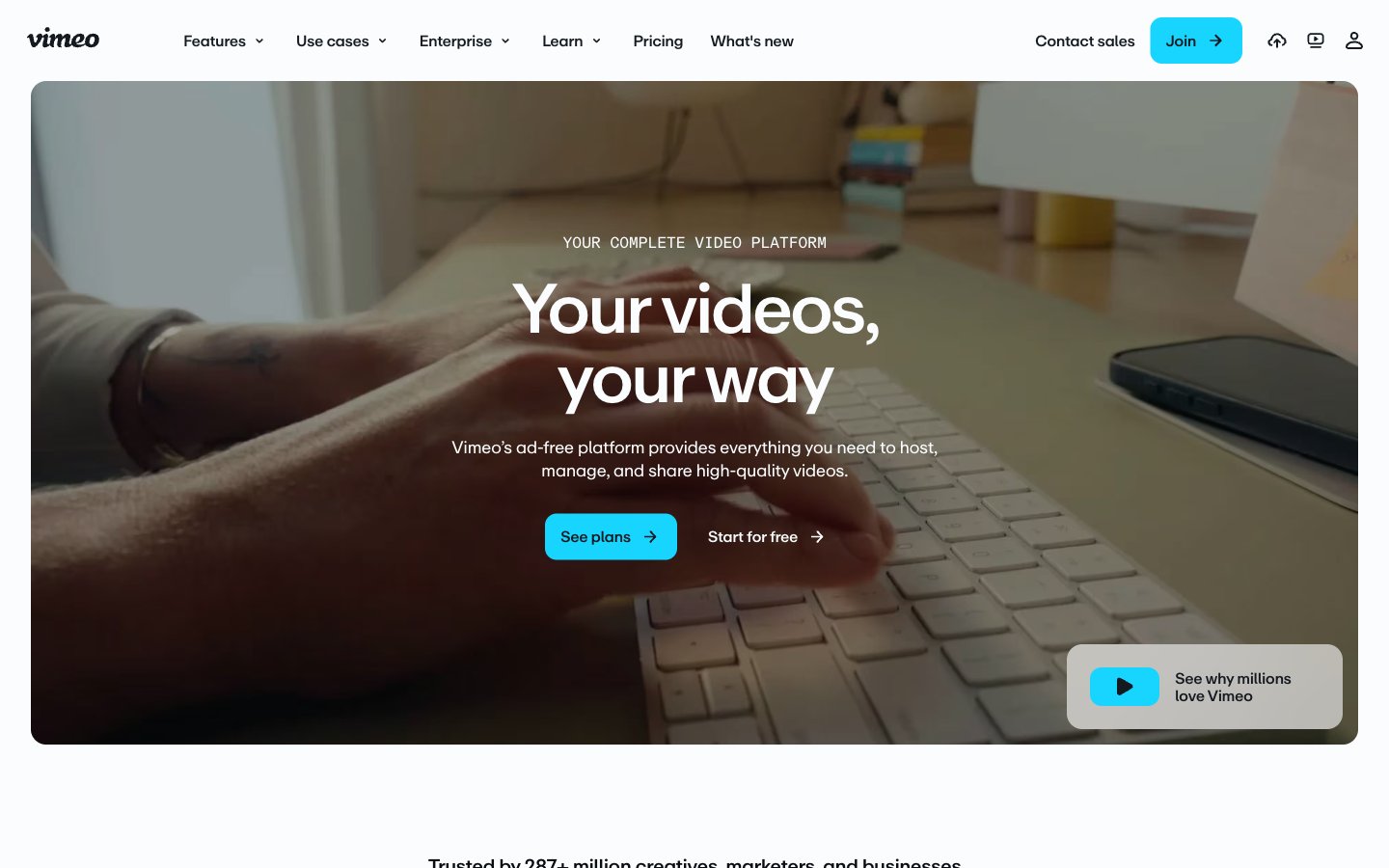
Vimeo
Vimeo — Style Reference
# Vimeo — Style Reference
> Spotlight on matte white
**Theme:** mixed
Vimeo's visual language treats the page as a matte white gallery wall where one electric cyan accent acts as the only spotlight. The dominant canvas is near-white (#fafcfd) with a deep ink (#141a20) used sparingly for cinematic dark bands, and a single vivid #17d5ff cyan that appears exclusively on action elements — never on decoration, illustration, or background fills. Typography carries the brand's editorial weight: a custom neo-grotesque (ABCRepro) at 400/500/700 with aggressive negative tracking at display sizes (-0.05em at 72px), tight 1.20 leading on body, and 1.00 leading on oversized headlines that makes them feel architectural. The layout alternates between breathing light sections and dense dark platforms, creating a vertical rhythm that mirrors the site's own product (lightness for browsing, darkness for viewing). Components are flat, low-elevation, and slightly rounded — 8px on buttons and inputs, 16px on cards, 9999px on tags. Density is compact: 8px and 16px do the heavy lifting, with 24px marking section breaks rather than breathing room.
## Tokens — Colors
| Name | Value | Token | Role |
|------|-------|-------|------|
| Cyan Signal | `#17d5ff` | `--color-cyan-signal` | Primary action background, active nav, the single brand chromatic — filled CTAs and selected states. Electric against matte white, cool enough to feel like light rather than pigment |
| Cyan Depth | `#13b1d4` | `--color-cyan-depth` | Blue wash for highlight backgrounds, decorative bands, and soft emphasis behind content. Do not promote it to the primary CTA color |
| Ink Black | `#141a20` | `--color-ink-black` | Dark section backgrounds (platform showcase bands, footer), filled dark buttons. Near-black with a cool blue undertone that keeps it on-brand rather than neutral |
| Carbon | `#0a0e12` | `--color-carbon` | Primary text, heading color, strongest dark neutral for text on light surfaces and borders on dark surfaces |
Websites
Markdown Text
design-md
website-prompt
landing-page-prompt
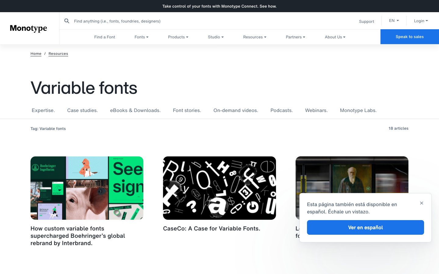
Monotype.
Monotype. — Style Reference
# Monotype. — Style Reference
> Curated typography showcase on paper. Monotype's interface behaves like a gallery wall: white surfaces, hairline dividers, generous whitespace, and type itself as the only ornament.
**Theme:** light
Monotype's design is an editorial type museum on white: the type is the artifact, the chrome recedes. The interface is overwhelmingly monochrome — near-black ink (#1e242c) on paper-white, with hairline gray dividers and a single saturated blue reserved exclusively for conversion. Components are low-elevation and flat: thin 1px borders instead of shadows, modest 8px radii on controls, generous 16-24px internal padding. Typography is the hero: a custom HelveticaNow family handles body, nav, and display, with a -0.02em tracking on bold labels that signals the brand's typographic pedigree. Layout breathes — comfortable 8px base grid, 16px element gaps, wide section spacing — letting featured type specimens and photography carry visual weight without competition from the UI.
## Tokens — Colors
| Name | Value | Token | Role |
|------|-------|-------|------|
| Ink | `#1e242c` | `--color-ink` | Primary text, nav borders, icon strokes, card borders — near-black with a barely-there cool tint reads as a refined alternative to pure black |
| Steel | `#576579` | `--color-steel` | Secondary text, muted nav links, subtle borders — the workhorse mid-gray for everything that must be quieter than body copy |
| Paper | `#ffffff` | `--color-paper` | Page canvas, card surfaces, button text on filled controls — the dominant surface |
| Mist | `#e7eaee` | `--color-mist` | Nav dividers, subtle section separators — the lightest functional border |
Websites
Markdown Text
design-md
website-prompt
landing-page-prompt
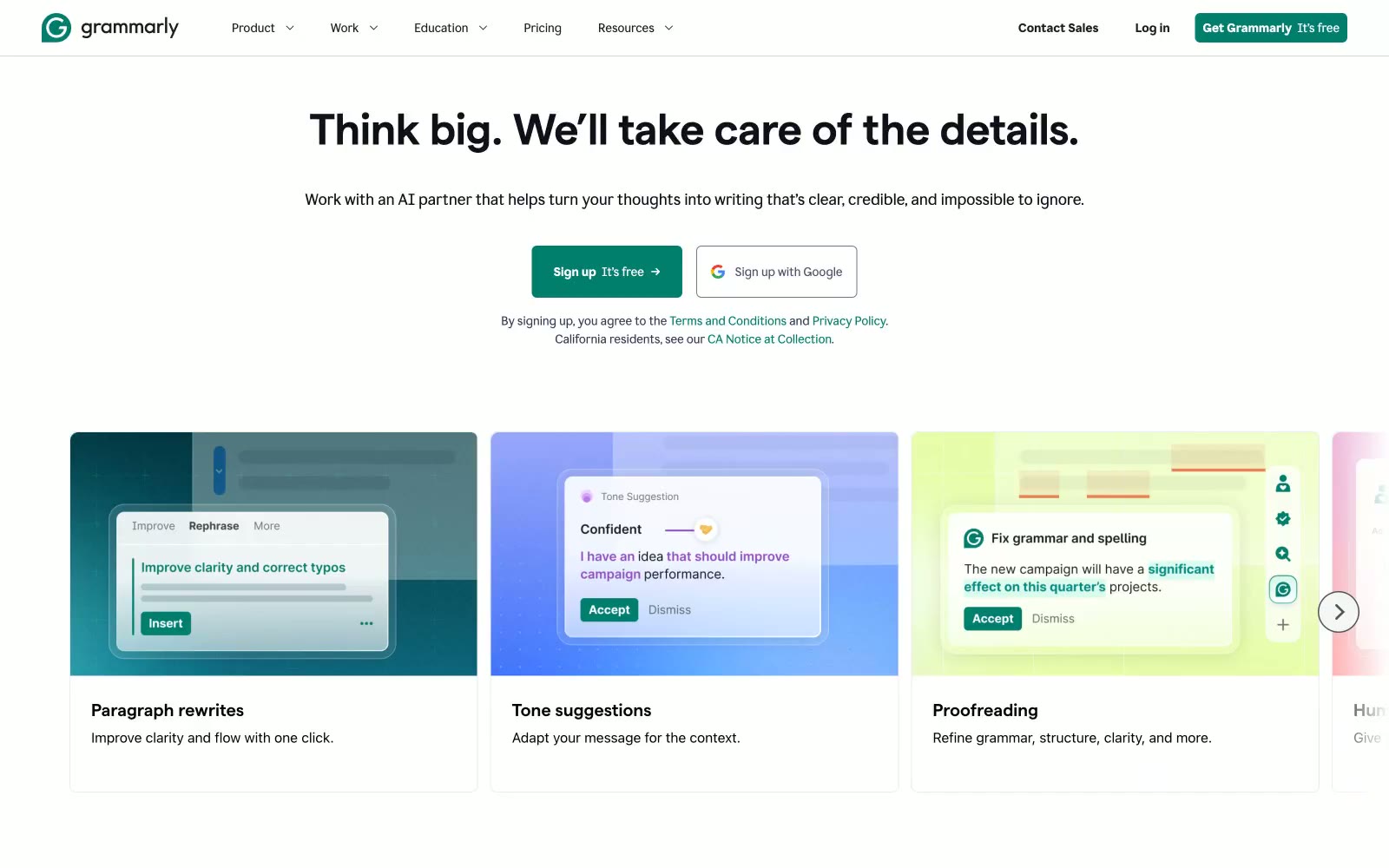
Grammarly
Grammarly — Style Reference
# Grammarly — Style Reference
> Thoughtful editor's desk — restrained, precise, one confident accent
**Theme:** light
Grammarly's design system reads like a considered editorial workspace: a near-white canvas, confident dark typography, and a single deep teal that signals action. The custom display face 'matter' (weight 670) carries a compressed, geometric authority at large sizes, while 'Glyph' handles body copy with a quieter, humanist warmth. Components are restrained — 8px corners, hairline borders, ghost controls, minimal elevation — letting the teal CTA and the occasional dark enterprise band do the emotional work. Surfaces are flat and paper-like; shadows are nearly absent. The palette is 90%+ achromatic, with teal appearing as functional punctuation for buttons, links, active states, and full-bleed brand sections.
## Tokens — Colors
| Name | Value | Token | Role |
|------|-------|-------|------|
| Grammarly Teal | `#027e6f` | `--color-grammarly-teal` | Primary buttons, links, active nav, dark enterprise hero bands, decorative icon strokes — a deep botanical teal that reads as both professional and approachable against white and near-black surfaces |
| Midnight Navy | `#1f243c` | `--color-midnight-navy` | Headings, navigation text, body copy, card text, icon strokes, footer copy — the dominant dark color carrying nearly all prose |
| Ink Black | `#0e101a` | `--color-ink-black` | Display headings, high-emphasis body text, link text — slightly cooler/deeper than Midnight Navy, used for the heaviest type |
| Graphite | `#545454` | `--color-graphite` | Muted body text, secondary button labels, helper copy, icon strokes |