AI Prompt Studio - Intelligent Prompt Library
Explore and use professional AI prompts to optimize your workflow.
One-click Use
Websites
Markdown Text
design-md
website-prompt
landing-page-prompt
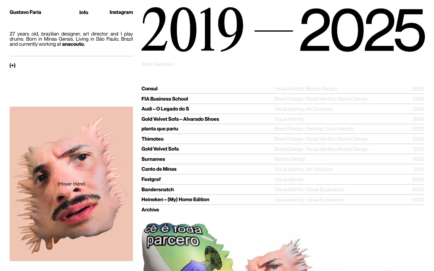
GUSTAVO Faria ©
GUSTAVO Faria © — Style Reference

# GUSTAVO Faria © — Style Reference
> Editorial monograph on white paper
**Theme:** light
Gustavo Faria's portfolio operates as a printed monograph on white paper: an editorial spread where one massive serif date range dominates the right column while a compact bio and portrait anchor the left. The system is almost aggressively monochrome — four grays/black on white, no decorative color, no shadows, no rounded corners. Typography does all the heavy lifting: a custom display serif at 125-142px creates scale contrast against 16px system body text, and negative letter-spacing tightens the display letters into a single confident statement. Content is organized as a work selection table — project name, category, year — separated by hairline rules. The atmosphere is that of an art director's contact sheet: restrained, intentional, every element earning its space.
## Tokens — Colors
| Name | Value | Token | Role |
|------|-------|-------|------|
| Paper White | `#ffffff` | `--color-paper-white` | Page canvas, card surfaces — the foundational surface on which all content sits |
| Charcoal | `#282828` | `--color-charcoal` | Primary text, hairline borders, structural rules — softer than pure black, reduces glare for long reading |
| Ink Black | `#000000` | `--color-ink-black` | Display text fill, link borders, maximum contrast elements |
| Ash Gray | `#dcdcdc` | `--color-ash-gray` | Hairline borders, dividers, input outlines, and card edges on light surfaces. Do not promote it to the primary CTA color |
Websites
Markdown Text
design-md
website-prompt
landing-page-prompt
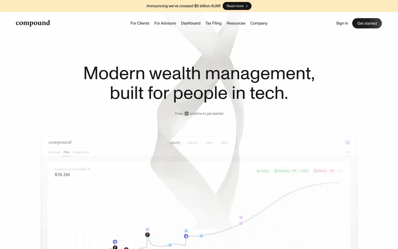
Compound
Compound — Style Reference
# Compound — Style Reference
> ink-on-paper wealth journal — a quiet editorial system where one font at one weight does all the work, and the only color is the cream ribbon at the top of the page.
**Theme:** light
Compound operates on near-total chromatic silence: one typeface (Monument Grotesk) at a single weight of 400, a fully achromatic palette, and shadows so faint they register as atmosphere rather than depth. Surfaces are nearly invisible — a white canvas, #e5e7eb hairline borders, and 20px rounded cards — so hierarchy is carried entirely by dramatic size jumps (14px body climbing to 60–72px display) and generous whitespace. The only chromatic note in the system is a warm cream announcement bar (#ffe9bf) flush at the very top edge. Interactive elements are deliberately quiet: a single near-black pill button and ghost underlined text links that read as typeset words more than UI chrome. The product preview card — with its subtle four-layer drop shadow and 20px radius — is the one moment of visual thickness in the layout, the only thing the eye can actually grasp as an object.
## Tokens — Colors
| Name | Value | Token | Role |
|------|-------|-------|------|
| Ink | `#171717` | `--color-ink` | Primary text, filled pill buttons, navigation emphasis, logo wordmark — the only dark anchor in an otherwise white system |
| Paper | `#ffffff` | `--color-paper` | Page canvas, card surfaces, product preview background — the default ground for all content |
| Graphite Hairline | `#e5e7eb` | `--color-graphite-hairline` | All structural borders, dividers, card edges, input borders — the most-used color in the system by frequency, defining every container |
| Vellum | `#f3f3f3` | `--color-vellum` | Secondary surface fills, subtle hover washes, tertiary panel background — the lightest gray still distinct from white |
Websites
Markdown Text
design-md
website-prompt
landing-page-prompt
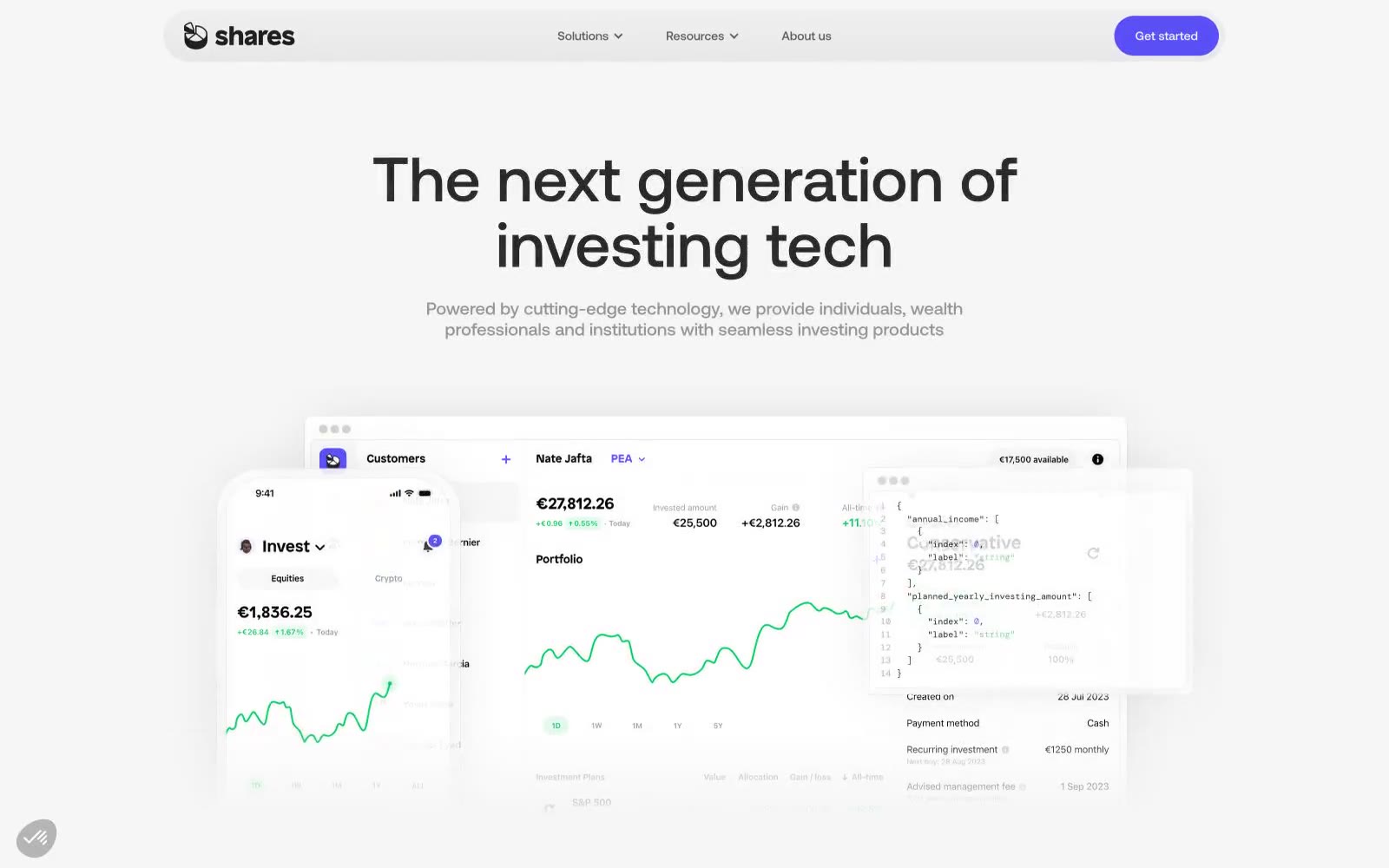
Shares
Shares — Style Reference
# Shares — Style Reference
> Ivory terminal with violet pulse — a clinical white workspace where one color marks every deliberate action.
**Theme:** light
A monochromatic fintech interface on near-white surfaces, where one vivid violet does all the talking. The visual language is sparse and confident: no decorative gradients, no chromatic ornamentation, no shadow theatrics. Everything sits on flat porcelain with dark charcoal text, and the only color that earns attention is Signal Violet (#594ff4), reserved strictly for action — filled buttons, active links, brand marks. Components lean on geometry rather than depth: pill-shaped controls (99px radius), generously rounded cards (36px), and soft 1px gray dividers instead of elevation. Typography is geometric and tightly tracked, with large headlines at compressed line-heights (1.05–1.15) that feel architectural rather than editorial. Product mockups float in layered, slightly overlapping arrangements — phone + dashboard + code panel — anchored by a single brand color.
## Tokens — Colors
| Name | Value | Token | Role |
|------|-------|-------|------|
| Signal Violet | `#594ff4` | `--color-signal-violet` | Primary action fill, active links, brand iconography — the only chromatic color in the system, creating high-contrast urgency against the monochrome canvas |
| Inkstone | `#1f1f1f` | `--color-inkstone` | Primary headings, body text emphasis, dark surface fills — the dominant dark neutral |
| Graphite | `#333333` | `--color-graphite` | Secondary text, dense borders, icon strokes — the most-used neutral |
| Slate | `#5d5d5d` | `--color-slate` | Muted body text, navigation subtext, secondary borders |
Websites
Markdown Text
design-md
website-prompt
landing-page-prompt
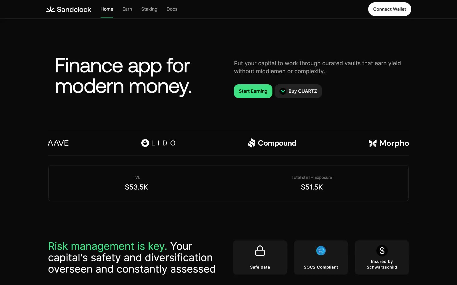
Sandclock
Sandclock — Style Reference
# Sandclock — Style Reference
> DeFi command terminal at midnight — green signal lights on a matte black console
**Theme:** dark
Sandclock is a DeFi yield terminal dressed in matte black: near-zero chrome, one vivid mint-green signal color, and typography that does all the work. The interface reads like a Bloomberg terminal reimagined for DeFi — dark canvas (#0a0a0a), hairline graphite borders (#222222), flat surfaces with no decorative elevation, and Inter for utility text paired with a custom Aeonik display face for the rare 72px headline. Green (#3fe280) appears as functional punctuation only: active nav underline, primary CTAs, and accent borders on live stat cards. Every other surface stays achromatic so the green reads as a live signal, not decoration. Components feel like a trading dashboard — compact, information-dense in numbers, but breathing with generous section gaps. No gradients, no drop shadows beyond a single subtle button lift, no colorful illustration chrome. Trust is communicated through restraint: the design says 'your money is here' by staying quiet.
## Tokens — Colors
| Name | Value | Token | Role |
|------|-------|-------|------|
| Abyss | `#0a0a0a` | `--color-abyss` | Page canvas and primary background — the entire site lives on this near-black surface so the mint accent reads as a live signal against pure darkness |
| Carbon | `#171717` | `--color-carbon` | Elevated card and panel surface — used for stat cards, security badges, and announcement containers that need to lift off the canvas without introducing color |
| Graphite | `#222222` | `--color-graphite` | Hairline borders, dividers, and the highest-frequency structural color in the system. Carries 356 borderColor uses — it is the wireframe that defines every container |
| Ash | `#9b9b9b` | `--color-ash` | Muted secondary text, helper labels, and de-emphasized nav items. The only non-white text color — reserves #ffffff for content that must be read first |
Websites
Markdown Text
design-md
website-prompt
landing-page-prompt
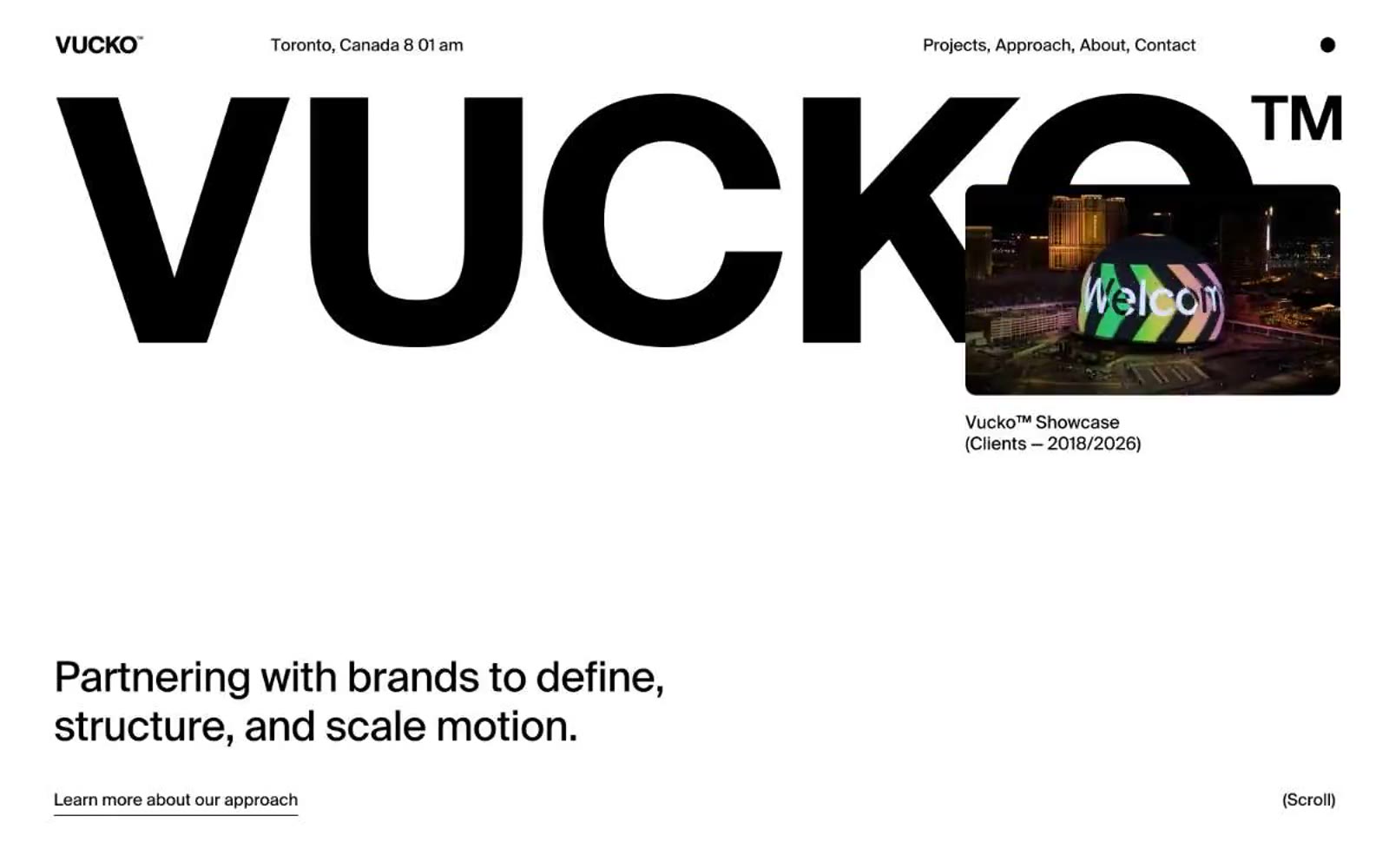
Vucko
Vucko — Style Reference
# Vucko — Style Reference
> oversized type on white gallery floor — a type-specimen book where the wordmark is the room.
**Theme:** light
Vucko operates as a monochrome editorial canvas where the type is the architecture. Pure white surfaces meet pure black ink, with a single faint gray reserved for de-emphasized secondary text and ghost-list items in service lists. The custom Suisse typeface at display sizes — up to 211px — creates a monumental, almost architectural presence where the wordmark alone can fill a viewport. Chromatic color is absent from the system itself, appearing only inside project showcase content (vivid gradients, yellow cards) that punctuates the otherwise austere page. The interface is whisper-thin: hairline 1px borders, zero shadows, generous 58px section gaps, and pill-shaped nav elements. Every screen should read like a page in a high-end art book — restrained, confident, and anti-decoration.
## Tokens — Colors
| Name | Value | Token | Role |
|------|-------|-------|------|
| Ink | `#000000` | `--color-ink` | Primary text, all borders, dark surface blocks, and the hero wordmark — the structural backbone of every screen |
| Paper | `#ffffff` | `--color-paper` | Hairline borders, dividers, input outlines, and card edges on light surfaces. Do not promote it to the primary CTA color |
| Faint Ash | `#eeeeee` | `--color-faint-ash` | Subtle surface tint for secondary cards or de-emphasized blocks, barely distinguishable from Paper |
| Steel | `#888a8b` | `--color-steel` | Muted secondary text and ghost-list items in service lists — the only non-black text color, used to create tonal hierarchy without introducing hue |
Websites
Markdown Text
design-md
website-prompt
landing-page-prompt
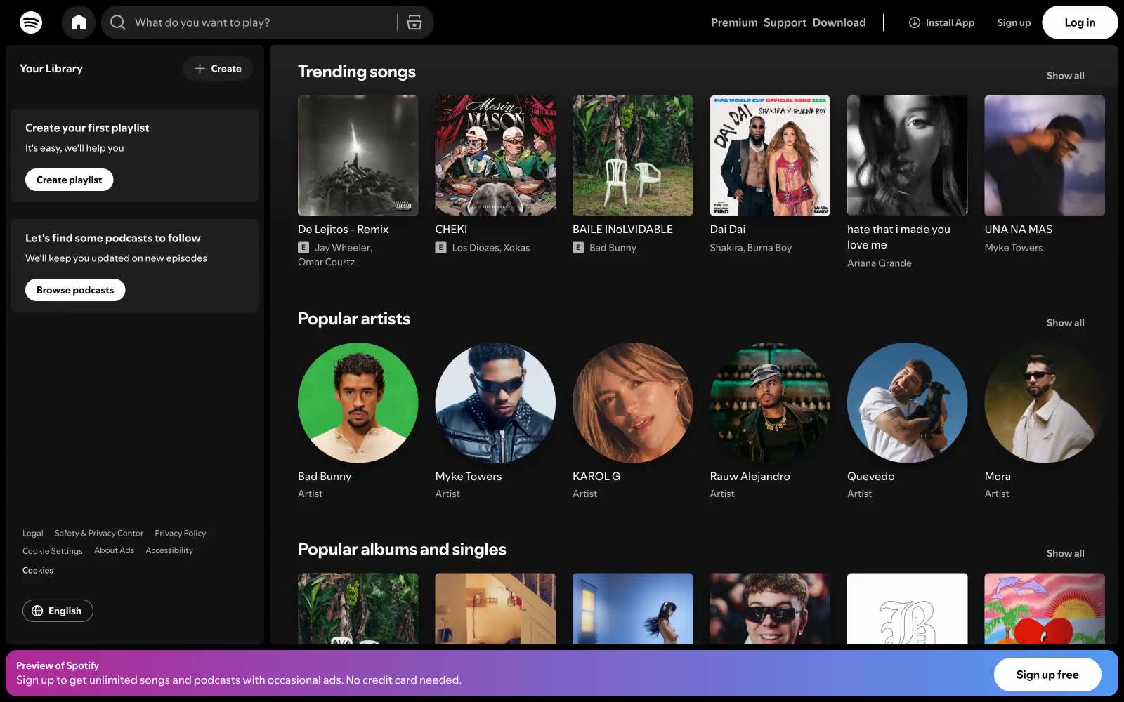
Spotify
Spotify — Style Reference
# Spotify — Style Reference
> Darkened record store at midnight — every surface recedes so the album art can glow.
**Theme:** dark
Spotify operates as a darkened cinema for music: a near-black canvas lets album artwork and artist photography supply all the color, while the chrome itself stays nearly monochrome to keep focus on the content. The interface is compact, information-dense, and built around horizontal scrolling rails of square album cards and circular artist portraits. One signature vivid green (#1ed760) punctuates the system for primary actions, play states, and brand identity, while a purple-to-blue gradient appears only in premium promotional banners. Buttons are fully pill-shaped (9999px), cards carry a modest 6px radius with a generous drop shadow, and typography is a tight, geometric sans-serif that speaks at conversational volumes — never shouting, always functional.
## Tokens — Colors
| Name | Value | Token | Role |
|------|-------|-------|------|
| Void Black | `#000000` | `--color-void-black` | Primary canvas, page background — deepest layer of the dark surface stack |
| Obsidian | `#121212` | `--color-obsidian` | Card surfaces, raised panels, modal backgrounds — one step up from the canvas |
| Graphite | `#1f1f1f` | `--color-graphite` | Elevated controls, hover surfaces, filled button backgrounds — the interactive surface tier |
| Ash Gray | `#333333` | `--color-ash-gray` | Input borders, subtle dividers, inactive control outlines |
Websites
Markdown Text
design-md
website-prompt
landing-page-prompt
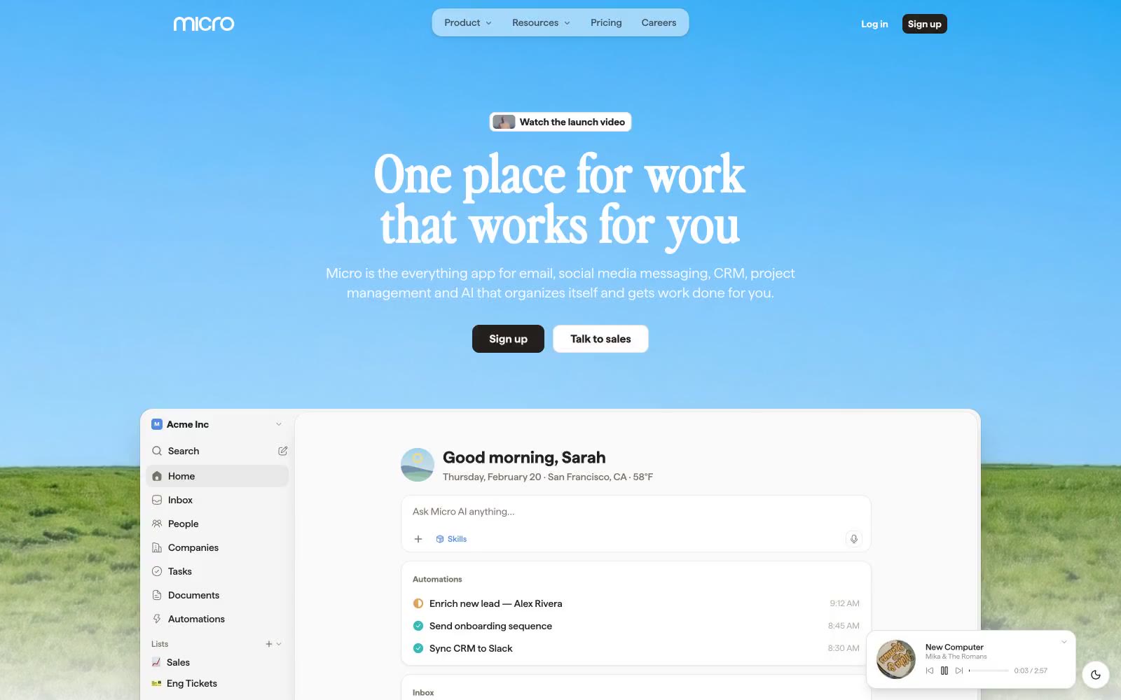
Micro
Micro — Style Reference
# Micro — Style Reference
> sunrise over a digital meadow — a calm horizon gradient holding a quiet, ink-on-paper workspace beneath it.
**Theme:** light
Micro is a sunrise productivity workspace: a chromatic blue-to-teal gradient sky opens the page, then drops into a quiet, neutral canvas of warm off-white with a near-black ink text color. The signature typographic move pairs a chunky editorial display face (perfectlyNineties) for oversized headlines with a neutral workhorse (haffer) for the dense product UI — giving marketing pages a magazine-cover gravity and product screens a calm, readable density. Color is used as functional punctuation: one azure blue (#518bdb) for actions, plus a pastel accent system (mint, peach, lavender, teal-mist) for soft surface washes and a small multicolor icon palette (teal, pink, red, orange, green) that signals connectivity and categories. Components are flat-first, bordered and gently shadowed rather than heavily elevated; radii cluster at 8px and 14px, with 18px for the larger product cards. The overall feel is a software product that has been allowed to breathe — open, friendly, slightly nostalgic in its display type, but precise in its data-rich product surfaces.
## Tokens — Colors
| Name | Value | Token | Role |
|------|-------|-------|------|
| Ink Black | `#221f1c` | `--color-ink-black` | Primary text, dark CTA backgrounds, dark icon fills — warm near-black rather than neutral black keeps the palette from feeling clinical |
| Paper White | `#f5f5f5` | `--color-paper-white` | Page canvas, card backgrounds, subtle surface fills — the warm off-white that gives the product its paper-like base |
| Pure White | `#ffffff` | `--color-pure-white` | Elevated product card surfaces inside the app UI (inbox, context graph nodes) — one level above Paper White |
| Stone Gray | `#797267` | `--color-stone-gray` | Secondary text, icon strokes, muted body copy — warm gray that stays in the same family as Ink Black |
Websites
Markdown Text
design-md
website-prompt
landing-page-prompt
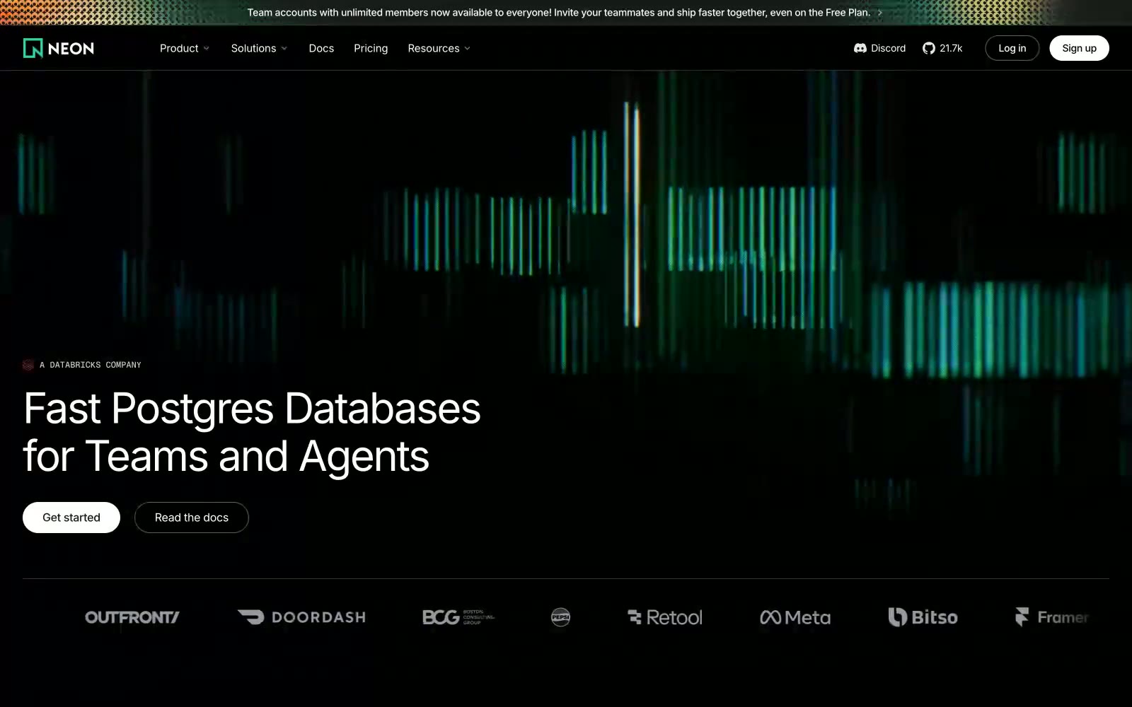
Neon
Neon — Style Reference
# Neon — Style Reference
> Server Room After Dark. A deep black environment where data and interactions are the only sources of light.
**Theme:** dark
The design feels like a high-end server room after dark — a pure black void where information glows. A strict monochrome palette of pure black (#000000) and white (#ffffff) creates maximum contrast, ensuring text and UI are starkly legible. All visual energy comes from a single, electric green (#34d59a) that mimics terminal output and data visualizations, used exclusively for accents and decorative, code-like background graphics. The system achieves depth not with shadows but with subtle, layered near-black surfaces. A unique tension exists between the pill-shaped buttons and the sharp, 4px corners of all other UI containers.
## Tokens — Colors
| Name | Value | Token | Role |
|------|-------|-------|------|
| Neon Glow | `#34d59a` | `--color-neon-glow` | Key brand accent, active state indicators, data visualizations — injects a vibrant, code-like energy. |
| Neon Muted | `#285d49` | `--color-neon-muted` | Subtle background tones in visualizations, less prominent brand elements. |
| Scanline Fade | `linear-gradient(90deg, rgba(57, 165, 125, 0.6) 50%, rgba(0, 0, 0, 0) 50%)` | `--color-scanline-fade` | Special effect for highlighting code or UI elements, mimicking a terminal scanline. |
| System Warning | `#ff3621` | `--color-system-warning` | Used sparingly for icons or highlights requiring urgent attention. |
Websites
Markdown Text
design-md
website-prompt
landing-page-prompt
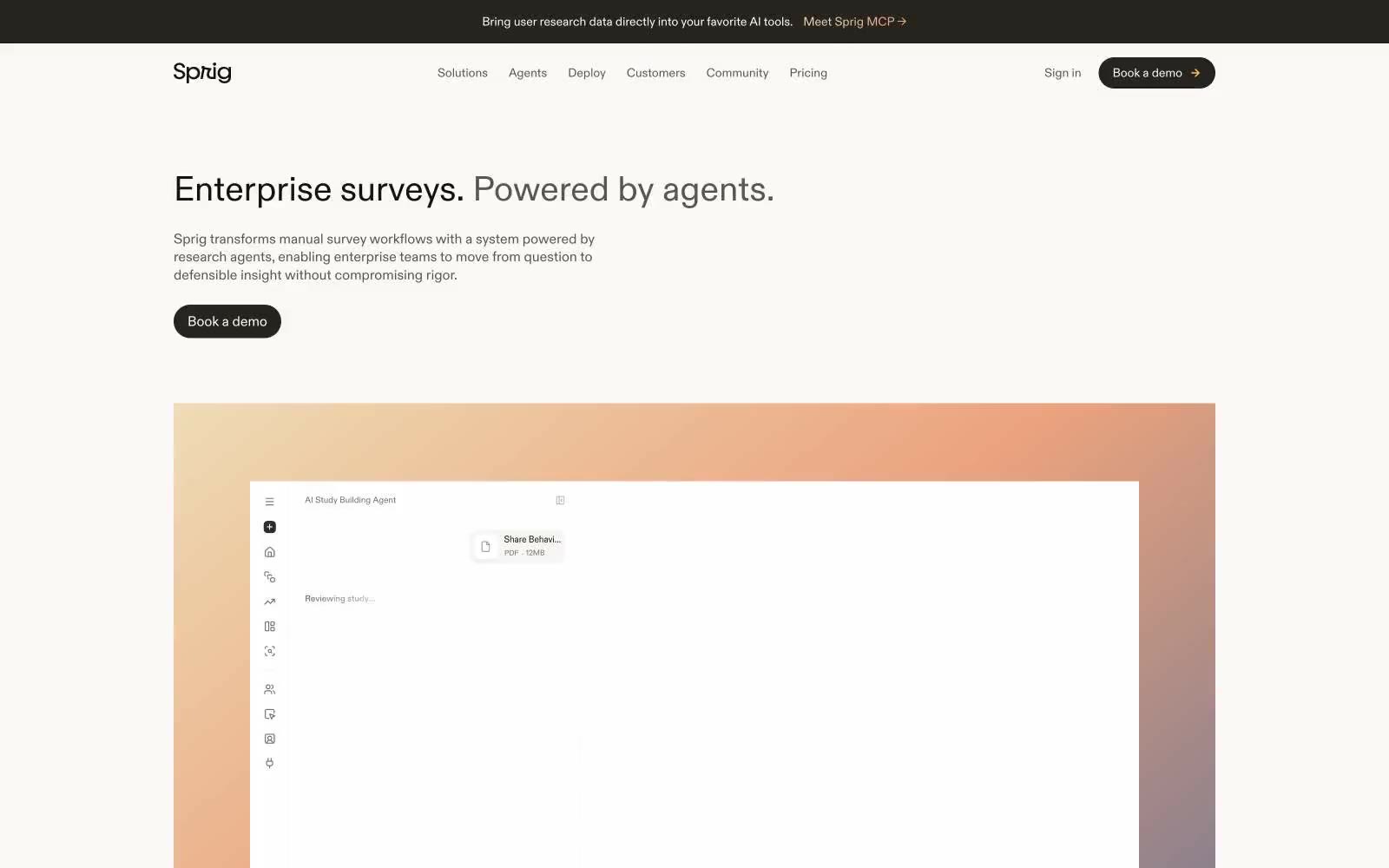
Sprig
Sprig — Style Reference
# Sprig — Style Reference
> editorial research notebook on warm paper — quiet, almost inkless, with warm light leaking in at the edges
**Theme:** light
Sprig operates in a near-monochrome editorial register: a warm bone-white canvas, hairline borders, and a single ink tone so dark it reads as black but carries a barely-there navy undertone. The system feels like a research notebook — quiet, confident, and deliberately undecorated — punctuated by warm sunset gradients that act as section markers rather than decoration. Typography is two custom families in conversation: ABC Diatype for the editorial moments (headings, display) and TT Commons Pro for the functional UI (nav, buttons, labels). Components are pill-shaped and generously spaced; cards can be nearly circular (100px radius) for feature moments, creating a visual contrast between the very-soft and the very-structured. Color is rationed: the only chromatic color in the interface is the near-black ink itself, and gradients are reserved for hero and event imagery — never on buttons, never on controls.
## Tokens — Colors
| Name | Value | Token | Role |
|------|-------|-------|------|
| Abyssal Ink | `#0b2330` | `--color-abyssal-ink` | Primary text, nav links, borders, icon strokes — the workhorse near-black with a whisper of navy. Carries every reading surface in the system |
| Bone | `#faf9f8` | `--color-bone` | Page canvas, card surfaces, button text on dark fills — a warm off-white, never pure #fff |
| Obsidian | `#141312` | `--color-obsidian` | Headings, display text, strong UI fills — slightly warmer than Abyssal, used where headings need a touch more warmth |
| Espresso | `#272420` | `--color-espresso` | Filled button background (primary action), dark surface sections — the primary CTA color, a warm near-black |
Websites
Markdown Text
design-md
website-prompt
landing-page-prompt
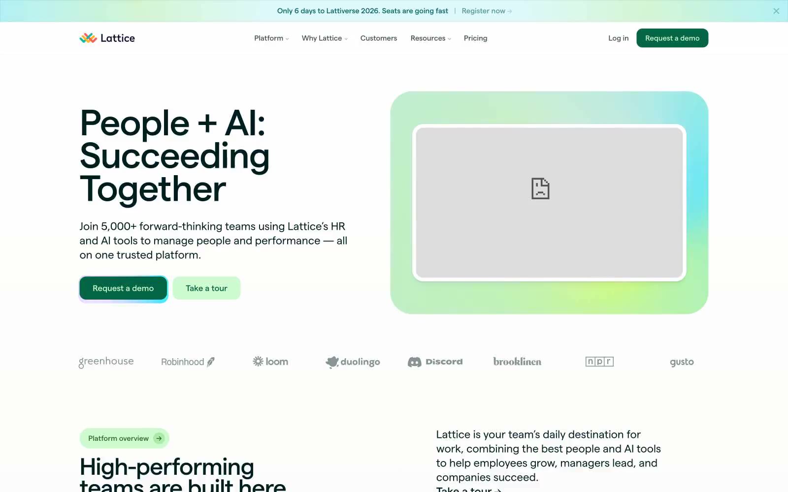
Lattice
Lattice — Style Reference
# Lattice — Style Reference
> Botanical field journal on warm parchment — a quiet cream canvas where dark forest ink does the speaking and pastel specimen cards provide the color.
**Theme:** light
Lattice reads like a botanical field journal rendered in product form: a warm parchment canvas (#f7f6f2) carries the entire site, with a single near-black forest ink (#001f1f) doing the heavy lifting as both primary text and primary action surface. The signature is a system of pastel-tinted feature cards — mint, lime, lavender, buttercream — each color-coding a product module like a specimen tray, paired with dark filled and outlined buttons in the same forest green. Typography is a single geometric sans (Matter) at compact sizes, with tight tracking on large display copy and wide tracking on small uppercase labels. Everything sits on generous rounded corners (14–29px), soft 1px-tinted shadows, and zero decorative noise — color appears as functional punctuation, not ornament.
## Tokens — Colors
| Name | Value | Token | Role |
|------|-------|-------|------|
| Parchment | `#f7f6f2` | `--color-parchment` | Page background — the warm off-white canvas that gives the entire system its paper-like, non-clinical feel. Never use pure white for the body background |
| Paper White | `#ffffff` | `--color-paper-white` | Card surfaces, product UI mockups, and embedded media containers — pure white lifted above the parchment canvas to create subtle elevation without shadows |
| Forest Ink | `#001f1f` | `--color-forest-ink` | Neutral form states, badge text, and quiet UI feedback where color should stay understated. Do not promote it to the primary CTA color |
| Lichen Gray | `#5c7070` | `--color-lichen-gray` | Secondary text and medium-emphasis borders. Sits between Forest Ink and the lighter grays — use for body descriptions, supporting copy, and subtle dividers |
Websites
Markdown Text
design-md
website-prompt
landing-page-prompt
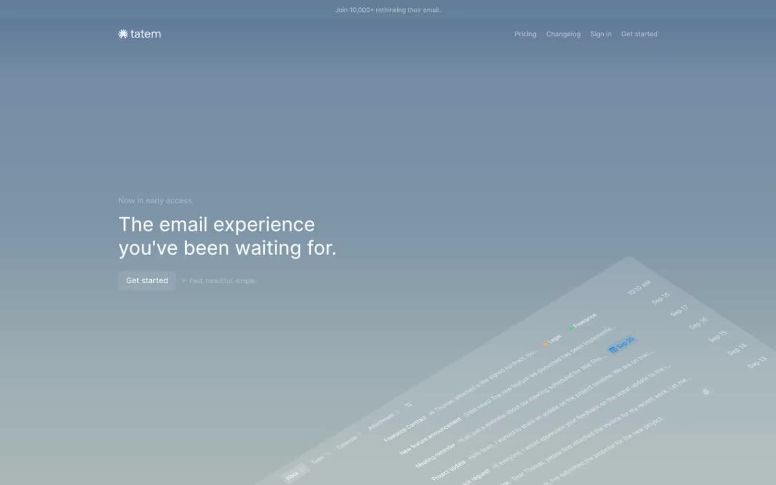
Tatem
Tatem — Style Reference
# Tatem — Style Reference
> calm twilight command center — a hushed dark workspace washed in a single soft blue-to-charcoal gradient, with one warm sunburst as the only color punctuation.
**Theme:** dark
Tatem operates in a hushed, dark twilight palette where nearly the entire interface is rendered in neutral grays and near-black surfaces, creating a calm, focused environment for an email client. The hero breaks the monochrome with a single soft blue-gray gradient that fades to black, framing a large left-aligned headline and a gently rotated app preview. Typography is exclusively Inter at weight 400, relying on size and letter-spacing to establish hierarchy rather than weight contrast. Components stay flat and minimal: ghost buttons with thin borders, 6px-radius cards, keyboard shortcut chips, and inbox rows that use spacing and subtle gray separators rather than borders or shadows. The visual signature is restraint — one warm sunburst icon is the only chromatic punctuation, and the rest of the system communicates through negative space, neutral gradients, and whisper-quiet text colors.
## Tokens — Colors
| Name | Value | Token | Role |
|------|-------|-------|------|
| White | `#ffffff` | `--color-white` | Primary text, logo mark, ghost button borders on dark — the highest-contrast color, used sparingly for headlines and active labels |
| Ash Gray | `#c2c2c2` | `--color-ash-gray` | Secondary headings, emphasis text on dark surfaces |
| Mist | `#b5b5b5` | `--color-mist` | Muted body text, sub-labels, metadata |
| Smoke | `#919191` | `--color-smoke` | Tertiary text, icon strokes, inactive nav items, secondary button text |
Websites
Markdown Text
design-md
website-prompt
landing-page-prompt
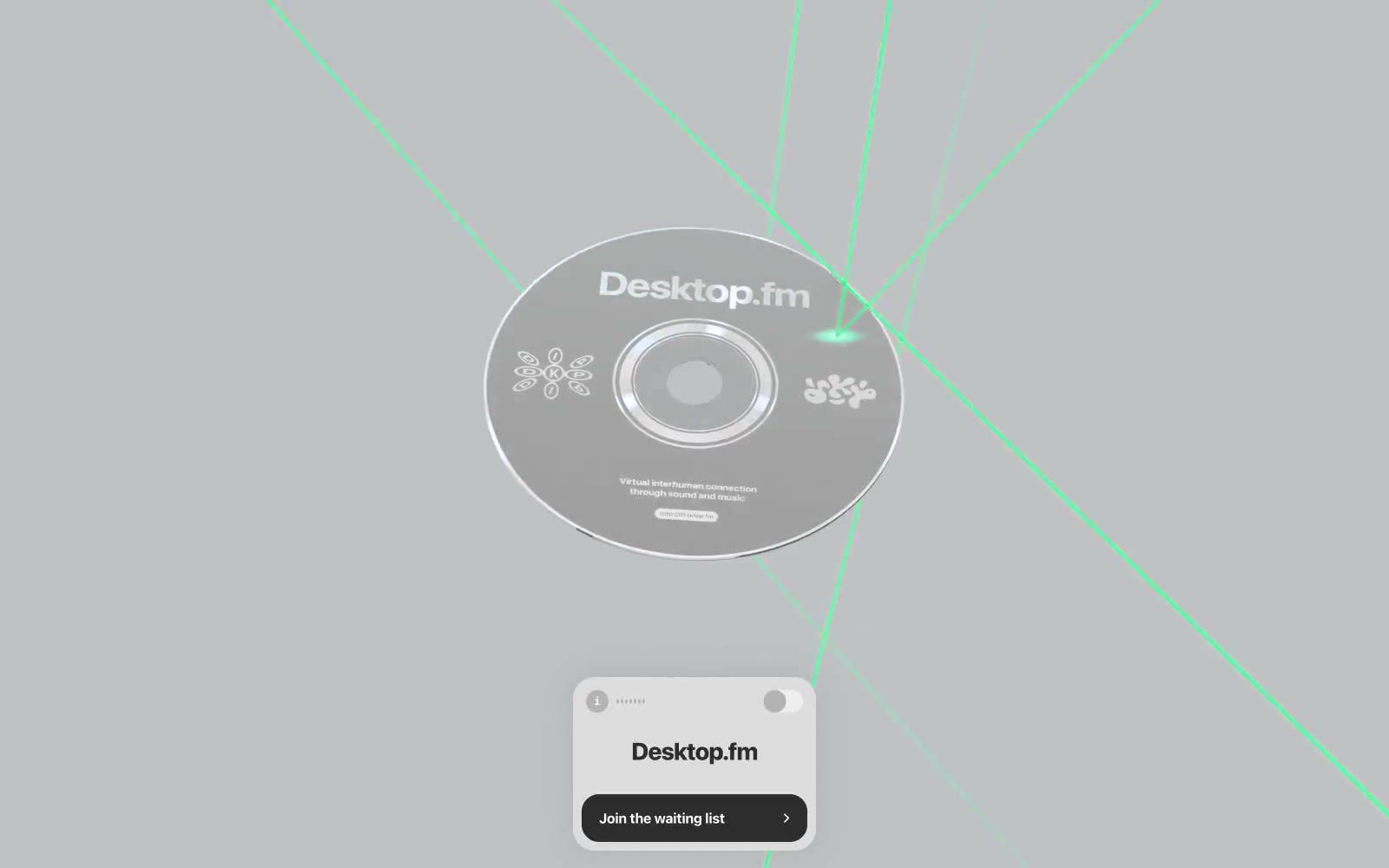
Desktop.fm
Desktop.fm — Style Reference
# Desktop.fm — Style Reference
> Chrome disc in a laser grid — Apple keynote restraint meets cyberpunk CD-ROM nostalgia.
**Theme:** light
Desktop.fm is a near-monochrome product page that treats a single 3D-rendered object as the entire hero. The canvas is a cold light gray, the chrome disc floats centered, and the interface furniture is reduced to a single macOS-style window card with one black button. Typography is aggressive: system fonts pushed to weights 700-800 with tight tracking, never thin or light. The page is 1% chromatic by design — the only color comes from the rendered scene (neon green laser lines across a silver CD), and that color is not part of the UI token system, it is the product. Components are compact, radii are mostly sharp (1.5px), and the only soft radius belongs to the app-window card itself (25px) and the pill-lozenge button (20px). The result reads as an Apple product page filtered through a cyberpunk CD-ROM era — restrained chrome surfaces, one bold interactive element, and atmosphere carried entirely by a 3D asset rather than by gradient or illustration.
## Tokens — Colors
| Name | Value | Token | Role |
|------|-------|-------|------|
| Canvas Mist | `#f1f2f3` | `--color-canvas-mist` | Page background, dominant surface across hero and surrounding space |
| Carbon Black | `#111111` | `--color-carbon-black` | Dark supporting neutral for text, icons, and strong contrast. Do not promote it to the primary CTA color |
| Pure White | `#ffffff` | `--color-pure-white` | Elevated card surface (app window mockup), inverse text on dark buttons |
| Graphite | `#2d2d2d` | `--color-graphite` | Secondary dark surfaces, icon strokes, muted dark UI elements |
Websites
Markdown Text
design-md
website-prompt
landing-page-prompt
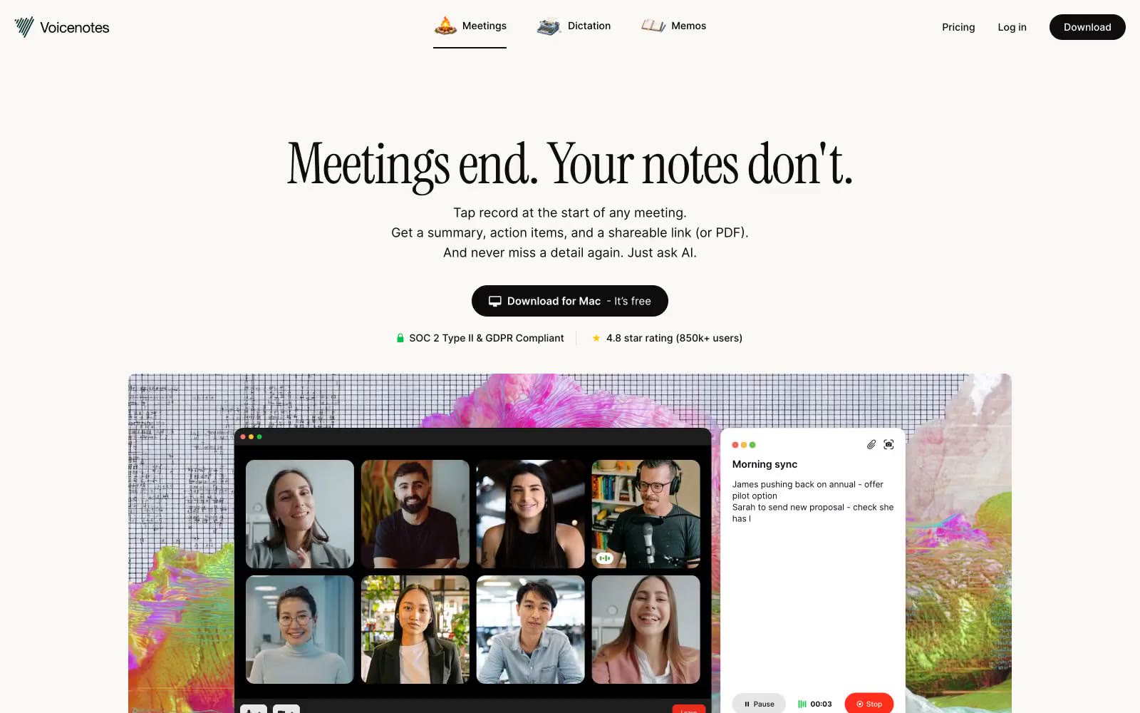
Voicenotes
Voicenotes — Style Reference
# Voicenotes — Style Reference
> cream-paper notebook with a single inkwell. A warm parchment workspace where oversized editorial serifs meet whisper-quiet Inter UI, and almost every pixel is neutral except a single green check that says "you're safe."
**Theme:** light
Voicenotes operates as a quiet, editorial note-taking workspace: a warm cream canvas with nearly zero chroma, where the only vivid mark is a single green check used as a tiny trust signal. The visual identity is a conversation between a humanist display serif (Instrument Serif) and a utilitarian sans (Inter) — the serif sings the marketing headlines while the sans does all the interface labor. Components are low-elevation, generously rounded, and pill-shaped for actions, giving every screen the feel of paper notebook pages laid out on a desk rather than a chrome-heavy SaaS dashboard.
## Tokens — Colors
| Name | Value | Token | Role |
|------|-------|-------|------|
| Parchment | `#faf9f5` | `--color-parchment` | Page canvas, hero backgrounds, section bands — the warm off-white that makes the whole product feel like paper rather than a screen |
| Paper White | `#ffffff` | `--color-paper-white` | Card surfaces, modal backgrounds, elevated panels — pure white sits on top of Parchment to create depth without shadows |
| Soft Sky | `#eaf2f8` | `--color-soft-sky` | Soft section background, alternate surface, and quiet card fill |
| Hairline | `#e5e7eb` | `--color-hairline` | Primary border color for cards, dividers, and input fields — the most-used neutral in the system |
Websites
Markdown Text
design-md
website-prompt
landing-page-prompt
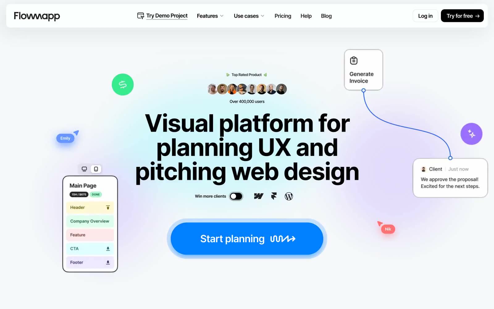
Flowmapp
Flowmapp — Style Reference
# Flowmapp — Style Reference
> White blueprint desk with one blue pen
**Theme:** light
Flowmapp uses a bright, airy, almost lab-notebook language: near-pure white canvas, oversized bold black headlines, pill-shaped blue CTAs, and a constellation of small floating product mockups that act as proof rather than decoration. The system relies on a single vivid blue (#0080ff) as the only saturated signal, with everything else staying achromatic or near-gray so that color reads as action, not as noise. Shapes are aggressively rounded — cards arc at 20–32px, buttons and tags become full pills at 1600px, and the hero CTA even has a hand-drawn wavy tail that makes the primary action feel sketched rather than templated. Layout is max-width contained with generous breathing room; content is broken by small product screenshots, floating UI fragments, and a row of pastel circular icon badges that punctuate long-form copy.
## Tokens — Colors
| Name | Value | Token | Role |
|------|-------|-------|------|
| Signal Blue | `#0080ff` | `--color-signal-blue` | Blue supporting accent for decorative details and low-frequency emphasis. Do not promote it to the primary CTA color |
| Voltage Violet | `#0050ff` | `--color-voltage-violet` | Decorative card border glow, hero gradient bloom, chromatic outline accents on floating mockups — sits one notch deeper than Signal Blue for layered brand moments |
| Sky Wash | `#c5e0fb` | `--color-sky-wash` | Gray supporting accent for decorative details and low-frequency emphasis. Do not promote it to the primary CTA color |
| Pencil Gray | `#8c9baa` | `--color-pencil-gray` | Muted body text, hairline borders, nav dividers, step badges, tertiary metadata |
Websites
Markdown Text
design-md
website-prompt
landing-page-prompt
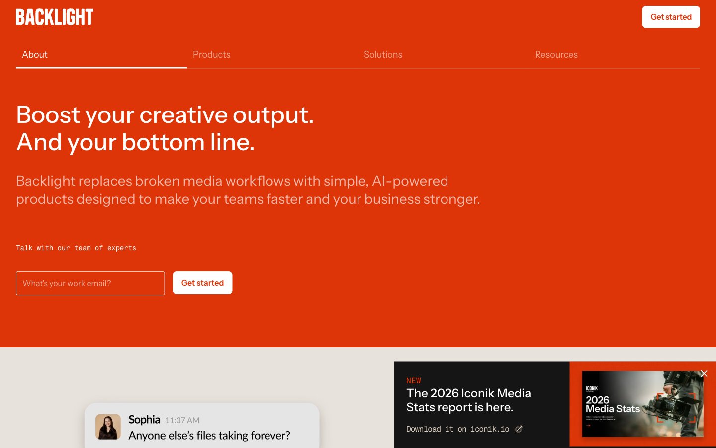
Backlight
Backlight — Style Reference
# Backlight — Style Reference
> Vermillion stamp on warm vellum — a printed catalog cover where one ink red commands the cream page and everything else stays in quiet grayscale.
**Theme:** light
Backlight uses a warm editorial language built on cream vellum and one vermillion accent. The full-bleed orange-red hero acts as the cover page of a printed catalog, with white type and a single white pill button as the only allowed elements. Below the hero, the canvas shifts to warm cream (#e4ddd5) carrying white cards, dark text, and a thin peach hairline (#f3b8a9) that traces the grid like a printer's rule. Chat-bubble cards are used as a signature device to dramatize team conversations and pain points. The type system is confident but quiet — Instrument Sans with consistent negative tracking creates density without weight, and Fragment Mono punctuates timestamps and metadata. The palette never escalates: no shadows, no gradients, no secondary accents — just warm neutrals, one bold red, and a single full-bleed black band for tonal contrast.
## Tokens — Colors
| Name | Value | Token | Role |
|------|-------|-------|------|
| Vermillion | `#dd3508` | `--color-vermillion` | Orange accent for outlined action borders, linked labels, and lightweight interactive emphasis. Do not promote it to the primary CTA color |
| Peach Hairline | `#f3b8a9` | `--color-peach-hairline` | Orange outline accent for tags, dividers, and focused UI edges. Do not promote it to the primary CTA color |
| Cream Vellum | `#e4ddd5` | `--color-cream-vellum` | Page canvas below the hero, input borders, soft surface washes — the warm paper stock everything else sits on |
| Bone White | `#ffffff` | `--color-bone-white` | Card surfaces, button fills on the orange hero, nav text on dark/orange, inverted typography — the bright surface layer |
Websites
Markdown Text
design-md
website-prompt
landing-page-prompt
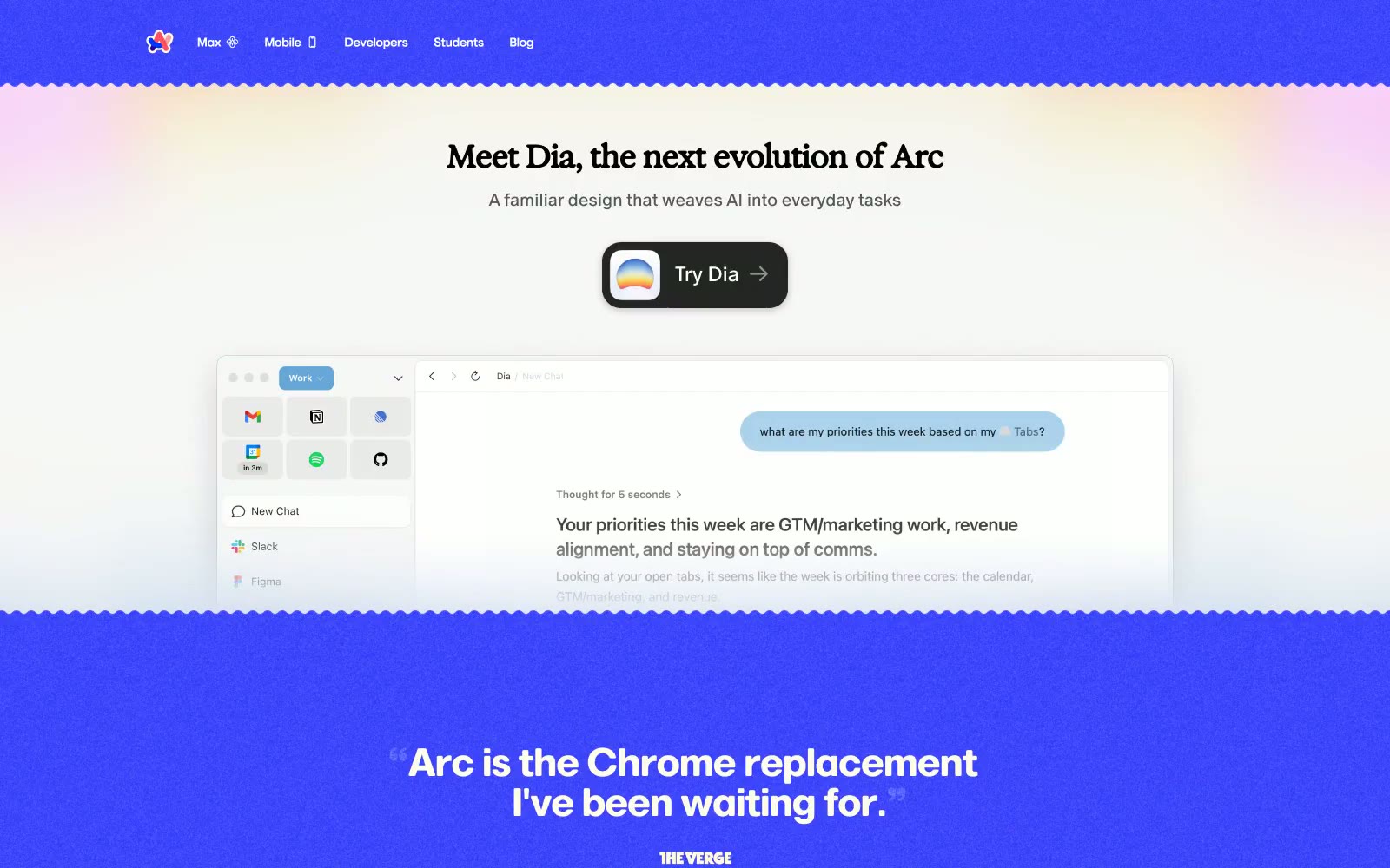
Arc
Arc — Style Reference
# Arc — Style Reference
> Scalloped editorial playground
**Theme:** light
Arc's site reads like a warm editorial spread sliced with a craft-paper cutter: vanilla cream canvases, scalloped section edges that ripple between every band, and a single vivid violet that floods large blocks like a color-soaked page turn. Serif headlines (Marlin) pair with clean sans-serif UI (Inter) to create an editorial-meets-product tension, while the browser itself — not photography — is the hero, rendered as large interactive mockups with sidebar spaces, folders, and inline chat. The palette is mostly paper and ink; the violet is atmospheric punctuation rather than interactive color, and the wavy dividers do most of the personality work that shadows and gradients do on other sites.
## Tokens — Colors
| Name | Value | Token | Role |
|------|-------|-------|------|
| Electric Iris | `#3139fb` | `--color-electric-iris` | Full-bleed section backgrounds, brand atmosphere, sidebar chrome inside the browser mockup — a single high-saturation violet floods entire bands so the page reads as editorial color blocking, not UI state |
| Deep Violet | `#2702c2` | `--color-deep-violet` | Darker accent layer within violet sections, pressed or active states inside the brand color, secondary headings on violet — deepens the iris without shifting hue |
| Oat | `#fffadd` | `--color-oat` | Primary page canvas and hero gradient base — warm cream that reads as paper rather than screen white, the default surface everything else sits on |
| Linen | `#fffcec` | `--color-linen` | Secondary warm surface for cards, nav backgrounds, and footer — a half-step warmer than Oat, used when a layer needs to lift off the canvas without going white |
Websites
Markdown Text
design-md
website-prompt
landing-page-prompt
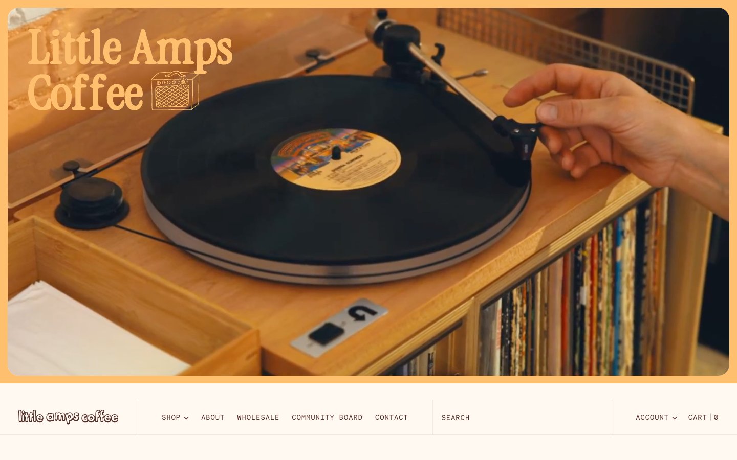
Little Amps
Little Amps — Style Reference
# Little Amps — Style Reference
> vinyl record sleeve in afternoon sun. Cream paper, burnt-orange ink, a single dusty blue stamp, every label set in monospace — the interface behaves like a printed coffee zine: tactile, editorial, never sterile.
**Theme:** light
Little Amps is a warm analog coffee-shop world: cream-paper canvas, rich espresso-brown type, and burnt-orange accents that feel like sun-faded label ink. The interface reads like a printed zine or vinyl insert — a custom chunky display serif handles headlines while monospaced type (Necto Mono, Roboto Mono) labels everything that is structural: nav, buttons, prices, dates, callouts. Photography is documentary and tactile (hands on records, café counters, coffee cherries) and anchors every section. Color is sparse but decisive: a single vivid red-orange does the work of links and highlights, a dusty blue and marigold yellow appear as quiet secondary signals. Surfaces are flat, borders are hairline warm-taupe lines, and radius stays small (3–8px) — the aesthetic is curated and editorial, not soft or rounded.
## Tokens — Colors
| Name | Value | Token | Role |
|------|-------|-------|------|
| Espresso | `#522c25` | `--color-espresso` | Primary text, icons, card borders, nav, footer, input fields — the structural dark that holds every screen together, warm rather than black to stay on-brand with roasted coffee |
| Burnt Orange | `#c03001` | `--color-burnt-orange` | Filled action buttons, active links, key highlights, badge fills — the single vivid accent that makes interactive elements feel switched on against the cream canvas |
| Amber Ink | `#c46500` | `--color-amber-ink` | Secondary accent for emphasized text, hover states, and warm callouts — a slightly darker orange that pairs with Burnt Orange for tonal depth |
| Marigold Wash | `#febf6f` | `--color-marigold-wash` | Soft highlight backgrounds, tag fills, and decorative washes — used sparingly to add warm sunlight moments inside otherwise neutral layouts |
Websites
Markdown Text
design-md
website-prompt
landing-page-prompt
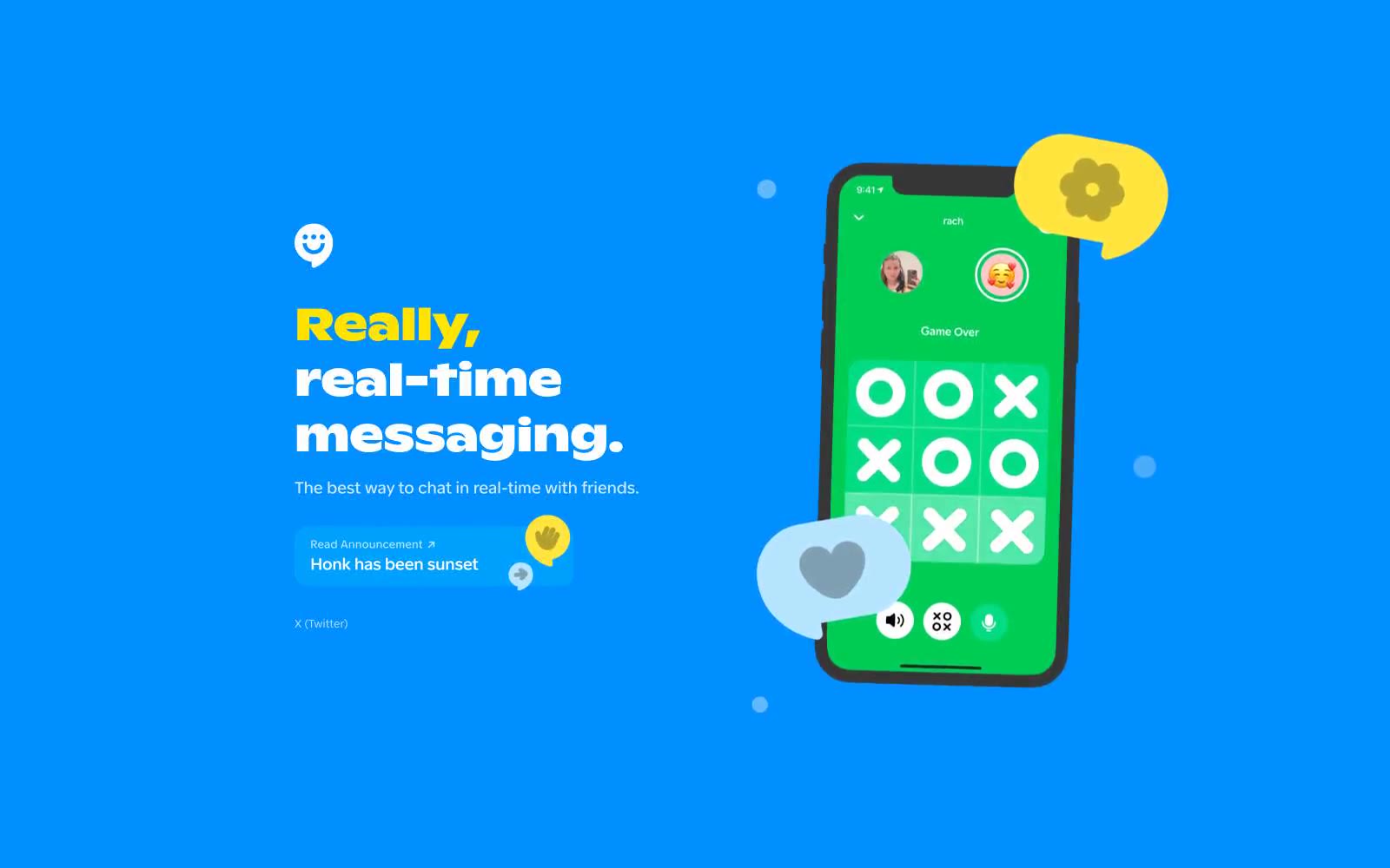
Honk
Honk — Style Reference
# Honk — Style Reference
> Cobalt billboard with a yellow highlighter slash
**Theme:** light
Honk operates on a saturated blue-canvas design system built for a messaging product that wants energy, not restraint. The entire viewport is a single electric blue field (#008fff) with white and signal-yellow typography floating on it — no warm grays, no soft cards, no light-mode chrome. Headlines are a custom heavy display face at 52px, tight-tracked, with one or two words flipped to vivid yellow (#ffe400) so key terms punch out of the headline. Surfaces are minimal: everything either sits directly on the blue or uses a hard 16px-radius white panel as a notification/UI element. The phone mockup carries the only secondary color (game-green) and floats with subtle decoration — speech bubbles, emoji-shaped UI nubs. The system reads as playful, confident, and loud on purpose: it is anti-corporate, anti-minimal, and uses color saturation as the primary brand carrier instead of typography or layout sophistication.
## Tokens — Colors
| Name | Value | Token | Role |
|------|-------|-------|------|
| Honk Blue | `#008fff` | `--color-honk-blue` | Full-viewport page canvas, hero background, all top-level sections — the electric blue IS the brand surface, not a secondary accent |
| Honk Sky | `#00a0ff` | `--color-honk-sky` | Secondary blue for gradient bands, large decorative shapes, and depth layers behind the primary canvas |
| Signal Yellow | `#ffe400` | `--color-signal-yellow` | Accent words inside headlines, heading border underlines, and highlight punctuation — the only chromatic accent on the blue field, used sparingly for emphasis rather than decoration |
| Honk White | `#ffffff` | `--color-honk-white` | Hairline borders, dividers, input outlines, and card edges on light surfaces. Do not promote it to the primary CTA color |
Websites
Markdown Text
design-md
website-prompt
landing-page-prompt
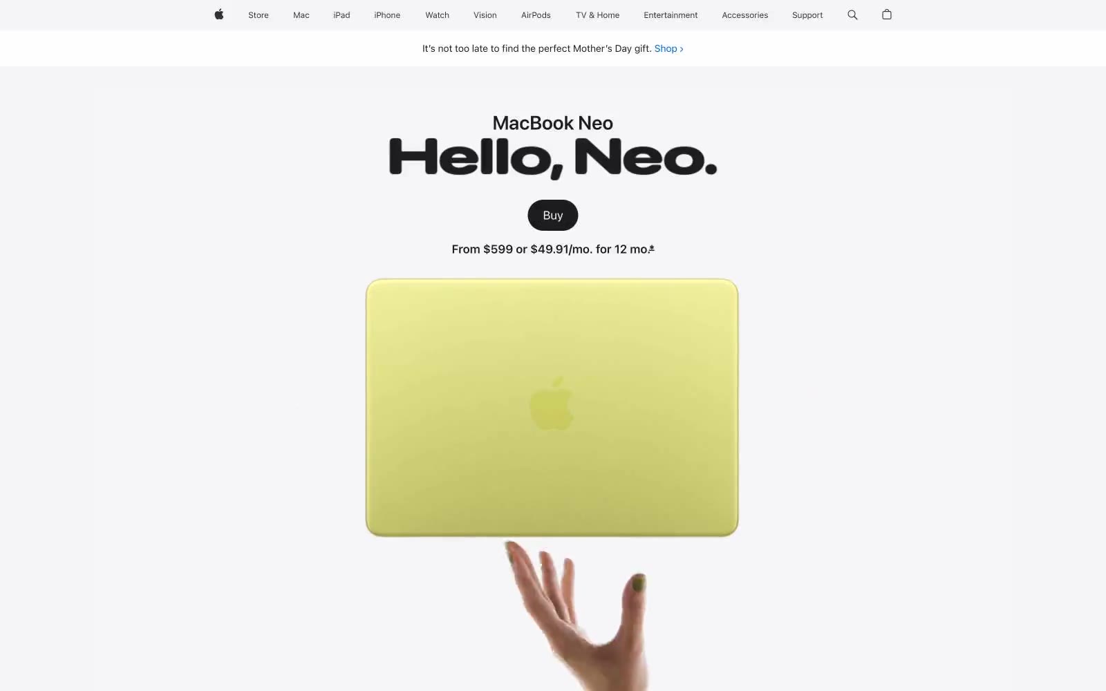
Apple
Apple — Style Reference
# Apple — Style Reference
> Gallery wall at natural light — enormous type casts shadows on a white surface, color enters only as product.
**Theme:** light
Apple's MacBook Neo product page radiates cool luminosity — a gallery-white canvas where enormous weight-700 headlines at 80-96px dominate above feather-light body copy, creating a tension between mass and air. The page background stays #f5f5f7, one step off pure white, giving cards and content wells a surface-lift effect without any shadows. Negative letter-spacing tightens progressively with size — display headlines track at -0.022em while body text breathes at -0.003em, a signature move that makes large type feel chiseled rather than loose. The single interactive accent (#0071e3 CTA blue) appears only on the 'Buy' pill button and nav links, rationed so every appearance reads as an instruction to act. Product gradients — dark-to-citrus-green, dark-to-blue, dark-to-violet — serve as full-bleed theatrical backdrops for each color finish showcase, never decorating UI chrome.
## Tokens — Colors
| Name | Value | Token | Role |
|------|-------|-------|------|
| Ink | `#1d1d1f` | `--color-ink` | Primary text, headings, nav labels, icon fills — near-black with just enough warmth to avoid harshness on white |
| Graphite | `#707070` | `--color-graphite` | Secondary body copy, captions, footnotes, muted nav items |
| Slate | `#474747` | `--color-slate` | Tertiary body text, supporting link text, secondary nav |
| Ash | `#333333` | `--color-ash` | Icon strokes, mid-weight body text, button labels in ghost state |
Websites
Markdown Text
design-md
website-prompt
landing-page-prompt
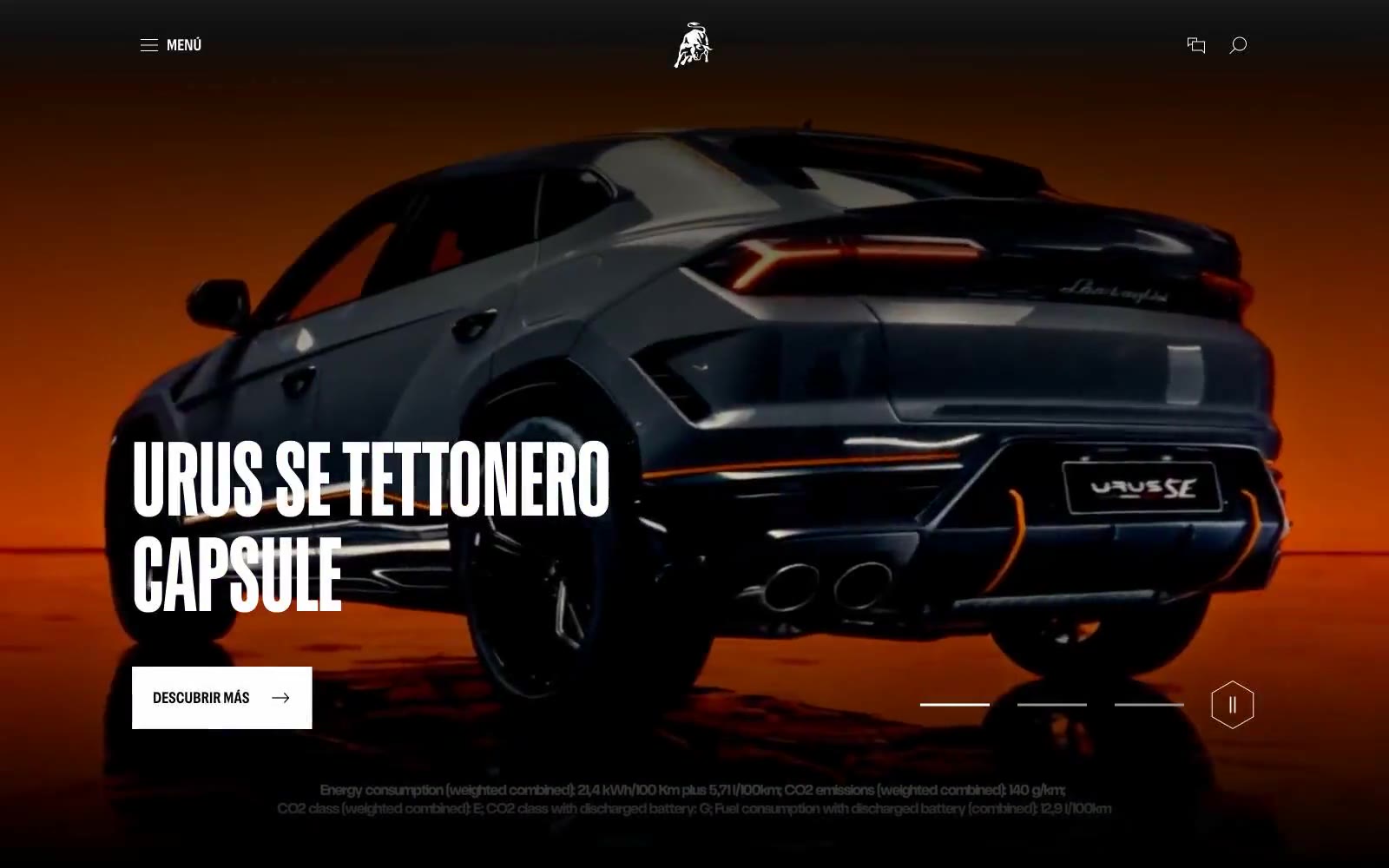
Lamborghini.com
Lamborghini.com — Style Reference
# Lamborghini.com — Style Reference
> Showroom black with one yellow car under spotlights
**Theme:** mixed
Lamborghini's design language is automotive theater: a cinematic dark stage where Giallo yellow punctuates an otherwise black-and-white world. The interface alternates between full-bleed dark hero canvases (where video and product photography dominate) and quiet light-gray content surfaces (where editorial storytelling takes over). Typography is the loudest element — an industrial custom sans-serif (LamboType) spoken only in UPPERCASE, scaled aggressively to 80–120px for hero statements. Components are minimal and structural: no rounded cards, no soft shadows, no decorative gradients — just hard-edged surfaces, hairline rules, and one vivid yellow action button. The overall feeling is gallery-grade restraint interrupted by a single confident color hit, the way a matte black showroom is broken by one yellow car under a spotlight.
## Tokens — Colors
| Name | Value | Token | Role |
|------|-------|-------|------|
| Giallo Vivo | `#ffc000` | `--color-giallo-vivo` | Yellow supporting accent for decorative details and low-frequency emphasis. Do not promote it to the primary CTA color |
| Giallo Ombra | `#917300` | `--color-giallo-ombra` | Hover or secondary yellow state, list markers with brand accent — darker mustard variant of the primary |
| Carbony Black | `#202020` | `--color-carbony-black` | Primary text, dark hero canvases, navigation bar — the workhorse near-black used at 1400+ occurrences |
| Pure Black | `#000000` | `--color-pure-black` | Body copy, footer ink, icon strokes on light surfaces — maximum contrast text and absolute dark |
Websites
Markdown Text
design-md
website-prompt
landing-page-prompt
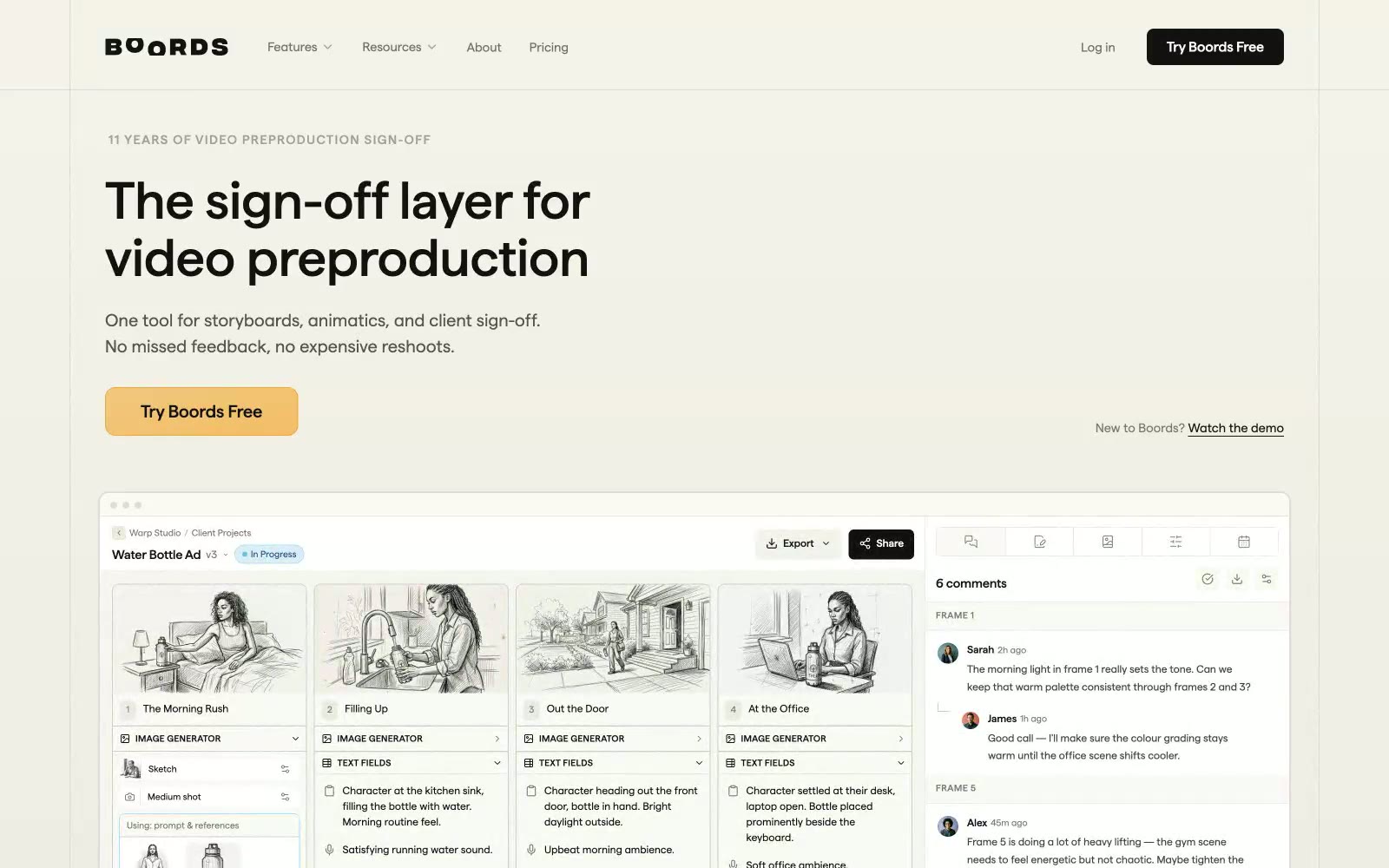
boords.com
boords.com — Style Reference
# boords.com — Style Reference
> Warm storyboard studio on cream paper — a cream canvas, amber pencil accents, and flat geometric type that feels hand-drawn even when it's pure UI.
**Theme:** light
Boords operates in a warm, paper-like visual register: a cream canvas (#fafaf5) sits beneath pure white surfaces, with a single amber accent that feels more like a pencil highlight than a digital CTA. The custom 'matter' typeface carries a geometric, friendly character at every scale, with positive tracking on small-caps eyebrows and tight, confident headlines at 32–60px. The interface is deliberately flat — 6px corners are the default radius, shadows are nearly absent, and one dark section (the developer/API area) breaks the cream monotony without disrupting the calm. The aesthetic borrows from the storyboard world it serves: warm neutrals, soft radii, amber-warm action colors, and a hand-drawn quality in the product imagery that makes the UI feel like a creative tool rather than a productivity app.
## Tokens — Colors
| Name | Value | Token | Role |
|------|-------|-------|------|
| Warm Cream | `#fafaf5` | `--color-warm-cream` | Page canvas, base surface — replaces pure white to give the interface a paper-like warmth |
| Pure White | `#ffffff` | `--color-pure-white` | Card surfaces, product UI panels, elevated content blocks |
| Ink Black | `#121212` | `--color-ink-black` | Primary text, dark section background, filled nav button, high-contrast borders |
| Stone Gray | `#e9e9e7` | `--color-stone-gray` | Section dividers, subtle alternating surfaces, input field backgrounds |

Websites
Markdown Text
design-md
website-prompt
landing-page-prompt
Parloa
Parloa — Style Reference
# Parloa — Style Reference
> warm editorial paper with ink and highlighter
**Theme:** light
Parloa uses a warm editorial language: cream paper backgrounds, deep ink-black typography, and a single vivid orange that punctuates like a highlighter. The pairing of a display serif (Exposure30) with a precise grotesque (Geist) gives every screen the cadence of a premium magazine spread rather than a typical SaaS dashboard. Dark navigation and announcement bars anchor the warm cream canvas, while white cards float on that canvas as if pinned to a designer's moodboard. The orange accent never fills buttons — it only outlines, links, and marks icons — keeping the surface warm but the actions grounded in dark fills. The overall feeling is editorial-confidence, not tech-dashboard.
## Tokens — Colors
| Name | Value | Token | Role |
|------|-------|-------|------|
| Ink Black | `#1f1c1b` | `--color-ink-black` | Primary text, filled action buttons, dark surfaces — warm near-black replaces pure black so the entire palette feels printed on cream rather than rendered on glass |
| Paper White | `#ffffff` | `--color-paper-white` | Card surfaces, button text on dark fills — the only true white in the system, reserved for elements that need to lift off the warm canvas |
| Canvas Cream | `#ebe9e1` | `--color-canvas-cream` | Page background — the dominant warm neutral that makes the entire site feel like uncoated stock paper rather than a screen |
| Linen | `#f5f4f0` | `--color-linen` | Nav bar background, subtle section alternation, heading hairlines — a lighter cream that layers on the canvas without breaking warmth |
Websites
Markdown Text
design-md
website-prompt
landing-page-prompt
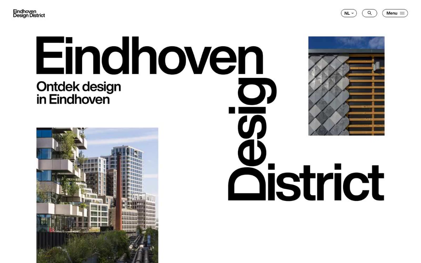
Eindhoven Design District
Eindhoven Design District — Style Reference
# Eindhoven Design District — Style Reference
> editorial brutalism on white paper — a municipal design manifesto rendered in oversized type, sparse photographs, and absolute restraint.
**Theme:** light
Eindhoven Design District reads as editorial brutalism on white paper: a near-monochrome canvas where typography does the heavy lifting and photography earns its space through scale and asymmetric placement. The entire interface is a conversation between massive HelveticaNow display type and quiet supporting text, with black-on-white doing 95% of the work. The only chromatic note is a single vivid red used as a content accent (article category labels) — never as UI chrome. Components are deliberately flat: pill-shaped ghost buttons, image-top article cards, hairline borders, zero shadows or gradients. The result is less a website and more a printed design journal that happens to be interactive.
## Tokens — Colors
| Name | Value | Token | Role |
|------|-------|-------|------|
| Charcoal Ink | `#000000` | `--color-charcoal-ink` | All text, borders, icon strokes, nav links, button outlines, and structural lines. The dominant ink of the system — every shape and character carries this weight |
| Paper White | `#ffffff` | `--color-paper-white` | Primary page canvas, card surfaces, button fills, and inverted text on dark blocks. The ground against which everything else is set |
| Newsprint Gray | `#e8e8e8` | `--color-newsprint-gray` | Section background for content bands (article grids, footer areas) — creates quiet tonal shifts between white sections without introducing a second hue |
| Pewter | `#bfbfbf` | `--color-pewter` | Muted helper text, list dividers, secondary link borders — used sparingly where information is deprioritized but still present |
Websites
Markdown Text
design-md
website-prompt
landing-page-prompt
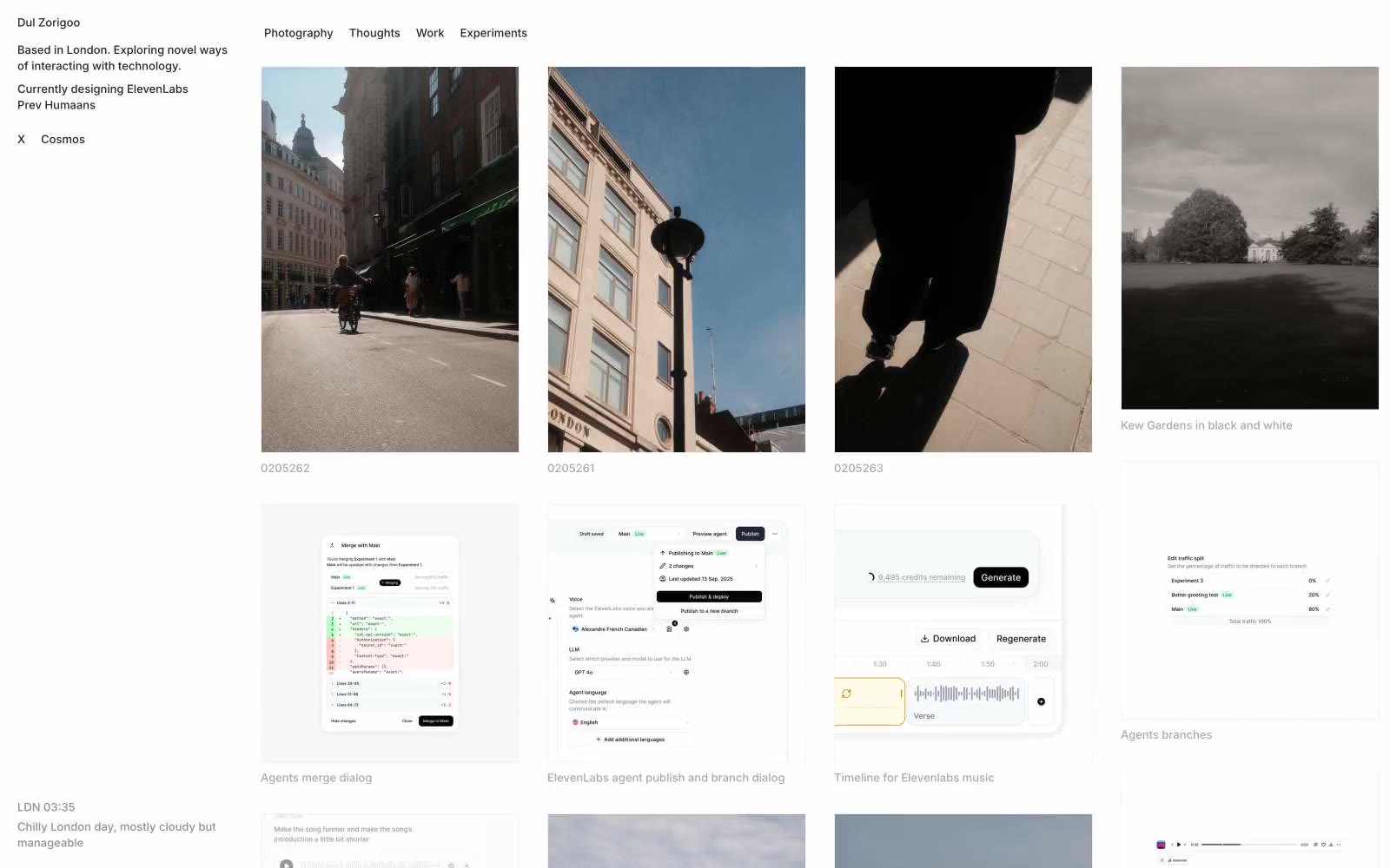
Dul Zorigoo
Dul Zorigoo — Style Reference
# Dul Zorigoo — Style Reference
> ink-and-pencil gallery wall — a designer's portfolio rendered as monochrome exhibition panels on white, where structure is drawn not filled
**Theme:** light
A monochrome gallery wall for a designer's portfolio — pure white canvas, hairline gray dividers, and a near-black ink for text, with the work itself (photography, UI captures, experiments) supplying every drop of color. Layout follows a two-column shell: a thin fixed bio rail on the left, a filter-tab bar across the top, and a breathable masonry of varied-size work tiles in the main well. The system is deliberately under-designed — no accent color, no shadow, no rounded softness beyond an 8px radius on the few controls that exist. The restraint is the brand: every visual decision is the absence of a decision, letting photographs and product screenshots carry the entire visual load. The single most defining trait is the 620-occurrence hairline border color #ebebeb, which structures every panel, card, and divider — a grid drawn in 1px pencil rather than built in elevation.
## Tokens — Colors
| Name | Value | Token | Role |
|------|-------|-------|------|
| Paper White | `#ffffff` | `--color-paper-white` | Page background, image wells, card surfaces inside embedded UI captures |
| Pencil Gray | `#ebebeb` | `--color-pencil-gray` | Hairline borders, panel dividers, card edges, button borders, the dominant structural line of the entire system |
| Graphite | `#a8a8a8` | `--color-graphite` | Image captions, subdued headings, section labels, timestamp/location metadata |
| Smoke | `#8e8e8e` | `--color-smoke` | Body helper text, secondary metadata, low-emphasis descriptors |