AI Prompt Studio - Intelligent Prompt Library
Explore and use professional AI prompts to optimize your workflow.
One-click Use
Websites
Markdown Text
design-md
website-prompt
landing-page-prompt
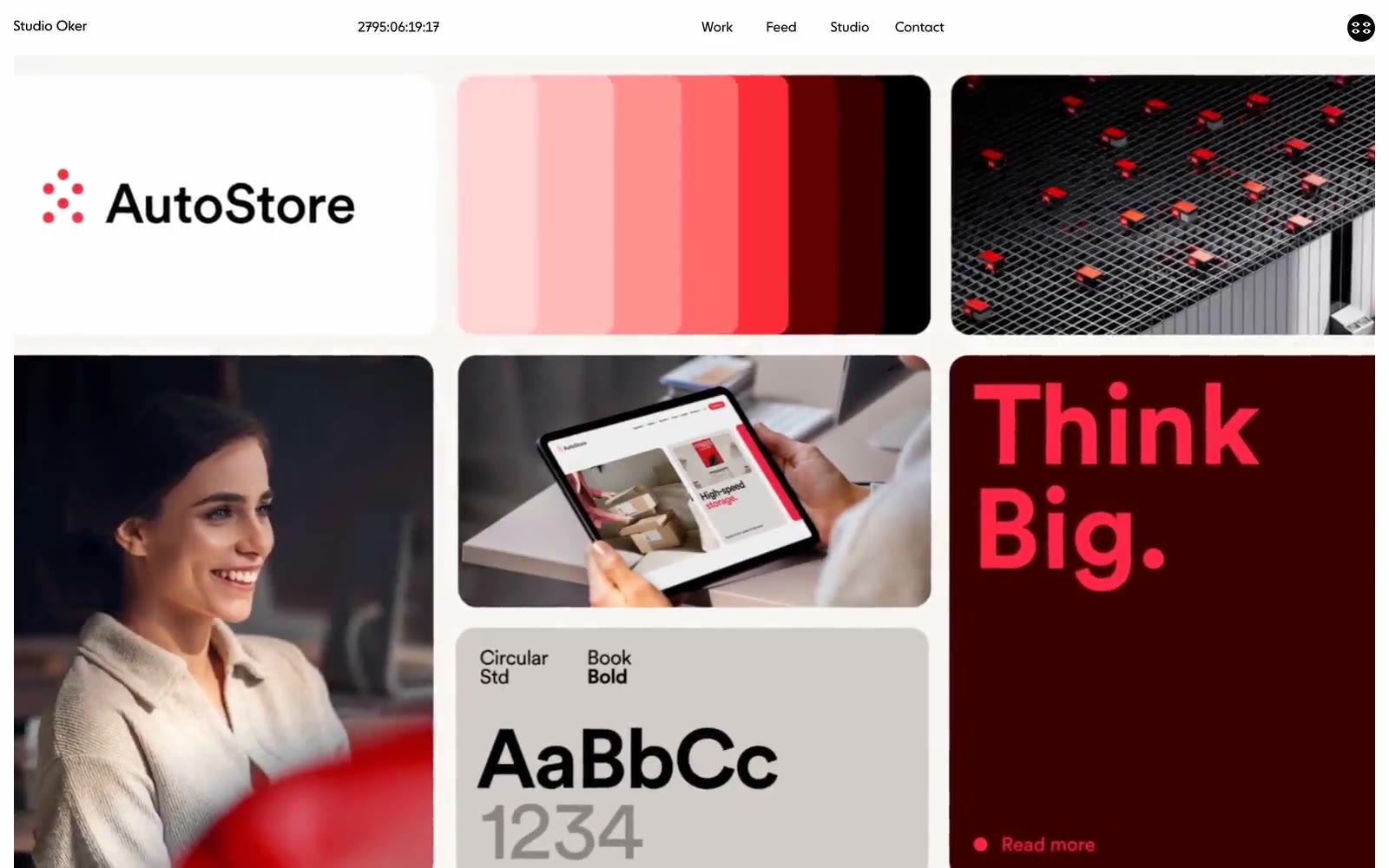
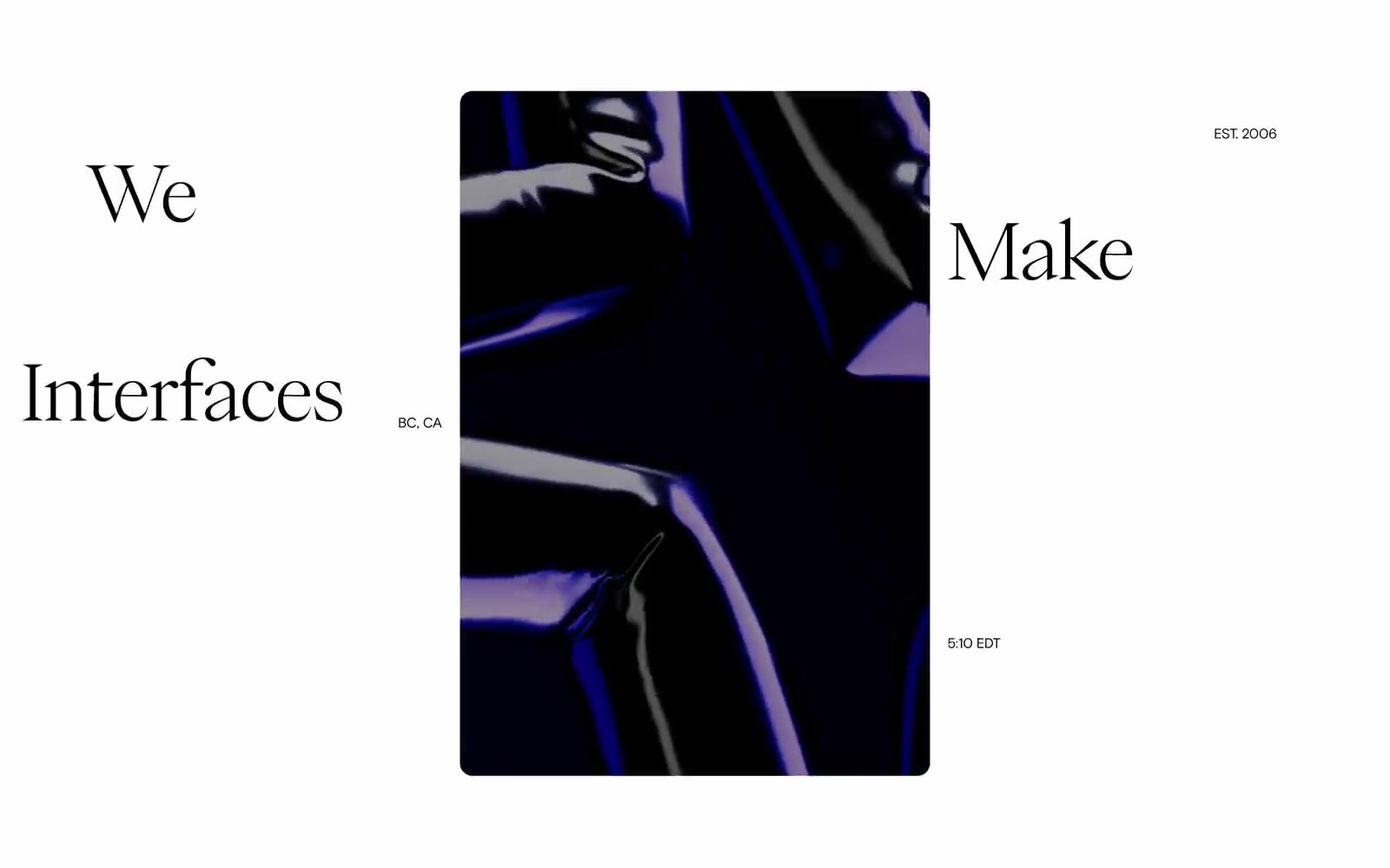
Studio Oker
Studio Oker — Style Reference

# Studio Oker — Style Reference
> darkened gallery with scarlet punctuation — a black-walled portfolio room where white type floats and one red whisper cuts through the silence.
**Theme:** dark
Studio Oker presents a darkened gallery aesthetic where pure black canvases frame white typography and project showcases with monastic restraint. The system speaks through negative space — generous 120–264px section breaks, hairline borders, and tight letter-spacing that pulls type into whisper-thin compositions. A single vivid scarlet acts as punctuation rather than decoration, surfacing only in project-specific contexts and a single 'Think Big' hero moment. Photography dominates the surface, displayed in asymmetric tile grids that let the work carry visual weight without decorative chrome. The rhythm is slow, considered, and confident — a portfolio that trusts silence over spectacle and treats every margin as a deliberate composition choice.
## Tokens — Colors
| Name | Value | Token | Role |
|------|-------|-------|------|
| Pure Black | `#000000` | `--color-pure-black` | Page canvas, section backgrounds, project card fills — the void everything else floats on |
| Soft Black | `#101010` | `--color-soft-black` | Subtle surface elevation over the pure black canvas, card backgrounds in tight stacks |
| Bone White | `#ffffff` | `--color-bone-white` | Primary text, headings, hairline borders, nav text — the only light in the room |
| Fog Gray | `#a0a0a0` | `--color-fog-gray` | Secondary text, metadata, captions, image borders, inactive labels |
Websites
Markdown Text
design-md
website-prompt
landing-page-prompt
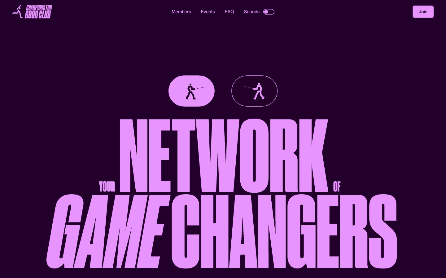
Champions4good
Champions4good — Style Reference
# Champions4good — Style Reference
> midnight sports broadside — a vintage club poster screaming from a plum-dark wall
**Theme:** dark
Champions4good is a dark-first club poster: deep plum canvas, one screaming lavender accent, and ultra-condensed display type that fills the screen like a vintage sports broadside. The visual hierarchy is brutally simple — everything chromatic is lavender-pink (#e894ff) against the plum ground, and supporting accents (mint, amber) appear as small functional punctuation rather than competing for attention. Body sections break to white canvas with the same condensed display type rendered in dense black, creating a high-contrast section rhythm. The type attitude is anti-restraint: Druk Condensed at 200-300px with tight tracking and tight line-height pushes the display copy to the edges of its container, while Neue Montreal handles UI chrome at human sizes. Components are minimal — pill toggles, a single filled lavender button, sparse navigation — letting the typography and the plum-to-white contrast do the work.
## Tokens — Colors
| Name | Value | Token | Role |
|------|-------|-------|------|
| Deep Plum | `#23002b` | `--color-deep-plum` | Hero canvas, dark section backgrounds, page-level ground — sets the exclusive nighttime club mood |
| Lavender Shock | `#e894ff` | `--color-lavender-shock` | Pink supporting accent for decorative details and low-frequency emphasis. Do not promote it to the primary CTA color |
| Espresso Brown | `#291900` | `--color-espresso-brown` | Warm near-black for card backgrounds, dark UI surfaces, warm-tinted borders — adds subtle warmth to the otherwise cool palette |
| Ink Teal | `#002629` | `--color-ink-teal` | Cool near-black for body text, deep card surfaces, cool borders — the teal undertone distinguishes dark text from the plum background |
Websites
Markdown Text
design-md
website-prompt
landing-page-prompt
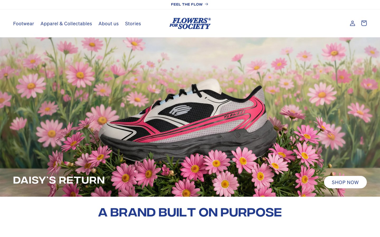
Flowers For Society
Flowers For Society — Style Reference
# Flowers For Society — Style Reference
> indigo editorial on white gallery — a single deep-violet voice laid over a paper-white canvas, where the product photograph and the typography do all the talking.
**Theme:** light
Flowers For Society is a fashion house that speaks in a single, assertive voice: deep indigo (#203b90) threading through every surface — logo, headings, buttons, borders, and hero scrims — anchored by a white gallery that breathes. The product is the hero: full-bleed photography with gradient overlays for legibility, oversized pill-shaped CTAs at 41-60px radius, and centered display type that uses Integral's tight line-heights (0.92-1.0) to compress vertical space. The system is deliberately minimal — two custom typefaces, no shadows, extreme border radii, and a single chromatic color. Soehne carries the UI with wide letter-spacing (0.033-0.063em) that gives even small text a boutique, editorial cadence. The result feels like a magazine spread: confident, restrained, and unmistakably branded.
## Tokens — Colors
| Name | Value | Token | Role |
|------|-------|-------|------|
| Indigo Statement | `#203b90` | `--color-indigo-statement` | Primary brand color — logo, all headings, primary action fills, action borders, and the left-side hero scrim. This is the only chromatic color in the system; it appears on roughly every surface to assert brand presence |
| Indigo Mist | `#7989bc` | `--color-indigo-mist` | Tonal violet for subtle borders and secondary outlines — the softer sibling of Indigo Statement used where full saturation would feel heavy |
| Paper White | `#ffffff` | `--color-paper-white` | Neutral form states, badge text, and quiet UI feedback where color should stay understated. Do not promote it to the primary CTA color |
| Carbon | `#000000` | `--color-carbon` | Icon strokes, sharp borders, and high-contrast text accents. Used sparingly where the indigo brand color would be too soft |
Websites
Markdown Text
design-md
website-prompt
landing-page-prompt
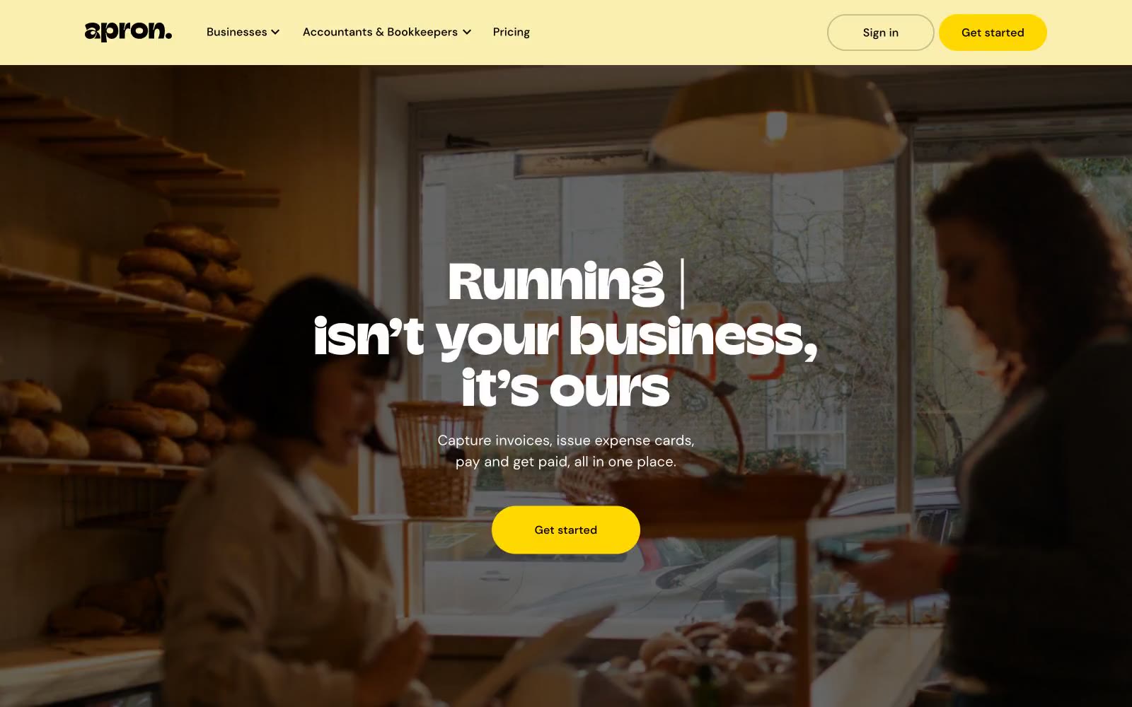
Automate Supplier Payments
Automate Supplier Payments — Style Reference
# Automate Supplier Payments — Style Reference
> butcher paper bakery ledger.
A cream-colored, sun-warmed workspace where thick slab type, pill buttons, and a single school-bus yellow accent do all the work — no shadows, no gradients, just warm paper and confident black ink.
**Theme:** light
Apron wears a warm bakery-counter aesthetic: buttercream canvas, thick slab-serif display type, pill-shaped CTAs in vivid school-bus yellow, and bone-black text that snaps against the cream. The visual logic is "honest ledger on butcher paper" — confident, slightly retro, unapologetically saturated. Surfaces stack in warm cream tones (not cool grays), borders are hairline black rather than soft shadows, and the only chromatic accent is a single yellow that means "act now." Components feel handmade rather than enterprise — rounded cards, chunky buttons, and a custom display face (Champ) that signals brand voice before any copy is read.
## Tokens — Colors
| Name | Value | Token | Role |
|------|-------|-------|------|
| Buttercream | `#fff6d2` | `--color-buttercream` | Page canvas, card surfaces, and warm backgrounds — the dominant neutral that gives the entire UI its sun-warmed temperature |
| Marigold | `#ffd801` | `--color-marigold` | Primary CTA fill, brand accent — school-bus yellow that carries the only chromatic voice in the system, reserved exclusively for action surfaces |
Websites
Markdown Text
design-md
website-prompt
landing-page-prompt
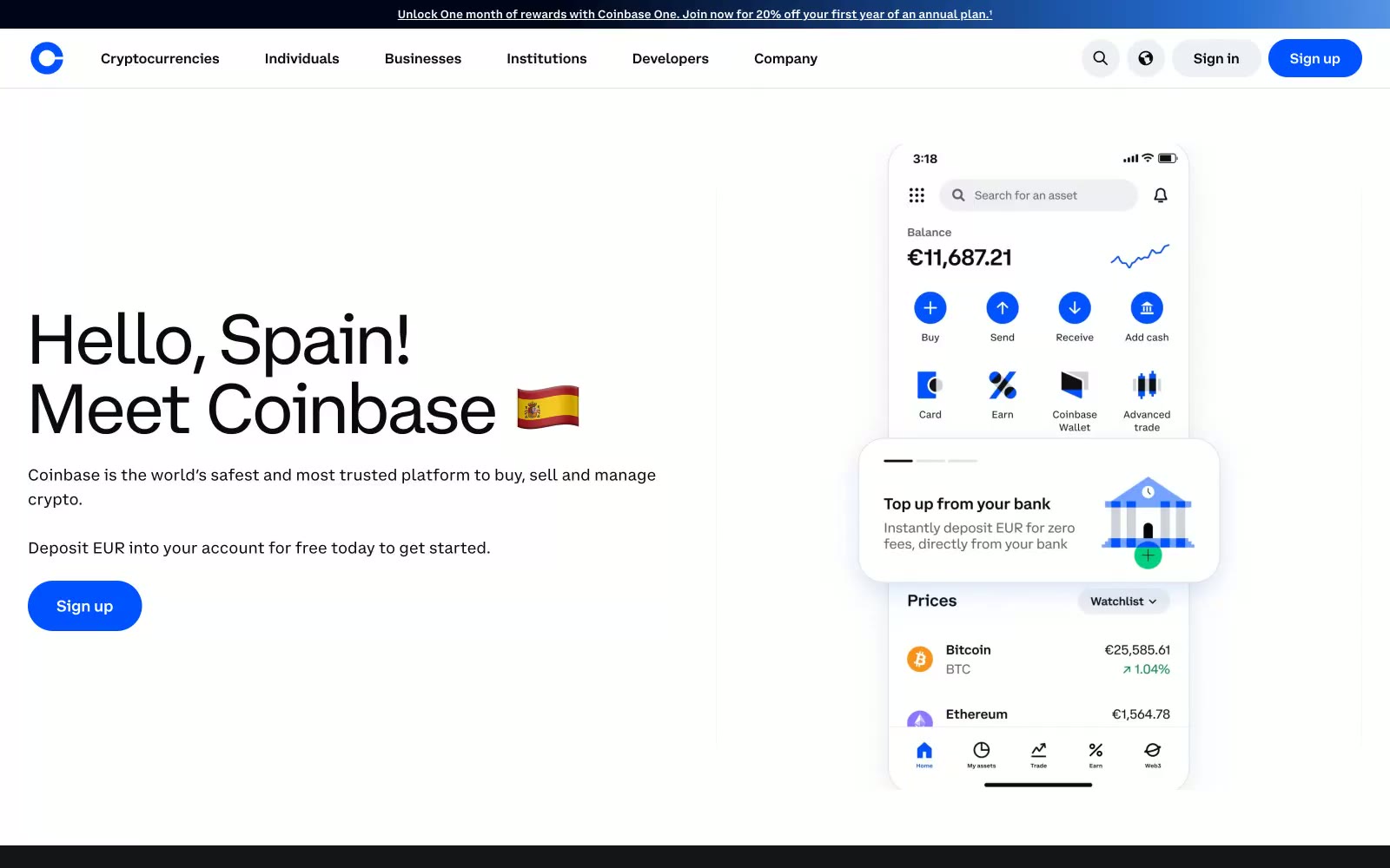
Coinbase
Coinbase Spain — Style Reference
# Coinbase Spain — Style Reference
> Digital Trust, Blueprinted. A system built on the clarity of an architectural plan, energized by a single, electric blue neuron.
**Theme:** light
The design system establishes a feeling of digital-native trust, grounded in a high-contrast, minimalist palette. A precise foundation of pure white (#ffffff) and near-black (#0a0b0d) creates an environment of clarity and focus. The system's entire personality is injected through a single, electric `Coinbase Blue` (#0052ff), which is reserved exclusively for primary actions and brand marks, acting as a confident guide. A suite of custom fonts (Coinbase Display, Sans, Text) provides a unique and cohesive typographic voice across all scales. Depth is achieved not with shadows but with bold, full-width color blocks, alternating between bright white and deep midnight sections, creating a clean, architectural rhythm.
## Tokens — Colors
| Name | Value | Token | Role |
|------|-------|-------|------|
| Coinbase Blue | `#0052ff` | `--color-coinbase-blue` | Primary CTAs, logos, active states — the core brand identifier. |
| Interactive Blue | `#578bfa` | `--color-interactive-blue` | Secondary links and interactive elements. |
| Pure White | `#ffffff` | `--color-pure-white` | Primary page background, text on dark surfaces. |
| Midnight | `#0a0b0d` | `--color-midnight` | Dark section backgrounds, primary text. |
Websites
Markdown Text
design-md
website-prompt
landing-page-prompt
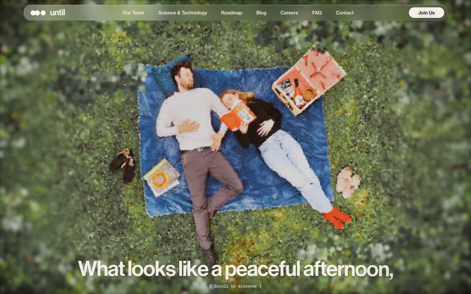
until
until — Style Reference
# until — Style Reference
> warm parchment monograph under a single olive tree.
**Theme:** light
Until presents a warm, editorial biotech identity: a cream-paper canvas (#f7f3ec) carries nearly all surfaces, text is near-black (#121212), and a single olive green (#6c853b) acts as botanical punctuation on headings and borders. The system is fundamentally photographic — full-bleed overhead lifestyle imagery replaces illustration, and copy rides directly over pictures with no tinted overlays. Typography carries the weight: Neue Haas Display in compressed tracking at near-1.0 line-height creates a Swiss editorial cadence, while Neue Haas Text at 14–16px keeps body content quiet. Everything is rounded generously — 32px on cards, 64px on buttons — producing soft, pill-heavy UI that feels like a printed science monograph rather than a dashboard. Shadows are almost imperceptible; the cream-on-cream layering and thick border lines (1px solid #121212) provide separation instead of elevation.
## Tokens — Colors
| Name | Value | Token | Role |
|------|-------|-------|------|
| Parchment | `#f7f3ec` | `--color-parchment` | Page background, card surfaces, nav container — warm off-white that replaces pure white to soften the entire system |
| Ink | `#121212` | `--color-ink` | Primary text, all borders, card outlines, nav links — near-black with a whisper of warmth, drives every structural line on the page |
| Black | `#000000` | `--color-black` | Link borders, footer accents, and icon fills — pure black reserved for high-emphasis micro elements |
| Paper | `#ffffff` | `--color-paper` | Button fills, elevated surface accents, footer background — pure white used sparingly for contrast punctuation against the cream canvas |
Websites
Markdown Text
design-md
website-prompt
landing-page-prompt
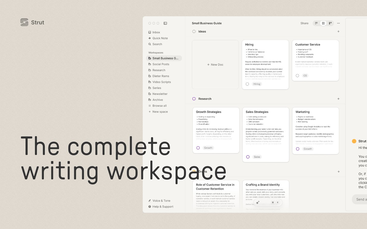
Strut
Strut — Style Reference
# Strut — Style Reference
> editorial broadsheet on warm canvas — oversized serif-adjacent display type sitting on a cream paper field, marked only by a single amber highlighter and hairline rules.
**Theme:** light
Strut treats its interface as a sheet of warm paper rather than a software screen: a continuous cream canvas carries oversized editorial type, hairline-bordered flat cards, and a single amber accent that punctuates like a highlighter stroke. GT Pressura anchors the voice — its geometric, slightly utilitarian forms at 100–136px turn every headline into a broadsheet masthead, while Inter quietly handles body and UI at 14–16px. Components are deliberately weightless: 1px borders do the work of shadows, 28px corners soften without rounding into pill territory, and vertical rhythm opens up to 80–120px between sections so the page reads like a printed spread. Color is rationed — the amber appears as decorative micro-touches (active icon strokes, brand mark, tag dots) while text and structure stay in warm neutrals from #2e2d2b ink to #ead7b8 paper.
## Tokens — Colors
| Name | Value | Token | Role |
|------|-------|-------|------|
| Paper Cream | `#ead7b8` | `--color-paper-cream` | Page canvas, the continuous warm background behind every section — the paper the whole product sits on |
| Sand Border | `#e5dfd5` | `--color-sand-border` | Hairline borders, soft card surfaces that float just barely above the cream canvas, subtle dividers |
| Ink Black | `#2e2d2b` | `--color-ink-black` | Primary text, masthead headlines, and the near-black ink that gives the editorial type its printed authority |
| Charcoal | `#333333` | `--color-charcoal` | Body copy, secondary text, and any UI text that needs to stay just slightly softer than pure ink |

Websites
Markdown Text
design-md
website-prompt
landing-page-prompt
WRITER
WRITER — Style Reference
# WRITER — Style Reference
> editorial AI atelier — a white marble newsroom where pill-shaped controls and a single violet accent turn enterprise software into confident editorial design
**Theme:** light
WRITER operates as an editorial AI atelier: a near-white canvas where confident display headlines in Poppins (64px, tight tracking) sit above pill-shaped controls with 60-82px radii, and a single vivid violet accent punctuates an otherwise monochrome system. The visual language alternates between bright editorial sections and near-black resource blocks, creating a magazine-meets-control-center rhythm where typography carries authority and color acts as functional punctuation. Custom serif CanelaDeck surfaces in body copy for an editorial undertone, while the geometric Poppins handles everything from eyebrow labels (0.14-0.30em tracking) to product UI. Components are lightweight and rounded: thin dividers, pill inputs, soft cards with 12px radii, and minimal elevation — the design trusts whitespace and type scale over chrome.
## Tokens — Colors
| Name | Value | Token | Role |
|------|-------|-------|------|
| Orchid Accent | `#a95ef8` | `--color-orchid-accent` | Highlighted word in display headlines, decorative emphasis — vivid violet that draws the eye to a single concept within a monochrome headline |
| Iris Brand | `#5551ff` | `--color-iris-brand` | Violet supporting accent for decorative details and low-frequency emphasis. Do not promote it to the primary CTA color |
| Lavender Wash | `#e4e9ff` | `--color-lavender-wash` | Light supporting surface for subtle backgrounds and section separation. Do not promote it to the primary CTA color |
| Cobalt Spark | `#007aff` | `--color-cobalt-spark` | Blue supporting accent for decorative details and low-frequency emphasis. Do not promote it to the primary CTA color |
Websites
Markdown Text
design-md
website-prompt
landing-page-prompt
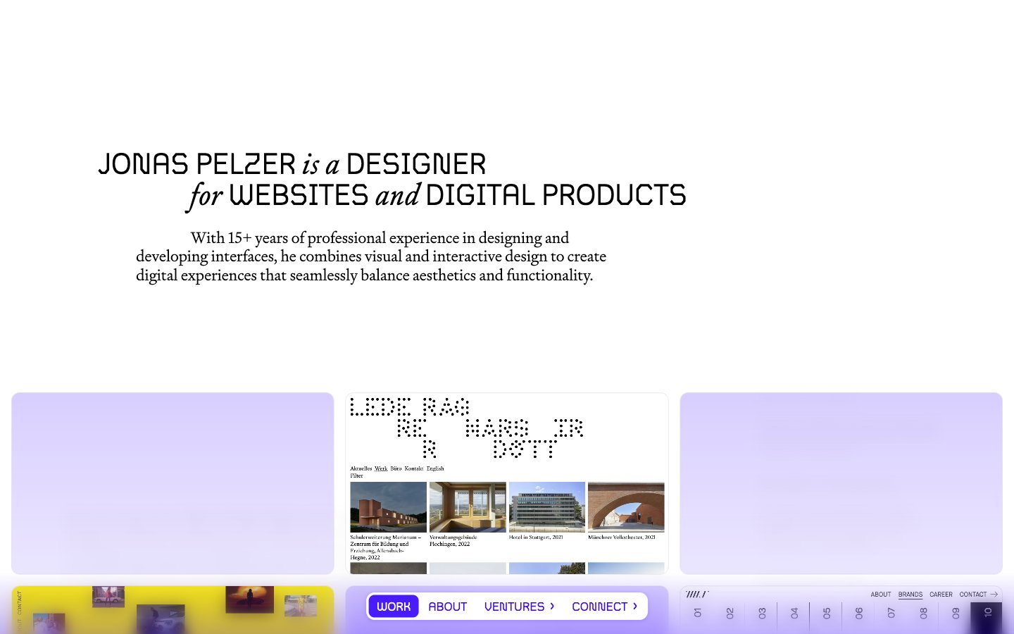
Jonas Pelzer
Jonas Pelzer — Style Reference
# Jonas Pelzer — Style Reference
> Literary broadsheet on white paper. A single weight-400 display headline sets the tone — roman and italic interleave in one breath, all type shares one weight, and a rationed violet ink punctuates an otherwise achromatic page.
**Theme:** light
A literary editorial portfolio rendered as a typographic broadsheet on white paper. The page reads like a magazine spread: a single weight-400 display headline mixes roman and italic to create rhythm without resorting to bold, every paragraph earns its place, and the entire chromatic system is reduced to a single violet ink. The brand violet (#3502ff) is rationed — appearing only as the active nav pill, an active border accent, and a single deep text link — while a softer lavender wash (#c2b3ff) provides surface variety on accent cards. Spacing is compact and the grid is opinionated, with hard-edged 12px radii everywhere and almost no shadow depth. The visual system rewards restraint: negative space, type weight, and a single accent color do the work that color, elevation, and decoration do elsewhere.
## Tokens — Colors
| Name | Value | Token | Role |
|------|-------|-------|------|
| Paper White | `#ffffff` | `--color-paper-white` | Page background, card surfaces, nav backgrounds |
| Ink Black | `#000000` | `--color-ink-black` | All text, hairline borders, dividers, list separators |
| Mist Gray | `#d4d6dd` | `--color-mist-gray` | Secondary borders, card outlines, inactive dividers |
| Violet Ink | `#3502ff` | `--color-violet-ink` | Violet outline accent for tags, dividers, and focused UI edges. Do not promote it to the primary CTA color |
Websites
Markdown Text
design-md
website-prompt
landing-page-prompt
ToDesktop
ToDesktop — Style Reference
# ToDesktop — Style Reference
> Cosmic command deck transitioning into a bright spec sheet. Dark gradient hero with a single electric blue accent button; below, a calm, light, hairline-bordered document surface with pill navigation and floating product mockups.
**Theme:** mixed
ToDesktop operates as a dual-environment system: a deep space-grade dark hero with gradient atmosphere that transitions into a bright, document-like feature surface. The dark zone uses a sweeping white-to-near-black gradient to position the product against a cosmic backdrop, while the light zone feels like a clean product spec sheet. The single saturated #0036ff blue/violet is the only chromatic moment — used exclusively on primary action buttons — making every CTA feel like switching on a spotlight. Components are flat and confident: pill navigation, hairline 1px borders, generous 14-24px card radii, and almost no elevation shadow. The type system pairs Aeonik Pro's geometric character at display sizes with Inter's neutrality for UI, while Geist Mono marks developer-facing elements. The overall attitude is premium developer tool — the visual language of a tool that respects your attention.
## Tokens — Colors
| Name | Value | Token | Role |
|------|-------|-------|------|
| Electric Iris | `#0036ff` | `--color-electric-iris` | Primary CTA fill, active nav indicators — the only saturated hue on the entire page, it functions as a switch-on moment against an otherwise achromatic or deep-blue canvas |
| Signal Cyan | `#0093ff` | `--color-signal-cyan` | Blue state accent for badges, validation surfaces, and short status labels. Do not promote it to the primary CTA color |
| Deep Void | `#05061b` | `--color-deep-void` | Card surface within dark sections, box-shadow tone on dark cards — near-black with a violet undertone matching the hero gradient |
| Ink Black | `#141414` | `--color-ink-black` | Primary heading and body text on light surfaces, dark button labels |
Websites
Markdown Text
design-md
website-prompt
landing-page-prompt
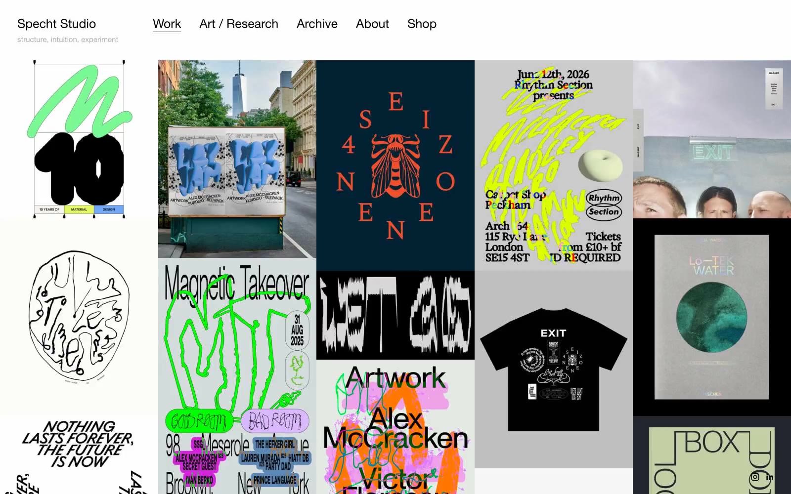
Specht Studio
Specht Studio — Style Reference
# Specht Studio — Style Reference
> Gallery wall of restrained curiosity. The studio's own chrome is a white plane and black type; the visual fireworks live entirely inside the project tiles.
**Theme:** light
Specht Studio is a curatorial frame, not a design showcase — the website removes every trace of itself so the portfolio work can hang on a neutral gallery wall. The chrome is aggressively monochrome: a single typeface, a single weight, black and gray ink on a near-white plane. There is no brand color, no CTA, no marketing surface — navigation is bare text and the grid of project tiles does all the work. The system achieves its identity through what it withholds: no shadows, no rounded corners, no gradient washes, no chromatic accent. Any page built in this system should read as a museum catalog, not a product page — the structure is the design, and the work is the content.
## Tokens — Colors
| Name | Value | Token | Role |
|------|-------|-------|------|
| Gallery White | `#ffffff` | `--color-gallery-white` | Page canvas, project tile background where artwork doesn't fill the frame |
| Fog Gray | `#b0b0b0` | `--color-fog-gray` | Secondary surface, subtle dividers, muted metadata text |
| Graphite | `#666666` | `--color-graphite` | Link borders, secondary text, caption metadata, inactive nav |
| Gallery Black | `#000000` | `--color-gallery-black` | Primary text, active nav, all structural borders, the single ink that holds the system together |
Websites
Markdown Text
design-md
website-prompt
landing-page-prompt
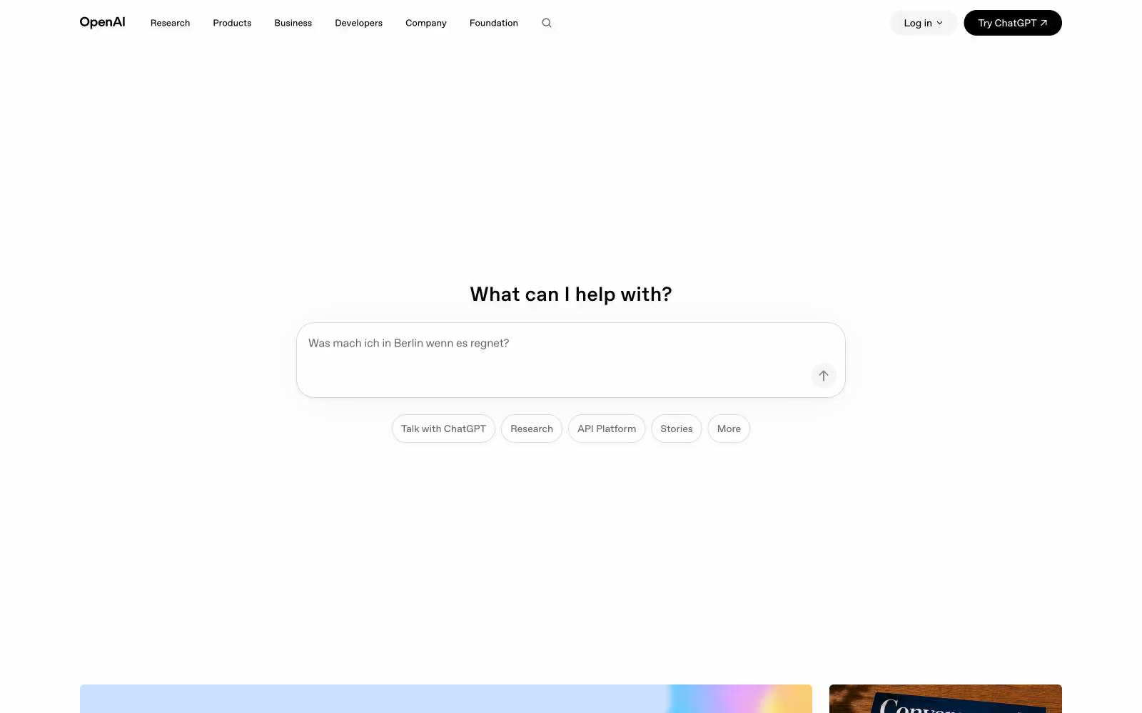
OpenAI
OpenAI — Style Reference
# OpenAI — Style Reference
> Blank page before the first word — a design that treats white space as the most powerful element, reserving all color for user-generated and editorial content.
**Theme:** light
OpenAI.com reads like a blank page waiting to be written on — pure white, near-zero chromatic saturation (1%), and typography that does everything. The custom OpenAI Sans carries the entire visual weight: tightly tracked at -0.03em for large display text, it condenses space so headlines feel carved rather than set. Black (#000000) and border-gray (#e5e7eb) are the only tools; no accent colors, no gradients on the core UI, no decorative illustration. Color arrives exclusively through editorial imagery — soft-focus flower macros, pastel gradient thumbnail cards — making those images feel explosive against the white canvas. The signature tension is 9999px pills for interactive chips and inputs sitting inside a layout where cards use a very specific 6.08px radius, creating a system that pairs one extreme roundness with one precise near-flat radius.
## Tokens — Colors
| Name | Value | Token | Role |
|------|-------|-------|------|
| Void | `#000000` | `--color-void` | Primary text, nav labels, filled CTA button background, icon fills — the singular chromatic anchor of the entire system |
| Fog Border | `#e5e7eb` | `--color-fog-border` | All dividing lines, card outlines, input borders, nav underlines — the lightest possible mark that still reads as a separator on white |
| Chalk | `#f1f1f1` | `--color-chalk` | Hover-state button backgrounds, subtle surface fills — one step off pure white without introducing warmth |
| Graphite | `#666666` | `--color-graphite` | Supporting body text, icon strokes, secondary labels — muted but still readable |
Websites
Markdown Text
design-md
website-prompt
landing-page-prompt
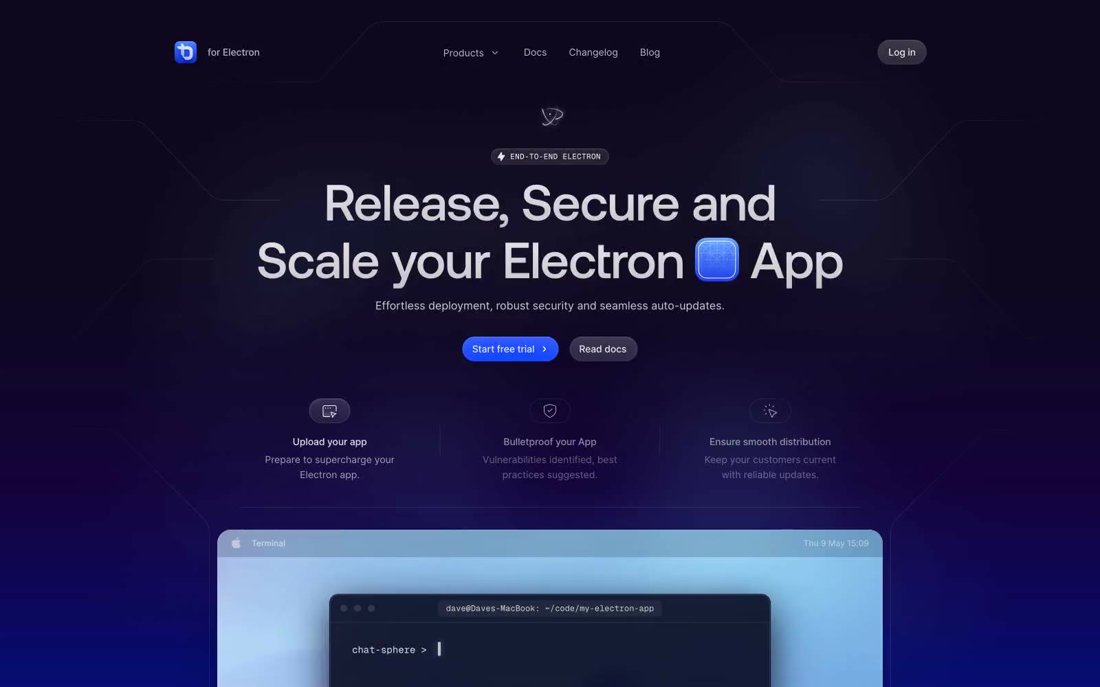
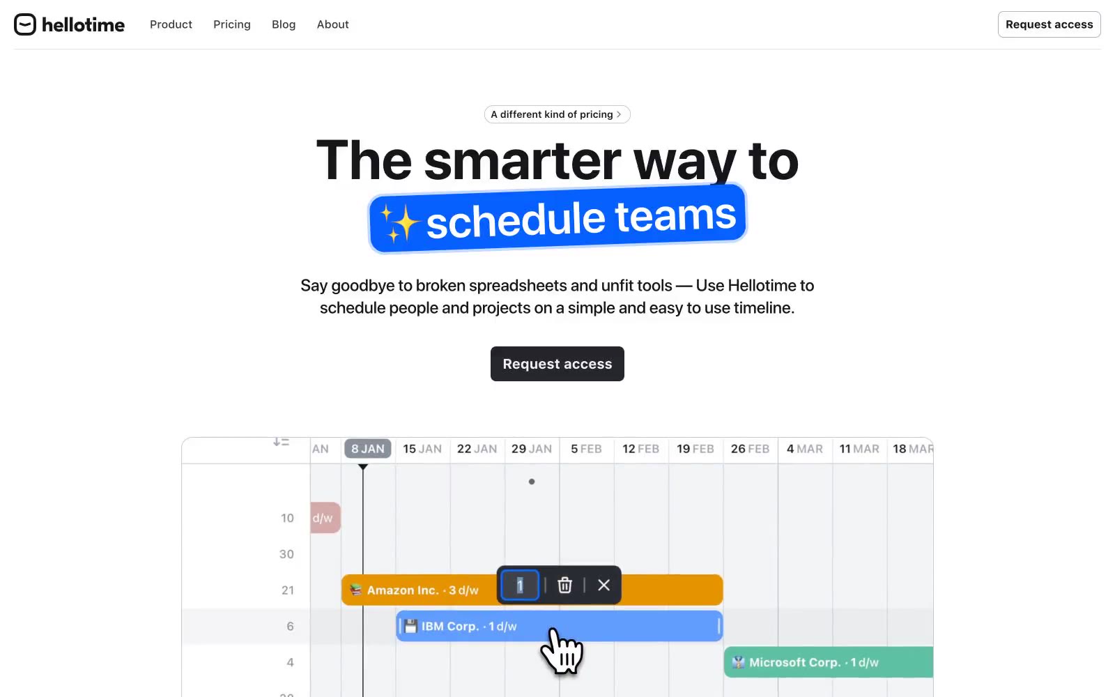
Hellotime
Hellotime — Style Reference
# Hellotime — Style Reference
> monochrome editorial command center
**Theme:** light
Hellotime is a near-monochrome productivity surface: white canvas, near-black type, and one electric blue accent that appears almost exclusively as a gradient highlight on hero headlines and key words. The visual system relies on typographic weight contrast rather than color variety — massive 700-weight headlines (64–80px) sit beside compact 400–500 body text, creating a clear hierarchy without decorative noise. Surfaces are flat with hairline borders (1px, #c8cad0) and 16px radii; elevation is avoided in favor of crisp edges and generous whitespace. The dark filled button (#25272d) is the only chromatic UI element besides the green logo mark and blue gradient accent, making every action feel deliberate rather than decorative.
## Tokens — Colors
| Name | Value | Token | Role |
|------|-------|-------|------|
| Ink | `#151619` | `--color-ink` | Primary text, icon strokes, hairline borders, footer text — the dominant non-background color in the system |
| Smoke | `#7f8491` | `--color-smoke` | Secondary/muted text, link text, subdued borders, placeholder labels — recedes so body copy reads first |
| Fog | `#c8cad0` | `--color-fog` | Card and component borders, subtle dividers, icon outlines at rest — the default hairline |
| Ash | `#e1e2e5` | `--color-ash` | Dividers between sections, secondary surface tint, input borders in resting state |
Websites
Markdown Text
design-md
website-prompt
landing-page-prompt
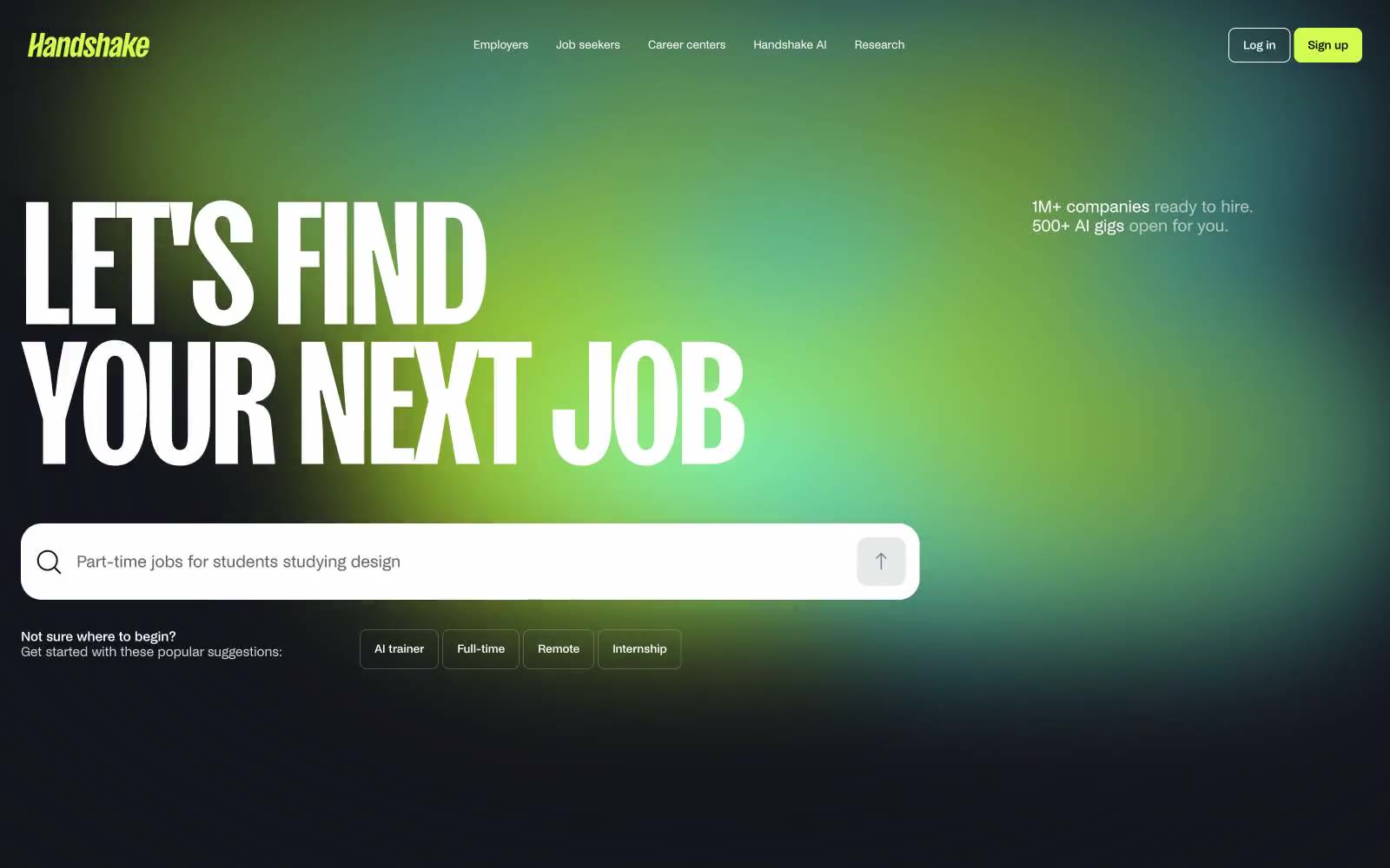
Handshake
Handshake — Style Reference
# Handshake — Style Reference
> neon highlighter on white paper
**Theme:** light
Handshake runs on a monochrome canvas punched open by one radioactive lime (#d3fb52) that acts less like a brand color and more like a highlighter dragged across white paper. The system is deliberately binary: almost everything is black text on white surfaces, and then the accent ignites — on nav pills, primary actions, and the hero's cyan-to-lime radial glow. Custom NoiGrotesk carries the UI with tight tracking and three stylistic sets (ss03, ss06, ss12) active everywhere, while SansPlomb at 201px declares the page in display headlines so large they feel architectural rather than typographic. Surfaces are pillow-soft (24px on cards and inputs), buttons are compact (8px), and the overall density is comfortable — the page breathes because the typography and gradient do the heavy emotional work, not ornament.
## Tokens — Colors
| Name | Value | Token | Role |
|------|-------|-------|------|
| Voltage Lime | `#d3fb52` | `--color-voltage-lime` | Primary action fill, nav pill, active state, hero gradient endpoint — the single chromatic ignition point against an otherwise monochrome system |
| Cyan Spark | `radial-gradient(at 55% 45%, rgb(122, 243, 255) 0%, rgb(211, 251, 82) 70%, rgba(0, 0, 0, 0) 76%)` | `--color-cyan-spark` | Hero gradient start point, secondary glow tone — pairs with Voltage Lime to create the aurora-like radial background |
| Mid Abyss | `#052326` | `--color-mid-abyss` | Footer surface, dark section backgrounds — a near-black with a subtle teal undertone that keeps the dark mode on-brand |
| Carbon Ink | `#14151c` | `--color-carbon-ink` | Primary text, icon strokes, input borders — the slightly cool near-black used for the majority of foreground content |
Websites
Markdown Text
design-md
website-prompt
landing-page-prompt
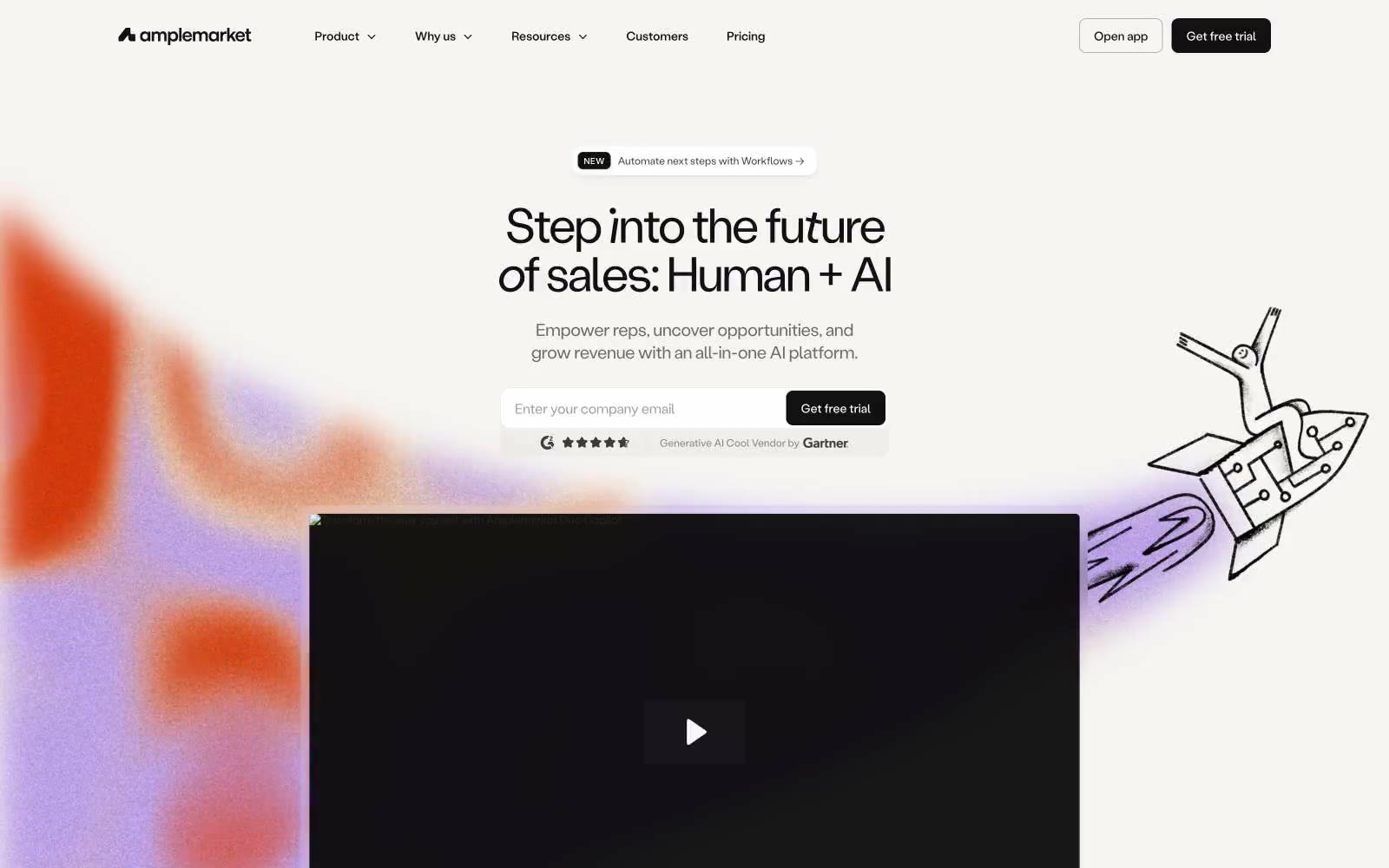
Amplemarket
Amplemarket — Style Reference
# Amplemarket — Style Reference
> Frosted white workspace, sun-stained corner gradient. A bright cool neutrals system with a deep violet core and one orange ember, all set in a single tight grotesk.
**Theme:** light
Amplemarket operates as a minimal white canvas pierced by concentrated color. The default page is near-empty — white backgrounds, a single grotesk typeface at work, hairline borders, and tight negative tracking at display sizes that compresses the headline into a compact block. The signature move is a vivid radial atmosphere (orange → cream → lavender → cyan) that bleeds in from page edges as a soft glow rather than a background fill, paired with a hand-drawn line illustration that humanizes the otherwise austere grid. A deep violet (#10054d) is reserved for dark sections and bold accent surfaces, never competing with the bright gradient. Components are flat, border-driven, and generously spaced; elevation is almost always a 1px inset ring rather than a drop shadow. The effect is a workspace that feels calm and grown-up, with color appearing in deliberate, emotional bursts.
## Tokens — Colors
| Name | Value | Token | Role |
|------|-------|-------|------|
| Ink Black | `#111111` | `--color-ink-black` | Primary text, hairline borders, icon strokes, filled button background — the dominant structural neutral at ~5000 occurrences, always reading as near-black with no warm or cool cast |
| Paper White | `#ffffff` | `--color-paper-white` | Primary page and card surfaces, inverse text on dark buttons and dark sections |
| Obsidian Warm | `#272625` | `--color-obsidian-warm` | Dark section background (CTAs, feature blocks), dark surface for cards inside dark contexts — subtly warmer than pure black so the violet text on top still feels in the same family |
| Graphite Mid | `#6d6c6b` | `--color-graphite-mid` | Secondary body text, muted labels, caption helper copy, decorative image borders |
Websites
Markdown Text
design-md
website-prompt
landing-page-prompt
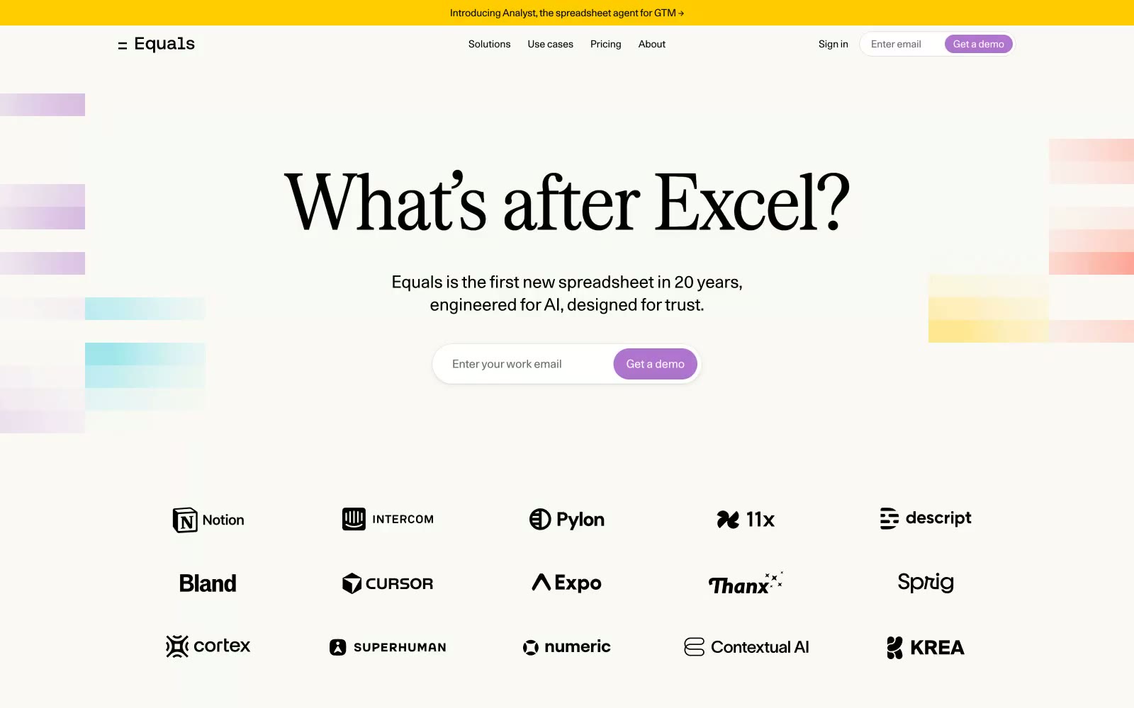
Equals
Equals — Style Reference
# Equals — Style Reference
> Broadsheet meets spreadsheet — editorial serif authority on warm cream, punctuated by floating pastel data cells.
**Theme:** light
Equals feels like a newspaper broadsheet that learned to breathe — authoritative serif headlines punching at 110px sit on a warm cream field (#FAF9F5), while playful pastel color swatches float loosely in the background like spreadsheet cells coming undone. The tension between Serrif Condensed's editorial weight and Unica77's tight UI precision creates a dual-register: serious data tool and approachable product. Yellow (#FFCC00) announces itself only on the top announcement bar, orchid purple (#B074CE) appears exclusively on CTA buttons — two accent colors that never compete because they never share the same zone. Thin horizontal rules divide sections instead of whitespace padding, referencing spreadsheet grid lines as a structural metaphor throughout the page.
## Tokens — Colors
| Name | Value | Token | Role |
|------|-------|-------|------|
| Analyst Yellow | `#FFCC00` | `--color-analyst-yellow` | Announcement bar background only — saturated yellow on near-black text creates maximum urgency at minimal surface area, never used elsewhere so it retains its alarm-signal quality |
| Orchid CTA | `#B074CE` | `--color-orchid-cta` | Primary CTA buttons — warm violet against cream background reads as inviting rather than urgent, distinguishing CTAs from the aggressive red/orange typical of SaaS |
| Brand Green | `#20A277` | `--color-brand-green` | Finance category accent swatch — one of three role-coded indicator blocks (RevOps red, Founders navy, Finance green) flanking solution rows |
| Glacier | `#2DCBDC` | `--color-glacier` | Background decorative color block in hero, part of the floating pastel spreadsheet-cell visual language |
Websites
Markdown Text
design-md
website-prompt
landing-page-prompt
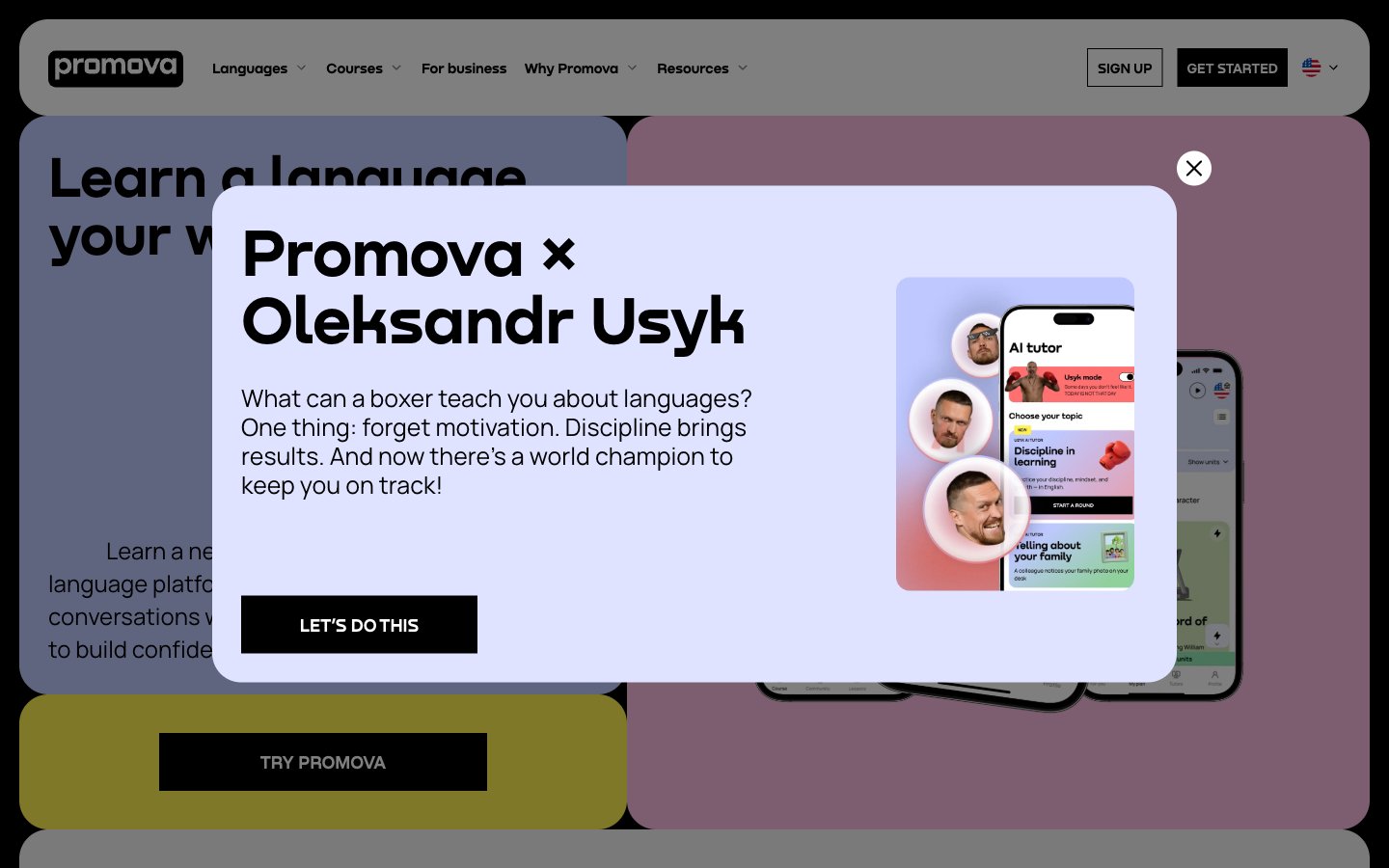
Promova
Promova — Style Reference
# Promova — Style Reference
> midnight magazine with one yellow highlighter — a black page, white type, and a vivid lemon swatch that says 'press here'.
**Theme:** dark
Promova is a midnight-magazine language learning surface: near-black canvas, white type, a single electric yellow (#fff050) used as functional punctuation for the primary action and icon highlights. Headlines are set in Nekst, a custom display face used exclusively at oversized scales (40–140px) — never as UI text — giving every screen a confident editorial weight. Body and interface type run on Manrope from 200 to 700, with weight 200 doing the work most sites assign to 300. The system is ruthlessly monochromatic (1% colorfulness) and the visual rhythm comes from oversized type, generous 30px corner radii, and the yellow accent appearing only where action or attention is required. Components feel like magazine spreads rather than dashboard widgets: flat, rounded, low-elevation, with cards that read as paper inserts against the black page.
## Tokens — Colors
| Name | Value | Token | Role |
|------|-------|-------|------|
| Jet Black | `#000000` | `--color-jet-black` | Dark supporting neutral for text, icons, and strong contrast. Do not promote it to the primary CTA color |
| Paper White | `#ffffff` | `--color-paper-white` | Primary text on dark canvas, inverted button surface, logo, nav foreground |
| Ash | `#595959` | `--color-ash` | Muted helper text, secondary captions, subdued metadata |
| Fog | `#dddddd` | `--color-fog` | Hairline borders, low-emphasis dividers, card outlines on dark backgrounds |
Websites
Markdown Text
design-md
website-prompt
landing-page-prompt
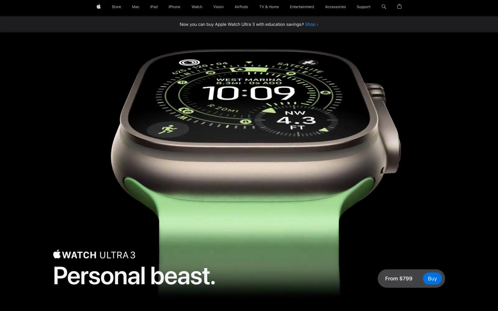
Apple (España)
Apple (España) — Style Reference
# Apple (España) — Style Reference
> obsidian gallery vitrine — a dark showroom where a single titanium object glows against pure black
**Theme:** mixed
Apple's product page is a cinematic dark-stage that lets hardware speak first: full-bleed near-black canvas, a single hero product floating in negative space, white SF Pro Display headlines at massive scale, and one vivid blue Buy button as the only saturated action color on the page. The page alternates between black feature stages and white detail bands, using generous 28px card radii and 36–980px pill buttons to feel premium and tactile. Color is used as functional punctuation: orange for category eyebrows, blue for links and the single CTA, violet/teal for other product categories. Typography is the only chrome — heavy negative letter-spacing, tight line-heights, and weight contrast between SF Pro Text body and SF Pro Display headlines carry all the hierarchy.
## Tokens — Colors
| Name | Value | Token | Role |
|------|-------|-------|------|
| Obsidian | `#1d1d1f` | `--color-obsidian` | Primary dark canvas, card surfaces on dark sections, primary text on light backgrounds — the signature near-black that defines Apple's product stage |
| Frost White | `#f5f5f7` | `--color-frost-white` | Primary text on dark backgrounds, light section surfaces, subtle dividers — slightly warm white that softens contrast against pure black |
| Pure Black | `#000000` | `--color-pure-black` | Deepest dark canvas for hero and feature stages, footer background — used where absolute darkness amplifies product photography |
| Paper White | `#ffffff` | `--color-paper-white` | Light section backgrounds, button text on dark fills, icon fills — the bright counterweight in alternating dark/light page rhythm |
Websites
Markdown Text
design-md
website-prompt
landing-page-prompt
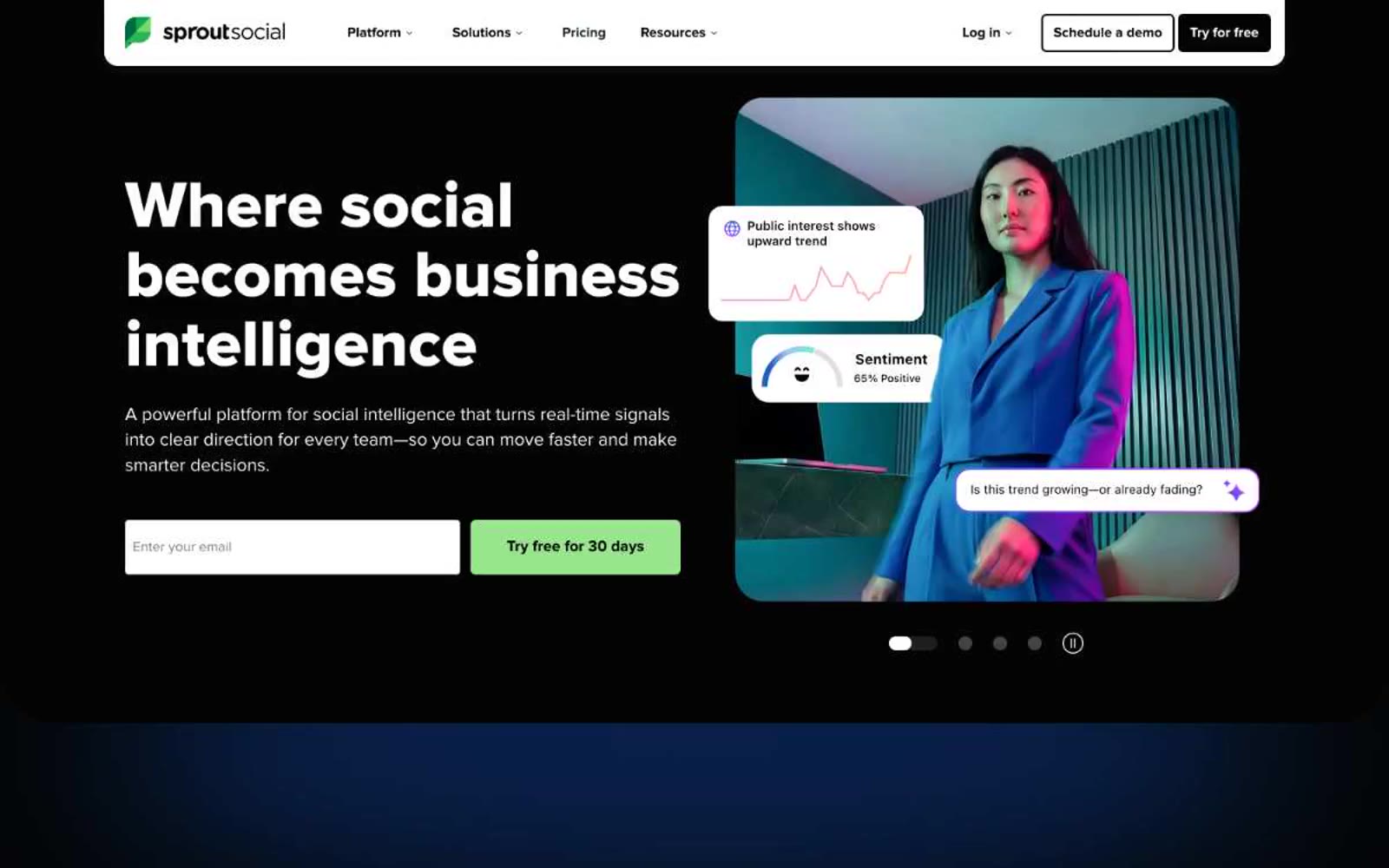
Sprout Social
Sprout Social — Style Reference
# Sprout Social — Style Reference
> Green sprout on black slate. One vivid accent on a stark monochrome canvas, the color rationed to actions only, with confident geometric type that functions like wayfinding signage.
**Theme:** light
Sprout Social operates on a stark, high-contrast visual system: near-black ink on white canvas, with a single vivid green that punctuates every call to action. The typeface is Proxima Nova at bold weights (700–800), delivering confident, geometric headlines that feel like signage rather than prose. Surfaces are flat and borderless in feel — rounded corners (16px on cards, 6px on controls) do the structural work that shadows do elsewhere. Color is rationed: 99% of the page is achromatic; the green accent is reserved for primary actions and the brand leaf, never decoration. Product showcases break the monochrome with soft purple-to-white and green-to-blue gradient washes that frame UI screenshots without competing with them.
## Tokens — Colors
| Name | Value | Token | Role |
|------|-------|-------|------|
| Ink Black | `#040404` | `--color-ink-black` | Primary text, nav borders, heading strokes, footer dividers — the dominant non-white color across the entire system |
| Paper White | `#ffffff` | `--color-paper-white` | Page background, card surfaces, nav surface, input fills, button text on dark fills |
| Ash Gray | `#d9d9d9` | `--color-ash-gray` | Nav dividers, link borders, subtle separators, muted UI chrome |
| Smoke Gray | `#cbcece` | `--color-smoke-gray` | Image borders, input borders, secondary button surface, faint dividers |
Websites
Markdown Text
design-md
website-prompt
landing-page-prompt
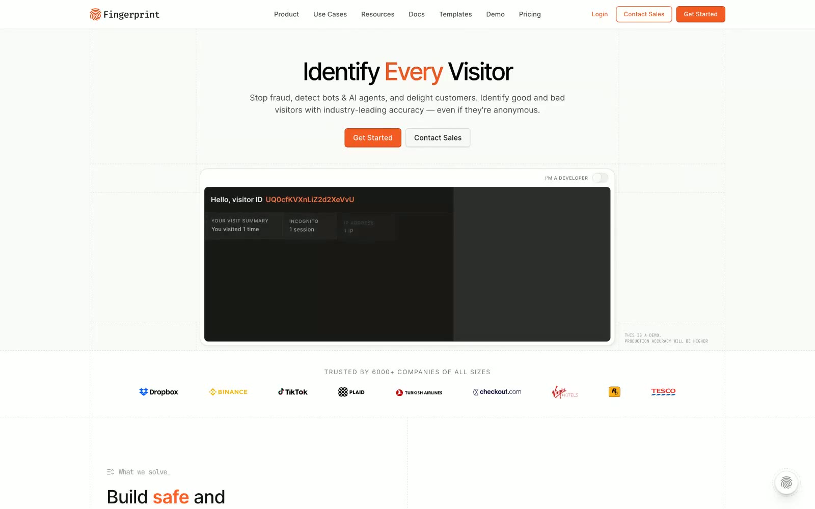
Fingerprint
Fingerprint — Style Reference
# Fingerprint — Style Reference
> warm CRT terminal on cream paper — a fraud-detection lab notebook where code blocks are the main characters
**Theme:** light
Fingerprint reads as a developer tool that has been deliberately warmed up: a cream-paper canvas (#fafaf8) sits beneath sharp black type, a single vivid orange (#f35b22) does the work of a highlighter on key nouns, and the rest of the accent palette is borrowed from an IDE — teal, blue, pink, green as code-syntax tokens. Surfaces are flat with hairline borders; elevation is whispered, not announced. The hero alternates between editorial typography (Inter, tight tracking) and a dark CRT-style terminal panel, establishing a two-mode visual rhythm: light prose, dark code. Orange never decorates — it annotates, turning one word per headline into a call-to-action, and turning the primary button into the only filled rectangle on the page.
## Tokens — Colors
| Name | Value | Token | Role |
|------|-------|-------|------|
| Cream Paper | `#fafaf8` | `--color-cream-paper` | Page canvas and primary surface — warm off-white that softens the otherwise stark black/orange system |
| Card White | `#ffffff` | `--color-card-white` | Elevated card surfaces and input backgrounds — sits one step above the cream canvas |
| Pebble Gray | `#f0f0ef` | `--color-pebble-gray` | Secondary surface for section bands, subtle backgrounds behind grouped content |
| Linen Border | `#e4e5e1` | `--color-linen-border` | Hairline dividers, card borders, and table separators — the dominant structural line color |
Websites
Markdown Text
design-md
website-prompt
landing-page-prompt
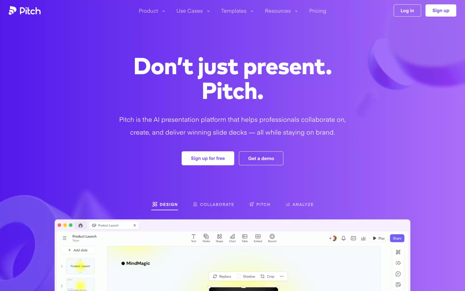
Pitch
Pitch — Style Reference
# Pitch — Style Reference
> violet stage spotlight on white. A deep purple gradient floods the hero like theater lighting, then the page steps down into a clean, flat slate workspace where one bright violet does all the work.
**Theme:** light
Pitch is a stage-lit productivity platform: the hero floods with a vivid violet gradient like theatrical lighting, then the rest of the page settles into a clean slate-and-white workspace where color is rationed to functional punctuation. Typography pairs a wide-tracked geometric sans (Eina01) for UI with a heavy, tightly-tracked display sans (Mark Pro) for headlines — the two voices create a clear hierarchy between product surface and marketing voice. Surfaces are flat white with soft, low-opacity shadows; the violet (#6b53ff) carries every action and brand mark, a single warm yellow (#ffd02c) injects energy accents, and a near-black charcoal (#2b2a35) does the heavy lifting for text. Components are compact and confident — pill buttons, small radii (6–20px), tight 20px padding, and a deliberate absence of decoration. The page rhythm alternates between immersive dark-violet full-bleed bands and bright content sections, producing a theatrical pacing from spectacle to substance.
## Tokens — Colors
| Name | Value | Token | Role |
|------|-------|-------|------|
| Signal Violet | `#6b53ff` | `--color-signal-violet` | Violet supporting accent for decorative details and low-frequency emphasis. Do not promote it to the primary CTA color |
| Lighter Violet | `#8d49f7` | `--color-lighter-violet` | Secondary brand accent, gradient highlight stops, icon fills, decorative violet washes — a brighter cousin used when Signal Violet would feel too heavy |
| Deep Indigo | `#371789` | `--color-deep-indigo` | Dark brand text, deep gradient end-stops, footer/marketing accent on white sections — the shadow side of the violet family |
| Solar Yellow | `linear-gradient(90deg, #ffd02c, #ff9e2c)` | `--color-solar-yellow` | Energy accent — slide preview highlights, decorative bursts, gradient start, illustration fills. Used sparingly as visual punctuation, never as a functional color; Warm accent gradient — linear-gradient(90deg, #ffd02c, #ff9e2c) for decorative bursts and illustration gradients |

Websites
Markdown Text
design-md
website-prompt
landing-page-prompt
1Password
Passwords — Style Reference
# Passwords — Style Reference
> Secure Airlock Behind Glass. A system that moves from the protective dark of an airlock to the bright clarity of a control room.
**Theme:** mixed
The design feels like a high-security airlock transitioning into a well-lit control room. An immersive, deep-space dark hero (#1D1D21) establishes a serious, secure atmosphere, which gives way to crisp white (#FFFFFF) content sections focused on informational clarity. The signature brand blue (#145FE4) is used exclusively for calls-to-action and active states, acting like an indicator light confirming interaction. Typography is a key differentiator; the custom font `agileSans` at large sizes with tight negative letter-spacing creates dense, architectural headlines. Buttons are distinctly full-pill (9999px radius), contrasting with the generally sharp, un-rounded cards, creating a focused tension between interactive and container elements.
## Tokens — Colors
| Name | Value | Token | Role |
|------|-------|-------|------|
| Brand Blue | `#145fe4` | `--color-brand-blue` | Primary CTAs, active links, focus indicators — the single point of interactive confirmation. |
| Hero Fade | `linear-gradient(180deg, #1d1d21 25%, #145fe4 70%, #99beff 100%)` | `--color-hero-fade` | Hero background — creates a deep, atmospheric transition from dark space to brand blue. |
| White | `#ffffff` | `--color-white` | Main content backgrounds, card surfaces, text on dark backgrounds. |
| Onyx | `#000000` | `--color-onyx` | Primary text on light backgrounds. |
Websites
Markdown Text
design-md
website-prompt
landing-page-prompt
Metalab
Metalab — Style Reference
# Metalab — Style Reference
> black editorial spread — a serif headline breathing in void, annotated by a whisper-quiet grotesque
**Theme:** dark
Metalab operates in a black-canvas editorial mode: a design agency that lets typography and negative space do the entire performance. Two custom typefaces share the stage — an ultra-light display serif (PP Eiko) at commanding sizes, and a quiet grotesque (Basis Grotesque Pro) for all functional copy — creating a dialogue between a whispering serif headline and a precise sans-serif annotation layer. The interface is achromatic by conviction: no accent color exists, no decorative gradient, no brand chromatic mark. Information is structured purely through scale contrast, micro-typography, and metadata labels (dates, times, coordinates) that float beside content like editorial marginalia. Components are sparse and oversized — a single dark elevated card, a pill toggle, and very little else. The system reads less like a product UI and more like the masthead of a design publication.
## Tokens — Colors
| Name | Value | Token | Role |
|------|-------|-------|------|
| Void | `#000000` | `--color-void` | Page canvas, primary surface, heading text on light zones — the dominant black that absorbs all surrounding elements |
| Bone | `#ffffff` | `--color-bone` | Inverse text on dark surfaces, hairline borders on dark zones, contrast punctuation against the black canvas |
| Charcoal | `#252525` | `--color-charcoal` | Supporting neutral for secondary UI, dividers, and muted labels. Do not promote it to the primary CTA color |
Websites
Markdown Text
design-md
website-prompt
landing-page-prompt
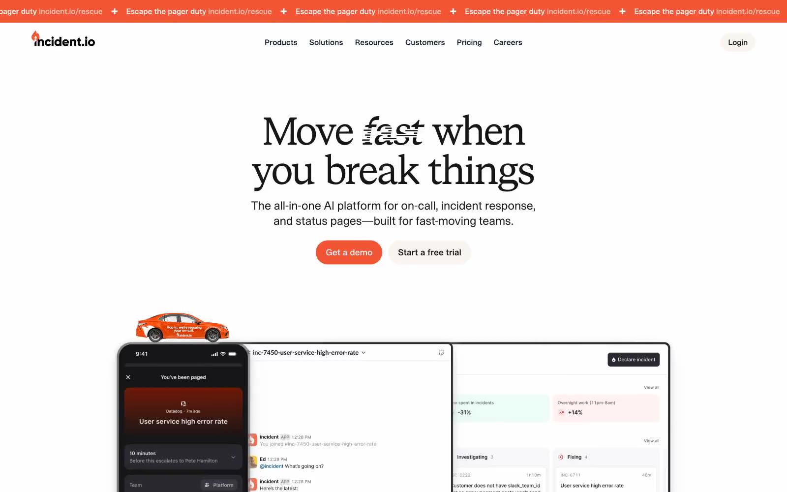
Incident
Incident — Style Reference
# Incident — Style Reference
> Technical broadsheet on concrete. Times-serif headlines float on a warm-gray page with hairline black rules and a single orange flare that breaks the calm like a signal beacon.
**Theme:** light
Incident treats the status page like an editorial publication: a Times-serif typeface on a concrete-gray canvas, hairlines of pure black, and one warm signal-orange that acts as a flare against the monochrome. The discipline is extreme — chromatic color is rationed, appearing only as brand accent fills, logo marks, and decorative file-type illustrations, never as button backgrounds or action fills. Surfaces are flat and paper-like; depth comes from soft 2-layer shadows on imagery rather than elevation stacking. The result reads as a trusted technical broadsheet rather than a typical dashboard — authority through typographic restraint, not color volume.
## Tokens — Colors
| Name | Value | Token | Role |
|------|-------|-------|------|
| Signal Orange | `#f25533` | `--color-signal-orange` | Brand accent, logo mark, decorative SVG fills, nav emphasis — the single warm chromatic note that cuts through the monochrome system |
| Concrete | `#efefef` | `--color-concrete` | Page canvas, button background — the dominant surface tone that gives the system its paper-like warmth |
| Ink | `#000000` | `--color-ink` | Primary text, hairline borders (920+ uses), button outlines — pure black carries all structural line work |
| Paper | `#ffffff` | `--color-paper` | Card surfaces, nav fills — the white layer that sits on top of the concrete canvas |