AI Prompt Studio - Intelligent Prompt Library
Explore and use professional AI prompts to optimize your workflow.
One-click Use
Websites
Markdown Text
design-md
website-prompt
landing-page-prompt
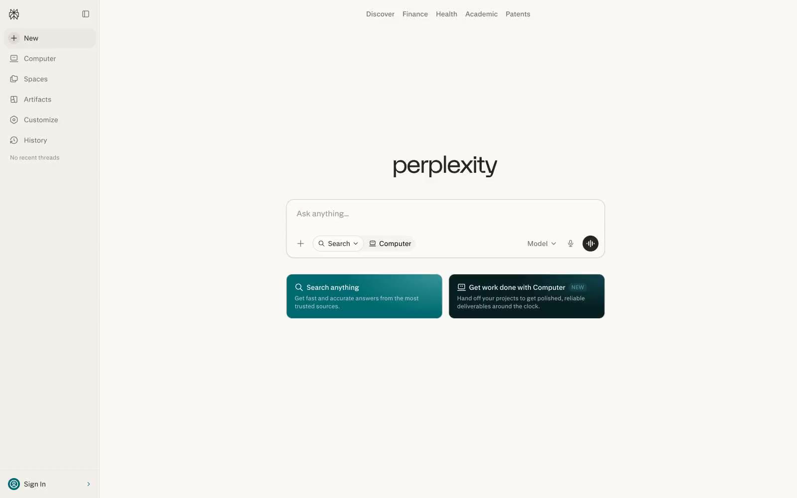
Perplexity AI
Perplexity AI — Style Reference

# Perplexity AI — Style Reference
> Warm research terminal. A cream-toned search bar floats on aged-paper canvas, surrounded by quiet monochrome controls — the calm of a library reading desk distilled into a single input field.
**Theme:** light
Perplexity's interface operates like a quiet research terminal: a warm off-white canvas (#faf8f5) that reads more like aged paper than sterile app-white, a single monochrome typographic voice, and one restrained teal accent (#016a71) that appears only as functional punctuation. The entire visual system compresses to a search bar as the hero — every surrounding control (sidebar, top nav, model selector, voice button) is a subordinate satellite. Density is compact but not cramped: 8px is the workhorse gap, 12–16px the padding standard, with 9999px pill rounding on all interactive controls. There is almost no elevation — the design is deliberately flat, using a barely-there 1px border at #d1d1cd and a single whisper-soft shadow to separate the card layer from the canvas. Typography is custom (pplxSans) at exactly two weights (400, 500) and three sizes (12, 14, 16) — the scale is intentionally narrow, making the interface feel like a document rather than a dashboard.
## Tokens — Colors
| Name | Value | Token | Role |
|------|-------|-------|------|
| Aged Paper | `#faf8f5` | `--color-aged-paper` | Page canvas and card surfaces — warm off-white replaces sterile pure white, giving the interface a document-like, paper-textured quality |
| Ink Black | `#000000` | `--color-ink-black` | Primary text, icon strokes, and the dominant fill across navigation and body copy |
| Charcoal | `#27251e` | `--color-charcoal` | Primary action button background and high-emphasis text — warm near-black that pairs with the cream canvas for a softer than pure-black contrast |
| Ash Gray | `#72706b` | `--color-ash-gray` | Secondary text, muted icons, and inactive nav fills — carries the warm tint of the palette |
Websites
Markdown Text
design-md
website-prompt
landing-page-prompt
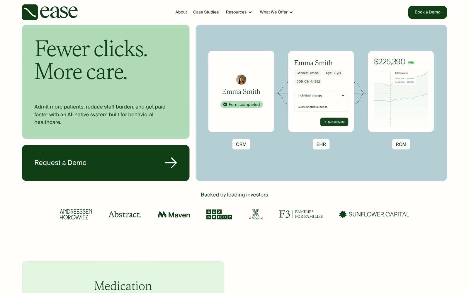
Ease Health
Ease Health — Style Reference
# Ease Health — Style Reference
> Sunlit clinic on white linen. A muted, light-first healthcare surface where one deep forest green does the work of accent, action, and trust, framed by sage washes, dusty-blue panels, and whisper-weight serif headlines.
**Theme:** light
Ease Health uses a clinical-calm language: warm sage and dusty blue surfaces on a near-white canvas, with a single deep forest green carrying every action, icon, and heading accent. The page breathes — generous whitespace, no shadows, thin gray hairlines, and pill-shaped tags that feel like medical labels rather than UI chrome. Typography pairs a delicate serif (Faire Octave) for headline moments with a quiet grotesque (Suisseintl) for everything operational, both set in weight 300 with tight negative tracking so type whispers rather than shouts. Color is rationed: most surfaces are achromatic or barely tinted, and the dark green appears only where the user should act, look, or trust. Components feel light, flat, and confident — the system reads as a calm, premium clinic, not a noisy SaaS dashboard.
## Tokens — Colors
| Name | Value | Token | Role |
|------|-------|-------|------|
| Forest Ink | `#0f3e17` | `--color-forest-ink` | Primary action buttons, heading text, brand icons, footer, active states — the only saturated color in the system; deep enough to read as serious clinical authority against the pale surfaces |
| Sage Wash | `#b1dbb8` | `--color-sage-wash` | Green wash for highlight backgrounds, decorative bands, and soft emphasis behind content. Do not promote it to the primary CTA color |
| Mist Blue | `#b6ced5` | `--color-mist-blue` | Hero panel background, secondary surface tint, pill badge background — the cool counterpoint to sage, used for product/showcase bands |
| Mint Veil | `#cfe7d3` | `--color-mint-veil` | Soft card surface tint, subtle highlight wash |
Websites
Markdown Text
design-md
website-prompt
landing-page-prompt
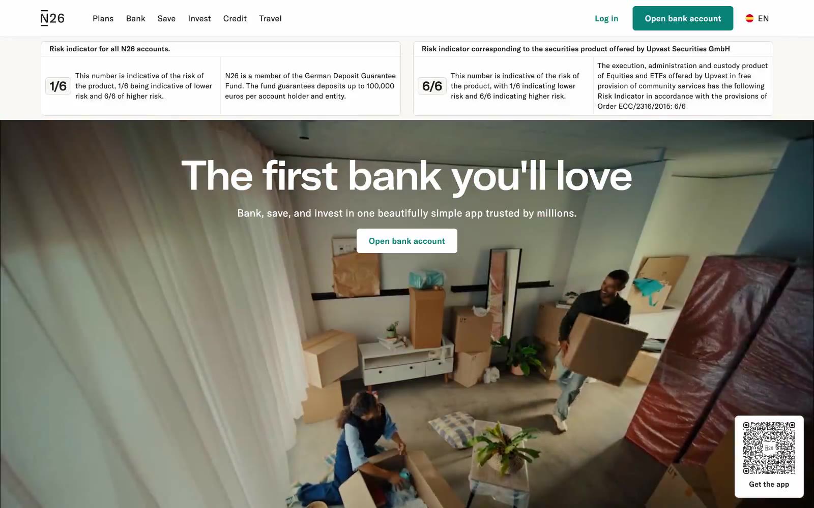
The online bank
The online bank — Style Reference
# The online bank — Style Reference
> Digital vault in deep ocean teal — a bank that earns calm through quiet white space and a single confident color.
**Theme:** light
N26 presents a calm, confident digital banking sanctuary anchored by a single deep teal hero that commands the viewport while the rest of the interface recedes into warm off-white space. The visual hierarchy is built on contrast: dense dark ink (#1b1b1b) on near-white canvas (#faf8f5), with teal appearing as purposeful punctuation for primary actions and brand moments rather than decoration. Typography carries a distinctive tension between the compact, slightly tracked N26 sans-serif used for navigation and body content, and the wider N26-Extended display face that gives headlines room to breathe at 58–80px. Components feel architectural and minimal — thin borders, generous padding, small radii on controls, large radii on imagery — reflecting a European design-banking sensibility where trust is conveyed through restraint rather than ornament.
## Tokens — Colors
| Name | Value | Token | Role |
|------|-------|-------|------|
| Deep Teal | `#088177` | `--color-deep-teal` | Teal supporting accent for decorative details and low-frequency emphasis. Do not promote it to the primary CTA color |
| Ink | `#1b1b1b` | `--color-ink` | Primary body text, headings, icon strokes, link text, and nav labels — a near-black that softens to charcoal, avoiding the harshness of pure black on warm white |
| Canvas Warmth | `#faf8f5` | `--color-canvas-warmth` | Page background — a warm, paper-like off-white that gives the entire interface a human, editorial quality distinct from clinical SaaS whites |
| Surface White | `#ffffff` | `--color-surface-white` | Light supporting surface for subtle backgrounds and section separation. Do not promote it to the primary CTA color |
Websites
Markdown Text
design-md
website-prompt
landing-page-prompt
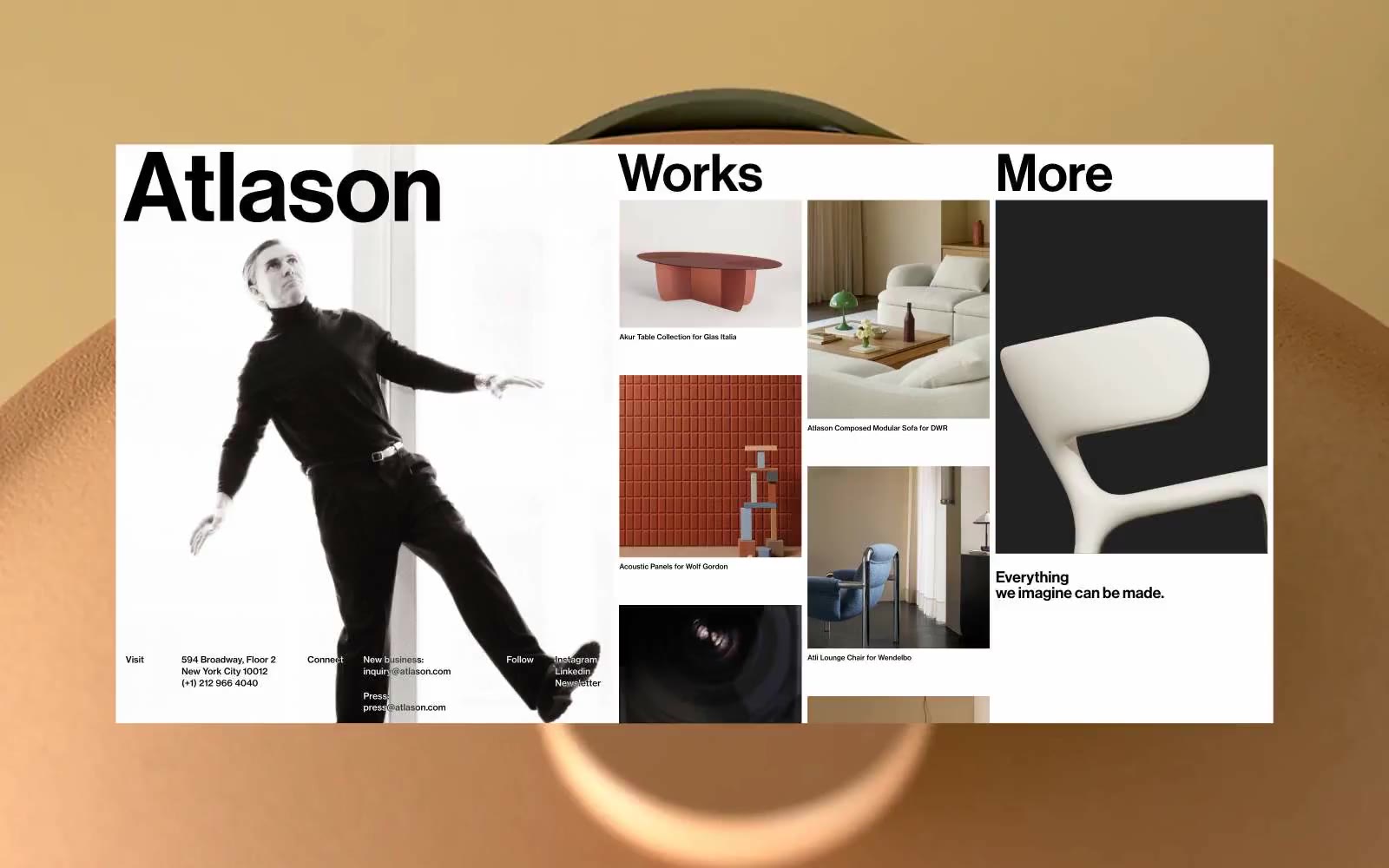
Altason
Altason — Style Reference
# Altason — Style Reference
> architectural monochrome broadsheet
**Theme:** light
Altason is a portfolio-as-canvas: a pure black-on-white editorial grid where massive, medium-weight Grotesk wordmarks are the hero and the work itself is the product. The system is 0% chromatic — every visual moment is built from ink, paper, and the negative space between them. Components are borderless except for hairline 1px black lines that quietly subdivide the page; there are no shadows, no gradients, no rounded corners, no accent hues. Type does all the work, and it speaks loudly by being huge and only weight 500 — the restraint of a medium weight at 288px is the signature move. Density is generous and architectural: sections breathe with 112–288px vertical padding, content sits in a three-column grid, and every surface is a flat plane with no elevation hierarchy. An AI agent should think of this as designing a printed magazine spread, not a SaaS dashboard.
## Tokens — Colors
| Name | Value | Token | Role |
|------|-------|-------|------|
| Ink Black | `#000000` | `--color-ink-black` | Primary text, hairline borders, structural rules, image borders, heading fills — the dominant ink that draws the entire page |
| Paper White | `#ffffff` | `--color-paper-white` | Page canvas, card surfaces, reverse text on dark blocks — the surface that lets the black type speak |
| Charcoal Plate | `#212121` | `--color-charcoal-plate` | Dark surface blocks and image backgrounds where white reverse type sits — a softer alternative to pure black for large dark areas |
| Silver Hairline | `#b0b0b0` | `--color-silver-hairline` | Subtle dividers and muted secondary links — a quiet mid-gray that recedes behind the black ink without disappearing |
Websites
Markdown Text
design-md
website-prompt
landing-page-prompt
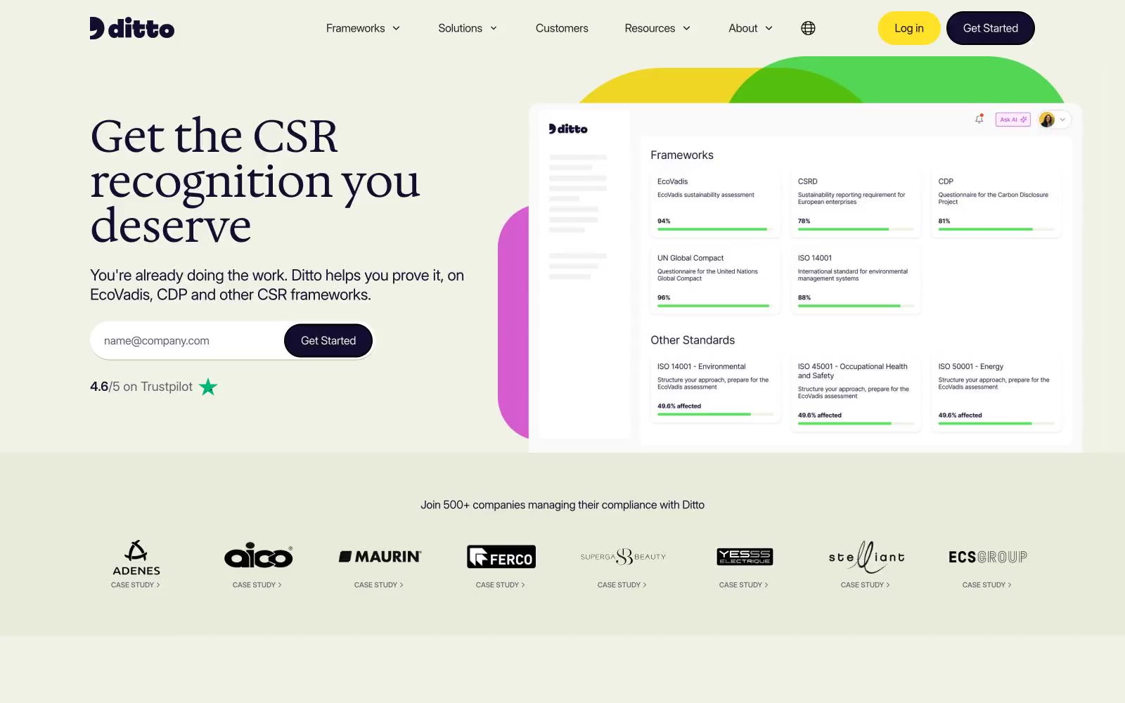
Ditto
Ditto — Style Reference
# Ditto — Style Reference
> Sunlit wildflower compliance atelier. Warm cream surfaces, vivid yellow primary action, deep navy ink, organic color shapes blooming behind the product.
**Theme:** light
Ditto uses a sunlit, garden-inspired SaaS language: a warm cream canvas, organic decorative blobs in vivid greens, pinks, and yellows, and a confident pairing of a warm serif (Hedvig Letters) for headlines with a clean grotesque (Inter) for everything else. The deep navy-violet #130e30 carries all structural text and borders, while a single bright yellow #ffe228 powers every primary action — the contrast is so high it reads almost like a highlighter. Components stay lightweight: pill-shaped buttons (1440px radius), generously padded cards on a slightly green-tinted surface (#eff2e5), and minimal elevation. The mood is optimistic and approachable, not corporate or clinical — the floral backdrop shapes, serif headlines, and warm neutrals keep it human.
## Tokens — Colors
| Name | Value | Token | Role |
|------|-------|-------|------|
| Deep Ink | `#130e30` | `--color-deep-ink` | Primary text color, heading ink, card borders, secondary button fills — near-black violet that adds warmth over pure black |
| Hi-Yellow | `#ffe228` | `--color-hi-yellow` | Primary action fill (filled CTA buttons), hero pill backgrounds, accent highlights — bright highlighter yellow with near-black text for maximum contrast |
| Moss Green | `#59e25d` | `--color-moss-green` | Decorative organic shape fill behind hero — warm leaf green used in background blobs, not UI controls |
| Fuchsia | `#e261e5` | `--color-fuchsia` | Decorative organic shape fill behind hero — vivid pink used in background blobs, not UI controls |
Websites
Markdown Text
design-md
website-prompt
landing-page-prompt
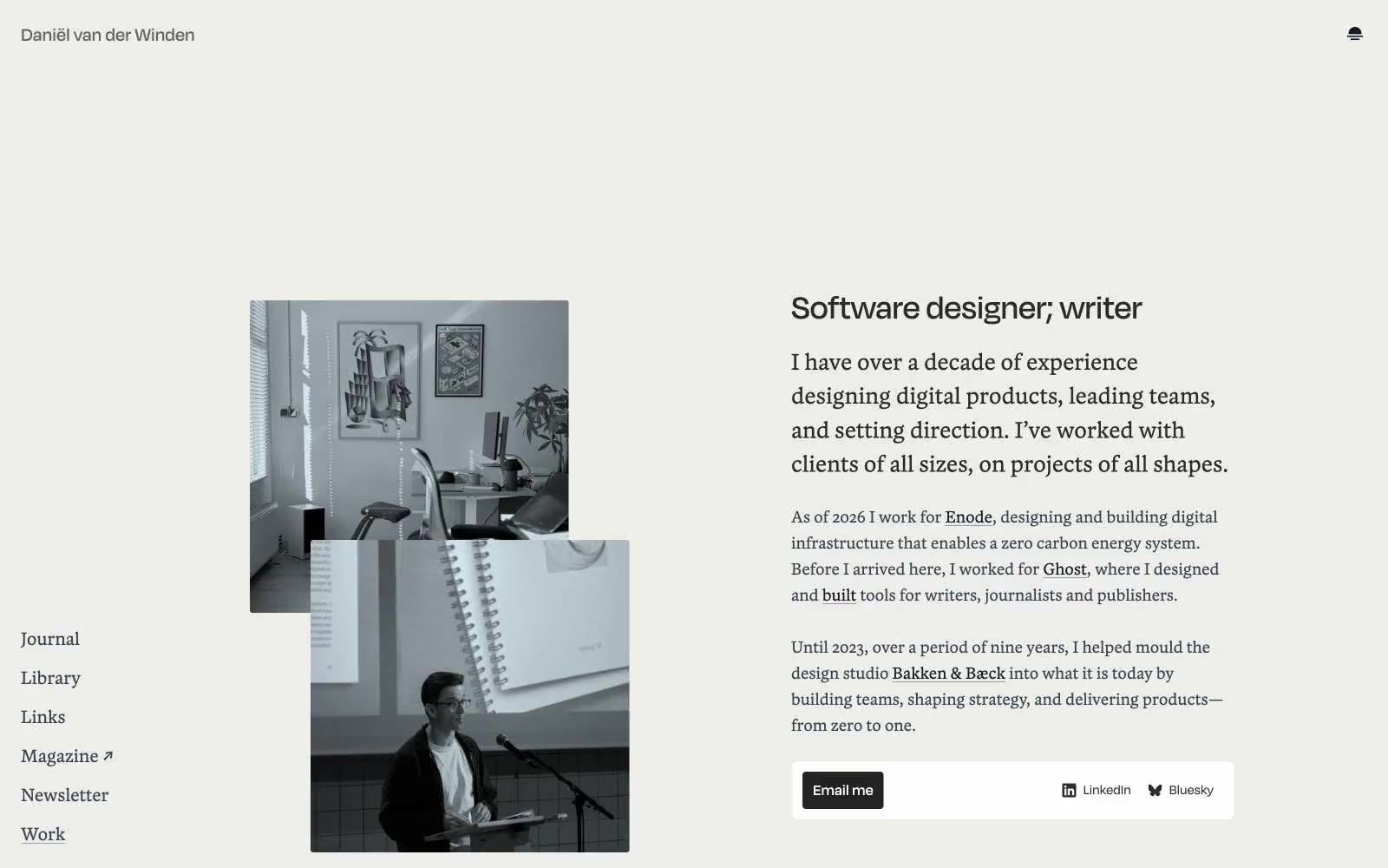
Daniël van der Winden
Daniël van der Winden — Style Reference
# Daniël van der Winden — Style Reference
> Printed monograph on vellum
**Theme:** light
This is an editorial personal folio rendered like a printed monograph on warm paper. A single warm-gray canvas (#e5e7eb) holds everything, with content floating on it without visible card containers or heavy dividers. The type system is the design: a humanist sans (Degular) handles UI, body, and navigation while a bookish serif (Blanco) carries all editorial weight — headlines, introductions, and section titles. Color is almost entirely absent; the only chromatic event is the near-black fill of the sole action button against the light field. Layout is a fixed left rail of nav links and a generous reading-width column of text, with photographs overlapping the text column as collaged inserts. Everything else — borders, hairlines, separators — is hairline and quiet.
## Tokens — Colors
| Name | Value | Token | Role |
|------|-------|-------|------|
| Vellum | `#e5e7eb` | `--color-vellum` | Page canvas, hairline dividers, link underlines, card-edge borders — the warm-gray field that holds all content |
| Ink Black | `#111827` | `--color-ink-black` | Primary text, nav links, body copy — the default reading color |
| Graphite | `#374151` | `--color-graphite` | Secondary body text, list items, supporting copy — one step lighter than primary ink |
| Charcoal | `#2a2a28` | `--color-charcoal` | Headings and editorial emphasis — slightly warm dark for serif display |
Websites
Markdown Text
design-md
website-prompt
landing-page-prompt
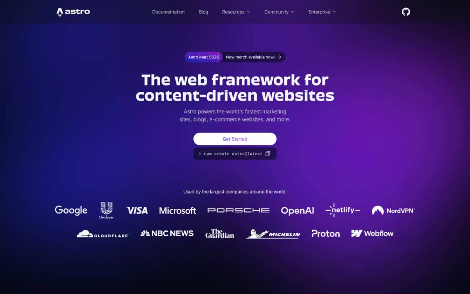
Astro
Astro — Style Reference
# Astro — Style Reference
> Deep space mission control with a single purple nebula glow
**Theme:** dark
Astro speaks in the language of a cosmic command bridge: near-black canvas, a single signature purple-magenta nebula gradient that blooms from the hero, and white display type that reads like mission copy. The system is overwhelmingly achromatic — 4% colorfulness — so every chromatic pixel is doing real work: a mint-aqua syntax highlight, a violet link, a sky-blue inline chip. Components are geometric and confident: pill-shaped interactive controls at 9999px radius, 16px cards, 8px chips, and thin hairline borders at 8% opacity rather than colored dividers. The custom display face 'Obviously' does the heavy lifting with its wide, open apertures and quirky alternates (salt, ss06, ss11) that give headlines a friendly, slightly retrofuturist swagger against the dark void.
## Tokens — Colors
| Name | Value | Token | Role |
|------|-------|-------|------|
| Void Canvas | `#1f232e` | `--color-void-canvas` | Primary page background — the base layer for hero, sections, and footer. Slight cool-blue undertone, never pure black, so colored elements feel like they're floating in space rather than printed on paper |
| Abyss | `#0c0f19` | `--color-abyss` | Deeper surface level for elevated cards, code blocks, and inset wells. One step darker than the canvas to create depth without using shadows |
| Singularity | `#060913` | `--color-singularity` | Darkest surface for terminal windows, CLI boxes, and high-contrast containers. Almost pure black with a blue whisper |
| Carbon | `#17191e` | `--color-carbon` | Mid-elevation card surface, sitting between canvas and abyss. Used for theme preview tiles and nested cards |
Websites
Markdown Text
design-md
website-prompt
landing-page-prompt
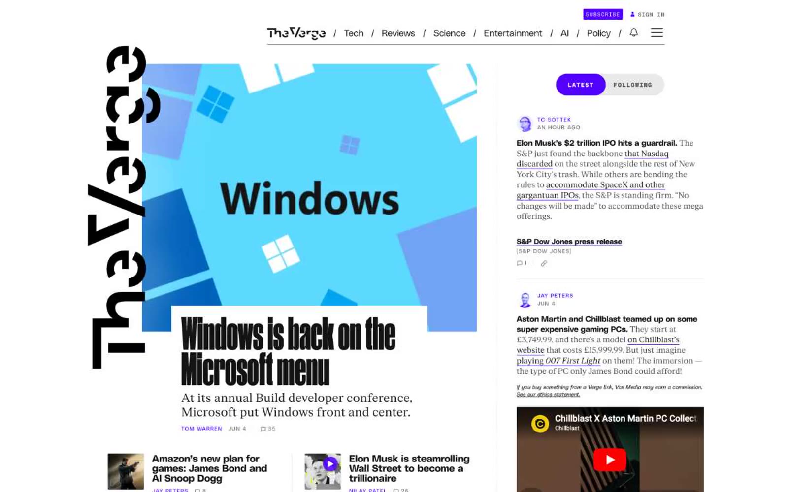
The Verge
The Verge — Style Reference
# The Verge — Style Reference
> Midnight control room, mint alerts
**Theme:** dark
The Verge reads as a late-night newsroom: a near-black canvas where type carries the weight and teal appears only as functional punctuation. The Signal Mint accent (#3cffd0) marks everything that is alive — section labels, author bylines, active states, the subscribe button — while the rest of the page stays achromatic. Display headlines run at Manuka weight 900, 60–107px, creating editorial impact at near-zero line-height, then article bodies switch to Fk Roman Standard serif to separate reading mode from chrome. The vertical 'Verge' wordmark pinned to the left margin is the page's most distinctive structural element — a constant typographic frame, not a logo. Violet (#5200ff) and red-orange (#ff3d00) appear only as section-card fills (Most Popular, Podcasts), giving the monochrome feed two moments of color without breaking the dark mood.
## Tokens — Colors
| Name | Value | Token | Role |
|------|-------|-------|------|
| Charcoal | `#131313` | `--color-charcoal` | Page canvas, primary background, inverted sections |
| Onyx | `#000000` | `--color-onyx` | Deepest darks, shadows, text on light surfaces |
| Paper | `#ffffff` | `--color-paper` | Primary text, inverted surfaces, light icons |
| Iron | `#313131` | `--color-iron` | Elevated card surface, image-adjacent panels |
Websites
Markdown Text
design-md
website-prompt
landing-page-prompt
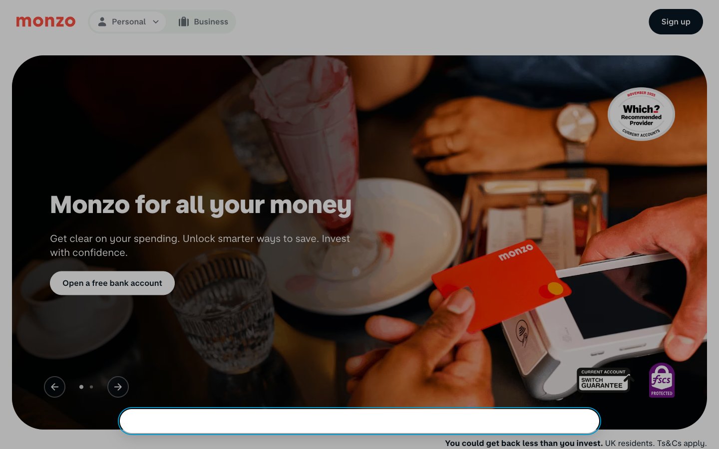
Monzo
Monzo — Style Reference
# Monzo — Style Reference
> Warm coral on cool mint paper — confident restraint with a single hot accent.
**Theme:** light
Monzo operates as a digital-first challenger bank with a light, warm, and unapologetically friendly visual language. The canvas is a whisper-soft mint off-white (#f2f8f3) that sits behind crisp white card surfaces, creating a layered paper-on-paper feel without relying on heavy shadows. A single vivid Hot Coral (#ff4f40) carries all chromatic energy — it stains the logo, links, headings, icons, and the physical card product itself, while the rest of the interface stays achromatic and quiet. Typography is custom sans-serif in two voices: a text family with a distinctive negative letter-spacing of -0.05em that tightens paragraphs, and a chunky display face at 600-800 weight for headings. Components are generously rounded (pills for actions, 64px for containers) and deliberately low-elevation — the brand trusts color, type weight, and whitespace to create hierarchy, not drop shadows.
## Tokens — Colors
| Name | Value | Token | Role |
|------|-------|-------|------|
| Hot Coral | `#ff4f40` | `--color-hot-coral` | Brand signature — logo, links, headings, icons, card product. One vivid accent against the achromatic interface; every chromatic moment in the system draws from this single hue |
| Midnight Ink | `#091723` | `--color-midnight-ink` | Dark supporting neutral for text, icons, and strong contrast. Do not promote it to the primary CTA color |
| Deep Navy | `#112231` | `--color-deep-navy` | Secondary surface tint and footer accents. Slightly lighter than Midnight Ink for layered dark elements |
| Page Mist | `#f2f8f3` | `--color-page-mist` | Page canvas — the dominant background behind all content sections. A barely-green off-white that gives the interface warmth without competing with white surfaces |
Websites
Markdown Text
design-md
website-prompt
landing-page-prompt
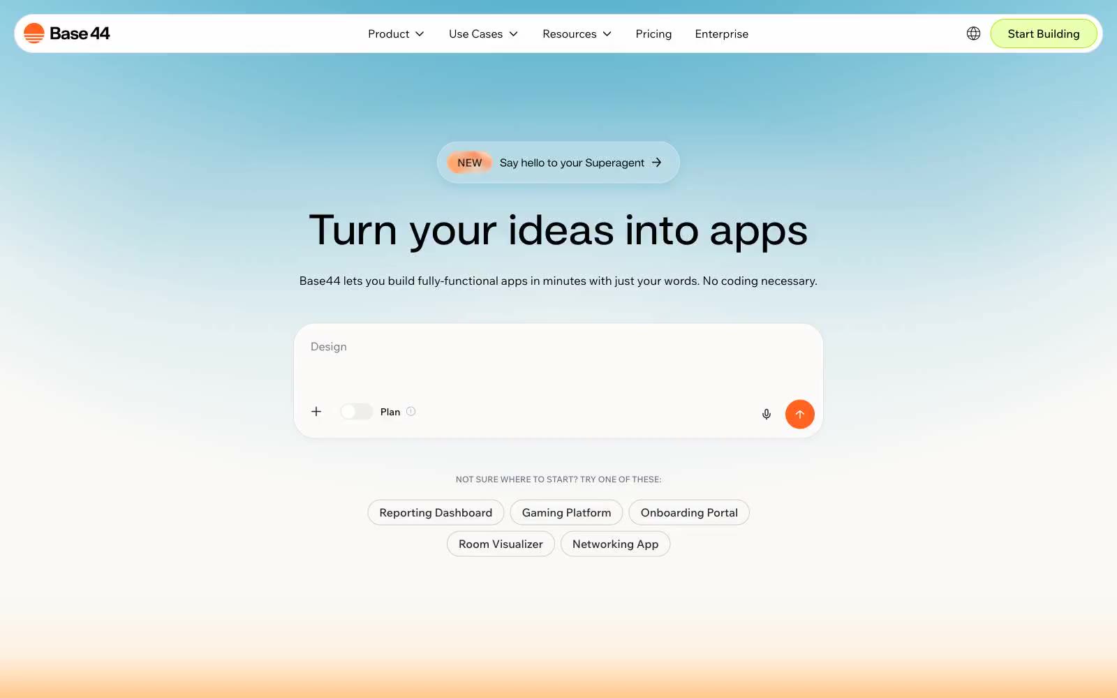
Base44
Base44 — Style Reference
# Base44 — Style Reference
> Sunlit workspace with a single lime spark. Warm off-white canvas, white product surfaces, pill controls, whisper-weight display type, and one electric lime accent that powers every action.
**Theme:** light
Base44 speaks in warm off-white daylight: a sunlit canvas (#faf9f7) with white product surfaces, whisper-weight display type that feels engraved rather than stamped, and one electric lime accent (#ebffb1) that makes the primary action feel switched on. Section transitions are painted as soft gradient bands — cool blue-to-white in the hero, warm orange-to-coral in the mid-page — creating a horizon-line effect between content blocks rather than hard dividers. Components stay featherlight: pill-shaped controls (999px radius), ~10px card corners, hairline borders, and almost no shadow. The lime-green is the only saturated color allowed on interactive elements; everything else is achromatic or carried inside gradients, which keeps the interface quiet and gives the single accent real authority.
## Tokens — Colors
| Name | Value | Token | Role |
|------|-------|-------|------|
| Lime Spark | `#ebffb1` | `--color-lime-spark` | Primary action background, active highlights — soft electric lime that reads as energy/switched-on without aggression |
| Lime Bolt | `#ade900` | `--color-lime-bolt` | Green accent for outlined action borders, linked labels, and lightweight interactive emphasis. Do not promote it to the primary CTA color |
| Ember Outline | `#d8723c` | `--color-ember-outline` | Outlined button border, secondary warm-orange action variant |
| Solar Orange | `linear-gradient(rgba(250, 249, 247, 0) 2.69%, rgb(255, 240, 222) 24.16%, rgb(255, 174, 83) 56.55%, rgba(255, 174, 83, 0) 98.02%)` | `--color-solar-orange` | Mid-stop of section gradient bands — warm coral that anchors horizon-line transitions; Mid-page section transition — warm orange-to-coral horizon |
Websites
Markdown Text
design-md
website-prompt
landing-page-prompt
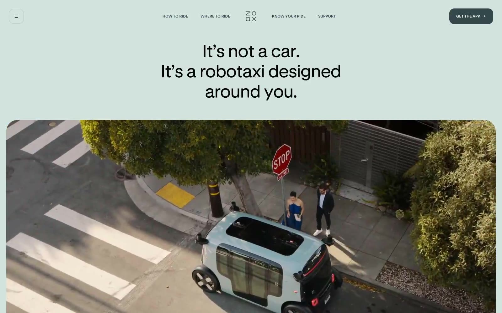
Zoox
Zoox — Style Reference
# Zoox — Style Reference
> serene sage showroom. A pale mint gallery space where one vivid teal accent and one dark forest panel interrupt the quiet — spacious, premium, and forward-looking.
**Theme:** light
Zoox presents a serene, gallery-like interface where a soft sage canvas (#d3e4df) carries the entire experience, broken only by a single dark forest-green section that acts as a dramatic contrast moment. The typography system is built on two weights of a custom neo-grotesque family — a compact sans for UI and body, and a display cut for oversized headlines that stretch to 120px with near-zero letter-spacing. A single vivid teal (#64d5b3) punctuates the system: it is the only chromatic color used as a filled surface, appearing on CTA buttons and key accent zones. Everything else stays desaturated — grays, near-blacks, and that signature sage. Components feel weightless: cards use large 36px radii, shadows are nearly absent, and borders are hairline. The mood is calm futurism — a showroom, not a dashboard.
## Tokens — Colors
| Name | Value | Token | Role |
|------|-------|-------|------|
| Sage Canvas | `#d3e4df` | `--color-sage-canvas` | Page background, hero bands, section dividers — the dominant ambient color that gives the system its calming gallery atmosphere |
| Pure White | `#ffffff` | `--color-pure-white` | Card surfaces, image masks, icon fills, high-contrast text on dark sections |
| Mint Frost | `#edf4f2` | `--color-mint-frost` | Badge backgrounds, subtle highlight washes, secondary card surfaces — a quieter sibling of the sage canvas |
| Carbon | `#0d1212` | `--color-carbon` | Primary text, dark section backgrounds, heavy borders — the deepest near-black, slightly cooler than true black |
Websites
Markdown Text
design-md
website-prompt
landing-page-prompt
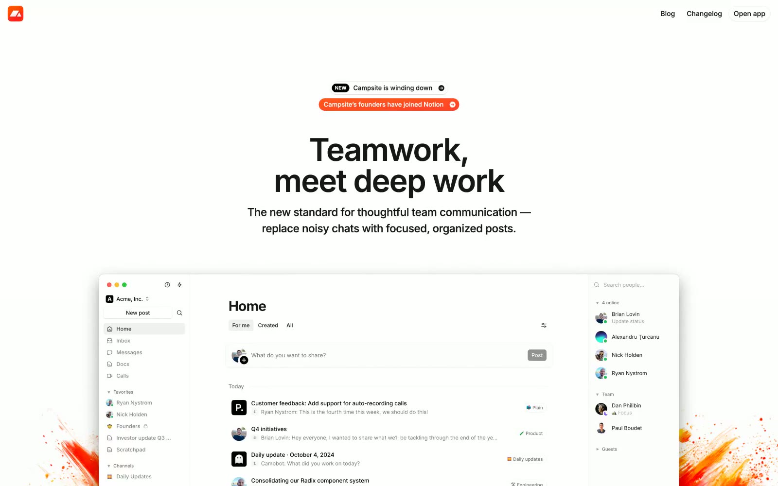
Campsite
Campsite — Style Reference
# Campsite — Style Reference
> sunlit editorial workspace — warm cream paper with one orange stamp of intent
**Theme:** light
Campsite is a sunlit editorial workspace — warm cream canvas, near-black Inter typography, and a single vivid orange that marks brand moments. The interface reads like a thoughtfully arranged bulletin board: compact rows, pill-shaped controls, soft 5%-black shadows, and generous breathing room between sections. Color is rationed — chromatic notes appear only in the logo, the paint-splash decorative motifs, a few tags, and semantic states. The density is compact but the layout feels open because of wide gutters and generous section padding; everything important sits on pure white cards floating just above the cream paper beneath them.
## Tokens — Colors
| Name | Value | Token | Role |
|------|-------|-------|------|
| Campfire Orange | `#ff6b1a` | `--color-campfire-orange` | Logo badge, notification pills, and brand-punctuation moments — a single warm coral that anchors the entire palette against the cream canvas |
| Ember Brown | `#451a03` | `--color-ember-brown` | Deep brown accent for paint-splash illustration shadows and inline highlight text in testimonials |
| Sunlit Cream | `#fef3c7` | `--color-sunlit-cream` | Soft warm wash behind tags, badges, and inline highlights |
| Forest Pulse | `#22c55e` | `--color-forest-pulse` | Green supporting accent for decorative details and low-frequency emphasis. Use as a supporting accent, not as a status color |
Websites
Markdown Text
design-md
website-prompt
landing-page-prompt
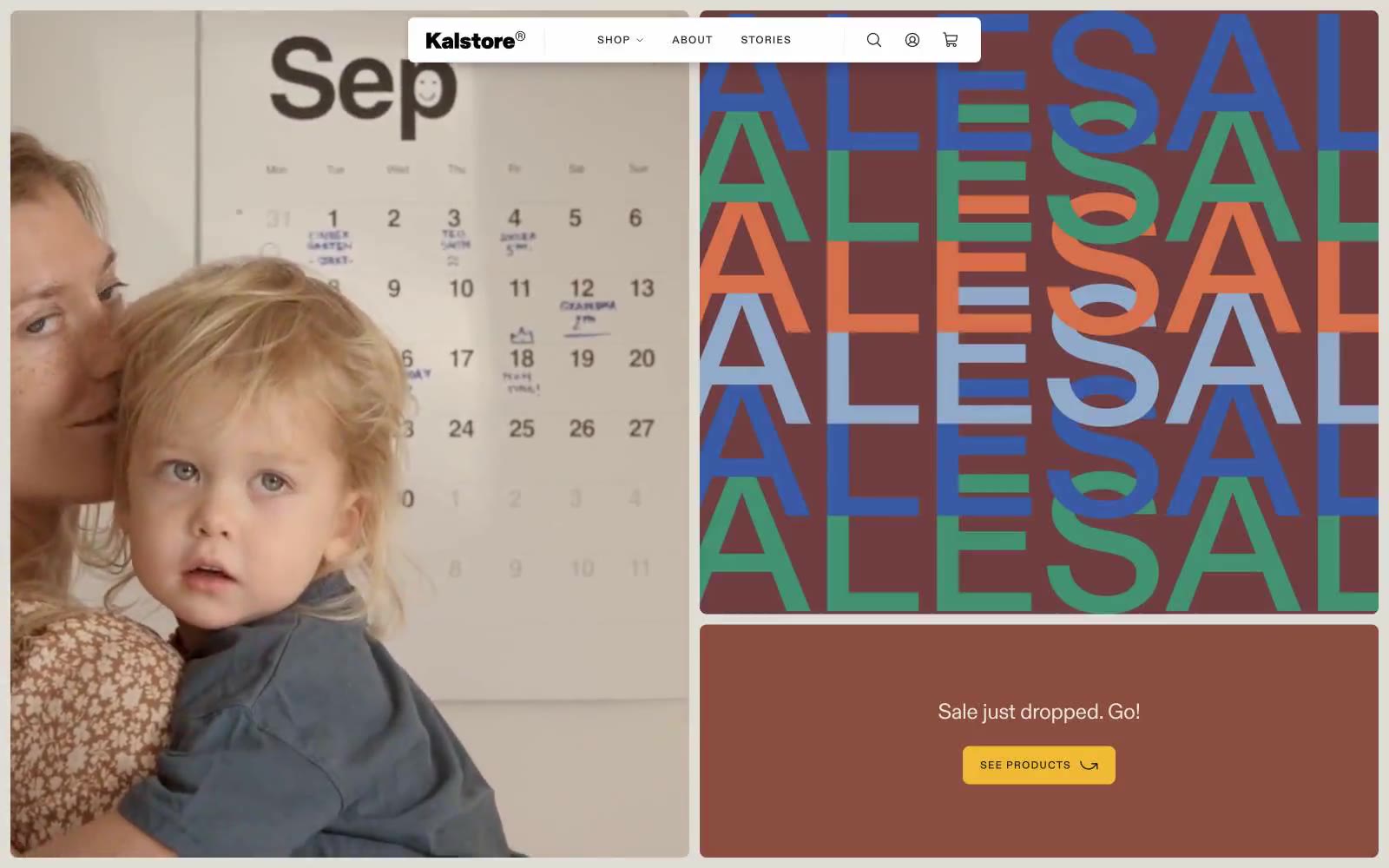
Kalstore®
Kalstore® — Style Reference
# Kalstore® — Style Reference
> Paper atelier on a quiet morning. The interface is warm off-white, sparsely set, and lets one mustard accent and oversized editorial type do the talking.
**Theme:** light
Kalstore is a paper atelier rendered as a quiet editorial spread: warm off-white canvas, sparse generous breathing room, large-scale lifestyle photography, and one warm mustard accent that interrupts the monochrome calm like a sticky note on a drafting table. Typography is the loudest element — a single editorial sans at multiple registers, from whisper-thin 19px body copy to 140px display treatments with aggressively tight tracking. Chromatic color appears almost entirely as editorial art (the ALESAL typographic block uses a palette of terracotta, sage, cobalt, and rust) rather than functional UI, keeping the interface itself disciplined. Components are small, flat, and almost unstyled — thin hairline borders, 8px corners, 6px button padding, barely-there shadows. The overall feel is less e-commerce and more independent magazine.
## Tokens — Colors
| Name | Value | Token | Role |
|------|-------|-------|------|
| Paper White | `#faf9f7` | `--color-paper-white` | Page canvas — warm off-white that mimics uncoated paper stock; the default surface behind everything |
| Ink | `#242424` | `--color-ink` | Primary text, icon strokes, and dominant border color. Slightly softened from pure black to sit comfortably on the warm canvas |
| Felt Gray | `#d3d3d3` | `--color-felt-gray` | Hairline dividers, card borders, list separators — the structural neutral that holds the layout together without drawing attention |
| Linen | `#edecea` | `--color-linen` | Subtle surface elevation for nav backgrounds and hover states; slightly cooler than Paper White to create depth without contrast |
Websites
Markdown Text
design-md
website-prompt
landing-page-prompt
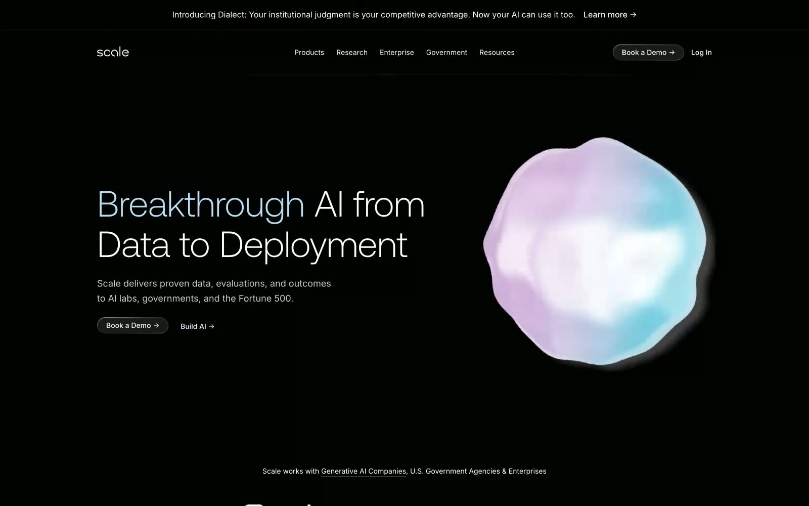
Scale
Scale — Style Reference
# Scale — Style Reference
> Holographic signal in a blackout room — a single iridescent paper plane against total darkness
**Theme:** dark
Scale operates in a near-total darkness — pure black canvas with white type and almost no chromatic noise. The signature is restraint: a custom display face at weight 300 instead of the expected 700, turning enterprise AI copy into something that reads like editorial typography. Hero imagery is the only place color lives, expressed as holographic iridescent gradients (pinks dissolving into blues into violet) on hard-edged paper-plane geometry. Components are flat and pill-shaped, with hairline borders and no shadows. The page breathes through vertical whitespace and centered stacks, not through cards or dense grids. There is one button shape (pill), one text style (white), one accent (iridescent gradient) — and the system is built around saying almost nothing visually and meaning it.
## Tokens — Colors
| Name | Value | Token | Role |
|------|-------|-------|------|
| Void | `#000000` | `--color-void` | Page background, section backgrounds — the dominant canvas; everything else floats on this |
| Bone | `#ffffff` | `--color-bone` | Primary headings, body text, nav items, icon strokes, button labels |
| Ash | `#a1a1a1` | `--color-ash` | Muted secondary text, inactive nav, subdued labels, hairline borders on dark |
| Frost | `#e5e5e5` | `--color-frost` | Icon strokes, subtle dividers, light foreground accents |
Websites
Markdown Text
design-md
website-prompt
landing-page-prompt
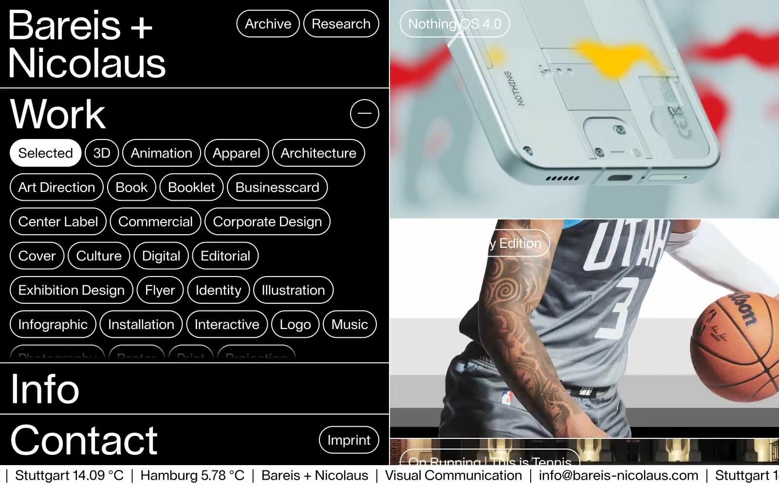
Bareis + Nicolaus
Bareis + Nicolaus — Style Reference
# Bareis + Nicolaus — Style Reference
> White chalk on black slate. A typographic control panel and a full-bleed visual index share one strict monochrome stage, with pill-shaped outlines as the only punctuation.
**Theme:** dark
Bareis + Nicolaus operates as a monochrome editorial grid: pitch-black canvas, bone-white outlines, and a single typeface carrying the entire voice. The interface is a split workspace — a typographic control column on the left filters and indexes, a full-bleed visual index on the right showcases the work. Every interactive element is a pill: 120px radius, 1px white stroke, no fill, no shadow, no hover fill — the geometry does the work. Typography is the protagonist: 72px display at weight 400 with a 1.0 line-height gives headlines architectural presence without weight, while 24px body text reads as quiet annotation. The system refuses decoration — no gradients, no brand color, no elevation, no rounded cards — and that absence is the identity. Every element earns its pixel by being typographic, structural, or navigational.
## Tokens — Colors
| Name | Value | Token | Role |
|------|-------|-------|------|
| Obsidian | `#000000` | `--color-obsidian` | Page background, card surface, filled button fill — the flat black ground that all white typography and outlines sit on |
| Bone | `#ffffff` | `--color-bone` | Primary text, pill button borders, link text, section dividers, card hover overlays — every outlined and typographic element |
| Ash | `#a9a9a9` | `--color-ash` | Muted borders and secondary structural strokes where pure white would compete with primary controls |
Websites
Markdown Text
design-md
website-prompt
landing-page-prompt
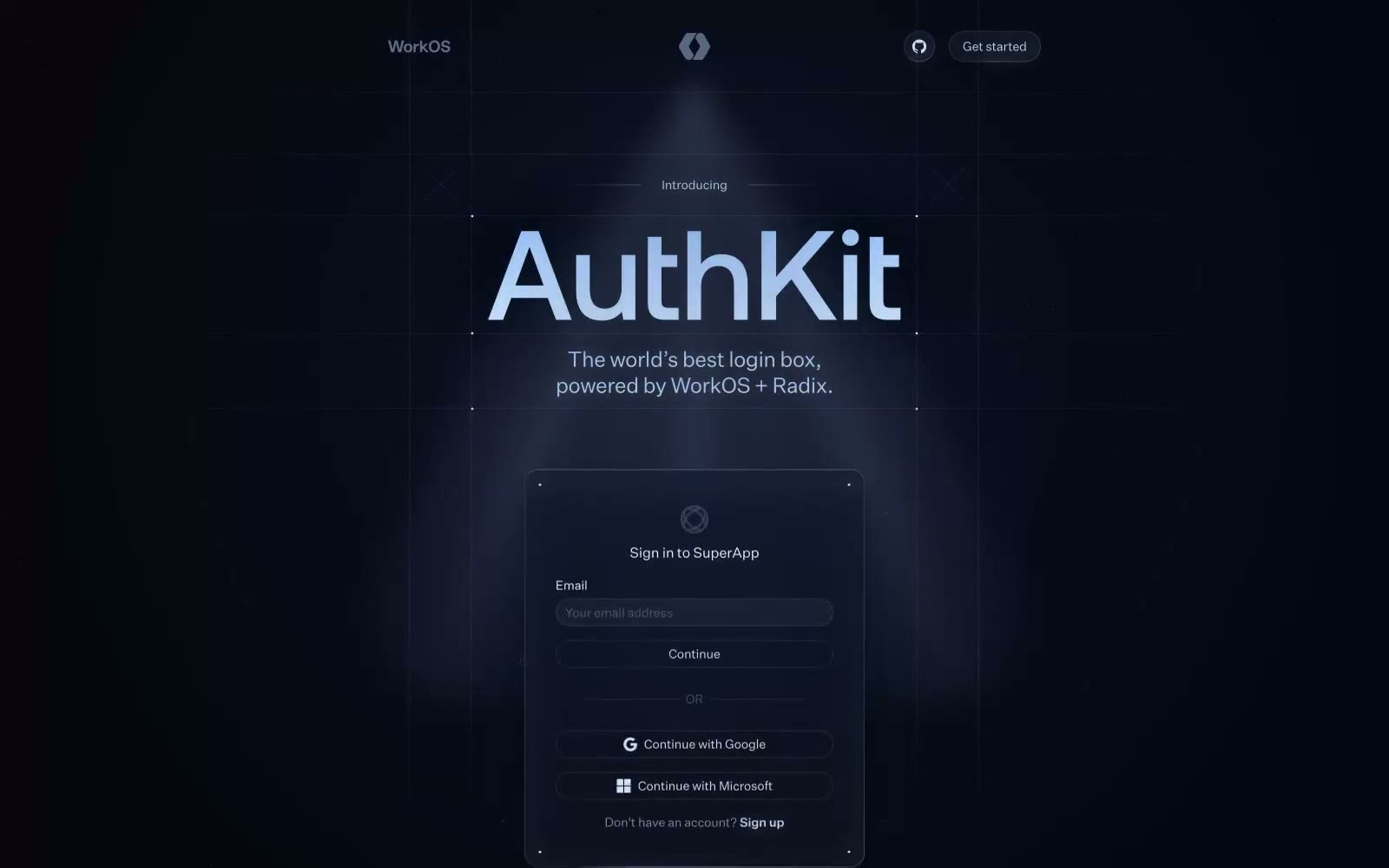
Authkit
Authkit — Style Reference
# Authkit — Style Reference
> blueprint on midnight glass
**Theme:** dark
AuthKit operates in a midnight blueprint language: near-black canvas, cool blue-gray typography, and a single electric iris purple that marks the only thing you can press. Surfaces are matte and flat — no glossy gradients, no heavy drop shadows — instead, a constellation of soft blue glows (rgba(186, 207, 247, 0.32)) and hairline 1px inset strokes suggest an interface drawn in light on dark paper. Typography is restrained and confident: a geometric workhorse (Untitled Sans) handles everything from 12px captions to 24px section titles, while a wider display face (aeonikPro) introduces hero and section headlines. Almost all decorative color lives in the shadows themselves, not in fills — the result reads as technical, precise, and quietly luminous rather than colorful.
## Tokens — Colors
| Name | Value | Token | Role |
|------|-------|-------|------|
| Midnight Ink | `#05060f` | `--color-midnight-ink` | Page canvas and primary surface — the near-black ground everything else is drawn onto. Slight cool tint keeps it from feeling truly black, giving a blueprint-paper quality |
| Graphite Plate | `#2f343e` | `--color-graphite-plate` | Elevated card and panel surface — one step above canvas, used for previewed UI mockups and form containers. Matte, never glossy |
| Steel Border | `#3f4959` | `--color-steel-border` | Hairline borders, dividers, and muted structural lines between UI elements |
| Fog | `#81899b` | `--color-fog` | De-emphasized helper text and secondary metadata that should recede behind primary content |
Websites
Markdown Text
design-md
website-prompt
landing-page-prompt
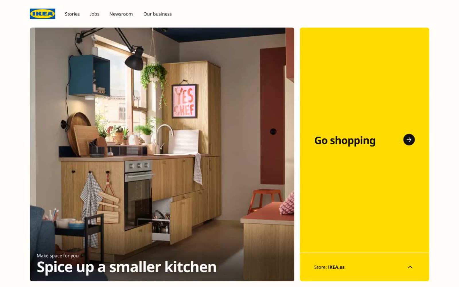
IKEA
IKEA — Style Reference
# IKEA — Style Reference
> sunlit Swedish flat-pack showroom
**Theme:** light
IKEA's interface reads as a high-contrast editorial spread: near-black type on warm white, punctuated by flat yellow panels that function as built-in call-to-action zones. The system is deliberately sparse — one custom sans-serif (Noto IKEA) at just two weights (400 and 700), one 8px corner radius across every component, zero shadows, no gradients. The tightness is structural, not minimalism-as-trend: the negative letter-spacing (-0.029em at display, -0.027em at body) makes even 13px captions feel architectural. Cards are large and media-led, arranged in generous two-column blocks with gradient-to-black text overlays for legibility. The yellow #ffdb00 does all the interface work — it never decorates, it only activates.
## Tokens — Colors
| Name | Value | Token | Role |
|------|-------|-------|------|
| IKEA Yellow | `#ffdb00` | `--color-ikea-yellow` | Primary CTA fills, featured card backgrounds, hero accent panels, the singular chromatic workhorse of the system |
| Ink Black | `#111111` | `--color-ink-black` | Primary text, body copy, headings, dominant borders (851 occurrences), icon strokes |
| Pure White | `#ffffff` | `--color-pure-white` | Page background, card surfaces, nav background, button text on dark fills |
| Warm White | `#fffefb` | `--color-warm-white` | Slightly off-white surface variant for buttons and cards — barely warmer than pure white, breaks digital coldness |
Websites
Markdown Text
design-md
website-prompt
landing-page-prompt
Visitors
Visitors — Style Reference
# Visitors — Style Reference
> frosted glass observatory at dawn — a periwinkle beacon rises over a white marble dashboard.
**Theme:** light
Visitors is a light, violet-accented analytics product that reads like a glass-walled observatory: bright white canvas, hairline borders, pill-shaped navigation, and one confident periwinkle action color that makes every interactive surface feel switched on. Typography stays in a single humanist sans (OpenRunde) with aggressively tightened tracking at every size, so headlines feel architectural rather than airy. Components are flat and compact — borders do the work that shadows usually would, corners are soft (8–24px), and gradient washes (blue-to-violet) appear only as atmospheric backgrounds behind floating product previews. Color is used sparingly and semantically: violet for primary action, green/yellow/pink/blue for data and icon variety, and near-black (#181925) for all meaningful text.
## Tokens — Colors
| Name | Value | Token | Role |
|------|-------|-------|------|
| Periwinkle Beam | `linear-gradient(to right in oklab, rgb(44, 120, 252) 0%, rgb(145, 141, 246) 100%)` | `--color-periwinkle-beam` | Primary action background, active nav fills, brand icon strokes, decorative icon accents — the single chromatic action color across the system; Atmospheric section background transitioning from cobalt blue to periwinkle |
| Iris Dusk | `#9580ff` | `--color-iris-dusk` | Secondary violet variant for hover states and secondary action surfaces |
| Lavender Mist | `#dad9fc` | `--color-lavender-mist` | Soft tint for gentle background washes, subtle borders, and muted violet surfaces |
| Midnight Ink | `#181925` | `--color-midnight-ink` | Primary text, heading color, dark surface fill, high-contrast borders — the near-black that carries the entire information hierarchy |
Websites
Markdown Text
design-md
website-prompt
landing-page-prompt
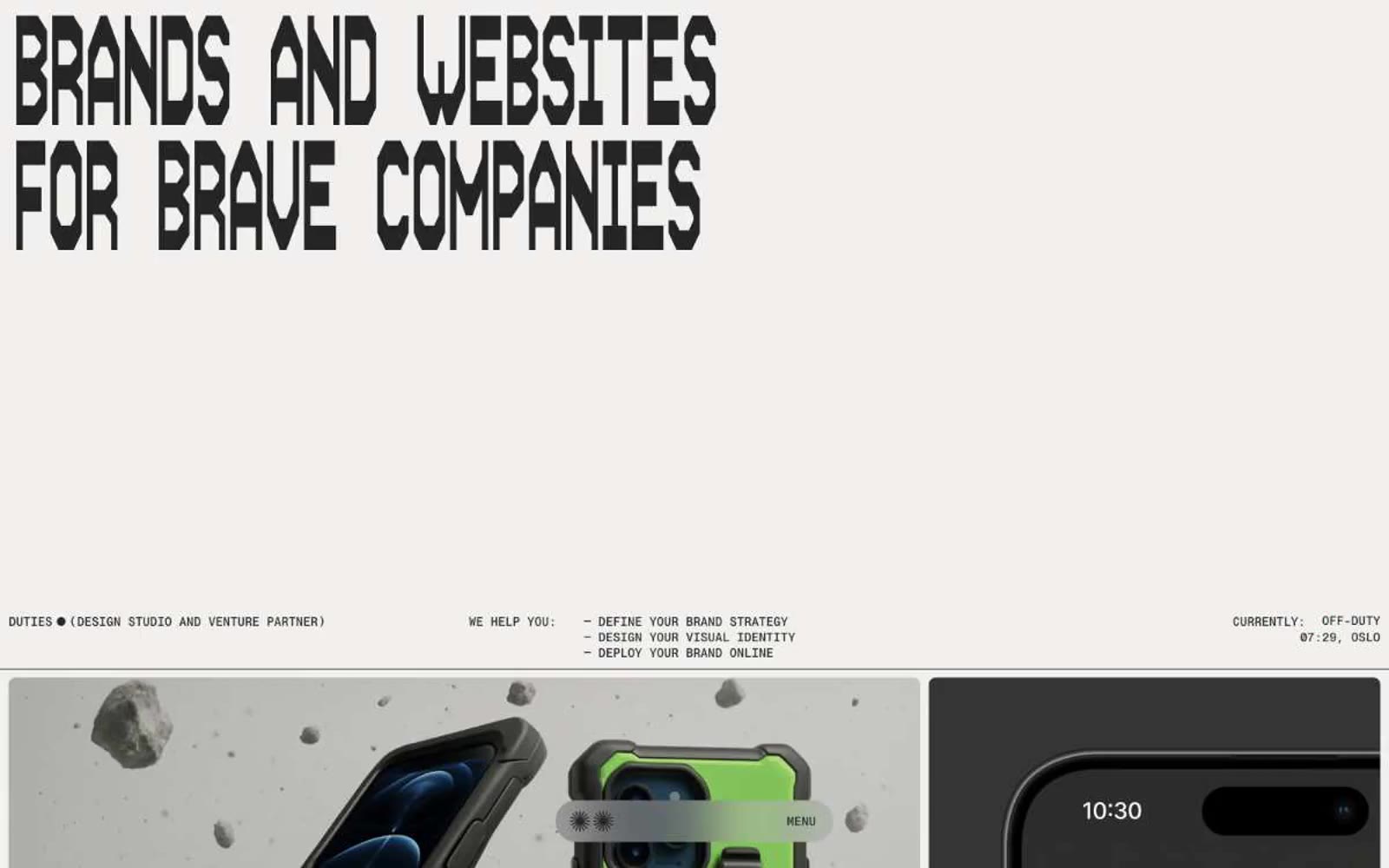
Duties.xyz
Duties.xyz — Style Reference
# Duties.xyz — Style Reference
> Monochrome broadside manifesto — a cream-paper zine where the only ink is black and the only type that matters is shouting.
**Theme:** light
Duties.xyz operates as a monochrome editorial broadsheet for an Oslo design studio and venture partner. A warm cream canvas (#f1f0ee) carries massive condensed display type — AS Therma Bold Condensed at 96-180px with negative tracking — that dominates the viewport like protest typography shouting \"BRANDS AND WEBSITES FOR BRAVE COMPANIES\". The palette is deliberately limited to pure black, warm off-white, and a single dark charcoal; there is no accent color, no decoration, no color punctuation of any kind. All interface rhythm comes from typographic scale, generous breathing room, and tight 8px-radius cards holding large project photography in full-bleed grids. The micro-typography uses a custom monospace (PP Neue Montreal Mono) with stylistic sets enabled (ss04, ss07, ss08, dlig, case, zero) for labels, metadata, and nav — a technical editorial voice paired with the screaming display type. The result is confident, restrained, brutally simple, and unmistakably a design studio's portfolio.
## Tokens — Colors
| Name | Value | Token | Role |
|------|-------|-------|------|
| Cream Paper | `#f1f0ee` | `--color-cream-paper` | Page canvas and large surface fills; warm off-white sets the editorial paper tone |
| Pure Ink | `#000000` | `--color-pure-ink` | Primary text, nav links, icon strokes, footer metadata, logo marks — maximum contrast against cream |
| Charcoal Press | `#252525` | `--color-charcoal-press` | Supporting neutral for secondary UI, dividers, and muted labels. Do not promote it to the primary CTA color |
| Bone Gray | `#dbdad9` | `--color-bone-gray` | Quiet divider tone, subtle background blocks, low-emphasis surfaces — barely visible, only there for separation |
Websites
Markdown Text
design-md
website-prompt
landing-page-prompt
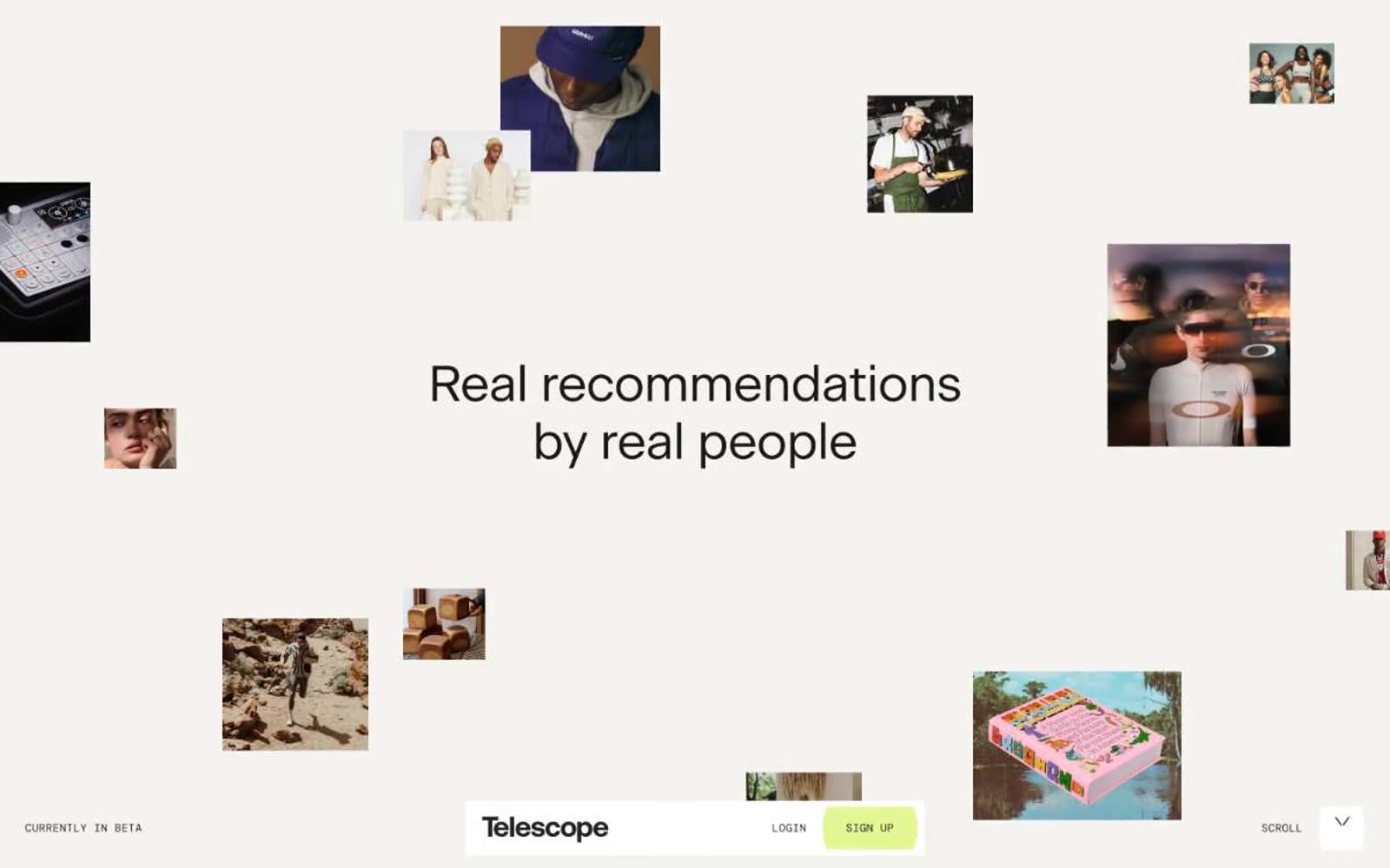
Telescope
Telescope — Style Reference
# Telescope — Style Reference
> Editorial pasteboard on cream paper. A warm bone-white canvas with full-bleed magazine photography, one bright lime accent, and serif headlines that lay out around the images like an art director's spread.
**Theme:** light
Telescope reads as an editorial fashion magazine printed on warm cream paper: a nearly monochrome world of bone-white canvas, warm near-black type, and full-bleed editorial photography, punctuated by a single vivid lime accent that signals the only interactive surface. The UI is stripped to the bone — no cards, no panels, no decorative chrome — with a fixed bottom bar in mono caps doing all the navigation work and photos floating freely into the headline as if laid out on a pasteboard. Typography does the heavy lifting: a quiet custom serif at generous sizes with tight negative tracking whispers rather than shouts, while the mono labels at 12px are the only typographic texture outside the serif system. Everything is sharp at 2px corners, spacing is generous, and the lime green is rationed — one button, nothing else.
## Tokens — Colors
| Name | Value | Token | Role |
|------|-------|-------|------|
| Bone Paper | `#f4f3f0` | `--color-bone-paper` | Page canvas — the warm off-white that reads as paper stock, not screen white. Everything sits on this surface |
| Ink | `#1a1915` | `--color-ink` | Primary text, body copy, headings, borders, and hairline rules. A warm near-black, never pure #000, so the contrast against Bone Paper feels printed rather than digital |
| Ash | `#82868e` | `--color-ash` | Secondary text, meta labels, and subtle borders. The cool counterpoint to Ink's warmth — used when type needs to recede without losing legibility |
| Pure White | `#ffffff` | `--color-pure-white` | Surface layer above Bone Paper for inline cards and the bottom navigation bar. Rare — most surfaces stay on Bone |
Websites
Markdown Text
design-md
website-prompt
landing-page-prompt
Surface
Surface — Style Reference
# Surface — Style Reference
> editorial gallery on bone linen — a single 230px word anchors scattered photography against pure off-white, with everything else reduced to a whisper of black type.
**Theme:** light
Surface is a print-publication-shaped digital editorial: a bone-white canvas (#f7f7f7) where almost everything is black type, with the layout itself acting as the brand. The visual system is radical in its restraint — no accent color, no borders, no shadows, no gradients, no rounded corners. Instead, personality comes from the type scale (a 230px display weight) and from deliberately placed editorial photography that breaks the grid at angles. Navigation is reduced to a monogram, a wordmark, and a hamburger. Content sections breathe with wide left margins and generous vertical padding, reading like a magazine spread rather than a web product. An AI agent should treat this as a 'design system of absence' — every added element must earn its place against the white field.
## Tokens — Colors
| Name | Value | Token | Role |
|------|-------|-------|------|
| Bone | `#f7f7f7` | `--color-bone` | Page canvas, card surfaces, section backgrounds — the only non-black color in the system |
| Pressed Ink | `#000000` | `--color-pressed-ink` | All text, all borders, all icons, all link states, nav strokes, heading rules — the entire interface communicates in pure black against Bone |
## Tokens — Typography
Websites
Markdown Text
design-md
website-prompt
landing-page-prompt
Relief
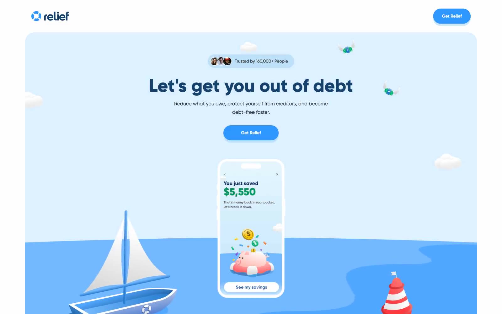
Relief — Style Reference
# Relief — Style Reference
> Cream-paper harbor under flat sky-blue
**Theme:** light
Relief uses a warm nautical-sky language: a cream canvas (#f9f7f0) replaces the default stark white, and a single vivid sky blue (#2e96ff) carries every interactive moment. Information architecture flips the usual light-card-on-white pattern — deep navy (#134f26f) feature and testimonial cards sit on cream like buoys on sand, creating bold visual blocks. The headline font Gilroy runs at tight -0.018em tracking across every size, giving text a compact, rounded confidence. Buttons earn their weight not from gradients or glow, but from a chunky 7px solid blue drop-shadow that makes the sky-blue fill appear to physically lift off the page.
## Tokens — Colors
| Name | Value | Token | Role |
|------|-------|-------|------|
| Warm Cream | `#f9f7f0` | `--color-warm-cream` | Page canvas — the entire site rests on this off-white, never pure #ffffff. Removes clinical SaaS sterility; reads as approachable, paper-like |
| Snow | `#ffffff` | `--color-snow` | Elevated card surfaces, input fields, and light-bordered elements |
| Ink | `#333333` | `--color-ink` | Primary body and UI text — the dominant neutral for readable copy across cards, paragraphs, and labels |
| Charcoal | `#212121` | `--color-charcoal` | Heavier text instances, emphasis copy |
Websites
Markdown Text
design-md
website-prompt
landing-page-prompt
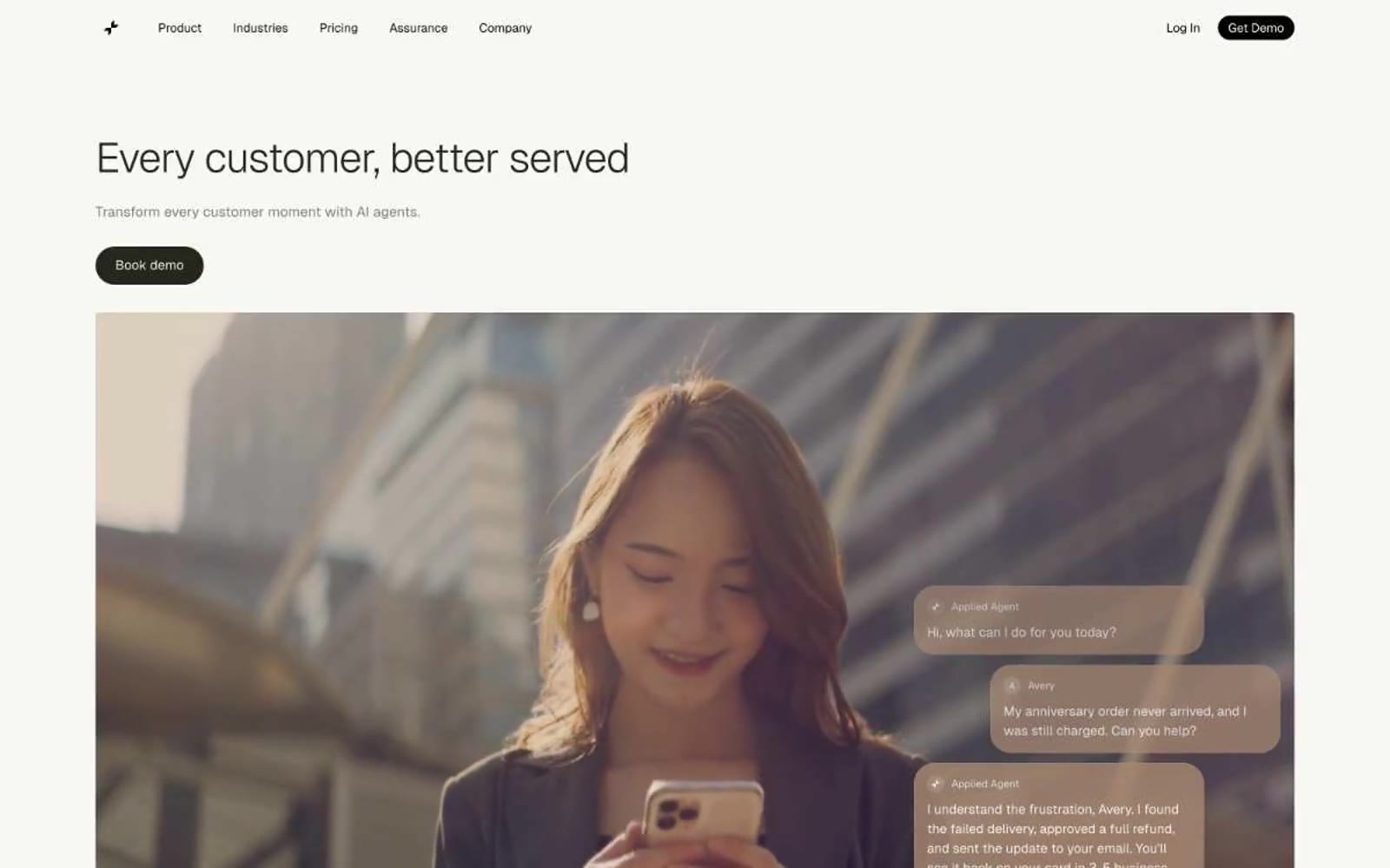
Applied Labs
Applied Labs — Style Reference
# Applied Labs — Style Reference
> Sunlit cream paper with cobalt punctuation and floating conversation cards
**Theme:** light
Applied Labs reads like a warm, sunlit editorial spread: cream paper backgrounds, near-black ink type, and a single vivid cobalt blue used as quiet punctuation rather than a shout. The visual signature is the contrast between photographic warmth (real people in real light, not illustrations or 3D renders) and restrained, typographically-driven UI chrome. Conversation fragments — translucent chat bubbles, message exchanges, agent replies — float as a design motif across hero and feature sections, making the product's nature legible without explaining it. Dark filled buttons (espresso-black) are the only hard shapes against the otherwise soft, hairline-divided surface stack; the entire system feels like reading a thoughtful magazine rather than scrolling a product page.
## Tokens — Colors
| Name | Value | Token | Role |
|------|-------|-------|------|
| White | `#ffffff` | `--color-white` | Page canvas, base card surface, nav background |
| Cream | `#f7f7f4` | `--color-cream` | Warm off-white section background, soft card fill — the secondary surface layer that gives the page its paper-like warmth |
| Fog | `#f5f5f5` | `--color-fog` | Elevated card surfaces and subtle section bands |
| Ash | `#e4e4e7` | `--color-ash` | Hairline borders, dividers, input underlines — the structural skeleton of the layout |
Websites
Markdown Text
design-md
website-prompt
landing-page-prompt
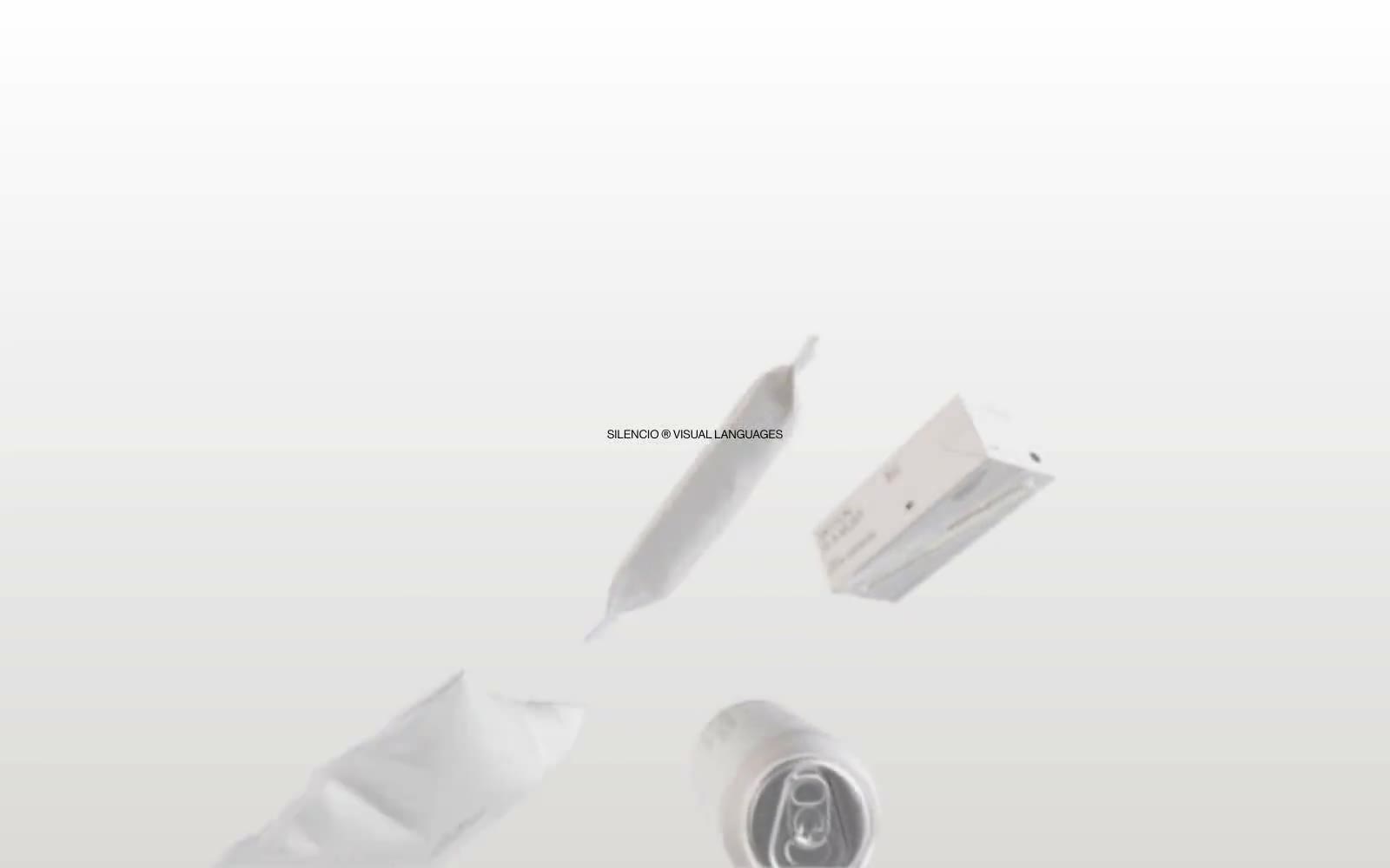
Silencio
Silencio — Style Reference
# Silencio — Style Reference
> white room with floating artifacts. A warm-paper gallery vitrine where every element earns its space against negative volume, and silence is a deliberate design material.
**Theme:** light
Silencio operates as a visual silence — a monochrome gallery where objects float on warm paper-white and typography does nearly all the talking. The system strips away every non-essential: no chromatic accents, no shadows, no decorative geometry; instead it relies on extreme type contrast (141px display whispers next to 9px metadata) and one warm gray (#dbdad9) as the only departure from pure black-on-white. Surfaces are paper-flat, separated by hairline rules and small radius (7.2px) rather than elevation. The brand voice reads like museum wall text: centered, brief, slightly italicized by silence, with monospaced labels (PT Mono, 11px) used as quiet signatures next to a custom Haas grotesque. Components feel like printed catalog pages more than web UI — buttons are full pill shapes (129.6px), cards have a single rounded corner, and the whole composition breathes with the confidence of a room with nothing on its walls.
## Tokens — Colors
| Name | Value | Token | Role |
|------|-------|-------|------|
| Ink Black | `#000000` | `--color-ink-black` | Primary text, iconography, hairline rules, table borders — the only high-contrast element on the page |
| Paper Warm Gray | `#dbdad9` | `--color-paper-warm-gray` | Card surfaces, soft fills, the single chromatic departure from pure white, gentle gradient origin |
| Graphite Border | `#808080` | `--color-graphite-border` | Subtle table dividers and secondary rule lines — used when #000000 would feel too heavy |
| Bleach White | `#ffffff` | `--color-bleach-white` | Supporting palette color for small decorative accents when the core palette needs contrast. |