AI Prompt Studio - Intelligent Prompt Library
Explore and use professional AI prompts to optimize your workflow.
One-click Use
Websites
Markdown Text
design-md
website-prompt
landing-page-prompt
Oevra
Oevra — Style Reference

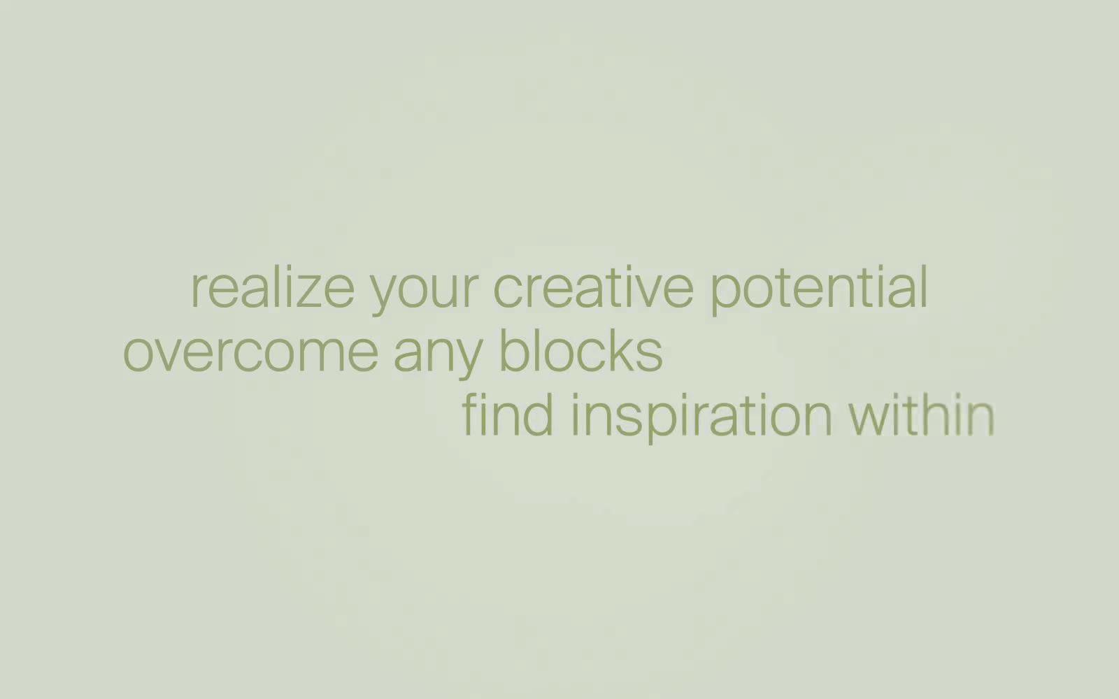
# Oevra — Style Reference
> sage greenhouse at dawn
**Theme:** light
Oevra speaks in a single quiet voice: sage green on white, whispered through enormous light-weight headlines. The chromatic palette is ruthlessly restrained — one muted olive (#778643) does all the talking across text, borders, and the occasional button, while every surface stays a white canvas washed with a soft sage radial gradient. Typography is the show: Suisse Int'l at 300-weight blows up to 90px display sizes that read like a meditation, paired with a 14–15px body in Space Grotesk. Components feel like artifacts in a greenhouse — rounded 15px corners, hairline 1px borders, no shadows, no fills, no decoration. The result is less an interface and more a slow walk through a plant nursery at dawn.
## Tokens — Colors
| Name | Value | Token | Role |
|------|-------|-------|------|
| Eucalyptus | `radial-gradient(ellipse at 50% 50%, rgba(119,134,67,0.35) 0%, rgba(119,134,67,0.08) 50%, #ffffff 100%)` | `--color-eucalyptus` | Headline accents, body text emphasis, hairline borders, single filled CTA — the only chromatic voice in the entire system. Muted enough to never shout, present enough to carry the brand; Full-bleed background gradient behind hero and section text. The green is a breath, not a wall — it fades to white at the edges so text remains the focus |
| Ink Black | `#000000` | `--color-ink-black` | Primary text, dividers, image borders, icon strokes. Used at 1px hairline weight almost exclusively — never as a fill |
| Pure Canvas | `#ffffff` | `--color-pure-canvas` | Page background, card surfaces, button text on filled green CTAs. The dominant surface color across the entire site |
| Graphite | `#4e4e4e` | `--color-graphite` | Secondary body text, muted link borders, helper copy, footer text. Quieter than black but still AA-readable on white |
Websites
Markdown Text
design-md
website-prompt
landing-page-prompt
Simone Sniekers
Simone Sniekers — Style Reference
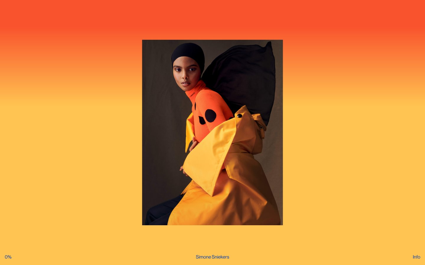
# Simone Sniekers — Style Reference
> A single editorial photograph breathes behind whisper-thin black captions — the image does all the work, the UI almost disappears.
**Theme:** light
Simone Sniekers is a photography portfolio stripped to its essence: the photograph is the interface. The site uses a single full-bleed editorial image as the entire canvas, with a barely-there UI layer of three text elements — a progress counter bottom-left, a name credit bottom-center, and an 'Info' trigger bottom-right. Typography is unified to one size and one weight across every UI element, treating all chrome as equal-weight caption text. The color palette is almost entirely photographic: warm amber, vermillion, and ochre washes bleed from the imagery itself, while the UI overlay sticks to black on whatever the photo presents. No cards, no borders, no shadows, no gradients in the traditional sense — the image provides all visual richness.
## Tokens — Colors
| Name | Value | Token | Role |
|------|-------|-------|------|
| Obsidian | `#000000` | `--color-obsidian` | Dark borders and separators for elevated surfaces and inverted UI |
| Paper White | `#ffffff` | `--color-paper-white` | Inset text on dark photographic zones and button border accents |
| Warm Fog | `#bcbcbc` | `--color-warm-fog` | Dominant canvas wash — the neutral mid-tone the warm gradient settles into at its lower band |
| Bone | `#cccbbb` | `--color-bone` | Cool-warm neutral surface, secondary canvas tone between photography passages |
Websites
Markdown Text
design-md
website-prompt
landing-page-prompt
Paper
Paper — Style Reference
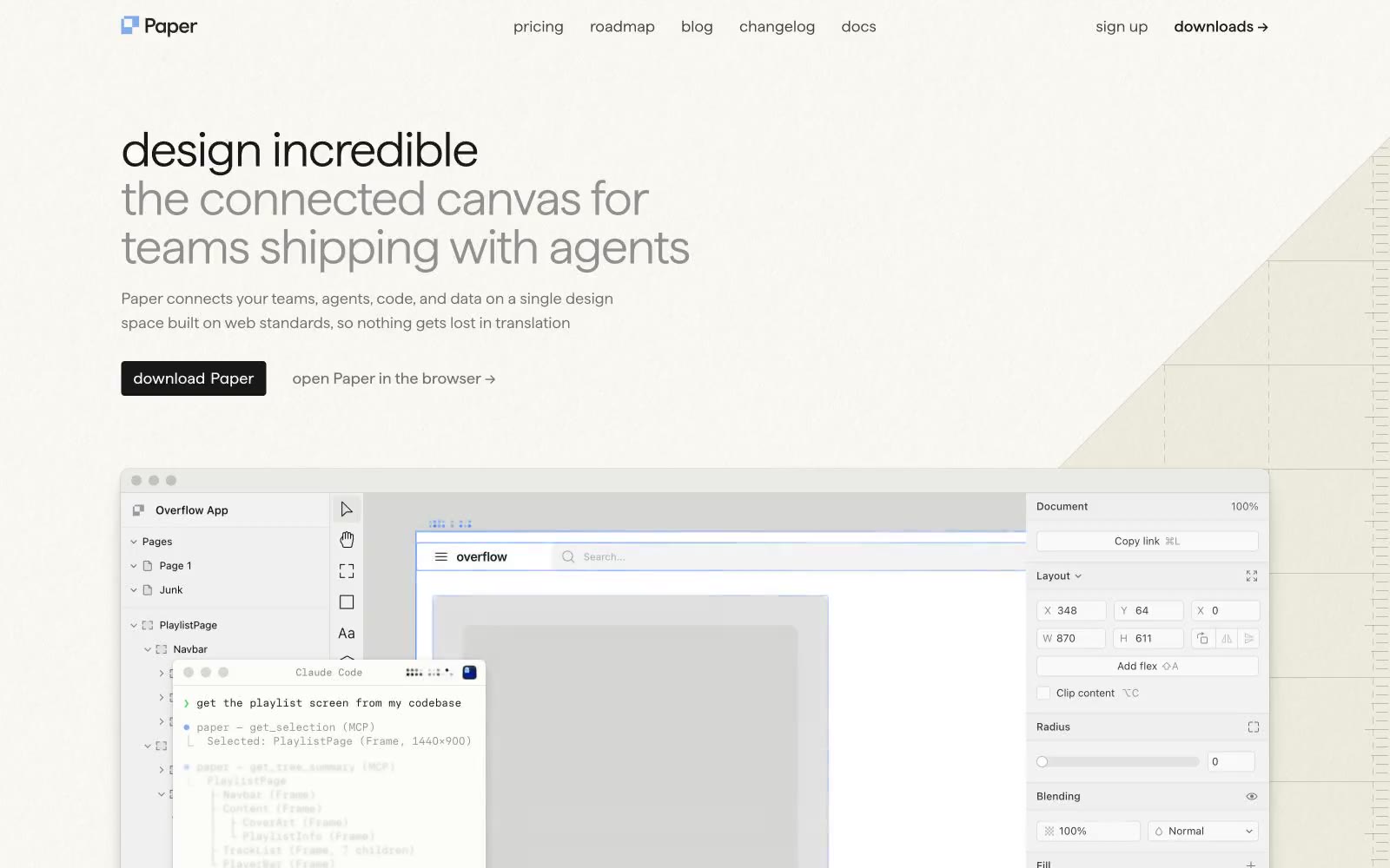
# Paper — Style Reference
> warm paper notebook under studio lights
**Theme:** light
Paper uses a warm-paper-studio language: a cream ivory canvas instead of white, calm monochrome typography in a custom display face, and a single cool blue accent that does almost no UI work. The two-tone headline (dark first line, mid-gray continuation) is the signature move — it treats the hero copy as a composition of weights rather than a single block. Surfaces sit flat on the page with one barely-there card shadow, borders are hairline, and the product feels like a printed notebook page under cool studio light. Most of the chromatic energy lives inside the product screenshot; the marketing surface around it stays restrained, near-achromatic, and grid-quiet.
## Tokens — Colors
| Name | Value | Token | Role |
|------|-------|-------|------|
| Bone Canvas | `#efefe4` | `--color-bone-canvas` | Page background — warm cream instead of white, the signature surface that makes the whole site feel like a notebook page |
| Paper White | `#fcfcf9` | `--color-paper-white` | Primary page canvas and white card surfaces. Do not promote it to the primary CTA color |
| Bright Card | `#ffffff` | `--color-bright-card` | Pure white card surface for highest elevation, code panels, product chrome |
| Mist | `#f3f3f4` | `--color-mist` | Subtle alternate band background, soft dividers in long pages |
Websites
Markdown Text
design-md
website-prompt
landing-page-prompt
Cowboy
Cowboy — Style Reference
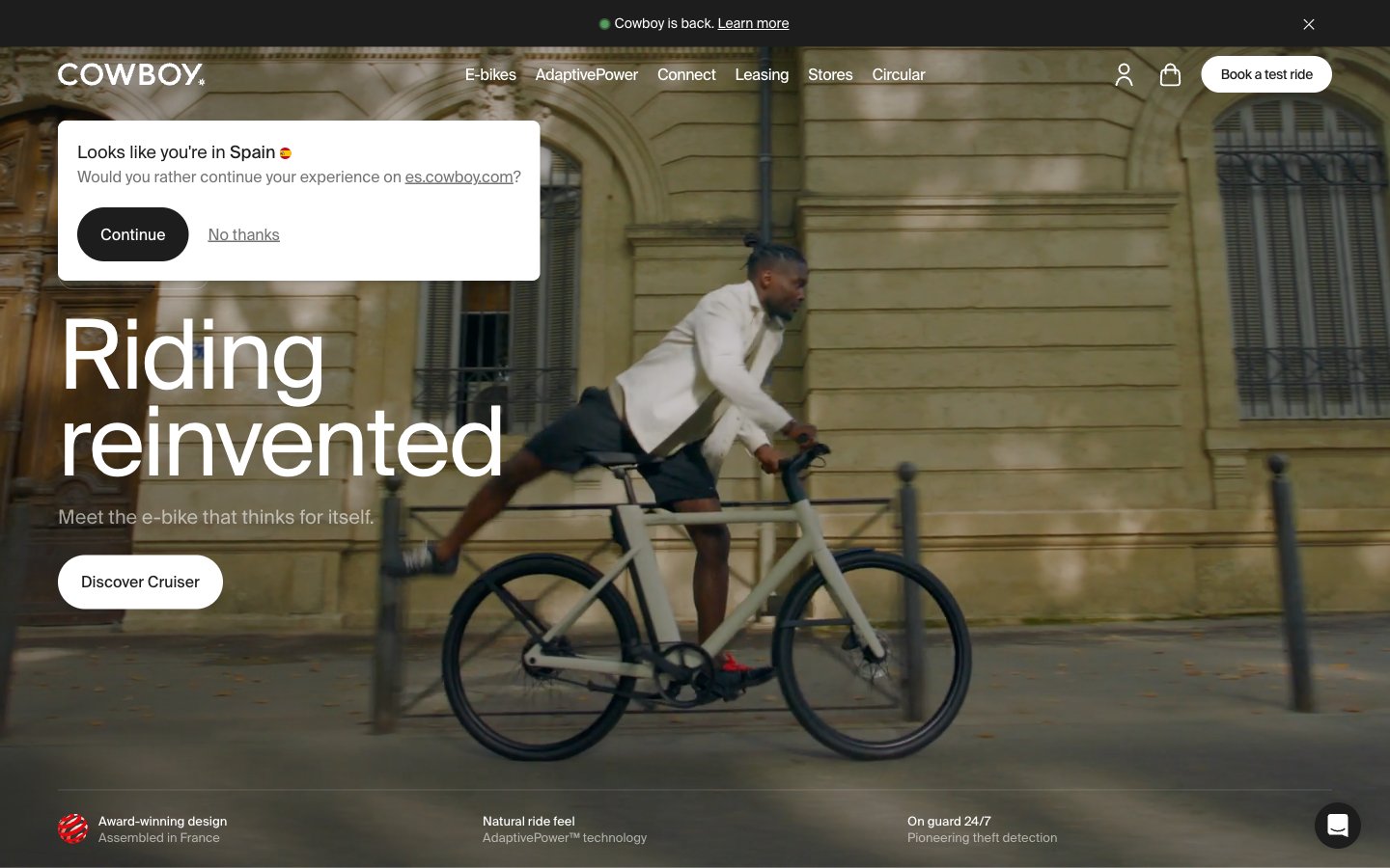
# Cowboy — Style Reference
> Belgian bicycle gallery in porcelain white. A showroom where matte surfaces, oversized editorial type, and near-zero decoration force the eye onto the machine and the message.
**Theme:** light
Cowboy's visual system is editorial restraint taken to its logical extreme: a near-monochrome canvas where the only chromatic signal comes from product photography and press logos. SuisseIntl at near-poster sizes (72–100px) with aggressive negative tracking gives every headline a magazine-cover gravity, while 8px radii and 9999px pill buttons keep the chrome physically quiet. Surfaces are white porcelain; structure is communicated through hairline #e5e7eb borders rather than shadows or filled panels. The interface is designed to disappear so the bicycle — and the word — can carry the room.
## Tokens — Colors
| Name | Value | Token | Role |
|------|-------|-------|------|
| Porcelain | `#ffffff` | `--color-porcelain` | Page canvas, card surfaces, button text on dark fills — the dominant neutral that lets photography carry all chromatic weight |
| Charcoal | `#1d1d1d` | `--color-charcoal` | Primary text, filled primary action buttons, active nav — a soft black that reads warm rather than digital |
| Hairline | `#e5e7eb` | `--color-hairline` | Dividers, card borders, input outlines, image frame edges — the structural skeleton of every section |
| Smoke | `#737373` | `--color-smoke` | Secondary body text, button borders, subtle metadata — a middle gray that recedes behind primary copy |
Websites
Markdown Text
design-md
website-prompt
landing-page-prompt
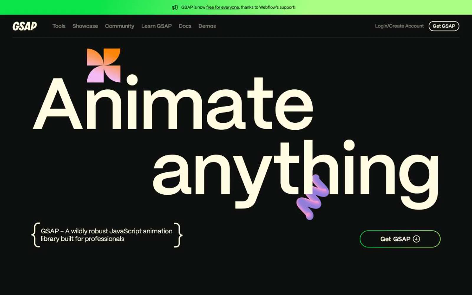
Gsap
Gsap — Style Reference
# Gsap — Style Reference
> neon playground in midnight void — dark canvas where every color glows
**Theme:** dark
GSAP operates as a neon playground floating in midnight void: near-black canvas, cream-white typography that glows against the dark, and a rainbow of vivid accent hues that feel electrically charged. The system uses a custom display face (Mori) at extreme sizes — from 14px body copy to 224px hero numerals — with tightly tracked letter-spacing that compresses at scale, giving headlines a sculpted, almost typographic-object quality. Color is the primary organizational device: each product tool or category claims its own accent (pink, orange, green, violet, blue, lime), expressed as colored headings, bracket-bracketed metadata tags, and gradient illustrations. Surfaces stay flat — no shadows, no elevation games — so the color does the heavy lifting. Components are rounded and pill-shaped, navigation is horizontally minimal, and copy uses a distinctive `{ bracketed }` syntax for section labels.
## Tokens — Colors
| Name | Value | Token | Role |
|------|-------|-------|------|
| Void Black | `#0e100f` | `--color-void-black` | Page canvas, card surfaces, primary background — the dark stage that makes all accent colors appear to emit light |
| Cream Glow | `#fffce1` | `--color-cream-glow` | Primary text, icon strokes, button borders, nav link colors — warm off-white reads softer than pure white against the near-black canvas and carries a slight luminosity |
| Olive Stone | `#42433d` | `--color-olive-stone` | Muted borders, secondary dividers, low-emphasis UI structure |
| Ash Gray | `#7c7c6f` | `--color-ash-gray` | Body metadata, icon fills at reduced weight, helper text — the desaturated middle ground that recedes from the cream foreground |
Websites
Markdown Text
design-md
website-prompt
landing-page-prompt
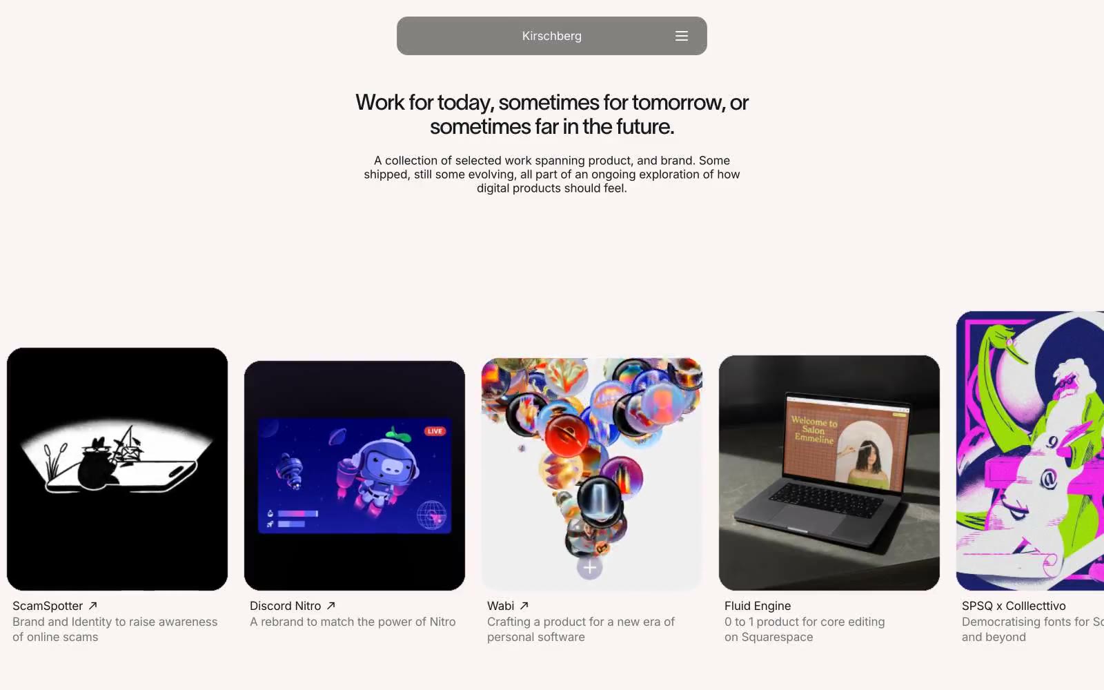
David Kirschberg
David Kirschberg — Style Reference
# David Kirschberg — Style Reference
> midnight gallery wall — a darkened room where spotlit work is the only color, and the frame around it is intentionally invisible.
**Theme:** dark
Kirschberg operates as a darkened exhibition space: a near-black canvas (#181818) with a single elevated surface (#262626) hosts colorful project work as the only chromatic event on screen. The interface is deliberately austere — Inter at weight 400 handles all text at 16-17px, while a custom display face (twkLausanne) appears at exactly 32px with aggressive -0.04em tracking for the sole headline. The signature structural shape is the 24px rounded card; there are no shadows, no gradients, and no interface accent color. The portfolio reads as a single horizontal-scroll row where the frame is engineered to disappear so the work is remembered.
## Tokens — Colors
| Name | Value | Token | Role |
|------|-------|-------|------|
| Obsidian | `#181818` | `--color-obsidian` | Page canvas, primary background — the dominant surface that recedes so work thumbnails advance |
| Graphite | `#262626` | `--color-graphite` | Elevated surface, card thumbnail backgrounds, and content containers that need to sit one level above the page |
| Bone | `#fafafa` | `--color-bone` | Primary text, hero headlines, card titles — near-white that reads as soft rather than clinical against the dark canvas |
| Ash | `#a3a3a3` | `--color-ash` | Muted secondary text, subtitles, card descriptions — one step quieter than primary text for hierarchy without color |
Websites
Markdown Text
design-md
website-prompt
landing-page-prompt
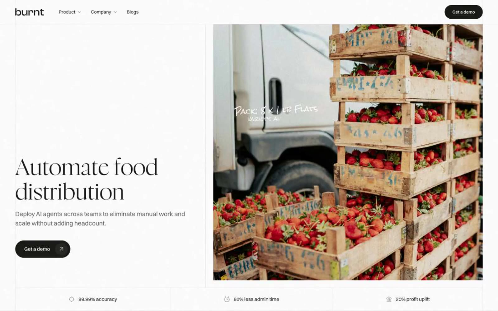
Getburnt
Getburnt — Style Reference
# Getburnt — Style Reference
> editorial monochrome on warm paper — a minimal typeset spread where warm-black ink, a light display serif, and pill-shaped controls turn a B2B tool into something that reads like a quarterly journal.
**Theme:** light
Getburnt operates in a near-achromatic editorial register: a warm near-black ink against white paper, with a single mid-gray for secondary text. The visual language borrows from print typography — a featherweight display serif carries headlines while a neutral grotesque handles everything operational, creating the rhythm of a magazine spread rather than a SaaS dashboard. Pill-shaped controls and small-radius cards keep the UI tactile and quick, and the deliberate absence of chromatic accents forces hierarchy through scale, weight, and whitespace alone. Product mockups float as photographic-style still lifes within warm grayscale containers, making the interface feel like a curated catalog rather than a software platform.
## Tokens — Colors
| Name | Value | Token | Role |
|------|-------|-------|------|
| Ink | `#1a1a17` | `--color-ink` | Primary text, filled buttons, dark surface backgrounds, heading strokes — a warm-tinted near-black that replaces pure #000 throughout the system |
| Paper | `#ffffff` | `--color-paper` | Page canvas, card surfaces, light section backgrounds, button borders on dark surfaces |
| Ash | `#5f5f5d` | `--color-ash` | Secondary body text, helper text, muted borders, low-emphasis UI metadata |
Websites
Markdown Text
design-md
website-prompt
landing-page-prompt
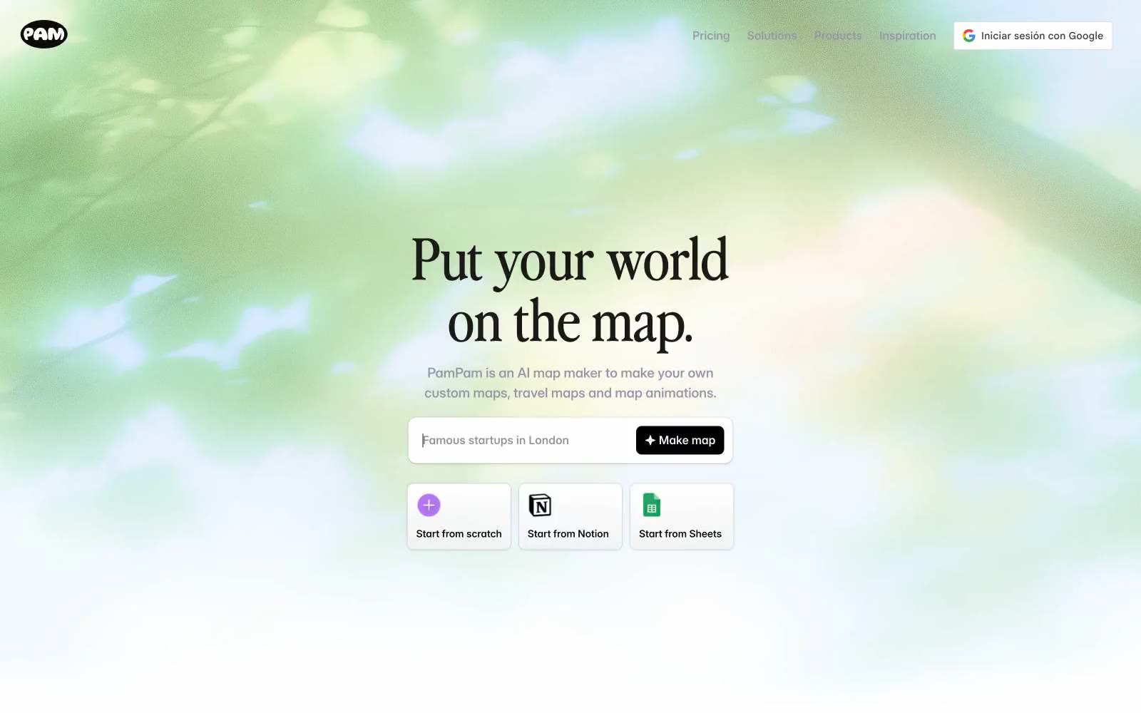
pampam.city
pampam.city — Style Reference
# pampam.city — Style Reference
> Old explorer's notebook on warm cream
**Theme:** light
PamPam reads as a warm editorial travel journal translated into a modern app: a soft parchment-cream canvas (#faf2ec) carries the interface, with a custom display serif ('Nineties') giving headlines a vintage-magazine voice against a clean, workhorse Inter body. The palette is nearly monochromatic, leaning on a single muted lavender-gray (#9894a8) for borders, links, and hairlines, and reserving one vivid periwinkle blue (#4b72f3) for the one action that must feel switched on. Surfaces stay flat and paper-like — white cards float on cream, never the other way around, and shadows are whisper-quiet so the maps and illustrations can do the emotional work. Components are compact and confident: pill-ish buttons with generous 16px radii, 12px-radius cards, and tight 12–16px internal padding. Color and weight, not elevation, carry hierarchy.
## Tokens — Colors
| Name | Value | Token | Role |
|------|-------|-------|------|
| Parchment Cream | `#faf2ec` | `--color-parchment-cream` | Page canvas — the warm, paper-like surface that everything sits on; cards and buttons float above it as white or charcoal |
| Warm Ink | `#1b1917` | `--color-warm-ink` | Primary text and headline color — a near-black with a brown undertone that harmonizes with the cream canvas instead of fighting it |
| Carbon | `#000000` | `--color-carbon` | Secondary text, icon strokes, and heavy dark surfaces (filled dark buttons, logo marks); used sparingly so Warm Ink remains the default reading color |
| Paper White | `#ffffff` | `--color-paper-white` | Card surfaces, input fields, and dark-on-light icon fills — the only true white in the system, reserved for elements that must lift off the cream |