AI Prompt Studio - Intelligent Prompt Library
Explore and use professional AI prompts to optimize your workflow.
One-click Use
Websites
Markdown Text
design-md
website-prompt
landing-page-prompt
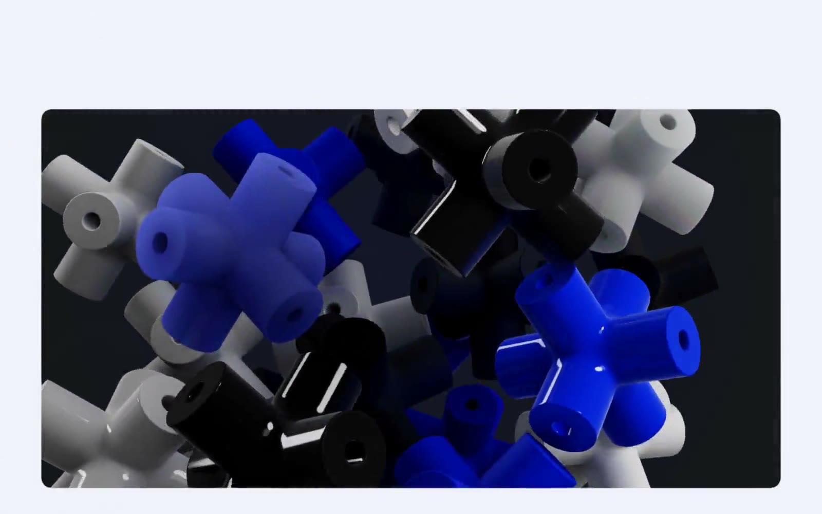
Lusion
Lusion — Style Reference

# Lusion — Style Reference
> 3D sculpture gallery on a frosted lavender plane. Every interface element should feel like a tactile object resting on a pale, slightly cool gallery floor, with the 3D content doing all the chromatic and dramatic work.
**Theme:** light
Lusion treats its website as a digital sculpture gallery rather than a typical agency portfolio. The entire chrome sits on a cold lavender-tinted off-white (#f0f1fa) that makes pure black Aeonik text feel etched into the canvas, while the 3D renders — vivid electric indigo crosses, polished metal, glass cylinders — supply every drop of chromatic energy. Pill-shaped components at 87–100px radius make the UI feel like physical objects placed on a gallery floor, never card stacks. Shadows are reduced to a 4% whisper; depth and drama come from the 3D content itself, not from UI elevation. Whitespace is generous, navigation is reduced to bare essentials, and the few text links are pure black with the same tight -0.02em tracking as body copy.
## Tokens — Colors
| Name | Value | Token | Role |
|------|-------|-------|------|
| Lavender Mist | `#f0f1fa` | `--color-lavender-mist` | Page canvas — the dominant background, a cool off-white with a barely-perceptible lavender cast that makes pure black text feel sharper than it would on pure white |
| Paper White | `#ffffff` | `--color-paper-white` | Elevated card and surface backgrounds, button text on dark fills, inverted surfaces |
| Ink | `#000000` | `--color-ink` | Primary text, all headings, body copy, icons, and link text — pure black with no softening |
| Graphite | `#2b2e3a` | `--color-graphite` | Supporting neutral for secondary UI, dividers, and muted labels. Do not promote it to the primary CTA color |
Websites
Markdown Text
design-md
website-prompt
landing-page-prompt
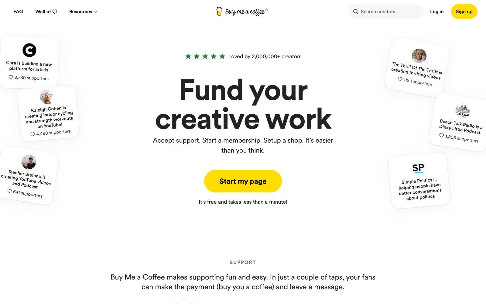
Buymeacoffee
Buymeacoffee — Style Reference
# Buymeacoffee — Style Reference
> Cream-paper café scrapbook with floating polaroid testimonials
**Theme:** light
Buy Me a Coffee operates on a warm, generous canvas — a cream paper background (#faf8f0) that softens the entire experience like sunlight through a café window. The interface is overwhelmingly monochromatic with black text at heroic sizes (96px display), reserving color for two highly intentional roles: a bright marigold yellow (#ffdd00) for creator-facing signup actions, and a burnt terracotta (#d8573f) for supporter-facing payment actions. Cards float with generous 24-40px radii and soft layered shadows that feel like paper resting on a table. The Circular font family gives everything a friendly, geometric warmth — bold weights carry massive headlines with tight tracking while lighter weights handle conversational body copy. The system breathes: wide margins, floating creator cards, pill-shaped buttons, and small-caps section labels that whisper rather than shout.
## Tokens — Colors
| Name | Value | Token | Role |
|------|-------|-------|------|
| Cream Paper | `#faf8f0` | `--color-cream-paper` | Page canvas, section backgrounds — the warm off-white ground that softens every interface layer and gives the whole product its café-on-paper atmosphere |
| Card White | `#ffffff` | `--color-card-white` | Card surfaces, modal backgrounds, raised panels — pure white floats above the cream canvas to create depth through luminance contrast rather than color |
| Hairline Gray | `#e5e7eb` | `--color-hairline-gray` | Borders, dividers, icon outlines, badge outlines — used at 1146+ occurrences as the universal hairline separator across cards, buttons, and inputs |
| Ink Black | `#000000` | `--color-ink-black` | Primary text, filled icon strokes, high-contrast UI elements — the dominant text and icon color across the entire product |
Websites
Markdown Text
design-md
website-prompt
landing-page-prompt
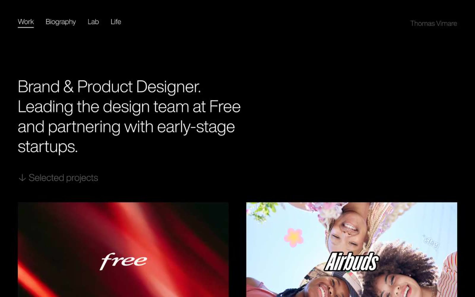
Thomas Vimare
Thomas Vimare — Style Reference
# Thomas Vimare — Style Reference
> midnight monochrome atelier — a designer's darkroom where white type and saturated photography are the only light
**Theme:** dark
thms.works is a monochrome dark-mode portfolio built on absolute restraint. The entire interface is three colors: a near-black canvas, white type, and one muted gray for secondary information. A single custom typeface — HelveticaNowDisplay-Light — carries every word on the site, with tight negative tracking that tightens further at display sizes. The layout is spacious and editorial: large left-aligned headlines, generous 120px section gaps, and a two-column project grid where full-bleed photography is the only chromatic content. There are no buttons, no shadows, no accent colors, no border radii — just type, image, and negative space doing all the work.
## Tokens — Colors
| Name | Value | Token | Role |
|------|-------|-------|------|
| Obsidian Canvas | `#171717` | `--color-obsidian-canvas` | Page background, all surface layers — the flat dark base every element sits on |
| Chalk | `#ffffff` | `--color-chalk` | Headlines, primary body text, active nav text, active nav underline border, project titles |
| Ash | `#9a9a9a` | `--color-ash` | Muted secondary text — project descriptions, section labels, inactive supporting copy |
Websites
Markdown Text
design-md
website-prompt
landing-page-prompt
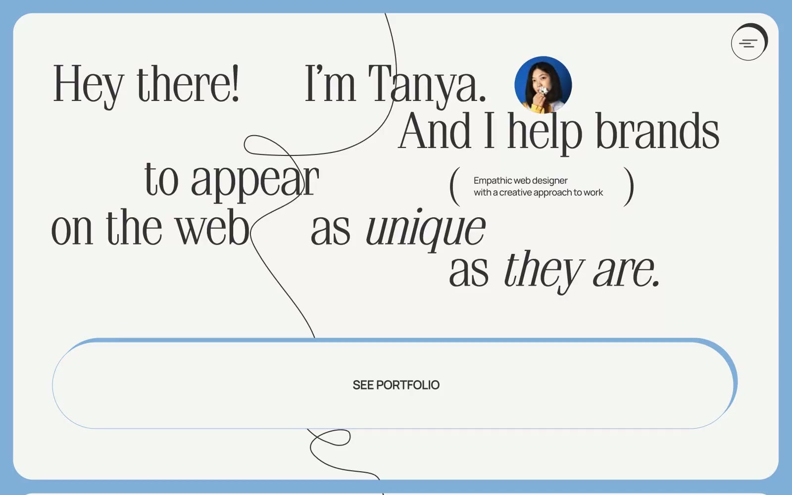
Dyotanya
Dyotanya — Style Reference
# Dyotanya — Style Reference
> Editorial sketchbook on warm paper — oversized serif confessions floating between hand-drawn squiggles
**Theme:** light
Dyotanya is an editorial sketchbook brought to life: a warm off-white paper canvas scattered with hand-drawn thin black lines, oversized serif headlines that mix roman and italic for emotional rhythm, and dusty blue accents that feel like risograph ink. The interface avoids conventional elevation in favor of offset hard-shadow borders (5px down-and-left solid #333333) that make every card and button feel pasted onto the page like a collage element. Typography does the heavy lifting — Simeiz serif at 80px whispers and shouts in the same paragraph, while Manrope handles everything functional at a much smaller scale. The single coral-orange link color and dusty-blue borders provide the only chromatic punctuation in an otherwise achromatic world.
## Tokens — Colors
| Name | Value | Token | Role |
|------|-------|-------|------|
| Warm Paper | `#f5f5f3` | `--color-warm-paper` | Page background, card surfaces, text on dark elements — the warm off-white that replaces pure white and gives the entire site its analog, paper-like quality |
| Ink Black | `#000000` | `--color-ink-black` | Primary text, hairline borders, decorative line illustrations, icon strokes — the dominant neutral that carries nearly all UI information |
| Charcoal | `#333333` | `--color-charcoal` | Offset hard-shadow borders on cards and buttons, secondary text, surface backgrounds for inverted elements |
| Pure White | `#ffffff` | `--color-pure-white` | Elevated card surfaces, button text on dark fills, subtle highlights |
Websites
Markdown Text
design-md
website-prompt
landing-page-prompt
Qatchup
Qatchup — Style Reference
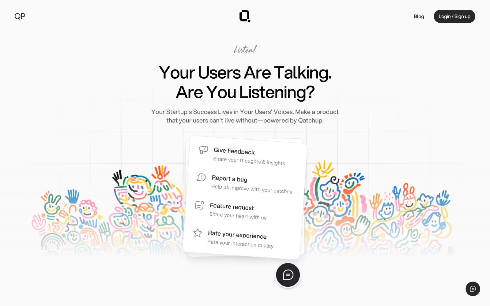
# Qatchup — Style Reference
> Ink on warm paper, whispered quietly.
**Theme:** light
Qatchup uses a near-achromatic canvas where the only color is emotional: a washed-out grid of gray ink on warm white, with the product almost entirely communicated through type, spacing, and a single handwritten accent. The system is defined by restraint — a custom display sans (Aspekta) set tight with negative tracking, pill-shaped controls, and cards that float on layered hairline shadows rather than colored surfaces. Structure is established by border weight and vertical rhythm, not fills or gradients. A single script typeface (Fasthand) appears sparingly as a human signature — the 'Listen!' above the hero, the 'Open Letter' kicker — creating emotional warmth against an otherwise architectural grid. Components are minimal and ghosted: dark pill buttons for primary action, light pill buttons for secondary, bordered cards for content blocks, and thin dividers carrying the layout's load. The colorful hand-drawn illustration is decorative atmosphere, not a UI token system — the interface itself stays quiet and monochrome.
## Tokens — Colors
| Name | Value | Token | Role |
|------|-------|-------|------|
| Charcoal | `#080808` | `--color-charcoal` | Primary headings, high-emphasis text — the deepest ink against the warm white canvas, anchoring headlines at maximum contrast |
| Graphite | `#222222` | `--color-graphite` | Body text, icon strokes, secondary headings — slightly lighter than Charcoal for body density where pure black feels too heavy |
| Mid Ink | `#292929` | `--color-mid-ink` | Filled button background, dark UI surfaces, strong border emphasis — the primary action surface; charcoal-darker than body text for weight contrast against pills |
| Steel | `#696969` | `--color-steel` | Default border color, card edges, icon strokes at rest — the structural hairline that carries the entire layout; appears in 260 borderColor uses, making it the most-used stroke in the system |
Websites
Markdown Text
design-md
website-prompt
landing-page-prompt
Copy
Copy — Style Reference
# Copy — Style Reference
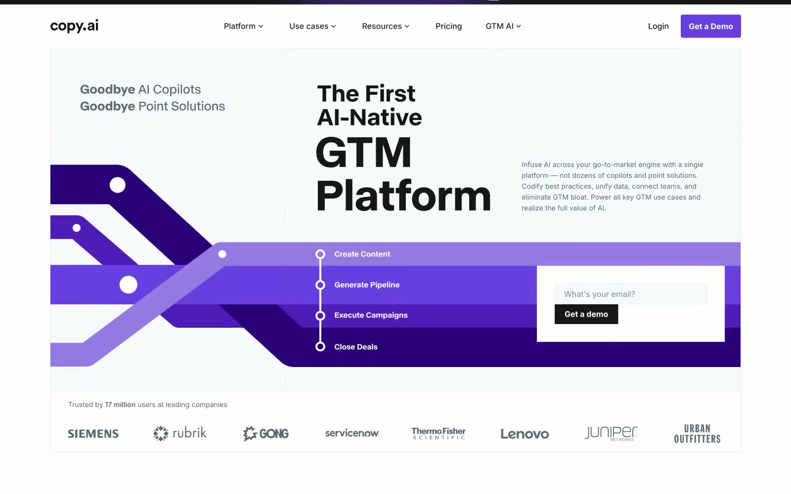
> violet voltage on white blueprint
**Theme:** light
Copy.ai operates as a sunlit enterprise platform: white canvas, crisp black text, and a single vivid violet that acts as electric punctuation across an otherwise quiet monochrome interface. The design language is assertive but restrained — heavy display weights in a custom grotesque deliver headlines with presence, while a universal 4px radius keeps every surface sharp and architectural rather than soft. Depth comes from a violet gradient hero band and inset hairline shadows on buttons, not from drop shadows or skeuomorphism. Components are flat, dense with information, and grid-aligned, with cards sitting on white rather than tinted surfaces to maintain contrast discipline.
## Tokens — Colors
| Name | Value | Token | Role |
|------|-------|-------|------|
| Voltage Violet | `#693edf` | `--color-voltage-violet` | Violet supporting accent for decorative details and low-frequency emphasis. Do not promote it to the primary CTA color |
| Deep Iris | `#4f1bb7` | `--color-deep-iris` | Mid-gradient stop in hero band and platform diagram backgrounds. Bridges Voltage Violet to darker violet depths |
| Plum Voltage | `#4514a6` | `--color-plum-voltage` | Deeper gradient stop, card-on-violet backgrounds in platform architecture diagram |
| Royal Purple | `#3b0d96` | `--color-royal-purple` | Even deeper gradient stop; used in platform diagram cells and hero band lower section |
Websites
Markdown Text
design-md
website-prompt
landing-page-prompt
Increase
Increase — Style Reference
# Increase — Style Reference
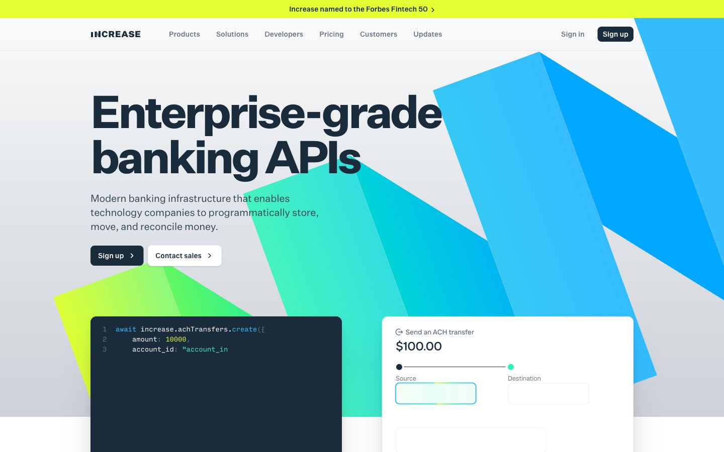
> institutional blueprint on vellum — one electric chartreuse stripe cuts the navy calm, mint data signals pulse beneath it.
**Theme:** light
Increase projects the quiet authority of institutional banking through a disciplined navy-and-paper palette, with chartreuse and mint used as deliberate voltage — the only colors bright enough to stop the eye. Typography is structurally mathematical: a custom grotesque (Untitled Sans) pulled tight with negative tracking pairs with a monospaced companion (Input Mono) for code, creating a typographic handshake between API documentation and product surface. Cards float on a warm off-white canvas with subtle tinted shadows rather than hard borders, while a gradient hero grounds the page in cool-to-warm motion. Buttons are nearly black ink on paper — the action language is gravitas, not energy, leaving the accent colors free to signal features, status, and data flow.
## Tokens — Colors
| Name | Value | Token | Role |
|------|-------|-------|------|
| Inkwell Navy | `#1a2b3b` | `--color-inkwell-navy` | Primary text, nav text, icon strokes, hairline borders — the structural graphite of every screen. Used as filled button background for primary actions to project institutional weight rather than enthusiasm |
| Slate 600 | `#314352` | `--color-slate-600` | Secondary borders and supporting text where Inkwell Navy is too heavy — outlines on cards, tertiary headings, subdued dividers |
| Abyss | `#0d1726` | `--color-abyss` | Dark code-block and terminal surfaces — deeper than Inkwell Navy so syntax highlighting reads with high voltage against the near-black |
| Graphite | `#687887` | `--color-graphite` | Muted helper text, inactive nav links, secondary button outlines — recedes so the navy headlines and mint accents can carry the hierarchy |
Websites
Markdown Text
design-md
website-prompt
landing-page-prompt
V7labs
V7labs — Style Reference
# V7labs — Style Reference
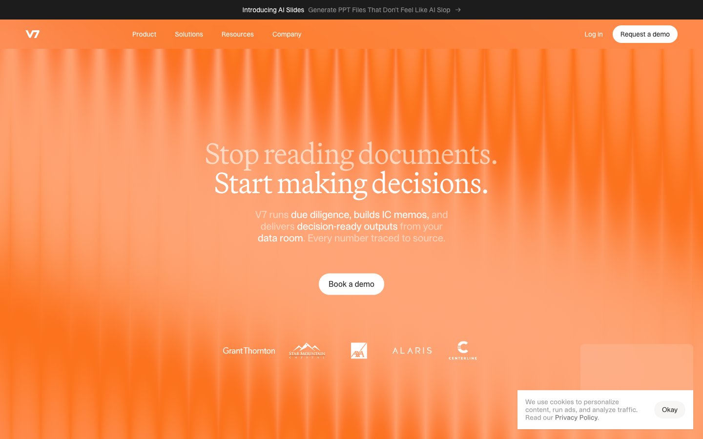
> Sunlit amber archive — editorial intelligence behind theater curtains. The first screen pours warm orange light through vertical drapery streaks, then strips to monochrome seriousness below.
**Theme:** mixed
V7 stages its interface like a film studio: a single warm amber hero floods the first screen with vertical curtain-like light streaks, then gives way to a high-contrast editorial system of cream-white canvases and near-black panels. The voice is serious and archival — Martina Plantijn serif at whisper-light weight for headlines carries a printed-publication authority, while the dense sans-serif body text in STK Bureau keeps the data-heavy product feel quiet and clinical. Color discipline is absolute in the interface: every interactive surface is either pure white, pure black, or the deep warm neutral, with the amber orange reserved almost exclusively for atmospheric hero and statistic blocks — never for buttons, never for links, never for accents. Components are pill-shaped and minimal, sitting flush on the page with hairline borders and almost no shadow, reinforcing the impression of a system designed for decisions rather than decoration.
## Tokens — Colors
| Name | Value | Token | Role |
|------|-------|-------|------|
| Amber Curtain | `#ec580a` | `--color-amber-curtain` | Hero and statistics block backgrounds, brand atmospheric layer — the entire warm light system of the page, applied as full-bleed gradient with vertical streak texture. Never used for buttons, links, or inline accents |
| Ember Wash | `#ff683d` | `--color-ember-wash` | Lighter highlight within the amber gradient — the illuminated folds of the curtain texture, appearing in hero highlights and statistic card upper regions |
| Midnight Ink | `#00104e` | `--color-midnight-ink` | Deep navy used sparingly for outlined link borders and select link text — the only chromatic accent in the otherwise achromatic interface, and only where link affordance must be unmistakable |
| Canvas Cream | `#f7f6f5` | `--color-canvas-cream` | Page background, the warm off-white that gives the whole system its paper-like editorial base — sits behind cards, inputs, and quiet content areas |
Websites
Markdown Text
design-md
website-prompt
landing-page-prompt
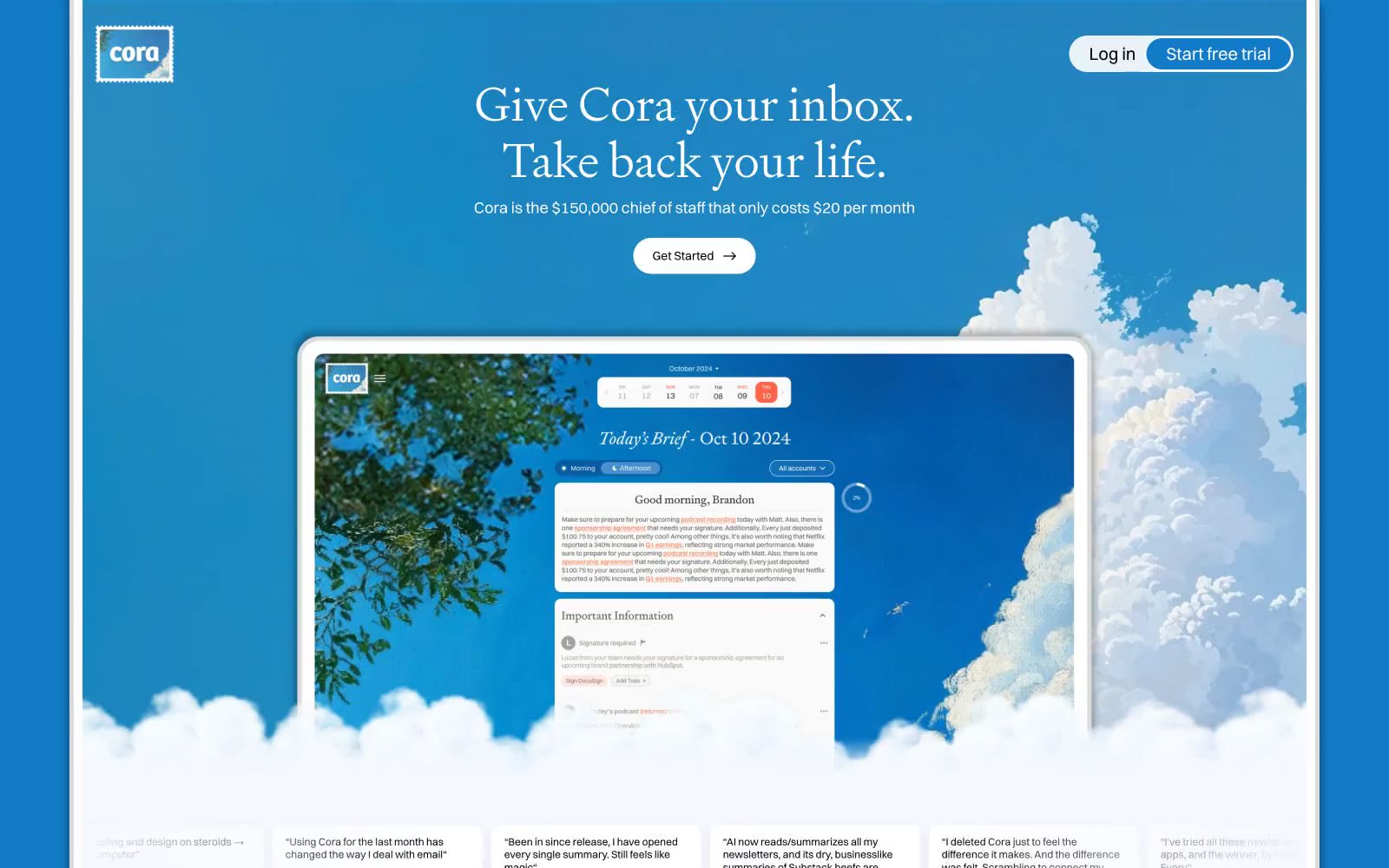
Cora
Cora — Style Reference
# Cora — Style Reference
> Romantic sky painting with floating desk
**Theme:** light
Cora pairs a romantic plein-air sky painting with a precision product interface — the page feels like looking up through clouds at freedom, then returning to a calm desk. The signature move is full-bleed atmospheric illustration as the canvas, not as a banner: tree branches, cumulus clouds, and birds occupy the entire viewport, with UI elements floating on top like cards laid against a window. Typography is literary: a light-weight serif (signifier) for headlines whispers where most SaaS sites shout, and a workhorse sans (switzer) handles the product surface. Color stays minimal — vivid cerulean sky, one deep navy for filled actions, warm red as a single ink-stamp accent — so the painting and the type do the emotional work, not the palette.
## Tokens — Colors
| Name | Value | Token | Role |
|------|-------|-------|------|
| Cerulean Sky | `#117bc8` | `--color-cerulean-sky` | Full-bleed canvas for hero and atmospheric sections, primary nav background, sky-illustration base |
| Deep Cerulean | `#0d5c96` | `--color-deep-cerulean` | Tinted shadow color — the brand-blue cast on every elevation shadow makes even drop shadows feel atmospheric |
| Atmosphere Blue | `#60a8dd` | `--color-atmosphere-blue` | Outlined action border — secondary buttons and card outlines gain a cool sky tint instead of neutral gray |
| Midnight Navy | `#09426c` | `--color-midnight-navy` | Primary filled action background — the Get Started pill, pressed against the sky, reads as a deep horizon line |

Websites
Markdown Text
design-md
website-prompt
landing-page-prompt
Shopify
Shopify — Style Reference
# Shopify — Style Reference
> midnight bazaar under mint lanterns
**Theme:** dark
Shopify's design language reads as a midnight marketplace lit by mint-green signals: a near-black canvas with a faint forest tint, white typography at whisper-light weights (330) that lets generous letter-spacing carry the voice, and a single vivid mint accent that functions as functional punctuation rather than decoration. Surfaces stack in subtle dark-green tints (#02090a → #041e18 → #072720) so that cards feel like panels lifted from the same material, separated by hairline borders rather than heavy shadows. The primary action is a high-contrast white pill button — the green never fills an action — which keeps the brand hue available for inline highlights, key phrases, and iconography where it reads as confidence rather than urgency. Layout alternates between cinematic full-bleed photography and dark content bands with rounded media cards (12px radius), creating a rhythm of spectacle and catalog.
## Tokens — Colors
| Name | Value | Token | Role |
|------|-------|-------|------|
| Abyssal Ink | `#02090a` | `--color-abyssal-ink` | Page canvas and hero backgrounds — near-black with a green undertone makes the mint accent glow rather than fight |
| Forest Floor | `#041e18` | `--color-forest-floor` | Card and elevated surface — one step up from canvas, reads as a panel cut from the same dark material |
| Deep Canopy | `#072720` | `--color-deep-canopy` | Secondary card surface and nav backgrounds — provides a second elevation step above Forest Floor |
| Midnight Tinge | `#000a1e` | `--color-midnight-tinge` | Sectional backgrounds where a cooler, blue-tinted dark is needed for variation |
Websites
Markdown Text
design-md
website-prompt
landing-page-prompt
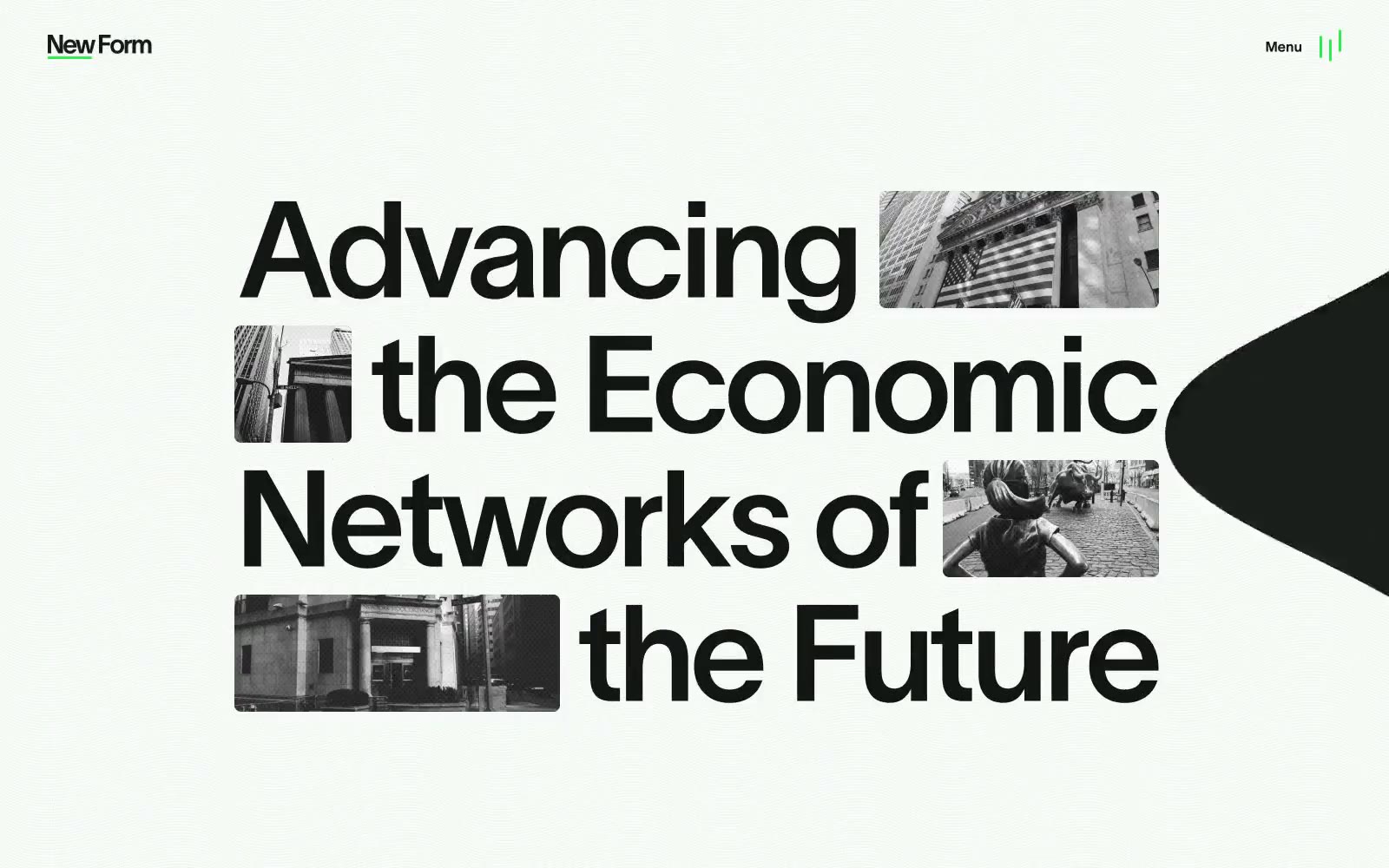
Home
Home — Style Reference
# Home — Style Reference
> Broadsheet financial broadside — the masthead itself is the design
**Theme:** light
NewForm operates as an editorial financial publication disguised as a fund website. A near-white, faintly green-tinted canvas holds massive serif display type at 140-295px that does the heavy lifting, while a single neon green (#2bee4b) acts as surgical punctuation on the CTA and small decorative marks. Layout is spacious and asymmetric, with black-and-white photography cropped in rounded rectangles placed beside or overlapping display headlines. UI chrome is stripped to almost nothing — wordmark, a 'Menu' label, and a green mark icon — letting the typography and imagery own every page.
## Tokens — Colors
| Name | Value | Token | Role |
|------|-------|-------|------|
| Linen | `#fafffa` | `--color-linen` | Page canvas, card surfaces, text on dark fills — a faintly green-tinted near-white that keeps the whole site from reading as a stark #ffffff |
| Obsidian Ink | `#121613` | `--color-obsidian-ink` | Primary text, dominant borders, image frames, footer background — a warm-tinted near-black that pairs with Linen instead of pure black to keep the palette organic |
| Pure Black | `#000000` | `--color-pure-black` | Hard borders, icon strokes, the deepest text layer where maximum contrast against Linen is needed |
| Bark | `#232924` | `--color-bark` | Secondary dark surface, heading borders, subtle elevated panels — a half-step lighter than Obsidian for layered depth |
Websites
Markdown Text
design-md
website-prompt
landing-page-prompt
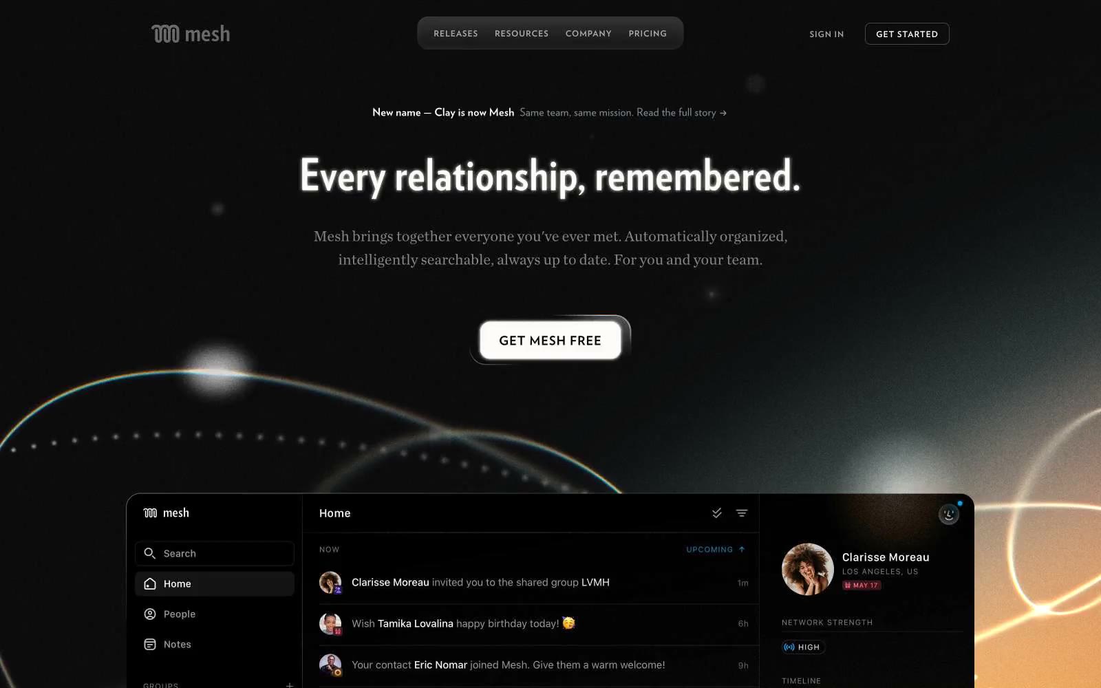
Mesh
Mesh — Style Reference
# Mesh — Style Reference
> Bronze ink on midnight paper. A dark editorial spread where warm amber rules and serif-slim sans type guide the eye through a dense, unhurried layout.
**Theme:** dark
Mesh presents a nocturnal editorial workspace: near-black canvas, warm amber glow bleeding up from the lower viewport, and crisp white type that reads like a magazine spread rather than a SaaS dashboard. The voice is confident but quiet — compact, information-dense, with text doing the heavy lifting and color reserved as semantic punctuation. Warm copper (#f2b98b) is the only chromatic accent, and it arrives as outlines and rules rather than fills, so actions feel invited rather than pushed. The interface borrows from print typography: wide-tracked uppercase labels (0.1–0.17em), condensed display faces for hero headlines, and generous line-height on body copy. Surfaces are flat, borders are hairline, and the lone shadow is subtle — depth comes from layering and glow, not drop shadows.
## Tokens — Colors
| Name | Value | Token | Role |
|------|-------|-------|------|
| Obsidian Canvas | `#0f0f10` | `--color-obsidian-canvas` | Page background, hero base, footer — the dominant near-black field that holds everything else |
| Graphite Layer | `#1d1d1f` | `--color-graphite-layer` | Elevated surfaces, icon strokes, secondary button borders — one step lighter than the canvas to create depth without elevation |
| Bone White | `#fefef7` | `--color-bone-white` | Neutral form states, badge text, and quiet UI feedback where color should stay understated. Do not promote it to the primary CTA color |
| Cream Paper | `#f7f3ee` | `--color-cream-paper` | Light surface variant, gradient terminus — a soft warm white paired with Obsidian for AAA contrast |
Websites
Markdown Text
design-md
website-prompt
landing-page-prompt
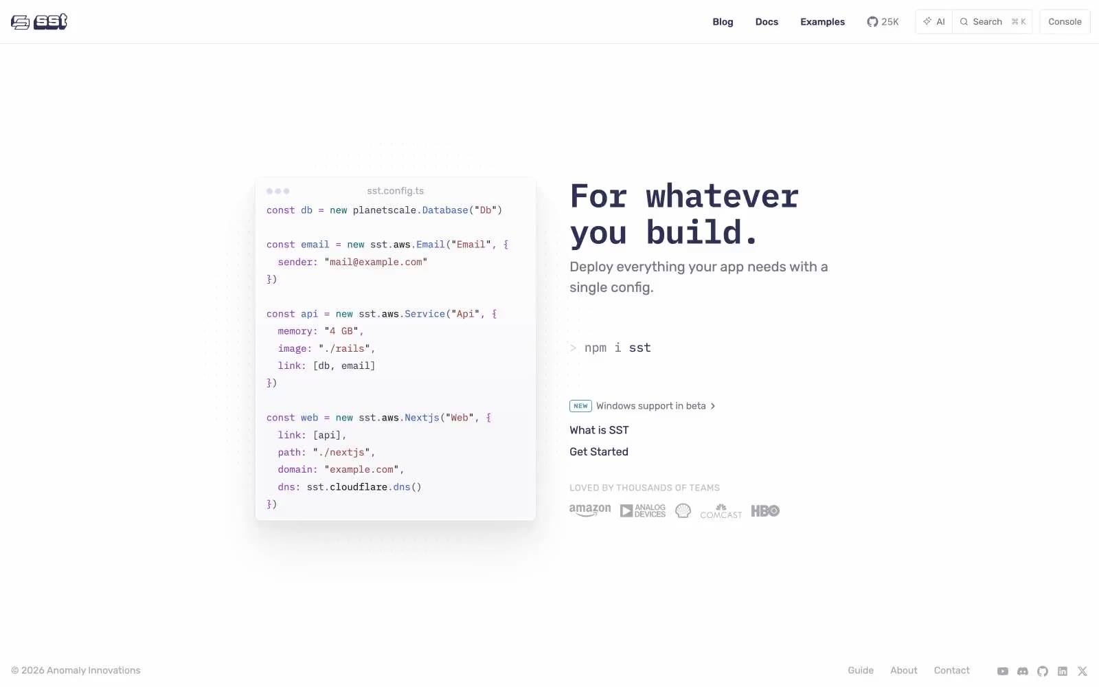
SST
SST — Style Reference
# SST — Style Reference
> Code terminal in a gallery. The config file is the artwork; everything else is a clean white frame.
**Theme:** light
SST's design language reads like a developer's terminal wrapped in a polished product page. A monospaced code block anchors the hero — the syntax-highlighted config is the visual hero, not a decorative illustration. Typography is strictly two-family: IBM Plex Mono carries every code surface, technical label, and inline command, while Rubik Variable handles all prose, navigation, and UI chrome. The palette is austere and off-black: a signature dark indigo-violet (#303055) drives headings, body, and links, sitting on a pure white canvas with a barely-tinted lavender-gray (#e8e8f2) as the only soft surface accent. Code syntax uses four muted-but-distinct hues (purple, blue, teal, red-brown) that never bleed into the surrounding UI. Components are minimal and flat: 4px-rounded ghost buttons, pill-shaped nav controls, hairline borders, zero decorative shadows.
## Tokens — Colors
| Name | Value | Token | Role |
|------|-------|-------|------|
| SST Ink | `#303055` | `--color-sst-ink` | Headings, body text, links, primary text color — dark indigo-violet replaces the conventional near-black, giving every word a faint cool cast that signals developer-tool seriousness without feeling heavy |
| Code Plum | `#8844ae` | `--color-code-plum` | Code syntax highlighting for strings, property names, and keywords — the most vivid color in the system, reserved exclusively for inside code blocks |
| Code Cobalt | `#3b61b0` | `--color-code-cobalt` | Code syntax for method names, object keys, and function calls — paired with Code Plum to create the two-color syntax core |
| Code Teal | `#096e72` | `--color-code-teal` | Code syntax for type annotations, decorators, and select tokens — deeper teal that reads as technical rather than decorative |
Websites
Markdown Text
design-md
website-prompt
landing-page-prompt
Handsome Frank
Handsome Frank — Style Reference
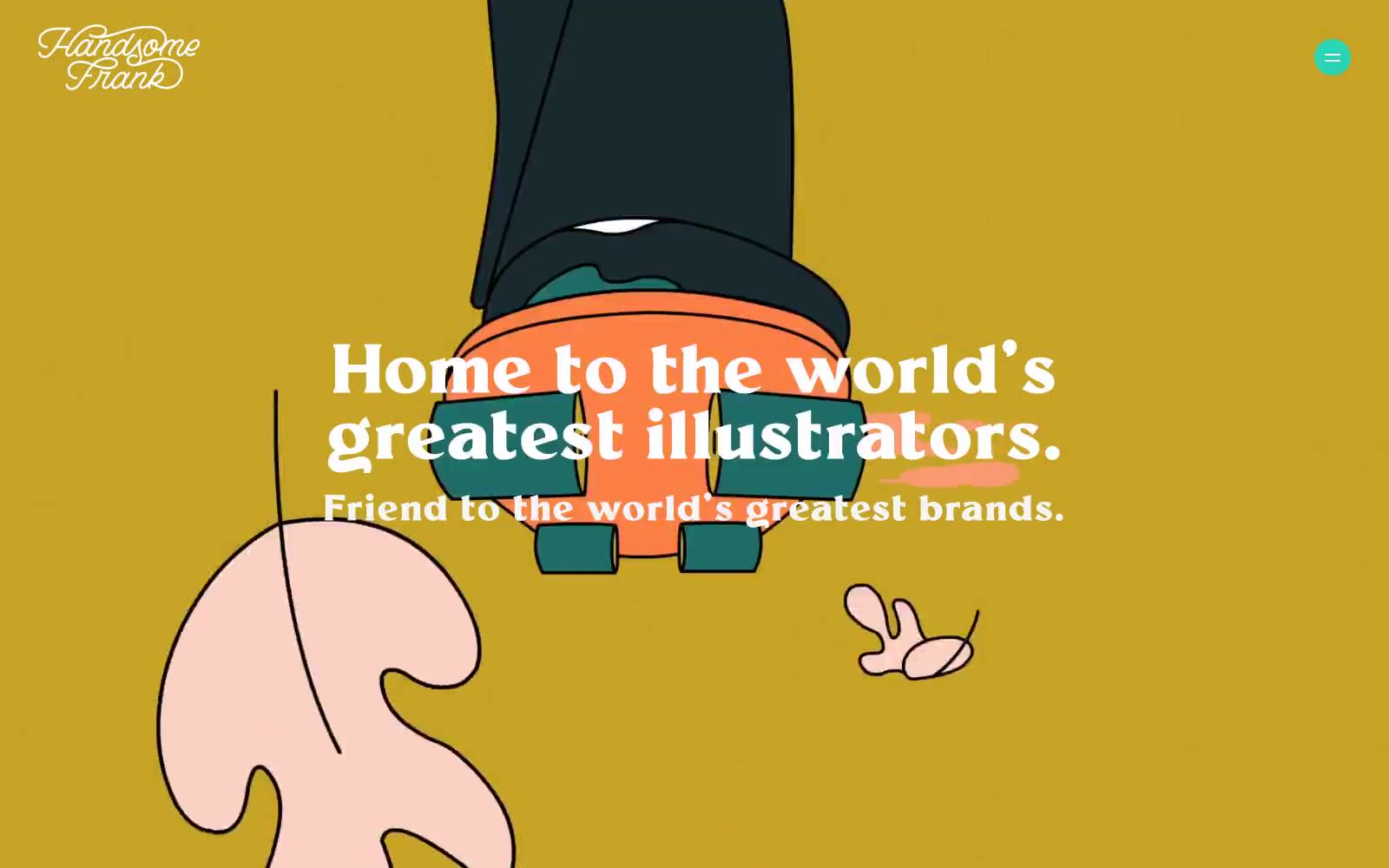
# Handsome Frank — Style Reference
> Curator's atelier with living murals — a warm-paper gallery where illustrated worlds bloom against indigo frames.
**Theme:** light
Handsome Frank operates as a curator's atelier for contemporary illustration: full-bleed illustrated hero scenes give way to warm paper-toned canvases where artist work is presented with museum-label restraint. The system is defined by a single dominant deep indigo (#160572) that anchors navigation, headlines, and the closing footer bar, surrounded by hairline black borders that act like gallery frame edges. Typography is a two-voice conversation — a tight-tracked editorial serif (Millik) for hero/display headlines and a quiet grotesque (Klarheit) for everything structural. Color is deployed as curated punctuation: the hero illustration carries the chromatic spectrum, while the rest of the page stays achromatic with isolated bursts of vivid red, teal, orange, and yellow acting as spotlight accents on links, tags, and project cards.
## Tokens — Colors
| Name | Value | Token | Role |
|------|-------|-------|------|
| Indigo Frame | `#160572` | `--color-indigo-frame` | Navigation strokes, display headlines, footer band — the deepest anchor in the system, commanding authority without shouting |
| Cream Paper | `#f2ebe6` | `--color-cream-paper` | Primary page canvas for content sections — warm eggshell that softens black text and lets illustration breathe |
| Pure White | `#ffffff` | `--color-pure-white` | Card surfaces, reversed text on dark bands, and the clean counterpoint to cream — the gallery wall |
| Obsidian Hairline | `#000000` | `--color-obsidian-hairline` | Dominant border, text, and icon stroke — used as a 1-2px frame line across nav, cards, and decorative elements |
Websites
Markdown Text
design-md
website-prompt
landing-page-prompt
Alpine Bio
Alpine Bio — Style Reference
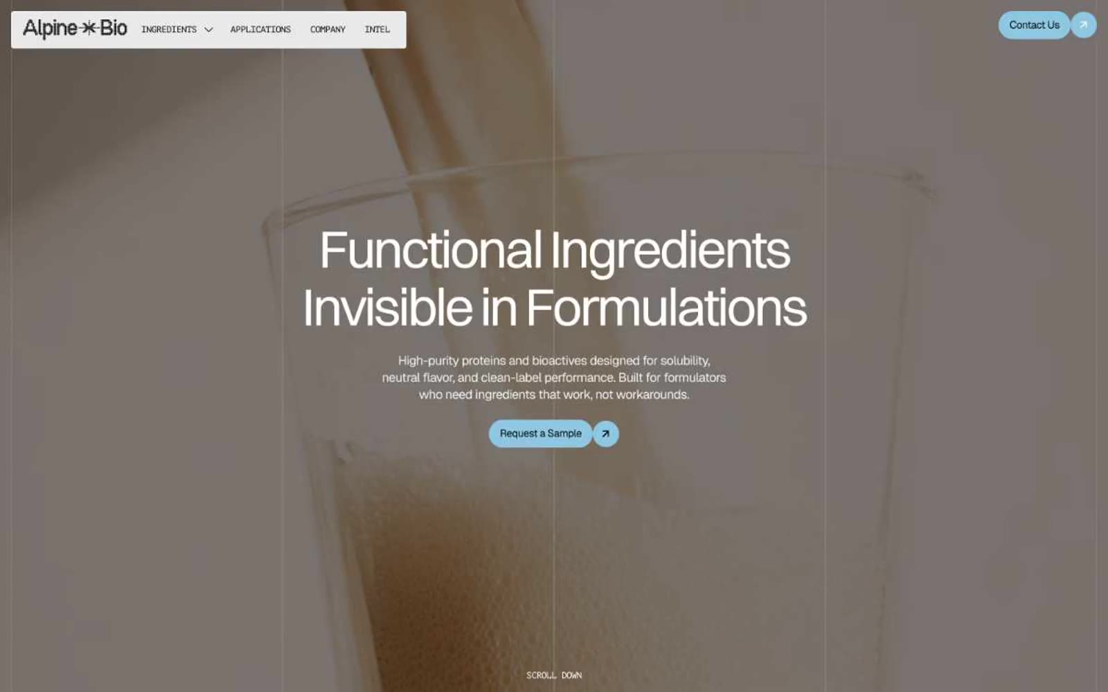
# Alpine Bio — Style Reference
> Sun-drenched botanical apothecary on cream parchment
**Theme:** light
Alpine Bio reads as a warm apothecary-editorial system: cream-parchment canvases, a single sky-blue pill accent, and Switzer display type sized like a botanical journal. The interface is deliberately chromatically silent — nearly every surface lives in the warm off-white family, with one soft blue for actions and one pollen-yellow for tiny typographic highlights. Components are flat, unshadowed, and pill-rounded; the design is defined as much by what it withholds (no gradients, no shadows, no dark mode) as by what it adds. Full-bleed close-up product photography carries all atmospheric warmth, letting the UI stay calm and lab-like while the imagery feels edible and alive.
## Tokens — Colors
| Name | Value | Token | Role |
|------|-------|-------|------|
| Parchment | `#f5f5f5` | `--color-parchment` | Page canvas and base background — the neutral ground everything sits on |
| Warm Cream | `#f8f4e6` | `--color-warm-cream` | Section backgrounds, footer surface, and warm page rhythm — gives the system its apothecary warmth |
| Paper White | `#ffffff` | `--color-paper-white` | Text on dark imagery, elevated card surfaces, and bright contrast moments |
| Mist Gray | `#e9e9e9` | `--color-mist-gray` | Subtle surface fills — nav background, button hover rests, and quiet UI layers |
Websites
Markdown Text
design-md
website-prompt
landing-page-prompt
Ecosia
Ecosia — Style Reference
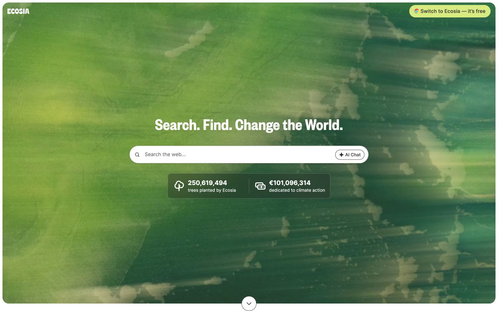
# Ecosia — Style Reference
> verdant search clearing — a white-canvas interface with a single lime-green accent and full-bleed leaf photography as the only chromatic noise.
**Theme:** light
Ecosia positions itself as a verdant search engine: a clean white-canvas interface where one vivid lime-green accent (#d7eb80) acts as the brand's single chromatic punctuation against an otherwise monochrome system. The hero is a full-bleed nature photograph — a leaf-canopied backdrop that reframes the search bar as a clearing — while every other section returns to white space, warm off-white cards, and Founders Grotesk headlines. Components lean soft and rounded: 20px card radii, pill-shaped buttons at 9999px, generous 40-48px section gaps, and a single translucent dark stat overlay floating above the hero photo. The overall rhythm is one confident page, one quiet page, one page with a colorful donut chart — the system uses color sparingly so the lime accent and the nature photography carry the emotional weight.
## Tokens — Colors
| Name | Value | Token | Role |
|------|-------|-------|------|
| Lime Canopy | `#d7eb80` | `--color-lime-canopy` | Primary action buttons, brand accent border, surface highlight — the single chromatic accent; warm yellow-green reads as young foliage and gives the CTA a nature-coded urgency without alarm |
| Ink Black | `#333333` | `--color-ink-black` | Primary text, icon strokes, hairlines, structural borders, footer text — carries the entire interface's information hierarchy |
| Paper White | `#ffffff` | `--color-paper-white` | Page background, card surfaces, button text on lime fills, search bar fill — the dominant canvas |
| Warm Mist | `#f8f8f6` | `--color-warm-mist` | Secondary card surfaces, subtle elevated panels — a barely-warm off-white that softens the page from clinical white |
Websites
Markdown Text
design-md
website-prompt
landing-page-prompt
Airbnb
Airbnb — Style Reference
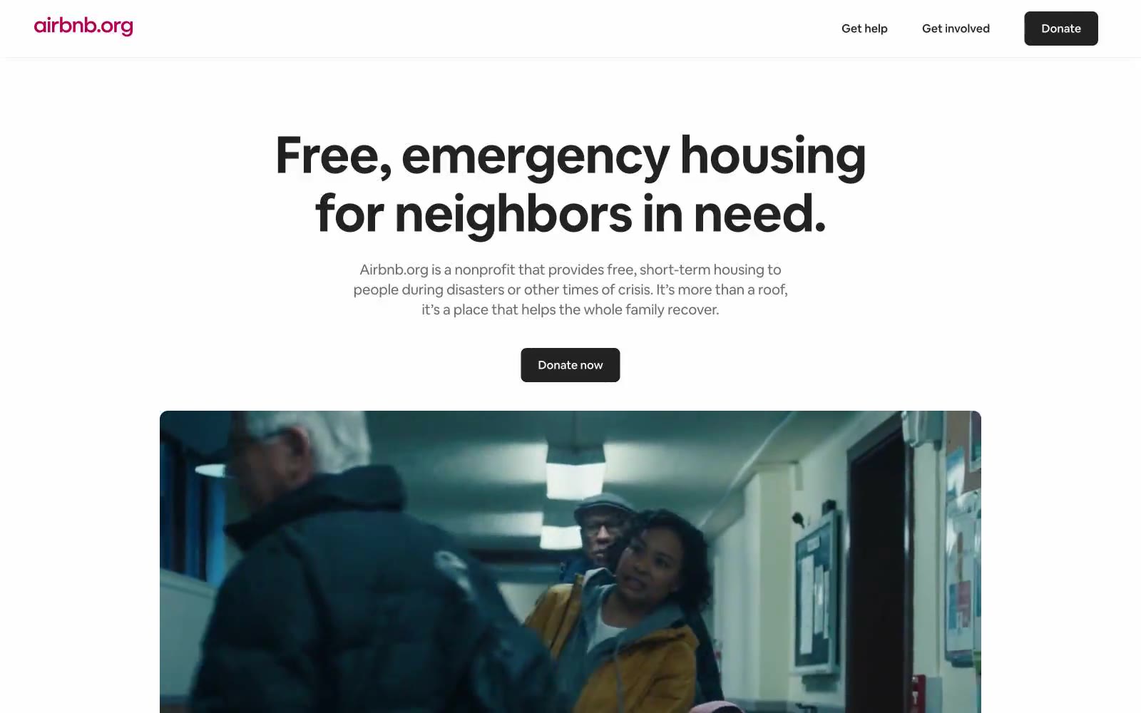
# Airbnb — Style Reference
> Editorial masthead on white paper — the page speaks through scale and silence, not color or ornament.
**Theme:** light
Airbnb.org is a stripped-down editorial system: pure achromatic canvas, oversized type, and dark-on-white CTAs that feel more like a nonprofit annual report than a tech brand site. Every color decision is denied except a single near-black action button — the page trusts typography and photography to carry emotion, never decoration. Surfaces alternate between stark white and a quiet warm gray (#f7f7f7), creating soft newspaper-like bands rather than dramatic light/dark shifts. Components are flat: no shadows, no gradients, no rounded pill buttons — just 8px-radius rectangles and 12px-radius media frames. The result reads as earnest, restrained, and institutional without feeling corporate.
## Tokens — Colors
| Name | Value | Token | Role |
|------|-------|-------|------|
| Carbon Ink | `#222222` | `--color-carbon-ink` | Primary text, filled CTA buttons, nav bar, footer background, hairline borders, icon strokes — the only chromatic-acting color in the system; its near-black weight gives the page its editorial authority |
| Paper White | `#ffffff` | `--color-paper-white` | Page canvas, card surfaces, button text, icon fills on dark backgrounds — the dominant surface and the foil against which all type sits |
| Newsprint Gray | `#f7f7f7` | `--color-newsprint-gray` | Alternate section backgrounds, footer surface, subtle banding to separate editorial blocks without visual noise |
| Pebble | `#ebebeb` | `--color-pebble` | Section divider washes, faint background blocks that fade further into the page than Newsprint Gray |
Websites
Markdown Text
design-md
website-prompt
landing-page-prompt
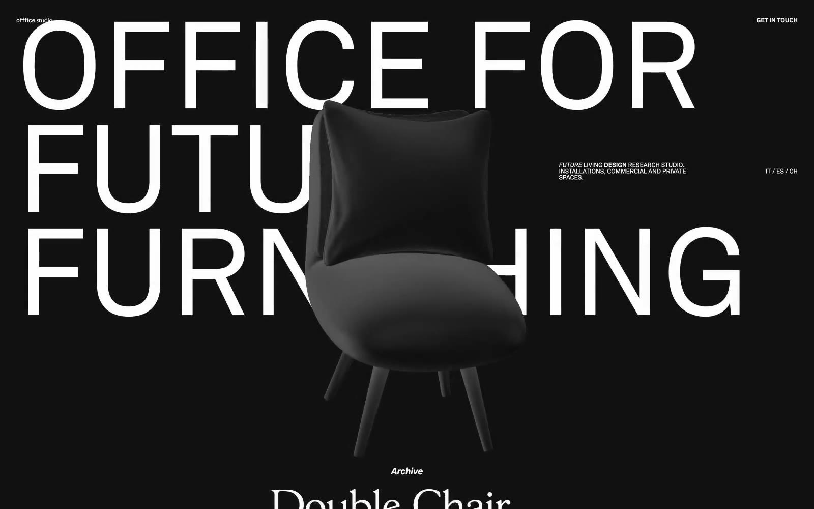
OFFFICE :
OFFFICE : — Style Reference
# OFFFICE : — Style Reference
> noir gallery swallowed by monolithic type
**Theme:** dark
OFFFICE operates as a black-walled gallery where typography is architecture: a single custom sans-serif (ak) scales from 12px micro-labels to 216px display blocks that bleed off the viewport edges, with line-heights collapsing to 0.80 to stack text into wall-like slabs. The entire palette is near-black canvas against near-white ink — no accent color, no semantic hues, no gradients. A second custom serif (gs) appears only inside the project archive, bringing a subtle editorial counterpoint to the otherwise austere sans system. Product is presented as a single sculptural 3D object centered in the void, overlapping text in the scroll sequence to create depth without any shadow or elevation system. Everything is flat, full-bleed, and typographically loud.
## Tokens — Colors
| Name | Value | Token | Role |
|------|-------|-------|------|
| Onyx | `#0e0e00` | `--color-onyx` | Full-bleed page background, navigation surface, product staging void — the entire canvas is one continuous dark field |
| Paper White | `#fefefe` | `--color-paper-white` | Display headlines, body text, navigation labels, archive list entries, locale switcher — the sole ink color across all UI layers |
| Faint White | `#2a2a2a` | `--color-faint-white` | Supporting palette color for small decorative accents when the core palette needs contrast. Do not promote it to the primary CTA color |
Websites
Markdown Text
design-md
website-prompt
landing-page-prompt
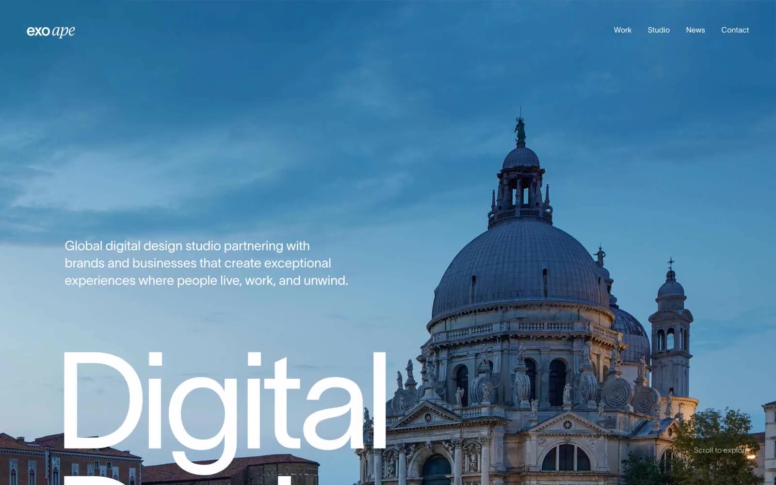
Exo Ape
Exo Ape — Style Reference
# Exo Ape — Style Reference
> Venetian gallery at golden hour
**Theme:** light
Exo Ape operates as a digital studio site that reads like a printed architecture monograph: one massive custom neo-grotesque (Lausanne) sets a near-monastic tone while full-bleed editorial photography does the heavy atmospheric work. The palette is almost entirely warm neutrals — a deep ink-black, warm canvas beige, and two sand-toned border colors that replace the usual cool-gray UI chrome. Headlines are not styled; they are BUILT at 144–250px with negative tracking tight enough to make the letterforms collide, while body copy drops to 14–16px in the same family at loose, breathable line-heights (1.88–2.64). There is no shadow, no gradient, no accent color, and no filled button — interactions are thin warm-beige outlined links that feel like captions, not calls to action. The whole system whispers prestige through scale, whitespace, and warmth rather than shouting it through saturation or contrast.
## Tokens — Colors
| Name | Value | Token | Role |
|------|-------|-------|------|
| Ink Black | `#0d0e13` | `--color-ink-black` | Primary text, dark UI frames, icon strokes — the deepest near-black with a barely-perceptible cool cast that keeps it from feeling warm or brown against the beige canvas |
| Pure White | `#ffffff` | `--color-pure-white` | Card surfaces, nav background, image bleeds — the brightest surface level that lifts content off the warm canvas |
| Canvas Beige | `#e4e0db` | `--color-canvas-beige` | Page background, section bands — a warm light gray-beige that gives the whole site its sunlit, paper-like quality |
| Steel Gray | `#6e6e71` | `--color-steel-gray` | Secondary body text, muted borders — the only truly achromatic neutral in the system, used sparingly to signal de-emphasis |
Websites
Markdown Text
design-md
website-prompt
landing-page-prompt
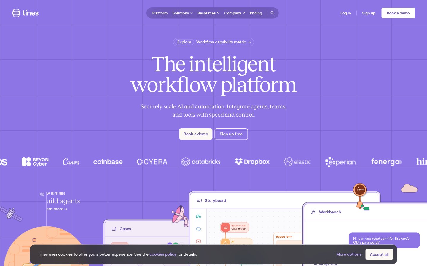
Tines
Tines — Style Reference
# Tines — Style Reference
> lavender observatory under glass — soft warm white, deep violet edges, specimen cards in pastel tints
**Theme:** light
Tines is a violet-drenched observatory: a soft, warm-white canvas (#fcf9f5) layered with a deep iris (#4d3e78) that saturates borders, text, and iconography like ink on parchment. Reckless serif headlines sit at whisper-weights (300) with tight negative tracking, while Roobert sans carries all UI at near-equal weight. The system replaces typical flat SaaS chrome with hand-drawn whimsy: illustrated clouds, paper planes, and sprouts float across sections as decorative atmosphere. Cards are the signature element — pastel-tinted backgrounds paired with vivid, saturated 2px borders in pink, orange, green, or teal, creating a 'lab notebook' feeling where each story is its own labeled specimen. Buttons are quietly confident: ghost outlines on hero CTAs, pill-shaped deep-violet fills for booking, and zero drop-shadow elevation throughout.
## Tokens — Colors
| Name | Value | Token | Role |
|------|-------|-------|------|
| Deep Iris | `#4d3e78` | `--color-deep-iris` | Primary brand color, dominant borders, body text, icon strokes, link color — saturates the interface like violet ink on parchment |
| Amethyst | `#6956a8` | `--color-amethyst` | Secondary brand violet for mid-weight text, secondary borders, and decorative iconography |
| Iris Glow | `#745fbb` | `--color-iris-glow` | Filled primary action button background — the only filled CTA color, used sparingly to make Book a demo / Sign up commands feel switched on |
| Lilac Mist | `#f3ecf7` | `--color-lilac-mist` | Soft violet-tinted surface for cards, table rows, and section backgrounds |
Websites
Markdown Text
design-md
website-prompt
landing-page-prompt
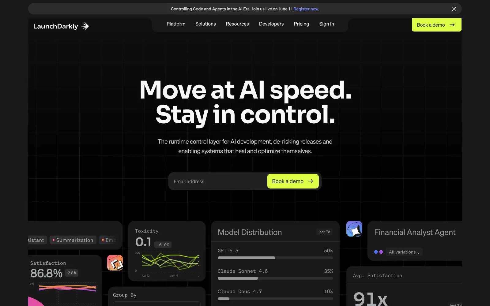
LaunchDarkly
LaunchDarkly — Style Reference
# LaunchDarkly — Style Reference
> Neon control room — a dark cockpit where violet signals pulse through charcoal panels.
**Theme:** dark
LaunchDarkly is a midnight control room: deep charcoal canvas, cool violet-blue as the only chromatic voice, and white type that cuts through like console output. The interface is dense and technical without feeling cluttered — it borrows the visual language of developer tools (monospace code, panel grids, pill-shaped inputs) and wraps it in a confident marketing skin. The violet→blue gradient (#405bff → #7084ff) acts as the brand's electronic pulse, appearing in glows, hero text, active states, and decorative washes rather than flat fills. Components are pill-soft (30-60px radii dominate), borders are hairline-white on near-black, and elevation is communicated through glow rather than shadow.
## Tokens — Colors
| Name | Value | Token | Role |
|------|-------|-------|------|
| Signal Violet | `linear-gradient(179deg, #405bff 1.06%, #7084ff 123.42%)` | `--color-signal-violet` | Hero text accent, link underlines, icon glows, decorative gradient endpoint — the brand's chromatic signature; used as paint, not fill; Hero ambient washes, card glow halos, decorative background floods |
| Voltage Blue | `#405bff` | `--color-voltage-blue` | Violet outline accent for tags, dividers, and focused UI edges. Do not promote it to the primary CTA color |
| Midnight Ink | `#0e0e0e` | `--color-midnight-ink` | Page canvas, deepest background layer |
| Carbon | `#191919` | `--color-carbon` | Surface level 1 — nav pill, card backgrounds, button fills, footer |
Websites
Markdown Text
design-md
website-prompt
landing-page-prompt
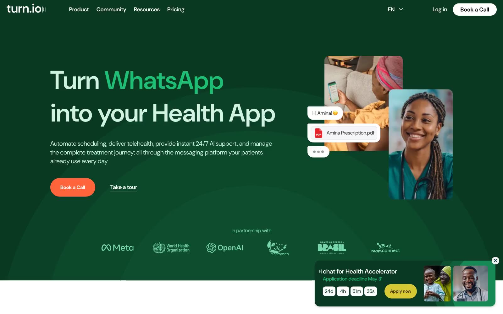
Chat for impact
Chat for impact — Style Reference
# Chat for impact — Style Reference
> forest-green clinic with pastel rooms
**Theme:** light
Turn.io runs on a warm, healthcare-optimistic visual system: a deep forest green acts as the dominant brand surface and hero canvas, while soft pastel washes (mint, lavender, peach, cream, sky) create section rhythm like colored rooms in a clinic. The single vivid coral CTA (#ff643b) is the only high-saturation action color and it sits on a near-monochrome field, so every 'Book a Call' reads as the obvious next step. Typography is DM Sans everywhere, pushed to enormous display sizes (69–116px) with tight negative tracking, which gives even the hero a conversational softness rather than corporate weight. Components stay flat and borderless — the system communicates through color blocks and 16–24px rounded cards, not shadows or chrome. Pastel feature cards and a lavender page canvas give the whole site a hand-drawn, almost editorial warmth, while the green hero and purple toolkit band inject the brand's two anchor colors at full saturation.
## Tokens — Colors
| Name | Value | Token | Role |
|------|-------|-------|------|
| Canopy Green | `#0a3922` | `--color-canopy-green` | Hero canvas, dark section backgrounds, primary heading color on light backgrounds — establishes the dominant brand surface |
| Coral Pulse | `#ff643b` | `--color-coral-pulse` | Primary action buttons, filled CTAs — the only warm high-saturation color in the system, creates urgency without aggression |
| Indigo Bloom | `#460095` | `--color-indigo-bloom` | Toolkit section background overlay, secondary brand headings — anchors the purple-lavender pastel system |
| Leaf Bright | `#1dbf73` | `--color-leaf-bright` | Green outline accent for tags, dividers, and focused UI edges |
Websites
Markdown Text
design-md
website-prompt
landing-page-prompt
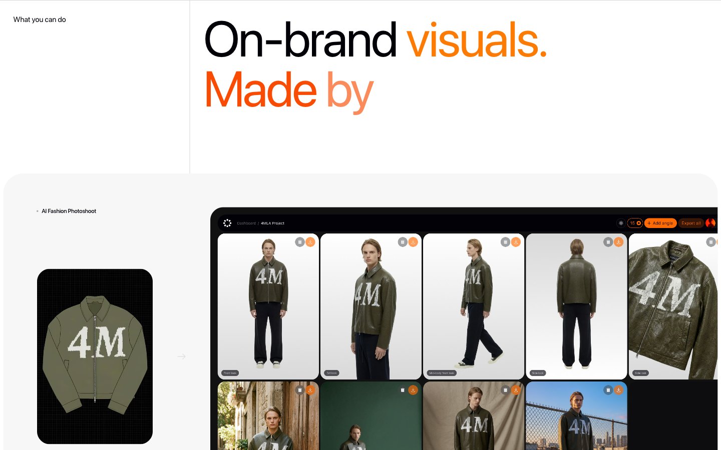
AI Product Generation
AI Product Generation — Style Reference
# AI Product Generation — Style Reference
> editorial photography studio on white paper — headline display type as cover, orange as the editor's highlight pen
**Theme:** light
Fourmula is an editorial product-photography studio rendered in code: vast white pages, near-black display type at extreme sizes, and a single disciplined orange accent that reads like editorial highlight pen rather than brand chrome. The system is almost monochromatic — three near-grays carry the entire interface, and color appears only as semantic punctuation inside headlines and gradients. Surfaces are flat and borderless, relying on hairline gray dividers and generous whitespace to separate regions instead of shadow or elevation. Typography is the dominant design move: SF Pro Display at weights 400–500, tracked tight at large sizes, producing headlines that feel like magazine cover titles rather than SaaS hero copy. Components are quiet and minimal — a thin outlined button, a small tag badge, flat cards with generous padding, and a single rounded image corner. The result is a site that treats its product imagery as the spectacle while the chrome recedes.
## Tokens — Colors
| Name | Value | Token | Role |
|------|-------|-------|------|
| Ink Black | `#020108` | `--color-ink-black` | Primary text, borders, icon strokes — near-black carries all body and heading copy |
| Charcoal | `#333333` | `--color-charcoal` | Dominant border color across the entire interface, card outlines, dividers |
| Steel | `#5d5c61` | `--color-steel` | Secondary borders, muted icon fills, tertiary structural lines |
| Pewter | `#818084` | `--color-pewter` | Muted helper text, secondary link text, subdued metadata |
Websites
Markdown Text
design-md
website-prompt
landing-page-prompt
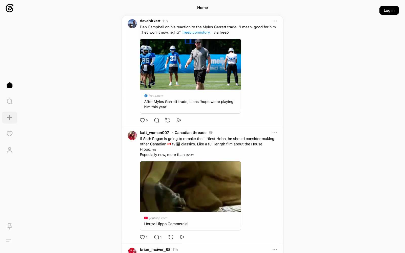
Threads
Threads — Style Reference
# Threads — Style Reference
> Quiet monochrome paper feed
**Theme:** light
Threads reads as a monochrome whisper — a near-white canvas (#fafafa) holding a single narrow feed column framed by a sparse icon-only sidebar. Almost every surface, border, and icon is rendered in black-to-gray neutrals, with color appearing only as functional punctuation: the indigo-blue (#385898) for verified badges, links, and hover states, and a brighter blue (#0095f6) for the primary follow action. Components are flat, hairline-bordered, and generously rounded — 18px on post cards, fully pill-shaped (1000px) on buttons and tags, 8px on media thumbnails. The system avoids elevation entirely; cards sit on the canvas with 1px borders rather than shadows, giving the interface a printed-on-paper feel rather than a stacked-product feel. Typography is system-ui at small compact sizes (12–15px), with bold 600 used for usernames and post bodies remain at 400, creating a text-first social reader where avatars and short replies are the visual content.
## Tokens — Colors
| Name | Value | Token | Role |
|------|-------|-------|------|
| Ink | `#000000` | `--color-ink` | Primary text, icon strokes, hairline borders, Log in button — the structural black that carries almost all interface weight |
| Paper | `#fafafa` | `--color-paper` | Page canvas, card surface background — the off-white that makes the whole feed feel like printed paper |
| Concrete | `#d5d5d5` | `--color-concrete` | Dividers and separator borders between feed sections |
| Graphite | `#969696` | `--color-graphite` | Muted helper text, inactive icons, disabled state borders, timestamp labels |