AI Prompt Studio - Intelligent Prompt Library
Explore and use professional AI prompts to optimize your workflow.
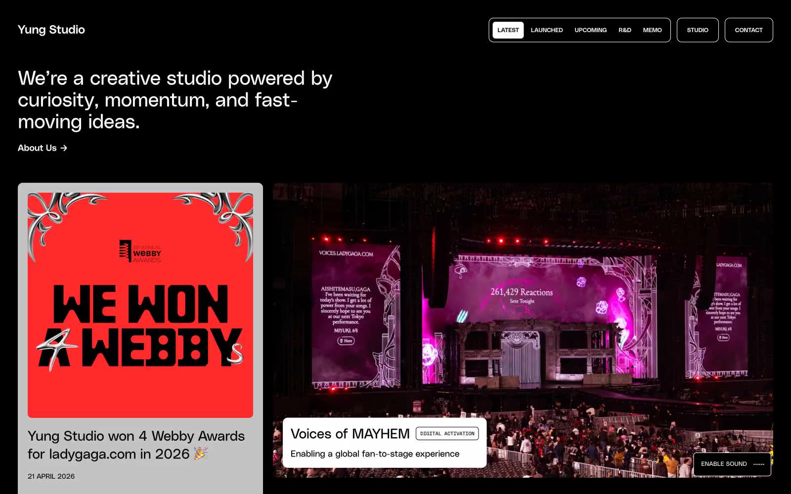
Yung Studio
Yung Studio — Style Reference

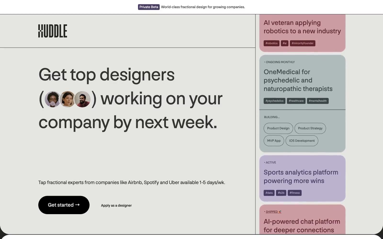
Huddle
Huddle — Style Reference
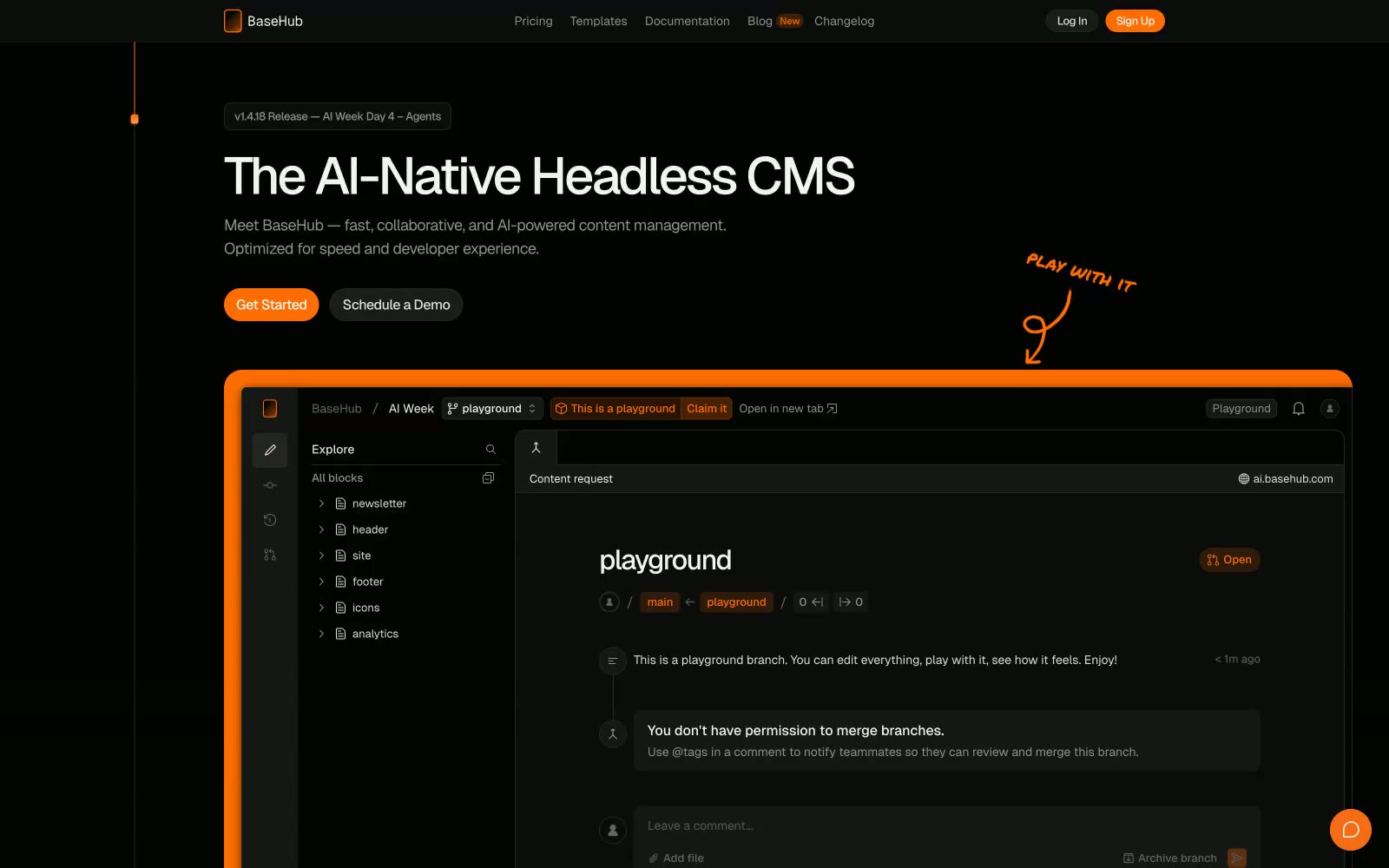
BaseHub
BaseHub — Style Reference
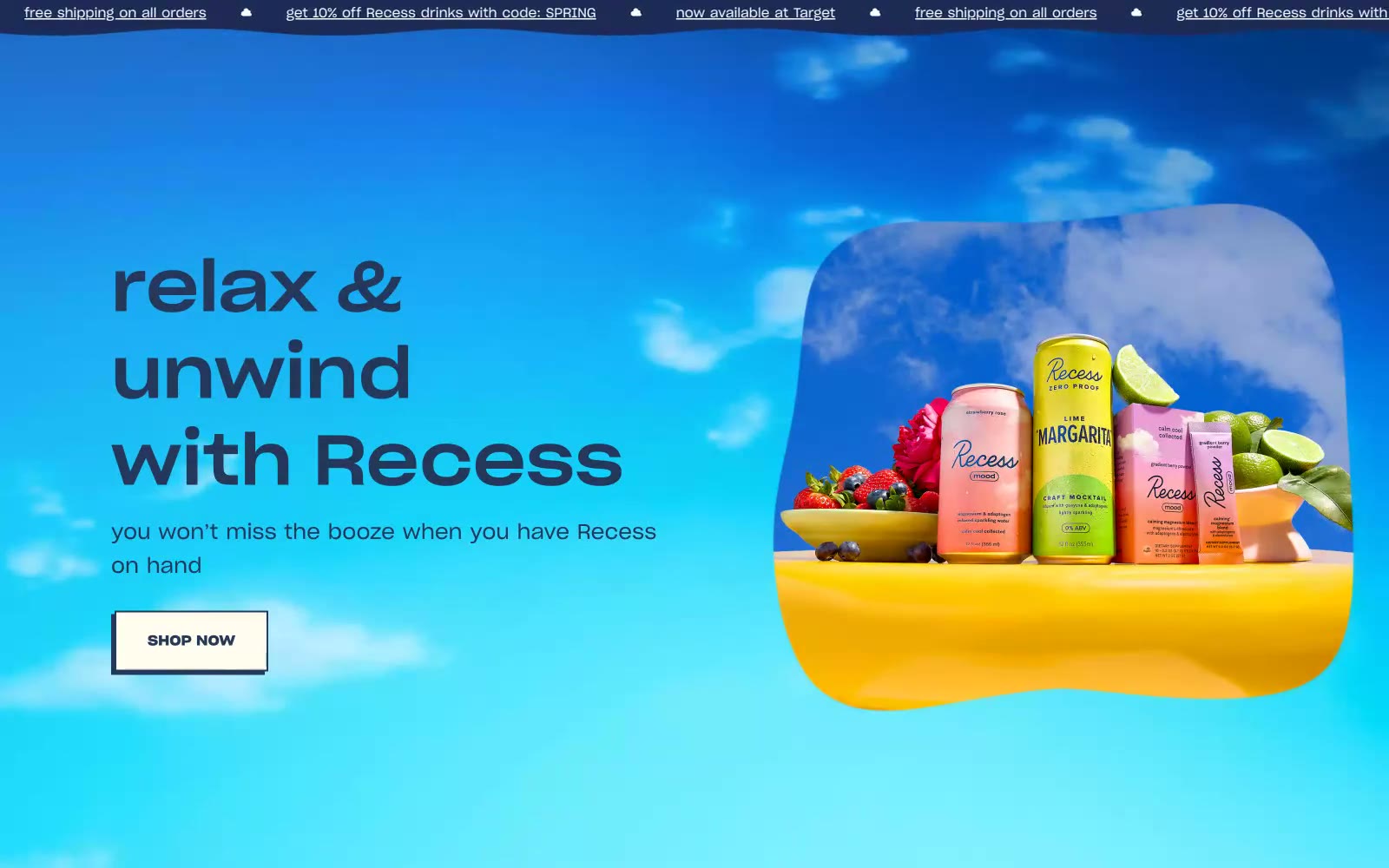
Recess
Recess — Style Reference
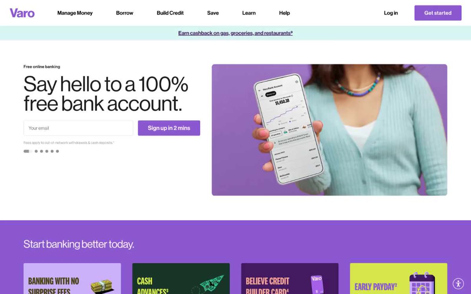
Varo Bank
Varo Bank — Style Reference
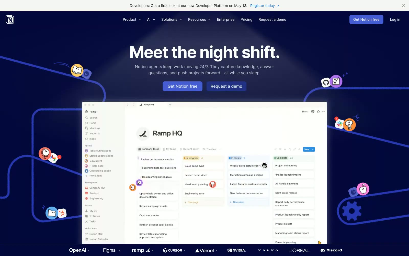
Notion
Notion — Style Reference
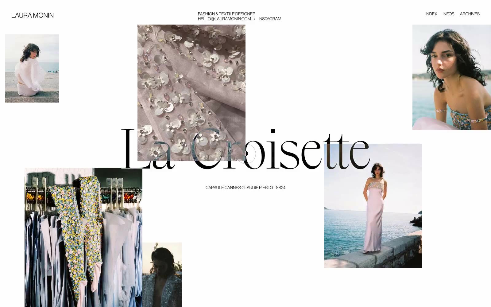
Laura Monin
Laura Monin — Style Reference
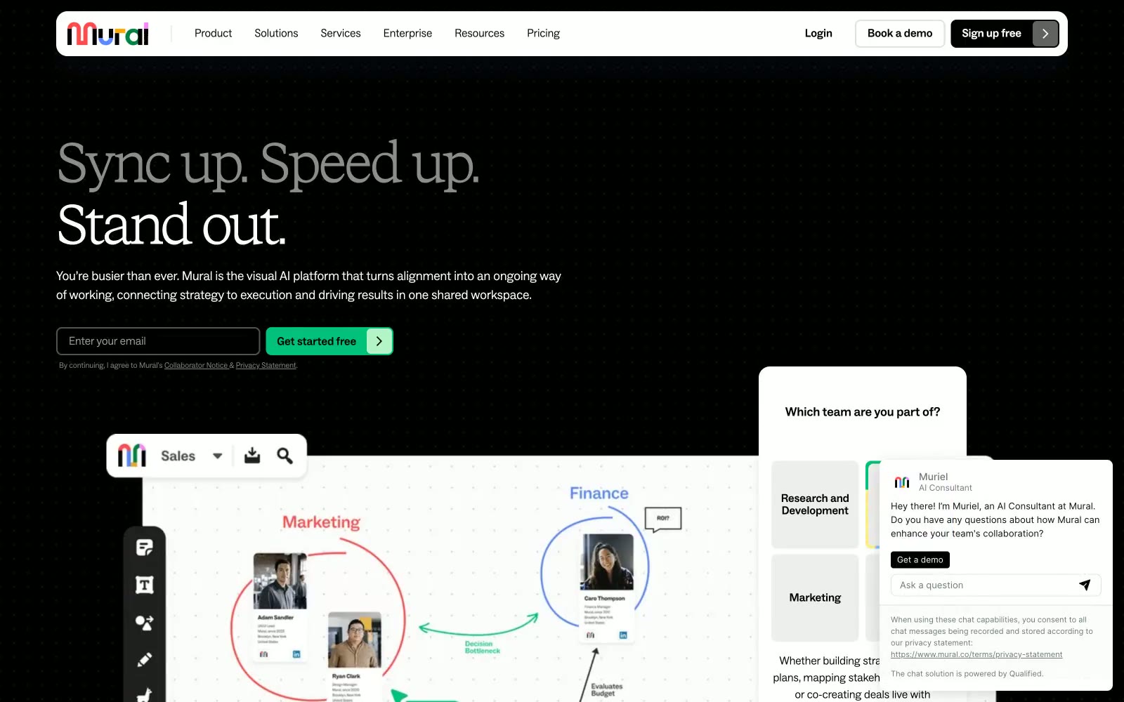
Mural
Mural — Style Reference
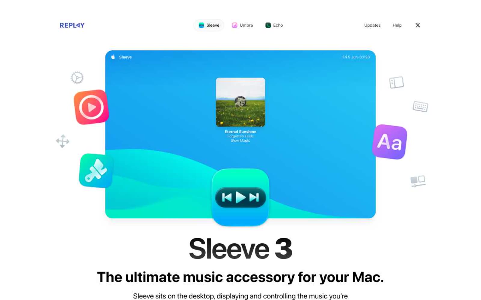
Sleeve
Sleeve — Style Reference
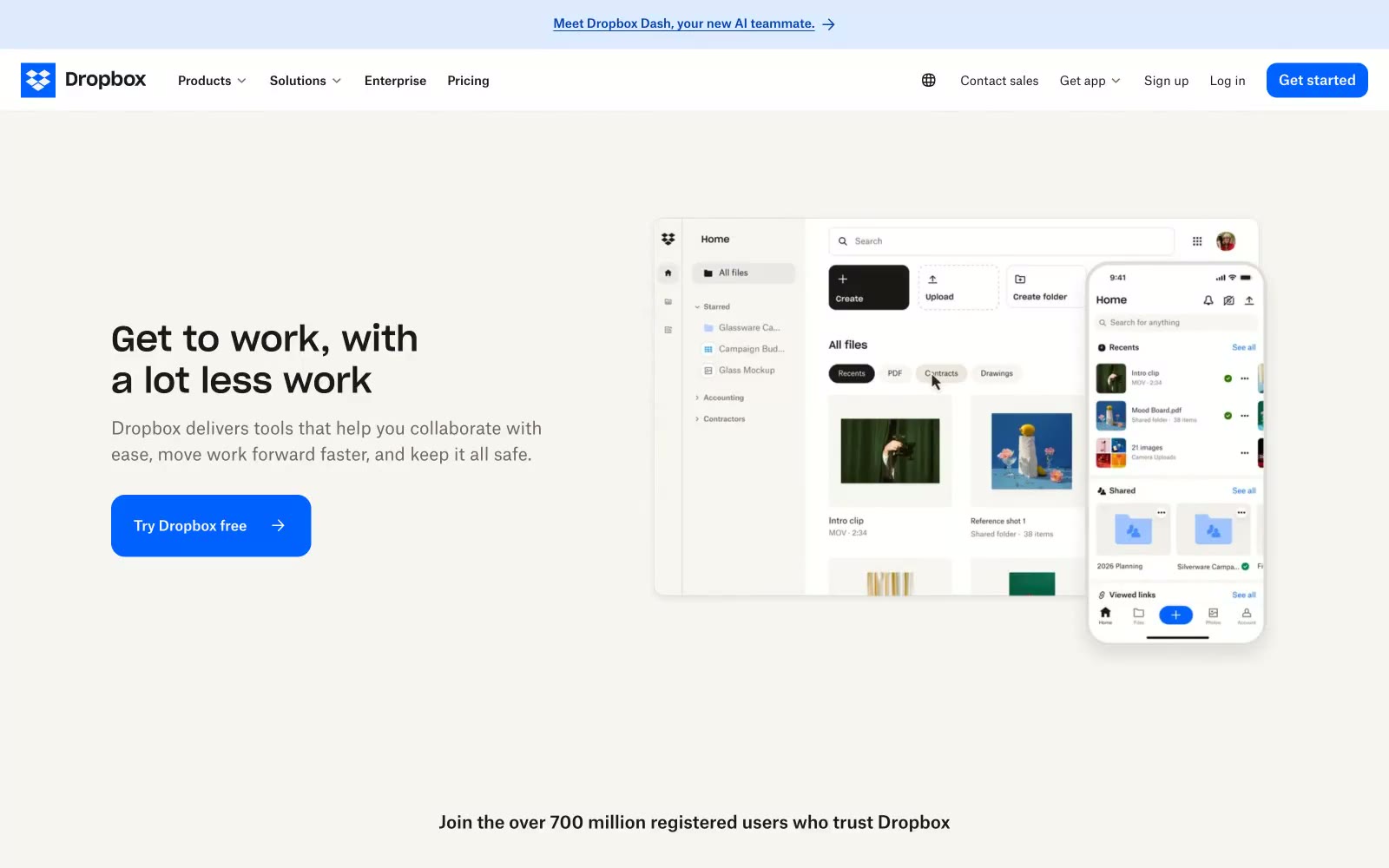
Dropbox.com
Dropbox.com — Style Reference
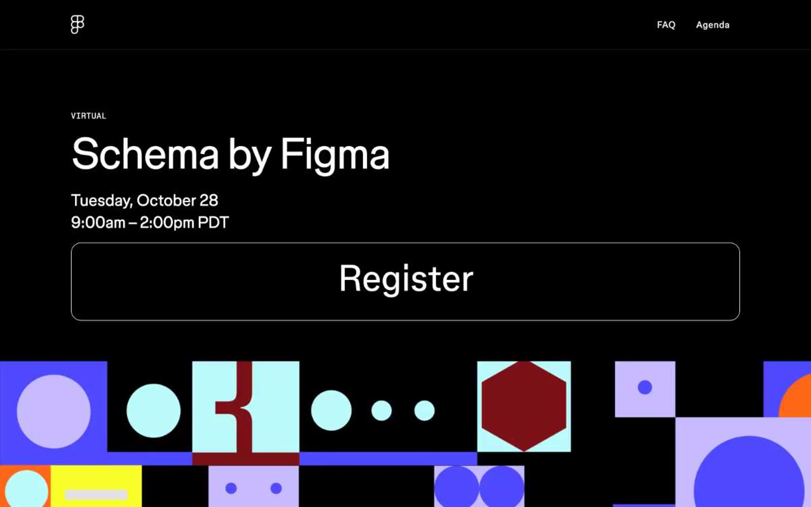
Schema
Schema — Style Reference
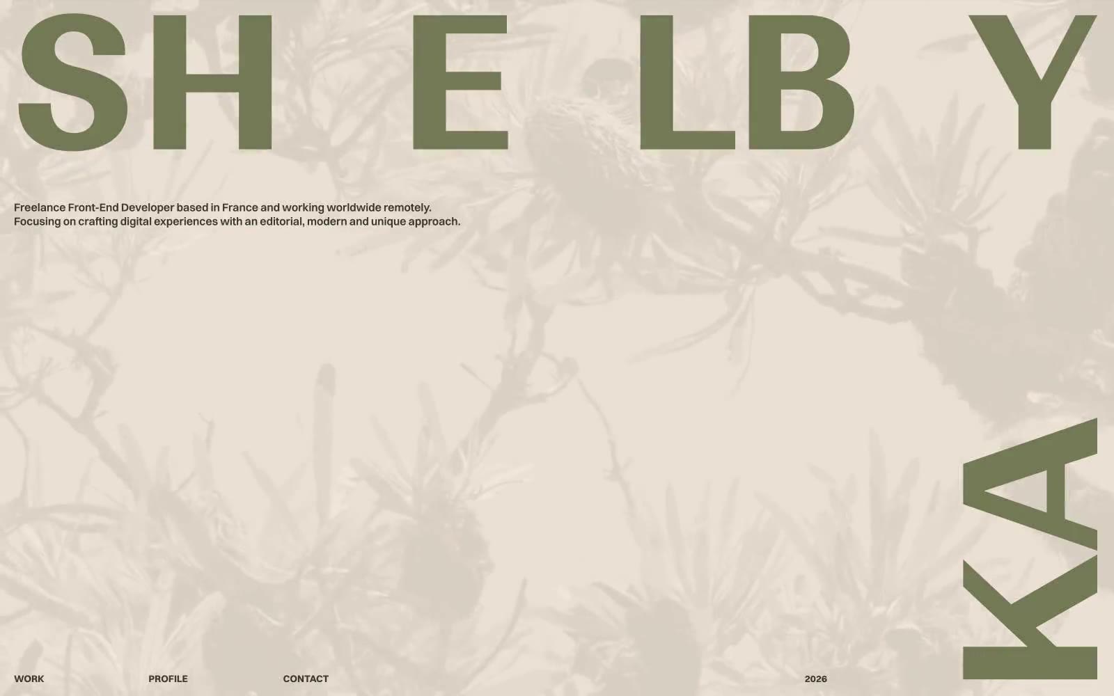
Shelby Kay
Shelby Kay — Style Reference
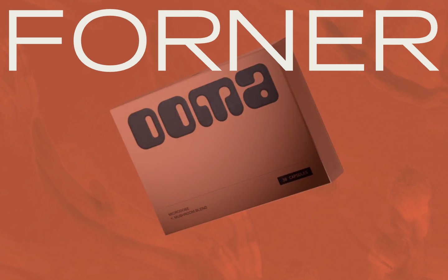
Forner
Forner — Style Reference
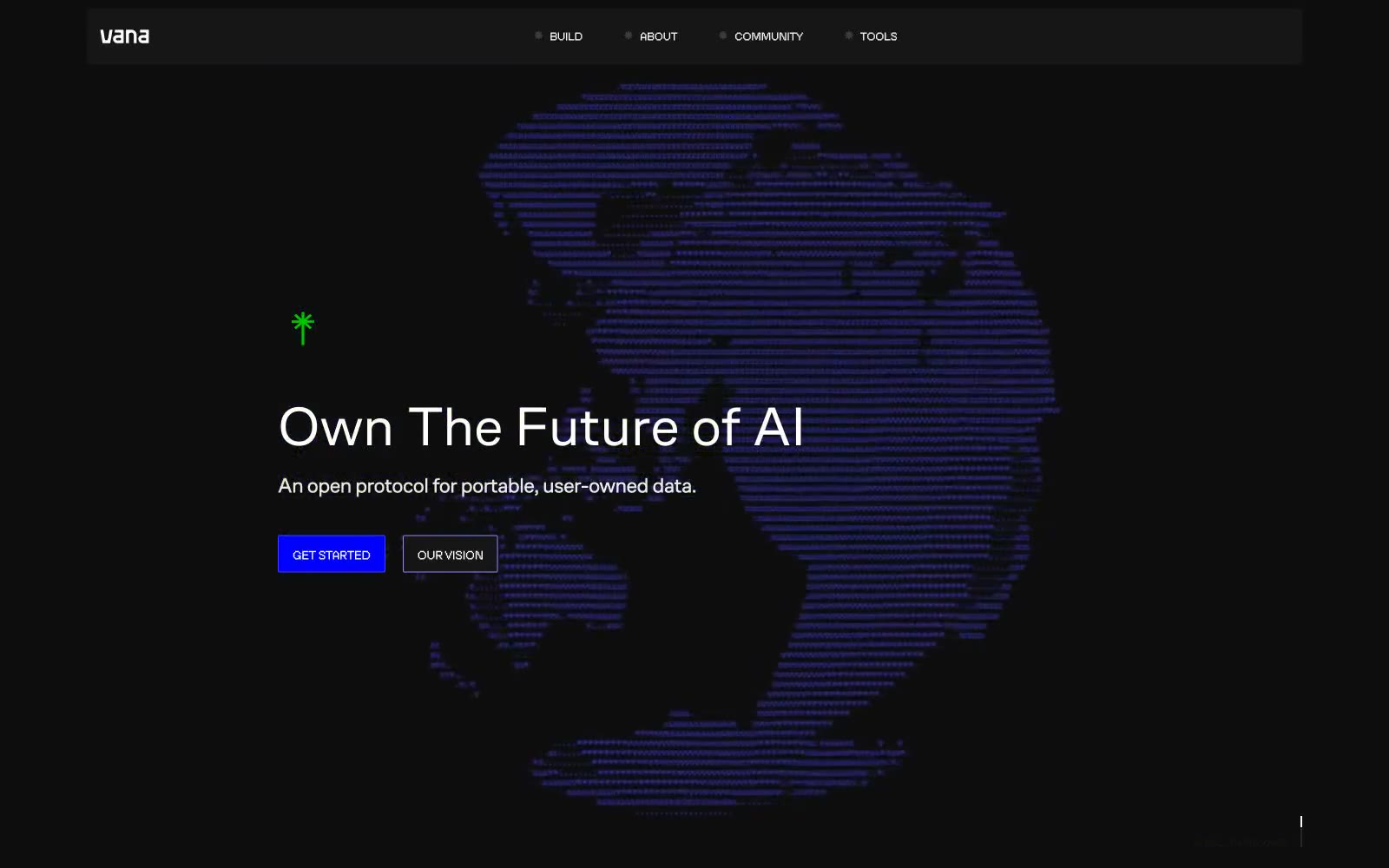
Vana
Vana — Style Reference
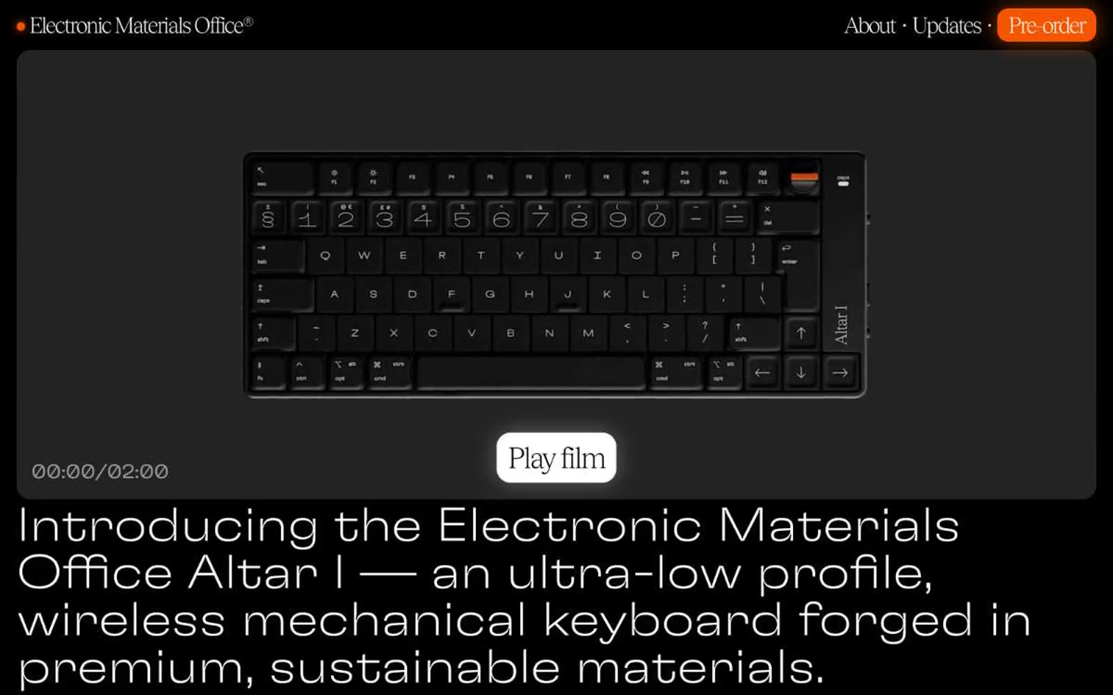
Electronic Materials Office®
Electronic Materials Office® — Style Reference
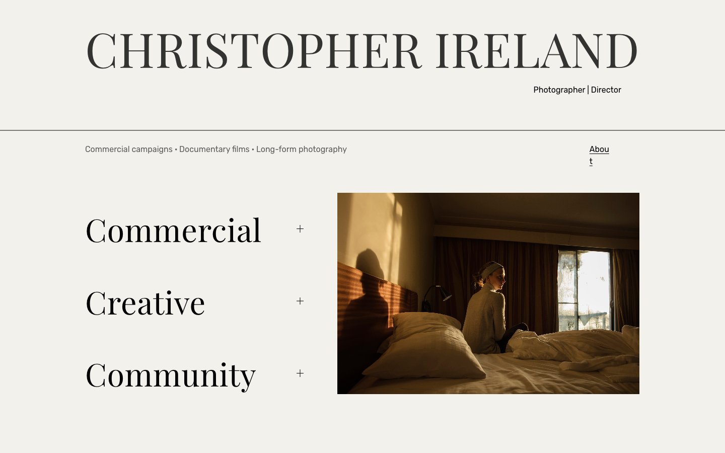
CHRISTOPHER IRELAND CREATIVE
CHRISTOPHER IRELAND CREATIVE — Style Reference
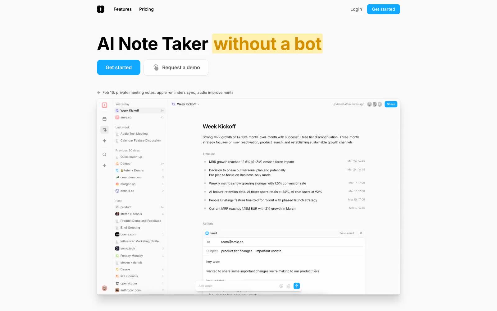
Amie
Amie — Style Reference
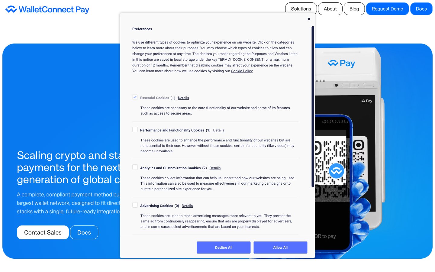
WalletConnect
WalletConnect — Style Reference
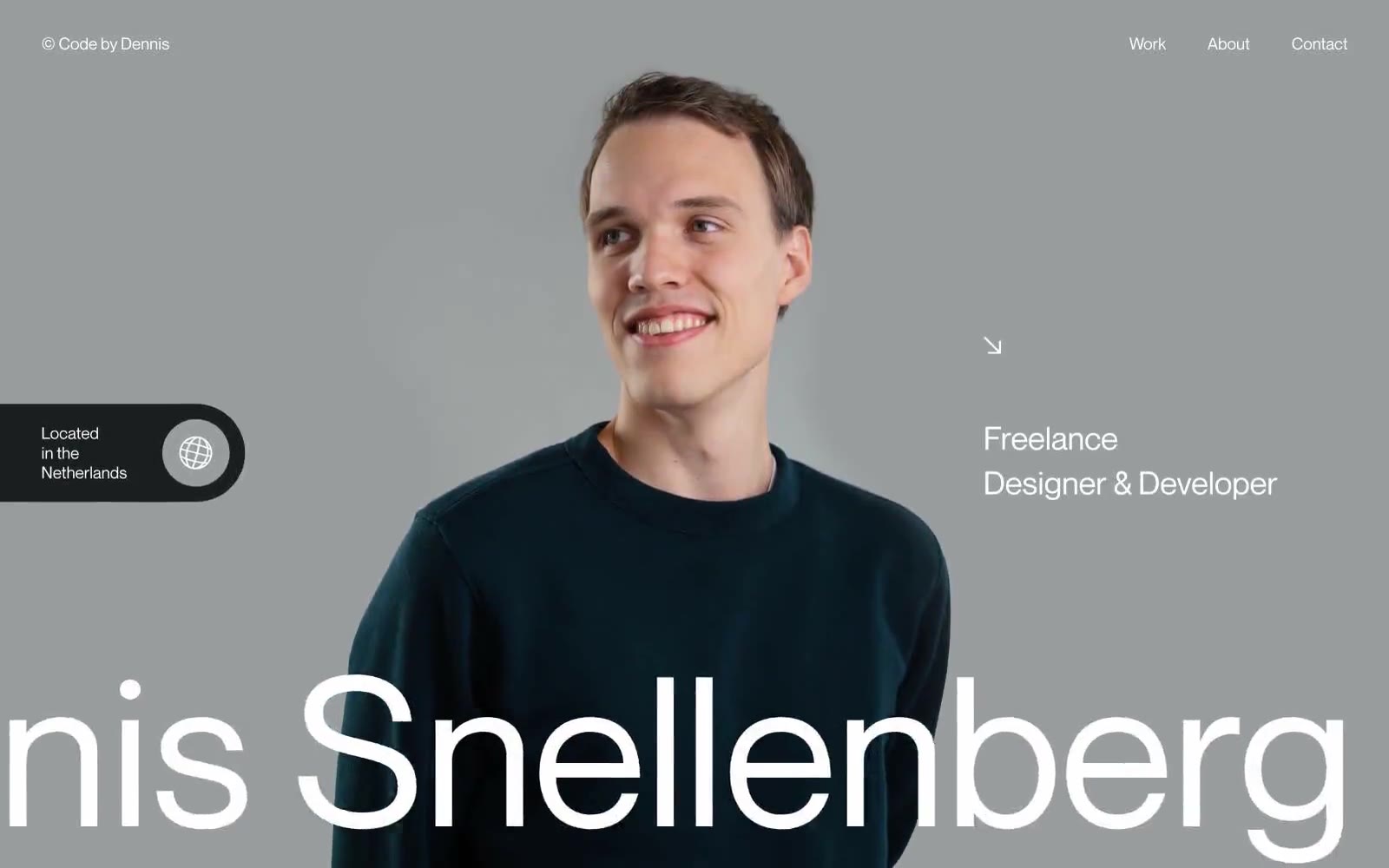
Dennis Snellenberg
Dennis Snellenberg — Style Reference
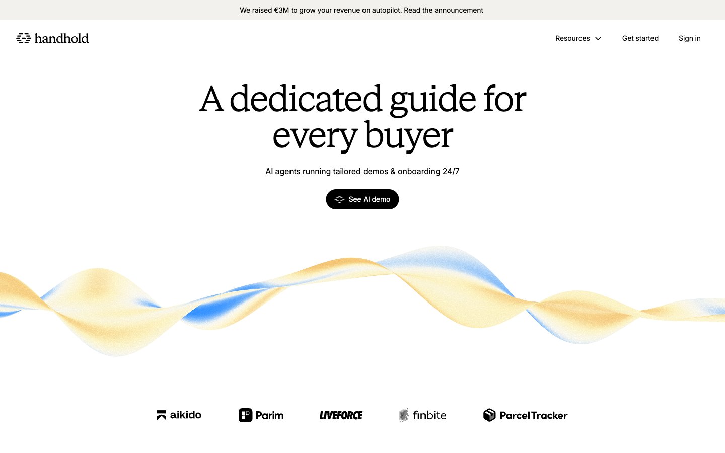
Handhold
Handhold — Style Reference
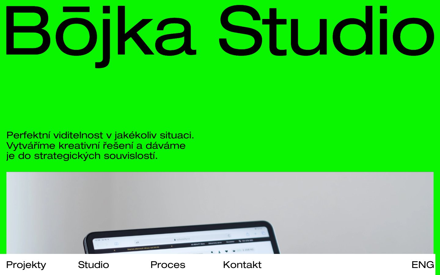
Bōjka Studio
Bōjka Studio — Style Reference
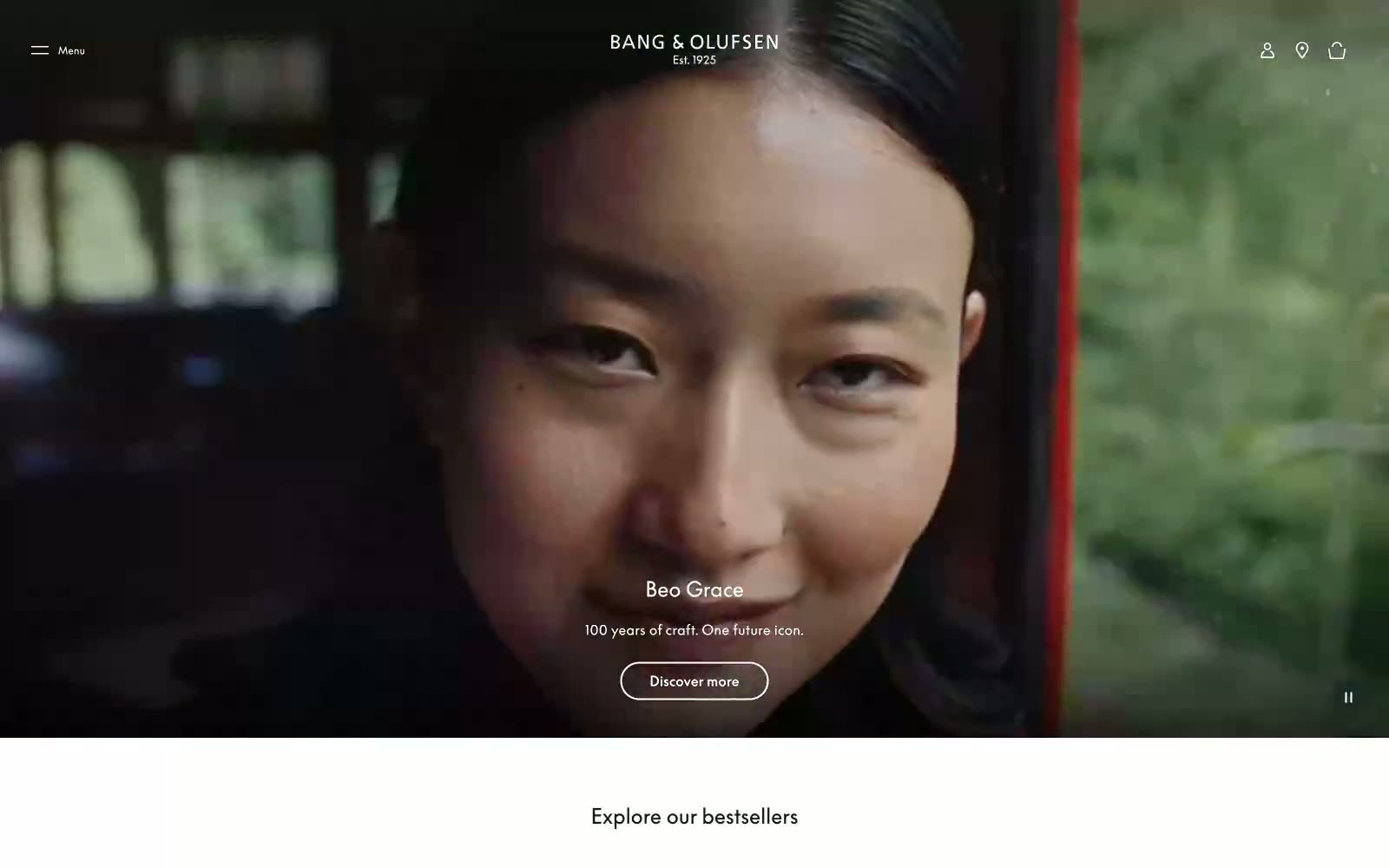
Bang & Olufsen
Bang & Olufsen — Style Reference
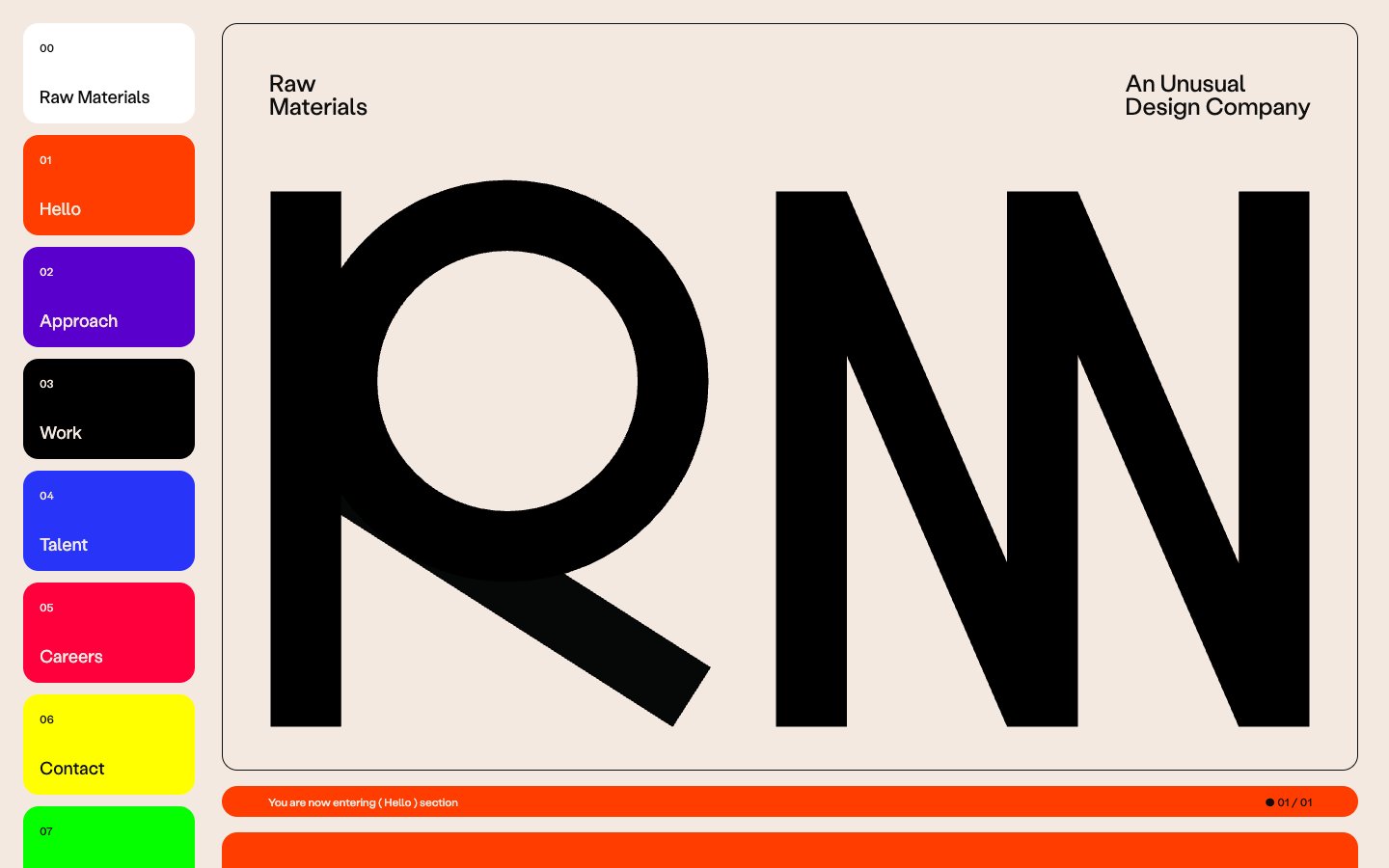
Raw Materials
Raw Materials — Style Reference
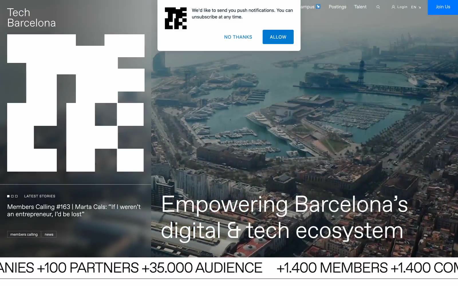
Tech Barcelona
Tech Barcelona — Style Reference