AI Prompt Studio - Intelligent Prompt Library
Explore and use professional AI prompts to optimize your workflow.
One-click Use
Websites
Markdown Text
design-md
website-prompt
landing-page-prompt
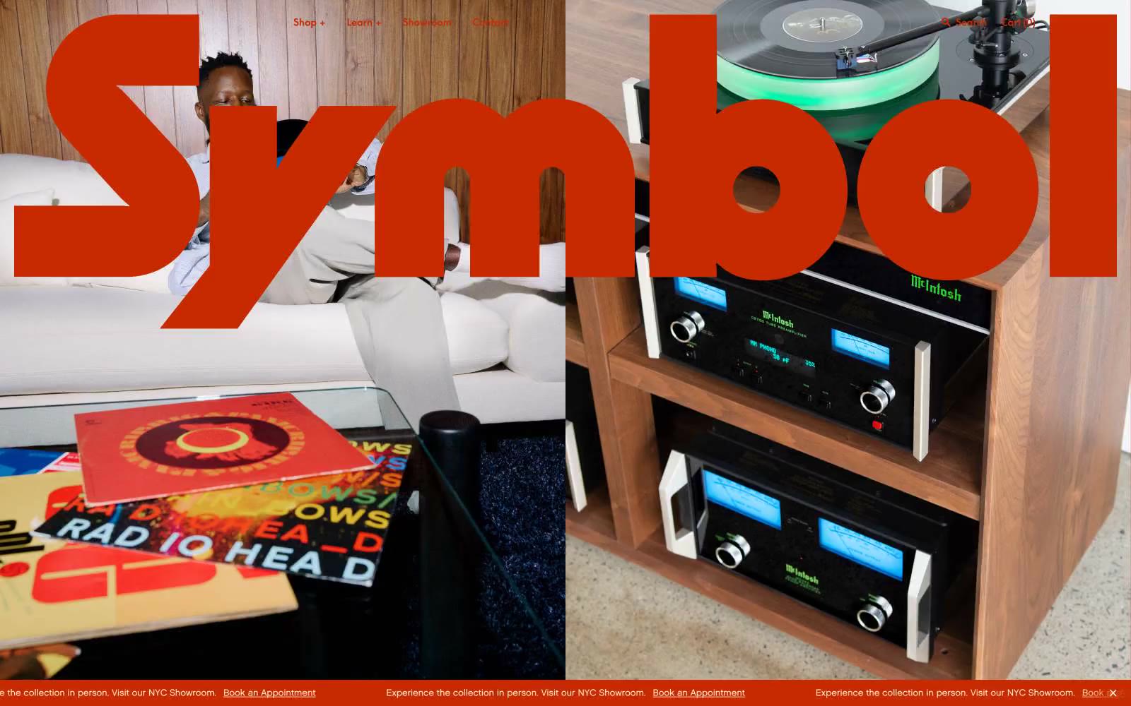
Symbol Audio
Symbol Audio — Style Reference

# Symbol Audio — Style Reference
> midcentury listening room after dusk
**Theme:** dark
Symbol Audio is a dark forest-green gallery for handcrafted audio furniture — a velvet wall behind museum-label typography. The entire site is anchored in a single deep evergreen (#1c3c27) that functions simultaneously as canvas, brand, and action border, with cream-bone cards floating on it like exhibition placards. Two custom serifs (Chalet-LondonSixty, Chalet-NewYorkSixty) carry every word of product copy, nav, and body, paired with a sharp geometric sans (SupremeLL-Bold) that exclusively handles display moments and headings — the contrast between rounded serif warmth and cold geometric boldness IS the voice. A single bottom marquee runs continuously, and the hero commits to a display headline so massive it bleeds off both edges of the viewport.
## Tokens — Colors
| Name | Value | Token | Role |
|------|-------|-------|------|
| Evergreen Gallery | `#1c3c27` | `--color-evergreen-gallery` | Green accent for outlined action borders, linked labels, and lightweight interactive emphasis. Do not promote it to the primary CTA color |
| Frost White | `#fffffd` | `--color-frost-white` | Product card surfaces, text on dark sections — slightly warm off-white, never pure #fff |
| Pewter Mist | `#dfe2e5` | `--color-pewter-mist` | Hairline borders, card outlines, divider rules, ghost-button borders on light cards |
| Onyx | `#000000` | `--color-onyx` | Primary text on light cards, icon strokes, high-contrast detail |
Websites
Markdown Text
design-md
website-prompt
landing-page-prompt
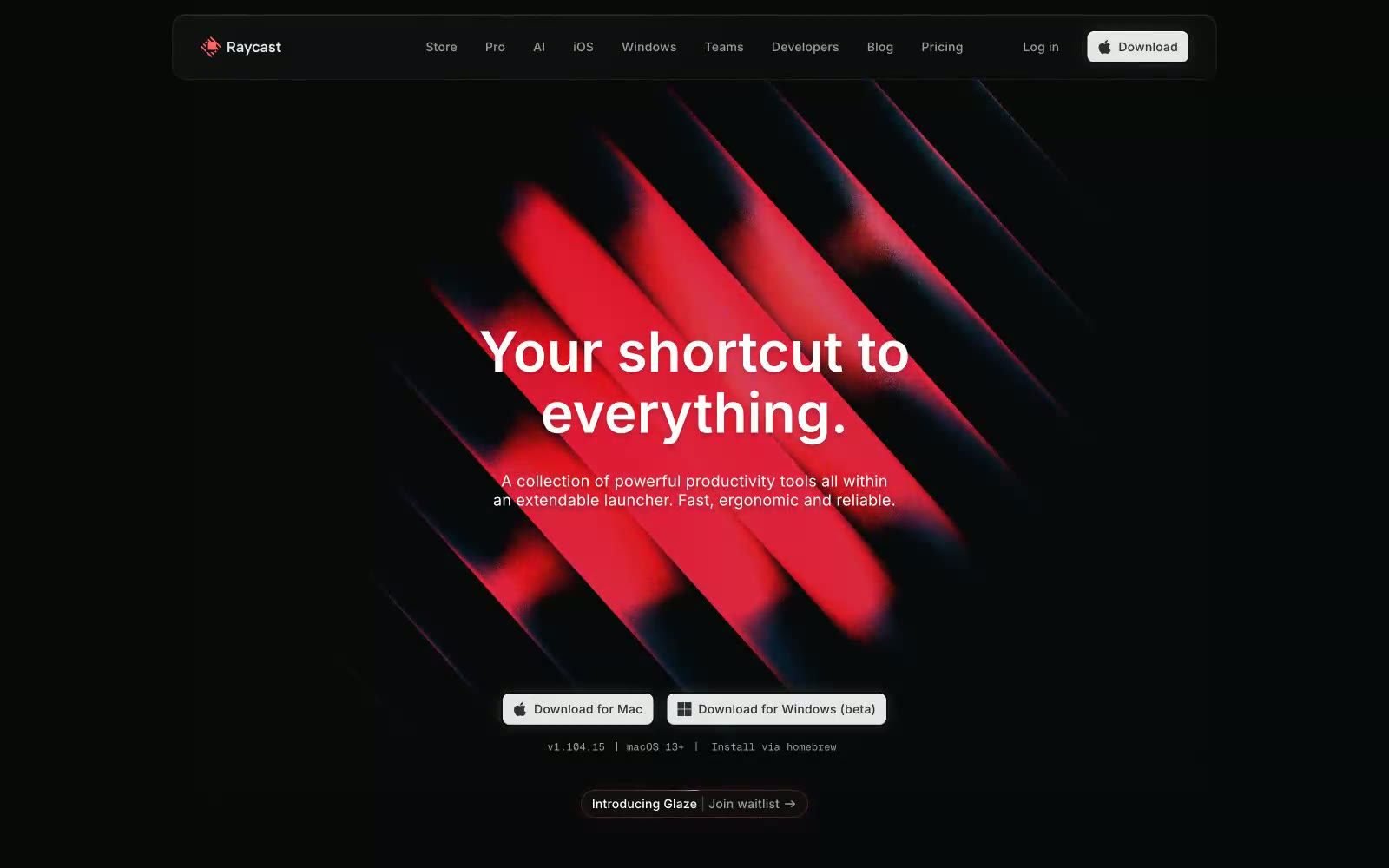
Raycast
Raycast — Style Reference
# Raycast — Style Reference
> Obsidian command terminal — a near-black void where UI surfaces emerge like backlit glass panels, depth created by shadow layering rather than color contrast.
**Theme:** dark
Raycast lives in near-total darkness — a #040506 void where UI surfaces emerge as barely-lighter charcoal strata rather than conventional cards. The signature move is depth through shadow layering: the keyboard-key shadow `rgba(0,0,0,0.4) 0px 1.5px 0.5px 2.5px, rgb(0,0,0) 0px 0px 0.5px 1px, rgba(0,0,0,0.25) 0px 2px 1px 1px inset, rgba(255,255,255,0.2) 0px 1px 1px 1px inset` makes interactive elements feel physically pressable — a tactile metaphor for keyboard shortcuts. The brand red (#FF6363) appears sparingly as a status signal and logo accent rather than a CTA color; primary download buttons are a near-white #E6E6E6 pill on black — inverted convention. Radial gradients with blue and purple cores bleed into the dark canvas at very low opacity, creating the impression of colored light sources behind frosted obsidian. Type is Inter with tight negative tracking at display sizes, shifting to loose positive tracking on micro labels and badges — creating a two-register system where headlines contract and metadata breathes.
## Tokens — Colors
| Name | Value | Token | Role |
|------|-------|-------|------|
| Void Black | `#040506` | `--color-void-black` | Dominant page canvas and deepest shadow color — the ground state everything floats above |
| Deep Charcoal | `#07080a` | `--color-deep-charcoal` | Primary card and section backgrounds; the first surface level above canvas |
| Graphite 700 | `#111214` | `--color-graphite-700` | Secondary surface and elevated card backgrounds |
| Graphite 600 | `#1b1c1e` | `--color-graphite-600` | Observed in other boxShadow, link boxShadow, badge backgroundColor. Extracted usage does not support a distinct primary control color. |
Websites
Markdown Text
design-md
website-prompt
landing-page-prompt
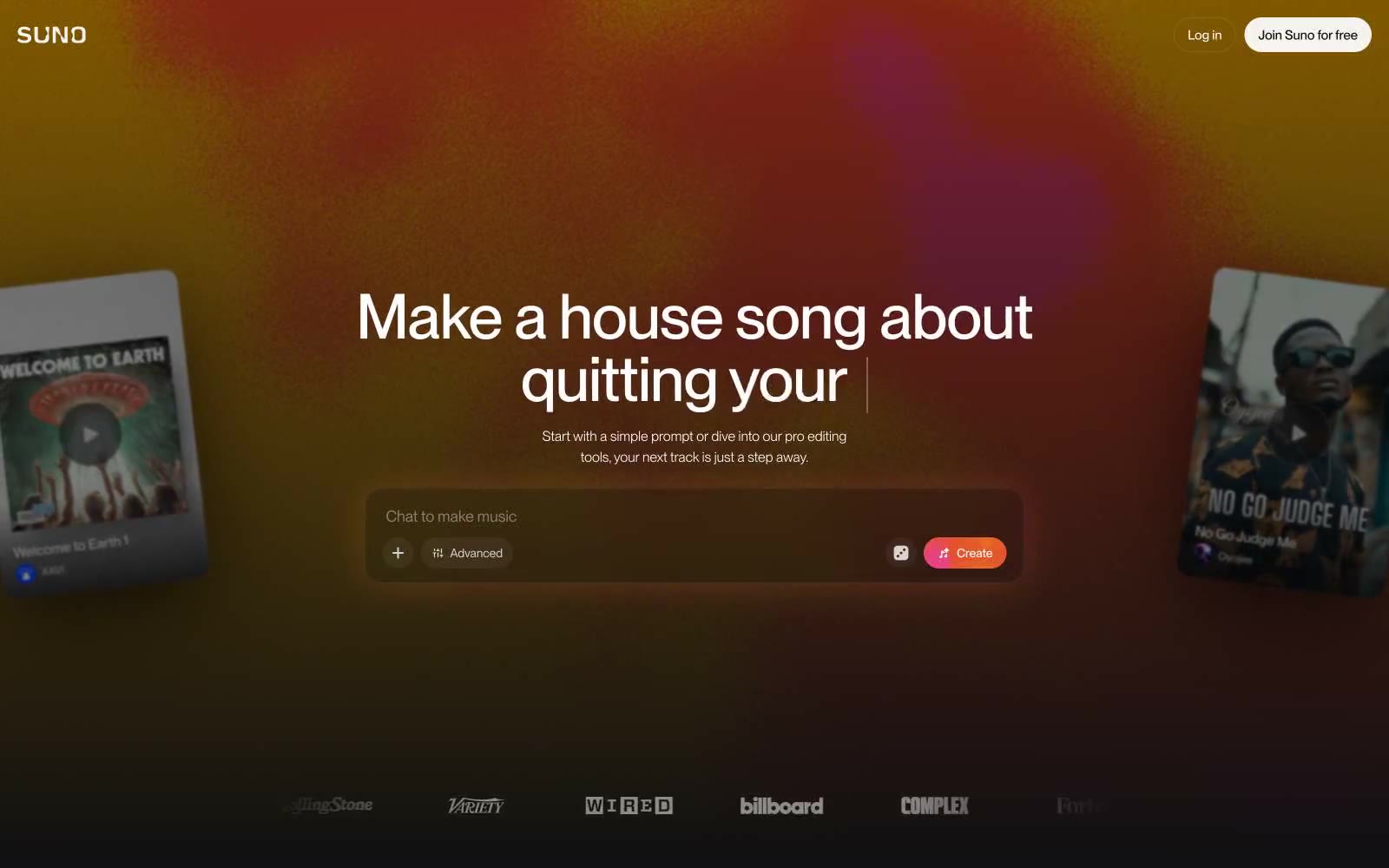
Suno
Suno — Style Reference
# Suno — Style Reference
> Afterglow on a mixing console. Cream typography and a sunset wash over a matte black studio, with a single coral button as the only chromatic punctuation.
**Theme:** dark
Suno operates in a warm nocturnal register: a near-black canvas (#101012) lit by a single dusk-gradient wash, with one cream-warm off-white (#f7f4ef) carrying all body and headline text. The whole product feels like a recording studio after midnight — quiet, matte, and slightly reflective, with color reserved as a single-function event (the coral Create button) that punctuates an otherwise monochromatic surface. Typography does the heavy lifting: Neue Montreal sets almost everything in compact 14–16px rows, while an Editorial New italic display voice breaks the dark with humanistic serifs at 72–140px, giving every screen one moment of warmth and scale. Components are low-elevation by default — soft cards, ghost controls, thin dividers — and the only true accent is the sunset gradient that bleeds behind the hero.
## Tokens — Colors
| Name | Value | Token | Role |
|------|-------|-------|------|
| Studio Black | `#101012` | `--color-studio-black` | Page canvas, default surface — the dominant background behind every screen |
| Deep Anvil | `#17171a` | `--color-deep-anvil` | Elevated surface — cards, input wells, modals layered above the canvas |
| Pure Ink | `#000000` | `--color-pure-ink` | Dark supporting neutral for text, icons, and strong contrast. Do not promote it to the primary CTA color |
| Warm Cream | `#f7f4ef` | `--color-warm-cream` | Primary text color and high-contrast foreground — the signature off-white that keeps the dark UI from feeling cold |
Websites
Markdown Text
design-md
website-prompt
landing-page-prompt
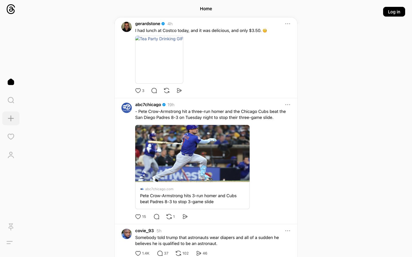
Threads
Threads — Style Reference
# Threads — Style Reference
> newspaper column on frosted glass
**Theme:** light
Threads uses a text-first social-feed language: a near-monochrome canvas where black text on warm-white surfaces carries almost all communication, with a single deep Facebook-blue (#385898) used sparingly for links, verification ticks, and hover accents. The interface strips away decorative chrome — no gradients, no color fills, no rounded buttons beyond pure pills — to keep visual weight concentrated on the words people write. Surfaces are quietly layered: a paper-white page holds a softly elevated, large-radius feed column, and every interactive element is reduced to a line icon or a thin border. The result feels closer to a newspaper column rendered on a tablet than a typical social app — dense with text, generous with whitespace, and confident enough to let the content do the work.
## Tokens — Colors
| Name | Value | Token | Role |
|------|-------|-------|------|
| Ink Black | `#000000` | `--color-ink-black` | Primary text, icon strokes, structural borders, and the filled Log in button — the load-bearing color that carries almost every interface element |
| Paper White | `#fafafa` | `--color-paper-white` | Page canvas and the topmost surface layer — warm off-white that softens the contrast of pure black text |
| Mist Gray | `#efefef` | `--color-mist-gray` | Secondary surface beneath the elevated feed container — the shadow-tinted plane that gives the feed column its lifted feel |
| Cloud Gray | `#d5d5d5` | `--color-cloud-gray` | Post dividers and card outline borders — the thinnest structural separator between stacked feed items |
Websites
Markdown Text
design-md
website-prompt
landing-page-prompt
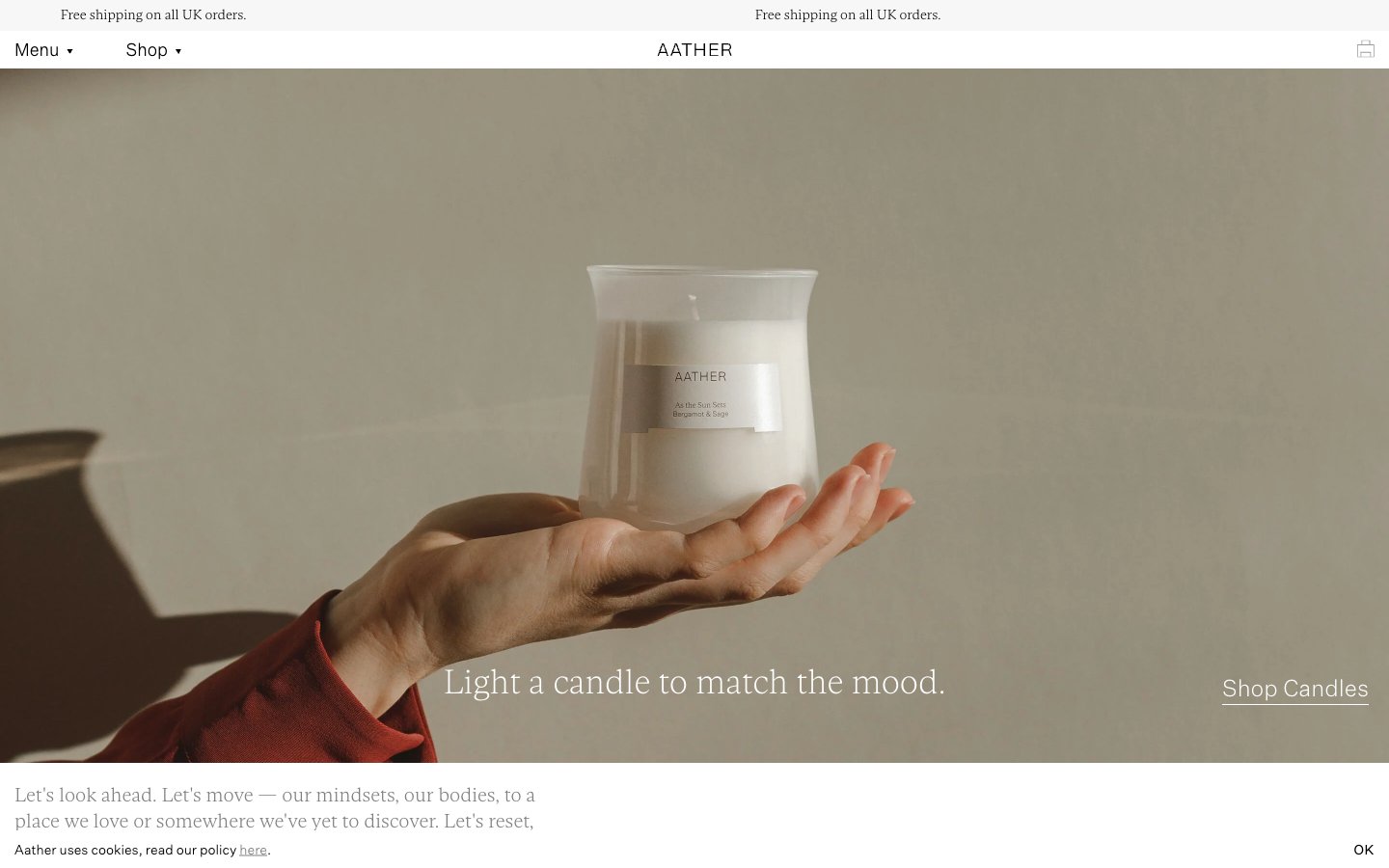
AATHER
AATHER — Style Reference
# AATHER — Style Reference
> Open palm, single flame — quiet luxury held in stillness.
**Theme:** light
AATHER operates as an editorial candle studio rendered in near-total monochrome: white canvas, black ink, hairline rules, and photography doing all the emotional heavy lifting. The interface itself is austere to the point of being almost invisible — every typographic decision is calibrated toward whisper (weights 100–200) and air (tracking 0.036–0.056em), so the UI reads like a fashion magazine layout rather than a storefront. Warmth is never injected into the UI palette; instead, a single sand-toned surface (#dec39d) and full-bleed editorial photography carry the brand's tactile, hand-held mood. Components are reduced to their most elemental forms: text links with thin underlines stand in for buttons, 2px corners refuse decoration, and the centered wordmark navigation borrows directly from print editorial conventions.
## Tokens — Colors
| Name | Value | Token | Role |
|------|-------|-------|------|
| Ink | `#000000` | `--color-ink` | Neutral form states, badge text, and quiet UI feedback where color should stay understated. |
| Paper | `#ffffff` | `--color-paper` | Page background, card surfaces, reversed text on dark — the default canvas. Never tinted, never warmed; warmth arrives only through photography |
| Mist | `#f7f7f7` | `--color-mist` | Alternate canvas band, subtle section wash — used to separate content blocks without introducing a visible border line |
| Ash | `#e8e8e8` | `--color-ash` | Footer and secondary dividers — the lightest perceptible rule, reserved for structural seams that must recede |
Websites
Markdown Text
design-md
website-prompt
landing-page-prompt
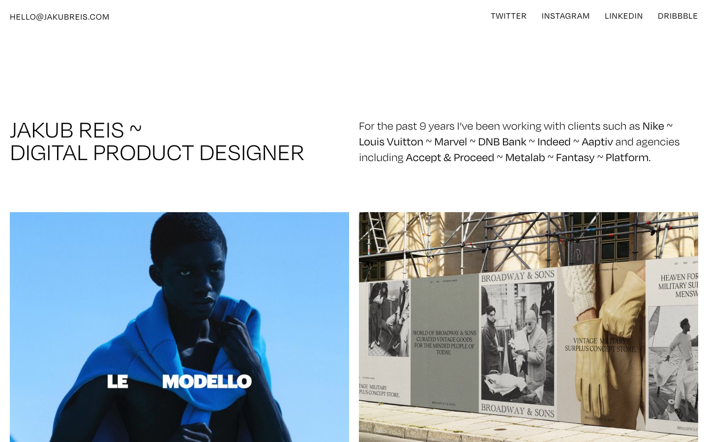
Jakub Reis
Jakub Reis — Style Reference
# Jakub Reis — Style Reference
> gallery wall on bone paper — every screen is a quiet white room where only typography and photography exist
**Theme:** light
Jakub Reis is a type-driven portfolio: a bone-white canvas, a single custom sans-serif at whisper weights, and photographs that carry every drop of color the system refuses to supply. The site reads like a printed exhibition catalog — a name, a discipline, a grid of framed works, and nothing else. Hierarchy is built entirely from size, weight (300 vs 400 only), and the generous negative space between blocks; there are no buttons, no badges, no borders, no shadows, no gradients. The signature is restraint: even the separator between client names in the intro paragraph is a tilde (~) instead of a dot, pipe, or comma — a typographic personality choice that the entire UI leans into. Components are essentially text labels attached to full-bleed images; the design system exists to disappear so the work can speak.
## Tokens — Colors
| Name | Value | Token | Role |
|------|-------|-------|------|
| Bone | `#f8f8f8` | `--color-bone` | Page canvas, the only background tone — a warm off-white that keeps the page from feeling clinical |
| Carbon | `#000000` | `--color-carbon` | Primary text, project titles, navigation links, all body copy — the only ink the system ever uses |
| Ash | `#080808` | `--color-ash` | Secondary text, near-identical to Carbon for AAA contrast on Bone — exists for accessibility, not visual contrast |
| Stone | `#d8d8d8` | `--color-stone` | Muted UI surface for disabled controls, low-emphasis panels, and placeholder blocks. Do not promote it to the primary CTA color |
Websites
Markdown Text
design-md
website-prompt
landing-page-prompt
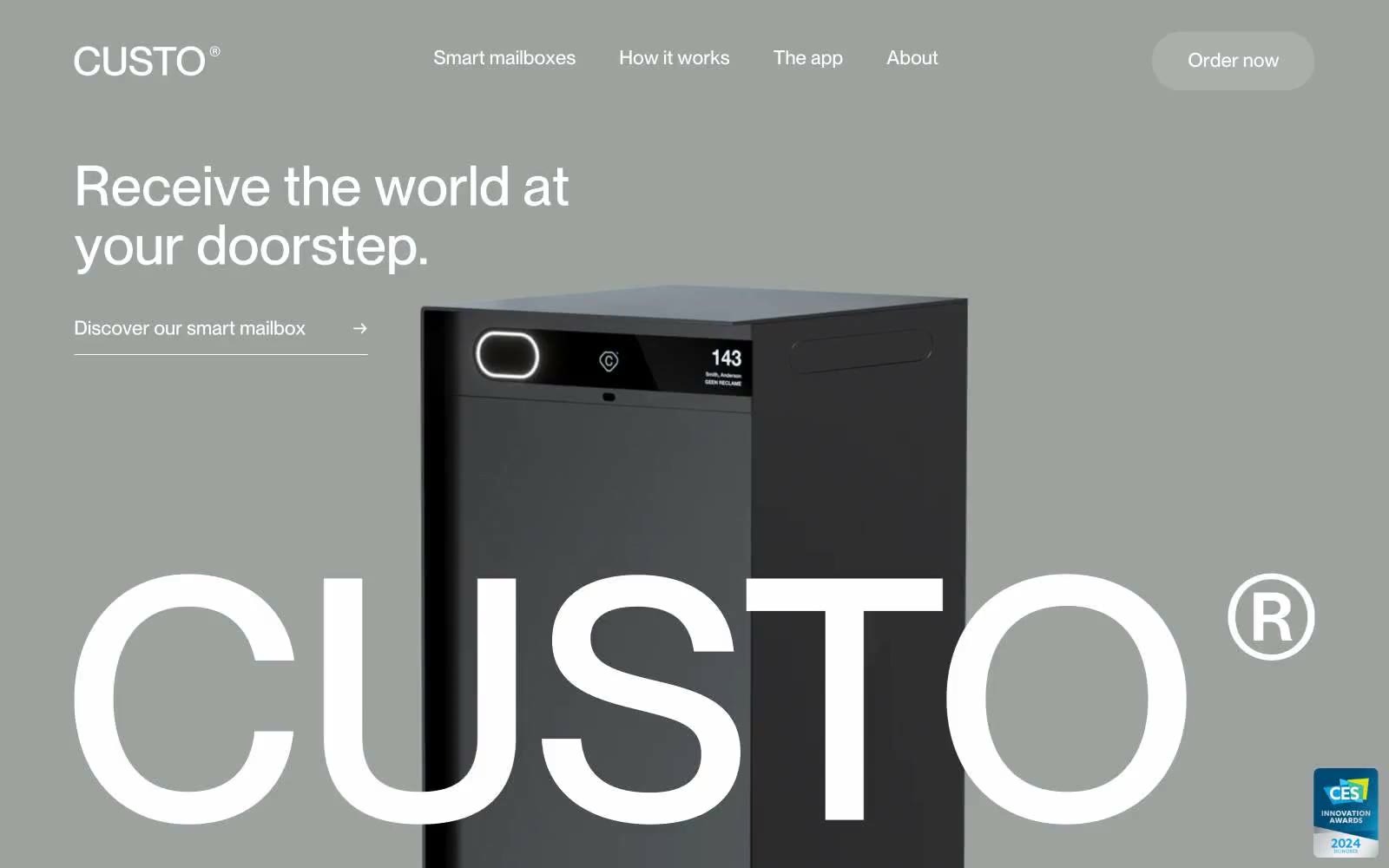
Custo
Custo — Style Reference
# Custo — Style Reference
> Gunmetal gallery with monolithic type. A muted gray-green showroom where a single dark object and 57px type do all the talking.
**Theme:** light
Custo operates as an industrial product gallery: a warm gunmetal canvas hosts the physical product while oversized display typography serves as the primary visual ornament. The system is rigorously achromatic — zero chromatic colors — letting the dark anodized mailbox and the geometric weight of a single sans-serif carry all brand personality. Every screen balances generous negative space against one monumental typographic statement, with the brand wordmark recurring as a near-architectural element. Surfaces are flat and matte; depth is implied by the product's own reflectivity rather than drop shadows or gradients.
## Tokens — Colors
| Name | Value | Token | Role |
|------|-------|-------|------|
| Canvas Gunmetal | `#9ea29f` | `--color-canvas-gunmetal` | Hero and feature-section background — the warm gray-green tint distinguishes Custo from generic white SaaS canvases and reads as architectural concrete rather than digital surface |
| Obsidian | `#000000` | `--color-obsidian` | Primary text, hairline borders, icon strokes — the highest-contrast ink in the system, used for headings and structural dividers |
| Paper White | `#ffffff` | `--color-paper-white` | Body section backgrounds, reversed text on gunmetal canvas, text on the dark product photography |
| Anodized Graphite | `#4b514d` | `--color-anodized-graphite` | Dark surface for product photography, secondary headings, and elevated text — echoes the mailbox finish so the UI and product share a material |
Websites
Markdown Text
design-md
website-prompt
landing-page-prompt
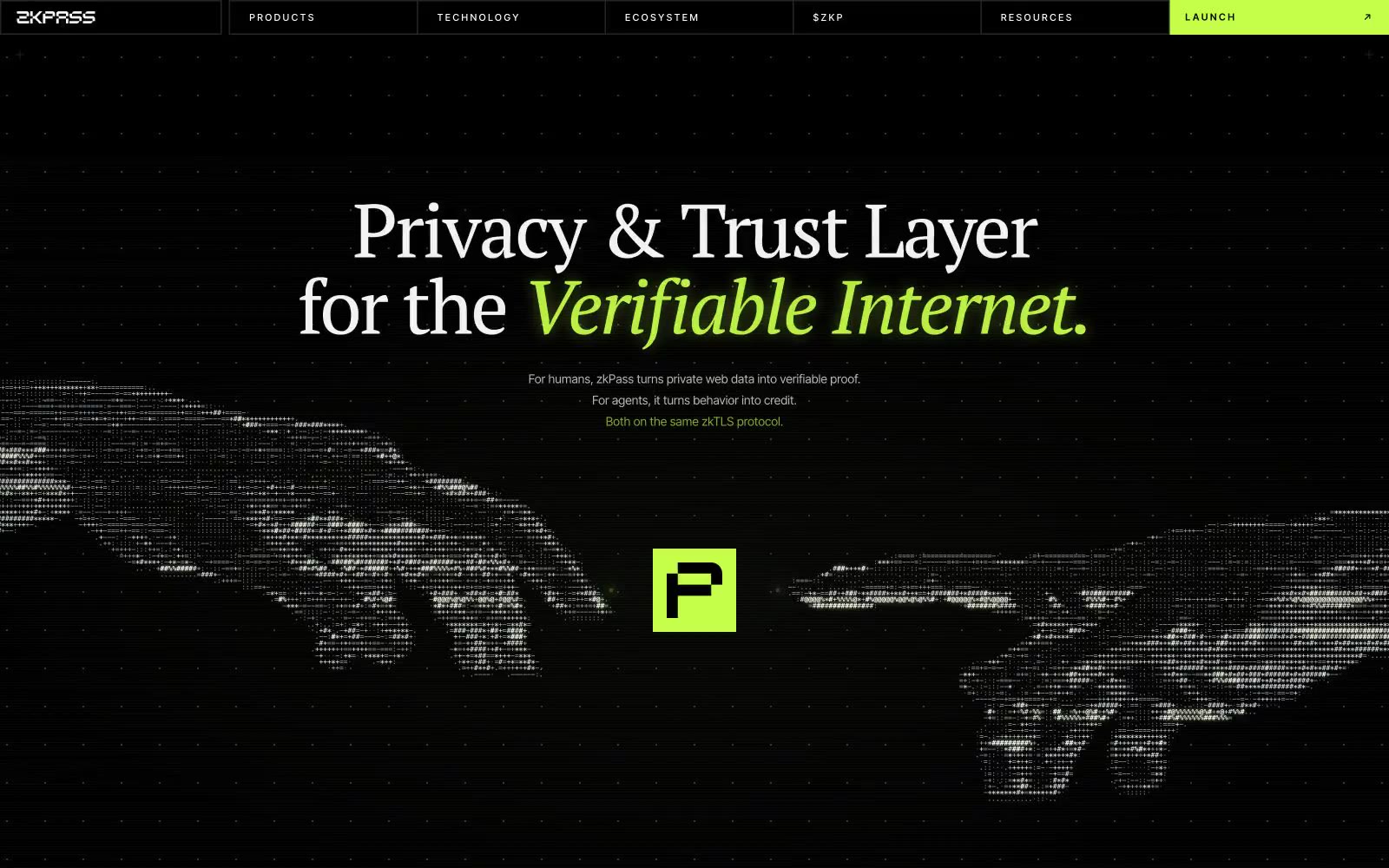
zkPass
zkPass — Style Reference
# zkPass — Style Reference
> Encrypted terminal meets classified broadsheet — a single lime-green signal cutting through near-black typography that mixes a whisper-weight serif with terminal-grade sans.
**Theme:** dark
zkPass is an encrypted-terminal meets editorial-broadsheet: a near-black canvas serves as the substrate for a single vivid chartreuse accent (#c5ff4a) that behaves like a signal light in a dark room. The display voice is PT Serif at weight 300 — a deliberate contrarian choice that lends editorial gravity to a cryptographic protocol, contrasting the cold tech feel with a typeset-newspaper authority. Body and UI chrome switch to Inter Tight, with uppercase tracked-out labels (0.18–0.26em) that read as classified-document metadata. Surfaces stack tightly: pure black canvas → near-black cards → slightly raised panels, all separated by hairline borders rather than shadows. The lime green only ever appears in three roles: filled CTA, glowing border, and italic accent word inside headlines. Everything else stays monochrome.
## Tokens — Colors
| Name | Value | Token | Role |
|------|-------|-------|------|
| Void Black | `#000000` | `--color-void-black` | Page canvas, deep background layer — the absolute floor of the surface stack |
| Carbon | `#060606` | `--color-carbon` | Primary page background where pure black would be too harsh — the actual canvas color in the dominant layout |
| Graphite | `#252525` | `--color-graphite` | Card surfaces, nav bar, raised panels — the dominant mid-neutral |
| Onyx | `#1f1f1f` | `--color-onyx` | Subtle elevation layer between canvas and card |
Websites
Markdown Text
design-md
website-prompt
landing-page-prompt
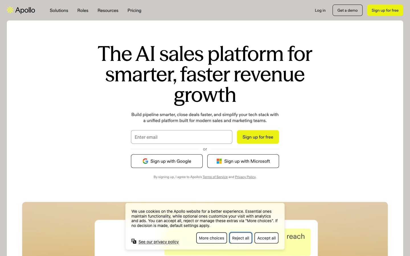
Apollo
Apollo — Style Reference
# Apollo — Style Reference
> Sun-baked limestone with highlighter-pen accents — editorial warmth over corporate coldness
**Theme:** light
Apollo's visual language is a sun-baked editorial workspace: warm limestone canvas, cream card surfaces, and a single electric yellow-green that functions like a highlighter on paper. The design is deliberately flat — no shadows, no gradients, just clean borders and generous whitespace. Typography does the heavy lifting: a confident medium-weight display serif (Season Mix at 550) commands headlines while a workhorse neo-grotesque (Soehne) handles everything else. Color is rationed aggressively: pages read almost monochrome with the vivid chartreuse appearing only on primary actions and the Apollo star logo, making those moments feel switched on. The overall impression is a premium B2B tool that doesn't try to look like a B2B tool — closer to a design magazine layout than a SaaS dashboard.
## Tokens — Colors
| Name | Value | Token | Role |
|------|-------|-------|------|
| Charcoal | `#1a1a1a` | `--color-charcoal` | Primary body text and input values — softer than pure black for extended reading |
| Onyx | `#000000` | `--color-onyx` | Headlines, high-contrast text, icon strokes, and button text on light surfaces |
| Limestone | `#ccc9c6` | `--color-limestone` | Page canvas and footer background — warm gray that prevents the UI from feeling sterile |
| Marble | `#f7f5f2` | `--color-marble` | Card surfaces and button backgrounds — warm cream that lifts cards off the limestone canvas |
Websites
Markdown Text
design-md
website-prompt
landing-page-prompt
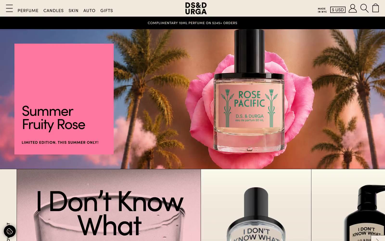
D.S. & DURGA
D.S. & DURGA — Style Reference
# D.S. & DURGA — Style Reference
> indie perfumery broadsheet on bone-white paper — a single warm cream canvas where black ink and oversized type do all the talking.
**Theme:** light
D.S. & Durga reads as an indie perfumery broadsheet printed on bone-white paper. The entire system is monochrome-warm: a single warm cream canvas, black ink for all type and rules, and a dusty rose secondary surface that only appears as quiet tonal shifts between bands. Typography does the heavy lifting — Sofia Pro is pushed to its extremes, with a chunky weight-800 display face at 120px serving as editorial hero headlines and a whisper-thin weight-400 for utility labels, creating dramatic size contrast that feels like a fashion magazine spread. Photography is the dominant visual element: full-bleed product shots on dark moody backdrops, torn-paper collages, and oversized object crops sit directly on the cream canvas with no card chrome or borders. Components are stripped to absolute minimum — no buttons with backgrounds, no rounded containers, no shadows; the only interactive affordance is a thin black arrow and uppercase tracked text. The site feels more like an art object or printed catalog than a typical e-commerce experience.
## Tokens — Colors
| Name | Value | Token | Role |
|------|-------|-------|------|
| Ink Black | `#000000` | `--color-ink-black` | High-contrast neutral action fill for primary buttons on light surfaces. |
| Bone White | `#f2e9de` | `--color-bone-white` | Page canvas, announcement bar, card surfaces, product label backgrounds, button fills — warm cream that makes the entire site feel like aged paper |
| Dusty Rose | `#ddc9c0` | `--color-dusty-rose` | Secondary surface band, subtle tonal shift between cream sections — barely-distinguishable warm blush that creates the only depth in an otherwise flat system |
Websites
Markdown Text
design-md
website-prompt
landing-page-prompt
Baggu
Baggu — Style Reference
# Baggu — Style Reference
> Sunlit print catalog on cream paper — a single warm off-white surface where black type and product photography do all the work, and a single green whisper says 'new'.
**Theme:** light
Baggu operates as an editorial product catalog: a single warm cream canvas, black type and hairline borders, and product photography that takes 90% of the viewport. The interface is almost entirely achromatic — one warm off-white surface, one true black, and one muted warm gray for secondary metadata. The only chromatic element is a single medium green reserved for the 'New Arrivals' label and success states, functioning as a quiet signal rather than a brand color. Typography is custom and compact: a neo-grotesque at 12–18px with tight tracking and stylistic alternates enabled, sitting close to the baseline so product cards feel like printed price tags. Layout is image-first, text-second: full-bleed editorial triptychs, 5-up product grids, category tiles with caption labels. Density is tight, but the cream surface gives the whole thing room to breathe.
## Tokens — Colors
| Name | Value | Token | Role |
|------|-------|-------|------|
| Bone Cream | `#f6f4ee` | `--color-bone-cream` | Page background, card surfaces, button fills, input fields. The signature warm off-white that defines the entire visual field — never pure white, always slightly toasted |
| True Black | `#000000` | `--color-true-black` | Primary text, hairline borders, icons, nav, button outlines, footer. Drawn at full saturation — no softened grays for type |
| Warm Ash | `#7b7a77` | `--color-warm-ash` | Secondary text, muted metadata, breadcrumb separators, helper labels. Sits at AA contrast against bone cream for body text |
| Moss Signal | `#298018` | `--color-moss-signal` | Green outline accent for tags, dividers, and focused UI edges. Use as a supporting accent, not as a status color |
Websites
Markdown Text
design-md
website-prompt
landing-page-prompt
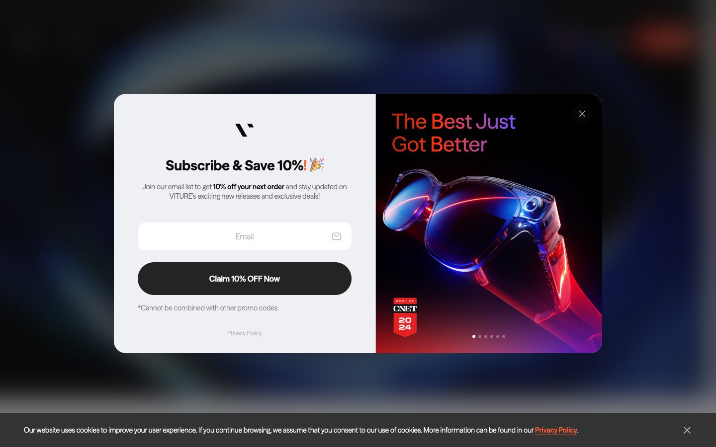
VITURE
VITURE — Style Reference
# VITURE — Style Reference
> neon product stage behind midnight glass — a blacked-out showroom where one orange beam cuts through the dark to illuminate a pair of glasses on a pedestal.
**Theme:** mixed
VITURE projects a premium consumer-electronics showroom: near-black canvases, photographic product stages lit with neon rim-lighting, and one searing orange accent (#ff5f34) that acts as the brand's heartbeat across links, emphasis text, and filled CTAs. The interface is intentionally restrained — a single custom geometric sans-serif (FontSeasonSans) carries the entire typographic voice, from 12px captions to 340px hero numerals, with positive letter-spacing that widens as type grows, giving display text an airy, almost holographic openness. Surfaces are flat and confident: pure white and pale grays for content cards, deep #0c0c0c for product showcases, and pill-shaped controls (9999px radius) that feel tactile and modern. Rounded cards (28px) and full-bleed gradient washes (orange-to-purple, blue-to-cyan) inject the futuristic XR energy without cluttering the UI.
## Tokens — Colors
| Name | Value | Token | Role |
|------|-------|-------|------|
| VITURE Ember | `#ff5f34` | `--color-viture-ember` | Brand accent, filled CTA buttons, active links, emphasis text, input focus — searing orange against matte black creates urgency and ownership of the brand voice |
| Crimson Core | `linear-gradient(90deg, #ff5f34 -100%, #f31010 0%, #ff5f34 100%)` | `--color-crimson-core` | Gradient midpoint for orange-red text washes and accent streaks |
| Aurora Wash | `linear-gradient(to right, #ff2900 0%, #fe7a60 61%, #581dff 100%)` | `--color-aurora-wash` | Gradient transition color in premium orange-to-violet washes (product banners, hero overlays) |
| Ultra Violet | `#581dff` | `--color-ultra-violet` | Gradient terminus for the orange-to-violet premium wash — appears only inside multi-stop gradients, not as a standalone token |
Websites
Markdown Text
design-md
website-prompt
landing-page-prompt
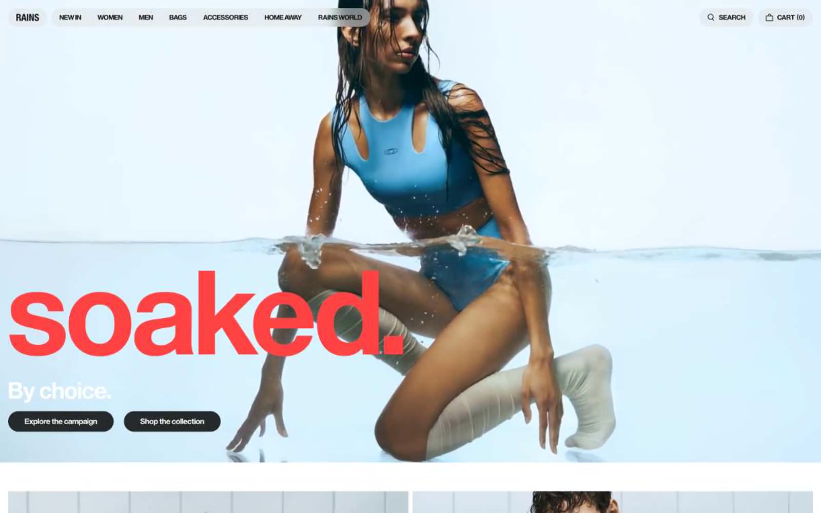
Rains INT
Rains INT — Style Reference
# Rains INT — Style Reference
> Nordic rain catalog on fog-gray paper.
A Scandinavian weather report where massive editorial type sits over raincoat photography on a warm gray field — almost no color, all atmosphere, type as the only dramatic gesture.
**Theme:** light
Rains operates in a near-monochromatic Scandinavian editorial register: a warm off-white canvas (not clinical white), a single charcoal accent for interactive surfaces, and photography that does all the emotional work. The defining signature is typographic scale — headlines reach 200+ pixels and sit directly over full-bleed product photography, with line-heights compressed to ~0.9 so massive type locks into tight visual bands. UI chrome is deliberately spare: pill buttons, hairline borders, no shadows, no gradients, no color. The single chromatic moment is a pale butter-cream hero text (#fffb85) that breaks the grayscale without breaking the quiet. Every screen should feel like a printed fashion catalog: generous breathing room, product-first imagery, and type that whispers and shouts in the same family.
## Tokens — Colors
| Name | Value | Token | Role |
|------|-------|-------|------|
| Fog | `#efefef` | `--color-fog` | Page canvas, card surfaces, divider hairlines — the warm light gray that IS the page background |
| Ink | `#10100f` | `--color-ink` | Primary text, nav links, body copy, icon strokes — near-black with a barely-warm bias (never pure #000) |
Websites
Markdown Text
design-md
website-prompt
landing-page-prompt
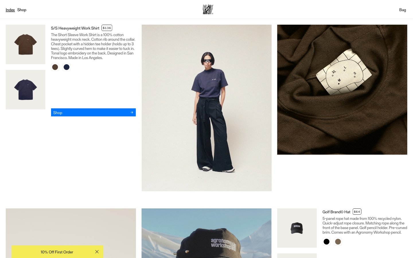
Agronomy Workshop
Agronomy Workshop — Style Reference
# Agronomy Workshop — Style Reference
> newsprint zine taped to a workshop wall
**Theme:** light
Agronomy Workshop reads as a print-meets-product catalog: a warm, slightly yellowed white canvas, oversized editorial photography, and copy typeset in a quirky serif that feels stamped rather than set. The layout is asymmetric and dense — product metadata (name, price, description, color swatches) is crammed into a narrow column beside full-bleed lookbook imagery, more like flipping through a zine than browsing a store. A single saturated blue and a mustard-yellow promotional wash are the only chromatic notes; everything else is black, white, and warm gray, which makes the color swatches and blue 'Shop' buttons feel switched on. The compressed display headings, typewriter serif body, and tracked uppercase mono labels give the system a deliberate analog/maker voice — utilitarian, unfussy, slightly rough around the edges.
## Tokens — Colors
| Name | Value | Token | Role |
|------|-------|-------|------|
| Workshop Blue | `#0076ff` | `--color-workshop-blue` | Blue action color for filled buttons, selected navigation states, and focused conversion moments. |
| Hail Yellow | `#f4eb59` | `--color-hail-yellow` | Promotional banners, first-order discount strip — a single warm yellow used sparingly to draw the eye without competing with photography |
| Pale Sky | `#c3d7ee` | `--color-pale-sky` | Soft blue surface for secondary panels or callout backgrounds — a desaturated companion to Workshop Blue |
| Canvas | `#ffffff` | `--color-canvas` | Page background, base surface |
Websites
Markdown Text
design-md
website-prompt
landing-page-prompt
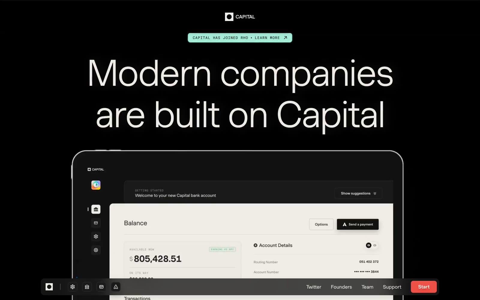
Modern companies are built on Capital
Modern companies are built on Capital — Style Reference
# Modern companies are built on Capital — Style Reference
> midnight editorial gallery with ember accent. Pure black rooms the size of gallery walls, enormous weight-300 serif-like sans type floating in negative space, a single warm red button glowing like a small fire against the matte black.
**Theme:** mixed
Capital reads as a high-end editorial spread rendered in dark mode: true black canvases alternating with warm cream sections, enormous light-weight Muoto display type, and a single vivid red ember (#ed5145) used sparingly as functional punctuation. Type carries the entire weight of the design — weight 300 at 90–115px with tight negative tracking whispers authority rather than shouts it, and uppercase GT America Mono labels in wide tracking act as section markers above each headline. The layout alternates between dramatic full-bleed dark sections with centered editorial typography and lighter cream sections that feel like magazine pages, with product mockups and portrait photography breaking the rhythm. Surfaces stay flat and matte; the only warmth comes from the cream neutrals and the red accent, never from gradients or decoration.
## Tokens — Colors
| Name | Value | Token | Role |
|------|-------|-------|------|
| Obsidian | `#000000` | `--color-obsidian` | Page canvas for dark sections, hero backgrounds — the true black that swallows surrounding UI |
| Bone | `#efece6` | `--color-bone` | Primary text on dark sections, pill-badge fills, light-section canvas — warm off-white that softens the pure black without going clinical |
| Charcoal | `#1a1a1a` | `--color-charcoal` | Elevated surface above obsidian (card backgrounds, product mockup shells), heading borders on light sections |
| Carbon | `#131413` | `--color-carbon` | Intermediate dark surface — product UI panels, modals nested inside the black canvas |
Websites
Markdown Text
design-md
website-prompt
landing-page-prompt
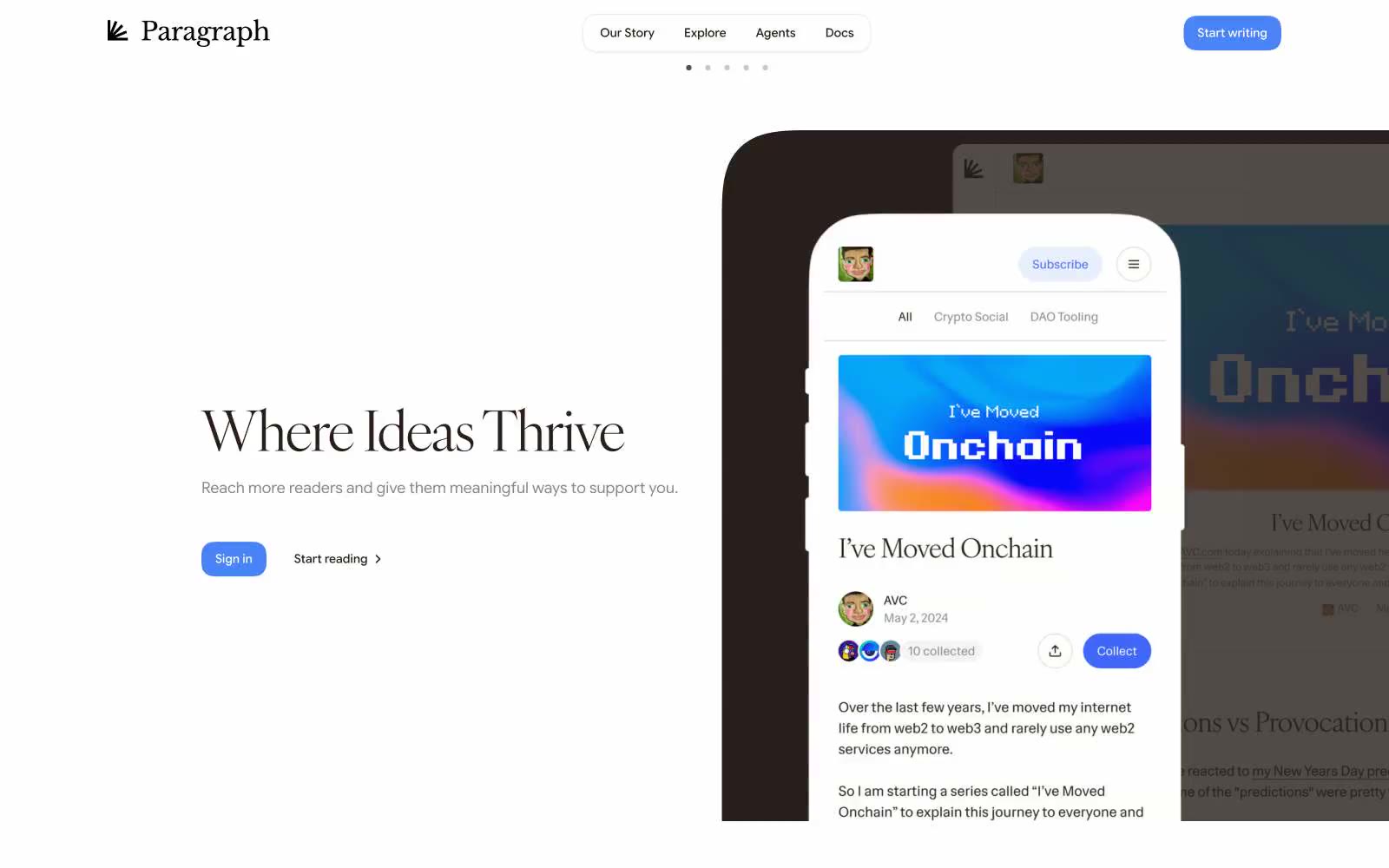
Paragraph
Paragraph — Style Reference
# Paragraph — Style Reference
> Editorial letterpress on warm parchment — a literary journal where the only color is ink-blue and every border is a page edge
**Theme:** light
Paragraph reads like a literary journal that learned to type: a vast white parchment where serif headlines do the heavy lifting and a single periwinkle blue is the only chromatic voice. The warm taupe borders (#dbd5d2) replace cold grays everywhere, making every container feel like a page edge rather than a UI panel. Typography carries meaning — IvyOra serif at 64px with -0.03em tracking whispers editorial authority while Google Sans Flex at 14-16px keeps utility invisible. Layout breathes: centered compositions, generous vertical gaps, and pill-shaped controls at 24-28px radius that feel handwritten rather than engineered. Color is rationed — one blue for action, warm neutrals for everything else, no gradients, no decorative chrome.
## Tokens — Colors
| Name | Value | Token | Role |
|------|-------|-------|------|
| Page Parchment | `#dbd5d2` | `--color-page-parchment` | Primary border color for all containers, cards, nav, body, and links — warm taupe that reads as paper edge, not digital gray |
| Ink Black | `#271f1b` | `--color-ink-black` | All text, icons, and heading strokes — warm near-black with brown undertone, never pure #000 |
| Sheet White | `#ffffff` | `--color-sheet-white` | Primary page canvas and white card surfaces. Do not promote it to the primary CTA color |
| Felt Gray | `#ededed` | `--color-felt-gray` | Secondary surface for badges, subtle panel backgrounds, and inactive card states |
Websites
Markdown Text
design-md
website-prompt
landing-page-prompt
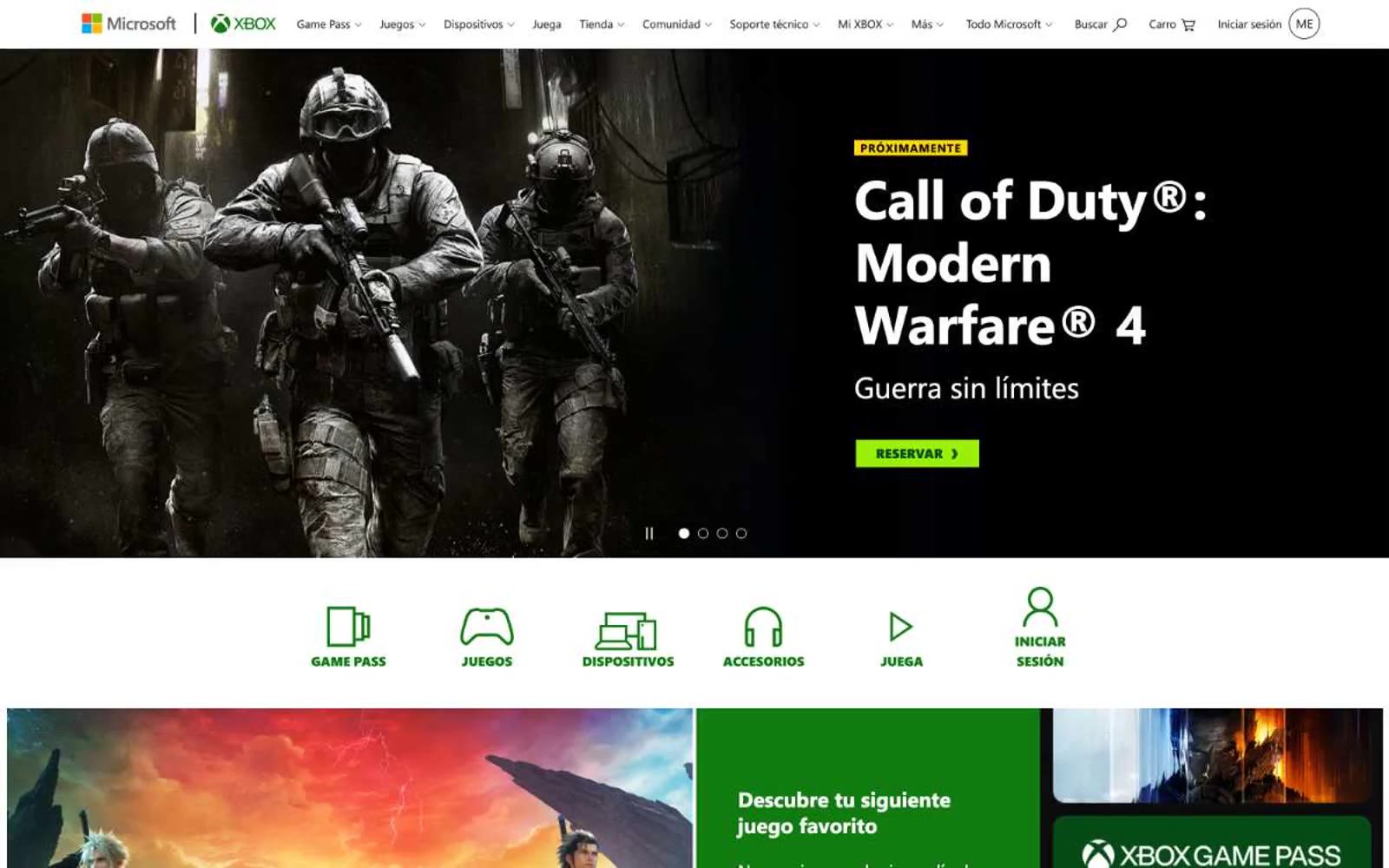
Xbox.com
Xbox.com — Style Reference
# Xbox.com — Style Reference
> stadium-lit arcade storefront. Stark white shelves displaying game artwork under dramatic lighting, with one signature green neon strip cutting through the rows.
**Theme:** light
Xbox.com runs a high-contrast storefront language: a stark white canvas interrupted by full-bleed game artwork and product photography, with Xbox's signature deep green (#107c10) acting as a structural accent across category labels, promotional bands, and section headers. The interface is dense and catalog-driven — compact nav, tile grids, and split content blocks — but the visual weight is deliberately held back to let game artwork dominate. Typography stays utilitarian via Segoe UI at conservative weights, with a single bold display size (46px) for hero headlines. The system uses uppercase badge labels with wide tracking (0.075em) as a recurring visual punctuation mark, and lime-green (#9bf00b) promotional buttons punctuate an otherwise monochrome surface.
## Tokens — Colors
| Name | Value | Token | Role |
|------|-------|-------|------|
| Xbox Green | `#107c10` | `--color-xbox-green` | Dominant brand color — Game Pass wordmark, promotional section headers, decorative dividers, link accents. The single chromatic identity anchor in an otherwise achromatic interface |
| Forest Green | `#054b16` | `--color-forest-green` | Deep secondary green for dark-surface accents, button hover states on dark backgrounds, Game Pass subheadings on dark imagery |
| Volt Lime | `#9bf00b` | `--color-volt-lime` | Green supporting accent for decorative details and low-frequency emphasis. Do not promote it to the primary CTA color |
| Caution Yellow | `#ffd800` | `--color-caution-yellow` | Yellow supporting accent for decorative details and low-frequency emphasis. Use as a supporting accent, not as a status color |
Websites
Markdown Text
design-md
website-prompt
landing-page-prompt
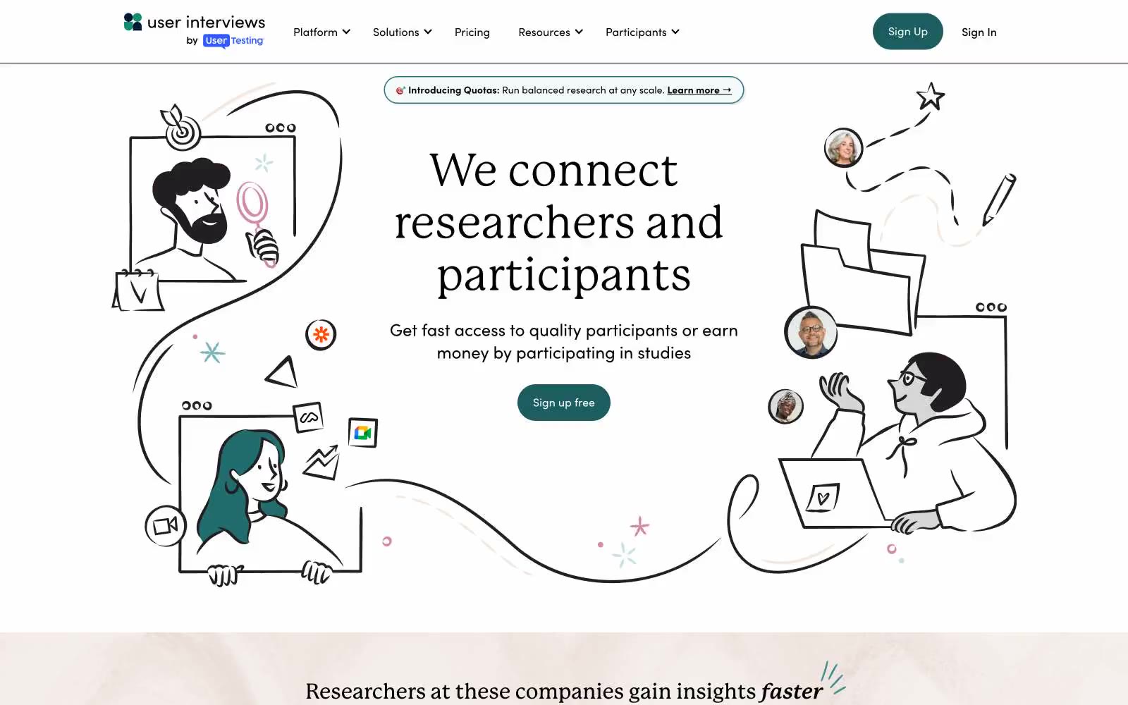
User Interviews
User Interviews — Style Reference
# User Interviews — Style Reference
> hand-drawn research field notes on warm paper
**Theme:** light
User Interviews is a sunlit research-platform language built on a warm off-white canvas with pale mint and blush accent surfaces. Typography pairs a literary serif (P22 Mackinac Pro) for editorial headlines with a geometric sans (Sofia Pro) for confident UI, while IBM Plex Mono labels in spaced uppercase act as section eyebrows — the overall rhythm feels like a well-edited research journal translated into a SaaS product. A single deep teal (#1c5d5f) drives all primary action, with dusty rose, sage, and navy secondary buttons that never compete for the same attention. Hand-drawn line illustrations of people inside browser frames make the interface feel human and process-oriented rather than dashboard-heavy; the product stays flat, low-elevation, and pill-buttoned throughout.
## Tokens — Colors
| Name | Value | Token | Role |
|------|-------|-------|------|
| Deep Teal | `#1c5d5f` | `--color-deep-teal` | Primary action button fill, filled CTA — a desaturated dark teal reads as confident and scholarly rather than aggressive or corporate |
| Pine Shadow | `#0e4749` | `--color-pine-shadow` | Outlined/ghost action borders, secondary link underlines — same hue family as the primary, one step deeper for quiet secondary actions |
| Sage | `#65b8a2` | `--color-sage` | Outlined action borders, decorative illustrations, and soft accent strokes — the mid-tone teal for secondary interactive elements |
| Lake Teal | `#2a7779` | `--color-lake-teal` | Mid-saturation teal for decorative illustration fills and accent borders |

Websites
Markdown Text
design-md
website-prompt
landing-page-prompt
Ameba
Ameba — Style Reference
# Ameba — Style Reference
> Midnight control room — electric blue pulse inside frosted glass panels.
**Theme:** dark
Ameba operates as a nocturnal command center for supply chain intelligence — deep midnight navy canvases host glowing data visualizations and floating product cards, with a single electric blue (#0428cb) acting as the only warm element in an otherwise cold, precise palette. Typography is distinctly editorial: the humanist F37 Bolton at weight 300 carries oversized headlines with tight tracking (-0.019em at 54px+), giving even product copy a magazine-cover cadence rather than typical SaaS density. The interface lives in two registers: dark hero/feature bands that feel like mission control, and light product showcase bands that reveal the actual dashboard. Surfaces are flat and minimal — no heavy shadows, no gradients on UI chrome — but a single radial gradient and a glow halo around the central particle sphere add atmospheric depth. The visual signature is restraint meeting precision: small radii (4-8px), hairline borders, and a cyan accent (#34fcff) used so sparingly it feels like electricity arcing across the screen.
## Tokens — Colors
| Name | Value | Token | Role |
|------|-------|-------|------|
| Midnight Ink | `#00052e` | `--color-midnight-ink` | Primary canvas, hero backgrounds, deep surface — the foundational dark that absorbs the electric blue glow and makes it feel like signal emerging from noise |
| Signal Blue | `#0428cb` | `--color-signal-blue` | Violet outline accent for tags, dividers, and focused UI edges. Do not promote it to the primary CTA color |
| Arc Cyan | `#34fcff` | `--color-arc-cyan` | Atmospheric accent and glow halos around the particle sphere, rare decorative energy that reads as electricity rather than UI |
| Halo Violet | `#afb4db` | `--color-halo-violet` | Soft gradient midtone that bridges Signal Blue into Midnight Ink, used in the radial background wash and ambient surface tinting |
Websites
Markdown Text
design-md
website-prompt
landing-page-prompt
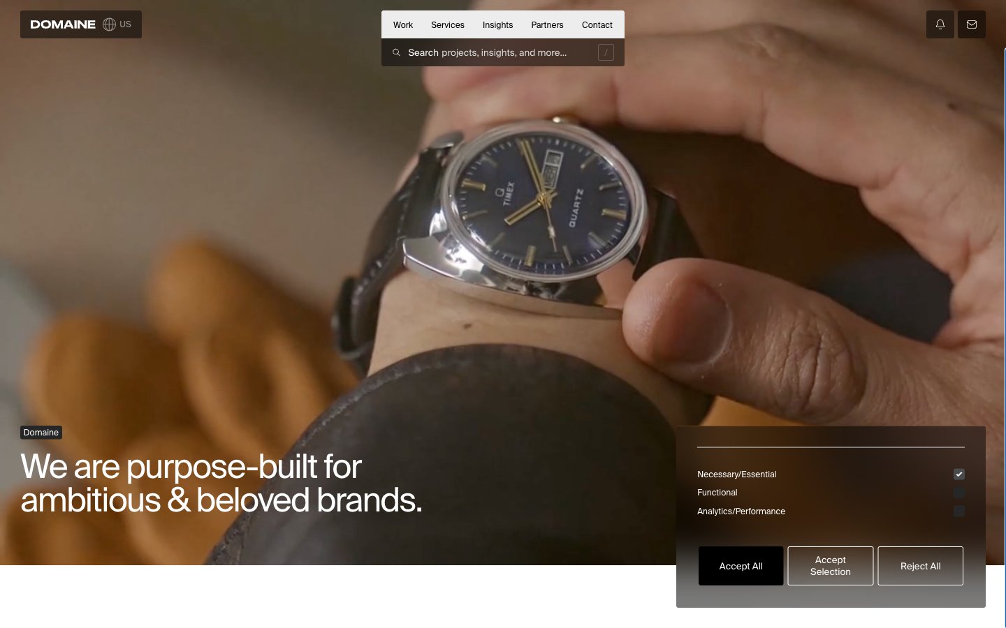
Halfhelix
Halfhelix — Style Reference
# Halfhelix — Style Reference
> Gallery wall on white marble — restrained, text-led, photographic
**Theme:** light
Domaine operates as a luxury editorial canvas: near-total achromatic palette, one neutral grotesque typeface at weight 400 only, and display-sized headlines that dominate the viewport. The interface recedes so that full-bleed lifestyle and product photography can carry the brand — every UI element is a quiet frame for the image, never a competing surface. Typography is the primary interface: massive stacked words ('Strategy / Creative / Technology / Marketing'), tight tracking, and line-heights approaching 1.0 create a magazine-spread density. Components are minimal and text-driven — ghost links, thin underline rules, 3px corners, no shadows, no filled color buttons. The single chromatic accent (#2749ff) appears so rarely it functions more as a hyperlink convention than a brand color.
## Tokens — Colors
| Name | Value | Token | Role |
|------|-------|-------|------|
| Pure White | `#ffffff` | `--color-pure-white` | Page canvas, card surfaces, inverse text on dark blocks |
| Ink Black | `#000000` | `--color-ink-black` | Primary text, primary borders, hairline rules, icon strokes, logo |
| Carbon | `#262626` | `--color-carbon` | Dark surface blocks, inverse badges, input fields on dark |
| Graphite | `#484a4c` | `--color-graphite` | Footer borders, subtle dark dividers, secondary dark UI |
Websites
Markdown Text
design-md
website-prompt
landing-page-prompt
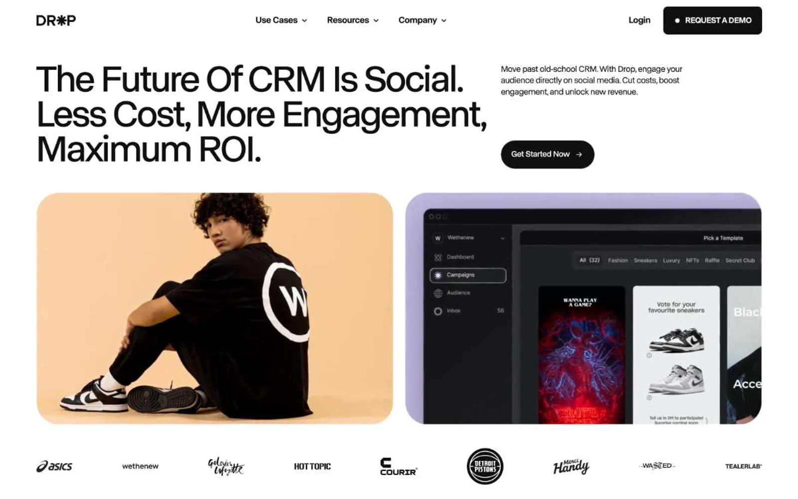
Drop
Drop — Style Reference
# Drop — Style Reference
> lavender editorial spread in bold serif. Lavender dusk washing over stark white pages, anchored by a confident slab-serif voice that commands the page like a broadsheet headline.
**Theme:** light
Drop operates as an editorial-tech hybrid: crisp sans-serif body type (ABC Normal) meets a confident slab-serif display (Ivar Display) that dominates the page at near-poster scale, anchoring an otherwise restrained palette of black, white, and a soft lavender (#b8afda) that recurs as the chromatic signature. The page alternates between near-white surfaces and a black editorial band, with vivid orange and electric yellow reserved as hard punctuation for revenue figures, data callouts, and the new-world narrative. Components lean pill-shaped (1440px radius is ubiquitous for buttons, tags, and nav), card radii cluster between 16-24px, and the system avoids shadows almost entirely — contrast comes from hard color blocks, not elevation. The overall attitude is that of a confident magazine spread that also happens to be a product page.
## Tokens — Colors
| Name | Value | Token | Role |
|------|-------|-------|------|
| Obsidian | `#101010` | `--color-obsidian` | Neutral form states, badge text, and quiet UI feedback where color should stay understated. Do not promote it to the primary CTA color |
| Pure White | `#ffffff` | `--color-pure-white` | Page canvas, card surfaces, text on dark fills — the default surface that 60%+ of the page lives on |
| Carbon | `#1a1a1a` | `--color-carbon` | Dark card surfaces for product mockups and the dark editorial band, barely distinguishable from Obsidian to create depth without color |
| Mint Cream | `#e5ede4` | `--color-mint-cream` | Light pastel surface tint, used sparingly for soft card backgrounds that need warmth without chromatic commitment |
Websites
Markdown Text
design-md
website-prompt
landing-page-prompt
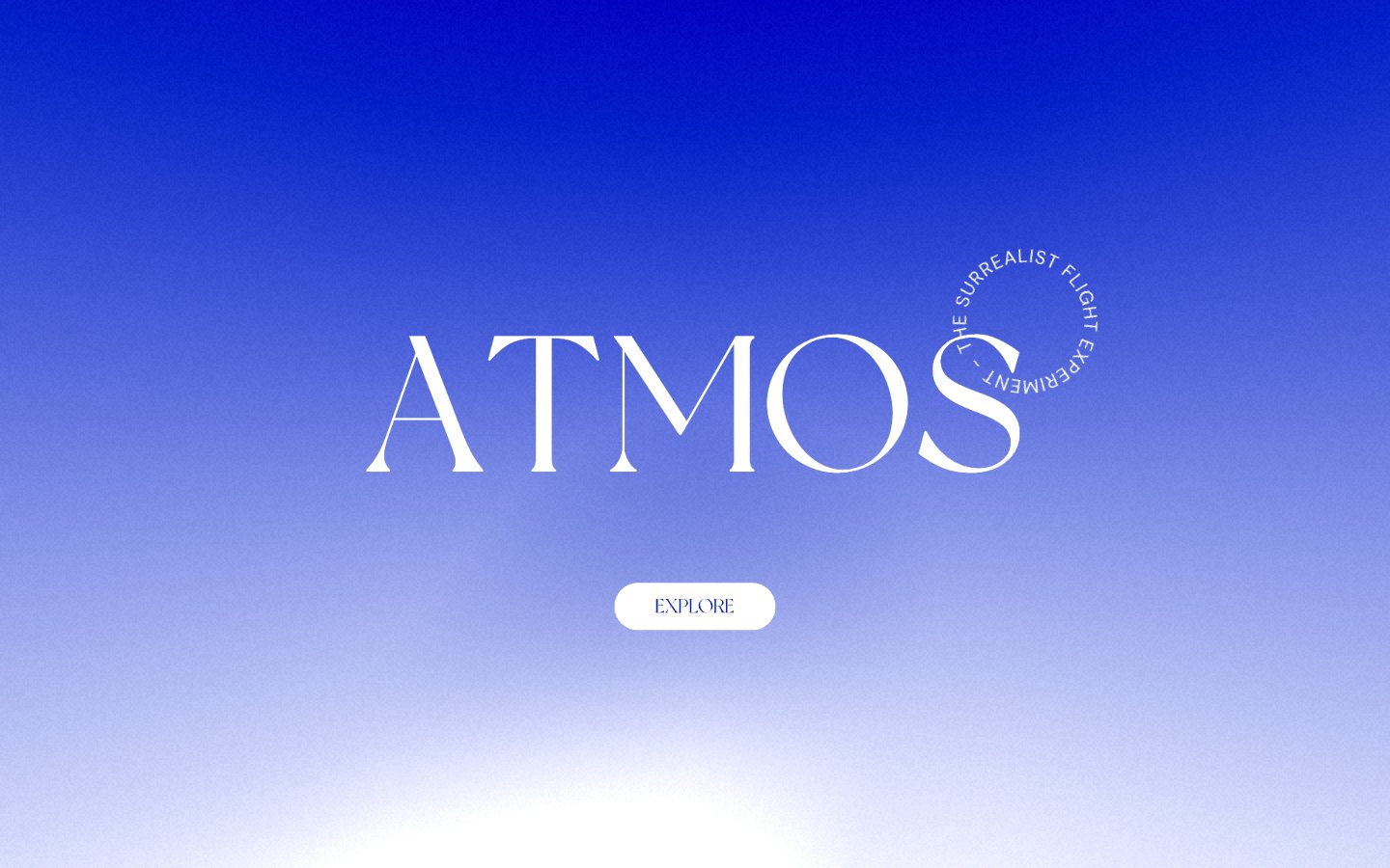
ATMOS
ATMOS — Style Reference
# ATMOS — Style Reference
> violet horizon above white void
**Theme:** light
Atmos is a single-screen meditation: one deep violet sky fading to lavender above an expanse of white silence. The entire interface lives in the first viewport — a colossal serif wordmark, a ring of small caps text orbiting it, and a single pill button — then dissolves into negative space. Typography does the heavy lifting: a custom display serif at 200px whispers rather than shouts, paired with DM Sans for micro-labels. There is no product UI, no navigation bar, no cards, no shadows. The only chromatic note is the violet gradient; everything else is paper-white and ink-black.
## Tokens — Colors
| Name | Value | Token | Role |
|------|-------|-------|------|
| Deep Violet | `linear-gradient(180deg, #0825c6 0%, #6b6ce0 100%)` | `--color-deep-violet` | Hero gradient anchor, decorative atmosphere — the singular chromatic note; fills the sky of the opening viewport |
| Paper White | `#ffffff` | `--color-paper-white` | Hairline borders, dividers, input outlines, and card edges on light surfaces. Do not promote it to the primary CTA color |
| Ink Black | `#000000` | `--color-ink-black` | Body text, headings, button text, border outlines — the only contrast color |
Websites
Markdown Text
design-md
website-prompt
landing-page-prompt
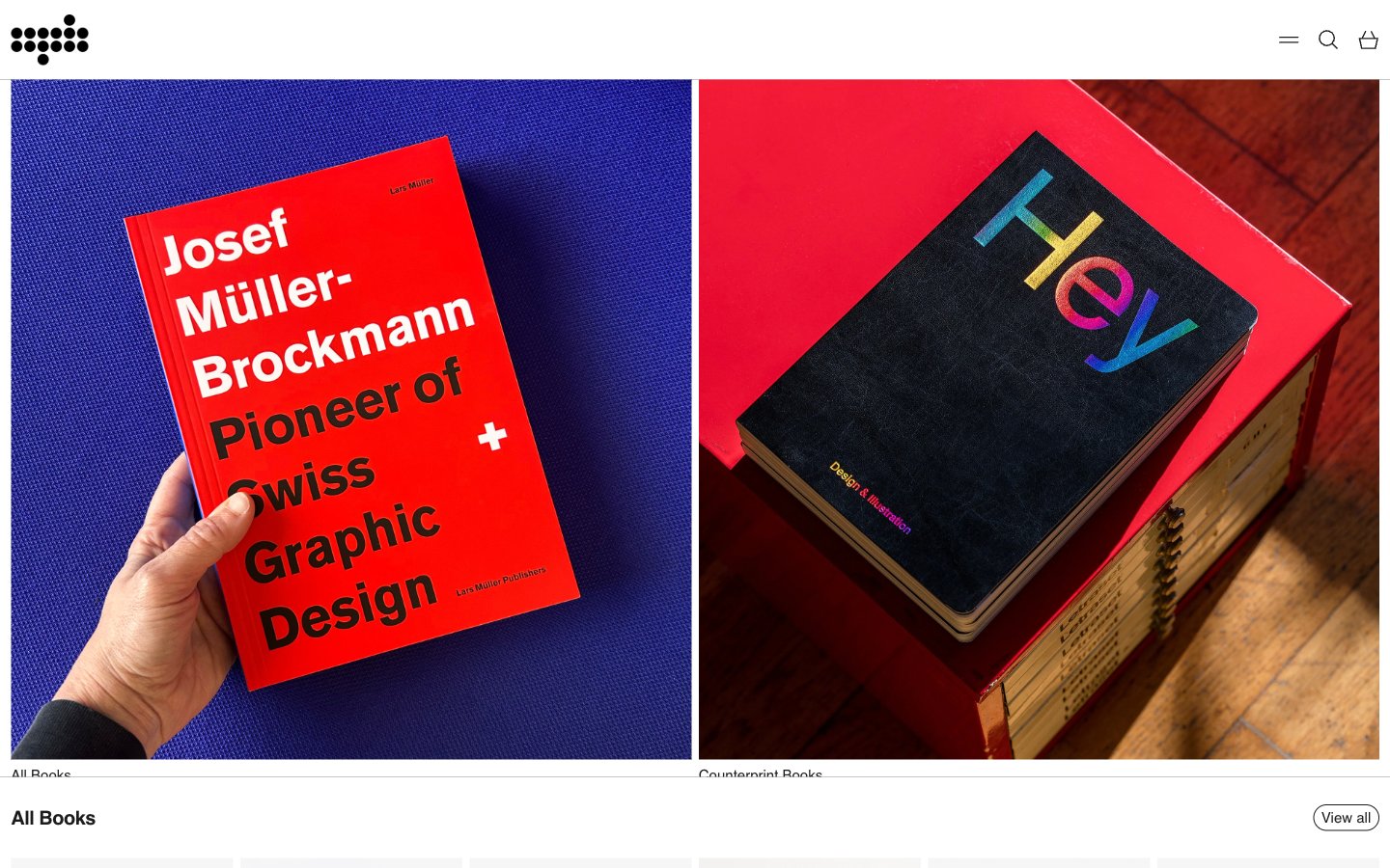
Counterprint
Counterprint — Style Reference
# Counterprint — Style Reference
> white gallery wall, books as art
**Theme:** light
Counterprint is a quiet white canvas designed to let bold printed matter do the talking — a publisher's storefront that behaves like a gallery wall rather than a shop. The interface is deliberately monochrome: a pure white stage, hairline gray dividers, and near-black type, with the entire color vocabulary supplied by the photographed books themselves. Every screen follows a strict rhythm: section title on the left, minimal 'View all' pill on the right, then a uniform six-column product grid where the only variation is the cover art. The product images are square, unbordered, and presented without chrome — no card containers, no shadows, no hover decoration — so the editorial photography carries 100% of the visual weight.
## Tokens — Colors
| Name | Value | Token | Role |
|------|-------|-------|------|
| Pure Canvas | `#ffffff` | `--color-pure-canvas` | Page and surface background — the entire interface lives on this single white plane |
| Ink Black | `#1c1c1c` | `--color-ink-black` | Primary text, product titles, icon strokes, outlined button borders — the only chromatic dark in the system |
| Graphite | `#232323` | `--color-graphite` | Secondary text, meta labels, footer copy — a near-identical companion to Ink Black for subtle hierarchy steps |
| Slate Mute | `#5f6368` | `--color-slate-mute` | Muted helper text, tertiary metadata, disabled states |

Websites
Markdown Text
design-md
website-prompt
landing-page-prompt
Synthesia
Synthesia — Style Reference
# Synthesia — Style Reference
> studio control room on white
**Theme:** light
Synthesia's visual language is a bright, white-canvas SaaS surface saturated with a single vivid indigo-violet accent that acts as electric punctuation against a calm, near-gray neutral stack. Typography carries the brand more than color: a custom geometric sans (Basiersquare) set in tight, aggressively tracked display weights — 88px and 56px headlines run at -0.04 to -0.05em letter-spacing, compressing letterforms into dense, architectural wordmarks. Components are lightweight and honest: 12px-radius buttons, 16-24px-radius cards, hairline borders in #e6eaf4 paired with whisper-soft shadows at 8% opacity, and pill-shaped badges in pale tints. The product metaphor is a 'video studio dashboard behind a clean editor's wall' — mostly white, but with dark indigo panels (#0d0f2c) where the AI video preview lives, creating a stage-light contrast between the marketing surface and the product surface.
## Tokens — Colors
| Name | Value | Token | Role |
|------|-------|-------|------|
| Graphite Violet | `#333b52` | `--color-graphite-violet` | Body text, default borders, icon strokes — near-gray with a cool violet undertone carries all secondary content |
| Slate Gray | `#656c86` | `--color-slate-gray` | Muted body text, nav items, secondary button labels |
| Mist | `#969bb5` | `--color-mist` | Placeholder text, disabled input values, tertiary helper text |
| Hairline | `#d1d6e5` | `--color-hairline` | Input borders, dividers, secondary card borders |