AI Prompt Studio - Intelligent Prompt Library
Explore and use professional AI prompts to optimize your workflow.
One-click Use
Websites
Markdown Text
design-md
website-prompt
landing-page-prompt
Metamask
Metamask — Style Reference

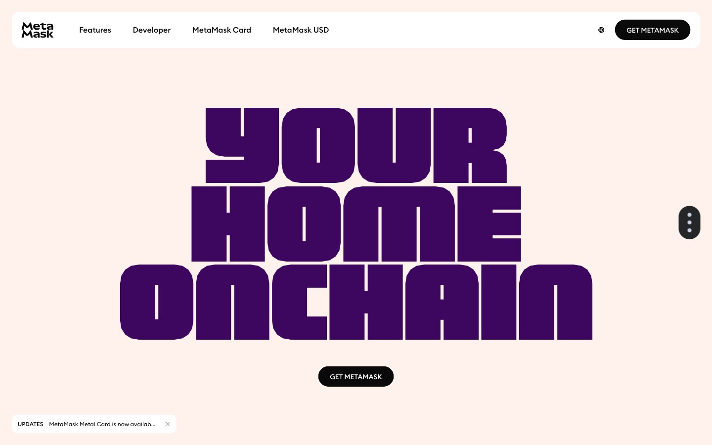
# Metamask — Style Reference
> Warm peach workshop with giant purple type — cozy, loud headlines, quiet controls.
**Theme:** light
MetaMask's visual system is a warm, maximalist-on-type language built on a single signature cream-peach canvas (#fff1eb) that makes every page feel like an editorial spread. Display type does the heavy lifting: an ultra-condensed geometric face at 75–158px in deep violet carries authority through sheer scale rather than weight, while the rest of the interface stays compact and quiet. CTAs are small black pill buttons that sit against the warm canvas as a precise, high-contrast anchor. Color is used functionally as wash — green, pink, blue, and orange swatches paint cards and illustrations rather than chrome — leaving the chrome itself nearly monochrome.
## Tokens — Colors
| Name | Value | Token | Role |
|------|-------|-------|------|
| Peach Cream | `#fff1eb` | `--color-peach-cream` | Page canvas, hero backgrounds, dominant surface — the warm skin of the entire site |
| Ink Black | `#0a0a0a` | `--color-ink-black` | Primary text, pill CTA fill, nav icons, borders — near-black rather than pure #000 for slightly softer edges |
| Pure White | `#ffffff` | `--color-pure-white` | Card surfaces on cream sections, button labels, inverted text on black CTAs |
| Cool Mist | `#e9edf6` | `--color-cool-mist` | Secondary surface, link/button hover washes, soft card backgrounds when a section needs visual cooling |

Websites
Markdown Text
design-md
website-prompt
landing-page-prompt
Clearbit
Clearbit — Style Reference
# Clearbit — Style Reference
> data observatory on cloud paper — a room-bright, near-acromatic canvas where midnight ink and a single blue current do all the work.
**Theme:** light
Clearbit reads as a blueprint rendered on white linen: an almost purely achromatic canvas where a single midnight-navy ink carries every word, and one electric blue fires only on actions. The interface floats — product cards, data records, score badges — suspended on a barely-there lavender wash that whispers data-warehouse more than SaaS-template. Typography is InterVar at its most restrained: generous weight range but headlines carry the same navy as body, so hierarchy comes from size and tracking, not color. The product IS the hero: screenshots of company profiles, enrichment tables, and scoring chips do the talking that stock photography would in a less confident design. Components are flat, thin-bordered, and soft-cornered; the only shadow in the system is a deep-blue focus ring, not a drop shadow — elevation is expressed through layering on subtle background tints, not through depth.
## Tokens — Colors
| Name | Value | Token | Role |
|------|-------|-------|------|
| Midnight Ink | `#091135` | `--color-midnight-ink` | Primary text, headings, nav, body, link color — the dominant ink of the entire interface, set against white and pale-lavender surfaces |
| Electric Blue | `#0f77ff` | `--color-electric-blue` | Blue outline accent for tags, dividers, and focused UI edges. Do not promote it to the primary CTA color |
| Cobalt Surface | `#127ee3` | `--color-cobalt-surface` | Blue wash for highlight backgrounds, decorative bands, and soft emphasis behind content. Do not promote it to the primary CTA color |
| Slate | `#36394a` | `--color-slate` | Secondary muted text where Midnight Ink would be too heavy — metadata, timestamps, helper copy |
Websites
Markdown Text
design-md
website-prompt
landing-page-prompt
OpenSea
OpenSea — Style Reference
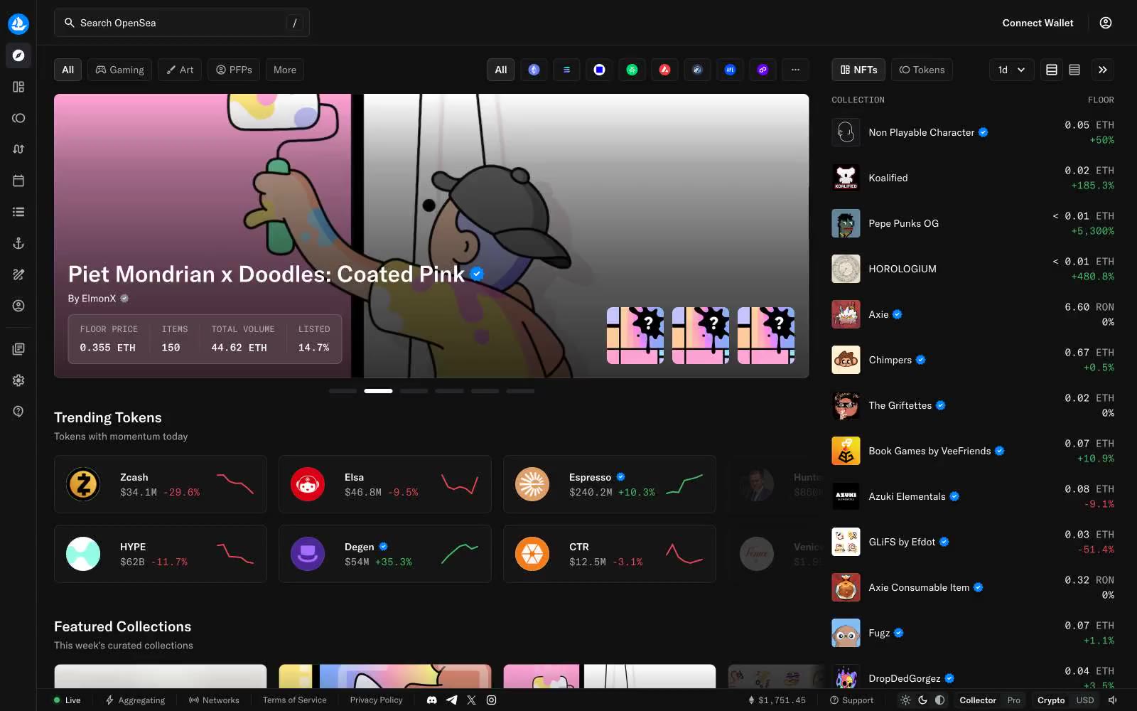
# OpenSea — Style Reference
> Black trading terminal with frosted blue wireframes.
**Theme:** dark
OpenSea runs on a near-black canvas with paper-white text and a single cool blue accent (#83c3ff) that signals links, verified badges, and outlined interactive elements. Surfaces are stratified in tiny tonal steps (#080809 → #141415 → #1b1d1f → #26272d) so cards appear to float on the page through hairline inset white-alpha rings (rgba(255,255,255,0.08)) rather than drop shadows. Typography is restrained: gtAmerica at 12–16px for almost everything, with 20–32px reserved for section headers, and gtAmericaMono stepping in for prices, addresses, and numeric data. The layout is a three-pane shell — slim left icon rail, fluid center content, fixed right sidebar — and the rhythm stays dense, with 8–12px gutters and 4px/8px corner radii throughout.
## Tokens — Colors
| Name | Value | Token | Role |
|------|-------|-------|------|
| Ice Signal | `#83c3ff` | `--color-ice-signal` | Verified badges, link text, outlined button borders, focus rings, and filter pills — the only chromatic accent on a monochrome canvas, cool enough to read as informational rather than promotional |
| Paper White | `#ffffff` | `--color-paper-white` | Primary text, icon strokes, hairline borders, and checkbox fills — the dominant surface signal against the near-black canvas |
| Fog | `#acadae` | `--color-fog` | Muted secondary text, placeholder copy, and subtle borders — the bridge tone between paper white and the dark surfaces |
| Iron | `#34353c` | `--color-iron` | Outlined button borders and tertiary dividers on the main canvas — the lightest neutral that still reads as a structural edge |
Websites
Markdown Text
design-md
website-prompt
landing-page-prompt
Phantom
Phantom — Style Reference
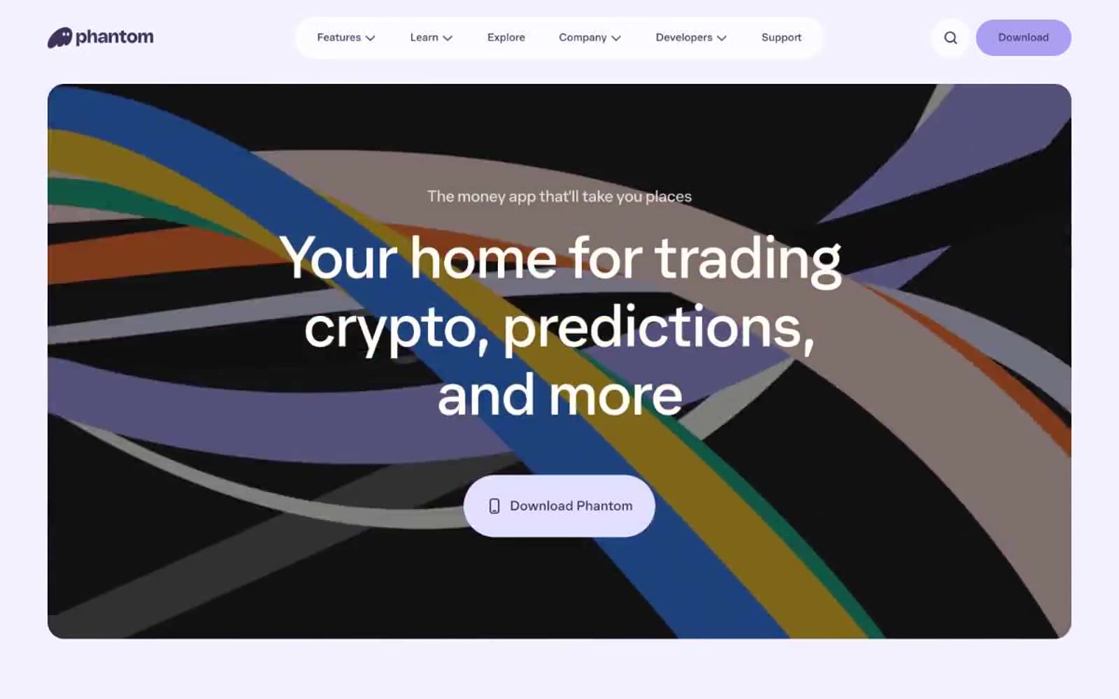
# Phantom — Style Reference
> lavender candy shop at dusk. A monochromatic violet world where everything is a soft pill on a near-white plane, interrupted by a mischievous ghost and pastel highlights.
**Theme:** mixed
Phantom is a soft, monochromatic crypto-wallet world bathed in aubergine and lavender. The interface lives in a near-white canvas but bleeds into deep violet sections, creating a mood that oscillates between airy and intimate. Typography is whisper-weight (350) with aggressive negative tracking, letting massive 80-96px hero lines float with grace. The defining signature is generous pill-shaped geometry — navigation, buttons, and cards all dissolve into capsule forms with 24-100px radii. A single ghost mascot replaces vowels in headlines, breaking the grid with playful subversion. The palette is deliberately narrow: one primary violet does all the structural work, while pastel button tints (lavender, butter, blush) create a candy-store rhythm against the restrained backdrop.
## Tokens — Colors
| Name | Value | Token | Role |
|------|-------|-------|------|
| Aubergine | `#3c315b` | `--color-aubergine` | Primary brand — navigation borders, nav text, heading text, card surfaces in dark sections, icon strokes. The structural spine of the entire system |
| Ghost Lavender | `#e2dffe` | `--color-ghost-lavender` | Primary action — filled CTA button background, violet glow shadow on buttons. The light-on-light button that only reveals its presence through a soft 4px halo |
| Periwinkle | `#ab9ff2` | `--color-periwinkle` | Secondary action — brighter lavender for secondary CTAs, decorative fills, icon accents. Adds saturation to the pale-violet world |
| Cornflower Pop | `#4a87f2` | `--color-cornflower-pop` | Accent button — occasional vivid blue button for emphasis or differentiation. Use sparingly as a high-energy interruption |
Websites
Markdown Text
design-md
website-prompt
landing-page-prompt
Franco Maria Ricci Editore
Franco Maria Ricci Editore — Style Reference
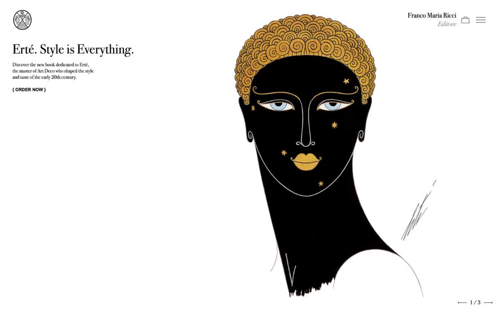
# Franco Maria Ricci Editore — Style Reference
> Art Déco gallery catalogue — burnished gold hairlines on bone-white vellum
**Theme:** light
Franco Maria Ricci is a quiet luxury of typographic restraint: a vast off-white vellum, a single high-contrast Bodoni voice, and a thread of burnished gold that hairlines every editorial moment. The system behaves like an art-book spread — no shadows, no gradients, no rounded corners, no filled buttons — only the architecture of type, generous white space, and vertical rules dividing book objects. Color appears as gold punctuation (borders on titles, rules beneath section headers, thin lines under links) rather than as fill, and the lone dark surface (#0a0a0a) reads as a gallery wall, not as a UI mode. All interactive elements are text-driven: ghost links, bracketed call-to-action markers like `{ ORDER NOW }`, and pagination arrows at page corners. The page is a long horizontal editorial scroll divided into discrete exhibition rooms, each introduced by a serif italic section title with a gold underline.
## Tokens — Colors
| Name | Value | Token | Role |
|------|-------|-------|------|
| Vellum White | `#f6f6f6` | `--color-vellum-white` | Page canvas — the warm off-white that grounds every section, never pure #ffffff so type never feels clinical |
| Paper | `#ffffff` | `--color-paper` | Card and section surfaces — book spreads, product panels, inset blocks sitting one shade above the vellum canvas |
| Gallery Ink | `#0a0a0a` | `--color-gallery-ink` | Dark sections (FMR Magazine block, footer band) and deepest typographic emphasis — reads as letterpress black, not screen black |
| Letterpress Black | `#000000` | `--color-letterpress-black` | Body copy, navigation text, icons, all hairlines and borders, pagination marks — the structural ink of the system |
Websites
Markdown Text
design-md
website-prompt
landing-page-prompt
Cosmos Network
Cosmos Network — Style Reference
# Cosmos Network — Style Reference
> Deep space command center — a near-black financial observatory where white type and concentric diagrams float in measured silence.
**Theme:** dark
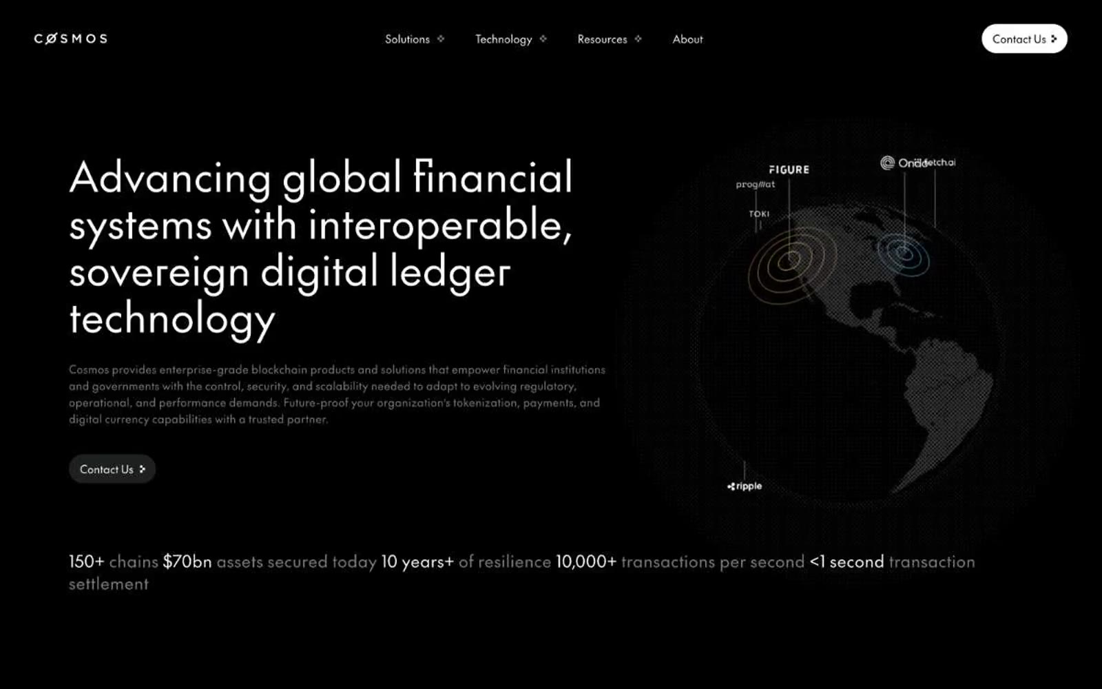
Cosmos Network presents an institutional dark-mode financial infrastructure aesthetic: a near-black canvas where white typography does all the visual work, supported by pill-shaped ghost controls and generous whitespace. The single custom typeface 'The Future' carries a slight positive tracking that gives headlines a measured, ceremonial quality — authority through restraint rather than volume. Layout follows a disciplined two-column rhythm: large declarative headlines paired with restrained secondary imagery (like the concentric-circle globe diagram), followed by horizontal case-study card carousels. Color is almost entirely suppressed — any chromatic presence is deeply desaturated, creating a quiet, high-trust environment where structure and whitespace carry the weight.
## Tokens — Colors
| Name | Value | Token | Role |
|------|-------|-------|------|
| Void Black | `#000000` | `--color-void-black` | Page canvas, section backgrounds, maximum-contrast surface |
| Carbon | `#181818` | `--color-carbon` | Navigation bar, elevated surface base, footer surface |
| Graphite | `#1e1f20` | `--color-graphite` | Card surfaces, elevated panels, contained content blocks |
| Iron | `#333333` | `--color-iron` | Hairline borders, dividers, structural separators |
Websites
Markdown Text
design-md
website-prompt
landing-page-prompt
Giga
Giga — Style Reference
# Giga — Style Reference
> Literary dusk over mountain ridges — A serif headline floats over a cinematic photograph, with a single warm ember glow below.
**Theme:** mixed
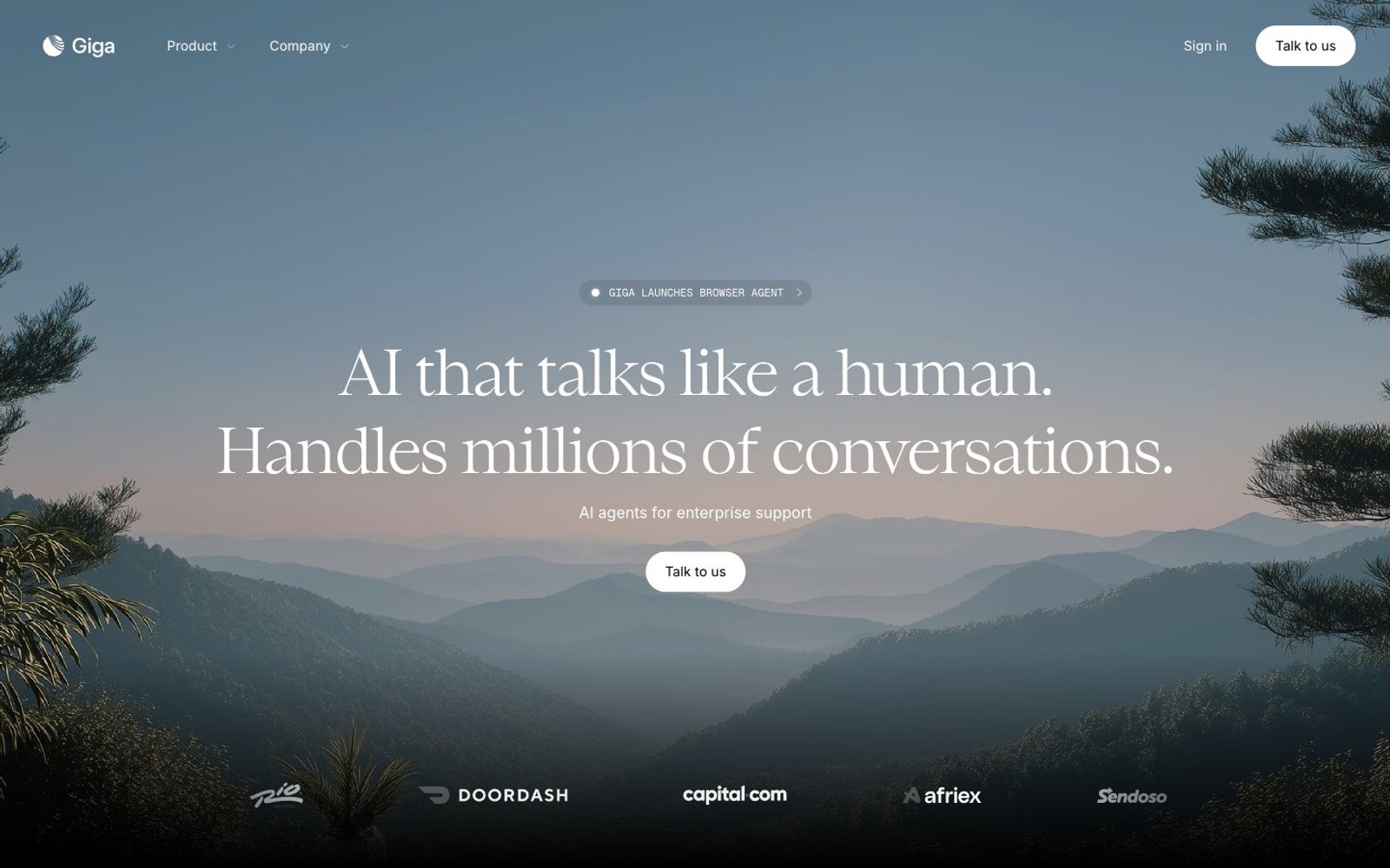
Giga operates as a literary enterprise-AI brand: cinematic mountain photography as the primary visual, serif display type for emotional weight, and an almost monastic monochrome palette disrupted by a single warm orange-red accent. The interface alternates between full-bleed photographic light sections and near-black dark panels, creating a dawn-to-dusk rhythm that mirrors the hero image. Headlines use a humanist serif at light weight — anti-convention for an AI company, deliberately editorial rather than technical. Components are compact and pill-shaped: buttons, tags, and badges all share the 9999px radius, while cards settle into a soft 16px. Density is tight but not cramped, with 10px baseline gaps and generous section breathing room (48-64px). Color is rationed — white and near-black do 95% of the work, and the one vivid orange-red (#fe2c02) plus a single green status dot are the only chromatic interruptions.
## Tokens — Colors
| Name | Value | Token | Role |
|------|-------|-------|------|
| Obsidian | `#000000` | `--color-obsidian` | Primary text, hairlines, icon strokes, borders on light surfaces — the dominant structural color |
| Paper | `#ffffff` | `--color-paper` | Page backgrounds, card surfaces, text on dark sections |
| Carbon | `#161717` | `--color-carbon` | Dark surface panels, filled button backgrounds — warm-tinted near-black, not pure black |
| Ember | `#fe2c02` | `--color-ember` | Primary accent — link/CTA emphasis, the one chromatic moment in the system, warm orange-red against the monochrome field |
Websites
Markdown Text
design-md
website-prompt
landing-page-prompt
Slite
Slite — Style Reference
# Slite — Style Reference
> Warm parchment editorial desk — a workspace where knowledge feels handwritten, not enterprise-stamped.
**Theme:** light
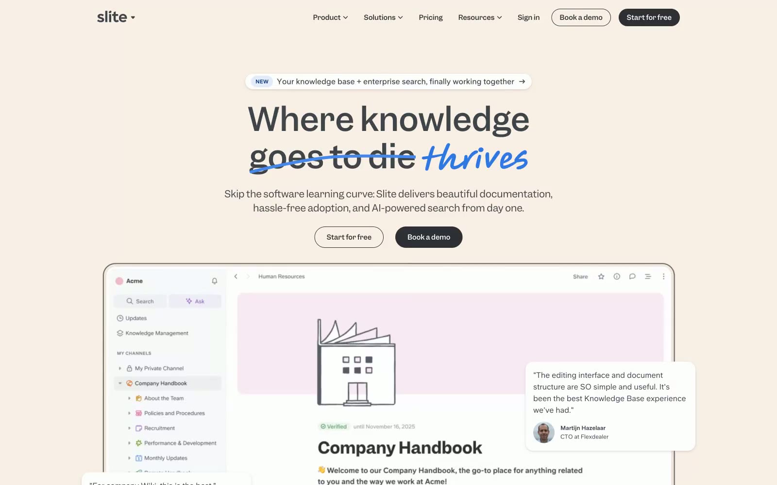
Slite's visual language feels like warm parchment under natural light — a cream-toned workspace where knowledge feels approachable rather than clinical. The dominant #f9efe4 background reads as aged paper without feeling retro, grounded by #3f434a ink-dark text that gives editorial weight to every line. The signature move is typographic contradiction: a serif-adjacent custom face (Garnett) at 64px for display, crossed out in black with 'goes to die' while 'thrives' renders in a hand-lettered cursive script in vivid blue — disruption-by-contrast rather than polish. Feature cards sit on near-white #fdfdfd against the warm cream ground, tagged with muted category badges in yellows, greens, and pinks that never compete with the overall softness. Pill buttons in near-black (#2d2f34) against cream create the sharpest contrast point on every screen, anchoring calls to action without resorting to saturated color.
## Tokens — Colors
| Name | Value | Token | Role |
|------|-------|-------|------|
| Parchment | `#f9efe4` | `--color-parchment` | Primary page background and hero — the defining warm cream that separates Slite from the cold-white SaaS default |
| Vellum | `#fdf9f4` | `--color-vellum` | Secondary surface, slightly cooler than Parchment — used for card interiors and section alternation |
| Chalk | `#fdfdfd` | `--color-chalk` | Highest-surface level — card backgrounds, modal surfaces, product UI previews |
| Ink | `#3f434a` | `--color-ink` | Primary text across all contexts — body, headings, labels, icons |
Websites
Markdown Text
design-md
website-prompt
landing-page-prompt
Figma
Figma — Style Reference
# Figma — Style Reference
> monochrome chassis for chromatic chaos
**Theme:** light
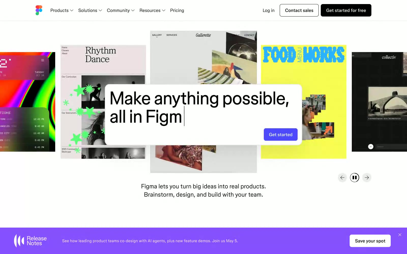
The interface operates as a strict, high-contrast structural container that entirely defers visual dominance to user-generated content. A stark #000000 on #ffffff palette forms the baseline, eschewing subtle grays in favor of absolute maximum contrast for primary boundaries and text. Typographic hierarchy relies almost purely on size and aggressive negative tracking rather than color variation, turning large text strings into dense graphical blocks. The border-radius logic enforces a severe dichotomy: 50px extreme pills for global navigation elements clashing intentionally against completely sharp 0px corners on content containers.
## Tokens — Colors
| Name | Value | Token | Role |
|------|-------|-------|------|
| Absolute Canvas | `#ffffff` | `--color-absolute-canvas` | Page background, floating toolbars, elevated panel bases |
| Structural Ink | `#000000` | `--color-structural-ink` | Primary typography, global solid button backgrounds, outlined button strokes |
| Graphite Metadata | `#595959` | `--color-graphite-metadata` | Secondary author text, localized component subtext, placeholder values |
| Boundary Frame | `#e2e2e2` | `--color-boundary-frame` | Subtle hair-line dividers and inactive input field bounds |
Websites
Markdown Text
design-md
website-prompt
landing-page-prompt
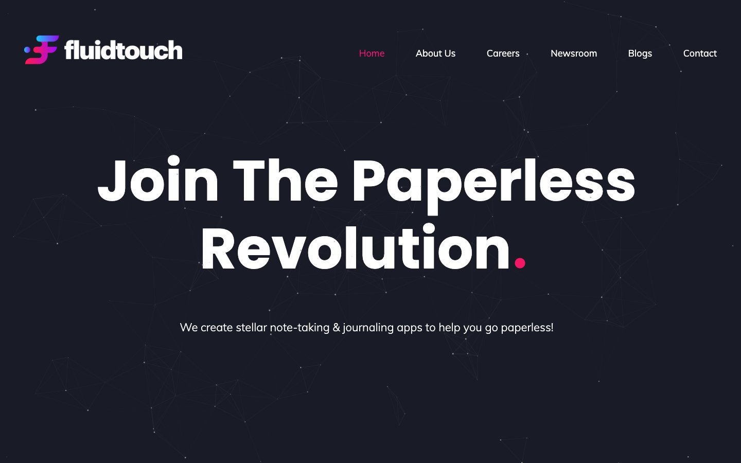
Home
Home — Style Reference
# Home — Style Reference
> Stargazer's dark observatory
**Theme:** dark
Fluidtouch operates as a digital observatory: near-black canvas (#121318) hosts monumental white type and a constellation of pale dots connected by hairline vectors, with a single hot pink (#ed1672) acting as the only chromatic signal in an otherwise monochrome universe. Display voice is Poppins 700 at scale that borders on poster-sized (110px hero), while Muli 300 whispers at body sizes — the contrast between geometric-bold and humanist-soft is the system's emotional center. Surfaces are flat and borderless; depth comes from slightly lighter panels (#191c26) and hairline #212529 rules, never from shadows. Components are generously padded and pill-shaped (100px radius), floating in generous negative space that makes every interactive element feel deliberate rather than dense.
## Tokens — Colors
| Name | Value | Token | Role |
|------|-------|-------|------|
| Hot Magenta | `#ed1672` | `--color-hot-magenta` | Active nav links, primary CTA fills, decorative accent dots — the only chromatic voice in the system, reserved so each occurrence reads as signal |
| Midnight Ink | `#121318` | `--color-midnight-ink` | Page canvas, hero background, footer — the deep-space base layer everything floats on |
| Deep Space | `#191c26` | `--color-deep-space` | Elevated card surfaces, section backgrounds one step above canvas |
| Slate Edge | `#212529` | `--color-slate-edge` | Hairline borders, image frame rules, subtle structural dividers |
Websites
Markdown Text
design-md
website-prompt
landing-page-prompt
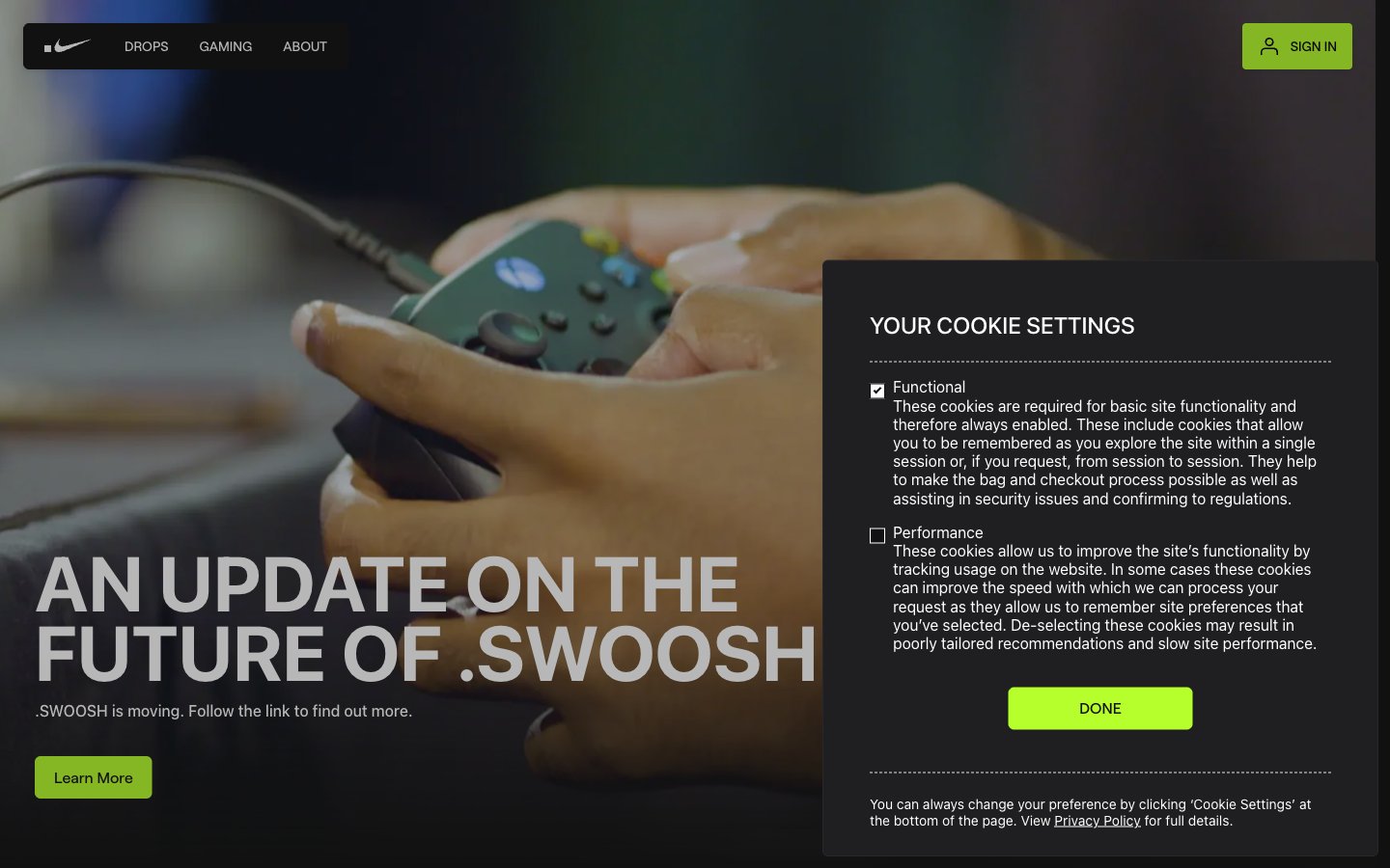
Home
Home — Style Reference
# Home — Style Reference
> Neon-lit gaming arena at midnight — black floor, one electric lime, and tournament-scale typography screaming from the walls.
**Theme:** dark
Swoosh operates as a midnight arena console: nearly all-black canvas (#111111), a single electric lime accent (#b7ff2c) that carries every interaction, and oversized compressed display type (110px at 0.85 line-height) that functions like tournament signage rather than web copy. The system is intentionally austere — only one chromatic hue exists, and it appears exclusively on filled CTA buttons and as thin chromatic action borders, so lime reads as 'switched on' against the dark. Photography is full-bleed and moody, often overlaid with white or near-white cards that float on the image, creating a poster-like layering where editorial typography and photography alternate. The custom Font Roobert carries the voice at every scale — its compressed display weights are signature, while a 6px radius across buttons, cards, nav, and image containers gives the system a uniform sharpness that feels engineered, not soft.
## Tokens — Colors
| Name | Value | Token | Role |
|------|-------|-------|------|
| Lime Pulse | `#b7ff2c` | `--color-lime-pulse` | Green action color for filled buttons, selected navigation states, and focused conversion moments |
| Midnight Canvas | `#111111` | `--color-midnight-canvas` | Page background, hero canvas, nav surface, body base — the structural floor everything else sits on |
| Card Charcoal | `#1f1f21` | `--color-card-charcoal` | Elevated card surface, modal background, panel base — one step above Midnight Canvas for layered containers |
| Card Border Ink | `#28282a` | `--color-card-border-ink` | Card perimeter borders — a barely-visible outline that defines containers without breaking the monochrome |
Websites
Markdown Text
design-md
website-prompt
landing-page-prompt
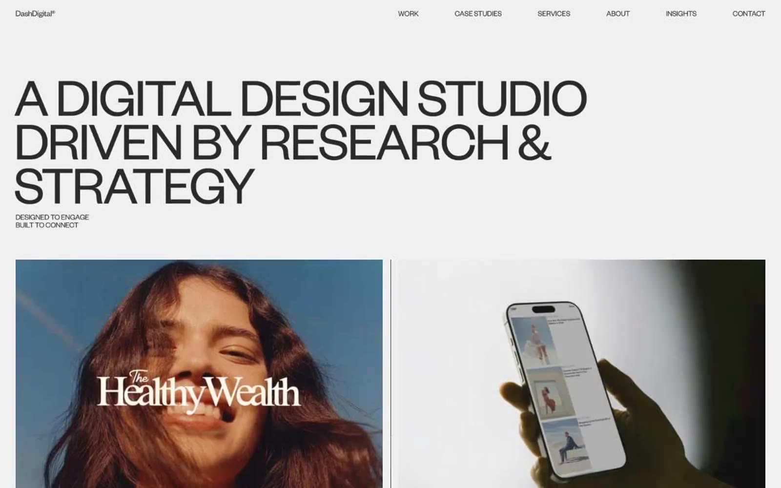
Dash Digital Studio
Dash Digital Studio — Style Reference
# Dash Digital Studio — Style Reference
> Editorial museum on warm paper. A gallery where giant whisper-weight typography floats over off-white walls and full-bleed product photography does all the talking.
**Theme:** light
Dash Digital Studio runs a strictly achromatic editorial system — warm off-white canvases, near-black type, and absolutely zero chromatic accent. The entire visual language is carried by two type weights of Founders Grotesk at extreme sizes: whisper-light 300 for monumental display headlines (70–101px) and regular 400 for body and navigation. Letter-spacing tightens aggressively at large sizes (-0.0600em at display) while line-heights compress to 0.80–0.88, making the giant headlines feel architectural and sculptural rather than promotional. Work is presented like a gallery: full-bleed product photography inside 2-up case study frames, minimal UI chrome, pill-shaped dark badges for actions, and hairline rules separating brand lists. The absence of color is the system — every signal (hierarchy, emphasis, interaction) must be built from type weight, scale, spacing, and the tonal shift between #fafafa, #f0f0f0, and #2a2a2a.
## Tokens — Colors
| Name | Value | Token | Role |
|------|-------|-------|------|
| Carbon Black | `#2a2a2a` | `--color-carbon-black` | Primary text, nav links, body copy, badge text, footer copy — the near-black that carries every word on the site |
| Bone | `#f0f0f0` | `--color-bone` | Page canvas and primary surface — the warm off-white that fills every section background |
| Ink | `#000000` | `--color-ink` | Maximum-contrast text and hard borders, reserved for the strongest emphasis moments |
| Linen | `#fafafa` | `--color-linen` | Subtle elevated surface and section dividers — one step lighter than the canvas for soft separation |
Websites
Markdown Text
design-md
website-prompt
landing-page-prompt
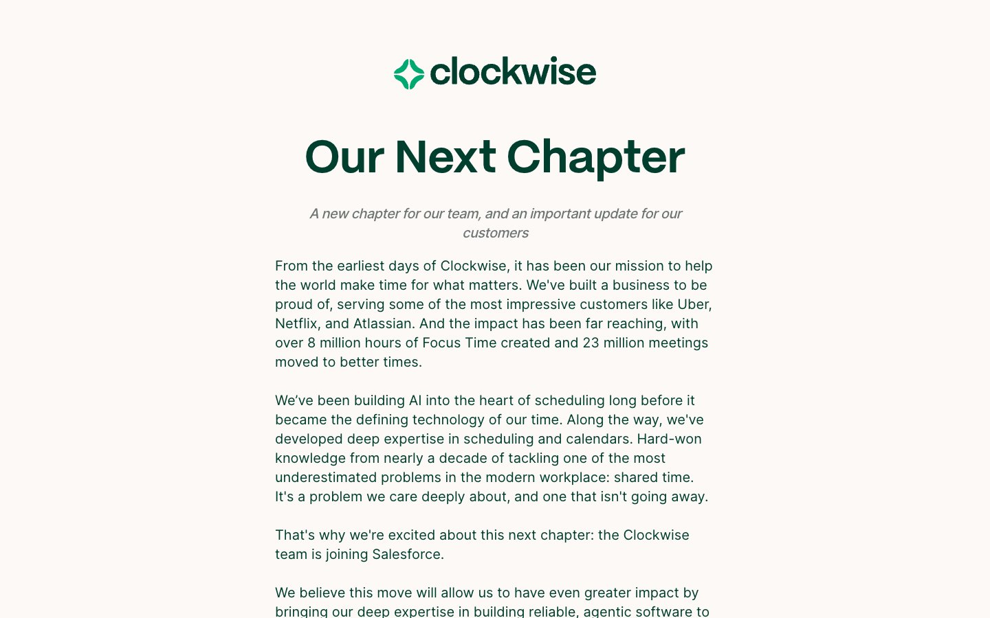
Getclockwise
Getclockwise — Style Reference
# Getclockwise — Style Reference
> monogrammed letterhead on cream paper — a warm, editorial announcement, not a product page
**Theme:** light
Clockwise speaks in a warm, paper-like voice: cream canvas, deep forest-green ink, and generous white space that lets short paragraphs breathe. The design is editorial rather than product-UI — think a well-typeset letter rather than a dashboard. A single custom display face (PP Mori) carries every heading at 52–66px with tight line-heights, while Inter handles body text with a subtle -0.03em tracking. The palette is ruthlessly restrained: nearly every visual element is either warm off-white, deep green ink, or a hairline border. Pill-shaped radii (800px) wrap around tags, buttons, and logo containers, giving every rounded element the same soft capsule form. Interactivity is whisper-quiet — no filled CTA buttons, no heavy shadows, no gradients — just a vivid emerald accent (#039861) that appears on ghost-style links and section rules.
## Tokens — Colors
| Name | Value | Token | Role |
|------|-------|-------|------|
| Forest Ink | `#003f2e` | `--color-forest-ink` | Primary brand color, headlines, logo mark, body emphasis, heavy borders, dark surface blocks — deep emerald reads as ink-stamp rather than digital green, anchoring every page with editorial weight |
| Vivid Emerald | `#039861` | `--color-vivid-emerald` | Outlined/ghost link borders, thin section rules, and occasional icon accents — the only chromatic accent in the system, used sparingly so it reads as a signal rather than decoration |
| Cream Canvas | `#fdf9f7` | `--color-cream-canvas` | Page background, document body — warm off-white gives the entire site a paper-like, non-screen feel |
| Pure Paper | `#ffffff` | `--color-pure-paper` | Card and elevated surfaces layered above the cream canvas |
Websites
Markdown Text
design-md
website-prompt
landing-page-prompt
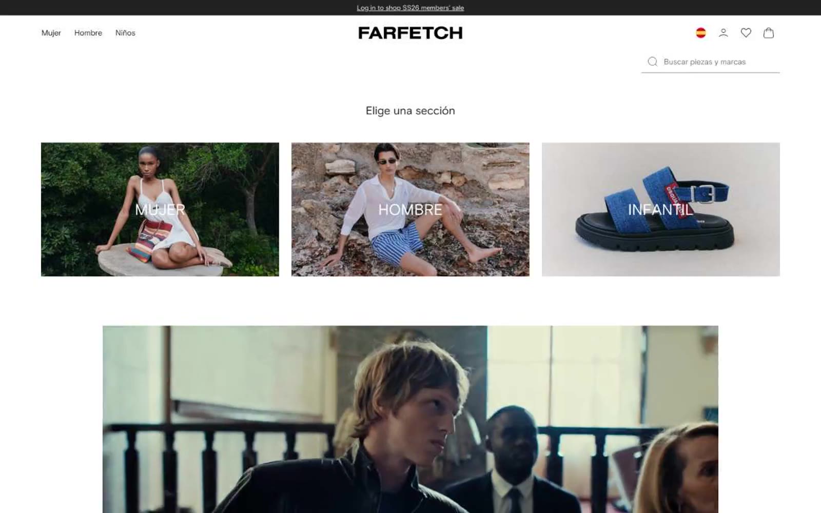
FARFETCH España
FARFETCH España — Style Reference
# FARFETCH España — Style Reference
> White-cube fashion gallery. Imagine a high-end retail space where the walls, floors, and fixtures have been bleached to bone, leaving only the garments and the people wearing them to provide every hue, texture, and visual weight.
**Theme:** light
Farfetch operates as a white-cube gallery for fashion: the interface is a near-total absence of color, letting editorial photography carry every visual decision. Typography does all the structural work — a custom geometric sans-serif (Farfetch Basis) at weights 400 and 700, with section titles and the wordmark set in a serif display treatment that treats text as composition. Layout is architectural: centered full-width content, rigid 3- and 4-column product grids, generous 48–72px section breathing room, and zero decorative chrome. Components are unornamented — thin underlines for search, ghost navigation links, uppercase category labels beneath imagery, flat product tiles with no shadows or borders. The only color in the system is the photography itself; the interface is the frame, never the picture.
## Tokens — Colors
| Name | Value | Token | Role |
|------|-------|-------|------|
| Carbon | `#222222` | `--color-carbon` | Primary text, body copy, nav links, icons, logo wordmark, footer surface, and the near-black anchoring tone for the entire monochrome system |
| Paper | `#ffffff` | `--color-paper` | Page canvas, card backgrounds, product tile surfaces, input fields, and the dominant background that makes photography the only chromatic voice |
| Ash Gray | `#b6b6b6` | `--color-ash-gray` | Subtle icon strokes, secondary borders, search underline at rest, placeholder ghost text in inputs — the quietest non-text neutral |
| Stone | `#f5f5f5` | `--color-stone` | Hover wash on nav strips, secondary surface tone for utility bars and announcement backgrounds, the softest surface lift in the stack |
Websites
Markdown Text
design-md
website-prompt
landing-page-prompt
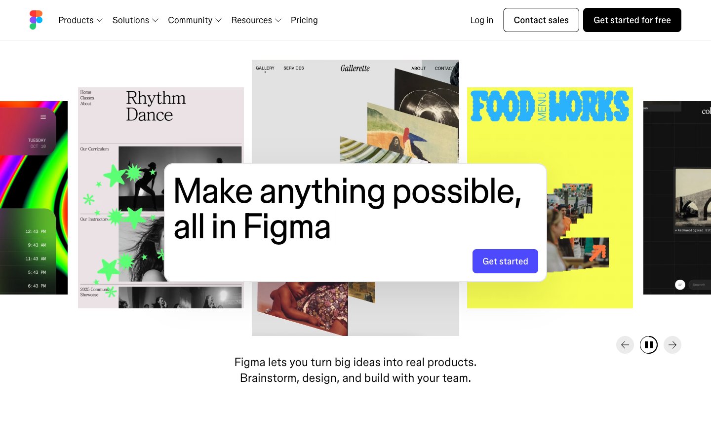
Figma
Figma — Style Reference
# Figma — Style Reference
> white gallery wall with a single indigo spotlight.
**Theme:** light
Figma operates as a pure white canvas for creativity: an achromatic interface where black text, white surfaces, and a single electric indigo accent do all the work. The visual system stays out of the way so that user-generated design work can speak — bold display headlines, light weight body text, and pill-shaped controls create a quiet, confident stage. Color appears sparingly as functional punctuation (CTAs, hover states, the Figma logo) while the surrounding page is deliberately blank, almost gallery-like. Elevation is reduced to one soft drop shadow on elevated cards; the rest of the hierarchy is built with whitespace, weight contrast, and scale. The rhythm alternates between vast breathing-room sections and tightly packed card grids, producing a museum-meets-workspace feel.
## Tokens — Colors
| Name | Value | Token | Role |
|------|-------|-------|------|
| Ink Black | `#000000` | `--color-ink-black` | Primary text, icon strokes, high-contrast borders — the default for all body, heading, and UI stroke color |
| Paper White | `#ffffff` | `--color-paper-white` | Page canvas, card surfaces, button fills for ghost/outlined controls — the dominant surface tone |
| Soft Mist | `#e2e2e2` | `--color-soft-mist` | Subtle card surface, secondary panel backgrounds — sits one step above pure white |
| Graphite | `#595959` | `--color-graphite` | Muted helper text, secondary labels, de-emphasized metadata |
Websites
Markdown Text
design-md
website-prompt
landing-page-prompt
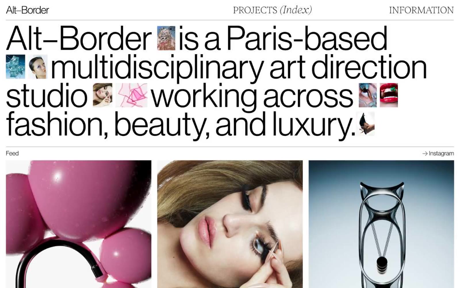
Alt–Border
Alt–Border — Style Reference
# Alt–Border — Style Reference
> Monochrome editorial gallery — broadsheet headline on gallery white.
**Theme:** light
Alt–Border is an editorial gallery built on a strict monochrome foundation: pure white canvas, near-black ink, hairline gray rules, and image as the sole carrier of color. Typography carries the entire personality — a massive condensed display face at ~105px with line-height locked near 0.85 lets headlines sprawl edge-to-edge like a magazine cover, while a lighter humanist sans handles body and labels. The layout reads as a print spread translated to the web: a minimal top bar, a hero that is just type, thin rules that separate sections, and 3-column image grids with almost no gap. There is no decoration, no shadow, no rounded corner language, no button styling — every interface decision is editorial restraint. The site treats itself as a publication, not a product.
## Tokens — Colors
| Name | Value | Token | Role |
|------|-------|-------|------|
| Ink | `#000000` | `--color-ink` | Primary type, body text, hairline rules, link borders, and the structural color of the entire page — used at high frequency for borders and text alike, creating a printed-ink quality against the white canvas |
| Gallery White | `#ffffff` | `--color-gallery-white` | Page canvas, card and image backgrounds, the negative space that lets type and photography breathe |
| Graphite | `#333333` | `--color-graphite` | Secondary text, muted borders, image strokes — a slightly softened black for elements that should not compete with primary ink |
| Ash | `#808080` | `--color-ash` | Section divider rules, link borders, faint hairlines where a true black stroke would be too assertive |
Websites
Markdown Text
design-md
website-prompt
landing-page-prompt
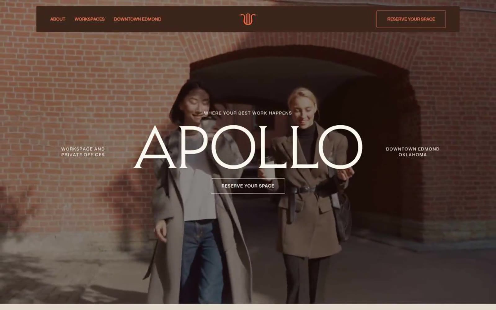
Apollo
Apollo — Style Reference
# Apollo — Style Reference
> Warm brick atelier at golden hour
**Theme:** light
Apollo reads like a printed membership brochure for a curated physical workspace: warm cream canvas, hairline ash-gray rules, and a whisper-thin display serif that gives every page an editorial weight. A single terracotta accent is rationed across actions and one or two decorative headings, while deep espresso brown replaces black as the structural dark — the palette feels sunlit rather than backlit. The 3px corner radius rejects SaaS pill-button softness in favor of print-publication crispness, and uppercase labels with wide tracking read like section dividers in a magazine. Color rarely speaks, and when it does, it speaks in one confident orange.
## Tokens — Colors
| Name | Value | Token | Role |
|------|-------|-------|------|
| Espresso Bark | `#3c261c` | `--color-espresso-bark` | Primary text, navigation background, structural borders — a warm near-black that anchors every screen without the harshness of pure #000000 |
| Terracotta Ember | `#e97451` | `--color-terracotta-ember` | Primary action borders, active nav state, decorative accents — rationed to moments of intent, never used as a large surface fill |
| Iris Ink | `#4a43dd` | `--color-iris-ink` | Decorative display headings, logo monogram stroke — a vivid violet that breaks the warm palette for brand-voice headlines only |
| Honey Parchment | `#f7efc5` | `--color-honey-parchment` | Subtle highlight washes, eyebrow label backgrounds, warm text tint — a muted yellow that warms the cream canvas without competing with terracotta |
Websites
Markdown Text
design-md
website-prompt
landing-page-prompt
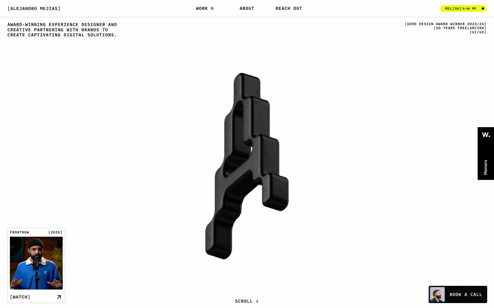
Alejandro Mejias
Alejandro Mejias — Style Reference
# Alejandro Mejias — Style Reference
> Acid-lit brutalist atelier, acid yellow against obsidian and bone white
**Theme:** mixed
Alejandro Mejias operates as a brutalist editorial portfolio: near-total monochrome canvases (white and deep black sections alternate) are interrupted by a single electric lime accent (#ebff00) that only appears on contact actions, time stamps, and avatar CTAs. Typography is the identity — a custom wide-compact grotesque (FK Raster Grotesk) at 32–48px carries every section heading, while IBM Plex Mono at 10–18px with aggressive positive tracking handles every label, tag, and metadata string. The signature element is a glossy 3D-rendered abstract 'A' sculpture that anchors major sections like a sculptural logo-mascot. Layout is edge-to-edge with very tight gutters, a fixed three-zone top bar (left brand, center nav, right status pill), and floating corner CTAs. Components feel architectural: sharp 4px button corners, soft 24px image corners, and occasional oversized pill radii up to 84px create deliberate contrast. The overall atmosphere is a high-design atelier's workshop log — restrained, opinionated, and unapologetically loud where it matters.
## Tokens — Colors
| Name | Value | Token | Role |
|------|-------|-------|------|
| Acid Lime | `#ebff00` | `--color-acid-lime` | Green action color for filled buttons, selected navigation states, and focused conversion moments |
| Obsidian | `#080707` | `--color-obsidian` | Body and heading text, dominant border color, dark section canvas — near-pure black for maximum contrast |
| Pure Black | `#000000` | `--color-pure-black` | High-frequency borders, icons, decorative strokes, image outlines — the structural black that outlines every other element |
| Bone White | `#ffffff` | `--color-bone-white` | Light section canvas, card surfaces, inverted text on dark sections and lime buttons |
Websites
Markdown Text
design-md
website-prompt
landing-page-prompt
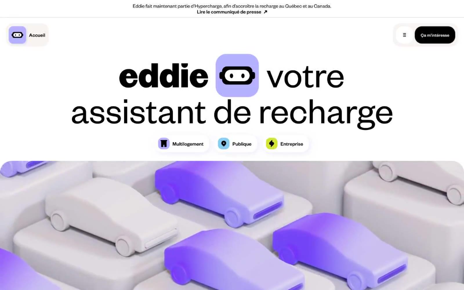
Eddie
Eddie — Style Reference
# Eddie — Style Reference
> Pastel sticker pack on warm cream paper
**Theme:** light
Eddie operates in a soft-canvas product world: a warm off-white stage (#f7f4f2) where generous rounded cards float on lavender-tinted shadows. The color story is split — the structural skeleton is near-black on cream for maximum clarity, while content cards burst into pastel lavender, vivid lime, and sky blue, making each section feel like a distinct room rather than a uniform scroll. Typography is confident and loud at the top (66–119px bold display), then shrinks into a tight compact body system. Components are heavily rounded (30–40px radii), relying on colored fill rather than outline for hierarchy, with floating action buttons that are solid black pills. The robot mascot icon is a recurring brand stamp — a rounded square with a face — used inside soft lavender badges as a visual signature throughout.
## Tokens — Colors
| Name | Value | Token | Role |
|------|-------|-------|------|
| Graphite | `#000000` | `--color-graphite` | Primary text, filled action buttons, and dominant borders — near-black provides maximum contrast against the warm cream canvas |
| Cream | `#f7f4f2` | `--color-cream` | Page canvas and soft surface washes — the warm off-white foundation of every section |
| Paper White | `#ffffff` | `--color-paper-white` | Card surfaces, button text, and inverted text on black — the cleanest layer above cream |
| Lavender Mist | `#eeeafa` | `--color-lavender-mist` | Shadow tint and near-white lavender surface — appears as the soft drop-shadow color (rgba 0.3) that makes cards feel like they hover |
Websites
Markdown Text
design-md
website-prompt
landing-page-prompt
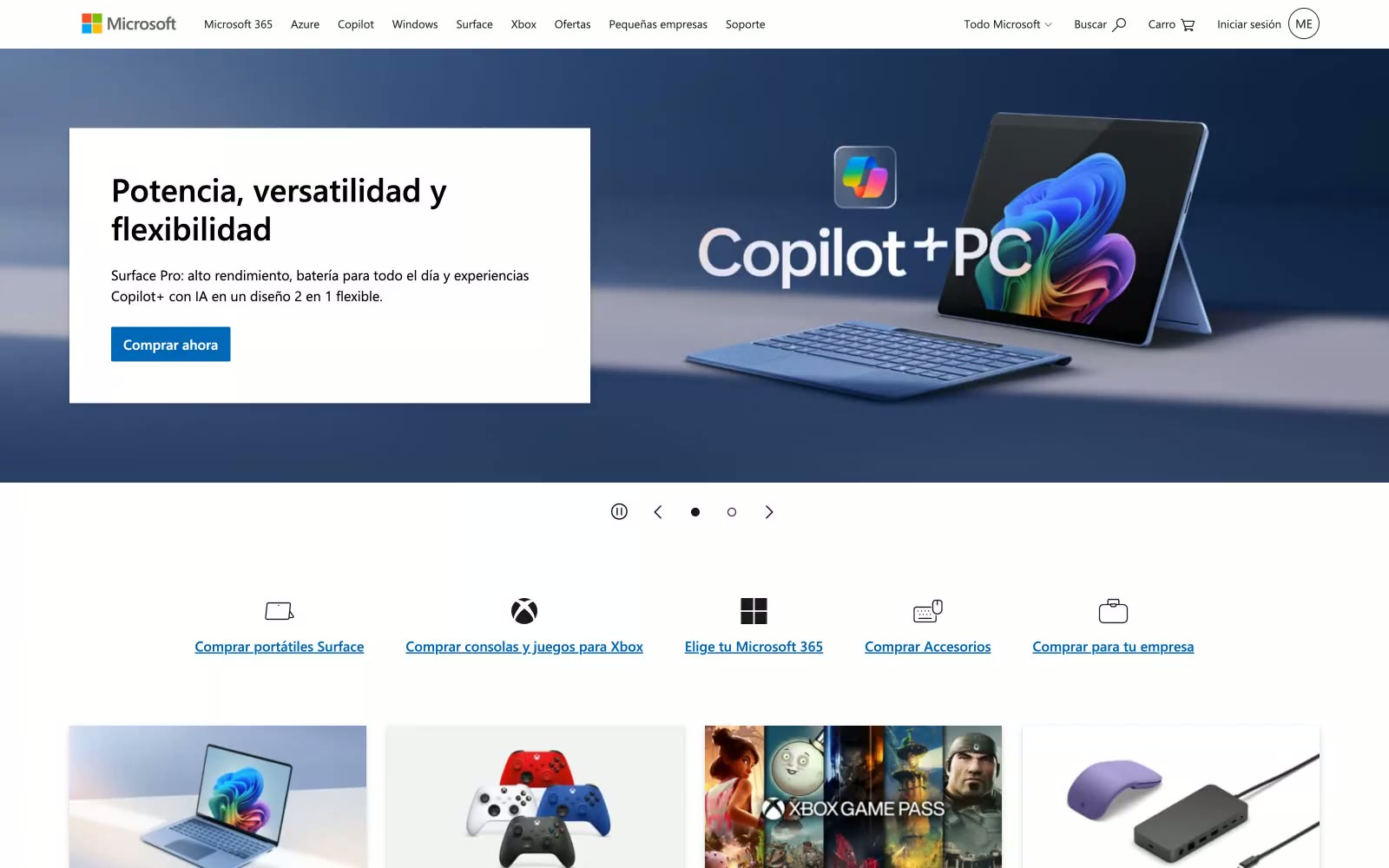
Microsoft
Microsoft — Style Reference
# Microsoft — Style Reference
> Retail shelf behind plate glass — products float forward, chrome recedes.
**Theme:** light
Microsoft.com reads like a department store catalog translated into pixels — functional, product-forward, and deliberately unshowy. The near-achromatic palette (colorfulness 2%) lets product photography and brand imagery carry all chromatic weight, while the UI itself stays out of the way. A single vivid blue (#0067b8) does everything — links, buttons, borders — appearing nowhere decorative, only interactive. Cards use a dual-layer shadow (rgba(0,0,0,0.13) 3px 7px + rgba(0,0,0,0.11) 1px 2px) against sharp 0px radius corners, a deliberate anti-trend choice that makes the surface feel like printed catalog tiles rather than floated app cards. Segoe UI at weight 400/600 across 11px–37px is the only typeface — no display cuts, no italics, no variable axes — enforcing a utilitarian uniformity across 56 interactive elements in a single header.
## Tokens — Colors
| Name | Value | Token | Role |
|------|-------|-------|------|
| Microsoft Blue | `#0067b8` | `--color-microsoft-blue` | All interactive elements — links, primary buttons, icon accents. A single saturated hue against a near-grayscale UI creates maximum clickability signal without a second accent color. |
| Deep Azure | `#004a7f` | `--color-deep-azure` | Hover and active states for links and card link colors — darkened variant of Microsoft Blue creating depth without hue shift. |
| Fluent Icon Blue | `#0078d4` | `--color-fluent-icon-blue` | Card image icon color per CSS token; slightly lighter than Microsoft Blue, used in Fluent UI icon contexts. |
| Amber Badge | `#ffb900` | `--color-amber-badge` | Badge background (CSS token sc-badge-bg-yellow) with black text — the only warm accent in the system, reserved for promotional or notification badges. |
Websites
Markdown Text
design-md
website-prompt
landing-page-prompt
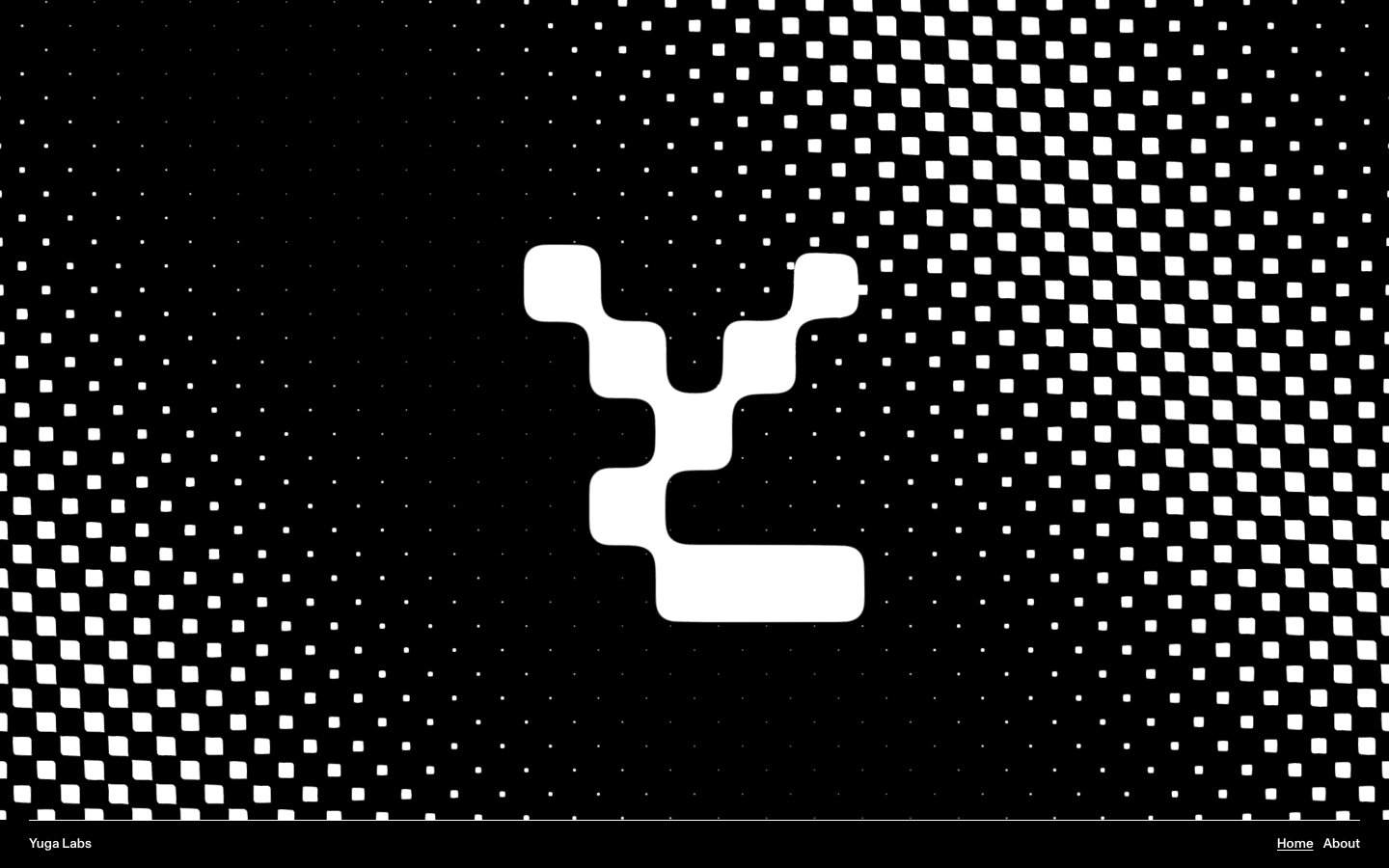
Yuga
Yuga — Style Reference
# Yuga — Style Reference
> Black gallery with neon lime punctuation
**Theme:** dark
Yuga operates as a void-gallery: pure black canvases, pure white typography, and a single chartreuse flare that reads like neon in a darkroom. The system is brutally reductive — two tones carry the entire interface, with a third acid-lime color reserved for accent strips and decorative punctuation rather than action. Typography is monumental: ultra-tight tracking, crushed line-heights below 0.9 even at 100px+, and a custom geometric grotesque pushed to display sizes that fill viewports. Components are rounded generously (30–90px radii), creating a softness that contrasts with the otherwise severe monochromatic space. The halftone dot field and pixelated logo dissolve act as the only ornamentation, reinforcing a digital-art-meets-exhibition-hall atmosphere where content is the artifact and the chrome stays out of the way.
## Tokens — Colors
| Name | Value | Token | Role |
|------|-------|-------|------|
| Void | `#000000` | `--color-void` | Page canvas, card surfaces, footer background — the dominant black field that swallows everything except typography and accent |
| Charcoal | `#131313` | `--color-charcoal` | Elevated card surface above Void, hover-state surfaces — barely lighter than canvas, creates whisper-quiet depth |
| Pure | `#ffffff` | `--color-pure` | Hairline borders, dividers, input outlines, and card edges on light surfaces. |
| Acid Lime | `#d3de5d` | `--color-acid-lime` | Decorative accent strip, highlight washes, section punctuation — chartreuse against matte black creates voltage; never used for text or buttons |
Websites
Markdown Text
design-md
website-prompt
landing-page-prompt
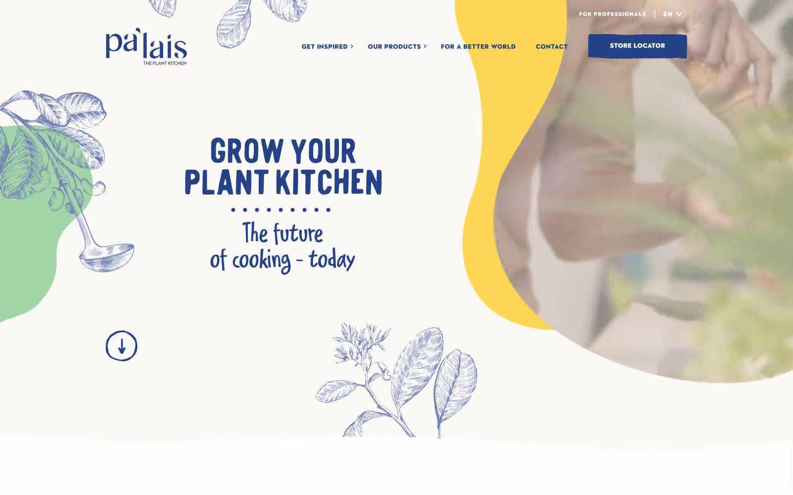
Pa'lais
Pa'lais — Style Reference
# Pa'lais — Style Reference
> Botanical sketchbook dipped in honey. The cream paper canvas, blue toile-style line illustrations, and warm color blobs recall a hand-bound recipe journal, while the bold condensed display type and generous whitespace give it modern editorial confidence.
**Theme:** light
Pa'lais reads like a hand-illustrated artisan cookbook dropped into a modern food-magazine layout. The canvas is a warm cream paper (#fbf9f6) with pure white cards layered on top, anchored by a single deep-indigo brand voice (#234386) that owns every headline, link, and primary button. That indigo is intentionally the only saturated cool in the system; everything else is warm and edible — honey-gold (#ffc400), burnt orange (#ed7328), warm sand (#d2b68c), mint sage (#a2d3a6) — and those warms appear almost exclusively as organic flowing blob shapes and botanical line-art, never as flat fills. Typography splits into two loud voices: bold condensed display fonts in all-caps navy for headlines, and widely-tracked geometric sans (Axiforma / ITC Avant Garde) for labels and UI chrome with letter-spacing up to 0.27em. A handwritten script carries emotional taglines ('The future of cooking – today'). Components stay lightweight — soft 8px cards, generous 32px-radius pill buttons, hairline borders — letting the illustrations and photography do the storytelling.
## Tokens — Colors
| Name | Value | Token | Role |
|------|-------|-------|------|
| Deep Indigo | `#234386` | `--color-deep-indigo` | Primary brand color — headlines, navigation text, links, filled CTA buttons, and dark section backgrounds. The only cool saturated hue in the system, it gives every action weight and authority |
| Honey Gold | `#ffc400` | `--color-honey-gold` | Decorative accent — used exclusively in organic flowing blob shapes and illustration highlights, never as a fill or button. The warm burst of yellow is the system's signature punctuation against the cream canvas |
| Burnt Orange | `#ed7328` | `--color-burnt-orange` | Orange accent for outlined action borders, linked labels, and lightweight interactive emphasis. |
| Sky Blue | `#6aa8dc` | `--color-sky-blue` | Soft illustration blue — used in botanical line-art washes and supporting decorative blobs. Lighter and more atmospheric than the primary indigo, it adds depth to the plant illustrations |
Websites
Markdown Text
design-md
website-prompt
landing-page-prompt
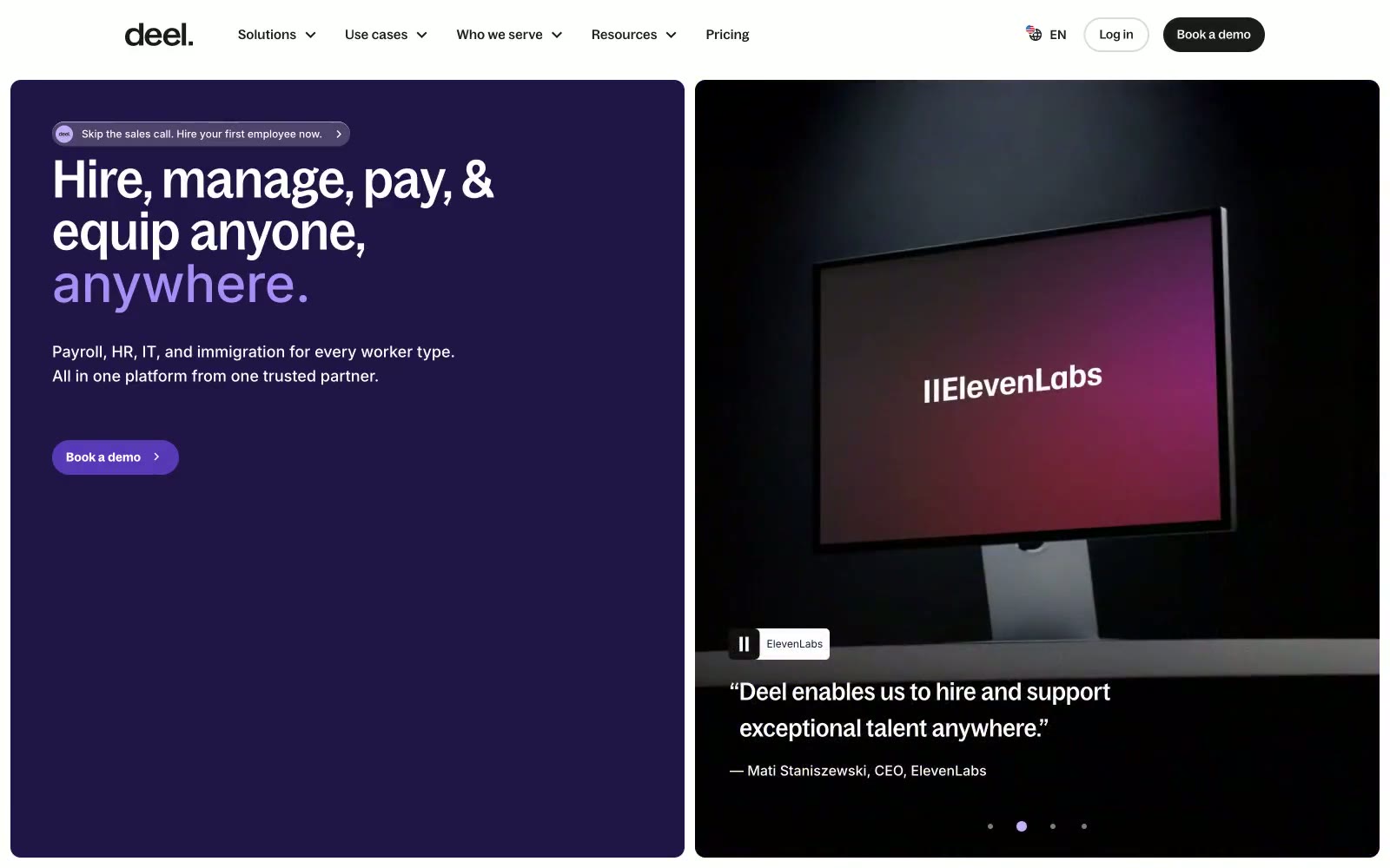
Deel
Deel — Style Reference
# Deel — Style Reference
> Global command split-screen — a war-room purple panel beside a neon product showcase, then warm cream scrolls below.
**Theme:** mixed
Deel operates in contrasting registers — a deep purple-black (#201547) hero punched through with electric yellow-green product shots, then a cream-warm (#fffbf4) body that stretches through the rest of the page. The dual-zone layout is the signature move: dark/vivid left panel with serif-weight condensed Bagoss headlines, fluorescent product imagery on the right, then warmth and space below. Accent violet (#a98df6 to #5938b7) appears only within the dark hero for the word 'anywhere.' and CTAs — never in the light body sections. Pill-shaped buttons (200px radius) coexist with 24px-radius cards, creating a soft geometry throughout. The custom Bagoss family — in Condensed, Extended, Standard, and VF cuts — gives the brand typographic range unavailable through any system font.
## Tokens — Colors
| Name | Value | Token | Role |
|------|-------|-------|------|
| Deep Cosmos | `#201547` | `--color-deep-cosmos` | Hero section background — the darkest brand surface, houses white headlines and violet accent text |
| Violet Mid | `#5938b7` | `--color-violet-mid` | CTA buttons in hero context, pill backgrounds — saturated mid-violet bridges cosmos and accent |
| Lavender Pulse | `#a98df6` | `--color-lavender-pulse` | Headline accent text ('anywhere.') in dark hero — vivid violet pops against #201547 |
| Pale Amethyst | `#c4b1f9` | `--color-pale-amethyst` | Soft violet surface tint, used as background on secondary dark panels |
Websites
Markdown Text
design-md
website-prompt
landing-page-prompt
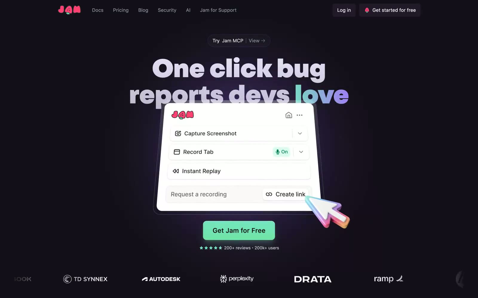
Jam
Jam — Style Reference
# Jam — Style Reference
> late-night dev console with mint LED pulse — a near-black interface where one vivid green button glows like a power LED on matte hardware.
**Theme:** dark
Jam is a late-night dev console with a mint signal pulse: a near-black canvas in deep plum-black, massive geometric grotesk headlines that take over the viewport, and a single electric mint accent that marks everything that is on, active, or ready. The interface is deliberately quiet — most surfaces share a tonal near-gray darkness, letting the mint and violet accents do the talking. Cards, pills, and controls are generously rounded (12–24px) and defined by hairline borders rather than heavy shadows, giving the product a lightweight, paper-on-graphite feel. The brand oscillates between three chromatic voices: mint for primary actions and status, violet for secondary icons and gradients, and a hot pink-red for the persistent header CTA and the wordmark — each one a small electric punctuation against the dark.
## Tokens — Colors
| Name | Value | Token | Role |
|------|-------|-------|------|
| Obsidian Plum | `#130f18` | `--color-obsidian-plum` | Page canvas, deepest background — the negative space headlines float on |
| Graphite Plum | `#21192a` | `--color-graphite-plum` | Card and list surface — one step lifted from the canvas, carries testimonial cards and feature lists |
| Smoke Plum | `#2e2d36` | `--color-smoke-plum` | Inner card surface and hairline border on cards — a second elevation step |
| Ink Border | `#252542` | `--color-ink-border` | Subtle violet-tinted borders and dividers between elements |