AI Prompt Studio - Intelligent Prompt Library
Explore and use professional AI prompts to optimize your workflow.
One-click Use
Websites
Markdown Text
design-md
website-prompt
landing-page-prompt
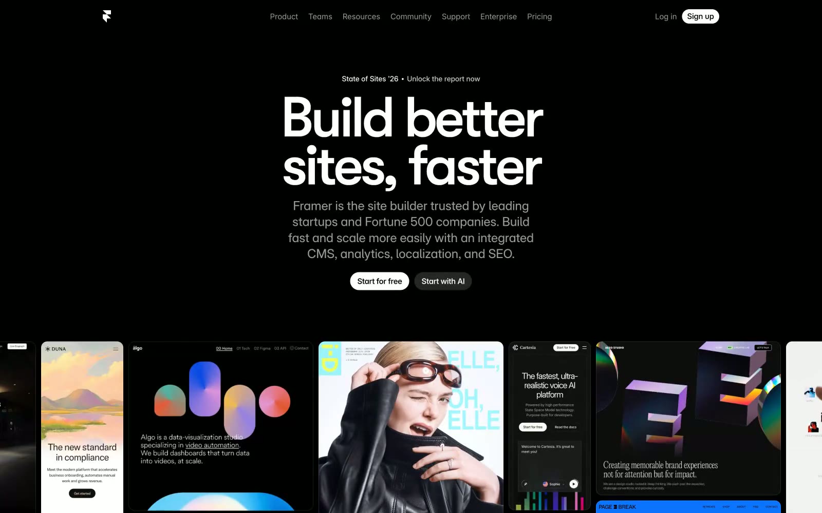
Framer
Framer — Style Reference

# Framer — Style Reference
> Midnight gallery with monumental type — a dark exhibition hall where 100px headlines hang on black walls like spotlit artwork.
**Theme:** dark
Framer is a pitch-black gallery where colossal sans-serif type floats on void, and one electric blue does all the shouting. The interface is essentially typographic architecture: massive display headlines (85–110px) with aggressive negative tracking anchor each section, while a single grid of project tiles in the mid-scroll does the visual work that gradients or illustrations do elsewhere. Components are deliberately quiet — pill-shaped buttons, hairline borders, near-invisible shadows — so the typography and showcase imagery carry the energy. Density is compact (10px gutters), surfaces are barely-distinguished shades of near-black, and the only chromatic note is #0099ff for links and emphasis, creating a designer-tool atmosphere that feels more like a portfolio site than a SaaS landing page.
## Tokens — Colors
| Name | Value | Token | Role |
|------|-------|-------|------|
| Void | `#000000` | `--color-void` | Page background, hero canvas, deepest surface — the default everywhere; nothing sits on top of it, everything floats within it |
| Obsidian | `#080808` | `--color-obsidian` | Sub-surface for cards and panels directly on the canvas — barely lighter than Void, so elevation is felt rather than seen |
| Graphite | `#171717` | `--color-graphite` | Elevated card surface, modal backgrounds, project tile frames — the most clearly distinct card layer above the canvas |
| Carbon | `#222222` | `--color-carbon` | Higher-elevation panels, inset wells, code blocks — a step up from Graphite for content that needs to feel enclosed |
Websites
Markdown Text
design-md
website-prompt
landing-page-prompt
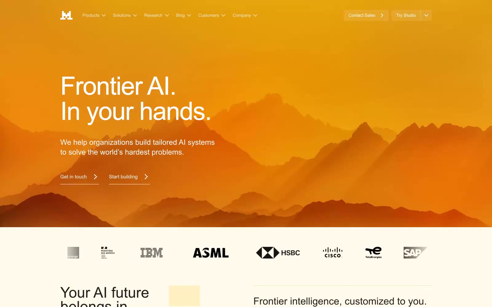
Frontier AI LLMs
Frontier AI LLMs — Style Reference
# Frontier AI LLMs — Style Reference
> warm parchment with a campfire heart
**Theme:** light
Mistral's visual system reads as a sunlit workshop on warm paper — a cream-ivory canvas (#fffaeb) that feels like aged parchment, generously padded with a single vivid orange (#fa520f) doing all the chromatic talking. The hero erupts into a dramatic amber landscape gradient with mountain silhouettes, then everything afterward returns to that quiet, warm, almost tactile quietness. Typography stays in a clean system sans (Arial) with tight -0.025em tracking that tightens the lines into one confident whisper. The system has an unusual visual signature: warm-toned shadows tinted in olive-gold rather than cool gray, giving every elevated element a 'lit from within by firelight' quality. Density is comfortable and confident, not dense — breathing room is part of the brand. The product mockups in the body break into dark UI panels floating on the cream, creating contrast between the paper-warm site shell and the structured dark application surfaces.
## Tokens — Colors
| Name | Value | Token | Role |
|------|-------|-------|------|
| Parchment Canvas | `#fffaeb` | `--color-parchment-canvas` | Page background, hero body, section fills — warm cream-ivory that replaces the typical white SaaS canvas and gives the system its sunlit, paper-like quality |
| Pure Card | `#ffffff` | `--color-pure-card` | Card surfaces, elevated panels, feature blocks, and product mockup shells — pure white that reads brighter than the canvas and creates a subtle paper-on-paper layering |
| Midnight Ink | `#1f1f1f` | `--color-midnight-ink` | Primary body text, headings, nav links, button text — near-black rather than pure black keeps text from feeling harsh against the warm canvas |
| Carbon | `#000000` | `--color-carbon` | Dark supporting neutral for text, icons, and strong contrast. Do not promote it to the primary CTA color |
Websites
Markdown Text
design-md
website-prompt
landing-page-prompt
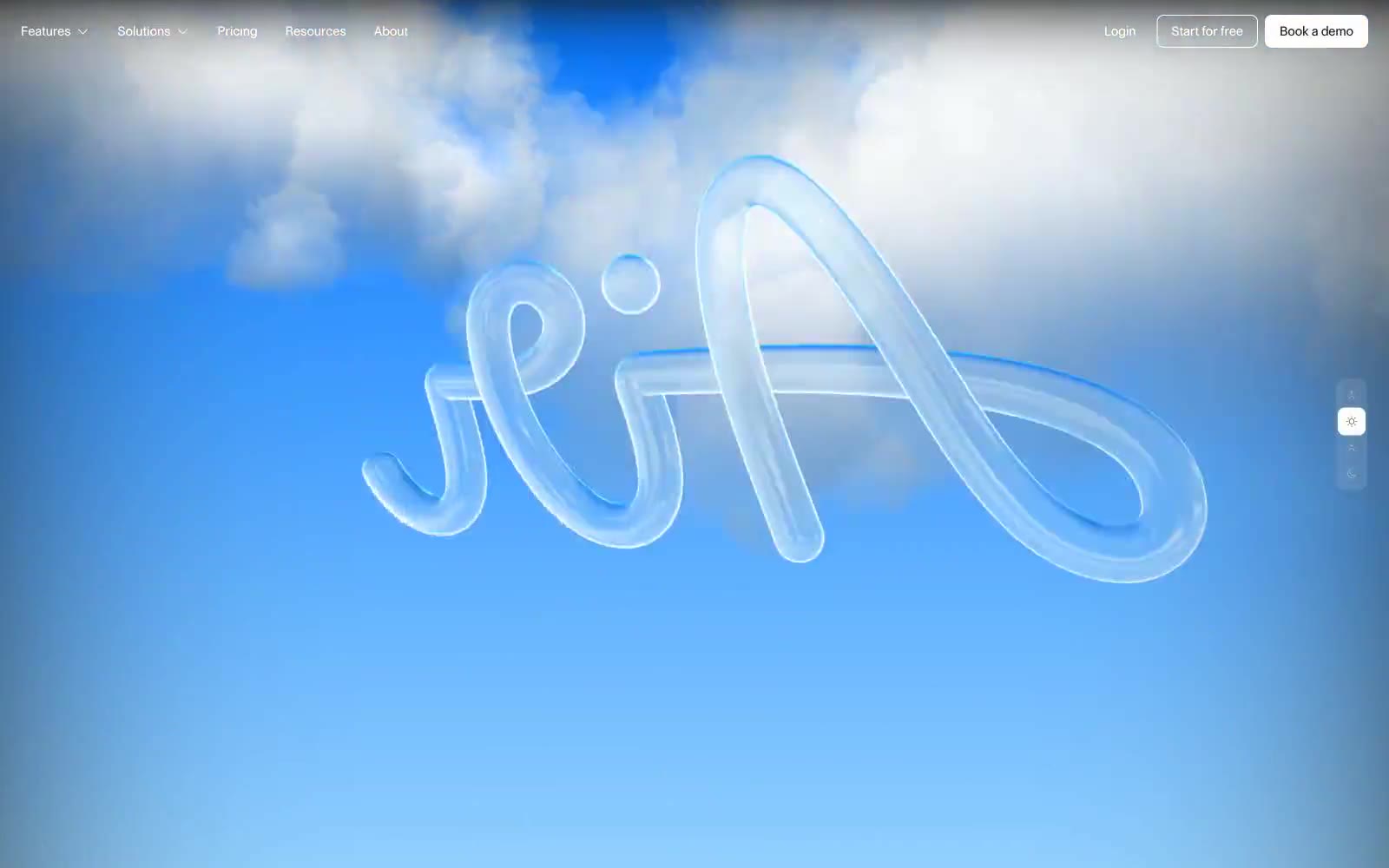
Air
Air — Style Reference
# Air — Style Reference
> sky canvas, frosted glass
**Theme:** light
Air's visual system evokes a serene, cloud-like experience with a dominant blue sky background theme. Its typography balances expressive, custom display fonts for impact with understated, functional text for clarity. UI elements are largely monochromatic, maintaining focus through subtle surface variations and ghost-like components. A single vivid blue accent color is reserved for interactive states, guiding user attention and highlighting primary actions against the expansive, airy backdrop.
## Tokens — Colors
| Name | Value | Token | Role |
|------|-------|-------|------|
| Sky Canvas | `#426188` | `--color-sky-canvas` | Dominant page background element, providing depth and a sky-like atmosphere. Also used for some decorative headline coloring and borders |
| Action Blue | `#2b7fff` | `--color-action-blue` | Primary accent for interactive elements, such as outlined buttons and links, guiding user actions |
| Midnight Ink | `#000000` | `--color-midnight-ink` | Primary text color for headlines and body copy, ensuring high contrast against light surfaces. Used for borders of selected elements |
| Cloud White | `#ffffff` | `--color-cloud-white` | Background for primary UI surfaces, headers, and text where contrast is needed against darker elements. Also used for ghost button borders and text |
Websites
Markdown Text
design-md
website-prompt
landing-page-prompt
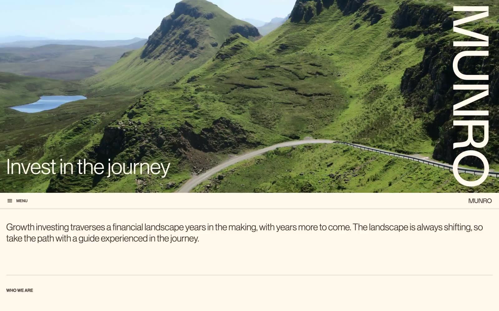
Munro Partners
Munro Partners — Style Reference
# Munro Partners — Style Reference
> Editorial parchment under alpine light — a warm cream canvas holding generous whitespace, a whisper-weight grotesque, and full-bleed mountain photography where the landscape does the talking and the interface stays nearly invisible.
**Theme:** light
Munro Partners operates in a quiet, editorial register: a warm cream canvas (#fff9ee) holds generous whitespace, with every interface element trimmed in a single warm dark brown (#3f322a) that reads as ink rather than black. The Neue Haas Grotesk typography is set tight and small, with a 68px display headline at weight 400 that whispers against full-bleed mountain photography rather than shouting. A single deep teal (#004e4e) is reserved for the most important interactive moments, while muted violets, aubergine, and ice blue appear as thin accent borders on cards and data treatments. The system feels less like a financial product and more like a printed annual report — calm, spacious, and confident enough to let landscape imagery carry the emotional weight.
## Tokens — Colors
| Name | Value | Token | Role |
|------|-------|-------|------|
| Cream Parchment | `#fff9ee` | `--color-cream-parchment` | Page canvas, section backgrounds, card surfaces, nav bar fill — the warm off-white that defines the entire mood and replaces what would normally be pure white |
| Paper White | `#ffffff` | `--color-paper-white` | Elevated card surfaces, video embed containers, contrast panels against the cream canvas |
| Bark Brown | `#3f322a` | `--color-bark-brown` | Primary text, all borders, nav links, body copy, headings — replaces black throughout the system, giving every line a warm ink-like quality |
| Warm Gray | `#9f968c` | `--color-warm-gray` | Secondary text, subtle borders, nav dividers — the mid-tone that bridges Bark Brown headings and lighter dividers |
Websites
Markdown Text
design-md
website-prompt
landing-page-prompt
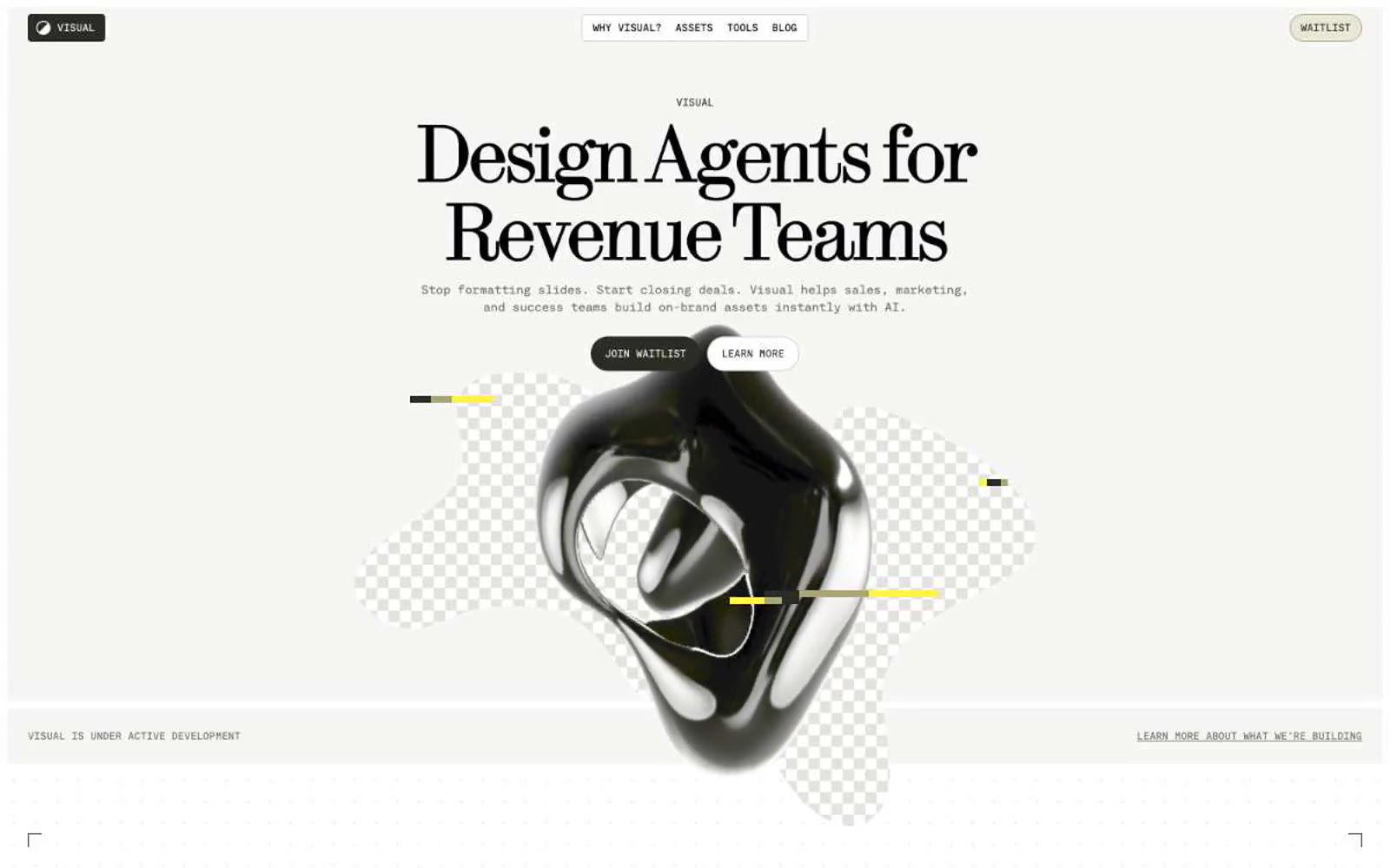
Visual
Visual — Style Reference
# Visual — Style Reference
> Warm editorial zine. Cream paper, serif posters, mono marginalia, a single yellow highlighter mark.
**Theme:** light
Visual speaks an editorial design dialect: a warm cream canvas (#f6f6f4) holds a high-contrast modern serif at near-poster sizes (64–96px) paired with monospaced UI text at 12–16px. The palette is near-monochrome — warm blacks, olive-sage neutrals, and a single vivid yellow (#fff347) deployed as decorative punctuation on accent bars and highlight washes. Surfaces stay flat with hairline 1px borders; visual hierarchy comes from color contrast and generous 80px section gaps, never from shadows. Components are lightweight and geometric: 8px-radius cards, 3px-radius nav, tiny all-caps mono labels, and a neutral dark button that reads as 'next' rather than 'buy now'. The overall feel is a design museum catalog that happens to contain a product — confident, restrained, and slightly cerebral.
## Tokens — Colors
| Name | Value | Token | Role |
|------|-------|-------|------|
| Vellum | `#f6f6f4` | `--color-vellum` | Page background — the warm off-white that defines the entire canvas tone |
| Paper | `#ffffff` | `--color-paper` | Card surfaces, elevated panels, product mockup backgrounds |
| Ink | `#000000` | `--color-ink` | Primary text, heavy structural borders, nav bar outlines |
| Carbon | `#2c2c26` | `--color-carbon` | Warm near-black for dark panels, footer background, and neutral filled button fill — the only filled button in the system |
Websites
Markdown Text
design-md
website-prompt
landing-page-prompt
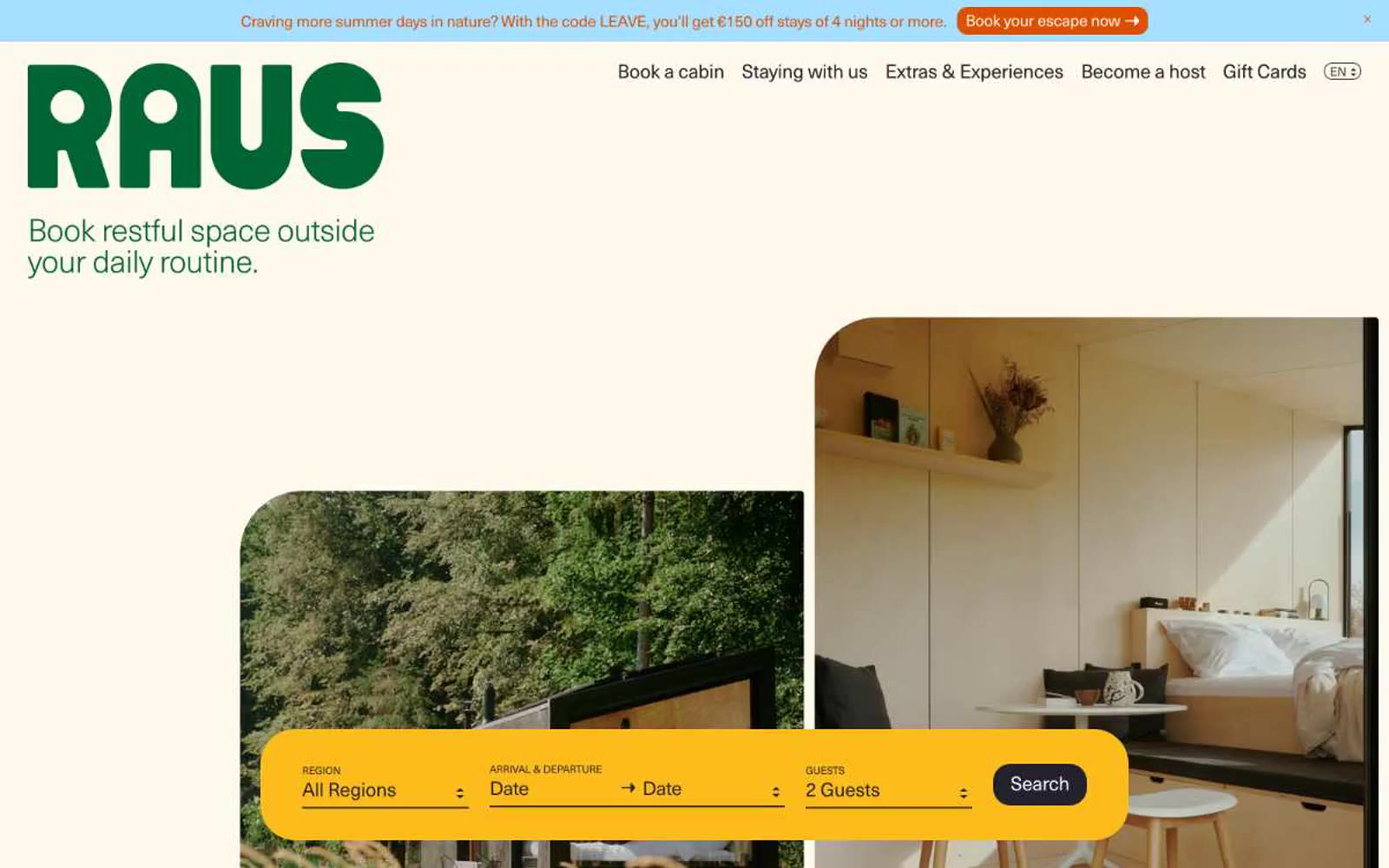
Raus
Raus — Style Reference
# Raus — Style Reference
> Warm cabin journal on cream paper — every page a postcard from the woods.
**Theme:** light
Raus is an editorial cabin-booking platform rendered as a warm, hand-printed travel journal: cream paper backgrounds, generous generous breathing room, and photography that sits beside text rather than beneath it. The brand uses a deep forest green as a calm, non-shouting identity color — present in the wordmark and key links but never screaming — while a bright marigold yellow search bar acts as the single visual exclamation point on each page, anchoring the booking flow. Typography does the heavy lifting: a single neo-grotesque face set at weight 300 with tight negative tracking creates an airy, almost whispered voice that contrasts with the confident, rounded geometry of the components. Surfaces are warm and matte, corners are generously rounded (20px is the default, 40px for hero cards), and shadows are absent — depth comes from layering cream on cream, not elevation.
## Tokens — Colors
| Name | Value | Token | Role |
|------|-------|-------|------|
| Charcoal | `#23212c` | `--color-charcoal` | Body text, headings, dark surfaces, icon strokes, hairline borders. Anchors the entire system — almost-black but slightly warm, never pure black |
| Paper | `#f7f0e1` | `--color-paper` | Primary page background and card canvas — warm cream that gives the entire site its printed, hand-made feel. Not white, not beige; paper |
| Snow | `#ffffff` | `--color-snow` | Search bar text, button labels on dark fills, image overlays, and any surface that needs to sit forward of the cream canvas |
| Pine | `#006434` | `--color-pine` | Brand wordmark, primary headings on hero, link text, and the only chromatic authority — deep forest green used sparingly to mark identity, never decoration |
Websites
Markdown Text
design-md
website-prompt
landing-page-prompt
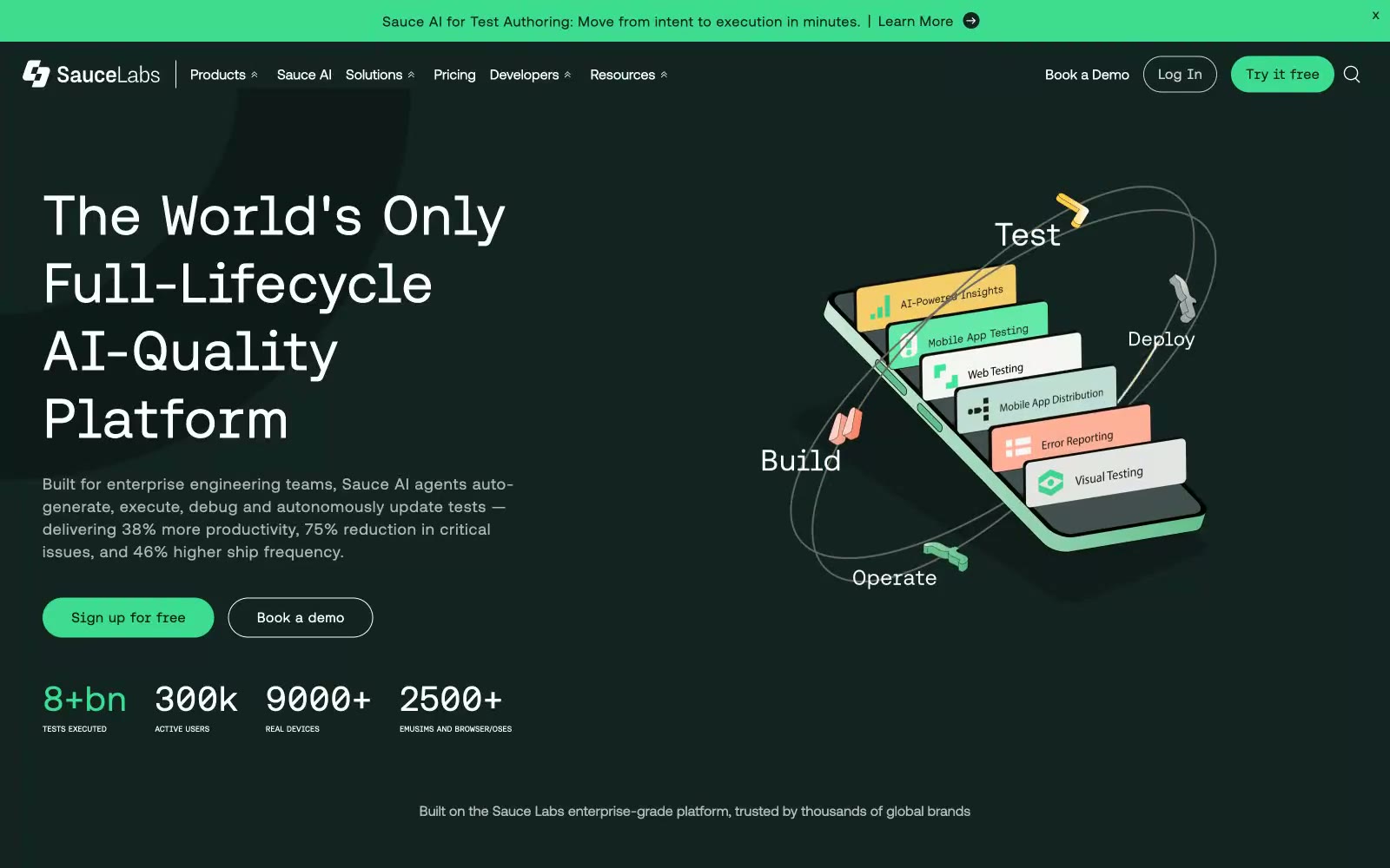
Sauce Labs
Sauce Labs — Style Reference
# Sauce Labs — Style Reference
> Neon-lit command center on obsidian glass — a dark engineering console where a single green pulse marks every live signal.
**Theme:** dark
Sauce Labs operates as a neon-lit engineering console: deep obsidian canvas (#132322) with white precision typography and a single vivid green (#3ddc91) that activates every interactive surface. The system alternates between dark structural bands and light content cards (#edf7f5), creating rhythm through luminance contrast rather than ornament or elevation. Components are confident and generously rounded — 56px pill buttons, 20px card radii, minimal shadow — reading as high-end developer tooling where the product's intelligence is the visual subject. The green accent is rationed: it appears on primary actions, active tab states, announcement bars, and stat highlights, never as decoration, which gives it real semantic weight.
## Tokens — Colors
| Name | Value | Token | Role |
|------|-------|-------|------|
| Obsidian Shell | `#132322` | `--color-obsidian-shell` | Primary page background, dark navigation, dark card surfaces — the structural canvas that absorbs everything else and makes the green accent feel electric by contrast |
| Pure White | `#ffffff` | `--color-pure-white` | Primary text on dark surfaces, card content backgrounds, light section canvases — maximum contrast against the obsidian shell |
| Mint Frost | `#edf7f5` | `--color-mint-frost` | Light content card surfaces, elevated feature panels — the bright counterpoint that breaks up dark sections and hosts detailed content |
| Deep Abyss | `#0e1a19` | `--color-deep-abyss` | Darker surface variant for nested elements, deep card backgrounds, gradient endpoints — pushes further into the void when extra depth is needed |
Websites
Markdown Text
design-md
website-prompt
landing-page-prompt
Epidemicsound
Epidemicsound — Style Reference
# Epidemicsound — Style Reference
> Boutique liner notes on sunlit paper. A warm off-white spread with a custom editorial serif, a single hot-pink section that breaks the monochrome like a magazine cover, and sharp black CTAs that feel like ink stamps — not a software product, a printed object that happens to stream music.
**Theme:** light
Epidemic Sound reads as a music-industry editorial: a warm bone-white canvas, confident black sans-serif UI, and a custom high-contrast serif that carries the brand voice at display sizes. A single vivid hot-pink (#ff82c2) is the signature accent — used sparingly as full-bleed section backgrounds and inline emphasis rather than scattered decoration. Colorfulness sits at 1%, so the system should feel mostly monochrome with chromatic color arriving as deliberate editorial punctuation (pink, signal blue, sun yellow). Components are flat and rectangular, almost no border-radius, very little shadow — the design trusts typography weight and generous spacing to create hierarchy. Italic inside the display serif is a signature move: emphasis is set in the same family rather than a separate color or weight shift, giving headlines a literary, liner-notes quality.
## Tokens — Colors
| Name | Value | Token | Role |
|------|-------|-------|------|
| Hot Pink | `#ff82c2` | `--color-hot-pink` | Signature accent section backgrounds (announcement bar, Studio feature block), inline link emphasis — the brand's editorial punctuation. Used full-bleed, not as a tint |
| Sun Yellow | `#ffda40` | `--color-sun-yellow` | Accent highlight wash and decorative badge fills. Secondary chromatic accent that pairs with the pink in the brand's signature palette |
| Signal Blue | `#20afff` | `--color-signal-blue` | Secondary section background, decorative callout. A cool counterpoint to the warm pink and yellow, used when a third chromatic moment is needed in long pages |
| Ember Orange | `#ff6138` | `--color-ember-orange` | Sporadic chromatic accent for icon strokes and small decorative highlights. Does not define sections |
Websites
Markdown Text
design-md
website-prompt
landing-page-prompt
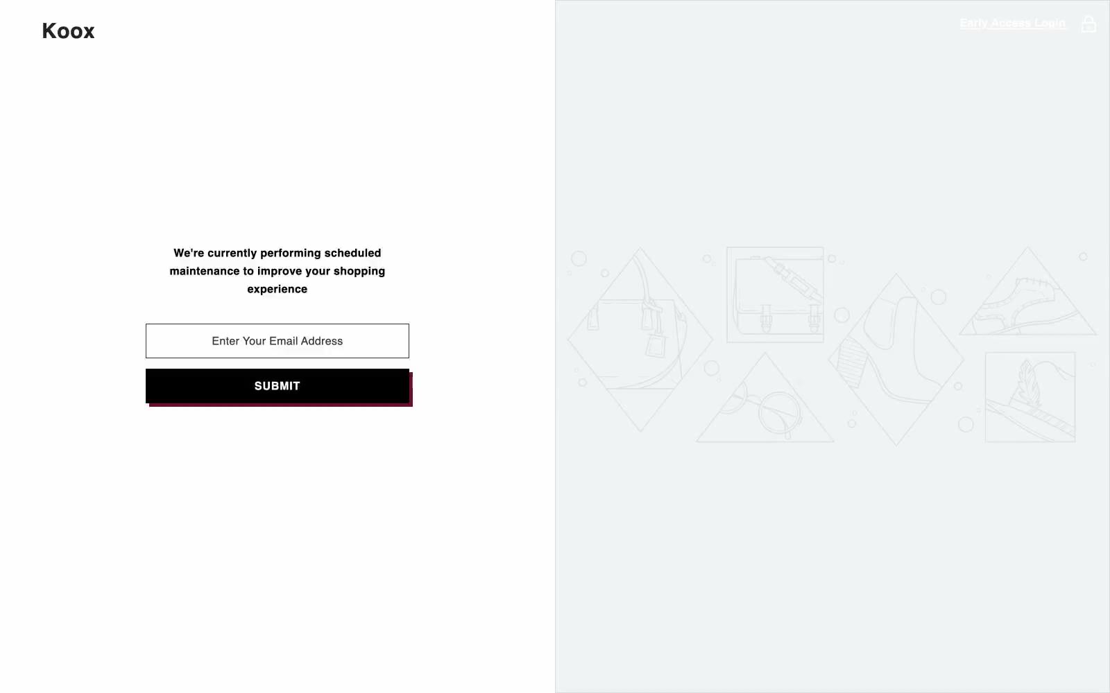
Koox
Koox — Style Reference
# Koox — Style Reference
> Brutalist cold-press lab — white tile, sticker print, stencil voice.
**Theme:** light
Koox is a brutalist cold-press lab where white subway tile meets product photography and shouty stencil typography. The brand trades in confident all-caps headlines tracked wide across the page, orange grout-line borders that frame every surface like a tiled wall, and a dark-green apothecary palette anchored by a single hard-offset burgundy shadow that makes every button feel like a screen-printed sticker. Pages stay clinical and bright — white canvas, near-black text, thin hairlines — with color reserved for functional punctuation: the orange frame, the dark-green CTA, the burgundy shadow. The result is loud but disciplined, like a juice bar designed by a printmaker.
## Tokens — Colors
| Name | Value | Token | Role |
|------|-------|-------|------|
| Tile Grout | `#d25a24` | `--color-tile-grout` | Signature brand border and link accent — orange tile-line strokes that frame cards, links, and section edges with the warmth of fired clay against the clinical white canvas |
| Cold-Press Green | `#113722` | `--color-cold-press-green` | Primary action fill — the dark botanical green of filled CTA buttons, footer band, and category button backgrounds, signaling the product inside without resorting to food-photo greens |
| Sticker Crimson | `#6b1229` | `--color-sticker-crimson` | Hard-offset shadow accent — deep burgundy that throws a zero-blur 5px shadow under stickers and emphasized buttons, turning flat elements into screen-print layers peeled onto the page |
| Noir | `#000000` | `--color-noir` | Navigation, body text, and default border color — the unyielding black that carries every paragraph, icon stroke, and card hairline |
Websites
Markdown Text
design-md
website-prompt
landing-page-prompt
HyperAktiv
HyperAktiv — Style Reference
# HyperAktiv — Style Reference
> Swiss editorial broadsheet. Black display type at 90px on white, with electric blue as the only chromatic note.
**Theme:** light
HyperAktiv operates as a Swiss editorial poster: pure white canvas, oversized black display type, and one electric blue (#0000ff) that fires only on action and footer surfaces. Headlines dominate at 72–90px with line-heights tightened to 0.89–1.0, collapsing the page into a vertical column of massive typographic statements. Layouts alternate between full-bleed photography and asymmetric 50/50 splits, treating the interior photos as raw documentation rather than styled artwork. Everything is sharp-cornered except a single 20px button radius, and the only shadows are the ones baked into the photography — the interface itself stays flat, binary, and graphic.
## Tokens — Colors
| Name | Value | Token | Role |
|------|-------|-------|------|
| Pure White | `#ffffff` | `--color-pure-white` | Page background, card surfaces, text on dark/action backgrounds |
| Absolute Black | `#000000` | `--color-absolute-black` | Body text, headings, icon strokes, hairline borders, image overlays |
| Mid Graphite | `#333333` | `--color-mid-graphite` | Input text, secondary text content |
| Light Silver | `#cccccc` | `--color-light-silver` | Input borders, subtle form dividers |
Websites
Markdown Text
design-md
website-prompt
landing-page-prompt
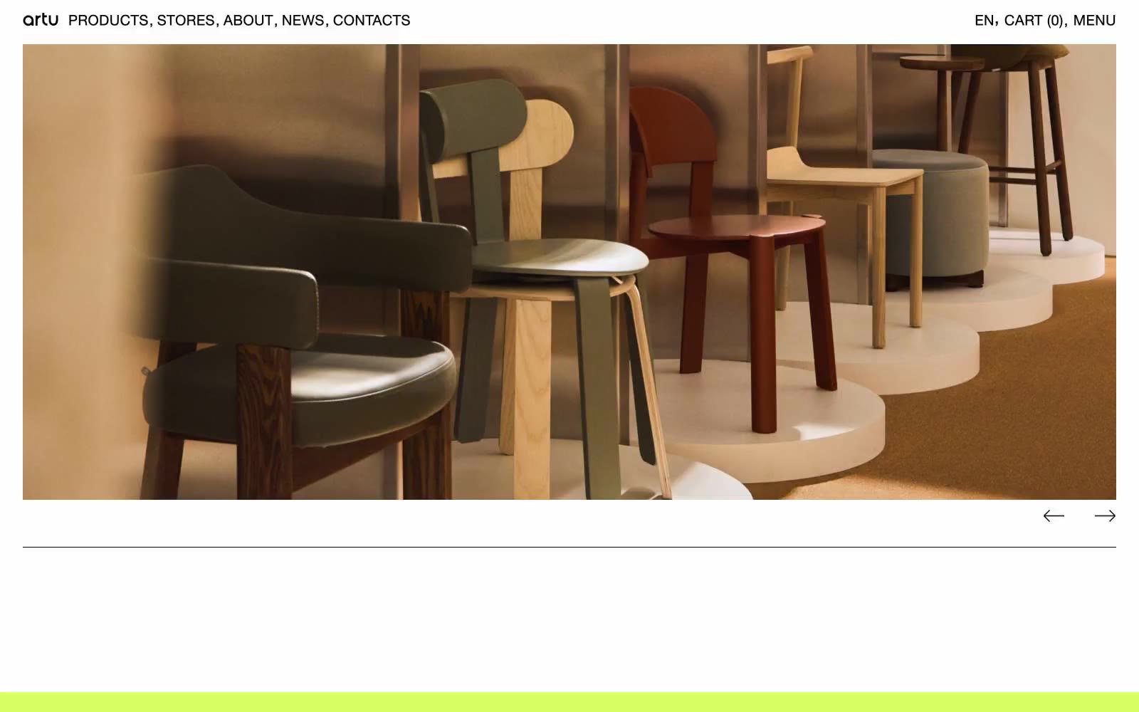
ARTU
ARTU — Style Reference
# ARTU — Style Reference
> Gallery wall on white paper. ARTU treats the browser as a museum spread — massive product photography, hairline rules, and a single shock of lime at the bottom edge to close the room.
**Theme:** light
ARTU operates as a furniture gallery in browser form: one custom neo-grotesque at a single weight, pure white canvas, product photography that fills the viewport, and almost no visible UI chrome. The discipline is extreme — there is one weight, one type family, two surface colors, and negative space does the work that shadows and gradients do elsewhere. Color is used surgically: a high-chroma lime green (#d7ff66) punctuates only the footer band as a terminal signal, while a raw red (#ff1313) appears as thin border lines and icon strokes — deliberately failing contrast, it functions as graphic rhythm, not information. The result reads less like a commerce site and more like an art-book spread: the products are the layout, the layout is whitespace, and the UI is a thin black line of all-caps navigation at the top edge.
## Tokens — Colors
| Name | Value | Token | Role |
|------|-------|-------|------|
| Canvas White | `#ffffff` | `--color-canvas-white` | Page background, card surface, image plate — the entire site sits on pure white |
| Ink Black | `#000000` | `--color-ink-black` | All text, hairline borders, navigation, link underlines, image frames — the sole structural color |
| Terminal Lime | `#d7ff66` | `--color-terminal-lime` | Footer band, surface highlight wash, terminal accent — high-chroma green that signals a page boundary the way a colored edge stops a gallery wall |
| Signal Red | `#ff1313` | `--color-signal-red` | Decorative border strokes, icon outlines, hairline rules in editorial layouts — used at sub-readable contrast as graphic punctuation, never as body text |
Websites
Markdown Text
design-md
website-prompt
landing-page-prompt
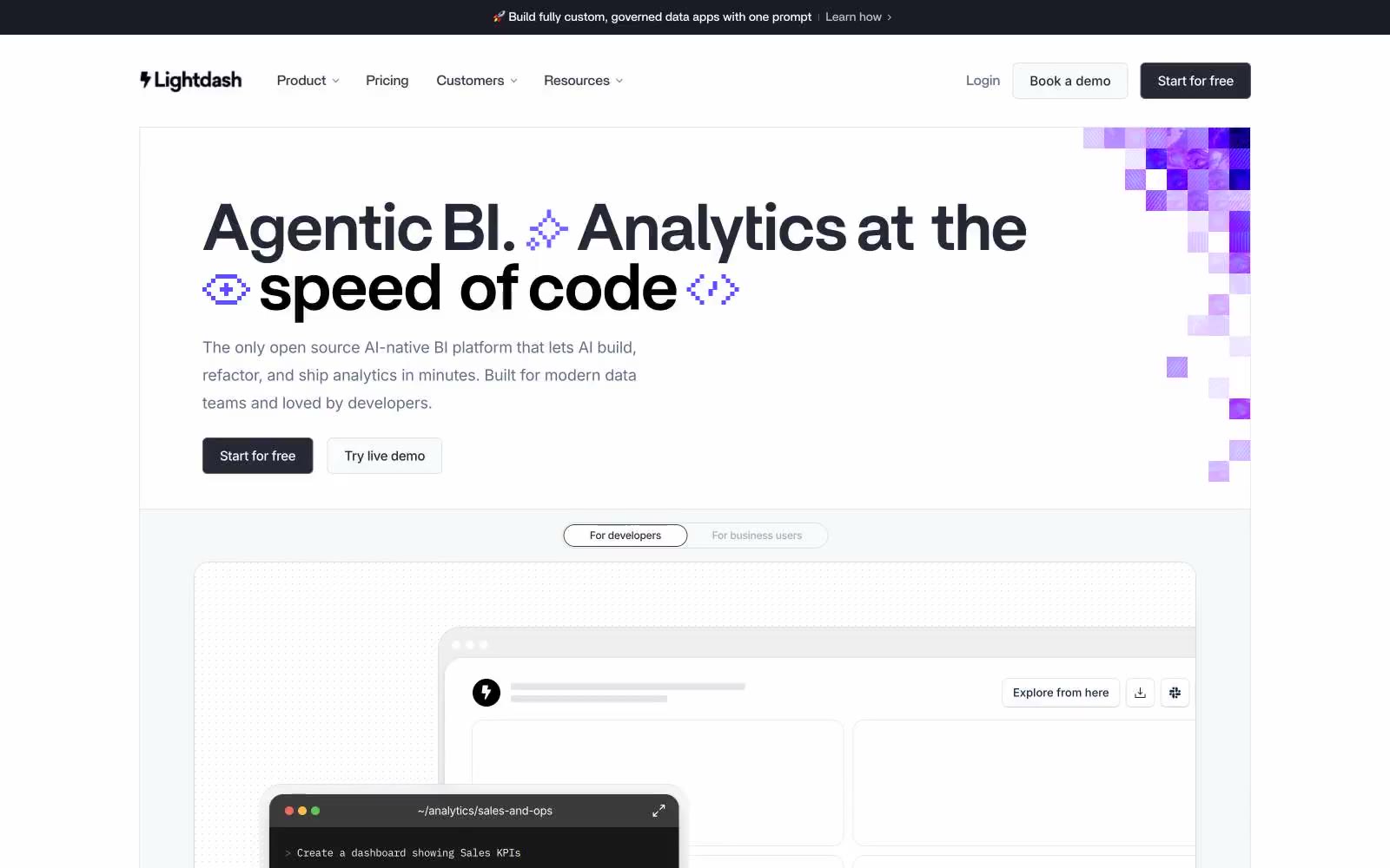
Lightdash
Lightdash — Style Reference
# Lightdash — Style Reference
> violet pixel-grid on drafting paper
**Theme:** light
Lightdash operates as a calm, developer-first command center: a near-white canvas populated by slate-gray typography, subtle hairline borders, and one saturated violet (#5e4cff) that powers every interactive moment. The brand voice is confident and quiet — headlines are set in a custom geometric sans (Britti Sans) at 48–76px with aggressively tight tracking (-0.025em), making them feel architectural rather than decorative. Body copy uses Inter at 14–18px with slightly negative letter-spacing, keeping dense information readable without feeling heavy. Surfaces layer gently from #ffffff canvas to #f6f8fa sections to 12px-rounded cards, and a pixel-art violet mosaic in the hero is the only ornamental gesture — a deliberate nod to the 'code-native' identity. Components are flat and borderless-by-default; elevation is borrowed from layered rgba shadows tinted with the brand's slate (#272835) rather than neutral gray, which keeps every card visually on-brand.
## Tokens — Colors
| Name | Value | Token | Role |
|------|-------|-------|------|
| Canvas White | `#ffffff` | `--color-canvas-white` | Primary page background, card surfaces, input fills |
| Cloud Mist | `#f6f8fa` | `--color-cloud-mist` | Alternate section background, subtle surface tier below white |
| Frost Tint | `#eceff3` | `--color-frost-tint` | Tertiary surface, muted background blocks |
| Ash Border | `#cdd2d9` | `--color-ash-border` | Hairline dividers, card borders, table separators |
Websites
Markdown Text
design-md
website-prompt
landing-page-prompt
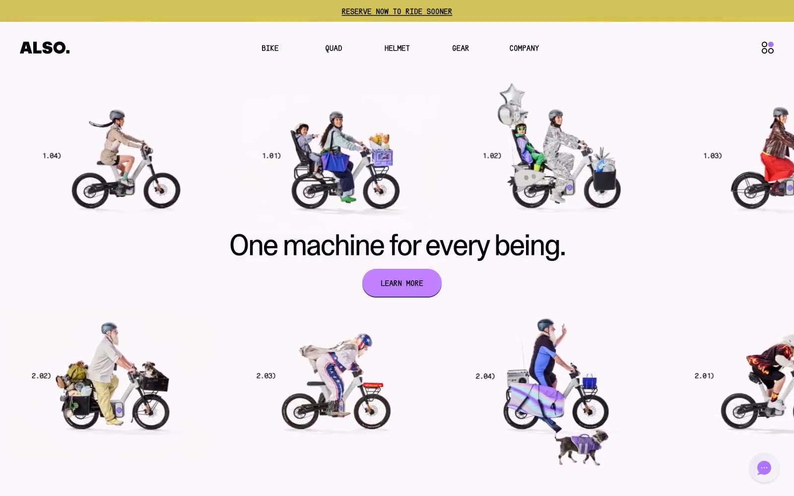
ALSO
ALSO — Style Reference
# ALSO — Style Reference
> Bicycle zine on cream paper
**Theme:** light
ALSO reads as a confident, editorial product showcase — a bicycle zine reimagined for the web rather than a conventional e-commerce interface. A warm cream canvas (#fcf7fa) carries every surface while a single electric violet (#ac74fc) does the work of an entire color system, appearing on links, borders, highlights, and the dominant CTA fill. Type is whisper-tight: ABCCameraPlainVariable pushes negative tracking harder as size grows and line-heights collapse to 0.93 at display, making even the 60px headline feel architectural rather than shouty. Uppercase mono labels (SerialC-Heavy) with positive tracking act as eyebrows, button text, and section markers — the only place the type system opens up. Pill buttons (9999px) sit on hard 2px violet offset shadows with zero blur, reading as stickers pressed onto paper rather than soft UI elevation. Full-bleed violet sections flip the canvas to accent mode without changing typography, spacing logic, or component rules — the same buttons, same shadows, same rhythm, just inverted.
## Tokens — Colors
| Name | Value | Token | Role |
|------|-------|-------|------|
| Cream Paper | `#fcf7fa` | `--color-cream-paper` | Page canvas, soft section background — warm off-white with a barely-there pink cast, never pure white |
| Pure Card | `#ffffff` | `--color-pure-card` | Card surfaces, elevated panels, button text on violet fills |
| Ash Mist | `#f1f1f1` | `--color-ash-mist` | Tertiary surface, muted dividers, subtle background washes |
| Carbon Black | `#000000` | `--color-carbon-black` | Primary text, default borders, icon strokes — the structural ink of the system |
Websites
Markdown Text
design-md
website-prompt
landing-page-prompt
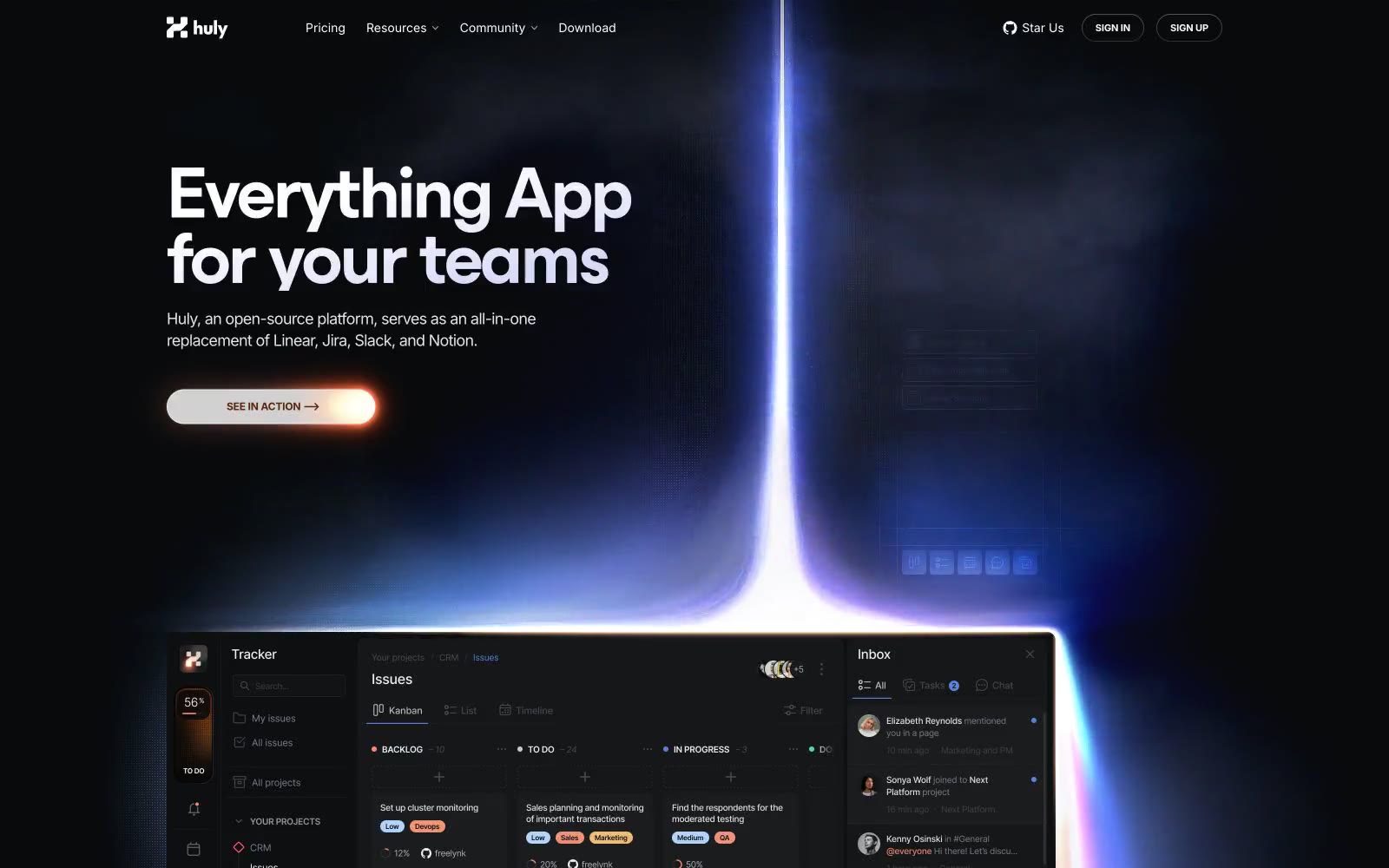
Huly
Huly — Style Reference
# Huly — Style Reference
> Aurora through a midnight observatory — the hero is a vertical beam of violet melting into coral, and every quiet section below it borrows that same two-color story told at lower volume.
**Theme:** mixed
Huly projects a cosmic-workspace atmosphere: near-black canvas with a single violet-to-amber aurora slicing through the hero, then a quieter productivity grid below. The system lives in a narrow chromatic band — one electric iris blue and one ember coral do all the brand work against layered graphite surfaces, so the dark mode never feels neutral. Typography is Inter for everything functional, with a custom display face (Esbuild) reserved for hero moments at 80–84px with aggressive negative tracking. Components lean pill-shaped: 9999px radii on controls, 12px on cards, minimal shadow, and glowing gradient strokes as the primary decoration. The page alternates between full-bleed dark spectacle and calm light sections, so any new screen must decide which mode it's in before picking colors.
## Tokens — Colors
| Name | Value | Token | Role |
|------|-------|-------|------|
| Obsidian Canvas | `#303236` | `--color-obsidian-canvas` | Page background, dominant surface — near-black with a whisper of warmth, the default stage for all content |
| Void | `#090a0c` | `--color-void` | Deepest surface layer for hero gradients, modal backdrops, and borders that need to disappear into the canvas |
| Charcoal Card | `#111111` | `--color-charcoal-card` | Elevated card and panel surfaces sitting one step above the canvas |
| Slate Edge | `#4a4b50` | `--color-slate-edge` | Hairline borders and dividers on dark surfaces |
Websites
Markdown Text
design-md
website-prompt
landing-page-prompt
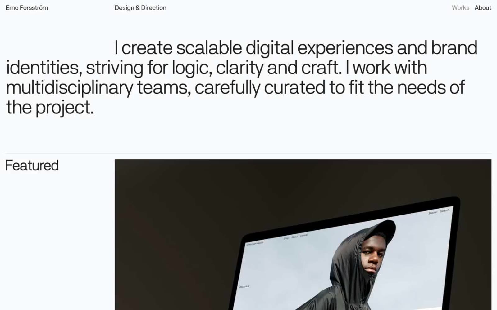
Erno Forsström
Erno Forsström — Style Reference
# Erno Forsström — Style Reference
> editorial gallery on warm paper
**Theme:** light
A personal design director's portfolio built on radical editorial restraint: a warm off-white canvas, a single weight of a single grotesque typeface, and near-black ink for everything typographic. The page behaves like a printed monograph — generous margins, tight tracking, lines of body text that sit close together while the display headline compresses to a 0.93 line-height so ascenders and descenders nearly touch. The chrome is essentially invisible: a three-word header, hairline section dividers, project labels in the same size as the body. Color and shadow are absent by design; the only chromatic information comes from the photographic work itself, which sits as full-bleed dark imagery against the warm paper. Hierarchy is built exclusively through scale, tracking, and the dramatic jump from 21px to 58px.
## Tokens — Colors
| Name | Value | Token | Role |
|------|-------|-------|------|
| Ink | `#202020` | `--color-ink` | Body text, headings, project titles, hairline borders, and the bottom edge of links — a soft near-black that reads as flat black at body sizes but never goes dead 000 |
| Bone | `#dfdcdc` | `--color-bone` | Page canvas and the implicit surface for every project card — a warm off-white with just enough gray to feel like paper, not a screen |
| Ash | `#cdcecf` | `--color-ash` | Hairline divider tone that sits one step darker than the canvas to register as a visible rule without becoming a hard line |
Websites
Markdown Text
design-md
website-prompt
landing-page-prompt
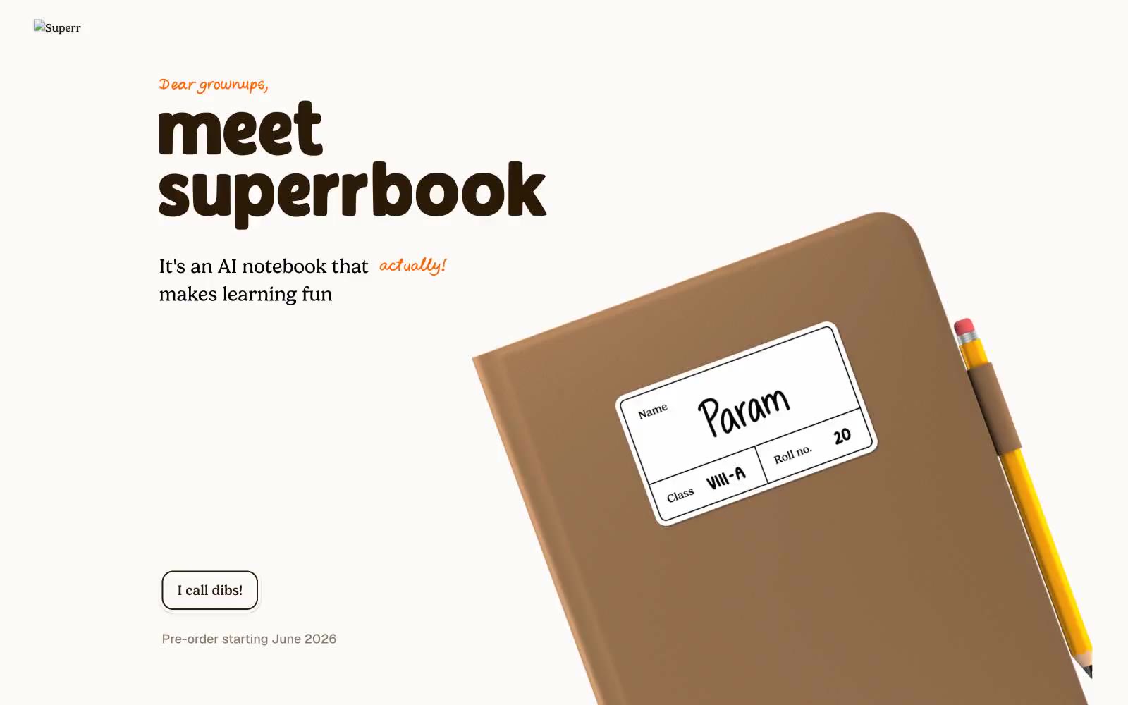
Superr
Superr — Style Reference
# Superr — Style Reference
> Warm schoolyard notebook in soft afternoon light. A cream page, an orange marker uncapped, and a stack of sticker-laminated name labels waiting to be peeled.
**Theme:** light
Superr is a warm schoolyard aesthetic rendered in digital form: a cream-paper canvas, hand-marker orange as the only chromatic accent, and chunky lowercase display type that reads like a child's notebook scrawled at full volume. The product itself is photographed like a real object — leather-bound notebooks, colored pencils, sticker-laminated name labels — and these objects, not abstract UI illustrations, do the visual work. Playful illustrated stickers (lightning bolts, bears, hearts, ghosts) scatter across the layout as little bursts of personality, but they are decorative punctuation, not system icons. Every surface stays matte and soft: thin dark borders instead of fills, minimal shadows, generous breathing room, and rounded corners that stop at 20px before going full-pill. The result is a site that feels like opening a fresh parchi on the first day of school — unhurried, tactile, and slightly mischievous.
## Tokens — Colors
| Name | Value | Token | Role |
|------|-------|-------|------|
| Cream Paper | `#fdfbf9` | `--color-cream-paper` | Page canvas, card surfaces, button fills — the warm-white ground tone that makes dark borders and orange accents feel like ink and marker on paper |
| Charcoal | `#171717` | `--color-charcoal` | Dark borders and separators for elevated surfaces and inverted UI. |
| Cocoa Ink | `#2b1a07` | `--color-cocoa-ink` | Headline color, decorative borders — a warmer dark that headlines and accent borders inherit from notebook-leather tones instead of pure black |
| True Black | `#000000` | `--color-true-black` | Reserved for highest-emphasis headline moments and strict edge cases where charcoal feels too soft |
Websites
Markdown Text
design-md
website-prompt
landing-page-prompt
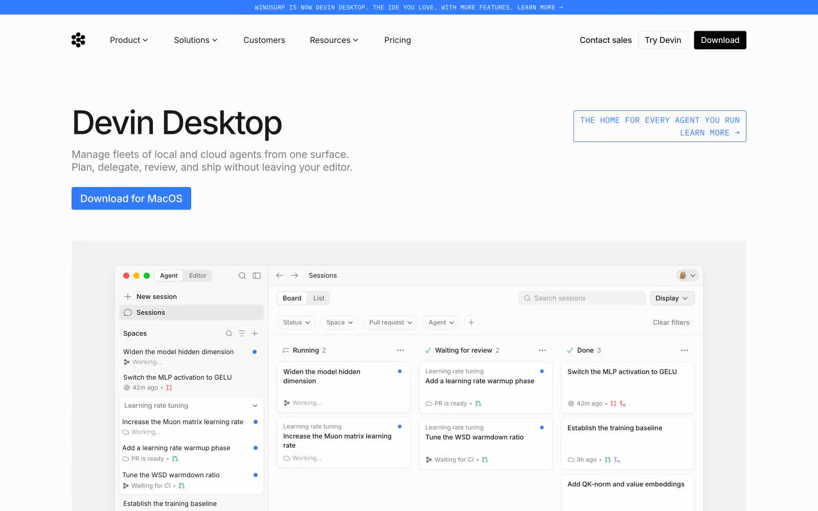
Windsurf
Windsurf — Style Reference
# Windsurf — Style Reference
> Midnight aurora command center — a deep navy terminal where a single mint teal action glows and a chromatic ribbon is the only permitted spectacle.
**Theme:** dark
Windsurf's visual system is a midnight IDE that walked out into a marketing site: deep navy canvas (#011c42) with one bioluminescent teal accent (#34e8bb) that makes every action glow against the dark. Display headlines use tomatoGrotesk at weight 300 — size does the heavy lifting while weight stays whisper-thin, an anti-convention choice that creates authority through restraint. An aurora ribbon (blue→purple→pink gradient) sweeps across the hero as the sole moment of color spectacle; everywhere else the palette stays disciplined. Components lean pill-shaped (9999px) for actions and gently squared (6px) for cards, with shadows used sparingly because contrast on the dark canvas already creates depth.
## Tokens — Colors
| Name | Value | Token | Role |
|------|-------|-------|------|
| Midnight Navy | `#011c42` | `--color-midnight-navy` | Page background, section canvas, footer — the dominant surface that gives the entire site its terminal-like confidence |
| Canvas White | `#ffffff` | `--color-canvas-white` | Primary text on dark surfaces, icon strokes, card text in light contexts |
| Obsidian | `#0b100f` | `--color-obsidian` | Near-black text for light-context sections, logo mark, high-contrast headings |
| Warm Sand | `#f8f1e5` | `--color-warm-sand` | Secondary text on dark surfaces, warm accent surface, card borders in light contexts — adds cream warmth that prevents the dark UI from feeling sterile |
Websites
Markdown Text
design-md
website-prompt
landing-page-prompt
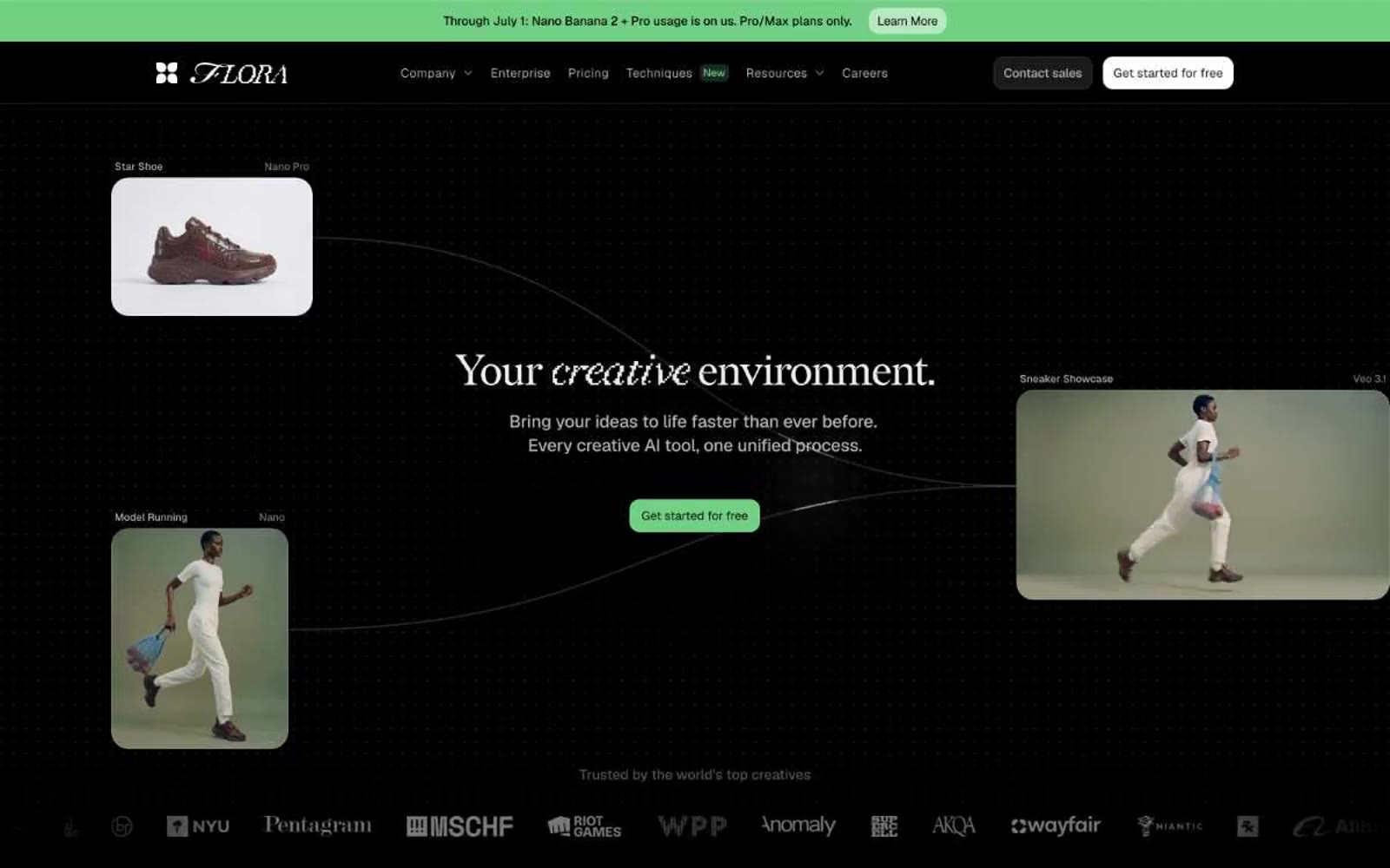
FLORA
FLORA — Style Reference
# FLORA — Style Reference
> Black velvet gallery — pure dark canvas, vivid images as the only color
**Theme:** dark
FLORA is a black-velvet gallery for AI-generated imagery: a pure #000000 canvas where the only color comes from the images themselves. The interface is austere and editorial — no chromatic brand accent, no decorative gradients, no icon color. Geist carries every functional surface with quiet efficiency while Redaction 10 and Redaction 50 Italic lend expressive typographic weight to the few moments that need to feel curated (the hero question, the section openers). Components float on #191919 cards with hairline #b4b4b4 borders and 24px radii, looking more like matted photographs than software panels. The entire system is designed to disappear so that the generated visual output — the actual product — becomes the only vivid thing on screen.
## Tokens — Colors
| Name | Value | Token | Role |
|------|-------|-------|------|
| Obsidian | `#000000` | `--color-obsidian` | Page canvas, primary borders, image frame edges |
| Carbon | `#191919` | `--color-carbon` | Card surfaces, elevated panels, input fields — one step above the canvas |
| Graphite | `#303030` | `--color-graphite` | Deeper elevated surfaces, input interiors, subtle panel separation |
| Slate | `#606060` | `--color-slate` | Muted headings, secondary borders, subdued labels |
Websites
Markdown Text
design-md
website-prompt
landing-page-prompt
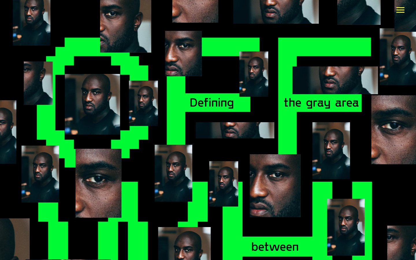
OFF WHITE
OFF WHITE — Style Reference
# OFF WHITE — Style Reference
> Glitched editorial monolith on midnight — a wall of pixelated green typography in which portrait photographs of a single human face are pressed into the negative space between monumental letterforms, all on absolute black.
**Theme:** dark
This is a conceptual editorial experience, not a product UI — the visual system weaponizes binary extremes (pure black canvas, pure white text) and three vivid chromatic accents (electric green, alarm red, hi-vis yellow) to physically manifest the site's theme of the 'gray area between black and white.' Typography is deliberately polarized: a custom blocky display face scaled to 180–500px acts as architecture, while a conventional Times serif at 16px whispers against it as editorial annotation. Layout is collage-driven rather than grid-rigid — portrait photographs overlap display type, bleed past frames, and stack in an irregular scatter, producing a zine/protest-poster feel that rejects conventional product UI patterns. Spacing is generous vertically (60–120px) but horizontally dense and chaotic, with no max-width container constraining the canvas. The custom 'Offwhite' display face is the single most important asset in the system: its blocky pixel-inspired geometry makes every letter a sculptural object.
## Tokens — Colors
| Name | Value | Token | Role |
|------|-------|-------|------|
| Voltage Green | `#00fb34` | `--color-voltage-green` | Green action color for filled buttons, selected navigation states, and focused conversion moments |
| Alarm Red | `#ff0000` | `--color-alarm-red` | Frame borders, decorative strokes, section dividers — the most-used border color in the system. Borders total 44 instances vs only 12 backgrounds, meaning red reads as a hard rectangular frame or alert outline rather than a surface fill |
| Caution Yellow | `#fff500` | `--color-caution-yellow` | Yellow outline accent for tags, dividers, and focused UI edges |
| Absolute Black | `#000000` | `--color-absolute-black` | Page canvas, photo tile borders (104 image borders), all text colors. The most frequent single color in the system (3357 occurrences) — everything else floats on it |
Websites
Markdown Text
design-md
website-prompt
landing-page-prompt
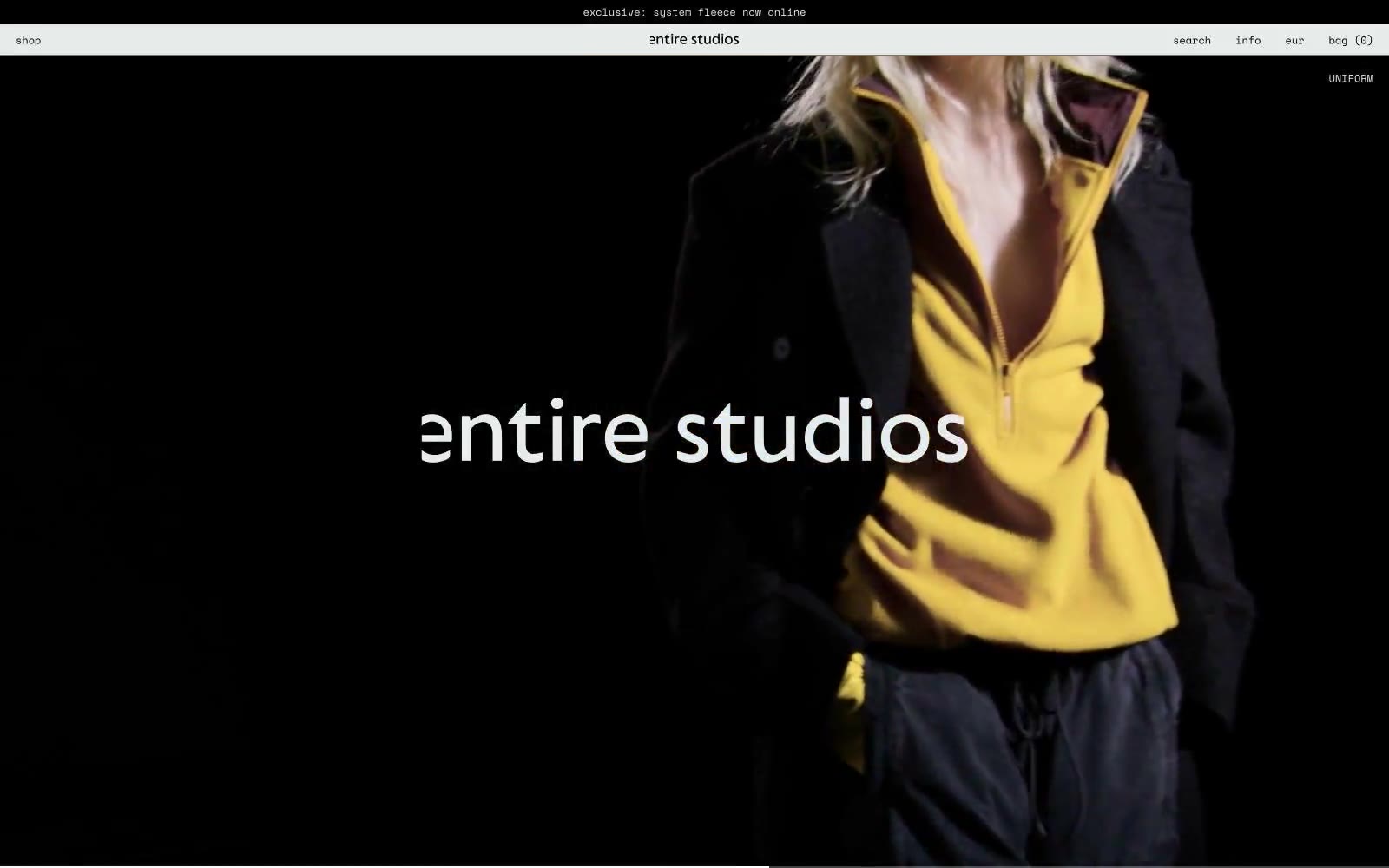
entire studios
entire studios — Style Reference
# entire studios — Style Reference
> Concrete-walled fashion zine — an editorial runway printed on warm cream paper, where photography is the only luxury.
**Theme:** light
A brutally reductive editorial fashion system: two colors (warm off-white canvas, pure black ink), one monospaced voice, compact spacing, and full-bleed photography that does every emotional job. The warm off-white #e7ecea replaces cold SaaS gray, giving every surface a paper-like, gallery-wall warmth rather than digital sterility. Space Mono at 12–16px and weight 400 refuses typographic hierarchy — distinction comes from position, whitespace, and the sheer scale of a single image, not from a type scale. Components are stripped to their skeleton: announcement bars, centered wordmarks, hairline-adjacent text links, and logo overlays that float over photography without chrome. The system reads like a fashion zine printed on heavy cream stock, not a typical e-commerce template.
## Tokens — Colors
| Name | Value | Token | Role |
|------|-------|-------|------|
| Bone | `#e7ecea` | `--color-bone` | Page canvas, card surfaces, image gutters — warm off-white that reads as heavy cream paper or raw plaster, not digital gray |
| Ink | `#000000` | `--color-ink` | Dark supporting neutral for text, icons, and strong contrast. Do not promote it to the primary CTA color |
| Paper White | `#ffffff` | `--color-paper-white` | Reverse text on dark announcement bar, reverse logo overlays on photography |
Websites
Markdown Text
design-md
website-prompt
landing-page-prompt
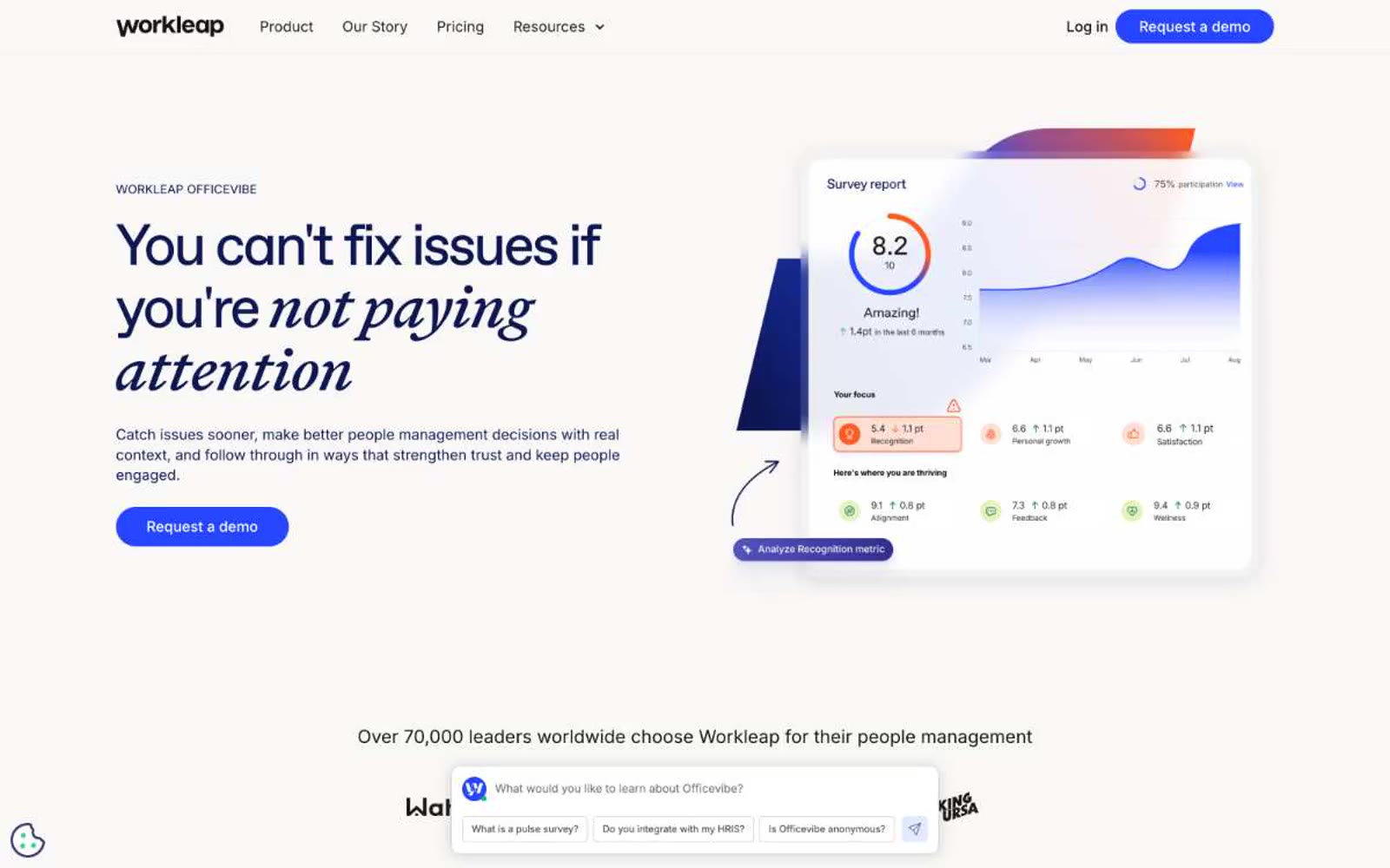
Officevibe
Officevibe — Style Reference
# Officevibe — Style Reference
> Editorial journal on warm cream paper. Think a thoughtful HR essay rendered as a product — serif italics whispering through a modern blue interface.
**Theme:** light
Workleap Officevibe speaks in a calm editorial register: a warm cream canvas, generous whitespace, and serif display type that lends the product a literary, almost handwritten authority. The palette pivots between two blues — a deep ink-navy for headings, dark cards, and editorial weight, and a vivid electric blue reserved for buttons and interactive punctuation. Surfaces are paper-soft with cream borders rather than gray; corners are gently rounded (16px cards, 100px pill buttons). The italicized serif words inside otherwise sans-serif headlines ("not paying attention", "Everything") are the signature: they break the corporate SaaS voice and make the interface feel like a well-edited magazine. Density stays comfortable; the chat widget anchored at the bottom of every screen is part of the identity, not an afterthought.
## Tokens — Colors
| Name | Value | Token | Role |
|------|-------|-------|------|
| Ink Navy | `#0c1754` | `--color-ink-navy` | Display headings, dark feature cards, footer background, body text on light canvas — the editorial weight color, used wherever the page needs to feel considered rather than decorative |
| Electric Cobalt | `#2545ff` | `--color-electric-cobalt` | Violet supporting accent for decorative details and low-frequency emphasis. Do not promote it to the primary CTA color |
| Charcoal | `#171417` | `--color-charcoal` | Primary body and heading text, nav text, icon strokes on light surfaces |
| Warm Canvas | `#f9f8f6` | `--color-warm-canvas` | Page background, footer surface, soft card fills, input backgrounds — the unifying warm off-white |
Websites
Markdown Text
design-md
website-prompt
landing-page-prompt
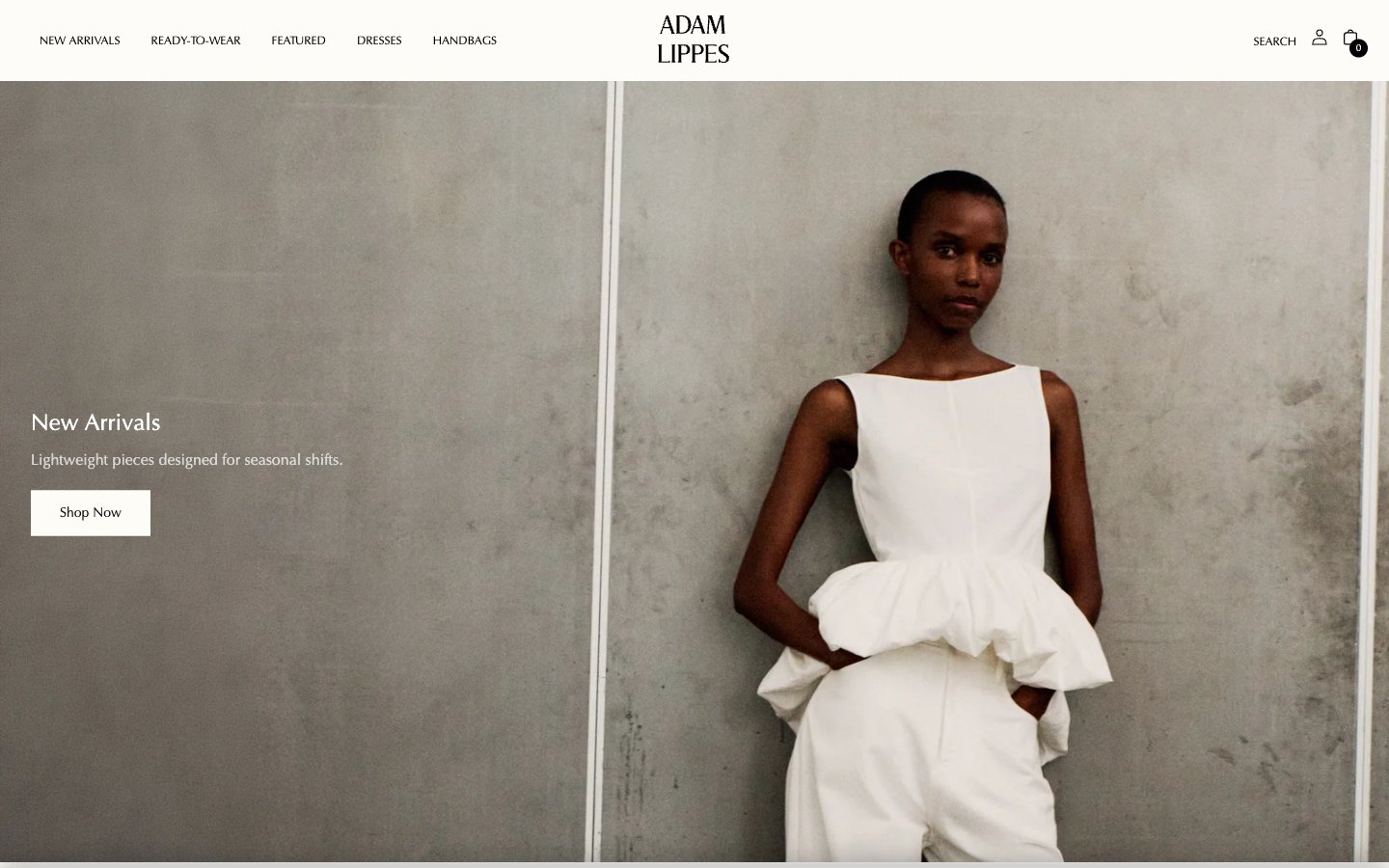
Adam Lippes
Adam Lippes — Style Reference
# Adam Lippes — Style Reference
> Monochrome editorial atelier on cream paper — a Vogue spread where the layout grid, not the color palette, is the only decoration.
**Theme:** light
Adam Lippes is a monochrome editorial atelier built on cream paper (#fefcf8) with Optima typography and full-bleed fashion photography. The interface is deliberately restrained: zero chromatic accents, zero decorative gradients, near-zero corner radii — the photographic plate IS the design. Product imagery carries all visual weight inside a dense five-column grid; UI chrome recedes behind hairline rules and uppercase tracked nav. Buttons are stark black fills or ghost outlines against the warm canvas, and the only tonal shifts between pages come from the photography itself, never from UI chroma.
## Tokens — Colors
| Name | Value | Token | Role |
|------|-------|-------|------|
| Bone Canvas | `#fefcf8` | `--color-bone-canvas` | Primary page background — warm off-white, the entire site sits on this paper-like canvas rather than pure white |
| Press White | `#ffffff` | `--color-press-white` | Alternate surface for product cards, input fields, and crisp overlays that need to separate from Bone Canvas |
| Onyx Black | `#000000` | `--color-onyx-black` | Primary text, hairline rules, filled action buttons, icon strokes, and nav borders. The structural ink of the system |
| Graphite | `#403f3e` | `--color-graphite` | Secondary text and icon color — a softened black for less critical copy and outline button borders |
Websites
Markdown Text
design-md
website-prompt
landing-page-prompt
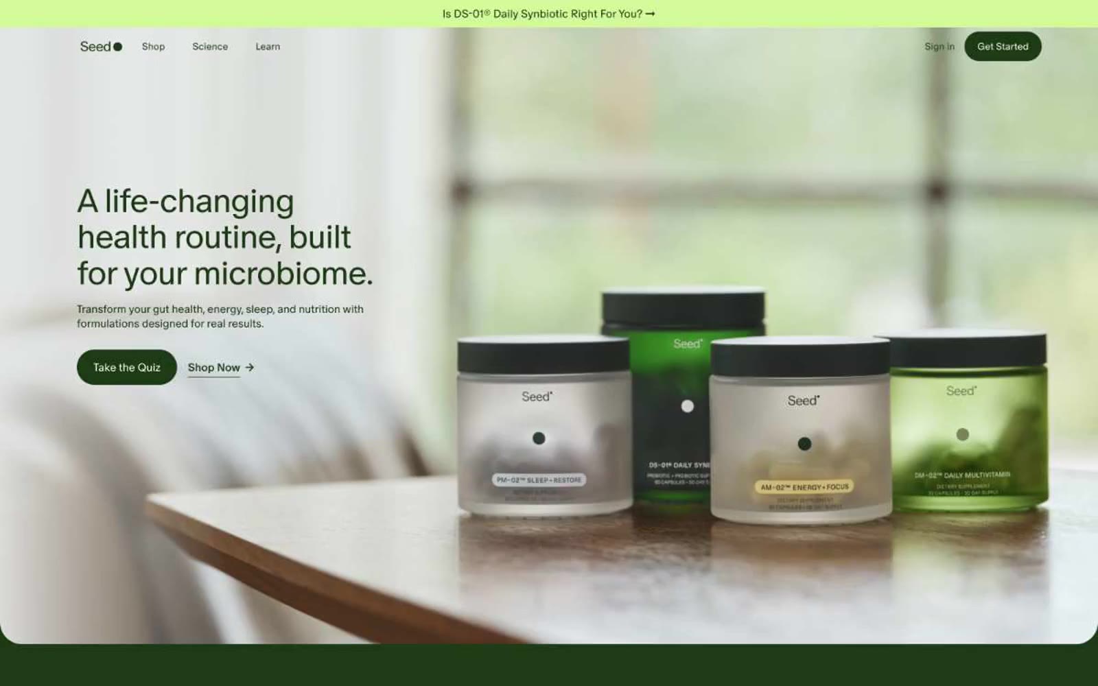
Seed
Seed — Style Reference
# Seed — Style Reference
> Apothecary greenhouse at dawn — warm parchment walls, deep botanical greens, pill-shaped vessels, and a single sunlit lime accent for small moments of life.
**Theme:** light
Seed presents an apothecary-meets-modern-clinical aesthetic: a warm parchment canvas, one deep forest green that does all the chromatic work, and pill-shaped forms everywhere. The interface is flat and unshadowed — boundaries are drawn with color contrast and hairline rules, not elevation. Typography is custom, tightly tracked, and deliberately humanist in its lighter weights (300–350), lending a calm, editorial authority rather than a hard pharma feel. Color is restrained to the extreme: a single dark green carries text, buttons, and iconography; a single lime green is reserved for punctuation — badges, highlights, the small green dots beside DS-01® callouts. The result reads as botanical laboratory: scientific in rigor, organic in warmth, and confidently minimal in ornamentation.
## Tokens — Colors
| Name | Value | Token | Role |
|------|-------|-------|------|
| Forest Canopy | `#1c3a13` | `--color-forest-canopy` | Primary brand green — headlines, body text on light surfaces, filled CTA buttons, icon strokes, active nav markers, card borders and outlines |
| Lime Sprout | `#d3fa99` | `--color-lime-sprout` | Green wash for highlight backgrounds, decorative bands, and soft emphasis behind content |
| Warm Parchment | `#fcfcf7` | `--color-warm-parchment` | Primary canvas and surface — page background, card surface, input field background, button surface for ghost/neutral controls |
| Pale Stone | `#eeeee9` | `--color-pale-stone` | Subtle raised surface — section bands, secondary card backgrounds, muted dividers and zones |
Websites
Markdown Text
design-md
website-prompt
landing-page-prompt
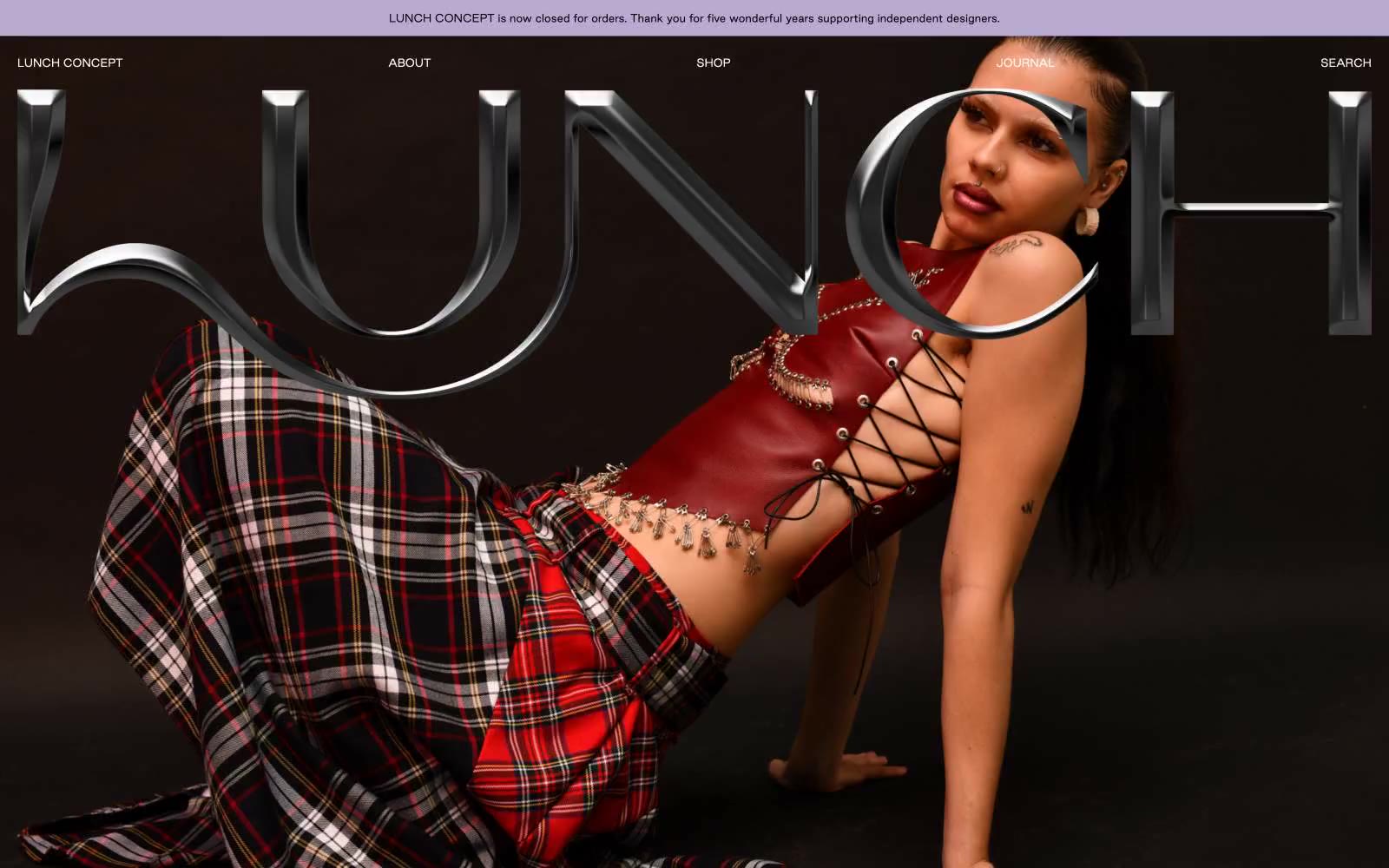
LUNCH
LUNCH — Style Reference
# LUNCH — Style Reference
> velvet runway on warm parchment
**Theme:** mixed
LUNCH CONCEPT reads as a printed fashion editorial dropped onto the web: one full-bleed dark photographic hero where the brand wordmark appears as oversized 3D chrome text, followed by a calm, catalog-like product gallery on warm parchment. The page alternates between cinematic confrontation and quiet restraint — the hero assaults, the body section whispers. A single muted lavender surfaces only on the announcement bar, the 'Sold Out' state, and the footer, acting as a brand period rather than a shout. Typography is overwhelmingly one custom sans-serif (Good Sans) at modest sizes, with the hero wordmark as the singular moment of typographic spectacle. Interaction is text-link only: no filled buttons, no gradients, no decorative chrome beyond the hero's 3D logotype.
## Tokens — Colors
| Name | Value | Token | Role |
|------|-------|-------|------|
| Lilac Veil | `#b8aad0` | `--color-lilac-veil` | Violet wash for highlight backgrounds, decorative bands, and soft emphasis behind content |
| Ink Black | `#000000` | `--color-ink-black` | All body text, navigation text, link borders, card borders, and badge borders — the structural linework of the entire interface |
| Warm Parchment | `#f4f1e4` | `--color-warm-parchment` | Page and section backgrounds in the editorial/product area — the calm canvas against which the product photography sits |
| Ivory Mist | `#fcfaf1` | `--color-ivory-mist` | Navigation text color over the dark hero, subtle surface variant and hairline borders — a warmer alternative to pure white for the dark-section UI |