AI Prompt Studio - Intelligent Prompt Library
Explore and use professional AI prompts to optimize your workflow.

Your workplace has the answer. Just ask Dala for it.
Your workplace has the answer. Just ask Dala for it. — Style Reference

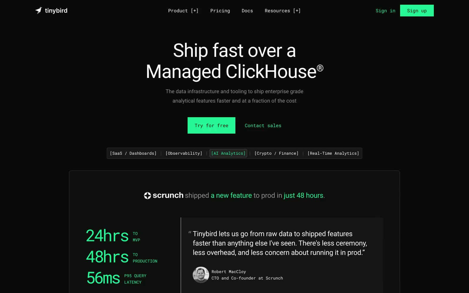
Tinybird
Tinybird — Style Reference
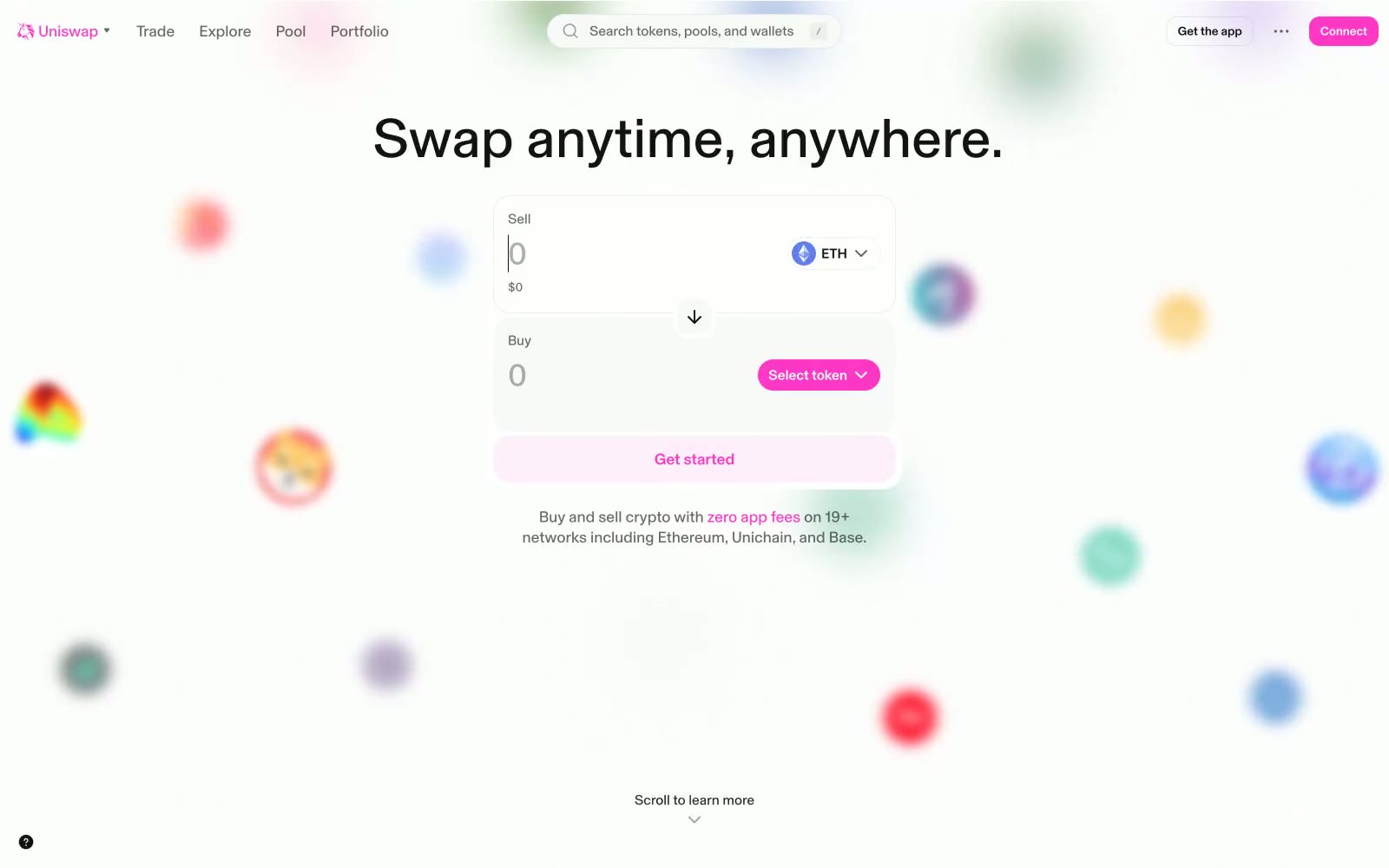
Uniswap
Uniswap — Style Reference
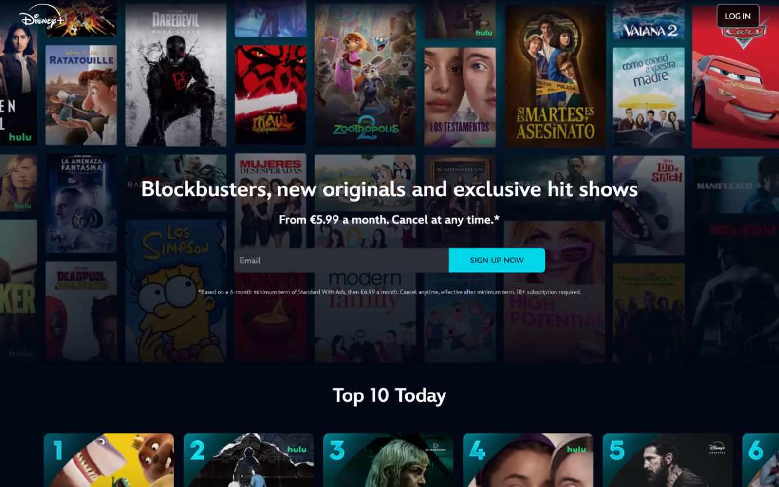
Watch new Originals
Watch new Originals — Style Reference
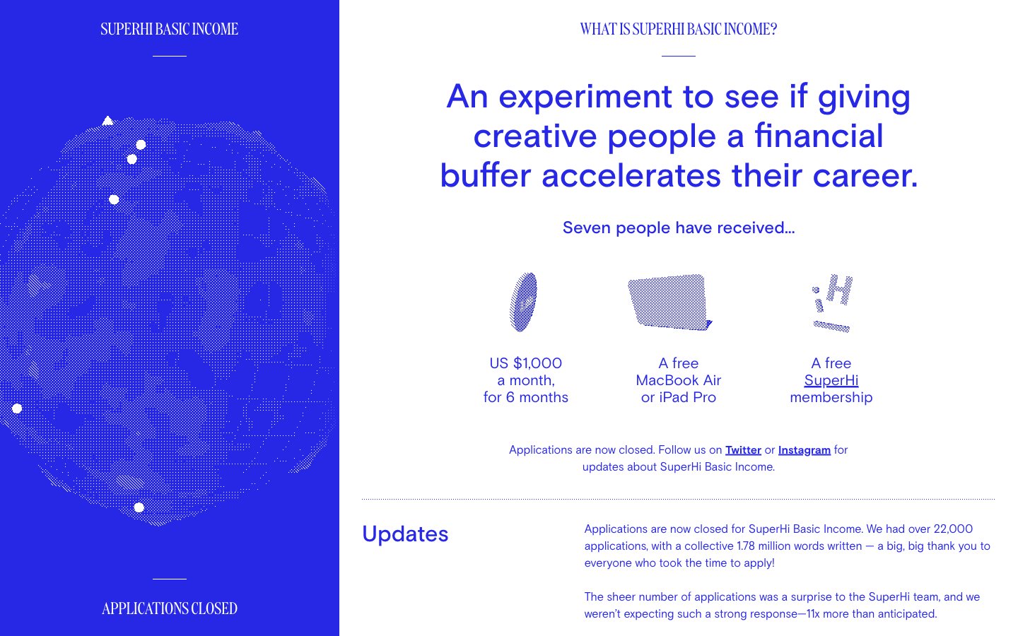
SuperHi Basic Income
SuperHi Basic Income — Style Reference
Shade
Shade — Style Reference
Ableton
Ableton — Style Reference
Eight Sleep
Eight Sleep — Style Reference
Pirsch Analytics
Pirsch Analytics — Style Reference
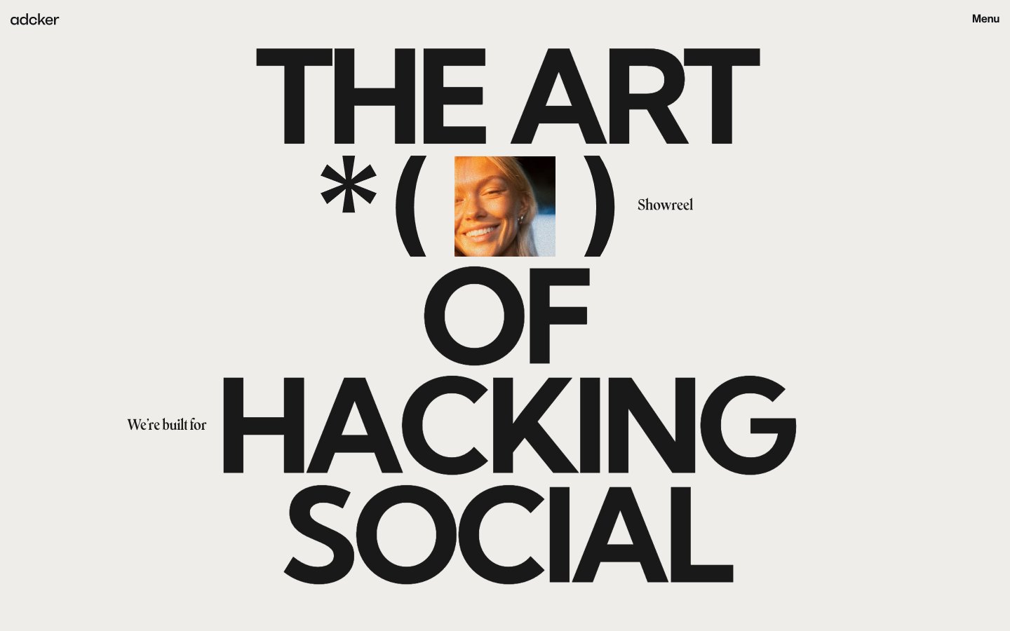
Adcker
Adcker — Style Reference
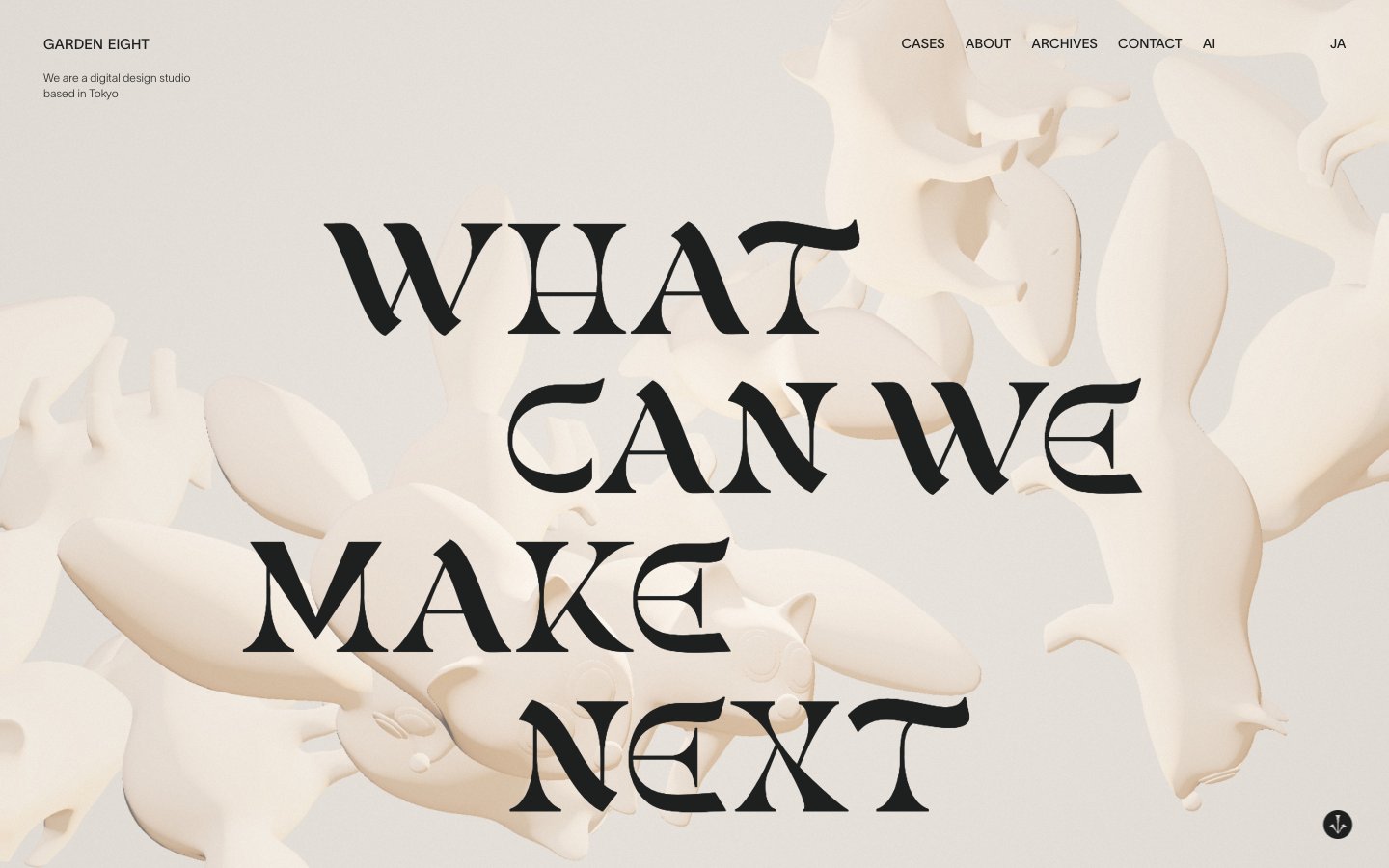
Garden Eight
Garden Eight — Style Reference
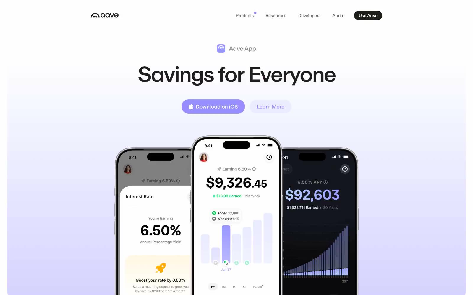
aave.com
aave.com — Style Reference
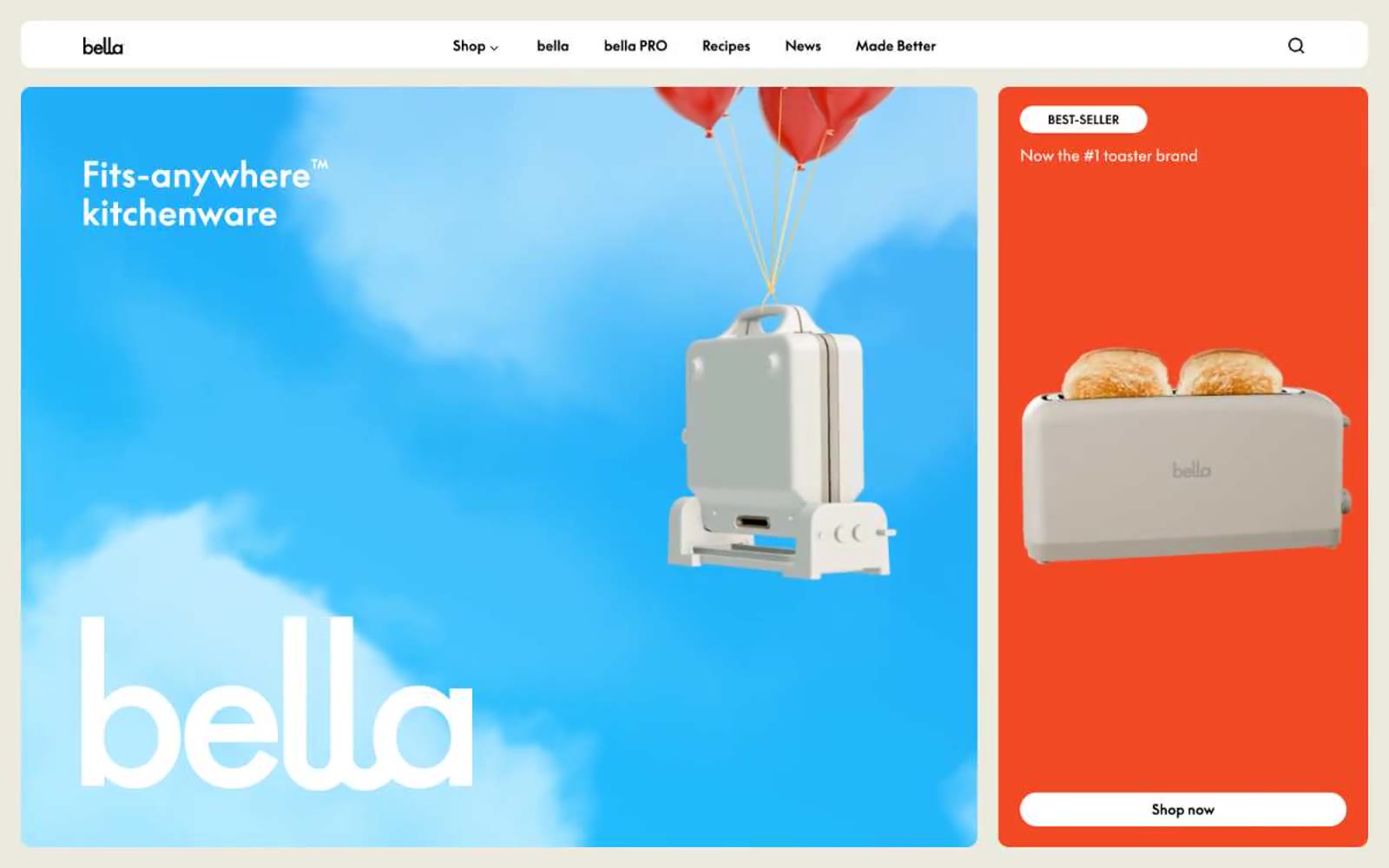
bella Kitchen Appliances
bella Kitchen Appliances — Style Reference

Josh Warner
Josh Warner — Style Reference
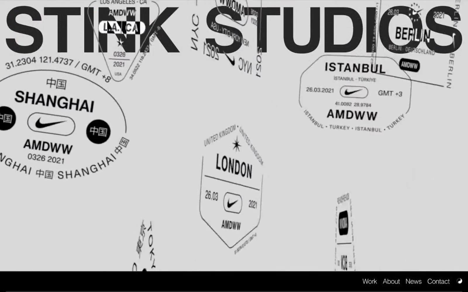
Stink Studios
Stink Studios — Style Reference
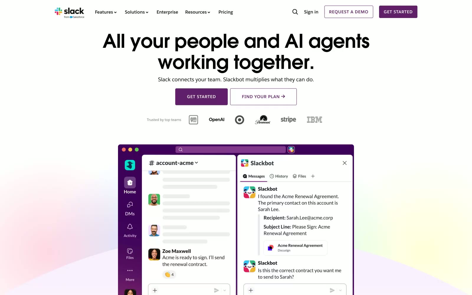
Slack
Slack — Style Reference

dope.security
dope.security — Style Reference
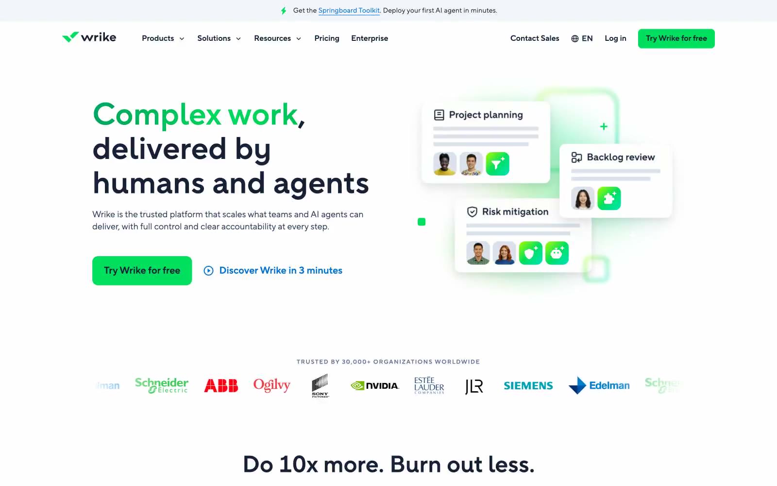
Wrike
Wrike — Style Reference
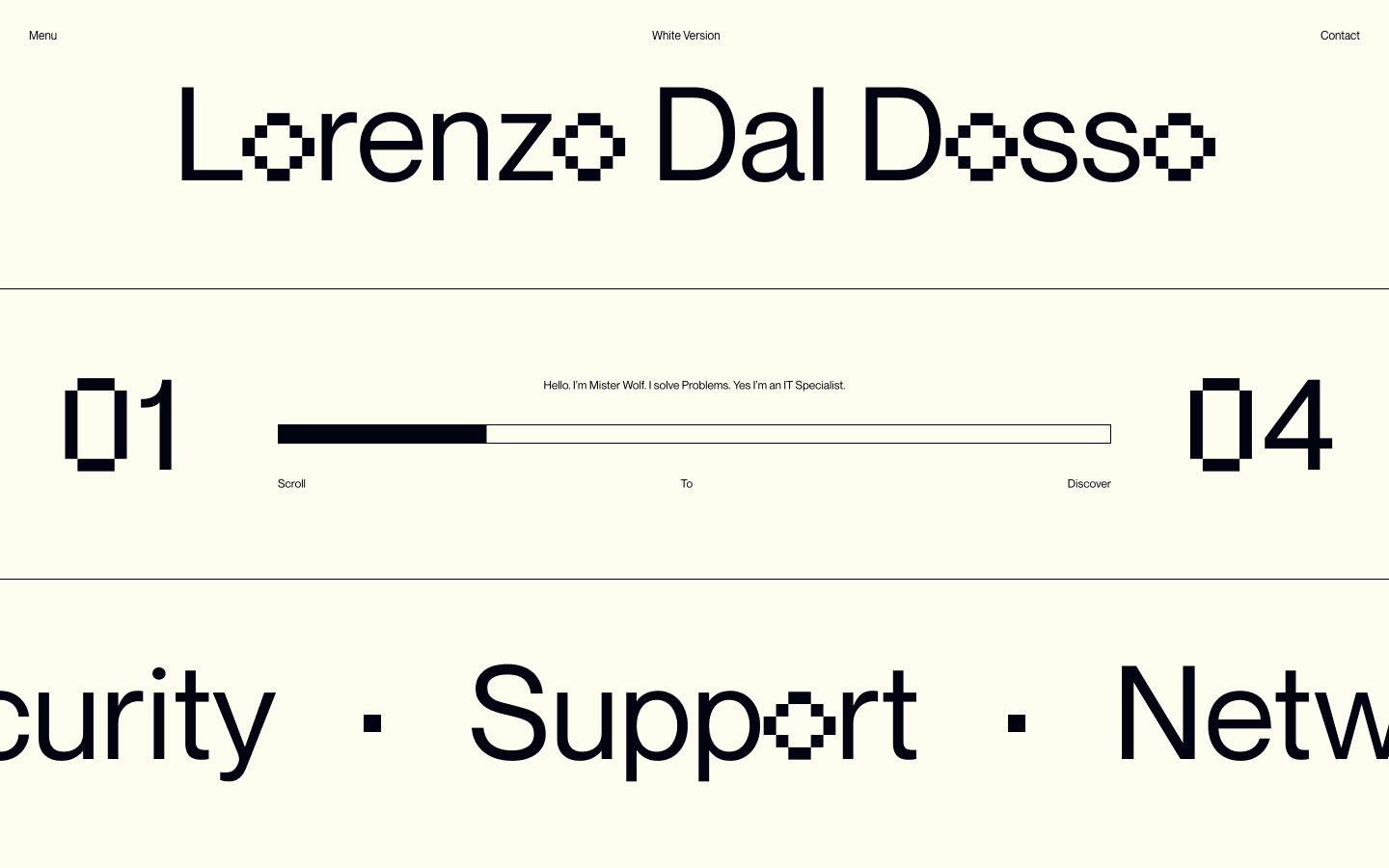
ldd
ldd — Style Reference
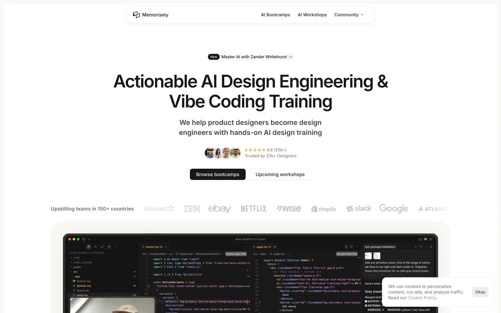
Memorisely
Memorisely — Style Reference
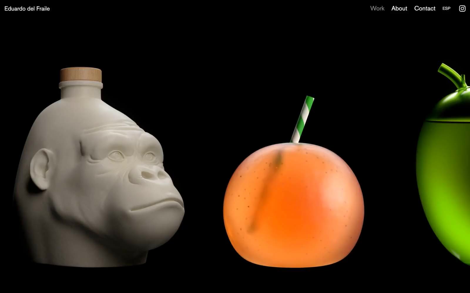
Eduardo del Fraile
Eduardo del Fraile — Style Reference
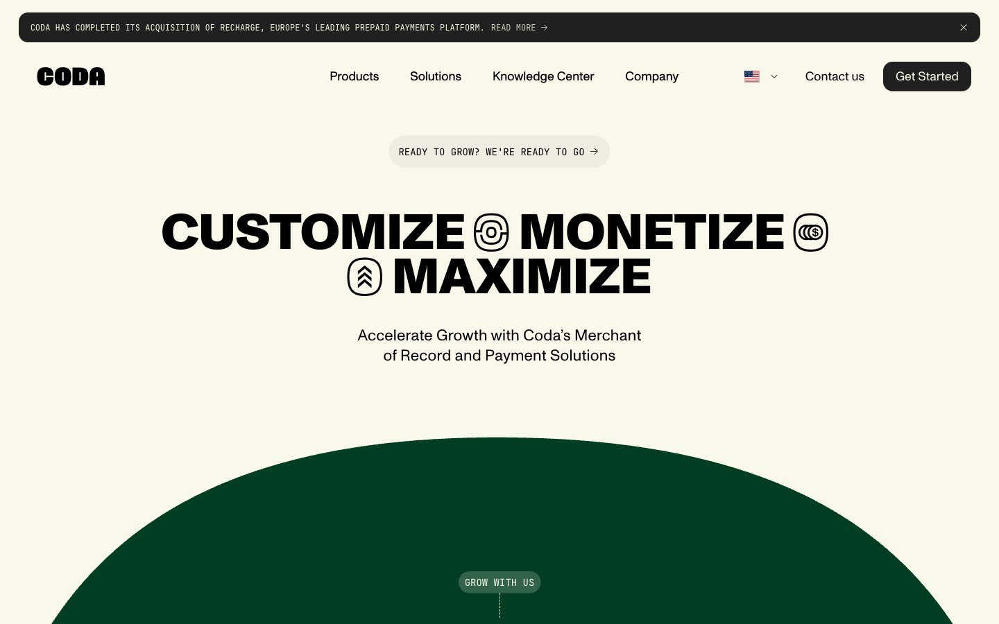
Coda
Coda — Style Reference
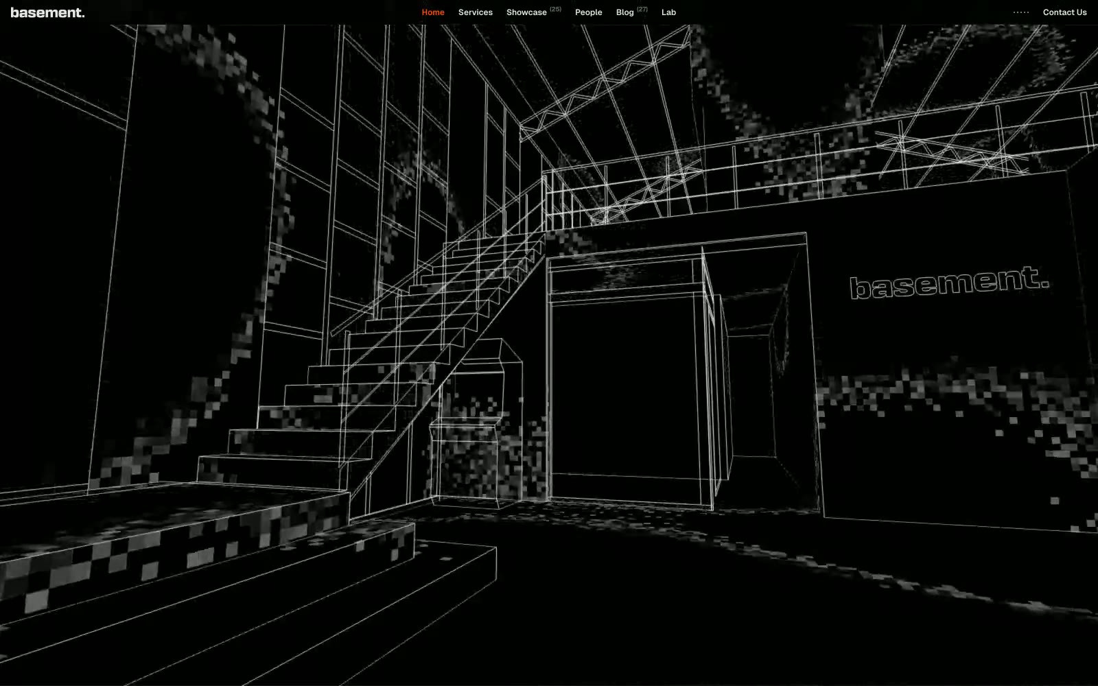
basement.studio
basement.studio — Style Reference

Upstash
Upstash — Style Reference