AI Prompt Studio - Intelligent Prompt Library
Explore and use professional AI prompts to optimize your workflow.
One-click Use
Websites
Markdown Text
design-md
website-prompt
landing-page-prompt
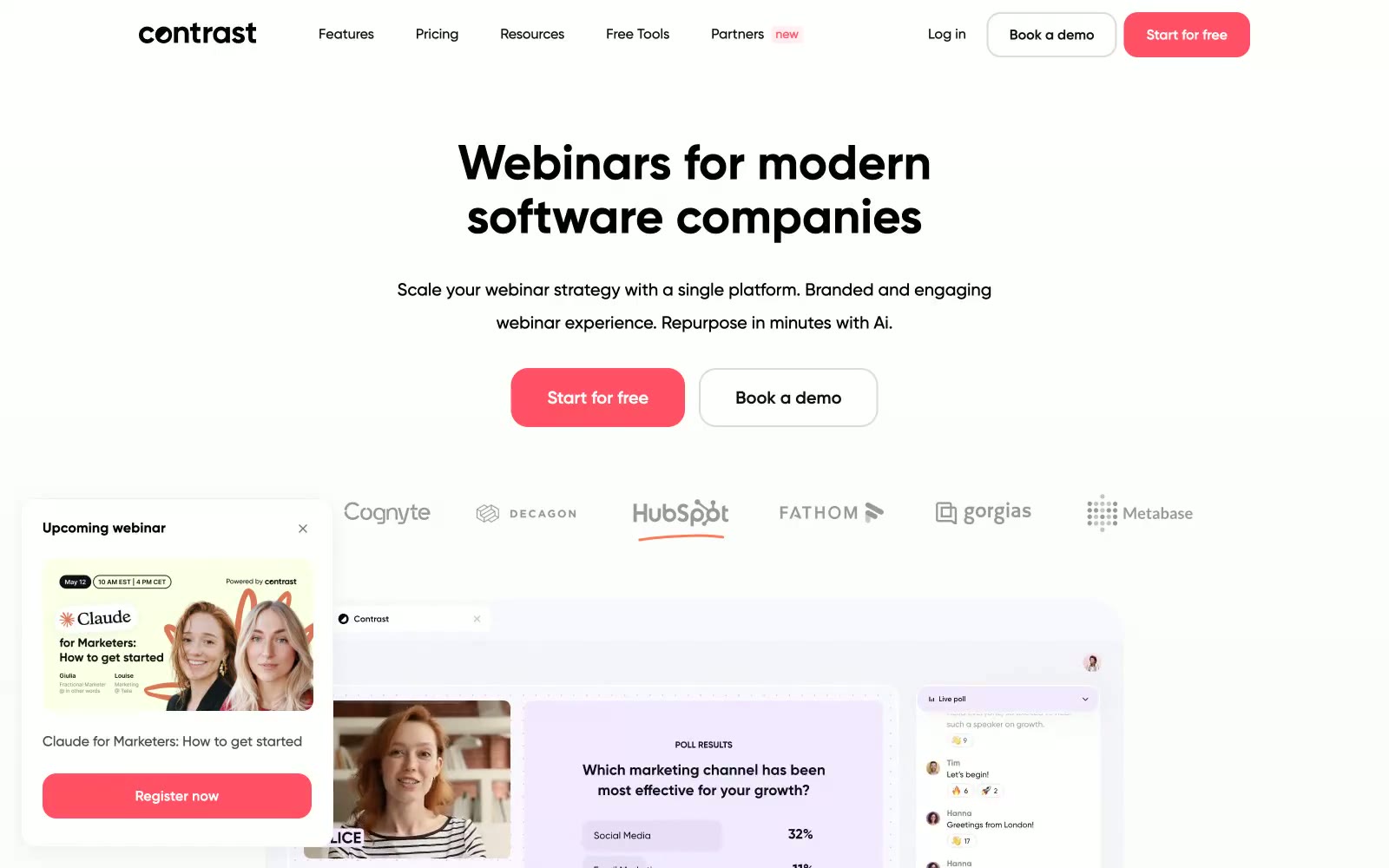
Contrast
Contrast — Style Reference

# Contrast — Style Reference
> neon coral signal on white silence
**Theme:** light
Contrast runs on white-silence interrupted by one vivid coral signal. The entire visual system is deliberately restrained — generous whitespace, monochrome surfaces, heavy geometric type — so that the single warm-red CTA can do all the emotional work. Cards float on barely-visible shadows (0.06 alpha), radii are generous and pill-heavy, and the coral accent repeats as a system: buttons, borders, icons, badges, decorative washes. Black text is near-pure (#0e0f10) rather than softened gray, giving the headlines weight and authority that the otherwise delicate chrome would otherwise lack. Layout alternates between full-bleed centered hero stacks and dense multi-column card grids, with a persistent floating webinar widget anchoring the lower-left.
## Tokens — Colors
| Name | Value | Token | Role |
|------|-------|-------|------|
| Signal Coral | `#ff5065` | `--color-signal-coral` | Primary action buttons, active links, icon accents, decorative badges — the only chromatic element allowed to fill space |
| Ember Wash | `#ff7a59` | `--color-ember-wash` | Secondary warm accent for icon borders, decorative fills, and illustration strokes when coral needs a lighter companion |
| Persimmon | `#ff5c35` | `--color-persimmon` | Deepest warm accent for icon borders, decorative fills, and hero illustration strokes |
| Coral Mist | `#ffe9eb` | `--color-coral-mist` | Soft pink-tinted wash for accent backgrounds, hover surfaces, and decorative bands |
Websites
Markdown Text
design-md
website-prompt
landing-page-prompt
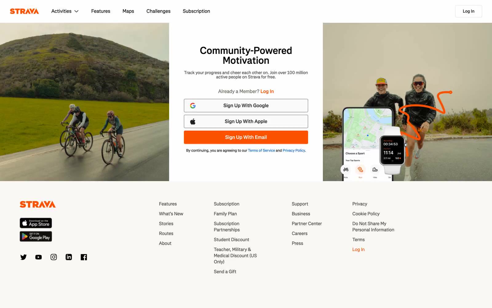
Strava
Strava — Style Reference
# Strava — Style Reference
> athlete's logbook on warm paper — a single orange highlighter mark against black-and-white print
**Theme:** light
Strava's design reads like an athlete's logbook printed on warm paper: a stark white canvas warmed by off-white surfaces and a disciplined near-black text palette, with one bolt of vivid orange that signals every primary action. The interface is deliberately flat — no gradients, no shadows, no decorative chrome — letting full-bleed photography of cyclists, runners, and hikers in motion carry all the emotional weight. The custom Boathouse typeface and tight, slightly humanist letterforms give the system a print-publication quality rather than a typical SaaS feel. Sharp 4px corners on every interactive element, warm-toned grays instead of cool ones, and an almost monastic restraint with color (one orange, one link blue) create a visual hierarchy where the orange CTA always wins attention without ever needing elevation or glow.
## Tokens — Colors
| Name | Value | Token | Role |
|------|-------|-------|------|
| Strava Orange | `#fc5200` | `--color-strava-orange` | Orange supporting accent for decorative details and low-frequency emphasis. Do not promote it to the primary CTA color |
| Link Blue | `#0060d0` | `--color-link-blue` | Inline text links and policy references; the only secondary chromatic color and reserved strictly for navigational links |
| Paper White | `#ffffff` | `--color-paper-white` | Light supporting surface for subtle backgrounds and section separation. Do not promote it to the primary CTA color |
| Warm Linen | `#f9f8f5` | `--color-warm-linen` | Footer background, secondary surface elevation, subtle banding beneath white |
Websites
Markdown Text
design-md
website-prompt
landing-page-prompt
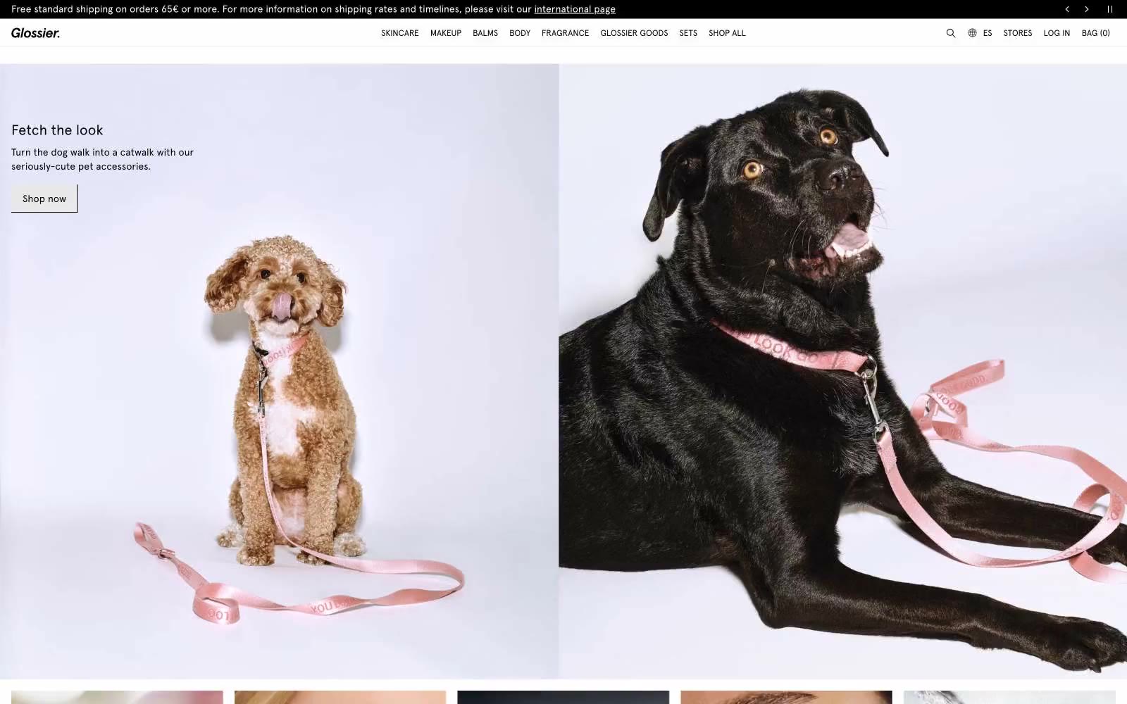
Glossier
Glossier — Style Reference
# Glossier — Style Reference
> Sunlit beauty editorial — paper white, ink black, one flash of yellow
**Theme:** light
Glossier operates as a digital beauty magazine: a near-monochrome canvas of paper-white and ink-black, disrupted by one electric yellow accent that functions as both the brand wordmark and the singular call to action. The system is editorial in restraint — huge Apercu headlines, generous breathing room, full-bleed lifestyle photography that carries most of the emotional weight — and utilitarian in execution, with flat product cards, hairline borders, and zero decorative ornament. The yellow is not a secondary brand color; it IS the brand, deployed sparingly so each appearance feels like a flashbulb. Everything else must recede: neutrals are warm grays with a faint blush undertone, borders are barely-there, type is tight and compressed. The result is a storefront that reads as confident, understated, and unapologetically modern.
## Tokens — Colors
| Name | Value | Token | Role |
|------|-------|-------|------|
| Glossier Yellow | `#fff116` | `--color-glossier-yellow` | Yellow supporting accent for decorative details and low-frequency emphasis. Do not promote it to the primary CTA color |
| Ink | `#000000` | `--color-ink` | Primary text, nav links, body copy, footer text, icon strokes, hairline borders; the dominant typographic and structural color |
| Paper | `#ffffff` | `--color-paper` | Product card surfaces, input fills, elevated panels; the brightest surface level in the stack |
| Fog | `#f7f7f7` | `--color-fog` | Page canvas, section backgrounds, image-to-page transitions; the base surface the entire site sits on |
Websites
Markdown Text
design-md
website-prompt
landing-page-prompt
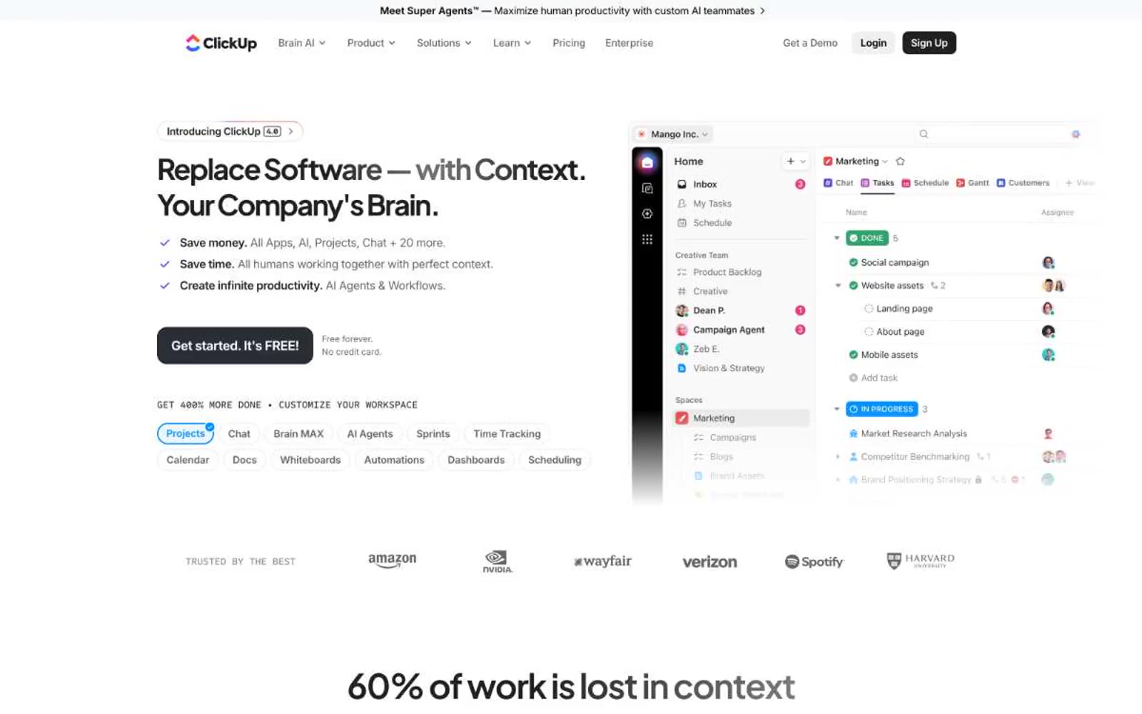
ClickUp™
ClickUp™ — Style Reference
# ClickUp™ — Style Reference
> Violet-lit productivity cockpit on white
**Theme:** light
ClickUp presents a productivity command center on a clean white canvas — a SaaS brand that uses a single vivid violet as its primary voice against an otherwise achromatic interface. The visual rhythm is dense and information-rich: large confident display headlines (Plus Jakarta Sans at 60-76px, weight 800) that occupy generous whitespace, paired with compact body text and tightly-packed product UIs shown as the hero itself. Surfaces are flat with subtle blue-tinted shadows rather than dramatic elevation, and the brand violet (#7b68ee) appears sparingly on primary actions, the logo, and a few accent moments. The overall feel is utilitarian but premium — a product showcase where the software IS the hero, framed by clean typographic hierarchy and a restrained palette punctuated by that single signature purple.
## Tokens — Colors
| Name | Value | Token | Role |
|------|-------|-------|------|
| Brand Violet | `#7b68ee` | `--color-brand-violet` | Primary brand color for the logo, primary CTAs, active states, and brand accents — this single violet carries 90% of the chromatic identity |
| Signal Blue | `#0091ff` | `--color-signal-blue` | Secondary accent for badges, icons, and the Agents/Brain feature highlights — a cool counterpoint to the violet, often appearing in conic-gradient sweeps |
| Ultra Violet | `#6647f0` | `--color-ultra-violet` | Deeper violet variant for hover states and selected/active surfaces — gives the brand a darker dimension when needed |
| Muted Violet | `#514b81` | `--color-muted-violet` | Desaturated violet for secondary text, subdued borders, and tonal backgrounds where brand presence is needed without full saturation |
Websites
Markdown Text
design-md
website-prompt
landing-page-prompt
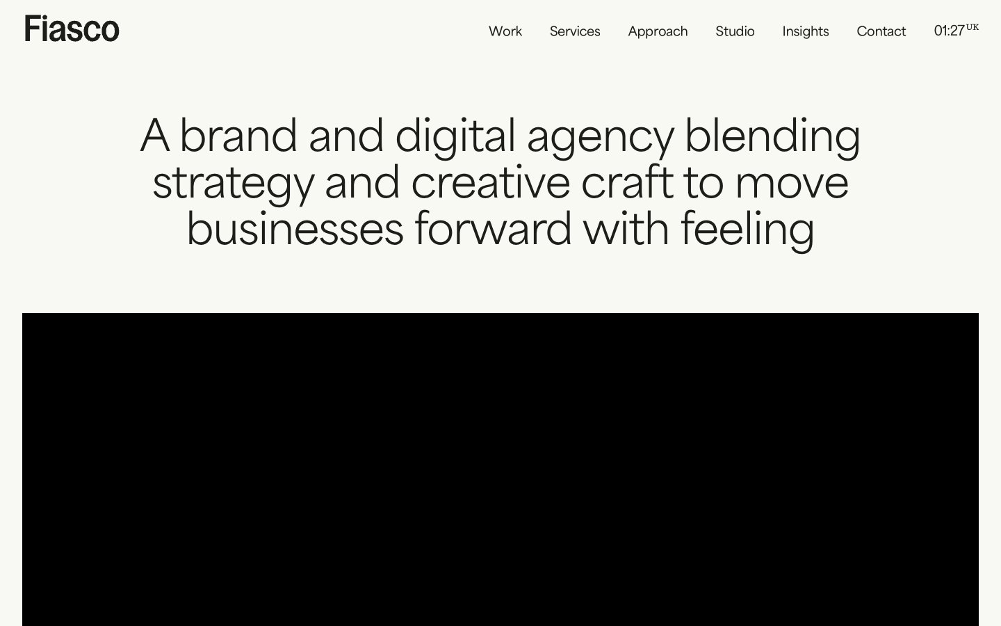
Fiasco
Fiasco — Style Reference
# Fiasco — Style Reference
> "editorial gallery on cream paper" — warm off-white canvas with confident black type and single-color project cards.
**Theme:** light
Fiasco operates in an editorial, gallery-like register: a warm off-white canvas (#f8f9f3) with near-black text (#1d1e19) creates a hushed paper feel, while every project card introduces a single vivid color field that acts as wayfinding rather than decoration. The type system pairs a geometric sans (area-normal) for body and interface with a more characterful display family (Gooper) for headlines, giving the page an italic, magazine-like confidence. Components are deliberately unembellished — pill-shaped buttons (800px radius), 8px-cornered cards, 3px input fields, and a 40px radius reserved for hero and feature surfaces. Color appears as sparse, deliberate punctuation: yellow, pink, blue, orange, green blocks behind work, while the rest of the system stays in warm neutrals so the colored surfaces read as the loudest thing in the room.
## Tokens — Colors
| Name | Value | Token | Role |
|------|-------|-------|------|
| Canvas Cream | `#f8f9f3` | `--color-canvas-cream` | Page background, button borders, soft surface |
| Ink Black | `#1d1e19` | `--color-ink-black` | Primary text, nav borders, link borders, all structural outlines |
| Stone Mist | `#e9eae2` | `--color-stone-mist` | Nav borders, icon strokes, subtle dividers, secondary borders |
| Shadow Stone | `#d0d1cc` | `--color-shadow-stone` | Card and hero box-shadow base, low-contrast elevation |
Websites
Markdown Text
design-md
website-prompt
landing-page-prompt
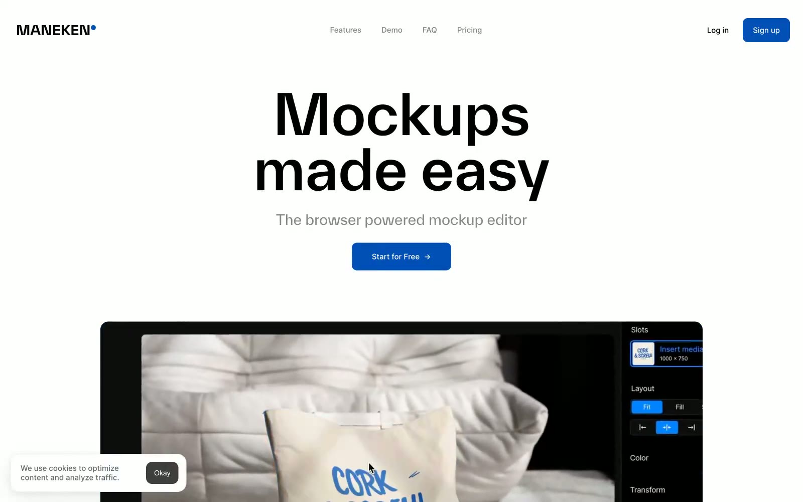
Mockups made easy
Mockups made easy — Style Reference
# Mockups made easy — Style Reference
> Editorial design studio on white paper
**Theme:** light
Maneken's visual system is gallery-first: a near-white canvas lets photographic mockup work dominate while a single saturated blue acts as the only chromatic voice in the interface. Typography does the heavy lifting — a custom display face (TWKEverett) towers over the page in oversized 77–110px headlines with tight 1.0–1.2 leading, creating an editorial magazine feel rather than a typical SaaS dashboard. Inter handles everything functional at compact 14–18px sizes, creating a deliberate tension between theatrical display type and utilitarian UI. Surfaces stay flat with 10px radii, borders lean heavily on pure black hairlines, and elevation is reserved for the image content itself via soft, multi-layer drop shadows.
## Tokens — Colors
| Name | Value | Token | Role |
|------|-------|-------|------|
| Signal Blue | `#0050b7` | `--color-signal-blue` | Primary action buttons, logo dot accent, active nav strokes — the only chromatic color in the system creates unmistakable focus against the monochrome frame |
| Ink | `#000000` | `--color-ink` | Primary text, icon fills, hairline borders, image outlines — true black anchors the monochrome structure with maximum contrast (21:1 on white) |
| Paper | `#ffffff` | `--color-paper` | Card surfaces, button text on dark, image backgrounds — the bright surface that makes photographic content pop |
| Carbon | `#10151c` | `--color-carbon` | Dark surface backgrounds, body text on light cards, nav bar fills — near-black with a barely-perceptible blue undertone that warms the deep neutral |
Websites
Markdown Text
design-md
website-prompt
landing-page-prompt
Mobbin
Mobbin — Style Reference
# Mobbin — Style Reference
> Grayscale specimen board — a printer's proof sheet where typographic weight IS color.
**Theme:** light
Mobbin runs on pure achromatic restraint — zero chroma across the entire palette, forcing hierarchy through weight, size, and tone alone. The page is white space interrupted by near-black ink (#141414) at display sizes and warm-gray (#707070, #adadad) for secondary text. The custom 'saans' typeface is the single differentiator: fractional weights (440, 456, 652) that don't exist in any system font, creating headline mass that sits between regular and semibold — typography doing the work of color. 9999px pill shapes appear on every interactive element while card content sits on 16-24px rounded rectangles, making buttons feel like badges in a sea of contained thumbnails. The content itself — mobile app screenshots in grayscale cards — IS the visual texture of the page.
## Tokens — Colors
| Name | Value | Token | Role |
|------|-------|-------|------|
| Midnight Ink | `#141414` | `--color-midnight-ink` | Primary text, headings, filled CTA buttons, nav items, icon strokes — the single chromatic workhorse of an achromatic system |
| Pure Canvas | `#ffffff` | `--color-pure-canvas` | Page background, card surfaces, button text on dark fills |
| Graphite | `#707070` | `--color-graphite` | Body copy, secondary links, descriptive text |
| Ash | `#adadad` | `--color-ash` | Tertiary text, disabled/muted button borders, placeholder icons |
Websites
Markdown Text
design-md
website-prompt
landing-page-prompt
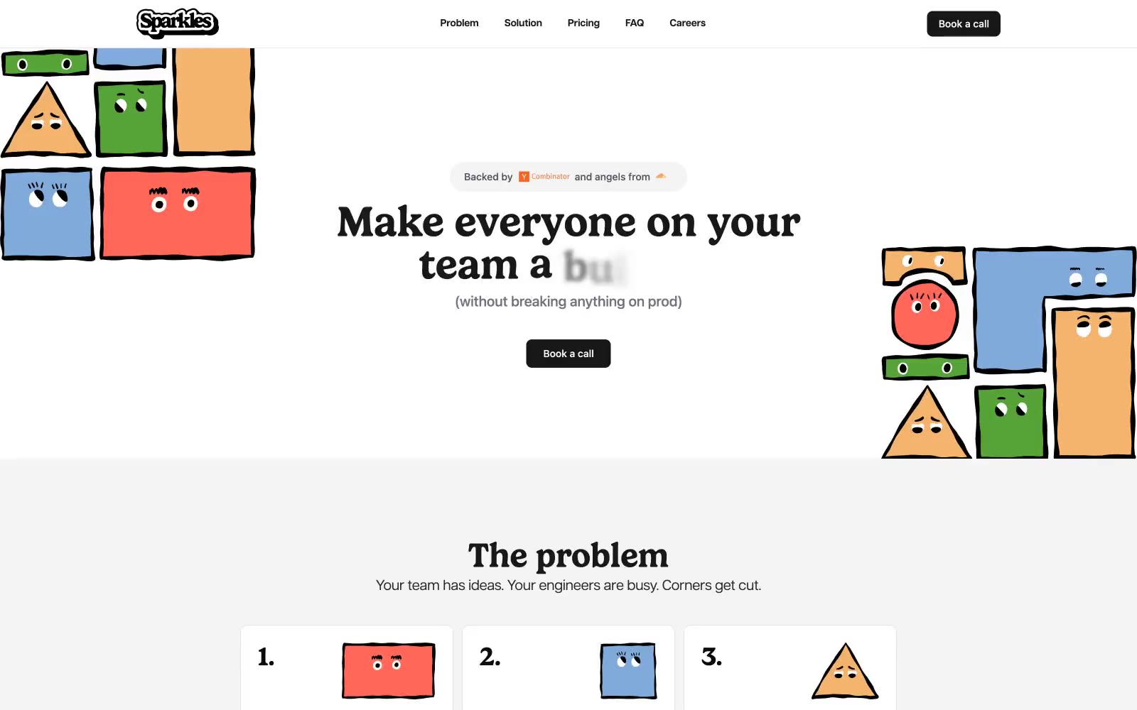
Sparkles
Sparkles — Style Reference
# Sparkles — Style Reference
> Ink-on-paper broadsheet guarded by crayon mascots
**Theme:** light
Sparkles runs on a near-total monochrome palette interrupted only by a single block of footer green — a deliberate, almost editorial restraint that makes the playful hand-drawn character illustrations do all the chromatic heavy lifting. Gelica (a chunky display serif) carries every headline at weight 600 with near-zero line-height, creating tight, assertive editorial moments that contrast with Articulat CF's wide-tracked sans-serif body and UI text. The interface is flat, border-driven, and uses #18181b as the universal 'ink' — for headings, nav text, icons, and the only filled button — so the eye reads the page like a printed broadsheet. Cards and inputs sit on white (#ffffff) with #e5e5e5 hairlines and 10px corners; elevation is essentially absent. The visual signature is the collision of austere typesetting with crayon-colored cartoon mascots tucked into the margins.
## Tokens — Colors
| Name | Value | Token | Role |
|------|-------|-------|------|
| Ink Black | `#0a0a0a` | `--color-ink-black` | Primary text, deepest foreground — the absolute ink for body copy and legal/footer type |
| Zinc Ink | `#18181b` | `--color-zinc-ink` | Headlines, nav text, icons, filled button background — the universal interactive ink |
| Slate 700 | `#27272a` | `--color-slate-700` | Body text emphasis, input fill backgrounds for dark/inverted inputs |
| Slate 600 | `#3f3f46` | `--color-slate-600` | Secondary body text, input borders, subtle button borders |
Websites
Markdown Text
design-md
website-prompt
landing-page-prompt
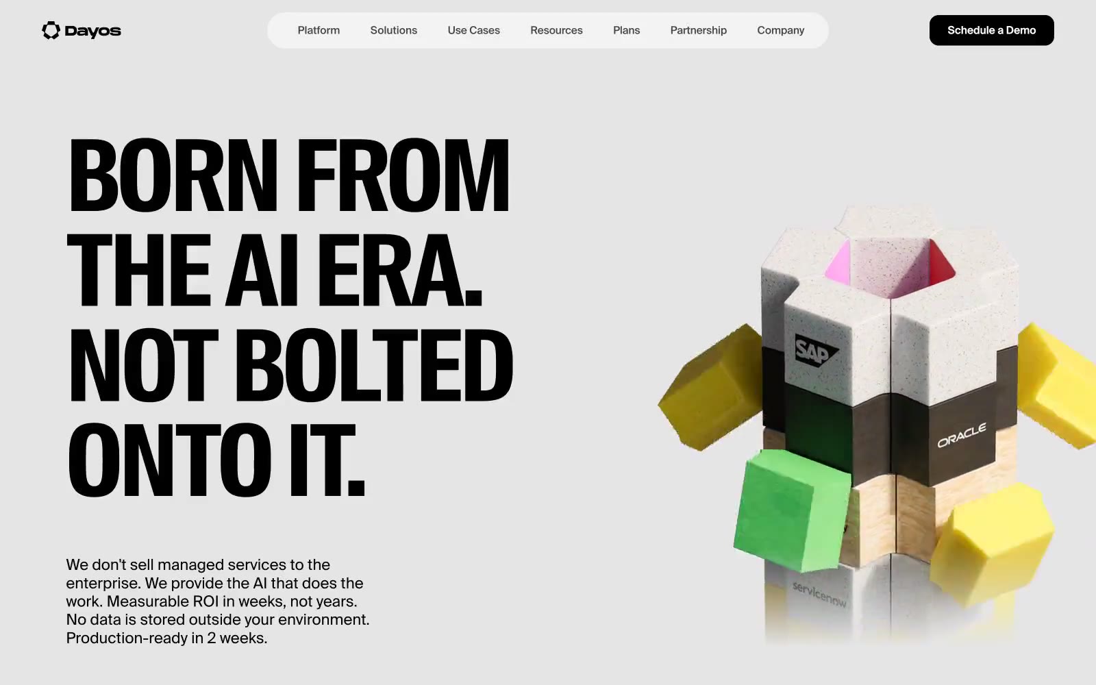
AI for Business
AI for Business — Style Reference
# AI for Business — Style Reference
> Swiss editorial spread on cool paper
**Theme:** light
Dayos runs a Swiss-editorial visual system: a soft gray canvas holding massive, ultra-condensed display headlines, restrained grotesque body text, and a tiny mono voice for tags and micro-labels. The page behaves like a print spread — one colossal typographic statement per section, set tight (0.90 line-height, -3% tracking), supported by generous whitespace rather than dividers or rules. Color is nearly absent in chrome and nearly explosive in 3D illustration; UI accents are a single soft mint and a single electric yellow used surgically as highlight washes. Surfaces are flat — no shadows, no gradients — and rely on a 5-level tonal stack (canvas → white card → mist → mint → yellow) to separate layers. Components stay small and confident: a pill-shaped white nav bar, near-square dark buttons, oversized rounded cards. The feeling is engineered restraint with a playful object at the center of the page.
## Tokens — Colors
| Name | Value | Token | Role |
|------|-------|-------|------|
| Canvas Mist | `#e5e7eb` | `--color-canvas-mist` | Page background, section canvases, hairline dividers and UI borders — the quiet ground on which all display type rests |
| Pure White | `#ffffff` | `--color-pure-white` | Card surfaces, navigation pill background, elevated panels, button and nav text |
| Surface Mist | `#f3f3f3` | `--color-surface-mist` | Subtle secondary surfaces, button hover washes, low-emphasis panels one step off the canvas |
| Ink Black | `#000000` | `--color-ink-black` | Primary headings, body text, and icon fills on light surfaces. Do not promote it to the primary CTA color |
Websites
Markdown Text
design-md
website-prompt
landing-page-prompt
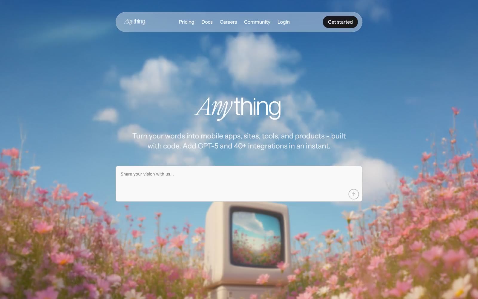
Anything
Anything — Style Reference
# Anything — Style Reference
> afternoon daydream over a wildflower field. Soft, floating, a little surreal — white UI plates drifting above a photograph that feels half-remembered.
**Theme:** light
Anything speaks in a daylight reverie: white canvas overlaid on dreamy photography, pill-shaped translucent navigation floating above the imagery, and one soft green accent that surfaces only as decorative punctuation. The wordmark is set in Instrument Serif italic — handwritten, not corporate — paired with Inter for UI and Instrument Sans for headlines, replacing the typical bold sans wordmark with something more personal. Components round generously at 20px on cards and images, 9999px on buttons, with shadows kept whisper-soft. Color is rationed: most surfaces are white or the faintest off-white; #448f52 appears sparingly on text and shimmer gradients, never as a filled CTA.
## Tokens — Colors
| Name | Value | Token | Role |
|------|-------|-------|------|
| Ink Black | `#000000` | `--color-ink-black` | Primary headings, body text, and icon fills on light surfaces. Do not promote it to the primary CTA color |
| Charcoal | `#18191b` | `--color-charcoal` | Secondary text, heading color, deep UI surfaces — slightly warmer than pure black |
| Slate Mid | `#6a6a6c` | `--color-slate-mid` | Body text, helper copy, muted descriptions |
| Steel | `#7d7f80` | `--color-steel` | De-emphasized headings, inactive labels |
Websites
Markdown Text
design-md
website-prompt
landing-page-prompt
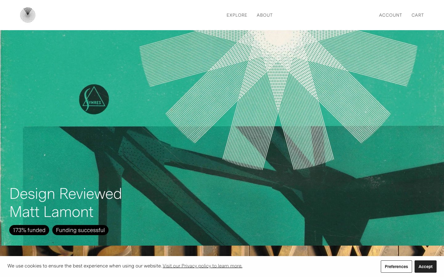
Volume
Volume — Style Reference
# Volume — Style Reference
> gallery wall with whispers — editorial restraint on paper-white canvas, the chrome is invisible, the imagery is the only color
**Theme:** light
Volume reads as an editorial gallery for design publications: full-bleed photographic campaigns with whisper-light Messina Sans headlines floating over image backgrounds. The chrome itself is nearly invisible — paper-white canvas, charcoal type, hairline borders, and a small set of pill-shaped status tags that carry the only chromatic punctuation. The extreme light weights (300/350) and tight negative tracking create a refined, magazine-page atmosphere where negative space and imagery do the heavy lifting. Every surface favors restraint and breathing room, letting the projects — not the interface — command attention.
## Tokens — Colors
| Name | Value | Token | Role |
|------|-------|-------|------|
| Ink | `#272727` | `--color-ink` | Primary text, nav, footer text, dark pill tags (funded, successful) — the workhorse near-black that grounds every layout |
| Graphite | `#717171` | `--color-graphite` | Secondary text, hairline borders on cards, images, and inputs — the quiet structural neutral |
| Ash | `#949494` | `--color-ash` | Tertiary text, subtle borders, disabled or muted states |
| Fog | `#cdcccc` | `--color-fog` | Light placeholder text, decorative dividers on dark surfaces |
Websites
Markdown Text
design-md
website-prompt
landing-page-prompt
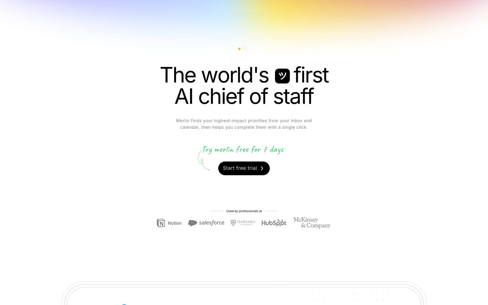
Merlin
Merlin — Style Reference
# Merlin — Style Reference
> Handwritten margin notes on white paper. A calm off-white page where one vivid green dot says yes, soft pastel light bleeds in from the edges, and Inter does the heavy talking.
**Theme:** light
Merlin uses a hushed, paper-like productivity language: a warm off-white canvas, flat white surfaces, a single vivid green accent that makes the primary action feel like a green light turning on, and soft pastel atmospheric gradients reserved for the page's top and the product backdrop. Type is bold and confident at display sizes but quiet at body sizes — Inter carries the entire voice in one family, letting weight and tracking do all the work. The system feels hand-touched: handwritten green annotations in a script style sit beside machine-clean sans-serif, bridging warmth and product precision. Components stay close to the page — thin hairlines replace heavy elevation, pills replace boxes, and the nav floats as a capsule rather than anchoring as a bar.
## Tokens — Colors
| Name | Value | Token | Role |
|------|-------|-------|------|
| Paper White | `#f5f5f4` | `--color-paper-white` | Page canvas — the warm off-white ground the entire page sits on |
| Card Snow | `#ffffff` | `--color-card-snow` | Card surfaces, product mockup backgrounds, floating nav capsule |
| Blush Mist | `#fdf8f7` | `--color-blush-mist` | Subtle warm-tinted surface for accent cards or highlighted zones |
| Ink Black | `#000000` | `--color-ink-black` | Primary headings, strong borders, icon strokes — maximum contrast |
Websites
Markdown Text
design-md
website-prompt
landing-page-prompt
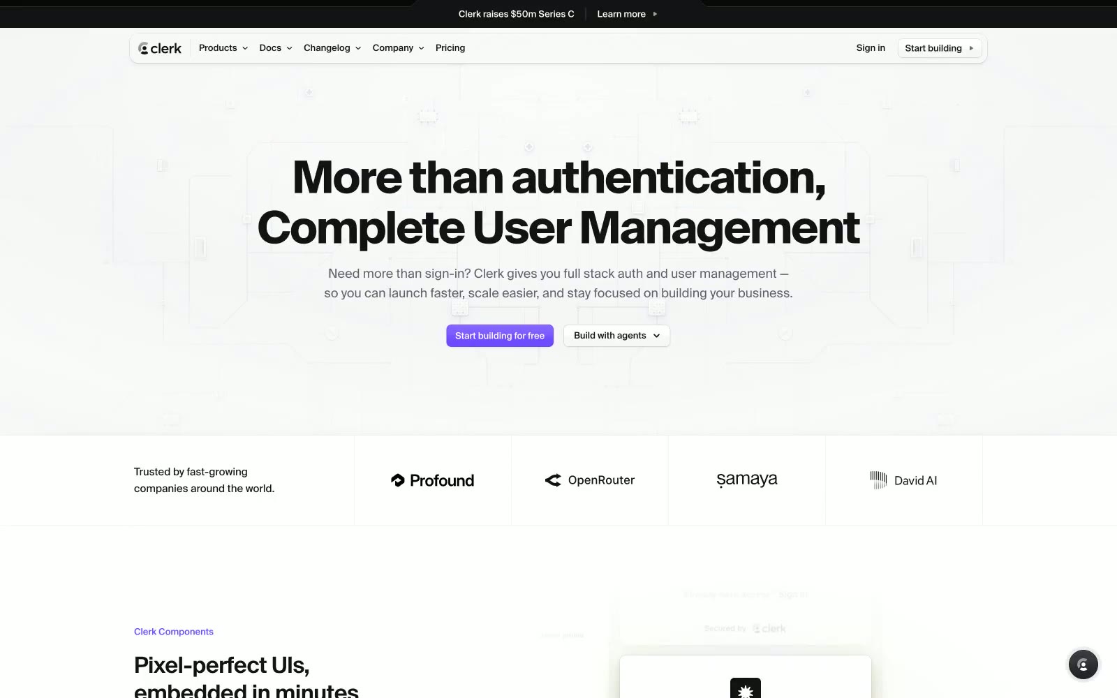
Clerk
Clerk — Style Reference
# Clerk — Style Reference
> Developer dashboard behind frosted violet glass — surfaces feel like a live IDE preview: dark product cards floating inside a light documentation shell, with one electric violet pulse marking the path forward.
**Theme:** mixed
Clerk uses a split-personality canvas: the marketing shell is near-white (#f7f7f8) with barely-there borders and generous whitespace, while product demo surfaces drop into near-black (#212126) dark cards that showcase UI components in context. The single brand color — a mid-range violet (#6c47ff) — appears with surgical restraint: only on primary CTAs and the occasional heading accent, making every appearance feel deliberate. Typography defaults to Geist, a custom numeric-optimized face at tight negative tracking (-0.035em), giving headlines a technical density that signals developer-first thinking without heavy weight. The gradient system layers violet with stray yellow (#fff963) and cyan (#5de3ff) halos at low opacity, creating an atmospheric shimmer behind hero content rather than decorative noise.
## Tokens — Colors
| Name | Value | Token | Role |
|------|-------|-------|------|
| Void Black | `#131316` | `--color-void-black` | Primary text, headings, and high-contrast body copy across light surfaces |
| Fog White | `#f7f7f8` | `--color-fog-white` | Page canvas and light section backgrounds |
| Pure White | `#ffffff` | `--color-pure-white` | Card surfaces, modal backgrounds, form inputs on light sections |
| Graphite | `#5e5f6e` | `--color-graphite` | Secondary body text, muted labels, icon fills on light surfaces |
Websites
Markdown Text
design-md
website-prompt
landing-page-prompt
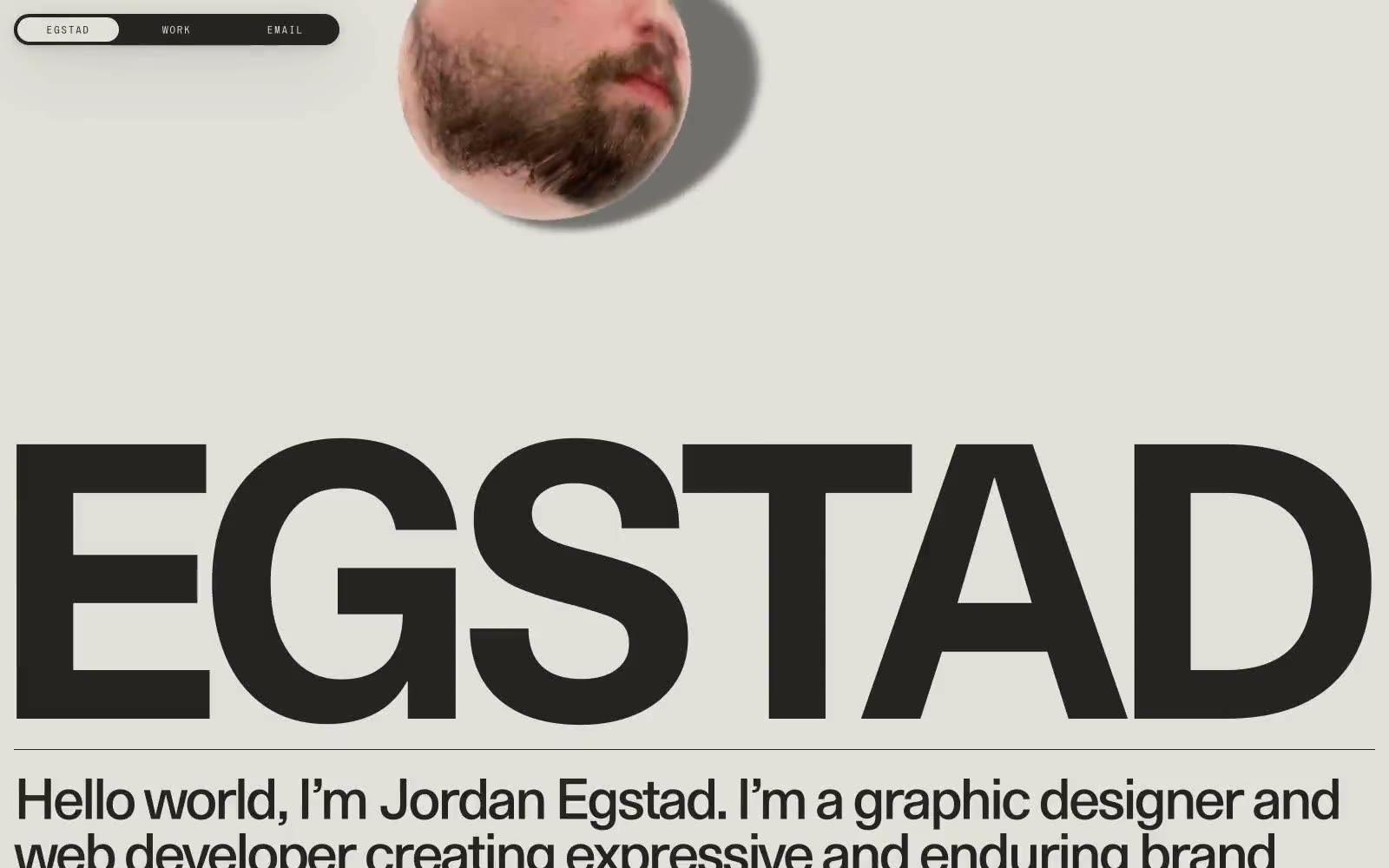
Egstad
Egstad — Style Reference
# Egstad — Style Reference
> editorial broadside in warm ink — monumental type, one paper color, zero decoration
**Theme:** light
Egstad operates as a one-color editorial broadside: warm ink (#252422) stamped onto warm cream paper (#e2e0d9), with no decorative color, no gradients, and almost no UI chrome. The entire visual identity is carried by three typefaces — a custom monumental display face (EG Metaphor) that fills the page edge-to-edge, system Times for body copy, and a wide-tracked micro-display (S85) for navigation. Components are stripped to their bones: a fully pill-shaped dark navigation bar, hairline horizontal rules, and circular image masks that overlap type without containers. The result reads more like a printed poster or magazine masthead than a typical portfolio site — restraint as identity, typography as architecture.
## Tokens — Colors
| Name | Value | Token | Role |
|------|-------|-------|------|
| Press Ink | `#252422` | `--color-press-ink` | Primary text, heading strokes, borders, dark surface for the navigation bar and any filled dark blocks — warm near-black with a brown undertone that sits softer than pure black on the cream canvas |
| Bone Paper | `#e2e0d9` | `--color-bone-paper` | Page canvas, card and container backgrounds, inverted text on dark surfaces — warm off-white with a slight olive/khaki cast that makes the dark ink feel printed rather than digital |
| Pure Carbon | `#000000` | `--color-pure-carbon` | Hairline borders and rare exact-black accents where maximum edge contrast is needed against the cream canvas |
Websites
Markdown Text
design-md
website-prompt
landing-page-prompt
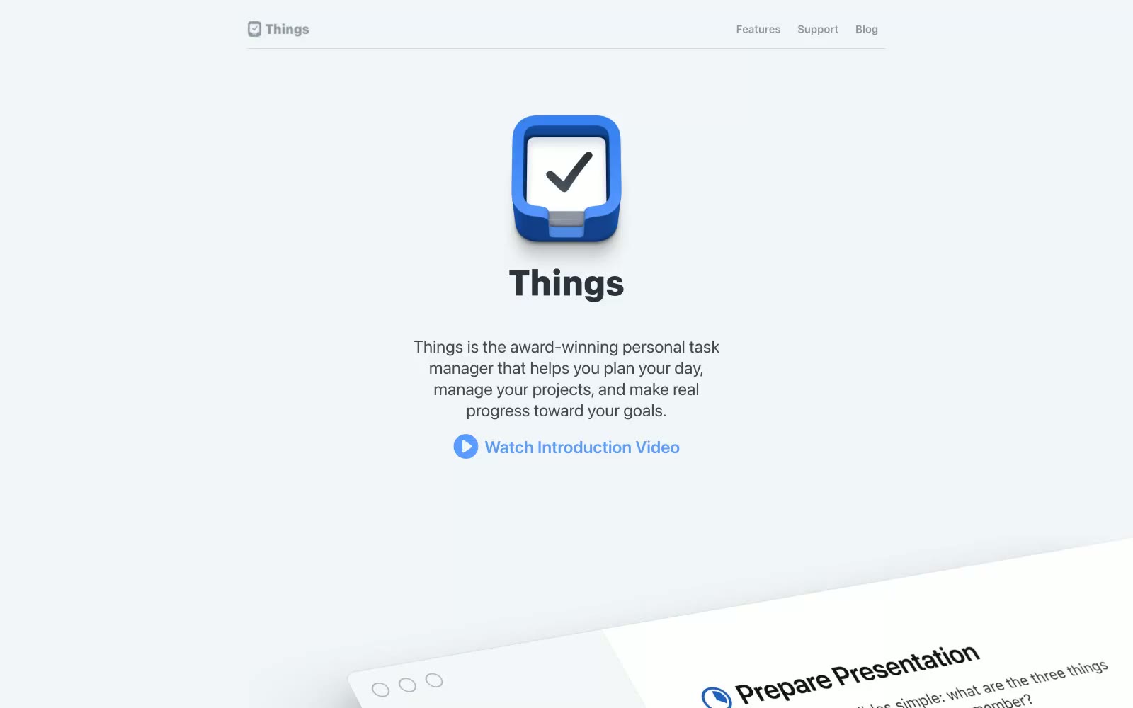
Things
Things — Style Reference
# Things — Style Reference
> Apple keynote at half volume — a gallery wall of tilted product frames floating on a quiet cool-gray canvas, with one vivid blue spark pulling the eye to every interactive moment.
**Theme:** light
Things presents a gallery-like product page where the app speaks through generous white space, tilted product mockups, and a single confident blue accent. The aesthetic borrows from Apple's editorial restraint — system fonts, near-grayscale neutrals, subtle layered elevation, and rounded cards with 18px radii feel premium without ever feeling cold. Color appears sparingly and functionally: a vivid blue for links, icons, and the circular play control; a slightly lighter blue for secondary headings; and a near-black (#303336) for body text against a faintly cool canvas (#f2f5f7). Sections breathe with 40-80px vertical gaps, and hierarchy is carried by type weight (600-800 for headings) and generous line-height rather than decorative flourishes.
## Tokens — Colors
| Name | Value | Token | Role |
|------|-------|-------|------|
| Ink | `#303336` | `--color-ink` | Primary text, body copy, heading text — near-black with a faint cool cast, never pure #000, keeping the page from feeling harsh |
| Paper | `#ffffff` | `--color-paper` | Card surfaces, elevated product mockups, input fields — pure white against the cooler canvas reads as lifted, not flat |
| Mist | `#f2f5f7` | `--color-mist` | Page canvas, full-width background bands — a cool-tinted off-white that feels softer than pure white but still reads as light |
| Fog | `#838b96` | `--color-fog` | Secondary body text, helper copy, muted descriptions — the most-used neutral after Ink, creates the dominant mid-tone of the page |
Websites
Markdown Text
design-md
website-prompt
landing-page-prompt
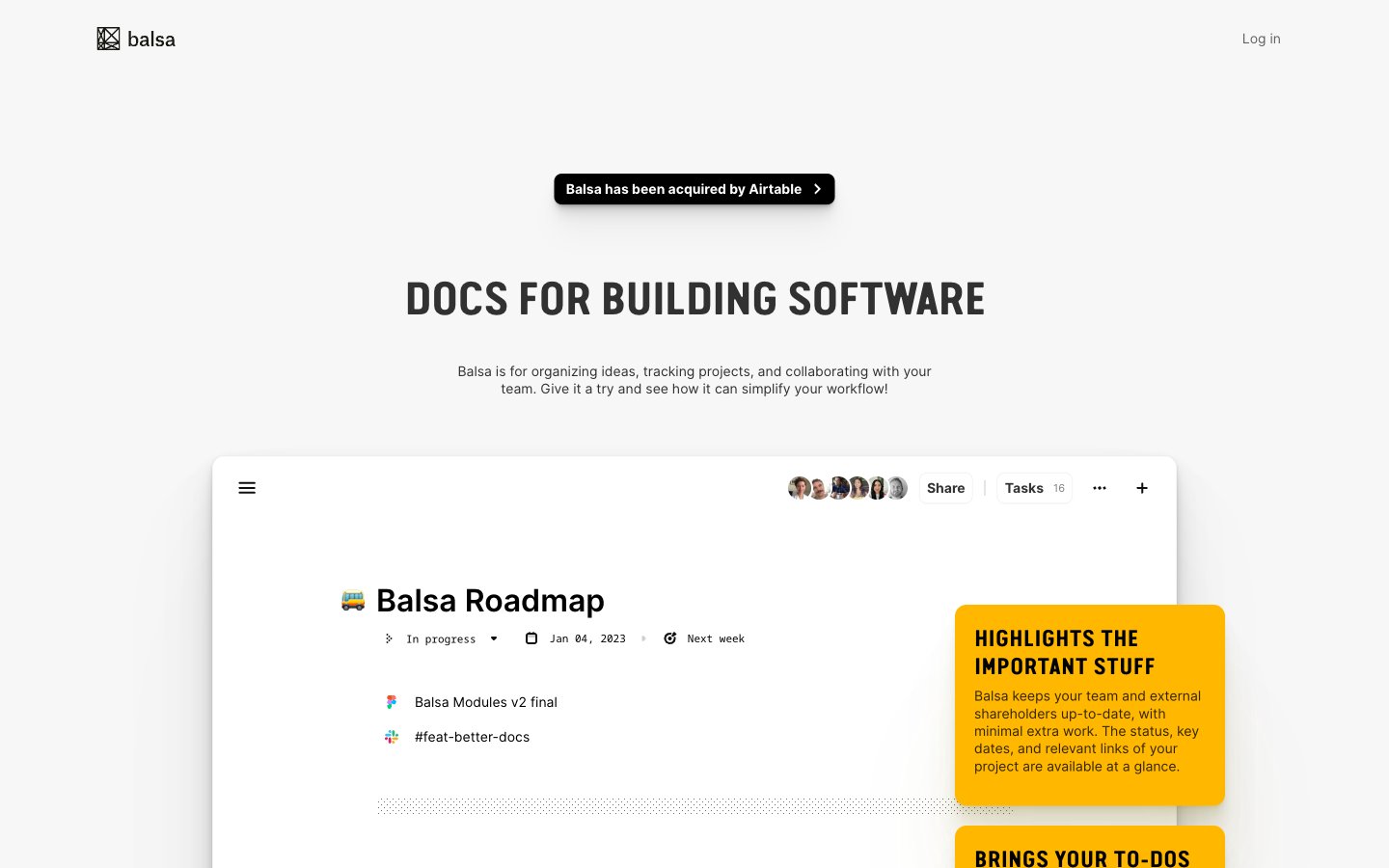
Balsa
Balsa — Style Reference
# Balsa — Style Reference
> engineering notebook on white drafting paper
**Theme:** light
Balsa's design language is an engineering notebook on white drafting paper: an almost exclusively achromatic canvas interrupted only by amber highlighter-pen annotations and one deep purple accent. The hero voice is Van Condensed Pro Bold set uppercase at extreme negative tracking (-0.047em at 48px) — industrial, compressed, shouting in a whisper. Inter handles every secondary voice at compact sizes (11–18px), with the entire interface reading as product-first: a large embedded product screenshot is the real hero, flanked by floating yellow callout cards that explain the screenshot like margin notes. Black filled buttons with 6px radius and 12px-radius flat white cards with hairline borders carry the entire component vocabulary. Shadows are barely there (0.5px black at 10% or a single 1px line at 5%), the palette does almost no decorative work, and the layout breathes with generous 60–80px section gaps so each annotation card and product crop can do its job.
## Tokens — Colors
| Name | Value | Token | Role |
|------|-------|-------|------|
| Carbon Black | `#000000` | `--color-carbon-black` | Primary text, filled action buttons, icons — the only assertive color in the system carries all interactive and typographic weight |
| Paper White | `#ffffff` | `--color-paper-white` | Card surfaces, product screenshot backgrounds, button labels on filled buttons |
| Drafting Gray | `#f7f7f7` | `--color-drafting-gray` | Page canvas, the base surface every component sits on; sets the off-white tone that makes cards read as elevated without shadow |
| Graphite | `#313131` | `--color-graphite` | Secondary headings and body emphasis, slightly softer than pure black for hierarchical depth |
Websites
Markdown Text
design-md
website-prompt
landing-page-prompt
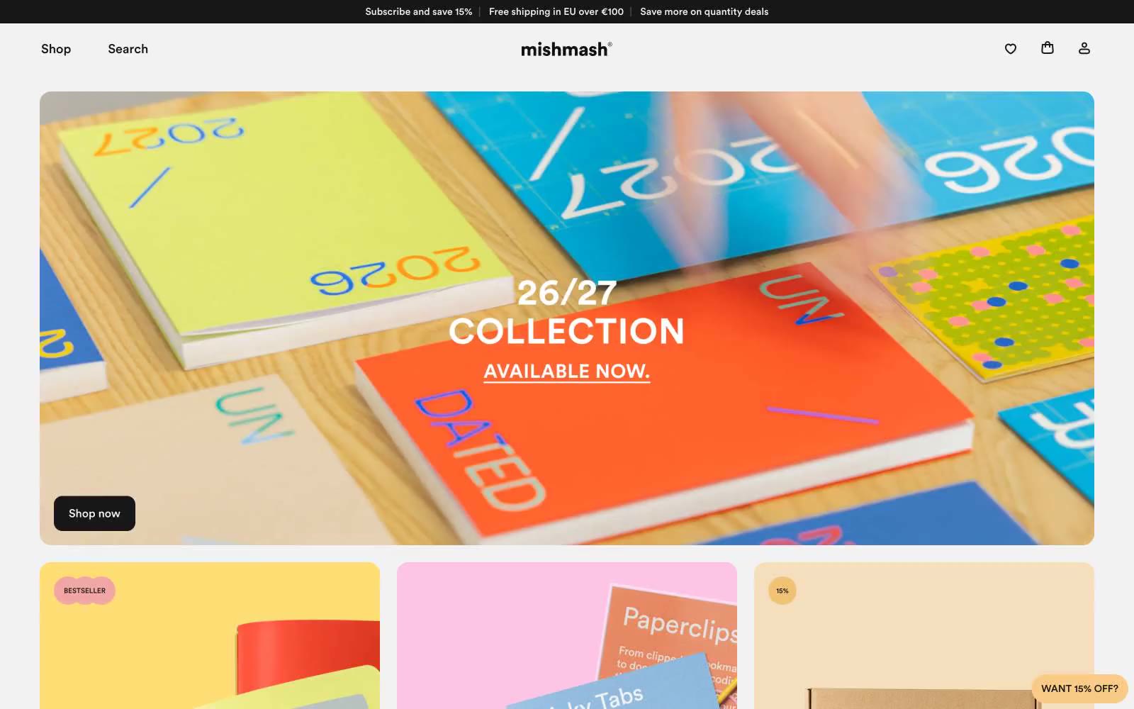
mishmash®
mishmash® — Style Reference
# mishmash® — Style Reference
> paper boutique, black frame, vivid contents.
**Theme:** light
mishmash® operates as a paper goods gallery: the chrome (type, borders, buttons, cards) is almost entirely achromatic, letting the saturated product photography carry every color moment. The layout is a compact, image-led grid where large editorial photos do the heavy lifting and UI elements stay quiet, small, and confident. Only two chromatic tokens exist in the interface — a soft butter yellow and a warmer amber — and both appear as small floating punctuation (sale badges, the persistent discount chip) rather than as filled buttons or backgrounds. Type is the only place warmth enters the system: Circular at modest sizes with comfortable line-height, set tight to the grid. The result feels like a curated stationery boutique — restrained shell, vivid contents.
## Tokens — Colors
| Name | Value | Token | Role |
|------|-------|-------|------|
| Ink | `#171717` | `--color-ink` | Primary text, nav links, button text, card borders, footer dividers — near-black with a hint of warmth, not pure #000 |
| Paper White | `#ffffff` | `--color-paper-white` | Page canvas, card surface, product card background |
| Bone | `#f2f2f2` | `--color-bone` | Subtle body borders, secondary text, input borders, hairline dividers between sections |
| Ash | `#e3e3e3` | `--color-ash` | Button borders, card surface variant, footer separator lines — slightly darker than Bone for elevated borders |
Websites
Markdown Text
design-md
website-prompt
landing-page-prompt
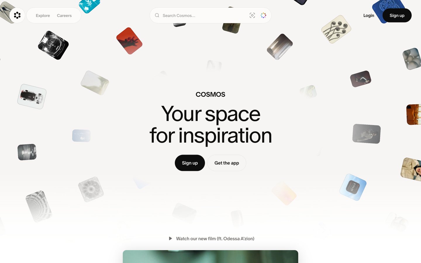
Cosmos
Cosmos — Style Reference
# Cosmos — Style Reference
> Linen gallery wall with floating polaroids
**Theme:** light
Cosmos is a gallery-wrapped canvas for visual discovery: a warm cream background (#f7f5f3) that reads like unprimed linen, black ink typography, and a strict monochrome UI where color only intrudes through user-curated imagery. The product believes in restraint — the chrome is invisible so the images can shout. Type is a single custom serif-influenced face (cosmosOracle) pulled tight with negative tracking, using weight 350 for hero copy to create editorial softness rather than marketing aggression. Surfaces are flat with a single signature radius (16px) repeated across cards, inputs, and video containers. The hero scatters image tiles in a free-form collage that frames centered copy, and the rest of the page settles into a three-column grid of image-led feature cards. There are no gradients, no shadows beyond what the collage cards cast naturally, and no chromatic accents in the interface itself.
## Tokens — Colors
| Name | Value | Token | Role |
|------|-------|-------|------|
| Linen Canvas | `#f7f5f3` | `--color-linen-canvas` | Page background — warm off-white, never pure #ffffff at the root, gives the interface a paper-like, gallery-wall base |
| Ink Black | `#0d0d0d` | `--color-ink-black` | Dark supporting neutral for text, icons, and strong contrast. Do not promote it to the primary CTA color; Borders, dividers, outlined button strokes — used at low opacity to create subtle structural lines, always Ink Black rather than a separate gray |
| Paper White | `#ffffff` | `--color-paper-white` | Light supporting surface for subtle backgrounds and section separation. Do not promote it to the primary CTA color |
| Stone | `#6e6a69` | `--color-stone` | Body text, secondary icons, inactive UI — warm mid-gray for body copy and supporting metadata |
Websites
Markdown Text
design-md
website-prompt
landing-page-prompt
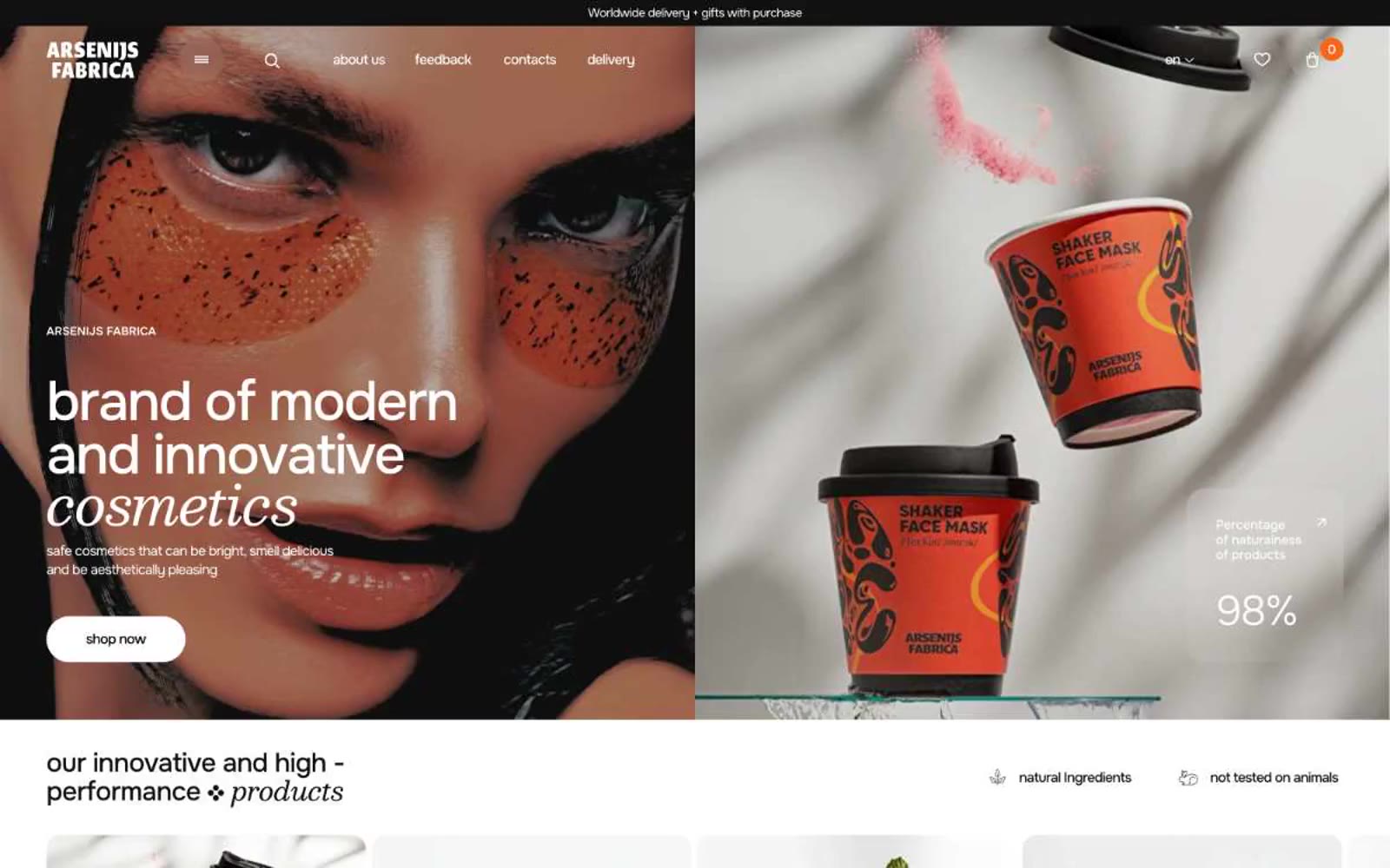
Arsenijs Fabrica
Arsenijs Fabrica — Style Reference
# Arsenijs Fabrica — Style Reference
> Editorial beauty spread under gallery lights. Pure-white gallery walls, a single warm strobe pulsing orange against the monochrome, type set thin as glass and hung with generous negative space.
**Theme:** light
Arsenijs Fabrica operates as an editorial beauty spread: expansive white surfaces, whisper-weight display type that floats across the canvas, and a single vivid orange that cuts through monochrome like a studio strobe. The brand voice in type is restrained and continental — weights 200-300 at hero scale, near-black text on pure white, generous breathing room between sections. Orange appears as functional punctuation: filled CTAs, modal backgrounds, card borders, and link accents — never as a wash or gradient field. Components feel fashion-magazine lightweight: hairline 1px borders, 10px card corners, 600px pill buttons, and a deliberate absence of shadows across the structural layer.
## Tokens — Colors
| Name | Value | Token | Role |
|------|-------|-------|------|
| Ember Orange | `#f15730` | `--color-ember-orange` | Filled CTA buttons, primary action backgrounds — deep saturated orange that reads as confident rather than playful, the only color with enough chroma to anchor a click target against the white field |
| Tangerine Blaze | `#f7651a` | `--color-tangerine-blaze` | Promotional surface fills (email capture modal, featured product cards, stat callout backgrounds) — slightly brighter and more luminous than Ember, used where orange must own an entire region of the layout |
| Apricot Whisper | `#ff8562` | `--color-apricot-whisper` | Borders on outlined cards, link underlines, icon strokes, accent hairlines — the lightest orange, functioning as a warm-tinted structural color rather than a fill |
| Graphite Black | `#111111` | `--color-graphite-black` | Body text, default borders, the dominant structural color — a true near-black, not warm, used for the bulk of hairline rules and paragraph copy |
Websites
Markdown Text
design-md
website-prompt
landing-page-prompt
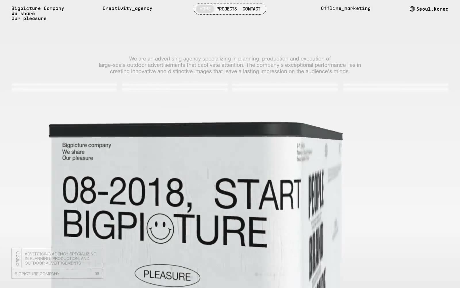
큰그림컴퍼니
큰그림컴퍼니 — Style Reference
# 큰그림컴퍼니 — Style Reference
> Concrete slab typographic manifesto. A black-on-white press kit where oversized Helvetica does the work of photography, and the only texture is a single sheet of crumpled paper under the body type.
**Theme:** light
Bigpicture Company is a monochrome editorial system that treats the webpage as a printed press kit laid out on raw paper. The interface strips away all chromatic color and relies entirely on black ink, white space, hairline rules, and a single crumpled-paper texture to carry atmosphere. Typography is the product: display headlines reach 274px at Helvetica Neue 700 with aggressive negative tracking, making text the dominant visual mass on every screen. Monospace labels ([01-N INTRODUCTION], CREATIVE/AGENCY) act as print-style captions, while four-pointed sparkle icons serve as the only ornament between sections. Layout is generous and zine-like — 72px section gaps, 144-250px horizontal padding, and full-bleed image blocks with 288px corners let the page breathe like a gallery wall rather than a software product.
## Tokens — Colors
| Name | Value | Token | Role |
|------|-------|-------|------|
| Press Ink | `#121212` | `--color-press-ink` | Primary text, hairlines, section borders, icon strokes, footer text — the singular dark tone that carries 95% of all foreground information |
| Paper White | `#ffffff` | `--color-paper-white` | Page canvas, card surfaces, nav pill background, heading-bordered surfaces |
| Newsprint | `#f1f1f1` | `--color-newsprint` | Subtle surface fills, soft borders, hairline dividers, the tone behind the crumpled-paper texture |
| Foil Gray | `#e1e1e1` | `--color-foil-gray` | Light borders, icon stroke accents, secondary dividers |
Websites
Markdown Text
design-md
website-prompt
landing-page-prompt
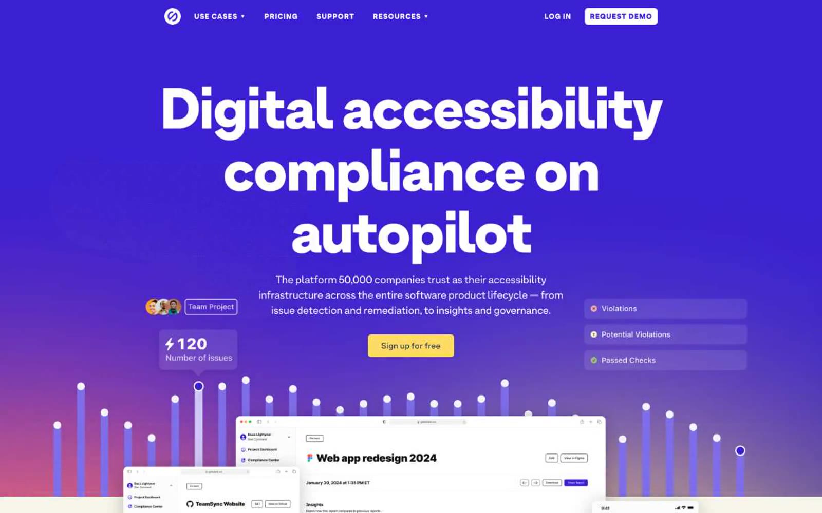
Stark
Stark — Style Reference
# Stark — Style Reference
> midnight lecture hall with yellow highlighter
**Theme:** light
Stark operates as a confident accessibility-infrastructure brand sitting on a dual-surface canvas: a deep midnight-navy hero that crashes into a warm cream secondary field, linked by a vivid violet primary action and a mustard-yellow highlighter that reads like a teacher's marking pen. The type system is anchored by ArminGrotesk at its heaviest possible weight (900) for hero display — the 110px headline is not a statement, it is a wall — then steps down through 56/48/28/24/20/16/14 with tight negative tracking (-0.02em) that pulls large letters into a single sculpted block. Yellow is not decoration; it marks emphasis inside running copy (the diagonal-split gradient) and signals one specific action. Violet is the chromatic engine: CTA fills, card borders, icon accents, active states. Everything else stays in a narrow achromatic corridor of #000, #fff, and #e5e7eb hairlines, so the two chromatic colors always read with maximum signal.
## Tokens — Colors
| Name | Value | Token | Role |
|------|-------|-------|------|
| Midnight Navy | `#10284b` | `--color-midnight-navy` | Hero background, primary headings, footer surface — the dominant brand color establishes authority and anchors the dark-to-light page split. Used as a background field for the above-the-fold section and as body-text color on the cream secondary surface |
| Stark Violet | `#381fd1` | `--color-stark-violet` | Primary action fills (Get started, Sign up, Request demo), card border accents, active nav state, decorative icon strokes, and inline emphasis text. The vivid violet against midnight navy creates a switched-on, electric feel without aggression |
| Highlighter Yellow | `#fedb63` | `--color-highlighter-yellow` | Diagonal text-highlight gradient fill, one specific secondary CTA, and illustration accent. Yellow never decorates broadly — it marks, underlines, and punctuates specific words within dark-on-light headlines |
| Lilac Tint | `#e5e0ff` | `--color-lilac-tint` | Soft button surface variant, gentle tinted card backgrounds. A desaturated wash of the violet brand that softens interactive elements without competing with the primary action |
Websites
Markdown Text
design-md
website-prompt
landing-page-prompt
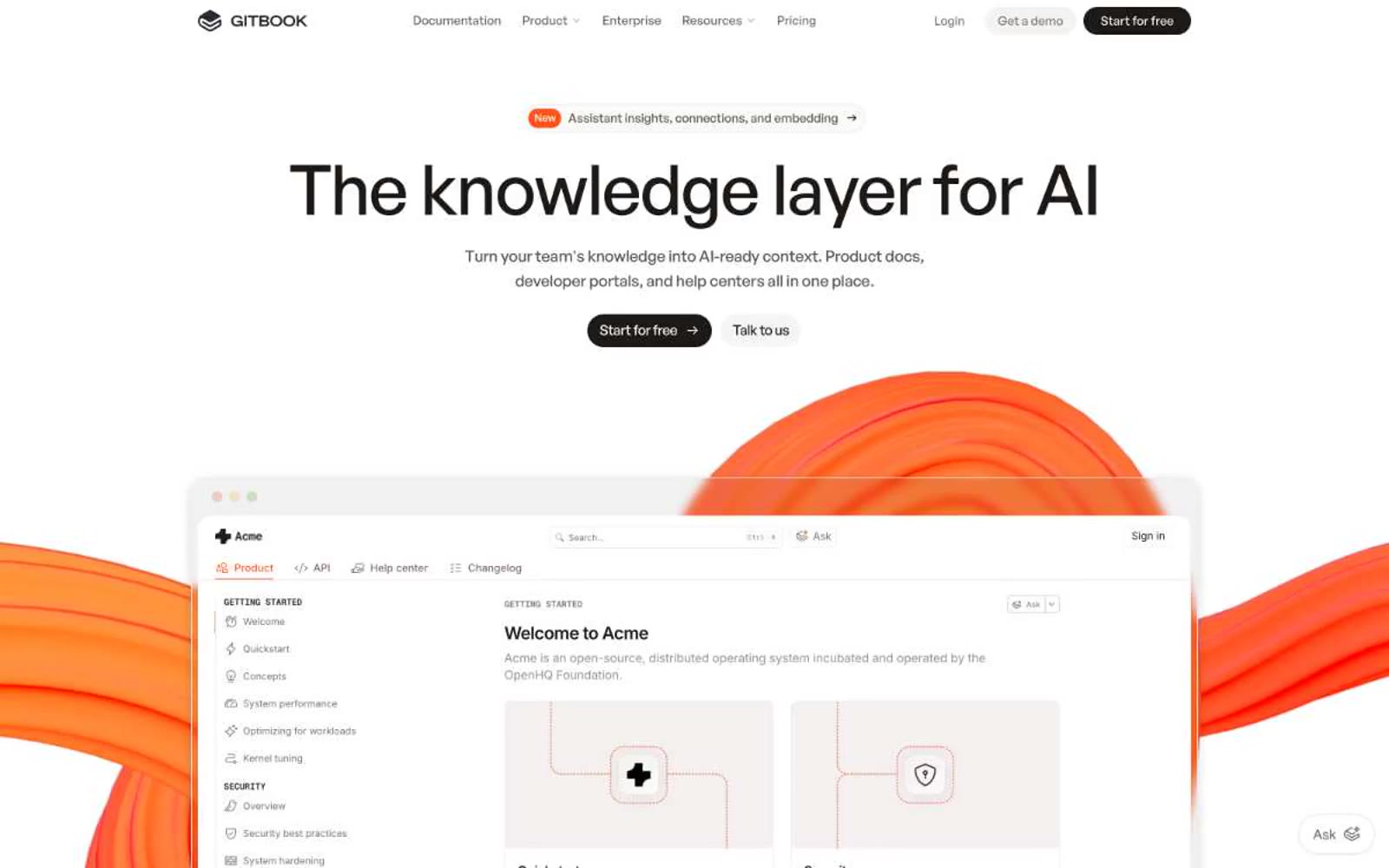
Gitbook
Gitbook — Style Reference
# Gitbook — Style Reference
> warm-white architecture studio with orange highlighter marks
**Theme:** light
GitBook projects the calm authority of a well-edited reference book: warm-white pages, generous breathing room, and near-black type that commands without shouting. A single vivid orange acts as a highlighter — appearing only in badges, the 'New' pill, the floating Ask widget, and the kinetic 3D shapes that bleed into the hero screenshot. The interface stays almost entirely monochromatic; color is punctuation, not atmosphere. Typography is the visual identity: a geometric bold display face at 45-55px with tight negative tracking creates editorial weight, while Inter handles the dense body copy. Components are paper-like — flat cards, hairline borders, pill buttons, minimal shadow. Everything reads as a knowledge product: structured, legible, confident.
## Tokens — Colors
| Name | Value | Token | Role |
|------|-------|-------|------|
| Flame Orange | `#fe551b` | `--color-flame-orange` | Orange outline accent for tags, dividers, and focused UI edges. |
| Ink | `#1c1917` | `--color-ink` | Primary action buttons, headlines, body text, primary borders — warm near-black replaces pure black for a softer, editorial feel |
| Paper | `#ffffff` | `--color-paper` | Page canvas, button text on dark fills, card surfaces — the dominant background |
| Bone | `#fafaf9` | `--color-bone` | Card backgrounds, subtle surface elevation above the white canvas, link/button ghost states |
Websites
Markdown Text
design-md
website-prompt
landing-page-prompt
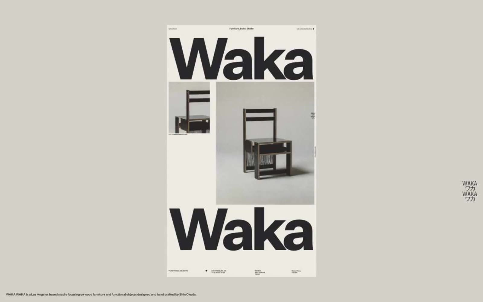
Waka Waka
Waka Waka — Style Reference
# Waka Waka — Style Reference
> museum poster in bone and ink — monumental black grotesk type printed on warm off-white paper, everything else recedes
**Theme:** light
Waka Waka treats its website like a printed exhibition catalog: a warm bone-colored paper canvas, one near-black ink, and a custom grotesk typeface deployed at both 10px footnote size and 560px monumental scale. The system is essentially monoline and monochromatic — there are no accents, no secondary hues, no gradients, and almost no decorative chrome. Visual hierarchy is created entirely through typographic weight, scale, and whitespace, with the brand's own name acting as the dominant graphic device on every screen. Components are flat, borderless or hairline-bordered, and feel curated rather than interactive — the page reads as a gallery wall of objects and oversized letterforms, not a software interface.
## Tokens — Colors
| Name | Value | Token | Role |
|------|-------|-------|------|
| Bone Paper | `#edeae4` | `--color-bone-paper` | Page background, all canvas surfaces — warm off-white that reads as unbleached paper rather than digital white |
| Stone Gray | `#c9c7c4` | `--color-stone-gray` | Secondary surface and muted contextual neutral — appears in contrast pairings as a slightly deeper layer below the canvas |
| Ink Black | `#28282a` | `--color-ink-black` | Primary text, all borders, hairline rules, icon strokes, and the only chromatic anchor in the system — near-black with a hint of warmth so it sits comfortably on the bone background instead of vibrating |
Websites
Markdown Text
design-md
website-prompt
landing-page-prompt
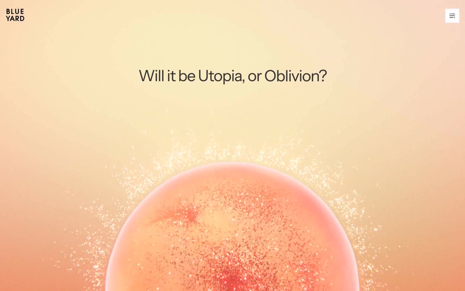
BlueYard Capital
BlueYard Capital — Style Reference
# BlueYard Capital — Style Reference
> Sunset editorial observatory. A warm peach horizon bleeds into pure white, one oversized headline floats in the negative space, and a single 3D celestial body hangs below like a planet in a printed monograph.
**Theme:** light
BlueYard Capital reads as a printed editorial object disguised as a venture capital homepage: a vast white canvas anchored by one warm peach atmospheric wash, a single oversized Instrument Sans headline, and a rendered spherical artwork that behaves like a magazine cover image. The palette is 98% achromatic — a warm near-black (#3a3a3e) does all the textual heavy lifting against pure white — with three pale chromatic tints (peach, lavender, pink) appearing only as card backgrounds and hairlines, never as functional buttons. Cards are flat, borderless or hairline-bordered, and float on whitespace rather than sitting in shadow wells. Navigation is barely there: a tiny two-line wordmark and a hamburger square. The whole site earns attention through restraint and scale, not chrome.
## Tokens — Colors
| Name | Value | Token | Role |
|------|-------|-------|------|
| Canvas White | `#ffffff` | `--color-canvas-white` | Page background, card surfaces, ghost button fill — the primary stage everything else sits on |
| Graphite Ink | `#3a3a3e` | `--color-graphite-ink` | Primary text, link color, icon strokes, hairline borders, ghost button borders — a warm near-black that carries 97% of all typographic weight |
| Deep Carbon | `#090b11` | `--color-deep-carbon` | Accent text, nav strokes, strong card borders — slightly cooler and harder than Graphite Ink, reserved for moments of maximum contrast |
| Ash Veil | `#b5b0b0` | `--color-ash-veil` | Muted body backgrounds, soft borders — a warm gray used for secondary surface bands beneath the main canvas |